Embed Size (px)
Citation preview

Multimedia Design

Table of Content
1. Navigational structures
2. Storyboard
3. Multimedia interface components
4. Tips for interface design

• When you are done with the planning stage, it is time for you to organize your content.
• Computer screens are better suited to show concise chunks of information.
• Very long content/pages are disorienting because the user has to scroll long distances and remember what was off-screen.
• Organize your information into short categories.

Questions to ask yourself:
• What categories should the information be organized into?
• What are the priorities for these categories (what is the most important)?
• Can I make the chunks of information flow without repeating information?
• Are the categories logical and well organized so that the user can predict where to go to find what he wants?
• The simplest way to plan and view this flow of information is to draw a flowchart to show how the information will be mapped.
Navigational Structures
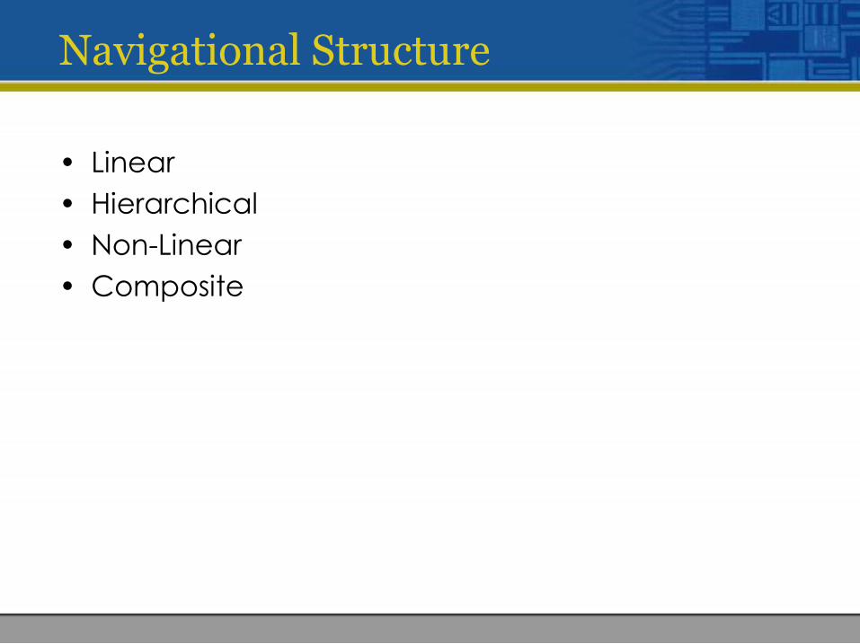
Navigational Structure
• Linear
• Hierarchical
• Non-Linear
• Composite

Linear
• Sequential navigation (sequence of step by step procedures)
• They usually go Forward or Backward.
• E.g. slides and video presentation
Hierarchical
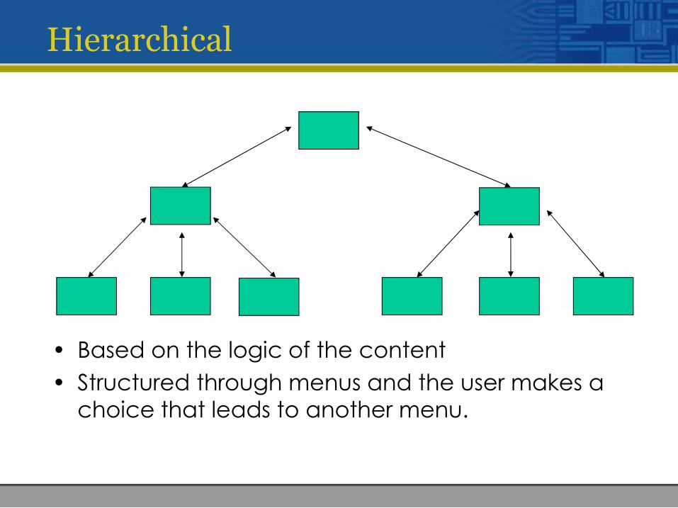
• Based on the logic of the content
• Structured through menus and the user makes a choice that leads to another menu.
Non-linear
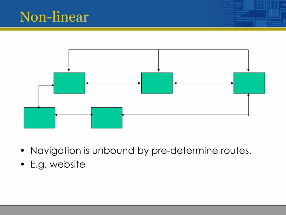
• Navigation is unbound by pre-determine routes.
• E.g. website
Composite
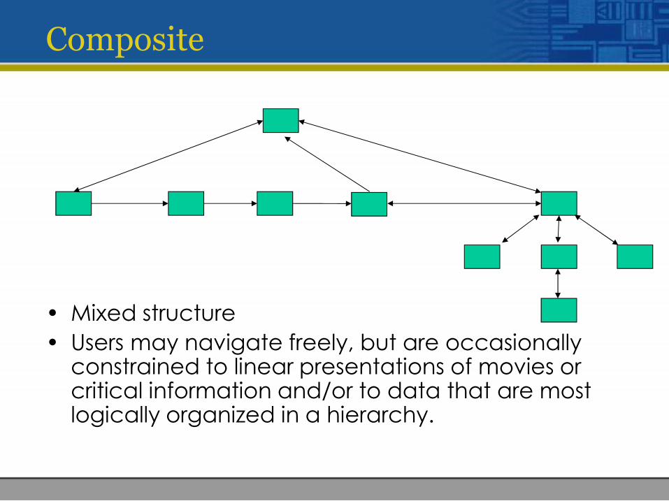
• Mixed structure
• Users may navigate freely, but are occasionally constrained to linear presentations of movies or critical information and/or to data that are most logically organized in a hierarchy.

Storyboard
Storyboard
• Storyboarding is literally building a story or sample page on paper that describes roughly the layout.
• This is a process lifted from other media development including movie making, cartoon animation and marketing.
• A visual representation of the different frames, or screens, that will be included in your production.
• The storyboard page is used to describe specificframe of time within a multimedia presentation. Itcan contain the formatting, layout of the content,layout of the navigational controls, interactivityinformation and useful comments.
Storyboard
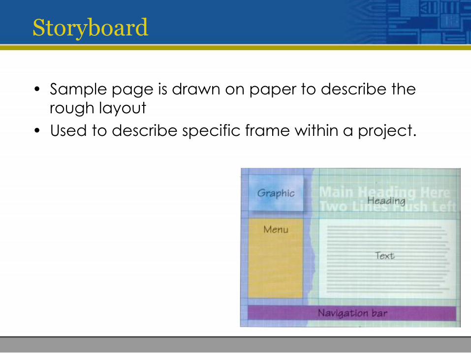
• Sample page is drawn on paper to describe the rough layout
• Used to describe specific frame within a project.
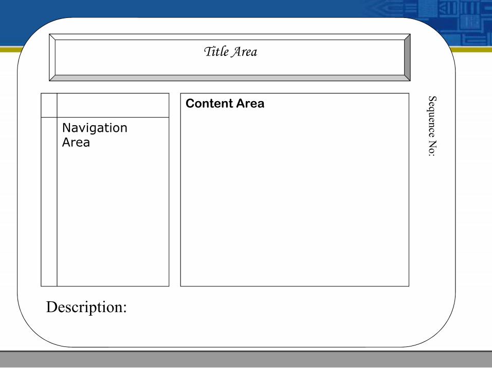
Title Area
Navigation Area
Content Area
Seq
uen
ce No
:
Description:

Represent the components
• Sketch the components that will be displayed on each screen, including text (rough sketches will do for a first draft).
Add the navigation structure:
• draw the buttons,
• show the links (e.g. with arrows or numbered screens)
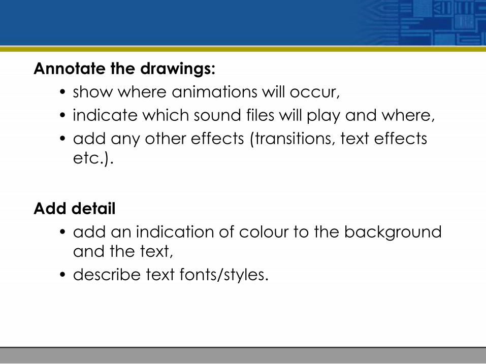
Annotate the drawings:
• show where animations will occur,
• indicate which sound files will play and where,
• add any other effects (transitions, text effects etc.).
Add detail
• add an indication of colour to the background and the text,
• describe text fonts/styles.
Multimedia Interface Components
• Background and texture
• Buttons, icons and picons
• Rollovers and sliders
• Hotspots and menus
• Feedback

Background and texture

Buttons, icons and picons

Rollovers and sliders
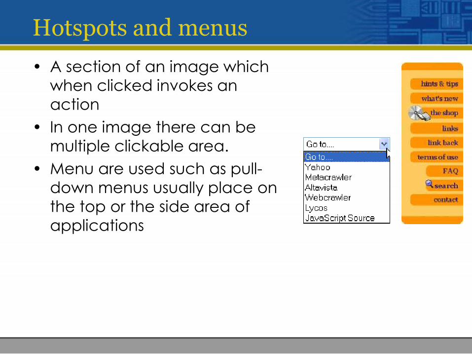
Hotspots and menus
• A section of an image which when clicked invokes an action
• In one image there can be multiple clickable area.
• Menu are used such as pull-down menus usually place on the top or the side area of applications

Feedback
• Immediate response triggered by user’s action.
• E.g. After user answered a question, a pop up window will respond whether the answer is correct or not.
Tips for Interface design
• Make sure your information is readable without straining your eyes. Use appropriate background and foreground colors. Do not overuse color and limit the use of strong colors particularly red.
• The navigational controls should have indication or visual cues of what are their function.
• Make sure users do not have to click too many times to look for specific information.
• Do not put too many things/information in one place. It will make the screen too ‘busy’.

• Create your interface as simple as possible.
• Make sure the size of text and graphics are legible.
• Be consistent in the use of symbols and color. Your navigation controls should be at the same place so that users will always know where they are.
• Choose clarity over sophistication.

• Keep Screen Content Simple and Clear
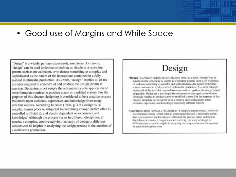
• Good use of Margins and White Space
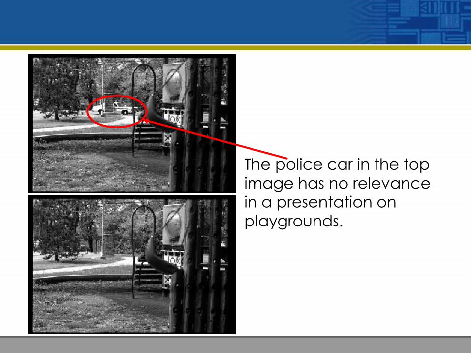
The police car in the topimage has no relevancein a presentation onplaygrounds.
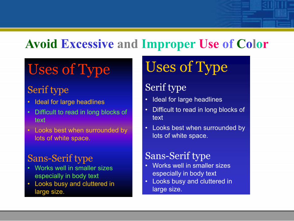
Avoid Excessive and Improper Use of Color
Uses of Type
Serif type• Ideal for large headlines
• Difficult to read in long blocks of text
• Looks best when surrounded by lots of white space.
Sans-Serif type• Works well in smaller sizes
especially in body text• Looks busy and cluttered in
large size.
Uses of Type
Serif type• Ideal for large headlines
• Difficult to read in long blocks of text
• Looks best when surrounded by lots of white space.
Sans-Serif type• Works well in smaller sizes
especially in body text• Looks busy and cluttered in
large size.
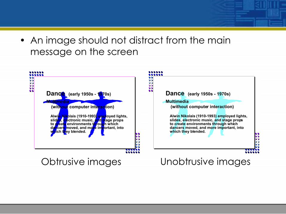
• An image should not distract from the main message on the screen
Dance (early 1950s - 1970s)
Multimedia (without computer interaction)
Alwin Nikolais (1910-1993) employed lights, slides, electronic music, and stage props to create environments through which dancers moved, and more important, into which they blended.
Dance (early 1950s - 1970s)
Multimedia (without computer interaction)
Alwin Nikolais (1910-1993) employed lights, slides, electronic music, and stage props to create environments through which dancers moved, and more important, into which they blended.
Obtrusive images Unobtrusive images
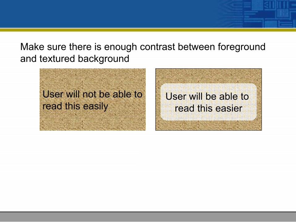
User will not be able to read this easily
Make sure there is enough contrast between foreground and textured background
User will be able to read this easier
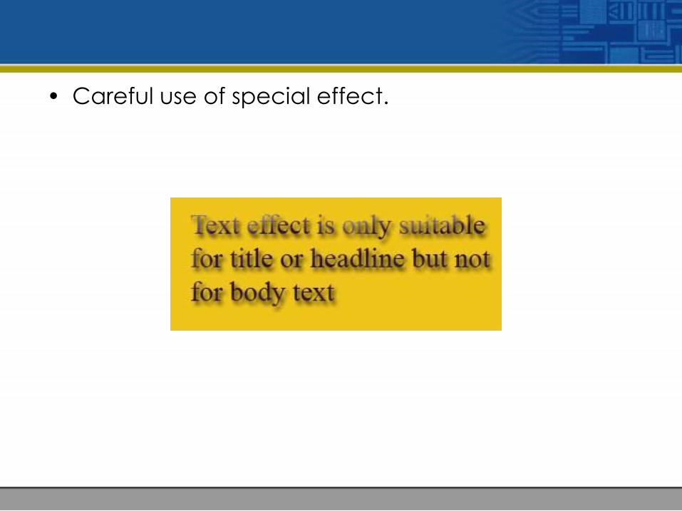
• Careful use of special effect.

• Use Dark Type on a Light Background
Easier to read Harder to read

How Does the Internet Work?
• Packet switched networks
– if it uses phone lines, it must work like thephone system, right? WRONG!
– circuit switched/packet switcheddifference
• A better model -- the postal system
– think of a packet as an envelope with anaddress
– point-to-point collection and distribution
What Makes theInternet Go?
H Protocols -- rules ofthe road for nets
H Packets
– 1-1500 characters
– travel out ofsequence and byvarious routes
H Routers -- connectvarious networks
H The InternetProtocol
– addresses thepackets
– tells the routers thebest way to go
How Does the Internet Work?
• The Transmission Control Protocol
– breaks the info into packets, puts orderinginfo on and inserts into IP “envelopes”
– opens the envelopes and reassembles
– if packets are missing or damaged, it asksfor retransmission -- parity bits
• The User Datagram Protocol (UDP)
– used for short messages only
– doesn’t worry about missing packets
Employ ConsistentLayouts for
Related Materials
Don’tChangeFormats in theMidst of a Concept
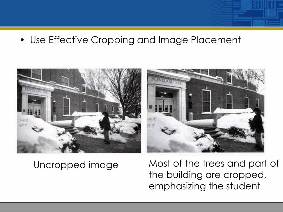
• Use Effective Cropping and Image Placement
Uncropped image Most of the trees and part ofthe building are cropped,emphasizing the student
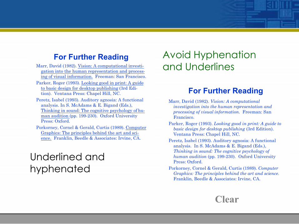
For Further ReadingMarr, David (1982). Vision: A computational
investigation into the human representation andprocessing of visual information. Freeman: SanFrancisco.
Parker, Roger (1993). Looking good in print: A guide tobasic design for desktop publishing (3rd Edition).Ventana Press: Chapel Hill, NC.
Peretz, Isabel (1993). Auditory agnosia: A functionalanalysis. In S. McAdams & E. Bigand (Eds.),Thinking in sound: The cognitive psychology ofhuman audition (pp. 199-230). Oxford UniversityPress: Oxford.
Porkorney, Cornel & Gerald, Curtis (1989). ComputerGraphics: The principles behind the art and science.Franklin, Beedle & Associates: Irvine, CA.
For Further ReadingMarr, David (1982). Vision: A computational investi-
gation into the human representation and process-ing of visual information. Freeman: San Francisco.
Parker, Roger (1993). Looking good in print: A guideto basic design for desktop publishing (3rd Edi-tion). Ventana Press: Chapel Hill, NC.
Peretz, Isabel (1993). Auditory agnosia: A functionalanalysis. In S. McAdams & E. Bigand (Eds.),Thinking in sound: The cognitive psychology of hu-man audition (pp. 199-230). Oxford UniversityPress: Oxford.
Porkorney, Cornel & Gerald, Curtis (1989). ComputerGraphics: The principles behind the art and sci-ence. Franklin, Beedle & Associates: Irvine, CA.
Avoid Hyphenationand Underlines
Underlined and hyphenated
Clear
Summary
1. Navigational structures:
• Linear
• Hierarchical
• Non-Linear
• Composite
2. Storyboarding is literally building a story or sample page on paper that describes roughly the layout.
3. Multimedia interface components:
• Background and texture
• Buttons, icons and picons
• Rollovers and sliders
• Hotspots and menus
• Feedback