Embed Size (px)
Citation preview

Monitoring change in health care through statistical process control methods Research report Chris Sherlaw-Johnson and Martin Bardsley January 2016

Monitoring change in health care
2
Contents Summary 3 1. Background 5 2. Separating genuine change from random noise – statistical process control 8 3. Special cause and common cause variation 10 4. What indicators are suitable for SPC? 12 5. What methods are available? 12 6. Other approaches 18 7. Handling over-dispersion 21 8. Control limits 24 9. Effectiveness at detecting changes 27 10. Putting this into practice 29 References 31
Acknowledgements Hospital Episodes Statistics data are © 2016, re-used with permission of the Health and Social Care Information Centre. All rights reserved.

Monitoring change in health care
3
Summary The ability to detect real change in the way care is being delivered will be critical over the next few years as the NHS faces probably its greatest financial challenge. Using information in the right way will be especially important if managers and policy-makers are to make the right decisions about the impacts that new models of care are having. The family of approaches known as statistical process control (SPC) have been widely used for monitoring outcomes in industry and have gained acceptance in many health care settings: usually within an organisation or clinical pathway. However, they are less commonly applied to look at population level changes across organisations: the changes we now see emerging in new models of care. Moreover, SPC methods can be applied to looking at some of the measures (such as changes in emergency admissions) that are commonly used to monitor major programmes of organisational change as seen in, for example, new models of integrated care or the Vanguards. SPC has value over more static modes of statistical evaluation when information about a process or its outcomes is being reported on a continuous basis, particularly in real-time, and decision-makers want to be made aware of potential problems or improvements as soon as there is evidence in support. The key value of these methods is their ability to distinguish real changes from just random noise seen in all measures. This means that they are more likely to detect genuine changes earlier – and yet, conversely, more likely to detect the absence of change earlier. We cannot afford to put in place a new model of care and then wait three years to see if it is working. So we need methods that can give earlier warnings. The benefits of these approaches are:
• Timeliness of the findings. In many cases the length of time required to set up a service and undertake a full summative evaluation is simply too long – so we need interim measures of progress that are statistically robust.
• Influencing direction of travel to identify change in a way that allows you to respond – reinforce the good and react to the bad.
• Methods that use sequential outcomes are more sensitive to real change and can be used closer to real time. SPC methods make more use of the information available by looking not just at one point in time, but considering the history of observations.
• They can be adapted to look at change against a variety of benchmarks, could set the expectations to be an improvement on historical patterns or to be better than elsewhere or to change faster than elsewhere. So, for example, you can test first whether in your area there is an improvement over time, and then test to see if this change is greater or lesser than that seen elsewhere. So we might expect Vanguard areas to demonstrate change that exceeds that seen in other areas.

Monitoring change in health care
4
There are a number of different SPC methods that can be used – in this report we describe three:
• Shewhart or Runs charts.
• Variable life-adjusted displays (VLAD).
• Cumulative sum charts (CUSUM). All applications will require three key elements:
• a readily understood and intuitive display
• immunity to when monitoring starts (unless evaluating change after a specific, pre-determined moment)
• robust methods for evaluating the statistical evidence that a change has taken place.
These different methods have their own strengths and weaknesses. Shewhart and VLAD charts have the advantage that they are easy to understand and have simple graphical displays. However, the Shewhart charts are not as good at identifying trends, and the VLAD plots are heavily dependent on when the monitoring starts. In contrast, the CUSUM charts allow quicker identification of change, but are not as easy to understand and more complex to implement. The methods described in this research report are not new and to many clinicians and analysts they are well known, yet they are still relatively uncommon as a means for monitoring change across health systems. However, realising the potential of these methods may not always be plain-sailing and there are a number of potential barriers in terms of access to the data, skills and an acceptance to use analytical methods that are more complex than normal. These are not insurmountable. Though these methods require some degree of statistical knowledge, there are a variety of tools and learning resources available. There are also opportunities for collaborative work to develop common tools specifically aimed at monitoring population level change for vanguard sites and new models of care.

Monitoring change in health care
5
1. Background The past decade has seen many attempts to redesign systems for the delivery of health care, the most recent of which, the five-year forward view (NHS England, 2014), is perhaps the boldest. Though the rhetoric of evidence-based policy is appealing, in reality these changes rarely match the existing evidence base exactly. New models of care can learn from the past, but they are often modifications and adaptations of what has gone before in order to fit local circumstances. This means that we cannot take the success of these changes for granted and we need methods to evaluate impacts and monitor change in both process and outcome to assess success. So, for example, one of the most commonly used metrics is emergency admissions (Figure 1). With a proliferation of new models of care – there is also a growing body of evaluative work looking at the impacts of these changes on emergency admissions (Bardsley and others, 2013; Purdy and others, 2012) though the findings are not as encouraging as many hoped. While independent and discrete evaluation are important in understanding the success or otherwise of new models of care, there are other ways to monitor change and these can include advanced analytical techniques – where they are appropriate. There is a spectrum of activities that can be used to assess the impacts of service changes, ranging from a formal independent multi-stranded evaluation at one end, to management reporting at the other. While independent academic evaluation usually generates the more robust findings, it is often expensive and can be slow. Moreover, many evaluations are essentially summative: they wait for sufficient cases to be seen and then assess whether the intervention has ‘worked’ – crudely in terms of ‘yes’ or ‘no’. The limitations of this approach to evaluation are widely accepted and there is a lot of research into more subtle ways to assess change and in ways that are capable of influencing the change itself. At the other end of the evaluative spectrum are the management reporting methods, which may be a balanced scorecard produced on a monthly basis or a summary of a handful of quantitative indicators, often in the form of Red, Amber, Green (RAG) ratings. These offer the directness and simplicity favoured in management circles, yet the apparent lack of ambiguity can be misleading. So, for example, the extent to which such dashboards use basic statistical tests is variable even though such tests are an essential guide for distinguishing real differences from random noise. Moreover, with repeated cross-sectional measures, the chances of an atypical, random observation being seen as important increases the more measurements are taken. On the other hand, a small incremental change over time, that may become significant, may go unnoticed. RAG ratings Red Issues that need to be addressed to higher
management Amber Issues that can be dealt with Green Project running as planned

Monitoring change in health care
6
There are a range of methods known as statistical process control (SPC) that can be applied to make the most of such data and a number of examples of where these methods have been applied in the health sector. For example, the basic method using Runs charts has been described by the NHS Institute in England (Bardsley and others, 2013) and the equivalent in Scotland (NHS Scotland Improvement Hub, 2015). There are also cases in the monitoring of hospital outcomes where VLAD plots have been used (Duckett and others, 2007; Lovegrove and others, 1997; Sherlaw-Johnson and others, 2005) CUSUM methods have also been used to monitor in-hospital mortality rates (Bottle and Aylin, 2008). However, they are less commonly applied to look at population level changes across organisations: the changes we now see emerging in new models of care. The rest of this research report discusses SPC methods and describes how they might be applied at this level. Glossary of terms
Special cause variation
Observations that are sufficiently outside the normal historical range of variation to suggest a specific cause.
Six (or two sigma) These are multiples of the standard deviation and care used to measure the extent of special cause variation as well as the tolerance limits for ‘normal’ variation. Note: sigma is commonly used short-hand for standard deviation.
Control chart A chart generated by the observations with thresholds which indicate that there is sufficient evidence for notable changes having taken place.
CUSUM A widely used SPC approach based on log likelihood ratios.
Over-dispersion Extra variation in the system that is not accounted for by the modelling assumptions used.
Control limits Thresholds that are used on a control chart to signal when a notable change has occurred.
False positive/negative
In a control charting context, a false positive occurs when a chart signals a change, when in fact it is just random variation. A false negative is when a change has occurred but it remains undetected.
Signalling An indication that an observation or set of observations crosses a pre-agreed threshold, indicating the need for action

Monitoring change in health care
7
Emergency admissions For many of these new models of care, one of the key aims is to reduce the need for emergency care. There has been a long-standing, almost inexorable rise in unplanned hospital admission that has become a key driver of many local and national policy initiatives (Figure 1). Behind the concern is the fact that emergency admissions are undesirable. Nobody wants an emergency admission, especially if preventive strategies could reduce the risk of having a health crisis. Moreover, there is a belief that hospital care is often more costly. As a consequence, the rates of emergency admission are often used as proxy markers – either for avoidable health status or potentially avoidable costs. We have seen a range of different approaches, for example, models of risk stratification, case management, integrated care, the Better Care Fund or, more recently, pioneers and vanguards – yet almost all at some point come back to a problem of reducing emergency admission. Figure 1: Quarterly emergency admissions of individuals aged 75 or over (ignoring people discharged on the same day)
Source: Hospital Episode Statistics Despite its ubiquity, measures based on emergency admission do have limitations.
• Not all emergency admissions are avoidable or a ‘bad thing’.
• Admission rates are a product of the health state of the patient plus local clinical decisions and resource supply and it is not always clear what explains the observed differences.
• The cost of a hospital stay may not be that much greater than a community-based intervention.
• Hospitals are ‘good’ environments for uncertain and high-risk health problems – access to specialist staff and facilities is usually easier.
0
50,000
100,000
150,000
200,000
250,000
300,000
350,000
400,000
2005
/06_
Q1
Q2
Q3
Q4
2006
/07_
Q1
Q2
Q3
Q4
2007
/08_
Q1
Q2
Q3
Q4
2008
/09_
Q1
Q2
Q3
Q4
2009
/10_
Q1
Q2
Q3
Q4
2010
/11_
Q1
Q2
Q3
Q4
2011
/12_
Q1
Q2
Q3
Q4
2012
/13_
Q1
Q2
Q3
Q4
2013
/14_
Q1
Q2
Q3
Q4

Monitoring change in health care
8
However, it is also the case that – unlike many other patient outcomes of service outputs – we have a lot of information about emergency admissions which means that monitoring of emergency admission rates will continue to be used.
2. Separating genuine change from random noise – statistical process control
Statistical process control (SPC) methods were originally developed in the manufacturing industry in the 1920s for the purpose of quality control. They only started to be used in health care in the 1990s, initially as a means for surgeons to monitor the quality of their operations in order to be quickly alerted to any signs of declining outcomes (Lovegrove and others, 1997; Steiner and others, 2000) Later, they were adapted for wider quality-monitoring purposes, including for regulation (Spiegelhalter and others, 2012). SPC has value over more static modes of statistical evaluation when information about a process or its outcomes is being reported on a continuous basis, particularly in real-time, and decision-makers want to be made aware of potential problems or improvements as soon as there is evidence in support. Repeated use of static measurements, such as funnel plots, runs the risk of losing specificity as false positives become more likely. They are also not designed for picking up sudden changes or trends, where the timing of the change and the ability to act quickly can be crucial. A combination of the right statistical methods on time series data offers some particular advantages when looking at change.
• Timeliness of the findings. In many cases the length of time required to set up a service and undertake a full summative evaluation is simply too long. We cannot afford to put in place a new model of care and then wait three years to see if it is working. So we need methods that can give earlier warnings.
• Influencing direction of travel to identify change in a way that allows you to respond – reinforce the good and react to the bad.
• Methods that use sequential outcomes are more sensitive to real change and can be used closer to real time. SPC methods make more use of the information available by looking not just at one point in time, but considering the history of observations.
• They can be adapted to look at change against a variety of benchmarks, could set the expectations to be an improvement on historical patterns or to be better than elsewhere or to change faster than elsewhere.
To illustrate where SPC methods could be useful, we show a typical plot of time series data in Figure 2a. This represents quarterly emergency admissions of older people resident in one London borough for fracture neck of femur (FNOF). Values oscillate between around 20 and 40 per quarter with what appears to be a slight downward trend over the period. An important question with information like this is whether this represents a genuine improvement or is just due to random variation. We can improve

Monitoring change in health care
9
visual clarity of the trend by fitting a regression line, and subsequent regression techniques can be used to determine whether there is a significant downward trend. However, they are most useful if the underlying trend is continuous. Another way of viewing the data is as in Figure 2b, which suggests that, instead of modelling the data as random variation about a continuous downward trend, we represent rates as constant with a sudden drop at the end of 2009/10. The question now is not about the trend but whether a significant change has occurred at that one moment. SPC methods can be employed to make some sense of this situation and help us understand not just whether any significant changes have occurred, but the nature of that change.
Figure 2a: Quarterly emergency admissions to hospital for fracture neck of femur: residents of a local authority area aged 75 or over (zero length of stay admissions excluded) – least squares regression line implying a continuous change
Source: Hospital Episode Statistics
0
5
10
15
20
25
30
35
40
45
50
2005
/06_
Q1 Q2 Q3 Q4
2006
/07_
Q1 Q2 Q3 Q4
2007
/08_
Q1 Q2 Q3 Q4
2008
/09_
Q1 Q2 Q3 Q4
2009
/10_
Q1 Q2 Q3 Q4
2010
/11_
Q1 Q2 Q3 Q4
2011
/12_
Q1 Q2 Q3 Q4
2012
/13_
Q1 Q2 Q3 Q4
2013
/14_
Q1 Q2 Q3 Q4

Monitoring change in health care
10
Figure 2b: Quarterly emergency admissions to hospital for fracture neck of femur: residents of a local authority area aged 75 or over (zero length of stay admissions excluded) – two constant levels implying a sudden shift in admission rates
S Source: Hospital Episode Statistics 3. Special cause and common cause variation At the heart of SPC methods is the idea that we need to distinguish between special and common cause variation. This helps in understanding how to apply different monitoring methods in health care. Special cause variation is usually typified by large deviations from the norm that can often be picked up with one observation (for example, an outlier that deviates by more than three standard deviations). These will reflect sudden large deteriorations or improvements in outcomes and, one could argue, are more relevant to traditional industrial applications, as in health outcomes measurement they are more likely to reflect problems with data than performance. If the variation is large enough, cross-sectional methods that analyse sufficiently frequent measurements can pick these up. Where SPC is particularly relevant in health care is for identifying ‘common cause’ variation. This refers to less dramatic but persistent changes that may go unnoticed without sufficient statistical means for detecting them. The different types of variation are illustrated in Figures 3a and 3b. These figures compare observed and expected emergency admissions for older people within two separate London boroughs. The drop in values for two quarters in Figure 3a is far too large to be reasonably attributed to changes in either the quality or delivery of care and data recording issues seem more likely, and would at least be the first line of any enquiry. (As it happened, in the final Hospital Episode Statistics (HES) data for that year the data were rectified and the drops disappeared.) In Figure 3b the changes are more subtle. Over several years, even though numbers of admissions have risen, there has been a gradual yet persistent deviation from expected values. In this case, a pertinent question is whether a deviation of this size is particularly notable.
0
5
10
15
20
25
30
35
40
45
50
2005
/06_
Q1 Q2 Q3 Q420
06/0
7_Q1 Q2 Q3 Q4
2007
/08_
Q1 Q2 Q3 Q420
08/0
9_Q1 Q2 Q3 Q4
2009
/10_
Q1 Q2 Q3 Q420
10/1
1_Q1 Q2 Q3 Q4
2011
/12_
Q1 Q2 Q3 Q420
12/1
3_Q1 Q2 Q3 Q4
2013
/14_
Q1 Q2 Q3 Q4

Monitoring change in health care
11
Source: Hospital Episode Statistics
Figure 3a: Observed and expected emergency admissions aged 75 or over in two London boroughs – special cause variation
Figure 3b: Observed and expected emergency admissions aged 75 or over in two London boroughs – common cause variation
Source: Hospital Episode Statistics
0
200
400
600
800
1000
1200
1400
1600
1800
2000
Observed
Expected
Special cause variation
0
200
400
600
800
1000
1200
1400
2005
/06_
Q1
Q2
Q3
Q4
2006
/07_
Q1
Q2
Q3
Q4
2007
/08_
Q1
Q2
Q3
Q4
2008
/09_
Q1
Q2
Q3
Q4
2009
/10_
Q1
Q2
Q3
Q4
2010
/11_
Q1
Q2
Q3
Q4
2011
/12_
Q1
Q2
Q3
Q4
2012
/13_
Q1
Q2
Q3
Q4
2013
/14_
Q1
Q2
Q3
Q4
Observed
Expected

Monitoring change in health care
12
4. What indicators are suitable for SPC? SPC methods can be applied to any indicators where the underlying data are collected repeatedly and consistently and felt to reflect important changes within the health system. In other health settings SPC has been used for monitoring mortality (Bottle and others, 2008; Rogers and others, 2005); the frequency of health care acquired infection (Curran and others, 2002; Sherlaw-Johnson and others, 2007; Grigg and others, 2009); and a number of process measures including readmission rates, lengths of stay or bed days (Duckett and others, 2007; Smith and others, 2013). The most important factor is that information needs to be collected frequently and, ideally, continuously. So, for example, an annual survey of patient experience will probably be too infrequent. On the hand, using weekly or quarterly returns means you are more likely to generate a result that will influence future action.
5. What methods are available? There are a wide variety of different SPC techniques available and for any given application the best method to use will depend on the purposes of the monitoring and the data being monitored. In this section, we summarise some of the most common techniques applying them to data on emergency admissions to hospital among people aged 75 or over. Shewhart charts The first type of SPC method to be developed, as well as one of the easiest to understand, is the Shewhart or Runs chart. This is a display of observed outcomes over time compared against an expected value with lines representing deviations from expected (usually one and two standard deviations). Figure 4 shows such a chart for the FNOF data shown previously in Figures 2a and 2b. These are compared against the national rate over the first two years, adjusted for age, sex and deprivation. Lines are drawn representing one and two standard deviations (sigma) from the expected value, derived from assuming quarterly admissions are Poisson distributed. (Note that the Poisson assumption has been used here to help illustrate the method. In practice there may be various reasons why it will not hold, in which case more complex methods are available.)

Monitoring change in health care
13
Table 1: Examples of indicators that are more likely to fit continuous monitoring with SPC*
Emergency hospital admissions One of the most commonly used metrics in both monitoring and evaluative studies and in system-level monitoring
Admission rates of specific marker conditions, for example, ambulatory care sensitive conditions
Widely used set of health conditions (defined by diagnostic codes) where the level of emergency admission suggests sub-optimal preventive care – usually in terms of access to appropriate primary care services
Case specific mortality rates (in hospital or longer)
There are a range of mortality measures (for example, mortality following cardiac surgery) which are used in control charts
Emergency bed days A measure that potentially reflects control over levels of emergency admission and length of stay – related to appropriate discharge processes and access to alternatives to hospital care
Attendance at A&E departments Data widely available – and though the details of individual cases is very limited, person level data are collected in HES. High rates are a combination of the prevalence of health crises among patients, and the availability and accessibility of alternatives of going to A&E. Provision of urgent care in one of many other settings can make interpretation difficult without local knowledge
Routine performance monitoring metrics, for example, cancelled operations, delayed discharges
Some of the more closely monitored ‘Sit Rep’ style statistics lend themselves to these methods where data are collected on a weekly basis and with reasonable consistency. Bigger issues may exist in ensuring consistency in data collection across sites. Some of the routine indicators have significant organisational implications and may be subject to local interpretation
Hospital costs Though genuine costs from finance may be available these may be affected by the unevenness of financial flows in and out of an organisation and need consistent accounting practices. Alternative systems of unit cost (for example, using hospital tariffs) can be applied to measures of activity to give notional cost values that are effectively a form of weighted activity
Uptake of specific preventive care, for example, immunisation rates
There are a range of statistics available that track basic preventive services such as immunisation or cancer screening
Primary care indicators There are a number of information sources in primary care that provide reasonably consistent and regular data (for example, indicators from the Quality Outcomes Framework at GP practice level, or prescribing indicators).
*Note: This list is indicative and not comprehensive.

Monitoring change in health care
14
In Figure 4 admission rates initially appear to be centred on the national value with what appears to be a notable shift downwards in recent years and rates below the lower two sigma limit for the third quarter of 2010/11 and the first quarter of 2012/13. A relevant question is whether this represents a notable change in relation to the expected value. With the SPC approach ‘notable’ changes are defined by signalling rules which, when satisfied, can trigger an in-depth investigation. A simple rule using a Shewhart chart would be whether the plot exceeds one of the two sigma limits. Such a rule is potentially useful if the purpose is to act on single notable deviations, but looking at one observation is a generally limited method for assessing what appears to be a persistent downward shift in admission rates. Other rules are better at addressing this by, for example, looking for runs of three consecutive observations below the one sigma limit, or six below expected. We address the issues of evaluating signalling rules and deciding which to use in a later section. Of course, the longer the monitoring period, the greater is the chance that a specific observation randomly falls outside the range and generates a false positive signal. The above chart presents outcomes for 36 quarters and the chances of randomly exceeding the two sigma limits over that time are as high as 84 per cent. We could use wider limits instead (three or four sigma) but the more we restrict the occurrence of false positives, the more we restrict our ability to detect true changes when they occur. This is an important consideration when handling time series: false positives need to be controlled, but not at the expense of true positives. This leads to decisions about control limits being based on relative frequencies of the two events, and choosing values that suit the purposes of the monitoring, for example, a greater tolerance of false
Figure 4: Shewhart chart of quarterly emergency admissions to hospital for fracture neck of femur: residents of a local authority area aged 75 or over (zero length of stay admissions excluded)
Source: Hospital Episode Statistics
10
15
20
25
30
35
40
45
5020
05/0
6_Q
1Q
2Q
3Q
420
06/0
7_Q
1Q
2Q
3Q
420
07/0
8_Q
1Q
2Q
3Q
420
08/0
9_Q
1Q
2Q
3Q
420
09/1
0_Q
1Q
2Q
3Q
420
10/1
1_Q
1Q
2Q
3Q
420
11/1
2_Q
1Q
2Q
3Q
420
12/1
3_Q
1Q
2Q
3Q
420
13/1
4_Q
1Q
2Q
3Q
4
2 sigma
2 sigma
1 sigma
1 sigma
Expected

Monitoring change in health care
15
alarms for internal performance assessment, and a more conservative approach for external regulation. For Figure 4 we have compared admission rates against a constant value which has been derived from national values at the beginning of the series. However, national rates of admission for FNOF have been increasing (Figure 5), so it is perhaps more relevant to compare rates within the local authority against these variable national values. Moreover, against an increasing national trend, the observed drop in recent years might be an even more important outcome. Figure 5 shows the Shewhart chart for this situation, with two sigma limits and adjustments also having been made for the local distributions of age, sex and deprivation. This chart shows that the apparent reduction in admission rates within the local authority is more notable in that it happens against an overall national increase. The two sigma limit is therefore higher and the plot crosses it on three occasions. The downward shift seems to be of the order of two standard deviations below what would be expected.
Figure 5: Shewhart chart of quarterly emergency admissions to hospitals comparing a single local authority against a changing national rate
Source: Hospital Episode Statistics
0
10
20
30
40
50
60
2005
/06_
Q1
Q2
Q3
Q4
2006
/07_
Q1
Q2
Q3
Q4
2007
/08_
Q1
Q2
Q3
Q4
2008
/09_
Q1
Q2
Q3
Q4
2009
/10_
Q1
Q2
Q3
Q4
2010
/11_
Q1
Q2
Q3
Q4
2011
/12_
Q1
Q2
Q3
Q4
2012
/13_
Q1
Q2
Q3
Q4
2013
/14_
Q1
Q2
Q3
Q4
Observed
Expected
Two sigma limits

Monitoring change in health care
16
VLAD charts A more useful method for displaying trends is the variable life-adjusted display (VLAD) chart. This is a plot of cumulative expected minus observed outcomes (Figure 6) so, unlike the Shewhart chart, it adds information over time (Lovegrove and others, 1997). If outcomes are persistently worse than expected, then the plot will continue on a downward course, and upwards if persistently better. (Note: some representations of the VLAD are the reverse, being plots of cumulative observed minus expected outcomes, so that poor trends move up rather than down.) The VLAD in Figure 6 is for the same FNOF data as in Figure 2a and 2b. One and two sigma limits can be superimposed in the same way and used as triggers. But this time the limits are for the value of the VLAD rather than for individual observations and combinations of several rules, as used with the Shewhart, can be avoided.
The apparent downward shift observed in the Shewhart chart is more starkly apparent in this chart, and the limit is crossed in the fourth quarter of 2011/12. One potential problem is that this limit is designed to answer the question as to whether cumulative outcomes over the whole period are significantly below expected, not whether a significant change has occurred half-way through. Therefore the speed of signalling is highly dependent on when, during the series, the trend starts to move upwards. This raises an issue when using these limits on the VLAD about when to start monitoring, and we don’t want to be retrospectively revising the start time to force a
Figure 6: Cumulative expected minus observed outcomes (VLAD). (FNOF data as in Figures 2a and 2b)
Source: Hospital Episode Statistics -40
-20
0
20
40
60
80
100
120
140
160
2005
/06_
Q1
Q2
Q3
Q4
2006
/07_
Q1
Q2
Q3
Q4
2007
/08_
Q1
Q2
Q3
Q4
2008
/09_
Q1
Q2
Q3
Q4
2009
/10_
Q1
Q2
Q3
Q4
2010
/11_
Q1
Q2
Q3
Q4
2011
/12_
Q1
Q2
Q3
Q4
2012
/13_
Q1
Q2
Q3
Q4
2013
/14_
Q1
Q2
Q3
Q4
Control limit

Monitoring change in health care
17
signal. If the interest is in evaluating changes after a fixed, pre-specified time, then such a limit would be more appropriate. This underlines three key aspirations of SPC methods that affect their practical application:
• a readily understood and intuitive display
• except in particular situations, methods that are immune to when monitoring starts
• robust methods for evaluating the statistical evidence that a change has taken place.
The Shewhart and VLAD methods are strong on the first point. The Shewhart is less so on the third one, as is the VLAD, if the limits described above are used. However, there is some flexibility with the VLAD to super-impose other limits derived for cumulative outcomes (Sherlaw-Johnson, 2005). The CUSUM More efficient signalling tools are based on the theory of sequential hypothesis testing. The measures used here are derived from the ratio of the likelihood of making the observations when a change has occurred to the likelihood that a change has not occurred. So, if, given the observations, a change is more probable, the likelihood ratio will exceed one and be less than one if it is more probable a change has not occurred. (Or, using logs, the log likelihood ratio will be respectively positive or negative.) With a CUSUM the log likelihood accumulates after each observation and an alert is signalled if it exceeds a given value (in other words, there has been a sufficient accumulation of positive log likelihoods providing evidence of a change). The CUSUM is also constrained not to fall below zero, which means it is only designed to look for changes in one direction. After a signal the CUSUM is often reset: if the signal triggers some form of action, then by resetting the chart the user can observe whether the action has been successful. If looking at good outcomes, resetting the chart can enable us to view whether any changes are persistent. A CUSUM for the same FNOF data is shown in Figure 7. This CUSUM is designed to detect improvements in admission rates and signals three times. Notably, each signal corresponds to where the Shewhart chart crosses the lower two sigma limit although, in this case, the signalling criteria are more stringent. An important feature in the design of a CUSUM is the size of change that you want to be able to detect. For example, a CUSUM that is designed to maximise detection of a one standard deviation fall in admissions will be different to one that is designed for detecting two standard deviation falls. You can detect two sigma falls with the former and one sigma falls with the latter, but they are not optimised to do so.

Monitoring change in health care
18
6. Other approaches In this research report we have concentrated on a few SPC techniques that have their own strengths and weaknesses. Shewhart and VLAD charts have the advantage that they are easy to understand and have simple graphical displays. However, the Shewhart charts are not as good at identifying trends, and the VLAD plots are heavily dependent on when the monitoring started. In contrast, CUSUM will allow quicker identification of change – but is not as easy to understand and more complex to implement. Other methods are available which may, in some specific situations, be preferred. A number of these are described in Table 2. Table 2: Summary of three other SPC methods
Exponentially weighted moving average (EWMA)
A moving average that applies higher weights to more recent observations. Control limits are derived from the distribution of the moving average
Sequential probability ratio test (SPRT)
Like the CUSUM, this is derived from log likelihood ratios, except that the plot is not bounded below by zero. There are two limits: an upper limit to detect a change and a lower limit to provide evidence that no change has occurred. A resetting version (the RSPRT) also exists
The scan statistic
This looks for unusually high (or low) numbers of events using a moving window that corresponds to a fixed time interval
Figure 7: Cumulative Sum (CUSUM) chart. Emergency admissions for FNOF
Source: Hospital Episode Statistics
0
1
2
3
4
5
6
7
8
9
2005
/06_
Q1
Q2
Q3
Q4
2006
/07_
Q1
Q2
Q3
Q4
2007
/08_
Q1
Q2
Q3
Q4
2008
/09_
Q1
Q2
Q3
Q4
2009
/10_
Q1
Q2
Q3
Q4
2010
/11_
Q1
Q2
Q3
Q4
2011
/12_
Q1
Q2
Q3
Q4
2012
/13_
Q1
Q2
Q3
Q4
2013
/14_
Q1
Q2
Q3
Q4
Control limit

Monitoring change in health care
19
Local monitoring The charts illustrated so far measure changes against a national benchmark. In many cases it may be more useful to measure whether, for example, there are local improvements, irrespective of where the area or organisation sits in relation to elsewhere. In cases where many of the sources of variation between places are unknown or poorly measured (overall hospital mortality rates being a classic example) this can be a more useful form of monitoring. It is also the more appropriate method to use if you want to understand whether any particular change in delivery of care is having an effect. Figure 8 illustrates the history of emergency admissions for residents of another local authority area and compares against the numbers that would be expected if the rates followed the national trend. Up until 2010/11 numbers of admissions are high, being consistently above the upper two sigma limit, but, unlike the national trend, remain more or less constant, showing a drop in more recent years, which brings it more in line with the rest of the country.
Figure 8: Emergency admissions for people aged 75 or over resident within a specific local authority compared against national rates
Source: Hospital Episode Statistics
0
500
1000
1500
2000
2500
2005
/06_
Q1
Q2
Q3
Q4
2006
/07_
Q1
Q2
Q3
Q4
2007
/08_
Q1
Q2
Q3
Q4
2008
/09_
Q1
Q2
Q3
Q4
2009
/10_
Q1
Q2
Q3
Q4
2010
/11_
Q1
Q2
Q3
Q4
2011
/12_
Q1
Q2
Q3
Q4
2012
/13_
Q1
Q2
Q3
Q4
2013
/14_
Q1
Q2
Q3
Q4
Observed
Expected
Two sigma limits
Monitoring change in health care
20
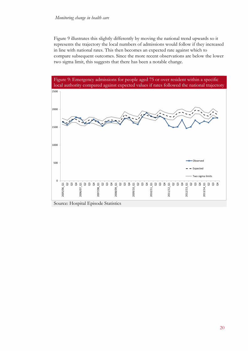
Figure 9 illustrates this slightly differently by moving the national trend upwards so it represents the trajectory the local numbers of admissions would follow if they increased in line with national rates. This then becomes an expected rate against which to compare subsequent outcomes. Since the more recent observations are below the lower two sigma limit, this suggests that there has been a notable change.
Figure 9: Emergency admissions for people aged 75 or over resident within a specific local authority compared against expected values if rates followed the national trajectory
Source: Hospital Episode Statistics
0
500
1000
1500
2000
2500
2005
/06_
Q1
Q2
Q3
Q4
2006
/07_
Q1
Q2
Q3
Q4
2007
/08_
Q1
Q2
Q3
Q4
2008
/09_
Q1
Q2
Q3
Q4
2009
/10_
Q1
Q2
Q3
Q4
2010
/11_
Q1
Q2
Q3
Q4
2011
/12_
Q1
Q2
Q3
Q4
2012
/13_
Q1
Q2
Q3
Q4
2013
/14_
Q1
Q2
Q3
Q4
Observed
Expected
Two sigma limits

Monitoring change in health care
21
As before, CUSUM methods can be used to identify changes (Figure 10). In this case the series signals a change in the third quarter of 2008/09 and numerous signals thereafter.
7. Handling over-dispersion In the examples presented in this research report, the data are assumed to be Poisson distributed. However, in practice this would need to be validated as the data could, in particular, be over-dispersed: in other words, there are factors that are unaccounted for which persistently increase the variance. In complex systems it is common for over-dispersion to exist. There are a number of ways for adjusting for this including:
• Fitting a negative binomial distribution. This can be fitted to count data where the variance is greater than the mean (in contrast to a Poisson distribution where the variance equals the mean).
• Normalising the data and modelling over-dispersion as a multiple of the theoretical variance you would have if the data were not over-dispersed.
• Using shrinkage techniques – for example, trimming outliers or ‘Winsorising’ (a method for reducing extreme values to a given level).
• Applying a hierarchical model where we assume random variation not just of each monitored unit about its own mean, but of the means themselves.
Figure 10: CUSUM chart for identifying local changes
Source: Hospital Episode Statistics
0
2
4
6
8
10
12
14
16
18

Monitoring change in health care
22
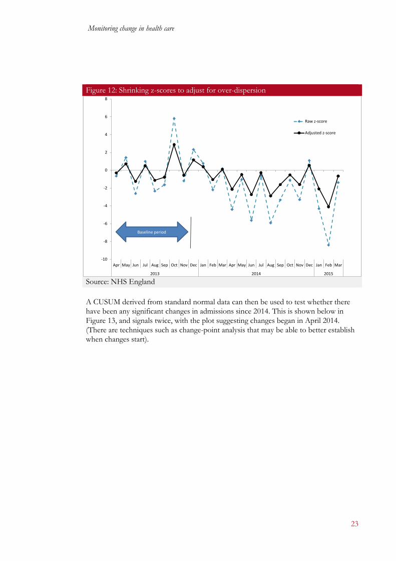
It can be useful to combine some of these. For example, it may be sensible to apply a shrinkage method before fitting a negative binomial or calculating over-dispersion of normalised data. Also, it may be reasonable to normalise the data before applying a hierarchical model (Spiegelhalter and others, 2012). A series of monthly non-elective admissions from a clinical commissioning group (CCG) area is shown in Figure 11 with two sigma Poisson limits. The expected value is derived from the average of the first eight data points, and there seems to be a shift downwards from early 2014. The variation about the mean is fairly erratic, with data points appearing both above and below the two sigma limits, suggesting that the Poisson assumption may not be valid and that the data are over-dispersed.
One way of handling this is to normalise the data to create z-scores, assuming a standard Poisson variance, trim the data to exclude outliers, and then readjust the z-scores to allow for the extra observed variance. This process is illustrated in Figure 12. (Rather than just work on one CCG’s data, however, we established the variance from all CCGs, making an underlying assumption that outcomes for each CCG are similarly over-dispersed about their mean for the first eight months.) Over the first eight months, if the Poisson assumption holds, the variance of the z-scores would be close to one. The actual value is over four, and so this value is then used to readjust the z-scores so that they now have unit variance. These are the adjusted z-scores shown as the dotted series in the chart.
Figure 11: Non-elective admissions of residents registered within a CCG area – an example of data with over-dispersion
Source: NHS England
1500
1700
1900
2100
2300
2500
2700
2900
Apr May Jun Jul Aug Sep Oct Nov Dec Jan Feb Mar Apr May Jun Jul Aug Sep Oct Nov Dec Jan Feb Mar
2013 2014 2015
Observed admissions
Expected
2 sigma limits
Baseline period
Monitoring change in health care
23
A CUSUM derived from standard normal data can then be used to test whether there have been any significant changes in admissions since 2014. This is shown below in Figure 13, and signals twice, with the plot suggesting changes began in April 2014. (There are techniques such as change-point analysis that may be able to better establish when changes start).
Figure 12: Shrinking z-scores to adjust for over-dispersion
Source: NHS England
-10
-8
-6
-4
-2
0
2
4
6
8
Apr May Jun Jul Aug Sep Oct Nov Dec Jan Feb Mar Apr May Jun Jul Aug Sep Oct Nov Dec Jan Feb Mar
2013 2014 2015
Raw z-score
Adjusted z-score
Baseline period

Monitoring change in health care
24
8. Control limits The choice of which control limits to use will depend on the purpose of the monitoring and the balance between true and false alarms that are deemed acceptable. For example, individual hospitals may want less conservative limits for their own quality monitoring: false alarms being less critical than, say, with regulators where there may be a greater financial and reputational cost associated with chasing false positives. Three ways of evaluating limits are:
• Average run length: the expected time before a signal occurs – evaluated for null and alternative hypotheses.
• False and true alarm rates: the chances of signals occurring over a given time under the conditions of the null and alternative hypotheses.
• False detection rates: setting limits to constrain the proportion of false alarms to within a pre-specified value (for example, 10 per cent of all signals).
In the example below we look at CUSUMs for Poisson data, although similar approaches and principle apply when considering other types of data. The relationship between control limit and false alarm rate for a CUSUM chart is shown in Figure 14. The false alarm rate in this case is defined as the probability of a signal over the period of one year. The observations are assumed to be quarterly and
Figure 13: CUSUM for non-elective admissions to one CCG area with a baseline derived from outcomes observed over the first eight months
Source: NHS England
0
1
2
3
4
5
6
7
8
9
Apr May Jun Jul Aug Sep Oct Nov Dec Jan Feb Mar Apr May Jun Jul Aug Sep Oct Nov Dec Jan Feb Mar
2013 2014 2015

Monitoring change in health care
25
from a Poisson distribution with expected values of 30 per quarter (similar to the FNOF example above), and the CUSUM designed to detect reductions of two standard deviations. (It is actually a specific feature of a Poisson CUSUM detecting fixed changes in standard deviations that the relationship between false alarm rates and control limits is similar, once the expected rates exceed around 20. This means we would have a similar chart if we were monitoring events where the expected rates were 60 or 100 or more per quarter.)
Source: Nuffield Trust The false alarm rate declines very rapidly as the control limit increases, from over four per cent with a limit of three to around 0.2% with a limit of six. Varying the limit will also affect the chances of detecting a true change, and it is trying to achieve a plausible balance between the false and true alarm rates that governs decisions about which limits to choose. How they are related in accordance with different values for the control limit is illustrated in Figure 15. Here, the true alarm rate is defined as the chances of detecting a change within one year and again the expected rate is 30 per quarter. The CUSUMs are designed to detect the observed reduction in each case. The equivalent relationship for a single cross-sectional (funnel plot) measurement taken over a year is shown for comparison with limits set at one and two standard deviations.
Figure 14: The chances of detecting a false alarm over a period of one year for a selection of control limits: quarterly monitoring of Poisson events with an expected rate of 30 per quarter
0.0%
0.5%
1.0%
1.5%
2.0%
2.5%
3.0%
3.5%
4.0%
4.5%
5.0%
0 1 2 3 4 5 6 7
Fals
e al
arm
rate
Control limit

Monitoring change in health care
26
Source: Nuffield Trust Three things are worth noting in Figure 15:
• With the CUSUM designed to detect a two sigma reduction, the chances of detecting one within four quarterly data points is very high.
• A CUSUM that is designed to detect only a one sigma deviation performs considerably less well.
• Cross-sectional analysis (for example, using funnel plots) relying on limits defined by p-values is far less able to detect true changes than the CUSUM.
Figure 15: The relationship between true and false alarm rates governed by changes in control limits
0%
10%
20%
30%
40%
50%
60%
70%
80%
90%
100%
0% 1% 2% 3% 4% 5% 6%
Chan
ces o
f det
ectin
g a
chan
ge w
ithin
one
yea
r
Chances of a false alarm over one year
CUSUM: Expected = 30. 2 sigma reduction CUSUM: Expected = 30. 1 sigma reduction
Annual snapshot: 2 sigma reduction Annual snapshot: 1 sigma reduction
Monitoring change in health care
27
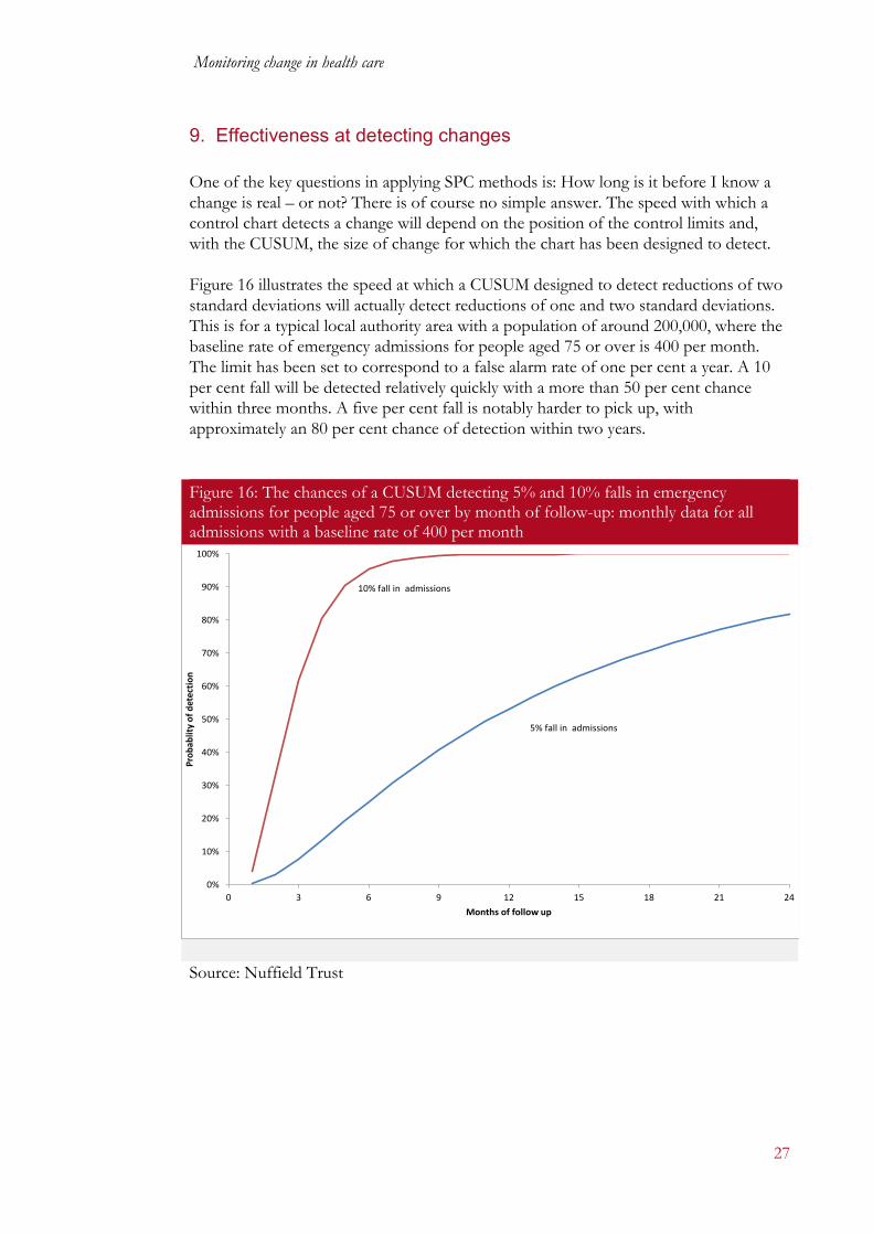
9. Effectiveness at detecting changes One of the key questions in applying SPC methods is: How long is it before I know a change is real – or not? There is of course no simple answer. The speed with which a control chart detects a change will depend on the position of the control limits and, with the CUSUM, the size of change for which the chart has been designed to detect. Figure 16 illustrates the speed at which a CUSUM designed to detect reductions of two standard deviations will actually detect reductions of one and two standard deviations. This is for a typical local authority area with a population of around 200,000, where the baseline rate of emergency admissions for people aged 75 or over is 400 per month. The limit has been set to correspond to a false alarm rate of one per cent a year. A 10 per cent fall will be detected relatively quickly with a more than 50 per cent chance within three months. A five per cent fall is notably harder to pick up, with approximately an 80 per cent chance of detection within two years.
Source: Nuffield Trust
Figure 16: The chances of a CUSUM detecting 5% and 10% falls in emergency admissions for people aged 75 or over by month of follow-up: monthly data for all admissions with a baseline rate of 400 per month
0%
10%
20%
30%
40%
50%
60%
70%
80%
90%
100%
0 3 6 9 12 15 18 21 24
Prob
ablit
y of
det
ectio
n
Months of follow up
10% fall in admissions
5% fall in admissions

Monitoring change in health care
28
Figure 17 shows the smallest change that can be picked up by a CUSUM with 95 per cent certainty as follow-up increases. So for a typical population, using an indicator based on emergency hospital admissions in older people, if a new care model is being successful and reducing admission by 10 per cent then you could probably detect that change after six months and be reasonably confident the difference was real. For an indicator where events are less common, for example, hip fractures in older people, then you could only detect much more pronounced 42 per cent falls over the same period with the same degree of certainty.
Source: Nuffield Trust
Figure 17: The minimum change that can be detected by a CUSUM with 95% certainty, by month of follow-up
0%
10%
20%
30%
40%
50%
60%
70%
80%
90%
100%
0 2 4 6 8 10 12
Min
imum
% d
ecre
ase
Month of follow-up
20
50
200
400
Volumes of admissions per month

Monitoring change in health care
29
10. Putting this into practice The methods described in this research report are not new and to many clinicians and analysts they are well known, yet they are still relatively infrequently used in the monitoring of change across health systems. Realising the potential of these methods may not always be plain-sailing and there are a number of potential barriers:
• Accessing the data. We know there are information systems that collect basic activity data – but in many cases accessing these can be problematic either because of IT issues locally or information governance issues nationally. On the latter point, if information from patient-level systems is to be used, it is important where possible to use anonymised data – there is no reason to know patient identities for these exercises.
• Accessing the skills. Some of these techniques require a reasonable level of competence in manipulation of what are often large datasets and statistical understanding. Though some statistical packages are available, little more than just the basic SPC methods are available off the shelf, so very often use of these methods will require some programming skills. The skills probably exist in most organisations with an information function – but they tend to be in very short supply and with high demand.
• Accepting analytical complexity. It is probably true to say that attitudes to analytics are changing, but there can still be occasions where the use of statistical methods is regarded as some form of witchcraft to be avoided. It is encouraging that, for example, the use of things like confidence intervals and funnel plots are gaining acceptance in health settings (a form of control chart). But for many, there can still be resistance to statistical methods.
• Setting the values. As with all statistical methods, the technical elements are not a complete substitute for judgment and there are decisions to be made in choosing the way SPCs are applied.
The computation required to undertake SPC are not especially challenging and it is possible to devise simple Excel-based tools. In fact, it is probably best to start with bespoke software tools (Excel is a reasonable start). One of the main challenges will be to incorporate control-limit evaluation. It will differ according to the type of data and chart and may include exact methods, stochastic approximations or simulations. Again, bespoke software can be developed. For CUSUMs, for example, it may be feasible to create a generic tool based on a Markov chain, which would suit any type of data. One approach to overcoming these barriers is to use external expertise – for example, through a commercial company, a Commissioning Support Unit (CSU) or an academic group The NHS Institute has a great record in disseminating information about SPC tools and techniques – generally focused on local improvement, and there are other resources available (see below).

Monitoring change in health care
30
Examples of other resources on SPC
• How to use control charts for six sigma by C Gygi, B Williams and N DeCarlo. Accessible at: www.dummies.com/how-to/content/how-to-use-control-charts-for-six-sigma.html
• Statistical process control (SPC) by Institute for Innovation and Improvement.
Accessible at: www.institute.nhs.uk/quality_and_service_improvement_tools/quality_and_service_improvement_tools/statistical_process_control.html
• Technical Briefing 2: Statistical process control methods in public health intelligence by
Public Health England. Accessible at: www.apho.org.uk/resource/item.aspx?RID=39445
• Statistical Process Control by ASQ. Accessible at: http://asq.org/learn-about-
quality/statistical-process-control/overview/overview.html There is an opportunity for a central agency to develop approaches that exploit national datasets such as HES and Office for National Statistics mortality files. A centralised approach to providing such tools can help local monitoring and avoid duplication of effort around the service. So, for example, there are potential economies if a central agency:
• extracts monthly HES data
• extracts activity counts for a range of metrics – adding to cumulative time series, enabling local NHS organisations to adapt queries, for example, by selecting only older people
• generates and disseminates basic Excel tools for display The right software could enable monitoring to be done at a reasonably local level, in other words, with little technical ability required to run it.

References Bardsley M, Steventon A, Smith J and Dixon J (2013) Evaluating Integrated and Community-based Care. Nuffield Trust. Bottle A and Aylin P (2008) ‘Intelligent information: a national system for monitoring clinical performance’, Health Service Research 43: 10-31. Curran E, Benneyan J and Hood J (2002) ‘Controlling methicillin-resistant Staphylococcus aureus: a feedback approach using annotated statistical process control charts’, Infection Control & Hospital Epidemiology 23: 13-18. Duckett S, Coory M and Sketcher-Baker K (2007) ‘Identifying variations in quality of care in Queensland hospitals’, Medical Journal Australia 187: 571-5. Grigg O, Spiegelhalter D and Jones H (2009) Local and marginal control charts applied to methicillin resistant Staphylococcus aureus bacteraemia reports in UK acute National Health Service trusts, Journal of Royal Statistical Society: Series A 172: 49-66. Lovegrove J, Valencia O, Treasure T, Sherlaw-Johnson C and Gallivan S (1997) ‘Monitoring the results of cardiac surgery by variable life-adjusted display’, Lancet 350: 1128-30. NHS England (2014) ‘Five Year Forward View’. https://www.england.nhs.uk/wp-content/uploads/2014/10/5yfv-web.pdf. Accessed: 5 January 2016. NHS Scotland Improvement Hub (2015) ‘Shewart Control Charts, NHS Scotland Improvement Hub’. www.qihub.scot.nhs.uk/knowledge-centre/quality-improvement-tools/shewhart-control-charts.aspx . Accessed 1 October 2015. Purdy S, Paranjothy S, Huntley A, Thomas R, Mann M, Huws D, Brindle P and Elwyn G (2012) Interventions to reduce
unplanned hospital admission: A series of systematic reviews. www.bristol.ac.uk/media-library/sites/primaryhealthcare/migrated/documents/unplannedadmissions.pdf . Rogers C, Ganesh J, Banner N and Bonser R (2005) Cumulative risk adjusted monitoring of 30-day mortality after cardiothoracic transplantation: UK experience, European Journal of Cardio-Thoracic Surgery 27: 1022-9. Sherlaw-Johnson C (2005) ‘A method for detecting runs of good and bad clinical outcomes on variable life-adjusted display (VLAD) chart’, Health Care Management Science 8: 61-5. Sherlaw-Johnson C, Morton A, Robinson M and Hall A (2005) ‘Real-time monitoring of coronary care mortality: a comparison and combination of two monitoring tools’, International Journal of Cardiology 100: 301-7. Sherlaw-Johnson C, Wilson A, Keogh B and Gallivan S (2007) ‘Monitoring the occurrence of wound infections after cardiac surgery’, Journal of Hospital Infection 65: 307-13. Smith I, Garlick B, Gardner M, Brighouse R, Foster K and Rovers J (2013) ‘Use of graphical statistical process control tools to monitor and improve outcomes in cardiac surgery’, Heart, Lung and Circulation 22: 92-9. Spiegelhalter D, Sherlaw-Johnson C, Bardsley M, Blunt I, Wood C and Grigg O (2012) ‘Statistical methods for healthcare regulation: rating, screening and surveillance’, Journal of Royal Statistical Society: Series A 175: 1-47. Steiner S, Cook R, Farewell V and Treasure T (2000) ‘Monitoring surgical performance using risk-adjusted cumulative sum charts’, Biostatistics 1: 442-52.

For more information about the Nuffield Trust, including details of our latest research and analysis, please visit www.nuffieldtrust.org.uk
Download further copies of this report from www.nuffieldtrust.org.uk/publications
Subscribe to our newsletter: www.nuffieldtrust.org.uk/newsletter
Follow us on Twitter: Twitter.com/NuffieldTrust
Nuffield Trust is an independent health charity. We aim to improve the quality of health care in the UK by providing evidence-based research and policy analysis and informing and generating debate.
59 New Cavendish Street London W1G 7LP Telephone: 020 7631 8450 Email: [email protected]
www.nuffieldtrust.org.uk
Published by the Nuffield Trust. © Nuffield Trust 2016. Not to be reproduced without permission.


![Exploring Cause and Effect through Change [7th grade]](https://img.pdfslide.us/doc/110x75/6286b8dd80dbb9662e6a7c34/exploring-cause-and-effect-through-change-7th-grade.jpg)