Embed Size (px)
Citation preview
Mohato Lekena: Re-designing the Mobile Interface
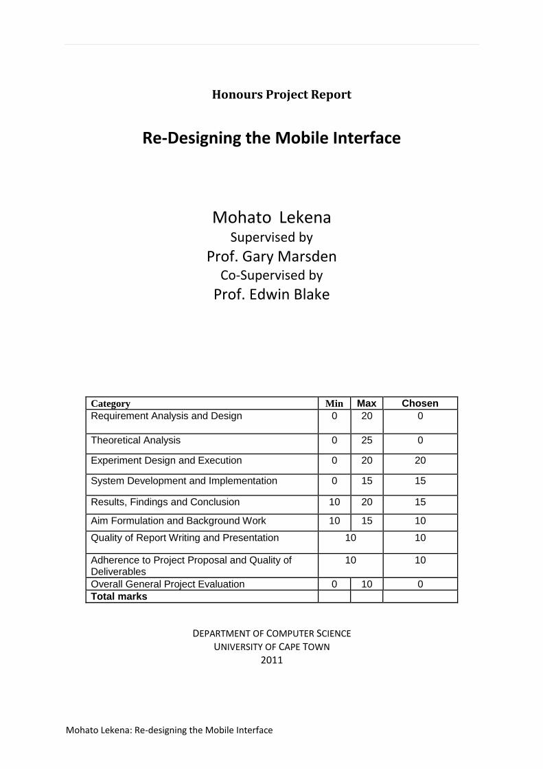
Honours Project Report
Re-Designing the Mobile Interface
Mohato Lekena Supervised by
Prof. Gary Marsden Co-Supervised by
Prof. Edwin Blake
Category Min Max Chosen
Requirement Analysis and Design 0 20 0
Theoretical Analysis 0 25 0
Experiment Design and Execution 0 20 20
System Development and Implementation 0 15 15
Results, Findings and Conclusion 10 20 15
Aim Formulation and Background Work 10 15 10
Quality of Report Writing and Presentation 10 10
Adherence to Project Proposal and Quality of Deliverables
10 10
Overall General Project Evaluation 0 10 0
Total marks
DEPARTMENT OF COMPUTER SCIENCE
UNIVERSITY OF CAPE TOWN
2011

Mohato Lekena: Re-designing the Mobile Interface
Abstract
The contemporary desktop metaphor used on many modern PC’s has been shown to be both
inefficient and outdated in terms of usability. Regardless of this though, many concepts associated
with the desktop metaphor, such as hierarchical filing, are being used on mobile computing
platforms. Since, at the PC level, various desktop replacement systems have been both suggested
and built, what this project seeks to do is to try and port an amalgamation of some of these systems
to the mobile platform. In particular, the system that will be implemented will contain aspects of
both the Lifestreams and Haystack user interfaces - which look at new ways of organising data using
search based systems - and the Shortcuts mobile system. In doing so, the research questions
explored will revolve around (1) whether or not such a mobile system can be built to a high level of
usability and (2) whether or not such a system would be preferable to the popular Android mobile
Interface. Evaluation was carried out using the often used System Usability Questionnaire to assess
research question 1, and using a task analysis fir question 2. For the task analysis both quantitative
information (number of interactions per task, number of errors per task) and qualitative information
(user comments, evaluator observations) were noted. From this information it was concluded that
the system could both be built at a high level of usability and that in, terms of data organisation,
having a search based user interface is more efficient and usable than the current application based
hierarchically filed Android system.

Mohato Lekena: Re-designing the Mobile Interface
Acknowledgements
Although this project has taken 6 months to complete, it has been the culmination of four years of
academic work in which many parties have played a role in my success. Firstly and foremost I will
thank my God, and then my project Partner Matthew Krog and supervisor Prof. Gary Marsden. I feel
it somehow poetic that Matthew, my first year fist semester roommate, and Prof. Marsden, the first
course convenor I spoke to in first year here at UCT, have been involved in this - my final project.
Without their patient and understanding help this document would be nowhere near what it is now.
Next I would like to thank all those who helped me keep my sanity throughout the year by making
sure I still had some semblance of a life outside of schooling. The Lekena Dream Team (Kamohelo,
Theko, Khabane) and my parents for keeping me grounded at home, the Smuts Hall Hound Pound
(especially Lesego and Pelo in this project) for being my family in UCT, the Wednesday Crew
(especially Motheo in this project) for supporting me in my endeavours, allowing me a creative
outlet and being every ready ears when I needed someone to listen and Chanelle Louw for being
Chanelle Louw, and the old Alberview crew (Lizo, Rayman, Gugu) that helped define me. Lastly to
everyone in the Honours class for help in finishing projects, assignments, essays, drafts and
draughts.
Today I cry lion’s tears, but any success I have gained is not mine alone, but is shared equally
amongst all of you who have put work (in one way or another) into to making me a success.
Honourable mention should also go to the Brinks (Rob, Geoff), Zinzile and Devin Ross.

Mohato Lekena: Re-designing the Mobile Interface
Table of Contents Honours Project Report .......................................................................................................................... 1
1 Introduction .................................................................................................................................... 1
1.1 Data organization .................................................................................................................... 1
1.2 Data Retrieval .......................................................................................................................... 1
1.3 Research questions: ................................................................................................................ 2
1.4 System Design ......................................................................................................................... 2
1.5 Ethical, Professional and Legal Issues ..................................................................................... 3
1.6 Document outline ................................................................................................................... 3
2 Previous Work ................................................................................................................................. 4
2.1 INTRODUCTION ....................................................................................................................... 4
2.2 GOALS FOR DESIGN ................................................................................................................. 4
2.2.1 User and context specific designs ................................................................................... 4
2.2.2 Move away from Hierarchical filing structures. .............................................................. 5
2.2.3 User Subjective and non-application specific organisation ............................................ 6
2.3 PROPOSED SYSTEMS ............................................................................................................... 6
2.3.1 Lifestreams ...................................................................................................................... 6
2.3.2 Haystack .......................................................................................................................... 7
2.3.3 Shortcuts ......................................................................................................................... 8
2.4 DISCUSSION ............................................................................................................................. 9
2.4.1 Pitfalls .............................................................................................................................. 9
2.4.2 Proposed System............................................................................................................. 9
2.5 CONCLUSIONS ....................................................................................................................... 10
3 Design Chapter .............................................................................................................................. 11
3.1 Introduction .......................................................................................................................... 11
3.2 Design method ...................................................................................................................... 11
3.3 Phase one .............................................................................................................................. 12
3.3.1 Lifestreams Introduction ............................................................................................... 12
3.3.2 Task analysis .................................................................................................................. 14
3.3.3 Preliminary Design ........................................................................................................ 16
3.4 Phase 2 .................................................................................................................................. 25
3.4.1 Evaluation...................................................................................................................... 26
3.4.2 User Issues and Comments ........................................................................................... 28
3.4.3 Discussion ...................................................................................................................... 29
Mohato Lekena: Re-designing the Mobile Interface
3.4.4 Changes To the system ................................................................................................. 30
3.4.5 Ordering of applications ............................................................................................... 32
3.4.6 Contents of Main View.................................................................................................. 32
3.4.7 Technical changes ......................................................................................................... 33
3.5 Phase 3 .................................................................................................................................. 34
3.5.1 Changes to the system .................................................................................................. 34
3.6 Summary ............................................................................................................................... 35
4 Implementation ............................................................................................................................ 36
4.1 Development Specification ................................................................................................... 36
4.2 Conceptual overview ............................................................................................................ 36
4.3 Data (model + controller) ...................................................................................................... 36
4.4 Activities (view) ..................................................................................................................... 37
4.4.1 Gesture Overlay View ................................................................................................... 38
4.4.2 Horizontal Pager ............................................................................................................ 39
4.4.3 Adapters ........................................................................................................................ 39
4.4.4 Interactions with the system ........................................................................................ 40
4.5 Development Process ........................................................................................................... 40
5 Evaluation ..................................................................................................................................... 42
5.1 Introduction .......................................................................................................................... 42
5.2 Goals ..................................................................................................................................... 42
5.3 Users, location ...................................................................................................................... 42
5.4 Experimental Design ............................................................................................................. 43
5.5 Experiments .......................................................................................................................... 43
5.5.1 Experiment 1: comparative evaluation. ........................................................................ 43
Experiment 2: usability evaluation ............................................................................................... 43
5.6 Instruments ........................................................................................................................... 44
5.6.1 Hardware....................................................................................................................... 44
5.6.2 The Systems .................................................................................................................. 44
5.6.3 Task List ......................................................................................................................... 45
5.6.4 The SUS questionnaire .................................................................................................. 45
5.7 Procedure .............................................................................................................................. 46
5.8 Results ................................................................................................................................... 47
5.8.1 System Usability Scale Results ...................................................................................... 47
5.8.2 Task analysis .................................................................................................................. 48

Mohato Lekena: Re-designing the Mobile Interface
5.8.3 Errors per task and Interactions per task ...................................................................... 48
5.9 Discussion .............................................................................................................................. 51
6 Conclusion ..................................................................................................................................... 53
6.1 Future work ........................................................................................................................... 54
7 References .................................................................................................................................... 55
8 Appendix ....................................................................................................................................... 59
8.1 Usibility Testing Task Sets ..................................................................................................... 59
8.1.1 Task Set A ...................................................................................................................... 59
8.1.2 Task Set B ...................................................................................................................... 59
8.2 Consent Form ........................................................................................................................ 60
8.3 System Usability Scale ........................................................................................................... 61

Mohato Lekena: Re-designing the Mobile Interface
Table of Figures
Figure 1-1 System Overview .................................................................................................................. 3
Figure 2-1 ScopeWare Visualisation ....................................................................................................... 5
Figure 2-2 Focus Visualisation ................................................................................................................. 6
Figure 2-3 Haystack Visualisation ........................................................................................................... 8
Figure 3-1 Design Phase Workflow ....................................................................................................... 11
Figure 3-2 Main Lifestream Visualisation.............................................................................................. 12
Figure 3-3 Substreams visualisation ..................................................................................................... 13
Figure 3-4 Altering the time .................................................................................................................. 13
Figure 3-5 System Overview ................................................................................................................. 18
Figure 3-6 Main View ............................................................................................................................ 20
Figure 3-7 Chosen Icon Set ................................................................................................................... 20
Figure 3-8 List View ............................................................................................................................... 21
Figure 3-9 Searches View ...................................................................................................................... 22
Figure 3-10 Web View ........................................................................................................................... 23
Figure 3-11 Query Specification Dialog ................................................................................................. 24
Figure 3-12 QuickView Dialog ............................................................................................................... 25
Figure 3-13 New Screen Ordering ......................................................................................................... 31
Figure 3-14 Second Searches View, with Receding App-list Shown in Figure 2 ................................... 31
Figure 3-15 Second Main View, With Colour Information .................................................................... 33
Figure 3-16 Final Screen Ordering ........................................................................................................ 34
Figure 3-17 Home button and Animation from List View to Searches View ........................................ 35
Figure 4-1 Examples of Gestures in Gesture Library ............................................................................. 39
Figure 5-1 Modified Query Specification Dialog ................................................................................... 44
Figure 5-2 SUS Grading Curve ............................................................................................................... 47
Figure 5-3 SUS Average Scores per Question ....................................................................................... 48
Figure 5-4 Interactions per Question in Set B ....................................................................................... 49
Figure 5-5 Errors per Question in Set B ................................................................................................ 49
Figure 5-6 Errors per Question in Set A ................................................................................................ 50
Figure 5-7 Interactions per Question in Set A ....................................................................................... 50
P a g e | 1
Mohato Lekena: Re-designing the Mobile Interface
1 Introduction The hierarchically organized, application-based desktop metaphor used on many user interfaces
today has been shown many times to be an ineffective method for both data organization and
retrieval [1][4][5]. Despite this, most mobile interfaces have simply been adaptations of this desktop
metaphor, in which users employ applications to perform tasks and hierarchical file structures to
organise information [1] [2]. When these concepts from the desktop were ported for use on mobile
computing devices the same problems they had not only remained, but actually became worse. This
worsening was due to the fact that there lay many inherent differences between mobile and
stationary computing devices [6] [7]. At a desktop level, however, many of these problems have
been investigated, and solutions have been given in an attempt to replace these out-dated ideas
(see Previous Work section). Unfortunately, none of these systems or concepts has yet been
actualised on a mobile level. One of the ways users often struggle with these devices is in finding or
interacting with specific files on the large file systems using the Smartphone’s small displays.
What this project aims to do is to investigate how successful ideas from previously proposed desktop
replacement systems would be when implemented on a mobile platform as a new interface. The
interface will shift focus away from the desktop metaphor, and instead look at developing a more
natural way for users to interact with their personal information. This will be done by developing a
prototype system that runs on the currently popular Android mobile platform. This new interface
would, once created, completely replace all the data organization and retrieval tasks already
performed on the devices in a non-application specific, non-hierarchically stored way. Instead, the
system would implement ideas covered in two separate papers—the Lifestreams [2] user interface
and the Feldspar [3] search interface. These papers look, respectively, at the inter-dependant, yet
separate, areas of data organization and data retrieval.
1.1 Data organization For data organization, the central idea that designs revolve around is that of the Stream. A Stream is
a virtual area on the user’s device where all their data is stored, regardless of application type. The
stream would then be ordered by time, with new items entering the system being placed near the
front of the stream and older items then being pushed towards the back. A visualisation of the
Stream can be seen in figure 3-2. Further organization would be achieved via the implementation of
constructs called views, which are inspired by the Haystack system [8]. These views are persistent
visualizations of data filters which are defined by the user. Any new or existing data fitting into the
filter’s criteria would then be displayed in its view. These views would also be application
independent and time ordered, and would act as the primary filing system – essentially allowing for
data organization using user defined criteria. Although singular items could also be added or
removed to any single view, and multiple views will be able to be split or merged, the main method
for creating views will be through a sophisticated querying method. This querying method is
explained in the section below.
1.2 Data Retrieval An important feature seen in many of the systems proposed as new paradigms for computer
interfaces (such as Lifestreams) is search-based data retrieval. For this reason it can be seen that
having an effective search query construction interface is an important aspect of this new interface.

P a g e | 2
Mohato Lekena: Re-designing the Mobile Interface
The paper from which this project will be drawing inspiration and from which will be implemented
on the mobile interface is the one describing the Feldspar Associative Query System. Feldspar is a
desktop query system that uses associative retrieval of personal information [3]. Feldspar takes the
philosophy that people remember things by association and uses an orienteering approach to
retrieve information, allowing users are able to specify multiple queries to refine their search. When
implemented on the mobile interface it will be coupled to a linking system, as seen in the Life Ideas
[15] paper. This will allow the user to browse through related sets of documents, with relations
being worked out from tags and other textual information. The development and testing of this
aspect of the system will be conducted separately by Matthew Krog. In a complete system, these
two aspects of the interface, the organisation and search functionalities, would in the end be
amalgamated into one system. Due to time constraints, though, this shall not be possible, and thus
the rest of this paper will focus solely on the implementation of the data organisation constructs
described above.
1.3 Research questions: On implementing this system which would incorporate the above mentioned proposed solutions,
the research questions which will be investigated will thus be:
1. a) Can a time ordered user interface with user defined contextual organizing based on the
Lifestreams system be implemented successfully on a mobile platform?
1. b) If so, would it be preferable (Defining preferable as being more usable than the standard
Android system)?
Once the prototype system has been created, user testing will have to be completed in order to
assess the system’s success. The success, as described in the research questions, will be measured in
two facets: comparative success (1.b) and absolute success (1.a). For 1.a what is tested is users’
subjective assessment of the system’s usability. For 1.b though, what is tested is whether or not the
system is preferable when compared to the standard Android system. More on this process will be
given in the Evaluation section of this project.
1.4 System Design As mentioned earlier, the interface prototype will consist of two components; the information
retrieval system (or query system) and the information organisation system. The information query
system will be based on the Feldspar desktop solution, which provides associative search
functionality. Users are able to build queries based on associative clues or hints. The user then has
the ability to refine searches using multiple queries.
The data organisation system will be an implementation of Lifestreams. All information will be
stored in a unified inbox ordered by time (with recently used items appearing first). This information
will then be able to be filtered using the underlying query system. Popular queries and filters can be
saved and used as an organisational feature.

P a g e | 3
Mohato Lekena: Re-designing the Mobile Interface
Figure 1-1 System Overview
1.5 Ethical, Professional and Legal Issues Due to the nature of the project, a large amount of user testing is essential for the evaluation of the
interfaces. For this reason, ethics clearance from the University Of Cape Town was procured in order
to have gain access to the premises for testing. Student housing will also have to be contacted in
order to gain access to the student population for testing reasons. Besides this, the only other legal
issue lies around the use of third party libraries in the system. The library lies under the Apache
Licence, which is a permissive, free licence. The licence though does not require modified versions of
the software to be distributed using the same license, so this is not an issue that requires any legal
precautions to be taken.
1.6 Document outline This document details the process taken to fulfil the research questions stated above. Chapter 2
gives details of some of the most pertinent work previously done in fields that affect this project.
Chapter 3 describes the process taken in designing the interface used to explore the research
question, and the proceeding Chapter (4) gives details of how this design was actualised as a
prototype. After this, descriptions of, and results from, the evaluation process are will be given in
Chapter 5. Finally, an analysis and discussion of the results will be given in the concluding Chapter, 6.

P a g e | 4
Mohato Lekena: Re-designing the Mobile Interface
2 Previous Work
2.1 INTRODUCTION Many of the mobile computing devices sold today revolve around the desktop metaphor for
interfacing with the user. This metaphor, which also often imposes a hierarchical filing system, has
been shown to be inappropriate for most users’ management of their electronic information on their
desktop systems [2]. When looking at the specific case of its application on mobile devices, the
metaphor suffers even more due to differences between stationary and mobile systems. For
instance, the screen size and the number of interaction types possible differ amongst these devices
[16]. This adoption on mobiles is all in spite of the fact that users look strongly at interactions with
data when deciding which cell phones to buy, as Ling et al [17] had shown with their 2004 survey. In
fact, it was postulated as early as 1993 by computing panels that much of the usage of mobile
devices will be to access rapidly changing data at the home office, rather than authoring new data
[18]. The fact that we are still using systems and analogies for data access, such as the desktop, that
have been shown to be inadequate [4] should be a cause for concern in the HCI world. Indeed, given
the dramatic increases in computing power and memory over the years, it is somewhat surprising
how little progress has been made in the area of commercial computer user interfaces [6].
What this chapter seeks to do is to outline the literary backing for a potential replacement for the
desktop metaphor by considering aspects of several innovative interfaces that have previously been
proposed. These interface proposals will be reviewed, analysed in terms of pros and cons, and
synthesised to describe a single solution. More specifically, this chapter will look at projected ways
of moving away from the hierarchically filed, desktop metaphor implementing user interfaces that
are popular with many phone manufacturers.
The structure of the chapter is as follows: (1) the salient design features discovered in literature are
discussed. (2) An in-depth look is given to three proposed systems that fit many of the design goals
mentioned in the preceding section. (3) The proposed systems are analysed in terms of pros and
cons and the final chosen system is discussed.
2.2 GOALS FOR DESIGN In researching the possible future of mobile interfaces, three main overarching areas were noted.
These areas are discussed below.
2.2.1 User and context specific designs
Adowd [19] noted three main areas that needed to be considered when designing an effective
interface for mobile or ubiquitous computers. These were that (1) human tasks performed everyday
must be understood and supported by appropriate interaction experiences, (2) heterogeneous
solutions should be available to offer differing forms of interactive experience as situations warrant,
and (3) that these solutions, when networked, should provide a holistic user experience [19]. These
three goals all allude to the fact that the interfaces for these devices need to be built in such a way
that they fit well in the user’s life *20]. Considering this, it is telling that studies have shown that the
concepts used in desktop computing are not scalable and do not fit the mobile computing
environment [21]. This is one of the reasons that there seems to be a general move away from the
desktop based metaphors that are currently popular in personal computing when looking at mobile
computing. Another reason is that the rapid context changes in a mobile setting bring the need for

P a g e | 5
Mohato Lekena: Re-designing the Mobile Interface
flexible user interfaces [16]. This is because the context in which a mobile user operates changes
much more rapidly than for a stationary user, and this is an important feature that needs to be
addressed [7]. All this leads to the conclusion that the proposed user interfaces of the future need to
be both context and user specific in their design.
2.2.2 Move away from Hierarchical filing structures.
As discussed above, hierarchical filing has been seen to be inadequate in terms of usability. One
solution for this is the so called Semantic Filing System, which allows users to create virtual
directories for the information on their machines [7]. This, and other similar systems, though do not
replace the hierarchical system, but rather modified it to improve usability - which is still not
optimal. Other systems, which completely overhaul the hierarchical system, are those such as
Lifestreams [2] (see Design Chapter) and ScopeWare [22] (figure 2.1) which use a temporal ordering
system to visualise data. Here, documents would be arranged in a continuous manner, with the
more recent documents being placed the opposite end of a visualisation to older ones. These
systems were seen as having much potential, and are well cited, but some schools of thought still
believe the best solution lies elsewhere.
Figure 2-1 ScopeWare Visualisation
Another direction that research has taken is using associative stores of data. One solution proposed
by Marsden & Cairns [5] describes using concepts from relational databases to provide query based
interactions. Focus [23], a separate system, implemented user controlled associative access—with
associations being based on file meta-data as well as any textual file content – which, in the end, was
successful (Figure 2.2).

P a g e | 6
Mohato Lekena: Re-designing the Mobile Interface
Figure 2-2 Focus Visualisation
All these above mentioned areas of research show both that there is a need to move away from
hierarchical systems, and also some of the directions that can be taken in the search for this move.
2.2.3 User Subjective and non-application specific organisation
Personal information management is an important task within any interface. Bergman, et al. [10]
argues that the management of one’s information should be user subjective, as opposed to being
user objective. Their research concluded that users speak about their personal information in terms
of subjective attributes – and prefer using such attributes when the design allowed them to. This
research also had insights into the fact that users store information in terms of projects and other
subjective terms, rather than technical attributes such as file types. This view has been echoed in
other proposed user interfaces such as Presto [24] and Semantic Regions [25], both of which realised
the need for application independent task execution.
This shows that many personal data organisation tasks occur naturally for users at the attribute
level, regardless of the application. It can therefore be seen that the need for user subjective
classification and application independent task execution are salient in terms of good effective
designs.
2.3 PROPOSED SYSTEMS Keeping in mind the information found in section 3, the following proposed systems give canonical
examples of many of the design goals discussed. It is upon these three that the final chosen system
will be based.
2.3.1 Lifestreams
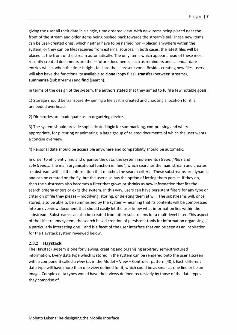
A seminal paper in regards to moving away from current interface paradigms is the Lifestreams
system, as discussed by Freeman & Gelernter [2]. The core difference that the system brought
forward was moving away from hierarchical filing to having the system store all information in a
common area, called a stream. The stream would subsume many separate desktop applications,
P a g e | 7
Mohato Lekena: Re-designing the Mobile Interface
giving the user all their data in a single, time ordered view–with new items being placed near the
front of the stream and older items being pushed back towards the stream’s tail. These new items
can be user-created ones, which neither have to be named nor ―placed anywhere within the
system, or they can be files received from external sources. In both cases, the latest files will be
placed at the front of the stream automatically. The only items which appear ahead of these most
recently created documents are the ―future documents, such as reminders and calendar date
entries which, when the time is right, fall into the ―present zone. Besides creating new files, users
will also have the functionality available to clone (copy files), transfer (between streams),
summarize (substreams) and find (search).
In terms of the design of the system, the authors stated that they aimed to fulfil a few notable goals:
1) Storage should be transparent–naming a file as it is created and choosing a location for it is
unneeded overhead.
2) Directories are inadequate as an organizing device.
3) The system should provide sophisticated logic for summarizing, compressing and where
appropriate, for picturing or animating, a large group of related documents of which the user wants
a concise overview.
4) Personal data should be accessible anywhere and compatibility should be automatic.
In order to efficiently find and organise the data, the system implements stream filters and
substreams. The main organisational function is “find”, which searches the main stream and creates
a substream with all the information that matches the search criteria. These substreams are dynamic
and can be created on the fly, but the user also has the option of letting them persist. If they do,
then the substream also becomes a filter that grows or shrinks as new information that fits the
search criteria enters or exits the system. In this way, users can have persistent filters for any type or
criterion of file they please – modifying, storing, or deleting them at will. The substreams will, once
stored, also be able to be summarized by the system – meaning that its contents will be compressed
into an overview document that should easily let the user know what information lies within the
substream. Substreams can also be created from other substreams for a multi-level filter. This aspect
of the Lifestreams system, the search based creation of persistent tools for information organising, is
a particularly interesting one – and is a facet of the user interface that can be seen as an inspiration
for the Haystack system reviewed below.
2.3.2 Haystack
The Haystack system is one for viewing, creating and organising arbitrary semi-structured
information. Every data type which is stored in the system can be rendered onto the user’s screen
with a component called a view (as in the Model – View – Controller pattern [40]). Each different
data type will have more than one view defined for it, which could be as small as one line or be an
image. Complex data types would have their views defined recursively by those of the data types
they comprise of.
P a g e | 8
Mohato Lekena: Re-designing the Mobile Interface
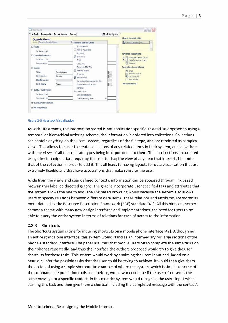
Figure 2-3 Haystack Visualisation
As with Lifestreams, the information stored is not application specific. Instead, as opposed to using a
temporal or hierarchical ordering scheme, the information is ordered into collections. Collections
can contain anything on the users’ system, regardless of the file type, and are rendered as complex
views. This allows the user to create collections of any related items in their system, and view them
with the views of all the separate types being incorporated into them. These collections are created
using direct manipulation, requiring the user to drag the view of any item that interests him onto
that of the collection in order to add it. This all leads to having layouts for data visualisation that are
extremely flexible and that have associations that make sense to the user.
Aside from the views and user defined contexts, information can be accessed through link based
browsing via labelled directed graphs. The graphs incorporate user specified tags and attributes that
the system allows the one to add. The link based browsing works because the system also allows
users to specify relations between different data items. These relations and attributes are stored as
meta-data using the Resource Description Framework (RDF) standard [41]. All this hints at another
common theme with many new design interfaces and implementations, the need for users to be
able to query the entire system in terms of relations for ease of access to the information.
2.3.3 Shortcuts
The Shortcuts system is one for inducing shortcuts on a mobile phone interface [42]. Although not
an entire standalone interface, this system would stand as an intermediary for large sections of the
phone’s standard interface. The paper assumes that mobile users often complete the same tasks on
their phones repeatedly, and thus the interface the authors proposed would try to give the user
shortcuts for these tasks. This system would work by analysing the users input and, based on a
heuristic, infer the possible tasks that the user could be trying to achieve. It would then give them
the option of using a simple shortcut. An example of where the system, which is similar to some of
the command line prediction tools seen before, would work could be if the user often sends the
same message to a specific contact. In this case the system would recognise the users input when
starting this task and then give them a shortcut including the completed message with the contact’s

P a g e | 9
Mohato Lekena: Re-designing the Mobile Interface
details already entered. A large part of this system was still experimental in nature, and several
different heuristics were used in an attempt to produce the best shortcuts. These heuristics were:
1) No Shortcut
2) Last task performed
3) Most Frequently performed task
4) C4.5 Based decision tree
5) Naive-Bayes Based algorithm
6) Contingency Based algorithm
7) Hybrid Naive-Bayes/most frequently performed
The success of the heuristics was measured based on the number of keystrokes saved by the
shortcuts induces and the stability of the shortcuts: i.e. how often the shortcuts given changed. In all
the cases there were less keys pressed when the shortcuts were given, with between about 5% and
25% fewer keystrokes being needed to complete tasks.
2.4 DISCUSSION
2.4.1 Pitfalls
Although the systems named above all address some very important issues, they all also have their
pitfalls. A few of these are noted:
2.4.1.1 Lifestreams
As noted in [5] – while there is much to praise about this system, one big pitfall is that its core
mechanism relies on the user remembering when an item was created. Another criticism that can be
levelled at the system is that while a query might help in pruning large amounts of unwanted data, a
more specific method of item collection could have also been implemented in order to complement
the find functionality. Lastly the visualisation of the Lifestreams system described in the original
paper used menus and submenus in order to show substreams, which is an implementation that can
be greatly improved upon.
2.4.1.2 Haystack
The largest pitfall of the Haystack system is the apparent lack of an easy to use singular view of all
the information in the system. Without this, there is no singular and easy way to sequentially search
all the items in the users’ stores. Although the user could traverse the directed graph structure used,
this is not very intuitive. Also, only being able to create collections through clicking and dragging
individual items can be cumbersome and slow
2.4.1.3 Shortcuts
Although this system makes marked improvements to the users’ access times to certain
functionality, its lack of custom shortcut generation can be seen as its biggest downfall. Also it is not
an entire system, and falls some way short of addressing all the goals discussed in section 3.
2.4.2 Proposed System
The proposed system that we shall implement is therefore a hybrid one, incorporating features from
all three of the proposed systems given above and including some extra functionality in order to
mitigate for unaddressed goals from section 3. The final chosen system will have a unified data
storage area where all items are placed, regardless of file type. These items will also be arranged by
P a g e | 10
Mohato Lekena: Re-designing the Mobile Interface
time, such as in Lifestreams, addressing goals 3.2 and 3.3. This would be used for sequential
searching by the user of all their data.
In order to organise the data the user will be given the functionality to create relational queries. The
results of these queries will be returned in a view window, similar in concept to the views used in the
Haystack system. These views, once created, will be able to be kept permanently and act as filters
for new information, like in the Lifestreams system, but functionality for adding or removing singular
items via drag and drop will also be included, like Haystack
These views would then inhabit a two dimensional space of their own, where they will be organised
and represented by a Lifestream ―summary like image. Often used functions, queries and
documents would also be given in a separate area (depending on context), with an implementation
of the Shortcuts hybrid Naive-Bayes/Most Frequently Performed heuristic used to predict these
items, time permitting.
This implementation allows the user to easily and effectively create an environment whereby the
information they use is organized according to their own mental model. It also allows for the speedy
retrieval of information without having to worry about specifics such as file location or application
type. In this way most, if not all, of the goals give in section 3 would be covered and a successful
mobile interface could be built
2.5 CONCLUSIONS In order to successfully redesign the mobile interface various goals and considerations have to be
met. These are goals that were greatly met by three systems, Lifestreams, Haystack and Shortcuts.
We have concluded that the most effective implementation would be a hybrid of these three ideas,
taking aspects from each and adding some minor tweaks in order to fully realise the above
mentioned design goals. The file organisation techniques of Lifestreams would be supplemented
with the Haystack visualizations and the prediction techniques from Shortcuts would give the user a
more streamlined experience. This, in the end, is what the literature points to being one of the best
design frameworks for the mobile interface of the future.

P a g e | 11
Mohato Lekena: Re-designing the Mobile Interface
3 Design Chapter
3.1 Introduction This chapter will look at the specifics of how the final design for the iMobile system was conceived.
Firstly a detailed overview will be given of the iterative development methodology chosen for the
project, then specifics about the preliminary designs at various points during the project’s timeline.
At all points, rationale will be given for design decisions and directions taken, with screenshots given
to supplement the descriptions given for the interfaces.
3.2 Design method While many usability and design methodologies and paradigms begin with steps such as interacting
with either the user or customer as a first step, in the specific case of this project such a step is not
necessary. This is mainly due to the fact that, as opposed to designing an entirely new system, the
design challenge here lies in appropriating an existing design for a new platform. What this means is
that many of the initial steps usually taken within the contexts of HCI and Usability design can simply
be ignored here, as many of these steps were taken by the original designers of the Lifestreams
system. Thus this project can almost be seen as a continuation of their work, as iMobile looks to
build upon the success of the original system. Hence, the first step in the design process, referred to
as phase one below, will be an early implementation of the Lifestreams system on the Android
platform. Design here will be informed mainly by the use various design heuristics [22] [29] [31],
some which are general and others aimed specifically at mobile development. We will therefore use
these mobile design heuristics to adapt, so far as is possible, Lifestreams to the mobile platform.
During this phase, any evaluation will also be done via the use of heuristics and through small,
informal meetings with users in order to gather early opinions. Users at this point will all be
Computer Science Honours students, due to ease of accessibility.
The second phase of design shall follow a more traditional usability life-cycle, beginning with a more
formal usability evaluation [45]. This evaluation, again conducted using Computer science Honours
students, will then inform the final round of design, with the user’s input being the basis for any
changes or additions to the system. After this phase the completed prototype shall be ready for use
in the final evaluation. Figure 3-1 shows the process described above graphically.
Figure 3-1 Design Phase Workflow

P a g e | 12
Mohato Lekena: Re-designing the Mobile Interface
3.3 Phase one
3.3.1 Lifestreams Introduction
Lifestreams can be seen as a new concept or paradigm in which designers can operate to create
systems that circumnavigate many of the before mentioned pitfalls of contemporary interfaces.
What this section will do is describe how the original authors of the Lifestreams paper envisioned
the concept being visualised as a working user interface. After this, an early critical look will be given
to their implementation of the user interface from the specific perspective of viability on a mobile
platform. It should be noted that implementation issues that would affect design, as opposed to
purely design issues, will also be analysed in this section.
3.3.1.1 Description of Lifestreams system
As a concept, Lifestreams simply prescribes an alternative method of file storage and retrieval to the
oft used hierarchical filing system. Thus the visual implementation of this system can vary greatly
and take different directions, much as a script in the hands of different directors can yield different
end products. In Lifestreams, the central visualization used is based around “pages” representing
various objects in the system, with the information pertaining to the item then displayed as text
printed on the pages. The Streams are thus visualized as 3-dimensional stacks of the pages, with
each page obscuring the majority of the preceding page’s surface area, and pages appearing larger
the further forward in the stack they are. Only the very first page is then ever fully visible, thus
descriptive information about the pages is placed on their top left corners – the only area discernible
on all pages. The system also allowed users to take a glimpse at each item in the stream using either
the mouse pointer or by using a vertical scroll bar in the lower left hand corner of the screen to roll
themselves back into the past. When users are “glancing” at an item, its page is then displayed in its
entirety alongside the stream (figure 3-2).
Figure 3-2 Main Lifestream Visualisation

P a g e | 13
Mohato Lekena: Re-designing the Mobile Interface
Further contextual information is given via the use of colour and animation. All items in the system
that are unseen have a red border, while items that are writable are assigned a bold one. Items that
are open somewhere in the system are offset somewhat to the left in the stream to show that they
are being edited. Incoming files, when being added to the stream, slide into it from the left, while
newly created documents slide down from above. Once an item is clicked to be opened, the system
hands over control to the application in the system already designated to handling that file type – for
example, Acrobat for PDFs. The only other items on the main display area besides the Stream are a
text bar to be used for searching and 5 buttons representing the system’s 5 major operations
(discussed in the Task Analysis section).
All organisation and access to the substreams is done via a very menu-intensive system. The saved
substreams are given as entries in the main menu, with the contents of the substreams being given
as entries in a submenu (figure 3-3). No further graphical representation is given besides this. Also
worth noting is the fact that substreams can be created in an incremental fashion, which would
result in further nested menu’s being created.
Figure 3-3 Substreams visualisation
Lastly the interface also has a clock in the top right corner of the display. This clock display acts as a
menu for the system. By setting the time on it, users control the time-frame for which the items
displayed in the Lifestream belong. This can be seen almost as sliding the viewport across the time
axis and viewing the files relevant to that period. Setting this clock to a future date would show any
notifications scheduled for the future.
Figure 3-4 Altering the time

P a g e | 14
Mohato Lekena: Re-designing the Mobile Interface
3.3.2 Task analysis
As stated in [32], User Interface Issues in Mobile Computing, the assumption often made by
researchers that the tasks users carry out of their desktop devices will be the same as those carried
out on their mobile devices is incorrect. As [32] continues, although the use of the same applications
across both platforms might be both desirable and useful, because of inherent differences, the
running of the same environment is often both undesirable and in many cases impossible. This all
resonates with fact that contemporary techniques from User-Centered Design [34] and task analysis
[39+ stress the importance of understanding the tasks likely to be performed by a design’s target
audience. For these reasons it can be seen that it would be pertinent, when porting an interface
such as life streams to a mobile platform, to begin with analysing the tasks that users need from
their mobile devices. In this way it could be seen which functionality included Lifestreams system is
superfluous for the mobile environment and whether or not any necessary functionality is absent. In
the following section, a critical look will be taken at the Lifestreams system in terms of interface
elements, tasks supported, and information displayed. This analysis will be done comparatively
between Lifestreams and contemporary mobile systems (in terms of the above mentioned criteria).
In the end it should become apparent which functionality should be included into the iMobile
system in order to support all potentially useful tasks.
3.3.2.1 Tasks Supported in Lifestreams
The main task that Lifestreams allows one to do is to organise the files on their personal computer.
All the supplementary tasks can be described in terms of the 5 basic operations that it supports [2]:
new, clone, transfer, summarize, and find.
3.3.2.1.1 Document Creation and Storage
This is encompassed in the new, clone and transfer operations. New allows the user to create a new
file of any type and add it to the system. The file is then added to the stream without the need for it
to be named or given a specific location. Clone is a simple copy command that creates a duplicate of
a file, and transfer is used to move items from one stream another. It should also be noted here that
an important aspect of the Lifestreams system is the fact that it allows you to have a single file in
multiple virtual locations (streams.)
3.3.2.1.2 Directories on Demand
Through the find feature, Lifestreams allows users to create directories (substreams) on demand.
The directories are created as users specify queries for the data types that should be encompassed
in them, and then fine tune their directories by adding or removing individual files from them. The
system also allows for nested directories within directories.
3.3.2.1.3 Overviews
What the system does with the summarize command is to give the user a concise visual summary of
any data in the system that they choose. The content and representation of this summary depends
on both the data types and the information encompassed in the files chosen to be summarized
3.3.2.1.4 Reminding
A last feature is that of reminding. Through the use of items placed in “future” positions in the
Stream, users are effectively able to create a reminder system. Since these documents can be of any
type, users have a wide array of different potential reminders, specific to their needs.

P a g e | 15
Mohato Lekena: Re-designing the Mobile Interface
3.3.2.2 Mobile Tasks Supported Today
In order to analyse some of the most popular uses for cell phones today, data from the Pew
Research Centre’s AOL cell phone survey was used. Below lies a table created using data from the
2007 AOL cell phone usage survey which summarises the different tasks that people indicated to use
the most on their mobiles [57].
Send and receive text messages 35%
Take still images 28%
Play Games 22%
Access the internet 14%
Send/receive email 8%
I.M 7%
Perform Internet Searches 7%
Play Music 6%
Record Video Clips 6%
Get Mobile Maps 4%
Watch video or TV programs 2%
Although the statistics are now four years old, they speak to trends that have only continued since.
Almost predictably,(1) the SMS service is the most widely used, and the 2011 version of the same
study showed that teens aged between 11-17 received a median amount of 50 SMSs a day. This,
coupled with the 7% figure shown above for instance messaging (I.M), shows the importance of text
messaging to users.
The next note of interest from the table above is the use of (2) multimedia, with the second most
used feature being the taking of still images and video recording and music playback also making the
list. This speaks mainly to the multi-purpose approach to phone design taken by most
manufacturers.

P a g e | 16
Mohato Lekena: Re-designing the Mobile Interface
A very recent development that, although maybe too recent to be properly represented in this
survey, is the increasing importance of (3) is the rise in popularity of applications. Even though this
fact is encapsulated somewhat by the high number of people using their cell phones games, modern
cell phone applications stretch far beyond being just games. Apple’s App Store is currently valued at
about 200 million U.S.D, according to advertising start-up AdMob; while Android’s Market currently
hosts more than 200 000 [26] applications with more than 3 billion downloads to date [27].
The penultimate task of importance to take cognisance of is the number of people using their cell
phones to access the (4) Internet. The figure of 7% above might seem diminutive, but it is indeed a
significant one - especially as the use of the mobile internet has increased over the years. The 2011
survey shows that mobile phones are a main source of internet access for one-quarter of the
Smartphone population.
Lastly it should also be noted that, as stated in [28], (5) mobile devices are moving more towards
becoming peoples’ primary personal computing devices. This means that, more than anything else,
people will begin keeping more and more information on their cell phones. This move is mirrored by
cell phone manufacturers themselves as most Android mobile phones now require that the device
have an SD card for increased storage capacity.
3.3.2.3 Task Analysis Summary
Of the 5 major tasks identified above, the Lifestreams system has the capabilities to handle tasks 2, 4
and 5 as is. When it comes to handling the representation of text messages, although no such
interface would exist on the PC based system, this could easily be rectified by having text messages
simply being represented as a file type in the stream. This then leaves the representation of
applications as the only area of the interface not currently handled.
Within Lifestreams, applications are not central, and are only ever called upon when users open files
of a certain type. This approach, though, lacks somewhat when looking at applications in the mobile
context. This is mainly because many off the applications found on mobile devices today exist in
isolation, completing all tasks within the application itself and not having a specific file type. This
means that most applications would never be opened if the Lifestreams approach was adopted. This
is one of the first issues to be tackled in the design phase of the project. Another, that was not
mentioned before this point as it does not tie specifically to any task, is the representation of some
cell phone specific data types. A prime example would be that of the contact, which has no obvious
field for use in chronological ordering.
3.3.3 Preliminary Design
3.3.3.1 Introduction: General overview
The system consists in total of four different views, supplemented by a few dialogs. The first view is
the one holding the visualisation of the main stream containing all the users data items, hereby
referred to as the Main View. When users create substreams from this view they are saved and
displayed as icons in the second view, the Searches View. Thirdly there is the Web View, which acts
as a web browser. These three views represent the core of the interface, and are always available to
the user, who can swipe between them in a manner consistent with many Smartphone interfaces.
Lastly, when the results of any search need to be displayed it is done via the use of a List View. These
searches, represented as List Views, can either be created and saved, or created on an
P a g e | 17
Mohato Lekena: Re-designing the Mobile Interface
impermanent, in which case they are not kept. List views, it should be noted, only hold virtual
representations of items, i.e. pointers to the actual items in memory. In this way items can be in
more than one list at a time, and can be represented in various different locations in the system.
The remainder of this chapter will give a more detailed description of the various systems
components mentioned to above. Along with these descriptions, rationalisations and motivations for
the choices made will be given.
3.3.3.2 Conceptual Overview
The conceptual model of the system is based upon two often stated design guidelines, the Pareto
Principle and Zipf’s Principle of Least Effort. Zipf’s principle *29+ essentially states that when
designing a system one should make often performed tasks quicker easier to achieve than rare (or
dangerous) tasks. The Pareto 80/20 principle which states that for most systems, 80% of its use will
derive from 20% of its functionality [43]. Considering these two principles, and looking at the Task
Analysis carried out in the preceding chapter, the more often performed features that will comprise
80 of the system’s use will probably revolve around:
(1) browsing the Internet
(2) browsing one’s personal contents (including messages etc.) and using various
applications
(3) Performing various organisational tasks.
In order to support all of these tasks, each of them are given dedicated, full screen views (as
discussed in the Introduction to this chapter) – of which the Main View is the entry point into the
system because it encapsulates the core functionality of the Lifestreams system. More in depth
descriptions of the views will be given in preceding subsections of this chapter.
To move between each of these views, the user will swipe the screen to the left or right - giving the
illusion of the interface being larger than the phone’s screen, which would just be a “window” into it.
This approach has many advantages, the first of which is the fact that interface interactions using
direct manipulation have been found to have numerous advantages, such as being easier for novice
users to understand [30]. Secondly this approach is also highly screen-estate efficient, and uses less
screen space than either trying to represent all information on the screen at once or having many
buttons for navigation. Thirdly, this approach is advantageous as, since a user’s mobile phone is
often not the focal point of their current activities [39] it would be of benefit to the user to have a
mode of interaction that users can perform quickly and with their heads up (i.e. not physically
looking at their screens). Thus the three views are always accessible to the user and conceptually lie
side by side with the Main View being first, the Searches View second and the Web View last.
Scrolling between these will go from left to right (so the first view is the left-most) as an affordance
to most users in the western world who are accustomed to reading from left to right.
The only full screen view not accessible from the onset via swiping is the List View. This view exits
solely for the purpose of displaying the results of a search query specified by the user. There are
three ways in which a user can specify these searches, which are to this system what substreams
were to the original Lifestreams interface. This is achieved (1) via the creation of new search query
or (2) by using the QuickSearch dialog. Both of these will be elaborated on later.
P a g e | 18
Mohato Lekena: Re-designing the Mobile Interface
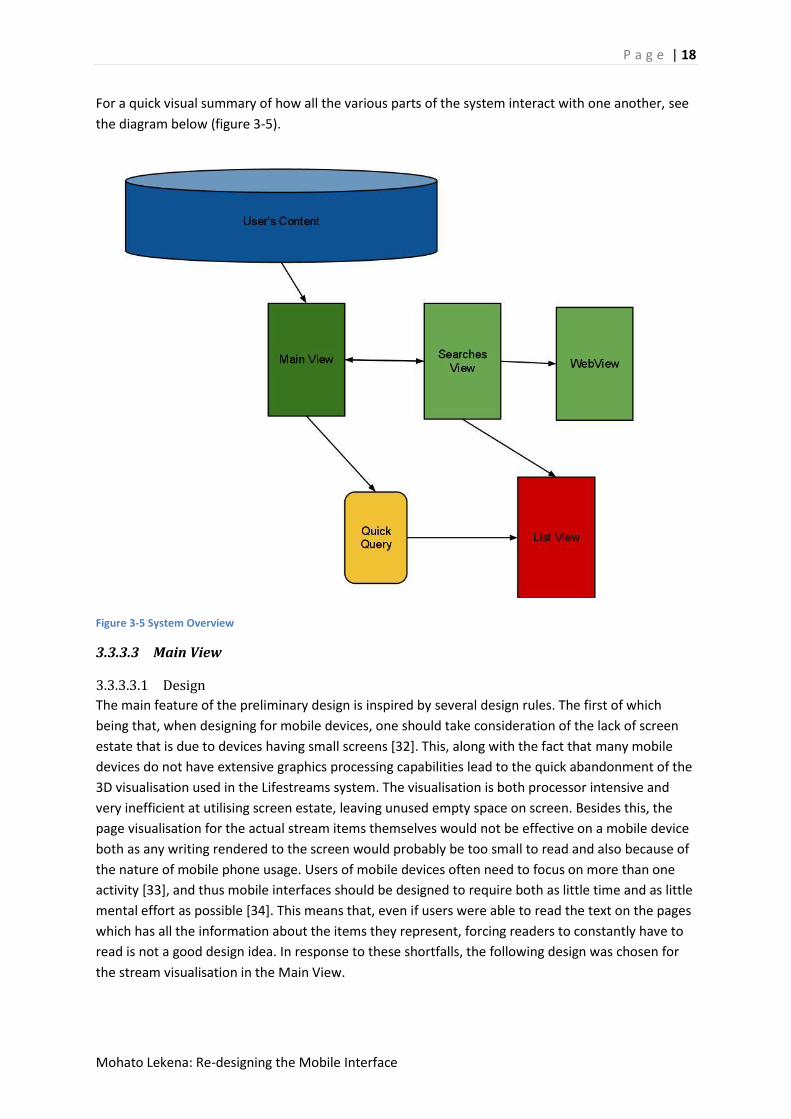
For a quick visual summary of how all the various parts of the system interact with one another, see
the diagram below (figure 3-5).
Figure 3-5 System Overview
3.3.3.3 Main View
3.3.3.3.1 Design
The main feature of the preliminary design is inspired by several design rules. The first of which
being that, when designing for mobile devices, one should take consideration of the lack of screen
estate that is due to devices having small screens [32]. This, along with the fact that many mobile
devices do not have extensive graphics processing capabilities lead to the quick abandonment of the
3D visualisation used in the Lifestreams system. The visualisation is both processor intensive and
very inefficient at utilising screen estate, leaving unused empty space on screen. Besides this, the
page visualisation for the actual stream items themselves would not be effective on a mobile device
both as any writing rendered to the screen would probably be too small to read and also because of
the nature of mobile phone usage. Users of mobile devices often need to focus on more than one
activity [33], and thus mobile interfaces should be designed to require both as little time and as little
mental effort as possible [34]. This means that, even if users were able to read the text on the pages
which has all the information about the items they represent, forcing readers to constantly have to
read is not a good design idea. In response to these shortfalls, the following design was chosen for
the stream visualisation in the Main View.

P a g e | 19
Mohato Lekena: Re-designing the Mobile Interface
The view consists solely of an Android GridView housing all the items on the users’ phone. These
items are represented by icons indicating the file type, with a TextView beneath each containing the
item’s name. The use of icons was chosen to speed up the process of giving the user information on
an item, as it has been shown that humans can perceive images - even blurred or complex ones -
with extreme quickness [35].This is especially true when comparing this time to the time it would
take to read a similar amount of information. The use of icons also speaks to the principle of
affordance [36], as most users today should be accustomed to the use of icons and the clear-looks
GTK+ theme inspired set of icons chosen are archetypal of many of the icon types used
conventionally today (see figure 3-7). The icons are larger than and take precedence over the text
views as it is believed that most users, when trying to quickly get through a large amount of files, will
look at the file types first, and then only the names. While there was no literary work found to justify
this, the personal experience and the opinions of potential users were consulted as per “Quick and
Dirty” ethnography [44].
Since cell phone displays are usually very small, and users often do not have much time in which to
interact with the mobiles *34+, the icons’ clickable area expands beyond its graphical representation.
This is a practice found on many modern interfaces, and in this case the clickable area is about half
the screen size in width and is about the same height as that of the icon and text view combined.
The size of the clickable area effects speed of interaction when one considers Fitt’s Law *37+ which
states that the time taken to acquire a target is a function of distance to the target and the size of
the target. The entire view is scrollable, which is the quickest available method of allowing the user
to browse through the potentially large number of files in the stream. This approach is also
advantageous because of the affordance and familiarity that it offers [36].

P a g e | 20
Mohato Lekena: Re-designing the Mobile Interface
Figure 3-6 Main View
Due to the importance to users of various applications such as the camera, video capture and games,
as evidenced by the Task Analysis performed above, applications will also be included in the stream
on the Main View. Most applications found on a user’s phone, though, will be native ones and hence
always at the “farthest” end of the stream since they will be the oldest items in the system. It is
because of this that all applications will not be ordered by time as all other items in the system are.
Instead, they will always occupy the first few slots in the users’ stream. Within these first few slots,
the applications will be ordered chronologically by their dates of last access in the system, in order
to help streamline the user’s search for often used applications.
The file types represented in the grid view are
- Audio
- Video
- Image
- Messages
- Text files
Figure 3-7 Chosen Icon Set

P a g e | 21
Mohato Lekena: Re-designing the Mobile Interface
- Web Documents
- Archive.
- Unknown file type
- Geoposition
3.3.3.4 List View
The List View is similar to the Main view in that it utilises both an icon and text view in order to
display information. The difference between the two is that with the List View the icon does not take
spacial precedence. Here, a smaller icon is used with multiple text views being placed besides it. The
reason for this general configuration is the design guideline given in [32] stating that when designing
for mobile devices, one should design for top down interaction. What this means is that the
presentation of information should be done in a hierarchical or multilevel manner, only giving the
user details on demand. This is useful because on devices with small screens, displaying all possible
information all the time is inefficient of screen estate. Thus at a higher level, i.e. the main view that
displays all the users information, fewer details are given and thus more information/items can be
displayed on the screen at once. Only once a user demands that a query be satisfied, and only items
filtered by that query are displayed, does the system give users extra details about the items
themselves. These extra details are specific to the file types, but include textual information such as
song details for MP3s or an excerpt from the body of an SMS message. Thus the text views used in
the list are item name, body (for SMS), and details (for applicable file types.). From this generated
view the user returns to the main system via use of the “back” button found on all Android devices.
Besides these minor differences mentioned above, the list view’s functionality and rationale is
similar to that of the main view.
Figure 3-8 List View
P a g e | 22
Mohato Lekena: Re-designing the Mobile Interface
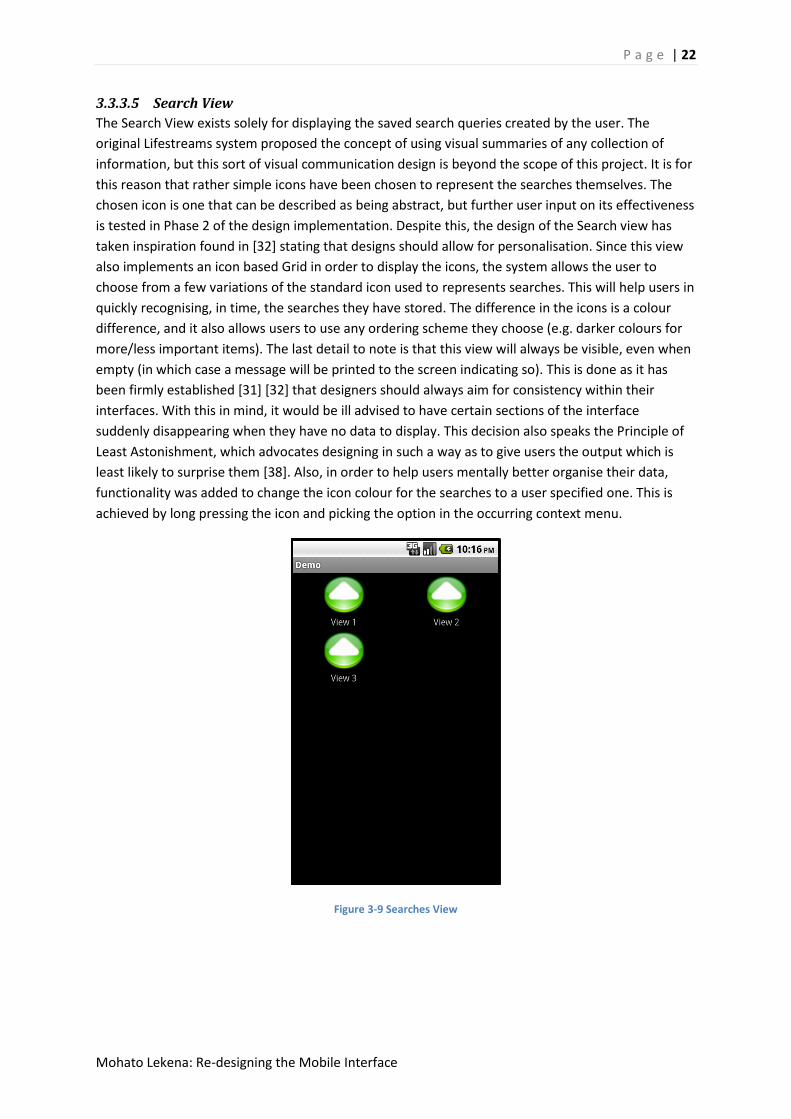
3.3.3.5 Search View
The Search View exists solely for displaying the saved search queries created by the user. The
original Lifestreams system proposed the concept of using visual summaries of any collection of
information, but this sort of visual communication design is beyond the scope of this project. It is for
this reason that rather simple icons have been chosen to represent the searches themselves. The
chosen icon is one that can be described as being abstract, but further user input on its effectiveness
is tested in Phase 2 of the design implementation. Despite this, the design of the Search view has
taken inspiration found in [32] stating that designs should allow for personalisation. Since this view
also implements an icon based Grid in order to display the icons, the system allows the user to
choose from a few variations of the standard icon used to represents searches. This will help users in
quickly recognising, in time, the searches they have stored. The difference in the icons is a colour
difference, and it also allows users to use any ordering scheme they choose (e.g. darker colours for
more/less important items). The last detail to note is that this view will always be visible, even when
empty (in which case a message will be printed to the screen indicating so). This is done as it has
been firmly established [31] [32] that designers should always aim for consistency within their
interfaces. With this in mind, it would be ill advised to have certain sections of the interface
suddenly disappearing when they have no data to display. This decision also speaks the Principle of
Least Astonishment, which advocates designing in such a way as to give users the output which is
least likely to surprise them [38]. Also, in order to help users mentally better organise their data,
functionality was added to change the icon colour for the searches to a user specified one. This is
achieved by long pressing the icon and picking the option in the occurring context menu.
Figure 3-9 Searches View
P a g e | 23
Mohato Lekena: Re-designing the Mobile Interface
3.3.3.6 Web View
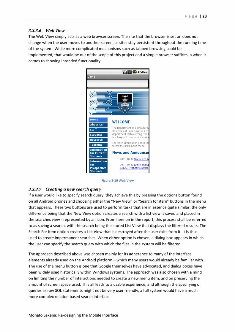
The Web View simply acts as a web browser screen. The site that the browser is set on does not
change when the user moves to another screen, as sites stay persistent throughout the running time
of the system. While more complicated mechanisms such as tabbed browsing could be
implemented, that would be out of the scope of this project and a simple browser suffices in when it
comes to showing intended functionality.
Figure 3-10 Web View
3.3.3.7 Creating a new search query
If a user would like to specify search query, they achieve this by pressing the options button found
on all Android phones and choosing either the “New View” or “Search for item” buttons in the menu
that appears. These two buttons are used to perform tasks that are in essence quite similar; the only
difference being that the New View option creates a search with a list view is saved and placed in
the searches view - represented by an icon. From here on in the report, this process shall be referred
to as saving a search, with the search being the stored List View that displays the filtered results. The
Search For item option creates a List View that is destroyed after the user exits from it. It is thus
used to create impermanent searches. When either option is chosen, a dialog box appears in which
the user can specify the search query with which the files in the system will be filtered.
The approach described above was chosen mainly for its adherence to many of the interface
elements already used on the Android platform – which many users would already be familiar with.
The use of the menu button is one that Google themselves have advocated, and dialog boxes have
been widely used historically within Windows systems. The approach was also chosen with a mind
on limiting the number of interactions needed to create a new menu item, and on preserving the
amount of screen space used. This all leads to a usable experience, and although the specifying of
queries as raw SQL statements might not be very user friendly, a full system would have a much
more complex relation based search interface.

P a g e | 24
Mohato Lekena: Re-designing the Mobile Interface
Figure 3-11 Query Specification Dialog
3.3.3.8 Quick View dialog
The Quick View dialog was inspired by the first of Shneiderman’s eight design rules *31+ which states
that one should design interfaces in a way that allows frequent users to use shortcuts. In achieving
this goal, one would also ensure that other design guidelines more specific to mobiles would be met,
such as designing for limited and split attention [32]. The Quick View dialog works by allowing users
to choose from a set of pre-compiled queries with which to filter the data on their phones. Six of the
queries were chosen to represent the types of searches that would be common to the average user.
These six are all queries that select all instances of specific file types, with the chosen file types
being:
-audio
-video
-SMS
-images
-web document
-text files

P a g e | 25
Mohato Lekena: Re-designing the Mobile Interface
The final item on the Quick View is a dynamic query which represents the last used query (outside of
those found in the Quick view). Through this the user should also have quick access to often used
queries that are not found within the six discussed above. Each of these queries is represented
within the dialog box as the icon associated with the file type they represent. The dialog box is
created whenever the user performs a circular gesture anywhere within the system.
Figure 3-12 QuickView Dialog
This gesture based opening of the Quick View dialog is a continuation of the direct manipulation
theme discussed above. This would again allow users to interact with the system in a heads down,
easy to learn manner. This way, users can open useful queries in a quick manner and speed up their
access to the files on their phones. Also, in order to make sure that all gestures placed by the user
are recognised, multiple possible versions of the gesture were recorded and will be captured buy the
system. The technical details of this recording of gestures are given in the Evaluation chapter. If any
of the items on the Quick View are chosen then a List View will be opened with the results of the
query.
3.4 Phase 2 The first part to the second phase of the project is evaluating the first prototype and redesigning if
necessary. When building a suitable evaluation plan it often helps to have a framework to help guide
the evaluation. The framework chosen for this part of the project is the DECIDE framework described
in [45]. The acronym decide stands for
- Determine goals
- Explore questions
- Choose evaluation methods

P a g e | 26
Mohato Lekena: Re-designing the Mobile Interface
- Identify practical issues
- Decide how to deal with ethical issues
- Evaluate, analyse, interpret and present the data
The next section will, by going through each individual point outlined by DECIDE, describe exactly
how the evaluations performed on the early prototype were carried out. Also it should be noted that
the only component of this framework that will not be delved into in any great detail is the Deciding
How to Deal with Ethical Issues, as at this point of testing there are none.
3.4.1 Evaluation
The evaluations of the early interface’s prototype will be carried out through usability testing of the
interface. At this early stage the testing will be more informal and formative than as compared to
the types of full scale testing that would normally happen just before a system’s deployment. The
evaluations will be carried out using students from the UCT Honours 2011 class. In addition to
evaluation, the usability sessions will also be used to inform future iterations of the interface. As
such, it could be said that the evaluations will thus be a combination of user testing and user based
co-design as user’s opinions and comments on various aspects of the interface’s design will also be
taken. In this way the evaluation and concurrent design phases of the project’s iteration cycle will be
fused into one. This is an approach that can be envisioned to be successful as most of the back-end
coding work required by the project will, by this point, have been done already and, as noted in [45]
“it is true that if changes are not significant then prototyping and evaluation activities can be
reduced”. Further detail will now be given on the usability evaluations themselves
3.4.1.1 Goals
The goals of the evaluation, at this early stage will not lie primarily with testing to see if users’
mental models correlate with the chosen conceptual model behind Lifestreams, that of the time-
ordered stream. This is because the issue of whether the Lifestream is a convenient metaphor to use
is one of the main research questions of this project, and thus this will be an issue that is explored
thoroughly at a later stage of the project. At this stage the goals of the evaluation lie mainly around
finding if the chosen visualisation and implementation of the interface is one that can be seen as the
most usable. That is, the main goal is trying to find whether the design decisions taken were indeed
correct, and whether or not they need to be altered.
A secondary goal, as described in the introduction above, is to see what future directions to take
with the system. This will be through not only seeing people’s reactions to and difficulties with the
system, but also through explicitly garnering user’s opinions.
3.4.1.2 Questions
Since the evaluation will be, at this stage, be a very informal one, there will not be many structured
questions. Rather, there will be exploratory themes that will lead to a dialog about the system,
eliciting the user’s feelings about it. This is not to say that specific queries won’t be made of the user,
just that these (named below) shall not form the basis for all discussion. The questions themselves
were chosen to try and validate any design decision for which there was only one alternative. Also

P a g e | 27
Mohato Lekena: Re-designing the Mobile Interface
questions were chosen that revolved around issues that the evaluator thought would be points of
confusion. The main questions and points to explore will include:
-Whether or not the chosen icon set is an intuitive one
-Whether or not the grid view is an effective viewing mechanism
-Whether or not gestures add to the system’s usability and if so,
-Whether or not the chosen gestures are intuitive for the actions they perform
-Whether or not the user find a specific file placed on the phone’s SD card
-Whether or not the user create specific filing directories
After these mainly evaluatory questions are asked, dialog about possible future directions that the
system will be taken. These points are asked to get the user’s overall feeling about the system, as
opposed to their feelings on specific topics. In this dialog the following will be explored:
-Users impression of the system as is
-What salient features supported by your current mobile are not supported here?
-What features could be added to help make the interface more intuitive
3.4.1.3 Evaluation method
The evaluation method here will be the so called think-out-loud usability testing, as described briefly
in [48]. This method relies on having the user vocally narrating their thought processes while
interacting with the system in order to give the researcher an idea of how they feel about it. This is
all above the questions and dialogs described above and collecting data on how users perform the
given tasks, which is a central component of usability testing [45]. All of this information will be
collected as written paper notes. Afterwards, the information will be annotated in a concise form,
and used for future design decisions.
3.4.1.4 Practical issues
The only practical issues would be who the users are, and where they are being tested. These issues
are conveniently mitigated by the fact that the test does not need any specific demographic of
people, as the only requisite to being a potential user of the system is Smartphone experience. As
such, Honours students, who are very easily accessible, will be used – this method of finding used is
called convenience sampling [47]. As to where the tests will take place and on what platform, a
combination of the Android Emulator on a PC and a copy of the interface installed on a Motorola
Milestone xt720 (running Android 2.1 update 1) will be used and the tests will occur in a lab.

P a g e | 28
Mohato Lekena: Re-designing the Mobile Interface
Although specific care will not be taken into that background knowledge of the users, a variety of
different platform users will be asked to participate. The different platforms involved will be Apples’
iOS, Android, and Nokia’s Symbian. The diversity of systems here will help in bringing new ideas, as
users from different systems will have different ideas of what acceptable design is depending on
their previous experiences.
6 users were used for the evaluations, as it has been established that using between 5-12 users for
usability testing is sufficient [46]. Users were not paid, and tests lasted between 10-15 minutes on
average. The data collected from the tests will be users’ opinions and comments.
3.4.1.5 Evaluate, analyse and present the data
The evaluation will be done, in part, with the user themselves when they are asked to give opinions
on possible future directions. Since there will not be a huge amount of data after this process, the
evaluation and analysis stage should not take too long, and only the conclusions of the evaluation (in
terms of changes that need to be made to the system) will be given. These will be outlined in further
detail in the chapters that follow this.
3.4.2 User Issues and Comments
The following list details the various issues users articulated about the system, as well as their general sentiments and comment.
Users felt that the entry point to the system should not be the Main View. This, they said, was mainly for two reasons. The first reason was purely aesthetic, as users felt that the having the entry point being another screen would “just look better”. The second reason was that users felt that since the information displayed in the Main View is highly personal in nature, it should not the systems entry point, but should rather be “hidden”. A suggestion was made to have the entry point being the Searches View, and that the applications list be moved into this new entry point. The suggested new order for the screens would thus have the Searches View being first, the Main View second and the Web View last.
(2) Concerning this switch, one user commented that having this new order would also make chronological sense. He noted that having Searches, Main and Web Views following each other in this order would metaphorically represent “past, present and future information”.
(3) One user suggested having separate gestures for every item represented in the Quick View dialog.
(4) Currently, the system had every SMS on the mobile’s memory being represented in the Main View. Users remarked that they would prefer to have a “threaded” view of their text messages. This would mean that, while all SMSs in the system would still be in the prototype’s memory, only the latest SMSs from each contact would be placed in the Main View. When this latest message is then opened, then a conversational view of the SMS interactions would then allow users to access older messages from that contact.
(5) A comment was made about the Main View concerning the usage of space within it, with a user suggesting that only icons should be used to represent items. This would therefore entail the removal of the TextViews used to display the items’ names.

P a g e | 29
Mohato Lekena: Re-designing the Mobile Interface
(6) Users suggested that modification dates be added as a field to each item in the list view
(7) It was also suggested that contacts should be added as a file type to the Main View
(8) Another comment was made about the items included in the Main View. This time it was suggested that it would be of benefit to have applications placed in a different area to the rest of the file types found in the Main View. This sentiment that the Main View is not an appropriate position for the application list to be placed was a recurring one throughout the evaluation.
(9) A unanimous feeling amongst users was that the Unknown file type should not be represented in the Main View or anywhere in the system. This is as the Android system creates many Cache files on a mobile’s SD card (.tmp files) for internal system use. Having these represented in the system (as an unknown file type) would add to much noise to the users’ information, making it difficult to differentiate between items that is useful and those which are not.
(10) Two of the iPhone users involved in the evaluation commented that the buttons brought up by the menu button being pressed should remain constant.
(11) Another iPhone user commented that the interface used good metaphors in displaying the users’ information. He particularly liked the swiping/sliding between screens, which we commented reminded him of flipping through “paper stacks”.
(12) Lastly it was suggested that a splash screen be included to help hide the system’s sometimes long loading times at start-up.
3.4.3 Discussion
On the whole, users’ reaction to the interface was a positive one. An encouraging sign was found in
the fact that none of the users struggled in understanding the time based stream metaphor, even
though it was completely novel to them. Most of the issues listed above revolve around items to
included or excluded from the Main View. Although there was some variation in opinion, there
seemed to be general agreement that the applications should not be listed here. This is issue first to
be tackled in the prototype’s second iteration. The changing of the ordering of the screens is another
issue that several users agreed on, and will thus also be tackled in implementation.
When it comes to whether or not to add contacts to the Main View, as some users suggested, the
challenge that presents itself is how to order contacts chronologically. In the end the method chosen
was to have contacts in the View ordered by the time of the last interaction with the contact. This
would then also mean that only contacts that have been interacted with previously would be
represented on Main View. This is a design feature that is acceptable though, as it means that
contacts that never interacted would not make it onto the Main View of the user’s system – leading
to a more streamlined display of information.
The removal of unknown file types and the aggregating of messages from contacts into threads also
seem feasible ideas. These are strategies that are currently being implemented by many mobile
interfaces and applications, and as a result many users should already be familiar with these
approaches. This is also something that can be said regarding the suggestion to include modification
date as a field in the List View. This is, in retrospect, something that should have already been
present in the first implementation of the prototype.
The proposition that multiple gestures be implemented was one which most other users disagreed
with when queried. This is in accordance with literature [32] which states that users' cognitive load
should be kept low. Requiring them to remember a whole set of gestures in order to interact with
the system would thus not be good design, so this suggestion would not make it into
P a g e | 30
Mohato Lekena: Re-designing the Mobile Interface
implementation. For similar reasons the suggestion that only icons (without text views) be added to
the system has also not been taken into consideration. This is as it would only make it more difficult
for users looking for specific items to locate them. Another idea that was rejected was the one that
the buttons shown by pressing the Android Menu Button should remain visible. The reason for the
rejection of this idea is that only iPhone users are accustomed to having persistent buttons on their
displays, while Android has used the menu button layout since early versions. For this reason it can
been seen that the gain made by appeasing iPhone users would not be worth the sacrifice in Android
users’ opinions and the screen estate that would be lost by having persistent buttons. Lastly the
addition of a splash screen in order to hide loading times is a simple but effective mechanism that
will also be added to the prototype.
It should also be noted that after having had users interact with the system, other issues that the
users themselves hadn’t commented on became apparent. The first was that more information can
be given in the Main View through the use of colour. By having different items in the View rendered
with different background colours, more contextual information about the items themselves
projected. Another issue is that when users create new search queries, the queries themselves are
created, but the user is given no any feedback. This is bad design, as users should always be given
feedback for the actions they take, as noted in [32]. Lastly, it was also observed that using the date
of last interaction to order the applications was inefficient and left the users unsatisfied, so a new
ordering scheme would have to be created.
Besides this, the only other changes to the system were technical ones. Although these are generally
not the types of issues that users might be able to pick up on easily in a short testing session, they
are still salient. Thus they are also described in the following section.
3.4.4 Changes To the system
This chapter documents how the issues brought up above have been implemented as changes to the
system. Since both the overall framework of the system and the rationalisations are given above,
this section will be a lot briefer then the descriptions given in phase one.
3.4.4.1 Ordering Of Views
The first major change is concerns the ordering of the views and the information kept in the views.
As suggested above, the entry point of the system was changed to the Searches View, which is then
followed by the Main View (when the user swipes to scroll left) and finally the Web View. The
application list has also been moved from the Main View to the Searches View. This means that
when a user first engages the system, they are greeted by the GridView containing all their saved
searches, and another GridView underneath containing the list of applications. This change is shown
in the figure below (3-13).
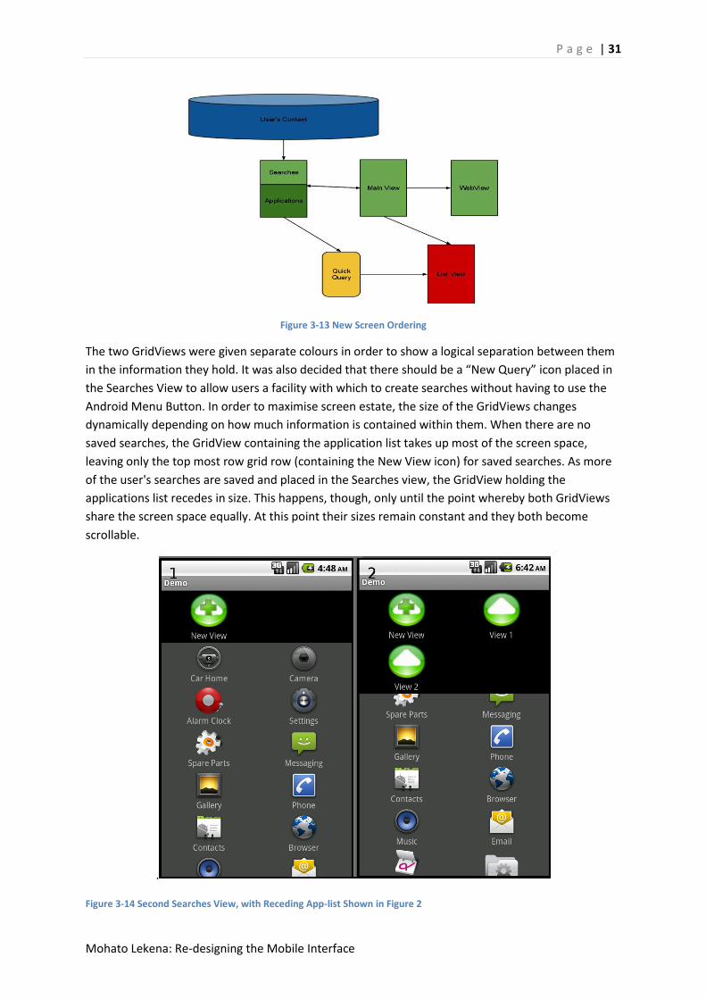
P a g e | 31
Mohato Lekena: Re-designing the Mobile Interface
Figure 3-13 New Screen Ordering
The two GridViews were given separate colours in order to show a logical separation between them
in the information they hold. It was also decided that there should be a “New Query” icon placed in
the Searches View to allow users a facility with which to create searches without having to use the
Android Menu Button. In order to maximise screen estate, the size of the GridViews changes
dynamically depending on how much information is contained within them. When there are no
saved searches, the GridView containing the application list takes up most of the screen space,
leaving only the top most row grid row (containing the New View icon) for saved searches. As more
of the user's searches are saved and placed in the Searches view, the GridView holding the
applications list recedes in size. This happens, though, only until the point whereby both GridViews
share the screen space equally. At this point their sizes remain constant and they both become
scrollable.
.
Figure 3-14 Second Searches View, with Receding App-list Shown in Figure 2

P a g e | 32
Mohato Lekena: Re-designing the Mobile Interface
3.4.5 Ordering of applications
After it was found that the ordering scheme used for the applications was not one which users
agreed with, various options were considered to replace it. In the end an ordering scheme was
selected that used the cumulative counts of the number of times an application has been opened by
the user. Each application would keep a counter of how many times it has been opened, and in this
way the most used (and therefore also most searched for) applications in the system could be
moved to the very top of the applications list. This movement within the list happens dynamically as
soon as the users open the application.
3.4.6 Contents of Main View
As stated above, the application list was removed from the Main View. Added to the Main View
though was the ‘contacts’ file type. This file type represents an interaction with a contact, such as
receiving, missing or placing calls. In order to represent the contacts in the Main View, the contact’s
saved photos are used as opposed to having a single set icon. When these photos are not available,
though, a standard “blank contact” image is used as a place holder. In order to help differentiate
between the various types of possible interactions with contacts, a colour scheme was devised
whereby any contact entries representing missed calls would be rendered with red background. This
idea of using colour schemes was then also extended to the SMS file type, where any new messages
are rendered with a green background. Old (already read) messages also have their background
colour changed, in this case to blue. This is done because, as evidenced by the task analysis
performed above, users highly value the texting aspect of mobile communication. With this in mind,
it was decided that it would be wise to make it easier for users to differentiate the text messages in
the Main View from all the other data types, and the changing the background colour of the text
message icon in the system achieves this. This, along with the removal of the unknown file type from
the Main View will result in a more efficient experience for the user.
The threaded SMS view was also accomplished by only inserting the latest SMSs received by the user
into the Main View. From here if a user clicks to open the SMS, the native Android application opens
the message in a threaded view, showing the users entire conversation with the SMS contact. In this
way, advantage of the native SMS application is taken in order make the usability of the system
closer to what users had specified in the evaluation section above.

P a g e | 33
Mohato Lekena: Re-designing the Mobile Interface
Figure 3-15 Second Main View, With Colour Information
3.4.7 Technical changes
It was noted while preparing for the evaluations that when the test device had no SD card present,
the application would crash upon start-up. This is an occurrence that happened quite often, as every
time an Android is connected to a PC via USB, the mobile loses its access to the SD card. In order to
counter this, a check for SD card presence was added at the very beginning of the systems start-up
code. If it is detected that the SD card is not present then a message appears via a dialog box alerting
the user to the fact that the application requires the SD card to be present in order to function
properly.
A second realization made while preparing for the user evaluations was that upon orientation
change, i.e. when the mobile device is moved from a portrait to landscape position or (vice versa),
the system took some time to render again. This was due to the fact that when the orientation is
changed, the system recreates the Activity class responsible for rendering. Since the process of
recreation is one that involves various time consuming steps in which the system populates various
data structures, the system would thus spend some time rendering nothing, waiting for the process
to be completed. This issue was rectified by the introduction of methods to save and load the
applications state, therefore removing the need to repopulate data structures as they could just be
reloaded.
With these changes designed and added to the system, the second phase of implementation was
complete. At this stage a system had been developed via the use of design heuristics which stood up
to the rigors of evaluation by usability testing. The only remaining evaluation type that the system

P a g e | 34
Mohato Lekena: Re-designing the Mobile Interface
was yet to undergo was expert evaluation. The details of this final evaluation are given in the
proceeding chapter, which gives details of the third phase of design.
3.5 Phase 3 For the final design phase the system was inspected by in brief by usability expert Gary Marsden.
Upon seeing the system, his response was positive overall. One suggestion that was made, though,
was to change the way that searches were visualized after being saved. After the second phase, the
system had added saved searches only as icons on the Searches View, and this was the only way to
access them. When opened, a new instantiation of the List View would be opened to display the
items every time. The suggestion Prof. Marsden made was to append the List Views that represent
the saved searches as a new screens that the user can swipe to. In this way, every time a search was
saved the system would, conceptually, become one screen wider. In this way users would have more
than one way to access the searches, and also would have a more concrete conceptual metaphor to
help them understand just how the system works. The following section documents the changes
made to the system in order to facilitate the suggested functionality.
3.5.1 Changes to the system
The first and most obvious change was that new searches were appended to the system’s core set of
Views as new screens. These new Views would be added to the rightmost View in the system, in
keeping with the before mentioned fact that most users would be comfortable with the idea of new
information being processed from left to right. In order to alert the user to the fact that any new
View is being appended to the current Views animation is used. When the user is finished specifying
the information for creating the View, a sliding animation, starting at which ever View the system is
currently on and moving leftwards to the new view, is initiated. This will help users understand the
view adding metaphor.
Figure 3-16 Final Screen Ordering
Since there is now the chance that systems could feasibly grow to encompass a large number of
searches, and hence a large number of screens so swipe through, a button that slides the user to the
very first View was added. This button has been placed in the in-between the Search for an Item and
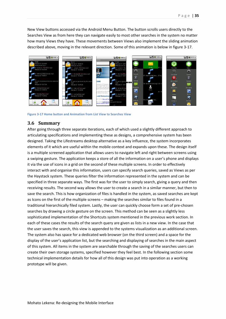
P a g e | 35
Mohato Lekena: Re-designing the Mobile Interface
New View buttons accessed via the Android Menu Button. The button scrolls users directly to the
Searches View as from here they can navigate easily to most other searches in the system no matter
how many Views they have. These movements between Views also implement the sliding animation
described above, moving in the relevant direction. Some of this animation is below in figure 3-17.
Figure 3-17 Home button and Animation from List View to Searches View
3.6 Summary After going through three separate iterations, each of which used a slightly different approach to
articulating specifications and implementing these as designs, a comprehensive system has been
designed. Taking the Lifestreams desktop alternative as a key influence, the system incorporates
elements of it which are useful within the mobile context and expands upon these. The design itself
is a multiple screened application that allows users to navigate left and right between screens using
a swiping gesture. The application keeps a store of all the information on a user’s phone and displays
it via the use of icons in a grid on the second of these multiple screens. In order to effectively
interact with and organise this information, users can specify search queries, saved as Views as per
the Haystack system. These queries filter the information represented in the system and can be
specified in three separate ways. The first was for the user to simply search, giving a query and then
receiving results. The second way allows the user to create a search in a similar manner, but then to
save the search. This is how organization of files is handled in the system, as saved searches are kept
as Icons on the first of the multiple screens – making the searches similar to files found in a
traditional hierarchically filed system. Lastly, the user can quickly choose form a set of pre-chosen
searches by drawing a circle gesture on the screen. This method can be seen as a slightly less
sophisticated implementation of the Shortcuts system mentioned in the previous work section. In
each of these cases the results of the search query are given as lists in a new view. In the case that
the user saves the search, this view is appended to the systems visualization as an additional screen.
The system also has space for a dedicated web browser (on the third screen) and a space for the
display of the user’s application list, but the searching and displaying of searches in the main aspect
of this system. All items in the system are searchable through the saving of the searches users can
create their own storage systems, specified however they feel best. In the following section some
technical implementation details for how all of this design was put into operation as a working
prototype will be given.

P a g e | 36
Mohato Lekena: Re-designing the Mobile Interface
4 Implementation In this chapter details will be given on how the designed described in the previous chapter was
implemented as a functioning application. These details will include both technical lower level
descriptions and higher level conceptual overviews of how the system’s various components
interact. To begin with, the general development specifications and conceptual overview will be
given, with details of specific implementation following afterwards.
4.1 Development Specification The prototypes were all written for the Android platform using standard and recommended tools.
This means that all coding was done in the Java, incorporating also Google’s corresponding Software
Development Kit (SDK). The officially supported IDE, Eclipse 3.6, was used for development,
complemented by the Android Development Tools (ADT). Most early debugging was carried out on
the Android Emulator which comes as part of the SDK. Only native Java/Android constructs and
classes were used, with the exception of the public HorizontalPager library employed (which is
described later in this chapter).
4.2 Conceptual overview As stated above, the system was created entirely using Android’s development tools and
recommendations. This also meant that the system was built using the Model-View-Controller [40]
design pattern advocated by Google and Android. The Model in the prototype consists of a database
created to index all the items in the users system. Control of this database is handled by the
DBhandler and DatabaseHelper classes, which act as intermediaries between the Android system’s
SQL Lite functionality and the other classes that in the system. When information is pulled from the
database, it is kept in a class called StreamItem, which was created to act as a general wrapper class
for any file type found in the system. This can thus be seen as being still part of the system’s Model.
Viewing is handled by the several Activity classes, the main of which is the DemoActivity class. It
should be noted that although the DemoActivity does control many aspects of the interaction, it is
seen as being the View as it does not communicate with the Model directly at all. Each of these
classes and their functions will be described in further detail below.
4.3 Data (model + controller) Since effective searching is an essential part of the system, it can be seen that having a database
with which to facilitate queries would be of great advantage. The database is created and populated
when the system is first run, and all interactions between any classes and the database itself are
handled by the DataBasehelper and DBhandler classes. The Databasehelper class is the one that
extends the standard Android SQLiteOpenHelper class and adds needed functionality to the class’
constructor. An instance of this class is then kept within the DataBasehandler class, which is the class
responsible for handling interactions between other parts of the system and database. It thus has
the relevant functions for insertion into, deletion from and querying of the database.
The database itself holds only metadata on the items found in the system. It keeps this metadata
textually in columns for attributes such name, timestamp and dataType. In order for the actual files
described by the metadata in the various records to be retrieved by other parts of the system, a field
called Uri is kept which contains the assorted Uniform Resource Identifiers associated with files.
Although they might vary widely in form and format, all file types found on the Android system have
information that can be used as an URI. This chosen database schema is advantageous as it both

P a g e | 37
Mohato Lekena: Re-designing the Mobile Interface
allows the system to keep one single database to query (because of the schema’s its generality) and
because it saves on system memory (because only metadata is kept).
When one of the other classes in the system interacts with the DBhandler via one of its query
methods, the return type is always an ArrayList of the StreamItem class. StreamItem is a class
created to reflect what the various columns of the database would be. It is therefore a general class
that is able to hold the information needed to specify any of the data types represented in the
system. The only items in the system not general enough to be represented by the streamItem are
applications, which are represented by the streamApp class derived from streamItem. This is mainly
as, in order to represent applications, more information is needed than for other more general
items. This extra information that the applications need is related to the fact that they need
instantiated Intents (an Android class) and not simple textual URIs in order to be opened on request.
In order to circumnavigate this problem a separate array of streamApps is kept on the system, with
each app in the array having its Intents instantiated correctly. In the database, then, the application
is stored with its index in the array acting as its URI.
4.4 Activities (view) Most of the work and all of the visuals in the system are controlled by the application’s main activity
class – DemoActivity. This is the class which keeps instances of most of the classes used throughout
the system. It is also the class that holds the data used for the system’s multiple screens, and the
adapter methods used to display the data in the various grids. It is also the class that contains the
important onCreate method which is always the first to be called when an Android application is run.
The process that happens when this method is run is as follows:
- The various database components are instantiated
- Methods to collect the meta-data needed to populate the database are run
- Methods for adding text messages and the call log meta-data to the database is run
- The ArrayLists containing all items to be displayed are populated from the database
- The view group hierarchy (described below) is instantiated
Population of the database is completed via the use of three simple methods. The first is a method
which recursively travels through the files on the mobile device’s SD card. The method starts at the
root and adds all of its children (files contained within it) to the database. If any of these files
happens to be a directory, then the method itself is called recursively with the directory becoming
the new root. This method is called from within the DemoActivity, which calls the DataBaseHandler’s
insert method to pace items within the database.
The other two methods are run from inside the DataBaseHandler. These methods populate the
database with all the information not found on the SD card. This information includes the SMS list
and the call log. The reason that these methods are placed within the DataBaseHandler is for the
sake of consistency, as in order to get the information SQL queries to the Android system’s
databases have to be made.
Almost all items displayed in the system fall within the view-group hierarchy are held in the
DemoActivity class. At the top level of this hierarchy is the GestureOverlayView under which all
items are inserted. This view is used to capture the gestures used for creating the QuickView dialog
and is at the top of the hierarchy to ensure that the gestures can be captured no matter where in

P a g e | 38
Mohato Lekena: Re-designing the Mobile Interface
the system the user is. Placed within this top view is the ViewSwitcher, which is an instance of the
HorizontalPager class that handles the swipe-gestures for movement between screens. The screens
that are swiped between are represented by Layouts, which are placed within the ViewSwitcher.
Layouts specify the look and behaviour of a component rendered to the screen and include the
GridView class used in the Main View and the ListView class used in the List View. These layouts then
have adapters specified to them, which in turn take ArrayLists that contain the actual data to be
displayed. Adapters are internal classes that are used to give a Layout the specific details of how to
display the information of a given data type. Since every item in the hierarchy has methods that
apply both to it and to every item below it, functionality is spread amongst all components in the
system in a controlled manner. Below, the details of some of the individual elements described in
the hierarchy illustrated above are given.
4.4.1 Gesture Overlay View
In order to be able to have the QuickView functionality discussed in the design section, the
GestureOverlayView class was used. This class takes in an instance of the GestureLibrary class upon
creation and uses it to recognise when specific gestures performed. GestureLibrary is a class used to
enclose any number of user specified gestures. It is populated using the Gesture Creator application
on the Android Emulator which captures gesture details and exports them via the ADT. Even though
the gesture that is intended to be caught in the system is a simple one, users are likely to often make
mistakes while attempting to perform the gesture. For this reason, the gesture library used for the
prototype was populated with numerous possible variations of the circle gesture used by the
prototype. These variations included broken circles, oval gestures and so on, in order have the
overlay accept as many of the users gestures as possible when it is obvious what they were trying to
achieve, but somewhere made a mistake (see figure 4-1 for the list of captured gestures). It does this
by intercepting any potential gesture placed on its surface area or that of any item in encloses. It
then checks this intercepted gesture against all the gesture stored within the gesture library and if a
potential match is found then its acts upon it. If a match is not found then the intercepted gesture is
passed on to all of the overlay’s children to handle. In the prototype’s system though, the only
children that use these are the Horizontal Pager, the Adapters (for vertical scrolling) and then finally
the Activity itself which handles all interactions with the items in the system.

P a g e | 39
Mohato Lekena: Re-designing the Mobile Interface
Figure 4-1 Examples of Gestures in Gesture Library
4.4.2 Horizontal Pager
Horizontal Pager is an additional library for the Android platform, written by Yoni Salam and made
available through the Apache Licence. An improvement on the previous RealViewSwitcher library
written by Marc Reichelt (under the same licence), it is in essence a horizontal scroll view that snaps
to the view of a full length child. It, like the GestureOverlayView, also intercepts gesture events and
uses these to initiate the animations that represent the changing of visible child views. One major
advantage that the HorizontalPager over any previous implementations by other authors is that it
allows vertical scrolling events to occur within any of its children. This is an important feature as
every one of the children of the HorizontalPager used in the prototype would need to be scrollable
in order to be used effectively.
It should be noted also that on the 23rd of August Google officially released the ViewPager library,
which would effectively give all the functionality described above. It was released as part of
Compatibility Package revision three and is compatible with Android version 1.6 and onwards. Its
rerelease date, though, came at a time where development using the above mentioned
HorizontalPager class was already at an advanced stage. Therefore, it was not used, as changing the
implementation at that stage would have cost the project more than what the potential gain from
using the official library would be.
4.4.3 Adapters
The adapter classes are those that take in data-structures containing specific class types and return a
renderable view. While some standard adapters are already available via the SDK, these are for
primitive and supported types. Since the StreamApp type is a custom one, custom adapters had to

P a g e | 40
Mohato Lekena: Re-designing the Mobile Interface
be written. The key method in the adapter class is the getView method. It is in this method that
specifications are given for how to handle the display of any of the items found in the data-structure
given to the adapter. Since this getView method returns a single object of class Drawable, a custom
class which extends from Drawable was created that would encompass all of the visual elements
found in a single item to be displayed in a GridView. These elements are namely the TextView
containing the item’s name and the icon representing the item’s type. The icons are all called from
the application’s resources, with the exception of those used for the contacts file type – which are
called from a method which retrieves the contacts’ photos from the Android system.
All icons were sourced from sourced from IconsArchive.com, a licence free, community based icon
sharing website. Icon sets are uploaded by users of the websites under different themes and are
then made available to the general public.
The adapter used for the List Views that display the query results are exactly the same to those used
for the GridView in most regards. The main difference is that getView method in this case returns a
view for which there is an XML specification. This was done as within the List View, the single
Drawable that represents a solitary item is too complex to be represented purely programmatically.
This is unlike the in the GridView, where items are represented by only a single item and TextView.
4.4.4 Interactions with the system
At the lowest level of the hierarchy lies the code that handles the interactions with the various
elements in the system. This code is placed within the DemoActivity class’ onClickListener and
onLongClickListener methods. These methods are interface definitions for call-backs to be sent when
a view is clicked, where clicks are defined through the touch events received by a view after they
have been sent down through the view group hierarchy. When an item (such as an MP3 or text
message) is touched to be opened, the URI field of its representative streamItem instance is used to
access the actual item from the Android Operating System. Since the URI’s are inherently different
depending on what the item is, the streamItem’s type member variable becomes important here as
it helps in deciding which protocol to use in opening the file.
4.5 Development Process Development throughout the project followed the User-Centered Design [48] software engineering
process, which prescribes the completion of multiple rapid iteration, all informed by user input. The
first few of these iterations were chosen to encompass what was envisioned to be the most
technically demanding and possibly unfeasible aspects of the prototype. In this way the vertical
prototypes were used, which are more exhaustive prototypes of a single subsystem. Fortuitously,
these chosen aspects all revolved around aspects of the system which could be defined as being
“back-end” or foundational elements, which do not depend on the system’s design. Thus, the very
first prototype which was created, before the design process had started, was essentially a file
browser, as the biggest challenge in the system was envisioned to be whether or not access to the
necessary file types was possible. Version control was achieved through the use of the cloud based
file sharing DropBox application, in which dated versions of the prototype were kept. It is through
this version control system that file browser discussed in The Evaluation Chapter was synthesised, as
it used the prototypes very first iteration as a basis for development.

P a g e | 41
Mohato Lekena: Re-designing the Mobile Interface
From this point on, further development was interleaved with the earliest stages of design. This
process was followed until Phase one was completed, after which design and implementation
happened concurrently. Since Phase one represented the base upon a further designed would be
founded, concurrent development was possible as the chances of there being major system chances
were seen as being low. This turned out to actually be the case as the project moved through Phases
two and three, after which development was complete.

P a g e | 42
Mohato Lekena: Re-designing the Mobile Interface
5 Evaluation
5.1 Introduction In order to gauge the success of the proposed interface design, usability testing was carried out
using the latest version of the system prototype. As the two main components of the system,
namely the interface described in this paper and the dedicated search interface mentioned in
section 2, were developed separately and pose different research questions, both systems were also
tested separately. The testing occurred over a period of 14 days and 10 users were involved. All
users were given consent forms (attached in the appendices) and had the procedure of the test well
explained to them. The exact details of the experiment are described below.
5.2 Goals The goals of this project, as expressed in the research questions stated in section 1, revolve entirely
around the proper evaluation of the system prototype. With this in mind, there are therefore several
factors that need to be tested for during the evaluation phase of this project, all of which revolve
around the usability of the system. Firstly, it should be determined whether or not the system is any
better (or more usable) than the contemporary system that it would be envisioned to be replacing -
namely, Android. This requires tests that compare the two systems in terms of usability. In doing
these tests, it will be thus found whether or not the concepts and metaphors applied in the interface
are ones that are indeed an improvement the Android system. Secondly, the overall, non-
comparative usability level of the system itself should be ascertained. Here what would be tested is
essentially the level of usability in the specific case of the metaphors’ application in the system.
These two experiments (herein referred to as experiments 1, 2 respectfully) form the basis for the
evaluation method chosen for the project - and the evaluations will be described in terms of these
5.3 Users, location In any evaluation it is integral that experimenters use a test population that is as close to the
perceived user population as possible. In this case the actual population consists of any person likely
to be in ownership of a smart phone. For this reason, and also for the sake of convenience, the test
population was thus taken from the student population at UCT, with the only pre-requisite being
smart-phone experience. The make and models of the users’ current mobile phones were also taken.
The ages of the students range from 20 - 24, with a wide variety of ethnicities and a fairly equal
balance of genders (37% female – 63% male). The user’s chosen course of study at university was
not queried as this is not a factor that should affect performance in a usability test.
Since all testing, in order to be as representative of real life scenarios as possible, was carried out on
actual mobile devices - there could be a certain flexibility to the location of the tests. The majority of
the tests were carried out in the users’ residence rooms - with the rest being completed either in
labs or other secluded areas. All locations were selected such that there would be as few distractions
as possible and users would be as comfortable as possible. 12 users participated in the experiment,
which is sufficient for an evaluation of this type [46] and users were not paid.

P a g e | 43
Mohato Lekena: Re-designing the Mobile Interface
5.4 Experimental Design In the evaluation the traditional usability test consisting of a set of tasks to be performed by the
users on the system was employed. This is a method used to gather quantitative data about the
users’ performance when attempting to execute the given tasks. The tasks here were chosen both to
encompass the type of everyday behaviour one might expect from users interacting with such a
system and also to be encompassing of as a wide a spread of features as possible. The 20 tasks
(attached in the appendices) were split into two sets, A and B, and during testing the user would
attempt to complete a set with the tasks given in a random order. The tasks would be completed on
the two systems, the designed prototype and a stripped down android system (described below). All
users were randomly assigned a first system to evaluate. They were then also given a task set to
complete on this system at random, after which they would complete the unused task set on the
second system. The reason for the split in tasks is to eliminate any advantage that a system being
used second could have from users already being familiar with how a task might be completed. All
this then puts each user in to one of four groups:
1. Task set A - Android system
2. Task set B - Android system
3. Task set A – Prototype
4. Task set B - Prototype
The importance of having such randomized selections lies in the fact that by randomly allocating
tasks and system orders, we guarantee that the groups of users are not systematically different. This
way, even if there are traits amongst the groups that are invisible to us, these traits should be
equalized between the two groups and not affect the results of the study. It also helps in negating
the learning effect, where users perform better on a second system after having gained experience
through evaluating the first [54]
5.5 Experiments
5.5.1 Experiment 1: comparative evaluation.
In order to quantitatively find whether or not there is a difference in usability between the two
systems, the metrics used were the number of errors encountered in completing a task set and the
average number of interactions for a specific task. With these we were be able to determine the
both intuitiveness of each system, and also how much effort it takes for users to interact with the
system. This makes the experimental design used for this part of the evaluation a randomised
complete block design.
Experiment 2: usability evaluation In order to be able to gauge whether or not the design was a success in and of its own, a formal
questionnaire and informal interview were used. The questionnaire was based on the System
Usability Scale (SUS) often used for the quick evaluation of interfaces in industry. The questionnaire
was handed to the user to fill out after they had completed both sets of tasks, with any effects
caused by the order of system use being equalized by the randomisation described above. This
questionnaire (attached in the appendices) consists of 10 questions which require the user to choose
a value for each between 1 (strongly disagree) and 5 (strongly agree). In the end the various scores
given for the answers are used to compute a single score – using a process which is discussed below.
Above and beyond the questionnaire users were also engaged by the evaluator in informal

P a g e | 44
Mohato Lekena: Re-designing the Mobile Interface
conversation concerning their opinions of the system. Through these conversations, users’ opinions
and suggestions for future work on the system were gained. A summary of these will be given in the
results section.
5.6 Instruments
5.6.1 Hardware
The only hardware item of note is the mobile phone. The model Used is the Motorola Milestone
xt720. The phone is running Android version 2.1 update 1, which although - slightly out-dated - is
missing no major interface elements from newer versions. The phone itself has a 3.7" 480x854
WVGA TFT display and weighs 139g. These statistics are about on par with other contemporary
touch screen enabled smart phones available today.
5.6.2 The Systems
The two systems used for the evaluation are the Prototype described in the design chapter and the
Android 2.1 update 1 system, both with minor changes applied to them. In the prototype system the
following changes were made:
The text boxes used to specify search queries were removed and replaced with spinner
boxes. This was done because, although the design and evaluation of this system was not
intended to also include the development of a full search interface, expecting users to fill in
SQL queries would be unreasonable. Therefore all possible search queries (according to the
tasks) were pre-computed and given to the user as options in a spinner (figure 5-1)
All items found on the phone were given random times between two specific dates. This was
done in order to further equalize the testing and remove any potential bias (as certain tasks
would always be quicker if files being searched for were newer). Code was also inserted that
always give the phone a single unread text message in order to help with task completion.
Figure 5-1 Modified Query Specification Dialog

P a g e | 45
Mohato Lekena: Re-designing the Mobile Interface
The Android 2.1 system had the following changes applied to it for the tests:
Firstly, all icons were removed from the home screens and only the standard launcher and
background applications were used. This was done both to try avoid the effects that the
aesthetic appeal would have on the user testing and also because icons represent shortcuts
created by a user after prolonged use of a system. In order to have the tests being as
controlled as possible, an effort was made to have the two systems being as close to each
other as possible in everything except core functionality.
Only the standard Android applications were installed on the phone, save for one. This one
exception was a file browser written specifically for use in these tests. The reason for only
having standard applications on the phone relates again to having as controlled a
comparison as possible. The reason for the file browser is because the Android system does
not come with one installed, and some of the tasks chosen for the evaluation are such that
for many users a file system would be the only way they know to complete them. Again, this
was done in order to have the two interfaces as close to each other as possible during the
comparison.
Lastly it should be noted that the information available to the users on the phones was controlled
pragmatically. This was achieved by restricting both systems’ SD card access to a single folder called
Test Data, in which all the necessary files for testing could be easily added or modified. Any files
mentioned explicitly by name within either sets of tasks was placed in these files, as well as other
miscellaneous files to act as “noise”. All of this was set up in order to make the test phone feel as
used as possible. For call data and text messages restricted access to the evaluator’s private data
was allowed during testing.
5.6.3 Task List
The task lists were printed out once for each test that was taken, with the order of tasks being randomised.
5.6.4 The SUS questionnaire
The System Usability Scale in a simple, ten question aptitude Likert Scale based questionnaire used to give experimenters an overall view of subjective assessments of a system’s usability. It was first suggested by John Brooke [53] as a quick way to ascertain the usability level of a product - with usability being defined as the “appropriateness to a purpose” of any artefact. This definition hints towards the view that usability can only really be assessed within a certain contextual framework, a view shared by the ISO (see ISO 9241 Part 11) - and just as the ISO defines usability in terms of effectiveness, efficiency and satisfaction, so does the SUS. Each one of these three facets of usability is also defined only within a specific context. In practice the SUS has often been used as a very high level subjective assessment usability tool. The fact that it calculates a single, score on a scale of between 0 and 100, means that it has also often been used as a point of comparison between vastly dissimilar systems. This is not only because of the system’s generality, but also because the robustness and reliability of the scale. These factors, along with the fact that the scale is available for free use to evaluators (as long as mention to the original author in [53] is given), mean that it is the most viable option for this evaluation. The SUS scale has also been studied thoroughly, with its reliability as a questionnaire being confirmed by more than one researcher [51, 52].

P a g e | 46
Mohato Lekena: Re-designing the Mobile Interface
5.6.4.1 Scoring the questionnaire
The ten questions found in the questionnaire all have scale positions assigned to them from between 0 and 4. From this scale, each question is then assigned a score depending on the question itself and the users’ input on the scale. For questions 1,3,5,7 and 9 the score contribution is the position on the scale minus one. For the remainder of the questions, the contribution is 5 minus the scale position. Once these scores have been summed, this sum is then multiplied by 2.5 in order to obtain the overall System Usability. It should be noted though, that although the score is out of 100, it is not a percentage of any sort. Initially the SUS was created for comparative purposes and, as noted in [53+ “scores for individual items are not meaningful on their own”. Since its inception though, it has become one of the most used tools for usability evaluation, and metrics to help determine what scores mean in isolation have been formed. One such metric has been computed by quantitative research firm Measuring Usability LLC after reviewing data from 5000 users across 500 evaluations. The metric, based on a grading curve, allows one to take an SUS score and convert it to a percentile score. The score is then used to determine a grade on a scale from F to A — F signifying bad design and A the point at which users are likely to recommend the system to others. A mare in-depth discussion of what exactly the SUS scores mean will be given in the evaluation of results gained from testing [54].
5.7 Procedure The purpose of this section is to give details on how exactly the tests were carried out. Upon meeting the user, after the pleasantries have been exchanged, the first item shown to them was the consent form. This was then read through with the user and any points of confusion or ambiguity were dealt with. After this, users were run through what exactly the test is, how it would proceed and what exactly was being tested. It was at this point that it was emphasised that the user themselves was in no way being evaluated, but rather the system that they would be using. At this point the user was assigned a task set and system to start with (randomly at first, then systematically in order to ensure equal user numbers in each of the groups). From here the user was be given a tour of which ever system they would be using at that point, illuminating points of interest and important features. The tour remained fairly constant, although never formally scripted. After this point the evaluator read the tasks out to the user, who then attempted to complete them on the mobile device. Since the nature of mobile tasks dictates easily repeatable, simple interactions, it was not felt that recording the tasks on video was important. Instead, every interaction made by the user was be jotted down by the evaluator on paper. After this first round of task completion was through, the process described above would then be repeated with the unused system and task set. The only interaction between the evaluator and the user throughout this stage of the test occurs when a user is unable to complete a task. Any questions/points for clarification brought up by the user were also jotted down. After both sets of tasks were completed, the user would then be handed a SUS questionnaire and asked to complete it. Lastly, thoughts on the system and the comparison between the two systems would be taken. It is at this point that any suggestions for future improvements would be taken. The tests lasted on average around 25 minutes.

P a g e | 47
Mohato Lekena: Re-designing the Mobile Interface
5.8 Results As stated above, there are two parts to the evaluation - the SUS to test for the design’s overall success and a task based usability test to assess how the prototype compares to the standard Android system. The first results discussed will be those of the SUS
5.8.1 System Usability Scale Results
The results of the SUS questionnaires were positive. The overall average score that the system achieved on the questionnaires amongst all students was one of 75. The standard deviation for the scores was 6.37, with the lowest observed sample being 67.5 and the highest being 82.5. When using the grading curve suggested by Measuring Usability (added below) the programme scores a grade of B+. This puts it slightly below the point at which people would recommend the system, yet quite a way above their “average” score of around 68.
Figure 5-2 SUS Grading Curve
While the SUS has always been assumed to be one-dimensional, recent studies [50] have been able
to show that it can accurately represent two factors. These two factors are Usability - questions 1, 2,
3, 5, 6, 7, 8, 9 - and Learnability - from questions 4 and 8. With this in mind, it is interesting to note
that the average summed scores for questions 4 and 10 only work out to be 15.2 out of a possible
maximum of 20. While it would not be wise to try to make a conclusive interpretation of these
results without a guiding mechanism such as the grading scale used above, one can see that the
score is close to what would be considered the perfect score in this case. This speaks quite well to
the user’s perceived learnability of the system the average scores for all the individual questions are
tabulated below.

P a g e | 48
Mohato Lekena: Re-designing the Mobile Interface
Figure 5-3 SUS Average Scores per Question
5.8.2 Task analysis
In this section all the qualitative results gathered will be given along with the statistical analyses.
During the testing through task analysis, though, it became apparent that the qualitative information
gathered here would be equally, if not more, useful. Results of the qualitative data taken are given in
the Discussion section below as well as some early interpretations of the results.
5.8.3 Errors per task and Interactions per task
Looking at the quantitative data found, the first notable statistic is that the average number of
interactions per task for the prototype system is slightly higher, at 6.95 interactions, then that
of the Android equivalent, at 5.8. In order to test whether or not the difference in the means is
significant, a two sampled T-test (assuming equal variance) was run on the data.
Null hypothesis: no difference existed between the means.
Hypothesis: there exists a difference.
The chosen confidence level is 5% (or 0.05)
Observed p-value: 0.219
Conclusion: we can-not accept the null hypothesis and thus conclude that the means do actually
differ significantly.
When looking at the mean number of errors per task for each system the results were similar in that
the prototype system had a slightly higher number (0.55 as opposed to 0.50). When running the
same t-test again the null hypothesis of there being no difference had to be rejected at the 5%
confidence level.
0123456789
Scores

P a g e | 49
Mohato Lekena: Re-designing the Mobile Interface
Figure 5-4 Interactions per Question in Set B
Figure 5-5 Errors per Question in Set B
0
2
4
6
8
10
12
14
16
18
1 2 3 4 5 6 7 8 9 10
Prototype interactions
Android interactions
Set B
0
0.5
1
1.5
2
2.5
3
1 2 3 4 5 6 7 8 9 10
Prototype errors
Android errors
Set B

P a g e | 50
Mohato Lekena: Re-designing the Mobile Interface
Figure 5-6 Errors per Question in Set A
Figure 5-7 Interactions per Question in Set A
0
0.5
1
1.5
2
2.5
3
3.5
4
1 2 3 4 5 6 7 8 9 10
Prototype errors
Android errors
Set A
0
2
4
6
8
10
12
14
16
18
1 2 3 4 5 6 7 8 9 10
Prototype interactions
Android interactions
Set A

P a g e | 51
Mohato Lekena: Re-designing the Mobile Interface
5.9 Discussion The scoring on the SUS questionnaire shows clearly that users found the system overall to be usable,
and at a high level of perceived learnability. This result, though, is in contrast to how users
performed on the system when compared to on the Android system. The results stated above clearly
show that there is a difference, both in terms of the number of interactions and number of errors
made, but this evaluation cannot be taken without a few considerations.
Firstly, for the testing, “Interactions” were defined as any of the user’s manipulation of the system’s
state via actions such as the pushing of buttons and typing of text. What this does not consider,
though, is actions such as scrolling and visual querying - which users had to do a lot more of when
using the Android system. On three separate occasions, users had to stop and ask for the locations
of certain files and applications (especially on Set A, question 2). This, however, was not necessary
when users used the prototype’s searching functionality - which would return more concise lists. In
considering this in retrospect, a metric such as the amount of time spent on each task might have
been more accurate.
Secondly: much of the core functionality of the Prototype system is designed, as with most other
systems, to make navigation easier for more experienced users. Thus, while users were still grasping
at the new conceptual model being presented to them, not many were able to remember to call
upon various shortcuts in the system. This is a behaviour that could only be investigated through
having longer and more extensive testing sessions, possibly using techniques such as probing [53].
This, unfortunately, is out of the scope of this project.
Besides these two facts though, there is no other reason to question the findings given here. As one
user commented after the test, the Android system would have fewer interactions as it had
persistent “hot-keys” on screen for all calling and messaging functionality. This was one of the areas
in which the Android system outperformed the prototype, as in order to access the calling
functionality of the prototype one had to first navigate to the main screen and then find the Phone
app. Other user comments and suggestions included:
Giving users the functionality to customize the file types represented in the Quick-View
shortcut would make that functionality more user-friendly.
Having a persistent button that navigates users back to the first screen would be more
effective than having it hidden in the Android Context Menu.
Pre-Ordering applications in the main screen by those most likely to be used first by new
users would make it easier for first time users to operate.
Having the Android “back button” perform the same function of returning you to your
previous screen no matter where one has navigated to would aide consistency.
Asides from these issues, it was encouraging to see that users, when asked, seemed to have no
problems understanding the time ordered stream metaphor. Another interesting quote in this
regard came from a user who stated that had she actually owned and used the phone for some time,
then she would perform better as she would have more of a natural understanding of where files
were. This again speaks to the possibility of long term behaviours varying from the behaviour found
during the short user tests.

P a g e | 52
Mohato Lekena: Re-designing the Mobile Interface
In terms of the number of errors and where they were found, the Android system performed less
effectively when it came to operations that revolved around file browsing. Finding files with vague
information became extremely cumbersome here, and often users resorted to simply scrolling
through long lists. The prototype system, as noted before, did not perform as well when it came to
giving the users phone (call related) functionality in a quick manner. This, though, can be expected as
the system was designed as one that keeps data organisation as a priority (as was stated in the first
two sections of this report). This is also the reason for the disparity between the results in the two
sets of tasks as it can be seen that one set more questions requiring data accesses, while the other
set had more communication tasks. This was not a feature designed into the experiment, and – in
retrospect – is possibly one which should have been mitigated for, although the randomisation in
the choices should remove any possible biases created. Never the less, it has still helped to expose
the interesting nature of the areas in which the prototype performs well, and where the Android
system does not.
P a g e | 53
Mohato Lekena: Re-designing the Mobile Interface
6 Conclusion Mobile interfaces today have evolved from systems and ideas not originally made for the mobile
platform. Looking at the very origins of some of their most used interface ideas and metaphors; it
was shown that the out-dated desktop metaphor had a large influence on mobile design today. At a
PC level though, in order to move away from this out-dated system, various desktop replacement
systems have been suggested and built, but none of these made it to the mobile platform. What this
project proposed to do was to implement a system representing an amalgamation of some of these
ideas on the mobile platform in order to explore their usability. The systems chosen to be
incorporated were namely the Lifestreams and Haystack desktop replacement user interfaces and
the Shortcuts mobile system. During the research phase of the implementation it was found that the
two over-arching goals that will face users of mobile computing devices, and that these systems
address, will be data-organisation and data retrieval. Since each of the areas of data organisation
and retrieval are both equally salient and complex, this project focussed specifically on the data
organisation aspect, while data retrieval was focussed on separately by Matthew Krog in another
project. In a complete system, these two separate projects would be integrated into one interface.
Within the area of data organisation specifically, the goals that the design in this project strove for
were:
Having user and context specific designs
Moving away from hierarchical filing
Implementing user subjective and non-application-specific data organisation.
In implementing the amalgamated system for data organisation, the explicit questions that the
research explored revolved around (1) whether or not such a system could be built in a usable way,
and (2) whether or not it would perform comparably to the currently popular Android system in
terms of usability.
The first of the two questions asked in the research was answered through the building of the
system and its evaluation using the System Usability Scale questionnaire. It was found that the
system could both be built and, as evidenced by the confirmatory results from the evaluation, it was
concluded that was a usable. This usability came mainly as the result of a fastidious adherence to
design rules and heuristics and the employing of the User-Centered Design principles during the
project. The amalgamated systems implemented co-existed on the mobile platform in such a way
that users had a high subjective assessment of the systems usability, and also a high measure of the
systems perceived usability (seen from the SUS score). In this aspect, the system and project were a
success.
In terms of the second part of the research, namely the exploration into the comparative
performance of the system when matched to the Android system, mix results were witnessed. When
it came to tasks of a certain nature, the system developed would falter in comparison, while in other
tasks it would thrive. Using the number of errors and the number of interactions per task it was seen
that in tasks involving core phone functionality, the use of dedicated “hot-keys” that act as short
cuts gave the Android system an advantage that the prototype built did not. This, though, was
outweighed by the prototype’s dominance when it came to tasks involving file browsing and
P a g e | 54
Mohato Lekena: Re-designing the Mobile Interface
searching. This could be expected though, as from the very beginning the focus of this project was
on data organisation, and this is therefore where it should be expected to perform best. This fact
was alluded to by users, who spoke brightly of the system’s file browsing prowess. Having the
Lifestreams/Haystack querying and persistent search functionality, complemented by the Shortcuts
based functionality added, gave users’ a system of file organisation and browsing that was much
more efficient than the application based browsing enforced by interfaces today. Users not often
required fewer interactions to complete browsing tasks, but also spent less time searching and
through long lists of items for a particular one.
In the end what was found during this project was that the mobile user interface of the future can
and should be a search based one as, in terms of data organisation, this is the most efficient and
usable scheme to employ. Users do not seem to care much about where on the system files are
placed, especially on mobile systems, but rather they focus on quick and easy access. In this way the
prototype was a success in illuminating this fact, as when using the integrated search functionality of
the system, they found tasks easy and quick to complete. This move towards having search based
systems is one that is also being seen on popular PC operating systems with the rise of applications
such as Google’s Desktop Search and Apple’s Spotlight. Having an entire user interface based around
the concept of fully system pervasive search, with added functionality and shortcuts not only for file
browsing but also for core phone functionality seems to be indeed to future of the mobile interface.
What has been given in this project is not only evidence of this, but also a template for one such
search based interface which is as a high level of usability and can act as a basis for imminent mobile
interface designs.
6.1 Future work The first item to be noted for future work is the full implementation of the system, which includes
both the data organisation and retrieval modules of the two projects which were developed
separately. These two projects were intended to be one completed as one, and in order to assess
the full usability of the concepts described in this paper, the full system would have to be developed
and user tested. Secondly, seeing the downfalls of the system discovered in the final evaluation,
more could be done to make the system described in the system more usable as a communication
device, as opposed to simply being an efficient data organisation device.
Also, in order to move further away from dependence on applications, a deeper and more pervasive
version of the Main View could be implemented which subsumes the tasks completed by more of
the major application types found. Since the list of these application types is a large one, such
encompassing implementation would be out of the scope of this project, but in future this would
make a valuable addition to the existing prototype.
Lastly, in terms of testing, in future more long term testing could be carried out. As mentioned in the
evaluation chapter, the system was designed in such a manner that long term behaviours with it
would change quite drastically. In this way, having a more widespread evaluation plan that may
involve elements such as technology probes would be of more use than short usability testing
sessions.

P a g e | 55
Mohato Lekena: Re-designing the Mobile Interface
7 References *1+ Hall, S., & Anderson, E., “Operating Systems for Mobile Computing” (2009)., Journal of Computing
Sciences in Colleges , 25 (2), 64-71.
*2+ Freeman, E., Gelernter, E., “Lifestreams: A Storage Model for Personal Data” (1996), SIGMOD
Record, Vol. 25
[3] Chau, D.H. et al., “What to Do When Search Fails: Finding Information by Association”, CHI '08
Proceeding of the twenty-sixth annual SIGCHI conference on Human factors in computing systems,
p. 999-1008, ACM New York, NY, USA, 2008.
*4+ Terkourafi, M., Petrakis, S., “A critical look at the desktop metaphor 30 years on”, Researching
and Applying Metaphor in the Real World, Chapter 8
*5+ Marsden, G., Cairns, E., “Improving the Usability of the Hierarchical File System” Proceedings of
SAICSIT 2003, pp 111 –113
[6] Taivalsaari, A., “The Event Horizon User Interface Model for Small Devices (1999)”, SML Technical
Report, Sun Microsystems
*7+ Gifford, D., Jouvelot, P., Sheldon, M.,Toole, J., “Semantic file systems”(1991). Proceedings of the
Thirteenth ACM Symposium on Operating System Principles, ACM Press, New York, NY.
*8+ Karger, D.R., Quan, D., “Haystack: A User Interface for Creating, Browsing, and Organizing
Arbitrary Semistructured Information” (2004), CHI Vienna, Austria.
[9] Dumais, S., “Stuff I’ve Seen: A System for Personal Information Retrieval and Re-Use” (2003), SIGIR
'03 Proceedings of the 26th annual international ACM SIGIR conference on Research and
development in information retrieval, p. 72-79, ACM New York, NY, USA, 2003.
*10+ Bergman, O. Et al., “The User-Subjective Approach to Personal Information Management
Systems Design: Evidence and Implementations” (2008), Journal of the American Society Information
Science and Technology
[11] Teevan, et al., “The perfect search engine is not enough: a study of orienteering behavior in
directed search” (2004)., Proceedings of the SIGCHI conference on Human factors in computing
systems, p.415-422, April 24-29, Vienna, Austria, 2004.
[12] Chen, J., et al, “iMecho: An Associative Memory Based Desktop Search System” (2009)., CIKM '09
Proceeding of the 18th ACM conference on Information and knowledge management, p. 731-740,
ACM New York, NY, USA, 2009.
*13+ Cutrell, E., “Searching to eliminate personal information management” (2006)., Communications
of the ACM - Personal information management, 49 (1), January 2006, ACM New York, NY, USA.
*14+ Karlson, A., et al, “FaThumb: a facet-based interface for mobile search” (2006)., CHI '06
Proceedings of the SIGCHI conference on Human Factors in computing systems, p. 711-720, ACM
New York, NY, USA, 2006.

P a g e | 56
Mohato Lekena: Re-designing the Mobile Interface
*15+ Kim, J. et al, “Building a Semantic Representation for Personal Information” (2010)., CIKM '10
Proceedings of the 19th ACM international conference on Information and knowledge management,
p. 1741-1744, ACM New York, NY, USA, 2010
[16] Nilsson, E.G., Rahlff, O.G, “Mobile and Stationary User Interfaces – Differences and Similarities
Based on Two Examples” (2010)., SINTEF Telecom and Informatics
[17] Ling et al, “A survey of what customers want in a cell phone design” (2007), Behaviour &
Information Technology, Vol. 26, No. 2, 149 – 163
[18] Badrinath, B.R, “Mobile Distributed Systems Panel at the 13th International Conference on
Distributed Computing Systems” (1993). IEEE Computer Society
[19] Abowd, G.D., Mynatt,E.D., “Charting past, present, and future research in ubiquitous
computing.” (2000), ACM Transactions on Computer–Human Interaction (TOCHI) 7 (1), 29–58.
[20] Yorka, J., Parag, C., Pendharkar, B., “Human–computer interaction issues for mobile computing
in a variable work context” (2004), Int. J. Human-Computer Studies 60 pp. 771–797
[21] Bertelsen, O.W., Nielsen, V., “Augmented reality as a design tool for mobile interfaces.” (2000)
Conference Proceedings on Designing Interactive Systems: Processes, Practices, Methods, and
Techniques, pp. 185–192.
[22] SCOPEWARE (2004) http://www.scopeware.com/ Product Web page, last visited 30th April
2011
[23] Collins, A. Kay, J., “ESCAPING HIERARCHIES AND DESKTOPS: ASSOCIATIVE, PERVASIVE FILE
ACCESS WITH USER CONTROL” (2010), TECHNICAL REPORT 649
[24] Dourish, P., Edwards, W.K., et al., “Extending Document Management Systems with User-
Specific Active Properties, ACM Transactions on Information Systems 18 (2), 140–170.
[25] Kang, H. and Shneiderman, B., “MediaFinder: An Interface for Dynamic Personal Media
Management with Semantic Regions” (2003)., Proc. CHI
[26] Barra, Hugo (10 May 2011). “Android: momentum, mobile and more at Google I/O”.The Official
Google Blog. Retrieved 10 May 2011.
*27+ Leena Rao (2011). “Google: 3 Billion Android Apps Installed; Downloads Up 50 Percent From
Last Quarter”. Techcrunch. Retrieved 13 May 2011
*28+Bartor, J.J., et al.,(2006), “Mobile Phones Will Become the Primary Personal Computing Devices”,
IBM Almaden Research Center
[29] Zipf, G.K.,(1949) “Human behaviour and the principle of least effort.”, Oxford, England: Addison-
Wesley Press
[30] Hutchins, E.L., Hollan, J.D., Norman, D.A, “Direct Manipulation Interfaces”, HUMAN-COMPUTER
INTERACTION, Volume 1
P a g e | 57
Mohato Lekena: Re-designing the Mobile Interface
[31] Shneiderman, B.,(1998) “Designing the User Interface - Strategies for Effective Human-
Computer Interaction”, Addison-Wesley
[32] Gong, J., Tarasewich, P.,(2004) “GUIDELINES FOR HANDHELD MOBILE DEVICE INTERFACE
DESIGN”, proceedings of DSI 2004 Annual Meeting
[33] Kristoffersen, S., Ljungberg, F., “Making Place to Make IT Work: Empirical Explorations of HCI for
Mobile CSCW”, Proceeding of the International ACM SIGGROUP Conference on Supporting Group
Work, 1999
[34] Poupyrev, I., Maruyama, S., Rekimoto, J., “Ambient Touch: Designing Tactile Interfaces for
Handheld Devices”, Proceedings of the 15th annual ACM symposium on User interface software and
technology, 51-60. 2002
[35] Olivia, A., Torralba, A.,(2006) “Building the Gist of a Scene: The Role of Global Image Features in
Recognition”, In press. Progress in Brain Research
[36] Norman, D., (1999) “Affordance, Conventions and Design”, Interactions May + June
[37] Paul M. Fitts (1954). “The information capacity of the human motor system in controlling the
amplitude of movement.”, Journal of Experimental Psychology, volume 47, number 6, June 1954, pp.
381–391.
[38] Thimbleby H., (1990) “User interface design.”, ACM Press, New York
[39] Holland, S. and Morse, D. R. Audio GPS: Spatial Audio in a Minimal Attention Interface,
Proceedings of Mobile HCI 01. 2001
[41] Berners-Lee, T., “Primer: Getting into RDF & Semantic Web using N3.” (2000),
http://www.w3.org/2000/10/swap/Primer.html Accessed October 2011
*42+ Bridle, R., McCreath, E., “Inducing Shortcuts on a Mobile Phone Interface” (2006), IUI’06,
Sydney, Australia
[43+ Lidwell, W., et. al., “Universal Principles of Design” (2003), p. 12, Rockport Publishers
*44+ Marsden, G., Jones, G., “Mobile Interaction Design” (2006), published by John Wiley & Sons
*45+ Rogers, I., Sharp, H., Preece, J., “Interaction Design: Beyond Human Interaction Design” (2011),
published by John Wiley & Sons
*46+ Dumas, J., Redish, J., “A practical guide to usability testing” (1999), Intellect Books
[47] Castillo, J., “Convenience Sampling.” (2009), Retrieved 2077/10/27 from Experiment
Resources: http://www.experiment-resources.com/convenience-sampling.html
[48] Ericsson, K., Simon, H., “Verbal reports as data” (1980), Psychological Review, vol. 87, pp.
215-251
P a g e | 58
Mohato Lekena: Re-designing the Mobile Interface
[49] Abras, C., Maloney-Krichmar, D., Preece, J., “User-Centered Design” (2004), Encyclopaedia of
Human-Computer Interaction. Thousand Oaks: Sage Publications
[50] Lewis, J.R., Sauro, J., “The Factor Structure of the System Usability Scale”
[51] Lucey, N. M., “More than Meets the I: User-Satisfaction of Computer Systems”.
Unpublished thesis for Diploma in Applied Psychology, University College Cork,
Cork, Ireland (1991)
[52] Kirakowski, J., The use of questionnaire methods for usability assessment (1994),
http://sumi.ucc.ie/sumipapp.html
[53] SUS - A quick and dirty usability scale -John Brooke
[54] http://www.measuringusability.com/sus.php
[55] Hutchinson, H., “Technology Probes: Inspiring Design for and with Families”(2003), CHI 2003
Ft. Lauderdale, Florida.
[56] Cozby, P.C, “Methods in behavioural research” (2007)., McGraw-Hill Humanities Social
publishing.
[57] Pew Internet & American Life Project, “AOL cell phone survey.” (2006) , Associated Press, March
8–28, 2006.

P a g e | 59
Mohato Lekena: Re-designing the Mobile Interface
8 Appendix
8.1 Usibility Testing Task Sets
8.1.1 Task Set A
1) You received a phone call from Diana a while ago, check when that was
2) Place a phone call to Stewart.
3) You want to keep a list of all the songs in the Metallica album, master of puppets.
4) You have a new text message, find and read it.
5) You would like to keep a list of all the SMSs from Zinzile, how would you do this
6) Go to the Google home page
7) you need to quickly find the photo called scorched
8) Create a new SMS
9) You want to quickly make a list of all video’s on the system
10) Remove the first song from your previous Metallica list
8.1.2 Task Set B
1) You have a few calls from Motheo, when was the first?
2) Do you have any unread messages? Who from?
3) You have a song you want to listen to, but only remember that it starts with ala, find it
4) You want to change display settings
5) Open the PDF by Francis
6) You want to scroll through all photo’s from land week to find one called graph
7) Of these photos you want to remove one called scorched, how?
8) Call Amanda
9) You want to go to Wikipedia, how
10) When was the oldest message you have from Azizzar received?

P a g e | 60
Mohato Lekena: Re-designing the Mobile Interface
8.2 Consent Form
EXPERIMENT CONSENT FORM Mohato Lekena
University of Cape Town
Computer Science Department
You are invited to participate in a study conducted by Mohato Lekena. We hope to whether or not a new
developed system is at all usable. You have been selected as a possible participant in this study because you a
part of the perceived target market for such a product
If you decide to participate, we will ask you to complete tasks on a mobile device then fill out a questionnaire.
While there are no risks, we cannot guarantee, however that you will receive any benefits from this study.
Any information that is obtained in connection with this study and that can be identified with you will remain
confidential and will be disclosed only with your permission or as required by law. If you give us your
permission by signing this document, we plan to disclose only the answers given to the questionnaire and
nothing else.
Your decision whether or not to participate will not prejudice your future relations with any U.C.T departments.
If you decide to participate, you are free to withdraw your consent and to discontinue participation at any time
without penalty. U.C.T student affairs have reviewed and approved the present research.
If you have any questions, please ask us. If you have any additional questions later please email
[email protected], and we will be happy to answer them.
YOU ARE MAKING A DECISION WHETHER OR NOT TO PARTICIPATE. YOUR SIGNATURE
INDICATES THAT YOU HAVE DECIDED TO PARTICIPATE, HAVING READ THE INFORMATION
PROVIDED ABOVE.
Date Signature
_________________________________________________________
Relationship to Subject
Signature of Witness (if any)
Signature of Investigator

P a g e | 61
Mohato Lekena: Re-designing the Mobile Interface
8.3 System Usability Scale
© Digital Equipment Corporation, 1986.
Strongly Strongly
disagree agree
1. I think that I would like to use this system frequently 2. I found the system unnecessarily complex 3. I thought the system was easy to use 4. I think that I would need the support of a technical person to be able to use this system 5. I found the various functions in this system were well integrated 6. I thought there was too much inconsistency in this system 7. I would imagine that most people would learn to use this system very quickly 8. I found the system very cumbersome to use 9. I felt very confident using the system 10. I needed to learn a lot of things before I could get going with this system
1 2 3 4 5
1 2 3 4 5
1 2 3 4 5
1 2 3 4 5
1 2 3 4 5
1 2 3 4 5
1 2 3 4 5
1 2 3 4 5
1 2 3 4 5
1 2 3 4 5