Embed Size (px)
DESCRIPTION
Outlines best practices and considerations in designing mobile web sites
Citation preview
November 5, 2010
Mobile Best PracticesDesign, Device & Regional Considerations
MOBILE DESIGN CONSIDERATIONS
1. Minimize gratuitous imagery or advertisements
� Many mobile users have limited data plans so reducing the page
weight typically result in faster downloads (and lower bills).
2. Accommodate for multiple user navigation preferences
� Some users prefer browsing, others prefer searching. Accommodate
for both use cases.
3. Create custom apps for customized transactional scenarios,
© Ayantek, LLC Confidential
3. Create custom apps for customized transactional scenarios, rather than for informational content
� Transactional applications that require user authentication and
custom data can benefit from custom platform-based apps.
4. Do not use Flash
� Mobile platforms (even the most recent smart phones) have trouble
displaying Flash. Native browsers on the iPhone and Android do not
support Flash.
5. Accommodate for common target URL variations
� Ensure access on “m.sitename.com” & “www.sitename.mobi”November 5, 2010 2
MOBILE DESIGN CONSIDERATIONS
6. Ensure prominent Home and Back links on all pages
� Phones may not have these easy-navigation buttons, so it can be
important to provide these standard functions on your mobile pages
7. Utilize site branding (e.g. logo) but keep it minimal
� Brand elements help users maintain site context
8. Provide link to allow users to browse the full HTML site
� Some users (especially Smart phone users) choose to start their
© Ayantek, LLC Confidential
� Some users (especially Smart phone users) choose to start their
experience on the mobile site and then switch over to the full site.
9. Customize the layout to the needs of your users
� News sites were among the early adopters of the mobile platform.
Layouts and content considerations typically used by news sites
may not necessarily carry over to your site audience.
10. Limiting choices
� Given the limited screen real-estate, users benefit by having a small
set of discrete selections on each screen.
November 5, 2010 3
MOBILE DESIGN CONSIDERATIONS
11. Maintain a site depth of about 4 – 6 levels
� Users tend to lose context and become concerned about losing
anchor.
12. Accommodate larger fonts and spacing between links
� Although screen real-estate is limited, having links close to each
other might result in users selecting the wrong link. Provide users
with the ability to increase font sizes without breaking the layout.
© Ayantek, LLC Confidential
13. Designing for different screen sizes
� Given the variance in screen real-estate and resolution, pages
designed for a low-end phone may render poorly on a high-end
smart phone and be difficult to use, requiring the user to zoom in to
view the page contents.
14. Designing for the right device
� Feature Phones (e.g. Moto RAZR), Smart Phones (e.g. DROID),
PDA (e.g. Pocket PC), and Voice only phones have different
capabilities.
November 5, 2010 4
REGIONAL CONSIDERATIONS
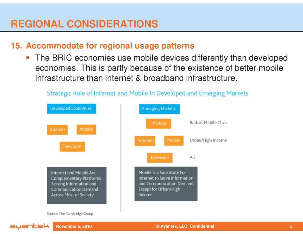
15. Accommodate for regional usage patterns
� The BRIC economies use mobile devices differently than developed
economies. This is partly because of the existence of better mobile
infrastructure than internet & broadband infrastructure.
© Ayantek, LLC ConfidentialNovember 5, 2010 5
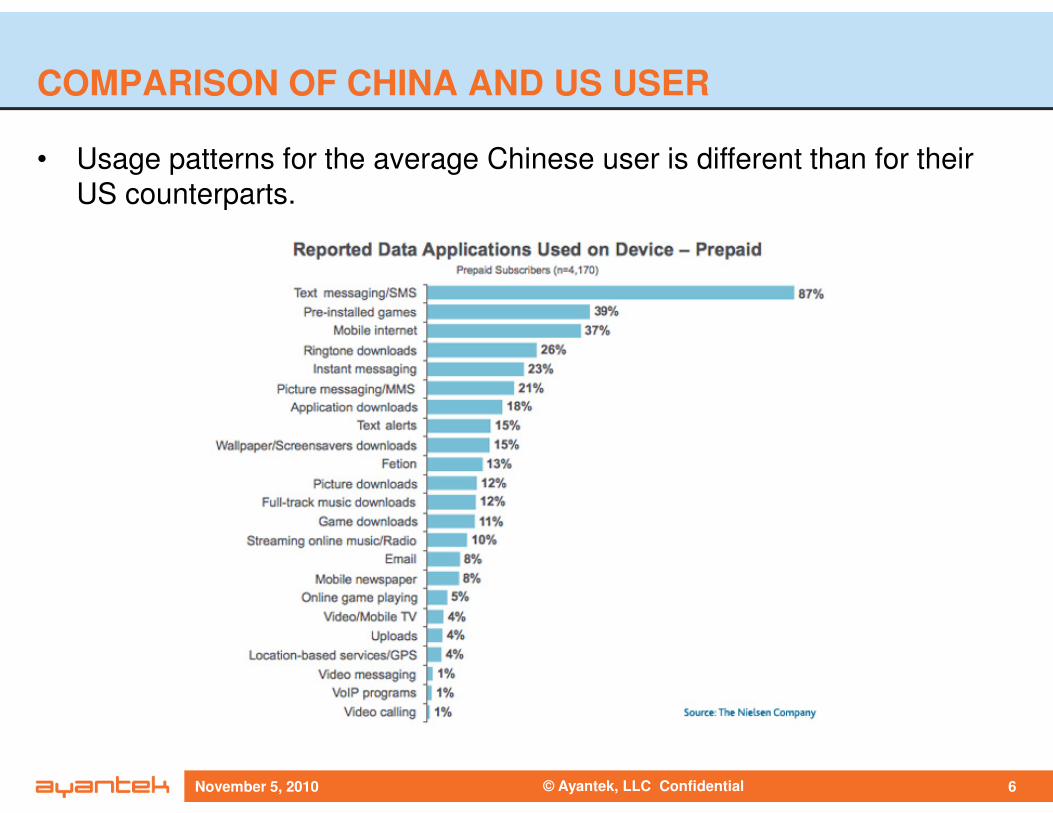
COMPARISON OF CHINA AND US USER
• Usage patterns for the average Chinese user is different than for their
US counterparts.
© Ayantek, LLC ConfidentialNovember 5, 2010 6
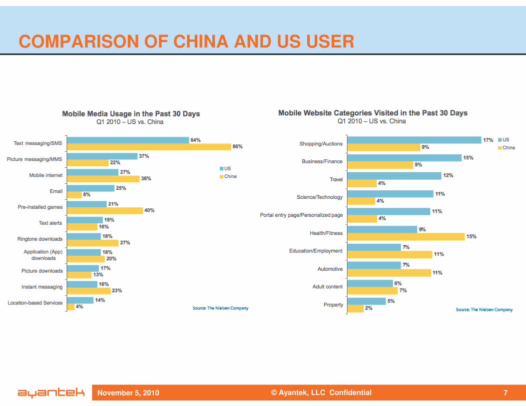
COMPARISON OF CHINA AND US USER
© Ayantek, LLC ConfidentialNovember 5, 2010 7
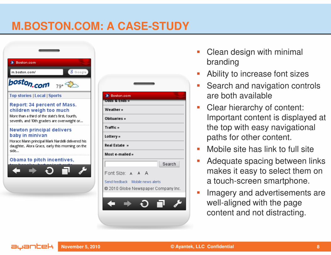
M.BOSTON.COM: A CASE-STUDY
� Clean design with minimal
branding
� Ability to increase font sizes
� Search and navigation controls
are both available
� Clear hierarchy of content:
Important content is displayed at
the top with easy navigational
© Ayantek, LLC ConfidentialNovember 5, 2010 8
the top with easy navigational
paths for other content.
� Mobile site has link to full site
� Adequate spacing between links
makes it easy to select them on
a touch-screen smartphone.
� Imagery and advertisements are
well-aligned with the page
content and not distracting.

November 5, 2010
THANK YOU!
www.ayantek.comDigital Solutions for Market Leadership
54 Middlesex Turnpike, Suite C-3255
Bedford MA 01730