Embed Size (px)
Citation preview
Mobile First Design with HTML5 and CSS3
Jason Gonzales
Chapter No. 4 "Building the Contact Form"
In this package, you will find: A Biography of the author of the book
A preview chapter from the book, Chapter NO.4 "Building the Contact Form"
A synopsis of the book’s content
Information on where to buy this book
About the Author Jason Gonzales has worked as a musician and an English teacher, but front-end engineering is his passion. He is a self-taught engineer, but is an obsessive learner and researcher. He's been working on front ends for over seven years, but also does full-stack work and lots of fretting over making sites that have awesome user experiences. This keeps him learning pretty much on a daily basis, which is how he likes it.
I'd like to thank my wife, kids, and friends for putting up with me while working on this book. I'd also like to thank Bear Republic Racer 5, coffee, and vim.
For More Information: www.packtpub.com/mobile-first-design-with-html5-and-css3/book
Mobile First Design with HTML5 and CSS3 Building websites that display well on everything from web-enabled smartphones, to tablets, to laptops and desktops, is a daunting challenge. The myriad permutations of screen sizes and browser types might be a reason enough to not even try. But if your business counts on getting web content to people on these devices and you need your business to look tech-savvy, you must put your best foot forward. In this book, you will see that with the help of some easy-to-understand principles and an open source framework you can build a mobile first responsive website fast.
What This Book Covers Chapter 1, Mobile First – How and Why? gives a quick introduction to mobile first strategy.
Chapter 2, Building the Home Page, dives right in and builds the face of your site and the foundation for the rest of the site.
Chapter 3, Building the Gallery Page, builds a responsive page to show off your work.
Chapter 4, Building the Contact Form, lets prospective clients contact you from a device of any screen size.
Chapter 5, Building the About Me Page, makes an attractive, responsive page to help people get to know you.
Appendix A, Anatomy of HTML5 Boilerplate, gives an overview of HTML5 Boilerplate, including meta tags and scripts.
Appendix B, Using CSS Preprocessors, helps you learn the basics of CSS Preprocessors and how to use them.
For More Information: www.packtpub.com/mobile-first-design-with-html5-and-css3/book
Building the Contact FormIn Chapter 3, Building the Gallery Page, we built pages to show off our work. Hopefully, the quality of the work you show off on these pages is so compelling that site visitors will want to contact you to hire you for your amazing work.
Let's make the ability to do that easy and attractive!
Making a form planI know forms aren't exactly exciting, but we must get user info somehow, so we might as well make them look nice and not stodgy and cold. A clean and friendly form will be easy and minimal, gathering only the info we need. We also need to make the process of fi lling out a form as clear and free of frustration as possible. The 320 and Up framework is built to facilitate quite a bit of this, but we will still need to do the requisite planning to make sure it is just so.
Luckily, this isn't going to be too tough for our rather simple needs. Let's think about the bare minimum we need to collect in order to follow up with a potential client. Here are the things we need:
• The prospect's name• The company• The e-mail address• The phone number• A message
A few important things to keep in mind are to make sure that the labels for all fi elds let users know what to put in which fi eld. I think that the most compelling argument for a usable form goes like this:
For More Information: www.packtpub.com/mobile-first-design-with-html5-and-css3/book
Building the Contact Form
[ 70 ]
People read from left-to-right and top-to-bottom. Therefore, the label should appear above the input that it is describing, as the user will read the label fi rst and then see the input. This of course is an assumption that our users understand the visual cues that defi ne an input in a form. If we have users that don't know what form fi elds are, we are probably out of luck. That said, it's probably worth thinking about the fact that our user interfaces heavily rely on people understanding conventions!
There are other conventions we can use for our purpose on this form. A common one is the use of placeholders to show users examples of the kind of content that is expected in each input. Again, this convention is well-known to anyone who has been using the Internet for any signifi cant amount of time. Hopefully, it could be a useful cue to someone less familiar with these conventions too.
Handling mandatory fi eldsThe last things we need to let users know are the required fi elds that we want them to enter input into. There are two schools of thought on this; I will introduce both, mostly because I see the merit in both and it really depends on what you are doing.
One convention is to place the required * next to all the fi elds that are required. This convention again works for most visitors but the problem with this approach is that it might prevent gathering some information if we essentially annotate a few fi elds that we have as being optional. This argument basically claims that if we don't require a message and don't mark it as required, there is an increased likelihood of users skipping over this. Our form should absolutely require the user to submit a name and an e-mail; otherwise, we cannot respond at all. It's customary to not require a phone number or a message. Leaving the Phone fi eld as optional is a courtesy in most cases for those who prefer not to be contacted via the phone. Leaving the Message fi eld as optional is a courtesy to users. We don't want to make it mandatory as we can always respond once we have a name and e-mail, although our response will have to be really generic. It is helpful for our prospective clients to get a context for our next conversation. It saves everyone the time and energy.
With that in mind, I want to introduce the argument against following the convention of marking fi elds as required. Here is how the argument goes:
If we, as creators of the site, put on the form only the input fi elds that we absolutely need to follow up, then the form should be simple enough to not discourage a user. In our case, we have fi ve fi elds, which is quite parsimonious. Then, by not marking any fi elds as required, we suggest that we want all the information we are asking for, but we don't actually require it. We can use form validation to then make sure we get the bare minimum, which in our case will be the name and e-mail.
For More Information: www.packtpub.com/mobile-first-design-with-html5-and-css3/book
Chapter 4
[ 71 ]
Ultimately, these decisions take a lot of other things into account. Since our portfolio site is most likely to be for digital media work, our audience should be familiar with web conventions, and we can use that to everyone's advantage and present them with a clean, simple form. On other projects, you will certainly have to cater to different audiences or gather more data. Hopefully, walking you through my planning on this form will be of some help in the future decisions you make.
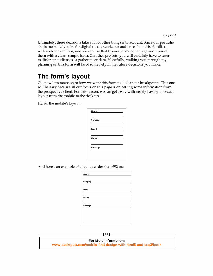
The form's layoutOk, now let's move on to how we want this form to look at our breakpoints. This one will be easy because all our focus on this page is on getting some information from the prospective client. For this reason, we can get away with nearly having the exact layout from the mobile to the desktop.
Here's the mobile's layout:
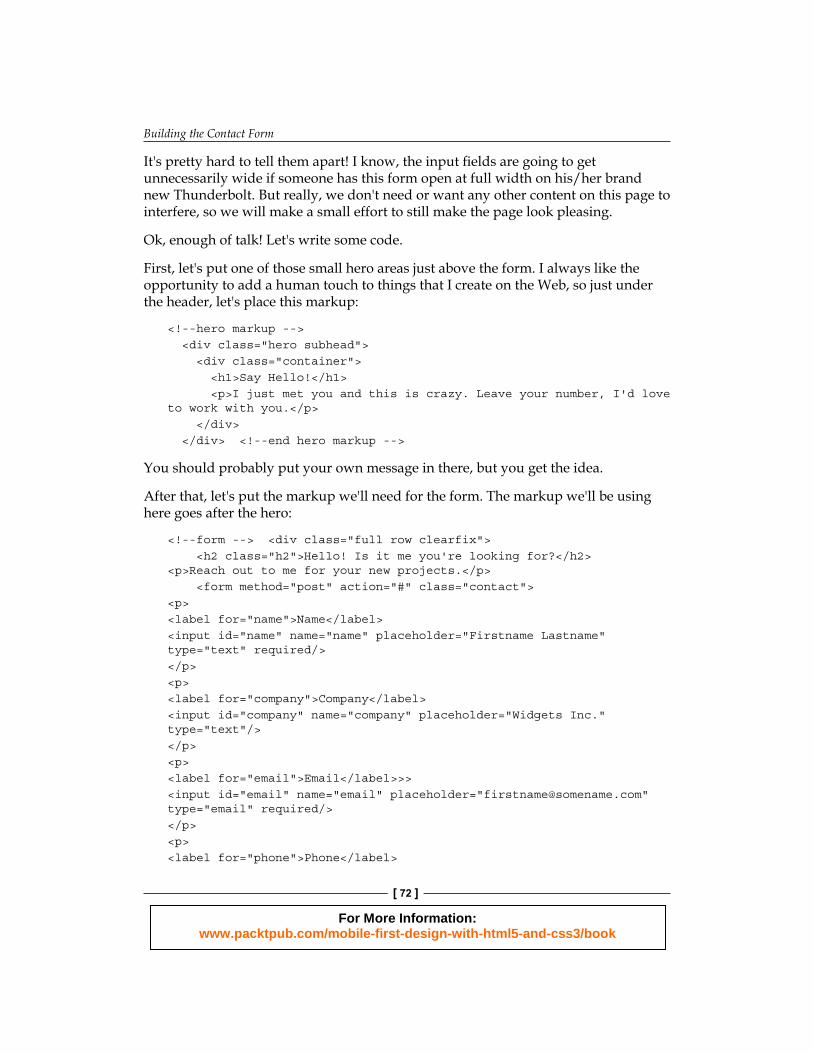
And here's an example of a layout wider than 992 px:
For More Information: www.packtpub.com/mobile-first-design-with-html5-and-css3/book
Building the Contact Form
[ 72 ]
It's pretty hard to tell them apart! I know, the input fi elds are going to get unnecessarily wide if someone has this form open at full width on his/her brand new Thunderbolt. But really, we don't need or want any other content on this page to interfere, so we will make a small effort to still make the page look pleasing.
Ok, enough of talk! Let's write some code.
First, let's put one of those small hero areas just above the form. I always like the opportunity to add a human touch to things that I create on the Web, so just under the header, let's place this markup:
<!--hero markup --> <div class="hero subhead"> <div class="container"> <h1>Say Hello!</h1> <p>I just met you and this is crazy. Leave your number, I'd love to work with you.</p> </div> </div> <!--end hero markup -->
You should probably put your own message in there, but you get the idea.
After that, let's put the markup we'll need for the form. The markup we'll be using here goes after the hero:
<!--form --> <div class="full row clearfix"> <h2 class="h2">Hello! Is it me you're looking for?</h2> <p>Reach out to me for your new projects.</p> <form method="post" action="#" class="contact"> <p><label for="name">Name</label><input id="name" name="name" placeholder="Firstname Lastname" type="text" required/></p><p><label for="company">Company</label><input id="company" name="company" placeholder="Widgets Inc." type="text"/></p> <p><label for="email">Email</label>>> <input id="email" name="email" placeholder="[email protected]" type="email" required/></p><p> <label for="phone">Phone</label>
For More Information: www.packtpub.com/mobile-first-design-with-html5-and-css3/book
Chapter 4
[ 73 ]
<input id="phone" name="phone" placeholder="123-456-7890" type="tel"/> </p> <p> <label for="message">Message</label> <textarea id="message" name="message"></textarea> </p> <p> <input type="submit" class="btn btn-primary btn-extlarge" value="Send It!" /> </p> </form> </div> <!--end form -->
This markup is mostly straightforward, but I have used markup that is slightly opinionated and is good practices. First, you will notice that I have not supplied a value for the action parameter for the form that is used to post form data to a server. I will leave that to you, as we will not be making a backend to handle this data (alternatively, you can use one of the many nifty services out there that will handle contact and e-mail forms for y ou).
Moving down the code, you will notice that I have wrapped every label and input pairing in <p> </p> tags. This isn't uncommon but it is an opinionated way to handle the laying out of the form. I prefer not to style inputs and form controls if I can avoid it. For sites that grow, these can lead to a lot of work that isn't reusable. You can eliminate or reduce this by relying on styling some elements that wrap the form controls. As always, keep these elements semantically appropriate. I would argue that a label and an input form something of a paragraph, as they share the same subject and are a break in the subject of the content that follows.
Input label magicAlso, especially for mobiles, always take advantage of the for attribute in the label that works only if you set the value of that parameter to mirror the value of the ID of the input you want to associate with it. In other words, if your label is the E-mail input, give that input an ID of email (id=email) and set the label to email as well (name=email). This practice is not just semantic, otherwise, I probably wouldn't bother. Once you have paired an input and a label in this way, some magic happens. The label now gets magical powers—when a user clicks or touches the label, the input it is paired with will get focus. This standard has been around long before the practice of browsing the web with touch interfaces was common, but what an awesome feature for touch! Now, users with fat fi ngers, shaky hands, or imprecise movements will be more likely to hit their mark. If you never knew this, test it out. If you knew about it already, I hope you skipped this paragraph; time is precious.
For More Information: www.packtpub.com/mobile-first-design-with-html5-and-css3/book
Building the Contact Form
[ 74 ]
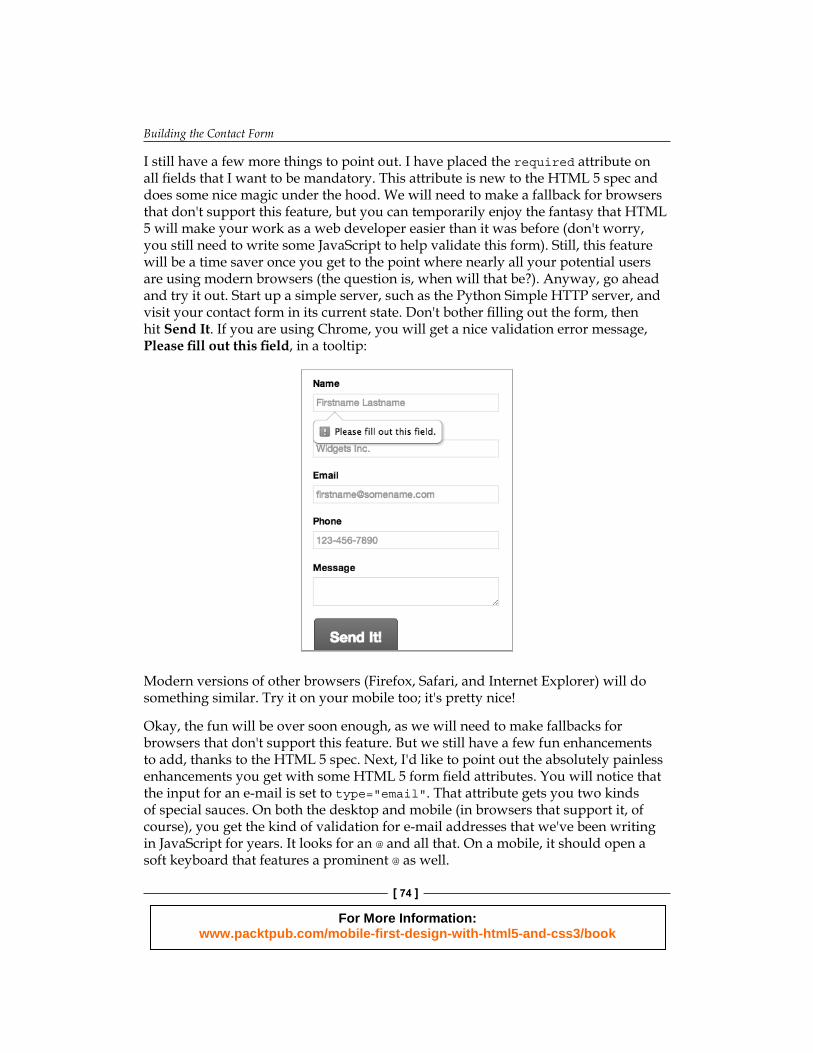
I still have a few more things to point out. I have placed the required attribute on all fi elds that I want to be mandatory. This attribute is new to the HTML 5 spec and does some nice magic under the hood. We will need to make a fallback for browsers that don't support this feature, but you can temporarily enjoy the fantasy that HTML 5 will make your work as a web developer easier than it was before (don't worry, you still need to write some JavaScript to help validate this form). Still, this feature will be a time saver once you get to the point where nearly all your potential users are using modern browsers (the question is, when will that be?). Anyway, go ahead and try it out. Start up a simple server, such as the Python Simple HTTP server, and visit your contact form in its current state. Don't bother fi lling out the form, then hit Send It. If you are using Chrome, you will get a nice validation error message, Please fi ll out this fi eld, in a tooltip:
Modern versions of other browsers (Firefox, Safari, and Internet Explorer) will do something similar. Try it on your mobile too; it's pretty nice!
Okay, the fun will be over soon enough, as we will need to make fallbacks for browsers that don't support this feature. But we still have a few fun enhancements to add, thanks to the HTML 5 spec. Next, I'd like to point out the absolutely painless enhancements you get with some HTML 5 form fi eld attributes. You will notice that the input for an e-mail is set to type="email". That attribute gets you two kinds of special sauces. On both the desktop and mobile (in browsers that support it, of course), you get the kind of validation for e-mail addresses that we've been writing in JavaScript for years. It looks for an @ and all that. On a mobile, it should open a soft keyboard that features a prominent @ as well.
For More Information: www.packtpub.com/mobile-first-design-with-html5-and-css3/book
Chapter 4
[ 75 ]
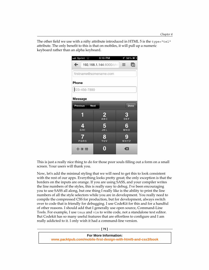
The other fi eld we use with a nifty attribute introduced in HTML 5 is the type="tel" attribute . The only benefi t to this is that on mobiles, it will pull up a numeric keyboard rather than an alpha keyboard.
This is just a really nice thing to do for those poor souls fi lling out a form on a small screen. Your users will thank you.
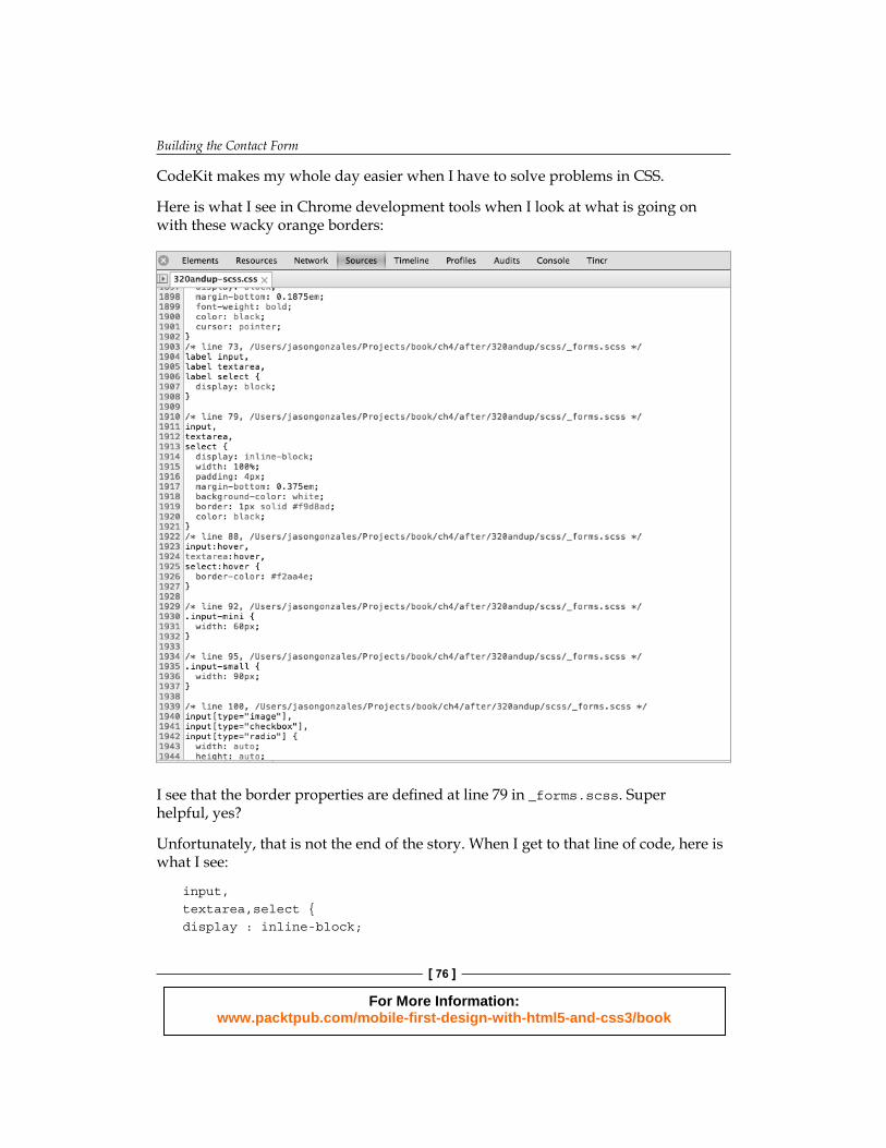
Now, let's add the minimal styling that we will need to get this to look consistent with the rest of our apps. Everything looks pretty great; the only exception is that the borders on the inputs are orange. If you are using SASS, and your compiler writes the line numbers of the styles, this is really easy to debug. I've been encouraging you to use SASS all along, but one thing I really like is the ability to print the line numbers of all the style selectors while you are in development. You really need to compile the compressed CSS for production, but for development, always switch over to code that is friendly for debugging. I use CodeKit for this and for a handful of other reasons. I should add that I generally use open source, Command-Line Tools. For example, I use tmux and vim to write code, not a standalone text editor. But Codekit has so many useful features that are effortless to confi gure and I am really addicted to it. I only wish it had a command-line version.
For More Information: www.packtpub.com/mobile-first-design-with-html5-and-css3/book
Building the Contact Form
[ 76 ]
CodeKit makes my whole day easier when I have to solve problems in CSS.
Here is what I see in Chrome development tools when I look at what is going on with these wacky orange borders:
I see that the border properties are defi ned at line 79 in _forms.scss. Super helpful, yes?
Unfortunately, that is not the end of the story. When I get to that line of code, here is what I see:
input,textarea,select {display : inline-block;
For More Information: www.packtpub.com/mobile-first-design-with-html5-and-css3/book
Chapter 4
[ 77 ]
width : 100%;padding : 4px;margin-bottom : $baselineheight / 4;background-color : $inputbackground;border : $inputborderwidth $inputborderstyle $inputborder;color : $textcolor;
&:hover {border-color : $inputhover; }}
Right off I notice two things. The border color is defi ned with the variable $inputborder and the hover color for that border is defi ned with $inputhover. In my opinion, these are poorly named variables as they are not semantically accurate, but to be fair, I've done worse in the past. At any rate, if I could pick an improvement here, it would be to name these variables something in order to point out the fact that they are actually variables for color—something such as $inputbordercolor and $inputborderhovercolor. Sure, those are long names, but they are precise.
Okay, moving on. We need to go to the _variables.scss partial to see what is going on. Why are these borders orange, for goodness sake? Don't panic, help is on the way. Going into the _variables.scss fi le, I do a quick search for $inputborder and here is what I see:
$inputborder : lighten($basecolor, 40%);
Let's think about what is going on in the code. For many designs, using the base color for input borders can create a harmonious design. But, in my example, I have chosen a yellowish orange color, which makes for pretty low-contrast borders. To be honest, they look annoying to me; I can't imagine what they look like to someone who has visual challenges. But, furthermore, I would guess that 90 percent of the time, I want my input borders to be some shade of grey. Why? Well, with something as critical as creating a form, I want to make sure that the fi elds are well defi ned with a high-contrast color, and with a white background, the greatest contrast comes with black. If #000 black looks too stark, we can always choose a darker shade of gray that is near to black. At this point, I think it's best for this design (and perhaps others in the future) to go ahead and redefi ne this variable as some shade of gray.
Let's try this:
$inputborder : $lightgrey;
For More Information: www.packtpub.com/mobile-first-design-with-html5-and-css3/book
Building the Contact Form
[ 78 ]
I actually experimented with all the greys defi ned in this variable fi le, and I prefer the lighter grey. It helps the rows look more organized. Another thing you may have noticed by now is that the border still changes to an orange color when you hover over the input. Let's make that a darker grey instead. Similar to what we followed previously, you will notice that the input:hover style is defi ned in the _forms.scss fi le. It looks like this:
&:hover { border-color : $inputhover; }
So now we go to the _variables.scss fi le to redefi ne $inputhover!
Let's make it like this:
$inputhover : $grey;
Looks good!
We just need a few more things to tune up the styles on this page. Let's make the inputs look nicer and more consistent in terms of how inputs are rendered in a mobile browser. You will notice in the previous screenshot on the form of an iPhone (or on your own mobile, if you are checking your work there) that the inputs automatically get rounded corners on the mobile. Let's set a style to do that in our forms page.
I want to change all inputs across the site, so I am going to go and edit the _forms.scss fi le.
Update this style:
input, textarea, select { display : inline-block; width : 100%; padding : 4px; margin-bottom : $baselineheight / 4; background-color : $inputbackground; border : $inputborderwidth $inputborderstyle $inputborder; color : $textcolor; @include rounded(6px); //this is the new bit
&:hover { border-color : $inputhover; }}
For More Information: www.packtpub.com/mobile-first-design-with-html5-and-css3/book
Chapter 4
[ 79 ]
While using rounded mixin, I like 6 px, but feel free to round it to your taste. One more thing that I'd like to change with these inputs is the padding. Having a big target is nice, but they could also do with a little breathing room between the words and the border of the input. Just below that rounded mixin, let's add some padding:
padding: 10px;
Looking much better!
The last styling task we have on this page is to contain the width of the form. Let's keep the form from getting any wider than 992 px and keep it centered.
We can do that without having to use any @ media queries actually. Let's go back to the site.scss fi le and add a style that will work the same if we want to reuse it:
.row { max-width: 992px; margin: 0 auto;}
This does exactly what I described previously. This is actually a great example of how to think about being responsive without necessarily relying on newer standards.
Okay, now the last thing we need to do is go hook up the validation that will work for browsers that don't yet support the HTML 5 required attribute.
JS validation fallbacksWell, we could write all our fallbacks. Knowing how to write fallbacks is super useful but that is beyond the scope of this book. Also, there is a really awesome way to make fallbacks that have been made already. It is called webshims and you can fi nd it here: http://afarkas.github.io/webshim/demos/index.html.
This library makes it super easy to take advantage of a lot of HTML 5 features without writing a ton of support for older browsers. In our case, we will have to do very little to support the HTML 5 validation in our form.
Download the lib from the site I listed previously. Once you do that, copy the js-webshim folder to your project. I've already done that in the after folder for this chapter.
Now, we need to do two more things and we will be good to go.
For More Information: www.packtpub.com/mobile-first-design-with-html5-and-css3/book
Building the Contact Form
[ 80 ]
Include the polyfiller script from the webshims lib at the bottom of the contact.html page:
<script src="js/js-webshim/minified/polyfiller.js"></script>
You must put this after jQuery but before the scripts you write.
Now in script.js, add this line to instantiate the polyfiller script:
$.webshims.polyfill();
I have put this inside the ready function to make sure that all the form elements are present in the Document Object Model (DOM) before it fi res.
Now, we're done polyfi lling our form validation and it should work in browsers that don't support HTML 5 validation. Enjoy!
SummarySo, in this chapter, we planned our way to a much simpler layout than any of our other pages, but for good reason. No one likes fi lling out forms much, but if we can keep the noise down on pages with forms, we can encourage users to give us the information to better facilitate communication. Or at the very least, we won't discourage people from fi lling out our form.
Probably, the biggest challenge here is the cross-browser support for client-side validation. Until it is known that the majority of users use modern browsers, we still need to shim and polyfi ll, but as we saw, well-written code makes that fairly easy too, unless our requirements are complex.
Next, let's move on to the About Me page.
For More Information: www.packtpub.com/mobile-first-design-with-html5-and-css3/book
Where to buy this book You can buy Mobile First Design with HTML5 and CSS3 from the Packt Publishing website: http://www.packtpub.com/mobile-first-design-with-html5-and-css3/book. Free shipping to the US, UK, Europe and selected Asian countries. For more information, please read our shipping policy.
Alternatively, you can buy the book from Amazon, BN.com, Computer Manuals and most internet book retailers.
www.PacktPub.com
For More Information: www.packtpub.com/mobile-first-design-with-html5-and-css3/book