Embed Size (px)
Citation preview

1
Minitab Directions – 01
Descriptive Statistics
1. Numerical Descriptive Statistics 1.1. Put data in columns:
Note: if your measurement is time, convert all times to seconds or minutes, or whatever is most appropriate. For instance, convert 1 minute 40 seconds to either 100 seconds or 1.67 minutes. Minitab does have a Date data type, but I do not recommend it.
1.2. Choose: Stats/Basic Statistics/Display Descriptive Statistics
2
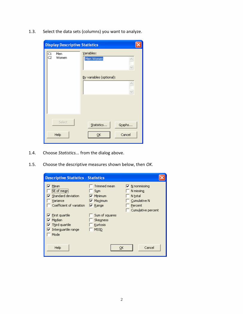
1.3. Select the data sets (columns) you want to analyze.
1.4. Choose Statistics... from the dialog above.
1.5. Choose the descriptive measures shown below, then OK.
3
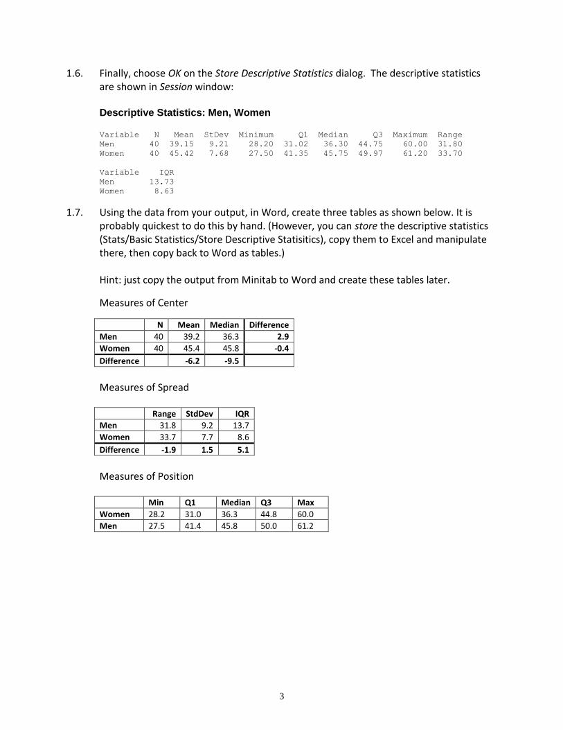
1.6. Finally, choose OK on the Store Descriptive Statistics dialog. The descriptive statistics are shown in Session window:
Descriptive Statistics: Men, Women Variable N Mean StDev Minimum Q1 Median Q3 Maximum Range
Men 40 39.15 9.21 28.20 31.02 36.30 44.75 60.00 31.80
Women 40 45.42 7.68 27.50 41.35 45.75 49.97 61.20 33.70
Variable IQR
Men 13.73
Women 8.63
1.7. Using the data from your output, in Word, create three tables as shown below. It is probably quickest to do this by hand. (However, you can store the descriptive statistics (Stats/Basic Statistics/Store Descriptive Statisitics), copy them to Excel and manipulate there, then copy back to Word as tables.) Hint: just copy the output from Minitab to Word and create these tables later.
Measures of Center
N Mean Median Difference
Men 40 39.2 36.3 2.9
Women 40 45.4 45.8 -0.4
Difference -6.2 -9.5
Measures of Spread Range StdDev IQR
Men 31.8 9.2 13.7
Women 33.7 7.7 8.6
Difference -1.9 1.5 5.1
Measures of Position Min Q1 Median Q3 Max
Women 28.2 31.0 36.3 44.8 60.0
Men 27.5 41.4 45.8 50.0 61.2
4
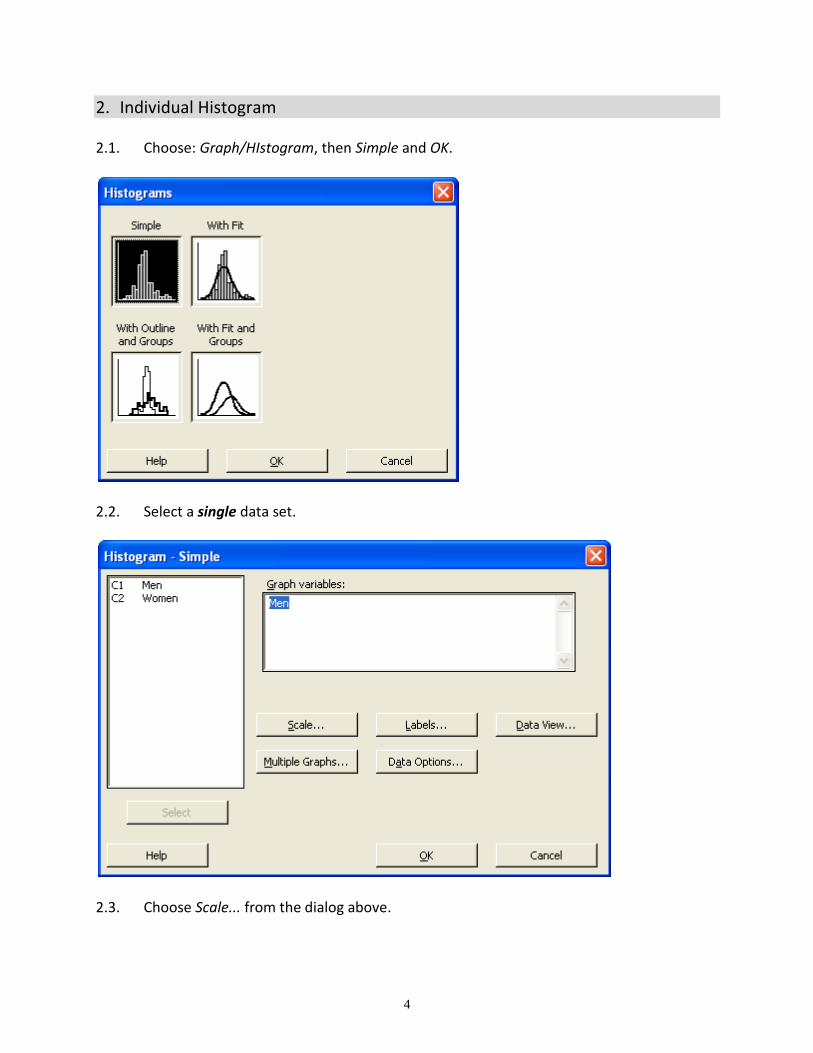
2. Individual Histogram 2.1. Choose: Graph/HIstogram, then Simple and OK.
2.2. Select a single data set.
2.3. Choose Scale... from the dialog above.
5
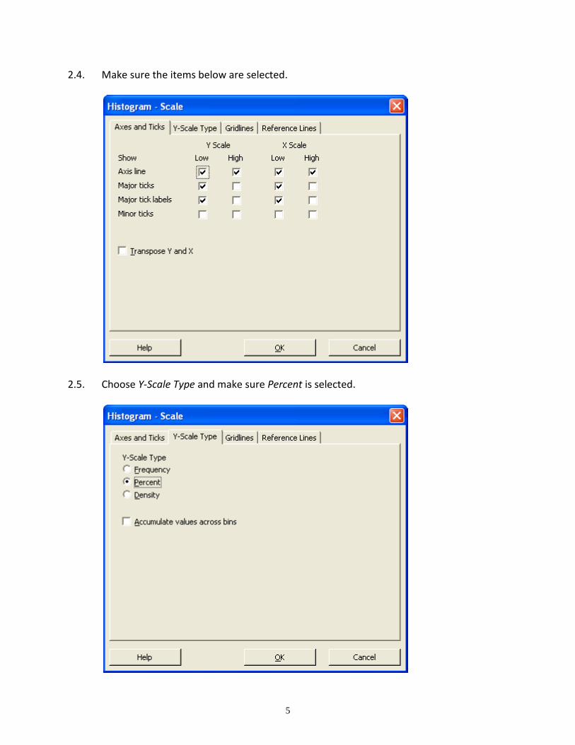
2.4. Make sure the items below are selected.
2.5. Choose Y-Scale Type and make sure Percent is selected.
6
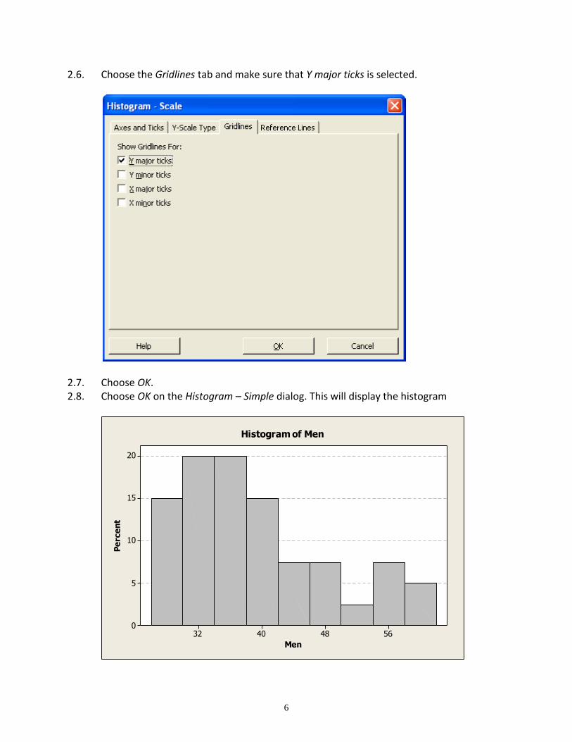
2.6. Choose the Gridlines tab and make sure that Y major ticks is selected.
2.7. Choose OK. 2.8. Choose OK on the Histogram – Simple dialog. This will display the histogram
56484032
20
15
10
5
0
Men
Pe
rce
nt
Histogram of Men
7
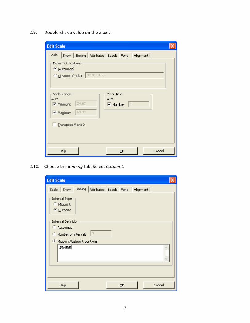
2.9. Double-click a value on the x-axis.
2.10. Choose the Binning tab. Select Cutpoint.
8
2.11. Also on the previous dialog, select Midpoint/Cutpoint positions. Type in:
beginning / ending : bar width
For instance, if you type in 10:20/2 you will get a histogram that starts at 10 and ends at 20, and each bar has width 2. Thus, there are 5 bars in that histogram. For this example, the minimum is 28.9 and the maximum is 60.0. Thus, one possible set of values is: 25:65/5 for a histogram with 8 bars. Remember the value you typed in. You will need it on the next step.
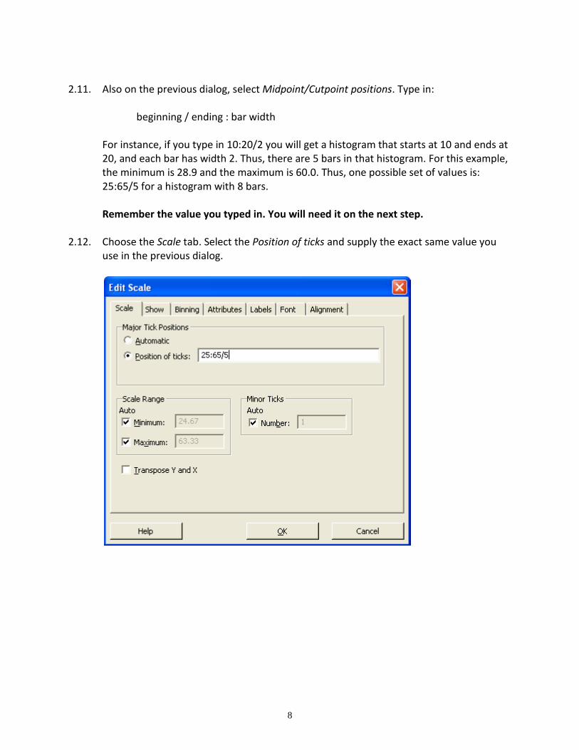
2.12. Choose the Scale tab. Select the Position of ticks and supply the exact same value you
use in the previous dialog.
9
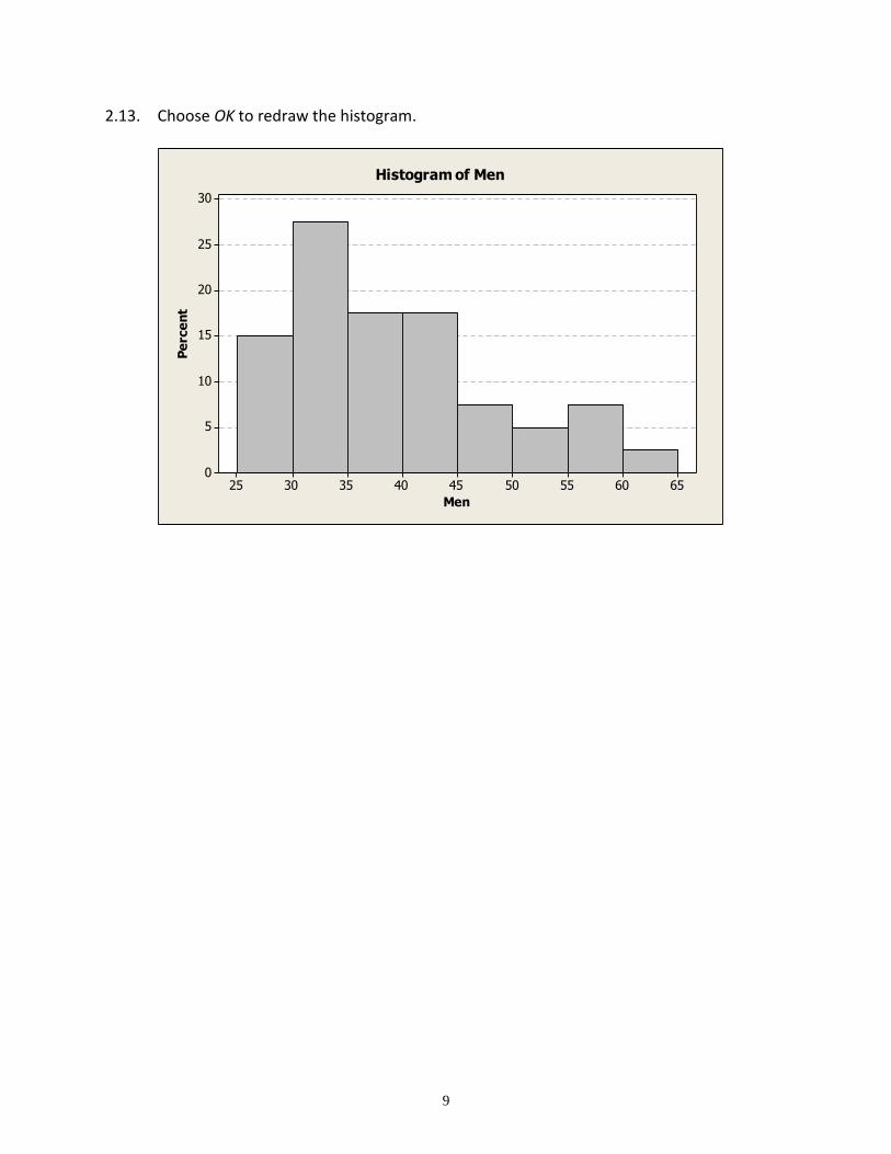
2.13. Choose OK to redraw the histogram.
656055504540353025
30
25
20
15
10
5
0
Men
Pe
rce
nt
Histogram of Men
10
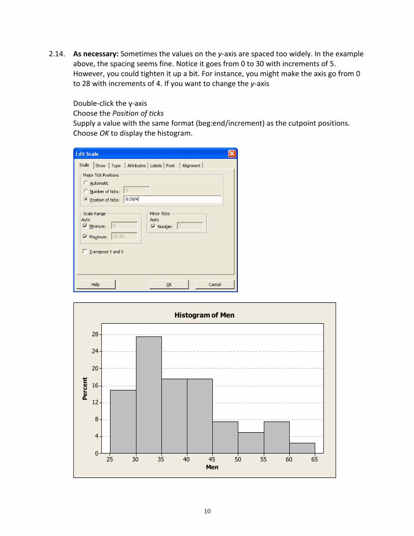
2.14. As necessary: Sometimes the values on the y-axis are spaced too widely. In the example above, the spacing seems fine. Notice it goes from 0 to 30 with increments of 5. However, you could tighten it up a bit. For instance, you might make the axis go from 0 to 28 with increments of 4. If you want to change the y-axis Double-click the y-axis Choose the Position of ticks Supply a value with the same format (beg:end/increment) as the cutpoint positions. Choose OK to display the histogram.
656055504540353025
28
24
20
16
12
8
4
0
Men
Pe
rce
nt
Histogram of Men
11
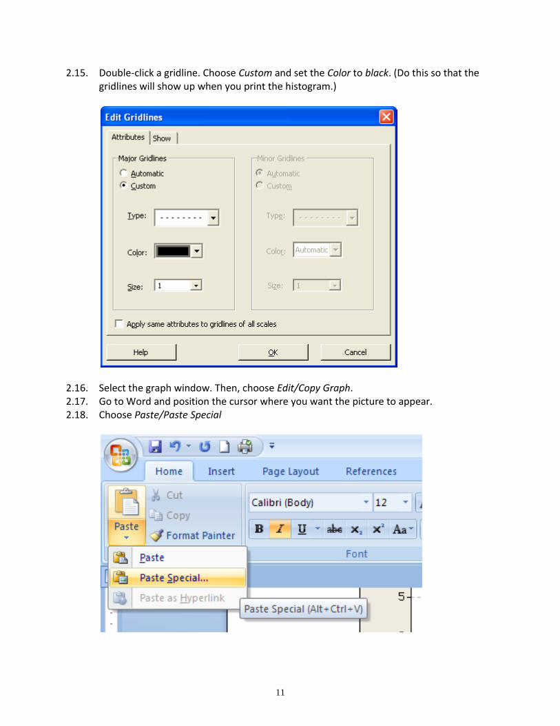
2.15. Double-click a gridline. Choose Custom and set the Color to black. (Do this so that the gridlines will show up when you print the histogram.)
2.16. Select the graph window. Then, choose Edit/Copy Graph. 2.17. Go to Word and position the cursor where you want the picture to appear. 2.18. Choose Paste/Paste Special
12
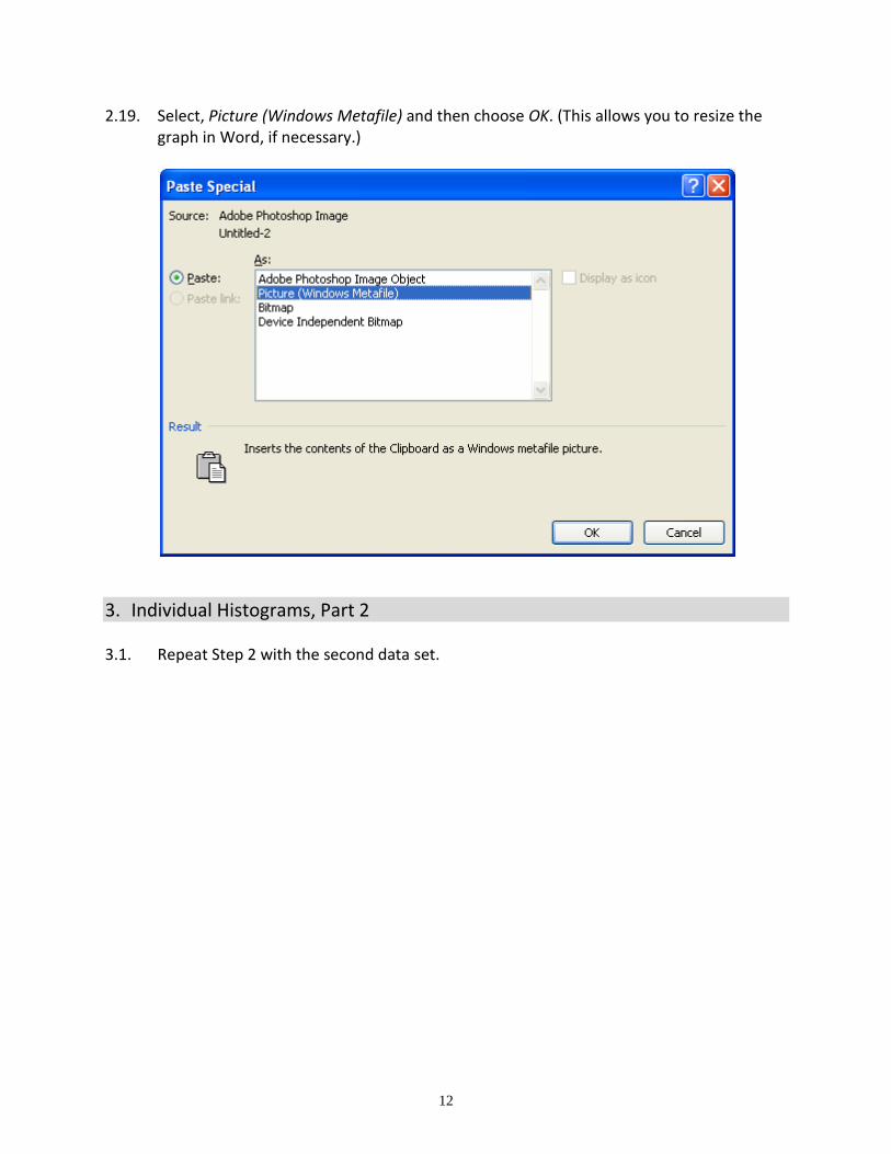
2.19. Select, Picture (Windows Metafile) and then choose OK. (This allows you to resize the graph in Word, if necessary.)
3. Individual Histograms, Part 2 3.1. Repeat Step 2 with the second data set.
13
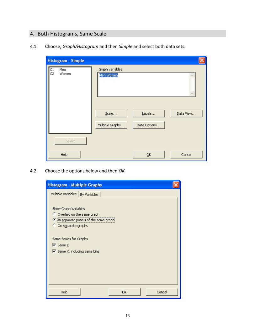
4. Both Histograms, Same Scale 4.1. Choose, Graph/Histogram and then Simple and select both data sets.
4.2. Choose the options below and then OK.
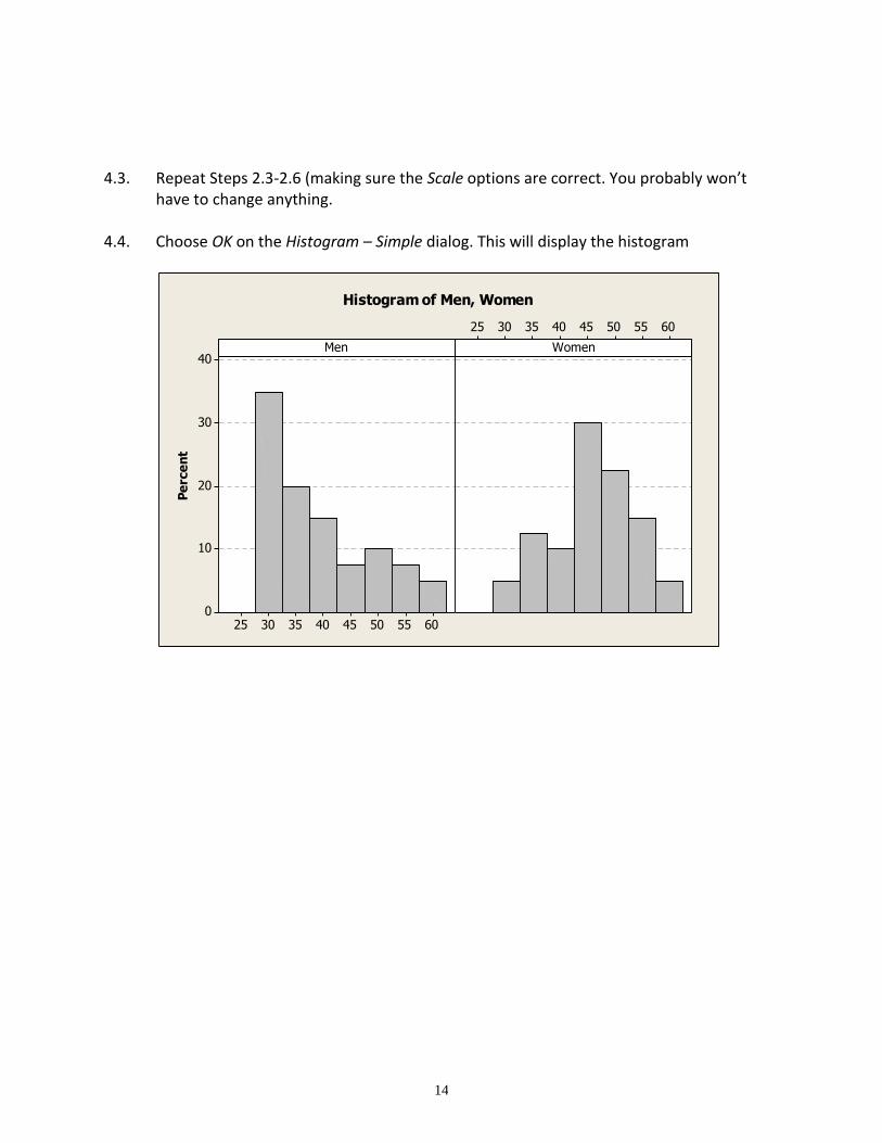
14
4.3. Repeat Steps 2.3-2.6 (making sure the Scale options are correct. You probably won’t have to change anything.
4.4. Choose OK on the Histogram – Simple dialog. This will display the histogram
6055504540353025
40
30
20
10
0
6055504540353025
Men
Pe
rce
nt
Women
Histogram of Men, Women
15
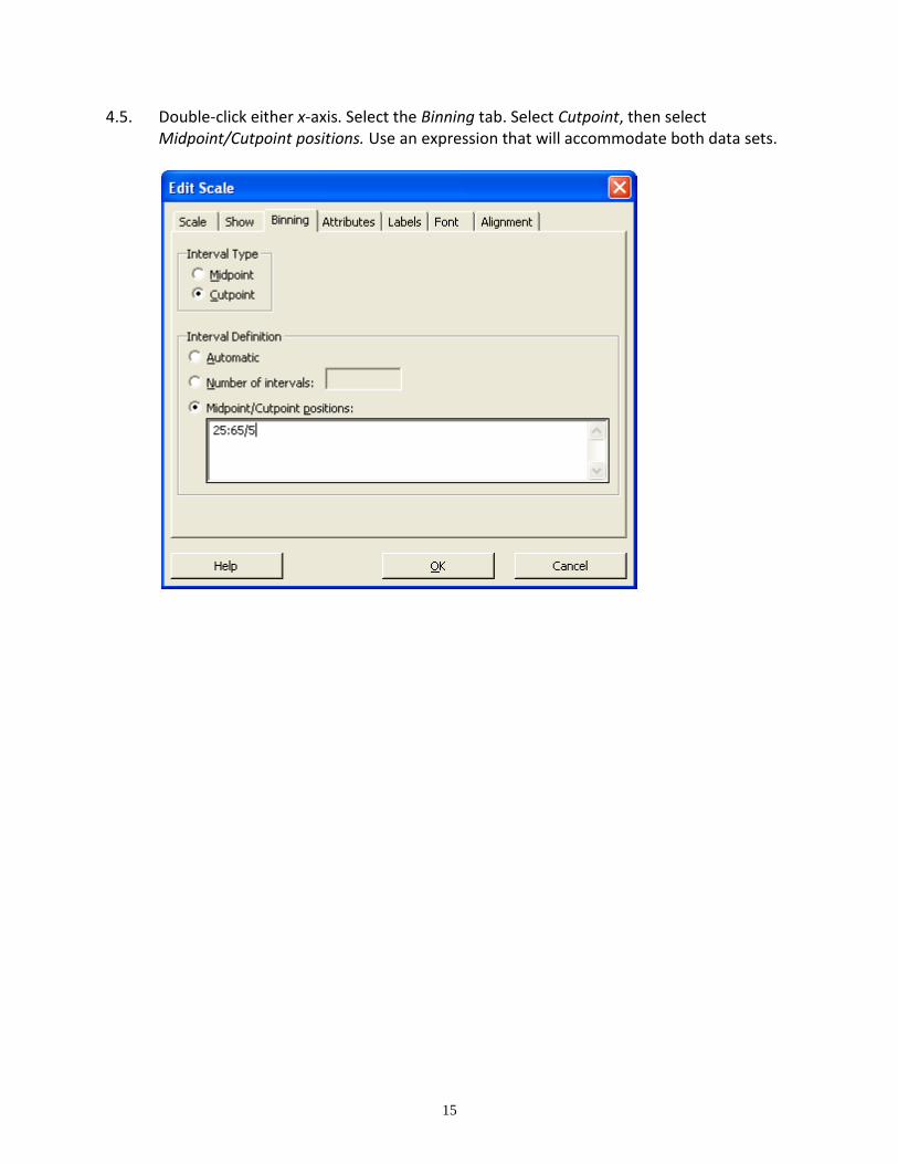
4.5. Double-click either x-axis. Select the Binning tab. Select Cutpoint, then select Midpoint/Cutpoint positions. Use an expression that will accommodate both data sets.
16
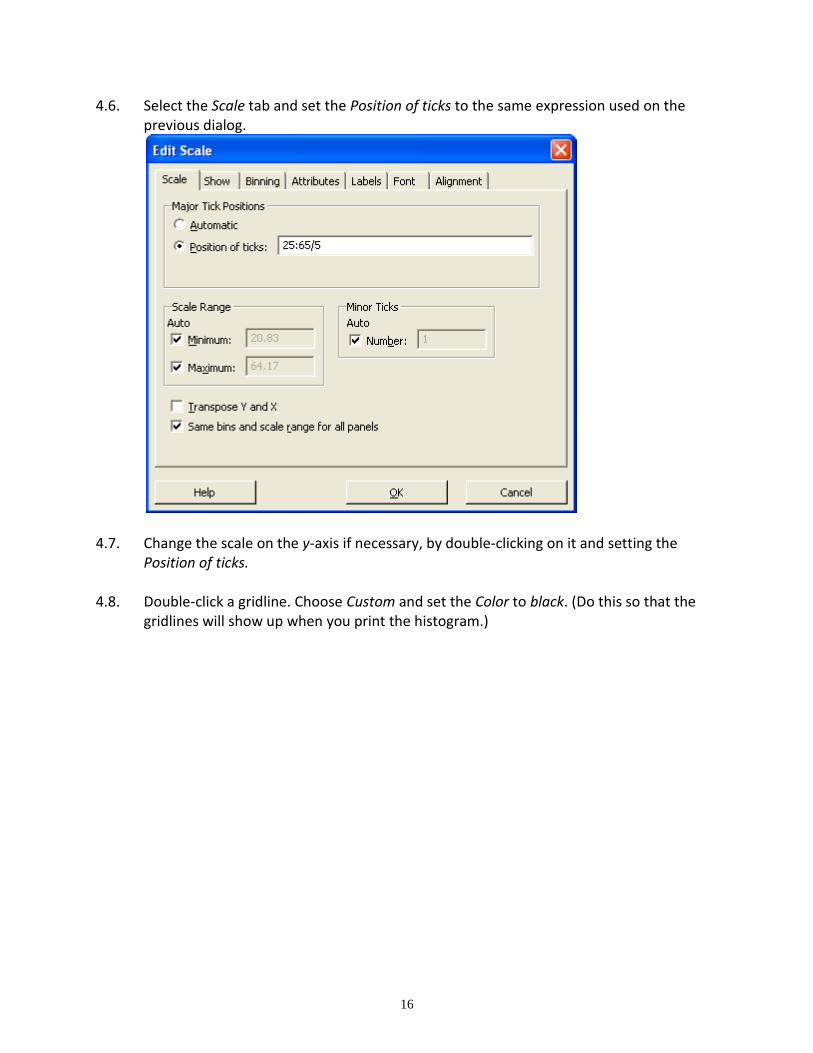
4.6. Select the Scale tab and set the Position of ticks to the same expression used on the previous dialog.
4.7. Change the scale on the y-axis if necessary, by double-clicking on it and setting the Position of ticks.
4.8. Double-click a gridline. Choose Custom and set the Color to black. (Do this so that the gridlines will show up when you print the histogram.)
17
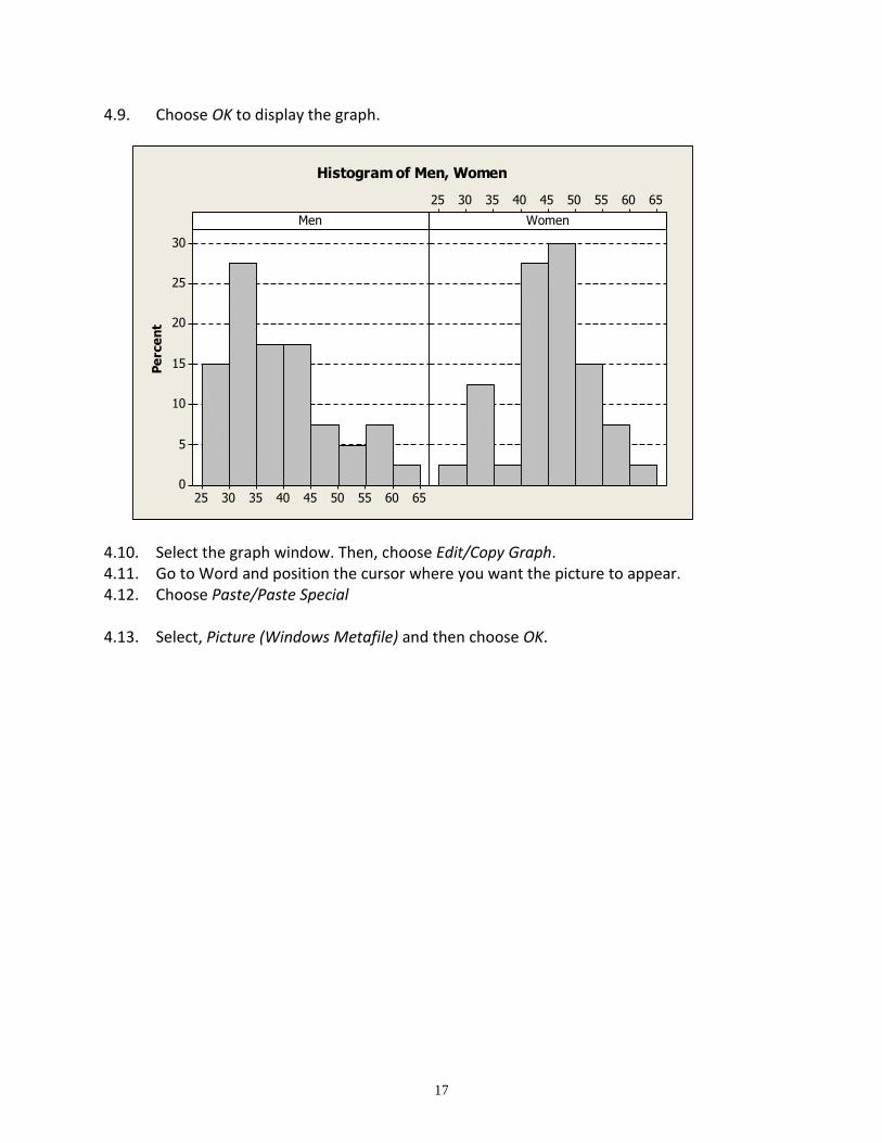
4.9. Choose OK to display the graph.
4.10. Select the graph window. Then, choose Edit/Copy Graph. 4.11. Go to Word and position the cursor where you want the picture to appear. 4.12. Choose Paste/Paste Special
4.13. Select, Picture (Windows Metafile) and then choose OK.
656055504540353025
30
25
20
15
10
5
0
656055504540353025
Men
Pe
rce
nt
Women
Histogram of Men, Women
18
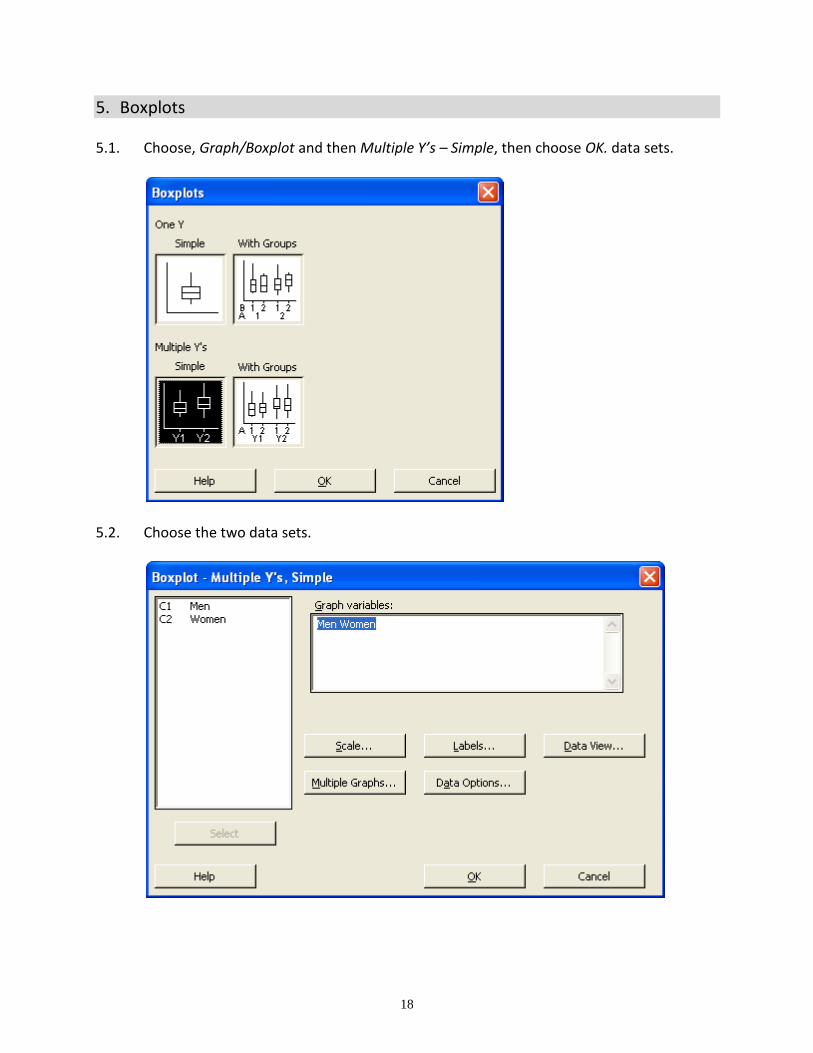
5. Boxplots 5.1. Choose, Graph/Boxplot and then Multiple Y’s – Simple, then choose OK. data sets.
5.2. Choose the two data sets.
19
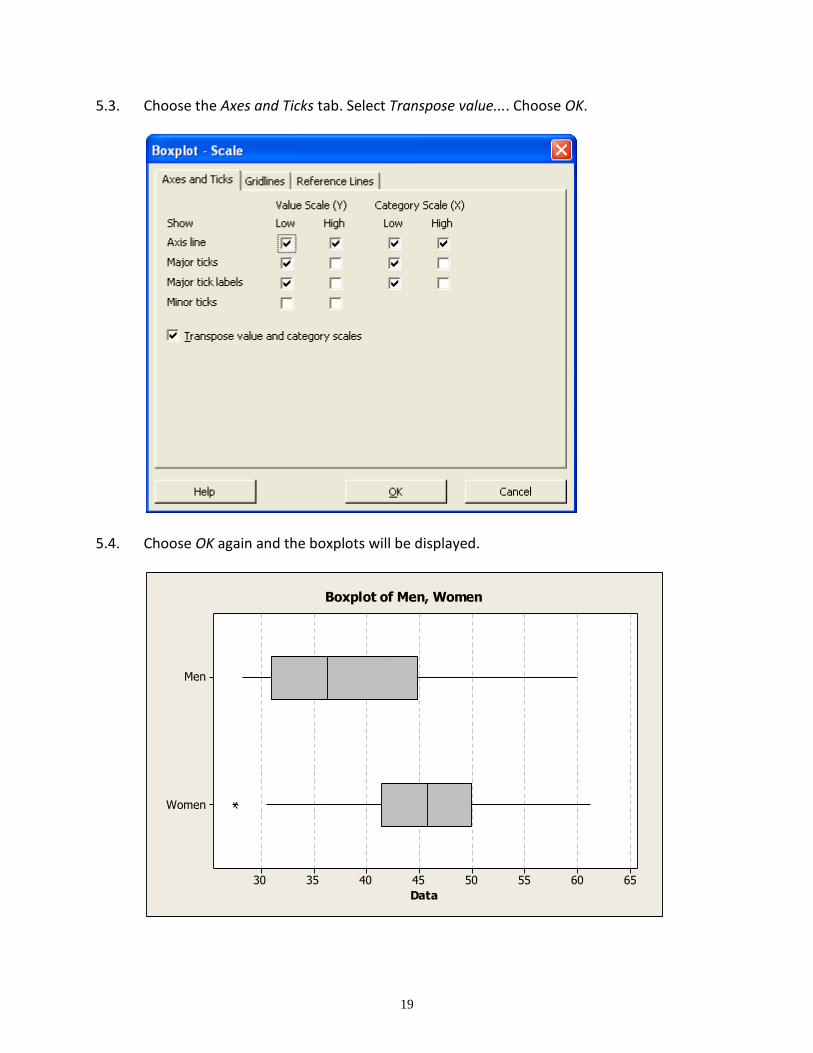
5.3. Choose the Axes and Ticks tab. Select Transpose value.... Choose OK.
5.4. Choose OK again and the boxplots will be displayed.
Women
Men
6560555045403530
Data
Boxplot of Men, Women
20
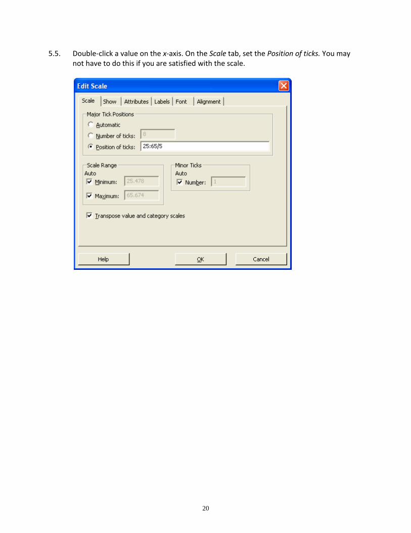
5.5. Double-click a value on the x-axis. On the Scale tab, set the Position of ticks. You may not have to do this if you are satisfied with the scale.

21
5.6. Choose OK to redisplay the boxplots. 5.7. Double-click a gridline. Choose Custom and set the Color to black. 5.8. Select the graph window. Then, choose Edit/Copy Graph. 5.9. Go to Word and position the cursor where you want the picture to appear. 5.10. Choose Paste/Paste Special. 5.11. Select, Picture (Windows Metafile) and then choose OK.
22
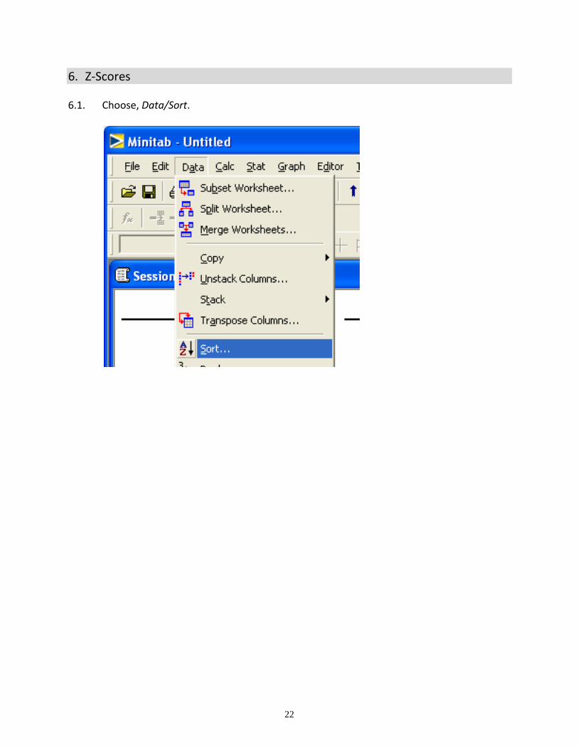
6. Z-Scores 6.1. Choose, Data/Sort.
23
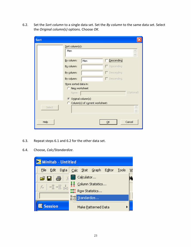
6.2. Set the Sort column to a single data set. Set the By column to the same data set. Select the Original column(s) options. Choose OK.
6.3. Repeat steps 6.1 and 6.2 for the other data set.
6.4. Choose, Calc/Standardize.
24
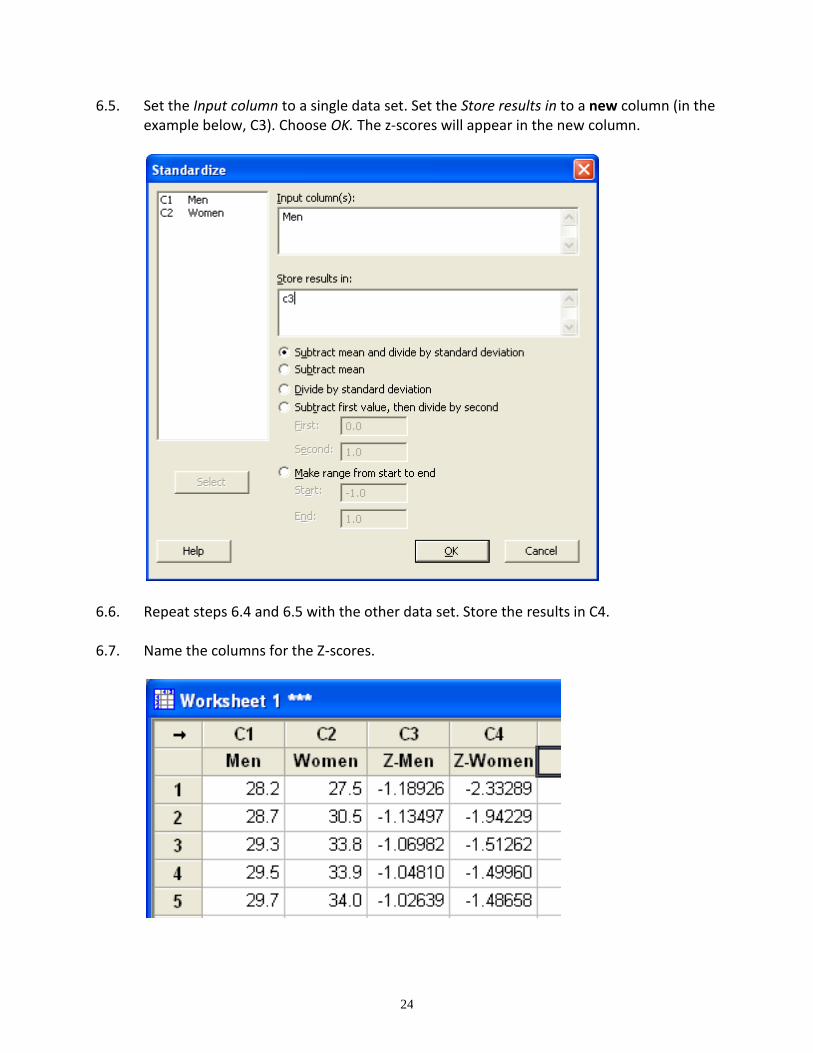
6.5. Set the Input column to a single data set. Set the Store results in to a new column (in the example below, C3). Choose OK. The z-scores will appear in the new column.
6.6. Repeat steps 6.4 and 6.5 with the other data set. Store the results in C4.
6.7. Name the columns for the Z-scores.
25
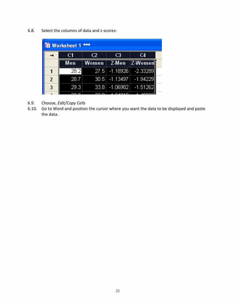
6.8. Select the columns of data and z-scores:
6.9. Choose, Edit/Copy Cells 6.10. Go to Word and position the cursor where you want the data to be displayed and paste
the data.
26
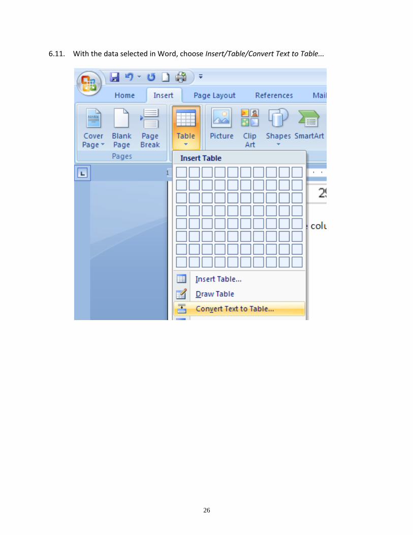
6.11. With the data selected in Word, choose Insert/Table/Convert Text to Table...
27
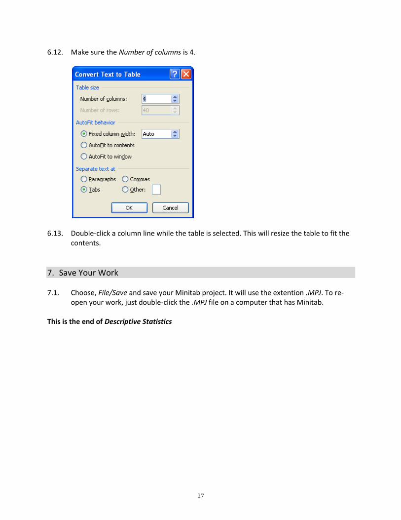
6.12. Make sure the Number of columns is 4.
6.13. Double-click a column line while the table is selected. This will resize the table to fit the contents.
7. Save Your Work 7.1. Choose, File/Save and save your Minitab project. It will use the extention .MPJ. To re-
open your work, just double-click the .MPJ file on a computer that has Minitab. This is the end of Descriptive Statistics