Embed Size (px)
Citation preview

Minitab 14 Technology Guide
for
Prepared by
Nancy Pfenning University of Pittsburgh
Melissa M. Sovak University of Pittsburgh
Australia • Brazil • Japan • Korea • Mexico • Singapore • Spain • United Kingdom • United States
Elementary Statistics: Looking at the Big Picture
1st EDITION
Nancy Pfenning University of Pittsburgh
© 2011 Brooks/Cole, Cengage Learning ALL RIGHTS RESERVED. No part of this work covered by the copyright herein may be reproduced, transmitted, stored, or used in any form or by any means graphic, electronic, or mechanical, including but not limited to photocopying, recording, scanning, digitizing, taping, Web distribution, information networks, or information storage and retrieval systems, except as permitted under Section 107 or 108 of the 1976 United States Copyright Act, without the prior written permission of the publisher except as may be permitted by the license terms below.
For product information and technology assistance, contact us at Cengage Learning Customer & Sales Support,
1-800-354-9706
For permission to use material from this text or product, submit all requests online at www.cengage.com/permissions
Further permissions questions can be emailed to [email protected]
ISBN-13: 978-0-495-83003-0 ISBN-10: 0-495-83003-8 Brooks/Cole 20 Channel Center Street Boston, MA 02210 USA Cengage Learning is a leading provider of customized learning solutions with office locations around the globe, including Singapore, the United Kingdom, Australia, Mexico, Brazil, and Japan. Locate your local office at: international.cengage.com/region Cengage Learning products are represented in Canada by Nelson Education, Ltd. For your course and learning solutions, visit academic.cengage.com Purchase any of our products at your local college store or at our preferred online store www.ichapters.com
Minitab 14 Technology Guide
for Elementary Statistics: Looking at the Big Picture
Preview
The first part of Elementary Statistics: Looking at the Big Picture, on Data Produc-tion, does not call for the use of statistical software. For this reason, our first part consists ofbasic tips, such as how to enter and manipulate data. Parts 2, 3, and 4 of this guide parallelParts II, III, and IV of the textbook, presenting examples and activities on Displaying andSummarizing, Probability, and Inference. Within Part 2 on Displaying and Summarizing,and Part 4 on Statistical Inference, methods are presented in sequence for each of the fivevariable situations: C, Q, C→Q, C→C, Q→Q.
PART 1: WARMING UP WITH MINITAB
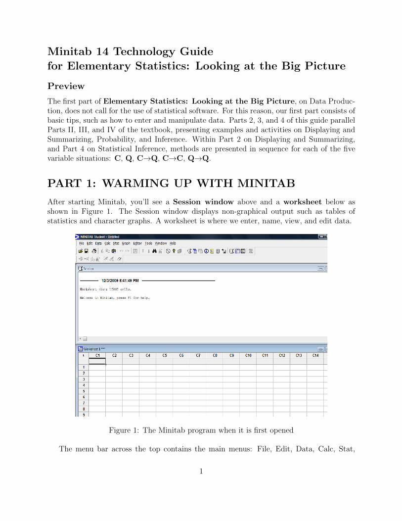
After starting Minitab, you’ll see a Session window above and a worksheet below asshown in Figure 1. The Session window displays non-graphical output such as tables ofstatistics and character graphs. A worksheet is where we enter, name, view, and edit data.
Figure 1: The Minitab program when it is first opened
The menu bar across the top contains the main menus: File, Edit, Data, Calc, Stat,
1
Graph, Editor, Tools, Window, and Help. At any point, the session or worksheet window(whichever is currently active) may be printed by selecting File and Print Session Windowor Print Worksheet. If multiple worksheets are in use, you may access other worksheetsfrom the Window menu, upper right.
Beneath each item in the menu bar is the Toolbar that provides paths to several importantactions. When an action has been selected, a dialogue box appears, for the purpose ofmaking choices such as which variables are to be considered, which particular style of graphis needed, or which values of parameters are known, such as a population standard deviation.To specify variables, you can double-click on the variable name instead of typing it in letterby letter. Minitab automatically supplies only the names of the variables for which theaction is appropriate: for example, if a histogram is requested, the dialogue box will list onlythe columns for quantitative (“numeric”) variables in the data set. Columns of categoricalvalues are designated by Minitab as “text” by appending a “-T” to the column number. Forexample, the column for Sex is identified as “C6-T”, whereas height is simply “C4”.
In the instructions that follow, text to be typed will be underlined and column nameswill be shown in italics. Menu options will be set in boldface type with the entries separatedby pointers. When there are options not explained in the examples of this guide, you willsee a link to the Options Explained section where these options will be briefly explained.
Entering and Manipulating Data
Each data set is stored in a column, designated by a “C” followed by a number. Forexample, C1 stands for Column 1. The column designations are displayed along the top ofthe worksheet. A column usually represents values of a particular variable.
The numbers at the left of the worksheet represent positions within a column and arereferred to as rows. Each rectangle occurring at the intersection of a column and a row iscalled a cell. It can hold one observation. Each row in a column usually represents a valueof the variable represented by that column.
The active cell has the worksheet cursor inside it and a dark rectangle around it. Toenter or change an observation in a cell, we first make the cell active and then type the value.
Directly below each column label in the worksheet is a cell optionally used for namingthe column. To name the column, we click on this cell and type the desired name. Becausecontext is so important in statistics, it is a good idea to always name the columns you areworking with.
CAUTION: Typing numeric data into the first cell under the heading C1 will name thecolumn rather than input data. Note that this data will then NOT be used in any operationsthat you perform involving this cell!
CAUTION: If you type the name of a column into the any cell other than the namerow, the column will automatically be converted into a text-valued column, thus disallowingany numeric analysis to be performed.
2
Examples for Warming Up with Minitab
Example 1.1: Suppose we want to store heights, in inches, of female class members [59,65, 60, 66, 62, 66, 66, 65, 68, 64, 63, 65, 59, 62, 61] into column C1 and name the column“FHts”. Just click in the name cell for this column, type FHts, and press the “Enter” key.Then type 59, Enter, 65, Enter, 60, Enter, and so on. Note that a height of “5 foot 5” wouldbe entered as 65, and “6 foot 4” would be 76.
To store male heights, name column C2 “MHts” and enter those data values [76, 68, 75,66, 67, 68, 71, 72, 70, 71, 71, 69, 72, 67, 69] in this column.
Example 1.2: To combine and sort female and male class members’ heights,
1. Choose Data>Stack>Columns
2. Specify FHts and MHts as columns to be stacked. Click the Column of currentworksheet button and type Hts in this box. (Click OK.)
3. Specify Hts in the sort columnn(s) text box, Hts in the By column box, andSortedHts in the Store sorted data in: box, either in New worksheet or Columnof current worksheet.
4. Click OK.
Example 1.3: Suppose a column for Age is created and the first of the age values [q9,19, 22, ...] is mis-typed as “q9” instead of “19”. The first step is to re-type the value correctly.Even after the correction, Minitab will consider the column to contain categorical values,and automatically designate it as “ C3 T”. To change the variable type from categorical toquantitative,
1. Choose Data>Change data type>Text to numeric.
2. Under Change text column: select Age and under Store numeric column in:again select Age.
3. Click OK.
Example 1.4: Suppose column C4 consists of students’ zip-codes, named Zips [15213,15213, 15260, ...] Minitab will still perform summaries appropriate to categorical data, suchas tallying counts, but you may want to change the data type to categorical, as a reminderthat the zip-codes are not to be treated as values of a quantitative variable.
1. Choose Data>Change data type>Numeric to text.
2. Under Change text column: select Zips and under Store numeric column in:again select Zips.
3. Click OK.
3
Lab Activities for Warming Up with Minitab
1.1. Create a column PG for the lengths, in minutes, of seven movies rated PG: 100, 99,106, 115, 90, 140, 90. Sort the column in ascending order.
1.2 Create a column R for the lengths, in minutes, of eight movies rated R: 134, 173, 113,108, 98, 118, 102, 123. Stack the columns of movie lengths, PG and R, into a columncalled Lengths and sort them in ascending order.
1.3 Create a column PG-13 for the lengths, in minutes, of three movies rated PG-13: q130,143, 102, where the typographical error “q130” is to be entered as is. Then re-type itcorrectly as 130 and change the data type from text to numeric.
4
PART 2: DISPLAYING AND SUMMARIZING DATA
The remaining examples work with existing data that can be found in two separate files. Onefile contains the data for the examples in the remainder of this part. The other file containsthe data for the examples in this guide. Both files can be found at www.cengage.com/statistics/pfenning.
Examples for Part 2: Displaying and Summarizing Data
Remember that variables can be entered in the dialogue box by double-clicking on theirnames instead of typing them out.
C Single Categorical Variable
Note: You can copy the graph into an editor of your choice by right-clicking andclicking copy, then pasting into your editor.
Recall: Pie charts and bar charts are appropriate for displaying single categoricalvariables.
Example 2.1: Use Minitab to produce a pie chart for the students’ color preferences,and to tally the counts and percentages preferring each color. (Pie Chart OptionsExplained)
1. Choose Graph>Pie Chart and enter Color as the Categorical variables
2. Click OK.
3. Close the graph window without saving by clicking on the red “X” box in theupper right-hand corner, and choose “No” when Minitab asks if you would liketo save the graph in a separate file.
Note: Colors on the pie chart do not necessarily correspond to the colors listedin the variable.
4. Choose Stat>Tables>Tally Individual Variables
5. Specify Color in the Variables box.
6. Check Counts for Display box.
7. Check Percents for Display box.
8. Click OK.
Q Single Quantitative Variable
Recall: Histograms, stemplots, and boxplots are appropriate display methods forsingle quantitative variables.
For a histogram (A), stemplot (B), and boxplot (C) of students’ numbers of siblings,
Example 2.2A: (Histogram Options Explained)
1. Choose Graph>Histogram...
5
2. Double-click on the Simple histogram (upper left)
3. Specify Sibs in the Graph variables text box
4. Click OK
5. After viewing the graph, close it without saving.
Example 2.2B: (Stem and Leaf Options Explained)
1. Choose Graph>Stem-and-Leaf...
2. Specify Sibs in the Graph variables text box
3. Click OK
Example 2.2C: (Boxplot Options Explained)
1. Choose Graph>Boxplot...
2. Double-click on the Simple boxplot, under One Y (upper left)
3. Specify Sibs in the Graph variables text box
4. Click OK
5. After viewing the graph, close it without saving.
Example 2.2D: This example produces sample size N , number of non-responses N∗,mean, SE Mean (relevant for inference purposes in Part 4), standard deviation, min-imum, Q1, median, Q3, and maximum of the sibling data. (Descriptive StatisticsOptioned Explained)
1. Choose Stat>Basic Statistics>Display Descriptive Statistics...
2. Specify Sibs in the Variables text box.
3. Click OK
C→Q Relationship between Categorical Explanatory and Quantitative ResponseVariables
Recall: Side-by-side boxplots are an appropriate display for a categorical explanatoryvariable and a quantitative response variable.
Example 2.3A: (Paired design) To display and summarize the single sample of dif-ferences, ages of dads minus ages of moms,
1. Choose Stat>Basic Statistics>Paired t...
2. Click in the First Sample text box and specify DadAge.
3. Click in the Second Sample text box and specify MomAge.
4. Click on Graphs and select Histogram of differences.
6
5. Click OK.
6. Click OK.
7. After viewing the graph, close it without saving.
Note: If you have data summarized, you can choose Summarized Data option andinput the summary statistics to complete the test.
Note that, besides the descriptive statistics of the individual ages and their differences,the session window for Example 2.3A includes additional information relevant to in-ference procedures, to be discussed in Part IV of the textbook, and Part 4 of thisguide.
Example 2.3B: (Two-sample design) To compare heights of students in the two gendergroups with summaries and a side-by-side boxplot, when all heights are entered in asingle column Ht, and genders (male or female) are entered in the column Sex,
1. Choose Stat>Basic Statistics>Display Descriptive Statistics...
2. Specify Ht in the Variables text box
3. Specify Sex in the By variables text box
4. Choose Graphs and check Boxplot of data
5. Click OK
6. Click OK
7. Close the graph window without saving by clicking on the red “X” box in theupper right-hand corner, and choose “No” when Minitab asks if you would liketo save the graph in a separate file.
Note that the output from the above example includes descriptive statistics separatelyfor female and male heights. Next we show ways to obtain boxplots only, withoutaccompanying summaries.
Example 2.3B(i) (continued): Another way to produce side-by-side boxplots ofmale and female heights, when all heights are entered in a single column Ht, andgenders (male or female) are entered in the column Sex, is to
1. Choose Graph>Boxplot
2. Double-click on the With groups, One Y (upper right)
3. Specify Ht in the Graph variables text box and Sex in the Categorical vari-ables for grouping text box.
4. Click OK
7
Example 2.3B(ii) (continued):
To produce side-by-side boxplots of male and female heights, when the data occur intwo separate columns [which must first be created],
1. Choose Data>Unstack columns
2. Specify Ht for Unstack the data in and Sex for Using subscripts in. Bydefault, the unstacked columns Ht female and Ht male will be stored In a newworksheet, but you can also request After last column in use.
3. Click OK
4. Choose Graph>Boxplot...
5. Double-click on the Simple boxplot under Multiple Y’s (lower left)
6. Specify Ht female and Ht male in the Graph variables text box.
7. Click OK
Example 2.3C: (Several-sample design) To compare earnings of students in Years1 to 3 only (if for some reason the 4th year students are to be omitted), assume allearnings are entered in a single column Earned, and Year contains values 1, 2, 3, and4.
1. Choose Data>Unstack columns
2. Specify Earned for Unstack the data in and Year for Using subscripts in.By default, the unstacked columns Earned 1 to Earned Other will be stored In anew worksheet, but you can also request After last column in use.
3. Click OK
4. Obtain desired descriptive statistics and displays for Earned 1 to Earned 3. [Box-plots would be Simple under Multiple Y’s as in Example 2.3B.]
C→C Relationship between two Categorical Variables
Recall: A contingency table is an appropriate display method for two categoricalvariables.
Example 2.4: To check for a relationship between major being decided or not, andliving situation (on or off campus),
1. Choose Stat>Tables>Cross Tabulation and Chi-Square
2. Although neither of the variables necessarily makes intuitive sense as the explana-tory variable, specify Dec? as the categorical variable for rows and Live forcolumns.
3. Check Counts and Row percents under Display. The row percents are condi-tional percentages for respective values of the explanatory variable.
8
4. Click OK.
5. Choose Graph>Bar Chart
6. Double-click on Cluster
7. Enter Dec? and Live as the Categorical variables (Dec? first because it is theexplanatory variable, graphed horizontally).
8. Click OK.
Q→Q Relationship between two Quantitative Variables
Recall: A scatterplot is an appropriate display for two quantitative variables.
Example 2.5: To examine the relationship between ages of students fathers and agesof their mothers, first produce a scatterplot (and verify its linearity), then find thecorrelation r and the regression equation., and produce a fitted line plot: (ScatterplotOptioned Explained)
1. Choose Graph>Scatterplot and double-click on Simple
2. Specify DadAge in the Y variables text box next to the 1
3. Specify MomAge in the X variables text box next to the 1
4. Click OK
5. After viewing the graph, close it without saving.
6. Choose Stat>Basic Statistics>Correlation...
7. Specify MomAge and DadAge in the Variables text box
8. Click OK.
9. Choose Stat>Regression>Regression...
10. Specify DadAge in the Response text box
11. Specify MomAge in the Predictors text box
12. Click OK.
Example 2.5 (continued): Another way to examine the relationship between ages ofstudents fathers and ages of their mothers is to produce a fitted line plot (automaticallyaccompanied by regression output):
1. Choose Stat>Regression>Fitted Line Plot
2. Specify DadAge in the Y variables text box next to the 1
3. Specify MomAge in the X variables text box next to the 1
4. Click OK.
9
Lab Activities for Part 2: Displaying and Summarizing Data
2.1. This activity considers method of transportation (bike, bus, car, or walking) for thesurveyed students who lived off campus.
(a) What variable or variables are involved? For each variable, tell whether its typeis quantitative or categorical. If the situation involves two variables, report theexplanatory variable first.
• first variable: type:
• second variable (if there are two): type:
(b) Before you even look at the data, try to make a rough guess as to whichmode of transportation will be most common and which will beleast common .
(c) First unstack the data for method of transportation using subscripts for livingon or off campus, as in Example 2.3C, so that you can focus on the off-campusstudents. Use Example 2.1 to produce an appropriate display and summaries;report the proportion in each category: bike , bus ,car , walk .
(d) Summarize your findings in one or two sentences. Be sure to express your resultsspecifically in terms of the variable(s) of interest, and mention to what extent theresults match your guesses in (b).
2.2 This activity considers how many credits surveyed students were taking.
(a) What variable or variables are involved? For each variable, tell whether its typeis quantitative or categorical. If the situation involves two variables, report theexplanatory variable first.
• first variable: type:
• second variable (if there are two): type:
(b) Before you even look at the data, try to make a rough guess for each of thefollowing: [If you have no idea, just answer with a “?”.]
i. (center) mean: median:
ii. (spread) standard deviation: range: to
iii. shape:Do you expect outliers? (Explain briefly.)
(c) Use Example 2.2 to produce an appropriate display and summaries; report thefollowing:Five Number Summary:mean standard deviationshape
10
(d) Summarize your findings in one or two sentences. Be sure to express your resultsspecifically in terms of the variable(s) of interest, and mention to what extent theresults match your guesses in (b).
2.3A For surveyed students, how does the number of minutes students spent exercising theday before compare with the number of minutes spent on the phone?
(a) In this situation, we should consider type of activity to be one variable, and timespent on the activity to be a second variable. For each of these variables, tellwhether it is quantitative or categorical, and whether its role is explanatory orresponse. Report the explanatory variable first:
• first variable: type:
• second variable: type:
(b) Before you even look at the data, try to make a reasonable guess for each ofthe following:
i. (center) Do you suspect the students spent more time exercising or on thephone? Do you think the sample of differences, time spent exercising minustime spent on the phone, will average out to a negative number, zero, or apositive number?
ii. (spread) Do you think the typical distance of the differences from their meanwill be just a few minutes or at least an hour?
iii. (shape) Do you expect the distribution of differences to be left-skewed orright-skewed? Do you expect outliers?
(c) Use Example 2.3A to produce an appropriate display and summaries to makea comparison:
i. On average, did the sampled students spend more time exercising or on thephone?
ii. Report and interpret the standard deviation of the time differences.
iii. Report and interpret the shape of the distribution of time differences.
(d) Summarize your findings in one or two sentences. Be sure to express your resultsspecifically in terms of the variable(s) of interest, and mention to what extent theresults match your guesses in (b).
2.3B For surveyed students, how do the shoe sizes of males compare to those of females?
(a) What variable or variables are involved? For each variable, tell whether its typeis quantitative or categorical. If the situation involves two variables, report theexplanatory variable first.
• first variable: type:
• second variable (if there are two): type:
11
(b) Before you even look at the data, try to make a reasonable guess for each ofthe following:
i. Which group will have a higher center (or about the same)?
ii. Which group will have more spread (or about the same)?
iii. What shapes do you expect?Do you expect outliers?
(c) Use Example 2.3B to produce an appropriate display and summaries to makea comparison:
i. Does one group have a considerably higher center?
ii. Does one group have more spread?
iii. Compare the shapes.
(d) Summarize your findings in one or two sentences. Be sure to express your resultsspecifically in terms of the variable(s) of interest, and mention to what extent theresults match your guesses in (b).
2.4 Does living on or off campus depend at all on whether a surveyed student is male orfemale?
(a) What variable or variables are involved? For each variable, tell whether its typeis quantitative or categorical. If the situation involves two variables, report theexplanatory variable first.
• first variable: type:
• second variable (if there are two): type:
(b) Before you even look at the data, do you expect the variables to be related?If so, for which explanatory group do you expect to see a higher proportion livingon campus?
(c) Use Example 2.4 to produce an appropriate display and summaries. Does onegroup have a considerably higher proportion living on campus?
(d) Summarize your findings in one or two sentences. Be sure to express your resultsspecifically in terms of the variable(s) of interest, and mention to what extent theresults match your guesses in (b).
2.5 How are surveyed students’ heights and weights related?
(a) What variable or variables are involved? For each variable, tell whether its typeis quantitative or categorical. If the situation involves two variables, report theexplanatory variable first.
• first variable: type:
• second variable (if there are two): type:
12
(b) Before you even look at the data, try to make a reasonable guess for each ofthe following: [If you have no idea, just answer with a “?”.]
i. form (linear or curved):
ii. direction (positive, negative, or none):
iii. strength (strong, moderate, or weak):Do you expect outliers or influential observations? (Explain briefly.)
(c) Use Example 2.5 to produce an appropriate display and summaries in order toanswer the following:Does the form appear roughly linear?What is the regression line equation?What is the value of the correlation r?What is the typical residual size s?
(d) Summarize your findings in one or two sentences. Be sure to express your resultsspecifically in terms of the variable(s) of interest, and mention to what extent theresults match your guesses in (b).
Exercises to Try
For more practice with techniques from this section, try these exercises from your text:
Exercises 4.13 - 4.16,Exercises 4.41 - 4.45,Exercises 4.65 - 4.67,Exercises 4.85 - 4.86,Exercises 4.98 - 4.99,
Exercises 5.84 - 5.90,Exercises 5.99 - 5.101,Exercises 5.115 - 5.119,Exercises 8.65 - 8.68,Exercises 8.80 - 8.83
13
PART 3: PROBABILITY
Examples for Part 3: Probability
Example 3.1 We can use Minitab to take a random sample of, say, 10 heights from thosein a data column.
1. Choose Calc>Random Data>Sample From Columns
2. Type 10 in the box to specify how many rows, and after “From column(s)” enter Ht.
3. After “Store samples in:” type the name of a new column, such as SampledHts. Donot check the ”sample with replacement” box.
4. Click OK.
Note: for a simulation involving independent samples (such as for two-sample t orANOVA), perform the above steps twice. To sample pairs of values (such as for pairedt or regression), two columns of equal length can be specified (eg. MomAge and DadAge)and then two empty columns must be specified for storage.
Example 3.2: We can also use Minitab to randomly select 5 from 100 names in a hard-copy list. Assume the names are listed alphabetically, where the first name corresponds tothe number 1 and the last corresponds to the number 100.
1. Choose Calc>Make Patterned Data>Simple Set of Numbers...
2. Type Numbers in the Store Patterned Data text box.
3. Click in the From first value text box and type 1.
4. Click in the To last value text box and type 100.
5. Click OK.
6. Choose Calc>Random Data>Sample From Columns...
7. Type 5 in the small text box after Number of rows to sample.
8. Click in the From columns text box and specify Numbers.
9. Click in the Store samples in text box and type SampledNumbers. Do not check the”sample with replacement” box.
10. Click OK .
14
Lab Activities for Part 3: Probability
3.1 Use Example 3.1 to randomly sample (without replacement) 5 values from the col-umn Cash and report the total amount of cash carried by the five selected students.
3.2 The probability that at least two people in a group of 23 have the same birthday isapproximately 0.50; the probability that at least two people in a group of 60 have thesame birthday is approximately 0.99.
1. Use Example 3.2 to set up a column of numbers from 1 to 365 in Minitab,representing all the possible birthday dates in a year.
2. Sample 23 dates with replacement, sort them, and check if there are duplicates.Take a total of twenty such samples with replacement, and report what proportioncontain duplicates: Is it close to 0.50?
3. Sample 60 dates with replacement, sort them, and check if there are duplicates.Take a total of twenty such samples with replacement, and report what proportioncontain duplicates: Is it close to 0.99?
15
PART 4: STATISTICAL INFERENCE
Note: A confidence interval is automatically provided in the output for a hypothesis test,but it will not be the standard confidence interval unless the two-sided alternative has beenselected.
Examples for Part 4: Statistical Inference
C Single Categorical Variable
Recall: A Z-test is used when testing hypotheses about population proportions.
Example 4.1A: Use Minitab to do inference about the population proportion ofmales/females; specifically, test if the sample represent a population with less than 40%who are male. Note that the following procedure only works for categorical variableslike Sex that have just 2 possibilities. Including a display is a good habit to acquire inusing software to perform inference.
1. Choose Graph>Pie Chart and enter Sex as the Categorical variables
2. Click OK.
3. After viewing the graph, close it without saving.
4. Choose Stat>Basic Statistics>1 Proportion...
5. Specify Sex for Samples in columns
6. Choose Options; enter the Test proportion to be 0.4 (the default is 0.5)
7. Specify the Alternative to be less than (the default is not equal). SinceMinitab defines the lowest value to be a failure and the highest to be a success,and since “female” comes before “male” in the alphabet, the value “male” is takento be a success. So that Minitab will provide exact binomial probabilities, do notcheck the box Use text and interval based on normal distribution.
8. Click OK.
9. Click OK.
10. Now carry out the test a second time, requesting results based on a normal approx-imation. This P -value and confidence interval would be consistent with calcula-tions done by hand. Note that the results differ somewhat depending on whetherthey are based on exact binomial probabilities or a normal approximation. In thisexample, the difference is minor, because the sample counts are relatively large.
Example 4.1B: Use Minitab to test if the population proportion preferring the colorgreen could be one-eighth (0.125), starting with a piechart to display the data. Thesesteps may be followed if the variable of interest has more than 2 possibilities.
1. Choose Graph>Pie Chart and enter Color as the Categorical variables.
16
2. Click OK.
3. After viewing the graph, close it without saving.
4. Choose Stat>Tables>Tally Individual Variables.
5. Specify Color in the Variables box.
6. Check Counts for Display box.
7. Click OK.
8. Note the count 64 who preferred the color green (events) and the total countN=446 (trials).
9. Choose Stat>Basic Statistics>1 Proportion.
10. Activate the Summarized data button.
11. Specify the numbers of trials (446) and events (64).
12. Click Options, enter 0.125 as the Test proportion, and under Options makesure the Alternative is the default not equal.
13. Click OK.
14. Click OK.
Q Single Quantitative Variable
Recall: A Z-test is used to test hypotheses about a single population mean (orconstruct confidence intervals) when σ is known. A t-test is used to test hypothesesabout a population mean (or construct confidence intervals) when σ is unknown.
Example 4.2A: (σ known) Assume Verbal SAT scores of surveyed students to bea random sample taken from scores of all students at a particular university, whosemean score is unknown and standard deviation is 100. Use sample scores to obtaina 90% confidence interval for the unknown population mean score, after producing ahistogram of the scores.
1. Choose Graph>Histogram...
2. Double-click on the Simple histogram (upper left).
3. Specify Verbal in the Graph variables text box.
4. Click OK.
5. After viewing the graph, close it without saving.
6. Choose Stat>Basic Statistics>1-Sample Z...
7. Specify Verbal in the Samples in columns text box.
8. Click in the Standard deviation text box and type 100.
9. Select the Options button.
10. Click in the Confidence level text box and type 90.
17
11. Make sure Alternative is at the default not equal.
12. Click OK.
13. Click OK.
Next, test the null hypothesis that Verbal SAT scores of surveyed students are a randomsample taken from a population with mean 600 against the alternative that the meanis less than 600. Assume the population standard deviation to be 100. [If populationstandard deviation were not assumed to be known, a 1-Sample t test would be used,and Standard deviation would not be specified.]
1. Choose Stat>Basic Statistics>1-Sample Z...
2. Specify Verbal in the Samples in columns text box.
3. Click in the Standard deviation text box and type 100.
4. Enter 600 in the Test mean box.
5. Select the Options button.
6. Under Alternative select less than.
7. Click OK.
8. Click OK.
Example 4.2B: (σ unknown) Now assume Verbal SAT scores of surveyed studentsmembers to be a random sample taken from scores of all students at a particularuniversity, whose mean and standard deviation are unknown. Use sample scores toobtain a 99% confidence interval for the population mean score.
1. Choose Stat>Basic Statistics>1-Sample t...
2. Specify Verbal in the Samples in columns text box.
3. Select the Options button.
4. Click in the Confidence level text box and type 99.
5. Make sure Alternative is at the default not equal.
6. Click OK.
7. Click OK.
18
C→Q Relationship between Categorical Explanatory and Quantitative ResponseVariables
Recall: A paired t-test is used to test hypotheses involving two population meanswhen the two samples involved are dependent. A two-sample t-test is used to testhypotheses involving two population means when the two samples involved are inde-pendent. An ANOVA is used to test hypotheses involving more than two populationmeans.
Example 4.3A: (Paired design) Do students’ dads tend to be older than their moms?Test the null hypothesis that the mean of differences (ages of dads minus ages of moms)for the larger population is zero, against the alternative that the mean of differences ispositive.
1. Choose Stat>Basic Statistics>Paired t...
2. Click in the First Sample text box and specify DadAge.
3. Click in the Second Sample text box and specify MomAge
4. Click on the Graphs... button.
5. Check Histogram of differences.
6. Click OK.
7. Click in the Options button.
8. Make sure the Test Mean text box says 0.
9. Click the arrow button at the right of the Alternative drop-down list box andselect greater than.
10. Click OK.
11. Click OK.
Example 4.3B: (Two-sample design)
Use Minitab to check if, on average, there is a difference between amount of cashcarried by female and male students. Procedure may or may not be pooled.
1. Choose Stat>Basic Statistics>2-Sample t...
2. Select the Samples in one column option button and enter Cash for Samplesand Sex for subscripts.
3. Click on Graphs and select Boxplots of data.
4. Click OK.
5. Click on the Options button.
6. Make sure the Test difference text box says 0.0.
7. Click the arrow button at the right of the Alternative drop-down list box andselect not equal.
19
8. Click OK.
9. Leave the Assume equal variances box unselected.
10. Click OK.
11. Since the sample standard deviations are fairly close, repeat the test using a pooledprocedure: once again choose Stat>Basic Statistics>2-Sample t... and nowselect the Assume equal variances button.
12. Click OK. Note that the two-sample t statistics, P -values, and degrees of freedomall differ somewhat, depending on whether the procedure is pooled or not. If weadhere strictly to an α level of 0.05, the null hypothesis can only be rejected whena pooled procedure is used.
Suppose the data occur in unstacked form, as columns Cash female and Cash male.(This can be arranged by following Example 2.3C.)
1. Choose Stat>Basic Statistics>2-Sample t...
2. Select the Samples in different columns option button.
3. Click in the First text box and specify Cash female.
4. Click in the Second text box and specify Cash male.
5. Proceed as above.
Example 4.3C: (Several-sample design) Use Minitab to see if there is a significantdifference in mean earnings of freshmen, sophomores, juniors, and seniors in the class.Include side-by-side boxplots to display the data. (ANOVA Options Explained)
1. First unstack earnings according to year, as in Example 2.3C.
2. Choose Stat>ANOVA>Oneway (Unstacked)...
3. Specify Earned 1, Earned 2, Earned 3, Earned 4 in the Responses text box.
4. Click on the Graphs... box.
5. Check the box for Boxplots of data.
6. Click OK.
7. Click OK.
You may also compare mean responses of stacked data as it appears in the originalworksheet by using Stat>ANOVA>One Way... and specifying Earned in the Re-sponse box and Year as the Factor variable.
20
C→C Relationship between two Categorical Variables
Recall: A χ2 test is used to determine if there two categorical variables are indepen-dent or dependent.
Example 4.4: Use Minitab to check for a relationship between major being decidedor not, and living situation (on or off campus).
1. Choose Stat>Tables>Cross Tabulation and Chi-Square.
2. Consider which should be the explanatory variable; in this case, neither of thevariables is a natural choice for the explanatory variable, because a confoundingvariable is responsible for the relationship. We’ll specifiy Dec? as the categoricalvariable for rows and Live for columns.
3. For data analysis, check Counts and Row percents under Display. The rowpercents are conditional percentages for respective values of the explanatory vari-able.
4. For statistical inference, click Chi-Square and check the Chi-Square analysisbox, and the Expected cell counts, if desired.
5. Click OK.
6. Click OK.
7. To include a display, choose Graph>Bar Chart.
8. Double-click on Cluster.
9. Enter Dec? and Live as the Categorical variables (Dec? first because it is theexplanatory variable, graphed horizontally).
10. Click OK.
Q→Q Relationship between two Quantitative Variables
Recall: Correlation and testing to determine if the slope of the regression line is 0 aremethods to determine if a linear relationship exists between two quantitative variables.
Example 4.5: Use Minitab to examine the relationship between ages of studentsfathers and ages of their mothers; after verifying the linearity of the scatterplot, findthe correlation r and the regression equation; produce a fitted line plot. Produce ahistogram of residuals and a plot of residuals vs. the explanatory variable (MomAge).Obtain a confidence interval for the mean height of all fathers when mothers are 40,and a prediction interval for an individual father when the mother is 40 years old.(Regression Options Explained)
1. Choose Graph>Scatterplot and double-click on Simple.
2. Specify DadAge in the Y variables text box next to the 1.
3. Specify MomAge in the X variables text box next to the 1.
21
4. Click OK.
5. Choose Stat>Basic Statistics>Correlation...
6. Specify MomAge and DadAge in the Variables text box.
7. Click OK.
8. Choose Graph>Scatterplot and double-click on With regression line.
9. Specify DadAge in the Y variables text box next to the 1.
10. Specify MomAge in the X variables text box next to the 1.
11. Click OK.
12. Choose Stat>Regression>Regression...
13. Specify DadAge in the Response text box.
14. Specify MomAge in the Predictors text box.
15. Click in the Options... button.
16. Click in the Prediction intervals for new observations text box and type 40.
17. Verify the default 95 in the Confidence level text box.
18. Click OK.
19. Click OK.
Lab Activities for Part 4: Statistical Inference
4.1 The proportion of American adults who smoked at the time the students were surveyedwas 0.25. Was the proportion significantly lower for university students?
(a) What variable or variables are involved? For each variable, tell whether its typeis quantitative or categorical. If the situation involves two variables, report theexplanatory variable first.
• first variable: type:
• second variable (if there are two): type:
(b) Before you even look at the data, give a rough guess for the populationproportion of students who smoked . Then formulate null and al-ternative hypotheses to test if the population proportion was necessarily less than0.25.H0 :Ha :Do you suspect that there will be enough evidence to reject H0?
(c) Use Example 4.1 to display the data, then find a 95% confidence interval forthe unknown population proportion.Test your hypotheses, making sure to opt for the correct alternative: the P -valueis . Do you reject H0?
22
(d) State your results: since you did or did not reject H0, what do you concludeabout the unknown population proportion? Be sure to express your results specif-ically in terms of the variable(s) of interest, and mention to what extent the resultsmatch your suspicions in (b).
4.2A (σ known) Math SAT scores are assumed to have a standard deviation of 100. Is themean Math SAT score of all intro Stat students at a particular university 600?
(a) What variable or variables are involved? For each variable, tell whether its typeis quantitative or categorical. If the situation involves two variables, report theexplanatory variable first.
• first variable: type:
• second variable (if there are two): type:
(b) Before you even look at the data, formulate null and alternative hypotheses aboutthe population mean µ.H0 :Ha :Do you suspect that there will be enough evidence to reject H0?
(c) Use Example 4.2A to carry out a z test, specifying σ and making sure to optfor the correct alternative (<, 6=, or >); include a display of the data. What isthe P -value?Do you reject H0?Give a 95% confidence interval for µ:[Note: this was automatically provided if your alternative was 6=; otherwise, repeatthe procedure, this time opting for a two-sided alternative.]
(d) State your results: based on the outcome (you did or did not reject H0), whatdo you conclude about the unknown population mean? Be sure to express yourresults specifically in terms of the variable(s) of interest, and mention to whatextent the results match your suspicions in (b).
4.2B (σ unknown) Adults in the U.S. average 7 hours of sleep a night. Is this also the meanfor the population of students at a particular university?
(a) What variable or variables are involved? For each variable, tell whether its typeis quantitative or categorical. If the situation involves two variables, report theexplanatory variable first.
• first variable: type:
• second variable (if there are two): type:
(b) Before you even look at the data, formulate null and alternative hypothesesabout the population mean µ.H0 :
23
Ha :Do you suspect that there will be enough evidence to reject H0?
(c) Note: When σ is unknown, you should carry out a test of your hypotheses using at procedure, not z. Use Example 4.2B to carry out the one-sample t procedure,making sure to opt for the correct alternative (<, 6=, or >); include a display ofthe data. What is the P -value?Do you reject H0?Give a 95% confidence interval for µ: [Note: this was auto-matically provided if your alternative was 6=; otherwise, repeat the t procedure,this time opting for a two-sided alternative.]
(d) State your results: based on the outcome (you did or did not reject H0), whatdo you conclude about the unknown population mean? Be sure to express yourresults specifically in terms of the variable(s) of interest, and mention to whatextent the results match your suspicions in (b).
4.3A Overall, is there a positive mean difference between the number of minutes studentsspend on the computer versus the number of minutes they spend exercising? (Theinitial suspicion is that students spend more time on the computer than they do exer-cising.)
(a) What variable or variables are involved? For each variable, tell whether its typeis quantitative or categorical. If the situation involves two variables, report theexplanatory variable first.
• first variable: type:
• second variable (if there are two): type:
(b) Before you even look at the data, formulate null and alternative hypothesesabout the population mean difference µd.H0 :Ha :Do you suspect that there will be enough evidence to reject H0?
(c) Use Example 4.3A to carry out a paired t procedure, making sure to opt forthe correct alternative (<, 6=, or >); include a display of the data. What is theP -value?Do you reject H0?
(d) State your results: based on the outcome (you did or did not rejectH0), what doyou conclude about the unknown population mean difference? Be sure to expressyour results specifically in terms of the variable(s) of interest, and mention towhat extent the results match your suspicions in (b).
4.3B Is the mean number of credits taken the same for all on- and off-campus students at aparticular university?
24
(a) What variable or variables are involved? For each variable, tell whether its typeis quantitative or categorical. If the situation involves two variables, report theexplanatory variable first.
• first variable: type:
• second variable (if there are two): type:
(b) Before you even look at the data, formulate null and alternative hypothesesabout the difference µ1 − µ2 between population means for the two groups. [Thenull hypothesis usually states that this difference is zero.]H0 :Ha :Do you suspect that there will be enough evidence to reject H0?
(c) Use Example 4.3B to carry out a two-sample t procedure, making sure to optfor the correct alternative (<, 6=, or >); include a display of the data. What isthe P -value?Do you reject H0?
(d) State your results: based on the outcome (you did or did not reject H0), whatdo you conclude about the unknown difference between population means? Besure to express your results specifically in terms of the variable(s) of interest, andmention to what extent the results match your suspicions in (b).
4.3C In general, is mean age the same for students who wear contact lenses, glasses, orneither?
(a) What variable or variables are involved? For each variable, tell whether its typeis quantitative or categorical. If the situation involves two variables, report theexplanatory variable first.
• first variable: type:
• second variable (if there are two): type:
(b) Before you even look at the data, formulate null and alternative hypothesesabout the population means.H0 :Ha :Do you suspect that there will be enough evidence to reject H0?
(c) Use Example 4.3C to carry out an ANOVA procedure; include a display of thedata. What is the P -value?Do you reject H0?
(d) State your results: based on the outcome (you did or did not reject H0), whatdo you conclude about the various population means? Be sure to express your
25
results specifically in terms of the variable(s) of interest, and mention to whatextent the results match your suspicions in (b).
4.4 Is there a statistically significant relationship between whether or not a student smokesand whether the student lives on or off campus?
(a) What variable or variables are involved? For each variable, tell whether its typeis quantitative or categorical. If the situation involves two variables, report theexplanatory variable first.
• first variable: type:
• second variable (if there are two): type:
(b) Before you even look at the data, formulate null and alternative hypothesesabout the relationship between those variables.H0 :Ha :Do you suspect that there will be enough evidence to reject H0?
(c) Use Example 4.4 to construct a two-way table of counts and row percents,and carry out a chi-square test; include a display of the data. What is the P -value?Do you reject H0?
(d) State your results: based on the outcome (you did or did not reject H0), doyou conclude that those variables are related? Be sure to express your resultsspecifically in terms of the variable(s) of interest, and mention to what extent theresults match your suspicions in (b).
4.5 Is there a relationship between the heights of students’ fathers and mothers?
(a) What variable or variables are involved? For each variable, tell whether its typeis quantitative or categorical. If the situation involves two variables, report theexplanatory variable first.
• first variable: type:
• second variable (if there are two): type:
(b) Before you even look at the data, formulate null and alternative hypothesesabout the slope β1 of the population regression line.H0 :Ha :Do you suspect that there will be enough evidence to reject H0?
(c) Use Example 4.5 to display the data and verify that the form is reasonablylinear. Then carry out a regression procedure to test your hypotheses. What isthe P -value?
26
Do you reject H0?
(d) State your results: based on the outcome (you did or did not reject H0), doyou conclude that the population variables are related? Be sure to express yourresults specifically in terms of the variable(s) of interest, and mention to whatextent the results match your suspicions in (b).
Exercises to Try
For more practice with techniques from this section, try these exercises from your text:
Exercises 9.32 - 9.35,Exercises 9.68 - 9.71,Exercises 9.93 - 9.95,Exercises 10.73 -10.85,Exercises 11.50 - 11.51,
Exercises 11.70 - 11.73,Exercises 11.80 - 11.103,Exercises 12.44 - 12.54,Exercises 13.50 - 13.58
27
OPTIONS EXPLAINED
Pie Chart Options
1. The default option “Chart raw data” should be used when there is a list of data. Theoption “Chart values from a table” would be used if we have the data summarized bycounts rather than a list of raw data.
2. The “Pie chart options...” button opens dialog box that allows you to order the waythe slices appear in the chart.
3. The “Labels...” button opens a dialog box that allows you to give titles and subtitlesto your graph along with labels for the slices.
4. The “Multiple graphs...” button opens a dialog box that allows you to specify howmultiple graphs should appear, if multiple graphs are being created.
5. The “Data options...” button opens a dialog box that allows you to include or excludespecific data and specify how to deal with missing data.
Return to Pie Chart Example
Histogram Options
1. The “With fit” option will provide a histogram of the data with a plot of the distri-bution of your choice overlaid. The “With Outline and Groups” option will providethe outline of histograms for a variable by categories on a single plot. The “With Fitand Groups” option will provide histograms for a variable by categories with plots (foreach group) of the distribution of your choice overlaid.
2. The “Scale...” button opens a dialog box that allows you to work with the scale of theaxes.
3. The “Data View...” button opens a dialog box that allows you to specify how the datais displayed and allows you to pick the distribution for the “fit” options.
Return to Histogram Example
Stem and Leaf Options
1. The “By variable” option can be used to create stemplots separated by category.
2. The “Increment” textbox allows you to specify the increment (.1, 1, 10, 100, etc.) thatwill be used to create the stems. The default is 10.
Return to Stem and Leaf Example
28
Boxplot Options
1. The “With Groups” option will provide side-by-side boxplots separated by a categori-cal variable. The “Multiple Y’s Simple” option will provide side-by- side boxplots fordifferent quantitative variables. The “Multiple Y’s with Groups” options will provideside-by-side boxplots for different quantitative variables, each separated by a categor-ical variable.
2. The “Scale...” button opens a dialog box that allows you to work with the scale of theaxes.
3. The “Labels...” button opens a dialog box that allows you to give titles and subtitlesto your graph along with labels for the slices.
4. The “Data View...” button opens a dialog box that allows you to select values to bedisplayed on the graph.
5. The “Multiple Graphs...” buttons button opens a dialog box that allows you to specifyhow multiple graphs should appear, if multiple graphs are being created.
6. The “Data Options...” button opens a dialog box that allows you to specify how thedata is displayed and allows you to pick the distribution for the “fit” options.
Return to Boxplot Example
Descriptive Statistics Options
1. The “By variables” box can be used to display descriptive statistics separately for thecategories in the variable entered in this box.
2. The “Statistics...” button opens a dialog box that allows you to select the descriptivestatistics you would like to view for the variable.
3. The “Graphs...” button opens a dialog box that allows you to select graphs to displayalong with the descriptive statistics.
Return to Descriptive Statistics Example
Scatterplot Options
1. The “With Groups” option will provide a scatterplot of two variables with differentmarkers for different groups as defined by a categorical variable. The “With Regre-sion” options will provide a scatterplot of two variables with the calculated regressionline overlaid on the plot. The “With Regression and Groups” option will provide ascatterplot of two variables with different markers for different groups as defined by
29
a categorical variable with separate regression lines for each category overlaid on theplot. The “With Connect Line” option will provide a scatterplot of two variables withthe markers connected by a line (Note: This does not produce a regression line!).The “With Connect Line and Groups” option will provide a scatterplot of two variableswith different markers for different groups as defined by a categorical variable and themarkers for each group will be connected by a line.
2. The “Scale...” button opens a dialog box that allows you to work with the scale of theaxes.
3. The “Labels...” button opens a dialog box that allows you to give titles and subtitlesto your graph along with labels for the slices.
4. The “Data View...” button opens a dialog box that allows you to select values to bedisplayed on the graph.
5. The “Multiple Graphs...” buttons button opens a dialog box that allows you to specifyhow multiple graphs should appear, if multiple graphs are being created.
6. The “Data Options...” button opens a dialog box that allows you to specify how thedata is displayed and allows you to pick the distribution for the “fit” options.
Return to Scatterplot Example
ANOVA Options
1. The “Comparisons...” button opens a dialog box that allows you to select comparisonoptions to calculate multiple comparisons.
Return to ANOVA Example
Regression Options
1. The “Graphs...” button opens a dialog box that allows you to select plots involvingthe residuals to be displayed.
2. The “Results...” button opens a dialog box that allows you to control the display ofthe results.
3. The “Storage...” button opens a dialog box that allows you to select diagnostic mea-sures and characteristics of the estimated equation to store.
Return to Regression Example
30