Embed Size (px)
Citation preview
1
MIDDLE KINGDOM SCRIBES’ HANDBOOK
by
Randy AsplundKnown in the Society for Creative Anachronism as
Ran ulfr Asparlundr, OL, KSCA
First Published in 1992
by
The Middle Kingdomof the
Society for Creative Anachronism, Inc.
Copyright Information
The knowledge contained herein is based on information common in severalbooks, the experience of the author, manufacturer’s pamphlets and carefulexamination of first-hand objects as well as photographs of manuscript pages.Copyright 1992 and 2001 Randy Asplund. Copyright of the illustrations belongsto the illustrators and is used with permission. The Sinister Scribe text is copyrightSondra Venable and used with permission.
The Society For Creative Anachronism, Inc., and its members have permissionof the author to reproduce this work continuously and in context for non-profiteducational purposes only.
Middle Kingdom Scribes’ Handbook
Third Edition2001
2
MIDDLE KINGDOM SCRIBES’ HANDBOOK
Introduction his Third Edition of the Middle King-
dom Scribe’s Handbook is an expansion ofthe pioneering first edition originally writ-ten and edited by then Kingdom SignetKyrille Andreskevich. This edition is anupdate of the Second Edition, which owedmuch to the monumental undertaking ofthe first version. In addition to the FirstEdition, it has added information involvingthe formalization of heraldic achievements,more detailed instructions for scribes, theaddition of new award texts, and morealternatives for award texts. The Secondversion was designed to be used as a hand-book with a three ring binder. It had beendivided into sections which may be re-moved for easy reference. This Third Edi-tion now provides for a hardcopy which canbe punched for three ring binder, but it isalso being presented as an online documentthrough the SCA Middle Kingdom websiteas well as the website of the author, RandyAsplund.
Across the Society, scribes have beenprovided by their kingdom officers withaward text books. These usually include the
T texts, some examples of heraldry, scroll lay-outs, and conventions of production withinthat kingdom. Some have only a minimum ofinformation on the actual process of creatinga scroll. Most Society scribes have had tolearn from friends and from what they wereable to piece together from numerous sourcebooks. Source books are great, but they arenot written with the goal of training a scribeto make a scroll that follows the techniquesused in creating a medieval page.
My goal with this handbook is to provide,under one cover, a means for the beginningscribe to access a reasonable amount ofinformation necessary to produce a scrollthat emulates medieval appearance and tech-nique. Of course, there is no substitution forhands-on instruction from someone alreadyskilled in the craft, but I hope this book willcover enough material to give the beginner agood head start. If you have any furtherquestions or would like to create scrolls forKingdom awards, please contact the King-dom Signet, whose address and phone num-ber are listed in The Pale.
3
MIDDLE KINGDOM SCRIBES’ HANDBOOK
Acknowledgments and CreditsSpecial thanks go to Master Kyrille Andreskevich, who compiled and edited the first edition,
entitled Middle Kingdom Text Standards, which was the direct predecessor of this handbook.Much of the work in this current version reflects the many hours of toil given to the first.
Special thanks also to David Hoornstra (AKA Baron Daibhid MacLachlan) for his efforts inediting, typesetting and page setup for the final version of the Second Edition, as well as helpwith technical assistance on the Third.
My heartfelt thanks to Elizabeth Bodenmiller (AKA Lady Morliuet de Lan Deguennec for herprofessional proof reading of the Third Edition. Thanks also to those gentles who helped in theproofreading the Second Edition: Jeanne-Marie Quevedo (AKA Mistress Aureliane Rioghail)Brian Scott (AKA Master Talan Gwynek), David Craig (AKA Lord David mac Dougal mac Rori),and Roberta Asplund. Their polish has made this work truly shine.
Thanks also to Cecilia Hughes (AKA Mistress Graidhne ni Ruaidh), Averyll Brass (AKAMistress Fiona Averylle of Maidenhead), Sondra Venable (AKA Mistress Aleksandra deAcciptre), Betsy Wintermute (AKA Mistress Elizabeth Karien of the Four Winds), John Vernier(AKA Lord Guichart de Chadenac), and all of the many generous gentles in ours and otherkingdoms who provided reference and research materials for the betterment of this project, andto the three Kingdom Signets who let me run with it. Thank you, also, Ellen Starr (AKA MistressAngeli du Bois), Lisa Parker (AKA Countess Kobayakawa Ariake), and Dawn Vukson-VanBeek (AKA Lady Lucia Sforza di Firenze).
ART CREDITS: The Kingdom achievement, other achievement examples, and the heral-dic display models of helms and shields were drawn by Jeanne-Marie Quevedo. The calli-graphic exemplars, scroll layout samples and technique illustrations are by Randy Asplund.Badges of the Awards and Orders were drawn by Jeanne-Marie Quevedo, William J.Michalski, and Randy Asplund.
4
MIDDLE KINGDOM SCRIBES’ HANDBOOK
Page Chapter Content
2 Introduction
3 Acknowledgement of Credits
5 Chapter 1 Calligraphic Exemplars
8-20 The Exemplars
21 Chapter 2 Medieval Writing
25 Medieval Roman numerals and SCA dates
26 Chapter 3 Award Text Wordings
37 Chapter 4 Text Alternatives
40 Chapter 5 Scroll Heraldry
42 Kingdom Arms and full Achievement
43 Basic Achievement of Arms
44 Some Helms Used in Heraldic Art
46 Some Shields Used in Heraldic Art
48 Badges of Awards and Orders
53 Chapter6 What You Need to Know to Make a Middle Kingdom Scroll
56 Chapter 7 Layout and Design of Scrolls
59 Chapter 8 Contemporary Techniques For Making Scrolls60 Choosing Tools and Materials65 Correcting Mistakes of the Pen and Brush68 Chapter 9 Advice on Calligraphy70 The Sinister Scribe73 How to Form Letters76 Chapter 10 Advice on Painting78 Pigment Safety & Toxicity81 Methods84 Chapter 11 The Gilding Process94 Chapter 12 A Perspective on Period Methods
Table of Contents
5
MIDDLE KINGDOM SCRIBES’ HANDBOOK
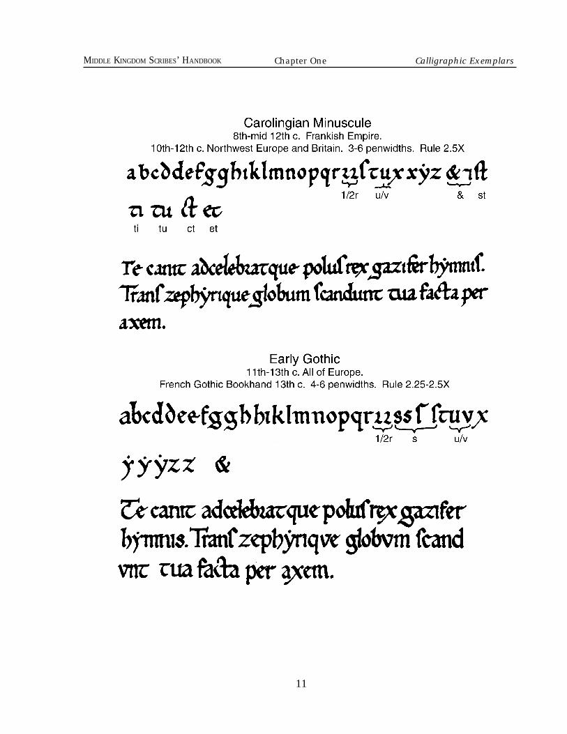
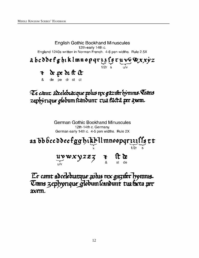
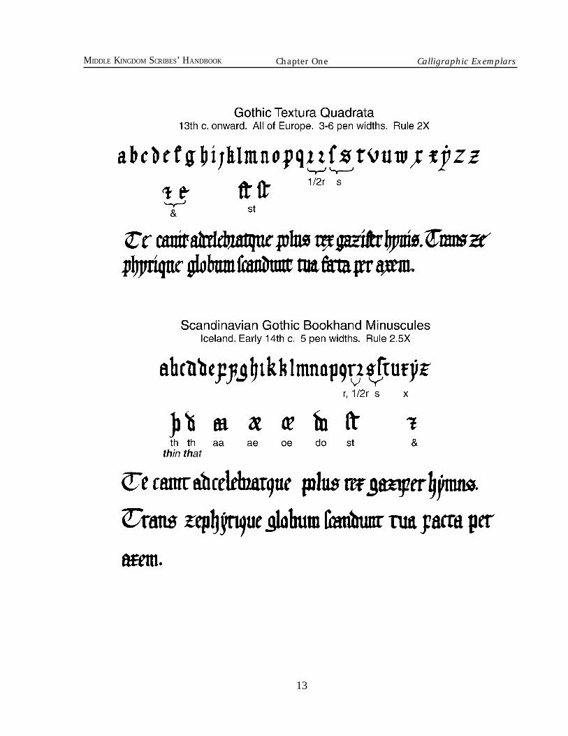
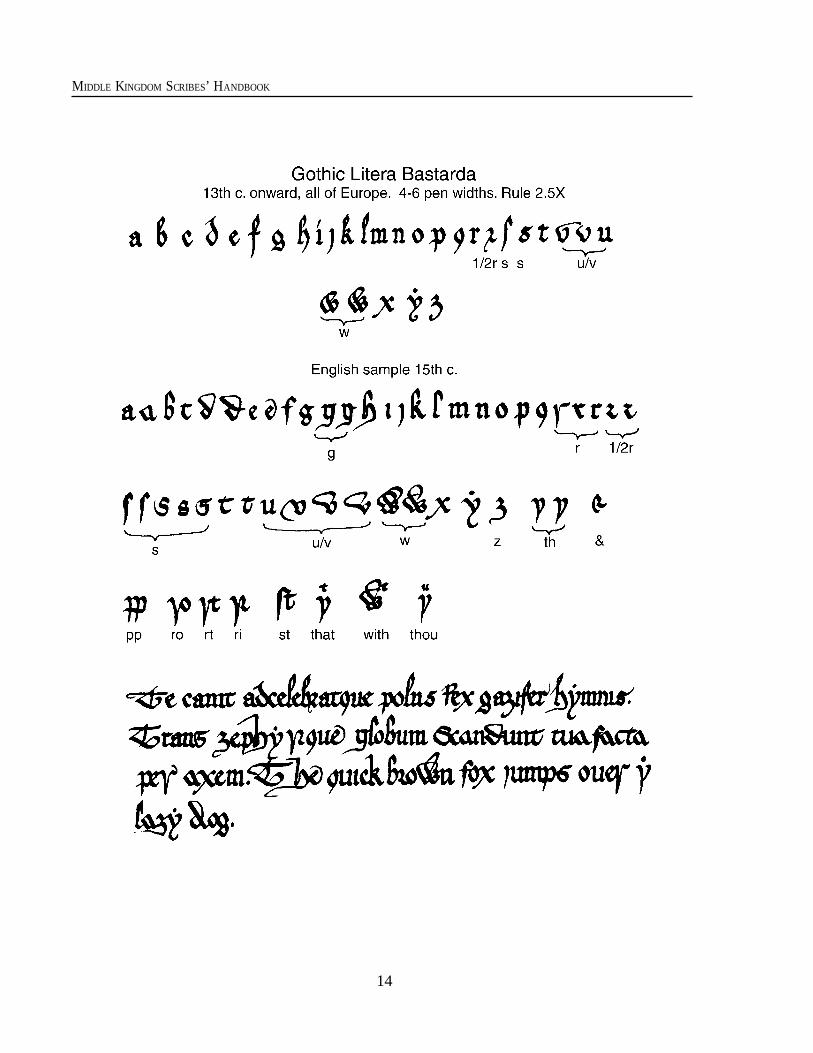
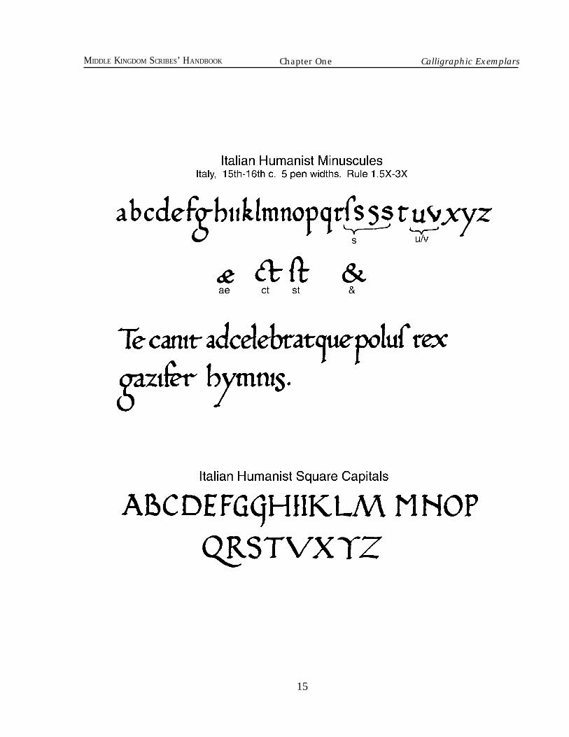
hese calligraphic exemplars will provideyou with a script of lower case, upper case,and display letters which can be used in mostwestern European nations within our SCAtime frame. More exotic award texts, andsometimes alternate language texts, may beavailable from the Kingdom Signet office,but it is assumed that scribes who havetaken the time to learn non-latin alphabetsor languages other than modern English willalready be able to provide their own calli-graphic exemplars.
How to use the exemplarsThis listing is not intended to be an
accurate statement which identifies specifichands used at any specific time and place. Itis only meant to be a loose and general guideto aid the beginner in selecting a form that isclose to what might have been used in SCAperiod, offering an approximate and gener-alized time and place. Since in the hardcopyversion the exemplars can be punched for athree ring binder, it is easy to remove theones you need and place them at your sidefor reference while you work.
To determine what type of script to use foryour text you may look below to the listing bydemographic area. Each region will have a shortreference to exemplars appropriate for use at agiven time period within the scope of the SCA.
Begin by looking at the general sectionon western Europe, then check the local
region for special instructions.
Each exemplar was originally pennedactual size with a l mm pen nib for the secondEdition, but in the Third Edition some scalechange has occured. There is a key denotingletter height and line spacing.
For example, if you see “Gothic TexturaQuadrata 3-5 Pen widths. Rule 2x” it meansthat in this Gothic hand the lower case lettersare between 3 and 5 pen widths in height andthe ruling lines should be spaced at twice thatdistance. Remember that we usually leave alittle space between the bottom of the lettersand the lower ruling line. In an accurate periodproportion we might have the 5-pen-width-high letters start with l pen width below themand 4 above the height of the lower case letters.To learn how to establish letter heights for yourpen nib, see Chapter Two, Medieval Writing.
You will notice that the scripts providedinclude several strange letters and omit someimportant modern ones. This is because theseletters were uncommon or nonexistent in thelanguages which used these scripts. Themost notable is the letter W since it is so oftenused in our scroll texts in the word “we."Letters s, r, i, j, u and v also have specialcharacteristics. Both Anglo-Saxon and theScandinavian languages used special lettersfor the th sounds. Information on how tocope with these special cases can also befound in Chapter Two.
T
CHOOSING AN EXEMPLAR Options listed by Period and Geographical Area
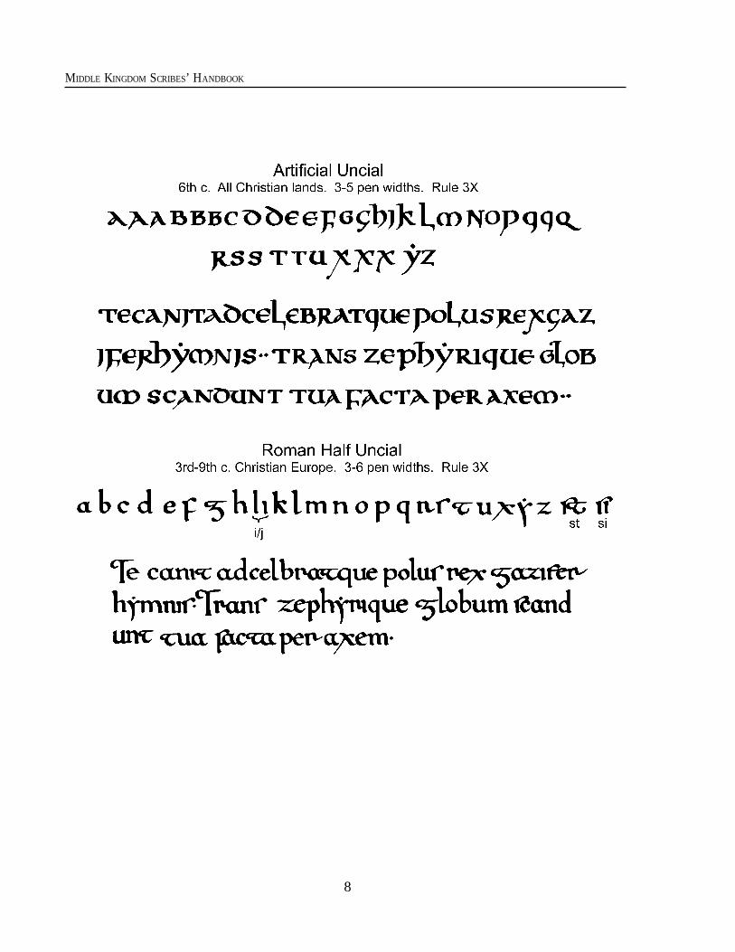
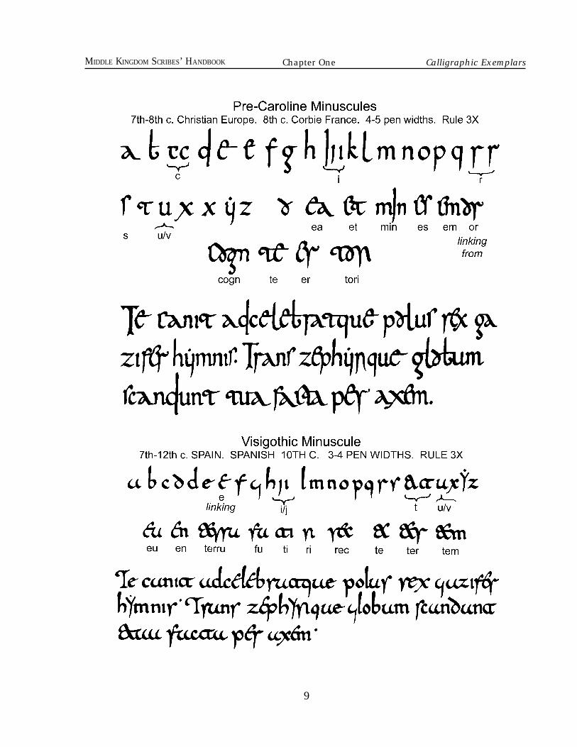
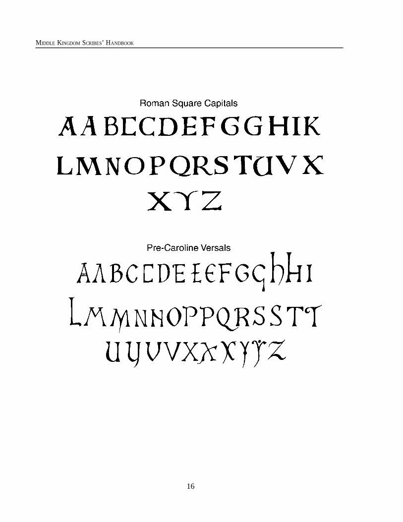
ALL OF CHRISTIAN NORTH WESTERN AND NORTH CENTRAL EUROPE600-10th c.: Artificial Uncial. When used, capitals are either large versions of the same or RomanSquare Capitals.600-9th c.: Roman Half Uncial. Capitals are either large versions of the same, Roman SquareCapitals or Pre-Caroline Versals.
Chapter One
Calligraphic Exemplars
6
MIDDLE KINGDOM SCRIBES’ HANDBOOK
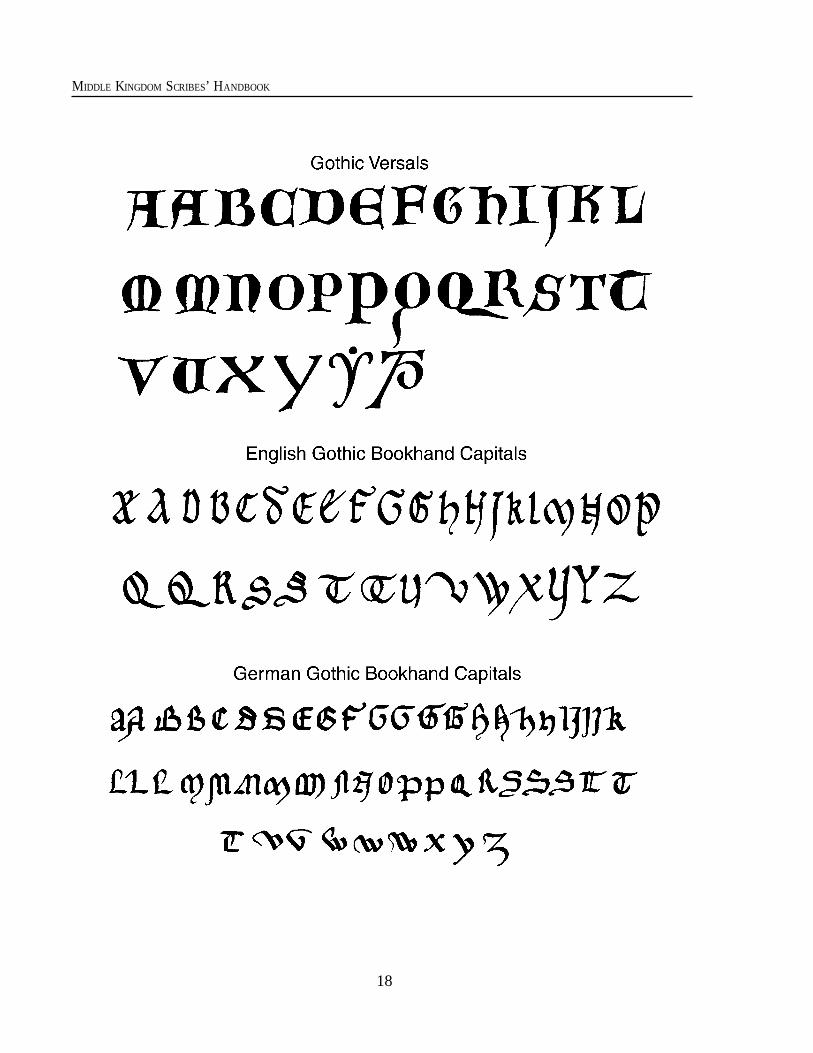
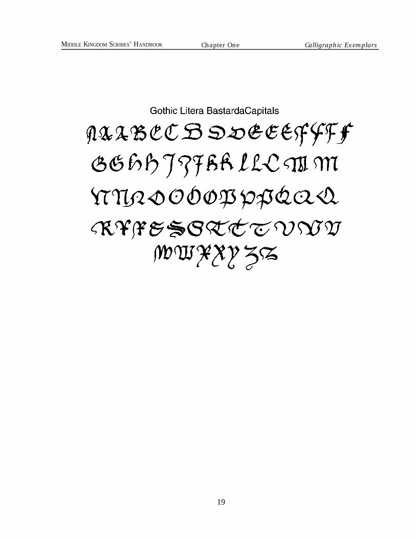
11th c. onward: Gothic Versals are often used as capitals and especially Display Initials andother Decorated Initials.11th-13th c.: Early Gothic with Roman Square Capitals within the text, and Gothic Versalsfor all large decorated letters.13th c. onward: Gothic Littera Bastarda and Bastarda Capitals within the text and GothicVersals for all large decorated letters. Alternatively, formal works would often use GothicTextura Quadrata, with Gothic Versals for text capitals and all large decorated letters.
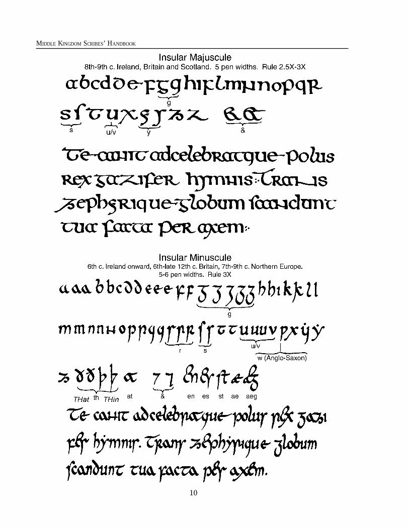
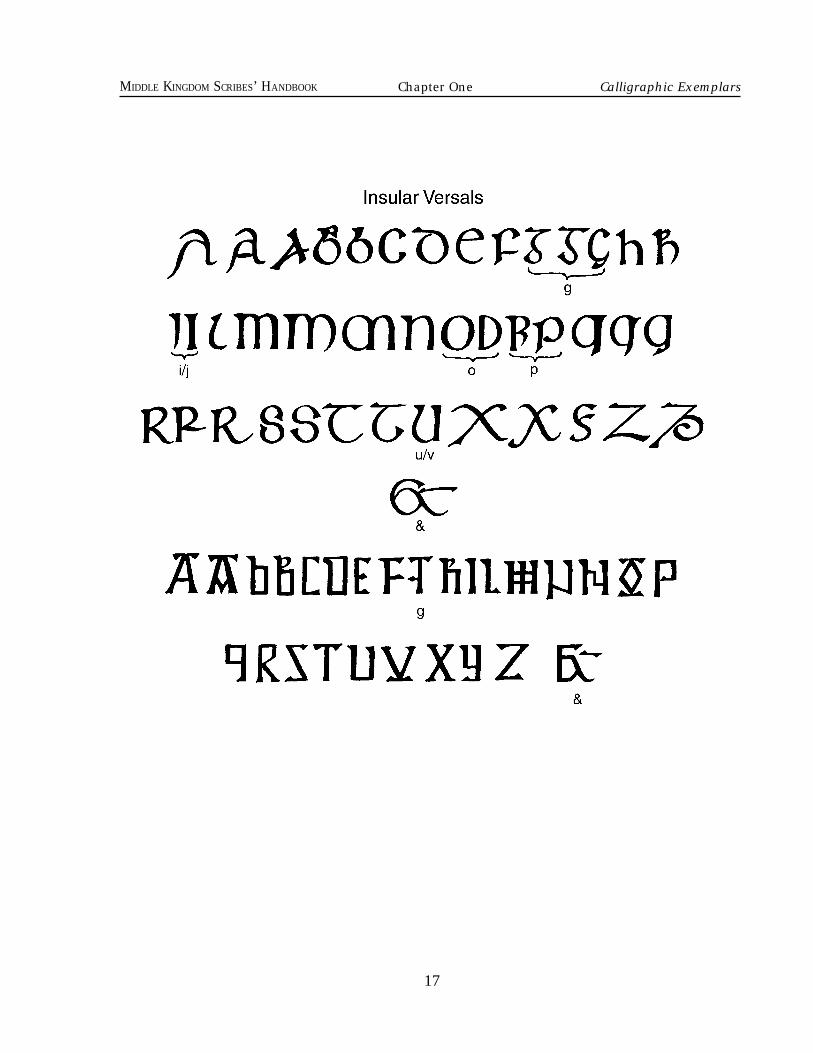
BRITAIN & IRELAND7th-9th c: Britain and Ireland: Insular Minuscule or Insular Majuscule with InsularVersals.10th c. onward: Ireland: Insular scripts survive in modified forms through the SCA period,but take progressively more angular characteristics from the 10th c. onward.10th-12th c.: Britain: Carolingian Minuscule with Roman Half Uncial or Roman SquareCapitals.11th-13th c.: Early Gothic with Roman Square Capitals within the text, and Gothic Versalsfor all large decorated letters.Late 12th-mid 14th c.: English Gothic Book Hand Minuscules with English Gothic BookHand Capitals within the text and Gothic Versals for all large decorated letters.13th c. onward: English style Gothic Littera Bastarda and Bastarda Capitals within the textand Gothic Versals for all large decorated letters. Alternatively, formal works would often useGothic Textura Quadrata, with Gothic Versals for text capitals and all large decorated letters.
FRANCE AND NORTHWEST EUROPE10th-12th c.: Carolingian Minuscule with Roman Half Uncial or Roman Square Capitals.11th-13th c.: Early Gothic with English style Gothic Book Hand Capitals or Roman SquareCapitals within the text, and Gothic Versals for all large decorated letters.13th c. onward: Regular Gothic Littera Bastarda and Bastarda Capitals within the text andGothic Versals for all large decorated letters. Alternatively, formal works would often useGothic Textura Quadrata and Gothic Versals for text capitals and all large decorated letters.
GERMANY AND NORTH CENTRAL EUROPE10th-12th c.: Carolingian Minuscule with Roman Half Uncial or Roman Square Capital.Late 12th-mid 14th c.: German Gothic Book Hand Minuscules with German Gothic BookHand Capitals within the text and Gothic Versals for all large decorated letters.13th c. onward: Regular Gothic Littera Bastarda and Bastarda Capitals within the text, andGothic Versals for all large decorated letters. Alternatively, formal works would often useGothic Textura Quadrata with Gothic Versals for text capitals and all large decorated letters.ITALY11th-14th c.: Italian book hands are similar to the northern continental European styles.15th-16th c.: Italian Humanist Minuscules, with Humanist Capitals used in text and forlarge decorated letters.
7
MIDDLE KINGDOM SCRIBES’ HANDBOOK
SCANDINAVIA AND NORTH ISLANDSBefore Christianization around the 10th c., there was little writing on the page in
Scandinavia, so missionaries and travellers would use whatever script they brought withthem to the north. Contact with Britain and Ireland meant that the Scandinavians whosettled there would use what scripts existed there already.
Your best bet for “Viking age” scripts would be to follow Anglo-Saxon and Germanstyles. Insular Minuscule, Artificial Uncial, Roman Half Uncial, and Early Gothic are allgood candidates. Runes were not usually used on scrolls or manuscripts. The Eth andThorn letters are used.
From the Gothic age onward, follow Northern European standards. A 14th c. IcelandicBook Hand sample is given for comparison.
SPAIN AND PORTUGAL600-12th c.: Visigothic Minuscule with Pre-Caroline Versals. (Arabic was used by the Islamicpopulation of the Iberian peninsula until the expulsion in the late 15th c.)
EASTERN EUROPEEastern Europe of the Byzantine Empire used forms of Greek, and in Russia, Greek evolved
throughout the Middle Ages into Cyrillic alphabets. The Hebrew alphabet was used in everyEuropean nation by the Jewish community with illumination which matched contemporarytastes.
Chapter One Calligraphic Exemplars
8
MIDDLE KINGDOM SCRIBES’ HANDBOOK
9
MIDDLE KINGDOM SCRIBES’ HANDBOOK Chapter One Calligraphic Exemplars
10
MIDDLE KINGDOM SCRIBES’ HANDBOOK
11
MIDDLE KINGDOM SCRIBES’ HANDBOOK Chapter One Calligraphic Exemplars
12
MIDDLE KINGDOM SCRIBES’ HANDBOOK
13
MIDDLE KINGDOM SCRIBES’ HANDBOOK Chapter One Calligraphic Exemplars
14
MIDDLE KINGDOM SCRIBES’ HANDBOOK
15
MIDDLE KINGDOM SCRIBES’ HANDBOOK Chapter One Calligraphic Exemplars
16
MIDDLE KINGDOM SCRIBES’ HANDBOOK
17
MIDDLE KINGDOM SCRIBES’ HANDBOOK Chapter One Calligraphic Exemplars
18
MIDDLE KINGDOM SCRIBES’ HANDBOOK
19
MIDDLE KINGDOM SCRIBES’ HANDBOOK Chapter One Calligraphic Exemplars

20
MIDDLE KINGDOM SCRIBES’ HANDBOOK
21
MIDDLE KINGDOM SCRIBES’ HANDBOOK
Chapter Two
Medieval WritingT hroughout the one thousand years en-
compassed by the SCA, historical scriptsevolved several times from their ancient Greekand Roman beginnings. Even within eachcalligraphic style there were subtle differ-ences in everything from letter shapes to theway words were contracted. The study ofthese differences is work for scholars and isa level of detail you may or may not wish toexplore in your SCA scroll work. The level ofaccuracy in your works intended as awardscrolls is up to you, as long as it represents anattempt to follow a medieval model consis-tent with the aims of the SCA.
If your goal is to produce the most accu-rate possible work, good sources are yourbest bet. You may wish to find a photo-graphic reference of a particular style andemulate it precisely. Alternatively, you maywish to take a generic approach, and that isalso acceptable.
The calligraphic Exemplars in this hand-book are designed to be a shortcut for scribesusing a generic approach. They are represen-tative of several major styles from the SCAtime period. Some variations within stylesare given, as well as suggestions for use ofcapital letters, ampersands, alternative let-ters, and combined letters known as liga-tures and conjoined letters.
Using Medieval ScriptsThere are several elements peculiar to
medieval writing which will make your workacquire a very medieval look if you begin touse them. The following descriptions willoutline some of the more basic characteris-tics which you may eventually choose to addto your repertoire.
Rule #1: All rules are subject toexceptions!Upper-Case vs. Lower-Case Letters. Inmany early calligraphic styles there is nodistinction between upper- and lower-caseletters. In these scripts, the main text may beall majuscule (that which we modern folksconsider “upper case” or capital letters) or itmay be all minuscule (what we consider“lower case” or small letters). Larger, some-what decoratively built-up forms of the sameletters, or more usually, an outdated alpha-betic form, would be used to call specialattention to the beginnings of special sec-tions. Chapters often opened with elabo-rately decorated display lettering. To callattention to the beginnings of verses, sen-tences, or paragraphs, letters called versalswere used within the main text block.
From this practice evolved the use of oneset of letters for the text and another to beused for what we consider to be capitalletters. When colored and made slightly largerthan the other letters of the text line, these“capital” letters became an alphabet on theirown. These were known by the late 11thcentury as versals. The rubricator was theperson who added these colored initials afterthe scribe had finished writing out the text.Although the display versals continued to beused in later times, we see changes from, forexample, the Celtic style to the Carolingianstyle, and then to the Gothic style. In the“Celtic” age we see very large display lettersdrawn as individual works of art which di-minished in size as they progressed acrossthe page.
By the Gothic era the first letter of the textmay be a large decorated initial followed by
22
MIDDLE KINGDOM SCRIBES’ HANDBOOK
one or even a whole panel of display versals.They may be all the same size and similar tothe versals within the rest of the text. By thislater time, the versal had become its owntype of alphabet.
When a letter is big enough to be illumi-nated with a pictorial scene, we stop callingit a decorated initial and refer to it as“historiated,” “inhabited,” or “foliated,” de-pending on the type of decoration. This isoften followed by the first letter of the maintext being slightly bigger than the rest of thetext. It is frequently in an “upper-case” form,and sometimes a stroke of color is added tothe letter.
The later period of handmade books con-tains many examples of books using a “mod-ern” looking system of capital letters withinthe text for the beginning of sentences andfor beginning the names of people and places.The versals still open more important pas-sages, but the choice for what to use andwhere depends on the level of formality ofthe “book.”
LETTER HEIGHT. The height of letters isgiven in reference to the common strokeheight of lower case letters. From the bottomof a letter (such as m) to the top is called the“minim” height or the “x-height.” A letter mis made of three minim strokes and the letteri is made of one. Ascenders and descendersare extensions of minim strokes.
PEN WIDTH. This is a convenient measure.It refers to the width of the pen point. It ishandy in counting how tall to make yourletters. A scale can be made by placing sev-eral strokes in a ladder arrangement such asthis: = four penwidths high.
RULING LINES. Medieval scribes almostalways used ruling lines to get their scriptseven, and it is usually appropriate to leavethem on the page. In fact, in the Gothic periodthe lines were often either a colored drypoint(similar to pencil), or they could be colored or
black ink. The reason we seldom see theruling lines in photos of early period andItalian Renaissance manuscripts is that thescribes often ruled with a bone or metal pointwhich left only a light crease on the parchmentwithout color.
Point location guides for the ruling lineswere made on the outside edges of the page bypin-pricking holes. The vertical lines that de-termine the column sides would be done first.These were followed by horizontal lines for thetext.
Text was written between two ruled lines.The bottom of the letter was usually written alittle above the line and the top of the minimstrokes fell somewhere around half way up tothe next ruling line (give or take a little depend-ing on style). The minim height would be asconstant as the skill of the scribe permitted,and the tops of ascenders would reach to ashort distance below the ruling line above.
Strange Letters From The PastThe script styles used in the middle ages
contained several letters which are unfamiliarto modern eyes. Also, there are letters that weuse today that were yet to be invented! Forexample, the w and j shapes were unknown inearly period. This can be disconcerting to thoseof us not writing in Latin. Later, when manu-scripts were being translated into or composedin colloquial speech, the sounds of local tongueswere added into texts. The following descrip-tions are meant to help you find your waythrough the alphabet jungle without the needof a machete!
Æ. The æ was used as a diphthong in Latin,as well as to represent the sound of the letter“ash” in Old Norse and Old English.
J and I and Y. The J & j shapes are not foundin the earlier scripts except that sometimesthe j is used to differentiate the last of threeI shapes in a Roman numeral. Nor was the idotted in early times as it is today. As a
23
MIDDLE KINGDOM SCRIBES’ HANDBOOK
matter of fact, it was common to dot the Y &y.)
By 1400 the j is in use, but sometimes,(especially in versals), it means a letter i. Thei began to be dotted with a diagonal slash inthe 14th century when it became difficult todistinguish between i, m, n and u whenwritten together. The dot above the y startedto be rarer.
However, the more formal the text, thelikelier the old practice is to be used. Eventoday INRI means Jesus Nazarenus RexJudorum.
One more thing to be aware of is that insome early scripts the letter I was sometimeswritten as an ascending or a descendingletter. This happened within texts that em-ployed it as a normal minim high letterelsewhere. It became an ascender sometimeswhen there were a lot of minim high letterslike m or n surrounding it, but, of course, notnext to a lower case letter l.
K. You may miss the letter K in some sourcesof early manuscripts and some languages.For example, K is not used in Latin, Gaelic,and Welsh. The letter C is not generally usedin Old Norse. Both C and K represent thesame sound in these cases. Half r. If you take the shape of R andremove the left-hand staff you are left withthe shape of the 1/2 r. It is only for the lowercase letter. It follows letters that have rightside bows (curves) without a foot, such as o,p, and b. In some scripts other letters maybow to the right such as . In these casesit is fine to use 1/2 r. Long S. One important letter to relearn isthe “long s.” Our ancestors used what iscalled the “long s” for almost all of the sshapes in lower case text. It looked like an f,but instead of the cross bar it has a little spuron the upper left side of the staff. The long s,pictured above, was usually used for alllower case s forms, except for the last letterof the word, when our familiar snake shaped
“short s” was used. When two s charactersare at the end of the word, use only two shorts characters as in “fortress” rather than along and short as in “fortre s” or "fortre ."
The Short S shape is used for capitals,versals, and display letters. Be aware, how-ever, that some scripts use only short S andothers use only long S in lower case text. The letter Thorn is used in Old Englishand Old Norse. It stands for the sound of theletters “th” as in “thick” or “thin.” It looksmuch like a letter y with an ascending staff,or similar to the Anglo-Saxon letter "wen"( see W below) which looks a lot like a p.Sometimes thorn has an ascending staff, butin some forms it does not, and the bow maybe more angular. Especially after the use ofwen went out of fashion, the ascending staffdisappears and the bow may open a bit morelike a letter y.
In the phrase “Ye olde colonial inn” wefind a remnant of the letter thorn. The Y in“Ye” is actually a thorn. From the 13thcentury, thorn goes mostly out of fashionexcept in the words the, thou, and thee.Thorn survived later in Scandinavian scripts.
The letter Eth (or “dh,” also "Edh") isalso an Anglo-Saxon letter. It represents theth sound of that and then. It looks like aletter D with a line slashing the staff or theascender. In an upper case eth we have theleft staff slashed on a standard D shape. Afterthe Normans came to England in the secondhalf of the 11th century and the scripts werereplaced by continental scripts, the eth andthe wen dropped off in use, and the thornbegan to stand for both th sounds. However,the upper-case version of the eth remainedin use as the upper-case th . The letter ethsurvived longer in Scandinavian scripts.
V and U. Through most of our period thesetwo letters were the same shape but repre-sented two sounds. The choice of usinground bottom or pointed was a stylistic choice.Hence the word verbum would either be
Chapter Two Medieval Writing
24
MIDDLE KINGDOM SCRIBES’ HANDBOOK
written VERBVM or UERBUM.From the 13th century, a V may be cho-
sen as the first letter of a word (within textcolumns) possibly because you could makea nice calligraphic sweep from its left side. Insuch a style the u might be used for all of theother v and u letters. Check your style sheetand photo references. The v shape is morecommon in numerals than the u.
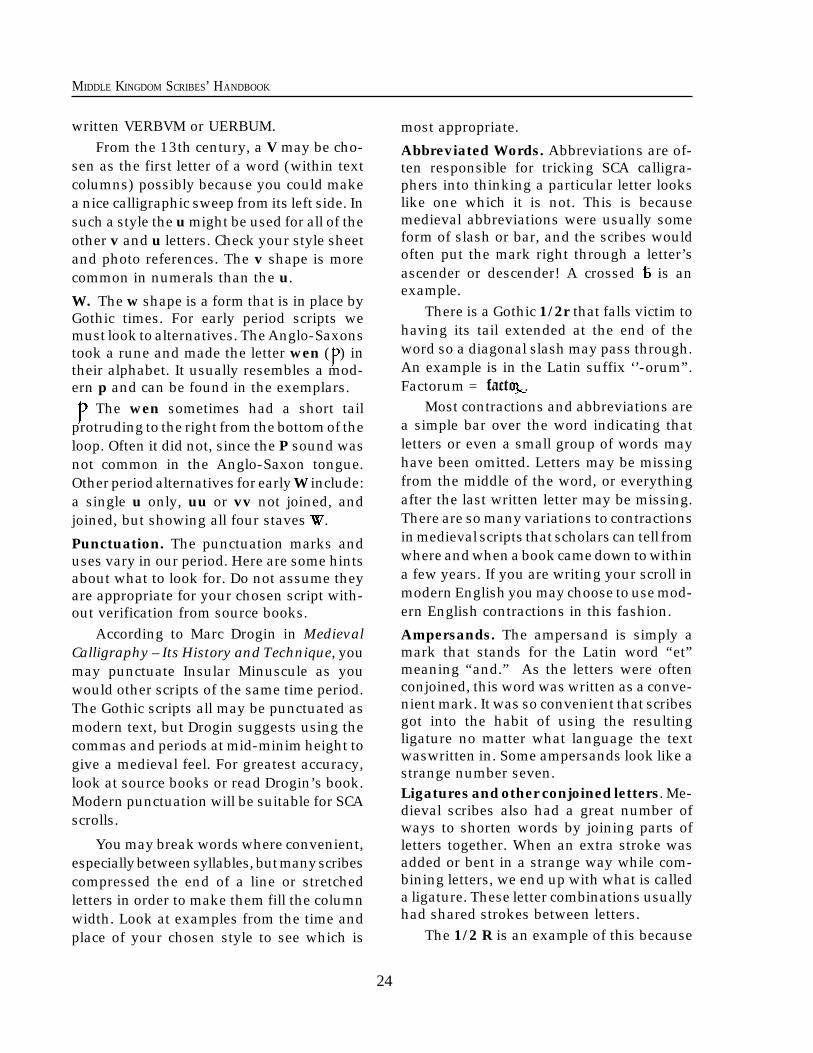
W. The w shape is a form that is in place byGothic times. For early period scripts wemust look to alternatives. The Anglo-Saxonstook a rune and made the letter wen ( ) intheir alphabet. It usually resembles a mod-ern p and can be found in the exemplars.
The wen sometimes had a short tailprotruding to the right from the bottom of theloop. Often it did not, since the P sound wasnot common in the Anglo-Saxon tongue.Other period alternatives for early W include:a single u only, uu or vv not joined, andjoined, but showing all four staves .
Punctuation. The punctuation marks anduses vary in our period. Here are some hintsabout what to look for. Do not assume theyare appropriate for your chosen script with-out verification from source books.
According to Marc Drogin in MedievalCalligraphy – Its History and Technique, youmay punctuate Insular Minuscule as youwould other scripts of the same time period.The Gothic scripts all may be punctuated asmodern text, but Drogin suggests using thecommas and periods at mid-minim height togive a medieval feel. For greatest accuracy,look at source books or read Drogin’s book.Modern punctuation will be suitable for SCAscrolls.
You may break words where convenient,especially between syllables, but many scribescompressed the end of a line or stretchedletters in order to make them fill the columnwidth. Look at examples from the time andplace of your chosen style to see which is
most appropriate.
Abbreviated Words. Abbreviations are of-ten responsible for tricking SCA calligra-phers into thinking a particular letter lookslike one which it is not. This is becausemedieval abbreviations were usually someform of slash or bar, and the scribes wouldoften put the mark right through a letter’sascender or descender! A crossed is anexample.
There is a Gothic 1/2r that falls victim tohaving its tail extended at the end of theword so a diagonal slash may pass through.An example is in the Latin suffix ‘’-orum”.Factorum = facto .
Most contractions and abbreviations area simple bar over the word indicating thatletters or even a small group of words mayhave been omitted. Letters may be missingfrom the middle of the word, or everythingafter the last written letter may be missing.There are so many variations to contractionsin medieval scripts that scholars can tell fromwhere and when a book came down to withina few years. If you are writing your scroll inmodern English you may choose to use mod-ern English contractions in this fashion.
Ampersands. The ampersand is simply amark that stands for the Latin word “et”meaning “and.” As the letters were oftenconjoined, this word was written as a conve-nient mark. It was so convenient that scribesgot into the habit of using the resultingligature no matter what language the textwaswritten in. Some ampersands look like astrange number seven.Ligatures and other conjoined letters. Me-dieval scribes also had a great number ofways to shorten words by joining parts ofletters together. When an extra stroke wasadded or bent in a strange way while com-bining letters, we end up with what is calleda ligature. These letter combinations usuallyhad shared strokes between letters.
The 1/2 R is an example of this because
25
MIDDLE KINGDOM SCRIBES’ HANDBOOK
the bowed letter preceding it shares its rightside with the r which uses that stroke as itsleft staff. The “et” ligature, depicted as “&,”owes its shape to the same thoughts whichproduced the tall linking e in early minusculescripts. Other ligatures to look for include:
en = , ct = , at = , and some three-letter ligatures like ter = .
Long s is a very common element inligatures because the medieval scribe lovedto carry the hook of the letter down and pullit out as the staff and tail of the t. Letter bconjoined to o is another example of com-monly conjoined letters. The letters d and oare often joined in the word“domini” “ ”but notice that the staff of the d slants to the left.
Try to avoid conjoining more than twoletters at a time until you get the feel for whatlooks right. In many scripts, the letters arenot so much conjoined as they are just touch-ing. Also remember that while conjoiningletters does add a very medieval look to ascroll, the more of them you use, the tougherit is for the herald to read it in court!
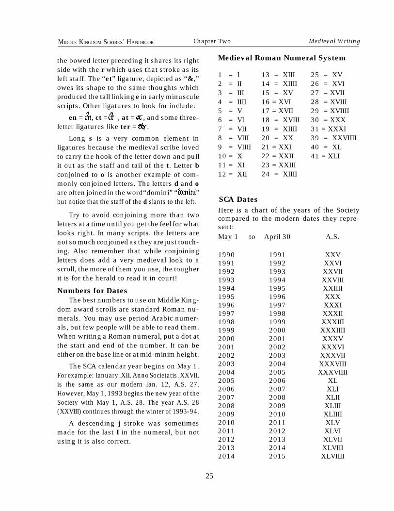
Numbers for DatesThe best numbers to use on Middle King-
dom award scrolls are standard Roman nu-merals. You may use period Arabic numer-als, but few people will be able to read them.When writing a Roman numeral, put a dot atthe start and end of the number. It can beeither on the base line or at mid-minim height.
The SCA calendar year begins on May 1.For example: Ianuary .XII. Anno Societatis .XXVII.is the same as our modern Jan. 12, A.S. 27.However, May 1, 1993 begins the new year of theSociety with May 1, A.S. 28. The year A.S. 28(XXVIII) continues through the winter of 1993-94.
A descending j stroke was sometimesmade for the last I in the numeral, but notusing it is also correct.
1 = I2 = II3 = III4 = IIII5 = V6 = VI7 = VII8 = VIII9 = VIIII10 = X11 = XI12 = XII
25 = XV26 = XVI27 = XVII28 = XVIII29 = XVIIII30 = XXX31 = XXXI39 = XXVIIII40 = XL41 = XLI
13 = XIII14 = XIIII15 = XV16 = XVI17 = XVII18 = XVIII19 = XIIII20 = XX21 = XXI22 = XXII23 = XXIII24 = XIIII
SCA DatesHere is a chart of the years of the Societycompared to the modern dates they repre-sent:May 1 to April 30 A.S.
1990 1991 XXV1991 1992 XXVI1992 1993 XXVII1993 1994 XXVIII1994 1995 XXIIII1995 1996 XXX1996 1997 XXXI1997 1998 XXXII1998 1999 XXXIII1999 2000 XXXIIII2000 2001 XXXV2001 2002 XXXVI2002 2003 XXXVII2003 2004 XXXVIII2004 2005 XXXVIIII2005 2006 XL2006 2007 XLI2007 2008 XLII2008 2009 XLIII2009 2010 XLIIII2010 2011 XLV2011 2012 XLVI2012 2013 XLVII2013 2014 XLVIII2014 2015 XLVIIII
Medieval Roman Numeral System
Chapter Two Medieval Writing
26
MIDDLE KINGDOM SCRIBES’ HANDBOOK
efore beginning to write an award scroll,please be sure to read Chapters Five and Sixconcerning the production of scrolls. Thereare several conventions that must be fol-lowed on Middle Kingdom scrolls. Pleasealso see the section on scroll heraldry inorder to use the appropriate heraldry in yourdesign.
Please be careful to use the word "grant"only on scrolls which "grant" rank. Use theword "award" when it says the rank is con-ferred by "award" level. They are not thesame. Also, a rank can be given by LettersPatent, which is above grant and award levels.
The text for the Award of Arms has beengiven first because it is the most commonlyused text. All others have been listed in orderof precedence.
Awards and Orders that have badgesshould have the badges depicted on thescroll. A scroll conferring arms should depictthe arms in some appropriate way when theyare both registered and known.
Please also note that the lower case hasbeen used for the w in the word "we." Itwasn't always correct to use the upper-caseW for the "Royal We" but it is appropriate wellback into SCA period and is a common usagein the SCA.
Award of Arms (AoA)Text for recipient with registered device
Due commendations and greetings fromTheir Royal Majesties (name of Sovereign),and (name of Consort), King (Queen) andQueen (King) of the Middle Kingdom. Knowye that we are pleased to recognize the goodservice that (name of recipient) hath ren-dered unto the Middle Kingdom, (specifi-cally) (optional specific mentions) and there-
fore are we minded to make unto him/her anAward of Arms. We bestow upon him/herthe right to bear the arms (heraldic descrip-tion of the arms) when confirmed by theCollege of Arms of the Society, and all rightsand responsibilities conveyed by elevationto this rank. Done this __ day of ___, AnnoSocietatis (A.S.) __, in our (location of event).In testimony whereof we have set our handsand seal.
The following texts may be used for ascroll when either the recipient has not yetregistered a heraldic device or that device isunknown to the scribe or Signet:
Award of Arms (AoA)(Unregistered/unknown device)
Be it known that we (name of sovereign),King (Queen) of the Middle Kingdom, and(name of consort) our Queen (King) areminded to make unto (name of recipient) anAward of Arms in recognition of his/herservice to the Middle Kingdom, (specificallyfor) (optional specific mentions). We be-stow upon him/her the right to bear arms asregistered within the Society without let orhindrance from any person, and the rightsand responsibilities conveyed by his/her el-evation to this rank from this day onward.Done by our hands this __ day of ___, AnnoSocietatis (A.S.)__, in our (location of event).
Award of Arms (AoA)(Unregistered/unknown device)
Proclaim throughout the realm that we(name of sovereign), King (Queen) of theMiddle Kingdom, and (name of consort) ourQueen (King), send greetings and commenda-tions from our (location of event). Know thatwe, in recognition of the good works and deedsof (name of recipient), (especially for) (op-
B
Chapter Three
Award Texts
27
MIDDLE KINGDOM SCRIBES’ HANDBOOK Chapter Three Award Texts
tional specific mentions), are minded to makeunto him/her an Award of Arms. We bestowupon him/her the right to bear Arms as dulyregistered within the Society and all rights andresponsibilities conveyed by elevation to thisrank without let or hindrance from any personfrom this day onward. Done by our hands this__ day of ___, Anno Societatis (A.S.)___, in our(location of event).
Award of Arms (AoA)(Unregistered/unknown device) Let it be known to all that we (name ofSovereign), King (Queen) by right of arms ofthe Middle Kingdom, and (name of Consort),our Queen (King), having come to recognizethe good service and contributions of oursubject (name of recipient), (most notablyoptional specific mentions), do therefore wishto confer upon him/her an Award of Arms.We bestow upon him/her the right to beararms as duly registered with the College ofArms of the Society and all rights andresponsibilities associated with armigerousstatus. Done by our hands this __ day of ___,Anno Societatis (A.S.)__ , in our (location ofevent).
Royal Augmentation of Arms (R. Aug.)Proclaim to all throughout the land that
we (name of Sovereign), King (Queen) byright of arms of the Middle Kingdom, and(name of Consort), our Queen (King), havewitnessed the service with which (name ofrecipient) hath exemplified the ideals whichwe strive to uphold, and therefore do we wishto acknowledge him/her in a fitting andseemly manner with some visible token ofour esteem. We are minded to give unto him/her a Royal Augmentation of Arms in recog-nition of his/her deeds. It shall be a specificcharge signifying our appreciation and com-mendation, to be incorporated into his/herarms in accordance with both his/her wishesand the Rules of the College of Arms of the
Known World. Done by our hands this __ dayof ___, Anno Societatis (A.S.) ___, in our(location of event).
Kingdom Augmentation of Arms (K.Aug.)
Special: Because of the nature of thisaward, the office of the Dragon Herald pre-fers the scribe to obtain a specific wordingfrom their majesties at the time of the assign-ment.
Order of the Royal Vanguard (CRV) Let all persons within our Realm hear the
proclamation that we (name of Sovereign),King (Queen) by right of arms of the MiddleKingdom, and (name of Consort), our Queen(King) set forth. Know that in considerationof his/her outstanding service as Our King's/Queen's Champion we hereby make (name ofrecipient) a Companion of Our Order of theRoyal Vanguard. We bestow unto him/her allrights and responsibilities associated withthis Order and the right to bear the badge ofthe Order: Fieldless, a demi-dragon rampantargent. Done by our hands this __ day of ___,Anno Societatis (A.S.) ___, in our (locationof event).
Award of the Sapphire (RSL)Proclaim throughout our Realm that we
(name of Sovereign), King (Queen) by rightof arms of the Middle Kingdom, and (name ofConsort), our Queen (King), send heartfeltgreetings. Know that it is one of the pleasuresof the Crown to recognize individuals whoexhibit great courtesy, grace, and honor topeople of all ranks and who exemplify whatit means to be the embodiment of The Dream.Therefore, we are hereby minded to makeunto (name of recipient) an Award of theSapphire. We bestow unto him/her all rightsand responsibilities associated with The Sap-phire Light and the right to bear the badge:Fieldless, a gemstone azure. Done by ourhands this __ day of ___, Anno Societatis(A.S.) ___, in our (location of event).
28
MIDDLE KINGDOM SCRIBES’ HANDBOOK
Award of the Dragon’s TreasureUnto all to whom these presents come
know that we (name of Sovereign), King(Queen) by right of arms of the MiddleKingdom, and (name of Consort), our Queen(King) send greetings. As we know that thetreasure of a kingdom lies in its future lead-ers, so do we know that such a treasure isbefore us in the person of (name of recipi-ent) and in recognition of his/her good ser-vice to the Middle Kingdom it is fitting thatwe honor (name of recipient) by naminghim/her a Dragon’s Treasure. As he/she hasadorned the crown of the Middle Kingdomuntil now, so shall he/she continue to do soin our hearts. Done by our hands this __ dayof __, Anno Societatis (A.S.) __, in our (loca-tion of event).
Award of the GroveBe it known that we (name of Consort),
Royal Patroness (Patron) of the Arts, and(name of Sovereign) our King (Queen), arewell aware of the endeavors and successes ofthe people of (Group name) in the artisticand/or scientific area of (reason of award).Therefore we wish for all to know that theyare held in high regard, and so we are mindedto bestow upon them the Award of the Grove.Henceforward (name of group) may displaythe banner: Per pale Or and argent, a hurstpurpure. Given by Our hands this __ day of ___,Anno Societatis (A.S.) __ in our (location of event)
Award of the Dragon's Flight Proclaim unto all that we (name of
Sovereign), King (Queen) by right of arms ofthe Middle Kingdom, and (name of Consort),our Queen (King), wish to commend thesuperior skill and service of (name of group)to the Archer Corps of the Middle Kingdom.Therefore we are minded to bestow uponthem the Award of the Dragon's Flight, withall rights, privileges, insignia, precedence and re-
sponsibilities thereto appertaining, and the rightto bear the banner: Argent, a pale vert scalyargent between four pheons vert, without letor hindrance from any person. Done by ourhands this __ day of ___, Anno Societatis (A.S.) __in our (location of event).
Award of the Dragon's Teeth Let it be known to all that we (name of
Sovereign), King (Queen) by right of arms ofthe Middle Kingdom, and (name of Consort),our Queen (King), right mindful of the dramaticdeeds and skills that (name of group) hath dis-played upon the field of battle, especially (reason ofaward), are mindful to bestow upon them theAward of the Dragon's Teeth. We bestow upon themall rights and responsibilities thereto appertaining,and the right to bear the banner: Argent, on a dancebetween two broken dragon's teeth vert anotherargent, without let or hindrance from any person.Done by our hands this __ day of __, AnnoSocietatis (A.S.) __, in our (location of event).
Award of the Purple FrettyBe it known that we (name of Sovereign),
King (Queen) by right of arms of the MiddleKingdom, and (name of Consort), our Queen(King), have heard of the exemplary servicethat (name of group) hath rendered unto theMiddle Kingdom, specifically by (reason foraward). We do here publicly commend themand are pleased to bestow upon them theAward of the Purple Fretty, with all rightsand responsibilities thereto appertaining, andthe right to bear the badge: Or, fretty purpure,without let or hindrance from any person.Given by Our hands this __ day of __, AnnoSocietatis (A.S.) __, in our (location of event).
Order of the Rose (OR)Special Note: This Order originally car-
ried a Patent of Arms. If this award is madeafter the Peerage level was removed from thisaward, then use this version. If the scroll is
29
MIDDLE KINGDOM SCRIBES’ HANDBOOK
for a recipient who recieved the version byletters Patent, skip ahead to the text on page
Proclaim to all Gentles and Nobles that we(name of Consort), Queen (King) of the MiddleKingdom, and (name of King/Queen) our King(Queen), knowing full well the grace and dignitywith which (name of recipient) has served theMiddle Kingdom as Queen (King), are minded to doher/him honor. We do, therefore, recognize her/him as a Lady/Lord of the Rose, with all of therights, privileges, insignia, precedence and respon-sibilities thereto appertaining. Done by our handsthis __ day of ___, Anno Societatis (A.S.) __ in our(location of event).
Order of the White Chamfron (CWC)Let all know that we (name of Sover-
eign), King (Queen) the strong and just, and(name of Consort), our Queen (King) thegraceful and wise, Regnum Mediterranae,have seen the skill, devotion and supportthat (name of recipient) has displayed in thediscipline of horsemanship. We are thereforeminded to make him/her a Companion of ourOrder of the White Chamfron and bestowupon him/her all rights and responsibilitiesthereto appertaining in order that he/she maydischarge his/her new duties to the Crownand the right to bear the badge: (Fieldless) AChamfron Argent . Done by our hands this __day of __, Anno Societatis (A.S.) __, in our(location of event).
Order of the Cavendish Knot (CCK)It shall be known by all that we (name of
Sovereign) King (Queen) by right of arms ofthe Middle Kingdom, and (name of Consort)our Queen (King), have witnessed skill,devotion and support that (name of recipi-ent) has displayed in the discipline of rapiercombat and are therefore minded to createhim/her a member of Our Order of theCavendish Knot. We bestow upon him/herall rights and responsibilities attendant upon
this rank, and as token of this honor the rightto bear the badge: Four Cavendish knotsconjoined in cross vert. Done by our handsthis __ day of ___, Anno Societatis (A.S.) __,in our (location of event).
Award of the Dragon’s Barb (CDB)Proclaim unto all that we (name of Sov-
ereign), King (Queen) by right of arms of theMiddle Kingdom, and (name of Consort) ourQueen (King), would fain honour (name ofrecipient) for his/her superior skill in ar-chery and service to the Archer Corps of theMiddle Kingdom. Therefore are we minded tocreate him/her a Companion of the Order ofthe Dragon’s Barb, and thus we bestow uponhim/her all rights and responsibilities atten-dant upon this rank, and the right to bear thebadge of the order: A dragon’s tail palewisebarb to chief, within and issuant from anannulet vert, scaly argent, without let orhindrance from any person. Done by ourhands this __ day of ___, Anno Societatis(A.S.) __, in our (location of event).
Order of the Red Company (CRC) See, hear, and read the words of (name
of Sovereign), King (Queen) by right of armsof the Middle Kingdom, and (name of Con-sort), Queen (King)of the Middle Kingdom.Inall the armies in history there have beenmany warriors who have fought and led fromwithin the ranks, rising to positions of greathonor. A warrior has many virtues, such asskill at arms, leadership on the field, andteaching of the arts martial. Therefore do weherewith recognize (name of recipient) ofthe Order of Red Company. Henceforth mayhe/she style himself/herself a Serjeant ofthis noble order, and may bear its badge:Gules, two maces in saltire Argent, in cantonupon his/her shield. Done by our hands this__ day of ___ , Anno Societatis (A.S.) __, inour (location of event).
Chapter Three Award Texts
30
MIDDLE KINGDOM SCRIBES’ HANDBOOK
Order of the Dragon’s Tooth (CDT)May it be known to all that we (name of
Sovereign), King (Queen) by right of arms ofthe Middle Kingdom, and (name of Consort)our Queen (King), right mindful of the drama-tic deeds and skills that (name of recipient)hath displayed on the field of battle, espe-cially (optional specific mentions), are mindedto make him/her a companion of our Order ofthe Dragon’s Tooth. We bestow upon him/her all rights and responsibilities attendantupon this rank, and the right to bear a fangdependent from a chain about the neck, andthe badge: Or, on a pale vert, three fangs Or,without let or hindrance from any person.Done by our hands this _ day of __, AnnoSocietatis (A.S.) __, in our (location of event).
Award of the Doe’s Grace (ADG)Unto all Gentles and Nobles to whom
these presents come, know that we (name ofQueen) Queen of the Middle Kingdom, and(name of king) our King, right mindful of thehigh esteem in which (name of recipient) isheld by our Kingdom and ourselves, and inacknowledgment of (specific mention), arepleased to show him/her this sign of theQueen’s favor, to wit: we bestow upon him/her the Award of the Doe’s Grace. We bestowupon him/her all rights and responsibilitiesattendant upon this rank and the right tobear the badge: Azure, a sword proper enfiledof a wreath of flowers argent, slipped andleaved Or. Given by our hands this __ day of___ , Anno Societatis (A.S.) __, in our (loca-tion of event).
Award of the King's Chalice (RKC)See, read, hear, and understand by these
presents that, right mindful of the high es-teem in which (name of recipient) is held byOur Kingdom and Ourselves, and inacknowledgement of his/her authenticity in(area of accomplishment), are pleased to
bestow upon him/her the Award of the King'sChalice. We bestow upon him/her all rightsand responsibilities attendant upon this rank,and the right to bear the badge of the award:(Fieldless) A Chalice Sable, without let orhindrance from any person. Done by ourhands this _ day of __, Anno Societatis (A.S.)__, in our (location of event).
Award of the Purple Fret (APF)It shall be known by all that we (name of
Sovereign) King (Queen) by right of arms ofthe Middle Kingdom, and (name of Consort)our Queen (King), do recognize the exem-plary service that (name of recipient) hathfreely given unto the Middle Kingdom, spe-cifically (specific mentions). We do herepublicly commend him/her and are pleasedto bestow upon him/her the Award of thePurple Fret. We confirm unto him/her allrights and responsibilities attendant uponthis rank and the right to bear the badge: Or,a fret purpure; without let or hindrance fromany person. Given by our hands this __ dayof ____, Anno Societatis (A.S.) __, in our(location of event).
Order of the Willow (CW)
May it be known by all that we (name ofConsort), Royal Patroness (Patron) of theArts, and (name of Sovereign) our King(Queen), right mindful of the skills that(name of recipient) hath displayed in the artof (specific mentions), wish to recognizehim/her as a Companion of our Order of theWillow. We bestow upon him/her all rightsand responsibilities attendant upon this rankand the right to bear the badge: Purpure, awillow tree eradicated Or, without let orhindrance from any person. Confirmed byour hands this __ day of ___, Anno Societatis(A.S.) __, in our (location of event).
31
MIDDLE KINGDOM SCRIBES’ HANDBOOK
dered unto the Middle Kingdom, most espe-cially by (reason for award), are minded tomake unto him/her a Grant of Arms. We dohereby confirm by Grant the right to bear(blazon), (and the right to bear as a crest(specific non-dragon crest, if one is given)and the arms: (blazon). Done by our handsthis __ day of___, Anno Societatis (A.S.)__,in our (location of event).
Company of the Bronze Ring (CBR)To all and singular unto whom these
presents shall come, know that we (name ofSovereign) King (Queen) by right of arms ofthe Middle Kingdom, and (name of Consort)our Queen (King), right mindful of the supe-rior skill, leadership, and exemplary servicerendered unto the Rapier Legions of Ourkingdom by our subject (name of recipient),do herewith recognize him/her as a Com-panion of our Company of the Bronze Ring.We grant unto him/her all rights and respon-sibilities attendant upon this rank, and theright to bear the badge of the award: Gules,two rapiers in saltire argent within an annu-let Or; without let or hindrance from anyperson. Given by our hands this __ day of____, Anno Societatis (A.S.) __, in our (loca-tion of event).
Company of the White Lance (CWL)See, hear, and read the words of (name of
Sovereign, King (Queen) by right of arms ofthe Middle Kingdom, and (name of Consort),Queen (King)of the Middle Kingdom. Bothin times of war and times of peace the un-daunted equestrian honed their battle skillsin tournaments to prepare rider and steed forthe defenses of our glorious kingdom. Anequestrian has many virtues such as skill inriding, mounted precision at arms, and teach-ing of the arts equestrian; True leadership isdisplayed when all culminate in a symbiosis
Order of the Silver Oak (CSO)May it be known by all that we (name of
consort), Royal Patroness (Patron) of theSciences, and (name of sovereign) our King(Queen), right mindful of the skills that(name of recipient) hath displayed in thescience of (specific mentions), wish to rec-ognize him/her as a Companion of our Orderof the Silver Oak. We bestow upon him/herall rights and responsibilities attendant uponthis rank and the right to bear the badge:Purpure, an oak tree blasted and eradicatedargent, fructed Or, without let or hindrancefrom any person. Done by our hands this __day of ____, Anno Societatis (A.S.) __, in our(location of event).
Grant of Arms (GoA)For Great Officer of State
Proclaim to all unto whom these presentscome that we (name of Sovereign), King(Queen) by right of arms of the MiddleKingdom, and (name of Consort), our Queen(King), in consideration of the excellentservice that (name of recipient) has given tothe Middle Kingdom as (name of office), areminded to make unto him/her a Grant ofArms. We do hereby confirm by Grant theright to bear (heraldic description of regis-tered arms or “arms as duly registered withthe college of arms of the Society”) and theright to bear as a crest a Dragon (specificdragon crest description if given) as token ofhis/her service to our Kingdom. Done by ourhands this __ day of __, Anno Societatis(A.S) __, in our (location of event).
Grant of Arms - For OthersProclaim to all unto whom these presents
come that we (name of Sovereign), King(Queen) by right of arms of the MiddleKingdom, and (name of Consort), our Queen(King), in consideration of the excellentservice that (name of recipient) hath ren-
Chapter Three Award Texts
32
MIDDLE KINGDOM SCRIBES’ HANDBOOK
of horse and rider, to carry them to victory.Therefore do we recognize (name of recipi-ent) as a Companion of Our Company of theWhite Lance. We grant upon him/her allrights and responsibilities attendant uponthis rank, and the right to bear the badge:Fieldless, a lance argent; without let or hin-drance from any person. Done by our handsthis _ day of __, Anno Societatis (A.S.) __, inour (location of event).
Order of the Greenwood Company(CGC)
To all and singular unto whom thesepresents shall come, know that we (name ofSovereign) King (Queen) by right of arms ofthe Middle Kingdom, and (name of Consort)our Queen (King), right mindful of the supe-rior skill, leadership, and exemplary servicethat (name of recipient) hath rendered untoto the Archer Corps of Our kingdom, doherewith recognize him/her as a Companionof the Order of Greenwood Company, and dogrant unto him/her all rights and responsi-bilities thereto appertaining. Henceforth mayhe/she style himself/herself a Forester of thisnoble order, and may bear its badge: On ahurst of pine trees vert, a pheon inverted Or.Done by our hands this _ day of __, AnnoSocietatis (A.S.) __, in our (location of event).
Order of the Gold Mace (CGM) See, hear, and read the words of (name
of Sovereign), King (Queen) by right of armsof the Middle Kingdom, and (name of Con-sort), Queen (King) of the Middle Kingdom.The leadership and training of our warriorsis essential to the strength of the army, andwe have witnessed such excellence in oursubject (name of recipient). Therefore do wewish to recognize (him/her) as a Compan-ion of the Order of the Gold Mace. We grantunto him/her all rights and responsibilitiesattendant upon this rank, <with the right tostyle himself/herself a Lieutenant of the
Order Of The Red Company> (Note: If theinductee is already a member of the Chivalry,omit the Lieutenant clause). Henceforth mayhe/she bear the badge of this Order as dulyregistered with the College of Heralds. Doneby our hands this __ day of ___ , AnnoSocietatis (A.S.) __, in our (location of event).
Order of the Evergreen (CE)
Let it be known throughout the vastnessof the realm that we (name of Consort),Royal Patroness (Patron) of the Arts, and(name of Sovereign) our King (Queen), arewell aware of the skills and teaching accom-plished by (name of recipient) in the (art/science/research) of (reason of award).Therefore we wish for all to know of the highregard in which we hold him/her, and so weare minded to create him/her a Companionof the Order of the Evergreen. We grant untohim/her all rights and responsibilities atten-dant upon this rank, and the right to bear thebadge of the Order as registered with thecollege of Heralds. Given by Our hands this__ day of ___, Anno Societatis (A.S.) __ in our(location of event).
Order of the Dragon’s Heart (CDH)See, read, hear and know by these pre-
sents that we (name of Sovereign), King(Queen) by right of arms of the MiddleKingdom, and (name of Consort) our Queen(King), are mindful of the time, labor andlove that (name of recipient) hath mostfreely given unto the Middle Kingdom by(specific mentions), and we are minded tomake him/her a Companion of the Order ofthe Dragon’s Heart. We grant unto him/herall rights and responsibilities attendant uponthis rank and the right to bear the badge:Argent, a heart vert scaly argent, without letor hindrance from any person. Done by ourhands this __ day of ___ , Anno Societatis(A.S.) __, in our (location of event).
33
MIDDLE KINGDOM SCRIBES’ HANDBOOK
Baron(ess) of the CourtAll gentles and nobility, let it be known
by all that we (name of Sovereign), King(Queen) by right of arms of the MiddleKingdom, and (name of Consort) our Queen(King), send greetings. Forasmuch as it isthe privilege of the crown to recognize cer-tain nobility, and we have seen such nobilityin (name of recipient), specifically by (spe-cific mention), we are pleased to bestowupon him/her the right to style him/herselfBaron(ess) of our Court. And though aBaron(ess) of the court holds no authority orpower to command, yet is he/she to be grantedsuch honor and respect as befits a person ofgreat worth and courtesy. We confirm andacknowledge unto him/her all rights andresponsibilities attendant upon this rank,without let or hindrance from any person.Henceforth he/she shall be known by his/hercoronet of silver ornamented with pearls.This do we confirm by our hands this __ dayof ___, Anno Societatis (A.S.) __, in our(location of event).
Territorial Baron(ess)All Nobility, know by these presents that
we (name of Sovereign), King (Queen) byright of arms of the Middle Kingdom, and(name of Consort), our Queen (King), hav-ing heard petition from the Barony of (nameof Barony) and well pleased with the serviceof our subject (name of recipient) are mindedto create him/her Baron(ess) of our Baronyof (full name of Barony), to have and main-tain for us and our successors in fealty andhonor those aforesaid lands. We further be-stow upon him/her all rights and responsi-bilities thereto appertaining, and the right toemploy, without let or hindrance, all symbolsand ornaments of that position from this timeonward including the right to bear the arms(blazon of the Barony’s registered arms).Henceforth he/she shall be known by his/hercoronet of gold ornamented with pearls. Done
by our hands this __ day of___, Anno Societatis(A.S.)__, in our (location of event).
Orders of Chivalry: Knight (KSCA) orMaster of Arms (MSCA)
Special Note: If the recipient already hasarms by Letters Patent (i. e. is a member ofthe order of the Pelican, Laurel or in somecases the Rose or Royal Peerage) omit theheraldic confirmation in parentheses.
All Gentles and Nobles know by thesepresents that we (name of Sovereign), King(Queen) by right of arms of the MiddleKingdom, and (name of Consort), our Queen(King), in consideration of his/her courtesy,chivalry, and skill both on and off the field ofbattle, do of our especial grace and certainknowledge recognize (name of recipient) asa Knight/ Master of Arms of the Society, to bein all places of honour numbered a Peer ofour Realm and a member of the Order ofChivalry, with all rights, privileges, insignia,precedence, and responsibilities thereto ap-pertaining. (And furthermore do we confirmupon him/her by Letters Patent the right tobear (heraldic description of registered armsor “arms as duly registered with the Collegeof Arms of the Society”).) Done by our handsthis __ day of ____, Anno Societatis (A. S.)__, in our (location of event).
Order of the Laurel (OL)Special Note: If the recipient already has
arms by Letters Patent (i.e. is a member ofthe order of the Pelican, Chivalry or in somecases the Rose or Royal Peerage) omit theheraldic confirmation in parentheses.
All Gentles and Nobles know by thesepresents that we (name of Sovereign), King(Queen) by right of arms of the MiddleKingdom, and (name of Consort), our Queen(King), in consideration of the skills, excel-lence, and expertise in the arts and sciencesthat (name of recipient) has displayed, most
Chapter Three Award Texts
34
MIDDLE KINGDOM SCRIBES’ HANDBOOK
Order of the Pelican (OP)Special Note: If the recipient already has
arms by Letters Patent (i.e. is a member ofthe order of the Laurel, Chivalry or in somecases the Rose or Royal Peerage) omit theheraldic confirmation in parentheses.
All Gentles and Nobles know by thesepresents that we (name of Sovereign), King(Queen) by right of arms of the MiddleKingdom, and (name of Consort), our Queen(King), in consideration of the noble virtuesand distinguished service, alike in courtesyand honor as in patience and toil, of ourfaithful and dedicated (name of recipient) docreate him/her a Companion of the Order ofthe Pelican, to be in all places numbered aPeer of our Realm, with all of the rights,privileges, insignia, precedence and respon-sibilities thereto appertaining. (And further-more do we confirm upon him/her by LettersPatent the right to bear (heraldic descriptionof registered arms or “arms as duly regis-tered with the College of Arms of the Soci-ety”).) Done by our hands this __ day of ___,Anno Societatis (A.S.) __, in our (location ofevent).
Viscount(ess)(This version is for the person who reigned
over a principality by right of arms)All Gentles and Nobles know by these
presents that we (name of Sovereign), King(Queen) by right of arms of the Middle King-dom, and (name of Consort), our Queen (King),right mindful of the valiant efforts in battle andwisdom in council given by (name of recipient)and in recognition of his/her service to ourkingdom as Prince(ss) of (name of Principal-ity), are most pleased to acknowledge him/heras Viscount(ess). And though a Viscount(ess)holds no authority or power to command, yetis he/she to be granted such honor and respectas befits a person of great worth and courtesy.He/she shall be known by his/her coronet ofsilver, embattled, and his/her counsel shall beweighed as befits one who has borne the
especially in the (art)(science) of (specificmentions), and the generosity of spirit withwhich he/she has shared it with our Society,are minded to create (name of recipient) aCompanion of the Order of the Laurel, to bein all places numbered a Peer of our Realm,with all of the rights, privileges, insignia,precedence and responsibilities thereto ap-pertaining. (And furthermore do we confirmupon him/her by Letters Patent the right tobear (heraldic description of registered armsor “arms as duly registered with the Collegeof Arms of the Society”).) Done by our handsthis __ day of ___, Anno Societatis (A.S.) __,in our (location of event).
Order of the Rose (OR)OLD VERSION
Special Note: This arard no longer carriesa Peerage. Only use this version of the text ifyou are creating a backlog scroll for a recipi-ent who received this award by Letters Patent.Otherwise use the version on page 8 above.If the recipient already has arms by LettersPatent (i.e. is a member of the order of theLaurel, Chivalry or Pelican, or bears Arms byLetters Patent with their Royal Peerage), orif the grant of Letters Patent is otherwise notto be conferred, omit the heraldic confirma-tion in parentheses.
Proclaim to all Gentles and Nobles that we(name of Queen)(King), Queen (King) of the MiddleKingdom, and (name of King/Queen) our King(Queen), knowing full well the grace and dignitywith which (name of recipient) has served theMiddle Kingdom as Queen (King), are minded to doher/him honor. We do, therefore, recognize her/himas a Lady/Lord of the Rose, with all of the rights,privileges, insignia, precedence and responsibilitiesthereto appertaining. (And furthermore do we con-firm upon him/her by Letters Patent the right to bear(heraldic description of registered arms or “arms asduly registered with the College of Arms of theSociety”). Done by our hands this __ day of ___,Anno Societatis (A.S.) __ in our (location of event).
35
MIDDLE KINGDOM SCRIBES’ HANDBOOK Chapter Three Award Texts
coronet of a Principality within the MiddleKingdom. Done by our hands this __ day of ___,Anno Societatis (A.S.) __, in our (location of event).
Viscount(ess)(This version is for the consort)All Gentles and Nobles know by these
presents that we (name of Sovereign), King(Queen) by right of arms of the Middle King-dom, and (name of Consort), our Queen (King),right mindful of the grace and nobility which(name of recipient) lent to the Coronet of(name of Principality), and knowing full wellthe toil and patience with which she/he hasserved the Kingdom, are pleased to acknowl-edge her/him Viscount(ess). And though aViscount(ess) holds no authority or power tocommand, yet is he/she to be granted suchhonor and respect as befits a person of greatworth and courtesy. She/he shall be known byher/his coronet of silver, embattled, and her/his counsel shall be weighed as befits one whohas borne the coronet of a Principality of theMiddle Kingdom. Done by our hands this __day of __, Anno Societatis (A.S.) __, in our(location of event).
Count(ess)(This version is for the person who served
as the Sovereign.)All Gentles and Nobles know by these
presents that we (name of Sovereign), King(Queen) by right of arms of the MiddleKingdom, and (name of Consort), our Queen(King), in rightful succession to (name ofprevious Sovereign) and (name of previousConsort), and mindful of the excellent man-ner in which (name of recipient) has servedthe Middle Kingdom, giving of his/her val-iant efforts in battle and of his/her wisdom incouncil, are most pleased to acknowledgehim/her as Count(ess). He/she shall beknown by his/her coronet of gold, embattled,and his/her counsel shall be weighed asbefits one who has borne the crown of theMiddle Kingdom. Done by our hands this __
day of ___, Anno Societatis (A.S.) __, in our(location of event).
Countess (Count)(This version is for the person who served
as the Consort.)
All Gentles and Nobles know by thesepresents that we (name of Sovereign), King(Queen) by right of arms of the MiddleKingdom, and (name of Consort), our Queen(King), in rightful succession to (name ofprevious Sovereign) and (name of previousConsort), and mindful of the grace and no-bility which (name of recipient) lent to theCrown of the Middle Kingdom, and knowingfull well the toil and patience with which she/he has served the Kingdom, are pleased toacknowledge her/him Countess(Count). Andthough a Countess (Count) holds no author-ity or power to command, yet is he/she to begranted such honor and respect as befits aperson of great worth and courtesy. She/heshall be known by her/his coronet of gold,embattled, and her/his counsel shall beweighed as befits one who has borne thecrown of the Middle Kingdom. Done by ourhands this __ day of ___, Anno Societatisor(A.S.) __, in our (location of event).
Duke (Duchess)(This version is for the person who served
as the Sovereign.)
All Gentles and Nobles know by thesepresents that we (name of Sovereign), King(Queen) by right of arms of the MiddleKingdom, and (name of Consort), our Queen(King), in rightful succession to (name ofprevious Sovereign) and (name of previousConsort), and mindful of the excellent man-ner in which (name of recipient) has servedthe Crown of the Middle Kingdom, giving ofhis/her valiant efforts in battle and of his/herwisdom in council and court, are most pleasedto acknowledge him/her as Duke (Duchess).
36
MIDDLE KINGDOM SCRIBES’ HANDBOOK
And though a Duke (Duchess) holds noauthority or power to command, yet is he/she to be granted such honor and respect asbefits a person of great worth and courtesy.He/she shall be known by his/her coronet ofgold, embellished with strawberry leaves,and his/her counsel shall be weighed asbefits one who has twice borne the crown ofthe Middle Kingdom. Done by our hands this__ day of ___, Anno Societatis (A.S.) __, inour (location of event).
Duchess (Duke)(This version is for the person who served
as the Consort.)
All Gentles and Nobles know by thesepresents that we (name of Sovereign), King(Queen) by right of arms of the MiddleKingdom, and (name of Consort), our Queen(King), in rightful succession to (name ofprevious Sovereign) and (name of previousConsort), and mindful of the excellent man-ner in which (name of recipient) has servedthe Crown of the Middle Kingdom, giving ofher/his wisdom in council and court, aremost pleased to acknowledge her/him asDuchess (Duke). And though a Duchess(Duke) holds no authority or power to com-mand, yet is she/he to be granted such honorand respect as befits a person of great worthand courtesy. She/he shall be known by his/her coronet of gold, embellished with straw-berry leaves, and her/his counsel shall beweighed as befits one who has twice bornethe crown of the Middle Kingdom. Done byour hands this __ day of ___, Anno Societatis(A.S.) __, in our (location of event).
37
MIDDLE KINGDOM SCRIBES’ HANDBOOK
Chapter Four
Text AlternativesS croll wording components
Most scrolls are composed of the sameset of key phrases arranged in differentways. Each of the phrases has a variety ofequivalent versions. Many of these are listedin this section. Phrases may be interchangedto suit your style, your favorite capital letter,the recipient’s persona, or the amount ofspace required.
Medieval scrolls also followed a set pat-tern. They were composed of several partswhich varied in content and degree of usageaccording to the rank of the grantor, thechancery in which they were produced, andthe time period. Many of these parts arepresent in the typical Midrealm scroll. Sucha scroll may be outlined as follows:
1) Address (Opening) (Be it known that...)
2) Intitulation (who it is from) (. . .we,(name), King of the Middle Kingdom and(name) our Queen...)
3) Notification and Exposition (Why it isbeing given) (...having heard much praise of(name), especially in..)
4) Disposition (What we are giving to whom)(...are pleased to bestow...)
5) Corroboration and date (When andwhere) (Done by our hand...)
The following guidelines can be used tocreate a variety of scroll wordings. As long asthe basic pattern is followed, you can exer-cise your creativity. If you think of a new orunusual variant, it might be wise to check itout with the Signet.
Basic WordingBe it known that we, (name), King of the
Middle Kingdom, and (name) our Queen,
having heard of the (reason for award) wishto make unto (name of recipient) an (type ofaward or order). We bestow upon him/her(rights and heraldic description of arms orbadge). Done this (date) in our (place).
Address:All gentles and nobles know that we...All nobility, know by these presents thatwe...All shall know that we...Be it known unto all that we...Come forward all and know that we...Do ye all hear and tell others that we...Due commendations and greetings from...For as much as we...Greetings unto all to whom these presentscome, know that we...Hear ye all of these presents that we...It shall be known to all that we...Know ye all to whom these presents come that we...Know that we...Let it be known throughout our realm that we...May it be known to all that we..Now let it be known to all that we...One and all shall know that we...Pray let all know that we...Proclaim to all gentles and nobles that we...Proclaim to all unto whom these presentscome that we..Proclaim unto all that we...Salutations to all to whom these presentscome and know that we...See, read, hear, and understand by thesepresents that we...To all and singular unto whom these pre-sents may come . . .Unto all to whom these presents come, knowthat we...Verily we...Whereas we...
38
MIDDLE KINGDOM SCRIBES’ HANDBOOK
Intitulation:...we, (name of King and name of Queen),King and Queen of the Middle Kingdom,... .we, (name of King and name of Queen),Rex et Regina Mediterranei,....we, (name of King and name of Queen),King and Queen of the Midrealm,...we, (name of King and name of Queen),King and Queen of these Middle Lands,......we, (name of King and name of Queen),King and Queen of the Laurel Kingdom of theMiddle,......we, (name of King), King by right of armsof the Middle Kingdom, and (name of Queen)our Queen,......we, (name of King) King by right of armsof the Middle Kingdom, and (name of Queen),our Queen of Love and Beauty,......we, (name of King), King by right of arms ofthe Middle Kingdom, and (name of Queen), byGrace and Courtesy Queen of the Middle King-dom,...
Notification and ExpositionThis is made of two parts. The lead phrase
(examples below) is accompanied by thereason for the award which will be given.
...finding ourselves in receipt of many goodreports of......having heard much good of (name of re-cipient), especially for......having given greatly and unstintingly ofhis/her skills and energy . . ....having observed the many good worksand labors of......having weighed well the works and labors of......right mindful of the high esteem in which(name of recipient) is held by our Kingdomand ourselves......who has labored long and hard in our lands......who has made him/herself worthy of ad-vancement by ......having given greatly of time and labor...
Disposition:The following are worded for an Award of
Arms but may be modified to other texts.Mention should be made of the elevation inrank within this part of the text....are minded to make unto (name of recipi-ent) an Award of Arms with all rank andtitles thereto appertaining, in recognition ofhis/her service to the Middle Kingdom, spe-cifically......in recognition of the achievements of (nameof recipient) we do award him/her the soleright and title to the following Arms......are moved to advance and commend (nameof recipient) with the Award of these Arms......and wishing to show our appreciation ofsuch service do we award him/her the soleand exclusive right to bear the Arms of...
BlazonFollow with the heraldic description of thearms (called the blazon) and then somethingbased on the following:... as Arms within the Society, without let orhindrance from any person, and all rightsand responsibilities conveyed by his/her el-evation to this rank from this day onward....to be borne by him/her throughout theKnown World....to be borne and displayed by Lord/Lady(recipient’s name) and none other in all thelands of the Known World.
Corroboration and DateThe corroboration consists of a phrase con-
firming that the award has been given by theKing and Queen, with the addition of the dateof presentation and the location of the eventwhere the presentation took place. It is optionalto use the name of the event. The phrase usedin corroboration consists of one of the open-ings listed below plus the date and place of theevent. Please use the Society date as explainedin Chapter Two.
39
MIDDLE KINGDOM SCRIBES’ HANDBOOK
For example:Done this thirtieth day of February, Anno
Societatis .LXVII., in our Barony of theWhatchamacallit, in testimony whereof wehave set our hands and seal.Given this... Awarded by...Given by our hands... In witness whereof we have set our handsand seal...By our hands...Confirmed by our hands and seal....Confirmed by our signs manual...
Chapter Four Text Alternatives
40
MIDDLE KINGDOM SCRIBES’ HANDBOOK
Chapter Five
Scroll Heraldry: Achievements and Badges his chapter is designed to help you createappropriate heraldic displays on your scroll.Unfortunately, much of the heraldic displaypracticed by the Society comes from a smallportion of the SCA period. Also, heraldicdisplays were adopted at different times indifferent places, so if you really want to beaccurate, do some research.
Achievements are comprised of the vari-ous heraldic elements which make up theheraldic display. They include the shield,helm, mantling or cloak, crest, torse or coro-net, cloak, livery, compartment, supporters,motto, and various badges.
The heraldic emblems may be anythingfrom badges displayed on objects such asmedallions to symbols like hats and garters.Some parts are now formalized in the MiddleKingdom, while others will require you todetermine their best usage.
Basic achievements begin to be used inthe early-to-mid 14th century.Livery. The colors used in some elements ofthe achievement are known as the liverytinctures. Specifically, they are the two promi-nent tinctures of the arms, one being usuallya heraldic color and the other being a heraldicmetal. They are selected from the field andprimary charge of the arms. Note: when a furis one of the livery tinctures the base tinctureof the fur may be used.
The following is a generalized overview ofthe introduction of various heraldic achieve-ments to help you determine which shieldshapes, helms, crests, and supporters, etc. touse.Shield. The beginning of the SCA period is600 A.D. The common shields then wereround or oval. However, our form of heraldryhad not been invented yet. A possible solu-
tion to the problem of incorporating armorialdisplay might be to illustrate the arms as adesign in the general page decoration. Thiswould be illustrated in the style of the times.What you sacrifice in pure heraldry youmake up for in maintaining a period appear-ance. Another alternative is to place thedesign on the round format, but design it inan early period decorative style without pre-tending it is on a shield.
In the early Gothic era the shield becamemore teardrop-shaped like the Norman kiteshield. This is when heraldry as we think ofit really began. In the later 1100’s we beginto see crests as well. By the 1200’s we seeknights bearing hereditary arms on shields,and in some parts of Europe, like Spain andGermany, we see heraldic surcoats and crests.
Also, by the end of the thirteenth centurymuch of our heraldic system was in place.Shields had become more like the familiar“heater” shape and other parts of the achieve-ment were developing.Torse. The torse appeared by the middle ofthe 14th century. It was a roll of fabricconsisting of twists of the two livery tinc-tures. It encircled the helm at forehead level.It was never used without a crest.Mantling. Mantling is a piece of fabricwhich covers the top, rear sides, and rear ofthe helm. It may issue from the wreath of thetorse, in which case the top of the helm is notseen due to the crest. Mantling is usuallylined in the metal tincture of the livery, andthe outside is depicted in the livery color.
The edges may be decoratively daggedand artistically turned to show both theinside and outside tinctures. Mantling wasin use by 1300 and by the early 15th century
T
41
MIDDLE KINGDOM SCRIBES’ HANDBOOK Chapter Five Scroll Heraldry
Who can have whatIn the Middle Kingdom, anyone with a
registered device is entitled to display thatdevice with a steel helm, torse, personalcrest, and mantling with the helm eitherdisplayed face-on or in profile.
Someone with an Award of Arms mayadd one supporter and a compartment for itto stand upon. If the person has an award ororder, the badge may be displayed on thesupporter, e.g. from a ribbon around its neck.
Nobility (including all Barons, Baron-esses, holders of Grants of Arms, Peers, andGreat Officers of State) are entitled to asecond supporter. Great Officers of State,Holders of Grants of Arms by virtue of pastservice to the Middle Kingdom as Great Offic-ers of State, and Royal Peers of the MiddleKingdom may have a dragon as one of theirsupporters. No one else may use a dragonsupporter in the Middle Kingdom.
All Greater Nobility (i.e., Dukes, Duch-esses, Counts, Countesses, Viscounts, Vis-countesses and Peers) may ornament theirhelms with gold and surround their armswith the appropriate symbols of their orders(see below: Badges of Awards and Orders).The Princes and Princesses of a Principalitymay use silver helms ornamented with gold.
The crest of a Dragon is reserved forholders of Grants of Arms. The Dragon as asupporter is restricted as described above.
A landed Baron or Baroness may displayhis/her Baronial Arms on a banner carriedby a supporter.
The torse and mantling are usually donein the livery colors (the two main tinctures ,color and metal, on the arms); however,crimson mantling lined with ermine spots isreserved for the Royal Family.
If you desire, you may include on thescroll the Arms and even the Achievementsof the Middle Kingdom. Just make sure they
its depiction had become artistically elabo-rate. See your source books for models.Crests. Crests appeared by the late 12thcentury. They were usually quite simple.They were often abstract forms such as col-ored fans, triangles, horns, or otherwisederived from the arms of the bearer. Oftenthe color would reflect the color of the field ofthe shield. As crests developed through ourperiod they became more sophisticated, solook into source books for ideas correspondingto the period of art in which you are working.Cloaks. The cloak may be used instead of ahelm. It is appropriate for ladies and ecclesi-astical persons. The armorial style cloak is acircular pattern cloak which is usually linedwith the metal or metal-based fur tincture ofthe arms. The sides of the cloak sweep aroundforward to display half of the arms on eachside. Remember that since the arms aredisplayed on the outside of the cloak, whichis essentially facing away from you, left sideof the arms will appear on the right side!
The other form of cloak is the livery cloak.It uses the livery tinctures the same way asthe mantle. It may also have decorative edges.Supporters. A single supporter was usedmostly in the Gothic heraldic era before about1450. After 1450 the use of two supportersis more common. The supporters are usuallythe full figure of a person or creature andthey hold up the shield. When two are usedthey are usually the same on both sides,except in some cases of royalty and nobility.Motto. The motto may be added to yourscroll if you know the preferred motto of therecipient. Please do not invent one as a gift!It is depicted on an object called a mottoscroll, which is a wavy band, usually whiteor parchment colored, containing the text.Mottos were used starting around 1350.They are usually placed below the arms orarcing above the shield and crest. Sometimesthe motto scroll was used as a place for thesupporters to stand.
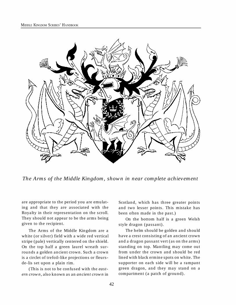
42
MIDDLE KINGDOM SCRIBES’ HANDBOOK
The Arms of the Middle Kingdom, shown in near complete achievement
are appropriate to the period you are emulat-ing and that they are associated with theRoyalty in their representation on the scroll.They should not appear to be the arms beinggiven to the recipient.
The Arms of the Middle Kingdom are awhite (or silver) field with a wide red verticalstripe (pale) vertically centered on the shield.On the top half a green laurel wreath sur-rounds a golden ancient crown. Such a crownis a circlet of trefoil-like projections or fleurs-de-lis set upon a plain rim.
(This is not to be confused with the east-ern crown, also known as an ancient crown in
Scotland, which has three greater pointsand two lesser points. This mistake hasbeen often made in the past.)
On the bottom half is a green Welshstyle dragon (passant).
The helm should be golden and shouldhave a crest consisting of an ancient crownand a dragon passant vert (as on the arms)standing on top. Mantling may come outfrom under the crown and should be redlined with black ermine spots on white. Thesupporter on each side will be a rampantgreen dragon, and they may stand on acompartment (a patch of ground).
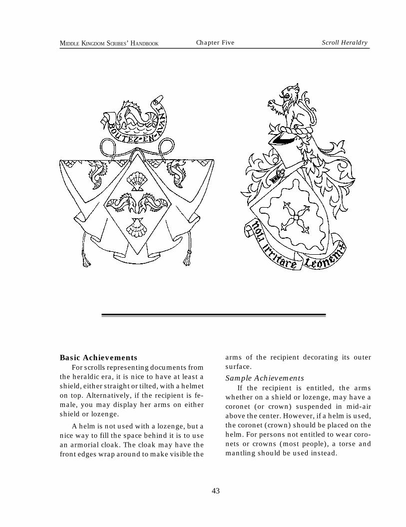
43
MIDDLE KINGDOM SCRIBES’ HANDBOOK
Basic AchievementsFor scrolls representing documents from
the heraldic era, it is nice to have at least ashield, either straight or tilted, with a helmeton top. Alternatively, if the recipient is fe-male, you may display her arms on eithershield or lozenge.
A helm is not used with a lozenge, but anice way to fill the space behind it is to usean armorial cloak. The cloak may have thefront edges wrap around to make visible the
arms of the recipient decorating its outersurface.
Sample AchievementsIf the recipient is entitled, the arms
whether on a shield or lozenge, may have acoronet (or crown) suspended in mid-airabove the center. However, if a helm is used,the coronet (crown) should be placed on thehelm. For persons not entitled to wear coro-nets or crowns (most people), a torse andmantling should be used instead.
Chapter Five Scroll Heraldry
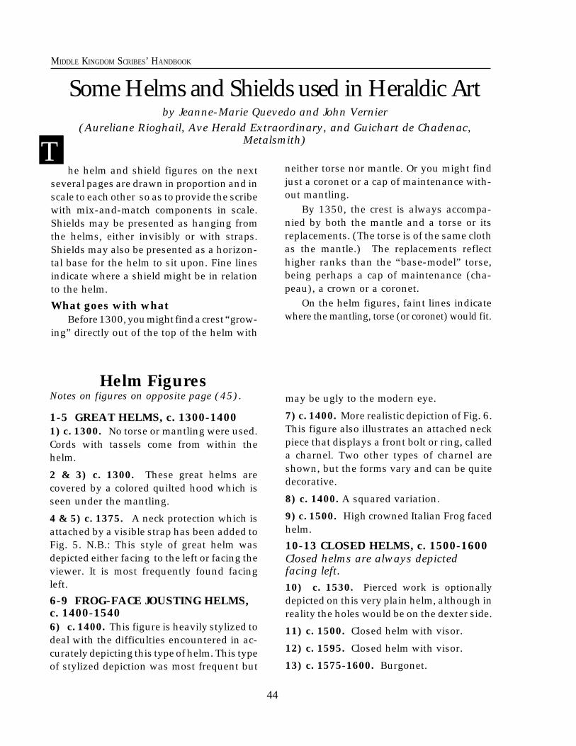
44
MIDDLE KINGDOM SCRIBES’ HANDBOOK
he helm and shield figures on the nextseveral pages are drawn in proportion and inscale to each other so as to provide the scribewith mix-and-match components in scale.Shields may be presented as hanging fromthe helms, either invisibly or with straps.Shields may also be presented as a horizon-tal base for the helm to sit upon. Fine linesindicate where a shield might be in relationto the helm.
What goes with whatBefore 1300, you might find a crest “grow-
ing” directly out of the top of the helm with
Some Helms and Shields used in Heraldic Artby Jeanne-Marie Quevedo and John Vernier
(Aureliane Rioghail, Ave Herald Extraordinary, and Guichart de Chadenac,Metalsmith)
may be ugly to the modern eye.
7) c. 1400. More realistic depiction of Fig. 6.This figure also illustrates an attached neckpiece that displays a front bolt or ring, calleda charnel. Two other types of charnel areshown, but the forms vary and can be quitedecorative.
8) c. 1400. A squared variation.
9) c. 1500. High crowned Italian Frog facedhelm.
10-13 CLOSED HELMS, c. 1500-1600Closed helms are always depictedfacing left.10) c. 1530. Pierced work is optionallydepicted on this very plain helm, although inreality the holes would be on the dexter side.
11) c. 1500. Closed helm with visor.
12) c. 1595. Closed helm with visor.
13) c. 1575-1600. Burgonet.
Tneither torse nor mantle. Or you might findjust a coronet or a cap of maintenance with-out mantling.
By 1350, the crest is always accompa-nied by both the mantle and a torse or itsreplacements. (The torse is of the same clothas the mantle.) The replacements reflecthigher ranks than the “base-model” torse,being perhaps a cap of maintenance (cha-peau), a crown or a coronet.
On the helm figures, faint lines indicatewhere the mantling, torse (or coronet) would fit.
Helm FiguresNotes on figures on opposite page (45).
1-5 GREAT HELMS, c. 1300-14001) c. 1300. No torse or mantling were used.Cords with tassels come from within thehelm.
2 & 3) c. 1300. These great helms arecovered by a colored quilted hood which isseen under the mantling.
4 & 5) c. 1375. A neck protection which isattached by a visible strap has been added toFig. 5. N.B.: This style of great helm wasdepicted either facing to the left or facing theviewer. It is most frequently found facingleft.
6-9 FROG-FACE JOUSTING HELMS,c. 1400-15406) c. 1400. This figure is heavily stylized todeal with the difficulties encountered in ac-curately depicting this type of helm. This typeof stylized depiction was most frequent but
45
MIDDLE KINGDOM SCRIBES’ HANDBOOK Chapter Five Scroll Heraldry
46
MIDDLE KINGDOM SCRIBES’ HANDBOOK
SHIELDSOn the shield figures (opposite page), the “x” markings arecenter points for drawing shield edge arcs.A. “KITE” shield, c. 1120-1220. This shape varied in width (the widestexample is shown), in the straightness or curvature of the sides, or in thepoint or curve of the bottom tip. In the 13th century, styles were changingto a straighter top of the shield. A kite might have the top cut off in astraight line (indicated on the figure), resulting in a “turnip” shape thatwas to remain popular until 1475. This shape was found throughoutEurope.
B. Classic “heater” shield, c. 13th century. A shape evolved from thekite shield. This shape was found throughout Europe. A thinner form ofit was found in Germany. (The “X” location point for the compass is foundabove shield C.)
C. Classic “heater” shield, c. 1250-1350. Notice that the sides runparallel more than the previous. This shape was found throughoutEurope.
D. Classic “heater” shield, c. 1350-1500. Notice that the sides runparallel more than half the length of the shield. This shape was foundthroughout Europe.
E. Straight-edge Heater Shield, c.1450-1600. Notice that the sides runparallel most of the shield. This shape was found throughout Europe.
F. Half round shield, c. 12th century to 1600. This shape wassometimes called the “Spanish shield” since it was used most frequentlyin Spain. Its earliest Spanish form dates from the 12th c. and was thinner,much like the “kite." That thin shape widened slightly by the 13thcentury, and was then found in both Spain and Italy. The width shownin the figure has been known in Spain since the 15th c. and remainedpopular well past 1600. The width shown has also been extremelypopular in Germany since the 15th century. Notice the shape is con-structed of a rough square with a semi-circle drawn at the bottom.
G. Jousting shield, c. 1450-1600. This notched shield shape was verypopular in England. It was also found, with slight variation, in Germanyin the 15th century. An un-notched (i.e., symmetrical) version of thisshield was used in England in the 16th century.
H. Jousting shield, 14th-15th centuries. This shape was particularlypopular in Italy. A straight-sided version (top and bottom remain curved)was also popular in Italy in the 14th century.
I. Jousting shield, 16th century. This shape is uniquely Italian. Thebasic outline resembles a piece of head armor for a horse called achamfron. Slight variations known in period were created by a repositionof the scalloping along the sides, but can result in less available area todisplay charges.
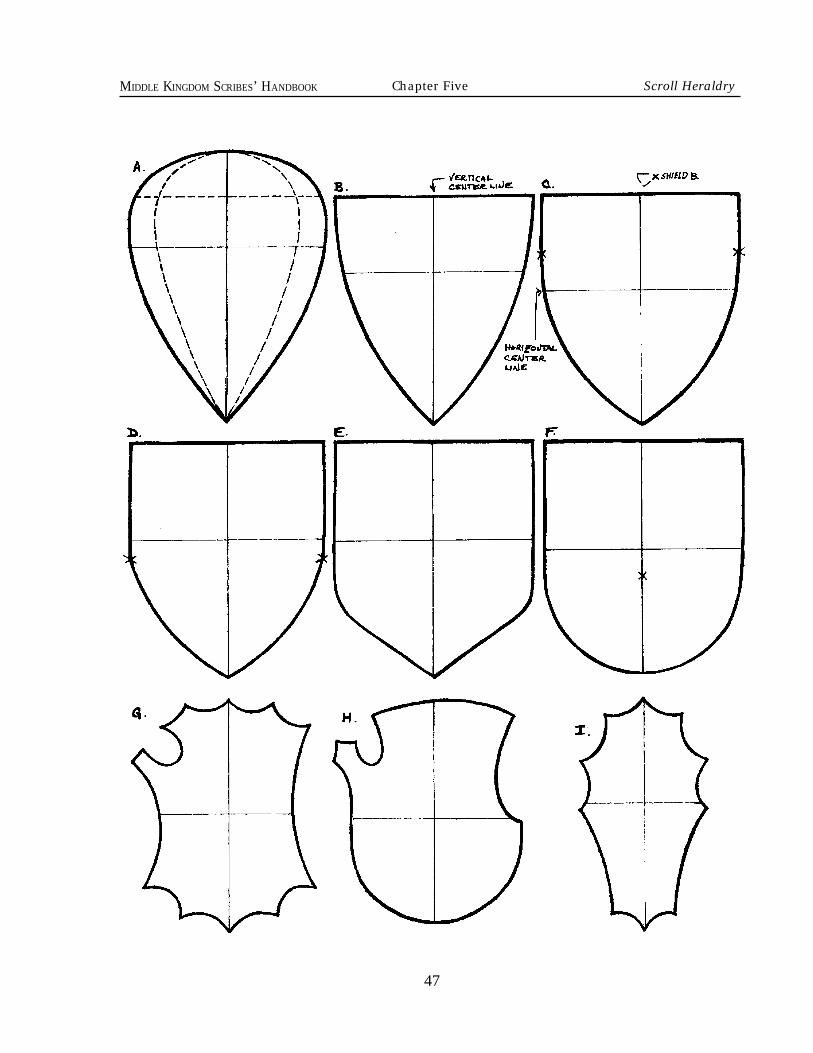
47
MIDDLE KINGDOM SCRIBES’ HANDBOOK Chapter Five Scroll Heraldry
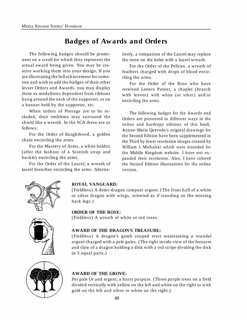
48
MIDDLE KINGDOM SCRIBES’ HANDBOOK
The following badges should be promi-nent on a scroll for which they represent theactual award being given. You may be cre-ative working them into your design. If youare illustrating the full achievement for some-one and wish to add the badges of their otherlesser Orders and Awards, you may displaythem as medallions dependent from ribbonshung around the neck of the supporter, or ona banner held by the supporter, etc.
When orders of Peerage are to be in-cluded, their emblems may surround theshield like a wreath. In the SCA these are asfollows:
For the Order of Knighthood, a goldenchain encircling the arms.
For the Mastery of Arms, a white baldric(after the fashion of a Scottish strap andbuckle) encircling the arms.
For the Order of the Laurel, a wreath oflaurel branches encircling the arms. Alterna-
tively, a companion of the Laurel may replacethe torse on the helm with a laurel wreath.
For the Order of the Pelican, a wreath offeathers charged with drops of blood encir-cling the arms.
For the Order of the Rose who havereceived Letters Patent, a chaplet (branchwith leaves) with white (or silver) and/orencircling the arms.
The following badges for the Awards andOrders are presented in different ways in theonline and hardcopy editions of this book.Jeanne-Marie Quevedo's original drawings forthe Second Edition have been supplemented inthe Third by lower resolution images created byWilliam J. Michalski which were intended forthe Middle Kingdom website. I have not ex-panded their resolution. Also, I have coloredthe Second Edition illustrations for the onlineversion.
ROYAL VANGUARD:(Fieldless) A demi-dragon rampant argent. (The front half of a whiteor silver dragon with wings, oriented as if standing on the missingback legs.)
ORDER OF THE ROSE:(Fieldless) A wreath of white or red roses.
AWARD OF THE DRAGON'S TREASURE:(Fieldless) A dragon's gamb couped erect maintaining a roundelargent charged with a pale gules. (The right inside view of the forearmand claw of a dragon holding a disk with a red stripe dividing the diskin 3 equal parts.)
AWARD OF THE GROVE:Per pale Or and argent, a hurst purpure. (Three purple trees on a fielddivided vertically with yellow on the left and white on the right or withgold on the left and silver or white on the right.)
Badges of Awards and Orders
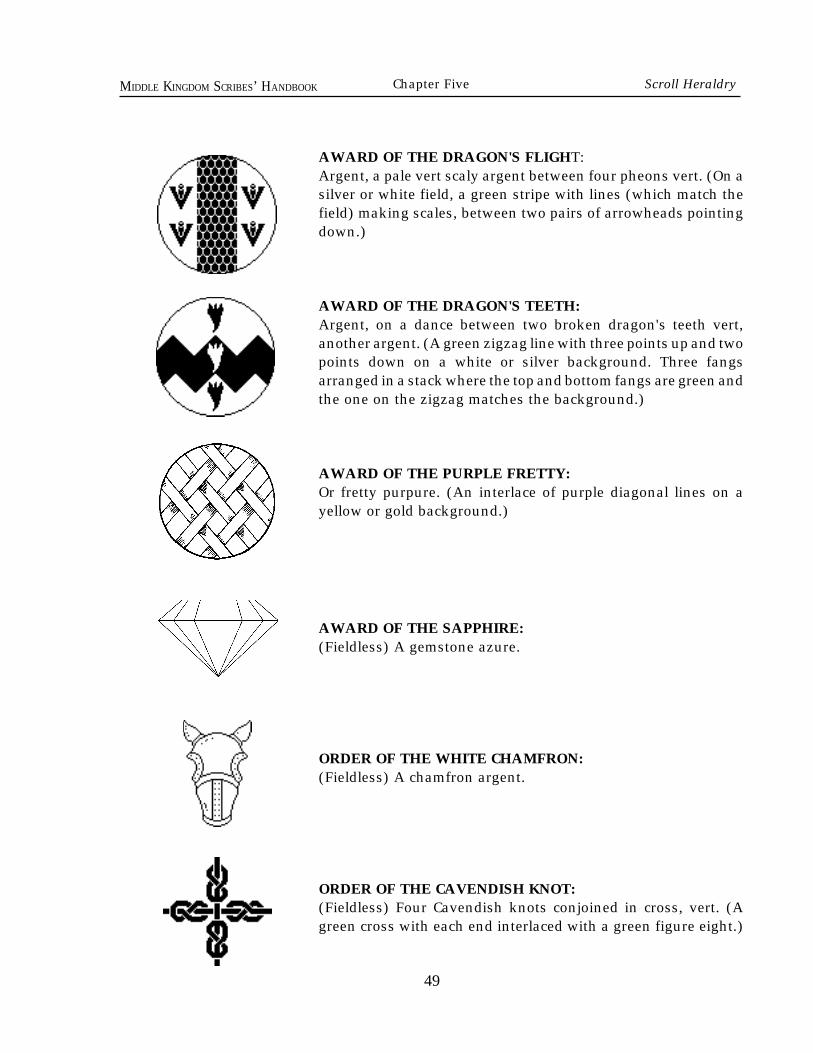
49
MIDDLE KINGDOM SCRIBES’ HANDBOOK
AWARD OF THE DRAGON'S FLIGHT:Argent, a pale vert scaly argent between four pheons vert. (On asilver or white field, a green stripe with lines (which match thefield) making scales, between two pairs of arrowheads pointingdown.)
AWARD OF THE DRAGON'S TEETH:Argent, on a dance between two broken dragon's teeth vert,another argent. (A green zigzag line with three points up and twopoints down on a white or silver background. Three fangsarranged in a stack where the top and bottom fangs are green andthe one on the zigzag matches the background.)
AWARD OF THE PURPLE FRETTY:Or fretty purpure. (An interlace of purple diagonal lines on ayellow or gold background.)
AWARD OF THE SAPPHIRE:(Fieldless) A gemstone azure.
ORDER OF THE WHITE CHAMFRON:(Fieldless) A chamfron argent.
ORDER OF THE CAVENDISH KNOT:(Fieldless) Four Cavendish knots conjoined in cross, vert. (Agreen cross with each end interlaced with a green figure eight.)
Chapter Five Scroll Heraldry
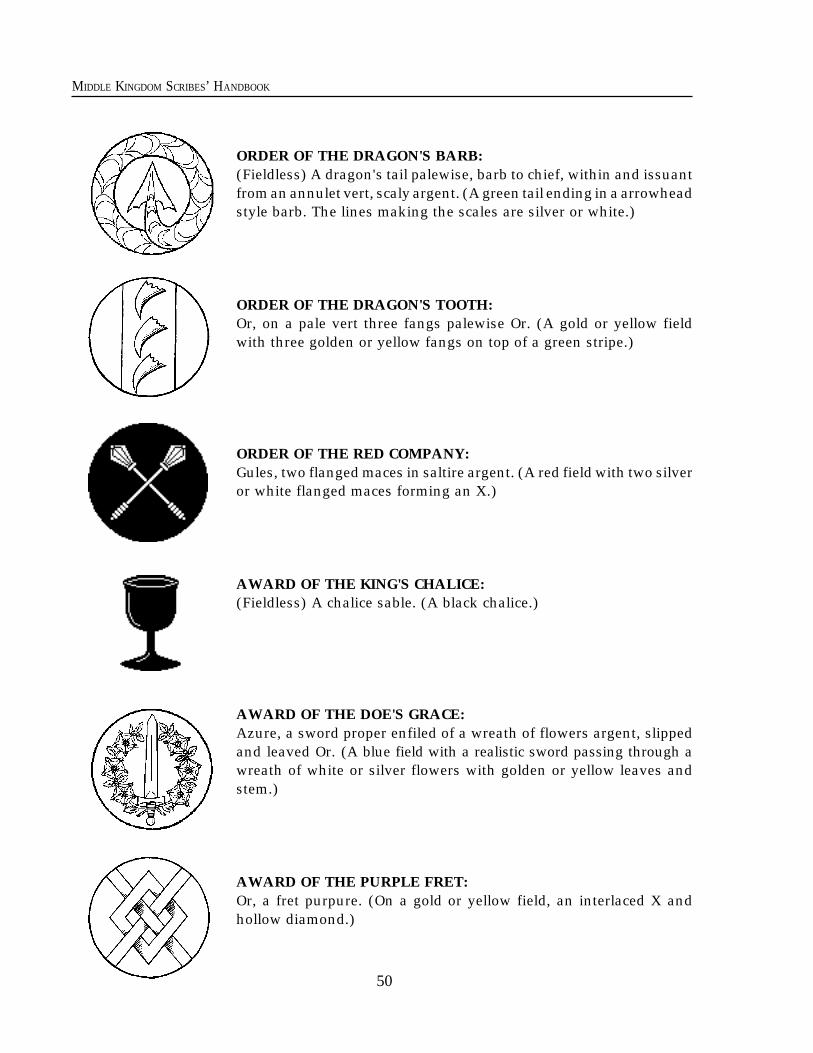
50
MIDDLE KINGDOM SCRIBES’ HANDBOOK
ORDER OF THE DRAGON'S BARB:(Fieldless) A dragon's tail palewise, barb to chief, within and issuantfrom an annulet vert, scaly argent. (A green tail ending in a arrowheadstyle barb. The lines making the scales are silver or white.)
ORDER OF THE DRAGON'S TOOTH:Or, on a pale vert three fangs palewise Or. (A gold or yellow fieldwith three golden or yellow fangs on top of a green stripe.)
ORDER OF THE RED COMPANY:Gules, two flanged maces in saltire argent. (A red field with two silveror white flanged maces forming an X.)
AWARD OF THE KING'S CHALICE:(Fieldless) A chalice sable. (A black chalice.)
AWARD OF THE DOE'S GRACE:Azure, a sword proper enfiled of a wreath of flowers argent, slippedand leaved Or. (A blue field with a realistic sword passing through awreath of white or silver flowers with golden or yellow leaves andstem.)
AWARD OF THE PURPLE FRET:Or, a fret purpure. (On a gold or yellow field, an interlaced X andhollow diamond.)
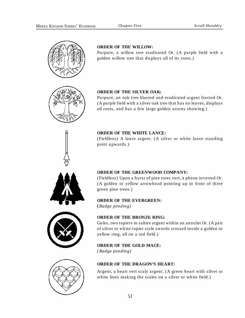
51
MIDDLE KINGDOM SCRIBES’ HANDBOOK
ORDER OF THE WILLOW:Purpure, a willow tree eradicated Or. (A purple field with agolden willow tree that displays all of its roots.)
ORDER OF THE SILVER OAK:Purpure, an oak tree blasted and eradicated argent fructed Or.(A purple field with a silver oak tree that has no leaves, displaysall roots, and has a few large golden acorns showing.)
ORDER OF THE WHITE LANCE:(Fieldless) A lance argent. (A silver or white lance standingpoint upwards.)
ORDER OF THE GREENWOOD COMPANY:(Fieldless) Upon a hurst of pine trees vert, a pheon inverted Or.(A golden or yellow arrowhead pointing up in front of threegreen pine trees.)
ORDER OF THE EVERGREEN:(Badge pending)
ORDER OF THE BRONZE RING:Gules, two rapiers in saltire argent within an annulet Or. (A pairof silver or white rapier style swords crossed inside a golden oryellow ring, all on a red field.)
ORDER OF THE GOLD MACE:(Badge pending)
ORDER OF THE DRAGON’S HEART:
Argent, a heart vert scaly argent. (A green heart with silver orwhite lines making the scales on a silver or white field.)
Chapter Five Scroll Heraldry
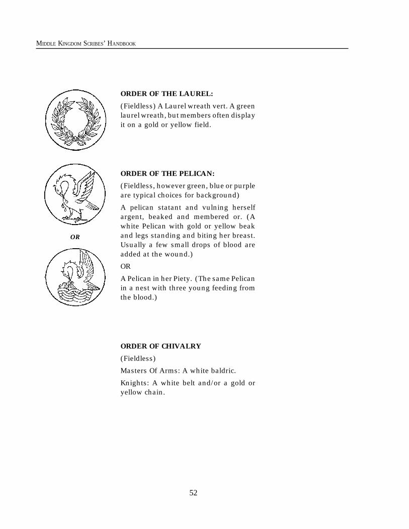
52
MIDDLE KINGDOM SCRIBES’ HANDBOOK
ORDER OF THE LAUREL:
(Fieldless) A Laurel wreath vert. A greenlaurel wreath, but members often displayit on a gold or yellow field.
ORDER OF THE PELICAN:
(Fieldless, however green, blue or purpleare typical choices for background)
A pelican statant and vulning herselfargent, beaked and membered or. (Awhite Pelican with gold or yellow beakand legs standing and biting her breast.Usually a few small drops of blood areadded at the wound.)
OR
A Pelican in her Piety. (The same Pelicanin a nest with three young feeding fromthe blood.)
ORDER OF CHIVALRY
(Fieldless)
Masters Of Arms: A white baldric.
Knights: A white belt and/or a gold oryellow chain.
OR
53
MIDDLE KINGDOM SCRIBES’ HANDBOOK
Making a scroll for the Kingdom not onlyhelps to give recognition to someone, it givesyou an opportunity to show off your ownskills in the arts. In addition, you are helpingrevive an ancient art, and that is one of thepurposes of the SCA.
Foremost, you are a volunteer, and theKingdom appreciates that fact. Please do notfeel pressured to put more into a scroll thanthe minimum requested below. The King-dom is very grateful for whatever efforts youchoose to donate.
Sometimes you may be approached by arecipient who has already been given anoriginal handmade scroll. They may want tocommission you to make a new one becauseeither the old one was damaged after receiptor the person just wants a prettier one.
Since the Kingdom already gave them anoriginal, you may feel free to take suchcommissions and charge the recipient as youwould for any other piece of commissionedartwork. The Signet will be happy to use theKingdom Seal on such replacements, but theburden of obtaining signatures rests be-tween you and your patron.
Where You fit into the system. The person responsible for providing
scrolls for awards is a Kingdom Lesser Of-ficer of State known as the Kingdom Signet.The Kingdom Signet is a deputy of the DragonHerald and works directly with the Crown.The Kingdom Signet has Regional Deputieswho know the scribes in their areas betterthan the Kingdom officer usually can. Somelocal groups may also have a Signet who iseither a deputy of the Kingdom Signet or anassistant to the Regional Deputy. Any ofthese people may contact you with a requestto do a scroll. If you are not yet in communi-cation with the Signet Office, you shouldcontact the Kingdom Signet or a Deputy to letthem know you would like to help. The King-dom Signet may be found listed in the Pale.
One of the most important things to re-member is that when you are given an as-signment by one of these people you havebecome privy to a STATE SECRET. Theidentity of the recipient MUST be kept secretfrom any and all who have not been givenpermission by Their Majesties. Failure tokeep this secret is cause for not trusting youin the future, and you may end up doingbacklog scrolls only. (Actually, we alwaysneed help on backlog.)
This means don’t show your friends thescroll unless you first cover the name and any-thing else which might identify the recipient.
Also, no matter how strong the tempta-tion, avoid trying to make sure the recipientwill be at court that night. This often tipsthem off.
If they don’t show up, then they don’t
Chapter Six
What You Need To KnowTo Make Award Scrolls For The Middle Kingdom
W hy scrolls are made The Middle Kingdom goes beyond many
SCA Kingdoms in the elaborate quality of itsaward scrolls. We consider them to be aspecial “thank you” for recognition of ser-vices and skills. The actual legal elevation isthe announcement of the award in Court andits publication in the Kingdom newsletter.The scroll is not required to make the awardlegal. It is an extra bonus, a gift given by theCrown. By custom, we try hard to provide eachand every recipient with a handmade scroll.
54
MIDDLE KINGDOM SCRIBES’ HANDBOOK
show up. Nor should you indicate to friendsthat they should show up to see the awardmade if you think they might figure out whois getting something.
Alternative languages. If you write a scroll in a script that is
difficult for a herald to read, please write atranscription and/or translation on the backor on a separate sheet of paper.
If you are interested in making a scrollusing a language other than modern En-glish, and you can translate the text accu-rately, feel free to do so. If you do translate ascroll, please include a modern English ver-sion for the court herald to read. The SignetOffice has several scroll texts in differentlanguages which are available for this pur-pose. Please contact either your local deputyor the Kingdom Signet for more information.If you do create an alternate language scroll,please consider contributing the text to thisoffice for the use of other scribes.
Regency Courts. Sometimes the King and Queen may
wish to delegate the distribution of awards tocertain other individuals such as TheirHighnesses or Baronial representatives. Inthis case, a Regency Court is held on behalfof Their Majesties, and awards are given inTheir names. Such scrolls have special for-mats because they must reflect both thatthey are given by the Regent, and that theyare coming from the Crown.
The Regency scroll text reads exactly thesame as a regular scroll until you get to thecorroboration and date at the bottom. Herethe text follows a changed model:
“Done by the hands of our Regent(s),(names and titles of acting Regents) this(date) in our (place of event).”
At the bottom of the Regency scroll,below the signature spaces, indicate “ProRege” (for the King) and “Pro Regina” (forthe Queen) and leave room above these
words for the Regents to sign. (Note thechange from “Rex” to “Rege.")
The Parts of a scrollThe recipients will probably want to frame
your work when they get home, so pleaseuse a paper which conforms to a standardphoto frame size.
Unless you are working on somethingunique which specifically calls for an oddsize, and you know the recipient won’t mindbuying a custom frame, it is best to keepthings easy. Some common sizes are 5x7,8x10, 8.5x11, 8x12, and 11x14 inches.
Signature. You should sign your work. It isbest to put your name, address, and themedium with which you made the scroll onthe back of the artwork. There are periodways to sign on the front, such as:(Your name) DELINIAVIT: drawn by ____(Your name) FACIEBAT: fashioned by ____(Your name) ME FECIT: ____ made mePER MANO (Your name): by the hand of ___(Your name) PINXIT: painted by ____(Your name) SCRIPSIT: written by ____Royal signatures. The signatures of theKing and Queen will be placed near thebottom of the scroll, so you must leave roomfor them, and also room somewhere on thescroll for the Kingdom Seal. The signaturelocations are often designated by the scribewith the words Rex for King and Regina forQueen in very small letters under where theysign. On most scrolls the King signs on theleft and the Queen on the right. However, onthe Doe’s Grace, Willow, Silver Oak, andRose the places are reversed. Do not make anink line for them to sign on. It is not appro-priate. Instead you may leave a very lightpencil line if you feel it is necessary.
Kingdom Seal. There are two types ofKingdom seal. There is a metal stamping sealwhich works on wax. It either covers a rib-bon or covers a tongue cut in the paper of thescroll itself. It is rarely used because thescribe needs to design the scroll specially to
55
MIDDLE KINGDOM SCRIBES’ HANDBOOK
accommodate this. The standard seal is arubber stamp which is a disk 1.75 inches indiameter and is inked in either red or green.It is very difficult to place the ink seal into adesigned circular space left by the scribe.Nevertheless the rubber ink seal may beincorporated into the scroll design, but it isusually given an open space at the bottom ofthe scroll.Text. The important part of the scroll is thetext. You may deviate from the models pre-sented in this handbook if you understandwhich are the necessary and required ele-ments. In Chapter Four: Text Alternativesyou will find information on rewording scrolltexts.Date. The scroll must have the date of theCourt written into the text to state when theaward was made. SCA dates begin the yearon May 1, and the month and day are thesame as in the mundane system. The year isdesignated Anno Societatis, meaning “yearof the Society," instead of A.D. (Anno Domini).
For example, the twenty-fifth year of theSociety, A.S. XXV began May 1, 1990 A.D.(The A.S. letters with periods after them donot represent accurate medieval contractions.These would have shortened versions of thewords and added horizontal lines above eachdenoting the contractions.)Decoration. The amount of decoration on ascroll will depend on the type of scroll andlevel of award, and how much work you arewilling to put into your creation. The mini-mum amount of decoration expected for lowerlevel scrolls is a nicely illuminated first initialof the text. Middle level awards should havea bit more, such as more border design.Scrolls for Court Barony and above should besomewhat more involved, but even Peeragescrolls are not required to be intense repro-ductions of lavish manuscripts. On the otherhand, it is the expectation.
You may have noticed that many scribestend to go far beyond this minimum amount
of decoration. For some it is because theywish to excel in the art. For others it is achance for recognition of their skills. Somescribes use it as a way to return to theKingdom and their friends some of the plea-sure they have received in the Society. Thereis no upper limit to the amount of decoration!We do, however, expect the scroll to bedelivered complete at or before the event.Unfinished Scrolls. If the dog gets hungry,or junior gets a little crayon-happy the daybefore the event, well, accidents happen. Itwill be acceptable to turn in a substitutescroll freshly calligraphed, have it awarded,and then take it back to finish it ASAP. Ifthere is no way to at least provide the callig-raphy by the due date, tell the Signet whomade the assignment to you. We will be sureto bring a promissory to award in Court.Authenticity. Scrolls handed out by theMiddle Kingdom are usually based on thestyle of authentic documents or on illumi-nated manuscript pages from the middleages. Contemporary fantasy style illustra-tions are sincerely frowned upon. This policyreflects the historical goals of the Society.Armorial Content. If the scroll confers armsand the device of the recipient is known andregistered, it is preferred that the scroll depictthe arms. You may also wish to considermaking the scroll layout resemble some kindof period heraldic document. In this case, it isgood to include the arms and achievementdone in a way appropriate to the style andperiod of your artwork.
We recommend that you try to familiarizeyourself with the basics of heraldry so youwill be able to draw the described heraldiccharges in a heraldic style. The person as-signing the scroll to you should supply youwith the exact wording of the blazon (heral-dic description) for the arms of the awardrecipient. If you do not completely under-stand the blazon, consult a senior herald (i.e.,a Regional Herald or the Dragon Herald).
Chapter Six What You Need to Know
56
MIDDLE KINGDOM SCRIBES’ HANDBOOK
here are several ways to lay out a scroll.Let us first discuss the physical parts of thescroll.
Support. This is the paper or parchment(animal skin) on which the scroll is writtenand painted.
Ruling Lines and Margins. These are theguidelines. They may be either erased aftercompletion or retained, depending on whatis appropriate to the period being emulated.
Display Letters. These are oversized, usu-ally upper-case letters. They are colored orgilded and head the text.
Versals. From the late 11th century thisrefers to an alphabet of upper-case lettersused as display letters or as emphasizedcapitals within text.
Capital Initials. Any upper-case letters em-phasized by being enlarged and/or colored.
Decorated Initials. These are ornamentedlarge upper-case letters beginning text orverses.
Historiated Initials. These are very largeupper-case letters with narrative illustra-tions inside and around them.
Inhabited Initials. These are large upper-case letters decorated by the addition ofanimal or human figures.
Foliated Initials. These are large upper-case letters decorated by the addition ofplant motifs in and around them.
Miniature. This refers to the main illustra-tion panel.
Signatures of Royalty. Heraldic Displays.Kingdom Seal. These are all expected to beincorporated into the design. Badges ofawards and orders may be incorporated atthe discretion of the scribe. The recipient’sarms should be included only if they areknown to be registered. At the discretion ofthe scribe, the recipient’s registered armsmay be included on awards which do notconfer arms.
*
It is very important to leave ample openspace between the edge of the page and yourdesign. When you see medieval book illus-trations running close to the page edge it isusually because the book rotted and wastrimmed down.
A comfortable margin is at least 1/8 ofthe width of the scroll sheet, to be used oneach side and the top. The bottom needsslightly more and should have room for theseal.
For example: for an 8 x 10” scroll thesides and top should have 1 to 1.25 inches ofclear space between the paper’s edge and thedesign. Remember, (especially for smallscrolls) the frame will cover about 1/4 inchon each side.
Please make sure your calligraphy fitsthe style and period of the illumination.Below are several design layouts which sug-gest possible ways of using the above-men-tioned elements on SCA award scrolls. Youmay feel free to experiment with ideas fromsource books.
T
Chapter Seven
The Layout and Design of Scrolls
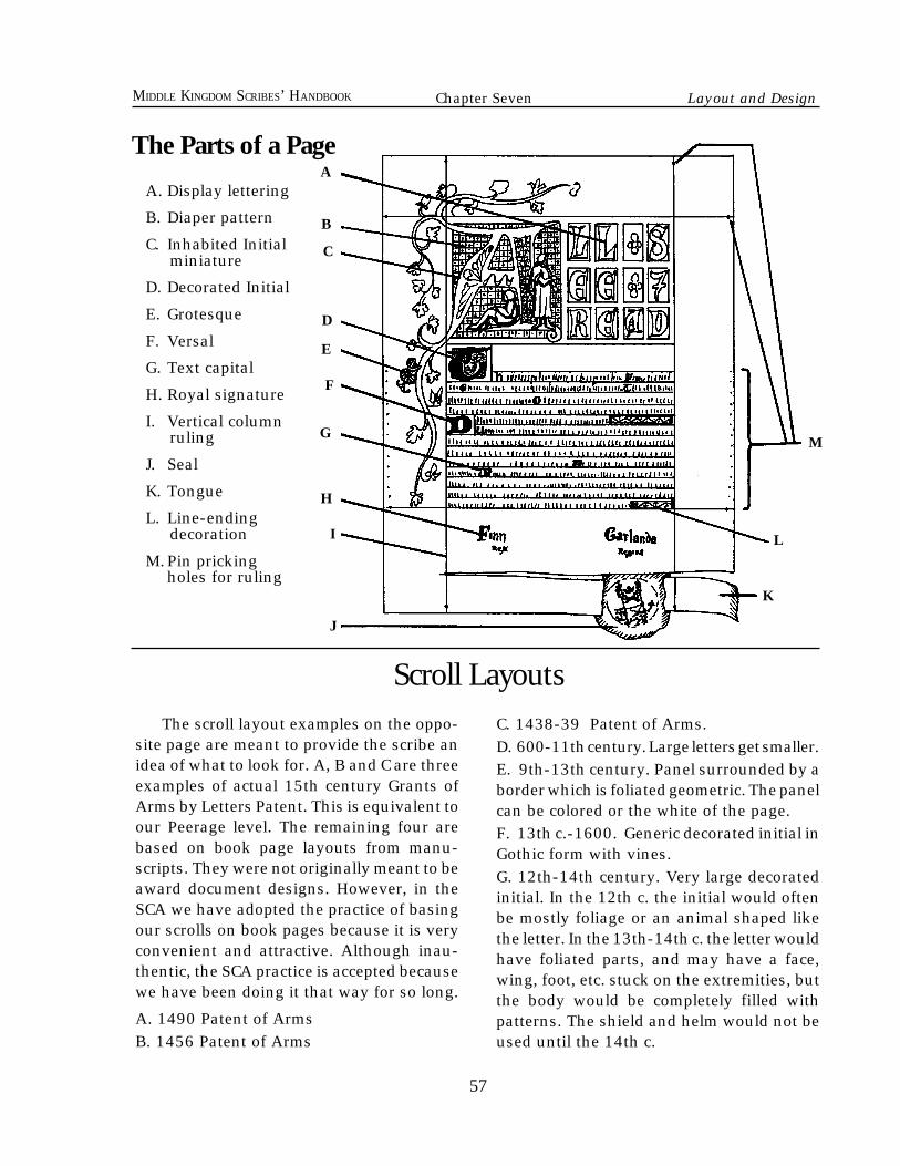
57
MIDDLE KINGDOM SCRIBES’ HANDBOOK
Scroll LayoutsC. 1438-39 Patent of Arms.D. 600-11th century. Large letters get smaller.E. 9th-13th century. Panel surrounded by aborder which is foliated geometric. The panelcan be colored or the white of the page.F. 13th c.-1600. Generic decorated initial inGothic form with vines.G. 12th-14th century. Very large decoratedinitial. In the 12th c. the initial would oftenbe mostly foliage or an animal shaped likethe letter. In the 13th-14th c. the letter wouldhave foliated parts, and may have a face,wing, foot, etc. stuck on the extremities, butthe body would be completely filled withpatterns. The shield and helm would not beused until the 14th c.
The scroll layout examples on the oppo-site page are meant to provide the scribe anidea of what to look for. A, B and C are threeexamples of actual 15th century Grants ofArms by Letters Patent. This is equivalent toour Peerage level. The remaining four arebased on book page layouts from manu-scripts. They were not originally meant to beaward document designs. However, in theSCA we have adopted the practice of basingour scrolls on book pages because it is veryconvenient and attractive. Although inau-thentic, the SCA practice is accepted becausewe have been doing it that way for so long.
A. 1490 Patent of ArmsB. 1456 Patent of Arms
A. Display lettering
B. Diaper pattern
C. Inhabited Initial miniature
D. Decorated Initial
E. Grotesque
F. Versal
G. Text capital
H. Royal signature
I. Vertical column ruling
J. Seal
K. Tongue
L. Line-ending decoration
M.Pin prickingholes for ruling
B
A
C
D
E
F
G
H
I
K
L
M
J
The Parts of a Page
Chapter Seven Layout and Design
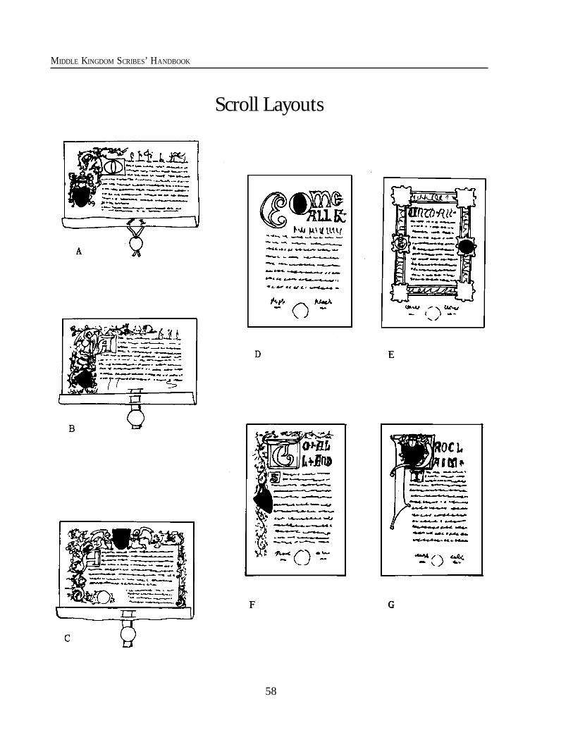
58
MIDDLE KINGDOM SCRIBES’ HANDBOOK
Scroll Layouts
59
MIDDLE KINGDOM SCRIBES’ HANDBOOK
59
he goal of this chapter is to give advice onthe materials and techniques used to makescrolls for the Middle Kingdom. It is impor-tant to remember that this is only advice. It isbased on the knowledge and experience ofthe author and should not be considered thefinal word. You, as artists working withinthe framework of appropriate medieval SCAscroll design, will make the final artisticdecisions which make the product work bestfor you.
The emphasis in this chapter will includemethods of imitating period appearanceswhile using contemporary tools. For infor-mation on how actual period documentswere made, see Chapter 12: A Perspectiveon Period Methods.
The suggested order for the steps inproducing a scroll are as follow:
1) Accept commission of assignment.2) Determine scroll size.3) Choose period, place and appropriate style.4) Plan the design with a pencil sketch.5) Rule calligraphy guidelines.6) Write.7) Rubricate.8) Create illustration layout underdrawing.9) Gild.10) Paint.11) Credit yourself and list media.
1) The Commission is when the Crown or theSignet contacts you and gives you the correctspelling of the name, the gender, and thearms of the recipient when appropriate, theplace, date, location of the event and thereason for the award. Make sure you get allof this information.
Chapter Eight
Contemporary Techniques for Producing Scrollsand
Advice for Choosing Tools and Materials
2) Determine the size of the page you needby considering the amount of text, margins, andhow much decoration you plan to use in accor-dance with whatever layout you will be using.3) Choose the style of your calligraphy andillumination. It is nice if it fits the persona ofthe recipient, but this is not required. If armsor badges are to be included, please add themto the design.4) On another piece of paper, plan the designyou have in mind with a rough sketch.5) Rule vertical lines for the text column(s)in either pencil, drypoint, or thin ink, de-pending on the style you are emulating.Then rule the horizontal text lines the sameway. This can be done with either a specialboard that has a sliding straight edge, or byusing a triangle next to a ruler. The spacingshould be in proportion to the height of theletters as explained in the calligraphy sec-tion. In many period styles the ruling waspermanent, not erased.6) The calligraphy comes next. Remember toleave spaces for the miniature, decorated ini-tials, display letters, and other capital initials,etc. Any of these may intrude into the textblock. You may indicate areas with loosepencil lines.7) Rubrication: Now add the colored versalletters and/or other capital initials, the dis-play letters, and decorative flourishing linesetc. where appropriate.8) Do an underdrawing of the design verylightly in pencil (otherwise the pencil lineswill show through the paint). You may wishto ink some of the lines at this point and erasethe pencil. This will crisp up the drawing;however, it is not always necessary. It is best toleave only a crisp, smooth line, whether in inkor pencil, because sketchiness will always causeyour work to look unnecessarily crude.
T
60
MIDDLE KINGDOM SCRIBES’ HANDBOOK
9) If you are gilding with real gold leaf overgesso (raised gold), this is the time when thegold should be put down. Otherwise, paintedgold can be used when convenient in thepainting step.10) Paint the design.11) Sign your work on the back with bothyour mundane and SCA names. This way therecipient will know whom to thank! It is alsorecommended that you list the medium ofthe paint, whether the ink is waterproof ornot, and mention if you sprayed a sealingfixative over the page (Note: My experiencecauses me to suggest that you try to usetechniques which do not need such overspraybecause it can lead to other problems). If youinclude your address, who knows, you mighteven receive a letter of appreciation!12) Store the finished artwork in a flat place.It can be transported in a large manila enve-lope with a card in it to prevent creasing orother damage. Please do not roll scrolls as thiscan cause cracking or smudging of the paint.
SourcesAppendix A of the Middle Kingdom
Scribes' Handbook is being hosted online atthe following URL: http://www.provide.net/~randyaf/rmkshb.html. It isour intention to have this section updated asfrequently as a volunteer basis can allow.You can also contact the local, regional, oreven Kingdom Signet for suggestions onreference books, tools, papers, wording sug-gestions, etc.
There are a great number of good bookson the market which teach calligraphy. Mosthave instructions which teach the basics ofmedieval calligraphic strokes. Beware of anybooks which claim to be showing medievalscripts but fail to give source references totime and place. These are usually very ge-neric, and are designed for modern calligra-phers who want an antique appearance intheir work. They are often misleading andgrossly inauthentic.
Your best bet for authentic medieval art-work is to look for books which are specifi-cally about medieval manuscripts. You maylook for the ones which show a lot of colorreproductions of both calligraphed and illu-minated pages through the middle ages.These books should tell the time, place andsize of the pages. Avoid the widely-availablereprints of several nineteenth-century bookson the subject. They are often incomplete.Even worse, the illustrations are lithographi-cally printed from artwork hand-copied fromthe original pieces. They will not show thelevel of detail or accuracy which you will getfrom photographic reproductions. You willnot see how translucent the paint was, whatthe brushstrokes were like, or see how theyblended colors.
The best, but most expensive sourcebooks are facsimile reproductions of illumi-nated books. A collection of these will giveyou an excellent source for the particulartime and place featured. Unfortunately, ithas the potential to make a collector of youand can cost hundreds of dollars.
Choosing Tools and MaterialsThe types of tools you use are your
choice. Feel free to substitute as you see fit.The one main thing to remember is that toolsand materials are a personal choice. Whatworks really well for one person may bedisastrous for someone else. Do not ever letsomeone tell you that you must use whatthey use because it is the best. It is only thebest for them.
Lighting: Since you can’t predict thelighting under which your work will be dis-played, it makes sense to give it the bestpossible color balance to start with. Believe itor not, if you paint by anything less than full-spectrum daylight, the lighting you paint bywill distort the color balance of your finishedwork, to the same degree that your lightsource is limited.
60
61
MIDDLE KINGDOM SCRIBES’ HANDBOOK
Ordinary incandescent lamps furnish lessthan a third of the blue and yellow light thatbalanced daylight does. Under it, yellowsand reds will look more orange, and bluesand greens will look more dull. Fluorescentlights will make the blues and yellows greenerand the reds and purples grayer. Naturally,you will tend to compensate as you paint,heightening the colors that look dull. Then,under more balanced lighting conditions,your finished work will show the compen-sating color imbalance.
To demonstrate the effect to yourself,look at photographs taken with daylight(outdoor) film under both outdoor and in-door lighting, without a flash. The colordifference between the two is quite pro-nounced.
The challenge is to avoid letting yourwork lights cause a color imbalance in yourwork. One method is to look at the colorsoutdoors so you can see them in a balancedlighting and try to remember their true ap-pearance. However, an overcast day givesbluer light than a sunny day, and sunriseand sunset lighting provides much more redthan you’d expect. Without a photographer’scolor meter, you cannot really know whatcolor environmental lighting is; the eye com-pensates too much.
This is one reason art studio windows areset up to catch north light: it has less colorvariation by time, season, and weather thanother light directions (in the northern hemi-sphere only). Of course it also eliminates thebright harshness of direct sunlight.
You can create somewhat balanced light-ing by using a combination of incandescentand fluorescent lamps. There are drawing-board lamps available with an incandescentbulb surrounded by a fluorescent ring(Circline®) tube, or two side by side fluores-cent tubes so you can use a cool white and awarm white simultaneously. Or you can find
light bulbs which are already color balanced.For true, balanced lighting, color profes-
sionals (printers and designers) have estab-lished the color temperature of 5000°K (av-erage daylight) as a standard. (This is noth-ing like "cool white," which has a stronggreen cast.) 5000°K fluorescent tubes areavailable in standard sizes and wattages, butcan be pricey.
Real parchment is the skin of calves(vellum), sheep, and goats. It is very expen-sive, but in period most documents weremade on it. It may require some specialinstructions to prepare it before use.
Papyrus was also used in the Mediterra-nean during the early middle ages. If youwish to use this, it is a good idea to do someresearch on period and place first. It wasusually used for rolled books and docu-ments, and rarely used in bound form byfolding into codices (modern-style books).Its use faded out by the middle of the 11thcentury.
Birch bark was written on for all sorts ofpurposes from the most ancient times. I donot know about western Europe, but thereare archeological finds from Novgorod wherebirch bark manuscripts called beresty havebeen dated to the 15th century. They arepersonal letters, instructions, legal docu-ments, etc. written with a blunt dry styluswhich creased the surface. The page waseither rolled and bound, or made into a bookformat (codex). Pages were usually a coupleof inches wide and several times that inlength.
Paper is period, but it came to Europeduring the Renaissance and was not usedmuch. We are, however, happy to have youuse paper. Do not be fooled by a productcalled drafting vellum or tracing parch-ment. These are paper products made fromplant pulp and have nothing in common withreal parchment. Most of these “vegetable
61
Chapter Eight Techniques, Tools, & Materials
62
MIDDLE KINGDOM SCRIBES’ HANDBOOK
parchments” are unsuitable because theyhave a high acid level which will cause themto get brittle and darken with age.
The best papers are 100% rag and acidfree. Wood pulp papers (which are naturallyacidic) and acid-treated papers get brittle,darken, and may even affect painted colorswith age. The brownish ‘calligraphy paper’has terrible longevity because it is both pulpand treated with acid to make the color.Besides, the choice parchment was prettywhite or off-white in the Middle Ages, notyellow!
The thickness of the paper will determinehow wet you can get it while painting. If youmust scrape ink to correct calligraphy errors,thicker paper will also let you scrape deeper.Thicker papers will also resist warping whenwet in the painting process. A good thick-ness is like a playing card. Minimum thick-ness is usually called 2-ply or designated inpounds where 90 pound is a good minimum.
The other important ingredient in paperis the glue called "size" which holds the paperfibers together. Too much size and your inkwill not penetrate the paper. Too little willcause your inks and paint to bleed into theloose fibers. Excessive pooling of ink canweaken the bond of the fibers so when thecalligraphy pen is pulled through the wet inkit will sometimes pull up fibers and spreadink in places you don’t want. If there issufficient sizing in the paper this is muchless likely to happen.
One good type of paper is called ‘Bristol’(not to be confused with Bristol Board) andis made by several manufacturers. You canbuy pads of it already cut to good scroll sizes.It takes pencil well and erases well. You canget either cold press (including “vellum style”)surface or hot press, sometimes called“smooth” or “plate” surface. "Vellum” sur-face takes the paint and ink more and holdsit, but you may find it a little more difficult to
get sharp, clean calligraphy with smallernibs. A metal calligraphy nib gives a sharp,clean line on plate surface paper but the inkpools on the surface and resists bonding wellwith the paper. For this reason, paint layersare more likely to crack and flake off of theplate finish page. It is also harder to erasepencil from plate surface.
Another drawback of the more absorbentpaper is that when a second stroke is madeover a wet ink stroke fibers may get pickedup and dragged by a metal nib as previouslydescribed. This happens because the mois-ture loosens the fiber and the stronger pres-sure of the metal nib scratches it away. Tryusing a lighter touch or a real feather quill.
If you have questions about a particularpaper ask your dealer. It is also a good ideato buy a small amount of a new paper andtest it first. People will suggest differenttypes which are good to try, but you shoulddecide based on your own experience. Re-member, no matter how good the scribe whorecommends a particular brand of material,it still may not work well for you!
I would also make this caution: papersspecifically designated as Watercolor pa-pers are usually a problem for most scribes.The first reason is that the surface is oftenrather bumpy and course, causing the pen tohave uneven strokes. The second reason isthat watercolors count on penetrating thepaper's surface for their adhesion and visualeffects. This means that the watercolor pa-pers are usually weaker in size content andthe fibers are not tightly pressed. Colors andinks tend to bleed, and pens can easilyscratch the paper and cause bleeding.
Pencils, ink, & Pens: You want a pencil that erases well and
makes rather light lines. A number 2H is agood compromise. Ultimately the hardnesswhich works best is based on your papersurface. Harder pencils need more tooth in
62
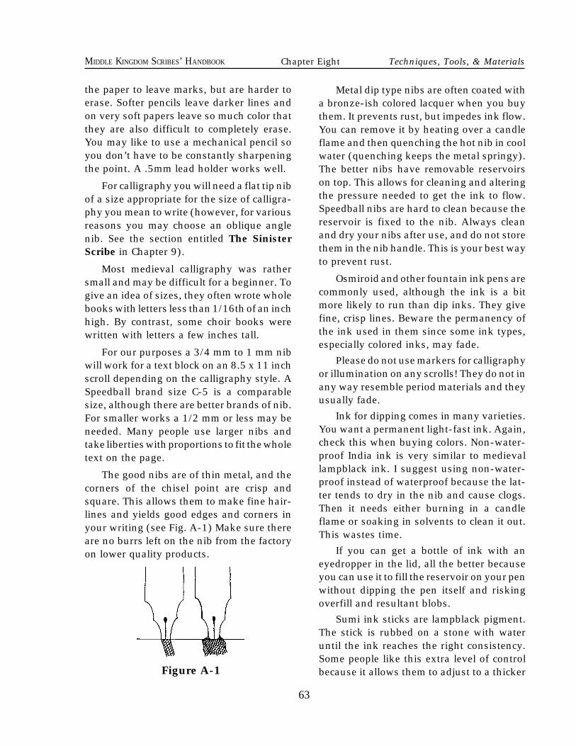
63
MIDDLE KINGDOM SCRIBES’ HANDBOOK
the paper to leave marks, but are harder toerase. Softer pencils leave darker lines andon very soft papers leave so much color thatthey are also difficult to completely erase.You may like to use a mechanical pencil soyou don’t have to be constantly sharpeningthe point. A .5mm lead holder works well.
For calligraphy you will need a flat tip nibof a size appropriate for the size of calligra-phy you mean to write (however, for variousreasons you may choose an oblique anglenib. See the section entitled The SinisterScribe in Chapter 9).
Most medieval calligraphy was rathersmall and may be difficult for a beginner. Togive an idea of sizes, they often wrote wholebooks with letters less than 1/16th of an inchhigh. By contrast, some choir books werewritten with letters a few inches tall.
For our purposes a 3/4 mm to 1 mm nibwill work for a text block on an 8.5 x 11 inchscroll depending on the calligraphy style. ASpeedball brand size C-5 is a comparablesize, although there are better brands of nib.For smaller works a 1/2 mm or less may beneeded. Many people use larger nibs andtake liberties with proportions to fit the wholetext on the page.
The good nibs are of thin metal, and thecorners of the chisel point are crisp andsquare. This allows them to make fine hair-lines and yields good edges and corners inyour writing (see Fig. A-1) Make sure thereare no burrs left on the nib from the factoryon lower quality products.
Metal dip type nibs are often coated witha bronze-ish colored lacquer when you buythem. It prevents rust, but impedes ink flow.You can remove it by heating over a candleflame and then quenching the hot nib in coolwater (quenching keeps the metal springy).The better nibs have removable reservoirson top. This allows for cleaning and alteringthe pressure needed to get the ink to flow.Speedball nibs are hard to clean because thereservoir is fixed to the nib. Always cleanand dry your nibs after use, and do not storethem in the nib handle. This is your best wayto prevent rust.
Osmiroid and other fountain ink pens arecommonly used, although the ink is a bitmore likely to run than dip inks. They givefine, crisp lines. Beware the permanency ofthe ink used in them since some ink types,especially colored inks, may fade.
Please do not use markers for calligraphyor illumination on any scrolls! They do not inany way resemble period materials and theyusually fade.
Ink for dipping comes in many varieties.You want a permanent light-fast ink. Again,check this when buying colors. Non-water-proof India ink is very similar to medievallampblack ink. I suggest using non-water-proof instead of waterproof because the lat-ter tends to dry in the nib and cause clogs.Then it needs either burning in a candleflame or soaking in solvents to clean it out.This wastes time.
If you can get a bottle of ink with aneyedropper in the lid, all the better becauseyou can use it to fill the reservoir on your penwithout dipping the pen itself and riskingoverfill and resultant blobs.
Sumi ink sticks are lampblack pigment.The stick is rubbed on a stone with wateruntil the ink reaches the right consistency.Some people like this extra level of controlbecause it allows them to adjust to a thicker
63
Chapter Eight Techniques, Tools, & Materials
Figure A-1
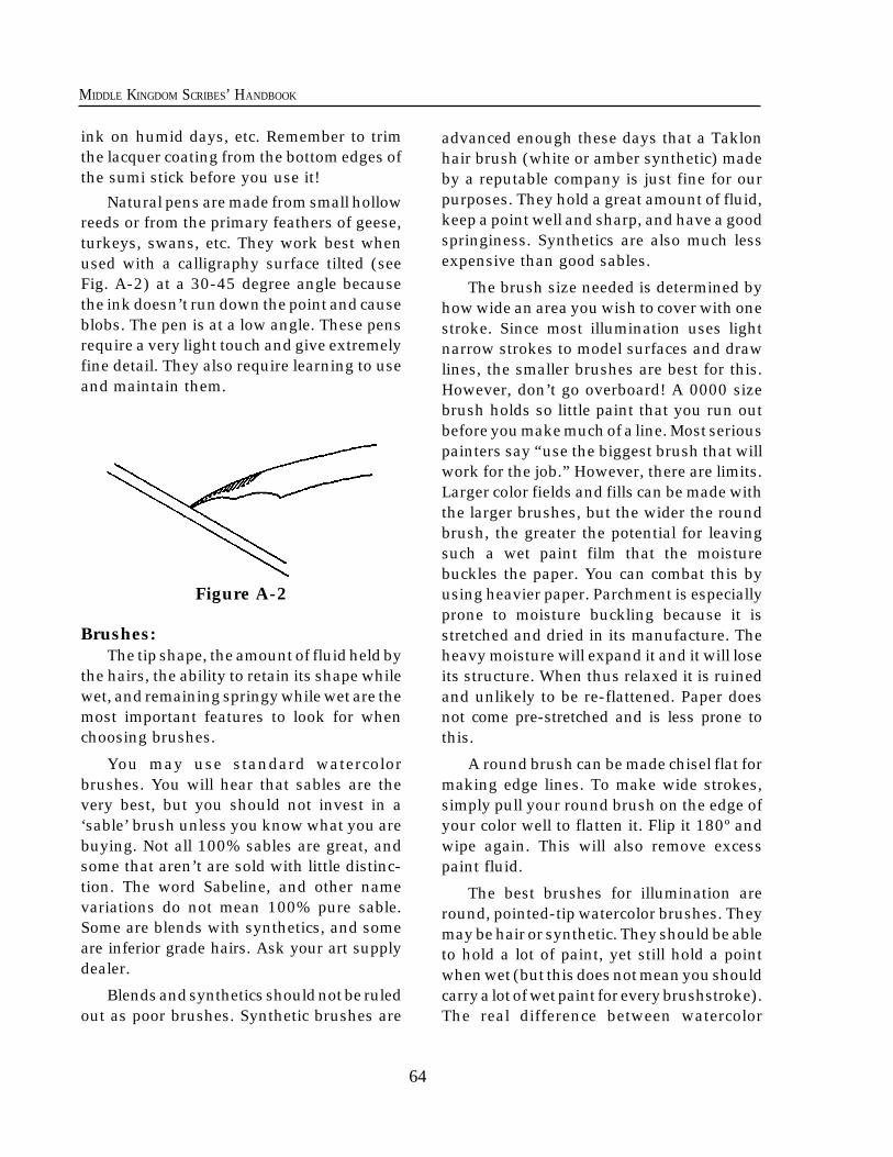
64
MIDDLE KINGDOM SCRIBES’ HANDBOOK
ink on humid days, etc. Remember to trimthe lacquer coating from the bottom edges ofthe sumi stick before you use it!
Natural pens are made from small hollowreeds or from the primary feathers of geese,turkeys, swans, etc. They work best whenused with a calligraphy surface tilted (seeFig. A-2) at a 30-45 degree angle becausethe ink doesn’t run down the point and causeblobs. The pen is at a low angle. These pensrequire a very light touch and give extremelyfine detail. They also require learning to useand maintain them.
Figure A-2
Brushes:The tip shape, the amount of fluid held by
the hairs, the ability to retain its shape whilewet, and remaining springy while wet are themost important features to look for whenchoosing brushes.
You may use standard watercolorbrushes. You will hear that sables are thevery best, but you should not invest in a‘sable’ brush unless you know what you arebuying. Not all 100% sables are great, andsome that aren’t are sold with little distinc-tion. The word Sabeline, and other namevariations do not mean 100% pure sable.Some are blends with synthetics, and someare inferior grade hairs. Ask your art supplydealer.
Blends and synthetics should not be ruledout as poor brushes. Synthetic brushes are
advanced enough these days that a Taklonhair brush (white or amber synthetic) madeby a reputable company is just fine for ourpurposes. They hold a great amount of fluid,keep a point well and sharp, and have a goodspringiness. Synthetics are also much lessexpensive than good sables.
The brush size needed is determined byhow wide an area you wish to cover with onestroke. Since most illumination uses lightnarrow strokes to model surfaces and drawlines, the smaller brushes are best for this.However, don’t go overboard! A 0000 sizebrush holds so little paint that you run outbefore you make much of a line. Most seriouspainters say “use the biggest brush that willwork for the job.” However, there are limits.Larger color fields and fills can be made withthe larger brushes, but the wider the roundbrush, the greater the potential for leavingsuch a wet paint film that the moisturebuckles the paper. You can combat this byusing heavier paper. Parchment is especiallyprone to moisture buckling because it isstretched and dried in its manufacture. Theheavy moisture will expand it and it will loseits structure. When thus relaxed it is ruinedand unlikely to be re-flattened. Paper doesnot come pre-stretched and is less prone tothis.
A round brush can be made chisel flat formaking edge lines. To make wide strokes,simply pull your round brush on the edge ofyour color well to flatten it. Flip it 180º andwipe again. This will also remove excesspaint fluid.
The best brushes for illumination areround, pointed-tip watercolor brushes. Theymay be hair or synthetic. They should be ableto hold a lot of paint, yet still hold a pointwhen wet (but this does not mean you shouldcarry a lot of wet paint for every brushstroke).The real difference between watercolor
64
65
MIDDLE KINGDOM SCRIBES’ HANDBOOK
brushes and those sold for acrylic and oil isthe length of the handle. The hairs are usu-ally the same. If you have them, you can usethem.
The exceptions to that are the bristle andox-hair brushes. You do not want these forillumination. The first is too stiff and coarse,and the second has little springiness. Thespringiness of a brush is what keeps thepoint on the paper when you let up on astroke. This is important for controlling theline width from wide to narrow.
Drafting tools:These are very helpful in laying out par-
allel and perpendicular lines. A finely di-vided ruler or two, a triangle and sometimesa protractor will aid in layout. A compass andtemplates come in handy for circles andother shapes you may create such as quatre-foils. A bow pen (or ruling pen) is used forruling inked guidelines. Some calligraphersfind that the Ames Lettering Guide (a clearplastic tool with holes in it for a mechanicalpencil) saves a lot of time ruling. Your tablecan be a board or some apparatus which tiltsfor calligraphy. Drafting tape is like maskingtape but is less adhesive. It will be removableafter it holds your paper for ruling and writing.
Paint:Paint is made of raw color plus a binder
which “glues” the color to the page. Mostpeople use either gouache (opaque water-color, pronounced “gwash”) or regular water-color. These are never waterproof so theycan be rewet and worked even after they dry.The binder for gouache and watercolor isgum arabic, which is a medieval temperabinder. The difference between watercolorand gouache is that gouache has an inertwhite pigment called Blanc Fixe (aka bariumsulfate) added to create opacity, and extrabinder to make a stronger paint film whichsits on top of the paper. Watercolor, which
has less binder, is intended to adhere to thepage by soaking into the fibers of the paper.
Some people use glair tempera. The me-dieval illuminator's binder known as glair isthe beaten white of a hen’s egg. It sticks thecolors to the page better than the gum arabicbound colors. It is workable for quite a longtime after drying (see Chapter 10: Adviceon Illumination). Egg yolk is also used insome illumination techniques. However,unless you know the appropriate techniqueand you add sweetener for flexibility, I sug-gest you avoid using egg yolk tempera be-cause it dries hard and may crack severely onpaper. Also be aware that poster paint tem-pera is not tempera paint and you are notusing real medieval tempera when you use it!It is a cheap, poorly ground version of gouachewith a lot of crusty fillers. It is guaranteed toflake off and ruin your work.
Acrylic may be used if it is all you have,but it is not a medieval paint, doesn't handleanything like medieval paint, and you willneed some manipulative skill to make it lookmedieval. This is because it is not workablewhen it dries. Oils and alkyds should not beused because they do not look like illumina-tion paints and they will cause the page todeteriorate.
Correcting Mistakes of the Pen andBrush
If you have had a scribal accident theremay be a way to save your work if the areaaffected is not too large. In this case, thedefinition of too large is one you will have tomake. It is a balance between how much timeand work the repair will take, and how muchwork has already been put into the scroll.You must also consider whether the repairwill be more obvious than you are willing toallow.
65
Chapter Eight Techniques, Tools, & Materials
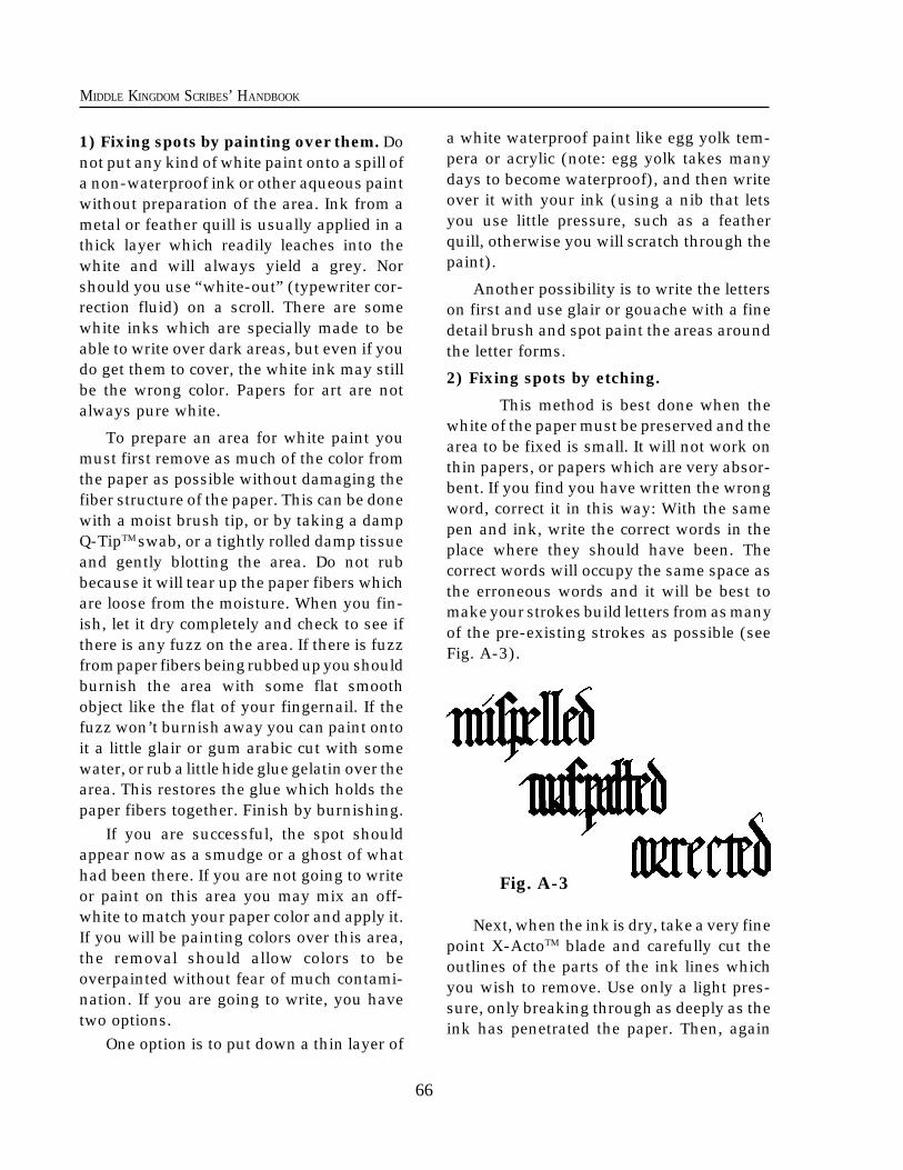
66
MIDDLE KINGDOM SCRIBES’ HANDBOOK
1) Fixing spots by painting over them. Donot put any kind of white paint onto a spill ofa non-waterproof ink or other aqueous paintwithout preparation of the area. Ink from ametal or feather quill is usually applied in athick layer which readily leaches into thewhite and will always yield a grey. Norshould you use “white-out” (typewriter cor-rection fluid) on a scroll. There are somewhite inks which are specially made to beable to write over dark areas, but even if youdo get them to cover, the white ink may stillbe the wrong color. Papers for art are notalways pure white.
To prepare an area for white paint youmust first remove as much of the color fromthe paper as possible without damaging thefiber structure of the paper. This can be donewith a moist brush tip, or by taking a dampQ-TipTM swab, or a tightly rolled damp tissueand gently blotting the area. Do not rubbecause it will tear up the paper fibers whichare loose from the moisture. When you fin-ish, let it dry completely and check to see ifthere is any fuzz on the area. If there is fuzzfrom paper fibers being rubbed up you shouldburnish the area with some flat smoothobject like the flat of your fingernail. If thefuzz won’t burnish away you can paint ontoit a little glair or gum arabic cut with somewater, or rub a little hide glue gelatin over thearea. This restores the glue which holds thepaper fibers together. Finish by burnishing.
If you are successful, the spot shouldappear now as a smudge or a ghost of whathad been there. If you are not going to writeor paint on this area you may mix an off-white to match your paper color and apply it.If you will be painting colors over this area,the removal should allow colors to beoverpainted without fear of much contami-nation. If you are going to write, you havetwo options.
One option is to put down a thin layer of
a white waterproof paint like egg yolk tem-pera or acrylic (note: egg yolk takes manydays to become waterproof), and then writeover it with your ink (using a nib that letsyou use little pressure, such as a featherquill, otherwise you will scratch through thepaint).
Another possibility is to write the letterson first and use glair or gouache with a finedetail brush and spot paint the areas aroundthe letter forms.
2) Fixing spots by etching.
This method is best done when thewhite of the paper must be preserved and thearea to be fixed is small. It will not work onthin papers, or papers which are very absor-bent. If you find you have written the wrongword, correct it in this way: With the samepen and ink, write the correct words in theplace where they should have been. Thecorrect words will occupy the same space asthe erroneous words and it will be best tomake your strokes build letters from as manyof the pre-existing strokes as possible (seeFig. A-3).
Fig. A-3
Next, when the ink is dry, take a very finepoint X-ActoTM blade and carefully cut theoutlines of the parts of the ink lines whichyou wish to remove. Use only a light pres-sure, only breaking through as deeply as theink has penetrated the paper. Then, again
66
67
MIDDLE KINGDOM SCRIBES’ HANDBOOK
using the sharp tip, gently scratch away thesurface layer with the ink. If you think theink may be flaking off and ink dust may becontaminating the etched area, you shouldgently blot the spot with a putty eraser. Thismethod will leave a fuzzy area which mayhave a slight shadow. The deeper you etch,the more obvious the shadow will be. Makesure there is as little of the ink dust in thewound of the paper because it makes theshadow obvious. The affected area may bedry burnished as above or one of the men-tioned binders applied before burnishing ifthere is no paint or ink near the spot.
3) Fixing a large mistake.
If your mistake is a long series ofwords or you do not like either of the correc-tion methods described above you can al-ways strike the area with a line and write thecorrection above in small letters. Anotheroption is to write the Latin word VACU,where VA is written at the beginning of theerror and CU is written immediately after.These are both period corrections. If yourmistake was one of painting, remember thesewords passed down from my teacher: "Agreat artist never makes mistakes; he justcovers them up!“
Chapter Eight Techniques, Tools, & Materials
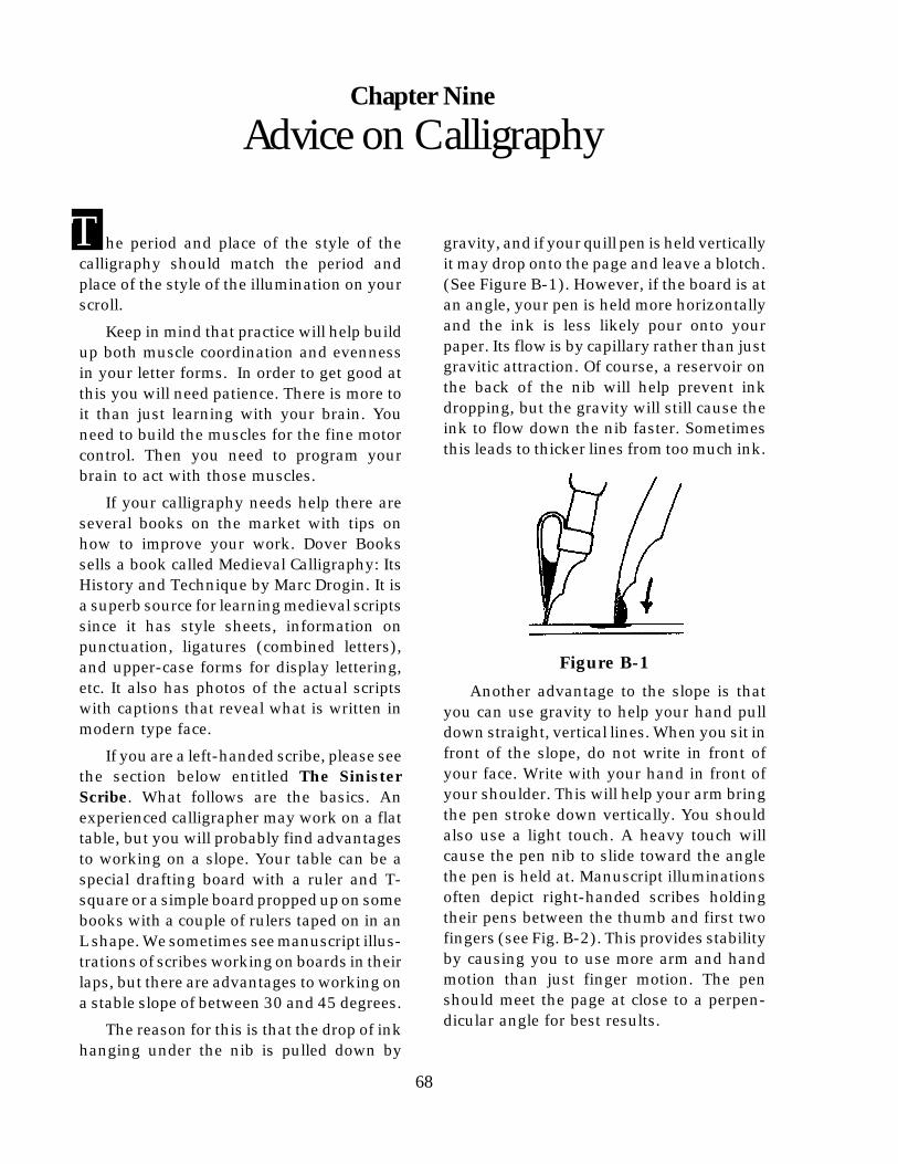
68
MIDDLE KINGDOM SCRIBES’ HANDBOOK
gravity, and if your quill pen is held verticallyit may drop onto the page and leave a blotch.(See Figure B-1). However, if the board is atan angle, your pen is held more horizontallyand the ink is less likely pour onto yourpaper. Its flow is by capillary rather than justgravitic attraction. Of course, a reservoir onthe back of the nib will help prevent inkdropping, but the gravity will still cause theink to flow down the nib faster. Sometimesthis leads to thicker lines from too much ink.
Figure B-1
Another advantage to the slope is thatyou can use gravity to help your hand pulldown straight, vertical lines. When you sit infront of the slope, do not write in front ofyour face. Write with your hand in front ofyour shoulder. This will help your arm bringthe pen stroke down vertically. You shouldalso use a light touch. A heavy touch willcause the pen nib to slide toward the anglethe pen is held at. Manuscript illuminationsoften depict right-handed scribes holdingtheir pens between the thumb and first twofingers (see Fig. B-2). This provides stabilityby causing you to use more arm and handmotion than just finger motion. The penshould meet the page at close to a perpen-dicular angle for best results.
T
68
Appendix A Techniques, Tools, & Materials
he period and place of the style of thecalligraphy should match the period andplace of the style of the illumination on yourscroll.
Keep in mind that practice will help buildup both muscle coordination and evennessin your letter forms. In order to get good atthis you will need patience. There is more toit than just learning with your brain. Youneed to build the muscles for the fine motorcontrol. Then you need to program yourbrain to act with those muscles.
If your calligraphy needs help there areseveral books on the market with tips onhow to improve your work. Dover Bookssells a book called Medieval Calligraphy: ItsHistory and Technique by Marc Drogin. It isa superb source for learning medieval scriptssince it has style sheets, information onpunctuation, ligatures (combined letters),and upper-case forms for display lettering,etc. It also has photos of the actual scriptswith captions that reveal what is written inmodern type face.
If you are a left-handed scribe, please seethe section below entitled The SinisterScribe. What follows are the basics. Anexperienced calligrapher may work on a flattable, but you will probably find advantagesto working on a slope. Your table can be aspecial drafting board with a ruler and T-square or a simple board propped up on somebooks with a couple of rulers taped on in anL shape. We sometimes see manuscript illus-trations of scribes working on boards in theirlaps, but there are advantages to working ona stable slope of between 30 and 45 degrees.
The reason for this is that the drop of inkhanging under the nib is pulled down by
Chapter Nine
Advice on Calligraphy
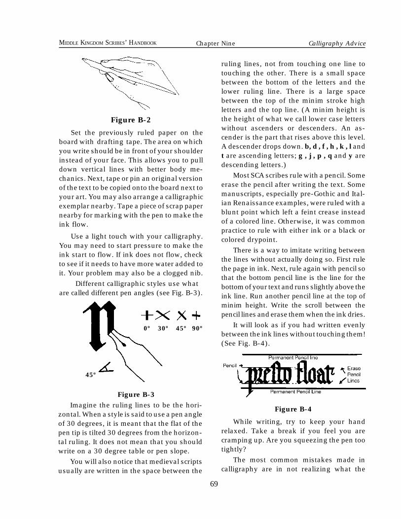
69
MIDDLE KINGDOM SCRIBES’ HANDBOOK
Figure B-2
Set the previously ruled paper on theboard with drafting tape. The area on whichyou write should be in front of your shoulderinstead of your face. This allows you to pulldown vertical lines with better body me-chanics. Next, tape or pin an original versionof the text to be copied onto the board next toyour art. You may also arrange a calligraphicexemplar nearby. Tape a piece of scrap papernearby for marking with the pen to make theink flow.
Use a light touch with your calligraphy.You may need to start pressure to make theink start to flow. If ink does not flow, checkto see if it needs to have more water added toit. Your problem may also be a clogged nib.
Different calligraphic styles use whatare called different pen angles (see Fig. B-3).
ruling lines, not from touching one line totouching the other. There is a small spacebetween the bottom of the letters and thelower ruling line. There is a large spacebetween the top of the minim stroke highletters and the top line. (A minim height isthe height of what we call lower case letterswithout ascenders or descenders. An as-cender is the part that rises above this level.A descender drops down. b, d , f , h , k , l andt are ascending letters; g , j , p , q and y aredescending letters.)
Most SCA scribes rule with a pencil. Someerase the pencil after writing the text. Somemanuscripts, especially pre-Gothic and Ital-ian Renaissance examples, were ruled with ablunt point which left a feint crease insteadof a colored line. Otherwise, it was commonpractice to rule with either ink or a black orcolored drypoint.
There is a way to imitate writing betweenthe lines without actually doing so. First rulethe page in ink. Next, rule again with pencil sothat the bottom pencil line is the line for thebottom of your text and runs slightly above theink line. Run another pencil line at the top ofminim height. Write the scroll between thepencil lines and erase them when the ink dries.
It will look as if you had written evenlybetween the ink lines without touching them!(See Fig. B-4).
Figure B-4
While writing, try to keep your handrelaxed. Take a break if you feel you arecramping up. Are you squeezing the pen tootightly?
The most common mistakes made incalligraphy are in not realizing what the
69
Figure B-3Imagine the ruling lines to be the hori-
zontal. When a style is said to use a pen angleof 30 degrees, it is meant that the flat of thepen tip is tilted 30 degrees from the horizon-tal ruling. It does not mean that you shouldwrite on a 30 degree table or pen slope.
You will also notice that medieval scriptsusually are written in the space between the
0º 30º 45º 90º
45º
Chapter Nine Calligraphy Advice
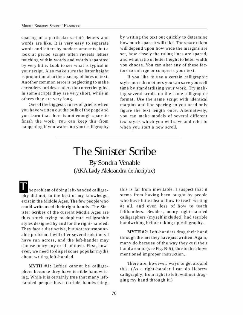
70
MIDDLE KINGDOM SCRIBES’ HANDBOOK
spacing of a particular script’s letters andwords are like. It is very easy to separatewords and letters by modern amounts, but alook at period scripts often reveals letterstouching within words and words separatedby very little. Look to see what is typical inyour script. Also make sure the letter heightis proportional to the spacing of lines of text.Another common error is neglecting to makeascenders and descenders the correct lengths.In some scripts they are very short, while inothers they are very long.
One of the biggest causes of grief is whenyou have written out the bulk of the page andyou learn that there is not enough space tofinish the work! You can keep this fromhappening if you warm-up your calligraphy
by writing the text out quickly to determinehow much space it will take. The space takenwill depend upon how wide the margins areset, how closely the ruling lines are spaced,and what ratio of letter height to letter widthyou choose. You can alter any of these fac-tors to enlarge or compress your text.
If you like to use a certain calligraphicstyle more than others you can save yourselftime by standardizing your work. Try mak-ing several scrolls on the same calligraphicformat. Use the same script with identicalmargins and line spacing so you need onlyfigure the text length once. Alternatively,you can make models of several differenttext styles which you will save and refer towhen you start a new scroll.
70
he problem of doing left-handed calligra-phy did not, to the best of my knowledge,exist in the Middle Ages. The few people whocould write used their right hands. The Sin-ister Scribes of the current Middle Ages arethus stuck trying to duplicate calligraphicstyles designed by and for the right-handed.They face a distinctive, but not insurmount-able problem. I will offer several solutions Ihave run across, and the left-hander maychoose to try any or all of them. First, how-ever, we need to dispel some popular mythsabout writing left-handed.
MYTH #1: Lefties cannot be calligra-phers because they have terrible handwrit-ing. While it is certainly true that many left-handed people have terrible handwriting,
this is far from inevitable. I suspect that itstems from having been taught by peoplewho have little idea of how to teach writingat all, and even less of how to teachlefthanders. Besides, many right-handedcalligraphers (myself included) had terriblehandwriting before taking up calligraphy.
MYTH #2: Left-handers drag their handthrough the line they have just written. Again,many do because of the way they curl theirhand around (see Fig. B-5), due to the abovementioned improper instruction.
There are, however, ways to get aroundthis. (As a right-hander I can do Hebrewcalligraphy, from right to left, without drag-ging my hand through it.)
The Sinister ScribeBy Sondra Venable
(AKA Lady Aleksandra de Acciptre)
T
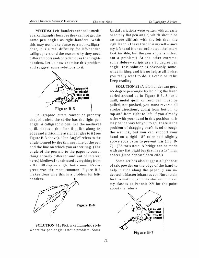
71
MIDDLE KINGDOM SCRIBES’ HANDBOOK
MYTH #3: Left-handers cannot do medi-eval calligraphy because they cannot get thesame pen angles as right-handers. Whilethis may not make sense to a non-calligra-pher, it is a real difficulty for left-handedcalligraphers and the reason why they needdifferent tools and/or techniques than right-handers. Let us now examine this problemand suggest some solutions to it.
Figure B-5
Calligraphic letters cannot be properlyshaped unless the scribe has the right penangle. A calligraphic pen, like the medievalquill, makes a thin line if pulled along itsedge and a thick line at right angles to it (seeFigure B-3 above). “Pen Angle” refers to theangle formed by the thinnest line of the penand the line on which you are writing. (Theangle of the pen nib to the paper is some-thing entirely different and not of interesthere.) Medieval hands used everything froma 0 to 90 degree angle, but around 45 de-grees was the most common. Figure B-6makes clear why this is a problem for left-handers.
Figure B-6
SOLUTION #1: Pick a calligraphic stylewhere the pen angle is not a problem. Some
Uncial variations were written with a nearlyor totally flat pen angle, which should beno more difficult with the left than theright hand. (I have tried this myself – sincemy left hand is unco-ordinated, the letterslook terrible, but the pen angle is indeednot a problem.) At the other extreme,some Hebrew scripts use a 90 degree penangle. This solution is obviously some-what limiting, and it is no help at all if whatyou really want to do is Gothic or Italic.Keep reading.
SOLUTION #2: A left-hander can get a45 degree pen angle by holding the handcurled around as in Figure B-5. Since aquill, metal quill, or reed pen must bepulled, not pushed, you must reverse allstroke directions, going from bottom totop and from right to left. If you alreadywrite with your hand in this position, thismay be the way for you to go. There is theproblem of dragging one’s hand throughthe wet ink, but you can support yourhand on a rigid 18” ruler held slightlyabove your paper to prevent this (Fig. B-7). (Editor’s note: A bridge can be madewith any flat, rigid bar that has a 1/4 inchspacer glued beneath each end.)
Some scribes also suggest a light coatof talc powder on the edge of the hand tohelp it glide along the paper. (I am in-debted to Master Johannes von Nurensteinfor this method, and to a student in one ofmy classes at Pennsic XV for the pointabout the ruler.)
Figure B-7
Chapter Nine Calligraphy Advice
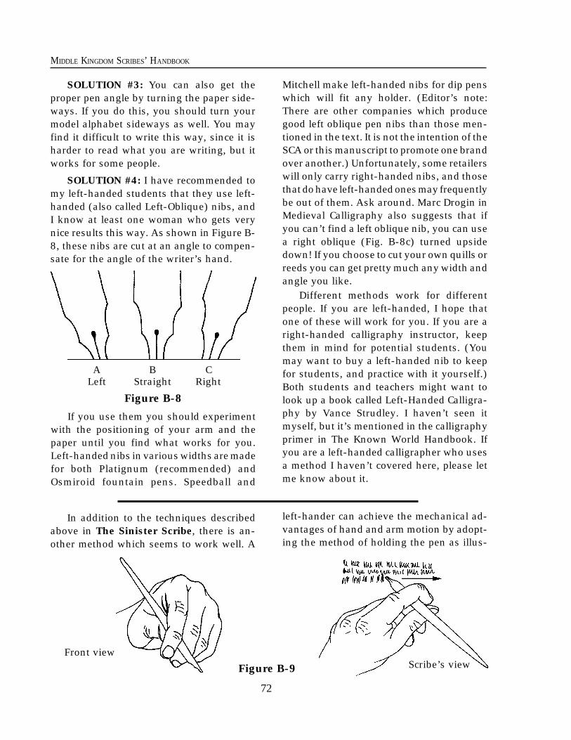
72
MIDDLE KINGDOM SCRIBES’ HANDBOOK
Scribe’s viewFront view
Figure B-9
SOLUTION #3: You can also get theproper pen angle by turning the paper side-ways. If you do this, you should turn yourmodel alphabet sideways as well. You mayfind it difficult to write this way, since it isharder to read what you are writing, but itworks for some people.
SOLUTION #4: I have recommended tomy left-handed students that they use left-handed (also called Left-Oblique) nibs, andI know at least one woman who gets verynice results this way. As shown in Figure B-8, these nibs are cut at an angle to compen-sate for the angle of the writer’s hand.
72
Mitchell make left-handed nibs for dip penswhich will fit any holder. (Editor’s note:There are other companies which producegood left oblique pen nibs than those men-tioned in the text. It is not the intention of theSCA or this manuscript to promote one brandover another.) Unfortunately, some retailerswill only carry right-handed nibs, and thosethat do have left-handed ones may frequentlybe out of them. Ask around. Marc Drogin inMedieval Calligraphy also suggests that ifyou can’t find a left oblique nib, you can usea right oblique (Fig. B-8c) turned upsidedown! If you choose to cut your own quills orreeds you can get pretty much any width andangle you like.
Different methods work for differentpeople. If you are left-handed, I hope thatone of these will work for you. If you are aright-handed calligraphy instructor, keepthem in mind for potential students. (Youmay want to buy a left-handed nib to keepfor students, and practice with it yourself.)Both students and teachers might want tolook up a book called Left-Handed Calligra-phy by Vance Strudley. I haven’t seen itmyself, but it’s mentioned in the calligraphyprimer in The Known World Handbook. Ifyou are a left-handed calligrapher who usesa method I haven’t covered here, please letme know about it.
A B CLeft Straight Right
Figure B-8
If you use them you should experimentwith the positioning of your arm and thepaper until you find what works for you.Left-handed nibs in various widths are madefor both Platignum (recommended) andOsmiroid fountain pens. Speedball and
In addition to the techniques describedabove in The Sinister Scribe, there is an-other method which seems to work well. A
left-hander can achieve the mechanical ad-vantages of hand and arm motion by adopt-ing the method of holding the pen as illus-
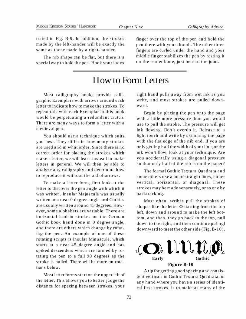
73
MIDDLE KINGDOM SCRIBES’ HANDBOOK
73
Most calligraphy books provide calli-graphic Exemplars with arrows around eachletter to indicate how to make the strokes. Torepeat this with each Exemplar in this bookwould be perpetuating a redundant crutch.There are many ways to form a letter with amedieval pen.
You should use a technique which suitsyou best. They differ in how many strokesare used and in what order. Since there is nocorrect order for placing the strokes whichmake a letter, we will learn instead to makeletters in general. We will then be able toanalyze any calligraphy and determine howto reproduce it without the aid of arrows.
To make a letter form, first look at theletter to discover the pen angle with which itwas written. Insular Majuscule was usuallywritten at a near 0 degree angle and Gothicsare usually written around 45 degrees. How-ever, some alphabets are variable. There arehorizontal lead-in strokes on the GermanGothic book hand done in 0 degree angle,and there are others which change by rotat-ing the pen. An example of one of theserotating scripts is Insular Minuscule, whichstarts at a near 45 degree angle and hasspiked descenders which are formed by ro-tating the pen to a full 90 degrees as thestroke is pulled. There will be more on rota-tions below.
Most letter forms start on the upper left ofthe letter. This allows you to better judge thedistance for spacing between strokes, your
right hand pulls away from wet ink as youwrite, and most strokes are pulled down-ward.
Begin by placing the pen onto the pagewith a little more pressure than you woulduse to pull the stroke. The pressure will getink flowing. Don’t overdo it. Release to alight touch and write by skimming the pagewith the flat edge of the nib end. If you areonly getting half the width of your line, or theink won’t flow, look at your technique. Areyou accidentally using a diagonal pressureso that only half of the nib is on the paper?
The formal Gothic Textura Quadrata andsome others use a lot of straight lines, eithervertical, horizontal, or diagonal. Thesestrokes may be made separately, or as one bybacktracking.
Most often, scribes pull the strokes ofshapes like the letter O starting from the topleft, down and around to make the left bot-tom, and then, they go back to the top, pulldown to the right, and then continue pulingldownward to meet the other side (Fig. B-10).
Early GothicFigure B-10
A tip for getting good spacing and consis-tent verticals in Gothic Textura Quadrata, orany hand where you have a series of identi-cal first strokes, is to make as many of the
How to Form Letters
trated in Fig. B-9. In addition, the strokesmade by the left-hander will be exactly thesame as those made by a right-hander.
The nib shape can be flat, but there is aspecial way to hold the pen. Hook your index
finger over the top of the pen and hold thepen there with your thumb. The other threefingers are curled under the hand and yourmiddle finger stabilizes the pen by resting iton the center bone, just behind the joint.
Chapter Nine Calligraphy Advice
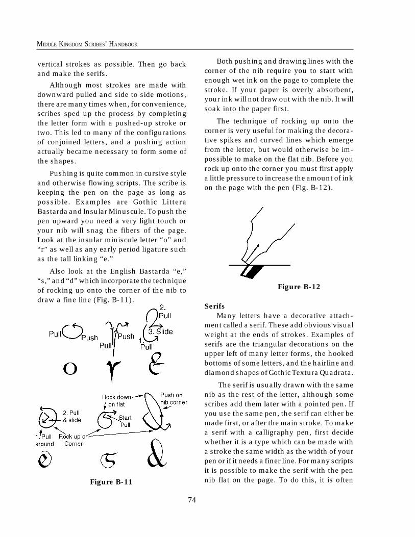
74
MIDDLE KINGDOM SCRIBES’ HANDBOOK
74
Figure B-11
vertical strokes as possible. Then go backand make the serifs.
Although most strokes are made withdownward pulled and side to side motions,there are many times when, for convenience,scribes sped up the process by completingthe letter form with a pushed-up stroke ortwo. This led to many of the configurationsof conjoined letters, and a pushing actionactually became necessary to form some ofthe shapes.
Pushing is quite common in cursive styleand otherwise flowing scripts. The scribe iskeeping the pen on the page as long aspossible. Examples are Gothic LitteraBastarda and Insular Minuscule. To push thepen upward you need a very light touch oryour nib will snag the fibers of the page.Look at the insular miniscule letter “o” and“r” as well as any early period ligature suchas the tall linking “e.”
Also look at the English Bastarda “e,”“s,” and “d” which incorporate the techniqueof rocking up onto the corner of the nib todraw a fine line (Fig. B-11).
Both pushing and drawing lines with thecorner of the nib require you to start withenough wet ink on the page to complete thestroke. If your paper is overly absorbent,your ink will not draw out with the nib. It willsoak into the paper first.
The technique of rocking up onto thecorner is very useful for making the decora-tive spikes and curved lines which emergefrom the letter, but would otherwise be im-possible to make on the flat nib. Before yourock up onto the corner you must first applya little pressure to increase the amount of inkon the page with the pen (Fig. B-12).
Figure B-12
SerifsMany letters have a decorative attach-
ment called a serif. These add obvious visualweight at the ends of strokes. Examples ofserifs are the triangular decorations on theupper left of many letter forms, the hookedbottoms of some letters, and the hairline anddiamond shapes of Gothic Textura Quadrata.
The serif is usually drawn with the samenib as the rest of the letter, although somescribes add them later with a pointed pen. Ifyou use the same pen, the serif can either bemade first, or after the main stroke. To makea serif with a calligraphy pen, first decidewhether it is a type which can be made witha stroke the same width as the width of yourpen or if it needs a finer line. For many scriptsit is possible to make the serif with the pennib flat on the page. To do this, it is often
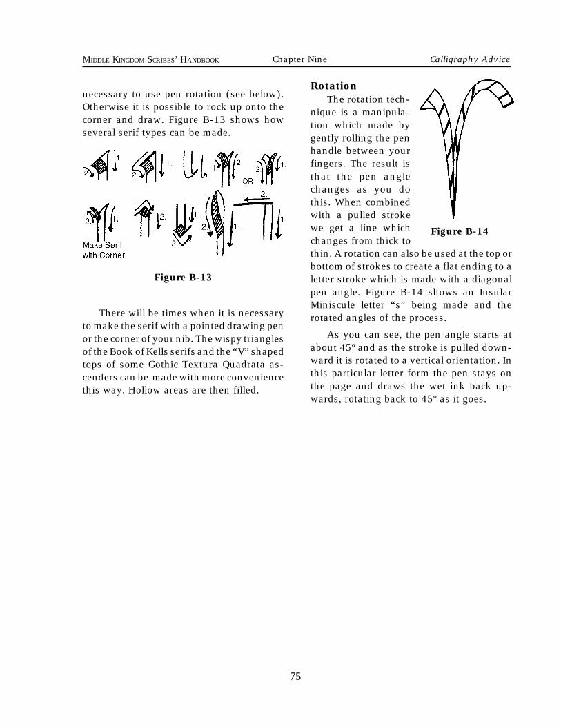
75
MIDDLE KINGDOM SCRIBES’ HANDBOOK
75
Figure B-14
RotationThe rotation tech-
nique is a manipula-tion which made bygently rolling the penhandle between yourfingers. The result isthat the pen anglechanges as you dothis. When combinedwith a pulled strokewe get a line whichchanges from thick tothin. A rotation can also be used at the top orbottom of strokes to create a flat ending to aletter stroke which is made with a diagonalpen angle. Figure B-14 shows an InsularMiniscule letter “s” being made and therotated angles of the process.
As you can see, the pen angle starts atabout 45º and as the stroke is pulled down-ward it is rotated to a vertical orientation. Inthis particular letter form the pen stays onthe page and draws the wet ink back up-wards, rotating back to 45º as it goes.
necessary to use pen rotation (see below).Otherwise it is possible to rock up onto thecorner and draw. Figure B-13 shows howseveral serif types can be made.
Figure B-13
There will be times when it is necessaryto make the serif with a pointed drawing penor the corner of your nib. The wispy trianglesof the Book of Kells serifs and the “V” shapedtops of some Gothic Textura Quadrata as-cenders can be made with more conveniencethis way. Hollow areas are then filled.
Chapter Nine Calligraphy Advice
76
MIDDLE KINGDOM SCRIBES’ HANDBOOK
lthough this section is provided for theless experienced painter, we will assume thatthe artist has already studied several ex-amples of a favorite style and is familiar withthe shapes, patterns and colors as seen in thesource material being emulated. The trickthen is to reproduce the period effects. Theseeffects varied tremendously within SCA pe-riod. They range from simple color areas laidin as thin washes, with either line work ordots, etc., to the more subtle shading andblending of naturalistic form which came inwith the Renaissance.
ColorMedieval colors are often accused of be-
ing very bright and pure. Actually, many ofour modern colors are more powerful inintensity and “purity of hue." Some moderncolors are more opaque and have strongercovering abilities than medieval counter-parts. Many medieval colors have been re-placed for a variety of reasons. Modern chem-istry has made some colors like Ultramarinemuch cheaper than by using natural LapisLazuli. Other colors like lead have beenvanishing because of toxicity issues. Thenthere are a lot of medieval colors which arenot permanent when continuously exposedto light and atmosphere. Such colors werefine shut up in books, but little contemporaryart is meant to be stored in airtight darkplaces. Our illuminated manuscript style artis no exeption. In fact, even during the middleages there was a specific set of colors whichwas considered OK in books but not onpanels because of archival reasons.
Today we have a huge range of colorsavailable to us. Some are dingy and dull,
while others are far brighter than any medi-eval pigments. The contemporary artist needsto be very careful when deciding which col-ors to use on the page. Care should be takento try to use colors which are similar tomedieval colors, but there are other impor-tant considerations. Lightfastness, color per-manence, and toxicity are all factors to con-sider when shopping for paint.
How To Shop For PaintThe first question should be "What kind
of paint should I buy?" Well, the work isprobably going to be on paper or parchment,so you want something that won't eat thepage or make it turn brittle. So oils are rightout. Acrylics don't behave anything likemedieval paint for the page, but fortunatelywe have some options which happen to bevery much the same as what the medievalartist used. My advice is to consider that thepaint will cost you a fair bit, so you may bestuck with what you buy for a while. If youbuy a lot of colors of one kind, and thendecide you really want something else, youmight end up paying a lot more than isnecessary. It is best to try some differentkinds first, and then decide what you want toget.
Lets take a quick look at what the differ-ent paints are. The verb "To Temper" meansto add something which changes the natureof something else. When we temper rawcolor powder with a binding medium we aremaking a tempera paint. When most peoplethink of "tempera paint" they either think ofa cruddy poster paint used in public schools,or they think of egg tempera, the kind made
A
76
MIDDLE KINGDOM SCRIBES’ HANDBOOK ANNO SOCIETATIS XXVIII
Chapter Ten
Advice on Painting
77
MIDDLE KINGDOM SCRIBES’ HANDBOOK
from yolk. But really, any paint you makeyourself becomes a form of tempera.
In the middle ages the common bindersused to temper color were gum arabic, (a gluemade from ground tree sap and water) andglair (the white of egg). Other binders suchas egg yolk, fluid hide glue, and even fishglue were used, but gum and glair were thecommon ones. You can make glair as per theinstructions below, or you can make gumtempera. All you need is the binder, a littlewater, a watercolor well to mix it in (or if youwant to be medieval you can use a whiteshell), and the raw color. However, if that ismore advanced than you want to get for nowYOU ARE IN LUCK! because both watercolorand gouache are bound with gum arabic, sothey are almost exactly medieval paint al-ready! Remember, as stated in Chapter 8,watercolor needs a little more gum arabicadded into it and gouache will look most likemedieval paint.
Choosing Colors
Hue means the actual color of a pigment.Blue and green are different hues. Ultrama-rine Blue is a slightly purpler hue than mod-ern Phthalo Blue, which is a bit more to thegreen side.
Value refers to how bright it is. Pink is alight value of red. The pink and the red mayrepresent the same hue on the color wheel.
Colors with white added are called Tints.Colors with black added are called Shades.When you tint or shade a color you make itless saturated. It becomes a little duller thanthe original, but it does get lighter or darker.Shading and tinting can make colors some-what more opaque.
Some paints have a greater coveringability than others. This is called Opacity.You can use opaque colors to paint oversome other colors without sacrificing thebrilliance of the hue by shading or tinting it.
However, colors with lesser opacity can bediluted with some water and painted asthinner color over the white of a page tomake them lighter without changing thehue. I caution you not to rely on this muchthough. Medieval illuminators seldomworked on very white pages and so didn'tuse this technique as much. Also, coveringlarge areas with dilute, wet paint is justasking for the extra moisture to buckle thepage. Medieval colors were usually lightenedwith white.
You have lots of choices for colors whichlook medieval. The following are some rec-ommended modern colors. They are reason-ably close to common medieval colors, butfew are exact. They are chosen forlightfastness and color permanence. Severalare very toxic! You may wish to choose othercolors for your palette. A good book fordescribing medieval colors is Daniel V.Thompson’s Materials and Techniques ofMedieval Painting from Dover Books.
Black: Lampblack, bone or ivory black.
White: Permanent white, Titanium white,and various translucent whites.
Blue: Ultramarine, Indigo.
Red: Cadmium Red Medium (Hue or real),Red Ochre, Alizarine Crimson Hue, Cad-mium Red Light.
Yellow: Cadmium Yellow Medium, YellowOchre,
Green: Chomium Oxide, Viridian + White.Sap Green Hue.
Although it would be better to mix browns,some browns such as these can be used:Burnt Umber, Burnt Sienna.
Mix your purples from blue and a redfrom the alizarin hue family.
77
Chapter Ten Painting Advice
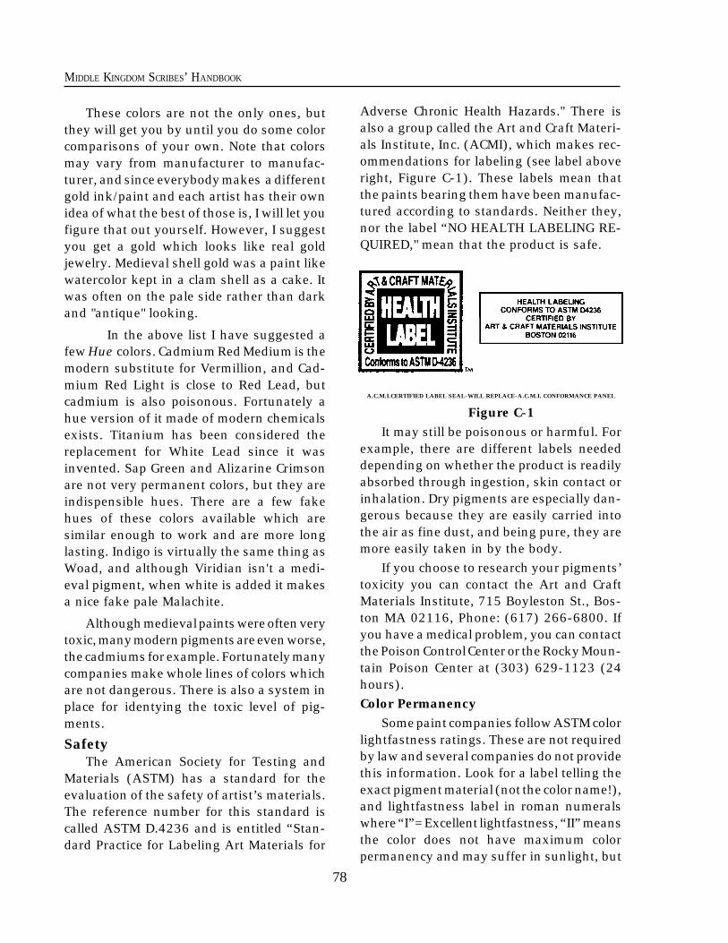
78
MIDDLE KINGDOM SCRIBES’ HANDBOOK
These colors are not the only ones, butthey will get you by until you do some colorcomparisons of your own. Note that colorsmay vary from manufacturer to manufac-turer, and since everybody makes a differentgold ink/paint and each artist has their ownidea of what the best of those is, I will let youfigure that out yourself. However, I suggestyou get a gold which looks like real goldjewelry. Medieval shell gold was a paint likewatercolor kept in a clam shell as a cake. Itwas often on the pale side rather than darkand "antique" looking.
In the above list I have suggested afew Hue colors. Cadmium Red Medium is themodern substitute for Vermillion, and Cad-mium Red Light is close to Red Lead, butcadmium is also poisonous. Fortunately ahue version of it made of modern chemicalsexists. Titanium has been considered thereplacement for White Lead since it wasinvented. Sap Green and Alizarine Crimsonare not very permanent colors, but they areindispensible hues. There are a few fakehues of these colors available which aresimilar enough to work and are more longlasting. Indigo is virtually the same thing asWoad, and although Viridian isn't a medi-eval pigment, when white is added it makesa nice fake pale Malachite.
Although medieval paints were often verytoxic, many modern pigments are even worse,the cadmiums for example. Fortunately manycompanies make whole lines of colors whichare not dangerous. There is also a system inplace for identying the toxic level of pig-ments.
SafetyThe American Society for Testing and
Materials (ASTM) has a standard for theevaluation of the safety of artist’s materials.The reference number for this standard iscalled ASTM D.4236 and is entitled “Stan-dard Practice for Labeling Art Materials for
Adverse Chronic Health Hazards." There isalso a group called the Art and Craft Materi-als Institute, Inc. (ACMI), which makes rec-ommendations for labeling (see label aboveright, Figure C-1). These labels mean thatthe paints bearing them have been manufac-tured according to standards. Neither they,nor the label “NO HEALTH LABELING RE-QUIRED," mean that the product is safe.
A.C.M.I.CERTIFIED LABEL SEAL-WILL REPLACE-A.C.M.I. CONFORMANCE PANEL
Figure C-1It may still be poisonous or harmful. For
example, there are different labels neededdepending on whether the product is readilyabsorbed through ingestion, skin contact orinhalation. Dry pigments are especially dan-gerous because they are easily carried intothe air as fine dust, and being pure, they aremore easily taken in by the body.
If you choose to research your pigments’toxicity you can contact the Art and CraftMaterials Institute, 715 Boyleston St., Bos-ton MA 02116, Phone: (617) 266-6800. Ifyou have a medical problem, you can contactthe Poison Control Center or the Rocky Moun-tain Poison Center at (303) 629-1123 (24hours).Color Permanency
Some paint companies follow ASTM colorlightfastness ratings. These are not requiredby law and several companies do not providethis information. Look for a label telling theexact pigment material (not the color name!),and lightfastness label in roman numeralswhere “I”= Excellent lightfastness, “II” meansthe color does not have maximum colorpermanency and may suffer in sunlight, but
78
79
MIDDLE KINGDOM SCRIBES’ HANDBOOK
it should survive fairly well under normalcircumstances, “III” means the color is proneto fading or changing of color, usually moreobvious when applied in thin coats.
The Permanency rating is different fromlightfastness. It refers to color stability. Class“AA” are the best. Class “A” are not as stablewhen used less than full strength or left tothe elements. Class “B” are rather non-du-rable and Class “C” are considered fugitive.
Color Matching
There are numerous books on the marketwhich contain manuscript illustrations, butkeep in mind that printed colors in one bookmay be very different from the reproductionof the exact same page in another book! Thisis very common, so do not trust the colorreproductions of art books very far. Just doyour best and go to a museum when you can.
Applications Of ColorIn many medieval styles, medium and
light pigmented colors were often put downeither as straight color or with a little whiteadded (depending on the color’s opacity).For example, a bright red field might be justvermilion pigment mixed with binder of gumarabic or glair and painted directly onto thepage. Darker colors such as ultramarine orindigo (woad) were mixed with a little whiteto make them light enough to be used formost applications. If white was not added,the blue would be very dark and translucent.It would not be best in all styles to make lightblue by using the pure blue in thin consisten-cies. Although its “blueness” would remainstronger, the paint film would not cover theparchment color. (However, sometimes youwill see thin streaky paint on real manu-scripts.) Some colors were shaded or high-lighted with translucent washes of paintdiluted with water.
One of the reasons medieval book colorsseem so pure is that except for white, mostcolors were not combined nearly as much asmodern painters mix colors. The medievalpainter did mix colors, but it was in a limitedway, such as a little yellow into some greento brighten it up, or red and blue to createpurple. Modern paintings seem to have amore dull look because several colors are allmixed together in different amounts whichtends to greatly tone down hues toward grey.
One of the biggest mistakes people makewhen working on medieval paintings is tobuy watercolor or gouache color cakes, andthen use all of them straight. Not only doesthis limit the palette, but failing to mix whitewith some colors when needed can ruin theperiod effect. If you are using color cakes,you should have some extra color wells formixing tints and shades. Carry wet color withyour brush from the color cake to the newreceptacle. Add the next color and keep yourbrush clean when it goes to the other colorcake!
If you are using dry pigment (raw, purepigment powder sold in jars) and either gumarabic or glair tempera as the binder, youhave the advantage of being able to easilymix colors ahead of time. Glair will bind thecolors to the page a bit better than the gumarabic in watercolor or gouache. Gum is aslightly weaker binder. In fact, part of thereason that watercolor sticks to the page isbecause it is finely ground and the fineparticles sink into the absorbent paper andget stuck in the fibers. That is why gum-bound paints rub off more easily from platesurface papers.
Making GlairTo make glair, take one egg, break it open
and without breaking the yolk, separate outthe white into a clean bowl. Next beat thewhite with a whisk (or egg beater) for a long
79
Chapter Ten Painting Advice
80
MIDDLE KINGDOM SCRIBES’ HANDBOOK
time. It must peak into a very stiff foam, thenbeat it some more. Cover and let sit for 10-12hours. After that time there will be a wateryliquid at the bottom; that is the glair. Pour itinto a small jar like a 35mm film cassettecanister. You can save it for several days orlonger in the refrigerator, or you can leave itout and allow it to go stale. Stale glair is alittle stickier as a binder than fresh glair. Itwill have an odor, but it is not the same asrotten eggs since it contains none of the yolk.
To use glair, first take a small amount ofthe dry color from the jar and put it into alittle pile in a color well. Drop about the samevolume of binder next to it and mix themtogether. The actual amount of binder variesfrom pigment to pigment a little bit. If you arenot sure about the amounts, paint out astroke on a separate piece of paper. If thepaint dries shiny there is too much binder. Ifit rubs off, you have too little.
Once you get the proportion of binder topigment correct, you may thin the paintfurther with as much water as you want -within reason- to make any level of translu-cency. It is better to get a little too much glairthan too little. At least it will not rub off.Saffron stamens were soaked in glair to leechout the yellow color. The craftsman thenpainted with the stained glair. You can’t geta color heavier in binder than that! However,glair, and especially gum, were susceptibleto cracking when used in this thickness, so atiny amount of sweetener like honey or sugarwas added to regain flexibility.
You may temper color with gum arabicsolution in the same way. It is readily avail-able from most art supply stores. Just re-member that the proportion of binder topigment is what is important. The amount ofwater added to that mixture is only impor-tant for achieving the desired consistency ofthe paint fluid. Thus, you may wish to adjustthe gum to water ratio in the gum water
solution. Gum water should have the rightamount of binder for your colors when addedin equal proportions by volume to the pig-ment.
As with glair the addition of a tiny amountof honey or sugar will help the gum temperaresist cracking in thicker applications. Don’tadd too much sweetener or the paint maybecome permanently sticky. Always test itbefore you apply it.
Application of color
Some paint films were fairly thin in books,but usually some kind of brushwork designof another color went over the field. Forexample, a thin background field may beornamented with lines, dots or differentshades of the same color making a two-toned or three-toned geometric design. An-other example might be a late period land-scape with a thin, light brown or greenground and darker opaque blades of grassbrushed on top.
Large color fields often appear streaky onparchment. This was probably because thecolors needed to be painted onto the surfacewithout a lot of moisture to avoid bucklingthe page.
The more paint that is layered on thepage, the thicker the paint film, and the morelikely the paint is to lose flexibility, crack,and flake off the page. Do not goop or crust-up your paint on the scroll! Sometimes wefall into this bad habit while trying to get onecolor (often white) to go opaquely over adarker or more powerful color. The paint youare trying to put on top may be too wet to goon opaquely. Another possibility may be aninherently weak color like yellow. Addingwhite, black, or another opaque color to aweak color will make it more opaque, but itwill also lower its purity and intensity.
80
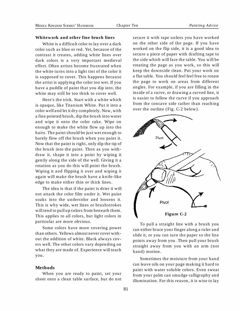
81
MIDDLE KINGDOM SCRIBES’ HANDBOOK
secure it with tape unless you have workedon the other side of the page. If you haveworked on the flip side, it is a good idea tosecure a piece of paper with drafting tape tothe side which will face the table. You will berotating the page as you work, so this willkeep the downside clean. Put your work ona flat table. You should feel feel free to rotatethe page to work on areas from differentangles. For example, if you are filling in theinside of a curve, or drawing a curved line, itis easier to follow the curve if you approachfrom the concave side rather than reachingover the outline (Fig. C-2 below).
To pull a straight line with a brush youcan either brace your finger along a ruler andslide it, or you can turn the paper so the linepoints away from you. Then pull your brushstraight away from you with an arm (nothand) motion.
Sometimes the moisture from your handcan leave oils on your page making it hard topaint with water soluble colors. Even sweatfrom your palm can smudge calligraphy andillumination. For this reason, it is wise to lay
Whitework and other fine brush linesWhite is a difficult color to lay over a dark
color such as blue or red. Yet, because of thecontrast it creates, adding white lines overdark colors is a very important medievaleffect. Often artists become frustrated whenthe white turns into a light tint of the color itis supposed to cover. This happens becausethe artist is applying the color too wet. If youhave a puddle of paint that you dip into, thewhite may still be too thick to cover well.
Here's the trick. Start with a white whichis opaque, like Titanium White. Put it into acolor well and let it dry completely. Now, witha fine pointed brush, dip the brush into waterand wipe it onto the color cake. Wipe onenough to make the white flow up into thehairs. The paint should be just wet enough tobarely flow off the brush when you paint it.Now that the paint is right, only dip the tip ofthe brush into the paint. Then as you with-draw it, shape it into a point by wiping itgently along the side of the well. Giving it arotation as you do this will point the brush.Wiping it and flipping it over and wiping itagain will make the brush have a knife-likeedge to make either thin or thick lines.
The idea is that if the paint is drier it willnot attack the color film under it. Wet paintsoaks into the undercolor and loosens it.This is why wide, wet lines or brushstrokeswill tend to pull up colors from beneath them.This applies to all colors, but light colors inparticular are more obvious.
Some colors have more covering powerthan others. Yellows almost never cover with-out the addition of white. Black always cov-ers well. The other colors vary depending onwhat they are made of. Experience will teachyou.
MethodsWhen you are ready to paint, set your
sheet onto a clean table surface, but do not
81
Figure C-2
Chapter Ten Painting Advice
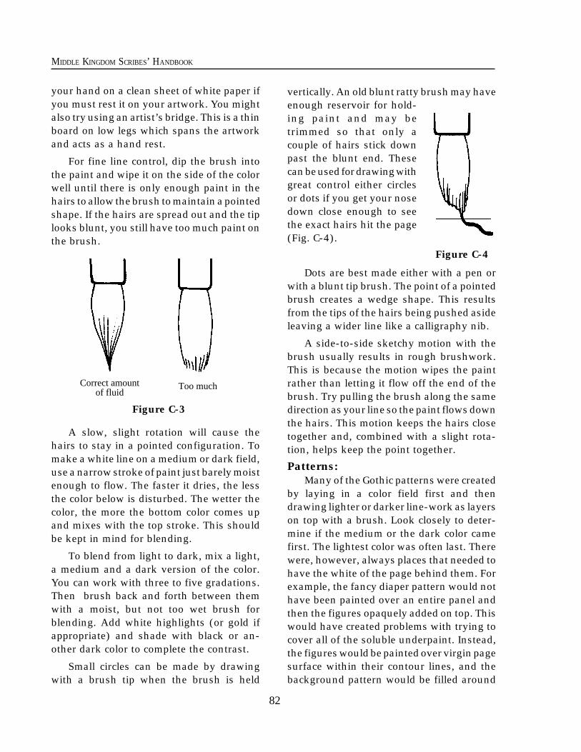
82
MIDDLE KINGDOM SCRIBES’ HANDBOOK
your hand on a clean sheet of white paper ifyou must rest it on your artwork. You mightalso try using an artist’s bridge. This is a thinboard on low legs which spans the artworkand acts as a hand rest.
For fine line control, dip the brush intothe paint and wipe it on the side of the colorwell until there is only enough paint in thehairs to allow the brush to maintain a pointedshape. If the hairs are spread out and the tiplooks blunt, you still have too much paint onthe brush.
A slow, slight rotation will cause thehairs to stay in a pointed configuration. Tomake a white line on a medium or dark field,use a narrow stroke of paint just barely moistenough to flow. The faster it dries, the lessthe color below is disturbed. The wetter thecolor, the more the bottom color comes upand mixes with the top stroke. This shouldbe kept in mind for blending.
To blend from light to dark, mix a light,a medium and a dark version of the color.You can work with three to five gradations.Then brush back and forth between themwith a moist, but not too wet brush forblending. Add white highlights (or gold ifappropriate) and shade with black or an-other dark color to complete the contrast.
Small circles can be made by drawingwith a brush tip when the brush is held
vertically. An old blunt ratty brush may haveenough reservoir for hold-ing paint and may betrimmed so that only acouple of hairs stick downpast the blunt end. Thesecan be used for drawing withgreat control either circlesor dots if you get your nosedown close enough to seethe exact hairs hit the page(Fig. C-4).
Dots are best made either with a pen orwith a blunt tip brush. The point of a pointedbrush creates a wedge shape. This resultsfrom the tips of the hairs being pushed asideleaving a wider line like a calligraphy nib.
A side-to-side sketchy motion with thebrush usually results in rough brushwork.This is because the motion wipes the paintrather than letting it flow off the end of thebrush. Try pulling the brush along the samedirection as your line so the paint flows downthe hairs. This motion keeps the hairs closetogether and, combined with a slight rota-tion, helps keep the point together.
Patterns:Many of the Gothic patterns were created
by laying in a color field first and thendrawing lighter or darker line-work as layerson top with a brush. Look closely to deter-mine if the medium or the dark color camefirst. The lightest color was often last. Therewere, however, always places that needed tohave the white of the page behind them. Forexample, the fancy diaper pattern would nothave been painted over an entire panel andthen the figures opaquely added on top. Thiswould have created problems with trying tocover all of the soluble underpaint. Instead,the figures would be painted over virgin pagesurface within their contour lines, and thebackground pattern would be filled around
Figure C-4
Correct amountof fluid
Figure C-3
Too much
83
MIDDLE KINGDOM SCRIBES’ HANDBOOK
them. In general, one wide color area rarelypaints well over another color field, and itwould make a dangerously thick paint film ifit did.
However, we will note that backgroundsof thin or less intense color were oftenunderpainted behind a whole area and thenfigures laid in over that paint. An examplewould be a renaissance blue sky and greyishgreen foreground being laid in across thewhole field first, followed by the added fig-ures (like trees) painted opaquely over top.Whereas you could get away with painting adark tree over the background, you wouldhave difficulty adding people in white robesover a dark field of grass.
Diaper patterns are the fancy geometricbackgrounds found in miniatures. Often theystart with a field color of a medium lightvalue of red or blue. Red and blue or red andgreen are considered contrasting colors. Thesecond step usually involved adding a darkervalue of the field color as a grid, eitherstraight or diagonally over the field. Thethird step may be to add a tiny design usinga contrasting color in half or all of the result-ant boxes.
The final color step was usually whiteand was to bring full contrast to the pattern.
The white may be a grid connecting the tinydesigns or it may be just dots or circles. Thereare a lot of variations on these patterns,some even using gold as a third main color.Use the knowledge of the basic constructionto determine the steps used in the patternyou have chosen.
Strip patterns in borders and line endingsin texts were often made in a similar way, butthey seldom had a grid. Usually the mediumor dark value was painted down the wholestrip as a field, and then light or white colorwas painted over that to create the design.
Tiny color interlace can be first laid outwith a single light pencil line or drypointindentation, and then the color painted overit opaquely, following the line. The overlapsare made with thin black lines delicatelyplaced as edging. If the ribbons are to be thewhite of the paper, take a pencil and sketchthe design over the whole area in a singleline. The final lines are then inked with avery sharp pen to create the edges, and thusthe overlaps. The pencil is then erased.
Alternatively, you could add color to theseribbons by painting thin color very carefullybetween the black lines. Thin paint is sotranslucent that small amounts will not bevery noticeable over the black.
Chapter Ten Painting Advice
84
MIDDLE KINGDOM SCRIBES’ HANDBOOK
his article will provide you with impor-tant information which will lead to success-ful gilding. It will demonstrate period gildingtechniques and a good, modern time-savingtechnique. A good art supply store may carrythe tools and materials needed for gilding ifyou are in a big city, but most art supplystores do not. Most people will need to ordersuch things from mail order companies thatretail them.
There are five ingredients necessary forgilding. They include:
1) Gold: Sold in loose sheet “books” of ultrathin leaf. Medieval gold leaf was somewhatthicker than what we have available today.Except for practice, I recommend you do notuse the bronze Composition Leaf. Bronzewill tarnish if used without a treatment,which must be painted over it. If you haveused bronze composition leaf and it hastarnished, you may make it golden again bycarefully painting colored metallic enamelpaint (such as is sold for painting plasticmodels) over the entire surface of your metal,but this may not be permanent either.2) Support: This is what your artwork ispainted or written upon. Paper or true skinparchment could be used as a support for thiskind of gilding. Note: The word “parchment”in this pamphlet refers only to pages ofanimal skin and not to the paper pulp mate-
rial sold for calligraphers. Also, modern draft-ing vellum is not even close to real vellum,which is specifically calf parchment.3) Glue: Special glues are used to stick thegold to the support.4) Sweetener: Honey or fine ground sugarare used to give the glue body some flexibil-ity and allow it to hold moisture better whenlaying the gold. (Sweetener is unnecessaryin PVA type glue recipes.)5) Bulk Former: Inert chalk or plaster type ofwhite powder is used to make the glue set upwith an appreciable thickness. The goal is tocreate a slightly raised surface above therough page texture. This would provide aperfectly smooth surface for the gold to beadhered. The idea of making gold sit veryhigh up off the page is quite secondary andhas been inappropriately emphasized in theSCA. Most gilding in books was rather low.
This article deals with water gilding. Watergilding uses moisture to dampen a raisedglue surface to make it sticky for laying gold.It can then be burnished to a high polish.Another type of gilding is called mordantgilding, and it uses some form of oil or otherslower drying base, which can not be madesticky again after it dries. It is not burnished,and one does not usually add a bulk former.Mordant gilding usually leaves a surface of goldmatching the surface texture of the support.
T
84
Appendix B Calligraphy
Chapter Eleven
The Process of Gilding
The following instructions are quoted from an Italian illumination treatise from the 14thcentury called De Arte Illuminandi, as translated by Daniel V. Thompson, Jr. from the NaplesMS XII.E.27, Yale Univ. Press, 1933.
2. Binders for Gilding.
The binders for gilding are as follows: stag’shorn glue, parchment or fish glue, and thingslike these.
14. Size for laying Gold.
Size for laying gold on parchment is madein many ways. But I shall put down a certainrule for it which is both good and tested. So
85
MIDDLE KINGDOM SCRIBES’ HANDBOOK
85
take as much as you want of the calcined andprepared gesso which the painters use forgilding panels, that is, the gesso sottile, and aquarter of that amount of the best Armenianbole; work it up to the utmost fineness withclear water on the porphyry slab.
Then let it dry on this slab, and takewhatever part of it which you want, puttingthe rest aside, and grind it with stag’s hornglue or parchment size. And put in as muchhoney as you think necessary to give it a sweettaste; and in this it behooves you to be careful,so as not to put in either too much or too little,but, according to the amount of the material,so much that, if you put a little of the com-pound into your mouth, it just barely tastessweet.
And you may figure that for one of the littledishes that painters use, twice what you canpick up with the handle of a brush will beenough; and if there were any less, the com-pound would be ruined. And after grindingthoroughly, put it into a glazed dish, and atonce pour enough clear water on it to cover it,working carefully, without disturbing the ma-terial; and it will immediately be refined insuch a way as not to make either bubbles orholes after it dries.
And when you want to use it, after a briefdelay, pour off the water which stands over it,without stirring the material at all. And al-ways, before you lay any size on the actualplace where you have to work on the parch-ment, you should try it out on some similarparchment, to see whether it is properly tem-pered; and after it dries, put a little gold on it,and see whether it takes a good burnish.
And know that, if there is too much of thetempera or of the honey in it, you correct it byputting plain soft water over it in the dish,without any stirring; and if it stands for sometime, and the water is then poured off, stillwithout stirring, the tempering will be im-proved.
And if it should need a stronger tempera,put in more of the size, that is, more of thesolution of it, or more of the solution ofhoney, if that is needed, until the composition
suits you.And since experience is worth more in all
this than written documents, I am not takingany special pains to explain what I mean: – aword to the wise.
15. How to use it.
You ought to know that after the letters, orleaves, or figures have been drawn on theparchment, the places where the gold is to belaid should be rubbed over with a scrap ofstag’s horn or fish glue in this way: by moist-ening a scrap of this glue in your mouth, on anempty stomach or after digestion, until it hassoftened, and with that, constantly moisten-ing that scrap of glue, coat the place where thegold is to be laid, so that the parchment getsmade more manageable for taking the size.
And some people even coat the wholedrawing in this way with this glue, so as tomake all of the colors unite better; but thiswould only be necessary if the parchmentwere hairy or rough. And the parchment caneven be wet down or coated, wherever thegold and colors are to be laid, with the sizesolution, sweetened with a little honey, andapplied deftly with cotton, as required, orwith a brush; and this is better.
Then take this size, well tempered as hasbeen said, and with a brush right for thispurpose, put it on, quite wet at first. Andwhen it is almost dry, put some once moreover this size; and do this two or three timesuntil it seems to be about right, and neithertoo thick nor too thin, but adequate.
When the last coat is quite dry, scrape thesurface thoroughly with a good and suitableknife and clean it up with a hare’s foot. Thentake some glair of eggs broken with a bristlebrush or with a reed, split and adapted forthat, as painters do; and when all the white hasbeen turned into froth, pour over it enoughplain water, either mixed with the best whitewine or a little lye, or plain, because any ofthese is good.
And after a little while pour it out from thefroth which it produces on top, and what re-mains will be good. Then take some of it, with
Chapter Eleven Gilding
86
MIDDLE KINGDOM SCRIBES’ HANDBOOK
age for more than a day if you can help it.You must let it dry enough so that the insideisn't soft or it will be destroyed when youburnish. However, if you let it go too long themoisture from your breath will not be enoughto rewet it to make it sticky and accept thegold.
If this happens, you can use a wettingagent to moisten the gold, but you must becareful. If you wish to use a wetting agent, Iagree with the author that it is best to applyit with a brush. That way you will not get anyon the paper or parchment surface, whichmay lead to some gold adhering there.Moisten only the surface of the gesso andmake sure you apply the fluid evenly. Don'toverwet it!
If you apply a lot of fluid you will make ittoo wet in the middle and the outside edgeswill be too dry to lay gold before the middlebecomes dry enough.
If it is too wet when you lay the gold, themoisture will puddle under the metal and thegesso will get soft. If you press the gold downat this point the gold will tear and red gessowill burst up through it, leaving a crack inyour gilding.
It is important to remember that fresh
Gesso is the name for the material thatwe paint onto the page and then stick thegold onto. It is a type of gilding seat. Theauthor of De Arte Illuminandi calls it a size.
Notice that the author has not used anytoxic materials like white lead pigment. Somemodern gilding recipes use white lead, whichhelps yield a smoother finish and brighterburnish. However, this author describes theuse of Armenian bole which serves thatsame purpose. Armenian bole is a soft redclay, also known as gilder’s clay. It gives a bitof color to the material for making it morevisible, and it is also a filler which will helpto yield a smoother polish from the burnish-ing. Modern recipes using white lead suggestthe addition of a little red color such as IndianRed pigment, and Bole has less tincturalpotential than Indian Red dry pigment, but inthe amount we'll use it will make the gessoplenty red.
The author describes the use of glair as awetting agent for the laying of the gold. Somerecipes are exact enough that the gilder needonly breathe on the gesso with a long moistbreath to make it sticky for the gold.
I suggest that you let the gesso dry com-pletely before laying the gold, but not let it
a brush fit for this, and wet over this size withjudgement and moderation, so that this sizewill take the gold or silver readily, as paintersdo when they are laying gold on panels.
And cut the gold with a knife upon parch-ment, as you know how to do, according tothe number of places where the gold has to belaid; and if necessary, you may force the goldto stick to the size with a bit of cotton. Andafter a little while, when it is practically dryand can stand burnishing, you burnish it witha suitable tooth of a wolf or calf, or with ahematite stone as the painters do, on top of apanel of box or other wood, well polished and
sound. And if the gold comes out imperfectanywhere, with this glair carefully wet theplace where the gold is imperfect, and lay thegold, pressing it down with cotton if need be.And after all the gold has been burnished, rubit lightly with a hare’s foot; and any excesswhich has not been removed by the foot,scrape off and even up with a good sharpknife. And after removing the excess, burnishit again, until it suits you perfectly. And so,with a stone of hematite or other tools madefor this, one can rule or stamp the gold in thisway, over the panel of box or other wood, etc.And so it will be finished.
86
Making Gesso
87
MIDDLE KINGDOM SCRIBES’ HANDBOOK
87
gesso requires much less moisture to rehy-drate. Gesso also holds the moisture muchlonger. It is thus better to use the breathmethod of moistening while the gesso isfresh, but firm. When you moisten gessowith glairwater you will find that it soaksright into the material and softens the wholemass. You must allow the gesso to regain itsfirmness before you lay the gold.
The glair is made in a glazed bowl. Put inan egg white, and with a whisk beat thedaylights out of the white for a long time!Continue beating a few minutes past whenthe white foam is so stiff it will not even jigglewhen you shake it. To make diluted glair,pour a shot glass or sake cup of water overthe foam material. Allow it to sit for severalhours (up to 12 hours). Undiluted glair isgreat for painting, but can cause gilding fail-ure.
The verb “to temper” is used often inmedieval painting treatises. It does not refer
to poster paint tempera. It means to changethe nature of material “x” by treating it withsomething “y” in order to achieve a plannedresult. For example, we temper dry colorpowder with binders such as glair or gumarabic to make it flow from a brush and thenstick to a page. The gilder tempers parch-ment glue (such as rabbit skin glue) withhoney to make it remain flexible when dry.
In the section where the author of De ArteIlluminandi describes priming the surface ofthe support with stag’s horn, fish or parch-ment glue, observe that it is a precautionagainst overly absorbent support material(the parchment). An application of glue canalso be used to get rid of high nap on parch-ment or paper if you burnish the applicationwith some smooth tool. It is not necessary toprime a moderately absorbent parchment orpaper, such as a vellum surface Bristol paper,because the first thin layer of gesso shouldnot soak in far enough to weaken the gesso’scontact with the support.
Tools needed for gilding(See Figure D-1 on the next page)
1) A fine point metal or natural quill styledrawing pen.
2) A wad of soft cotton or folded tissue.
3) A couple of sake cups or shot glasses.
4) A 1/4 tsp. measuring spoon.
5) A small pointed palette knife.
6) A new X-ActoTM or other sharp hobby sized knife.
7) Either a gilder’s brush or a second, very clean, new X-ActoTM knife.
8) A gilder’s pad or some dry clean parch- ment for cutting gold upon.9) Some glassine paper. (A very slick, non- stick paper which looks a lot like waxed paper. It is available at art supply stores)
10) A small burnisher of agate or hematite
with a blunt pointed tip and at least onesemi-flat surface. Don’t buy any of thosehuge, clunky burnishers. They are usedfor sign and frame gilding.
11) A double boiler and heat source.
12) A small pointed round brush and amedium small round brush.
13) Any of the following: slaked plaster, finegypsum powder, calcium carbonate(CaS04), or any other fine powder chalkmaterial.
14) Small jar of honey and an eyedropper.
15) Dry ground rabbit skin glue.
16) Armenian bole or Indian red dry groundpigment (or any other color you like.Terre vert and saffron were also used inperiod).
Chapter Eleven Gilding
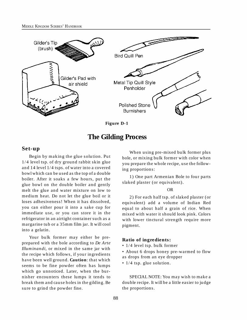
88
MIDDLE KINGDOM SCRIBES’ HANDBOOK
The Gilding Process
88
Set-upBegin by making the glue solution. Put
1/4 level tsp. of dry ground rabbit skin glueand 14 level 1/4 tsps. of water into a coveredbowl which can be used as the top of a doubleboiler. After it soaks a few hours, put theglue bowl on the double boiler and gentlymelt the glue and water mixture on low tomedium heat. Do not let the glue boil or itloses adhesiveness! When it has dissolved,you can either pour it into a sake cup forimmediate use, or you can store it in therefrigerator in an airtight container such as amargarine tub or a 35mm film jar. It will coolinto a gelatin.
Your bulk former may either be pre-prepared with the bole according to De ArteIlluminandi, or mixed in the same jar withthe recipe which follows, if your ingredientshave been well ground. Caution: that whichseems to be fine powder often has lumpswhich go unnoticed. Later, when the bur-nisher encounters these lumps it tends tobreak them and cause holes in the gilding. Besure to grind the powder fine.
When using pre-mixed bulk former plusbole, or mixing bulk former with color whenyou prepare the whole recipe, use the follow-ing proportions:
1) One part Armenian Bole to four partsslaked plaster (or equivalent).
OR
2) For each half tsp. of slaked plaster (orequivalent) add a volume of Indian Redequal to about half a grain of rice. Whenmixed with water it should look pink. Colorswith lower tinctural strength require morepigment.
Ratio of ingredients:• 1/4 level tsp. bulk former• About 6 drops honey pre-warmed to flowas drops from an eye dropper• 1/4 tsp. glue solution.
SPECIAL NOTE: You may wish to make adouble recipe. It will be a little easier to judgethe proportions.
Figure D-1
89
MIDDLE KINGDOM SCRIBES’ HANDBOOK
The amount of honey varies a little ac-cording to humidity of the day, and if theamount is off by 1 drop it may result in adisaster. Too much honey makes a stickygoop which will have problems drying andwill remain soft and unburnishable. Toolittle honey will make your gesso inflexibleand prone to flaking off the page, especiallyduring burnishing. It will also have problemsrehydrating enough to become sticky. If youmust err, do it on the side of not enoughhoney.
The portion of glue used in solution ismuch more forgiving: Too little will lead to anover-chalky material and create brittlenessfrom lack of binder. Too much glue, and thematerial will be thin and may not burnish asbrightly. However, it should gild all rightunless it exceeds the honey ratio. If you err,do it on the side of more glue.
If you substitute Indian Red pigment forthe bole, use a tiny amount or the color willbecome overpowering. I have seen actualperiod manuscripts where the gold has rubbedoff the gesso. On those samples, the densityof color ranged from a medium reddish-brown to a translucent off-white. Some gild-ing was on gessos of green or yellow.
If you have an internet connection with aweb browser you can see pictures of the toolsI use. My article on the making of a manu-script style illuminated page has a section ongilding which can be found on my website at:
http://www.provide.net/~randyaf/Illos.TI/TI.page.1.html
If you mix your gilding seat (anotherterm for the gesso) from scratch, follow thesesteps:
1) Warm some water in a bowl on top ofa double boiler. Into this bowl put a small jarof honey to warm it until it flows like water.Also, put some of the cold glue gelatin into asake cup and place the cup in the water to
89
melt the glue.
2) Measure the melted glue into anothersake cup and add the honey. (Also add thenon-toxic pigment at this time, if it has notalready been combined with the bulk former.Slowly mix the color into the material withyour finger tip to avoid creating bubbles. Ifyou use toxic pigment you should put arubber barrier over your finger.)When theglue and sweetener are combined, this mate-rial can be used to prime the page IF YOUFEEL IT IS NECESSARY. If you have anabsorbant paper, this may be needed. Other-wise when you applied the finished gesso theglue in the gesso might soak down into thepage and leave underbound chalk on top ogthe page. That chalk, no longer having enoughglue, would be fragile. If you prime anabsorbant surface you make a barrier toclose the surface from further absorbtion.
3) Add bulk former slowly to the glue/honey solution and mix gently with yourfinger tip so as not to create bubbles.
4) As it says in De Arte Illuminandi, weneed to test the mixture. This is very impor-tant! If the gesso isn't just right, it won'twork. Take a brush and paint out a layer ofthe gesso onto a sample of the same surfaceas you will be working on. See if it soaks intothe page and remains crusty and smeary ontop. If it does, your paper may be tooabsorbant. Also look to see if the surface ofthe gesso follows the paper texture like paint,or if it is thick enough to have a smoothsurface. If it has paper texture, then you needanother coat. When it dries, inspect it closely.
It should appear a little pale and drylooking, and it should be stiff, but just softenough that you can slightly dent it with theedge of your fingernail. The big test is if it isdry to the touch and not at all sticky until youdo the following: Breathe a long, slow moistbreath onto the patch. If you can get it to goa little darker with the moisture, and it be-
Chapter Eleven Gilding
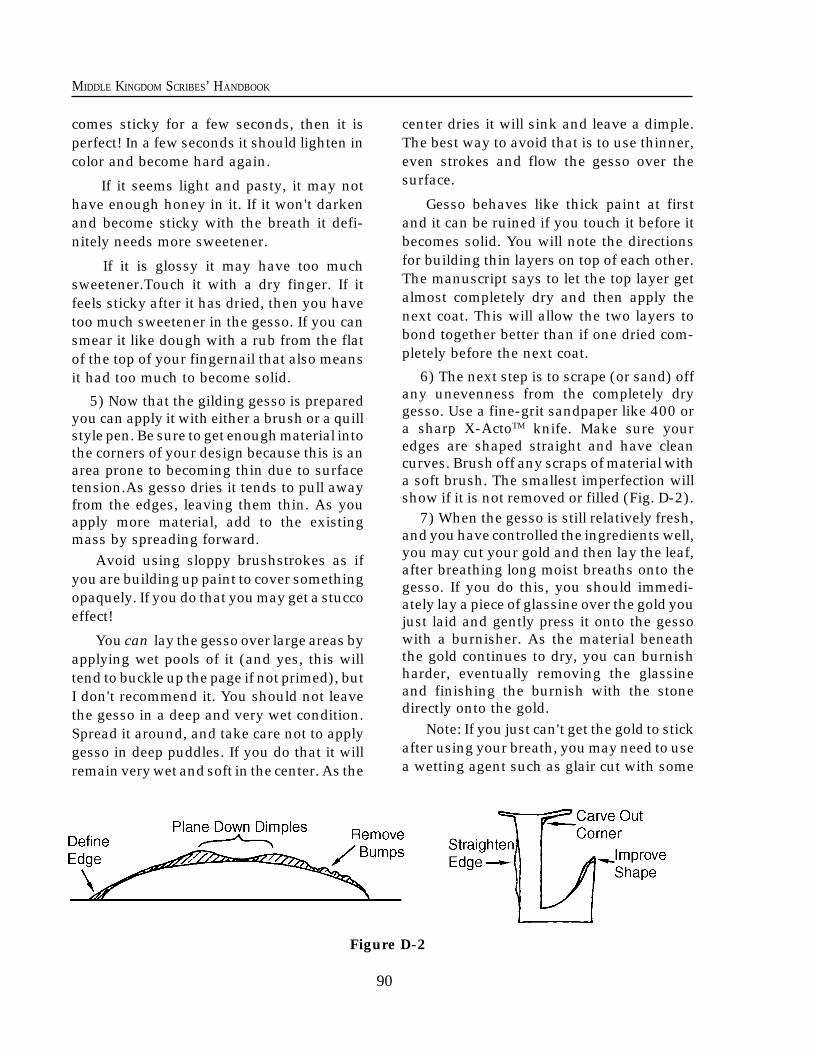
90
MIDDLE KINGDOM SCRIBES’ HANDBOOK
comes sticky for a few seconds, then it isperfect! In a few seconds it should lighten incolor and become hard again.
If it seems light and pasty, it may nothave enough honey in it. If it won't darkenand become sticky with the breath it defi-nitely needs more sweetener.
If it is glossy it may have too muchsweetener.Touch it with a dry finger. If itfeels sticky after it has dried, then you havetoo much sweetener in the gesso. If you cansmear it like dough with a rub from the flatof the top of your fingernail that also meansit had too much to become solid.
5) Now that the gilding gesso is preparedyou can apply it with either a brush or a quillstyle pen. Be sure to get enough material intothe corners of your design because this is anarea prone to becoming thin due to surfacetension.As gesso dries it tends to pull awayfrom the edges, leaving them thin. As youapply more material, add to the existingmass by spreading forward.
Avoid using sloppy brushstrokes as ifyou are building up paint to cover somethingopaquely. If you do that you may get a stuccoeffect!
You can lay the gesso over large areas byapplying wet pools of it (and yes, this willtend to buckle up the page if not primed), butI don't recommend it. You should not leavethe gesso in a deep and very wet condition.Spread it around, and take care not to applygesso in deep puddles. If you do that it willremain very wet and soft in the center. As the
center dries it will sink and leave a dimple.The best way to avoid that is to use thinner,even strokes and flow the gesso over thesurface.
Gesso behaves like thick paint at firstand it can be ruined if you touch it before itbecomes solid. You will note the directionsfor building thin layers on top of each other.The manuscript says to let the top layer getalmost completely dry and then apply thenext coat. This will allow the two layers tobond together better than if one dried com-pletely before the next coat.
6) The next step is to scrape (or sand) offany unevenness from the completely drygesso. Use a fine-grit sandpaper like 400 ora sharp X-ActoTM knife. Make sure youredges are shaped straight and have cleancurves. Brush off any scraps of material witha soft brush. The smallest imperfection willshow if it is not removed or filled (Fig. D-2).
7) When the gesso is still relatively fresh,and you have controlled the ingredients well,you may cut your gold and then lay the leaf,after breathing long moist breaths onto thegesso. If you do this, you should immedi-ately lay a piece of glassine over the gold youjust laid and gently press it onto the gessowith a burnisher. As the material beneaththe gold continues to dry, you can burnishharder, eventually removing the glassineand finishing the burnish with the stonedirectly onto the gold.
Note: If you just can't get the gold to stickafter using your breath, you may need to usea wetting agent such as glair cut with some
Figure D-2
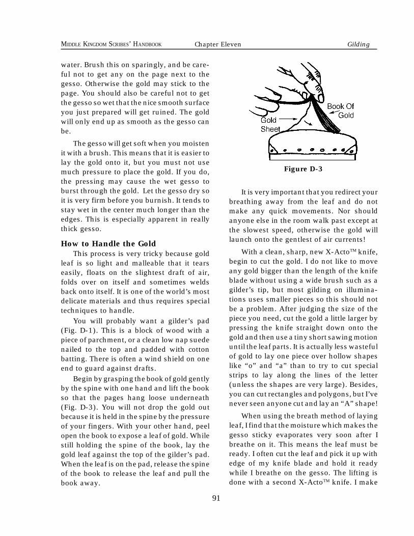
91
MIDDLE KINGDOM SCRIBES’ HANDBOOK
water. Brush this on sparingly, and be care-ful not to get any on the page next to thegesso. Otherwise the gold may stick to thepage. You should also be careful not to getthe gesso so wet that the nice smooth surfaceyou just prepared will get ruined. The goldwill only end up as smooth as the gesso canbe.
The gesso will get soft when you moistenit with a brush. This means that it is easier tolay the gold onto it, but you must not usemuch pressure to place the gold. If you do,the pressing may cause the wet gesso toburst through the gold. Let the gesso dry soit is very firm before you burnish. It tends tostay wet in the center much longer than theedges. This is especially apparent in reallythick gesso.
How to Handle the GoldThis process is very tricky because gold
leaf is so light and malleable that it tearseasily, floats on the slightest draft of air,folds over on itself and sometimes weldsback onto itself. It is one of the world’s mostdelicate materials and thus requires specialtechniques to handle.
You will probably want a gilder’s pad(Fig. D-1). This is a block of wood with apiece of parchment, or a clean low nap suedenailed to the top and padded with cottonbatting. There is often a wind shield on oneend to guard against drafts.
Begin by grasping the book of gold gentlyby the spine with one hand and lift the bookso that the pages hang loose underneath(Fig. D-3). You will not drop the gold outbecause it is held in the spine by the pressureof your fingers. With your other hand, peelopen the book to expose a leaf of gold. Whilestill holding the spine of the book, lay thegold leaf against the top of the gilder’s pad.When the leaf is on the pad, release the spineof the book to release the leaf and pull thebook away.
Figure D-3
It is very important that you redirect yourbreathing away from the leaf and do notmake any quick movements. Nor shouldanyone else in the room walk past except atthe slowest speed, otherwise the gold willlaunch onto the gentlest of air currents!
With a clean, sharp, new X-ActoTM knife,begin to cut the gold. I do not like to moveany gold bigger than the length of the knifeblade without using a wide brush such as agilder’s tip, but most gilding on illumina-tions uses smaller pieces so this should notbe a problem. After judging the size of thepiece you need, cut the gold a little larger bypressing the knife straight down onto thegold and then use a tiny short sawing motionuntil the leaf parts. It is actually less wastefulof gold to lay one piece over hollow shapeslike “o” and “a” than to try to cut specialstrips to lay along the lines of the letter(unless the shapes are very large). Besides,you can cut rectangles and polygons, but I’venever seen anyone cut and lay an “A” shape!
When using the breath method of layingleaf, I find that the moisture which makes thegesso sticky evaporates very soon after Ibreathe on it. This means the leaf must beready. I often cut the leaf and pick it up withedge of my knife blade and hold it readywhile I breathe on the gesso. The lifting isdone with a second X-ActoTM knife. I make
91
Chapter Eleven Gilding
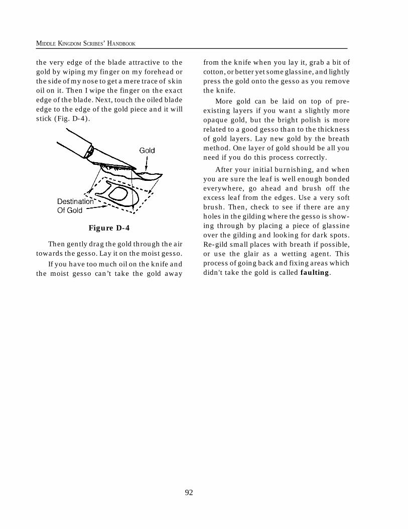
92
MIDDLE KINGDOM SCRIBES’ HANDBOOK
92
the very edge of the blade attractive to thegold by wiping my finger on my forehead orthe side of my nose to get a mere trace of skinoil on it. Then I wipe the finger on the exactedge of the blade. Next, touch the oiled bladeedge to the edge of the gold piece and it willstick (Fig. D-4).
Figure D-4
Then gently drag the gold through the airtowards the gesso. Lay it on the moist gesso.
If you have too much oil on the knife andthe moist gesso can’t take the gold away
from the knife when you lay it, grab a bit ofcotton, or better yet some glassine, and lightlypress the gold onto the gesso as you removethe knife.
More gold can be laid on top of pre-existing layers if you want a slightly moreopaque gold, but the bright polish is morerelated to a good gesso than to the thicknessof gold layers. Lay new gold by the breathmethod. One layer of gold should be all youneed if you do this process correctly.
After your initial burnishing, and whenyou are sure the leaf is well enough bondedeverywhere, go ahead and brush off theexcess leaf from the edges. Use a very softbrush. Then, check to see if there are anyholes in the gilding where the gesso is show-ing through by placing a piece of glassineover the gilding and looking for dark spots.Re-gild small places with breath if possible,or use the glair as a wetting agent. Thisprocess of going back and fixing areas whichdidn't take the gold is called faulting.
93
MIDDLE KINGDOM SCRIBES’ HANDBOOK
to be gilded. Use thin coats to avoid dimplesin the middle. If you need to add some waterto make it flow better, do so. Build up asmany layers as you like to give your pre-ferred thickness for the final result.
4) This material will take about an hour todry (subject to atmospheric humidity andthickness) and it should darken somewhatas it dries. When it has dried completely,sand the material with 320 or 340 grit emorypaper to smooth and even the surface.
5) When you are ready to lay the leaf youmay use breath or a brush to rehumidify thesurface. This may be done anytime up toabout a week after the material has beenapplied. Use the same techniques for layingthe leaf as described above. The final burnish-ing is best done 1/2 to 1 hour after leaf wasoriginally adhered.
Materials Needed:*A fine point metal or natural quill style drawing pen.*A wad of soft cotton or folded tissue.*A couple of sake cups or shot glasses.*A 1/4 tsp. measure.*A small pointed palette knife.*A new X-ActoTM or other sharp hobby sized knife.*Either a gilder’s tip brush or a second very clean new X-ActoTM knife.
*A gilder’s pad or some dry clean parchment for cutting gold upon.*Some glassine paper.*A small burnisher of agate or hematite.*A small pointed round brush and a medium small round brush.*Any of the following: slaked plaster, fine gypsum powder, calcium carbonate (CaS04), or any other fine powder chalk material.*PVA glue. It looks like Elmer’s white glue.*Red dry ground pigment or watercolor.
Modern Alternative Gilding
This process requires much of the sameleaf laying technique as the process de-scribed above, but the actual materials in therecipe are easier to get correctly propor-tioned, and you do not need a heat source.1) Put some PVA glue into a shot glass andadd a little bit of color mixed well into theglue. Dilute this with water until it is of aconsistency which flows easily from a brush.This will be painted onto the areas to begilded in order to seal the surface porosity ofthe support page. Let it dry almost com-pletely, but not quite.
2) Next, mix PVA glue (regular strength)with a little less than the same volume ofbulk former and some color so you can see iton the white page. Be careful as you mix soas not to create air bubbles!
3) Brush this thicker solution onto the areas
Chapter Eleven Gilding
94
MIDDLE KINGDOM SCRIBES’ HANDBOOK
here is a difference between a periodbook page and a document which conferselevation and/or awards. The book pagecontained far more decoration because it wasusually an object of religious devotion orneeded illustration to clarify or even beautifythe text. Documents were for the business ofState and were often rather bare. Towardsthe latter part of SCA period special docu-ments, such as those conferring arms, some-times had decorations.
Some of these had elaborate borderwork,and they would usually have been written inwhat is called a court hand. The court handswere less formal than the scripts used inmost religious manuscripts. Court hand wasmore of a “handwriting” style which wouldbe more difficult to forge than a standardbook hand. The book hands were originallydesigned to be clearer and easier to read.
Documents were horizontal in layout andfilled most of the page. The texts were longand windy to modern eyes because the her-ald writing the document was apt to identifyhimself and all of his titles. The recipient wasalso identified at length. At the bottom of thescroll was a ribbon or cord which passeddirectly through a hole in the page and cameback through, the ends being caught to-gether with a disk of sealing wax or lead thatwas stamped with the seal of the grantor.Alternatively, the seal might be set on atongue of parchment which was cut from thebottom of the scroll but not cut completely off.
Many SCA scribes choose book page styleformats for their scrolls. Although it is inac-curate for period documents, it has neverthe-less become acceptable in the SCA. There-fore, the following description of one of the
T
94
Appendix E Period MethodsChapter Twelve
A Perspective on Period Methods
ways a medieval book may have been madeis included for the scribe’s “illumination.”
Until the rise of universities in the twelfthand thirteenth centuries, most books weremade by ecclesiastic hands. Nearly the entirework was made by a few people. Except fora few hard-to-get colors, like ultramarineblue made from processed lapis lazuli, mostof the materials were locally collected, pro-cessed, or otherwise made. Books were lentfrom one collection to another so that theycould be copied.
For a more complete idea about how abook might be made, let us take a closer lookat the process as it might have happened inearly fourteenth century Paris:
Henri is a young nobleman with bothmoney and religious faith. He is planning tomarry Jeanne and needs a sincere weddingpresent. He goes to the street where the booksellers are found, and he steps into a shop.He tells the proprietor that he wants a Bookof Hours, and together they discuss the typeand amount of decoration. Henri specifiesthat he wants only ultramarine azure forcertain parts of the illustrations, he wants aspecific number of gilded initials, and hewants rubrications to begin all verses. Thelist goes on and is specific. A price is set.
Elsewhere, the parchmenters have beenbusy. A large number of calves’ skins (ormaybe goat or sheep skins) have been soakedin lime water for about a week and had thehair and flesh scraped off. Then they wererinsed and stretched on a frame, scraped,sanded, and then rewetted and stretchedvery tightly and allowed to dry.
The bookseller has had the hides cut into
95
MIDDLE KINGDOM SCRIBES’ HANDBOOK
95
the sizes of the bifolia (a bifolio is both theright and left sides of one sheet, making foursides), which were arranged into stacks ofseveral sheets. The top bifolio was pin prickeddown the outside edges where the rulingedge will be lined-up to produce the rulinglines. This top bifolio becomes a template forthe entire book and was laid upon the top ofthe stack. An awl would then be driventhrough the pin holes through the wholestack. When the whole book was pricked, thebifolios would be ruled. In this case, theruling was with fine ink lines for both thecolumns and the text lines.
Next the bookseller sent stacks of severalblank bifolia out to various copyists. Alongwith these went the peciae. A pecia is asection of the original text broken into num-bered loose leaves. The calligraphers leftspace for decorated initials and plenty ofroom for the miniatures. They used pensmade of bird quills, although at other timesand in other places pens made of reeds werevery common. Their inks were made fromoak galls or lamp soot mixed with gum“arabic” and were kept either in small glazedpots or in horns stuck through holes in thecopydesk. The copydesk had a slanted sur-face which opened to reveal storage under-neath. It also had a post which supported abook stand which might swivel in front of thecopyist.
The finished writing was then given tothe rubricator, who was paid to paint in allof the versals and other initials throughoutthe collective manuscript. Although the Bookof Hours is a secular text, Henri feels thework would not be complete until the book-seller takes the work to Notre Dame to bechecked by an ecclesiastic corrector.
Mistakes were either corrected above, orscraped clean and rewritten if they weresmall enough. Otherwise they are strickenand rewritten in small letters nearby. Some-times “va” was written at the beginning of
the error and “cu” at the end meaning “Vacu”or “out with everything between”.
The bookseller then distributed the peciaebetween a couple of illuminator’s workshopson the “Rue des Enlumineurs” on the leftbank.
The master would design the importantillustrations and check the designs of his/hertrusted journeymen. Drawings would thenbe made with a form of pencil and the finallines fixed in light ink. Sometimes a cuewould be written in the design to indicatewhat colors were to be used and where goldwould be laid.
An advanced apprentice was given thelabour of gilding. The outlines were filled inwith a pen or brush laying gesso (a mixtureof hide glue, plaster or chalk), a bit of sugar,a small bit of pigment, and often some whitelead. The gold, slightly thicker than we usetoday, was laid onto the gesso after the gessowas moistened by breathing onto it. Thenthe gold was burnished and sometimesstamped.
The master had only a few apprentices topaint the backgrounds and simple parts ofthe illustrations. Then, he/she personallycompleted the figures and other importantparts. The loose folio leaves were then re-turned to the bookseller.
In the meantime, Henri had revisited thebookseller and asked that some additionalprayers be added to the manuscript. Thebookseller knew of a man and woman whoran a tavern and supplemented their incomeby doing manuscript illumination. He as-sured Henri that they were competent andthat Henri will have the remaining bifoliawhen the others became due.
The illuminator’s workshop was a busyplace. Apprentices had to be taught how topurchase good quality colors, usually sold inbags (occasionally gravel or other impuritiesfound their way into the containers by “acci-
Chapter Twelve Period Methods
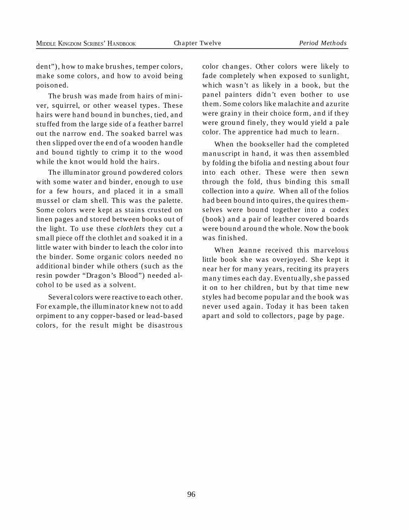
96
MIDDLE KINGDOM SCRIBES’ HANDBOOK
96
Chapter Twelve Period Methods
dent”), how to make brushes, temper colors,make some colors, and how to avoid beingpoisoned.
The brush was made from hairs of mini-ver, squirrel, or other weasel types. Thesehairs were hand bound in bunches, tied, andstuffed from the large side of a feather barrelout the narrow end. The soaked barrel wasthen slipped over the end of a wooden handleand bound tightly to crimp it to the woodwhile the knot would hold the hairs.
The illuminator ground powdered colorswith some water and binder, enough to usefor a few hours, and placed it in a smallmussel or clam shell. This was the palette.Some colors were kept as stains crusted onlinen pages and stored between books out ofthe light. To use these clothlets they cut asmall piece off the clothlet and soaked it in alittle water with binder to leach the color intothe binder. Some organic colors needed noadditional binder while others (such as theresin powder “Dragon’s Blood”) needed al-cohol to be used as a solvent.
Several colors were reactive to each other.For example, the illuminator knew not to addorpiment to any copper-based or lead-basedcolors, for the result might be disastrous
color changes. Other colors were likely tofade completely when exposed to sunlight,which wasn’t as likely in a book, but thepanel painters didn’t even bother to usethem. Some colors like malachite and azuritewere grainy in their choice form, and if theywere ground finely, they would yield a palecolor. The apprentice had much to learn.
When the bookseller had the completedmanuscript in hand, it was then assembledby folding the bifolia and nesting about fourinto each other. These were then sewnthrough the fold, thus binding this smallcollection into a quire. When all of the folioshad been bound into quires, the quires them-selves were bound together into a codex(book) and a pair of leather covered boardswere bound around the whole. Now the bookwas finished.
When Jeanne received this marvelouslittle book she was overjoyed. She kept itnear her for many years, reciting its prayersmany times each day. Eventually, she passedit on to her children, but by that time newstyles had become popular and the book wasnever used again. Today it has been takenapart and sold to collectors, page by page.