Embed Size (px)
DESCRIPTION
Media studies music magazine By Teeruthpal Singh Purewall. Contents. Task Genre Why Hip hop magazines Audience Title why Sketches Photo’s Pictures that never made it Forms and conventions Front cover Contents Article Old vs. new Technology for in design - PowerPoint PPT Presentation
Citation preview
Media studies music magazine
By Teeruthpal Singh Purewall

Contents • Task• Genre • Why• Hip hop magazines • Audience • Title • why • Sketches• Photo’s • Pictures that never made it• Forms and conventions• Front cover • Contents • Article• Old vs. new • Technology for in design• Technology for Photoshop• How could it improve• How does this make your audience want to buy it• Conclusion• End
Task
• My task was to create a music magazine.
• The genre was of my choice or decided by my questionnaire results.
• I had to create a front cover• Contents page• Double page article

Genre
why?•Big fan• If you are already a fan then less time will me spent
on research. Being a fan already helps me to know my audience and to know what they want.
Questionnaire results The results showed that I should do rock or hip hop. I have
more knowledge of hip hop so it would be much easier to pick hip hop.
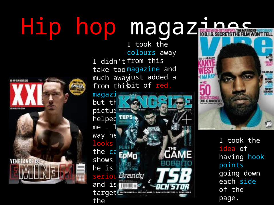
Hip hop magazinesI didn't take too much away from this magazine but the picture helped me . The way he looks at the camera shows that he is serious and is targeting the audience.
I took the colours away from this magazine and just added a bit of red.
I took the idea of having hook points going down each side of the page.
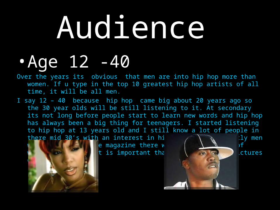
Audience • Age 12 -40Over the years its obvious that men are into hip hop more than women. If u
type in the top 10 greatest hip hop artists of all time, it will be all men. I say 12 – 40 because hip hop came big about 20 years ago so the 30 year
olds will be still listening to it. At secondary its not long before people start to learn new words and hip hop has always been a big thing for teenagers. I started listening to hip hop at 13 years old and I still know a lot of people in there mid 30’s with an interest in hip hop. Although mostly men would be reading the magazine there will still be a lot of women viewers, so it is important that I have not only pictures of men.
TITLE NAME
RHYMERHYME
WHY?
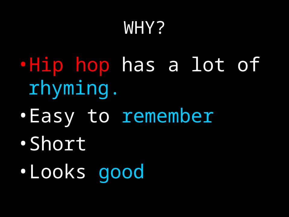
•Hip hop has a lot of rhyming.• Easy to remember • Short• Looks good
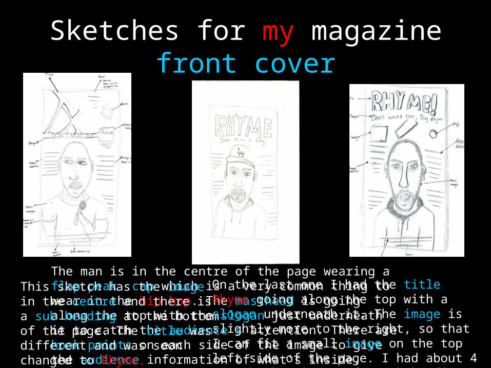
Sketches for my magazine front cover
The man is in the centre of the page wearing a flap peak cap which is a very common thing to wear in the hip hop. The masthead is going along the top with the slogan just underneath it to catch the audience’s attention. There are hook points on each side of the image to give the audience information of what's inside.
This sketch has the image in the centre and there is a sub heading at the bottom of the page. The title was different and was soon changed to Rhyme.
On the last one I had the title Rhyme going along the top with a slogan underneath it. The image is slightly more to the right, so that I can fit a small image on the top left side of the page. I had about 4 or 5 hook points and a sub heading on the bottom.
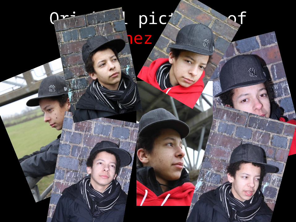
Original pictures of Sanchez Gomez

Pictures that never made it
Didn’t have the correct look.
Background was hard to work with.Not the correct
background for a hip hop magazine.
Didn’t like the shadow or red jumper
Mouth is open

Pictures of G.T
Forms and conventions.
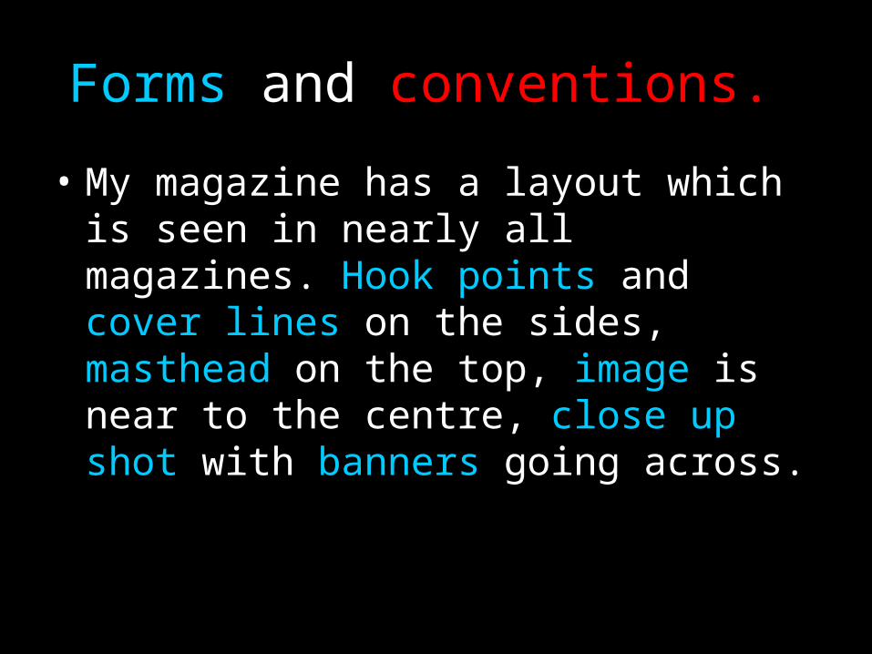
• My magazine has a layout which is seen in nearly all magazines. Hook points and cover lines on the sides, masthead on the top, image is near to the centre, close up shot with banners going across.

front cover magazine The masthead is in big white writing on a dark background so that it stands out and is in graffiti font. Graffiti font is used because it connotes hip hop. Over the years hip hop has become the music of the streets.
Sanchez Gomez is in big white writing just like the masthead because he is the big news of the day. If people see his name then they would want to buy the magazine. Its diagonal because it makes it stand out more and make the page look compact.
Hook points and cover lines, which tell you what articles are inside, going down the side of the page, to make the reader want to read what’s inside. The important words in blue.
The price and the bar code are at the bottom to make it look realistic.
The image takes up most of the page and is looking directly at the camera. This makes it look like he is looking at the audience rather than doing something else. The baseball hat connotes hip hop. The scarf and jacket blend in with the back ground to make his face
stand out more.
The sub heading is trying to persuade the viewer to buy it and think that it is the number one hip hop magazine.
The blue connotes
freshness.
The picture of G.T is there to show that he is included in the magazine

Contents page Contents, which helps the reader navigate the magazine easily, is written at the top of the page so that people realise what this page is for.
The image of Sanchez is there to show the page reference and to also show that it is important in this months issue.
The picture next him is G..T, he next to him because they are performing together at the o2
arena.
Rhyme is going down the side and is just there to show that it is rhyme magazine.
Z de is another big story but not big enough to have a picture on the front cover. However, he is still important so there is a picture of him in the contents page with a page reference.
His daughter is just below him as she is in an interview telling us about her and her father Zed e. I thought it would also be a good idea to have both genders in the magazine and a Varity of ages.
The feature are the most important part of the contents page. I have lots of different story's going on so that people would want to read it. If you have lots of stuff that means more people audience otherwise it would be too limited.
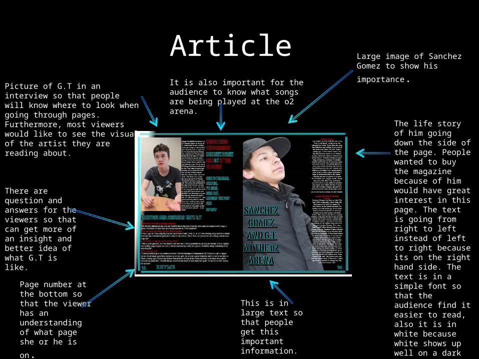
Article Picture of G.T in an interview so that people will know where to look when going through pages. Furthermore, most viewers would like to see the visual of the artist they are reading about.
There are question and answers for the viewers so that can get more of an insight and better idea of what G.T is like.
Page number at the bottom so that the viewer has an understanding of what page she or he is
on.
Large image of Sanchez Gomez to
show his importance.
The life story of him going down the side of the page. People wanted to buy the magazine because of him would have great interest in this page. The text is going from right to left instead of left to right because its on the right hand side. The text is in a simple font so that the audience find it easier to read, also it is in white because white shows up well on a dark background.
This is in large text so that people get this important information.
It is also important for the audience to know what songs are being played at the o2 arena.
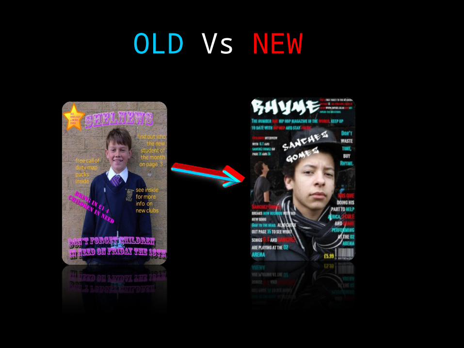
OLD Vs NEW
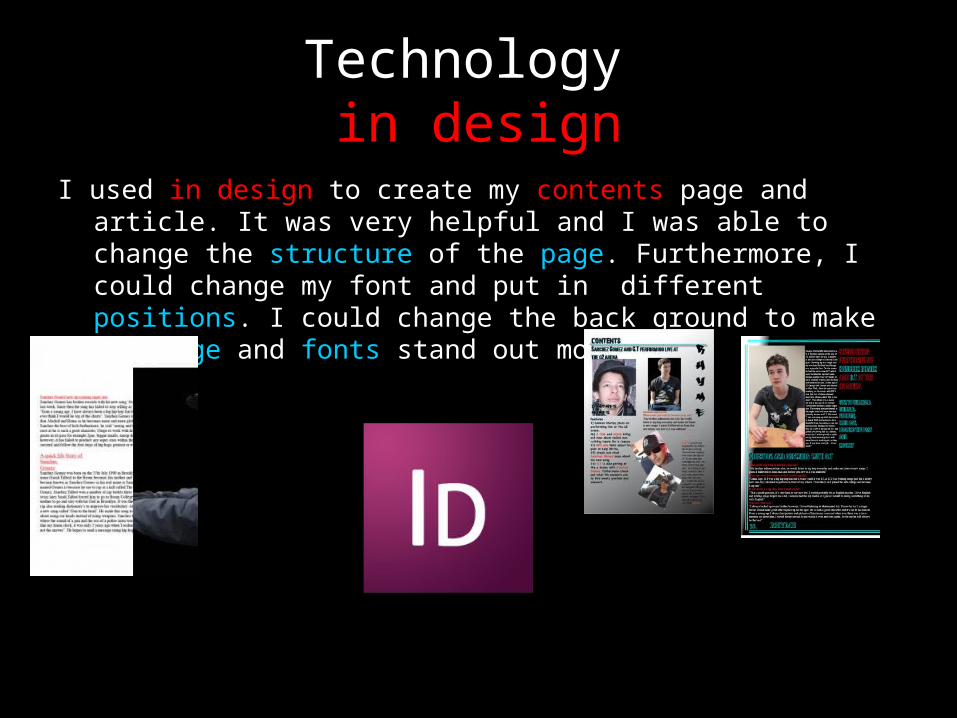
Technology in design
I used in design to create my contents page and article. It was very helpful and I was able to change the structure of the page. Furthermore, I could change my font and put in different positions. I could change the back ground to make my image and fonts stand out more.
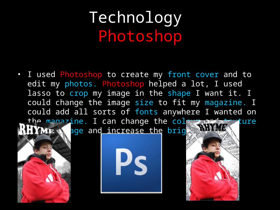
Technology Photoshop
• I used Photoshop to create my front cover and to edit my photos. Photoshop helped a lot, I used lasso to crop my image in the shape I want it. I could change the image size to fit my magazine. I could add all sorts of fonts anywhere I wanted on the magazine. I can change the colour and texture of the image and increase the brightness or contrast.
How can I improve
• I should of got a picture of Sanchez Gomez and G.T together. This way the viewer would realise straight away that they are together.
• Having a picture without a wall in the background could of made it a lot more easier.
• Changing the font on my contents page.• Making the picture of G.T on the front
cover more clearer.
How does this magazine make your audience want to buy it?
• There is a lot of information around the front cover and helpful notifications within the contents page. In today's society people want to see new stuff and my magazine is based on new up coming super stars. However, there are some news about the old ones to so I don't limit my audience. Not only do I include male stars but women stars as well so I target both genders which means a larger audience. The article is pact with information including questions and answers so that the audience have more knowledge of the rap star, as fans love to know there personal life, there are to big article's on G.T and Sanchez Gomez on how they became a rap star. On the front cover I put “win a free ticket to the o2 arena to see this years hip hop London concert.” this persuades people to buy my magazine.
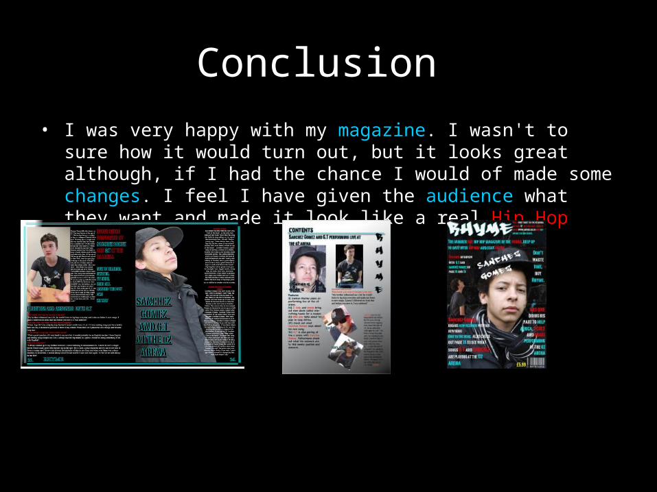
Conclusion • I was very happy with my magazine. I wasn't to sure how it
would turn out, but it looks great although, if I had the chance I would of made some changes. I feel I have given the audience what they want and made it look like a real Hip Hop magazine.
The EndCAST
Teeruthpal Singh Purewall
Produced byTeeruthpal Singh Purewall
Directed byTeeruthpal Singh Purewall
Audio byTeeruthpal Singh Purewall
Visual effects by Teeruthpal Singh Purewall
Thanks for listening