Embed Size (px)
Citation preview
135
Chapter 5
Measures of Variability
The Importance of Measuring Variability
The Index of Qualitative Variation (IQV): A Brief Introduction
Steps for Calculating the IQVExpressing the IQV as a Percentage
Statistics in Practice: Diversity in U.S. Society
A Closer Look 5.1 Statistics in Practice: Diversity at Berkeley Through the Years
The Range
The lnterquartile Range: Increases in Elderly Population
The Box Plot
The Variance and the Standard Deviation: Changes in the Elderly Population
Calculating the Deviation From the MeanCalculating the Variance and the Standard
Deviation
Considerations for Choosing a Measure of Variation
Reading the Research Literature: Ethnicity and College Aspirations and Expectations
In the previous chapter, we looked at measures of central tendency: the mean, the median, and the mode. With these measures, we can use a single number to describe what is average for or typical of a distribution. Although measures of central tendency can
be very helpful, they tell only part of the story. In fact, when used alone they may mislead rather than inform. Another way of summarizing a distribution of data is by selecting a single number that describes how much variation and diversity there is in the distribution. Numbers that describe diversity or variation are called measures of variability. Researchers often use measures of central tendency along with measures of variability to describe their data.
05-Frankfort5e-45753.indd135 7/30/20087:38:27PM
136— S O C I A L S TAT I S T I C S F O R A D I V E R S E S O C I E T Y
Measures of variability Numbers that describe diversity or variability in the distribution.
In this chapter, we discuss five measures of variability: the index of qualitative variation, the range, the interquartile range, the standard deviation, and the variance. Before we discuss these measures, let’s explore why they are important.
- ThE IMPoRTAnCE of MEASuRIng VARIABILITY
The importance of looking at variation and diversity can be illustrated by thinking about the differences in the experiences of U.S. women. Are women united by their similarities or divided by their differences? The answer is both. To address the similarities without deal-ing with differences is “to misunderstand and distort that which separates as well as that which binds women together.”1 Even when we focus on one particular group of women, it is important to look at the differences as well as the commonalities. Take, for example, Asian American women. As a group, they share a number of characteristics.
Their participation in the workforce is higher than that of women in any other ethnic group. Many . . . live life supporting others, often allowing their lives to be subsumed by the needs of the extended family. . . . However, there are many circumstances when these shared experiences are not sufficient to accurately describe the condition of a particular Asian-American woman, Among Asian-American women there are those who were born in the United States . . . and . . . those who recently arrived in the United States. Asian-American women are diverse in their heritage or country of origin: China, Japan, the Philippines, Korea . . . and . . . India. . . . Although the majority of Asian-American women are working class—contrary to the stereotype of the “ever successful” Asians—there are poor, “middle-class,” and even affluent Asian-American women.2
As this example illustrates, one basis of stereotyping is treating a group as if it were totally represented by its central value, ignoring the diversity within the group. Sociologists often contribute to this type of stereotyping when their empirical generalizations, based on a statis-tical difference between averages, are interpreted in an overly simplistic way. All this argues for the importance of using measures of variability as well as central tendency whenever we want to characterize or compare groups. Whereas the similarities and commonalities in the experiences of Asian American women are depicted by a measure of central tendency, the diversity of their experiences can be described only by using measures of variation.
The concept of variability has implications not only for describing the diversity of social groups such as Asian American women but also for issues that are important in your everyday life. One of the most important issues facing the academic community is how to reconstruct the curriculum to make it more responsive to the needs of students. Let’s consider the issue of statistics instruction on the college level.
Statistics is perhaps the most anxiety-provoking course in any social science curriculum. Statistics courses are often the last “roadblock” preventing students from completing their
05-Frankfort5e-45753.indd136 7/30/20087:38:27PM
Measures of Variability— 137
major requirements. One factor, identified in numerous studies as a handicap for many students, is the “math anxiety syndrome.” This anxiety often leads to a less than optimum learning environment, with students often trying to memorize every detail of a statistical procedure rather than understand the general concept involved.
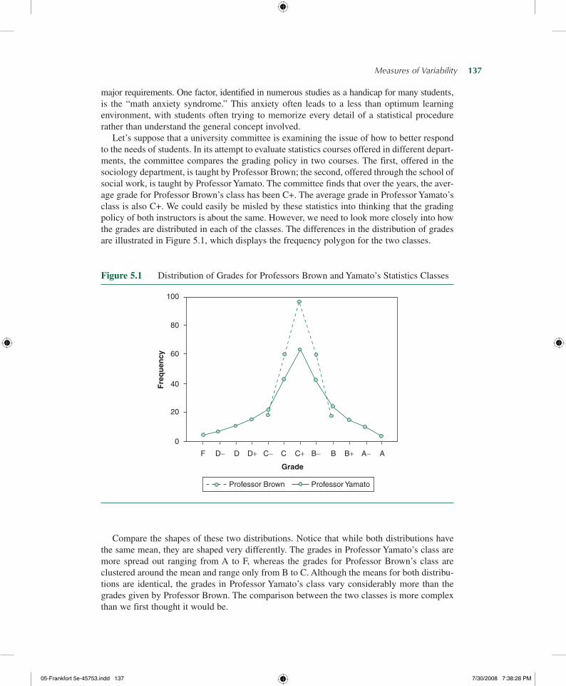
Let’s suppose that a university committee is examining the issue of how to better respond to the needs of students. In its attempt to evaluate statistics courses offered in different depart-ments, the committee compares the grading policy in two courses. The first, offered in the sociology department, is taught by Professor Brown; the second, offered through the school of social work, is taught by Professor Yamato. The committee finds that over the years, the aver-age grade for Professor Brown’s class has been C+. The average grade in Professor Yamato’s class is also C+. We could easily be misled by these statistics into thinking that the grading policy of both instructors is about the same. However, we need to look more closely into how the grades are distributed in each of the classes. The differences in the distribution of grades are illustrated in Figure 5.1, which displays the frequency polygon for the two classes.
Figure 5.1 Distribution of Grades for Professors Brown and Yamato’s Statistics Classes
100
60
40
20
D− B−
Grade
B+F D C BC− A− AD+ C+0
80
Fre
qu
ency
Professor Brown Professor Yamato
Compare the shapes of these two distributions. Notice that while both distributions have the same mean, they are shaped very differently. The grades in Professor Yamato’s class are more spread out ranging from A to F, whereas the grades for Professor Brown’s class are clustered around the mean and range only from B to C. Although the means for both distribu-tions are identical, the grades in Professor Yamato’s class vary considerably more than the grades given by Professor Brown. The comparison between the two classes is more complex than we first thought it would be.
05-Frankfort5e-45753.indd137 7/30/20087:38:28PM

138— S O C I A L S TAT I S T I C S F O R A D I V E R S E S O C I E T Y
As this example demonstrates, information on how scores are spread from the center of a distribution is as important as information about the central tendency in a distribution. This type of information is obtained by measures of variability.
✓ Learning Check. Look closely at Figure 5.1. Whose class would you choose to take? If you were worried that you might fail statistics, your best bet would be Professor Brown’s class where no one fails. However, if you want to keep up your GPA and are willing to work, Professor Yamato’s class is the better choice. If you had to choose one of these classes based solely on the average grades, your choice would not be well informed.
- ThE InDEx of QuALITATIVE VARIATIon: A BRIEf InTRoDuCTIon
The United States is undergoing a demographic shift from a predominantly European popu-lation to one characterized by increased racial, ethnic, and cultural diversity. These changes challenge us to rethink every conceptualization of society based solely on the experiences of European populations and force us to ask questions that focus on the experiences of different racial/ethnic groups. For instance, we may want to compare the racial/ethnic diversity in dif-ferent cities, regions, or states or may want to find out if a group has become more racially and ethnically diverse over time.
The index of qualitative variation (IQV) is a measure of variability for nominal variables such as race and ethnicity. The index can vary from 0.00 to 1.00. When all the cases in the distribution are in one category, there is no variation (or diversity) and the IQV is 0.00. In contrast, when the cases in the distribution are distributed evenly across the categories, there is maximum variation (or diversity) and the IQV is 1.00.
Index of qualitative variation (IQV) A measure of variability for nominal vari-ables. It is based on the ratio of the total number of differences in the distribution to the maximum number of possible differences within the same distribution.
Suppose you live in Maine, where the majority of residents are white and a small minority are Latino or Asian. Also suppose that your best friend lives in Hawaii, where the majority of the population are either Asians or Native Hawaiians. The distributions for these two states are presented in Table 5.1. Which is more diverse? Clearly, Hawaii, where the majority of the population are either Asians or Native Hawaiians, is more diverse than Maine, where Asians and Latinos are but a small minority. You can also get a visual feel for the relative diversity in the two states by examining the two bar charts presented in Figure 5.2.
05-Frankfort5e-45753.indd138 7/30/20087:38:28PM

Measures of Variability— 139
Table 5.1 Top Three Racial/Ethnic Groups for Two States by Percentage
Race/Ethnic Group Maine Hawaii
White 98.0 35.1Latino 1.0 n.d.Asian 1.0 53.3Native Hawaiian or Pacific Islander n.d. 11.6
Total 100.0 100.0
Source: U.S. Census Bureau, American Community Survey, 2006.
Note: Tables include only the three largest racial/ethnic groups per state.
Figure 5.2 Top Three Racial/Ethnic Groups in Maine and Hawaii
0%10%20%30%40%50%60%70%80%90%
100%
White Latino Asian0%
10%20%30%40%50%60%70%80%90%
100%
White Asian NativeHawaiianor PacificIslander
(a) (b)
Steps for Calculating the IQV
To calculate the IQV, we use this formula:
IQV= K 1002 −P
Pct2ð Þ1002ðK− 1Þ
(5.1)
where
K = the number of categories
∑ Pct2 = the sum of all squared percentages in the distribution
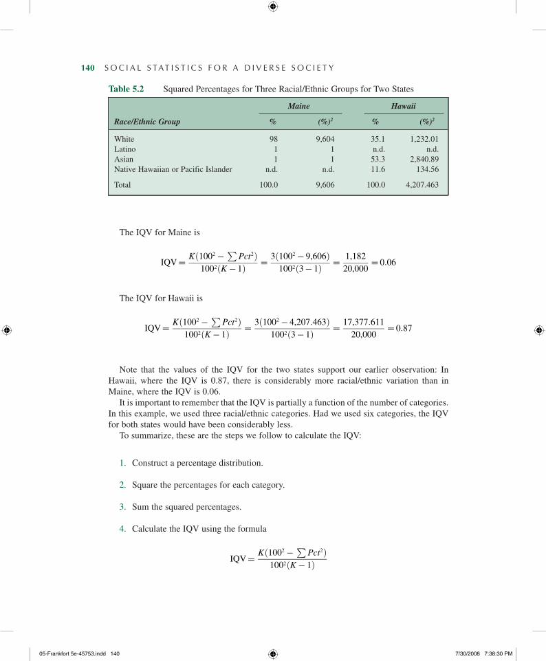
In Table 5.2, we present the squared percentages for each racial/ethnic group for Maine and Hawaii.
05-Frankfort5e-45753.indd139 7/30/20087:38:29PM
140— S O C I A L S TAT I S T I C S F O R A D I V E R S E S O C I E T Y
The IQV for Maine is
IQV= K 1002 −P
Pct2ð Þ1002ðK− 1Þ
= 3ð1002 − 9,606Þ1002ð3− 1Þ
= 1,182
20,000= 0:06
The IQV for Hawaii is
IQV= K 1002 −P
Pct2ð Þ1002ðK− 1Þ
= 3ð1002 − 4,207:463Þ1002ð3− 1Þ
= 17,377:611
20,000= 0:87
Note that the values of the IQV for the two states support our earlier observation: In Hawaii, where the IQV is 0.87, there is considerably more racial/ethnic variation than in Maine, where the IQV is 0.06.
It is important to remember that the IQV is partially a function of the number of categories. In this example, we used three racial/ethnic categories. Had we used six categories, the IQV for both states would have been considerably less.
To summarize, these are the steps we follow to calculate the IQV:
1. Construct a percentage distribution.
2. Square the percentages for each category.
3. Sum the squared percentages.
4. Calculate the IQV using the formula
IQV= K 1002 −P
Pct2ð Þ1002ðK− 1Þ
Table 5.2 Squared Percentages for Three Racial/Ethnic Groups for Two StatesTable 5.2 Squared Percentages for Three Racial/Ethnic Groups for Two States
Maine Hawaii
Race/Ethnic Group % (%)2 % (%)2
White 98 9,604 35.1 1,232.01Latino 1 1 n.d. n.d.Asian 1 1 53.3 2,840.89Native Hawaiian or Pacific Islander n.d. n.d. 11.6 134.56
Total 100.0 9,606 100.0 4,207.463
05-Frankfort5e-45753.indd140 7/30/20087:38:30PM
Measures of Variability— 141
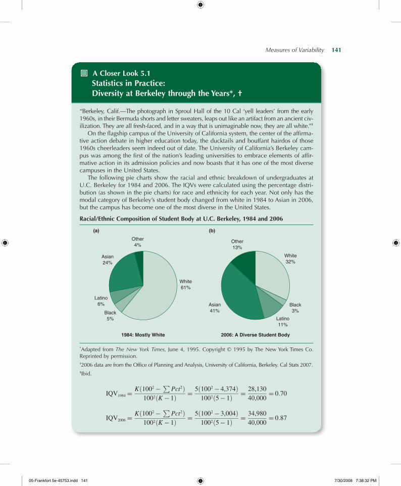
- A Closer Look 5.1 Statistics in Practice: Diversity at Berkeley through the Years*, †
“Berkeley, Calif.—The photograph in Sproul Hall of the 10 Cal ‘yell leaders’ from the early 1960s, in their Bermuda shorts and letter sweaters, leaps out like an artifact from an ancient civ-ilization. They are all fresh-faced, and in a way that is unimaginable now, they are all white.”‡
On the flagship campus of the University of California system, the center of the affirma-tive action debate in higher education today, the ducktails and bouffant hairdos of those 1960s cheerleaders seem indeed out of date. The University of California’s Berkeley cam-pus was among the first of the nation’s leading universities to embrace elements of affir-mative action in its admission policies and now boasts that it has one of the most diverse campuses in the United States.
The following pie charts show the racial and ethnic breakdown of undergraduates at U.C. Berkeley for 1984 and 2006. The IQVs were calculated using the percentage distri-bution (as shown in the pie charts) for race and ethnicity for each year. Not only has the modal category of Berkeley’s student body changed from white in 1984 to Asian in 2006, but the campus has become one of the most diverse in the United States.
Racial/Ethnic Composition of Student Body at u.C. Berkeley, 1984 and 2006
White61%
Other4%
Asian24%
Latino6%
Black5%
White32%
Other13%
Asian41%
Latino11%
Black3%
(a) (b)
1984: Mostly White 2006: A Diverse Student Body
*Adapted from The New York Times, June 4, 1995. Copyright © 1995 by The New York Times Co. Reprinted by permission.†2006 data are from the Office of Planning and Analysis, University of California, Berkeley. Cal Stats 2007.‡Ibid.
IQV1984 =K 1002 −
PPct2ð Þ
1002ðK− 1Þ= 5ð1002 − 4,374Þ
1002ð5− 1Þ= 28,130
40,000= 0:70
IQV2006 =K 1002 −
PPct2ð Þ
1002ðK− 1Þ= 5ð1002 − 3,004Þ
1002ð5− 1Þ= 34,980
40,000= 0:87
05-Frankfort5e-45753.indd141 7/30/20087:38:32PM

142— S O C I A L S TAT I S T I C S F O R A D I V E R S E S O C I E T Y
Expressing the IQV as a Percentage
The IQV can also be expressed as a percentage rather than a proportion: Simply multiply the IQV by 100. Expressed as a percentage, the IQV would reflect the percentage of racial/ethnic differences relative to the maximum possible differences in each distribution. Thus, an IQV of 0.06 indicates that the number of racial/ethnic differences in Maine is 6.0% (0.06 × 100) of the maximum possible differences. Similarly, for Hawaii, an IQV of 0.87 means that the number of racial/ethnic differences is 87.0% (0.87 × 100) of the maximum possible differences.
✓ Learning Check. Examine A Closer Look 5.1 and consider the impact that the number of categories of a variable has on the IQV. What would happen to the Berkeley case if Asians were broken down into two categories with 20% in one and 21% in the other? (To answer this question you will need to recalculate the IQV with these new data.)
Statistics in Practice: Diversity in U.S. Society
According to demographers’ projections, by the middle of this century the United States will no longer be a predominantly white society. It is estimated that the combined popula-tion of the three largest minority groups—African Americans, Asian Americans, and Latino Americans—will reach an estimated 102 million by 2010.3 Population shifts during the 1990s indicate geographic concentration of minority groups in specific regions and metropolitan areas of the United States.4 Demographers call it chain migration: Essentially, migrants use social capital specific knowledge of the migration process (i.e., to move from one area and settle in another).5 For example, Los Angeles is home to one fifth of the Latino population, placing it first in total growth.
How do you compare the amount of diversity in different cities or states? Diversity is a characteristic of a population many of us can sense intuitively. For example, the ethnic diver-sity of a large city is seen in the many members of various groups encountered when walking down its streets or traveling through its neighborhoods.6
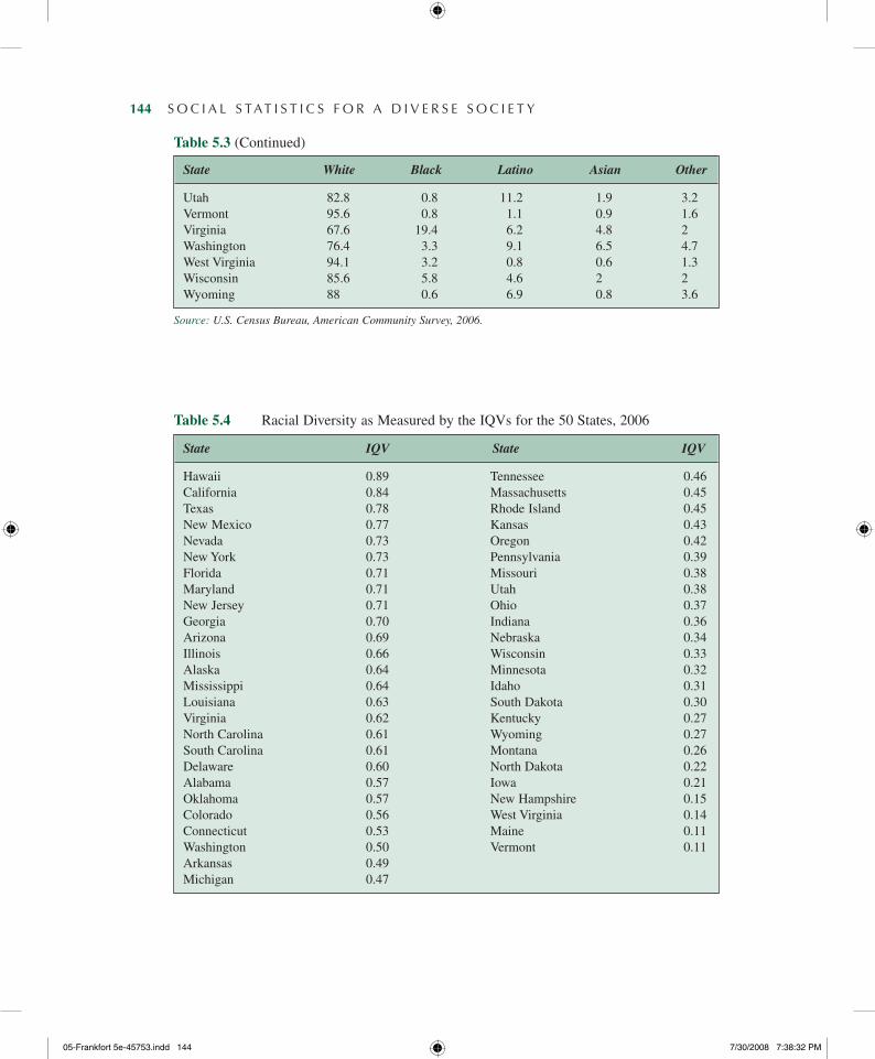
We can use the IQV to measure the amount of diversity in different states. Table 5.3 dis-plays the 2006 percentage breakdown of the population by race for all the 50 states. Based on the data in Table 5.3, and using Formula 5.1 as in our earlier example, we have calculated the IQV for each state in Table 5.4.7
The advantage of using a single number to express diversity is demonstrated in Figure 5.3, which depicts the regional variations in diversity as expressed by the IQVs from Table 5.4. Figure 5.3 shows the wide variation in racial diversity that exists in the United States. Note that Hawaii, with an IQV of 0.89, is the most diverse state. At the other extreme, Vermont and Maine, whose populations are overwhelmingly white, are the most homogeneous states with an IQV of 0.11.
05-Frankfort5e-45753.indd142 7/30/20087:38:32PM

Measures of Variability— 143
Table 5.3 Percentage Makeup of Population for States by Race, 2006
State White Black Latino Asian Other
Alabama 69 26.2 2.4 1 1.4Alaska 66.3 3 5.6 4.4 20.7Arizona 59.5 3.2 29.2 2.3 5.8Arkansas 76.3 15.5 4.9 1 2.2California 42.8 6 35.9 12.1 3.2Colorado 71.5 3.6 19.7 2.7 2.5Connecticut 74.5 9.2 11.2 3.3 1.8Delaware 68.8 20.4 6.3 2.8 1.8Florida 61 14.9 20.1 2.1 1.8Georgia 58.7 29.6 7.4 2.7 1.5Hawaii 24.6 2 7.8 39 26.6Idaho 86.3 0.4 9.5 1 2.8Illinois 65.1 14.6 14.7 4.1 1.4Indiana 83.8 8.7 4.7 1.3 1.5Iowa 91 2.2 3.8 1.5 1.5Kansas 80.1 5.5 8.6 2.2 2.8Kentucky 88.3 7.3 2 0.9 1.4Louisiana 62.7 31.5 2.9 1.3 1.6Maine 95.3 1 1 0.9 1.9Maryland 58.3 28.7 6 4.9 2.1Massachusetts 79.3 5.7 7.9 4.8 2.3Michigan 77.6 14 3.9 2.3 2Minnesota 85.9 4.4 3.8 3.4 2.6Mississippi 59.3 37.3 1.6 0.8 1Missouri 82.5 11.3 2.8 1.5 2Montana 88.6 0.5 2.2 0.6 8.2Nebraska 84.8 4 7.4 1.7 2.1Nevada 58.6 7.2 24.4 5.9 3.9New Hampshire 93.6 1 2.3 2 1.2New Jersey 62.3 13.2 15.6 7.4 1.5New Mexico 42.4 1.8 44 1.2 10.5New York 60.2 14.8 16.3 6.8 2North Carolina 67.7 21.2 6.7 1.8 2.5North Dakota 90.4 0.9 1.5 0.7 6.5Ohio 82.8 11.8 2.3 1.5 1.6Oklahoma 72 7.3 6.8 1.6 12.2Oregon 80.8 1.6 10.2 3.6 3.7Pennsylvania 82 10.2 4.2 2.3 1.3Rhode Island 78.9 4.6 11 2.7 2.7South Carolina 65.3 28.6 3.4 1 1.6South Dakota 86.5 0.7 2 0.9 9.9Tennessee 77.5 16.7 3.1 1.3 1.5Texas 48.1 11.4 35.7 3.3 1.5
(Continued)
05-Frankfort5e-45753.indd143 7/30/20087:38:32PM
144— S O C I A L S TAT I S T I C S F O R A D I V E R S E S O C I E T Y
Table 5.3 (Continued)
State White Black Latino Asian Other
Utah 82.8 0.8 11.2 1.9 3.2Vermont 95.6 0.8 1.1 0.9 1.6Virginia 67.6 19.4 6.2 4.8 2Washington 76.4 3.3 9.1 6.5 4.7West Virginia 94.1 3.2 0.8 0.6 1.3Wisconsin 85.6 5.8 4.6 2 2Wyoming 88 0.6 6.9 0.8 3.6
Source: U.S. Census Bureau, American Community Survey, 2006.
Table 5.4 Racial Diversity as Measured by the IQVs for the 50 States, 2006
State IQV State IQV
Hawaii 0.89 Tennessee 0.46California 0.84 Massachusetts 0.45Texas 0.78 Rhode Island 0.45New Mexico 0.77 Kansas 0.43Nevada 0.73 Oregon 0.42New York 0.73 Pennsylvania 0.39Florida 0.71 Missouri 0.38Maryland 0.71 Utah 0.38New Jersey 0.71 Ohio 0.37Georgia 0.70 Indiana 0.36Arizona 0.69 Nebraska 0.34Illinois 0.66 Wisconsin 0.33Alaska 0.64 Minnesota 0.32Mississippi 0.64 Idaho 0.31Louisiana 0.63 South Dakota 0.30Virginia 0.62 Kentucky 0.27North Carolina 0.61 Wyoming 0.27South Carolina 0.61 Montana 0.26Delaware 0.60 North Dakota 0.22Alabama 0.57 Iowa 0.21Oklahoma 0.57 New Hampshire 0.15Colorado 0.56 West Virginia 0.14Connecticut 0.53 Maine 0.11Washington 0.50 Vermont 0.11Arkansas 0.49Michigan 0.47
05-Frankfort5e-45753.indd144 7/30/20087:38:32PM
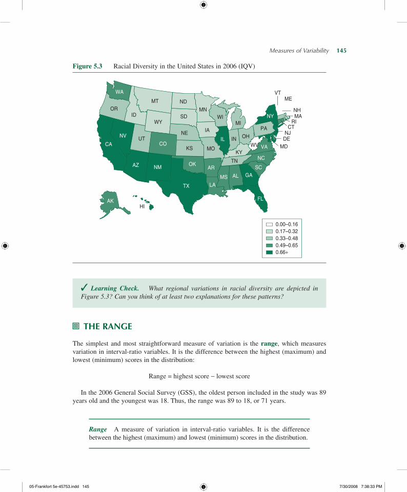
Measures of Variability— 145
✓ Learning Check. What regional variations in racial diversity are depicted in Figure 5.3? Can you think of at least two explanations for these patterns?
- ThE RAngE
The simplest and most straightforward measure of variation is the range, which measures variation in interval-ratio variables. It is the difference between the highest (maximum) and lowest (minimum) scores in the distribution:
Range = highest score − lowest score
In the 2006 General Social Survey (GSS), the oldest person included in the study was 89 years old and the youngest was 18. Thus, the range was 89 to 18, or 71 years.
Range A measure of variation in interval-ratio variables. It is the difference between the highest (maximum) and lowest (minimum) scores in the distribution.
Figure 5.3 Racial Diversity in the United States in 2006 (IQV)
WA
MTOR
IDWY
SD
ND
CA
NV UT
AZ
AKHI
NE
CO
NM
TX LA
AROK
KS
MN
IA
MO
WI
IL IN
MI
OH
KY
TN
MS AL GA
FL
SC
NC
VAWV
PA
NY
MEVT
NHMA
RICT
NJDE
MD
0.00–0.160.17–0.320.33–0.480.49–0.650.66+
05-Frankfort5e-45753.indd145 7/30/20087:38:33PM
146— S O C I A L S TAT I S T I C S F O R A D I V E R S E S O C I E T Y
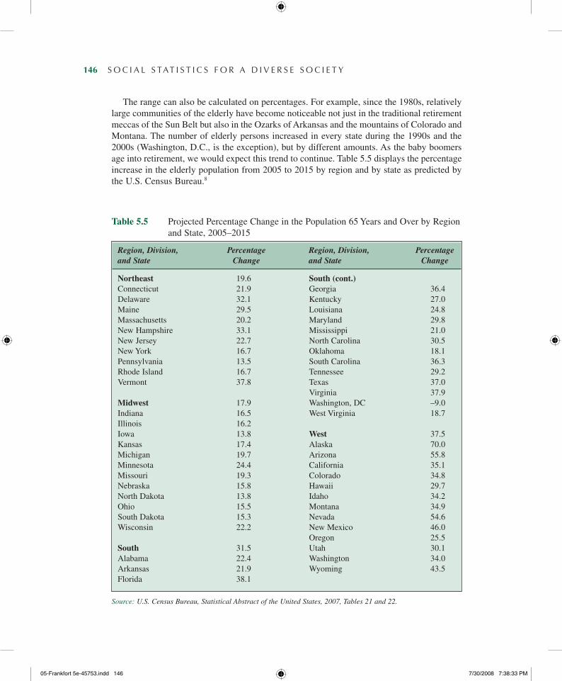
The range can also be calculated on percentages. For example, since the 1980s, relatively large communities of the elderly have become noticeable not just in the traditional retirement meccas of the Sun Belt but also in the Ozarks of Arkansas and the mountains of Colorado and Montana. The number of elderly persons increased in every state during the 1990s and the 2000s (Washington, D.C., is the exception), but by different amounts. As the baby boomers age into retirement, we would expect this trend to continue. Table 5.5 displays the percentage increase in the elderly population from 2005 to 2015 by region and by state as predicted by the U.S. Census Bureau.8
Table 5.5 Projected Percentage Change in the Population 65 Years and Over by Region and State, 2005–2015
Region, Division, Percentage Region, Division, Percentage and State Change and State Change
Northeast 19.6 South (cont.) Connecticut 21.9 Georgia 36.4Delaware 32.1 Kentucky 27.0Maine 29.5 Louisiana 24.8Massachusetts 20.2 Maryland 29.8New Hampshire 33.1 Mississippi 21.0New Jersey 22.7 North Carolina 30.5New York 16.7 Oklahoma 18.1Pennsylvania 13.5 South Carolina 36.3Rhode Island 16.7 Tennessee 29.2Vermont 37.8 Texas 37.0 Virginia 37.9Midwest 17.9 Washington, DC –9.0Indiana 16.5 West Virginia 18.7Illinois 16.2 Iowa 13.8 West 37.5Kansas 17.4 Alaska 70.0Michigan 19.7 Arizona 55.8Minnesota 24.4 California 35.1Missouri 19.3 Colorado 34.8Nebraska 15.8 Hawaii 29.7North Dakota 13.8 Idaho 34.2Ohio 15.5 Montana 34.9South Dakota 15.3 Nevada 54.6Wisconsin 22.2 New Mexico 46.0 Oregon 25.5South 31.5 Utah 30.1Alabama 22.4 Washington 34.0Arkansas 21.9 Wyoming 43.5Florida 38.1
Source: U.S. Census Bureau, Statistical Abstract of the United States, 2007, Tables 21 and 22.
05-Frankfort5e-45753.indd146 7/30/20087:38:33PM
Measures of Variability— 147
What is the range in the percentage increase in state elderly population for the United States? To find the ranges in a distribution, simply pick out the highest and lowest scores in the distribution and subtract. Alaska has the highest percentage increase, with 70%, and Washington, D.C., has the lowest increase, with −9%. The range is 79 percentage points, or 70% − (−9%).
Although the range is simple and quick to calculate, it is a rather crude measure because it is based on only the lowest and highest scores. These two scores might be extreme and rather atypical, which might make the range a misleading indicator of the variation in the distribu-tion. For instance, note that among the 50 states and Washington, D.C., listed in Table 5.5, no state has a percentage decrease as that of the Washington, D.C., and only Arizona and Nevada has a percentage increase nearly as high as Alaska’s. The range of 79 percentage points does not give us information about the variation in states between Washington, D.C., and Alaska.
✓ Learning Check. Why can’t we use the range to describe diversity in nominal variables? The range can be used to describe diversity in ordinal variables (e.g., we can say that responses to a question ranged from “somewhat satisfied” to “very dis-satisfied”), but it has no quantitative meaning. Why not?
- ThE InTERQuARTILE RAngE: InCREASES In ELDERLY PoPuLATIonS
To remedy this limitation, we can employ an alternative to the range—the interquartile range. The interquartile range (IQR), a measure of variation for interval-ratio variables, is the width of the middle 50% of the distribution. It is defined as the difference between the lower and upper quartiles (Q1 and Q3).
IQR = Q3 − Q1
Recall that the first quartile (Q1) is the 25th percentile, the point at which 25% of the cases fall below it and 75% above it. The third quartile (Q3) is the 75th percentile, the point at which 75% of the cases fall below it and 25% above it. The IQR, therefore, defines variation for the middle 50% of the cases.
Interquartile range (IQR) The width of the middle 50%of the distribution. It is defined as the difference between the lower and upper quartiles (Q1 and Q3).
Like the range, the IQR is based on only two scores. However, because it is based on intermediate scores, rather than on the extreme scores in the distribution, it avoids some of the instability associated with the range.
05-Frankfort5e-45753.indd147 7/30/20087:38:33PM

148— S O C I A L S TAT I S T I C S F O R A D I V E R S E S O C I E T Y
These are the steps for calculating the IQR:
1. To find Q1 and Q3, order the scores in the distribution from the highest to the lowest score, or vice versa. Table 5.6 presents the data of Table 5.5 arranged in order from Alaska (70.0%) to Washington, D.C. (−9.0%).
2. Next, we need to identify the first quartile, Q1 or the 25th percentile. We have to identify the percentage increase in the elderly population associated with the state that divides the distribution so that 25% of the states are below it and 75% of the states are above it. To find Q1, we multiply N by 0.25:
(N)(0.25) = (51)(0.25) = 12.75
The first quartile falls between the 12th and the 13th states. Counting from the bottom, the 12th state is Kansas, and the percentage increase associated with it is 17.4. The 13th state is Oklahoma, with a percentage increase of 18.1. To find the first quartile, we take the average of 17.4 and 18.1. Therefore, (17.4 + 18.1)/2 = 17.75 is the first quartile (Q1).
Table 5.6 Projected Percentage Increase in the Population 65 Years and Over, 2005–2015, by State, Ordered From Highest to Lowest
Percentage Percentage PercentageState Change State Change State Change
Alaska 70.0 Delaware 32.1 Massachusetts 20.2Arizona 55.8 North Carolina 30.5 Michigan 19.7Nevada 54.6 Utah 30.1 Missouri 19.3New Mexico 46.0 Maryland 29.8 West Virginia 18.7Wyoming 43.5 Hawaii 29.7 Oklahoma 18.1Florida 38.1 Maine 29.5 Kansas 17.4Virginia 37.9 Tennessee 29.2 New York 16.7Vermont 37.8 Kentucky 27.0 Rhode Island 16.7Texas 37.0 Oregon 25.5 Indiana 16.5Georgia 36.4 Louisiana 24.8 Illinois 16.2South Carolina 36.3 Minnesota 24.4 Nebraska 15.8California 35.1 New Jersey 22.7 Ohio 15.5Montana 34.9 Alabama 22.4 South Dakota 15.3Colorado 34.8 Wisconsin 22.2 Iowa 13.8Idaho 34.2 Arkansas 21.9 North Dakota 13.8Washington 34.0 Connecticut 21.9 Pennsylvania 13.5New Hampshire 33.1 Mississippi 21.0 Washington, DC –9.0
Source: U.S. Census Bureau, Statistical Abstract of the United States, 2007, Tables 21 and 22.
3. To find Q3, we have to identify the state that divides the distribution in such a way that 75% of the states are below it and 25% of the states are above it. We multiply N this time by 0.75:
(N)(0.75) = (51)(0.75) = 38.25
05-Frankfort5e-45753.indd148 7/30/20087:38:34PM
Measures of Variability— 149
The third quartile falls between the 38th and the 39th states. Counting from the bottom, the 38th state is Colorado, and the percentage increase associated with it is 34.8. The 39th state is Montana, with a percentage increase of 34.9. To find the third quartile, we take the average of 34.8 and 34.9. Therefore, (34.8 + 34.9)/2 = 34.85 is the third quartile (Q3).
4. We are now ready to find the IQR:
IQR = Q3 − Q1 = 34.85 − 17.75 = 17.10
The IQR of percentage increase in the elderly population is 17.10 percentage points.
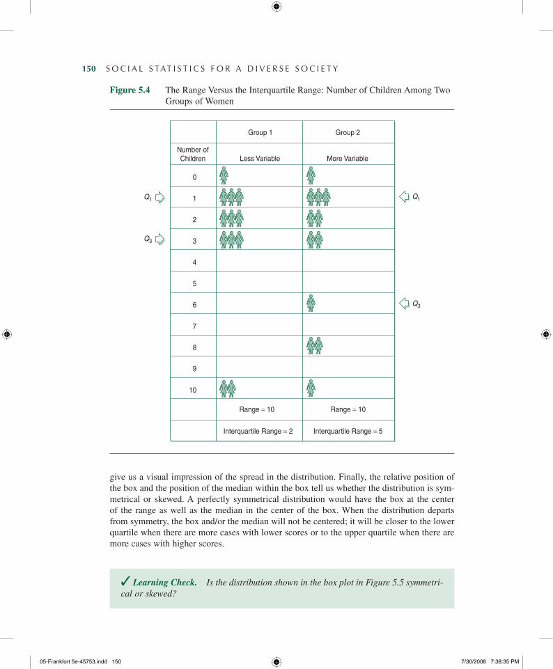
Notice that the IQR gives us better information than the range. The range gave us a 79-point spread, from 70% to −9.0%, but the IQR tells us that half the states are clustered between 34.85 and 17.75—a much narrower spread. The extreme scores represented by Alaska and Washington, D.C., have no effect on the IQR because they fall at the extreme ends of the distribution (see also Figure 5.4).
✓ Learning Check. Why is the IQR better than the range as a measure of variability, especially when there are extreme scores in the distribution? To answer this question, you may want to examine Figure 5.4.
- ThE Box PLoT
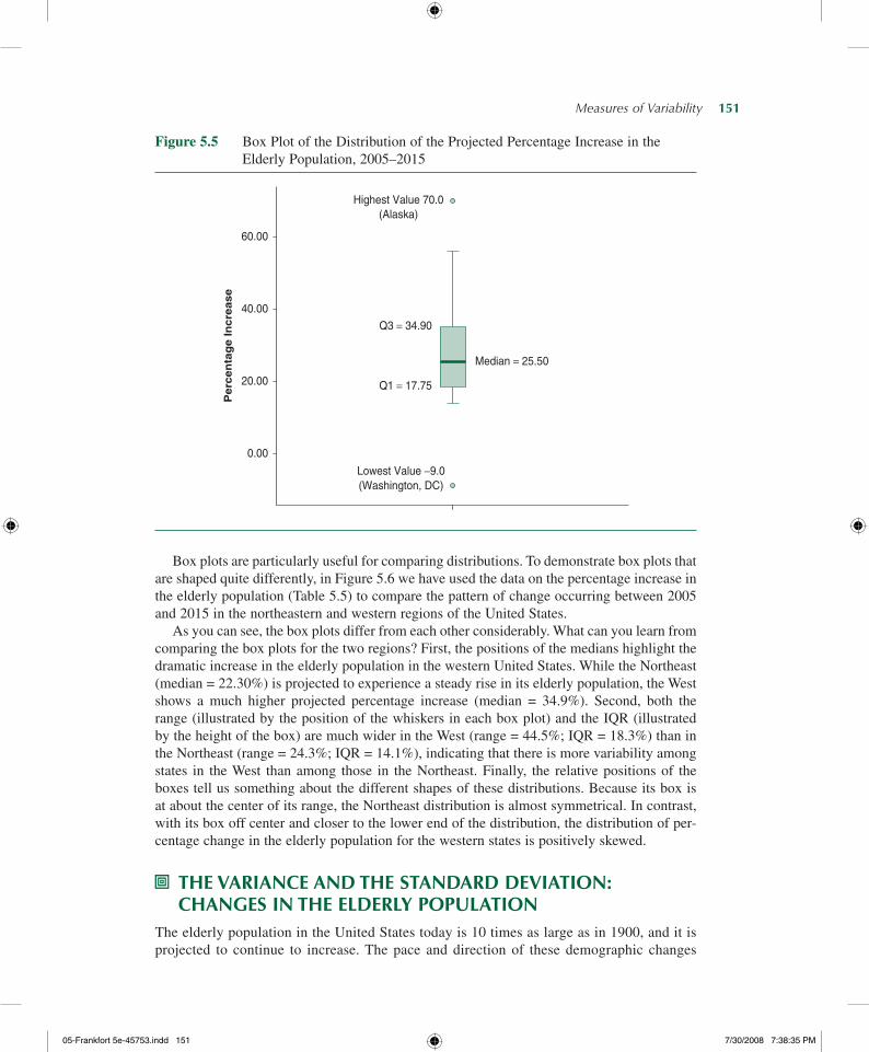
A graphic device called the box plot can visually present the range, the IQR, the median, the lowest (minimum) score, and the highest (maximum) score. The box plot provides us with a way to visually examine the center, the variation, and the shape of distributions of interval-ratio variables.
Figure 5.5 is a box plot of the distribution of the 2005–2015 projected percentage increase in elderly population displayed in Table 5.6. To construct the box plot in Figure 5.5, we used the lowest and highest values in the distribution, the upper and lower quartiles, and the median. We can easily draw a box plot by hand following these instructions:
1. Draw a box between the lower and upper quartiles.
2. Draw a solid line within the box to mark the median.
3. Draw vertical lines (called whiskers) outside the box, extending to the lowest and high-est values.
What can we learn from creating a box plot? We can obtain a visual impression of the following properties: First, the center of the distribution is easily identified by the solid line inside the box. Second, since the box is drawn between the lower and upper quartiles, the IQR is reflected in the height of the box. Similarly, the length of the vertical lines drawn outside the box (on both ends) represents the range of the distribution.9 Both the IQR and the range
05-Frankfort5e-45753.indd149 7/30/20087:38:34PM
150— S O C I A L S TAT I S T I C S F O R A D I V E R S E S O C I E T Y
Figure 5.4 The Range Versus the Interquartile Range: Number of Children Among Two Groups of Women
Group 1 Group 2
Number ofChildren Less Variable More Variable
0
1
2
3
4
5
6
7
8
9
10
Range = 10 Range = 10
Interquartile Range = 2 Interquartile Range = 5
Q1 Q1
Q3
Q3
give us a visual impression of the spread in the distribution. Finally, the relative position of the box and the position of the median within the box tell us whether the distribution is sym-metrical or skewed. A perfectly symmetrical distribution would have the box at the center of the range as well as the median in the center of the box. When the distribution departs from symmetry, the box and/or the median will not be centered; it will be closer to the lower quartile when there are more cases with lower scores or to the upper quartile when there are more cases with higher scores.
✓ Learning Check. Is the distribution shown in the box plot in Figure 5.5 symmetri-cal or skewed?
05-Frankfort5e-45753.indd150 7/30/20087:38:35PM
Measures of Variability— 151
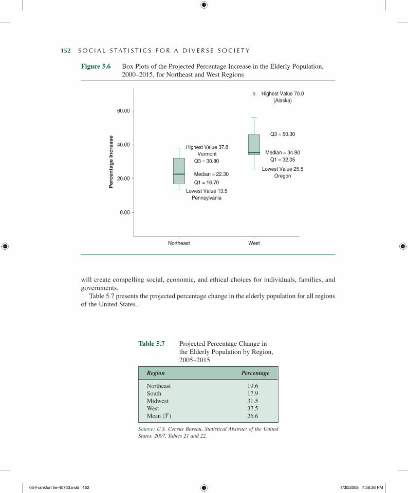
Box plots are particularly useful for comparing distributions. To demonstrate box plots that are shaped quite differently, in Figure 5.6 we have used the data on the percentage increase in the elderly population (Table 5.5) to compare the pattern of change occurring between 2005 and 2015 in the northeastern and western regions of the United States.
As you can see, the box plots differ from each other considerably. What can you learn from comparing the box plots for the two regions? First, the positions of the medians highlight the dramatic increase in the elderly population in the western United States. While the Northeast (median = 22.30%) is projected to experience a steady rise in its elderly population, the West shows a much higher projected percentage increase (median = 34.9%). Second, both the range (illustrated by the position of the whiskers in each box plot) and the IQR (illustrated by the height of the box) are much wider in the West (range = 44.5%; IQR = 18.3%) than in the Northeast (range = 24.3%; IQR = 14.1%), indicating that there is more variability among states in the West than among those in the Northeast. Finally, the relative positions of the boxes tell us something about the different shapes of these distributions. Because its box is at about the center of its range, the Northeast distribution is almost symmetrical. In contrast, with its box off center and closer to the lower end of the distribution, the distribution of per-centage change in the elderly population for the western states is positively skewed.
- ThE VARIAnCE AnD ThE STAnDARD DEVIATIon: ChAngES In ThE ELDERLY PoPuLATIon
The elderly population in the United States today is 10 times as large as in 1900, and it is projected to continue to increase. The pace and direction of these demographic changes
Figure 5.5 Box Plot of the Distribution of the Projected Percentage Increase in the Elderly Population, 2005–2015
0.00
20.00
40.00
60.00P
erc
en
tag
e In
cre
ase
Lowest Value −9.0(Washington, DC)
Highest Value 70.0(Alaska)
Q1 = 17.75
Median = 25.50
Q3 = 34.90
05-Frankfort5e-45753.indd151 7/30/20087:38:35PM
152— S O C I A L S TAT I S T I C S F O R A D I V E R S E S O C I E T Y
Figure 5.6 Box Plots of the Projected Percentage Increase in the Elderly Population, 2000–2015, for Northeast and West Regions
0.00
Northeast West
20.00
40.00
60.00P
erc
en
tag
e In
cre
ase
Lowest Value 13.5Pennsylvania
Highest Value 70.0(Alaska)
Highest Value 37.8Vermont
Q1 = 16.70
Q3 = 30.80
Median = 22.30Lowest Value 25.5
Oregon
Q1 = 32.05
Q3 = 50.30
Median = 34.90
will create compelling social, economic, and ethical choices for individuals, families, and governments.
Table 5.7 presents the projected percentage change in the elderly population for all regions of the United States.
Table 5.7 Projected Percentage Change in the Elderly Population by Region, 2005–2015
Region Percentage
Northeast 19.6South 17.9Midwest 31.5West 37.5Mean (Y–) 26.6
Source: U.S. Census Bureau, Statistical Abstract of the United States, 2007, Tables 21 and 22.
05-Frankfort5e-45753.indd152 7/30/20087:38:36PM
Measures of Variability— 153
These percentage changes were calculated by the U.S. Census Bureau using the following formula:
Percentage change= ð2015 population− 2005 populationÞ2005 population
× 100
For example, the elderly population in the West region was 5,773,363 in 1990. In 2000, the elderly population increased to 6,922,129. Therefore, the percentage change from 1990 to 2000 is
Percentage change = ð6,922,129− 5,773,363Þ5,773,363
× 100= 19:9
Table 5.7 shows that between 2005and 2015, the size of the elderly population in the United States is projected to increase by an average of 26.63%. But this average increase does not inform us about the regional variation in the elderly population. For example, will the northeastern states show a smaller-than-average increase because of the out-migration of the elderly population to the warmer climate of the Sun Belt states? Is the projected increase higher in the South because of the immigration of the elderly?
Although it is important to know the average projected percentage increase for the nation as a whole, you may also want to know whether regional increases might differ from the national average. If the regional projected increases are close to the national average, the fig-ures will cluster around the mean, but if the regional increases deviate much from the national average, they will be widely dispersed around the mean.
Table 5.7 suggests that there is considerable regional variation. The percentage change ranges from 37.5% in the West to 19.6% in the Northeast, so the range is 17.9% (37.5% − 19.6% = 17.9%). Moreover, most of the regions are projected to considerably deviate from the national average of 26.63%. How large are these deviations on the average? We want a measure that will give us information about the overall variations among all regions in the United States and, unlike the range or the IQR, will not be based on only two scores.
Such a measure will reflect how much, on the average, each score in the distribution deviates from some central point, such as the mean. We use the mean as the reference point rather than other kinds of averages (the mode or the median) because the mean is based on all the scores in the distribution. Therefore, it is more useful as a basis from which to calculate average deviation. The sensitivity of the mean to extreme values carries over the calculation of the average deviation, which is based on the mean. Another reason for using the mean as a reference point is that more advanced measures of variation require the use of algebraic properties that can be assumed only by using the arithmetic mean.
The variance and the standard deviation are two closely related measures of variation that increase or decrease based on how closely the scores cluster around the mean. The variance is the average of the squared deviations from the center (mean) of the distribution, and the standard deviation is the square root of the variance. Both measure variability in interval-ratio variables.
05-Frankfort5e-45753.indd153 7/30/20087:38:36PM
154— S O C I A L S TAT I S T I C S F O R A D I V E R S E S O C I E T Y
Variance A measure of variation for interval-ratio variables; it is the average of the squared deviations from the mean.
Standard deviation A measure of variation for interval-ratio variables; it is equal to the square root of the variance.
Calculating the Deviation from the Mean
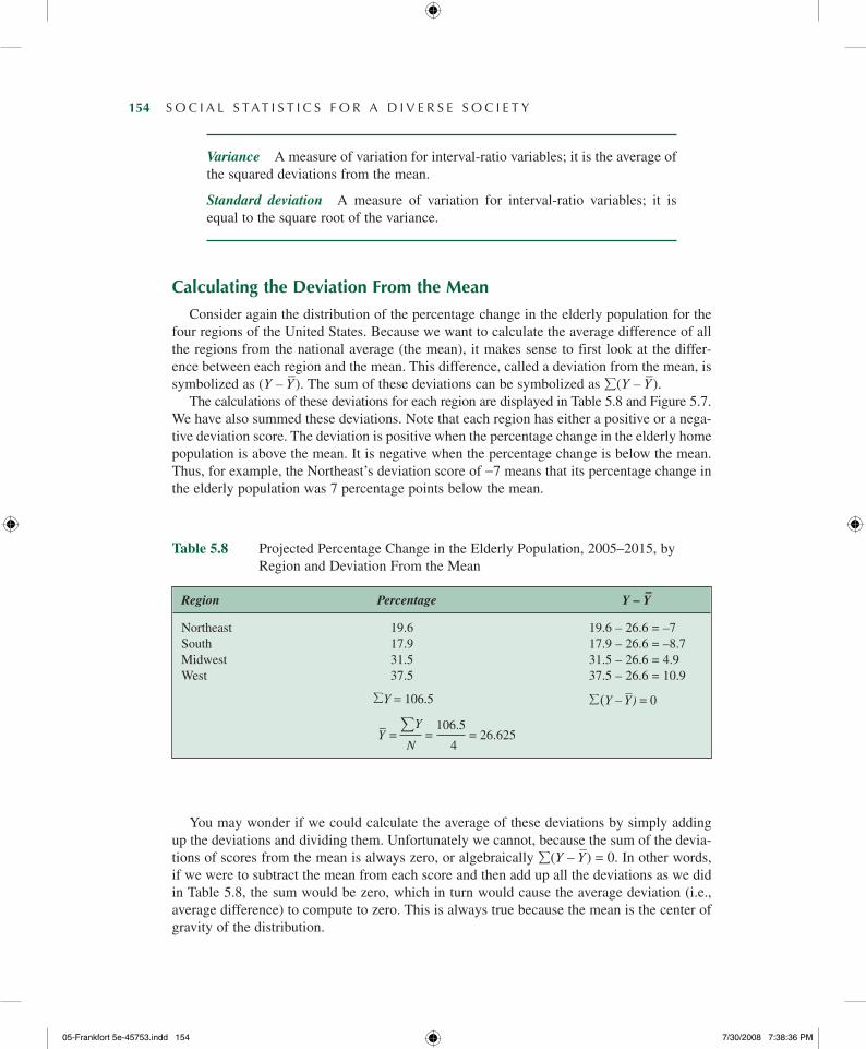
Consider again the distribution of the percentage change in the elderly population for the four regions of the United States. Because we want to calculate the average difference of all the regions from the national average (the mean), it makes sense to first look at the differ-ence between each region and the mean. This difference, called a deviation from the mean, is symbolized as (Y – Y
–). The sum of these deviations can be symbolized as
(Y – Y
–).
The calculations of these deviations for each region are displayed in Table 5.8 and Figure 5.7. We have also summed these deviations. Note that each region has either a positive or a nega-tive deviation score. The deviation is positive when the percentage change in the elderly home population is above the mean. It is negative when the percentage change is below the mean. Thus, for example, the Northeast’s deviation score of −7 means that its percentage change in the elderly population was 7 percentage points below the mean.
Table 5.8 Projected Percentage Change in the Elderly Population, 2005–2015, by Region and Deviation From the Mean
Region Percentage Y – Y–
Northeast 19.6 19.6 – 26.6 = –7South 17.9 17.9 – 26.6 = –8.7Midwest 31.5 31.5 – 26.6 = 4.9West 37.5 37.5 – 26.6 = 10.9
Y = 106.5
(Y – Y–) = 0
Y– =
Y
= 106.5
= 26.625 N 4
You may wonder if we could calculate the average of these deviations by simply adding up the deviations and dividing them. Unfortunately we cannot, because the sum of the devia-tions of scores from the mean is always zero, or algebraically
(Y – Y
–) = 0. In other words,
if we were to subtract the mean from each score and then add up all the deviations as we did in Table 5.8, the sum would be zero, which in turn would cause the average deviation (i.e., average difference) to compute to zero. This is always true because the mean is the center of gravity of the distribution.
05-Frankfort5e-45753.indd154 7/30/20087:38:36PM
Measures of Variability— 155
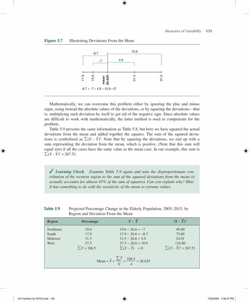
Mathematically, we can overcome this problem either by ignoring the plus and minus signs, using instead the absolute values of the deviations, or by squaring the deviations—that is, multiplying each deviation by itself to get rid of the negative sign. Since absolute values are difficult to work with mathematically, the latter method is used to compensate for the problem.
Table 5.9 presents the same information as Table 5.8, but here we have squared the actual deviations from the mean and added together the squares. The sum of the squared devia-tions is symbolized as
(Y – Y
–)2. Note that by squaring the deviations, we end up with a
sum representing the deviation from the mean, which is positive. (Note that this sum will equal zero if all the cases have the same value as the mean case. In our example, this sum is
(Y – Y–)2 = 267.51.
✓ Learning Check. Examine Table 5.9 again and note the disproportionate con-tribution of the western region to the sum of the squared deviations from the mean (it actually accounts for almost 45% of the sum of squares). Can you explain why? Hint: It has something to do with the sensitivity of the mean to extreme values.
Figure 5.7 Illustrating Deviations From the Mean
−8.7
−7
10.9
4.9
17.9
19.6
31.5
mean
26.6
25
37.5
−8.7 + −7 + 4.9 + 10.9 = 0*
Table 5.9 Projected Percentage Change in the Elderly Population, 2005–2015, by Region and Deviation From the Mean
Region Percentage Y – Y– (Y – Y
–)2
Northeast 19.6 19.6 − 26.6 = −7 49.00South 17.9 17.9 − 26.6 = −8.7 75.69Midwest 31.5 31.5 − 26.6 = 4.9 24.01West 37.5 37.5 − 26.6 = 10.9 118.80
Y = 106.5
(Y − Y
–) = 0
(Y − Y
–)2 = 267.51
Mean = Y– =
Y
= 106.5
= 26.625 N 4
05-Frankfort5e-45753.indd155 7/30/20087:38:37PM
156— S O C I A L S TAT I S T I C S F O R A D I V E R S E S O C I E T Y
Calculating the Variance and the Standard Deviation
The average of the squared deviations from the mean is known as the variance. The vari-ance is symbolized as SY
2. Remember that we are interested in the average of the squared deviations from the mean. Therefore, we need to divide the sum of the squared deviations by the number of scores (N) in the distribution. However, unlike the calculation of the mean, we will use N – 1 rather than N in the denominator.10 The formula for the variance can be stated as
S2
Y=
PðY − YÞ2
N− 1(5.2)
where
SY2 = the variance
Y – Y– = the deviation from the mean
(Y – Y
–)2 =
the sum of the squared deviations from the mean
N = the number of scores
Note that the formula incorporates all the symbols we defined earlier. This formula means that the variance is equal to the average of the squared deviations from the mean.
Follow these steps to calculate the variance:
1. Calculate the mean, Y– =
Y/N.
2. Subtract the mean from each score to find the deviation, (Y – Y–).
3. Square each deviation, (Y – Y–)
2.
4. Sum the squared deviations,
(Y – Y–)
2.
5. Divide the sum by N – 1,
(Y – Y–)
2/(N – 1).
6. The answer is the variance.
To assure yourself that you understand how to calculate the variance, go back to Table 5.9 and follow this step-by-step procedure for calculating the variance. Now plug the required quantities into Formula 5.2. Your result should look like this:
S2
Y=
PðY − YÞ2
N− 1= 267:51
3= 89:17
One problem with the variance is that it is based on squared deviations and therefore is no longer expressed in the original units of measurement. For instance, it is difficult to interpret the variance of 89.17, which represents the distribution of the percentage change in the elderly population, because this figure is expressed in squared percentages. Thus, we often take the square root of the variance and interpret it instead. This gives us the standard deviation, SY.
05-Frankfort5e-45753.indd156 7/30/20087:38:38PM
Measures of Variability— 157
The standard deviation, symbolized as SY , is the square root of the variance, or
SY =ffiffiffiffiffiS2Y
p
The standard deviation for our example is
SY =ffiffiffiffiffiS2Y
p=
ffiffiffiffiffiffiffiffiffiffiffi89:17
p= 9:44
The formula for the standard deviation uses the same symbols as the formula for the variance:
SY =
ffiffiffiffiffiffiffiffiffiffiffiffiffiffiffiffiffiffiffiffiffiffiffiPðY − YÞ2
N− 1
s(5.3)
As we interpret the formula, we can say that the standard deviation is equal to the square root of the average of the squared deviations from the mean.
The advantage of the standard deviation is that unlike the variance, it is measured in the same units as the original data. For instance, the standard deviation for our example is 9.44. Because the original data were expressed in percentages, this number is expressed as a per-centage as well. In other words, you could say, “The standard deviation is 9.44%.” But what does this mean? The actual number tells us very little by itself, but it allows us to evaluate the dispersion of the scores around the mean.
In a distribution where all the scores are identical, the standard deviation is zero (0). Zero is the lowest possible value for the standard deviation; in an identical distribution, all the points would be the same, with the same mean, mode, and median. There is no variation or dispersion in the scores.
The more the standard deviation departs from zero, the more variation there is in the dis-tribution. There is no upper limit to the value of the standard deviation. In our example, we can conclude that a standard deviation of 9.44% means that the projected percentage change in the elderly population for the four regions of the United States is widely dispersed around the mean of 26.63%.
The standard deviation can be considered a standard against which we can evaluate the positioning of scores relative to the mean and to other scores in the distribution. As we will see in more detail in Chapter 6, in most distributions, unless they are highly skewed, about 34% of all scores fall between the mean and 1 standard deviation above the mean. Another 34% of scores fall between the mean and 1 standard deviation below it. Thus, we would expect the majority of scores (68%) to fall within 1 standard deviation of the mean. For example, let’s consider the distribution of grade point average (GPA) for Monitoring the Future (MTF) survey respondents in 2006. The mean GPA on a 4.0 scale is 3.11 with a standard deviation of 0.67. We can expect about 68% of MTF survey respondents to have a GPA within the range of 2.44 (3.11 − 0.67) to 3.78 (3.11 + 0.67). Hence, based on the mean and the standard deviation, we have a pretty good indication of what would be considered a typical GPA for the majority of respondents. For example, we would consider a respondent with a 3.9 GPA to be an exceptional student in comparison with the other students. More than two thirds of all respondents fall closer to the mean than a student with such a GPA.
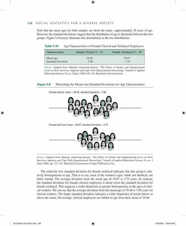
Another way to interpret the standard deviation is to compare it with another distribution. For instance, Table 5.10 displays the means and standard deviations of employee age for two samples drawn from a Fortune 100 corporation. Samples are divided into female clerical and female technical.
05-Frankfort5e-45753.indd157 7/30/20087:38:39PM
158— S O C I A L S TAT I S T I C S F O R A D I V E R S E S O C I E T Y
Note that the mean ages for both samples are about the same—approximately 39 years of age. However, the standard deviations suggest that the distribution of age is dissimilar between the two groups. Figure 5.8 loosely illustrates this dissimilarity in the two distributions.
Characteristics Female Clerical N = 22 Female Technical N = 39
Mean age 39.46 39.87Standard deviation 7.80 3.75
Table 5.10 Age Characteristics of Female Clerical and Technical Employees
Source: Adapted from Marjorie Armstrong-Srassen, “The Effect of Gender and Organizational Level on How Survivors Appraise and Cope with Organizational Downsizing,” Journal of Applied Behavioral Science 34, no. 2(June 1998):125–142. Reprinted with permission.
Source: Adapted from Marjorie Armstrong-Stassen, “The Effect of Gender and Organizational Level on How Survivors Appraise and Cope With Organizational Downsizing,” Journal of Applied Behavioral Science 34, no. 2 (June 1998), pp. 125–142. Reprinted by permission of Sage Publications, Inc.
The relatively low standard deviation for female technical indicates that this group is rela-tively homogeneous in age. That is to say, most of the women’s ages, while not identical, are fairly similar. The average deviation from the mean age of 39.87 is 3.75 years. In contrast, the standard deviation for female clerical employees is about twice the standard deviation for female technical. This suggests a wider dispersion or greater heterogeneity in the ages of cleri-cal workers. We can say that the average deviation from the mean age of 39.46 is 7.80 years for clerical workers. The larger standard deviation indicates a wider dispersion of points below or above the mean. On average, clerical employees are farther in age from their mean of 39.46.
Figure 5.8 Illustrating the Means and Standard Deviations for Age Characteristics
Female clerical: mean = 39.46, standard deviation = 7.80
39.46
Female technical: mean = 39.87, standard deviation = 3.75
39.87
05-Frankfort5e-45753.indd158 7/30/20087:38:40PM

Measures of Variability— 159
✓ Learning Check. Take time to understand the section on standard deviation and variance. You will see these statistics in more advanced procedures. Although your instructor may require you to memorize the formulas, it is more important for you to understand how to interpret standard deviation and variance and when they can be appropriately used. Many hand calculators and all statistical software programs will calculate these measures of diversity for you, but they won’t tell you what they mean. Once you understand the meaning behind these measures, the formulas will be easier to remember.
- ConSIDERATIonS foR ChooSIng A MEASuRE of VARIATIon
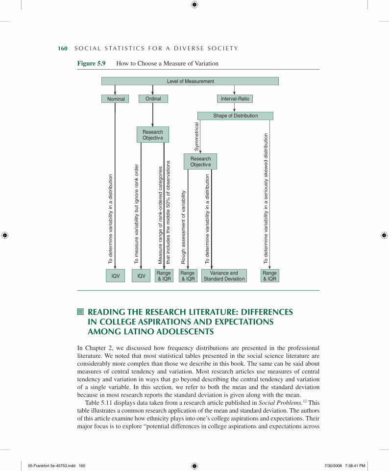
So far we have considered five measures of variation: the IQV, the range, the IQR, the vari-ance, and the standard deviation. Each measure can represent the degree of variability in a distribution. But which one should we use? There is no simple answer to this question. However, in general, we tend to use only one measure of variation, and the choice of the appropriate one involves a number of considerations. These considerations and how they affect our choice of the appropriate measure are presented in the form of a decision tree in Figure 5.9.
As in choosing a measure of central tendency, one of the most basic considerations in choosing a measure of variability is the variable’s level of measurement. Valid use of any of the measures requires that the data are measured at the level appropriate for that measure or higher, as shown in Figure 5.9.
Nominal level: With nominal variables, your choice is restricted to the IQV as a measure of variability.
Ordinal level: The choice of measure of variation for ordinal variables is more prob-lematic. The IQV can be used to reflect variability in distributions of ordinal variables, but because it is not sensitive to the rank ordering of values implied in ordinal variables, it loses some information. Another possibility is to use the IQR. However, the IQR relies on distance between two scores to express variation, information that cannot be obtained from ordinal-measured scores. The compromise is to use the IQR (reporting Q1 and Q3) alongside the median, interpreting the IQR as the range of rank-ordered values that includes the middle 50% of the observations.11
Interval-ratio level: For interval-ratio variables, you can choose the variance (or standard deviation), the range, or the IQR. Because the range, and to a lesser extent the IQR, is based on only two scores in the distribution (and therefore tends to be sensitive if either of the two points is extreme), the variance and/or standard deviation is usually preferred. However, if a distribution is extremely skewed so that the mean is no longer representative of the central tendency in the distribution, the range and the IQR can be used. The range and the IQR will also be useful when you are reading tables or quickly scanning data to get a rough idea of the extent of dispersion in the distribution.
05-Frankfort5e-45753.indd159 7/30/20087:38:40PM
160— S O C I A L S TAT I S T I C S F O R A D I V E R S E S O C I E T Y
Figure 5.9 How to Choose a Measure of Variation
Level of Measurement
Nominal Ordinal Interval-Ratio
Shape of Distribution
ResearchObjective
ResearchObjective
IQV IQVRange& IQR
Range& IQR
Variance andStandard Deviation
Range& IQR
To d
ete
rmin
e v
ari
ab
ility
in a
dis
trib
utio
n
To m
ea
sure
vari
ab
ility
bu
t ig
no
re r
an
k o
rde
r
Me
asu
re r
an
ge
of
ran
k-o
rde
red
ca
teg
orie
s
tha
t in
clu
de
s th
e m
idd
le 5
0%
of
ob
serv
atio
ns
Ro
ug
h a
sse
ssm
en
t o
f va
ria
bili
ty
To d
ete
rmin
e v
ari
ab
ility
in a
dis
trib
utio
n
To d
ete
rmin
e v
ari
ab
ility
in a
se
rio
usl
y sk
ew
ed
dis
trib
utio
n
Sym
me
tric
al
- READIng ThE RESEARCh LITERATuRE: DIffEREnCES In CoLLEgE ASPIRATIonS AnD ExPECTATIonS AMong LATIno ADoLESCEnTS
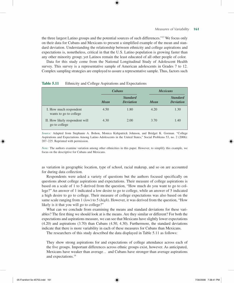
In Chapter 2, we discussed how frequency distributions are presented in the professional literature. We noted that most statistical tables presented in the social science literature are considerably more complex than those we describe in this book. The same can be said about measures of central tendency and variation. Most research articles use measures of central tendency and variation in ways that go beyond describing the central tendency and variation of a single variable. In this section, we refer to both the mean and the standard deviation because in most research reports the standard deviation is given along with the mean.
Table 5.11 displays data taken from a research article published in Social Problems.12 This table illustrates a common research application of the mean and standard deviation. The authors of this article examine how ethnicity plays into one’s college aspirations and expectations. Their major focus is to explore “potential differences in college aspirations and expectations across
05-Frankfort5e-45753.indd160 7/30/20087:38:41PM
Measures of Variability— 161
the three largest Latino groups and the potential sources of such differences.”13 We focus only on their data for Cubans and Mexicans to present a simplified example of the mean and stan-dard deviation. Understanding the relationship between ethnicity and college aspirations and expectations is, nonetheless, critical in that the U.S. Latino population is growing faster than any other minority group; yet Latinos remain the least educated of all other people of color.
Data for this study come from the National Longitudinal Study of Adolescent Health survey. This survey is a representative sample of American adolescents in Grades 7 to 12. Complex sampling strategies are employed to assure a representative sample. Thus, factors such
Table 5.11 Ethnicity and College Aspirations and Expectations
Cubans Mexicans
Standard Standard Mean Deviation Mean Deviation
I. How much respondent 4.50 1.80 4.20 1.30 wants to go to college
II. How likely respondent will 4.30 2.00 3.70 1.40 go to college
Source: Adapted from Stephanie A. Bohon, Monica Kirkpatrick Johnson, and Bridget K. Gorman. “College Aspirations and Expectations Among Latino Adolescents in the United States,” Social Problems 53, no. 2 (2006): 207–225. Reprinted with permission.
Note: The authors examine variation among other ethnicities in this paper. However, to simplify this example, we focus on the descriptive for Cubans and Mexicans.
as variation in geographic location, type of school, racial makeup, and so on are accounted for during data collection.
Respondents were asked a variety of questions but the authors focused specifically on questions about college aspirations and expectations. Their measure of college aspirations is based on a scale of 1 to 5 derived from the question, “How much do you want to go to col-lege?” An answer of 1 indicated a low desire to go to college, while an answer of 5 indicated a high desire to go to college. Their measure of college expectations was also based on the same scale ranging from 1 (low) to 5 (high). However, it was derived from the question, “How likely is it that you will go to college?”
What can we conclude from examining the means and standard deviations for these vari-ables? The first thing we should look at is the means. Are they similar or different? For both the expectations and aspirations measure, we can see that Mexicans have slightly lower expectations (4.20) and aspirations (3.70) than Cubans (4.50, 4.30). Furthermore, the standard deviations indicate that there is more variability in each of these measures for Cubans than Mexicans.
The researchers of this study described the data displayed in Table 5.11 as follows:
They show strong aspirations for and expectations of college attendance across each of the five groups. Important differences across ethnic groups exist, however. As anticipated, Mexicans have weaker than average . . and Cubans have stronger than average aspirations and expectations.14
05-Frankfort5e-45753.indd161 7/30/20087:38:41PM
162— S O C I A L S TAT I S T I C S F O R A D I V E R S E S O C I E T Y
Why might this be? The authors conclude their discussion of the data presented in Table 5.11 by arguing as follows:
Differential aspirations and expectations may be explained by the considerable differences in family and household characteristics, parental hopes for their child’s educational suc-cess, and academic skills and disengagement.15
M A I n P o I n T S
• Measures of variability are numbers that describe how much variation or diversity there is in a distribution.
• The index of qualitative variation (IQV) is used to measure variation in nomi-nal variables. It is based on the ratio of the total number of differences in the distribution to the maximum number of possible differ-ences within the same distribution. IQV can vary from 0.00 to 1.00.
• The range measures variation in interval- ratio variables and is the difference between the highest (maximum) and lowest (mini-mum) scores in the distribution. To find the range, subtract the lowest from the highest score in a distribution. For an ordinal vari-able, just report the lowest and highest values without subtracting.
• The interquartile range (IQR) mea-sures the width of the middle 50% of the
distribution. It is defined as the difference between the lower and upper quartiles (Q1 and Q3). For an ordinal variable, just report Q1 and Q3 without subtracting.
• The box plot is a graphical device that visually presents the range, the IQR, the median, the lowest (minimum) score, and the highest (maximum) score. The box plot provides us with a way to visually examine the center, the variation, and the shape of a distribution.
• The variance and the standard devia-tion are two closely related measures of vari-ation for interval-ratio variables that increase or decrease based on how closely the scores cluster around the mean. The variance is the average of the squared deviations from the center (mean) of the distribution; the standard deviation is the square root of the variance.
K E Y T E R M S
index of qualitative variation (IQV)interquartile range (IQR)measures of variability
rangestandard deviationvariance
o n Y o u R o w n
Log on to the Web-based student study site at www.pineforge.com/frankfort- nachmiasstudy5 for additional study questions, quizzes, Web resources, and links to social science journal articles reflecting the statistics used in this chapter.
Exer
cise
s
05-Frankfort5e-45753.indd162 7/30/20087:38:41PM
Measures of Variability— 163
Exercises
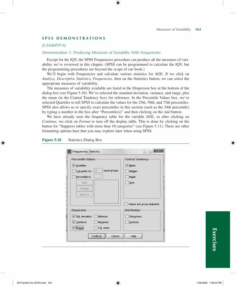
Figure 5.10 Statistics Dialog Box
S P S S D E M o n S T R A T I o n S
[GSS06PFP-A]
Demonstration 1: Producing Measures of Variability With Frequencies
Except for the IQV, the SPSS Frequencies procedure can produce all the measures of vari-ability we’ve reviewed in this chapter. (SPSS can be programmed to calculate the IQV, but the programming procedures are beyond the scope of our book.)
We’ll begin with Frequencies and calculate various statistics for AGE. If we click on Analyze, Descriptive Statistics, Frequencies, then on the Statistics button, we can select the appropriate measures of variability.
The measures of variability available are listed in the Dispersion box at the bottom of the dialog box (see Figure 5.10). We’ve selected the standard deviation, variance, and range, plus the mean (in the Central Tendency box) for reference. In the Percentile Values box, we’ve selected Quartiles to tell SPSS to calculate the values for the 25th, 50th, and 75th percentiles. SPSS also allows us to specify exact percentiles in this section (such as the 34th percentile) by typing a number in the box after “Percentile(s)” and then clicking on the Add button.
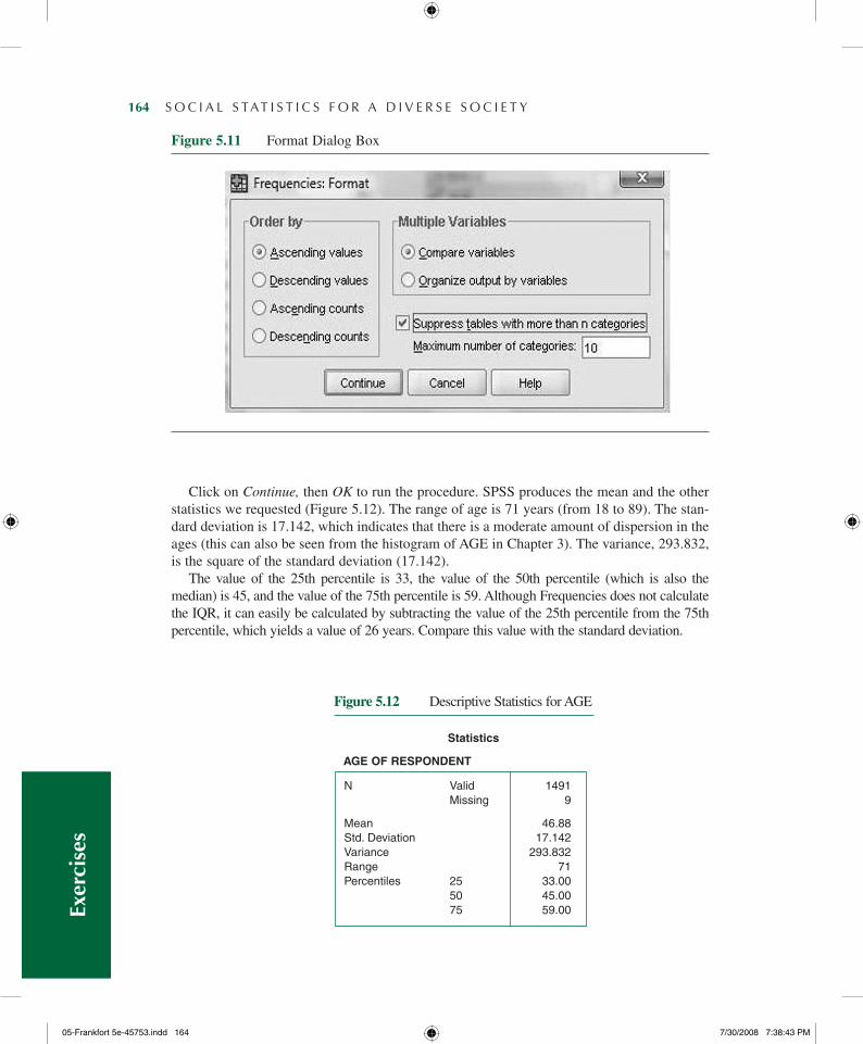
We have already seen the frequency table for the variable AGE, so after clicking on Continue, we click on Format to turn off the display table. This is done by clicking on the button for “Suppress tables with more than 10 categories” (see Figure 5.11). There are other formatting options here that you may explore later when using SPSS.
05-Frankfort5e-45753.indd163 7/30/20087:38:42PM
164— S O C I A L S TAT I S T I C S F O R A D I V E R S E S O C I E T Y
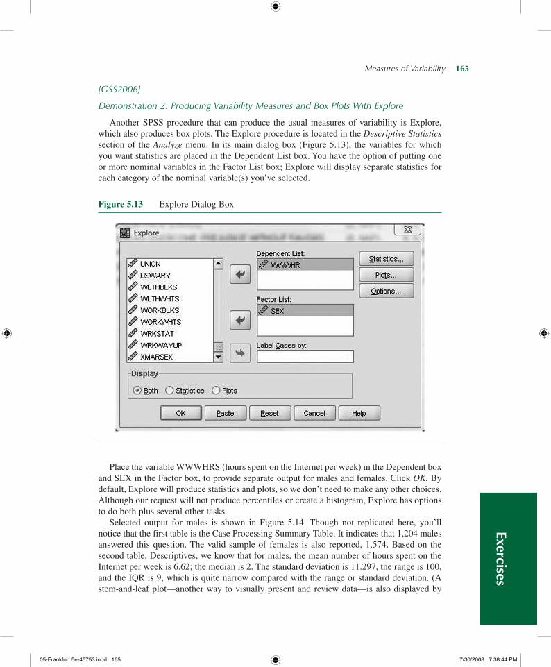
Click on Continue, then OK to run the procedure. SPSS produces the mean and the other statistics we requested (Figure 5.12). The range of age is 71 years (from 18 to 89). The stan-dard deviation is 17.142, which indicates that there is a moderate amount of dispersion in the ages (this can also be seen from the histogram of AGE in Chapter 3). The variance, 293.832, is the square of the standard deviation (17.142).
The value of the 25th percentile is 33, the value of the 50th percentile (which is also the median) is 45, and the value of the 75th percentile is 59. Although Frequencies does not calculate the IQR, it can easily be calculated by subtracting the value of the 25th percentile from the 75th percentile, which yields a value of 26 years. Compare this value with the standard deviation.
N Valid 1491 Missing 9
Mean 46.88Std.Deviation 17.142Variance 293.832Range 71Percentiles 25 33.00 50 45.00 75 59.00
Statistics
AGE OF RESPONDENT
Figure 5.12 Descriptive Statistics for AGE
Figure 5.11 Format Dialog Box
Exer
cise
s
05-Frankfort5e-45753.indd164 7/30/20087:38:43PM
Measures of Variability— 165
[GSS2006]
Demonstration 2: Producing Variability Measures and Box Plots With Explore
Another SPSS procedure that can produce the usual measures of variability is Explore, which also produces box plots. The Explore procedure is located in the Descriptive Statistics section of the Analyze menu. In its main dialog box (Figure 5.13), the variables for which you want statistics are placed in the Dependent List box. You have the option of putting one or more nominal variables in the Factor List box; Explore will display separate statistics for each category of the nominal variable(s) you’ve selected.
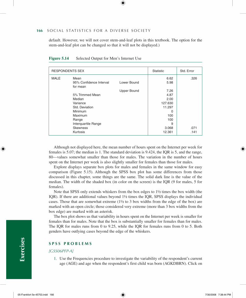
Figure 5.13 Explore Dialog Box
Place the variable WWWHRS (hours spent on the Internet per week) in the Dependent box and SEX in the Factor box, to provide separate output for males and females. Click OK. By default, Explore will produce statistics and plots, so we don’t need to make any other choices. Although our request will not produce percentiles or create a histogram, Explore has options to do both plus several other tasks.
Selected output for males is shown in Figure 5.14. Though not replicated here, you’ll notice that the first table is the Case Processing Summary Table. It indicates that 1,204 males answered this question. The valid sample of females is also reported, 1,574. Based on the second table, Descriptives, we know that for males, the mean number of hours spent on the Internet per week is 6.62; the median is 2. The standard deviation is 11.297, the range is 100, and the IQR is 9, which is quite narrow compared with the range or standard deviation. (A stem-and-leaf plot—another way to visually present and review data—is also displayed by
Exercises
05-Frankfort5e-45753.indd165 7/30/20087:38:44PM
166— S O C I A L S TAT I S T I C S F O R A D I V E R S E S O C I E T Y
default. However, we will not cover stem-and-leaf plots in this textbook. The option for the stem-and-leaf plot can be changed so that it will not be displayed.)
ReSPoNDeNtSSex Statistic Std.error
MALe Mean 6.62 .326 95%ConfidenceInterval LowerBound 5.98 formean UpperBound 7.26 5%trimmedMean 4.87 Median 2.00 Variance 127.630 Std.Deviation 11.297 Minimum 0 Maximum 100 Range 100 InterquartileRange 9 Skewness 3.068 .071 Kurtosis 12.361 .141
Figure 5.14 Selected Output for Men’s Internet Use
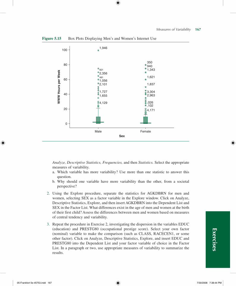
Although not displayed here, the mean number of hours spent on the Internet per week for females is 5.07; the median is 1. The standard deviation is 9.424, the IQR is 5, and the range, 80—values somewhat smaller than those for males. The variation in the number of hours spent on the Internet per week is also slightly smaller for females than those for males.
Explore displays separate box plots for males and females in the same window for easy comparison (Figure 5.15). Although the SPSS box plot has some differences from those discussed in this chapter, some things are the same. The solid dark line is the value of the median. The width of the shaded box (in color on the screen) is the IQR (9 for males, 5 for females).
Note that SPSS only extends whiskers from the box edges to 1½ times the box width (the IQR). If there are additional values beyond 1½ times the IQR, SPSS displays the individual cases. Those that are somewhat extreme (1½ to 3 box widths from the edge of the box) are marked with an open circle; those considered very extreme (more than 3 box widths from the box edge) are marked with an asterisk.
The box plot shows us that variability in hours spent on the Internet per week is smaller for females than for males. Note that the box is substantially smaller for females than for males. The IQR for males runs from 0 to 9.25, while the IQR for females runs from 0 to 5. Both genders have outlying cases beyond the edge of the whiskers.
S P S S P R o B L E M S
[GSS06PFP-A]
1. Use the Frequencies procedure to investigate the variability of the respondent’s current age (AGE) and age when the respondent’s first child was born (AGKDBRN). Click on
Exer
cise
s
05-Frankfort5e-45753.indd166 7/30/20087:38:44PM
Measures of Variability— 167
Analyze, Descriptive Statistics, Frequencies, and then Statistics. Select the appropriate measures of variability.a. Which variable has more variability? Use more than one statistic to answer this
question.b. Why should one variable have more variability than the other, from a societal
perspective?
2. Using the Explore procedure, separate the statistics for AGKDBRN for men and women, selecting SEX as a factor variable in the Explore window. Click on Analyze, Descriptive Statistics, Explore, and then insert AGKDBRN into the Dependent List and SEX in the Factor List. What differences exist in the age of men and women at the birth of their first child? Assess the differences between men and women based on measures of central tendency and variability.
3. Repeat the procedure in Exercise 2, investigating the dispersion in the variables EDUC (education) and PRESTG80 (occupational prestige score). Select your own factor (nominal) variable to make the comparison (such as CLASS, RACECEN1, or some other factor). Click on Analyze, Descriptive Statistics, Explore, and insert EDUC and PRESTG80 into the Dependent List and your factor variable of choice in the Factor List. In a paragraph or two, use appropriate measures of variability to summarize the results.
Figure 5.15 Box Plots Displaying Men’s and Women’s Internet Use
0
20
40
60
80
100
Male
SexFemale
WW
W H
ou
rs p
er W
eek
4,129
4,171,102,026
2,9633,304
1,837
1,621
1,343940350
1,6551,727
2,1011,056481
2,356921
1,946
Exercises
05-Frankfort5e-45753.indd167 7/30/20087:38:44PM
168— S O C I A L S TAT I S T I C S F O R A D I V E R S E S O C I E T Y
4. Using MTF2006, investigate respondents’ opinion of police performance (POLICE) and military performance (MILITARY).a. First, use SPSS to identify the level of measurement for each variable.b. Based on the level of measurement for each variable, what would be the appropriate
measures of central tendency? What are the appropriate measures of variability?c. Use SPSS and your calculator if necessary to calculate the appropriate measures of
central tendency and variability for each variable.d. Do respondents more positively view police or military performance?e. Examine whether or not your answer toward (d) varies by gender. Hint: You want
to use the Data and Split File feature.
5. Use GSS06PFP-B to study the number of hours that blacks and whites work each week. The variable HRS1 measures the number of hours a respondent worked the week before the interview. Use the Explore procedure to study the variability of hours worked, comparing blacks and whites (RACECEN1) in the GSS sample.a. Is there a difference between the two groups in the variability of work hours?b. Write a short paragraph describing the box plot that SPSS created as if you were
writing a report and had included the box plot as a chart to support your conclu-sions about the difference between blacks and whites in the variability (and central tendency) of hours worked.
C h A P T E R E x E R C I S E S
1. Americans often think of themselves as quite diverse in their political opinions, within the continuum of liberal to conservative. Let’s use data from the 2006 GSS to investigate the diversity of political views. The percentage distribution shown displays respondents’ self-rating of their political position. (The statistics box is not displayed; cases with no response were removed for this example.)
Years of Education Frequency
Extremely liberal 3.2
Liberal 12.1
Slightly liberal 11.9
Moderate 38.8
Slightly conservative 17.3
Conservative 15.8
Extremely conservative 3.9
Total 100.0
a. How many categories (K) are we working with?b. Calculate the sum of the squared percentages, or ∑Pct2. c. What is the IQV for this variable? Do you find it to be higher (closer to 1) or lower
(closer to 0) than you might have expected for political views? Or to put it another way, did you expect that Americans would be diverse in their political views, or
Exer
cise
s
05-Frankfort5e-45753.indd168 7/30/20087:38:45PM
Measures of Variability— 169
more narrowly concentrated in certain categories? Does this IQV support your expectation and what you observe from the table?
2. Using the information listed below, answer the following questions to get an idea about the educational attainment, by percentage, of GSS respondents in 2006.
Highest Educational Degree Male Female
Less than high school 16.0 14.8
High school graduate 49.0 51.6
Junior college 6.7 9.7
Bachelor’s degree 18.1 16.7
Graduate degree 10.1 8.0
Total 100.0 100.0
a. What is the value of K?b. Calculate the sum of the squared percentages, or ∑Pct2, for both males and
females.c. Use the values you calculated in (a) and (b) to calculate the IQV for males and
females. Is there more diversity by degree for males or females?
3. Public corruption continues to be a concern. Let’s examine data from the U.S. Department of Justice to explore the variability in public corruption in the years 1985 and 2005. All the numbers below are of those convicted of public corruption.
Number of Public Corruption Convictions by Year
1985 2005
Govt. Level No. of Convictions Govt. Level No. of Convictions
Federal 470 Federal 390
State 66 State 94
Local 221 Local 232
Source: U.S. Census Bureau, Statistical Abstract of the United States, 2008, Table 328.
a. What is the range of convictions in 1985? In 2005? Which is greater?b. What is the mean number of convictions in 1985 and 2005?c. Calculate the standard deviation for 1985 and 2005.d. Which year appears to have more variability in number of convictions as measured
by the standard deviation? Are the results consistent with what you found using the range?
4. Your task is to construct a report regarding criminal offenses investigated by U.S. attorneys by offense and year using the following data from the U.S. Department of
Exercises
05-Frankfort5e-45753.indd169 7/30/20087:38:45PM
170— S O C I A L S TAT I S T I C S F O R A D I V E R S E S O C I E T Y
Justice. Your report should include the appropriate measures of central tendency, mea-sures of variability, and a few sentences comparing the number of criminal offenses in 1994 with the number of criminal offenses in 2004. Also, include an explanation for any reported difference between 1994 and 2004.
1994 2004
Type of Offense No. of Suspects Type of Offense No. of Suspects
Violent 5,570 Violent 5,714
Property 32,579 Property 24,956
Drug 29,311 Drug 37,501
Public Order 19,143 Public Order 21,277
Weapon 5,996 Weapon 14,398
Immigration 5,526 Immigration 35,858
Source: U.S. Census Bureau, Statistical Abstract of the United States, 2008, Table 331.
5. Use Table 5.5 from the chapter for this exercise to continue comparisons by region. Use only the information for states in the West and Midwest.a. Compare the western states with those in the Midwest on the projected percentage
increase in the elderly population by calculating the range. Which region had a greater range?
b. Calculate the IQR for each region. Which is greater?c. Use the statistics to characterize the variability in population increase of the elderly
in the two regions. Does one region have more variability than another? If yes, why do you think that is?
6. Occupational prestige is a statistic developed by sociologists to measure the status of one’s occupation. Occupational prestige is also a component of what sociolo-gists call socioeconomic status, a composite measure of one’s status in society. On average, people with more education tend to have higher occupational prestige than people with less education. We investigate this using the 2006 GSS variable PRESTG80 and the Explore procedure to generate the selected SPSS output shown in Figure 5.16.a. Note that SPSS supplies the IQR, the median, and the minimum and maximum
values of each group. Looking at the values of the mean and median, do you think the distribution of prestige is skewed for respondents with a high school diploma? For respondents with a bachelors degree? Why or why not?
b. Explain why you think there is more variability of prestige for either group, or why the variability of prestige is similar for the two groups.Ex
erci
ses
05-Frankfort5e-45753.indd170 7/30/20087:38:45PM
Measures of Variability— 171
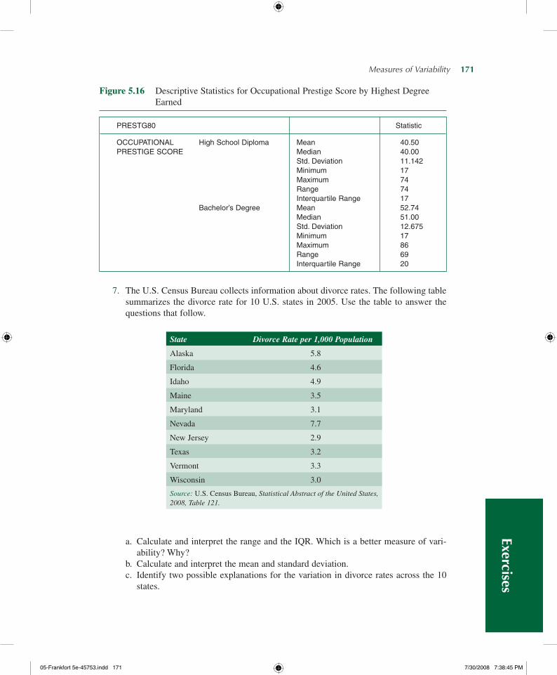
7. The U.S. Census Bureau collects information about divorce rates. The following table summarizes the divorce rate for 10 U.S. states in 2005. Use the table to answer the questions that follow.
PReStG80 Statistic
oCCUPAtIoNAL HighSchoolDiploma Mean 40.50PReStIGeSCoRe Median 40.00
Std.Deviation 11.142 Minimum 17 Maximum 74 Range 74 InterquartileRange 17 Bachelor’sDegree Mean 52.74 Median 51.00 Std.Deviation 12.675 Minimum 17 Maximum 86 Range 69 InterquartileRange 20
Figure 5.16 Descriptive Statistics for Occupational Prestige Score by Highest Degree Earned
State Divorce Rate per 1,000 Population
Alaska 5.8
Florida 4.6
Idaho 4.9
Maine 3.5
Maryland 3.1
Nevada 7.7
New Jersey 2.9
Texas 3.2
Vermont 3.3
Wisconsin 3.0
Source: U.S. Census Bureau, Statistical Abstract of the United States, 2008, Table 121.
a. Calculate and interpret the range and the IQR. Which is a better measure of vari-ability? Why?
b. Calculate and interpret the mean and standard deviation.c. Identify two possible explanations for the variation in divorce rates across the 10
states.
Exercises
05-Frankfort5e-45753.indd171 7/30/20087:38:45PM
172— S O C I A L S TAT I S T I C S F O R A D I V E R S E S O C I E T Y
8. A group of investigators has just finished a study that measured the amount of time each partner in a marriage spends doing housework. The investigators classified each couple as traditional or nontraditional, depending on the attitudes of both partners. (Traditional couples commonly grant more authority to the male; nontraditional cou-ples share more in decision making.) The investigators provide you with the following data for males only.
Hours of Housework per Week
Traditional Family Nontraditional Family
Y– = 6.3 Y
– = 12.4
Y 2 = 1,104
Y 2 = 2,889
Y = 63
Y = 186
N = 10 N = 15
a. Calculate the variance and standard deviation from these statistics for each family type.
b. What can you say about the variability in the amount of time men spend doing housework in traditional versus nontraditional marriages? Why might there be a dif-ference? Why might there be more variability for one type of family than another?
c. Was it necessary in this problem to provide you with the value to calculate the vari-ance and standard deviation?
9. You are interested in studying the variability of crimes committed (including violent and property crimes) and police expenditures in the Eastern and Midwestern United States. The U.S. Census Bureau collected the following statistics on these two vari-ables for 21 states in the East and Midwest in 2004.
State
Number of Crimes per 100,000 Population
Police Protection Expenditures in Millions of Dollars
Maine 2,525 207
New Hampshire 1,928 239
Vermont 2,401 115
Massachusetts 2,821 1,480
Rhode Island 2,970 284
Connecticut 2,833 806
New York 2,555 6,870
New Jersey 2,688 2,687
Pennsylvania 2,842 2,333
Ohio 4,014 2,531
Indiana 3,780 926
Illinois 3,632 3,459
Exer
cise
s
05-Frankfort5e-45753.indd172 7/30/20087:38:45PM
Measures of Variability— 173
a. Calculate the mean for each variable.b. Calculate the standard deviation for each variable.c. Compare the mean with the standard deviation for each variable. Does there appear
to be more variability in the number of crimes or in police expenditures per capita in these states? Which states contribute more to this greater variability?
d. Suggest why one variable has more variability than the other. In other words, what social forces would cause one variable to have a relatively large standard deviation?
10. Construct a box plot for both variables in Exercise 9. Discuss how the box plot rein-forces the conclusions you drew about the variability of crimes committed and police expenditures per capita.
11. Use the data in Table 5.6 from the chapter for this exercise.a. Calculate the standard deviation for the projected percentage increase in the elderly
population from 2005 to 2015.b. Compare this statistic with the IQR and the box plot shown in Figure 5.6. Which is
larger, the IQR or the standard deviation?c. Would the standard deviation lead you to the same conclusion about the variability
of the projected increase in the elderly population as the IQR and the box plot?
12. You decide to use MTF 2006 data to investigate how young Americans feel about alco-hol and (ATDRINK) cigarette use (ATSMOKE). You obtain the following (Figure 5.17a and b) selected output shown below. You should note that ATDRINK measures how respondents feel about trying alcohol, while ATSMOKE measures how respondents feel about smoking one pack of cigarettes per day. These are substantially different questions, and you should consider that in your answer.a. What would an appropriate measure of variability be for these variables? Why?b. Calculate the appropriate measure of variability for each variable.c. In 2006, was there more variability in attitudes trying alcohol or smoking one pack
of cigarettes per day? Offer an explanation for your findings.
State
Number of Crimes per 100,000 Population
Police Protection Expenditures in Millions of Dollars
Illinois 3,632 3,459
Michigan 3,643 2,244
Wisconsin 2,902 1,388
Minnesota 3,381 1,140
Iowa 3,125 493
Missouri 4,453 1,079
North Dakota 2,076 85
South Dakota 1,952 122
Nebraska 3,710 283
Kansas 4,174 544
Source: U.S. Census Bureau. Statistical Abstract of the United States, 2008, Tables 310 and 429.
Exercises
05-Frankfort5e-45753.indd173 7/30/20087:38:46PM
174— S O C I A L S TAT I S T I C S F O R A D I V E R S E S O C I E T Y
13. Averagelifeexpectancyforfemalesin2004isreportedfor10countries.CalculatetheappropriatemeasuresofcentraltendencyandvariabilityforbothEuropeancountriesandnon-Europeancountries.IstheremorevariabilityinlifeexpectancyforEuropeancountriesornon-Europeancountries?Ifso,whatmightexplainthesedifferences?
Adolescent Attitudes Toward Alcohol and Cigarettes
Trying Alcohol
Smoking One Pack of Cigarette per Day
Don’t disapprove 71.0% 19.3%
Disapprove 16.2% 30.2%
Strongly disapprove 12.8% 50.5%
Total 100%N = 1,466
100%N = 1,474
Country Life Expectancy at Birth
European countries
France 83.8
Germany 81.4
Netherlands 81.4
Spain 83.8
Turkey 73.6
Non-European countries
Japan 85.7
Australia 83.0
Mexico 77.6
Iceland 82.7
New Zealand 81.3
Source: U.S. Census Bureau. Statistical Abstract of the United States, 2008, Table 1306.
14. You have been asked to prepare a brief statement about young drivers for a public policymaker. Using statistics from the following table obtained from MTF 2006, write a paragraph or two about young drivers in America. In your answer be sure to identify at least two explanations for your findings.Ex
erci
ses
05-Frankfort5e-45753.indd174 7/30/20087:38:46PM
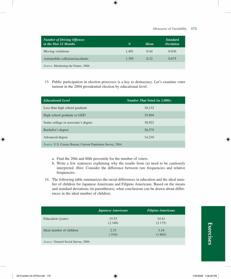
Measures of Variability— 175
15. Public participation in election processes is a key to democracy. Let’s examine voter turnout in the 2004 presidential election by educational level.
a. Find the 20th and 80th percentile for the number of voters.b. Write a few sentences explaining why the results from (a) need to be cautiously
interpreted. Hint: Consider the difference between raw frequencies and relative frequencies.
16. The following table summarizes the racial differences in education and the ideal num-ber of children for Japanese Americans and Filipino Americans. Based on the means and standard deviations (in parentheses), what conclusions can be drawn about differ-ences in the ideal number of children.
Number of Driving Offenses in the Past 12 Months
N
Mean
Standard Deviation
Moving violations 1,401 0.44 0.836
Automobile collisions/accidents 1,395 0.32 0.675
Source: Monitoring the Future, 2006.
Educational Level Number That Voted (in 1,000s)
Less than high school graduate 10,132
High school graduate or GED 35,894
Some college or associate’s degree 38,922
Bachelor’s degree 26,579
Advanced degree 14,210
Source: U.S. Census Bureau, Current Population Survey, 2004.
Japanese Americans Filipino Americans
Education (years) 15.53 (2.348)
14.41 (2.175)
Ideal number of children 2.33 (.516)
3.18 (1.662)
Source: General Social Survey, 2006.
Exercises
05-Frankfort5e-45753.indd175 7/30/20087:38:46PM
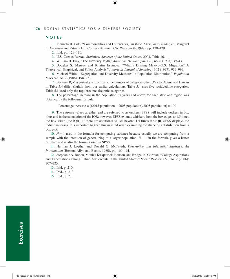
176— S O C I A L S TAT I S T I C S F O R A D I V E R S E S O C I E T Y
n o T E S
1. Johnneta B. Cole, “Commonalities and Differences,” in Race, Class, and Gender, ed. Margaret L. Andersen and Patricia Hill Collins (Belmont, CA: Wadsworth, 1998), pp. 128–129.
2. Ibid. pp. 129–130. 3. U.S. Census Bureau, Statistical Abstract of the United States, 2004, Table 16. 4. William H. Frey, “The Diversity Myth,” American Demographics 20, no. 6 (1998): 39–43. 5. Douglas S. Massey and Kristin Espinosa, “What’s Driving Mexico-U.S. Migration? A
Theoretical, Empirical, and Policy Analysis.” American Journal of Sociology 102 (1997): 939–999. 6. Michael White, “Segregation and Diversity Measures in Population Distribution,” Population
Index 52, no. 2 (1986): 198–221. 7. Because IQV is partially a function of the number of categories, the IQVs for Maine and Hawaii
in Table 5.4 differ slightly from our earlier calculations. Table 5.4 uses five racial/ethnic categories. Table 5.1 used only the top three racial/ethnic categories.
8. The percentage increase in the population 65 years and above for each state and region was obtained by the following formula:
Percentage increase = [(2015 population – 2005 population)/2005 population] × 100
9. The extreme values at either end are referred to as outliers. SPSS will include outliers in box plots and in the calculation of the IQR; however, SPSS extends whiskers from the box edges to 1.5 times the box width (the IQR). If there are additional values beyond 1.5 times the IQR, SPSS displays the individual cases. It is important to keep this in mind when examining the shape of a distribution from a box plot.
10. N − 1 used in the formula for computing variance because usually we are computing from a sample with the intention of generalizing to a larger population. N − 1 in the formula gives a better estimate and is also the formula used in SPSS.
11. Herman J. Loether and Donald G. McTavish, Descriptive and Inferential Statistics: An Introduction (Boston: Allyn and Bacon, 1980), pp. 160–161.
12. Stephanie A. Bohon, Monica Kirkpatrick Johnson, and Bridget K. Gorman. “College Aspirations and Expectations among Latino Adolescents in the United States,” Social Problems 53, no. 2 (2006): 207–225.
13. Ibid, p. 210.14. Ibid., p. 213.15. Ibid., p. 213.
Exer
cise
s
05-Frankfort5e-45753.indd176 7/30/20087:38:46PM