Embed Size (px)
Citation preview
1

Mascot Insight is a new application designed to help you to organise and manage your Mascot search and quantitation results.
Mascot Insight provides ways to flexibly merge your Mascot search and quantitation results, including MS-1 based quantitation data from Mascot Distiller, such as SILAC and Carbon 13 data, and MS2 based quantitation such as iTRAQ and TMT.
Mascot Insight allows you to further annotate your results, including areas such as Gene Ontology annotation of results, use of molecular interactions databases and manual annotation and approval of protein hits
And Mascot Insight provides a wide range of reports covering areas such as comparing datasets, quantitation analysis, plotting charts etc, and provides exports for these to allow you to easily share those results and to export data in machine readable formats
2

Mascot Insight is a server based system. It requires you have an in house copy of Mascot, version 2.4 or later. It can also be installed on the same system as your Mascot server, provided you have plenty of spare resources and it is a Microsoft Windows server. You access Mascot Insight via a browser and there are no limits on the number of users that can be connected to the system at any one time.
3

Once you’ve logged in, this is the home page of the application. On the left we have the Data explorer tree. This is where the data available in the system is organised and displayed, with different types of node for storing different types of information. Data can be manually position on the tree, or structures can be automatically generated to your own specifications
On the current view, we can see two main types of node – User nodes and Folder nodes. Each user is given a User node automatically, and this is for them to organise their own data and experiments, and you can also have shared group nodes.
On the right hand side of the home page, we have the ‘Search panel’. The data explorer tree may contain many thousands of search results, and the search panel allows us to rapidly search the tree to find a particular result or set of results. Security is role-based and handled by Mascot security. Exactly what you see on the dataset explorer tree when you log in depends on your user’s roles, and on what access settings have been given to particular nodes on the tree by their owners.
4

Here I’ve expanded out the Data Explorer tree under my user node to show you how it can be used to group data. Under the user node I’ve got data from two experiments which were examining SUMO interacting proteins in Arabidopsis thaliana after either heat stress or multiple chemical stresses. Each experiment had two biological replicates. The data for each biological replicate was searched first against a contaminants database, and then MS/MS spectra which failed to give a match were automatically researched against SwissProt using a Mascot Daemon follow-up task. Each biological replicate had three technical replicates run. As you can see, everything is logically laid out on the Data Explorer tree, in a structure which was created automatically by the system when the results were imported – I’ll be going into more detail about that later in the presentation.
If I want to manipulate a set of results, I do that by selecting the result nodes as I’ve done here. Right clicking then opens a context menu which allows me to carry out a number of operations, such as viewing the results or changing the default result display conditions. I can also run reports directly from here. As an example of that, we’ll generate a three-way Venn diagram of the protein matches from these three technical replicates. Simply click on the ‘Run report’ menu option and the select the ‘Protein Venn Diagram’ link on the window that opens.
5
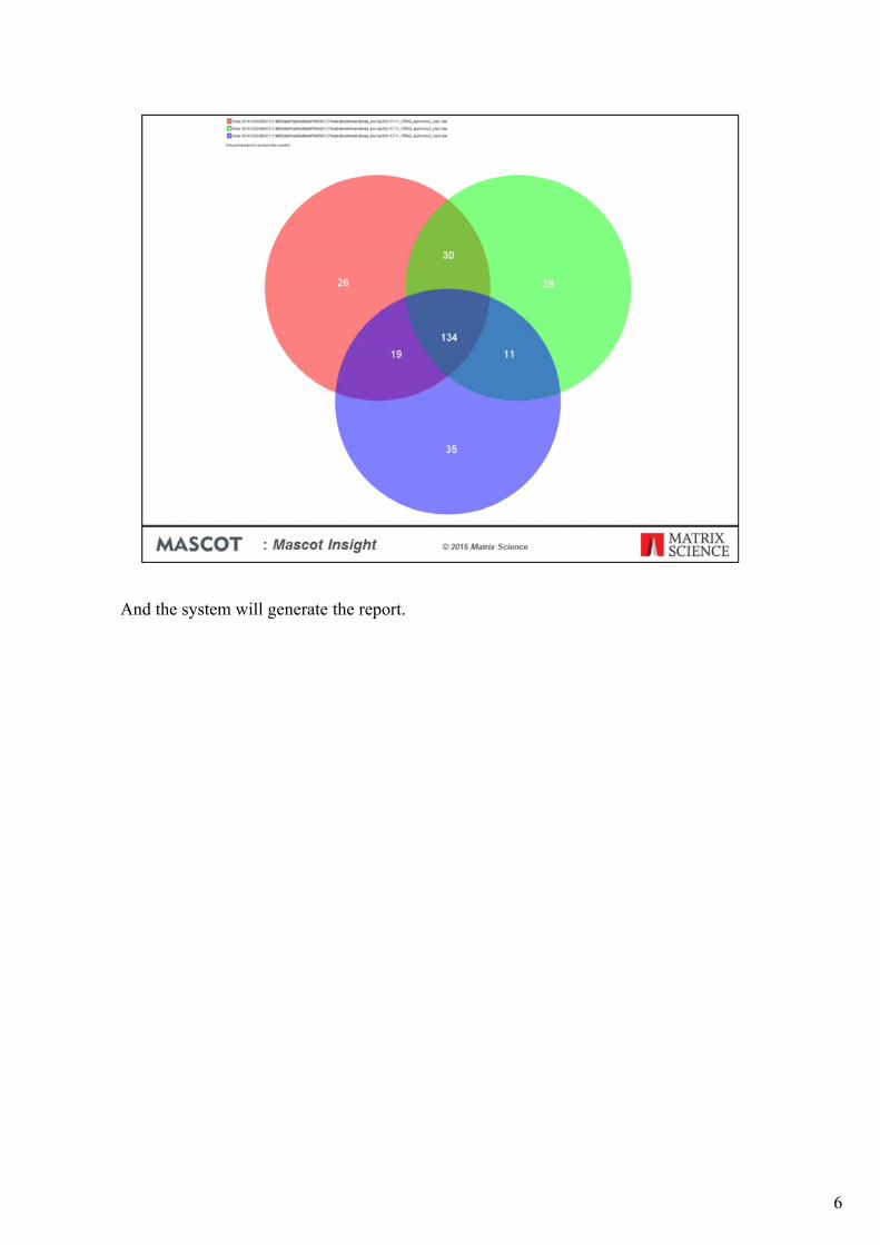
And the system will generate the report.
6

The main tool used to view results and generate reports in Mascot Insight is a Java applet called MIRA (for Mascot Insight Results Applet).
MIRA provides a tabular view of a single result or merged set of results. You can view results in either the Protein centric mode (as we are doing here), or in a peptide centric view. On the upper left we have the searches pane, which is used to change between the selected results, changing which result is being displayed in the main body of MIRA. It is also used for running search level reports from within MIRA and for setting result display parameters across multiple searches. The upper panel on the right contains the proteins table. This is the protein hit list for the currently selected result on the searches pane, and resembles the ‘Report builder’ view in the standard Mascot protein family report. If we click on a row in the Proteins table:
The peptides table, containing the list of matching peptide hits for the selected protein, and various details tabs (such as a protein view) are populated. Clicking on a table column header for either the proteins or peptides table sorts the table on that field. You can also re-order the columns by dragging them and also show and hide columns as you wish – you can save your default column selection, order and column widths if you wish; your choices are saved to the Mascot Insight database, so are available on any client PC you log in from. In the bottom left of the main pane is a panel with search functions, and options to switch between this view and a peptide (or spectrum) centric view.
7

You can enable GO Analysis in MIRA. GO annotations are shown in the proteins table, as different coloured dots. Hover over a cell for a tooltip.
8

GO assignments are also presented in additional tabs as piecharts. Click on a wedge of the pie-chart, and the protein table is filtered on that GO assignment
9
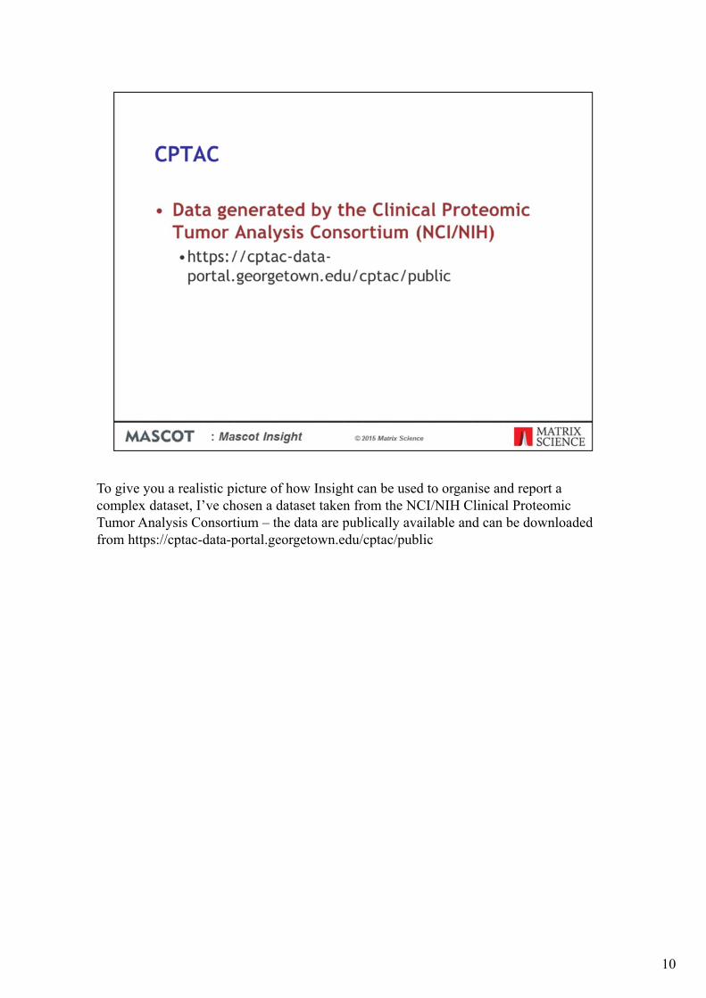
To give you a realistic picture of how Insight can be used to organise and report a complex dataset, I’ve chosen a dataset taken from the NCI/NIH Clinical Proteomic Tumor Analysis Consortium – the data are publically available and can be downloaded from https://cptac-data-portal.georgetown.edu/cptac/public
10
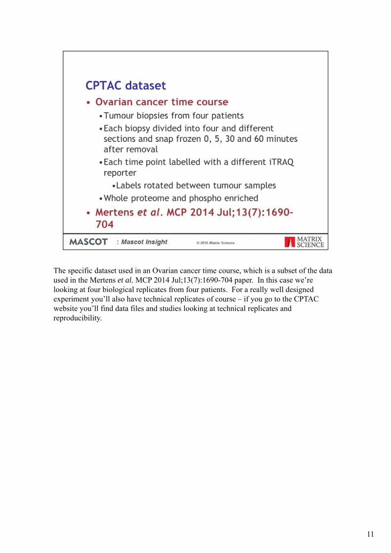
The specific dataset used in an Ovarian cancer time course, which is a subset of the data used in the Mertens et al. MCP 2014 Jul;13(7):1690-704 paper. In this case we’re looking at four biological replicates from four patients. For a really well designed experiment you’ll also have technical replicates of course – if you go to the CPTAC website you’ll find data files and studies looking at technical replicates and reproducibility.
11

CPTAC are carrying out proteomics characterisation of tumour samples originally collected as part of the Cancer Genome Atlas (TCGA) project. However, these samples were not collected with proteomics studies in mind and the time between the tumour tissue being collected and the sample being frozen is generally not known for the samples - in general these tissues are collected without any tight regulation or documentation of this time period. The time course experiments were designed evaluate the impact of this ischemic time.
12
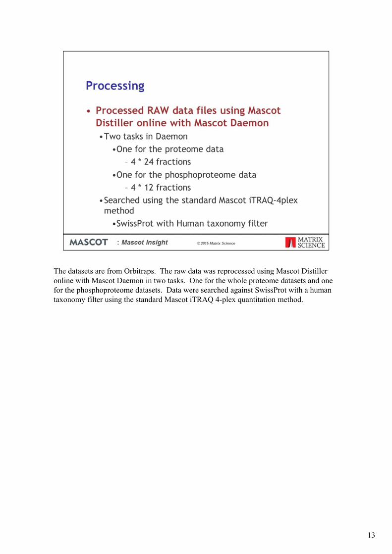
The datasets are from Orbitraps. The raw data was reprocessed using Mascot Distiller online with Mascot Daemon in two tasks. One for the whole proteome datasets and one for the phosphoproteome datasets. Data were searched against SwissProt with a human taxonomy filter using the standard Mascot iTRAQ 4-plex quantitation method.
13

The searches will be automatically imported into Mascot Insight when they are completed. By default they will be imported as a group into a structure based on the Daemon tasks we set up. However, since we’re searching a series of fractions from different samples, it would be helpful if we could automatically group the different fraction results by sample and by whether they’re proteome or phosphoproteomesamples. Fortunately we can do this because the required information is encoded in the raw data file names and paths obtained from CPTAC. Using an Import Assignment Filter in Mascot Insight, we can pull the required information out to automatically generate a complex organisation structure automatically, which will greatly simplify our downstream processing of the results.
The filter in this slide is quite complicated and often the requirements will be far more simple. To show you how the Import Assignment Filter works, I’ll walk through an example using one of the Phosphoproteome files as an example.
14

When a search result which matches this import assignment filter is imported into the system, the child folder rules are then run in order to test what folder structure on the Dataset Explorer the search result should be imported to, creating new folders on the Dataset Explorer tree as required.
The first child folder rule tests against the search title. It is looking to match against the phrase CPTAC followed by an underscore and then any other characters. CPTAC is enclosed in brackets, which means that it is this section of the search title that will be used to match an existing folder or to name a new folder. If there isn’t an existing CPTAC folder under the selected parent node, the system will automatically create one.
15

The second child folder rule then matches all characters after the _ after CPTAC through to the next _ character of the search title. So for this raw datafile that is OvC
16
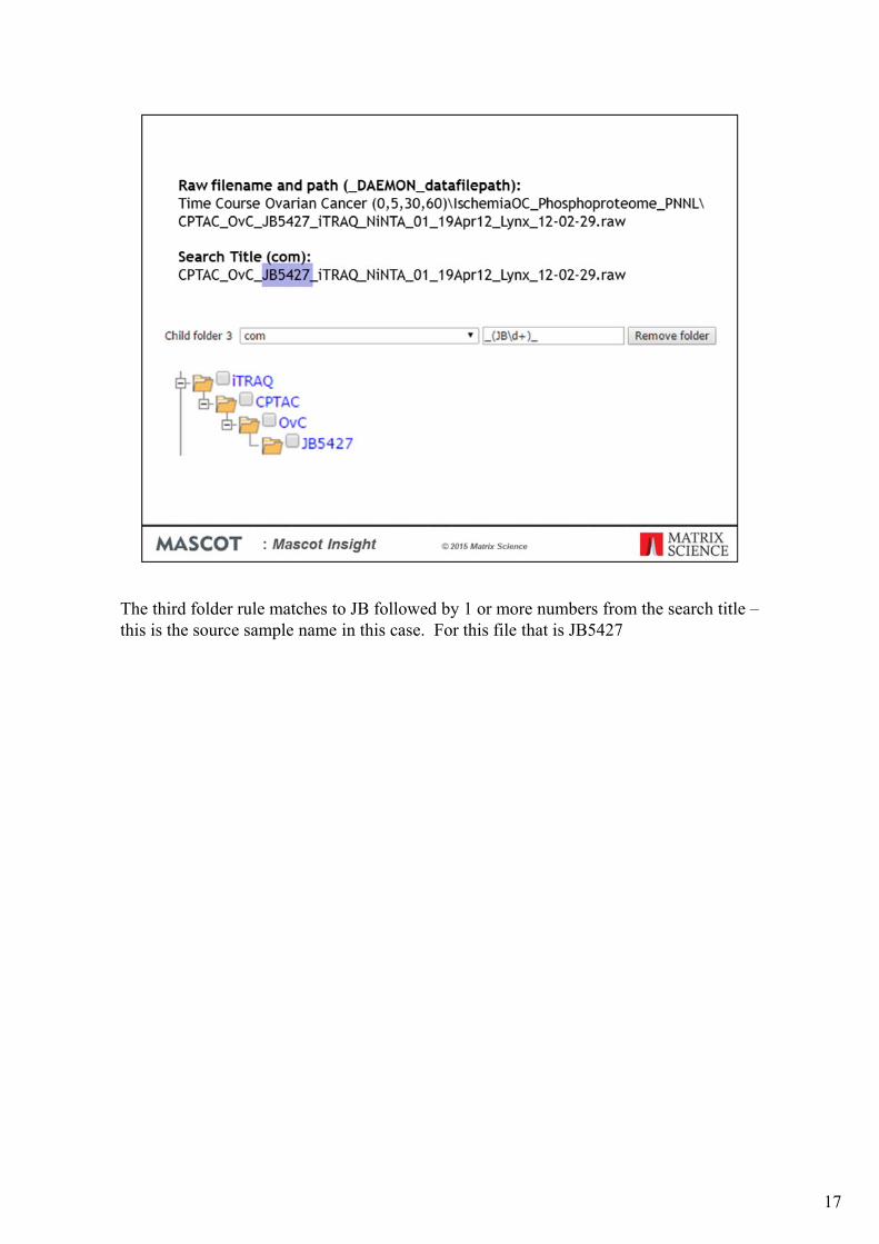
The third folder rule matches to JB followed by 1 or more numbers from the search title –this is the source sample name in this case. For this file that is JB5427
17

The fourth folder rule tries to match and select the word Proteome from the raw datafilepath, as long as it appears between two underscore characters. This rule does not match the path for these raw data file and so the rule does not run.
18

The final child folder rule matches the word Phosphoproteome from the raw datafile path as long as it appears between two underscore characters. This matches the path for this raw datafile. Since this is the final point in the generated path, the search result will be imported as a child of this Phosphoproteome folder.
19

Once the searches have completed, the results are automatically grouped together in the main Explorer Tree on the Mascot Insight home page, as illustrated here. The next step is to merge the separate fractions into single merged results – 2 for each sample; one for the proteome and one for the phosphoproteome. If you don’t need to make any changes to the quantitation setup in order to make the merged results, you can simply select the top shared node on the tree (OvC in this case) and tell the system to merge all the search results at the same level under the selected node.
20

However, in this experiment the different time points were rotated between the channels for each sample, we need to reset the quantitation ratio settings when we do the merge. We can do this by selecting the group of searches we want to merge and selecting the ‘Merge results’ option from the context menu.
21

When the tumour samples were labelled using the iTRAQ reagents, the time points were rotated between the different iTRAQ channels as shown in this table. This type of rotation is commonly called a ‘latin square’, and is considered good practice because it reduces the impact of tag-related systematic errors. Whenever we want to generate a report, its much clearer if we can label a feature as "time 0" rather than "channel 115". Also, when we want to merge samples, we can't just add up the 115 intensity. Insight allows us to map component names (e.g. 115) to more meaningful terms (e.g. time 0). We do this by selecting a set of search results and choosing the ‘Merge results’ option from the context menu.
22

This opens an HTML wizard which allows us to rename the components on a result by result basis. Here I’m merging the fractions from the JB5439 sample, so channel 114 is mapped to the 60 minute time point, 115 to the zero time point, etc. Once you’ve done that, the next step of the wizard allows you to set up the ratios you want to report – in this case, ratios to the zero time point.
By managing the quantitation methods this way, you can simplify the Daemon tasks required to submit the searches as you can always use the standard quantitation method supplied with Mascot server and then adjust the quantitation ratios afterwards. This also avoids having to setup multiple very similar quantitation methods on your Mascot server.
23

After the fractions are merged, a new result node is added to the Mascot Insight explorer tree.
24

Once we’ve setup all the merged datasets, we can also set the default search and quantitation settings for all the search results using a single form – this includes setting the peptide FDR to a target value. Once we do this, the required settings are saved to the Mascot Insight database so that whenever we open the results or generate a report in Mascot Insight, the correct search and quantitation settings are used.
25

Now the data are ready for reporting on. The system ships with some 30 reports designed specifically for proteomics data. These cover a wide range of areas such as result comparison, quantitation and quantitation clustering/grouping, Gene Ontology analysis, Interactions database analysis and general graphing reports such as scatter plots. You can also write your own reports using the Java programming language.
26
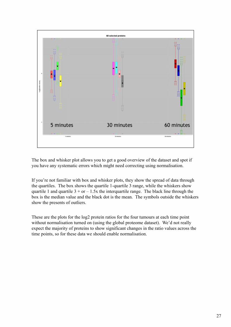
The box and whisker plot allows you to get a good overview of the dataset and spot if you have any systematic errors which might need correcting using normalisation.
If you’re not familiar with box and whisker plots, they show the spread of data through the quartiles. The box shows the quartile 1-quartile 3 range, while the whiskers show quartile 1 and quartile 3 + or – 1.5x the interquartile range. The black line through the box is the median value and the black dot is the mean. The symbols outside the whiskers show the presents of outliers.
These are the plots for the log2 protein ratios for the four tumours at each time point without normalisation turned on (using the global proteome dataset). We’d not really expect the majority of proteins to show significant changes in the ratio values across the time points, so for these data we should enable normalisation.
27

And here are the data with median peptide ratio normalisation turned on. As you can see normalisation has brought the median ratios for each tumour and timepoint much closer to zero – normalisation works at the peptide level, so we’d next expect it to bring all the median protein ratios to exactly zero. If you plotted the peptide ratio values for this dataset as a box and whisker plot you would see the peptide median ratio values corrected to zero.
28
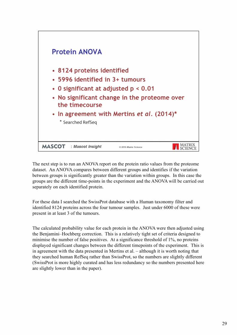
The next step is to run an ANOVA report on the protein ratio values from the proteome dataset. An ANOVA compares between different groups and identifies if the variation between groups is significantly greater than the variation within groups. In this case the groups are the different time-points in the experiment and the ANOVA will be carried out separately on each identified protein.
For these data I searched the SwissProt database with a Human taxonomy filter and identified 8124 proteins across the four tumour samples. Just under 6000 of these were present in at least 3 of the tumours.
The calculated probability value for each protein in the ANOVA were then adjusted using the Benjamini–Hochberg correction. This is a relatively tight set of criteria designed to minimise the number of false positives. At a significance threshold of 1%, no proteins displayed significant changes between the different timepoints of the experiment. This is in agreement with the data presented in Mertins et al. – although it is worth noting that they searched human RefSeq rather than SwissProt, so the numbers are slightly different (SwissProt is more highly curated and has less redundancy so the numbers presented here are slightly lower than in the paper).
29

We then ran an ANOVA report on the phospho peptide dataset. This time the ANOVA was run on the peptide quantitation ratios, with peptides grouped together by unique sequence and phosphorylation state.
We have a total of 16819 distinct phospho peptides, of which 10638 were identified in at least 3 out of the 4 samples. Of those, 1122 showed significant differences between timepoints at a threshold of 1%. That is that the differences between the timepoints of the experiment are greater than the differences within the timepoints – in other words, significant changes in the amounts of these phosphopeptides were observed across the different timepoints. 669 phosphopeptides were observed at an increased amount at 60 minutes, with 453 decreased. These 1122 peptides match into 684 different proteins. So, unlike at the whole proteome protein level, we are seeing some significant changes at the phospho-proteome level.
30
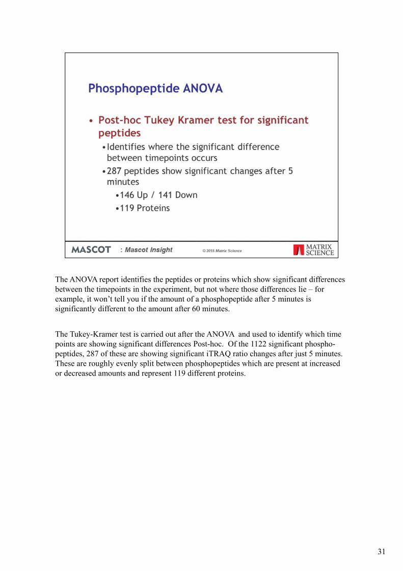
The ANOVA report identifies the peptides or proteins which show significant differences between the timepoints in the experiment, but not where those differences lie – for example, it won’t tell you if the amount of a phosphopeptide after 5 minutes is significantly different to the amount after 60 minutes.
The Tukey-Kramer test is carried out after the ANOVA and used to identify which time points are showing significant differences Post-hoc. Of the 1122 significant phospho-peptides, 287 of these are showing significant iTRAQ ratio changes after just 5 minutes. These are roughly evenly split between phosphopeptides which are present at increased or decreased amounts and represent 119 different proteins.
31

Mascot Insight has various reports and functions available for looking at Gene Ontology assignments. Here we’ve filtered the identified proteins from one of the tumour samples with the proteins identified as having phosphopeptides which have significantly altered amounts after 5 minutes. The report compares between the GO assignments from the dataset and the frequencies calculated from the Human Uniprot proteome database. On the report, any bar above zero is over-represented, any below is under-represented, in the search result. Here we’re looking at GO ‘Biological Process’ assignments significantly over or under represented in the results when compared with the proteome numbers. Some of the key groupings of assignments are shown in the box. As you can see, we’re finding that, amongst others, proteins involved in the MAP Kinase and Ras pathways are over-represented in the identified proteins.
32
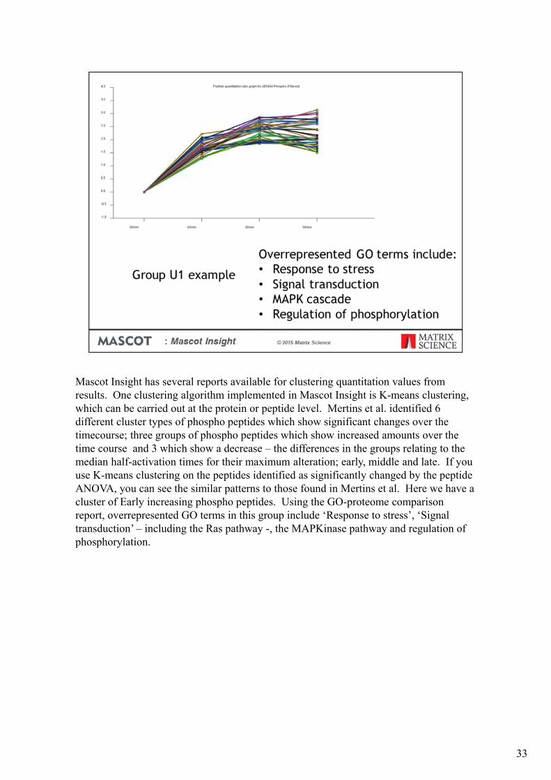
Mascot Insight has several reports available for clustering quantitation values from results. One clustering algorithm implemented in Mascot Insight is K-means clustering, which can be carried out at the protein or peptide level. Mertins et al. identified 6 different cluster types of phospho peptides which show significant changes over the timecourse; three groups of phospho peptides which show increased amounts over the time course and 3 which show a decrease – the differences in the groups relating to the median half-activation times for their maximum alteration; early, middle and late. If you use K-means clustering on the peptides identified as significantly changed by the peptide ANOVA, you can see the similar patterns to those found in Mertins et al. Here we have a cluster of Early increasing phospho peptides. Using the GO-proteome comparison report, overrepresented GO terms in this group include ‘Response to stress’, ‘Signal transduction’ – including the Ras pathway -, the MAPKinase pathway and regulation of phosphorylation.
33
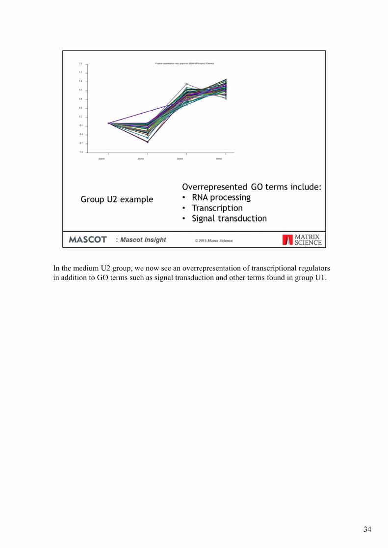
In the medium U2 group, we now see an overrepresentation of transcriptional regulators in addition to GO terms such as signal transduction and other terms found in group U1.
34
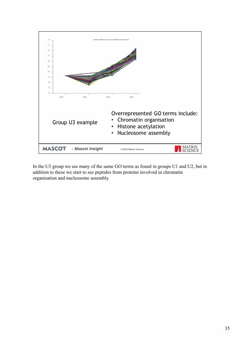
In the U3 group we see many of the same GO terms as found in groups U1 and U2, but in addition to these we start to see peptides from proteins involved in chromatin organisation and nucleosome assembly.
35

There is less variability in the proteins identified by phospho peptide groups D1-D3 (which show decreasing phosphopeptide amounts over the timecourse), but overrepresented GO terms include signal transduction, cytoskeletal organisation and transcription.
36

In addition to the K-means clustering report, Mascot Insight has a Hierarchical clustering report for protein quantitation data. Here, I’ve filtered one of the tumour phosphopeptideenriched samples to select only the peptides identified as showing significant changes after 5 minutes and carried out hierarchical clustering on the protein quantitation data calculated using just those peptide matches. On the diagram, red is showing increased iTRAQ ratios, and green decreased. As you can see this identifies two groups of proteins, one where the iTRAQ ratios are largely up and a smaller group which is mostly down – the identified proteins in the groups are similar to (a subset of) the proteins found for the U1 and D1 groups identified by the k-means clustering.
37

Mascot Insight can use any molecular interaction database in the PSI-MITAB standard format to generate a molecular interaction report for a selected protein. Here I’ve selected Map Kinase 2 and generated a report showing the known direct interactors for the protein. Where the node on the diagram is blue, green or red the interacting protein was identified in the search result, while those in grey were not. Blue denotes a protein which was identified but not quantified, while green through to red is used as a heatmapfor proteins which were quantified.
38

If you increase the report to include interactors of interactors, it generates a very largenetwork – we’re viewing a small section of it here. From the colour coding you can see that we’ve identified a large number of the known interacting proteins. In addition to a graphical export, the generated report can be exported back out in PSI-MITAB format, including details of whether the interacting protein was identified in the search result. There are a number of other tools, including the commonly used Cytoscape software, which can then import the generated PSI-MITAB file.
39

So conclusions from the Ovarian cancer time course – there is no overall change in protein levels caused by delayed freezing of tumour samples. When we look at the phosphoproteome, the majority of phosphopeptides are also unchanged across the course of the experiment. However, approximately 10% of the identified phosphopeptides did show significant changes across the time course, some of which occurred very rapidly. The proteins identified with altered phosphorylation include those involved in stress response, transcriptional regulation and cell-death.
40

So in summary, the 144 Raw data files which made up this dataset were batch processed in Mascot Distiller and searched on Mascot Server fully automatically using Mascot Daemon.
The search results were imported into Mascot Insight and organised into a logical folder structure fully automatically.
Quantitation components were mapped to time points using a wizard and the separate fractions merged from a menu click.
Reports were generated on the dataset without having to resort to Excel or R
The results and reports are saved in a secure and organised fashion and are readily available to any lab members who want to take a closer look at any aspect of the data or generate more reports
41


![Getting People Logged[IN]](https://img.pdfslide.us/doc/110x75/55d026dcbb61eb88488b4632/getting-people-loggedin.jpg)
