Embed Size (px)
Citation preview

Marketing & CommunicationsQuick Reference Guide
6.15.2021

Girl Scout Brand Usage Process for Volunteers
Girl Scouts of Connecticut (GSOFCT) volunteers may create marketing materials to promote Troop and Service Unit activities. All materials that feature the Girl Scout brand are subject to a review and approval process. Please allow 3-4 business days for Customer Care to process your request.
In order to streamline the process to complete your project as efficiently as possible, please adhere to the following:
1. Any design that features the Girl Scout brand needs to be reviewed and approved by council. Please email Customer Care at [email protected] with “Request for Girl Scout Brand Usage” as the email subject line. Girl Scout branding includes:
• Girl Scout Logo in any form• Trefoil• The words “Girl Scout” or “Girl Scouts” • The words “Girl Scouts of Connecticut”• DO NOT use “Scouts” or “scout” in any form. It must have “Girl” preceding it.• The above applies to any hand-drawn pieces (or any similar mediums) submitted
by a Girl Scout Member.
2. GSOFCT’s Marketing and Communications Department will then review and respond via email with approval, changes, and/or next steps.
3. Once approved, GSOFCT’s Marketing and Communications Department will send the approved design files to GSOFCT’s Retail Operations Department for printing and project completion.
4. Notes:• Please do not contact any GSUSA vendors on your own. GSOFCT’s Retail
Operations Department will act as liaison to process your order. (Councils may also receive pricing discounts.)
• If you omit any branded items listed above, you may design and work with any vendor of your choice. The use of “Service Unit #,” for example, does not need to go through the approval process.
If you have any questions about your design, please contact [email protected]

Visual Standards

Typography Don’ts
Typography
• Don’t set type in color. • Don’t outline type. • Don’t add effects to typography. • Don’t place the Trefoil closer to
text than the clear space allows.• Don’t create type lockups by
mixing type sizes or weights. • Don’t use mixed alignment.
• Don’t use previous Girl Scout typefaces: Trefoil Sans, Trefoil Slab, Trefoil DIY, Shortbread, or Thin Mint.
• Don’t illustrate type. • Don’t use both black and white
type in the same shape.
There are two styles of Girl Scout—display and text—as well as a version that contains all the badge and patch shapes used as design building blocks.
Display is optimized for large-scale copy, like a poster or billboard. Any copy that is used at a large scale (over 24pts) should be set in display.
For applications where Girl Scout fonts can’t be used—such as email—use Georgia as a substitute, but never combine the two typefaces in one document.
For brand communications, typography is always set in either black or white.
Display
LightLight Italic
TextBookBook ItalicMediumMedium ItalicBoldBold Italic

Cobranding
Partner and Sponsor Cobranding The Movement servicemark should be used when creating partnership lockups.
While there is no single rule defining the scale relationship of our servicemark to all partner logos, the following examples of various proportions serve as a guide.
The distance between our logo and the partner logo should be one Trefoil, vertically or horizontally. The scale of the logos should achieve an optical balance, not an exact measurement.
The two logos should always be vertically or horizontally centered
depending on the orientation.
Use a thin gray line to separate our logo from the partner logo.
If there is prominent placement of the Girl Scout brand name where the partnership lockup appears, the Trefoil alone can be used in place of the servicemark.
Note: These parameters apply to partners and sponsors but are not intended for product and licensing.
Here is a range of examples to show how partnership servicemarks should appear.
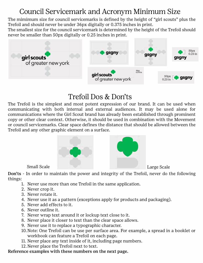
Council Servicemark and Acronym Minimum Size
Trefoil Dos & Don’ts
The mimimum size for council servicemarks is defined by the height of “girl scouts” plus the Trefoil and should never be under 36px digitally or 0.375 inches in print.The smallest size for the council servicemark is determined by the height of the Trefoil should never be smaller than 50px digitally or 0.25 inches in print.
Don’ts - In order to maintain the power and integrity of the Trefoil, never do the following things:
1. Never use more than one Trefoil in the same application. 2. Never crop it. 3. Never rotate it. 4. Never use it as a pattern (exceptions apply for products and packaging).5. Never add effects to it. 6. Never outline it.7. Never wrap text around it or lockup text close to it.8. Never place it closer to text than the clear space allows. 9. Never use it to replace a typographic character. 10. Note: One Trefoil can be use per surface area. For example, a spread in a booklet or
workbook can feature a Trefoil on each page. 11. Never place any text inside of it, including page numbers. 12. Never place the Trefoil next to text.
Reference examples with these numbers on the next page.
The Trefoil is the simplest and most potent expression of our brand. It can be used when communicating with both internal and external audiences. It may be used alone for communications where the Girl Scout brand has already been established through prominent copy or other clear context. Otherwise, it should be used in combination with the Movement or council servicemarks. Clear space defines the distance that should be allowed between the Trefoil and any other graphic element on a surface.
Small Scale Large Scale

Trefoil Don’ts

Trefoil ColorGreen is our signature color and has been a brand equity since we introduced it in our uniforms in the 1940s, and it became associated with our brand over time. We should leverage this color strategically.
As our official brand color, Girl Scout Green should be used for the Trefoil in formal settings. It should also be used for audiences who are unfamiliar with our brand. Using a consistent color will help to build familiarity and brand recognition.
However, in order to allow for more flexibility within the design system, the Trefoil can also be used as a supporting element using colors from the official palette. This should be reserved for environments where the audience is already familiar with the brand.
Color Don’tsHere are some examples of what not to do when using color.
• Don’t use gradients.• Don’t add new colors to the brand palette.• Don’t fake metallics.

Full Color PaletteThis set of colors offers a broad range of options to achieve various moods and tones when designing for different audiences. The palette includes highest awards colors, grade level colors, and cookie colors—but these colors are not reserved exclusively for those uses.
Green is one of our greatest equities. It should be used prominently in external communications, especially for the Trefoil. Two new shades of green support Girl Scout Green, adding variety, depth, and richness. Always consider the role of green when creating both internal and external communications. Also think about communications for both low awareness and high awareness environments.
RBG and Hex are two different ways of expressing additive color—the mix of red, green, and blue light that creates images on digital screens. These are used for digital ads, websites, video, projection, outdoor digital advertising, or other digital media.
CMYK (which stands for cyan, magenta, yellow, and black—the four ink colors used in the process) is the most common form of printed material: magazines, book, billboards, and posters—as well as printouts from home or office printers. Pantone is a system of custom-mixed inks that can match additive color much more accurately than CMYK. However it is significantly more expensive, so is usually reserved for high-end, low-run printing applications.
TCX stands for “textile, cotton edition, extended range,” and is a color system used in the manufacturing of fabric and other products.
Star Green
RGB213/242/103
Hex#d5f267
Girl Scouts Green
RGB0/180/81
Hex#00b451
Forest Green
RGB0/86/64
Hex#005640
Ocean
RGB0/73/135
Hex#004987
Deep Purple
RGB92/31/139
Hex#5c1f8b
Plum
RGB175/0/97
Hex#af0061
Cherry
RGB156/0/0
Hex#9c0000
Lilac
RGB204/179/250
Hex#ccb3fa
Violet
RGB158/95/214
Hex#9e5fd6
Peach
RGB255/185/157
Hex#fcb89d
Poppy
RGB238/49/36
Hex#ee3124
Sunshine
RGB255/244/65
Hex#fff441
Gold
RGB247/190/0
Hex#f7be00
Cloud
RGB217/217/217
Hex#d9d9d9
Black
RGB0/0/0
Hex#000000
Sky
RGB160/222/241
Hex#a0def1
River
RGB20/150/212
Hex#1496d4
Bubblegum
RGB247/171/214
Hexf7abd6
Fuchsia
RGB253/50/158
Hex#fd329e
Khaki
RGB213/202/159
Hex#d5ca9f
Flame
RGB255/120/24
Hex#ff7818
CMYK15/0/70/0
CMYK95/0/100/0
CMYK95/35/80/40
CMYK100/50/0/30
CMYK80/100/0/0
CMYK5/100/0/25
CMYK0/100/85/40
CMYK20/30/0/0
CMYK40/60/0/0
CMYK0/30/30/0
CMYK0/90/100/0
CMYK0/5/80/0
CMYK0/30/100/0
CMYK0/0/0/20
CMYK0/0/0/100
CMYK35/0/0/0
CMYK90/15/0/0
CMYK0/35/0/0
CMYK0/80/0/0
CMYK20/15/40/0
CMYK0/70/100/0
Pantone 2296
TCX 13-0645
Pantone 354
TCX 16-6340
Pantone 7729
TCX 19-6027
Pantone 2186
TCX 19-4049
Pantone 3583
TCX 19-3638
Pantone 227
TCX 19-2434
Pantone 7622
TCX 18-1552
Pantone 2635
TCX 14-3612
Pantone 2083
TCX 7-3628
Pantone 162
TCX 13-1022
Pantone Bright Red
TCX 17-1563
Pantone 101
TCX 12-0642
Pantone 7408
TCX 13-0759
Pantone Cool Gray 1
TCX 12-4300
Pantone Black
TCX 19-0840
Pantone 635
TCX 12-4401
Pantone 2192
TCX 17-4435
Pantone 230
TCX 15-2213
Pantone 232
TCX 17-2627
Pantone 4545
TCX 14-0925
Pantone 1585
TCX 16-1454
Stone
RGB168/168/168
Hex#a8a8a8
CMYK0/0/0/40
Pantone Cool Gray 6
TCX 14-5002
Desert
RGB192/102/22
Hex#a86b1d
CMYK0/60/100/25
Pantone 146
TCX 18-1160
Brown
RGB118/58/22
Hex#763a16
CMYK5/75/95/60
Pantone 168
TCX 18-1541

Photography Dos
Photography Don’ts
Our photography should capture the authentic emotional range of girls and their expressions. We show a full spectrum of expression ranging from determination and pride to joy and bliss. We should show real girls, not images of who they think they should be.
It is important to capture girls in the places where they are doing things: in the classroom, outside, camping, running, advocating. These images represent the wide range of experiences girls have with Girl Scouts. When capturing shots of girls in action, the girls should be unaware of the camera. It is crucial to capture candid moments so the images don’t feel staged.
1. Don’t use duotones. 2. Don’t overlay a gradient to photography. 3. Don’t add filters to photography.
4. Don’t add a vignette to photography. 5. Don’t silhouette. 6. Don’t use low-quality images.
Additionally, avoid using photos where the expressions on girls’ faces feels forced or unnatural—girls should not be “acting” for the camera. They should either be completely candid (not staged) or be looking directly at the camera with intent.
Here are styles and effects to avoid when using photography:

IllustrationIllustrations are vibrant artistic visual interpretations that bring a story to life. They enhance messaging, storytelling, merchandise, and program materials. They also serve as decorative elements and patterns on products. Don’t confuse illustrations with iconography; generally, an illustration is specific to a particular project and isn’t recycled (with a few exceptions, such as standardized badges and cookie illustrations).
To work within the design system, illustrations should use solid fields of color to create dimensionality, movement, and detail. Here we show a range of illustration styles that align with our brand identity and represent examples of the style suggested above.

Illustration Don’ts
1. Color outlined with black strokes 2. A sketchy, hand-drawn look 3. Photorealism 4. Collages
5. “Bathroom door” style figures 6. More than one style within a
composition or program
The following illustration styles don’t conform to the brand standard: