Embed Size (px)
Citation preview
A very interesting talkData Graphics andScientific Communication
for Climate System Research
QuickTime™ and aTIFF (Uncompressed) decompressorare needed to see this picture.
Mark Baldwin
Northwest Research, Bellevue, WA, USAVisitor, Department of Meteorology
QuickTime™ and aTIFF (Uncompressed) decompressor
are needed to see this picture.

QuickTime™ and aTIFF (Uncompressed) decompressor
are needed to see this picture.
How should you judge whether your typographic choice (e.g., type, type size, leading, number of columns) is a good one?
a) You judge whether it looks appealing
b) You base your decision on studies of reading comprehension

Fonts: serif or sans serif? Minion is a serif font. Arial is a sans serif font. For continuous text, reading comprehension is greatly reduced by a sans serif font. Percent of readers Good Fair Poor
Serif font 67 19 14 Sans serif font 12 23 65

Is the stratosphere important for predicting changes in weather and climate? Although the role of the stratosphere has not been emphasized until recently, observations and models both indicate that the stratosphere acts to integrate high-frequency forcing from below, with long-lasting feedback effects.
Is the stratosphere important for predicting changes in weather and climate? Although the role of the stratosphere has not been emphasized until recently, observations and models both indicate that the stratosphere acts to integrate high-frequency forcing from below, with long-lasting feedback effects.
Justified
Ragged right

Should text be set justified or ragged right? For continuous text, reading comprehension is greatly reduced by a ragged right margin.
Percent of readers
Good Fair Poor
Justifed text 67 19 14 Ragged right text 38 22 40

Leading: the space between lines
Negative Leading
15/13: This climatology presents a picture consistent with the concepts of wavebreaking and vortex/surf-zone regions proposed by McIntyre and Palmer [1983, 1984]. In their conceptual model,
15/14: This climatology presents a picture consistent with the concepts of wavebreaking and vortex/surf-zone regions proposed by McIntyre and Palmer [1983, 1984]. In their conceptual model,
Solid
15/15: This climatology presents a picture consistent with the concepts of wavebreaking and vortex/surf-zone regions proposed by McIntyre and Palmer [1983, 1984]. In their conceptual model,
Positive Leading
15/16: This climatology presents a picture consistent with the concepts of wavebreaking and vortex/surf-zone regions proposed by McIntyre and Palmer [1983, 1984]. In their conceptual model,
15/17: This climatology presents a picture consistent with the concepts of wavebreaking and vortex/surf-zone regions proposed by McIntyre and Palmer [1983, 1984]. In their conceptual model,
15/18: This climatology presents a picture consistent with the concepts of wavebreaking and vortex/surf-zone regions proposed by McIntyre and Palmer [1983, 1984]. In their conceptual model,
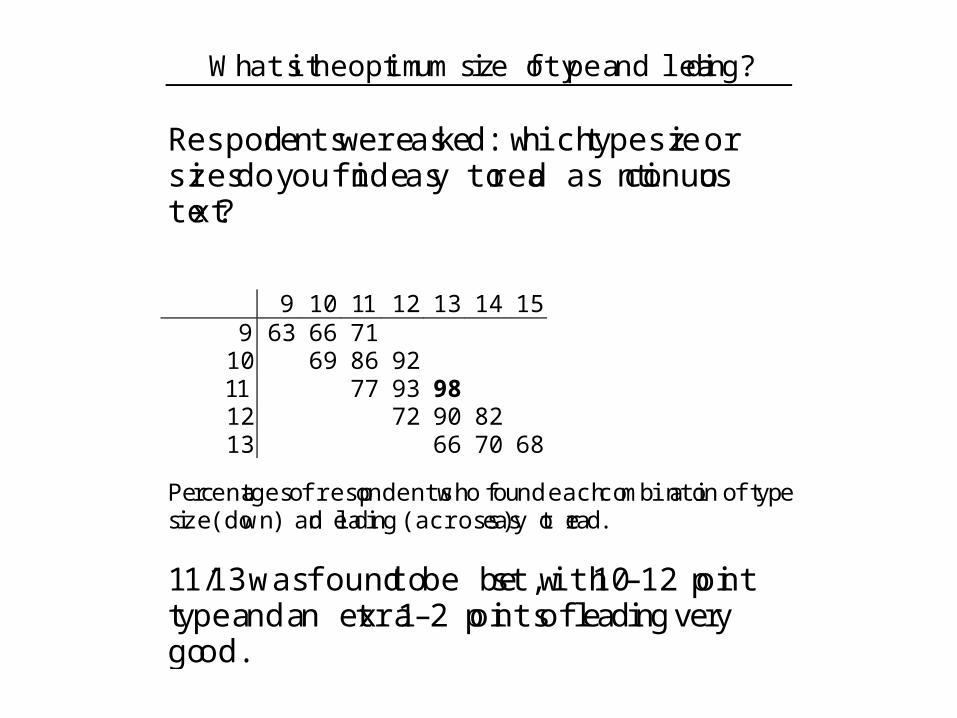
What is the optimum size of type and leading? Respondents were asked: which type size or sizes do you find easy to read as continuous text?
9 10 11 12 13 14 15 9 63 66 71
10 69 86 92 11 77 93 98
12 72 90 82 13 66 70 68
Percentages of respondents who found each combination of type size (down) and leading (across) easy to read.
11/13 was found to be best, with 10–12 point type and an extra 1–2 points of leading very good.
Leading
Font Size

Line length: how long is too long? 38% of readers found that a line length over 60 characters is hard to read. On an 8 11 page with 1” margins, how many characters per line result using 10–12 point fonts? Characters/line 10 11 12 Single column 111 103 93
Double column 53 50 45

80
Sans Serif Font


Graphs & PlotsMinimize non-data ink
No “chartjunk” (e.g., gratuitous 3-D)
Avoid lying with data
Bank to 45º
Edward R. Tufte

Maximize Data-ink; Minimize non-Data Ink
Edward Tufte defines the data ink ratio as:
Data Ink Ratio = (data ink)/(total ink in the plot)
The goal is to make this as large as is reasonable. To do this you:
Avoid heavy gridsReplace enclosing box with an x/y gridPrune graphics by: replacing bars with single lines, erasing non-data ink; eliminating lines from axes; starting x/y axes at the data valuesAvoid over busy grids, excess ticks, redundant representation of simple data, boxes, shadows, pointers, legends.


QuickTime™ and aTIFF (Uncompressed) decompressor
are needed to see this picture.

QuickTime™ and aTIFF (Uncompressed) decompressor
are needed to see this picture.


QuickTime™ and aTIFF (Uncompressed) decompressor
are needed to see this picture.
ChartjunChartjunkk

QuickTime™ and aTIFF (Uncompressed) decompressor
are needed to see this picture.
ChartjunChartjunkk

ChartjunChartjunkk

QuickTime™ and aTIFF (Uncompressed) decompressor
are needed to see this picture.
QuickTime™ and aTIFF (Uncompressed) decompressor
are needed to see this picture.
QuickTime™ and aTIFF (Uncompressed) decompressor
are needed to see this picture.
QuickTime™ and aTIFF (Uncompressed) decompressor
are needed to see this picture.
QuickTime™ and aTIFF (Uncompressed) decompressor
are needed to see this picture.
QuickTime™ and aTIFF (Uncompressed) decompressor
are needed to see this picture.
ChartjunkChartjunk


Drug C
Drug B
Drug AProportion Survived

From Baldwin and Gray, 2005
Bank to 45°
QuickTime™ and aTIFF (Uncompressed) decompressor
are needed to see this picture.From “The Visual Display of Quantitative Information” by Edward R. Tufte.

QuickTime™ and aTIFF (Uncompressed) decompressor
are needed to see this picture.

QuickTime™ and aTIFF (Uncompressed) decompressor
are needed to see this picture.

QuickTime™ and aTIFF (Uncompressed) decompressor
are needed to see this picture.

QuickTime™ and aTIFF (Uncompressed) decompressor
are needed to see this picture.

QuickTime™ and aTIFF (Uncompressed) decompressor
are needed to see this picture.
QuickTime™ and aTIFF (Uncompressed) decompressor
are needed to see this picture.
QuickTime™ and aTIFF (Uncompressed) decompressor
are needed to see this picture.
QuickTime™ and aTIFF (Uncompressed) decompressor
are needed to see this picture.
QuickTime™ and aTIFF (Uncompressed) decompressor
are needed to see this picture.
QuickTime™ and aTIFF (Uncompressed) decompressor
are needed to see this picture.
QuickTime™ and aTIFF (Uncompressed) decompressor
are needed to see this picture.
QuickTime™ and aTIFF (Uncompressed) decompressor
are needed to see this picture.
QuickTime™ and aTIFF (Uncompressed) decompressor
are needed to see this picture.
Color Tables

Can you see a difference?
6% of the male population can’t.www.vischeck.com


From Baldwin and Dunkerton, 2001

Composite surface maps for high and low AO index.
(From Thompson and Wallace, Science 2001)
>0.9°C


Avoid visual puzzles.

QuickTime™ and aTIFF (Uncompressed) decompressor
are needed to see this picture.


A very interesting talk
Conclusions
for Climate System Research
1) Pay attention to typography2) Work to improve graphs and plots3) Avoid “chartjunk”4) Maximize data ink5) Avoid visual puzzles6) Use easy-to-decode color tables7) See my Web site for references