Embed Size (px)
Citation preview

MAKING MAPS IN POWERPOINT AND WORD
WHY DO REGIONAL SCIENTISTS NOT MAP THEIR RESULTS?
Thomas Vanoutrive
University of Antwerp
Abstract
Cartography has commonly been used in regional science and Exploratory Spatial Data Analysis
is regularly applied to visualise the distribution of the variable of interest in space. Articles often
contain several maps of administrative areas showing the values of a certain variable. However,
and despite the benefits of such maps, they are nothing more than spatial catalogues of data.
Their usefulness for regional scientist is beyond questioning, but the communicative value is
limited. The rise of GIS has rightly been welcomed by many scientists, however, critical
cartographers often pose the question if ‘GIS has killed cartography?’. Moreover, this discussion
about maps in regional science can be more than a trivial item since it can reveal the fear of
scientists to draw a conclusion. The chorematics approach, as developed by Brunet, considers
maps as ‘vitrines’, and not as catalogues. In this paper we show that such an approach can enrich
regional science by delivering a methodology to visualise spatial structures and dynamics using
geometric figures. Finally, we argue that powerpoint and word are better cartographic tools than
common GIS packages.
50th Anniversary European Congress of the Regional Science Association International (ERSA)
‘Sustainable Regional Growth and Development in the Creative Knowledge Economy’
19th – 23rd August 2010, Jönköping, Sweden

2
Introduction
In the last few years, regional scientists reflect on their discipline as a result of anniversaries of
journals, like the thirty-fifth birthday of Regional Science and Urban Economics (RSUE;
(Ottaviano and Minerva 2007) and the Golden Issue of the Journal of Regional Science
(Duranton 2010). Two statements attract our attention since they deal with cartography. First,
while looking back at 35 years of RSUE, Ottaviano and Minerva (2007, p.448) state that,
‘it is remarkable that, in a journal that claims to be exclusively concerned with spatial
economic phenomena, practically none of the papers employ maps. This trend will
probably change, now that mapping software is becoming more sophisticated and easier
to use.'
In the Golden Issue of the Journal of Regional Science, Murray (2010, p.147) indicates that the
trend has changed.
'Display in GIS has proven to add the wow factor to this method, enabling map-based
graphics to be easily generated for evaluation and inspection by humans. This is where
knowledge is typically derived.’
However, he also warns that making maps is rather complex,
‘Interestingly, this is far more complicated and involved than one may realize, as
substantial research continues to be devoted to display-oriented endeavors. From the
human perception and cognition side, there are issues of appropriate communication in
color selection, symbology, and so on. Even the most basic choropleth map displays,
where polygons are color coded to represent some attribute interval, are involved, with
the default natural breaks approach reflecting a class selection mathematical
optimization problem.'
We will use these observations as a starting point to explore the use of maps in regional science.
In this essay, we illustrate which type of maps are mainly used in regional science. Next, we
discuss the pros and cons of this kind of maps. Finally, we discuss alternative approaches and
their advantages.
3
Maps in regional science
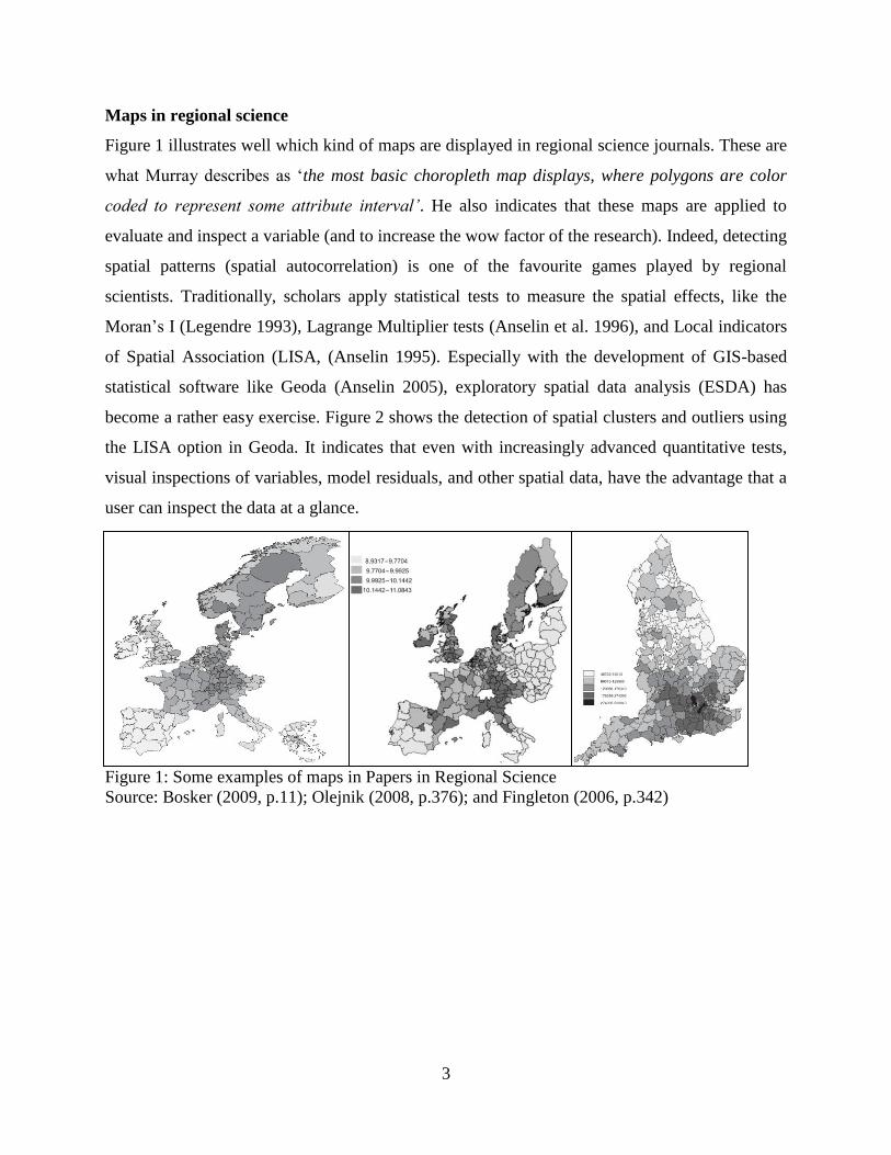
Figure 1 illustrates well which kind of maps are displayed in regional science journals. These are
what Murray describes as ‘the most basic choropleth map displays, where polygons are color
coded to represent some attribute interval’. He also indicates that these maps are applied to
evaluate and inspect a variable (and to increase the wow factor of the research). Indeed, detecting
spatial patterns (spatial autocorrelation) is one of the favourite games played by regional
scientists. Traditionally, scholars apply statistical tests to measure the spatial effects, like the
Moran’s I (Legendre 1993), Lagrange Multiplier tests (Anselin et al. 1996), and Local indicators
of Spatial Association (LISA, (Anselin 1995). Especially with the development of GIS-based
statistical software like Geoda (Anselin 2005), exploratory spatial data analysis (ESDA) has
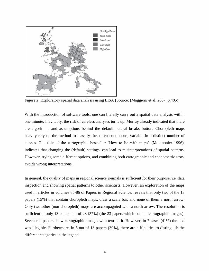
become a rather easy exercise. Figure 2 shows the detection of spatial clusters and outliers using
the LISA option in Geoda. It indicates that even with increasingly advanced quantitative tests,
visual inspections of variables, model residuals, and other spatial data, have the advantage that a
user can inspect the data at a glance.
Figure 1: Some examples of maps in Papers in Regional Science
Source: Bosker (2009, p.11); Olejnik (2008, p.376); and Fingleton (2006, p.342)
4
Figure 2: Exploratory spatial data analysis using LISA (Source: (Maggioni et al. 2007, p.485)
With the introduction of software tools, one can literally carry out a spatial data analysis within
one minute. Inevitably, the risk of careless analyses turns up. Murray already indicated that there
are algorithms and assumptions behind the default natural breaks button. Choropleth maps
heavily rely on the method to classify the, often continuous, variable in a distinct number of
classes. The title of the cartographic bestseller ‘How to lie with maps’ (Monmonier 1996),
indicates that changing the (default) settings, can lead to misinterpretations of spatial patterns.
However, trying some different options, and combining both cartographic and econometric tests,
avoids wrong interpretations.
In general, the quality of maps in regional science journals is sufficient for their purpose, i.e. data
inspection and showing spatial patterns to other scientists. However, an exploration of the maps
used in articles in volumes 85-86 of Papers in Regional Science, reveals that only two of the 13
papers (15%) that contain choropleth maps, draw a scale bar, and none of them a north arrow.
Only two other (non-choropleth) maps are accompagnied with a north arrow. The resolution is
sufficient in only 13 papers out of 23 (57%) (the 23 papers which contain cartographic images).
Seventeen papers show cartographic images with text on it. However, in 7 cases (41%) the text
was illegible. Furthermore, in 5 out of 13 papers (39%), there are difficulties to distinguish the
different categories in the legend.
5
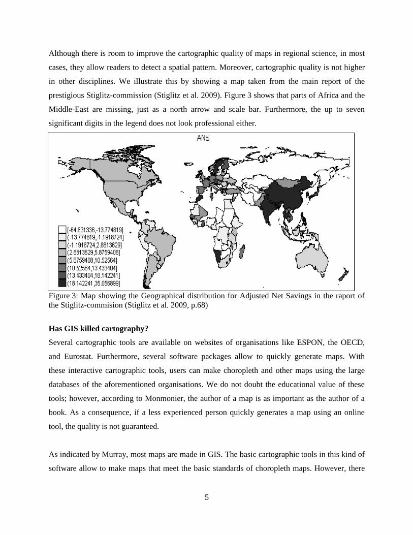
Although there is room to improve the cartographic quality of maps in regional science, in most
cases, they allow readers to detect a spatial pattern. Moreover, cartographic quality is not higher
in other disciplines. We illustrate this by showing a map taken from the main report of the
prestigious Stiglitz-commission (Stiglitz et al. 2009). Figure 3 shows that parts of Africa and the
Middle-East are missing, just as a north arrow and scale bar. Furthermore, the up to seven
significant digits in the legend does not look professional either.
Figure 3: Map showing the Geographical distribution for Adjusted Net Savings in the raport of
the Stiglitz-commision (Stiglitz et al. 2009, p.68)
Has GIS killed cartography?
Several cartographic tools are available on websites of organisations like ESPON, the OECD,
and Eurostat. Furthermore, several software packages allow to quickly generate maps. With
these interactive cartographic tools, users can make choropleth and other maps using the large
databases of the aforementioned organisations. We do not doubt the educational value of these
tools; however, according to Monmonier, the author of a map is as important as the author of a
book. As a consequence, if a less experienced person quickly generates a map using an online
tool, the quality is not guaranteed.
As indicated by Murray, most maps are made in GIS. The basic cartographic tools in this kind of
software allow to make maps that meet the basic standards of choropleth maps. However, there
6
is critique on this kind of maps. Some scholars raise the question whether ‘GIS has killed
cartography’. Sui (2004) refers to a discussion on this topic in 1996, and lists following answers,
(i) ‘No, GIS has not killed cartography; cartography committed suicide instead!’ ‘(answer
cartographers), (ii) ‘No, GIS has not killed cartography; they got married!’ (answer GIS
practitioners), and (iii) ‘Yes, GIS may have killed cartography—but the jury will never convict!’
(answer Social theorists). He himself concludes that ‘GIS and cartography are still having a
honeymoon’ (Sui 2004, p.68).
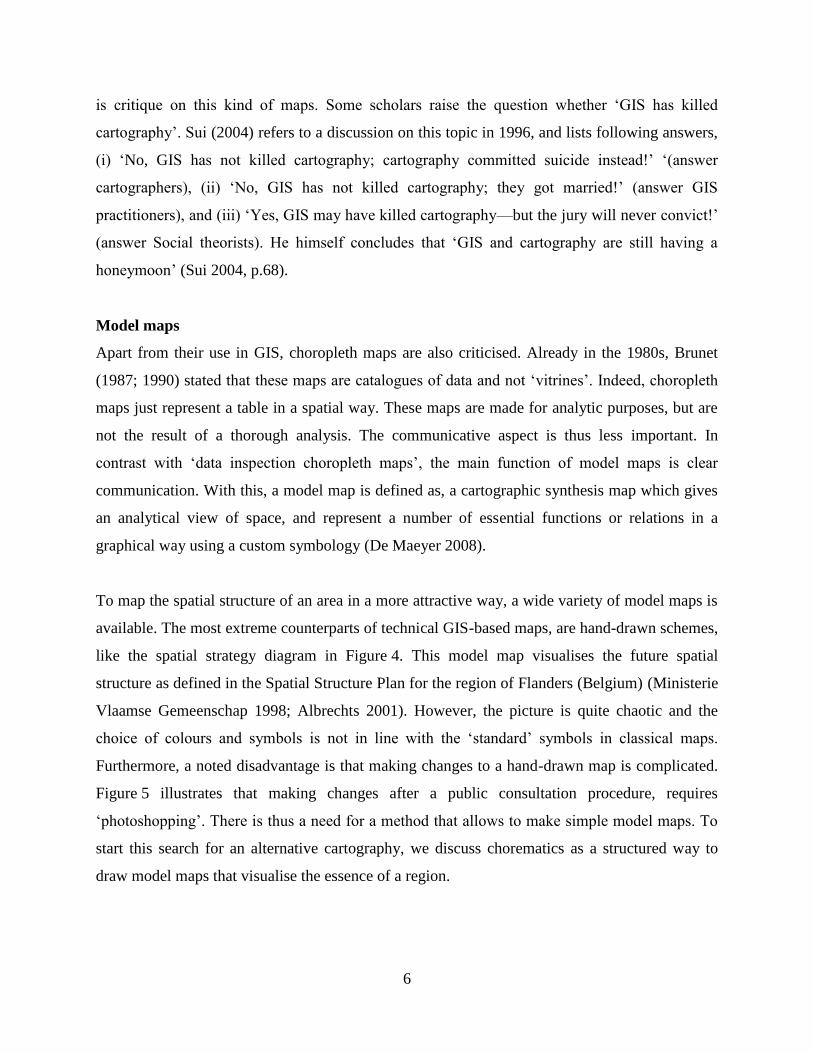
Model maps
Apart from their use in GIS, choropleth maps are also criticised. Already in the 1980s, Brunet
(1987; 1990) stated that these maps are catalogues of data and not ‘vitrines’. Indeed, choropleth
maps just represent a table in a spatial way. These maps are made for analytic purposes, but are
not the result of a thorough analysis. The communicative aspect is thus less important. In
contrast with ‘data inspection choropleth maps’, the main function of model maps is clear
communication. With this, a model map is defined as, a cartographic synthesis map which gives
an analytical view of space, and represent a number of essential functions or relations in a
graphical way using a custom symbology (De Maeyer 2008).
To map the spatial structure of an area in a more attractive way, a wide variety of model maps is
available. The most extreme counterparts of technical GIS-based maps, are hand-drawn schemes,
like the spatial strategy diagram in Figure 4. This model map visualises the future spatial
structure as defined in the Spatial Structure Plan for the region of Flanders (Belgium) (Ministerie
Vlaamse Gemeenschap 1998; Albrechts 2001). However, the picture is quite chaotic and the
choice of colours and symbols is not in line with the ‘standard’ symbols in classical maps.
Furthermore, a noted disadvantage is that making changes to a hand-drawn map is complicated.
Figure 5 illustrates that making changes after a public consultation procedure, requires
‘photoshopping’. There is thus a need for a method that allows to make simple model maps. To
start this search for an alternative cartography, we discuss chorematics as a structured way to
draw model maps that visualise the essence of a region.

7
Figure 4: Spatial strategy diagram of the region of Flanders (Belgium)
Source: Ministerie Vlaamse Gemeenschap 1998, p.326 (originally in colour)
Figure 5: Example of a difference between the spatial strategy diagram of the Spatial Structure
Plan for Flanders used during the public consultation (left) and the final document (right)
A structured approach: chorematics
A specific type of model maps are the choreme maps, which are cited as a potential method to
use in e.g. spatial planning . Indeed, the choreme methodology emphasises the identification of
trends, relationships and networks (Dühr 2007). Chorematics is the brainchild of Roger Brunet.
8
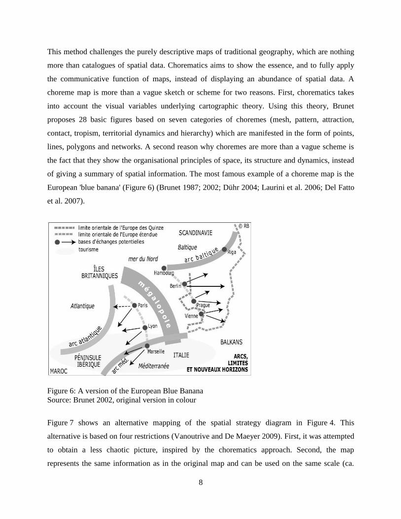
This method challenges the purely descriptive maps of traditional geography, which are nothing
more than catalogues of spatial data. Chorematics aims to show the essence, and to fully apply
the communicative function of maps, instead of displaying an abundance of spatial data. A
choreme map is more than a vague sketch or scheme for two reasons. First, chorematics takes
into account the visual variables underlying cartographic theory. Using this theory, Brunet
proposes 28 basic figures based on seven categories of choremes (mesh, pattern, attraction,
contact, tropism, territorial dynamics and hierarchy) which are manifested in the form of points,
lines, polygons and networks. A second reason why choremes are more than a vague scheme is
the fact that they show the organisational principles of space, its structure and dynamics, instead
of giving a summary of spatial information. The most famous example of a choreme map is the
European 'blue banana' (Figure 6) (Brunet 1987; 2002; Dühr 2004; Laurini et al. 2006; Del Fatto
et al. 2007).
Figure 6: A version of the European Blue Banana
Source: Brunet 2002, original version in colour
Figure 7 shows an alternative mapping of the spatial strategy diagram in Figure 4. This
alternative is based on four restrictions (Vanoutrive and De Maeyer 2009). First, it was attempted
to obtain a less chaotic picture, inspired by the chorematics approach. Second, the map
represents the same information as in the original map and can be used on the same scale (ca.

9
A4). Avoiding colour is the third condition and, finally, the map is made in a widely distributed
software package, i.e. microsoft powerpoint.
Figure 7: Alternative mapping of the spatial strategy diagram of the spatial structure plan for
Flanders (Adapted from Vanoutrive and De Maeyer 2009)
Choremes in regional science
Although choremes aim to visualise spatial processes, trends, relationships and networks, they
are not regularly applied in regional science. Figure 8 shows an example of how an analysis of a
economic geographical phenomenon can be summarised in a choreme map. In the title of this
paper, we asked the tendentious question why regional scientists not map their results. Regional
scientists has started to apply cartography, but mainly for data inspection. Therefore, we raise the
question why the main findings of the analyses, are not mapped using a choreme-like style. The
blue banana is a well-known concept, but scholars seem not ready to draw their own banana on
the basis of their findings. Note that drawing a basic scheme, forces a scientist to clearly
communicate the conclusions. Probably, the absence of model maps hides the uncertainty of
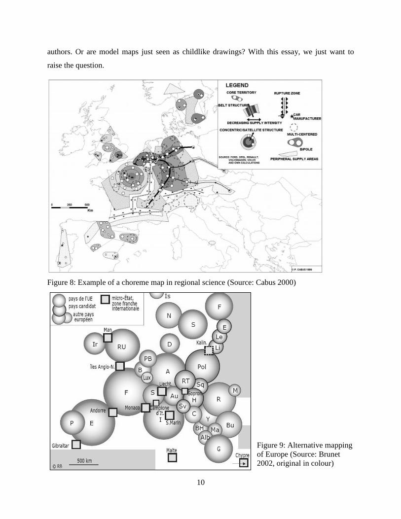
10
authors. Or are model maps just seen as childlike drawings? With this essay, we just want to
raise the question.
Figure 8: Example of a choreme map in regional science (Source: Cabus 2000)
Figure 9: Alternative mapping
of Europe (Source: Brunet
2002, original in colour)
11
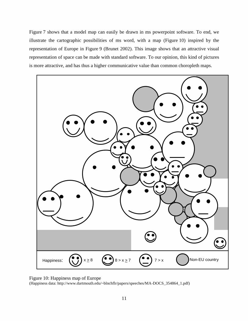
Figure 7 shows that a model map can easily be drawn in ms powerpoint software. To end, we
illustrate the cartographic possibilities of ms word, with a map (Figure 10) inspired by the
representation of Europe in Figure 9 (Brunet 2002). This image shows that an attractive visual
representation of space can be made with standard software. To our opinion, this kind of pictures
is more attractive, and has thus a higher communicative value than common choropleth maps.
Figure 10: Happiness map of Europe (Happiness data: http://www.dartmouth.edu/~blnchflr/papers/speeches/MA-DOCS_354864_1.pdf)
Happiness: x > 8 8 > x > 7 7 > x Non-EU country

12
Conclusion
In general, cartography in regional science limits itself to technical choropleth maps. Although
these maps generally fulfil the needs of the user, we argue in this essay that the quality of
mapping can be improved. An appropriate resolution, the addition of a scale bar, and the use of
distinguishable categories, all can improve cartographic quality. However, also more
communication-oriented maps can be produced. We illustrate that standard software packages
like ms word and powerpoint, enable researchers to literally draw their conclusions in an
attractive way.
References
Albrechts, L. 2001. How to Proceed from Image and Discourse to Action: As Applied to the
Flemish Diamond, Urban Studies 38: 733-745.
Anselin, L., Bera, A.K., Florax, R., and Yoon, M.J. 1996. Simple diagnostic tests for spatial
dependence, Regional Science and Urban Economics 26: 77-104.
Anselin, L. 1995. Local Indicators of Spatial Association-LISA, Geographical Analysis 27: 93-
115.
Anselin, L. 2005. Exploring Spatial Data with GeoDaTM
: A Workbook, Center for Spatially
Integrated Social Science, Urbana.
Bosker, M. 2009. The spatial evolution of regional GDP disparities in the 'old' and the 'new'
Europe, Papers in Regional Science 88: 3-27.
Brunet, R. 1987. La carte, mode d'emploi, Fayard/Reclus, Paris.
Brunet, R. 1990. à quoi sert la chorématique, pp. 27-39. In Y. André, A. Bailly, M. Clary, R.
Ferras, and J.-P. Guérin, editors, Modèles graphiques et représentations spatiales.
Anthropos/GIP RECLUS, Paris/Montpellier.
Brunet, R. 2002. Lignes de Force de l'Espace Européen, MappeMonde 66: 14-19.
Cabus, P. 2000. Modelling Spatial Relationships between Belgian Car Manufacturers and their
Suppliers Using Choremes, Tijdschrift voor Economische en Sociale Geografie 91: 3-19.
De Maeyer, Ph. 2008. Cartografie, Academia Press, Ghent.
Del Fatto, V., Laurini, R., Lopez, K., Loreto, R., Milleret-Raffort, F., Sebillo, M., Sol-Martinez,
D., and Vitiello, G. 2007. Potentialities of Chorems as Visual Summaries of Geographic
Databases Contents, pp. 537-548. In G. Qiu, C. Leung, X. Xue, and R. Laurini, editors, Advances
in Visual Information Systems. Springer-Verlag, Berlin / Heidelberg.
13
Dühr, S. 2004. The form, style, and use of cartographic visualisations in European spatial
planning: examples from England and Germany, Environment and Planning A 36: 1961-1989.
Dühr, S. 2007. The Visual Language of Spatial Planning - Exploring Cartographic
Representations for Spatial Planning in Europe, Routledge, Abingdon, Oxon.
Duranton, G. 2010. Introduction: the Journal of Regional Science at 50: Looking Forward to the
Next 50 Years, Journal of Regional Science 50: 1-3.
Fingleton, B. 2006. A cross-sectional analysis of residential property prices: the effects of
income, commuting, schooling, the housing stock and spatial interaction in the English regions,
Papers in Regional Science 85: 339-361.
Laurini, R., Milleret-Raffort, F., and Lopez, K. 2006. A Primer of Geographic Databases Based
on Chorems, pp. 1693-1702. In R. Meersman, Z. Tari, and P. Herrero, editors, On the Move to
Meaningful Internet Systems 2006: OTM 2006 Workshops. Springer-Verlag, Berlin / Heidelberg.
Legendre, P. 1993. Spatial Autocorrelation: Trouble or New Paradigm?, Ecology 74: 1659-1673.
Maggioni, M.A., Nosvelli, M., and Uberti, T.E. 2007. Space versus networks in the geography of
innovation: A European analysis, Papers in Regional Science 86: 471-493.
Ministerie Vlaamse Gemeenschap 1998. Ruimtelijk Structuurplan Vlaanderen (Spatial structure
plan for Flanders), Ministerie Vlaamse Gemeenschap, Brussels.
Monmonier, M. 1996. How to Lie with Maps, University of Chicago Press.
Murray, A.T. 2010. Quantitative Geography, Journal of Regional Science 50: 143-163.
Olejnik, A. 2008. Using the spatial autoregressively distributed lag model in assessing the
regional convergence of per-capita income in the EU25, Papers in Regional Science 87: 371-
385.
Ottaviano, G.I.P. and Minerva, G.A. 2007. Thirty-five years of R(S)UE: A retrospective,
Regional Science and Urban Economics 37: 434-449.
Stiglitz, J., Sen, A., and Fitoussi, J.P. Report of the commission on the measurement of economic
performance et social progress. 2009.
Sui, D.Z. 2004. GIS, Cartography, and the ''Third Culture'': Geographic Imaginations in the
Computer Age, The Professional Geographer 56: 62-72.
Vanoutrive, T. and De Maeyer, P. 2009. Over GeRSt en Patatten: de cartografische weergave
van de gewenste ruimtelijke structuur in Vlaanderen (België). In G. Bouma, F. Filius, H.
Leinfelder, and B. Waterhout, editors, Plandag 2009: Tussen droom en werkelijkheid. Stichting
Planologische Discussiedagen, Brussels, pp. 387-397.