Embed Size (px)
Citation preview

Plunging into the waters of UX
Maja Engel
TCUK 2017

UX vs. UI design
UX is a journey UI design and technical communication are
vehicles for that journey – «things» that the user can interact with
“A UI without UX is like a painter slapping paint onto
canvas without thought; while UX without UI is like the frame of a sculpture with no paper
maché on it.
A great product experience starts with UX followed by UI.”
Raul Varshney, Foster.fm

UXFunctions
Aesthetics
Emotions

“People don’t want a quarter inch drill bit. They want a quarter inch hole”
Theodore LevittPeople don’t care about tools
They care about goals they can accomplish with these tools!

So why products fail?
Poorly defined requirements
Poorly articulated goals
Poor communication
Stakeholder interference(usually happens when the first two points are badly defined)

Features vs. Goals
80% of users use 20% of features

More complex technology = more features BUT
Features are expensive so they must add value
Don’t add features and hope someone will use them
First figure out the user’s goal
SO

Prioritize!If everything seems equally important
SO
The solutions are not problem-tailored
Same importance given to the majority of users and edge cases
Users get annoyed and frustrated

Consider the context!
Who is the user?What is the social and physical environment of use?

Don’t assume – you’re not the user
USER RESEARCH(or at least test your assumptions)

Behavioural(what people do)
Attitudinal(what people say they do)
Qualitative
Quantitative
Usability testing
Online surveyInterviews

Quantitative researchMake a survey and send it to a mailing list – great starting point if you have no information at all
PROs reveals what happens easiest way to gather some info measureable and statistical cheap
CONs only proves theories and assumptions does not reveal why something happens large samples required

Qualitative researchGive a task to the subject and observe how they solve it
PROs reveals what happens and why great amount of detail small samples required observe user’s behavior and interaction with product
CONs takes time and effort to prepare, conduct and analyze subjective and interpretative

Research analysis
spot behavior patterns (focus instead of edge cases)
identify goals and pain points (and thus problems)
prioritize things to do (and thus organize production)

Prioritization matrix
score 1-5 per feature for each column (1 =bad, 5 = good)
features with the highest scores are the easiest to do and have the biggest impact
total allowed points per column = number of features x 3
if column score is higher, review points (it means you’ve given similar importance to everything)

I begin here
I have to do this
I reached my goal
Flow diagram
Make a storyboard
Include screens, screen states, compulsory and
optional actions

6 UX Design Principles
Consistent and Conventional Affordances Perceivable and Predictable Fitt’s Law Constraints Feedback

Consistent and Conventional
Don’t try to establish new conventions(limited pool of users)
Don’t underestimate habits
Reduce mental effort –user should not be wondering if different actions/words mean the same thing

Affordancescontrols (for example, buttons, labels, drop-downs and similar) and visual clues that tell users how a system behaves
Powerful – can override written instructions
Must be discoverable and obvious

Perceivable & Predictable
What can a product do?
What do I have to do?
Where should I begin?
How long it’s gonna take me?
How difficult is it?
What do I get from it?

Perceivable & Predictable
Once they learn, make sure users
don’t have to learn the same
thing all over again
Avoid surprises or lack of clarity
If users can’t see a feature they will probably not use it

HOW?
Chunk information in smaller bits
Use field labels Align everything (shortest
path to completion) Call to action Visual hierarchy (size,
position and colour of elements

Fitt’s Law
Easier and faster to hit larger targets closer to you than smaller targets further away

Closely related to
Hick’s Law
The more the options, the longer the task completion
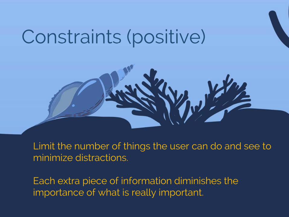
Constraints (positive)
Limit the number of things the user can do and see to minimize distractions.
Each extra piece of information diminishes the importance of what is really important.

Feedback (to the user)Let the user know whether what they are doing is ok or not, or that they can go to the next step
Users like to know what’s going on
HOW? micro-feedback
(progress bar, breadcrumbs,hints)
error handling(what went wrong, where andhow to fix it)

UX Design ProcessChecklist
1. Research2. Define problem3. Prioritize4. Map the action flow5. Design6. Prototype7. Test8. Go back to where
the test reveals problems

UX requiresTEAMWORK

Thank you for your attention
Useful resources
https://material.io/guidelines/ https://developer.apple.com/ios/human-
interface-guidelines/overview/design-principles/ Don't Make Me Think, Revisited: A Common Sense
Approach to Web Usability by Steve Krug https://www.uxpin.com/studio/ebooks/ Smashing Magazine Nielsen Norman Group