Embed Size (px)
Citation preview
1
Magazine: The Slab Serif and the Industrial Revolution
Aanya Kumar
GCM110-011: Introduction to Graphic Communications
Martin Habekost
November 23, 2020
Word Count: 1225
The Slab Serif and the Industrial Revolution
The Slab Serif and the Industrial Revolutionby Aanya Kumar
1 2
During the Industrial Revolution between 1760 and 1840, the importance of typography increased with the shif t in its social and economic roles. There was an explosion in the range of new typefaces and letterforms to adapt to commercial use (Meggs, 2016). One of the categories being the slab serif, better known as the Egyptian during that era.
HISTORYThe slab serif was an outgrowth of display typefaces introduced in Britain by Lund Humphries, a printing house that set contemporary typography trends (Chapman, 2020; Archer 2001). However it was not until 1815 when Vincent Figgins used slab serif type, named an Antique, for commercial use (Archer, 2001).
CHARACTERISTICSSlab Serif typefaces are characterized by their geometric serifs and consistent strokes. They are essentially hybridized sans serif and serif typefaces.
The serifs have the same weight as the strokes which gives it a slab like style. The slab serif ʼs body is usually wider than what is considered normal (Samara, 2006). During the Industrial Revolution, some slab serif typefaces were specifically designed to be used only at larger sizes (Chapman, 2020).
SUB-CLASSIFICATIONS•Early slab serifs were Antiques and Egyptians (Capelluto, 2016). This style of slab serif was very geometrized (“Slab Happy”, 2020). Geometrized typefaces such as Memphis, Rockwell, Karnak, Beton, Rosmini, City and Tower gained popularity in the 1920s to compliment Futura (Capelluto, 2016).
•Clarendon had bracketing and contrast in size of the serif which is not typical for slab serif typefaces (Capelluto, 2016).
•French Clarendon had serifs that were thicker than the strokes, which emphasized the purpose of slab serifs as dramatic attention-drawing type. They were commonly seen in circus posters and Western ʻwantedʼ signs (Capelluto, 2016).
•Typewriter slab, still seen today, has a unique fixed-width characteristic. Every character occupied the same horizontal space (Capelluto, 2016).
There have been many other adaptations of the slab serif including neo-grotesque (eg. Univers) and humanist (eg. PMN Caecilia) versions of the typeface (“Slab Happy”, 2020).
As the Industrial Revolution came into full swing in England, graphic communications became more important and widely accessible. Prior to the nineteenth century, the dominant function of type was to disseminate information through books employing small and, earlier on, handwritten type. The nineteenth century brought along larger scale, visually impactful and even fanciful novelty styles of type (Meggs, 2016). Typography was needed for body copy and newly, titles and displays as well. During this prolific period, the slab serif, better known as the Egyptian typeface were not only legible but bold and distinctive for display purposes (Capelluto, 2016). Industrial manufacturing created a need for promoting ready-made goods and so, these typefaces were pertinent to the new age of print advertising in a fast-paced, urban and industrialized society (Capelluto, 2016; Meggs, 2016). The industrial age created a new purpose for type to be “abstract visual forms projecting powerful concrete shapes of strong contrast and large size”(Meggs, 2016, p. 152) for posters, billboards,
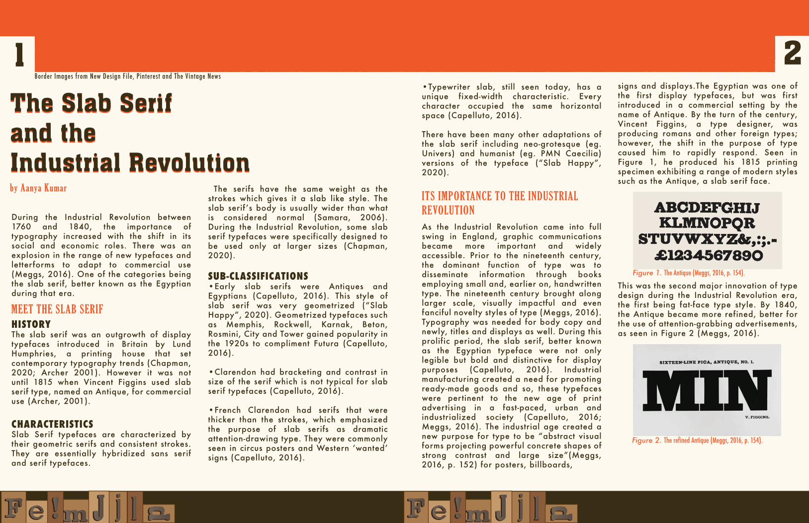
signs and displays.The Egyptian was one of the first display typefaces, but was first introduced in a commercial setting by the name of Antique. By the turn of the century, Vincent Figgins, a type designer, was producing romans and other foreign types; however, the shif t in the purpose of type caused him to rapidly respond. Seen in Figure 1, he produced his 1815 printing specimen exhibiting a range of modern styles such as the Antique, a slab serif face.
This was the second major innovation of type design during the Industrial Revolution era, the first being fat-face type style. By 1840, the Antique became more refined, better for the use of attention-grabbing advertisements, as seen in Figure 2 (Meggs, 2016).
MEET THE SLAB SERIF
ITS IMPORTANCE TO THE INDUSTRIAL REVOLUTION
Border Images from New Design File, Pinterest and The Vintage News
Figure 1. The Antique (Meggs, 2016, p. 154).
Figure 2. The refined Antique (Meggs, 2016, p. 154).
3 4These Antiques were successful because they communicated the social and economic change of the industrial age in their style, they “convey a bold, mechanical feeling through rectangular slab serifs, even weight throughout the letters, and short ascenders and descenders”(Meggs, 2016, p. 153). The popular name of the Egyptian for the slab serif typeface is credited to Robert Thorne. In Thorowgoodʼs 1821 specimen book of Thorneʼs type, the name Egyptian appeared (Meggs, 2016). Hereʼs why it was interestingly named the Egyptian:
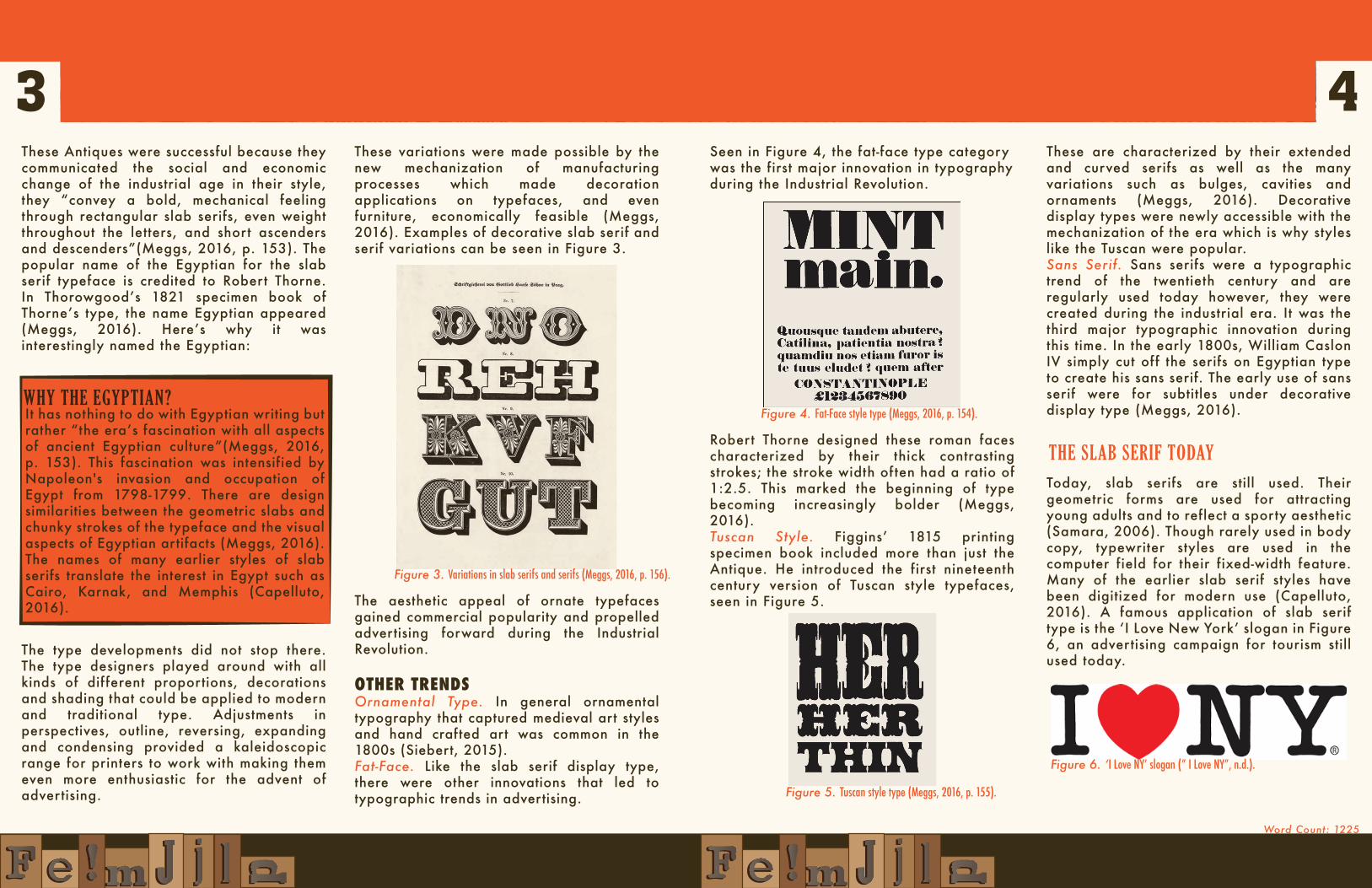
These variations were made possible by the new mechanization of manufacturing processes which made decoration applications on typefaces, and even furniture, economically feasible (Meggs, 2016). Examples of decorative slab serif and serif variations can be seen in Figure 3.
These are characterized by their extended and curved serifs as well as the many variations such as bulges, cavities and ornaments (Meggs, 2016). Decorative display types were newly accessible with the mechanization of the era which is why styles like the Tuscan were popular.Sans Serif. Sans serifs were a typographic trend of the twentieth century and are regularly used today however, they were created during the industrial era. It was the third major typographic innovation during this time. In the early 1800s, William Caslon IV simply cut off the serifs on Egyptian type to create his sans serif. The early use of sans serif were for subtitles under decorative display type (Meggs, 2016).
Today, slab serifs are still used. Their geometric forms are used for attracting young adults and to reflect a sporty aesthetic (Samara, 2006). Though rarely used in body copy, typewriter styles are used in the computer field for their fixed-width feature. Many of the earlier slab serif styles have been digitized for modern use (Capelluto, 2016). A famous application of slab serif type is the ʻI Love New Yorkʼ slogan in Figure 6, an advertising campaign for tourism still used today.
Seen in Figure 4, the fat-face type category was the first major innovation in typography during the Industrial Revolution.
Robert Thorne designed these roman faces characterized by their thick contrasting strokes; the stroke width often had a ratio of 1:2.5. This marked the beginning of type becoming increasingly bolder (Meggs, 2016). Tuscan Style. Figginsʼ 1815 printing specimen book included more than just the Antique. He introduced the first nineteenth century version of Tuscan style typefaces, seen in Figure 5. The aesthetic appeal of ornate typefaces
gained commercial popularity and propelled advertising forward during the Industrial Revolution.
OTHER TRENDSOrnamental Type. In general ornamental typography that captured medieval art styles and hand crafted art was common in the 1800s (Siebert, 2015).Fat-Face. Like the slab serif display type, there were other innovations that led to typographic trends in advertising.
The type developments did not stop there. The type designers played around with all kinds of different proportions, decorations and shading that could be applied to modern and traditional type. Adjustments in perspectives, outline, reversing, expanding and condensing provided a kaleidoscopic range for printers to work with making them even more enthusiastic for the advent of advertising.
It has nothing to do with Egyptian writing but rather “the eraʼs fascination with all aspects of ancient Egyptian culture”(Meggs, 2016, p. 153). This fascination was intensified by Napoleon's invasion and occupation of Egypt from 1798-1799. There are design similarities between the geometric slabs and chunky strokes of the typeface and the visual aspects of Egyptian artifacts (Meggs, 2016). The names of many earlier styles of slab serifs translate the interest in Egypt such as Cairo, Karnak, and Memphis (Capelluto, 2016).
WHY THE EGYPTIAN?
THE SLAB SERIF TODAY
Word Count: 1225
Figure 3. Variations in slab serifs and serifs (Meggs, 2016, p. 156).
Figure 4. Fat-Face style type (Meggs, 2016, p. 154).
Figure 5. Tuscan style type (Meggs, 2016, p. 155).
Figure 6. ʻI Love NYʼ slogan (” I Love NY”, n.d.).
1
Reference List
Archer, C. (2001).Typographic trendsetters: Each era in print has its own distinct typefaces, but
who sets the trends? Caroline Archer looks at some of the cutting-edge printers of the
past. PrintWeek 28. Business Insights: Global.
http://bi.gale.com.ezproxy.lib.ryerson.ca/global/article/GALE%7CA80234249?u=rpu_ma
in
British Fishmonger Store. Pinterest. Photograph.
https://www.pinterest.ca/pin/185210603403135522/.
Capelluto, J. (2016). The Industrial Revolution: The History of Slab-Serifs. [Scholarly Project].
https://issuu.com/literallyjuana/docs/project3_with_new_suggestions.
Chapman, C. (2020). A brief history of typeface and its online evolution. Newstex.
https://www-proquest-com.ezproxy.lib.ryerson.ca/docview/2405473576/E3A0F23B7653
4E72PQ/34?accountid=13631
Hardware Store Sold Weapons. (2015). The Vintage News. photograph.
https://www.thevintagenews.com/2015/12/21/41923/.
I Love New York . I Love NY. [Digital Image]. https://www.iloveny.com/.
Industrial Revolution Ads. (2013). New Design File. Photograph.
http://www.newdesignfile.com/post_industrial-revolution-graphic-design_283480/.
Industrial Revolution Font. (2009). New Design File. Photograph.
http://www.newdesignfile.com/post_serif-font-egyptian_284723/.
2
Meggs, P. B., & Purvis, A. W. (2016). Meggs' history of graphic design. ProQuest Ebook
Central https://ebookcentral-proquest-com.ezproxy.lib.ryerson.ca.
Samara, T. (2006). Type style finder: the busy designer's guide to choosing type. Rockport
Publishers.
http://courses.washington.edu/art166sp/documents/Spring2012/readings/week_5/TypeFin
der.pdf
Siebert, J. (2015, June 10). The Evolution of Typography: A Brief History. PRINT.
https://www.printmag.com/post/evolution-typography-history.
Slab Happy: Trilby Reviewed. PRINT. (2010, October 5).
https://www.printmag.com/post/slab-happy-trilby-reviewed.