Embed Size (px)
Citation preview
Logosprocessing, perception and association

What is a logo?
introduction
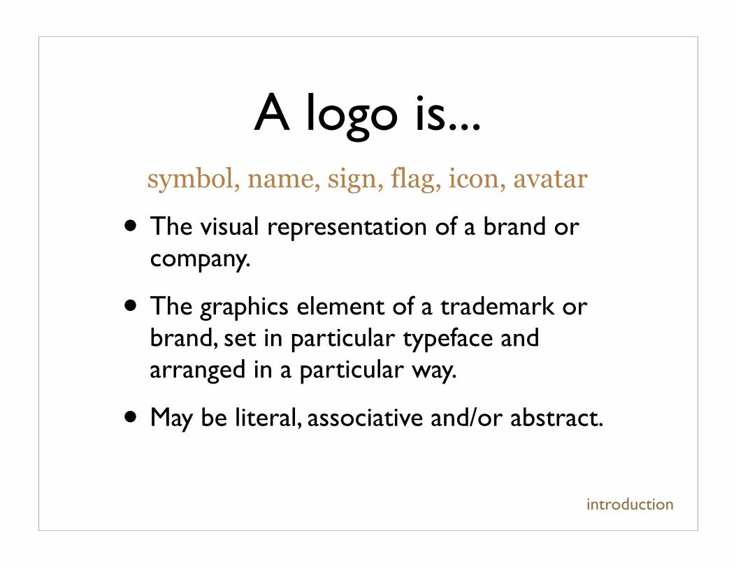
A logo is...
introduction
• The visual representation of a brand or company.
• The graphics element of a trademark or brand, set in particular typeface and arranged in a particular way.
• May be literal, associative and/or abstract.
symbol, name, sign, flag, icon, avatar
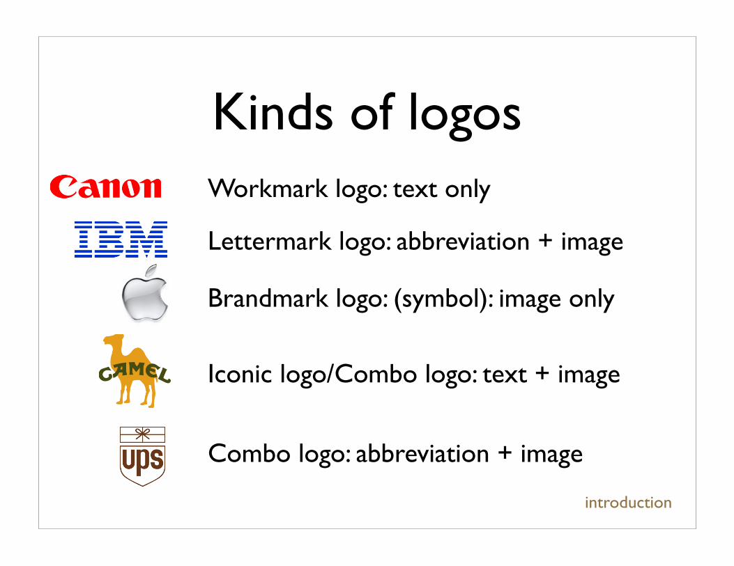
Kinds of logos
Iconic logo/Combo logo: text + image
Workmark logo: text only
Combo logo: abbreviation + image
Lettermark logo: abbreviation + image
Brandmark logo: (symbol): image only
introduction
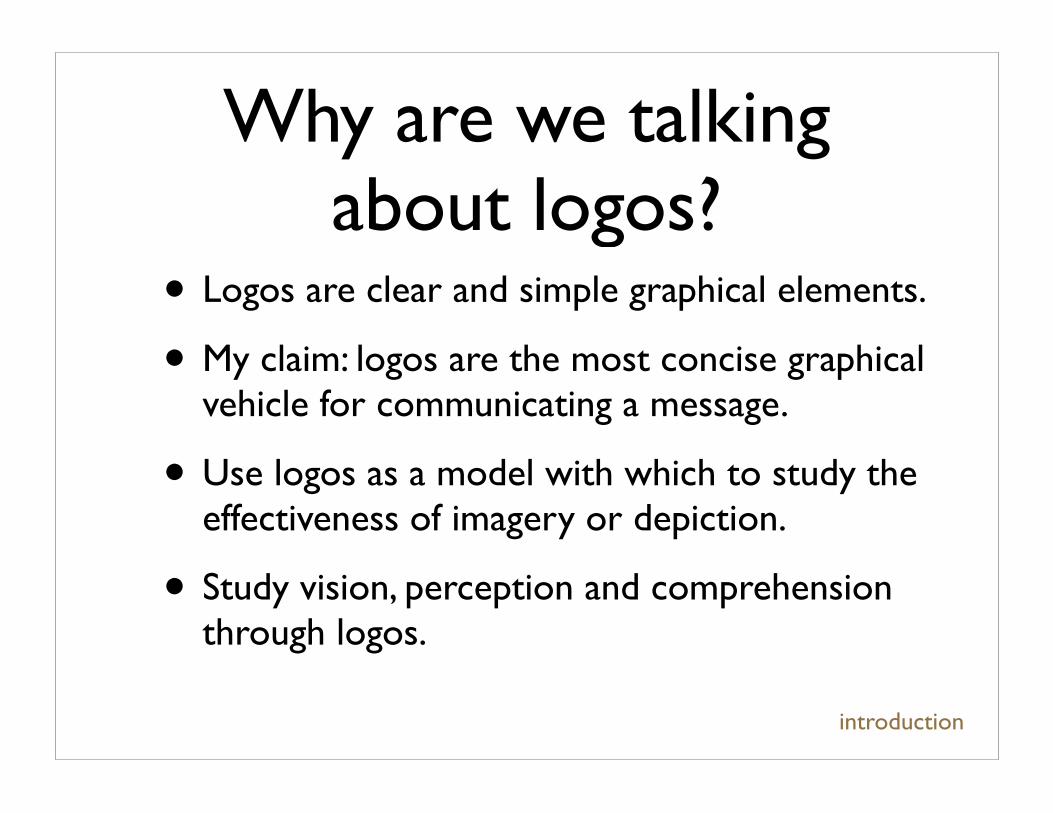
Why are we talking about logos?
• Logos are clear and simple graphical elements.
• My claim: logos are the most concise graphical vehicle for communicating a message.
• Use logos as a model with which to study the effectiveness of imagery or depiction.
• Study vision, perception and comprehension through logos.
introduction
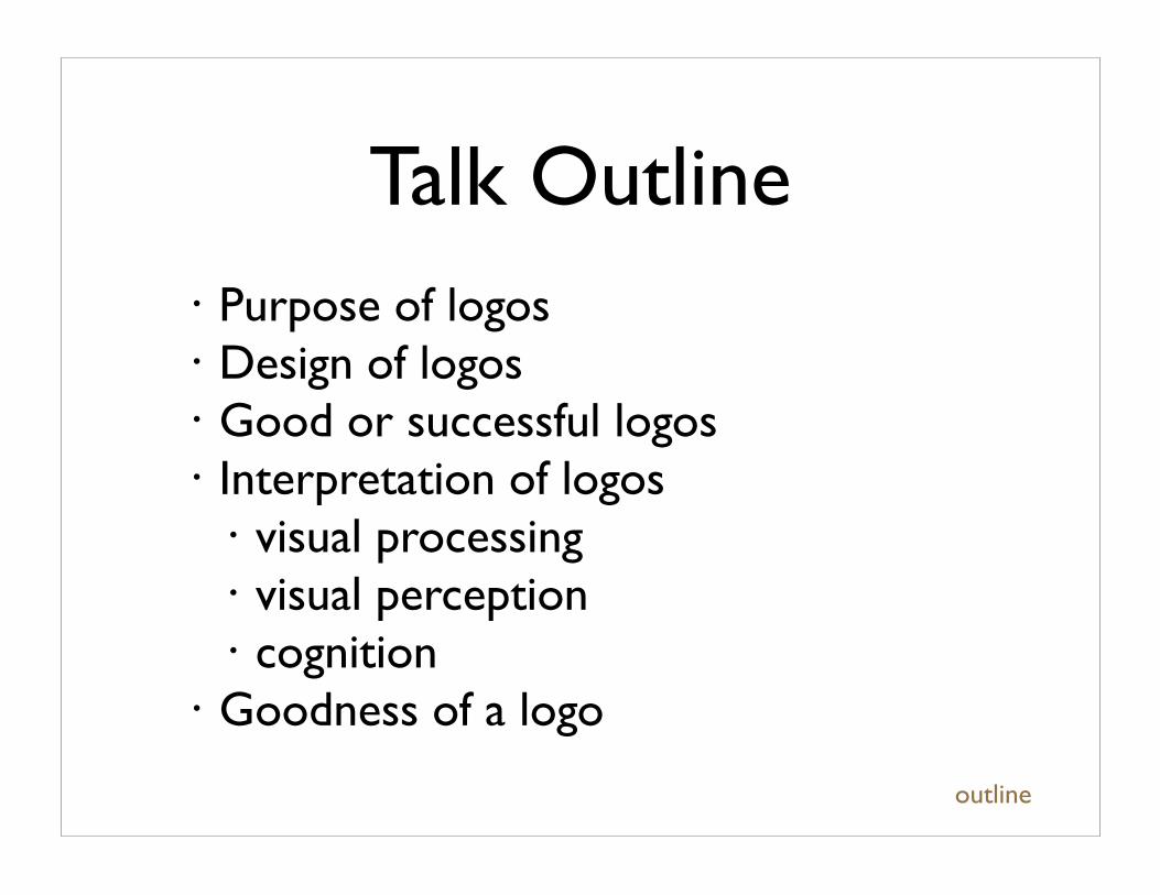
Talk Outline• Purpose of logos• Design of logos• Good or successful logos• Interpretation of logos
• visual processing• visual perception• cognition
• Goodness of a logo
outline
Talk Sources
outline
Paul Rand Design, Form and Chaos
Margaret Livingstone Vision and Art: The Biology of Seeing
Richard Zakia Perception and Imaging
http://www.goodlogo.com
http://en.wikipedia.org/wiki/
Purpose of logos
purpose of logos
“The principle role of a logo is to identify, and simplicity is its means.”
- Paul Rand, DF&C
Purpose of logos
What a logo is and does [selected from DF&C]• A logo does not sell (directly), it identifies.
• A logo is rarely a description of a business.
• A logo derives its meaning from the quality of the thing it symbolizes, not the other way around.
purpose of logos
“The principle role of a logo is to identify, and simplicity is its means.”
- Paul Rand, DF&C
The design of logos
• The general theory of design holds for logo design.
• Designers understand how to exploit traits of our visual and perceptual processes and our cognition of imagery.
design of logos
The design of logos
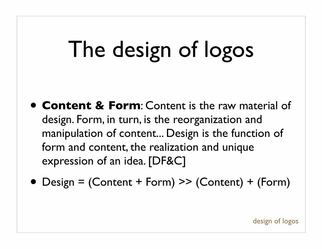
• Content & Form: Content is the raw material of design. Form, in turn, is the reorganization and manipulation of content... Design is the function of form and content, the realization and unique expression of an idea. [DF&C]
• Design = (Content + Form) >> (Content) + (Form)
design of logos
The design of logos
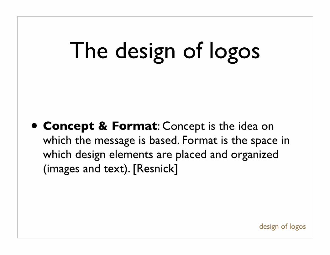
• Concept & Format: Concept is the idea on which the message is based. Format is the space in which design elements are placed and organized (images and text). [Resnick]
design of logos
The design of logos
design of logos
“To design is much more than simply to assemble, to order, or even to edit; it is to add value and meaning,
to illuminate, to simplify, to clarify, to modify, to dignify, to dramatize, to persuade, and perhaps even to amuse [...] Design broadens perception, magnifies
experience, and enhances vision. Design is the product of feeling and awareness, or ideas that
originate in the mind of the designer and culminate, one hopes, in the mind of the spectator.”
- Paul Rand, DF&C
The design of logos
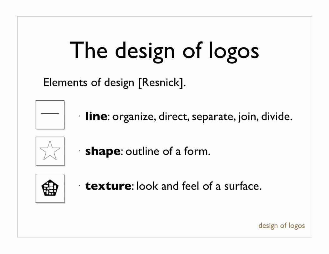
• line: organize, direct, separate, join, divide.
• shape: outline of a form.
• texture: look and feel of a surface.
design of logos
Elements of design [Resnick].
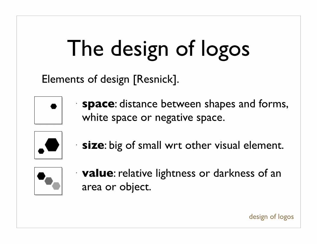
The design of logos
• space: distance between shapes and forms, white space or negative space.
• size: big of small wrt other visual element.
• value: relative lightness or darkness of an area or object.
design of logos
Elements of design [Resnick].
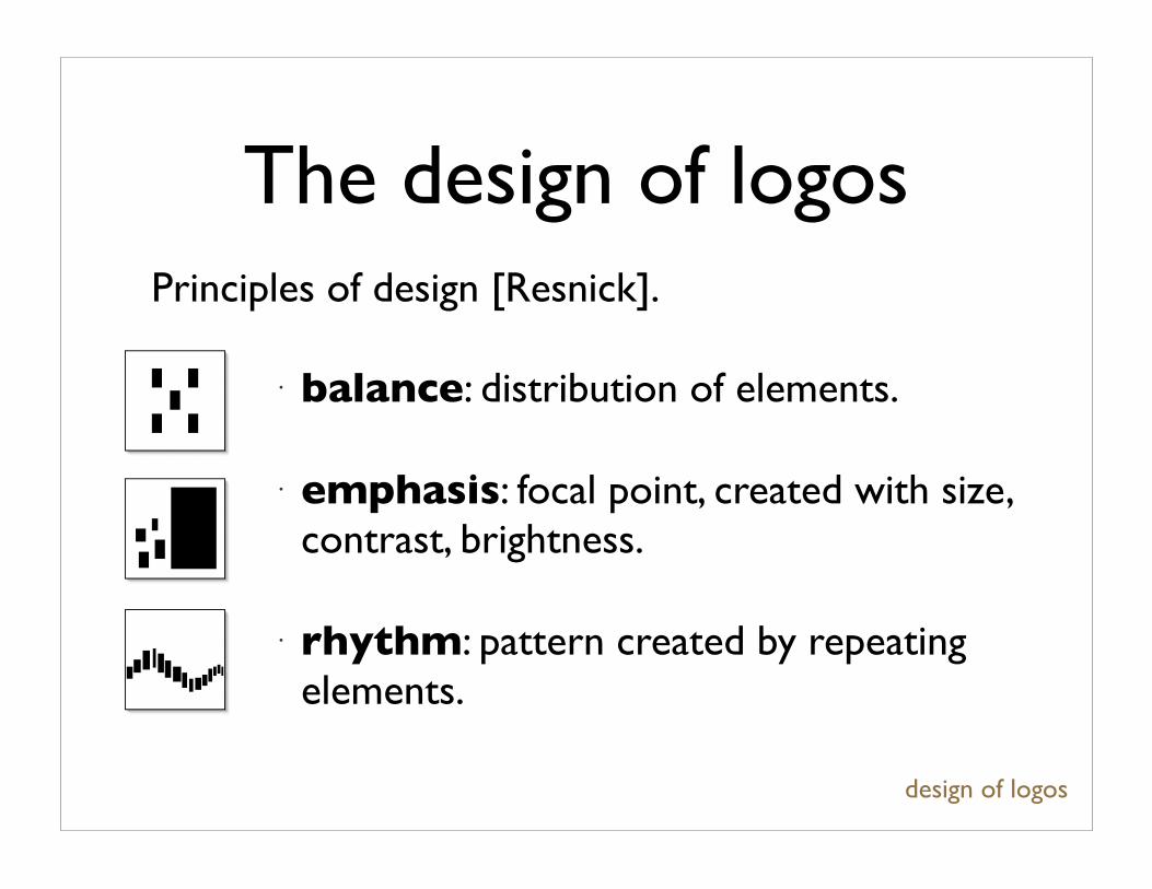
The design of logos
• balance: distribution of elements.
• emphasis: focal point, created with size, contrast, brightness.
• rhythm: pattern created by repeating elements.
design of logos
Principles of design [Resnick].
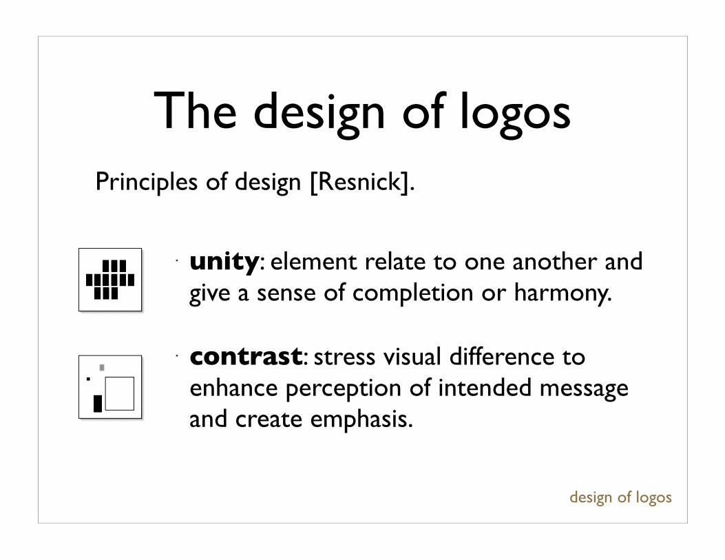
The design of logos
• unity: element relate to one another and give a sense of completion or harmony.
• contrast: stress visual difference to enhance perception of intended message and create emphasis.
design of logos
Principles of design [Resnick].

The design of logos
• These principles hold for the design of logos.
• Additional restrictions on logos: spatial restrictions, less repetition and patterns, no spatial interpolation of colour.
• Require clarity and simplicity.
• Almost always work by contrast of light and dark.
• Almost always one figure (the logo) and the ground.
design of logos
Good logos
good logos
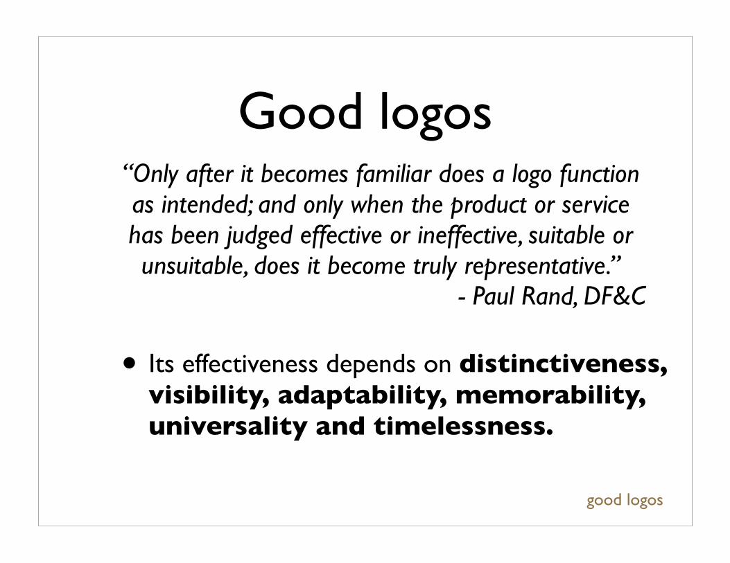
“Only after it becomes familiar does a logo function as intended; and only when the product or service has been judged effective or ineffective, suitable or unsuitable, does it become truly representative.”
- Paul Rand, DF&C
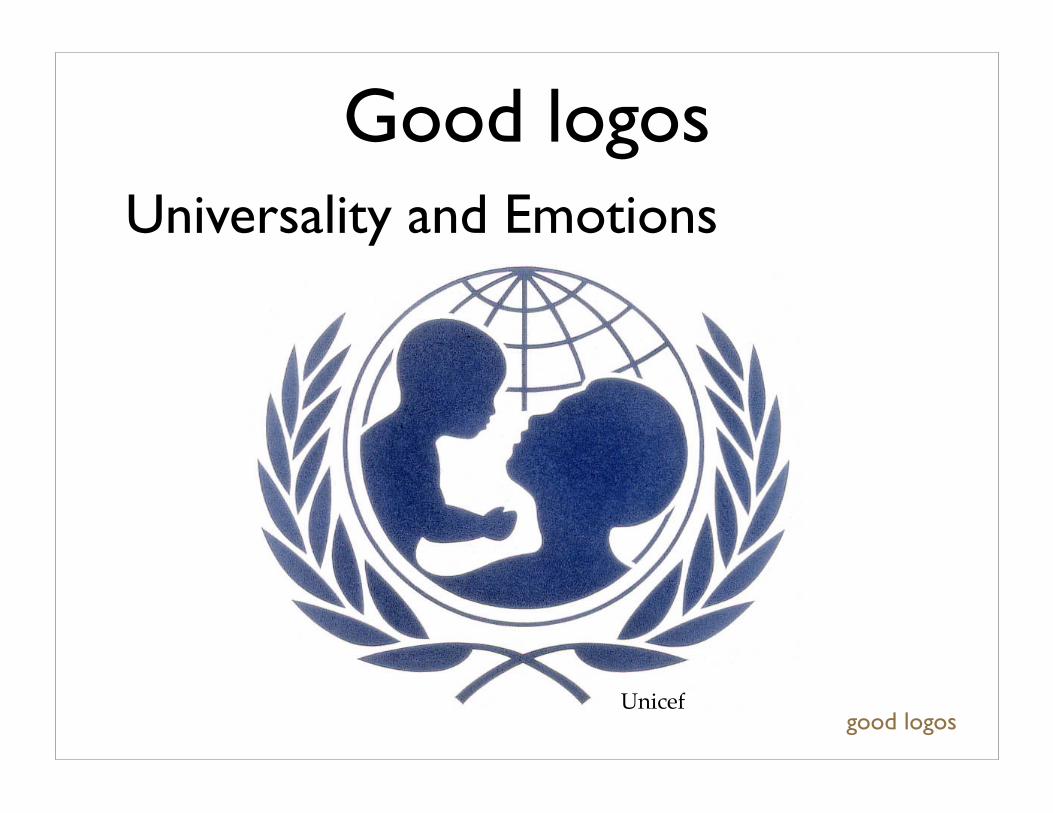
• Its effectiveness depends on distinctiveness, visibility, adaptability, memorability, universality and timelessness.
good logos
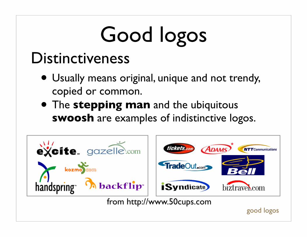
Good logosDistinctiveness
from http://www.50cups.com
• Usually means original, unique and not trendy, copied or common.
• The stepping man and the ubiquitous swoosh are examples of indistinctive logos.
good logos
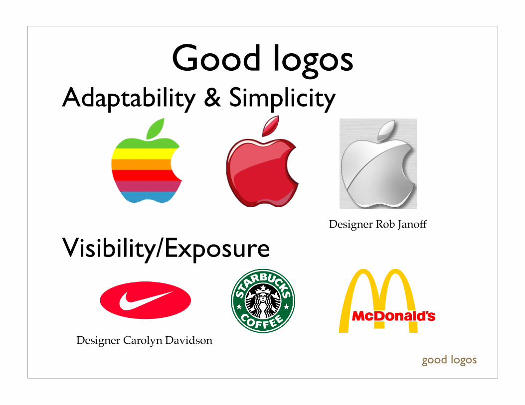
Adaptability & SimplicityGood logos
Visibility/ExposureDesigner Rob Janoff
Designer Carolyn Davidson
good logos
Good logos
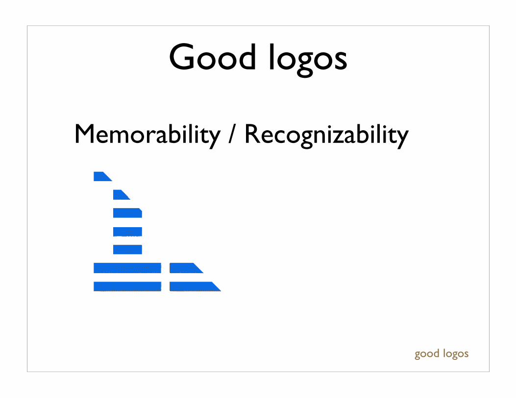
Memorability / Recognizability
good logos
Good logos
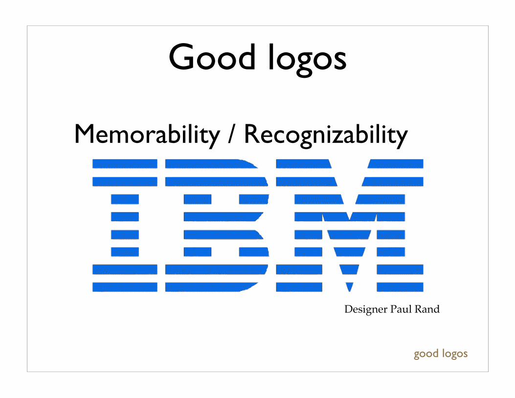
Memorability / Recognizability
Designer Paul Rand
good logos
Good logosUniversality and Emotions
Unicef
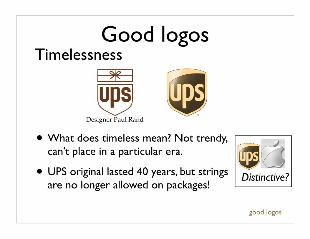
• What does timeless mean? Not trendy, can’t place in a particular era.
• UPS original lasted 40 years, but strings are no longer allowed on packages!
good logos
TimelessnessGood logos
Distinctive?
Designer Paul Rand
Good logos
• These characteristics work on many different levels. Some are purely visual, others perceptual and others are cognitive.
• To understand how a designer makes a good logo, we can consider how a person interprets a logo, and how a designer exploits different aspects of this interpretive process.
good logos
Good logos
• Paul Rand splits the judgement of design (the result of the interpretive process) in two: 1. intrinsic: beauty, acuity, sensitivity 2. extrinsic: symbolic, subjective, opinion
• We’ll break the process of logo interpretation into: visual processing, visual perception, and cognition.
good logos
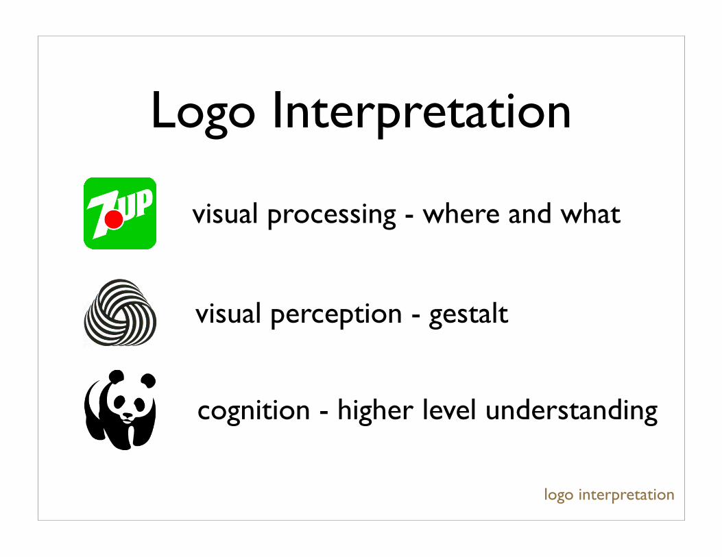
Logo Interpretation
logo interpretation
cognition - higher level understanding
visual perception - gestalt
visual processing - where and what
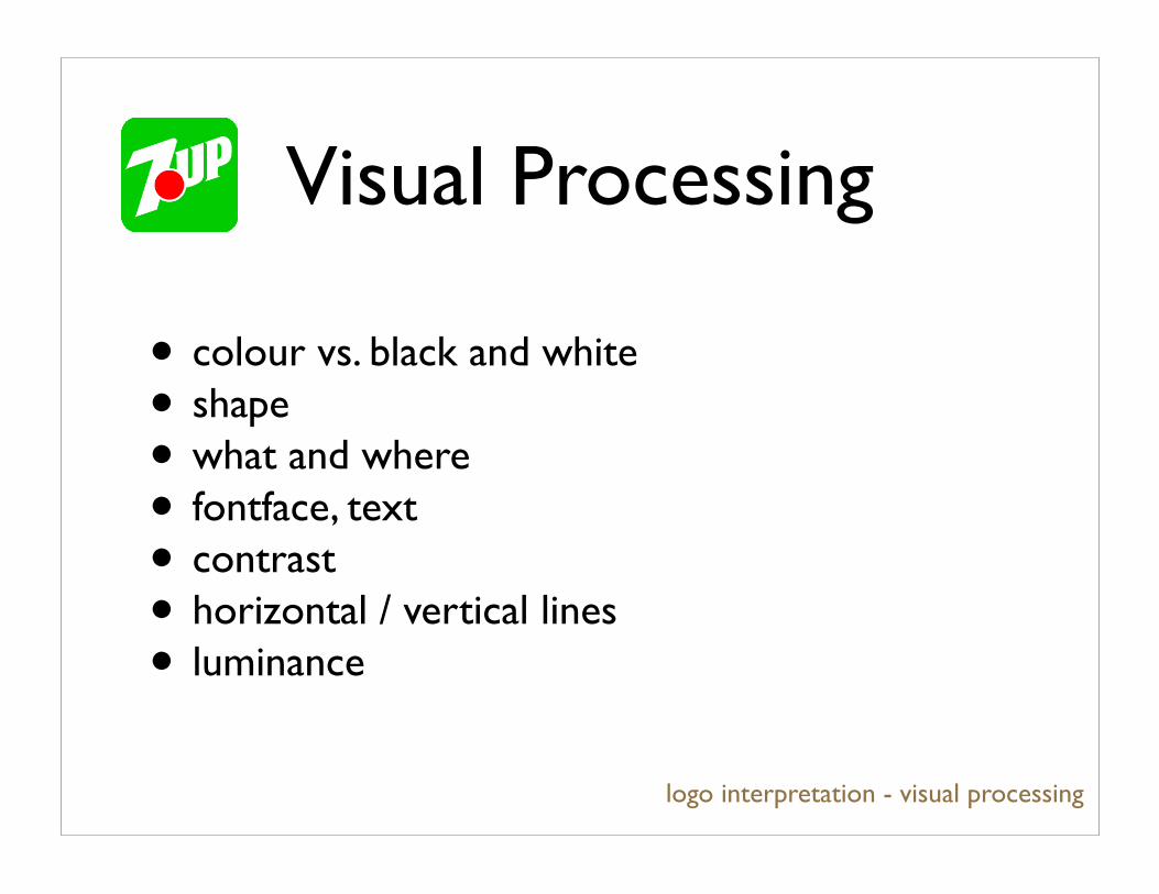
Visual Processing
logo interpretation - visual processing
• colour vs. black and white
• shape
• what and where
• fontface, text
• contrast
• horizontal / vertical lines
• luminance
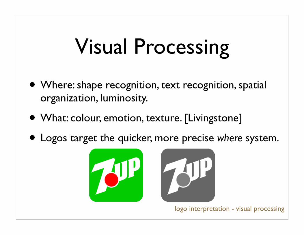
Visual Processing
logo interpretation - visual processing
• Where: shape recognition, text recognition, spatial organization, luminosity.
• What: colour, emotion, texture. [Livingstone]
• Logos target the quicker, more precise where system.
Visual Processing
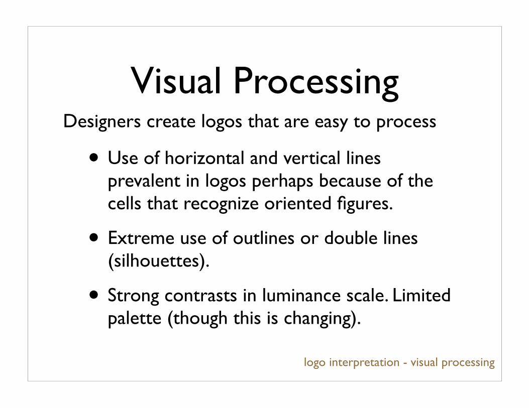
• Use of horizontal and vertical lines prevalent in logos perhaps because of the cells that recognize oriented figures.
• Extreme use of outlines or double lines (silhouettes).
• Strong contrasts in luminance scale. Limited palette (though this is changing).
logo interpretation - visual processing
Designers create logos that are easy to process
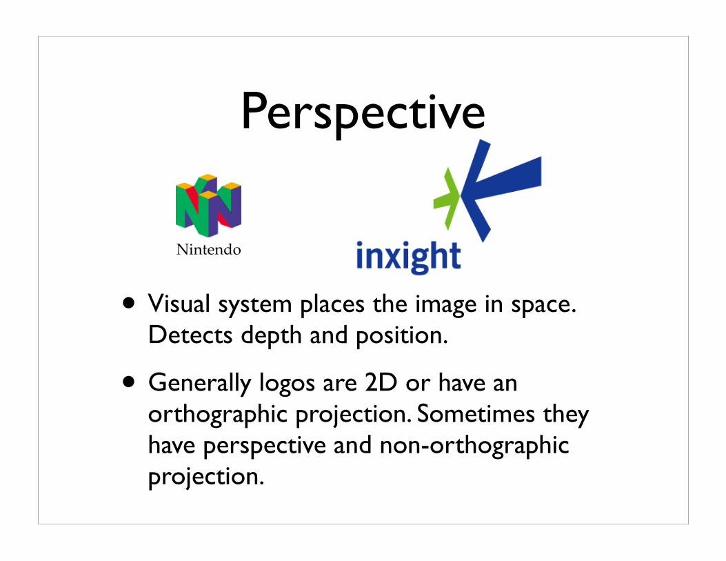
Perspective
• Visual system places the image in space. Detects depth and position.
• Generally logos are 2D or have an orthographic projection. Sometimes they have perspective and non-orthographic projection.
Nintendo
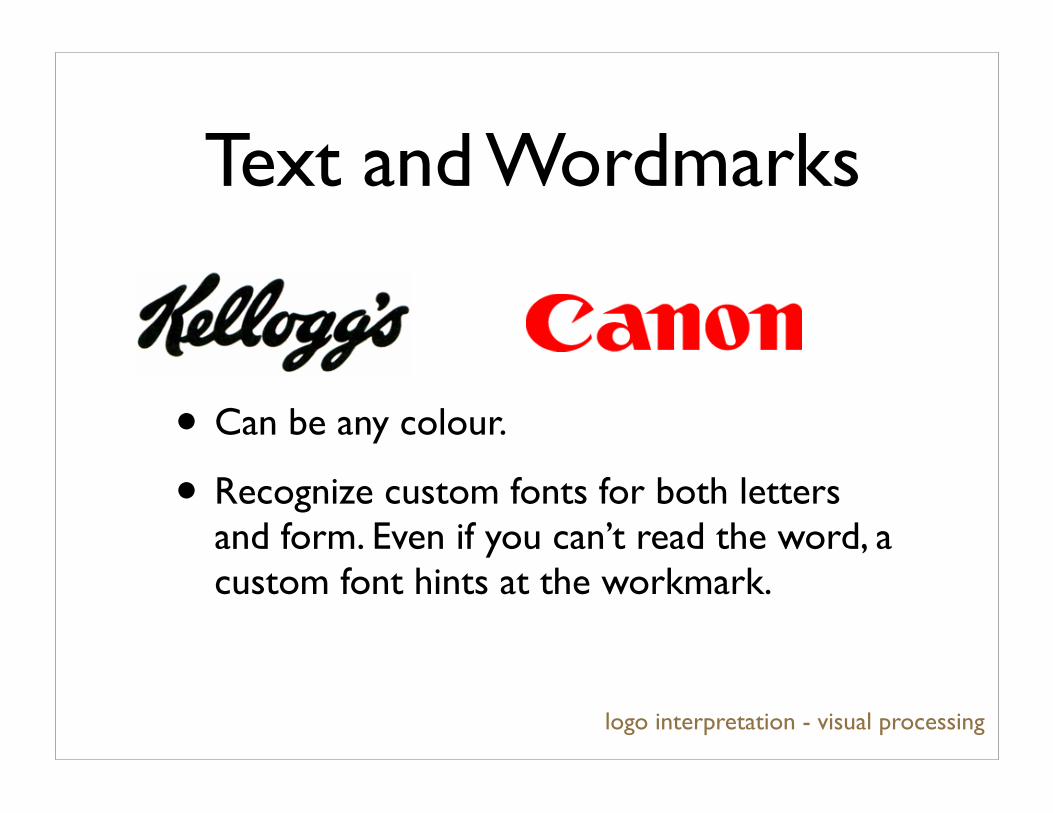
Text and Wordmarks
• Can be any colour.
• Recognize custom fonts for both letters and form. Even if you can’t read the word, a custom font hints at the workmark.
logo interpretation - visual processing

Colour space
logo interpretation - visual processing
• Use contrasting luminance to display image.
• In logos, colour is used to evoke emotion, nuance or memory.
• Logos have to adapt to luminance display.
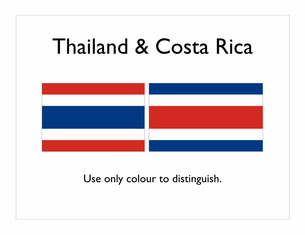
Thailand & Costa Rica
Use only colour to distinguish.
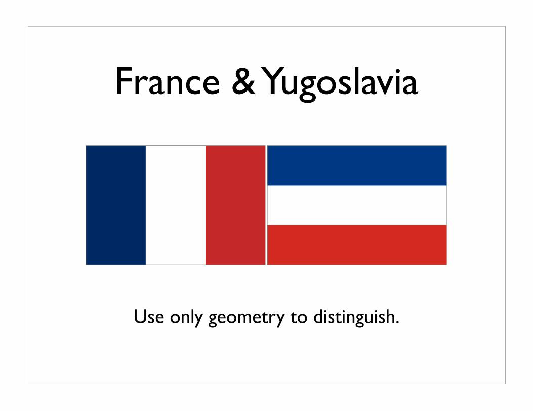
France & Yugoslavia
Use only geometry to distinguish.
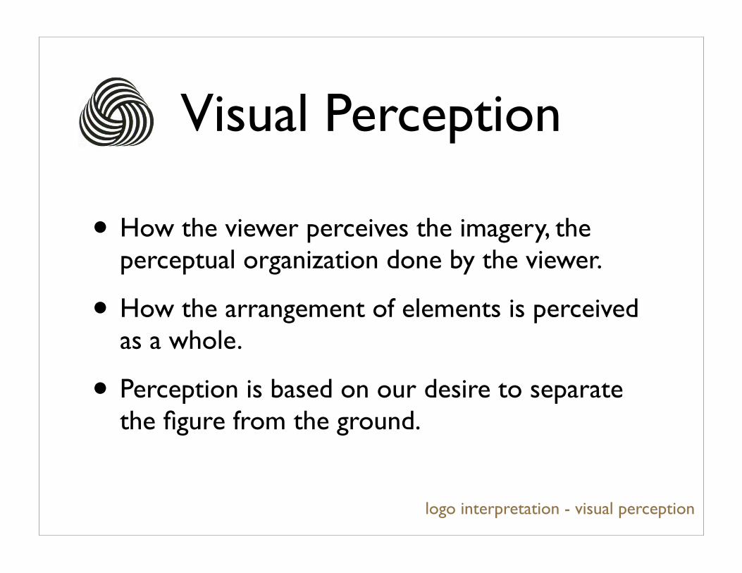
Visual Perception
logo interpretation - visual perception
• How the viewer perceives the imagery, the perceptual organization done by the viewer.
• How the arrangement of elements is perceived as a whole.
• Perception is based on our desire to separate the figure from the ground.
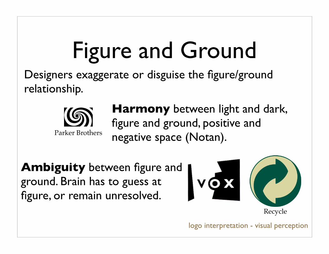
Figure and Ground
logo interpretation - visual perception
Ambiguity between figure and ground. Brain has to guess at figure, or remain unresolved.
Parker Brothers
Recycle
Harmony between light and dark, figure and ground, positive and negative space (Notan).
Designers exaggerate or disguise the figure/ground relationship.
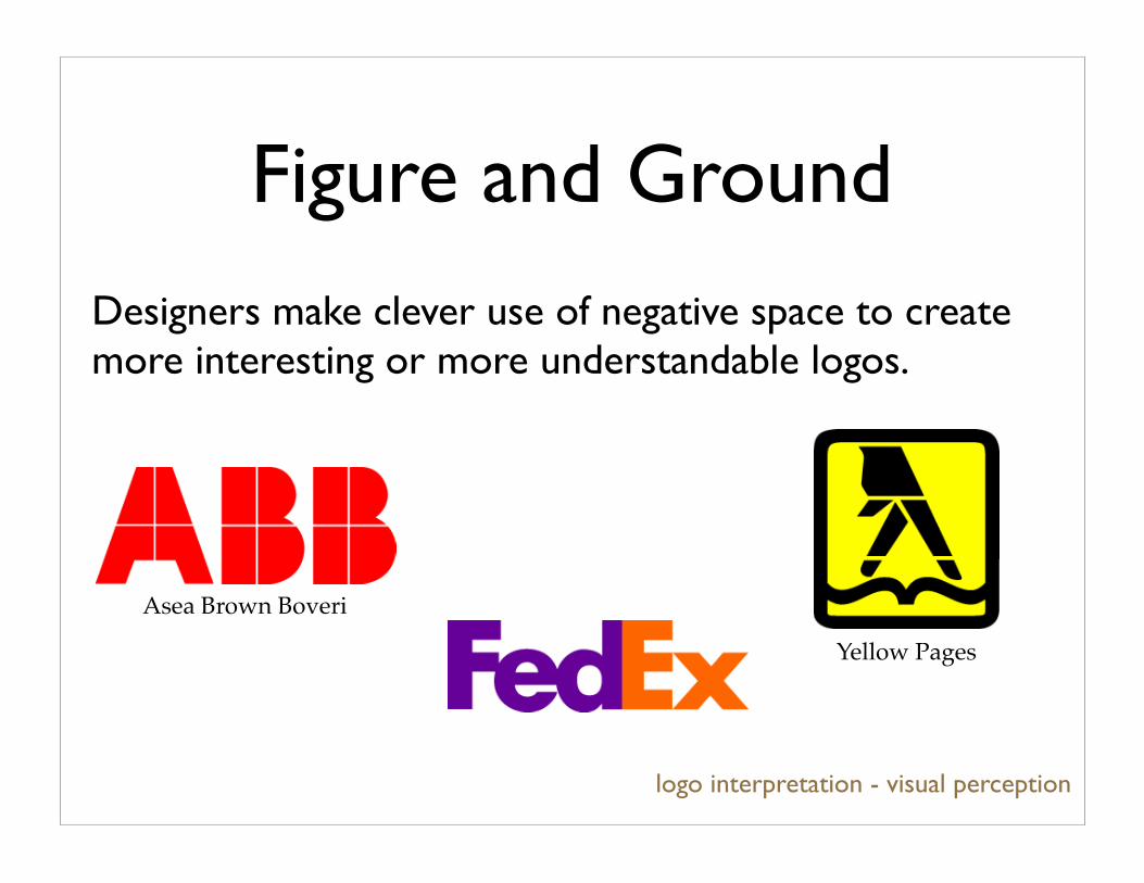
Figure and Ground
logo interpretation - visual perception
Yellow Pages
Designers make clever use of negative space to create more interesting or more understandable logos.
Asea Brown Boveri
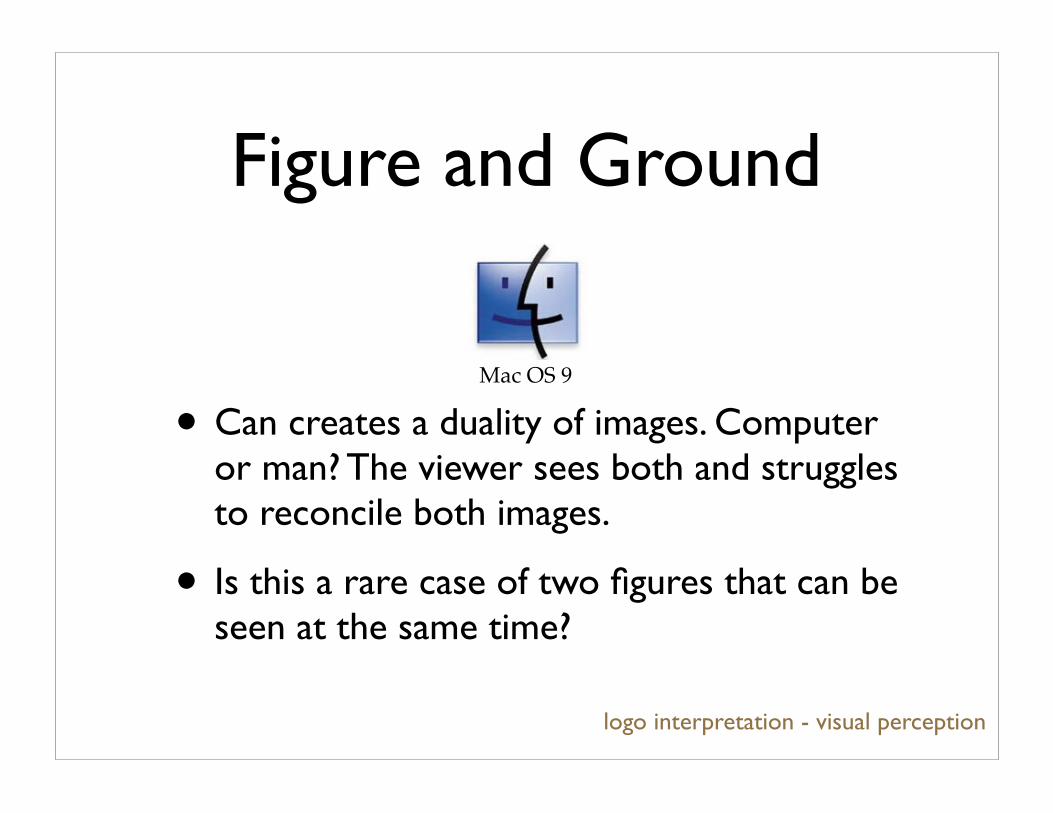
• Can creates a duality of images. Computer or man? The viewer sees both and struggles to reconcile both images.
• Is this a rare case of two figures that can be seen at the same time?
Mac OS 9
logo interpretation - visual perception
Figure and Ground
Gestalt
logo interpretation - visual perception
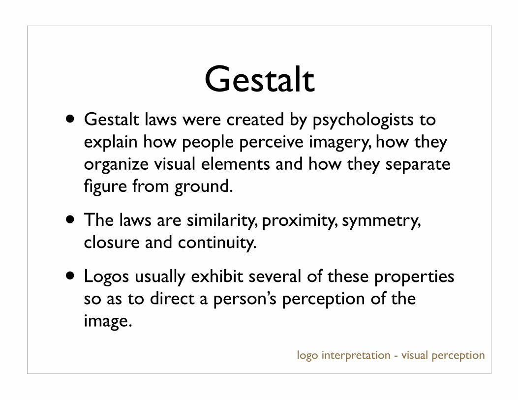
• Gestalt laws were created by psychologists to explain how people perceive imagery, how they organize visual elements and how they separate figure from ground.
• The laws are similarity, proximity, symmetry, closure and continuity.
• Logos usually exhibit several of these properties so as to direct a person’s perception of the image.

Similarity
• Similar elements can be grouped together to be perceived as either figure or as ground.
• Similarity creates a redundancy and predictability of visual information.
logo interpretation - visual perception
NBC
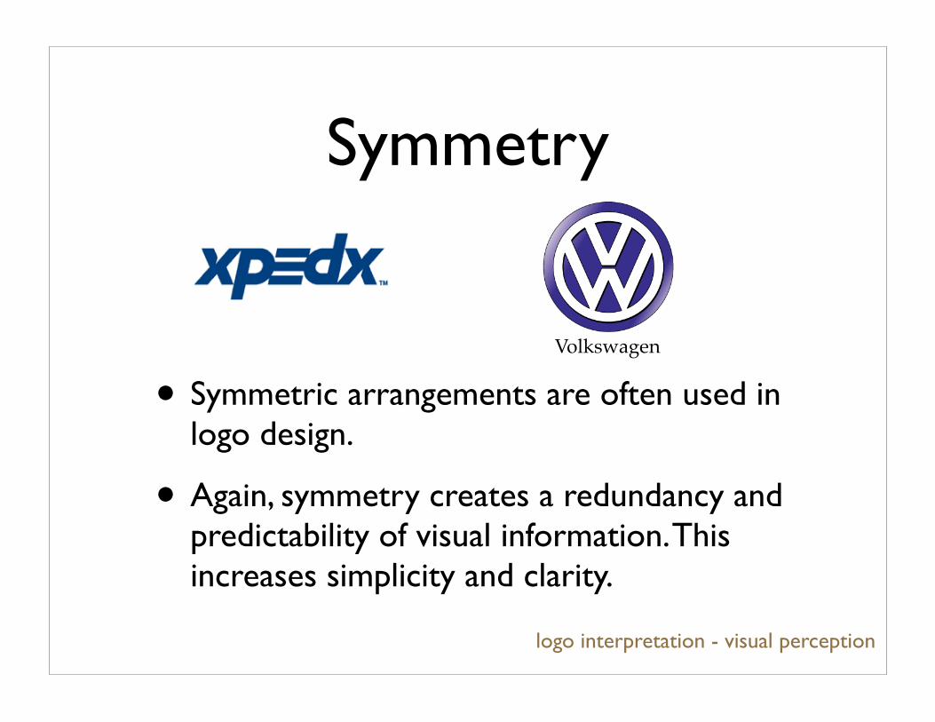
Symmetry
• Symmetric arrangements are often used in logo design.
• Again, symmetry creates a redundancy and predictability of visual information. This increases simplicity and clarity.
logo interpretation - visual perception
Volkswagen
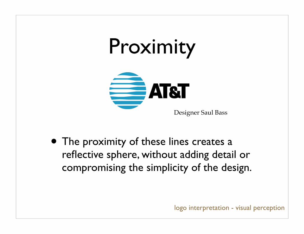
Proximity
• The proximity of these lines creates a reflective sphere, without adding detail or compromising the simplicity of the design.
logo interpretation - visual perception
Designer Saul Bass

Continuity
• Paths, directions and shapes are more easily perceived as being continuous.
• Continuity can direct viewer’s visual path over imagery. The Northwest circle leads us from the ‘N’ to the ‘W’. The Fuji film logo keeps us looping.
logo interpretation - visual perception
Northwest Airlines Fuji Film
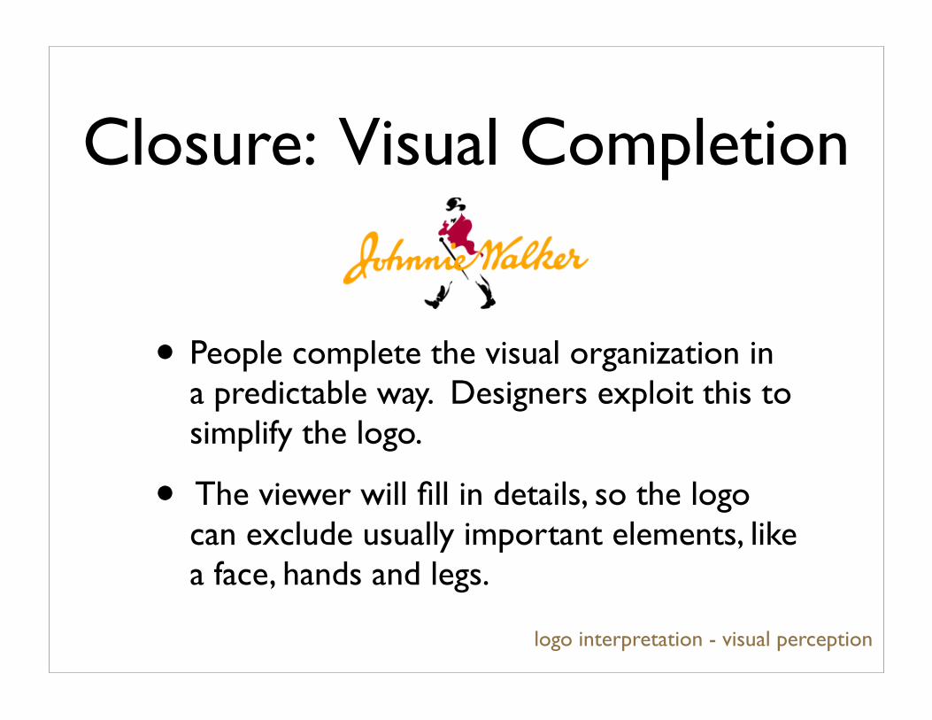
• People complete the visual organization in a predictable way. Designers exploit this to simplify the logo.
• The viewer will fill in details, so the logo can exclude usually important elements, like a face, hands and legs.
logo interpretation - visual perception
Closure: Visual Completion

Similarity and Proximity
• People complete the word before reading all of the letters. The proximity of similar letters create a well known pattern.
• Designers have to consider this so that they can avoid people making mistakes when they interpret a logo.
logo interpretation - visual perception
NEXT EXIT
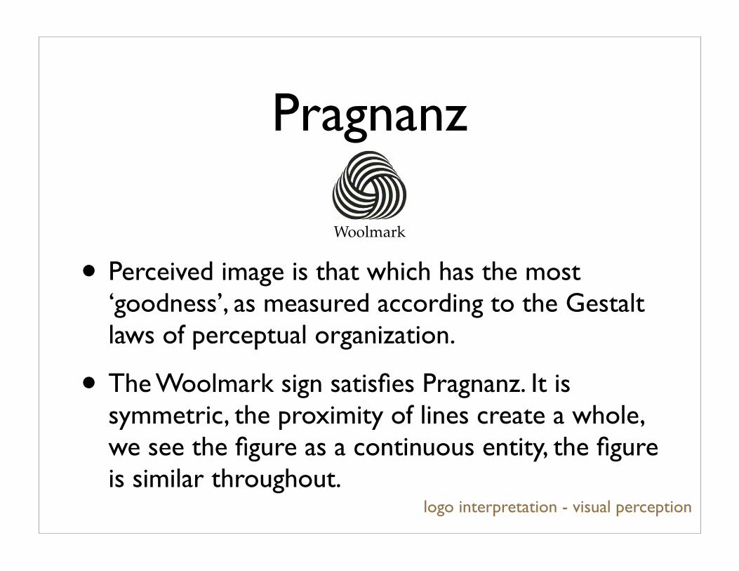
Pragnanz
• Perceived image is that which has the most ‘goodness’, as measured according to the Gestalt laws of perceptual organization.
• The Woolmark sign satisfies Pragnanz. It is symmetric, the proximity of lines create a whole, we see the figure as a continuous entity, the figure is similar throughout.
logo interpretation - visual perception
Woolmark
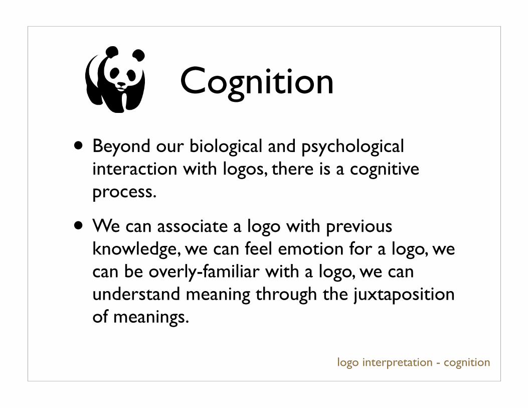
Cognition
logo interpretation - cognition
• Beyond our biological and psychological interaction with logos, there is a cognitive process.
• We can associate a logo with previous knowledge, we can feel emotion for a logo, we can be overly-familiar with a logo, we can understand meaning through the juxtaposition of meanings.

Association
“A one to one relationship between a symbol and what is symbolized is very often impossible to
achieve and, under certain conditions, objectionable.”- Paul Rand, DF&C
logo interpretation - cognition

Association
World Wildlife Federation
Shell
Chanel
Non-literal relationshipsLogo associated with status, wealth and prestige of product and company.
Literal relationshipsLogos associated with work of the organization or associated with the name of the company.
logo interpretation - cognition
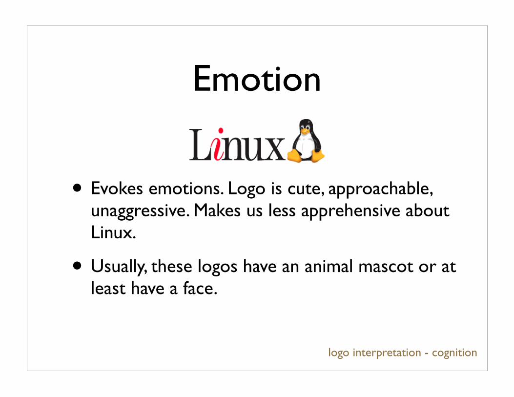
Emotion
• Evokes emotions. Logo is cute, approachable, unaggressive. Makes us less apprehensive about Linux.
• Usually, these logos have an animal mascot or at least have a face.
logo interpretation - cognition
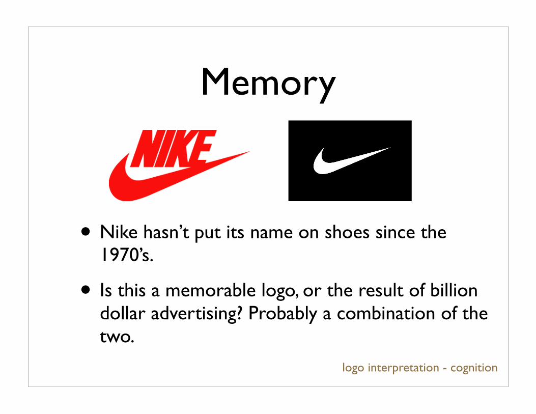
Memory
• Nike hasn’t put its name on shoes since the 1970’s.
• Is this a memorable logo, or the result of billion dollar advertising? Probably a combination of the two.
logo interpretation - cognition
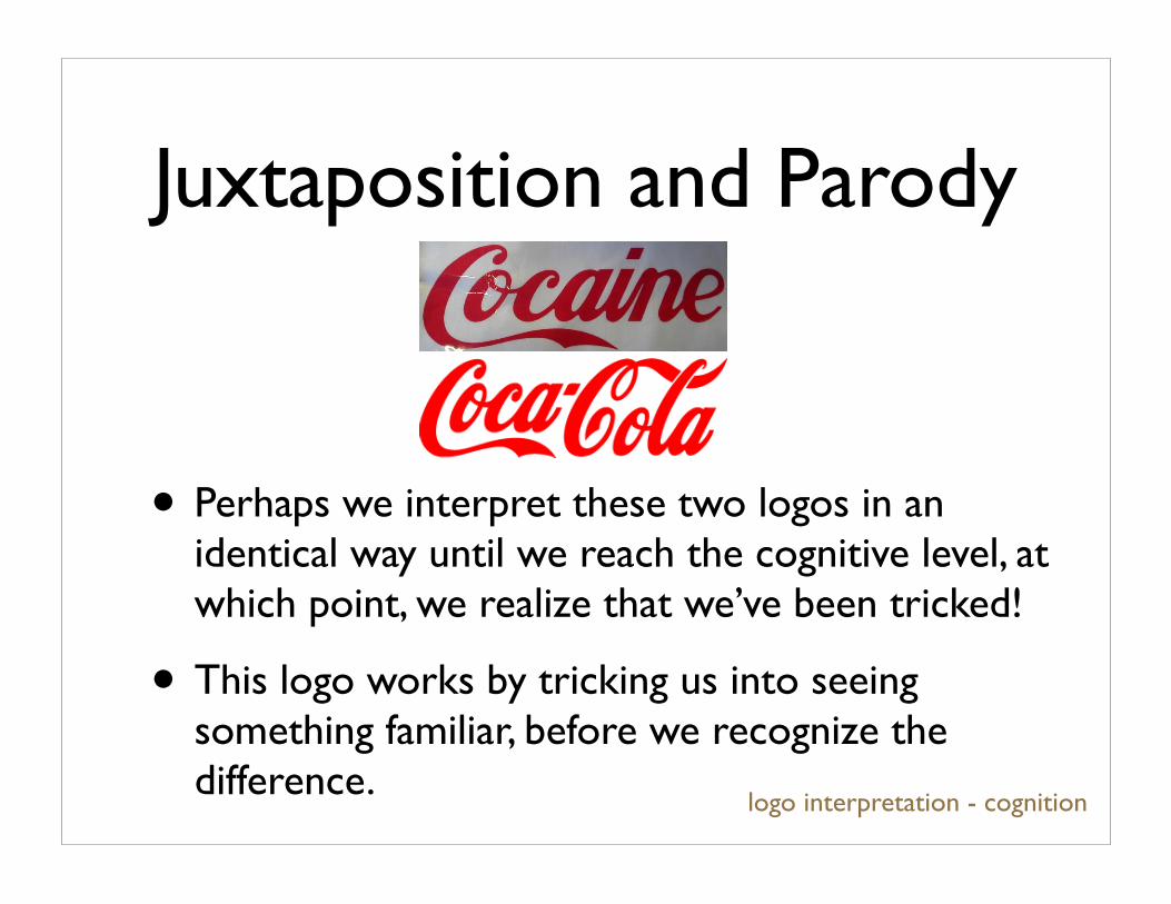
• Perhaps we interpret these two logos in an identical way until we reach the cognitive level, at which point, we realize that we’ve been tricked!
• This logo works by tricking us into seeing something familiar, before we recognize the difference.
logo interpretation - cognition
Juxtaposition and Parody
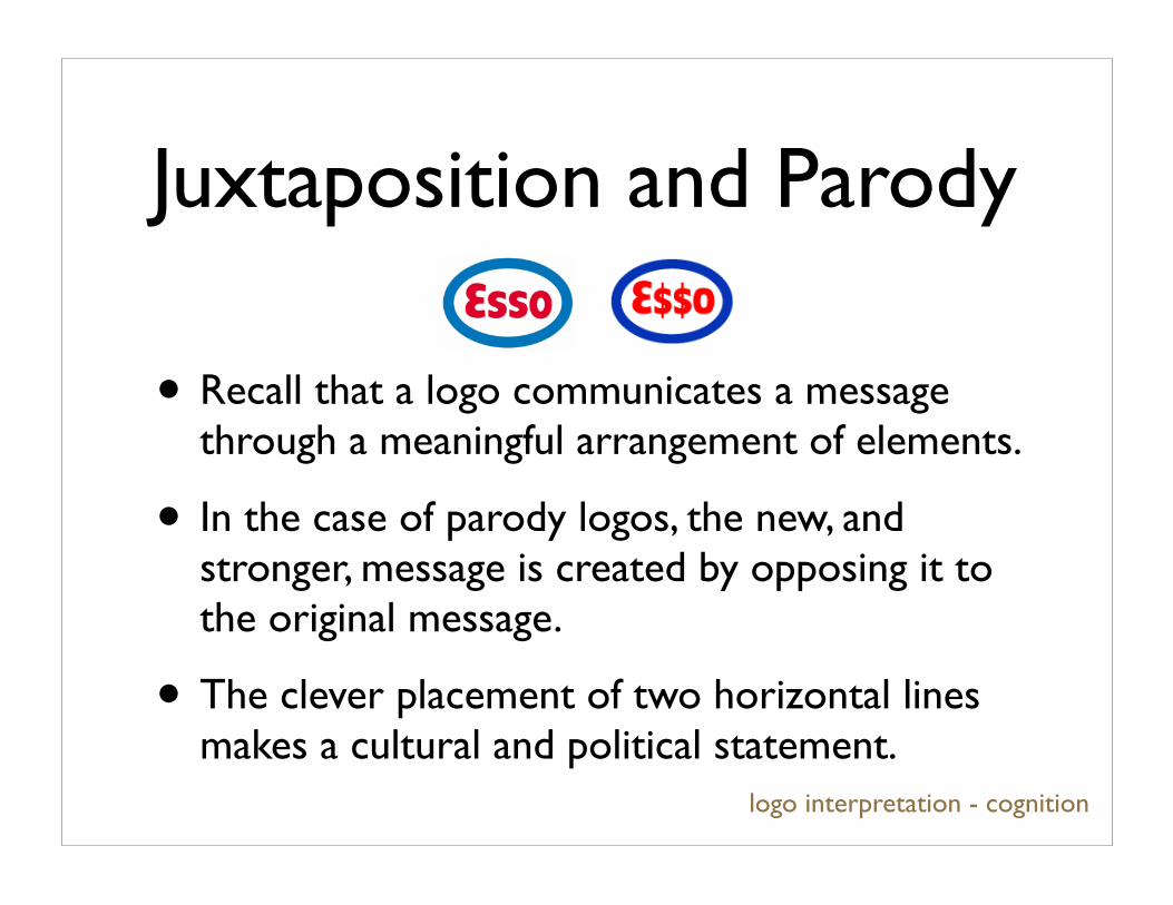
• Recall that a logo communicates a message through a meaningful arrangement of elements.
• In the case of parody logos, the new, and stronger, message is created by opposing it to the original message.
• The clever placement of two horizontal lines makes a cultural and political statement.
Juxtaposition and Parody
logo interpretation - cognition
Goodness of a logo
• So logo’s success works on three levels. Designers exploit biological processes, psychology and cognition to create successful imagery.
• Claim: this tells us that we can’t directly use the theory of pragnanz to measure the goodness of a logo.
logo goodness
Goodness of a logo• Apart from the associative and memory
level of logo interpretation, can we identify a good logo by the characteristics we have listed?
• And so, we return to Victor’s question about measuring the ‘goodness’ depiction.
• If we could do this for logos, which recall, we consider to be a model of more elaborate imagery, then should be able to extend to general depictions.
logo goodness
Goodness of a logo
• Is there existing technology to measure logo goodness?
• Market research (designers don’t think much of this).
• Logo recognition... which is much more like shape matching.
logo goodness

Conclusion
• We have considered the logo as a model of imagery.
• We have identified aspects of logos, particularly successful logos, and how where these aspects fall in the process of logo interpretation.
• We have reviewed visual processing and perception through logo interpretation.
conclusion
Conclusion
• Logos are an excellent model with which to understand design, depiction and people’s interpretation of imagery.
• Open question #1: Can we measure logo goodness in a scaleable fashion that can be extended to general imagery?
• Open question #2: Would we want to?
conclusion
References
• Design, Form and Chaos. Paul Rand.
• Design for Communication. Resnick.
• Perception and Imaging. Richard D. Zakia.
• Art for Computer Graphicists. Course notes for Siggraph 1998.
references
References• A few logo designers: Paul Rand, Saul Bass, Milton Glaser,
Art Chantry, Rob Janoff
• All logos, with few exception, are taken from http://www.goodlogo.com.
• Other logos were found with google’s image search.
• Definitions from http://en.wikipedia.org/wiki/.
• http://www.50cups.com/swoosh/
• http://www.e-normicom.com
• http://www.logo-mojo.com
• http://www.aiga.org
references