Embed Size (px)
Citation preview
Logo usage guidelines
OCT_2005_V1
Contents
Introduction ............................................................................... 3
Logo use – corporate ........................................................... 4
Logo use – marketing ......................................................... 5
Supporting straplines .......................................................... 6
Clear space and minimum space ................................. 7
Incorrect usage ........................................................................ 8
Colours .......................................................................................... 9
Corporate typefaces ........................................................... 10
Printed support material .................................................. 11
Online support material ..................................................... 12
Stationery ................................................................................... 13
Word conventions ................................................................. 14
Contact details ........................................................................ 15
Ebuyers know value when they see it. And the Ebuyer identity plays a huge role in promoting this image in the marketplace.
A friendly and customer-focused brand, Ebuyer is synonymous with these qualities, and this must be reflected wherever the name appears.
These guidelines have been produced to ensure the Ebuyer message is delivered to customers, and potential customers, in a correct and consistent manner every time.
Introduction
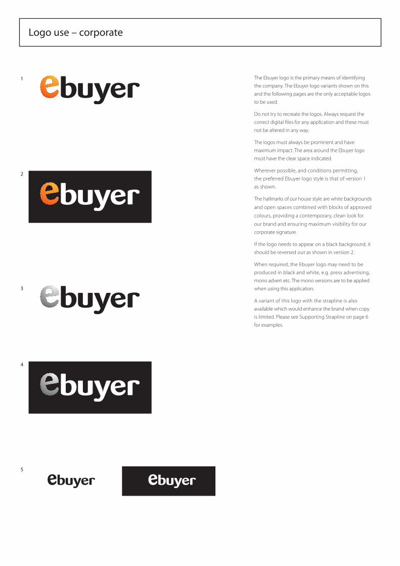
Logo use – corporate
The Ebuyer logo is the primary means of identifying
the company. The Ebuyer logo variants shown on this
and the following pages are the only acceptable logos
to be used.
Do not try to recreate the logos. Always request the
correct digital files for any application and these must
not be altered in any way.
The logos must always be prominent and have
maximum impact. The area around the Ebuyer logo
must have the clear space indicated.
Wherever possible, and conditions permitting,
the preferred Ebuyer logo style is that of version 1
as shown.
The hallmarks of our house style are white backgrounds
and open spaces combined with blocks of approved
colours, providing a contemporary, clean look for
our brand and ensuring maximum visibility for our
corporate signature.
If the logo needs to appear on a black background, it
should be reversed out as shown in version 2.
When required, the Ebuyer logo may need to be
produced in black and white, e.g. press advertising,
mono advert etc. The mono versions are to be applied
when using this application.
A variant of this logo with the strapline is also
available which would enhance the brand when copy
is limited. Please see Supporting Strapline on page 6
for examples.
1
2
3
4
5
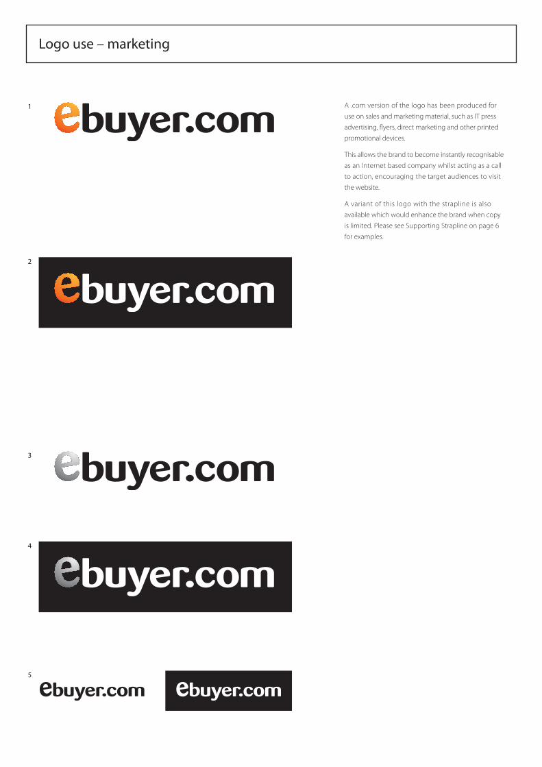
Logo use – marketing
A .com version of the logo has been produced for
use on sales and marketing material, such as IT press
advertising, flyers, direct marketing and other printed
promotional devices.
This allows the brand to become instantly recognisable
as an Internet based company whilst acting as a call
to action, encouraging the target audiences to visit
the website.
A variant of this logo with the strapline is also
available which would enhance the brand when copy
is limited. Please see Supporting Strapline on page 6
for examples.
1
2
3
4
5
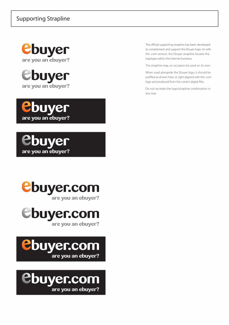
Supporting Strapline
The official supporting strapline has been developed
to complement and support the Ebuyer logo. As with
the .com version, the Ebuyer strapline locates the
logotype within the Internet business.
The strapline may, on occasion be used on its own.
When used alongside the Ebuyer logo, it should be
justified as shown here, or right aligned with the .com
logo and produced from the correct digital files.
Do not recreate the logo/strapline combination in
any way.
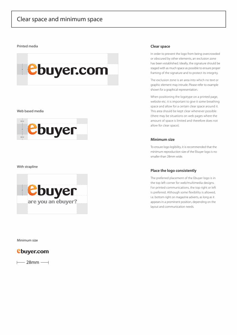
Clear space and minimum space
x
Clear space
In order to prevent the logo from being overcrowded
or obscured by other elements, an exclusion zone
has been established. Ideally, the signature should be
staged with as much space as possible to ensure proper
framing of the signature and to protect its integrity.
The exclusion zone is an area into which no text or
graphic element may intrude. Please refer to example
shown for a graphical representation.
When positioning the logotype on a printed page,
website etc. it is important to give it some breathing
space and allow for a certain clear space around it.
This area should be kept clear whenever possible
(there may be situations on web pages where the
amount of space is limited and therefore does not
allow for clear space).
Minimum size
To ensure logo legibility, it is recommended that the
minimum reproduction size of the Ebuyer logo is no
smaller than 28mm wide.
Place the logo consistently
The preferred placement of the Ebuyer logo is in
the top left corner for web/multimedia designs.
For printed communications, the top right or left
is preferred. Although some flexibility is allowed,
i.e. bottom right on magazine adverts, as long as it
appears in a prominent position, depending on the
layout and communication needs.
28mm
0.5 x
x
0.5 x
x
Printed media
Web based media
With strapline
Minimum size
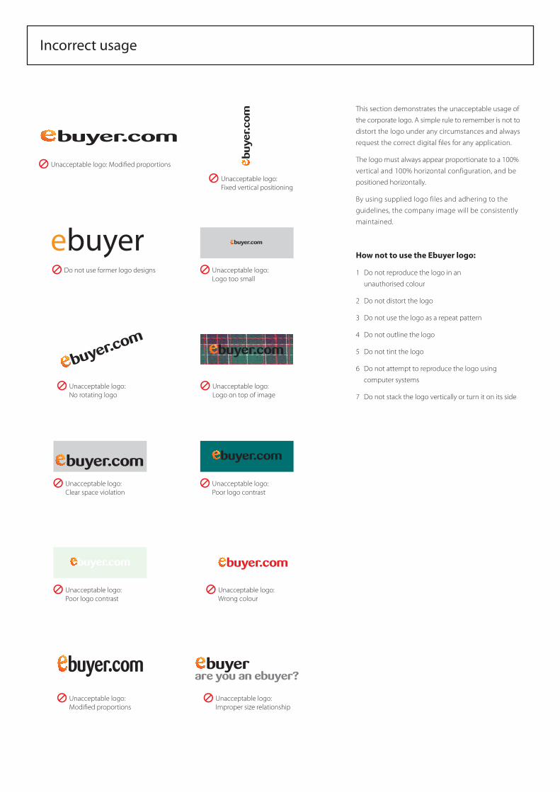
This section demonstrates the unacceptable usage of
the corporate logo. A simple rule to remember is not to
distort the logo under any circumstances and always
request the correct digital files for any application.
The logo must always appear proportionate to a 100%
vertical and 100% horizontal configuration, and be
positioned horizontally.
By using supplied logo files and adhering to the
guidelines, the company image will be consistently
maintained.
How not to use the Ebuyer logo:
1 Do not reproduce the logo in an
unauthorised colour
2 Do not distort the logo
3 Do not use the logo as a repeat pattern
4 Do not outline the logo
5 Do not tint the logo
6 Do not attempt to reproduce the logo using
computer systems
7 Do not stack the logo vertically or turn it on its side
Incorrect usage
Unacceptable logo: Modi�ed proportions
Unacceptable logo:No rotating logo
Unacceptable logo:Fixed vertical positioning
Unacceptable logo: Clear space violation
Unacceptable logo: Logo on top of image
Unacceptable logo: Logo too small
Unacceptable logo: Poor logo contrast
Unacceptable logo: Poor logo contrast
Unacceptable logo: Modi�ed proportions
Unacceptable logo: Improper size relationship
Do not use former logo designs
ebuyer
Unacceptable logo: Wrong colour
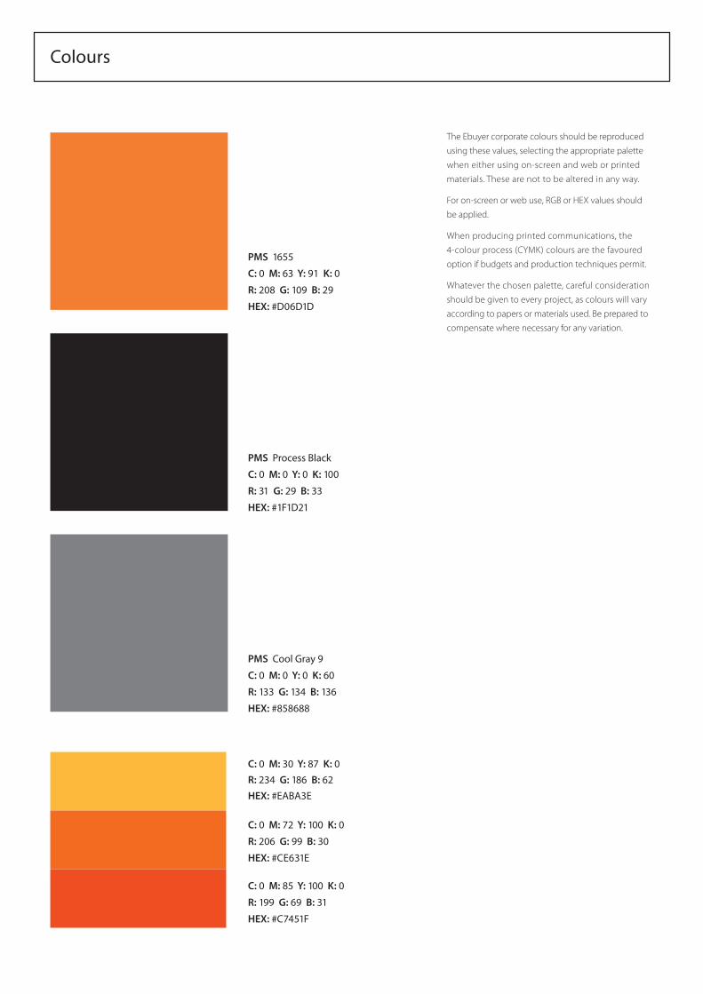
Colours
The Ebuyer corporate colours should be reproduced
using these values, selecting the appropriate palette
when either using on-screen and web or printed
materials. These are not to be altered in any way.
For on-screen or web use, RGB or HEX values should
be applied.
When producing printed communications, the
4-colour process (CYMK) colours are the favoured
option if budgets and production techniques permit.
Whatever the chosen palette, careful consideration
should be given to every project, as colours will vary
according to papers or materials used. Be prepared to
compensate where necessary for any variation.
PMS 1655
C: 0 M: 63 Y: 91 K: 0
R: 208 G: 109 B: 29
HEX: #D06D1D
PMS Process Black
C: 0 M: 0 Y: 0 K: 100
R: 31 G: 29 B: 33
HEX: #1F1D21
PMS Cool Gray 9
C: 0 M: 0 Y: 0 K: 60
R: 133 G: 134 B: 136
HEX: #858688
C: 0 M: 30 Y: 87 K: 0R: 234 G: 186 B: 62HEX: #EABA3E
C: 0 M: 72 Y: 100 K: 0
R: 206 G: 99 B: 30
HEX: #CE631E
C: 0 M: 85 Y: 100 K: 0
R: 199 G: 69 B: 31
HEX: #C7451F
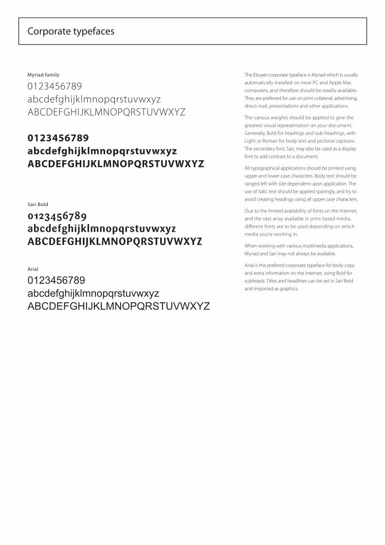
Corporate typefaces
Myriad family
0123456789abcdefghijklmnopqrstuvwxyzABCDEFGHIJKLMNOPQRSTUVWXYZ
0123456789abcdefghijklmnopqrstuvwxyzABCDEFGHIJKLMNOPQRSTUVWXYZ
Sari Bold
0123456789abcdefghijklmnopqrstuvwxyzABCDEFGHIJKLMNOPQRSTUVWXYZ
Arial
0123456789abcdefghijklmnopqrstuvwxyzABCDEFGHIJKLMNOPQRSTUVWXYZ
The Ebuyer corporate typeface is Myriad which is usually
automatically installed on most PC and Apple Mac
computers, and therefore should be readily available.
They are preferred for use on print collateral, advertising,
direct mail, presentations and other applications.
The various weights should be applied to give the
greatest visual representation on your document.
Generally, Bold for headings and sub-headings, with
Light or Roman for body text and pictorial captions.
The secondary font, Sari, may also be used as a display
font to add contrast to a document.
All typographical applications should be printed using
upper and lower case characters. Body text should be
ranged left with size dependent upon application. The
use of italic text should be applied sparingly, and try to
avoid creating headings using all upper case characters.
Due to the limited availability of fonts on the Internet,
and the vast array available in print based media,
different fonts are to be used depending on which
media you’re working in.
When working with various multimedia applications,
Myriad and Sari may not always be available.
Arial is the prefered corporate typeface for body copy
and extra information on the Internet, using Bold for
subheads. Titles and headlines can be set in Sari Bold
and imported as graphics.
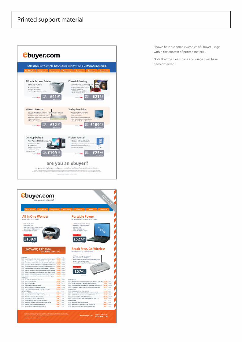
Printed support material
Shown here are some examples of Ebuyer usage
within the context of printed material.
Note that the clear space and usage rules have
been observed.
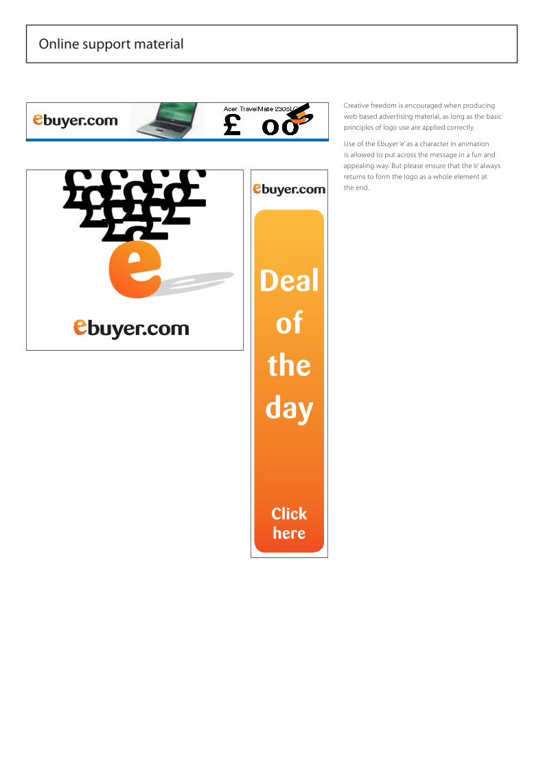
Online support material
Creative freedom is encouraged when producing
web based advertising material, as long as the basic
principles of logo use are applied correctly.
Use of the Ebuyer ‘e’ as a character in animation
is allowed to put across the message in a fun and
appealing way. But please ensure that the ‘e’ always
returns to form the logo as a whole element at
the end.
Clickhere
Deal of the day
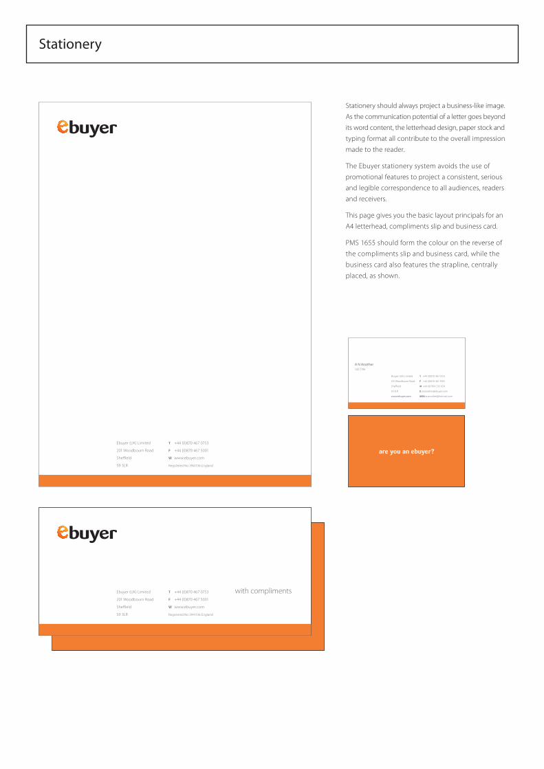
Stationery
Stationery should always project a business-like image.
As the communication potential of a letter goes beyond
its word content, the letterhead design, paper stock and
typing format all contribute to the overall impression
made to the reader.
The Ebuyer stationery system avoids the use of
promotional features to project a consistent, serious
and legible correspondence to all audiences, readers
and receivers.
This page gives you the basic layout principals for an
A4 letterhead, compliments slip and business card.
PMS 1655 should form the colour on the reverse of
the compliments slip and business card, while the
business card also features the strapline, centrally
placed, as shown.
T +44 (0)870 467 0753
F +44 (0)870 467 5001
M +44 (0)7814 235 634
Ebuyer (UK) Limited
201 Woodbourn Road
Sheffield
S9 3LR
www.ebuyer.com
A N AnotherJob Title
are you an ebuyer?Ebuyer (UK) Limited
201 Woodbourn Road
Sheffield
S9 3LR
T +44 (0)870 467 0753
F +44 (0)870 467 5001
W www.ebuyer.com
Registered No 3941136 England
Ebuyer (UK) Limited
201 Woodbourn Road
Sheffield
S9 3LR
T +44 (0)870 467 0753
F +44 (0)870 467 5001
W www.ebuyer.com
Registered No 3941136 England
with compliments
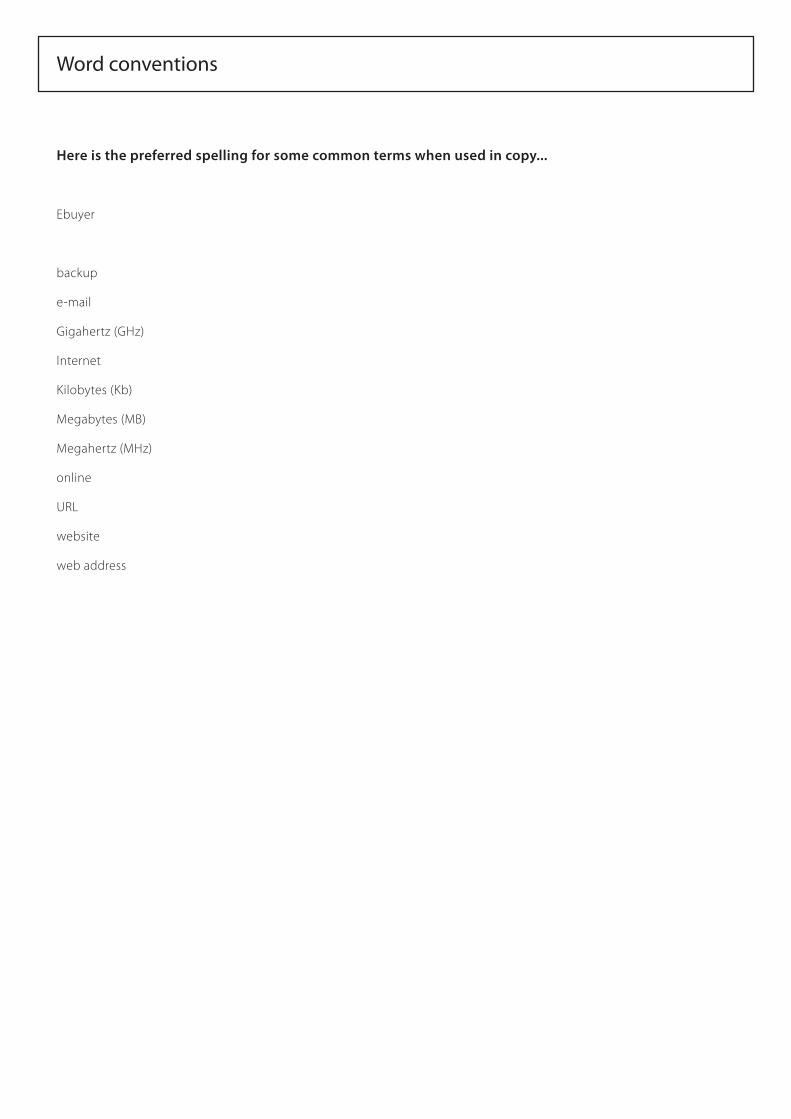
Here is the preferred spelling for some common terms when used in copy...
Ebuyer
backup
Gigahertz (GHz)
Internet
Kilobytes (Kb)
Megabytes (MB)
Megahertz (MHz)
online
URL
website
web address
Word conventions
We hope that these guidelines have given you the details you require. Should you require any further information, please contact the Ebuyer Marketing department on the details shown below:
Richard WalkerHead of Marketing
Ebuyer (UK) Limited
Howden
East Yorkshire
DN14 7UW
T +44 (0)871 528 5027
E
Contact details