Embed Size (px)
Citation preview
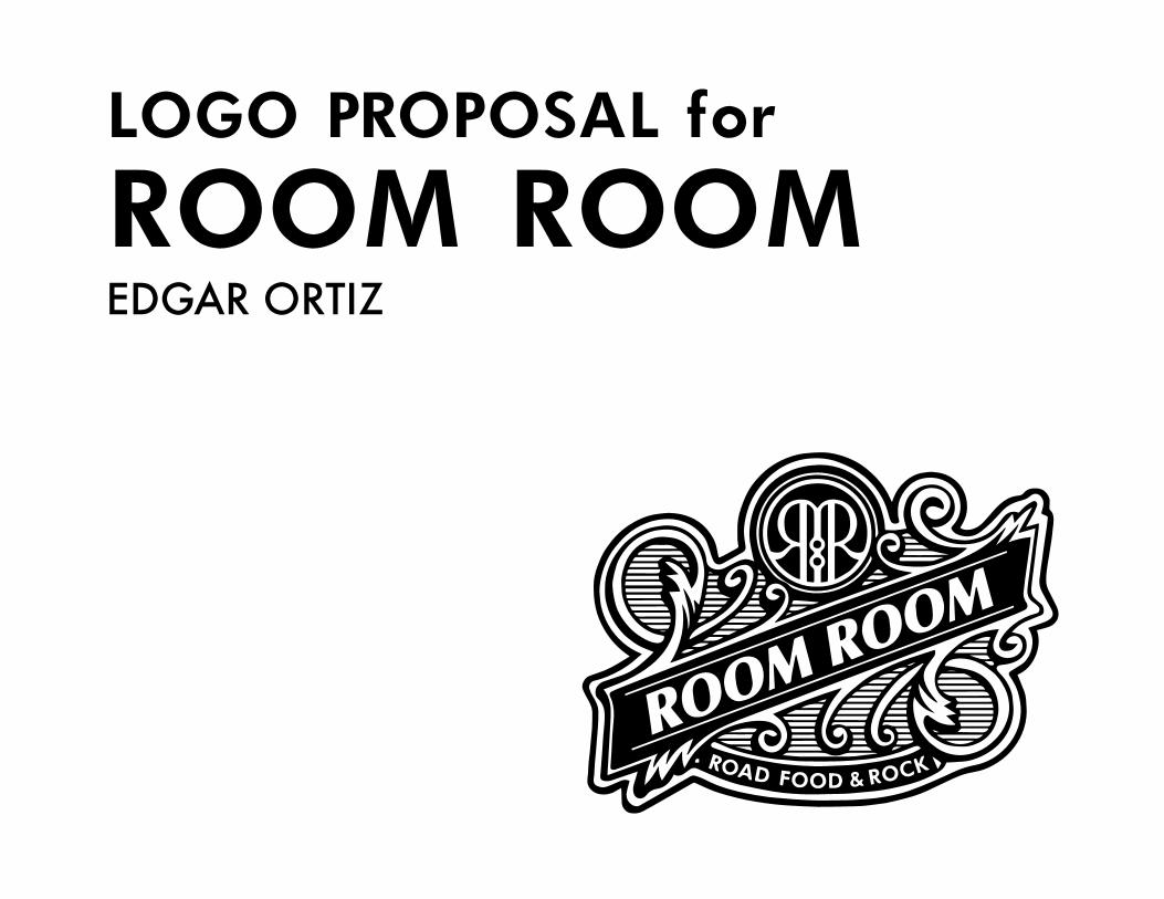
EDGAR ORTIZ ROOM ROOMLOGO PROPOSAL for
1 2
Restaurant/bar
“Road Food & Rock”
(Spanish) - “El lugar es un restaurante bar con bandas en vivo y dirigido a clase media y media alta muy de la onda hipster de zona de bares por lo que tiene que ser un logo muy cuida-do. El nombre del lugar es Room Room y el denominativo es “road food & rock” el concepto del lugar es un tanto ligado a tabernas antiguas
Europea/Americana con maderas, sillones viejos de piel y ladrillos desgastados en paredes, escenario y elementos muy sutiles con referencia a las motos. La comida que se sirve es internacional pero comida que encuentras en la calle.”- Carla Chanes
Room Room
Linked to antique European/American taverns. Wood, old leather sofas, weathered brick walls, elements with subtle references to motorcycles. International food that can be found in the streets.
middle class - upper middle class. Hipsters. A hipster is an informal term defined as “a person who follows the latest trends and fashions, especially those regarded as being outside the cultural main-stream.” - Google
CLIENT NAME:
CONCEPT/THEME:
CLIENT TYPE:
SLOGAN:
DESCRIPITION:
TARGET AUDIENCE:
DESIGN BRIEF LOGO GOALSWhen creating the logo, it is important to keep in mind what the logo should do and how it will be used.
LOGOESSENTIALS:
POSSIBLEAPPLICATIONS:
- Single-color. The logo must work in color and in black & white (or single color).
- Scalability. The logo must function at a small size and large size.
- Versatility. The logo must work on several different mediums and surfaces according to how the client may need to use it.
- Signage- Gift cards- Cups/glasses- Employee uniforms- Paperwork- Drink coasters- Menus- Website- Billboards- Napkins- Merchandise (pens, t-shirts, etc. )
3 4
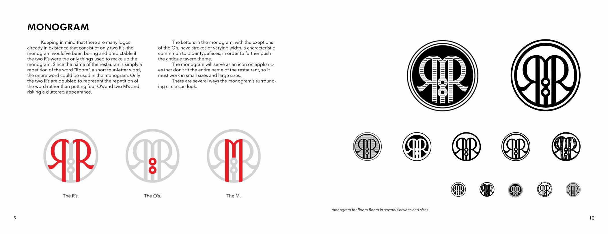
Close looks of the exampes provided led to the following general observations that can be used as a basis for how the logo will be created.
- Baroque. Baroque refers to a 17th century style of art and architecture that is characterized by extravagant, highly ornate detail. This style connects very well with the antique European/American tavern feel that was described as a theme to go for. This style is most prom-inent in the Don Papa label and Artisan playing cards packaging.
- Ornamentation. Although not all the examples use Baroque artwork specifically, the vast majority include some sort of busy and heavily illustrated design with little to no white space left, that results in a look similar to the business of Baroque style design.
- Framing. Many of the examples use a frame around the text, usually a rectangle or circle. Even the examples with more organic designs have a ribbon or some kind of strokes holding the text within into a defined space.
- Antler. The big exception to all the observations noted above is Antler. Of all the examples provided, Antler has the simplest, cleanest appearance. The brand has a simple design consisting only of a sans serif wordmark and a thin-stroked icon that almost appears to be hand-drawn. This simple style of a design is popular at the mo-ment, making it an approporiate style for the “hipster” audience in mind. Although the design itself doesn’t have much of a tavern feel, the choice of colors help give it a more antique feel (brown, baige, black, gold).
WALL OF INSPIRATION(Spanish) - “algunos logos que le gustan al cliente y que pueden servir como inspiración para lo que vas a desarrollar. Enfoquémonos solo al uso de letras y arte a partir de estas, de
preferencia que el logo no cuente con nada que haga referencia al motociclismo.”- Carla Chanes
Focus only on use of letters and art from these examples. No references to motorcycling.
DESCRIPITION:
KEY POINTS:
images provided by client as designs to draw from
5 6

MONOGRAM/ICONAn image or graphic that represents a person, place or thing, not using any text.
A mark composed of two or more letters usually combined or interwoven into a design, usually made with a person or place’s initials. Also known as a lettermark.
A monogram/icon is very useful when branding a small space that doesn’t fit the entire full-name logo, for example the icon for a tab on a website or an app icon. The scalability of the monogram/icon is extremely im-portant for this reason, and must therefore work at small and large sizes. Many of the examples provided use a monogram in their design, or a combination of the two, with antler being the main exception again by using a word-less icon instead. The use of a monogram with initials seems more appropriate for Room Room because monograms have a more antique appearance that better suits the antique
tavern theme. After doing research on what is con-sidered a hipster logo, I found that many of them use letters or words in a seal format with a basic surrounding shape (often a circle). I began by sketching out several ways the mono-gram could look.
MONOGRAMLOGO:
ICON (SYMBOL) LOGO:
sketches of a monogram for Room Room
icons and wordmarks from wall of inspiration
7 8
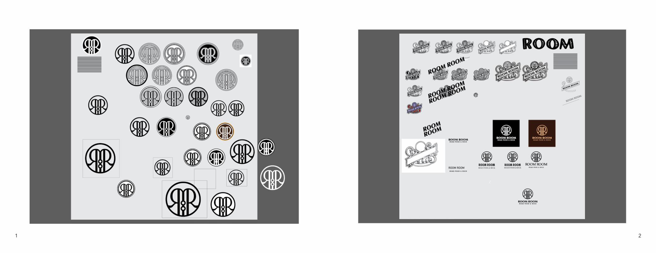
MONOGRAM Keeping in mind that there are many logos already in existence that consist of only two R’s, the monogram would’ve been boring and predictable if the two R’s were the only things used to make up the monogram. Since the name of the restauran is simply a repetition of the word “Room”, a short four-letter word, the entire word could be used in the monogram. Only the two R’s are doubled to represent the repetition of the word rather than putting four O’s and two M’s and risking a cluttered appearance.
The Letters in the monogram, with the exeptions of the O’s, have strokes of varying width, a characteristic commmon to older typefaces, in order to further push the antique tavern theme. The monogram will serve as an icon on applianc-es that don’t fit the entire name of the restaurant, so it must work in small sizes and large sizes. There are several ways the monogram’s surround-ing circle can look.
The O’s. The M.The R’s.
monogram for Room Room in several versions and sizes.
9 10
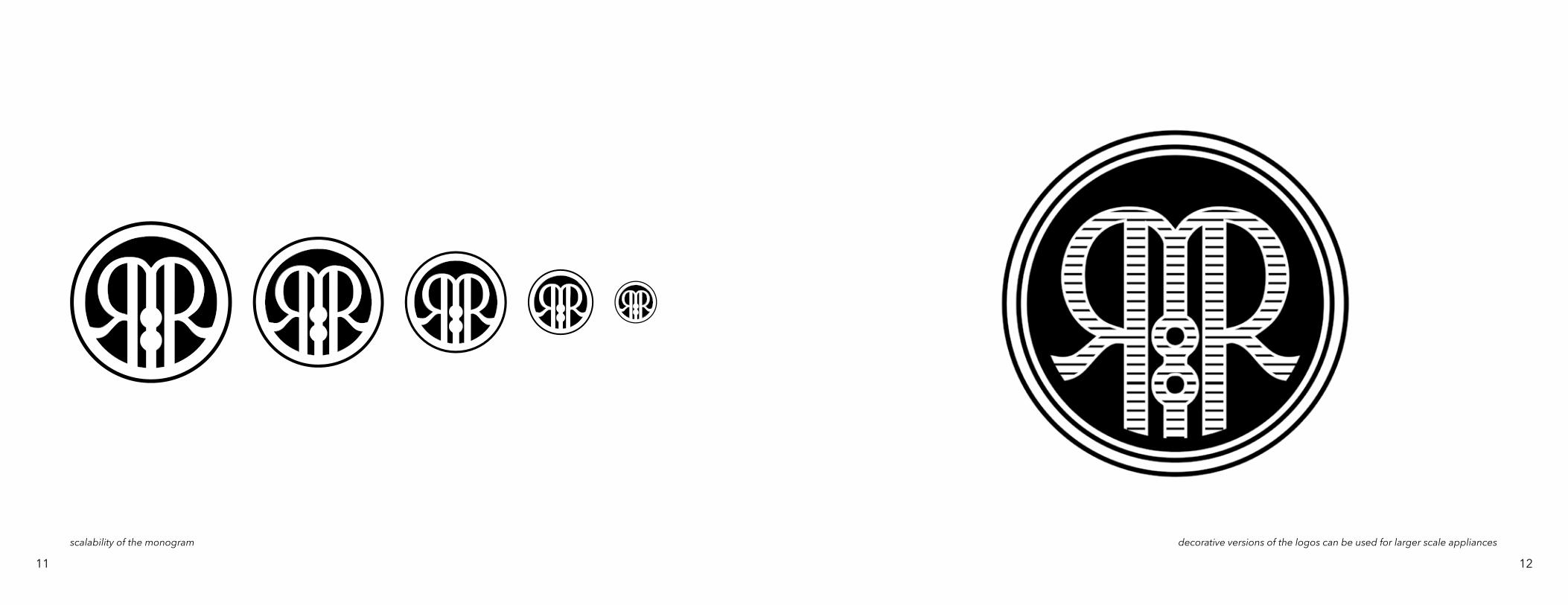
scalability of the monogram decorative versions of the logos can be used for larger scale appliances
11 12
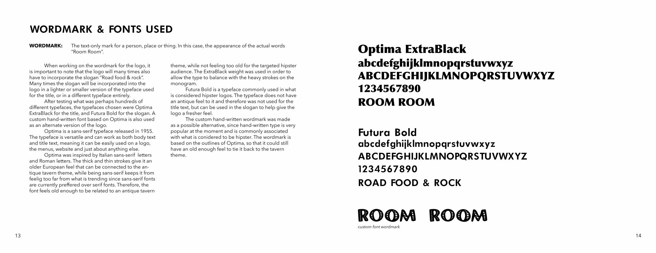
WORDMARK & FONTS USEDWORDMARK: The text-only mark for a person, place or thing. In this case, the appearance of the actual words
“Room Room”.
When working on the wordmark for the logo, it is important to note that the logo will many times also have to incorporate the slogan “Road food & rock”. Many times the slogan will be incorporated into the logo in a lighter or smaller version of the typeface used for the title, or in a different typeface entirely. After testing what was perhaps hundreds of different typefaces, the typefaces chosen were Optima ExtraBlack for the title, and Futura Bold for the slogan. A custom hand-written font based on Optima is also used as an alternate version of the logo. Optima is a sans-serif typeface released in 1955. The typeface is versatile and can work as both body text and title text, meaning it can be easily used on a logo, the menus, website and just about anything else. Optima was inspired by Italian sans-serif letters and Roman letters. The thick and thin strokes give it an older European feel that can be connected to the an-tique tavern theme, while being sans-serif keeps it from feelig too far from what is trending since sans-serif fonts are currently preffered over serif fonts. Therefore, the font feels old enough to be related to an antique tavern
theme, while not feeling too old for the targeted hipster audience. The ExtraBlack weight was used in order to allow the type to balance with the heavy strokes on the monogram. Futura Bold is a typeface commonly used in what is considered hipster logos. The typeface does not have an antique feel to it and therefore was not used for the title text, but can be used in the slogan to help give the logo a fresher feel. The custom hand-written wordmark was made as a possible alternative, since hand-written type is very popular at the moment and is commonly associated with what is conidered to be hipster. The wordmark is based on the outlines of Optima, so that it could still have an old enough feel to tie it back to the tavern theme.
Optima ExtraBlack
Futura Bold
abcdefghijklmnopqrstuvwxyzABCDEFGHIJKLMNOPQRSTUVWXYZ1234567890ROOM ROOM
abcdefghijklmnopqrstuvwxyzABCDEFGHIJKLMNOPQRSTUVWXYZ1234567890ROAD FOOD & ROCK
custom font wordmark
13 14
COMBINATION MARK
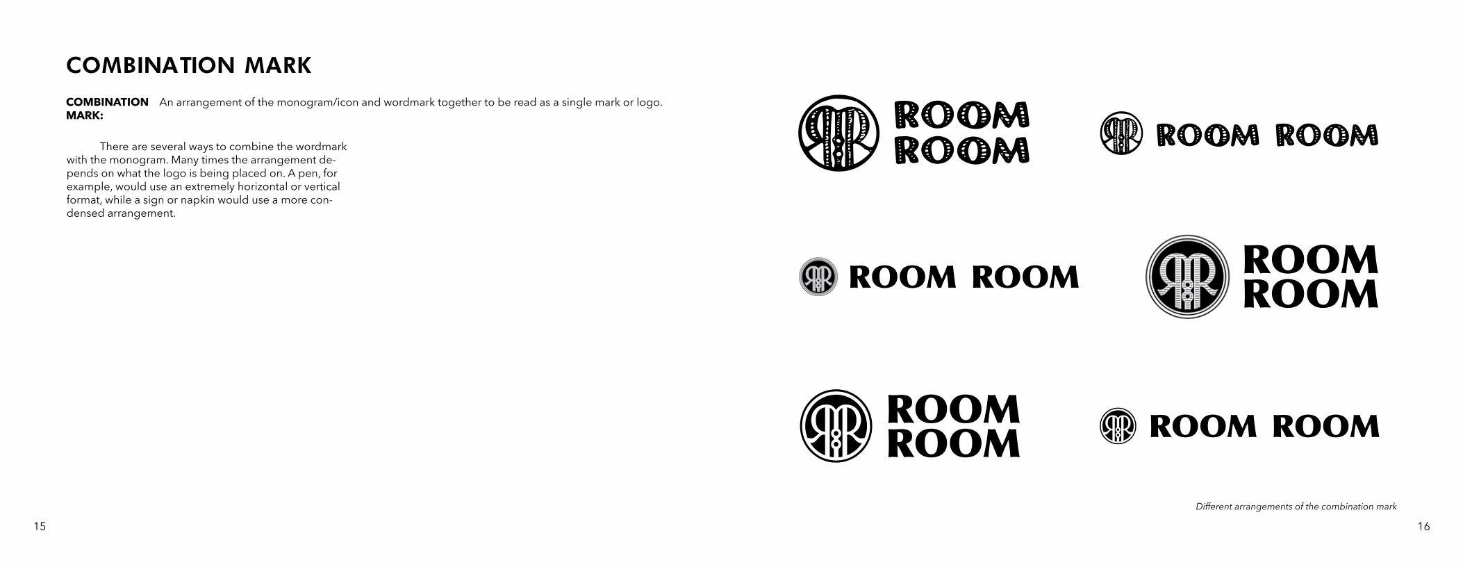
There are several ways to combine the wordmark with the monogram. Many times the arrangement de-pends on what the logo is being placed on. A pen, for example, would use an extremely horizontal or vertical format, while a sign or napkin would use a more con-densed arrangement.
An arrangement of the monogram/icon and wordmark together to be read as a single mark or logo.COMBINATION MARK:
Different arrangements of the combination mark
15 16
EMBLEM
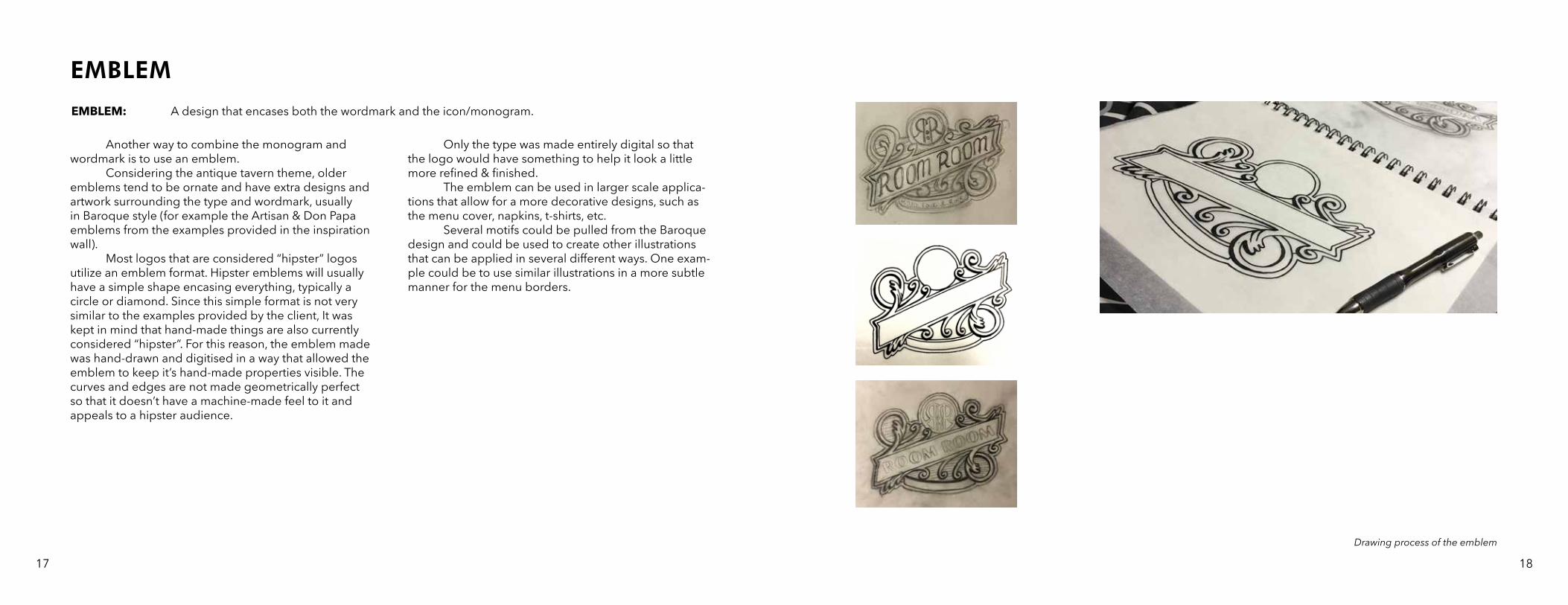
Another way to combine the monogram and wordmark is to use an emblem. Considering the antique tavern theme, older emblems tend to be ornate and have extra designs and artwork surrounding the type and wordmark, usually in Baroque style (for example the Artisan & Don Papa emblems from the examples provided in the inspiration wall). Most logos that are considered “hipster” logos utilize an emblem format. Hipster emblems will usually have a simple shape encasing everything, typically a circle or diamond. Since this simple format is not very similar to the examples provided by the client, It was kept in mind that hand-made things are also currently considered “hipster”. For this reason, the emblem made was hand-drawn and digitised in a way that allowed the emblem to keep it’s hand-made properties visible. The curves and edges are not made geometrically perfect so that it doesn’t have a machine-made feel to it and appeals to a hipster audience.
Only the type was made entirely digital so that the logo would have something to help it look a little more refined & finished. The emblem can be used in larger scale applica-tions that allow for a more decorative designs, such as the menu cover, napkins, t-shirts, etc. Several motifs could be pulled from the Baroque design and could be used to create other illustrations that can be applied in several different ways. One exam-ple could be to use similar illustrations in a more subtle manner for the menu borders.
A design that encases both the wordmark and the icon/monogram.EMBLEM:
Drawing process of the emblem
17 18
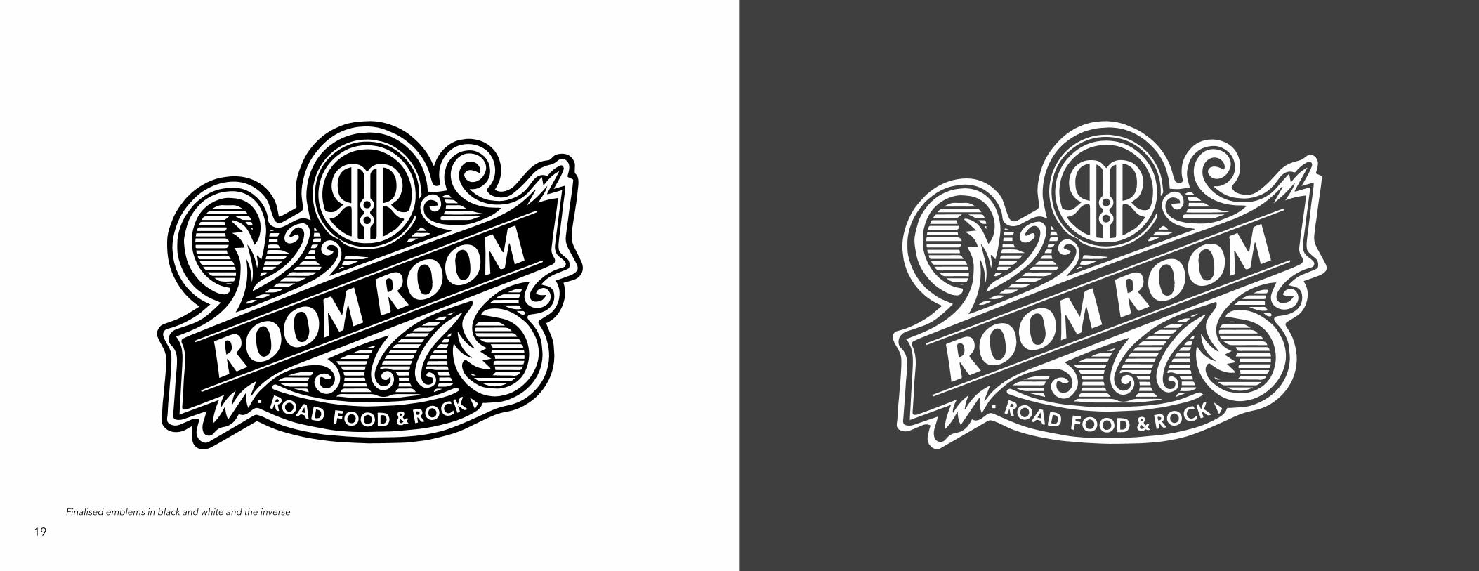
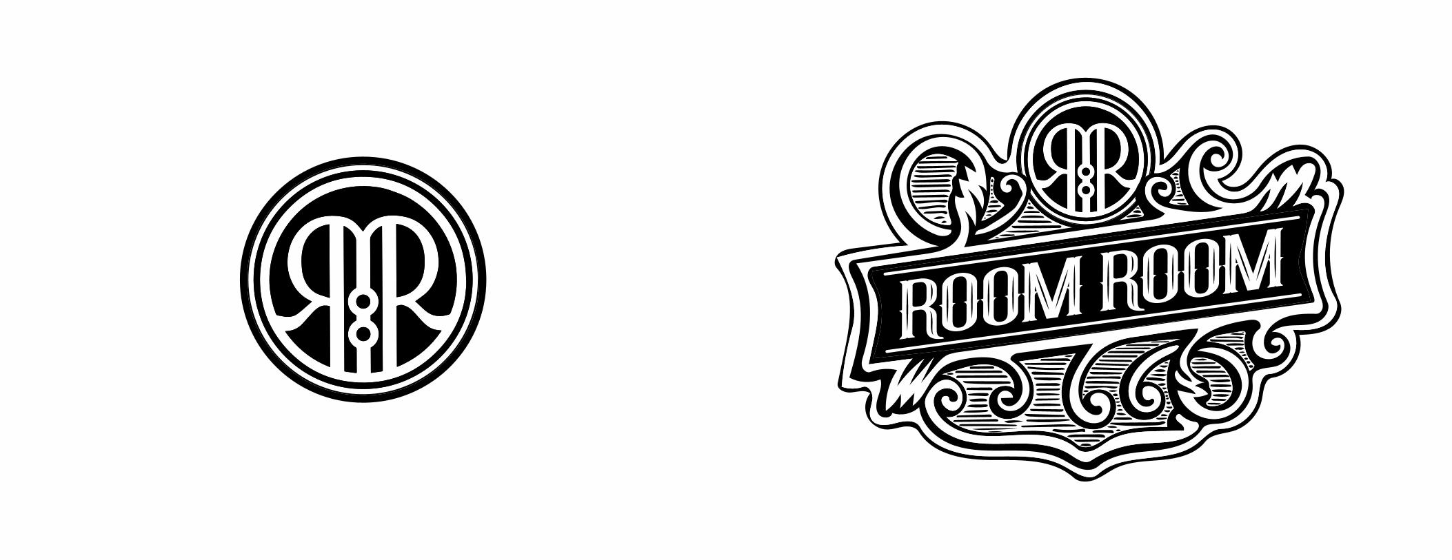
Finalised emblems in black and white and the inverse
19
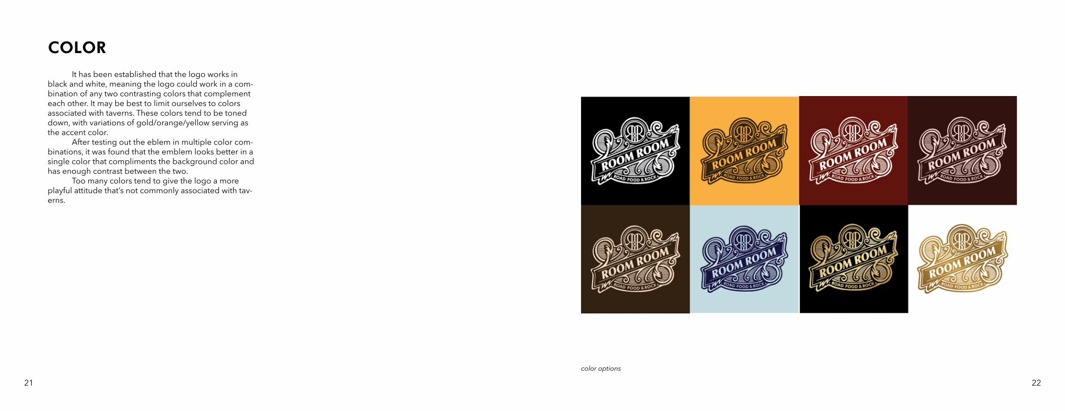
COLOR It has been established that the logo works in black and white, meaning the logo could work in a com-bination of any two contrasting colors that complement each other. It may be best to limit ourselves to colors associated with taverns. These colors tend to be toned down, with variations of gold/orange/yellow serving as the accent color. After testing out the eblem in multiple color com-binations, it was found that the emblem looks better in a single color that compliments the background color and has enough contrast between the two. Too many colors tend to give the logo a more playful attitude that’s not commonly associated with tav-erns.
color options
21 22
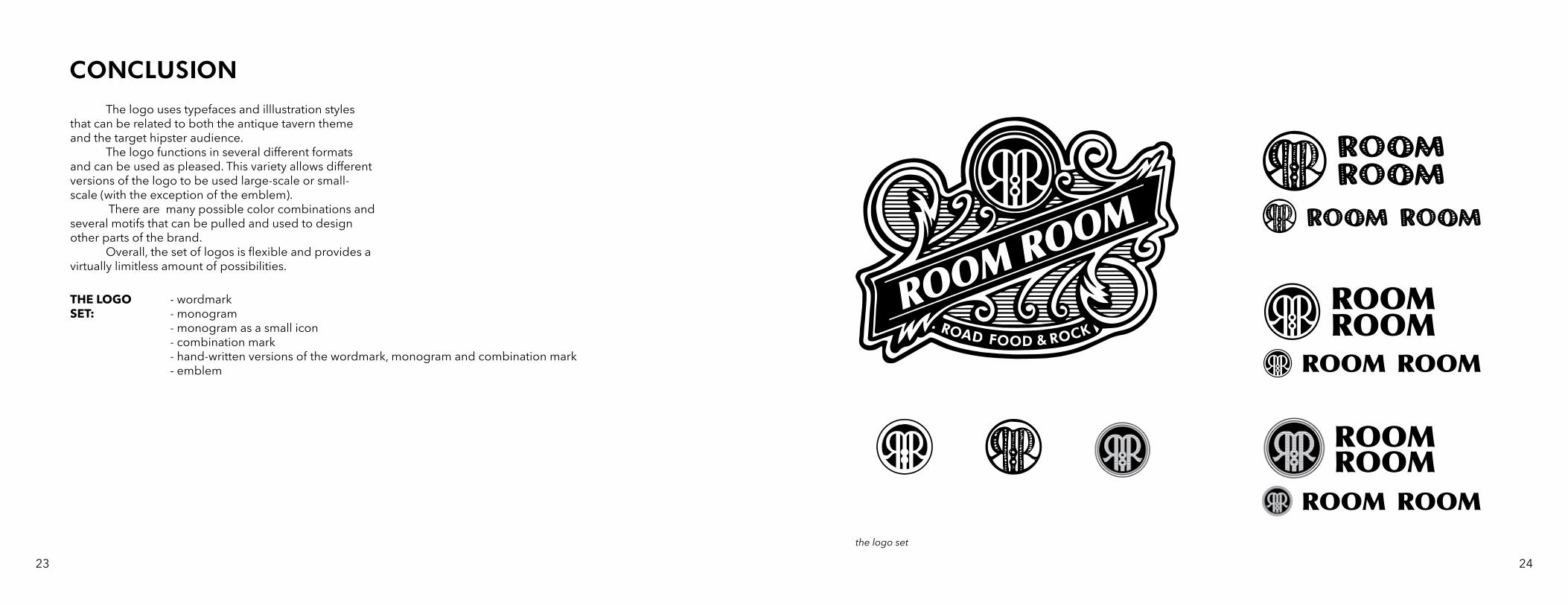
CONCLUSION The logo uses typefaces and illlustration styles that can be related to both the antique tavern theme and the target hipster audience. The logo functions in several different formats and can be used as pleased. This variety allows different versions of the logo to be used large-scale or small-scale (with the exception of the emblem). There are many possible color combinations and several motifs that can be pulled and used to design other parts of the brand. Overall, the set of logos is flexible and provides a virtually limitless amount of possibilities.
- wordmark - monogram- monogram as a small icon- combination mark - hand-written versions of the wordmark, monogram and combination mark- emblem
THE LOGO SET:
the logo set
23 24
26
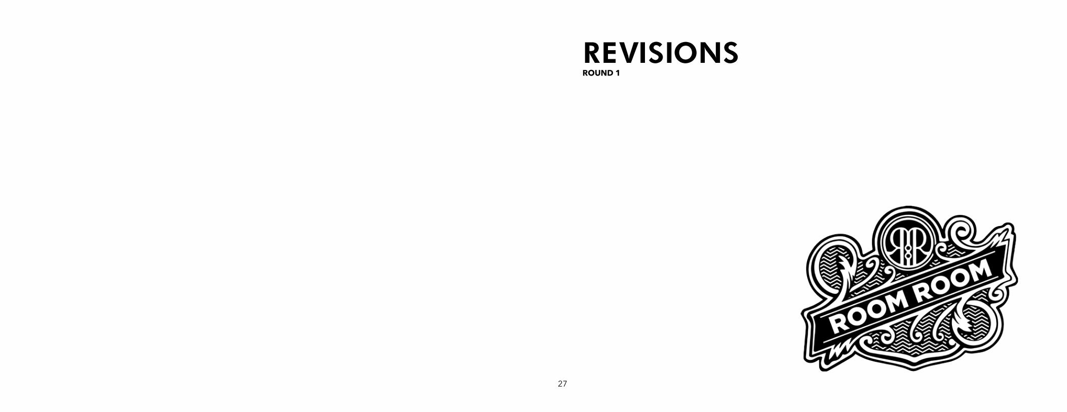
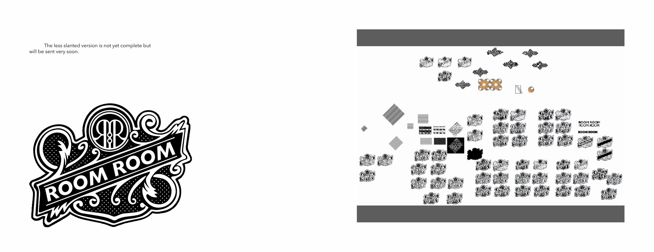
REVISIONSROUND 1
27
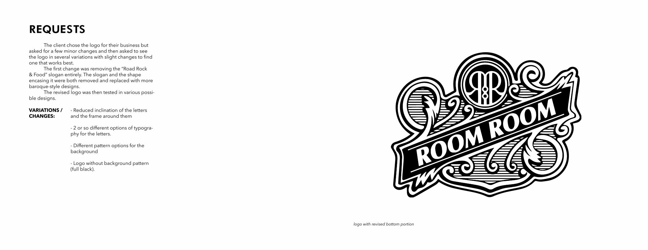
The client chose the logo for their business but asked for a few minor changes and then asked to see the logo in several variations with slight changes to find one that works best. The first change was removing the “Road Rock & Food” slogan entirely. The slogan and the shape encasing it were both removed and replaced with more baroque-style designs. The revised logo was then tested in various possi-ble designs.
REQUESTS
- Reduced inclination of the letters and the frame around them
- 2 or so different options of typogra-phy for the letters.
- Different pattern options for the background
- Logo without background pattern (full black).
VARIATIONS / CHANGES:
logo with revised bottom portion
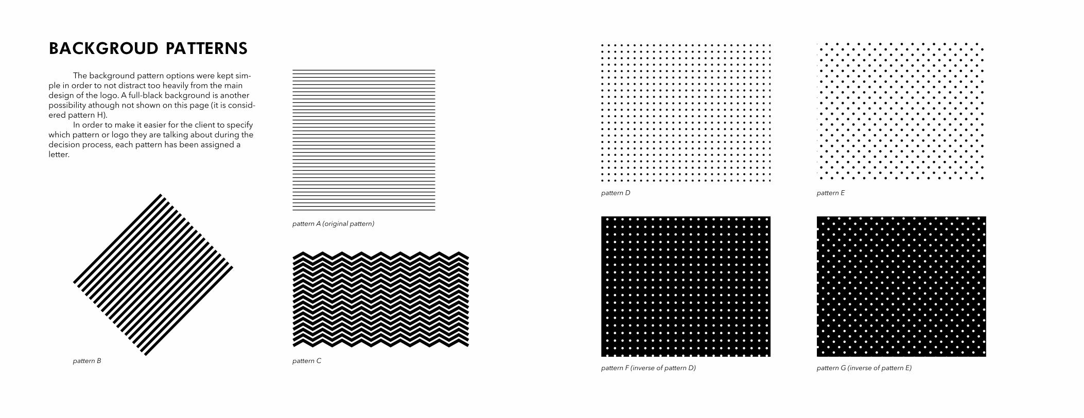
BACKGROUD PATTERNS The background pattern options were kept sim-ple in order to not distract too heavily from the main design of the logo. A full-black background is another possibility athough not shown on this page (it is consid-ered pattern H). In order to make it easier for the client to specify which pattern or logo they are talking about during the decision process, each pattern has been assigned a letter.
pattern A (original pattern)
pattern B
pattern D pattern E
pattern Cpattern F (inverse of pattern D) pattern G (inverse of pattern E)
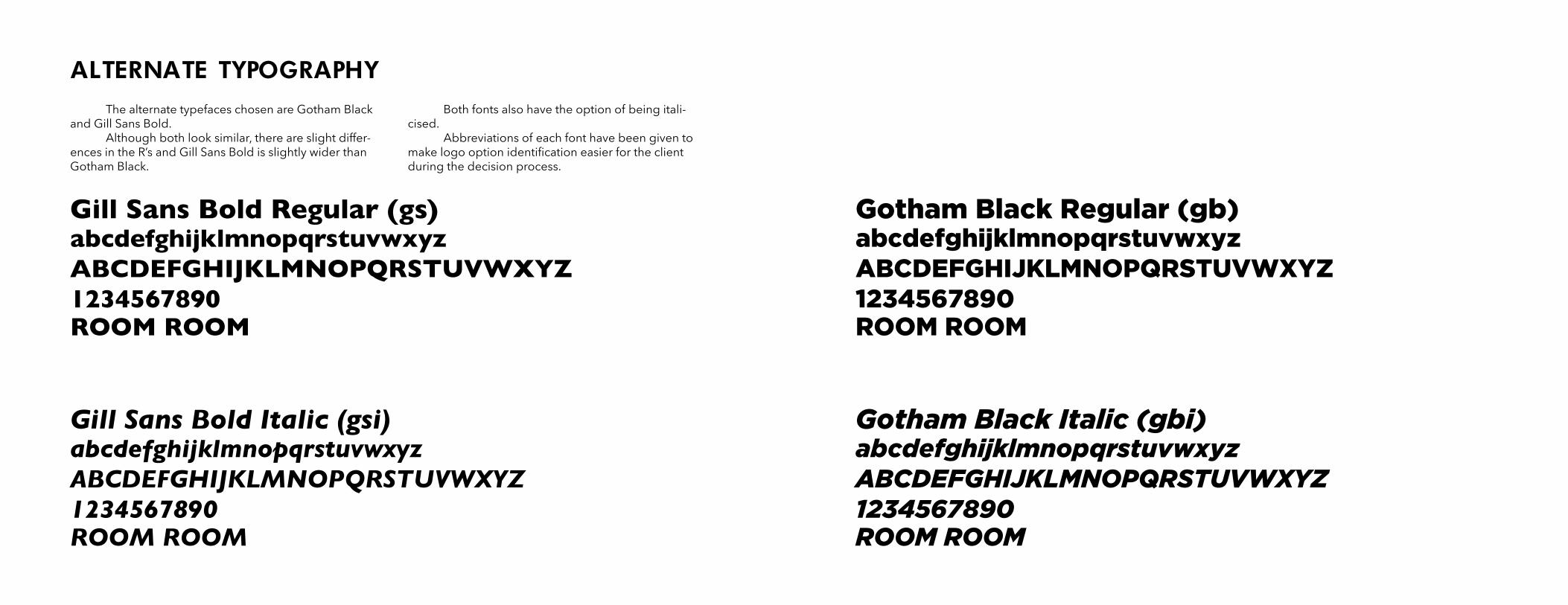
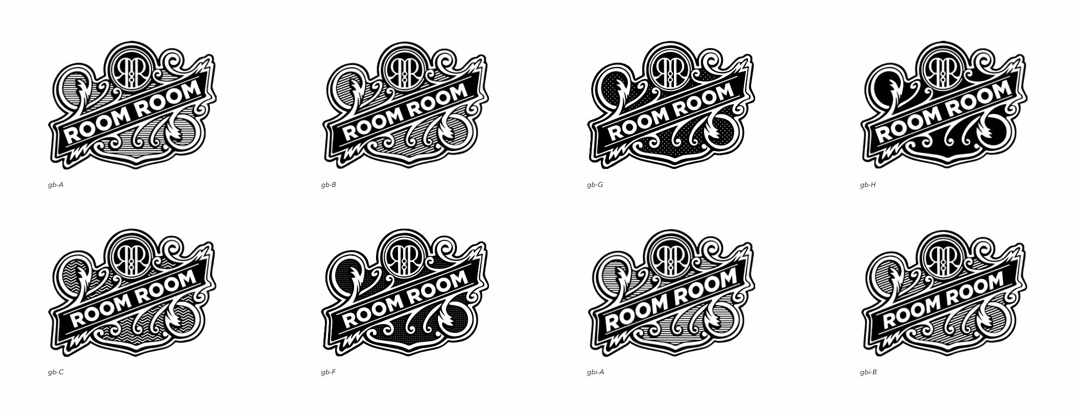
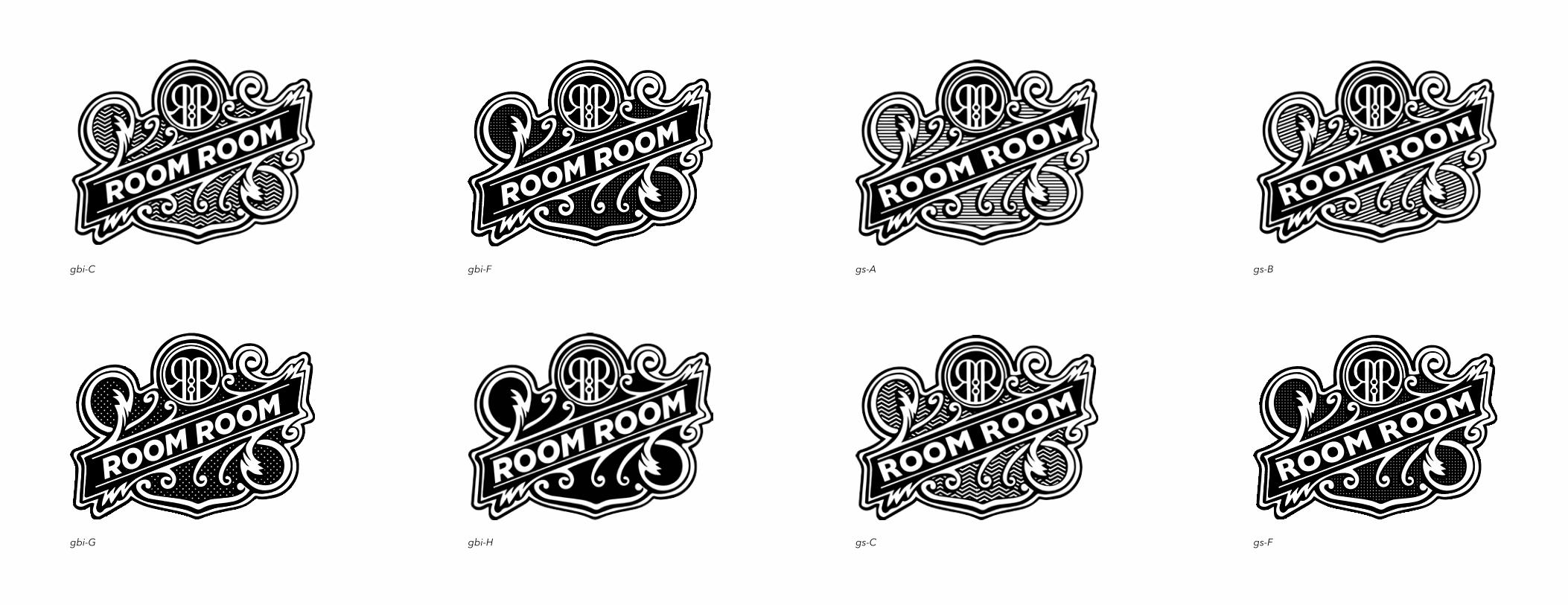
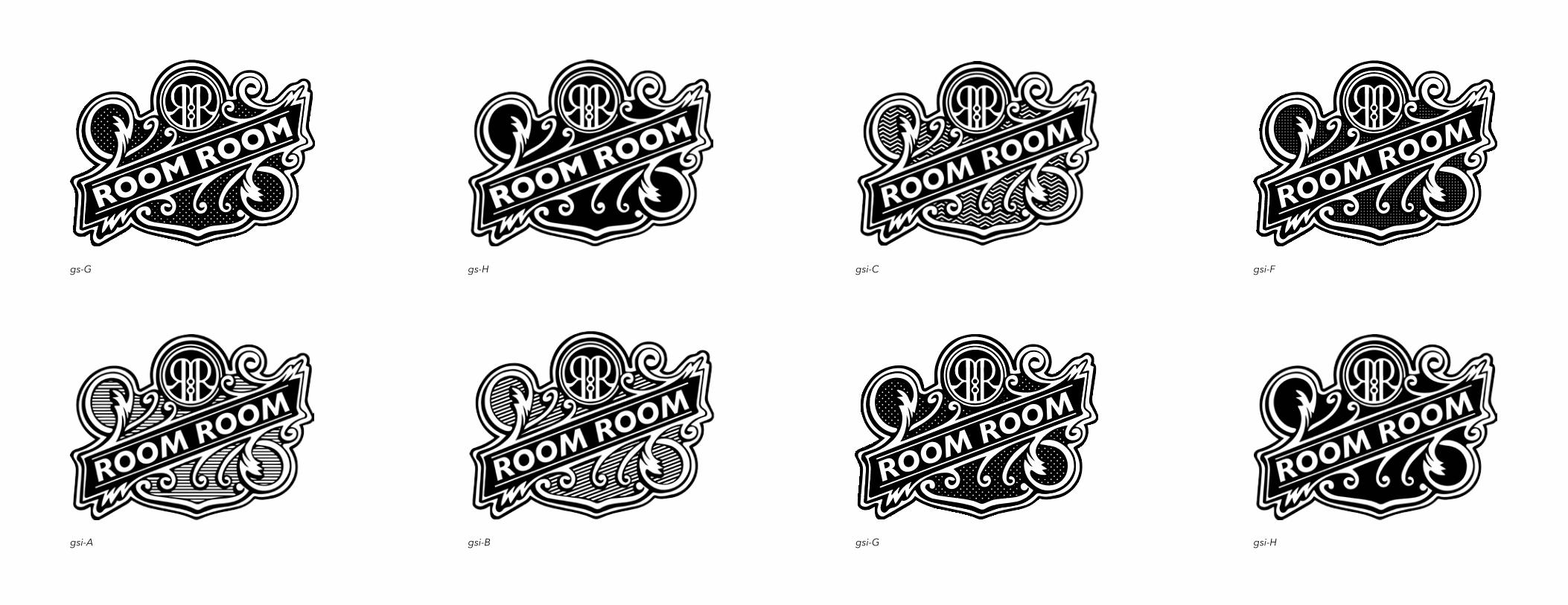
ALTERNATE TYPOGRAPHY The alternate typefaces chosen are Gotham Black and Gill Sans Bold. Although both look similar, there are slight differ-ences in the R’s and Gill Sans Bold is slightly wider than Gotham Black.
Both fonts also have the option of being itali-cised. Abbreviations of each font have been given to make logo option identification easier for the client during the decision process.
Gotham Black Regular (gb)
Gotham Black Italic (gbi)
Gill Sans Bold Regular (gs)
Gill Sans Bold Italic (gsi)
abcdefghijklmnopqrstuvwxyzABCDEFGHIJKLMNOPQRSTUVWXYZ1234567890
abcdefghijklmnopqrstuvwxyzABCDEFGHIJKLMNOPQRSTUVWXYZ1234567890
abcdefghijklmnopqrstuvwxyzABCDEFGHIJKLMNOPQRSTUVWXYZ1234567890
abcdefghijklmnopqrstuvwxyzABCDEFGHIJKLMNOPQRSTUVWXYZ1234567890
ROOM ROOM
ROOM ROOM
ROOM ROOM
ROOM ROOM
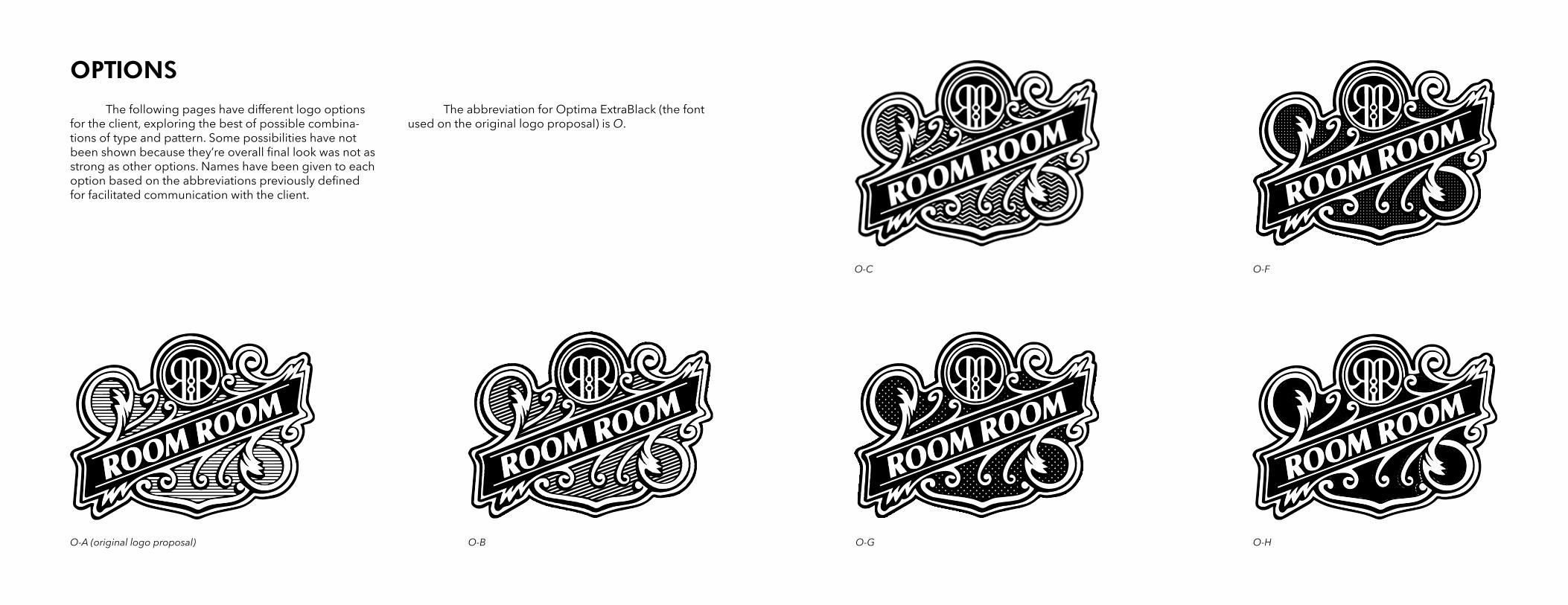
OPTIONS The following pages have different logo options for the client, exploring the best of possible combina-tions of type and pattern. Some possibilities have not been shown because they’re overall final look was not as strong as other options. Names have been given to each option based on the abbreviations previously defined for facilitated communication with the client.
The abbreviation for Optima ExtraBlack (the font used on the original logo proposal) is O.
O-A (original logo proposal) O-B
O-C O-F
O-G O-H
ROOM ROOM
ROOM ROOM
gb-A gb-Ggb-B gb-H
gb-C gbi-Agb-F gbi-B
ROOM ROOM
ROOM ROOM
ROOM ROOM
gs-Agbi-C gs-Bgbi-F
gs-Cgbi-G gs-Fgbi-H
ROOM ROOM
ROOM ROOM
ROOM ROOM
gs-G gsi-Cgs-H gsi-F
gsi-A gsi-Ggsi-B gsi-H
The less slanted version is not yet complete but will be sent very soon.
ROOM ROOM
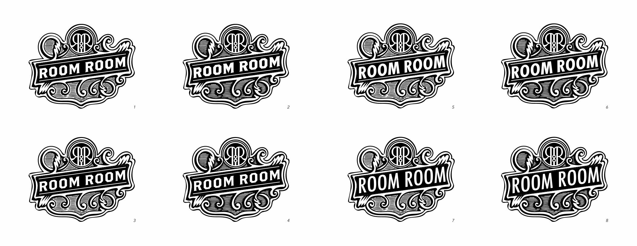
REVISIONSROUND 2
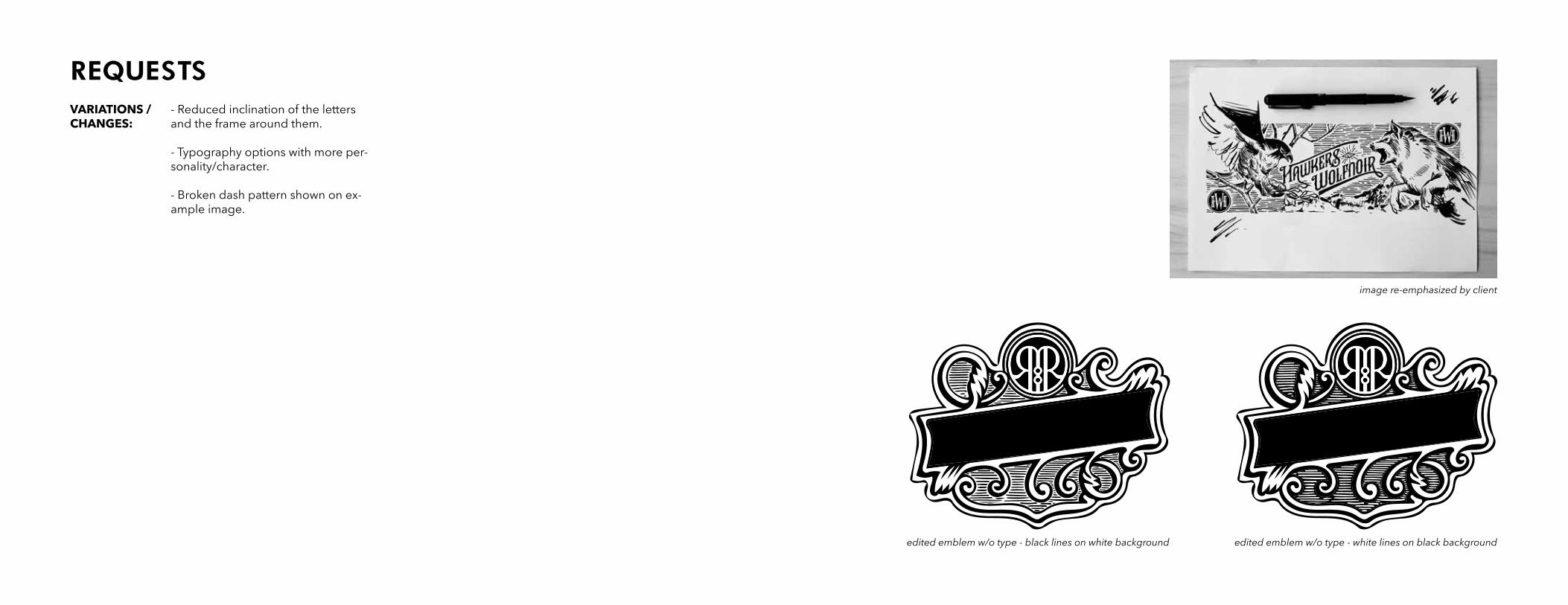
REQUESTS- Reduced inclination of the letters and the frame around them.
- Typography options with more per-sonality/character.
- Broken dash pattern shown on ex-ample image.
VARIATIONS / CHANGES:
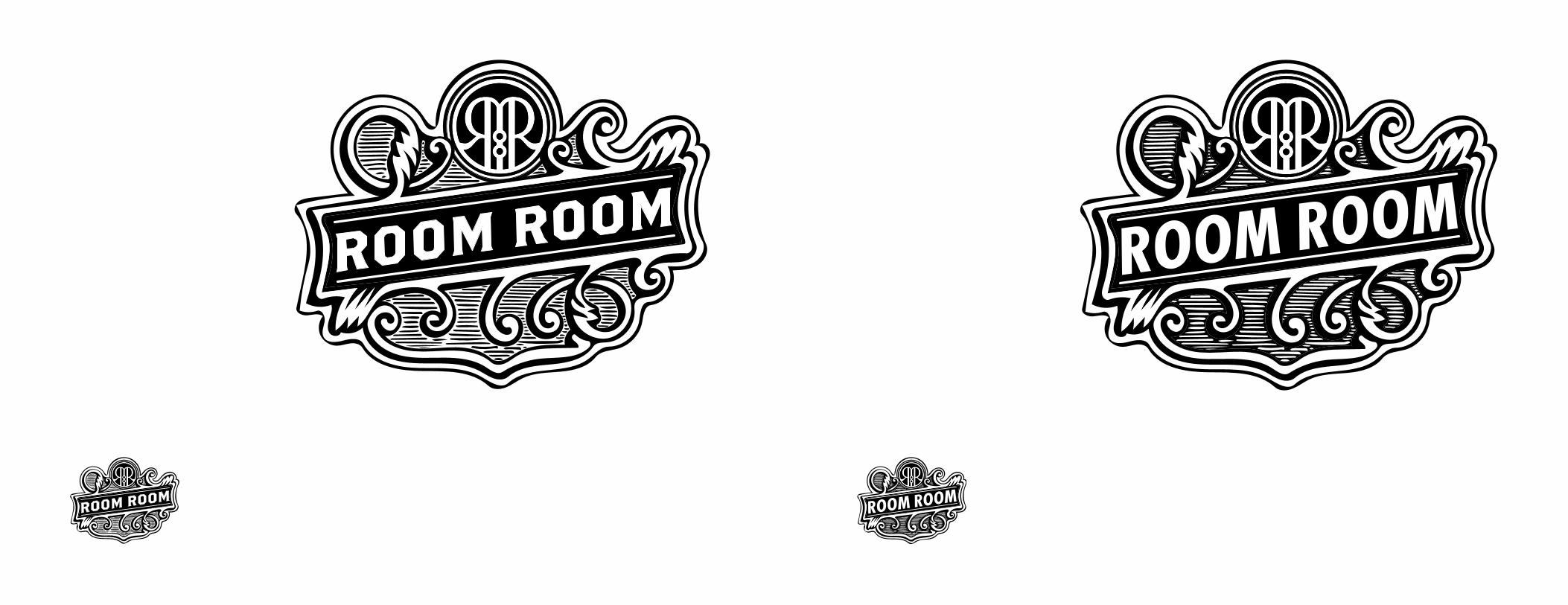
image re-emphasized by client
edited emblem w/o type - white lines on black backgroundedited emblem w/o type - black lines on white background
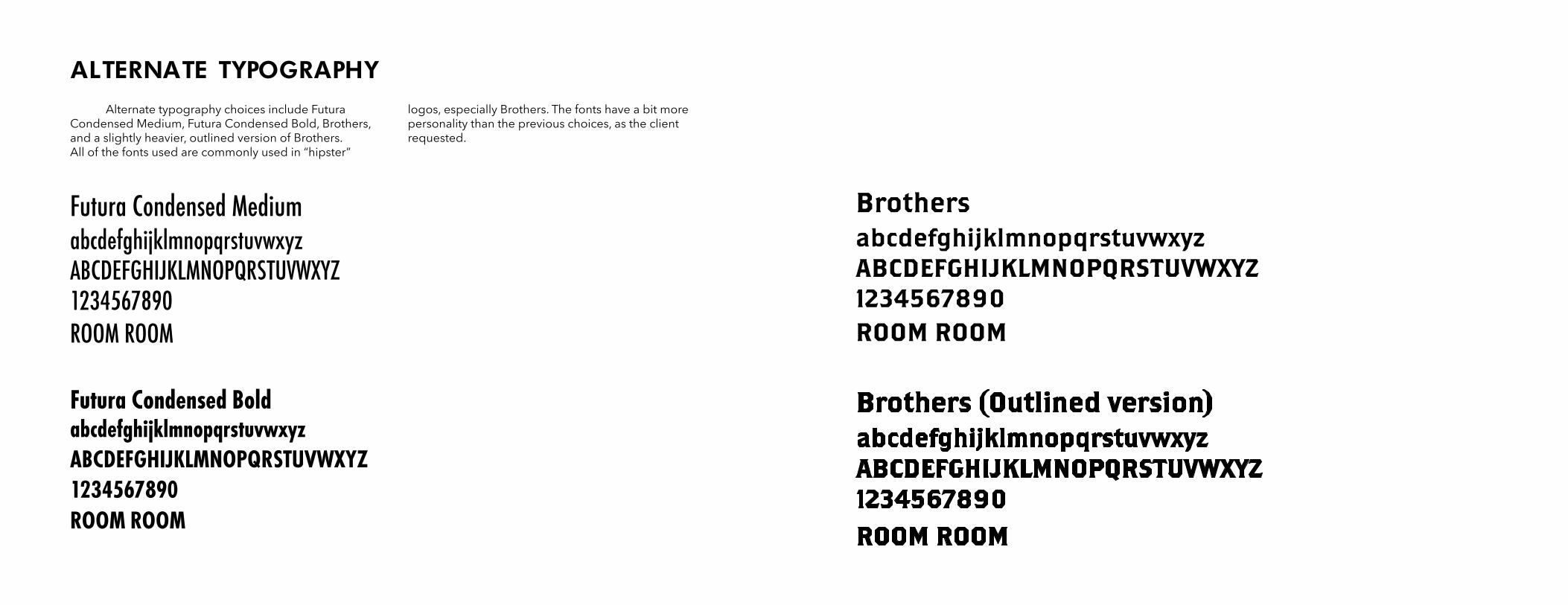
ALTERNATE TYPOGRAPHY Alternate typography choices include Futura Condensed Medium, Futura Condensed Bold, Brothers, and a slightly heavier, outlined version of Brothers. All of the fonts used are commonly used in “hipster”
logos, especially Brothers. The fonts have a bit more personality than the previous choices, as the client requested.
Futura Condensed Medium
Futura Condensed Bold
abcdefghijklmnopqrstuvwxyzABCDEFGHIJKLMNOPQRSTUVWXYZ1234567890
abcdefghijklmnopqrstuvwxyzABCDEFGHIJKLMNOPQRSTUVWXYZ1234567890
ROOM ROOM
ROOM ROOM
BrothersabcdefghijklmnopqrstuvwxyzABCDEFGHIJKLMNOPQRSTUVWXYZ1234567890ROOM ROOM
1
3
2
4
ROOM ROOM
ROOM ROOM ROOM ROOM
ROOM ROOMROOM ROOM
ROOM ROOM ROOM ROOM
ROOM ROOM
5
7
6
8
ROOM ROOM
ROOM ROOM ROOM ROOM
ROOM ROOM
ROOM ROOM
ROOM ROOM ROOM ROOM
ROOM ROOM
REVISIONSROUND 3
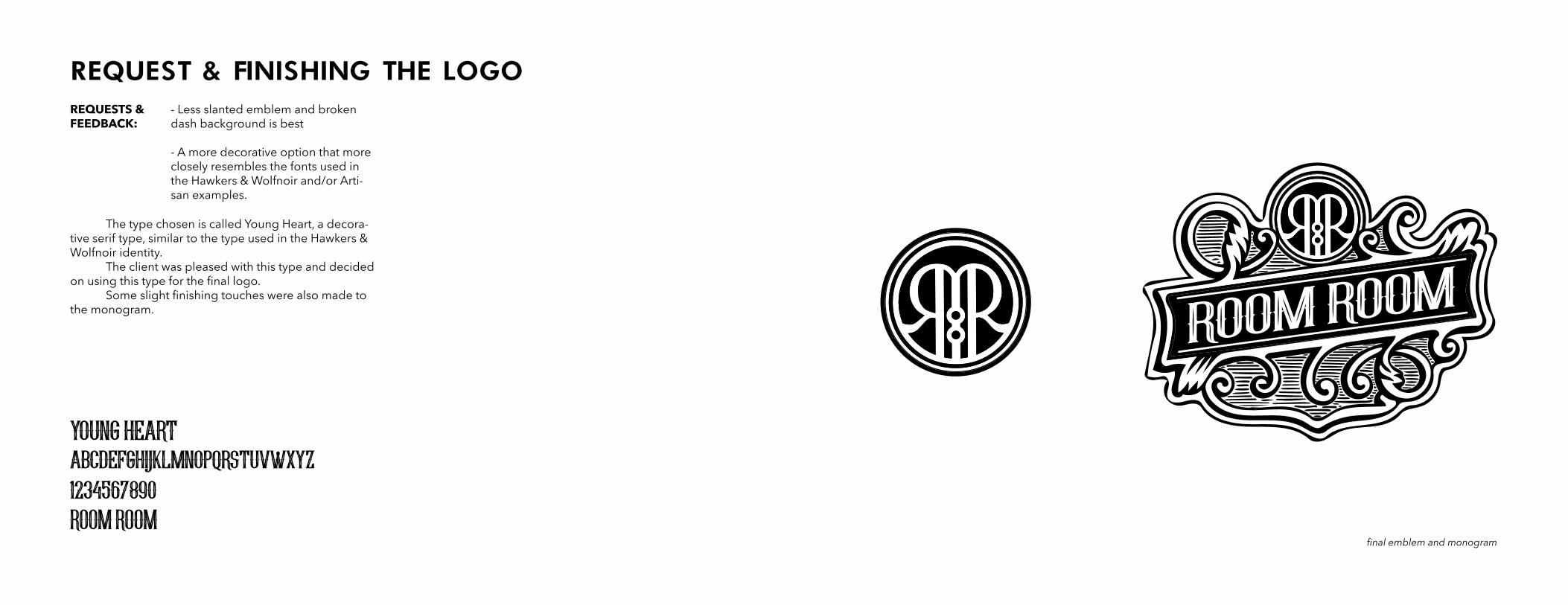
REQUEST & FINISHING THE LOGO- Less slanted emblem and broken dash background is best
- A more decorative option that more closely resembles the fonts used in the Hawkers & Wolfnoir and/or Arti-san examples.
The type chosen is called Young Heart, a decora-tive serif type, similar to the type used in the Hawkers & Wolfnoir identity. The client was pleased with this type and decided on using this type for the final logo. Some slight finishing touches were also made to the monogram.
REQUESTS & FEEDBACK:
young heartabcdefghijklmnopqrstuvwxyz1234567890ROOM ROOM
final emblem and monogram
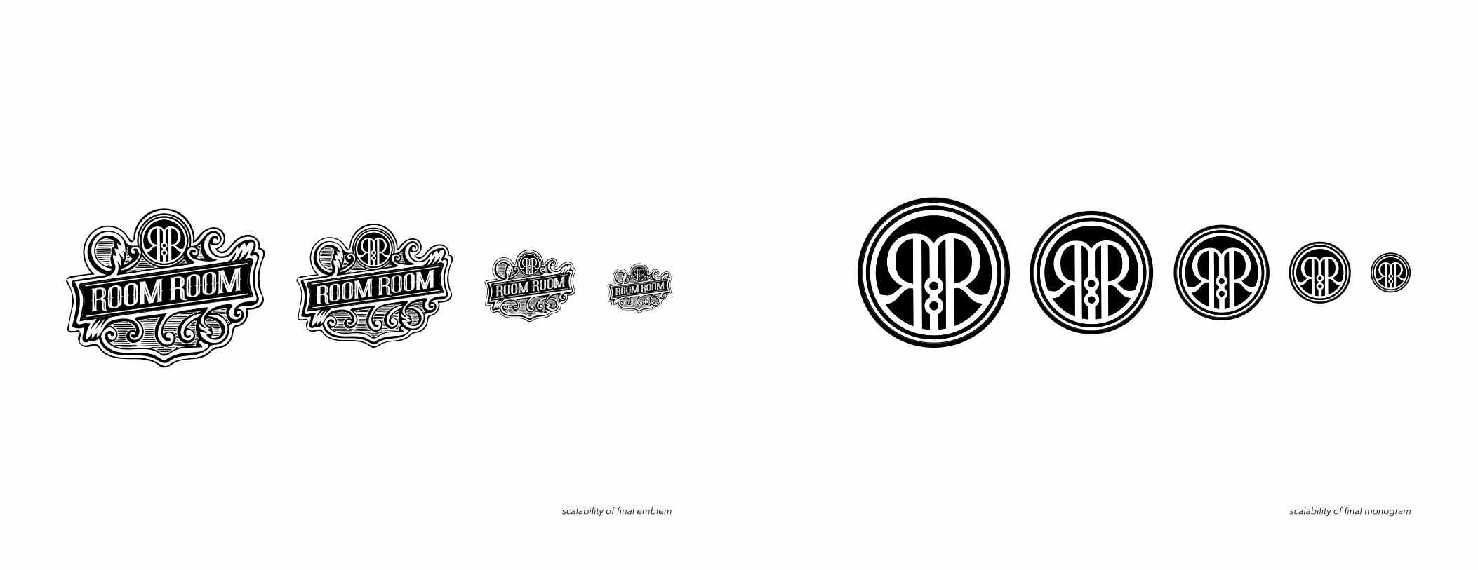
scalability of final monogramscalability of final emblem
Edgar Ortiz Design 2016