Embed Size (px)
Citation preview

EYEWIRE
GRAPHIC DESIGN
LOG
By Nicole Benson

3
TABLE OF
CONTENTS
Badge Grid System 06
Camp Eyewire Logo 14
Camp Eyewire Badge 22
Camp Eyewire Promo Image 30
Badge Grid System Continued 36
SWAG 38
Marathon & Winning Badges 54
Trivia Badge 56
Superpower Badges 58
Superpower Promo Image 68
Millionaire Badges 72
Sythe Menu Bar 76

5
BADGE GRID SYSTEM DESIGN
ExISTInG CoLor SySTEM
Experience/ status/ other/ competition
(If based on points, cubes, trailblazes then use respect-
ed color)
Scythe Locked
Points Cubes Traiblaze

SkETChES
76
Upon research, we started sketching possible ideas for a grid system. The existing icons had the influence of cir-cles and sharp angles. Through many sketches, we played around with the relationship of the angles and circles to-gether until we decided upon a possible few grid systems.
DIGITAL SkETChES
Through the series of pencil sketches, we were able to begin the creation of the digital sketches. This meant that we took the elements of our hand drawn sketches that we agreed on and used them in the digital versions. Af-ter this step, we again, picked the strongest and tried to simplify it into a solid grid system.
98

FInAL BADGE SySTEM1
2
3
The final grid system was heavily in-fluenced by three last iterations. These iterations encompassed the use of a box, to show the angles, as well as circles to show the bounding area. In figure 1, we took the angles into consideration for out final design. In figure 2, we simpli-fied the design it further decided that there were extra lines that did not pro-vide any needed information. In addi-tion, we refined the emphasize on the angles by making a divided box with 40 degree angles. Lastly, in figure three we played around with circles again decid-ing that the center and outside bounding area is very important and planned ways to show it by still remaining simplistic.
1110
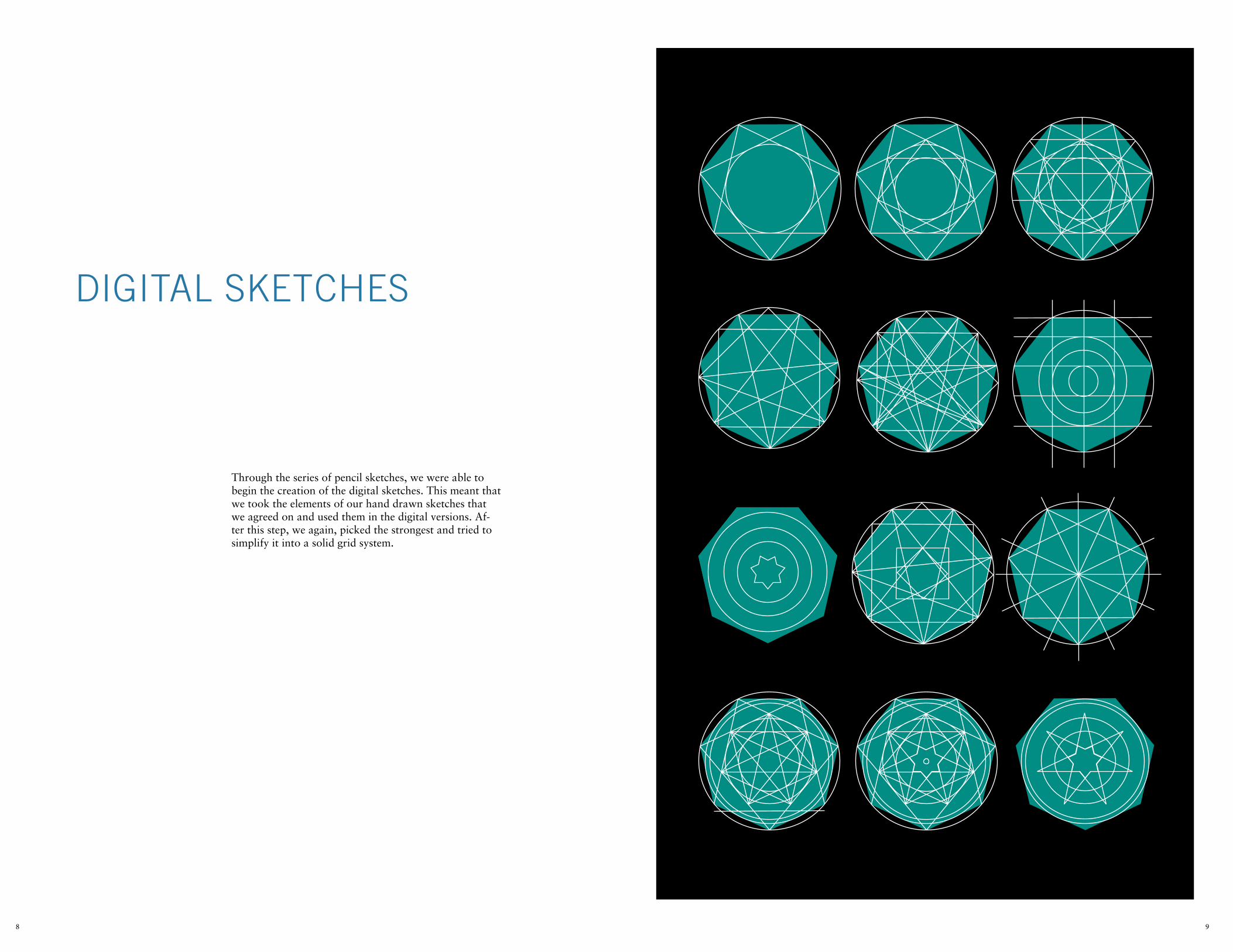
Our final badge icon system uses three circles, one of which is inside a box. This keeps the objects in proportion to the rest of the area within the badge. Also, we added lines going through more than just the box to help guide some of the objects with angles that would be a little bigger. Overall, this system is complex in a simplistic way. It shows why an object is placed where and how the grid affect the placement of an icon on the badge.
1312

SkETChES
Through a series of many sketches, the EyeWire team wanted icons that went along with the theme of a vintage summer camp. After research was made, a dozen sketch-es were completed along with colors that would fit along with the theme of summer camp.
1514

DIGITAL SkETChES
After the sketches were completed, the most successful and vintage looking icons were selected to be created digitally. I chose nine of the twelve sketches to vector-ize. After this step, I picked the two that the team most liked and added color to them as well as played around with the alignment of some of the elements in each icon, which can be shown on the next page.
1716
W
Eyewirecamp

1918
W

FInAL ProMo LoGo1
2
3
2120
20
15
20 15
20 15
The final promo logo was heavily influ-enced by three of the color-vectorized sketches. I took away from the first fig-ure that it needed to have the logo some-where on it. The second figure shown was the most successful of arrangements done. Lastly, the third icon shows the colors that fit best with the layout that worked well for the design.

SkETChES
Making badge icons for a summer camp themed game, I thought of simple images (because the promo icon was simple) that would fit with the theme. These images included camping things like fires, compasses, tents, and trees.
2322

DIGITAL SkETChES
After I decided what objects shown camping the best, I vectorized a handful of them to see them more clearly. After they were vectorized, I reiterated them multiple times using the real badge colors to see what design worked best with the grid system created before hand. These icons were made with size in mind meaning that they would be able to be seen really small or larger, de-pending on screen.
2524

W
2726
FInAL BADGE
Actual size icon:
2928
W
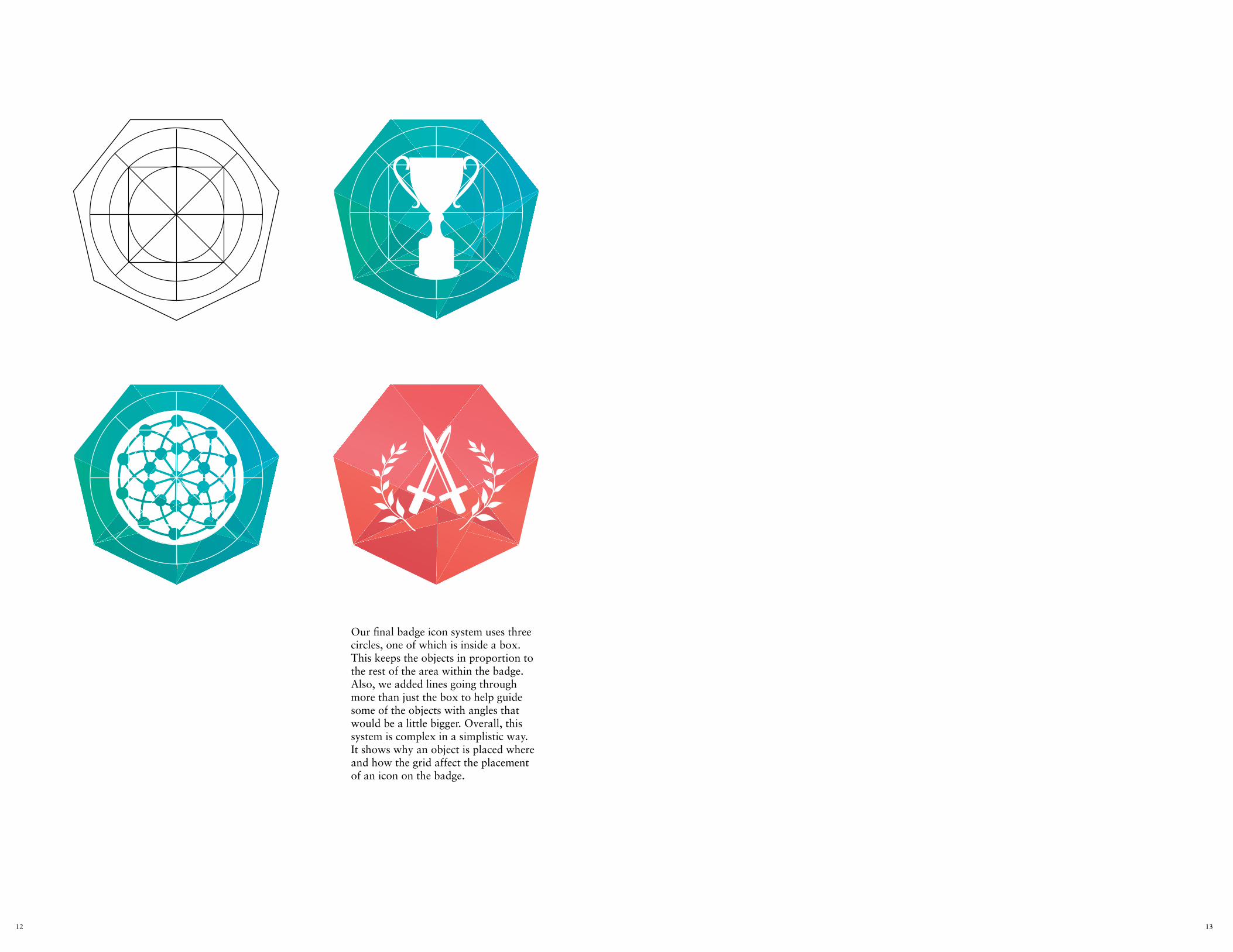
The final promo logo was made after a handful of iterations done on the most successful versions of the icon. After the picture I created was voted on, the team thought the fire ones fit most and conveyed a the theme they wanted re-ally well. After that, I took that icon and changed it up a few times using the previous grid system to decide what way showed the icon best in its given space. The final icon had it lying, centred, be-tween the second ring and aligned with the vertical and horizontal alignments.

3130
SkETChES
For Facebook, the blog, and other social media sites a promo image would need to be made. These promo im-ages would hold the promo icon as well as information about the summer camp competitions.

3332
DIGITAL SkETChES
Rough digital sketches were done exploring three possi-ble ideas, one was an 8-bit woods to show vintage camp-ing. The second was a more mystical route to show it was video game like. Lastly, the third and most solid idea was keeping it simple, like the icon, so that everything meshed together well and still exemplified camping.
W
1
2
3

3534
FInAL ProMo IMAGES
W
The final social media image consist-ed of a gradient from the first image I made except to stay with the geometrics, I made the gradient in bars. The trees were first triangles but did not look like trees so I redrew them so be more tree like! After the background was taken care of, I then decided how I would place the text on page. The box is a gra-dient with the badge shape in the back-ground. The fonts used were the same as the ones in the promo logo.

36
BEForE IConS
Without grid system in place to keep icons organized.

39
W
�

4140
W
�

4342
AFTEr IConS
With the grid system in place to keep icons organized.

4544
W
�
competitionV

4746
W
�
competitionV

SWAG ProDUCTIon
When creating the SWAG, they said the old icons were too big to fit on the mugs so I redesigned the template. This new template included icons I pre-viously edited/recreated using the grid system. Other icons included new icons (the Eyewire logo in badge form) that I created also. These were being sent directly to KT (a funder of Eyewire) as well as posted to the store (a funder of Eyewire), but the Summer Camp SWAG was only done to be put in the store.
4948
after
Before

5150

5352

MArAThon & WInnInG BADGES
5554

TrIvIA BADGE
5756
W
1
2
3
On the left page, is the final trivia badge chosen to represent trivia competitions throughout Eyewire. On this page are three possible trivia designs I went trough after my team wanted me to use a question mark in the design.

5958
SyThE/ SCoUTInG& CoMPLETED
The new Sythe/ Scouting and Completed badges were made with the idea of Superpowers in mind. Through group brainstorming, we were able to collectively get a handful of Superpowers through this. I then divided those powers into more categories and sub categories. For example, I broke alchemy into many levels ranging from types of alchemy to skill level used to complete a move. After these initial levels were then created, a mem-ber and I teamed up to mind map again and reorganize all the data into the two categories. We organized Sythe and Scouting by grouping Mental and Physical powers together, and then used Completed badges as Elemental Powers.

6160

SkETChES
Through the series of super powers created, I begun to sketch possible concepts for each super power.
6362

DIGITAL SkETChES
After the sketches were completed, the most successful and vintage looking icons were selected to be created digitally. I chose nine of the twelve sketches to vector-ize. After this step, I picked the two that the team most liked and added color to them as well as played around with the alignment of some of the elements in each icon, which can be shown on the next page.
6564

FInAL SUPErPoWErBADGES
6766

6968
DIGITAL SkETChES
Rough digital sketches were done exploring three possi-ble ideas about comic book pop culture. With the main game badge designed, I tried to keep that element the most important while also keeping with the spirit of comic book culture throughout my designs.
W
1
2

7170
FInAL ProMo IMAGES
W
1
2
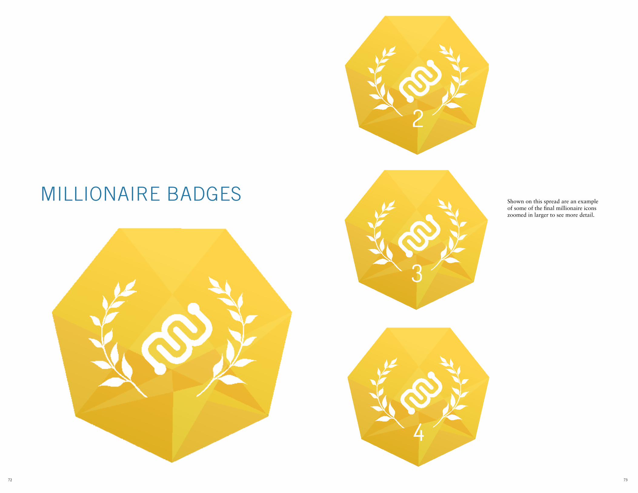
MILLIonAIrE BADGES
7372
Shown on this spread are an example of some of the final millionaire icons zoomed in larger to see more detail.

7574
W

7776
DIGITAL SkETChES
Rough sketches were created in preperation for rede-signing the icons on the menu bar. The menu had a color scheme that did not fit with the rest of the website and badges as well as icons that did not fit together as a set. My job in designing this set was to use the color scheme used in the badges while also using a simple design to join them all together.
W

7978
W
nEW ICon SET
1
2
In figure I and 2, are the previous icon set and color scehme used within the menu bar.

80
2015 SUMMEr745 Atlantic Ave, Boston, MA, USA 02111
The fonts used were Sabon and Trade Gothic.


![PROOF COPY [A-8672] 004307JOAtai/papers/potetz_josa.pdfPROOF COPY [A-8672] 004307JOA PROOF COPY [A-8672] 004307JOA multiplicative factor, becomes an additive factor under log intensity](https://img.pdfslide.us/doc/110x75/5f94817cf1036119c9392cd4/proof-copy-a-8672-taipaperspotetzjosapdf-proof-copy-a-8672-004307joa-proof.jpg)