Embed Size (px)
Citation preview
LIS Working Paper Series
Luxembourg Income Study (LIS), asbl
No. 614
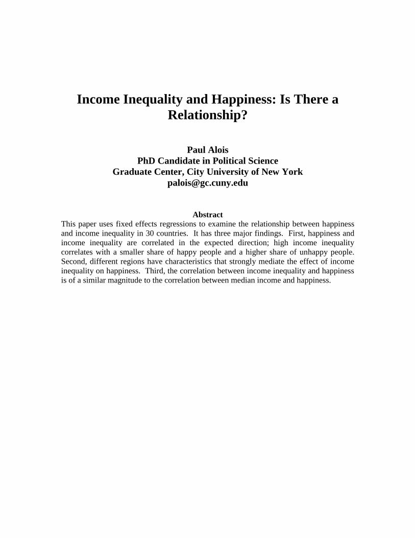
Income Inequality and Happiness: Is There a Relationship?
Paul Alois
June 2014
Income Inequality and Happiness: Is There a
Relationship?
Paul Alois
PhD Candidate in Political Science
Graduate Center, City University of New York
Abstract
This paper uses fixed effects regressions to examine the relationship between happiness
and income inequality in 30 countries. It has three major findings. First, happiness and
income inequality are correlated in the expected direction; high income inequality
correlates with a smaller share of happy people and a higher share of unhappy people.
Second, different regions have characteristics that strongly mediate the effect of income
inequality on happiness. Third, the correlation between income inequality and happiness
is of a similar magnitude to the correlation between median income and happiness.
1
1 Introduction
The effect of income inequality on society has been a subject of intense scrutiny in recent
years, both within academia and the public press. A famous OECD report found a
significant negative correlation between inequality and intergenerational mobility
(OECD, 2008). Several economists at the International Monetary Fund have found a
negative relationship between inequality and economic growth (Berg and Ostry, 2011;
Ostry et. al 2014); Keynesian economists have argued that inequality lowers economic
growth by reducing demand (Krugman, 2012; Stiglitz, 2013); and many scholars have
focused on the deleterious effects of inequality on democracy (Galbraith, 2008; Gilens,
2005; Gilens and Page, 2014; Hacker and Pierson, 2011; Reich, 2012;).
This paper explores the relationship between income inequality and happiness
among women. Specifically, it looks at the relationship between five country level
measures of income inequality (the GINI coefficient, the 90/10 ratio, the 50/10 ratio,
female poverty rates, and single mother poverty rates) and reported happiness among
women in 30 countries. These countries were selected because they participate in the
Luxembourg Income Study (LIS) Database, which is the gold standard in detailed income
data.
The relationship between a country’s average income and its level of happiness
has been examined many times. The famous “Easterlin Paradox,” which found that
happiness and income are correlated for individuals within countries but not across
countries, has been refuted (Easterlin, 1974). One economist, using more recent and
higher quality data, found a strong positive relationship between a country’s per-capita
income and its average level of happiness (Deaton, 2007). This effect was particularly
strong among the elderly; i.e. the elderly in poor countries are far more likely to be
unhappy than their counterparts in rich countries. This finding was confirmed by a pair
of scholars using a different method (Stephenson and Wolfers, 2008). Another researcher
tested the importance of income versus other predictors of individual happiness and
found that income, although significant, mattered less than other variables (Helliwell,
2009).
In comparison, the literature on happiness and income inequality is rather sparse.
There have been several studies looking at individuals within countries or comparing a
small group of countries. One paper, by a psychologist, finds that more income equality
in American neighborhoods predicts higher levels of happiness, although the magnitude
of the effect is dwarfed by the effect of household income (Hagerty, 2000). Another
paper compares Europeans and Americans, finding different responses to inequality
based on socio-economic status and political leanings (Alesina, 2004). The authors find
that poor and left-leaning Europeans report lower levels of happiness in countries with
higher inequality. They also find that only wealthy, left-leaning Americans report lower
levels of happiness in states with higher inequality. The lack of concern by the American
poor is explained as a product of the American belief in upward mobility. Another study,
this one focusing on Latin America, finds that individual level happiness is not predicted
by absolute income but it is strongly predicted by relative income (Graham, 2006). A
final paper focuses on happiness inequality and various measures on income, including
income inequality. Using time-series data from four countries, the authors conclude that
2
income inequality does lower happiness equality, even though the effect is overwhelmed
by rising average incomes, which increases happiness equality (Clark, 2012).
When put together, this literature yields two general conclusions. First, income
inequality and an individual’s relative income matter to happiness. It is unclear,
however, whether a country’s income inequality matters more than average income.
Second, the relationship between income inequality and happiness probably varies across
countries and regions.
This paper adds to the literature in a few ways. First, it examines far more
countries than any of the studies cited above. Including a broader array of countries
allows this paper to draw more generalizable conclusions about the relationship between
happiness and income inequality. The second contribution of this paper is its use of
LIS’s high quality income data. Some of the studies cited above use unreliable measures
of income, calling into question the precision of their findings. Third, this paper uses
income and happiness data for women, allowing us to examine two gender-specific
variables: female poverty rates and single mother poverty rates. Fourth, this study uses
country level aggregates for income inequality and happiness, as opposed to individual
level data.
Using country level data has pluses and minuses. On the plus side, it allows us to
make clear inferences about relationships at the country level and allows simple cross-
country comparisons. On the downside, within-country differences get lost when
aggregating individual data up to the country level. The broader research project on
income inequality and happiness will ultimately require both types of data. Given that
individual level data have already been explored, this paper’s use of country level data
provides a way to cross-check inferences from individual level data.
This paper has three broad findings. First, a country’s income inequality does
have a strong relationship with its level of happiness. Second, the correlation between
income inequality and happiness is mediated by characteristics of a country’s region.
Third, the magnitude of this relationship is as large as the relationship between happiness
and average income.
Part 2 of this paper will discuss the data sources and give details on each measure
used here. Part 3 highlights the significant differences across regions and explains why a
single correlation for the entire sample could be misleading. Part 4 presents the results
from several fixed effects regressions. Part 5 concludes with some thoughts for future
research.
2 Data
2.1 Happiness Data
The data on happiness come from two sources: the 2005 wave of the World Values
Survey and the Eurobarometer's 2006 survey on European Social Reality. Fortunately,
the two surveys ask the respondent the same question: “Taking all things together would
you say you are…?'' The respondent can choose from four answers:
1. very happy
2. quite happy
3. not very happy
3
4. not at all happy
The designers of both surveys were well aware of problems that could arise from
translation and took steps to ameliorate the issue. They used local partners in each
country to ensure that the meaning of the questions and answers were translated properly.
More information is available on their websites.1
2.2. Happiness Data Transformation
For each country, I calculated the percent of women that gave each answer. Answer 4
posed a challenge because, on average, just 1.5 per cent percent of respondents gave this
answer. Instead of discarding the answer, however, I merged 3 and 4 to create a new
category, simply called “Unhappy.” I merged the categories because I assumed that
much of the variation in answer 4 was due to individual, not country, characteristics such
as clinical depression or mental illness.
After adding answer 3 and 4 together, I had three measures of happiness for each
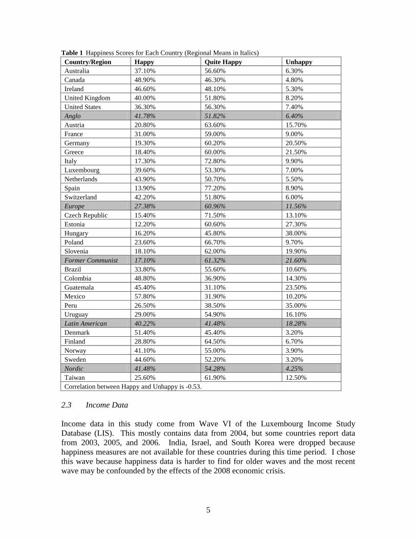
country: Happy (i.e. very happy), Quite Happy, and Unhappy. Table 1 displays the
percentage of respondents in each category for each country.
In this paper, I only examine the correlation of income inequality with Happy and
with Unhappy. I assume that Quite Happy is the default answer for most healthy people,
while variation in Happy and Unhappy will be a function of country characteristics. The
correlation between Happy and Unhappy is only -0.53, so the categories are not inverses.
Predicting two happiness variables, Happy and Unhappy, is preferable to any
attempt to reduce country level happiness to a single number. Any conceivable ratio of
Happy, Quite Happy, and Unhappy would raise the question of whether or not variation
was caused by change in the numerator, the denominator, or both. One could also
calculate a weighted average of reported happiness, but this would be meaningless on a
three point scale.
A single country score would also ignore the underlying distribution of happiness.
Some countries, for example Guatemala, have a relatively high share of both Happy and
Unhappy people and a relatively low share of Quite Happy people. Any single variable
would overlook cross-country differences in happiness distribution.
The issue of distribution is a major blind spot in the happiness literature and in
cross-country studies more broadly. Many happiness studies use the Pew Global Values
Survey, which has a 10 point scale for respondents’ happiness. I examined the Pew data
and found numerous instances where countries with similar means had very different
variances. For example, both India and Poland have a mean happiness of 6.2, but India’s
standard deviation is 0.086 while Poland’s is 0.333. Clearly these countries differ in
ways not captured by a simple mean.
Cross-national research on happiness inevitably runs into another problem. Are
differences across reported happiness in countries a result of actual differences in
happiness, or are they driven by cultural differences? For example, is a “very happy''
American happier than a “satisfied'' Brit, given the storied English penchant for stoicism
and the American preference for superlative language? In general, this problem is
quickly mentioned by researchers and then forgotten about. I only found one study that
tackled this issue directly. A team of psychologists asked students from different
countries to numerically score the favorability of different hypothetical situations. They
4
found that students gave similar scores regardless of their country of origin, and the
within-country variance far exceeded the small cross-country variance (Bolle, 2009).
This single study hardly settles the matter, but it does suggest that happiness can be
compared across countries. Another strong piece of evidence in support of cross-country
happiness studies is the persistence of statistically significant correlations between
happiness and common-sense effectors of happiness such as income, political freedom,
and health. If happiness responses were driven totally by country-specific norms, then
one would expect to find a random relationship between country characteristics and
happiness.
I decided to only use happiness data only from female respondents so that I could
use income inequality measures that apply only to women, specifically Single Mother
Poverty Rates and Female Poverty Rates. (Excluding males was not that significant,
given that the correlation between male and female happiness scores was 0.95.) Table 1
displays the happiness data used here.
5
Table 1 Happiness Scores for Each Country (Regional Means in Italics)
Country/Region Happy Quite Happy Unhappy
Australia 37.10% 56.60% 6.30%
Canada 48.90% 46.30% 4.80%
Ireland 46.60% 48.10% 5.30%
United Kingdom 40.00% 51.80% 8.20%
United States 36.30% 56.30% 7.40%
Anglo 41.78% 51.82% 6.40%
Austria 20.80% 63.60% 15.70%
France 31.00% 59.00% 9.00%
Germany 19.30% 60.20% 20.50%
Greece 18.40% 60.00% 21.50%
Italy 17.30% 72.80% 9.90%
Luxembourg 39.60% 53.30% 7.00%
Netherlands 43.90% 50.70% 5.50%
Spain 13.90% 77.20% 8.90%
Switzerland 42.20% 51.80% 6.00%
Europe 27.38% 60.96% 11.56%
Czech Republic 15.40% 71.50% 13.10%
Estonia 12.20% 60.60% 27.30%
Hungary 16.20% 45.80% 38.00%
Poland 23.60% 66.70% 9.70%
Slovenia 18.10% 62.00% 19.90%
Former Communist 17.10% 61.32% 21.60%
Brazil 33.80% 55.60% 10.60%
Colombia 48.80% 36.90% 14.30%
Guatemala 45.40% 31.10% 23.50%
Mexico 57.80% 31.90% 10.20%
Peru 26.50% 38.50% 35.00%
Uruguay 29.00% 54.90% 16.10%
Latin American 40.22% 41.48% 18.28%
Denmark 51.40% 45.40% 3.20%
Finland 28.80% 64.50% 6.70%
Norway 41.10% 55.00% 3.90%
Sweden 44.60% 52.20% 3.20%
Nordic 41.48% 54.28% 4.25%
Taiwan 25.60% 61.90% 12.50%
Correlation between Happy and Unhappy is -0.53.
2.3 Income Data
Income data in this study come from Wave VI of the Luxembourg Income Study
Database (LIS). This mostly contains data from 2004, but some countries report data
from 2003, 2005, and 2006. India, Israel, and South Korea were dropped because
happiness measures are not available for these countries during this time period. I chose
this wave because happiness data is harder to find for older waves and the most recent
wave may be confounded by the effects of the 2008 economic crisis.
6
LIS does not conduct its own income surveys, but rather harmonizes household
income datasets conducted by governments or data producers that participate in the
project. The goal of harmonization is to create comparable variables from each country’s
data, allowing researchers to compare income data from around the world even when data
producers conduct diverse income surveys. LIS also gives researchers access to data that
governments are hesitant to share.
LIS data are extremely high quality for several reasons. First, LIS has access to
detailed household income surveys, so non-wage income that other datasets overlook are
included. This is especially important in countries where a lot of economic activity is not
monetized or is informal. Second, the data allow researchers to account for household
size, which is important because households have economies of scale. These economies
of scale arise because individuals share resources in a household. This makes intuitive
sense: a four-person household would not need the four times the income of a one-person
household to have equal per-person consumption since individuals in the four-person
household would share the kitchen, the TV, the car, etc.
Finally, because LIS allows researchers to construct their own measures, we know
we are comparing apples to apples when making cross-country comparisons. This is
important because comparisons of official measures (such as poverty rates) can be
meaningless if governments have set different poverty lines. With LIS data, poverty rates
can be constructed uses the same poverty line, so comparisons are meaningful.
The income measures used in this paper are derived from one of LIS’s central
variables: Disposable Household Income (DHI). DHI captures a household’s income, net
of direct taxes and transfers.
2.4 Income Data Transformation
I began by transforming DHI into individual level data by assigning each individual in
the house an income equal to DHI divided by the square root of family size. This takes
into account household economies of scale because larger families will have their
household income divided into relatively smaller amounts.2 Other household weights are
possible, but using the square root of family size is the most widely used convention.
This transformation yields income data for “equivalized” individuals, meaning
that each member of a household is treated equally to all other members with respect to
income. The reader should keep in mind that when this paper refers to individual
income, the paper is actually referring to “equivalized” individuals. Using this
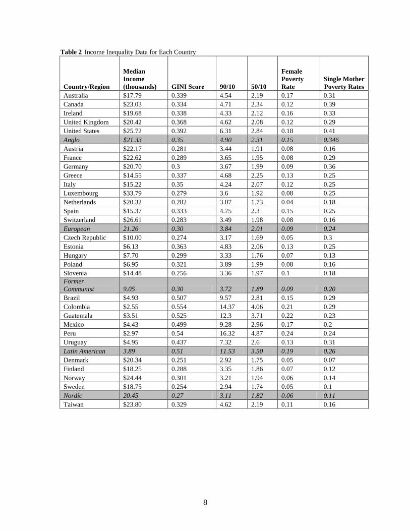
“equivalized” individual level data, I created five income variables (Table 2 displays the
values for each country):
1. Median Income: This is the median individual’s income in each country,
measured in thousands of US dollars. The median is a far better measure of a
country’s “average income” than the mean. In unequal societies, the mean
income is distorted by the wealthy, sometimes by a significant amount. Mexico,
for example, has a mean of $7,014 and a median of $4,426. As LIS data are
calculated using local currencies, I converted all amounts to US dollars using the
World Bank’s Development Indicators for exchange rates and purchasing power
parity (Taiwan’s data came from the International Monetary Fund). One flaw with
this measure is that it does not fully capture wealth. In a perfect world, we would
7
have a single measure that incorporates annual income with total net wealth. But
wealth data are sparse and there is no convention for integrating it with income
data.
2. GINI: GINI measures the distribution of wealth in a country. A GINI of 1 means
perfect inequality, while 0 indicates perfect equality. The weakness of the GINI is
that it is not sensitive to different distributions of income.
3. 90/10 and 50/10 Ratios: These are the ratios between different income percentiles.
These ratios help correct for GINI’s inability to differentiate between income
distributions. The 90/50 ratio is not examined because it correlates with GINI at
0.99.
4. Female Poverty Rates: This is the percent of the female population that lives in
households where the individual income is below 50% of the country’s Median
Income. Establishing a poverty line at 50% of Median Income makes cross-
country comparisons more meaningful than using official poverty lines, which
may not be comparable across countries. The sample omits females below the
age of 25 to exclude minors and college students who appear poor in survey data
but are obviously in a different category.
5. Single Mother Poverty Rates: This is the fraction of single mothers living in
households were the individual income is below 50% of the country’s Median
Income. Defining single mothers is not straightforward; there are many variables
to consider. The precise definition of single mothers used in this dataset is
mothers who are not living with their partners and have children living in their
house. This definition excludes mothers who live with their own parents and are
not the household head, and it excludes women whose children do not live with
them. It does not take into account legal marriage status, so married mothers
whose husbands do not live at home would be counted as single mothers.
8
Table 2 Income Inequality Data for Each Country
Country/Region
Median
Income
(thousands) GINI Score 90/10 50/10
Female
Poverty
Rate
Single Mother
Poverty Rates
Australia $17.79 0.339 4.54 2.19 0.17 0.31
Canada $23.03 0.334 4.71 2.34 0.12 0.39
Ireland $19.68 0.338 4.33 2.12 0.16 0.33
United Kingdom $20.42 0.368 4.62 2.08 0.12 0.29
United States $25.72 0.392 6.31 2.84 0.18 0.41
Anglo $21.33 0.35 4.90 2.31 0.15 0.346
Austria $22.17 0.281 3.44 1.91 0.08 0.16
France $22.62 0.289 3.65 1.95 0.08 0.29
Germany $20.70 0.3 3.67 1.99 0.09 0.36
Greece $14.55 0.337 4.68 2.25 0.13 0.25
Italy $15.22 0.35 4.24 2.07 0.12 0.25
Luxembourg $33.79 0.279 3.6 1.92 0.08 0.25
Netherlands $20.32 0.282 3.07 1.73 0.04 0.18
Spain $15.37 0.333 4.75 2.3 0.15 0.25
Switzerland $26.61 0.283 3.49 1.98 0.08 0.16
European 21.26 0.30 3.84 2.01 0.09 0.24
Czech Republic $10.00 0.274 3.17 1.69 0.05 0.3
Estonia $6.13 0.363 4.83 2.06 0.13 0.25
Hungary $7.70 0.299 3.33 1.76 0.07 0.13
Poland $6.95 0.321 3.89 1.99 0.08 0.16
Slovenia $14.48 0.256 3.36 1.97 0.1 0.18
Former
Communist 9.05 0.30 3.72 1.89 0.09 0.20
Brazil $4.93 0.507 9.57 2.81 0.15 0.29
Colombia $2.55 0.554 14.37 4.06 0.21 0.29
Guatemala $3.51 0.525 12.3 3.71 0.22 0.23
Mexico $4.43 0.499 9.28 2.96 0.17 0.2
Peru $2.97 0.54 16.32 4.87 0.24 0.24
Uruguay $4.95 0.437 7.32 2.6 0.13 0.31
Latin American 3.89 0.51 11.53 3.50 0.19 0.26
Denmark $20.34 0.251 2.92 1.75 0.05 0.07
Finland $18.25 0.288 3.35 1.86 0.07 0.12
Norway $24.44 0.301 3.21 1.94 0.06 0.14
Sweden $18.75 0.254 2.94 1.74 0.05 0.1
Nordic 20.45 0.27 3.11 1.82 0.06 0.11
Taiwan $23.80 0.329 4.62 2.19 0.11 0.16
9
3 Method I: Analysis of Regions
Initial explorations into the dataset yielded some counterintuitive correlations between
happiness and income inequality. Upon further examination, it became clear that
different regions have different relationships between happiness and inequality. It is not
clear if these differences are due to culture, history, political and economic institutions, or
some other factor. This part of the paper will highlight the empirical differences between
regions.
3.1 Latin America
The six Latin American countries all have a high share of Happy people. Mexico is by
far the happiest country in the sample, with Colombia and Guatemala not far behind. The
country with the lowest share of Happy people in Latin America, Uruguay, is still in the
middle of the sample.
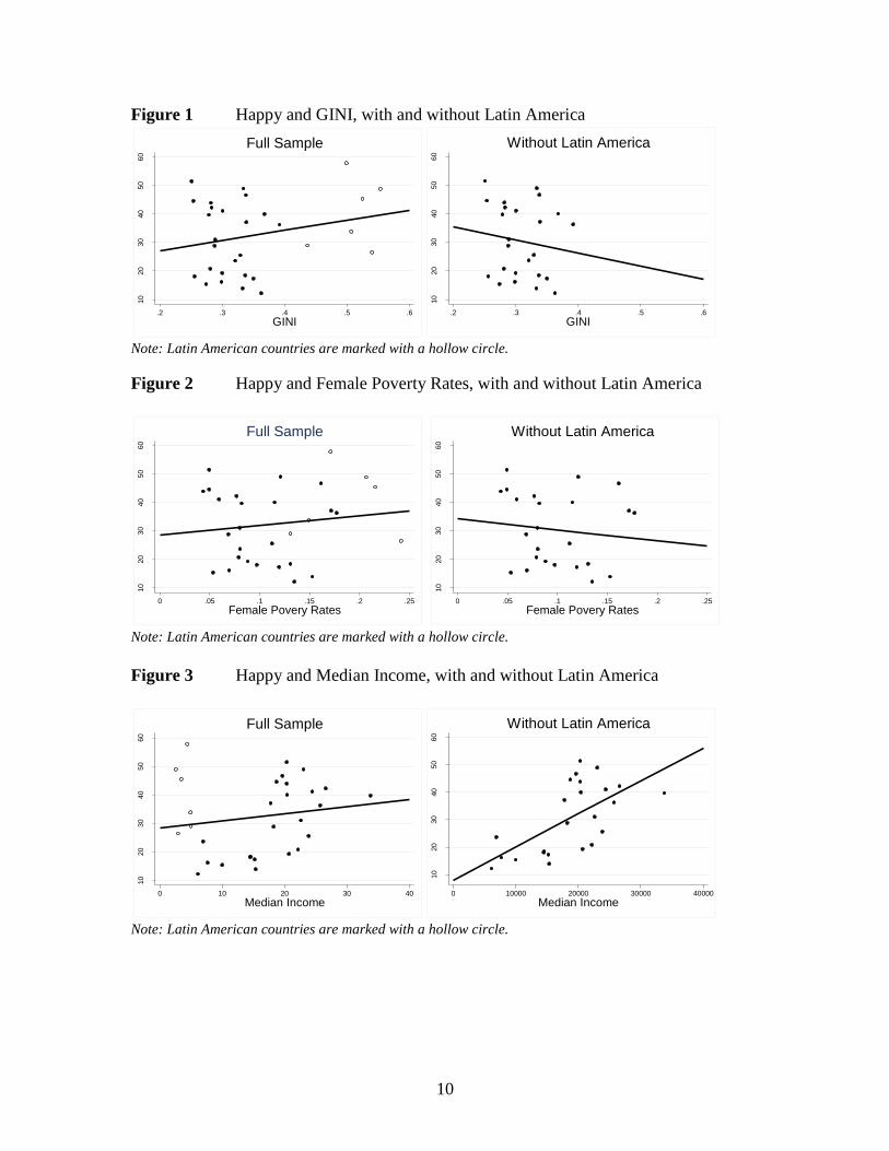
Latin American countries are even more exceptional with respect to income
measures, specifically GINI, Female Poverty Rates, and Median Income. Interestingly,
the region is not notable for Single Mother Poverty Rates, possibly because single
mothers face strong pressure to live with their parents.
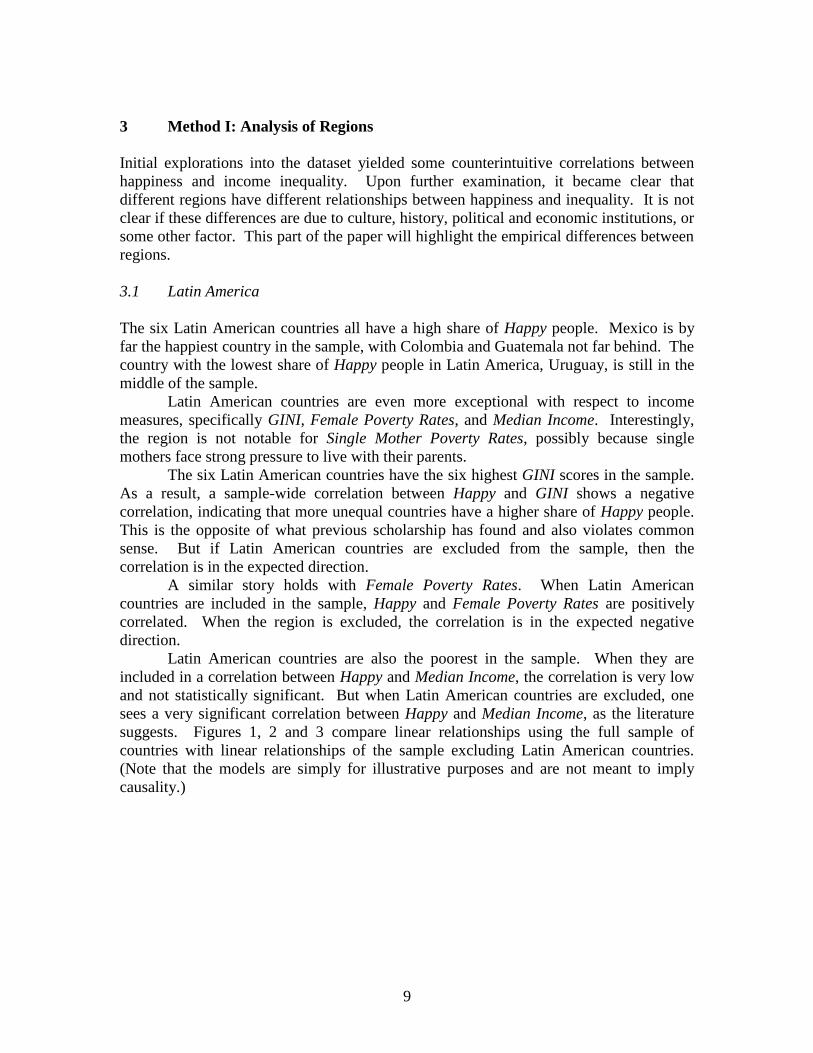
The six Latin American countries have the six highest GINI scores in the sample.
As a result, a sample-wide correlation between Happy and GINI shows a negative
correlation, indicating that more unequal countries have a higher share of Happy people.
This is the opposite of what previous scholarship has found and also violates common
sense. But if Latin American countries are excluded from the sample, then the
correlation is in the expected direction.
A similar story holds with Female Poverty Rates. When Latin American
countries are included in the sample, Happy and Female Poverty Rates are positively
correlated. When the region is excluded, the correlation is in the expected negative
direction.
Latin American countries are also the poorest in the sample. When they are
included in a correlation between Happy and Median Income, the correlation is very low
and not statistically significant. But when Latin American countries are excluded, one
sees a very significant correlation between Happy and Median Income, as the literature
suggests. Figures 1, 2 and 3 compare linear relationships using the full sample of
countries with linear relationships of the sample excluding Latin American countries.
(Note that the models are simply for illustrative purposes and are not meant to imply
causality.)
10
Figure 1 Happy and GINI, with and without Latin America
10
20
30
40
50
60
.2 .3 .4 .5 .6
GINI
Full Sample
10
20
30
40
50
60
.2 .3 .4 .5 .6
GINI
Without Latin America
Note: Latin American countries are marked with a hollow circle.
Figure 2 Happy and Female Poverty Rates, with and without Latin America
10
20
30
40
50
60
0 .05 .1 .15 .2 .25
Female Povery Rates
Full Sample
10
20
30
40
50
60
0 .05 .1 .15 .2 .25
Female Povery Rates
Without Latin America
Note: Latin American countries are marked with a hollow circle.
Figure 3 Happy and Median Income, with and without Latin America
10
20
30
40
50
60
0 10 20 30 40
Median Income
Full Sample
10
20
30
40
50
60
0 10000 20000 30000 40000
Median Income
Without Latin America
Note: Latin American countries are marked with a hollow circle.
11
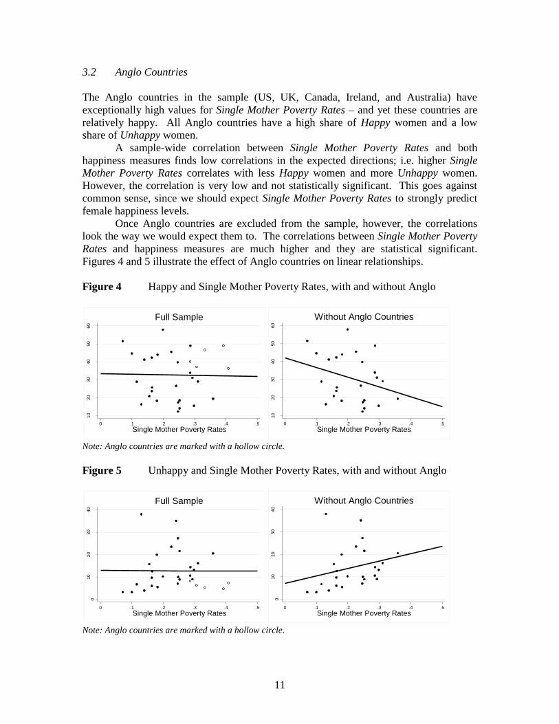
3.2 Anglo Countries
The Anglo countries in the sample (US, UK, Canada, Ireland, and Australia) have
exceptionally high values for Single Mother Poverty Rates – and yet these countries are
relatively happy. All Anglo countries have a high share of Happy women and a low
share of Unhappy women.
A sample-wide correlation between Single Mother Poverty Rates and both
happiness measures finds low correlations in the expected directions; i.e. higher Single
Mother Poverty Rates correlates with less Happy women and more Unhappy women.
However, the correlation is very low and not statistically significant. This goes against
common sense, since we should expect Single Mother Poverty Rates to strongly predict
female happiness levels.
Once Anglo countries are excluded from the sample, however, the correlations
look the way we would expect them to. The correlations between Single Mother Poverty
Rates and happiness measures are much higher and they are statistical significant.
Figures 4 and 5 illustrate the effect of Anglo countries on linear relationships.
Figure 4 Happy and Single Mother Poverty Rates, with and without Anglo
10
20
30
40
50
60
0 .1 .2 .3 .4 .5
Single Mother Poverty Rates
Full Sample
10
20
30
40
50
60
0 .1 .2 .3 .4 .5
Single Mother Poverty Rates
Without Anglo Countries
Note: Anglo countries are marked with a hollow circle.
Figure 5 Unhappy and Single Mother Poverty Rates, with and without Anglo
010
20
30
40
0 .1 .2 .3 .4 .5
Single Mother Poverty Rates
Full Sample
010
20
30
40
0 .1 .2 .3 .4 .5
Single Mother Poverty Rates
Without Anglo Countries
Note: Anglo countries are marked with a hollow circle.
12
3.3 The Importance of Regions
The Latin American and Anglo countries powerfully influence the correlations between
happiness and inequality. Other regions, however, are also exceptional in certain
measures. Former Communist Countries, for example, tend to have a lot of Unhappy
people; they also tend to be very equal. Nordic countries have exceptionally low GINI
and very low poverty rates.
After conducting a region-by-region analysis, it can be concluded that sample-
wide correlations are confounded by differences between regions. Regions clearly have
unique characteristics that influence the relationship between happiness and inequality.
Under these circumstances, a fixed effects regression model has the best chance of
estimating this relationship.
4 Data Analysis II: Fixed Effects Models
Fixed effects models are called for when “the unobserved individual effect embodies
elements that are correlated with the regressors in the model (Green, 2007 p.183).” In
layman’s terms, this means that the relationship between happiness and inequality is
influenced by variables that we cannot observe, e.g. culture, political institutions, climate,
etc. If these unobserved variables affect both happiness and income inequality, then a
ordinary least squares regression is biased. A fixed effects model will be less biased
because it controls for these unobserved variables.
A fixed effects model works by creating a dummy variable for a group of
observations. In this case, the observations are countries and the groups are regions. In
theory, each region has unobserved characteristics that influence the relationship between
happiness and inequality. By creating a dummy variable for each region, the model
controls for these characteristics.
Fixed effects models have two weaknesses. First, the variables that they control
for are unobserved. Therefore, one can never be sure that these variables exist or even
matter. Second, the variables being controlled for may have heterogeneous effects within
regions, but using a single dummy variable per region assumes that the variables have
homogenous effects within regions. Despite these flaws, however, a fixed effects model
presents the best model. Part 3 of this paper strongly indicates than a correlation
coefficient or an ordinary least squares model would be biased. Further, there is no
theoretically sound reason to use a random effects model (for the sake of completeness, I
did run some random effects models; the ensuing Hausman tests rejected the random
effects models).
Before proceeding, one important point must be emphasized. This paper uses a
fixed effects model as the best way to describe the observed relationship between
happiness and inequality - the model cannot demonstrate causality. And although it is
reasonable to assume that inequality has a causal effect on happiness, this relationship
cannot be proven given the available data. The possible directions of causality are
discussed in more detail below.
13
4.1 Evidence for Selection of Regions
Dividing countries into regions is strongly supported by previous scholarship. Alesina et
al., find that Americans and Europeans are affected by inequality differently. Another
paper argues that high levels of religiosity in the US compensate for high inequality
(Scheve and Stasavage, 2006). Esping-Andersen’s famous typology of welfare states
divides the western world into Liberal, Corporatist-Statist, and Social Democratic, which
roughly correspond to Anglo, European, and Nordic countries (Esping-Andersen, 1990).
The research team behind the World Values Survey has generated a famous graph called
“The Cultural Map of the World,” in which the regions used in the paper are shown to
have similar values (World Values Survey, 2014a). Table 3 displays how this paper
divides the sample of countries into five regions.
Table 3 Regional Groupings
Anglo Europe Former
Communist
Latin
American
Nordic
Australia Austria Czech Republic Brazil Denmark
Canada Germany Estonia Colombia Finland
Ireland Greece Hungary Guatemala Norway
United States Italy Poland Mexico Sweden
United Kingdom Luxembourg Slovenia Peru
Netherlands Uruguay
Spain
Switzerland
Taiwan is the reference category
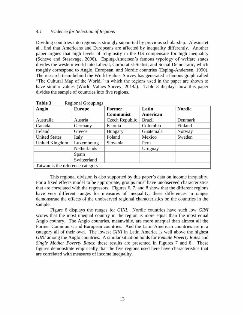
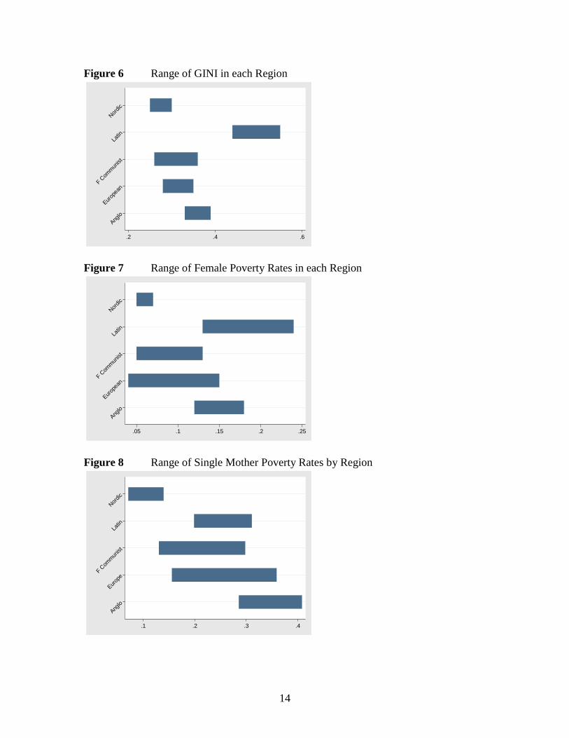
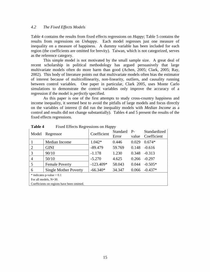
This regional division is also supported by this paper’s data on income inequality.
For a fixed effects model to be appropriate, groups must have unobserved characteristics
that are correlated with the regressors. Figures 6, 7, and 8 show that the different regions
have very different ranges for measures of inequality; these differences in ranges
demonstrate the effects of the unobserved regional characteristics on the countries in the
sample.
Figure 6 displays the ranges for GINI. Nordic countries have such low GINI
scores that the most unequal country in the region is more equal than the most equal
Anglo country. The Anglo countries, meanwhile, are more unequal than almost all the
Former Communist and European countries. And the Latin American countries are in a
category all of their own. The lowest GINI in Latin America is well above the highest
GINI among the Anglo countries. A similar situation holds for Female Poverty Rates and
Single Mother Poverty Rates; these results are presented in Figures 7 and 8. These
figures demonstrate empirically that the five regions used here have characteristics that
are correlated with measures of income inequality.
14
Figure 6 Range of GINI in each Region
Ang
lo
Eur
opea
nF C
omm
unist
Latin
Nor
dic
.2 .4 .6
Figure 7 Range of Female Poverty Rates in each Region
Ang
lo
Eur
opea
nF C
omm
unist
Latin
Nor
dic
.05 .1 .15 .2 .25
Figure 8 Range of Single Mother Poverty Rates by Region
Ang
lo
Eur
ope
F Com
mun
ist
Latin
Nor
dic
.1 .2 .3 .4
15
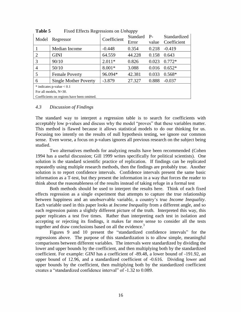
4.2 The Fixed Effects Models
Table 4 contains the results from fixed effects regressions on Happy; Table 5 contains the
results from regressions on Unhappy. Each model regresses just one measure of
inequality on a measure of happiness. A dummy variable has been included for each
region (the coefficients are omitted for brevity). Taiwan, which is not categorized, serves
as the reference category.
This simple model is not motivated by the small sample size. A great deal of
recent scholarship in political methodology has argued persuasively that large
multivariate models often do more harm than good (Achen, 2005; Clark, 2005; Ray,
2002). This body of literature points out that multivariate models often bias the estimator
of interest because of multicollinearity, non-linearity, outliers, and causality running
between control variables. One paper in particular, Clark 2005, uses Monte Carlo
simulations to demonstrate the control variables only improve the accuracy of a
regression if the model is perfectly specified.
As this paper is one of the first attempts to study cross-country happiness and
income inequality, it seemed best to avoid the pitfalls of large models and focus directly
on the variables of interest (I did run the inequality models with Median Income as a
control and results did not change substantially). Tables 4 and 5 present the results of the
fixed effects regressions.
Table 4 Fixed Effects Regressions on Happy
Model Regressor Coefficient Standard
Error
P-
value
Standardized
Coefficient
1 Median Income 1.042* 0.446 0.029 0.674*
2 GINI -89.479 59.769 0.148 -0.616
3 90/10 -1.178 1.230 0.348 -0.313
4 50/10 -5.270 4.625 0.266 -0.297
5 Female Poverty -123.409* 58.043 0.044 -0.505*
6 Single Mother Poverty -66.340* 34.347 0.066 -0.437*
* indicates p-value < 0.1
For all models, N=30.
Coefficients on regions have been omitted.
16
Table 5 Fixed Effects Regressions on Unhappy
Model Regressor Coefficient Standard
Error
P-
value
Standardized
Coefficient
1 Median Income -0.448 0.354 0.218 -0.419
2 GINI 64.559 44.228 0.158 0.643
3 90/10 2.011* 0.826 0.023 0.772*
4 50/10 8.001* 3.088 0.016 0.652*
5 Female Poverty 96.094* 42.381 0.033 0.568*
6 Single Mother Poverty -3.879 27.327 0.888 -0.037
* indicates p-value < 0.1
For all models, N=30.
Coefficients on regions have been omitted.
4.3 Discussion of Findings
The standard way to interpret a regression table is to search for coefficients with
acceptably low p-values and discuss why the model “proves” that these variables matter.
This method is flawed because it allows statistical models to do our thinking for us.
Focusing too intently on the results of null hypothesis testing, we ignore our common
sense. Even worse, a focus on p-values ignores all previous research on the subject being
studied.
Two alternatives methods for analyzing results have been recommended (Cohen
1994 has a useful discussion; Gill 1999 writes specifically for political scientists). One
solution is the standard scientific practice of replication. If findings can be replicated
repeatedly using multiple research methods, then the findings are probably true. Another
solution is to report confidence intervals. Confidence intervals present the same basic
information as a T-test, but they present the information in a way that forces the reader to
think about the reasonableness of the results instead of taking refuge in a formal test
Both methods should be used to interpret the results here. Think of each fixed
effects regression as a single experiment that attempts to capture the true relationship
between happiness and an unobservable variable, a country’s true Income Inequality.
Each variable used in this paper looks at Income Inequality from a different angle, and so
each regression paints a slightly different picture of the truth. Interpreted this way, this
paper replicates a test five times. Rather than interpreting each test in isolation and
accepting or rejecting its findings, it makes far more sense to consider all the tests
together and draw conclusions based on all the evidence.3
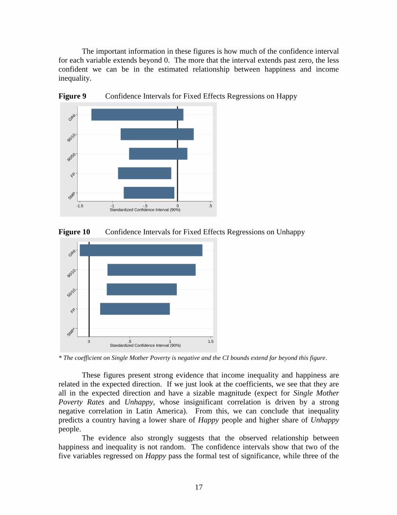
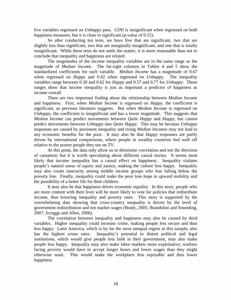
Figures 9 and 10 present the “standardized confidence intervals” for the
regressions above. The purpose of this standardization is to allow simple, meaningful
comparisons between different variables. The intervals were standardized by dividing the
lower and upper bounds by the coefficient, and then multiplying both by the standardized
coefficient. For example: GINI has a coefficient of -89.48, a lower bound of -191.92, an
upper bound of 12.96, and a standardized coefficient of -0.616. Dividing lower and
upper bounds by the coefficient, then multiplying both by the standardized coefficient
creates a “standardized confidence interval” of -1.32 to 0.089.
17
The important information in these figures is how much of the confidence interval
for each variable extends beyond 0. The more that the interval extends past zero, the less
confident we can be in the estimated relationship between happiness and income
inequality.
Figure 9 Confidence Intervals for Fixed Effects Regressions on Happy
SM
P
GIN
I
90/1
0
FP
90/5
0
-1.5 -1 -.5 0 .5Standardized Confidence Interval (90%)
Figure 10 Confidence Intervals for Fixed Effects Regressions on Unhappy
SM
P*
FP
50/1
0
90/1
0
GIN
I
0 .5 1 1.5Standardized Confidence Interval (90%)
* The coefficient on Single Mother Poverty is negative and the CI bounds extend far beyond this figure.
These figures present strong evidence that income inequality and happiness are
related in the expected direction. If we just look at the coefficients, we see that they are
all in the expected direction and have a sizable magnitude (expect for Single Mother
Poverty Rates and Unhappy, whose insignificant correlation is driven by a strong
negative correlation in Latin America). From this, we can conclude that inequality
predicts a country having a lower share of Happy people and higher share of Unhappy
people.
The evidence also strongly suggests that the observed relationship between
happiness and inequality is not random. The confidence intervals show that two of the
five variables regressed on Happy pass the formal test of significance, while three of the
18
five variables regressed on Unhappy pass. GINI is insignificant when regressed on both
happiness measures, but it is close to significant (p-value of 0.15).
So after conducting ten tests, we have five that are significant, two that are
slightly less than significant, two that are marginally insignificant, and one that is totally
insignificant. While these tests do not settle the matter, it is more reasonable than not to
conclude that inequality and happiness are related.
The magnitudes of the income inequality variables are in the same range as the
magnitude of Median Income. The far-right columns in Tables 4 and 5 show the
standardized coefficients for each variable. Median Income has a magnitude of 0.67
when regressed on Happy and 0.42 when regressed on Unhappy. The inequality
variables range between 0.30 and 0.62 for Happy and 0.57 and 0.77 for Unhappy. These
ranges show that income inequality is just as important a predictor of happiness as
income overall.
There are two important finding about the relationship between Median Income
and happiness. First, when Median Income is regressed on Happy, the coefficient is
significant, as previous literature suggests. But when Median Income is regressed on
Unhappy, the coefficient is insignificant and has a lower magnitude. This suggests that
Median Income can predict movements between Quite Happy and Happy, but cannot
predict movements between Unhappy into Quite Happy. This may be because Unhappy
responses are caused by persistent inequality and rising Median Incomes may not lead to
any economic benefits for the poor. It may also be that Happy responses are partly
driven by international comparisons, where people in wealthy countries feel well off
relative to the poorer people they see on TV.
At this point, the data only allow us to determine correlation and not the direction
of causation; but it is worth speculating about different causal stories. It seems most
likely that income inequality has a causal effect on happiness. Inequality violates
people’s natural sense of equity and justice, making the culture less happy. Inequality
may also create insecurity among middle income groups who fear falling below the
poverty line. Finally, inequality could make the poor lose hope in upward mobility and
the possibility of a better life for their children.
It may also be that happiness drives economic equality. In this story, people who
are more content with their lives will be more likely to vote for policies that redistribute
income, thus lowering inequality and poverty rates. This story is supported by the
overwhelming data showing that cross-country inequality is driven by the level of
government redistribution and not market wages (Brady, 2005; Brandolini and Smeeding,
2007; Scruggs and Allen, 2006).
The correlation between inequality and happiness may also be caused by third
variables. Higher inequality could increase crime, making people less secure and thus
less happy. Latin America, which is by far the most unequal region in this sample, also
has the highest crime rates. Inequality’s potential to distort political and legal
institutions, which would give people less faith in their government, may also make
people less happy. Inequality may also make labor markets more exploitative; workers
facing poverty would have to accept longer hours and lower wages than they might
otherwise want. This would make the workplace less enjoyable and thus lower
happiness.
19
5 Conclusion
This paper finds that income inequality is correlated with a country’s level of happiness:
more equal countries have more Happy people and less Unhappy people. This
relationship, however, is strongly mediated by the characteristics of different regions.
Further, the magnitude of this relationship is similar to the magnitude that a country’s
Median Income has on its level of happiness.
The findings presented here corroborate previous research, both on Median
Income and income inequality. This paper contributes in two important ways. First, its
sample of countries is much larger than samples used in previous papers. This paper
controlled for characteristics of different regions and still found a significant relationship
between inequality and happiness, suggesting that this relationship is universal. Second,
this paper shows that income inequality is just as important as Median Income. Based on
this finding, it seems that societies should be just as concerned about distribution as they
are about growth.
I will end by suggesting four ways to improve research on this topic. The first
method is simply to have data on more countries. This obvious improvement is
constrained by the challenge of measuring income in most economies. In non-
industrialized countries, a majority of economic activity is conducted outside the formal
sector. Often, economic activity does not even involve the exchange of money as much
as the exchange of favors or bartering. As such, measures of income can fluctuate wildly.
For example, numerous expenditure-based studies have calculated that India’s GINI is
between 0.30 and 0.35; a recent income-based approach, however, concluded that India’s
GINI is actually 0.52 (Desai et al. 2010). Given that both approaches were conducted by
sincere, knowledgeable, well-funded researchers, we can only conclude that measuring
incomes in India cannot be done with any precision.
A second way to improve research would be to look at changes in happiness and
income inequality over time. At present, however, this path is also constrained by lack of
available data. Income inequality changes very slowly, and we can surmise that national
happiness also changes slowly. In addition, a population’s perception of income
inequality may change even more slowly than actual income inequality. As such, it will
take decades of continuous data collection before a time-series analysis can be conducted.
A third avenue for improving research would be to combine neighborhood, city,
country, and regional data. This paper looks at cross-country variation, but country level
inequality may not be the strongest predictor of happiness. Individuals may care more
about inequality within their immediate neighborhoods, cities, or counties. Conversely,
individuals may be more concerned about their income in an international context. For
example, a rich Guatemalan who frequently travels to Europe may be unhappy because
she compares herself to Europeans rather than her countrymen.
Finally, this research project can be improved by ironing out the differences in
cross-country analysis and individual level analysis. For example, one paper argues that
Latin Americans are more concerned about inequality than Americans and Europeans
(Graham 2006). This conclusion somewhat contradicts the findings present here, given
that Latin Americans have a very high share of Happy despite extreme inequality (of
course, Latin Americans also have a high share of Unhappy). This difference is hard to

20
reconcile, as their paper and mine use different data. Nevertheless, an ideal research
project would reconcile the different inferences made by different levels of analysis.
21
References
Achen, Christopher (2005) ‘Let's Put Garbage-Can Regressions and Garbage-Can Probits
Where They Belong’, Conflict Management and Peace Science. Vol.22, No.4, pp.327
Alesina Alberto, Rafael Di Tellab, Robert MacCulloch (2004) ‘Inequality and Happiness:
Are Europeans and Americans Different?’, Journal of Public Economics Vol.88,
pp.2009– 2042
Berg, Andrew and Jonathan D. Ostry (2011) ‘Inequality and Unsustainable Growth: Two
Sides of the Same Coin?’ IMF Staff Discussion Note, 8 April 2011, SDN/11/08
Bolle, Friedel and Simon Kemp (2009) ‘Can We Compare Life Satisfaction between
Nationalities? Evaluating Actual and Imagined Situations’, Social Indicators Research,
Vol.90, No.3, pp. 397-408
Brady, David (2005) ‘The Welfare State and Relative Poverty in Rich Western
Democracies, 1967-1997’, Social Forces, Vol 83, No.4, pp.1329–1364
Brandolini, Andrea and Timothy Smeeding (2007) ‘Inequality in Western Democracies:
Cross-Country Differences and Time Change’, Luxembourg Income Study Working
Paper Series Working Paper No. 458
Clark, Andrew (2012) ‘The Great Happiness Moderation’, Discussion Paper No. 6761,
Institute for the Study of Labor
Cohen, Jacob (1994) ‘The Earth is Round’, American Psychologist, Vol.49, No.12, pp.
997
Deaton, Angus (2007) ‘Income, Aging, Health, and Wellbeing Around the World’, NBER
Working Paper 13317
Desai, Sonalde B, Amaresh Dubey, Brij Lal Joshi, Mitali Sen, Abusaleh Shariff, and
Reeve Vanneman (2010) Human Development in India: Challenges for a Society in
Transition, New Delhi: Oxford University Press.
Easterlin, William (1974) ‘Does Economic Growth Improve the Human Lot? Some
Empirical Evidence’, [online]
http://graphics8.nytimes.com/images/2008/04/16/business/Easterlin1974.pdf
(Accessed on 17 September 2013).
Eurobarometer Data [online] http://www.gesis.org/en/eurobarometer/home/ (Accessed 10
September 2013)
Esping Andersen, Gosta (1990) The Three Worlds of Welfare Capitalism. Cambridge:
Polity Press & Princeton: Princeton University Press
22
Galbraith, James (2008) The Predator State, New York: Free Press
Gilens, Martin (2005) ‘Inequality and Democratic Responsiveness’, Public Opinion
Quarterly, Vol.69, No.5, pp.778–796
Gilens, Martin and Benjamin Page (2014) ‘Testing Theories of American Politics: Elites,
Interest Groups, and Average Citizens’, forthcoming in Perspectives on Politics, Vol. 12
No.2.
Graham, Carol and Andrew Felton (2006) ‘Inequality and Happiness: Insights from Latin
America’, Journal of Economic Inequality, Vol.4, pp.107–122
Gill, Jeff (1999) ‘The Insignificance of Null Hypothesis Significance Testing’, Political
Research Quarterly, Vol.52, No.3, pp.647-674.
Greene, William (2008) Econometric Analysis, 6th edition, New Jersey: Prentice Hall,
Hacker, Jacob and Paul Pierson (2011) Winner-Take-All Politics: How Washington Made
the Rich Richer--and Turned Its Back on the Middle Class, New York: Simon & Schuster
Hagerty, Michael (2000) ‘Social Comparisons of Income in One's Community: Evidence
from National Surveys of Income and Happiness’, Journal of Personality and Social
Psychology, Vol.78, No.4, pp.764-771
Helliwell, John, Christopher P. Barrington-Leigh, Anthony Harris, and Haifang Huang
(2009) ‘International Evidence on the Social Context of Wellbeing’, NBER Working
Paper 14720
Kenworthy, Lane (2003) ‘An Equality-Growth Tradeoff?’, Luxembourg Income Study
Working Paper Series, Working Paper No. 362
Krugman, Paul (2012) End This Depression Now!, New York: W.W. Norton
Luxembourg Income Study (LIS) Database [online] http://www.lisdatacenter.org/
(Accessed 10 September 2014) Luxembourg: LIS.
OECD (2008) Growing Unequal: Income Distribution and Poverty in OECD Countries,
Paris: OECD.
Ostry, Jonathan D., Andrew Berg, Charalambos G. Tsangarides (2014) ‘Redistribution,
Inequality, and Growth’, IMF Staff Discussion Note, February 2014, SDN/14/02
Ray, J. L. (2002) Explaining interstate conflict and war: What should be controlled for?
Presidential Address to the Peace Science Society, University of Arizona, Tucson,
23
November 2, 2002 [online] http://qssi.psu.edu/files/Ray_2003.pdf (Accessed 24 February
2014).
Reich, Robert B (2012) Beyond Outrage: Expanded Edition: What has gone wrong with
our economy and our democracy, and how to fix it, New York: Vintage
Scheve, Kenneth and David Stasavage (2006) ‘Religion and Preferences for Social
Insurance’, Quarterly Journal of Political Science, Vol.1, pp.255-286
Scruggs, Lyle and James P. Allan (2006) ‘The Material Consequences of Welfare States:
Benefit Generosity and Absolute Poverty in 16 OECD Countries’, Comparative Political
Studies, Vol.39, pp.880
Stephenson, Betsey and Justin Wolfers (2008) ‘Economic Growth and Subjective
Wellbeing: Reassessing the Easterlin Paradox’, Brookings Papers on Economic Activity
Stiglitz, Joseph (2013) The Price of Inequality: How Today's Divided Society Endangers
Our Future. W. W. Norton & Company
World Values Survey; The WVS Cultural Map of the World, [online]
http://www.worldvaluessurvey.org/wvs/articles/folder_published/article_base_54
(Accessed 24 February 2014)
World Values Survey; Download Data files of the Values Survey [online]
http://www.wvsevsdb.com/wvs/WVSData.jsp (Accessed 24 February 2014)
Notes
1. http://www.worldvaluessurvey.org/ and http://ec.europa.eu/public_opinion/index_en.htm
2. Consider an example where two families of different sizes both have an income of $100,000. A
four person family will have per-capita income of $50,000 [100,000/√4], while an eight person
household will have per-capita income of $35,360 [100,000/√8], not $25,000.
3. If this seems odd, consider the strangeness of the common practice of interpreting each regression
in isolation. Imagine if 19 of 20 similar regressions returned p-values of over 0.5, but the 20th
regression returned a p-value of 0.001. Should we conclude that this final regression has proven
something? Or should we conclude that this tiny p-value is the result of randomness? I would
interpret this final regression as meaningless, but could only do so based on the other 19 results.