Embed Size (px)
DESCRIPTION
http://www.ianmartinadams.co.uk/uniwork/
Citation preview
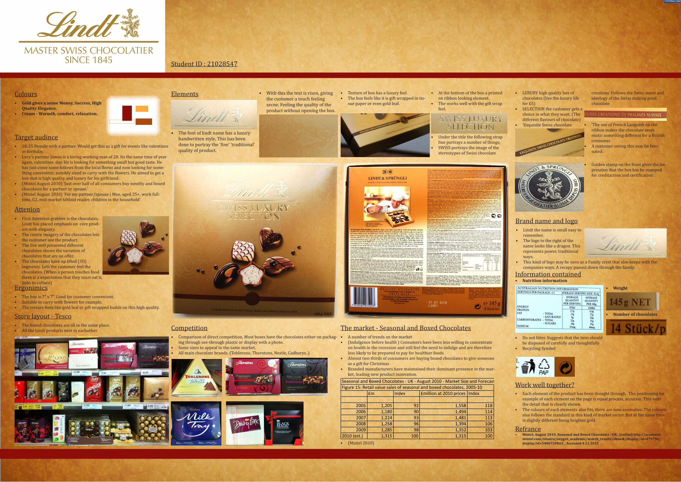
ElementsColours
Target audince
Attenion
Ergonimics
Store layout - Tesco
• GoldgivesasenseMoney,Success,HighQualityElegance.
• Cream-Warmth,comfort,relaxation.
• 18-25 Female with a partner. Would get this as a gift for events like valentines or birthday.
• Lucy’s partner James is a loving working man of 28. Its the same time of year again, valentines day. He is looking for something small but good taste. He has just come some follows from the local florist and now looking for some-thing convenient, suitably sized to carry with the flowers. He aimed to get a box that is high quality and luxury for his girlfriend.
• (Mintel August 2010) ‘Just over half of all consumers buy novelty and boxed chocolates for a partner or spouse.’
• (Mintel August 2010) ‘For my partner/spouse | Men, aged 25+, work full-time, C2, mid-market tabloid reader, children in the household’
• First Attention grabber is the chocolates. Lindt has placed emphasis on core prod-uct with elegancy.
• The centre imagery of the chocolates lets the customer see the product.
• The five well presented different chocolates shows the variation of chocolates that are on offer.
• The chocolates have up lifted (3D) segments. Lets the customer feel the chocolates. (When a person touches food there is a expectation that they must eat it, links to culture)
• The box is 7” x 7”. Good for customer convenient. • Suitable to carry with flowers for example.• The texture feels like gold leaf or gift wrapped builds on this high quality.
• The boxed chocolates are all in the same place.• All the Lindt products next to eachother.
• The font of lindt name has a luxury handwritten style. This has been done to portray the ‘fine’ ‘traditional’ quality of product.
• With this the text is risen, giving the customer a touch feeling secne. Feeling the quality of the product without opening the box.
• Texture of box has a luxury feel.• The box feels like it is gift wrapped in tis-
sue paper or even gold leaf.
• At the bottom of the box a printed on ribbon looking element.
• The works well with the gift wrap feel.
• Under the title the following strap line portrays a number of things;
• SWISS portrays the image of the stereotypes of Swiss chocolate
• LUXURY high quality box of chocolates (live the luxury life for £5)
• SELECTION the customer gets a choice in what they want. (The different flavours of chocolate)
• ‘Exquisite Swiss chocolate
creations’ Follows the Swiss name and ideology of the Swiss making good chocolate.
• ‘The use of French Languish on the ribbon makes the chocolate seem exotic something different for a British consumer.
• A customer seeing this may be fasci-nated.
• Golden stamp on the front gives the im-pression that the box has be stamped for creditaction and certification.
Competition• Comparison of direct competition, Most boxes have the chocolates either on packag-
ing through see-through plastic or display with a photo.• Same sizes to appeal to the same market.• All main chocolate brands. (Toblerone, Thorntons, Nestle, Cadburys..)
Information contained• Nutritioninformation
• Donotlitter.Suggeststhattheitemshouldbedisposedofcarefullyandthoughtfully
• RecyclingSymbol
• Weight
• Numberofchocolates
Work well together?
Refrance
Brand name and logo• Lindt the name is small easy to
remember.• The logo to the right of the
name looks like a dragon. This represents power, traditional ways.
• This kind of logo may be seen as a Family crest that also keeps with the companies ways. A recapy passed down through the faimly.
• Each element of the product has been thought through. The positioning for example of each element on the page is equal process, accurate. This suits the detail that is clearly shown.
• The colours of each elements also fits, there are now anomalies. The colours also follows the standard in this kind of market sector. But at the same time is slightly different being brighter gold.
• Mintel,August2010,SeasonalandBoxedChocolates–UK,[online]http://academic.mintel.com/sinatra/oxygen_academic/search_results/show&/display/id=479796/display/id=540672#hit1,Accessed4.11.2011
The market - Seasonal and Boxed Chocolates• A number of trends on the market • (Indulgence before health ) Consumers have been less willing to concentrate
on health in the recession and still feel the need to indulge and are therefore less likely to be prepared to pay for healthier foods
• Almost two thirds of consumers are buying boxed chocolates to give someone as a gift for Christmas
• Branded manufacturers have maintained their dominant presence in the mar-ket, leading new product innovation.
Seasonal and Boxed Chocolates -‐ UK -‐ August 2010 -‐ Market Size and ForecastFigure 15: Retail value sales of seasonal and boxed chocolates, 2005-‐10
£m Index £million at 2010 prices Index
2005 1,205 92 1,558 1182006 1,180 90 1,494 1142007 1,224 93 1,481 1132008 1,258 96 1,394 1062009 1,285 98 1,352 103
2010 (est.) 1,315 100 1,315 100• (Mintel 2010)
Student ID : 21028547