Embed Size (px)
Citation preview
www.openeering.com
powered by
DATA ANALYSIS AND STATISTICS The purpose of this tutorial is to show that Scilab can be considered as a powerful data mining tool, able to perform the widest possible range of important data mining tasks.
Level
This work is licensed under a Creative Commons Attribution-NonComercial-NoDerivs 3.0 Unported License.

A Scilab data mining tutorial www.openeering.com page 2/15
Step 1: The purpose of this tutorial
Nowadays it is really frequent to have availability of large amounts of data describing aspects of our world or work in a deeply detailed way. It could be difficult to get useful information without the support of data mining, a discipline that describes the process of extracting meaningful patterns from these complex data sets.
The purpose of this tutorial is to show that Scilab can be considered as a powerful data mining tool, able to perform the widest possible range of important data mining tasks.
Step 2: Roadmap
In this tutorial, after a description of the database we are going to use and of the commands used to extract the data, we describe the charts we can create in Scilab in order to analyze our data.
Descriptions Steps Database description 3 Data extraction 4 Data mining charts 5-13 Conclusions and remarks 14-15

A Scilab data mining tutorial www.openeering.com page 3/15
Step 3: Database description
The database presented in this tutorial regards the most relevant characteristics of the United Nations in terms of population, latitude, longitude, ages, per capita GDP and so on. It has been created by extracting data from the website
“http://www.un.org/”
The database collects all the United Nations with any row containing 23 specific elements, listed on the right.
Once the data are well organized in a table, Scilab helps the users in getting the relations between the data that are not visible at a first glance due to the quantity of data and/or the high dimensionality of the problem.
1. A unique identification code for the state 2 Name of the state 3. Average latitude of the state 4. Average longitude of the state 5. Total population (in thousands) 6. Number of women (in thousands) 7. Number of men (in thousands) 8. Number of women every 100 men 9. Annual population growth rate 10. Percentage of population under 15 years 11. Percentage of men over 60 years 12. Percentage of women over 60 years 13.
Number of men every 100 women of the over 60 population
14.
Number of annual maternal deaths every 100.000 live births
15.
Number of annual infants dying before reaching the age of one year per 1.000 live births
16. Life expectancy at birth for women 17. Life expectancy at birth for men 18. Life expectancy at the age of 60 years for women 19. Life expectancy at the age of 60 years for men 20. Total school life expectancy (in years) 21. School life expectancy for men (in years) 22. School life expectancy for women (in years) 23. Per capita GDP (in US$)

A Scilab data mining tutorial www.openeering.com page 4/15
Step 4: How to extract the data
The first step in data mining is to input raw data in an appropriate way. In Scilab, loading and filtering the data is really easy. During the import phase, the user can remove rows and columns containing useless data.
Our dataset is stored in a comma-separated values (CSV) file, which stores tabular data (numbers and text) in plain-text form.
We load the data using the function csvRead, which returns the corresponding Scilab matrix of strings or doubles. In particular, typing in the Scilab Console
D = csvRead('data_UN.csv');
we create a matrix of doubles, where data that cannot be read as a double are substituted with NaN, while typing
S = csvRead('data_UN.csv',',','.', 'string'); we get a matrix in which every data is read as a string. In the following examples we will always restrict our set of data of type “double” from the second to the last line of the matrix D:
data = D(2:$,:);
(Loading data as matrix of doubles)
(Loading data as matrix of strings)

A Scilab data mining tutorial www.openeering.com page 5/15
Once our dataset has been loaded, it is possible to select on “Variable Browser” the cell “data” with a double click, which will show the table with the data stored as shown in the figure on the right.
In the Variable Editor it is possible to select a subset of the data in the table and to create automatically a chart, choosing among the available charts listed by an icon.
(Table of data selected from the Variable Browser)
A Scilab data mining tutorial www.openeering.com page 6/15
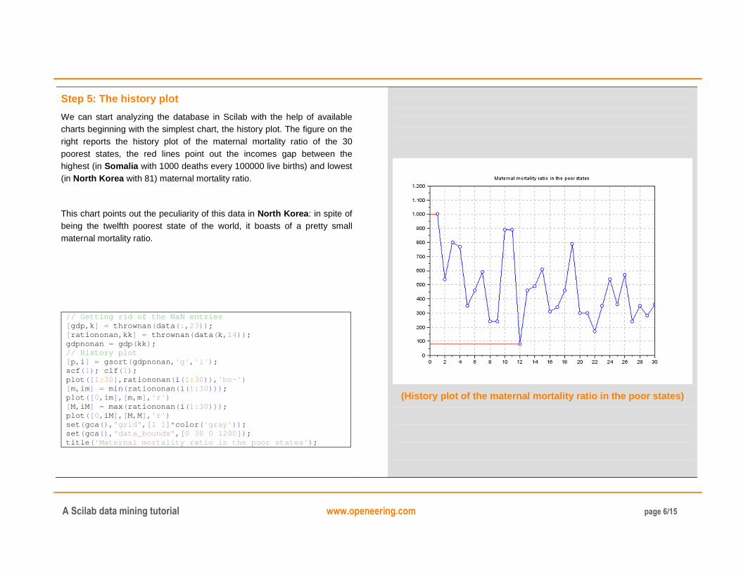
Step 5: The history plot
We can start analyzing the database in Scilab with the help of available charts beginning with the simplest chart, the history plot. The figure on the right reports the history plot of the maternal mortality ratio of the 30 poorest states, the red lines point out the incomes gap between the highest (in Somalia with 1000 deaths every 100000 live births) and lowest (in North Korea with 81) maternal mortality ratio.
This chart points out the peculiarity of this data in North Korea: in spite of being the twelfth poorest state of the world, it boasts of a pretty small maternal mortality ratio.
// Getting rid of the NaN entries [ gdp,k ] = thrownan ( data ( : , 23)) ; [ rationonan,kk ] = thrownan ( data ( k, 14)) ; gdpnonan = gdp ( kk ) ; // History plot [ p,i ] = gsort ( gdpnonan, 'g' , 'i' ) ; scf ( 1) ; clf ( 1) ; plot ([ 1: 30] ,rationonan ( i ( 1: 30)) , 'bo-' ) [ m,im ] = min ( rationonan ( i ( 1: 30))) ; plot ([ 0,im ] , [ m,m] , 'r' ) [ M,iM ] = max ( rationonan ( i ( 1: 30))) ; plot ([ 0,iM ] , [ M,M] , 'r' ) set ( gca () , "grid" , [ 1 1] * color ( 'gray' )) ; set ( gca () , "data_bounds" , [ 0 30 0 1200 ]) ; title ( 'Maternal mortality ratio in the poor states' ) ;
(History plot of the maternal mortality ratio in the poor states)

A Scilab data mining tutorial www.openeering.com page 7/15
Similarly, we can even plot a multi-history chart, putting in the same plot the maternal mortality ratio and the infant mortality rate by adding the line
plot ([ 1: 30] ,data ( k( kk ( i ( 1: 30))) , 15) , 'go-' )
as shown in the figure on the top-right, but this chart does not give us a good comparison between the two lines, because we are plotting in blue the annual maternal deaths every 100.000 live births, while the green line represents the number of annual infants dying before reaching the age of one year per 1.000 live births.
A good solution to compare this two datasets is to normalize them; this operation allows us to get the unique information we are interested in: the trends of the two lines, which are very similar.
// Data normalization dnorm = [ rationonan ( i ( 1: 30)) ,data ( k( kk ( i ( 1: 30))) , 15)] ; for i = 1: size ( dnorm, 2) dmin ( i ) = min ( dnorm ( : ,i )) ; dmax ( i ) = max( dnorm ( : ,i )) ; dnorm ( : ,i ) = ( dnorm ( : ,i ) - dmin ( i )) ./ ( dmax( i ) -dmin ( i )) ; end // Plot scf ( 2) ; clf ( 2) ; plot ([ 1: 30] ,dnorm ( : , 1) , 'bo-' ) plot ([ 1: 30] ,dnorm ( : , 2) , 'go-' ) set ( gca () , "grid" , [ 1 1] * color ( 'gray' )) ; set ( gca () , "data_bounds" , [ 0 30 0 1]) ;
(History plot of the maternal and infant mortality ratio in the poor states)
(History plot of the normalized maternal and infant mortality ratio in the poor states)
A Scilab data mining tutorial www.openeering.com page 8/15
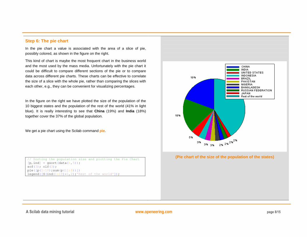
Step 6: The pie chart
In the pie chart a value is associated with the area of a slice of pie, possibly colored, as shown in the figure on the right.
This kind of chart is maybe the most frequent chart in the business world and the most used by the mass media. Unfortunately with the pie chart it could be difficult to compare different sections of the pie or to compare data across different pie charts. These charts can be effective to correlate the size of a slice with the whole pie, rather than comparing the slices with each other, e.g., they can be convenient for visualizing percentages.
In the figure on the right we have plotted the size of the population of the 10 biggest states and the population of the rest of the world (41% in light blue). It is really interesting to see that China (19%) and India (18%) together cover the 37% of the global population.
We get a pie chart using the Scilab command pie.
// Sorting the population size and plotting the Pie Chart [ p,ind ] = gsort ( data ( : , 5)) ; scf ( 3) ; clf ( 3) ; pie ([ p( 1: 10) ;sum ( p( 11:$ ))]) legend ([ S( ind ( 1: 10) +1, 2) ; "Rest of the world" ]) ;
(Pie chart of the size of the population of the states)

A Scilab data mining tutorial www.openeering.com page 9/15
Step 7: The bar chart
A bar chart consists of rectangular bars with lengths proportional to the values that they represent.
In order for the bars to be clearly visible, their number has to be limited. Each bar is characterized by a label and a length: they can therefore be used for plotting data with a discrete set of labels, while the data assigned to the length can be continuous. Bar charts are optimal when we want to associate nominal values along the X axis to numerical values along the Y axis.
In the figure on the right, using the command bar, we have plotted the percentage of the global per capita GDP for the 10 states with highest per capita GDP, while the red line shows the cumulative sum of these values: it points out that these 10 states cover the 30% of the global per capita GDP.
// Bar Chart and cumulative scf ( 4) ; clf ( 4) ; [ gdpnonan,i ] = thrownan ( data ( : , 23)) ; [ gdp,j ] = gsort ( gdpnonan ) ; tot_gdp = sum ( gdp ) ; cum_gdp = cumsum( gdp( 1: 10)) ; bar ( gdp ( 1: 10) * 100 / tot_gdp ) plot ([ 1: 10] ,cum_gdp * 100 / tot_gdp, 'ro-' ) set ( gca () , "grid" , [ 1 1] * color ( 'gray' )) ; h = get ( "current_entity" ) ; h. parent . x_ticks . labels = S ( i ( j ( 1: 10)) +1, 1) ; h. parent . y_ticks . labels = h . parent . y_ticks . labels +'%' ;
(Bar chart and cumulative of the per capita GDP)
A Scilab data mining tutorial www.openeering.com page 10/15
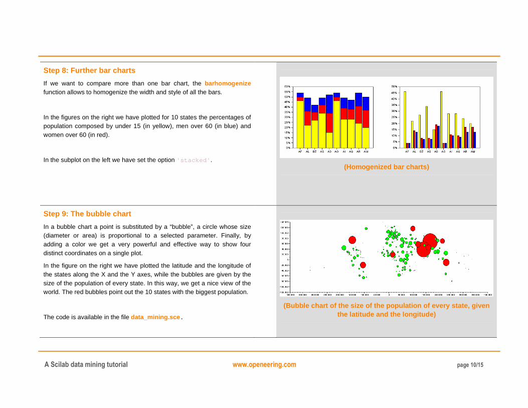
Step 8: Further bar charts
If we want to compare more than one bar chart, the barhomogenize function allows to homogenize the width and style of all the bars.
In the figures on the right we have plotted for 10 states the percentages of population composed by under 15 (in yellow), men over 60 (in blue) and women over 60 (in red).
In the subplot on the left we have set the option 'stacked' .
(Homogenized bar charts)
Step 9: The bubble chart
In a bubble chart a point is substituted by a “bubble”, a circle whose size (diameter or area) is proportional to a selected parameter. Finally, by adding a color we get a very powerful and effective way to show four distinct coordinates on a single plot.
In the figure on the right we have plotted the latitude and the longitude of the states along the X and the Y axes, while the bubbles are given by the size of the population of every state. In this way, we get a nice view of the world. The red bubbles point out the 10 states with the biggest population.
The code is available in the file data_mining.sce.
(Bubble chart of the size of the population of every state, given the latitude and the longitude)

A Scilab data mining tutorial www.openeering.com page 11/15
Step 10: Histograms
When dealing with numerical data corresponding to measurements, a useful type of information is related to the data distribution. We might be interested in knowing if the values are nicely concentrated around a central value; or it may be interesting to know how many cases are falling in a given interval.
In a histogram, a simple descriptive analysis can be done by partitioning the interval between two specific values (usually the minimum and maximum values) into a set of equally-sized segments, also called bins, and by counting how many values fall in the different segments, as shown in the figure on the right.
In the figure, using the command histplot, we have plotted the number of states that have the life expectancy in the given age groups.
// Histograms LEW = thrownan ( data ( : , 16)) ; LEM = thrownan ( data ( : , 17)) ; classes = 45: 5: 90; lW = length ( LEW) ; lM = length ( LEM) ; scf ( 5) ; clf ( 5) ; subplot ( 2, 1, 1) histplot ( classes, LEW, normalization =%f, style =5) xtitle ( "Life expectancy at birth: Women" ) ; subplot ( 2, 1, 2) histplot ( classes, LEM, normalization =%f, style =2) xtitle ( "Life expectancy at birth: Men" ) ;
The command hist3d allows to create histograms in three dimensions.
(Histograms of the life expectancy for women and men)

A Scilab data mining tutorial www.openeering.com page 12/15
Step 11: The box-and-whisker plot
Also the box-and-whisker plot is useful if we are interested in the data distribution.
The four horizontal lines of the boxes are the lower quartile Q1, the mean (in red), the mode (in green) and the upper quartile Q3. In order to understand the graphic we give the notion of interquartile range, which is a measure of statistical dispersion, being equal to the difference between the upper and lower quartiles: IQR = Q3−Q1. The lowest datum of every whisker under the boxes is placed within 1.5 IQR of the lower quartile and the highest datum of every whisker on top of the boxes is placed within 1.5 IQR of the upper quartile. Any point not included between the whiskers is called outlier, because it is an observation that is numerically distant from the rest of the data. In our chart, outliers are plotted as red points.
In the figure on the right we have plotted the same data used for plotting the histograms above: the life expectancy of women and men respectively.
The function box_whiskers.sci is provided with the source code.
// Box-and-whisker scf ( 6) ; clf ( 6) ; subplot ( 1, 2, 1) [ outUp, outDown ] =box_whiskers ( LEW) a=get ( "current_axes" ) ; a. data_bounds =[ 0, 45; 2, 90] ; xtitle ( "Life expectancy at birth: Women" ) ; subplot ( 1, 2, 2) [ outUp, outDown ] =box_whiskers ( LEM) a=get ( "current_axes" ) ; a. data_bounds =[ 0, 45; 2, 90] ; xtitle ( 'Life expectancy at birth: Men' )
(Box-and-whisker plot of the life expectancy for women and men)

A Scilab data mining tutorial www.openeering.com page 13/15
Step 12: The parallel coordinates plot
In the parallel coordinates plot, coordinates are represented by equally-spaced parallel vertical lines and each data point is assigned to a polyline (a continuous line composed of a sequence of segments) that intersects each vertical line at the specific value received by that coordinate.
In the figures on the right we have plotted the data related to the population (considering its composition and evolution), hence the parallel coordinates correspond to the elements of our database starting from the fifth column up to the fifteenth one and each polyline corresponds to a state.
In the first chart we have pointed out the polyline defined by the United States, while in the second one we have chosen to point out the United States, China and Afghanistan.
The function plot_parallel_chart.sci is provided with the source code.
// Parallel coordinates [ i1,j1 ] = find ( S=='US' ) ; // United States [ i2,j2 ] = find ( S=='CN' ) ; // China [ i3,j3 ] = find ( S=='AF' ) ; // Afghanistan plot_parallel_chart ( 9,data ( : , 5: 15) ,i1 - 1,S ( 1, 5: 15)) plot_parallel_chart ( 10,data ( : , 5: 15) , [ i1 - 1,i2 - 1,i3 -1] ,S ( 1, 5: 15))
(Parallel plot pointing out the United States)
(Parallel plot pointing out three nations)

A Scilab data mining tutorial www.openeering.com page 14/15
������� , �� � ���� ��� ��� �����
������
Step 13: The correlation matrix chart and scatterplots
The correlation matrix of n random variables ��, … , �� is the � � � matrix whose �, � entry is
where �� is the mean of the variable � and �� is its standard deviation.
corr is +1 in the case of a perfect positive linear relationship (correlation) between two variables, -1 in the case of a perfect negative linear relationship (anticorrelation), and some value between -1 and 1 in all other cases, indicating the degree of linear dependence between the variables. As it approaches zero the variables are closer to uncorrelated. The closer the coefficient is to either -1 or 1, the stronger the correlation. The correlation matrix is symmetric because the correlation between �� and �� is the same as the correlation between �� and ��. In the figure on the top-right we have written in the main diagonal our elements (the correlation of an element with itself is 1) and the colors map the degree of correlation (dark blue stands for -1, dark red for +1).
In the figure on the bottom-right we have the scatterplot of the data that refer to the value of the matrix -0.83 in the white circle, i.e. the number of annual infants dying before reaching the age of one year per 1000 live births and the school life expectancy for women (in years). These two elements are strongly anticorrelated, hence when we have many infant deaths we also have a brief school life expectancy, which is typical of poor states. The red line is obtained using the command reglin, which performs the linear regression between two sets of data.
The files data_mining.sce, linear_correlation.sci and linear_corr_matrix.sci are provided with the source code.
(Correlation matrix)
(Scatterplot with linear regression)

A Scilab data mining tutorial www.openeering.com page 15/15
Step 14: Concluding remarks and References
In this tutorial we have shown that Scilab can be considered as a powerful data mining tool, well-equipped to perform the widest possible range of important data mining tasks.
On the right-hand column you may find a list of references for further studies.
1. Scilab Web Page: Available: www.scilab.org.
2. Openeering: www.openeering.com.
3. United Nations web site: http://www.un.org/
Step 15: Software content
To report a bug or suggest some improvement please contact Openeering team at the web site www.openeering.com.
Thank you for your attention,
Anna Bassi, Giovanni Borzi
----------------------------- A SCILAB DATA MINING TUTORIAL ----------------------------- -------------------- Directory: functions -------------------- box_whiskers.sci : box and whiskers plot linear_correlation.sci : computes the linear c orrelation linear_corr_matrix.sci : linear correlation ma trix plot plot_parallel_chart.sci : parallel coordinates plot -------------- Main directory -------------- data_mining.sce : main scilab program data_UN.csv : dataset license.txt : the license file