Embed Size (px)
Citation preview

Copyright © by Holt, Rinehart and Winston. 181 Holt MathematicsAll rights reserved.
Samples and Surveys9-1
LESSON
Lesson Objectives
Identify sampling methods and recognize biased samples
Vocabulary
population (p. 462)
sample (p. 462)
biased sample (p. 463)
random sample (p. 462)
systematic sample (p. 462)
stratified sample (p. 462)
convenience sample (p. 462)
voluntary-response sample (p. 462)
Additional Examples
Example 1
Identify the sampling method used.
A. In a county survey, Democratic Party members whose names begin withthe letter D are chosen.
The is to survey members whose names begin with D.
B. A telephone company randomly chooses customers to survey about itsservice.
Customers are chosen by .

Copyright © by Holt, Rinehart and Winston. 182 Holt MathematicsAll rights reserved.
LESSON 9-1 CONTINUED
People that attend a
baseball game are more
likely to
the construction of a new
stadium.
Population Sample Possible Bias
Customers who make a
purchase might be more
in music than others in
the store.
Population Sample Possible Bias
Example 2
Identify the population and the sample. Give a reason why the samplecould be biased.
A. A record store manager asks customers who make a purchase how manyhours of music they listen to each day.
Try This
1. Identify the sampling method used.
In a county survey, families with 3 or more children are chosen.
2. Identify the population and the sample. Give a reason why the samplecould be biased.
People attending a baseball game were asked if they support theconstruction of a new stadium in the city.

Copyright © by Holt, Rinehart and Winston. 183 Holt MathematicsAll rights reserved.
Organizing Data9-2
LESSON
Lesson Objectives
Organize data in tables and stem-and-leaf plots
Vocabulary
stem-and-leaf plot (p. 467)
back-to-back stem-and-leaf plot (p. 468)
line plot (p. 467)
Venn diagram (p. 468)
Additional Examples
Example 1
Use a line plot to organize the math exam scores.
Find the least value, , and the greatest value, , in the data
set. Then draw a number line from to . Place an “x” above each number on the number line for each time it appears in the data set.
There are numbers in the data set
and x’s above the number line.50 55 60 65 70 80 10075 90 9585
xxx x
xx
xxx x
xx x
xxx
Student Test Scores
100 95 75 80
60 100 60 75
90 85 80 100
50 90 65 80

Copyright © by Holt, Rinehart and Winston. 184 Holt MathematicsAll rights reserved.
LESSON 9-2 CONTINUED
Example 2
List the data values in the stem-and-leaf plot.
The data values are
Example 3
Use the given data to make a back-to-back stem-and-leaf plot.
Example 4
Make a Venn diagram to show how many 8th grade students play soccer.
Draw two circles. Label one circle “8th Grader”and the other circle “Soccer Player”. The region that overlaps represents the characteristics that are shared by both sets of data.
145
202
517
19
Key: 1 2 means 12
Grade Sport Grade Sport
6 baseball 8 tennis
6 tennis 7 soccer
8 soccer 7 baseball
8 baseball 6 soccer
7 soccer 8 soccer
Survey Results
IL MA MI NY PA
1950 25 14 18 43 31
2000 19 10 15 29 19
U.S. Representatives forSelected States, 1950 and 2000

Copyright © by Holt, Rinehart and Winston. 185 Holt MathematicsAll rights reserved.
Measures of Central Tendency9-3
LESSON
Lesson Objectives
Find appropriate measures of central tendency
Vocabulary
mean (p. 472)
median (p. 472)
mode (p. 472)
outlier (p. 472)
range (p. 472)
Additional Examples
Example 1
Find the mean, median, mode, and range of the data set.
21, 21, 28, 29, 30, 28, 32
mean: 21 � 21 � 28 � 29 � 30 � the values.
28 � 32 �
��189
�Divide by , the number of values.
median: 21 21 28 28 29 30 32 the values.3 values 3 values
mode: The values occur two times.
range: � �

Copyright © by Holt, Rinehart and Winston. 186 Holt MathematicsAll rights reserved.
LESSON 9-3 CONTINUED
Example 2
Determine and find the most appropriate measure of central tendency orrange for each situation. Justify your answer.
A. Competitors received the following scores for their performance in agymnastic competition: 9.0, 8.3, 8.5, 9.1, 8.2, 8.9, 8.2, 9.0, 8.8, 8.3, 9.2,9.0, 8.6. What score occurred most often?
Find the mode.
, , , , 8.5, 8.6, List the scores in .
8.8, 8.9, , , , 9.1, 9.2 Underline the scores that
appear more than .
Nine appears most frequently. The is .
Example 3
Employees at a store earned $275, $330, $290, $300, $350, $365, and $310during one week. What measure of central tendency or range would makethe salaries look the highest?
Find each measure of central tendency and range of the data set.
mean: �
�$2,
7220� � $
median: $275, $290, $300, $ , $330, $350, $365
Underline the value.
mode: There is mode.
range: $310 � $275 � $
The would make the salaries look the highest.
$275 � $330 � $290 � $300 � $350 � $365 � $310�������7

Copyright © by Holt, Rinehart and Winston. 187 Holt MathematicsAll rights reserved.
Variability9-4
LESSON
Lesson Objectives
Find measures of variability
Vocabulary
variability (p. 476)
quartile (p. 476)
box-and-whisker plot (p. 477)
Additional Examples
Example 1
Find the first and third quartiles of each data set.
A. 15, 83, 75, 12, 19, 74, 21
21, the values.
first quartile:
third quartile:

Copyright © by Holt, Rinehart and Winston. 187 Holt MathematicsAll rights reserved.
Variability9-4
LESSON
The spread of values in a set of data.
Three values, one of which is the median, that divide a data set
into four equal parts.
A graph that displays the highest and lowest
quarters of data as whiskers, the middle two quarters of the data as a box, and
the median.
Lesson Objectives
Find measures of variability
Vocabulary
variability (p. 476)
quartile (p. 476)
box-and-whisker plot (p. 477)
Additional Examples
Example 1
Find the first and third quartiles of each data set.
A. 15, 83, 75, 12, 19, 74, 21
21, the values.
first quartile:
third quartile: 75
15
Order74, 75, 8312, 15, 19,

Copyright © by Holt, Rinehart and Winston. 189 Holt MathematicsAll rights reserved.
Displaying Data9-5
LESSON
Lesson Objectives
Display data in bar graphs, histograms, and line graphs
Vocabulary
double-bar graph (p. 485)
frequency table (p. 485)
histogram (p. 485)
double-line graph (p. 486)
Additional Examples
Example 1
Make a double-bar graph.
The following are the number of books read in one month by some boysand girls in Grade 8:
The frequencies are the of
the bars in the bar graph.
Use a different to represent
each gender.
00 1 2 3 4 5
1234
Freq
uenc
y
Books Read
Number of BooksRead by 8th-grade Students
Boys Girls
Books read 0 1 2 3 4 5
Boys 2 3 3 1 0 1
Girls 2 1 2 4 1 0
Copyright © by Holt, Rinehart and Winston. 190 Holt MathematicsAll rights reserved.
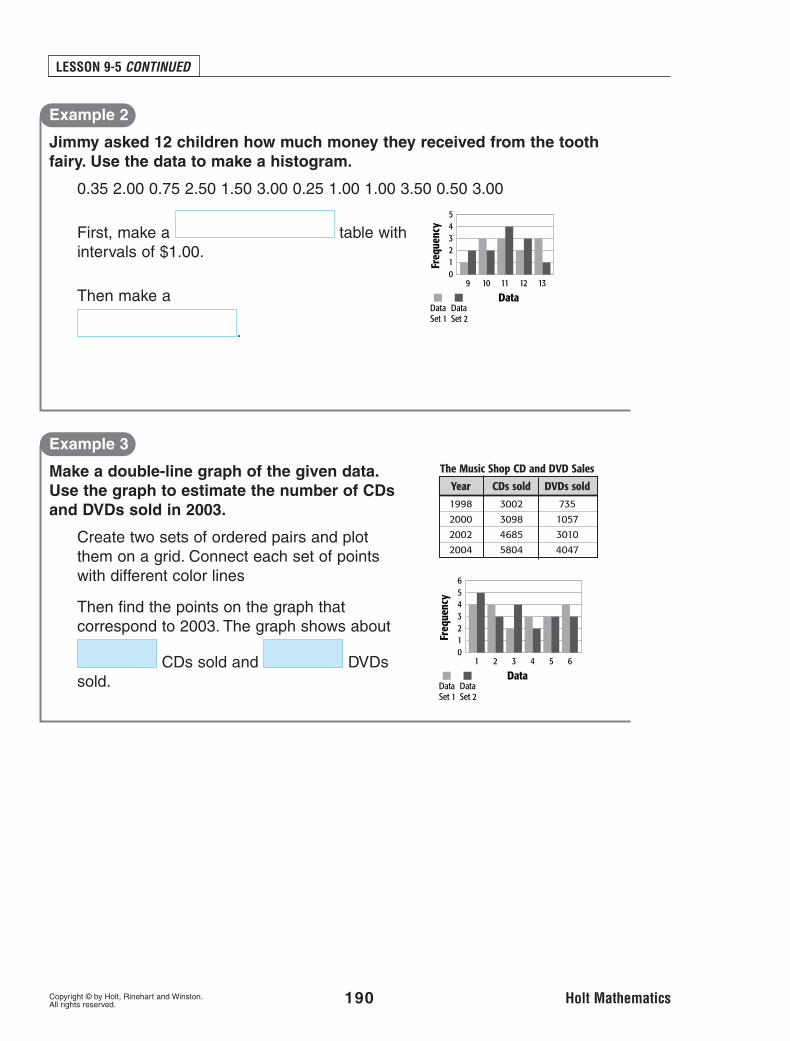
LESSON 9-5 CONTINUED
Example 2
Jimmy asked 12 children how much money they received from the toothfairy. Use the data to make a histogram.
0.35 2.00 0.75 2.50 1.50 3.00 0.25 1.00 1.00 3.50 0.50 3.00
First, make a table with intervals of $1.00.
Then make a
.
Example 3
Make a double-line graph of the given data.Use the graph to estimate the number of CDsand DVDs sold in 2003.
Create two sets of ordered pairs and plot them on a grid. Connect each set of points with different color lines
Then find the points on the graph thatcorrespond to 2003. The graph shows about
CDs sold and DVDs sold.
09 10 11 12 13
12345
Freq
uenc
y
DataDataSet 1
DataSet 2
01 2 3 4 5 6
123456
Freq
uenc
y
DataDataSet 1
DataSet 2
Year CDs sold DVDs sold
1998 3002 735
2000 3098 1057
2002 4685 3010
2004 5804 4047
The Music Shop CD and DVD Sales
Copyright © by Holt, Rinehart and Winston. 191 Holt MathematicsAll rights reserved.
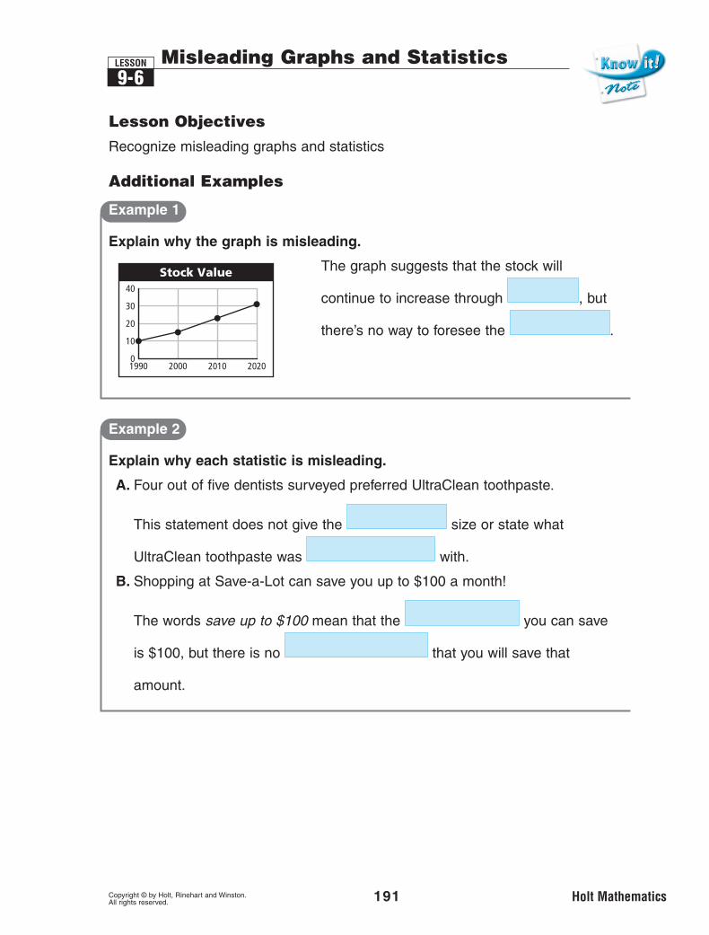
9-6LESSON Misleading Graphs and Statistics
Lesson Objectives
Recognize misleading graphs and statistics
Additional Examples
Example 1
Explain why the graph is misleading.
The graph suggests that the stock will
continue to increase through , but
there’s no way to foresee the .
Example 2
Explain why each statistic is misleading.
A. Four out of five dentists surveyed preferred UltraClean toothpaste.
This statement does not give the size or state what
UltraClean toothpaste was with.
B. Shopping at Save-a-Lot can save you up to $100 a month!
The words save up to $100 mean that the you can save
is $100, but there is no that you will save that
amount.
Stock Value40
30
20
10
01990 2000 2010 2020

Copyright © by Holt, Rinehart and Winston. 192 Holt MathematicsAll rights reserved.
9-7LESSON Scatter Plots
Lesson Objectives
Create and interpret scatter plots
Vocabulary
scatter plot (p. 494)
correlation (p. 494)
line of best fit (p. 494)
Additional Examples
Example 1
Use the given data to make a scatter plot of the weight and height ofeach member of a basketball team.
The points on the scatter plot are ( ), ( ),
( ), ( ), and ( ).
71 170
68 160
70 175
73 180
74 190
Height (in.) Weight (lb)200
190
180
170
160
150
140
69 71Height (in.)
Wei
ght
(lb)
7370 72 7468

Copyright © by Holt, Rinehart and Winston. 193 Holt MathematicsAll rights reserved.
LESSON 9-7 CONTINUED
Example 2
Do the data sets have a positive, a negative, or no correlation?
A. the size of a jar of baby food and the number of jars of baby food a babywill eat
correlation: The food in each jar, the
number of jars of baby food a baby will eat.
B. the speed of a runner and the number of races she wins
correlation: The the runner, the
races she will win.
C. the size of a person and the number of fingers he has
correlation: The size of a person affect the number of fingers he has.
Example 3
Use the data to predict how much a worker will earn in tips in 10 hours.
According to the graph a worker who works 10 hours should earn about
$ .
30
25
20
15
10
5
4 8Hours
Tips
($)
126 102

Choosing the Best Representation of Data9-8
LESSON
Copyright © by Holt, Rinehart and Winston. 194 Holt MathematicsAll rights reserved.
Lesson Objectives
Select the best representation for a set of data
Additional Examples
Example 1
A. Which graph is a better display of the data on temperature?
Since the question asks about change in data over , the
is the better representation.
B. Which graph is a better display of the data on temperature?
Since the question asks about the relationship of two data sets, the
is the better representation.
1 2 3 4 5 8 126 107 119
x x x xxx x
Pric
e ($
)
Gallons
Gasoline Prices
1 3 5
50
1510
2520
3530
72 4 6 8 9 10 11 12
Tem
pera
ture
(F)
Time of Day
Temperature Measurements
8 12 4
400
5045
6055
7065
75
810 2 6
40 50 7060 80

LESSON 9-8 CONTINUED
Copyright © by Holt, Rinehart and Winston. 195 Holt MathematicsAll rights reserved.
Example 2
The Singer family keeps the budget shown below for their monthlyexpenses. Choose an appropriate data display and draw the graph. Whichtwo categories account for one-fifth of their budget?
1. Understand the Problem
You are looking for the best data display and the two categories thataccount for one-fifth of the budget.
2. Make a Plan
You need to compare each category to the whole. Find the percentage of
each category and make a graph.
3. Solve
Make a circle graph. To find which two categories account for one-fifth of
the budget, convert one-fifth to a percent. One-fifth equals %. The
two categories that add to 20% are or and
.
4. Look Back
Look at the table. Saving or auto plus entertainment equals $ , which is about 20% or one-fifth of the budget.
Groceries $400Utilities $330Mortgage $850Clothing $200Entertainment $100Auto $500Savings $500Misc. $120