Embed Size (px)
Citation preview

Lesson 4: Creating a HistogramDate: 4/3/14 35
© 2013 Common Core, Inc. Some rights reserved. commoncore.org This work is licensed under a Creative Commons Attribution‐NonCommercial‐ShareAlike 3.0 Unported License.
NYS COMMON CORE MATHEMATICS CURRICULUM 6•6Lesson 4
Lesson 4: Creating a Histogram
Student Outcomes
Students construct a frequency histogram.
Students recognize that the number of intervals may affect the shape of a histogram.
Classwork
This lesson organizes the development of the student outcomes in three examples. Example 1 introduces frequency
tables with intervals. Example 2 discusses how to create a histogram from the data that is organized in the interval
frequency table from Example 1. Example 3 discusses another feature of a histogram – its shape. Students are
introduced to a mound/symmetric shape and a skewed shape. Following each example is an exercise set designed for
independent or small group work to reinforce the main objectives of constructing and interpreting a histogram. Teacher
selection of problems is encouraged. If all problems are completed, this lesson may take longer than one class period.
Example 1 (10 minutes): Frequency Table with Intervals
Example 1: Frequency Table with Intervals
The boys and girls basketball teams at Roosevelt Middle School wanted to raise money to help buy new uniforms. They
decided to sell hats with the school logo on the front to family members and other interested fans. To obtain the correct
hat size, the students had to measure the head circumference (distance around the head) of the adults who wanted to
order a hat. The following data represents the head circumferences, in millimeters (mm), of the adults:
, , , , , , , , , , , , , , , , , , , , , ,
, , , , , , , , , , , , , , , , ,
The hats come in six sizes: XS, S, M, L, XL, and XXL. Each hat size covers a span of head circumferences. The hat
manufacturer gave the students the table below that shows the interval of head circumferences for each hat size. The
interval represents head circumferences from to , not including .
Hat Sizes Interval of Head
Circumferences (mm) Tally Frequency
XS
S
M
L
XL
XXL
Lesson 4: Creating a HistogramDate: 4/3/14 36
© 2013 Common Core, Inc. Some rights reserved. commoncore.org This work is licensed under a Creative Commons Attribution‐NonCommercial‐ShareAlike 3.0 Unported License.
NYS COMMON CORE MATHEMATICS CURRICULUM 6•6Lesson 4
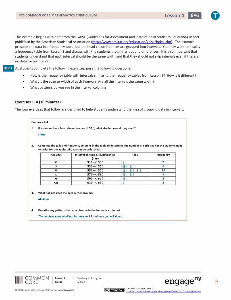
This example begins with data from the GAISE (Guidelines for Assessment and Instruction in Statistics Education) Report
published by the American Statistical Association (http://www.amstat.org/education/gaise/index.cfm). The example
presents the data in a frequency table, but the head circumferences are grouped into intervals. You may want to display
a frequency table from Lesson 3 and discuss with the students the similarities and differences. It is also important that
students understand that each interval should be the same width and that they should not skip intervals even if there is
no data for an interval.
As students complete the following exercises, pose the following questions:
How is the frequency table with intervals similar to the frequency tables from Lesson 3? How is it different?
What is the span or width of each interval? Are all the intervals the same width?
What patterns do you see in the interval column?
Exercises 1–4 (10 minutes)
The four exercises that follow are designed to help students understand the idea of grouping data in intervals.
Exercises 1–4
1. If someone has a head circumference of , what size hat would they need?
Large
2. Complete the tally and frequency columns in the table to determine the number of each size hat the students need
to order for the adults who wanted to order a hat.
Hat Sizes Interval of Head Circumferences (mm)
Tally Frequency
XS || S |||| ||| M |||| |||| |||| L |||| |||| XL |||| XXL ||
3. What hat size does the data center around?
Medium
4. Describe any patterns that you observe in the frequency column?
The numbers start small but increase to and then go back down.
MP.1

Lesson 4: Creating a HistogramDate: 4/3/14 37
© 2013 Common Core, Inc. Some rights reserved. commoncore.org This work is licensed under a Creative Commons Attribution‐NonCommercial‐ShareAlike 3.0 Unported License.
NYS COMMON CORE MATHEMATICS CURRICULUM 6•6Lesson 4
Example 2 (15 minutes): Histogram
Example 2: Histogram
One student looked at the tally column and said that it looked somewhat like a bar graph turned on its side. A histogram
is a graph that is like a bar graph, except that the horizontal axis is a number line that is marked off in equal intervals.
To make a histogram:
Draw a horizontal line and mark the intervals.
Draw a vertical line and label it “frequency.”
Mark the frequency axis with a scale that starts at and goes up to something that is greater than the largest
frequency in the frequency table.
For each interval, draw a bar over that interval that has a height equal to the frequency for that interval.
The first two bars of the histogram have been drawn below.
The students are introduced to a histogram in this example. They use the data that was organized in a frequency table
with intervals in Example 1. You may want to begin this lesson by showing the students an example of a bar graph. For
example, show a bar graph showing favorite pizza toppings. Point out the horizontal axis is not a number line, but
contains categories. The vertical axis is the frequency (or count) of how many people chose the particular pizza topping.
As you present the histogram to the students, point out the main difference is the horizontal axis is a number line, and
the intervals are listed in order from smallest to largest. Some students may struggle with the notation for the intervals.
Point out to the students that the interval labeled 510 530, represents any head circumference from 510 mm to
530, not including 530. A head circumference of 530 is counted in the bar from 530 550 and not in the bar from
510 530.
Pose the following questions as students develop the following exercise:
Why should the bars touch each other in the histogram?
How are histograms and bar graphs similar? How are they different?
Lesson 4: Creating a HistogramDate: 4/3/14 38
© 2013 Common Core, Inc. Some rights reserved. commoncore.org This work is licensed under a Creative Commons Attribution‐NonCommercial‐ShareAlike 3.0 Unported License.
NYS COMMON CORE MATHEMATICS CURRICULUM 6•6Lesson 4
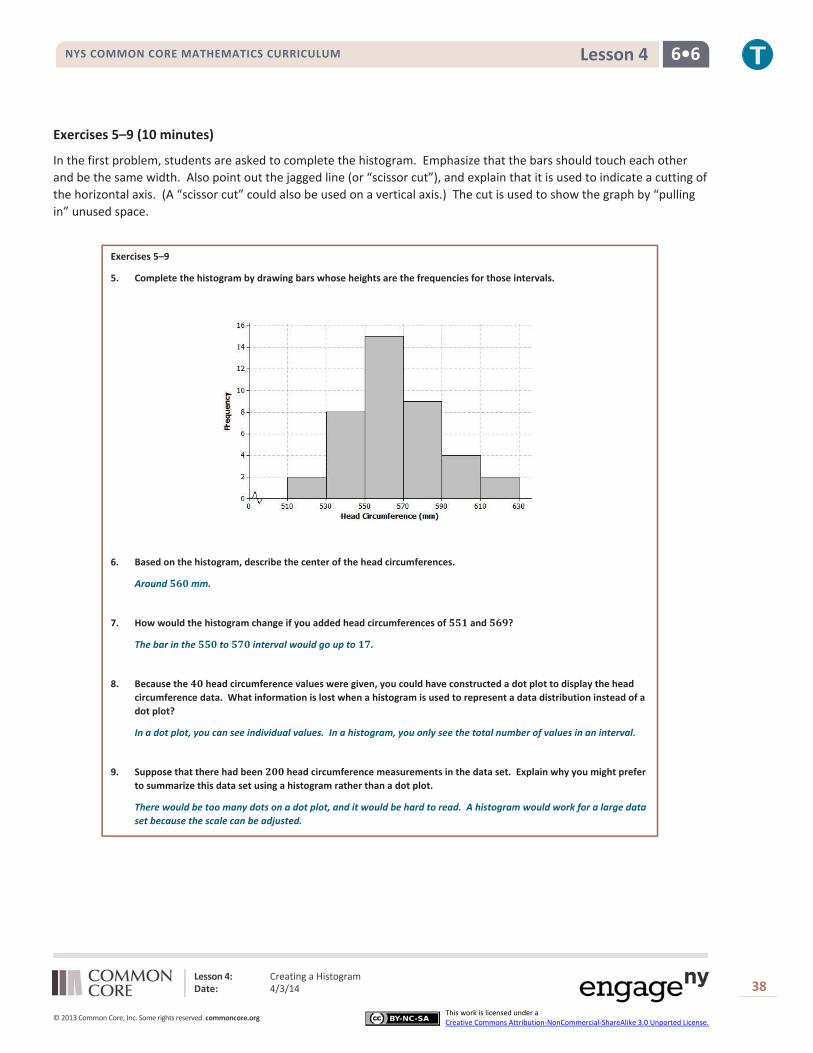
Exercises 5–9 (10 minutes)
In the first problem, students are asked to complete the histogram. Emphasize that the bars should touch each other
and be the same width. Also point out the jagged line (or “scissor cut”), and explain that it is used to indicate a cutting of
the horizontal axis. (A “scissor cut” could also be used on a vertical axis.) The cut is used to show the graph by “pulling
in” unused space.
Exercises 5–9
5. Complete the histogram by drawing bars whose heights are the frequencies for those intervals.
6. Based on the histogram, describe the center of the head circumferences.
Around mm.
7. How would the histogram change if you added head circumferences of and ?
The bar in the to interval would go up to .
8. Because the head circumference values were given, you could have constructed a dot plot to display the head
circumference data. What information is lost when a histogram is used to represent a data distribution instead of a
dot plot?
In a dot plot, you can see individual values. In a histogram, you only see the total number of values in an interval.
9. Suppose that there had been head circumference measurements in the data set. Explain why you might prefer
to summarize this data set using a histogram rather than a dot plot.
There would be too many dots on a dot plot, and it would be hard to read. A histogram would work for a large data
set because the scale can be adjusted.

Lesson 4: Creating a HistogramDate: 4/3/14 39
© 2013 Common Core, Inc. Some rights reserved. commoncore.org This work is licensed under a Creative Commons Attribution‐NonCommercial‐ShareAlike 3.0 Unported License.
NYS COMMON CORE MATHEMATICS CURRICULUM 6•6Lesson 4
Example 3 (10 minutes): Shape of the Histogram
Example 3: Shape of the Histogram
A histogram is useful to describe the shape of the data distribution. It is important to think about the shape of a data
distribution because depending on the shape, there are different ways to describe important features of the distribution,
such as center and variability.
A group of students wanted to find out how long a certain brand of AA batteries lasted. The histogram below shows the
data distribution for how long (in hours) that some AA batteries lasted. Looking at the shape of the histogram, notice
how the data “mounds” up around a center of approximately . We would describe this shape as mound shaped or
symmetric. If we were to draw a line down the center, notice how each side of the histogram is approximately the same
or mirror images of each other. This means the graph is approximately symmetrical.
Another group of students wanted to investigate the maximum drop length for roller coasters. The histogram below
shows the maximum drop (in feet) of a selected group of roller coasters. This histogram has a skewed shape. Most of the
data are in the intervals from to . But there are two values that are unusual (or not typical) when compared to
the rest of the data. These values are much higher than most of the data.

Lesson 4: Creating a HistogramDate: 4/3/14 40
© 2013 Common Core, Inc. Some rights reserved. commoncore.org This work is licensed under a Creative Commons Attribution‐NonCommercial‐ShareAlike 3.0 Unported License.
NYS COMMON CORE MATHEMATICS CURRICULUM 6•6Lesson 4
This example discusses the concept of the shape of a distribution and how it relates to center and variability. Two
shapes are introduced, mound‐shaped or symmetric and skewed. Below is an example of a symmetric (i.e., mound‐
shaped) distribution. The emphasis is on the approximate symmetry in the histogram.
Below are two examples of skewed distributions:
Skewed Left (skewed toward smaller values)
Skewed Right (skewed toward larger values)
Point out to the students that a skewed distribution has values that are not typical of the rest of the data. They either
could be data much greater than the rest of the data or much lower than the rest of the data. The graph will have a tail
that is longer on one side than the other.
MP.4
Lesson 4: Creating a HistogramDate: 4/3/14 41
© 2013 Common Core, Inc. Some rights reserved. commoncore.org This work is licensed under a Creative Commons Attribution‐NonCommercial‐ShareAlike 3.0 Unported License.
NYS COMMON CORE MATHEMATICS CURRICULUM 6•6Lesson 4
Exercises 10–12 (10 minutes)
The next three questions are designed to help students classify a distribution as approximately symmetric (i.e., mound‐
shaped) or skewed.
Exercises 10–12
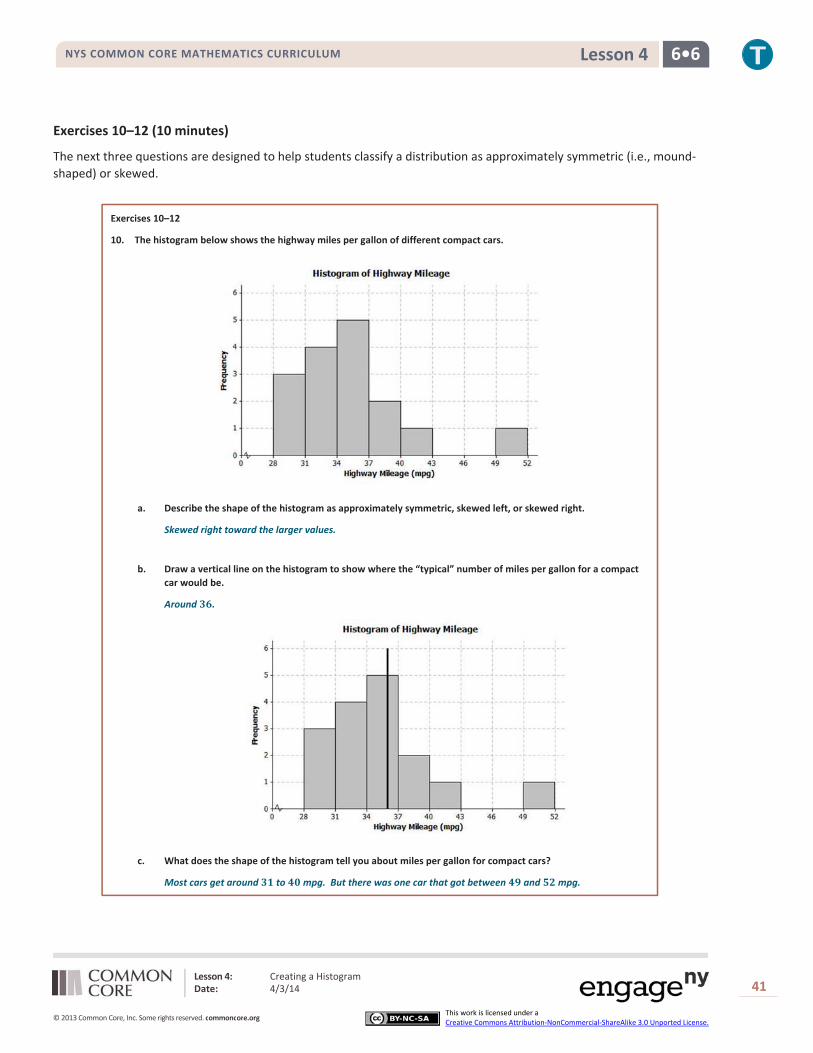
10. The histogram below shows the highway miles per gallon of different compact cars.
a. Describe the shape of the histogram as approximately symmetric, skewed left, or skewed right.
Skewed right toward the larger values.
b. Draw a vertical line on the histogram to show where the “typical” number of miles per gallon for a compact
car would be.
Around .
c. What does the shape of the histogram tell you about miles per gallon for compact cars?
Most cars get around to mpg. But there was one car that got between and mpg.

Lesson 4: Creating a HistogramDate: 4/3/14 42
© 2013 Common Core, Inc. Some rights reserved. commoncore.org This work is licensed under a Creative Commons Attribution‐NonCommercial‐ShareAlike 3.0 Unported License.
NYS COMMON CORE MATHEMATICS CURRICULUM 6•6Lesson 4
11. Describe the shape of the head circumference histogram that you completed in Exercise 5 as approximately
symmetric, skewed left, or skewed right.
Approximately symmetric.
12. Another student decided to organize the head circumference data by changing the width of each interval to be
instead of . Below is the histogram that the student made.
a. How does this histogram compare with the histogram of the head circumferences that you completed in
Exercise 5?
Answers will vary; same shape and center, but not as symmetric.
b. Describe the shape of this new histogram as approximately symmetric, skewed left, or skewed right.
Approximately symmetric.
c. How many head circumferences are in the interval from to ?
d. In what interval would a head circumference of be included? In what interval would a head
circumference of be included?
is in the interval from to ; is in the interval from to .
Exit Ticket (7–10 minutes)
Lesson Summary
A histogram is a graph that represents the number of data values falling in an interval with a bar. The horizontal
axis shows the intervals and the vertical axis shows the frequencies (how many data values are in the interval).
Each interval should be the same width and the bars should touch each other.

Lesson 4: Creating a HistogramDate: 4/3/14 43
© 2013 Common Core, Inc. Some rights reserved. commoncore.org This work is licensed under a Creative Commons Attribution‐NonCommercial‐ShareAlike 3.0 Unported License.
NYS COMMON CORE MATHEMATICS CURRICULUM 6•6Lesson 4
Name ___________________________________________________ Date____________________
Lesson 4: Creating a Histogram
Exit Ticket
The frequency table below shows the length of selected movies shown in a local theater over the past six months.
Length of Movie (min) Tally Frequency
80 90 | 190 100 |||| 4100 110 |||| || 7110 120 |||| 5120 130 |||| || 7130 140 ||| 3140 150 | 1
1. Construct a histogram for the length of movies data.
2. Describe the shape of the histogram.
3. What does the shape tell you about the length of movies?

Lesson 4: Creating a HistogramDate: 4/3/14 44
© 2013 Common Core, Inc. Some rights reserved. commoncore.org This work is licensed under a Creative Commons Attribution‐NonCommercial‐ShareAlike 3.0 Unported License.
NYS COMMON CORE MATHEMATICS CURRICULUM 6•6Lesson 4
Exit Ticket Sample Solutions
The frequency table below shows the length of selected movies shown in a local theater over the past six months.
Length of Movie (min) Tally Frequency
|
||||
|||| ||
||||
|||| ||
|||
|
1. Construct a histogram for the length of movies data.
2. Describe the shape of the histogram.
Mound shaped or approximately symmetric.
3. What does the shape tell you about the length of movies?
Most movies lengths were between and minutes.

Lesson 4: Creating a HistogramDate: 4/3/14 45
© 2013 Common Core, Inc. Some rights reserved. commoncore.org This work is licensed under a Creative Commons Attribution‐NonCommercial‐ShareAlike 3.0 Unported License.
NYS COMMON CORE MATHEMATICS CURRICULUM 6•6Lesson 4
Problem Set Sample Solutions
Note that teacher discretion is encouraged for assigning problems from this problem set. Problems are provided to
address the varying interests of students.
1. The following histogram shows ages of the actresses whose performances have won in the Best Leading Actress
category at the annual Academy Awards (Oscars).
a. Which age interval contains the most actresses? How many actresses are represented in that interval?
The interval to contains the most actresses. There are actresses whose age falls into that category.
b. Describe the shape of the histogram.
Skewed to the right.
c. What does the shape tell you about the ages of actresses who win the Oscar for best actress award?
Most of the ages are between and , with two ages much larger than the rest.
d. Which interval describes the center of the ages of the actresses?
to
e. An age of would be included in which interval?
It is in the interval from to .

Lesson 4: Creating a HistogramDate: 4/3/14 46
© 2013 Common Core, Inc. Some rights reserved. commoncore.org This work is licensed under a Creative Commons Attribution‐NonCommercial‐ShareAlike 3.0 Unported License.
NYS COMMON CORE MATHEMATICS CURRICULUM 6•6Lesson 4
2. The frequency table below shows the seating capacity of arenas for NBA basketball teams.
Number of seats Tally Frequency
||
|
|||| |
||||
||||
||||
||
||
|
a. Draw a histogram of the number of seats in NBA arenas. Use the histograms you have seen throughout this
lesson to help you in the construction of your histogram.
b. What is the width of each interval? How do you know?
The width of each interval is .
Subtract the values identifying an interval.
c. Describe the shape of the histogram.
Skewed to the right.
d. Which interval describes the center of the number of seats?
, to ,

Lesson 4: Creating a HistogramDate: 4/3/14 47
© 2013 Common Core, Inc. Some rights reserved. commoncore.org This work is licensed under a Creative Commons Attribution‐NonCommercial‐ShareAlike 3.0 Unported License.
NYS COMMON CORE MATHEMATICS CURRICULUM 6•6Lesson 4
3. Listed are the grams of carbohydrates in hamburgers at selected fast food restaurants.
a. Complete the frequency table with intervals of width .
Number of carbohydrates (grams)
Tally Frequency
|
||
||||
|||| |
||||
||
|
b. Draw a histogram of the carbohydrate data.
c. Describe the center and shape of the histogram.
Center is around ; it is mound shaped.
d. In the frequency table below, the intervals are changed. Using the carbohydrate data above, complete the
frequency table with intervals of width .
Number of carbohydrates (grams)
Tally Frequency
|||
||||
|||| ||||
||
|

Lesson 4: Creating a HistogramDate: 4/3/14 48
© 2013 Common Core, Inc. Some rights reserved. commoncore.org This work is licensed under a Creative Commons Attribution‐NonCommercial‐ShareAlike 3.0 Unported License.
NYS COMMON CORE MATHEMATICS CURRICULUM 6•6Lesson 4
e. Draw a histogram.
4. Use the histograms that you constructed in question 3 parts (b) and (e) to answer the following questions.
a. Why are there fewer bars in the histogram in question 3 part (e) than the histogram in part (b)?
There are fewer bars because the width of the interval changed from grams to grams, so there are fewer
intervals.
b. Did the shape of the histogram in question 3 part (e) change from the shape of the histogram in part (b)?
Generally, both are mound shaped, but the histogram in question 3 part (b) has gaps.
c. Did your estimate of the center change from the histogram in question 3 part (b) to the histogram in part (e)?
The centers of the two histograms are about the same.


![Histogram [Www.nikonians.org]](https://img.pdfslide.us/doc/110x75/577cd8911a28ab9e78a17d60/histogram-wwwnikoniansorg.jpg)