Embed Size (px)
Citation preview
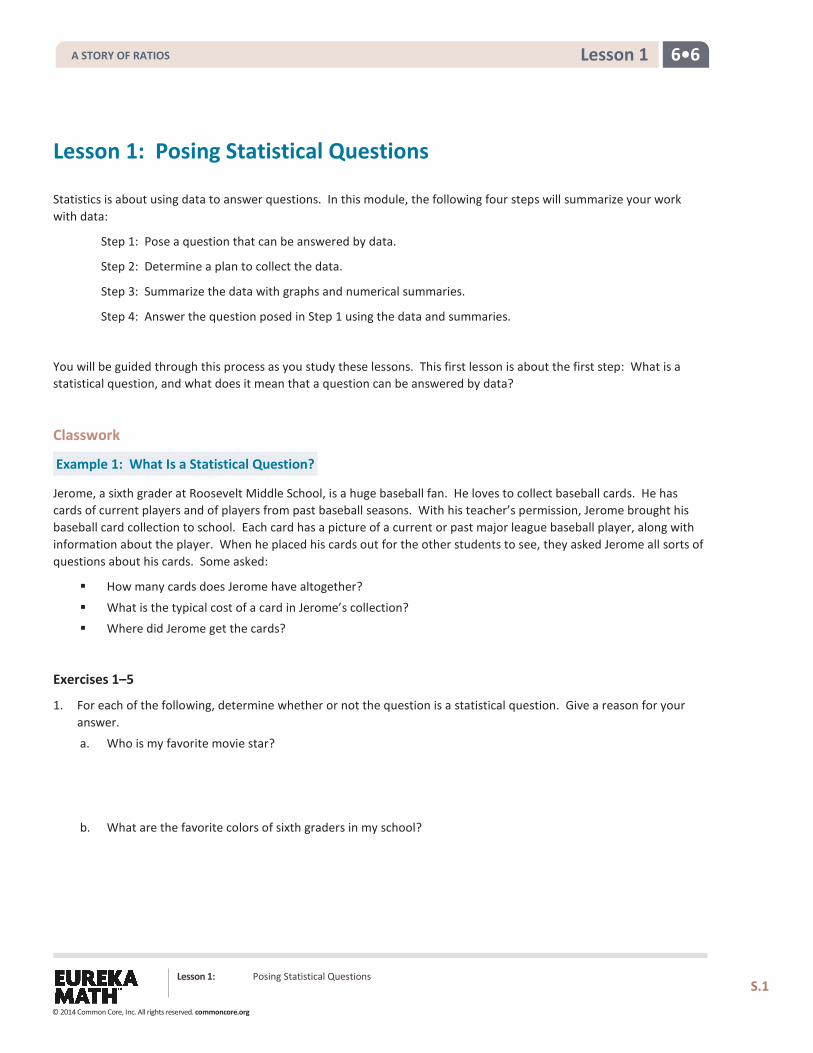
6•6 Lesson 1
Lesson 1: Posing Statistical Questions
Statistics is about using data to answer questions. In this module, the following four steps will summarize your work with data:
Step 1: Pose a question that can be answered by data.
Step 2: Determine a plan to collect the data.
Step 3: Summarize the data with graphs and numerical summaries.
Step 4: Answer the question posed in Step 1 using the data and summaries.
You will be guided through this process as you study these lessons. This first lesson is about the first step: What is a statistical question, and what does it mean that a question can be answered by data?
Classwork
Example 1: What Is a Statistical Question?
Jerome, a sixth grader at Roosevelt Middle School, is a huge baseball fan. He loves to collect baseball cards. He has cards of current players and of players from past baseball seasons. With his teacher’s permission, Jerome brought his baseball card collection to school. Each card has a picture of a current or past major league baseball player, along with information about the player. When he placed his cards out for the other students to see, they asked Jerome all sorts of questions about his cards. Some asked:
How many cards does Jerome have altogether?
What is the typical cost of a card in Jerome’s collection? Where did Jerome get the cards?
Exercises 1–5
1. For each of the following, determine whether or not the question is a statistical question. Give a reason for your answer.
a. Who is my favorite movie star?
b. What are the favorite colors of sixth graders in my school?
Lesson 1: Posing Statistical Questions
S.1
A STORY OF RATIOS
© 2014 Common Core, Inc. All rights reserved. commoncore.org
6•6 Lesson 1
c. How many years have students in my school’s band or orchestra played an instrument?
d. What is the favorite subject of sixth graders at my school?
e. How many brothers and sisters does my best friend have?
2. Explain why each of the following questions is not a statistical question.
a. How old am I?
b. What’s my favorite color?
c. How old is the principal at our school?
3. Ronnie, a sixth grader, wanted to find out if he lived the farthest from school. Write a statistical question that would help Ronnie find the answer.
4. Write a statistical question that can be answered by collecting data from students in your class.
5. Change the following question to make it a statistical question: How old is my math teacher?
Lesson 1: Posing Statistical Questions
S.2
A STORY OF RATIOS
© 2014 Common Core, Inc. All rights reserved. commoncore.org
6•6 Lesson 1
Example 2: Types of Data
We use two types of data to answer statistical questions: numerical data and categorical data. If we recorded the age of 25 baseball cards, we would have numerical data. Each value in a numerical data set is a number. If we recorded the team of the featured player for 25 baseball cards, you would have categorical data. Although you still have 25 data values, the data values are not numbers. They would be team names, which you can think of as categories.
Exercises 6–7
6. Identify each of the following data sets as categorical (C) or numerical (N).
a. Heights of 20 sixth graders __________
b. Favorite flavor of ice cream for each of 10 sixth graders __________
c. Hours of sleep on a school night for 30 sixth graders __________
d. Type of beverage drunk at lunch for each of 15 sixth graders __________
e. Eye color for each of 30 sixth graders __________
f. Number of pencils in each desk of 15 sixth graders __________
7. For each of the following statistical questions, students asked Jerome to identify whether the data are numerical or categorical. Explain your answer, and list four possible data values.
a. How old are the cards in the collection?
b. How much did the cards in the collection cost?
c. Where did you get the cards?
Lesson 1: Posing Statistical Questions
S.3
A STORY OF RATIOS
© 2014 Common Core, Inc. All rights reserved. commoncore.org
6•6 Lesson 1
Problem Set 1. For each of the following, determine whether the question is a statistical question. Give a reason for your answer.
a. How many letters are in my last name?
b. How many letters are in the last names of the students in my sixth-grade class?
c. What are the colors of the shoes worn by the students in my school?
d. What is the maximum number of feet that roller coasters drop during a ride? e. What are the heart rates of the students in a sixth-grade class?
f. How many hours of sleep per night do sixth graders usually get when they have school the next day?
g. How many miles per gallon do compact cars get?
2. Identify each of the following data sets as categorical (C) or numerical (N). Explain your answer.
a. Arm spans of 12 sixth graders b. Number of languages spoken by each of 20 adults
c. Favorite sport of each person in a group of 20 adults
d. Number of pets for each of 40 third graders
e. Number of hours a week spent reading a book for a group of middle school students
3. Rewrite each of the following questions as a statistical question.
a. How many pets does your teacher have?
b. How many points did the high school soccer team score in its last game?
c. How many pages are in our math book?
d. Can I do a handstand?
4. Write a statistical question that would be answered by collecting data from the sixth graders in your classroom.
5. Are the data you would collect to answer that question categorical or numerical? Explain your answer.
Lesson Summary Statistics is about using data to answer questions. In this module, the following four steps will summarize your work with data:
Step 1: Pose a question that can be answered by data.
Step 2: Determine a plan to collect the data.
Step 3: Summarize the data with graphs and numerical summaries.
Step 4: Answer the question posed in Step 1 using the data and the summaries.
Lesson 1: Posing Statistical Questions
S.4
A STORY OF RATIOS
© 2014 Common Core, Inc. All rights reserved. commoncore.org
6•6 Lesson 2
Lesson 2: Displaying a Data Distribution
Classwork
Example 1: Heart Rate
Mia, a sixth grader at Roosevelt Middle School, was thinking about joining the middle school track team. She read that Olympic athletes have lower resting heart rates than most people. She wondered about her own heart rate and how it would compare to other students. Mia was interested in investigating the statistical question: What are the heart rates of the students in my sixth-grade class?
Heart rates are expressed as bpm (or beats per minute). Mia knew her resting heart rate was 80 beats per minute. She asked her teacher if she could collect the heart rates of the other students in her class. With the teacher’s help, the other sixth graders in her class found their heart rates and reported them to Mia. Following are the heart rates (in beats per minute) for the 22 other students in Mia’s class:
89 87 85 84 90 79 83 85 86 88 84 81 88 85 83 83 86 82 83 86 82 84
Exercises 1–10
1. What was the heart rate for the student with the lowest heart rate?
2. What was the heart rate for the student with the highest heart rate?
Lesson 2: Displaying a Data Distribution
S.5
A STORY OF RATIOS
© 2014 Common Core, Inc. All rights reserved. commoncore.org
6•6 Lesson 2
3. How many students had a heart rate greater than 86?
4. What fraction of the students had a heart rate less than 82?
5. What is the most common heart rate?
6. What heart rate describes the center of the data?
7. What heart rates are most unusual?
8. If Mia’s teacher asked what the typical heart rate is for sixth graders in the class, what would you tell Mia’s teacher?
9. Add a dot for Mia’s heart rate on the dot plot in Example 1.
10. How does Mia’s heart rate compare with the heart rates of the other students in the class?
Lesson 2: Displaying a Data Distribution
S.6
A STORY OF RATIOS
© 2014 Common Core, Inc. All rights reserved. commoncore.org
6•6 Lesson 2
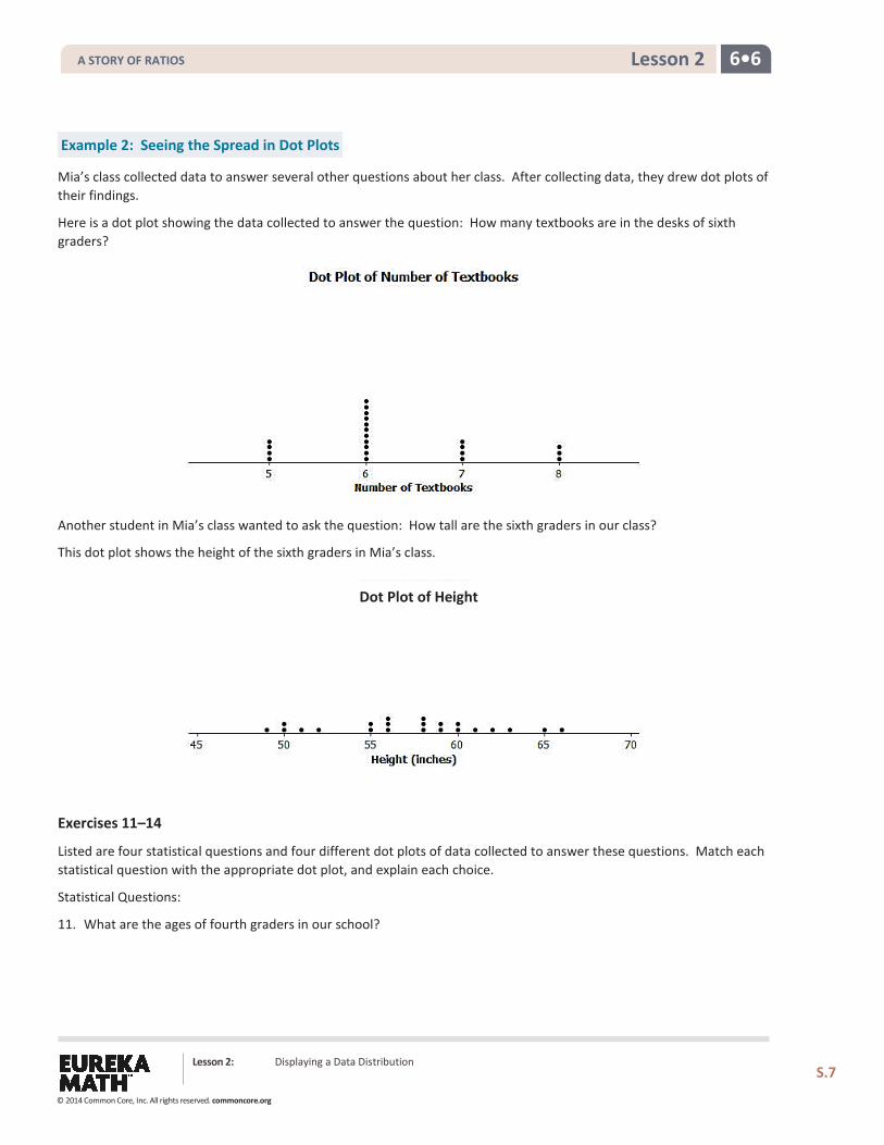
Example 2: Seeing the Spread in Dot Plots
Mia’s class collected data to answer several other questions about her class. After collecting data, they drew dot plots of their findings.
Here is a dot plot showing the data collected to answer the question: How many textbooks are in the desks of sixth graders?
Another student in Mia’s class wanted to ask the question: How tall are the sixth graders in our class?
This dot plot shows the height of the sixth graders in Mia’s class.
Exercises 11–14
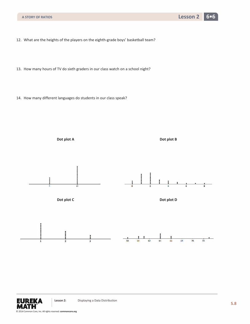
Listed are four statistical questions and four different dot plots of data collected to answer these questions. Match each statistical question with the appropriate dot plot, and explain each choice.
Statistical Questions:
11. What are the ages of fourth graders in our school?
Dot Plot of Height
Lesson 2: Displaying a Data Distribution
S.7
A STORY OF RATIOS
© 2014 Common Core, Inc. All rights reserved. commoncore.org
6•6 Lesson 2
12. What are the heights of the players on the eighth-grade boys’ basketball team?
13. How many hours of TV do sixth graders in our class watch on a school night?
14. How many different languages do students in our class speak?
Dot plot A
Dot plot B
Dot plot C
Dot plot D
Lesson 2: Displaying a Data Distribution
S.8
A STORY OF RATIOS
© 2014 Common Core, Inc. All rights reserved. commoncore.org
6•6 Lesson 2
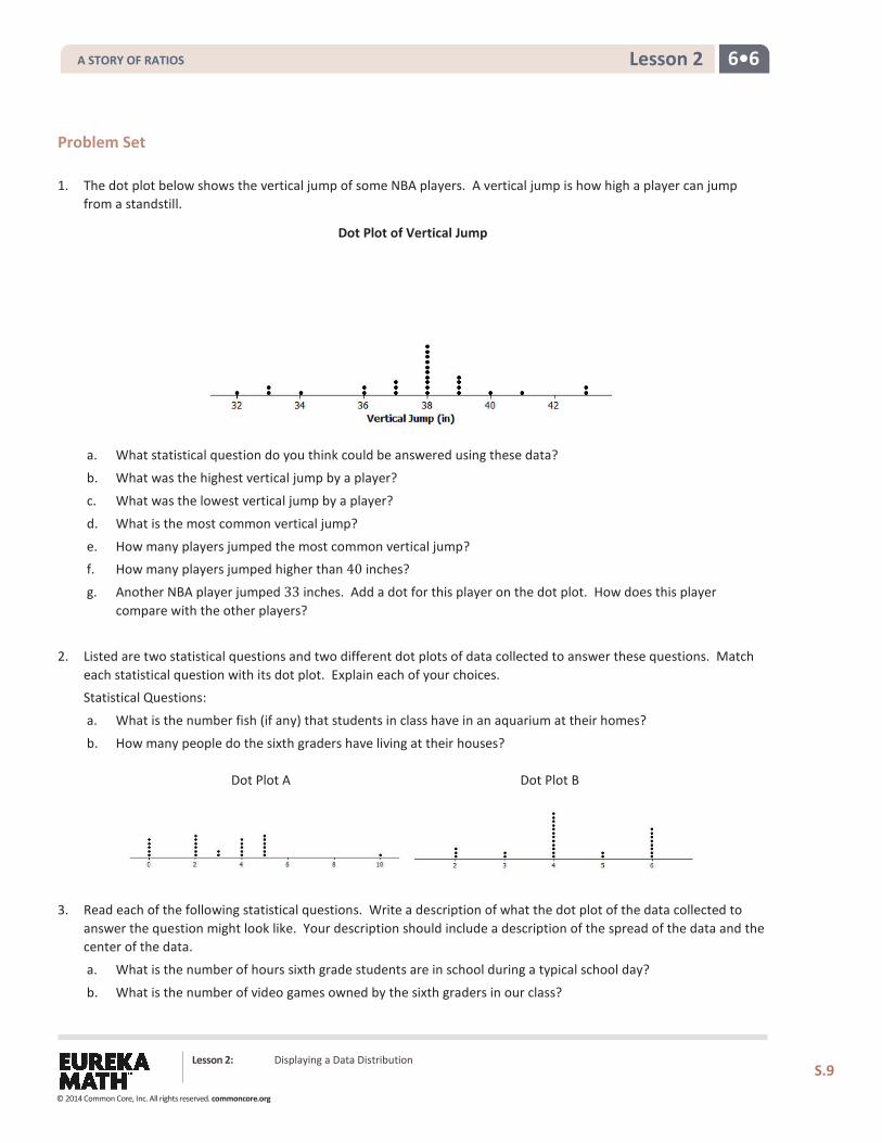
Problem Set 1. The dot plot below shows the vertical jump of some NBA players. A vertical jump is how high a player can jump
from a standstill.
a. What statistical question do you think could be answered using these data?
b. What was the highest vertical jump by a player?
c. What was the lowest vertical jump by a player?
d. What is the most common vertical jump?
e. How many players jumped the most common vertical jump? f. How many players jumped higher than 40 inches?
g. Another NBA player jumped 33 inches. Add a dot for this player on the dot plot. How does this player compare with the other players?
2. Listed are two statistical questions and two different dot plots of data collected to answer these questions. Match each statistical question with its dot plot. Explain each of your choices. Statistical Questions:
a. What is the number fish (if any) that students in class have in an aquarium at their homes?
b. How many people do the sixth graders have living at their houses?
3. Read each of the following statistical questions. Write a description of what the dot plot of the data collected to answer the question might look like. Your description should include a description of the spread of the data and the center of the data.
a. What is the number of hours sixth grade students are in school during a typical school day?
b. What is the number of video games owned by the sixth graders in our class?
Dot Plot A Dot Plot B
Dot Plot of Vertical Jump
Lesson 2: Displaying a Data Distribution
S.9
A STORY OF RATIOS
© 2014 Common Core, Inc. All rights reserved. commoncore.org
Lesson 3: Creating a Dot Plot
S.10
6•6 Lesson 3
Lesson 3: Creating a Dot Plot
Classwork
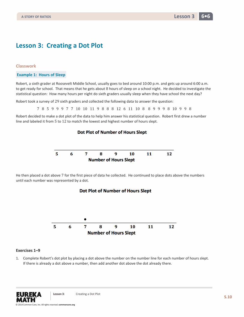
Example 1: Hours of Sleep
Robert, a sixth grader at Roosevelt Middle School, usually goes to bed around 10:00 p.m. and gets up around 6:00 a.m. to get ready for school. That means that he gets about 8 hours of sleep on a school night. He decided to investigate the statistical question: How many hours per night do sixth graders usually sleep when they have school the next day?
Robert took a survey of 29 sixth graders and collected the following data to answer the question:
7 8 5 9 9 9 7 7 10 10 11 9 8 8 8 12 6 11 10 8 8 9 9 9 8 10 9 9 8
Robert decided to make a dot plot of the data to help him answer his statistical question. Robert first drew a number line and labeled it from 5 to 12 to match the lowest and highest number of hours slept.
He then placed a dot above 7 for the first piece of data he collected. He continued to place dots above the numbers until each number was represented by a dot.
Exercises 1–9
1. Complete Robert’s dot plot by placing a dot above the number on the number line for each number of hours slept. If there is already a dot above a number, then add another dot above the dot already there.
A STORY OF RATIOS
© 2014 Common Core, Inc. All rights reserved. commoncore.org
Lesson 3: Creating a Dot Plot
S.11
6•6 Lesson 3
2. What are the least and the most hours of sleep reported in the survey of sixth graders?
3. What is the most common number of hours slept?
4. How many hours of sleep describes the center of the data?
5. Think about how many hours of sleep you usually get on a school night. How does your number compare with the number of hours of sleep from the survey of sixth graders?
Here are the data for the number of hours sixth graders sleep when they do not have school the next day:
7 8 10 11 5 6 12 13 13 7 9 8 10 12 11 12 8 9 10 11 10 12 11 11 11 12 11 11 10
6. Make a dot plot of the number of hours slept when there is no school the next day.
7. How many hours of sleep with no school the next day describes the center of the data?
8. What are the least and most hours slept with no school the next day reported in the survey?
A STORY OF RATIOS
© 2014 Common Core, Inc. All rights reserved. commoncore.org
Lesson 3: Creating a Dot Plot
S.12
6•6 Lesson 3
9. Do students sleep longer when they don’t have school the next day than they do when they do have school the next day? Explain your answer using the data in both dot plots.
Example 2: Building and Interpreting a Frequency Table
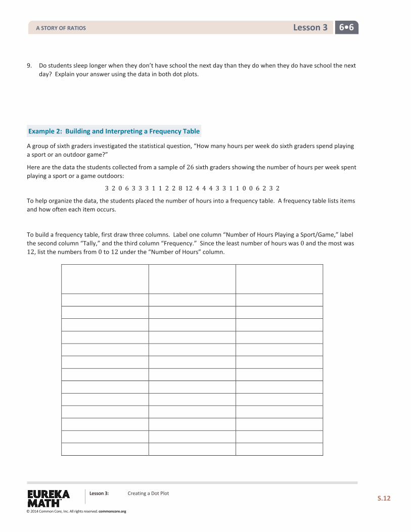
A group of sixth graders investigated the statistical question, “How many hours per week do sixth graders spend playing a sport or an outdoor game?”
Here are the data the students collected from a sample of 26 sixth graders showing the number of hours per week spent playing a sport or a game outdoors:
3 2 0 6 3 3 3 1 1 2 2 8 12 4 4 4 3 3 1 1 0 0 6 2 3 2
To help organize the data, the students placed the number of hours into a frequency table. A frequency table lists items and how often each item occurs.
To build a frequency table, first draw three columns. Label one column “Number of Hours Playing a Sport/Game,” label the second column “Tally,” and the third column “Frequency.” Since the least number of hours was 0 and the most was 12, list the numbers from 0 to 12 under the “Number of Hours” column.
A STORY OF RATIOS
© 2014 Common Core, Inc. All rights reserved. commoncore.org
Lesson 3: Creating a Dot Plot
S.13
6•6 Lesson 3
Exercises 10–15
10. Complete the tally mark column in the table created in Example 2.
11. For each number of hours, find the total number of tally marks, and place this in the frequency column in the table
created in Example 2.
12. Make a dot plot of the number of hours playing a sport or playing outdoors.
13. What number of hours describes the center of the data?
14. How many sixth graders reported that they spend eight or more hours a week playing a sport or playing outdoors?
15. The sixth graders wanted to answer the question, “How many hours do sixth graders spend per week playing a sport or playing an outdoor game?” Using the frequency table and the dot plot, how would you answer the sixth grader’s question?
A STORY OF RATIOS
© 2014 Common Core, Inc. All rights reserved. commoncore.org

Lesson 3: Creating a Dot Plot
S.14
6•6 Lesson 3
Problem Set 1. The data below is the number of goals scored by a professional indoor soccer team over their last 23 games.
8 16 10 9 11 11 10 15 16 11 15 13 8 9 11 9 8 11 16 15 10 9 12
a. Make a dot plot of the number of goals scored.
b. What number of goals describes the center of the data?
c. What is the least and most number of goals scored by the team?
d. Over the 23 games played, the team lost 10 games. Circle the dots on the plot that you think represent the games that the team lost. Explain your answer.
2. A sixth grader rolled two number cubes 21 times. The student found the sum of the two numbers that he rolled each time. The following are the sums of the 21 rolls of the two number cubes:
9 2 4 6 5 7 8 11 9 4 6 5 7 7 8 8 7 5 7 6 6
a. Complete the frequency table.
Sum Rolled Tally Frequency 2 3 4 5 6 7 8 9
10 11 12
b. What sum describes the center of the data?
c. What was the most common sum of the number cubes?
A STORY OF RATIOS
© 2014 Common Core, Inc. All rights reserved. commoncore.org
Lesson 3: Creating a Dot Plot
S.15
6•6 Lesson 3
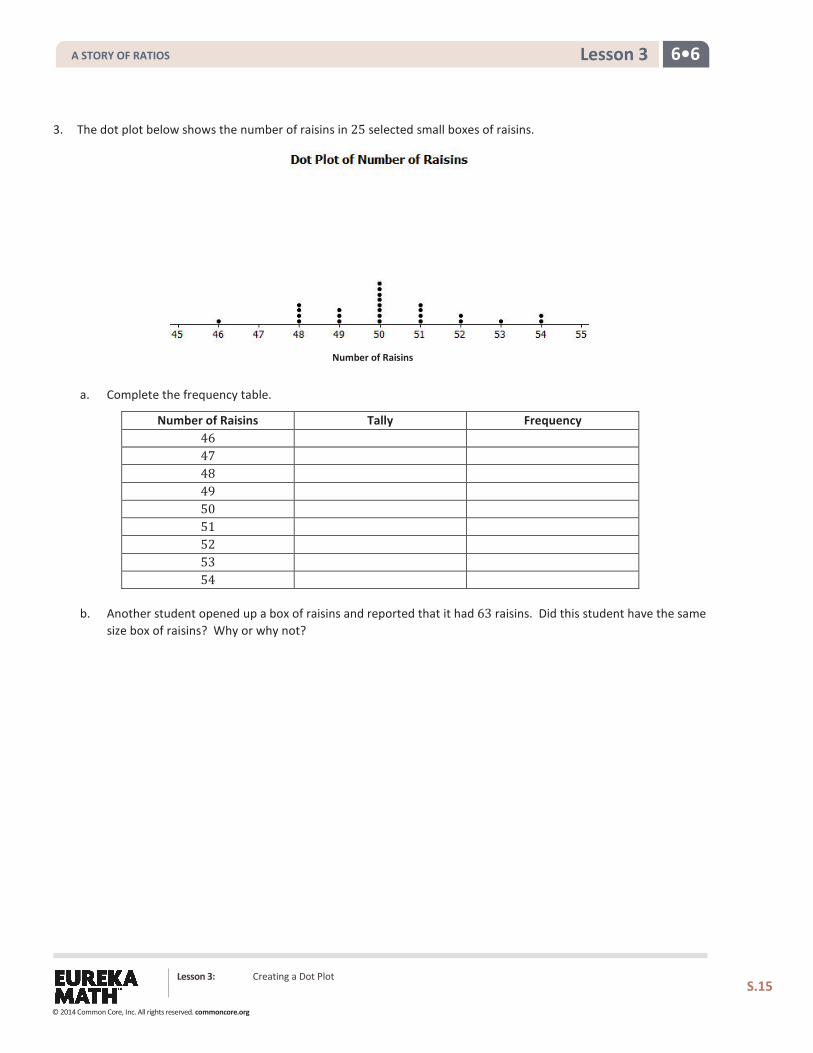
3. The dot plot below shows the number of raisins in 25 selected small boxes of raisins.
a. Complete the frequency table.
Number of Raisins Tally Frequency 46 47 48 49 50 51 52 53 54
b. Another student opened up a box of raisins and reported that it had 63 raisins. Did this student have the same size box of raisins? Why or why not?
Number of Raisins
A STORY OF RATIOS
© 2014 Common Core, Inc. All rights reserved. commoncore.org
Lesson 4: Creating a Histogram
S.16
6•6 Lesson 4
Lesson 4: Creating a Histogram
Classwork
Example 1: Frequency Table with Intervals
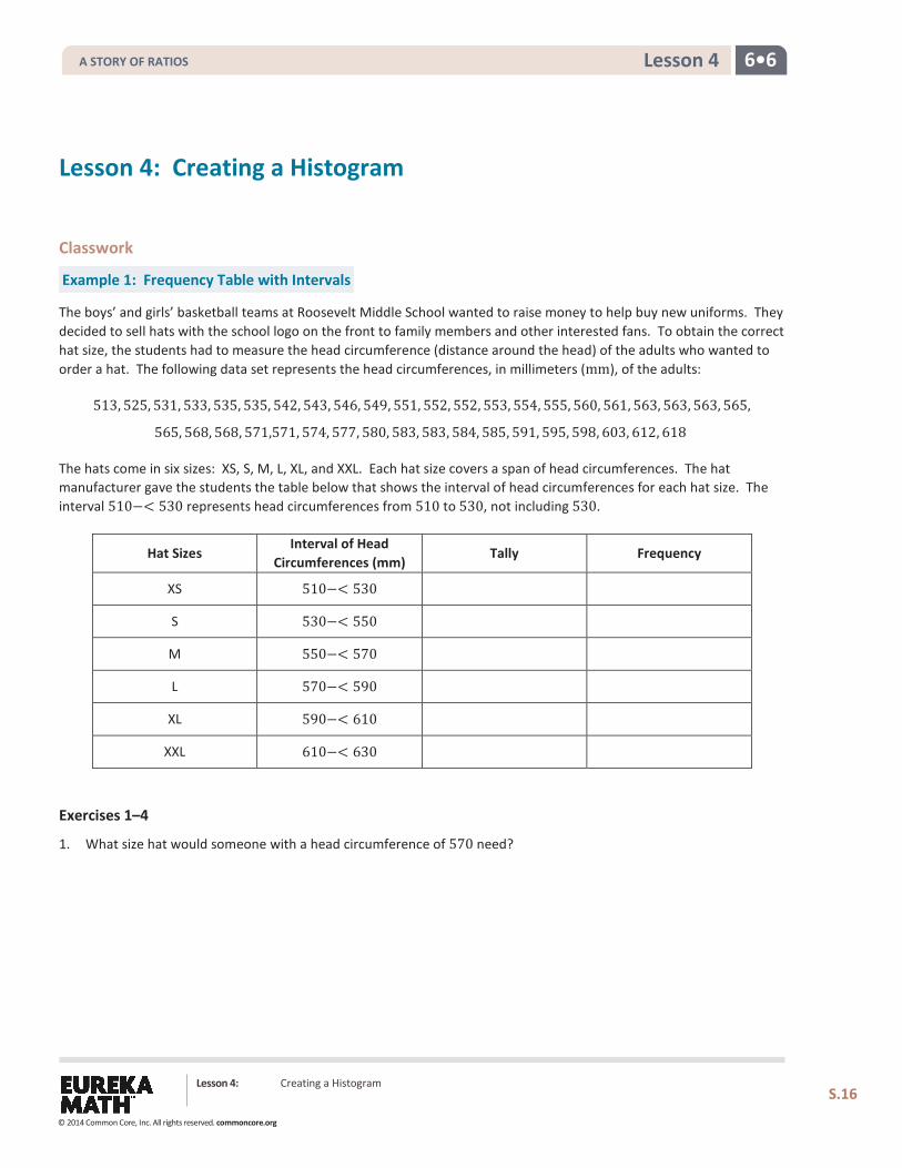
The boys’ and girls’ basketball teams at Roosevelt Middle School wanted to raise money to help buy new uniforms. They decided to sell hats with the school logo on the front to family members and other interested fans. To obtain the correct hat size, the students had to measure the head circumference (distance around the head) of the adults who wanted to order a hat. The following data set represents the head circumferences, in millimeters (mm), of the adults:
513, 525, 531, 533, 535, 535, 542, 543, 546, 549, 551, 552, 552, 553, 554, 555, 560, 561, 563, 563, 563, 565,
565, 568, 568, 571,571, 574, 577, 580, 583, 583, 584, 585, 591, 595, 598, 603, 612, 618
The hats come in six sizes: XS, S, M, L, XL, and XXL. Each hat size covers a span of head circumferences. The hat manufacturer gave the students the table below that shows the interval of head circumferences for each hat size. The interval 510−< 530 represents head circumferences from 510 to 530, not including 530.
Hat Sizes Interval of Head
Circumferences (mm) Tally Frequency
XS 510−< 530
S 530−< 550
M 550−< 570
L 570−< 590
XL 590−< 610
XXL 610−< 630
Exercises 1–4
1. What size hat would someone with a head circumference of 570 need?
A STORY OF RATIOS
© 2014 Common Core, Inc. All rights reserved. commoncore.org
Lesson 4: Creating a Histogram
S.17
6•6 Lesson 4
2. Complete the tally and frequency columns in the table in Example 1 to determine the number of each size hat the students need to order for the adults who wanted to order a hat.
3. What hat size does the data center around?
4. Describe any patterns that you observe in the frequency column.
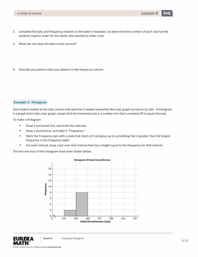
Example 2: Histogram
One student looked at the tally column and said that it looked somewhat like a bar graph turned on its side. A histogram is a graph that is like a bar graph, except that the horizontal axis is a number line that is marked off in equal intervals.
To make a histogram:
Draw a horizontal line, and mark the intervals.
Draw a vertical line, and label it “Frequency.”
Mark the Frequency axis with a scale that starts at 0 and goes up to something that is greater than the largest frequency in the frequency table.
For each interval, draw a bar over that interval that has a height equal to the frequency for that interval.
The first two bars of the histogram have been drawn below.
Histogram of Head Circumference
A STORY OF RATIOS
© 2014 Common Core, Inc. All rights reserved. commoncore.org
Lesson 4: Creating a Histogram
S.18
6•6 Lesson 4
Exercises 5–9
5. Complete the histogram by drawing bars whose heights are the frequencies for those intervals.
6. Based on the histogram, describe the center of the head circumferences.
7. How would the histogram change if you added head circumferences of 551 and 569 mm?
8. Because the 40 head circumference values were given, you could have constructed a dot plot to display the head circumference data. What information is lost when a histogram is used to represent a data distribution instead of a dot plot?
9. Suppose that there had been 200 head circumference measurements in the data set. Explain why you might prefer to summarize this data set using a histogram rather than a dot plot.
A STORY OF RATIOS
© 2014 Common Core, Inc. All rights reserved. commoncore.org
Lesson 4: Creating a Histogram
S.19
6•6 Lesson 4
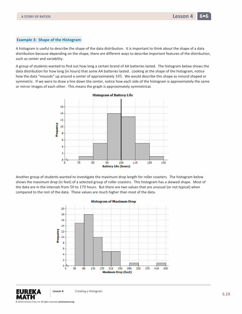
Example 3: Shape of the Histogram
A histogram is useful to describe the shape of the data distribution. It is important to think about the shape of a data distribution because depending on the shape, there are different ways to describe important features of the distribution, such as center and variability.
A group of students wanted to find out how long a certain brand of AA batteries lasted. The histogram below shows the data distribution for how long (in hours) that some AA batteries lasted. Looking at the shape of the histogram, notice how the data “mounds” up around a center of approximately 105. We would describe this shape as mound shaped or symmetric. If we were to draw a line down the center, notice how each side of the histogram is approximately the same or mirror images of each other. This means the graph is approximately symmetrical.
Another group of students wanted to investigate the maximum drop length for roller coasters. The histogram below shows the maximum drop (in feet) of a selected group of roller coasters. This histogram has a skewed shape. Most of the data are in the intervals from 50 to 170 hours. But there are two values that are unusual (or not typical) when compared to the rest of the data. These values are much higher than most of the data.
A STORY OF RATIOS
© 2014 Common Core, Inc. All rights reserved. commoncore.org
Lesson 4: Creating a Histogram
S.20
6•6 Lesson 4
Exercises 10–12
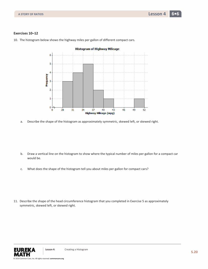
10. The histogram below shows the highway miles per gallon of different compact cars.
a. Describe the shape of the histogram as approximately symmetric, skewed left, or skewed right.
b. Draw a vertical line on the histogram to show where the typical number of miles per gallon for a compact car would be.
c. What does the shape of the histogram tell you about miles per gallon for compact cars?
11. Describe the shape of the head circumference histogram that you completed in Exercise 5 as approximately symmetric, skewed left, or skewed right.
A STORY OF RATIOS
© 2014 Common Core, Inc. All rights reserved. commoncore.org
Lesson 4: Creating a Histogram
S.21
6•6 Lesson 4
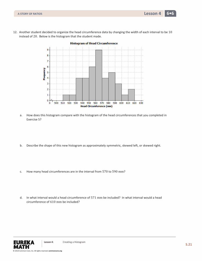
12. Another student decided to organize the head circumference data by changing the width of each interval to be 10 instead of 20. Below is the histogram that the student made.
a. How does this histogram compare with the histogram of the head circumferences that you completed in Exercise 5?
b. Describe the shape of this new histogram as approximately symmetric, skewed left, or skewed right.
c. How many head circumferences are in the interval from 570 to 590 mm?
d. In what interval would a head circumference of 571 mm be included? In what interval would a head circumference of 610 mm be included?
A STORY OF RATIOS
© 2014 Common Core, Inc. All rights reserved. commoncore.org
Lesson 4: Creating a Histogram
S.22
6•6 Lesson 4
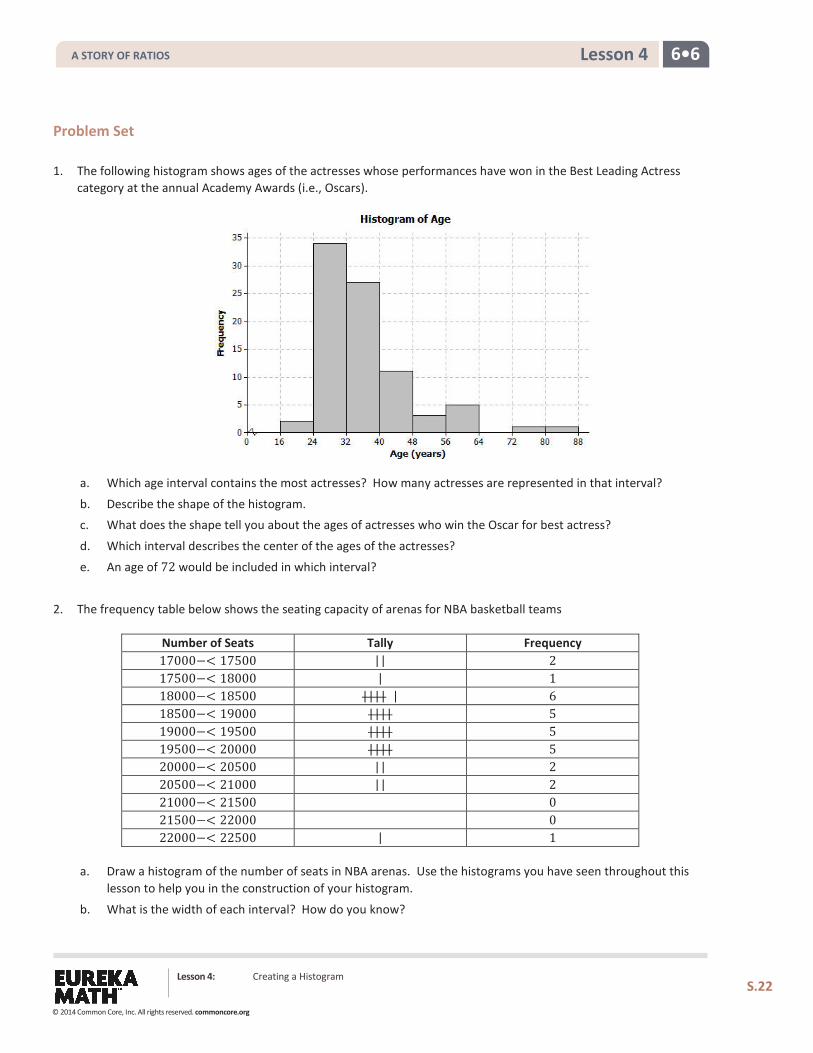
Problem Set 1. The following histogram shows ages of the actresses whose performances have won in the Best Leading Actress
category at the annual Academy Awards (i.e., Oscars).
a. Which age interval contains the most actresses? How many actresses are represented in that interval?
b. Describe the shape of the histogram. c. What does the shape tell you about the ages of actresses who win the Oscar for best actress?
d. Which interval describes the center of the ages of the actresses?
e. An age of 72 would be included in which interval?
2. The frequency table below shows the seating capacity of arenas for NBA basketball teams
Number of Seats Tally Frequency 17000−< 17500 || 2 17500−< 18000 | 1 18000−< 18500 |||| | 6 18500−< 19000 |||| 5 19000−< 19500 |||| 5 19500−< 20000 |||| 5 20000−< 20500 || 2 20500−< 21000 || 2 21000−< 21500 0 21500−< 22000 0 22000−< 22500 | 1
a. Draw a histogram of the number of seats in NBA arenas. Use the histograms you have seen throughout this lesson to help you in the construction of your histogram.
b. What is the width of each interval? How do you know?
A STORY OF RATIOS
© 2014 Common Core, Inc. All rights reserved. commoncore.org
Lesson 4: Creating a Histogram
S.23
6•6 Lesson 4
c. Describe the shape of the histogram.
d. Which interval describes the center of the number of seats?
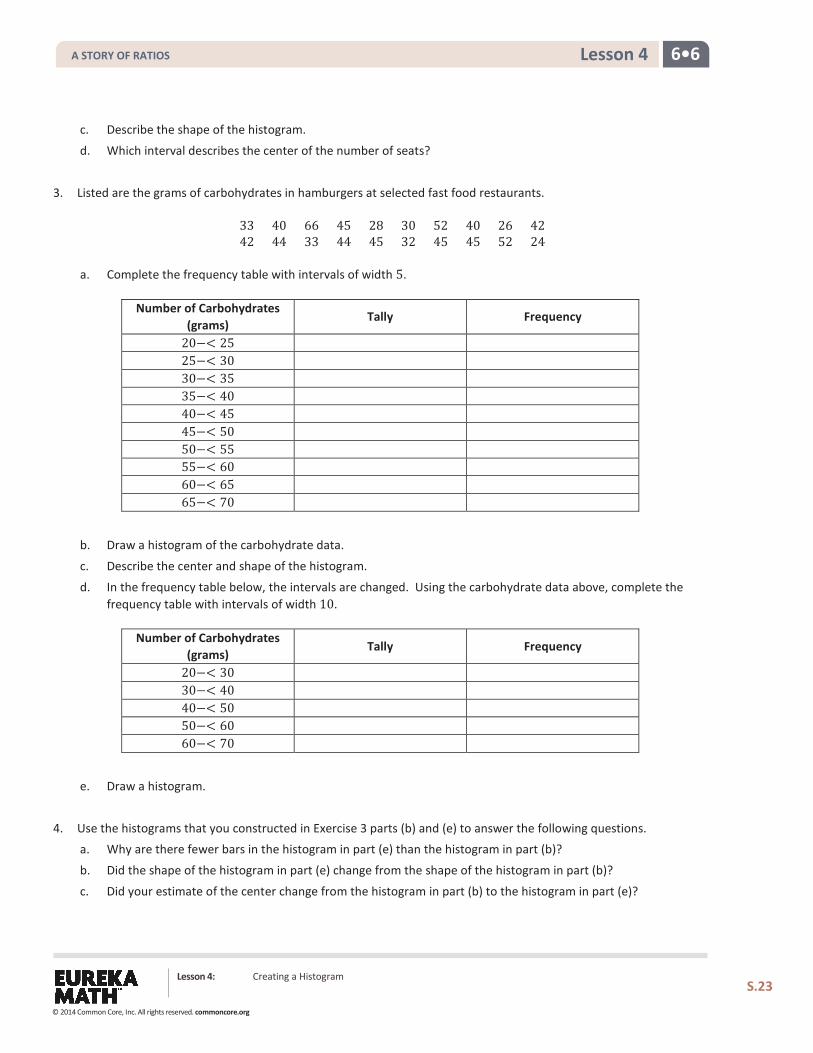
3. Listed are the grams of carbohydrates in hamburgers at selected fast food restaurants.
33 40 66 45 28 30 52 40 26 42 42 44 33 44 45 32 45 45 52 24
a. Complete the frequency table with intervals of width 5.
Number of Carbohydrates (grams)
Tally Frequency
20−< 25 25−< 30 30−< 35 35−< 40 40−< 45 45−< 50 50−< 55 55−< 60 60−< 65 65−< 70
b. Draw a histogram of the carbohydrate data.
c. Describe the center and shape of the histogram.
d. In the frequency table below, the intervals are changed. Using the carbohydrate data above, complete the frequency table with intervals of width 10.
Number of Carbohydrates (grams)
Tally Frequency
20−< 30 30−< 40 40−< 50 50−< 60 60−< 70
e. Draw a histogram.
4. Use the histograms that you constructed in Exercise 3 parts (b) and (e) to answer the following questions. a. Why are there fewer bars in the histogram in part (e) than the histogram in part (b)?
b. Did the shape of the histogram in part (e) change from the shape of the histogram in part (b)?
c. Did your estimate of the center change from the histogram in part (b) to the histogram in part (e)?
A STORY OF RATIOS
© 2014 Common Core, Inc. All rights reserved. commoncore.org
6•6 Lesson 5
Lesson 5: Describing a Distribution Displayed in a Histogram
Classwork
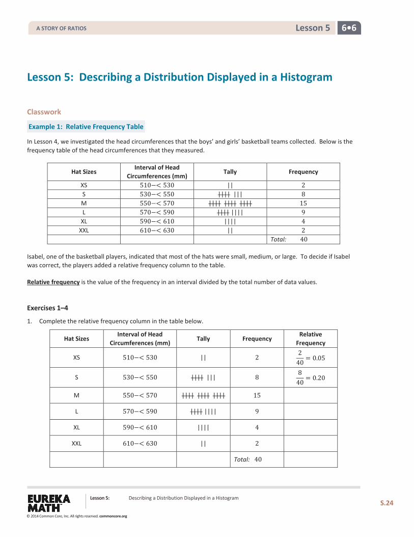
Example 1: Relative Frequency Table
In Lesson 4, we investigated the head circumferences that the boys’ and girls’ basketball teams collected. Below is the frequency table of the head circumferences that they measured.
Hat Sizes Interval of Head
Circumferences (mm) Tally Frequency
XS 510−< 530 || 2 S 530−< 550 |||| ||| 8 M 550−< 570 |||| |||| |||| 15 L 570−< 590 |||| |||| 9
XL 590−< 610 |||| 4 XXL 610−< 630 || 2
Total: 40
Isabel, one of the basketball players, indicated that most of the hats were small, medium, or large. To decide if Isabel was correct, the players added a relative frequency column to the table.
Relative frequency is the value of the frequency in an interval divided by the total number of data values.
Exercises 1–4
1. Complete the relative frequency column in the table below.
Hat Sizes Interval of Head
Circumferences (mm) Tally Frequency
Relative Frequency
XS 510−< 530 || 2 2
40= 0.05
S 530−< 550 |||| ||| 8 8
40= 0.20
M 550−< 570 |||| |||| |||| 15
L 570−< 590 |||| |||| 9
XL 590−< 610 |||| 4
XXL 610−< 630 || 2
Total: 40
Lesson 5: Describing a Distribution Displayed in a Histogram
S.24
A STORY OF RATIOS
© 2014 Common Core, Inc. All rights reserved. commoncore.org
6•6 Lesson 5
2. What is the total of the relative frequency column?
3. Which interval has the greatest relative frequency? What is the value?
4. What percentage of the head circumferences are between 530 and 589 mm? Show how you determined the answer.
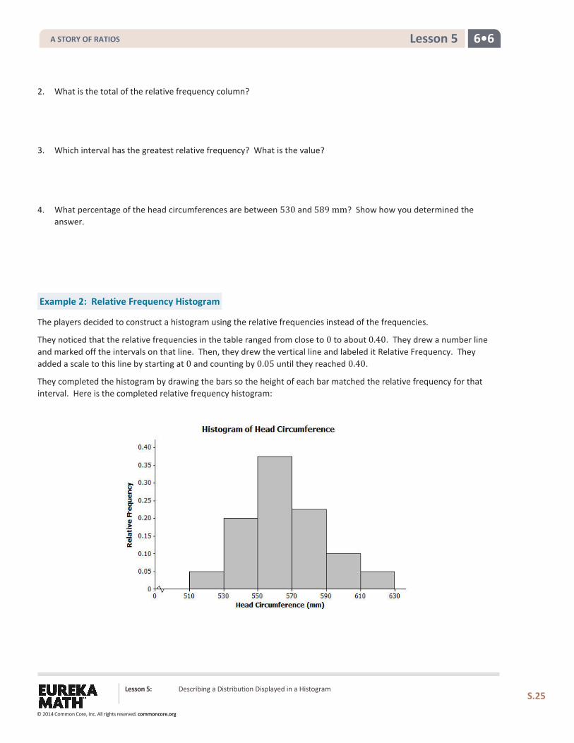
Example 2: Relative Frequency Histogram
The players decided to construct a histogram using the relative frequencies instead of the frequencies.
They noticed that the relative frequencies in the table ranged from close to 0 to about 0.40. They drew a number line and marked off the intervals on that line. Then, they drew the vertical line and labeled it Relative Frequency. They added a scale to this line by starting at 0 and counting by 0.05 until they reached 0.40.
They completed the histogram by drawing the bars so the height of each bar matched the relative frequency for that interval. Here is the completed relative frequency histogram:
Lesson 5: Describing a Distribution Displayed in a Histogram
S.25
A STORY OF RATIOS
© 2014 Common Core, Inc. All rights reserved. commoncore.org
6•6 Lesson 5
Exercises 5–6
5.
a. Describe the shape of the relative frequency histogram of head circumferences from Example 2.
b. How does the shape of this histogram compare with the frequency histogram you drew in Exercise 5 of Lesson 4?
c. Isabel said that most of the hats that needed to be ordered were small, medium, and large. Was she right? What percentage of the hats to be ordered are small, medium, or large?
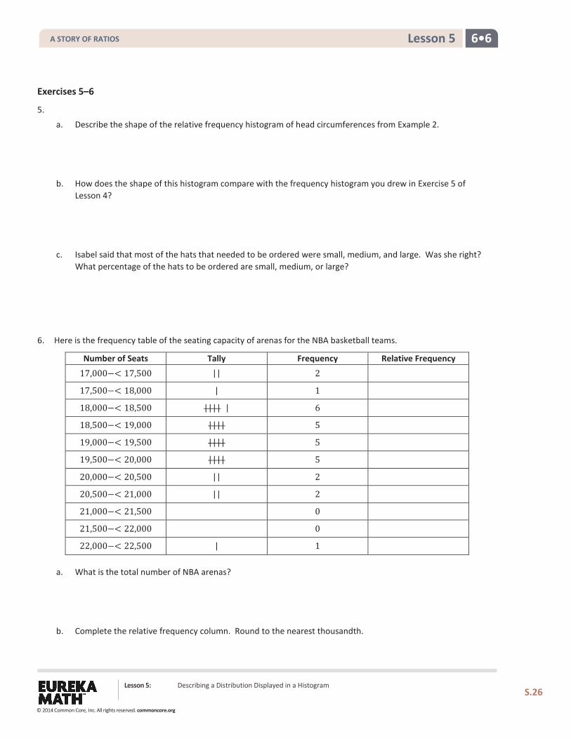
6. Here is the frequency table of the seating capacity of arenas for the NBA basketball teams.
Number of Seats Tally Frequency Relative Frequency
17,000−< 17,500 || 2
17,500−< 18,000 | 1
18,000−< 18,500 |||| | 6
18,500−< 19,000 |||| 5
19,000−< 19,500 |||| 5
19,500−< 20,000 |||| 5
20,000−< 20,500 || 2
20,500−< 21,000 || 2
21,000−< 21,500 0
21,500−< 22,000 0
22,000−< 22,500 | 1
a. What is the total number of NBA arenas?
b. Complete the relative frequency column. Round to the nearest thousandth.
Lesson 5: Describing a Distribution Displayed in a Histogram
S.26
A STORY OF RATIOS
© 2014 Common Core, Inc. All rights reserved. commoncore.org
6•6 Lesson 5
c. Construct a relative frequency histogram. Round to the nearest thousandth.
d. Describe the shape of the relative frequency histogram.
e. What percentage of the arenas have a seating capacity between 18,500 and 19,999 seats?
f. How does this relative frequency histogram compare to the frequency histogram that you drew in Problem 2 of the Problem Set in Lesson 4?
Lesson 5: Describing a Distribution Displayed in a Histogram
S.27
A STORY OF RATIOS
© 2014 Common Core, Inc. All rights reserved. commoncore.org
6•6 Lesson 5
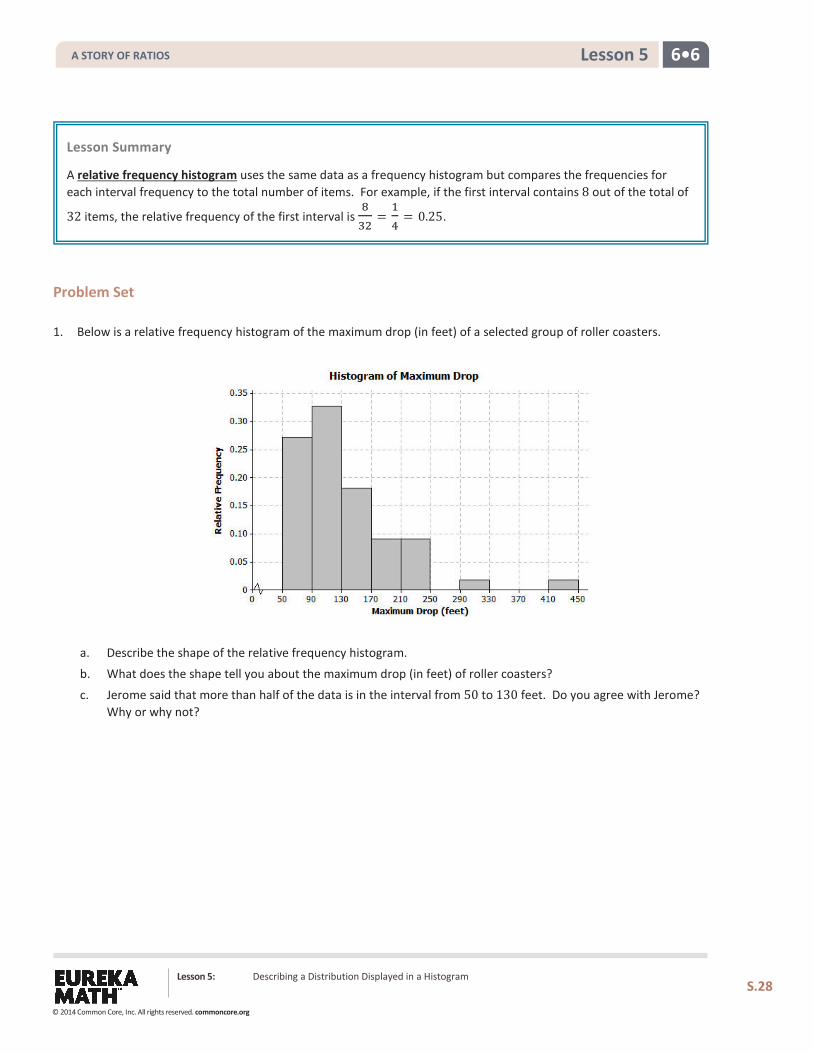
Problem Set 1. Below is a relative frequency histogram of the maximum drop (in feet) of a selected group of roller coasters.
a. Describe the shape of the relative frequency histogram.
b. What does the shape tell you about the maximum drop (in feet) of roller coasters?
c. Jerome said that more than half of the data is in the interval from 50 to 130 feet. Do you agree with Jerome? Why or why not?
Lesson Summary A relative frequency histogram uses the same data as a frequency histogram but compares the frequencies for each interval frequency to the total number of items. For example, if the first interval contains 8 out of the total of
32 items, the relative frequency of the first interval is 832
=14
= 0.25.
Lesson 5: Describing a Distribution Displayed in a Histogram
S.28
A STORY OF RATIOS
© 2014 Common Core, Inc. All rights reserved. commoncore.org
6•6 Lesson 5
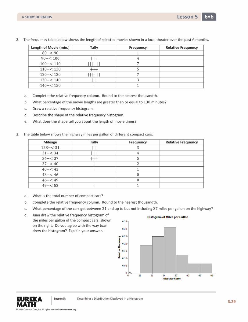
2. The frequency table below shows the length of selected movies shown in a local theater over the past 6 months.
Length of Movie (min.) Tally Frequency Relative Frequency 80−< 90 | 1
90−< 100 |||| 4 100−< 110 |||| || 7 110−< 120 |||| 5 120−< 130 |||| || 7 130−< 140 ||| 3 140−< 150 | 1
a. Complete the relative frequency column. Round to the nearest thousandth.
b. What percentage of the movie lengths are greater than or equal to 130 minutes?
c. Draw a relative frequency histogram.
d. Describe the shape of the relative frequency histogram. e. What does the shape tell you about the length of movie times?
3. The table below shows the highway miles per gallon of different compact cars.
Mileage Tally Frequency Relative Frequency 128−< 31 ||| 3 31−< 34 |||| 4 34−< 37 |||| 5 37−< 40 || 2 40−< 43 | 1 43−< 46 0 46−< 49 0 49−< 52 | 1
a. What is the total number of compact cars?
b. Complete the relative frequency column. Round to the nearest thousandth. c. What percentage of the cars get between 31 and up to but not including 37 miles per gallon on the highway?
d. Juan drew the relative frequency histogram of the miles per gallon of the compact cars, shown on the right. Do you agree with the way Juan drew the histogram? Explain your answer.
Lesson 5: Describing a Distribution Displayed in a Histogram
S.29
A STORY OF RATIOS
© 2014 Common Core, Inc. All rights reserved. commoncore.org
6•6 Lesson 6
Lesson 6: Describing the Center of a Distribution Using the Mean
Classwork
Example 1
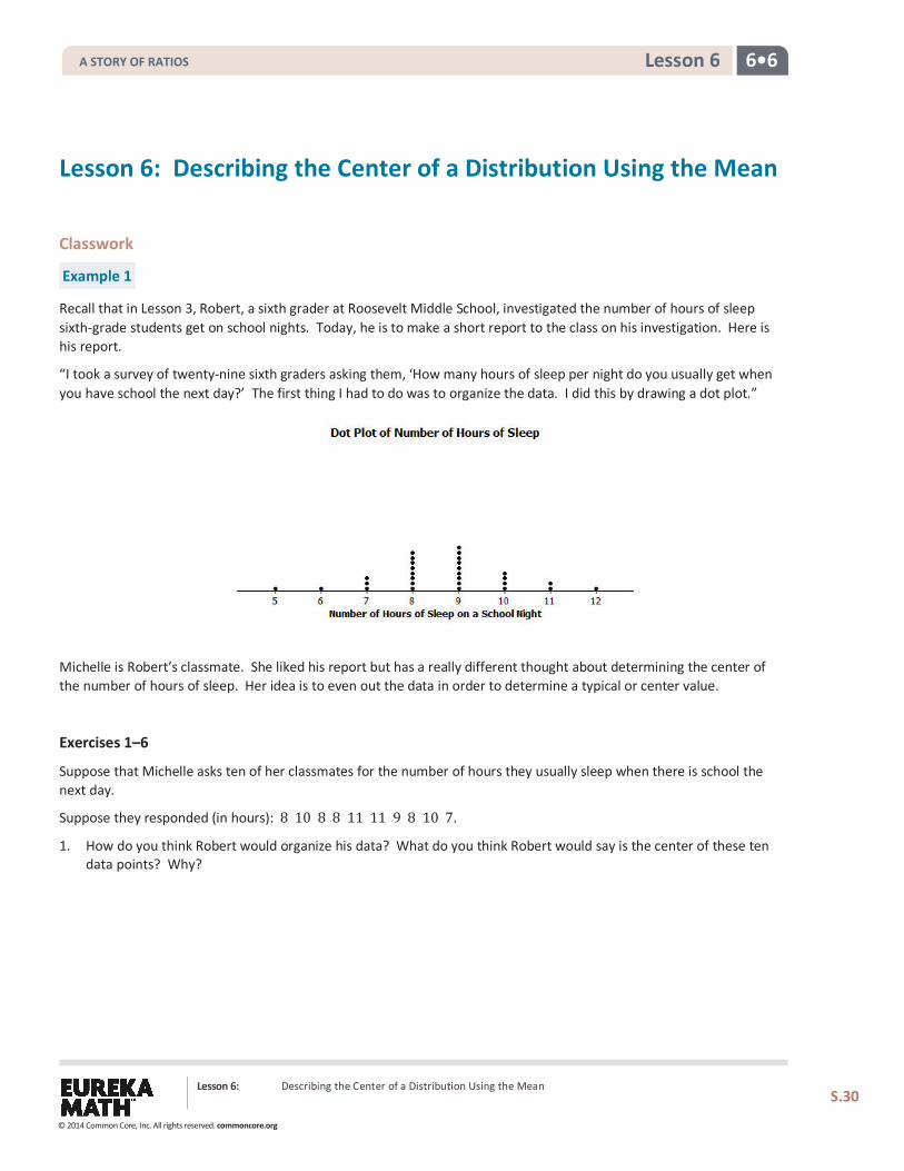
Recall that in Lesson 3, Robert, a sixth grader at Roosevelt Middle School, investigated the number of hours of sleep sixth-grade students get on school nights. Today, he is to make a short report to the class on his investigation. Here is his report.
“I took a survey of twenty-nine sixth graders asking them, ‘How many hours of sleep per night do you usually get when you have school the next day?’ The first thing I had to do was to organize the data. I did this by drawing a dot plot.”
Michelle is Robert’s classmate. She liked his report but has a really different thought about determining the center of the number of hours of sleep. Her idea is to even out the data in order to determine a typical or center value.
Exercises 1–6
Suppose that Michelle asks ten of her classmates for the number of hours they usually sleep when there is school the next day.
Suppose they responded (in hours): 8 10 8 8 11 11 9 8 10 7.
1. How do you think Robert would organize his data? What do you think Robert would say is the center of these ten data points? Why?
Lesson 6: Describing the Center of a Distribution Using the Mean
S.30
A STORY OF RATIOS
© 2014 Common Core, Inc. All rights reserved. commoncore.org
6•6 Lesson 6
2. Do you think his value is a good measure to use for the center of Michelle’s data set? Why or why not?
Michelle’s center is called the mean. She finds the total number of hours of sleep for each of the ten students. That is 90 hours. She has 90 Unifix cubes (Snap cubes). She gives each of the ten students the number of cubes that equals the number of hours of sleep each had reported. She then asks each of the ten students to connect their cubes in a stack and put their stacks on a table to compare them. She then has them share their cubes with each other until they all have the same number of cubes in their stacks when they are done sharing.
3. Make ten stacks of cubes representing the number of hours of sleep for each of the ten students. Using Michelle’s method, how many cubes are in each of the ten stacks when they are done sharing?
4. Noting that one cube represents one hour of sleep, interpret your answer to Exercise 3 in terms of number of hours of sleep. What does this number of cubes in each stack represent? What is this value called?
5. Suppose that the student who told Michelle he slept 7 hours changes his data entry to 8 hours. What does Michelle’s procedure now produce for her center of the new set of data? What did you have to do with that extra cube to make Michelle’s procedure work?
6. Interpret Michelle’s fair share procedure by developing a mathematical formula that results in finding the fair share value without actually using cubes. Be sure that you can explain clearly how the fair share procedure and the mathematical formula relate to each other.
Lesson 6: Describing the Center of a Distribution Using the Mean
S.31
A STORY OF RATIOS
© 2014 Common Core, Inc. All rights reserved. commoncore.org
6•6 Lesson 6
Example 2
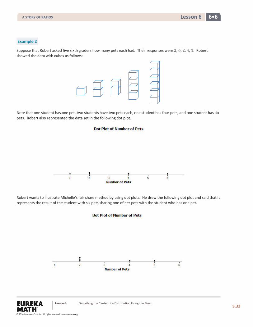
Suppose that Robert asked five sixth graders how many pets each had. Their responses were 2, 6, 2, 4, 1. Robert showed the data with cubes as follows:
Note that one student has one pet, two students have two pets each, one student has four pets, and one student has six pets. Robert also represented the data set in the following dot plot.
Robert wants to illustrate Michelle’s fair share method by using dot plots. He drew the following dot plot and said that it represents the result of the student with six pets sharing one of her pets with the student who has one pet.
Lesson 6: Describing the Center of a Distribution Using the Mean
S.32
A STORY OF RATIOS
© 2014 Common Core, Inc. All rights reserved. commoncore.org
6•6 Lesson 6
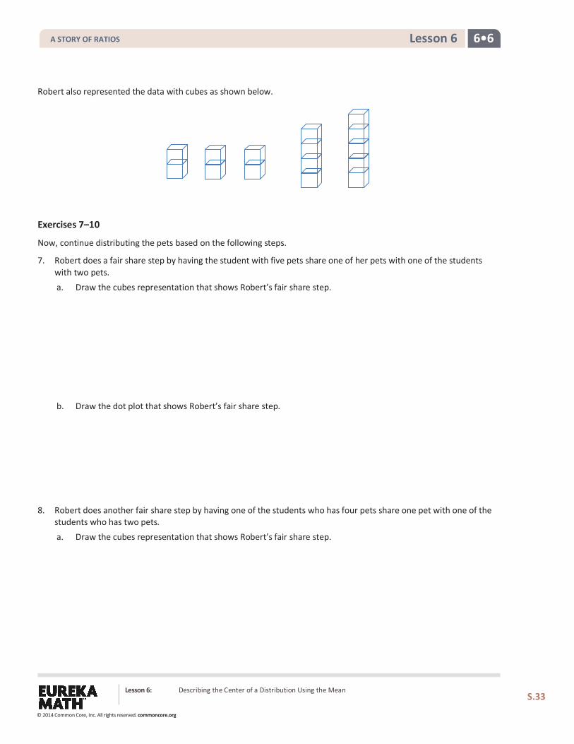
Robert also represented the data with cubes as shown below.
Exercises 7–10
Now, continue distributing the pets based on the following steps.
7. Robert does a fair share step by having the student with five pets share one of her pets with one of the students with two pets. a. Draw the cubes representation that shows Robert’s fair share step. b. Draw the dot plot that shows Robert’s fair share step.
8. Robert does another fair share step by having one of the students who has four pets share one pet with one of the students who has two pets. a. Draw the cubes representation that shows Robert’s fair share step.
Lesson 6: Describing the Center of a Distribution Using the Mean
S.33
A STORY OF RATIOS
© 2014 Common Core, Inc. All rights reserved. commoncore.org
6•6 Lesson 6
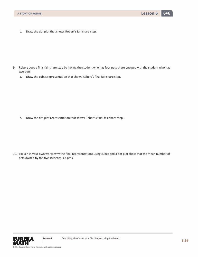
b. Draw the dot plot that shows Robert’s fair share step.
9. Robert does a final fair share step by having the student who has four pets share one pet with the student who has two pets. a. Draw the cubes representation that shows Robert’s final fair share step. b. Draw the dot plot representation that shows Robert’s final fair share step.
10. Explain in your own words why the final representations using cubes and a dot plot show that the mean number of pets owned by the five students is 3 pets.
Lesson 6: Describing the Center of a Distribution Using the Mean
S.34
A STORY OF RATIOS
© 2014 Common Core, Inc. All rights reserved. commoncore.org
6•6 Lesson 6
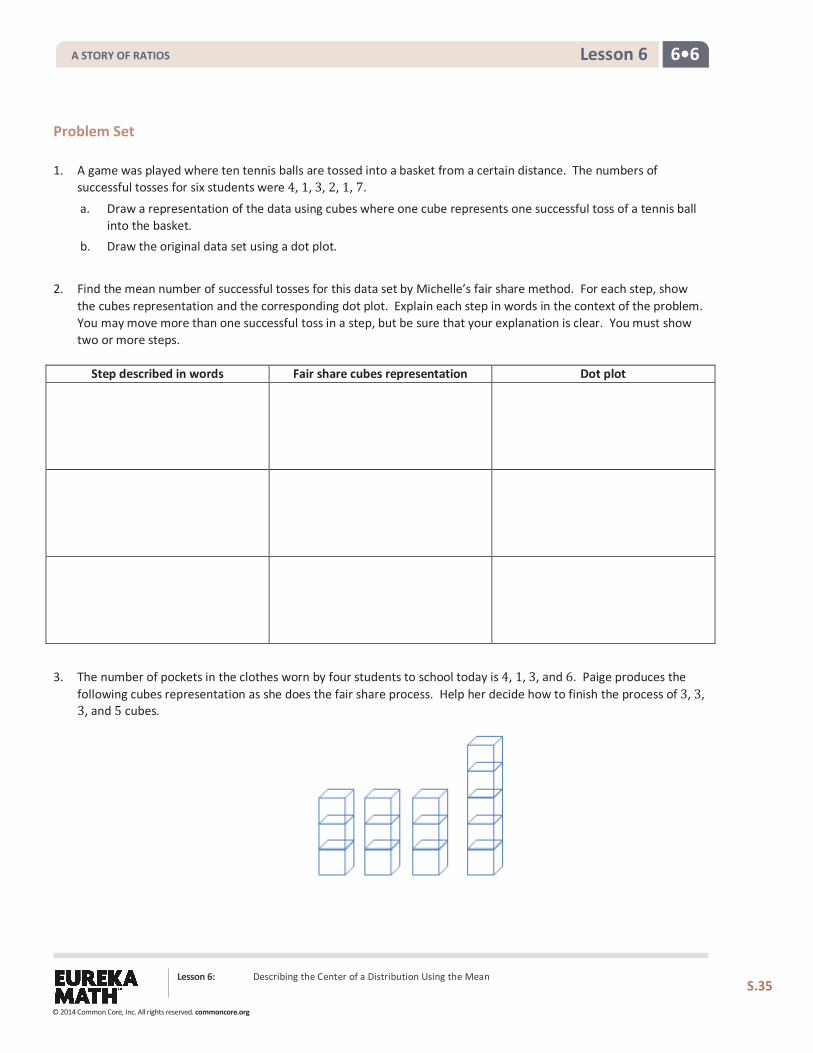
Problem Set 1. A game was played where ten tennis balls are tossed into a basket from a certain distance. The numbers of
successful tosses for six students were 4, 1, 3, 2, 1, 7.
a. Draw a representation of the data using cubes where one cube represents one successful toss of a tennis ball into the basket.
b. Draw the original data set using a dot plot.
2. Find the mean number of successful tosses for this data set by Michelle’s fair share method. For each step, show the cubes representation and the corresponding dot plot. Explain each step in words in the context of the problem. You may move more than one successful toss in a step, but be sure that your explanation is clear. You must show two or more steps.
Step described in words Fair share cubes representation Dot plot
3. The number of pockets in the clothes worn by four students to school today is 4, 1, 3, and 6. Paige produces the
following cubes representation as she does the fair share process. Help her decide how to finish the process of 3, 3, 3, and 5 cubes.
Lesson 6: Describing the Center of a Distribution Using the Mean
S.35
A STORY OF RATIOS
© 2014 Common Core, Inc. All rights reserved. commoncore.org
6•6 Lesson 6
4. Suppose that the mean number of chocolate chips in 30 cookies is 14 chocolate chips. a. Interpret the mean number of chocolate chips in terms of fair share. b. Describe the dot plot representation of the fair share mean of 14 chocolate chips in 30 cookies.
5. Suppose that the following are lengths (in millimeters) of radish seedlings grown in identical conditions for three days: 12 11 12 14 13 9 13 11 13 10 10 14 16 13 11. a. Find the mean length for these 15 radish seedlings. b. Interpret the value from part (a) in terms of the fair share center length.
Lesson 6: Describing the Center of a Distribution Using the Mean
S.36
A STORY OF RATIOS
© 2014 Common Core, Inc. All rights reserved. commoncore.org
Lesson 7: The Mean as a Balance Point
S.37
6•6 Lesson 7
Lesson 7: The Mean as a Balance Point
Classwork In Lesson 3, Robert gave us an informal interpretation of the center of a data set. In Lesson 6, Michelle developed a more formal interpretation of the center as a fair share mean, a value that every person in the data set would have if they all had the same value. In this lesson, Sabina will show us how to interpret the mean as a balance point.
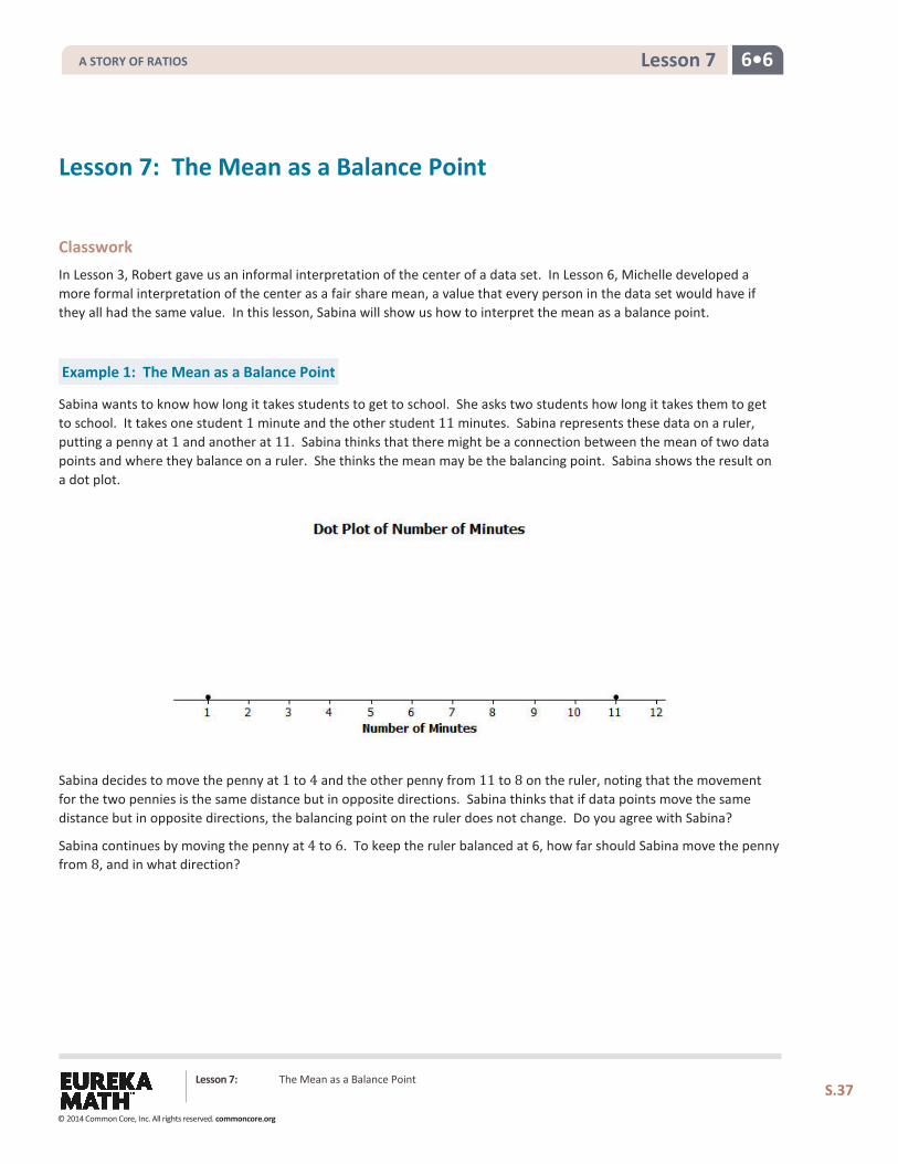
Example 1: The Mean as a Balance Point
Sabina wants to know how long it takes students to get to school. She asks two students how long it takes them to get to school. It takes one student 1 minute and the other student 11 minutes. Sabina represents these data on a ruler, putting a penny at 1 and another at 11. Sabina thinks that there might be a connection between the mean of two data points and where they balance on a ruler. She thinks the mean may be the balancing point. Sabina shows the result on a dot plot.
Sabina decides to move the penny at 1 to 4 and the other penny from 11 to 8 on the ruler, noting that the movement for the two pennies is the same distance but in opposite directions. Sabina thinks that if data points move the same distance but in opposite directions, the balancing point on the ruler does not change. Do you agree with Sabina?
Sabina continues by moving the penny at 4 to 6. To keep the ruler balanced at 6, how far should Sabina move the penny from 8, and in what direction?
A STORY OF RATIOS
© 2014 Common Core, Inc. All rights reserved. commoncore.org
Lesson 7: The Mean as a Balance Point
S.38
6•6 Lesson 7
Exercises 1–2
Now, it is your turn to try balancing two pennies on a ruler.
1. Tape one penny at 2.5 on your ruler. a. Where should a second penny be taped so that the ruler will balance at 6?
b. How far is the penny at 2.5 from 6? How far is the other penny from 6?
c. Is 6 the mean of the two locations of the pennies?
2. Move the penny that is at 2.5 two inches to the right. a. Where will the penny be placed?
b. What do you have to do with the other data point (the other penny) to keep the balance point at 6?
c. What is the mean of the two new data points? Is it the same value as the balancing point of the ruler?
A STORY OF RATIOS
© 2014 Common Core, Inc. All rights reserved. commoncore.org
Lesson 7: The Mean as a Balance Point
S.39
6•6 Lesson 7
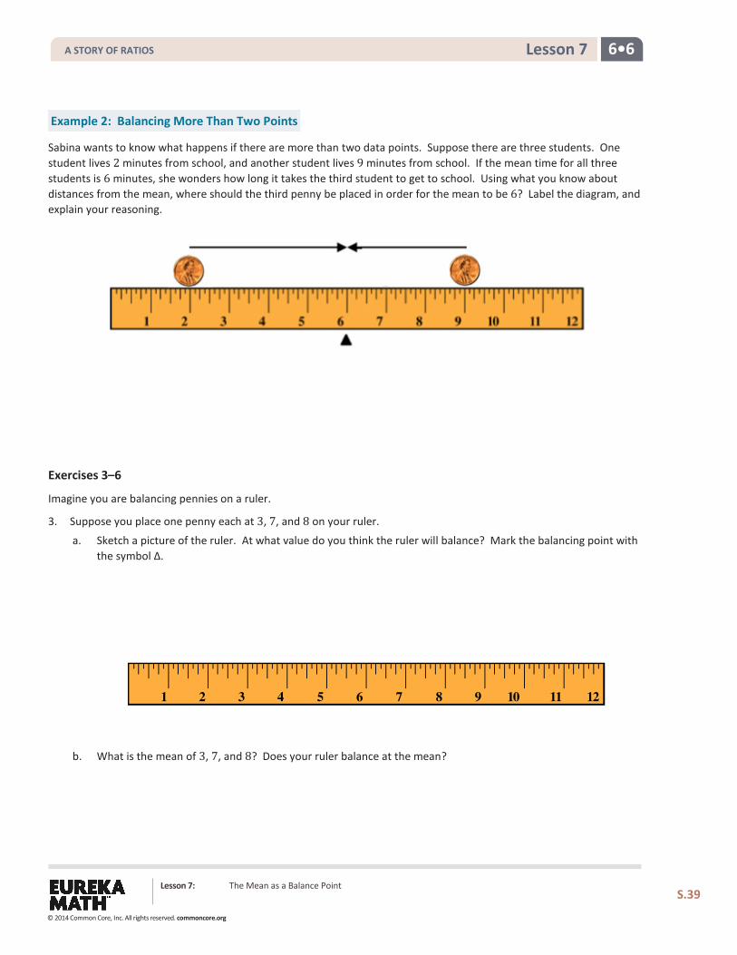
Example 2: Balancing More Than Two Points
Sabina wants to know what happens if there are more than two data points. Suppose there are three students. One student lives 2 minutes from school, and another student lives 9 minutes from school. If the mean time for all three students is 6 minutes, she wonders how long it takes the third student to get to school. Using what you know about distances from the mean, where should the third penny be placed in order for the mean to be 6? Label the diagram, and explain your reasoning.
Exercises 3–6
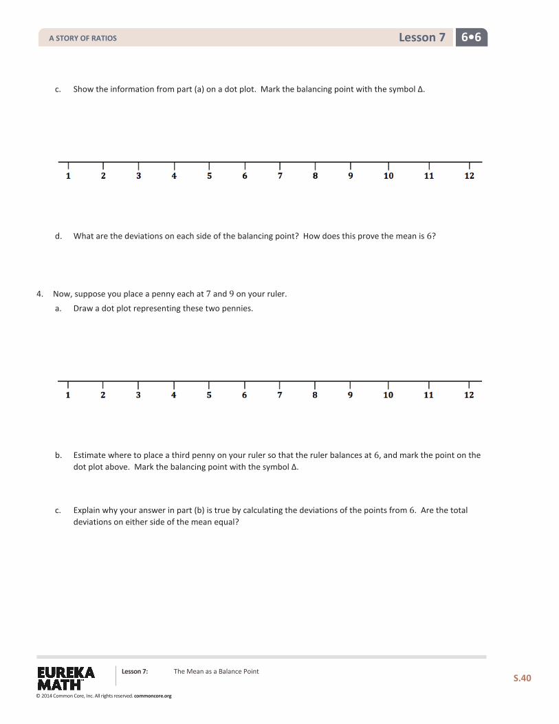
Imagine you are balancing pennies on a ruler.
3. Suppose you place one penny each at 3, 7, and 8 on your ruler.
a. Sketch a picture of the ruler. At what value do you think the ruler will balance? Mark the balancing point with the symbol ∆.
b. What is the mean of 3, 7, and 8? Does your ruler balance at the mean?
A STORY OF RATIOS
© 2014 Common Core, Inc. All rights reserved. commoncore.org
Lesson 7: The Mean as a Balance Point
S.40
6•6 Lesson 7
c. Show the information from part (a) on a dot plot. Mark the balancing point with the symbol ∆.
d. What are the deviations on each side of the balancing point? How does this prove the mean is 6?
4. Now, suppose you place a penny each at 7 and 9 on your ruler.
a. Draw a dot plot representing these two pennies.
b. Estimate where to place a third penny on your ruler so that the ruler balances at 6, and mark the point on the dot plot above. Mark the balancing point with the symbol ∆.
c. Explain why your answer in part (b) is true by calculating the deviations of the points from 6. Are the total deviations on either side of the mean equal?
A STORY OF RATIOS
© 2014 Common Core, Inc. All rights reserved. commoncore.org
Lesson 7: The Mean as a Balance Point
S.41
6•6 Lesson 7
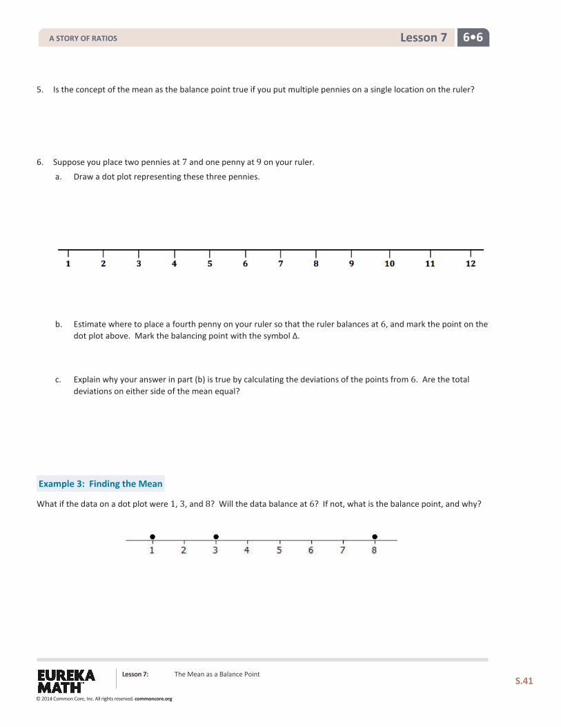
5. Is the concept of the mean as the balance point true if you put multiple pennies on a single location on the ruler?
6. Suppose you place two pennies at 7 and one penny at 9 on your ruler.
a. Draw a dot plot representing these three pennies.
b. Estimate where to place a fourth penny on your ruler so that the ruler balances at 6, and mark the point on the dot plot above. Mark the balancing point with the symbol ∆.
c. Explain why your answer in part (b) is true by calculating the deviations of the points from 6. Are the total deviations on either side of the mean equal?
Example 3: Finding the Mean
What if the data on a dot plot were 1, 3, and 8? Will the data balance at 6? If not, what is the balance point, and why?
A STORY OF RATIOS
© 2014 Common Core, Inc. All rights reserved. commoncore.org
Lesson 7: The Mean as a Balance Point
S.42
6•6 Lesson 7
Exercise 7
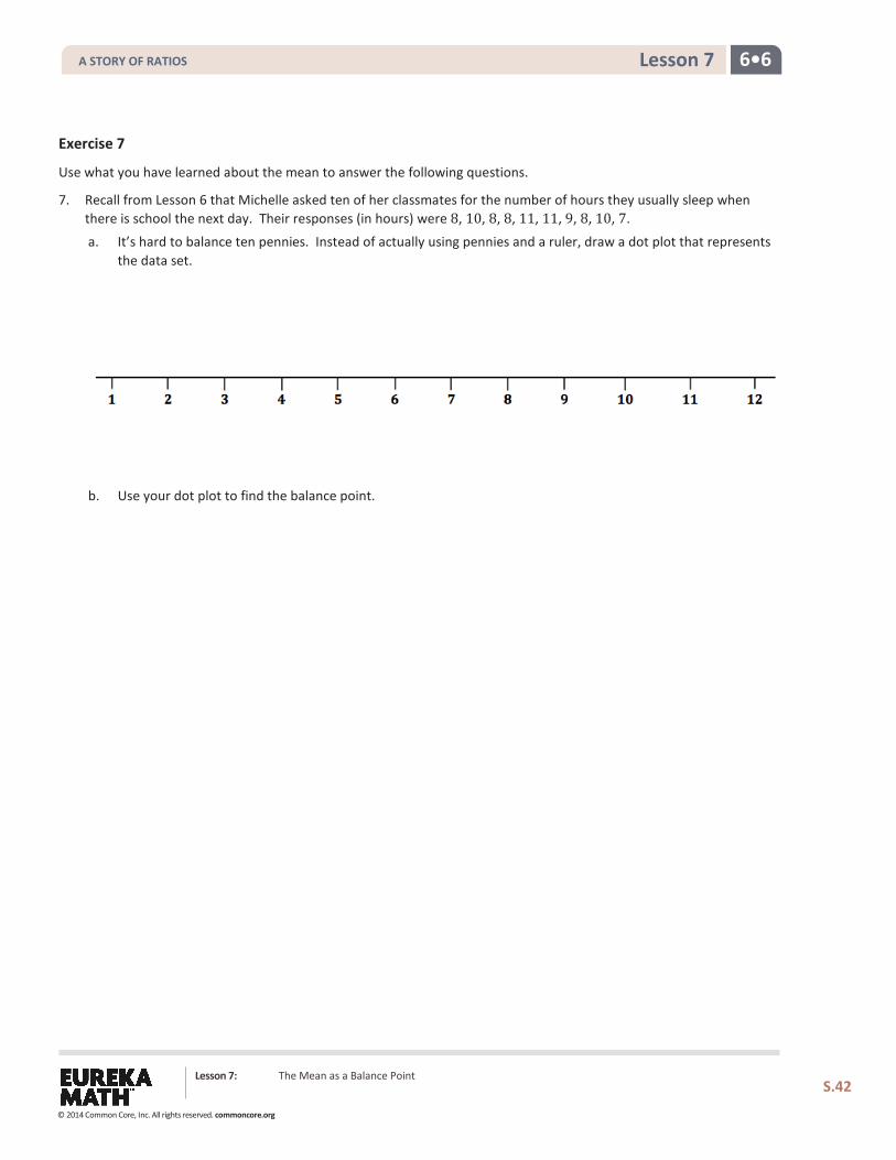
Use what you have learned about the mean to answer the following questions.
7. Recall from Lesson 6 that Michelle asked ten of her classmates for the number of hours they usually sleep when there is school the next day. Their responses (in hours) were 8, 10, 8, 8, 11, 11, 9, 8, 10, 7.
a. It’s hard to balance ten pennies. Instead of actually using pennies and a ruler, draw a dot plot that represents the data set.
b. Use your dot plot to find the balance point.
A STORY OF RATIOS
© 2014 Common Core, Inc. All rights reserved. commoncore.org
Lesson 7: The Mean as a Balance Point
S.43
6•6 Lesson 7
Problem Set 1. The number of pockets in the clothes worn by four students to school today is 4, 1, 3, 4.
a. Perform the fair share process to find the mean number of pockets for these four students. Sketch the cube representations for each step of the process.
b. Find the total deviations on each side of the mean to prove the mean found in part (a) is correct.
2. The times (rounded to the nearest minute) it took each of six classmates to run a mile are 7, 9, 10, 11, 11, and 12 minutes. a. Draw a dot plot representation for the mile times.
b. Suppose that Sabina thinks the mean is 11 minutes. Is she correct? Explain your answer.
c. What is the mean?
3. The prices per gallon of gasoline (in cents) at five stations across town on one day are shown in the following dot
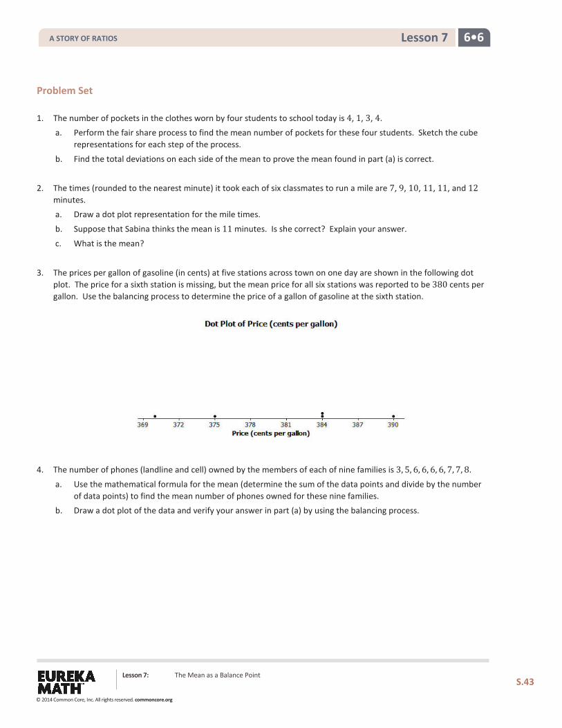
plot. The price for a sixth station is missing, but the mean price for all six stations was reported to be 380 cents per gallon. Use the balancing process to determine the price of a gallon of gasoline at the sixth station.
4. The number of phones (landline and cell) owned by the members of each of nine families is 3, 5, 6, 6, 6, 6, 7, 7, 8.
a. Use the mathematical formula for the mean (determine the sum of the data points and divide by the number of data points) to find the mean number of phones owned for these nine families.
b. Draw a dot plot of the data and verify your answer in part (a) by using the balancing process.
A STORY OF RATIOS
© 2014 Common Core, Inc. All rights reserved. commoncore.org
6•6 Lesson 8
Lesson 8: Variability in a Data Distribution
S.44
Lesson 8: Variability in a Data Distribution
Classwork
Example 1: Comparing Two Distributions
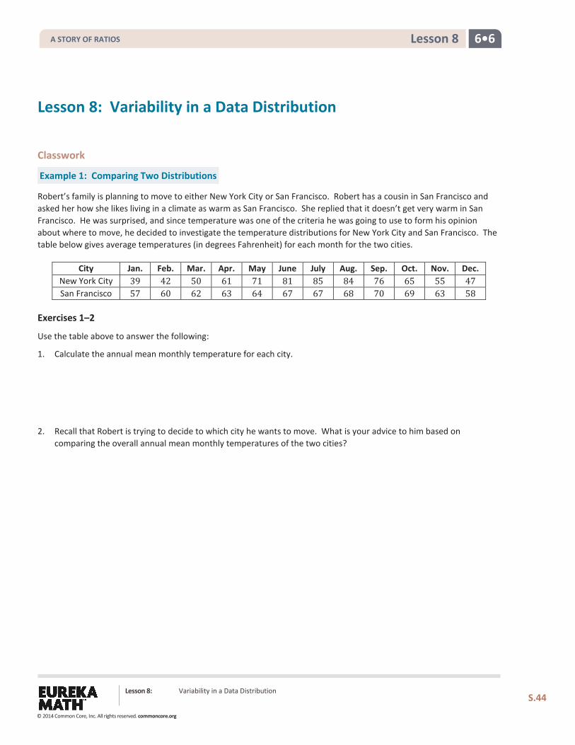
Robert’s family is planning to move to either New York City or San Francisco. Robert has a cousin in San Francisco and asked her how she likes living in a climate as warm as San Francisco. She replied that it doesn’t get very warm in San Francisco. He was surprised, and since temperature was one of the criteria he was going to use to form his opinion about where to move, he decided to investigate the temperature distributions for New York City and San Francisco. The table below gives average temperatures (in degrees Fahrenheit) for each month for the two cities.
City Jan. Feb. Mar. Apr. May June July Aug. Sep. Oct. Nov. Dec. New York City 39 42 50 61 71 81 85 84 76 65 55 47 San Francisco 57 60 62 63 64 67 67 68 70 69 63 58
Exercises 1–2
Use the table above to answer the following:
1. Calculate the annual mean monthly temperature for each city.
2. Recall that Robert is trying to decide to which city he wants to move. What is your advice to him based on comparing the overall annual mean monthly temperatures of the two cities?
A STORY OF RATIOS
© 2014 Common Core, Inc. All rights reserved. commoncore.org
6•6 Lesson 8
Lesson 8: Variability in a Data Distribution
S.45
Example 2: Understanding Variability
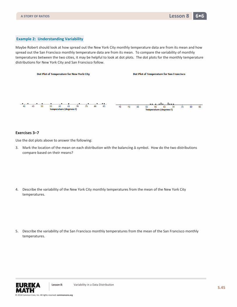
Maybe Robert should look at how spread out the New York City monthly temperature data are from its mean and how spread out the San Francisco monthly temperature data are from its mean. To compare the variability of monthly temperatures between the two cities, it may be helpful to look at dot plots. The dot plots for the monthly temperature distributions for New York City and San Francisco follow.
Exercises 3–7
Use the dot plots above to answer the following:
3. Mark the location of the mean on each distribution with the balancing ∆ symbol. How do the two distributions compare based on their means?
4. Describe the variability of the New York City monthly temperatures from the mean of the New York City temperatures.
5. Describe the variability of the San Francisco monthly temperatures from the mean of the San Francisco monthly
temperatures.
A STORY OF RATIOS
© 2014 Common Core, Inc. All rights reserved. commoncore.org
6•6 Lesson 8
Lesson 8: Variability in a Data Distribution
S.46
6. Compare the amount of variability in the two distributions. Is the variability about the same, or is it different? If different, which monthly temperature distribution has more variability? Explain.
7. If Robert prefers to choose the city where the temperatures vary the least from month to month, which city should he choose? Explain.
Example 3: Using Mean and Variability in a Data Distribution
The mean is used to describe the typical value for the entire distribution. Sabina asks Robert which city he thinks has the better climate. How do you think Robert responds?
Sabina is confused and asks him to explain what he means by this statement. How could Robert explain what he means to Sabina?
A STORY OF RATIOS
© 2014 Common Core, Inc. All rights reserved. commoncore.org
6•6 Lesson 8
Lesson 8: Variability in a Data Distribution
S.47
Exercises 8–14
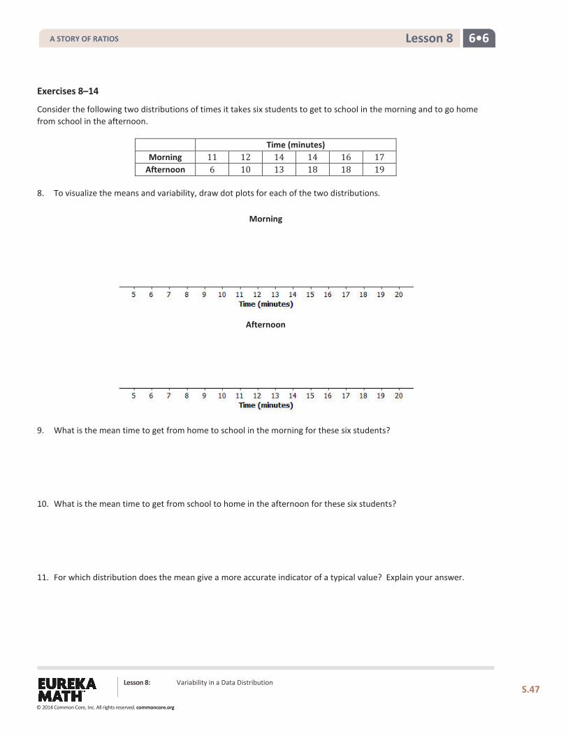
Consider the following two distributions of times it takes six students to get to school in the morning and to go home from school in the afternoon.
Time (minutes) Morning 11 12 14 14 16 17
Afternoon 6 10 13 18 18 19
8. To visualize the means and variability, draw dot plots for each of the two distributions.
Morning
Afternoon
9. What is the mean time to get from home to school in the morning for these six students?
10. What is the mean time to get from school to home in the afternoon for these six students?
11. For which distribution does the mean give a more accurate indicator of a typical value? Explain your answer.
A STORY OF RATIOS
© 2014 Common Core, Inc. All rights reserved. commoncore.org
6•6 Lesson 8
Lesson 8: Variability in a Data Distribution
S.48
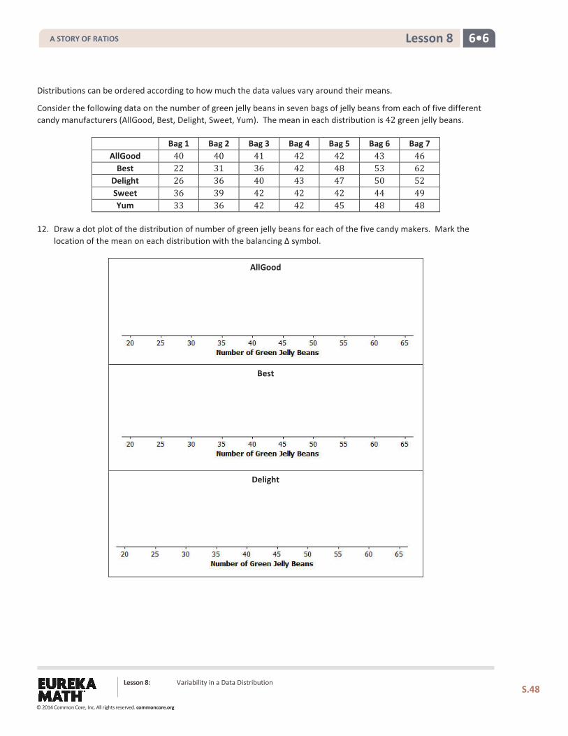
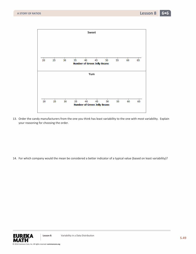
Distributions can be ordered according to how much the data values vary around their means.
Consider the following data on the number of green jelly beans in seven bags of jelly beans from each of five different candy manufacturers (AllGood, Best, Delight, Sweet, Yum). The mean in each distribution is 42 green jelly beans.
Bag 1 Bag 2 Bag 3 Bag 4 Bag 5 Bag 6 Bag 7 AllGood 40 40 41 42 42 43 46
Best 22 31 36 42 48 53 62 Delight 26 36 40 43 47 50 52 Sweet 36 39 42 42 42 44 49 Yum 33 36 42 42 45 48 48
12. Draw a dot plot of the distribution of number of green jelly beans for each of the five candy makers. Mark the location of the mean on each distribution with the balancing ∆ symbol.
AllGood
Best
Delight
A STORY OF RATIOS
© 2014 Common Core, Inc. All rights reserved. commoncore.org
6•6 Lesson 8
Lesson 8: Variability in a Data Distribution
S.49
Sweet
Yum
13. Order the candy manufacturers from the one you think has least variability to the one with most variability. Explain your reasoning for choosing the order.
14. For which company would the mean be considered a better indicator of a typical value (based on least variability)?
A STORY OF RATIOS
© 2014 Common Core, Inc. All rights reserved. commoncore.org
6•6 Lesson 8
Lesson 8: Variability in a Data Distribution
S.50
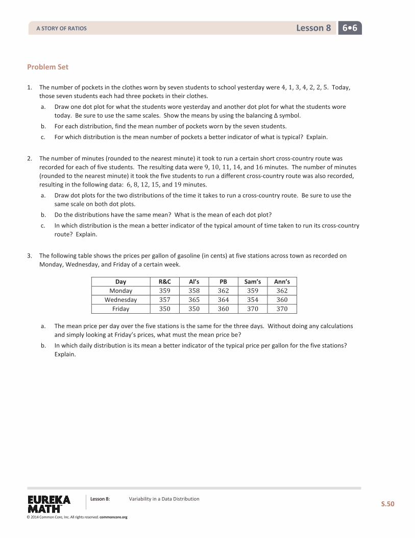
Problem Set 1. The number of pockets in the clothes worn by seven students to school yesterday were 4, 1, 3, 4, 2, 2, 5. Today,
those seven students each had three pockets in their clothes.
a. Draw one dot plot for what the students wore yesterday and another dot plot for what the students wore today. Be sure to use the same scales. Show the means by using the balancing ∆ symbol.
b. For each distribution, find the mean number of pockets worn by the seven students.
c. For which distribution is the mean number of pockets a better indicator of what is typical? Explain.
2. The number of minutes (rounded to the nearest minute) it took to run a certain short cross-country route was
recorded for each of five students. The resulting data were 9, 10, 11, 14, and 16 minutes. The number of minutes (rounded to the nearest minute) it took the five students to run a different cross-country route was also recorded, resulting in the following data: 6, 8, 12, 15, and 19 minutes.
a. Draw dot plots for the two distributions of the time it takes to run a cross-country route. Be sure to use the same scale on both dot plots.
b. Do the distributions have the same mean? What is the mean of each dot plot?
c. In which distribution is the mean a better indicator of the typical amount of time taken to run its cross-country route? Explain.
3. The following table shows the prices per gallon of gasoline (in cents) at five stations across town as recorded on
Monday, Wednesday, and Friday of a certain week.
Day R&C Al’s PB Sam’s Ann’s Monday 359 358 362 359 362
Wednesday 357 365 364 354 360 Friday 350 350 360 370 370
a. The mean price per day over the five stations is the same for the three days. Without doing any calculations and simply looking at Friday’s prices, what must the mean price be?
b. In which daily distribution is its mean a better indicator of the typical price per gallon for the five stations? Explain.
A STORY OF RATIOS
© 2014 Common Core, Inc. All rights reserved. commoncore.org
6•6 Lesson 9
Lesson 9: The Mean Absolute Deviation (MAD)
Classwork
Example 1: Variability
In Lesson 8, Robert tried to decide to which of two cities he would rather move, based on comparing their annual mean monthly temperatures. Since the annual mean monthly temperature for New York City and San Francisco turned out to be about the same, he decided instead to compare the cities based on the variability in their monthly temperatures from the overall mean. He looked at the two distributions and decided that the New York City temperatures were more spread out from their mean than were the San Francisco temperatures from their mean.
Exercises 1–3
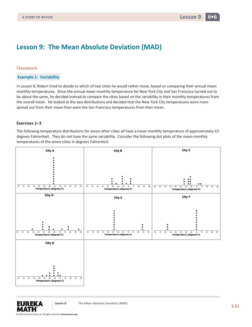
The following temperature distributions for seven other cities all have a mean monthly temperature of approximately 63 degrees Fahrenheit. They do not have the same variability. Consider the following dot plots of the mean monthly temperatures of the seven cities in degrees Fahrenheit.
Lesson 9: The Mean Absolute Deviation (MAD) S.51
Temperature (degrees F)90858075706560555045403530
City A
Temperature (degrees F)90858075706560555045403530
City B
Temperature (degrees F)90858075706560555045403530
City C
Temperature (degrees F)90858075706560555045403530
City F
Temperature (degrees F)90858075706560555045403530
City E
Temperature (degrees F)90858075706560555045403530
City D
Temperature (degrees F)90858075706560555045403530
City G
A STORY OF RATIOS
© 2014 Common Core, Inc. All rights reserved. commoncore.org
6•6 Lesson 9
1. Which distribution has the smallest variability of the temperatures from its mean of 63 degrees Fahrenheit? Explain your answer.
2. Which distribution(s) seems to have the most variability of the temperatures from the mean of 63 degrees Fahrenheit? Explain your answer.
3. Order the seven distributions from least variability to most variability. Explain why you listed the distributions in the order that you chose.
Example 2: Measuring Variability
Based on just looking at the distributions, there are different orderings of variability that seem to make some sense. Sabina is interested in developing a formula that will produce a number that measures the variability in a data distribution. She would then apply the formula to each data set and order the distributions from lowest to highest. Using deviations to develop a formula measuring variability is a good idea to consider.
Exercises 4–6
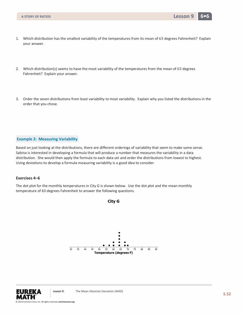
The dot plot for the monthly temperatures in City G is shown below. Use the dot plot and the mean monthly temperature of 63 degrees Fahrenheit to answer the following questions.
Temperature (degrees F)90858075706560555045403530
City G
Lesson 9: The Mean Absolute Deviation (MAD)
S.52
A STORY OF RATIOS
© 2014 Common Core, Inc. All rights reserved. commoncore.org
6•6 Lesson 9
4. Fill in the following table for City G’s temperature deviations.
Temp Distance Deviation
53 53− 63 10 to the left
57
60
60
64
64
64
64
64
68
68
70
Sum
5. What is the total deviation to the left of the mean? What is the total deviation to the right of the mean?
6. Another way to graph the deviations is to write them on a number line as follows. Mark the mean on the number line. Place the deviations from the mean on the number line. What is the total deviation to the left of the mean? What is the total deviation to the right of the mean?
City G’s Temperatures
Lesson 9: The Mean Absolute Deviation (MAD)
S.53
A STORY OF RATIOS
© 2014 Common Core, Inc. All rights reserved. commoncore.org
6•6 Lesson 9
Example 3: Finding the Mean Absolute Deviation (MAD)
By the balance interpretation of the mean, the total deviations on either side of the mean will always be equal. Sabina notices that we have consistently been counting distances to the left and to the right of the mean, which is the balance point. She wonders how she can use the left and right directions to help her develop a formula to find variability.
Exercises 7–8
7. One suggestion to possibly help Sabina is to take the absolute value of the deviations.
a. Fill in the following table.
Temp Deviation from the Mean Deviation Represented as a Signed Number
Absolute Value (Absolute Deviations)
53 10 to the left −10 10
57
60
60
64
64
64
64
64
68
68
70
b. From the following graph, what is the sum of the absolute deviations?
Lesson 9: The Mean Absolute Deviation (MAD)
S.54
A STORY OF RATIOS
© 2014 Common Core, Inc. All rights reserved. commoncore.org
6•6 Lesson 9
c. Sabina suggests that the mean of the absolute deviations could be a measure of the variability in a data set. Its value is the average distance that all the data values are from the mean monthly temperature. It is called the mean absolute deviation and is denoted by the letters, MAD. Find the MAD for this data set of City G’s temperatures. Round to the nearest tenth.
d. Find the MAD for each of the seven city temperature distributions, and use the values to order the distributions from least variability to most variability. Recall that the mean for each data set is 63 degrees Fahrenheit. Looking only at the distributions, does the list that you made in Exercise 2 match the list made by ordering MAD values?
e. Which of the following is a correct interpretation of the MAD?
i. The monthly temperatures in City G are all within 3.7 degrees from the approximate mean of 63 degrees.
ii. The monthly temperatures in City G are, on average, 3.7 degrees from the approximate mean temperature of 63 degrees.
iii. All of the monthly temperatures in City G differ from the approximate mean temperature of 63 degrees by 3.7 degrees.
Lesson 9: The Mean Absolute Deviation (MAD)
S.55
A STORY OF RATIOS
© 2014 Common Core, Inc. All rights reserved. commoncore.org
6•6 Lesson 9
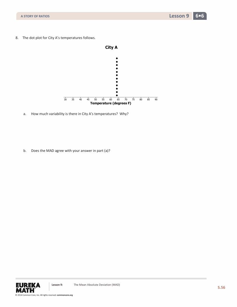
8. The dot plot for City A’s temperatures follows.
a. How much variability is there in City A’s temperatures? Why? b. Does the MAD agree with your answer in part (a)?
Temperature (degrees F)90858075706560555045403530
City A
Lesson 9: The Mean Absolute Deviation (MAD)
S.56
A STORY OF RATIOS
© 2014 Common Core, Inc. All rights reserved. commoncore.org
6•6 Lesson 9
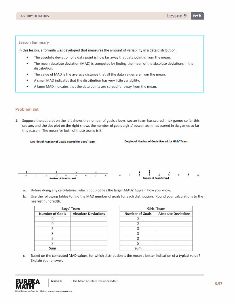
Problem Set 1. Suppose the dot plot on the left shows the number of goals a boys’ soccer team has scored in six games so far this
season, and the dot plot on the right shows the number of goals a girls’ soccer team has scored in six games so far this season. The mean for both of these teams is 3.
a. Before doing any calculations, which dot plot has the larger MAD? Explain how you know.
b. Use the following tables to find the MAD number of goals for each distribution. Round your calculations to the nearest hundredth.
Boys’ Team Number of Goals Absolute Deviations
0 0 3 3 5 7
Sum
Girls’ Team Number of Goals Absolute Deviations
2 2 3 3 3 5
Sum
c. Based on the computed MAD values, for which distribution is the mean a better indication of a typical value? Explain your answer.
Lesson Summary In this lesson, a formula was developed that measures the amount of variability in a data distribution.
The absolute deviation of a data point is how far away that data point is from the mean.
The mean absolute deviation (MAD) is computed by finding the mean of the absolute deviations in the distribution.
The value of MAD is the average distance that all the data values are from the mean. A small MAD indicates that the distribution has very little variability. A large MAD indicates that the data points are spread far away from the mean.
Lesson 9: The Mean Absolute Deviation (MAD)
S.57
A STORY OF RATIOS
© 2014 Common Core, Inc. All rights reserved. commoncore.org
6•6 Lesson 9
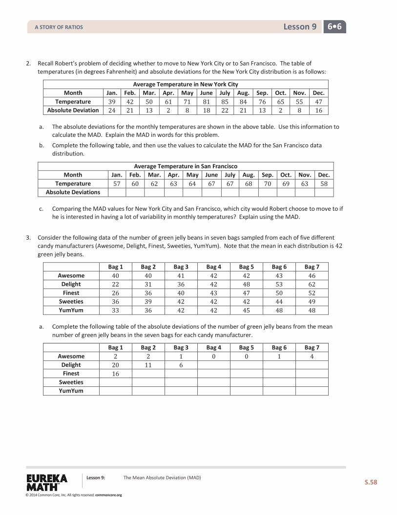
2. Recall Robert’s problem of deciding whether to move to New York City or to San Francisco. The table of temperatures (in degrees Fahrenheit) and absolute deviations for the New York City distribution is as follows:
Average Temperature in New York City Month Jan. Feb. Mar. Apr. May June July Aug. Sep. Oct. Nov. Dec.
Temperature 39 42 50 61 71 81 85 84 76 65 55 47 Absolute Deviation 24 21 13 2 8 18 22 21 13 2 8 16
a. The absolute deviations for the monthly temperatures are shown in the above table. Use this information to calculate the MAD. Explain the MAD in words for this problem.
b. Complete the following table, and then use the values to calculate the MAD for the San Francisco data distribution.
Average Temperature in San Francisco Month Jan. Feb. Mar. Apr. May June July Aug. Sep. Oct. Nov. Dec.
Temperature 57 60 62 63 64 67 67 68 70 69 63 58 Absolute Deviations
c. Comparing the MAD values for New York City and San Francisco, which city would Robert choose to move to if he is interested in having a lot of variability in monthly temperatures? Explain using the MAD.
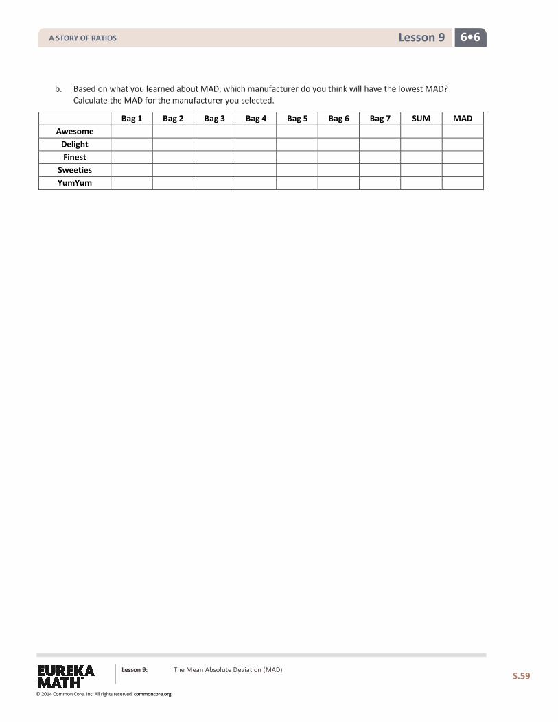
3. Consider the following data of the number of green jelly beans in seven bags sampled from each of five different candy manufacturers (Awesome, Delight, Finest, Sweeties, YumYum). Note that the mean in each distribution is 42 green jelly beans.
Bag 1 Bag 2 Bag 3 Bag 4 Bag 5 Bag 6 Bag 7 Awesome 40 40 41 42 42 43 46
Delight 22 31 36 42 48 53 62 Finest 26 36 40 43 47 50 52
Sweeties 36 39 42 42 42 44 49 YumYum 33 36 42 42 45 48 48
a. Complete the following table of the absolute deviations of the number of green jelly beans from the mean number of green jelly beans in the seven bags for each candy manufacturer.
Bag 1 Bag 2 Bag 3 Bag 4 Bag 5 Bag 6 Bag 7 Awesome 2 2 1 0 0 1 4
Delight 20 11 6 Finest 16
Sweeties YumYum
Lesson 9: The Mean Absolute Deviation (MAD)
S.58
A STORY OF RATIOS
© 2014 Common Core, Inc. All rights reserved. commoncore.org
6•6 Lesson 9
b. Based on what you learned about MAD, which manufacturer do you think will have the lowest MAD? Calculate the MAD for the manufacturer you selected.
Bag 1 Bag 2 Bag 3 Bag 4 Bag 5 Bag 6 Bag 7 SUM MAD Awesome
Delight Finest
Sweeties YumYum
Lesson 9: The Mean Absolute Deviation (MAD)
S.59
A STORY OF RATIOS
© 2014 Common Core, Inc. All rights reserved. commoncore.org
6•6 Lesson 10
Lesson 10: Describing Distributions Using the Mean and MAD
Classwork
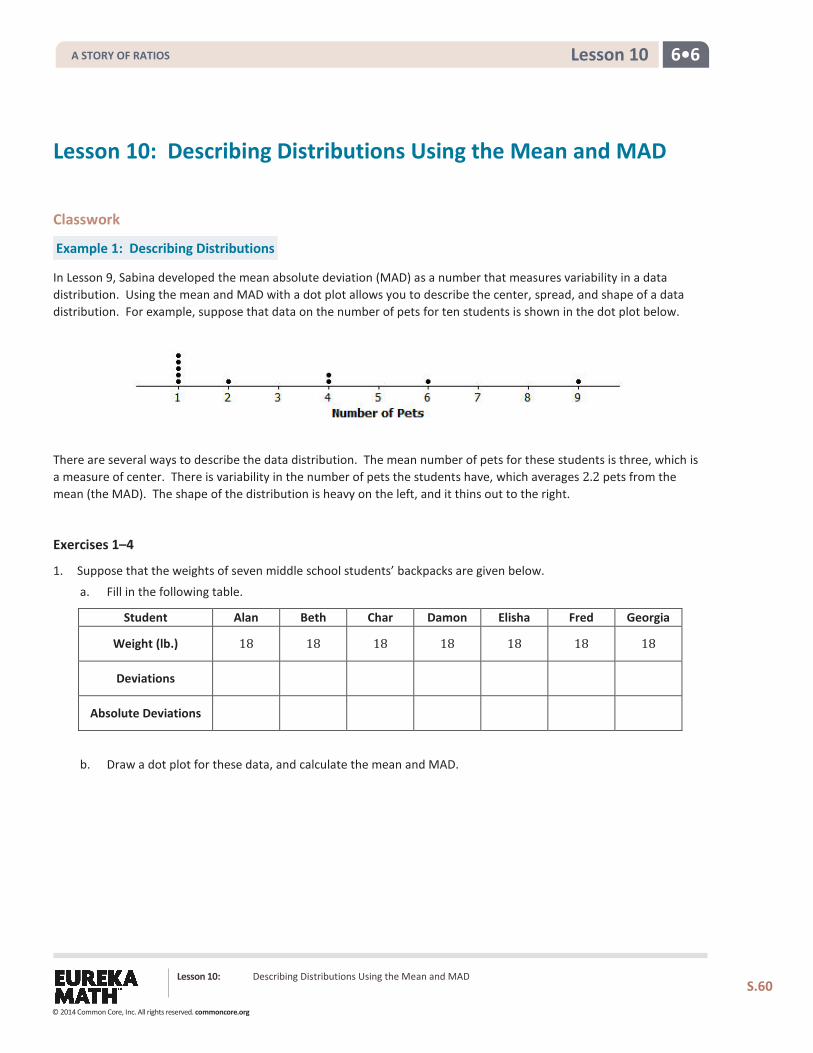
Example 1: Describing Distributions
In Lesson 9, Sabina developed the mean absolute deviation (MAD) as a number that measures variability in a data distribution. Using the mean and MAD with a dot plot allows you to describe the center, spread, and shape of a data distribution. For example, suppose that data on the number of pets for ten students is shown in the dot plot below.
There are several ways to describe the data distribution. The mean number of pets for these students is three, which is a measure of center. There is variability in the number of pets the students have, which averages 2.2 pets from the mean (the MAD). The shape of the distribution is heavy on the left, and it thins out to the right.
Exercises 1–4
1. Suppose that the weights of seven middle school students’ backpacks are given below.
a. Fill in the following table.
Student Alan Beth Char Damon Elisha Fred Georgia
Weight (lb.) 18 18 18 18 18 18 18
Deviations
Absolute Deviations
b. Draw a dot plot for these data, and calculate the mean and MAD.
Lesson 10: Describing Distributions Using the Mean and MAD
S.60
A STORY OF RATIOS
© 2014 Common Core, Inc. All rights reserved. commoncore.org
6•6 Lesson 10
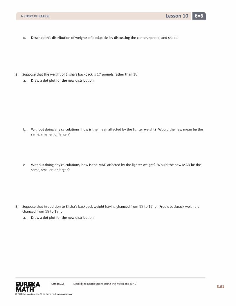
c. Describe this distribution of weights of backpacks by discussing the center, spread, and shape.
2. Suppose that the weight of Elisha’s backpack is 17 pounds rather than 18.
a. Draw a dot plot for the new distribution.
b. Without doing any calculations, how is the mean affected by the lighter weight? Would the new mean be the same, smaller, or larger?
c. Without doing any calculations, how is the MAD affected by the lighter weight? Would the new MAD be the
same, smaller, or larger?
3. Suppose that in addition to Elisha’s backpack weight having changed from 18 to 17 lb., Fred’s backpack weight is changed from 18 to 19 lb.
a. Draw a dot plot for the new distribution.
Lesson 10: Describing Distributions Using the Mean and MAD
S.61
A STORY OF RATIOS
© 2014 Common Core, Inc. All rights reserved. commoncore.org
6•6 Lesson 10
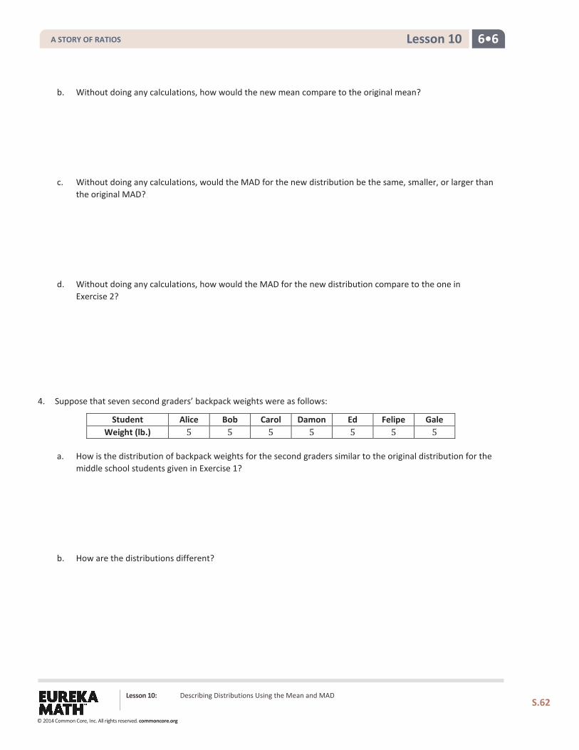
b. Without doing any calculations, how would the new mean compare to the original mean?
c. Without doing any calculations, would the MAD for the new distribution be the same, smaller, or larger than the original MAD?
d. Without doing any calculations, how would the MAD for the new distribution compare to the one in Exercise 2?
4. Suppose that seven second graders’ backpack weights were as follows:
Student Alice Bob Carol Damon Ed Felipe Gale Weight (lb.) 5 5 5 5 5 5 5
a. How is the distribution of backpack weights for the second graders similar to the original distribution for the middle school students given in Exercise 1?
b. How are the distributions different?
Lesson 10: Describing Distributions Using the Mean and MAD
S.62
A STORY OF RATIOS
© 2014 Common Core, Inc. All rights reserved. commoncore.org
6•6 Lesson 10
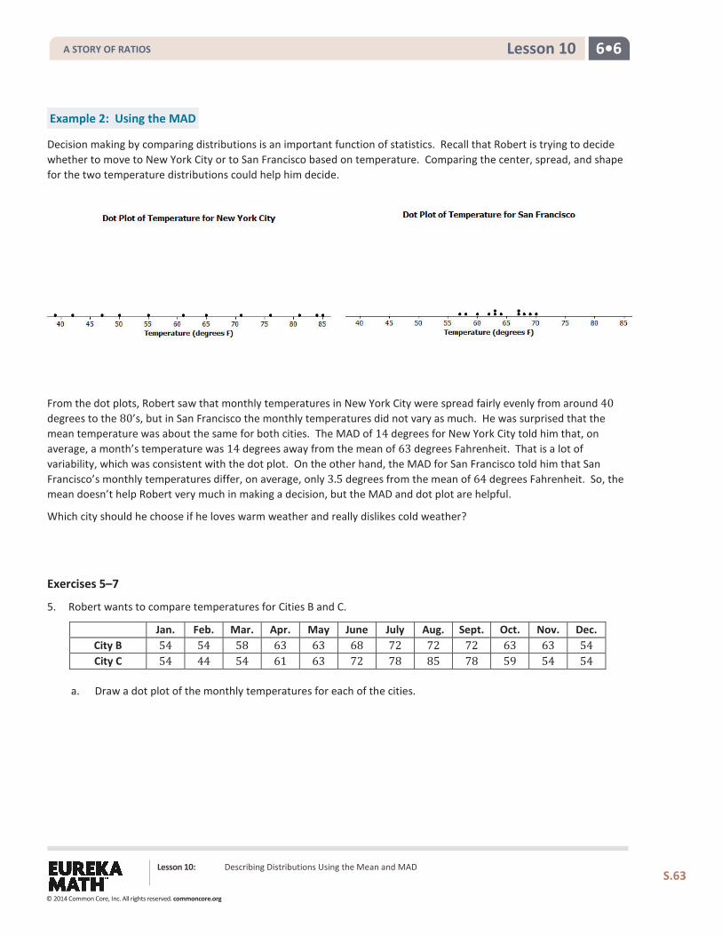
Example 2: Using the MAD
Decision making by comparing distributions is an important function of statistics. Recall that Robert is trying to decide whether to move to New York City or to San Francisco based on temperature. Comparing the center, spread, and shape for the two temperature distributions could help him decide.
From the dot plots, Robert saw that monthly temperatures in New York City were spread fairly evenly from around 40 degrees to the 80’s, but in San Francisco the monthly temperatures did not vary as much. He was surprised that the mean temperature was about the same for both cities. The MAD of 14 degrees for New York City told him that, on average, a month’s temperature was 14 degrees away from the mean of 63 degrees Fahrenheit. That is a lot of variability, which was consistent with the dot plot. On the other hand, the MAD for San Francisco told him that San Francisco’s monthly temperatures differ, on average, only 3.5 degrees from the mean of 64 degrees Fahrenheit. So, the mean doesn’t help Robert very much in making a decision, but the MAD and dot plot are helpful.
Which city should he choose if he loves warm weather and really dislikes cold weather?
Exercises 5–7
5. Robert wants to compare temperatures for Cities B and C.
Jan. Feb. Mar. Apr. May June July Aug. Sept. Oct. Nov. Dec. City B 54 54 58 63 63 68 72 72 72 63 63 54 City C 54 44 54 61 63 72 78 85 78 59 54 54
a. Draw a dot plot of the monthly temperatures for each of the cities.
Lesson 10: Describing Distributions Using the Mean and MAD
S.63
A STORY OF RATIOS
© 2014 Common Core, Inc. All rights reserved. commoncore.org
6•6 Lesson 10
b. Verify that the mean monthly temperature for each distribution is 63 degrees Fahrenheit.
c. Find the MAD for each of the cities. Interpret the two MADs in words, and compare their values.
6. How would you describe the differences in the shapes of the monthly temperature distributions of the two cities?
7. Suppose that Robert had to decide between Cities D, E, and F.
Jan. Feb. Mar. Apr. May June July Aug. Sept. Oct. Nov. Dec. Mean MAD City D 54 44 54 59 63 72 78 87 78 59 54 54 63 10.5 City E 56 56 56 56 56 84 84 84 56 56 56 56 63 10.5 City F 42 42 70 70 70 70 70 70 70 70 70 42 63 10.5
a. Draw dot plots for each distribution.
Lesson 10: Describing Distributions Using the Mean and MAD
S.64
A STORY OF RATIOS
© 2014 Common Core, Inc. All rights reserved. commoncore.org
6•6 Lesson 10
b. Interpret the MAD for the distributions. What does this mean about variability?
c. How will Robert decide to which city he should move? List possible reasons Robert might have for choosing each city.
Lesson 10: Describing Distributions Using the Mean and MAD
S.65
A STORY OF RATIOS
© 2014 Common Core, Inc. All rights reserved. commoncore.org
6•6 Lesson 10
Problem Set 1. Draw a dot plot of the times that five students studied for a test if the mean time they studied was two hours and
the MAD was zero hours.
2. Suppose the times that five students studied for a test is as follows:
Student Aria Ben Chloe Dellan Emma Time (hrs.) 1.5 2 2 2.5 2
Michelle said that the MAD for this data set is 0 because the dot plot is balanced around 2. Without doing any calculations, do you agree with Michelle? Why or why not?
3. Suppose that the number of text messages eight students receive on a typical day is as follows:
Student 𝟏𝟏 𝟐𝟐 𝟑𝟑 𝟒𝟒 𝟓𝟓 𝟔𝟔 𝟕𝟕 𝟖𝟖 Number 42 56 35 70 56 50 65 50
a. Draw a dot plot for the number of text messages received on a typical day by these eight students.
b. Find the mean number of text messages these eight students receive on a typical day.
c. Find the MAD for the number of text messages, and explain its meaning using the words of this problem.
d. Describe the shape of this data distribution.
e. Suppose that in the original data set, Student 3 receives an additional five text messages per day, and Student 4 receives five fewer text messages per day.
i. Without doing any calculations, does the mean for the new data set stay the same, increase, or decrease as compared to the original mean? Explain your reasoning.
ii. Without doing any calculations, does the MAD for the new data set stay the same, increase, or decrease as compared to the original MAD? Explain your reasoning.
Lesson Summary A data distribution can be described in terms of its center, spread, and shape.
The center can be measured by the mean.
The spread can be measured by the mean absolute deviation (MAD). A dot plot shows the shape of the distribution.
Lesson 10: Describing Distributions Using the Mean and MAD
S.66
A STORY OF RATIOS
© 2014 Common Core, Inc. All rights reserved. commoncore.org
6•6 Lesson 11
Lesson 11: Describing Distributions Using the Mean and MAD
S.67
Lesson 11: Describing Distributions Using the Mean and MAD
Classwork
Example 1: Comparing Distributions with the Same Mean
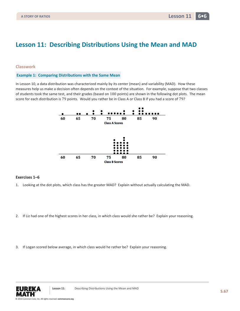
In Lesson 10, a data distribution was characterized mainly by its center (mean) and variability (MAD). How these measures help us make a decision often depends on the context of the situation. For example, suppose that two classes of students took the same test, and their grades (based on 100 points) are shown in the following dot plots. The mean score for each distribution is 79 points. Would you rather be in Class A or Class B if you had a score of 79?
Exercises 1–6
1. Looking at the dot plots, which class has the greater MAD? Explain without actually calculating the MAD.
2. If Liz had one of the highest scores in her class, in which class would she rather be? Explain your reasoning.
3. If Logan scored below average, in which class would he rather be? Explain your reasoning.
A STORY OF RATIOS
© 2014 Common Core, Inc. All rights reserved. commoncore.org
6•6 Lesson 11
Lesson 11: Describing Distributions Using the Mean and MAD
S.68
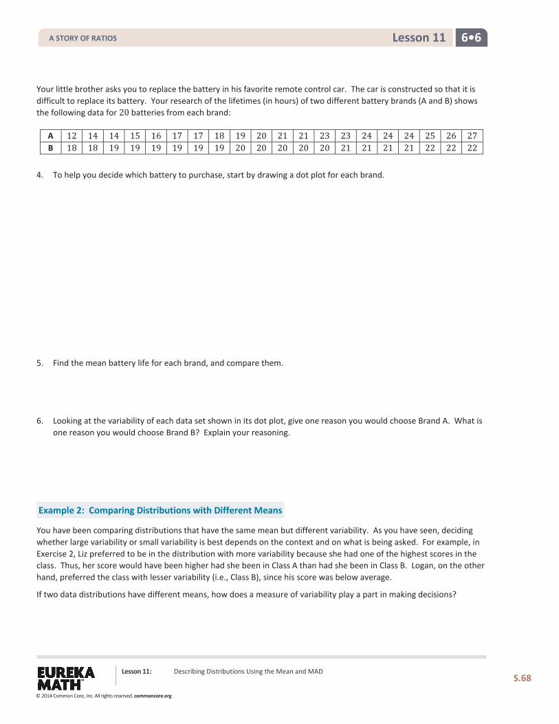
Your little brother asks you to replace the battery in his favorite remote control car. The car is constructed so that it is difficult to replace its battery. Your research of the lifetimes (in hours) of two different battery brands (A and B) shows the following data for 20 batteries from each brand:
A 12 14 14 15 16 17 17 18 19 20 21 21 23 23 24 24 24 25 26 27 B 18 18 19 19 19 19 19 19 20 20 20 20 20 21 21 21 21 22 22 22
4. To help you decide which battery to purchase, start by drawing a dot plot for each brand.
5. Find the mean battery life for each brand, and compare them.
6. Looking at the variability of each data set shown in its dot plot, give one reason you would choose Brand A. What is one reason you would choose Brand B? Explain your reasoning.
Example 2: Comparing Distributions with Different Means
You have been comparing distributions that have the same mean but different variability. As you have seen, deciding whether large variability or small variability is best depends on the context and on what is being asked. For example, in Exercise 2, Liz preferred to be in the distribution with more variability because she had one of the highest scores in the class. Thus, her score would have been higher had she been in Class A than had she been in Class B. Logan, on the other hand, preferred the class with lesser variability (i.e., Class B), since his score was below average.
If two data distributions have different means, how does a measure of variability play a part in making decisions?
A STORY OF RATIOS
© 2014 Common Core, Inc. All rights reserved. commoncore.org
6•6 Lesson 11
Lesson 11: Describing Distributions Using the Mean and MAD
S.69
Exercises 7–9
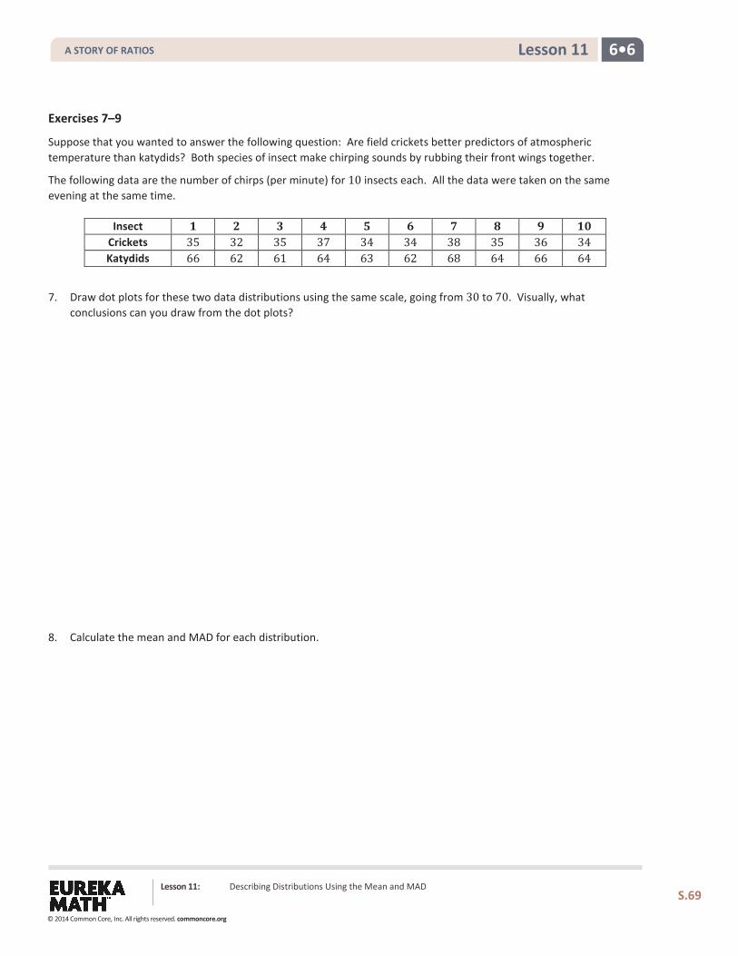
Suppose that you wanted to answer the following question: Are field crickets better predictors of atmospheric temperature than katydids? Both species of insect make chirping sounds by rubbing their front wings together.
The following data are the number of chirps (per minute) for 10 insects each. All the data were taken on the same evening at the same time.
Insect 𝟏𝟏 𝟐𝟐 𝟑𝟑 𝟒𝟒 𝟓𝟓 𝟔𝟔 𝟕𝟕 𝟖𝟖 𝟗𝟗 𝟏𝟏𝟏𝟏 Crickets 35 32 35 37 34 34 38 35 36 34 Katydids 66 62 61 64 63 62 68 64 66 64
7. Draw dot plots for these two data distributions using the same scale, going from 30 to 70. Visually, what conclusions can you draw from the dot plots?
8. Calculate the mean and MAD for each distribution.
A STORY OF RATIOS
© 2014 Common Core, Inc. All rights reserved. commoncore.org
6•6 Lesson 11
Lesson 11: Describing Distributions Using the Mean and MAD
S.70
9. The outside temperature 𝑇𝑇 can be predicted by counting the number of chirps made by these insects.
a. For crickets, 𝑇𝑇 is found by adding 40 to its mean number of chirps per minute. What value of 𝑇𝑇 is being predicted by the crickets?
b. For katydids, 𝑇𝑇 is found by adding 161 to its mean number of chirps per minute and then dividing the sum by 3. What value of 𝑇𝑇 is being predicted by the katydids?
c. The temperature was 75 degrees when these data were recorded, so using the mean from each data set gave
an accurate prediction of temperature. If you were going to use the number of chirps from a single cricket or a single katydid to predict the temperature, would you use a cricket or a katydid? Explain how variability in the distributions of number of chirps played a role in your decision.
A STORY OF RATIOS
© 2014 Common Core, Inc. All rights reserved. commoncore.org
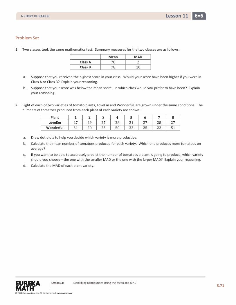
6•6 Lesson 11
Lesson 11: Describing Distributions Using the Mean and MAD
S.71
Problem Set 1. Two classes took the same mathematics test. Summary measures for the two classes are as follows:
Mean MAD Class A 78 2 Class B 78 10
a. Suppose that you received the highest score in your class. Would your score have been higher if you were in Class A or Class B? Explain your reasoning.
b. Suppose that your score was below the mean score. In which class would you prefer to have been? Explain your reasoning.
2. Eight of each of two varieties of tomato plants, LoveEm and Wonderful, are grown under the same conditions. The numbers of tomatoes produced from each plant of each variety are shown:
Plant 𝟏𝟏 𝟐𝟐 𝟑𝟑 𝟒𝟒 𝟓𝟓 𝟔𝟔 𝟕𝟕 𝟖𝟖 LoveEm 27 29 27 28 31 27 28 27
Wonderful 31 20 25 50 32 25 22 51
a. Draw dot plots to help you decide which variety is more productive.
b. Calculate the mean number of tomatoes produced for each variety. Which one produces more tomatoes on average?
c. If you want to be able to accurately predict the number of tomatoes a plant is going to produce, which variety should you choose—the one with the smaller MAD or the one with the larger MAD? Explain your reasoning.
d. Calculate the MAD of each plant variety.
A STORY OF RATIOS
© 2014 Common Core, Inc. All rights reserved. commoncore.org
6•6 Lesson 12
Lesson 12: Describing the Center of a Distribution Using the
Median
How do we summarize a data distribution? What provides us with a good description of the data? The following exercises help us to understand how a numerical summary answers these questions.
Classwork
Example 1: The Median—A Typical Number
Suppose a chain restaurant (Restaurant A) advertises that a typical number of french fries in a large bag is 82. The graph shows the number of french fries in selected samples of large bags from Restaurant A.
Sometimes it is useful to know what point separates a data distribution into two equal parts, where one part represents the larger half of the data values and the other part represents the smaller half of the data values. This point is called the median. When the data are arranged in order from smallest to largest, the same number of values will be above that point as below that point.
Exercises 1–3
1. You just bought a large bag of fries from the restaurant. Do you think you have 82 french fries? Why or why not?
2. How many bags were in the sample?
Lesson 12: Describing the Center of a Distribution Using the Median
S.72
A STORY OF RATIOS
© 2014 Common Core, Inc. All rights reserved. commoncore.org
6•6 Lesson 12
3. Which of the following statement(s) would seem to be true given the data? Explain your reasoning.
a. Half of the bags had more than 82 fries in them.
b. Half of the bags had fewer than 82 fries in them.
c. More than half of the bags had more than 82 fries in them.
d. More than half of the bags had fewer than 82 fries in them. e. If you got a random bag of fries, you could get as many as 93 fries.
Example 2
Examine the dot plot below.
a. How many data values are represented on the dot plot above?
b. How many data values should be located above the median? How many below the median? Explain.
c. What is the median of the data presented on the dot plot?
Lesson 12: Describing the Center of a Distribution Using the Median
S.73
A STORY OF RATIOS
© 2014 Common Core, Inc. All rights reserved. commoncore.org
6•6 Lesson 12
d. What does this information tell us about the data?
Example 3
Use the information from the dot plot in Example 2.
a. What percentage of students scored higher than the median? Lower than the median?
b. Suppose the teacher graded incorrectly and the student who scored 65 actually scored a 71. Would the median change? Why or why not?
c. Suppose the student who scored a 65 actually scored an 89. Would the median change? Why or why not?
Example 4
Suppose you were trying to convince your family that you needed a new pair of tennis shoes. After checking with your friends, you argued that half of them had more than four pairs of tennis shoes, and you only had two pairs. Give another example of when you might want to know that a data value is a halfway point? Explain your thinking.
Lesson 12: Describing the Center of a Distribution Using the Median
S.74
A STORY OF RATIOS
© 2014 Common Core, Inc. All rights reserved. commoncore.org
6•6 Lesson 12
Exercises 4–5
4. The owner of the chain decided to check the number of french fries at another restaurant in the chain. Here is the data for Restaurant B: 82, 83, 83, 79, 85, 82, 78, 76, 76, 75, 78, 74, 70, 60, 82, 82, 83, 83, 83. a. How many bags of fries were counted?
b. Sallee claims the median is 75 as she sees that 75 is the middle number in the data set listed above. She
thinks half of the bags had fewer than 75 fries. Do you think she would change her mind if the data were plotted in a dot plot? Why or why not?
c. Jake said the median was 83. What would you say to Jake?
d. Betse argued that the median was halfway between 60 and 85 or 72.5. Do you think she is right? Why or why
not?
e. Chris thought the median was 82. Do you agree? Why or why not?
Lesson 12: Describing the Center of a Distribution Using the Median
S.75
A STORY OF RATIOS
© 2014 Common Core, Inc. All rights reserved. commoncore.org
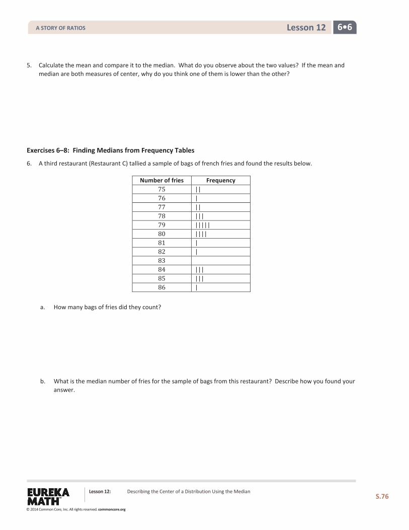
6•6 Lesson 12
5. Calculate the mean and compare it to the median. What do you observe about the two values? If the mean and median are both measures of center, why do you think one of them is lower than the other?
Exercises 6–8: Finding Medians from Frequency Tables
6. A third restaurant (Restaurant C) tallied a sample of bags of french fries and found the results below.
Number of fries Frequency 75 || 76 | 77 || 78 ||| 79 ||||| 80 |||| 81 | 82 | 83 84 ||| 85 ||| 86 |
a. How many bags of fries did they count?
b. What is the median number of fries for the sample of bags from this restaurant? Describe how you found your answer.
Lesson 12: Describing the Center of a Distribution Using the Median
S.76
A STORY OF RATIOS
© 2014 Common Core, Inc. All rights reserved. commoncore.org
6•6 Lesson 12
7. Robere decided to divide the data into four parts. He found the median of the whole set.
a. List the 13 values of the bottom half. Find the median of these 13 values.
b. List the 13 values of the top half. Find the median of these 13 values.
8. Which of the three restaurants seems most likely to really have 82 fries in a typical bag? Explain your thinking.
Lesson 12: Describing the Center of a Distribution Using the Median
S.77
A STORY OF RATIOS
© 2014 Common Core, Inc. All rights reserved. commoncore.org
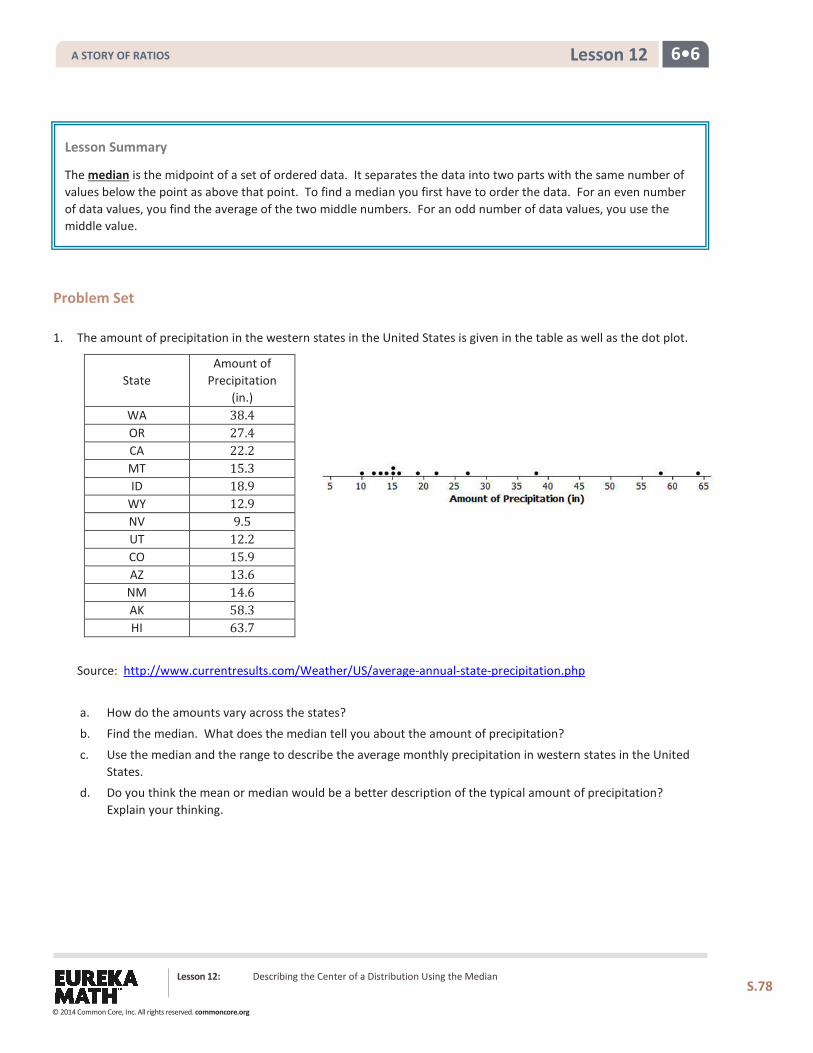
6•6 Lesson 12
Problem Set 1. The amount of precipitation in the western states in the United States is given in the table as well as the dot plot.
State Amount of
Precipitation (in.)
WA 38.4 OR 27.4 CA 22.2 MT 15.3 ID 18.9
WY 12.9 NV 9.5 UT 12.2 CO 15.9 AZ 13.6
NM 14.6 AK 58.3 HI 63.7
Source: http://www.currentresults.com/Weather/US/average-annual-state-precipitation.php
a. How do the amounts vary across the states?
b. Find the median. What does the median tell you about the amount of precipitation?
c. Use the median and the range to describe the average monthly precipitation in western states in the United States.
d. Do you think the mean or median would be a better description of the typical amount of precipitation? Explain your thinking.
Lesson Summary
The median is the midpoint of a set of ordered data. It separates the data into two parts with the same number of values below the point as above that point. To find a median you first have to order the data. For an even number of data values, you find the average of the two middle numbers. For an odd number of data values, you use the middle value.
Lesson 12: Describing the Center of a Distribution Using the Median
S.78
A STORY OF RATIOS
© 2014 Common Core, Inc. All rights reserved. commoncore.org
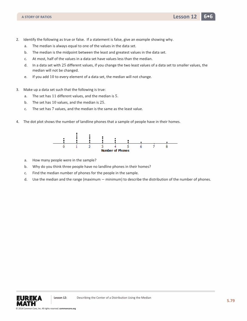
6•6 Lesson 12
2. Identify the following as true or false. If a statement is false, give an example showing why.
a. The median is always equal to one of the values in the data set.
b. The median is the midpoint between the least and greatest values in the data set.
c. At most, half of the values in a data set have values less than the median.
d. In a data set with 25 different values, if you change the two least values of a data set to smaller values, the median will not be changed.
e. If you add 10 to every element of a data set, the median will not change.
3. Make up a data set such that the following is true:
a. The set has 11 different values, and the median is 5. b. The set has 10 values, and the median is 25.
c. The set has 7 values, and the median is the same as the least value.
4. The dot plot shows the number of landline phones that a sample of people have in their homes.
a. How many people were in the sample?
b. Why do you think three people have no landline phones in their homes? c. Find the median number of phones for the people in the sample.
d. Use the median and the range (maximum − minimum) to describe the distribution of the number of phones.
Lesson 12: Describing the Center of a Distribution Using the Median
S.79
A STORY OF RATIOS
© 2014 Common Core, Inc. All rights reserved. commoncore.org
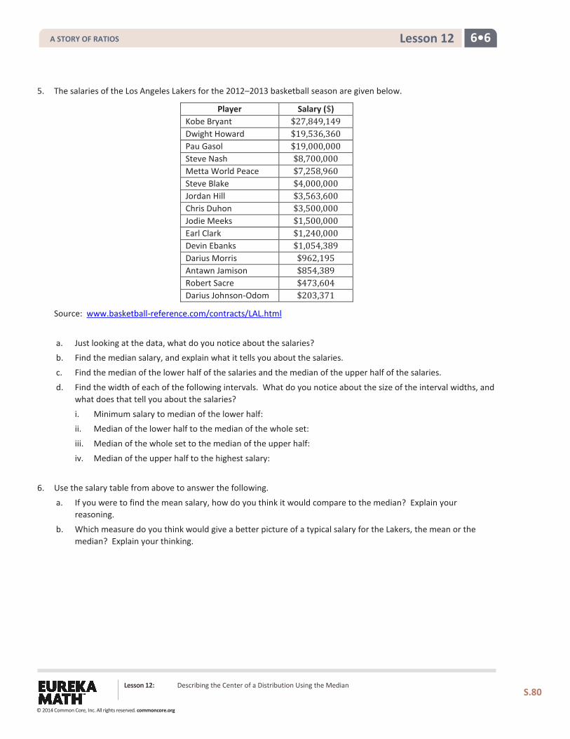
6•6 Lesson 12
5. The salaries of the Los Angeles Lakers for the 2012–2013 basketball season are given below.
Player Salary ($) Kobe Bryant $27,849,149 Dwight Howard $19,536,360 Pau Gasol $19,000,000 Steve Nash $8,700,000 Metta World Peace $7,258,960 Steve Blake $4,000,000 Jordan Hill $3,563,600 Chris Duhon $3,500,000 Jodie Meeks $1,500,000 Earl Clark $1,240,000 Devin Ebanks $1,054,389 Darius Morris $962,195 Antawn Jamison $854,389 Robert Sacre $473,604 Darius Johnson-Odom $203,371
Source: www.basketball-reference.com/contracts/LAL.html
a. Just looking at the data, what do you notice about the salaries? b. Find the median salary, and explain what it tells you about the salaries.
c. Find the median of the lower half of the salaries and the median of the upper half of the salaries.
d. Find the width of each of the following intervals. What do you notice about the size of the interval widths, and what does that tell you about the salaries?
i. Minimum salary to median of the lower half: ii. Median of the lower half to the median of the whole set:
iii. Median of the whole set to the median of the upper half:
iv. Median of the upper half to the highest salary:
6. Use the salary table from above to answer the following.
a. If you were to find the mean salary, how do you think it would compare to the median? Explain your reasoning.
b. Which measure do you think would give a better picture of a typical salary for the Lakers, the mean or the median? Explain your thinking.
Lesson 12: Describing the Center of a Distribution Using the Median
S.80
A STORY OF RATIOS
© 2014 Common Core, Inc. All rights reserved. commoncore.org
6•6 Lesson 13
Lesson 13: Describing Variability using the Interquartile Range
(IQR)
Classwork The median was used to describe the typical value of our data in Lesson 12. Clearly, not all of the data is described by this value. How do we find a description of how the data vary? What is a good way to indicate how the data vary when we use a median as our typical value? These questions are developed in the following exercises.
Exercises 1–4: More French Fries
1. In Lesson 12, you thought about the claim made by a chain restaurant that the typical number of french fries in a large bag was 82. Then you looked at data on the number of fries in a bag from three of the restaurants.
a. How do you think the data was collected and what problems might have come up in collecting the data?
b. What scenario(s) would give counts that might not be representative of typical bags?
2. In Exercise 7 of Lesson 12, you found the median of the top half and the median of the bottom half of the counts for each of the three restaurants. These were the numbers you found: Restaurant A—87.5 and 77; Restaurant B—82 and 79; Restaurant C—84 and 78. The difference between the medians of the two halves is called the interquartile range, or IQR.
a. What is the IQR for each of the three restaurants?
Lesson 13: Describing Variability using the Interquartile Range (IQR)
S.81
A STORY OF RATIOS
© 2014 Common Core, Inc. All rights reserved. commoncore.org
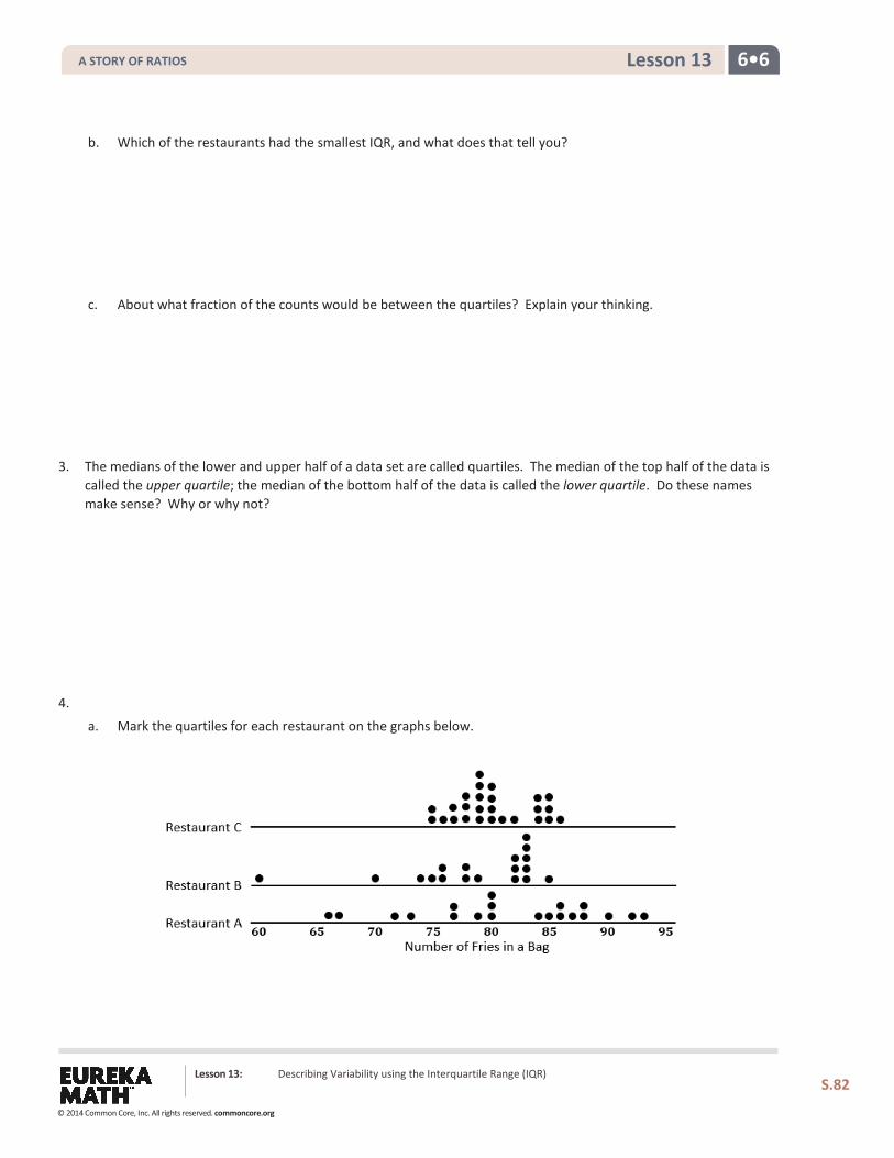
6•6 Lesson 13
b. Which of the restaurants had the smallest IQR, and what does that tell you?
c. About what fraction of the counts would be between the quartiles? Explain your thinking.
3. The medians of the lower and upper half of a data set are called quartiles. The median of the top half of the data is called the upper quartile; the median of the bottom half of the data is called the lower quartile. Do these names make sense? Why or why not?
4.
a. Mark the quartiles for each restaurant on the graphs below.
Lesson 13: Describing Variability using the Interquartile Range (IQR)
S.82
A STORY OF RATIOS
© 2014 Common Core, Inc. All rights reserved. commoncore.org
6•6 Lesson 13
b. Does the IQR help you decide which of the three restaurants seems most likely to really have 82 fries in a typical bag? Explain your thinking.
Example 1: Finding the IQR
Read through the following steps. If something does not make sense to you, make a note, and raise it during class discussion. Consider the data: 1, 1, 3, 4, 6, 6, 7, 8, 10, 11, 11, 12, 15, 15, 17, 17, 17
Creating an IQR:
a. Order the data.
b. Find the minimum and maximum.
c. Find the median.
d. Find the lower quartile and upper quartile.
e. Calculate the IQR by finding the difference between Q3 and Q1.
Lesson 13: Describing Variability using the Interquartile Range (IQR)
S.83
A STORY OF RATIOS
© 2014 Common Core, Inc. All rights reserved. commoncore.org
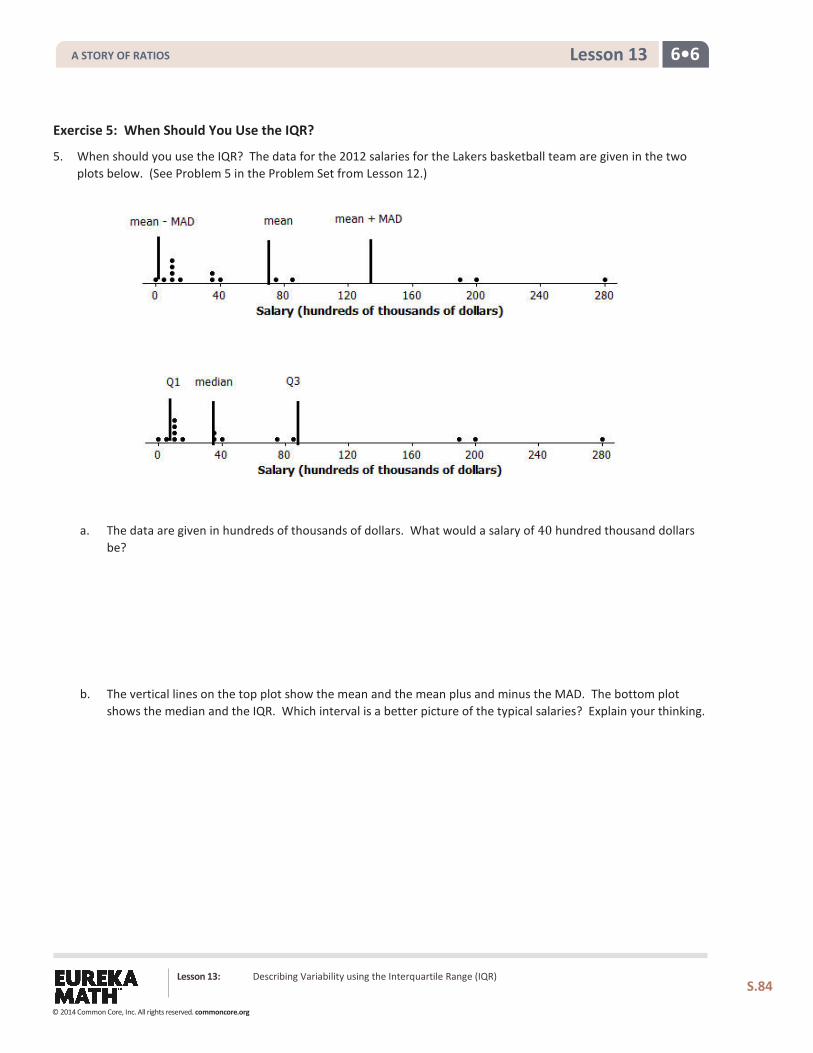
6•6 Lesson 13
Exercise 5: When Should You Use the IQR?
5. When should you use the IQR? The data for the 2012 salaries for the Lakers basketball team are given in the two plots below. (See Problem 5 in the Problem Set from Lesson 12.)
a. The data are given in hundreds of thousands of dollars. What would a salary of 40 hundred thousand dollars be?
b. The vertical lines on the top plot show the mean and the mean plus and minus the MAD. The bottom plot
shows the median and the IQR. Which interval is a better picture of the typical salaries? Explain your thinking.
Lesson 13: Describing Variability using the Interquartile Range (IQR)
S.84
A STORY OF RATIOS
© 2014 Common Core, Inc. All rights reserved. commoncore.org
6•6 Lesson 13
Exercise 6: On Your Own with IQRs
6. Create three different contexts for which a set of data collected related to those contexts could have an IQR of 20. Define a median for each context. Be specific about how the data might have been collected and the units involved. Be ready to describe what the median and IQR mean in each case.
a.
b.
c.
Lesson 13: Describing Variability using the Interquartile Range (IQR)
S.85
A STORY OF RATIOS
© 2014 Common Core, Inc. All rights reserved. commoncore.org
6•6 Lesson 13
Problem Set 1. The average monthly high temperatures (in degrees Fahrenheit) for St. Louis and San Francisco are given in the table
below.
Jan. Feb. Mar. Apr. May June July Aug. Sept. Oct. Nov. Dec.
St. Louis 40 45 55 67 77 85 89 88 81 69 56 43 San Francisco 57 60 62 63 64 67 67 68 70 69 63 57
Data Source: www.weather.com/weather/wxclimatology/monthly/graph/USCA0987
www.weather.com/weather/wxclimatology/monthly/graph/USMO0787
a. How do you think the data might have been collected?
b. Do you think it would be possible for 14 of the temperatures in the month of July for St. Louis to be 95°F or
above? Why or why not?
c. Make a prediction about how the sizes of the IQR for the temperatures for each city compare. Explain your thinking.
d. Find the IQR for the average monthly high temperature for each city. How do the results compare to your conjecture?
Lesson Summary
To find the IQR, you order the data, find the median of the data, and then find the median of the lower half of the data (the lower quartile) and the median of the upper half of the data (the upper quartile). The IQR is the difference between the upper quartile and the lower quartile, which is the length of the interval that includes the middle half of the data because the median and the two quartiles divide the data into four sections, with about 1
4 of
the data in each section. Two of the sections are between the quartiles, so the interval between the quartiles would contain about 50% of the data.
Lesson 13: Describing Variability using the Interquartile Range (IQR)
S.86
A STORY OF RATIOS
© 2014 Common Core, Inc. All rights reserved. commoncore.org
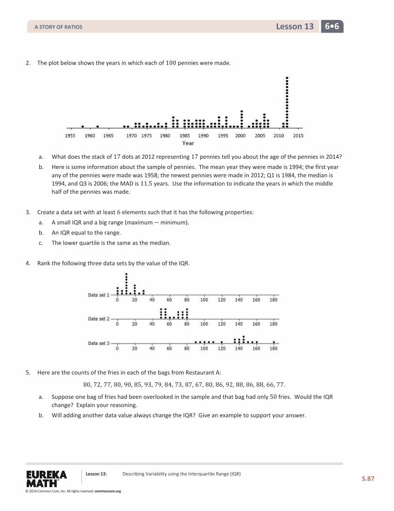
6•6 Lesson 13
2. The plot below shows the years in which each of 100 pennies were made.
a. What does the stack of 17 dots at 2012 representing 17 pennies tell you about the age of the pennies in 2014?
b. Here is some information about the sample of pennies. The mean year they were made is 1994; the first year any of the pennies were made was 1958; the newest pennies were made in 2012; Q1 is 1984, the median is 1994, and Q3 is 2006; the MAD is 11.5 years. Use the information to indicate the years in which the middle half of the pennies was made.
3. Create a data set with at least 6 elements such that it has the following properties:
a. A small IQR and a big range (maximum − minimum).
b. An IQR equal to the range.
c. The lower quartile is the same as the median.
4. Rank the following three data sets by the value of the IQR.
5. Here are the counts of the fries in each of the bags from Restaurant A:
80, 72, 77, 80, 90, 85, 93, 79, 84, 73, 87, 67, 80, 86, 92, 88, 86, 88, 66, 77.
a. Suppose one bag of fries had been overlooked in the sample and that bag had only 50 fries. Would the IQR change? Explain your reasoning.
b. Will adding another data value always change the IQR? Give an example to support your answer.
Lesson 13: Describing Variability using the Interquartile Range (IQR)
S.87
A STORY OF RATIOS
© 2014 Common Core, Inc. All rights reserved. commoncore.org
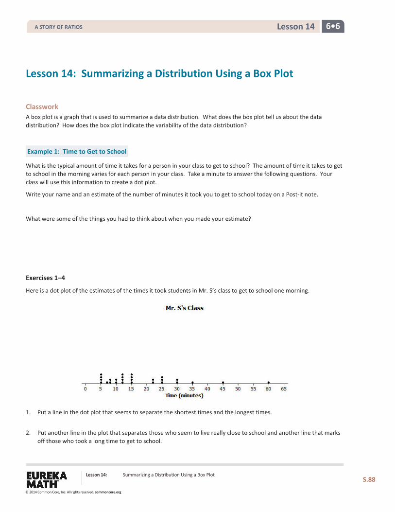
6•6 Lesson 14
Lesson 14: Summarizing a Distribution Using a Box Plot
Classwork A box plot is a graph that is used to summarize a data distribution. What does the box plot tell us about the data distribution? How does the box plot indicate the variability of the data distribution?
Example 1: Time to Get to School
What is the typical amount of time it takes for a person in your class to get to school? The amount of time it takes to get to school in the morning varies for each person in your class. Take a minute to answer the following questions. Your class will use this information to create a dot plot.
Write your name and an estimate of the number of minutes it took you to get to school today on a Post-it note.
What were some of the things you had to think about when you made your estimate?
Exercises 1–4
Here is a dot plot of the estimates of the times it took students in Mr. S’s class to get to school one morning.
1. Put a line in the dot plot that seems to separate the shortest times and the longest times.
2. Put another line in the plot that separates those who seem to live really close to school and another line that marks off those who took a long time to get to school.
Lesson 14: Summarizing a Distribution Using a Box Plot
S.88
A STORY OF RATIOS
© 2014 Common Core, Inc. All rights reserved. commoncore.org
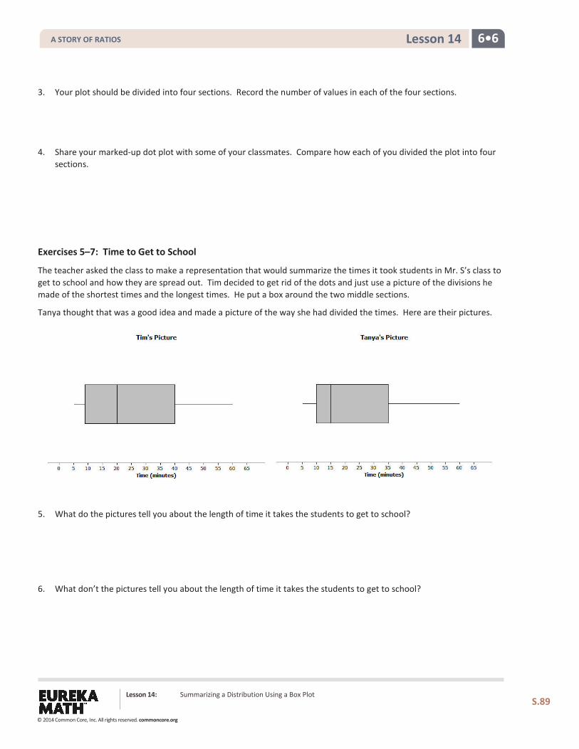
6•6 Lesson 14
3. Your plot should be divided into four sections. Record the number of values in each of the four sections.
4. Share your marked-up dot plot with some of your classmates. Compare how each of you divided the plot into four sections.
Exercises 5–7: Time to Get to School
The teacher asked the class to make a representation that would summarize the times it took students in Mr. S’s class to get to school and how they are spread out. Tim decided to get rid of the dots and just use a picture of the divisions he made of the shortest times and the longest times. He put a box around the two middle sections.
Tanya thought that was a good idea and made a picture of the way she had divided the times. Here are their pictures.
5. What do the pictures tell you about the length of time it takes the students to get to school?
6. What don’t the pictures tell you about the length of time it takes the students to get to school?
Lesson 14: Summarizing a Distribution Using a Box Plot
S.89
A STORY OF RATIOS
© 2014 Common Core, Inc. All rights reserved. commoncore.org
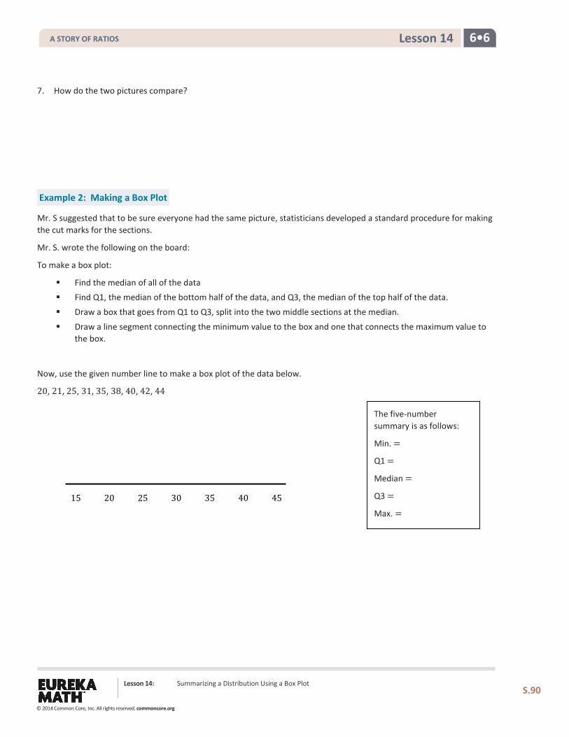
6•6 Lesson 14
7. How do the two pictures compare?
Example 2: Making a Box Plot
Mr. S suggested that to be sure everyone had the same picture, statisticians developed a standard procedure for making the cut marks for the sections.
Mr. S. wrote the following on the board:
To make a box plot:
Find the median of all of the data Find Q1, the median of the bottom half of the data, and Q3, the median of the top half of the data.
Draw a box that goes from Q1 to Q3, split into the two middle sections at the median.
Draw a line segment connecting the minimum value to the box and one that connects the maximum value to the box.
Now, use the given number line to make a box plot of the data below.
20, 21, 25, 31, 35, 38, 40, 42, 44
15 20 25 30 35 40 45
The five-number summary is as follows:
Min. =
Q1 =
Median =
Q3 =
Max. =
Lesson 14: Summarizing a Distribution Using a Box Plot
S.90
A STORY OF RATIOS
© 2014 Common Core, Inc. All rights reserved. commoncore.org
6•6 Lesson 14
Exercises 8–11: A Human Box Plot
Consider again your Post-it note that you used to write down the number of minutes it takes you to get to school. If possible, you and your classmates will form a human box plot of the number of minutes it takes your class to get to school.
8. Find the median of the group. Does someone represent the median? If not, who is the closest to the median?
9. Find the maximum and minimum of the group. Who are they?
10. Find Q1 and Q3 of the group. Does anyone represent Q1 or Q3? If not, who is the closest to Q1? Who is closest to Q3?
11. Sketch the box plot for this data set below.
Lesson 14: Summarizing a Distribution Using a Box Plot
S.91
A STORY OF RATIOS
© 2014 Common Core, Inc. All rights reserved. commoncore.org
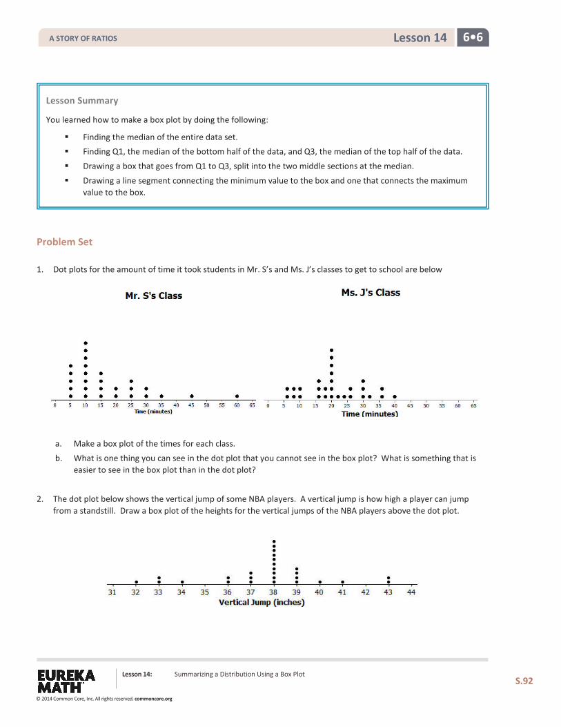
6•6 Lesson 14
Problem Set 1. Dot plots for the amount of time it took students in Mr. S’s and Ms. J’s classes to get to school are below
a. Make a box plot of the times for each class.
b. What is one thing you can see in the dot plot that you cannot see in the box plot? What is something that is easier to see in the box plot than in the dot plot?
2. The dot plot below shows the vertical jump of some NBA players. A vertical jump is how high a player can jump from a standstill. Draw a box plot of the heights for the vertical jumps of the NBA players above the dot plot.
Lesson Summary You learned how to make a box plot by doing the following:
Finding the median of the entire data set. Finding Q1, the median of the bottom half of the data, and Q3, the median of the top half of the data.
Drawing a box that goes from Q1 to Q3, split into the two middle sections at the median.
Drawing a line segment connecting the minimum value to the box and one that connects the maximum value to the box.
Lesson 14: Summarizing a Distribution Using a Box Plot
S.92
A STORY OF RATIOS
© 2014 Common Core, Inc. All rights reserved. commoncore.org
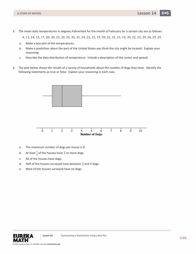
6•6 Lesson 14
3. The mean daily temperatures in degrees Fahrenheit for the month of February for a certain city are as follows:
4, 11, 14, 15, 17, 20, 30, 23, 20, 35, 35, 31, 34, 23, 15, 19, 39, 22, 15, 15, 19, 39, 22, 23, 29, 26, 29, 29
a. Make a box plot of the temperatures.
b. Make a prediction about the part of the United States you think the city might be located. Explain your reasoning.
c. Describe the data distribution of temperature. Include a description of the center and spread.
4. The plot below shows the results of a survey of households about the number of dogs they have. Identify the following statements as true or false. Explain your reasoning in each case.
a. The maximum number of dogs per house is 8.
b. At least 12 of the houses have 2 or more dogs.
c. All of the houses have dogs.
d. Half of the houses surveyed have between 2 and 4 dogs.
e. Most of the houses surveyed have no dogs.
Lesson 14: Summarizing a Distribution Using a Box Plot
S.93
A STORY OF RATIOS
© 2014 Common Core, Inc. All rights reserved. commoncore.org
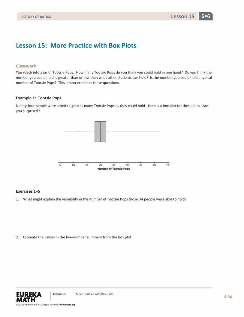
6•6 Lesson 15
Lesson 15: More Practice with Box Plots
Classwork You reach into a jar of Tootsie Pops. How many Tootsie Pops do you think you could hold in one hand? Do you think the number you could hold is greater than or less than what other students can hold? Is the number you could hold a typical number of Tootsie Pops? This lesson examines these questions.
Example 1: Tootsie Pops
Ninety-four people were asked to grab as many Tootsie Pops as they could hold. Here is a box plot for these data. Are you surprised?
Exercises 1–5
1. What might explain the variability in the number of Tootsie Pops those 94 people were able to hold?
2. Estimate the values in the five-number summary from the box plot.
Lesson 15: More Practice with Box Plots
S.94
A STORY OF RATIOS
© 2014 Common Core, Inc. All rights reserved. commoncore.org
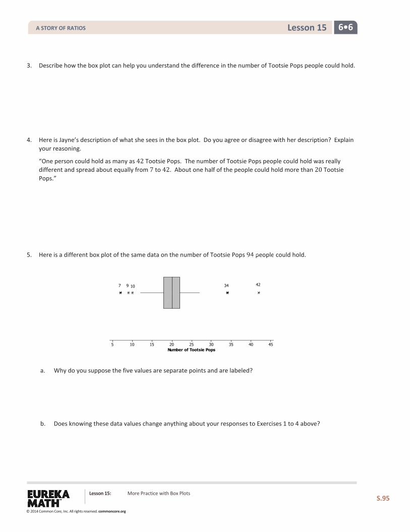
6•6 Lesson 15
3. Describe how the box plot can help you understand the difference in the number of Tootsie Pops people could hold.
4. Here is Jayne’s description of what she sees in the box plot. Do you agree or disagree with her description? Explain your reasoning.
“One person could hold as many as 42 Tootsie Pops. The number of Tootsie Pops people could hold was really different and spread about equally from 7 to 42. About one half of the people could hold more than 20 Tootsie Pops.”
5. Here is a different box plot of the same data on the number of Tootsie Pops 94 people could hold.
a. Why do you suppose the five values are separate points and are labeled?
b. Does knowing these data values change anything about your responses to Exercises 1 to 4 above?
Lesson 15: More Practice with Box Plots
S.95
Number of Tootsie Pops45403530252015105
4234107 9
A STORY OF RATIOS
© 2014 Common Core, Inc. All rights reserved. commoncore.org
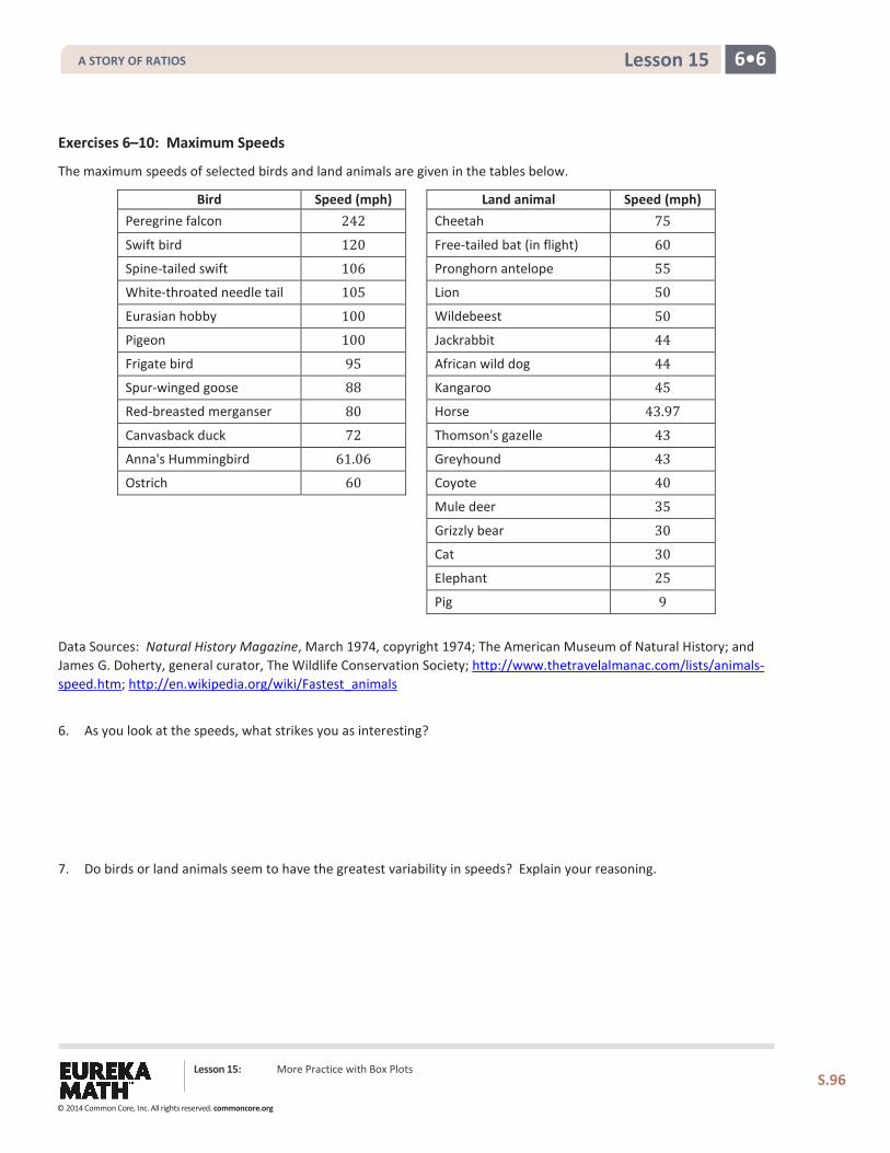
6•6 Lesson 15
Exercises 6–10: Maximum Speeds
The maximum speeds of selected birds and land animals are given in the tables below.
Bird Speed (mph) Land animal Speed (mph) Peregrine falcon 242 Cheetah 75 Swift bird 120 Free-tailed bat (in flight) 60 Spine-tailed swift 106 Pronghorn antelope 55 White-throated needle tail 105 Lion 50 Eurasian hobby 100 Wildebeest 50 Pigeon 100 Jackrabbit 44 Frigate bird 95 African wild dog 44 Spur-winged goose 88 Kangaroo 45 Red-breasted merganser 80 Horse 43.97 Canvasback duck 72 Thomson's gazelle 43 Anna's Hummingbird 61.06 Greyhound 43 Ostrich 60 Coyote 40 Mule deer 35 Grizzly bear 30 Cat 30 Elephant 25 Pig 9
Data Sources: Natural History Magazine, March 1974, copyright 1974; The American Museum of Natural History; and James G. Doherty, general curator, The Wildlife Conservation Society; http://www.thetravelalmanac.com/lists/animals-speed.htm; http://en.wikipedia.org/wiki/Fastest_animals
6. As you look at the speeds, what strikes you as interesting?
7. Do birds or land animals seem to have the greatest variability in speeds? Explain your reasoning.
Lesson 15: More Practice with Box Plots
S.96
A STORY OF RATIOS
© 2014 Common Core, Inc. All rights reserved. commoncore.org
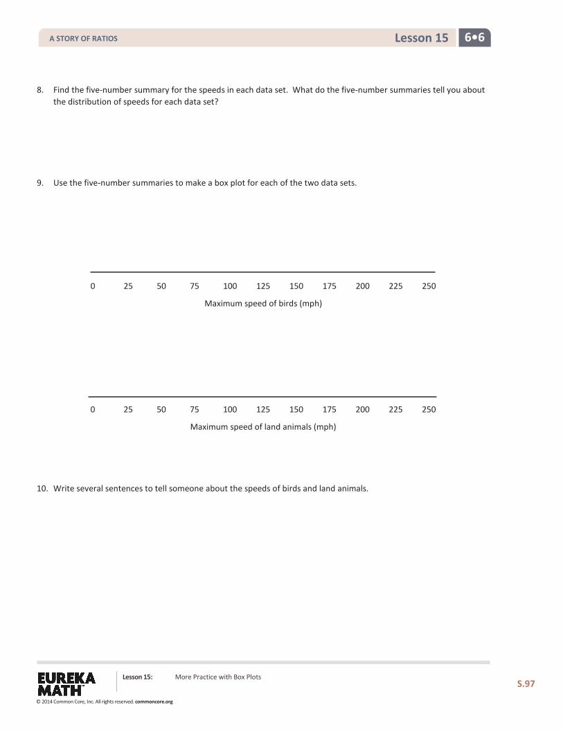
6•6 Lesson 15
8. Find the five-number summary for the speeds in each data set. What do the five-number summaries tell you about the distribution of speeds for each data set?
9. Use the five-number summaries to make a box plot for each of the two data sets.
0 25 50 75 100 125 150 175 200 225 250
Maximum speed of birds (mph)
0 25 50 75 100 125 150 175 200 225 250
Maximum speed of land animals (mph)
10. Write several sentences to tell someone about the speeds of birds and land animals.
Lesson 15: More Practice with Box Plots
S.97
A STORY OF RATIOS
© 2014 Common Core, Inc. All rights reserved. commoncore.org
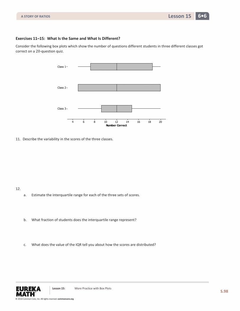
6•6 Lesson 15
Exercises 11–15: What Is the Same and What Is Different?
Consider the following box plots which show the number of questions different students in three different classes got correct on a 20-question quiz.
11. Describe the variability in the scores of the three classes.
12.
a. Estimate the interquartile range for each of the three sets of scores.
b. What fraction of students does the interquartile range represent?
c. What does the value of the IQR tell you about how the scores are distributed?
Number Correct
Class 3
Class 2
Class 1
201816141210864
Lesson 15: More Practice with Box Plots
S.98
A STORY OF RATIOS
© 2014 Common Core, Inc. All rights reserved. commoncore.org
6•6 Lesson 15
13. Which class do you believe performed the best? Be sure to use the data from the box plots to back up your answer.
14.
a. Find the IQR for the three data sets in the first two examples: maximum speed of birds, maximum speed of land animals, and number of Tootsie Pops.
b. Which data set had the highest percentage of data values between the lower quartile and the upper quartile? Explain your thinking.
15. The teacher asked students to draw a box plot with a minimum value at 34 and a maximum value at 64 that had an
interquartile range of 10. Jeremy said he could not draw just one because he did not know where to put the box on the number line. Do you agree with Jeremy? Why or why not?
Lesson 15: More Practice with Box Plots
S.99
A STORY OF RATIOS
© 2014 Common Core, Inc. All rights reserved. commoncore.org
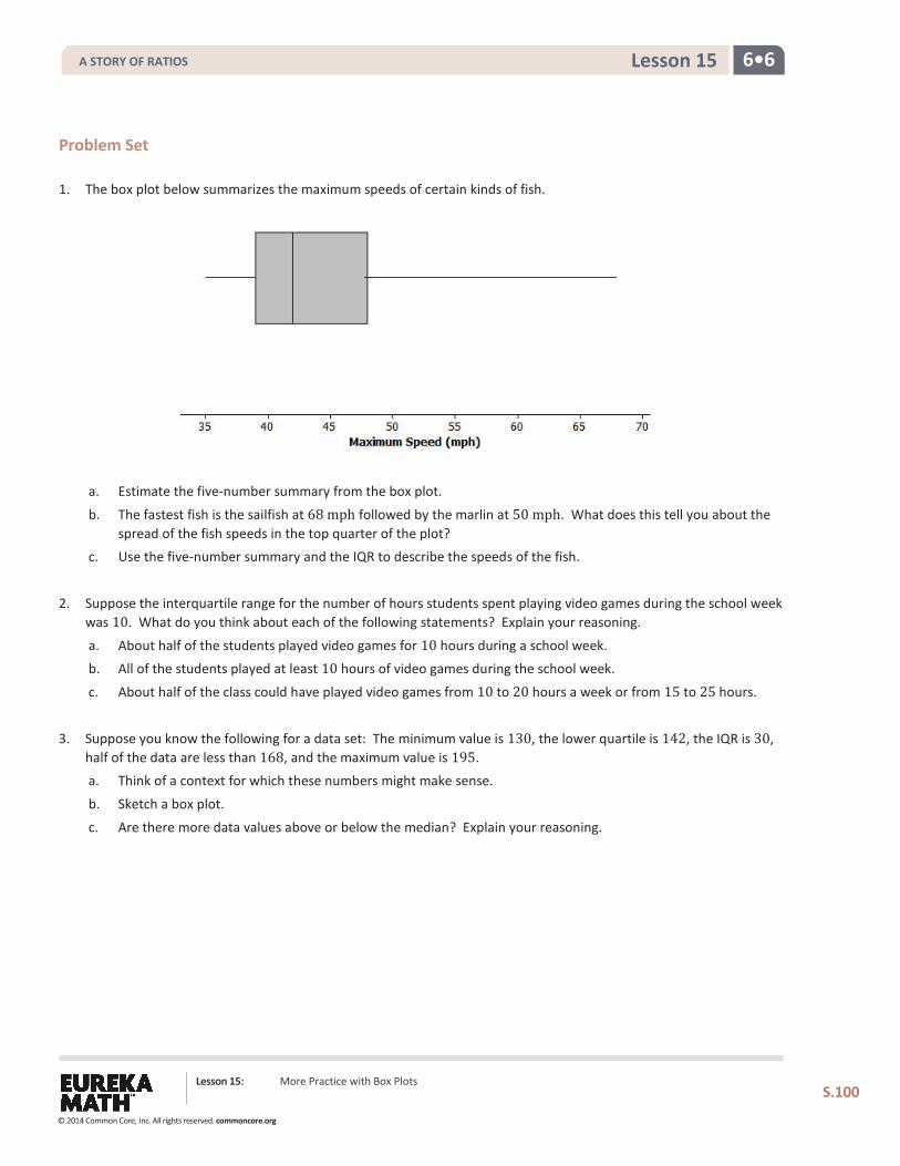
6•6 Lesson 15
Problem Set 1. The box plot below summarizes the maximum speeds of certain kinds of fish.
a. Estimate the five-number summary from the box plot.
b. The fastest fish is the sailfish at 68 mph followed by the marlin at 50 mph. What does this tell you about the spread of the fish speeds in the top quarter of the plot?
c. Use the five-number summary and the IQR to describe the speeds of the fish.
2. Suppose the interquartile range for the number of hours students spent playing video games during the school week was 10. What do you think about each of the following statements? Explain your reasoning.
a. About half of the students played video games for 10 hours during a school week. b. All of the students played at least 10 hours of video games during the school week.
c. About half of the class could have played video games from 10 to 20 hours a week or from 15 to 25 hours.
3. Suppose you know the following for a data set: The minimum value is 130, the lower quartile is 142, the IQR is 30, half of the data are less than 168, and the maximum value is 195. a. Think of a context for which these numbers might make sense.
b. Sketch a box plot.
c. Are there more data values above or below the median? Explain your reasoning.
Lesson 15: More Practice with Box Plots
S.100
A STORY OF RATIOS
© 2014 Common Core, Inc. All rights reserved. commoncore.org
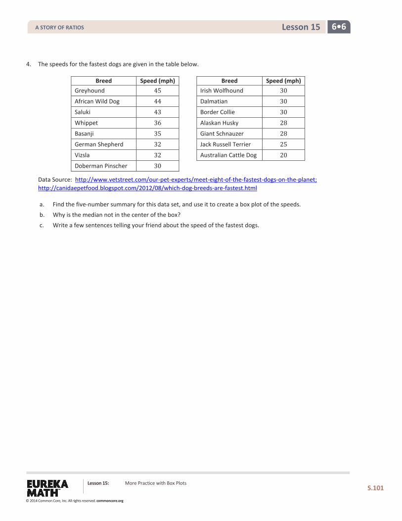
6•6 Lesson 15
4. The speeds for the fastest dogs are given in the table below.
Breed Speed (mph) Breed Speed (mph) Greyhound 45 Irish Wolfhound 30 African Wild Dog 44 Dalmatian 30 Saluki 43 Border Collie 30 Whippet 36 Alaskan Husky 28 Basanji 35 Giant Schnauzer 28 German Shepherd 32 Jack Russell Terrier 25 Vizsla 32 Australian Cattle Dog 20 Doberman Pinscher 30
Data Source: http://www.vetstreet.com/our-pet-experts/meet-eight-of-the-fastest-dogs-on-the-planet; http://canidaepetfood.blogspot.com/2012/08/which-dog-breeds-are-fastest.html
a. Find the five-number summary for this data set, and use it to create a box plot of the speeds.
b. Why is the median not in the center of the box?
c. Write a few sentences telling your friend about the speed of the fastest dogs.
Lesson 15: More Practice with Box Plots
S.101
A STORY OF RATIOS
© 2014 Common Core, Inc. All rights reserved. commoncore.org
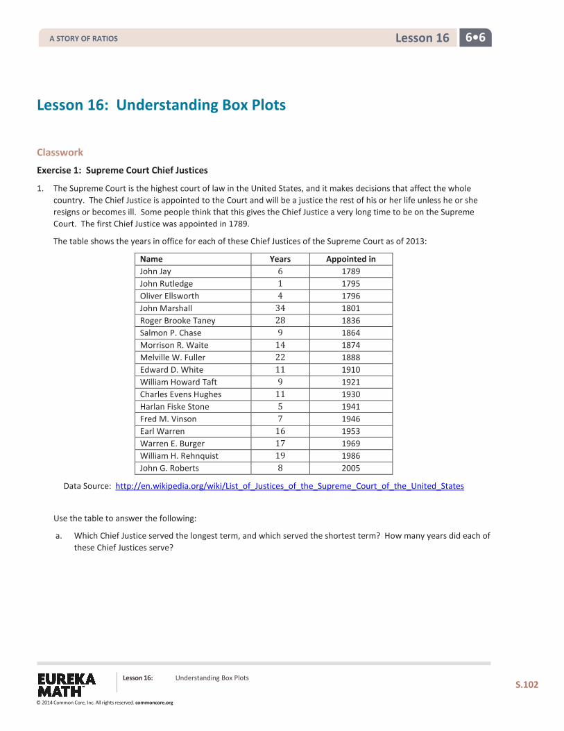
6•6 Lesson 16
Lesson 16: Understanding Box Plots
S.102
Lesson 16: Understanding Box Plots
Classwork
Exercise 1: Supreme Court Chief Justices
1. The Supreme Court is the highest court of law in the United States, and it makes decisions that affect the whole country. The Chief Justice is appointed to the Court and will be a justice the rest of his or her life unless he or she resigns or becomes ill. Some people think that this gives the Chief Justice a very long time to be on the Supreme Court. The first Chief Justice was appointed in 1789.
The table shows the years in office for each of these Chief Justices of the Supreme Court as of 2013:
Name Years Appointed in John Jay 6 1789 John Rutledge 1 1795 Oliver Ellsworth 4 1796 John Marshall 34 1801 Roger Brooke Taney 28 1836 Salmon P. Chase 9 1864 Morrison R. Waite 14 1874 Melville W. Fuller 22 1888 Edward D. White 11 1910 William Howard Taft 9 1921 Charles Evens Hughes 11 1930 Harlan Fiske Stone 5 1941 Fred M. Vinson 7 1946 Earl Warren 16 1953 Warren E. Burger 17 1969 William H. Rehnquist 19 1986 John G. Roberts 8 2005
Data Source: http://en.wikipedia.org/wiki/List_of_Justices_of_the_Supreme_Court_of_the_United_States
Use the table to answer the following:
a. Which Chief Justice served the longest term, and which served the shortest term? How many years did each of these Chief Justices serve?
A STORY OF RATIOS
© 2014 Common Core, Inc. All rights reserved. commoncore.org
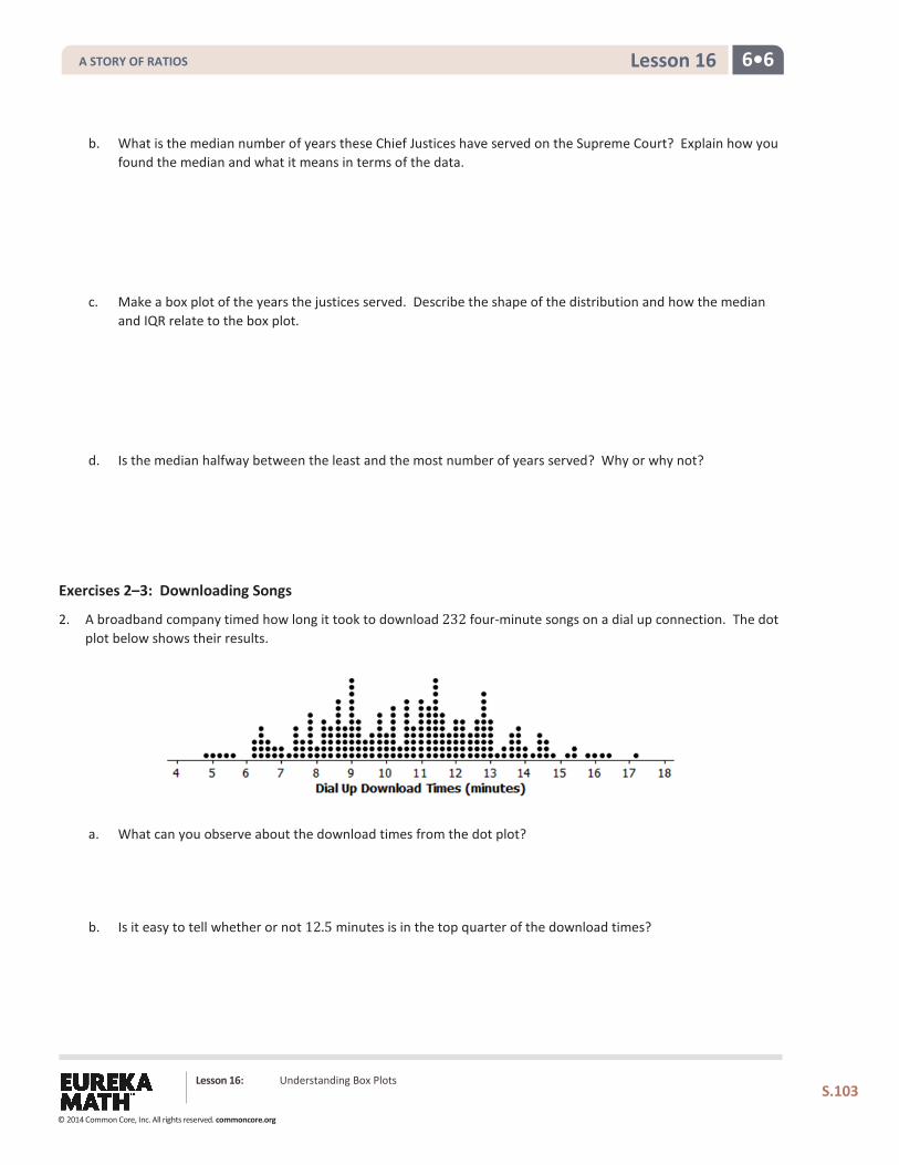
6•6 Lesson 16
Lesson 16: Understanding Box Plots
S.103
b. What is the median number of years these Chief Justices have served on the Supreme Court? Explain how you found the median and what it means in terms of the data.
c. Make a box plot of the years the justices served. Describe the shape of the distribution and how the median and IQR relate to the box plot.
d. Is the median halfway between the least and the most number of years served? Why or why not?
Exercises 2–3: Downloading Songs
2. A broadband company timed how long it took to download 232 four-minute songs on a dial up connection. The dot plot below shows their results.
a. What can you observe about the download times from the dot plot?
b. Is it easy to tell whether or not 12.5 minutes is in the top quarter of the download times?
A STORY OF RATIOS
© 2014 Common Core, Inc. All rights reserved. commoncore.org
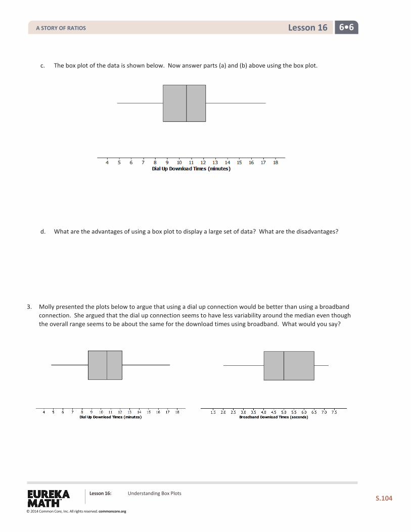
6•6 Lesson 16
Lesson 16: Understanding Box Plots
S.104
c. The box plot of the data is shown below. Now answer parts (a) and (b) above using the box plot.
d. What are the advantages of using a box plot to display a large set of data? What are the disadvantages?
3. Molly presented the plots below to argue that using a dial up connection would be better than using a broadband connection. She argued that the dial up connection seems to have less variability around the median even though the overall range seems to be about the same for the download times using broadband. What would you say?
A STORY OF RATIOS
© 2014 Common Core, Inc. All rights reserved. commoncore.org
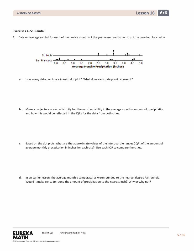
6•6 Lesson 16
Lesson 16: Understanding Box Plots
S.105
Exercises 4–5: Rainfall
4. Data on average rainfall for each of the twelve months of the year were used to construct the two dot plots below.
a. How many data points are in each dot plot? What does each data point represent?
b. Make a conjecture about which city has the most variability in the average monthly amount of precipitation and how this would be reflected in the IQRs for the data from both cities.
c. Based on the dot plots, what are the approximate values of the interquartile ranges (IQR) of the amount of average monthly precipitation in inches for each city? Use each IQR to compare the cities.
d. In an earlier lesson, the average monthly temperatures were rounded to the nearest degree Fahrenheit.
Would it make sense to round the amount of precipitation to the nearest inch? Why or why not?
A STORY OF RATIOS
© 2014 Common Core, Inc. All rights reserved. commoncore.org
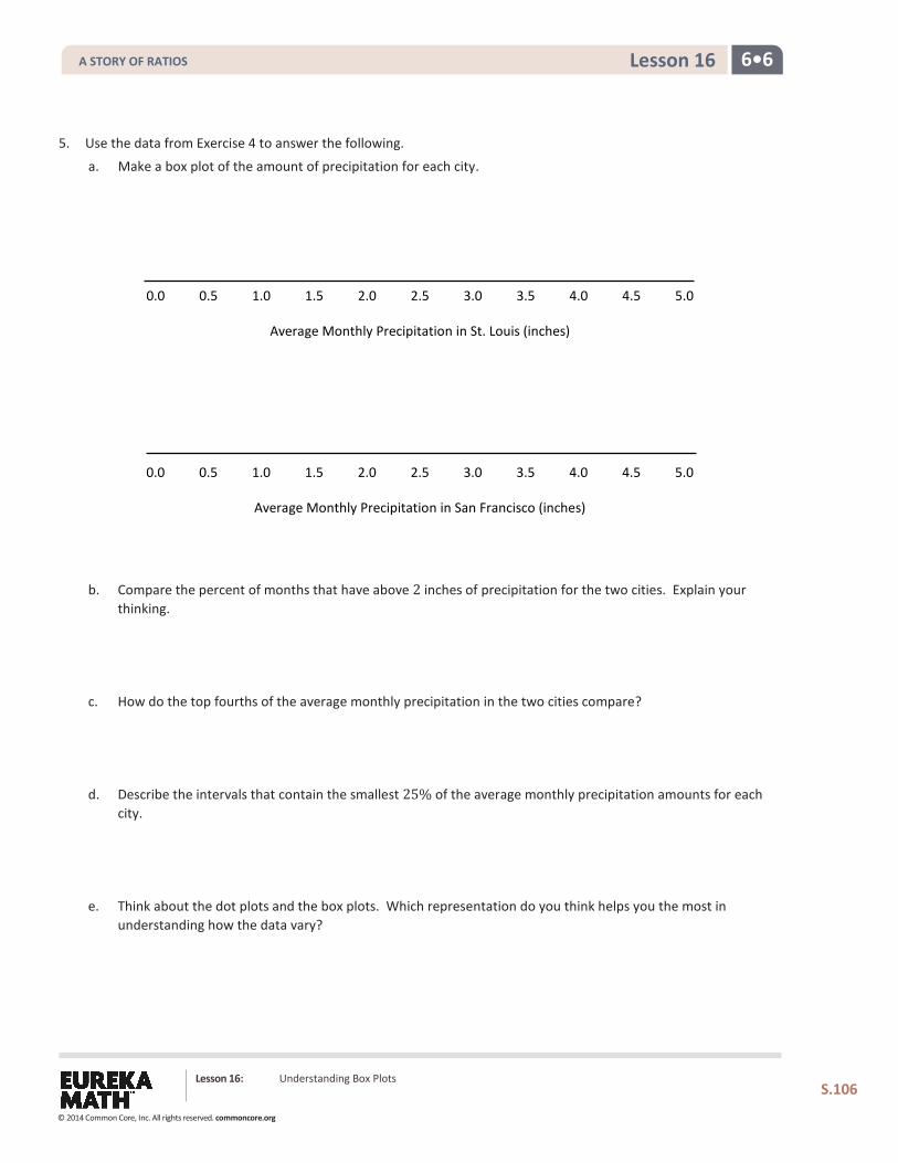
6•6 Lesson 16
Lesson 16: Understanding Box Plots
S.106
5. Use the data from Exercise 4 to answer the following.
a. Make a box plot of the amount of precipitation for each city.
0.0 0.5 1.0 1.5 2.0 2.5 3.0 3.5 4.0 4.5 5.0
Average Monthly Precipitation in St. Louis (inches)
0.0 0.5 1.0 1.5 2.0 2.5 3.0 3.5 4.0 4.5 5.0
Average Monthly Precipitation in San Francisco (inches)
b. Compare the percent of months that have above 2 inches of precipitation for the two cities. Explain your
thinking.
c. How do the top fourths of the average monthly precipitation in the two cities compare?
d. Describe the intervals that contain the smallest 25% of the average monthly precipitation amounts for each city.
e. Think about the dot plots and the box plots. Which representation do you think helps you the most in understanding how the data vary?
A STORY OF RATIOS
© 2014 Common Core, Inc. All rights reserved. commoncore.org
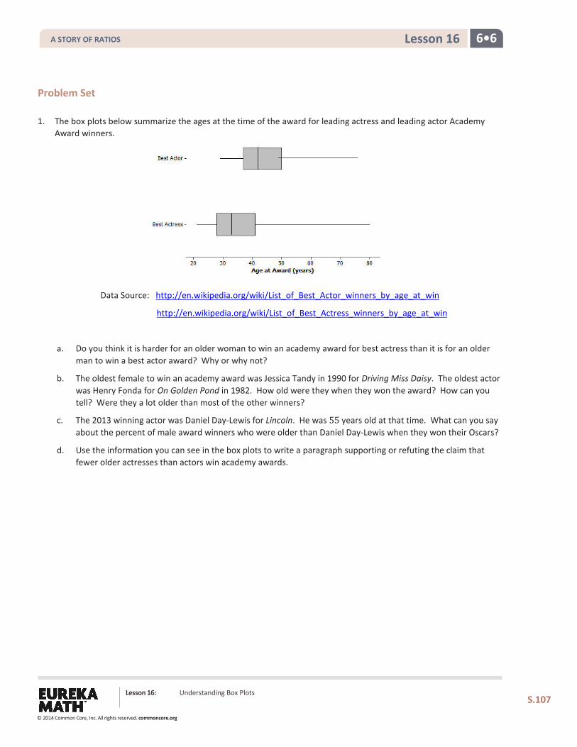
6•6 Lesson 16
Lesson 16: Understanding Box Plots
S.107
Problem Set 1. The box plots below summarize the ages at the time of the award for leading actress and leading actor Academy
Award winners.
Data Source: http://en.wikipedia.org/wiki/List_of_Best_Actor_winners_by_age_at_win
http://en.wikipedia.org/wiki/List_of_Best_Actress_winners_by_age_at_win
a. Do you think it is harder for an older woman to win an academy award for best actress than it is for an older man to win a best actor award? Why or why not?
b. The oldest female to win an academy award was Jessica Tandy in 1990 for Driving Miss Daisy. The oldest actor was Henry Fonda for On Golden Pond in 1982. How old were they when they won the award? How can you tell? Were they a lot older than most of the other winners?
c. The 2013 winning actor was Daniel Day-Lewis for Lincoln. He was 55 years old at that time. What can you say about the percent of male award winners who were older than Daniel Day-Lewis when they won their Oscars?
d. Use the information you can see in the box plots to write a paragraph supporting or refuting the claim that fewer older actresses than actors win academy awards.
A STORY OF RATIOS
© 2014 Common Core, Inc. All rights reserved. commoncore.org
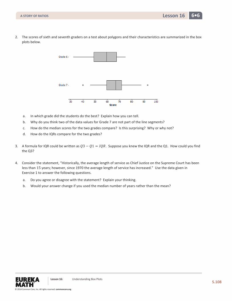
6•6 Lesson 16
Lesson 16: Understanding Box Plots
S.108
2. The scores of sixth and seventh graders on a test about polygons and their characteristics are summarized in the box plots below.
a. In which grade did the students do the best? Explain how you can tell.
b. Why do you think two of the data values for Grade 7 are not part of the line segments?
c. How do the median scores for the two grades compare? Is this surprising? Why or why not? d. How do the IQRs compare for the two grades?
3. A formula for IQR could be written as 𝑄𝑄3 − 𝑄𝑄1 = 𝐼𝐼𝑄𝑄𝐼𝐼. Suppose you knew the IQR and the Q1. How could you find the Q3?
4. Consider the statement, “Historically, the average length of service as Chief Justice on the Supreme Court has been
less than 15 years; however, since 1970 the average length of service has increased.” Use the data given in Exercise 1 to answer the following questions.
a. Do you agree or disagree with the statement? Explain your thinking.
b. Would your answer change if you used the median number of years rather than the mean?
A STORY OF RATIOS
© 2014 Common Core, Inc. All rights reserved. commoncore.org
6•6 Lesson 17
Lesson 17: Developing a Statistical Project
Classwork
Exploratory Challenge
Review of Statistical Questions
Statistical questions you investigated in this module included the following:
How many hours of sleep do sixth graders typically get on a night when there is school the next day?
What is the typical number of books read over the course of 6 months by a sixth grader?
What is the typical heart rate of a student in a sixth-grade class?
How many hours does a sixth grader typically spend playing a sport or a game outdoors? What are the head circumferences of adults interested in buying baseball hats?
How long is the battery life of a certain brand of batteries?
How many pets do students have?
How long does it take a student to get to school?
What is a typical daily temperature in New York City? What is the typical weight of a backpack for students at a certain school?
What is the typical number of french fries in a large order from a fast food restaurant?
What is the typical number of minutes a student spends on homework each day?
What is the typical height of a vertical jump for a player in the NBA?
What do these questions have in common?
Why do several of these questions include the word typical?
Lesson 17: Developing a Statistical Project
S.109
A STORY OF RATIOS
© 2014 Common Core, Inc. All rights reserved. commoncore.org
6•6 Lesson 17
Recall from the very first lesson in this module that a statistical question is a question answered by data that you anticipate will vary.
Let’s review the steps of a statistical investigation.
Step 1: Pose a question that can be answered by data.
Step 2: Collect appropriate data.
Step 3: Summarize the data with graphs and numerical summaries.
Step 4: Answer the question posed in Step 1 using the numerical summaries and graphs.
The first step is to pose a statistical question. Select one of the questions, and write it in the following Statistical Study Review Template.
The second step is to collect the data. In all of these investigations, you were given data. How do you think the data for the question you selected in Step 1 was collected? Write your answer in the summary below for Step 2.
The third step involves the various ways you summarize the data. List the various ways you summarized data for Step 3.
Statistical Study Review Template
Step 1: Pose a statistical question.
Step 2: Collect data.
Step 3: Summarize the data.
Step 4: Answer the question.
Lesson 17: Developing a Statistical Project
S.110
A STORY OF RATIOS
© 2014 Common Core, Inc. All rights reserved. commoncore.org
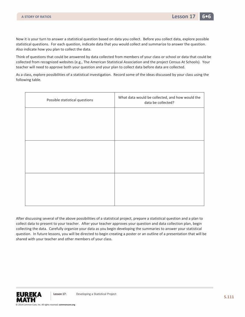
6•6 Lesson 17
Now it is your turn to answer a statistical question based on data you collect. Before you collect data, explore possible statistical questions. For each question, indicate data that you would collect and summarize to answer the question. Also indicate how you plan to collect the data.
Think of questions that could be answered by data collected from members of your class or school or data that could be collected from recognized websites (e.g., The American Statistical Association and the project Census At Schools). Your teacher will need to approve both your question and your plan to collect data before data are collected.
As a class, explore possibilities of a statistical investigation. Record some of the ideas discussed by your class using the following table.
Possible statistical questions What data would be collected, and how would the
data be collected?
After discussing several of the above possibilities of a statistical project, prepare a statistical question and a plan to collect data to present to your teacher. After your teacher approves your question and data collection plan, begin collecting the data. Carefully organize your data as you begin developing the summaries to answer your statistical question. In future lessons, you will be directed to begin creating a poster or an outline of a presentation that will be shared with your teacher and other members of your class.
Lesson 17: Developing a Statistical Project
S.111
A STORY OF RATIOS
© 2014 Common Core, Inc. All rights reserved. commoncore.org
6•6 Lesson 17
Complete the following to present to your teacher:
1. The statistical question for my investigation is as follows:
2. Here is the plan I propose to collect my data. (Include how you are going to collect your data and a clear description of what you plan to measure or count.)
Lesson 17: Developing a Statistical Project
S.112
A STORY OF RATIOS
© 2014 Common Core, Inc. All rights reserved. commoncore.org
6•6 Lesson 17
Problem Set Your teacher will outline steps you are expected to complete in the next several days to develop this project. Keep in mind that the first step in developing your project is a statistical question. With one of the statistical questions posed in this lesson or with a new one developed in this lesson, organize your question and plan to collect and summarize data. Complete the process as outlined by your teacher.
Lesson Summary
A statistical study involves a four-step investigative process:
Pose questions that can be answered by data.
Design a plan for collecting appropriate data and then use the plan to collect data. Analyze the data.
Interpret results and draw valid conclusions from the data to the question posed.
Lesson 17: Developing a Statistical Project
S.113
A STORY OF RATIOS
© 2014 Common Core, Inc. All rights reserved. commoncore.org
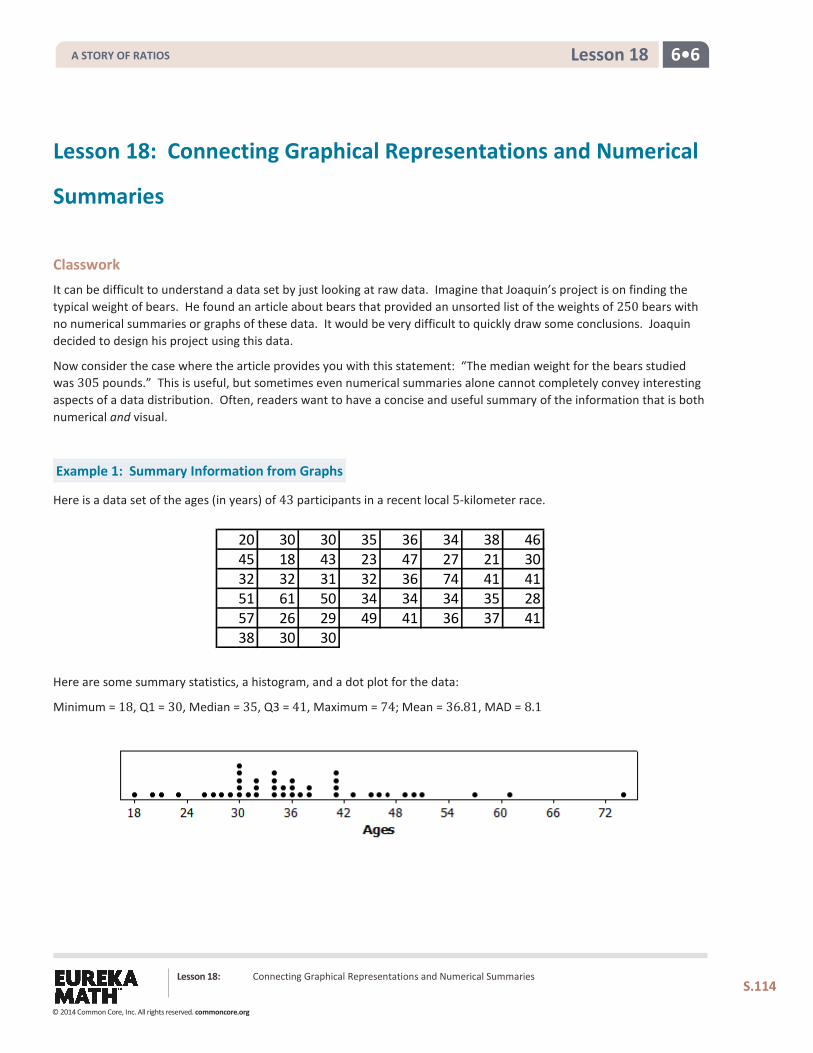
6•6 Lesson 18
Lesson 18: Connecting Graphical Representations and Numerical
Summaries
Classwork It can be difficult to understand a data set by just looking at raw data. Imagine that Joaquin’s project is on finding the typical weight of bears. He found an article about bears that provided an unsorted list of the weights of 250 bears with no numerical summaries or graphs of these data. It would be very difficult to quickly draw some conclusions. Joaquin decided to design his project using this data.
Now consider the case where the article provides you with this statement: “The median weight for the bears studied was 305 pounds.” This is useful, but sometimes even numerical summaries alone cannot completely convey interesting aspects of a data distribution. Often, readers want to have a concise and useful summary of the information that is both numerical and visual.
Example 1: Summary Information from Graphs
Here is a data set of the ages (in years) of 43 participants in a recent local 5-kilometer race.
Here are some summary statistics, a histogram, and a dot plot for the data:
Minimum = 18, Q1 = 30, Median = 35, Q3 = 41, Maximum = 74; Mean = 36.81, MAD = 8.1
20 30 30 35 36 34 38 4645 18 43 23 47 27 21 3032 32 31 32 36 74 41 4151 61 50 34 34 34 35 2857 26 29 49 41 36 37 4138 30 30
Lesson 18: Connecting Graphical Representations and Numerical Summaries
S.114
A STORY OF RATIOS
© 2014 Common Core, Inc. All rights reserved. commoncore.org
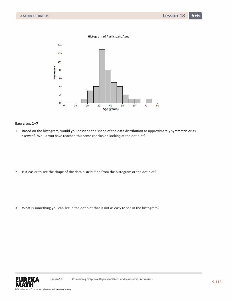
6•6 Lesson 18
Exercises 1–7
1. Based on the histogram, would you describe the shape of the data distribution as approximately symmetric or as skewed? Would you have reached this same conclusion looking at the dot plot?
2. Is it easier to see the shape of the data distribution from the histogram or the dot plot?
3. What is something you can see in the dot plot that is not as easy to see in the histogram?
Histogram of Participant Ages in a 5K Race
Lesson 18: Connecting Graphical Representations and Numerical Summaries
S.115
A STORY OF RATIOS
© 2014 Common Core, Inc. All rights reserved. commoncore.org
6•6 Lesson 18
4. Do the dot plot and the histogram seem to be centered in about the same place?
5. Do both the dot plot and the histogram convey information about the variability in the age distribution?
6. If you did not have the original data set and only had the dot plot and the histogram, would you be able to find the value of the median age from the dot plot?
7. Explain why you would only be able to estimate the value of the median if you only had a histogram of the data.
Lesson 18: Connecting Graphical Representations and Numerical Summaries
S.116
A STORY OF RATIOS
© 2014 Common Core, Inc. All rights reserved. commoncore.org
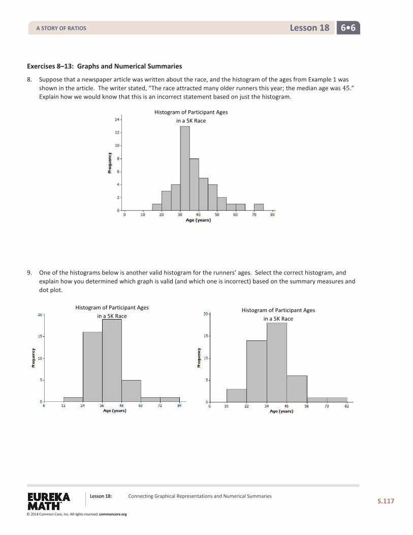
6•6 Lesson 18
Exercises 8–13: Graphs and Numerical Summaries
8. Suppose that a newspaper article was written about the race, and the histogram of the ages from Example 1 was shown in the article. The writer stated, “The race attracted many older runners this year; the median age was 45.” Explain how we would know that this is an incorrect statement based on just the histogram.
9. One of the histograms below is another valid histogram for the runners’ ages. Select the correct histogram, and
explain how you determined which graph is valid (and which one is incorrect) based on the summary measures and dot plot.
Histogram of Participant Ages in a 5K Race
Histogram of Participant Ages in a 5K Race
Histogram of Participant Ages in a 5K Race
Lesson 18: Connecting Graphical Representations and Numerical Summaries
S.117
A STORY OF RATIOS
© 2014 Common Core, Inc. All rights reserved. commoncore.org
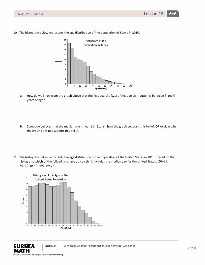
6•6 Lesson 18
10. The histogram below represents the age distribution of the population of Kenya in 2010.
a. How do we know from the graph above that the first quartile (Q1) of this age distribution is between 5 and 9 years of age?
b. Someone believes that the median age is near 30. Explain how the graph supports this belief, OR explain why the graph does not support this belief.
11. The histogram below represents the age distribution of the population of the United States in 2010. Based on the histogram, which of the following ranges do you think includes the median age for the United States: 20–29, 30–39, or 40–49? Why?
Histogram of the Population in Kenya
Histogram of the Ages of the United States Population
Lesson 18: Connecting Graphical Representations and Numerical Summaries
S.118
A STORY OF RATIOS
© 2014 Common Core, Inc. All rights reserved. commoncore.org
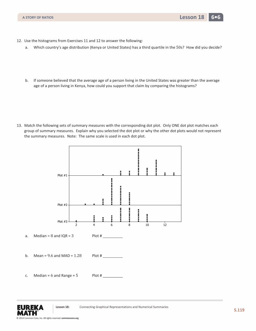
6•6 Lesson 18
12. Use the histograms from Exercises 11 and 12 to answer the following:
a. Which country’s age distribution (Kenya or United States) has a third quartile in the 50s? How did you decide?
b. If someone believed that the average age of a person living in the United States was greater than the average age of a person living in Kenya, how could you support that claim by comparing the histograms?
13. Match the following sets of summary measures with the corresponding dot plot. Only ONE dot plot matches each group of summary measures. Explain why you selected the dot plot or why the other dot plots would not represent the summary measures. Note: The same scale is used in each dot plot.
a. Median = 8 and IQR = 3 Plot #
b. Mean = 9.6 and MAD = 1.28 Plot #
c. Median = 6 and Range = 5 Plot #
Lesson 18: Connecting Graphical Representations and Numerical Summaries
S.119
12108642
Plot #1
Plot #2
Plot #3
A STORY OF RATIOS
© 2014 Common Core, Inc. All rights reserved. commoncore.org
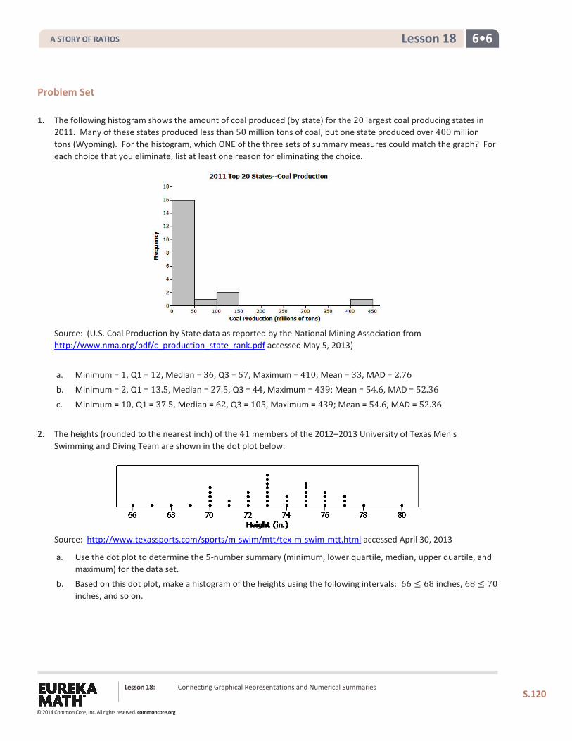
6•6 Lesson 18
Problem Set 1. The following histogram shows the amount of coal produced (by state) for the 20 largest coal producing states in
2011. Many of these states produced less than 50 million tons of coal, but one state produced over 400 million tons (Wyoming). For the histogram, which ONE of the three sets of summary measures could match the graph? For each choice that you eliminate, list at least one reason for eliminating the choice.
Source: (U.S. Coal Production by State data as reported by the National Mining Association from http://www.nma.org/pdf/c_production_state_rank.pdf accessed May 5, 2013)
a. Minimum = 1, Q1 = 12, Median = 36, Q3 = 57, Maximum = 410; Mean = 33, MAD = 2.76
b. Minimum = 2, Q1 = 13.5, Median = 27.5, Q3 = 44, Maximum = 439; Mean = 54.6, MAD = 52.36
c. Minimum = 10, Q1 = 37.5, Median = 62, Q3 = 105, Maximum = 439; Mean = 54.6, MAD = 52.36
2. The heights (rounded to the nearest inch) of the 41 members of the 2012–2013 University of Texas Men's
Swimming and Diving Team are shown in the dot plot below.
Source: http://www.texassports.com/sports/m-swim/mtt/tex-m-swim-mtt.html accessed April 30, 2013
a. Use the dot plot to determine the 5-number summary (minimum, lower quartile, median, upper quartile, and maximum) for the data set.
b. Based on this dot plot, make a histogram of the heights using the following intervals: 66 ≤ 68 inches, 68 ≤ 70 inches, and so on.
Lesson 18: Connecting Graphical Representations and Numerical Summaries
S.120
A STORY OF RATIOS
© 2014 Common Core, Inc. All rights reserved. commoncore.org
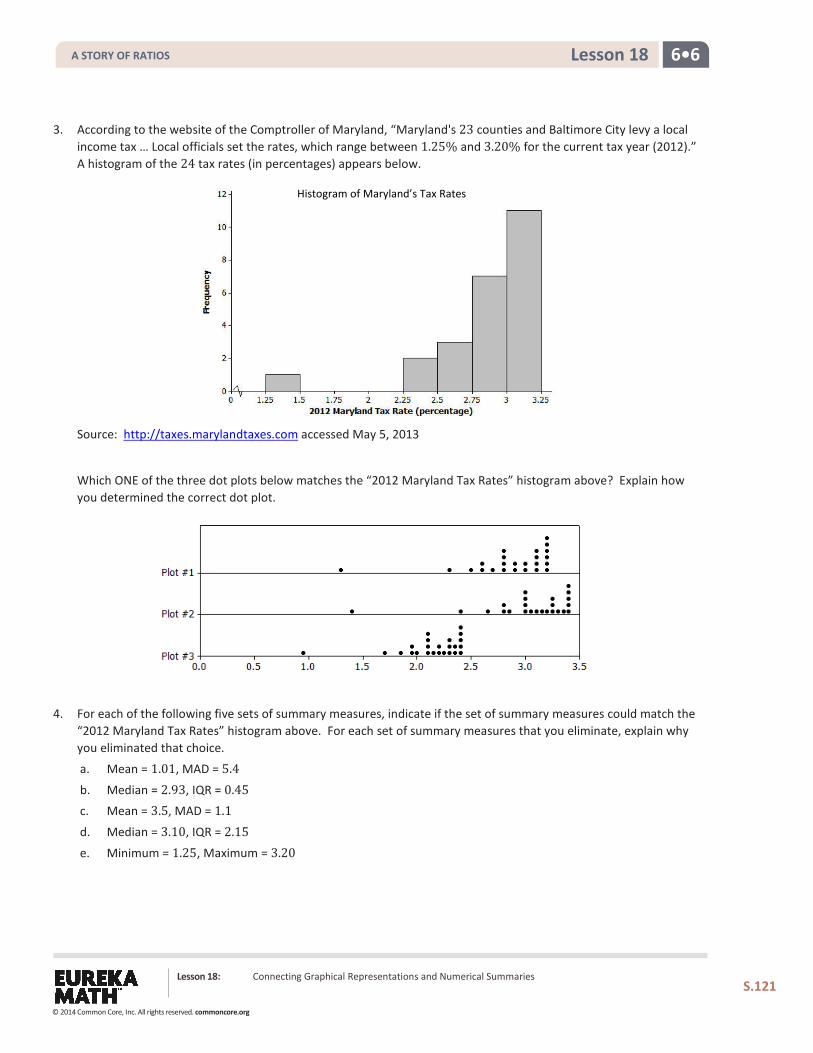
6•6 Lesson 18
3. According to the website of the Comptroller of Maryland, “Maryland's 23 counties and Baltimore City levy a local income tax … Local officials set the rates, which range between 1.25% and 3.20% for the current tax year (2012).” A histogram of the 24 tax rates (in percentages) appears below.
Source: http://taxes.marylandtaxes.com accessed May 5, 2013
Which ONE of the three dot plots below matches the “2012 Maryland Tax Rates” histogram above? Explain how you determined the correct dot plot.
4. For each of the following five sets of summary measures, indicate if the set of summary measures could match the
“2012 Maryland Tax Rates” histogram above. For each set of summary measures that you eliminate, explain why you eliminated that choice.
a. Mean = 1.01, MAD = 5.4
b. Median = 2.93, IQR = 0.45 c. Mean = 3.5, MAD = 1.1
d. Median = 3.10, IQR = 2.15
e. Minimum = 1.25, Maximum = 3.20
Histogram of Maryland’s Tax Rates
Lesson 18: Connecting Graphical Representations and Numerical Summaries
S.121
A STORY OF RATIOS
© 2014 Common Core, Inc. All rights reserved. commoncore.org
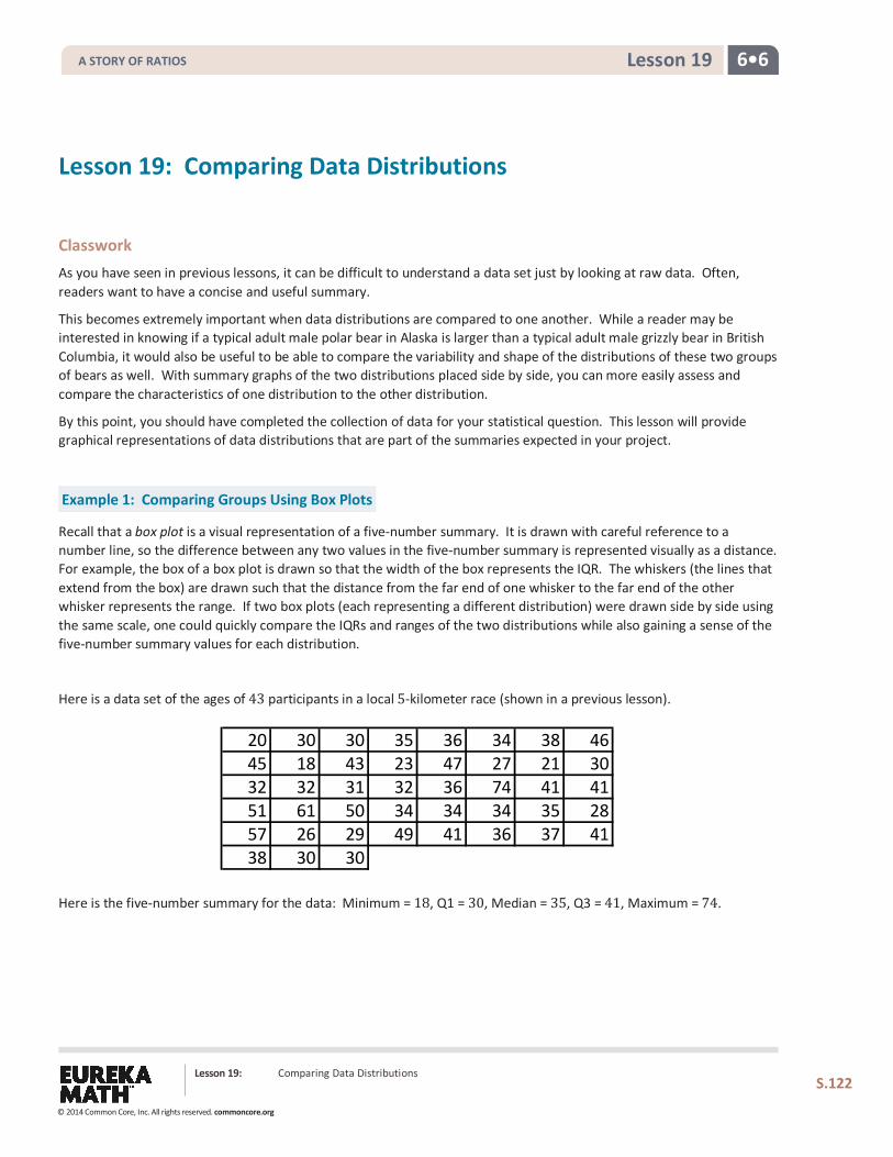
6•6 Lesson 19
Lesson 19: Comparing Data Distributions
Classwork As you have seen in previous lessons, it can be difficult to understand a data set just by looking at raw data. Often, readers want to have a concise and useful summary.
This becomes extremely important when data distributions are compared to one another. While a reader may be interested in knowing if a typical adult male polar bear in Alaska is larger than a typical adult male grizzly bear in British Columbia, it would also be useful to be able to compare the variability and shape of the distributions of these two groups of bears as well. With summary graphs of the two distributions placed side by side, you can more easily assess and compare the characteristics of one distribution to the other distribution.
By this point, you should have completed the collection of data for your statistical question. This lesson will provide graphical representations of data distributions that are part of the summaries expected in your project.
Example 1: Comparing Groups Using Box Plots
Recall that a box plot is a visual representation of a five-number summary. It is drawn with careful reference to a number line, so the difference between any two values in the five-number summary is represented visually as a distance. For example, the box of a box plot is drawn so that the width of the box represents the IQR. The whiskers (the lines that extend from the box) are drawn such that the distance from the far end of one whisker to the far end of the other whisker represents the range. If two box plots (each representing a different distribution) were drawn side by side using the same scale, one could quickly compare the IQRs and ranges of the two distributions while also gaining a sense of the five-number summary values for each distribution.
Here is a data set of the ages of 43 participants in a local 5-kilometer race (shown in a previous lesson).
Here is the five-number summary for the data: Minimum = 18, Q1 = 30, Median = 35, Q3 = 41, Maximum = 74.
20 30 30 35 36 34 38 4645 18 43 23 47 27 21 3032 32 31 32 36 74 41 4151 61 50 34 34 34 35 2857 26 29 49 41 36 37 4138 30 30
Lesson 19: Comparing Data Distributions
S.122
A STORY OF RATIOS
© 2014 Common Core, Inc. All rights reserved. commoncore.org
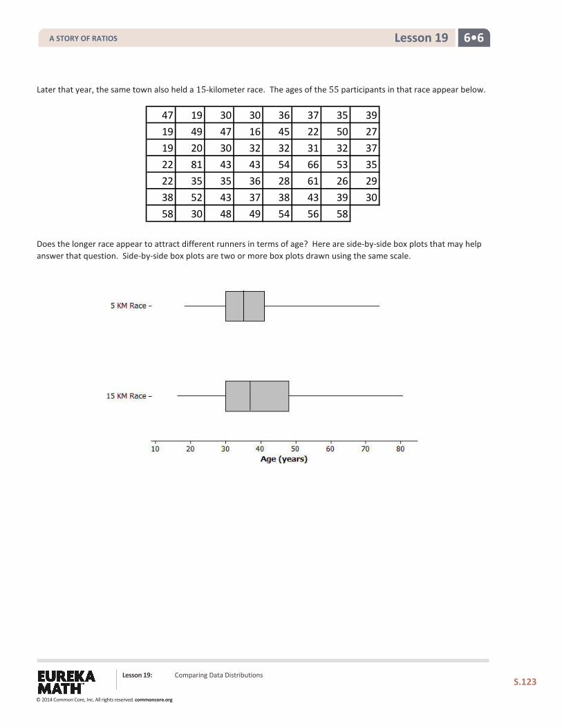
6•6 Lesson 19
Later that year, the same town also held a 15-kilometer race. The ages of the 55 participants in that race appear below.
Does the longer race appear to attract different runners in terms of age? Here are side-by-side box plots that may help answer that question. Side-by-side box plots are two or more box plots drawn using the same scale.
47 19 30 30 36 37 35 3919 49 47 16 45 22 50 2719 20 30 32 32 31 32 3722 81 43 43 54 66 53 3522 35 35 36 28 61 26 2938 52 43 37 38 43 39 3058 30 48 49 54 56 58
Lesson 19: Comparing Data Distributions
S.123
A STORY OF RATIOS
© 2014 Common Core, Inc. All rights reserved. commoncore.org
6•6 Lesson 19
Exercises 1–6
1. Based on the side-by-side box plots, estimate the five-number summary for the 15-kilometer race data set.
2. Do the two data sets have the same median? If not, which race had the higher median age?
3. Do the two data sets have the same IQR? If not, which distribution has the greater spread in the middle 50% of its distribution?
4. Which race had the smaller overall range of ages? What do you think the range of ages is for the 15-kilometer race?
5. Which race had the oldest participant? About how old was this participant?
6. Now consider just the youngest 25% of participants in the 15-kilometer race. How old was the youngest runner in this group? How old was the oldest runner in this group? How does that compare with the 5-kilometer race?
Lesson 19: Comparing Data Distributions
S.124
A STORY OF RATIOS
© 2014 Common Core, Inc. All rights reserved. commoncore.org
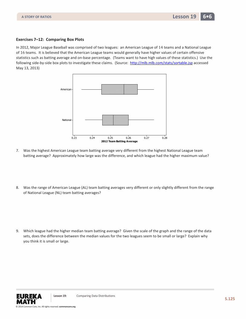
6•6 Lesson 19
Exercises 7–12: Comparing Box Plots
In 2012, Major League Baseball was comprised of two leagues: an American League of 14 teams and a National League of 16 teams. It is believed that the American League teams would generally have higher values of certain offensive statistics such as batting average and on-base percentage. (Teams want to have high values of these statistics.) Use the following side-by-side box plots to investigate these claims. (Source: http://mlb.mlb.com/stats/sortable.jsp accessed May 13, 2013)
7. Was the highest American League team batting average very different from the highest National League team batting average? Approximately how large was the difference, and which league had the higher maximum value?
8. Was the range of American League (AL) team batting averages very different or only slightly different from the range of National League (NL) team batting averages?
9. Which league had the higher median team batting average? Given the scale of the graph and the range of the data sets, does the difference between the median values for the two leagues seem to be small or large? Explain why you think it is small or large.
Lesson 19: Comparing Data Distributions
S.125
National
American
0.280.270.260.250.240.232012 Team Batting Average
A STORY OF RATIOS
© 2014 Common Core, Inc. All rights reserved. commoncore.org
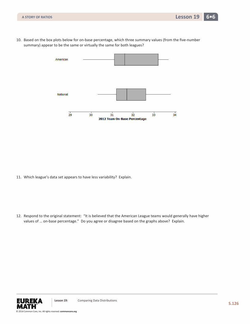
6•6 Lesson 19
10. Based on the box plots below for on-base percentage, which three summary values (from the five-number summary) appear to be the same or virtually the same for both leagues?
11. Which league’s data set appears to have less variability? Explain.
12. Respond to the original statement: “It is believed that the American League teams would generally have higher values of … on-base percentage.” Do you agree or disagree based on the graphs above? Explain.
Lesson 19: Comparing Data Distributions
S.126
A STORY OF RATIOS
© 2014 Common Core, Inc. All rights reserved. commoncore.org
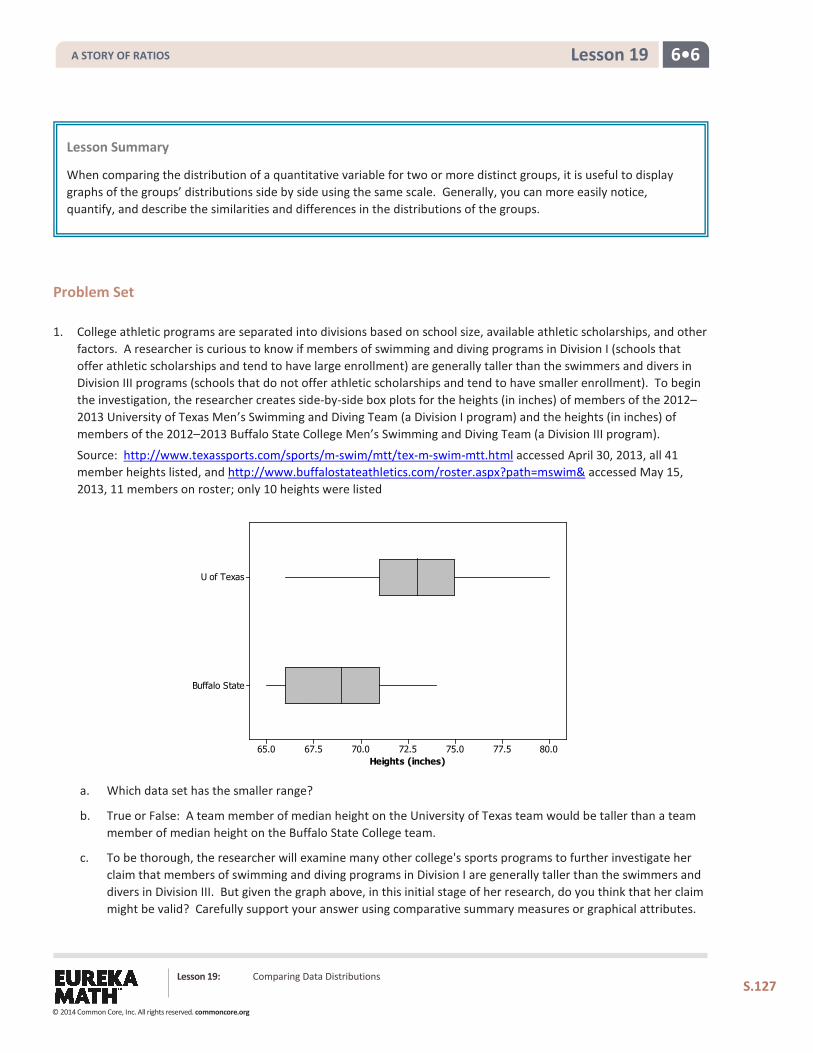
6•6 Lesson 19
Problem Set 1. College athletic programs are separated into divisions based on school size, available athletic scholarships, and other
factors. A researcher is curious to know if members of swimming and diving programs in Division I (schools that offer athletic scholarships and tend to have large enrollment) are generally taller than the swimmers and divers in Division III programs (schools that do not offer athletic scholarships and tend to have smaller enrollment). To begin the investigation, the researcher creates side-by-side box plots for the heights (in inches) of members of the 2012–2013 University of Texas Men’s Swimming and Diving Team (a Division I program) and the heights (in inches) of members of the 2012–2013 Buffalo State College Men’s Swimming and Diving Team (a Division III program).
Source: http://www.texassports.com/sports/m-swim/mtt/tex-m-swim-mtt.html accessed April 30, 2013, all 41 member heights listed, and http://www.buffalostateathletics.com/roster.aspx?path=mswim& accessed May 15, 2013, 11 members on roster; only 10 heights were listed
a. Which data set has the smaller range?
b. True or False: A team member of median height on the University of Texas team would be taller than a team member of median height on the Buffalo State College team.
c. To be thorough, the researcher will examine many other college's sports programs to further investigate her claim that members of swimming and diving programs in Division I are generally taller than the swimmers and divers in Division III. But given the graph above, in this initial stage of her research, do you think that her claim might be valid? Carefully support your answer using comparative summary measures or graphical attributes.
Lesson Summary
When comparing the distribution of a quantitative variable for two or more distinct groups, it is useful to display graphs of the groups’ distributions side by side using the same scale. Generally, you can more easily notice, quantify, and describe the similarities and differences in the distributions of the groups.
Lesson 19: Comparing Data Distributions
S.127
Buffalo State
U of Texas
80.077.575.072.570.067.565.0Heights (inches)
A STORY OF RATIOS
© 2014 Common Core, Inc. All rights reserved. commoncore.org
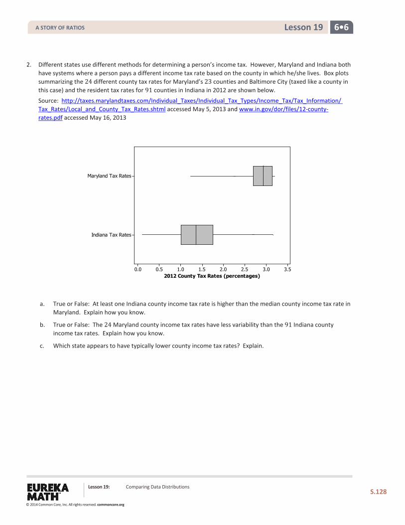
6•6 Lesson 19
2. Different states use different methods for determining a person’s income tax. However, Maryland and Indiana both have systems where a person pays a different income tax rate based on the county in which he/she lives. Box plots summarizing the 24 different county tax rates for Maryland’s 23 counties and Baltimore City (taxed like a county in this case) and the resident tax rates for 91 counties in Indiana in 2012 are shown below.
Source: http://taxes.marylandtaxes.com/Individual_Taxes/Individual_Tax_Types/Income_Tax/Tax_Information/ Tax_Rates/Local_and_County_Tax_Rates.shtml accessed May 5, 2013 and www.in.gov/dor/files/12-county-rates.pdf accessed May 16, 2013
a. True or False: At least one Indiana county income tax rate is higher than the median county income tax rate in Maryland. Explain how you know.
b. True or False: The 24 Maryland county income tax rates have less variability than the 91 Indiana county income tax rates. Explain how you know.
c. Which state appears to have typically lower county income tax rates? Explain.
Lesson 19: Comparing Data Distributions
S.128
Indiana Tax Rates
Maryland Tax Rates
3.53.02.52.01.51.00.50.02012 County Tax Rates (percentages)
A STORY OF RATIOS
© 2014 Common Core, Inc. All rights reserved. commoncore.org
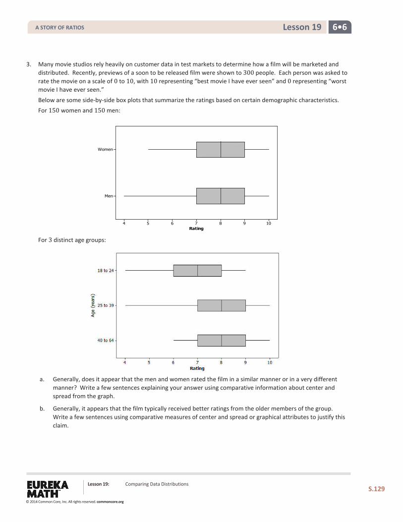
6•6 Lesson 19
3. Many movie studios rely heavily on customer data in test markets to determine how a film will be marketed and distributed. Recently, previews of a soon to be released film were shown to 300 people. Each person was asked to rate the movie on a scale of 0 to 10, with 10 representing “best movie I have ever seen” and 0 representing “worst movie I have ever seen.”
Below are some side-by-side box plots that summarize the ratings based on certain demographic characteristics. For 150 women and 150 men:
For 3 distinct age groups:
a. Generally, does it appear that the men and women rated the film in a similar manner or in a very different manner? Write a few sentences explaining your answer using comparative information about center and spread from the graph.
b. Generally, it appears that the film typically received better ratings from the older members of the group. Write a few sentences using comparative measures of center and spread or graphical attributes to justify this claim.
Lesson 19: Comparing Data Distributions
S.129
Men
Women
10987654Rating
A STORY OF RATIOS
© 2014 Common Core, Inc. All rights reserved. commoncore.org
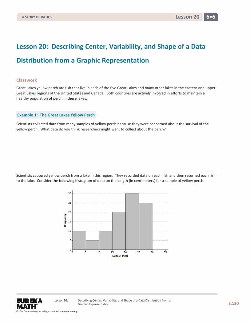
6•6 Lesson 20
Lesson 20: Describing Center, Variability, and Shape of a Data
Distribution from a Graphic Representation
Classwork Great Lakes yellow perch are fish that live in each of the five Great Lakes and many other lakes in the eastern and upper Great Lakes regions of the United States and Canada. Both countries are actively involved in efforts to maintain a healthy population of perch in these lakes.
Example 1: The Great Lakes Yellow Perch
Scientists collected data from many samples of yellow perch because they were concerned about the survival of the yellow perch. What data do you think researchers might want to collect about the perch?
Scientists captured yellow perch from a lake in this region. They recorded data on each fish and then returned each fish to the lake. Consider the following histogram of data on the length (in centimeters) for a sample of yellow perch.
Lesson 20: Describing Center, Variability, and Shape of a Data Distribution from a Graphic Representation
S.130
A STORY OF RATIOS
© 2014 Common Core, Inc. All rights reserved. commoncore.org
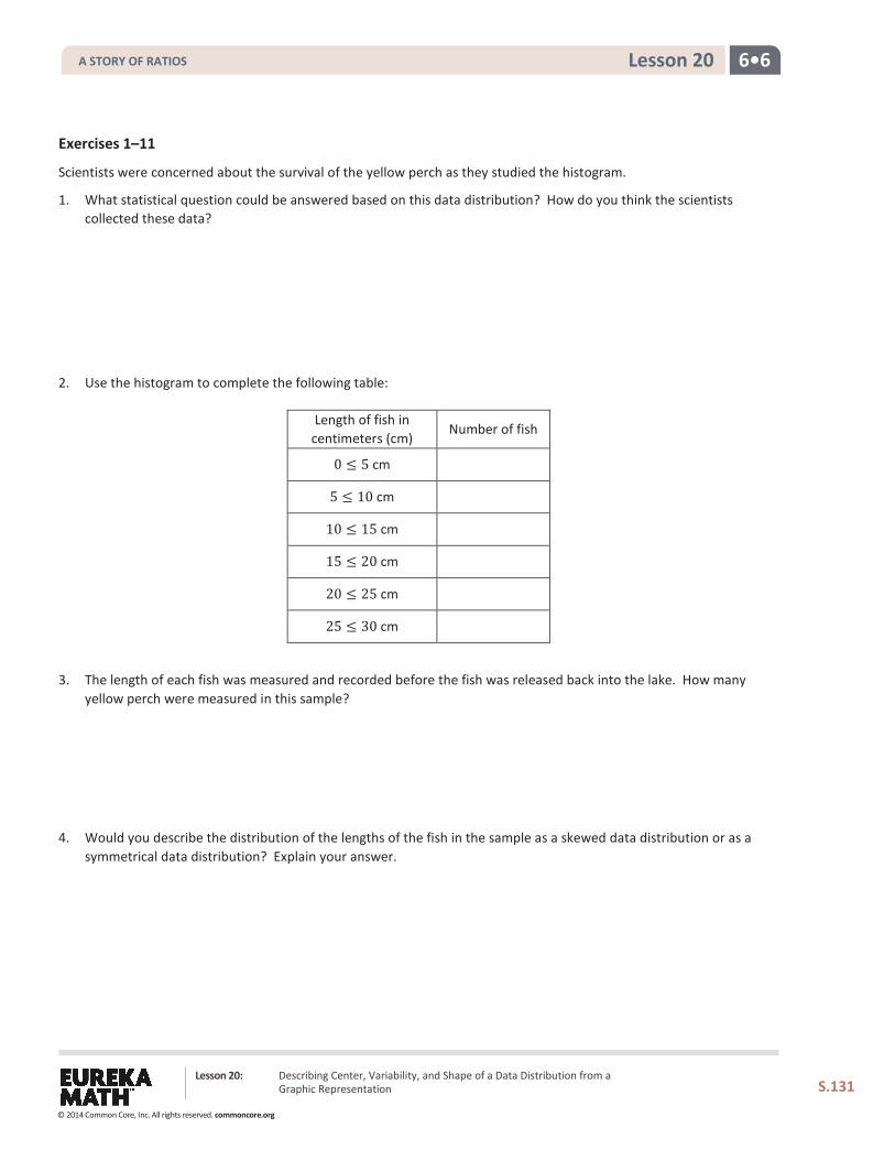
6•6 Lesson 20
Exercises 1–11
Scientists were concerned about the survival of the yellow perch as they studied the histogram.
1. What statistical question could be answered based on this data distribution? How do you think the scientists collected these data?
2. Use the histogram to complete the following table:
Length of fish in centimeters (cm)
Number of fish
0 ≤ 5 cm
5 ≤ 10 cm
10 ≤ 15 cm
15 ≤ 20 cm
20 ≤ 25 cm
25 ≤ 30 cm
3. The length of each fish was measured and recorded before the fish was released back into the lake. How many yellow perch were measured in this sample?
4. Would you describe the distribution of the lengths of the fish in the sample as a skewed data distribution or as a symmetrical data distribution? Explain your answer.
Lesson 20: Describing Center, Variability, and Shape of a Data Distribution from a Graphic Representation
S.131
A STORY OF RATIOS
© 2014 Common Core, Inc. All rights reserved. commoncore.org
6•6 Lesson 20
5. What percentage of fish in the sample were less than 10 centimeters in length?
6. If the smallest fish in this sample were 2 centimeters in length, what is your estimate of an interval of lengths that would contain the lengths of the shortest 25% of the fish? Explain how you determined your answer.
7. If the length of the largest yellow perch was 29 centimeters, what is your estimate of an interval of lengths that would contain the lengths of the longest 25% of the fish?
8. Estimate the median length of the yellow perch in the sample. Explain how you determined your estimate.
9. Based on the shape of this data distribution, do you think the mean length of a yellow perch would be greater than, less than, or the same as your estimate of the median? Explain your answer.
Lesson 20: Describing Center, Variability, and Shape of a Data Distribution from a Graphic Representation
S.132
A STORY OF RATIOS
© 2014 Common Core, Inc. All rights reserved. commoncore.org
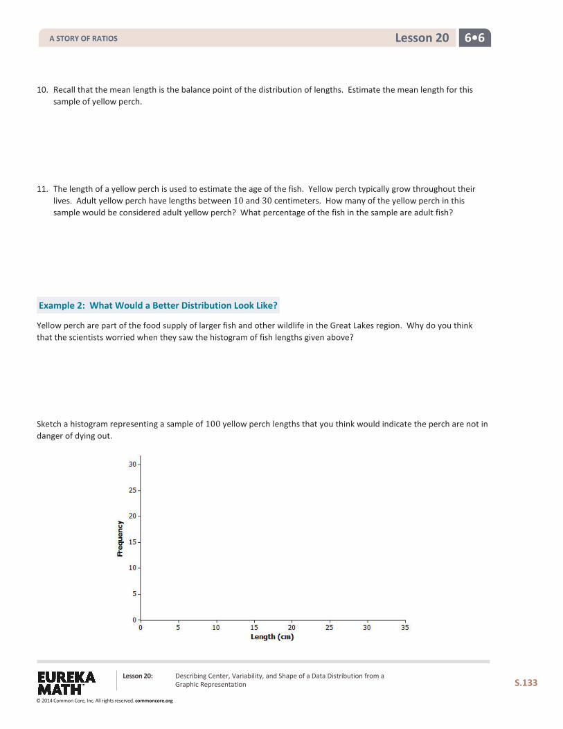
6•6 Lesson 20
10. Recall that the mean length is the balance point of the distribution of lengths. Estimate the mean length for this sample of yellow perch.
11. The length of a yellow perch is used to estimate the age of the fish. Yellow perch typically grow throughout their lives. Adult yellow perch have lengths between 10 and 30 centimeters. How many of the yellow perch in this sample would be considered adult yellow perch? What percentage of the fish in the sample are adult fish?
Example 2: What Would a Better Distribution Look Like?
Yellow perch are part of the food supply of larger fish and other wildlife in the Great Lakes region. Why do you think that the scientists worried when they saw the histogram of fish lengths given above?
Sketch a histogram representing a sample of 100 yellow perch lengths that you think would indicate the perch are not in danger of dying out.
Lesson 20: Describing Center, Variability, and Shape of a Data Distribution from a Graphic Representation
S.133
A STORY OF RATIOS
© 2014 Common Core, Inc. All rights reserved. commoncore.org
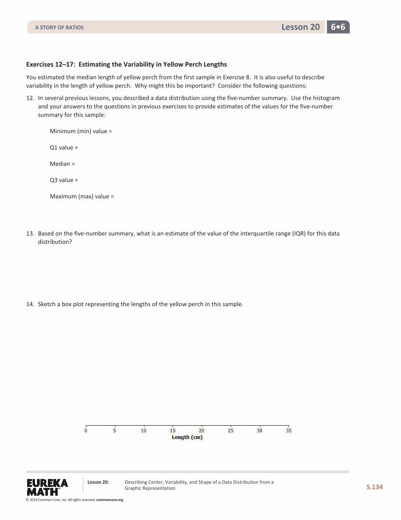
6•6 Lesson 20
Exercises 12–17: Estimating the Variability in Yellow Perch Lengths
You estimated the median length of yellow perch from the first sample in Exercise 8. It is also useful to describe variability in the length of yellow perch. Why might this be important? Consider the following questions:
12. In several previous lessons, you described a data distribution using the five-number summary. Use the histogram and your answers to the questions in previous exercises to provide estimates of the values for the five-number summary for this sample:
Minimum (min) value =
Q1 value =
Median =
Q3 value =
Maximum (max) value =
13. Based on the five-number summary, what is an estimate of the value of the interquartile range (IQR) for this data distribution?
14. Sketch a box plot representing the lengths of the yellow perch in this sample.
Lesson 20: Describing Center, Variability, and Shape of a Data Distribution from a Graphic Representation
S.134
A STORY OF RATIOS
© 2014 Common Core, Inc. All rights reserved. commoncore.org
6•6 Lesson 20
15. Which measure of center, the median or the mean, is closer to where the lengths of yellow perch tend to cluster?
16. What value would you report as a typical length for the yellow perch in this sample?
17. The mean absolute deviation (or MAD) or the interquartile range (IQR) are used to describe the variability of a data distribution. Which measure of variability would you use for this sample of perch? Explain your answer.
Lesson 20: Describing Center, Variability, and Shape of a Data Distribution from a Graphic Representation
S.135
A STORY OF RATIOS
© 2014 Common Core, Inc. All rights reserved. commoncore.org
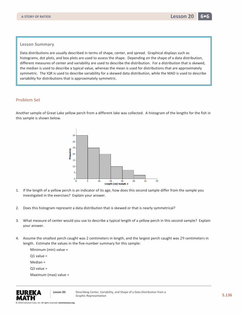
6•6 Lesson 20
Problem Set Another sample of Great Lake yellow perch from a different lake was collected. A histogram of the lengths for the fish in this sample is shown below.
1. If the length of a yellow perch is an indicator of its age, how does this second sample differ from the sample you investigated in the exercises? Explain your answer.
2. Does this histogram represent a data distribution that is skewed or that is nearly symmetrical?
3. What measure of center would you use to describe a typical length of a yellow perch in this second sample? Explain your answer.
4. Assume the smallest perch caught was 2 centimeters in length, and the largest perch caught was 29 centimeters in length. Estimate the values in the five-number summary for this sample:
Minimum (min) value =
Q1 value = Median =
Q3 value =
Maximum (max) value =
Lesson Summary
Data distributions are usually described in terms of shape, center, and spread. Graphical displays such as histograms, dot plots, and box plots are used to assess the shape. Depending on the shape of a data distribution, different measures of center and variability are used to describe the distribution. For a distribution that is skewed, the median is used to describe a typical value, whereas the mean is used for distributions that are approximately symmetric. The IQR is used to describe variability for a skewed data distribution, while the MAD is used to describe variability for distributions that is approximately symmetric.
Lesson 20: Describing Center, Variability, and Shape of a Data Distribution from a Graphic Representation
S.136
A STORY OF RATIOS
© 2014 Common Core, Inc. All rights reserved. commoncore.org
6•6 Lesson 20
5. Based on the shape of this data distribution, do you think the mean length of a yellow perch from this second sample would be greater than, less than, or the same as your estimate of the median? Explain your answer.
6. Estimate the mean value of this data distribution.
7. What is your estimate of a typical length of a yellow perch in this sample? Did you use the mean length from
Problem 5 for this estimate? Explain why or why not.
8. Would you use the MAD or the IQR to describe variability in the length of Great Lakes yellow perch in this sample? Estimate the value of the measure of variability that you selected.
Lesson 20: Describing Center, Variability, and Shape of a Data Distribution from a Graphic Representation
S.137
A STORY OF RATIOS
© 2014 Common Core, Inc. All rights reserved. commoncore.org
6•6 Lesson 21
Lesson 21: Summarizing a Data Distribution by Describing Center,
Variability, and Shape
Classwork Each of the lessons in this module is about data. What are data? What questions can be answered by data? How do you represent the data distribution so that you can understand and describe its shape? What does the shape tell us about how to summarize the data? What is a typical value of the data set? These and many other questions were part of your work in the exercises and investigations. There is still a lot to learn about what data tell us. You will continue to work with statistics and probability in Grades 7 and 8 and throughout high school. You have already, however, started to learn how to uncover the stories behind data.
When you started this module, the four steps used to carry out a statistical study were introduced.
Step 1: Pose a question that can be answered by data.
Step 2: Collect appropriate data.
Step 3: Summarize the data with graphs and numerical summaries.
Step 4: Answer the question posed in Step 1 using the numerical summaries and graphs.
In this lesson, you will carry out these steps using a given data set.
Exploratory Challenge: Annual Rainfall in the State of New York
The National Climate Data Center collects data throughout the United States that can be used to summarize the climate of a region. You can obtain climate data for a state, a city, a county, or a region. If you were interested in researching the climate in your area, what data would you collect? Explain why you think this data would be important as a statistical study of the climate in your area.
For this lesson, you will use yearly rainfall data for the state of New York that were compiled by the National Climate Data Center. The following data are the number of inches of rain (averaged over various locations in the state) for the years from 1983 to 2012 (30 years).
45 42 39 44 39 35 42 49 37 42 41 42 37 50 39 41 38 46 34 44 48 50 47 49 44 49 43 44 54 40
Lesson 21: Summarizing a Data Distribution by Describing Center, Variability, and Shape
S.138
A STORY OF RATIOS
© 2014 Common Core, Inc. All rights reserved. commoncore.org
6•6 Lesson 21
Use the four steps to carry out a statistical study using this data.
Step 1: Pose a question that can be answered by data.
What is a statistical question that you think can be answered with these data? Write your question in the template provided for this lesson.
Step 2: Collect appropriate data.
The data have already been collected for this lesson. How do you think these data were collected? Recall that the data are the number of inches of rain (averaged over various locations in the state) for the years from 1983 to 2012 (30 years). Write a summary of how you think the data were collected in the template for this lesson.
Step 3: Summarize the data with graphs and numerical summaries.
A good first step might be to summarize the data with a dot plot. What other graph might you construct? Construct a dot plot or another appropriate graph in the template for this lesson.
What numerical summaries will you calculate? What measure of center will you use to describe a typical value for these data? What measure of variability will you calculate and use to summarize the spread of the data? Calculate the numerical summaries and write them in the template for this lesson.
Step 4: Answer your statistical question using the numerical summaries and graphs.
Write a summary that answers the question you posed in the template for this lesson.
Lesson 21: Summarizing a Data Distribution by Describing Center, Variability, and Shape
S.139
A STORY OF RATIOS
© 2014 Common Core, Inc. All rights reserved. commoncore.org
6•6 Lesson 21
Template for Lesson 21
Step 1: What is your statistical question?
Step 2: How do you think the data were collected?
Step 3: Construct graphs and calculate numerical summaries of the data.
Construct at least one graph of the data distribution. Calculate appropriate numerical summaries of the data. Also, indicate why you selected these summaries.
Step 4: Answer your statistical question using your graphs and numerical summaries.
Lesson 21: Summarizing a Data Distribution by Describing Center, Variability, and Shape
S.140
A STORY OF RATIOS
© 2014 Common Core, Inc. All rights reserved. commoncore.org
6•6 Lesson 21
Problem Set In Lesson 17, you posed a statistical question and a plan to collect data to answer your question. You also constructed graphs and calculated numerical summaries of your data. Review the data collected and your summaries.
Based on directions from your teacher, create a poster or an outline for a presentation using your own data. On your poster, indicate your statistical question. Also, indicate a brief summary of how you collected your data based on the plan you proposed in Lesson 17. Include a graph that shows the shape of your data distribution, along with summary measures of center and variability. Finally, answer your statistical question based on the graphs and the numerical summaries.
Share the poster you will present in Lesson 22 with your teacher. If you are instructed to prepare an outline of the presentation, share your outline with your teacher.
Lesson Summary
Statistics is about using data to answer questions. The four steps used to carry out a statistical study include posing a question that can be answered by data, collecting appropriate data, summarizing the data with graphs and numerical summaries, and using the data, graphs, and summaries to answer the statistical question.
Lesson 21: Summarizing a Data Distribution by Describing Center, Variability, and Shape
S.141
A STORY OF RATIOS
© 2014 Common Core, Inc. All rights reserved. commoncore.org
6•6 Lesson 22
Lesson 22: Presenting a Summary of a Statistical Project
Classwork A statistical study involves the following four-step investigative process:
Step 1: Pose a question that can be answered by data.
Step 2: Collect appropriate data.
Step 3: Summarize the data with graphs and numerical summaries.
Step 4: Answer the question posed in Step 1 using the numerical summaries and graphs.
Now it is your turn to be a researcher and to present your own statistical study. In Lesson 17, you posed a statistical question, proposed a plan to collect data to answer the question, and collected the data. In Lesson 21, you created a poster or an outline of a presentation that included the following: the statistical question, the plan you used to collect the data, graphs and numerical summaries of the data, and an answer to the statistical question based on your data. Use the following table to organize your presentation.
Points to consider: Notes to include in your presentation:
(1) Describe your statistical question.
(2) Explain to your audience why you were interested in this question.
(3) Explain the plan you used to collect the data.
(4) Explain how you organized the data you collected.
Lesson 22: Presenting a Summary of a Statistical Project
S.142
A STORY OF RATIOS
© 2014 Common Core, Inc. All rights reserved. commoncore.org
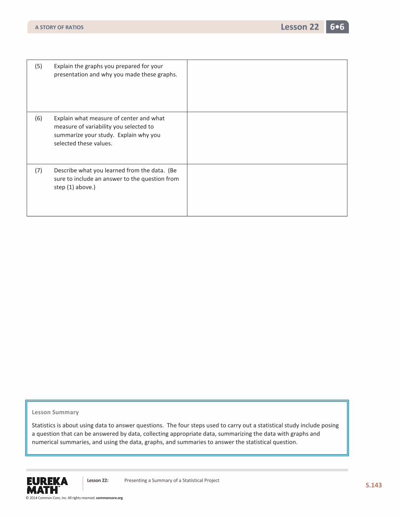
6•6 Lesson 22
(5) Explain the graphs you prepared for your presentation and why you made these graphs.
(6) Explain what measure of center and what measure of variability you selected to summarize your study. Explain why you selected these values.
(7) Describe what you learned from the data. (Be sure to include an answer to the question from step (1) above.)
Lesson Summary Statistics is about using data to answer questions. The four steps used to carry out a statistical study include posing a question that can be answered by data, collecting appropriate data, summarizing the data with graphs and numerical summaries, and using the data, graphs, and summaries to answer the statistical question.
Lesson 22: Presenting a Summary of a Statistical Project
S.143
A STORY OF RATIOS
© 2014 Common Core, Inc. All rights reserved. commoncore.org