Embed Size (px)
Citation preview

1
Fall 2003 6.893 UI Design and Implementation 1
Lecture 5: Heuristic Evaluation
2
Fall 2003 6.893 UI Design and Implementation 2
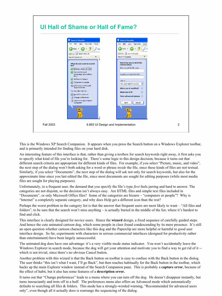
UI Hall of Shame or Hall of Fame?
This is the Windows XP Search Companion. It appears when you press the Search button on a Windows Explorer toolbar, and is primarily intended for finding files on your hard disk.An interesting feature of this interface is that, rather than giving a textbox for search keywords right away, it first asks youto specify what kind of file you’re looking for. There’s some logic to this design decision, because it turns out that different search criteria are appropriate for different kinds of files. For example, if you select “Picture, music, and video”, the next step of the dialog won’t both asking for a word or phrase inside the file, since these kinds of files are not textual. Similarly, if you select “Documents”, the next step of the dialog will ask not only for search keywords, but also for the approximate time since you last edited the file, since most documents are sought for editing purposes (while most media files are sought for playing purposes).Unfortunately, to a frequent user, the demand that you specify the file’s type first feels jarring and hard to answer. The categories are not disjoint, so the decision isn’t always easy. Are HTML files and simple text files included in“Documents”, or only Microsoft Office files? Some of the categories are bizarre – “computers or people”? Why is “Internet” a completely separate category, and why does Help get a different icon than the rest?Perhaps the worst problem in the category list is that the answer that frequent users are most likely to want – “All files and folders”, to be sure that the search won’t miss anything – is actually buried in the middle of the list, where it’s hardest to find and click.This interface is clearly designed for novice users. Hence the wizard design, a fixed sequence of carefully guided steps. And hence the cute animated cartoon dog, which some people in class found condescending by its mere presence. It’s still an open question whether cartoon characters like this dog and the Paperclip are more helpful or harmful to good user interface design. So far, experiments with characters in serious commercial interfaces (designed for productivity rather than entertainment) have been largely unsuccessful.The animated dog does have one advantage: it’s a very visible mode status indicator. You won’t accidentally leave the Windows Explorer in search mode, because the dog will get your attention and motivate you to find a way to get rid of it --which is not trivial, since there’s no obvious Cancel button.Another problem with this wizard is that the Back button on toolbar is easy to confuse with the Back button in the dialog. The user thinks “this isn’t what I want, I’ll go Back”, but then reaches habitually for the Back button in the toolbar, which backs up the main Explorer window instead of the Search Companion pane. This is probably a capture error, because of the effect of habit, but it also has some features of a description error.It turns out that “Change preferences” leads to a menu where you can turn off the dog. He doesn’t disappear instantly, but turns insouciantly and trots off in a huff. The preferences menu also offers an Advanced mode which automatically defaults to searching all files & folders. This mode has a strongly-worded warning, “Recommended for advanced users only”, even though all it actually does is rearrange the sequencing of the dialog.

3
Fall 2003 6.893 UI Design and Implementation 3
UI Hall of Fame or Shame?
In contrast to the previous example, here’s Google’s start page. Google is an outstanding example of a heuristic we’ll see today: Aesthetic and minimalist design. Its interface is as simple as possible. Unnecessary features and hyperlinks are omitted, lots of whitespace is used. Google is fast to load and trivial to use.But maybe Google goes a little too far! Take the perspective of a completely novice user coming to Google for the first time. •What does Google actually do? The front page doesn’t say. •What should be typed into the text box? It has no caption at all. •The button labels are almost gibberish. “Google Search” isn’t meaningful English (although it’s gradually becoming more meaningful as Google enters the language as a noun, verb, and adjective). And what does “I’m Feeling Lucky” mean?•Where is Help? Turns out it’s buried at the bottom, along with “Jobs & Press”.Although these problems would be easy for Google to fix, they are actually minor, because Google’s interface is simple enough that it can be learned by only a small amount of exploration. (Except perhaps for the I’m Feeling Lucky button, which probably remains a mystery until a user is curious enough to hunt for the help. After all, maybe it does a random choice from the search results!)Notice that Google does not ask you to choose your search domain first. It picks a good default, and makes it easy to change.

4
Fall 2003 6.893 UI Design and Implementation 4
Internet Search for Novices
Here’s how the Windows XP dog presents Internet search to novice users. One interesting feature is the example question: “Find art information.” Google could probably benefit from an example or two on its home page.

5
Fall 2003 6.893 UI Design and Implementation 5
Class Projects
1. Star Logo Blocks2. Social Networks from Fiction3. Antichess.net4. Market Liquidity5. SKINNI Smart Kiosk6. Comparative Genome7. StreamIt Editor8. Example-Centric Programming9. File Sharing for Friends10. Interactive Course Manager11. Interactive Phrasebook12. PowerPoint Sketching13. FrontDesk14. Directed Sketch Interpretation
15. Recipe Organizer16. Room Layout17. Multi-Document Editing18. Text-tree Synchronization for
Alloy19. Google URL Generator20. Human Intelligible Positioning21. LAPIS Pattern Editing22. Digital Photo Browser23. Foreign Language Tutor24. Network Security Analysis Tool25. Video Collection
In case you’re curious, here are the projects that your classmates are working on. You’ll have several opportunities to see what everybody is doing: some in paper prototype testing in 2 weeks, others when you do heuristic evaluation of computer prototypes, and all of them in the final presentations at the end of the course.Incidentally, the original version of this slide used bullets instead of numbers. Then I thought about one natural question that people would ask – how many projects are there? Although it’s possible to answer that question from a bulleted list, it’s trivial when the list is numbered. Every kind of communication you do has a user interface, whether it’s a talk or a paper or a homework assignment. The effectiveness of a communication is strongly influenced by its usability.

6
Fall 2003 6.893 UI Design and Implementation 6
Review
Design L2: Task analysisL3: Human capabilitiesL4: Conceptual modelsToday: Design heuristics
EvaluateToday: Heuristic evaluation
ImplementNext time: Prototyping
Here’s a quick review of what we’ve seen so far in the context of the iterative design process. Most of the lectures so far have contributed to design knowledge: how to understand the user’s tasks, the user’s capabilities, and how to choose and communicate conceptual models through the interface.Today, we’re going to look at usability heuristics. Heuristics are useful in two stages of the process. In design, you can use the heuristics to guide you in choosing between design alternatives (and avoid making boneheaded mistakes). It turns out that heuristics are also effective for evaluation, identifying problems in an implemented interface.Next time, we’ll see our first set of techniques for implementation: prototyping on paper and computer.

7
Fall 2003 6.893 UI Design and Implementation 7
Usability Guidelines (“Heuristics”)
• Plenty to choose from– Nielsen’s 10 principles
• One version in his book• A more recent version on his website
– Tognazzini’s 16 principles– Norman’s rules from Design of Everyday Things– Mac, Windows, Gnome, KDE guidelines
• Help designers choose design alternatives• Help evaluators find problems in interfaces
(“heuristic evaluation”)
Usability guidelines, or heuristics, are rules that distill out the principles of effective user interfaces. There are plenty of sets of guidelines to choose from – sometimes it seems like every usability researcher has their own set of heuristics. Most of these guidelines overlap in important ways, however. The experts don’t disagree about what constitutes good UI. They just disagree about how to organize what we know into a small set of operational rules.For the basis of this lecture, we’ll use Jakob Nielsen’s 10 heuristics, which can be found on his web site. (An older version of the same heuristics, with different names but similar content, can be found in his Usability Engineering book, one of the recommended books for this course.) Another good list is Tog’s First Principles (find it in Google), 16 principles from Bruce Tognazzini that include affordances and Fitts’s Law. In the last lecture, we talked about some design guidelines proposed by Norman: visibility, affordances, constraints, feedback, and so on.Platform-specific guidelines are also important and useful to follow. Platform guidelines tend to be very specific, e.g. you should have a File menu, and there command called Exit on it (not Quit, not Leave, not Go Away). Following platform guidelines ensures consistency among different applications running on the same platform, which is valuable for novice and frequent users alike. However, platform guidelines are relatively limited in scope, offering solutions for only a few of the design decisions in a typical UI.Heuristics can be used in two ways: during design, to choose among different alternatives; and during evaluation, to find and justify problems in interfaces.
8
Fall 2003 6.893 UI Design and Implementation 8
1. Match the Real World
• Use common words, not techie jargon– But use domain-specific
terms where appropriate• Don’t put limits on user-
defined names• Allow aliases/synonyms
in command languages• Metaphors are useful
but may mislead Source: Interface Hall of Shame
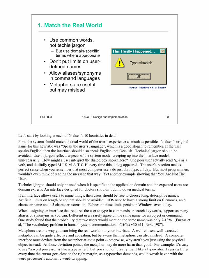
Let’s start by looking at each of Nielsen’s 10 heuristics in detail.First, the system should match the real world of the user’s experience as much as possible. Nielsen’s original name for this heuristic was “Speak the user’s language”, which is a good slogan to remember. If the user speaks English, then the interface should also speak English, not Geekish. Technical jargon should be avoided. Use of jargon reflects aspects of the system model creeping up into the interface model, unnecessarily. How might a user interpret the dialog box shown here? One poor user actually read type as a verb, and dutifully typed M-I-S-M-A-T-C-H every time this dialog appeared. The user’s reaction makes perfect sense when you remember that most computer users do just that, type, all day. But most programmers wouldn’t even think of reading the message that way. Yet another example showing that You Are Not The User.Technical jargon should only be used when it is specific to the application domain and the expected users are domain experts. An interface designed for doctors shouldn’t dumb down medical terms.If an interface allows users to name things, then users should be free to choose long, descriptive names. Artificial limits on length or content should be avoided. DOS used to have a strong limit on filenames, an 8 character name and a 3 character extension. Echoes of these limits persist in Windows even today.When designing an interface that requires the user to type in commands or search keywords, support as many aliases or synonyms as you can. Different users rarely agree on the same name for an object or command. One study found that the probability that two users would mention the same name was only 7-18%. (Furnas et al, “The vocabulary problem in human-system communication,” CACM v30 n11, Nov. 1987). Metaphors are one way you can bring the real world into your interface. A well-chosen, well-executed metaphor can be quite effective and appealing, but be aware that metaphors can also mislead. A computer interface must deviate from the metaphor at some point -- otherwise, why aren’t you just using the physical object instead? At those deviation points, the metaphor may do more harm than good. For example, it’s easy to say “a word processor is like a typewriter,” but you shouldn’t really use it like a typewriter. Pressing Enter every time the cursor gets close to the right margin, as a typewriter demands, would wreak havoc with the word processor’s automatic word-wrapping.

9
Fall 2003 6.893 UI Design and Implementation 9
2. Consistency and Standards
• Principle of Least Surprise– Similar things should look
and act similar– Different things should
look different• Other properties
– Size, location, color, wording, ordering, …
• Command/argument order– Prefix vs. postfix
• Follow platform standards Source: Interface Hall of Shame
The second heuristic is Consistency. This rule is often given the hifalutin’ name the Principle of Least Surprise, which basically means that you shouldn’t surprise the user with the way a command or interface object works. Similar things should look, and act, in similar ways. Conversely, different things should be visibly different.Consistency is important to lots of properties. The screenshots show three different dialog box layouts used in Visual Basic. A consistent design would use only one.A very important kind of consistency is in wording. Use the same terms throughout your user interface. If your interface says “share price” in one place, “stock price” in another, and “stock quote” in a third, users will wonder whether these are three different things you’re talking about.Incidentally, we’ve only looked at two heuristics, but already we have a contradiction! Matching the Real World argued for synonyms and aliases, so a command language should include not only delete but erase and remove too. But Consistency argues for only one name for each command, or else users will wonder whether these are three different commands that do different things. One way around the impasse is to look at the context in which you’re applying the heuristic. When the user is talking, the interface should make a maximum effort to understand the user, allowing synonyms and aliases. When the interface is speaking, it should be consistent, always using the same name to describe the same command or object. What if the interface is smart enough to adapt to the user – should it then favor matching its output to the user’s vocabulary (and possibly the user’s inconsistency) rather than enforcing its own consistency? Perhaps, but adaptive interfaces are still an active area of research, and not much is known.Command & argument ordering is another kind of consistency. In noun-verb order, the conventional order in graphical user interfaces, the user first selects the object of the command, and then invokes the command. In verb-noun order, the command is invoked first, and then the arguments are selected. A drawing program in which some commands were noun-verb and others were verb-noun would be very hard to learn and use.There are three kinds of consistency you need to worry about: internal consistency within your application (like the VB dialog boxes shown); external consistency with other applications on the same platform (how do other Windows apps lay out OK and Cancel?); and metaphorical consistency with your interface metaphor or similar real-world objects.Jonathan Grudin (in “The Case Against User Interface Consistency, CACM v32 n10, Oct 1989) finesses the issue of consistency still further. His argument is that consistency should not be treated as a sacred cow, but rather remain subservient to the needs of context and task. For example, although the inverted-T arrow-key arrangement on modern keyboards is both internally and metaphorically inconsistent in the placement of the down arrow, it’s the right choice for efficiency of use. If two design alternatives are otherwise equivalent, however, consistency should carry the day.Designs that are seriously inconsistent but provide only a tiny improvement in performance will probably fail. The Dvorak keyboard, for example, is slightly faster than the standard QWERTY keyboard, but not enough to overcome the power of an entrenched standard.

10
Fall 2003 6.893 UI Design and Implementation 10
3. Help and Documentation
• Users don’t read manuals– Prefer to spend time working toward their task
goals, not learning about your system• But manuals and online help are vital
– Usually when user is frustrated or in crisis• Help should be:
– Searchable– Context-sensitive– Task-oriented– Concrete– Short
The next heuristic is (good) Help and Documentation. The sad fact about documentation is that most users simply don’t read it, at least not before they try the interface. As a result, when they finally do want to look at the manual, it’s because they’ve gotten stuck. Good help should take this into account.A good point was raised in class that exclusively task-oriented help (which has largely taken over in Microsoft Windows) makes it impossible to get a high-level overview of an interface from the manual. So it’s possible to go too far.Google’s start page (shown at the beginning of this lecture) fails this heuristic. It lacks even a simple description of its purpose, omits control labels, and buries the link to Help.

11
Fall 2003 6.893 UI Design and Implementation 11
4. User Control and Freedom
• Provide undo• Long operations should be cancelable• All dialogs should have a cancel button
Source: Interface Hall of Shame
This heuristic used to be called “Clearly Marked Exits” in Nielsen’s old list. Users should not be trapped by the interface. Every dialog box should have a cancel button (where is it in this CuteFTP dialog box?), and long operations should be interruptible.Users should be able to explore the interface without fear of being trapped in a corner. Undo is a great way to support exploration.

12
Fall 2003 6.893 UI Design and Implementation 12
5. Visibility of System Status
• Keep user informed of system state– Cursor change– Selection highlight– Status bar– Don’t overdo it…
• Response time– < 0.1 s: seems instantaneous– 0.1-1 s: user notices, but no feedback needed– 1-5 s: display busy cursor – > 1-5 s: display progress bar
Source: Interface Hall of Shame
This heuristic used to be called, simply, “Feedback.” Keep the user informed about what’s going on. We’ve developed lots of idioms for feedback in graphical user interfaces. Use them:•Change the cursor to indicate possible actions (e.g. hand over a hyperlink), modes (e.g. drag/drop), and activity (hourglass).•Use highlights to show selected objects. Don’t leave selections implicit.•Use the status bar for messages and progress indicators.But don’t overdo it. This dialog box demands a click from the user. Why? Does the interface need a pat on the back for finishing the conversion? It would be better to just skip on and show the resulting documentation.Depending on how long an operation takes, you may need different amounts of feedback. Even though we say “no feedback needed” if the operation takes less than a second, remember that something should change, visibly, within 100 ms, or perceptual fusion will be disrupted.

13
Fall 2003 6.893 UI Design and Implementation 13
6. Flexibility and Efficiency
• Provide shortcuts for frequent operations– Keyboard accelerators– Command abbreviations– Styles– Bookmarks– History
Source: Interface Hall of Shame
This heuristic used to be called “Shortcuts.” Frequent users need and want them.Recently-used history is one very useful kind of shortcut, like this recently-used files menu.

14
Fall 2003 6.893 UI Design and Implementation 14
7. Error Prevention
• Selection is less error-prone than typing– But don’t go overboard…
• Disable illegal commands• Avoid modes
Source: Interface Hall of Shame
Now we get into heuristics about error handling. Since humans make errors if they’re given a chance, the best solution is to prevent errors entirely.One way to prevent errors is to allow users to select rather type. Misspellings then become impossible. This attitude can be taken to an extreme, however, as shown in this example.If a command is illegal in the current state of the interface – e.g., Copy is impossible if nothing is selected – then the command should be disabled (“grayed out”) so that it simply can’t be selected in the first place.We talked about a number of errors last lecture (capture, description, mode) and ways to solve them. Description errors can be fought off by studious application of the Consistency heuristic: if different things look and act different, it will be harder to make description errors between them. Modes should be avoided, made temporary or spring-loaded, or at the very least, visibly distinguished.

15
Fall 2003 6.893 UI Design and Implementation 15
8. Recognition, Not Recall
• Use menus, not command languages• Use combo boxes, not textboxes• Use generic commands where possible
(Open, Save, Copy Paste)• All needed information should be visible
Source: Interface Hall of Shame
There’s another reason why selection is better than typing – it reduces the user’s memory load. “Minimize Memory Load” was the original name for this heuristic, and it drives much of modern user interface design.Norman (in The Design of Everyday Things) makes a useful distinction between knowledge in the head, which is hard to get in there and still harder to recover, and knowledge in the world, which is far more accessible. Knowledge in the head is what we usually think of as knowledge and memory. Knowledge in the world, on the other hand, means not just documentation and button labels and signs, but also nonverbalfeatures of a system that constrain our actions or remind us of what to do. Affordances, constraints, and feedback are all aspects of knowledge in the world. Command languages demand lots of knowledge in the head, while menus rely on knowledge in the world.Generic commands are polymorphic, working the same way across a wide variety of data objects and applications. Generic commands are powerful because only one command has to be learned and remembered.Any information needed by a task should be visible or otherwise accessible in the interface for that task. The interface shouldn’t depend on users to remember the email address they want to send mail to, or the product code for the product they want to buy.This dialog box is a great example of overreliance on the user’s memory. It’s a modal dialog box, so the user can’t start following its instructions until after clicking OK. But then the instructions vanish from the screen, and the user is left to struggle to remember them. An obvious solution to this problem would be a button that simply executes the instructions directly! This message is clearly a last-minute patch for a usability problem.

16
Fall 2003 6.893 UI Design and Implementation 16
9. Error Reporting, Diagnosis, and Recovery
• Be precise; restate user’s input– Not “Cannot open file”, but “Cannot open file named paper.doc”
• Give constructive help– why error occurred and how to fix it
• Be polite and nonblaming– Not “fatal error”, not “illegal”
• Hide technical details (stack trace) until requested
Source: Interface Hall of Shame
If you can’t prevent the error, give a good error message. A good error message should (1) be precise; (2) speak the user’s language, avoiding technical terms and details unless explicitly requested; (3) give constructive help; and (4) be polite. The message should be worded to take as much blame as possible away from the user and heap the blame instead on the system. Save the user’s face; don’t worry about the computer’s. The computer doesn’t feel it, and in many cases it is the interface’s fault anyway for not finding a way to prevent the error in the first place.The tooltip shown here came from a production version of AutoCad! As the story goes, it was inserted by a programmer as a joke, but somehow never removed before release.

17
Fall 2003 6.893 UI Design and Implementation 17
10. Aesthetic and Minimalist Design
• “Less is More”– Omit extraneous info,
graphics, features• Good graphic design
– Few, well-chosen colors and fonts
– Follow color guidelines– Group with whitespace– Align controls sensibly
• Use concise language– Choose labels carefully
Source: Interface Hall of Shame
The final heuristic is a catch-all for a number of rules of good graphic design, which really boil down to one word: simplicity. Leave things out unless you have good reason to include them. Don’t put more help text on your main window than what’s really necessary. Leave out extraneous graphics. Most important, leave out unnecessary features. If a feature is never used, there’s no reason for it to complicate your interface.Use few, well-chosen colors. The toolbars at the top show the difference between cluttered and minimalist color design. The first toolbar is full of many saturated colors. It’s not only gaudy and distracting, but actually hard to scan. The second toolbar, from Microsoft Office, uses only a handful of colors – black, white, gray, blue, yellow. It’s muted, calming, and the few colors are used to great effect to distinguish the icons. The whitespace separating icon groups helps a lot too.The dialog box shows how cluttered and incomprehensible a layout can look when controls aren’t aligned. We’ll look at graphic design in more detail in a future lecture.

18
Fall 2003 6.893 UI Design and Implementation 18
Chunking the Heuristics Further
• Meet expectations1. Match the real world2. Consistency & standards3. Help & documentation
• User is the boss4. User control & freedom5. Visibility of system status6. Flexibility & efficiency
• Handle errors7. Error prevention8. Recognition, not recall9. Error reporting, diagnosis, and recovery
• Keep it simple10. Aesthetic & minimalist design
Since it’s hard to learn 10 heuristics and hold them in your head when you’re trying to design, I find it useful to categorize Nielsen’s heuristics still further.Meet expectations. The first three heuristics concern how well the interface fits its environment, its task, and its users: speaking the user’s language, keeping consistent with itself and other applications, and satisfying the expectation of help when it’s needed.User is the boss. The next three heuristics are related in that the interface should serve the user, rather than the other way around. Don’t push the boss into the corner, keep the boss aware of things, and make the boss productive and efficient.Handle errors. The next three heuristics largely concern errors, which are part and parcel of human-computer interaction: prevent them as much as possible, don’t rely on human memory, but when errors are unavoidable, report them properly.Aesthetic & minimal design stays in its own category, as befits its overwhelming importance. Keep it simple.

19
Fall 2003 6.893 UI Design and Implementation 19
Heuristic Evaluation
• Performed by an expert• Steps
– Inspect UI thoroughly– Compare UI against heuristics– List usability problems
• Explain & justify each problem with heuristics
One application of these 10 heuristics is a usability inspection process called heuristic evaluation. Heuristic evaluation was originally invented by Jakob Nielsen, and you can learn more about it on his web site. Nielsen has done a number of studies to evaluate the effectiveness of heuristic evaluation. Those studies have shown that heuristic evaluation’s cost-benefit ratio is quite favorable; the cost per problem of finding usability problems in an interface is generally cheaper than alternative methods.Heuristic evaluation is an inspection method. It is performed by a usability expert –someone who knows and understands the heuristics we’ve just discussed, and has used and thought about lots of interfaces. The basic steps are simple: the evaluator inspects the user interface thoroughly, judges the interface on the basis of the heuristics we’ve just discussed, and makes a list of the usability problems found – the ways in which individual elements of the interface deviate from the usability heuristics.The Hall of Fame and Hall of Shame discussions we have at the beginning of each class are informal heuristic evaluations. In particular, if you look back at previous lecture notes, you’ll see that most of the usability problems are justified by appealing to a heuristic.

20
Fall 2003 6.893 UI Design and Implementation 20
How To Do Heuristic Evaluation Right
• Justify every problem with a heuristic– “Too many choices on the home page – Aesthetic &
Minimalist Design”– Can’t just say “I don’t like the colors”
• List every problem– Even if an interface element has multiple problems
• Go through the interface at least twice– Once to get the feel of the system– Again to focus on particular interface elements
• Don’t limit yourself to the 10 heuristics– We’ve seen others: affordances, constraints, visibility of
parts, Fitts’s Law, perceptual fusion, color principles– But the 10 heuristics are easier to compare against
Let’s look at heuristic evaluation from the evaluator’s perspective. That’s the role you’ll be adopting in problem set 2, and you’ll also serve as heuristic evaluators for each others’ computer prototypes in a few weeks.Here are some tips for doing a good heuristic evaluation. First, your evaluation should be grounded in known usability guidelines. You should justify each problem you list by appealing to a heuristic, and explaining how the heuristic is violated. This practice helps remove most of the (inevitable) subjectivity involved in inspections: You can’t just say “that’s an ugly yellow color.” (If it’s really yucky, you should pass that subjective opinion back to the design team, but you’ll be forced to identify it as subjective if you can’t find a heuristic to justify it.)List every problem you find. If a button has several problems with it – inconsistent placement, bad color combination, confusing label – then each of those problems should be listed separately. Some of the problems may be more severe than others, and some may be easier to fix than others. It’s best to get all the problems on the table in order to make these tradeoffs.Inspect the interface at least twice. The first time you’ll get an overview and a feel for the system. The second time, you should focus carefully on individual elements of the interface, one at a time.Finally, although you have to justify every problem with a guidelines, you don’t have to limit yourself to the Nielsen 10. We’ve seen a number of specific usability principles that can serve equally well: affordances, Fitts’s Law, perceptual fusion, color guidelines are a few. We’ll see still more guidelines in the lecture on graphic design. The Nielsen 10 are helpful in that they’re a short list that covers a wide spectrum of usability problems. For each element of the interface, you can quickly look down the Nielsen list to guide your thinking.

21
Fall 2003 6.893 UI Design and Implementation 21
Heuristic Evaluation Is Not User Testing
• Evaluator is not the user either– Maybe closer to being a typical user than
you are, though• Analogy: code inspection vs. testing• HE finds problems that UT often misses
– Inconsistent fonts– Fitts’s Law problems
• But UT is the gold standard for usability
Heuristic evaluation is only one way to evaluate a user interface. User testing -- watching users interact with the interface – is another. User testing is really the gold standard for usability evaluation. An interface has usability problems only if real users have real problems with it, and the only sure way to know is to watch and see.A key reason why heuristic evaluation is different is that an evaluator is not a typical user either! They may be closer to a typical user, however, in the sense that they don’t know the system model to the same degree that its designers do. And a good heuristic evaluator tries to think like a typical user. But an evaluator knows too much about user interfaces, and too much about usability, to respond like a typical user.So heuristic evaluation is not the same as user testing. A useful analogy from software engineering is the difference between code inspection and testing.Heuristic evaluation may find problems that user testing would miss (unless the user testing was extremely expensive and comprehensive). For example, heuristic evaluators can easily detect problems like inconsistent font styles, e.g. a sans-serif font in one part of the interface, and a serif font in another. Adapting to the inconsistency slows down users slightly, but only extensive user testing would reveal it. Similarly, a heuristic evaluation might notice that buttons along the edge of the screen are not taking proper advantage of the Fitts’s Law benefits of the screen boundaries, but this problem might be hard to detect in user testing.

22
Fall 2003 6.893 UI Design and Implementation 22
Hints for Better Heuristic Evaluation
• Use multiple evaluators– Different evaluators find different problems– The more the better, but diminishing returns– Nielsen recommends 3-5 evaluators
• Alternate heuristic evaluation with user testing– Each method finds different problems– Heuristic evaluation is cheaper
• It’s OK for observer to help evaluator– As long as the problem has already been noted– This wouldn’t be OK in a user test
Now let’s look at heuristic evaluation from the designer’s perspective. Assuming I’ve decided to use this technique to evaluate my interface, how do I get the most mileage out of it?First, use more than one evaluator. Studies of heuristic evaluation have shown that no single evaluator can find all the usability problems, and some of the hardest usability problems are found by evaluators who find few problems overall (Nielsen, “Finding usability problems through heuristic evaluation”, CHI ’92). The more evaluators the better, but with diminishing returns: each additional evaluator finds fewer new problems. The sweet spot for cost-benefit, recommended by Nielsen based on his studies, is 3-5 evaluators.One way to get the most out of heuristic evaluation is to alternate it with user testing in subsequent trips around the iterative design cycle. Each method finds different problems in an interface, and heuristic evaluation is almost always cheaper than user testing. Heuristic evaluation is particularly useful in the tight inner loops of the iterative design cycle, when prototypes are raw and low-fidelity, and cheap, fast iteration is a must.In heuristic evaluation, it’s OK to help the evaluator when they get stuck in a confusing interface. As long as the usability problems that led to the confusion have already been noted, an observer can help the evaluator get unstuck and proceed with evaluating the rest of the interface, saving valuable time. In user testing, this kind of personal help is totally inappropriate, because you want to see how a user would really behave if confronted with the interface in the real world, without the designer of the system present to guide them. In a user test, when the user gets stuck and can’t figure out how to complete a task, you usually have to abandon the task and move on to another one.

23
Fall 2003 6.893 UI Design and Implementation 23
Formal Evaluation Process
1. Training– Meeting for design team & evaluators– Introduce application– Explain user population, domain, scenarios
2. Evaluation– Evaluators work separately– Generate written report, or oral comments recorded by an
observer– Focus on generating problems, not on ranking their severity yet– 1-2 hours per evaluator
3. Severity Rating– Evaluators prioritize all problems found (not just their own) – Take the mean of the evaluators’ ratings
4. Debriefing– Evaluators & design team discuss results, brainstorm solutions
Here’s a formal process for performing heuristic evaluation.The training meeting brings together the design team with all the evaluators, and brings the evaluators up to speed on what they need to know about the application, its domain, its target users, and scenarios of use.The evaluators then go off and evaluate the interface separately. They may work alone, writing down their own observations, or they may be observed by a member of the design team, who records their observations (and helps them through difficult parts of the interface, as we discussed earlier). In this stage, the evaluators focus just on generating problems, not on how important they are or how to solve them.Next, all the problems found by all the evaluators are compiled into a single list, and the evaluators rate the severity of each problem. We’ll see one possible severity scale in the next slide. Evaluators can assign severity ratings either independently or in a meeting together. Since studies have found that severity ratings from independent evaluators tend to have a large variance, it’s best to collect severity ratings from several evaluators and take the mean to get a better estimate.Finally, the design team and the evaluators meet again to discuss the results. This meeting offers a forum for brainstorming possible solutions, focusing on the most severe (highest priority) usability problems.When you do heuristic evaluations in this class, I suggest you follow this ordering as well: first focus on generating as many usability problems as you can, then rank their severity, and then think about solutions.

24
Fall 2003 6.893 UI Design and Implementation 24
Severity Ratings
• Contributing factors– Frequency: how common?– Impact: how hard to overcome?– Persistence: how often to overcome?
• Severity scale1. Cosmetic: need not be fixed2. Minor: needs fixing but low priority3. Major: needs fixing and high priority4. Catastrophic: imperative to fix
Here’s one scale you can use to judge the severity of usability problems found by heuristic evaluation. It helps to think about the factors that contribute to the severity of a problem: its frequency of occurrence (common or rare); its impact on users (easy or hard to overcome), and its persistence (does it need to be overcome once or repeatedly). A problem that scores highly on several contributing factors should be rated more severe than another problem that isn’t so common, hard to overcome, or persistent.

25
Fall 2003 6.893 UI Design and Implementation 25
Evaluating Prototypes
• Heuristic evaluation works on:– Sketches– Paper prototypes– Unstable prototypes
• “Missing-element” problems are harder to find on sketches– Because you’re not actually using the
interface, you aren’t blocked by feature’s absence
– Look harder for them
A final advantage of heuristic evaluation that’s worth noting: heuristic evaluation can be applied to interfaces in varying states of readiness, including unstable prototypes, paper prototypes, and even just sketches. When you’re evaluating an incomplete interface, however, you should be aware of one pitfall. When you’re just inspecting a sketch, you’re less likely to notice missing elements, like buttons or features essential to proceeding in a task. If you were actually interacting with an active prototype, essential missing pieces rear up as obstacles that prevent you from proceeding. With sketches, nothing prevents you from going on: you just turn the page. So you have to look harder for missing elements when you’re heuristically evaluating static sketches or screenshots.

26
Fall 2003 6.893 UI Design and Implementation 26
Reading for Next Time (Wednesday)
• Rettig, “Prototyping for Tiny Fingers”• Landay & Myers, “Interactive Sketching”• Cooper, “Perils of Prototyping”