Embed Size (px)
DESCRIPTION
kuliah8_dscptstat
Citation preview

Descriptive StatisticsDescriptive Statistics
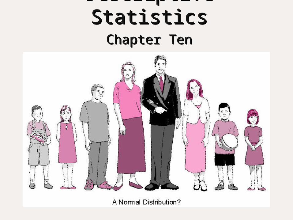
Descriptive StatisticsDescriptive StatisticsChapter TenChapter Ten

Measurement ScalesMeasurement ScalesType of Scale
Numerical Operation
Example of Measurement
Nominal Counting Gender, country of origin, race
Ordinal Rank ordering Level of education, income and age categories
Interval Arithmetic operations that preserve order and relative magnitudes. No zero
Attitude scaled, agree/disagree, important/not important
Ratio Arithmetic operations on actual quantities
Age in years, weight, number of children, number of people in house holds

Descriptive Statistics for Types of Descriptive Statistics for Types of ScalesScales
Type of Scale
Numerical Operation
Descriptive Statistics
Nominal Counting Frequency in each categoryPercentage in each categoryMode
Ordinal Rank ordering Median, Range, Percentile ranking
Interval Arithmetic operations that preserve order and relative magnitudes. No zero
Mean, Standard deviation, variance
Ratio Arithmetic operations on actual quantities
Geometric meanCoefficient of variation

Statistics vs. ParametersStatistics vs. Parameters
A parameter is a characteristic of a A parameter is a characteristic of a population.population. It is a numerical or graphic way to It is a numerical or graphic way to
summarize data obtained from the summarize data obtained from the populationpopulation
A statistic is a characteristic of a sample.A statistic is a characteristic of a sample. It is a numerical or graphic way to It is a numerical or graphic way to
summarize data obtained from a samplesummarize data obtained from a sample

Types of Numerical DataTypes of Numerical Data
There are two fundamental types of There are two fundamental types of numerical data:numerical data:
1)1) Categorical data: obtained by determining Categorical data: obtained by determining the frequency of occurrences in each of the frequency of occurrences in each of several categoriesseveral categories
2)2) Quantitative data: obtained by determining Quantitative data: obtained by determining placement on a scale that indicates amount placement on a scale that indicates amount or degreeor degree
Techniques for Summarizing Techniques for Summarizing Quantitative DataQuantitative Data
Frequency DistributionsFrequency Distributions Histograms/Stem and Leaf PlotsHistograms/Stem and Leaf Plots Distribution curvesDistribution curves Averages/SpreadAverages/Spread Variability/CorrelationsVariability/Correlations

Frequency PolygonsFrequency Polygons
Places data in some sort of orderPlaces data in some sort of order A A frequency distributionfrequency distribution lists scores from lists scores from
high to low high to low (Table 10.1)(Table 10.1)
This results in a grouped frequency This results in a grouped frequency distribution distribution (Table 10.2)(Table 10.2)
Since the information is not very visual, a Since the information is not very visual, a graphical display called a graphical display called a frequency frequency polygonpolygon can help with this can help with this (Figure 10.1)(Figure 10.1) Frequency polygons can be negatively or Frequency polygons can be negatively or
positively skewed positively skewed (Figure 10.2)(Figure 10.2)
They can be useful in comparing two or more They can be useful in comparing two or more groupsgroups

Example of a Frequency Distribution (Table 10.1)Example of a Frequency Distribution (Table 10.1)Raw Score Frequency
64 263 161 259 256 252 151 238 436 334 531 529 527 525 124 221 217 215 1
6 23 1
n = 50
Technically, the table should include all scores, including those for which thereare zero frequencies. We have eliminated those to simplify the presentation.

Example of a Grouped Frequency Distribution Example of a Grouped Frequency Distribution (Table 10.2)(Table 10.2)
64 263 161 259 256 252 151 238 436 334 531 529 527 525 124 221 217 215 1
6 23 1
n = 50
Raw Score Frequency(Intervals of Five)

Example of a Frequency Polygon (Figure 10.1)Example of a Frequency Polygon (Figure 10.1)

Example of a Positively Skewed Example of a Positively Skewed Polygon Polygon (Figure 10.2)(Figure 10.2)

Example of a Negatively Skewed Example of a Negatively Skewed Polygon Polygon (Figure 10.3)(Figure 10.3)

Two Frequency Polygons Compared Two Frequency Polygons Compared (Figure 10.4)(Figure 10.4)

Histograms and Stem-and-Leaf PlotsHistograms and Stem-and-Leaf Plots
A A histogramhistogram is a bar graph used to display is a bar graph used to display quantitative data at the interval or ratio quantitative data at the interval or ratio level of measurement (Table 10.2)level of measurement (Table 10.2)
A A Stem-leaf PlotStem-leaf Plot (stem plot) looks like a (stem plot) looks like a histogram, except instead of bars, it shows histogram, except instead of bars, it shows values for each categoryvalues for each category They are helpful for comparing and contrasting They are helpful for comparing and contrasting
two distributions (Table 10.1)two distributions (Table 10.1)

Histogram of Data in Table 10.2 Histogram of Data in Table 10.2 (Figure 10.5)(Figure 10.5)
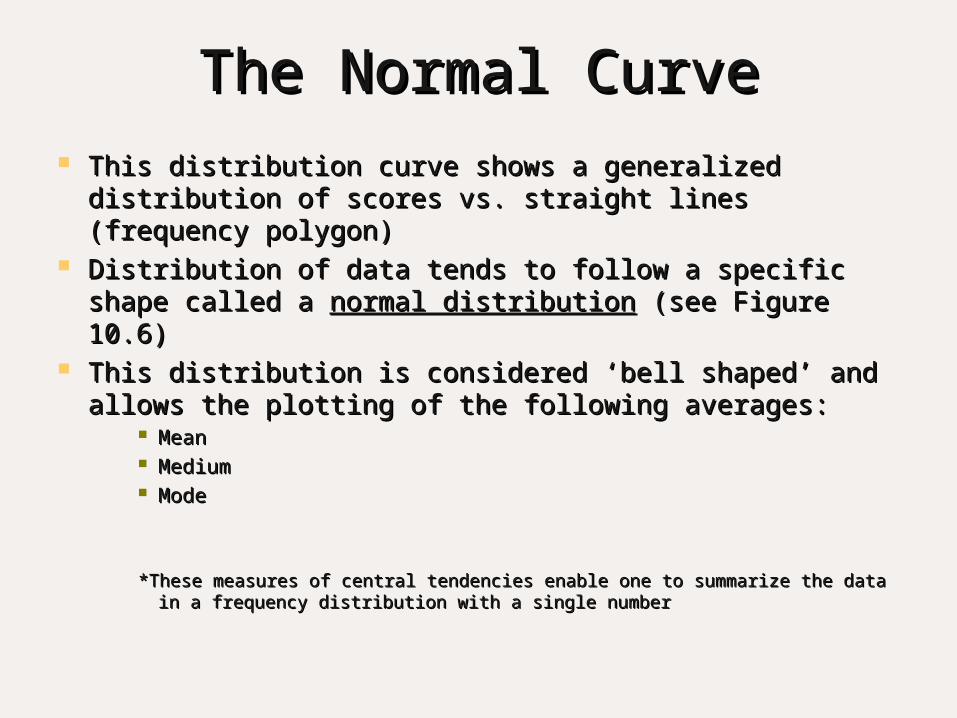
The Normal CurveThe Normal Curve This distribution curve shows a generalized This distribution curve shows a generalized
distribution of scores vs. straight lines (frequency distribution of scores vs. straight lines (frequency polygon)polygon)
Distribution of data tends to follow a specific shape Distribution of data tends to follow a specific shape called a called a normal distributionnormal distribution (see Figure 10.6) (see Figure 10.6)
This distribution is considered ‘bell shaped’ and allows This distribution is considered ‘bell shaped’ and allows the plotting of the following averages:the plotting of the following averages:
MeanMean MediumMedium ModeMode
*These measures of central tendencies enable one to summarize the data in *These measures of central tendencies enable one to summarize the data in a frequency distribution with a single numbera frequency distribution with a single number

The Normal Curve The Normal Curve (Figure 10.6)(Figure 10.6)

Example of the Mode, Median and Mean Example of the Mode, Median and Mean in a Distribution in a Distribution (Table 10.3)(Table 10.3)
Raw Score Frequency
98 197 191 285 180 577 772 565 364 762 1058 345 233 111 1
5 1n = 50
Mode = 62; median = 64.5; mean = 66.7

Averages Can Be Misleading Averages Can Be Misleading (Figure 10.7)(Figure 10.7)

Different Distributions Compared Different Distributions Compared (Figure 10.8)(Figure 10.8)

VariabilityVariability Refers to the extent to which the scores on a Refers to the extent to which the scores on a
quantitative variable in a distribution are spread quantitative variable in a distribution are spread out.out.
The The rangerange represents the difference between the represents the difference between the highest and lowest scores in a distribution.highest and lowest scores in a distribution.
A A five number summaryfive number summary reports the lowest, the reports the lowest, the first quartile, the median, the third quartile, and first quartile, the median, the third quartile, and highest score.highest score.
Five number summaries are often portrayed Five number summaries are often portrayed graphically by the use of graphically by the use of box plots.box plots.

Box plots Box plots (Figure 10.9)(Figure 10.9)

Standard DeviationStandard Deviation Considered the most useful index of variability.Considered the most useful index of variability. It is a single number that represents the spread of It is a single number that represents the spread of
a distribution.a distribution. See p. 348 to calculate the mean of the See p. 348 to calculate the mean of the
distribution.distribution. Table 10.5 will illustrate the calculation of the SD Table 10.5 will illustrate the calculation of the SD
of a distribution.of a distribution. If a distribution is normal, then the mean plus or If a distribution is normal, then the mean plus or
minus 3 SD will encompass about 99% of all minus 3 SD will encompass about 99% of all scores in the distribution.scores in the distribution.

Calculation of the Standard Deviation of a Calculation of the Standard Deviation of a Distribution (Table 10.5)Distribution (Table 10.5)
Σ Σσ√Χ¯
Σσ√Χ¯
√
RawScore Mean X – X (X – X)
2
85 54 31 96180 54 26 67670 54 16 25660 54 6 3655 54 1 150 54 -4 1645 54 -9 8140 54 -14 19630 54 -24 57625 54 -29 841
Variance (SD2) =
Σ(X – X)2
n
= 3640
10 = 364a
Standard deviation (SD) = Σ(X – X)2
n

Standard Deviations for Boys’ and Men’s Standard Deviations for Boys’ and Men’s Basketball Teams Basketball Teams (Figure 10.10)(Figure 10.10)

Facts about the Normal DistributionFacts about the Normal Distribution
55% of all the observations fall on each side 55% of all the observations fall on each side of the mean. (Figure 10.11)of the mean. (Figure 10.11)
68% of scores fall within 1 SD of the mean in 68% of scores fall within 1 SD of the mean in a normal distribution.a normal distribution.
27% of the observations fall between 1 and 2 27% of the observations fall between 1 and 2 SD from the mean.SD from the mean.
99.7% of all scores fall within 3 SD of the 99.7% of all scores fall within 3 SD of the mean. (Figure 10.12)mean. (Figure 10.12)
This is often referred to as the This is often referred to as the 68-95-99.7 68-95-99.7 rulerule

Fifty Percent of All Scores in a Normal Fifty Percent of All Scores in a Normal Curve Fall on Each Side of the MeanCurve Fall on Each Side of the Mean
(Figure 10.11)(Figure 10.11)

Probabilities Under the Normal Curve Probabilities Under the Normal Curve (Figure 10.12)(Figure 10.12)

Standard ScoresStandard Scores Standard scores use a common scale to indicate Standard scores use a common scale to indicate
how an individual compares to other individuals in a how an individual compares to other individuals in a group.group.
The simplest form of a standard score is a The simplest form of a standard score is a Z scoreZ score.. A A Z score Z score expresses how far a raw score is from the expresses how far a raw score is from the
mean in standard deviation units. (see Figure 10.13)mean in standard deviation units. (see Figure 10.13) Standard scores provide a better basis for Standard scores provide a better basis for
comparing performance on different measures than comparing performance on different measures than do raw scores.do raw scores.
A A Probability Probability is a percent stated in decimal form and is a percent stated in decimal form and refers to the likelihood of an event occurring.refers to the likelihood of an event occurring.
T scores T scores are z scores expressed in a different form are z scores expressed in a different form (z score x 10 + 50).(z score x 10 + 50).

Probability Areas Between the Mean and Probability Areas Between the Mean and Different Z Scores Different Z Scores (Figure 10.13)(Figure 10.13)

Examples of Standard Scores Examples of Standard Scores (Figure 10.14)(Figure 10.14)

CorrelationCorrelation Researchers seek to determine whether a Researchers seek to determine whether a
relationship exists between two or more relationship exists between two or more quantitative variables.quantitative variables.
A A ScatterplotScatterplot is a pictorial representation of the is a pictorial representation of the relationship between two quantitative variables. relationship between two quantitative variables. (see Figure 10.15)(see Figure 10.15)
OutliersOutliers are scores that deviate or fall are scores that deviate or fall considerably outside most of the other scores in a considerably outside most of the other scores in a distribution or pattern.distribution or pattern. They indicate an unusual exception to a general They indicate an unusual exception to a general
pattern (See Figure 10.16)pattern (See Figure 10.16) Correlation coefficientsCorrelation coefficients express the degree of express the degree of
relationship between two sets of scores.relationship between two sets of scores. Pearson Product-Moment Correlation CoefficientPearson Product-Moment Correlation Coefficient EtaEta

Scatterplot of Data from Table 10.7 Scatterplot of Data from Table 10.7 (Figure 10.15)(Figure 10.15)

Relationship Between Family Cohesiveness and Relationship Between Family Cohesiveness and School Achievement in a Hypothetical Group of School Achievement in a Hypothetical Group of
Students Students (Figure 10.16)(Figure 10.16)

Examples of Scatterplots Examples of Scatterplots (Figure 10.17)(Figure 10.17)

A Perfect Negative Correlation A Perfect Negative Correlation (Figure 10.18)(Figure 10.18)

Positive and Negative Correlations Positive and Negative Correlations (Figure 10.19)(Figure 10.19)

X
Y
A HIGH POSITIVE CORRELATIONr = +.98
Correlation PatternsCorrelation Patterns

X
Y
PERFECT NEGATIVECORRELATION - r= -1.0
.
Correlation PatternsCorrelation Patterns

X
Y
NO CORRELATION
.
Correlation PatternsCorrelation Patterns

Examples of Nonlinear (Curvilinear) Examples of Nonlinear (Curvilinear) Relationships Relationships (Figure 10.20)(Figure 10.20)

Techniques for Summarizing Techniques for Summarizing Categorical DataCategorical Data
The Frequency TableThe Frequency Table Bar Graphs and Pie ChartsBar Graphs and Pie Charts The Crossbreak TableThe Crossbreak Table

Frequency and Percentage of Frequency and Percentage of Responses to QuestionnaireResponses to Questionnaire
PercentageResponse Frequency of Total (%)
Lecture 15 30Class discussions 10 20Demonstrations 8 16Audiovisual presentations 6 12Seatwork 5 10Oral reports 4 8Library research 2 4 Total 50 100

Example of a Bar Graph Example of a Bar Graph (Figure 10.21)(Figure 10.21)

Example of Pie Chart Example of Pie Chart (Figure 10.22)(Figure 10.22)


