Embed Size (px)
Citation preview

Kuali Rice 2.5.5 KRAD Guide

iii
Table of Contents1. About KRAD ................................................................................................................. 1
Overview of the Rice Project ...................................................................................... 1Rice Objectives .................................................................................................. 1Rice Methodology .............................................................................................. 2Rice Modules .................................................................................................... 3Rice Deployments .............................................................................................. 4
User Experience 101 .................................................................................................. 5Increasing skills in UI development ....................................................................... 6KRAD - Common User Interface Artifacts .............................................................. 7
Accessibility with WCAG 2.0 and ARIA ....................................................................... 8Introduction – What are WCAG 2.0 and ARIA? ...................................................... 8WCAG 2.0 Overview .......................................................................................... 9Accessibility Code Checkers ................................................................................. 9What should developers pay attention to in creating accessible applications withKRAD? ............................................................................................................ 9ARIA Overview ............................................................................................... 10Adding ARIA to an application ........................................................................... 11
2. Getting Started .............................................................................................................. 14KRAD Architecture ................................................................................................. 14Spring Beans .......................................................................................................... 14
Configuration System ........................................................................................ 15Bean Configuration ........................................................................................... 15Primitive Properties ........................................................................................... 16Collections ....................................................................................................... 17Other Objects ................................................................................................... 18Compound Property Names ................................................................................ 20The P-Namespace ............................................................................................. 20Bean Parents .................................................................................................... 21Bean Containers ............................................................................................... 22Bean Scope ...................................................................................................... 23
3. A Sample Application .................................................................................................... 25The Development Environment ................................................................................... 25New Project Setup ................................................................................................... 25Project Structure and Configuration Files ...................................................................... 26Importing into Eclipse and Starting the App .................................................................. 26Setup for KRAD Development .................................................................................... 30Sample App Tables ................................................................................................... 32Data Objects ............................................................................................................ 33Inquiry View ............................................................................................................ 36
Using a Generated Inquiry View ......................................................................... 36Specifying an Inquiry View with XML ................................................................. 38
Lookup View ........................................................................................................... 43Maintenance View .................................................................................................... 50
Rice Configuration for a Maintenance View .......................................................... 50Creating the Maintenance View ........................................................................... 62
4. Data Objects and Persistence ........................................................................................... 69Data Framework ....................................................................................................... 69Data Objects ........................................................................................................... 69
Data Objects .................................................................................................... 69Data Objects .................................................................................................... 71Special Data Objects ......................................................................................... 71
Kuali Rice 2.5.5 KRAD Guide
iv
Extending Data Objects ..................................................................................... 73Java Persistence API ................................................................................................. 74
KRAD Entity Manager Factories ......................................................................... 74Persistence Providers ......................................................................................... 77Metadata Provider ............................................................................................. 79Custom Providers .............................................................................................. 79Accessing Metadata ........................................................................................... 80Queries ........................................................................................................... 80Sequences ........................................................................................................ 85Entity Attribute Converters ................................................................................. 85
Data Object Metadata ................................................................................................ 86Annotation Metadata Provider ............................................................................. 87Spring Metadata Provider ................................................................................... 88
Linking and Fetching ................................................................................................. 88Relationship Fetching ........................................................................................ 90Reference Linking ............................................................................................. 91Foreign Key Linking ......................................................................................... 91
5. The Data Dictionary ...................................................................................................... 93Introduction to the Data Dictionary ............................................................................. 93Attribute Definitions ................................................................................................. 93Data Object Entries .................................................................................................. 94Relationship and Collection Definitions ....................................................................... 96Constraints ............................................................................................................. 96
Simple Constraint Properties ............................................................................... 96Validation Patterns ............................................................................................ 98Custom Validation Patterns ............................................................................... 101Prerequisite Constraints .................................................................................... 101Must Occur Constraints .................................................................................... 102Case Constraints ............................................................................................. 103State-based Validation and Constraints ................................................................ 104
Data Dictionary Services ......................................................................................... 108The DATAOBJECTMETADATASERVICE ................................................................ 108Extending the Data Dictionary .................................................................................. 108
6. Introduction to the UIF ................................................................................................. 109Overview of the UIF ............................................................................................... 109
UIF Goal: Rich UI Support ............................................................................... 109UIF Goal: More Layout Flexibility .................................................................... 109UIF Goal: Easy to Customize and Extend .......................................................... 110UIF Goal: Improved Configuration and Tooling .................................................... 110UIF Dictionary ............................................................................................... 110The UIF and UIM ........................................................................................... 110
Component Design .................................................................................................. 111Parts of a Component ..................................................................................... 111Customizing and Extending the UIF ................................................................... 113
Building Templates with FreeMarker .......................................................................... 116Variable Markup ............................................................................................. 116FreeMarker DataTypes ..................................................................................... 119Control Statements .......................................................................................... 120Context and Macros ......................................................................................... 121Invoking Macros ............................................................................................. 123Other Features of Macros ................................................................................. 123Built-Ins ........................................................................................................ 124Including FTL Files ......................................................................................... 125Component Templates ...................................................................................... 126
Kuali Rice 2.5.5 KRAD Guide
v
Coarse-Grained Parameters ............................................................................... 126The KRAD Macro Library ................................................................................ 128Template Macro .............................................................................................. 128
The Component Interface ......................................................................................... 129Common Component Properties ......................................................................... 130Script Event Support ...................................................................................... 135
Types of Components .............................................................................................. 136Content Elements ............................................................................................ 136Controls ......................................................................................................... 137Fields ............................................................................................................ 137Containers ...................................................................................................... 138Widgets ......................................................................................................... 139Composition and Containers .............................................................................. 139
UIF Constants ........................................................................................................ 140UIF Bean Files ....................................................................................................... 142
UIF Configuration Definitions ........................................................................... 142UIF Control Definitions ................................................................................... 143UIF Document Definitions ................................................................................ 143UIF Field Definitions ....................................................................................... 143UIF Group Definitions ..................................................................................... 143UIF Header Footer Definitions .......................................................................... 143UIF Incident Report Definitions ......................................................................... 143UIF Inquiry Definitions ................................................................................... 143UIF Layout Managers Definitions ...................................................................... 143UIF Lookup Definitions ................................................................................... 143UIF Maintenance Definitions ............................................................................ 143UIF Rice Definitions ....................................................................................... 144UIF View Page Definitions ............................................................................... 144UIF Widget Definitions .................................................................................... 144
Styling and themes .................................................................................................. 144View Theme .................................................................................................. 144Modifying Themes .......................................................................................... 144Base Styles and Conventions ............................................................................ 145Fluid Skinning System ..................................................................................... 147
KRAD Spring Extensions ......................................................................................... 148Merge Ordering .............................................................................................. 149
7. Fields and Content Elements ......................................................................................... 151Field Labels ........................................................................................................... 151
Other Label Options ........................................................................................ 152Other Field Label Options ................................................................................ 153Base Beans .................................................................................................... 153
Data Fields and Input Fields ..................................................................................... 154Data Field ...................................................................................................... 154Input Field ..................................................................................................... 155Default Values ................................................................................................ 156Alternate and Additional Display Properties ......................................................... 158Additional Display Properties for List<String> fields ............................................. 159Additional Display Properties for Input Fields with Widgets .................................... 160
Data Binding .......................................................................................................... 161Property Editors .............................................................................................. 162Complex Paths ................................................................................................ 163
Data Dictionary Backing .......................................................................................... 168Types of Controls ................................................................................................... 171
Checkbox ....................................................................................................... 171
Kuali Rice 2.5.5 KRAD Guide
vi
File ............................................................................................................... 172Hidden .......................................................................................................... 173Password ....................................................................................................... 173Text .............................................................................................................. 174TextArea ........................................................................................................ 176Spinner .......................................................................................................... 176Multi-Value Controls ....................................................................................... 177KIM Group .................................................................................................... 185KIM User ...................................................................................................... 186
Disabling Controls and Tabbing ................................................................................. 189Hooking up Lookups and Inquiries ............................................................................. 190
Automatic Lookups and Inquiries ....................................................................... 192Input Field Messages ............................................................................................... 194Field Queries and Informational Properties .................................................................. 195
Field Attribute Query ....................................................................................... 196Field Suggest Widget ....................................................................................... 200
Other Data and Input Field Properties ......................................................................... 203Action and Action Field ........................................................................................... 204
Action Even and Action Parameters ................................................................... 207Field Focus and Anchoring ............................................................................... 209Disabled ........................................................................................................ 210
Space and Space Field ............................................................................................. 211ValidationMessages content element ........................................................................... 212Generic Field .......................................................................................................... 217Iframe ................................................................................................................... 218Image and Image Field ............................................................................................ 219Link and Link Field ................................................................................................ 221Toggle Menu .......................................................................................................... 222Progress Bars ......................................................................................................... 223
Percentage Progress Bars .................................................................................. 223Step Progress Bars .......................................................................................... 224
Message Field ........................................................................................................ 226Rich Message Content ............................................................................................. 227
Component Rich Message Tags ......................................................................... 2298. Groups ....................................................................................................................... 232
Groups .................................................................................................................. 232Page Decomposition with Groups .............................................................................. 233Headers ................................................................................................................. 237Footers .................................................................................................................. 240Introduction to Layout Managers ............................................................................... 242Group Layout Managers ........................................................................................... 244
Grid Layout ................................................................................................... 244Box Layout .................................................................................................... 249Css Grid Layout ............................................................................................. 253
Field Groups .......................................................................................................... 259Link Group ............................................................................................................ 261Navigation Group .................................................................................................... 261Collection Groups ................................................................................................... 261
Collection Object Class .................................................................................... 263Add Line ....................................................................................................... 263Collection Add Blank Line ............................................................................... 264Collection Add Via Lightbox ............................................................................ 265Line Actions .................................................................................................. 266Validated Line Actions ..................................................................................... 268
Kuali Rice 2.5.5 KRAD Guide
vii
Collection Action Column Sequence ................................................................... 268SubCollections ................................................................................................ 269Collection Group Builder .................................................................................. 270LightTable Group ............................................................................................ 270
Component Prototypes ............................................................................................. 273Collection Layout Managers ...................................................................................... 273
Table Layout .................................................................................................. 274Stacked Layout ............................................................................................... 284The List Template ........................................................................................... 285Disclosure ...................................................................................................... 288Scrollable ....................................................................................................... 289
9. Widgets ..................................................................................................................... 290Widgets ................................................................................................................. 290jQuery Plugins and Options ...................................................................................... 290Types of Widgets .................................................................................................... 291
Breadcrumbs .................................................................................................. 291DatePicker ..................................................................................................... 291DirectInquiry .................................................................................................. 292Disclosure ...................................................................................................... 292Help .............................................................................................................. 293Inquiry .......................................................................................................... 294Lightbox ........................................................................................................ 294LocationSuggest .............................................................................................. 295Multi-File Upload Collection ............................................................................. 296Pager ............................................................................................................ 299QuickFinder ................................................................................................... 300RichTable ...................................................................................................... 300Suggest .......................................................................................................... 301Tabs .............................................................................................................. 301Tooltip .......................................................................................................... 301Tree .............................................................................................................. 303
Creating a New Widget ............................................................................................ 310jQuery Plugin ................................................................................................. 310Java Widget Class .......................................................................................... 310FreeMarker Template ....................................................................................... 311JavaScript Function ......................................................................................... 311Spring Beans Definitions .................................................................................. 311
10. The View ................................................................................................................. 313Putting It Together with Views .................................................................................. 313
The View Component ...................................................................................... 313Navigation ............................................................................................................. 316Breadcrumbs .......................................................................................................... 317
BreadcrumbItem .............................................................................................. 317BreadcrumbOptions ......................................................................................... 318ParentLocation breadcrumbs .............................................................................. 319Path-based Breadcrumbs ................................................................................... 320Understanding Breadcrumb Rendering order ........................................................ 321
View Indexing ........................................................................................................ 321Requesting a View Instance ...................................................................................... 321View Request Parameters ......................................................................................... 322The View Service ................................................................................................... 323The View Lifecycle and View Helper Services ............................................................. 323Application Header and Footer .................................................................................. 325Sticky Headers And Footers ...................................................................................... 326
Kuali Rice 2.5.5 KRAD Guide
viii
Sticky Header Options ..................................................................................... 326Sticky Footer Options ...................................................................................... 327
View Themes ......................................................................................................... 327Manual Theme Configuration ............................................................................ 327Theme Configuration by Convention .................................................................. 329The Theme Builder ......................................................................................... 331Linking Themes To Views ................................................................................ 336
KIM Authorization .................................................................................................. 33611. Conditional Logic ...................................................................................................... 339
Conditional Logic ................................................................................................... 339Presentation Controllers and Authorizers ..................................................................... 339Configuration with Expressions ................................................................................. 340
Spring EL ...................................................................................................... 340Component Context ......................................................................................... 342Built-In and Custom Functions .......................................................................... 342Custom Variables ............................................................................................ 343
Component Modifiers .............................................................................................. 344Property Replacers .................................................................................................. 344Collection Filters ..................................................................................................... 345Code Support ......................................................................................................... 345
Overriding with the ViewHelperService .............................................................. 345Component Finalization .................................................................................... 346Group Initialization ......................................................................................... 346The Component Factory ................................................................................... 346Copying Components ....................................................................................... 347
12. Client Side Features ................................................................................................... 348Progressive Disclosure ............................................................................................. 348Component Refresh ................................................................................................. 348Disable on User Action ............................................................................................ 349AJAX Actions ........................................................................................................ 350Lightbox ................................................................................................................ 351Working in the Client with jQuery ............................................................................. 351Data Attributes ....................................................................................................... 351Configuring Event Handling ...................................................................................... 352Validation .............................................................................................................. 353
Client Side Validation ...................................................................................... 353Server Side Validation .................................................................................... 353Validation Messages ........................................................................................ 353
Ajax Improvements ................................................................................................. 354Enter Key Support ................................................................................................... 356Utilities ................................................................................................................. 359
13. Controllers ................................................................................................................ 360Introduction to Spring MVC ..................................................................................... 360Controllers ............................................................................................................. 360Controller Annotations ............................................................................................. 360
Interceptors .................................................................................................... 360Spring Views and the Common UIF View ................................................................... 360Spring Tags ............................................................................................................ 360Binding and Validation ............................................................................................ 360
Property Editors .............................................................................................. 360Security and Masking ...................................................................................... 360Bean Wrapper and ObjectPropertyUtils ............................................................... 360
Form Beans ............................................................................................................ 360UifControllerBase and UifFormBase ........................................................................... 361
Kuali Rice 2.5.5 KRAD Guide
ix
Connecting the Controller with the View ............................................................. 361Dialogs .................................................................................................................. 361
Using Dialogs in a View .................................................................................. 361Creating a Dialog Group For a View .................................................................. 362Managing Dialogs from a Controller ................................................................... 363Invoking a Dialog Entirely from the Client .......................................................... 364Pre-Defined Dialog Groups ............................................................................... 364Customizing Dialog Groups .............................................................................. 364
Error, Info, and Warning Messages ............................................................................ 364Growls .......................................................................................................... 364
Exception Handling ................................................................................................. 365Session Support and the User Session ......................................................................... 365Servlet Configuration ............................................................................................... 365Using Controllers to Allow Guest Access .................................................................... 365
14. View Types .............................................................................................................. 367What are View Types? ............................................................................................. 367View Type Indexing ................................................................................................ 367Lookup View Type ................................................................................................. 367
Lookup View ................................................................................................. 367Lookupable and LookupableImpl ....................................................................... 368LookupService ................................................................................................ 369Lookup Action and Form ................................................................................. 369Customizing the Lookup View .......................................................................... 369
Inquiry View Type .................................................................................................. 370Inquiry View .................................................................................................. 370Inquirable and InquirableImpl ............................................................................ 370Customizing the Inquiry View ........................................................................... 370
Maintenance View Type ........................................................................................... 371Maintenance Document Entry ............................................................................ 371Maintenance View ........................................................................................... 371Comparable and Maintenance Edit ..................................................................... 372Maintainable and MaintainableImpl .................................................................... 372Maintenance Action and Form ........................................................................... 373The Maintenance Lifecycle ............................................................................... 373Maintenance Serialization and @Serialized ..................................................... 374Customizing Maintenance Documents ................................................................. 375Bulk Update Maintenance Documents ................................................................. 375
Transactional View Type .......................................................................................... 378Document Objects and Mappings ....................................................................... 378Transactional Document Entry ........................................................................... 378Document View .............................................................................................. 378Document Action and Form Base ....................................................................... 378The Document Service ..................................................................................... 378Document Authorizer and Presentation Controller ................................................. 378
Request Setting of Fields to Read-Only ....................................................................... 378Writing Business Rules ............................................................................................ 378Notes and Attachments ............................................................................................ 378Creating a New View Type ...................................................................................... 378KIM Primer ........................................................................................................... 379
Entities ........................................................................................................ 379Groups and Roles ......................................................................................... 380Roles: Differentiating among principals .......................................................... 381Permissions .................................................................................................. 382
KEW Primer .......................................................................................................... 384
Kuali Rice 2.5.5 KRAD Guide
x
Documents and Document Types .................................................................... 385KIM and KEW together: Responsibilities ........................................................ 387Document Searching ..................................................................................... 392
Message View Type ................................................................................................ 395Message View ................................................................................................ 395
15. Performance .............................................................................................................. 397Table Collection Performance Options ........................................................................ 397
When to use Ajax retrieval for details ................................................................. 397When to use local JSON data ............................................................................ 398When to use server-side paging ......................................................................... 399When to use LightTable ................................................................................... 399
Stacked Collection Performance Options ..................................................................... 400When to use server-side paging ......................................................................... 401When to use Ajax retrieval of collapsed collection items ........................................ 401
16. Security .................................................................................................................... 403Overview ............................................................................................................... 403Model Binding ........................................................................................................ 403
Default Security Level - View ........................................................................... 403Accessible Security Level ................................................................................. 403Protected Security Level ................................................................................... 404
Controller Method Binding ....................................................................................... 404Use Screen ............................................................................................................. 405Edit Modes ............................................................................................................ 405
17. Testing and Tooling ................................................................................................... 408Reloading the Data Dictionary ................................................................................... 408Rice Data Objects ................................................................................................... 408
Introduction .................................................................................................... 408Installation and Configuration ............................................................................ 409User Guide .................................................................................................... 412
Rice Dictionary Validator ......................................................................................... 424Introduction .................................................................................................... 424Installation and Configuration ............................................................................ 424User Guide .................................................................................................... 425
Rice Dictionary Schema ........................................................................................... 427Introduction .................................................................................................... 427Setting Up the RDS ......................................................................................... 428
xi
List of Figures1.1. Service Based Architecture ............................................................................................ 31.2. UI Process Maturity ...................................................................................................... 62.1. KRAD Frameworks .................................................................................................... 142.2. Bean Factories ........................................................................................................... 233.1. Import New Project Eclipse .......................................................................................... 273.2. Selecting Project Eclipse .............................................................................................. 275.1. State-based Validation Server Errors ............................................................................. 1076.1. Building Blocks ........................................................................................................ 1126.2. Building Blocks ........................................................................................................ 1146.3. Building Blocks ........................................................................................................ 1166.4. KRAD Rendering Process .......................................................................................... 1286.5. KRAD Container Parts ............................................................................................... 1386.6. KRAD Component Hierarchy ...................................................................................... 1406.7. KRAD Intellij Project Pane ......................................................................................... 1427.1. Data Field Label ....................................................................................................... 1557.2. Input Field ............................................................................................................... 1567.3. Data Field Label ....................................................................................................... 1587.4. Checkbox Control ..................................................................................................... 1717.5. File Control ............................................................................................................. 1727.6. Watermark Control .................................................................................................... 1757.7. Date Control ............................................................................................................ 1757.8. Text Expand Control ................................................................................................. 1757.9. TextArea Control ...................................................................................................... 1767.10. Spinner Control ....................................................................................................... 1777.11. CheckboxGroup Control ........................................................................................... 1817.12. Select Control ......................................................................................................... 1827.13. Multi Select Control ................................................................................................ 1837.14. OptionList Control ................................................................................................... 1857.15. Navigation OptionList Control ................................................................................... 1857.16. KIM Group Control ................................................................................................. 1877.17. Disabled State Control ............................................................................................. 1897.18. Quickfinder Hook .................................................................................................... 1917.19. Quickfinder Hook Example ....................................................................................... 1917.20. Standard Inquiry, Read Only ..................................................................................... 1927.21. Input Field with Contratint Text ................................................................................. 1947.22. Two Informational Properties Example ........................................................................ 1967.23. Button Levels ......................................................................................................... 2057.24. Buttons Toolbar ...................................................................................................... 2077.25. Quickfinder Widget ................................................................................................. 2077.26. Action Link ............................................................................................................ 2077.27. Enabled and Disabled Buttons ................................................................................... 2107.28. ValidationMessages for a Page .................................................................................. 2157.29. ValidationMessages for a Section ............................................................................... 2157.30. ValidationMessages for an InputField .......................................................................... 2167.31. Image with alt Text ................................................................................................. 2197.32. Image with Cutline Text ........................................................................................... 2207.33. Link Component Example ......................................................................................... 2217.34. Toggle Menu Component Example ............................................................................. 2227.35. Percentage based Progress Bars .................................................................................. 2237.36. Customized segment sizes and styles .......................................................................... 2247.37. Step Progress Bar .................................................................................................... 224
Kuali Rice 2.5.5 KRAD Guide
xii
7.38. Vertical Step Progress Bar ........................................................................................ 2257.39. Different size steps .................................................................................................. 2267.40. Message Field ......................................................................................................... 2278.1. One Large Box ......................................................................................................... 2348.2. Full View Page ......................................................................................................... 2348.3. Vertical Sections ....................................................................................................... 2358.4. Vertical SubSections .................................................................................................. 2358.5. Conceptual Groupings ................................................................................................ 2368.6. Header Text Example ................................................................................................ 2398.7. Additional Header Examples ....................................................................................... 2398.8. Group Footer Example ............................................................................................... 2418.9. Group Layout ........................................................................................................... 2448.10. Grid Layout ............................................................................................................ 2448.11. Grid Layout Examples .............................................................................................. 2458.12. Row, Col Span Layout ............................................................................................. 2478.13. Row, Col Span Example ........................................................................................... 2478.14. Horizontal Box Layout ............................................................................................. 2508.15. Box Layout Manager ............................................................................................... 2508.16. Css Grid Layout ...................................................................................................... 2548.17. Css Grid Label Column Layout - 2 Label columns ........................................................ 2558.18. Grid Group Checkbox .............................................................................................. 2598.19. Nested Field Groups ................................................................................................ 2608.20. Collection Add Blank Line Example - TableLayout with TOP add line placement ................ 2658.21. Collection Add Via Lightbox Example - TableLayout with TOP add line placement ............. 2668.22. Collection Action Column Placement Example ............................................................. 2698.23. Table Layout Manager ............................................................................................. 2748.24. Row Details ........................................................................................................... 2778.25. Stacked Layout Manager .......................................................................................... 2858.26. Scrollable Section .................................................................................................... 28910.1. Breadcrumbs Appearance .......................................................................................... 31710.2. siblingBreadcrumbComponent after clicking arrow ........................................................ 31810.3. URL Mapping ........................................................................................................ 32210.4. RequestResponseFlow .............................................................................................. 32410.5. Detailed RequestResponseFlow .................................................................................. 32510.6. KRAD Web Structure .............................................................................................. 32910.7. Theme Directory Structure ........................................................................................ 33010.8. MyApp Theme Directory .......................................................................................... 33010.9. Parent/Child Theme Directories ................................................................................. 33513.1. Header Text Example ............................................................................................... 36114.1. Lookup View .......................................................................................................... 36814.2. Maintenance View ................................................................................................... 37214.3. PreserveLockingKeysOnCopy set to true and clearValueOnCopyPropertyNames containsmileageRate ................................................................................................................... 37414.4. Bulk Update Maintenance Document Example .............................................................. 37714.5. Role Screen ............................................................................................................ 38114.6. Role Screen, Qualifiers ............................................................................................. 38214.7. Permission Inquiry ................................................................................................... 38314.8. Custom Doc Search ................................................................................................. 39214.9. Message View ........................................................................................................ 396

xiii
List of Tables3.1. Created Files .............................................................................................................. 264.1. Kuali Rice Standard Converters ..................................................................................... 864.2. Merge Actions ........................................................................................................... 876.1. Macro Parameter Contracts ......................................................................................... 1277.1. State Options Example ............................................................................................... 1779.1. Breadcrumb Properties ............................................................................................... 2919.2. DatePicker Options .................................................................................................... 2929.3. DirectInquiry Properties ............................................................................................. 2929.4. Disclosure Properties ................................................................................................. 2929.5. Help Properties ......................................................................................................... 2939.6. Inquiry Properties ...................................................................................................... 2949.7. Lightbox Properties ................................................................................................... 2949.8. Lightbox Options ...................................................................................................... 2949.9. Suggest Properties ..................................................................................................... 2959.10. MultiFile Upload Properties ...................................................................................... 2999.11. MultiFile Upload Options ......................................................................................... 2999.12. Pager Properties ...................................................................................................... 2999.13. QuickFinder Properties ............................................................................................. 3009.14. RichTable Properties ................................................................................................ 3009.15. Rich Table Options .................................................................................................. 3009.16. Suggest Properties ................................................................................................... 3019.17. Suggest Options ...................................................................................................... 3019.18. Tooltip Properties .................................................................................................... 3029.19. Tooltip Options ....................................................................................................... 30210.1. Tooltip Properties .................................................................................................... 31810.2. Tooltip Properties .................................................................................................... 32010.3. Theme Builder Configuration Properties ...................................................................... 33210.4. Theme Property Listing ............................................................................................ 33317.1. Rice Tooling: RDS .................................................................................................. 432

1
Chapter 1. About KRAD
Overview of the Rice ProjectBefore diving into the exciting new Rice 2.0 KRAD framework and all its technical details, let's take abrief look at how the effort was formed and the general Kuali ecosystem in which it exists.
KRAD (Kuali Rapid Application Development) is a module within the Kuali Rice project. The Riceproject provides the technical infrastructure for which the Kuali projects and other non-Kuali institutionalapplications are built. This infrastructure includes a set of middleware solutions such as Workflow andIdentify Management, along with the development framework portion that includes the KNS (KualiNervous System) and its next generation replacement KRAD.
The use of Rice for project development allows applications to build and evolve much more quickly. Thereasons for this are as follows:
1. By isolating many common technical concerns, application developers can focus their time on solvingthe business problems that are unique to their application.
2. Developers have a common paradigm for building functionality across all modules and projects
3. Sharing of technical solutions allows for the underlying tooling to evolve more easily
4. Software built using Rice allows for easy integration
In addition to the technical benefits, use of Rice across projects gives a greater user experience. The userinteracts with the applications in a consistent manner and can more quickly learn new areas.
Rice ObjectivesThere are two primary objectives of the Rice project:
1. Support the needs of the other Kuali applications
2. Promote adoption of Rice as the middleware/framework solution across higher education
Decisions for the Rice roadmap in addition to other work items are made by committees made up ofrepresentatives from the Kuali projects and institutions. These committees are the following:
• Application Roadmap Committee (ARC): The Application Roadmap Committee is responsible forgoal-setting, and prioritizing high-level application architecture for integration of Kuali applicationprojects, and for an evolving roadmap for the future. This group defines overall ownership of sharedservices among the Kuali projects. The group defines work and priorities for Rice and cross applicationprojects. This group works with the projects to coordinate working teams.
• Kuali Application Integration Working Group (KAI): Under the direction of the Kuali ApplicationRoadmap Committee, the Kuali Application Integration Work Group recommends the strategicfunctional direction for integration between the Kuali Community systems and the facilitation of theintegration of future Kuali systems.
• Technology Roadmap Committee (TRC): Responsible for goal-setting, for high-level technicalarchitecture and tools, and for an evolving road map for the future. This replaces the current KTC

About KRAD
2
and focuses on creating a technology direction over time. This Committee recognizes the challengesinherent in different timing for the applications which causes technology to get out of synch, andthis Committee addresses those challenges by creating a road map for the evolution of the projects tocommon technologies when feasible. It is suggested that this Committee provide a semi-annual formalpresentation to the Rice Project Board and to the Kuali Foundation Board.
• Kuali Technical Integration Working Group: The Kuali Technology Integration (KTI) workinggroup performs an executive steering function for the TRC. It receives and formulates technologyenhancement requests and proposals for Rice and performs initial research and analysis of the requestsand makes recommendations to the TRC on the relative priority and timing of the requests. The KTIalso triages and makes decisions on technology issues.
Rice Methodology
Community Source Model
Rice is committed to the community source development model and to the value of collaboration inproducing a quality product that serves interested institutions well.
Iterative Development
The Rice development methodology is a lightweight, iterative approach to development that focuses onindividual components that can be quickly developed and integrated into a larger application. Frequentcommunication and interaction with users is required in order for this methodology to succeed. Bysimplifying the development process and emphasizing frequent testing and feedback, the software producthas a much greater likelihood of meeting the user's needs.
Not Invented Here
Rice leverages existing open source solutions that meet the needs of the Kuali projects. That is, Rice avoids'Reinventing the Wheel' where possible.
Loosely-Coupled Components
The architecture of Rice contains a set of distributed, loosely-coupled components and services that providedistinct business functionality. The components are designed for building a Rice application into threelayers: Presentation, Business, and Persistence Layer.
Service Oriented Architecture (SOA)
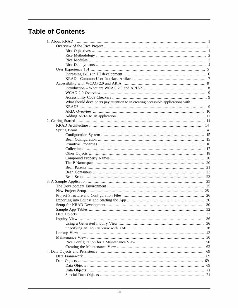
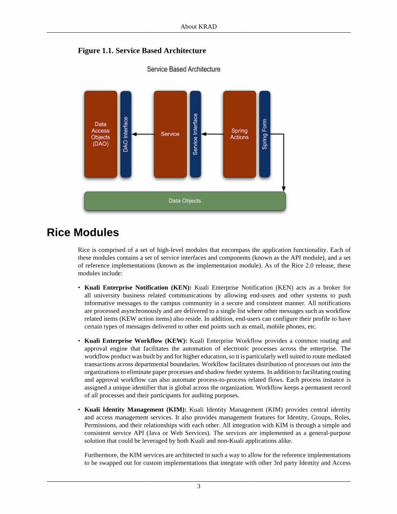
Access to the Rice components and functionality is provided using a Service Oriented Architecture. Thismeans applications make use of Rice services with well-defined APIs to business functionality. Accessto the services is provided with the Kuali Service Bus (KSB) which provides interoperability for Riceand the other Kuali projects. In addition, the Rice services are exposed via SOAP (Simple Object AccessProtocol) Web Services allowing access from non Kuali based applications. Rice comes with referenceimplementations for all services. However, implementations can easily be changed to meet the needs of theimplementing institution. The SOA architecture is depicted in Figure 1.1, “Service Based Architecture”.
About KRAD
3
Figure 1.1. Service Based Architecture
Rice ModulesRice is comprised of a set of high-level modules that encompass the application functionality. Each ofthese modules contains a set of service interfaces and components (known as the API module), and a setof reference implementations (known as the implementation module). As of the Rice 2.0 release, thesemodules include:
• Kuali Enterprise Notification (KEN): Kuali Enterprise Notification (KEN) acts as a broker forall university business related communications by allowing end-users and other systems to pushinformative messages to the campus community in a secure and consistent manner. All notificationsare processed asynchronously and are delivered to a single list where other messages such as workflowrelated items (KEW action items) also reside. In addition, end-users can configure their profile to havecertain types of messages delivered to other end points such as email, mobile phones, etc.
• Kuali Enterprise Workflow (KEW): Kuali Enterprise Workflow provides a common routing andapproval engine that facilitates the automation of electronic processes across the enterprise. Theworkflow product was built by and for higher education, so it is particularly well suited to route mediatedtransactions across departmental boundaries. Workflow facilitates distribution of processes out into theorganizations to eliminate paper processes and shadow feeder systems. In addition to facilitating routingand approval workflow can also automate process-to-process related flows. Each process instance isassigned a unique identifier that is global across the organization. Workflow keeps a permanent recordof all processes and their participants for auditing purposes.
• Kuali Identity Management (KIM): Kuali Identity Management (KIM) provides central identityand access management services. It also provides management features for Identity, Groups, Roles,Permissions, and their relationships with each other. All integration with KIM is through a simple andconsistent service API (Java or Web Services). The services are implemented as a general-purposesolution that could be leveraged by both Kuali and non-Kuali applications alike.
Furthermore, the KIM services are architected in such a way to allow for the reference implementationsto be swapped out for custom implementations that integrate with other 3rd party Identity and Access
About KRAD
4
Management solutions. The various services can be swapped out independently of each other. Forexample, many institutions may have a directory solution for identity, but may not have a central groupor permission system. In cases like this, the Identity Service implementation can be replaced while thereference implementations for the other services can remain intact.
• Kuali Nervous System (KNS): The Kuali Nervous System (KNS) is a software developmentframework aimed at allowing developers to quickly build web-based business applications in anefficient and agile fashion. KNS is an abstracted layer of "glue" code that provides developers easyintegration with the other Rice components. In this scope, KNS provides features to developers fordynamically generating user interfaces that allow end users to search, view details about records, interactelectronically with business processes, and much more. KNS adds visual, functional, and architecturalconsistency to any system that is built with it, helping to ensure easier and more efficient maintainabilityof your software.
• Kuali Rapid Application Development (KRAD): Kuali Rapid Application Development (KRAD) isa framework that eases the development of enterprise web applications by providing reusable solutionsand tooling that enables developers to build in a rapid and agile fashion. KRAD is a complete frameworkfor web developers that provides infrastructure in all the major areas of an application (client, business,and data), and integrates with other modules of the Rice middleware project. In future releases, KNSwill be absorbed into and replaced by KRAD.
• Kuali Rules Management System (KRMS): Kuali Rule Management System (KRMS) is a commonrules engine for defining decision logic, commonly referred to as business rules. KRMS facilitates thecreation and maintenance of rules outside of an application for rapid update and flexible implementationthat can be shared across applications.
• Kuali Service Bus (KSB): Kuali Service Bus (KSB) is a simple service bus geared towards easy serviceintegration in an SOA architecture. In a world of difficult to use service bus products KSB focuses onease of use and integration.
Rice DeploymentsRice provides various options for how it can be deployed and integrated with other applications. Each ofthese deployment modes has advantages and disadvantages which require the needs of the application tobe considered. The following is a brief description of each option:
• Bundled Mode: The simplest and quickest way to use Rice with your application is to use the bundledmode. In bundled mode, all of Rice is deployed with the application. This includes the services, webcontent, and database. In this mode there is no client-server interaction since the Rice server is alsothe client!
Generally the bundled mode is used only for quick start prototyping or testing and is not recommendedfor a production deployment. The biggest disadvantage to this mode is each bundled applicationmaintains its own Rice data (workflow data such as inboxes is a good example to think of).
• Standalone Rice Server: The recommended deployment mode for Rice is to create a standalone server.In this mode one or more clustered Rice instances act as a server for one or more clients. Applicationsshare Rice data (such as action list, document search) and a common service bus registry through theserver.
Within the standalone server mode there are various client configurations supported. Theseconfigurations are:
• Embedded Workflow Engine: Within the standalone server deployment mode applications canchoose to embed the workflow engine. This moves workflow processing from the Rice server to
About KRAD
5
within the client application. The workflow engine then interacts with the standalone server using theKSB or by directly talking to the database.
Embedding the workflow engine has several advantages. One due to the limitations of transactionalprocessing, when workflow processing occurs on the server it is not maintained within the same clienttransaction. Moving the processing to the client allows the processing to be transactional. Second theprocessing is faster due to direct database communication. Finally, this allows the entire system toscale better since the processing is distributed.
• Embedded Identity Services: In the pure standalone server mode each call to a Rice service is madethrough the service bus to a remote server. In some cases this can become a burden on performance.The identity management services in Rice represent one such case, as an application generally needsto perform many calls to perform authorization checks.
To help with this problem Rice supports embedding the identity management services in the clientapplication. This is similar to the embedded workflow engine where the embedded Rice componentsinteract directly with the database. This significantly improves performance of the application.
• Java Thin Clients and Web Services: The last deployment options are at the opposite end of thebundled mode. With these deployments no Rice components are deployed with the application. Theseare known as the Java thin client and the Web Services client.
In the thin client, a Java application consumes the Rice services remotely (without the use of theKuali Service Bus). This is generally only useful with the Rice KEW (Workflow) services. The WebServices client is similar except the application can be non-Java based and interacts with Rice usingweb services. Both of these deployments are good for applications needing only use of the workflowmodule. However it does contain some of the disadvantages as explained in the embedded workflowengine deployment.
Note
Development Framework: Note in standalone server mode even though the Rice servicesand web content are deployed on the server, to use the Rice development framework the KRADframework and web modules must be deployed with the application.
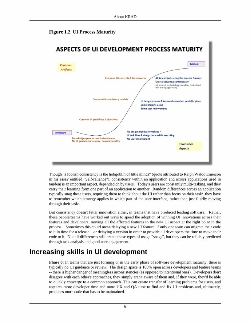
User Experience 101Designing a good user interface is an art, but there are development process aspects that are highlycorrelated with projects and brands that are loved by users. We cover two of those here, one having todo with the use of common user interface (UI) artifacts and the other having to do with the teamworkand user engagement model. Figure 1.2, “UI Process Maturity” shows the Aspects of UI DevelopmentProcess Maturity.
About KRAD
6
Figure 1.2. UI Process Maturity
Though "a foolish consistency is the hobgoblin of little minds" (quote attributed to Ralph Waldo Emersonin his essay entitled "Self-reliance"), consistency within an application and across applications used intandem is an important aspect, depended on by users. Today's users are constantly multi-tasking, and theycarry their learning from one part of an application to another. Random differences across an applicationtypically snag these users, requiring them to think about the UI rather than focus on their task: they haveto remember which strategy applies in which part of the user interface, rather than just fluidly movingthrough their tasks.
But consistency doesn't fetter innovation either, in teams that have produced leading software. Rather,these people/teams have worked out ways to speed the adoption of winning UI innovations across theirfeatures and developers, moving all the affected features to the new UI aspect at the right point in theprocess. Sometimes this could mean delaying a new UI feature, if only one team can migrate their codeto it in time for a release – or delaying a version in order to provide all developers the time to move theircode to it. Not all differences will create these types of usage "snags", but they can be reliably predictedthrough task analysis and good user engagement.
Increasing skills in UI developmentPhase 0: In teams that are just forming or in the early phase of software development maturity, there istypically no UI guidance or review. The design space is 100% open across developers and feature teams-- there is higher danger of meaningless inconsistencies (as opposed to intentional ones). Developers don'tdisagree with each other's approaches, they simply aren't aware of them and, if they were, they'd be ableto quickly converge to a common approach. This can create transfer of learning problems for users, andrequires more developer time and more UX and QA time to find and fix UI problems and, ultimately,produces more code that has to be maintained.
About KRAD
7
Phase 1: In teams that have formed and taken the first steps to organize and manage their user interfaceefforts, there are common UI guidelines. Today, in addition to the KRAD framework of controls, you cantake a look at the Kuali Student project's User Interaction Model that documents the design components,design patterns, and style guide they will use. This covers the type of common UI guidelines shown inthe preceding figure, particularly helpful for where there is not yet a common UI control or template thatdevelopers can use. These types of guidelines are also helpful for guiding when to use a particular control,or to make any customization choices available with that control – and are a recommended part of anyproject. Kuali projects are free to use this as a model or create their own.
Phase 2: In the next step in growing a user interface design leadership process, teams create common UItemplates / models, which enable "lighter-weight" efforts to design and code. The UX effort is up-front andthe benefit is inherited by all developers and feature teams afterward. There are multi-disciplinary teammembers collaborating with developers, including business analysts and UX staff trained in UI design. Consultations and collaboration across feature teams help span UI boundaries and ensure consistency.
Phase 3: In the final stage of maturation in user interface design management, users are engaged throughoutthe process with all feature teams, providing input through controlled user evaluations (rigorous researchmethodology, no pressure / biasing). Managing UX is a habit at this point, part of the development culture. Roles and rewards are in place, but there is momentum, the engine runs on its own steam, developersare championing the collaboration process.
KRAD - Common User Interface ArtifactsKRAD aims to provide common UI controls, making it easier for developers to achieve consistency acrossan application, and across a team of developers working on different parts of an application. Examples ofthe UI controls can be seen in the Rice Test Drive on the KRAD tab (log in with the user name equal toone of the following: admin, quickstart, admin1, admin2, supervisrsupervisor, or director - these providevarying levels of permissions).
Rice 2.0 KRAD is the first version, so with each successive version, more UI aspects will move froma design guideline stage, where every developer has to read and apply a guideline, to a design templatestage, that each developer can use and follow, and, ultimately, to a reusable UI control that each developercan use.
RECAP• Designing a good user interface is an art, but there are development process aspects that are highly
correlated with projects and brands that are loved by users. We covered two of those here, one havingto do with the use of common user interface (UI) artifacts and the other having to do with the teamworkand user engagement model.
• Consistency within an application and across applications used in tandem is an important aspect,depended on by users. In teams that have formed and taken the first steps to organize and manage theiruser interface efforts, there are common UI guidelines. The Kuali Student project has created a UserInteraction Model that documents the design components, design patterns, and style guide they will use.Kuali projects are free to use this as a model or create their own.
• KRAD aims to provide common UI controls, making it easier for developers to achieve consistencyacross an application, and across a team of developers working on different parts of an application. Rice2.0 KRAD is the first version, so with each successive version, more UI aspects will move from a designguideline stage, where every developer has to read and apply a guideline, to a design template stage, thateach developer can use and follow, and, ultimately, to a reusable UI control that each developer can use.
• In the final stage of maturation in user interface design management, users are also engaged throughoutthe process with all feature teams, providing input through controlled user evaluations. Managing UX

About KRAD
8
is a habit and part of the development culture at this point - there is momentum, the engine runs on ititsown steam, developers champion the collaboration process.
Accessibility with WCAG 2.0 and ARIA
Introduction – What are WCAG 2.0 and ARIA?There are two accessibility guidelines that apply to web applications: WCAG 2.0 (Web ContentAccessibility Guidelines) and ARIA (Accessible Rich Internet Applications). WCAG 2.0 sets the baselinefor web page content, while ARIA builds upon this baseline, to enable richer, more dynamic interactionwith web content (developed with Ajax, HTML, JavaScript, and other technologies).
Tip
Who produces the accessibility standards? The World Wide Web Consortium (W3C) isconsidered to be the main international standards organization for the World Wide Web. TheW3C has established the open standards for HTML, XML, XHTML, CSS, DOM, CGI, WCAGand many other aspects. The Web Accessibility Initiative (WAI) is the part of the W3C thatcoordinates and develops the open accessibility standards, including WCAG 2.0, and ARIA 1.0.
• WCAG 2.0 became the recommended standard in December 2008 (see step 5 in the information boxthat follows) and is still the current standard in 2012.
• ARIA became a candidate recommendation in January 2011 (see step 3 in the information box thatfollows). Most browsers across the industry are already implementing (see example compatibilitytables: Mozilla FAQ table, "Can I use" table). ARIA tags don't create problems in browsers that don'tsupport them – they are simply ignored by these older browsers. The ARIA candidate is projected tobecome the proposed recommendation this spring, 2012 (to move to step 4 in the information box thatfollows).
• HTML5, discussed in the previous section, also relates to accessibility in addition to its focus onmobility. The HTML5 guidelines are not as far along in the draft process as ARIA, but one of thegoals is to make the ARIA attributes into standard features in HTML5 – in addition to providingadditional semantic structure enrichment (accessibility depends on conveying the semantics). TheHTML5 guidelines were issued as a last call working draft in May 2011 (see step 2 below), with thereview period closing in August 2011. Even though it has not yet entered the call for implementationlevel, browsers have already begun to build in support (see http://html5accessibility.com/). It is expectedto go through another last call based on the extent of the review comments.
Tip
What is the review process for standards? 5 "maturity levels":
1. First Public Working Draft (out for public review and comment)
2. Last Call Working Draft (revised based on the comments, last chance for comments). HTML5is here and expected to be re-issued again at this level based on the comments!
3. Call for implementation of Candidate Recommendation (this is like a 'beta'). ARIA is hereand expected to move to #4 in spring 2012!
4. Call for Review of Proposed Recommendation (last review before finalization)
5. W3C Recommendation (considered to be the open web standard). WCAG 2.0 is here!
About KRAD
9
WCAG 2.0 OverviewWCAG 2.0 is a mature standard, though it is new to many of us. (If this content is familiar to you, you couldjump directly to the ARIA section that follows this.) WCAG 2.0 is an update to WCAG 1.0, which was forstatic web pages only (could not require jScript). Running without javascript is no longer a requirement. WCAG 2.0 recognizes the web as an interactive space, not solely for passive reading.
There are 12 guidelines, organized under 4 principles: perceivable, operable, understandable, and robust. For each of the 12 guidelines, there are testable success criteria, at each of these levels: A (must have),AA (should have), and AAA (may have).
Comprehensive information is available from the W3C here, about how to meet WCAG 2.0.
Accessibility Code CheckersThere are many free accessibility code checkers, and it is recommended that developers check their codewith one of these tools. For example, here is a short list of accessibility checkers you could consider:
• ACCprobe
• AChecker
• Adesigner
• Ainspector
• FAE (U of I)
• Open Ajax Alliance
• Total Validator
• WAVE
A more comprehensive list of code-checkers is available at http://www.w3.org/WAI/ER/tools/complete.
What should developers pay attention to in creatingaccessible applications with KRAD?
The KRAD team did an extensive baseline evaluation to understand where the KNS and new KRADframework stand on these criteria, and made several changes. For example,
• The standard language tag was added to KRAD. This supports level A criteria 3.1.1, in theUnderstandable category: "The default human language of each web page can be programmatically-determined."
• Buttons, which were formerly images of text in KNS, were changed to text buttons withbackground images. This supports level A criteria 1.4.3 and 1.4.4, in the Perceivable category: "Contrast ratio of at least 4.5:1" (inherits high contract setting) and "Text can be resized up to 200%without assistive technologies" (inherits low DPI/large font settings). This also supports level AAcriteria 1.4.5, in this same category: "Text used instead of images of text except for customizable images(by user) and essential images (logotype)".
Several other bugs were fixed and changes made, including adding alt-text in many places.

About KRAD
10
Our intent moving forward is to invest in making KRAD's UIF accessible, enabling applications built withthe framework to inherit the benefit. The first version of KRAD, in Rice 2.0, meets most of the A-levelcriteria, and many of the AA criteria, and in the areas where it does not meet, there are requirements listedfor Rice 2.2 to bring us up to compliance.
The good news is that applications can resolve most of the aspects where Rice 2.0 KRAD doesn't yet havethe built-in accessibility support for you to inherit, and there will be additional support in Rice 2.2 KRAD.
Following are 7 areas that application developers using Rice 2.0 KRAD should consider in theirapplications:
• Tables, tabs, and field group semantics. Even before we build this into the UIF in Rice 2.2 KRAD,applications can implement the fixes for these areas, documented in the requirements related to tablesemantics, tab semantics, and fieldset-legends. This affects level A criteria 1.3.1, in the Perceivablecategory: "Information, structure & relationships can be programmatically determined or are availablein text."
• Standard keyboard support. This affects level A criteria 2.1.1, in the Operable category: "Allfunctionality & info is operable through a keyboard interface w/o requiring specific timings forindividual keystrokes."
• Standard "Jump to main content" links. This affects level A criteria 2.4.1 in the Operable category:"Provide a way to bypass blocks of content that are repeated on multiple pages." A simple code snippetexample that fixes this follows.
<div id="accessibility"> <a href="#nav">Jump to Navigation</a> <a href="#main-content">Jump to MainContent</a></div>
• Page titles. This affects level A criteria 2.4.2 in the Operable category: "Web pages have titles thatdescribe topic or purpose." Also, KULRICE-5688 is related to this, though not technically a "page",the iframe title default is currently = "edoc", which default should be changed to "main content" andupdated by the application when they populate it.
• Link titles. This affects level A criteria 2.4.4 in the Operable category: "The purpose of each linkcan be determined from the link text alone or from the link text together with its programmatically-determined link context." Specifically, when a link will open a new browser tab or window, that shouldbe conveyed to the user in link title text (e.g., "Opens new browser tab – link title text").
• Parsing standards: This affects level A criteria 4.1.1 in the Robust category: "In content implementedusing markup languages, elements have complete start and end tags, elements are nested according totheir specifications, elements do not contain duplicate attributes, & IDs are unique (except where specsallow these features)." The W3C has code validators you can use to find and fix violations. See http://www.w3.org/QA/Tools/. See also the list of accessibility code checkers in the previous material.
• Name, role and value. This affects level A criteria 4.1.2 in the Robust category: "For all UIcomponents, the name & role can be programmatically determined; states, properties & values set bythe user can be programmatically set; and notification of changes to these items is available to useragents, including assistive technologies." The new ARIA guidelines make it easier to address thesecriteria, and we'll look at these guidelines next.
ARIA OverviewThe new ARIA guidelines enable interactive web applications to be accessible – you no longer have tocreate an alternate version without jScript. ARIA represents an extension to both HTML and XHTML,
About KRAD
11
providing new attributes to dynamically convey how interactive features (controls, widgets, Ajax liveregions, and events) relate to each other and what is their current state. The goal is to make these intostandard features in HTML5.
From the WAI-ARIA Primer:
"Authors of JavaScript-generated content do not want to limit themselves to using standard tag elementsthat define the actual user interface element such as tables, ordered lists, etc. Rather, they make extensiveuse of elements such as DIV tags in which they dynamically apply a user interface (UI) through the use ofstyle sheets and dynamic content changes. HTML DIV tags provide no semantic information. For example,authors may define a DIV as the start of a pop-up menu or even an ordered list. However, no HTMLmechanism exists to:
• Identify the role of the DIV as a pop-up menu
• Alert assistive technology when these elements have focus
• Convey accessibility property information, such as whether the pop-up menu is collapsed or expanded
• Define what actions can be formed on the element other than through a device-dependent means throughthe event handler type (onmouseover, onclick, etc.)
In short, JavaScript needs an accessibility architecture to write to such that a solution can be mapped tothe accessibility frameworks on the native platform by the user agent."
ARIA gives us several new constructs to do this, to dynamically convey how interactive features relateto each other and what is their current state:
• New "Roles" (Role =" ") to describe:
• the type of widget ("menu," "treeitem," "slider," and "progressmeter")
• the structure of a table or page (headings, regions, grids)
• New properties – to define and describe:
• the state of a widget or control
• the state of "live" regions on a page that will receive updates, and how/when to handle those
• drag-and-drop sources and targets
• New keyboard support techniques for navigating among web objects and events
Adding ARIA to an applicationThere is a 7-step process recommended when applying ARIA to web application code (steps drawn fromthe in WAI-ARIA Primer, examples supplied by this training module):
1. Rely on native markup when possible. For example, if there is a native HTML method that works wellfor grouping controls (fieldset & legend), use that instead of creating a div with a role to group them.
2. Apply appropriate ARIA roles. There are dozens more ARIA roles, but here are a few examples, toconvey the idea:
• Widget roles: button, checkbox, dialog, link, radio, tab, tooltip, treeitem
• Document structure roles: document, group, heading, presentation, region
About KRAD
12
• Landmark roles: application, banner, form, main, menu, navigation, search
Note
Assigning the role="presentation" to any native markup means that the semantics of themarkup will not be conveyed to assistive technologies (it is for visual presentation only). Thiscan be useful, for example, when a table is used for layout purposes (when the table row/column structure is not relevant).
If there is no landmark role that fits the need, authors can define their own custom regions. Anyrole can be marked aria-live, which means that it will receive updates, its state will change. Changes within live regions automatically get passed through to assistive technologies, sothese are accessible.
3. Preserve semantic structure. Preserve DOM hierarchy, form logical groups, assign landmark roles.
4. Build relationships. For example, use aria-describedby to identify the element that describes theobject, and use aria-labelledby to identify the element that labels the object. For more information, seeWAI-ARIA relationships.
5. Set states and properties in response to events. After you've created the elements with their roles inyour code-base, be sure you add the code to change the state and property in response to user interaction. For example, when something is selected, when something is expanded, and so on. For example,make sure the appropriate tab is marked active in the tablist structure and others are marked inactive.
6. Support keyboard navigation. Now with ARIA, the tabindex attribute can be applied to anydisplayable HTML element, making it easier to add items on a page into the keyboard tab order. Youcan either use a roving tabindex or the aria-activedescendant property. For more details, see WAI-ARIA- Keyboard support.
7. Synchronize the visual interface with the accessible interface. Make sure that ARIA states aresynchronized with the visual interface and vice-versa. For example, make sure that aria-selected itemsinherit a visual treatment for selected state, that ARIA infocus items inherit a visual treatment for in-focus state, that aria-required items are marked visually with a required indicator, and so on.
RECAPThere are four major "take-aways" in this accessibility section:
• There are two accessibility guidelines that apply to web applications, created by the W3C:
• WCAG 2.0 (Web Content Accessibility Guidelines) – a finalized standard in 2008.
• ARIA (Accessible Rich Internet Applications) – a candidate standard (beta) in 2011.
• There are many free accessibility code checkers, and it is recommended that developers check their codewith one of these tools. See the links to tools in the previous pages.
• KRAD is investing in accessibility and applications developed with KRAD will be able to inherit thisbenefit in Rice 2.2. Applications developed with Rice 2.0 KRAD should give attention to 7 areas inWCAG 2.0, with fixes discussed for these 7 areas in the previous pages.
• ARIA represents an extension to both HTML and XHTML, providing new attributes to dynamicallyconvey how interactive features (controls, widgets, Ajax live regions, and events) relate to each otherand what is their current state.

About KRAD
13
• There are new "roles" and properties to define states, new drag-and-drop semantics and expandedsupport for enabling keyboard access.
• There is a recommended 7-step process for adding ARIA to an application.
• The goal is to make these into standard features in HTML5.
See details and links in the previous pages.
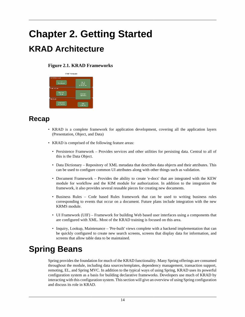
14
Chapter 2. Getting StartedKRAD Architecture
Figure 2.1. KRAD Frameworks
Recap• KRAD is a complete framework for application development, covering all the application layers
(Presentation, Object, and Data)
• KRAD is comprised of the following feature areas:
• Persistence Framework – Provides services and other utilities for persisting data. Central to all ofthis is the Data Object.
• Data Dictionary – Repository of XML metadata that describes data objects and their attributes. Thiscan be used to configure common UI attributes along with other things such as validation.
• Document Framework – Provides the ability to create 'e-docs' that are integrated with the KEWmodule for workflow and the KIM module for authorization. In addition to the integration theframework, it also provides several reusable pieces for creating new documents.
• Business Rules – Code based Rules framework that can be used to writing business rulescorresponding to events that occur on a document. Future plans include integration with the newKRMS module.
• UI Framework (UIF) – Framework for building Web based user interfaces using a components thatare configured with XML. Most of the KRAD training is focused on this area.
• Inquiry, Lookup, Maintenance – 'Pre-built' views complete with a backend implementation that canbe quickly configured to create new search screens, screens that display data for information, andscreens that allow table data to be maintained.
Spring BeansSpring provides the foundation for much of the KRAD functionality. Many Spring offerings are consumedthroughout the module, including data sources/templates, dependency management, transaction support,remoting, EL, and Spring MVC. In addition to the typical ways of using Spring, KRAD uses its powerfulconfiguration system as a basis for building declarative frameworks. Developers use much of KRAD byinteracting with this configuration system. This section will give an overview of using Spring configurationand discuss its role in KRAD.
Getting Started
15
Configuration SystemSpring provides a configuration system that allows us to configure how to instantiate, configure, andassemble objects in our application. Furthermore, this configuration can take place outside of Java code.As simple as it might sound, this is a very powerful construct that has changed many aspects of applicationdevelopment. An application of this includes configuring the dependencies for an object (other objects itdepends on). This is known as Inversion of Control, the opposite of the object getting its own dependencies(for example with a ServiceLocator for service dependencies).
KRAD along with the rest of Rice use this feature of Spring to set dependencies such as services, DAOs,and data sources. This gives applications built with Rice much greater flexibility, as the implementationsfor these dependencies can be changed and configured for us with the Spring configuration.
Besides setting other object dependencies, the Spring configuration can be used to set values for primitiveproperties (String, Integer, Boolean …). In addition, we can instruct Spring on how to set the propertyvalue, whether it be by a standard setter, constructor argument, or annotated method. Essentially Springallows us to give a formula for creating and populating an object instance completely outside of code. Thisso called formula is known as the bean configuration.
Bean ConfigurationSpring supports various methods for bean configuration, the most common of these being XML. EachXML file must adhere to the Spring bean doctype and is sometimes referred to as 'Spring Bean XML'. Thefollowing is the shows the doctype definition for the 3.1 release:
1 2 <beans xmlns="http://www.springframework.org/schema/beans" 3 xmlns:xsi="http://www.w3.org/2001/XMLSchema-instance" 4 xmlns:beans="http://www.springframework.org/schema/beans" 5 xsi:schemaLocation="http://www.springframework.org/schema/beans 6 http://www.springframework.org/schema/beans/spring-beans-3.1.xsd"> 7
Note this sets up use for the bean namespace. Spring provides many other XML namespaces that are usedfor various purposes. If one of these are used, the corresponding definition must be declared with the beandoctype. One of these other namespaces, the 'p' namespace, will be covered later on in this section.
Once we have our XML file setup, we can begin specifying the bean configuration. Each file may contain asmany bean configurations as we like (we will see later on certain best practices for Spring file organization).To start a new bean configuration, we use the bean tag:
1 2 <bean id="address" class="edu.myedu.sample.Address"> 3 </bean> 4
As we will see in a bit, the bean configuration is loading into a container managed by Spring. In orderto identify a bean configuration, we must give it a unique name using the id attribute. In addition we seehere an attribute named class. Recall the purpose of the bean configuration is to construct and populate anobject, so we must tell Spring what type of object we want created
Bean Names
Spring allows us to name our bean using the id attribute or the name attribute, or both. Inaddition, we can give multiple names in the name attribute that can be used to identify the bean
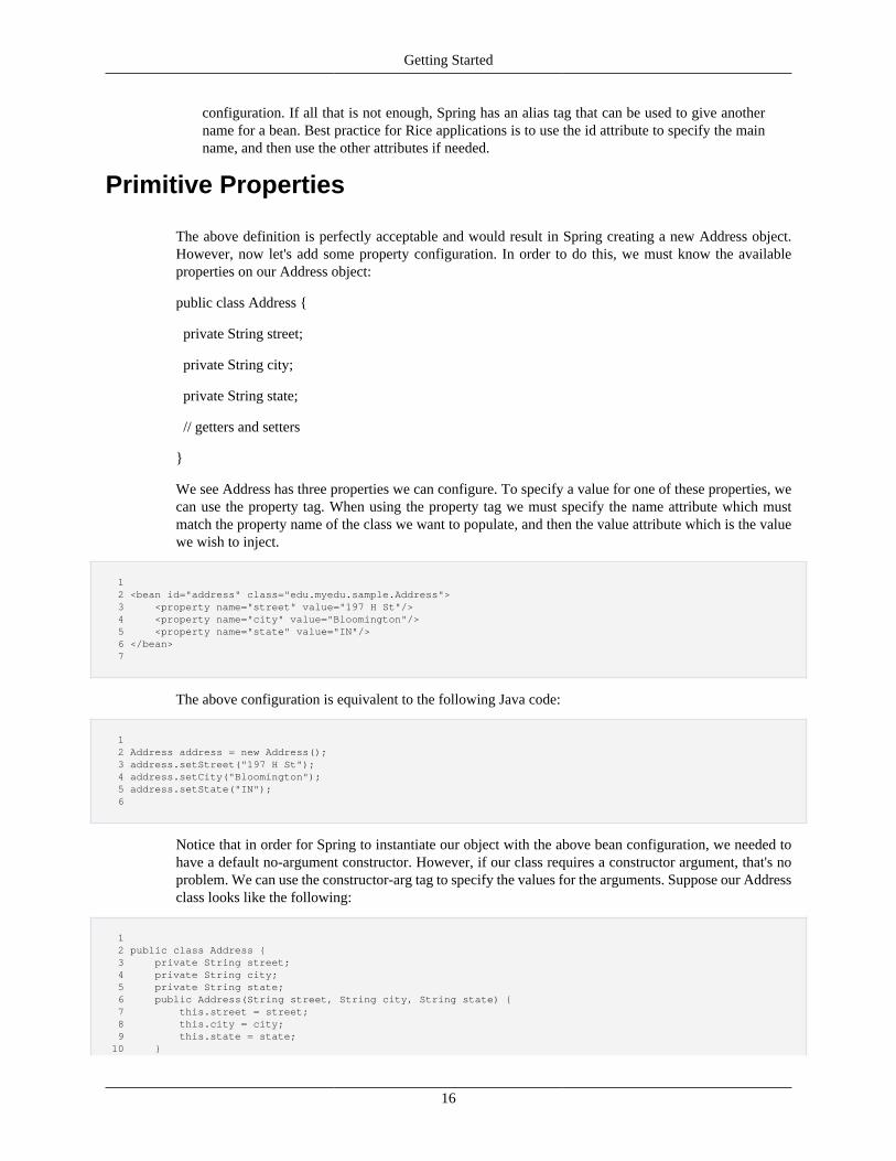
Getting Started
16
configuration. If all that is not enough, Spring has an alias tag that can be used to give anothername for a bean. Best practice for Rice applications is to use the id attribute to specify the mainname, and then use the other attributes if needed.
Primitive Properties
The above definition is perfectly acceptable and would result in Spring creating a new Address object.However, now let's add some property configuration. In order to do this, we must know the availableproperties on our Address object:
public class Address {
private String street;
private String city;
private String state;
// getters and setters
}
We see Address has three properties we can configure. To specify a value for one of these properties, wecan use the property tag. When using the property tag we must specify the name attribute which mustmatch the property name of the class we want to populate, and then the value attribute which is the valuewe wish to inject.
1 2 <bean id="address" class="edu.myedu.sample.Address"> 3 <property name="street" value="197 H St"/> 4 <property name="city" value="Bloomington"/> 5 <property name="state" value="IN"/> 6 </bean> 7
The above configuration is equivalent to the following Java code:
1 2 Address address = new Address(); 3 address.setStreet("197 H St"); 4 address.setCity("Bloomington"); 5 address.setState("IN"); 6
Notice that in order for Spring to instantiate our object with the above bean configuration, we needed tohave a default no-argument constructor. However, if our class requires a constructor argument, that's noproblem. We can use the constructor-arg tag to specify the values for the arguments. Suppose our Addressclass looks like the following:
1 2 public class Address { 3 private String street; 4 private String city; 5 private String state; 6 public Address(String street, String city, String state) { 7 this.street = street; 8 this.city = city; 9 this.state = state; 10 }
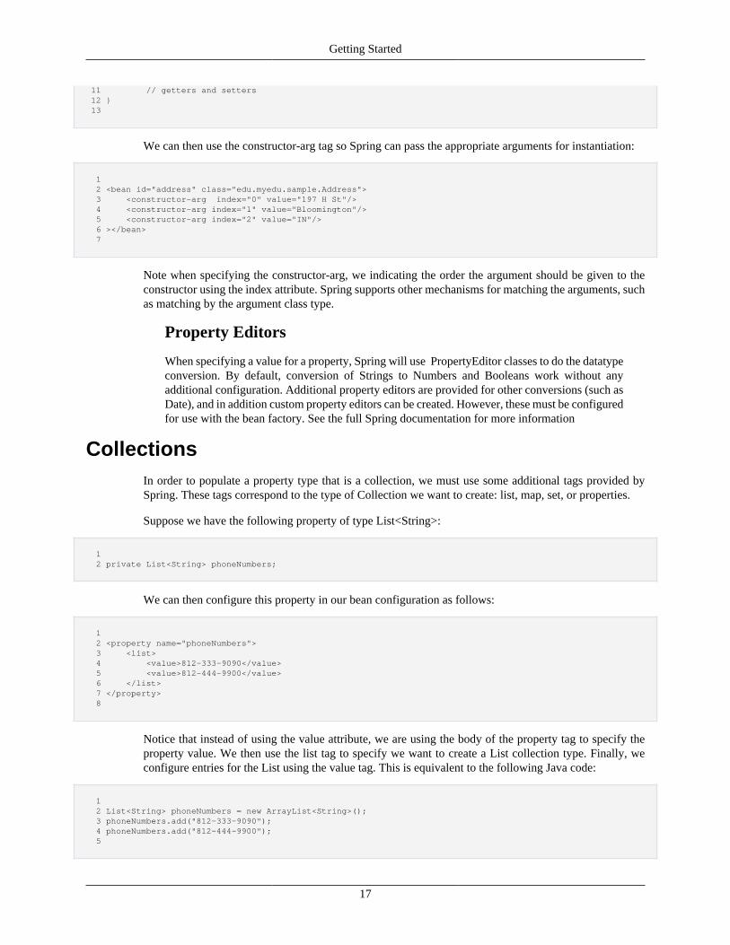
Getting Started
17
11 // getters and setters 12 } 13
We can then use the constructor-arg tag so Spring can pass the appropriate arguments for instantiation:
1 2 <bean id="address" class="edu.myedu.sample.Address"> 3 <constructor-arg index="0" value="197 H St"/> 4 <constructor-arg index="1" value="Bloomington"/> 5 <constructor-arg index="2" value="IN"/> 6 ></bean> 7
Note when specifying the constructor-arg, we indicating the order the argument should be given to theconstructor using the index attribute. Spring supports other mechanisms for matching the arguments, suchas matching by the argument class type.
Property Editors
When specifying a value for a property, Spring will use PropertyEditor classes to do the datatypeconversion. By default, conversion of Strings to Numbers and Booleans work without anyadditional configuration. Additional property editors are provided for other conversions (such asDate), and in addition custom property editors can be created. However, these must be configuredfor use with the bean factory. See the full Spring documentation for more information
CollectionsIn order to populate a property type that is a collection, we must use some additional tags provided bySpring. These tags correspond to the type of Collection we want to create: list, map, set, or properties.
Suppose we have the following property of type List<String>:
1 2 private List<String> phoneNumbers;
We can then configure this property in our bean configuration as follows:
1 2 <property name="phoneNumbers"> 3 <list> 4 <value>812-333-9090</value> 5 <value>812-444-9900</value> 6 </list> 7 </property> 8
Notice that instead of using the value attribute, we are using the body of the property tag to specify theproperty value. We then use the list tag to specify we want to create a List collection type. Finally, weconfigure entries for the List using the value tag. This is equivalent to the following Java code:
1 2 List<String> phoneNumbers = new ArrayList<String>(); 3 phoneNumbers.add("812-333-9090"); 4 phoneNumbers.add("812-444-9900"); 5
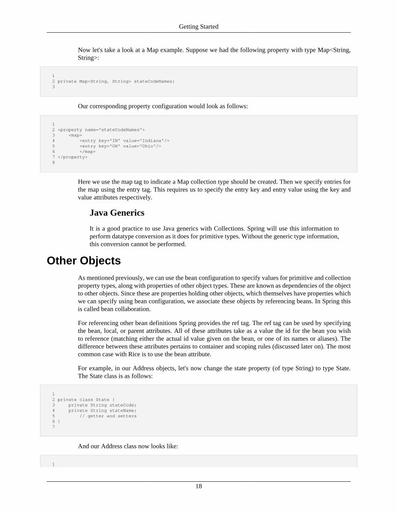
Getting Started
18
Now let's take a look at a Map example. Suppose we had the following property with type Map<String,String>:
1 2 private Map<String, String> stateCodeNames; 3
Our corresponding property configuration would look as follows:
1 2 <property name="stateCodeNames"> 3 <map> 4 <entry key="IN" value="Indiana"/> 5 <entry key="OH" value="Ohio"/> 6 </map> 7 </property> 8
Here we use the map tag to indicate a Map collection type should be created. Then we specify entries forthe map using the entry tag. This requires us to specify the entry key and entry value using the key andvalue attributes respectively.
Java Generics
It is a good practice to use Java generics with Collections. Spring will use this information toperform datatype conversion as it does for primitive types. Without the generic type information,this conversion cannot be performed.
Other ObjectsAs mentioned previously, we can use the bean configuration to specify values for primitive and collectionproperty types, along with properties of other object types. These are known as dependencies of the objectto other objects. Since these are properties holding other objects, which themselves have properties whichwe can specify using bean configuration, we associate these objects by referencing beans. In Spring thisis called bean collaboration.
For referencing other bean definitions Spring provides the ref tag. The ref tag can be used by specifyingthe bean, local, or parent attributes. All of these attributes take as a value the id for the bean you wishto reference (matching either the actual id value given on the bean, or one of its names or aliases). Thedifference between these attributes pertains to container and scoping rules (discussed later on). The mostcommon case with Rice is to use the bean attribute.
For example, in our Address objects, let's now change the state property (of type String) to type State.The State class is as follows:
1 2 private class State { 3 private String stateCode; 4 private String stateName; 5 // getter and setters 6 } 7
And our Address class now looks like:
1
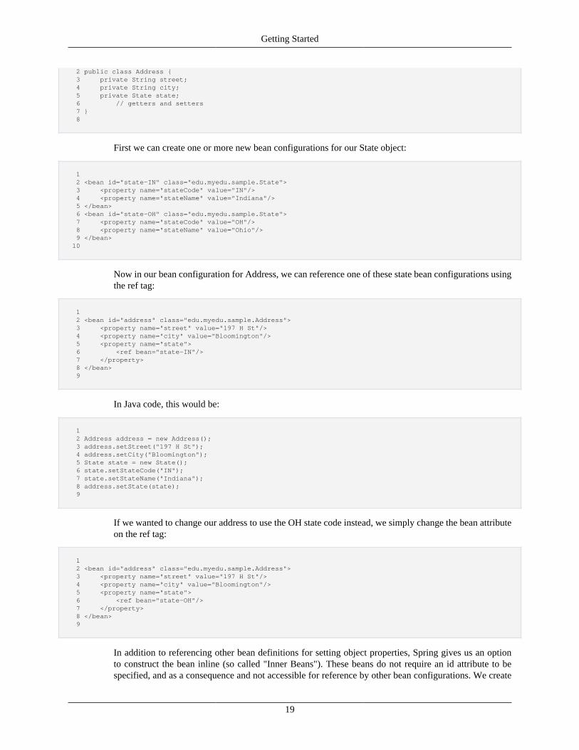
Getting Started
19
2 public class Address { 3 private String street; 4 private String city; 5 private State state; 6 // getters and setters 7 } 8
First we can create one or more new bean configurations for our State object:
1 2 <bean id="state-IN" class="edu.myedu.sample.State"> 3 <property name="stateCode" value="IN"/> 4 <property name="stateName" value="Indiana"/> 5 </bean> 6 <bean id="state-OH" class="edu.myedu.sample.State"> 7 <property name="stateCode" value="OH"/> 8 <property name="stateName" value="Ohio"/> 9 </bean> 10
Now in our bean configuration for Address, we can reference one of these state bean configurations usingthe ref tag:
1 2 <bean id="address" class="edu.myedu.sample.Address"> 3 <property name="street" value="197 H St"/> 4 <property name="city" value="Bloomington"/> 5 <property name="state"> 6 <ref bean="state-IN"/> 7 </property> 8 </bean> 9
In Java code, this would be:
1 2 Address address = new Address(); 3 address.setStreet("197 H St"); 4 address.setCity("Bloomington"); 5 State state = new State(); 6 state.setStateCode("IN"); 7 state.setStateName("Indiana"); 8 address.setState(state); 9
If we wanted to change our address to use the OH state code instead, we simply change the bean attributeon the ref tag:
1 2 <bean id="address" class="edu.myedu.sample.Address"> 3 <property name="street" value="197 H St"/> 4 <property name="city" value="Bloomington"/> 5 <property name="state"> 6 <ref bean="state-OH"/> 7 </property> 8 </bean> 9
In addition to referencing other bean definitions for setting object properties, Spring gives us an optionto construct the bean inline (so called "Inner Beans"). These beans do not require an id attribute to bespecified, and as a consequence and not accessible for reference by other bean configurations. We create
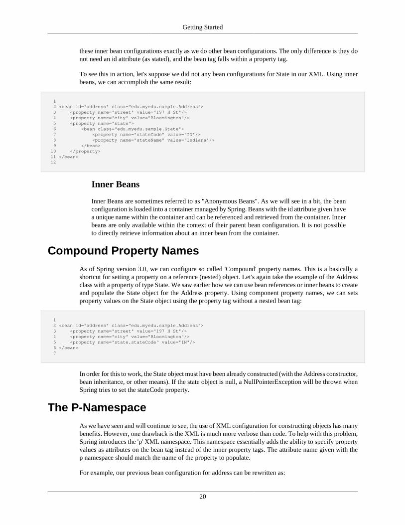
Getting Started
20
these inner bean configurations exactly as we do other bean configurations. The only difference is they donot need an id attribute (as stated), and the bean tag falls within a property tag.
To see this in action, let's suppose we did not any bean configurations for State in our XML. Using innerbeans, we can accomplish the same result:
1 2 <bean id="address" class="edu.myedu.sample.Address"> 3 <property name="street" value="197 H St"/> 4 <property name="city" value="Bloomington"/> 5 <property name="state"> 6 <bean class="edu.myedu.sample.State"> 7 <property name="stateCode" value="IN"/> 8 <property name="stateName" value="Indiana"/> 9 </bean> 10 </property> 11 </bean> 12
Inner Beans
Inner Beans are sometimes referred to as "Anonymous Beans". As we will see in a bit, the beanconfiguration is loaded into a container managed by Spring. Beans with the id attribute given havea unique name within the container and can be referenced and retrieved from the container. Innerbeans are only available within the context of their parent bean configuration. It is not possibleto directly retrieve information about an inner bean from the container.
Compound Property NamesAs of Spring version 3.0, we can configure so called 'Compound' property names. This is a basically ashortcut for setting a property on a reference (nested) object. Let's again take the example of the Addressclass with a property of type State. We saw earlier how we can use bean references or inner beans to createand populate the State object for the Address property. Using component property names, we can setsproperty values on the State object using the property tag without a nested bean tag:
1 2 <bean id="address" class="edu.myedu.sample.Address"> 3 <property name="street" value="197 H St"/> 4 <property name="city" value="Bloomington"/> 5 <property name="state.stateCode" value="IN"/> 6 </bean> 7
In order for this to work, the State object must have been already constructed (with the Address constructor,bean inheritance, or other means). If the state object is null, a NullPointerException will be thrown whenSpring tries to set the stateCode property.
The P-NamespaceAs we have seen and will continue to see, the use of XML configuration for constructing objects has manybenefits. However, one drawback is the XML is much more verbose than code. To help with this problem,Spring introduces the 'p' XML namespace. This namespace essentially adds the ability to specify propertyvalues as attributes on the bean tag instead of the inner property tags. The attribute name given with thep namespace should match the name of the property to populate.
For example, our previous bean configuration for address can be rewritten as:
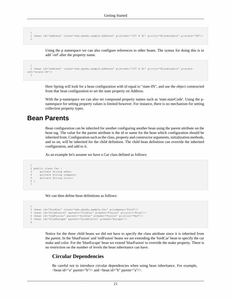
Getting Started
21
1 2 <bean id="address" class="edu.myedu.sample.Address" p:street="197 H St" p:city="Bloomington" p:state="IN"/> 3
Using the p namespace we can also configure references to other beans. The syntax for doing this is toadd '-ref' after the property name.
1 2 <bean id="address" class="edu.myedu.sample.Address" p:street="197 H St" p:city="Bloomington" p:state-ref="state-IN"/> 3
Here Spring will look for a bean configuration with id equal to "state-IN", and use the object constructedfrom that bean configuration to set the state property on Address.
With the p-namespace we can also set compound property names such as 'state.stateCode'. Using the p-namespace for setting property values is limited however. For instance, there is no mechanism for settingcollection property types.
Bean ParentsBean configuration can be inherited for another configuring another bean using the parent attribute on thebean tag. The value for the parent attribute is the id or name for the bean which configuration should beinherited from. Configuration such as the class, property and constructor arguments, initialization methods,and so on, will be inherited for the child definition. The child bean definition can override the inheritedconfiguration, and add to it.
As an example let's assume we have a Car class defined as follows:
1 2 public class Car { 3 private String make; 4 private String company; 5 private String color; 6 } 7
We can then define bean definitions as follows:
1 2 <bean id="fordCar" class="edu.myedu.sample.Car" p:company="Ford"/> 3 <bean id="blueFusion" parent="fordCar" p:make="Fusion" p:color="Blue"/> 4 <bean id="redFusion" parent="fordCar" p:make="Fusion" p:color="Red"/> 5 <bean id="blueEscape" parent="blueFusion" p:make="Escape"/> 6
Notice for the three child beans we did not have to specify the class attribute since it is inherited fromthe parent. In the 'blueFusion' and 'redFusion' beans we are extending the 'fordCar' bean to specify the carmake and color. For the 'blueEscape' bean we extend 'blueFusion' to override the make property. There isno restriction on the number of levels the bean inheritance can have.
Circular Dependencies
Be careful not to introduce circular dependencies when using bean inheritance. For example,<bean id="a" parent="b"/> and <bean id="b" parent="a"/>.
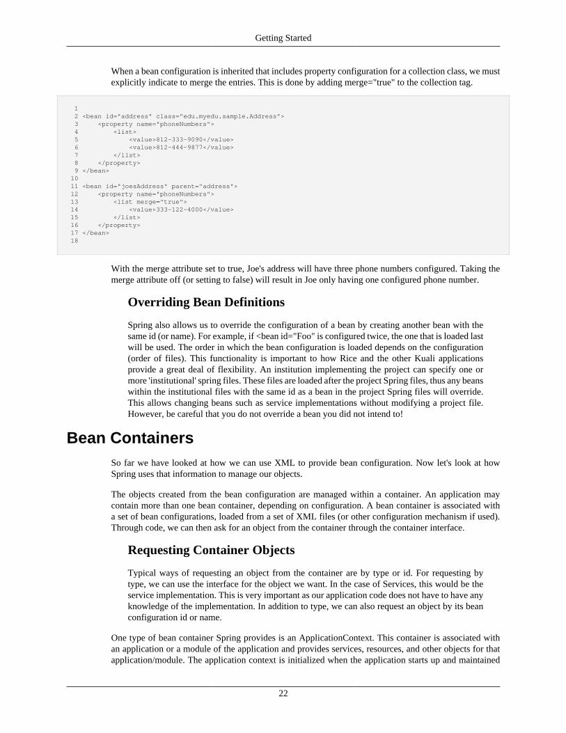
Getting Started
22
When a bean configuration is inherited that includes property configuration for a collection class, we mustexplicitly indicate to merge the entries. This is done by adding merge="true" to the collection tag.
1 2 <bean id="address" class="edu.myedu.sample.Address"> 3 <property name="phoneNumbers"> 4 <list> 5 <value>812-333-9090</value> 6 <value>812-444-9877</value> 7 </list> 8 </property> 9 </bean> 10 11 <bean id="joesAddress" parent="address"> 12 <property name="phoneNumbers"> 13 <list merge="true"> 14 <value>333-122-4000</value> 15 </list> 16 </property> 17 </bean> 18
With the merge attribute set to true, Joe's address will have three phone numbers configured. Taking themerge attribute off (or setting to false) will result in Joe only having one configured phone number.
Overriding Bean Definitions
Spring also allows us to override the configuration of a bean by creating another bean with thesame id (or name). For example, if <bean id="Foo" is configured twice, the one that is loaded lastwill be used. The order in which the bean configuration is loaded depends on the configuration(order of files). This functionality is important to how Rice and the other Kuali applicationsprovide a great deal of flexibility. An institution implementing the project can specify one ormore 'institutional' spring files. These files are loaded after the project Spring files, thus any beanswithin the institutional files with the same id as a bean in the project Spring files will override.This allows changing beans such as service implementations without modifying a project file.However, be careful that you do not override a bean you did not intend to!
Bean ContainersSo far we have looked at how we can use XML to provide bean configuration. Now let's look at howSpring uses that information to manage our objects.
The objects created from the bean configuration are managed within a container. An application maycontain more than one bean container, depending on configuration. A bean container is associated witha set of bean configurations, loaded from a set of XML files (or other configuration mechanism if used).Through code, we can then ask for an object from the container through the container interface.
Requesting Container Objects
Typical ways of requesting an object from the container are by type or id. For requesting bytype, we can use the interface for the object we want. In the case of Services, this would be theservice implementation. This is very important as our application code does not have to have anyknowledge of the implementation. In addition to type, we can also request an object by its beanconfiguration id or name.
One type of bean container Spring provides is an ApplicationContext. This container is associated withan application or a module of the application and provides services, resources, and other objects for thatapplication/module. The application context is initialized when the application starts up and maintained
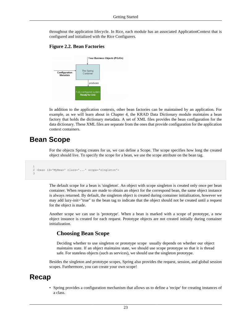
Getting Started
23
throughout the application lifecycle. In Rice, each module has an associated ApplicationContext that isconfigured and initialized with the Rice Configurers.
Figure 2.2. Bean Factories
In addition to the application contexts, other bean factories can be maintained by an application. Forexample, as we will learn about in Chapter 4, the KRAD Data Dictionary module maintains a beanfactory that holds the dictionary metadata. A set of XML files provides the bean configuration for thedata dictionary. These XML files are separate from the ones that provide configuration for the applicationcontext containers.
Bean ScopeFor the objects Spring creates for us, we can define a Scope. The scope specifies how long the createdobject should live. To specify the scope for a bean, we use the scope attribute on the bean tag.
1 2 <bean id="MyBean" class="..." scope="singleton"> 3
The default scope for a bean is 'singleton'. An object with scope singleton is created only once per beancontainer. When requests are made to obtain an object for the correspond bean, the same object instanceis always returned. By default, the singleton object is created during container initialization, however wemay add lazy-init="true" to the bean tag to indicate that the object should not be created until a requestfor the object is made.
Another scope we can use is 'prototype'. When a bean is marked with a scope of prototype, a newobject instance is created for each request. Prototype objects are not created initially during containerinitialization.
Choosing Bean Scope
Deciding whether to use singleton or prototype scope usually depends on whether our objectmaintains state. If an object maintains state, we should use scope prototype so that it is threadsafe. For stateless objects (such as services), we should use the singleton prototype.
Besides the singleton and prototype scopes, Spring also provides the request, session, and global sessionscopes. Furthermore, you can create your own scope!
Recap• Spring provides a configuration mechanism that allows us to define a 'recipe' for creating instances of
a class.

Getting Started
24
• We can use XML to provide bean configurations. A bean configuration is given using the bean tag,and includes an id attribute to uniquely identify the bean and a class attribute to indicate the class forthe object to create.
• Using the property tag we can configure property values for primitive types and collections. We canalso configure dependencies of the object (which are properties of other object types) using the ref tagor inner beans.
• The ability to configure dependencies external to the parent object is the Inversion of Control pattern.
• We can use the p-namespace as a shortcut for configuring properties.
• Spring allows us to inherit bean configuration using the parent attribute. The configuration inherited bythe child bean definition can be overridden and added to.
• In order to merge inherited collection configuration, we must specify merge="true".
• The objects created by Spring are managed within a container. Generally there is a container for thewhole application or each application module. In addition, containers can be created for other purposes.
• The bean scope defines how long the created object will live. The default scope of singleton means onlyone object will be created and shared throughout the application lifecycle. With a scope of prototype, anew object instance will be created each time a request is made to the container.
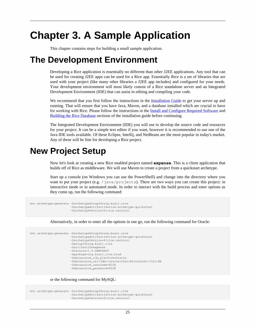
25
Chapter 3. A Sample ApplicationThis chapter contains steps for building a small sample application.
The Development EnvironmentDeveloping a Rice application is essentially no different than other J2EE applications. Any tool that canbe used for creating J2EE apps can be used for a Rice app. Essentially Rice is a set of libraries that areused with your project (like many other libraries a J2EE app includes) and configured for your needs.Your development environment will most likely consist of a Rice standalone server and an IntegratedDevelopment Environment (IDE) that can assist in editing and compiling your code.
We recommend that you first follow the instructions in the Installation Guide to get your server up andrunning. That will ensure that you have Java, Maven, and a database installed which are crucial to havefor working with Rice. Please follow the instructions in the Install and Configure Required Software andBuilding the Rice Database sections of the installation guide before continuing.
The Integrated Development Environment (IDE) you will use to develop the source code and resourcesfor your project. It can be a simple text editor if you want, however it is recommended to use one of theJava IDE tools available. Of these Eclipse, Intellij, and NetBeans are the most popular in today's market.Any of these will be fine for developing a Rice project.
New Project SetupNow let's look at creating a new Rice enabled project named expense. This is a client application thatbuilds off of Rice as middleware. We will use Maven to create a project from a quickstart archetype.
Start up a console (on Windows you can use the PowerShell) and change into the directory where youwant to put your project (e.g. /java/projects). There are two ways you can create this project: ininteractive mode or in automated mode. In order to interact with the build process and enter options asthey come up, run the following command:
mvn archetype:generate -DarchetypeGroupId=org.kuali.rice -DarchetypeArtifactId=rice-archetype-quickstart -DarchetypeVersion=${rice.version}
Alternatively, in order to enter all the options in one go, run the following command for Oracle:
mvn archetype:generate -DarchetypeGroupId=org.kuali.rice -DarchetypeArtifactId=rice-archetype-quickstart -DarchetypeVersion=${rice.version} -DgroupId=org.kuali.rice -DartifactId=expense -Dversion=1.0-SNAPSHOT -Dpackage=org.kuali.rice.krad -Ddatasource_ojb_platform=Oracle -Ddatasource_url=jdbc:oracle:thin:@localhost:1521:XE -Ddatasource_username=RICE -Ddatasource_password=RICE
or the following command for MySQL:
mvn archetype:generate -DarchetypeGroupId=org.kuali.rice -DarchetypeArtifactId=rice-archetype-quickstart -DarchetypeVersion=${rice.version}
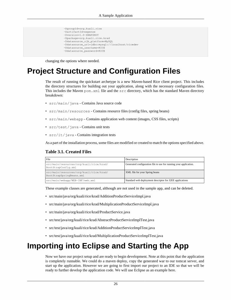
A Sample Application
26
-DgroupId=org.kuali.rice -DartifactId=expense -Dversion=1.0-SNAPSHOT -Dpackage=org.kuali.rice.krad -Ddatasource_ojb_platform=MySQL -Ddatasource_url=jdbc:mysql://localhost/ricedev -Ddatasource_username=RICE -Ddatasource_password=RICE
changing the options where needed.
Project Structure and Configuration FilesThe result of running the quickstart archetype is a new Maven-based Rice client project. This includesthe directory structures for building out your application, along with the necessary configuration files.This includes the Maven pom.xml file and the src directory, which has the standard Maven directorybreakdown:
• src/main/java - Contains Java source code
• src/main/resources - Contains resource files (config files, spring beans)
• src/main/webapp - Contains application web content (images, CSS files, scripts)
• src/test/java - Contains unit tests
• src/it/java - Contains integration tests
As a part of the installation process, some files are modified or created to match the options specified above.
Table 3.1. Created Files
File Description
src/main/resources/org/kuali/rice/krad/BootStrapConfig.xml
Generated configuration file to use for running your application.
src/main/resources/org/kuali/rice/krad/BootStrapSpringBeans.xml
XML file for your Spring beans
src/main/webapp/WEB-INF/web.xml Standard web deployment descriptor for J2EE applications
These example classes are generated, although are not used in the sample app, and can be deleted.
• src/main/java/org/kuali/rice/krad/AdditionProductServiceImpl.java
• src/main/java/org/kuali/rice/krad/MultiplicationProductServiceImpl.java
• src/main/java/org/kuali/rice/krad/ProductService.java
• src/test/java/org/kuali/rice/krad/AbstractProductServiceImplTest.java
• src/test/java/org/kuali/rice/krad/AdditionProductServiceImplTest.java
• src/test/java/org/kuali/rice/krad/MultiplicationProductServiceImplTest.java
Importing into Eclipse and Starting the AppNow we have our project setup and are ready to begin development. Note at this point that the applicationis completely runnable. We could do a maven deploy, copy the generated war to our tomcat server, andstart up the application. However we are going to first import our project to an IDE so that we will beready to further develop the application code. We will use Eclipse as an example here.
A Sample Application
27
When Eclipse starts up for the first time, it will ask you to choose a workspace. This is a directory thatEclipse places newly created projects, and will also read current projects from. A standard within thecommunity is to use /java/projects for your working space. Note you can select the checkbox touse the directory as your default and Eclipse will not prompt on the next startup.
Memory
It is generally needed and recommended to allocate additional JVM memory for your IDE. Thiswill largely depend on how much the IDE needs and what your system can handle. The settingsbelow are for a machine with 4g of memory. For Eclipse, allocating additional memory can bedone by opening up the file named eclipse.ini that exists in the root installation directory.At the end of the file you specify VM arguments as follows:
• vmargs
• Xms40m
• Xmx512m
When working with Eclipse for the first time, there are additional plugins you will likely want to get. Noneof these are required by Rice and depend on your institutional development environment and how you planto create your project. However, most projects today use SVN or GIT for source code control. Thereforean additional Eclipse plugin is needed for communicating with the repository. Also if you have chosen touse Maven (or used the create project script) the Eclipse Maven plugin will be very useful as well.
To bring a new project into eclipse, select the File-Import menu option. This should bring up a dialog asshow in the example below.
Figure 3.1. Import New Project Eclipse
For the import source select 'Existing Projects info Workspace'. This should bring up a dialog that lookslike the example below.
Figure 3.2. Selecting Project Eclipse
A Sample Application
28
Here click the 'Browse' button to locate the directory for the project. After selecting the project locationclick the 'Finish' button. Eclipse will then import the project contents and you are ready to begin coding!
To run our project we again have many options. One of these is to deploy to an external servlet containersuch as Tomcat. Using the Eclipse Web Tools platform, we can configure a Tomcat server and control allthe deployments, startups, and shutdowns from Eclipse.
Another approach is to use a Jetty Server. Rice provides a JettyServer class that can be used to launchJetty and host an application. To use this we just need to create an Eclipse launch configuration whichwill run the server as a Java main class, and provide arguments for the deployment (such as context, webapp location and so on).
Once deployed, if you are using HTTP port 8080, and an "application context" of expense, you shouldbe able to display the "Rice Portal" in your web browser via ...
http://localhost:8080/expense/portal.do
When you connect at the above link, you'll see a login screen. Login with the ID admin. No passwordis required. The Rice Portal should like look ...
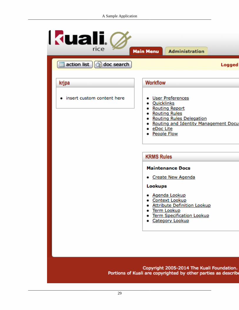
A Sample Application
29
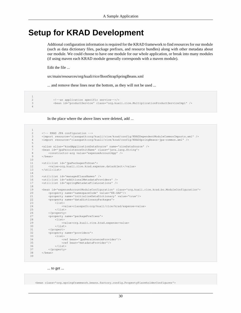
A Sample Application
30
Setup for KRAD DevelopmentAddtional configuration information is required for the KRAD framework to find resources for our module(such as data dictionary files, package prefixes, and resource bundles) along with other metadata aboutour module. We could choose to have one module for our whole application, or break into many modules(if using maven each KRAD module generally corresponds with a maven module).
Edit the file ...
src/main/resources/org/kuali/rice/BootStrapSpringBeans.xml
... and remove these lines near the bottom, as they will not be used ...
1 2 <!--an application specific service-->/> 3 <bean id="productService" class="org.kuali.rice.MultiplicationProductServiceImpl" /> 4
In the place where the above lines were deleted, add ...
1 2 <!-- KRAD JPA configuration --> 3 <import resource="classpath:org/kuali/rice/krad/config/KRADDependentModuleCommonImports.xml" /> 4 <import resource="classpath:org/kuali/rice/krad/config/KRADSpringBeans-jpa-common.xml" /> 5 6 <alias alias="kradApplicationDataSource" name="riceDataSource" /> 7 <bean id="jpaPersistenceUnitName" class="java.lang.String"> 8 <constructor-arg value="expenseAccountApp" /> 9 </bean> 10 11 <util:list id="jpaPackagesToScan"> 12 <value>org.kuali.rice.krad.expense.dataobject</value> 13 </util:list> 14 15 <util:list id="managedClassNames" /> 16 <util:list id="additionalMetadataProviders" /> 17 <util:list id="springMetadataFileLocations" /> 18 19 <bean id="expenseAccountModuleConfiguration" class="org.kuali.rice.krad.bo.ModuleConfiguration"> 20 <property name="namespaceCode" value="KR-SAP"/> 21 <property name="initializeDataDictionary" value="true"/> 22 <property name="dataDictionaryPackages"> 23 <list> 24 <value>classpath:org/kuali/rice/krad/expense<value> 25 </list> 26 </property> 27 <property name="packagePrefixes"> 28 <list> 29 <value>org.kuali.rice.krad.expense<value> 30 </list> 31 </propert> 32 <property name="providers"> 33 <list> 34 <ref bean="jpaPersistenceProvider"/> 35 <ref bean="metadataProvider"/> 36 </list> 37 </property> 38 </bean> 39
... to get ...
<bean class="org.springframework.beans.factory.config.PropertyPlaceholderConfigurer">
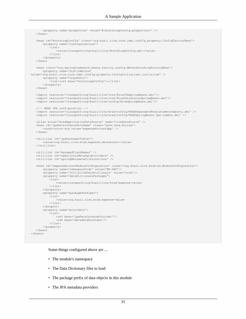
A Sample Application
31
<property name="properties" value="#{bootstrapConfig.properties}" /> </bean>
<bean id="bootstrapConfig" class="org.kuali.rice.core.impl.config.property.ConfigFactoryBean"> <property name="configLocations"> <list> <value>classpath:org/kuali/rice/BootStrapConfig.xml</value> </list> </property> </bean> <bean class="org.springframework.beans.factory.config.MethodInvokingFactoryBean"> <property name="staticMethod" value="org.kuali.rice.core.impl.config.property.ConfigInitializer.initialize" /> <property name="arguments"> <list><ref bean="bootstrapConfig"/></list> </property> </bean>
<import resource="classpath:org/kuali/rice/core/RiceJTASpringBeans.xml"/> <import resource="classpath:org/kuali/rice/core/RiceDataSourceSpringBeans.xml"/> <import resource="classpath:org/kuali/rice/config/RiceSpringBeans.xml"/>
<!-- KRAD JPA configuration --> <import resource="classpath:org/kuali/rice/krad/config/KRADDependentModuleCommonImports.xml" /> <import resource="classpath:org/kuali/rice/krad/config/KRADSpringBeans-jpa-common.xml" />
<alias alias="kradApplicationDataSource" name="riceDataSource" /> <bean id="jpaPersistenceUnitName" class="java.lang.String"> <constructor-arg value="expenseAccountApp" /> </bean>
<util:list id="jpaPackagesToScan"> <value>org.kuali.rice.krad.expense.dataobject</value> </util:list>
<util:list id="managedClassNames" /> <util:list id="additionalMetadataProviders" /> <util:list id="springMetadataFileLocations" />
<bean id="expenseAccountModuleConfiguration" class="org.kuali.rice.krad.bo.ModuleConfiguration"> <property name="namespaceCode" value="KR-SAP"/> <property name="initializeDataDictionary" value="true"/> <property name="dataDictionaryPackages"> <list> <value>classpath:org/kuali/rice/krad/expense<value> </list> </property> <property name="packagePrefixes"> <list> <value>org.kuali.rice.krad.expense<value> </list> </propert> <property name="providers"> <list> <ref bean="jpaPersistenceProvider"/> <ref bean="metadataProvider"/> </list> </property> </bean> </beans>
Some things configured above are ...
• The module's namespace
• The Data Dictionary files to load
• The package prefix of data objects in this module
• The JPA metadata providers
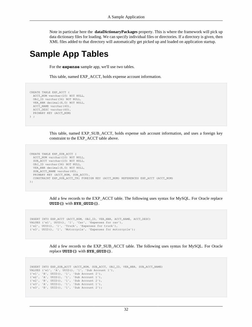
A Sample Application
32
Note in particular here the dataDictionaryPackages property. This is where the framework will pick updata dictionary files for loading. We can specify individual files or directories. If a directory is given, thenXML files added to that directory will automatically get picked up and loaded on application startup.
Sample App TablesFor the expense sample app, we'll use two tables.
This table, named EXP_ACCT, holds expense account information.
CREATE TABLE EXP_ACCT ( ACCT_NUM varchar(10) NOT NULL, OBJ_ID varchar(36) NOT NULL, VER_NBR decimal(8,0) NOT NULL, ACCT_NAME varchar(40), ACCT_DESC varchar(60), PRIMARY KEY (ACCT_NUM)) ;
This table, named EXP_SUB_ACCT, holds expense sub account information, and uses a foreign keyconstraint to the EXP_ACCT table above.
CREATE TABLE EXP_SUB_ACCT ( ACCT_NUM varchar(10) NOT NULL, SUB_ACCT varchar(10) NOT NULL, OBJ_ID varchar(36) NOT NULL, VER_NBR decimal(8,0) NOT NULL, SUB_ACCT_NAME varchar(40), PRIMARY KEY (ACCT_NUM, SUB_ACCT), CONSTRAINT EXP_SUB_ACCT_TR1 FOREIGN KEY (ACCT_NUM) REFERENCES EXP_ACCT (ACCT_NUM));
Add a few records to the EXP_ACCT table. The following uses syntax for MySQL. For Oracle replaceUUID() with SYS_GUID().
INSERT INTO EXP_ACCT (ACCT_NUM, OBJ_ID, VER_NBR, ACCT_NAME, ACCT_DESC)VALUES ('e1', UUID(), '1', 'Car', 'Expenses for car'),('e2', UUID(), '1', 'Truck', 'Expenses for truck'),('e3', UUID(), '1', 'Motorcycle', 'Expenses for motorcycle');
Add a few records to the EXP_SUB_ACCT table. The following uses syntax for MySQL. For Oraclereplace UUID() with SYS_GUID().
INSERT INTO EXP_SUB_ACCT (ACCT_NUM, SUB_ACCT, OBJ_ID, VER_NBR, SUB_ACCT_NAME)VALUES ('e1', 'A', UUID(), '1', 'Sub Account 1'),('e1', 'B', UUID(), '1', 'Sub Account 2'),('e2', 'A', UUID(), '1', 'Sub Account 1'),('e2', 'B', UUID(), '1', 'Sub Account 2'),('e3', 'A', UUID(), '1', 'Sub Account 1'),('e3', 'B', UUID(), '1', 'Sub Account 2');
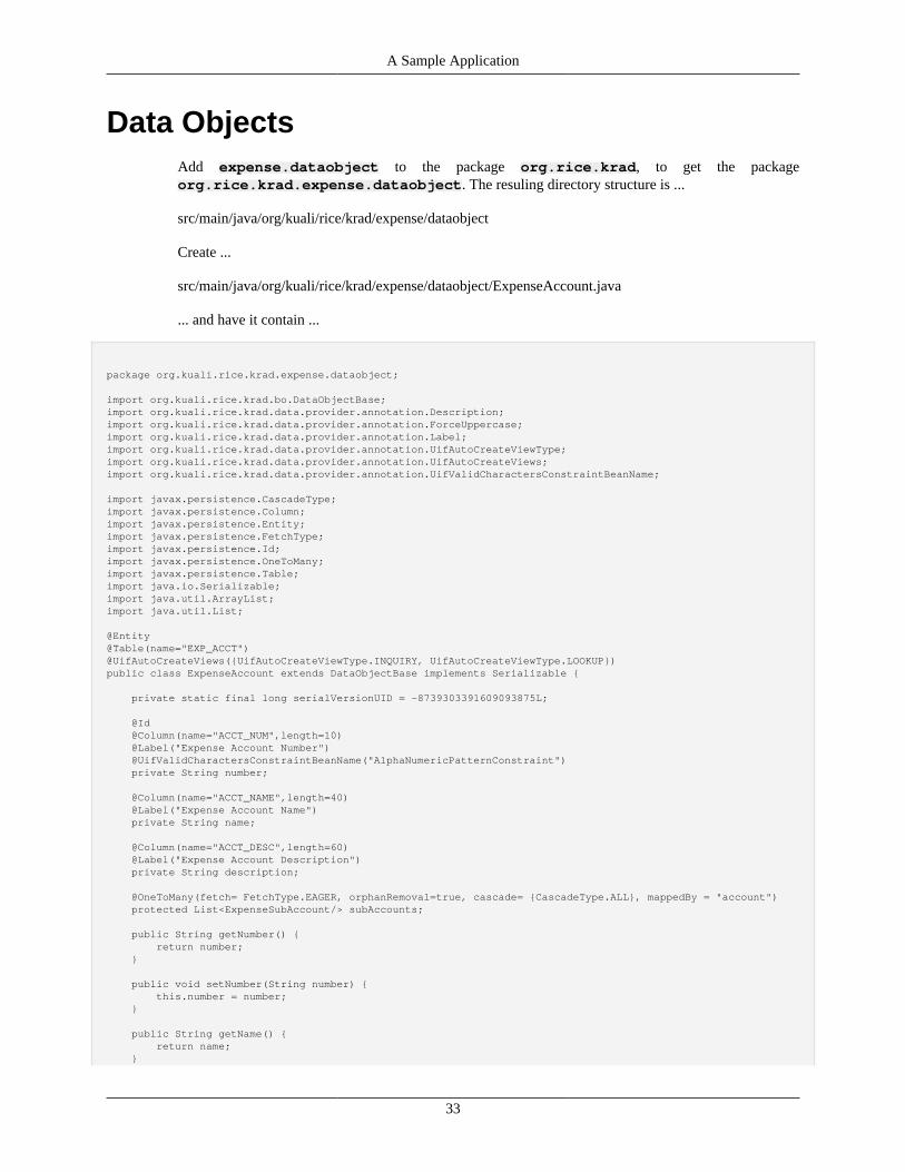
A Sample Application
33
Data ObjectsAdd expense.dataobject to the package org.rice.krad, to get the packageorg.rice.krad.expense.dataobject. The resuling directory structure is ...
src/main/java/org/kuali/rice/krad/expense/dataobject
Create ...
src/main/java/org/kuali/rice/krad/expense/dataobject/ExpenseAccount.java
... and have it contain ...
package org.kuali.rice.krad.expense.dataobject;
import org.kuali.rice.krad.bo.DataObjectBase;import org.kuali.rice.krad.data.provider.annotation.Description;import org.kuali.rice.krad.data.provider.annotation.ForceUppercase;import org.kuali.rice.krad.data.provider.annotation.Label;import org.kuali.rice.krad.data.provider.annotation.UifAutoCreateViewType;import org.kuali.rice.krad.data.provider.annotation.UifAutoCreateViews;import org.kuali.rice.krad.data.provider.annotation.UifValidCharactersConstraintBeanName;
import javax.persistence.CascadeType;import javax.persistence.Column;import javax.persistence.Entity;import javax.persistence.FetchType;import javax.persistence.Id;import javax.persistence.OneToMany;import javax.persistence.Table;import java.io.Serializable;import java.util.ArrayList;import java.util.List;
@Entity@Table(name="EXP_ACCT")@UifAutoCreateViews({UifAutoCreateViewType.INQUIRY, UifAutoCreateViewType.LOOKUP})public class ExpenseAccount extends DataObjectBase implements Serializable {
private static final long serialVersionUID = -8739303391609093875L;
@Id @Column(name="ACCT_NUM",length=10) @Label("Expense Account Number") @UifValidCharactersConstraintBeanName("AlphaNumericPatternConstraint") private String number;
@Column(name="ACCT_NAME",length=40) @Label("Expense Account Name") private String name;
@Column(name="ACCT_DESC",length=60) @Label("Expense Account Description") private String description;
@OneToMany(fetch= FetchType.EAGER, orphanRemoval=true, cascade= {CascadeType.ALL}, mappedBy = "account") protected List<ExpenseSubAccount/> subAccounts;
public String getNumber() { return number; }
public void setNumber(String number) { this.number = number; }
public String getName() { return name; }

A Sample Application
34
public void setName(String name) { this.name = name; }
public String getDescription() { return description; }
public void setDescription(String description) { this.description = description; }
public List<ExpenseSubAccount/> getSubAccounts() { if(subAccounts == null) { subAccounts = new ArrayList<ExpenseSubAccount/>(); } return subAccounts; }
public void setSubAccounts(List<ExpenseSubAccount/> subAccounts) { this.subAccounts = subAccounts; }
}
The ExpenseAccount class provides a way to read and write data via JPA. It also allows KRAD tocreate a few types of built-in web pages called KRAD "views".
The annotations @Entity, @Table, @Id, @Column and @OneToMany are JPA annotations.
The @Entity annotation tells JPA it can use the ExpenseAccount class to read and write to thedatabase.
The @Table annotation tells JPA to use the table named EXP_ACCT with the ExpenseAccount class.
The @Column annotation maps a field to a column name. The number field is mapped to the columnnamed ACCT_NUM in the EXP_ACCT table. The field name is mapped to the column ACCT_NAME, andthe field description is mapped to the column ACCT_DESC,
The @Id annotation specifies that the number field, which is mapped to the column ACCT_NUM, is aprimary key.
The @OneToMany annotation tells JPA that the List<ExpenseSubAccount> subAccountsfield is a relationship to a JPA annotated class named ExpenseSubAccount (which we will createbelow), and that this relationship is done via a field in ExpenseSubAccount named account.The subAccounts field is a collection, which allows multiple ExpenseSubAccount objects to beassociated with a single expense account.
@UifAutoCreateViews, @Label, and @UifValidCharactersConstraintBeanName areKRAD annotations.
The @UifAutoCreateViews annotation allows KRAD to automatically generate an Inquiry viewand a Lookup view. An Inquiry view is a web page built into KRAD which displays the results of a searchspecified in a URL parameter. A Lookup View is a forms based web page built into KRAD which allowsthe user to do searches interactively, and display the results.
For each String field in the ExpenseAccount class, KRAD can generate a corresponding static textfield (for an Inquiry View) or text input field (for a Lookup View). The @Label annotation allows KRADto generate a label associated with the generated static text or text input field. The @Label annotation isapplied to the fields number, name, and description.
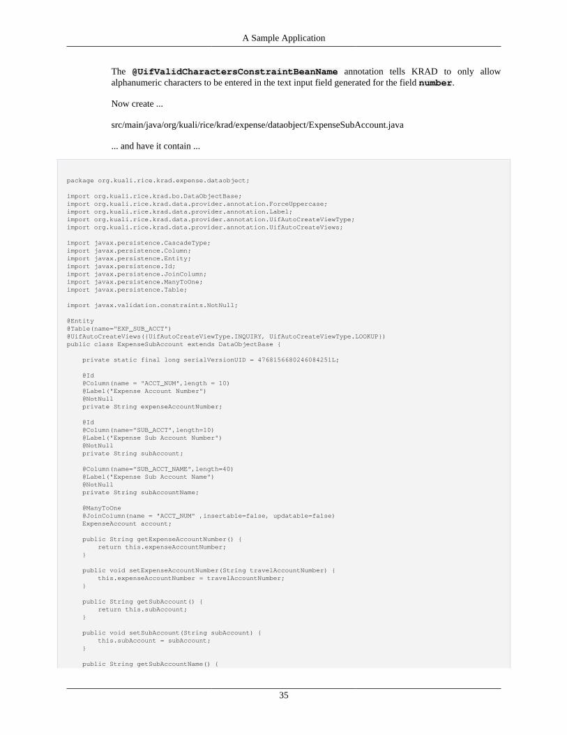
A Sample Application
35
The @UifValidCharactersConstraintBeanName annotation tells KRAD to only allowalphanumeric characters to be entered in the text input field generated for the field number.
Now create ...
src/main/java/org/kuali/rice/krad/expense/dataobject/ExpenseSubAccount.java
... and have it contain ...
package org.kuali.rice.krad.expense.dataobject;
import org.kuali.rice.krad.bo.DataObjectBase;import org.kuali.rice.krad.data.provider.annotation.ForceUppercase;import org.kuali.rice.krad.data.provider.annotation.Label;import org.kuali.rice.krad.data.provider.annotation.UifAutoCreateViewType;import org.kuali.rice.krad.data.provider.annotation.UifAutoCreateViews;
import javax.persistence.CascadeType;import javax.persistence.Column;import javax.persistence.Entity;import javax.persistence.Id;import javax.persistence.JoinColumn;import javax.persistence.ManyToOne;import javax.persistence.Table;
import javax.validation.constraints.NotNull;
@Entity@Table(name="EXP_SUB_ACCT")@UifAutoCreateViews({UifAutoCreateViewType.INQUIRY, UifAutoCreateViewType.LOOKUP})public class ExpenseSubAccount extends DataObjectBase {
private static final long serialVersionUID = 4768156680246084251L;
@Id @Column(name = "ACCT_NUM",length = 10) @Label("Expense Account Number") @NotNull private String expenseAccountNumber;
@Id @Column(name="SUB_ACCT",length=10) @Label("Expense Sub Account Number") @NotNull private String subAccount;
@Column(name="SUB_ACCT_NAME",length=40) @Label("Expense Sub Account Name") @NotNull private String subAccountName;
@ManyToOne @JoinColumn(name = "ACCT_NUM" ,insertable=false, updatable=false) ExpenseAccount account;
public String getExpenseAccountNumber() { return this.expenseAccountNumber; }
public void setExpenseAccountNumber(String travelAccountNumber) { this.expenseAccountNumber = travelAccountNumber; }
public String getSubAccount() { return this.subAccount; }
public void setSubAccount(String subAccount) { this.subAccount = subAccount; }
public String getSubAccountName() {
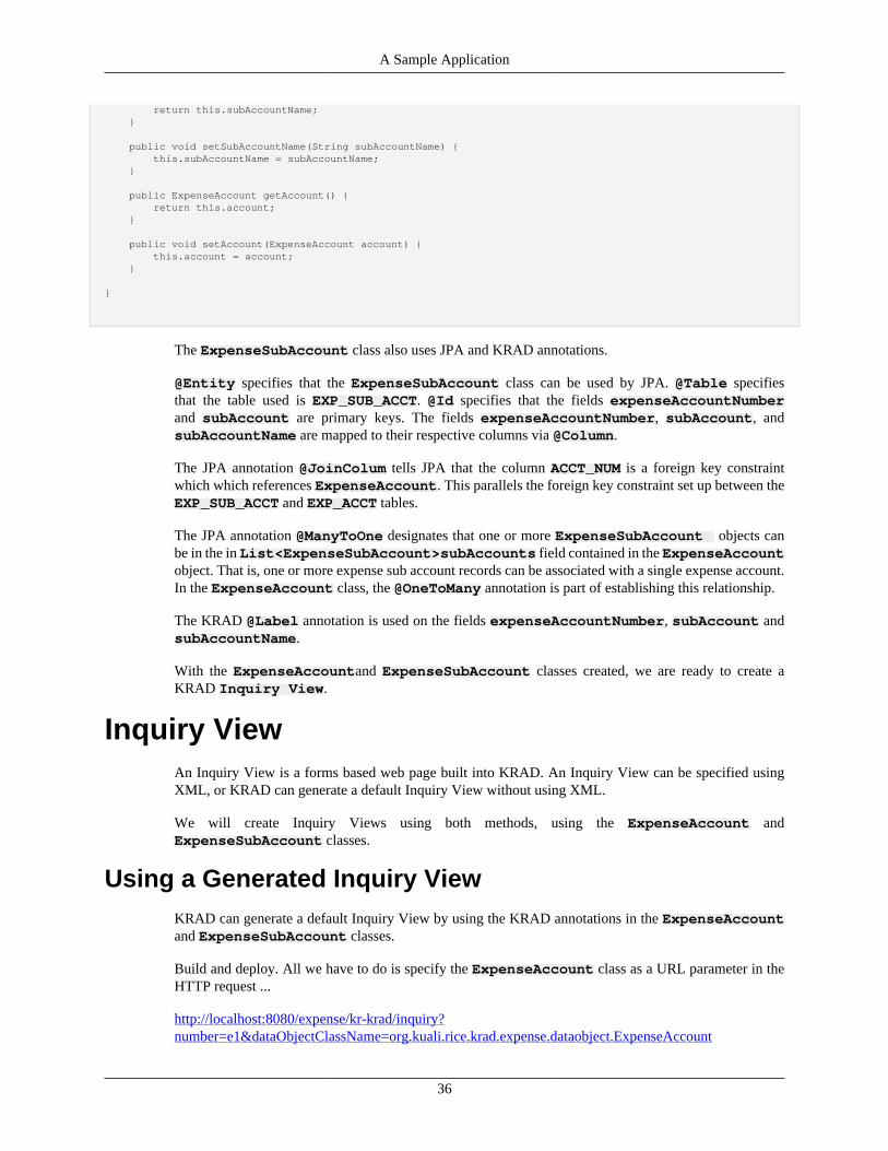
A Sample Application
36
return this.subAccountName; }
public void setSubAccountName(String subAccountName) { this.subAccountName = subAccountName; }
public ExpenseAccount getAccount() { return this.account; }
public void setAccount(ExpenseAccount account) { this.account = account; }
}
The ExpenseSubAccount class also uses JPA and KRAD annotations.
@Entity specifies that the ExpenseSubAccount class can be used by JPA. @Table specifiesthat the table used is EXP_SUB_ACCT. @Id specifies that the fields expenseAccountNumberand subAccount are primary keys. The fields expenseAccountNumber, subAccount, andsubAccountName are mapped to their respective columns via @Column.
The JPA annotation @JoinColum tells JPA that the column ACCT_NUM is a foreign key constraintwhich which references ExpenseAccount. This parallels the foreign key constraint set up between theEXP_SUB_ACCT and EXP_ACCT tables.
The JPA annotation @ManyToOne designates that one or more ExpenseSubAccount objects canbe in the in List<ExpenseSubAccount>subAccounts field contained in the ExpenseAccountobject. That is, one or more expense sub account records can be associated with a single expense account.In the ExpenseAccount class, the @OneToMany annotation is part of establishing this relationship.
The KRAD @Label annotation is used on the fields expenseAccountNumber, subAccount andsubAccountName.
With the ExpenseAccountand ExpenseSubAccount classes created, we are ready to create aKRAD Inquiry View.
Inquiry ViewAn Inquiry View is a forms based web page built into KRAD. An Inquiry View can be specified usingXML, or KRAD can generate a default Inquiry View without using XML.
We will create Inquiry Views using both methods, using the ExpenseAccount andExpenseSubAccount classes.
Using a Generated Inquiry ViewKRAD can generate a default Inquiry View by using the KRAD annotations in the ExpenseAccountand ExpenseSubAccount classes.
Build and deploy. All we have to do is specify the ExpenseAccount class as a URL parameter in theHTTP request ...
http://localhost:8080/expense/kr-krad/inquiry?number=e1&dataObjectClassName=org.kuali.rice.krad.expense.dataobject.ExpenseAccount
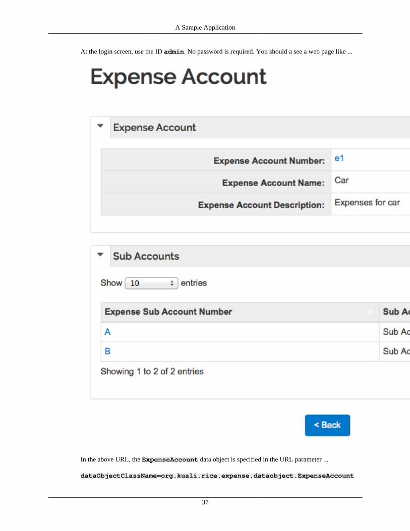
A Sample Application
37
At the login screen, use the ID admin. No password is required. You should a see a web page like ...
In the above URL, the ExpenseAccount data object is specified in the URL parameter ...
dataObjectClassName=org.kuali.rice.expense.dataobject.ExpenseAccount
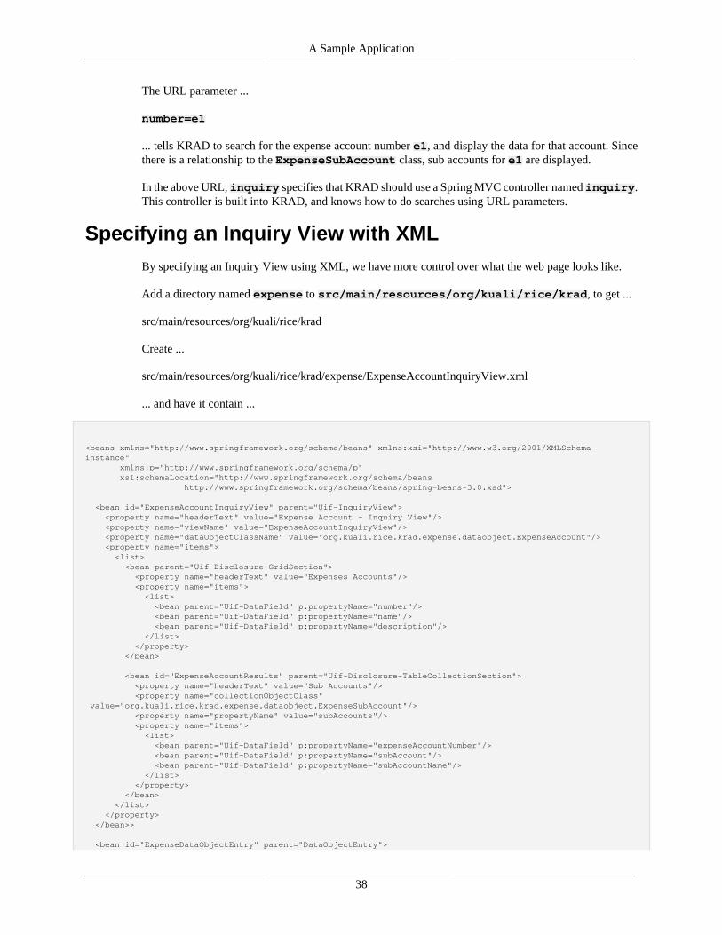
A Sample Application
38
The URL parameter ...
number=e1
... tells KRAD to search for the expense account number e1, and display the data for that account. Sincethere is a relationship to the ExpenseSubAccount class, sub accounts for e1 are displayed.
In the above URL, inquiry specifies that KRAD should use a Spring MVC controller named inquiry.This controller is built into KRAD, and knows how to do searches using URL parameters.
Specifying an Inquiry View with XMLBy specifying an Inquiry View using XML, we have more control over what the web page looks like.
Add a directory named expense to src/main/resources/org/kuali/rice/krad, to get ...
src/main/resources/org/kuali/rice/krad
Create ...
src/main/resources/org/kuali/rice/krad/expense/ExpenseAccountInquiryView.xml
... and have it contain ...
<beans xmlns="http://www.springframework.org/schema/beans" xmlns:xsi="http://www.w3.org/2001/XMLSchema-instance" xmlns:p="http://www.springframework.org/schema/p" xsi:schemaLocation="http://www.springframework.org/schema/beans http://www.springframework.org/schema/beans/spring-beans-3.0.xsd">
<bean id="ExpenseAccountInquiryView" parent="Uif-InquiryView"> <property name="headerText" value="Expense Account - Inquiry View"/> <property name="viewName" value="ExpenseAccountInquiryView"/> <property name="dataObjectClassName" value="org.kuali.rice.krad.expense.dataobject.ExpenseAccount"/> <property name="items"> <list> <bean parent="Uif-Disclosure-GridSection"> <property name="headerText" value="Expenses Accounts"/> <property name="items"> <list> <bean parent="Uif-DataField" p:propertyName="number"/> <bean parent="Uif-DataField" p:propertyName="name"/> <bean parent="Uif-DataField" p:propertyName="description"/> </list> </property> </bean>
<bean id="ExpenseAccountResults" parent="Uif-Disclosure-TableCollectionSection"> <property name="headerText" value="Sub Accounts"/> <property name="collectionObjectClass" value="org.kuali.rice.krad.expense.dataobject.ExpenseSubAccount"/> <property name="propertyName" value="subAccounts"/> <property name="items"> <list> <bean parent="Uif-DataField" p:propertyName="expenseAccountNumber"/> <bean parent="Uif-DataField" p:propertyName="subAccount"/> <bean parent="Uif-DataField" p:propertyName="subAccountName"/> </list> </property> </bean> </list> </property> </bean>>
<bean id="ExpenseDataObjectEntry" parent="DataObjectEntry">
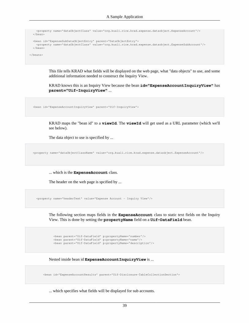
A Sample Application
39
<property name="dataObjectClass" value="org.kuali.rice.krad.expense.dataobject.ExpenseAccount"/> </bean>
<bean id="ExpenseSubDataObjectEntry" parent="DataObjectEntry"> <property name="dataObjectClass" value="org.kuali.rice.krad.expense.dataobject.ExpenseSubAccount"/> </bean>
</beans>
This file tells KRAD what fields will be displayed on the web page, what "data objects" to use, and someadditional information needed to construct the Inquiry View.
KRAD knows this is an Inquiry View because the bean id="ExpenseAccountInquiryView" hasparent="Uif-InquiryView" ...
<bean id="ExpenseAccountInquiryView" parent="Uif-InquiryView">
KRAD maps the "bean id" to a viewId. The viewId will get used as a URL parameter (which we'llsee below).
The data object to use is specified by ...
<property name="dataObjectClassName" value="org.kuali.rice.krad.expense.dataobject.ExpenseAccount"/>
... which is the ExpenseAccount class.
The header on the web page is spcified by ...
<property name="headerText" value="Expense Account - Inquiry View"/>
The following section maps fields in the ExpenseAccount class to static text fields on the InquiryView. This is done by setting the propertyName field on a Uif-DataField bean.
<bean parent="Uif-DataField" p:propertyName="number"/> <bean parent="Uif-DataField" p:propertyName="name"/> <bean parent="Uif-DataField" p:propertyName="description"/>
Nested inside bean id ExpenseAccountInquiryView is ...
<bean id="ExpenseAccountResults" parent="Uif-Disclosure-TableCollectionSection">
... which specifies what fields will be displayed for sub accounts.
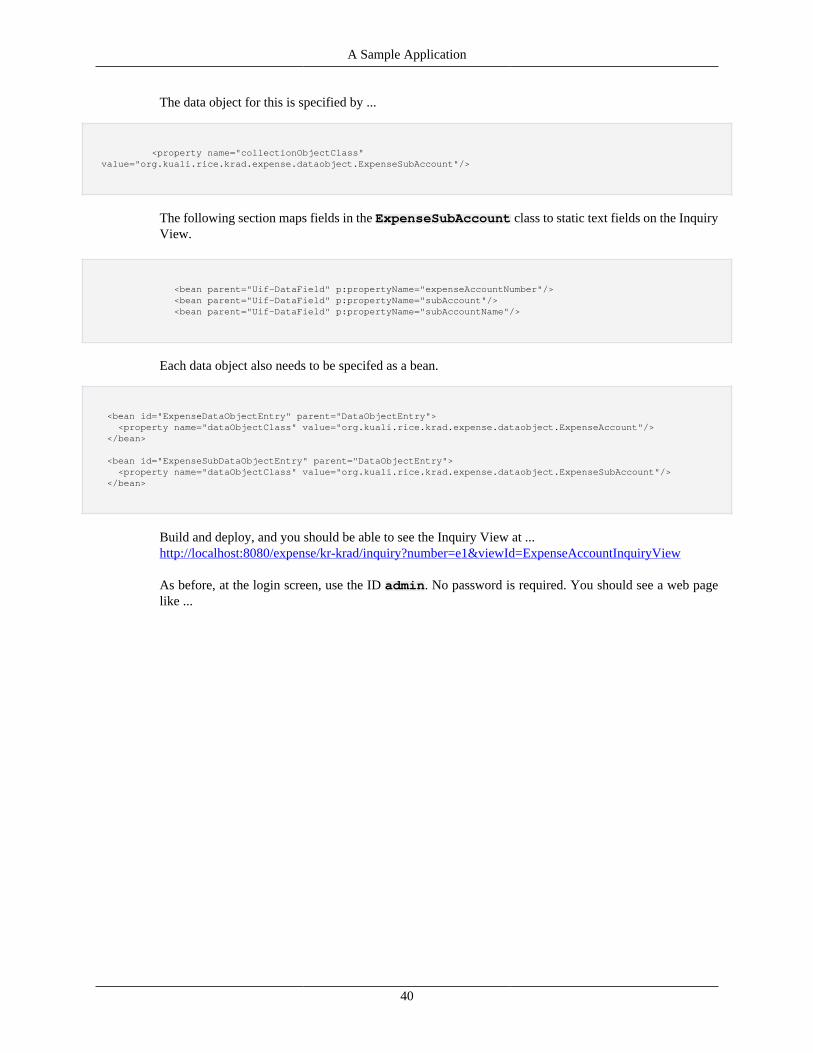
A Sample Application
40
The data object for this is specified by ...
<property name="collectionObjectClass" value="org.kuali.rice.krad.expense.dataobject.ExpenseSubAccount"/>
The following section maps fields in the ExpenseSubAccount class to static text fields on the InquiryView.
<bean parent="Uif-DataField" p:propertyName="expenseAccountNumber"/> <bean parent="Uif-DataField" p:propertyName="subAccount"/> <bean parent="Uif-DataField" p:propertyName="subAccountName"/>
Each data object also needs to be specifed as a bean.
<bean id="ExpenseDataObjectEntry" parent="DataObjectEntry"> <property name="dataObjectClass" value="org.kuali.rice.krad.expense.dataobject.ExpenseAccount"/> </bean>
<bean id="ExpenseSubDataObjectEntry" parent="DataObjectEntry"> <property name="dataObjectClass" value="org.kuali.rice.krad.expense.dataobject.ExpenseSubAccount"/> </bean>
Build and deploy, and you should be able to see the Inquiry View at ...http://localhost:8080/expense/kr-krad/inquiry?number=e1&viewId=ExpenseAccountInquiryView
As before, at the login screen, use the ID admin. No password is required. You should see a web pagelike ...
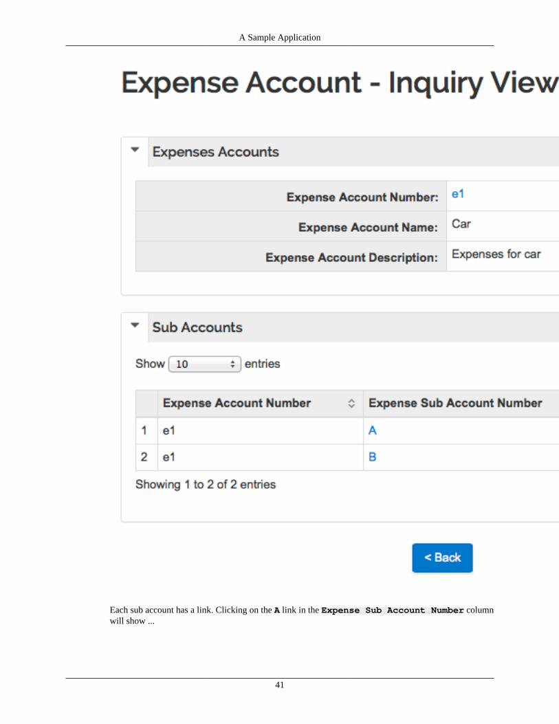
A Sample Application
41
Each sub account has a link. Clicking on the A link in the Expense Sub Account Number columnwill show ...
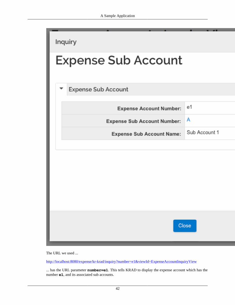
A Sample Application
42
The URL we used ...
http://localhost:8080/expense/kr-krad/inquiry?number=e1&viewId=ExpenseAccountInquiryView
... has the URL parameter number=e1. This tells KRAD to display the expense account which has thenumber e1, and its associated sub accounts.
A Sample Application
43
The URL parameter viewId=ExpenseAccountInquiryView tells KRAD to use a viewthat has an "id" of ExpenseAccountInquiryView. This is specified in the fileExpenseAccountInquiryView.xml as ...
<bean id="ExpenseAccountInquiryView" parent="Uif-InquiryView">
Lookup ViewA Lookup View is a forms based web page built into KRAD which allows interactive searching.
To create a Lookup View, create the file ...
src/main/resources/org/kuali/rice/krad/expense/ExpenseAccountLookupView.xml
... and have it contain ...
<beans xmlns="http://www.springframework.org/schema/beans" xmlns:xsi="http://www.w3.org/2001/XMLSchema-instance" xmlns:p="http://www.springframework.org/schema/p" xsi:schemaLocation="http://www.springframework.org/schema/beans http://www.springframework.org/schema/beans/spring-beans-3.0.xsd">
<bean id="ExpenseAccountLookupView" parent="Uif-LookupView"> <property name="viewName" value="ExpenseAccountLookupView"/> <property name="headerText" value="Expense Account - Lookup View"/> <property name="dataObjectClassName" value="org.kuali.rice.krad.expense.dataobject.ExpenseAccount"/> <property name="criteriaFields"> <list> <bean parent="Uif-LookupCriteriaInputField" p:propertyName="number"/> <bean parent="Uif-LookupCriteriaInputField" p:propertyName="name"/> <bean parent="Uif-LookupCriteriaInputField" p:propertyName="description"/> </list> </property> <property name="resultFields"> <list> <bean parent="Uif-DataField" p:propertyName="number"/> <bean parent="Uif-DataField" p:propertyName="name"/> <bean parent="Uif-DataField" p:propertyName="description"/> </list> </property> </bean>
</beans>
KRAD knows this is a Lookup View because the bean id="ExpenseAccountLookupview hasparent="Uif-LookupView"...
<bean id="ExpenseAccountLookupView" parent="Uif-LookupView">
The data object used is the ExpenseAccount, which is the same class used with the Inquiry View.
<property name="dataObjectClassName" value="org.kuali.rice.krad.expense.dataobject.ExpenseAccount"/>
A Sample Application
44
The following section maps the fields in the ExpenseAccount class to text input fields which willcontain the search criteria.
<property name="criteriaFields"> <list> <bean parent="Uif-LookupCriteriaInputField" p:propertyName="number"/> <bean parent="Uif-LookupCriteriaInputField" p:propertyName="name"/> <bean parent="Uif-LookupCriteriaInputField" p:propertyName="description"/> </list> </property>
This section maps the fields in the ExpenseAccount class to static text fields containing the resultsof the search.
<property name="resultFields"> <list> <bean parent="Uif-DataField" p:propertyName="number"/> <bean parent="Uif-DataField" p:propertyName="name"/> <bean parent="Uif-DataField" p:propertyName="description"/> </list> </property>
Build and deploy, and you should be able to see the Lookup View at ...
http://localhost:8080/expense/kr-krad/lookup?viewId=ExpenseAccountLookupView
As before, at the login screen, use the ID admin. No password is required. You should see a web pagelike ...
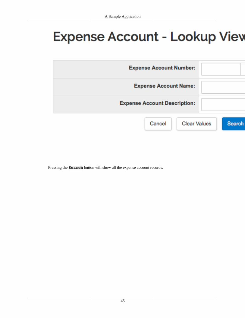
A Sample Application
45
Pressing the Search button will show all the expense account records.
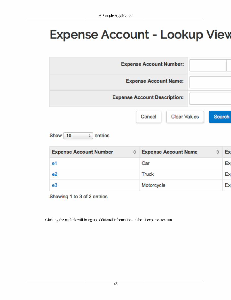
A Sample Application
46
Clicking the e1 link will bring up additional information on the e1 expense account.
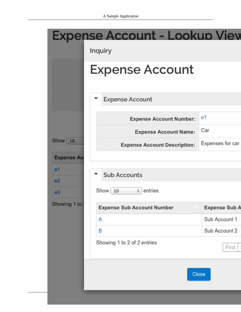
A Sample Application
47

A Sample Application
48
Clicking the A link in the Expense Sub Account Number column shows that sub account ...
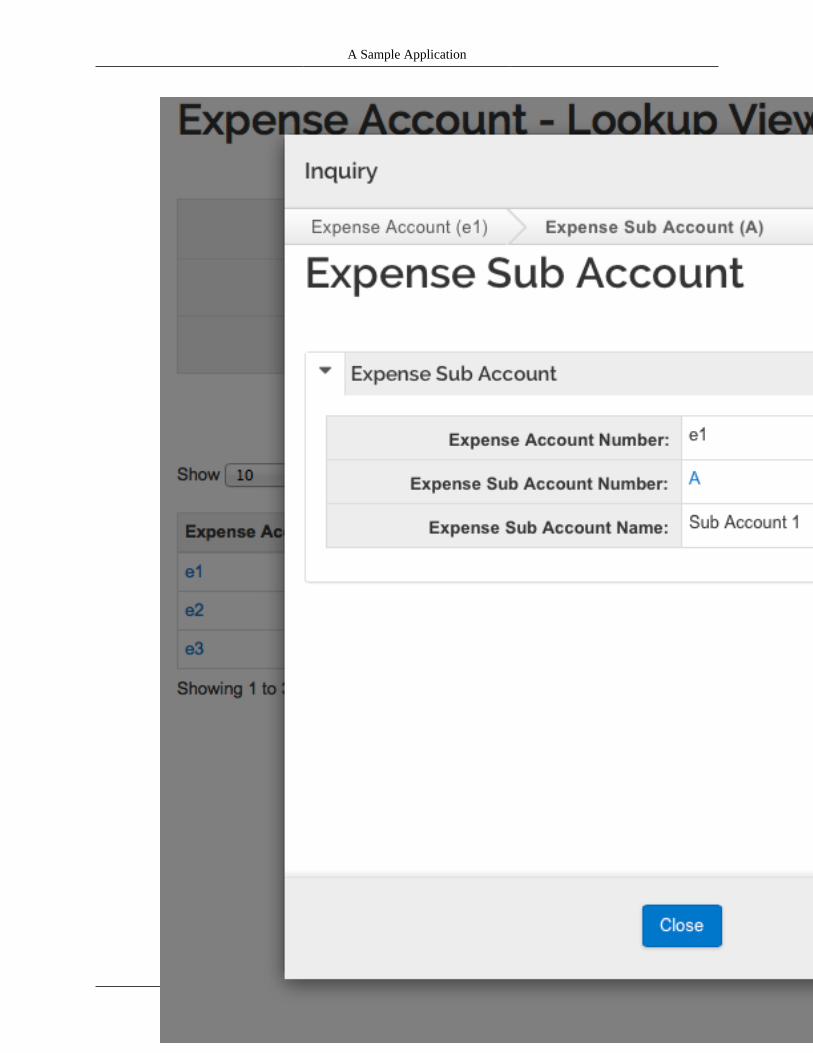
A Sample Application
49
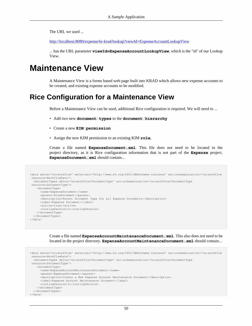
A Sample Application
50
The URL we used ...
http://localhost:8080/expense/kr-krad/lookup?viewId=ExpenseAccountLookupView
... has the URL parameter viewId=ExpenseAccountLookupView, which is the "id" of our LookupView.
Maintenance ViewA Maintenance View is a forms based web page built into KRAD which allows new expense accounts tobe created, and existing expense accounts to be modified.
Rice Configuration for a Maintenance View
Before a Maintenance View can be used, additional Rice configuration is required. We will need to ...
• Add two new document types to the document hierarchy
• Create a new KIM permission
• Assign the new KIM permission to an existing KIM role,
Create a file named ExpenseDocument.xml. This file does not need to be located in theproject directory, as it is Rice configuration information that is not part of the Expense project.ExpenseDocument.xml should contain...
<data xmlns="ns:workflow" xmlns:xsi="http://www.w3.org/2001/XMLSchema-instance" xsi:schemaLocation="ns:workflow resource:WorkflowData"> <documentTypes xmlns="ns:workflow/DocumentType" xsi:schemaLocation="ns:workflow/DocumentType resource:DocumentType"v <documentType> <name>ExpenseDocument</name> <parent>RiceDocument</parent> <description>Parent Document Type for all Expense Documents</description> <label>Expense Document</label> <active>true</active> <routingVersion>2</routingVersion> </documentType> </documentTypes></data>
Create a file named ExpenseAccountMaintenanceDocument.xml. This also does not need to belocated in the project directory. ExpenseAccountMaintenanceDocument.xml should contain...
<data xmlns="ns:workflow" xmlns:xsi="http://www.w3.org/2001/XMLSchema-instance" xsi:schemaLocation="ns:workflow resource:WorkflowData"> <documentTypes xmlns="ns:workflow/DocumentType" xsi:schemaLocation="ns:workflow/DocumentType resource:DocumentType"> <documentType> <name>ExpenseAccountMaintenanceDocument</name> <parent>ExpenseDocument</parent> <description>Create a New Expense Account Maintenance Document</description> <label>Expense Account Maintenance Document</label> <routingVersion>2</routingVersion> </documentType> </documentTypes></data>

A Sample Application
51
Now deploy the web app and connect to Rice Portal at ...
http://localhost:8080/expense/portal.do
As before, login with the ID admin. (No password required.) Click on the Administration tab, thenclick on the link XML Ingester. You should see ...
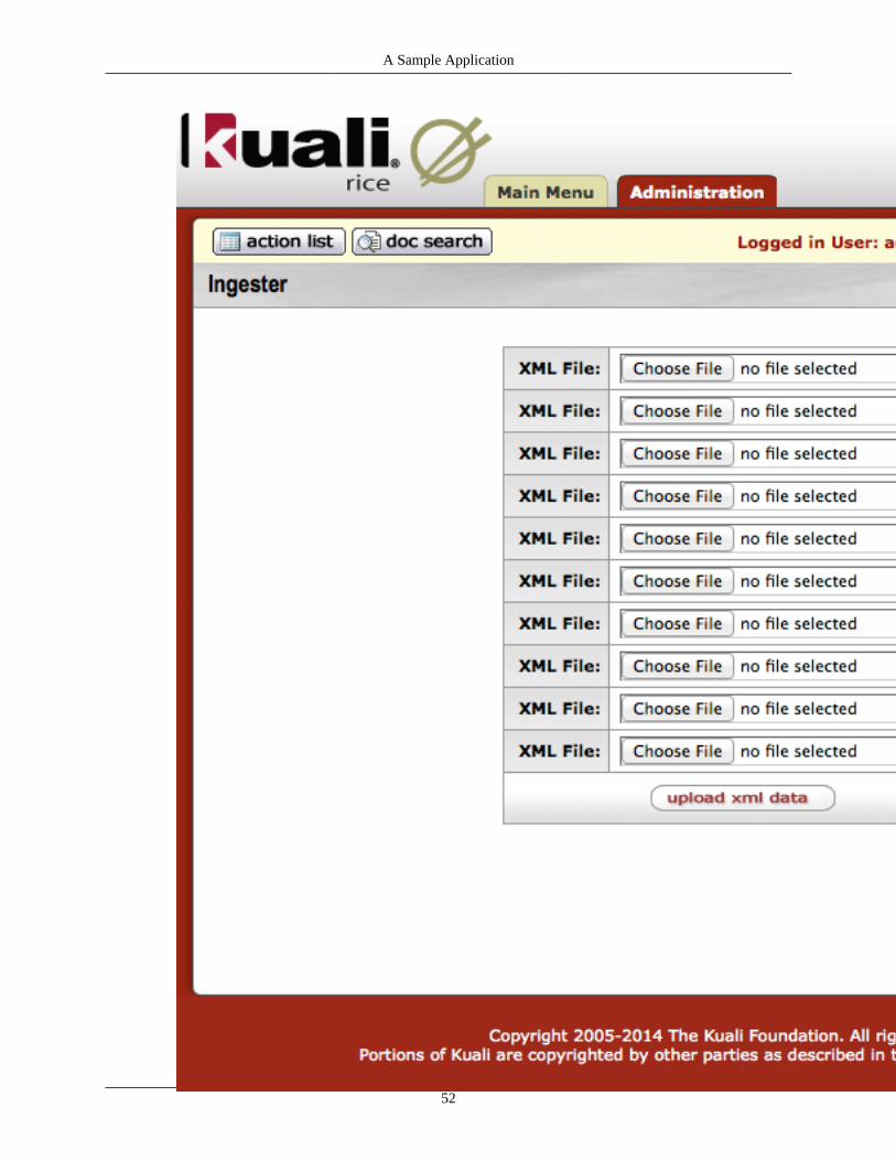
A Sample Application
52

A Sample Application
53
On the top row of the form, click Choose File, and select ExpenseDocument.xml fromthe location where it is saved. On the second row of the form, click Choose File, and selectExpenseAccountMaintenacneDocument.xml from the location where it is saved. Then clickupload xml data. You should see ...
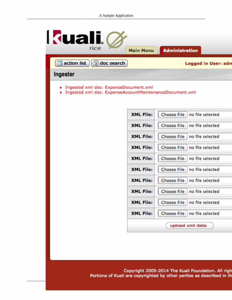
A Sample Application
54

A Sample Application
55
Now click on the Administration tab, and then click on the link named Permission. In the upperright hand corner of the screen, click the button named create new. This will take you to a form wherea new KIM permission can be created, which should look like ...
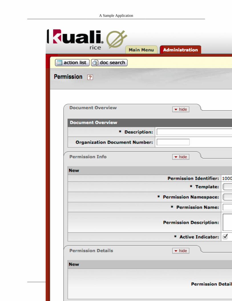
A Sample Application
56

A Sample Application
57
Not all the form fields need to be filled out. Here are the ones we need to fill in ...
• Description: Initiate Expense Document Permission
• Template: KR-SYS : Initiate Document
• Permission Namespace: KR-SAP - Sample App
• Permission Name: Initiate Expense Document
• Permission Details: documentTypeName=ExpenseDocument
The form should now look like ...
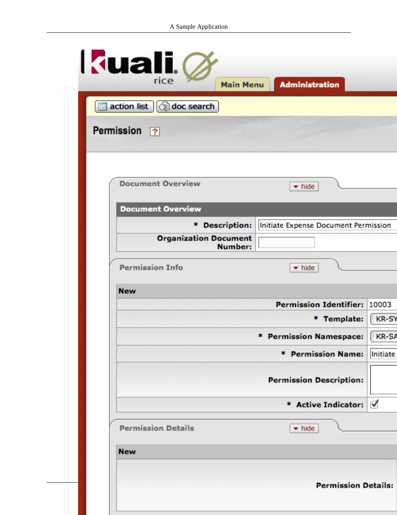
A Sample Application
58

A Sample Application
59
Now click the blanket approve button.
Next up we have to assign the KIM permission we just created to an existing KIM role. We will use theKIM role named Sampele App Users. To add the KIM permission to this KIM role, click on theAdministration tab, then click on the link named Role, and then click the search button. This willdisplay all of the KIM roles, and should look like...
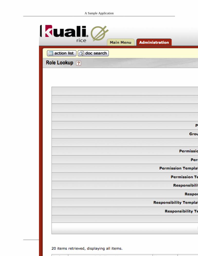
A Sample Application
60
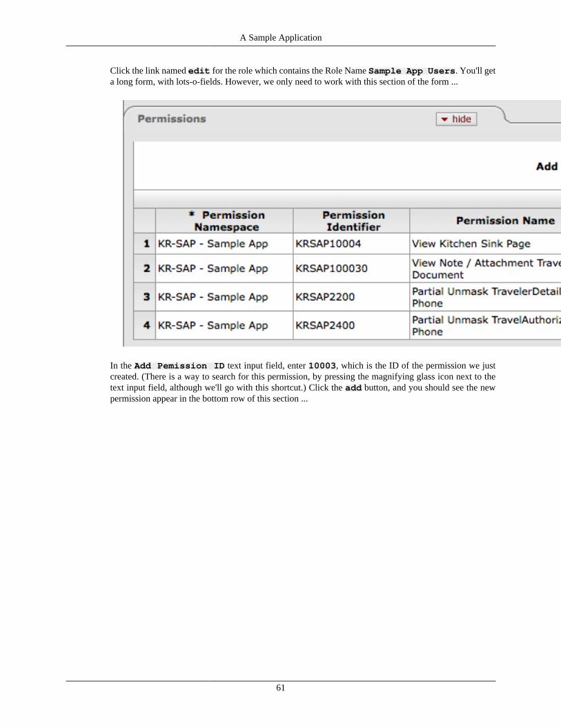
A Sample Application
61
Click the link named edit for the role which contains the Role Name Sample App Users. You'll geta long form, with lots-o-fields. However, we only need to work with this section of the form ...
In the Add Pemission ID text input field, enter 10003, which is the ID of the permission we justcreated. (There is a way to search for this permission, by pressing the magnifying glass icon next to thetext input field, although we'll go with this shortcut.) Click the add button, and you should see the newpermission appear in the bottom row of this section ...
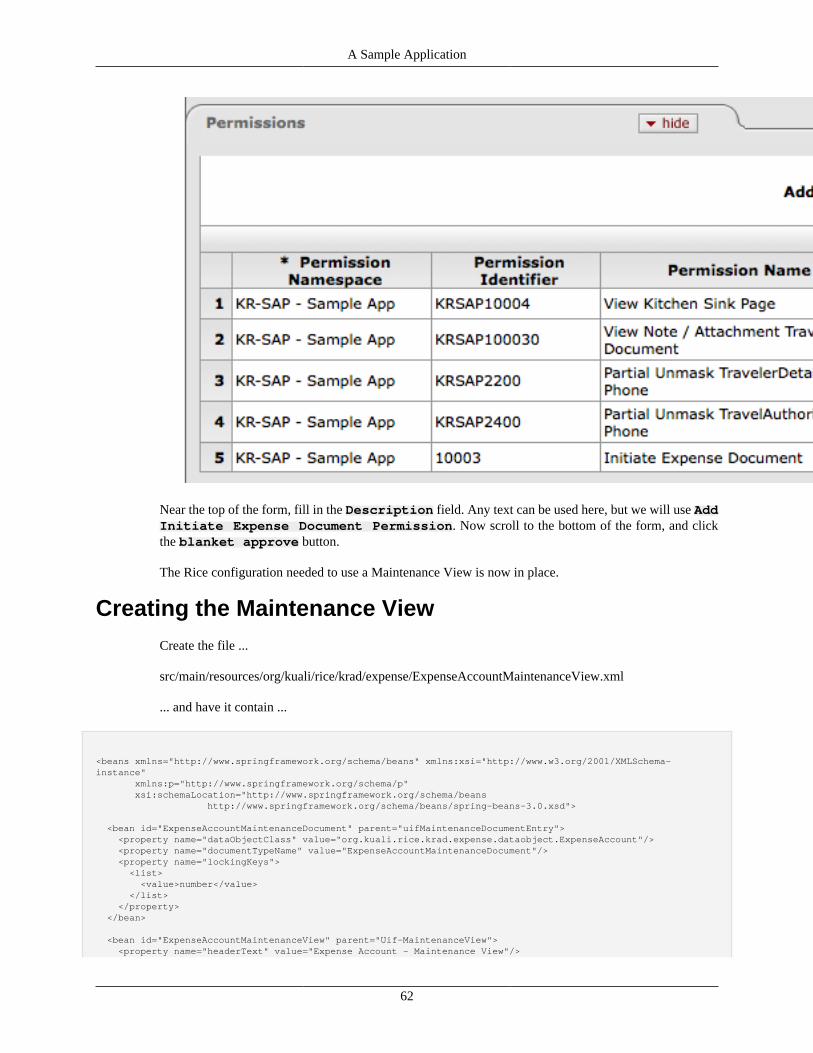
A Sample Application
62
Near the top of the form, fill in the Description field. Any text can be used here, but we will use AddInitiate Expense Document Permission. Now scroll to the bottom of the form, and clickthe blanket approve button.
The Rice configuration needed to use a Maintenance View is now in place.
Creating the Maintenance ViewCreate the file ...
src/main/resources/org/kuali/rice/krad/expense/ExpenseAccountMaintenanceView.xml
... and have it contain ...
<beans xmlns="http://www.springframework.org/schema/beans" xmlns:xsi="http://www.w3.org/2001/XMLSchema-instance" xmlns:p="http://www.springframework.org/schema/p" xsi:schemaLocation="http://www.springframework.org/schema/beans http://www.springframework.org/schema/beans/spring-beans-3.0.xsd"> <bean id="ExpenseAccountMaintenanceDocument" parent="uifMaintenanceDocumentEntry"> <property name="dataObjectClass" value="org.kuali.rice.krad.expense.dataobject.ExpenseAccount"/> <property name="documentTypeName" value="ExpenseAccountMaintenanceDocument"/> <property name="lockingKeys"> <list> <value>number</value> </list> </property> </bean>
<bean id="ExpenseAccountMaintenanceView" parent="Uif-MaintenanceView"> <property name="headerText" value="Expense Account - Maintenance View"/>
A Sample Application
63
<property name="title" value="Expense Account Maintenance"/> <property name="dataObjectClassName" value="org.kuali.rice.krad.expense.dataobject.ExpenseAccount"/> <property name="items"> <list merge="true"> <bean parent="Uif-MaintenanceGridSection"> <property name="headerText" value="Account Information"/> <property name="items"> <list> <bean parent="Uif-InputField" p:propertyName="number"/> <bean parent="Uif-InputField" p:propertyName="name"/> <bean parent="Uif-InputField" p:propertyName="description"/> </list> </property> </bean> <bean parent="Uif-MaintenanceStackedCollectionSection"> <property name="headerText" value="Sub Accounts"/> <property name="collectionObjectClass" value="org.kuali.rice.krad.expense.dataobject.ExpenseSubAccount"/> <property name="propertyName" value="subAccounts"/> <property name="items"> <list> <bean parent="Uif-InputField" p:propertyName="subAccount" p:readOnly="@{!#isAddLine}"/> <bean parent="Uif-InputField" p:propertyName="subAccountName" p:readOnly="@{!#isAddLine}"/> </list> </property> <property name="duplicateLinePropertyNames"> <list> <value>subAccount</value> </list> </property> <property name="lineActions"> <list> <bean parent="Uif-DeleteLineAction" p:render="@{isAddedCollectionItem(#line)}"/> <bean parent="Uif-SaveLineAction"/> </list> </property> <property name="layoutManager.summaryTitle" value="Sub Account"/> <property name="layoutManager.summaryFields"> <list> <value>subAccount</value> </list> </property> </bean> </list> </property> </bean>
</beans>
To create a Maintenance View, KRAD needs to have a Maintenance Document specified ...
<bean id="ExpenseAccountMaintenanceDocument" parent="uifMaintenanceDocumentEntry"> <property name="dataObjectClass" value="org.kuali.rice.krad.expense.dataobject.ExpenseAccount"/> <property name="documentTypeName" value="ExpenseAccountMaintenanceDocument"/> <property name="lockingKeys"> <list> <value>number</value> </list> </property> </bean>
KRAD knows this is a Maintenance View due to the line ...
<bean id="ExpenseAccountMaintenanceView" parent="Uif-MaintenanceView">
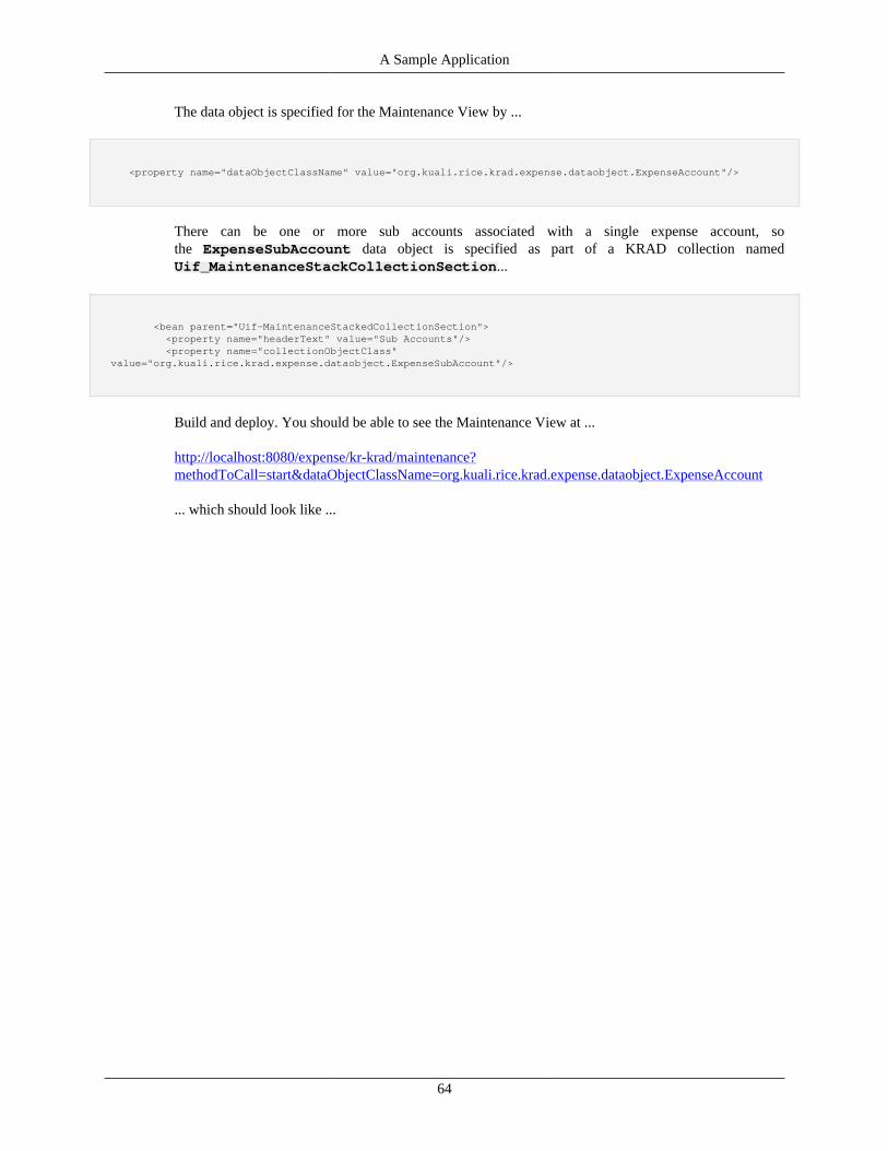
A Sample Application
64
The data object is specified for the Maintenance View by ...
<property name="dataObjectClassName" value="org.kuali.rice.krad.expense.dataobject.ExpenseAccount"/>
There can be one or more sub accounts associated with a single expense account, sothe ExpenseSubAccount data object is specified as part of a KRAD collection namedUif_MaintenanceStackCollectionSection...
<bean parent="Uif-MaintenanceStackedCollectionSection"> <property name="headerText" value="Sub Accounts"/> <property name="collectionObjectClass" value="org.kuali.rice.krad.expense.dataobject.ExpenseSubAccount"/>
Build and deploy. You should be able to see the Maintenance View at ...
http://localhost:8080/expense/kr-krad/maintenance?methodToCall=start&dataObjectClassName=org.kuali.rice.krad.expense.dataobject.ExpenseAccount
... which should look like ...
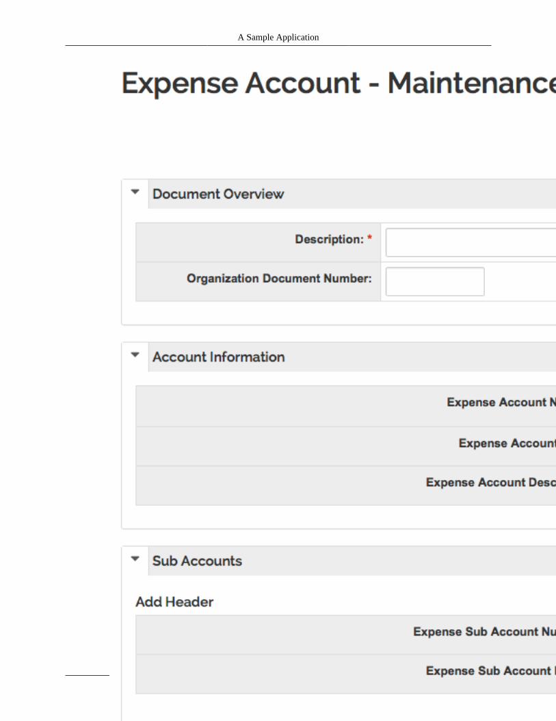
A Sample Application
65

A Sample Application
66
To create a new expense account, fill out these fields in the form ...
• Description: Tricycle Expense Account
• Expense Account Number: e4
• Expense Account Name: Tricycle expenses
• Expense Account Description: Huge amount of money for titanium tricycles.
• Expense Sub Account Number: A
• Sub Account Name: Titanium polishing
The form should now look like ...
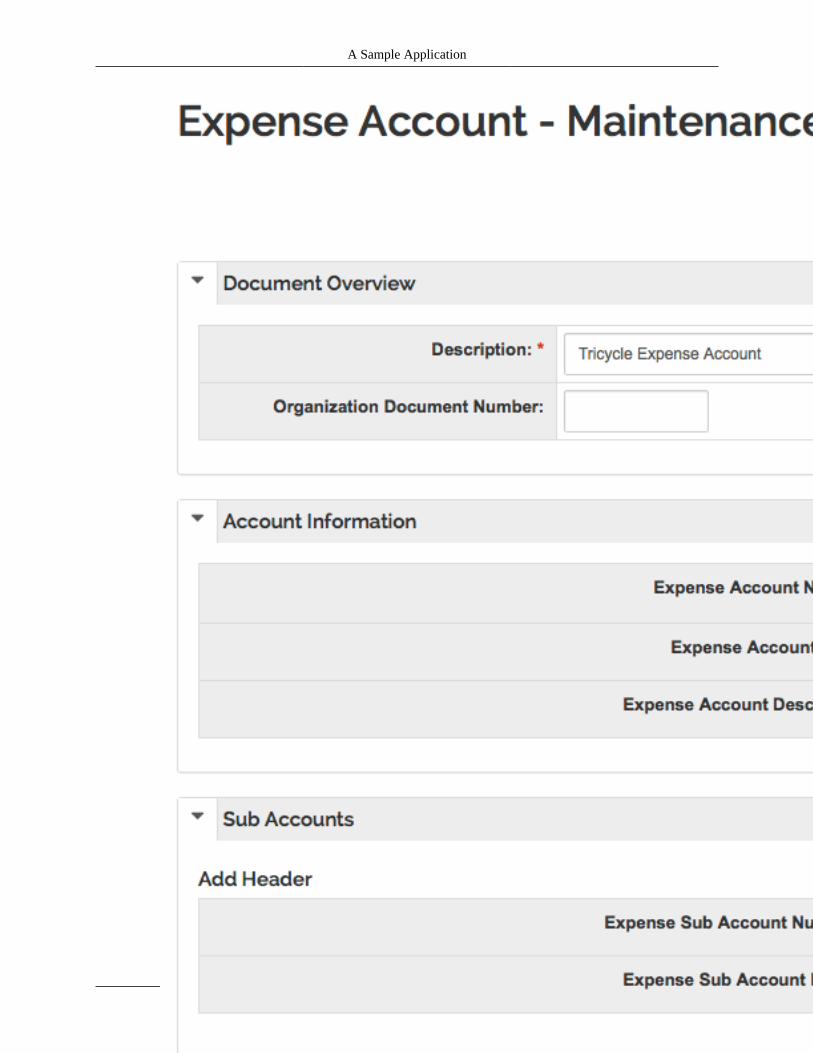
A Sample Application
67
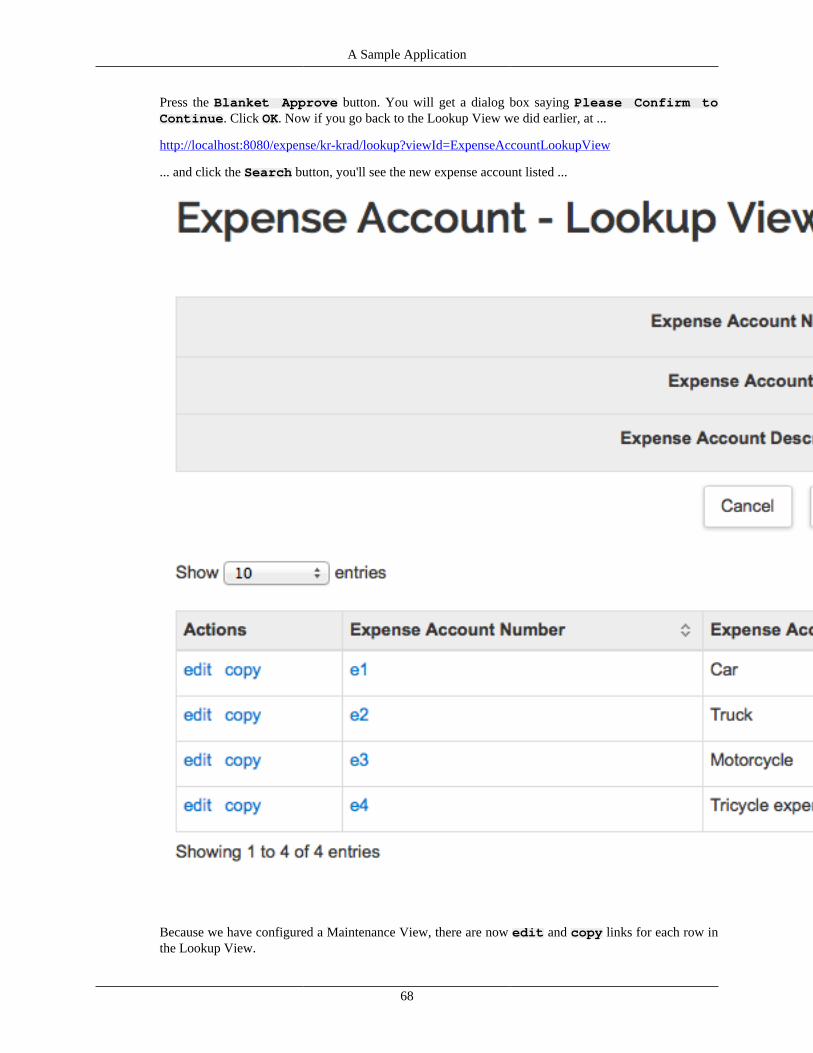
A Sample Application
68
Press the Blanket Approve button. You will get a dialog box saying Please Confirm toContinue. Click OK. Now if you go back to the Lookup View we did earlier, at ...
http://localhost:8080/expense/kr-krad/lookup?viewId=ExpenseAccountLookupView
... and click the Search button, you'll see the new expense account listed ...
Because we have configured a Maintenance View, there are now edit and copy links for each row inthe Lookup View.

69
Chapter 4. Data Objects andPersistence
Note
This document outlines the KRAD Data Framework as of Kuali Rice 2.4+. If you are workingwith older KRAD code and OJB, you will want to reference this document in pre 2.4 versionsof the KRAD Guide. See http://rice.kuali.org/docs for links to older versions of the Kuali Ricedocumentation.
Data FrameworkKRAD includes a "krad-data" module which provides data and persistence-related services. The dataframework provided by this module has a number of goals:
1. Provide CRUD (Create, Read, Update, Delete) operations for data.
2. Maintain a Metadata repository for storing additional information about data objects and their attributes.
3. Provide a mechanism to integrate custom persistence and metadata providers.
4. Include a default implementation based on the Java Persistence API (JPA).
As stated, it is intended that data which is consumed and processed by a KRAD application may be storedin any number of backend data stores or accessed using any number of different technologies.
For many KRAD applications, this data will be stored in a relational database and accessed using the JavaPersistence API (JPA). This is the default persistence technology that KRAD supports, however the designof the data framework facilitates integration with other technologies (plain JDBC and SQL, spring-data,web services, etc.) and backend data stores (key-value stores, document databases, object databases, etc.).This is accomplished through a service provider interface (SPI) that allows for the creation and integrationof custom providers.
In addition to providing persistence operations, the krad-data module also provides a Metadata repositorywhich stores various bits of metadata about the data objects that it is managing. Specifically, this includesinformation about what the keys and relationships are between data objects. It also contains informationlike human-readable labels for data object properties and constraints related to the valid representationof the data.
The krad-data module provides an API to interact with data objects and their metadata which is thenconsumed by the other components within the KRAD framework whenever they need to perform data-related operations. This API can also be used elsewhere within the application when it needs to interactwith its data objects.
Data ObjectsData Objects
Enterprise applications generally have a large number of CRUD (Create, Read, Update, Delete) operations;therefore, the access of data is a very important concern of development. KRAD builds on top of othertools to provide general facilities that greatly reduce the development time. These facilities are known asthe KRAD Persistence Framework.
Data Objects and Persistence
70
The foundation of the KRAD Persistence Framework is the third party ORM (Object Relational Mapping)tool. ORM tools target the persistence of data with a relational database. This is achieved by mapping aJava object that contains the data to one or more database tables. When a persistence operation is requested,the ORM tool performs the work of translating the request along with the corresponding object(s) to thenecessary DML statement. This provides a great advantage to the application as it generally requires nodatabase dependent code (database specific code might be required in certain cases).
In order to prepare our application for persisting data using an ORM tool, we must build the objects thatwill hold the application data. From the established data model, we can determine the objects needed usinga mapping strategy. Although the strategies and options available depend on the ORM solution we areusing, generally we have the following mapping options:
1. One table to one object
2. One table to multiple objects (polymorphism)
3. Multiple tables to one object
Once we have determined how an object will relate with its database table(s), each object property isassociated with a table column through configuration. This configuration will also give the ORM toolinformation on data type conversion and constraints. The final piece to our object mapping is specifyingany relationships. This includes one-to-one, one-to-many, and many-to-many relationships.
Tip
Referential Integrity: It is not required to have referential integrity set up in the database forrelationships declared for the persistent metadata. However, it is generally good practice to do so.
Now let's set aside the mapping concerns and have a closer look at our 'data' objects. Technically, theseobjects are not complex at all. First, they must adhere to the POJO (Plain Old Java Object) and JavaBeanguidelines. These guidelines are as follows:
1. Is Serializable (implements the java.io. Serializable interface)
2. Has a no-arg constructor
3. Provides property getter and setter methods using the conventional (get{PropertyName} for getter,set{PropertyName} for setter, and is{PropertyName} for Booleans)
In addition to the 'primitive' property types a data object may contain, a data object may also be composedof nested data objects (representing a one-to-one relationship), or a collection of data objects (representinga one-to-many relationship).
Tip
Related Data Objects: It is important to setup the related data object properties. As wewill see later on, the framework can take care of many things for us automatically based on themetadata derived from these relationships.
KRAD refers to any object that provides data as a 'Data Object'. Data objects provide a very central rolein an enterprise application. Within the suggested KRAD architecture, they are not bound to just the dataaccess layer, but can freely move between the other application layers as well. This means we can use dataobjects in our services, and we can use them to build our user interfaces.
Tip
'Data Object': The 'Data Object' term can refer to objects that are mapped to a persistencemechanism, but also might not be. For example, it might be an object whose data is assembled by
Data Objects and Persistence
71
a service call, which in turn interacts with other persisted objects or other services. This flexibilityis important for allowing other KRAD modules to be used with a variety of data sources andstrategies.
Best Practice: Keep data objects simple! Try to avoid introducing any business logic or presentation logicinto the objects.
Data ObjectsA special type of object in KRAD is known as a Data Object. There are two primary types of data object:those that persist to the database and those that do not. Generally, when creating a new data object, it ismore convenient to extend one of the provided base classes that implement the necessary interfaces. Forpersistable objects, this base class is org.kuali.rice.krad.bo.DataObjectBase. Within this base class, defaultimplementations for the persistable methods exist along with properties for the common fields requiredfor all persisted objects. These are described in more detail later on in this section. Data objects that donot persist to the database do not have to extend any particular class.
Tip
Business Objects: Earlier versions of Rice using OJB used to require that alldata objects extend the sub-interfaces of org.kuali.rice.krad.bo.BusinessObjectBase (such asorg.kuali.rice.krad.bo.PersistableBusinessObjectBase ororg.kuali.rice.krad.bo.TransientBusinessObjectBase), due to the framework requiring all objectsto be business objects (including the UI generation). With version 2.0 of Rice with KRAD andJPA, this restriction no longer exists; therefore there is really no need for these extensions.
In order to take advantage of all the features KRAD provides, it is recommended that all persistable objects(and therefore tables) contain two properties:
1. Version Number – This property holds a version for the record that is maintained by the ORM tool toperform optimistic locking. The number is initially set to 0. Each time the record is updated, the versionnumber is incremented. Before updating the record, the ORM tool performs a comparison betweenthe version number on the data object, and the version number of the record in the database. If theyare different, the tool knows the record has been updated since the record was pulled and throws anoptimistic lock exception.
2. Object Id – This property holds a GUID value for each record in the database. This is used in theframework as an alternate key for the record. Example usages of the object id include the notes andattachments framework. Notes are associated with a record by its object id. Another example is its usewithin the multi-value lookup framework. Selected records are identified and retrieved based on theirunique object ids.
Special Data ObjectsAdditional functionality exists for a few special types of data objects. One of these special types is dataobjects that have an active status. That is, each record has a state of active (which generally means therecord is valid for using) or inactive (meaning the record should not be used due to being old or notcurrently valid). Objects of this type should implement the Inactivatable interface. This interface requiresthe methods isActive() and setActive(Boolean active) to be implemented.
The simplest form of inactivatable data objects are those that maintain a single field that indicates the activestatus as a Boolean field. Another common case is that of an active date range (also known as effectivedating). These objects maintain two fields that work together for determining the active status. This first
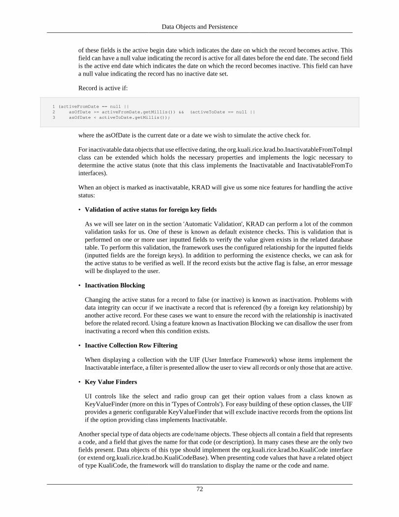
Data Objects and Persistence
72
of these fields is the active begin date which indicates the date on which the record becomes active. Thisfield can have a null value indicating the record is active for all dates before the end date. The second fieldis the active end date which indicates the date on which the record becomes inactive. This field can havea null value indicating the record has no inactive date set.
Record is active if:
1 (activeFromDate == null || 2 asOfDate >= activeFromDate.getMillis()) && (activeToDate == null || 3 asOfDate < activeToDate.getMillis());
where the asOfDate is the current date or a date we wish to simulate the active check for.
For inactivatable data objects that use effective dating, the org.kuali.rice.krad.bo.InactivatableFromToImplclass can be extended which holds the necessary properties and implements the logic necessary todetermine the active status (note that this class implements the Inactivatable and InactivatableFromTointerfaces).
When an object is marked as inactivatable, KRAD will give us some nice features for handling the activestatus:
• Validation of active status for foreign key fields
As we will see later on in the section 'Automatic Validation', KRAD can perform a lot of the commonvalidation tasks for us. One of these is known as default existence checks. This is validation that isperformed on one or more user inputted fields to verify the value given exists in the related databasetable. To perform this validation, the framework uses the configured relationship for the inputted fields(inputted fields are the foreign keys). In addition to performing the existence checks, we can ask forthe active status to be verified as well. If the record exists but the active flag is false, an error messagewill be displayed to the user.
• Inactivation Blocking
Changing the active status for a record to false (or inactive) is known as inactivation. Problems withdata integrity can occur if we inactivate a record that is referenced (by a foreign key relationship) byanother active record. For these cases we want to ensure the record with the relationship is inactivatedbefore the related record. Using a feature known as Inactivation Blocking we can disallow the user frominactivating a record when this condition exists.
• Inactive Collection Row Filtering
When displaying a collection with the UIF (User Interface Framework) whose items implement theInactivatable interface, a filter is presented allow the user to view all records or only those that are active.
• Key Value Finders
UI controls like the select and radio group can get their option values from a class known asKeyValueFinder (more on this in 'Types of Controls'). For easy building of these option classes, the UIFprovides a generic configurable KeyValueFinder that will exclude inactive records from the options listif the option providing class implements Inactivatable.
Another special type of data objects are code/name objects. These objects all contain a field that representsa code, and a field that gives the name for that code (or description). In many cases these are the only twofields present. Data objects of this type should implement the org.kuali.rice.krad.bo.KualiCode interface(or extend org.kuali.rice.krad.bo.KualiCodeBase). When presenting code values that have a related objectof type KualiCode, the framework will do translation to display the name or the code and name.
Data Objects and Persistence
73
Tip
Planned Feature
Code Table: In the future KRAD will provide the facilities for storing KualiCode objects in asingle code table. This will allow new codes to be created quickly (without the need for a tableand mapping).
Extending Data ObjectsAt times, there is a need to add additional attributes to existing objects in Rice or in a Rice-based clientapplication. Since not all objects can be subclassed safely (as some code may instantiate the base classesdirectly, we recommend creating an "extension" object with the additional attributes. This object will needto have the same primary key field(s) as the class being extended.
Rice helps to faciltate this through two additional features.
• The base class used for KRAD data objects (org.kuali.rice.krad.bo.DataObjectBase)contains a placeholder extensionObject property that can be used to traverse to your extension object.
• A special annotation @ExtensionFor which is used on your extension class in order to link it to thebase system data object. It links the objects automatically within the JPA layer and sets the extensionobject to JOIN-fetch with the extended object.
Usage
To make use of this feature, you need to do a few things.
1. Create a table for your extension attributes. This table's primary key must have the same fields anddatatypes as the data object you are extending.
Tip
Warning
Do NOT add a referential integrity constraint back to the main table. While that is a logicallycorrect relationship, we do not have full control over the order in which the ORM tools insertthe records in this case. As such, the system may attempt to insert your extension record first.(Which would fail if such a constraint were in place.)
2. Create a Java class to represent the extension and annotate normally for JPA.
3. Add the @ExtensionFor to the class. See below for examples.
@ExtensionFor Annotation
There are two properties on the @ExtensionFor annoation.
• value (default) : The class to which this extension should be attached.
• extensionPropertyName : On the above class, the property with this name should be used to make theattachment. This property must be a superclass of your actual extension object. (Baseline setup simplyhas the property set up as an Object.)
Examples
Using Default Extension Property
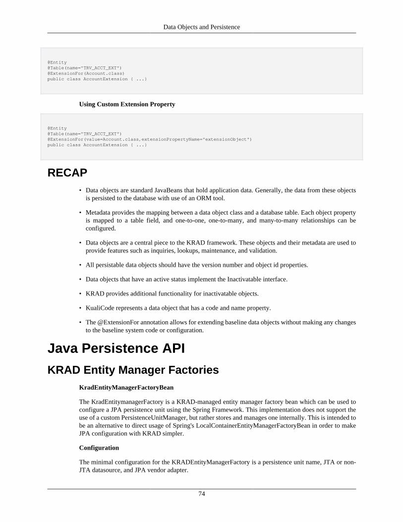
Data Objects and Persistence
74
@Entity@Table(name="TRV_ACCT_EXT")@ExtensionFor(Account.class)public class AccountExtension { ...}
Using Custom Extension Property
@Entity@Table(name="TRV_ACCT_EXT")@ExtensionFor(value=Account.class,extensionPropertyName="extensionObject")public class AccountExtension { ...}
RECAP• Data objects are standard JavaBeans that hold application data. Generally, the data from these objects
is persisted to the database with use of an ORM tool.
• Metadata provides the mapping between a data object class and a database table. Each object propertyis mapped to a table field, and one-to-one, one-to-many, and many-to-many relationships can beconfigured.
• Data objects are a central piece to the KRAD framework. These objects and their metadata are used toprovide features such as inquiries, lookups, maintenance, and validation.
• All persistable data objects should have the version number and object id properties.
• Data objects that have an active status implement the Inactivatable interface.
• KRAD provides additional functionality for inactivatable objects.
• KualiCode represents a data object that has a code and name property.
• The @ExtensionFor annotation allows for extending baseline data objects without making any changesto the baseline system code or configuration.
Java Persistence API
KRAD Entity Manager FactoriesKradEntityManagerFactoryBean
The KradEntitymanagerFactory is a KRAD-managed entity manager factory bean which can be used toconfigure a JPA persistence unit using the Spring Framework. This implementation does not support theuse of a custom PersistenceUnitManager, but rather stores and manages one internally. This is intended tobe an alternative to direct usage of Spring's LocalContainerEntityManagerFactoryBean in order to makeJPA configuration with KRAD simpler.
Configuration
The minimal configuration for the KRADEntityManagerFactory is a persistence unit name, JTA or non-JTA datasource, and JPA vendor adapter.
Data Objects and Persistence
75
Note
Persistence unit names must be unique
Behavior
When leveraging this class, persistence.xml files are not used. Rather, persistence unit configurationis loaded via the various settings provided on this factory bean which contain everything needed tocreate the desired persistence unit configuration in the majority of cases. If a KRAD application needsmore control over the configuration of the persistence unit or wants to use persistence.xml and JPA'sdefault bootstrapping and classpath scanning behavior, an EntityManagerFactory can be configuredusing the other classes provided by the Spring framework or by other means as needed. See theLocalContainerEntityManagerFactoryBean class for an alternative approach.
Only one of JTA or non-JTA datasource can be set. Depending on which one is set, the underlyingpersistence unit will have it's javax.persistence.spi.PersistenceUnitTransactionType set to eitherRESOURCE_LOCAL or JTA. If both of these are set, then this class will throw an IllegalStateExceptionwhen the afterPropertiesSet method is invoked by the Spring Framework.
Elsewhere, this class delegates to implementations of LocalContainerEntityManagerFactoryBean andDefaultPersistenceUnitManager, so information on the specific behavior of some of the settings andmethods on this class can be found on the javadoc for those classes as well.
JPA Property Defaults
When the afterPropertiesSet method is invoked, this class will scan the current config context forJPA properties and make them available to the persistence unit. It will combine these with anyproperties that were set directly on this factory bean via the setJpaProperties(java.util.Properties) or thesetJpaPropertyMap(java.util.Map) methods.
This scanning occurs in the following order, items later in the list will override any properties from earlierif they happen to set the same effective property value:
1. Scan ConfigContext for properties that begin with "rice.krad.jpa.global." For any found, strip off thisprefix prior to placing it into the JPA property map.
2. Scan ConfigContext for properties that begin with "rice.krad.jpa.<persistence-unit-name>" where"persistence-unit-name" is the configured name of this persistence unit. For any found, strip off thisprefix prior to placing it into the JPA property map.
3. Invoke loadCustomJpaDefaults(java.util.Map) method to allow for possible subclass customization ofJPA property defaults.
4. Load the JPA properties configured via setJpaPropertyMap(java.util.Map) method andsetJpaProperties(java.util.Properties) method. It is potentially non-deterministic which of these setterswill take precedence over the other, so it is recommended to only invoke one of them on a given instanceof this factory bean.
KradEclipseLinkEntityManagerFactoryBean
The KradEclipseLinkEntityManagerFactory is a KRAD-managed enitity manager factory which canbe used to configure an EclipseLink persistence unit using JPA. This class inherits from theKradEntityManagerFactoryBean class, but adds the following behavior:
1. Sets the jpa vendor adapter to an EclipsLink vendor adapter
2. Detects if Java Transation API (JTA) is being used and, if so sets a JPA property value accordingly toallow EclipseLink integration with the Java Transation API
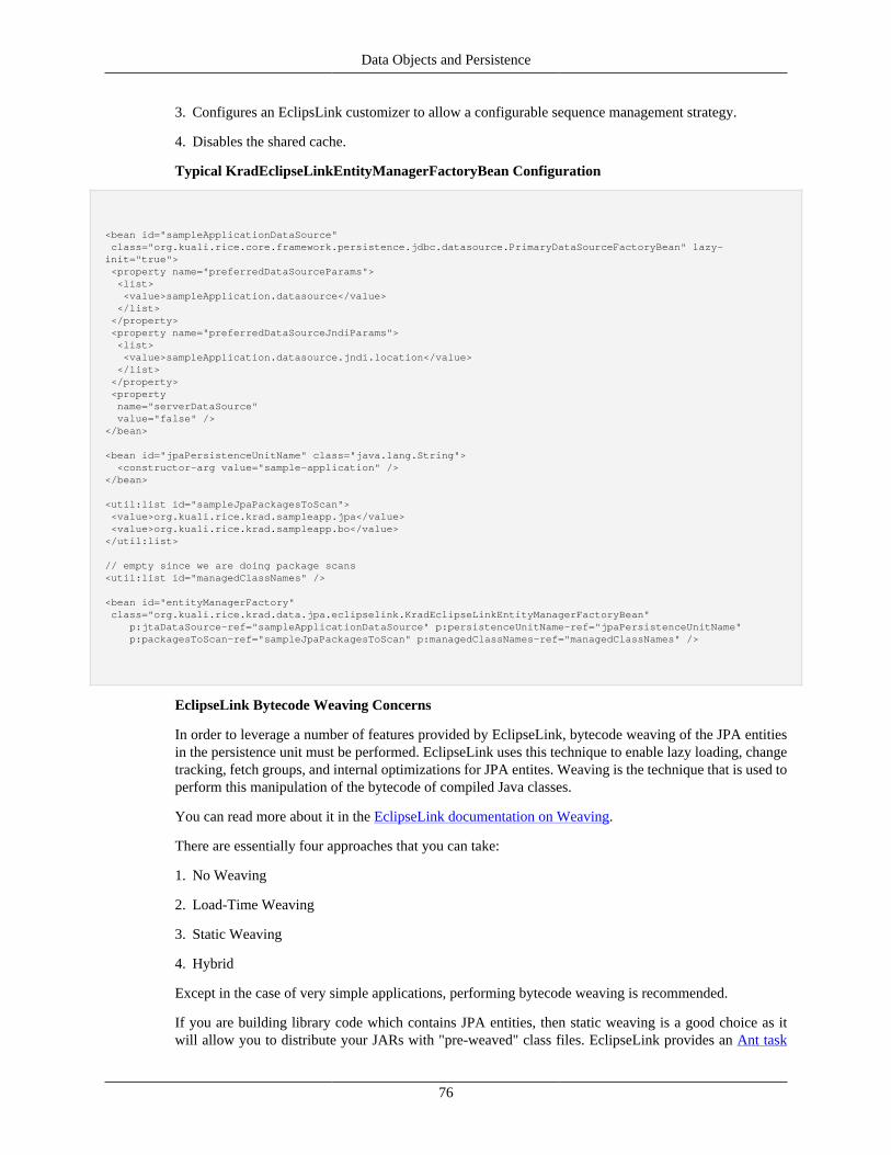
Data Objects and Persistence
76
3. Configures an EclipsLink customizer to allow a configurable sequence management strategy.
4. Disables the shared cache.
Typical KradEclipseLinkEntityManagerFactoryBean Configuration
<bean id="sampleApplicationDataSource" class="org.kuali.rice.core.framework.persistence.jdbc.datasource.PrimaryDataSourceFactoryBean" lazy-init="true"> <property name="preferredDataSourceParams"> <list> <value>sampleApplication.datasource</value> </list> </property> <property name="preferredDataSourceJndiParams"> <list> <value>sampleApplication.datasource.jndi.location</value> </list> </property> <property name="serverDataSource" value="false" /></bean>
<bean id="jpaPersistenceUnitName" class="java.lang.String"> <constructor-arg value="sample-application" /></bean>
<util:list id="sampleJpaPackagesToScan"> <value>org.kuali.rice.krad.sampleapp.jpa</value> <value>org.kuali.rice.krad.sampleapp.bo</value></util:list>
// empty since we are doing package scans<util:list id="managedClassNames" />
<bean id="entityManagerFactory" class="org.kuali.rice.krad.data.jpa.eclipselink.KradEclipseLinkEntityManagerFactoryBean" p:jtaDataSource-ref="sampleApplicationDataSource" p:persistenceUnitName-ref="jpaPersistenceUnitName" p:packagesToScan-ref="sampleJpaPackagesToScan" p:managedClassNames-ref="managedClassNames" />
EclipseLink Bytecode Weaving Concerns
In order to leverage a number of features provided by EclipseLink, bytecode weaving of the JPA entitiesin the persistence unit must be performed. EclipseLink uses this technique to enable lazy loading, changetracking, fetch groups, and internal optimizations for JPA entites. Weaving is the technique that is used toperform this manipulation of the bytecode of compiled Java classes.
You can read more about it in the EclipseLink documentation on Weaving.
There are essentially four approaches that you can take:
1. No Weaving
2. Load-Time Weaving
3. Static Weaving
4. Hybrid
Except in the case of very simple applications, performing bytecode weaving is recommended.
If you are building library code which contains JPA entities, then static weaving is a good choice as itwill allow you to distribute your JARs with "pre-weaved" class files. EclipseLink provides an Ant task
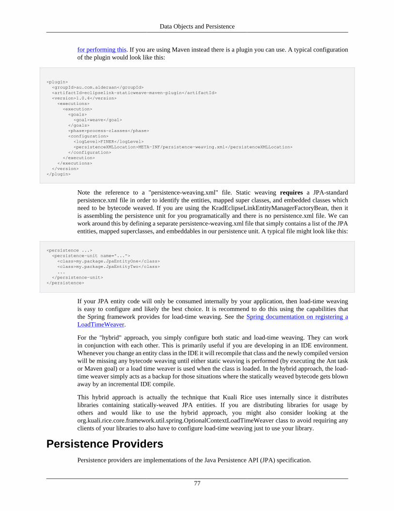
Data Objects and Persistence
77
for performing this. If you are using Maven instead there is a plugin you can use. A typical configurationof the plugin would look like this:
<plugin> <groupId>au.com.alderaan</groupId> <artifactId>eclipselink-staticweave-maven-plugin</artifactId> <version>1.0.4</version> <executions> <execution> <goals> <goal>weave</goal> </goals> <phase>process-classes</phase> <configuration> <logLevel>FINER</logLevel> <persistenceXMLLocation>META-INF/persistence-weaving.xml</persistenceXMLLocation> </configuration> </execution> </executions> </version></plugin>
Note the reference to a "persistence-weaving.xml" file. Static weaving requires a JPA-standardpersistence.xml file in order to identify the entities, mapped super classes, and embedded classes whichneed to be bytecode weaved. If you are using the KradEclipseLinkEntityManagerFactoryBean, then itis assembling the persistence unit for you programatically and there is no persistence.xml file. We canwork around this by defining a separate persistence-weaving.xml file that simply contains a list of the JPAentities, mapped superclasses, and embeddables in our persistence unit. A typical file might look like this:
<persistence ...> <persistence-unit name="..."> <class>my.package.JpaEntityOne</class> <class>my.package.JpaEntityTwo</class> ... </persistence-unit></persistence>
If your JPA entity code will only be consumed internally by your application, then load-time weavingis easy to configure and likely the best choice. It is recommend to do this using the capabilities thatthe Spring framework provides for load-time weaving. See the Spring documentation on registering aLoadTimeWeaver.
For the "hybrid" approach, you simply configure both static and load-time weaving. They can workin conjunction with each other. This is primarily useful if you are developing in an IDE environment.Whenever you change an entity class in the IDE it will recompile that class and the newly compiled versionwill be missing any bytecode weaving until either static weaving is performed (by executing the Ant taskor Maven goal) or a load time weaver is used when the class is loaded. In the hybrid approach, the load-time weaver simply acts as a backup for those situations where the statically weaved bytecode gets blownaway by an incremental IDE compile.
This hybrid approach is actually the technique that Kuali Rice uses internally since it distributeslibraries containing statically-weaved JPA entities. If you are distributing libraries for usage byothers and would like to use the hybrid approach, you might also consider looking at theorg.kuali.rice.core.framework.util.spring.OptionalContextLoadTimeWeaver class to avoid requiring anyclients of your libraries to also have to configure load-time weaving just to use your library.
Persistence ProvidersPersistence providers are implementations of the Java Persistence API (JPA) specification.
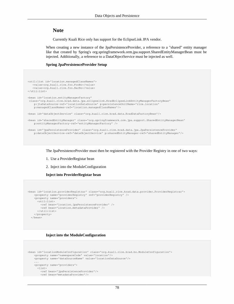
Data Objects and Persistence
78
Note
Currently Kuali Rice only has support for the EclipseLink JPA vendor.
When creating a new instance of the JpaPersistenceProvider, a reference to a "shared" entity managerlike that created by Spring's org.springframework.orm.jpa.support.SharedEntityManagerBean must beinjected. Additionally, a reference to a DataObjectService must be injected as well.
Spring JpaPersistenceProvider Setup
<util:list id="location.managedClassNames"> <value>org.kuali.rice.foo.FooBo</value> <value>org.kuali.rice.foo.BarBo</value></util:list>
<bean id="location.entityManagerFactory" class="org.kuali.rice.krad.data.jpa.eclipselink.KradEclipseLinkEntityManagerFactoryBean" p:jtaDataSource-ref="locationDataSource" p:persistenceUnitName="rice.location" p:managedClassNames-ref="location.managedClassNames"/>
<bean id="dataObjectService" class="org.kuali.rice.krad.data.KradDataFactoryBean"/> <bean id="sharedEntityManager" class="org.springframework.orm.jpa.support.SharedEntityManagerBean" p:entityManagerFactory-ref="entityManagerFactory" />
<bean id="jpaPersistenceProvider" class="org.kuali.rice.krad.data.jpa.JpaPersistenceProvider" p:dataObjectService-ref="dataObjectService" p:sharedEntityManager-ref="sharedEntityManager"/>
The JpaPersistenceProvider must then be registered with the Provider Registry in one of two ways:
1. Use a ProviderRegistar bean
2. Inject into the ModuleConfiguration
Inject into ProviderRegistar bean
<bean id="location.providerRegistrar" class="org.kuali.rice.krad.data.provider.ProviderRegistrar"> <property name="providerRegistry" ref="providerRegistry" /> <property name="providers"> <util:list> <ref bean="location.jpaPersistenceProvider" /> <ref bean="location.metadataProvider" /> </util:list> </property> </bean>
Inject into the ModuleConfiguration
<bean id="locationModuleConfiguration" class="org.kuali.rice.krad.bo.ModuleConfiguration"> <property name="namespaceCode" value="location"/> <property name="dataSourceName" value="locationDataSource"/> ... <property name="providers"> <list> <ref bean="jpaPersistenceProvider"/> <ref bean="metadataProvider"/>
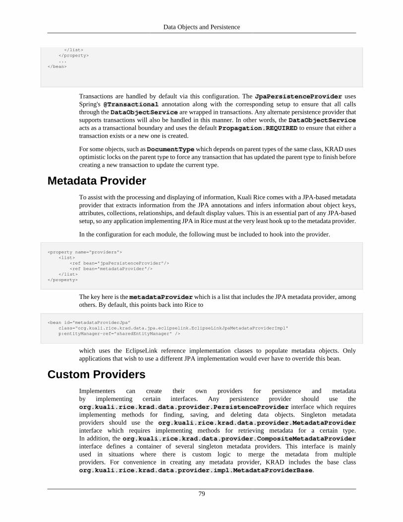
Data Objects and Persistence
79
</list> </property> ...</bean>
Transactions are handled by default via this configuration. The JpaPersistenceProvider usesSpring's @Transactional annotation along with the corresponding setup to ensure that all callsthrough the DataObjectService are wrapped in transactions. Any alternate persistence provider thatsupports transactions will also be handled in this manner. In other words, the DataObjectServiceacts as a transactional boundary and uses the default Propagation.REQUIRED to ensure that either atransaction exists or a new one is created.
For some objects, such as DocumentType which depends on parent types of the same class, KRAD usesoptimistic locks on the parent type to force any transaction that has updated the parent type to finish beforecreating a new transaction to update the current type.
Metadata ProviderTo assist with the processing and displaying of information, Kuali Rice comes with a JPA-based metadataprovider that extracts information from the JPA annotations and infers information about object keys,attributes, collections, relationships, and default display values. This is an essential part of any JPA-basedsetup, so any application implementing JPA in Rice must at the very least hook up to the metadata provider.
In the configuration for each module, the following must be included to hook into the provider.
<property name="providers"> <list> <ref bean="jpaPersistenceProvider"/> <ref bean="metadataProvider"/> </list></property>
The key here is the metadataProvider which is a list that includes the JPA metadata provider, amongothers. By default, this points back into Rice to
<bean id="metadataProviderJpa" class="org.kuali.rice.krad.data.jpa.eclipselink.EclipseLinkJpaMetadataProviderImpl" p:entityManager-ref="sharedEntityManager" />
which uses the EclipseLink reference implementation classes to populate metadata objects. Onlyapplications that wish to use a different JPA implementation would ever have to override this bean.
Custom ProvidersImplementers can create their own providers for persistence and metadataby implementing certain interfaces. Any persistence provider should use theorg.kuali.rice.krad.data.provider.PersistenceProvider interface which requiresimplementing methods for finding, saving, and deleting data objects. Singleton metadataproviders should use the org.kuali.rice.krad.data.provider.MetadataProviderinterface which requires implementing methods for retrieving metadata for a certain type.In addition, the org.kuali.rice.krad.data.provider.CompositeMetadataProviderinterface defines a container of several singleton metadata providers. This interface is mainlyused in situations where there is custom logic to merge the metadata from multipleproviders. For convenience in creating any metadata provider, KRAD includes the base classorg.kuali.rice.krad.data.provider.impl.MetadataProviderBase.
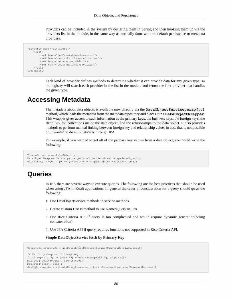
Data Objects and Persistence
80
Providers can be included in the system by declaring them in Spring and then hooking them up via theproviders list in the module, in the same way as normally done with the default persistence or metadataproviders.
<property name="providers"> <list> <ref bean="jpaPersistenceProvider"/> <ref bean="customPersistenceProvider"/> <ref bean="metadataProvider"/> <ref bean="customMetadataProvider"/> </list></property>
Each kind of provider defines methods to determine whether it can provide data for any given type, sothe registry will search each provider in the list in the module and return the first provider that handlesthe given type.
Accessing MetadataThe metadata about data objects is available now directly via the DataObjectService.wrap(..)method, which loads the metadata from the metadata repository and places it in a DataObjectWrapper.This wrapper gives access to such information as the primary keys, the business keys, the foreign keys, theattributes, the collections inside the data object, and the relationships to the data object. It also providesmethods to perform manual linking between foreign key and relationship values in case that is not possibleor unwanted to do automatically through JPA.
For example, if you wanted to get all of the primary key values from a data object, you could write thefollowing:
T dataObject = getDataObject();DataObjectWrapper<T> wrapper = getDataObjectService().wrap(dataObject);Map<String, Object> primaryKeyValues = wrapper.getPrimaryKeyValues();
QueriesIn JPA there are several ways to execute queries. The following are the best practices that should be usedwhen using JPA in Kuali applications. In general the order of consideration for a query should go as thefollowing:
1. Use DataObjectService methods in service methods.
2. Create custom DAOs method to use NamedQuery in JPA.
3. Use Rice Criteria API if query is too complicated and would require dynamic generation(Stringconcatenation).
4. Use JPA Criteria API if query requires functions not supported in Rice Criteria API.
Simple DataObjectService fetch by Primary Key
CountryBo countryBo = getDataObjectService().find(CountryBo.class,code);
// Fetch by Compound Primary Keyfinal Map<String, Object> map = new HashMap<String, Object>();map.put("countryCode", countryCode);map.put("code", code);StateBo stateBo = getDataObjectService().find(StateBo.class,new CompoundKey(map)));
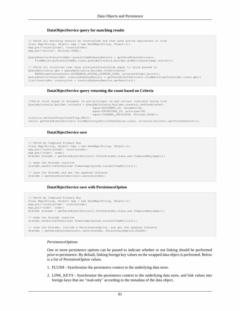
Data Objects and Persistence
81
DataObjectService query for matching results
// Fetch all matching results by countryCode and that have active equivalent to truefinal Map<String, Object> map = new HashMap<String, Object>();map.put("countryCode", countryCode);map.put("active", Boolean.TRUE);
QueryResults<PostalCodeBo> postalCodeBoQueryResults = getDataObjectService(). findMatching(PostalCodeBo.class,QueryByCriteria.Builder.andAttributes(map).build());
// Fetch all Countries that have alternateCountryCode equal to value passed inQueryByCriteria qbc = QueryByCriteria.Builder.forAttribute( KRADPropertyConstants.ALTERNATE_POSTAL_COUNTRY_CODE, alternateCode).build();QueryResults<CountryBo> countryBoQueryResults = getDataObjectService().findMatching(CountryBo.class,qbc);List<CountryBo> countryList = countryBoQueryResults.getResults();
DataObjectService query returning the count based on Criteria
//Fetch count based on document id and principal id and current indicator being trueQueryByCriteria.Builder criteria = QueryByCriteria.Builder.create().setPredicates( equal(DOCUMENT_ID, documentId), equal(PRINCIPAL_ID, principalId), equal(CURRENT_INDICATOR, Boolean.TRUE));criteria.setCountFlag(CountFlag.ONLY);return getDataObjectService().findMatching(ActionTakenValue.class, criteria.build()).getTotalRowCount();
DataObjectService save
// Fetch by Compound Primary Keyfinal Map<String, Object> map = new HashMap<String, Object>();map.put("countryCode", countryCode);map.put("code", code);StateBo stateBo = getDataObjectService().find(StateBo.class,new CompoundKey(map)));
// make the StateBo inactivestateBo.setActiveToDate(new Timestamp(System.currentTimeMillis());
// save the StateBo and get the updated instancestateBo = getDataObjectService().save(stateBo);
DataObjectService save with PersistenceOption
// Fetch by Compound Primary Keyfinal Map<String, Object> map = new HashMap<String, Object>();map.put("countryCode", countryCode);map.put("code", code);StateBo stateBo = getDataObjectService().find(StateBo.class,new CompoundKey(map)));
// make the StateBo inactivestateBo.setActiveToDate(new Timestamp(System.currentTimeMillis());
// save the StateBo, include a PersistenceOption, and get the updated instancestateBo = getDataObjectService().save(stateBo, PersistenceOption.FLUSH);
PersistenceOptions
One or more persistence options can be passed to indicate whether or not linking should be performedprior to persistence. By default, linking foreign key values on the wrapped data object is performed. Belowis a list of PersistionOption values.
1. FLUSH - Synchronize the persistence context to the underlying data store.
2. LINK_KEYS - Synchronize the persistence context to the underlying data store, and link values intoforeign keys that are "read-only" according to the metadata of the data object.
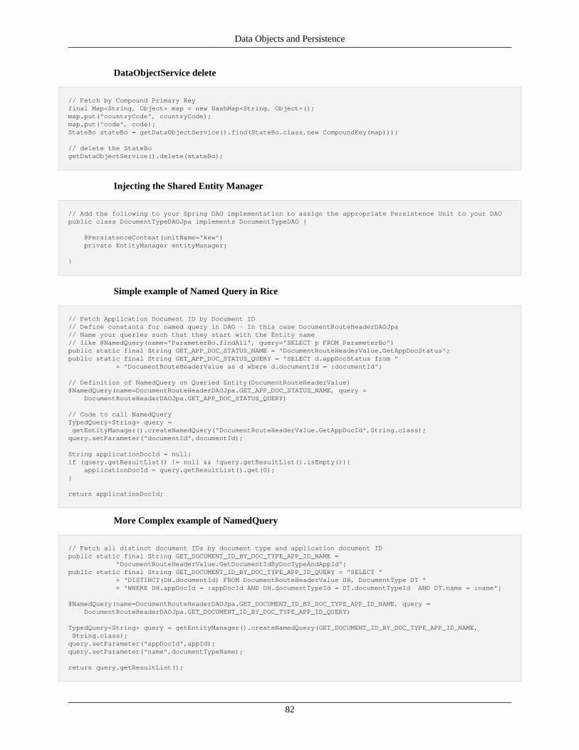
Data Objects and Persistence
82
DataObjectService delete
// Fetch by Compound Primary Keyfinal Map<String, Object> map = new HashMap<String, Object>();map.put("countryCode", countryCode);map.put("code", code);StateBo stateBo = getDataObjectService().find(StateBo.class,new CompoundKey(map)));
// delete the StateBogetDataObjectService().delete(stateBo);
Injecting the Shared Entity Manager
// Add the following to your Spring DAO implementation to assign the appropriate Persistence Unit to your DAOpublic class DocumentTypeDAOJpa implements DocumentTypeDAO {
@PersistenceContext(unitName="kew") private EntityManager entityManager;
}
Simple example of Named Query in Rice
// Fetch Application Document ID by Document ID// Define constants for named query in DAO - In this case DocumentRouteHeaderDAOJpa// Name your queries such that they start with the Entity name// like @NamedQuery(name="ParameterBo.findAll", query="SELECT p FROM ParameterBo")public static final String GET_APP_DOC_STATUS_NAME = "DocumentRouteHeaderValue.GetAppDocStatus";public static final String GET_APP_DOC_STATUS_QUERY = "SELECT d.appDocStatus from " + "DocumentRouteHeaderValue as d where d.documentId = :documentId";
// Definition of NamedQuery on Queried Entity(DocumentRouteHeaderValue)@NamedQuery(name=DocumentRouteHeaderDAOJpa.GET_APP_DOC_STATUS_NAME, query = DocumentRouteHeaderDAOJpa.GET_APP_DOC_STATUS_QUERY)
// Code to call NamedQueryTypedQuery<String> query = getEntityManager().createNamedQuery("DocumentRouteHeaderValue.GetAppDocId",String.class);query.setParameter("documentId",documentId);
String applicationDocId = null;if (query.getResultList() != null && !query.getResultList().isEmpty()){ applicationDocId = query.getResultList().get(0);}
return applicationDocId;
More Complex example of NamedQuery
// Fetch all distinct document IDs by document type and application document IDpublic static final String GET_DOCUMENT_ID_BY_DOC_TYPE_APP_ID_NAME = "DocumentRouteHeaderValue.GetDocumentIdByDocTypeAndAppId";public static final String GET_DOCUMENT_ID_BY_DOC_TYPE_APP_ID_QUERY = "SELECT " + "DISTINCT(DH.documentId) FROM DocumentRouteHeaderValue DH, DocumentType DT " + "WHERE DH.appDocId = :appDocId AND DH.documentTypeId = DT.documentTypeId AND DT.name = :name";
@NamedQuery(name=DocumentRouteHeaderDAOJpa.GET_DOCUMENT_ID_BY_DOC_TYPE_APP_ID_NAME, query = DocumentRouteHeaderDAOJpa.GET_DOCUMENT_ID_BY_DOC_TYPE_APP_ID_QUERY)
TypedQuery<String> query = getEntityManager().createNamedQuery(GET_DOCUMENT_ID_BY_DOC_TYPE_APP_ID_NAME, String.class);query.setParameter("appDocId",appId);query.setParameter("name",documentTypeName);
return query.getResultList();
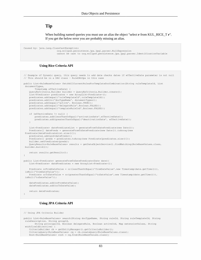
Data Objects and Persistence
83
Tip
When building named queries you must use an alias the object "select r from KUL_RICE_T r".If you get the below error you are probably missing an alias.
Caused by: java.lang.ClassCastException: org.eclipse.persistence.jpa.jpql.parser.NullExpression cannot be cast to org.eclipse.persistence.jpa.jpql.parser.IdentificationVariable
Using Rice Criteria API
// Example of Dynamic query, this query needs to add date checks dates if effectiveDate parameter is not null// This should be in a DAO class - RuleDAOJpa in this case
public List<RuleBaseValues> fetchAllCurrentRulesForTemplateDocCombination(String ruleTemplateId, List documentTypes, Timestamp effectiveDate) { QueryByCriteria.Builder builder = QueryByCriteria.Builder.create(); List<Predicate> predicates = new ArrayList<Predicate>(); predicates.add(equal("ruleTemplateId",ruleTemplateId)); predicates.add(in("docTypeName", documentTypes)); predicates.add(equal("active", Boolean.TRUE)); predicates.add(equal("delegateRule",Boolean.FALSE)); predicates.add(equal("templateRuleInd",Boolean.FALSE));
if (effectiveDate != null) { predicates.add(lessThanOrEqual("activationDate",effectiveDate)); predicates.add(greaterThanOrEqual("deactivationDate", effectiveDate)); }
List<Predicate> datePredicateList = generateFromToDatePredicate(new Date()); Predicate[] datePreds = generateFromToDatePredicate(new Date()).toArray(new Predicate[datePredicateList.size()]); predicates.add(and(datePreds)); Predicate[] preds = predicates.toArray(new Predicate[predicates.size()]); builder.setPredicates(preds); QueryResults<RuleBaseValues> results = getDataObjectService().findMatching(RuleBaseValues.class, builder.build());
return results.getResults();}
public List<Predicate> generateFromToDatePredicate(Date date){ List<Predicate> datePredicates = new ArrayList<Predicate>();
Predicate orFromDateValue = or(lessThanOrEqual("fromDateValue",new Timestamp(date.getTime())), isNull("fromDateValue")); Predicate orToDateValue = or(greaterThanOrEqual("toDateValue",new Timestamp(date.getTime())), isNull("toDateValue"));
datePredicates.add(orFromDateValue); datePredicates.add(orToDateValue);
return datePredicates;}
Using JPA Criteria API
// Using JPA Criteria Builder
public List<RuleBaseValues> search(String docTypeName, String ruleId, String ruleTemplateId, String ruleDescription, String groupId, String principalId, Boolean delegateRule, Boolean activeInd, Map extensionValues, String workflowIdDirective) { CriteriaBuilder cb = getEntityManager().getCriteriaBuilder(); CriteriaQuery<RuleBaseValues> cq = cb.createQuery(RuleBaseValues.class); Root<RuleBaseValues> root = cq.from(RuleBaseValues.class);
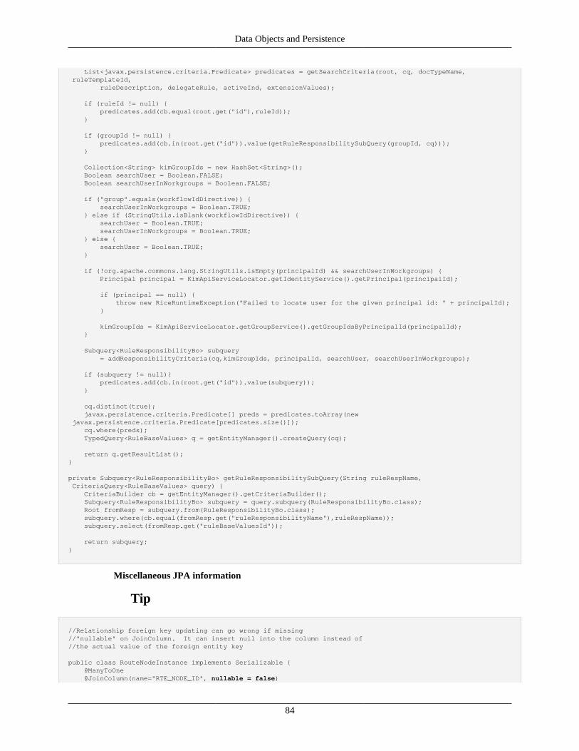
Data Objects and Persistence
84
List<javax.persistence.criteria.Predicate> predicates = getSearchCriteria(root, cq, docTypeName, ruleTemplateId, ruleDescription, delegateRule, activeInd, extensionValues);
if (ruleId != null) { predicates.add(cb.equal(root.get("id"),ruleId)); }
if (groupId != null) { predicates.add(cb.in(root.get("id")).value(getRuleResponsibilitySubQuery(groupId, cq))); }
Collection<String> kimGroupIds = new HashSet<String>(); Boolean searchUser = Boolean.FALSE; Boolean searchUserInWorkgroups = Boolean.FALSE; if ("group".equals(workflowIdDirective)) { searchUserInWorkgroups = Boolean.TRUE; } else if (StringUtils.isBlank(workflowIdDirective)) { searchUser = Boolean.TRUE; searchUserInWorkgroups = Boolean.TRUE; } else { searchUser = Boolean.TRUE; } if (!org.apache.commons.lang.StringUtils.isEmpty(principalId) && searchUserInWorkgroups) { Principal principal = KimApiServiceLocator.getIdentityService().getPrincipal(principalId);
if (principal == null) { throw new RiceRuntimeException("Failed to locate user for the given principal id: " + principalId); }
kimGroupIds = KimApiServiceLocator.getGroupService().getGroupIdsByPrincipalId(principalId); }
Subquery<RuleResponsibilityBo> subquery = addResponsibilityCriteria(cq,kimGroupIds, principalId, searchUser, searchUserInWorkgroups);
if (subquery != null){ predicates.add(cb.in(root.get("id")).value(subquery)); }
cq.distinct(true); javax.persistence.criteria.Predicate[] preds = predicates.toArray(new javax.persistence.criteria.Predicate[predicates.size()]); cq.where(preds); TypedQuery<RuleBaseValues> q = getEntityManager().createQuery(cq);
return q.getResultList();}
private Subquery<RuleResponsibilityBo> getRuleResponsibilitySubQuery(String ruleRespName, CriteriaQuery<RuleBaseValues> query) { CriteriaBuilder cb = getEntityManager().getCriteriaBuilder(); Subquery<RuleResponsibilityBo> subquery = query.subquery(RuleResponsibilityBo.class); Root fromResp = subquery.from(RuleResponsibilityBo.class); subquery.where(cb.equal(fromResp.get("ruleResponsibilityName"),ruleRespName)); subquery.select(fromResp.get("ruleBaseValuesId"));
return subquery;}
Miscellaneous JPA information
Tip
//Relationship foreign key updating can go wrong if missing//"nullable" on JoinColumn. It can insert null into the column instead of//the actual value of the foreign entity key
public class RouteNodeInstance implements Serializable { @ManyToOne @JoinColumn(name="RTE_NODE_ID", nullable = false)
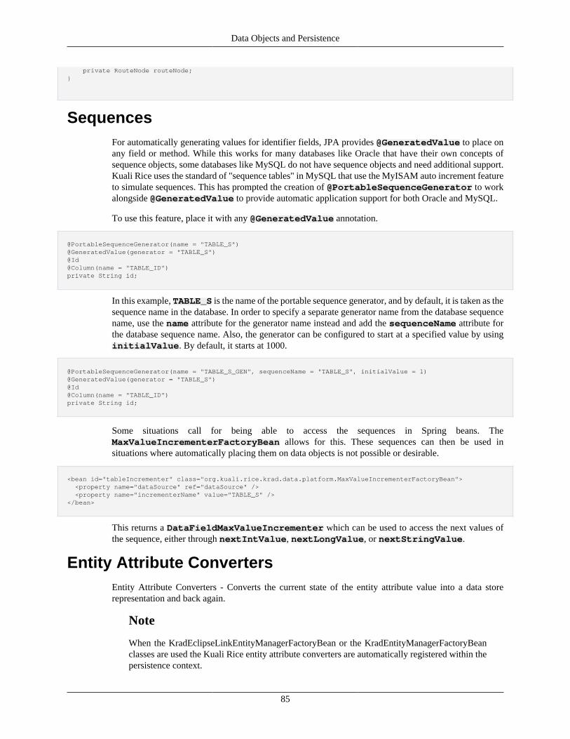
Data Objects and Persistence
85
private RouteNode routeNode;}
SequencesFor automatically generating values for identifier fields, JPA provides @GeneratedValue to place onany field or method. While this works for many databases like Oracle that have their own concepts ofsequence objects, some databases like MySQL do not have sequence objects and need additional support.Kuali Rice uses the standard of "sequence tables" in MySQL that use the MyISAM auto increment featureto simulate sequences. This has prompted the creation of @PortableSequenceGenerator to workalongside @GeneratedValue to provide automatic application support for both Oracle and MySQL.
To use this feature, place it with any @GeneratedValue annotation.
@PortableSequenceGenerator(name = "TABLE_S")@GeneratedValue(generator = "TABLE_S")@Id@Column(name = "TABLE_ID")private String id;
In this example, TABLE_S is the name of the portable sequence generator, and by default, it is taken as thesequence name in the database. In order to specify a separate generator name from the database sequencename, use the name attribute for the generator name instead and add the sequenceName attribute forthe database sequence name. Also, the generator can be configured to start at a specified value by usinginitialValue. By default, it starts at 1000.
@PortableSequenceGenerator(name = "TABLE_S_GEN", sequenceName = "TABLE_S", initialValue = 1)@GeneratedValue(generator = "TABLE_S")@Id@Column(name = "TABLE_ID")private String id;
Some situations call for being able to access the sequences in Spring beans. TheMaxValueIncrementerFactoryBean allows for this. These sequences can then be used insituations where automatically placing them on data objects is not possible or desirable.
<bean id="tableIncrementer" class="org.kuali.rice.krad.data.platform.MaxValueIncrementerFactoryBean"> <property name="dataSource" ref="dataSource" /> <property name="incrementerName" value="TABLE_S" /></bean>
This returns a DataFieldMaxValueIncrementer which can be used to access the next values ofthe sequence, either through nextIntValue, nextLongValue, or nextStringValue.
Entity Attribute ConvertersEntity Attribute Converters - Converts the current state of the entity attribute value into a data storerepresentation and back again.
Note
When the KradEclipseLinkEntityManagerFactoryBean or the KradEntityManagerFactoryBeanclasses are used the Kuali Rice entity attribute converters are automatically registered within thepersistence context.
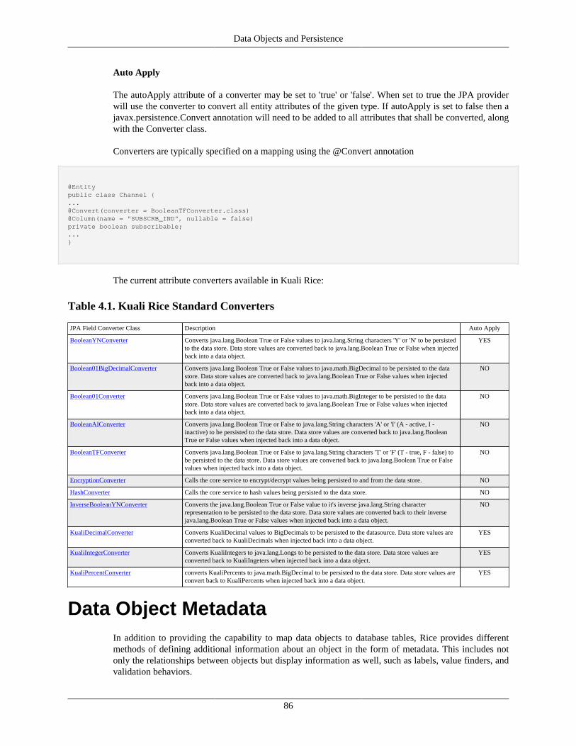
Data Objects and Persistence
86
Auto Apply
The autoApply attribute of a converter may be set to 'true' or 'false'. When set to true the JPA providerwill use the converter to convert all entity attributes of the given type. If autoApply is set to false then ajavax.persistence.Convert annotation will need to be added to all attributes that shall be converted, alongwith the Converter class.
Converters are typically specified on a mapping using the @Convert annotation
@Entitypublic class Channel {...@Convert(converter = BooleanTFConverter.class)@Column(name = "SUBSCRB_IND", nullable = false)private boolean subscribable;...}
The current attribute converters available in Kuali Rice:
Table 4.1. Kuali Rice Standard Converters
JPA Field Converter Class Description Auto Apply
BooleanYNConverter Converts java.lang.Boolean True or False values to java.lang.String characters 'Y' or 'N' to be persistedto the data store. Data store values are converted back to java.lang.Boolean True or False when injectedback into a data object.
YES
Boolean01BigDecimalConverter Converts java.lang.Boolean True or False values to java.math.BigDecimal to be persisted to the datastore. Data store values are converted back to java.lang.Boolean True or False values when injectedback into a data object.
NO
Boolean01Converter Converts java.lang.Boolean True or False values to java.math.BigInteger to be persisted to the datastore. Data store values are converted back to java.lang.Boolean True or False values when injectedback into a data object.
NO
BooleanAIConverter Converts java.lang.Boolean True or False to java.lang.String characters 'A' or 'I' (A - active, I -inactive) to be persisted to the data store. Data store values are converted back to java.lang.BooleanTrue or False values when injected back into a data object.
NO
BooleanTFConverter Converts java.lang.Boolean True or False to java.lang.String characters 'T' or 'F' (T - true, F - false) tobe persisted to the data store. Data store values are converted back to java.lang.Boolean True or Falsevalues when injected back into a data object.
NO
EncryptionConverter Calls the core service to encrypt/decrypt values being persisted to and from the data store. NO
HashConverter Calls the core service to hash values being persisted to the data store. NO
InverseBooleanYNConverter Converts the java.lang.Boolean True or False value to it's inverse java.lang.String characterrepresentation to be persisted to the data store. Data store values are converted back to their inversejava.lang.Boolean True or False values when injected back into a data object.
NO
KualiDecimalConverter Converts KualiDecimal values to BigDecimals to be persisted to the datasource. Data store values areconverted back to KualiDecimals when injected back into a data object.
YES
KualiIntegerConverter Converts KualiIntegers to java.lang.Longs to be persisted to the data store. Data store values areconverted back to KualiIngeters when injected back into a data object.
YES
KualiPercentConverter converts KualiPercents to java.math.BigDecimal to be persisted to the data store. Data store values areconvert back to KualiPercents when injected back into a data object.
YES
Data Object MetadataIn addition to providing the capability to map data objects to database tables, Rice provides differentmethods of defining additional information about an object in the form of metadata. This includes notonly the relationships between objects but display information as well, such as labels, value finders, andvalidation behaviors.
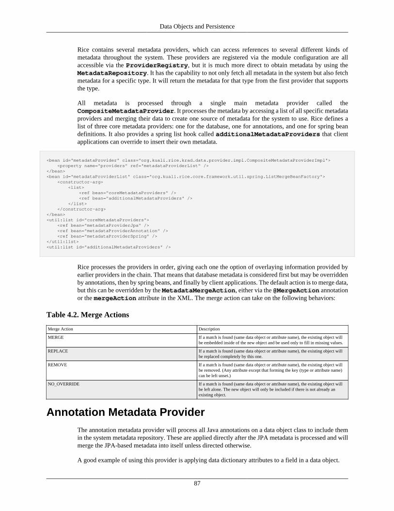
Data Objects and Persistence
87
Rice contains several metadata providers, which can access references to several different kinds ofmetadata throughout the system. These providers are registered via the module configuration are allaccessible via the ProviderRegistry, but it is much more direct to obtain metadata by using theMetadataRepository. It has the capability to not only fetch all metadata in the system but also fetchmetadata for a specific type. It will return the metadata for that type from the first provider that supportsthe type.
All metadata is processed through a single main metadata provider called theCompositeMetadataProvider. It processes the metadata by accessing a list of all specific metadataproviders and merging their data to create one source of metadata for the system to use. Rice defines alist of three core metadata providers: one for the database, one for annotations, and one for spring beandefinitions. It also provides a spring list hook called additionalMetadataProviders that clientapplications can override to insert their own metadata.
<bean id="metadataProvider" class="org.kuali.rice.krad.data.provider.impl.CompositeMetadataProviderImpl"> <property name="providers" ref="metadataProviderList" /></bean><bean id="metadataProviderList" class="org.kuali.rice.core.framework.util.spring.ListMergeBeanFactory"> <constructor-arg> <list> <ref bean="coreMetadataProviders" /> <ref bean="additionalMetadataProviders" /> </list> </constructor-arg></bean><util:list id="coreMetadataProviders"> <ref bean="metadataProviderJpa" /> <ref bean="metadataProviderAnnotation" /> <ref bean="metadataProviderSpring" /></util:list><util:list id="additionalMetadataProviders" />
Rice processes the providers in order, giving each one the option of overlaying information provided byearlier providers in the chain. That means that database metadata is considered first but may be overriddenby annotations, then by spring beans, and finally by client applications. The default action is to merge data,but this can be overridden by the MetadataMergeAction, either via the @MergeAction annotationor the mergeAction attribute in the XML. The merge action can take on the following behaviors:
Table 4.2. Merge Actions
Merge Action Description
MERGE If a match is found (same data object or attribute name), the existing object willbe embedded inside of the new object and be used only to fill in missing values.
REPLACE If a match is found (same data object or attribute name), the existing object willbe replaced completely by this one.
REMOVE If a match is found (same data object or attribute name), the existing object willbe removed. (Any attribute except that forming the key (type or attribute name)can be left unset.)
NO_OVERRIDE If a match is found (same data object or attribute name), the existing object willbe left alone. The new object will only be included if there is not already anexisting object.
Annotation Metadata ProviderThe annotation metadata provider will process all Java annotations on a data object class to include themin the system metadata repository. These are applied directly after the JPA metadata is processed and willmerge the JPA-based metadata into itself unless directed otherwise.
A good example of using this provider is applying data dictionary attributes to a field in a data object.
Data Objects and Persistence
88
@Label("Travel Account Type Code")@Description("Type code grouping for account")@KeyValuesFinderClass(AccountTypeKeyValues.class)private String accountTypeCode;
For accountTypeCode, the annotations define the label that will appear on the interface for any inputfields, the description that will go along with the field if requested, and a key values finder class that willsearch for all possible values that can go into this field.
The annotations can also define relationships between two objects that normally would not have a databaselink between them.
private String foId;
@Relationship(foreignKeyFields="foId")private Person fiscalOfficer;
In this case, the relationships directs the metadata to load the Person object using the foreign key fieldfoId.
Spring Metadata Provider
The spring metadata provider will process all spring beans that hold object metadata and include them inthe system metadata repository. These are applied directly after the annotation metadata is processed andwill merge both the JPA-based metadata and the annotation metadata into itself unless directed otherwise.This is especially useful when overriding metadata on Rice objects directly on the data level so it will becarried to all instances of this object on the interface.
The spring beans can be used to create a metadata structure for an object rooted atDataObjectMetadata. For example, to override the above accountTypeCode with a new label,add the following:
<bean parent="DataObjectMetadata" p:typeClassName="org.kuali.rice.krad.demo.travel.dataobject.TravelAccount"> <property name="attributes"> <list> <bean parent="DataObjectAttribute" p:name="accountTypeCode" p:label="University Travel Account Type Code" /> </list> </property></bean>
Instead of having the "Travel Account Type Code" this data object would now have the "University TravelAccount Type Code."
Linking and FetchingThe KRAD data module includes support for a number of different mechanisms to help ensure that objectstate is fully populated and related objects are properly linked together. These mechanisms encompass anumber of different techniques including:
1. Relationship Fetching
2. Reference Linking
Data Objects and Persistence
89
3. Foreign Key Linking
The goal of these different techniques is to use information available at runtime to "fill in the blanks" forrelationships and/or foreign key fields on a data object. This functionality can be accessed via variousmethods provided on the DataObjectWrapper. There are two primary ways to model these types ofrelationships, either with a simple relationship or one with a redundant foreign key field. In order to betterunderstand how linking and fetching works, it's important to understand the distinction between these twocases.
It is easiest to demonstrate this using examples. We will start with an example data object (using JPAannotations) that has a simple relationship:
@Entitypublic class EntityOne {
@Id @GeneratedValue @Column(name = "ID") private Long id;
@ManyToOne @JoinColumn(name = "TWO_ID") private EntityTwo two;
}
@Entitypublic class EntityTwo { @Id @GeneratedValue @Column(name = "ID") private String id; @Column(name = "VAL") private String value; }
In this example, we have EntityOne with a relationship to EntityTwo. The foreign key field which relatesEntityOne to EntityTwo is the "id" field on EntityTwo.
Now, let's consider the redundant foreign key case:
@Entitypublic class EntityOneWithFK {
@Id @GeneratedValue @Column(name = "ID") private Long id;
@Column(name = "TWO_ID", insertable = false, updatable = false) private String twoId;
@ManyToOne @JoinColumn(name = "TWO_ID") private EntityTwo two;
}
@Entitypublic class EntityTwo { @Id
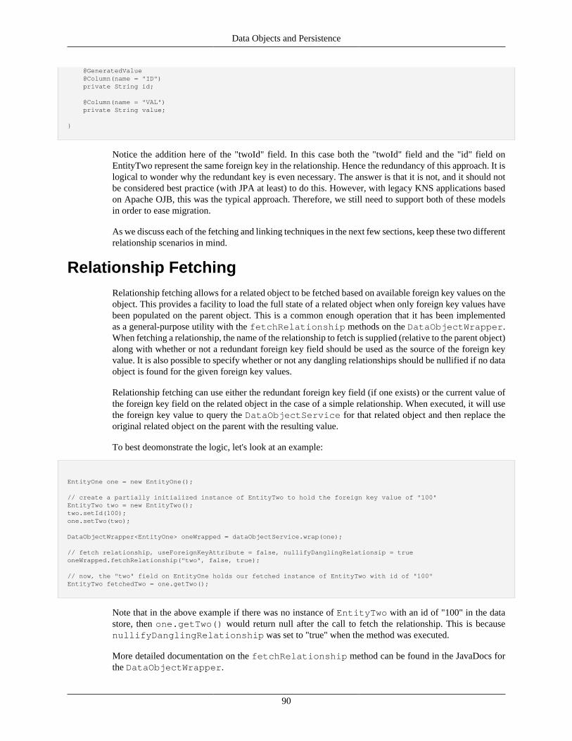
Data Objects and Persistence
90
@GeneratedValue @Column(name = "ID") private String id; @Column(name = "VAL") private String value; }
Notice the addition here of the "twoId" field. In this case both the "twoId" field and the "id" field onEntityTwo represent the same foreign key in the relationship. Hence the redundancy of this approach. It islogical to wonder why the redundant key is even necessary. The answer is that it is not, and it should notbe considered best practice (with JPA at least) to do this. However, with legacy KNS applications basedon Apache OJB, this was the typical approach. Therefore, we still need to support both of these modelsin order to ease migration.
As we discuss each of the fetching and linking techniques in the next few sections, keep these two differentrelationship scenarios in mind.
Relationship FetchingRelationship fetching allows for a related object to be fetched based on available foreign key values on theobject. This provides a facility to load the full state of a related object when only foreign key values havebeen populated on the parent object. This is a common enough operation that it has been implementedas a general-purpose utility with the fetchRelationship methods on the DataObjectWrapper.When fetching a relationship, the name of the relationship to fetch is supplied (relative to the parent object)along with whether or not a redundant foreign key field should be used as the source of the foreign keyvalue. It is also possible to specify whether or not any dangling relationships should be nullified if no dataobject is found for the given foreign key values.
Relationship fetching can use either the redundant foreign key field (if one exists) or the current value ofthe foreign key field on the related object in the case of a simple relationship. When executed, it will usethe foreign key value to query the DataObjectService for that related object and then replace theoriginal related object on the parent with the resulting value.
To best deomonstrate the logic, let's look at an example:
EntityOne one = new EntityOne();
// create a partially initialized instance of EntityTwo to hold the foreign key value of "100"EntityTwo two = new EntityTwo();two.setId(100);one.setTwo(two);
DataObjectWrapper<EntityOne> oneWrapped = dataObjectService.wrap(one);
// fetch relationship, useForeignKeyAttribute = false, nullifyDanglingRelationsip = trueoneWrapped.fetchRelationship("two", false, true);
// now, the "two" field on EntityOne holds our fetched instance of EntityTwo with id of "100"EntityTwo fetchedTwo = one.getTwo();
Note that in the above example if there was no instance of EntityTwo with an id of "100" in the datastore, then one.getTwo() would return null after the call to fetch the relationship. This is becausenullifyDanglingRelationship was set to "true" when the method was executed.
More detailed documentation on the fetchRelationship method can be found in the JavaDocs forthe DataObjectWrapper.
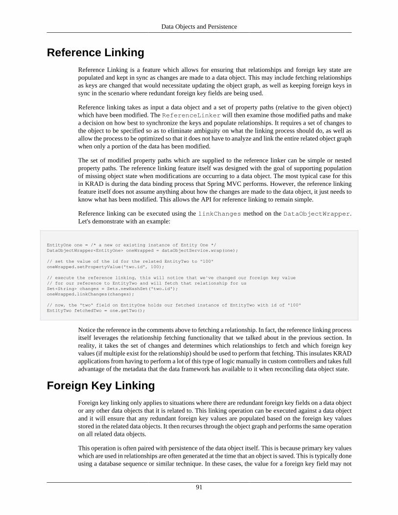
Data Objects and Persistence
91
Reference LinkingReference Linking is a feature which allows for ensuring that relationships and foreign key state arepopulated and kept in sync as changes are made to a data object. This may include fetching relationshipsas keys are changed that would necessitate updating the object graph, as well as keeping foreign keys insync in the scenario where redundant foreign key fields are being used.
Reference linking takes as input a data object and a set of property paths (relative to the given object)which have been modified. The ReferenceLinker will then examine those modified paths and makea decision on how best to synchronize the keys and populate relationships. It requires a set of changes tothe object to be specified so as to eliminate ambiguity on what the linking process should do, as well asallow the process to be optimized so that it does not have to analyze and link the entire related object graphwhen only a portion of the data has been modified.
The set of modified property paths which are supplied to the reference linker can be simple or nestedproperty paths. The reference linking feature itself was designed with the goal of supporting populationof missing object state when modifications are occurring to a data object. The most typical case for thisin KRAD is during the data binding process that Spring MVC performs. However, the reference linkingfeature itself does not assume anything about how the changes are made to the data object, it just needs toknow what has been modified. This allows the API for reference linking to remain simple.
Reference linking can be executed using the linkChanges method on the DataObjectWrapper.Let's demonstrate with an example:
EntityOne one = /* a new or existing instance of Entity One */DataObjectWrapper<EntityOne> oneWrapped = dataObjectService.wrap(one);
// set the value of the id for the related EntityTwo to "100"oneWrapped.setPropertyValue("two.id", 100);
// execute the reference linking, this will notice that we've changed our foreign key value// for our reference to EntityTwo and will fetch that relationship for usSet<String> changes = Sets.newHashSet("two.id");oneWrapped.linkChanges(changes);
// now, the "two" field on EntityOne holds our fetched instance of EntityTwo with id of "100"EntityTwo fetchedTwo = one.getTwo();
Notice the reference in the comments above to fetching a relationship. In fact, the reference linking processitself leverages the relationship fetching functionality that we talked about in the previous section. Inreality, it takes the set of changes and determines which relationships to fetch and which foreign keyvalues (if multiple exist for the relationship) should be used to perform that fetching. This insulates KRADapplications from having to perform a lot of this type of logic manually in custom controllers and takes fulladvantage of the metadata that the data framework has available to it when reconciling data object state.
Foreign Key LinkingForeign key linking only applies to situations where there are redundant foreign key fields on a data objector any other data objects that it is related to. This linking operation can be executed against a data objectand it will ensure that any redundant foreign key values are populated based on the foreign key valuesstored in the related data objects. It then recurses through the object graph and performs the same operationon all related data objects.
This operation is often paired with persistence of the data object itself. This is because primary key valueswhich are used in relationships are often generated at the time that an object is saved. This is typically doneusing a database sequence or similar technique. In these cases, the value for a foreign key field may not
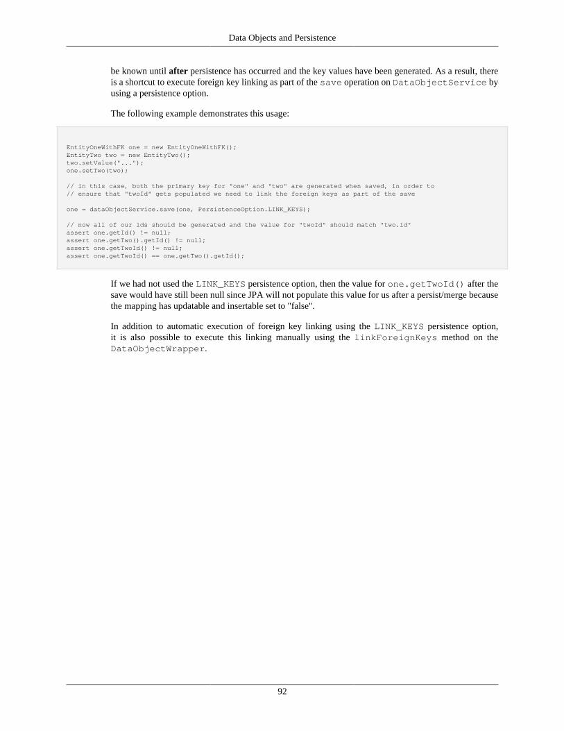
Data Objects and Persistence
92
be known until after persistence has occurred and the key values have been generated. As a result, thereis a shortcut to execute foreign key linking as part of the save operation on DataObjectService byusing a persistence option.
The following example demonstrates this usage:
EntityOneWithFK one = new EntityOneWithFK();EntityTwo two = new EntityTwo();two.setValue("...");one.setTwo(two);
// in this case, both the primary key for "one" and "two" are generated when saved, in order to// ensure that "twoId" gets populated we need to link the foreign keys as part of the save
one = dataObjectService.save(one, PersistenceOption.LINK_KEYS);
// now all of our ids should be generated and the value for "twoId" should match "two.id"assert one.getId() != null;assert one.getTwo().getId() != null;assert one.getTwoId() != null;assert one.getTwoId() == one.getTwo().getId();
If we had not used the LINK_KEYS persistence option, then the value for one.getTwoId() after thesave would have still been null since JPA will not populate this value for us after a persist/merge becausethe mapping has updatable and insertable set to "false".
In addition to automatic execution of foreign key linking using the LINK_KEYS persistence option,it is also possible to execute this linking manually using the linkForeignKeys method on theDataObjectWrapper.
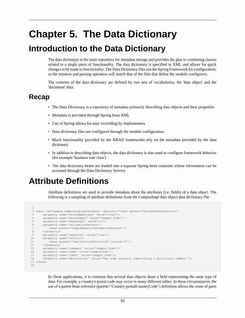
93
Chapter 5. The Data DictionaryIntroduction to the Data Dictionary
The data dictionary is the main repository for metadata storage and provides the glue to combining classesrelated to a single piece of functionality. The data dictionary is specified in XML and allows for quickchanges to be made to functionality. The Data Dictionary files use the Spring Framework for configuration,so the notation and parsing operation will match that of the files that define the module configurers.
The contents of the data dictionary are defined by two sets of vocabularies; the 'data object' and the'document' data.
Recap• The Data Dictionary is a repository of metadata primarily describing data objects and their properties
• Metadata is provided through Spring bean XML
• Use of Spring allows for easy overriding by implementers
• Data dictionary files are configured through the module configuration
• Much functionality provided by the KRAD frameworks rely on the metadata provided by the datadictionary
• In addition to describing data objects, the data dictionary is also used to configure framework behavior(for example 'business rule class')
• The data dictionary beans are loaded into a separate Spring bean container whose information can beaccessed through the Data Dictionary Service
Attribute DefinitionsAttribute definitions are used to provide metadata about the attributes (i.e. fields) of a data object. Thefollowing is a sampling of attribute definitions from the CampusImpl data object data dictionary file:
1 2 <bean id="Campus-campusCode-parentBean" abstract="true" parent="AttributeDefinition"> 3 <property name="forceUppercase" value="true"/> 4 <property name="shortLabel" value="Campus Code"/> 5 <property name="maxLength" value="2"/> 6 <property name="validationPattern"> 7 <bean parent="AlphaNumericValidationPattern"/> 8 </property> 9 <property name="required" value="true"/> 10 <property name="control"> 11 <bean parent="TextControlDefinition" p:size="2"/> 12 </property> 13 <property name="summary" value="Campus Code"/> 14 <property name="name" value="campusCode"/> 15 <property name="label" value="Campus Code"/> 16 <property name="description" value="The code uniquely identifying a particular campus."/> 17 </bean> 18
In client applications, it is common that several data objects share a field representing the same type ofdata. For example, a country's postal code may occur in many different tables. In these circumstances, theuse of a parent bean reference (parent="Country-postalCountryCode") definition allows the reuse of parts
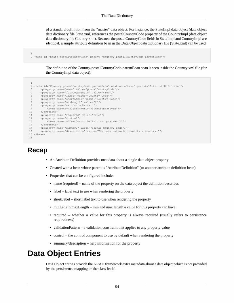
The Data Dictionary
94
of a standard definition from the "master" data object. For instance, the StateImpl data object (data objectdata dictionary file State.xml) references the postalCountryCode property of the CountryImpl (data objectdata dictionary file Country.xml). Because the postalCountryCode fields in StateImpl and CountryImpl areidentical, a simple attribute definition bean in the Data Object data dictionary file (State.xml) can be used:
1 2 <bean id="State-postalCountryCode" parent="Country-postalCountryCode-parentBean"/>
The definition of the Country-postalCountryCode-parentBean bean is seen inside the Country.xml file (forthe CountryImpl data object):
1 2 <bean id="Country-postalCountryCode-parentBean" abstract="true" parent="AttributeDefinition"> 3 <property name="name" value="postalCountryCode"/> 4 <property name="forceUppercase" value="true"/> 5 <property name="label" value="Country Code"/> 6 <property name="shortLabel" value="Country Code"/> 7 <property name="maxLength" value="2"/> 8 <property name="validationPattern"> 9 <bean parent="AlphaNumericValidationPattern"/> 10 </property> 11 <property name="required" value="true"/> 12 <property name="control"> 13 <bean parent="TextControlDefinition" p:size="2"/> 14 </property> 15 <property name="summary" value="Postal Country Code"/> 16 <property name="description" value="The code uniquely identify a country."/> 17 </bean> 18
Recap• An Attribute Definition provides metadata about a single data object property
• Created with a bean whose parent is "AttributeDefinition" (or another attribute definition bean)
• Properties that can be configured include:
• name (required) – name of the property on the data object the definition describes
• label – label text to use when rendering the property
• shortLabel – short label text to use when rendering the property
• minLength/maxLength – min and max length a value for this property can have
• required – whether a value for this property is always required (usually refers to persistencerequiredness)
• validationPattern – a validation constraint that applies to any property value
• control – the control component to use by default when rendering the property
• summary/description – help information for the property
Data Object EntriesData Object entries provide the KRAD framework extra metadata about a data object which is not providedby the persistence mapping or the class itself.
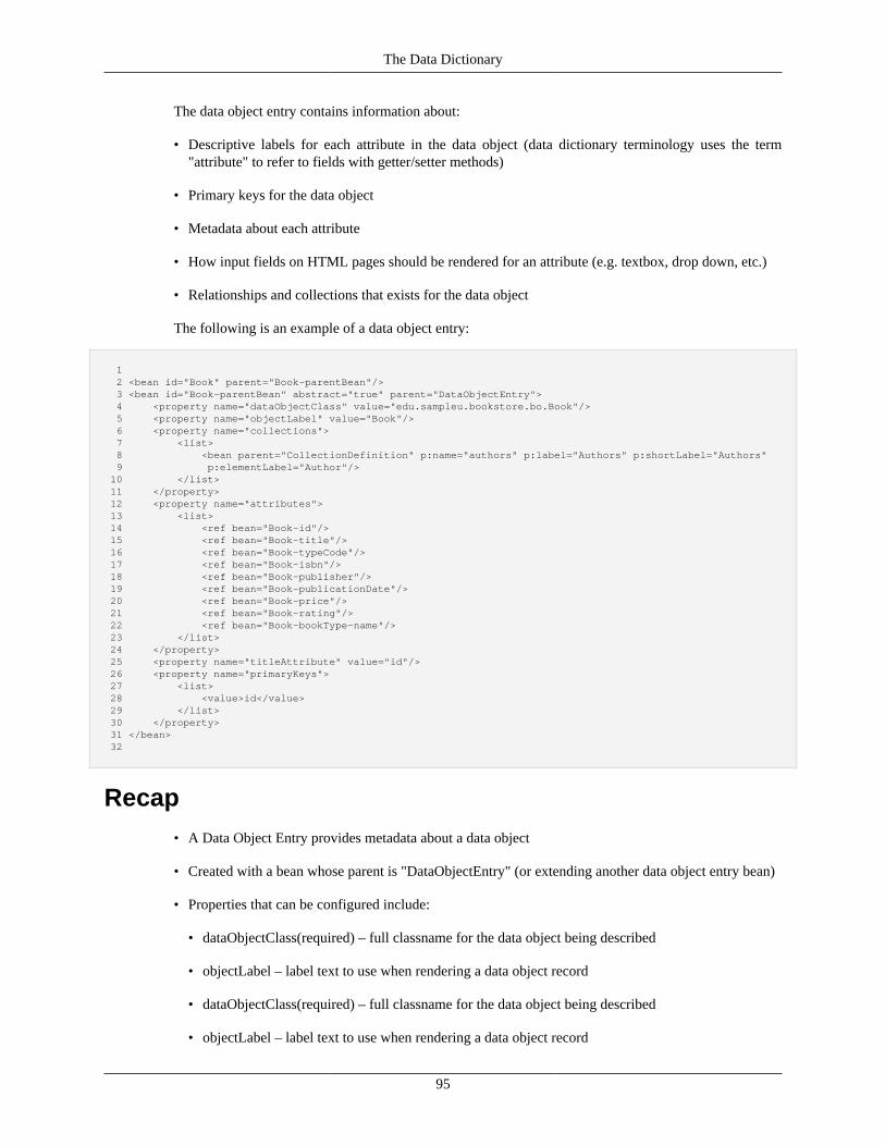
The Data Dictionary
95
The data object entry contains information about:
• Descriptive labels for each attribute in the data object (data dictionary terminology uses the term"attribute" to refer to fields with getter/setter methods)
• Primary keys for the data object
• Metadata about each attribute
• How input fields on HTML pages should be rendered for an attribute (e.g. textbox, drop down, etc.)
• Relationships and collections that exists for the data object
The following is an example of a data object entry:
1 2 <bean id="Book" parent="Book-parentBean"/> 3 <bean id="Book-parentBean" abstract="true" parent="DataObjectEntry"> 4 <property name="dataObjectClass" value="edu.sampleu.bookstore.bo.Book"/> 5 <property name="objectLabel" value="Book"/> 6 <property name="collections"> 7 <list> 8 <bean parent="CollectionDefinition" p:name="authors" p:label="Authors" p:shortLabel="Authors" 9 p:elementLabel="Author"/> 10 </list> 11 </property> 12 <property name="attributes"> 13 <list> 14 <ref bean="Book-id"/> 15 <ref bean="Book-title"/> 16 <ref bean="Book-typeCode"/> 17 <ref bean="Book-isbn"/> 18 <ref bean="Book-publisher"/> 19 <ref bean="Book-publicationDate"/> 20 <ref bean="Book-price"/> 21 <ref bean="Book-rating"/> 22 <ref bean="Book-bookType-name"/> 23 </list> 24 </property> 25 <property name="titleAttribute" value="id"/> 26 <property name="primaryKeys"> 27 <list> 28 <value>id</value> 29 </list> 30 </property> 31 </bean> 32
Recap• A Data Object Entry provides metadata about a data object
• Created with a bean whose parent is "DataObjectEntry" (or extending another data object entry bean)
• Properties that can be configured include:
• dataObjectClass(required) – full classname for the data object being described
• objectLabel – label text to use when rendering a data object record
• dataObjectClass(required) – full classname for the data object being described
• objectLabel – label text to use when rendering a data object record
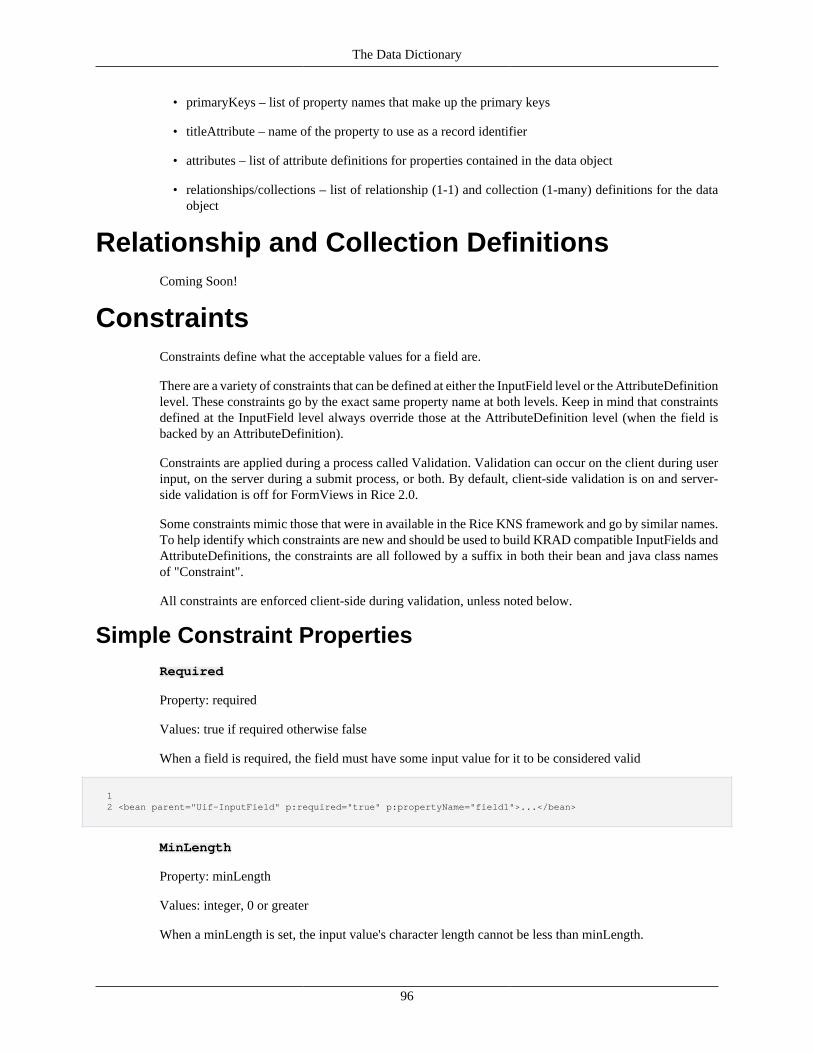
The Data Dictionary
96
• primaryKeys – list of property names that make up the primary keys
• titleAttribute – name of the property to use as a record identifier
• attributes – list of attribute definitions for properties contained in the data object
• relationships/collections – list of relationship (1-1) and collection (1-many) definitions for the dataobject
Relationship and Collection DefinitionsComing Soon!
ConstraintsConstraints define what the acceptable values for a field are.
There are a variety of constraints that can be defined at either the InputField level or the AttributeDefinitionlevel. These constraints go by the exact same property name at both levels. Keep in mind that constraintsdefined at the InputField level always override those at the AttributeDefinition level (when the field isbacked by an AttributeDefinition).
Constraints are applied during a process called Validation. Validation can occur on the client during userinput, on the server during a submit process, or both. By default, client-side validation is on and server-side validation is off for FormViews in Rice 2.0.
Some constraints mimic those that were in available in the Rice KNS framework and go by similar names.To help identify which constraints are new and should be used to build KRAD compatible InputFields andAttributeDefinitions, the constraints are all followed by a suffix in both their bean and java class namesof "Constraint".
All constraints are enforced client-side during validation, unless noted below.
Simple Constraint PropertiesRequired
Property: required
Values: true if required otherwise false
When a field is required, the field must have some input value for it to be considered valid
1 2 <bean parent="Uif-InputField" p:required="true" p:propertyName="field1">...</bean>
MinLength
Property: minLength
Values: integer, 0 or greater
When a minLength is set, the input value's character length cannot be less than minLength.
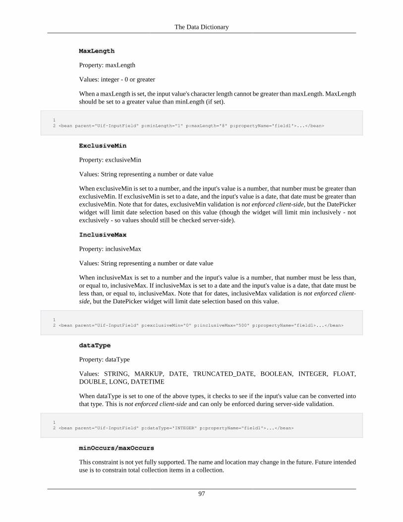
The Data Dictionary
97
MaxLength
Property: maxLength
Values: integer - 0 or greater
When a maxLength is set, the input value's character length cannot be greater than maxLength. MaxLengthshould be set to a greater value than minLength (if set).
1 2 <bean parent="Uif-InputField" p:minLength="1" p:maxLength="8" p:propertyName="field1">...</bean>
ExclusiveMin
Property: exclusiveMin
Values: String representing a number or date value
When exclusiveMin is set to a number, and the input's value is a number, that number must be greater thanexclusiveMin. If exclusiveMin is set to a date, and the input's value is a date, that date must be greater thanexclusiveMin. Note that for dates, exclusiveMin validation is not enforced client-side, but the DatePickerwidget will limit date selection based on this value (though the widget will limit min inclusively - notexclusively - so values should still be checked server-side).
InclusiveMax
Property: inclusiveMax
Values: String representing a number or date value
When inclusiveMax is set to a number and the input's value is a number, that number must be less than,or equal to, inclusiveMax. If inclusiveMax is set to a date and the input's value is a date, that date must beless than, or equal to, inclusiveMax. Note that for dates, inclusiveMax validation is not enforced client-side, but the DatePicker widget will limit date selection based on this value.
1 2 <bean parent="Uif-InputField" p:exclusiveMin="0" p:inclusiveMax="500" p:propertyName="field1>...</bean>
dataType
Property: dataType
Values: STRING, MARKUP, DATE, TRUNCATED_DATE, BOOLEAN, INTEGER, FLOAT,DOUBLE, LONG, DATETIME
When dataType is set to one of the above types, it checks to see if the input's value can be converted intothat type. This is not enforced client-side and can only be enforced during server-side validation.
1 2 <bean parent="Uif-InputField" p:dataType="INTEGER" p:propertyName="field1">...</bean>
minOccurs/maxOccurs
This constraint is not yet fully supported. The name and location may change in the future. Future intendeduse is to constrain total collection items in a collection.
The Data Dictionary
98
SimpleConstraint
The SimpleConstraint class is a constraint that contains all of the simple constraint properties (identifiedabove) within it. These are:
• required
• maxLength
• minLength
• exclusiveMin
• inclusiveMax
• dataType
• minOccurs/maxOccurs
The SimpleContraint is used within InputField to store the settings you can set directly through its simpleconstraint properties. SimpleConstraint itself can also be set directly on the InputField bean, and willoverride all settings that may have been set through a simple constraint property on InputField. Beyondthis usage, SimpleConstraint's main role is to allow the usage of simple constraints in CaseConstraints.
Complex Constraints
The rest of the constraints allow more complex validation to occur on input values. All of these constraintsallow the setting of a messageKey property if you would like to redefine the message that is shown whenvalidation encounters an error. By default, all complex constraints already have a message predefined withparameters generated for that message, and it is recommended you use the already defined messages inmost cases, except for a few when noted below. The base beans for all of the following constraints aredefined in DataDictionaryBaseTypes.xml.
Validation PatternsValidCharacterConstraints allow you to constrain the allowed input on a field to a setcombination of characters by using regex (Regular Expressions). There are a variety of predefinedValidCharacterConstraints available in KRAD, but the ability to easily create your own is available as wellusing standard regex. A ValidCharacterConstraint is set through the validCharacterConstraint property oneither an InputField or AttributeDefinition. This constraint mimics, but enhances, constraints available inthe original KNS called ValidationPatterns. However, do not use ValidationPatterns in KRAD as they aredeprecated and no longer used.
1 2 <bean parent="Uif-InputField" p:propertyName="field62"> 3 <property name="validCharactersConstraint"> 4 <bean parent="AlphaNumericPatternConstraint" /> 5 </property> 6 </bean> 7
The predefined beans for ValidCharacterConstraint are:
AlphaNumericPatternConstraint
Only alphabetic and numeric characters allowed.
The Data Dictionary
99
AlphaPatternConstraint
Only alphabetic characters allowed.
AnyCharacterPatternConstraint
Only keyboard characters are allowed. Specifically, these are ASCII characters x21 through x7E inhexadecimal. Whitespace is not allowed by default, unless enabled through the allowWhitespace flag.
CharsetPatternConstraint
Allows any characters set through its validCharacters property.
NumericPatternConstraint
Only numeric characters allowed.
AlphaNumericWithBasicPunc
Only alphabetic and numeric characters with whitespace, question marks, exclamation points, periods,parentheses, double quotes, apostrophes, forward slashes, dashes, colons, and semi-colons allowed. Thisis an additional configuration of AlphaNumericPatternConstraint with some "allow" flags turned on.
AlphaWithBasicPunc
Only alphabetic characters with whitespace, question marks, exclamation points, periods, parentheses,double quotes, apostrophes, forward slashes, dashes, colons, and semi-colons allowed. This is an additionalconfiguration of AlphaPatternConstraint with some "allow" flags turned on.
NumericWithOperators
Only numeric characters with whitespace, asterisks, pluses, periods, parentheses, forward slashes, dashes,and equals signs, dashes allowed. This is an additional configuration of NumericPatternConstraint withsome "allow" flags turned on.
FixedPointPatternConstraint
Only allows a numeric value where the precision property represents the maximum number ofnumbers allowed, and scale represents the maximum numbers after the decimal point. For example, aFixedPointPatternConstraint with precision 5 and scale 2 would allow: 2, 555, 555.11; but would not allow:111.222, 1.222, 5555 (this is actually the value 5555.00, so it is not allowed).
IntegerPatternConstraint
Allows any valid integer (but does not restrict length or range). There are optional flags for allowingnegative integers, only negative integers, or not allowing zero as input.
DatePatternConstraint
Allows any date to be input that is a valid date in the system. Any format defined in the configurationparameter "STRING_TO_DATE_FORMATS" is allowed.
BasicDatePatternConstraint
Allows a subset of the default date formats defined by DatePatternConstraint. These formats representthe most common input for date values: MM/dd/yy, MM/dd/yyyy, MM-dd-yy, and MM-dd-yyyy. It isrecommended that this constraint be used on fields which use the DatePicker widget.
The Data Dictionary
100
ConfigurationBasedRegexPatternConstraint
The following constraints are configurations of the ConfigurationBasedRegexPatternConstraintwhich have a patternConstraintKey that is used to retrieve a regex pattern by key inApplicationResources.properties (or any other imported properties file). This differs from the aboveValidCharactersConstraints because those generate their regex based on flags and options set on them.These constraints can easily have their functionality modified by changing the regex they use in anyimported properties file.
Custom Regex Constraints
You can easily define your own ConfigurationBasedRegexPatternContraint bean by setting yourown messageKey and patternConstraintKey to something that you have defined in a propertiesfile.
FloatingPointPatternConstraint
patternConstraintKey: validationPatternRegex.floatingPoint
Allows any valid floating point value (does not limit length or range). In other words, any number whichmay include a decimal point.
PhoneNumberPatternConstraint
patternConstraintKey: validationPatternRegex.phoneNumber
Allows any valid US phone number in this format: ###-###-####.
TimePatternConstraint
patternConstraintKey: validationPatternRegex.time12
Allows any valid time in 12 hour format, seconds and leading 0s are optional.
Time24HPatternConstraint
patternConstraintKey: validationPatternRegex.time24
Allows any valid time in 24 hour format, seconds and leading 0s are optional.
UrlPatternConstraint
patternConstraintKey: validationPatternRegex.url
Allows any valid url; the prefixes http://, https://, or ftp:// are required.
NoWhitespacePatternConstraint
patternConstraintKey: validationPatternRegex.noWhitespace
Any characters except for whitespace are allowed.
JavaClassPatternConstraint
patternConstraintKey: validationPatternRegex.javaClass
Only values that would be valid java class names are allowed.
EmailAddressPatternConstraint
The Data Dictionary
101
patternConstraintKey: validationPatternRegex.emailAddress
Only valid email addresses are allowed.
TimestampPatternConstraint
patternConstraintKey: validationPatternRegex.timestamp
Only valid timestamp values are allowed.
YearPatternConstraint
patternConstraintKey: validationPatternRegex.year
Any year from the 1600s to the 2100s is allowed.
MonthPatternConstraint
patternConstraintKey: validationPatternRegex.month
Any valid month, by number, is allowed.
ZipcodePatternConstraint
patternConstraintKey: validationPatternRegex.zipcode
Any valid US zip code, with or without its 4 number postfix, is allowed.
Custom Validation PatternsIn addition to the above defined ValidCharacterConstraints, you can define your ownValidCharactersConstraint by defining the regex property "value" directly. This is an additionalconfiguration option, similar to defining a custom ConfigurationBasedRegexPatternConstraint,the only difference being that the regex value is defined at the bean level and in aConfigurationBasedRegexPatternConstraint it is defined in an imported properties file. Both customconfigurations must have a messageKey defined.
1 2 <bean parent="Uif-InputField" p:instructionalText="custom valid characters 3 constraint - this one accepts only 1 alpha character followed by a period and 4 then followed by a number (a.8, b.0, etc)" p:propertyName="field1"> 5 <property name="validCharactersConstraint"> 6 <bean parent="ValidCharactersConstraint" p:value="^[a-zA-Z]\.[0-9]$" 7 p:messageKey="validation.aDotNumTest"/> 8 </property> 9 </bean> 10
Prerequisite ConstraintsA prerequisite constraint defines what fields must be filled out with this field (the field that thePrerequisiteConstraint is defined on). When this field is filled out, it requires the field set in the"propertyName" property of the PrerequisiteConstraint to be filled out as a result.
During client-side validation, whether that field comes after or before that field is irrelevant, as the UI willonly notify the user when appropriate. For example, if you haven't yet visited a field that is now required,the user will only be notified of an error after they have first visited this newly required field and have not
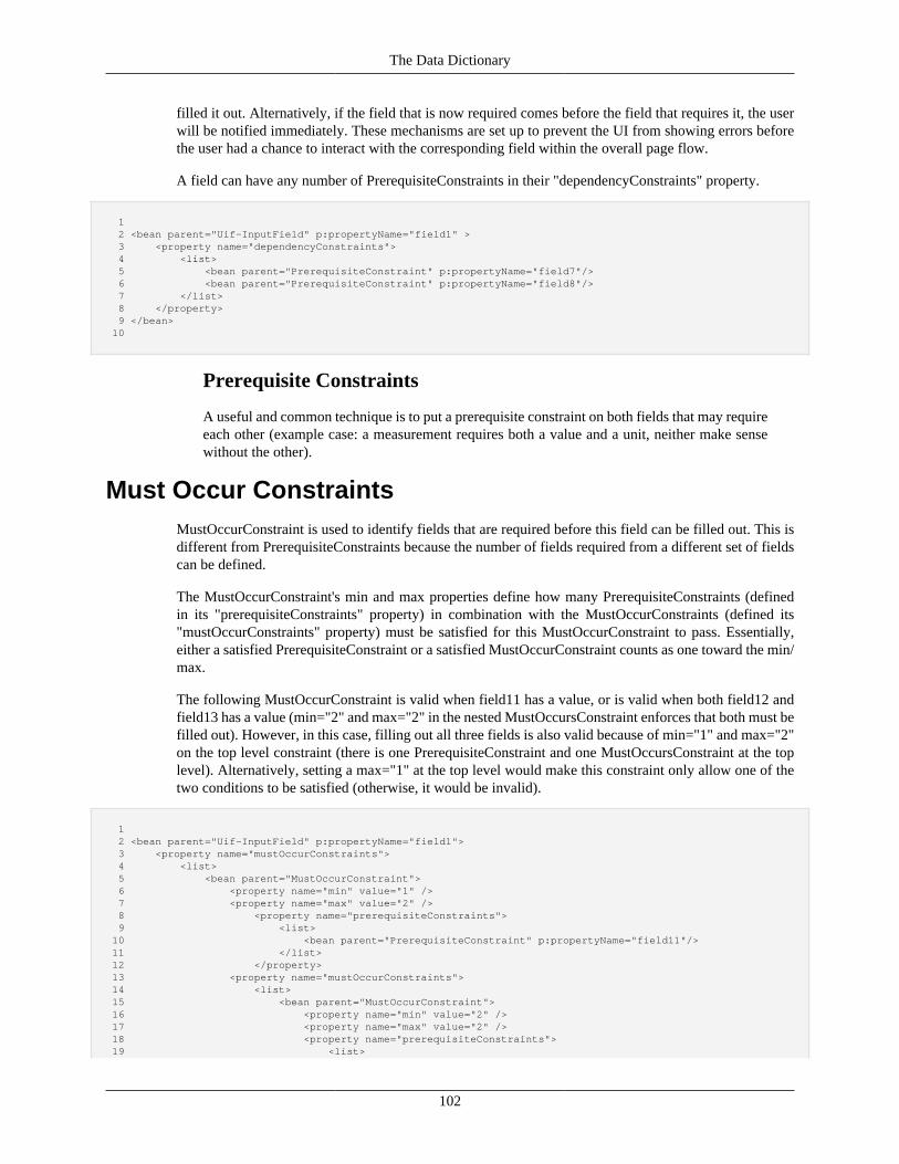
The Data Dictionary
102
filled it out. Alternatively, if the field that is now required comes before the field that requires it, the userwill be notified immediately. These mechanisms are set up to prevent the UI from showing errors beforethe user had a chance to interact with the corresponding field within the overall page flow.
A field can have any number of PrerequisiteConstraints in their "dependencyConstraints" property.
1 2 <bean parent="Uif-InputField" p:propertyName="field1" > 3 <property name="dependencyConstraints"> 4 <list> 5 <bean parent="PrerequisiteConstraint" p:propertyName="field7"/> 6 <bean parent="PrerequisiteConstraint" p:propertyName="field8"/> 7 </list> 8 </property> 9 </bean> 10
Prerequisite Constraints
A useful and common technique is to put a prerequisite constraint on both fields that may requireeach other (example case: a measurement requires both a value and a unit, neither make sensewithout the other).
Must Occur ConstraintsMustOccurConstraint is used to identify fields that are required before this field can be filled out. This isdifferent from PrerequisiteConstraints because the number of fields required from a different set of fieldscan be defined.
The MustOccurConstraint's min and max properties define how many PrerequisiteConstraints (definedin its "prerequisiteConstraints" property) in combination with the MustOccurConstraints (defined its"mustOccurConstraints" property) must be satisfied for this MustOccurConstraint to pass. Essentially,either a satisfied PrerequisiteConstraint or a satisfied MustOccurConstraint counts as one toward the min/max.
The following MustOccurConstraint is valid when field11 has a value, or is valid when both field12 andfield13 has a value (min="2" and max="2" in the nested MustOccursConstraint enforces that both must befilled out). However, in this case, filling out all three fields is also valid because of min="1" and max="2"on the top level constraint (there is one PrerequisiteConstraint and one MustOccursConstraint at the toplevel). Alternatively, setting a max="1" at the top level would make this constraint only allow one of thetwo conditions to be satisfied (otherwise, it would be invalid).
1 2 <bean parent="Uif-InputField" p:propertyName="field1"> 3 <property name="mustOccurConstraints"> 4 <list> 5 <bean parent="MustOccurConstraint"> 6 <property name="min" value="1" /> 7 <property name="max" value="2" /> 8 <property name="prerequisiteConstraints"> 9 <list> 10 <bean parent="PrerequisiteConstraint" p:propertyName="field11"/> 11 </list> 12 </property> 13 <property name="mustOccurConstraints"> 14 <list> 15 <bean parent="MustOccurConstraint"> 16 <property name="min" value="2" /> 17 <property name="max" value="2" /> 18 <property name="prerequisiteConstraints"> 19 <list>
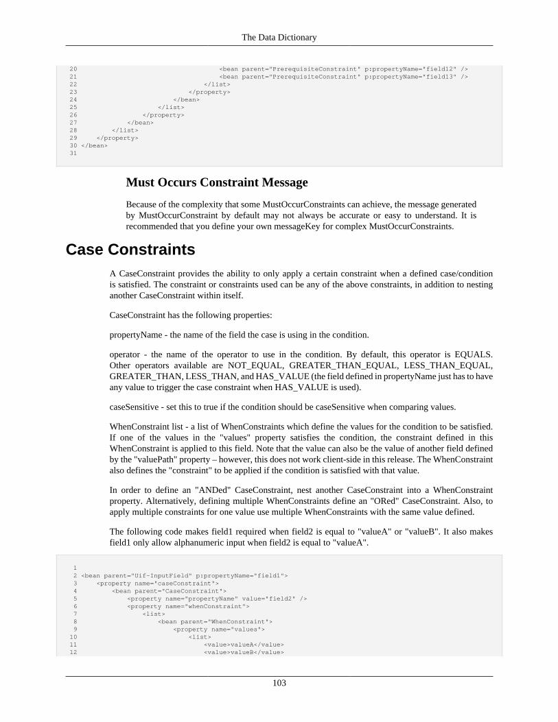
The Data Dictionary
103
20 <bean parent="PrerequisiteConstraint" p:propertyName="field12" /> 21 <bean parent="PrerequisiteConstraint" p:propertyName="field13" /> 22 </list> 23 </property> 24 </bean> 25 </list> 26 </property> 27 </bean> 28 </list> 29 </property> 30 </bean> 31
Must Occurs Constraint Message
Because of the complexity that some MustOccurConstraints can achieve, the message generatedby MustOccurConstraint by default may not always be accurate or easy to understand. It isrecommended that you define your own messageKey for complex MustOccurConstraints.
Case ConstraintsA CaseConstraint provides the ability to only apply a certain constraint when a defined case/conditionis satisfied. The constraint or constraints used can be any of the above constraints, in addition to nestinganother CaseConstraint within itself.
CaseConstraint has the following properties:
propertyName - the name of the field the case is using in the condition.
operator - the name of the operator to use in the condition. By default, this operator is EQUALS.Other operators available are NOT_EQUAL, GREATER_THAN_EQUAL, LESS_THAN_EQUAL,GREATER_THAN, LESS_THAN, and HAS_VALUE (the field defined in propertyName just has to haveany value to trigger the case constraint when HAS_VALUE is used).
caseSensitive - set this to true if the condition should be caseSensitive when comparing values.
WhenConstraint list - a list of WhenConstraints which define the values for the condition to be satisfied.If one of the values in the "values" property satisfies the condition, the constraint defined in thisWhenConstraint is applied to this field. Note that the value can also be the value of another field definedby the "valuePath" property – however, this does not work client-side in this release. The WhenConstraintalso defines the "constraint" to be applied if the condition is satisfied with that value.
In order to define an "ANDed" CaseConstraint, nest another CaseConstraint into a WhenConstraintproperty. Alternatively, defining multiple WhenConstraints define an "ORed" CaseConstraint. Also, toapply multiple constraints for one value use multiple WhenConstraints with the same value defined.
The following code makes field1 required when field2 is equal to "valueA" or "valueB". It also makesfield1 only allow alphanumeric input when field2 is equal to "valueA".
1 2 <bean parent="Uif-InputField" p:propertyName="field1"> 3 <property name="caseConstraint"> 4 <bean parent="CaseConstraint"> 5 <property name="propertyName" value="field2" /> 6 <property name="whenConstraint"> 7 <list> 8 <bean parent="WhenConstraint"> 9 <property name="values"> 10 <list> 11 <value>valueA</value> 12 <value>valueB</value>
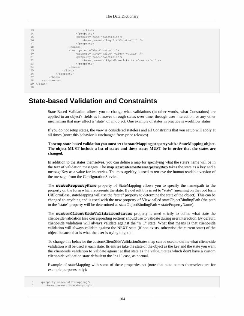
The Data Dictionary
104
13 </list> 14 </property> 15 <property name="constraint"> 16 <bean parent="RequiredConstraint" /> 17 </property> 18 </bean> 19 <bean parent="WhenConstraint"> 20 <property name="value" value="valueA" /> 21 <property name="constraint"> 22 <bean parent="AlphaNumericPatternConstraint" /> 23 </property> 24 </bean> 25 </list> 26 </property> 27 </bean> 28 </property> 29 </bean> 30
State-based Validation and ConstraintsState-Based Validation allows you to change what validations (in other words, what Constraints) areapplied to an object's fields as it moves through states over time, through user interaction, or any othermechanism that may affect a "state" of an object. One example of states in practice is workflow status.
If you do not setup states, the view is considered stateless and all Constraints that you setup will apply atall times (note: this behavior is unchanged from prior releases).
To setup state-based validation you must set the stateMapping property with a StateMapping object.The object MUST include a list of states and these states MUST be in order that the states arechanged.
In addition to the states themselves, you can define a map for specifying what the state's name will be inthe text of validation messages. The map stateNameMessageKeyMap takes the state as a key and amessageKey as a value for its entries. The messageKey is used to retrieve the human readable version ofthe message from the ConfigurationService.
The statePropertyName property of StateMapping allows you to specify the name/path to theproperty on the form which represents the state. By default this is set to "state" (meaning on the root formUifFormBase, stateMapping will use the "state" property to determine the state of the object). This can bechanged to anything and is used with the new property of View called stateObjectBindingPath (the pathto the "state" property will be determined as stateObjectBindingPath + statePropertyName).
The customClientSideValidationStates property is used strictly to define what state theclient-side validation (see corresponding section) should use to validate during user interaction. By default,client-side validation will always validate against the "n+1" state. What that means is that client-sidevalidation will always validate against the NEXT state (if one exists, otherwise the current state) of theobject because that is what the user is trying to get to.
To change this behavior the customClientSideValidationStates map can be used to define what client-sidevalidation will be used at each state. Its entries take the state of the object as the key and the state you wantthe client-side validation to validate against at that state as the value. States which don't have a customclient-side validation state default to the "n+1" case, as normal.
Example of stateMapping with some of these properties set (note that state names themselves are forexample purposes only):
1 <property name="stateMapping"> 2 <bean parent="StateMapping">
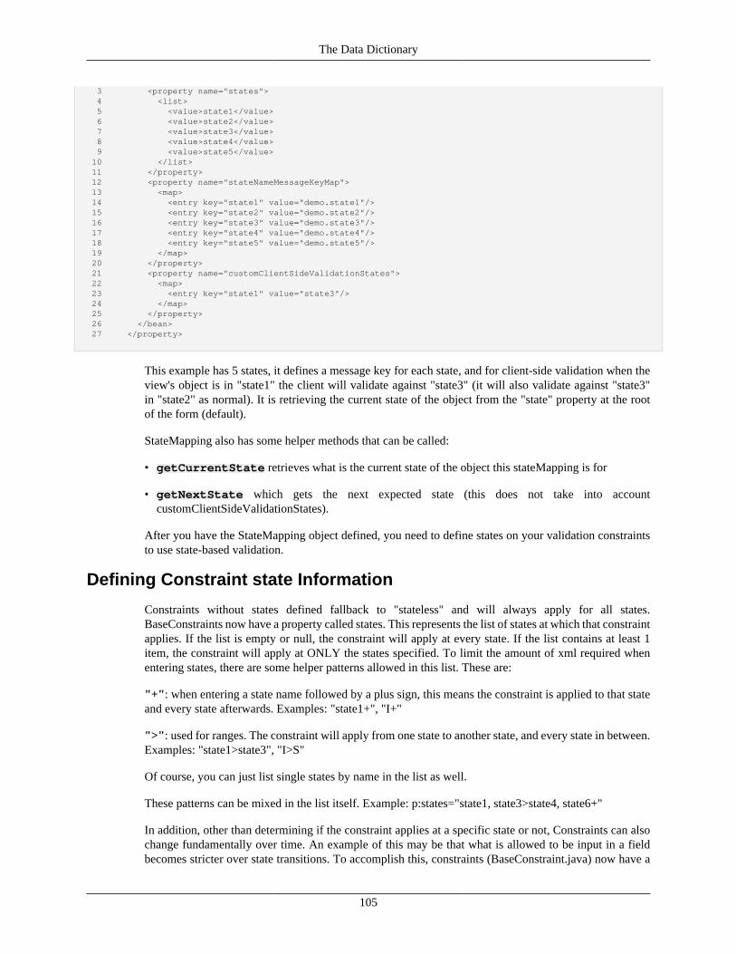
The Data Dictionary
105
3 <property name="states"> 4 <list> 5 <value>state1</value> 6 <value>state2</value> 7 <value>state3</value> 8 <value>state4</value> 9 <value>state5</value> 10 </list> 11 </property> 12 <property name="stateNameMessageKeyMap"> 13 <map> 14 <entry key="state1" value="demo.state1"/> 15 <entry key="state2" value="demo.state2"/> 16 <entry key="state3" value="demo.state3"/> 17 <entry key="state4" value="demo.state4"/> 18 <entry key="state5" value="demo.state5"/> 19 </map> 20 </property> 21 <property name="customClientSideValidationStates"> 22 <map> 23 <entry key="state1" value="state3"/> 24 </map> 25 </property> 26 </bean> 27 </property>
This example has 5 states, it defines a message key for each state, and for client-side validation when theview's object is in "state1" the client will validate against "state3" (it will also validate against "state3"in "state2" as normal). It is retrieving the current state of the object from the "state" property at the rootof the form (default).
StateMapping also has some helper methods that can be called:
• getCurrentState retrieves what is the current state of the object this stateMapping is for
• getNextState which gets the next expected state (this does not take into accountcustomClientSideValidationStates).
After you have the StateMapping object defined, you need to define states on your validation constraintsto use state-based validation.
Defining Constraint state Information
Constraints without states defined fallback to "stateless" and will always apply for all states.BaseConstraints now have a property called states. This represents the list of states at which that constraintapplies. If the list is empty or null, the constraint will apply at every state. If the list contains at least 1item, the constraint will apply at ONLY the states specified. To limit the amount of xml required whenentering states, there are some helper patterns allowed in this list. These are:
"+": when entering a state name followed by a plus sign, this means the constraint is applied to that stateand every state afterwards. Examples: "state1+", "I+"
">": used for ranges. The constraint will apply from one state to another state, and every state in between.Examples: "state1>state3", "I>S"
Of course, you can just list single states by name in the list as well.
These patterns can be mixed in the list itself. Example: p:states="state1, state3>state4, state6+"
In addition, other than determining if the constraint applies at a specific state or not, Constraints can alsochange fundamentally over time. An example of this may be that what is allowed to be input in a fieldbecomes stricter over state transitions. To accomplish this, constraints (BaseConstraint.java) now have a

The Data Dictionary
106
property called constraintStateOverrides which contains a list of replacements for the constraintthey are configured on. Constraints in this list must be compatible with the constraint they are replacing; forexample, ValidCharacterConstraints should only be replaced with other ValidCharacterConstraints (andits child classes), etc. Overrides that do not match or are not valid siblings/children classes of the constraintthey are overriding will throw an exception.
Constraints in this list MUST have the states at which they apply defined; the replacement willoverride the constraint they are configured on at the states they specify. Overrides which do nothave states specified will throw an exception.
Rules for constraintStateOverrides:
• Overrides, if configured, always take precedence over their parent when they apply. If no overridesmatch the state, or if the constraintStateOverrides list is empty, the parent constraint will apply (if itis applicable for the state).
• If there are there are 2 overrides that both apply at the same state, the last on the list will always takeprecedence.
State-based Validation at the Controller
While the client-side validation is automatic (always validates against "n+1" unless configured otherwise),the server-side validation is completely up to the implementer. If you would like to validate your View(or alternatively DataDictionaryEntry), there are methods provided to do so. The main point is that servervalidation is NOT automatic and is application controlled. These new state-based validation methods are(some overloaded version not noted here):
For ViewValidationService (should be used for KRAD views):
• validateView(View view) - This is the main validation method that should be used whenvalidating Views. This method validates against the current state if state based validation is setup.
• validateView(View view, ViewModel model, String forcedValidationState)- Validate the view against the specific validationState instead of the default (current state). IfforcedValidationState is null, validates against the current state, if state-based validation is setup.
• validateViewAgainstNextState(View view, ViewModel model) - Validate the viewagainst the next state based on the order of the states in the view's StateMapping. This will validateagainst current state + 1. If there is no next state, this will validate against the current state.
• validateViewSimulation(View view, ViewModel model) - Simulate view validation- this will run all validations against all states from the current state to the last state in the list of statesin the view's stateMapping. Validation errors received for the current state will be added as errors to theMessageMap. Validation errors for future states will be warnings.
For DictionaryValidationService (recommended only when you don't have a view. Also note that state-based validation only works for DataDictionaryEntry backed objects with StateMappings setup):
• validate(Object object) – Validates against the current state (if state-based validation is setup).
• validateAgainstState(Object object, String validationState) – validatesagainst the state specified by validationState.
• validateAgainstNextState(Object object) – validates against the next state as definedby the state mapping.
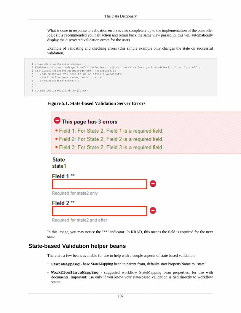
The Data Dictionary
107
What is done in response to validation errors is also completely up to the implementation of the controllerlogic (it is recommended you halt action and return back the same view passed in, this will automaticallydisplay the discovered validation errors for the user).
Example of validating and checking errors (this simple example only changes the state on successfulvalidation):
1 //inside a controller method 2 KRADServiceLocatorWeb.getViewValidationService().validateView(form.getPostedView(), form, "state2"); 3 if(!GlobalVariables.getMessageMap().hasErrors()){ 4 //do whatever you need to do on after a successful 5 //validation here (save, submit, etc) 6 form.setState("state2"); 7 } 8 9 return getUIFModelAndView(form);
Figure 5.1. State-based Validation Server Errors
In this image, you may notice the "**" indicator. In KRAD, this means the field is required for the nextstate.
State-based Validation helper beans
There are a few beans available for use to help with a couple aspects of state based validation:
• StateMapping - base StateMapping bean to parent from, defaults statePropertyName to "state"
• WorkflowStateMapping - suggested workflow StateMapping bean properties, for use withdocuments. Important: use only if you know your state-based validation is tied directly to workflowstatus.
The Data Dictionary
108
• Uif-StateBased-RequiredInstructionsMessage - message that indicates that "**"means required for the next state. May be enhanced in the future to tell the user what the actual nextstate is.
Data Dictionary ServicesComing Soon!
The DATAOBJECTMETADATASERVICEComing Soon!
Extending the Data DictionaryComing Soon!

109
Chapter 6. Introduction to the UIF
Overview of the UIFThe KRAD User Interface Framework (UIF) allows application developers to rapidly create rich andpowerful user interfaces. KRAD builds on concepts of the KNS (Kuali Nervous System) and the KS(Kuali Student) UIF to create a framework capable of generating modern Web 2.0 interfaces with a simpledeclarative configuration. In the next few chapters, we will explore the architecture and features of theUIF, and also see some of the exciting possibilities for future growth!
As mentioned in 'A Need for KNS Version 2', the KRAD effort was spawned based on the need to expandthe current Rice development framework for meeting requirements of the Kuali Student project. Althoughthe Rice KNS module has many great concepts that had worked well up to date, it was determined thatin order to meet the new requirements and to continue making overall improvements, portions of theframework would need to be redesigned and rewritten. The majority of this work focused on UI generation,with some enhancements to other feature areas of the KNS. The following lists the primary goals of thiseffort:
UIF Goal: Rich UI Support
Over the past few years, web-based user interfaces have taken off. Many of these technologies haveleveraged browser-based JavaScript and Cascading Style Sheets to create impressive effects or to radicallyincrease interactivity by communicating with a web-server in between the normal request/response pagecycle. Because of these huge advances, today's web application users have much higher expectations ofinteractivity.
The KRAD UIF aims to allow the development of rich web interfaces by offering a variety of richcomponents and behavior. This includes components like lightbox, suggest boxes, menu/tabs, and grid(table) features. Some of the 'behavioral' features include partial page refreshes, progressive disclosure,client-side validation, and AJAX queries. This is just a subset of the way that richer user interfacefunctionality is offered by KRAD. Chapters 8 and 11 cover these features and more in detail.
UIF Goal: More Layout Flexibility
One of the features of the Nervous System users pick up on quickly is the fact that so many screens canbe generated purely through configuration. A business object lookup and inquiry, as well as the screenfor maintenance documents: all can be generated entirely from an XML file. Freeing developers fromhaving to concern themselves with the particulars of the HTML generation for these screens makes theuser interface of Kuali applications more consistent, to say nothing of the boost to developer productivityit gives.
However, there were other screens which could not be so easily generated. Transactional documentsdepended on perhaps several JSP files, supported by hierarchies of traditional taglets. Non-documentscreens had to be coded in JSP as well. The KNS provided a standard library of taglets - such asdocumentPage, tab, htmlControlAttribute, and so on - which eased the development task a bit, but the hardfact was that developers still had to spend much more time coding these pages.
It should therefore be of little surprise that one of KRAD's major goals is improving this situation.If transactional documents and non-document screens could make use of the Rich UI support throughconfiguration, that would make it much easier to develop these incredibly important pieces of functionality.
Introduction to the UIF
110
However, as any KNS developer knows, transactional documents are much more flexible than lookupsor maintenance documents. Maintenance documents are almost always stacks of two or four columns,perhaps broken up by a standard sub-collection interface. Conversely, a transactional document can looklike practically anything.
UIF Goal: Easy to Customize and ExtendWe have all had the experience of working with development frameworks to meet some special need thatthe framework did not provide 'out of the box'. In many cases, this is a painful process, requiring thedeveloper to get inside the 'black box' and figure out many intricate details of the framework. Furthermore,once a solution is found, it might require we modify the core of the framework, causing maintenance andupgrade issues.
Similar issues were encountered when using the Rice KNS framework. In particular, the use of tags wasproblematic, in that there was no way to customize tag logic without breaking the upgrade path. In addition,the objects used for UI modeling were not extensible or customizable without modifying the Rice code.Therefore, an important goal for the UIF is to allow new UI features to be added, and current features tobe modified without modifying Rice code. As we will see later, this is accomplished using a componentframework and the power of Spring bean configuration.
UIF Goal: Improved Configuration and ToolingA lot of user feedback about the Kuali Nervous System centered on the repetitive tasks of setting upconfiguration. Every business object has an object-relational mapping and an entry in the data dictionary;that entry is made up of field configurations, which gets tediously long fairly quickly. And then there'sbuilding the corresponding Java code to be the actual business object. Even more pieces are added to thisrecipe when attempting to put together a document.
KRAD is adopting a series of design principles to alleviate some of the work required for this configuration.KRAD intends to introduce a series of simple-to-use tools to generate configuration based on defaults,letting developers focus on tweaking the configuration to match business logic.
KRAD is also simplifying configuration in general. The idea of "convention over configuration" will meanthat standard defaults will be provided for what had to be manually configured before. These defaults canbe overridden, but if they fit the needs of the application, no further configuration will be necessary. Thiswill cut down a huge amount on the "XML push-ups" required by KRAD application developers, but stillprovide a great deal of flexibility.
UIF DictionaryThe UIF builds on the KNS concept of using Spring bean XML to build UIs. XML files are created toconfigure and assemble UIF objects (called components). These files are then processed and loaded intothe Data Dictionary container.
More Information: Although the UIF configuration is loaded into the same container as the DataDictionary, conceptually we think of them as separate. A current practice within Rice is to have a resourcedirectory for data dictionary files, and a resource directory for UIF files (per module). In addition, carewas taken to allow for separate containers to be created (if desired at some point).
The UIF and UIMWe will see that technically, using the UIF is very easy, since most things can be accomplished by asimple XML configuration. However, there is a challenge in knowing how to put the pieces together.
Introduction to the UIF
111
To accomplish the amount of flexibility necessary, the UIF introduces a lot of concepts that will takesome time to learn. Taken all together, these form a language for how Rice developers and UX leads willdiscuss, prototype, and finally build user interfaces. To help with this process, the UIM (User InteractionModel) was developed. The UIM is a collection of pages that document how to best make use of theUIF functionality. Such things as when to use one component over another, various configurations of acomponent, and overall UX concerns are documented within the UIM. Investing time to read through theUIM will help developers get up to speed with the UIF much quicker.
You can find the latest version of the UIM at the following URL: https://wiki.kuali.org/display/STUDENT/User+Interaction+Mode
Recap• The UIF (User Interface Framework) is the KRAD module used to generate User Interfaces
• Goals of the UIF are:
• Rich UI Support
• More Layout Flexibility
• Easy to Customize and Extend
• Improved Configuration and Tooling
• The UIM (User Interaction Model) is documentation on how page developers should use the UIF fordesigning views
Component DesignCentral to all of the UIF is the component framework. Components provide the mechanism for whichfunctionality is implemented in a customizable and extensible fashion. In short, they are the bread andbutter of KRAD!
So what is a component? A component to KRAD is anything that can be used to build a web page. Manyof these have a visual presence on the screen, such as text. However, some do not, and instead providebehavior with a script. Treating all these as components, gives us a uniform approach to developing theUIF framework, in addition to providing a very customizable and easy to contribute modality. This sectionwill explore the design of components from a high level. Later on in this chapter, we will learn about thevarious types of components, and in chapters 6-9 we will look at the specific components KRAD providesout of the box.
Parts of a Component
A component is made up of three different artifacts (see Figure 6.1, “Building Blocks”). The first of theseis a Java class. The Java class defines the properties and behavior the component can have. As we willsee later on, the properties are what we can use to configure the component, while the behavior includesthings such as how the component interacts with other components. As with any class, the properties canbe primitive or collection types, or types of other objects. In this case of a component, these objects maybe other components. Therefore components can be nested (or a composition). In addition, componentsmay extend from other components to inherit properties and behavior. This forms a component hierarchy.The component class may exist anywhere on the class path.
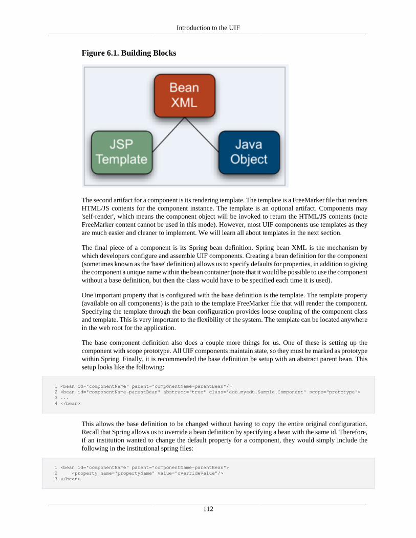
Introduction to the UIF
112
Figure 6.1. Building Blocks
The second artifact for a component is its rendering template. The template is a FreeMarker file that rendersHTML/JS contents for the component instance. The template is an optional artifact. Components may'self-render', which means the component object will be invoked to return the HTML/JS contents (noteFreeMarker content cannot be used in this mode). However, most UIF components use templates as theyare much easier and cleaner to implement. We will learn all about templates in the next section.
The final piece of a component is its Spring bean definition. Spring bean XML is the mechanism bywhich developers configure and assemble UIF components. Creating a bean definition for the component(sometimes known as the 'base' definition) allows us to specify defaults for properties, in addition to givingthe component a unique name within the bean container (note that it would be possible to use the componentwithout a base definition, but then the class would have to be specified each time it is used).
One important property that is configured with the base definition is the template. The template property(available on all components) is the path to the template FreeMarker file that will render the component.Specifying the template through the bean configuration provides loose coupling of the component classand template. This is very important to the flexibility of the system. The template can be located anywherein the web root for the application.
The base component definition also does a couple more things for us. One of these is setting up thecomponent with scope prototype. All UIF components maintain state, so they must be marked as prototypewithin Spring. Finally, it is recommended the base definition be setup with an abstract parent bean. Thissetup looks like the following:
1 <bean id="componentName" parent="componentName-parentBean"/> 2 <bean id="componentName-parentBean" abstract="true" class="edu.myedu.Sample.Component" scope="prototype"> 3 ... 4 </bean>
This allows the base definition to be changed without having to copy the entire original configuration.Recall that Spring allows us to override a bean definition by specifying a bean with the same id. Therefore,if an institution wanted to change the default property for a component, they would simply include thefollowing in the institutional spring files:
1 <bean id="componentName" parent="componentName-parentBean"> 2 <property name="propertyName" value="overrideValue"/> 3 </bean>
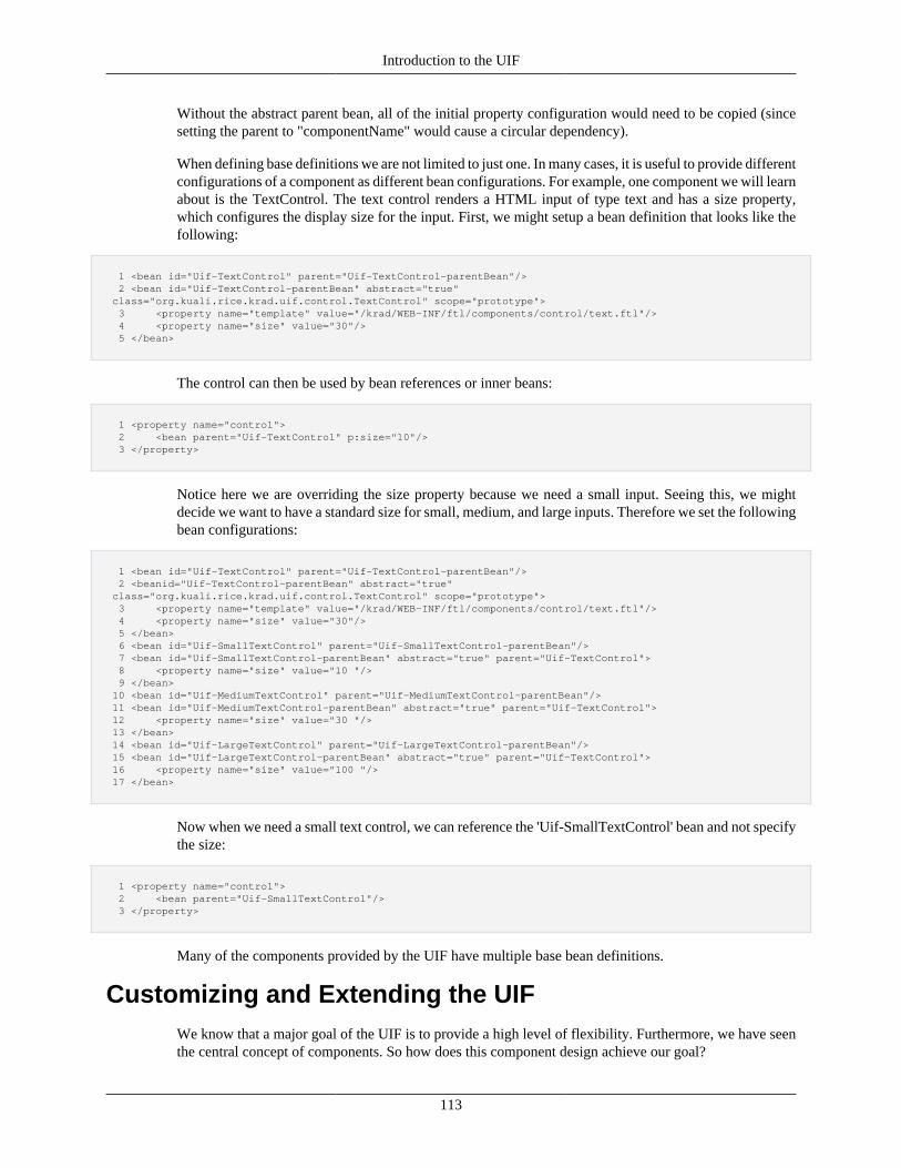
Introduction to the UIF
113
Without the abstract parent bean, all of the initial property configuration would need to be copied (sincesetting the parent to "componentName" would cause a circular dependency).
When defining base definitions we are not limited to just one. In many cases, it is useful to provide differentconfigurations of a component as different bean configurations. For example, one component we will learnabout is the TextControl. The text control renders a HTML input of type text and has a size property,which configures the display size for the input. First, we might setup a bean definition that looks like thefollowing:
1 <bean id="Uif-TextControl" parent="Uif-TextControl-parentBean"/> 2 <bean id="Uif-TextControl-parentBean" abstract="true" class="org.kuali.rice.krad.uif.control.TextControl" scope="prototype"> 3 <property name="template" value="/krad/WEB-INF/ftl/components/control/text.ftl"/> 4 <property name="size" value="30"/> 5 </bean>
The control can then be used by bean references or inner beans:
1 <property name="control"> 2 <bean parent="Uif-TextControl" p:size="10"/> 3 </property>
Notice here we are overriding the size property because we need a small input. Seeing this, we mightdecide we want to have a standard size for small, medium, and large inputs. Therefore we set the followingbean configurations:
1 <bean id="Uif-TextControl" parent="Uif-TextControl-parentBean"/> 2 <beanid="Uif-TextControl-parentBean" abstract="true" class="org.kuali.rice.krad.uif.control.TextControl" scope="prototype"> 3 <property name="template" value="/krad/WEB-INF/ftl/components/control/text.ftl"/> 4 <property name="size" value="30"/> 5 </bean> 6 <bean id="Uif-SmallTextControl" parent="Uif-SmallTextControl-parentBean"/> 7 <bean id="Uif-SmallTextControl-parentBean" abstract="true" parent="Uif-TextControl"> 8 <property name="size" value="10 "/> 9 </bean> 10 <bean id="Uif-MediumTextControl" parent="Uif-MediumTextControl-parentBean"/> 11 <bean id="Uif-MediumTextControl-parentBean" abstract="true" parent="Uif-TextControl"> 12 <property name="size" value="30 "/> 13 </bean> 14 <bean id="Uif-LargeTextControl" parent="Uif-LargeTextControl-parentBean"/> 15 <bean id="Uif-LargeTextControl-parentBean" abstract="true" parent="Uif-TextControl"> 16 <property name="size" value="100 "/> 17 </bean>
Now when we need a small text control, we can reference the 'Uif-SmallTextControl' bean and not specifythe size:
1 <property name="control"> 2 <bean parent="Uif-SmallTextControl"/> 3 </property>
Many of the components provided by the UIF have multiple base bean definitions.
Customizing and Extending the UIFWe know that a major goal of the UIF is to provide a high level of flexibility. Furthermore, we have seenthe central concept of components. So how does this component design achieve our goal?
Introduction to the UIF
114
To answer this question, let's first take a look at what criteria we should look for in a highly flexible system.
1. Can we customize all parts of the system, or are there places that are 'unreachable'?
2. If we can customize something, can we do that outside of the original codebase so that we do not hinderour upgrade path?
3. What level of understanding do we need to customize the system? Is each customization different?Does it require us to get deep inside the black box?
4. Can we add to the system? If so, do those additions act as first class citizens, or require some alternateapproach to use?
Recall besides the base 'plumbing' of the UIF, a set of components is provided to build pages with. Each ofthese components brings a piece of functionality to the framework. Thus we can think of them as 'buildingblocks' for the framework as shown in Figure 6.2, “Building Blocks”.
Figure 6.2. Building Blocks
Now let's suppose we want to customize a 'core' component. To do this, we simply change one of thecomponent parts (class, bean, or template). We saw previously how we can change the bean configurationfor a component by providing another bean configuration with the same id. Using the abstract parent bean,we can inherit all of the original configuration and then change or add configuration as needed.
For an example of this, let's use the UIF 'required' message field which has the following definition:
1 <bean id="Uif-RequiredMessage" parent="Uif-RequiredMessage-parentBean"/> 2 <bean id="Uif-RequiredMessage-parentBean" abstract="true" parent="Uif-MessageField" 3 scope="prototype" p:messageText="*" p:messageType="REQUIRED"> 4 ... 5 </bean>
Introduction to the UIF
115
We decide for our application we want the required message to actually display the text 'required' insteadof the configured asterisk. To do this we include a bean with the same id in our application (or institutionalspring) file:
1 <bean id="Uif-RequiredMessage" parent="Uif-RequiredMessage-parentBean" p:messageText="required" />
Now everywhere the required message field is used the text 'required' will display instead of '*'.
Tip
Adding Spring Files: Adding Spring files to the container can be done usingthe KRADConfigurer.
Next let's consider the component template. Remember the template is a FreeMarker file located in theweb root (or classpath) and generates the HTML/JS contents for the component. If we wish to change thisrendering, we can create another template in a web location of our choosing.
Depending on the level of customization we need to implement, we might start by copying the currenttemplate contents, or create one from scratch. One we have the template that renders the component how wewant, then we override the bean configuration as described previously and override the template propertyspecifying the location for the new template. Besides the source location for the template, there is thetemplateName property which specifies a name for the template in the host language (the name by whichthe template is invoked). This must be unique, so that when overridding a template, we must also give aunique name for the template (unless we are overriding the base bean definition itself):
1 <bean id="Uif-TextControl" parent="Uif-TextControl-parentBean"/> 2 <bean id="Uif-TextControl-parentBean" abstract="true" class="org.kuali.rice.krad.uif.control.TextControl" scope="prototype"> 3 <property name="template" value="/krad/WEB-INF/ftl/components/control/text.ftl"/> 4 <property name="templateName" value="uif_text"/> 5 <property name="size" value="30"/> 6 </bean> 7 <bean id="Uif-TextControl" parent="Uif-TextControl-parentBean"> 8 <property name="template" value="/myapp/WEB-INF/ftl/components/text.ftl"/> 9 <property name="templateName" value="myapp_text"/> 10 </bean>
The last part of the component we have to customize is the Java class itself. Modifying the Java class wouldallow us to add new properties and behavior to the component. For this, we can create a new class thatextends the original component class. This new class can be anywhere in the classpath. New propertiescan be made available by adding properties to our extension class (with getters and setters). Customizationof behavior can be modified by overriding the various lifecycle methods. These methods will be coveredin Chapter 9. Once we have the new class, we associate it with the component by again overriding thebean definition:
1 <bean id="Uif-TextControl" parent="Uif-TextControl-parentBean"/> 2 <bean id="Uif-TextControl-parentBean" abstract="true" class="org.kuali.rice.krad.uif.control.TextControl" scope="prototype"> 3 <property name="template" value="/krad/WEB-INF/ftl/components/control/text.ftl"/> 4 <property name="size" value="30"/> 5 </bean> 6 <bean id="Uif-TextControl" parent="Uif-TextControl-parentBean" class="edu.myedu.Sample.TextControl"> 7 <property name="additionalProperty" value="foo"/> 8 </bean>
Now that we have seen how to customize a component, how do we go about adding a new component? Wecan add a component using the same process we saw for customization. The difference between addingand customizing are:
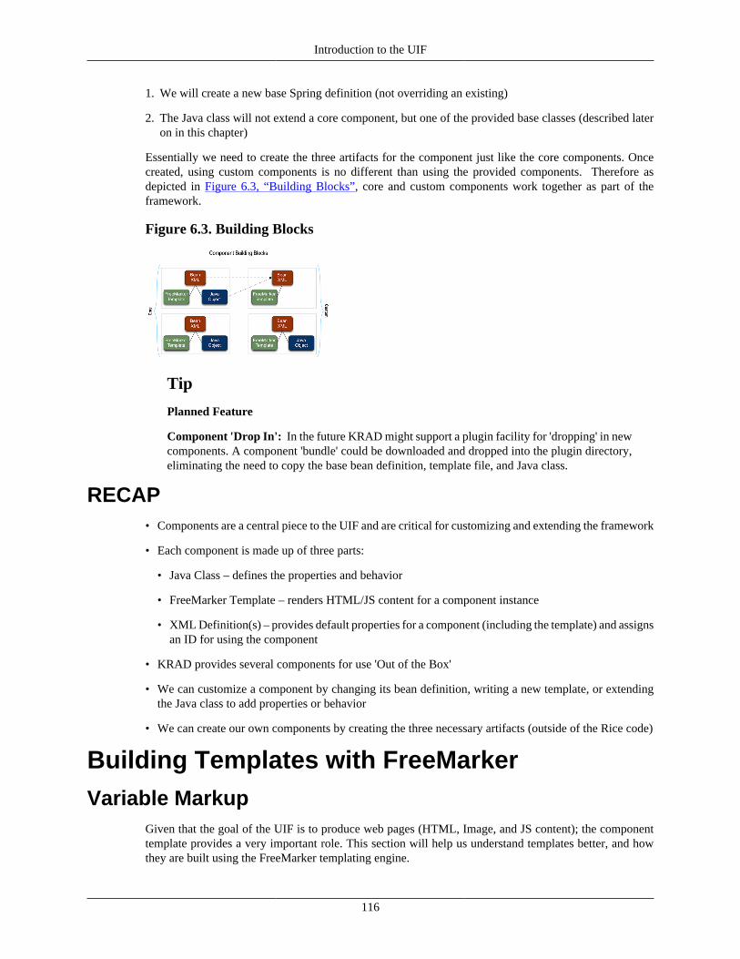
Introduction to the UIF
116
1. We will create a new base Spring definition (not overriding an existing)
2. The Java class will not extend a core component, but one of the provided base classes (described lateron in this chapter)
Essentially we need to create the three artifacts for the component just like the core components. Oncecreated, using custom components is no different than using the provided components. Therefore asdepicted in Figure 6.3, “Building Blocks”, core and custom components work together as part of theframework.
Figure 6.3. Building Blocks
Tip
Planned Feature
Component 'Drop In': In the future KRAD might support a plugin facility for 'dropping' in newcomponents. A component 'bundle' could be downloaded and dropped into the plugin directory,eliminating the need to copy the base bean definition, template file, and Java class.
RECAP• Components are a central piece to the UIF and are critical for customizing and extending the framework
• Each component is made up of three parts:
• Java Class – defines the properties and behavior
• FreeMarker Template – renders HTML/JS content for a component instance
• XML Definition(s) – provides default properties for a component (including the template) and assignsan ID for using the component
• KRAD provides several components for use 'Out of the Box'
• We can customize a component by changing its bean definition, writing a new template, or extendingthe Java class to add properties or behavior
• We can create our own components by creating the three necessary artifacts (outside of the Rice code)
Building Templates with FreeMarkerVariable Markup
Given that the goal of the UIF is to produce web pages (HTML, Image, and JS content); the componenttemplate provides a very important role. This section will help us understand templates better, and howthey are built using the FreeMarker templating engine.
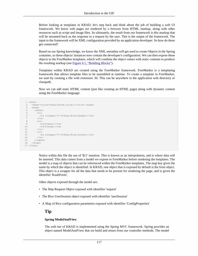
Introduction to the UIF
117
Before looking at templates in KRAD, let's step back and think about the job of building a web UIframework. We know web pages are rendered by a browser from HTML markup, along with otherresources such as script and image files. So ultimately, the result from our framework is this markup thatwill be streamed back as the response to a request by the user. This is the output of the framework. Theinput to the framework will be XML configuration provided by an application developer. So how do theseget connected?
Based on our Spring knowledge, we know the XML metadata will get used to create Objects in the Springcontainer, so these objects' instances now contain the developer's configuration. We can then expose theseobjects to the FreeMarker templates, which will combine the object values with static contents to producethe resulting markup (see Figure 6.1, “Building Blocks”).
Templates within KRAD are created using the FreeMarker framework. FreeMarker is a templatingframework that allows template files to be assembled at runtime. To create a template in FreeMarker,we start by creating a file with extension .ftl. This can be anywhere in the application web directory orclasspath.
Now we can add static HTML content (just like creating an HTML page) along with dynamic contentusing the FreeMarker language:
1 <html> 2 <head><title>${KualiForm.title}</title></head> 3 <body> 4 <table> 5 <tr> 6 <td colspan="2">${KualiForm.header}</td> 7 </tr> 8 <tr> 9 <td>${menu}</td> 10 <td>${body}</td> 11 </tr> 12 <tr> 13 <td colspan="2">${KualiForm.footer}</td> 14 </tr> 15 </table> 16 </body> 17 </html>
Notice within this file the use of '${}' notation. This is known as an interpolation, and is where data willbe inserted. This data comes from a model we expose to FreeMarker before rendering the templates. Themodel is a map of objects that can be referenced within the FreeMarker templates. The map key gives thename by which the object is identified. In KRAD, one object that is exposed by default is the form object.This object is a wrapper for all the data that needs to be present for rendering the page, and is given theidentifier 'KualiForm'.
Other objects exposed through the model are:
• The Http Request Object exposed with identifier 'request'
• The Rice UserSession object exposed with identifier 'userSession'
• A Map of Rice configuration parameters exposed with identifier 'ConfigProperties'
Tip
Spring ModelAndView
The web tier of KRAD is implemented using the Spring MVC framework. Spring provides anobject named ModelAndView that we build and return from our controller methods. The model
Introduction to the UIF
118
part of this object serves the same purpose as the FreeMarker model. In fact, when using thefreemarker view resolver, Spring pulls the model out of this object for configuring FreeMarker.Therefore, for exposing additional objects in the templates, we can add those objects to theModelAndView object we return.
Now suppose we want to pull out part of our FreeMarker content into a separate file, so that it can be reusedbetween different templates. First we create another file with .ftl extension. Let's call this file body.ftl.Now we add the FreeMarker content to our template file:
1 <h2> This is the page body </h2> 2 ${KualiForm.body}
Next, we can bring in the contents of body.ftl into our main template by using the FreeMarker directivenamed include. To use the include directive we specify the absolute or relative path to the template filethat should be included using the path attribute:
1 <html> 2 <head><title>${KualiForm.title}</title></head> 3 <body> 4 <table> 5 <tr> 6 <td colspan="2">${KualiForm.header}</td> 7 </tr> 8 <tr> 9 <td>${menu}</td> 10 <td> 11 <#include path="body.ftl"/> 12 </td> 13 </tr> 14 <tr> 15 <td colspan="2">${KualiForm.footer}</td> 16 </tr> 17 </table> 18 </body> 19 </html>
Interpolations may also contain expressions (see below). For example, we can add two numeric propertiestogether and render the result as follows:
1 ${KualiForm.numProp1 + KualiForm.numProp2}
With FreeMarker we are not limited to just reading properties from the model, but also may invokemethods! This is done using the method name within the expression, followed by list of values to send asparameters. The parameter values may reference another model property or variable:
1 ${KualiForm.retrieveTaxAmount(taxNumber, 'T')}
In addition to accessing dynamic data within the model, we can create new dynamic variables within thetemplate. To create a new variable the assign directive is used. Following the assign keyword, the nameand value for the variable are given separated by an equal:
1 <#assign myVar="Hello!"/>
Similar to model properties, the value for a variable can be written to the output stream using the ${}notation:
Introduction to the UIF
119
1 <td>${myVar}</td> <#-- prints <td>Hello!</td> -->
When assigning a variable value, we may also use an expression. Freemarker supports all of the standardexpression operators. The only notable difference is Freemarker does not support the alpha operatorrepresentation ('eq', 'ne', 'lt', 'or'). Operators are specified with the usual '==', '!=', '&&', '||' and so on. Theone exception in Freemarker is for '>','<','>=','<=" operators, the alpha operator can be given as well. Thefull list of expression operators is found here.
Let's take a simple case of addition as an example:
1 <#assign groupOneTotal=50/> 2 <#assign groupTwoTotal=100/> 3 <#assign totalBothGroups=groupOneTotal + groupTwoTotal/>
Tip
Watch out for Nulls!
When a variable or property expression is null, by default FreeMarker will not convert to anempty string but instead throw an exception. To prevent FreeMarker from throwing an exception(and instead output nothing) an exclamation mark must be added after the variable. For example:${variable!}
FreeMarker DataTypesWhen working with model properties or variables, it is important to know the underlying datatype.The datatype determines how the variable can be used within the markup (for example in expressions,interpolations, and passing macro parameters).
The datatypes used by FreeMarker are String, Number, Boolean, and Date (Scalars); Hash, Sequence, andCollection (Containers); Methods and Custom Directives (Subroutines); and Node.
Tip
Java Objects
Note that model properties that represent Objects are treated as a Hash in FreeMarker. This goesfor the model itself that is exposed for rendering.
Datatypes are implied by FreeMarker in one of two ways. For model properties, the datatype is derivedfrom the underlying Java type. For variables, the datatype will be derived based on the assigned value. Allstring values must be quoted. If value is not quoted, the datatype will be determined based on the format.The keywords true and false are used to indicate a boolean type.
1 <#assign var="Hello"/> <#-- string datatype --> 2 <#assign var=3/> <#-- numeric datatype --> 3 <#assign var=true/> <#-- boolean datatype --> 4 <#assign comp=model.comp/> <#-- assuming model.comp is object, hash datatype -->
Interpolations may only be used for variables/properties that are scalars. FreeMarker converts number anddate types to a string format based on the environment settings. Boolean types must be explicity convertedto a string using the built-in '?string'.
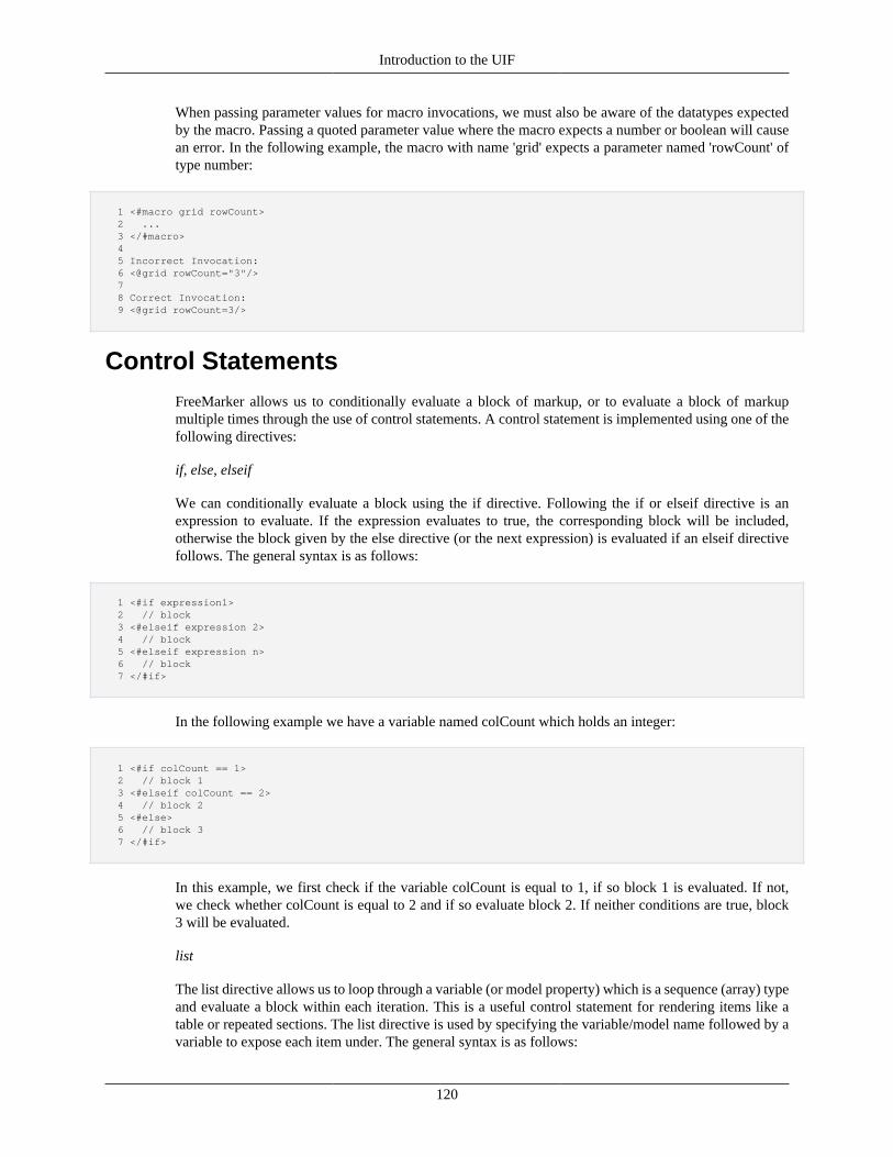
Introduction to the UIF
120
When passing parameter values for macro invocations, we must also be aware of the datatypes expectedby the macro. Passing a quoted parameter value where the macro expects a number or boolean will causean error. In the following example, the macro with name 'grid' expects a parameter named 'rowCount' oftype number:
1 <#macro grid rowCount> 2 ... 3 </#macro> 4 5 Incorrect Invocation: 6 <@grid rowCount="3"/> 7 8 Correct Invocation: 9 <@grid rowCount=3/>
Control StatementsFreeMarker allows us to conditionally evaluate a block of markup, or to evaluate a block of markupmultiple times through the use of control statements. A control statement is implemented using one of thefollowing directives:
if, else, elseif
We can conditionally evaluate a block using the if directive. Following the if or elseif directive is anexpression to evaluate. If the expression evaluates to true, the corresponding block will be included,otherwise the block given by the else directive (or the next expression) is evaluated if an elseif directivefollows. The general syntax is as follows:
1 <#if expression1> 2 // block 3 <#elseif expression 2> 4 // block 5 <#elseif expression n> 6 // block 7 </#if>
In the following example we have a variable named colCount which holds an integer:
1 <#if colCount == 1> 2 // block 1 3 <#elseif colCount == 2> 4 // block 2 5 <#else> 6 // block 3 7 </#if>
In this example, we first check if the variable colCount is equal to 1, if so block 1 is evaluated. If not,we check whether colCount is equal to 2 and if so evaluate block 2. If neither conditions are true, block3 will be evaluated.
list
The list directive allows us to loop through a variable (or model property) which is a sequence (array) typeand evaluate a block within each iteration. This is a useful control statement for rendering items like atable or repeated sections. The list directive is used by specifying the variable/model name followed by avariable to expose each item under. The general syntax is as follows:
Introduction to the UIF
121
1 <#list sequenceName as item> 2 // block 3 </#list>
Let's take an example where we assume we have a model property named 'foods' that is a List. Within thelist body, the item being iterated over will be exposed with the variable 'food':
1 <#list foods as food> 2 Name: ${food.name}, Type: ${food.type} 3 </#list>
If the datatype to iterate over is a Map, we can iterate using the list directive to iterate over the keys ofthe map like the following example:
1 <#list map?keys as parm> 2 ${map[parm]} 3 </#list>
Here the loop variable gives the key for the map entry we are iterating over.
In addition to the loop variable exposed by the list directive, two additional variables are exposed. The firstgives the index for the item and is retrieved by adding '_index' to the loop variable. The second indicateswhether there are more items to iterate over and is retrieved by adding '_has_next' to the loop variable.
Finally, the break directive exists to exit the list directive early, as the following example demonistrates:
1 <#list seq as x> 2 ${x} 3 <#if x = "spring"><#break></#if> 4 </#list>
Context and MacrosBy default, templates that are executed (by include directives) all belong to the same namespace. Thismeans each template has access to read and write the same variables. A change to the value of a variablein one template, will change the value of the variable in another. This namespace shared by templates isknown as the global namespace.
To execute FTL code in a separate namespace, FreeMarker allows the creation of Macros. Macros arecreated using the macro directive and are given a name that can be used for invocation. For example, wecan change our previous body.ftl to become a macro as follows:
1 <#macro body> 2 <h2> This is the page body </h2> 3 ${KualiForm.body} 4 </#macro>
The name for the macro follows the #macro keyword. In this example we have named our macro 'body'.Between the macro start and end tag we can add FreeMarker content just as we would for a general templatefile. Each time the macro is invoked, this FreeMarker content will be evaluated. Therefore macros giveus a way to reuse FreeMarker markup.
Introduction to the UIF
122
Within the macro we can define new variables. As with a general template, we can use the assigndirective to create a variable in the global namespace. However, since a macro has its own namespace, wecan create a variable that is scoped to it as well. This is done using the local directive. The syntax forusing the local directive is the same as the assign directive.
1 <#macro body> 2 <#local locVar="is only visible within macro"/> 3 <#macro>
If a global variable exists with the same name, the local variable will override within the context of themacro.
Macros may parameterize the content by accepting parameters. These parameters are given when the macrois invoked and are used within the macro body for evaluating the final output. Each parameter has a nameby which it is identified. Therefore, to declare macro parameters, we simply list their identifying nameson the macro directive after the macro name. Each parameter name is separated by a space:
1 <#macro macroName parm1 parm2 parm3 parm4 ...>
Within the macro the parameters become local variables. We can print the parameter value to the outputstream, use in a conditional statement, or use in any other way supported by variables. For example, let'sadd a header, bodyContent, and footer parameter to our body macro:
1 <#macro body header bodyContent footer> 2 <body> 3 <table> 4 <tr> 5 <td colspan="2">${header}</td> 6 </tr> 7 <tr> 8 <td>${menu}</td> 9 <td> 10 ${bodyContent} 11 </td> 12 </tr> 13 <tr> 14 <td colspan="2">${footer}</td> 15 </tr> 16 </table> 17 </body> 18 </#macro>
Notice in this example we are writing out the values of the given macro parameters using the ${} notation.Our body macro serves as a wrapper for the content.
For each macro parameter we can also specify whether a value is required to be given by the caller, and ifnot a default value to use. A default value is indicated by placing an equal sign after the parameter name,followed by the default value (which can be an expression). If a default value is not given, the parameteris assumed to be required. All required parameters must be given before parameters that have defaults.Let's take a look at an example:
1 <#macro body bodyContent header="Header One" footer=""> 2 ...
Here we have changed the body macro to make the bodyContent a required parameter, but not the headeror footer. If the header parameter is not specified by the caller, it will have a value of "Header One".Likewise, if the footer is not given, it will have a value of the empty string.
Introduction to the UIF
123
Invoking MacrosWhen a macro is loaded, it becomes a variable within the associated namespace. The macro name(identifier given after the macro declaration) becomes the variable name, and the assigned namespace isderived from the surrounding namespace of the FreeMarker file (see Including FTL Files).
If the macro belongs to the global namespace, it can be invoked with the text '<%' followed by the macroname. Any parameter values are then given after the macro name (separated by a space). Each parameterspecification includes the parameter name, followed by the equal sign, followed by the parameter value(which can be an expression). The macro invocation is completed with the closing greater than sign.
As an example, let's invoke our body macro created in the previous section, passing a value for the'bodyContent' parameter:
1 <@body bodyContent="Hello KRAD World!"/>
or
1 <#assign content="Hello KRAD World!"/> 2 <@body bodyContent=content/>
When the macro is associated with a namespace, we must specify the namespace before the macro name,using a dot to separate each. Let's assume our body macro was associated with the namespace 'myapp'.We would then invoke the macro as follows:
1 <@myapp.body bodyContent=content/>
Other Features of MacrosMacros are very powerful constructs that allow great flexibility! Up to this point we have invoked macrosby simply passing parameter values. A macro may also allow us to pass FreeMarker markup within thebody of the macro tag. The macro can then render this content in one or more locations of the macro. Toindicate where this content should be rendered, we use the nested directive. The nested directive maybe used more than once within the macro definition:
1 <#macro wrapTd> 2 <td> 3 <#nested/> 4 </td> 5 </#macro> 6 7 Invocation: 8 <@wrapTd> 9 <#if renderHeader> 10 ${header} 11 <#else> 12 ${footer} 13 </#if> 14 </@wrapTd>
Assuming renderHeader is true, and the header variable is 'Header One', the following would be output:
1 <td> 2 Header One
Introduction to the UIF
124
3 </td>
Another feature available for macros is varargs (variable number of arguments). To indicate a macroaccepts a variable number of arguments, the last parameter declaration must end with '...':
1 <#macro loop parms...> 2 <#list param.keys as key> 3 ${parm[key]} 4 </#list> 5 <#macro> 6 7 Invocation: 8 <@loop parm1 parm2/> 9 <@loop parm1 parm2 parm3/>
The parameter 'parms' becomes a hash, where the name for each additional parameter is the hash key andthe corresponding parameter value the hash value. The macro may include other named parameters thatare listed before the varargs declaration.
Finally, FreeMarker provides the ability to create macro functions. These are macros that will run notto render output, but to calculate and return a value. These are created using the function directive.The function directive is used the same as the macro with a few exceptions. First the function directive isassumed to return a value. Any variable that is created within the function (or a global variable) may bereturned using the return directive. The return directive is used by giving the variable name after thereturn keyword (we also may return an expression that will be evaluated as the function return value).
Let's build an example function that returns the max of two numbers:
1 <#function max number1 number2> 2 <#if number1 > number2> 3 <#return number1/> 4 <#else> 5 <#return number2/> 6 </#if> 7 <#function>
Functions also differ from Macros in how they are called. Recall functions return a value, therefore we canuse them anywhere a value is expected. This includes within an interpolation, an expression, or variableassignment. In addition, passing parameter values is done using function syntax '(parm1, parm2, ...)' ratherthan key/value pairs. The following shows examples of invoking the max function above:
1 ${max(number1, number2)} 2 <#assign maxNum=max(number1, number2)/> 3 <#if number3 > max(number1, number2)> 4 // block 5 </#if>
Similar to macros, functions may be associated with a non-global namespace. When this is so, thenamespace must be given before the function name, and a colon separates each.
Built-InsFreemarker provides several utility functions called Built-Ins that can be applied to a variable orexpression. The built-ins that can be used depend on the underlying datatype, as shown by the groupingbelow. To invoke a built-in, we add the question character ('?') after the variable (or expression), followedby the built-in name and any parameters. The following shows the general form:
Introduction to the UIF
125
1 ${someVariable?builtIn(parms)}
The return value of the built-in invocation becomes the value for the expression:
1 <#assign name='Joe Smith'/> 2 Rice <#-- prints 'Joe Smith' --> 3 ${name?upper_case} <#-- prints 'JOE SMITH' -->
The following are other examples of built-ins provided.
String Built-Ins
substring(from, toExclusive) - Returns a substring of a given string starting at the given from index upto the given toExclusive index.
html - Escapes html markup
js_string - Escapes the string according to JavaScript string literals
length - Returns the number of characters in the string
lower_case - Lower cases the string
left_pad(length) - Left pads the string with spaces until it reaches the given length
right_pad(length) - Same as left pad, but pads with spaces to the right
contains(substring) - Returns true if the string contains the given substring
matches(regex) - Return true if the string matches the given regular expression
replace(stringToReplace, replacement) - Replaces all occurances of stringToReplace in the string with thegiven replacement string
split(splitString) - Splits a string into an array on occurances of the given splitString parameter
starts_with(string) - Returns true if the string starts with the given string parameter
trim - Removes leading and trailing whitespace
upper_case - Upper cases the string
Boolean Built-Ins
string - Converts the boolean to a string using "true" as true and "false" as false
string("yes", "no") - Converts the boolean to a string using the first string parameter if the boolean is true,and the second string parameter if the boolean is false
Other Built-Ins
has_content - Returns true if the variable is not null and is not empty (meaning if the variable has a sizeor length)
Including FTL FilesA template file may pull markup from another template file using the include directive. The includedirective takes the path to the file as an argument, which may be expressed as a relative or absolute path:
Introduction to the UIF
126
1 <#include '../footer.ftl'/> 2 <#include '/krad/templates/footer.ftl'/>
FreeMarker also supports a second way of including template files for the purpose of library (or namespace)creation. This is done using the import directive. Again, we must give the path to the file as an argument.We can also give an additional argument that will identify the namespace the template contents shouldbe associated with. In the next example we include a freemarker template file that contains several macrodefinitions, and associate them with the namespace 'myapp':
1 <#import 'myapp.ftl' as 'myapp'/>
All the macros contained in myapp.ftl will be associated with the myapp namespace and must be invokedthrough that namespace. Note when using import, any output generated by the included template will beignored.
Component TemplatesEach component within the KRAD UIF has a template file that defines a macro for rendering thecomponent. The template location and the macro name are then configured with the component definition.Each time an instance of the component is encountered, the macro will be invoked with the componentinstance.
Generally, the component macros do the following:
1. Insert values from the component properties with static markup
2. Invoke rendering for child components
Coarse-Grained ParametersAn important consideration when setting up a macro is how to setup the parameters. To help explain this,let's take a look at a sample text control:
1 <@spring.input id="org.kuali.rice:rice:pom:2.5.5" path="${path}" disabled="${disabled}" size="${size}" maxlength="${maxLength}"/>
This snippet is invoking a spring input macro, which will then output the HTML input tag. We see some ofthe attributes this macro provides are id, path, disabled, size, and maxlength. Since this template is generic(in the sense that it should render all instances of the TextControl) the values for these attributes need to bevariable. Now based on our knowledge of macros, we can create an input macro which will allow values forthese variables (or attributes) to be specified by the calling template. This would look like the following:
1 <#macro uif_input id path disabled size maxLength> 2 <@spring:input id="org.kuali.rice:rice:pom:2.5.5" path="${path}" disabled="${disabled}" size="${size}" maxlength="${maxLength}"/> 3 </#macro>
The calling template would then be:
1 <@uif_input id="${component.id}" path="${component.path}" disabled="${component.disabled}" 2 size="${component.size}" maxLength="${component.maxLength}"/>
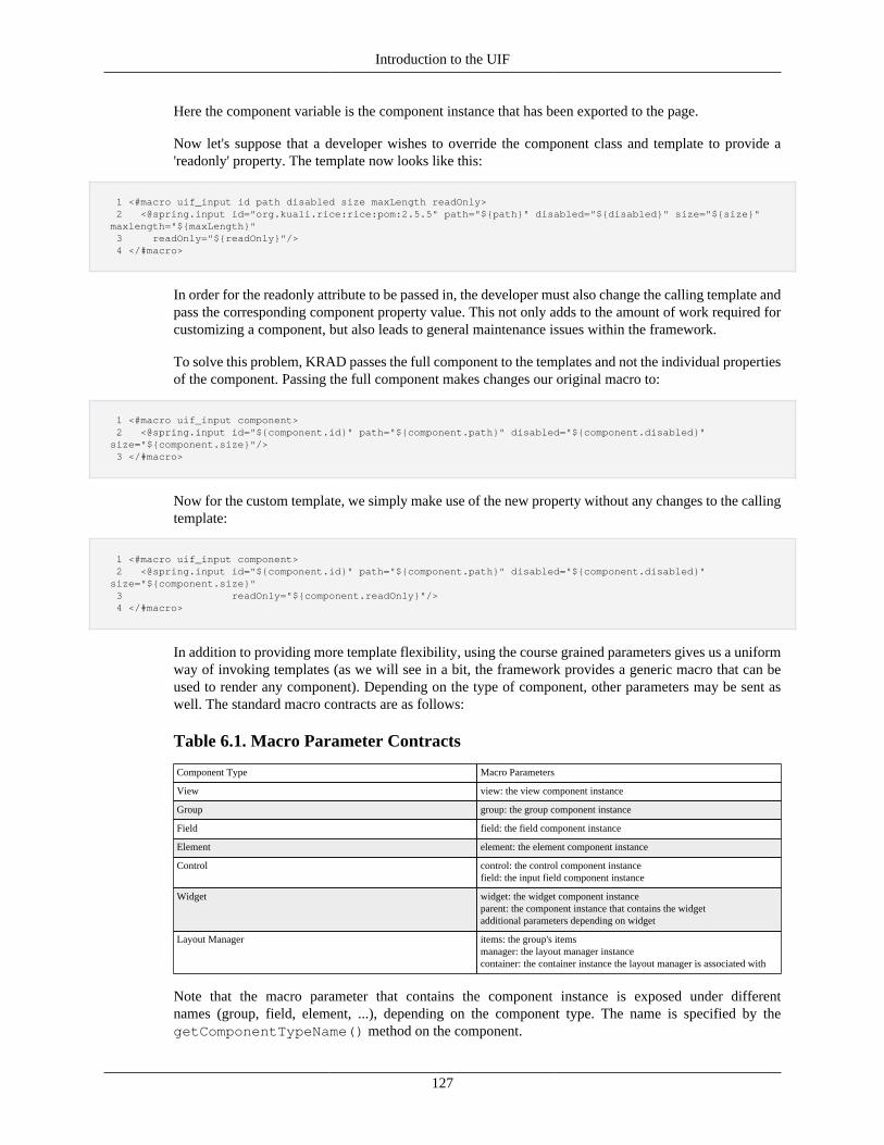
Introduction to the UIF
127
Here the component variable is the component instance that has been exported to the page.
Now let's suppose that a developer wishes to override the component class and template to provide a'readonly' property. The template now looks like this:
1 <#macro uif_input id path disabled size maxLength readOnly> 2 <@spring.input id="org.kuali.rice:rice:pom:2.5.5" path="${path}" disabled="${disabled}" size="${size}" maxlength="${maxLength}" 3 readOnly="${readOnly}"/> 4 </#macro>
In order for the readonly attribute to be passed in, the developer must also change the calling template andpass the corresponding component property value. This not only adds to the amount of work required forcustomizing a component, but also leads to general maintenance issues within the framework.
To solve this problem, KRAD passes the full component to the templates and not the individual propertiesof the component. Passing the full component makes changes our original macro to:
1 <#macro uif_input component> 2 <@spring.input id="${component.id}" path="${component.path}" disabled="${component.disabled}" size="${component.size}"/> 3 </#macro>
Now for the custom template, we simply make use of the new property without any changes to the callingtemplate:
1 <#macro uif_input component> 2 <@spring.input id="${component.id}" path="${component.path}" disabled="${component.disabled}" size="${component.size}" 3 readOnly="${component.readOnly}"/> 4 </#macro>
In addition to providing more template flexibility, using the course grained parameters gives us a uniformway of invoking templates (as we will see in a bit, the framework provides a generic macro that can beused to render any component). Depending on the type of component, other parameters may be sent aswell. The standard macro contracts are as follows:
Table 6.1. Macro Parameter Contracts
Component Type Macro Parameters
View view: the view component instance
Group group: the group component instance
Field field: the field component instance
Element element: the element component instance
Control control: the control component instancefield: the input field component instance
Widget widget: the widget component instanceparent: the component instance that contains the widgetadditional parameters depending on widget
Layout Manager items: the group's itemsmanager: the layout manager instancecontainer: the container instance the layout manager is associated with
Note that the macro parameter that contains the component instance is exposed under differentnames (group, field, element, ...), depending on the component type. The name is specified by thegetComponentTypeName() method on the component.
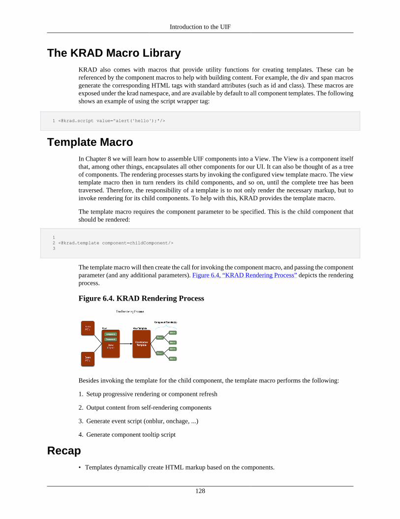
Introduction to the UIF
128
The KRAD Macro LibraryKRAD also comes with macros that provide utility functions for creating templates. These can bereferenced by the component macros to help with building content. For example, the div and span macrosgenerate the corresponding HTML tags with standard attributes (such as id and class). These macros areexposed under the krad namespace, and are available by default to all component templates. The followingshows an example of using the script wrapper tag:
1 <@krad.script value="alert('hello');"/>
Template MacroIn Chapter 8 we will learn how to assemble UIF components into a View. The View is a component itselfthat, among other things, encapsulates all other components for our UI. It can also be thought of as a treeof components. The rendering processes starts by invoking the configured view template macro. The viewtemplate macro then in turn renders its child components, and so on, until the complete tree has beentraversed. Therefore, the responsibility of a template is to not only render the necessary markup, but toinvoke rendering for its child components. To help with this, KRAD provides the template macro.
The template macro requires the component parameter to be specified. This is the child component thatshould be rendered:
1 2 <@krad.template component=childComponent/> 3
The template macro will then create the call for invoking the component macro, and passing the componentparameter (and any additional parameters). Figure 6.4, “KRAD Rendering Process” depicts the renderingprocess.
Figure 6.4. KRAD Rendering Process
Besides invoking the template for the child component, the template macro performs the following:
1. Setup progressive rendering or component refresh
2. Output content from self-rendering components
3. Generate event script (onblur, onchage, ...)
4. Generate component tooltip script
Recap• Templates dynamically create HTML markup based on the components.
Introduction to the UIF
129
• Templates within KRAD are created using the FreeMarker framework.
• Within templates we can use the interpolation syntax '${}' to output dynamic values.
• By default the UIF Form object, request object, user session, and configuration properties are madeavailable to templates.
• FreeMarker supports all the standard expressions for variable assignment, logic tests, and interpolation.
• FreeMarker allows us to create variables within the template using the assign directive.
• FreeMarker has the following datatypes: String, Number, Boolean, Date, Hash, Sequence, Collection,Method, and Node.
• FreeMarker provides the if,else,elseif control directive for conditionally including templatecontent.
• FreeMarker provides the list control directive for looping over template content one or more times.
• Macros provide the ability to create reusable template content that can be parameterized and createvariables in a local namespace.
• Macros are created using the #macro directive, followed by a name for the macro, followed by zeroor more parameter names. The template content that should be rendered when the macro is invoked isgiven between the opening and closing #macro tags.
• Variables created within a macro that should have local scope are created using the local directive.
• Default values can be specified for parameters by adding an equal and then the default value after theparameter name. If a parameter does not have a default value defined it becomes a required parameter.
• Macros are invoked using the '@' symbol followed by the macro name. Parameter values are given afterthe macro name with key=value pairs (parameterName=parameterValue).
• When the macro is associated with a namespace, we must specify the namespace before the macro name,using a dot to separate each.
• Macros can render content passed through the invocation body using the nested directive.
• A type of macro that returns a value is a function. Functions are created using the function directiveand return a value using the return directive.
• Freemarker provides several utility functions called Built-Ins that can be applied to a variable orexpression.
• A template file may pull markup from another template file using the include directive.
• Each component within the KRAD UIF has a template file that defines a macro for rendering thecomponent.
• Each component macro receives the component instance as a parameter.
• The template macro can be used to invoke rendering of a component.
The Component InterfaceOver the next few sections, we will look deeper into UIF components and the properties they have. Thesecomponents are defined by their Java class. The class declares how a component can be used and how it
Introduction to the UIF
130
works with other components. As in all object-oriented designs, these classes model the domain objectsin our problem area, which is building web pages! Thus the component classes found should be mostlyfamiliar to anyone who has worked with the web (controls, labels, containers, buttons, links, ...).
To become a UIF component, a class must implement the org.kuali.rice.krad.uif.component.Componentinterface. This interface defines standard getters/setters for properties all components should have, inaddition to methods that are invoked during the view lifecycle. Along with the Component interface,the abstract implementation org.kuali.rice.krad.uif.component.ComponentBase is provided which can beextended to build new components. Other than default implementations for lifecycle methods which wewill explore later, this class is essentially a POJO (Plain Old Java Object) for the common properties.
Common Component PropertiesWe have already learned about one very important property that all components have – the template andtemplate name. The template is the path to the FreeMarker file that will perform the rendering process(creating of HTML markup) for the component. The template name is the name of the macro by whichthe rendering can be invoked. Now let's look at some other properties that we get from ComponentBase:
Id – All components must have a unique identifier within a view. This id plays a critical role both serverside and on the client. On the server, the id is used to pull a component from its containing view. A view cancontain many components that are deeply nested. Iterating through this tree to find a particular componentcan require a lot of coding and add up to many wasted cycles. With the id we can 'index' the view suchthat a component can be retrieved in a single call.
On the client, the id becomes even more important. As is the case for many of the server side componentproperties, the id is used to populate the id attribute on the HTML element. This results in unique idsfor all elements on the page. These ids can then be referenced by a script created by the framework orby the developer. Furthermore, it is also possible to build CSS based on the ids (although this is not therecommended strategy).
For generating the id values, there are a few options KRAD provides. First, the id can be assigned by thedeveloper, or it can by generated by the framework. Manual assignment can furthermore be done in oneof two ways. The first is to set the id by using the bean property tag. For example:
1 <bean parent="Component"> 2 <property name="id" value="ks34"/>
The second way to manual assign the component id is by using the bean id attribute:
1 <bean id="ks34" parent="Component">
Since the id bean attribute is already required in most beans (top level beans), it is often most convenientto take this approach. If both the bean id attribute and the id property are specified, the id property valuewill be used.
Note that when a bean inherits a bean definition, an id specified with the property tag will be inherited,while the id attribute of the bean tag will not.
1 <bean id="ks34" parent="Component"> 2 ... 3 </bean> 4 5 <!-- this bean will not have a configured id --> 6 <bean parent="ks34"> 7 ...
Introduction to the UIF
131
8 </bean>
If an id is not configured by one of the above mechanisms, the framework will generate and assign a uniqueid for the component. Ids are generated using a sequence that starts at 1 each time the view lifecycle is run(each request), and prefixed with 'u'. For example, the first few generated ids would be 'u1', 'u2', and 'u3'.
The component ids are assigned by the framework at the beginning of the lifecycle (the 'initialize'phase). This guarantees all components will have an id throughout the view lifecycle (important forscript generation in addition to many other things). There is one twist, however. Some components aredynamically created while processing the view data (the 'applyModel' phase). For example, all collectionrow fields cannot be created until the collection data is available. In these cases, the configured componentrepresents a 'prototype' for creating the dynamic components. The prototype will have an id that wasmanually or automatically assigned. For creating the dynamic component, the prototype is copied and thenadjusted. This means the id value will be copied as well. In order to give the copy a unique id, the id issuffixed. In the example of collection rows, each id is suffixed with the line ('l0', 'l1', 'l2'...). For example,if the prototype has an id of 'u56', the field in the first collection line will have id 'u56_l0', in the second'u56_l1', and so on. Other id suffixes used in the framework will be discussed in the various componentsections.
Tip
Factory Id: Another property we find on ComponentBase is factoryId. This is used to holdthe original id for components that are copies of prototypes (dynamically) created. The propertyis necessary when we need to get a new instance of component using the ComponentFactory.Because the component was dynamically created, the ComponentFactory is not aware of it.However, it is aware of its prototype. Using the factoryId, we can get a new instance of theprototype and then adjust as necessary.
Title – For most components, we can specify the title property. This property gives extra information forthe component that will be available in the user interface. This is an example of a property that manycomponents have, but is used differently between components. For example, one of the component typeswe will learn about in the next section is a Container. Components generally begin with a header(using the HTML header tag) and use the title property for the header text. Other types of componentsinclude Fields and Controls. The component types use the title property as the title attribute on thecorresponding element they produce:
1 <element title="component title property value"/>
The title attribute value is most often shown as a tooltip when the user hovers over the element.
Title Property: The reason we say title property can be specified for 'most' components is that thereare some that do not use this. Since the overwhelming majority do, it was added to ComponentBase forconvenience.
Render – The render property is a Boolean that indicates whether the HTML markup should be generatedfor the component. When this is set to false, the configured template will not be invoked during therendering process. By using conditional expressions to set the render property, we can make our viewmuch more dynamic. Essentially the render property allows us to display or not display a component basedon runtime conditions.
For example in the following configuration only field1 will be rendered:
1 <bean parent="Uif-InputField" 2 p:propertyName="field1"/> <bean parent="Uif-InputField"
Introduction to the UIF
132
3 p:propertyName="field2" p:render="false"/>
The default value for render is true, so if the render property is not specified the component will be rendered.
Hidden – The hidden property is similar to the render property in that it configures whether or notthe component is displayed. However, when a component is hidden (and render is set to true), thecorresponding template will be invoked to generate markup. The content is then surrounded with a div thatcontains a style of display none. This keeps the content from being visible. The content can be displayedby changing the CSS display style through script. This provides a mechanism for toggling the display ofa component on the client. Later on, we will learn about jQuery, which among many other things, allowsus to flip the visibility of an element by invoking the show or hide function.
ReadOnly – It is common to use the UIF for building forms that will collect data and perform a processon behalf of the user. There are a variety of components, such as controls and widgets, that allow the userto input data. These components have a state of editable (user input is allowed) or read only (user input isnot allowed). To indicate a component should be in the read only state we can set the readOnly property totrue. Again, this is a property that expressions are generally used for that sets the state based on a condition.
Since it varies how components allow user input, the impact of setting a component as read only varies.For example, read-only controls simply display the control value as HTML text. An action field, on theother hand (button, link, image), will not render when set to read only.
More Info: Components such as controls and action fields also support the disabled property. Whenthese components are disabled they are in a read only state (no user input is allowed), however they arepresented differently. Although the disabled appearance can be modified, generally the component appearsas it does when editable (for example the actual control or button appears) but appears dimmed. The UIMprovide guidelines for when to use disabled over readOnly.
By default, the component base bean definitions have the readOnly property set as a condition on the readonly status of the parent. Recall that our View represents a tree of components, where each componentcontains zero or more child components. This is often referred to as a parent-child relationship. Allcomponents with the exception of the View have a parent. Thus if the parent is read only, the child willbe as well.
One example of the parent-child relationships is the Container component. The purpose of a containeris to hold other components and provide a layout. Therefore, the components in the container arechild components, and the container is the parent component. Setting the container component asread only will make all components within the container read only. This is a convenient feature thatsimplifies configuration. For example, if we needed to make a group of fields read only, we can addthe readOnly="true" property to the container component instead of adding the property to each field.Furthermore, since the View contains all the components, we can add readOnly="true" to make our entireweb page read only.
Some views are always read only. One example of this is the Inquiry view which displays informationabout a data object instance. The InquiryView base bean has the readOnly property set to true. Thereforeall components added to a view of this type will be read only without having to specify the property.
Required – When a component allows user input, the required property indicates whether the user mustprovide a value (or complete the input/action). This is most typically used with input fields that have acontrol, but can also be used with a container (group) to indicate a section must be completed (fields inthe section must have input). Other components may use the required attribute in a way that is appropriatefor the component.
In the case of input fields, setting required to true will do a couple of things. First, a message will bedisplayed to the user indicating if it is required (by default an asterisk '*'). Second, the framework will
Introduction to the UIF
133
perform validation client side and/or server side that checks a value was given. If the value is empty, anerror message is created and presented to the user.
Style and Style Classes – KRAD provides a lot of flexibility to make your web applicationslook great! All UIF components have a configured style class that performs the visual treatment. Thesestyle classes are provided within the CSS files that come with KRAD. However, if needed, using the styleproperties we can add or override CSS configuration for each component.
Inline style configuration can be specified using the style property. The value is then placed as the styleattribute value for the corresponding HTML element. Likewise, style classes can be specified using thestyleClasses property. This property is a list type with each list item specifying a style class. The configuredstyle classes are concatenated into a string using a space delimiter, then output as the class attribute valuefor the corresponding element.
Progressive and Refresh – Component base contains several properties that relate to configuringprogressive disclosure or component refresh functionality. This is covered in detail in Chapter 11.
Order – KRAD adds some abilities to the Spring configuration system, including more control overcollection merging. In a base bean definition that contains a collection, each component in the collectioncan have an order specified. When inheriting the collection property in child beans, components can bespecified with the same order to replace items in the parent list or given an order that inserts the componentbetween two items of the parent collection. This feature in covered in more detail at the end of this chapter.
Tip
Read Only: As stated above, the feature of read only inheritance is done by setting an expressionon the readOnly property which is inherited. This configuration is as follows:
1 <property name="readOnly" value="@{#parent.readOnly}"/>
However, the readOnly property can be overridden to specify another condition, or to explicitlymake the component editable. This can be useful for cases when a few of the child componentsneed to be editable, but the majority should be read only. We can set the parent as readOnly="true"which will make all child components read only. Then we can add readOnly="false" to the fewcomponents that should be editable.
Skip In Tab Order – By default, tabbing will follow the natural order of the elements and includeeach element that can accept focus. When needed, the element corresponding to the KRAD componentcan be taken out of the tab order (will not be tabbed to) by setting the skipInTabOrder Boolean to true.An example of where this might be needed is a widget. The widget might contain several elements thatwork together as one focusable item. Within the item, keyboard shortcuts can be provided for navigatingto the various elements. The user can simply tab again to get out of the widget (instead of having to tabpossibly several times).
More finely grained control over the tabbing order can be configured as well using the tabIndex propertyof Control.
Finalize Method To Call – Although you can do a great number of things using XML,you also have the option of assembling components with code. One way to invoke code is with thefinalizeMethodToCall. This is the name of a method on the ViewHelperServiceImpl that should be calledduring the finalize phase of the view lifecycle. Standard arguments to this method are the componentinstance and the model (view data). Two additional properties, finalizeMethodAdditionalArguments andfinalizeMethodInvoker, exist for greater flexibility on invoking a method. Code support is covered in detailin Chapter 10.
Introduction to the UIF
134
Self-Render and Render Output – As described in the section on templates and Apache Tiles,most components are rendered by a FreeMarker file that combines parameters from the components withstatic content to produce HTML markup. Components may render without a template by generating themarkup through code. This is done by setting the selfRender flag to true. When this flag is turned on,instead of invoking a template, the method getRenderOutput will be invoked on the component instanceto return the markup that should be output.
Tip
Self-Rendered Content: The markup returned by a self-rendered component may notinclude dynamic markup (FreeMarker content). The string is written directly to the responsewithout going through FreeMarker processing, therefore only HTML markup must be returned.
Component Security – KRAD allows for fine-grained security to be defined, which integrates withthe KIM (Kuali Identity Management) module. Security restrictions are indicated by setting a flag on anorg.kuali.rice.krad.uif.component.ComponentSecurity instance. When a flag is set,the framework will check a KIM permission (setup for that restriction type) and, if not granted to the user,the restriction will be activated. Particular security flags will be discussed while looking at each component.
Component Modifiers – Component modifiers are classes that can be configured on a componentto modify its properties through code. A component may have one or more component modifiers thatget applied in the order they are configured. Modifiers can be useful in many cases. For example, themaintenance framework supports a comparison view where an 'old' and 'new' field is presented for eachfield. To achieve this, a component modifier was created that reads the configured group fields copyingeach to make the 'old' field. Then a base bean was created with the component modifier configured. Allmaintenance groups then extend this bean and inherit the comparison feature.
Component modifiers can also have a condition that determines whether it should run (therunCondition). In the example of the maintenance modifier, we only want to show the comparisonwhen doing an edit operation (not for a new or copy). Therefore, the run condition is setup to check thatthe maintenance action is edit. The framework will evaluate this condition and only invoke the modifierif the condition succeeds.
There are many other things that can be done with component modifiers which will be covered in Chapter10.
Template Options – Besides the properties a component class has, some component templatessupport options that can be configured using the templateOptions map. These can be thought of as'pass-through' parameters since the component class is not aware of them.
Template options are used primarily with Widgets that invoke a jQuery plugin. All jQuery plugins have astandard options map (or object since this is JavaScript) that configures the plugin options. This optionsmap is created from the template options.
Tip
Template Options: The generic template options map allows parameters to be added bythe template without modifying the class. This can be useful when creating custom templateswith options not originally supported by the component. In addition, this allows us to change ourplugin implementations more easily. The options for the new plugin can be configured throughthe XML without having to change the class.
Property Replacers – Another tool provided by the UIF for component configuration are propertyreplacers. A property replacer allows us to exchange the value for a bean (component) property based ona condition. For example, we can change the control for a field from a text control to a checkbox control
Introduction to the UIF
135
if some condition is true. Or, we might want to change out a complete list of container fields with another.In a sense, property replacers give us the capability to have if statements in our XML.
A component may have one or more property replacers defined. In addition, one or more property replacerscan be configured for the same property. Each property replacer whose condition passes will be applied,so the order in which they are configured can matter. Property replacers will be covered in Chapter 10.
Context – One very powerful feature of the UIF is the ability to use EL (Expression Language)statements in XML. The expressions are evaluated using the Spring EL framework. Spring EL allows usto define variables that can be referenced within the expressions. The UIF provides these variables fromthe component context map.
Each entry of the context map represents a variable, where the map key is the name of the variable (howit will be referenced in the expression), and the map value is the value Spring should use for the variable.The framework adds standard variables to the context for all components. Some examples include the'view' and 'component' variables. Additional variables are added based on the component. For example,components within a collection group receive the variables 'line' and 'index' for referring to the currentline. Finally, custom variables can be added to the context either through the XML configuration for acomponent, or by code. More information on expressions will be covered in Chapter 10.
Script Event SupportIn addition to implementing the Component interface, ComponentBase implements theorg.kuali.rice.krad.uif.component.ScriptEventSupport interface. This allows a component to specifywhether a given jQuery event is supported, and to retrieve or set the JavaScript code for that event.For example, let's take the onblur event. If a component supports this event, it will implement thegetSupportsOnBlur method and return true. Script for the onblur event can then be set through the XMLby using the onBlurScript property. Finally, when rendering the component, the template tag will retrievethe onBlurScript and associate with the onblur event. A listing of all events and examples will be givenin Chapter 11.
Recap• A UIF Component is anything that can be used to build the application user interface.
• To become a UIF component, a class must implement the interfaceorg.kuali.rice.krad.uif.component.Component.
• The component interface defines properties and behaviors all components must provide.
• Components can extend org.kuali.rice.krad.uif.component.ComponentBase which provides propertiesand default implementations for the component interface.
• The id property is a unique identifier for the component which can be assigned in the xml with theproperty tag or by the bean id attribute.
• The component id is used as the id for the element that is generated from the component. On the clientit can be used for scripting and styling.
• The render property specifies whether html output for the component should be generated. When set tofalse the component template is not invoked.
• The render property along with expressions give us the ability to conditionally determine how a pagewill be displayed.
Introduction to the UIF
136
• For components that allow the user to interact with them, such as form controls, the readOnly propertycan be set to not allow user interaction.
• By default, the read-only state is inherited by a component from its parent. This allows us to easily seta group of components or the entire page as read-only.
• Any component can be styled by using the style and styleClasses properties. The style property allowsan inline style to be applied, while the styleClasses allows us to apply one or more css classes to thecomponent.
• Component base contains properties for configuring progressive disclosure and component refreshfunctionality.
• Although many things can be accomplished just with xml, code can be used to set the component stateby specifying a finalize method to call.
• Components can output their html marked directly instead of using a template. This is done by settingthe selfRender property to true.
• Component modifiers are classes that perform a modification on component state. One or moremodifiers can be configured for a component.
• In addition to the properties defined by a component, the template can have options that are passedthrough using the template options map.
• Property replacers can be used to replace the value for a component property based on a condition.
• All components hold a context map which contains variables that can be used for expressions that areevaluated for properties of that component.
• Components can indicate that they support a jQuery (JavaScript) event which allows script to beconfigured for that event.
Types of ComponentsWithin the UIF component landscape, there are groupings of components which share similar propertiesand behaviors. With each component grouping, the framework provides an interface (extendingComponent) and base class. This allows sharing of properties and behavior for components within thesegroupings. In particular, the base classes are important for the view processing, known as the view lifecycle.
Another way to think of these component types is how we use them to build our web page. Recall thateach component is rendered to produce HTML markup (including script), thus our components are reallya model HTML. Therefore, to understand the how the component groupings are formed, it is helpful tofirst breakdown the various HTML tags and how they are assembled.
Content ElementsHTML provides us tags (known as 'elements') we can specify that will be read by the browser to rendersome type of content. Examples of this include:
• <a> tag - Defines a hyperlink
• <button> tag - Defines a clickable button
• <h1> to <h6> tag - Defines HTML headings
• <img> tag - Defines an image
Introduction to the UIF
137
• <label> tag - Defines a label for an input element
As we see by the tag descriptions, these tags and others like them generate some content that is visibleto the user. The components that represent these tags (or will render these tags) are known as ContentElements. The following is a mapping of the above tags to its UIF component:
• <a> - ActionLink
• <button> - ActionButton
• <h1> to <h6> - Header
• <img> - Image
• <label> - Label
ControlsA special type of content element is one that allows the user to provide data input. These elements areknown as Form Elements or Controls. Controls are only valid within an HTML form which will collectthe data and post to a configured server location. Controls come in different types that determine how theuser can provide data. Some HTML control examples are as follows:
• <input> - a control that allows the user to input data by typing the value. Several different types of inputcontrols are provided which are configured by using the type attribute. Some available types include'checkbox', 'file', 'hidden', 'image', 'radio', 'submit', and 'text'.
• <textarea> - a special type of input that renders a multi-line text input
• <select> - a control that allows the user to select a value from a list of options
Within the UIF, these types of components are also known as controls. Unlike the previous contentelements, there is not a one-to-one mapping between the tag and control component. Instead, the UIFprovides a component for each input type. Some examples include:
• <input type="text"> - TextControl
• <input type="file"> - FileControl
• <input type="checkbox"> - CheckboxControl
• <textarea> - TextAreaControl
• <select> - SelectControl
Controls all implement the org.kuali.rice.krad.uif.control.Control interface, which has the base classorg.kuali.rice.krad.uif.control.ControlBase.
FieldsBesides the various content elements HTML provides us, we also can use tags that allow us to groupcontent for layout purposes. One such element is the span. The span element defines a section of thedocument and includes one or more content elements. Essentially, it is a wrapper for other elements.
Spans are very important for layout purposes. They give us the ability to put together more than one elementand have it treated as a 'block' in the layout being employed. A good example of this is the pairing of alabel and control, where the label should appear above the control. If we wanted several of these pairingsto align in a horizontal row, we would need to resort to a table. Wrapping each pairing in a span, however,
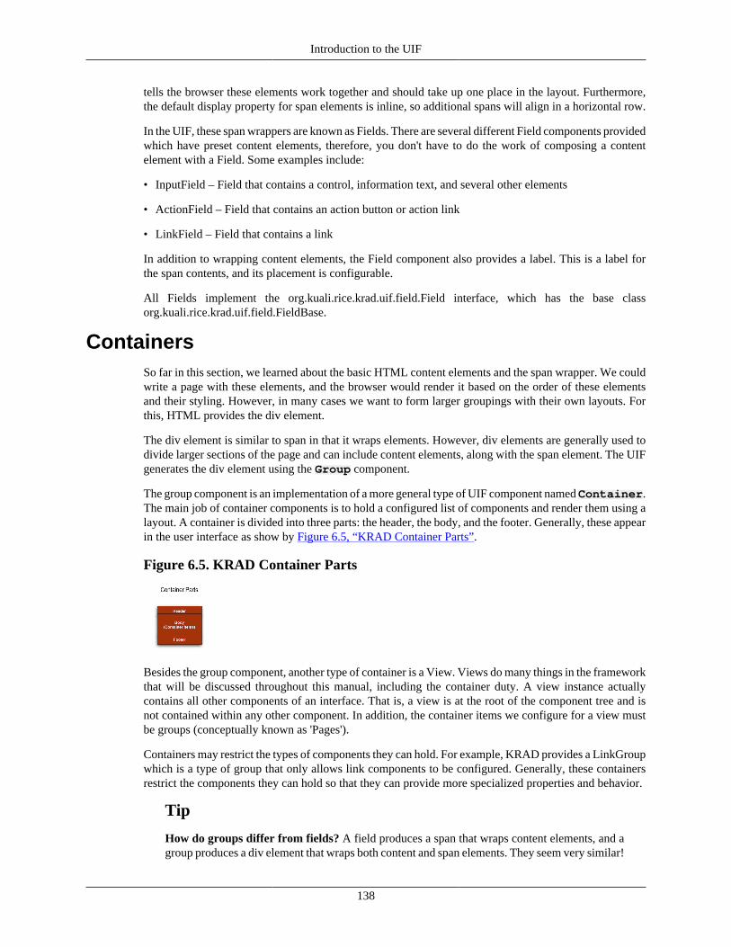
Introduction to the UIF
138
tells the browser these elements work together and should take up one place in the layout. Furthermore,the default display property for span elements is inline, so additional spans will align in a horizontal row.
In the UIF, these span wrappers are known as Fields. There are several different Field components providedwhich have preset content elements, therefore, you don't have to do the work of composing a contentelement with a Field. Some examples include:
• InputField – Field that contains a control, information text, and several other elements
• ActionField – Field that contains an action button or action link
• LinkField – Field that contains a link
In addition to wrapping content elements, the Field component also provides a label. This is a label forthe span contents, and its placement is configurable.
All Fields implement the org.kuali.rice.krad.uif.field.Field interface, which has the base classorg.kuali.rice.krad.uif.field.FieldBase.
ContainersSo far in this section, we learned about the basic HTML content elements and the span wrapper. We couldwrite a page with these elements, and the browser would render it based on the order of these elementsand their styling. However, in many cases we want to form larger groupings with their own layouts. Forthis, HTML provides the div element.
The div element is similar to span in that it wraps elements. However, div elements are generally used todivide larger sections of the page and can include content elements, along with the span element. The UIFgenerates the div element using the Group component.
The group component is an implementation of a more general type of UIF component named Container.The main job of container components is to hold a configured list of components and render them using alayout. A container is divided into three parts: the header, the body, and the footer. Generally, these appearin the user interface as show by Figure 6.5, “KRAD Container Parts”.
Figure 6.5. KRAD Container Parts
Besides the group component, another type of container is a View. Views do many things in the frameworkthat will be discussed throughout this manual, including the container duty. A view instance actuallycontains all other components of an interface. That is, a view is at the root of the component tree and isnot contained within any other component. In addition, the container items we configure for a view mustbe groups (conceptually known as 'Pages').
Containers may restrict the types of components they can hold. For example, KRAD provides a LinkGroupwhich is a type of group that only allows link components to be configured. Generally, these containersrestrict the components they can hold so that they can provide more specialized properties and behavior.
Tip
How do groups differ from fields? A field produces a span that wraps content elements, and agroup produces a div element that wraps both content and span elements. They seem very similar!
Introduction to the UIF
139
The important difference is a field is a preset composition of elements with a preset layout, whilethe group component and its layout can be configured. It is helpful to think of the field componentsas our palette to choose from, and the group component as our canvas!
WidgetsToday we have the ability to do a lot more in our web applications, beyond using the basic HTML elements.With the use of JavaScript and frameworks such as jQuery, we can have features such as menus, tabs,trees, and dialogs in our user interface. These features are achieved by composing the HTML elementswith script. Within the UIF, components that generate such content are known as Widgets.
Tip
Widget Templates: Although the majority of delivered widgets use jQuery, a widget templatemay invoke any script method or make use of other frameworks.
This is a component type that has a lot of variety. However, the commonality is we typically create widgetsnot by rendering HTML elements and attributes, but instead by invoking script. To be more specific, mostwidget templates invoke a jQuery plugin passing in parameters from the templateOptions map.
We can also think of widgets as client side components. Unlike the other UIF components that generatetheir HTML markup server side, widgets generate content on the client during page load. Widgets areexplained further in Chapter 8.
Composition and ContainersJust as HTML elements can be composed, so can the UIF components. These compositions can be fixedbased on the property type, or variable. For example, the LinkField is a fixed composition of a Linkcomponent with the Field component:
public class LinkField extends FieldBase { ... private Link link;}
An example of a variable composition is the Group container with the items list that can accept anycomponent:
public class Group extends ComponentBase { ... private List<Component> items;}
Although it is possible to have any composition of components between the various types, there are certainguidelines:
• Fixed Composition
• All components can be composed of groups, fields, elements, and widgets
• Input fields can be composed of controls
• Variable Composition (Container)
• Views are top level components and may not be contained in other components
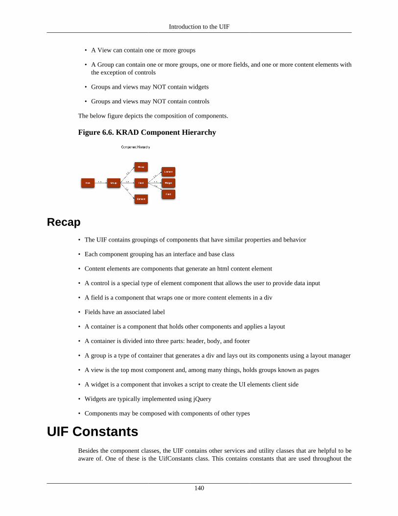
Introduction to the UIF
140
• A View can contain one or more groups
• A Group can contain one or more groups, one or more fields, and one or more content elements withthe exception of controls
• Groups and views may NOT contain widgets
• Groups and views may NOT contain controls
The below figure depicts the composition of components.
Figure 6.6. KRAD Component Hierarchy
Recap• The UIF contains groupings of components that have similar properties and behavior
• Each component grouping has an interface and base class
• Content elements are components that generate an html content element
• A control is a special type of element component that allows the user to provide data input
• A field is a component that wraps one or more content elements in a div
• Fields have an associated label
• A container is a component that holds other components and applies a layout
• A container is divided into three parts: header, body, and footer
• A group is a type of container that generates a div and lays out its components using a layout manager
• A view is the top most component and, among many things, holds groups known as pages
• A widget is a component that invokes a script to create the UI elements client side
• Widgets are typically implemented using jQuery
• Components may be composed with components of other types
UIF ConstantsBesides the component classes, the UIF contains other services and utility classes that are helpful to beaware of. One of these is the UifConstants class. This contains constants that are used throughout the
Introduction to the UIF
141
UIF. Some of these are constants that represent configuration options, while others are used by the code.For those that can be used for configuration, the constant can be referenced using an expression and the'UifConstants' variable. For example @{#UifConstants.Placement.LEFT} refers to the LEFT enum valuein the UifConstants class.
Position – The Position enum has values BOTTOM, LEFT, RIGHT, and TOP. This is used to configurewhere an element should be placed in relation to another. One use of this is for the field label. We canchoose to put the label to the left of the contained field element, on top, to the right, or on the bottom.
Orientation – The Orientation enum has values HORIZONTAL and VERTICAL. This is usedprimarily by the Box layout manager to configure whether the elements should be aligned in a horizontalor vertical row.
View Type – The View Type enum gives the available types of view. A View Type (discussed in 13) isa subclass of the View or FormView components that provides specialized behavior. The out of the boxview types are DEFAULT, DOCUMENT, INQUIRY, LOOKUP, MAINTENANCE, and INCIDENT.
Control Type – The Control Type enum gives the available controls and is used primarily whencreating components through code.
Workflow Action – The Workflow Action enum gives available workflow document actions andis used primarily within the Document controllers. Values are SAVE, ROUTE, BLANKETAPPROVE,APPROVE, DISAPPROVE, CANCEL, FYI, and ACKNOWLEDGE.
Method To Call Names – This is an inner constants class that specifies the name of methodToCallparameter values (which map to controller names).
Action Events – This is an inner constants class that specifies action event names. Action events area way of grouping types of actions that can then be used for logic or authorization. An example actionevent is "addLine".
Id Suffixes – This is an inner constants class that declares id suffixes that are used throughout theframework.
View Phases – This is an inner constants class that names the three view phases: INITIALIZE,APPLY_MODEL, and FINALIZE.
View Status – This is an inner constants class that names the three view states: C (CREATED), I(INITIALIZED), and F (FINAL).
Context Variables Names – This is an inner constants class that holds the names for variables thatcan be used in expressions. These variables are listed in Appendix E.
Refresh Caller Types – This is an inner constants class that holds names of refresh callers. Thesecan be used in return methods to determine what type of view called the refresh. Values are LOOKUP,MULTI_VALUE_LOOKUP, and QUESTION.
EL Placeholder Prefix and Suffix – These constants specify the placeholders that indicatean expression in the XML.
Binding Prefixes – These constants specify prefixes that can be used within expressions for bindingpaths. Options are covered in Chapter 10.
Other Constant Files - In addition to UifConstants, there are the following constant files:
• CssConstants – Constants for CSS strings
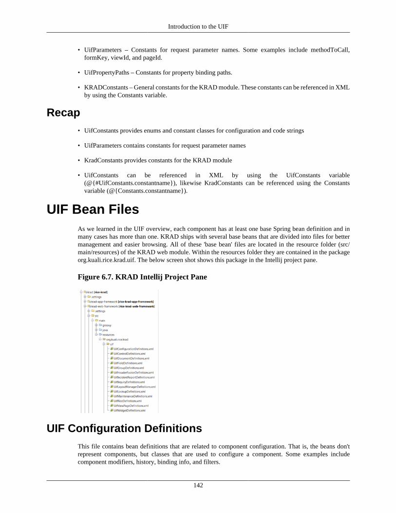
Introduction to the UIF
142
• UifParameters – Constants for request parameter names. Some examples include methodToCall,formKey, viewId, and pageId.
• UifPropertyPaths – Constants for property binding paths.
• KRADConstants – General constants for the KRAD module. These constants can be referenced in XMLby using the Constants variable.
Recap• UifConstants provides enums and constant classes for configuration and code strings
• UifParameters contains constants for request parameter names
• KradConstants provides constants for the KRAD module
• UifConstants can be referenced in XML by using the UifConstants variable(@{#UifConstants.constantname}), likewise KradConstants can be referenced using the Constantsvariable (@{Constants.constantname}).
UIF Bean FilesAs we learned in the UIF overview, each component has at least one base Spring bean definition and inmany cases has more than one. KRAD ships with several base beans that are divided into files for bettermanagement and easier browsing. All of these 'base bean' files are located in the resource folder (src/main/resources) of the KRAD web module. Within the resources folder they are contained in the packageorg.kuali.rice.krad.uif. The below screen shot shows this package in the Intellij project pane.
Figure 6.7. KRAD Intellij Project Pane
UIF Configuration DefinitionsThis file contains bean definitions that are related to component configuration. That is, the beans don'trepresent components, but classes that are used to configure a component. Some examples includecomponent modifiers, history, binding info, and filters.

Introduction to the UIF
143
UIF Control DefinitionsThis file contains bean definitions for control components. Examples include TextControl,CheckboxControl, FileControl, and the SelectControl.
UIF Document DefinitionsThis file contains bean definitions that are related to the Document view type. This includes the DocumentView bean, common document group and field beans.
UIF Field DefinitionsThis file contains bean definitions for the various field components. Examples include DataField,InputField, ActionField, and ImageField.
UIF Group DefinitionsThis file contains bean definitions for the various group components. Multiple bean definitionsare provided for the group component that configure different layout managers. Examples includeVerticalBoxGroup and HorizontalBoxGroup. In addition, bean definitions exist for the group level (page,section, and sub-section). Finally beans exist for the disclosure option and special types of groups likethe TreeGroup.
UIF Header Footer DefinitionsThis file contains bean definitions for header and footer groups. Headers and footers are defined for variousgroup levels (page, section, and sub-section), along with collection groups. Finally the basic h1 throughh6 header components are defined.
UIF Incident Report DefinitionsThis file contains bean definitions that are related to the incident report view.
UIF Inquiry DefinitionsThis file contains bean definitions that are related to the Inquiry view. This includes the Inquiry Viewbean, and definitions for inquiry groups.
UIF Layout Managers DefinitionsThis file contains bean definitions for the provided layout managers. In addition, common layout managerconfigurations are provided as separate beans.
UIF Lookup DefinitionsThis file contains bean definitions for the Lookup view. This includes the Lookup View bean, anddefinitions for lookup groups.
UIF Maintenance DefinitionsThis file contains bean definitions for the Maintenance view. This includes the Maintenance View bean,and definitions for the maintenance groups.
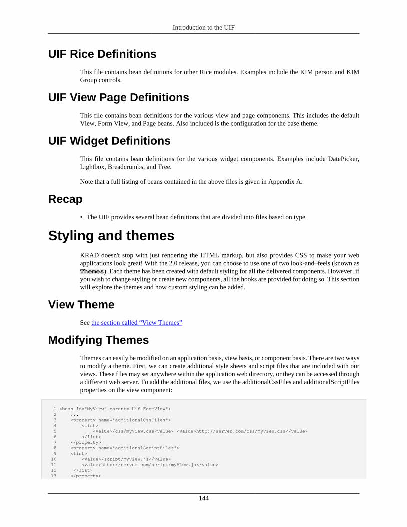
Introduction to the UIF
144
UIF Rice DefinitionsThis file contains bean definitions for other Rice modules. Examples include the KIM person and KIMGroup controls.
UIF View Page DefinitionsThis file contains bean definitions for the various view and page components. This includes the defaultView, Form View, and Page beans. Also included is the configuration for the base theme.
UIF Widget DefinitionsThis file contains bean definitions for the various widget components. Examples include DatePicker,Lightbox, Breadcrumbs, and Tree.
Note that a full listing of beans contained in the above files is given in Appendix A.
Recap• The UIF provides several bean definitions that are divided into files based on type
Styling and themesKRAD doesn't stop with just rendering the HTML markup, but also provides CSS to make your webapplications look great! With the 2.0 release, you can choose to use one of two look-and–feels (known asThemes). Each theme has been created with default styling for all the delivered components. However, ifyou wish to change styling or create new components, all the hooks are provided for doing so. This sectionwill explore the themes and how custom styling can be added.
View ThemeSee the section called “View Themes”
Modifying ThemesThemes can easily be modified on an application basis, view basis, or component basis. There are two waysto modify a theme. First, we can create additional style sheets and script files that are included with ourviews. These files may set anywhere within the application web directory, or they can be accessed througha different web server. To add the additional files, we use the additionalCssFiles and additionalScriptFilesproperties on the view component:
1 <bean id="MyView" parent="Uif-FormView"> 2 ... 3 <property name="additionalCssFiles"> 4 <list> 5 <value>/css/myView.css<value> <value>http://server.com/css/myView.css</value> 6 </list> 7 </property> 8 <property name="additionalScriptFiles"> 9 <list> 10 <value>/script/myView.js</value> 11 <value>http://server.com/script/myView.js</value> 12 </list> 13 </property>
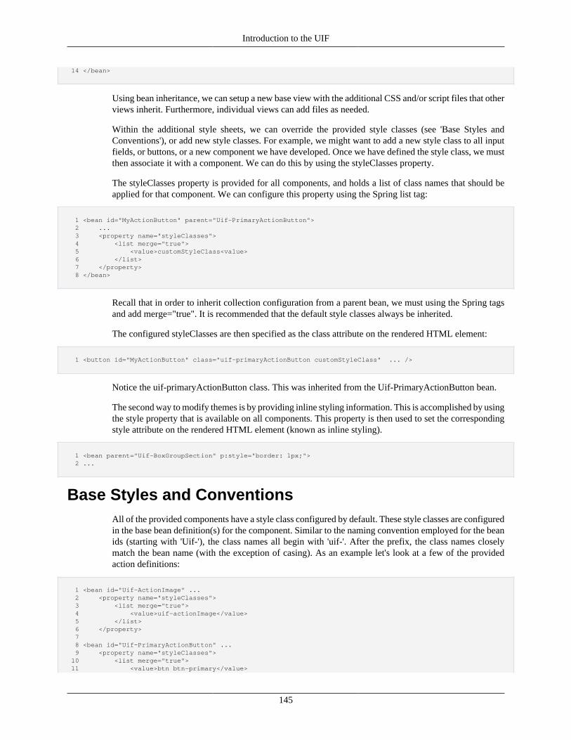
Introduction to the UIF
145
14 </bean>
Using bean inheritance, we can setup a new base view with the additional CSS and/or script files that otherviews inherit. Furthermore, individual views can add files as needed.
Within the additional style sheets, we can override the provided style classes (see 'Base Styles andConventions'), or add new style classes. For example, we might want to add a new style class to all inputfields, or buttons, or a new component we have developed. Once we have defined the style class, we mustthen associate it with a component. We can do this by using the styleClasses property.
The styleClasses property is provided for all components, and holds a list of class names that should beapplied for that component. We can configure this property using the Spring list tag:
1 <bean id="MyActionButton" parent="Uif-PrimaryActionButton"> 2 ... 3 <property name="styleClasses"> 4 <list merge="true"> 5 <value>customStyleClass<value> 6 </list> 7 </property> 8 </bean>
Recall that in order to inherit collection configuration from a parent bean, we must using the Spring tagsand add merge="true". It is recommended that the default style classes always be inherited.
The configured styleClasses are then specified as the class attribute on the rendered HTML element:
1 <button id="MyActionButton" class="uif-primaryActionButton customStyleClass" ... />
Notice the uif-primaryActionButton class. This was inherited from the Uif-PrimaryActionButton bean.
The second way to modify themes is by providing inline styling information. This is accomplished by usingthe style property that is available on all components. This property is then used to set the correspondingstyle attribute on the rendered HTML element (known as inline styling).
1 <bean parent="Uif-BoxGroupSection" p:style="border: 1px;"> 2 ...
Base Styles and ConventionsAll of the provided components have a style class configured by default. These style classes are configuredin the base bean definition(s) for the component. Similar to the naming convention employed for the beanids (starting with 'Uif-'), the class names all begin with 'uif-'. After the prefix, the class names closelymatch the bean name (with the exception of casing). As an example let's look at a few of the providedaction definitions:
1 <bean id="Uif-ActionImage" ... 2 <property name="styleClasses"> 3 <list merge="true"> 4 <value>uif-actionImage</value> 5 </list> 6 </property> 7 8 <bean id="Uif-PrimaryActionButton" ... 9 <property name="styleClasses"> 10 <list merge="true"> 11 <value>btn btn-primary</value>
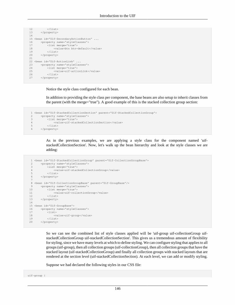
Introduction to the UIF
146
12 </list> 13 </property> 14 15 <bean id="Uif-SecondaryActionButton" ... 16 <property name="styleClasses"> 17 <list merge="true"> 18 <value>btn btn-default</value> 19 </list> 20 </property> 21 22 <bean id="Uif-ActionLink" ... 23 <property name="styleClasses"> 24 <list merge="true"> 25 <value>uif-actionLink</value> 26 </list> 27 </property>
Notice the style class configured for each bean.
In addition to providing the style class per component, the base beans are also setup to inherit classes fromthe parent (with the merge="true"). A good example of this is the stacked collection group section:
1 <bean id="Uif-StackedCollectionSection" parent="Uif-StackedCollectionGroup"> 2 <property name="styleClasses"> 3 <list merge="true"> 4 <value>uif-stackedCollectionSection</value> 5 </list> 6 </property>
As in the previous examples, we are applying a style class for the component named 'uif-stackedCollectionSection'. Now, let's walk up the bean hierarchy and look at the style classes we areadding:
1 <bean id="Uif-StackedCollectionGroup" parent="Uif-CollectionGroupBase"> 2 <property name="styleClasses"> 3 <list merge="true"> 4 <value>uif-stackedCollectionGroup</value> 5 </list> 6 </property> 7 8 <bean id="Uif-CollectionGroupBase" parent="Uif-GroupBase"/> 9 <property name="styleClasses"> 10 <list merge="true"> 11 <value>uif-collectionGroup</value> 12 </list> 13 </property> 14 15 <bean id="Uif-GroupBase"> 16 <property name="styleClasses"> 17 <list> 18 <value>uif-group</value> 19 </list> 20 </property>
So we can see the combined list of style classes applied will be 'uif-group uif-collectionGroup uif-stackedCollectionGroup uif-stackedCollectionSection'. This gives us a tremendous amount of flexibilityfor styling, since we have many levels at which to define styling. We can configure styling that applies to allgroups (uif-group), then all collection groups (uif-collectionGroup), then all collection groups that have thestacked layout (uif-stackedCollectionGroup) and finally all collection groups with stacked layouts that arerendered at the section level (uif-stackedCollectionSection). At each level, we can add or modify styling.
Suppose we had declared the following styles in our CSS file:
uif-group {
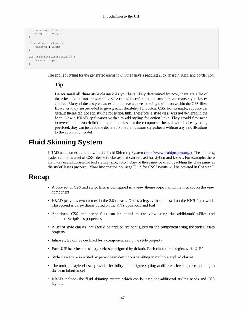
Introduction to the UIF
147
padding : 10px; margin : 10px;}
uif-collectionGroup { padding : 20px; }
uif-stackedCollectionGroup { border : 1px; }
The applied styling for the generated element will then have a padding 20px, margin 10px, and border 1px.
Tip
Do we need all these style classes? As you have likely determined by now, there are a lot ofthese bean definitions provided by KRAD, and therefore that means there are many style classesapplied. Many of these style classes do not have a corresponding definition within the CSS files.However, they are provided to give greater flexibility for custom CSS. For example, suppose thedefault theme did not add styling for action link. Therefore, a style class was not declared in thebean. Now a KRAD application wishes to add styling for action links. They would first needto override the bean definition to add the class for the component. Instead with it already beingprovided, they can just add the declaration in their custom style sheets without any modificationsto the application code!
Fluid Skinning SystemKRAD also comes bundled with the Fluid Skinning System (http://www.fluidproject.org/). The skinningsystem contains a set of CSS files with classes that can be used for styling and layout. For example, thereare many useful classes for text styling (size, color). Any of these may be used by adding the class name inthe styleClasses property. More information on using Fluid for CSS layouts will be covered in Chapter 7.
Recap• A base set of CSS and script files is configured in a view theme object, which is then set on the view
component
• KRAD provides two themes in the 2.0 release. One is a legacy theme based on the KNS framework.The second is a new theme based on the KNS open look and feel
• Additional CSS and script files can be added to the view using the additionalCssFiles andadditionalScriptFiles properties
• A list of style classes that should be applied are configured on the component using the styleClassesproperty
• Inline styles can be declared for a component using the style property
• Each UIF base bean has a style class configured by default. Each class name begins with 'UIF-'
• Style classes are inherited by parent bean definitions resulting in multiple applied classes
• The multiple style classes provide flexibility to configure styling at different levels (corresponding tothe bean inheritance)
• KRAD includes the fluid skinning system which can be used for additional styling needs and CSSlayouts
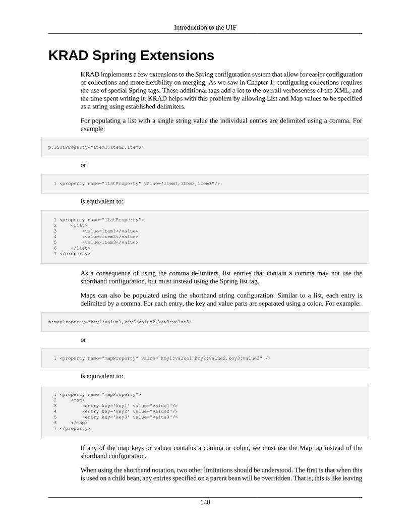
Introduction to the UIF
148
KRAD Spring ExtensionsKRAD implements a few extensions to the Spring configuration system that allow for easier configurationof collections and more flexibility on merging. As we saw in Chapter 1, configuring collections requiresthe use of special Spring tags. These additional tags add a lot to the overall verboseness of the XML, andthe time spent writing it. KRAD helps with this problem by allowing List and Map values to be specifiedas a string using established delimiters.
For populating a list with a single string value the individual entries are delimited using a comma. Forexample:
p:listProperty="item1,item2,item3"
or
1 <property name="listProperty" value="item1,item2,item3"/>
is equivalent to:
1 <property name="listProperty"> 2 <list> 3 <value>item1</value> 4 <value>item2</value> 5 <value>item3</value> 6 </list> 7 </property>
As a consequence of using the comma delimiters, list entries that contain a comma may not use theshorthand configuration, but must instead using the Spring list tag.
Maps can also be populated using the shorthand string configuration. Similar to a list, each entry isdelimited by a comma. For each entry, the key and value parts are separated using a colon. For example:
p:mapProperty="key1:value1,key2:value2,key3:value3"
or
1 <property name="mapProperty" value="key1:value1,key2:value2,key3:value3" />
is equivalent to:
1 <property name="mapProperty"> 2 <map> 3 <entry key="key1" value="value1"/> 4 <entry key="key2" value="value2"/> 5 <entry key="key3" value="value3"/> 6 </map> 7 </property>
If any of the map keys or values contains a comma or colon, we must use the Map tag instead of theshorthand configuration.
When using the shorthand notation, two other limitations should be understood. The first is that when thisis used on a child bean, any entries specified on a parent bean will be overridden. That is, this is like leaving
Introduction to the UIF
149
the merge attribute of the collection tag, or specifying merge="false". Therefore, when entries need to bemerged with the parent bean definition, the Spring collection tags must be used.
The second limitation is with generics (Java 1.5). When populating a collection, Spring will readgeneric information to determine how to convert the configured value. For example, suppose we had aList<Integer> property type. Spring will then attempt to convert each list value to an Integer type. Whenusing the shorthand string configuration, no type conversion on the entries is performed. Therefore, onlycollections of string type are supported (for example List<String> or just List).
Tip
Property Value Type Conversion: The shorthand configuration being described here wasimplemented using a feature of Spring that allows us to specify PropertyEditor classes that canbe used to convert values configured in the XML. A PropertyEditor is a core Java interface thatis invoked to convert a value of one type to another type. Two property editor implementationswere created and configured with the bean container. The first converting a String to List, andthe second converting a String to Map. Property editors are also used to provide formatting ofvalues in the UI. This will be discussed in Chapter 6.
Merge OrderingWhen inheriting configuration from a parent bean definition (using the parent attribute), we can mergecollection entries from the child to parent definition by adding merge="true" to the collection tag. Springperforms the merging by adding the entries on the child definition to the end of the entries of the parent. Forexample, if our parent bean specifies entries 'item1' and 'item4', then the child specifies items 'item3' and'item5', the resulting collection will have entries with the following order: 'item1','item4','item3','item5'. Inthe majority of cases this is fine. However, when the order of items within the collection make a functionaldifference, only being able to merge entries at the end of the collection can be a hindrance.
Within the UIF, many collections do represent a case where the order matters. One example is the Groupcomponent which has a list of component items and a Layout Manager. These items will be rendered onthe page based on the order in which they appear in the collection.
Therefore a property named 'order' was added to all components (ComponentBase) that can be used todeclare where the component should be placed in the collection when merging.
To make use of this functionality, we must first setup the collection items in the base bean to have anorder value:
1 <bean id="MyPage" parent="Uif-Page"> 2 ... 3 <property name="items"> 4 <list> 5 <bean id="Section1" parent="Uif-GridSection" p:order="100"> 6 <bean id="Section2" parent="Uif-GridSection" p:order="200"> 7 <bean id="Section3" parent="Uif-GridSection" p:order="300"> 8 </list> 9 </property> 10 <property name="itemOrderingSequence" value="101"/>
Notice a couple of things here. First, the order was specified for each item such that there is a range ofintegers that fall between each (<100, 100-200, 200-300, >300). The second is the property value of 101for itemOrderingSequence.
Now, let's assume we want to create a page that extends from 'MyPage'. For our page, we need to add twosections. However, when these sections are rendered, the first section should be between 'Section1' and'Section2', and our second section should be after 'Section3'. This can be done as follows:
Introduction to the UIF
150
1 <bean id="AnotherPage" parent="MyPage"> 2 ... 3 <property name="items"> 4 <list merge="true"> 5 <bean id="Section4" parent="Uif-GridSection"> 6 <bean id="Section5" parent="Uif-GridSection" p:order="320"> 7 </list> 8 </property>
That's it! So what happened? First, we need to understand the rules of merging when the order propertyis given:
1. If a component item does not have an order value, it will be assigned a value starting with the specifieditemOrderingSequence. This sequence gets incremented by one each time it is used to assign an ordervalue.
2. The combined collection of items is then sorted by ascending order values.
3. If an item from the child bean has the same order as an item from the parent bean, it will replace thatitem.
Applying these rules to our example we see that 'Section4' will get an assigned order value or '101', thusit will be placed between 'Section1' and 'Section2' which have order values of 100 and 200 respectively.Finally 'Section5' will be placed after 'Section3' since it has an order of 320 which is greater than 300. Thefinal ordering is 'Section1, Section4, Section2, Section3, Section5'.
Recap• KRAD provides extensions to spring that allow for easier configuration of collections and more
flexibility
• List and map property values can be specified using a string value
• For lists, each entry is delimited using a comma
• For maps, each entry is delimited using a comma, with each key/value pair delimited using a colon
• Shorthand string configuration cannot be used if merging is required
• Shorthand string configuration cannot be used if list or map entry types are non-string
• For lists of components, the order property can be given to control where in the merged list thecomponent will be placed
• Component items from a parent bean can be overridden with a child item by using the same order value
151
Chapter 7. Fields and ContentElements
Throughout the next few chapters, we will be taking a detailed look at the component types and theindividual components available out of the box with KRAD. We will start small and work our way upto the entire view. By the end of this section, you will be armed with knowledge you can use to create awide variety of rich web interfaces!
In this chapter, we will look at the Content Element and Field component types. These form the palettefrom which we can paint our page. Content elements are components that will generate an HTML elementtag. Their properties are generally used to populate an available attribute of the HMTL tag. Therefore, ifyou are familiar with the base set of HTML tag, learning these components should be no problem!
The Field component type is a wrapper. It is associated with the HTML span tag that allows us to encloseone or more elements, and treat them as one unit for layout purposes. The field also allows us to declarea label which will be presented with the field block. For convenience, KRAD includes field componentsthat have present elements included. This allows for easy bundling in a group and applying a layout tothe set of fields. If a span is not needed, the elements can be directly configured in a group and renderedusing the configured layout manager.
So to learn more about what we can do with elements and fields, let's take a look at each component wehave in these types.
Field LabelsOne commonly used content element we have is the Label component. As you might have guessed, thiscomponent will render an HTML Label element. To create a new label component, we create a new beanwith parent="Uif-Label":
1 <bean parent="Uif-Label" ... >
The label component is one of the simplest to use, since there are few properties which it accepts. However,there is one required property – the label text! This is the actual text that will appear on the screen as thelabel. To specify this, we can use the labelText property:
1 <bean parent="Uif-Label" p:labelText="Book Title"/>
In most cases, this is all we need to do! The resulting HTML will look like the following:
1 <label id="66_label">Field Label</label>
Wait, where did the id come from? Recall that all components extend ComponentBase which providesseveral properties for us, including the id property. If not specified, the framework will generate an idfor us automatically and use it for the element id attribute. We can specify a different id in either of thefollowing two ways:
1 <bean id="mylabel" parent="Uif-Label" p:labelText="Book Title"/>
Fields and Content Elements
152
1 <bean parent="Uif-Label" p:id="mylabel" p:labelText="Book Title"/>
In addition to the id property provided by ComponentBase, there are many others we might want to use.Some that might be useful for the label component include title, style, and styleClasses.
When generating a label, it is a best practice (for accessibility reasons) to also specify the for attribute.The value for this attribute is the id of the element for which the label applies. On the label component,we can configure this value using the labelForComponentId property:
1 <bean parent="Uif-Label" p:labelText="Book Title" p:labelForComponentId="bookTitle"/>
However, this is usually not necessary. Instead of creating the label component directly, we can let thefield component create one for us. The field component provides some assistance to us for configuringthe label and associating it with a component. To understand this, first let's look at the generic FieldBaseclass from which all fields extend:
1 2 public class FieldBase extends ComponentBase implements Field { 3 private Label fieldLabel; 4 }
We see the field base encapsulates a label component. Thus when creating a field component we can setthe label component properties using the spring nested syntax (dot notation)
1 <bean parent="Uif-DataField" p:fieldLabel.labelText="My Data Field" ... >
Since the label is bundled within the field which is a wrapper for another component, thelabelForComponentId property will be automatically set (to the id of that wrapped component).
The Field component also provides a more convenient way of setting the label text. Instead of using thenested notation of 'fieldLabel.labelText', we can simply set the 'label' property:
1 <bean parent="Uif-DataField" p:label="My Data Field" ... >
The given value will then be set on the label property of the nested label component.
Other Label OptionsIn addition to the properties described previously, the label component offers the following properties:
showLabel – This indicates whether the label should be shown. Note that the label is still rendered butoff screen for accessibility purposes. Set rendering to false to not render the label.
1 <bean parent="Uif-DataField" p:label="My Data Field" p:showLabel="false"/>
renderColon – This indicates whether a colon should be rendered after the label text. For example, thelabel text of 'Foo' will result in 'Foo:' being rendered.
requiredIndicator – This is a string that will be rendered with the label to indicate that the elementassociated with the label (generally a control) is required. By default, the string is configured to be '*' butcan be changed on a global or case by case basis:
Fields and Content Elements
153
1 <bean parent="Uif-DataField" p:label="My Data Field" p:label.requiredIndicator="required"/>
However, we typically want to display the required indicator when the component the label is associatedwith is required. This is again where our Field component provides value. The field will look at the requiredproperty (on all components) of the wrapped component, and, if set to true, will then render the label'srequired indicator. Likewise, if the component's required property is false, the required indicator will notrender.
Automatic Setting of Properties?
In this section we have mentioned a few cases where the field component will automatically setvalues for us based on a condition. Where does this happen? Well in code of course! Besidessimply holding the property values for us, the component class can also perform logic which areinvoked during the view lifecycle. Therefore, if we wanted to change the component behavior,we would need to create a new class and then override the base bean definition as described.
Other Field Label OptionsThe field also provides some additional properties that related to the label. These are:
shortLabel – On the field component, we can also configure an alternate 'short' label. When necessary,the short label can be pulled instead of the standard 'long' label. For example, the table layout manager inKRAD will use the short label for the table headers.
1 <bean parent="Uif-DataField" p:label="My Data Field" p:shortLabel="My Fld"/>
Base BeansWith the various configuration options such as what to render and where, it can overwhelming. Wecertainly do not want to think through each setting for every field we create. To help with this, base beansare provided sensible defaults based on the label placement. These beans exist for the data field and inputfield (two most commonly used fields).
Uif-DataField – Default which sets label placement to left, render colon as true, and required messageplacement to right
Uif-DataField-LabelTop – Sets label placement as top, render colon as false, and required messageplacement to right
Uif-DataField-LabelRight – Sets label placement to right, render colon as false, and required messageplacement to left
Similar beans exist for the Uif-InputField. To use one of the label configurations, we simply change ourparent bean:
1 <bean parent="Uif-DataField-LabelTop" p:labelText="My Data Field" />
Recap• The link content element component renders an html label tag
Fields and Content Elements
154
• The text for the label is specified using the labelText property
• The labelForComponentId property on a label specifies the component id the label is associatedwith
• Generally we don't need to create label components ourselves, but instead configure them through afield component
• Labels can also include a required indicator that indicates the field associated with the label has requiredinput
• The field component will automatically set rendering properties for the label and it's required indicator
• On the label component we can specify whether a colon should be added with the renderColonBoolean
• The field component allows us to specify a short label that can be used instead of the 'long' label bysome layout managers (for example the table layout manager)
Data Fields and Input FieldsTwo fields that are used often in enterprise applications are the DataField and InputField. Generally,enterprise applications have a large amount of data input and output. This IO is performed using an HTMLForm. The properties that back the form (provide and accept the data) are stored on a model. For ourpurposes now, we can think of the model as a simple JavaBean (more information will be given in thesection 'Data Binding'). When we need to display one of these properties using KRAD, we configure aDataField or InputField.
Data FieldA Data Field is used to display a property value from the model as read-only. When we say read-only, thismeans the value is displayed as static text on the page and the user cannot change its value. To create adata field we specify a new bean with parent="Uif-DataField":
1 <bean parent="Uif-DataField" ... >
When configuring a data field for our view, we must associate it with a property on the model object. This isaccomplished using the propertyName property. For example, suppose we had the following model object:
1 2 public class BookForm { 3 private String bookId; 4 private String bookTitle; 5 // getters/setters 6 } 7
To create a data field for the bookId property, our configuration would be as follows:
<bean parent="Uif-DataField" p:propertyName="bookId" p:label="Book"/>
Recall from the previous section that our data field includes a label element and, by default, is configuredto be placed to the left of the field content. Therefore, the result of this will appear as in Figure 7.1, “DataField Label”.
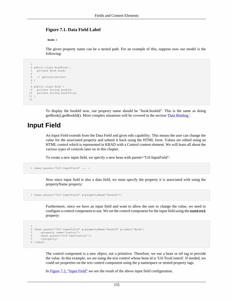
Fields and Content Elements
155
Figure 7.1. Data Field Label
The given property name can be a nested path. For an example of this, suppose now our model is thefollowing:
1 2 public class BookForm { 3 private Book book; 4 5 // getters/setters 6 } 7 8 public class Book { 9 private String bookId; 10 private String bookTitle; 11 } 12
To display the bookId now, our property name should be "book.bookId". This is the same as doinggetBook().getBookId(). More complex situations will be covered in the section 'Data Binding '.
Input FieldAn Input Field extends from the Data Field and gives edit capability. This means the user can change thevalue for the associated property and submit it back using the HTML form. Values are edited using anHTML control which is represented in KRAD with a Control content element. We will learn all about thevarious types of controls later on in this chapter.
To create a new input field, we specify a new bean with parent="Uif-InputField":
1 <bean parent="Uif-InputField" ... >
Now since input field is also a data field, we must specify the property it is associated with using thepropertyName property:
1 <bean parent="Uif-InputField" p:propertyName="bookId"/>
Furthermore, since we have an input field and want to allow the user to change the value, we need toconfigure a control component to use. We set the control component for the input field using the controlproperty:
1 2 <bean parent="Uif-InputField" p:propertyName="bookId" p:label="Book"> 3 <property name="control"> 4 <bean parent="Uif-TextControl"/> 5 </property> 6 </bean>
The control component is a new object, not a primitive. Therefore, we use a bean or ref tag to providethe value. In this example, we are using the text control whose bean id is 'Uif-TextControl'. If needed, wecould set properties on the text control component using the p namespace or nested property tags.
In Figure 7.2, “Input Field” we see the result of the above input field configuration.
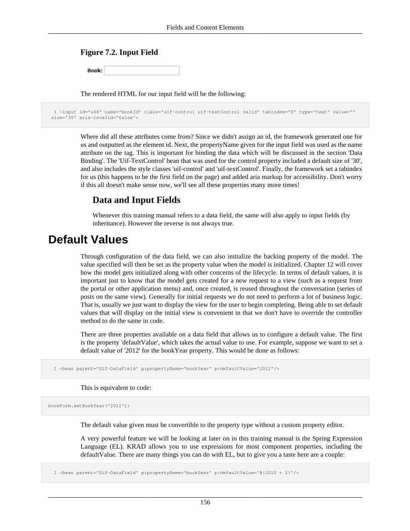
Fields and Content Elements
156
Figure 7.2. Input Field
The rendered HTML for our input field will be the following:
1 <input id="u66" name="bookId" class="uif-control uif-textControl valid" tabindex="0" type="text" value="" size="30" aria-invalid="false">
Where did all these attributes come from? Since we didn't assign an id, the framework generated one forus and outputted as the element id. Next, the propertyName given for the input field was used as the nameattribute on the tag. This is important for binding the data which will be discussed in the section 'DataBinding'. The 'Uif-TextControl' bean that was used for the control property included a default size of '30',and also includes the style classes 'uif-control' and 'uif-textControl'. Finally, the framework set a tabindexfor us (this happens to be the first field on the page) and added aria markup for accessibility. Don't worryif this all doesn't make sense now, we'll see all these properties many more times!
Data and Input Fields
Whenever this training manual refers to a data field, the same will also apply to input fields (byinheritance). However the reverse is not always true.
Default ValuesThrough configuration of the data field, we can also initialize the backing property of the model. Thevalue specified will then be set as the property value when the model is initialized. Chapter 12 will coverhow the model gets initialized along with other concerns of the lifecycle. In terms of default values, it isimportant just to know that the model gets created for a new request to a view (such as a request fromthe portal or other application menu) and, once created, is reused throughout the conversation (series ofposts on the same view). Generally for initial requests we do not need to perform a lot of business logic.That is, usually we just want to display the view for the user to begin completing. Being able to set defaultvalues that will display on the initial view is convenient in that we don't have to override the controllermethod to do the same in code.
There are three properties available on a data field that allows us to configure a default value. The firstis the property 'defaultValue', which takes the actual value to use. For example, suppose we want to set adefault value of '2012' for the bookYear property. This would be done as follows:
1 <bean parent="Uif-DataField" p:propertyName="bookYear" p:defaultValue="2012"/>
This is equivalent to code:
bookForm.setBookYear("2012");
The default value given must be convertible to the property type without a custom property editor.
A very powerful feature we will be looking at later on in this training manual is the Spring ExpressionLanguage (EL). KRAD allows you to use expressions for most component properties, including thedefaultValue. There are many things you can do with EL, but to give you a taste here are a couple:
1 <bean parent="Uif-DataField" p:propertyName="bookYear" p:defaultValue="@{2010 + 2}"/>
Fields and Content Elements
157
1 <bean parent="Uif-DataField" p:propertyName="bookYear" p:defaultValue="@{bookId < 1000 ? 2011 : 2012}"/>
1 <bean parent="Uif-DataField" p:propertyName="bookTitle" p:defaultValue="New Book for @{bookYear}"/>
The second way to configure default values is by setting the 'defaultValues' property (notice the 's' onthe end). This property provides the ability to set multiple default values. For example, if you wanted todefault items with values of either 2 or 3 you could add the following.
1 <property name="defaultValues" > 2 <list> 3 <value>2</value> 4 <value>3</value> 5 </list> 6 </property> 7
The third way to configure a default value is by setting the defaultValueFinderClassproperty. This is the full class name for the class that implements theorg.kuali.rice.krad.valuefinder.ValueFinder interface. This interface is very simplewith just the one method:
public String getValue();
Implementations of this can be made to determine the default value in whatever manner necessary.Previous to KRAD, this was helpful for retrieving the default value from a system parameter. However,with KRAD EL, you can do this with the defaultValue property using the getParam function.
Let's create a default value finder class that calls a service to retrieve the value. Our finder class wouldbe setup like:
1 2 package edu.myedu.sample; 3 public class BookCopyrightYearValueFinder implements ValueFinder { 4 public String getValue() { 5 return getBookService().getDefaultCopyrightYear(); 6 } 7 8 Protected BookService getBookService() { 9 ServiceLocator.getBookService(); 10 } 11 } 12
We would then configure the data field to use our value finder class like this:
1 <bean parent="Uif-DataField" p:propertyName="bookYear" 2 p:defaultValueFinderClass="edu.myedu.sample.BookCopyrightYearValueFinder"/>
One additional note that should be made regarding default values is for collection group fields. Data orInput fields declared in these groups behave differently from the standard group, in that for each collectionline that exists in the model, a new set of fields is created. When configuring a default value (by eithermechanism) for a collection field, the value is picked up each time a new line is created (as a result of anadd line request). Thus it is a default value for the collection line.
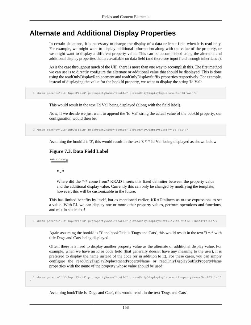
Fields and Content Elements
158
Alternate and Additional Display PropertiesIn certain situations, it is necessary to change the display of a data or input field when it is read only.For example, we might want to display additional information along with the value of the property, orwe might want to display a different property value. This can be accomplished using the alternate andadditional display properties that are available on data field (and therefore input field through inheritance).
As is the case throughout much of the UIF, there is more than one way to accomplish this. The first methodwe can use is to directly configure the alternate or additional value that should be displayed. This is doneusing the readOnlyDisplayReplacement and readOnlyDisplaySuffix properties respectively. For example,instead of displaying the value for the bookId property, we want to display the string 'Id Val':
1 <bean parent="Uif-InputField" p:propertyName="bookId" p:readOnlyDisplayReplacement="Id Val"/>
This would result in the text 'Id Val' being displayed (along with the field label).
Now, if we decide we just want to append the 'Id Val' string the actual value of the bookId property, ourconfiguration would then be:
1 <bean parent="Uif-InputField" p:propertyName="bookId" p:readOnlyDisplaySuffix="Id Val"/>
Assuming the bookId is '3', this would result in the text '3 *-* Id Val' being displayed as shown below.
Figure 7.3. Data Field Label
*-*
Where did the *-* come from? KRAD inserts this fixed delimiter between the property valueand the additional display value. Currently this can only be changed by modifying the template;however, this will be customizable in the future.
This has limited benefits by itself, but as mentioned earlier, KRAD allows us to use expressions to seta value. With EL we can display one or more other property values, perform operations and functions,and mix in static text!
1 <bean parent="Uif-InputField" p:propertyName="bookId" p:readOnlyDisplaySuffix="with title @{bookTitle}"/>
Again assuming the bookId is '3' and bookTitle is 'Dogs and Cats', this would result in the text '3 *-* withtitle Dogs and Cats' being displayed.
Often, there is a need to display another property value as the alternate or additional display value. Forexample, when we have an id or code field (that generally doesn't have any meaning to the user), it ispreferred to display the name instead of the code (or in addition to it). For these cases, you can simplyconfigure the readOnlyDisplayReplacementPropertyName or readOnlyDisplaySuffixPropertyNameproperties with the name of the property whose value should be used:
1 <bean parent="Uif-InputField" p:propertyName="bookId" p:readOnlyDisplayReplacementPropertyName="bookTitle"/>
Assuming bookTitle is 'Dogs and Cats', this would result in the text 'Dogs and Cats'.
Fields and Content Elements
159
1 <bean parent="Uif-InputField" p:propertyName="bookId" p:readOnlyDisplaySuffixPropertyName ="bookTitle"/>
Assuming bookId is '3' and bookTitle is 'Dogs and Cats', this would result in the text '3 *-* Dogs and Cats'.
Alternate/Additional Display and Input Field
The alternate and additional display values are only used when the field is read-only. But aninput field allows the user to edit the value, so does it make sense to configure these propertiesfor an input field? The answer is yes! An input field has a readOnly property (inherited formComponentBase) which dictates whether the control is rendered. If there are conditions whichset this property to true, then the control will not render and the value will be displayed as text.
Additional Display Properties for List<String> fieldsWhen a field is of type List<String> and the readOnly property is set to true, there are a few more optionsthat you can take advantage of to change how this data is displayed. By default this values will be output ina comma and space (", ") separated list, but this can be changed with the readOnlyListDisplayTypeproperty of DataField (and child type InputField). The following options are allowed:
• "DELIMITED" - list will be output with delimiters between each item defined byreadOnlyListDelimiter (which can be any text or html you would like)
• "BREAK" - list will be output with breaks between each item
• "OL" - list will be output in ordered list format (numbered)
• "UL" - list will be output in unordered list format (bulleted)
The following would put a dash with spaces between each item of the list:
1 <bean parent="Uif-InputField-LabelTop" p:propertyName="field120" p:label="Alternate Delimiter" 2 p:instructionalText="CheckboxGroupControl using an optionsFinder" p:width="auto" 3 p:readOnlyListDisplayType="DELIMITED" p:readOnlyListDelimiter=" - "> 4 ...
The result would be something like this "Value1 - Value2 - Value3"
Empty list alternate readOnly display
If your List<String> field is empty, the DataField will simply display nothing as a the value for thelist. Inorder to display something instead, indicating that the list is empty, you can use a SpringELexpression with the readOnlyDisplayReplacement property as follows:
p:readOnlyDisplayReplacement="@{#emptyList(field115)?'No Options Selected':''}
This would display 'No Options Selected' when the list is empty.
Note the OR; this means that the readOnlyDisplayReplacement property is blank whenthe list is not empty. This is required because we want the list to display with the options we mayhave set in readOnlyListDisplayType instead of an alternate replacement for when thelist does contain values. The readOnlyListDisplayType logic performs a check make sure thatreadOnlyDisplayReplacement is null or blank before processing - if it was set that content wouldbe used instead!
Fields and Content Elements
160
Additional Display Properties for Input Fields withWidgets
For certain widgets (i.e. quickfinder, date picker, spinner, etc) a user can interact through the widget orenter a value directly into the input field. In some cases it may be desirable to allow changes to thesewidgets through its controls. In order to do so set the widgetInputOnly property of the InputFieldto true. This will cause the value of the widget to become read only while the widget controls are fullyfunctional.
The following would put a dash with spaces between each item of the list:
1 <bean parent="Uif-InputField" p:propertyName="author" p:widgetInputOnly="true"> 2 ...
Recap• The Data Field and Input Field components are used to perform data IO
• These components are used within an HTML form, corresponding to the KRAD form view component
• Data and input fields are associated with a property on the model object (object providing the data)
• A data field is used to give a read-only display of a property value
• A data field is created with a bean whose parent is 'Uif-DataField'
• The model property associated with the data field is specified using the propertyName property
• The property name can refer to a property on a nested object using the dot notation
• An input field adds edit capability for a property's value
• A input field is created with a bean whose parent is 'Uif-InputField'
• The input field contains a control element component which is used to set the property value (forexample, a text control)
• We can set a default value with the defaultValue property. A static value can be given or anexpression which uses data from the model or a provided variable
• Default values can also be set by creating a class that implements the ValueFinder interface
• The value finder class is configured for use with the field using the defaultValueFinderClassproperty
• Default values for fields with a collection group are used to initialize properties on new lines for thecollection (after the add action has been taken)
• In some cases when the state is read-only we might need to display the value foranother property instead of the field's property, or display the value in addition toit. This is done by using the readOnlyDisplayReplacementPropertyName andreadOnlyDisplaySuffixPropertyName properties
• User interaction can by restricted to the widget controls by setting the widgetInputOnly property
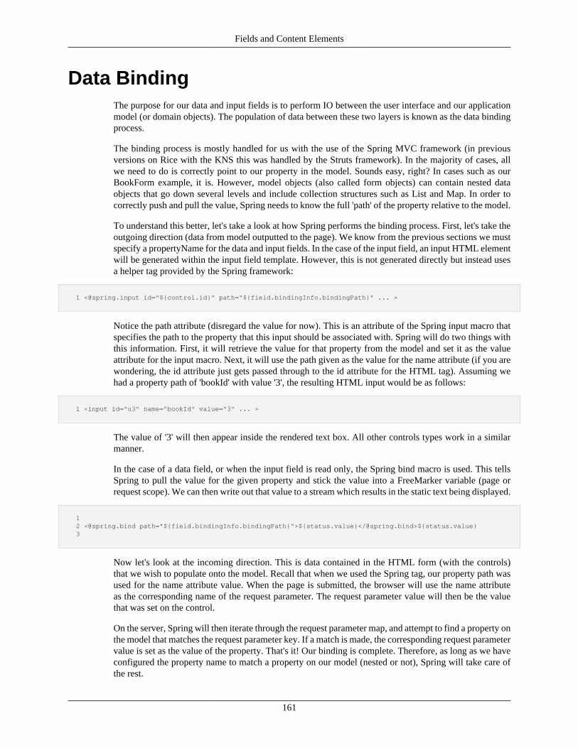
Fields and Content Elements
161
Data BindingThe purpose for our data and input fields is to perform IO between the user interface and our applicationmodel (or domain objects). The population of data between these two layers is known as the data bindingprocess.
The binding process is mostly handled for us with the use of the Spring MVC framework (in previousversions on Rice with the KNS this was handled by the Struts framework). In the majority of cases, allwe need to do is correctly point to our property in the model. Sounds easy, right? In cases such as ourBookForm example, it is. However, model objects (also called form objects) can contain nested dataobjects that go down several levels and include collection structures such as List and Map. In order tocorrectly push and pull the value, Spring needs to know the full 'path' of the property relative to the model.
To understand this better, let's take a look at how Spring performs the binding process. First, let's take theoutgoing direction (data from model outputted to the page). We know from the previous sections we mustspecify a propertyName for the data and input fields. In the case of the input field, an input HTML elementwill be generated within the input field template. However, this is not generated directly but instead usesa helper tag provided by the Spring framework:
1 <@spring.input id="${control.id}" path="${field.bindingInfo.bindingPath}" ... >
Notice the path attribute (disregard the value for now). This is an attribute of the Spring input macro thatspecifies the path to the property that this input should be associated with. Spring will do two things withthis information. First, it will retrieve the value for that property from the model and set it as the valueattribute for the input macro. Next, it will use the path given as the value for the name attribute (if you arewondering, the id attribute just gets passed through to the id attribute for the HTML tag). Assuming wehad a property path of 'bookId' with value '3', the resulting HTML input would be as follows:
1 <input id="u3" name="bookId" value="3" ... >
The value of '3' will then appear inside the rendered text box. All other controls types work in a similarmanner.
In the case of a data field, or when the input field is read only, the Spring bind macro is used. This tellsSpring to pull the value for the given property and stick the value into a FreeMarker variable (page orrequest scope). We can then write out that value to a stream which results in the static text being displayed.
1 2 <@spring.bind path="${field.bindingInfo.bindingPath}">${status.value}</@spring.bind>${status.value} 3
Now let's look at the incoming direction. This is data contained in the HTML form (with the controls)that we wish to populate onto the model. Recall that when we used the Spring tag, our property path wasused for the name attribute value. When the page is submitted, the browser will use the name attributeas the corresponding name of the request parameter. The request parameter value will then be the valuethat was set on the control.
On the server, Spring will then iterate through the request parameter map, and attempt to find a property onthe model that matches the request parameter key. If a match is made, the corresponding request parametervalue is set as the value of the property. That's it! Our binding is complete. Therefore, as long as we haveconfigured the property name to match a property on our model (nested or not), Spring will take care ofthe rest.

Fields and Content Elements
162
Property EditorsWhen binding the data between the JSP page and the model, Spring will again invoke registered PropertyEditors to perform the necessary type conversion. All values within the interface are treated as Strings.When going from or to a property type, other than the primitive types or String type, a property editormust be used.
Spring provides out-of-the-box property editors for common Java types that are registered by default(registration is the process of configuring the Spring container to use a property editor). Also, some optionalproperty editor implementations are provided that can be used. These include: ByteArrayPropertyEditor,ClassEditor, CustomBooleanEditor, CustomCollectionEditor, CustomDateEditor, CustomNumberEditor,FileEditor, InputStreamEditor, LocaleEditor, PatternEditor, PropertiesEditor, StringTrimmerEditor, andURLEditor.
In addition to the provided Spring property editors, KRAD provides a set that can be used with the customKuali types (such as KualiDecimal and KualiInteger) and other common formatting practices. Theseinclude:
UifBooleanEditor – Formats any of the strings "/true/yes/y/on/1/" to the Boolean true, and any ofthe strings "/false/no/n/off/0/" to Boolean false. Conversely, the Boolean true is formatted as the string"yes" and the Boolean false is formatted as the string "no".
UifCalendarEditor – Used for converting between a java.util.Calendar and a string. The RiceDateTimeService is used to perform the string formatting and Calendar creation.
UifCurrencyEditor – Used for converting between a KualiDecimal and a string. The string isformatted using commas and to two decimal places.
UifDateEditor – Used for converting between a java.util.Date and a string. The RiceDateTimeService is used to perform the string formatting and for parsing the string to create a dateobject.
UifKualiIntegerEditor – Used for converting between a KualiInteger and a string. The string isformatted using commas and to zero decimal places.
UifPercentageEditor – Used for converting between a KualiPercent and a string. Formatting issimilar to UifCurrencyEditor.
UifTimestampEditor – Used for converting between a java.sql.Timestamp and a string. The RiceDateTimeService is used to perform the string formatting and Timestamp creation.
These property editors, along with Spring editors, are registered with Spring by property type. This meanswhenever Spring encounters the associated type for the property being bound to, it will use the registeredproperty editor. For example, the UifCurrencyEditor is registered with the KualiDecimal type. Thus, whenbinding to a property with type KualiDecimal, the UifCurrencyEditor will be used.
If needed, KRAD allows you to also specify a property editor to use for a data field. This might beneeded to support a custom data type or to perform custom formatting (formatting refers to the processof rendering a String from an object). To create a new property editor, a class must be created thatimplements the PropertyEditor interface. The easiest way to do this is to extend the Spring provided classjava.beans.PropertyEditorSupport, and then override the getAsText() and setAsText(String text) methods.
1 2 package edu.sampleu.demo.kitchensink; 3 public class UITestPropertyEditor extends PropertyEditorSupport implements Serializable { 4 private static final long serialVersionUID = -4113846709722954737L; 5 6 /**
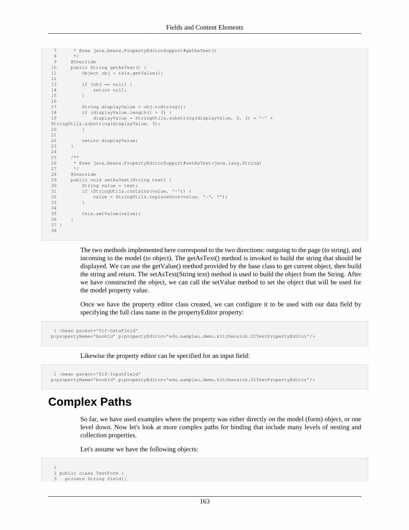
Fields and Content Elements
163
7 * @see java.beans.PropertyEditorSupport#getAsText() 8 */ 9 @Override 10 public String getAsText() { 11 Object obj = this.getValue(); 12 13 if (obj == null) { 14 return null; 15 } 16 17 String displayValue = obj.toString(); 18 if (displayValue.length() > 3) { 19 displayValue = StringUtils.substring(displayValue, 0, 3) + "-" + StringUtils.substring(displayValue, 3); 20 } 21 22 return displayValue; 23 } 24 25 /** 26 * @see java.beans.PropertyEditorSupport#setAsText(java.lang.String) 27 */ 28 @Override 29 public void setAsText(String text) { 30 String value = text; 31 if (StringUtils.contains(value, "-")) { 32 value = StringUtils.replaceOnce(value, "-", ""); 33 } 34 35 this.setValue(value); 36 } 37 } 38
The two methods implemented here correspond to the two directions: outgoing to the page (to string), andincoming to the model (to object). The getAsText() method is invoked to build the string that should bedisplayed. We can use the getValue() method provided by the base class to get current object, then buildthe string and return. The setAsText(String text) method is used to build the object from the String. Afterwe have constructed the object, we can call the setValue method to set the object that will be used forthe model property value.
Once we have the property editor class created, we can configure it to be used with our data field byspecifying the full class name in the propertyEditor property:
1 <bean parent="Uif-DataField" p:propertyName="bookId" p:propertyEditor="edu.sampleu.demo.kitchensink.UITestPropertyEditor"/>
Likewise the property editor can be specified for an input field:
1 <bean parent="Uif-InputField" p:propertyName="bookId" p:propertyEditor="edu.sampleu.demo.kitchensink.UITestPropertyEditor"/>
Complex PathsSo far, we have used examples where the property was either directly on the model (form) object, or onelevel down. Now let's look at more complex paths for binding that include many levels of nesting andcollection properties.
Let's assume we have the following objects:
1 2 public class TestForm { 3 private String field1;
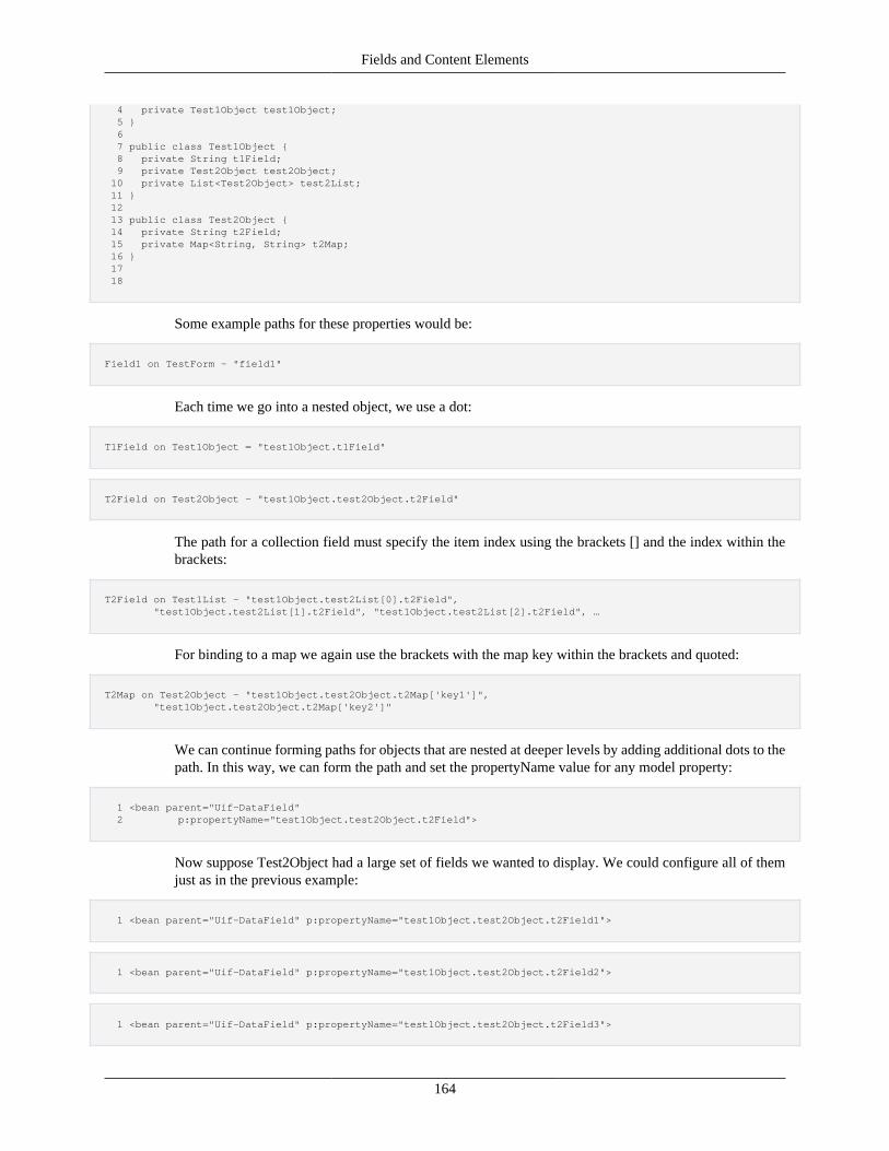
Fields and Content Elements
164
4 private Test1Object test1Object; 5 } 6 7 public class Test1Object { 8 private String t1Field; 9 private Test2Object test2Object; 10 private List<Test2Object> test2List; 11 } 12 13 public class Test2Object { 14 private String t2Field; 15 private Map<String, String> t2Map; 16 } 17 18
Some example paths for these properties would be:
Field1 on TestForm – "field1"
Each time we go into a nested object, we use a dot:
T1Field on Test1Object = "test1Object.t1Field"
T2Field on Test2Object – "test1Object.test2Object.t2Field"
The path for a collection field must specify the item index using the brackets [] and the index within thebrackets:
T2Field on Test1List – "test1Object.test2List[0].t2Field", "test1Object.test2List[1].t2Field", "test1Object.test2List[2].t2Field", …
For binding to a map we again use the brackets with the map key within the brackets and quoted:
T2Map on Test2Object – "test1Object.test2Object.t2Map['key1']", "test1Object.test2Object.t2Map['key2']"
We can continue forming paths for objects that are nested at deeper levels by adding additional dots to thepath. In this way, we can form the path and set the propertyName value for any model property:
1 <bean parent="Uif-DataField" 2 p:propertyName="test1Object.test2Object.t2Field">
Now suppose Test2Object had a large set of fields we wanted to display. We could configure all of themjust as in the previous example:
1 <bean parent="Uif-DataField" p:propertyName="test1Object.test2Object.t2Field1">
1 <bean parent="Uif-DataField" p:propertyName="test1Object.test2Object.t2Field2">
1 <bean parent="Uif-DataField" p:propertyName="test1Object.test2Object.t2Field3">
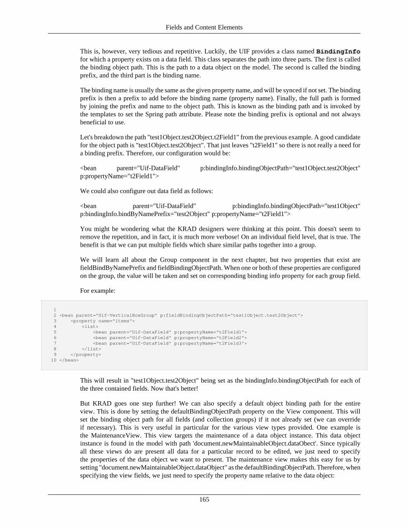
Fields and Content Elements
165
This is, however, very tedious and repetitive. Luckily, the UIF provides a class named BindingInfofor which a property exists on a data field. This class separates the path into three parts. The first is calledthe binding object path. This is the path to a data object on the model. The second is called the bindingprefix, and the third part is the binding name.
The binding name is usually the same as the given property name, and will be synced if not set. The bindingprefix is then a prefix to add before the binding name (property name). Finally, the full path is formedby joining the prefix and name to the object path. This is known as the binding path and is invoked bythe templates to set the Spring path attribute. Please note the binding prefix is optional and not alwaysbeneficial to use.
Let's breakdown the path "test1Object.test2Object.t2Field1" from the previous example. A good candidatefor the object path is "test1Object.test2Object". That just leaves "t2Field1" so there is not really a need fora binding prefix. Therefore, our configuration would be:
<bean parent="Uif-DataField" p:bindingInfo.bindingObjectPath="test1Object.test2Object"p:propertyName="t2Field1">
We could also configure out data field as follows:
<bean parent="Uif-DataField" p:bindingInfo.bindingObjectPath="test1Object"p:bindingInfo.bindByNamePrefix="test2Object" p:propertyName="t2Field1">
You might be wondering what the KRAD designers were thinking at this point. This doesn't seem toremove the repetition, and in fact, it is much more verbose! On an individual field level, that is true. Thebenefit is that we can put multiple fields which share similar paths together into a group.
We will learn all about the Group component in the next chapter, but two properties that exist arefieldBindByNamePrefix and fieldBindingObjectPath. When one or both of these properties are configuredon the group, the value will be taken and set on corresponding binding info property for each group field.
For example:
1 2 <bean parent="Uif-VerticalBoxGroup" p:fieldBindingObjectPath="test1Object.test2Object"> 3 <property name="items"> 4 <list> 5 <bean parent="Uif-DataField" p:propertyName="t2Field1"> 6 <bean parent="Uif-DataField" p:propertyName="t2Field2"> 7 <bean parent="Uif-DataField" p:propertyName="t2Field3"> 8 </list> 9 </property> 10 </bean>
This will result in "test1Object.test2Object" being set as the bindingInfo.bindingObjectPath for each ofthe three contained fields. Now that's better!
But KRAD goes one step further! We can also specify a default object binding path for the entireview. This is done by setting the defaultBindingObjectPath property on the View component. This willset the binding object path for all fields (and collection groups) if it not already set (we can overrideif necessary). This is very useful in particular for the various view types provided. One example isthe MaintenanceView. This view targets the maintenance of a data object instance. This data objectinstance is found in the model with path 'document.newMaintainableObject.dataObect'. Since typicallyall these views do are present all data for a particular record to be edited, we just need to specifythe properties of the data object we want to present. The maintenance view makes this easy for us bysetting "document.newMaintainableObject.dataObject" as the defaultBindingObjectPath. Therefore, whenspecifying the view fields, we just need to specify the property name relative to the data object:
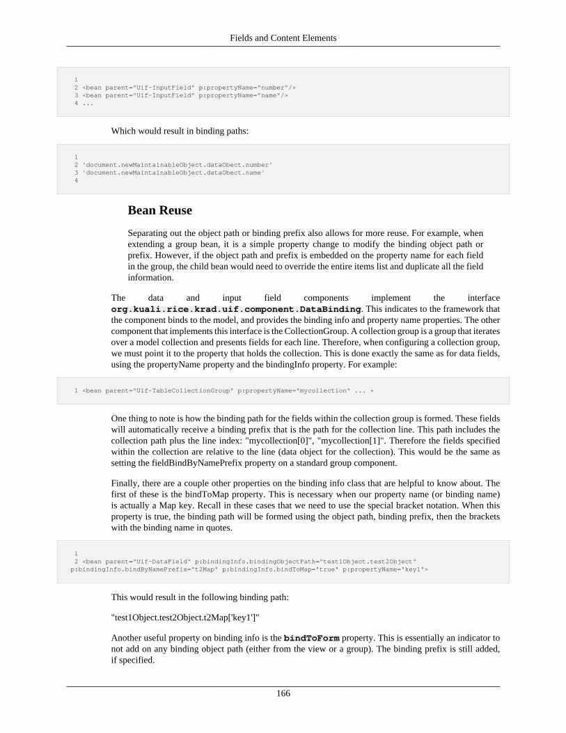
Fields and Content Elements
166
1 2 <bean parent="Uif-InputField" p:propertyName="number"/> 3 <bean parent="Uif-InputField" p:propertyName="name"/> 4 ...
Which would result in binding paths:
1 2 'document.newMaintainableObject.dataObect.number' 3 'document.newMaintainableObject.dataObect.name' 4
Bean Reuse
Separating out the object path or binding prefix also allows for more reuse. For example, whenextending a group bean, it is a simple property change to modify the binding object path orprefix. However, if the object path and prefix is embedded on the property name for each fieldin the group, the child bean would need to override the entire items list and duplicate all the fieldinformation.
The data and input field components implement the interfaceorg.kuali.rice.krad.uif.component.DataBinding. This indicates to the framework thatthe component binds to the model, and provides the binding info and property name properties. The othercomponent that implements this interface is the CollectionGroup. A collection group is a group that iteratesover a model collection and presents fields for each line. Therefore, when configuring a collection group,we must point it to the property that holds the collection. This is done exactly the same as for data fields,using the propertyName property and the bindingInfo property. For example:
1 <bean parent="Uif-TableCollectionGroup" p:propertyName="mycollection" ... >
One thing to note is how the binding path for the fields within the collection group is formed. These fieldswill automatically receive a binding prefix that is the path for the collection line. This path includes thecollection path plus the line index: "mycollection[0]", "mycollection[1]". Therefore the fields specifiedwithin the collection are relative to the line (data object for the collection). This would be the same assetting the fieldBindByNamePrefix property on a standard group component.
Finally, there are a couple other properties on the binding info class that are helpful to know about. Thefirst of these is the bindToMap property. This is necessary when our property name (or binding name)is actually a Map key. Recall in these cases that we need to use the special bracket notation. When thisproperty is true, the binding path will be formed using the object path, binding prefix, then the bracketswith the binding name in quotes.
1 2 <bean parent="Uif-DataField" p:bindingInfo.bindingObjectPath="test1Object.test2Object" p:bindingInfo.bindByNamePrefix="t2Map" p:bindingInfo.bindToMap="true" p:propertyName="key1">
This would result in the following binding path:
"test1Object.test2Object.t2Map['key1']"
Another useful property on binding info is the bindToForm property. This is essentially an indicator tonot add on any binding object path (either from the view or a group). The binding prefix is still added,if specified.
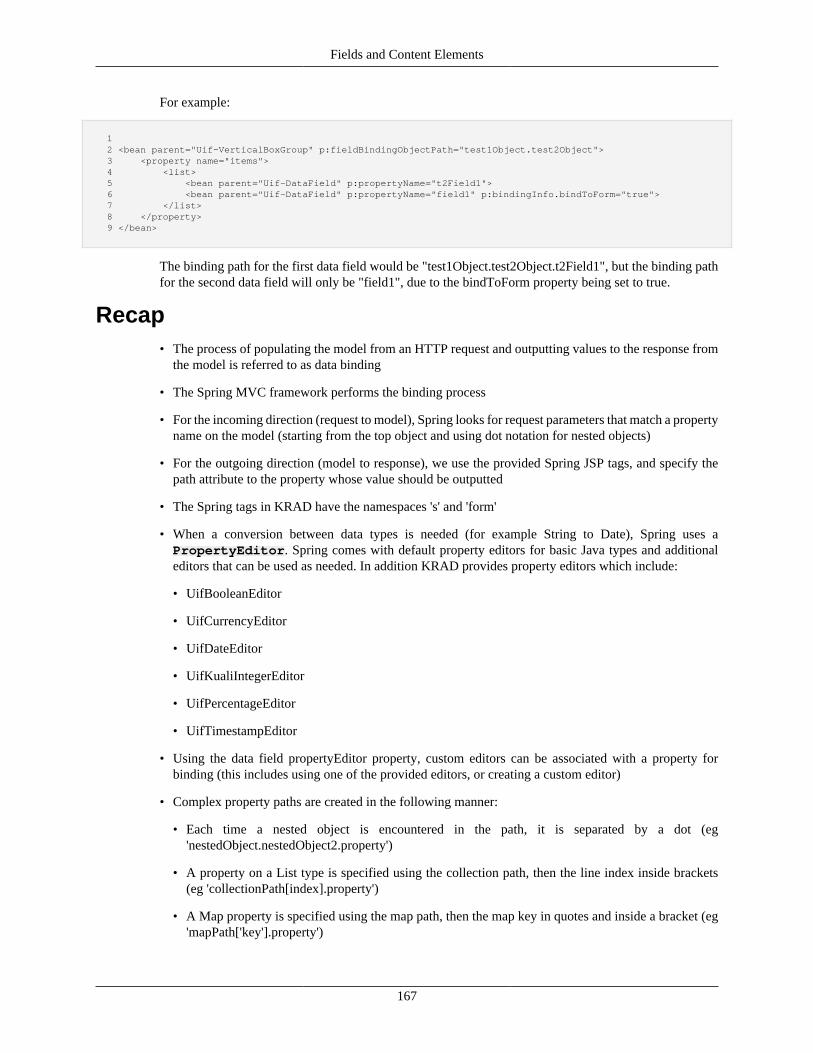
Fields and Content Elements
167
For example:
1 2 <bean parent="Uif-VerticalBoxGroup" p:fieldBindingObjectPath="test1Object.test2Object"> 3 <property name="items"> 4 <list> 5 <bean parent="Uif-DataField" p:propertyName="t2Field1"> 6 <bean parent="Uif-DataField" p:propertyName="field1" p:bindingInfo.bindToForm="true"> 7 </list> 8 </property> 9 </bean>
The binding path for the first data field would be "test1Object.test2Object.t2Field1", but the binding pathfor the second data field will only be "field1", due to the bindToForm property being set to true.
Recap• The process of populating the model from an HTTP request and outputting values to the response from
the model is referred to as data binding
• The Spring MVC framework performs the binding process
• For the incoming direction (request to model), Spring looks for request parameters that match a propertyname on the model (starting from the top object and using dot notation for nested objects)
• For the outgoing direction (model to response), we use the provided Spring JSP tags, and specify thepath attribute to the property whose value should be outputted
• The Spring tags in KRAD have the namespaces 's' and 'form'
• When a conversion between data types is needed (for example String to Date), Spring uses aPropertyEditor. Spring comes with default property editors for basic Java types and additionaleditors that can be used as needed. In addition KRAD provides property editors which include:
• UifBooleanEditor
• UifCurrencyEditor
• UifDateEditor
• UifKualiIntegerEditor
• UifPercentageEditor
• UifTimestampEditor
• Using the data field propertyEditor property, custom editors can be associated with a property forbinding (this includes using one of the provided editors, or creating a custom editor)
• Complex property paths are created in the following manner:
• Each time a nested object is encountered in the path, it is separated by a dot (eg'nestedObject.nestedObject2.property')
• A property on a List type is specified using the collection path, then the line index inside brackets(eg 'collectionPath[index].property')
• A Map property is specified using the map path, then the map key in quotes and inside a bracket (eg'mapPath['key'].property')
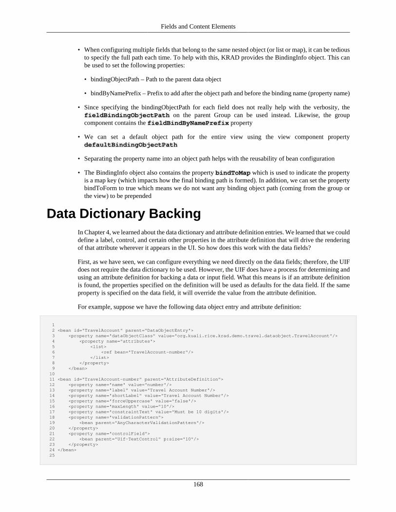
Fields and Content Elements
168
• When configuring multiple fields that belong to the same nested object (or list or map), it can be tediousto specify the full path each time. To help with this, KRAD provides the BindingInfo object. This canbe used to set the following properties:
• bindingObjectPath – Path to the parent data object
• bindByNamePrefix – Prefix to add after the object path and before the binding name (property name)
• Since specifying the bindingObjectPath for each field does not really help with the verbosity, thefieldBindingObjectPath on the parent Group can be used instead. Likewise, the groupcomponent contains the fieldBindByNamePrefix property
• We can set a default object path for the entire view using the view component propertydefaultBindingObjectPath
• Separating the property name into an object path helps with the reusability of bean configuration
• The BindingInfo object also contains the property bindToMap which is used to indicate the propertyis a map key (which impacts how the final binding path is formed). In addition, we can set the propertybindToForm to true which means we do not want any binding object path (coming from the group orthe view) to be prepended
Data Dictionary BackingIn Chapter 4, we learned about the data dictionary and attribute definition entries. We learned that we coulddefine a label, control, and certain other properties in the attribute definition that will drive the renderingof that attribute wherever it appears in the UI. So how does this work with the data fields?
First, as we have seen, we can configure everything we need directly on the data fields; therefore, the UIFdoes not require the data dictionary to be used. However, the UIF does have a process for determining andusing an attribute definition for backing a data or input field. What this means is if an attribute definitionis found, the properties specified on the definition will be used as defaults for the data field. If the sameproperty is specified on the data field, it will override the value from the attribute definition.
For example, suppose we have the following data object entry and attribute definition:
1 2 <bean id="TravelAccount" parent="DataObjectEntry"> 3 <property name="dataObjectClass" value="org.kuali.rice.krad.demo.travel.dataobject.TravelAccount"/> 4 <property name="attributes"> 5 <list> 6 <ref bean="TravelAccount-number"/> 7 </list> 8 </property> 9 </bean> 10 11 <bean id="TravelAccount-number" parent="AttributeDefinition"> 12 <property name="name" value="number"/> 13 <property name="label" value="Travel Account Number"/> 14 <property name="shortLabel" value="Travel Account Number"/> 15 <property name="forceUppercase" value="false"/> 16 <property name="maxLength" value="10"/> 17 <property name="constraintText" value="Must be 10 digits"/> 18 <property name="validationPattern"> 19 <bean parent="AnyCharacterValidationPattern"/> 20 </property> 21 <property name="controlField"> 22 <bean parent="Uif-TextControl" p:size="10"/> 23 </property> 24 </bean> 25
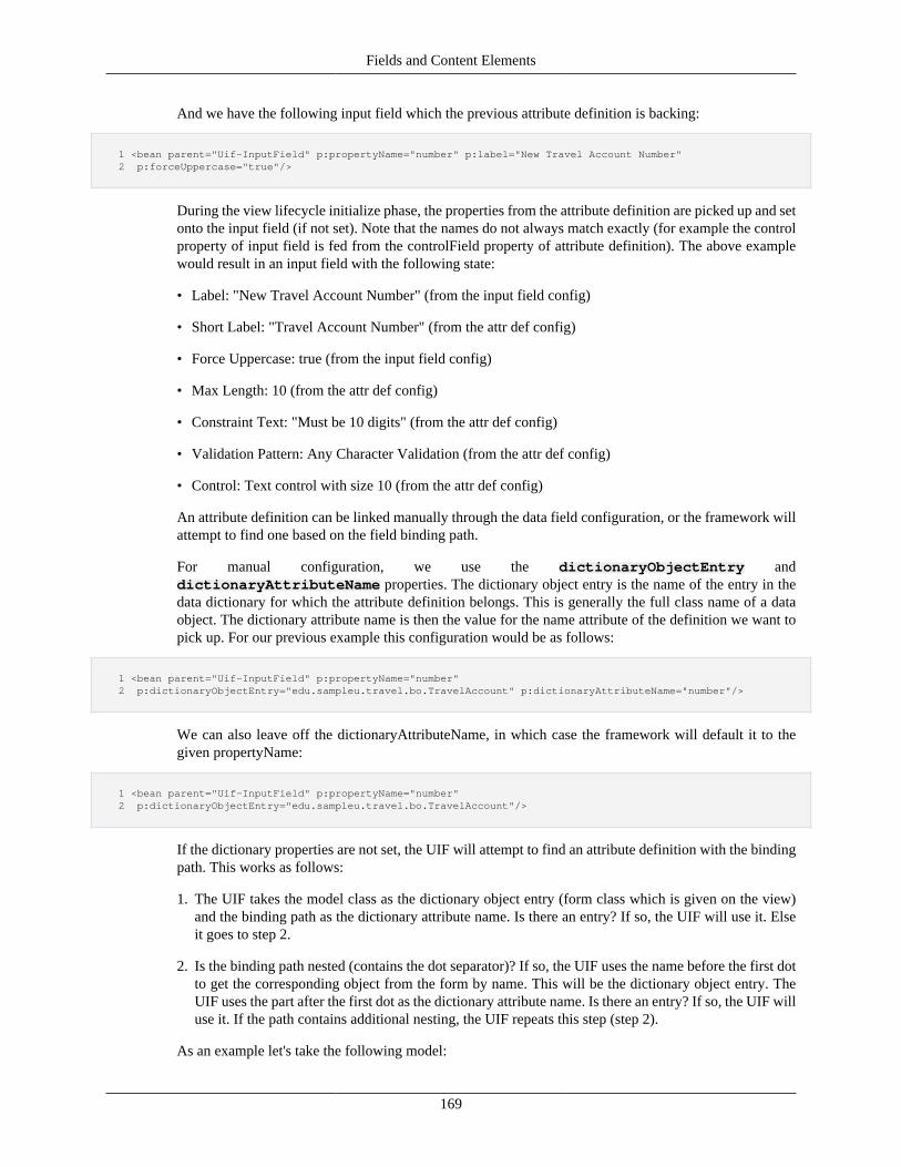
Fields and Content Elements
169
And we have the following input field which the previous attribute definition is backing:
1 <bean parent="Uif-InputField" p:propertyName="number" p:label="New Travel Account Number" 2 p:forceUppercase="true"/>
During the view lifecycle initialize phase, the properties from the attribute definition are picked up and setonto the input field (if not set). Note that the names do not always match exactly (for example the controlproperty of input field is fed from the controlField property of attribute definition). The above examplewould result in an input field with the following state:
• Label: "New Travel Account Number" (from the input field config)
• Short Label: "Travel Account Number" (from the attr def config)
• Force Uppercase: true (from the input field config)
• Max Length: 10 (from the attr def config)
• Constraint Text: "Must be 10 digits" (from the attr def config)
• Validation Pattern: Any Character Validation (from the attr def config)
• Control: Text control with size 10 (from the attr def config)
An attribute definition can be linked manually through the data field configuration, or the framework willattempt to find one based on the field binding path.
For manual configuration, we use the dictionaryObjectEntry anddictionaryAttributeName properties. The dictionary object entry is the name of the entry in thedata dictionary for which the attribute definition belongs. This is generally the full class name of a dataobject. The dictionary attribute name is then the value for the name attribute of the definition we want topick up. For our previous example this configuration would be as follows:
1 <bean parent="Uif-InputField" p:propertyName="number" 2 p:dictionaryObjectEntry="edu.sampleu.travel.bo.TravelAccount" p:dictionaryAttributeName="number"/>
We can also leave off the dictionaryAttributeName, in which case the framework will default it to thegiven propertyName:
1 <bean parent="Uif-InputField" p:propertyName="number" 2 p:dictionaryObjectEntry="edu.sampleu.travel.bo.TravelAccount"/>
If the dictionary properties are not set, the UIF will attempt to find an attribute definition with the bindingpath. This works as follows:
1. The UIF takes the model class as the dictionary object entry (form class which is given on the view)and the binding path as the dictionary attribute name. Is there an entry? If so, the UIF will use it. Elseit goes to step 2.
2. Is the binding path nested (contains the dot separator)? If so, the UIF uses the name before the first dotto get the corresponding object from the form by name. This will be the dictionary object entry. TheUIF uses the part after the first dot as the dictionary attribute name. Is there an entry? If so, the UIF willuse it. If the path contains additional nesting, the UIF repeats this step (step 2).
As an example let's take the following model:
Fields and Content Elements
170
1 2 package edu.myedu.sample; 3 public class TravelForm { 4 private TravelAccount travelAccount; 5 } 6 7 package edu.myedu.sample; 8 public class TravelAccount { 9 private String number; 10 } 11
Now suppose we have the following input field:
1 <bean parent="Uif-InputField" p:propertyName="travelAccount.number"/>
The UIF will first ask the data dictionary if it has an entry for 'edu.myedu.sample.TravelForm' andattribute 'travelAccount.number', if so that attribute definition will be used to populate the inputfield. If not, it will then get the property type for 'travelAccount' from TravelForm. This is of typeedu.myedu.sample.TravelAccount. Therefore, it will ask the data dictionary if it has an entry for'edu'myedu.sample.TravelAccount' and attribute 'number', and if so that attribute definition will be used.The process continues until an attribute definition is found or the binding path is no longer nested.
The one exception to the above rule is for fields in collection groups. Since the assumption is these areproperties on the data object for the collection lines, the framework begins by asking for entries for thatdata object class and the property name of the field.
1 2 <bean parent="Uif-TableCollectionGroup" p:propertyName="testObject1.mycollection" p:collectionObjectClass="edu.myedu.sample.Test3Object"> 3 <property name="items"> 4 <list> 5 <bean parent="Uif-InputField" p:propertyName="field1"/> 6 ... 7 </list> 8 </property> 9 </bean> 10
The binding path for our field here will be 'testObject1.mycollection[index].field1'. In this case, theframework asks the data dictionary for a definition with entry 'edu.myedu.sample.Test3Object' andattribute name 'field1'. If the field propertyName is nested (or has a bindingInfo.bindByNamePrefixspecified), and an entry was not found for the full name, the framework will recurse down the path as itdoes for non-collection fields.
Recap• We can default the properties for a data or input field from a data dictionary AttributeDefinition
• If an AttributeDefinition is used for a data field, the corresponding properties from the definition areused if a value for that property has not been specified for the field (in other words, we can overrideany value on the attribute definition)
• We can explicitly associate an attribute definition with a data field using the propertiesdictionaryObjectName and dictionaryAttributeName
• The dictionary object name gives the name of the data object entry in the data dictionary

Fields and Content Elements
171
• The dictionary attribute name is the name of the property (the attribute definition 'name') associated withthe attribute definition. If not given but the dictionary object name is, the propertyName configured onthe data field will be used
• For fields configured on collection groups, the dictionaryObjectName is automatically set to thecollectionObjectClass configured on the group
• If an attribute definition is not explicitly defined, the framework will attempt to discover an attributedefinition to use. This process involves performing substrings on the binding path (starting from theobject path and substringing on the dot) and making a series of calls to determine if an attribute definitionexists for a given object entry and attribute name. This continues until a definition is found or until allsubstrings of the binding path have been tried
Types of ControlsA very important type of content element is the control. Control components are used with an HTML Formto allow the user to interact with the data. The control holds one or more data values. These values are firstinitialized when the page renders (known as the initial value) and then can be changed by the user or script(known as the current value). When the form is submitted, the controls have their name attribute pairedwith their current value to form a request parameter that is sent to the server.
Controls are wrapped with the input field component. As described in the beginning of this chapter, theinput field holds the pointer to the model property whose value will be used as the initial value of thecontrol. The input field also contains other configurations related to the control and its value, such as helperwidgets and validation constraints.
HTML controls have different types. Some of these types are represented by different tag elements (such astextarea and select), while variations of the input control are indicated with the type attribute (technicallythese might all be considered input controls, but KRAD treats each type as a different control). In thissection, we will learn about the different types of controls and their UIF component representation.
CheckboxThe Checkbox control renders an HTML input tag with type of "checkbox". This control is used to togglethe state of a property between two values (usually the Booleans true and false). The image shows anexample checkbox control.
Figure 7.4. Checkbox Control
To create a new checkbox control, we create a new bean with parent of 'Uif-CheckboxControl'. Controlscannot be set on their own; they must be defined within an input field using the control property:
1 2 <bean parent="Uif-InputField" p:propertyName="acceptIndicator" p:label="Accept?"> 3 <property name="control"> 4 <bean parent="Uif-CheckboxControl"/> 5 </property> 6 </bean> 7
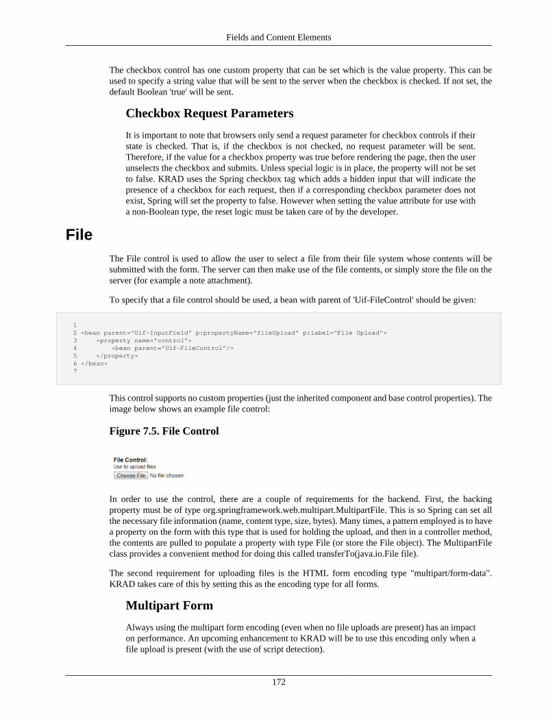
Fields and Content Elements
172
The checkbox control has one custom property that can be set which is the value property. This can beused to specify a string value that will be sent to the server when the checkbox is checked. If not set, thedefault Boolean 'true' will be sent.
Checkbox Request Parameters
It is important to note that browsers only send a request parameter for checkbox controls if theirstate is checked. That is, if the checkbox is not checked, no request parameter will be sent.Therefore, if the value for a checkbox property was true before rendering the page, then the userunselects the checkbox and submits. Unless special logic is in place, the property will not be setto false. KRAD uses the Spring checkbox tag which adds a hidden input that will indicate thepresence of a checkbox for each request, then if a corresponding checkbox parameter does notexist, Spring will set the property to false. However when setting the value attribute for use witha non-Boolean type, the reset logic must be taken care of by the developer.
FileThe File control is used to allow the user to select a file from their file system whose contents will besubmitted with the form. The server can then make use of the file contents, or simply store the file on theserver (for example a note attachment).
To specify that a file control should be used, a bean with parent of 'Uif-FileControl' should be given:
1 2 <bean parent="Uif-InputField" p:propertyName="fileUpload" p:label="File Upload"> 3 <property name="control"> 4 <bean parent="Uif-FileControl"/> 5 </property> 6 </bean> 7
This control supports no custom properties (just the inherited component and base control properties). Theimage below shows an example file control:
Figure 7.5. File Control
In order to use the control, there are a couple of requirements for the backend. First, the backingproperty must be of type org.springframework.web.multipart.MultipartFile. This is so Spring can set allthe necessary file information (name, content type, size, bytes). Many times, a pattern employed is to havea property on the form with this type that is used for holding the upload, and then in a controller method,the contents are pulled to populate a property with type File (or store the File object). The MultipartFileclass provides a convenient method for doing this called transferTo(java.io.File file).
The second requirement for uploading files is the HTML form encoding type "multipart/form-data".KRAD takes care of this by setting this as the encoding type for all forms.
Multipart Form
Always using the multipart form encoding (even when no file uploads are present) has an impacton performance. An upcoming enhancement to KRAD will be to use this encoding only when afile upload is present (with the use of script detection).
Fields and Content Elements
173
HiddenThe Hidden control is used to render an HTML input of type hidden. A hidden control is not visible to theuser, therefore its value can only be changed by a script. These are often used to hold some state that isneeded when the page is posted back, or to provide data for scripting purposes.
To specify a hidden control should be used, a bean with parent of 'Uif-HiddenControl' should be given:
1 2 <bean parent="Uif-InputField" p:propertyName="hiddenField"> 3 <property name="control"> 4 <bean parent="Uif-HiddenControl"/> 5 </property> 6 </bean> 7
Request/Session State
All model data is stored with the user session and when a form is submitted, the request datais overlaid. This means any model properties that were not present in the request will remainuntouched. This alleviates the need to write all state to the request (using hiddens) so that it isnot lost.
Using a hidden control is not the same as making the field state hidden (covered in Chapter 10). Whenthe field state is hidden, all of the field contents will be rendered (including a control that is possibly nothidden) but not visible by default. The field contents can then be shown with a script once a condition ismet. With the hidden control, the other field contents (such as label and lookup) can still be visible. Oneusage of the hidden control is to provide a field quickfinder (lookup icon) that forces the user to select avalue from the lookup instead of allowing them to type the value.
Min/Max Length
The input field control also has properties for setting min and max length. If the correspondingproperties on the control are not set, they will be synced with the field settings. It can be necessaryto have a different setting for the control than the field due to formatting. The min and max lengthsettings for the control are used on the client, which is working with the formatted value. On theserver, validation is performed against the model property value (unformatted) and uses the fieldlength settings.
PasswordThe Password control renders the HTML input element with type of "password". This is a single-line boxthat allows the user to type a masked value.
To specify that a password control should be used, a bean with parent of 'Uif-PasswordControl' shouldbe given:
1 2 <bean parent="Uif-InputField" p:propertyName="password" p:label="Password"> 3 <property name="control"> 4 <bean parent="Uif-PasswordControl"/> 5 </property> 6 </bean> 7
The password control supports the following properties:
Fields and Content Elements
174
size – This is the display size for the control in number of characters.
maxLength – When a value is given, this is the maximum number of characters in length the value canhave. If set, the browser will stop the user from entering more characters than allowed.
minLength – When a value is given, this is the minimum number of characters in length the value canhave. Note that this is not supported by the HTML input tag itself, but is used by the KRAD validatorsto check the value client side or server side.
TextThe Text control renders the HTML input element with type of "text". This is a single-line box that allowsthe user to type the value.
To specify that a text control should be used, a bean with parent of 'Uif-TextControl' should be given:
1 2 <bean parent="Uif-InputField" p:propertyName="title" p:label="Title"> 3 <property name="control"> 4 <bean parent="Uif-TextControl"/> 5 </property> 6 </bean> 7
The text control supports the following properties:
size – This is the display size for the control in number of characters.
maxLength – When a value is given, this is the maximum number of characters in length the value canhave. If set, the browser will stop the user from entering more characters than allowed.
minLength – When a value is given, this is the minimum number of characters in length the value canhave. Note that this is not supported by the HTML input tag itself, but is used by the KRAD validatorsto check the value client side or server side.
datePicker – This is a nested widget component that renders an icon next to the text input that can beused to selected a calendar day. Like all components, the date picker will be rendered if its render propertyis set to true. This widget and others are covered in Chapter 8.
watermarkText – Specifies text that will appear in the text control when the value is empty. This isused to show example inputs to the user and is sometimes referred to as a placeholder (HTML 5). Oncethe user begins to input a value the watermark text is cleared.
textExpand – A Boolean type which indicates whether the text input can be expanded. When enabled,an icon is rendered next to the text input that allows the user to click for getting a text area input thatallows more room for entering the value. This is useful if the maximum length for the field is longer thanthe display size.
The UIF provides a handful of base beans for the text control that have various commonly usedconfiguration. These are as follows:
Uif-TextControl – The default text control bean which sets the size to 30. None of the other textcontrol properties are set by default.
Uif-SmallTextControl – Similar to Uif-TextControl but sets the size to 10 and applies an additionalstyle class of 'uif-smallTextControl'.
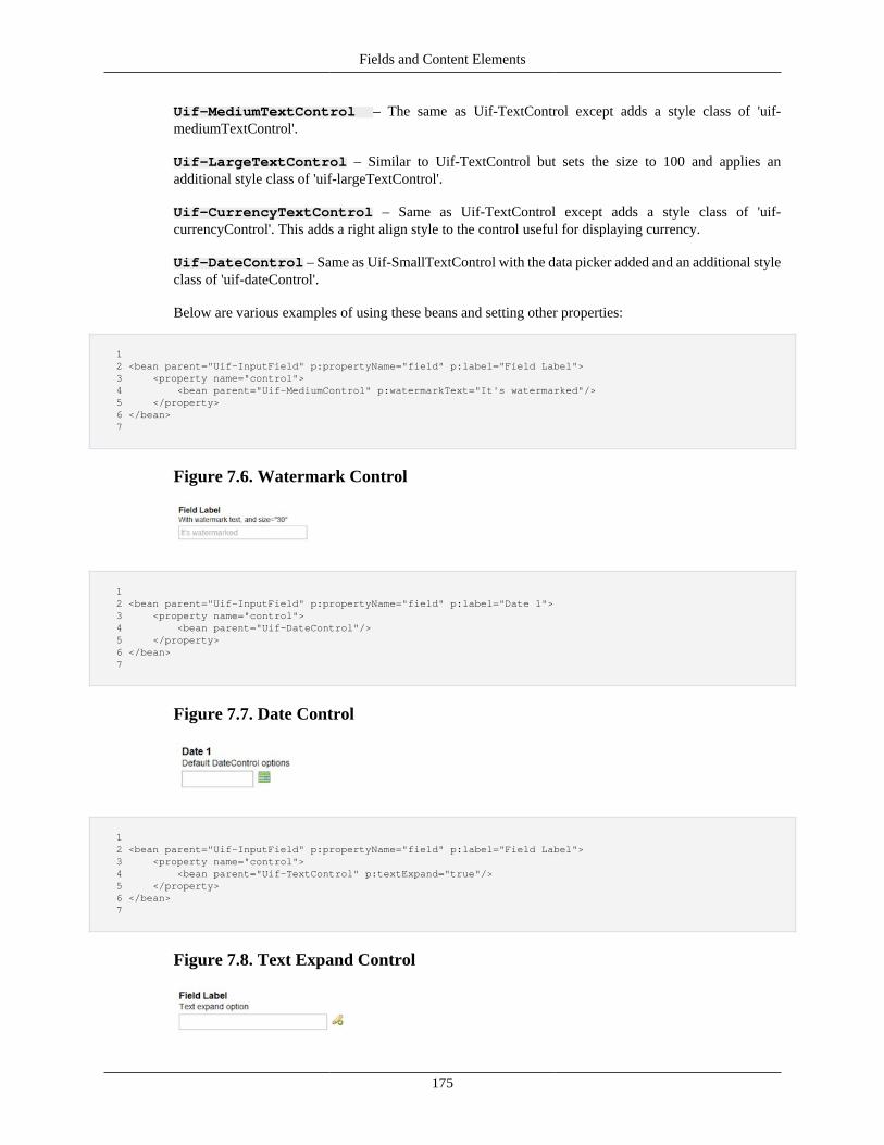
Fields and Content Elements
175
Uif-MediumTextControl – The same as Uif-TextControl except adds a style class of 'uif-mediumTextControl'.
Uif-LargeTextControl – Similar to Uif-TextControl but sets the size to 100 and applies anadditional style class of 'uif-largeTextControl'.
Uif-CurrencyTextControl – Same as Uif-TextControl except adds a style class of 'uif-currencyControl'. This adds a right align style to the control useful for displaying currency.
Uif-DateControl – Same as Uif-SmallTextControl with the data picker added and an additional styleclass of 'uif-dateControl'.
Below are various examples of using these beans and setting other properties:
1 2 <bean parent="Uif-InputField" p:propertyName="field" p:label="Field Label"> 3 <property name="control"> 4 <bean parent="Uif-MediumControl" p:watermarkText="It's watermarked"/> 5 </property> 6 </bean> 7
Figure 7.6. Watermark Control
1 2 <bean parent="Uif-InputField" p:propertyName="field" p:label="Date 1"> 3 <property name="control"> 4 <bean parent="Uif-DateControl"/> 5 </property> 6 </bean> 7
Figure 7.7. Date Control
1 2 <bean parent="Uif-InputField" p:propertyName="field" p:label="Field Label"> 3 <property name="control"> 4 <bean parent="Uif-TextControl" p:textExpand="true"/> 5 </property> 6 </bean> 7
Figure 7.8. Text Expand Control
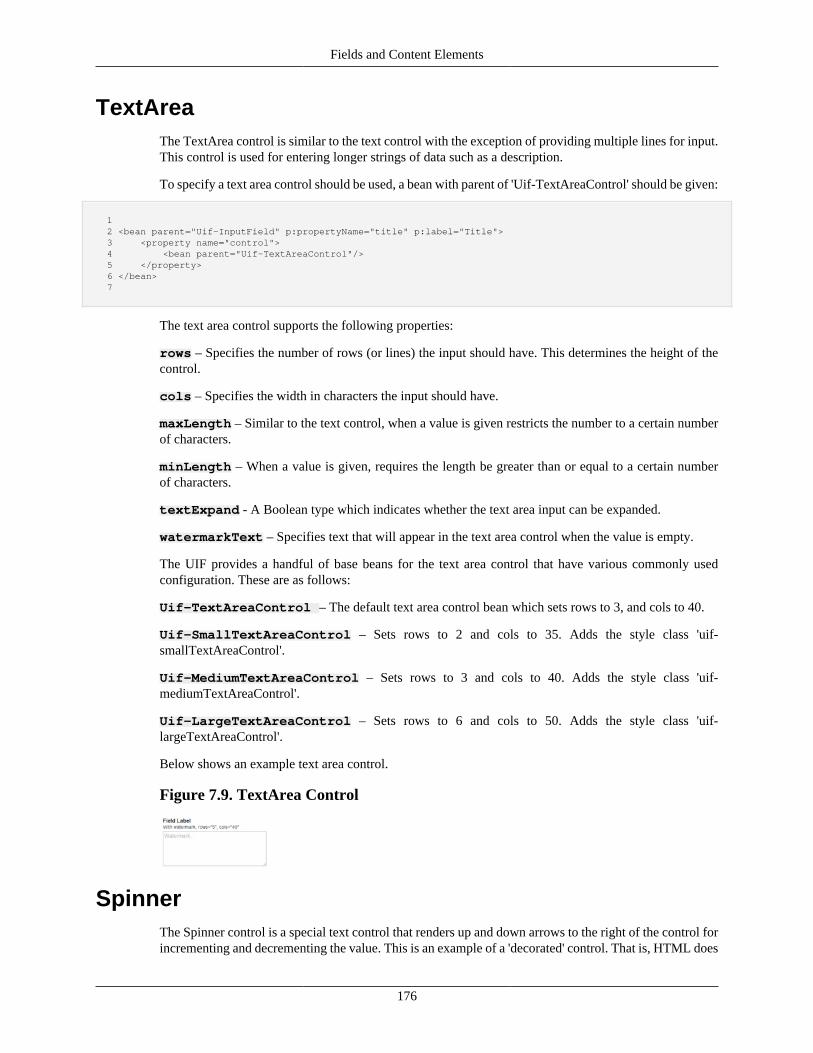
Fields and Content Elements
176
TextAreaThe TextArea control is similar to the text control with the exception of providing multiple lines for input.This control is used for entering longer strings of data such as a description.
To specify a text area control should be used, a bean with parent of 'Uif-TextAreaControl' should be given:
1 2 <bean parent="Uif-InputField" p:propertyName="title" p:label="Title"> 3 <property name="control"> 4 <bean parent="Uif-TextAreaControl"/> 5 </property> 6 </bean> 7
The text area control supports the following properties:
rows – Specifies the number of rows (or lines) the input should have. This determines the height of thecontrol.
cols – Specifies the width in characters the input should have.
maxLength – Similar to the text control, when a value is given restricts the number to a certain numberof characters.
minLength – When a value is given, requires the length be greater than or equal to a certain numberof characters.
textExpand - A Boolean type which indicates whether the text area input can be expanded.
watermarkText – Specifies text that will appear in the text area control when the value is empty.
The UIF provides a handful of base beans for the text area control that have various commonly usedconfiguration. These are as follows:
Uif-TextAreaControl – The default text area control bean which sets rows to 3, and cols to 40.
Uif-SmallTextAreaControl – Sets rows to 2 and cols to 35. Adds the style class 'uif-smallTextAreaControl'.
Uif-MediumTextAreaControl – Sets rows to 3 and cols to 40. Adds the style class 'uif-mediumTextAreaControl'.
Uif-LargeTextAreaControl – Sets rows to 6 and cols to 50. Adds the style class 'uif-largeTextAreaControl'.
Below shows an example text area control.
Figure 7.9. TextArea Control
SpinnerThe Spinner control is a special text control that renders up and down arrows to the right of the control forincrementing and decrementing the value. This is an example of a 'decorated' control. That is, HTML does
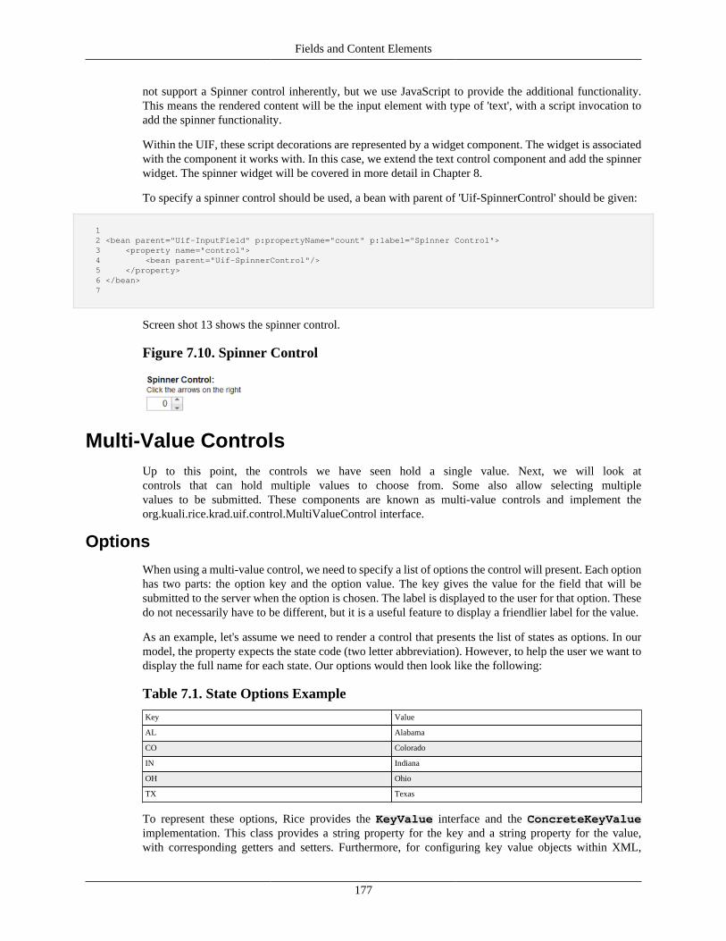
Fields and Content Elements
177
not support a Spinner control inherently, but we use JavaScript to provide the additional functionality.This means the rendered content will be the input element with type of 'text', with a script invocation toadd the spinner functionality.
Within the UIF, these script decorations are represented by a widget component. The widget is associatedwith the component it works with. In this case, we extend the text control component and add the spinnerwidget. The spinner widget will be covered in more detail in Chapter 8.
To specify a spinner control should be used, a bean with parent of 'Uif-SpinnerControl' should be given:
1 2 <bean parent="Uif-InputField" p:propertyName="count" p:label="Spinner Control"> 3 <property name="control"> 4 <bean parent="Uif-SpinnerControl"/> 5 </property> 6 </bean> 7
Screen shot 13 shows the spinner control.
Figure 7.10. Spinner Control
Multi-Value ControlsUp to this point, the controls we have seen hold a single value. Next, we will look atcontrols that can hold multiple values to choose from. Some also allow selecting multiplevalues to be submitted. These components are known as multi-value controls and implement theorg.kuali.rice.krad.uif.control.MultiValueControl interface.
Options
When using a multi-value control, we need to specify a list of options the control will present. Each optionhas two parts: the option key and the option value. The key gives the value for the field that will besubmitted to the server when the option is chosen. The label is displayed to the user for that option. Thesedo not necessarily have to be different, but it is a useful feature to display a friendlier label for the value.
As an example, let's assume we need to render a control that presents the list of states as options. In ourmodel, the property expects the state code (two letter abbreviation). However, to help the user we want todisplay the full name for each state. Our options would then look like the following:
Table 7.1. State Options Example
Key Value
AL Alabama
CO Colorado
IN Indiana
OH Ohio
TX Texas
To represent these options, Rice provides the KeyValue interface and the ConcreteKeyValueimplementation. This class provides a string property for the key and a string property for the value,with corresponding getters and setters. Furthermore, for configuring key value objects within XML,
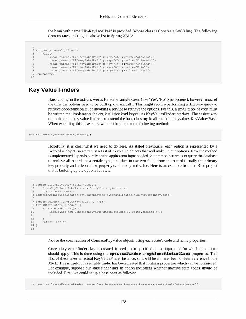
Fields and Content Elements
178
the bean with name 'Uif-KeyLabelPair' is provided (whose class is ConcreateKeyValue). The followingdemonstrates creating the above list in Spring XML:
1 2 <property name="options"> 3 <list> 4 <bean parent="Uif-KeyLabelPair" p:key="AL" p:value="Alabama"/> 5 <bean parent="Uif-KeyLabelPair" p:key="CO" p:value="Colorado"/> 6 <bean parent="Uif-KeyLabelPair" p:key="IN" p:value="Indiana"/> 7 <bean parent="Uif-KeyLabelPair" p:key="OH" p:value="Ohio"/> 8 <bean parent="Uif-KeyLabelPair" p:key="TX" p:value="Texas"/> 9 </property> 10
Key Value Finders
Hard-coding in the options works for some simple cases (like 'Yes', 'No' type options), however most ofthe time the options need to be built up dynamically. This might require performing a database query toretrieve code/name pairs, or invoking a service to retrieve the options. For this, a small piece of code mustbe written that implements the org.kuali.rice.krad.keyvalues.KeyValuesFinder interface. The easiest wayto implement a key value finder is to extend the base class org.kuali.rice.krad.keyvalues.KeyValuesBase.When extending this base class, we must implement the following method:
public List<KeyValue> getKeyValues();
Hopefully, it is clear what we need to do here. As stated previously, each option is represented by aKeyValue object, so we return a List of KeyValue objects that will make up our options. How the methodis implemented depends purely on the application logic needed. A common pattern is to query the databaseto retrieve all records of a certain type, and then to use two fields from the record (usually the primarykey property and a description property) as the key and value. Here is an example from the Rice projectthat is building up the options for state:
1 2 public List<KeyValue> getKeyValues() { 3 List<KeyValue> labels = new ArrayList<KeyValue>(); 4 List<State> codes = 5 LocationApiServiceLocator.getStateService().findAllStatesInCountry(countryCode); 6 7 labels.add(new ConcreteKeyValue("", "")); 8 for (State state : codes) { 9 if(state.isActive()) { 10 labels.add(new ConcreteKeyValue(state.getCode(), state.getName())); 11 } 12 } 13 return labels; 14 } 15
Notice the construction of ConcreteKeyValue objects using each state's code and name properties.
Once a key value finder class is created, it needs to be specified on the input field for which the optionsshould apply. This is done using the optionsFinder or optionsFinderClass properties. Thisfirst of these takes an actual KeyValueFinder instance, so it will be an inner bean or bean reference in theXML. This is useful if a reusable finder has been created that contains properties which can be configured.For example, suppose our state finder had an option indicating whether inactive state codes should beincluded. First, we could setup a base bean as follows:
1 <bean id="StateOptionsFinder" class="org.kuali.rice.location.framework.state.StateValuesFinder"/>
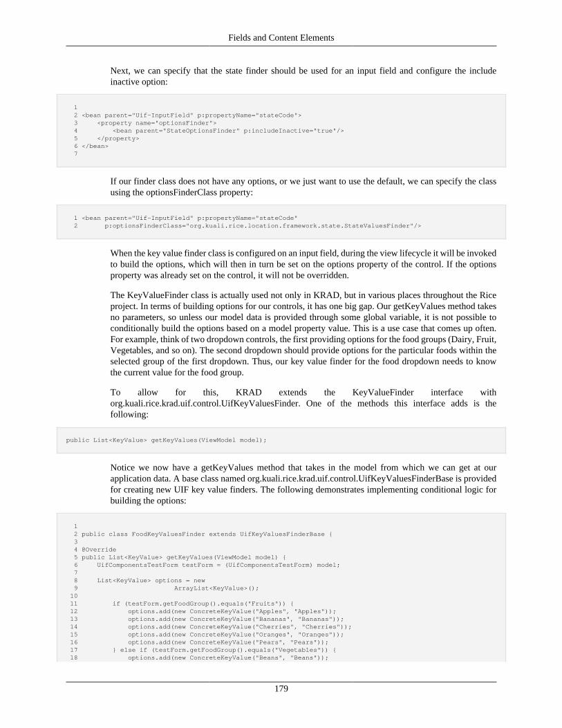
Fields and Content Elements
179
Next, we can specify that the state finder should be used for an input field and configure the includeinactive option:
1 2 <bean parent="Uif-InputField" p:propertyName="stateCode"> 3 <property name="optionsFinder"> 4 <bean parent="StateOptionsFinder" p:includeInactive="true"/> 5 </property> 6 </bean> 7
If our finder class does not have any options, or we just want to use the default, we can specify the classusing the optionsFinderClass property:
1 <bean parent="Uif-InputField" p:propertyName="stateCode" 2 p:optionsFinderClass="org.kuali.rice.location.framework.state.StateValuesFinder"/>
When the key value finder class is configured on an input field, during the view lifecycle it will be invokedto build the options, which will then in turn be set on the options property of the control. If the optionsproperty was already set on the control, it will not be overridden.
The KeyValueFinder class is actually used not only in KRAD, but in various places throughout the Riceproject. In terms of building options for our controls, it has one big gap. Our getKeyValues method takesno parameters, so unless our model data is provided through some global variable, it is not possible toconditionally build the options based on a model property value. This is a use case that comes up often.For example, think of two dropdown controls, the first providing options for the food groups (Dairy, Fruit,Vegetables, and so on). The second dropdown should provide options for the particular foods within theselected group of the first dropdown. Thus, our key value finder for the food dropdown needs to knowthe current value for the food group.
To allow for this, KRAD extends the KeyValueFinder interface withorg.kuali.rice.krad.uif.control.UifKeyValuesFinder. One of the methods this interface adds is thefollowing:
public List<KeyValue> getKeyValues(ViewModel model);
Notice we now have a getKeyValues method that takes in the model from which we can get at ourapplication data. A base class named org.kuali.rice.krad.uif.control.UifKeyValuesFinderBase is providedfor creating new UIF key value finders. The following demonstrates implementing conditional logic forbuilding the options:
1 2 public class FoodKeyValuesFinder extends UifKeyValuesFinderBase { 3 4 @Override 5 public List<KeyValue> getKeyValues(ViewModel model) { 6 UifComponentsTestForm testForm = (UifComponentsTestForm) model; 7 8 List<KeyValue> options = new 9 ArrayList<KeyValue>(); 10 11 if (testForm.getFoodGroup().equals("Fruits")) { 12 options.add(new ConcreteKeyValue("Apples", "Apples")); 13 options.add(new ConcreteKeyValue("Bananas", "Bananas")); 14 options.add(new ConcreteKeyValue("Cherries", "Cherries")); 15 options.add(new ConcreteKeyValue("Oranges", "Oranges")); 16 options.add(new ConcreteKeyValue("Pears", "Pears")); 17 } else if (testForm.getFoodGroup().equals("Vegetables")) { 18 options.add(new ConcreteKeyValue("Beans", "Beans"));
Fields and Content Elements
180
19 options.add(new ConcreteKeyValue("Broccoli", "Broccoli")); 20 options.add(new ConcreteKeyValue("Cabbage", "Cabbage")); 21 options.add(new ConcreteKeyValue("Carrots", "Carrots")); 22 options.add(new ConcreteKeyValue("Celery", "Celery")); 23 options.add(new ConcreteKeyValue("Corn", "Corn")); 24 options.add(new ConcreteKeyValue("Peas", "Peas")); 25 } 26 27 return options; 28 } 29 } 30
In this example, foodGroup, which is on our test form, holds the value for the selected food group. Thiskey value finder is then associated with the field that will display the available foods for that group:
1 2 <bean parent="Uif-InputField" p:propertyName="food" p:label="Foods" 3 p:optionsFinderClass="edu.sampleu.travel.options.FoodKeyValuesFinder" p:refreshWhenChanged="field88"> 4 <property name="control"> 5 <bean parent="Uif-DropdownControl"/> 6 </property> 7 </bean> 8
Notice the refreshWhenChanged property setting pointing to foodGroup. This is configuring refreshbehavior, which we will learn about in Chapter 11. When the value of the foodGroup control changes, itwill refresh our food control, which will then rebuild the options based on the new food group!
Besides making the model data available, the UIF key value finder also provides another convenience. Insome cases (depending on whether our field is required) we want to display a blank option for our control,while others we do not (forcing a value to be selected). You might have noticed in our state finder thefollowing line:
labels.add(new ConcreteKeyValue("", ""));
This is adding a blank option at the beginning of the options list. Previous to KRAD, if you then wantedthe same options on another screen but did not want to provide the blank option, a new key value finderclass would need to be created. The UifKeyValuesFinder makes this a simple configuration option withthe following method:
public boolean isAddBlankOption();
When this is set to true, the framework will add a blank option to the returned list of options from the keyvalue finder. Using the mechanism described above for setting key value finder properties, we can reusethe same class in multiple places and configure whether a blank option should be added.
CheckboxGroup
The CheckboxGroup control is a multi-value control that presents each option as a checkbox. When acheckbox is selected the corresponding option key will be selected as a value. The checkbox group allowsthe selection of multiple options, therefore multiple checkboxes for the group may be selected. The optionlabel for each checkbox is rendered to the right of the control.
The checkbox group control supports one custom property named delimiter. This is a string that will berendered between each checkbox (including the label). Two common options for this are the ' ' and'</br>' strings. Note this is the HTML entity and tag and thus the first adds a space between each checkbox,
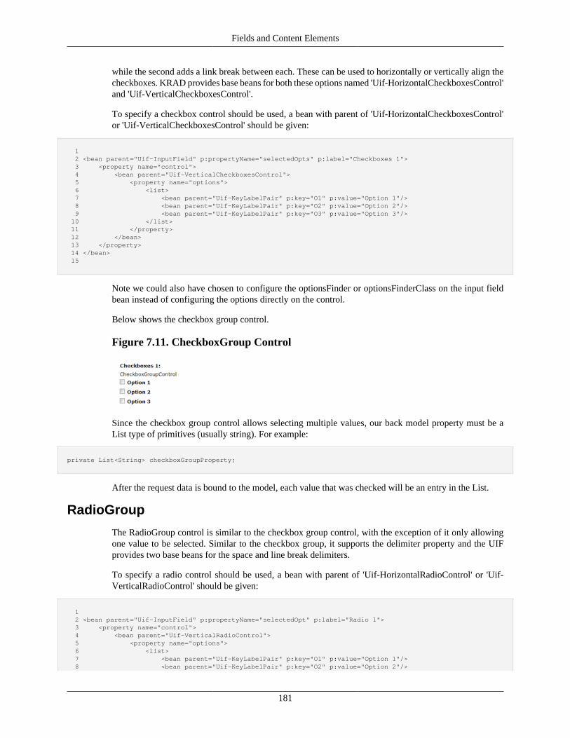
Fields and Content Elements
181
while the second adds a link break between each. These can be used to horizontally or vertically align thecheckboxes. KRAD provides base beans for both these options named 'Uif-HorizontalCheckboxesControl'and 'Uif-VerticalCheckboxesControl'.
To specify a checkbox control should be used, a bean with parent of 'Uif-HorizontalCheckboxesControl'or 'Uif-VerticalCheckboxesControl' should be given:
1 2 <bean parent="Uif-InputField" p:propertyName="selectedOpts" p:label="Checkboxes 1"> 3 <property name="control"> 4 <bean parent="Uif-VerticalCheckboxesControl"> 5 <property name="options"> 6 <list> 7 <bean parent="Uif-KeyLabelPair" p:key="O1" p:value="Option 1"/> 8 <bean parent="Uif-KeyLabelPair" p:key="O2" p:value="Option 2"/> 9 <bean parent="Uif-KeyLabelPair" p:key="O3" p:value="Option 3"/> 10 </list> 11 </property> 12 </bean> 13 </property> 14 </bean> 15
Note we could also have chosen to configure the optionsFinder or optionsFinderClass on the input fieldbean instead of configuring the options directly on the control.
Below shows the checkbox group control.
Figure 7.11. CheckboxGroup Control
Since the checkbox group control allows selecting multiple values, our back model property must be aList type of primitives (usually string). For example:
private List<String> checkboxGroupProperty;
After the request data is bound to the model, each value that was checked will be an entry in the List.
RadioGroup
The RadioGroup control is similar to the checkbox group control, with the exception of it only allowingone value to be selected. Similar to the checkbox group, it supports the delimiter property and the UIFprovides two base beans for the space and line break delimiters.
To specify a radio control should be used, a bean with parent of 'Uif-HorizontalRadioControl' or 'Uif-VerticalRadioControl' should be given:
1 2 <bean parent="Uif-InputField" p:propertyName="selectedOpt" p:label="Radio 1"> 3 <property name="control"> 4 <bean parent="Uif-VerticalRadioControl"> 5 <property name="options"> 6 <list> 7 <bean parent="Uif-KeyLabelPair" p:key="O1" p:value="Option 1"/> 8 <bean parent="Uif-KeyLabelPair" p:key="O2" p:value="Option 2"/>
Fields and Content Elements
182
9 <bean parent="Uif-KeyLabelPair" p:key="O3" p:value="Option 3"/> 10 </list> 11 </property> 12 </bean> 13 </property> 14 </bean> 15
Since the radio control only allows selection of one option, the back model property should be a non-List type.
Select
The Select control is another variation of a multi-value control. The select control appears similar to thetext control, but with an arrow to display a dropdown list of options. The select control can be configuredto only allow one selection, or multiple.
To specify a select control should be used that allows only one value to be selected, a bean with parentof 'Uif-DropdownControl' should be used:
1 2 <bean parent="Uif-InputField" p:propertyName="selectedOpt" p:label="Select Control"> 3 <property name="control"> 4 <bean parent="Uif-DropdownControl"> 5 <property name="options"> 6 <list> 7 <bean parent="Uif-KeyLabelPair" p:key="O1" p:value="Option 1"/> 8 ... 9 </list> 10 </property> 11 </bean> 12 </property> 13 </bean> 14
The back model property in this case should be a simple primitive (string, integer, …).
Below shows the select control allowing only one selection.
Figure 7.12. Select Control
To specify a select control should be used that allows one or more values to be selected, a bean with parentof 'Uif-MultiSelectControl' should be used:
1 2 <bean parent="Uif-InputField" p:propertyName="selectedOpts" p:label="Multi Select Control"> 3 <property name="control"> 4 <bean parent="Uif-MultiSelectControl"> 5 <property name="options"> 6 <list> 7 <bean parent="Uif-KeyLabelPair" p:key="O1" p:value="Option 1"/> 8 ... 9 </list> 10 </property> 11 </bean> 12 </property> 13 </bean> 14
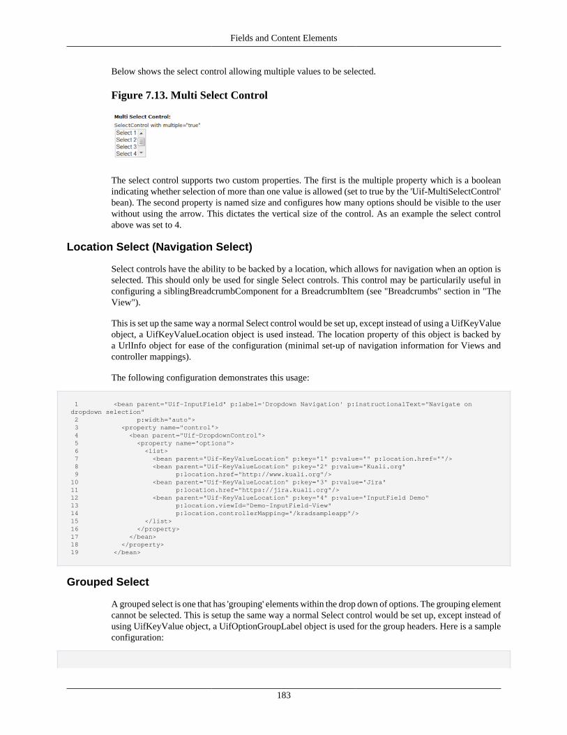
Fields and Content Elements
183
Below shows the select control allowing multiple values to be selected.
Figure 7.13. Multi Select Control
The select control supports two custom properties. The first is the multiple property which is a booleanindicating whether selection of more than one value is allowed (set to true by the 'Uif-MultiSelectControl'bean). The second property is named size and configures how many options should be visible to the userwithout using the arrow. This dictates the vertical size of the control. As an example the select controlabove was set to 4.
Location Select (Navigation Select)
Select controls have the ability to be backed by a location, which allows for navigation when an option isselected. This should only be used for single Select controls. This control may be particularily useful inconfiguring a siblingBreadcrumbComponent for a BreadcrumbItem (see "Breadcrumbs" section in "TheView").
This is set up the same way a normal Select control would be set up, except instead of using a UifKeyValueobject, a UifKeyValueLocation object is used instead. The location property of this object is backed bya UrlInfo object for ease of the configuration (minimal set-up of navigation information for Views andcontroller mappings).
The following configuration demonstrates this usage:
1 <bean parent="Uif-InputField" p:label='Dropdown Navigation' p:instructionalText="Navigate on dropdown selection" 2 p:width="auto"> 3 <property name="control"> 4 <bean parent="Uif-DropdownControl"> 5 <property name="options"> 6 <list> 7 <bean parent="Uif-KeyValueLocation" p:key="1" p:value="" p:location.href=""/> 8 <bean parent="Uif-KeyValueLocation" p:key="2" p:value="Kuali.org" 9 p:location.href="http://www.kuali.org"/> 10 <bean parent="Uif-KeyValueLocation" p:key="3" p:value="Jira" 11 p:location.href="https://jira.kuali.org"/> 12 <bean parent="Uif-KeyValueLocation" p:key="4" p:value="InputField Demo" 13 p:location.viewId="Demo-InputField-View" 14 p:location.controllerMapping="/kradsampleapp"/> 15 </list> 16 </property> 17 </bean> 18 </property> 19 </bean>
Grouped Select
A grouped select is one that has 'grouping' elements within the drop down of options. The grouping elementcannot be selected. This is setup the same way a normal Select control would be set up, except instead ofusing UifKeyValue object, a UifOptionGroupLabel object is used for the group headers. Here is a sampleconfiguration:
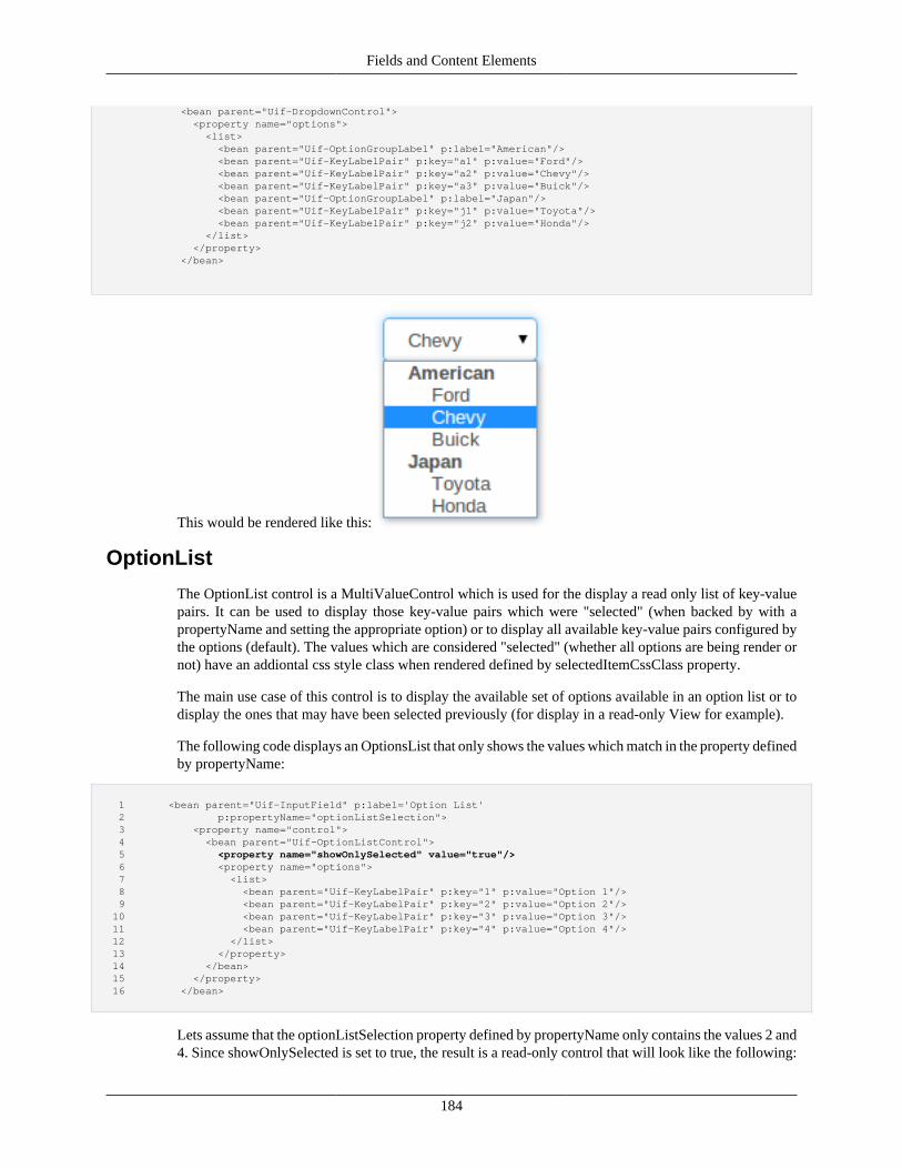
Fields and Content Elements
184
<bean parent="Uif-DropdownControl"> <property name="options"> <list> <bean parent="Uif-OptionGroupLabel" p:label="American"/> <bean parent="Uif-KeyLabelPair" p:key="a1" p:value="Ford"/> <bean parent="Uif-KeyLabelPair" p:key="a2" p:value="Chevy"/> <bean parent="Uif-KeyLabelPair" p:key="a3" p:value="Buick"/> <bean parent="Uif-OptionGroupLabel" p:label="Japan"/> <bean parent="Uif-KeyLabelPair" p:key="j1" p:value="Toyota"/> <bean parent="Uif-KeyLabelPair" p:key="j2" p:value="Honda"/> </list> </property> </bean>
This would be rendered like this:
OptionList
The OptionList control is a MultiValueControl which is used for the display a read only list of key-valuepairs. It can be used to display those key-value pairs which were "selected" (when backed by with apropertyName and setting the appropriate option) or to display all available key-value pairs configured bythe options (default). The values which are considered "selected" (whether all options are being render ornot) have an addiontal css style class when rendered defined by selectedItemCssClass property.
The main use case of this control is to display the available set of options available in an option list or todisplay the ones that may have been selected previously (for display in a read-only View for example).
The following code displays an OptionsList that only shows the values which match in the property definedby propertyName:
1 <bean parent="Uif-InputField" p:label='Option List' 2 p:propertyName="optionListSelection"> 3 <property name="control"> 4 <bean parent="Uif-OptionListControl"> 5 <property name="showOnlySelected" value="true"/> 6 <property name="options"> 7 <list> 8 <bean parent="Uif-KeyLabelPair" p:key="1" p:value="Option 1"/> 9 <bean parent="Uif-KeyLabelPair" p:key="2" p:value="Option 2"/> 10 <bean parent="Uif-KeyLabelPair" p:key="3" p:value="Option 3"/> 11 <bean parent="Uif-KeyLabelPair" p:key="4" p:value="Option 4"/> 12 </list> 13 </property> 14 </bean> 15 </property> 16 </bean>
Lets assume that the optionListSelection property defined by propertyName only contains the values 2 and4. Since showOnlySelected is set to true, the result is a read-only control that will look like the following:
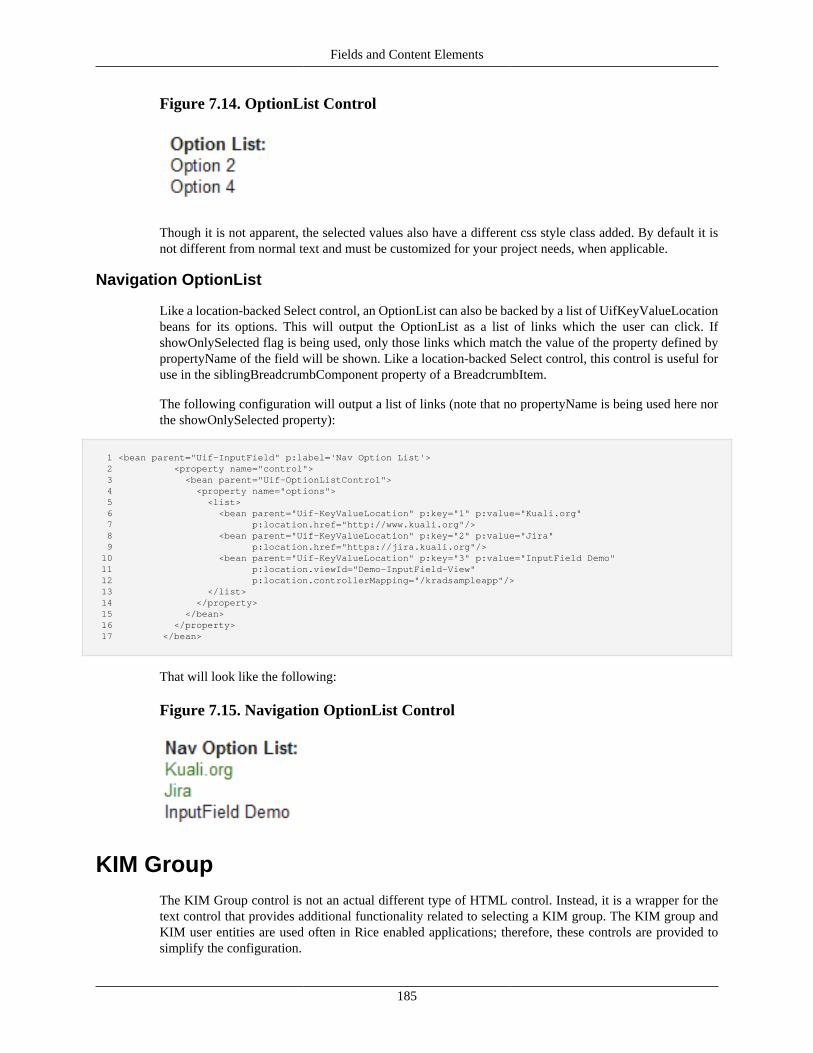
Fields and Content Elements
185
Figure 7.14. OptionList Control
Though it is not apparent, the selected values also have a different css style class added. By default it isnot different from normal text and must be customized for your project needs, when applicable.
Navigation OptionList
Like a location-backed Select control, an OptionList can also be backed by a list of UifKeyValueLocationbeans for its options. This will output the OptionList as a list of links which the user can click. IfshowOnlySelected flag is being used, only those links which match the value of the property defined bypropertyName of the field will be shown. Like a location-backed Select control, this control is useful foruse in the siblingBreadcrumbComponent property of a BreadcrumbItem.
The following configuration will output a list of links (note that no propertyName is being used here northe showOnlySelected property):
1 <bean parent="Uif-InputField" p:label='Nav Option List'> 2 <property name="control"> 3 <bean parent="Uif-OptionListControl"> 4 <property name="options"> 5 <list> 6 <bean parent="Uif-KeyValueLocation" p:key="1" p:value="Kuali.org" 7 p:location.href="http://www.kuali.org"/> 8 <bean parent="Uif-KeyValueLocation" p:key="2" p:value="Jira" 9 p:location.href="https://jira.kuali.org"/> 10 <bean parent="Uif-KeyValueLocation" p:key="3" p:value="InputField Demo" 11 p:location.viewId="Demo-InputField-View" 12 p:location.controllerMapping="/kradsampleapp"/> 13 </list> 14 </property> 15 </bean> 16 </property> 17 </bean>
That will look like the following:
Figure 7.15. Navigation OptionList Control
KIM GroupThe KIM Group control is not an actual different type of HTML control. Instead, it is a wrapper for thetext control that provides additional functionality related to selecting a KIM group. The KIM group andKIM user entities are used often in Rice enabled applications; therefore, these controls are provided tosimplify the configuration.
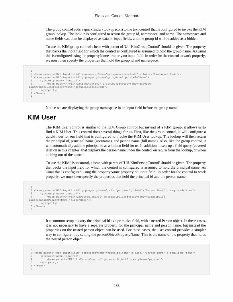
Fields and Content Elements
186
The group control adds a quickfinder (lookup icon) to the text control that is configured to invoke the KIMgroup lookup. The lookup is configured to return the group id, namespace, and name. The namespace andname fields can then be displayed as data or input fields, and the group id will be added as a hidden.
To use the KIM group control a bean with parent of 'Uif-KimGroupControl' should be given. The propertythat backs the input field for which the control is configured is assumed to hold the group name. As usualthis is configured using the propertyName property on input field. In order for the control to work properly,we must then specify the properties that hold the group id and namespace:
1 2 <bean parent="Uif-InputField" p:propertyName="groupNamespaceCode" p:label="Namespace Code"/> 3 <bean parent="Uif-InputField" p:propertyName="groupName" p:label="Name"> 4 <property name="control"> 5 <bean parent="Uif-KimGroupControl" p:groupIdPropertyName="groupId" p:namespaceCodePropertyName="groupNamespaceCode"/> 6 </property> 7 </bean> 8
Notice we are displaying the group namespace in an input field before the group name.
KIM UserThe KIM User control is similar to the KIM Group control but instead of a KIM group, it allows us tofind a KIM User. This control does several things for us. First, like the group control, it will configure aquickfinder for our field that is configured to invoke the KIM User lookup. The lookup will then returnthe principal id, principal name (username), and person name (full name). Also, like the group control, itwill automatically add the principal id as a hidden field for us. In addition, it sets up a field query (coveredlater on in this chapter) that displays the person name under the control on return from the lookup, or whentabbing out of the control.
To use the KIM User control, a bean with parent of 'Uif-KimPersonControl' should be given. The propertythat backs the input field for which the control is configured is assumed to hold the principal name. Asusual this is configured using the propertyName property on input field. In order for the control to workproperly, we must then specify the properties that hold the principal id and the person name:
1 2 <bean parent="Uif-InputField" p:propertyName="principalName" p:label="Person Name" p:required="true"> 3 <property name="control"> 4 <bean parent="Uif-KimPersonControl" p:principalIdPropertyName="principalId" p:personNamePropertyName="personName"/> 5 </property> 6 </bean> 7
It a common setup to carry the principal id as a primitive field, with a nested Person object. In these cases,it is not necessary to have a separate property for the principal name and person name, but instead theproperties on the nested person object can be used. For these cases, the user control provides a simplerway to configure it by setting the personObjectPropertyName. This is the name of the property that holdsthe nested person object.
1 2 <bean parent="Uif-InputField" p:propertyName="principalName" p:label="Person Name" p:required="true"> 3 <property name="control"> 4 <bean parent="Uif-KimPersonControl" p:personObjectPropertyName="person"/> 5 </property> 6 </bean> 7
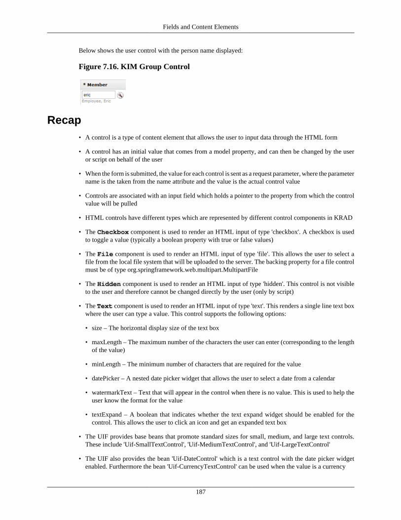
Fields and Content Elements
187
Below shows the user control with the person name displayed:
Figure 7.16. KIM Group Control
Recap• A control is a type of content element that allows the user to input data through the HTML form
• A control has an initial value that comes from a model property, and can then be changed by the useror script on behalf of the user
• When the form is submitted, the value for each control is sent as a request parameter, where the parametername is the taken from the name attribute and the value is the actual control value
• Controls are associated with an input field which holds a pointer to the property from which the controlvalue will be pulled
• HTML controls have different types which are represented by different control components in KRAD
• The Checkbox component is used to render an HTML input of type 'checkbox'. A checkbox is usedto toggle a value (typically a boolean property with true or false values)
• The File component is used to render an HTML input of type 'file'. This allows the user to select afile from the local file system that will be uploaded to the server. The backing property for a file controlmust be of type org.springframework.web.multipart.MultipartFile
• The Hidden component is used to render an HTML input of type 'hidden'. This control is not visibleto the user and therefore cannot be changed directly by the user (only by script)
• The Text component is used to render an HTML input of type 'text'. This renders a single line text boxwhere the user can type a value. This control supports the following options:
• size – The horizontal display size of the text box
• maxLength – The maximum number of the characters the user can enter (corresponding to the lengthof the value)
• minLength – The minimum number of characters that are required for the value
• datePicker – A nested date picker widget that allows the user to select a date from a calendar
• watermarkText – Text that will appear in the control when there is no value. This is used to help theuser know the format for the value
• textExpand – A boolean that indicates whether the text expand widget should be enabled for thecontrol. This allows the user to click an icon and get an expanded text box
• The UIF provides base beans that promote standard sizes for small, medium, and large text controls.These include 'Uif-SmallTextControl', 'Uif-MediumTextControl', and 'Uif-LargeTextControl'
• The UIF also provides the bean 'Uif-DateControl' which is a text control with the date picker widgetenabled. Furthermore the bean 'Uif-CurrencyTextControl' can be used when the value is a currency
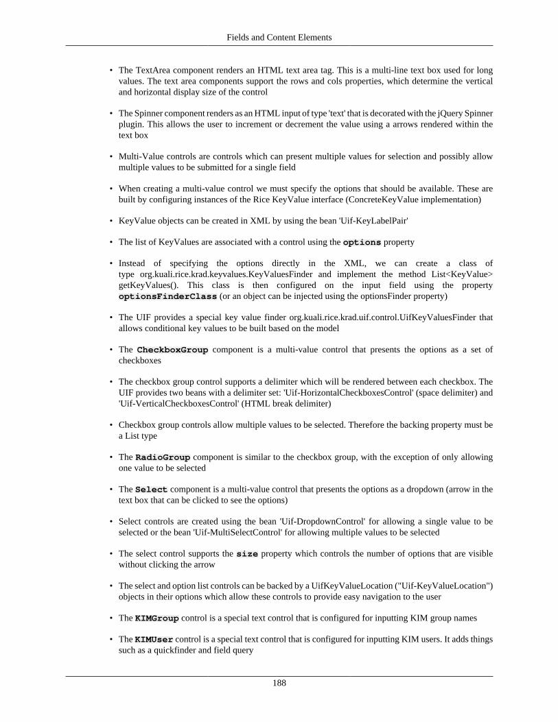
Fields and Content Elements
188
• The TextArea component renders an HTML text area tag. This is a multi-line text box used for longvalues. The text area components support the rows and cols properties, which determine the verticaland horizontal display size of the control
• The Spinner component renders as an HTML input of type 'text' that is decorated with the jQuery Spinnerplugin. This allows the user to increment or decrement the value using a arrows rendered within thetext box
• Multi-Value controls are controls which can present multiple values for selection and possibly allowmultiple values to be submitted for a single field
• When creating a multi-value control we must specify the options that should be available. These arebuilt by configuring instances of the Rice KeyValue interface (ConcreteKeyValue implementation)
• KeyValue objects can be created in XML by using the bean 'Uif-KeyLabelPair'
• The list of KeyValues are associated with a control using the options property
• Instead of specifying the options directly in the XML, we can create a class oftype org.kuali.rice.krad.keyvalues.KeyValuesFinder and implement the method List<KeyValue>getKeyValues(). This class is then configured on the input field using the propertyoptionsFinderClass (or an object can be injected using the optionsFinder property)
• The UIF provides a special key value finder org.kuali.rice.krad.uif.control.UifKeyValuesFinder thatallows conditional key values to be built based on the model
• The CheckboxGroup component is a multi-value control that presents the options as a set ofcheckboxes
• The checkbox group control supports a delimiter which will be rendered between each checkbox. TheUIF provides two beans with a delimiter set: 'Uif-HorizontalCheckboxesControl' (space delimiter) and'Uif-VerticalCheckboxesControl' (HTML break delimiter)
• Checkbox group controls allow multiple values to be selected. Therefore the backing property must bea List type
• The RadioGroup component is similar to the checkbox group, with the exception of only allowingone value to be selected
• The Select component is a multi-value control that presents the options as a dropdown (arrow in thetext box that can be clicked to see the options)
• Select controls are created using the bean 'Uif-DropdownControl' for allowing a single value to beselected or the bean 'Uif-MultiSelectControl' for allowing multiple values to be selected
• The select control supports the size property which controls the number of options that are visiblewithout clicking the arrow
• The select and option list controls can be backed by a UifKeyValueLocation ("Uif-KeyValueLocation")objects in their options which allow these controls to provide easy navigation to the user
• The KIMGroup control is a special text control that is configured for inputting KIM group names
• The KIMUser control is a special text control that is configured for inputting KIM users. It adds thingssuch as a quickfinder and field query
Fields and Content Elements
189
Disabling Controls and TabbingBesides the specific properties offered by the various controls, all control components inherit a couple ofproperties from org.kuali.rice.krad.uif.control.ControlBase. The first of these is the tabIndex property.This property is an int type that is used to populate the tabIndex attribute on the corresponding controlelement tag. This is of course used by the browser to set the tabbing order between the form controls.
By default, the framework sets all tab indexes to 0. This means the tabbing will follow the natural orderof the page (the order the controls are laid out on the page). However, if needed a specific tab order canbe created by setting the tab index property for each control.
The other property supported on all controls is the disabled property with type Boolean. The value givenfor this property will be set as the attribute value for the disabled attribute of the corresponding controlelement. This indicates to the browser that the user should not be allowed to interact with the control.
Similar to other properties, we can statically set the value to 'true' or 'false' in the XML, or use an expressionto conditionally disable the control:
1 2 <bean parent="Uif-InputField" p:propertyName="fruitName"> 3 <property name="control"> 4 <bean parent="Uif-TextControl" p:disabled="@{foodGroup ne 'Fruit'}"/> 5 </property> 6 </bean> 7
In this example, we are disabling the text control for 'Fruit Name' if the food group field is not 'Fruit'.
The following is an example text control that is in the disabled state:
Figure 7.17. Disabled State Control
Disabled or Read Only
An important UX issue is whether to disable a control, or make the control read only. Both displaythe current value and prevent the user from changing it. Generally, a disabled control is usedto temporarily disallow interaction based on a condition. It might be the result of a refreshedcomponent based on a change to data. Read only is often used to display a state that cannot bechanged based on the current data (for example user permissions, or a state that the user cannotmodify).
Recap• All controls have the tabIndex property which can be used to implement a custom tab order (Note
that this is not recommended, though, if not set, the framework will set the tab indexes based on thenatural order of the page)
• Controls also support the disabled property. This is a boolean that will disable the control so thatinput is not allowed (the control is still rendered). Like most properties, the disabled property can containan expression to conditionally disable the control
Fields and Content Elements
190
Hooking up Lookups and InquiriesThe input field component also provides a couple of widgets we can configure that will help the userwith data input. The first of these is the fieldLookup property which is a nested widget component. Thiswidget component is called a Quickfinder. Quickfinder is a term that was adopted in the KNS frameworkto represent the icon next to a control that can be used to bring up a lookup screen, search for a value, andreturn that value to the field. In KRAD, the quickfinder widget holds all the configuration for renderingthe icon along with the lookup request it makes.
All the options for quickfinder are covered in Chapter 8, but we will go over the essential ones here. Tounderstand these widget properties, we need to know a little bit about the lookup API. Essentially, thisis a request based API where communication is done via request parameters, of which the following arerequired:
dataObjectClassName – Lookup views (a special 'type' of view) are associated with a data objectclass. This is the class for the data object the search will be performed on. After the bean container isloading, an indexing process is performed that maps data object classes to configured lookup views (see'View Type Indexing' in Chapter 13). Therefore, instead of passing in the unique view id to specify theview we want, we can pass in the data object class name.
fieldConversions – The purpose of using the lookup is to search for a particular value and returnthat value to the form being completed. In order for the lookup framework to return the field back to us,we must specify the name of the field on the data object class whose value we need, and the name ofthe field on the calling view. Furthermore, we can choose to have the lookup return additional fields thatpopulate other form fields or informational properties (see 'Field Queries and Informational Properties').These pairs of fields are known as 'field conversions'.
The fieldConversions property is a Map. Each entry represents a field that will be returned back from thelookup, with the entry key being the field name on the data object class, and the entry value being the fieldname on the calling view. It is helpful to think of this as a from-to mapping. Pulling from the data objectfield (map key) to the calling view field (map value).
To configure a quickfinder on an input field, we have two options. First, we can create an inner bean withparent of 'Uif-QuickFinder' for the input field's fieldLookup property:
1 2 <bean parent="Uif-InputField" p:propertyName="document.number"> 3 <property name="fieldLookup"> 4 <bean parent="Uif-QuickFinder" p:dataObjectClassName="edu.sampleu.travel.bo.TravelAccount" 5 p:fieldConversions="number:document.number"/> 6 </property> 7 </bean> 8
In this example we have configured a quickfinder that will invoke the lookup view for Travel Account.After the user performs a search and selects a row (using the provided return value links), the correspondingnumber property value for the selected row will be returned and set in the document.number property forour view (the field for which the quickfinder is configured). Notice in this example we are using the mapshorthand configuration for the fieldConversions property.
An alternative configuration is to set the dataObjectClassName and fieldConversions properties directlyusing nested notation. Note this only works if the bean we are inheriting from (or one of its parents hasconfigured) the parent property, else a NullPointerException will be thrown:
1 <bean parent="Uif-InputField" p:propertyName="document.number" 2 p:fieldLookup.dataObjectClassName="edu.sampleu.travel.bo.TravelAccount"
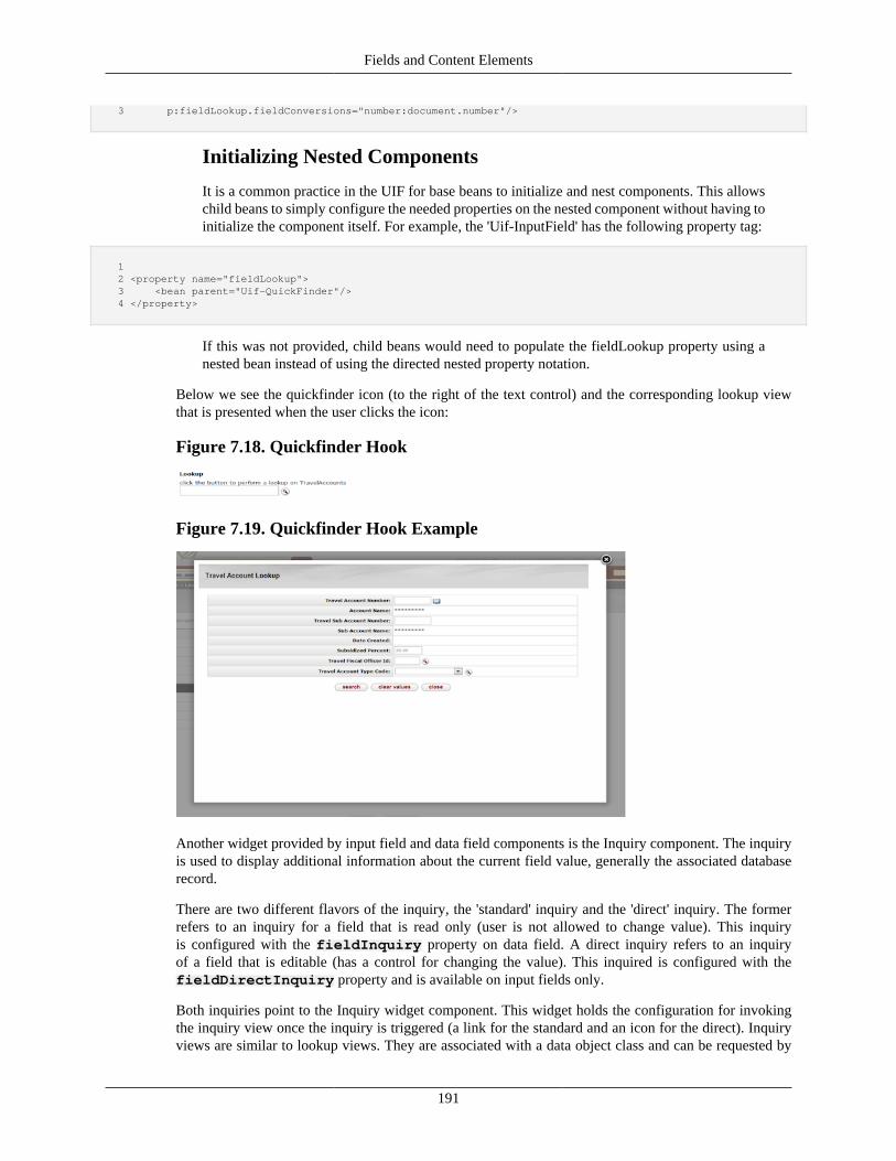
Fields and Content Elements
191
3 p:fieldLookup.fieldConversions="number:document.number"/>
Initializing Nested Components
It is a common practice in the UIF for base beans to initialize and nest components. This allowschild beans to simply configure the needed properties on the nested component without having toinitialize the component itself. For example, the 'Uif-InputField' has the following property tag:
1 2 <property name="fieldLookup"> 3 <bean parent="Uif-QuickFinder"/> 4 </property>
If this was not provided, child beans would need to populate the fieldLookup property using anested bean instead of using the directed nested property notation.
Below we see the quickfinder icon (to the right of the text control) and the corresponding lookup viewthat is presented when the user clicks the icon:
Figure 7.18. Quickfinder Hook
Figure 7.19. Quickfinder Hook Example
Another widget provided by input field and data field components is the Inquiry component. The inquiryis used to display additional information about the current field value, generally the associated databaserecord.
There are two different flavors of the inquiry, the 'standard' inquiry and the 'direct' inquiry. The formerrefers to an inquiry for a field that is read only (user is not allowed to change value). This inquiryis configured with the fieldInquiry property on data field. A direct inquiry refers to an inquiryof a field that is editable (has a control for changing the value). This inquired is configured with thefieldDirectInquiry property and is available on input fields only.
Both inquiries point to the Inquiry widget component. This widget holds the configuration for invokingthe inquiry view once the inquiry is triggered (a link for the standard and an icon for the direct). Inquiryviews are similar to lookup views. They are associated with a data object class and can be requested by
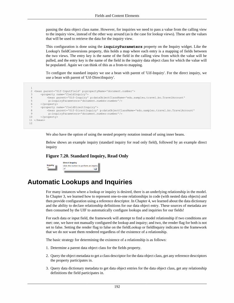
Fields and Content Elements
192
passing the data object class name. However, for inquiries we need to pass a value from the calling viewto the inquiry view, instead of the other way around (as is the case for lookup views). These are the valuesthat will be used to retrieve the data for the inquiry view.
This configuration is done using the inquiryParameters property on the Inquiry widget. Like theLookup's fieldConversions property, this holds a map where each entry is a mapping of fields betweenthe two views. The entry key is the name of the field in the calling view from which the value will bepulled, and the entry key is the name of the field in the inquiry data object class for which the value willbe populated. Again we can think of this as a from-to mapping.
To configure the standard inquiry we use a bean with parent of 'Uif-Inquiry'. For the direct inquiry, weuse a bean with parent of 'Uif-DirectInquiry'.
1 2 <bean parent="Uif-InputField" p:propertyName="document.number"> 3 <property name="fieldInquiry"> 4 <bean parent="Uif-Inquiry" p:dataObjectClassName="edu.sampleu.travel.bo.TravelAccount" 5 p:inquiryParameters="document.number:number"/> 6 </property> 7 <property name="fieldDirectInquiry"> 8 <bean parent="Uif-DirectInquiry" p:dataObjectClassName="edu.sampleu.travel.bo.TravelAccount" 9 p:inquiryParameters="document.number:number"/> 10 </property> 11 </bean> 12
We also have the option of using the nested property notation instead of using inner beans.
Below shows an example inquiry (standard inquiry for read only field), followed by an example directinquiry
Figure 7.20. Standard Inquiry, Read Only
Automatic Lookups and InquiriesFor many instances where a lookup or inquiry is desired, there is an underlying relationship in the model.In Chapter 3, we learned how to represent one-to-one relationships in code (with nested data objects) andthen provide configuration using a reference descriptor. In Chapter 4, we learned about the data dictionaryand the ability to declare relationship definitions for our data object entry. These sources of metadata arethen consumed by the UIF to automatically configure lookups and inquiries for our fields!
For each data or input field, the framework will attempt to find a model relationship if two conditions aremet: one, we have not manually configured the lookup and inquiry; and two, the render flag for both is notset to false. Setting the render flag to false on the fieldLookup or fieldInquiry indicates to the frameworkthat we do not want them rendered regardless of the existence of a relationship.
The basic strategy for determining the existence of a relationship is as follows:
1. Determine a parent data object class for the fields property.
2. Query the object metadata to get a class descriptor for the data object class, get any reference descriptorsthe property participates in.
3. Query data dictionary metadata to get data object entries for the data object class, get any relationshipdefinitions the field participates in.
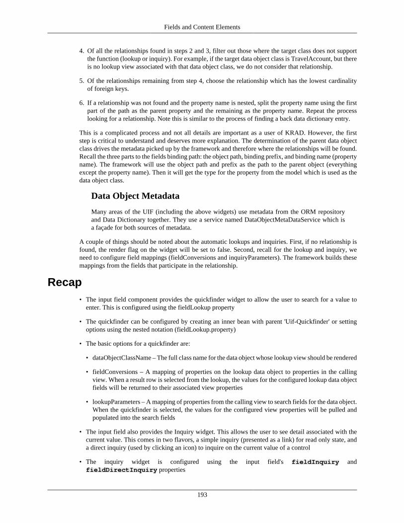
Fields and Content Elements
193
4. Of all the relationships found in steps 2 and 3, filter out those where the target class does not supportthe function (lookup or inquiry). For example, if the target data object class is TravelAccount, but thereis no lookup view associated with that data object class, we do not consider that relationship.
5. Of the relationships remaining from step 4, choose the relationship which has the lowest cardinalityof foreign keys.
6. If a relationship was not found and the property name is nested, split the property name using the firstpart of the path as the parent property and the remaining as the property name. Repeat the processlooking for a relationship. Note this is similar to the process of finding a back data dictionary entry.
This is a complicated process and not all details are important as a user of KRAD. However, the firststep is critical to understand and deserves more explanation. The determination of the parent data objectclass drives the metadata picked up by the framework and therefore where the relationships will be found.Recall the three parts to the fields binding path: the object path, binding prefix, and binding name (propertyname). The framework will use the object path and prefix as the path to the parent object (everythingexcept the property name). Then it will get the type for the property from the model which is used as thedata object class.
Data Object Metadata
Many areas of the UIF (including the above widgets) use metadata from the ORM repositoryand Data Dictionary together. They use a service named DataObjectMetaDataService which isa façade for both sources of metadata.
A couple of things should be noted about the automatic lookups and inquiries. First, if no relationship isfound, the render flag on the widget will be set to false. Second, recall for the lookup and inquiry, weneed to configure field mappings (fieldConversions and inquiryParameters). The framework builds thesemappings from the fields that participate in the relationship.
Recap• The input field component provides the quickfinder widget to allow the user to search for a value to
enter. This is configured using the fieldLookup property
• The quickfinder can be configured by creating an inner bean with parent 'Uif-Quickfinder' or settingoptions using the nested notation (fieldLookup.property)
• The basic options for a quickfinder are:
• dataObjectClassName – The full class name for the data object whose lookup view should be rendered
• fieldConversions – A mapping of properties on the lookup data object to properties in the callingview. When a result row is selected from the lookup, the values for the configured lookup data objectfields will be returned to their associated view properties
• lookupParameters – A mapping of properties from the calling view to search fields for the data object.When the quickfinder is selected, the values for the configured view properties will be pulled andpopulated into the search fields
• The input field also provides the Inquiry widget. This allows the user to see detail associated with thecurrent value. This comes in two flavors, a simple inquiry (presented as a link) for read only state, anda direct inquiry (used by clicking an icon) to inquire on the current value of a control
• The inquiry widget is configured using the input field's fieldInquiry andfieldDirectInquiry properties
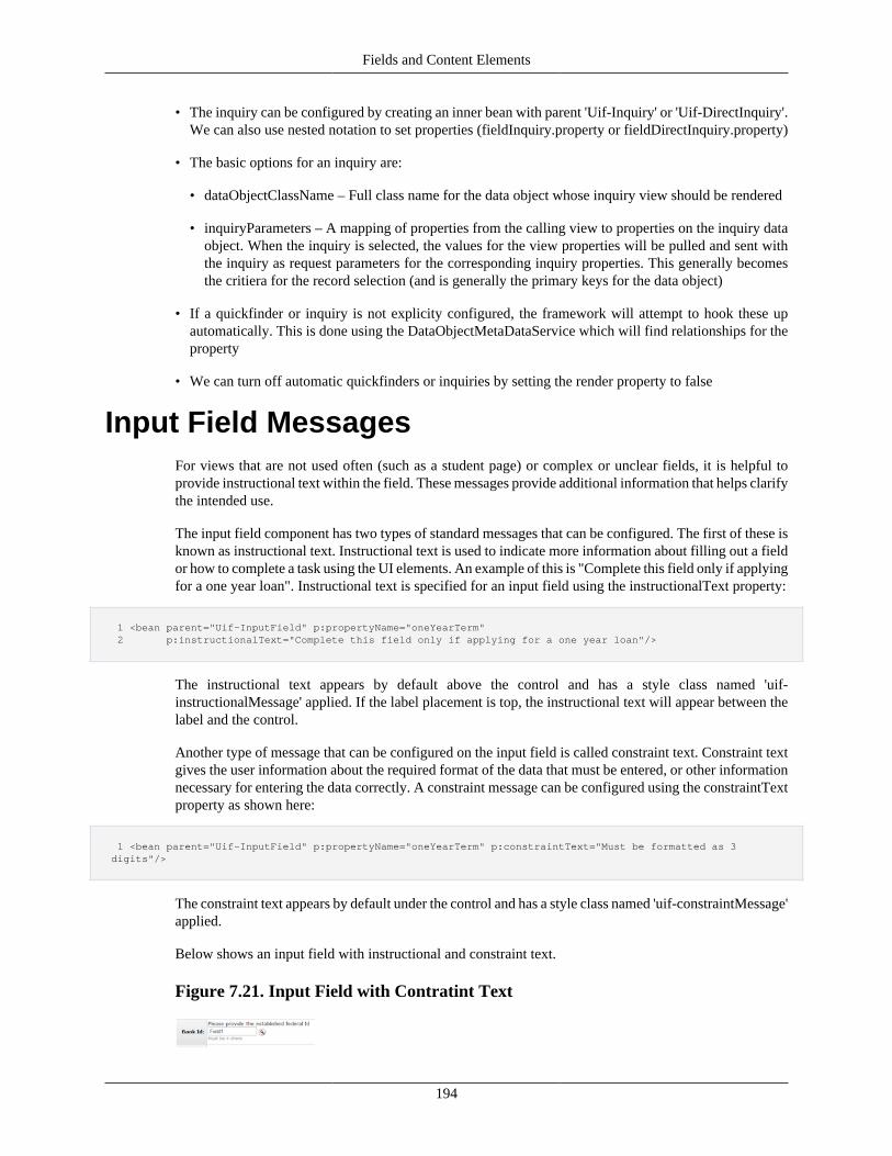
Fields and Content Elements
194
• The inquiry can be configured by creating an inner bean with parent 'Uif-Inquiry' or 'Uif-DirectInquiry'.We can also use nested notation to set properties (fieldInquiry.property or fieldDirectInquiry.property)
• The basic options for an inquiry are:
• dataObjectClassName – Full class name for the data object whose inquiry view should be rendered
• inquiryParameters – A mapping of properties from the calling view to properties on the inquiry dataobject. When the inquiry is selected, the values for the view properties will be pulled and sent withthe inquiry as request parameters for the corresponding inquiry properties. This generally becomesthe critiera for the record selection (and is generally the primary keys for the data object)
• If a quickfinder or inquiry is not explicity configured, the framework will attempt to hook these upautomatically. This is done using the DataObjectMetaDataService which will find relationships for theproperty
• We can turn off automatic quickfinders or inquiries by setting the render property to false
Input Field MessagesFor views that are not used often (such as a student page) or complex or unclear fields, it is helpful toprovide instructional text within the field. These messages provide additional information that helps clarifythe intended use.
The input field component has two types of standard messages that can be configured. The first of these isknown as instructional text. Instructional text is used to indicate more information about filling out a fieldor how to complete a task using the UI elements. An example of this is "Complete this field only if applyingfor a one year loan". Instructional text is specified for an input field using the instructionalText property:
1 <bean parent="Uif-InputField" p:propertyName="oneYearTerm" 2 p:instructionalText="Complete this field only if applying for a one year loan"/>
The instructional text appears by default above the control and has a style class named 'uif-instructionalMessage' applied. If the label placement is top, the instructional text will appear between thelabel and the control.
Another type of message that can be configured on the input field is called constraint text. Constraint textgives the user information about the required format of the data that must be entered, or other informationnecessary for entering the data correctly. A constraint message can be configured using the constraintTextproperty as shown here:
1 <bean parent="Uif-InputField" p:propertyName="oneYearTerm" p:constraintText="Must be formatted as 3 digits"/>
The constraint text appears by default under the control and has a style class named 'uif-constraintMessage'applied.
Below shows an input field with instructional and constraint text.
Figure 7.21. Input Field with Contratint Text
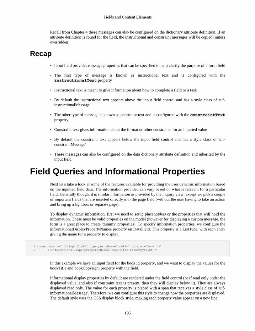
Fields and Content Elements
195
Recall from Chapter 4 these messages can also be configured on the dictionary attribute definition. If anattribute definition is found for the field, the instructional and constraint messages will be copied (unlessoverridden).
Recap
• Input field provides message properties that can be specified to help clarify the purpose of a form field
• The first type of message is known as instructional text and is configured with theinstructionalText property
• Instructional text is meant to give information about how to complete a field or a task
• By default the instructional text appears above the input field control and has a style class of 'uif-instructionalMessage'
• The other type of message is known as constraint text and is configured with the constraintTextproperty
• Constraint text gives information about the format or other constraints for an inputted value
• By default the constraint text appears below the input field control and has a style class of 'uif-constraintMessage'
• These messages can also be configured on the data dictionary attribute definition and inherited by theinput field
Field Queries and Informational PropertiesNext let's take a look at some of the features available for providing the user dynamic information basedon the inputted field data. The information provided can vary based on what is relevant for a particularfield. Generally though, it is similar information as provided by the inquiry view, except we pick a coupleof important fields that are inserted directly into the page field (without the user having to take an actionand bring up a lightbox or separate page).
To display dynamic information, first we need to setup placeholders or the properties that will hold theinformation. These must be valid properties on the model (however for displaying a custom message, theform is a great place to create 'dummy' properties). To specify information properties, we configure theinformationalDisplayPropertyNames property on DataField. This property is a List type, with each entrygiving the name for a property to display.
1 <bean parent="Uif-InputField" p:propertyName="bookId" p:label="Book Id" 2 p:informationalDisplayPropertyNames="bookTitle,bookCopyright"/>
In this example we have an input field for the book id property, and we want to display the values for thebookTitle and bookCopyright property with the field.
Informational display properties by default are rendered under the field control (or if read only under thedisplayed value, and also if constraint text is present, then they will display below it). They are alwaysdisplayed read only. The value for each property is placed with a span that receives a style class of 'uif-informationalMessage'. Therefore, we can configure this style to change how the properties are displayed.The default style uses the CSS display block style, making each property value appear on a new line.
Fields and Content Elements
196
Below gives a picture of this with two informational properties being displayed.
Figure 7.22. Two Informational Properties Example
Field Attribute QueryEach time the field is rendered, the information display property values will be displayed. This is useful,however, by itself it is not 'dynamic'. That is, if the user then changes the value, the information propertieswill not change to reflect the update. To make this happen, we need to associate a piece of functionalitycalled attribute query with our field.
An attribute query is represented by the class org.kuali.rice.krad.uif.field.AttributeQuery. This is not acomponent, just a class that configures behavior that can be added to the input field component. Basically,this class provides properties for configuring a query to retrieve these information properties. It has similarconcepts to the lookup (quickfinder widget) with a more targeted purpose. There are two mechanisms forconfiguring a query. The first involves configuring the necessary properties to allow the framework toautomatically perform a query. This involves the following attribute query properties:
dataObjectClassName – Name of the data object class the query will go against. The class givenmust be mapped to the database (with ORM metadata) to support the automatic lookup. This functions thesame as the dataObjectClassName for the lookup view (or quickfinder widget).
queryFieldMapping – A map type that holds the mappings of properties from the calling view toproperties on the data object class. Each entry represents one property mapping. The map key is theproperty name in the calling view, and the map value is the property name on the data object class. This willusually include the property name of the field for which the query is configured (since we want to querybased on the value the user has inputted). We might need to pass in additional properties from the view tocomplete the query. This property functions similarly to the inquiryParameters on the inquiry widget.
Note this mapping is used to build criteria for the query. The values for the calling view properties areretrieved and used to restrict the retrieved data object records based on the mapped data object fields. Forexample, suppose we have the following query field mapping: "document.rentedBookId:bookId" and thevalue of the document.rentedBookId on our view is '3'. When the query is performed the following clausewill be created "where bookId = '3'" (note the actual SQL is not constructed by KRAD, but created bythe ORM criteria object).
returnFieldMapping – A map type that holds the mappings of properties from the data object classto the calling view. Each entry represents one property mapping. The map key is the property name on thedata object class, and the map value is the property name on the calling view. We can use this propertyto map properties on the data object class back to configured information display properties of the field.However, it is not limited to that. We can also map properties of the data object class back to propertiesthat are separate fields (thus filling in the control value for those corresponding fields).
additionalCriteria – A map that holds additional criteria for the query. The criteria specified willbe added to the constructed criteria based on query field mapping. The map key is the name of the propertyon the data object class the criteria should apply to, and the map value is the value for the criteria. All mapentries are joined using the AND clause. Note, the map value does support query characters as providedby the lookup framework ('!' – not, '>' – greater than, '<' – less than, '*' – wildcard, and so on). In additionfor the map values, we can use expressions ('@{}').
Fields and Content Elements
197
To hook up an attribute query with an input field we use the fieldAttributeQuery property.We can then create an instance of the attribute query class by creating a bean with parent of 'Uif-AttributeQueryConfig':
1 2 <bean parent="Uif-InputField" p:propertyName="rentedBookId" p:label="Book Id" 3 p:informationalDisplayPropertyNames="rentedBookTitle,rentedBookCopyright"> 4 <property name="fieldAttribueQuery"> 5 <bean parent="Uif-AttributeQueryConfig" p:dataObjectClassName="edu.sampleu.bookstore.bo.Book" 6 p:queryFieldMapping="rentedBookId:bookId" 7 p:returnFieldMapping="bookTitle:rentedBookTitle, bookCopyright:rentedBookCopyright"/> 8 </property> 9 </bean> 10
In this example we have an input field for the rentedBookId property. We then setup a query thatwill go against the Book data object, passing the value for rentedBookId as criteria for the bookIdproperty. From the resulting record, the bookTitle and bookCopyright property values will be copied tothe rentedBookTitle and rendedBookCopyright properties. These are configured as informational displayproperties, therefore the updated values will display under the control for rentedBookId.
Note the framework takes care of triggering the query (with the 'onblur' event), performing the query,and updating the mapping return fields all client side (without a page post). It is expected the fieldattribute query will return only one result. If more than one record is retrieved, the first record of thehit list will be used. In the case of no matching records, a message will be rendered stating '{fieldlabel} not found', where {field label} is the configured label. This message can be disabled by settingfieldAttributeQuery.renderNotFoundMessage to false. In addition, attribute query contains a propertynamed returnMessageText that can be used to configure a message that will display with the results, or acustom message in the case where no results are found.
The attribute query class also allows us to hook up a custom query that will be invoked to retrieve theadditional information. In this case, the developer writes the actual code to perform the query (call anotherservice or whatever) and return the results. The framework will then take care of triggering the query andhandling the results (updating the values).
There is a great deal of flexibility for invoking a custom query method. Let's start with the way that requiresthe least amount of configuration. First, we need to know a little bit about the framework code, in particularone service. The UIF invokes a service of type org.kuali.rice.krad.uif.service.ViewHelperService toperform building of the view and many other UI related functions. An implementation of this service(ViewHelperServiceImpl) carries out this processing. The framework allows us to extend this service anddeclare that one or more views should use the custom view helper. This is our gateway for code-basedcustomizations. So let's do it! The following sets up a custom view helper service:
1 2 package edu.myedu.sample; 3 public class CustomViewHelperServiceImpl extends ViewHelperServiceImpl { 4 }
Next we configure our view to use the custom view helper service. This is done by setting theviewHelperServiceClass property on the view component (the View component is covered in completedetail in Chapter 9):
1 2 <bean id="MyView" parent="Uif-FormView"> 3 ... 4 <property name="viewHelperServiceClass" value="edu.myedu.sample.CustomViewHelperServiceImpl"/> 5 </bean>
Fields and Content Elements
198
6
Now we have a place to put our custom query method. The signature of this method depends on the querybeing performed, but there are a few guidelines:
1. The method parameters must correspond to fields on the view (for example, think of thequeryFieldMapping which is configured for the automatic query, essentially we will be pulling fieldsfrom the view the same way, except passing them as arguments to the method).
2. The method must return a data object instance for which the return properties can be retrieved, or alist of data objects (in the case of backing a field's suggest property), or an AttributeQueryResult. TheAttributeQueryResult is an object that gets returned back to the client and read to process the results. Ifthe method returns the data object, the framework will build the result object from that. However, theresult object can be built directly for custom needs.
To understand this better, let's take an example. We will create a method that will perform the same searchas our automatic book query example. The query will go against the Book data object and take in the bookid as a parameter:
1 2 public Book retrieveBookById(String bookId) { 3 Book foundBook; 4 // do query to find the book 5 6 return foundBook; 7 } 8
Now we need to configure the attribute query for the book id input field. To specify the name of our methodthat should be called, we use the queryMethodToCall property provided by the AttributeQueryclass. Then we specify the arguments for our method using the queryMethodArgumentFieldListproperty. Note this property functions similarly to the queryFieldMapping, except we are not mappingproperties from the calling view to properties on a data object, but instead to method arguments. Thevalue for each property configured in the queryMethodArgumentFieldList list is retrieved and passed asa method argument in the order listed.
The final step is to configure the returnFieldMapping property. This is the same as when doing theautomatic query. It maps properties on the returned object (returned from the method) to properties onthe view.
1 2 <bean parent="Uif-InputField" p:propertyName="rentedBookId" p:label="Book Id" 3 p:informationalDisplayPropertyNames="rentedBookTitle,rentedBookCopyright"> 4 <property name="fieldAttribueQuery"> 5 <bean parent="Uif-AttributeQueryConfig" p:queryMethodToCall="retrieveBookById" 6 p:queryMethodArgumentFieldList ="rentedBookId" 7 p:returnFieldMapping="bookTitle:rentedBookTitle, bookCopyright:rentedBookCopyright"/> 8 </property> 9 </bean> 10
Here we configure the attribute query to invoke the 'retrieveBookById' method. Since this is the onlyconfiguration we gave, the framework assumes this is on the view helper service. Next, we set the querymethod argument list as 'rentedBookId'. This means the value for the rentedBookId (the backing propertyfor the field) will be pulled and sent as the first argument to our method. If we added another property; itsvalue would be passed as the second argument, and so on. Finally, we configure the return field mappingto pull the bookTitle and bookCopyright properties from the data object returned from our method, andcopy those values to the rentedBookTitle and rentedBookCopyright properties on the view model.
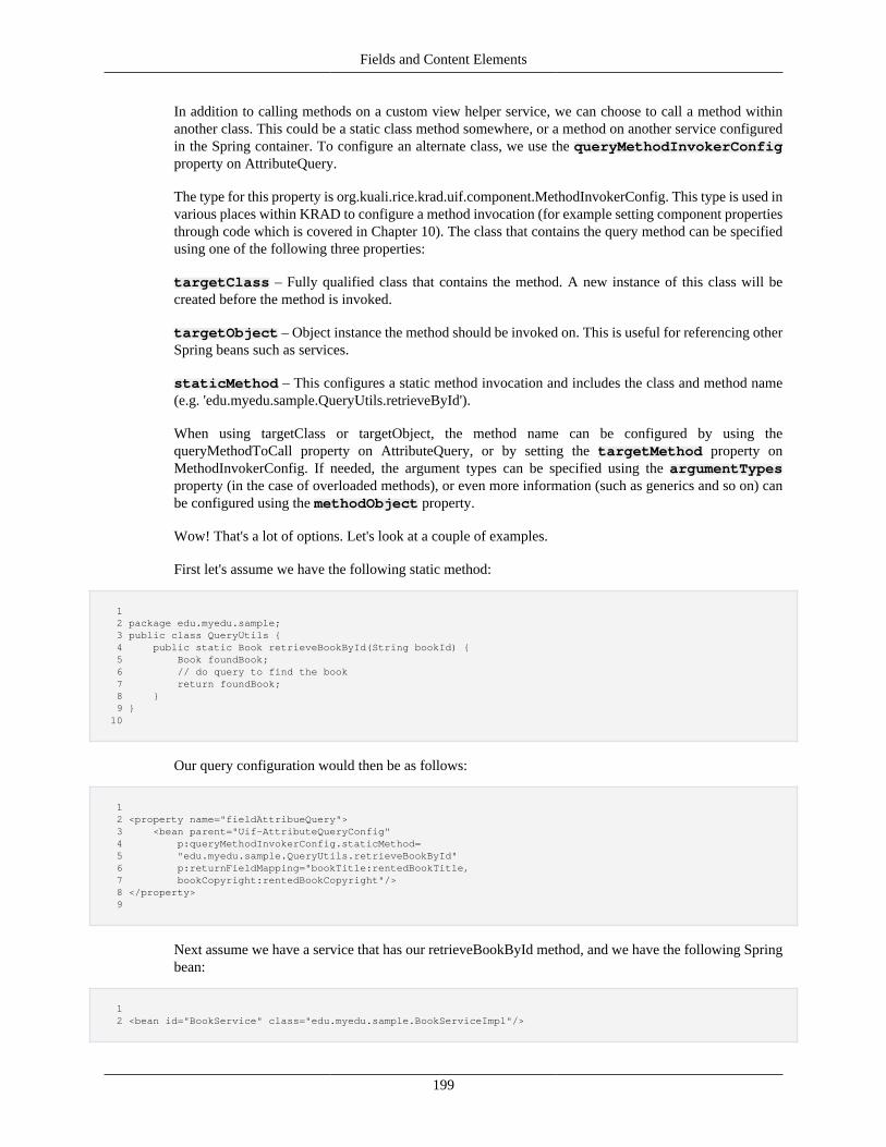
Fields and Content Elements
199
In addition to calling methods on a custom view helper service, we can choose to call a method withinanother class. This could be a static class method somewhere, or a method on another service configuredin the Spring container. To configure an alternate class, we use the queryMethodInvokerConfigproperty on AttributeQuery.
The type for this property is org.kuali.rice.krad.uif.component.MethodInvokerConfig. This type is used invarious places within KRAD to configure a method invocation (for example setting component propertiesthrough code which is covered in Chapter 10). The class that contains the query method can be specifiedusing one of the following three properties:
targetClass – Fully qualified class that contains the method. A new instance of this class will becreated before the method is invoked.
targetObject – Object instance the method should be invoked on. This is useful for referencing otherSpring beans such as services.
staticMethod – This configures a static method invocation and includes the class and method name(e.g. 'edu.myedu.sample.QueryUtils.retrieveById').
When using targetClass or targetObject, the method name can be configured by using thequeryMethodToCall property on AttributeQuery, or by setting the targetMethod property onMethodInvokerConfig. If needed, the argument types can be specified using the argumentTypesproperty (in the case of overloaded methods), or even more information (such as generics and so on) canbe configured using the methodObject property.
Wow! That's a lot of options. Let's look at a couple of examples.
First let's assume we have the following static method:
1 2 package edu.myedu.sample; 3 public class QueryUtils { 4 public static Book retrieveBookById(String bookId) { 5 Book foundBook; 6 // do query to find the book 7 return foundBook; 8 } 9 } 10
Our query configuration would then be as follows:
1 2 <property name="fieldAttribueQuery"> 3 <bean parent="Uif-AttributeQueryConfig" 4 p:queryMethodInvokerConfig.staticMethod= 5 "edu.myedu.sample.QueryUtils.retrieveBookById" 6 p:returnFieldMapping="bookTitle:rentedBookTitle, 7 bookCopyright:rentedBookCopyright"/> 8 </property> 9
Next assume we have a service that has our retrieveBookById method, and we have the following Springbean:
1 2 <bean id="BookService" class="edu.myedu.sample.BookServiceImpl"/>
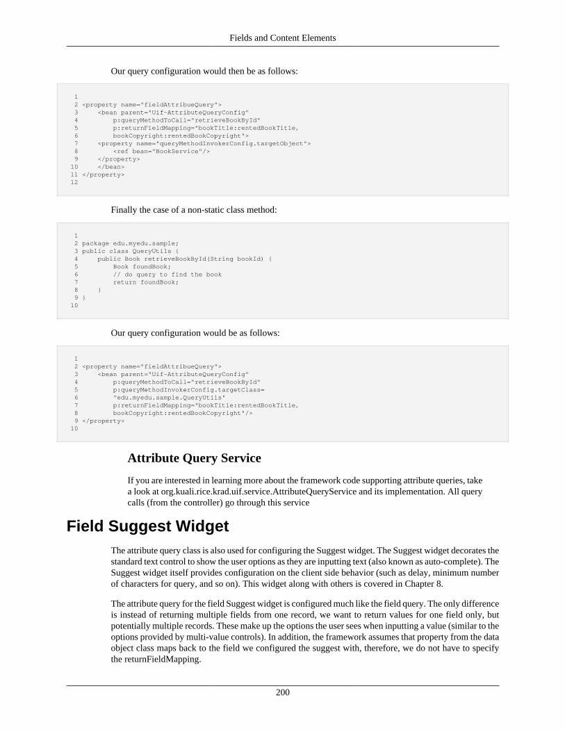
Fields and Content Elements
200
Our query configuration would then be as follows:
1 2 <property name="fieldAttribueQuery"> 3 <bean parent="Uif-AttributeQueryConfig" 4 p:queryMethodToCall="retrieveBookById" 5 p:returnFieldMapping="bookTitle:rentedBookTitle, 6 bookCopyright:rentedBookCopyright"> 7 <property name="queryMethodInvokerConfig.targetObject"> 8 <ref bean="BookService"/> 9 </property> 10 </bean> 11 </property> 12
Finally the case of a non-static class method:
1 2 package edu.myedu.sample; 3 public class QueryUtils { 4 public Book retrieveBookById(String bookId) { 5 Book foundBook; 6 // do query to find the book 7 return foundBook; 8 } 9 } 10
Our query configuration would be as follows:
1 2 <property name="fieldAttribueQuery"> 3 <bean parent="Uif-AttributeQueryConfig" 4 p:queryMethodToCall="retrieveBookById" 5 p:queryMethodInvokerConfig.targetClass= 6 "edu.myedu.sample.QueryUtils" 7 p:returnFieldMapping="bookTitle:rentedBookTitle, 8 bookCopyright:rentedBookCopyright"/> 9 </property> 10
Attribute Query Service
If you are interested in learning more about the framework code supporting attribute queries, takea look at org.kuali.rice.krad.uif.service.AttributeQueryService and its implementation. All querycalls (from the controller) go through this service
Field Suggest WidgetThe attribute query class is also used for configuring the Suggest widget. The Suggest widget decorates thestandard text control to show the user options as they are inputting text (also known as auto-complete). TheSuggest widget itself provides configuration on the client side behavior (such as delay, minimum numberof characters for query, and so on). This widget along with others is covered in Chapter 8.
The attribute query for the field Suggest widget is configured much like the field query. The only differenceis instead of returning multiple fields from one record, we want to return values for one field only, butpotentially multiple records. These make up the options the user sees when inputting a value (similar to theoptions provided by multi-value controls). In addition, the framework assumes that property from the dataobject class maps back to the field we configured the suggest with, therefore, we do not have to specifythe returnFieldMapping.
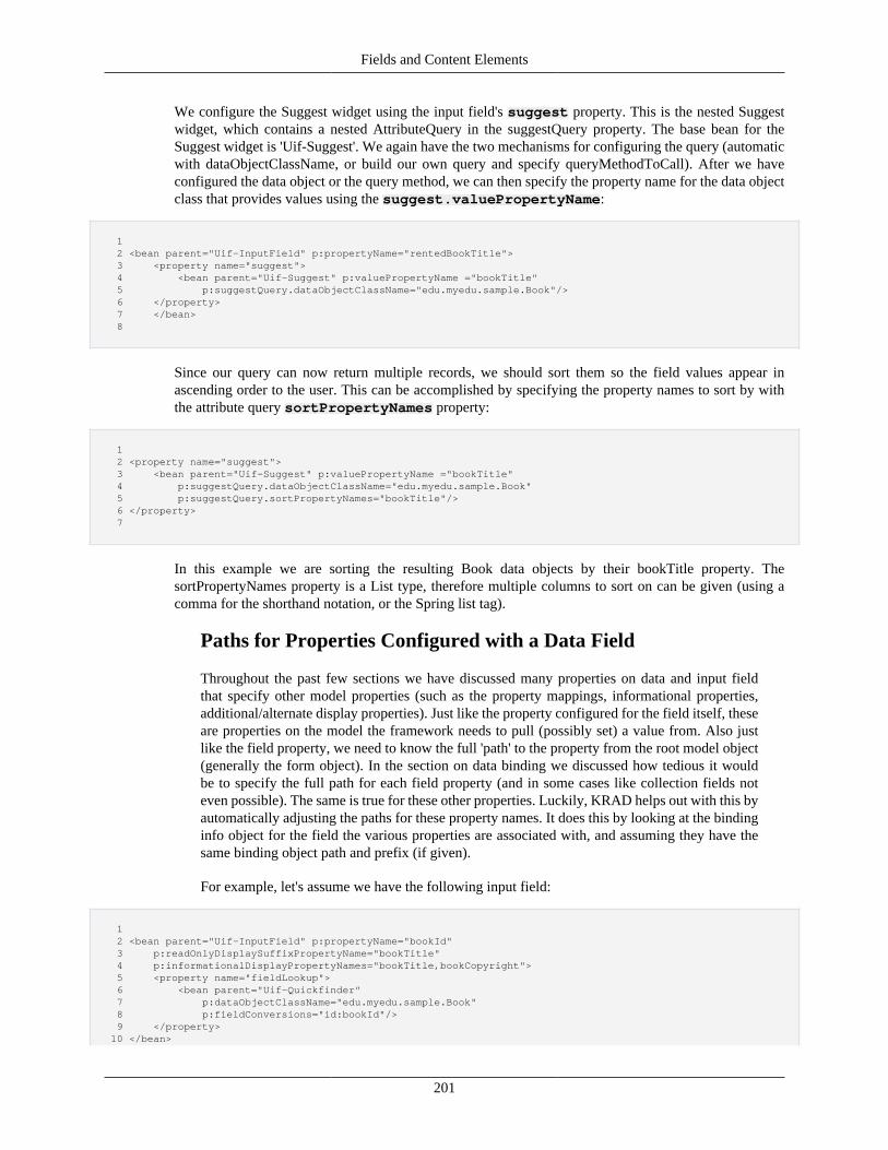
Fields and Content Elements
201
We configure the Suggest widget using the input field's suggest property. This is the nested Suggestwidget, which contains a nested AttributeQuery in the suggestQuery property. The base bean for theSuggest widget is 'Uif-Suggest'. We again have the two mechanisms for configuring the query (automaticwith dataObjectClassName, or build our own query and specify queryMethodToCall). After we haveconfigured the data object or the query method, we can then specify the property name for the data objectclass that provides values using the suggest.valuePropertyName:
1 2 <bean parent="Uif-InputField" p:propertyName="rentedBookTitle"> 3 <property name="suggest"> 4 <bean parent="Uif-Suggest" p:valuePropertyName ="bookTitle" 5 p:suggestQuery.dataObjectClassName="edu.myedu.sample.Book"/> 6 </property> 7 </bean> 8
Since our query can now return multiple records, we should sort them so the field values appear inascending order to the user. This can be accomplished by specifying the property names to sort by withthe attribute query sortPropertyNames property:
1 2 <property name="suggest"> 3 <bean parent="Uif-Suggest" p:valuePropertyName ="bookTitle" 4 p:suggestQuery.dataObjectClassName="edu.myedu.sample.Book" 5 p:suggestQuery.sortPropertyNames="bookTitle"/> 6 </property> 7
In this example we are sorting the resulting Book data objects by their bookTitle property. ThesortPropertyNames property is a List type, therefore multiple columns to sort on can be given (using acomma for the shorthand notation, or the Spring list tag).
Paths for Properties Configured with a Data Field
Throughout the past few sections we have discussed many properties on data and input fieldthat specify other model properties (such as the property mappings, informational properties,additional/alternate display properties). Just like the property configured for the field itself, theseare properties on the model the framework needs to pull (possibly set) a value from. Also justlike the field property, we need to know the full 'path' to the property from the root model object(generally the form object). In the section on data binding we discussed how tedious it wouldbe to specify the full path for each field property (and in some cases like collection fields noteven possible). The same is true for these other properties. Luckily, KRAD helps out with this byautomatically adjusting the paths for these property names. It does this by looking at the bindinginfo object for the field the various properties are associated with, and assuming they have thesame binding object path and prefix (if given).
For example, let's assume we have the following input field:
1 2 <bean parent="Uif-InputField" p:propertyName="bookId" 3 p:readOnlyDisplaySuffixPropertyName="bookTitle" 4 p:informationalDisplayPropertyNames="bookTitle,bookCopyright"> 5 <property name="fieldLookup"> 6 <bean parent="Uif-Quickfinder" 7 p:dataObjectClassName="edu.myedu.sample.Book" 8 p:fieldConversions="id:bookId"/> 9 </property> 10 </bean>
Fields and Content Elements
202
11
Now assume this field belongs to a group where fieldBindingObjectPath is set to'document.newBook'. Thus the binding path for our field will be 'document.newBook.bookId'.The paths for the additional display property, informational display properties, and quickfinderfield conversions will then be adjusted by prefixing 'document.newBook' to the path (eg'document.newBook.bookTitle'). If a property should not be adjusted (for example, using adummy form property), it can be prefixed with the string '#form.' (eg '#form.holdBookId'). Whenthe framework finds this, it will take the prefix off and do no further adjustment.
Recap• Field queries provide dynamic information for an inputted value
• To support field queries the data field property informationDisplayPropertyNames can beconfigured with a list of property names whose values should be displayed with the field
• When the field is rendered, values for informational display properties will be rendered as well.By default, each value appears on a line below the control and receives a style class of 'uif-informationalMessage'
• To update information display properties dynamically (immediately after the user inputs or changes thefield value) we can build a field attribute query
• Field queries are supported by the class org.kuali.rice.krad.uif.field.AttributeQuery. This holdsconfiguration for performing a query and mapping return values. Supported properties include:
• dataObjectClassName – Name of the data object class the query will be performed against. Whenspecified the framework will build a query against the data object
• queryFieldMapping - A map type that holds the mappings of properties from the calling view toproperties on the data object class. This becomes part of the query criteria
• returnFieldMapping – A map type that holds the mappings of properties from the data object class tothe calling view. The properties for the calling view may be informational display properties, hiddenproperties, or even other displayed field properties
• additionalCriteria – A map that holds additional criteria for the query.
• A field query is configured for an input field using the fieldAttributeQuery property
• An attribute query can be configured to invoke a custom method that will perform the query (such asa service method). The basic steps for doing so are:
• Set queryMethodToCall property to the name of the method that should be invoked (by defaultthis is assumed to be on the ViewHelperService implementation, for methods on other classes thequeryMethodInvokerConfig property can be configured)
• Specify the method argument mapping with the queryMethodArgumentFieldList property.This takes a list of properties on the view that will map to method arguments in the order listed
• Finally, as in the case of the automatic query, configure the returnFieldMapping property tomap properties from the returned data object to properties on the view
• The Suggest widget performs an attribute query to show the user valid options as they are inputtinga value. The widget is configured for an input field using the field's suggest property
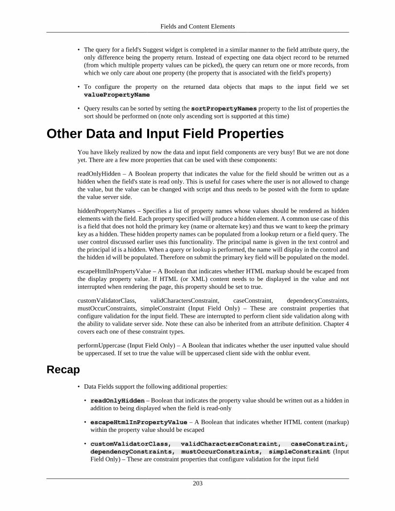
Fields and Content Elements
203
• The query for a field's Suggest widget is completed in a similar manner to the field attribute query, theonly difference being the property return. Instead of expecting one data object record to be returned(from which multiple property values can be picked), the query can return one or more records, fromwhich we only care about one property (the property that is associated with the field's property)
• To configure the property on the returned data objects that maps to the input field we setvaluePropertyName
• Query results can be sorted by setting the sortPropertyNames property to the list of properties thesort should be performed on (note only ascending sort is supported at this time)
Other Data and Input Field PropertiesYou have likely realized by now the data and input field components are very busy! But we are not doneyet. There are a few more properties that can be used with these components:
readOnlyHidden – A Boolean property that indicates the value for the field should be written out as ahidden when the field's state is read only. This is useful for cases where the user is not allowed to changethe value, but the value can be changed with script and thus needs to be posted with the form to updatethe value server side.
hiddenPropertyNames – Specifies a list of property names whose values should be rendered as hiddenelements with the field. Each property specified will produce a hidden element. A common use case of thisis a field that does not hold the primary key (name or alternate key) and thus we want to keep the primarykey as a hidden. These hidden property names can be populated from a lookup return or a field query. Theuser control discussed earlier uses this functionality. The principal name is given in the text control andthe principal id is a hidden. When a query or lookup is performed, the name will display in the control andthe hidden id will be populated. Therefore on submit the primary key field will be populated on the model.
escapeHtmlInPropertyValue – A Boolean that indicates whether HTML markup should be escaped fromthe display property value. If HTML (or XML) content needs to be displayed in the value and notinterrupted when rendering the page, this property should be set to true.
customValidatorClass, validCharactersConstraint, caseConstraint, dependencyConstraints,mustOccurConstraints, simpleConstraint (Input Field Only) – These are constraint properties thatconfigure validation for the input field. These are interrupted to perform client side validation along withthe ability to validate server side. Note these can also be inherited from an attribute definition. Chapter 4covers each one of these constraint types.
performUppercase (Input Field Only) – A Boolean that indicates whether the user inputted value shouldbe uppercased. If set to true the value will be uppercased client side with the onblur event.
Recap• Data Fields support the following additional properties:
• readOnlyHidden – Boolean that indicates the property value should be written out as a hidden inaddition to being displayed when the field is read-only
• escapeHtmlInPropertyValue – A Boolean that indicates whether HTML content (markup)within the property value should be escaped
• customValidatorClass, validCharactersConstraint, caseConstraint,dependencyConstraints, mustOccurConstraints, simpleConstraint (InputField Only) – These are constraint properties that configure validation for the input field

Fields and Content Elements
204
• performUppercase (Input Field Only) – A Boolean that indicates whether the user inputted valueshould be uppercased
Action and Action FieldSo far in this chapter we have looked at the data and input field components, which allow the userto perform data IO with our application. We will now move on to other types of content elementand field components that are offered by KRAD. The field component behaves the same as it didbefore, essentially being a wrapper for the content element and providing a label. The various fieldimplementations essentially provide convenience methods for setting properties on the nested elementcomponent. Therefore, we just need to focus on the different content elements available to us.
The first element we will look at is the Action component. This component allows the user to take an actionon the view, such as submitting the data, requesting a new page, or invoking a server side or client sideprocess. There are a few different ways of representing the action in the UI to the user. The most commonway is through an HTML button element (button tag). We can also choose to invoke the action with animage (HTML input element of type 'image'). Finally, we can use a link to invoke the action (HTML atag using script).
In the UIF the action component is represented by the class org.kuali.rice.krad.uif.field.ActionField. Thisclass contains properties that configure the action that will be taken when the component is invoked, alongwith the presentation of the action within the view.
To configure the action that will be taken, we have two strategies possible. The first is to use standard formposting that will submit the form and make a server side call. These calls will get processed by the SpringMVC framework, which will invoke a class referred to as the Controller. In Chapter 12 we will cover thedetails for building controllers and other web layer artifacts, but for our purposes now we can think of thisas a class with methods that get invoked to handle a request from the client. The request URL (which wasconstructed from the HTML form post URL) is used by Spring to determine the controller class to invoke.Therefore, on our individual action components, we just need to configure the controller method to call.This is done using the action component property methodToCall. The value given will be sent along withthe action request and used by Spring to determine the controller method to invoke.
The other possible action type is invoking a JavaScript method. This would be script developed by theapplication and included in the view. The script may then perform some client side operation and finish,or perform some operation and then in turn make a server call. When making the server call, the scriptwould be responsible for setting the sever side method to call. Invoking client side script is done by settingthe actionScript property. Note the value given for this property is assumed to be script code, and is boundwith the onclick event for the corresponding HTML element.
For example, we could give a value like p:actionScript="alert('Hello World!');" which would simply showthe alert dialog and finish. We could also invoke a method that is defined in one of our included script files(through the view components additionalScriptFiles property): p:actionScript="doCalculateAndPost();".This would invoke a script method named 'doCalculateAndPost'. Note multiple script statements can begiven within the string: "var i=0;var j=1;doMethod(i,j);".
Now that we know how to configure the action that will occur, how do we create the action componentin XML, and specify how it will appear? Like all UIF components, we just need to know the base beanswe can use, and then create a new bean that inherits from one. The following beans are provided for theaction component:
Uif-ActionImage – Action component that is configured for an image action. That is it will render anHTML input element of type 'image'. This bean sets the CSS style 'uif-actionImage' on the image element.
Fields and Content Elements
205
Uif-PrimaryActionButton – Action component that is configured to render a button. The button elementcan include text (the label) along with an image. This bean adds the CSS style 'btn' and 'btn-primary' onthe button element.
Uif-SecondaryActionButton – Action component that is configured to render a button. This bean sets theCSS style 'btn' and 'btn-default' on the button element.
Uif-PrimaryActionButton-Small – Action component that is configured to render a button. This bean setsthe CSS style 'btn', 'btn-default' and 'btn-xs' on the button element.
Uif-SecondaryActionButton-Small – Action component that is configured to render a button. This beansets the CSS style 'uif-secondaryActionButton' and 'uif-smallActionButton' on the button element.
Uif-ActionLink – Action component that is configured to render a link. The link may contain text and animage. This bean sets the CSS style 'uif-actionLink' on the link element.
Note the four beans that render a button are the same with the exception of the style class. These fourdifferent style classes give the ability to have different button 'levels' that result in different 'weight' beingapplied to the button visually. For example a button the user is expected to use often should be given theprimary level, while once used less often should be given a secondary level (thus it is easier for them tospot the former). Below the different button levels are shown.
Figure 7.23. Button Levels
Button Rendering
In addition to rendering the HTML button element, KRAD uses the jQuery Button plugin to addstyling and behavior to the buttons. For more information on this plugin visit http://jqueryui.com/demos/button/.
Let's look at some examples of creating buttons. Besides configuring the action, we generally want todisplay a label for the button (text that is display on the button). To do this we set the actionLabel property:
1 2 <bean parent="Uif-PrimaryActionButton" p:actionLabel="Save" p:methodToCall="performSave"/> 3
In this example we have created an action button with the primary styling that will have a label of 'Save'.When the user clicks the button, the enclosing form will be submitted and a method named 'performSave'will be invoked on our controller. It's that easy!
Along with the button label we can include an image icon. This is done by configuring an Image componentthat lives on the action component. The image component will be covered later on in this chapter, but wecan create one by simply giving the path to the image using the source property on Image. The imagecomponent is nested on the action component with the actionImage property and we can create a newimage component using the 'Uif-Image' bean:
1
Fields and Content Elements
206
2 <bean parent="Uif-PrimaryActionButton" p:actionLabel="Save" 3 p:methodToCall="performSave"> 4 <property name="actionImage"> 5 <bean parent="Uif-Image" 6 p:source="@{#ConfigProperties['krad.externalizable.images.url']}searchicon.png"/> 7 </property> 8 </bean> 9
Notice the use of the expression "#ConfigProperties['krad.externalizable.images.url']}" in the value forthe source property. ConfigProperties is a variable available for all expressions which holds properties theRice application has been configured with. This variable is a map type, where the key is the name of theconfiguration property, and the map value is the value for the configuration property. The Rice applicationcomes with a set of configuration properties, one of which is the 'krad.externalizable.images.url' whichpoints to the directory in the web app which contains the KRAD images. The definition of thisconfiguration is:
1 2 <param name="krad.externalizable.images.url"override="false">${application.url}/krad/images/</param> 3
This is referring to another configuration property named 'application.url' (which could refer to others).Ultimately this resolves to something like 'https://test.kuali.org/kr-krad/krad/images'. This makes thesource for our image 'https://test.kuali.org/kr-krad/krad/images/searchicon.png' which will be used by thebrowser to fetch the image contents.
Three other notable config properties are: krad.url, kr.krad.url, and rice.server.krad.url. Here are thedefinitions for these configurations (krad.url and kr.krad.url have the same definition):
1 2 <param name="krad.url" override="false">${application.url}/kr-krad</param> 3 <param name="kr.krad.url" override="false">${application.url}/kr-krad</param> 4 <param name="rice.server.krad.url" override="false">${rice.server.url}/kr-krad</param> 5
Configuration Properties:
Note the configuration properties are fed from the various '-config' XML files configured withthe application, including one that resides in the user home. You can add your own applicationproperties and refer to them like above. Note as well applications can configure other mechanismsfor picking up properties using the Rice configurers.
By default, the image will display to the left of the label text in the button. We can change this to one ofthe other positions (top, right, bottom) by setting the actionImagePlacement property:
1 2 <bean parent="Uif-PrimaryActionButton" p:actionLabel="Save" 3 p:methodToCall="performSave"> 4 <property name="actionImage"> 5 <bean parent="Uif-Image" 6 p:source="@{#ConfigProperties['krad.externalizable.images.url']}searchicon.png" 7 p:actionImagePlacement="RIGHT"/> 8 </property> 9 </bean> 10
The following Screen Shot is an example taken from the KRMS module which uses the images and buttonsto create a toolbar.
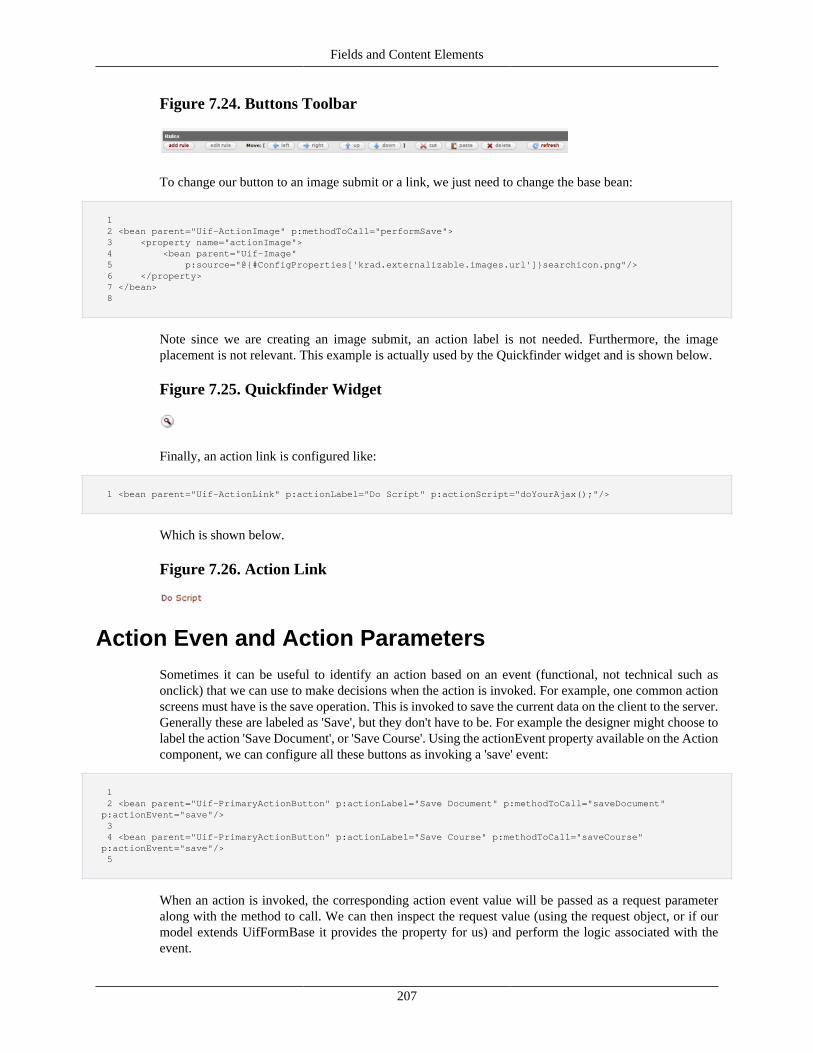
Fields and Content Elements
207
Figure 7.24. Buttons Toolbar
To change our button to an image submit or a link, we just need to change the base bean:
1 2 <bean parent="Uif-ActionImage" p:methodToCall="performSave"> 3 <property name="actionImage"> 4 <bean parent="Uif-Image" 5 p:source="@{#ConfigProperties['krad.externalizable.images.url']}searchicon.png"/> 6 </property> 7 </bean> 8
Note since we are creating an image submit, an action label is not needed. Furthermore, the imageplacement is not relevant. This example is actually used by the Quickfinder widget and is shown below.
Figure 7.25. Quickfinder Widget
Finally, an action link is configured like:
1 <bean parent="Uif-ActionLink" p:actionLabel="Do Script" p:actionScript="doYourAjax();"/>
Which is shown below.
Figure 7.26. Action Link
Action Even and Action ParametersSometimes it can be useful to identify an action based on an event (functional, not technical such asonclick) that we can use to make decisions when the action is invoked. For example, one common actionscreens must have is the save operation. This is invoked to save the current data on the client to the server.Generally these are labeled as 'Save', but they don't have to be. For example the designer might choose tolabel the action 'Save Document', or 'Save Course'. Using the actionEvent property available on the Actioncomponent, we can configure all these buttons as invoking a 'save' event:
1 2 <bean parent="Uif-PrimaryActionButton" p:actionLabel="Save Document" p:methodToCall="saveDocument" p:actionEvent="save"/> 3 4 <bean parent="Uif-PrimaryActionButton" p:actionLabel="Save Course" p:methodToCall="saveCourse" p:actionEvent="save"/> 5
When an action is invoked, the corresponding action event value will be passed as a request parameteralong with the method to call. We can then inspect the request value (using the request object, or if ourmodel extends UifFormBase it provides the property for us) and perform the logic associated with theevent.
Fields and Content Elements
208
So exactly what could we do with this? One good use is within the business rules framework (discussed inChapter 13). Business rules are written to respond to an event (a rule event), thus the action event name canbe mapped to a rule event. Action events can also be useful within the view rendering logic. For example,one use the UIF currently has is to determine when the add action has been taken for a collection. Sincethe button could be labeled differently between collections and views, the framework determines if theaction requested was a collection 'add' by looking at the action event. It then sets up a script to performhighlighting on the added row once the component refreshes.
Along with the method to call and action event parameters that are sent for an action, there are cases wherewe might need more information to complete a request. An example of this are actions that operate on acollection line. These actions are likely available for each line (for instance the delete button), so if weonly invoke the deleteLine button or send in the 'delete' action event, how will we know which line(s) todelete? Furthermore, if there are multiple collections on the page, how will we know which collection?
The framework allows us to specify additional request data that will be sent when an action is takenusing the actionParameters property. This is a map type where the key specifies the name for the requestparameter, and the map value the request parameter value. Let's assume we are configuring a button witha collection group (covered in next chapter):
1 2 <bean parent="Uif-PrimaryActionButton" p:actionLabel="delete" p:methodToCall="deleteAccount" 3 p:actionParameters="chart:@{#line.chartCode},account:@{#line.accountNumber}"/> 4
Here we are using the shorthand map notation to setup two action parameters. The first will have name'chart' and will be equal to the value for the chart code property on the current collection line (collectionsmake the '#line' variables available that refers to the current line instance for which the component isbeing built). Likewise the second parameter will have name 'account' and will be equal to the value forthe account number property on the current line.
When the user takes the action and our controller method is invoked, we will have request parameters withnames 'chart' and 'account' that we can use to determine which account data object instance we shoulddelete. In Chapter 12 we will learn about a base form class our model can extend which does many thingsfor us. Among these is providing a map property populated with the action parameter sent in the request,and a convenience method for getting the value of a parameter by name:
1 2 public Map<String, String> getActionParameters(); 3 public String getActionParamaterValue(String actionParameterName); 4
Thus in our controller method we can do the following:
1 2 public ModelAndView deleteAccount(@ModelAttribute("KualiForm") UifFormBase 3 uifForm, BindingResult result, HttpServletRequest request, HttpServletResponse response) { 4 AccountForm accountForm = (AccountForm) uifForm; 5 String selectedChartCode = accountForm.getActionParamaterValue("chart"); 6 String selectedAccountNumber = accountForm.getActionParamaterValue("account"); 7 // delete account 8 ... 9 } 10
Along with the action parameters we configure in XML, the framework will add parameters for usautomatically in certain situations. For example, any action component within a collection group will
Fields and Content Elements
209
receive a parameters 'selectedCollectionPath' and 'selectedLineIndex', which indicate the collection nameand line index the action took place on.
Field Focus and AnchoringAn action component can occur anywhere in a view, including in the middle of page. In most cases afteran action is taken the user wants to continue completing the form at the location the action took place(location of the button or link). In a page with lots of vertical scrolling, what we don't want to happen isafter the user clicks a button in the middle of the page, they are pushed back to the top on refresh and haveto scroll back down to their previous position. Therefore, we want to set anchor points that will be usedwhen the page refreshes after the action.
To set this up, the action component provides the jumpToIdAfterSubmit and jumpToNameAfterSubmitproperties. We can specify one of these properties to set the anchor position. For the jump to id, we specifythe id for a component on the view. This could be the button itself, a group (with a div element) or anyother field. For example, on the following button we are specifying the page should scroll back to thebutton location on refresh:
1 2 <bean id="delete_button" parent="Uif-PrimaryActionButton" p:actionLabel="delete" 3 p:methodToCall="deleteAccount" 4 p:jumpToIdAfterSubmit="delete_button"/> 5
If we want to scroll back to the location of a data or input field, we can specify the property name for thefield using the jumpToNameAfterSubmit property:
1 2 <bean parent="Uif-PrimaryActionButton" p:actionLabel="delete" 3 p:methodToCall="deleteAccount" 4 p:jumpToIdAfterSubmit="newAccount.accountNumber"/> 5
To scroll back to the top or bottom of the page, the keywords "TOP" or "BOTTOM" can be given forthe jump to id:
1 2 <bean parent="Uif-PrimaryActionButton" p:actionLabel="Save" p:methodToCall="save" p:jumpToIdAfterSubmit="TOP"/> 3
Anchoring and Partial Page Refreshes:
KRAD supports refreshing parts of the page (components) for actions instead of always postingthe full page. This is done with AJAX and replacing the DOM contents, therefore the user is neverscrolled away from their current positions and setting an anchoring point is not necessary.
In addition to anchoring, we might want to set focus to a particular field after an action is taken. The UIFincludes an example of this in the collection group. After the add action is taken, the focus is set back tothe first field on the collection add line.
We can configure the focused component using the focusOnIdAfterSubmit property. This is the id of thefield that should receive focus when the page (or component) refreshes. The keyword "FIRST" exists toset focus to the first visible input field control on the view:
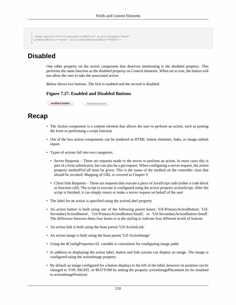
Fields and Content Elements
210
1 2 <bean parent="Uif-PrimaryActionButton" p:actionLabel="Save" 3 p:methodToCall="save" p:focusOnIdAfterSubmit="FIRST"/> 4
DisabledOne other property on the action component that deserves mentioning is the disabled property. Thisperforms the same function as the disabled property on Control elements. When set to true, the button willnot allow the user to take the associated action.
Below shows two buttons. The first is enabled and the second is disabled.
Figure 7.27. Enabled and Disabled Buttons
Recap• The Action component is a content element that allows the user to perform an action, such as posting
the form or performing a script function
• Out of the box action components can be rendered as HTML button elements, links, or image submitinputs
• Types of actions fall into two categories:
• Server Requests – These are requests made to the server to perform an action. In most cases this ispart of a form submission, but can also be a get request. When configuring a server request, the actionproperty methodToCall must be given. This is the name of the method on the controller class thatshould be invoked. Mapping of URL is covered in Chapter 9
• Client Side Requests – These are requests that execute a piece of JavaScript code (either a code blockor function call). The script to execute is configured using the action property actionScript. After thescript is finished, it can simply return or make a server request on behalf of the user
• The label for an action is specified using the actionLabel property
• An action button is built using one of the following parent beans: 'Uif-PrimaryActionButton', 'Uif-SecondaryActionButton', 'Uif-PrimaryActionButton-Small', or 'Uif-SecondaryActionButton-Small'.The difference between these four beans is in the styling to indicate four different levels of buttons
• An action link is built using the bean parent 'Uif-ActionLink'
• An action image is built using the bean parent 'Uif-ActionImage'
• Using the #ConfigProperties EL variable is convenient for configuring image paths
• In addition to displaying the action label, button and link actions can display an image. The image isconfigured using the actionImage property
• By default an image configured for a button displays to the left of the label, however its position can bechanged to TOP, RIGHT, or BOTTOM by setting the property actionImagePlacement (to be renamedto actionImagePosition)
Fields and Content Elements
211
• Actions that perform common server side actions (such as the save operation) but might have differentlabels can be associated with an action event. This is configured using the actionEvent property
• Action events give the ability to determine the type of action requested without relying on a label
• In certain cases an action needs to send additional parameters that clarify the action request. For examplecollection line actions need to send the collection for which the action was chosen, and also the linenumber
• Parameters for actions are built using the actionParameters map. The map key is the name of theparameter that will be sent when the action is selected, and the value is the parameter value that willbe submitted
• Action parameters can be configured in XML (or added through code). In addition the framework willautomatically add parameters in certain situations (for example actions configured for a collection linewill get the collection name and line index)
• Action parameters can easily be retrieved from a controller method by calling the form methodgetActionParamaterValue(String actionParameterName)
• The EL variable #line refers to the collection line data object the field is being rendered for
• Action components support configuring a focus element or anchor element for the page refresh
• For setting an anchor point, the properties jumpToIdAfterSubmit or jumpToNameAfterSubmit can beused
• The keywords 'TOP' and 'BOTTOM' can be used for the jumpToIdAfterSubmit property
• The element to focus on after a refresh is configured using the focusOnIdAfterSubmit property
• Like controls, actions can be disabled by setting the disabled property
• Some more properties have been added to the action component which are hooks that provide moreflexibility to the user
• preSubmitCall – This property is a script which needs to be invoked before the form is submitted.The script should return a boolean indicating if the form should be submitted or not.
• ajaxSubmit – boolean property which indicates if the data is to be submitted via ajax or otherwise
• successCallback – This property is a script which will be invoked for successful ajax calls
• errorCallback – script which will be invoked on error in ajax calls
Space and Space FieldNow for an easy one! One HTML entity that is useful for layout purposes is ' ' (a space). To createa space, we use the Space component. This component has no properties, and simply renders the ' 'element. When putting together multiple content elements in a group, the space component can be usedto adjust the padding between each. To create a space component, we specify a bean with parent of 'Uif-Space':
1
Fields and Content Elements
212
2 <bean parent="Uif-Space"/> 3
Likewise the space field exists which wraps the space entity in a span. This can be used for renderingempty 'blocks' in the layout. To create a space field, we specify a bean with parent of 'Uif-SpaceField':
1 2 <bean parent="Uif-SpaceField"/> 3
Recap• The Space component can be used to render the HTML entity
• The Space Field component can be used to render a span with a space. This is useful for creating blank'slots' in a layout
ValidationMessages content elementThe ValidationMessages component is used to display validation errors and other types of messages to theuser. This is the general mechanism by which the application communicates to the user about the successor failure of an action.
A ValidationMessages element is different in many ways from the previous components we have lookedat. First, we don't generally create new errors field components like we do data, input, and action fields.Instead, these components are already constructed as properties of a container (both the View and Group)and an Input Field. Therefore, all we need to do is configure them as needed.
In the next chapter we will learn about group nesting and how we form the conceptual groupings of theview: a page, section, sub-section, and field group. Each of these groups contains a ValidationMessageselement that displays by default under the group header. It is important to understand these group 'levels'when configuring the associated ValidationMessages (although the framework attempts to set reasonabledefaults out of the box). A ValidationMessages element is also included for an Input field by default. Thisis for handling individual field level messages from the server and messages from the client side validation.
Important - even though ValidationMessages are configured at the group level, validation messagesdisplayed to the user are only ever shown on the screen for what we consider "Sections". Sections areessentially groups that have a header. If a group does not have a header, it displays its messages at thenext available section. When no sections are present, messages are displayed at the "Page" level. Thusconfiguring a ValidationMessages element for a group without a header will result in no effect. Exception:for the PageGroup case - if no header is defined, the framework will still show the messages at this level.In addition to this, ValidationMessages for fields can only ever be configured for InputFields - becauseother fields do not allow user input.
In order to understand how to configure a ValidationMessages element, we need to understand howmessages are added during application processing. To collect messages for a request, KRAD providesthe class org.kuali.rice.krad.util.MessageMap. This collects messages of type Error, Warning, and Info.At the beginning of each request, a new message map is constructed and made available through theorg.kuali.rice.krad.util.GlobalVariables class as a static method. Therefore application code can get ahandle on the message map by calling GlobalVariables.getMessageMap(). This means the message mapdoes not have to be passed through all the application methods (made possible because the message mapis attached to the current thread).
Fields and Content Elements
213
When adding a message to the message map, there are three pieces of data we can specify. The first tells theframework what property or container the message is associated with. Associating the message allows theframework to give a better indication of the source of the error when rendering the page. When associatinga message with a group or field, we need to give the id for the component. A message for an Input fieldcan also be associated by property name, but we need to give the full property path of this field (as isdone for binding). To display a general message at the page level that doesn't relate to your current pagecontent, the present keywords of 'GLOBAL_ERRORS', 'GLOBAL_WARNINGS', and 'GLOBAL_INFO'exist for each of the message types.
The second piece of data we need to give is the property key for the message. In order to supportcustomizations and internalization, all messages are externalized from the code through a resourcebundle. In the current version of Rice, these messages are configured in property files, with one beingKRADApplicationResources.properties.
We need to provide the key of the resource and the framework will resolve the actual message. Thefinal piece (not always necessary) is any arguments that are necessary for the message. With the use ofplaceholders ('{0}', '{1}', '{2}'), we can have variables in our message that get replaced by the runtime data.If the message contains one or more variables, the value for each must be given when adding the message.
To add a message to the message map, we can use one of the following methods based on the type ofmessage we want to add and how we want it associated (property or component):
1 2 public AutoPopulatingList<ErrorMessage> putError(String propertyName, String errorKey, String... errorParameters); 3 4 public AutoPopulatingList<ErrorMessage> putWarning(String propertyName, String messageKey, String... messageParameters); 5 6 public AutoPopulatingList<ErrorMessage> putInfo(String propertyName, String messageKey, String... messageParameters); 7 8 public AutoPopulatingList<ErrorMessage> putErrorForSectionId(String sectionId, String errorKey, String... errorParameters); 9 10 public AutoPopulatingList<ErrorMessage> putWarningForSectionId(String sectionId, String messageKey, String... messageParameters); 11 12 public AutoPopulatingList<ErrorMessage> putInfoForSectionId(String sectionId, String messageKey, String... messageParameters); 13
Note even though the last three methods named include 'Section', they can be used for any UIF container.
Let's take some examples. Suppose we have the following Group definition:
1 2 <bean id="BookDocumentOverview" parent="Uif-GridSection" p:title="Book Overview"> 3 <property name="items"> 4 <list> 5 <bean parent="Uif-InputField" p:propertyName="bookId"/> 6 <bean parent="Uif-InputField" p:propertyName="bookTitle"/> 7 <bean parent="Uif-InputField" p:propertyName="author.name"/> 8 </list> 9 </property> 10 </bean> 11
Now we want to have a business rule that says the author name cannot be 'Anonymous'. First we add amessage to our application resources (properties file):
error.book.authorName.anonymous=Author name cannot be 'Anonymous'
Fields and Content Elements
214
Next we write application code to check the rule (see 'Writing Business Rules' in Chapter 13), and if therule fails we add an error message associated with the author name property:
1 2 if (isAnonymous) { 3 GlobalVariables.getMessageMap().putError("author.name","error.book.authorName.anonymous"); 4 } 5
Since our message did not have any variables, we only needed to pass the property name and message key.Note if there is a default binding object path on the view (or was added on the group), the property pathfor our field would be '{object path}.author.name'. The key we specify must then also include the objectpath. The message map allows for a similar concept of 'auto-prefixing' the path as is done in the UIF. Wecan make a call to the method addToErrorPath(String parentName) to specify a string that should prefixany message keys added from that point on. We can then call removeFromErrorPath(String parentName)to stop the prefixing. For example:
1 2 GlobalVariables.getMessageMap().addToErrorPath("document.newBook"); 3 4 //results in the full key of 'document.newBook.author.name' 5 GlobalVariables.getMessageMap().putError("author.name","error.book.authorName.anonymous"); 6 // more validation 7 8 GlobalVariables.getMessageMap().removeFromErrorPath("document.newBook"); 9
This is useful when doing several validations on the same object. KRAD also takes advantage of this incertain places to automatically prefix the error paths. For example, in the document framework for eventsthat take place on the document, it will add the prefix 'document'.
For one last example, let's assume we need to validate all three fields of the book overview group. Sincethis doesn't really tie to one property in particular, we will just associate the error with the section. Thiscan be done as follows:
1 2 if (missingFieldValue) { 3 GlobalVariables.getMessageMap().putError("BookDocumentOverview","error.book.overview.misingFieldValue"); 4 } 5
Ok, so now that we know a little bit about how messages are added, let's go back to configuring theValidationMessages element.
If we want to then match on additional keys, we can add those using the additionalKeysToMatchproperty. This is a List type where each entry gives an additional property path or id to match on. Each oneof these can be defined with a wildcard, as well. So if we wanted to also include any messages associatedwith the 'author' property path, we can do so as follows:
1 2 <bean id="BookDocumentOverview" parent="Uif-GridSection" p:title="Book Overview" 3 p:errorsField.additionalKeysToMatch="author*"> 4 ... 5
The ValidationMessages object and its subclasses have several other properties we can configure whichinclude:
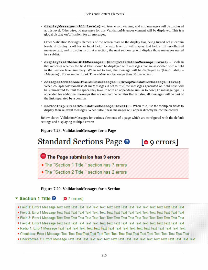
Fields and Content Elements
215
• displayMessages (All levels) – If true, error, warning, and info messages will be displayedat this level. Otherwise, no messages for this ValidationMessages element will be displayed. This is aglobal display on/off switch for all messages.
Other ValidationMessages elements of the screen react to the display flag being turned off at certainlevels: if display is off for an Input field, the next level up will display that field's full uncollapsedmessage text; and if display is off at a section, the next section up will display those messages nestedin a sublist.
• displayFieldLabelWithMessages (GroupValidationMessage level) – Booleanthat indicates whether the field label should be displayed with messages that are associated with a fieldin the Section level summary. When set to true, the message will be displayed as '{Field Label} –{Message}'. For example: 'Book Title – Must not be longer than 50 characters.'.
• collapseAdditionalFieldLinkMessages (GroupValidationMessage level) –When collapseAdditionalFieldLinkMessages is set to true, the messages generated on field links willbe summarized to limit the space they take up with an appendage similar to how [+n message type] isappended for additional messages that are omitted. When this flag is false, all messages will be part ofthe link separated by a comma.
• useTooltip (FieldValidationMessage level) – When true, use the tooltip on fields todisplay their relevant messages. When false, these messages will appear directly below the control.
Below shows ValidationMessages for various elements of a page which are configured with the defaultsettings and displaying multiple errors:
Figure 7.28. ValidationMessages for a Page
Figure 7.29. ValidationMessages for a Section
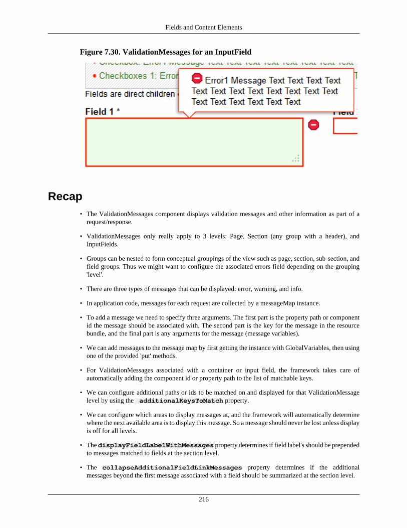
Fields and Content Elements
216
Figure 7.30. ValidationMessages for an InputField
Recap• The ValidationMessages component displays validation messages and other information as part of a
request/response.
• ValidationMessages only really apply to 3 levels: Page, Section (any group with a header), andInputFields.
• Groups can be nested to form conceptual groupings of the view such as page, section, sub-section, andfield groups. Thus we might want to configure the associated errors field depending on the grouping'level'.
• There are three types of messages that can be displayed: error, warning, and info.
• In application code, messages for each request are collected by a messageMap instance.
• To add a message we need to specify three arguments. The first part is the property path or componentid the message should be associated with. The second part is the key for the message in the resourcebundle, and the final part is any arguments for the message (message variables).
• We can add messages to the message map by first getting the instance with GlobalVariables, then usingone of the provided 'put' methods.
• For ValidationMessages associated with a container or input field, the framework takes care ofautomatically adding the component id or property path to the list of matchable keys.
• We can configure additional paths or ids to be matched on and displayed for that ValidationMessagelevel by using the additionalKeysToMatch property.
• We can configure which areas to display messages at, and the framework will automatically determinewhere the next available area is to display this message. So a message should never be lost unless displayis off for all levels.
• The displayFieldLabelWithMessages property determines if field label's should be prependedto messages matched to fields at the section level.
• The collapseAdditionalFieldLinkMessages property determines if the additionalmessages beyond the first message associated with a field should be summarized at the section level.
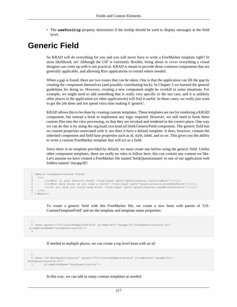
Fields and Content Elements
217
• The useTooltip property determines if the tooltip should be used to display messages at the fieldlevel.
Generic FieldSo KRAD will do everything for you and you will never have to write a FreeMarker template right? Inmost likelihood, no! Although the UIF is extremely flexible, being about to cover everything a visualdesigner can come up with is not practical. KRAD is meant to provide those common components that aregenerally applicable, and allowing Rice applications to extend where needed.
When a gap is found, there are two routes that can be taken. One is that the application can fill the gap bycreating the component themselves (and possibly contributing back). In Chapter 5 we learned the generalguidelines for doing so. However, creating a new component might be overkill in some situations. Forexample, we might need to add something that is really very specific to the use case, and it is unlikelyother places in the application (or other applications) will find it useful. In these cases, we really just wantto get the job done and not spend extra time making it 'generic'.
KRAD allows this to be done by creating custom templates. These templates are not for rendering a KRADcomponent, but instead a hook to implement any logic required. However, we still need to hook thesecustom files into the view processing, so that they are invoked and rendered in the correct place. One waywe can do this is by using the org.kuali.rice.krad.uif.field.GenericField component. The generic field hasno custom properties associated with it, nor does it have a default template. It does, however, contain theinherited component and field base properties such as id, style, label, and so on. This gives you the abilityto write a custom FreeMarker template that will act as a field.
Since there is no template provided by default, we must create one before using the generic field. Unlikeother component templates, there are really no rules to follow here; this can contain any content we like.Let's assume we have created a FreeMarker file named 'bookQuestionnaire' in one of our application webfolders named '/myapp/ftl':
1 <#macro bookQuestionaire field> 2 <ul> 3 <li>What is your favorite book? <form:input path="questionnaire.favoriteBook"/></li> 4 <li>What many books do you read a month? <form:input path="questionnaire.booksPerMonth"/></li> 5 <li>Do you wish you could read more? <form:input path="questionnaire.readMoreIndicator"/></li> 6 </ul> 7 </#macro>
To create a generic field with this FreeMarker file, we create a new bean with parent of 'Uif-CustomTemplateField' and set the template and template name properties:
1 2 <bean parent="Uif-CustomTemplateField" p:template="/myapp/ftl/bookQuestionnaire.ftl" p:templateName="bookQuestionaire"/> 3
If needed in multiple places, we can create a top level bean with an id:
1 2 <bean id="BookQuestionnaire" parent="Uif-CustomTemplateField" p:template="/myapp/ftl/bookQuestionnaire.ftl" 3 p:templateName="bookQuestionaire"/>
In this way, we can add as many custom templates as needed.
Fields and Content Elements
218
It is also possible to parameterize our custom template using the templateOptions map property (recall thisis provided by ComponentBase). For example, if we wanted a parameter to determine whether or not weask the third question, we could do so as follows:
1 <#macro bookQuestionaire field> 2 <#local askReadMore=field.templateOptions['askReadMore']/> 3 <ul> 4 <li>What is your favorite book? <form:input path="questionnaire.favoriteBook"/></li> 5 <li>How many books do you read a month? <form:input path="questionnaire.booksPerMonth"/></li> 6 <#if askReadMore> 7 <li>Do you wish you could read more? <@spring.input path="questionnaire.readMoreIndicator"/></li> 8 </#if> 9 </ul> 10 </#macro>
Now to specify the variable setting, our bean will be:
// TODO: need bean example here
Disadvantages of Generic Fields
A couple of things should be noted when building a generic field. First, since we don't have actualinput field components for any included input macros (or other form macros), we don't get certainfeatures such as custom property editors, default values, and so on. Another route to take forcustom templates is to use a Group (with all the fields configured) and write a custom template.The custom template can then render a custom layout, add additional markup or whatever else isnecessary, and invoke the template tag to render the individual fields.
Recap• The Generic field component allows a custom FreeMarker template to be created and act as a field to
the framework
• The custom template can reside anywhere in the web module and may contain any content
• Generic field components can be created with a bean with parent 'Uif-CustomTemplateField'
• Custom templates can have variables that are passed using the templateOptions map proper
• Another way to implement custom templates is by configuring a group (with field items) that uses thecustom template. The template can then render a custom layout and other markup, then invoke thetemplate tag to render each field
IframeAlthough not needed as much these days with the capability of modern web applications, KRADnonetheless provides the Iframe component for generating the HTML Iframe element. Iframes are inlineframes that can be used to embed another document (including cross-site).
To create an iframe component, we need to create a new bean with parent of 'Uif-Iframe'. The onlyrequired property is the source property, which is the URL (relative or full) for the document that shouldbe embedded.
For example, we can include the kuali.org webpage in our view as follows:
1
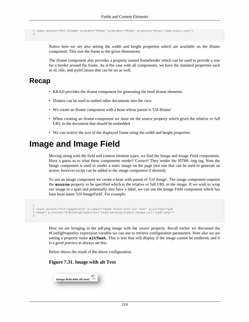
Fields and Content Elements
219
2 <bean parent="Uif-Iframe" p:width="800px" p:height="550px" p:source="http://www.kuali.org"/> 3
Notice here we are also setting the width and height properties which are available on the iframecomponent. This size the frame to the given dimensions.
The iframe component also provides a property named frameborder which can be used to provide a sizefor a border around the frame. As is the case with all components, we have the standard properties suchas id, title, and styleClasses that can be set as well.
Recap• KRAD provides the iframe component for generating the html iframe elements
• Iframes can be used to embed other documents into the view
• We create an iframe component with a bean whose parent is 'Uif-Iframe'
• When creating an iframe component we must set the source property which gives the relative or fullURL to the document that should be embedded
• We can restrict the size of the displayed frame using the width and height properties
Image and Image FieldMoving along with the field and content element types, we find the Image and Image Field components.Have a guess as to what these components render? Correct! They render the HTML img tag. Note theImage component is used to render a static image on the page (not one that can be used to generate anaction; however script can be added to the image component if desired).
To use an image component we create a bean with parent of 'Uif-Image'. The image component requiresthe source property to be specified which is the relative or full URL to the image. If we wish to wrapour image in a span and potentially also have a label, we can use the Image Field component which hasbase bean name 'Uif-ImageField'. For example:
1 2 <bean parent="Uif-ImageField" p:label="Image field with alt text" p:altText="pdf 3 image" p:source="@{#ConfigProperties['krad.externalizable.images.url']}pdf.png"/> 4
Here we are bringing in the pdf.png image with the source property. Recall earlier we discussed the#ConfigProperties expression variable we can use to retrieve configuration parameters. Note also we aresetting a property name altText. This is text that will display if the image cannot be rendered, and itis a good practice to always set this.
Below shows the result of the above configuration.
Figure 7.31. Image with alt Text
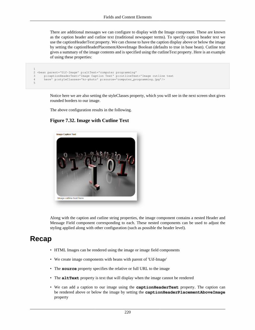
Fields and Content Elements
220
There are additional messages we can configure to display with the Image component. These are knownas the caption header and cutline text (traditional newspaper terms). To specify caption header text weuse the captionHeaderText property. We can choose to have the caption display above or below the imageby setting the captionHeaderPlacementAboveImage Boolean (defaults to true in base bean). Cutline textgives a summary of the image contents and is specified using the cutlineText property. Here is an exampleof using these properties:
1 2 <bean parent="Uif-Image" p:altText="computer programming" 3 p:captionHeaderText="Image Caption Text" p:cutlineText="Image cutline text 4 here" p:styleClasses="kr-photo" p:source="computer_programming.jpg"/> 5
Notice here we are also setting the styleClasses property, which you will see in the next screen shot givesrounded borders to our image.
The above configuration results in the following.
Figure 7.32. Image with Cutline Text
Along with the caption and cutline string properties, the image component contains a nested Header andMessage Field component corresponding to each. These nested components can be used to adjust thestyling applied along with other configuration (such as possible the header level).
Recap• HTML Images can be rendered using the image or image field components
• We create image components with beans with parent of 'Uif-Image'
• The source property specifies the relative or full URL to the image
• The altText property is text that will display when the image cannot be rendered
• We can add a caption to our image using the captionHeaderText property. The caption canbe rendered above or below the image by setting the captionHeaderPlacementAboveImageproperty
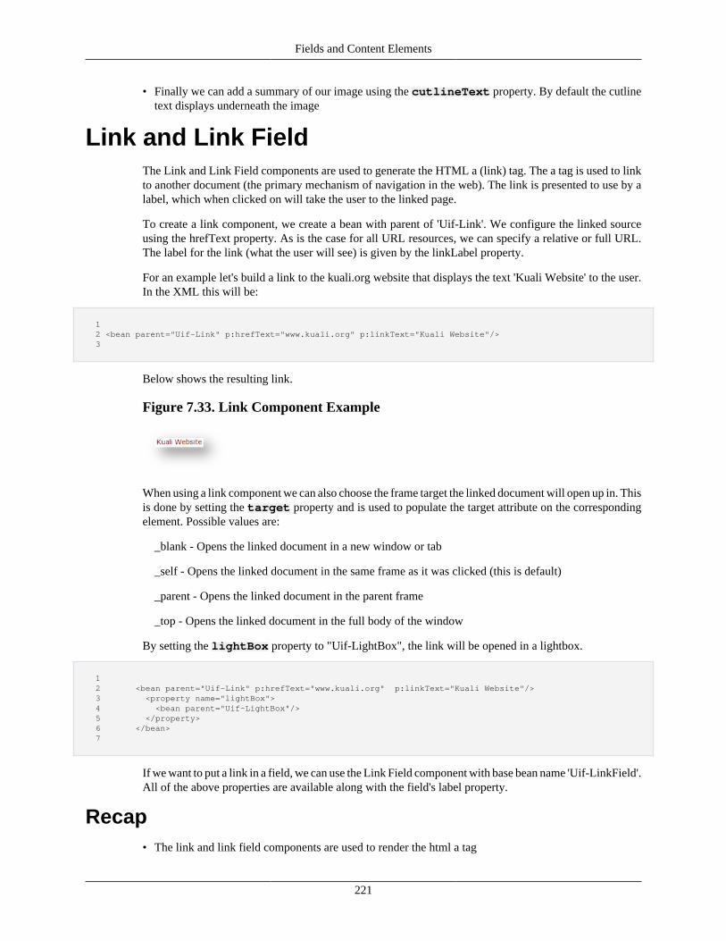
Fields and Content Elements
221
• Finally we can add a summary of our image using the cutlineText property. By default the cutlinetext displays underneath the image
Link and Link FieldThe Link and Link Field components are used to generate the HTML a (link) tag. The a tag is used to linkto another document (the primary mechanism of navigation in the web). The link is presented to use by alabel, which when clicked on will take the user to the linked page.
To create a link component, we create a bean with parent of 'Uif-Link'. We configure the linked sourceusing the hrefText property. As is the case for all URL resources, we can specify a relative or full URL.The label for the link (what the user will see) is given by the linkLabel property.
For an example let's build a link to the kuali.org website that displays the text 'Kuali Website' to the user.In the XML this will be:
1 2 <bean parent="Uif-Link" p:hrefText="www.kuali.org" p:linkText="Kuali Website"/> 3
Below shows the resulting link.
Figure 7.33. Link Component Example
When using a link component we can also choose the frame target the linked document will open up in. Thisis done by setting the target property and is used to populate the target attribute on the correspondingelement. Possible values are:
_blank - Opens the linked document in a new window or tab
_self - Opens the linked document in the same frame as it was clicked (this is default)
_parent - Opens the linked document in the parent frame
_top - Opens the linked document in the full body of the window
By setting the lightBox property to "Uif-LightBox", the link will be opened in a lightbox.
1 2 <bean parent="Uif-Link" p:hrefText="www.kuali.org" p:linkText="Kuali Website"/> 3 <property name="lightBox"> 4 <bean parent="Uif-LightBox"/> 5 </property> 6 </bean> 7
If we want to put a link in a field, we can use the Link Field component with base bean name 'Uif-LinkField'.All of the above properties are available along with the field's label property.
Recap• The link and link field components are used to render the html a tag
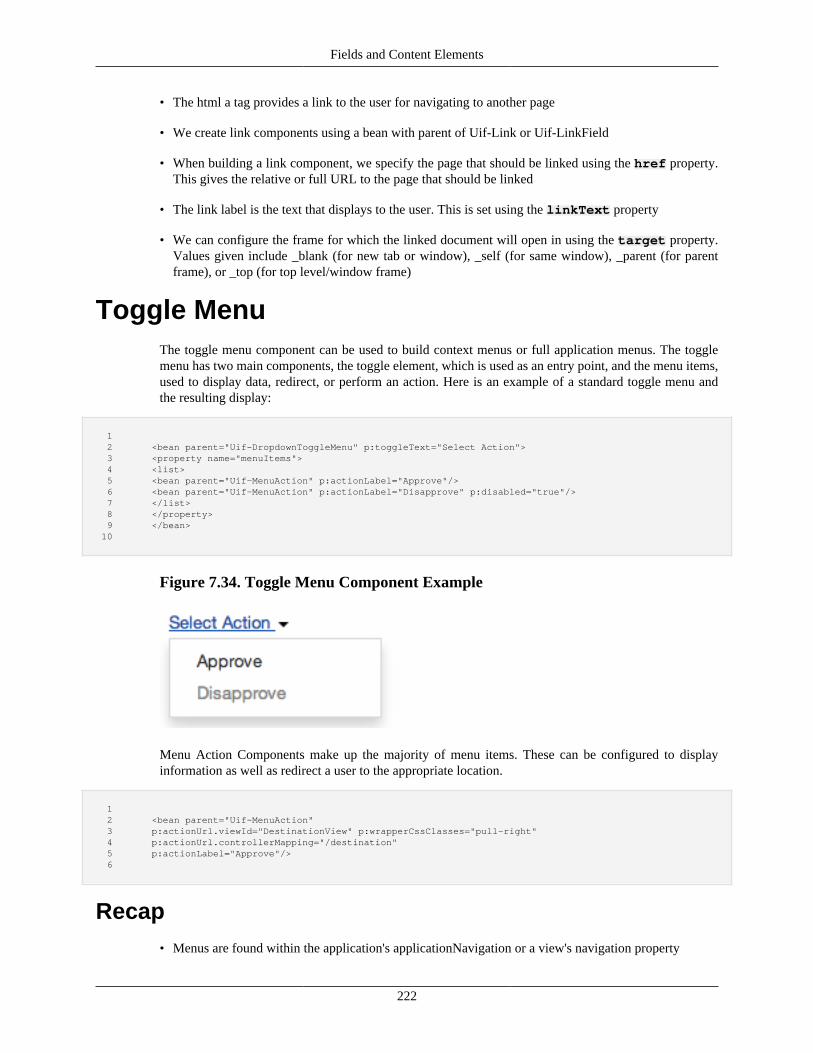
Fields and Content Elements
222
• The html a tag provides a link to the user for navigating to another page
• We create link components using a bean with parent of Uif-Link or Uif-LinkField
• When building a link component, we specify the page that should be linked using the href property.This gives the relative or full URL to the page that should be linked
• The link label is the text that displays to the user. This is set using the linkText property
• We can configure the frame for which the linked document will open in using the target property.Values given include _blank (for new tab or window), _self (for same window), _parent (for parentframe), or _top (for top level/window frame)
Toggle MenuThe toggle menu component can be used to build context menus or full application menus. The togglemenu has two main components, the toggle element, which is used as an entry point, and the menu items,used to display data, redirect, or perform an action. Here is an example of a standard toggle menu andthe resulting display:
1 2 <bean parent="Uif-DropdownToggleMenu" p:toggleText="Select Action"> 3 <property name="menuItems"> 4 <list> 5 <bean parent="Uif-MenuAction" p:actionLabel="Approve"/> 6 <bean parent="Uif-MenuAction" p:actionLabel="Disapprove" p:disabled="true"/> 7 </list> 8 </property> 9 </bean> 10
Figure 7.34. Toggle Menu Component Example
Menu Action Components make up the majority of menu items. These can be configured to displayinformation as well as redirect a user to the appropriate location.
1 2 <bean parent="Uif-MenuAction" 3 p:actionUrl.viewId="DestinationView" p:wrapperCssClasses="pull-right" 4 p:actionUrl.controllerMapping="/destination" 5 p:actionLabel="Approve"/> 6
Recap• Menus are found within the application's applicationNavigation or a view's navigation property
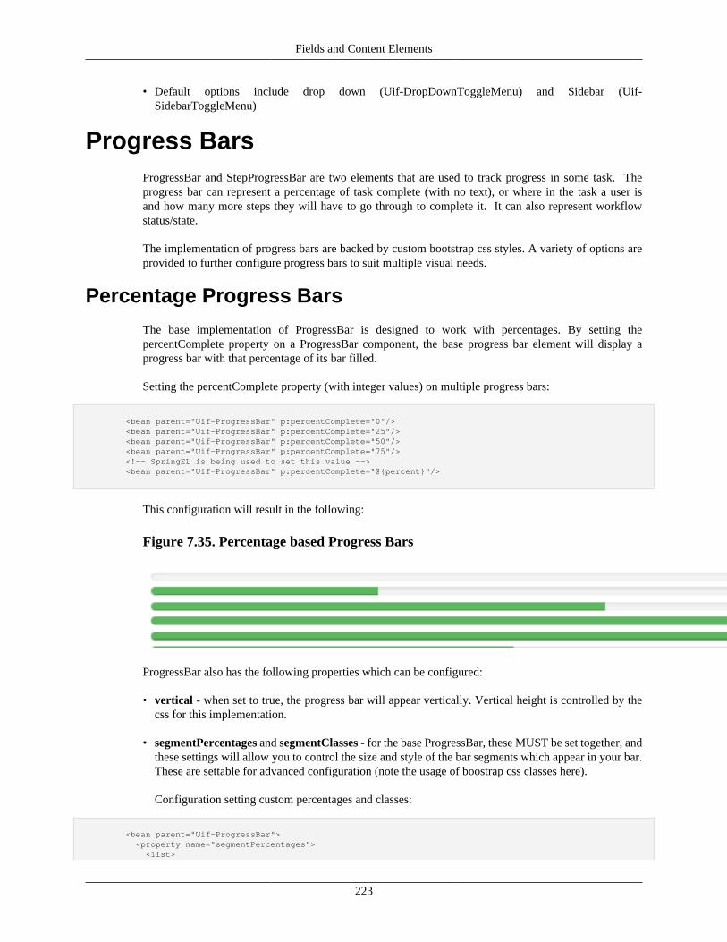
Fields and Content Elements
223
• Default options include drop down (Uif-DropDownToggleMenu) and Sidebar (Uif-SidebarToggleMenu)
Progress BarsProgressBar and StepProgressBar are two elements that are used to track progress in some task. Theprogress bar can represent a percentage of task complete (with no text), or where in the task a user isand how many more steps they will have to go through to complete it. It can also represent workflowstatus/state.
The implementation of progress bars are backed by custom bootstrap css styles. A variety of options areprovided to further configure progress bars to suit multiple visual needs.
Percentage Progress Bars
The base implementation of ProgressBar is designed to work with percentages. By setting thepercentComplete property on a ProgressBar component, the base progress bar element will display aprogress bar with that percentage of its bar filled.
Setting the percentComplete property (with integer values) on multiple progress bars:
<bean parent="Uif-ProgressBar" p:percentComplete="0"/> <bean parent="Uif-ProgressBar" p:percentComplete="25"/> <bean parent="Uif-ProgressBar" p:percentComplete="50"/> <bean parent="Uif-ProgressBar" p:percentComplete="75"/> <!-- SpringEL is being used to set this value --> <bean parent="Uif-ProgressBar" p:percentComplete="@{percent}"/>
This configuration will result in the following:
Figure 7.35. Percentage based Progress Bars
ProgressBar also has the following properties which can be configured:
• vertical - when set to true, the progress bar will appear vertically. Vertical height is controlled by thecss for this implementation.
• segmentPercentages and segmentClasses - for the base ProgressBar, these MUST be set together, andthese settings will allow you to control the size and style of the bar segments which appear in your bar.These are settable for advanced configuration (note the usage of boostrap css classes here).
Configuration setting custom percentages and classes:
<bean parent="Uif-ProgressBar"> <property name="segmentPercentages"> <list>
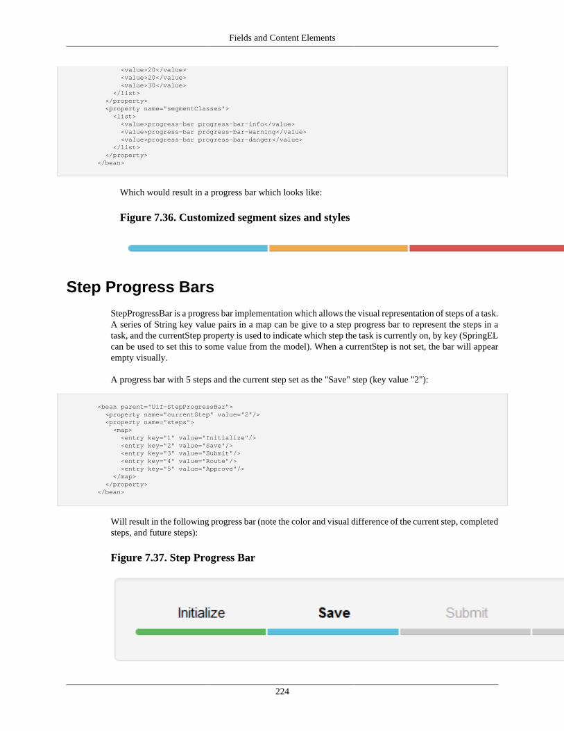
Fields and Content Elements
224
<value>20</value> <value>20</value> <value>30</value> </list> </property> <property name="segmentClasses"> <list> <value>progress-bar progress-bar-info</value> <value>progress-bar progress-bar-warning</value> <value>progress-bar progress-bar-danger</value> </list> </property> </bean>
Which would result in a progress bar which looks like:
Figure 7.36. Customized segment sizes and styles
Step Progress Bars
StepProgressBar is a progress bar implementation which allows the visual representation of steps of a task.A series of String key value pairs in a map can be give to a step progress bar to represent the steps in atask, and the currentStep property is used to indicate which step the task is currently on, by key (SpringELcan be used to set this to some value from the model). When a currentStep is not set, the bar will appearempty visually.
A progress bar with 5 steps and the current step set as the "Save" step (key value "2"):
<bean parent="Uif-StepProgressBar"> <property name="currentStep" value="2"/> <property name="steps"> <map> <entry key="1" value="Initialize"/> <entry key="2" value="Save"/> <entry key="3" value="Submit"/> <entry key="4" value="Route"/> <entry key="5" value="Approve"/> </map> </property> </bean>
Will result in the following progress bar (note the color and visual difference of the current step, completedsteps, and future steps):
Figure 7.37. Step Progress Bar
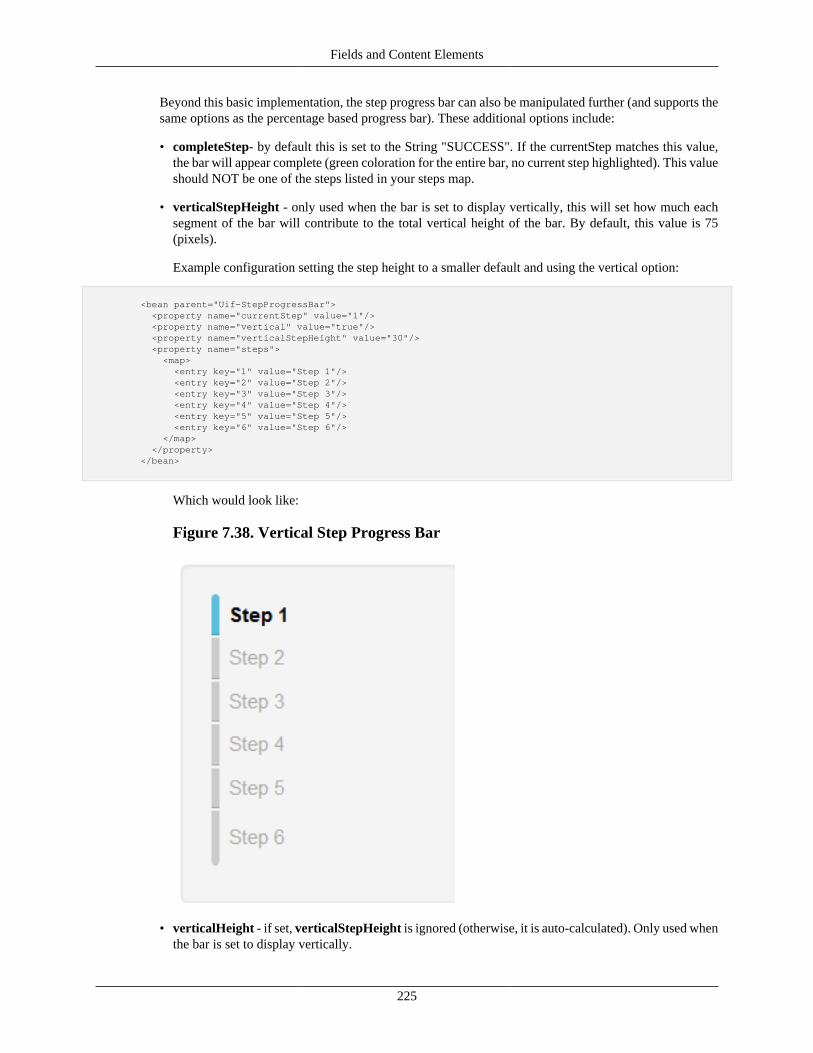
Fields and Content Elements
225
Beyond this basic implementation, the step progress bar can also be manipulated further (and supports thesame options as the percentage based progress bar). These additional options include:
• completeStep- by default this is set to the String "SUCCESS". If the currentStep matches this value,the bar will appear complete (green coloration for the entire bar, no current step highlighted). This valueshould NOT be one of the steps listed in your steps map.
• verticalStepHeight - only used when the bar is set to display vertically, this will set how much eachsegment of the bar will contribute to the total vertical height of the bar. By default, this value is 75(pixels).
Example configuration setting the step height to a smaller default and using the vertical option:
<bean parent="Uif-StepProgressBar"> <property name="currentStep" value="1"/> <property name="vertical" value="true"/> <property name="verticalStepHeight" value="30"/> <property name="steps"> <map> <entry key="1" value="Step 1"/> <entry key="2" value="Step 2"/> <entry key="3" value="Step 3"/> <entry key="4" value="Step 4"/> <entry key="5" value="Step 5"/> <entry key="6" value="Step 6"/> </map> </property> </bean>
Which would look like:
Figure 7.38. Vertical Step Progress Bar
• verticalHeight - if set, verticalStepHeight is ignored (otherwise, it is auto-calculated). Only used whenthe bar is set to display vertically.
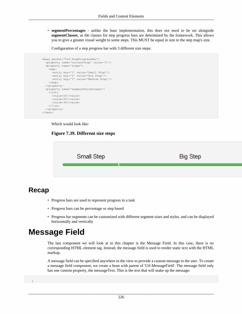
Fields and Content Elements
226
• segmentPercentages - unlike the base implementation, this does not need to be set alongsidesegmentClasses, as the classes for step progress bars are determined by the framework. This allowsyou to give a greater visual weight to some steps. This MUST be equal in size to the step map's size.
Configuration of a step progress bar with 3 different size steps:
<bean parent="Uif-StepProgressBar"> <property name="currentStep" value="3"/> <property name="steps"> <map> <entry key="1" value="Small Step"/> <entry key="2" value="Big Step"/> <entry key="3" value="Medium Step"/> </map> </property> <property name="segmentPercentages"> <list> <value>20</value> <value>50</value> <value>30</value> </list> </property> </bean>
Which would look like:
Figure 7.39. Different size steps
Recap• Progress bars are used to represent progress in a task
• Progress bars can be percentage or step based
• Progress bar segments can be customized with different segment sizes and styles, and can be displayedhorizontally and vertically
Message FieldThe last component we will look at in this chapter is the Message Field. In this case, there is nocorresponding HTML element tag. Instead, the message field is used to render static text with the HTMLmarkup.
A message field can be specified anywhere in the view to provide a custom message to the user. To createa message field component, we create a bean with parent of 'Uif-MessageField'. The message field onlyhas one custom property, the messageText. This is the text that will make up the message:
1
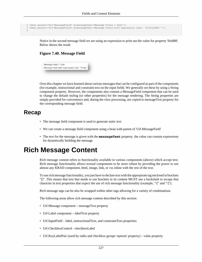
Fields and Content Elements
227
2 <bean parent="Uif-MessageField" p:messageText="Message Field 1 Text"/> 3 <bean parent="Uif-MessageField" p:messageText="Message Field with expression text: '@{field88}'"/> 4
Notice in the second message field we are using an expression to print out the value for property 'field88'.Below shows the result
Figure 7.40. Message Field
Over this chapter we have learned about various messages that can be configured as part of the components(for example, instructional and constraint text on the input field). We generally set these by using a Stringcomponent property. However, the components also contain a MessageField component that can be usedto change the default styling (or other properties) for the message rendering. The String properties aresimply provided for convenience and, during the view processing, are copied to messageText property forthe corresponding message field.
Recap• The message field component is used to generate static text
• We can create a message field component using a bean with parent of 'Uif-MessageField'
• The text for the message is given with the messageText property. the value can contain expressionsfor dynamically building the message
Rich Message ContentRich message content refers to functionality available in various components (above) which accept text.Rich message functionality allows textual components to be more robust by providing the power to usealmost any KRAD component, html, image, link, or css inline with the rest of the text.
To use rich message functionality, you just have to declare text with the appropriate tag enclosed in brackets"[]". This means that text that needs to use brackets in its content MUST use a backslash to escape thatcharacter in text properties that expect the use of rich message functionality (example, "\[" and "\]").
Rich message tags can be also be wrapped within other tags allowing for a variety of combinations.
The following areas allow rich message content described by this section:
• Uif-Message component – messageText property
• Uif-Label component – labelText property
• Uif-InputField – label, instructionalText, and constraintText properties
• Uif-CheckboxControl - checkboxLabel
• Uif-KeyLabelPair (used by radio and checkbox groups 'options' property) – value property
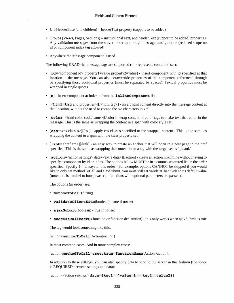
Fields and Content Elements
228
• Uif-HeaderBase (and children) – headerText property (support to be added)
• Groups (Views, Pages, Sections) – instructionalText, and headerText (support to be added) properties.Any validation messages from the server or set up through message configuration (reduced scope noid or component index tag allowed)
• Anywhere the Message component is used
The following KRAD rich message tags are supported (< > represents content to set):
• [id=<component id> property1=value property2=value] - insert component with id specified at thatlocation in the message. You can also set/override properties of the component referenced throughby specifying those additional properties (must be separated by spaces). Textual properties must bewrapped in single quotes.
• [n] - insert component at index n from the inlineComponent list.
• [<html tag and properties>][/<html tag>] - insert html content directly into the message content atthat location, without the need to escape the <> characters in xml.
• [color=<html color code/name>][/color] - wrap content in color tags to make text that color in themessage. This is the same as wrapping the content in a span with color style set.
• [css=<css classes>][/css] - apply css classes specified to the wrapped content . This is the same aswrapping the content in a span with the class property set.
• [link=<href src>][/link] - an easy way to create an anchor that will open in a new page to the hrefspecified. This is the same as wrapping the content in an a tag with the target set as "_blank".
• [action=<action settings> data=<extra data>][/action] - create an action link inline without having tospecify a component by id or index. The options below MUST be in a comma separated list in the orderspecified. Specify 1-4 always in this order – for example, options CANNOT be skipped if you wouldlike to only set methodToCall and ajaxSubmit, you must still set validateClientSide to its default value(note: this is parallel to how javascript functions with optional parameters are passed).
The options (in order) are:
• methodToCall(String)
• validateClientSide(boolean) - true if not set
• ajaxSubmit(boolean) - true if not set
• successCallback(js function or function declaration) - this only works when ajaxSubmit is true
The tag would look something like this:
[action=methodToCall]Action[/action]
in most common cases. And in more complex cases:
[action=methodToCall,true,true,functionName]Action[/action].
In addition to these settings, you can also specify data to send to the server in this fashion (the spaceis REQUIRED between settings and data):
[action=<action settings> data={key1: 'value 1', key2: value2}]
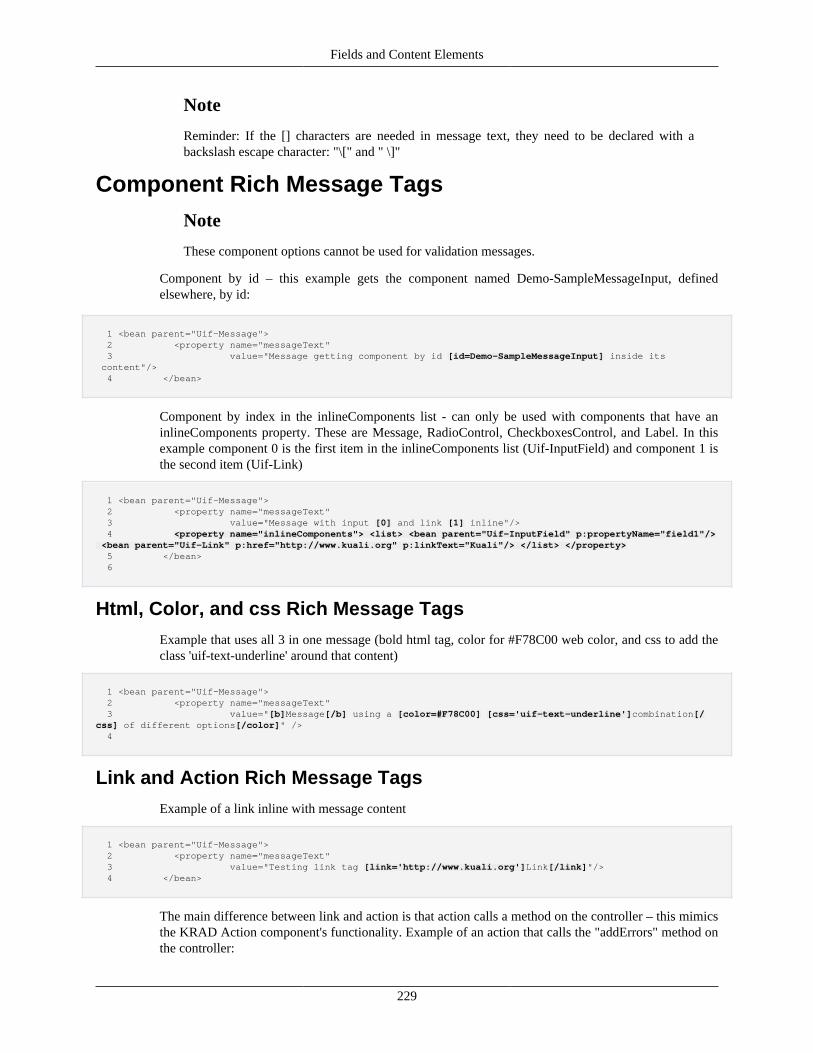
Fields and Content Elements
229
Note
Reminder: If the [] characters are needed in message text, they need to be declared with abackslash escape character: "\[" and " \]"
Component Rich Message Tags
Note
These component options cannot be used for validation messages.
Component by id – this example gets the component named Demo-SampleMessageInput, definedelsewhere, by id:
1 <bean parent="Uif-Message"> 2 <property name="messageText" 3 value="Message getting component by id [id=Demo-SampleMessageInput] inside its content"/> 4 </bean>
Component by index in the inlineComponents list - can only be used with components that have aninlineComponents property. These are Message, RadioControl, CheckboxesControl, and Label. In thisexample component 0 is the first item in the inlineComponents list (Uif-InputField) and component 1 isthe second item (Uif-Link)
1 <bean parent="Uif-Message"> 2 <property name="messageText" 3 value="Message with input [0] and link [1] inline"/> 4 <property name="inlineComponents"> <list> <bean parent="Uif-InputField" p:propertyName="field1"/> <bean parent="Uif-Link" p:href="http://www.kuali.org" p:linkText="Kuali"/> </list> </property> 5 </bean> 6
Html, Color, and css Rich Message Tags
Example that uses all 3 in one message (bold html tag, color for #F78C00 web color, and css to add theclass 'uif-text-underline' around that content)
1 <bean parent="Uif-Message"> 2 <property name="messageText" 3 value="[b]Message[/b] using a [color=#F78C00] [css='uif-text-underline']combination[/css] of different options[/color]" /> 4
Link and Action Rich Message Tags
Example of a link inline with message content
1 <bean parent="Uif-Message"> 2 <property name="messageText" 3 value="Testing link tag [link='http://www.kuali.org']Link[/link]"/> 4 </bean>
The main difference between link and action is that action calls a method on the controller – this mimicsthe KRAD Action component's functionality. Example of an action that calls the "addErrors" method onthe controller:
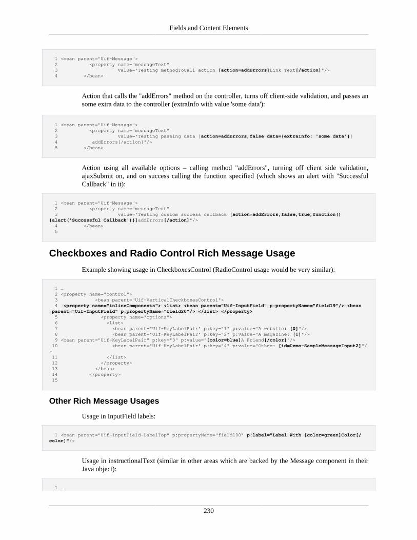
Fields and Content Elements
230
1 <bean parent="Uif-Message"> 2 <property name="messageText" 3 value="Testing methodToCall action [action=addErrors]Link Text[/action]"/> 4 </bean>
Action that calls the "addErrors" method on the controller, turns off client-side validation, and passes ansome extra data to the controller (extraInfo with value 'some data'):
1 <bean parent="Uif-Message"> 2 <property name="messageText" 3 value="Testing passing data [action=addErrors,false data={extraInfo: 'some data'}] 4 addErrors[/action]"/> 5 </bean>
Action using all available options – calling method "addErrors", turning off client side validation,ajaxSubmit on, and on success calling the function specified (which shows an alert with "SuccessfulCallback" in it):
1 <bean parent="Uif-Message"> 2 <property name="messageText" 3 value="Testing custom success callback [action=addErrors,false,true,function(){alert('Successful Callback')}]addErrors[/action]"/> 4 </bean> 5
Checkboxes and Radio Control Rich Message Usage
Example showing usage in CheckboxesControl (RadioControl usage would be very similar):
1 … 2 <property name="control"> 3 <bean parent="Uif-VerticalCheckboxesControl"> 4 <property name="inlineComponents"> <list> <bean parent="Uif-InputField" p:propertyName="field19"/> <bean parent="Uif-InputField" p:propertyName="field20"/> </list> </property> 5 <property name="options"> 6 <list> 7 <bean parent="Uif-KeyLabelPair" p:key="1" p:value="A website: [0]"/> 8 <bean parent="Uif-KeyLabelPair" p:key="2" p:value="A magazine: [1]"/> 9 <bean parent="Uif-KeyLabelPair" p:key="3" p:value="[color=blue]A Friend[/color]"/> 10 <bean parent="Uif-KeyLabelPair" p:key="4" p:value="Other: [id=Demo-SampleMessageInput2]"/> 11 </list> 12 </property> 13 </bean> 14 </property> 15
Other Rich Message Usages
Usage in InputField labels:
1 <bean parent="Uif-InputField-LabelTop" p:propertyName="field100" p:label="Label With [color=green]Color[/color]"/>
Usage in instructionalText (similar in other areas which are backed by the Message component in theirJava object):
1 …
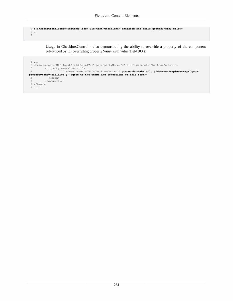
Fields and Content Elements
231
2 p:instructionalText="Testing [css='uif-text-underline']checkbox and radio groups[/css] below" 3 … 4
Usage in CheckboxControl - also demonstrating the ability to override a property of the componentreferenced by id (overriding propertyName with value 'field103'):
1 ... 2 <bean parent="Uif-InputField-LabelTop" p:propertyName="bField1" p:label="CheckboxControl"> 3 <property name="control"> 4 <bean parent="Uif-CheckboxControl" p:checkboxLabel="I, [id=Demo-SampleMessageInput4 propertyName='field103'], agree to the terms and conditions of this form"> 5 </bean> 6 </property> 7 </bean> 8 ...

232
Chapter 8. GroupsGroups
In the last chapter we learned a great deal about the Content Element and Field component types. Thesetypes are essentially KRAD representations of the HTML content markup. They form the palate fromwhich to paint our picture.
In this chapter, we will move on to the Group component. This is one of the general Container types inKRAD. These allow us to bundle our fields together and structure them for layout purposes. In other words,they allow us to organize our content into the top most container, the view.
A group component is represented by the org.kuali.rice.krad.uif.container.Group class. This is the 'general'group component, meaning there are no restrictions on the types of fields or content elements we can putinto the group. Other special group types exist that allow only a subset of fields and elements. They do thisto target a more specify behavior. For example, the LinkGroup only supports adding Link components.These group types have a class that extends the Group class and add properties specific to the behavioror rendering they provide.
Besides holding fields and content elements, groups can also contain other groups. This means we cannest groups within each other. Although a simple concept, it becomes very powerful in terms of buildingour view. Essentially, we can break complete web page up into several group layers. This process will bediscussed more in the next section.
As we stated in the UIF Overview, there are common properties for all containers. The first of theseis, of course, the container 'items'. This is the list of components that belong to the container. By itself,the items container just performs grouping of the components, it tells us nothing about how the itemsshould be arranged on the page. For this information, an object called a Layout Manager is associated withthe group. The layout manager encapsulates the information for how to arrange and decorate the items.Therefore, the same group can be reused and presented in different ways without changing its associatedlayout manager. A large part of this chapter will discuss the concept of layout managers and the particularmanagers provided by KRAD out of the box.
The items that are rendered form the majority of the group's contents. However, we can configureadditional content before and after the container items. The before content is known as the group's header,while the after content is known as the group's footer. In code the corresponding objects found on groupare the Header and Footer groups. The Header component contains another group itself. But in additionto containing a group with configurable items, it also generates a HTML header tag (h tag) using theHeader content element. The header generally indicates visually the beginning of the group presentation.The footer is just a standard group. It adds nothing special and is simply known as the footer because itfalls after the main group content.
The group also allows an instructional text message to be configured. Similar to the input field instructionalmessage, this gives directions to the user for completing the form. However, this applies to the group asa whole and not to an individual field. Finally, also similar to the input field, the group contains an errorsfield component. This is used for presenting error/warning/info messages that apply to the group contents,or to display message counts.
The group template controls how these various pieces are rendered. Basically the rendering order is: headergroup, instructional message, errors field, container items (delegate to layout manager), and footer.
Ok, so where's the beans? There are several base beans provided for groups (they actually have theirown file 'UifGroupDefinitions.xml'). These correspond to various layout manager configurations and thespecial types of groups. Therefore we will cover the beans with each subsequent section.
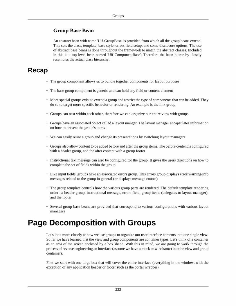
Groups
233
Group Base Bean
An abstract bean with name 'Uif-GroupBase' is provided from which all the group beans extend.This sets the class, template, base style, errors field setup, and some disclosure options. The useof abstract base beans is done throughout the framework to match the abstract classes. Includedin this is a top level bean named 'Uif-ComponentBase'. Therefore the bean hierarchy closelyresembles the actual class hierarchy.
Recap
• The group component allows us to bundle together components for layout purposes
• The base group component is generic and can hold any field or content element
• More special groups exist to extend a group and restrict the type of components that can be added. Theydo so to target more specific behavior or rendering. An example is the link group
• Groups can nest within each other, therefore we can organize our entire view with groups
• Groups have an associated object called a layout manger. The layout manager encapsulates informationon how to present the group's items
• We can easily reuse a group and change its presentations by switching layout managers
• Groups also allow content to be added before and after the group items. The before content is configuredwith a header group, and the after content with a group footer
• Instructional text message can also be configured for the group. It gives the users directions on how tocomplete the set of fields within the group
• Like input fields, groups have an associated errors group. This errors group displays error/warning/infomessages related to the group in general (or displays message counts)
• The group template controls how the various group parts are rendered. The default template renderingorder is: header group, instructional message, errors field, group items (delegates to layout manager),and the footer
• Several group base beans are provided that correspond to various configurations with various layoutmanagers
Page Decomposition with GroupsLet's look more closely at how we use groups to organize our user interface contents into one single view.So far we have learned that the view and group components are container types. Let's think of a containeras an area of the screen enclosed by a box shape. With this in mind, we are going to work through theprocess of reverse engineering an interface (assume we have a mock or wireframe) into the view and groupcontainers.
First we start with one large box that will cover the entire interface (everything in the window, with theexception of any application header or footer such as the portal wrapper).
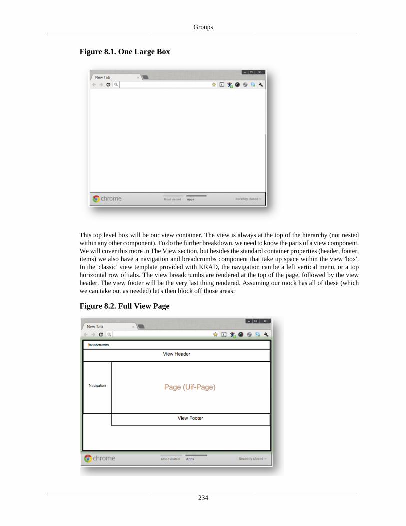
Groups
234
Figure 8.1. One Large Box
This top level box will be our view container. The view is always at the top of the hierarchy (not nestedwithin any other component). To do the further breakdown, we need to know the parts of a view component.We will cover this more in The View section, but besides the standard container properties (header, footer,items) we also have a navigation and breadcrumbs component that take up space within the view 'box'.In the 'classic' view template provided with KRAD, the navigation can be a left vertical menu, or a tophorizontal row of tabs. The view breadcrumbs are rendered at the top of the page, followed by the viewheader. The view footer will be the very last thing rendered. Assuming our mock has all of these (whichwe can take out as needed) let's then block off those areas:
Figure 8.2. Full View Page
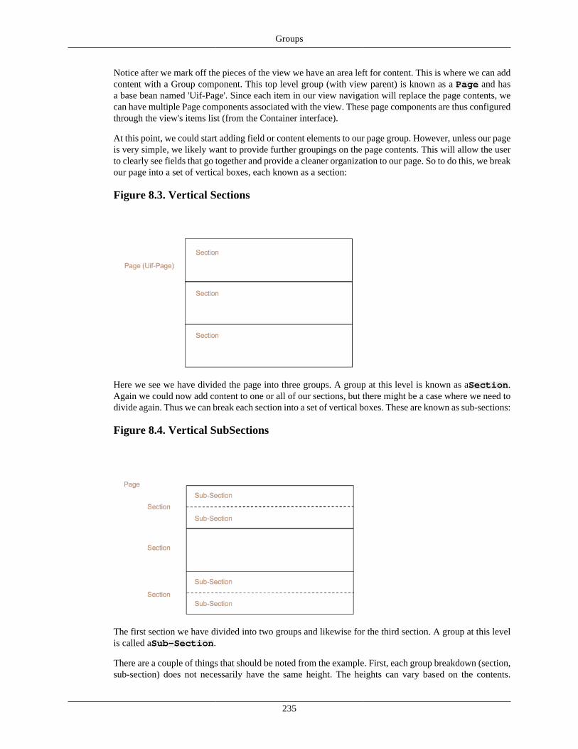
Groups
235
Notice after we mark off the pieces of the view we have an area left for content. This is where we can addcontent with a Group component. This top level group (with view parent) is known as a Page and hasa base bean named 'Uif-Page'. Since each item in our view navigation will replace the page contents, wecan have multiple Page components associated with the view. These page components are thus configuredthrough the view's items list (from the Container interface).
At this point, we could start adding field or content elements to our page group. However, unless our pageis very simple, we likely want to provide further groupings on the page contents. This will allow the userto clearly see fields that go together and provide a cleaner organization to our page. So to do this, we breakour page into a set of vertical boxes, each known as a section:
Figure 8.3. Vertical Sections
Here we see we have divided the page into three groups. A group at this level is known as aSection.Again we could now add content to one or all of our sections, but there might be a case where we need todivide again. Thus we can break each section into a set of vertical boxes. These are known as sub-sections:
Figure 8.4. Vertical SubSections
The first section we have divided into two groups and likewise for the third section. A group at this levelis called aSub-Section.
There are a couple of things that should be noted from the example. First, each group breakdown (section,sub-section) does not necessarily have the same height. The heights can vary based on the contents.
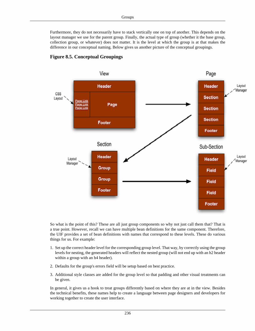
Groups
236
Furthermore, they do not necessarily have to stack vertically one on top of another. This depends on thelayout manager we use for the parent group. Finally, the actual type of group (whether it the base group,collection group, or whatever) does not matter. It is the level at which the group is at that makes thedifference in our conceptual naming. Below gives us another picture of the conceptual groupings.
Figure 8.5. Conceptual Groupings
So what is the point of this? These are all just group components so why not just call them that? That isa true point. However, recall we can have multiple bean definitions for the same component. Therefore,the UIF provides a set of bean definitions with names that correspond to these levels. These do variousthings for us. For example:
1. Set up the correct header level for the corresponding group level. That way, by correctly using the grouplevels for nesting, the generated headers will reflect the nested group (will not end up with an h2 headerwithin a group with an h4 header).
2. Defaults for the group's errors field will be setup based on best practice.
3. Additional style classes are added for the group level so that padding and other visual treatments canbe given.
In general, it gives us a hook to treat groups differently based on where they are at in the view. Besidesthe technical benefits, these names help to create a language between page designers and developers forworking together to create the user interface.
Groups
237
Levels Past Sub-Section
There is no limit enforced for how deep groups can nest. Therefore, if needed, you can nest groupswithin a sub-section and further down. However, base beans are not provided in these cases, soyou need to take care to set the header levels, error configuration, and styling for these levels (ordevelop the base beans to represent them).
Recap• Our entire interface can be broken down with the view component and a set of groups
• We can decompose our page by drawing boxes and dividing
• We start by drawing a box around the window content (excluding any application header and footersuch as portal navigation). This first box makes up the view content area
• Besides the standard container parts (header, items, footer), the view also contains a navigation andbreadcrumbs component that takes up a 'box' of the view
• After boxing the view header, footer, navigation, and breadcrumbs, the remaining content area is a groupknown as the page
• If we have navigation, the page contents can change for each navigation link. Thus the view can containmultiple page components which are set in the view's items property
• If we have a simple page, we can start adding fields directly to the page group. However, generallywe want make grouping of the page content. This is done by dividing the page into multiple groups. Agroup at this level is known as a section
• We can continue by dividing a section into groups. A group at this level is called a sub-section
• Although these different levels are all still group components, KRAD provides different bean definitionscorresponding to the levels
• Using the correct bean definition for a level ensures the header order will be correct for nested headers.In addition defaults for the associated errors fields at each level have been setup, and style classes areprovided to provide indenting and other visual cues
• You can nest groups down as many levels as needed. However when going past the sub-section level,care needs to be taken to correctly set the header levels, error configuration, and styling
HeadersThe Header component is used to render the various HTML header tags (h1, h2, h3, .. h6). Similar tothe errors field component, there are header component instances already associated with, and configuredfor, containers (view and group). These are generally used to indicate the start of a container on the pageand to give a title for that container. If needed, the header component can be used in other places of theview as well (for instance in a group's items list). However, it is generally better to create nested groupsin those situations.
Besides rendering the HTML 'h' tag, the header element contains a nested group that can be used to addfield components. Thus with this group we can configure links or other content type to display within theheader part of the group.
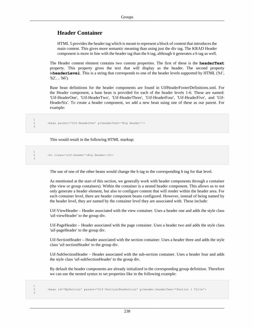
Groups
238
Header Container
HTML 5 provides the header tag which is meant to represent a block of content that introduces themain content. This gives more semantic meaning than using just the div tag. The KRAD Headercomponent is more in line with the header tag than the h tag, although it generates a h tag as well.
The Header content element contains two custom properties. The first of these is the headerTextproperty. This property gives the text that will display as the header. The second propertyisheaderLevel. This is a string that corresponds to one of the header levels supported by HTML ('h1','h2', .. 'h6').
Base bean definitions for the header components are found in UifHeaderFooterDefinitions.xml. Forthe Header component, a base bean is provided for each of the header levels 1-6. These are named:'Uif-HeaderOne', 'Uif-HeaderTwo', 'Uif-HeaderThree', 'Uif-HeaderFour', 'Uif-HeaderFive', and 'Uif-HeaderSix'. To create a header component, we add a new bean using one of these as our parent. Forexample:
1 2 <bean parent="Uif-HeaderOne" p:headerText="Big Header"/> 3
This would result in the following HTML markup:
1 2 <h1 class="uif-header">Big Header</h1> 3
The use of one of the other beans would change the h tag to the corresponding h tag for that level.
As mentioned at the start of this section, we generally work with header components through a container(the view or group containers). Within the container is a nested header component. This allows us to notonly generate a header element, but also to configure content that will render within the header area. Foreach container level, there are header component beans configured. However, instead of being named bythe header level, they are named by the container level they are associated with. These include:
Uif-ViewHeader – Header associated with the view container. Uses a header one and adds the style class'uif-viewHeader' to the group div.
Uif-PageHeader – Header associated with the page container. Uses a header two and adds the style class'uif-pageHeader' to the group div.
Uif-SectionHeader – Header associated with the section container. Uses a header three and adds the styleclass 'uif-sectionHeader' to the group div.
Uif-SubSectionHeader – Header associated with the sub-section container. Uses a header four and addsthe style class 'uif-subSectionHeader' to the group div.
By default the header components are already initialized in the corresponding group definition. Thereforewe can use the nested syntax to set properties like in the following example:
1 2 <bean id="MySection" parent="Uif-VerticalBoxSection" p:header.headerText="Section 1 Title"> 3
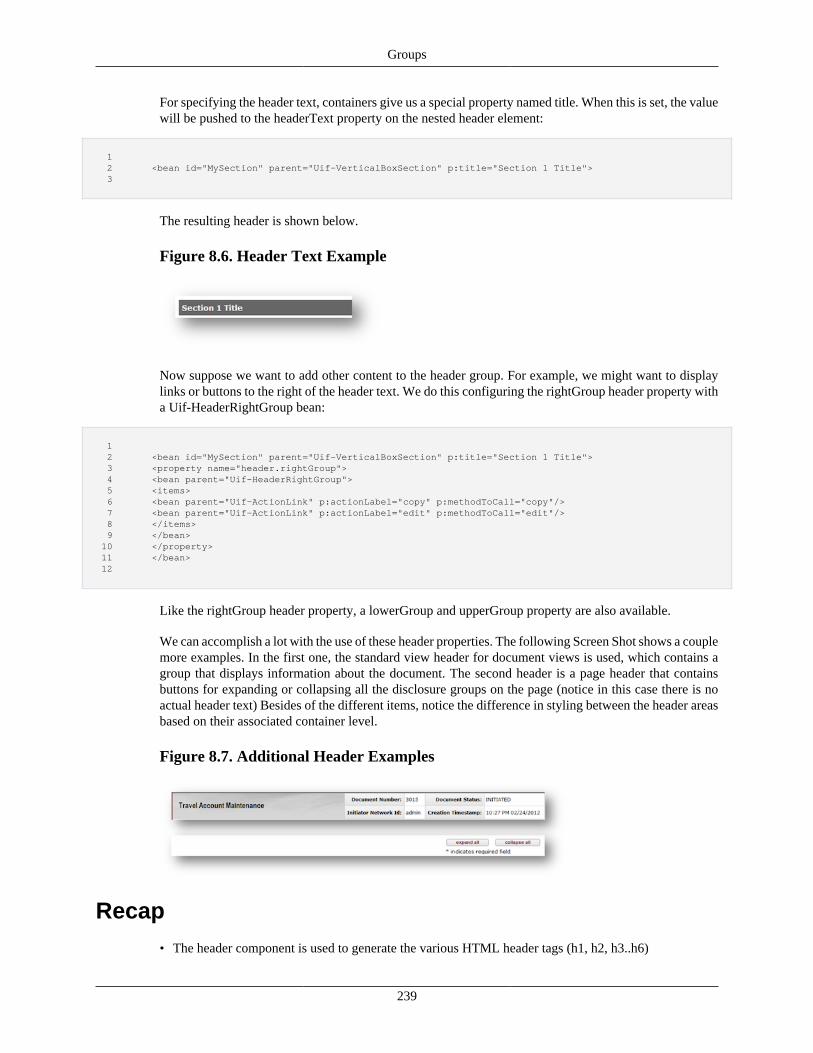
Groups
239
For specifying the header text, containers give us a special property named title. When this is set, the valuewill be pushed to the headerText property on the nested header element:
1 2 <bean id="MySection" parent="Uif-VerticalBoxSection" p:title="Section 1 Title"> 3
The resulting header is shown below.
Figure 8.6. Header Text Example
Now suppose we want to add other content to the header group. For example, we might want to displaylinks or buttons to the right of the header text. We do this configuring the rightGroup header property witha Uif-HeaderRightGroup bean:
1 2 <bean id="MySection" parent="Uif-VerticalBoxSection" p:title="Section 1 Title"> 3 <property name="header.rightGroup"> 4 <bean parent="Uif-HeaderRightGroup"> 5 <items> 6 <bean parent="Uif-ActionLink" p:actionLabel="copy" p:methodToCall="copy"/> 7 <bean parent="Uif-ActionLink" p:actionLabel="edit" p:methodToCall="edit"/> 8 </items> 9 </bean> 10 </property> 11 </bean> 12
Like the rightGroup header property, a lowerGroup and upperGroup property are also available.
We can accomplish a lot with the use of these header properties. The following Screen Shot shows a couplemore examples. In the first one, the standard view header for document views is used, which contains agroup that displays information about the document. The second header is a page header that containsbuttons for expanding or collapsing all the disclosure groups on the page (notice in this case there is noactual header text) Besides of the different items, notice the difference in styling between the header areasbased on their associated container level.
Figure 8.7. Additional Header Examples
Recap• The header component is used to generate the various HTML header tags (h1, h2, h3..h6)
Groups
240
• We generally don't need to create a header component, since they are associated with a container andinitialized as a nested component. However, they can be added in other places (in the groups items forinstance) if needed
• Besides rendering the html header tag, the header component also contains a nested group. This groupcan be used to display content (such as links or buttons) in the header area of the group
• The header element contains the properties headerText and headerLevel. The header text specifies theactual text that will display as the header. The header level corresponds with the html header level thatshould be generated (h1-h6)
• The UIF provides base bean definitions for each of the six header levels. To create a header componentwe use one of these in our bean parent
• Also provided are header beans that correspond with each container level (view, page, section, sub-section). In addition to setting the header level, these add a style class corresponding to the level so thatwe can add different visual treatments (a view header will display differently than a section header)
• We can add items to the header by setting the rightGroup, lowerGroup or upperGroup header property.Each property contains a group bean where components can be added.
FootersUnlike the header area for a group, the footer does nothing special. It is simply another group instance thatis rendered after the group's items. It is called a footer because of being rendered at the 'foot' of the group.The actual component type is just a standard group (at least in the default group definition, subclasses ofa group could have a subclass 'footer' group).
Since the footer is just a group, we can populate the property using any of the provided group beans.However, there are a few group beans that are target the footer area. Generally since the footer group isbelow the group's main content, it is a great place to add buttons, links, or other content that applies thepresented group. In the footer, we want to just display this content, not another header and footer (since thefooter is a group, it also has a nested header and footer, and the nesting can continue). The UIF providesthe following base bean for footer groups:
1 2 <bean id="Uif-FooterBase" parent="Uif-HorizontalBoxGroup" scope="prototype"> 3 <property name="styleClasses" value="uif-footer"/> 4 </bean> 5
Notice the footer base bean extends 'Uif-HorizontalBoxGroup'. We will learn more about this bean lateron, but essentially it is a group definition with no header and footer (both set to render false) and using abox layout with horizontal orientation. This means the items configured in the group will be rendered in ahorizontal row. When setting the header property, we can create an inner bean that extends the footer base:
1 2 <bean id="MyGroup" parent="Uif-VerticalBoxSection" p:title="My Group"> 3 <property name="footer"> 4 <bean parent="Uif-FooterBase"> 5 <property name="items> 6 <list> 7 <bean parent="Uif-PrimaryActionButton" p:methodToCall="calculate" p:actionLabel="calculate"/> 8 <bean parent="Uif-PrimaryActionButton" p:methodToCall="clear" p:actionLabel="clear"/> 9 </list> 10 </property> 11 </bean>
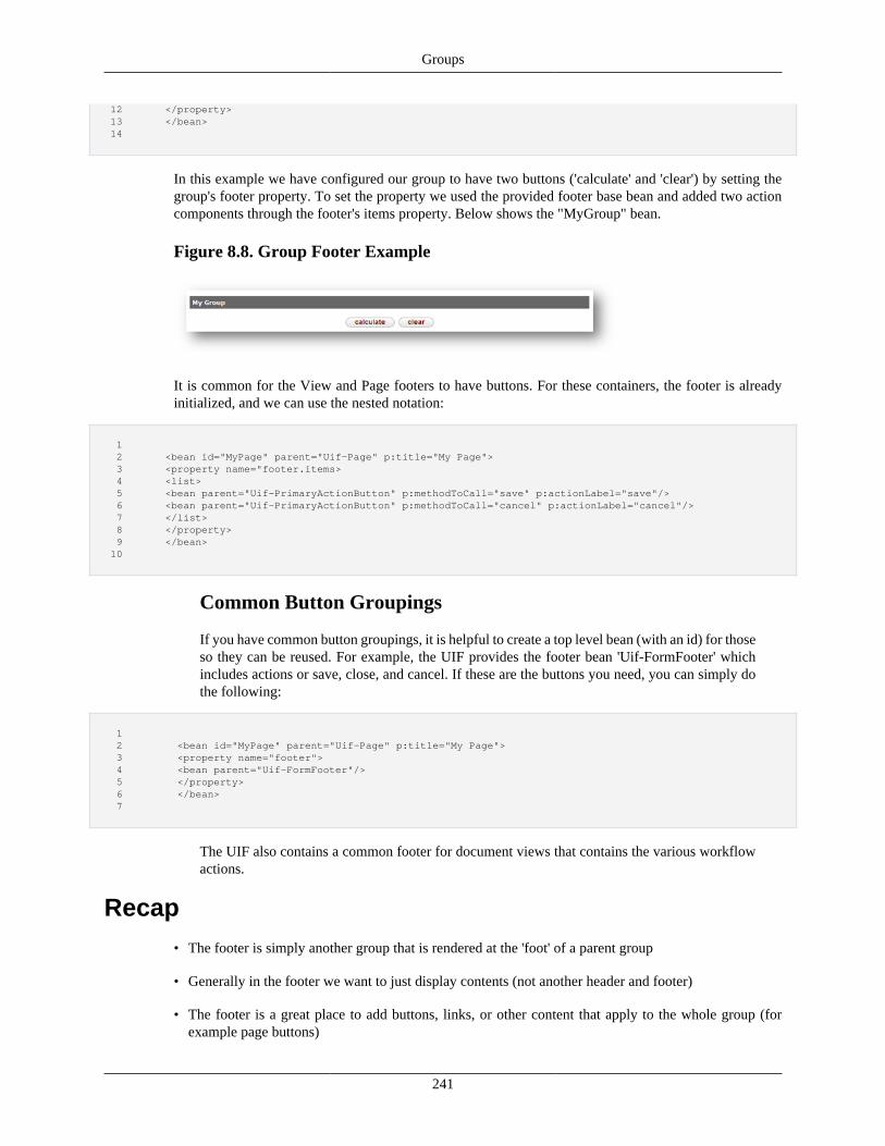
Groups
241
12 </property> 13 </bean> 14
In this example we have configured our group to have two buttons ('calculate' and 'clear') by setting thegroup's footer property. To set the property we used the provided footer base bean and added two actioncomponents through the footer's items property. Below shows the "MyGroup" bean.
Figure 8.8. Group Footer Example
It is common for the View and Page footers to have buttons. For these containers, the footer is alreadyinitialized, and we can use the nested notation:
1 2 <bean id="MyPage" parent="Uif-Page" p:title="My Page"> 3 <property name="footer.items> 4 <list> 5 <bean parent="Uif-PrimaryActionButton" p:methodToCall="save" p:actionLabel="save"/> 6 <bean parent="Uif-PrimaryActionButton" p:methodToCall="cancel" p:actionLabel="cancel"/> 7 </list> 8 </property> 9 </bean> 10
Common Button Groupings
If you have common button groupings, it is helpful to create a top level bean (with an id) for thoseso they can be reused. For example, the UIF provides the footer bean 'Uif-FormFooter' whichincludes actions or save, close, and cancel. If these are the buttons you need, you can simply dothe following:
1 2 <bean id="MyPage" parent="Uif-Page" p:title="My Page"> 3 <property name="footer"> 4 <bean parent="Uif-FormFooter"/> 5 </property> 6 </bean> 7
The UIF also contains a common footer for document views that contains the various workflowactions.
Recap• The footer is simply another group that is rendered at the 'foot' of a parent group
• Generally in the footer we want to just display contents (not another header and footer)
• The footer is a great place to add buttons, links, or other content that apply to the whole group (forexample page buttons)

Groups
242
• The UIF provides a base bean named 'Uif-FooterBase' that uses a group configured to not render aheader and footer, and to use a horizontal box layout
• Since it is common to have footer contents for the view and page, a footer is already initialized and wecan simply set the footer.items property
• Common button groups can be configured in a footer definition with an id so that they can be reused. TheUIF provides one such grouping for the standard save, close, and cancel actions named 'Uif-FormFooter'
Introduction to Layout ManagersWe know a group bundles together multiple components as a container, but the group itself has noknowledge on how these components should be positioned on the page. Instead, KRAD provides anobject called a Layout Manager. For those who have developed applications in Java with Swing, GWT, orused the .Net Framework, the concept of Layout Managers will be familiar. Basically a Layout Managerencapsulates an algorithm on how to position a group of components by their relative positions. You mightsay it is the blueprint for a group's items.
To become a layout manager, a class must implement theinterface org.kuali.rice.krad.uif.layout.LayoutManager, or extend the base classorg.kuali.rice.krad.uif.layout.LayoutManagerBase. A layout manager is not a Component itself (does notimplement the Component interface), however, it does have some of the same properties. These include:
id – A unique identifier for the layout manager instance. This is unique among all layout managers andcomponents of a view instance. If the layout manager renders some HTML element that needs to bereferenced client side, the id value can be used for the corresponding element id attribute. The id assignmentfor layout managers follows the same rules as components.
template – Unlike layout managers in Swing and others that build the layouts in code, the KRAD layoutmanagers operate through templates (although this is not required, a layout manger can build the layoutin code as well). These generally follow the basic pattern of:
1. Add starting markup (for example <table>)
2. Iterate through each of the groups items wrapping with markup and then invoking template tag (forexample <tr><td>template</td>..<td>template</td></tr>
3. Add finishing markup (for example </table>)
Since layout managers use templates, they can be customized the same way as a component (switchingthe template, extension and so on).
style and styleClasses – Similar to component, these properties hold style configuration or a list of styleclasses that should be applied to a layout manager wrapper (for example a div or table).
context – Map of context objects that can be used for expressions configured on layout manager properties
A layout manager by default supports any group instance. However, a layout manager can be built to onlysupport specific group types. One example of this is the layout managers that work with Collection Groups.We will see these later on in the chapter. A layout manager can declare the type of group supported byimplementing (or overriding) the following method:
1 2 public Class<? extends Container> getSupportedContainer();
Groups
243
3
For example, a layout manager may be setup to work only with TreeGroups as follows:
1 2 public Class<? extends Container> getSupportedContainer() { 3 return TreeGroup.class; 4 } 5
In the rendering process, the layout managers will then invoke the rendering of the group's items. Whatthen invokes the layout manager? Well the group of course! Recall at the beginning of this chapter thatbasic group template:
• Render header
• Render instructional text
• Render errors field
• Invoke layout manager passing group items
• Render footer
Since the group template controls the invocation of the layout manager, a group template may choose tonot do so and instead layout the items itself. There are a couple examples of this we will learn about lateron in this chapter.
Moving on, let's learn more about these layout managers!
Recap• A group has no knowledge regarding the positioning of the components
• KRAD provides the concept of layout mangers. This concept can also be seen in frameworks such asJava Swing, GWT, and .NET
• A layout manager encapsulates an algorithm on how to position a set of components by their relativeposition. It is a blueprint for rendering the group's items
• To become a layout manager, a class must implement theinterface org.kuali.rice.krad.uif.layout.LayoutManager, or extend the base classorg.kuali.rice.krad.uif.layout.LayoutManagerBase
• Layout managers are not components, but share similar properties. These include:
• id – unique identifier for the layout manager
• template – FreeMarker template file for the layout manager that performs the layout logic
• templateName – Name of the layout manager macro
• style and style classes – CSS treatment for the layout manger wrapper (such as a div or table)
• context – map of objects available for property expressions
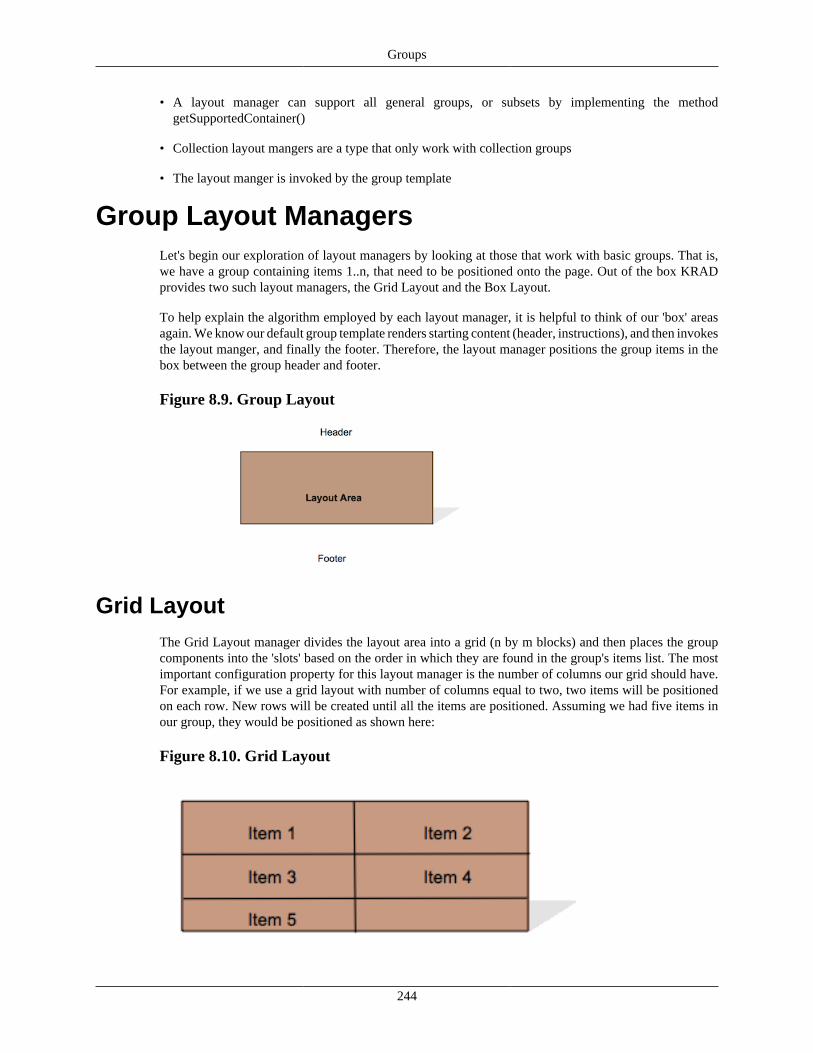
Groups
244
• A layout manager can support all general groups, or subsets by implementing the methodgetSupportedContainer()
• Collection layout mangers are a type that only work with collection groups
• The layout manger is invoked by the group template
Group Layout ManagersLet's begin our exploration of layout managers by looking at those that work with basic groups. That is,we have a group containing items 1..n, that need to be positioned onto the page. Out of the box KRADprovides two such layout managers, the Grid Layout and the Box Layout.
To help explain the algorithm employed by each layout manager, it is helpful to think of our 'box' areasagain. We know our default group template renders starting content (header, instructions), and then invokesthe layout manger, and finally the footer. Therefore, the layout manager positions the group items in thebox between the group header and footer.
Figure 8.9. Group Layout
Grid LayoutThe Grid Layout manager divides the layout area into a grid (n by m blocks) and then places the groupcomponents into the 'slots' based on the order in which they are found in the group's items list. The mostimportant configuration property for this layout manager is the number of columns our grid should have.For example, if we use a grid layout with number of columns equal to two, two items will be positionedon each row. New rows will be created until all the items are positioned. Assuming we had five items inour group, they would be positioned as shown here:
Figure 8.10. Grid Layout
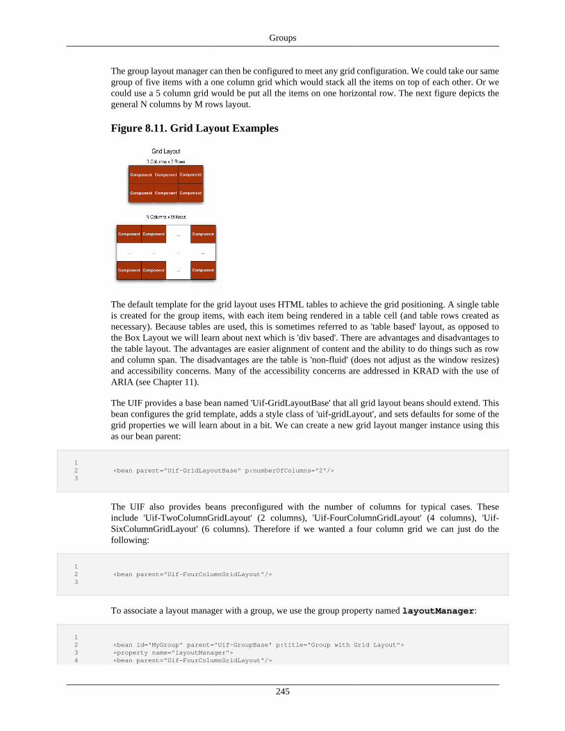
Groups
245
The group layout manager can then be configured to meet any grid configuration. We could take our samegroup of five items with a one column grid which would stack all the items on top of each other. Or wecould use a 5 column grid would be put all the items on one horizontal row. The next figure depicts thegeneral N columns by M rows layout.
Figure 8.11. Grid Layout Examples
The default template for the grid layout uses HTML tables to achieve the grid positioning. A single tableis created for the group items, with each item being rendered in a table cell (and table rows created asnecessary). Because tables are used, this is sometimes referred to as 'table based' layout, as opposed tothe Box Layout we will learn about next which is 'div based'. There are advantages and disadvantages tothe table layout. The advantages are easier alignment of content and the ability to do things such as rowand column span. The disadvantages are the table is 'non-fluid' (does not adjust as the window resizes)and accessibility concerns. Many of the accessibility concerns are addressed in KRAD with the use ofARIA (see Chapter 11).
The UIF provides a base bean named 'Uif-GridLayoutBase' that all grid layout beans should extend. Thisbean configures the grid template, adds a style class of 'uif-gridLayout', and sets defaults for some of thegrid properties we will learn about in a bit. We can create a new grid layout manger instance using thisas our bean parent:
1 2 <bean parent="Uif-GridLayoutBase" p:numberOfColumns="2"/> 3
The UIF also provides beans preconfigured with the number of columns for typical cases. Theseinclude 'Uif-TwoColumnGridLayout' (2 columns), 'Uif-FourColumnGridLayout' (4 columns), 'Uif-SixColumnGridLayout' (6 columns). Therefore if we wanted a four column grid we can just do thefollowing:
1 2 <bean parent="Uif-FourColumnGridLayout"/> 3
To associate a layout manager with a group, we use the group property named layoutManager:
1 2 <bean id="MyGroup" parent="Uif-GroupBase" p:title="Group with Grid Layout"> 3 <property name="layoutManager"> 4 <bean parent="Uif-FourColumnGridLayout"/>
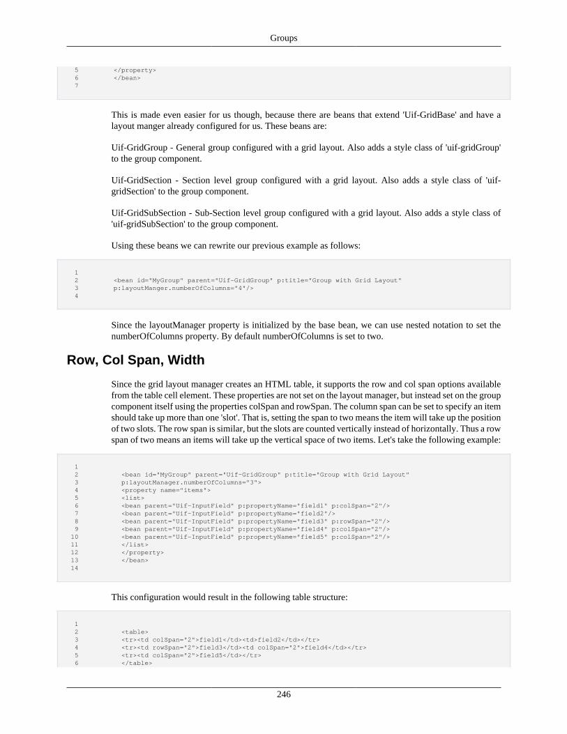
Groups
246
5 </property> 6 </bean> 7
This is made even easier for us though, because there are beans that extend 'Uif-GridBase' and have alayout manger already configured for us. These beans are:
Uif-GridGroup - General group configured with a grid layout. Also adds a style class of 'uif-gridGroup'to the group component.
Uif-GridSection - Section level group configured with a grid layout. Also adds a style class of 'uif-gridSection' to the group component.
Uif-GridSubSection - Sub-Section level group configured with a grid layout. Also adds a style class of'uif-gridSubSection' to the group component.
Using these beans we can rewrite our previous example as follows:
1 2 <bean id="MyGroup" parent="Uif-GridGroup" p:title="Group with Grid Layout" 3 p:layoutManger.numberOfColumns="4"/> 4
Since the layoutManager property is initialized by the base bean, we can use nested notation to set thenumberOfColumns property. By default numberOfColumns is set to two.
Row, Col Span, Width
Since the grid layout manager creates an HTML table, it supports the row and col span options availablefrom the table cell element. These properties are not set on the layout manager, but instead set on the groupcomponent itself using the properties colSpan and rowSpan. The column span can be set to specify an itemshould take up more than one 'slot'. That is, setting the span to two means the item will take up the positionof two slots. The row span is similar, but the slots are counted vertically instead of horizontally. Thus a rowspan of two means an items will take up the vertical space of two items. Let's take the following example:
1 2 <bean id="MyGroup" parent="Uif-GridGroup" p:title="Group with Grid Layout" 3 p:layoutManager.numberOfColumns="3"> 4 <property name="items"> 5 <list> 6 <bean parent="Uif-InputField" p:propertyName="field1" p:colSpan="2"/> 7 <bean parent="Uif-InputField" p:propertyName="field2"/> 8 <bean parent="Uif-InputField" p:propertyName="field3" p:rowSpan="2"/> 9 <bean parent="Uif-InputField" p:propertyName="field4" p:colSpan="2"/> 10 <bean parent="Uif-InputField" p:propertyName="field5" p:colSpan="2"/> 11 </list> 12 </property> 13 </bean> 14
This configuration would result in the following table structure:
1 2 <table> 3 <tr><td colSpan="2">field1</td><td>field2</td></tr> 4 <tr><td rowSpan="2">field3</td><td colSpan="2">field4</td></tr> 5 <tr><td colSpan="2">field5</td></tr> 6 </table>
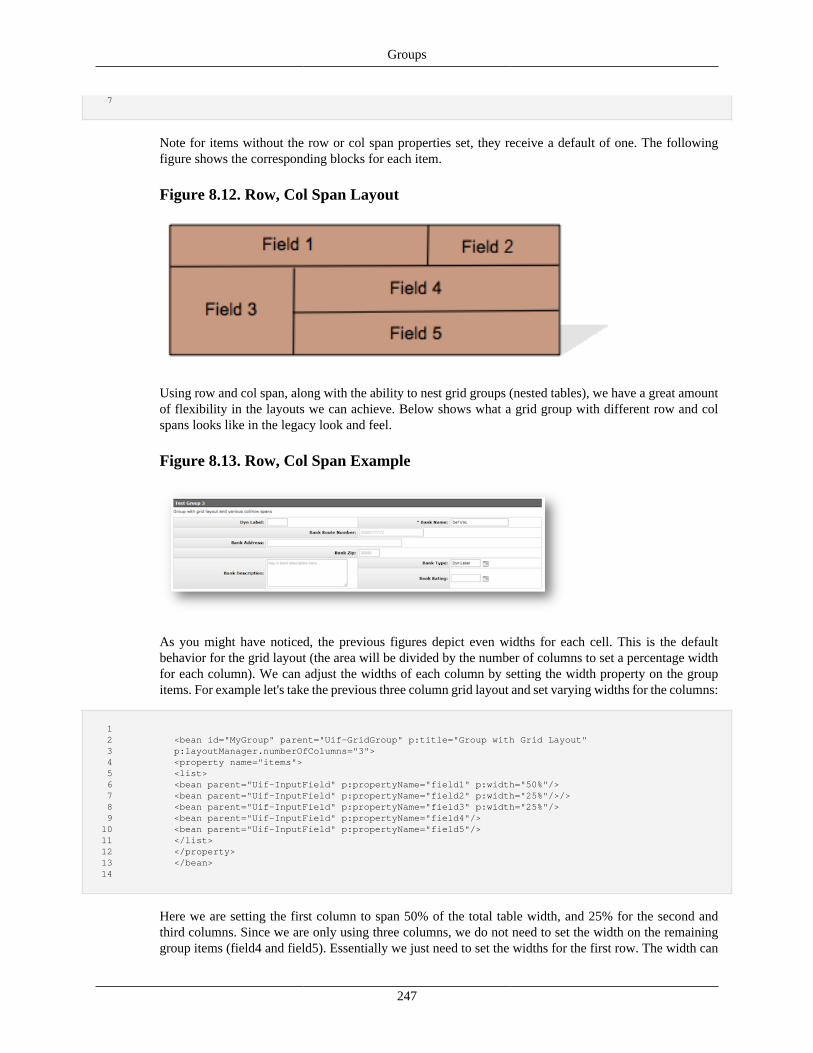
Groups
247
7
Note for items without the row or col span properties set, they receive a default of one. The followingfigure shows the corresponding blocks for each item.
Figure 8.12. Row, Col Span Layout
Using row and col span, along with the ability to nest grid groups (nested tables), we have a great amountof flexibility in the layouts we can achieve. Below shows what a grid group with different row and colspans looks like in the legacy look and feel.
Figure 8.13. Row, Col Span Example
As you might have noticed, the previous figures depict even widths for each cell. This is the defaultbehavior for the grid layout (the area will be divided by the number of columns to set a percentage widthfor each column). We can adjust the widths of each column by setting the width property on the groupitems. For example let's take the previous three column grid layout and set varying widths for the columns:
1 2 <bean id="MyGroup" parent="Uif-GridGroup" p:title="Group with Grid Layout" 3 p:layoutManager.numberOfColumns="3"> 4 <property name="items"> 5 <list> 6 <bean parent="Uif-InputField" p:propertyName="field1" p:width="50%"/> 7 <bean parent="Uif-InputField" p:propertyName="field2" p:width="25%"/>/> 8 <bean parent="Uif-InputField" p:propertyName="field3" p:width="25%"/> 9 <bean parent="Uif-InputField" p:propertyName="field4"/> 10 <bean parent="Uif-InputField" p:propertyName="field5"/> 11 </list> 12 </property> 13 </bean> 14
Here we are setting the first column to span 50% of the total table width, and 25% for the second andthird columns. Since we are only using three columns, we do not need to set the width on the remaininggroup items (field4 and field5). Essentially we just need to set the widths for the first row. The width can
Groups
248
be given as a percentage of the table or a fixed width (for example pixels). For controlling the full tablewidth, we can apply a style setting (which will render as the style attribute on the table element) or adda style class to the layout manager.
Label Separator
When working with a grid layout it can be useful for alignment purposes to render the field label in aseparate column. Recall our discussion in Chapter 6 regarding fields and label positioning. Let's assumewe have a group containing input fields with the label configured to render in the left position (the default).For this group we are using a grid layout configured with one column (therefore each field will stackvertically). Our labels and controls will then look something like the following:
Here the field labels were chosen to be different lengths, which is likely to happen with real label text.Notice with the variable label length, were the control begins varies from field to field and thus we do nothave alignment vertically. If we were to put the labels in their own column, the cell width would expand tocover the longest label, and our controls would all start in the next column. Thus we would have alignment:
The framework provides the option for doing this through a Component Modifier. Component modifiersare classes that perform some modification to the component they are configured on. Each component mayhave one or more such modifiers configured. Thus they give us a way to encapsulate some functionality ina piece of code that can be applied to multiple components, and in addition can be conditionally applied.Chapter 10 covers this concept in more detail.
One component modifier provided with KRAD is the LabelFieldSeparateModifier. This modifier operateson a group component by iterating through the group items and pulling out the label as a separate item.Thus, it appears to the layout manager that we configured the label as a separate group item, and the layoutmanager will then in turn render the label in its own cell. The Uif-GridGroup bean we have been workingwith has this modifier configured by default:
1 2 <bean id="Uif-GridGroup" parent="Uif-GroupBase" scope="prototype"> 3 ... 4 <property name="layoutManager"> 5 <bean parent="Uif-GridLayoutBase"/>
Groups
249
6 </property> 7 <property name="componentModifiers"> 8 <list> 9 <bean parent="Uif-LabelFieldSeparator-Modifier" p:runPhase="FINALIZE"/> 10 </list> 11 </property> 12 </bean> 13
Notice this bean sets the componentModifiers list property adding the label field separator, whose UIFbean is named 'Uif-LabelFieldSeparator-Modifier'. The runPhase is one property modifiers have thatdetermines when in the view lifecycle the modifier will be executed. The available phases are INITIALIZE,APPLY_MODEL, and FINALIZE.
If we inherit from a bean with one or more modifiers configured, we can choose not to use the modifiersby setting the property to null (using the Spring null tag):
1 2 <property name="componentModifiers"> 3 <null/> 4 </property> 5
Other Grid Layout Options
The Grid Layout Manager also supports the following properties:
suppressLineWrapping – By default, once the configured number of columns is reached, the layoutmanager will wrap to a new row. If this property is set to true, the layout manager will ignore the numberof columns property and instead continue to render all group items in one row. This is useful if the numberof group items is unknown and you wish to have them in a single line. The number of columns propertydoes not need to be specified when using line wrap suppressing.
applyAlternatingRowStyles – Boolean that indicates whether alternating row styles of 'odd' and 'even'should be applied to each tr element. This allows alternating row styles that is common on data grids.
applyDefaultCellWidths – Boolean that indicates whether default widths should be calculated for eachcell. If set to true, the total width will be divided by number of columns to determine the default width asa percentage for each cell. If the width is configured for an item, it will not be overridden.
renderAlternatingHeaderColumns – Boolean that indicates whether cells should alternate between tableheader and table cells (th and td). This is generally set to true when using the label separator so the labelcells appear with different styling. The appropriate scopes are added by the framework (th with scopeequal to column for the header row, and th with scope equal to row for table headers within a data row).
Box LayoutNext, let's take a look at the other provided group layout, called the Box Layout. Unlike the grid layout,which creates a grid of blocks, the box layout creates just a single row of blocks in either the horizontal orvertical direction. It will keep creating blocks in a direction until all items of the group have been rendered.The first item configured in the group will receive the first position, on to the last group item which willreceive the last position.
Within the layout area we can think of the box layout as dividing the area horizontally (in the case ofhorizontal orientation):
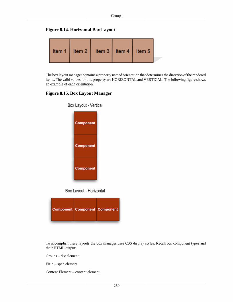
Groups
250
Figure 8.14. Horizontal Box Layout
The box layout manager contains a property named orientation that determines the direction of the rendereditems. The valid values for this property are HORIZONTAL and VERTICAL. The following figure showsan example of each orientation.
Figure 8.15. Box Layout Manager
To accomplish these layouts the box manager uses CSS display styles. Recall our component types andtheir HTML output:
Groups – div element
Field – span element
Content Element – content element
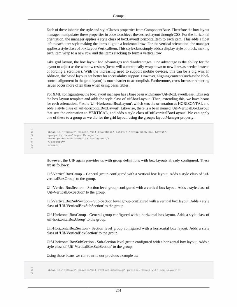
Groups
251
Each of these inherits the style and styleClasses properties from ComponentBase. Therefore the box layoutmanager manipulates these properties in code to achieve the desired layout through CSS. For the horizontalorientation, the manager applies a style class of boxLayoutHorizontalItem to each item. This adds a floatleft to each item style making the items align in a horizontal row. For the vertical orientation, the managerapplies a style class of boxLayoutVerticalItem. This style class simply adds a display style of block, makingeach item wrap to a new row and the items stacking to form a vertical row.
Like grid layout, the box layout had advantages and disadvantages. One advantage is the ability for thelayout to adjust as the window resizes (items will automatically wrap down to new lines as needed insteadof forcing a scrollbar). With the increasing need to support mobile devices, this can be a big win. Inaddition, div based layouts are better for accessibility support. However, aligning content (such as the label/control alignment in the grid layout) is much harder to accomplish. Furthermore, cross-browser renderingissues occur more often than when using basic tables.
For XML configuration, the box layout manager has a base bean with name 'Uif-BoxLayoutBase'. This setsthe box layout template and adds the style class of 'uif-boxLayout'. Then, extending this, we have beansfor each orientation. First is 'Uif-HorizontalBoxLayout', which sets the orientation as HORIZONTAL andadds a style class of 'uif-horizontalBoxLayout'. Likewise, there is a bean named 'Uif-VerticalBoxLayout'that sets the orientation to VERTICAL, and adds a style class of 'uif-verticalBoxLayout'. We can applyone of these to a group as we did for the grid layout, using the group's layoutManager property:
1 2 <bean id="MyGroup" parent="Uif-GroupBase" p:title="Group with Box Layout"> 3 <property name="layoutManager"> 4 <bean parent="Uif-VerticalBoxLayout"/> 5 </property> 6 </bean> 7
However, the UIF again provides us with group definitions with box layouts already configured. Theseare as follows:
Uif-VerticalBoxGroup – General group configured with a vertical box layout. Adds a style class of 'uif-verticalBoxGroup' to the group.
Uif-VerticalBoxSection – Section level group configured with a vertical box layout. Adds a style class of'Uif-VerticalBoxSection' to the group.
Uif-VerticalBoxSubSection – Sub-Section level group configured with a vertical box layout. Adds a styleclass of 'Uif-VerticalBoxSubSection' to the group.
Uif-HorizontalBoxGroup - General group configured with a horizontal box layout. Adds a style class of'uif-horizontalBoxGroup' to the group.
Uif-HorizontalBoxSection - Section level group configured with a horizontal box layout. Adds a styleclass of 'Uif-VerticalBoxSection' to the group.
Uif-HorizontalBoxSubSection - Sub-Section level group configured with a horizontal box layout. Adds astyle class of 'Uif-VerticalBoxSubSection' to the group.
Using these beans we can rewrite our previous example as:
1 2 <bean id="MyGroup" parent="Uif-VerticalBoxGroup" p:title="Group with Box Layout"/> 3
Groups
252
When looking at the grid layout, the examples shown were all fields. Recall, though, that we can also nestgroups within groups, and, just like fields, they need a layout manager to position them. The box layoutmanager is generally the layout of choice in this case. In particular, because groups such as section andsub-section typically span the full width available, the vertical box layout is used to 'stack' the groups.
As an example let's build a page group with sections:
1 2 <bean id="BookInfoPage" parent="Uif-Page" p:title="Book Info"> 3 <property name="items"> 4 <list> 5 <bean parent="BookInfoSection"/> 6 <bean parent="BookDetailsSection"/> 7 <bean parent="BookRefSection"/> 8 </list> 9 </property> 10 </bean> 11
Here we are creating a page with three items. Each item is a reference to another bean that is a sectiongroup. How will these sections be positioned? It turns out that because it is so common for the sectionsto be vertically stacked, that the default layout defined in Uif-Page is Uif-VerticalBoxLayout! Thereforeeach section will divide the page vertically.
Sections and Sub-Sections
There is no requirement that sections and sub-sections divide the page vertically. In fact, in ourprevious example, we could override the layout manager to be UIF-HorizontalBoxLayout. Thiswould result in three section columns. We could furthermore override the layout manager foreach section using a horizontal layout, which would result in sub-section columns. Of course,we can also switch between horizontal and vertical layout between group levels, or use anotherlayout such as grid.
Other Box Layout Options
The Box Layout Manager also supports the following properties:
padding – The box layout essentially is just using CSS to perform layouts, and, using the style andstyle classes properties, you can modify the CSS applied. However, the box layout provides a couple ofproperties for convenience. The first of these is the padding property. When positioning items side byside, or one below another, a typical visual concern is the padding (or space) between each item. Too littlespace and the item content might run together as one, and too much will waste space and not look visuallyappealing. Therefore, the padding can be set to specify the exact amount of space between each item. Notethe manager will take the value given and use it to set the corresponding CSS property (either padding-right for horizontal layout or padding-bottom for vertical layout). The value can be a fixed amount (px, pt,cm, etc.) or as a percentage of the parent container. Note the default styles applied have a default settingfor padding that should be acceptable in most cases.
itemStyle and itemStyleClasses – These have similar purposes to the style and styleClasses properties wehave already learned about. The difference in this case is the given style or class will be applied not tothe layout manager, but each group item that layout manager positions. Note that we could accomplishthe same thing by setting the style or styleClasses property on the group item itself; however, it is moreconvenient to set in this one place instead of each item. Also, if we are inheriting a group and changingthe layout, setting the properties for each item would require us to redefine each item.
As an example here is a group bean with the style classes set on each item:
Groups
253
1 2 <bean parent="Uif-HorizontalBoxSection"> 3 <property name="items"> 4 <list> 5 <bean parent="Uif-DataField" ...> 6 <property name="styleClasses"> 7 <list merge="true"> 8 <value>fssLayoutItem</value> 9 </list> 10 </property> 11 </bean> 12 <bean parent="Uif-DataField" ...> 13 <property name="styleClasses"> 14 <list merge="true"> 15 <value>fssLayoutItem</value> 16 </list> 17 </property> 18 </bean> 19 <bean parent="Uif-DataField" ...> 20 <property name="styleClasses"> 21 <list merge="true"> 22 <value>fssLayoutItem</value> 23 </list> 24 </property> 25 </bean> 26 </list> 27 </property> 28 </bean> 29
Since we want to keep the inherited style classes for Uif-DataField, we must use the Spring list tags withmerge="true". Now we can accomplish the same thing using the box layout manager's itemStyleClassesproperty:
1 2 <bean parent="Uif-HorizontalBoxSection"> 3 <property name="layoutManager.itemStyleClasses" value="fssLayoutItem"/> 4 <property name="items"> 5 <list> 6 <bean parent="Uif-DataField" ...> 7 <bean parent="Uif-DataField" ...> 8 <bean parent="Uif-DataField" ...> 9 </list> 10 </property> 11 </property> 12 </bean> 13
Since the layout manager property is initialized by the parent bean, we can use the nested notation. Nowthat is much better!
CSS Layouts
You can achieve many layouts using the box layout manager and using the styleClassesproperties. It is your gateway for doing CSS based layouts. In particular, KRAD comes bundledwith the Fluid CSS layout engine, which allows you to create various layouts by adding theappropriate Fluid classes. You can also explore such things as CSS3 grid layouts, or bring in otherCSS layout engines. For quick layout adjustments, just use the style property to specify a CSSfloat value: p:style="float: right;".
Css Grid LayoutNote: FixedCssGridLayouts have been removed in the 2.4 release
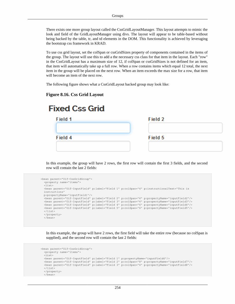
Groups
254
There exists one more group layout called the CssGridLayoutManager. This layout attempts to mimic thelook and field of the GridLayoutManager using divs. The layout will appear to be table-based withoutbeing backed by the table, tr, and td elements in the DOM. This functionality is achieved by leveragingthe bootstrap css framework in KRAD.
To use css grid layout, set the colSpan or cssGridSizes property of components contained in the items ofthe group. The layout will use this to add a the necessary css class for that item in the layout. Each "row"in the CssGridLayout has a maximum size of 12, if colSpan or cssGridSizes is not defined for an item,that item will automatically take up a full row. When a row contains items which equal 12 total, the nextitem in the group will be placed on the next row. When an item exceeds the max size for a row, that itemwill become an item of the next row.
The following figure shows what a CssGridLayout backed group may look like:
Figure 8.16. Css Grid Layout
In this example, the group will have 2 rows, the first row will contain the first 3 fields, and the secondrow will contain the last 2 fields:
<bean parent="Uif-CssGridGroup"> <property name="items"> <list> <bean parent="Uif-InputField" p:label="Field 1" p:colSpan="4" p:instructionalText="This is instructions" p:propertyName="inputField1"/> <bean parent="Uif-InputField" p:label="Field 2" p:colSpan="4" p:propertyName="inputField2"/> <bean parent="Uif-InputField" p:label="Field 3" p:colSpan="4" p:propertyName="inputField3"/> <bean parent="Uif-InputField" p:label="Field 4" p:colSpan="6" p:propertyName="inputField4"/> <bean parent="Uif-InputField" p:label="Field 5" p:colSpan="6" p:propertyName="inputField5"/> </list> </property> </bean>
In this example, the group will have 2 rows, the first field will take the entire row (because no colSpan issupplied), and the second row will contain the last 2 fields:
<bean parent="Uif-CssGridGroup"> <property name="items"> <list> <bean parent="Uif-InputField" p:label="Field 1" p:propertyName="inputField6"/> <bean parent="Uif-InputField" p:label="Field 2" p:colSpan="8" p:propertyName="inputField7"/> <bean parent="Uif-InputField" p:label="Field 3" p:colSpan="4" p:propertyName="inputField8"/> </list> </property> </bean>
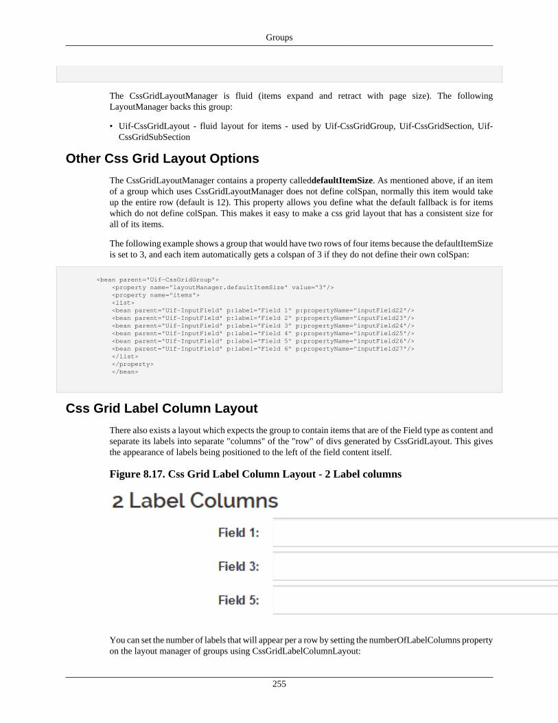
Groups
255
The CssGridLayoutManager is fluid (items expand and retract with page size). The followingLayoutManager backs this group:
• Uif-CssGridLayout - fluid layout for items - used by Uif-CssGridGroup, Uif-CssGridSection, Uif-CssGridSubSection
Other Css Grid Layout Options
The CssGridLayoutManager contains a property calleddefaultItemSize. As mentioned above, if an itemof a group which uses CssGridLayoutManager does not define colSpan, normally this item would takeup the entire row (default is 12). This property allows you define what the default fallback is for itemswhich do not define colSpan. This makes it easy to make a css grid layout that has a consistent size forall of its items.
The following example shows a group that would have two rows of four items because the defaultItemSizeis set to 3, and each item automatically gets a colspan of 3 if they do not define their own colSpan:
<bean parent="Uif-CssGridGroup"> <property name="layoutManager.defaultItemSize" value="3"/> <property name="items"> <list> <bean parent="Uif-InputField" p:label="Field 1" p:propertyName="inputField22"/> <bean parent="Uif-InputField" p:label="Field 2" p:propertyName="inputField23"/> <bean parent="Uif-InputField" p:label="Field 3" p:propertyName="inputField24"/> <bean parent="Uif-InputField" p:label="Field 4" p:propertyName="inputField25"/> <bean parent="Uif-InputField" p:label="Field 5" p:propertyName="inputField26"/> <bean parent="Uif-InputField" p:label="Field 6" p:propertyName="inputField27"/> </list> </property> </bean>
Css Grid Label Column Layout
There also exists a layout which expects the group to contain items that are of the Field type as content andseparate its labels into separate "columns" of the "row" of divs generated by CssGridLayout. This givesthe appearance of labels being positioned to the left of the field content itself.
Figure 8.17. Css Grid Label Column Layout - 2 Label columns
You can set the number of labels that will appear per a row by setting the numberOfLabelColumns propertyon the layout manager of groups using CssGridLabelColumnLayout:
Groups
256
<property name="numberOfLabelColumns" value="2"/>
Setting this property will automatically give a hardcoded medium size/width (backed by Twitter's bootstrapcss) to the separated Label component and field content, per Field. For 1 column this is 3 columns for thelabel and 9 for the field's content (3:9 ratio - 1 field per a row), 2 would be a 2:4 ratio (2 fields per a row),and 3 would be a 1:2 ratio (3 fields per row).
There exists beans for each of these 3 options (Uif-CssGridSection-1FieldLabelColumn, Uif-CssGridSection-2FieldLabelColumn, etc).
In addition to this property, the default size of labels and the field content columns can be set for eachscreen size using CssGridSize objects on the layout manager:
• labelColumnSizes
• fieldColumnSizes
For details on how to set CssGridSizes objects, see the following section.
CssGridSizes
By default, the settings for colSpan and defaultItemSize will set what the size of the content will be atmedium screen size and larger. This breakpoint is set in the css and is based on Twitter's bootstrap screensizes. Below medium screen sizes, every item will take 12 columns (a full "row") for its content. This willlikely be acceptable for most use cases and user experiences.
However, KRAD allows you to manipulate the size (width) content will take up on the screen at everyscreen size when using CssGridLayouts by using a configuration object called CssGridSizes. This objectexists on every Component in a property called cssGridSizes, and the settings provided to this object willALWAYS override those which exist at the layout level (they have highest precedence). This allows youto manipulate the width the content will take at the following screen sizes:
• extra small (xs) - approximately cell phone size
• small (sm) - approximately tablet size
• medium (md) - medium desktop resolutions/non-widescreen monitors
• large (lg) - large desktop resolutions/widescreen monitors
Keep in mind that these sizes are for the size/width of that content at that specific screen size AND everylarger screen size, unless there is a specific override set for larger screen sizes. It is also important toremember that the content is responsive to screen size when using a CssGridLayout and so the layout ofcontent can fundamentally and dynamically change at each screen size. Sizes which are set to 0 have thesame effect as not setting that property. The following code demonstrates specifying the size an InputFieldtakes at each screen size by using the size properties:
<bean parent="Uif-InputField" p:label="Field 1" p:instructionalText="xs 10, sm 6, md 4, lg 3" p:propertyName="inputField1"> <property name="cssGridSizes.xsSize" value="10"/> <property name="cssGridSizes.smSize" value="6"/> <property name="cssGridSizes.mdSize" value="4"/> <property name="cssGridSizes.lgSize" value="3"/> </bean>
Groups
257
In addition to having the ability to control the size/width the content will take at each screen size, howmuch offset it has at each screen size can also be controlled using the CssGridSizes object. Offset in thiscontext basically means how much additional space the content will take before it displays its content.However, an offset property does not exist for the extra small (xs) screen size.
By default, offsets are -1, which means they are not used, but can be set to integers 0 and greater. Thisis because 0 is a valid offset used to override offsets that may be inherited from a smaller screen size.However, it is not recommended to use offsets greater than 10.
Offset can be set alongside sizes as follows:
<bean parent="Uif-InputField" p:label="Field 1" p:instructionalText="xs size (default) 12, sm offset 2, sm size 10, md offset 4, md size 8, lg offset 6, lg size 6" p:propertyName="inputField1"> <property name="cssGridSizes.smOffset" value="2"/> <property name="cssGridSizes.smSize" value="10"/> <property name="cssGridSizes.mdOffset" value="4"/> <property name="cssGridSizes.mdSize" value="8"/> <property name="cssGridSizes.lgOffset" value="6"/> <property name="cssGridSizes.lgSize" value="6"/> </bean>
There are also convenience setters for the above properties. The size convenience setter takes in 4 integers,while the offset convenience setter takes in 3 (since there is no xsOffset). This snippet will set the exactsame properties with the same values as the previous example, but uses the convenience setters to do so:
<bean parent="Uif-InputField" p:label="Field 1" p:cssGridSizes.offsets="2,4,6" p:cssGridSizes.sizes="0,10,8,6" p:instructionalText="xs size (default) 12, sm offset 2, sm size 10, md offset 4, md size 8, lg offset 6, lg size 6" p:propertyName="inputField1"> </bean>
Keep in mind that setting 0 for xs in the above example has the same effect as setting 12 for it. In addition,just like setting the offsets directly, if you want to omit setting an offset, you must use -1, but if you wantto override a smaller screen size setting for offset you must use 0.
Recap• For basic groups KRAD provides two layout managers: the Grid layout and the Box layout
• The grid layout manager positions the group items in table cells
• When using the grid layout manager, we must specify the number of columns for each row. The managerwill then fill in the slots with the group items wrapping to new rows once the column count is reached
• The UIF provides the base bean 'Uif-GridLayoutBase' for the grid layout manager, in addition to beanswith a preconfigured number of columns (such as 'Uif-TwoColumnGridLayout')
• A layout manager is associated with a group using the layoutManager property
• Instead of setting the layout manager property on a group, we can use the base beans that are alreadyconfigured to use a grid layout. These correspond to the various group levels:
• Uif-GridGroup
• Uif-GridSection
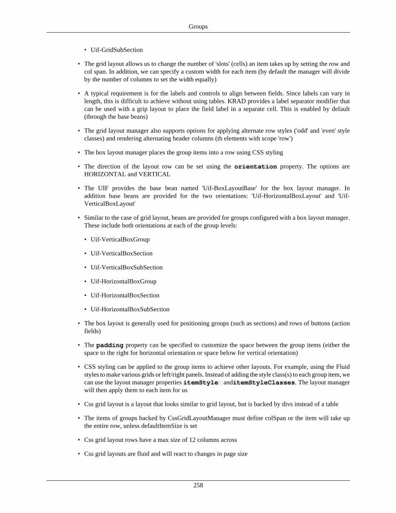
Groups
258
• Uif-GridSubSection
• The grid layout allows us to change the number of 'slots' (cells) an item takes up by setting the row andcol span. In addition, we can specify a custom width for each item (by default the manager will divideby the number of columns to set the width equally)
• A typical requirement is for the labels and controls to align between fields. Since labels can vary inlength, this is difficult to achieve without using tables. KRAD provides a label separator modifier thatcan be used with a grip layout to place the field label in a separate cell. This is enabled by default(through the base beans)
• The grid layout manager also supports options for applying alternate row styles ('odd' and 'even' styleclasses) and rendering alternating header columns (th elements with scope 'row')
• The box layout manager places the group items into a row using CSS styling
• The direction of the layout row can be set using the orientation property. The options areHORIZONTAL and VERTICAL
• The UIF provides the base bean named 'Uif-BoxLayoutBase' for the box layout manager. Inaddition base beans are provided for the two orientations: 'Uif-HorizontalBoxLayout' and 'Uif-VerticalBoxLayout'
• Similar to the case of grid layout, beans are provided for groups configured with a box layout manager.These include both orientations at each of the group levels:
• Uif-VerticalBoxGroup
• Uif-VerticalBoxSection
• Uif-VerticalBoxSubSection
• Uif-HorizontalBoxGroup
• Uif-HorizontalBoxSection
• Uif-HorizontalBoxSubSection
• The box layout is generally used for positioning groups (such as sections) and rows of buttons (actionfields)
• The padding property can be specified to customize the space between the group items (either thespace to the right for horizontal orientation or space below for vertical orientation)
• CSS styling can be applied to the group items to achieve other layouts. For example, using the Fluidstyles to make various grids or left/right panels. Instead of adding the style class(s) to each group item, wecan use the layout manager properties itemStyle anditemStyleClasses. The layout managerwill then apply them to each item for us
• Css grid layout is a layout that looks similar to grid layout, but is backed by divs instead of a table
• The items of groups backed by CssGridLayoutManager must define colSpan or the item will take upthe entire row, unless defaultItemSize is set
• Css grid layout rows have a max size of 12 columns across
• Css grid layouts are fluid and will react to changes in page size
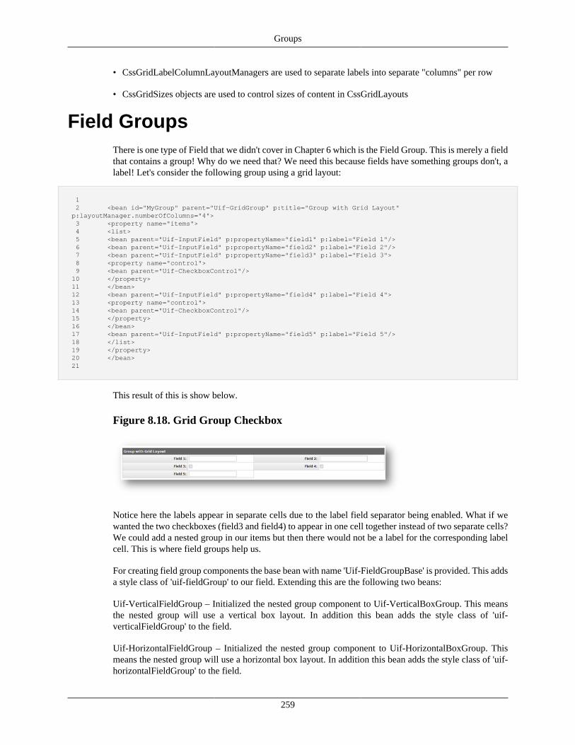
Groups
259
• CssGridLabelColumnLayoutManagers are used to separate labels into separate "columns" per row
• CssGridSizes objects are used to control sizes of content in CssGridLayouts
Field GroupsThere is one type of Field that we didn't cover in Chapter 6 which is the Field Group. This is merely a fieldthat contains a group! Why do we need that? We need this because fields have something groups don't, alabel! Let's consider the following group using a grid layout:
1 2 <bean id="MyGroup" parent="Uif-GridGroup" p:title="Group with Grid Layout" p:layoutManager.numberOfColumns="4"> 3 <property name="items"> 4 <list> 5 <bean parent="Uif-InputField" p:propertyName="field1" p:label="Field 1"/> 6 <bean parent="Uif-InputField" p:propertyName="field2" p:label="Field 2"/> 7 <bean parent="Uif-InputField" p:propertyName="field3" p:label="Field 3"> 8 <property name="control"> 9 <bean parent="Uif-CheckboxControl"/> 10 </property> 11 </bean> 12 <bean parent="Uif-InputField" p:propertyName="field4" p:label="Field 4"> 13 <property name="control"> 14 <bean parent="Uif-CheckboxControl"/> 15 </property> 16 </bean> 17 <bean parent="Uif-InputField" p:propertyName="field5" p:label="Field 5"/> 18 </list> 19 </property> 20 </bean> 21
This result of this is show below.
Figure 8.18. Grid Group Checkbox
Notice here the labels appear in separate cells due to the label field separator being enabled. What if wewanted the two checkboxes (field3 and field4) to appear in one cell together instead of two separate cells?We could add a nested group in our items but then there would not be a label for the corresponding labelcell. This is where field groups help us.
For creating field group components the base bean with name 'Uif-FieldGroupBase' is provided. This addsa style class of 'uif-fieldGroup' to our field. Extending this are the following two beans:
Uif-VerticalFieldGroup – Initialized the nested group component to Uif-VerticalBoxGroup. This meansthe nested group will use a vertical box layout. In addition this bean adds the style class of 'uif-verticalFieldGroup' to the field.
Uif-HorizontalFieldGroup – Initialized the nested group component to Uif-HorizontalBoxGroup. Thismeans the nested group will use a horizontal box layout. In addition this bean adds the style class of 'uif-horizontalFieldGroup' to the field.
Groups
260
The most common use case for a field group is to combine a set of fields into one, and then use the labelproperty of the field to label the group. In these cases the header and footer on the nested group are notused and thus turned off by default (in the base beans).
Now let's create a field group for our checkboxes. We'll use the vertical field group so they appear on topof each other within the cell:
1 2 <bean id="MyGroup" parent="Uif-GridGroup" p:title="Group with Field Groups" p:layoutManager.numberOfColumns="4"> 3 <property name="items"> 4 <list> 5 <bean parent="Uif-InputField" p:propertyName="field1" p:label="Field 1"/> 6 <bean parent="Uif-InputField" p:propertyName="field2" p:label="Field 2"/> 7 <bean parent="Uif-VerticalFieldGroup" p:label="Checkboxes"> 8 <property name="items"> 9 <list> 10 <bean parent="Uif-InputField" p:propertyName="field3" p:label="Field 3"> 11 <property name="control"> 12 <bean parent="Uif-CheckboxControl"/> 13 </property> 14 </bean> 15 <bean parent="Uif-InputField" p:propertyName="field4" p:label="Field 4"> 16 <property name="control"> 17 <bean parent="Uif-CheckboxControl"/> 18 </property> 19 </bean> 20 </list> 21 </property> 22 </bean> 23 <bean parent="Uif-InputField" p:propertyName="field5" p:label="Field 5"/> 24 </list> 25 </property> 26 </bean> 27
Notice here we are setting the label property on our field group, this will be the label that displays thein the label cell. Also notice to set the items on the nested group, we just specified "items" instead of"group.items". This is because the field group class provides a convenience getter and setter that workedwith the nested group. The result of the above is shown below.
Figure 8.19. Nested Field Groups
Recap• A Field Group is simply a field that contains a nested group
• Field groups are useful for grouping fields that act as a set (for example a group of checkboxes) andneed to be labeled as a set
• The UIF provides the base bean named 'Uif-FieldGroupBase' for field group components. Extendingfrom these are beans that use a box layout for the nested group: 'Uif-VerticalFieldGroup' and 'Uif-HorizontalFieldGroup'
• Generally, when using a field group, the header and footer for the nested group is not needed; thereforethese are turned off (render property is false) in the base beans
• Field groups are also helpful for achieving complex layouts
Groups
261
Link GroupOne special type of group provided in KRAD is the LinkGroup component. A link group may be usedto create such things as a link tool bar or a group of links (such as a menu group). As implied by its name,only link components may be placed into a link group.
To create a link group, a bean with parent of Uif-LinkGroup is used.
1 2 <bean parent="Uif-LinkGroup" p:headerText="Link Group"> 3
To position the contained links, the link group does not use a layout manager, but instead a specifieddelimiter. This delimiter is rendered between each link pair. To configure the delimiter string, the propertylinkSeparator is given.
1 2 <bean parent="Uif-LinkGroup" p:headerText="Link Group" p:linkSeparator="|"> 3
In addition we can specify a string that will render before the group of links, and a string that will renderafter the group. The begin string is given using the groupBeginDelimiter. Likewise the end stringis given using thegroupEndDelimiter.
1 2 <bean parent="Uif-LinkGroup" p:headerText="Link Group" p:linkSeparator="|" p:groupBeginDelimiter="[" 3 p:groupEndDelimiter="]"> 4
Now, to complete the link group, we add links through the group items property:
1 2 <bean parent="Uif-LinkGroup" p:headerText="Link Group" p:linkSeparator="|" p:groupBeginDelimiter="[" 3 p:groupEndDelimiter="]"> 4 <property name="items"> 5 <list> 6 <bean parent="Uif-Link" p:href="http:myapp/home" p:linkText="Home"/> 7 <bean parent="Uif-Link" p:href="http:myapp/register" p:linkText="Register"/> 8 <bean parent="Uif-Link" p:href="http:myapp/about" p:linkText="About"/> 9 </list> 10 </property> 11 </bean> 12
Navigation GroupComing Soon!
Collection GroupsTime to tackle the dragon! If you have followed everything up to this point, you are ready to go. If not, wellthis would be a good time to review! The next component type we are going to look at is the CollectionGroup. This component is inherent with complexity due to the many responsibilities it has. First, as its
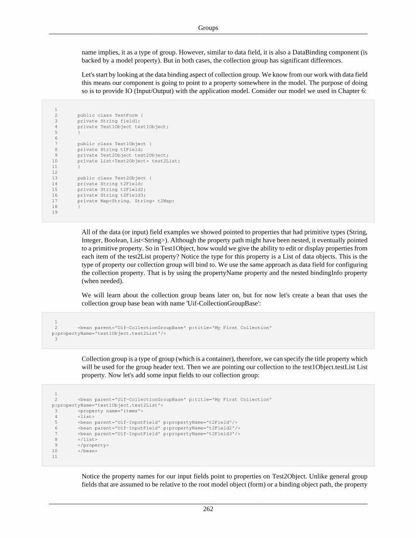
Groups
262
name implies, it as a type of group. However, similar to data field, it is also a DataBinding component (isbacked by a model property). But in both cases, the collection group has significant differences.
Let's start by looking at the data binding aspect of collection group. We know from our work with data fieldthis means our component is going to point to a property somewhere in the model. The purpose of doingso is to provide IO (Input/Output) with the application model. Consider our model we used in Chapter 6:
1 2 public class TestForm { 3 private String field1; 4 private Test1Object test1Object; 5 } 6 7 public class Test1Object { 8 private String t1Field; 9 private Test2Object test2Object; 10 private List<Test2Object> test2List; 11 } 12 13 public class Test2Object { 14 private String t2Field; 15 private String t2Field2; 16 private String t2Field3; 17 private Map<String, String> t2Map; 18 } 19
All of the data (or input) field examples we showed pointed to properties that had primitive types (String,Integer, Boolean, List<String>). Although the property path might have been nested, it eventually pointedto a primitive property. So in Test1Object, how would we give the ability to edit or display properties fromeach item of the test2List property? Notice the type for this property is a List of data objects. This is thetype of property our collection group will bind to. We use the same approach as data field for configuringthe collection property. That is by using the propertyName property and the nested bindingInfo property(when needed).
We will learn about the collection group beans later on, but for now let's create a bean that uses thecollection group base bean with name 'Uif-CollectionGroupBase':
1 2 <bean parent="Uif-CollectionGroupBase" p:title="My First Collection" p:propertyName="test1Object.test2List"/> 3
Collection group is a type of group (which is a container), therefore, we can specify the title property whichwill be used for the group header text. Then we are pointing our collection to the test1Object.testList Listproperty. Now let's add some input fields to our collection group:
1 2 <bean parent="Uif-CollectionGroupBase" p:title="My First Collection" p:propertyName="test1Object.test2List"> 3 <property name="items"> 4 <list> 5 <bean parent="Uif-InputField" p:propertyName="t2Field"/> 6 <bean parent="Uif-InputField" p:propertyName="t2Field2"/> 7 <bean parent="Uif-InputField" p:propertyName="t2Field3"/> 8 </list> 9 </property> 10 </bean> 11
Notice the property names for our input fields point to properties on Test2Object. Unlike general groupfields that are assumed to be relative to the root model object (form) or a binding object path, the property
Groups
263
names given for a collection field are assumed to be on the collection item class. What do we mean bycollection item class? This refers to the type for each of our list items, which in our example is Test2Object.All collection items must contain properties (with valid getters and setters) for the fields configured.
Collection Field Binding
Recall our discussion on data binding in Chapter 6 and the binding info 'bindByNamePrefix'. Thisproperty is set automatically for each field in the collection group to be the path to the collectionitem (collection binding path plus the item index).
This collection group looks very similar to the basic groups we have looked at, so what is the difference?A good way to think of the difference is our basic group renders one set of fields, while our collectiongroups renders multiple sets of fields. That is, for each item that exists in the list property, the set of fieldsconfigured will be generated. Let's assume our test2List property has three items, then the correspondingfields generated will be:
Collection Item 1 (test2List[0]):
Fields: test2List[0].t2Field, test2List[0].t2Field2, test2List[0].t2Field3
Collection Item 2 (test2List[1]):
Fields: test2List[1].t2Field, test2List[1].t2Field2, test2List[1].t2Field3
Collection Item 3 (test2List[2]):
Fields: test2List[2].t2Field, test2List[2].t2Field2, test2List[2].t2Field3
And so on for further collection items. This requires the framework to dynamically create new fields incode to expand to the number of collection items present in the model. This process is described in theupcoming section 'Component Prototypes'.
Collection Object ClassThe collection item class is critical for much of the functionality collection groups provide.Therefore, when creating a collection group, we must specify the item class type using thecollectionObjectClass property:
1 2 <bean parent="Uif-CollectionGroupBase" p:title="My First Collection" 3 p:propertyName="test1Object.test2List" 4 p:collectionObjectClass="edu.myedu.sample.Test2Object"/> 5
The class given must be a concrete (non-abstract) class that follows the JavaBean specification.
Add LineCollection groups provide data IO at two different levels: One for the individual collection item fields,and two at the collection level itself. Data IO at the collection level is done in terms of adding andremoving items (data objects). Therefore, a general facility provided by the collection group is the addline configuration.
First, to specify we want to have an add line for our collection group, we set the renderAddLineproperty to true. This is true by default in our collection group base, however, in code there is also thecondition that the collection group not be read-only (when in read-only state, the add line will not be
Groups
264
rendered). This behavior can be modified by a collection helper class called the Collection Group Builder,which we will learn about later in this section.
Currently the UIF implements the add line functionality using a separate property. This means the objectthat holds the add line data is not part of the collection property itself. Once the line is added, the add objectis interested in collection. Thus, the collection group needs to have a property to store the add line object.This can be done in one of two ways. First, if no configuration is provided and the UifFormBase is beingused for a base form class (the recommendation), a generic property of Map type will be used. The fullcollection path is used to key the map, with the actual add line object as the Map value. The frameworkwill then take care of setting the binding paths appropriately. You can also choose to specify the pathfor the add line through the collection group. This works similar to specifying other property paths. Wecan do this by setting the addLinePropertyName and, if needed, the addLineBindingInfoproperties. As an example, let's assume we want to use our test2Object property to hold the add line:
1 2 public class Test1Object { 3 private String t1Field; 4 private Test2Object test2Object; 5 private List<Test2Object> test2List; 6 } 7
We can configure this as follows:
1 2 <bean parent="Uif-CollectionGroupBase" p:title="My First Collection" 3 p:propertyName="test1Object.test2List" 4 p:collectionObjectClass="edu.myedu.sample.Test2Object"> 5 <property name="addLinePropertyName" value="test1Object.test2Object"/> 6 </bean> 7
Note unlike the field property names, the add line is not assume to be on the collection item. Therefore,it follows the standard rules as other non-collection fields. In this case (assuming the view has nodefault object binding path), we set the full path from the form to our add line property, which is'test1Object.test2Object".
The configured collection group items will be used to generate the add line as well. Therefore, they mustall exist for the add properties type (generally this is the same type as the collection items). If it is desiredto have a different set of fields for the add line (for example, some fields might get defaulted or arenot necessary to show until the line has been added), an alternate set of items can be specify using theaddLineItems property. This property holds a list of components similar to the generic group's itemsproperty.
Lastly, the collection group provides a nested Label component for the add line named addLineLabel.This is not used by the collection group itself, but is made available to the collection layout managers (forexample, the table layout manager uses this to label the add line row).
Collection Add Blank LineCollections can be configured to allow the user to add blank editable lines to the collection. This way, theuser is forced to add the line to the collection before entering data. In this case, the blank line will alreadybe part of the collection data.
To enable this feature the renderAddBlankLineButton property on CollectionGroup must be setto true. This can be set on stacked as well as table collection layouts. This will cause the default add line
Groups
265
actions not to be rendered inside the items and, instead, an Add Line action button will be rendered oncefor the collection.
The placement of this button can be set using the addLinePlacement property. Valid values are 'TOP'and 'BOTTOM'. The default will always be 'TOP'. This will also determine where the blank will be addedto the collection, 'TOP' will insert the line first and 'BOTTOM' will insert the line last.
The newly added line will be highlighted until the collection is saved in order to differentiate it from theoriginal items.
Example configuration (NOTE : the addLinePlacement does not need to specified if the value is 'TOP')...
1 2 <bean id="Collections-AddBlankLine-TableLayout" parent="Uif-Disclosure-TableCollectionSection" 3 p:layoutManager.numberOfColumns="4"> 4 ... 5 <property name="renderAddBlankLineButton" value="true" /> 6 <property name="addLinePlacement" value="TOP" /> 7 ... 8 </bean> 9
Figure 8.20. Collection Add Blank Line Example - TableLayout with TOP add lineplacement
Collection Add Via LightboxCollections can be configured to allow the user to add items to the collection via a modal dialog.
The add button in the dialog will execute client side checks just like the add action in normal collectionsetup would do, and not allow the user to add invalid content.
To enable this feature, the addWithDialog property on CollectionGroup must be set to true. This canbe set on stacked as well as table collection layouts. This will cause the default add line actions not to berendered inside the items and, instead, an Add Line action button will be rendered once for the collection.
The addLinePlacement property determines where the blank will be added to the collection. Validvalues are 'TOP' and 'BOTTOM'. The default will always be 'TOP'. 'TOP' will insert the line first and'BOTTOM' will insert the line last.
The newly added line will be highlighted until the collection is saved in order to differentiate it from theoriginal items.
Example configuration (NOTE : the addLinePlacement does not need to specified if the value is 'TOP') :
1 2 <bean id="Collections-AddViaLightBox-TableLayout" parent="Uif-Disclosure-TableCollectionSection" 3 p:layoutManager.numberOfColumns="4"> 4 ... 5 <property name="addWithDialog" value="true" />
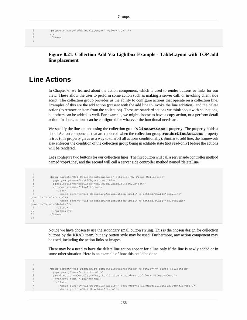
Groups
266
6 <property name="addLinePlacement" value="TOP" /> 7 ... 8 </bean> 9
Figure 8.21. Collection Add Via Lightbox Example - TableLayout with TOP addline placement
Line ActionsIn Chapter 6, we learned about the action component, which is used to render buttons or links for ourview. These allow the user to perform some action such as making a server call, or invoking client sidescript. The collection group provides us the ability to configure actions that operate on a collection line.Examples of this are the add action (present with the add line to invoke the line addition), and the deleteaction (to remove an item from the collection). These are standard actions we think about with collections,but others can be added as well. For example, we might choose to have a copy action, or a perform detailaction. In short, actions can be configured for whatever the functional needs are.
We specify the line actions using the collection group's lineActions property. The property holds alist of Action components that are rendered when the collection group renderLineActions propertyis true (this property gives us a way to turn off all actions conditionally). Similar to add line, the frameworkalso enforces the condition of the collection group being in editable state (not read-only) before the actionswill be rendered.
Let's configure two buttons for our collection lines. The first button will call a server side controller methodnamed 'copyLine', and the second will call a server side controller method named 'deleteLine':
1 2 <bean parent="Uif-CollectionGroupBase" p:title="My First Collection" 3 p:propertyName="test1Object.test2List" 4 p:collectionObjectClass="edu.myedu.sample.Test2Object"> 5 <property name="lineActions"> 6 <list> 7 <bean parent="Uif-SecondaryActionButton-Small" p:methodToCall="copyLine" p:actionLabel="copy"/> 8 <bean parent="Uif-SecondaryActionButton-Small" p:methodToCall="deleteLine" p:actionLabel="delete"/> 9 </list> 10 </property> 11 </bean> 12
Notice we have chosen to use the secondary small button styling. This is the chosen design for collectionbuttons by the KRAD team, but any button style may be used. Furthermore, any action component maybe used, including the action links or images.
There may be a need to have the delete line action appear for a line only if the line is newly added or insome other situation. Here is an example of how this could be done.
1 2 <bean parent="Uif-Disclosure-TableCollectionSection" p:title="My First Collection" 3 p:propertyName="collection1_5" 4 p:collectionObjectClass="org.kuali.rice.krad.demo.uif.form.UITestObject"> 5 <property name="lineActions"> 6 <list> 7 <bean parent="Uif-DeleteLineAction" p:render="@{isAddedCollectionItem(#line)}"/> 8 <bean parent="Uif-SaveLineAction"/>
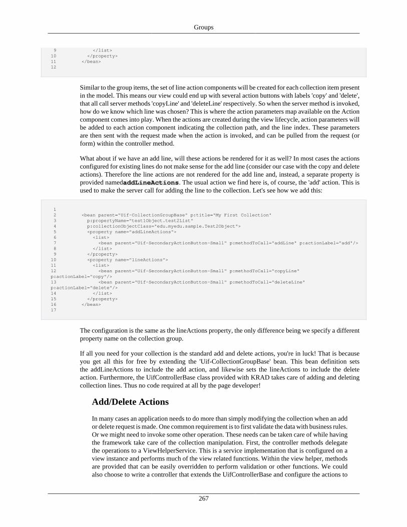
Groups
267
9 </list> 10 </property> 11 </bean> 12
Similar to the group items, the set of line action components will be created for each collection item presentin the model. This means our view could end up with several action buttons with labels 'copy' and 'delete',that all call server methods 'copyLine' and 'deleteLine' respectively. So when the server method is invoked,how do we know which line was chosen? This is where the action parameters map available on the Actioncomponent comes into play. When the actions are created during the view lifecycle, action parameters willbe added to each action component indicating the collection path, and the line index. These parametersare then sent with the request made when the action is invoked, and can be pulled from the request (orform) within the controller method.
What about if we have an add line, will these actions be rendered for it as well? In most cases the actionsconfigured for existing lines do not make sense for the add line (consider our case with the copy and deleteactions). Therefore the line actions are not rendered for the add line and, instead, a separate property isprovided namedaddLineActions. The usual action we find here is, of course, the 'add' action. This isused to make the server call for adding the line to the collection. Let's see how we add this:
1 2 <bean parent="Uif-CollectionGroupBase" p:title="My First Collection" 3 p:propertyName="test1Object.test2List" 4 p:collectionObjectClass="edu.myedu.sample.Test2Object"> 5 <property name="addLineActions"> 6 <list> 7 <bean parent="Uif-SecondaryActionButton-Small" p:methodToCall="addLine" p:actionLabel="add"/> 8 </list> 9 </property> 10 <property name="lineActions"> 11 <list> 12 <bean parent="Uif-SecondaryActionButton-Small" p:methodToCall="copyLine" p:actionLabel="copy"/> 13 <bean parent="Uif-SecondaryActionButton-Small" p:methodToCall="deleteLine" p:actionLabel="delete"/> 14 </list> 15 </property> 16 </bean> 17
The configuration is the same as the lineActions property, the only difference being we specify a differentproperty name on the collection group.
If all you need for your collection is the standard add and delete actions, you're in luck! That is becauseyou get all this for free by extending the 'Uif-CollectionGroupBase' bean. This bean definition setsthe addLineActions to include the add action, and likewise sets the lineActions to include the deleteaction. Furthermore, the UifControllerBase class provided with KRAD takes care of adding and deletingcollection lines. Thus no code required at all by the page developer!
Add/Delete Actions
In many cases an application needs to do more than simply modifying the collection when an addor delete request is made. One common requirement is to first validate the data with business rules.Or we might need to invoke some other operation. These needs can be taken care of while havingthe framework take care of the collection manipulation. First, the controller methods delegatethe operations to a ViewHelperService. This is a service implementation that is configured on aview instance and performs much of the view related functions. Within the view helper, methodsare provided that can be easily overridden to perform validation or other functions. We couldalso choose to write a controller that extends the UifControllerBase and configure the actions to
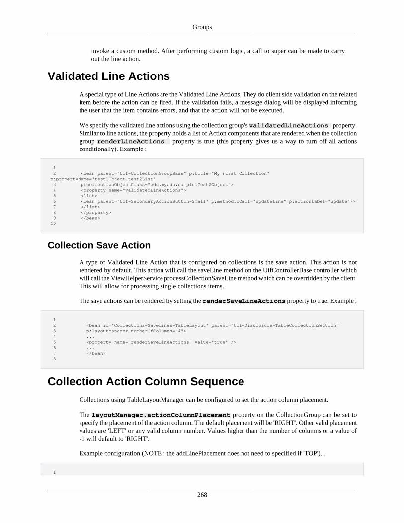
Groups
268
invoke a custom method. After performing custom logic, a call to super can be made to carryout the line action.
Validated Line ActionsA special type of Line Actions are the Validated Line Actions. They do client side validation on the relateditem before the action can be fired. If the validation fails, a message dialog will be displayed informingthe user that the item contains errors, and that the action will not be executed.
We specify the validated line actions using the collection group's validatedLineActions property.Similar to line actions, the property holds a list of Action components that are rendered when the collectiongroup renderLineActions property is true (this property gives us a way to turn off all actionsconditionally). Example :
1 2 <bean parent="Uif-CollectionGroupBase" p:title="My First Collection" p:propertyName="test1Object.test2List" 3 p:collectionObjectClass="edu.myedu.sample.Test2Object"> 4 <property name="validatedLineActions"> 5 <list> 6 <bean parent="Uif-SecondaryActionButton-Small" p:methodToCall="updateLine" p:actionLabel="update"/> 7 </list> 8 </property> 9 </bean> 10
Collection Save Action
A type of Validated Line Action that is configured on collections is the save action. This action is notrendered by default. This action will call the saveLine method on the UifControllerBase controller whichwill call the ViewHelperService processCollectionSaveLine method which can be overridden by the client.This will allow for processing single collections items.
The save actions can be rendered by setting the renderSaveLineActions property to true. Example :
1 2 <bean id="Collections-SaveLines-TableLayout" parent="Uif-Disclosure-TableCollectionSection" 3 p:layoutManager.numberOfColumns="4"> 4 ... 5 <property name="renderSaveLineActions" value="true" /> 6 ... 7 </bean> 8
Collection Action Column SequenceCollections using TableLayoutManager can be configured to set the action column placement.
The layoutManager.actionColumnPlacement property on the CollectionGroup can be set tospecify the placement of the action column. The default placement will be 'RIGHT'. Other valid placementvalues are 'LEFT' or any valid column number. Values higher than the number of columns or a value of-1 will default to 'RIGHT'.
Example configuration (NOTE : the addLinePlacement does not need to specified if 'TOP')...
1
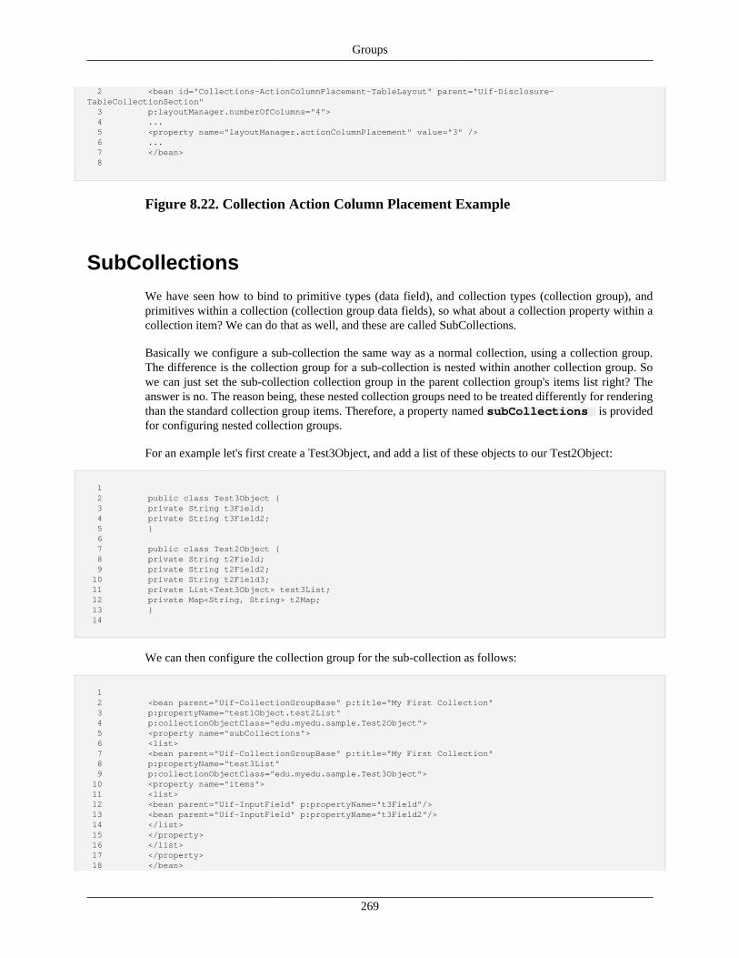
Groups
269
2 <bean id="Collections-ActionColumnPlacement-TableLayout" parent="Uif-Disclosure-TableCollectionSection" 3 p:layoutManager.numberOfColumns="4"> 4 ... 5 <property name="layoutManager.actionColumnPlacement" value="3" /> 6 ... 7 </bean> 8
Figure 8.22. Collection Action Column Placement Example
SubCollectionsWe have seen how to bind to primitive types (data field), and collection types (collection group), andprimitives within a collection (collection group data fields), so what about a collection property within acollection item? We can do that as well, and these are called SubCollections.
Basically we configure a sub-collection the same way as a normal collection, using a collection group.The difference is the collection group for a sub-collection is nested within another collection group. Sowe can just set the sub-collection collection group in the parent collection group's items list right? Theanswer is no. The reason being, these nested collection groups need to be treated differently for renderingthan the standard collection group items. Therefore, a property named subCollections is providedfor configuring nested collection groups.
For an example let's first create a Test3Object, and add a list of these objects to our Test2Object:
1 2 public class Test3Object { 3 private String t3Field; 4 private String t3Field2; 5 } 6 7 public class Test2Object { 8 private String t2Field; 9 private String t2Field2; 10 private String t2Field3; 11 private List<Test3Object> test3List; 12 private Map<String, String> t2Map; 13 } 14
We can then configure the collection group for the sub-collection as follows:
1 2 <bean parent="Uif-CollectionGroupBase" p:title="My First Collection" 3 p:propertyName="test1Object.test2List" 4 p:collectionObjectClass="edu.myedu.sample.Test2Object"> 5 <property name="subCollections"> 6 <list> 7 <bean parent="Uif-CollectionGroupBase" p:title="My First Collection" 8 p:propertyName="test3List" 9 p:collectionObjectClass="edu.myedu.sample.Test3Object"> 10 <property name="items"> 11 <list> 12 <bean parent="Uif-InputField" p:propertyName="t3Field"/> 13 <bean parent="Uif-InputField" p:propertyName="t3Field2"/> 14 </list> 15 </property> 16 </list> 17 </property> 18 </bean>
Groups
270
19
Notice our collection group for the sub-collection is configured exactly like any standard collection. Alsonotice that the property name is simply 'test3List'. This is because the binding for the sub collections followthe same rule as the collection group fields (assumed to be on the collection item). We can continue addingother sub collections to the list as needed.
Note that if your collection is using a TableLayoutManager, you should place your sub-collections ina rowDetailsGroup, as the subcollection property is not officially supported by TableLayoutManager.It is recommended that the subcollections property only be used for collections which use aStackedLayoutManager (or other).
As you might have guessed, the sub-collection could in turn have sub-collections and further down theline. The framework does not restrict how many levels the nesting can go (in practical terms of screen realestate three levels is usually the limit). The number of fields generated when using sub-collections cangrow quite rapidly. For each parent collection line, a separate sub collection must be rendered entirely. Forexample assume our test2List has 2 items, and our test3List has 3 items. The line rendering would then be:
• Render test2List[0]
• Render test2List[0].test3List[0]
• Render test2List[0].test3List[1]
• Render test2List[0].test3List[2]
• Render test2List[1]
• Render test2List[1].test3List[0]
• Render test2List[1].test3List[1]
• Render test2List[1].test3List[2]
You can clearly see that as more test2List items are added, the number of fields grows fast. Adding othersub-collections, or another level of sub-collections, makes the rate of growth even more rapid.
Collection Group BuilderComing Soon!
LightTable Groupwhich does not contain or allow many of the options already described in this section.
The LightTable group ("Uif-LightTableGroup") and sections are special collections that are a light-weightcollection table implementation, supporting a subset of features available in a normal collection. Since theLightTable does not retain the many of the features of the full featured collection table groups, the usageof a LightTable is to allow for a very fast render/response of a large table with many rows. Its purpose (inmost cases) is to display these entries as read-only, therefore, adding is not allowed for this collection.
Currently the features officially supported by this table in Krad are:
• DataField
• InputField with TextControl
Groups
271
• InputField with CheckboxControl
• InputField with a single-select SelectControl (ie, "Uif-Dropdown")
• MessageField
• LinkField
• ActionField
• ImageField
• most RichTable widget options (including sorting and paging, among other jQuery DataTables options)
• FieldGroup containing only Actions, Image, Messages, or Links
• SpringEL (Spring Expression Language) for String properties on components supported by this tableonly
• SpringEL specifically for the render property
Other features are not guaranteed by the framework to work, but may be still be functional.
LightTable has the following relevant properties:
• propertyName and bindingInfo - for data binding purposes
• richTable - RichTable widget configuration for sorting and other advanced features
• items - list of Fields/FieldGroups (must be of these types) for this table
• other properties inherited from the Group component
Example of using a LightTable group to display a very simple table that is highly performant with largesets of data:
1 <bean id="Demo-LightTableGroup1" parent="Uif-LightTableGroup"> 2 <property name="propertyName" value="list6"/> 3 <property name="items"> 4 <list> 5 <bean parent="Uif-DataField" p:label="Field 1" p:propertyName="field1"/> 6 <bean parent="Uif-DataField" p:label="Field 2" p:propertyName="field2"/> 7 <bean parent="Uif-DataField" p:label="Field 3" p:propertyName="field3"/> 8 <bean parent="Uif-DataField" p:label="Field 4" p:propertyName="field4"/> 9 </list> 10 </property> 11 </bean> 12
The appearance of this table will be exactly the same as if a CollectionGroup with a TableCollectionLayoutwas being used (though it is limited by the types of components and advanced functionality allowed).
Like TableLayoutManager, the LightTable has a property calledconditionalRowCssClasses. It supportsall the following conditions in its keys:
• all - put a class on every row
• even - put a class on even rows
Groups
272
• odd - put a class on odd rows
• index - one-based index is used to put a css class on a single row (this should only be used on tableswhich never change)
• SpringEL - create a condition that returns true/false based on the fields and context of the row itself.When true, that row will have the class specified.
Recap• A Collection Group is a special group that renders multiple sets of fields and associates with a model
property of type Collection
• Like an input field, the collection group uses the propertyName and bindingInfo properties forfinding the property that provides the collection data
• When configuring a collection group, we must specify the type for each collection item using thecollectionObjectClass property
• All data fields declared within the collection group's items list are assumed to be on the collection objectclass (therefore, their path given is relative to the path of the collection item)
• Collection groups provide data IO at two levels: the individual collection fields, and the collection items(data objects). For adding a collection item, we use the add line feature which is enabled by the propertyrenderAddLine (true by default when the group is not read-only)
• The add line data object is not part of the collection until the user performs the add operation. Therefore,we must hold the data object in a separate property
• The UIF provides a general Map on UifFormBase for holding add line objects. We canoverride this to use a custom property by setting the properties addLinePropertyName andaddLineBindingInfo
• By default, the components configured in the items property will be used for the add line as well. Wecan, however, configure a different list of components using the addLineItems property
• Collections can be configured to allow the user to add blank editable lines to the collection. This way,the user is forced to add the line to the collection before entering data. To enable this feature, therenderAddBlankLineButton property on CollectionGroup must be set to true
• Collections can be configured to allow the user to add items to the collection via a modal dialog. Toenable this feature the addWithDialog property on CollectionGroup must be set to true
• The collection group provides the property addLineLabel which is used by layout managers to labelthe add line
• Action fields that perform an action related to an existing line can be given using the lineActionsproperty. For the add line, actions are given using the addLineActions property. Common examplesinclude the 'delete' action for existing lines and the 'add' action for the add line
• Validated Action fields that perform a validation and an action related to an existing line can be givenusing the validatedLineActions property
• The display of the actions is controlled by the property renderLineActions (by default this istrue when the group is not read-only)
Groups
273
• We can specify the placement of the action column on collection groups using TableLayoutManager bysetting the layoutManager.actionColumnPlacement property
• Collection group beans can extend the base bean 'Uif-CollectionGroupBase' which configures the addand delete buttons by default
• We can create a controller that extends UifControllerBase which provides handling of the addand delete line actions. If we need to perform custom actions (such as validation), we can overridethe controller method or implement the ViewHelperService method processBeforeAddLine orprocessAfterAddLine
• In addition to providing data IO for primitive property types on a collection, we also have nestedcollection property types. These are referred to as sub-collections
• Sub-collections are just a collection that is nested, therefore, we use a collection group and configurein the same way as a non-nested collection. The only difference is we then add this collection group tothe subCollections property of the parent collection group
• When configuring the property path for the sub-collection (like the collection items), it is assumed tobe related to the collection object class
Component PrototypesComing Soon!
Recap• In many places of the UIF components need to be created dynamically based on data or other conditions.
A good example of this are components configured for a collection group. For example, when we specifythe lineActions, these action need to be rendered for each line. Therefore, we need separate componentsfor each line (the same components cannot be used for reasons such as id, action parameters, propertypaths and so on)
• When the framework needs to dynamically build a component, it makes a copy of the componentconfigured. Therefore, the configured component acts as a prototype for the component creations ratherthan being the actual component that is rendered
• Many properties have the suffix 'prototype' in their name to indicate this purpose
Collection Layout ManagersAgain we know the group component (including collection groups) has no knowledge of how to positionthe components it holds. Therefore, we need to associate a layout manager with the group. Because of theunique features we have seen with collection groups, they require a special type of layout manager. Theselayout managers must implement the interface org.kuali.rice.krad.uif.layout.CollectionLayoutManager,which requires a method named buildLine to be implemented. Collection layout managers have to do a lotmore work than the standard layout managers. For the standard manager such as grid and box, most of thework can be simply done through the template by the process described earlier in this chapter. Collectionlayout managers, though, need to do work in code to collect the generated collection line fields (and actions)and, in some cases, create wrapping components (this will become more clear as we continue).
Setting aside the concerns of item layout, the collection group appears just like the standard group. Wehave the group header, instructional message, errors field, the group items, and the footer. The differencecomes where the items are rendered, which we will again call the Layout Area.
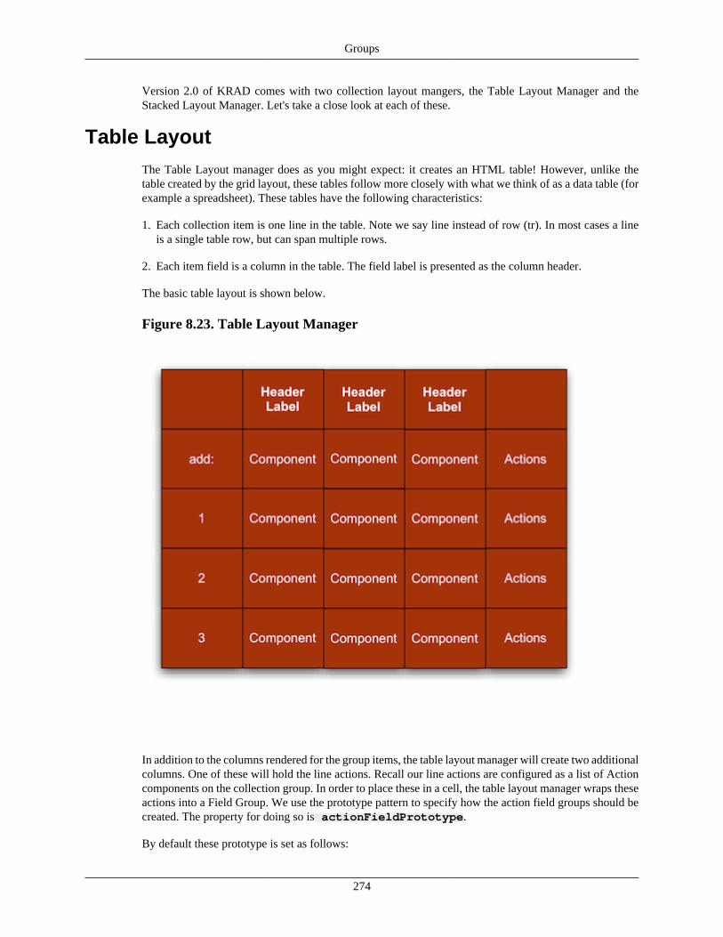
Groups
274
Version 2.0 of KRAD comes with two collection layout mangers, the Table Layout Manager and theStacked Layout Manager. Let's take a close look at each of these.
Table LayoutThe Table Layout manager does as you might expect: it creates an HTML table! However, unlike thetable created by the grid layout, these tables follow more closely with what we think of as a data table (forexample a spreadsheet). These tables have the following characteristics:
1. Each collection item is one line in the table. Note we say line instead of row (tr). In most cases a lineis a single table row, but can span multiple rows.
2. Each item field is a column in the table. The field label is presented as the column header.
The basic table layout is shown below.
Figure 8.23. Table Layout Manager
In addition to the columns rendered for the group items, the table layout manager will create two additionalcolumns. One of these will hold the line actions. Recall our line actions are configured as a list of Actioncomponents on the collection group. In order to place these in a cell, the table layout manager wraps theseactions into a Field Group. We use the prototype pattern to specify how the action field groups should becreated. The property for doing so is actionFieldPrototype.
By default these prototype is set as follows:
Groups
275
1 2 <property name="actionFieldPrototype"> 3 <bean parent="Uif-HorizontalFieldGroup" p:align="center" p:label="Actions" 4 p:shortLabel="Actions"/> 5 </property> 6
For each collection item, a new field group component will be created by copying this prototype. Thelist of actions will then also be copied, and finally inserted as the items on the nested field group. Theprototype definition here stated the field group items (actions) will be rendered using a horizontal boxlayout. Furthermore, this specifies a label for the field of 'Actions', which, like the label for the collectionfields, will be displayed as the column header. Finally, we are specifying our content should align center.
The second column the table layout manager will add is referred to as the sequence column. This is acolumn that will provide a label for each row. Typically the label is either a generated sequence (1,2,3…),or uses an identifier property from the collection item class (such as a line number or unique identifier).To enable the column, the property renderSequenceField on the table manger must be set to true(default). We then need to specify where the sequence value should come from. One way of doing thisis to allow the framework to create the sequence value for us. This is basically a numbering of each linestarting with one. To use autosequencing we set the property generateAutoSequence to true.
Conditional Row Css Classes
Row css classes can be set per a row conditional based on a variety of conditions for that row in yourtable layout. There is a property on TableLayoutManager called conditionalRowCssClasses which takesa "condition" as a key and a css class (or classes separated by spaces) as a value. The class will be placedon the tr element in the DOM for that row. The options available for the condition are:
• all - put a class on every row
• even - put a class on even rows
• odd - put a class on odd rows
• index - one-based index is used to put a css class on a single row (this should only be used on tableswhich never change)
• SpringEL - create a condition that returns true/false based on the fields and context of the row itself.When true, that row will have the class specified.
DO NOT use the rowCssClass property to set your css classes, but use this property instead.The rowCssClasses property is used by the framework internally (however it can be used withGridLayoutManagers).
This is an example of setting each type of condition, the SpringEL condition here puts the "demo-rowCondition" class on the row when field1 of the line equals "B":
<property name="layoutManager.conditionalRowCssClasses"> <map> <entry key="all" value="demo-all"/> <entry key="odd" value="demo-odd"/> <entry key="even" value="demo-even"/> <entry key="2" value="demo-index2"/> <entry key="@{#line.field1 eq 'B'}" value="demo-rowCondition"/> </map> </property>
Groups
276
Row Details Group option
Table collections can now display additional details on a row. When using this functionality, an additionalcolumn with a "Details" link will be available, and when the user clicks on it, the configured group todisplay for that row will be revealed/disclosed below that row. The intended uses of this functionality isfor the user to be able to discover additional information about that collection item without having to leavethe page, or hide content that can become large, such as descriptions. Using row details for subcollectionsis the ONLY officially supported way to display subcollections for table-based (TableLayoutManager)collections; do not use the subcollections property on CollectionGroup.
To use a row details group with a Uif-TableCollectionSection (or variation of) you setup the followingproperties on its layoutManager (It is REQUIRED that the layoutManager is using richTablefunctionality - in other words, it is using the dataTables jQuery plugin to render):
rowDetailsGroup – this can be ANY group or section content you would like to use for the contentof details. The input and data fields used in this group will automatically inherit the necessary collectionbinding path just like items of the collection itself
RowDetailsGroup which contains fields (note that both fields, field3 and field4 are part of line's objectsince the path is automatically adjusted):
<property name="layoutManager.rowDetailsGroup"> <bean parent="Uif-VerticalBoxGroup"> <property name="items"> <list> <bean parent="Uif-InputField" p:propertyName="field3" p:label="Field 3" p:required="true"/> <bean parent="Uif-InputField" p:propertyName="field4" p:label="Field 4" p:progressiveRender="false" p:required="true"/> </list> </property> </bean> </property>
RowDetailsGroup which contains an input field and a subcollection (again no need to adjust the bindingpath, this subcollection is a subcollection of the line's object):
<property name="layoutManager.rowDetailsGroup"> <bean parent="Uif-VerticalBoxGroup"> <property name="items"> <list> <bean parent="Uif-InputField" p:propertyName="field3" p:label="Field 3" p:required="true"/> <bean parent="Uif-StackedSubCollection-WithinSection"> <property name="propertyName" value="subList"/> <property name="headerText" value="SubCollection"/> <property name="collectionObjectClass" value="edu.sampleu.demo.kitchensink.UITestObject"/> <property name="readOnly" value="true"/> <property name="items"> <list> <bean parent="Uif-InputField" p:propertyName="field1" p:label="SubField 1" p:required="true"/> <bean parent="Uif-InputField" p:propertyName="field2" p:label="SubField 2" p:required="true"> </bean> </list> </property> </bean> </list> </property> </bean> </property>
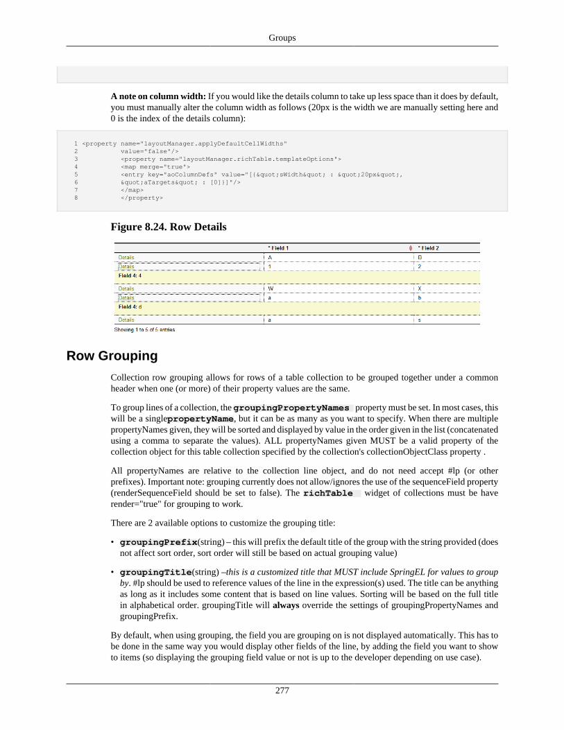
Groups
277
A note on column width: If you would like the details column to take up less space than it does by default,you must manually alter the column width as follows (20px is the width we are manually setting here and0 is the index of the details column):
1 <property name="layoutManager.applyDefaultCellWidths" 2 value="false"/> 3 <property name="layoutManager.richTable.templateOptions"> 4 <map merge="true"> 5 <entry key="aoColumnDefs" value="[{"sWidth" : "20px", 6 "aTargets" : [0]}]"/> 7 </map> 8 </property>
Figure 8.24. Row Details
Row Grouping
Collection row grouping allows for rows of a table collection to be grouped together under a commonheader when one (or more) of their property values are the same.
To group lines of a collection, the groupingPropertyNames property must be set. In most cases, thiswill be a singlepropertyName, but it can be as many as you want to specify. When there are multiplepropertyNames given, they will be sorted and displayed by value in the order given in the list (concatenatedusing a comma to separate the values). ALL propertyNames given MUST be a valid property of thecollection object for this table collection specified by the collection's collectionObjectClass property .
All propertyNames are relative to the collection line object, and do not need accept #lp (or otherprefixes). Important note: grouping currently does not allow/ignores the use of the sequenceField property(renderSequenceField should be set to false). The richTable widget of collections must be haverender="true" for grouping to work.
There are 2 available options to customize the grouping title:
• groupingPrefix(string) – this will prefix the default title of the group with the string provided (doesnot affect sort order, sort order will still be based on actual grouping value)
• groupingTitle(string) –this is a customized title that MUST include SpringEL for values to groupby. #lp should be used to reference values of the line in the expression(s) used. The title can be anythingas long as it includes some content that is based on line values. Sorting will be based on the full titlein alphabetical order. groupingTitle will always override the settings of groupingPropertyNames andgroupingPrefix.
By default, when using grouping, the field you are grouping on is not displayed automatically. This has tobe done in the same way you would display other fields of the line, by adding the field you want to showto items (so displaying the grouping field value or not is up to the developer depending on use case).
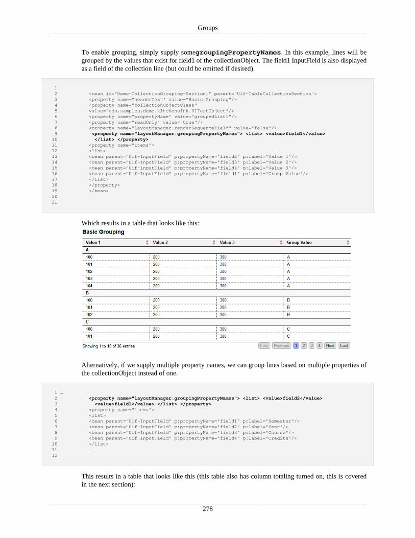
Groups
278
To enable grouping, simply supply somegroupingPropertyNames. In this example, lines will begrouped by the values that exist for field1 of the collectionObject. The field1 InputField is also displayedas a field of the collection line (but could be omitted if desired).
1 2 <bean id="Demo-CollectionGrouping-Section1" parent="Uif-TableCollectionSection"> 3 <property name="headerText" value="Basic Grouping"/> 4 <property name="collectionObjectClass" 5 value="edu.sampleu.demo.kitchensink.UITestObject"/> 6 <property name="propertyName" value="groupedList1"/> 7 <property name="readOnly" value="true"/> 8 <property name="layoutManager.renderSequenceField" value="false"/> 9 <property name="layoutManager.groupingPropertyNames"> <list> <value>field1</value> 10 </list> </property> 11 <property name="items"> 12 <list> 13 <bean parent="Uif-InputField" p:propertyName="field2" p:label="Value 1"/> 14 <bean parent="Uif-InputField" p:propertyName="field3" p:label="Value 2"/> 15 <bean parent="Uif-InputField" p:propertyName="field4" p:label="Value 3"/> 16 <bean parent="Uif-InputField" p:propertyName="field1" p:label="Group Value"/> 17 </list> 18 </property> 19 </bean> 20 21
Which results in a table that looks like this:
Alternatively, if we supply multiple property names, we can group lines based on multiple properties ofthe collectionObject instead of one.
1 … 2 <property name="layoutManager.groupingPropertyNames"> <list> <value>field2</value> 3 <value>field1</value> </list> </property> 4 <property name="items"> 5 <list> 6 <bean parent="Uif-InputField" p:propertyName="field1" p:label="Semester"/> 7 <bean parent="Uif-InputField" p:propertyName="field2" p:label="Year"/> 8 <bean parent="Uif-InputField" p:propertyName="field3" p:label="Course"/> 9 <bean parent="Uif-InputField" p:propertyName="field4" p:label="Credits"/> 10 </list> 11 … 12
This results in a table that looks like this (this table also has column totaling turned on, this is coveredin the next section):
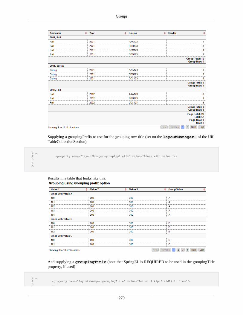
Groups
279
Supplying a groupingPrefix to use for the grouping row title (set on the layoutManager of the Uif-TableCollectionSection)
1 … 2 <property name="layoutManager.groupingPrefix" value="Lines with value "/> 3 … 4 5
Results in a table that looks like this:
And supplying a groupingTitle (note that SpringEL is REQUIRED to be used in the groupingTitleproperty, if used)
1 … 2 <property name="layoutManager.groupingTitle" value="Letter @{#lp.field1} in item"/> 3 …
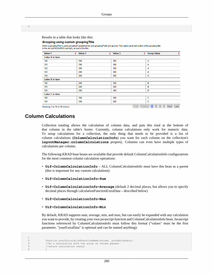
Groups
280
4
Results in a table that looks like this:
Column Calculations
Collection totaling allows the calculation of column data, and puts this total at the bottom ofthat column in the table's footer. Currently, column calculations only work for numeric data.To setup calculations for a collection, the only thing that needs to be provided is a list ofcolumn calculations (ColumnCalculationInfo) you want for each column on the collection'slayoutManager.columnCalculations property. Columns can even have multiple types ofcalculations per column.
The following KRAD base beans are available that provide default ColumnCalculationInfo configurationsfor the most common column calculation operations:
• Uif-ColumnCalculationInfo – ALL ColumnCalculationInfo must have this bean as a parent(this is important for any custom calculations)
• Uif-ColumnCalculationInfo-Sum
• Uif-ColumnCalculationInfo-Average (default 2 decimal places, but allows you to specifydecimal places through calculationFunctionExtraData – described below)
• Uif-ColumnCalculationInfo-Max
• Uif-ColumnCalculationInfo-Min
By default, KRAD supports sum, average, min, and max, but can easily be expanded with any calculationyou want to provide, by creating your own javascript function and ColumnCalculationInfo bean. Javascriptfunctions referenced by ColumnCalculationInfo must follow this format ("values" must be the firstparameter, "yourExtraData" is optional and can be named anything):
1 2 function yourCalculationFunctionName(values, yourExtraData){ 3 //do a calculation with the array of values passed 4 //return calculation result 5 }
Groups
281
6
The function's name is used in ColumnCalculationInfo's calculationFuctionName property.This property must be specified by name only; parenthesis and parameters CANNOT be included.The framework automatically passes the array of column values to calculate to the function as thefirst parameter and data specified by thecalculationFunctionExtraDataproperty as the secondparameter. This data can be any valid javascript data: int, String, object, etc.
The calculationFunctionExtraData property is meant to provide options to your calculation function, ifneeded (our average function, for example, uses calculationFunctionExtraData to pass the number ofdecimal places to be used in the average).
The settable properties available on Uif-ColumnCalculationInfo are:
• propertyName – must be set. This specifies the column of the collection you are totaling. The fieldfor this propertyName must be one of the fields specified by items of the TableCollection.
• showTotal (Boolean) – default true. Whether or not to show the calculation total for the column (thisis the total of all values of the collection across all pages)(default is true on KRAD base beans).
• showPageTotal(Boolean) – if true, this shows the calculation total for the values of the currentlyshown page for the column(default is true on KRAD base beans).
• showGroupTotal(Boolean) – if true, shows the group calculation total for the values of each group.The TableCollection must be using row grouping functionality for this to work (see TableCollectionRow Grouping) (default is false on KRAD base beans).
• totalField, pageTotalField, and groupTotalFieldPrototype – the MessageFieldcomponent used to display the column calculation results. Normally not configured, but can be usedto force messageText in the skip client-side scenario (described below) and to modify the label of thecalculation field at will. These fields should not be overridden, only their properties set. Example ofsetting the label on pageTotalField:
1 <property name="pageTotalField.fieldLabel.labelText" 2 value="Page Average"/> 3
• calculationFunctionName – described above, the js calculation function to use by name.
• calculationFunctionExtraData– optional. The additional js data to pass to the js calculationfunction.
• recalculateTotalClientSide – if false, the calculation for total (not page or group totals –these are ALWAYS client-side calculations if shown) is not done client side. What this means is thetotal must come from the server by providing the total to the totalField in this way through SpringEL:
1 <property name="totalField.messageText" value="@{#form.serverCalculatedTotal}"/> 2
• calculateOnKeyUp – if true, fields of this column will perform their calculations on key up (thereis a small delay to prevent it from calculating before you are done typing).
The following example has a different calculation for each column of the collection. Since we donot specify the show properties, our beans, by default, show total and page total. Note that thecolumnCalculationInfo propertyNames match the propertyNames of the fields in the collection's items list.
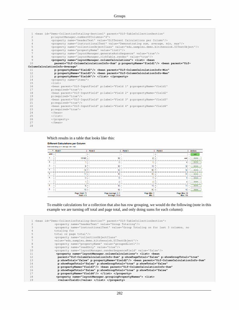
Groups
282
1 <bean id="Demo-CollectionTotaling-Section1" parent="Uif-TableCollectionSection" 2 p:layoutManager.numberOfColumns="4"> 3 <property name="headerText" value="Different Calculations per Column"/> 4 <property name="instructionalText" value="Demonstrating sum, average, min, max"/> 5 <property name="collectionObjectClass" value="edu.sampleu.demo.kitchensink.UITestObject"/> 6 <property name="propertyName" value="list1"/> 7 <property name="layoutManager.generateAutoSequence" value="true"/> 8 <property name="layoutManager.richTable.render" value="true"/> 9 <property name="layoutManager.columnCalculations"> <list> <bean 10 parent="Uif-ColumnCalculationInfo-Sum" p:propertyName="field1"/> <bean parent="Uif-ColumnCalculationInfo-Average" 11 p:propertyName="field2"/> <bean parent="Uif-ColumnCalculationInfo-Min" 12 p:propertyName="field3"/> <bean parent="Uif-ColumnCalculationInfo-Max" 13 p:propertyName="field4"/> </list> </property> 14 <property name="items"> 15 <list> 16 <bean parent="Uif-InputField" p:label="Field 1" p:propertyName="field1" 17 p:required="true"/> 18 <bean parent="Uif-InputField" p:label="Field 2" p:propertyName="field2" 19 p:required="true"/> 20 <bean parent="Uif-InputField" p:label="Field 3" p:propertyName="field3" 21 p:required="true"/> 22 <bean parent="Uif-InputField" p:label="Field 4" p:propertyName="field4" 23 p:required="true"> 24 </bean> 25 </list> 26 </property> 27 </bean> 28
Which results in a table that looks like this:
To enable calculations for a collection that also has row grouping, we would do the following (note in thisexample we are turning off total and page total, and only doing sums for each column):
1 <bean id="Demo-CollectionTotaling-Section7" parent="Uif-TableCollectionSection"> 2 <property name="headerText" value="Group Totaling"/> 3 <property name="instructionalText" value="Group Totaling on for last 3 columns, no 4 totaling for 5 total or page total"/> 6 <property name="collectionObjectClass" 7 value="edu.sampleu.demo.kitchensink.UITestObject"/> 8 <property name="propertyName" value="groupedList1"/> 9 <property name="readOnly" value="true"/> 10 <property name="layoutManager.renderSequenceField" value="false"/> 11 <property name="layoutManager.columnCalculations"> <list> <bean 12 parent="Uif-ColumnCalculationInfo-Sum" p:showPageTotal="false" p:showGroupTotal="true" 13 p:showTotal="false" p:propertyName="field2"/> <bean parent="Uif-ColumnCalculationInfo-Sum" 14 p:showPageTotal="false" p:showGroupTotal="true" p:showTotal="false" 15 p:propertyName="field3"/> <bean parent="Uif-ColumnCalculationInfo-Sum" 16 p:showPageTotal="false" p:showGroupTotal="true" p:showTotal="false" 17 p:propertyName="field4"/> </list> </property> 18 <property name="layoutManager.groupingPropertyNames"> <list> 19 <value>field1</value> </list> </property>
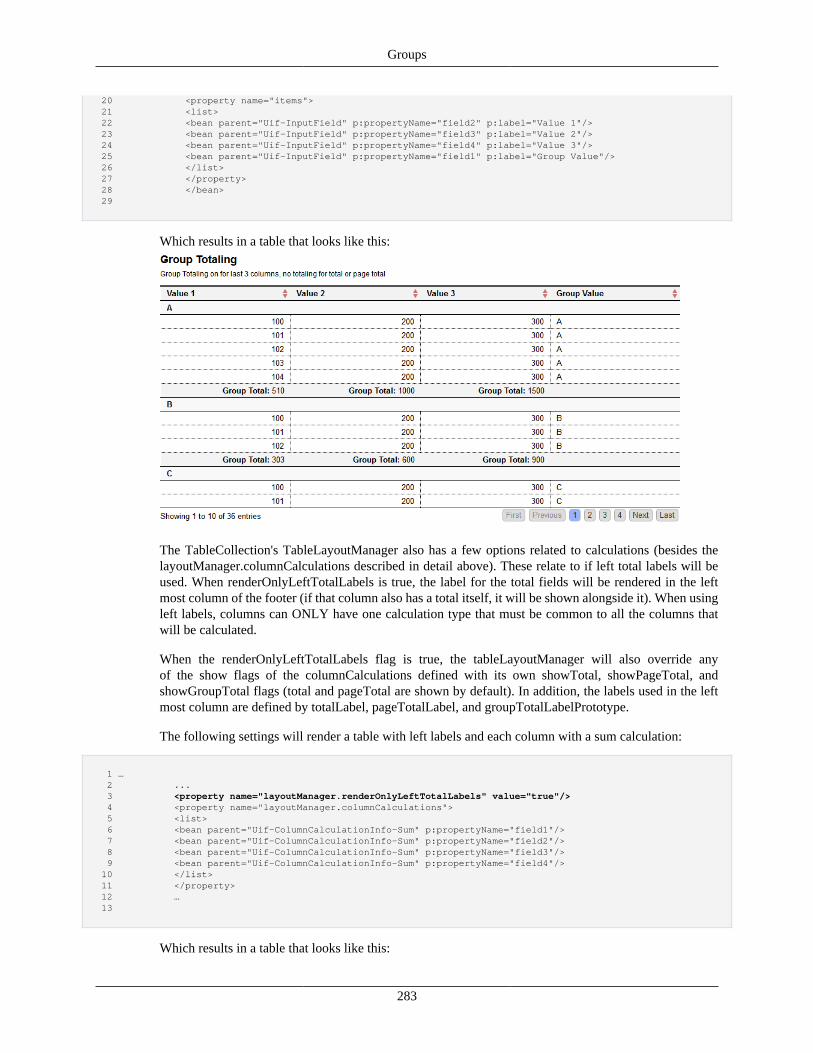
Groups
283
20 <property name="items"> 21 <list> 22 <bean parent="Uif-InputField" p:propertyName="field2" p:label="Value 1"/> 23 <bean parent="Uif-InputField" p:propertyName="field3" p:label="Value 2"/> 24 <bean parent="Uif-InputField" p:propertyName="field4" p:label="Value 3"/> 25 <bean parent="Uif-InputField" p:propertyName="field1" p:label="Group Value"/> 26 </list> 27 </property> 28 </bean> 29
Which results in a table that looks like this:
The TableCollection's TableLayoutManager also has a few options related to calculations (besides thelayoutManager.columnCalculations described in detail above). These relate to if left total labels will beused. When renderOnlyLeftTotalLabels is true, the label for the total fields will be rendered in the leftmost column of the footer (if that column also has a total itself, it will be shown alongside it). When usingleft labels, columns can ONLY have one calculation type that must be common to all the columns thatwill be calculated.
When the renderOnlyLeftTotalLabels flag is true, the tableLayoutManager will also override anyof the show flags of the columnCalculations defined with its own showTotal, showPageTotal, andshowGroupTotal flags (total and pageTotal are shown by default). In addition, the labels used in the leftmost column are defined by totalLabel, pageTotalLabel, and groupTotalLabelPrototype.
The following settings will render a table with left labels and each column with a sum calculation:
1 … 2 ... 3 <property name="layoutManager.renderOnlyLeftTotalLabels" value="true"/> 4 <property name="layoutManager.columnCalculations"> 5 <list> 6 <bean parent="Uif-ColumnCalculationInfo-Sum" p:propertyName="field1"/> 7 <bean parent="Uif-ColumnCalculationInfo-Sum" p:propertyName="field2"/> 8 <bean parent="Uif-ColumnCalculationInfo-Sum" p:propertyName="field3"/> 9 <bean parent="Uif-ColumnCalculationInfo-Sum" p:propertyName="field4"/> 10 </list> 11 </property> 12 … 13
Which results in a table that looks like this:
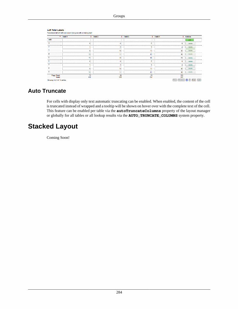
Groups
284
Auto Truncate
For cells with display only text automatic truncating can be enabled. When enabled, the content of the cellis truncated instead of wrapped and a tooltip will be shown on hover over with the complete text of the cell.This feature can be enabled per table via the autoTruncateColumns property of the layout manageror globally for all tables or all lookup results via the AUTO_TRUNCATE_COLUMNS system property.
Stacked Layout
Coming Soon!
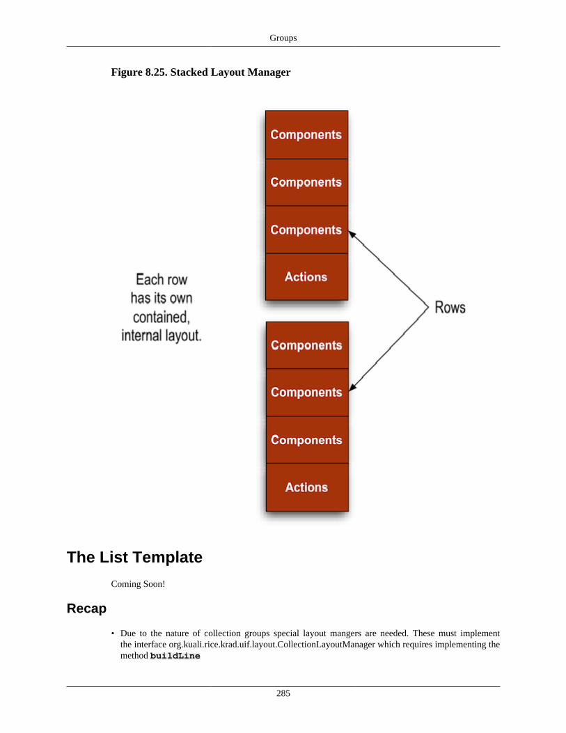
Groups
285
Figure 8.25. Stacked Layout Manager
The List Template
Coming Soon!
Recap
• Due to the nature of collection groups special layout mangers are needed. These must implementthe interface org.kuali.rice.krad.uif.layout.CollectionLayoutManager which requires implementing themethod buildLine
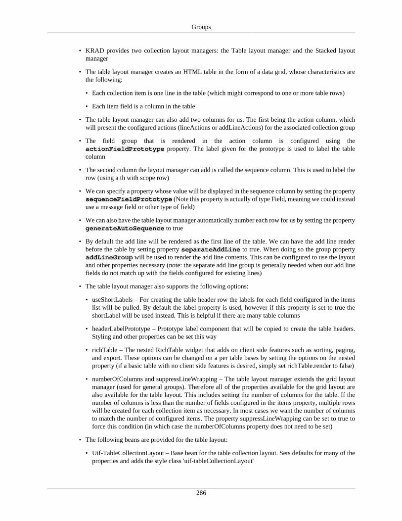
Groups
286
• KRAD provides two collection layout managers: the Table layout manager and the Stacked layoutmanager
• The table layout manager creates an HTML table in the form of a data grid, whose characteristics arethe following:
• Each collection item is one line in the table (which might correspond to one or more table rows)
• Each item field is a column in the table
• The table layout manager can also add two columns for us. The first being the action column, whichwill present the configured actions (lineActions or addLineActions) for the associated collection group
• The field group that is rendered in the action column is configured using theactionFieldPrototype property. The label given for the prototype is used to label the tablecolumn
• The second column the layout manager can add is called the sequence column. This is used to label therow (using a th with scope row)
• We can specify a property whose value will be displayed in the sequence column by setting the propertysequenceFieldPrototype (Note this property is actually of type Field, meaning we could insteaduse a message field or other type of field)
• We can also have the table layout manager automatically number each row for us by setting the propertygenerateAutoSequence to true
• By default the add line will be rendered as the first line of the table. We can have the add line renderbefore the table by setting property separateAddLine to true. When doing so the group propertyaddLineGroup will be used to render the add line contents. This can be configured to use the layoutand other properties necessary (note: the separate add line group is generally needed when our add linefields do not match up with the fields configured for existing lines)
• The table layout manager also supports the following options:
• useShortLabels – For creating the table header row the labels for each field configured in the itemslist will be pulled. By default the label property is used, however if this property is set to true theshortLabel will be used instead. This is helpful if there are many table columns
• headerLabelPrototype – Prototype label component that will be copied to create the table headers.Styling and other properties can be set this way
• richTable – The nested RichTable widget that adds on client side features such as sorting, paging,and export. These options can be changed on a per table bases by setting the options on the nestedproperty (if a basic table with no client side features is desired, simply set richTable.render to false)
• numberOfColumns and suppressLineWrapping – The table layout manager extends the grid layoutmanager (used for general groups). Therefore all of the properties available for the grid layout arealso available for the table layout. This includes setting the number of columns for the table. If thenumber of columns is less than the number of fields configured in the items property, multiple rowswill be created for each collection item as necessary. In most cases we want the number of columnsto match the number of configured items. The property suppressLineWrapping can be set to true toforce this condition (in which case the numberOfColumns property does not need to be set)
• The following beans are provided for the table layout:
• Uif-TableCollectionLayout – Base bean for the table collection layout. Sets defaults for many of theproperties and adds the style class 'uif-tableCollectionLayout'
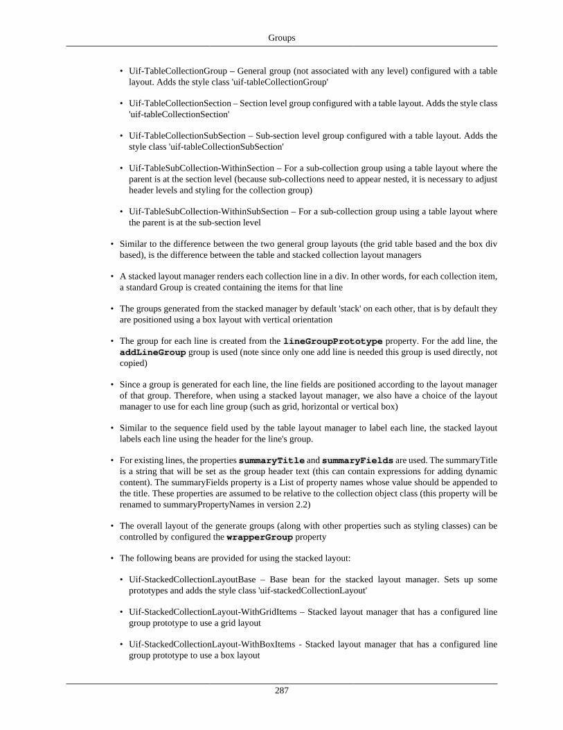
Groups
287
• Uif-TableCollectionGroup – General group (not associated with any level) configured with a tablelayout. Adds the style class 'uif-tableCollectionGroup'
• Uif-TableCollectionSection – Section level group configured with a table layout. Adds the style class'uif-tableCollectionSection'
• Uif-TableCollectionSubSection – Sub-section level group configured with a table layout. Adds thestyle class 'uif-tableCollectionSubSection'
• Uif-TableSubCollection-WithinSection – For a sub-collection group using a table layout where theparent is at the section level (because sub-collections need to appear nested, it is necessary to adjustheader levels and styling for the collection group)
• Uif-TableSubCollection-WithinSubSection – For a sub-collection group using a table layout wherethe parent is at the sub-section level
• Similar to the difference between the two general group layouts (the grid table based and the box divbased), is the difference between the table and stacked collection layout managers
• A stacked layout manager renders each collection line in a div. In other words, for each collection item,a standard Group is created containing the items for that line
• The groups generated from the stacked manager by default 'stack' on each other, that is by default theyare positioned using a box layout with vertical orientation
• The group for each line is created from the lineGroupPrototype property. For the add line, theaddLineGroup group is used (note since only one add line is needed this group is used directly, notcopied)
• Since a group is generated for each line, the line fields are positioned according to the layout managerof that group. Therefore, when using a stacked layout manager, we also have a choice of the layoutmanager to use for each line group (such as grid, horizontal or vertical box)
• Similar to the sequence field used by the table layout manager to label each line, the stacked layoutlabels each line using the header for the line's group.
• For existing lines, the properties summaryTitle and summaryFields are used. The summaryTitleis a string that will be set as the group header text (this can contain expressions for adding dynamiccontent). The summaryFields property is a List of property names whose value should be appended tothe title. These properties are assumed to be relative to the collection object class (this property will berenamed to summaryPropertyNames in version 2.2)
• The overall layout of the generate groups (along with other properties such as styling classes) can becontrolled by configured the wrapperGroup property
• The following beans are provided for using the stacked layout:
• Uif-StackedCollectionLayoutBase – Base bean for the stacked layout manager. Sets up someprototypes and adds the style class 'uif-stackedCollectionLayout'
• Uif-StackedCollectionLayout-WithGridItems – Stacked layout manager that has a configured linegroup prototype to use a grid layout
• Uif-StackedCollectionLayout-WithBoxItems - Stacked layout manager that has a configured linegroup prototype to use a box layout
Groups
288
• Uif-StackedCollectionGroup - General group (not associated with any level) configured with astacked layout with line group grid layout. Adds the style class 'uif-stackedCollectionGroup'
• Uif-StackedCollectionSection – Section level group configured with a stacked layout with line groupgrid layout. Adds the style class 'uif-stackedCollectionSection'
• Uif-StackedCollectionSubSection – Sub-section level group configured with a stacked layout withline group grid layout. Adds the style class 'uif-stackedCollectionSubSection'
• Uif-StackedSubCollection-WithinSection – For a sub-collection group using a stacked layout wherethe parent is at the section level (because sub-collections need to appear nested, it is necessary toadjust header levels and styling for the collection group)
• Uif-StackedSubCollection-WithinSubSection – For a sub-collection group using a stacked layoutwhere the parent is at the sub-section level
• An alternate template for the stacked collection layout is provided that renders each line group in a listitem. The following base beans are provided for a collection group that uses the stacked list template:'Uif-ListCollectionGroup', 'Uif-ListCollectionSection', and 'Uif-ListCollectionSubSection'
DisclosureThe Disclosure widget exists on KRAD Groups and is used to define settings for when to display and isused to define disclosure functionality. Disclosure refers to the ability to show and hide a Group's contentby clicking on that Group's header. By default, Groups in KRAD use the configuration defined by the "Uif-Disclosure" bean definition. All Group beans which use disclosure by default start with "Uif-Disclosure".For disclosure functionality to work, a header with headerText must be present.
The following properties are available on Disclosure for configuration:
• collapseImageSrc - path to the image to use when the Group is collapsed (hidden)
• expandImageSrc - path to the image to use when the Group is expanded (shown)
• animationSpeed - animation speed in ms for the opening/closing animation
• defaultOpen - if true, the disclosure's Group is open by default (this is the default setting). When false,the disclosure's Group is closed/collapsed
• ajaxRetrievalWhenOpened - when true, the Group's content will be retrieved from the server when thedisclosure's content is opened for the first time. This REQUIRES that defaultOpen be false to take effect.This option may help page load performance when used to hide complex group content.
• renderImage - if false, the collapse/expand images are not rendered
Recap
• The Disclosure component can be used to allow for the showing and hiding of presented content
• All Groups contain the disclosure component that can be enabled to provide the ability to collapse aGroup
• The UIF provides beans for all the group beans with disclosure enabled
• All the disclosure bean names start with 'Uif-Disclosure' (for example "Uif-Disclosure-GridGroup")
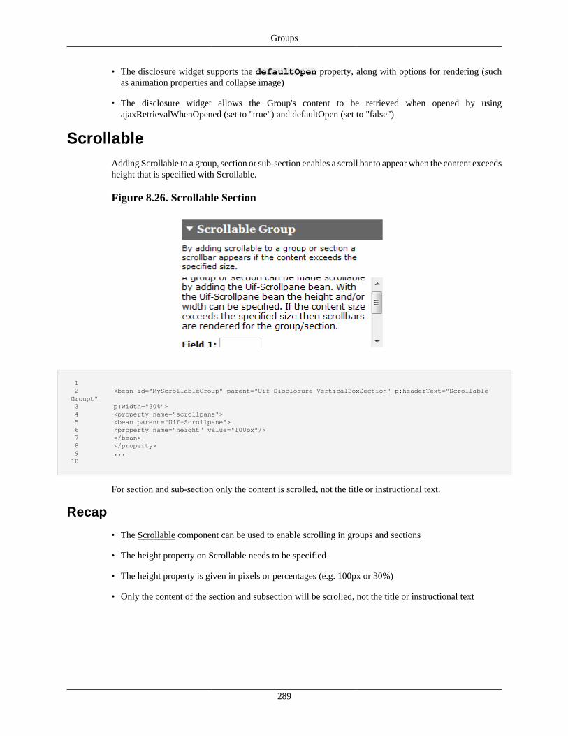
Groups
289
• The disclosure widget supports the defaultOpen property, along with options for rendering (suchas animation properties and collapse image)
• The disclosure widget allows the Group's content to be retrieved when opened by usingajaxRetrievalWhenOpened (set to "true") and defaultOpen (set to "false")
ScrollableAdding Scrollable to a group, section or sub-section enables a scroll bar to appear when the content exceedsheight that is specified with Scrollable.
Figure 8.26. Scrollable Section
1 2 <bean id="MyScrollableGroup" parent="Uif-Disclosure-VerticalBoxSection" p:headerText="Scrollable Groupt" 3 p:width="30%"> 4 <property name="scrollpane"> 5 <bean parent="Uif-Scrollpane"> 6 <property name="height" value="100px"/> 7 </bean> 8 </property> 9 ... 10
For section and sub-section only the content is scrolled, not the title or instructional text.
Recap
• The Scrollable component can be used to enable scrolling in groups and sections
• The height property on Scrollable needs to be specified
• The height property is given in pixels or percentages (e.g. 100px or 30%)
• Only the content of the section and subsection will be scrolled, not the title or instructional text
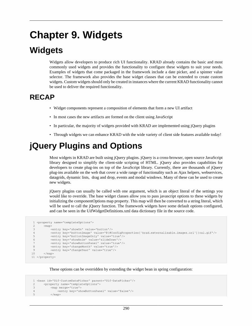
290
Chapter 9. WidgetsWidgets
Widgets allow developers to produce rich UI functionality. KRAD already contains the basic and mostcommonly used widgets and provides the functionality to configure these widgets to suit your needs.Examples of widgets that come packaged in the framework include a date picker, and a spinner valueselector. The framework also provides the base widget classes that can be extended to create customwidgets. Custom widgets should only be created in instances where the current KRAD functionality cannotbe used to deliver the required functionality.
RECAP• Widget components represent a composition of elements that form a new UI artifact
• In most cases the new artifacts are formed on the client using JavaScript
• In particular, the majority of widgets provided with KRAD are implemented using jQuery plugins
• Through widgets we can enhance KRAD with the wide variety of client side features available today!
jQuery Plugins and OptionsMost widgets in KRAD are built using jQuery plugins. jQuery is a cross-browser, open source JavaScriptlibrary designed to simplify the client-side scripting of HTML. jQuery also provides capabilities fordevelopers to create plug-ins on top of the JavaScript library. Currently, there are thousands of jQueryplug-ins available on the web that cover a wide range of functionality such as Ajax helpers, webservices,datagrids, dynamic lists, drag and drop, events and modal windows. Many of these can be used to createnew widgets.
jQuery plugins can usually be called with one argument, which is an object literal of the settings youwould like to override. The base widget classes allow you to pass javascript options to these widgets byinitializing the componentOptions map property. This map will then be converted to a string literal, whichwill be used to call the jQuery function. The framework widgets have some default options configured,and can be seen in the UifWidgetDefinitions.xml data dictionary file in the source code.
1 <property name="templateOptions"> 2 <map> 3 <entry key="showOn" value="button"/> 4 <entry key="buttonImage" value="@{#ConfigProperties['krad.externalizable.images.url']}cal.gif"/> 5 <entry key="buttonImageOnly" value="true"/> 6 <entry key="showAnim" value="slideDown"/> 7 <entry key="showButtonPanel" value="true"/> 8 <entry key="changeMonth" value="true"/> 9 <entry key="changeYear" value="true"/> 10 </map> 11 </property>
These options can be overridden by extending the widget bean in spring configuration:
1 <bean id="Uif-CustomDatePicker" parent="Uif-DatePicker"/> 2 <property name="templateOptions"> 3 <map merge="true"> 4 <entry key="showButtonPanel" value="false"/> 5 </map>
Widgets
291
6 </property> 7 </bean>
In this example the date picker is extended, and only the showButtonPanel parameter is changed. Themerge = 'true' property on map is very important if you want to keep the parent bean's properties.
RECAP• As stated, widgets are basically a front end to a client side component which has a set of supported
properties
• The properties for the client side component are configured using the widget's templateOptions property
• The templateOptions property is a Map. The map key is the name of the client side property, and themap value is the corresponding value for the property
• The template options are translated to a Javascript object string and passed to the plugin as the 'options'argument
• Since the widget properties are 'loosely' coupled with the class through the generic map, we can easilyexchange out plugins (without changing the Java widget class)
• In some cases, to make configuration easier for common plugin options, a property has been added tothe widget class
Types of WidgetsThe most commonly used widgets have already been added to the KRAD framework. These widgets canbe extended, and their properties and component options overridden. Some of the options are added asproperties on the beans where others will have to be set by adding them to the component options map.
BreadcrumbsThe breadcrumbs widget is used to render the breadcrumbs on the views that allow for navigation backto previous pages.
Properties
Table 9.1. Breadcrumb Properties
Property Default Description
usePathBasedBreadcrumbs false Uses path-based breadcrumb generation when set. This requires additional setup, see Breadcrumbs in "TheView" section.
displayBreadcrumbsWhenOne false Flag to hide/display breadcrumbs when there is only one history item
Plugin (Template) Options
None
DatePickerThe DatePicker widget is used to render the date picker on date fields. KRAD uses the jQuery UIDatePicker plugin. See http://jqueryui.com/demos/datepicker/#option-showOptions.
Widgets
292
Properties
The DataPicker widget has no properties (everything is configured through the templateOptions for thejQuery plugin).
Plugin (Template) Options
Table 9.2. DatePicker Options
Option Default Description
showOn button Have the DatePicker appear automatically when thefield receives focus ('focus'),
buttonImage @{#ConfigProperties['krad.externalizable.images.url']} cal.gif The URL for the popup button image. If set, buttonTextbecomes the alt value and is not directly displayed.
buttonImageOnly true Set to true to place an image after the field to use as thetrigger without it appearing on a button.
showAnim slideDown Set the name of the animation used to show/hide theDatePicker.
showButtonPanel true Whether to show the button panel.
changeMonth true Allows you to change the month by selecting from adrop-down list.
changeYear true Allows you to change the year by selecting from a drop-down list.
DirectInquiryThe DirectInquiry widget renders the icon next to a field and opens an inquiry lightbox for the currentvalue in that field when clicked. The default setting is to open the inquiry view in a lightbox. This can bechanged to open in a new window.
Properties
Table 9.3. DirectInquiry Properties
Property Default Desription
baseInquiryUrl @{#ConfigProperties['application.url']}/kr-krad/inquiry The base url used to build the inquiry url.
directInquiryActionField This field can be overridden to exclude the Uif-LightBox and open in a new browser window.
Plugin (Template) Options
None
DisclosureThe disclosure widget renders a disclosure header on a group that allows the group to be expanded andcollapsed. This allows the user to minimize clutter on the screen and only view the necessary groups. Thestate of these disclosures will be stored on form submits to be rendered correctly on the page refresh.
Properties
Table 9.4. Disclosure Properties
Property Default Description
collapseImageSrc ../h3_expand.png Expand icon
expandImageSrc ../h3_collapse.png Collapse icon
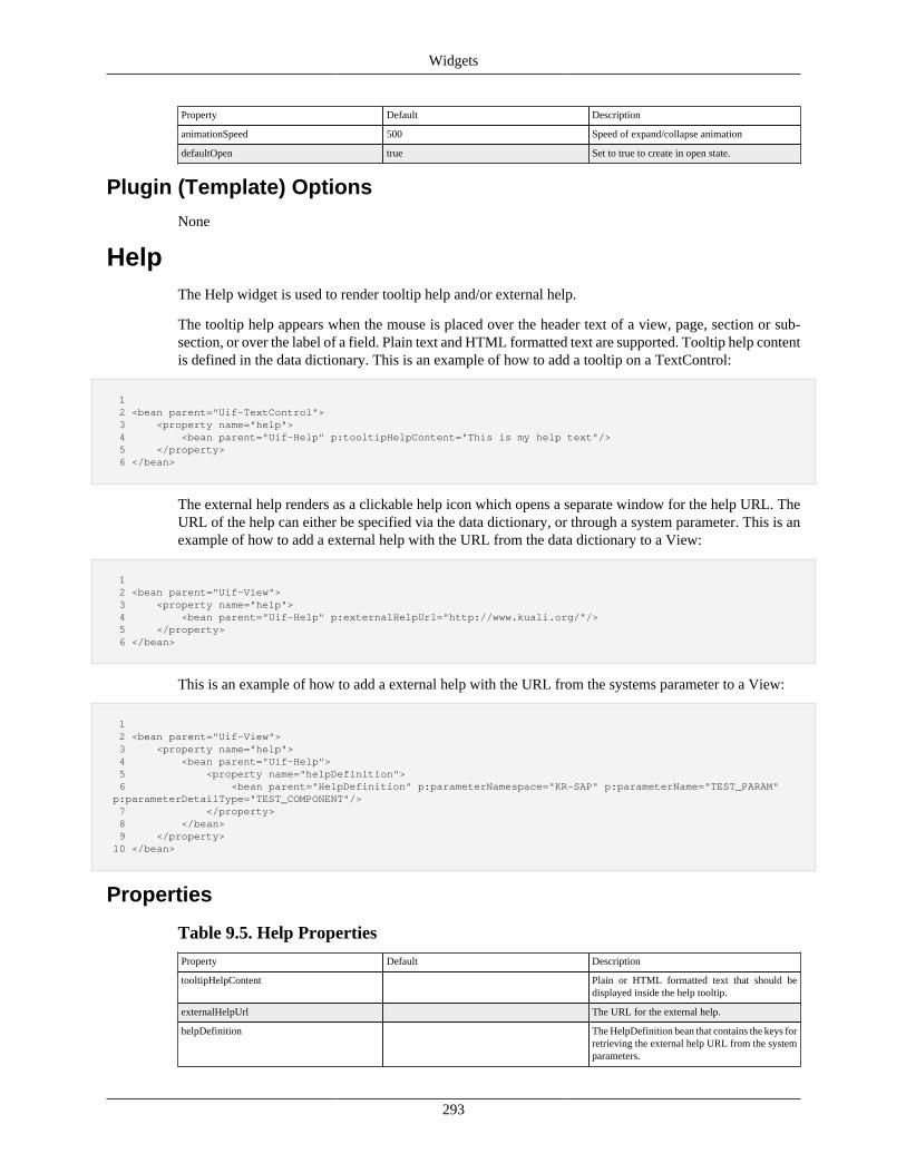
Widgets
293
Property Default Description
animationSpeed 500 Speed of expand/collapse animation
defaultOpen true Set to true to create in open state.
Plugin (Template) Options
None
HelpThe Help widget is used to render tooltip help and/or external help.
The tooltip help appears when the mouse is placed over the header text of a view, page, section or sub-section, or over the label of a field. Plain text and HTML formatted text are supported. Tooltip help contentis defined in the data dictionary. This is an example of how to add a tooltip on a TextControl:
1 2 <bean parent="Uif-TextControl"> 3 <property name="help"> 4 <bean parent="Uif-Help" p:tooltipHelpContent="This is my help text"/> 5 </property> 6 </bean>
The external help renders as a clickable help icon which opens a separate window for the help URL. TheURL of the help can either be specified via the data dictionary, or through a system parameter. This is anexample of how to add a external help with the URL from the data dictionary to a View:
1 2 <bean parent="Uif-View"> 3 <property name="help"> 4 <bean parent="Uif-Help" p:externalHelpUrl="http://www.kuali.org/"/> 5 </property> 6 </bean>
This is an example of how to add a external help with the URL from the systems parameter to a View:
1 2 <bean parent="Uif-View"> 3 <property name="help"> 4 <bean parent="Uif-Help"> 5 <property name="helpDefinition"> 6 <bean parent="HelpDefinition" p:parameterNamespace="KR-SAP" p:parameterName="TEST_PARAM" p:parameterDetailType="TEST_COMPONENT"/> 7 </property> 8 </bean> 9 </property> 10 </bean>
Properties
Table 9.5. Help Properties
Property Default Description
tooltipHelpContent Plain or HTML formatted text that should bedisplayed inside the help tooltip.
externalHelpUrl The URL for the external help.
helpDefinition The HelpDefinition bean that contains the keys forretrieving the external help URL from the systemparameters.
Widgets
294
Plugin (Template) Options
None
InquiryThe inquiry widget is used to render the link fields that will open an inquiry window. The default settingis to open the inquiry view in a lightbox. This can be changed to open in in a new window.
Properties
Table 9.6. Inquiry Properties
Property Default Description
baseInquiryUrl @{#ConfigProperties['application.url']}/kr-krad/inquiry The base url used to build the inquiry url.
inquiryActionField This field can be overridden to exclude the Uif-LightBox and open in a new browser window.
Plugin (Template) Options
None
LightboxThe lightbox widget is used to render content in a modal window. This widget is used in KRAD to openthe inquiry and lookup views in the modal lightbox without navigating away from the current view. ThejQuery fancyBox plugin is used in KRAD. See http://fancyapps.com/fancybox/#docs.
Properties
Table 9.7. Lightbox Properties
Property Default Description
height 95% Height in percentage of screen
width 75% Width in percentage of screen.
Plugin (Template) Options
Table 9.8. Lightbox Options
Option Default Description
fitToView true If set to true, fancyBox is resized to fit insideviewport before opening
openEffect fade The transition type. Can be set to 'elastic', 'fade' or'none'
closeEffect fade The transition type. Can be set to 'elastic', 'fade' or'none'
openSpeed 200 Speed of the fade and elastic transitions, inmilliseconds
closeSpeed 200 Speed of the fade and elastic transitions, inmilliseconds
helpers overlay:{css:{cursor:'arrow'},closeClick:false} Settings for additional fancybox helpers. Defaultsspecify an arrow cursor and disables closing oflightbox on mouse click
type iframe Forces content type. Can be set to 'image', 'html','ajax', 'iframe', 'swf' or 'inline'
Widgets
295
LocationSuggestThe LocationSuggest behaves the same and is backed by the same plugin as the Suggest widget. It containsall the same options and configuration as Suggest, as well. However, when one of its options is selectedthe user is navigated to a new page.
Properties
Table 9.9. Suggest Properties
Property Default Description
baseUrl @{#ConfigProperties['krad.url']} The baseUrl used to construct the url to navigate to
additionalUrlPathPropertyName The property in the returned objects whichcontains a path to be appended to the baseUrl(often the controller path)
hrefPropertyName href The property which contains the full href (url)to navigate to. If the objects returned have thisproperty, this will be used instead of constructinga url with baseUrl
objectIdPropertyName The objectIdPropertyName that represents the keyfor getting the object as a request parameter. Theproperty will be added to the request parametersby the name given with the value pulled from theresult object.
requestParameterPropertyNames requestParameterPropertyNames specify theproperties that should be included in the requestparameters. The key is used as the key of therequest parameter and the value is used as theproperty name to look for in the suggestion resultobject. If the property name specified exists onthe result object, the request parameter in the urlwill appear as key=propertyValue in the requestparameters. A common usage is using this to set aunique viewId per item.
additionalRequestParameters additionalRequestParameters specify thestatic(constant) request parameters that should beappended to the url. The key represents the keyof the request parameter and the value representsthe value of the request parameter. This will beused on each suggestion which uses a generatedurl (using baseUrl construction). A common usageis to set properties that are common to all locationssuch as "methodToCall" as "start"
For example the following, will retrieve objects from the getViewOptions method. If they contain an"id" these will be used as the "viewId" on the url that is navigated to. Note that baseUrl is overridenbecause all viewIds expected back in the objects returned use the same controller. Also note the usage ofadditionalRequestParameters, all urls also require "methodToCall=start" in this scenario:
1 <bean parent="Uif-LocationSuggest" p:render="true" p:retrieveAllSuggestions="true" 2 p:baseUrl="@{#ConfigProperties['krad.url']}/kradsampleapp"> 3 <property name="valuePropertyName" value="value"/> 4 <property name="additionalRequestParameters"> 5 <map> 6 <entry key="methodToCall" value="start"/> 7 </map> 8 </property> 9 <property name="requestParameterPropertyNames"> 10 <map> 11 <entry key="viewId" value="id"/> 12 </map> 13 </property> 14 <property name="suggestQuery"> 15 <bean parent="Uif-AttributeQueryConfig" p:queryMethodInvokerConfig.staticMethod= 16 "org.kuali.rice.krad.demo.uif.components.ComponentSuggestClass.getViewOptions"/> 17 </property>
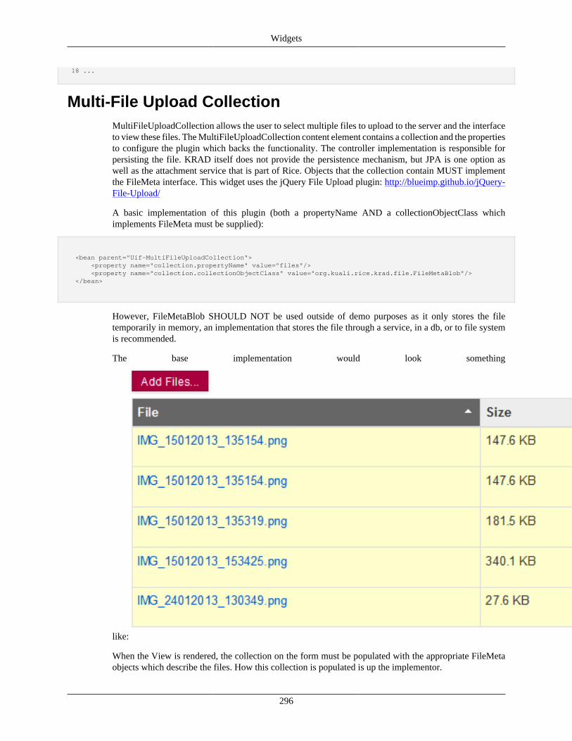
Widgets
296
18 ...
Multi-File Upload CollectionMultiFileUploadCollection allows the user to select multiple files to upload to the server and the interfaceto view these files. The MultiFileUploadCollection content element contains a collection and the propertiesto configure the plugin which backs the functionality. The controller implementation is responsible forpersisting the file. KRAD itself does not provide the persistence mechanism, but JPA is one option aswell as the attachment service that is part of Rice. Objects that the collection contain MUST implementthe FileMeta interface. This widget uses the jQuery File Upload plugin: http://blueimp.github.io/jQuery-File-Upload/
A basic implementation of this plugin (both a propertyName AND a collectionObjectClass whichimplements FileMeta must be supplied):
<bean parent="Uif-MultiFileUploadCollection"> <property name="collection.propertyName" value="files"/> <property name="collection.collectionObjectClass" value="org.kuali.rice.krad.file.FileMetaBlob"/> </bean>
However, FileMetaBlob SHOULD NOT be used outside of demo purposes as it only stores the filetemporarily in memory, an implementation that stores the file through a service, in a db, or to file systemis recommended.
The base implementation would look something
like:
When the View is rendered, the collection on the form must be populated with the appropriate FileMetaobjects which describe the files. How this collection is populated is up the implementor.
Widgets
297
There are 4 controller methods which are used by the MultiFileUploadCollection:
• addFileUploadLine - used to add an object to the collection of FileMeta objects which describe thefiles. The FileMeta object's init(MultipartFile file) method is invoked to create the object and can/shouldbe customized by the implementor. Alternatively, this controller method can be overriden to providea more custom implementation.
• deleteFileUploadLine - hook method which calls deleteLine on the collection. This method should beoverriden by implementors to delete the file from their db or filesystem, or alternatively this can bedelayed until a save action is processed and handled by the implementation there.
• getFileFromLine - this method is used to retrieve the file from the server, by default, links generatedby addFileUploadLine call this method. This method calls the sendFileFromLineResponse method tosend back the file data. This method SHOULD NOT be overriden unless necessary.
• sendFileFromLineResponse - this method is used to set appropriate properties on the response objectand send back the file data. This method MUST be overriden by the implemention's controller to retrievefiles.
When the user clicks the "Add Files..." button, or the user drags files onto the component, the url configuredon the MultiFileUploadCollection is invoked (by default this is the addFileUploadLine method of thecurrent controller). The file is processed by the controller implementation, a FileMeta object is added to thecollection, and the collection will be refreshed with the updated file information. The user can then eitherclick the link (rendered using FileMeta's url and name properties) which will invoke the getFileFromLinemethod on the controller (by default). Alternatively, they can delete the file by clicking the delete icon,which will invoke the deleteFileUploadLine method on the controller by default.
Custom Fields
Because the FileMeta objects used by the collection are completely customizable, the collection alsosupports all the features of field inputs found in a normal collection. A custom implementation that allowsone to enter additional details about a file may be be configured like:
<bean parent="Uif-MultiFileUploadCollection"> <property name="collection.propertyName" value="files2"/> <property name="collection.collectionObjectClass" value="org.kuali.rice.krad.labs.fileUploads.FileWithDetails"/> <property name="collection.items"> <list> <bean parent="Uif-LinkField" p:readOnly="true" p:label="File" p:link.linkText="@{#line.name}" p:link.href="@{#line.url}&selectedLineIndex=@{#index}"/> <bean parent="Uif-InputField" p:readOnly="true" p:label="Size" p:propertyName="sizeFormatted"/> <bean parent="Uif-InputField" p:readOnly="true" p:label="Date Uploaded" p:propertyName="dateUploadedFormatted"/> <bean parent="Uif-InputField" p:label="Detail 1" p:propertyName="detail1"/> <bean parent="Uif-InputField" p:label="Detail 2" p:propertyName="detail2"> <property name="control"> <bean parent="Uif-TextAreaControl" p:rows="4" p:cols="50"/> </property> </bean> </list> </property></bean>
Note the usage of default FileMeta properties and the new detail1 and detail2 properties supplied by thecustom object FileWithDetails.
This would result in a MultiFileUploadCollection which looks like:
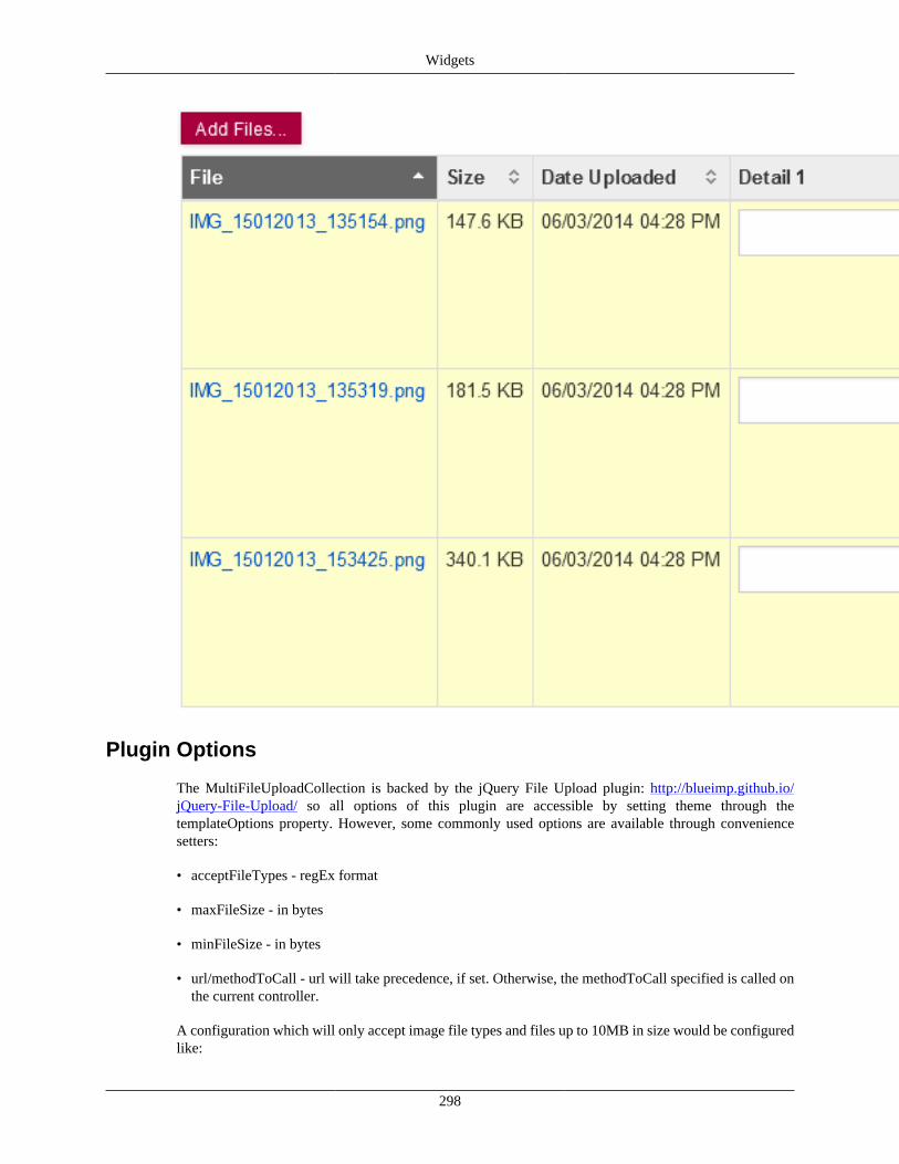
Widgets
298
Plugin Options
The MultiFileUploadCollection is backed by the jQuery File Upload plugin: http://blueimp.github.io/jQuery-File-Upload/ so all options of this plugin are accessible by setting theme through thetemplateOptions property. However, some commonly used options are available through conveniencesetters:
• acceptFileTypes - regEx format
• maxFileSize - in bytes
• minFileSize - in bytes
• url/methodToCall - url will take precedence, if set. Otherwise, the methodToCall specified is called onthe current controller.
A configuration which will only accept image file types and files up to 10MB in size would be configuredlike:
Widgets
299
<bean parent="Uif-MultiFileUploadCollection"> <property name="collection.propertyName" value="files3"/> <property name="collection.collectionObjectClass" value="org.kuali.rice.krad.file.FileMetaBlob"/> <property name="acceptFileTypes" value="(\\.|\\/)(gif|jpe?g|png)$"/> <property name="maxFileSize" value="10485760"/> </bean>
Properties
Table 9.10. MultiFile Upload Properties
Property Default Description
addFilesButtonText Add Files... The label for the add files button.
methodToCall addFileUploadLineThe methodToCall when the "Add Files..." button is clicked
url undefined UrlInfo object describing the url to call to add a file line to the collection, if set, methodToCall is ignored.
Plugin (Template) Options
Table 9.11. MultiFile Upload Options
Option Default Description
acceptFileTypes undefined The regular expression for allowed file types,matches against either file type or file name asonly browsers with support for the File API reportthe file type.
maxFileSize undefined The maximum allowed file size in bytes.
minFileSize undefined The minimum allowed file size in bytes.
PagerThe Pager widget is used to output a page selection interface for the user to select pages. This widgetis used by TableLayoutManager when the RichTable option is NOT being used and useServerPagingis set to true on the CollectionGroup. This widget is also used when a CollectionGroup which usesStackedLayoutManager has its useServerPaging property set to true.
The Pager widget itself contains a few options that can modify the what is displayed.
1 <property name="pagerWidget"> 2 <bean parent="Uif-Pager" p:maxNumberedLinksShown="8"/> 3 </property>
Properties
Table 9.12. Pager Properties
Property Default Description
maxNumberedLinksShown5 The max number of numbered page links to show, pages beyond this range are not shown and when pages are navigated, thepager "carousels" through the pages which are in the current range.
renderPrevNext true If true, render the previous and next links on the Pager widget
renderFirstLast true If true, render the first and last links on the Pager widget
linkScript The javascript function that is called when a link is clicked. This is automatically set by the framework and should not beset normally, but can be to accomadate rare circumstances. By default if not set, it is set to: "retrieveCollectionPage(this,'" + collectionGroup.getId() + "');"
numberOfPages The total number of pages for this Pager, this must be set by the framework and should not be set normally
Widgets
300
Property Default Description
currentPage The current page the Pager is on, this must be set by the framework and should not be set normally
QuickFinderThe Quickfinder Widget is used for navigating to a lookup from a field. There are two instances of thiswidget. Firstly, there is the standard widget that will do a page refresh when returning the results andreload the parent view. The second instance (Uif-QuickFinderByScript) will return the value by script andnot reload the parent view.
Tip
Return by Script: If you do not need the parent view to be refreshed when returning values,you can return the values by script and greatly improve the performance. To do this, you have toset a field's 'fieldLookup' property to the Uif-QuickFinderByScript bean.
Properties
Table 9.13. QuickFinder Properties
Property Default Description
baseLookupUrl @{#ConfigProperties['application.url']}/kr-krad/lookup The base url used to build the lookup url.
multipleValuesSelect false Indicates whether a multi-values lookup should berequested
Plugin (Template) Options
None
RichTableThe RichTable widget decorates a HTML Table client side with various tools including sorting, exporting,paging and skinning. This widget uses the jQuery DataTables plugin. See http://www.datatables.net/usage/options
Properties
Table 9.14. RichTable Properties
Property Default Description
emptyTableMessage No records found The text which is displayed when the table isempty
Plugin (Template) Options
Table 9.15. Rich Table Options
Option Default Description
sDom fTrtip This initialization variable allows you to specifyexactly where in the DOM you want DataTables toinject the various controls it adds to the page
bRetrieve true Retrieve the DataTables object for the given selector.
Widgets
301
Option Default Description
oTableTools aButtons' : [ 'csv', 'xls' ] , 'sSwfPath' : '@{#ConfigProperties['application.url']}/krad/scripts/jquery/copy_cvs_xls_pdf.swf' }
To customize the TableTools options through theDataTables initialization object, you can make use ofthis parameter.
SuggestThe Suggest widget provides dynamic select options to the user as they are entering the value (also knownas auto-complete). The widget is backed by an AttributeQuery that provides the configuration for executinga query server side that will retrieve the valid option values. Uses jQuery UI Auto-complete widget. Seehttp://jqueryui.com/demos/autocomplete/
Properties
Table 9.16. Suggest Properties
Property Default Description
suggestQuery Attribute query instance that will be executed toprovide the suggest options
Plugin (Template) Options
Table 9.17. Suggest Options
Option Default Description
minLength 2 The minimum number of characters a user has totype before the Autocomplete activates.
delay 3000 The delay in milliseconds the Autocomplete waitsafter a keystroke to activate itself.
TabsThe Tabs widget used for creating tabs to break up content into multiple sections. See http://jqueryui.com/demos/tabs/
Properties
None
Plugin (Template) Options
None
TooltipThe Tooltip widget is used to render a tooltip. The jQuery Bubble Popup plugin is used. See http://www.maxvergelli.com/jquery-bubble-popup/documentation/. Tooltips can display plain text or HTML,and can be added to any component by setting the tooltipContent in the Data Dictionary. This is a exampleof how to add a tooltip on a TextControl :
1 <bean parent="Uif-TextControl"> 2 <property name="toolTip"> 3 <bean parent="Uif-Tooltip" p:tooltipContent="This is my tooltip"/> 4 </property>
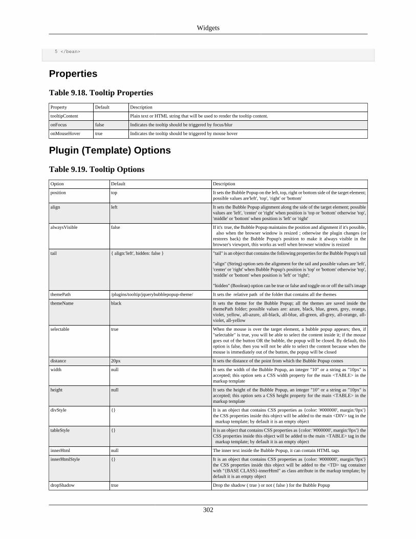
Widgets
302
5 </bean>
Properties
Table 9.18. Tooltip Properties
Property Default Description
tooltipContent Plain text or HTML string that will be used to render the tooltip content.
onFocus false Indicates the tooltip should be triggered by focus/blur
onMouseHover true Indicates the tooltip should be triggered by mouse hover
Plugin (Template) Options
Table 9.19. Tooltip Options
Option Default Description
position top It sets the Bubble Popup on the left, top, right or bottom side of the target element;possible values are'left', 'top', 'right' or 'bottom'
align left It sets the Bubble Popup alignment along the side of the target element; possiblevalues are 'left', 'center' or 'right' when position is 'top or 'bottom' otherwise 'top','middle' or 'bottom' when position is 'left' or 'right'
alwaysVisible false If it's true, the Bubble Popup maintains the position and alignment if it's possible, also when the browser window is resized ; otherwise the plugin changes (orrestores back) the Bubble Popup's position to make it always visible in thebrowser's viewport, this works as well when browser window is resized
tail { align:'left', hidden: false } "tail" is an object that contains the following properties for the Bubble Popup's tail
"align" (String) option sets the alignment for the tail and possible values are 'left','center' or 'right' when Bubble Popup's position is 'top' or 'bottom' otherwise 'top','middle' or 'bottom' when position is 'left' or 'right';
"hidden" (Boolean) option can be true or false and toggle on or off the tail's image
themePath /plugins/tooltip/jquerybubblepopup-theme/ It sets the relative path of the folder that contains all the themes
themeName black It sets the theme for the Bubble Popup; all the themes are saved inside thethemePath folder; possible values are: azure, black, blue, green, grey, orange,violet, yellow, all-azure, all-black, all-blue, all-green, all-grey, all-orange, all-violet, all-yellow
selectable true When the mouse is over the target element, a bubble popup appears; then, if"selectable" is true, you will be able to select the content inside it; if the mousegoes out of the button OR the bubble, the popup will be closed. By default, thisoption is false, then you will not be able to select the content because when themouse is immediately out of the button, the popup will be closed
distance 20px It sets the distance of the point from which the Bubble Popup comes
width null It sets the width of the Bubble Popup, an integer "10" or a string as "10px" isaccepted; this option sets a CSS width property for the main <TABLE> in themarkup template
height null It sets the height of the Bubble Popup, an integer "10" or a string as "10px" isaccepted; this option sets a CSS height property for the main <TABLE> in themarkup template
divStyle {} It is an object that contains CSS properties as {color: '#000000', margin:'0px'}the CSS properties inside this object will be added to the main <DIV> tag in the markup template; by default it is an empty object
tableStyle {} It is an object that contains CSS properties as {color: '#000000', margin:'0px'} theCSS properties inside this object will be added to the main <TABLE> tag in the markup template; by default it is an empty object
innerHtml null The inner text inside the Bubble Popup, it can contain HTML tags
innerHtmlStyle {} It is an object that contains CSS properties as {color: '#000000', margin:'0px'}the CSS properties inside this object will be added to the <TD> tag containerwith "{BASE CLASS}-innerHtml" as class attribute in the markup template; bydefault it is an empty object
dropShadow true Drop the shadow ( true ) or not ( false ) for the Bubble Popup
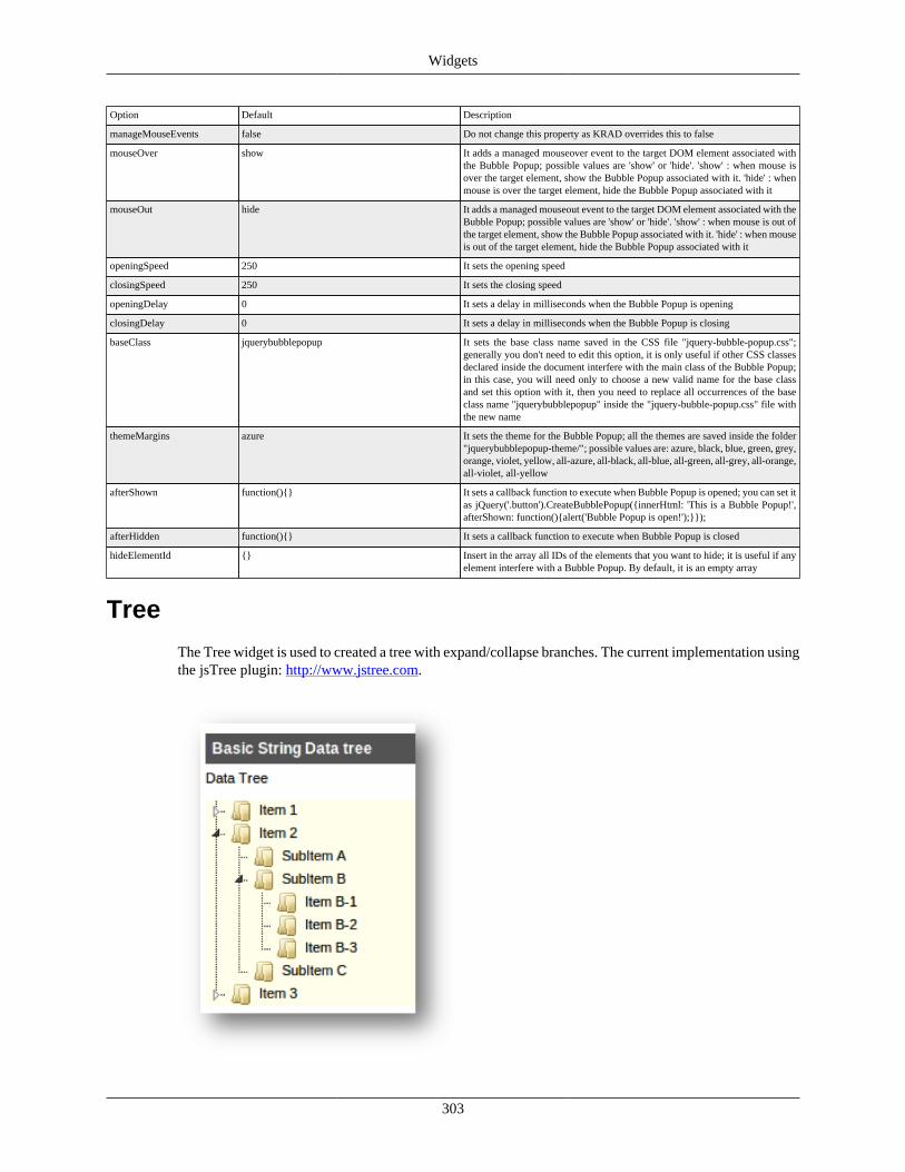
Widgets
303
Option Default Description
manageMouseEvents false Do not change this property as KRAD overrides this to false
mouseOver show It adds a managed mouseover event to the target DOM element associated withthe Bubble Popup; possible values are 'show' or 'hide'. 'show' : when mouse isover the target element, show the Bubble Popup associated with it. 'hide' : whenmouse is over the target element, hide the Bubble Popup associated with it
mouseOut hide It adds a managed mouseout event to the target DOM element associated with theBubble Popup; possible values are 'show' or 'hide'. 'show' : when mouse is out ofthe target element, show the Bubble Popup associated with it. 'hide' : when mouseis out of the target element, hide the Bubble Popup associated with it
openingSpeed 250 It sets the opening speed
closingSpeed 250 It sets the closing speed
openingDelay 0 It sets a delay in milliseconds when the Bubble Popup is opening
closingDelay 0 It sets a delay in milliseconds when the Bubble Popup is closing
baseClass jquerybubblepopup It sets the base class name saved in the CSS file "jquery-bubble-popup.css";generally you don't need to edit this option, it is only useful if other CSS classesdeclared inside the document interfere with the main class of the Bubble Popup;in this case, you will need only to choose a new valid name for the base classand set this option with it, then you need to replace all occurrences of the baseclass name "jquerybubblepopup" inside the "jquery-bubble-popup.css" file withthe new name
themeMargins azure It sets the theme for the Bubble Popup; all the themes are saved inside the folder"jquerybubblepopup-theme/"; possible values are: azure, black, blue, green, grey,orange, violet, yellow, all-azure, all-black, all-blue, all-green, all-grey, all-orange,all-violet, all-yellow
afterShown function(){} It sets a callback function to execute when Bubble Popup is opened; you can set itas jQuery('.button').CreateBubblePopup({innerHtml: 'This is a Bubble Popup!',afterShown: function(){alert('Bubble Popup is open!');}});
afterHidden function(){} It sets a callback function to execute when Bubble Popup is closed
hideElementId {} Insert in the array all IDs of the elements that you want to hide; it is useful if anyelement interfere with a Bubble Popup. By default, it is an empty array
Tree
The Tree widget is used to created a tree with expand/collapse branches. The current implementation usingthe jsTree plugin: http://www.jstree.com.
Widgets
304
Tree Group
Uif-TreeGroup - A group that contains a visual tree structure, with parent nodes that can be expanded orcollapsed to show or hide their children. This allows you to naturally display components that nest withinother components; for example, a visual representation of folders and files.
Uif-TreeSection - A section that contains a tree group. This component is actually an extension of Uif-TreeGroup, and so everything discussed below applies to both, but we'll be using Uif-TreeSection in ourexamples. The following Screen Shot shows a simple tree with several levels of nesting revealed byexpanding Item 2, and SubItem B.
The view configuration for a simple tree with nothing but a text label on each node is quite elementary:
1 <bean parent="Uif-TreeSection" p:instructionalText="Data Tree"> 2 <property name="title" value="Basic String Data tree"/> 3 <property name="propertyName" value="tree"/> 4 </bean>
The most important piece of configuration for this Uif-TreeSection is the propertyName whose valuecorresponds to a getter method on the data object, or the form which returns an object of typeorg.kuali.rice.core.api.util.tree.Tree. For the above configuration snippet, the body of this method mightlook like this:
1 /* somewhere in your form or data object */ 2 public Tree<Foo, String> getTree() { 3 return this.tree; // return the Tree member of this data object or form 4 }
This is a straightforward getter method, but we'll need to know more about the structure of the objectwe're returning. Tree has two generic types associated with it, of the form Tree<T,K>. For use in a Uif-TreeSection, the generic type T will correspond to the class of the data object at each node, and the generictype K will always be String to hold the label text for the node.
So in the above example, we have a data object of type Foo that each node in the tree holds, and (asalways) a corresponding String label. Speaking of nodes, let's look at some key parts of the API fororg.kuali.rice.core.api.util.Tree and it's right hand class, org.kuali.rice.core.api.util.tree.Node:
public class Tree<T, K> implements Serializable { /*...*/ // this is where you put the content into the tree. // The actual tree structure is all made up of Nodes // nested within Nodes
public void setRootElement(Node<T, K> rootElement) { /*...*/ }}
public class Node<T, K> implements Serializable { /*...*/ // construct a node with its data object and label
public Node(T data, K label) { /*...*/ }
// build up the nested structure by setting the children
public void setChildren(List<Node<T, K>> children) { /*...*/
Widgets
305
}}
Your data object containing the tree structure may use other classes than Tree and Node for the internalrepresentation of your tree. In that case, you can still utilize Uif-TreeSection to add a method that translatesyour internal tree into a Tree made up of Nodes. Spend a few minutes following this example where weare translating a tree made out of Foo objects which contain child Foos into a Tree of Nodes:
Warning
If you are not comfortable with recursion, you may want to do some homework on it to followalong.
1 /* somewhere in your form or data object */ 2 3 /** Getter method referenced from Uif-TreeSection component via the propertyName */ 4 public Tree<Foo, String> getTree() { 5 // construct our Tree object 6 Tree myTree = new Tree<Foo, String>(); 7 8 // construct a root 9 Node Node<Foo, String> rootNode = new Node<Foo, String>(); 10 myTree.setRootElement(rootNode); 11 12 // populate the tree structure with a recursive walk of our Foos 13 buildFooTree(rootNode, this.getRootFoo() ); 14 15 return myTree; 16 } 17 18 /** 19 * This method builds a tree by recursively walking through the children of the Foo. 20 * @param sprout - parenttree node 21 * @param foo - Foo for which to make the tree node 22 */ 23 24 private void buildFooTree(Node sprout, Foo foo) { 25 // Create a treeNode and attach it to the sprout parameter passed in. 26 27 if (foo != null) { // create a node for our Foo 28 sprout.setNodeLabel(foo.getDescription()); 29 sprout.setData(foo); 30 List<Foo> allMyChildren = foo.getChildren(); 31 32 if (allMyChildren != null) for (Foo child : allMyChildren){ 33 Node<Foo,String> childNode = new Node<Foo, String>(); 34 35 // add child node to sprout 36 sprout.getChildren().add(childNode); 37 38 // recursive call 39 buildFooTree(childNode, child); 40 } 41 } 42 }
So far we have talked about trees with nodes that only display labels for their corresponding data objects. Each node is, in fact, rendered in two parts: the label, and the data group. There are templates for hownodes are rendered, which are called node prototypes. Without doing any configuration, the default nodeprototype has just an empty container for its data group, which results in a tree that renders similar to thescreenshot shown previously; but we can change that by configuring a custom defaultNodePrototype.
1 <bean parent="Uif-TreeSection" p:instructionalText="Data Tree"> 2 <property name="title" value="Tree with Data Group"/> 3 <property name="propertyName" value="tree"/>
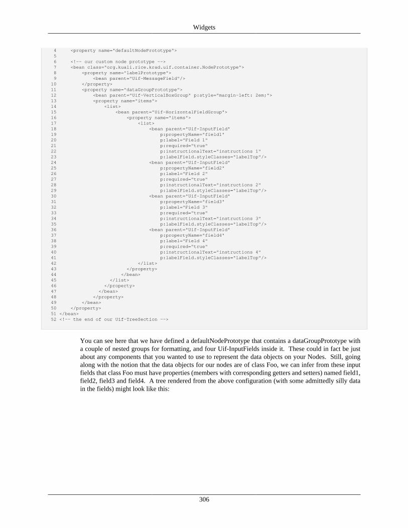
Widgets
306
4 <property name="defaultNodePrototype"> 5 6 <!-- our custom node prototype --> 7 <bean class="org.kuali.rice.krad.uif.container.NodePrototype"> 8 <property name="labelPrototype"> 9 <bean parent="Uif-MessageField"/> 10 </property> 11 <property name="dataGroupPrototype"> 12 <bean parent="Uif-VerticalBoxGroup" p:style="margin-left: 2em;"> 13 <property name="items"> 14 <list> 15 <bean parent="Uif-HorizontalFieldGroup"> 16 <property name="items"> 17 <list> 18 <bean parent="Uif-InputField" 19 p:propertyName="field1" 20 p:label="Field 1" 21 p:required="true" 22 p:instructionalText="instructions 1" 23 p:labelField.styleClasses="labelTop"/> 24 <bean parent="Uif-InputField" 25 p:propertyName="field2" 26 p:label="Field 2" 27 p:required="true" 28 p:instructionalText="instructions 2" 29 p:labelField.styleClasses="labelTop"/> 30 <bean parent="Uif-InputField" 31 p:propertyName="field3" 32 p:label="Field 3" 33 p:required="true" 34 p:instructionalText="instructions 3" 35 p:labelField.styleClasses="labelTop"/> 36 <bean parent="Uif-InputField" 37 p:propertyName="field4" 38 p:label="Field 4" 39 p:required="true" 40 p:instructionalText="instructions 4" 41 p:labelField.styleClasses="labelTop"/> 42 </list> 43 </property> 44 </bean> 45 </list> 46 </property> 47 </bean> 48 </property> 49 </bean> 50 </property> 51 </bean> 52 <!-- the end of our Uif-TreeSection -->
You can see here that we have defined a defaultNodePrototype that contains a dataGroupPrototype witha couple of nested groups for formatting, and four Uif-InputFields inside it. These could in fact be justabout any components that you wanted to use to represent the data objects on your Nodes. Still, goingalong with the notion that the data objects for our nodes are of class Foo, we can infer from these inputfields that class Foo must have properties (members with corresponding getters and setters) named field1,field2, field3 and field4. A tree rendered from the above configuration (with some admittedly silly datain the fields) might look like this:
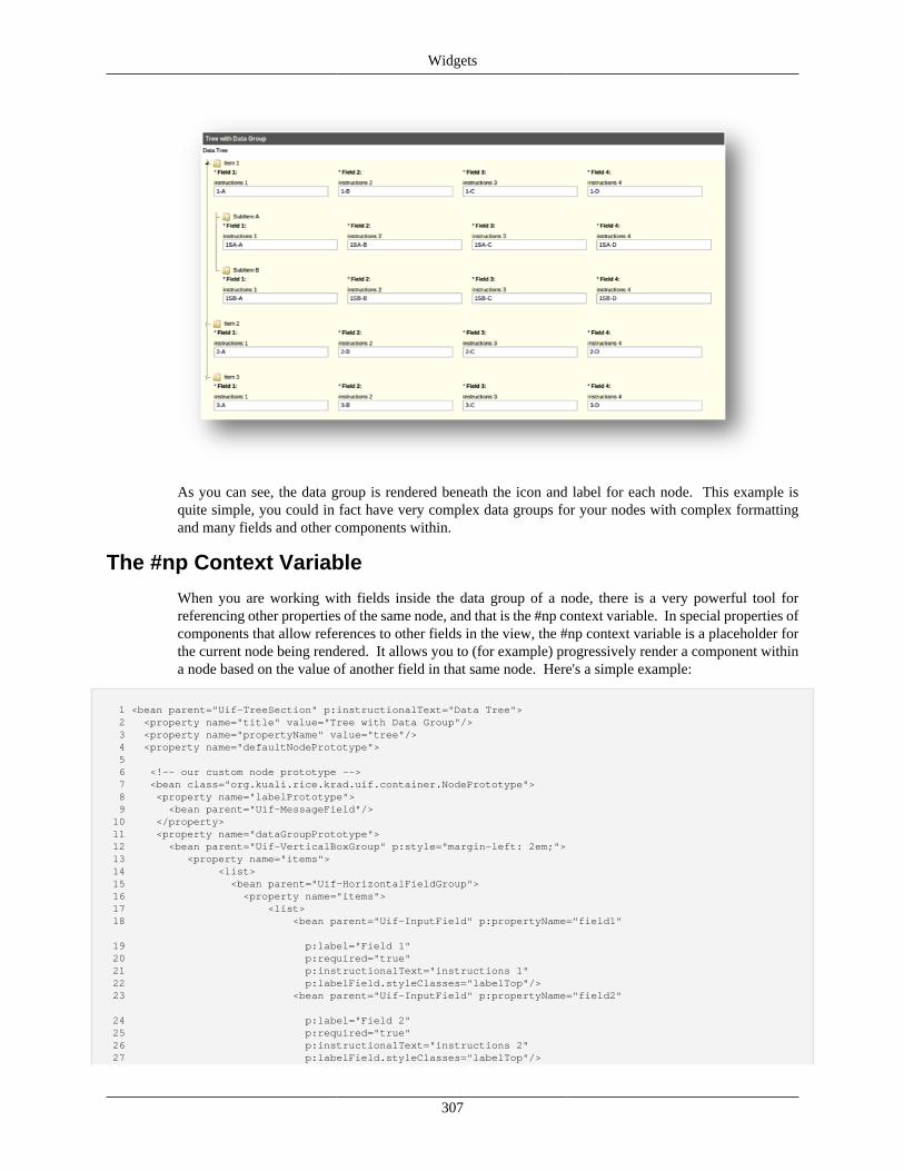
Widgets
307
As you can see, the data group is rendered beneath the icon and label for each node. This example isquite simple, you could in fact have very complex data groups for your nodes with complex formattingand many fields and other components within.
The #np Context Variable
When you are working with fields inside the data group of a node, there is a very powerful tool forreferencing other properties of the same node, and that is the #np context variable. In special properties ofcomponents that allow references to other fields in the view, the #np context variable is a placeholder forthe current node being rendered. It allows you to (for example) progressively render a component withina node based on the value of another field in that same node. Here's a simple example:
1 <bean parent="Uif-TreeSection" p:instructionalText="Data Tree"> 2 <property name="title" value="Tree with Data Group"/> 3 <property name="propertyName" value="tree"/> 4 <property name="defaultNodePrototype"> 5 6 <!-- our custom node prototype --> 7 <bean class="org.kuali.rice.krad.uif.container.NodePrototype"> 8 <property name="labelPrototype"> 9 <bean parent="Uif-MessageField"/> 10 </property> 11 <property name="dataGroupPrototype"> 12 <bean parent="Uif-VerticalBoxGroup" p:style="margin-left: 2em;"> 13 <property name="items"> 14 <list> 15 <bean parent="Uif-HorizontalFieldGroup"> 16 <property name="items"> 17 <list> 18 <bean parent="Uif-InputField" p:propertyName="field1" 19 p:label="Field 1" 20 p:required="true" 21 p:instructionalText="instructions 1" 22 p:labelField.styleClasses="labelTop"/> 23 <bean parent="Uif-InputField" p:propertyName="field2" 24 p:label="Field 2" 25 p:required="true" 26 p:instructionalText="instructions 2" 27 p:labelField.styleClasses="labelTop"/>
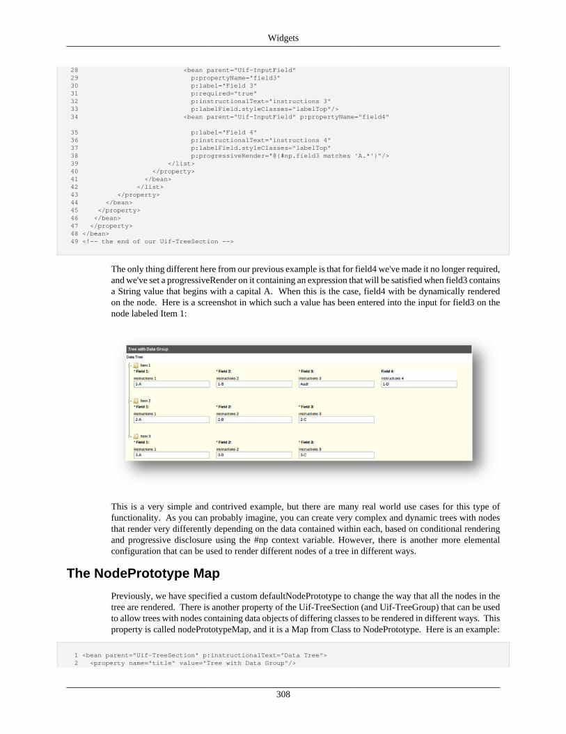
Widgets
308
28 <bean parent="Uif-InputField" 29 p:propertyName="field3" 30 p:label="Field 3" 31 p:required="true" 32 p:instructionalText="instructions 3" 33 p:labelField.styleClasses="labelTop"/> 34 <bean parent="Uif-InputField" p:propertyName="field4" 35 p:label="Field 4" 36 p:instructionalText="instructions 4" 37 p:labelField.styleClasses="labelTop" 38 p:progressiveRender="@{#np.field3 matches 'A.*'}"/> 39 </list> 40 </property> 41 </bean> 42 </list> 43 </property> 44 </bean> 45 </property> 46 </bean> 47 </property> 48 </bean> 49 <!-- the end of our Uif-TreeSection -->
The only thing different here from our previous example is that for field4 we've made it no longer required,and we've set a progressiveRender on it containing an expression that will be satisfied when field3 containsa String value that begins with a capital A. When this is the case, field4 with be dynamically renderedon the node. Here is a screenshot in which such a value has been entered into the input for field3 on thenode labeled Item 1:
This is a very simple and contrived example, but there are many real world use cases for this type offunctionality. As you can probably imagine, you can create very complex and dynamic trees with nodesthat render very differently depending on the data contained within each, based on conditional renderingand progressive disclosure using the #np context variable. However, there is another more elementalconfiguration that can be used to render different nodes of a tree in different ways.
The NodePrototype Map
Previously, we have specified a custom defaultNodePrototype to change the way that all the nodes in thetree are rendered. There is another property of the Uif-TreeSection (and Uif-TreeGroup) that can be usedto allow trees with nodes containing data objects of differing classes to be rendered in different ways. Thisproperty is called nodePrototypeMap, and it is a Map from Class to NodePrototype. Here is an example:
1 <bean parent="Uif-TreeSection" p:instructionalText="Data Tree"> 2 <property name="title" value="Tree with Data Group"/>
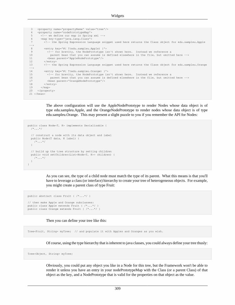
Widgets
309
3 <property name="propertyName" value="tree"/> 4 <property name="nodePrototypeMap"> 5 <!-- we define our map in Spring xml --> 6 <map key-type="java.lang.Class"> 7 <!-- the Spring Expression Language snippet used here returns the Class object for edu.sampleu.Apple --> 8 <entry key="#{ T(edu.sampleu.Apple) }"> 9 <!-- for brevity, the NodePrototype isn't shown here. Instead we reference a 10 parent bean that you can assume is defined elsewhere in the file, but omitted here --> 11 <bean parent="AppleNodePrototype"/> 12 </entry> 13 <!-- the Spring Expression Language snippet used here returns the Class object for edu.sampleu.Orange --> 14 <entry key="#{ T(edu.sampleu.Orange) }"> 15 <!-- for brevity, the NodePrototype isn't shown here. Instead we reference a 16 parent bean that you can assume is defined elsewhere in the file, but omitted here --> 17 <bean parent="OrangeNodePrototype"/> 18 </entry> 19 </map> 20 </property> 21 </bean>
The above configuration will use the AppleNodePrototype to render Nodes whose data object is oftype edu.sampleu.Apple, and the OrangeNodePrototype to render nodes whose data object is of typeedu.sampleu.Orange. This may present a slight puzzle to you if you remember the API for Nodes:
public class Node<T, K> implements Serializable { /*...*/ // construct a node with its data object and label public Node(T data, K label) { /*...*/ }
// build up the tree structure by setting children public void setChildren(List<Node<T, K>> children) { /*...*/ } }
As you can see, the type of a child node must match the type of its parent. What this means is that you'llhave to leverage a class (or interface) hierarchy to create your tree of heterogeneous objects. For example,you might create a parent class of type Fruit:
public abstract class Fruit { /*...*/ }
// then make Apple and Orange subclasses:public class Apple extends Fruit { /*...*/ }public class Orange extends Fruit { /*...*/ }
Then you can define your tree like this:
Tree<Fruit, String> myTree; // and populate it with Apples and Oranges as you wish.
Of course, using the type hierarchy that is inherent to java classes, you could always define your tree thusly:
Tree<Object, String> myTree;
Obviously, you could put any object you like in a Node for this tree, but the Framework won't be able torender it unless you have an entry in your nodePrototypeMap with the Class (or a parent Class) of thatobject as the key, and a NodePrototype that is valid for the properties on that object as the value.
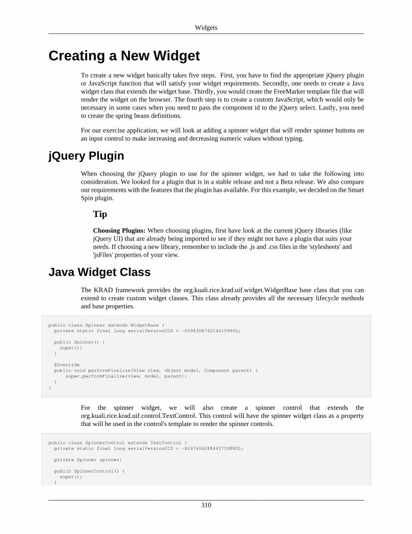
Widgets
310
Creating a New WidgetTo create a new widget basically takes five steps. First, you have to find the appropriate jQuery pluginor JavaScript function that will satisfy your widget requirements. Secondly, one needs to create a Javawidget class that extends the widget base. Thirdly, you would create the FreeMarker template file that willrender the widget on the browser. The fourth step is to create a custom JavaScript, which would only benecessary in some cases when you need to pass the component id to the jQuery select. Lastly, you needto create the spring beans definitions.
For our exercise application, we will look at adding a spinner widget that will render spinner buttons onan input control to make increasing and decreasing numeric values without typing.
jQuery PluginWhen choosing the jQuery plugin to use for the spinner widget, we had to take the following intoconsideration. We looked for a plugin that is in a stable release and not a Beta release. We also compareour requirements with the features that the plugin has available. For this example, we decided on the SmartSpin plugin.
Tip
Choosing Plugins: When choosing plugins, first have look at the current jQuery libraries (likejQuery UI) that are already being imported to see if they might not have a plugin that suits yourneeds. If choosing a new library, remember to include the .js and .css files in the 'stylesheets' and'jsFiles' properties of your view.
Java Widget ClassThe KRAD framework provides the org.kuali.rice.krad.uif.widget.WidgetBase base class that you canextend to create custom widget classes. This class already provides all the necessary lifecycle methodsand base properties.
public class Spinner extends WidgetBase { private static final long serialVersionUID = -659830874214415990L;
public Spinner() { super(); }
@Override public void performFinalize(View view, Object model, Component parent) { super.performFinalize(view, model, parent); }}
For the spinner widget, we will also create a spinner control that extends theorg.kuali.rice.krad.uif.control.TextControl. This control will have the spinner widget class as a propertythat will be used in the control's template to render the spinner controls.
public class SpinnerControl extends TextControl { private static final long serialVersionUID = -8267606288443759880L;
private Spinner spinner;
public SpinnerControl() { super(); }
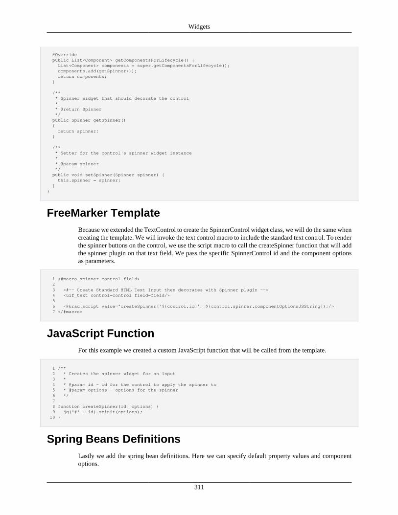
Widgets
311
@Override public List<Component> getComponentsForLifecycle() { List<Component> components = super.getComponentsForLifecycle(); components.add(getSpinner()); return components; }
/** * Spinner widget that should decorate the control * * @return Spinner */ public Spinner getSpinner() { return spinner; }
/** * Setter for the control's spinner widget instance * * @param spinner */ public void setSpinner(Spinner spinner) { this.spinner = spinner; } }
FreeMarker TemplateBecause we extended the TextControl to create the SpinnerControl widget class, we will do the same whencreating the template. We will invoke the text control macro to include the standard text control. To renderthe spinner buttons on the control, we use the script macro to call the createSpinner function that will addthe spinner plugin on that text field. We pass the specific SpinnerControl id and the component optionsas parameters.
1 <#macro spinner control field> 2 3 <#-- Create Standard HTML Text Input then decorates with Spinner plugin --> 4 <uif_text control=control field=field/> 5 6 <@krad.script value="createSpinner('${control.id}', ${control.spinner.componentOptionsJSString});/> 7 </#macro>
JavaScript FunctionFor this example we created a custom JavaScript function that will be called from the template.
1 /** 2 * Creates the spinner widget for an input 3 * 4 * @param id - id for the control to apply the spinner to 5 * @param options - options for the spinner 6 */ 7 8 function createSpinner(id, options) { 9 jq("#" + id).spinit(options); 10 }
Spring Beans DefinitionsLastly we add the spring bean definitions. Here we can specify default property values and componentoptions.
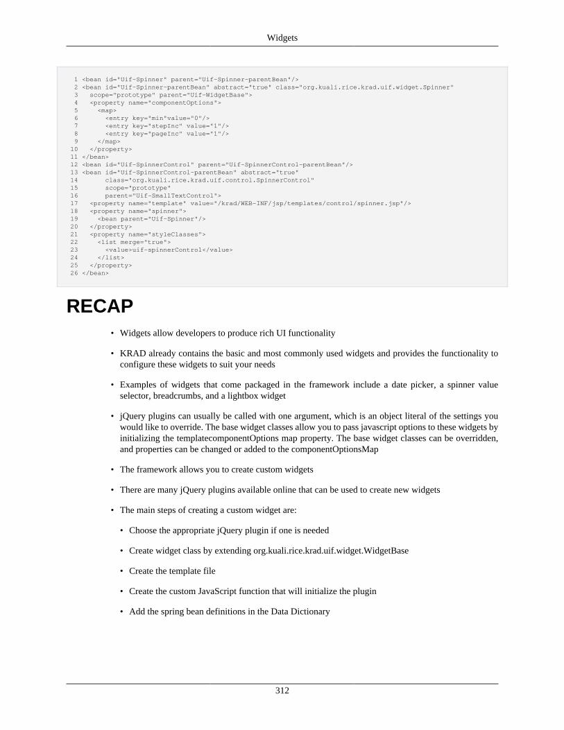
Widgets
312
1 <bean id="Uif-Spinner" parent="Uif-Spinner-parentBean"/> 2 <bean id="Uif-Spinner-parentBean" abstract="true" class="org.kuali.rice.krad.uif.widget.Spinner" 3 scope="prototype" parent="Uif-WidgetBase"> 4 <property name="componentOptions"> 5 <map> 6 <entry key="min"value="0"/> 7 <entry key="stepInc" value="1"/> 8 <entry key="pageInc" value="1"/> 9 </map> 10 </property> 11 </bean> 12 <bean id="Uif-SpinnerControl" parent="Uif-SpinnerControl-parentBean"/> 13 <bean id="Uif-SpinnerControl-parentBean" abstract="true" 14 class="org.kuali.rice.krad.uif.control.SpinnerControl" 15 scope="prototype" 16 parent="Uif-SmallTextControl"> 17 <property name="template" value="/krad/WEB-INF/jsp/templates/control/spinner.jsp"/> 18 <property name="spinner"> 19 <bean parent="Uif-Spinner"/> 20 </property> 21 <property name="styleClasses"> 22 <list merge="true"> 23 <value>uif-spinnerControl</value> 24 </list> 25 </property> 26 </bean>
RECAP• Widgets allow developers to produce rich UI functionality
• KRAD already contains the basic and most commonly used widgets and provides the functionality toconfigure these widgets to suit your needs
• Examples of widgets that come packaged in the framework include a date picker, a spinner valueselector, breadcrumbs, and a lightbox widget
• jQuery plugins can usually be called with one argument, which is an object literal of the settings youwould like to override. The base widget classes allow you to pass javascript options to these widgets byinitializing the templatecomponentOptions map property. The base widget classes can be overridden,and properties can be changed or added to the componentOptionsMap
• The framework allows you to create custom widgets
• There are many jQuery plugins available online that can be used to create new widgets
• The main steps of creating a custom widget are:
• Choose the appropriate jQuery plugin if one is needed
• Create widget class by extending org.kuali.rice.krad.uif.widget.WidgetBase
• Create the template file
• Create the custom JavaScript function that will initialize the plugin
• Add the spring bean definitions in the Data Dictionary
313
Chapter 10. The ViewPutting It Together with ViewsThe View Component
The view component sits at the very top of the component tree. It holds one or more pages that allowthe user to complete a course grained task. In addition to the pages it holds, the view also contains thestandard container header, footer, and errors fields. We also configure navigation for the pages throughthe view component.
In addition to the interface related configuration, many properties exist on the view component forconfiguring backend processing. Some examples of this include the form post URL, the form (model)class, and validation flags.
The base view component is defined with the class org.kuali.rice.krad.uif.view.View. For views that needto render an HTML form, the subclass org.kuali.rice.krad.uif.view.FormView is used. The componentbeans we use to configure the view are 'Uif-View' and 'Uif-FormView'. The following is an example ofconfiguring a form view:
1 2 <bean id="Travel-testView1" parent="Uif-FormView"> 3 <property name="title" value="Test View 1"/> 4 <property name="items"> 5 <list> 6 <bean parent="Uif-Disclosure-Page" p:id="page1"> 7 <property name="items"> 8 <list> 9 <ref bean="testSection1"/> 10 <ref bean="testSection2"/> 11 <ref bean="testSection3"/> 12 <ref bean="testSection4"/> 13 <ref bean="testSection5"/> 14 </list> 15 </property> 16 </bean> 17 </list> 18 </property> 19 <property name="formClass" value="edu.sampleu.travel.krad.form.UITestForm"/> 20 <property name="defaultBindingObjectPath" value="travelAccount1"/> 21 </bean> 22
In this example, we first set the title for the view (inherited from ContainerBase). Then, we configuredone page in the view's items list that contains five sections. Finally, we associated the view with the formclass 'UITestForm' and specify a default binding object path.
The id given for the view component (either by explicitly setting the id property or through the bean id) isvery important. For the case of general form view, this is how we will request the view with a URL (customviews that extend the general form view, known as view types, may support other ways of retrieving aview).
Recap• The view groups together all the UI components for a course grained task (it sits at the top of the
component tree)
• A view contains one or more pages, in addition to the standard container header, footer, and errors field
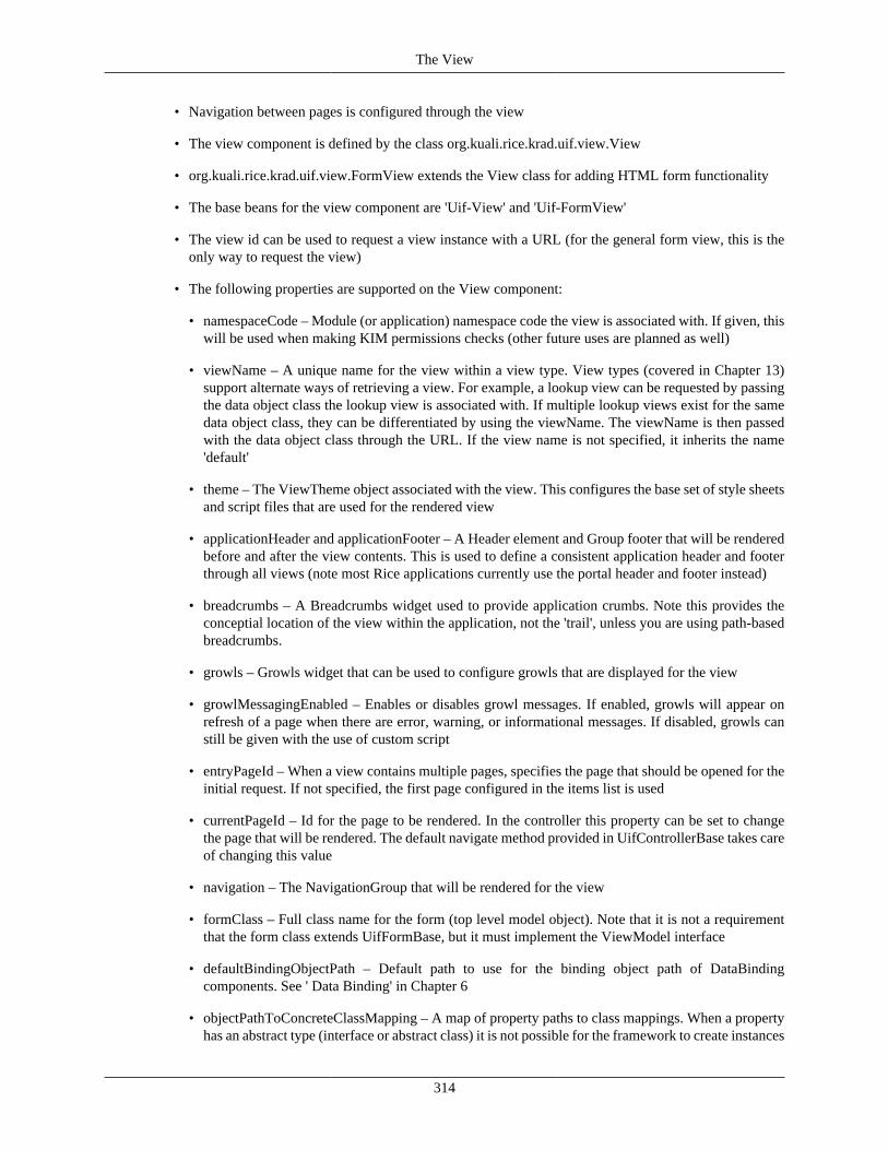
The View
314
• Navigation between pages is configured through the view
• The view component is defined by the class org.kuali.rice.krad.uif.view.View
• org.kuali.rice.krad.uif.view.FormView extends the View class for adding HTML form functionality
• The base beans for the view component are 'Uif-View' and 'Uif-FormView'
• The view id can be used to request a view instance with a URL (for the general form view, this is theonly way to request the view)
• The following properties are supported on the View component:
• namespaceCode – Module (or application) namespace code the view is associated with. If given, thiswill be used when making KIM permissions checks (other future uses are planned as well)
• viewName – A unique name for the view within a view type. View types (covered in Chapter 13)support alternate ways of retrieving a view. For example, a lookup view can be requested by passingthe data object class the lookup view is associated with. If multiple lookup views exist for the samedata object class, they can be differentiated by using the viewName. The viewName is then passedwith the data object class through the URL. If the view name is not specified, it inherits the name'default'
• theme – The ViewTheme object associated with the view. This configures the base set of style sheetsand script files that are used for the rendered view
• applicationHeader and applicationFooter – A Header element and Group footer that will be renderedbefore and after the view contents. This is used to define a consistent application header and footerthrough all views (note most Rice applications currently use the portal header and footer instead)
• breadcrumbs – A Breadcrumbs widget used to provide application crumbs. Note this provides theconceptial location of the view within the application, not the 'trail', unless you are using path-basedbreadcrumbs.
• growls – Growls widget that can be used to configure growls that are displayed for the view
• growlMessagingEnabled – Enables or disables growl messages. If enabled, growls will appear onrefresh of a page when there are error, warning, or informational messages. If disabled, growls canstill be given with the use of custom script
• entryPageId – When a view contains multiple pages, specifies the page that should be opened for theinitial request. If not specified, the first page configured in the items list is used
• currentPageId – Id for the page to be rendered. In the controller this property can be set to changethe page that will be rendered. The default navigate method provided in UifControllerBase takes careof changing this value
• navigation – The NavigationGroup that will be rendered for the view
• formClass – Full class name for the form (top level model object). Note that it is not a requirementthat the form class extends UifFormBase, but it must implement the ViewModel interface
• defaultBindingObjectPath – Default path to use for the binding object path of DataBindingcomponents. See ' Data Binding' in Chapter 6
• objectPathToConcreteClassMapping – A map of property paths to class mappings. When a propertyhas an abstract type (interface or abstract class) it is not possible for the framework to create instances
The View
315
of that class or, in many cases, find data dictionary or persistence metadata. In these cases, a mapentry can be added to specify the concrete class to use
• additionalScriptFiles – A list of script (.js) file paths (either relative to the web root or full URLS)that should be included for the rendered view
• additionalCssFiles - A list of style (.css) file paths (either relative to the web root or full URLS) thatshould be included for the rendered view
• viewTypeName – Name of the view type that the view belongs to. This is generally set in the basebeans for a view type (such as 'LOOKUP', or 'INQUIRY'). When requesting a view by type, thisname must be sent
• viewHelperServiceClass – Full class name for the ViewHelperService implementation. Defaultsto org.kuali.rice.krad.uif.service.impl.ViewHelperServiceImpl. Note you may also inject theViewHelperService instance by setting the viewHelperService property
• viewStatus – Lifecycle status for the view. This is generally just used by the framework
• viewIndex – A class the holds indexes for various view components. This is used throughout theframework and custom code to retrieve components. For example, suppose we wanted to find theInputField for property 'field1' and we were given the view instance. Without the index, we wouldneed to traverse the component tree, looking for InputField components, and then checking theproperty name. Using the view index, we can simply get the InputField by the property name withthe contained index. The indexes are built while carrying out the view lifecycle and traversing thetree for the phases
• viewRequestParameters – A Map of request parameters that were used to initialize the viewcomponent (see upcoming section 'View Request Parameters'). These must be maintained on the formin the case of view reinitialization (for example, in the case of a session timeout)
• presentationController – ViewPresentationController instance used to perform logic for edit, read-only, and hidden states of components
• authorizer – ViewAuthorizer instance used to perform user based authorization for a component'sedit or view state
• expressionVariables – A map of custom variables that can be used in expressions. The map key givesthe variable name, and the value gives the expression to evaluate for the variable value. These areevaluated at the beginning of the perform model phase, and then available in any expression on theview's contained components
• singlePageView – Indicates whether the view only contains one page group. In this case, the itemsconfigured are assumed to be section groups, and the sections are inserted into a page through code.This allows simpler configuration for views that typically don't have multiple pages (such as a lookupview)
• page – When singlePageView is true, this property holds the page group that will be rendered. Theitems configured on the view are then inserted into this group through code
• viewMenuGroupName – A string that identifier the group the view belongs to. This is currently notbeing used by KRAD, but is in place for future portal improvements (in portal terms, we can thinkof this as the channel the view link will be placed in)
• applyDirtyCheck – Boolean that enables or disables the dirty fields check
The View
316
• translateCodes – Boolean that indicates whether code properties should automatically be translatedto their name property for read only display. This is similar to the function of DataField'sreadOnlyDisplaySuffixPropertyName, however, the framework will attempt to do this automatically
• The following additional properties are supported on the FormView component:
• renderForm – Boolean that determines whether the HTML form will be rendered. In some cases, aview might need to conditionally render a form for which this property can be used. By default itis set to true
• validateClientSide – Boolean that indicates whether client side validation should be performed
• validateServerSide – Boolean that indicates whether automatic validation should be performed whenthe view is posted. This is currently not supported, but is planned for the future. The validation willbe performed against any constraints defined on the data fields (which could be inherited from thedata dictionary attribute definition)
• formPostUrl – The relative or absolute URL the form should post to. If not set, the framework willset this to the request URL (not including the request parameter string)
NavigationThe following view example shows a multi-page view with a navigation component:
1 2 <bean id="Travel-testView2" parent="Travel-testView1"> 3 <property name="title" value="Test View 2"/> 4 <property name="navigation"> 5 <ref bean="testViewMenu"/> 6 </property> 7 <property name="items"> 8 <list> 9 <bean parent="Uif-Page" p:id="page1" p:title="Page 1"/> 10 <bean parent="Uif-Page" p:id="page1" p:title="Page 1"/> 11 <bean parent="Uif-Page" p:id="page1" p:title="Page 1"/> 12 </list> 13 </property> 14 </bean> 15 16 <bean id="testViewMenu" 17 parent="Uif-MenuNavigationGroup"> 18 <property name="items"> 19 <list> 20 <bean parent="Uif-HeaderTwo" p:headerText="Navigation"/> 21 <bean parent="Uif-NavigationActionLink" p:navigateToPageId="page1" 22 p:actionLabel="Page 1"/> 23 <bean parent="Uif-NavigationActionLink" 24 p:navigateToPageId="page2" 25 p:actionLabel="Page 2"/> 26 <bean parent="Uif-NavigationActionLink" p:navigateToPageId="page3" 27 p:actionLabel="Page 3"/> 28 <bean parent="Uif-NavigationActionLink" p:navigateToPageId="page4" 29 p:actionLabel="Page 4"/> 30 </list> 31 </property> 32 </bean> 33
Recap• The NavigationGroup is a special type of group that renders navigation links for a view
The View
317
• The UIF provides the following navigation group beans:
• Uif-NavigationGroupBase – Base navigation group bean that sets the template and adds the styleclass 'uif-navigationGroup'
• Uif-MenuNavigationGroup – Navigation group that is rendered as a menu. Adds the style class 'uif-menuNavigationGroup'
• Uif-TabNavigationGroup – Navigation group that is rendered as tabs. Adds the style class 'uif-tabNavigationGroup'
• To configure the navigation links, we use the bean with id 'Uif-NavigationActionLink'. This bean setsup some default styling to the link, and sets up a script call. We can also choose to use the 'Uif-NavigationActionButton' bean for a menu button, or the 'Uif-SecondaryNavigationActionButton' beanto provide a secondary styling
• The navigateToPageId property is set to specify the page that should be navigated to when thelink is selected. By default, the server side method navigate is called, which will handle the navigation(we can call another method using the standard methodToCall property, and then call navigate at theend of our controller method)
• Header components can be used in the navigation group to label groupings (really any component, suchas images, can be used with the menu navigation group; however, this is not really practical with thetab navigation)
• The navigation group is associated with the view by the property navigation
BreadcrumbsBreadcrumbs represent where the view is located in the overall application structure. They give the user away to navigate to "parent" views/urls that may be associated with your application and are related to theView itself. Because different applications have the ability to build out various unique site structures withKrad, what appears in the breadcrumb trail for a View is highly configurable.
Figure 10.1. Breadcrumbs Appearance
In the UI, Breadcrumbs are part of every View and appear at the very top of each View below theapplication's header and below the View's topGroup (if these are configured). By default, with noconfiguration, the breadcrumbs will contain a View breadcrumb, with the view title as determined byheaderText of the View's header component and a page breadcrumb (also determined by its header'sheaderText). If no title can be determined, the item is omitted from the trail. In addition, by default, if thereare zero or one breadcrumbs in the trail, the Breadcrumbs widget is omitted from the View.
However, there are various ways to customize breadcrumbs beyond this default behavior.
BreadcrumbItem
A BreadcrumbItem represents the label and the url for a breadcrumb that appears in the breadcrumbs trail.Both View and PageGroup contain a BreadcrumbItem property called "breadcrumbItem". As described
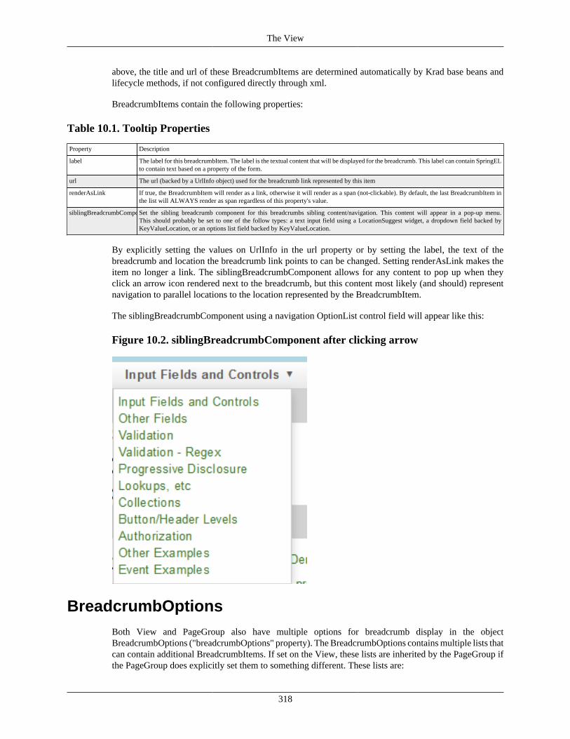
The View
318
above, the title and url of these BreadcrumbItems are determined automatically by Krad base beans andlifecycle methods, if not configured directly through xml.
BreadcrumbItems contain the following properties:
Table 10.1. Tooltip Properties
Property Description
label The label for this breadcrumbItem. The label is the textual content that will be displayed for the breadcrumb. This label can contain SpringELto contain text based on a property of the form.
url The url (backed by a UrlInfo object) used for the breadcrumb link represented by this item
renderAsLink If true, the BreadcrumbItem will render as a link, otherwise it will render as a span (not-clickable). By default, the last BreadcrumbItem inthe list will ALWAYS render as span regardless of this property's value.
siblingBreadcrumbComponentSet the sibling breadcrumb component for this breadcrumbs sibling content/navigation. This content will appear in a pop-up menu.This should probably be set to one of the follow types: a text input field using a LocationSuggest widget, a dropdown field backed byKeyValueLocation, or an options list field backed by KeyValueLocation.
By explicitly setting the values on UrlInfo in the url property or by setting the label, the text of thebreadcrumb and location the breadcrumb link points to can be changed. Setting renderAsLink makes theitem no longer a link. The siblingBreadcrumbComponent allows for any content to pop up when theyclick an arrow icon rendered next to the breadcrumb, but this content most likely (and should) representnavigation to parallel locations to the location represented by the BreadcrumbItem.
The siblingBreadcrumbComponent using a navigation OptionList control field will appear like this:
Figure 10.2. siblingBreadcrumbComponent after clicking arrow
BreadcrumbOptionsBoth View and PageGroup also have multiple options for breadcrumb display in the objectBreadcrumbOptions ("breadcrumbOptions" property). The BreadcrumbOptions contains multiple lists thatcan contain additional BreadcrumbItems. If set on the View, these lists are inherited by the PageGroup ifthe PageGroup does explicitly set them to something different. These lists are:
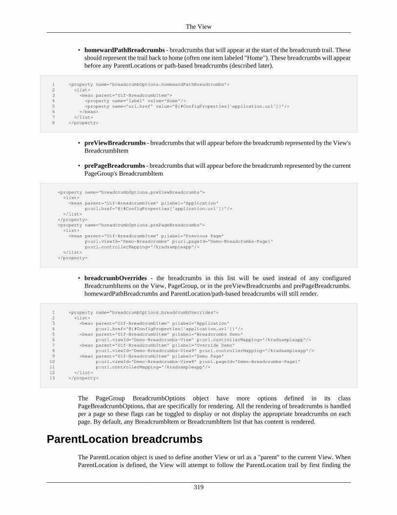
The View
319
• homewardPathBreadcrumbs - breadcrumbs that will appear at the start of the breadcrumb trail. Theseshould represent the trail back to home (often one item labeled "Home"). These breadcrumbs will appearbefore any ParentLocations or path-based breadcrumbs (described later).
1 <property name="breadcrumbOptions.homewardPathBreadcrumbs"> 2 <list> 3 <bean parent="Uif-BreadcrumbItem"> 4 <property name="label" value="Home"/> 5 <property name="url.href" value="@{#ConfigProperties['application.url']}"/> 6 </bean> 7 </list> 8 </property>
• preViewBreadcrumbs - breadcrumbs that will appear before the breadcrumb represented by the View'sBreadcrumbItem
• prePageBreadcrumbs - breadcrumbs that will appear before the breadcrumb represented by the currentPageGroup's BreadcrumbItem
<property name="breadcrumbOptions.preViewBreadcrumbs"> <list> <bean parent="Uif-BreadcrumbItem" p:label="Application" p:url.href="@{#ConfigProperties['application.url']}"/> </list> </property> <property name="breadcrumbOptions.prePageBreadcrumbs"> <list> <bean parent="Uif-BreadcrumbItem" p:label="Previous Page" p:url.viewId="Demo-Breadcrumbs" p:url.pageId="Demo-Breadcrumbs-Page1" p:url.controllerMapping="/kradsampleapp"/> </list> </property>
• breadcrumbOverrides - the breadcrumbs in this list will be used instead of any configuredBreadcrumbItems on the View, PageGroup, or in the preViewBreadcrumbs and prePageBreadcrumbs.homewardPathBreadcrumbs and ParentLocation/path-based breadcrumbs will still render.
1 <property name="breadcrumbOptions.breadcrumbOverrides"> 2 <list> 3 <bean parent="Uif-BreadcrumbItem" p:label="Application" 4 p:url.href="@{#ConfigProperties['application.url']}"/> 5 <bean parent="Uif-BreadcrumbItem" p:label="Breadcrumbs Demo" 6 p:url.viewId="Demo-Breadcrumbs-View" p:url.controllerMapping="/kradsampleapp"/> 7 <bean parent="Uif-BreadcrumbItem" p:label="Override Demo" 8 p:url.viewId="Demo-Breadcrumbs-View9" p:url.controllerMapping="/kradsampleapp"/> 9 <bean parent="Uif-BreadcrumbItem" p:label="Demo Page" 10 p:url.viewId="Demo-Breadcrumbs-View9" p:url.pageId="Demo-Breadcrumbs-Page1" 11 p:url.controllerMapping="/kradsampleapp"/> 12 </list> 13 </property>
The PageGroup BreadcrumbOptions object have more options defined in its classPageBreadcrumbOptions, that are specifically for rendering. All the rendering of breadcrumbs is handledper a page so these flags can be toggled to display or not display the appropriate breadcrumbs on eachpage. By default, any BreadcrumbItem or BreadcrumbItem list that has content is rendered.
ParentLocation breadcrumbsThe ParentLocation object is used to define another View or url as a "parent" to the current View. WhenParentLocation is defined, the View will attempt to follow the ParentLocation trail by first finding the
The View
320
View defined by the ParentLocation and then finding the next ParentLocation View of that View, andso forth, until the end of the trail is found (or a ParentLocation does not point to a View). During thistraversal, the BreadcrumbItems for these parent locations are collected from the Views processed to beused in the breadcrumbs trail rendered by the UI.
ParentLocation can be configured by setting the "parentLocation" on a View. The ParentLocation objecthas the following properties:
Table 10.2. Tooltip Properties
Property Description
parentViewLabel Label to use for the parent view - if not defined the label will be derived from the parent view's BreadcrumbItem first then the View's header
parentPageLabel Label to use for the parent page - if not defined the label will be derived from the parent page's BreadcrumbItem first then the page's header
parentViewUrl UrlInfo object which represents the location of the ParentLocation. If viewId is defined on this object, the View will be used duringParentLocation traversal (ie viewId is REQUIRED for View traversal).
parentPageUrl UrlInfo object which represents the location of the ParentLocation. The viewId must be the same as the viewId defined in parentViewUrland parentViewUrl must be defined to use a parent page location.
To use ParentLocation functionality, at a minimum some information in the parentViewUrl is requiredsuch as the viewId and controllerMapping (or a concrete href). Important: If the properties ofBreadcrumbItems derived from parent Views contain SpringEL, the current form must contain theproperties they reference.
In this example, a parent location is defined which points to the "UifBreadcrumbTest2" View and "/uicomponents" controller. Instead of deriving the title of this View from the ParentLocation's View, weare overriding it to display "Parent View".
1 <property name="parentLocation.parentViewLabel" value="Parent View"/> 2 <property name="parentLocation.parentViewUrl.viewId" value="UifBreadcrumbTest2"/> 3 <property name="parentLocation.parentViewUrl.controllerMapping" value="/uicomponents"/>
Path-based BreadcrumbsThe Breadcrumbs widget contains an option entitled "usePathBasedBreadcrumbs". When set to true, path-based breadcrumbs are used for the View. However, for this to work the View must be part of or start aHistoryFlow. To do this, the request must contain the request parameter "flow" with the flow key passedfrom a previous view or the value "start" to start a new HistoryFlow. The flowKey can be retrieved fromthe current form in the "flowKey" property of the form (or hidden input with name "flowKey" on theclient-side).
Taking the above into acount the following setup is required for Path-based Breadcrumbs to function:
• The flow request parameter must be set on the request to either the flow key of the previous View orthe keyword "start"
• The usePathBasedBreadcrumbs property must be set to true for this View's Breadcrumbs widget
• To continue collecting path-based breadcrumbs on a View linked from the current View, that link mustpass this View's flowKey forward as a request parameter
Example of setting up path-based breadcrumbs and a link which will continue the flow (continue collectingBreadcrumbItems for the trail) when clicked. If the view we are navigating to is also using path-basedbreadcrumbs, then the collected items will be displayed.
1 <property name="breadcrumbs.usePathBasedBreadcrumbs" value="true"/>
The View
321
2 ... 3 <!-- query parameter "flow" on the href is what continues the history flow (continues the path-based breadcrumbs) --> 4 <bean parent="Uif-Link" p:linkText="Click me to continue chaining path-based breadcrumbs" 5 p:href="@{#ConfigProperties['krad.url']}/kradsampleapp?viewId=Demo-Breadcrumbs-View8&methodToCall=start&flow=@{flowKey}"/>
Like ParentLocation breadcrumbs, path-based breadcrumbs derive the BreadcrumbItems from theprevious Views in the HistoryFlow (but do so while the user is navigating). ParentLocation breadcrumbsand path-based breadcrumbs cannot be used together. The main usage of path-based breadcrumbs in theKrad framework is for Lookup and Inquiry lightbox breadcrumb trails.
Understanding Breadcrumb Rendering order
Breadcrumbs are rendered in the following order through its template (note: any option that is notconfigured is not rendered):
• homewardPathBreadcrumbs
• Either ParentLocation breadcrumbs or path-based breadcrumbs (optional)
• If breadcrumbOverrides is not set:
• preViewBreadcrumbs
• View's BreadcrumbItem
• prePageBreadcrumbs
• current PageGroup's BreadcrumbItem
For example, in most views, you would like breadcrumbs to appear as: "Home > View1 > Page". The onlysetup that needs to be done is to either setup homewardPathBreadcrumbs with a home BreadcrumbItemor use the View's ParentLocation pointing to a home url (because the "View1" and "Page" breadcrumbsare automated if not configured).
Inorder to chose the appropriate mechanism to use in this scenario, it is up to your application needs, but ifthis View potentially links to another View, using ParentLocation would allow you to inherit the "Home"breadcrumb (if you make "View1" its parent) resulting in something like "Home > View1 > View2 > Page".
Alternatively, if your View bean parents from another base View bean defined in your project, every viewin your project could inherit the homewardPathBreadcrumbs property from it.
It is important to take into consideration how your application will setup its own breadcrumb structure tomeet your project's application needs by taking these options and rendering order into account.
View IndexingComing Soon!
Requesting a View InstanceComing Soon!
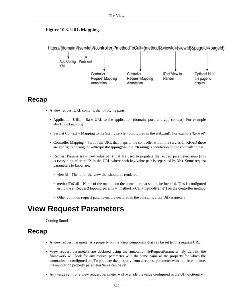
The View
322
Figure 10.3. URL Mapping
Recap
• A view request URL contains the following parts:
• Application URL – Base URL to the application (domain, port, and app context). For example'dev1.rice.kuali.org'
• Servlet Context – Mapping to the Spring servlet (configured in the web.xml). For example 'kr-krad'
• Controller Mapping – Part of the URL that maps to the controller within the servlet. In KRAD theseare configured using the @RequestMapping(value = "/training") annotation on the controller class
• Request Parameters – Key value pairs that are used to populate the request parameters map (thisis everything after the '?' in the URL where each key/value pair is separated by '&'). Some requestparameters to know are:
• viewId – The id for the view that should be rendered
• methodToCall – Name of the method on the controller that should be invoked. This is configuredusing the @RequestMapping(params = "methodToCall=methodName") on the controller method
• Other common request parameters are declared in the constants class UifParameters
View Request ParametersComing Soon!
Recap
• A view request parameter is a property on the View component that can be set from a request URL
• View request parameters are declared using the annotation @RequestParameter. By default, theframework will look for any request parameter with the same name as the property for which theannotation is configured on. To populate the property from a request parameter with a different name,the annotation property parameterName can be set
• Any value sent for a view request parameter will override the value configured in the UIF dictionary
The View
323
The View ServiceComing Soon!
The View Lifecycle and View Helper ServicesComing Soon!
Recap
• The ViewHelperService carries out the majority of the view processing
• Custom implementations of the view helper service can be set using the view propertiesviewHelperService and viewHelperServiceClass
• After the view object is retrieved from the Spring container, processing is done in three phases:
• Initialize – During this phase, defaults are set for component properties, and things such as IDassignment occurs
• Apply Model – During this phase, the model is looked at to perform conditional logic (includingexpressions), and to build dynamic components (for example collection lines)
• Finalize – A final phase to set state before the rendering is then performed. At this point, allcomponents should have been created and conditional logic applied
• Common logic (for all components) is performed within the view helper service for the various phases
• In addition, the view helper delegates to each component for every phase
• Therefore, customization of the processing can also be done by extending the component class (andoverriding the bean definition to use the custom class)
• The view helper also contains methods for callback from the UIf base controller. For example, the addand delete operations are performed through the view helper
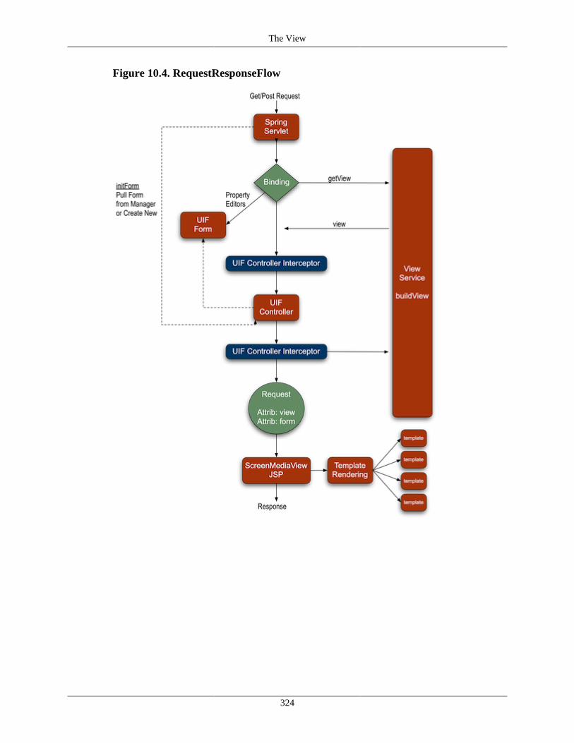
The View
324
Figure 10.4. RequestResponseFlow
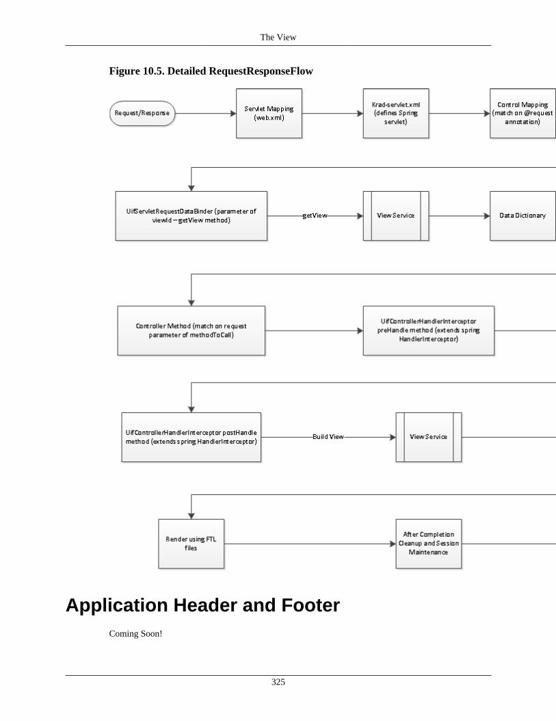
The View
325
Figure 10.5. Detailed RequestResponseFlow
Application Header and FooterComing Soon!
The View
326
Recap• A common application header and footer can be set using the view properties applicationHeader and
applicationFooter
Sticky Headers And FootersSpecific headers and footers of the view can become "sticky" to always stay in the view when the userscrolls. The page content will appear to scroll underneath these fixed portions. If pieces of the header/footer are sticky and other pieces are not, it will appear that the non-sticky pieces are either collapsing outof view or expanding into View when the user scrolls the window. This sticky functionality is useful toalways keep information important to the application visible; such as navigation, document information,or buttons that perform actions on the current View (allowing the user to click buttons that would normallyappear in a footer and require a user to scroll down to them when not sticky).
Since this functionality is heavily css and style based, and is completely automated by the frameworkthrough javascript, it is not recommended that you change default styling related to width or positioning forthe headers/footers you are attempting to make sticky in your application. Keep in mind that sticky contentmust have a solid background color or pattern and remain a width of 100% to appear correctly to the user.
Sticky Header OptionsThere are 4 main sections of the header content you can make sticky. These are: application header, theView's topGroup, breadcrumbs, and the View's header. These can be mixed and matched as needed foryour application or View needs.
Important note: The pattern (not sticky)-(sticky)-(not sticky)-(sticky) for header content is NOTALLOWED; ie, two independent areas that "scroll collapse" offscreen are not allowed.
The View has the following properties for controlling sticky header content:
• stickyApplicationHeader - make the application's header sticky
• stickyTopGroup - make the View's custom topGroup (content appears above breadcrumbs) contentsticky
• stickyBreadcrumbs - make the View's breadcrumbs sticky
• stickyHeader - make the View's header component sticky
To make the application header sticky, the following code on the View is used:
1 <property name="stickyApplicationHeader" value="true"/>
For sticky View's topGroup:
1 <property name="stickyTopGroup" value="true"/>
For sticky breadcrumbs and View's header:
1 <property name="stickyBreadcrumbs" value="true"/> 2 <property name="stickyHeader" value="true"/>
The View
327
The flags demonstrated can be used in any combination except the following combination. This codeWILL NOT work appropriately and will break user interaction:
1 <!-- NEVER do this --> 2 <property name="stickyApplicationHeader" value="false"/> 3 <property name="stickyTopGroup" value="true"/> 4 <property name="stickyBreadcrumbs" value="false"/> 5 <property name="stickyHeader" value="true"/>
Sticky Footer OptionsThere are 3 main sections of the View's footer you can make sticky. These are: application footer, theView's footer, the current PageGroup's footer. A common use case is to make the page or View's footersticky to have buttons always available to the user without forcing the user to scroll to get to them.
The View has the following properties for controlling sticky footer content:
• stickyFooter
• stickyApplicationFooter
The PageGroup (page) also has the stickyFooter property, to make its footer sticky.
The following code makes all footers sticky. Note the usage of stickyFooter on each PageGroup item ofthe View:
1 <bean id="Demo-StickyHeaderFooter-View9" parent="Demo-StickyHeaderFooter-BaseView"> 2 <property name="items"> 3 <list> 4 <bean parent="Demo-StickyHeaderFooter-Page1" p:stickyFooter="true"/> 5 <bean parent="Demo-StickyHeaderFooter-Page2" p:stickyFooter="true"/> 6 </list> 7 </property> 8 <property name="stickyFooter" value="true"/> 9 <property name="stickyApplicationFooter" value="true"/> 10 </bean>
Like sticky header options, these options can be mixed and matched as needed per a View.
View ThemesThe view and its contained components provide the structure for the page, or in other words they dictatethe HTML that will be rendered. But we all know the same HTML can appear in many different ways, orwith the use of script our view can even behave in many different ways. This is where the View Themecomes into play. The view theme provides a base set of CSS and JS files that will be sourced in when theview is rendered. In addition it can manage a group of images. We generally call this the 'look and feel'.
An application may have more than one view theme that is used, but generally there will be just one. Infact, KRAD ships with a default theme based on the Bootstrap/ library that you can use as is or modify.A new view theme can be configured manually within the UIF XML, or use automatic configuration byconvention. Both of these methods are described below.
Manual Theme ConfigurationWe can configure a new theme by creating a bean with parent Uif-ViewTheme:
The View
328
1 <bean id="MyAppViewTheme" parent="Uif-ViewTheme"/>
Now let's add some CSS files to the theme. To do so we use the cssFiles property which can containone or more URLs (relative or full) to a CSS file location. Also, since we wish to configure our thememanually, we must set the flag usesThemeBuilder to false:
1 <bean id="MyAppViewTheme" parent="Uif-ViewTheme" p:usesThemeBuilder="false"> 2 <property name="cssFiles"> 3 <list> 4 <value>/myapp/stylesheets/base.css</value> 5 <value>/myapp/stylesheets/fonts.css</value> 6 </list> 7 </property> 8 </bean>
Likewise we can add JavaScript files using the scriptFiles property. Again one or more URLs canbe given that point to a script file location:
1 <bean id="MyAppViewTheme" parent="Uif-ViewTheme"> 2 <property name="cssFiles"> 3 <list> 4 <value>/myapp/stylesheets/base.css</value> 5 <value>/myapp/stylesheets/fonts.css</value> 6 </list> 7 </property> 8 <property name="scriptFiles"> 9 <list> 10 <value>/myapp/scripts/common.js</value> 11 <value>/myapp/scripts/widgets.js</value> 12 </list> 13 </property> 14 </bean>
At this point we have a theme that includes CSS and JS files, and we can begin using it with our views.See the section called “Linking Themes To Views” for more information.
KRAD also provides support for using a minified CSS and JS file in test and production, while usingfull source files for development. To determine which files to source in, the Rice configuration parameterrice.krad.dev.mode is used. When this is true, full source files will be sourced for debuggingpurposes. Conversely, when this parameter is false, the minified files will be sourced in.
When using manual configuration the path for the minified files, and the path for the source files mustbe specified. First we can configure the source paths using the properties minCssSourceFilesand minScriptSourceFiles. These properties behave like the cssFiles and scriptFiles propertiesdescribed above.
1 <bean id="MyAppViewTheme" parent="Uif-ViewTheme"> 2 <property name="minCssSourceFiles"> 3 <list> 4 <value>/myapp/stylesheets/base.css</value> 5 <value>/myapp/stylesheets/fonts.css</value> 6 </list> 7 </property> 8 <property name="minScriptSourceFiles"> 9 <list> 10 <value>/myapp/scripts/common.js</value> 11 <value>/myapp/scripts/widgets.js</value> 12 </list> 13 </property> 14 </bean>
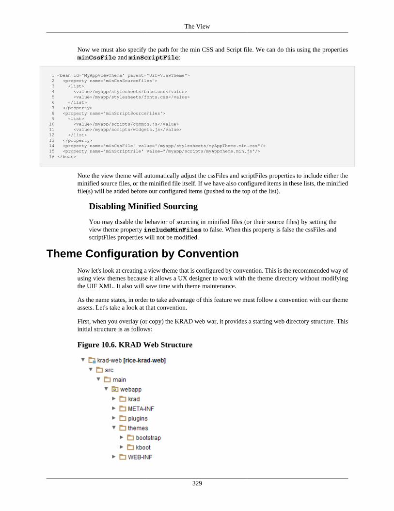
The View
329
Now we must also specify the path for the min CSS and Script file. We can do this using the propertiesminCssFile and minScriptFile:
1 <bean id="MyAppViewTheme" parent="Uif-ViewTheme"> 2 <property name="minCssSourceFiles"> 3 <list> 4 <value>/myapp/stylesheets/base.css</value> 5 <value>/myapp/stylesheets/fonts.css</value> 6 </list> 7 </property> 8 <property name="minScriptSourceFiles"> 9 <list> 10 <value>/myapp/scripts/common.js</value> 11 <value>/myapp/scripts/widgets.js</value> 12 </list> 13 </property> 14 <property name="minCssFile" value="/myapp/stylesheets/myAppTheme.min.css"/> 15 <property name="minScriptFile" value="/myapp/scripts/myAppTheme.min.js"/> 16 </bean>
Note the view theme will automatically adjust the cssFiles and scriptFiles properties to include either theminified source files, or the minified file itself. If we have also configured items in these lists, the minifiedfile(s) will be added before our configured items (pushed to the top of the list).
Disabling Minified Sourcing
You may disable the behavior of sourcing in minified files (or their source files) by setting theview theme property includeMinFiles to false. When this property is false the cssFiles andscriptFiles properties will not be modified.
Theme Configuration by ConventionNow let's look at creating a view theme that is configured by convention. This is the recommended way ofusing view themes because it allows a UX designer to work with the theme directory without modifyingthe UIF XML. It also will save time with theme maintenance.
As the name states, in order to take advantage of this feature we must follow a convention with our themeassets. Let's take a look at that convention.
First, when you overlay (or copy) the KRAD web war, it provides a starting web directory structure. Thisinitial structure is as follows:
Figure 10.6. KRAD Web Structure
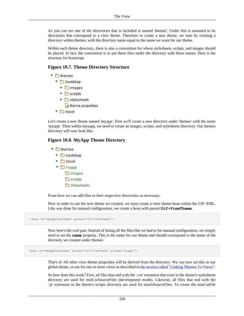
The View
330
As you can see one of the directories that is included is named 'themes'. Under this is assumed to bedirectories that correspond to a view theme. Therefore to create a new theme, we start by creating adirectory within themes, with the directory name equal to the name we want for our theme.
Within each theme directory, there is also a convention for where stylesheets, scripts, and images shouldbe placed. In fact, the convention is to put these files under the directory with those names. Here is thestructure for bootstrap:
Figure 10.7. Theme Directory Structure
Let's create a new theme named 'myapp'. First we'll create a new directory under 'themes' with the name'myapp'. Then within mysapp, we need to create an images, scripts, and stylesheets directory. Our themesdirectory will now look like:
Figure 10.8. MyApp Theme Directory
From here we can add files to their respective directories as necessary.
Now in order to use the new theme we created, we must create a view theme bean within the UIF XML.Like was done for manual configuration, we create a bean with parent Uif-ViewTheme.
<bean id="MyAppViewTheme" parent="Uif-ViewTheme"/>
Now here's the cool part. Instead of listing all the files like we had to for manual configuration, we simplyneed to set the name property. This is the name for our theme and should correspond to the name of thedirectory we created under themes:
<bean id="MyAppViewTheme" parent="Uif-ViewTheme" p:name="myapp"/>
That's it! All other view theme properties will be derived from the directory. We can now set this as ourglobal theme, or use for one or more views as described in the section called “Linking Themes To Views”.
So how does this work? First, all files that end with the '.css' extension that exist in the theme's stylesheetsdirectory are used for minCssSourceFiles (development mode). Likewise, all files that end with the'.js' extension in the theme's scripts directory are used for minJsSourceFiles. To create the minCssFile
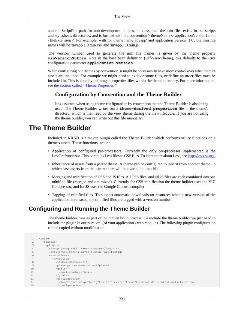
The View
331
and minScriptFile path for non-development modes, it is assumed the min files exists in the scriptsand stylesheets directories, and is formed with the convention '{themeName}.{applicationVersion}.min.{fileExtension}'. For example, with for theme name 'myapp' and application version '1.0', the min filenames will be 'myapp.1.0.min.css' and 'myapp.1.0.min.js'.
The version number used to generate the min file names is given by the theme propertyminVersionSuffix. Note in the base bean definition (Uif-ViewTheme), this defaults to the Riceconfiguration parameter application.version.
When configuring our themes by convention, it might be necessary to have more control over what theme'sassets are included. For example we might need to exclude some files, or define an order files must beincluded in. This is done by defining a properties files within the theme directory. For more information,see the section called “ Theme Properties ”.
Configuration by Convention and the Theme Builder
It is assumed when using theme configuration by convention that the Theme Builder is also beingused. The Theme Builder writes out a theme-derived.properties file in the theme'sdirectory, which is then read by the view theme during the view lifecycle. If you are not usingthe theme builder, you can write out this file manually.
The Theme BuilderIncluded in KRAD is a maven plugin called the Theme Builder which performs utility functions on atheme's assets. These functions include:
• Application of configured pre-processors. Currently the only pre-processor implemented is theLessPreProcessor. This compiles Less files to CSS files. To learn more about Less, see http://lesscss.org/
• Inheritance of assets from a parent theme. A theme can be configured to inherit from another theme, inwhich case assets from the parent them will be overlaid to the child
• Merging and minification of CSS and JS files. All CSS files, and all JS files are each combined into oneminified file (merged and optimized). Currently for CSS minification the theme builder uses the YUICompressor, and for JS uses the Google Closure compiler
• Tagging of minified files. To support automatic downloads on resources when a new version of theapplication is released, the minified files are tagged with a version number
Configuring and Running the Theme Builder
The theme builder runs as part of the maven build process. To include the theme builder we just need toinclude the plugin in our pom.xml (of your application's web module). The following plugin configurationcan be copied without modification:
1 <build> 2 <plugins> 3 <plugin> 4 <groupId>org.kuali.maven.plugins</groupId> 5 <artifactId>spring-maven-plugin</artifactId> 6 <executions> 7 <execution> 8 <id>buildthemes</id> 9 <phase>process-resources</phase> 10 <goals> 11 <goal>loadxml</goal> 12 </goals> 13 <configuration> 14 <location>classpath:org/kuali/rice/krad/theme/themebuilder-context.xml</location> 15 </configuration>
The View
332
16 </execution> 17 </executions> 18 <dependencies> 19 <dependency> 20 <groupId>org.kuali.rice</groupId> 21 <artifactId>rice-krad-theme-builder</artifactId> 22 <version>2.5.5</version> 23 </dependency> 24 </dependencies> 25 </plugin> 26 </plugins> 27 </build>
The plugin is configured through maven properties. In addition to the plugin, copy the following propertiesto the properties section of the pom.xml:
1 <properties> 2 <webapp.source.dir>/ssd/jenkins/workspace/rice-2.5-release-sitedeploy/src/main/webapp</webapp.source.dir> 3 <theme.builder.output.dir>/ssd/jenkins/workspace/rice-2.5-release-sitedeploy/target/rice-2.5.5</theme.builder.output.dir> 4 <theme.builder.excludes /> 5 <theme.builder.theme.adddirs /> 6 <theme.builder.plugin.adddirs /> 7 <theme.skip.theme.processing>false</theme.skip.theme.processing> 8 </properties>
Note these property values can be used as is, or modified as necessary. The following table describes theirusage.
Table 10.3. Theme Builder Configuration Properties
Property Name Property Description
webapp.source.dir Directory containing the web app source. Assets will pulled from here tothe output directory
theme.builder.output.dir Directory where the theme builders output should be placed. This can bethe actual war directory or a temporary directory that gets copied over ina later phase
theme.builder.excludes One or more themes to exclude from the build. The theme is identified byits directory name. Separate each theme with a comma. All directories inthe default themes directory or additional directories will be copied, butonly the ones not excluded here will be processed
theme.builder.theme.adddirs One or more additional directories (outside the 'themes' parent directory) toprocess as themes. This should contain the full path to the theme directory.Separate each directory with a comma
theme.builder.plugin.adddirs One or more additional directories (outside the 'plugins' parent directory)to process as plugins. This should contain the full path to the plugindirectory. Separate each directory with a comma
theme.skip.theme.processing Indicates whether theme processing should be disabled, in which case thebuilder will only perform copying of assets to the output directory andoverlays
The default plugin configuration configures the theme builder to run during the process-resourcesphase. Therefore each time a these phase is run (through maven) on the corresponding module thetheme builder will be invoked. This can be done through the maven command line, or using IDE mavenintegration.
Theme Builder and Manual Theme Configuration
As previously stated, the theme builder and automatic theme configuration go hand and hand.However, if using manual theme configuration you can still take advantage of the theme builder.For example, you might want to use Less files and use the theme builder to perform the compiling.Or use the theme builder to perform minification.
The View
333
Theme Properties
We can control how assets are collected for a theme through a properties file. First, we create a file namedtheme.properties in the root of our theme directory. For example if our theme name is 'myapp',the path for the properties file will be '/themes/myapp/theme.properties'. Within the properties file we candefine any of the following properties to customize the theme:
Table 10.4. Theme Property Listing
Property Name Property Description
parent Name of the theme to inherit from, this should correspond to the themedirectory. For example, if the theme directory is '/themes/bootstrap', theparent would be 'bootstrap'. All assets from the parent will be copied tothe theme directory, except those excluded by 'parentExcludes', and thoseassets which already exist in the theme (same name and path)
parentExcludes When a parent is set, one or more files to exclude from the asset copy.More than one file can be given using a comma delimiter. An exclude canbe an exact file (name and path relative to the parent theme directory), oran Ant pattern ex. 'scripts/bootstrap.js,scripts/k**,stylesheets/**'
cssExcludes One or more files to exclude from the final CSS list. This is relativeto the 'stylesheets' directory of the theme, and should not contain thefile extension. This is processed after all overlays. Ant patterns can beused as well. CSS files that come from a plugin directory can also beexcluded from the final list by filtering based on the file base name ex.'myTest,example*'
jsExcludes One or more files to exclude from the final JS list. This is relative to the'scripts' directory of the theme, and should not contain the file extension.This is processed after all overlays. Ant patterns can be used as well. JSfiles that come from a plugin directory can also be excluded from the finallist by filtering based on the file base name ex. 'myScript,scriptA*'
pluginIncludes One or more plugin names that should be included with the theme.Plugins are named by their directory (for example, the plugin at '/plugins/jstree' has name 'jstree'). By default all plugins in the '/plugins'directory are included, and can be filtered using pluginExcludes ex.'jquery,jqueryui,datatables,blockui'
pluginExcludes One or more plugin names to exclude from the theme. Plugins are namedby their directory (for example, the plugin at '/plugins/jstree' has name'jstree'). By default all plugins in the '/plugins' directory are included ex.'globalize,postmsg'
pluginFileExcludes One or more files to exclude from the plugin directories that are includedin the theme. File excludes should be relative to the plugin directory parent(most of the time this will be '/plugins'). Ant patterns may be used as wellex. 'fancybox/helpers/**,jstree/themes/**'
additionalOverlays One or more mappings of directories to overlay (copy). Each mappingis delimited by a comma. Within each mapping the from directory islisted, then the to directory within parenthesis ('fromDir(toDir)'). Both arerelative to themes directory, unless the path starts with '/', in which caseit is taken from the web root. This configuration is useful because someplugins/scripts look for assets (such as images) in the plugin directory.When the script is minified, it is essentially moved, therefore thoserelative paths are broken. This can be used to copy the needed contentto the theme directory ex. '/plugins/jstree/themes(scripts/themes),/plugins/tooltip/jquerybubblepopup-theme(scripts/jquerybubblepopup-theme)'
lessIncludes When the Less pre processor is used, provides the list of less files tocompile. Ant patterns are allowed. By default all files in the theme'sdirectory named 'stylesheets' and with .less extension are included,with the exception of those in the 'stylesheets/includes' directory. ex.'bootstrap.less,**/less/*.less'
lessExcludes When the Less pre processor is used, provides the list of less filesto exclude from the compile process. Ant patterns are allowed. ex.'reset.less,include*.less'
cssLoadFirst The remaining configuration properties customize the order CSS and JSfiles are sourced. In development mode this is the order they are sourcedin. When merging and minifying this is the order in which the contentsare included There is a global ordering of the following: plugin assets,krad assets, theme specific asset One or more CSS files that should beordered first. Ant patterns are allowed and the .css extension should not
The View
334
Property Name Property Description
be included. Each file/pattern is tested against the list of all included CSSfiles, and matches are placed into the final list in that position. Note onlythe file base name (not including any path or extension) is tested (thereforeit doesn't matter whether the file originally came from a plugin or themedirectory). If this property is not specified then plugin assets will be firstto load ex. 'reset,bootstrap'
cssLoadLast One or more CSS files that should be ordered last. The file/pattern givenfirst will be last in the list, second file/pattern will be second to last, and soon. Ant patterns are allowed and the .css extension should not be included.Each file/pattern is tested against the list of all included CSS files, andmatches are placed into the final list in that position. Note only the file basename (not including any path or extension) is tested (therefore it doesn'tmatter whether the file originally came from a plugin or theme directory).ex. 'override,colors'
pluginCssLoadOrder Order that CSS files that are included from plugins should be loaded.These will load after any CSS files given in cssLoadFirst. Ant patterns areallowed and the .css extension should not be included. Each file/patternis tested against the list of CSS files that come from the included plugindirectories. Any matches are loaded in that position. Any plugin CSSfiles not matched will be loaded afterwards in no set order. ex. 'jquery-ui*,jquery.fancybox'
themeCssLoadOrder Order that CSS files that are present in the themes 'stylesheets' directory (orinherited from a parent's 'stylesheets' directory) should be loaded. Thesewill load after plugin CSS files. Ant patterns are allowed and the .cssextension should not be included. Each file/pattern is tested against the listof CSS files that come from the stylesheets directory. Any matches areloaded in that position. Any theme CSS files not matched will be loadedafterwards in no set order. ex. 'base,fonts'
jsLoadFirst One or more JS files that should be ordered first. Ant patterns are allowedand the .js extension should not be included. Each file/pattern is testedagainst the list of all included JS files, and matches are placed into the finallist in that position. Note only the file base name (not including any path orextension) is tested (therefore it doesn't matter whether the file originallycame from a plugin or theme directory). If this property is not specifiedthen plugin assets will be first to load ex. 'jquery-1.8.3,jquery.validate'
jsLoadLast One or more JS files that should be ordered last. The file/pattern given firstwill be last in the list, second file/pattern will be second to last, and so on.Ant patterns are allowed and the .js extension should not be included. Eachfile/pattern is tested against the list of all included JS files, and matchesare placed into the final list in that position. Note only the file base name(not including any path or extension) is tested (therefore it doesn't matterwhether the file originally came from a plugin or theme directory). ex.'jquery.easing-1.3.pack'
pluginJsLoadOrder Order that JS files that are included from plugins should be loaded. Thesewill load after any JS files given in jsLoadFirst. Ant patterns are allowedand the .js extension should not be included. Each file/pattern is testedagainst the list of JS files that come from the included plugin directories.Any matches are loaded in that position. Any plugin JS files not matchedwill be loaded afterwards in no set order. ex. 'jquery-ui*,jquery.fancybox'
themeJsLoadOrder Order that JS files that are present in the themes 'scripts' directory (orinherited from a parent's 'scripts' directory) should be loaded. These willload after plugin JS files. Ant patterns are allowed and the .js extensionshould not be included. Each file/pattern is tested against the list of JSfiles that come from the scripts directory. Any matches are loaded in thatposition. Any theme JS files not matched will be loaded afterwards in noset order. ex. 'helpers,global*'
Sample Theme Properties
For a sample theme properties, see rice-framework\krad-theme-builder\src\main\resources\org\kuali\rice\krad\theme\theme-sample.properties within the Rice distribution.
Parent Themes
One very powerful feature of the theme builder is the ability to inherit from an existing theme. This givesyou the ability to create a theme starting with an existing theme, and performing any necessary overrides
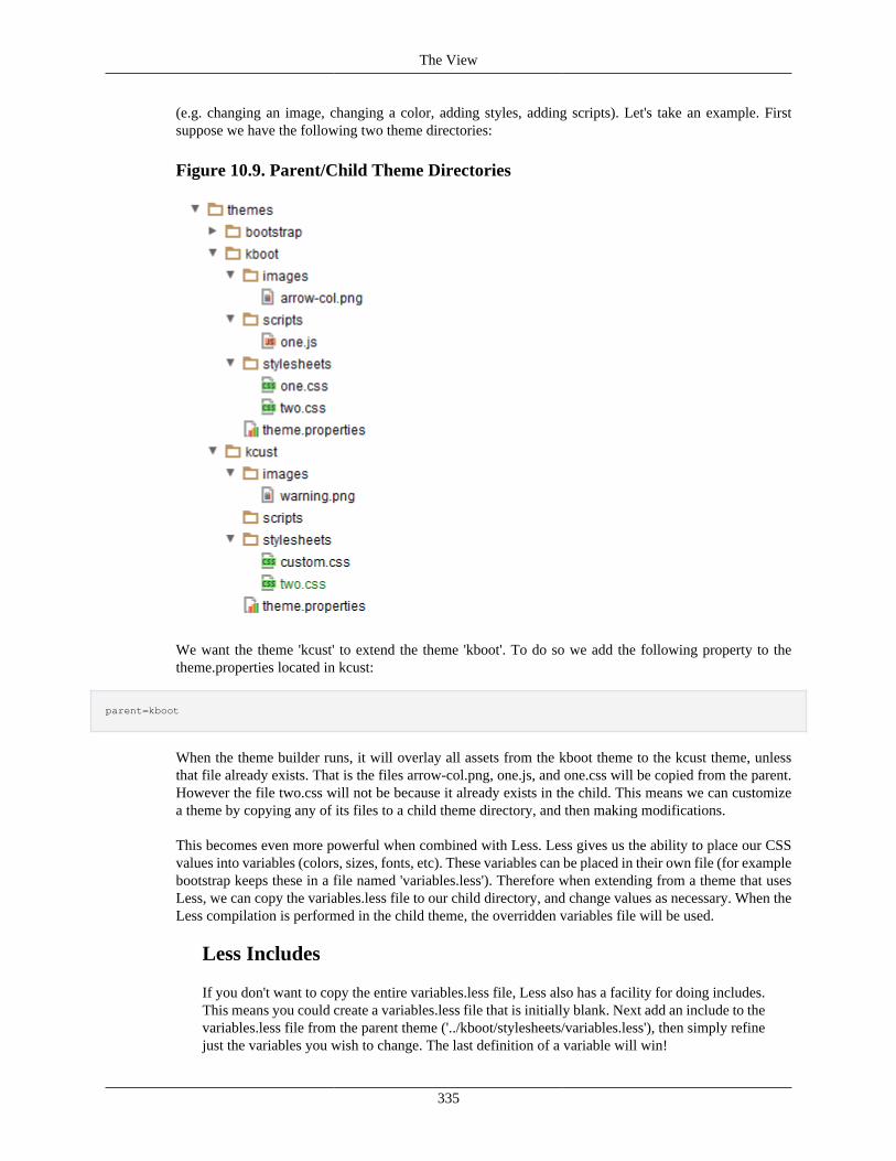
The View
335
(e.g. changing an image, changing a color, adding styles, adding scripts). Let's take an example. Firstsuppose we have the following two theme directories:
Figure 10.9. Parent/Child Theme Directories
We want the theme 'kcust' to extend the theme 'kboot'. To do so we add the following property to thetheme.properties located in kcust:
parent=kboot
When the theme builder runs, it will overlay all assets from the kboot theme to the kcust theme, unlessthat file already exists. That is the files arrow-col.png, one.js, and one.css will be copied from the parent.However the file two.css will not be because it already exists in the child. This means we can customizea theme by copying any of its files to a child theme directory, and then making modifications.
This becomes even more powerful when combined with Less. Less gives us the ability to place our CSSvalues into variables (colors, sizes, fonts, etc). These variables can be placed in their own file (for examplebootstrap keeps these in a file named 'variables.less'). Therefore when extending from a theme that usesLess, we can copy the variables.less file to our child directory, and change values as necessary. When theLess compilation is performed in the child theme, the overridden variables file will be used.
Less Includes
If you don't want to copy the entire variables.less file, Less also has a facility for doing includes.This means you could create a variables.less file that is initially blank. Next add an include to thevariables.less file from the parent theme ('../kboot/stylesheets/variables.less'), then simply refinejust the variables you wish to change. The last definition of a variable will win!
The View
336
Finally note that we can also exclude files that we don't want to inherit from a parent theme using theproperty parentExcludes.
Multiple Parents
Theme inheritance can go multiple levels, so when inheriting from a theme looking for itstheme.properties and check whether it is also inheriting from a theme. If so you will get thosefiles as well (by default).
Linking Themes To ViewsAs mentioned previously, a view theme can be used for all the application's views, a subset, or an individualview.
KRAD provides a bean that determines the 'global' view theme. This is a theme that will be used forall views, unless the view explicitly overrides the theme. To set the global theme, create a bean with idGlobalTheme and point to the desired them with the parent attribute:
<bean id="GlobalTheme" parent="MyAppViewTheme"/>
All views that do not have a view them explicity sit will now use the theme "MyAppViewTheme".
The theme can be sit (or overridden) for a particular view using the property theme. For example, tospecify a view should use the theme with id "MyAppViewTheme2", we can do the following:
1 <bean id="SalesTransactionView" parent="Uif-FormView" p:headerText="Sales Transaction"> 2 <property name="theme"> 3 <bean parent="MyAppViewTheme2"/> 4 </property> 5 ... 6 </bean>
Finally, to use a theme for a subset of the applications view, we can simply create an abstract bean for theview base that points to the theme, then extend that bean for all views that should use the theme:
1 <bean id="BlueTheme-Base" abstract="true" parent="Uif-FormView"> 2 <property name="theme"> 3 <bean parent="BlueTheme"/> 4 </property> 5 ... 6 </bean> 7 8 <bean id="TransferView" parent="BlueTheme-Base" headerText="Transfer with Blue Theme"> ... </bean> 9 <bean id="AccountView" parent="BlueTheme-Base" headerText="Account with Blue Theme"> ... </bean>
KIM AuthorizationComing Soon!
Recap• KRAD allows securing any piece of the view
• By default, authorization is controlled through KIM permissions (with assigned roles)
The View
337
• To enable authorization, first a KIM permission must be created with the correct template type andpermissions, then the corresponding component must be marked using the ComponentSecurity object(property is named componentSecurity)
• The following permissions can be added:
• Open View – Template Name 'Open View': Details viewId: Enabled by setting viewAuthz to trueon the view component
• Edit View – Template Name 'Edit View': Details viewId: Enabled by setting editAuthz to true onthe view component
• View Field – Template Name 'View Field': Details viewId and fieldId or viewId and propertyName(for data fields): Enabled by setting viewAuthz to true on the field component
• Edit Field – Template Name 'Edit Field': Details viewId and fieldId or viewId and propertyName (fordata fields): Enabled by setting editAuthz to true on the field component
• View Group (applies to any group including page, section, and subsection levels) – Template Name'View Group': Details viewId and groupId or viewId and propertyName (for collection groups):Enabled by setting viewAuthz to true on the group component
• Edit Group (applies to any group including page, section, and subsection levels) – Template Name'Edit Group': Details viewId and groupId or viewId and propertyName (for collection groups):Enabled by setting editAuthz to true on the group component
• View Widget – Template Name 'View Widget': Details viewId and widgetId: Enabled by settingviewAuthz to true on the widget component
• Edit Widget – Template Name 'Edit Widget': Details viewId and widgetId: Enabled by settingeditAuthz to true on the widget component
• Perform Action – Template Name 'Perform Action': Details viewId and actionId or viewId andactionEvent: Enabled by setting performActionAuthz to true on the action component
• View Line – Template Name 'View Line': Details viewId and groupId or viewId andcollectionPropertyName: Enabled by setting viewLineAuthz to true on the collection groupcomponent
• Edit Line – Template Name 'Edit Line': Details viewId and groupId or viewId andcollectionPropertyName: Enabled by setting editLineAuthz to true on the collection group component
• View Line Field – Template Name 'View Line Field': Details viewId, groupId orcollectionPropertyName, and fieldId or propertyName: Enabled by setting viewInLineAuthz to trueon the field component
• Perform Line Action – Template Name 'Perform Line Action': Details viewId, groupId orcollectionPropertyName, and actionId or actionEvent: Enabled by setting performLineActionAuthzto true on the action component
• Full Unmask Attribute – Template Name 'Full Unmask Field': Details namespaceCode,componentCode, and propertyName. Enabled by setting attributeSecurity.mask to true on the datafield security object of the data field

The View
338
• Partial Unmask Attribute – Template Name 'Partial Unmask Field': Details namespaceCode,componentCode, and propertyName. Enabled by setting attributeSecurity.partialMask to true on thedata field security object of the data field
• View Attribute – Template Name 'View Attribute': Details namespaceCode, componentCode, andpropertyName. Enabled by setting attributeSecurity.hide to true on the data field security object ofthe data field
• Edit Attribute – Template Name 'Edit Attribute': Details namespaceCode, componentCode, andpropertyName. Enabled by setting attributeSecurity.readOnly to true on the data field security objectof the data field
• In addition to the general View permissions, all permissions that previousely existed in the KNS(document, inquiry, maintenance permissions and so on) are supported in KRAD

339
Chapter 11. Conditional Logic
Conditional LogicComing Soon!
Presentation Controllers and AuthorizersThe View Presentation Controller is the class where business logic authorizations are handled. The baseclass is org.kuali.rice.krad.uif.view.ViewPresentationControllerBase. The example below shows how aPresentation Controller is configured to a view.
1 2 <bean id="LabsInquiry-PresentationController" parent="LabsInquiry-PerDiemSections"> 3 <property name="presentationControllerClass" value="org.kuali.rice.krad.demo.uif.controller.DemoInquiryViewPresentationController"/> 4 <property name="viewName" value="LabsInquiry-PresentationControllerView"/> 5 <property name="headerText" value="Inquiry with presentation controller controlling field and section visibility"/> 6 </bean> 7
Overriding the Presentation Controller methods provides the capability to control things like visibility,and edit modes of both fields and sections within a view. The example below shows how business logiccan be implemented to control the visibility for both a field and a section within a view.
1 2 @Override 3 public boolean canViewField(View view, ViewModel model, Field field, String propertyName) { 4 5 //hide travel authorization number 6 if (propertyName.equals("travelAuthorizationDocumentId")) { 7 return false; 8 } 9 10 return super.canViewField(view, model, field, propertyName); 11 } 12 13 @Override 14 public boolean canViewGroup(View view, ViewModel model, Group group, String groupId) { 15 16 //hide the estimates section 17 if (groupId.equals("TravelAccount-InquiryView-Costs")) { 18 return false; 19 } 20 21 return super.canViewGroup(view, model, group, groupId); 22 } 23
The View Authorizer is the class that handles the KIM permission checks for the view. The base classis org.kuali.rice.krad.uif.view.ViewAuthorizerBase. The example below shows how a View Authorizer isconfigured to a view.
1 2 <bean id="LabsInquiry-Authorizer" parent="LabsInquiry-PerDiemSections"> 3 <property name="authorizerClass" value="org.kuali.rice.krad.demo.uif.authorizer.DemoInquiryViewAuthorizer"/>
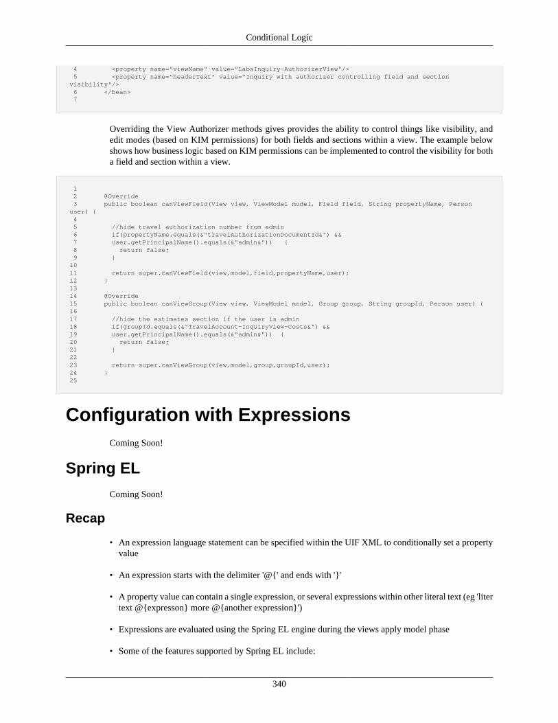
Conditional Logic
340
4 <property name="viewName" value="LabsInquiry-AuthorizerView"/> 5 <property name="headerText" value="Inquiry with authorizer controlling field and section visibility"/> 6 </bean> 7
Overriding the View Authorizer methods gives provides the ability to control things like visibility, andedit modes (based on KIM permissions) for both fields and sections within a view. The example belowshows how business logic based on KIM permissions can be implemented to control the visibility for botha field and section within a view.
1 2 @Override 3 public boolean canViewField(View view, ViewModel model, Field field, String propertyName, Person user) { 4 5 //hide travel authorization number from admin 6 if(propertyName.equals(&"travelAuthorizationDocumentId&") && 7 user.getPrincipalName().equals(&"admin&")) { 8 return false; 9 } 10 11 return super.canViewField(view,model,field,propertyName,user); 12 } 13 14 @Override 15 public boolean canViewGroup(View view, ViewModel model, Group group, String groupId, Person user) { 16 17 //hide the estimates section if the user is admin 18 if(groupId.equals(&"TravelAccount-InquiryView-Costs&") && 19 user.getPrincipalName().equals(&"admin&")) { 20 return false; 21 } 22 23 return super.canViewGroup(view,model,group,groupId,user); 24 } 25
Configuration with ExpressionsComing Soon!
Spring EL
Coming Soon!
Recap
• An expression language statement can be specified within the UIF XML to conditionally set a propertyvalue
• An expression starts with the delimiter '@{' and ends with '}'
• A property value can contain a single expression, or several expressions within other literal text (eg 'litertext @{expresson} more @{another expression}')
• Expressions are evaluated using the Spring EL engine during the views apply model phase
• Some of the features supported by Spring EL include:
Conditional Logic
341
• Literal expressions
• Boolean and relational operators
• Regular expressions
• Class expressions
• Accessing properties, arrays, lists, maps
• Method invocation
• Relational operators
• Assignment
• Calling constructors
• Bean references
• Array construction
• Inline lists
• Ternary operator
• Variables
• User defined functions
• Collection projection
• Collection selection
• Templated expressions
• By default, an expression term is evaluated against the model object. For example, if our expression is'@{field1}', the expression will evaluate the value of field1 on the model. Paths are formed in the usualmanner (dot for nested, brackets for lists and maps)
• Expression terms can also go against a variable. Variables are indicated using the '#' prefix (eg'@{#variable.property}'). The following variables are available within the UIF (note some of thevariables are only available in certain contexts)
• collectionGroup – For a property on a collection group, or any component within the group, thisvariable can be used to refer to the collection group component instance
• ConfigProperties – A map of the Rice configuration properties. The map key is the config propertyname and the map value is the config property value
• component – Refers to the component instance the property is configured on. Note when setting anested property, the component variable will point to the nested component, not the component beanthe property tag belongs to
• Constants – Constants from the KRADConstants class
• DocumentEntry – When on a document view refers to the data dictionary document entry
Conditional Logic
342
• index – When on a component within a collection group line, refers to the index of the line thecomponent is being rendered for
• isAddLine - When on a component within a collection group line, indicates if the line being renderedis the add line
• line - When on a component within a collection group line, refers to the data object for the collectionline the component is being rendered for
• parentLine - Refers to the parent collection line (parent to a sub collection) allowing access to the subcollection size with '@{#parentLine.subCollectionName.size()}' from within the sub collection
• readOnlyLine - When on a component within a collection group line, indicates if the line for whichthe component is being rendered for is read-only
• manager – Refers to the layout manager instance for the parent group (note if within a nested group,the manager instance will be that of the direct parent)
• node – For tree components refers to the current node the component is being rendered for
• nodePath – For tree components refers to the path for the node the component is being rendered for
• parent – Refers to the immediate parent component
• UifConstants – Constants from the UifConstants class
• view – Refers to the view instance the component belongs to
• ViewHelper – The view helper instance configured for the view (note this is a convenient way tocreate and call custom methods from EL)
Component ContextComing Soon!
Recap
• All components contain a property named context which is a Map type
• The context map holds various key/value pairs that build the context for a component
• The context map is then used for:
• Building EL variables
• Getting references to other components from a method (such as the finalize method)
• Common objects (such as those listed under EL variables) are inserted into the context map by theframework, however custom context entries can be added through XML or code
Built-In and Custom FunctionsThere are a variety of functions built-in to the framework that can be called from SpringEL. These caneven be expanded with your own custom functions.
Add content here!
Conditional Logic
343
Recap
Note
All UIF functions need to be prepended with #. For example, #isAssignableFrom.
• The UIF provides a number of functions that can be called from within an expression (seeExpressionFunctions class):
• boolean #isAssignableFrom(Class<?> assignableClass, Class<?> objectClass) – Used to checkwhether a class (such as a class configured for a property) is assignable to another class
• boolean #empty(Object value) – Used to check whether a given value is empty (null or empty string)(eg '@{!#empty(field1)}')
• boolean#emptyList(List<?> list) - if the empty is null or contains no items, returns true (eg '@{!#empty(list)}'
• boolean#listContains(List<?> list, Object[] values) - Check to see if the list contains the valuespassed in. The values can be string or numeric and should match the content type being stored in thelist. If the list is String and the values passed in are not string, toString() conversion will be used.Returns true if the values are in the list and both lists are non-empty, false otherwise. Example usage:"@{#listContains(checkboxesField2, {'2','3'})}" or "@{#listContains(checkboxesField2, 1)}".
• String #getName(Class<?> clazz) – Returns the name for a class
• String #getParam(String namespaceCode, String componentCode, String parameterName) –Retrieves the value for a system parameter as a String
• Boolean #getParamAsBoolean(String namespaceCode, String componentCode, StringparameterName) – Retrieves the value for a system parameter as a Boolean
• boolean #hasPerm(String namespaceCode, String permissionName) – Checks whether the currentuser has the given KIM permission
• boolean #hasPermDtls(String namespaceCode, String permissionName, Map<String, String>permissionDetails,Map<String, String> roleQualifiers) – Checks whether the current user has thegiven KIM permission matching the details and role qualifiers
• boolean #hasPermTmpl(String namespaceCode, String templateName, Map<String, String>permissionDetails,Map<String, String> roleQualifiers) – Checks whether the current user has a KIMpermission for the template name that matches the details and qualifiers
• Custom functions can be added to the ViewHelperService implementation and invoked by#ViewHelperService.functionName (for example "@{#ViewHelper.getLowestAmount(field1, field2,'true')}")
• In addition, for new global functions, the ExpressionEvaluatorService can be overridden to register newexpression functions
• Finally, recall that Spring allows us to call any method on an object we have a reference to
Custom VariablesComing Soon!
Conditional Logic
344
Component ModifiersComing Soon!
Recap• Component modifiers allows us to perform a modification on a component (and its nested components)
through code
• Component modifiers are created by implementing the interfaceorg.kuali.rice.krad.uif.modifier.ComponentModifier which requires implementing themethodperformModification(View view, Object model, Component component)
• One or more component modifiers may be associated with a component with thecomponentModifiers List property
• Component modifiers can be conditionally applied by setting the runCondition property
• On the comparable objects themselves, compareToForValueChange is used to indicate thebinding object path for determining whether the component modifier should be applied, andcompareToForFieldRender is used to indicate that the component should contain the additionalcontext variable renderOnComparableModifier which can be used to determine whether acomponent is rendered based on the condition specified by the comparable.
• Some examples of component modifiers in the UIF include the LabelSeparator (pull the label componentfor a field into a separate group item) and the MaintenanceCompareModifier (creates a field for the'old' data object).
Property ReplacersComing Soon!
Recap• Property replacers can be used to configur a replacement for a component property based on a condition
• A component can contain one or more property replacers configured with the propertyReplacers Listproperty
• A property replacer is created using a bean with parent 'Uif-ConditionalBeanPropertyReplacer'
• The following properties are supported by a property replacer:
• propertyName – Name of the property on the component the property replacer is configured on (notecan be nested) that should be replaced
• condition – The condition (EL expression) to evaluate for the replacement. If the condtion is true, theproperty value will be replaced, otherwise it will not be
• replacement – The object the property should be replaced with when the condition is true. In mostcases this is a component, but can be a primitive type, a collection (possibly of components), oranother type
Conditional Logic
345
• Using property replacers, we can do such things as replacing a control based on a condition, replacingthe entire group items list, replacing a layout manager, and so on
Collection FiltersComing Soon!
Recap• The lines displayed for a collection group can be filtered by using a
org.kuali.rice.krad.uif.container.CollectionFilter object
• To create a collection filter, we must implement the interface method: List<Integer> filter(View view,Object model, CollectionGroup collectionGroup)
• One or more collection filters can be applied to a collection group using the List property filters
• The UIF provides a filter implementation that allows filtering of the collection using an expression
• To use this filter we create a bean with parent 'Uif-ConditionalCollectionFilter'. Then we set the propertyexpression to the filtering expression. Lines will only be displayed if the expression evaluates to truefor that line
• Another example of a collection filter within the UIF is the ActiveCollectionFilter. This filter is addedautomatically to a collection group when the collection object class implements the Inactivatableinterface (a button is also rendered allowing the user to toggle the filter)
Code SupportComing Soon!
Overriding with the ViewHelperServiceComing Soon!
Recap
• Through a custom view helper service, we can implement custom logic for configuring components
• During the view processing, the default view helper service provides the following methods for customlogic:
• performCustomInitialization
• performCustomApplyModel
• performCustomFinalize
• We can implement one of these methods with code that conditionally sets component properties
• Specific component instances can be acquired by the component id
• We then hook up our view helper service with a view using the viewHelperServiceClassproperty
Conditional Logic
346
Component FinalizationComing Soon!
Recap
• The UIF provides a more convenient way of configuring components with code called ComponentFinalization
• First we create a method that returns void and accepts the following arguments:
• component – the component which we want to modify
• model – the model object (contains the data and the view)
• Next we set the finalizeMethodToCall property (available on all components) to the name ofthe created method
• With just the finalize method set, the framework assumes the method is available on the configuredview helper service
• We can implement our method in another class (such as a static class or a service)
• To invoke a class besides the view helper, we must configure the finalizeMethodInvokerproperty
• Our finalize method can take additional arguments if needed. We pass these arguments using thefinalizeMethodAdditionalArguments property
Group InitializationComing Soon!
The Component FactoryComing Soon!
Recap
• In code, we are not limited to just setting values on existing components, but can create new componentsas well
• For example, we can completely create the content for a group through code
• Generally when creating components in code, we want to reuse the setup defaults (template, styleclasses, …)
• Therefore instead of creating a new component instance ourselves, we can get a new component instancefrom the Spring container
• To help with this, the ComponentFactory class is provided
• The component factory contains methods to get new instances of the KRAD provided components, forexample:
Conditional Logic
347
• getInputField()
• getTextControl()
• In addition, some overloaded methods exist for convenient property setting:
• getInputField(String propertyName, String label)
• getInputField(String propertyName, String label, UifConstants.ControlType controlType)
• The return components are initialized according to their corresponding beans
• Once a new component instance is returned, properties can be changed as needed
Copying ComponentsComing Soon!
Recap
• In certain situations, we might wish to create a new component by copying an existing component
• By copying a component, we inherit the state from the component that was copied
• The framework makes extensive use of component copying through its prototype functionality (whendynamically generating components in code)
• KRAD provides the utility class ComponentUtils which contains methods for copying components
• These include:
• <T extends Component> T copy(T component) – copy component
• <T extends Component> T copy(T component, String idSuffix) – copy component and add suffix tothe id of the created component
• <T extends Component> T copyComponent(T component, String addBindingPrefix, String idSuffix)– copy component, adjust id, and adjust binding for components that are DataBinding
• <T extends Component> List<T> copyComponentList(List<T> components, String idSuffix) – copyall components into a new list of components and adjust ids
348
Chapter 12. Client Side FeaturesProgressive Disclosure
RECAP• Progressive disclosure reduces clutter on the page by presenting content only when needed
• Instead of displaying or sending all the content a user might need to complete a task, we display/sendcontent as the user needs them
• The content that is not displayed initially is associated with a condition, when the condition becomestrue the content will be displayed
• In KRAD we can configure a component to be progressive disclosed by setting theprogressiveRender property
• The value for the progressive render property is an el statement. However only a subset of the EL issupported since the expression will be translated to script that evaluates on the client. Therefore forthe most part the expressions are restricted to evaluation of model properties with a subset of the ELoperators
• First evaluation is done on the initial request to determine if the content should be displayed. In order tobe initially displayed both the render property (which can be an expression) and the progressiveRenderproperty must evaluate to true
• On the client, fields that participate in the progressRender condition receive events that will trigger thecondition evaluation
• If the evaluation succeeds and the content is hidden, it will be shown. Contrary if the evaluation fallsand the content is show, it will be hidden
• The progressive render feature supports the following options for how the content is retrieved:
• default (no other flags set) – content will be sent to the client and rendered, then hidden if the contentshould not be visible
• progressiveRenderViaAJAX set to true – if this property of Component is set to true and thecomponent's progressive render condition is not initially true, the content will not be sent to the client.When the condition becomes true on the client, a request with AJAX will be made to retrieve thecontent. Once the content is retrieve the first time it remains in the client for subsequence show/hideoperations
• progressiveRenderAndRefresh set to true – if this property of Component is set to true each time ashow or hide operation is performed a request to the server will be made to retrieve the content. Sincethe model data is also sent with the request, the content can also change between operations
Component Refresh
RECAP• The state of a component can change as the model changes
Client Side Features
349
• To be a highly responsive application, we want the updated component to be presented when thecorresponding data condition is met
• Traditionally, updates would only be presented after a server request such as a form action
• With script, we can trigger the condition immediately and update the contents, which is known asComponent Refresh
• Component refresh is similar to progressive disclosure in that a certain condition will trigger an updatefor the component's contents
• All KRAD components support the component refresh process
• To enable component refresh, we set the component property conditionalRefresh
• The conditional refresh property holds an expression that is translated to client side script
• Whenever the refresh condition toggles between the true and false result, a call to the server will bemade to retrieve updated contents
• Only the contents for the component are refreshed from the process, however the entire form data issent to the server with the request
• Using component refresh, we can do things such as the following:
• Change the disabled or read-only state of a component
• Change the options for a control
• In many cases, we want to refresh content when the value for a field changes
• For this cases, KRAD provides an easier configuration with therefreshWhenChangedPropertyNames property
• This property is configured on the component that should be refreshed. The value is one or more propertynames that trigger the refresh (when their value changes)
Disable on User ActionClient-side disable on user action refers to the ability to disable controls and/or buttons based on useractions or input. Client-side disable follows the same rules and limitations that progressive disclosure andrefresh conditions do (they operate on a limited set of SpringEl expressions because they must be translatedto the client – almost any Boolean expression which does not reference a function is allowed).
When a user interacts with a related control, the expression will be evaluated and if true, the correspondingcontrol will be disabled.
Important note: inputs which are disabled do not send their values to the server when a form issubmitted.
Disabled works with any Control (technically any control which extends ControlBase). It also workswith any Action or ActionLink. The following properties are available for disable functionality:
• disabled (Boolean expression) – can be any valid springEl boolean expression (or just true or false)– no custom SpringEL functions allowed
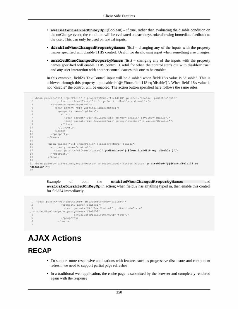
Client Side Features
350
• evaluateDisabledOnKeyUp (Boolean) – if true, rather than evaluating the disable condition onthe onChange event, the condition will be evaluated on each keystroke allowing immediate feedback tothe user. This can only be used on textual inputs.
• disabledWhenChangedPropertyNames (list) – changing any of the inputs with the propertynames specified will disable THIS control. Useful for disallowing input when something else changes.
• enabledWhenChangedPropertyNames (list) – changing any of the inputs with the propertynames specified will enable THIS control. Useful for when the control starts out with disable="true"and any user interaction with another control causes this one to be enabled.
In this example, field2's TextControl input will be disabled when field118's value is "disable". This isachieved through this property - p:disabled="@{#form.field118 eq 'disable'}". When field118's value isnot "disable" the control will be enabled. The action button specified here follows the same rules.
1 <bean parent="Uif-InputField" p:propertyName="field118" p:label="Choose" p:width="auto" 2 p:instructionalText="Click option to disable and enable"> 3 <property name="control"> 4 <bean parent="Uif-VerticalRadioControl"> 5 <property name="options"> 6 <list> 7 <bean parent="Uif-KeyLabelPair" p:key="enable" p:value="Enable"/> 8 <bean parent="Uif-KeyLabelPair" p:key="disable" p:value="Disable"/> 9 </list> 10 </property> 11 </bean> 12 </property> 13 </bean> 14 15 <bean parent="Uif-InputField" p:propertyName="field2"> 16 <property name="control"> 17 <bean parent="Uif-TextControl" p:disabled="@{#form.field118 eq 'disable'}"/> 18 </property> 19 </bean> 20 ... 21 <bean parent="Uif-PrimaryActionButton" p:actionLabel="Action Button" p:disabled="@{#form.field118 eq 'disable'}"/> 22
Example of both the enabledWhenChangedPropertyNames andevaluateDisabledOnKeyUp in action; when field52 has anything typed in, then enable this controlfor field54 immediately.
1 <bean parent="Uif-InputField" p:propertyName="field54"> 2 <property name="control"> 3 <bean parent="Uif-TextControl" p:disabled="true" p:enabledWhenChangedPropertyNames="field52" 4 p:evaluateDisabledOnKeyUp="true"/> 5 </property> 6 </bean> 7
AJAX Actions
RECAP• To support more responsive applications with features such as progressive disclosure and component
refresh, we need to support partial page refreshes
• In a traditional web application, the entire page is submitted by the browser and completely renderedagain with the response
Client Side Features
351
• Today with Ajax, we can make server requests ourselves, receive the response, and update pieces ofthe page as needed
• Within the framework partial updates are handled by the framework to support various features
• By default, actions configured for a view will result in the entire view being rendered
• For configuring partial refreshes, the Uif-PrimaryActionButton is provided
• Ajax action fields have all the same properties as action components, but have two additional properties:
• refreshId – id for the component that should be refresh when the action completes
• refreshPropertyName – property name for the data (or input) field that should be refresh when theaction completes
• Using these properties, we can refresh any group (including the page, section, sub- section, or othergroup), field, or widget
• Using these properties, we can refresh any group (including the page, section, sub- section, or othergroup), field, or widget
• By default when using ajax action field the page is refreshed
LightboxThe recommended way to use lightboxes is through the Uif-Link or the Uif-Dialog beans. For cases wherethis isn't possible, the following JavaScript functions can be used to open lightboxes.
showLightboxUrl(url) The content for the lightbox is loaded from the specified url.
showLightboxComponent(componentId)The content for the lightbox is a Uif component (e.g. a section) andis specified via the component id.
showLightboxContent(content) The content of the lightbox is passed as the parameter which couldbe either plain or html formatted text.
Each of the three functions can accept a second overrideOptions parameter which allows foradditional lightbox styling. This parameter is optional and should only be used if it is unavoidable, since itis specific to the underlying implementation, which could change. If possible use the "uif-lightbox" CSSclass for styling.
Working in the Client with jQuery
Data AttributesHTML 5 data attributes are a way of adding custom attributes to tags. Data attributes are prefixed witha 'data-' prefix e.g. 'data-role'. JQuery makes data attributes available on the jQuery data object for usein scripting manipulations. Internally, KRAD uses the jQuery data object and data attributes heavily invalidation, amongst other uses. This can be seen in krad.validate.js.
Data attributes are available on all form elements, except the radio button. Page elements like image,iframe, and links also support data attributes. There are two ways to add data attributes to a control orelement. Both these ways involve setting properties in the defining XML configuration files.
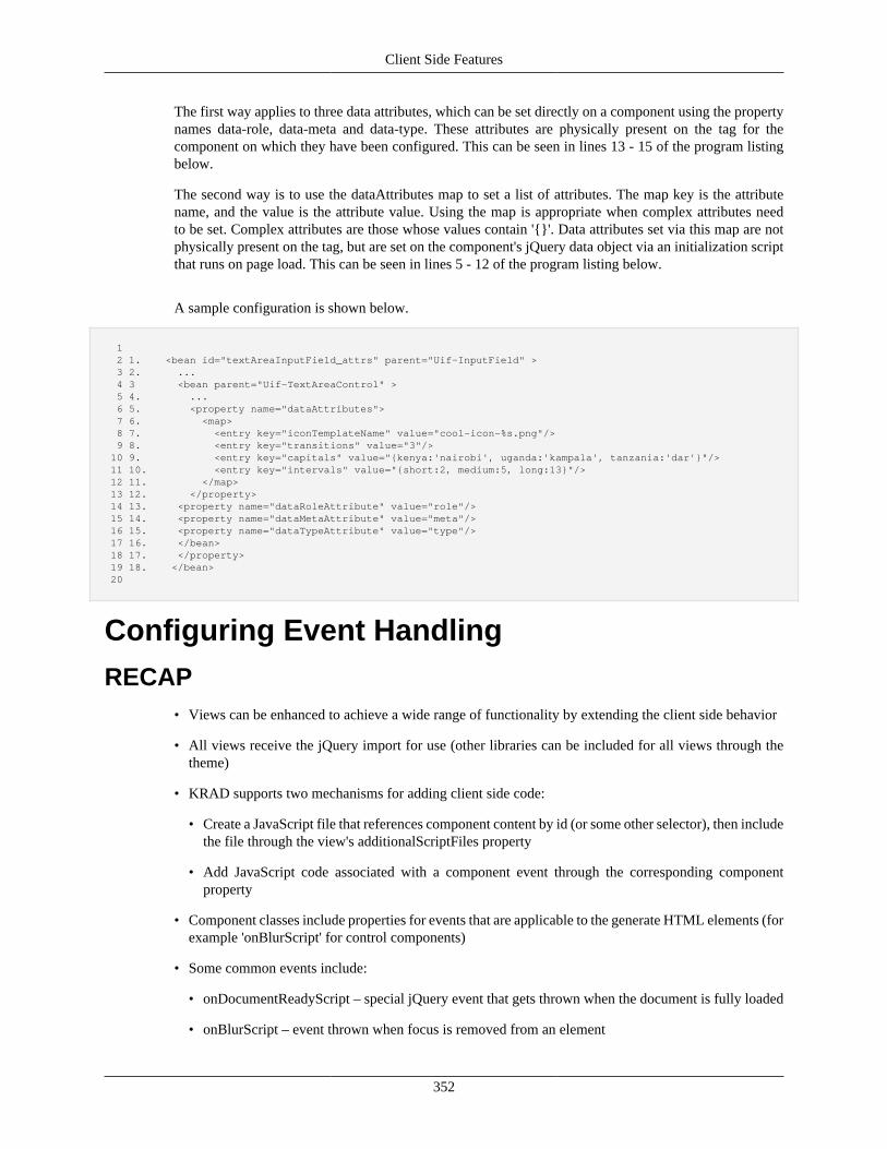
Client Side Features
352
The first way applies to three data attributes, which can be set directly on a component using the propertynames data-role, data-meta and data-type. These attributes are physically present on the tag for thecomponent on which they have been configured. This can be seen in lines 13 - 15 of the program listingbelow.
The second way is to use the dataAttributes map to set a list of attributes. The map key is the attributename, and the value is the attribute value. Using the map is appropriate when complex attributes needto be set. Complex attributes are those whose values contain '{}'. Data attributes set via this map are notphysically present on the tag, but are set on the component's jQuery data object via an initialization scriptthat runs on page load. This can be seen in lines 5 - 12 of the program listing below.
A sample configuration is shown below.
1 2 1. <bean id="textAreaInputField_attrs" parent="Uif-InputField" > 3 2. ... 4 3 <bean parent="Uif-TextAreaControl" > 5 4. ... 6 5. <property name="dataAttributes"> 7 6. <map> 8 7. <entry key="iconTemplateName" value="cool-icon-%s.png"/> 9 8. <entry key="transitions" value="3"/> 10 9. <entry key="capitals" value="{kenya:'nairobi', uganda:'kampala', tanzania:'dar'}"/> 11 10. <entry key="intervals" value="{short:2, medium:5, long:13}"/> 12 11. </map> 13 12. </property> 14 13. <property name="dataRoleAttribute" value="role"/> 15 14. <property name="dataMetaAttribute" value="meta"/> 16 15. <property name="dataTypeAttribute" value="type"/> 17 16. </bean> 18 17. </property> 19 18. </bean> 20
Configuring Event Handling
RECAP• Views can be enhanced to achieve a wide range of functionality by extending the client side behavior
• All views receive the jQuery import for use (other libraries can be included for all views through thetheme)
• KRAD supports two mechanisms for adding client side code:
• Create a JavaScript file that references component content by id (or some other selector), then includethe file through the view's additionalScriptFiles property
• Add JavaScript code associated with a component event through the corresponding componentproperty
• Component classes include properties for events that are applicable to the generate HTML elements (forexample 'onBlurScript' for control components)
• Some common events include:
• onDocumentReadyScript – special jQuery event that gets thrown when the document is fully loaded
• onBlurScript – event thrown when focus is removed from an element
Client Side Features
353
• onChangeScript – event thrown when the value for a control changes
• onClickScript – event thrown when an element is clicked
• onFocusScript – event thrown when an element receives focus
• For the event property value, a script can be included inline, or externalized to a JavaScript file andthen invoked as a function
• The jQuery object can be referenced by the full name of 'jQuery', or the abbreviated 'jq' name
Validation
Client Side ValidationClient-side validation refers to validation that happens without interaction with the server, immediatelyduring user interaction with input fields. Client-side validation uses the constraints defined on InputFieldsand AttributeDefinitions to determine if a field is valid. These constraints are converted in the java codeto methods and rules used by the jquery.validate.js plugin.
When the user has interacted with a field and moved on to the next field, client-side validation is invokedon that field and any validation errors are shown on the screen. When the user goes back to a field to correctit, validation occurs with any change so the user gets immediate feedback on whether they fixed their error.
The validation messages shown are determined by the messageKey on the constraint for that field.
By default, client-side validation is on. Client-side validation can be turned off/on on each individualconstraint, but also at the FormView level through the validateClientSide flag.
Server Side ValidationKRAD enabled server-side validation must be performed manually through methods on your customcontroller. To call server validation manually, use the validateView method on the ViewValidationService.This method will validate on any constraints set on the InputFields/AttributeDefinitions for your view. Ifthere are any errors, this method will add them to the MessageMap. The validation mechanism used isfunctionally equivalent to client-side validation.
1 KRADServiceLocatorWeb.getViewValidationService().validateView(form);
Validation MessagesValidation messages is the term used for error, warning, or information messages that are displayedon the screen. Validation messages can be displayed for both server-side and client-side messages. TheValidationMessages ContentElement allows configuration of how and when these messages are displayed.This object can be configured at the Page, Group/Section, and Field level, and each level is configuredwith some default recommended settings, but these can be overridden.
Server-side messages are shown for any messages that are added to the MessageMap from one of yourcontroller method calls (as described in 6.13 ValidationMessages content element).
Each message type will have different icons (and background patterns) associated with the messages whendisplayed. By default these icons are:

Client Side Features
354
• Error
• Warning
• Info
When validation messages are received from the server they are always displayed in a summary at the topof the page and at the sections for which they apply.
At the page level, if sections exist, the summary will include the total number of messages on the screenand links to each section which contains the fields/sections that have validation messages. Messages whichapply to the entire page are also displayed at this level. If the page has no sections, the page level summarywill include links directly to the fields which have messages.
At the section level, the messages will be links to the fields which they apply - these links will causethe browser to move focus to that field. Any message beyond the first for a field, will be displayed as asummary; the full message content will be available during field interaction. If the section contains its ownsubsections which have messages, there will be links to those subsections.
At the field level, all applicable messages will be displayed in a tooltip when the field's control has focusor when the field's control is being hovered over.
When first interacting with a page that has no message summaries, messages will only appear at the fieldlevel during client-side validation. If a summary already exists on the page, these new messages will appearin the summaries as client-side validation occurs.
When a client-side validation error occurs, the user will see an error icon and appropriate error highlightingon the control which has an error. When the user returns to this field, they will see the error message in atooltip, and when the user attempts to fix a field that has a client-side error, feedback to the user will beimmediate: when the error is fixed the tooltip, icon, and error highlighting will disappear.
It is important to note that only client-side errors can be resolved in this fashion. Server-side errors do notproduce immediate feedback because they require a server round-trip to determine if they are corrected,therefore, when a user interacts with a field which had a server-side error in attempt to fix it, the fieldwill instead be marked with an icon and highlighting that indicates that the field has been modified withan attempted fix.
When both server and client messages are present on the screen, they are all included in the summariesand tooltips, and when a client-side error is corrected, only that message text is removed.
Some of these default interactions can be changed through settings on the ValidationMessages elementas described in section 6.13.
Ajax ImprovementsAjax is a group of web development client side technologies which are used to create asynchronous webapplications. Web applications can send and retrieve data asynchronously without affecting the displayof the current page.
The ajax calls have been cleaned up. ajaxSubmitForm(), standard submitForm() and methods to dovalidation before hand have been added. writeHiddenToForm(), which was earlier used to write the dataas hidden params on the form, has been replaced by data-attributes.
• actionInvokeHandler() - The actionInvokeHandler method checks based on the data-attributes whetherit is an ajax submit, or a non ajax one, and then calls one of the submit methods.
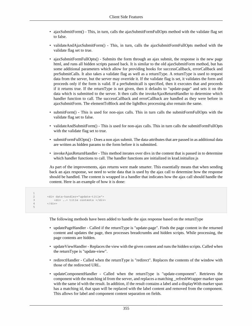
Client Side Features
355
• ajaxSubmitForm() - This, in turn, calls the ajaxSubmitFormFullOpts method with the validate flag setto false.
• validateAndAjaxSubmitForm() - This, in turn, calls the ajaxSubmitFormFullOpts method with thevalidate flag set to true.
• ajaxSubmitFormFullOpts() - Submits the form through an ajax submit, the response is the new pagehtml, and runs all hidden scripts passed back. It is similar to the old ajaxSubmitForm method, but hassome additional parameters which allow for providing hooks for successCallback, errorCallback andpreSubmitCalls. It also takes a validate flag as well as a returnType. A returnType is used to requestdata from the server, but the server may override it. If the validate flag is set, it validates the form andproceeds only if the form is valid. If a preSubmitcall is specified, then it executes that and proceedsif it returns true. If the returnType is not given, then it defaults to "update-page" and sets it on thedata which is submitted to the server. It then calls the invokeAjaxReturnHandler to determine whichhandler function to call. The successCallback and errorCallback are handled as they were before inajaxSubmitForm. The elementToBlock and the lightBox processing also remain the same.
• submitForm() - This is used for non-ajax calls. This in turn calls the submitFormFullOpts with thevalidate flag set to false.
• validateAndSubmitForm() - This is used for non-ajax calls. This in turn calls the submitFormFullOptswith the validate flag set to true.
• submitFormFullOpts() - Does a non ajax submit. The data-attributes that are passed in as additional dataare written as hidden params to the form before it is submitted.
• invokeAjaxReturnHandler - This method iterates over divs in the content that is passed in to determinewhich handler functions to call. The handler functions are initialized in krad.initialize.js
As part of the improvements, ajax returns were made smarter. This essentially means that when sendingback an ajax response, we need to write data that is used by the ajax call to determine how the responseshould be handled. The content is wrapped in a handler that indicates how the ajax call should handle thecontent. Here is an example of how it is done:
1 2 <div data-handler="update-title"> 3 <div ..> title contents </div> 4 </div> 5
The following methods have been added to handle the ajax response based on the returnType
• updatePageHandler - Called if the returnType is "update-page". Finds the page content in the returnedcontent and updates the page, then processes breadcrumbs and hidden scripts. While processing, thepage contents are hidden.
• updateViewHandler - Replaces the view with the given content and runs the hidden scripts. Called whenthe returnType is "update-view".
• redirectHandler - Called when the returnType is "redirect". Replaces the contents of the window withthose of the redirected URL.
• updateComponentHandler - Called when the returnType is "update-component". Retrieves thecomponent with the matching id from the server, and replaces a matching _refreshWrapper marker spanwith the same id with the result. In addition, if the result contains a label and a displayWith marker spanhas a matching id, that span will be replaced with the label content and removed from the component.This allows for label and component content separation on fields.
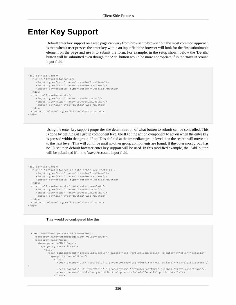
Client Side Features
356
Enter Key SupportDefault enter key support on a web page can vary from browser to browser but the most common approachis that when a user presses the enter key within an input field the browser will look for the first submittableelement on the page and use it to submit the form. For example, in the setup shown below the 'Details'button will be submitted even though the 'Add' button would be more appropriate if in the 'travelAccount'input field.
<div id="Uif-Page"> <div id="TravelInfoSection> <input type="text" name="travelerFirstName"/> <input type="text" name="travelerLastName"/> <button id="details" type="button">Details</button> </div> <div id="TravelAccounts"> <input type="text" name="travelAccount"/> <input type="text" name="travelSubAccount"/> <button id="add" type="button">Add</button> </div> <button id="save" type="button">Save</button></div>
Using the enter key support properties the determination of what button to submit can be controlled. Thisis done by defining at a group component level the ID of the action component to act on when the enter keyis pressed within that group. If no ID is defined at the immediate group level then the search will move outto the next level. This will continue until no other group components are found. If the outer most group hasno ID set then default browser enter key support will be used. In this modified example, the 'Add' buttonwill be submitted if in the 'travelAccount' input field.
<div id="Uif-Page"> <div id="TravelInfoSection data-enter_key="details"> <input type="text" name="travelerFirstName"/> <input type="text" name="travelerLastName"/> <button id="details" type="button">Details</button> </div> <div id="TravelAccounts" data-enter_key="add"> <input type="text" name="travelAccount"/> <input type="text" name="travelSubAccount"/> <button id="add" type="button">Add</button> </div> <button id="save" type="button">Save</button></div>
This would be configured like this:
<bean id="View" parent="Uif-FormView"> <property name="singlePageView" value="true"/> <property name="page"> <bean parent="Uif-Page"> <property name="items"> <list> <bean p:headerText="TravelInfoSection" parent="Uif-VerticalBoxSection" p:enterKeyAction="details"> <property name="items"> <list> <bean parent="Uif-InputField" p:propertyName="travelerFirstName" p:label="travelerFirstName"/> <bean parent="Uif-InputField" p:propertyName="travelerLastName" p:label="travelerLastName"/> <bean parent="Uif-PrimaryActionButton" p:actionLabel="Details" p:id="details"/> </list>
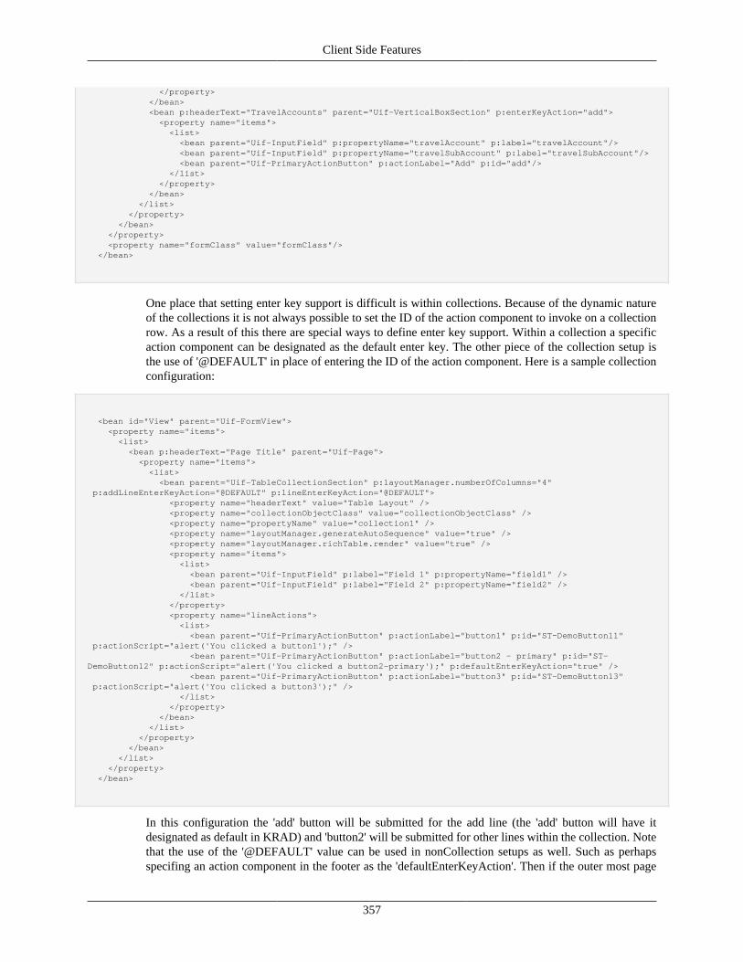
Client Side Features
357
</property> </bean> <bean p:headerText="TravelAccounts" parent="Uif-VerticalBoxSection" p:enterKeyAction="add"> <property name="items"> <list> <bean parent="Uif-InputField" p:propertyName="travelAccount" p:label="travelAccount"/> <bean parent="Uif-InputField" p:propertyName="travelSubAccount" p:label="travelSubAccount"/> <bean parent="Uif-PrimaryActionButton" p:actionLabel="Add" p:id="add"/> </list> </property> </bean> </list> </property> </bean> </property> <property name="formClass" value="formClass"/> </bean>
One place that setting enter key support is difficult is within collections. Because of the dynamic natureof the collections it is not always possible to set the ID of the action component to invoke on a collectionrow. As a result of this there are special ways to define enter key support. Within a collection a specificaction component can be designated as the default enter key. The other piece of the collection setup isthe use of '@DEFAULT' in place of entering the ID of the action component. Here is a sample collectionconfiguration:
<bean id="View" parent="Uif-FormView"> <property name="items"> <list> <bean p:headerText="Page Title" parent="Uif-Page"> <property name="items"> <list> <bean parent="Uif-TableCollectionSection" p:layoutManager.numberOfColumns="4" p:addLineEnterKeyAction="@DEFAULT" p:lineEnterKeyAction="@DEFAULT"> <property name="headerText" value="Table Layout" /> <property name="collectionObjectClass" value="collectionObjectClass" /> <property name="propertyName" value="collection1" /> <property name="layoutManager.generateAutoSequence" value="true" /> <property name="layoutManager.richTable.render" value="true" /> <property name="items"> <list> <bean parent="Uif-InputField" p:label="Field 1" p:propertyName="field1" /> <bean parent="Uif-InputField" p:label="Field 2" p:propertyName="field2" /> </list> </property> <property name="lineActions"> <list> <bean parent="Uif-PrimaryActionButton" p:actionLabel="button1" p:id="ST-DemoButton11" p:actionScript="alert('You clicked a button1');" /> <bean parent="Uif-PrimaryActionButton" p:actionLabel="button2 - primary" p:id="ST-DemoButton12" p:actionScript="alert('You clicked a button2-primary');" p:defaultEnterKeyAction="true" /> <bean parent="Uif-PrimaryActionButton" p:actionLabel="button3" p:id="ST-DemoButton13" p:actionScript="alert('You clicked a button3');" /> </list> </property> </bean> </list> </property> </bean> </list> </property> </bean>
In this configuration the 'add' button will be submitted for the add line (the 'add' button will have itdesignated as default in KRAD) and 'button2' will be submitted for other lines within the collection. Notethat the use of the '@DEFAULT' value can be used in nonCollection setups as well. Such as perhapsspecifing an action component in the footer as the 'defaultEnterKeyAction'. Then if the outer most page
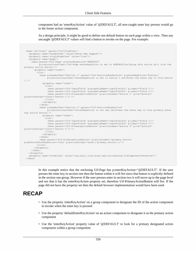
Client Side Features
358
component had an 'enterKeyAction' value of '@DEFAULT', all non-caught enter key presses would goto the footer action component.
As a design principle, it might be good to define one default button on each page within a view. Then anyuncaught '@DEFAULT' values will find a button to invoke on the page. For example:
<bean id="View1" parent="Uif-FormView"> <property name="headerText" value="Enter Key Support"/> <property name="singlePageView" value="true"/> <property name="page"> <bean parent="Uif-Page" p:enterKeyAction="@DEFAULT" p:instructionalText="Uif-Page enterKeyAction is set to @DEFAULT[br]Using this action will fire the primary action button."> <property name="items"> <list> <bean p:headerText="Section 1" parent="Uif-VerticalBoxSection" p:enterKeyAction="button1" p:instructionalText="enterKeyAction is set to button 1.[br]Press the enter key to fire button 1."> <property name="items"> <list> <bean parent="Uif-InputField" p:propertyName="inputField12" p:label="Field 1"/> <bean parent="Uif-InputField" p:propertyName="inputField13" p:label="Field 2"/> <bean parent="Uif-PrimaryActionButton" p:actionLabel="button 1" p:id="button1" p:actionScript="alert('button 1');"/> </list> </property> </bean> <bean p:headerText="Section 2" parent="Uif-VerticalBoxSection" p:instructionalText="enterKeyAction is not set.[br]Press the enter key to fire primary enter key action button."> <property name="items"> <list> <bean parent="Uif-InputField" p:propertyName="inputField14" p:label="Field 1"/> <bean parent="Uif-InputField" p:propertyName="inputField15" p:label="Field 2"/> <bean parent="Uif-PrimaryActionButton" p:actionLabel="button 2" p:id="button2" p:actionScript="alert('button 2');"/> </list> </property> </bean> <bean parent="Uif-PrimaryActionButton" p:actionLabel="primary button" p:defaultEnterKeyAction="true" p:actionScript="alert('primary button');"/> </list> </property> </bean> </property> <property name="formClass" value="org.kuali.rice.krad.labs.kitchensink.UifComponentsTestForm"/> </bean>
In this example notice that the enclosing Uif-Page has p:enterKeyAction="@DEFAULT". If the userpresses the enter key in section one then the button within it will fire since that button is explicitly definedin the section one group. However if the user presses enter in section two it will move up to the page leveland see that it has the enterKeyAction property set, therefore Uif-PrimaryActionButton will fire. If thepage did not have the property set then the default browser implementation would have been used.
RECAP• Use the property 'enterKeyAction' on a group component to designate the ID of the action component
to invoke when the enter key is pressed
• Use the property 'defaultEnterKeyAction' on an action component to designate it as the primary actioncomponent
• Use the 'enterKeyAction' property value of '@DEFAULT' to look for a primary designated actioncomponent within a group component

Client Side Features
359
Utilities
360
Chapter 13. ControllersIntroduction to Spring MVC
Coming Soon!
ControllersComing Soon!
Controller AnnotationsComing Soon!
InterceptorsComing Soon!
Spring Views and the Common UIF ViewComing Soon!
Spring TagsComing Soon!
Binding and ValidationComing Soon!
Property EditorsComing Soon!
Security and MaskingComing Soon!
Bean Wrapper and ObjectPropertyUtilsComing Soon!
Form BeansComing Soon!
Controllers
361
UifControllerBase and UifFormBaseComing Soon!
Connecting the Controller with the ViewComing Soon!
DialogsThe KRAD framework provides the ability to build modal dialogs into a web application. Modal dialogscan improve the usability and flow of a web page. Dialogs allow the server-side controller to gatheradditional information from the user after the form is submitted, without having to change page.
A common and simple example of a dialog is to confirm with the user before performing a potentiallydangerous action. For Example, "Are you sure you want to delete?". In this simple example, the questionis displayed in a lightbox. The user must select a response, which closes the lightbox, before they caninteract again with the underlying page contents.
KRAD dialogs support even more complex interactions with the user, with multiple componentsand controls, conditional logic, and rich styling. With KRAD, you can create re-usable dialog groupcomponents that enables rich styling (from CSS stylesheets) and user interaction, to pose questions andcollect user responses. The dialogs support images, tables, declarative logic, checkboxes, radio buttons,dropdowns, and input fields (for example, for a user to provide a text description, with details for theirresponse choice), or keyboard navigation. Dialogs also have the ability to progressively disclose questionsand other UI choices depending on other selections made in the lightbox, to dynamically add to the contentand re-size (up to a max, scrolling supported thereafter). Dialogs may be configured to pass the datacollected in the form where it is available to the controller code.
Multiple dialogs may be used on a single view. They can be stacked on each other or invoked separatelydepending on controller programmatic logic.
KRAD also provides a canned set of pre-defined dialog groups. These pre-defined dialogs have convenientproperties for easy customization. They may also be extended, just like any group, by adding componentsto the "items" property of the dialogGroup.
Using Dialogs in a ViewTo use a dialog in a view requires the following three setup steps:
1. Define the dialog group (or use a pre-defined dialog group) in the view definition file.
2. Declare the dialog group in the dialogList View property (also in the view definition).
3. Invoke the dialog from the view controller.
First, let's take a look at a very simple example. This is one of the pre-defined KRAD dialogs.
Figure 13.1. Header Text Example
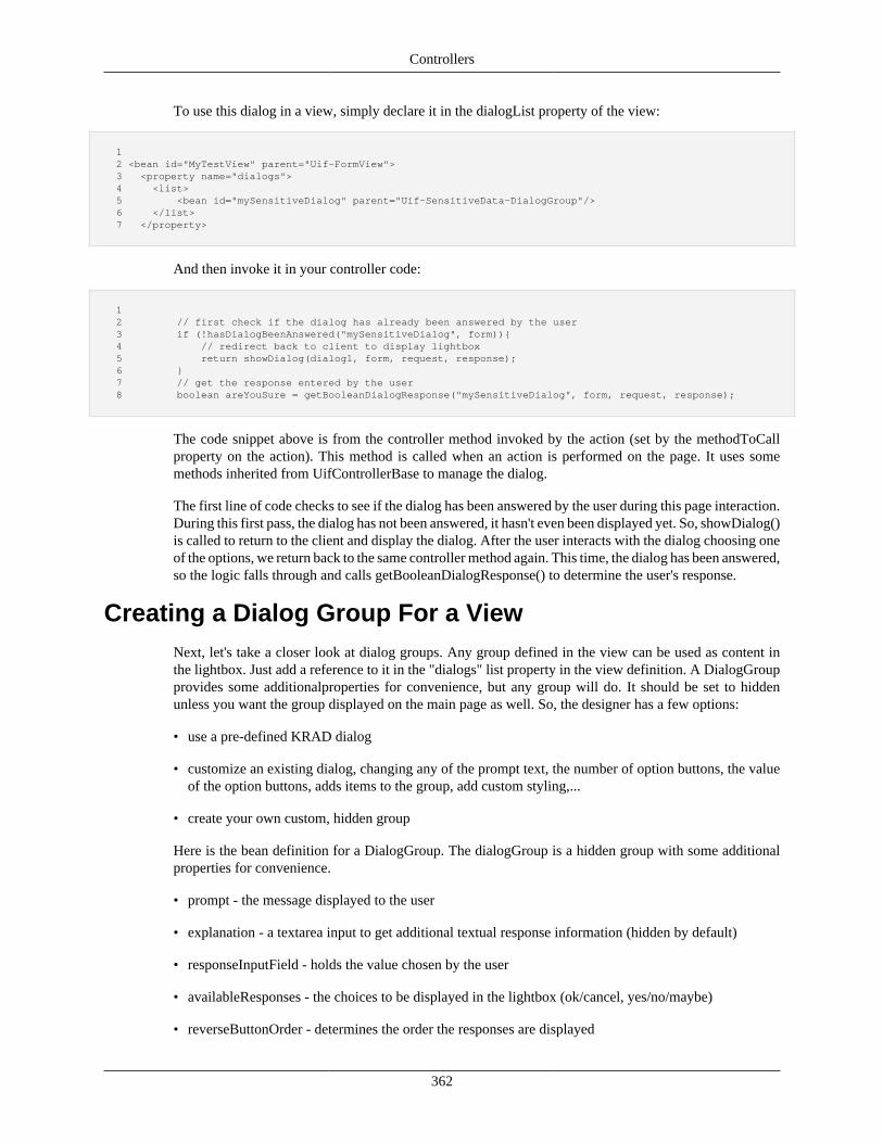
Controllers
362
To use this dialog in a view, simply declare it in the dialogList property of the view:
1 2 <bean id="MyTestView" parent="Uif-FormView"> 3 <property name="dialogs"> 4 <list> 5 <bean id="mySensitiveDialog" parent="Uif-SensitiveData-DialogGroup"/> 6 </list> 7 </property>
And then invoke it in your controller code:
1 2 // first check if the dialog has already been answered by the user 3 if (!hasDialogBeenAnswered("mySensitiveDialog", form)){ 4 // redirect back to client to display lightbox 5 return showDialog(dialog1, form, request, response); 6 } 7 // get the response entered by the user 8 boolean areYouSure = getBooleanDialogResponse("mySensitiveDialog", form, request, response);
The code snippet above is from the controller method invoked by the action (set by the methodToCallproperty on the action). This method is called when an action is performed on the page. It uses somemethods inherited from UifControllerBase to manage the dialog.
The first line of code checks to see if the dialog has been answered by the user during this page interaction.During this first pass, the dialog has not been answered, it hasn't even been displayed yet. So, showDialog()is called to return to the client and display the dialog. After the user interacts with the dialog choosing oneof the options, we return back to the same controller method again. This time, the dialog has been answered,so the logic falls through and calls getBooleanDialogResponse() to determine the user's response.
Creating a Dialog Group For a ViewNext, let's take a closer look at dialog groups. Any group defined in the view can be used as content inthe lightbox. Just add a reference to it in the "dialogs" list property in the view definition. A DialogGroupprovides some additionalproperties for convenience, but any group will do. It should be set to hiddenunless you want the group displayed on the main page as well. So, the designer has a few options:
• use a pre-defined KRAD dialog
• customize an existing dialog, changing any of the prompt text, the number of option buttons, the valueof the option buttons, adds items to the group, add custom styling,...
• create your own custom, hidden group
Here is the bean definition for a DialogGroup. The dialogGroup is a hidden group with some additionalproperties for convenience.
• prompt - the message displayed to the user
• explanation - a textarea input to get additional textual response information (hidden by default)
• responseInputField - holds the value chosen by the user
• availableResponses - the choices to be displayed in the lightbox (ok/cancel, yes/no/maybe)
• reverseButtonOrder - determines the order the responses are displayed
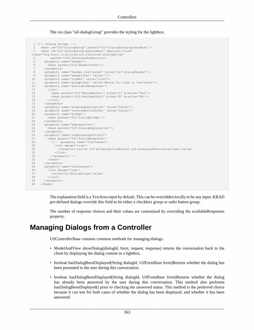
Controllers
363
The css class "uif-dialogGroup" provides the styling for the lightbox.
1 <!-- Dialog Groups --> 2 <bean id="Uif-DialogGroup" parent="Uif-DialogGroup-parentBean"/> 3 <bean id="Uif-DialogGroup-parentBean" abstract="true" class="org.kuali.rice.krad.uif.container.DialogGroup" 4 parent="Uif-VerticalBoxSection"> 5 <property name="header"> 6 <bean parent="Uif-HeaderThree"/> 7 </property> 8 <property name="header.cssClasses" value="uif-dialogHeader"/> 9 <property name="headerText" value=""/> 10 <property name="hidden" value="true"/> 11 <property name="promptText" value="Would You Like to Continue?"/> 12 <property name="availableResponses"> 13 <list> 14 <bean parent="Uif-KeyLabelPair" p:key="Y" p:value="Yes"/> 15 <bean parent="Uif-KeyLabelPair" p:key="N" p:value="No"/> 16 </list> 17 </property> 18 <property name="displayExplanation" value="false"/> 19 <property name="reverseButtonOrder" value="false"/> 20 <property name="prompt"> 21 <bean parent="Uif-DialogPrompt"/> 22 </property> 23 <property name="explanation"> 24 <bean parent="Uif-DialogExplanation"/> 25 </property> 26 <property name="responseInputField"> 27 <bean parent="Uif-DialogResponse"> 28 <!-- <property name="cssClasses"> 29 <list merge="true"> 30 <value>uif-action uif-primaryActionButton uif-boxLayoutHorizontalItem</value> 31 </list> 32 </property>--> 33 </bean> 34 </property> 35 <property name="cssClasses"> 36 <list merge="true"> 37 <value>uif-dialogGroup</value> 38 </list> 39 </property> 40 </bean>
The explanation field is a TextArea input by default. This can be overridden locally to be any input. KRADpre-defined dialogs override this field to be either a checkbox group or radio button group.
The number of response choices and their values are customized by overriding the availableResponsesproperty.
Managing Dialogs from a ControllerUifControllerBase contains common methods for managing dialogs.
• ModelAndView showDialog(dialogId, form, request, response) returns the conversation back to theclient by displaying the dialog content in a lightbox.
• boolean hasDialogBeenDisplayed(String dialogId, UifFormBase form)Returns whether the dialog hasbeen presented to the user during this conversation.
• boolean hasDialogBeenDisplayed(String dialogId, UifFormBase form)Returns whether the dialoghas already been answered by the user during this conversation. This method also performshasDialogBeenDisplayed() prior to checking the answered status. This method is the preferred choicebecause it can test for both cases of whether the dialog has been displayed, and whether it has beenanswered.
Controllers
364
• boolean getBooleanDialogResponse(dialogId, form, request, response) If the dialog has already beenanswered by the user, returns true if the user chose an affirmative response, false if negative responsewas chosen. Also returns false if the dialog has not been answered.
• String getStringDialogResponse(dialogId, form, request, response) If the dialog has already beenanswered by the user, returns the string value of the option chosen by the user.
The DialogManager class encapsulates this functionality and provides additional methods for moredetailed dialog management.
boolean getBooleanDialogResponse(String dialogId, UifFormBase form, HttpServletRequest request, HttpServletResponse response)
Invoking a Dialog Entirely from the Client
Pre-Defined Dialog GroupsFor convenience, the KRAD UI Framework contains several pre-built dialog groups.
• Uif-OK-Cancel-DialogGroup A basic dialog with the header text set as "Please Confirm to Continue".The prompt text default is "Would You Like to Continue?". Available responses are "OK" and "Cancel"
• Uif-Yes-No-DialogGroup A basic dialog with the header text set to "Please Select". The prompt textdefault is "Would You Like to Continue?". Available responses are "Yes" and "No"
• Uif-True-False-DialogGroup A basic dialog with the header text set to "Please select from the valuesbelow". The prompt text default is "Would You Like to Continue?". Available responses are "True"and "False"
• Uif-SensitiveData-DialogGroup A basic dialog with the header text set to "Warning: Sensitive Data".The prompt text default is ""Potentially sensitive data was found on the document. Do you wish tocontinue?". Available responses are "Yes" and "No"
• Uif-Checkbox-DialogGroup A basic dialog with the checkbox control for the explanation. The defaultresponses are "OK" and "Cancel"
• Uif-RadioButton-DialogGroup A basic dialog with the radio button control for the explanation. Thedefault responses are "OK" and "Cancel"
Customizing Dialog Groups
Error, Info, and Warning MessagesComing Soon!
GrowlsComing Soon!
Controllers
365
Exception HandlingComing Soon!
Session Support and the User SessionComing Soon!
Servlet ConfigurationComing Soon!
Using Controllers to Allow Guest AccessSome views might have to be exposed to users that does not have a Rice user. In these cases we canconfigure certain views using controllers to allow guest user access.
To bypass the normal login mechanism you can change the BootstrapFilter configuration.The BootstrapFilter is a Rice filter which at runtime reads a series of filter configurations,constructs and initializes those filters, and invokes them when it is invoked. This allows runtime userconfiguration of arbitrary filters in the webapp context. The BootstrapFilter configuration allowsfor excluding certain requests. The following example excludes the kradguest servlet requests from theDummyLoginFilter and adds an AutoLoginFilter for those requests. The AutoLoginFilterallows automatic login with the user specified via the filter init parameter. With this setup, any requests tothe kradguest servlet will be automatically logged in as guest and bypass the DummyLoginFilter.
<param name="filter.login.class">org.kuali.rice.kew.web.DummyLoginFilter</param><param name="filtermapping.login.1">/*</param><param name="filterexclude.login">.*/kr-kradguest/.*</param>
<param name="filter.guestlogin.class">org.kuali.rice.krad.web.filter.AutoLoginFilter</param><param name="filtermapping.guestlogin.2">/kr-kradguest/*</param><param name="filter.guestlogin.autouser">guest</param>
KRAD has configured a kradguest servlet mapping that can be used for the purpose of allowing guestaccess. The setup of controllers mapped to the kradguest servlet can be done in the kradguest-servlet.xml
<beans xmlns="http://www.springframework.org/schema/beans" xmlns:xsi="http://www.w3.org/2001/XMLSchema-instance" xmlns:p="http://www.springframework.org/schema/p" xmlns:context="http://www.springframework.org/schema/context" xmlns:tx="http://www.springframework.org/schema/tx" xmlns:mvc="http://www.springframework.org/schema/mvc" xmlns:aop="http://www.springframework.org/schema/aop" xsi:schemaLocation="http://www.springframework.org/schema/beans http://www.springframework.org/schema/beans/spring-beans-3.0.xsd http://www.springframework.org/schema/context http://www.springframework.org/schema/context/spring-context-3.0.xsd http://www.springframework.org/schema/mvc http://www.springframework.org/schema/mvc/spring-mvc-3.0.xsd http://www.springframework.org/schema/tx http://www.springframework.org/schema/tx/spring-tx-3.0.xsd http://www.springframework.org/schema/aop http://www.springframework.org/schema/aop/spring-aop-2.0.xsd">
<import resource="krad-base-servlet.xml"/>
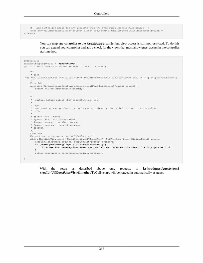
Controllers
366
<!-- Add controller beans for any requests that the krad guest servlet must handle --> <bean id="UifComponentsTestController" class="edu.sampleu.demo.kitchensink.UifGuestController"/></beans>
You can map any controller to the kradguest servlet but view access is still not restricted. To do thisyou can extend your controller and add a check for the views that must allow guest access in the controllerstart method.
@Controller@RequestMapping(value = "/guestviews")public class UifGuestController extends UifControllerBase {
/** * @see org.kuali.rice.krad.web.controller.UifControllerBase#createInitialForm(javax.servlet.http.HttpServletRequest) */ @Override protected UifComponentsTestForm createInitialForm(HttpServletRequest request) { return new UifComponentsTestForm(); }
/** * Initial method called when requesting new view * * <p> * For guest access we check that only certain views can be called through this controller. * </p> * * @param form - model * @param result - binding result * @param request - servlet request * @param response - servlet response * @return */ @Override @RequestMapping(params = "methodToCall=start") public ModelAndView start(@ModelAttribute("KualiForm") UifFormBase form, BindingResult result, HttpServletRequest request, HttpServletResponse response) { if (!form.getViewId().equals("UifGuestUserView")) { throw new RuntimeException("Guest user not allowed to acces this view : " + form.getViewId()); } return super.start(form,result,request,response); }}
With the setup as described above only requests to kr-kradguest/guestviews?viewId=UifGuestUserView&methodToCall=start will be logged in automatically as guest.
367
Chapter 14. View Types
What are View Types?A View Type is an identifier used to categorize and indicate common features and functionality of viewsused in Rice. View Types include:
• DEFAULT - Associated with base view
• INQUIRY - Associated with Inquiry views
• LOOKUP - Associated with Lookup views
• DOCUMENT - Associated with base document views
• MAINTENANCE - Associated with Maintenance Document views
• TRANSACTIONAL - Associated with Transactional Document views
• INCIDENT - Associated with Incident views
View Type IndexingComing Soon!
Lookup View Type
Lookup View
Lookups are used to list sets of data objects of a specific data object class. This might be used as the initialentry point from the application portal in order to list existing documents for view, edit, or copy. Or, itmight be used inside of a document to make an association to reference data (e.g. to assign a member toa group). In both cases, the same Lookup View is being used.
To create a document-specific lookup view, the Uif-LookupView is extended. The Uif-LookupViewconsists of two distinct sections, the criteria section and the result section.
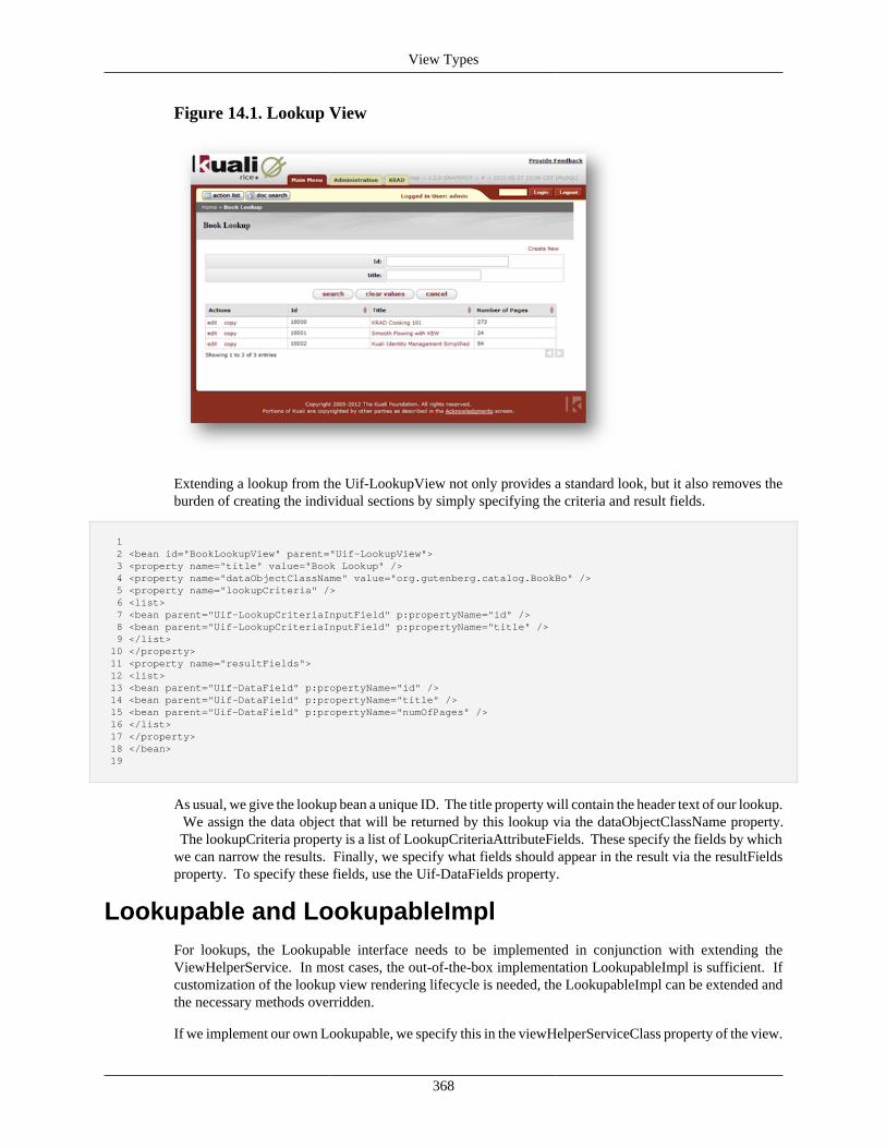
View Types
368
Figure 14.1. Lookup View
Extending a lookup from the Uif-LookupView not only provides a standard look, but it also removes theburden of creating the individual sections by simply specifying the criteria and result fields.
1 2 <bean id="BookLookupView" parent="Uif-LookupView"> 3 <property name="title" value="Book Lookup" /> 4 <property name="dataObjectClassName" value="org.gutenberg.catalog.BookBo" /> 5 <property name="lookupCriteria" /> 6 <list> 7 <bean parent="Uif-LookupCriteriaInputField" p:propertyName="id" /> 8 <bean parent="Uif-LookupCriteriaInputField" p:propertyName="title" /> 9 </list> 10 </property> 11 <property name="resultFields"> 12 <list> 13 <bean parent="Uif-DataField" p:propertyName="id" /> 14 <bean parent="Uif-DataField" p:propertyName="title" /> 15 <bean parent="Uif-DataField" p:propertyName="numOfPages" /> 16 </list> 17 </property> 18 </bean> 19
As usual, we give the lookup bean a unique ID. The title property will contain the header text of our lookup. We assign the data object that will be returned by this lookup via the dataObjectClassName property. The lookupCriteria property is a list of LookupCriteriaAttributeFields. These specify the fields by whichwe can narrow the results. Finally, we specify what fields should appear in the result via the resultFieldsproperty. To specify these fields, use the Uif-DataFields property.
Lookupable and LookupableImplFor lookups, the Lookupable interface needs to be implemented in conjunction with extending theViewHelperService. In most cases, the out-of-the-box implementation LookupableImpl is sufficient. Ifcustomization of the lookup view rendering lifecycle is needed, the LookupableImpl can be extended andthe necessary methods overridden.
If we implement our own Lookupable, we specify this in the viewHelperServiceClass property of the view.
View Types
369
1 <property name="viewHelperServiceClass" value="org.gutenberg.catalog.BookLookupableImpl" /> 2
LookupServiceThe LookupService is responsible for the data retrieval. The default implementation that is delivered out-of-the-box is LookupServiceImpl. This provides a generic search mechanism for data objects.
Lookup Action and FormComing Soon!
Customizing the Lookup ViewThe sorting of the result set can be customized with the defaultSortAttributeName property, which specifiesthe sort key and the defaultSortAscending property, which reverses the sorting order.
Changing Result Actions
The requltsGroup.lineActions property contains components that build the actions that are available oneach line of the result. Typically these are edit, copy and delete on lookups to maintain existing documentsand return on quickfinder lookups for returning the results to the previous screen.
Content customization are done via the resultsGroup.ineAction poperty of the view. Any components canbe used in the action columns. In the following example several links are grouped together.
1 2 <property name="resultsGroup.lineActions"> 3 <list> 4 <bean parent="Uif-Lookup-MaintenanceEditLink"/> 5 <bean parent="Uif-LinkGroup" p:groupBeginDelimiter="[" p:groupEndDelimiter="]" 6 p:linkSeparator="|" p:style="clear: none;"> 7 <property name="items"> 8 <list> 9 <bean id="action-loan" parent="Uif-Link" p:linkText="loan" p:finalizeMethodToCall="loan"/> 10 <bean id="action-renew" parent="Uif-Link" p:linkText="renew" p:finalizeMethodToCall="renew"/> 11 <bean id="action-return" parent="Uif-Link" p:linkText="return" pfinalizeMethodToCall="return"/> 12 </list> 13 </property> 14 </bean> 15 <bean parent="Uif-Lookup-MaintenanceCopyLink"/> 16 </property> 17
Layout customization are done via the resultsGroup.layoutManagerproperty of the view. In the followingexample actions are vertically stacked.
1 2 <property name="resultsGroup.layoutManager.actionFieldPrototype"> 3 <bean parent="Uif-VerticalFieldGroup" p:required="false" p:label="Actions" p:shortLabel="Actions"/> 4 </property> 5
Changing Layout for the Results
Coming Soon!
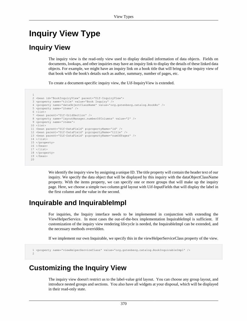
View Types
370
Inquiry View Type
Inquiry ViewThe inquiry view is the read-only view used to display detailed information of data objects. Fields ondocuments, lookups, and other inquiries may have an inquiry link to display the details of these linked dataobjects. For example, we might have an inquiry link on a book title that will bring up the inquiry view ofthat book with the book's details such as author, summary, number of pages, etc.
To create a document-specific inquiry view, the Uif-InquiryView is extended.
1 2 <bean id="BookInquiryView" parent="Uif-InquiryView"> 3 <property name="title" value="Book Inquiry" /> 4 <property name="dataObjectClassName" value="org.gutenberg.catalog.BookBo" /> 5 <property name="items" /> 6 <list> 7 <bean parent="Uif-GridSection" /> 8 <property name="layoutManager.numberOfColumns" value="2" /> 9 <property name="items"> 10 <list> 11 <bean parent="Uif-DataField" p:propertyName="id" /> 12 <bean parent="Uif-DataField" p:propertyName="title" /> 13 <bean parent="Uif-DataField" p:propertyName="numOfPages" /> 14 </list> 15 </property> 16 </bean> 17 </list> 18 </property> 19 </bean> 20
We identify the inquiry view by assigning a unique ID. The title property will contain the header text of ourinquiry. We specify the data object that will be displayed by this inquiry with the dataObjectClassNameproperty. With the items property, we can specify one or more groups that will make up the inquirypage. Here, we choose a simple two column grid layout with Uif-InputFields that will display the label inthe first column and the value in the second.
Inquirable and InquirableImplFor inquiries, the Inquiry interface needs to be implemented in conjunction with extending theViewHelperService. In most cases the out-of-the-box implementation InquirableImpl is sufficient. Ifcustomization of the inquiry view rendering lifecycle is needed, the InquirableImpl can be extended, andthe necessary methods overridden.
If we implement our own Inquirable, we specify this in the viewHelperServiceClass property of the view.
1 <property name="viewHelperServiceClass" value="org.gutenberg.catalog.BookInquirableImpl" /> 2
Customizing the Inquiry ViewThe inquiry view doesn't restrict us to the label-value grid layout. You can choose any group layout, andintroduce nested groups and sections. You also have all widgets at your disposal, which will be displayedin their read-only state.
View Types
371
If your view contains a field that creates an inquiry link to the same data object, you most likely wantto suppress this to avoid unnecessary recursive inquiries that might confuse the user. To do so, set theenableAutoInquiry property to false.
1 <bean parent="Uif-InputField" p:propertyName="title" p:enableAutoInquiry="false" /> 2
Maintenance View TypeMaintenance Documents are the primary method for creating and maintaining data elements within Rice.
Maintenance Document EntryMaintenance Document Entry acts as a wrapper for the data object while it binds the data object to itsdocument type.
1 2 <bean id="ExampleDataObjectMaintenanceDocument" parent="uifMaintenanceDocumentEntry"> 3 <property name="dataObjectClass" value="edu.sampleu.example.dataobject.ExampleDataObject"/> 4 <property name="documentTypeName" value="ExampleDataObjectMaintenanceDocument"/> 5 </bean> 6
The MaintenanceDocumentEntry bean help to manages the creation and deletion of records throughallowNewOrCopy and allowsRecordDeletion property as shown below:
1 2 <bean id="ExampleDataObjectMaintenanceDocument" parent="uifMaintenanceDocumentEntry"> 3 ... 4 <property name="allowNewOrCopy" value="true"/> 5 <property name="allowsRecordDeletion" value="true"/> 6 </bean> 7
An optional property that can be set on the MaintenanceDocumentEntry bean isclearValueOnCopyPropertyNames. The list of property names specified will not be copied on the newrecord when a maintenance copy action is performed. The fields will be populated with the default valueif applicable, otherwise they will be blank.
1 2 <bean id="ExampleDataObjectMaintenanceDocument" parent="uifMaintenanceDocumentEntry"> 3 ... 4 <property name="clearValueOnCopyPropertyNames"> 5 <list> 6 <value>testField1</value> 7 <value>testObject1</value> 8 <value>testObject2.testField2</value> 9 </list> 10 </property> 11 </bean> 12
Maintenance ViewThe Maintenance View is used to create, maintain and display a data object.
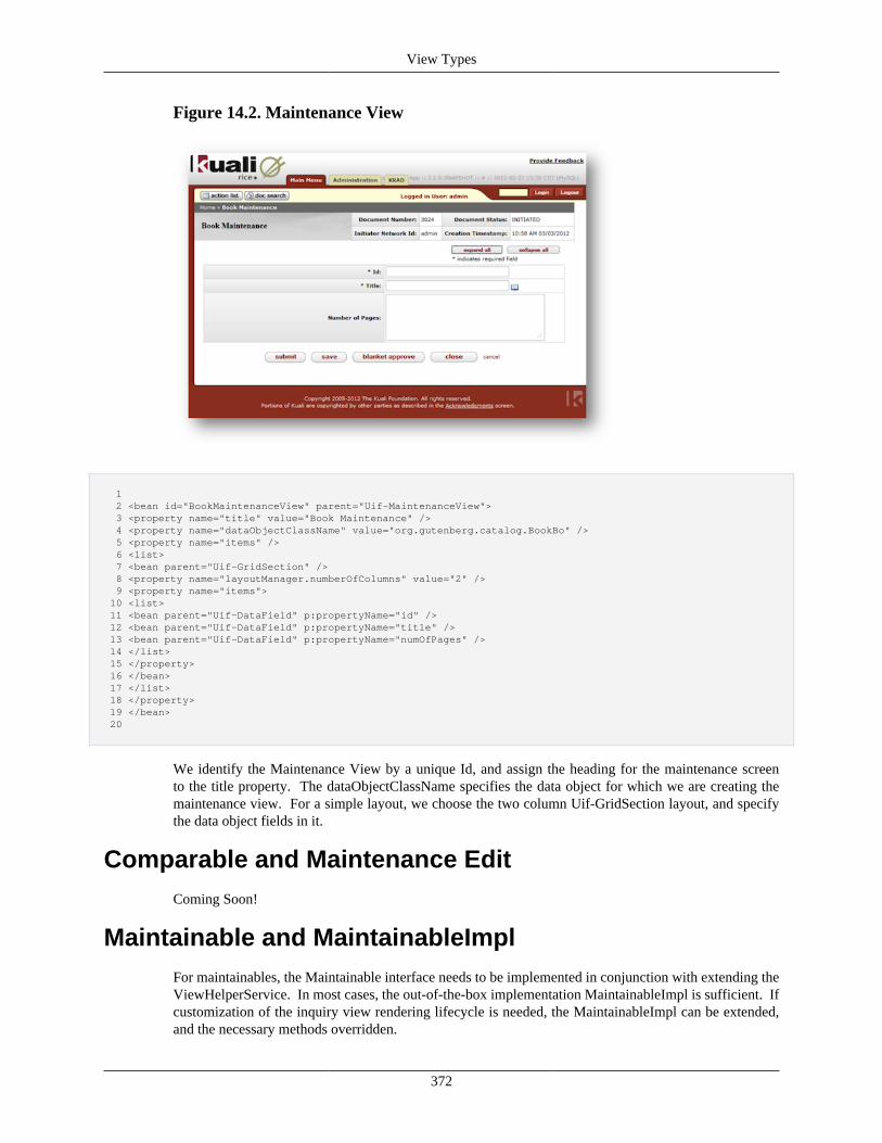
View Types
372
Figure 14.2. Maintenance View
1 2 <bean id="BookMaintenanceView" parent="Uif-MaintenanceView"> 3 <property name="title" value="Book Maintenance" /> 4 <property name="dataObjectClassName" value="org.gutenberg.catalog.BookBo" /> 5 <property name="items" /> 6 <list> 7 <bean parent="Uif-GridSection" /> 8 <property name="layoutManager.numberOfColumns" value="2" /> 9 <property name="items"> 10 <list> 11 <bean parent="Uif-DataField" p:propertyName="id" /> 12 <bean parent="Uif-DataField" p:propertyName="title" /> 13 <bean parent="Uif-DataField" p:propertyName="numOfPages" /> 14 </list> 15 </property> 16 </bean> 17 </list> 18 </property> 19 </bean> 20
We identify the Maintenance View by a unique Id, and assign the heading for the maintenance screento the title property. The dataObjectClassName specifies the data object for which we are creating themaintenance view. For a simple layout, we choose the two column Uif-GridSection layout, and specifythe data object fields in it.
Comparable and Maintenance EditComing Soon!
Maintainable and MaintainableImplFor maintainables, the Maintainable interface needs to be implemented in conjunction with extending theViewHelperService. In most cases, the out-of-the-box implementation MaintainableImpl is sufficient. Ifcustomization of the inquiry view rendering lifecycle is needed, the MaintainableImpl can be extended,and the necessary methods overridden.
View Types
373
If we implement our own Maintainable, we specify this in the viewHelperServiceClass property of theview.
1 2 <property name="viewHelperServiceClass" value="org.gutenberg.catalog.BookMaintainableImpl" /> 3
Maintenance Action and FormComing Soon!
The Maintenance LifecycleComing Soon!
Maintenance Locking
Since our application can be used by multiple users we need to worry about somebody else starting toedit our document while it is being routed through workflow. If we would allow this then that usermight override our changes with theirs. To prevent such a thing from happening we lock the maintenancedocument on its fields that uniquely identify the document. Often these fields are the primary keys ofthe data object.
1 2 <bean id="BookMaintenanceDocument" parent="uifMaintenanceDocumentEntry"> 3 ... 4 <property name="lockingKeys" > 5 <list> 6 <value>id</value> 7 </list> 8 </property> 9 ... 10 </bean> 11
In some situations there is a need to copy the locking keys when a maintenance copy action is performed. Toenable this, the optional preserveLockingKeysOnCopy property can be set to true. This property overridesthe default behavior and copies the locking key field values to the maintenance document. If none of thelocking key values are changed before the document is submitted, an existence check error will still occur.
1 2 <bean id="TravelMileageRateMaintenanceDocument" parent="uifMaintenanceDocumentEntry"> 3 ... 4 <property name="preserveLockingKeysOnCopy" value="true"/> 5 <property name="lockingKeys" > 6 <list> 7 <value>mileageRateCd</value> 8 <value>mileageRateName</value> 9 </list> 10 </property> 11 <property name="clearValueOnCopyPropertyNames"> 12 <list> 13 <value>mileageRate</value> 14 </list> 15 </property> 16 ... 17 </bean> 18
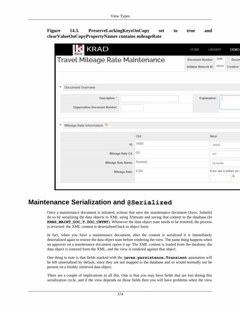
View Types
374
Figure 14.3. PreserveLockingKeysOnCopy set to true andclearValueOnCopyPropertyNames contains mileageRate
Maintenance Serialization and @SerializedOnce a maintenance document is initiated, actions that save the maintenance document (Save, Submit)do so by serializing the data objects to XML using XStream and saving that content to the database (InKRNS_MAINT_DOC_T.DOC_CNTNT). Whenever the data object state needs to be restored, the processis reversed: the XML content is deserialized back to object form.
In fact, when you Save a maintenance document, after the content is serialized it is immediatelydeserialized again to restore the data object state before rendering the view. The same thing happens whenan approver on a maintenance document opens it up: The XML content is loaded from the database, thedata object is restored from the XML, and the view is rendered against that object.
One thing to note is that fields marked with the javax.persistence.Transient annotation willbe left unserialized by default, since they are not mapped to the database and so would normally not bepresent on a freshly retrieved data object.
There are a couple of implications to all this. One is that you may have fields that are lost during thisserialization cycle, and if the view depends on those fields then you will have problems when the view
View Types
375
attempts to render against the deserialized data object. The other is that if your data object contains a largeobject graph, the size of that XML can become quite large and start to fill up your database storage. Inorder to give you control of the situation, an annotation has been provided in the framework.
The @Serialized annotation can be used to mark a field to be either included or excluded from thisXStream serialization. For example, to configure a @Transient field to override the default behaviorand include it in the serialized XML, add the following annotation to the field in the data object class:
@Serialized(enabled=true, forContexts={SerializationContext.MAINTENANCE})
If you have another field that you want to exclude from the serialized form of the object for any reason,then you would annotate it as follows:
@Serialized(enabled=false, forContexts={SerializationContext.MAINTENANCE})
Let's spend a moment on the attributes within the @Serialized annotation:
enabled Controls whether the field will be serialized, or omitted from serialized form. If true,the field will be serialized. The default value is true.
forContexts Controls which contexts for serialization the annotation applies to. For maintenancedocuments, SerializationContext.MAINTENANCE should be specified. The defaultvalue is SerializationContext.ALL, which should be used with caution sinceit could influence other contexts for serialization in the future.
Customizing Maintenance DocumentsWith the Maintenance document, we aren't restricted to the two column grid layout. You can choose anygroup layout, and introduce nested groups and sections. All the widgets can be used.
Bulk Update Maintenance DocumentsBulk Update Maintenance documents allow the update of multiple maintenance recordsfrom one document. KRAD provides a special type of Maintenance document entry,uifBulkUpdateMaintenanceDocumentEntry, that provides a special data object base class andmaintainable to assist in constructing these documents.
The data object base class that controls bulk updates,org.kuali.rice.krad.maintenance.BulkUpdateMaintenanceDataObjectBase,maintains two collections: updateFieldValues and targetUpdateDataObjects.updateFieldValues is a map of the property names that need to be changed on allupdated objects to the new property values. The targetUpdateDataObjects is a list ofall of the maintenance record objects that need to be changed. The custom maintainable,org.kuali.rice.krad.maintenance.BulkUpdateMaintainableImpl, will take care ofgenerating the necessary maintenance locks and updating the objects. All of these operations are achievedthrough data object metadata and reflection, but edge cases can be taken care of by extending the objects.
Currently, the Uif does not have a default interface for this, so one will have to be built for each bulkupdate document. An example is as follows:
1 <bean id="TravelAccountBulkUpdateMaintenanceDocument" parent="uifBulkUpdateMaintenanceDocumentEntry">
View Types
376
2 <property name="documentTypeName" value="TravelAccountBulkUpdateMaintenanceDocument"/> 3 <property name="maintainableClass" value="org.kuali.rice.krad.maintenance.BulkUpdateMaintainableImpl"/> 4 </bean> 5 6 <bean id="TravelAccountBulkUpdate-MaintenanceView" parent="Uif-MaintenanceView"> 7 <property name="headerText" value="Travel Account Bulk Update Maintenance"/> 8 <property name="dataObjectClassName" value="org.kuali.rice.krad.maintenance.BulkUpdateMaintenanceDataObjectBase"/> 9 <property name="docTypeName" value="TravelAccountBulkUpdateMaintenanceDocument"/> 10 <property name="items"> 11 <list merge="true"> 12 <bean parent="Uif-MaintenanceGridSection"> 13 <property name="headerText" value="Update Fields"/> 14 <property name="items"> 15 <list> 16 <bean parent="Uif-InputField" p:label="New Travel Account Type Code" p:propertyName="accountTypeCode" 17 p:bindingInfo.bindByNamePrefix="updateFieldValues" p:bindingInfo.bindToMap="true" p:required="true"> 18 <property name="control"> 19 <bean parent="Uif-VerticalRadioControl"/> 20 </property> 21 <property name="optionsFinder"> 22 <bean class="org.kuali.rice.krad.demo.travel.options.AccountTypeKeyValues"/> 23 </property> 24 </bean> 25 </list> 26 </property> 27 </bean> 28 <bean parent="Uif-MaintenanceStackedCollectionSection"> 29 <property name="headerText" value="Travel Accounts"/> 30 <property name="collectionObjectClass" value="org.kuali.rice.krad.demo.travel.dataobject.TravelAccount"/> 31 <property name="propertyName" value="targetUpdateDataObjects"/> 32 <property name="items"> 33 <list> 34 <bean parent="Uif-InputField" p:propertyName="number" p:enableAutoDirectInquiry="false" p:readOnly="@{!#isAddLine}"> 35 <property name="quickfinder"> 36 <bean parent="Uif-QuickFinder"> 37 <property name="dataObjectClassName" value="org.kuali.rice.krad.demo.travel.dataobject.TravelAccount"/> 38 <property name="fieldConversions" value="number:number,name:name,accountTypeCode:accountTypeCode"/> 39 </bean> 40 </property> 41 </bean> 42 <bean parent="Uif-DataField" p:propertyName="name"/> 43 <bean parent="Uif-DataField" p:propertyName="accountTypeCode"/> 44 </list> 45 </property> 46 <property name="layoutManager.summaryTitle" value="Travel Account"/> 47 <property name="layoutManager.summaryFields"> 48 <list> 49 <value>number</value> 50 </list> 51 </property> 52 </bean> 53 </list> 54 </property> 55 </bean>
Notice the alternate binding specified byp:bindingInfo.bindByNamePrefix="updateFieldValues"p:bindingInfo.bindToMap="true". This binds the accountTypeCode update values to themap instead of its own variable.
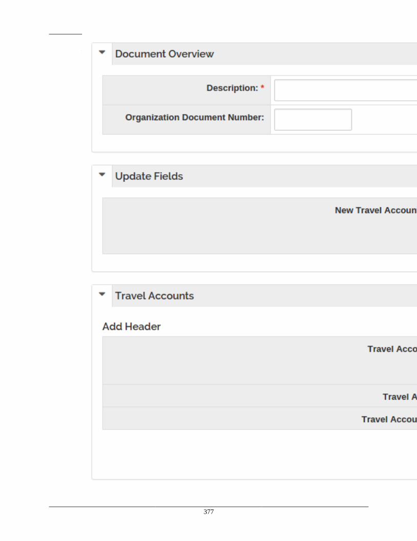
View Types
377
Figure 14.4. Bulk Update Maintenance Document Example
View Types
378
Transactional View TypeComing Soon!
Document Objects and MappingsComing Soon!
Workflow Post Processing
Coming Soon!
Transactional Document EntryComing Soon!
Document ViewComing Soon!
Document Action and Form BaseComing Soon!
The Document ServiceComing Soon!
Document Authorizer and Presentation ControllerComing Soon!
Request Setting of Fields to Read-OnlyComing Soon!
Writing Business RulesComing Soon!
Notes and AttachmentsComing Soon!
Creating a New View TypeComing Soon!
View Types
379
KIM PrimerKuali Identity Management is the component of Rice which deals with actors within an application. Thevast majority of system actors for an application are, sensibly enough, users. However, KIM was designedto handle non-user actors as well: people who are not actors, but still interact with the system such asuniversity applicants or visiting speakers, faculty and staff throughout the university (whether they use theapplication or not), and even the application itself. Marshaling all of this information and using it to grantactors abilities to use the application and be notified of its effects is at the heart of what KIM does.
Keeping track of this information may seem to be an order of the highest complexity, but it can beunderstood as consisting of a mere six high level objects. First, there are the system actors themselves,which KIM labels as "entities". Entities with the ability to authenticate within the system - i.e., applicationusers - are termed "principals". Multiple principals can be collected together and treated as a wholeinto two major units of conglomeration: "groups" and "roles". Finally, principals within a role canbe granted a "permission" - the ability to carry out an action within the application; and they can begiven a "responsibility" - a notification and opportunity to act upon actions others have taken within theapplication. (Permissions should seem fairly intuitive since they were covered earlier.) This primer willwork its way through the first five of these concepts in turn. Responsibilities will be covered in moredetail in the KEW primer.
Entities
Once again, system actors are known as "entities" in KIM terminology. Entities can interact or beacted upon the system in any number of ways. Most "entities" will represent people, though there aresome entities which represent applications (known as "system entities") to be associated with the acts ofapplication itself, or other applications. These are rarer cases - typically, there's a handful of system entitiesknown by an application, but large numbers of "person" entities.
Since most entities represent people, there's a staggering amount of information about entities which KIMcan manage. Entities can be associated with multiple addresses, so that home, work, and other addressescan be stored. The same is true of phone numbers and e-mail addresses. Entities can have residency,citizenship, and visa information stored for them. Employment information and institutional affiliationscan be stored for any entity. If a person in a system wants to limit access to any of this information, privacypreferences can be stored for that person's entity record. Entity records can store a complex amount ofinformation about a person's name. And if all of that wasn't enough, KIM provides a way to create genericentity attributes for an application, so that an application can store extra values, which it itself defines,about the entity.
Entities managed by KIM are typically maintained through the Person Identity Management document. However, since it's very common for institutions to already have an identity managementsystem in place, maintenance of KIM information can be overridden via a new implementationof org.kuali.rice.kim.api.identity.IdentityService. Institutions looking to override that service shouldcheck on Rice collaboration lists; there's a good chance that implementations geared towards specifictechnologies already exist. At least one Kuali Community created IdentityService implementation - forLDAP - comes packaged with Rice.
There is one other important piece of information which KIM manages about that very special subset ofentities who use the system: principal information. A principal is an entity - person or system - whichcan authenticate into a system, and then act within the system. Principals have a special id (which maybe equal to the entity id, depending on how each institution implements KIM) and a "principal name" -the username for the user in the system.
View Types
380
Just as entity management can be overridden through the IdentityService, web authentication can beoverridden via org.kuali.rice.kim.api.identity.AuthenticationService. Again, there's a high likelihood thatcommon authentication options already have implementations; ask Rice collaboration lists.
Groups and Roles
As useful as it is to have information on all of those various entities, the biggest interaction an applicationhas with them is to treat them as users: to allow authentication of principals, and then grant those principalspermission to perform certain actions within the system, as well as the responsibility to view actions whichhave occurred within the system. And, of course, granting all of that principal by principal would gettedious quickly and difficult to manage to boot. Therefore, KIM provides two ways to collect principalstogether so that principals with similar rights within the application can be treated as a whole. Onceagain, KIM offers two main forms of collecting principals: groups and roles. Roles are terribly important:permissions and responsibilities are only assigned to roles. Groups, though, tend to be a more intuitiveconcept and therefore a better starting place.
Groups are simply a collection of principals and other groups. Together, each principal or group collectedinto the parent group are known as "members". A group has a unique group id to identify it as well as aunique module namespace and group name combination. A group can also have an optional description. There's one other twist with groups, but for now, this definition will suffice: a collection of memberprincipals and groups with two unique identifiers: a system assigned group id and a user-assigned modulenamespace and name.
Of course, such a concept hardly originated with KIM; the KIM code for groups is actually based on oldercode which was part of KEW. Furthermore, just like with entities and principals, KIM supports othersources of group data, such as the open source Grouper project or Microsoft Active Directory Services. Group data is accessed through an implementation of org.kuali.rice.kim.api.group.GroupService. Ricecomes with an implementation of GroupService which holds group information in the KIM databasebut once again, other implementations for popular group services, such as Active Directory Services orGrouper, are almost certainly available in the Kuali community.
At first glance, roles likely will not seem that different from groups. Roles also have members, whichcan be principals, groups, or other roles. (Note: groups cannot have roles as members.) Roles have asystem assigned role id, but are better known by the unique combination of a module namespace and rolename. They even have descriptions. And yet, roles have the power to be associated with permissions andresponsibilities; the only way groups have a similar power is to be a member of a role. What then makesroles so special? Unlike groups, roles can provide further information about the principals within them: arole can differentiate among its members. Because of that, roles typically model certain authorities withinthe university system.
For instance, let's say a Rice application is being written for a state university with nineteen child campusesamong the state. Let's say furthermore that each campus has a collection of people whose job it is toadministrate financial aid for students. That could be modeled as nineteen groups, one for each campusin the state. But in KIM, a better modeling would be to create one role, which, for the purposes of thisexample, will have the module namespace KS-SA, and the role name Financial Administrator. All thefinancial administrators for each of the nineteen campuses would become members of this role: but eachmembership would also keep track of which campus the member is associated with. Groups cannot dothat, and this is why KIM roles are so much more powerful than KIM groups.
How, then, does this differentiation among members which occurs in roles, work? The next section takesthat question up.
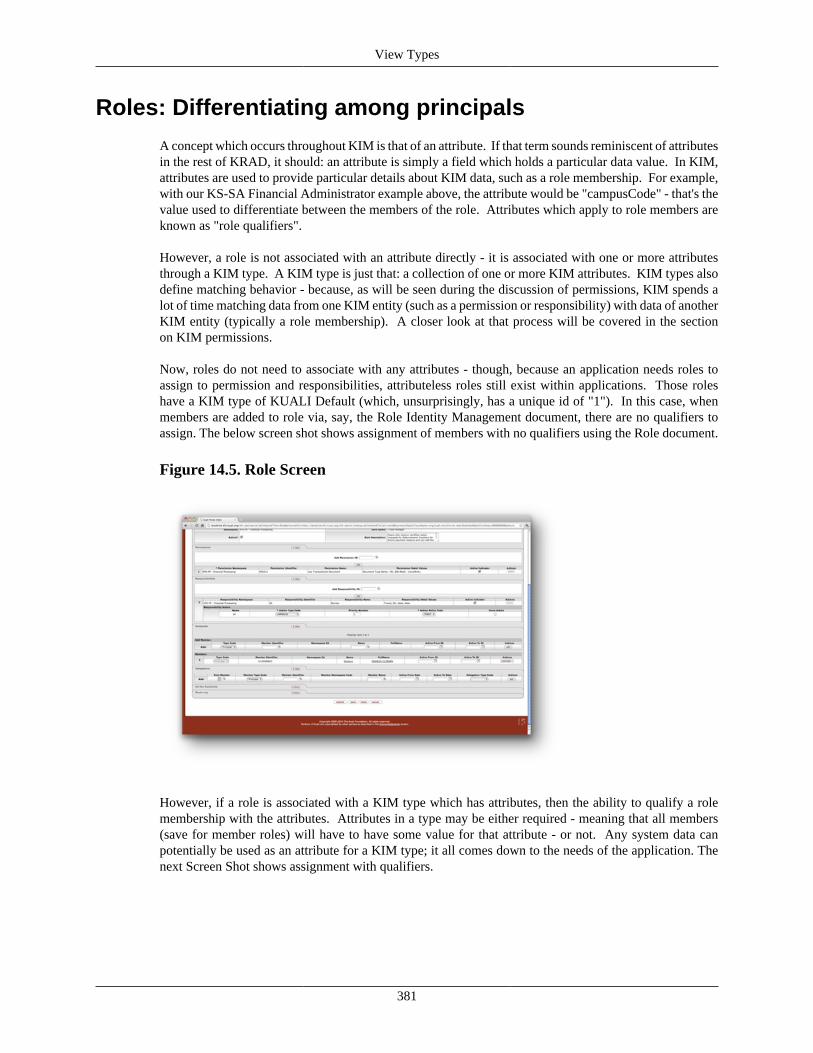
View Types
381
Roles: Differentiating among principals
A concept which occurs throughout KIM is that of an attribute. If that term sounds reminiscent of attributesin the rest of KRAD, it should: an attribute is simply a field which holds a particular data value. In KIM,attributes are used to provide particular details about KIM data, such as a role membership. For example,with our KS-SA Financial Administrator example above, the attribute would be "campusCode" - that's thevalue used to differentiate between the members of the role. Attributes which apply to role members areknown as "role qualifiers".
However, a role is not associated with an attribute directly - it is associated with one or more attributesthrough a KIM type. A KIM type is just that: a collection of one or more KIM attributes. KIM types alsodefine matching behavior - because, as will be seen during the discussion of permissions, KIM spends alot of time matching data from one KIM entity (such as a permission or responsibility) with data of anotherKIM entity (typically a role membership). A closer look at that process will be covered in the sectionon KIM permissions.
Now, roles do not need to associate with any attributes - though, because an application needs roles toassign to permission and responsibilities, attributeless roles still exist within applications. Those roleshave a KIM type of KUALI Default (which, unsurprisingly, has a unique id of "1"). In this case, whenmembers are added to role via, say, the Role Identity Management document, there are no qualifiers toassign. The below screen shot shows assignment of members with no qualifiers using the Role document.
Figure 14.5. Role Screen
However, if a role is associated with a KIM type which has attributes, then the ability to qualify a rolemembership with the attributes. Attributes in a type may be either required - meaning that all members(save for member roles) will have to have some value for that attribute - or not. Any system data canpotentially be used as an attribute for a KIM type; it all comes down to the needs of the application. Thenext Screen Shot shows assignment with qualifiers.
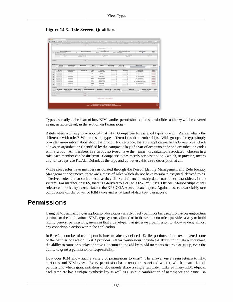
View Types
382
Figure 14.6. Role Screen, Qualifiers
Types are really at the heart of how KIM handles permissions and responsibilities and they will be coveredagain, in more detail, in the section on Permissions.
Astute observers may have noticed that KIM Groups can be assigned types as well. Again, what's thedifference with roles? With roles, the type differentiates the memberships. With groups, the type simplyprovides more information about the group. For instance, the KFS application has a Group type whichallows an organization (identified by the composite key of chart of accounts code and organization code)with a group. All members in a Group so typed have the _same_ organization associated, whereas in arole, each member can be different. Groups use types merely for description - which, in practice, meansa lot of Groups use KUALI Default as the type and do not use this extra description at all.
While most roles have members associated through the Person Identity Management and Role IdentityManagement documents, there are a class of roles which do not have members assigned: derived roles. Derived roles are so called because they derive their membership data from other data objects in thesystem. For instance, in KFS, there is a derived role called KFS-SYS Fiscal Officer. Memberships of thisrole are controlled by special data on the KFS-COA Account data object. Again, these roles are fairly rarebut do show off the power of KIM types and what kind of data they can access.
PermissionsUsing KIM permissions, an application developer can effectively permit or bar users from accessing certainportions of the application. KIM's type system, alluded to in the section on roles, provides a way to buildhighly generic permissions, meaning that a developer can generate a permission to allow or deny almostany conceivable action within the application.
In Rice 2, a number of useful permissions are already defined. Earlier portions of this text covered someof the permissions which KRAD provides. Other permissions include the ability to initiate a document,the ability to route or blanket approve a document, the ability to add members to a role or group, even theability to grant a permission or responsibility.
How does KIM allow such a variety of permissions to exist? The answer once again returns to KIMattributes and KIM types. Every permission has a template associated with it, which means that allpermissions which grant initiation of documents share a single template. Like so many KIM objects,each template has a unique synthetic key as well as a unique combination of namespace and name - so
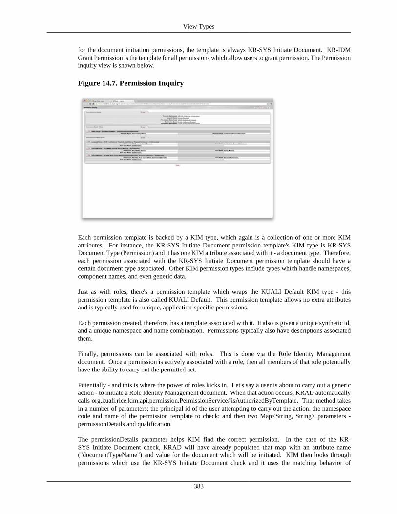
View Types
383
for the document initiation permissions, the template is always KR-SYS Initiate Document. KR-IDMGrant Permission is the template for all permissions which allow users to grant permission. The Permissioninquiry view is shown below.
Figure 14.7. Permission Inquiry
Each permission template is backed by a KIM type, which again is a collection of one or more KIMattributes. For instance, the KR-SYS Initiate Document permission template's KIM type is KR-SYSDocument Type (Permission) and it has one KIM attribute associated with it - a document type. Therefore,each permission associated with the KR-SYS Initiate Document permission template should have acertain document type associated. Other KIM permission types include types which handle namespaces,component names, and even generic data.
Just as with roles, there's a permission template which wraps the KUALI Default KIM type - thispermission template is also called KUALI Default. This permission template allows no extra attributesand is typically used for unique, application-specific permissions.
Each permission created, therefore, has a template associated with it. It also is given a unique synthetic id,and a unique namespace and name combination. Permissions typically also have descriptions associatedthem.
Finally, permissions can be associated with roles. This is done via the Role Identity Managementdocument. Once a permission is actively associated with a role, then all members of that role potentiallyhave the ability to carry out the permitted act.
Potentially - and this is where the power of roles kicks in. Let's say a user is about to carry out a genericaction - to initiate a Role Identity Management document. When that action occurs, KRAD automaticallycalls org.kuali.rice.kim.api.permission.PermissionService#isAuthorizedByTemplate. That method takesin a number of parameters: the principal id of the user attempting to carry out the action; the namespacecode and name of the permission template to check; and then two Map<String, String> parameters -permissionDetails and qualification.
The permissionDetails parameter helps KIM find the correct permission. In the case of the KR-SYS Initiate Document check, KRAD will have already populated that map with an attribute name("documentTypeName") and value for the document which will be initiated. KIM then looks throughpermissions which use the KR-SYS Initiate Document check and it uses the matching behavior of
View Types
384
the associated KIM permission type (specifically, the performPermissionMatches method) to find apermission which matches for the Role Identity Management document. Because permission templatescan have a customized type, the KIM permission type for KR-SYS Initiate Document does some specialbehavior: it traverses up the KEW document type hierarchy (to be covered more fully in the KEWprimer) to find an appropriate permission - basically meaning that if an application developer has wiselyarranged all application document types into a hierarchy, permissions need not be specified for everysingle document. Other permission KIM types perform matching services such as handling namespacewildcards. And of course, application developers can create their own permission type roles.
Once a permission has been found, KIM looks up the roles associated with those permissions and theirtypes. KIM sends the qualifier map to the role types of the matching roles. The KIM type for each roletakes the qualifier map that was passed to it and attempts to match each member's role qualifications. If thequalifier map is empty, then typically all members are passed back as matching - though some KIM roletypes override that behavior. If qualifier attributes have been passed in, then the KIM role type determinesif each member matches and only passes back the matching members.
KRAD sends generic role qualifiers to every KIM permission call that it makes. More specific rolequalifiers can be sent to KIM via View configuration, through a map passed into the componentSecurityproperty on a Field.
In short, this means that based on data within a KRAD screen, certain members of the role will be able toperform certain actions but not others. For instance, every member of our KS-SA Financial Administratorrole may have permission to view reports on cross-university financial aid grants, those same memberswill only be able to change the financial aid status of a student if the student takes classes primarily on theircampus. Qualified roles and permissions provide an incredibly powerful way to granularly limit accessto certain portions of the application with a minimum of configuration.
KRAD will generally add permission details and qualifier values that are generically appropriate tothe call. However, authorizers and KRAD configuration often allow the addition of more values -this can be especially important when adding qualifiers. Also, even though KRAD will automaticallymake permission calls in certain cases, there is nothing to prevent the application developer frommaking their own permission calls in the code. Calls based on template should call the aforementionedorg.kuali.rice.kim.api.permission.PermissionService#isAuthorizedByTemplate. If the template is KUALIDefault - one of those highly specific application permissions - then the appropriate permission checkwould go through org.kuali.rice.kim.api.permission.PermissionService#isAuthorized.
The last major object of KRAD - responsibilities - will be covered early on in the KEW Primer.
KEW PrimerVersions of what is now Kuali Enterprise Workflow existed before the first Kuali application was evenwritten. Why? Because enterprise applications find it highly useful to tie into a system which canroute application content among various users, where that content can be acknowledged, approved, ordisapproved. KEW provides an elegant and highly configurable way to route such content. Furthermore,as different foundation applications have produced more and more byzantine routing requirements, assystems such as KIM have become part of Rice, as institutions have tied non-Rice-based applicationdevelopment platforms to the KEW document framework, KEW has proven itself deeply adaptable, readyto handle any challenging routing situation.
That flexibility derives from the fact that KEW has one major conceptual entity: the document, but thenprovides myriad ways to route that entity. This primer will examine what documents are, cover twodifferent routing mechanisms which KEW provides, and finally look at some of the other support thatKEW gives documents. This primer will not be an exhaustive study of KEW's capabilities, but it shouldget developers started in understanding how KEW works.
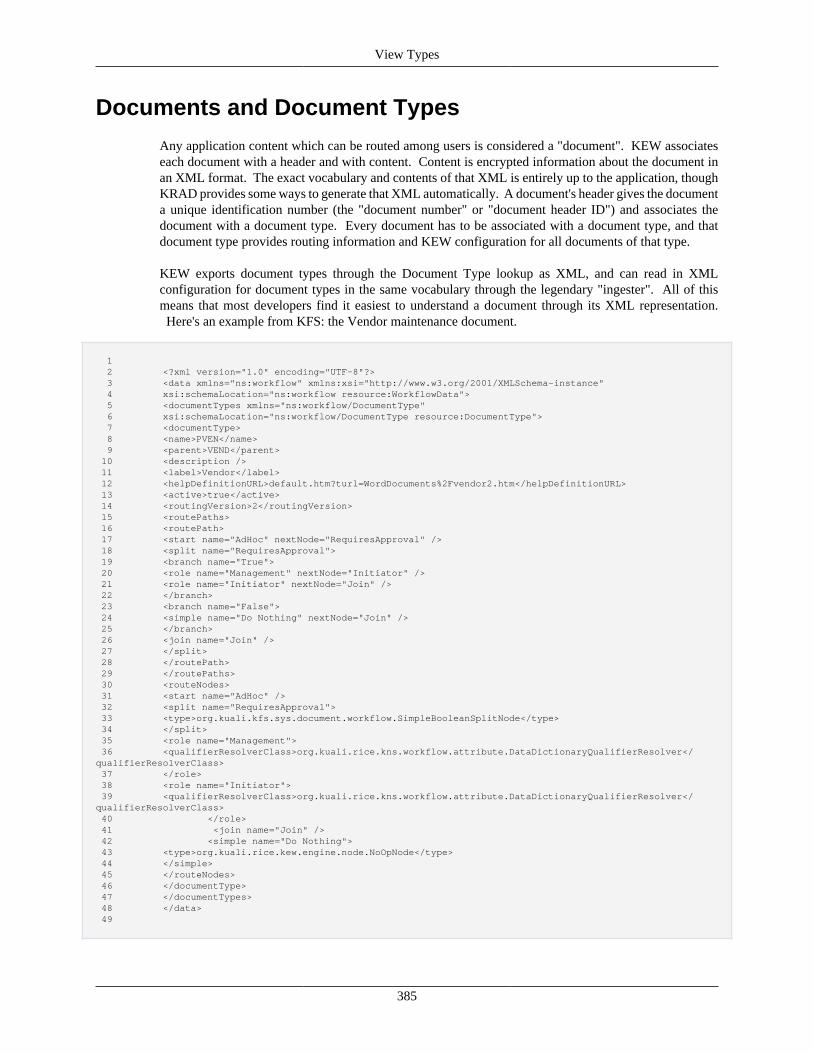
View Types
385
Documents and Document Types
Any application content which can be routed among users is considered a "document". KEW associateseach document with a header and with content. Content is encrypted information about the document inan XML format. The exact vocabulary and contents of that XML is entirely up to the application, thoughKRAD provides some ways to generate that XML automatically. A document's header gives the documenta unique identification number (the "document number" or "document header ID") and associates thedocument with a document type. Every document has to be associated with a document type, and thatdocument type provides routing information and KEW configuration for all documents of that type.
KEW exports document types through the Document Type lookup as XML, and can read in XMLconfiguration for document types in the same vocabulary through the legendary "ingester". All of thismeans that most developers find it easiest to understand a document through its XML representation. Here's an example from KFS: the Vendor maintenance document.
1 2 <?xml version="1.0" encoding="UTF-8"?> 3 <data xmlns="ns:workflow" xmlns:xsi="http://www.w3.org/2001/XMLSchema-instance" 4 xsi:schemaLocation="ns:workflow resource:WorkflowData"> 5 <documentTypes xmlns="ns:workflow/DocumentType" 6 xsi:schemaLocation="ns:workflow/DocumentType resource:DocumentType"> 7 <documentType> 8 <name>PVEN</name> 9 <parent>VEND</parent> 10 <description /> 11 <label>Vendor</label> 12 <helpDefinitionURL>default.htm?turl=WordDocuments%2Fvendor2.htm</helpDefinitionURL> 13 <active>true</active> 14 <routingVersion>2</routingVersion> 15 <routePaths> 16 <routePath> 17 <start name="AdHoc" nextNode="RequiresApproval" /> 18 <split name="RequiresApproval"> 19 <branch name="True"> 20 <role name="Management" nextNode="Initiator" /> 21 <role name="Initiator" nextNode="Join" /> 22 </branch> 23 <branch name="False"> 24 <simple name="Do Nothing" nextNode="Join" /> 25 </branch> 26 <join name="Join" /> 27 </split> 28 </routePath> 29 </routePaths> 30 <routeNodes> 31 <start name="AdHoc" /> 32 <split name="RequiresApproval"> 33 <type>org.kuali.kfs.sys.document.workflow.SimpleBooleanSplitNode</type> 34 </split> 35 <role name="Management"> 36 <qualifierResolverClass>org.kuali.rice.kns.workflow.attribute.DataDictionaryQualifierResolver</qualifierResolverClass> 37 </role> 38 <role name="Initiator"> 39 <qualifierResolverClass>org.kuali.rice.kns.workflow.attribute.DataDictionaryQualifierResolver</qualifierResolverClass> 40 </role> 41 <join name="Join" /> 42 <simple name="Do Nothing"> 43 <type>org.kuali.rice.kew.engine.node.NoOpNode</type> 44 </simple> 45 </routeNodes> 46 </documentType> 47 </documentTypes> 48 </data> 49

View Types
386
There's a great deal to notice about this example, but it does break into three major parts: information aboutthe document type at the top; the route paths next; and finally, the route nodes.
The document information is fairly straight forward. Every document type has a name. (KFS makes allof its document names four characters long. Other foundation projects eschewed that practice.) Everydocument can have a description and if the document is a transactional document, then the documentshould have a label associated with it - the page will blow up otherwise. A help definition can be associatedwith the whole of the document, which is useful if the help content for the application is at document-level granularity; KRAD will provide finer grained help options than that but an overall discussion of thedocument may still be helpful. Naturally, a new document type would be set to <active> and it's goodpractice to use routingVersion of 2; routingVersion of 1 is far legacy concept.
A special note about a document type's parent. PVEN's parent document type is "VEND", KFS's VendorModule Complex Maintenance Document. Having a parent means that the document type inherits all ofwhat the parent document type defines - unless the document type defines the value itself. For instance, ifPVEN had not defined the routePaths and routeNodes sections, then it would have inherited that routingtrail and notes from the VEND document type. There's a number of other document type elements - someof which will be covered later - which PVEN is inheriting from either VEND or one of its parent documenttypes. Applications which attempt to use KIM based routing are highly recommended to place all of theirdocuments into a single document hierarchy: one with a single root, parentless document type. That is(as will be covered in more detail in the section on responsibilities) responsibilities follow document typehierarchies, and having a single hierarchy means that nodes reused among several different documents canhave KIM responsibilities created at a higher level at the hierarchy and shared among all descendants.
When thinking about route paths and route nodes, it might be useful to think of a board game. Most boardgames have a path that player's pieces must go through in a specific order. Route paths work preciselylike that: they describe the paths (it's very rare to have more than one) that a document will follow as itroutes from user to user. Route nodes describes the points where the document can "land", just like eachspot within the path in the board game. Every node which is listed in the routePaths section must have acorresponding definition in the routeNodes section.
Just a note to get out of the way: yes, multiple routePaths can be defined for a single document. The authorof this primer has not seen a use case for that functionality.
routePaths defines several different kinds of nodes. In the PVEN example, we see several different types:start, split, branch, join, role, and simple.
Every document needs to start at a "start" node. The document is not routed to anyone at this point; it'ssimply beginning its journey of - if all goes well - approval. Having a common name for all start nodesin each document type in a given application is a pretty good idea. Note that the start is associated withanother "start" in the routeNodes section.
A split defines branches where a document can traverse multiple branches but skip others. As manybranches as required by application needs can be defined. For the sake of this discussion, though, let'sinvestigate a very simple branching mechanism in KFS.
First, every split also has a corresponding routeNode element. This routeNode element defines a type:org.kuali.kfs.sys.document.workflow.SimpleBooleanSplitNode. Every split node needs to have a typedefined for it which implements org.kuali.rice.kew.engine.node.SplitNode. That interface has one methodassociated with it: process, which takes in a RouteContext and RouteHelper objects and returns aSplitResult. The RouteContext includes both the document type header and the document content for thedocument; the RouteHelper has methods to examine nodes. An org.kuali.rice.kew.engine.node.SplitResultbasically wraps a List of which branches the given document should follow - again, there's a possibilitythat it could, in parallel, follow multiple branches.
View Types
387
org.kuali.kfs.sys.document.workflow.SimpleBooleanSplitNode will only follow one branch at a time -either the branch named true "True" or the branch named "False". It queries a special method on KFSdocuments which returns a Boolean; the value of the Boolean determines the branch the document willfollow. Simplicity works wonderfully for a lot of applications, but of course any required logic can beimplemented for a split node.
Branches are fairly simple. They do not even have corresponding nodes in the routeNodes section! Doremember, though, to make sure the branch names match up exactly - case and all - with the names returnedin the SplitResult. Also, every split node needs to have a corresponding join node to join the branchesback when the document is finished routing through the split logic. Joins do have corresponding nodesin the routeNodes section. If a document has multiple split nodes and each, as it should, has a join, eachjoin must have a unique name within the document type.
If the PVEN routes to the "False" branch, it goes to a simple node. That simple node has a correspondingdefinition in the routeNodes, where it too is given a type: org.kuali.rice.kew.engine.node.NoOpNode. ThatNoOpNode is an implementation of the org.kuali.rice.kew.engine.node.SimpleNode interface. Just likethe SplitNode interface, the SimpleNode interface has one method, process, and it even takes in the sameparameters. It returns a SimpleResult, which merely notes whether the processing of the node is completeor not. The NoOpNode does nothing, but SimpleNodes generally are used for when a document mustbe automatically processed at some point (though a PostProcessor - like the doRouteLevelChanged anddoRouteStatusChanged method hooks in every KRAD document - provide an alternate and preferred wayof carrying out such work). Like joins, every simple node must have a unique name within the documenttype.
That leaves role and the strange qualifierResolverClass - and what those are will remain unresolved untilKIM responsibilities get full coverage. There are also other kinds of nodes which will be covered withinthe primer as well.
Document types can define other things as well. The two biggest definitions not yet discussed are ruleattributes - and those will get full coverage later - and policies. Policies are simply KEW optionsthat a document can turn on or off. For example, if no action requests are generated for a document,then is that document automatically approved? That can be controlled via the DEFAULT_APPROVEpolicy. Does a document need to be routed by its initiator or by any user which has access? That'scontrolled by the INITIATOR_MUST_ROUTE policy. An enumeration of all policy options can be foundin org.kuali.rice.kew.doctype.DocumentTypePolicyEnum.
This has been a lot of discussion about document types - but the document hasn't routed to any users yet! Again, there are two major ways that KEW provides to route documents to people: KIM responsibilitiesand KEW rules. The primer will cover responsibilities first.
KIM and KEW together: ResponsibilitiesTime, at last, to cover the sixth and final major conceptual entity from KIM: responsibilities. Aresponsibility is a mapping of a KIM role to a KEW document type routeNode, with a description of theaction required at that node. When a document type is routed to a user, that user typically has one of threesets of actions - either they can approve or disapprove the document; they can acknowledge the document;or they can "FYI" the document. (Like so much about KEW in this primer, this is something of a grosssimplification; it's called a "primer" for a reason.) When a user has received a request to either approveor disapprove a document, the document cannot go to the next routeNode until all of the proper approvalshave been made - and if one disapproval is made on the document, the document is effectively dead andgoes no further (KEW can be a fairly cutthroat board game). With an acknowledge request, the documenttravels to the next routeNode and may even go to "processed" state - but it will not be a "final" documentuntil every user acknowledges it. An FYI request works similarly, with the variation that a user can clearFYI's in the action list - an FYI'd user need not even open the document. The KIM responsibility brings

View Types
388
all of this together: the KIM role, the KEW document type node, and information about the action the usergets to take on the document.
Much like permissions, KIM responsibilities are tied to a KIM type - and therefore a number of attributes- through a "responsibility template". However, unlike permissions, there's really only two responsibilitytemplates which KEW comes with: KR-WKFLW Review and KR-WKFLW Resolve Exception. Yes,new templates can be created for responsibilities but, whereas permissions can be used in a number ofcontexts throughout an application necessitating a need for multiple permission templates, the number ofcontexts where responsibilities get invoked is pretty limited. KR-WKFLW Review routes a document tomembers of a role - i.e., it does pretty much what KEW is out there to do. KR-WKFLW Resolve Exceptionis invoked in cases where an exception occurs on a document during post-processing; when this occursto a document, it seems wise to send it to a special group of support personnel to try to figure out whatwent wrong on the document.
Given that, the vast majority of responsibilities set up for an application use the KR-WKFLW Reviewtemplate. That template has five qualifiers associated with it, though in 99% of the cases, only four ofthose qualifiers are defined.
The first is the documentTypeName - the name of the document type that the responsibility applies to. Remember that responsibilities are aware of parents of document types, and therefore, if a responsibilityis assigned to a document type with many descendants, all descendants could possibly make use of thatresponsibility. Again: when using KIM responsibilities, it is wise to arrange all document types in anapplication in a hierarchy with a single, root parent-less document type.
The second is the routeNodeName. This name should match the name given the role on the documenttype definition - for instance, from the example above "Management" or "Initiator". This name must beexactly the name specified on the document type; these names are case sensitive.
The next responsibility attribute is "required". This is assigned either "true" or "false" (that's case sensitivetoo). If a responsibility has "true" for its "required" value, then it is expected that when a document routesto that node, action requests will be generated. If action requests are not generated, then the documentgoes to KR-WKFLW Resolve Exception routing - it's a dead document which needs be resuscitated.
Next is the "actionDetailsAtRoleMemberLevel" attribute which again is "true" or "false". Mostresponsibilities have a single action - approve, acknowledge, or FYI - defined for the whole role. However,in some special cases, it is useful for each member of a role to have a different choice - one gets to approve,one gets an FYI. This attribute enables that and the KIM Role Identity Management document handlesassigning actions on a member by member basis.
The final attribute, rarely used, is the qualifierResolverProvidedIdentifier attribute. Trust the author onthis one - the use of this attribute is far beyond the scope of this primer.
A responsibility also has a unique system generated id and a unique namespace and name combination,as well as an optional (but often useful) description.
On KIM's Role Identity Management document, responsibilities can be associated with roles. There'san extra twist to assigning a responsibility to a role: the actions described for the role must be describedas well. This includes the approve versus acknowledge versus FYI choice and a couple others. There's achoice of whether the first in the role to act on the document will act for the entire role, or whether everymember of the role must make that action on the document. There's a priority choice which can be leftblank but which will be respected - lower numbers will get higher priorities and roles with those lowerpriorities will get a chance to act on the document before it enters the lower priority role members' actionlists. Finally, there's the choice of whether to force the action or not. If a user has already approved adocument, and that user is a member of the role where the document is now routing, does the user needto look at the document and approve again? If force required is checked, then yes: someone in the role
View Types
389
needs to approve again. If force required is not checked, then the user's previous approval will count asapproval for the current responsibility.
Responsibilities are pretty simple to set up then - but there's one lingering question. The power of roles isthat members within a role can be differentiated between each other. How do responsibilities differentiatebetween members of the role? The answer to that question is back in the document type definition wherethe role node was set up:
1 2 <role name="Initiator"> 3 <qualifierResolverClass>org.kuali.rice.kns.workflow.attribute.DataDictionaryQualifierResolver</qualifierResolverClass> 4 </role> 5
A qualifier resolver pulls values from the document to feed into the role and find only qualified members. KEW provides a number of qualifier resolvers (and the org.kuali.rice.kew.role.QualifierResolverinterface so that applications can define their own). This primer will cover the two mostpopular qualifier resolvers: org.kuali.rice.kns.workflow.attribute.DataDictionaryQualifierResolver andthe org.kuali.rice.kew.role.XPathQualifierResolver.
The DataDictionaryQualifierResolver is tightly integrated with the KRAD framework. When trying toread qualifiers for a role at a responsibility node, it looks to two sources: a KRAD document, which it pullsvia KRAD's DocumentService, and the data dictionary entry for that KRAD document. Specifically, itlooks for a property on the document called workflowAttributes. The workflowAttributes handles bothhow to index the document for file searching - covered later - and how to send qualifiers to roles at nodes. Here's an example of the routing configuration for a document, a data dictionary bean definition whichwill be passed to the documentEntry's workflowAttribute's property:
1 2 <bean id="RequisitionDocument-workflowAttributes-parentBean" abstract="true" parent="WorkflowAttributes"> 3 <property name="routingTypeDefinitions"> 4 <map> 5 <entry key="Organization" value-ref="RoutingType-RequisitionDocument-Organization"/> 6 <entry key="SubAccount" value-ref="RoutingType-PurchasingAccountsPayableDocument-SubAccount"/> 7 <entry key="Account" value-ref="RoutingType-PurchasingAccountsPayableDocument-Account"/> 8 <entry key="AccountingOrganizationHierarchy" 9 value-ref="RoutingType-PurchasingAccountsPayableDocument-AccountingOrganizationHierarchy"/> 10 <entry key="Commodity" value-ref="RoutingType-PurchasingDocument-Commodity"/> 11 <!-- no qualifiers for separation of duties --> 12 </map> 13 </property> 14 </bean> 15
routingTypeDefinitions is a map which associates keys - route level names (again, case sensitive!) -to a bean of type org.kuali.rice.krad.datadictionary.RoutingTypeDefinition. If a document routes to anode with no qualified roles, then there does not need to be a map entry for that point. A sample of aRoutingTypeDefinition bean looks like this:
1 2 <bean id="RoutingType-RequisitionDocument-Organization" 3 class="org.kuali.rice.krad.datadictionary.RoutingTypeDefinition"> 4 <property name="routingAttributes"> 5 <list> 6 <ref bean="RoutingAttribute-chartOfAccountsCode" /> 7 <ref bean="RoutingAttribute-organizationCode" /> 8 </list> 9 </property> 10 <property name="documentValuePathGroups"> 11 <list>
View Types
390
12 <bean class="org.kuali.rice.krad.datadictionary.DocumentValuePathGroup"> 13 <property name="documentValues"> 14 <list> 15 <value>chartOfAccountsCode</value> 16 <value>account.organizationCode</value> 17 </list> 18 </property> 19 </bean> 20 </list> 21 </property> 22 </bean> 23
There are two properties in need of description. The routingAttributes property expects a List of attributesin the order that the values will be collected. This basically sets the names of the qualification attributessent to KIM. The documentValuePathGroups property takes a list of DocumentValuePathGroup objectswhich describe the property paths, relative to the document, to pull values from. In this case, the qualifierresolver will get a copy of the document via DocumentService; it will read getChartOfAccountsCode()and associate the value with the key "chartOfAccountsCode" in the property set and then it will read thevalue of getAccount() and read the value of getOrganizationCode() from the result of the first call andassociate that with the qualifier key "organizationCode". This qualification will then be sent to KIM andonly role members who match that qualification will have the document routed to them.
RoutingTypeDefinitions also handle collection definitions. The following bean uses aDocumentCollectionPath bean definition to loop over a collection returned from the documentby the method getAccountsForAwardRouting(); for each value in that collection, it will readthe value of getContractsAndGrantsAccountResponsibilityId() and associate it with the keycontractsAndGrantsAccountResponsibilityId; a new qualification will be generated for every item returnedby the getAccountsForAwardRouting() method.
1 2 <bean id="RoutingType-PurchasingDocument-Award" 3 class="org.kuali.rice.kns.datadictionary.RoutingTypeDefinition"> 4 <property name="routingAttributes"> 5 <list> 6 <bean class="org.kuali.rice.kns.datadictionary.RoutingAttribute"> 7 <property name="qualificationAttributeName" value="contractsAndGrantsAccountResponsibilityId" /> 8 </bean> 9 </list> 10 </property> 11 <property name="documentValuePathGroups"> 12 <list> 13 <bean class="org.kuali.rice.krad.datadictionary.DocumentValuePathGroup"> 14 <property name="documentCollectionPath"> 15 <bean class="org.kuali.rice.krad.datadictionary.DocumentCollectionPath"> 16 <property name="collectionPath" value="accountsForAwardRouting" /> 17 <property name="documentValues"> 18 <list> 19 <value>contractsAndGrantsAccountResponsibilityId</value> 20 </list> 21 </property> 22 </bean> 23 </property> 24 </bean> 25 </list> 26 </property> 27 </bean> 28
Applications which use KRAD documents will probably find it very simple to get the qualifiers they needat certain routing nodes via this mechanism.
The alternative popular qualifier resolver is org.kuali.rice.kew.role.XPathQualifierResolver. This qualifieruses the XML generated by KRAD at the time of document routing and runs XPath expressions againstit to find the qualifiers to pass to KIM for role resolution.
View Types
391
Before looking into how to configure XPathQualifierResolver, the concept of RuleAttributes must beintroduced. A "rule attribute" is simply a KEW entity which helps handle serialized XML documentcontent, typically through configurable XML. There are a number of different rule attribute types: rulevalidations, email notifications, document search customization options, and rule qualifiers. Here is aconfiguration of a rule attribute for an XPathQualifierResolver:
1 2 <data xmlns="ns:workflow" xmlns:xsi="http://www.w3.org/2001/XMLSchema-instance" 3 xsi:schemaLocation="ns:workflow resource:WorkflowData"> 4 <ruleAttributes xmlns="ns:workflow/RuleAttribute" 5 xsi:schemaLocation="ns:workflow/RuleAttribute RuleAttribute"> 6 <ruleAttribute> 7 <name>RoleRouteModule-TestXPathQualifierResolver</name> 8 <className>org.kuali.rice.kew.role.XPathQualifierResolver</className> 9 <label>RoleRouteModule-TestXPathQualifierResolver</label> 10 <description>RoleRouteModule-TestXPathQualifierResolver</description> 11 <type>QualifierResolver</type> 12 <resolverConfig> 13 <baseXPathExpression>/xmlData/chartOrg</baseXPathExpression> 14 <qualifier name="chart"> 15 <xPathExpression>./chart</xPathExpression> 16 </qualifier> 17 <qualifier name="org"> 18 <xPathExpression>./org</xPathExpression> 19 </qualifier> 20 </resolverConfig> 21 </ruleAttribute> 22 </ruleAttributes> 23 </data> 24
If rule attributes seem reminiscent of document types, with names, labels, and descriptions, that's helpful- those attributes work much the same as they do on document types. RuleAttributes have more though. They have the class name of the rule attribute - which for XPathQualifierResolvers is convenientlyalways org.kuali.rice.kew.role.XPathQualifierResolver. There are several different types of rule attributes;the type for qualifier resolvers is always QualifierResolver. And then there's a resolverConfig. This isthe configurable XML part of the rule attribute; it maps XPath expressions which pull values from theserialized XML and matches them with qualifier attribute names. It sets a base XPath expression and thenuses that to get values for the specific XPath expressions. The assumption here is that the document hasbeen serialized as so:
1 2 <?xml version="1.0" ?> 3 <xmlData> 4 <chartOrg> 5 <chart>UA</chart> 6 <org>TAR</org> 7 </chartOrg> 8 <chartOrg> 9 <chart>UA</chart> 10 <org>MUS</org> 11 </chartOrg> 12 </xmlData> 13
A qualifier set will be generated for each <chartOrg> tag that the XPath expressions find. The qualifierhas a name attribute, which will act as the key to the value within the qualifier.
The document type then uses this attribute, not via the qualifierResolverClassName tag but rather thequalifierResolver tag in the document type:
1 2 <role name="Role1"> 3 <activationType>P</activationType>
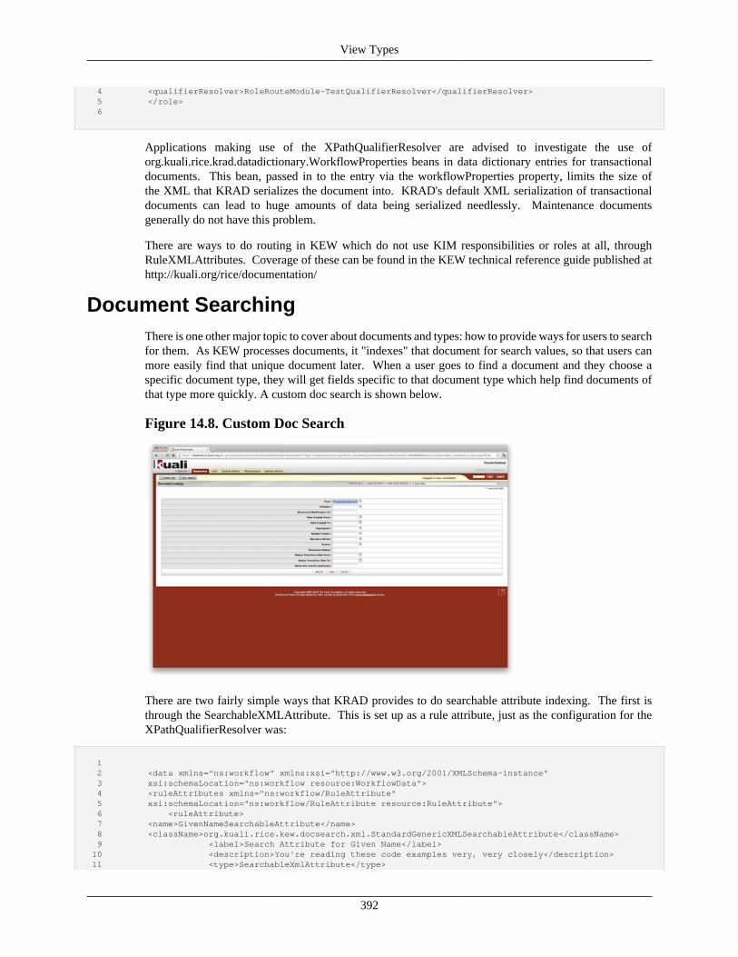
View Types
392
4 <qualifierResolver>RoleRouteModule-TestQualifierResolver</qualifierResolver> 5 </role> 6
Applications making use of the XPathQualifierResolver are advised to investigate the use oforg.kuali.rice.krad.datadictionary.WorkflowProperties beans in data dictionary entries for transactionaldocuments. This bean, passed in to the entry via the workflowProperties property, limits the size ofthe XML that KRAD serializes the document into. KRAD's default XML serialization of transactionaldocuments can lead to huge amounts of data being serialized needlessly. Maintenance documentsgenerally do not have this problem.
There are ways to do routing in KEW which do not use KIM responsibilities or roles at all, throughRuleXMLAttributes. Coverage of these can be found in the KEW technical reference guide published athttp://kuali.org/rice/documentation/
Document SearchingThere is one other major topic to cover about documents and types: how to provide ways for users to searchfor them. As KEW processes documents, it "indexes" that document for search values, so that users canmore easily find that unique document later. When a user goes to find a document and they choose aspecific document type, they will get fields specific to that document type which help find documents ofthat type more quickly. A custom doc search is shown below.
Figure 14.8. Custom Doc Search
There are two fairly simple ways that KRAD provides to do searchable attribute indexing. The first isthrough the SearchableXMLAttribute. This is set up as a rule attribute, just as the configuration for theXPathQualifierResolver was:
1 2 <data xmlns="ns:workflow" xmlns:xsi="http://www.w3.org/2001/XMLSchema-instance" 3 xsi:schemaLocation="ns:workflow resource:WorkflowData"> 4 <ruleAttributes xmlns="ns:workflow/RuleAttribute" 5 xsi:schemaLocation="ns:workflow/RuleAttribute resource:RuleAttribute"> 6 <ruleAttribute> 7 <name>GivenNameSearchableAttribute</name> 8 <className>org.kuali.rice.kew.docsearch.xml.StandardGenericXMLSearchableAttribute</className> 9 <label>Search Attribute for Given Name</label> 10 <description>You're reading these code examples very, very closely</description> 11 <type>SearchableXmlAttribute</type>
View Types
393
12 <searchingConfig> 13 <fieldDef name="givenname" title="First name"> 14 <display> 15 <type>text</type> 16 </display> 17 <visibility> 18 <column visible="true"/> 19 </visibility> 20 <fieldEvaluation> 21 <xpathexpression>//person/givenname/value</xpathexpression> 22 </fieldEvaluation> 23 </fieldDef> 24 </searchingConfig> 25 </ruleAttribute> 26 </ruleAttributes> 27 </data> 28
With searchable attributes, remember that there are two instructions which the search attribute needs toknow about: how to draw the field to search for the document on the screen and how to find the valueof the field on the document. The search attribute above does that in the searchingConfig. The fieldDeftag explains how to draw the field for the search: it will be a text box, and it will be visible in the searchresults. Inside the fieldDef tag is the fieldEvaluation tag. That declares an XPath expression which willbe run - not at all surprisingly - against the document's serialized XML header content. As the documentis processed, that value will be read and stored, and document searches will be carried out against thatindexed field.
Of course, this is a rule attribute and therefore certain fields must be filled out in the declaration. EveryXML searchable attribute uses the type SearchableXMLAttribute. The className should always beorg.kuali.rice.kew.docsearch.xml.StandardGenericXMLSearchableAttribute - this is the class which usesthe fieldDef definition to index and render the field in the document search. And of course, everysearchable attribute needs a name. The label and description are optional but often useful.
This attribute then can be associated with a document type, through the attributes tag.
1 2 <data xmlns="ns:workflow" xmlns:fo="http://www.w3.org/1999/XSL/Format" 3 xmlns:xsi="http://www.w3.org/2001/XMLSchema-instance" 4 xsi:schemaLocation="ns:workflow resource:WorkflowData"> 5 <documentTypes xmlns="ns:workflow/DocumentType" 6 xsi:schemaLocation="ns:workflow/DocumentType resource:DocumentType"> 7 <documentType> 8 <name>PersonDocument</name> 9 <parent>KualiDocument</parent> 10 <attributes> 11 <attribute> 12 <name>GivenNameSearchableAttribute</name> 13 </attribute> 14 </attributes> 15 </documentType> 16 </documentTypes> 17 </data> 18
If there's a searchable attribute which uses XPath expressions to find values in serialized documentcontent, surely then there must be a searchable attribute which reads in a KRAD documentfrom the database and uses the data dictionary to figure out what values to index and howto search against them. Such a hypothesis turns out to be completely correct: there existsorg.kuali.rice.krad.workflow.attribute.DataDictionarySearchableAttribute. It is defined as follows:
1 2 <ruleAttribute> 3 <name>DataDictionarySearchableAttribute</name> 4 <className>
View Types
394
5 org.kuali.rice.krad.workflow.attribute.DataDictionarySearchableAttribute 6 </className> 7 <label>Data Dictionary Searchable Attribute</label> 8 <type>SearchableAttribute</type> 9 </ruleAttribute> 10
It is part of a WorkflowAttributes bean, which is injected to the workflowAttributes property of adocument's data dictionary entry. The declaration looks like this:
1 2 <bean id="PersonDocument-workflowAttributes" parent="WorkflowAttributes"> 3 <property name="searchingTypeDefinitions"> 4 <list> 5 <bean class="org.kuali.rice.kns.datadictionary.SearchingTypeDefinition"> 6 <property name="searchingAttribute"> 7 <bean class="org.kuali.rice.kns.datadictionary.SearchingAttribute"> 8 <property name="businessObjectClassName" value="edu.sampleu.simpleapp.businessobject.Person"/> 9 <property name="attributeName" value="givenname"/> 10 </bean> 11 </property> 12 <property name="documentValues"> 13 <list> 14 <value>person.givenname</value> 15 </list> 16 </property> 17 </bean> 18 </list> 19 </property> 20 </bean> 21
Whereas routingTypeDefinitions are a map which map from a routeNodeName to a definition,searchingTypeDefinitions are simply a List of SearchingTypeDefinition beans. Much like theSearchingXMLAttribute, KEW needs two pieces of information: how to draw the field on the searchscreen and how to find a value for that field. The searchingAttribute property answers the question ofhow to draw the field. It takes in a SearchingAttribute bean which has a businessObjectClassName andan attribute name on that business object class. To draw the field, it looks at the data dictionary entryfor the given business object and draws its KRAD attribute - a fairly familiar scenario by now. ThedocumentValues property takes in a list of property paths to look for values in the document. In this case,DataDictionarySearchableAttribute will retrieve a copy of the document from DocumentService and thencall getPerson() against it; if that does not return null, it will call getGivenname() on the Person businessobject and store that value.
This searchable attribute would have been set up in the document type as follows:
1 2 <data xmlns="ns:workflow" xmlns:fo="http://www.w3.org/1999/XSL/Format" 3 xmlns:xsi="http://www.w3.org/2001/XMLSchema-instance" 4 xsi:schemaLocation="ns:workflow resource:WorkflowData"> 5 <documentTypes xmlns="ns:workflow/DocumentType" 6 xsi:schemaLocation="ns:workflow/DocumentType resource:DocumentType"> 7 <documentType> 8 <name>PersonDocument</name> 9 <parent>KualiDocument</parent> 10 <attributes> 11 <attribute> 12 <name>DataDictionarySearchableAttribute</name> 13 </attribute> 14 </attributes> 15 </documentType> 16 </documentTypes> 17 </data> 18
View Types
395
Again, barely the surface of KEW's document searching capabilities has been scratched. UniqueSearchAttribute classes can be created and there are ways to customize the results returned on the documentsearch screen in a lot of different ways. Further details can once again be found in the KEW technicalreference guide.
This primer has been only a short tour of the amazing power that Kuali Enterprise Workflow puts in thehands of application developers. Even though there's a great deal of power there, most developers getthe hang of KEW configuration pretty quickly. Enterprise applications can leverage the power of KRAD,KEW, and KIM together to provide the support for a powerful and robust enterprise application system.
Message View Type
Message ViewThe Message View is a simple view for displaying an application message, such as an error or otherinterruption that is encountered during processing of a request.
This view type provides two custom properties. The messageText property holds the text for themessage to display. In addtion, the message property holds the message component that will be used torender the message. This component can be used to alter the default CSS properties and other configurationif necessary. Other common view properties, such as footer, can be specified if desired. Usually howeverthis view simply displays a message.
The base bean definition for the message view has an id of Uif-MessageView and is shown below:
1 <bean id="Uif-MessageView" parent="Uif-MessageView-parentBean"/> 2 <bean id="Uif-MessageView-parentBean" abstract="true" 3 class="org.kuali.rice.krad.uif.view.MessageView" parent="Uif-FormView"> 4 <property name="page"> 5 <bean parent="Uif-Page"/> 6 </property> 7 <property name="message"> 8 <bean parent="Uif-Message"> 9 <property name="cssClasses"> 10 <list merge="true"> 11 <value>uif-applicationMessage</value> 12 </list> 13 </property> 14 </bean> 15 </property> 16 <property name="persistFormToSession" value="false"/> 17 <property name="breadcrumbs.render" value="false"/> 18 </bean>
Like any bean definition in the UIF, this default can be overridden. For example it might be useful to addactions to the view footer.
The message view is different from other view types in how it is used. We don't request a message viewfrom a URL, but instead it is given in response to another request. For example, one use of the messageview within KRAD is for locked modules. A module can be locked for maintenance through the SystemParameters table. When a module is locked, no views associated with that module can be accessed unlessthe user has been granted permission (through KIM) to do so. If the user does not have permission theyare given an error stating the given module is locked.
To enforce the module locked checking an interceptor is used to determine the module for a request andcheck its locked status. If the module is locked, the request is then redirected to the module locked controllerwhich will display the message view with the module locked message.
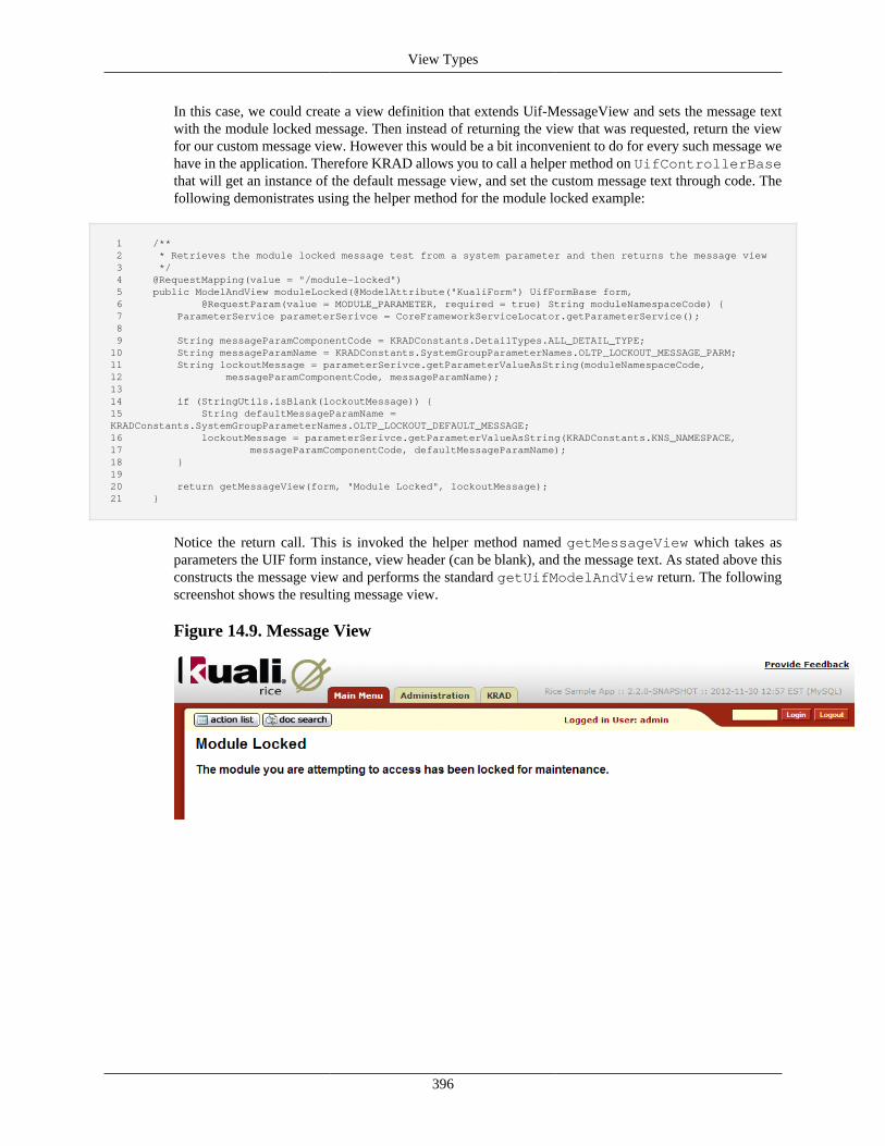
View Types
396
In this case, we could create a view definition that extends Uif-MessageView and sets the message textwith the module locked message. Then instead of returning the view that was requested, return the viewfor our custom message view. However this would be a bit inconvenient to do for every such message wehave in the application. Therefore KRAD allows you to call a helper method on UifControllerBasethat will get an instance of the default message view, and set the custom message text through code. Thefollowing demonistrates using the helper method for the module locked example:
1 /** 2 * Retrieves the module locked message test from a system parameter and then returns the message view 3 */ 4 @RequestMapping(value = "/module-locked") 5 public ModelAndView moduleLocked(@ModelAttribute("KualiForm") UifFormBase form, 6 @RequestParam(value = MODULE_PARAMETER, required = true) String moduleNamespaceCode) { 7 ParameterService parameterSerivce = CoreFrameworkServiceLocator.getParameterService(); 8 9 String messageParamComponentCode = KRADConstants.DetailTypes.ALL_DETAIL_TYPE; 10 String messageParamName = KRADConstants.SystemGroupParameterNames.OLTP_LOCKOUT_MESSAGE_PARM; 11 String lockoutMessage = parameterSerivce.getParameterValueAsString(moduleNamespaceCode, 12 messageParamComponentCode, messageParamName); 13 14 if (StringUtils.isBlank(lockoutMessage)) { 15 String defaultMessageParamName = KRADConstants.SystemGroupParameterNames.OLTP_LOCKOUT_DEFAULT_MESSAGE; 16 lockoutMessage = parameterSerivce.getParameterValueAsString(KRADConstants.KNS_NAMESPACE, 17 messageParamComponentCode, defaultMessageParamName); 18 } 19 20 return getMessageView(form, "Module Locked", lockoutMessage); 21 }
Notice the return call. This is invoked the helper method named getMessageView which takes asparameters the UIF form instance, view header (can be blank), and the message text. As stated above thisconstructs the message view and performs the standard getUifModelAndView return. The followingscreenshot shows the resulting message view.
Figure 14.9. Message View
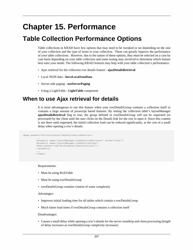
397
Chapter 15. PerformanceTable Collection Performance Options
Table collections in KRAD have few options that may need to be tweaked or set depending on the sizeof your collection and the type of items in your collection. These can greatly improve the performanceof your table collections. However, due to the nature of these options, they must be selected on a case bycase basis depending on your table collection and some testing may involved to determine which featurebest suits your needs. The following KRAD features may help with your table collection’s performance:
• Ajax retrieval for the collection row details feature - ajaxDetailsRetrieval
• Local JSON data - forceLocalJsonData
• Server-side paging - useServerPaging
• Using a LightTable - LightTable component
When to use Ajax retrieval for detailsIt is most advantageous to use this feature when your rowDetailsGroup contains a collection itself orcontains a large amount of javascript based features. By setting the collection table’s layoutManagerajaxDetailsRetrieval flag to true, the group defined in rowDetailsGroup will not be requested (orprocessed) by the client until the user clicks on the Details link for the row to open it. Since this contentis not there until requested, the initial collection load can be reduced significantly, at the cost of a smalldelay when opening a row’s details.
<bean parent="Uif-Disclosure-TableCollectionSection"> ... <property name="layoutManager.ajaxDetailsRetrieval" value="true"/> <property name="layoutManager.rowDetailsGroup"> <bean parent="Lab-Performance-SubCollection1"/> </property> ... </bean>
Requirements:
• Must be using RichTable
• Must be using rowDetailsGroup
• rowDetailsGroup contains content of some complexity
Advantages:
• Improves initial loading time for all tables which contain a rowDetailsGroup
• Much faster load times if rowDetailsGroup contains a collection itself
Disadvantages:
• Causes a small delay while opening a row’s details for the server roundtrip and client processing (lengthof delay increases as rowDetailsGroup complexity increases)
Performance
398
When to use local JSON dataIt is most advantageous to use this feature when the collection being processed is known to be small insize (less than 20-50, but also dependent on individual row item complexity). This loads all the data intothe table in JSON format automatically (by the framework) which allows us to take advantage of a featurein the datatable plugin called deferred render (this is automatically turned on by the framework when thisfeature is used). Deferred rendering allows the table to defer the rendering of the dom elements until thepage is changed, thus improving upfront load times.
This feature can also be combined with the ajax row details approach for even faster processing of tablecollections which use rowDetailsGroup functionality.
This feature can be turned on by setting the forceLocalJsonData flag to true in the layoutManager’srichTable properties.
<property name="layoutManager.richTable.forceLocalJsonData" value="true"/>
Due to a limitation of this approach, if you have a rowDetailsGroup in your table which contains asubcollection table that also uses the forceLocalJsonData flag, you must set the nestedLevel property ofrichTable to the level of nesting that table is at (a subcollection contained in rowDetailsGroup would benested level 1). This must only be set if the parent table is also using forceLocalJsonData (does not applyin cases where the parent collection is not using this feature or where the parent collection is a stackedcollection).
<property name="layoutManager.richTable.nestedLevel" value="1"/>
Requirements:
• Must be using RichTable
• Table is small in size (20-50 rows)
• Table should have multiple pages (to take advantage of deferred rendering)
• Must set nestedLevel for subCollection tables which exist in rowDetailsGroup
Advantages:
• Faster page load times for most tables vs. tables without this flag turned on
• Deferred render allows the elements to not be rendered by the browser until needed
• All data is stored client-side so page changes and sorting should be very responsive
Disadvantages:
• Page loading time increases as a collection becomes larger in size
• Larger DOM size because JSON data is sent upfront
• Requires manual management of the nestedLevel flag for subcollections which use this feature
• Row and col spans are not allowed
Performance
399
When to use server-side pagingIt is most advantageous to use this feature when the collection being processed is known to be large insize, however it may actually be faster than forceLocalJsonData in some situations even for smaller tablesdepending on overall row size and server processing required per a row. This feature scales with collectionsof any size because it does not require all the rows (and their components) to go through a full lifecycleprocess, but only until they are needed by the table. Since this table requires that it requests the datafrom the server, there may be a small delay in loading new pages. In addition, sorting the data of thetable because it requires a server roundtrip. The implementation itself returns back JSON data (when usingRichTable) on each request representing the rows being displayed.
This feature can also be combined with the ajax row details approach for even faster processing of tablecollections which use rowDetailsGroup functionality.
This feature can be turned on by setting the useServerPaging flag to true on the CollectionGroup itself.
<bean parent="Uif-Disclosure-TableCollectionSection" p:headerText="Collection 1"> <property name="useServerPaging" value="true"/> ...
Requirements:
• RichTable or a table without RichTable functionality can be used
• Collection size may be large (preferred) or small
• Collection should have multiple pages
Advantages:
• Faster page load times for most tables vs. tables without this flag turned on
• Very fast load times for extremely large collections (1000+) in comparison to other full featureapproaches
• Reduced DOM size upfront
Disadvantages:
• Small delays when changing pages and sorting, due to the server roundtrip (dependent on server loadand row complexity) – this impact should be somewhat minimal
• Server sorting becomes slower as the collection gets larger
• Server sorting can become slower if the column being sorted contains SpringEL expressions for itscontent
• Row and col spans are not allowed when using RichTable functionality, however they are allowed ifRichTable is not being used, but column sorting will be lost (richTable.render is "false")
When to use LightTableIt is most advantageous to use this feature when the collection is somewhat simple in nature, onlycontaining read-only data, basic input fields, and basic actions. The LightTable can be very fast to loadeven with very large sets of data, and the page and sorting functionality should be near instantaneous.
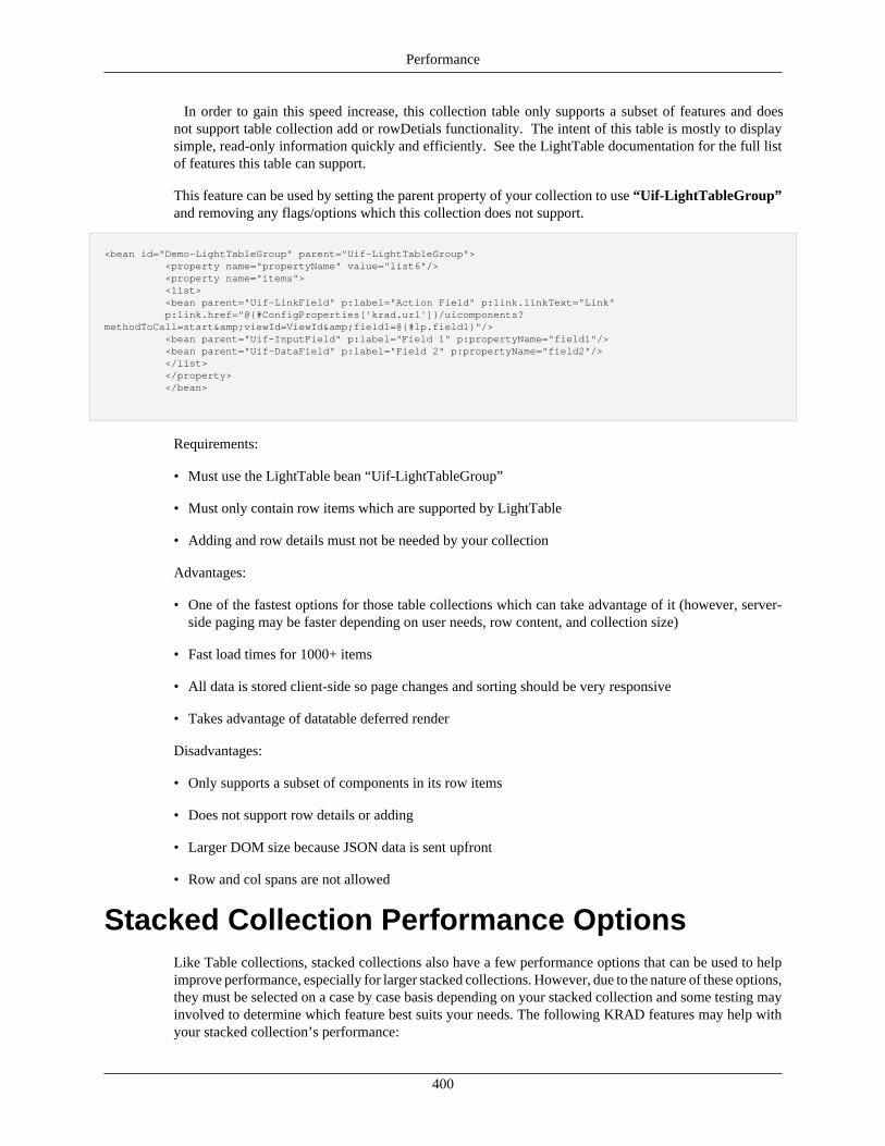
Performance
400
In order to gain this speed increase, this collection table only supports a subset of features and doesnot support table collection add or rowDetials functionality. The intent of this table is mostly to displaysimple, read-only information quickly and efficiently. See the LightTable documentation for the full listof features this table can support.
This feature can be used by setting the parent property of your collection to use “Uif-LightTableGroup”and removing any flags/options which this collection does not support.
<bean id="Demo-LightTableGroup" parent="Uif-LightTableGroup"> <property name="propertyName" value="list6"/> <property name="items"> <list> <bean parent="Uif-LinkField" p:label="Action Field" p:link.linkText="Link" p:link.href="@{#ConfigProperties['krad.url']}/uicomponents?methodToCall=start&viewId=ViewId&field1=@{#lp.field1}"/> <bean parent="Uif-InputField" p:label="Field 1" p:propertyName="field1"/> <bean parent="Uif-DataField" p:label="Field 2" p:propertyName="field2"/> </list> </property> </bean>
Requirements:
• Must use the LightTable bean “Uif-LightTableGroup”
• Must only contain row items which are supported by LightTable
• Adding and row details must not be needed by your collection
Advantages:
• One of the fastest options for those table collections which can take advantage of it (however, server-side paging may be faster depending on user needs, row content, and collection size)
• Fast load times for 1000+ items
• All data is stored client-side so page changes and sorting should be very responsive
• Takes advantage of datatable deferred render
Disadvantages:
• Only supports a subset of components in its row items
• Does not support row details or adding
• Larger DOM size because JSON data is sent upfront
• Row and col spans are not allowed
Stacked Collection Performance OptionsLike Table collections, stacked collections also have a few performance options that can be used to helpimprove performance, especially for larger stacked collections. However, due to the nature of these options,they must be selected on a case by case basis depending on your stacked collection and some testing mayinvolved to determine which feature best suits your needs. The following KRAD features may help withyour stacked collection’s performance:
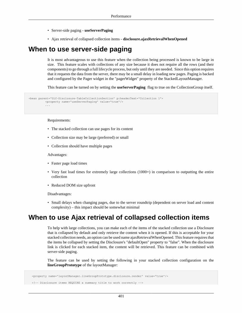
Performance
401
• Server-side paging - useServerPaging
• Ajax retrieval of collapsed collection items - disclosure.ajaxRetrievalWhenOpened
When to use server-side pagingIt is most advantageous to use this feature when the collection being processed is known to be large insize. This feature scales with collections of any size because it does not require all the rows (and theircomponents) to go through a full lifecycle process, but only until they are needed. Since this option requiresthat it requests the data from the server, there may be a small delay in loading new pages. Paging is backedand configured by the Pager widget in the "pagerWidget" property of the StackedLayoutManager.
This feature can be turned on by setting the useServerPaging flag to true on the CollectionGroup itself.
<bean parent="Uif-Disclosure-TableCollectionSection" p:headerText="Collection 1"> <property name="useServerPaging" value="true"/> ...
Requirements:
• The stacked collection can use pages for its content
• Collection size may be large (preferred) or small
• Collection should have multiple pages
Advantages:
• Faster page load times
• Very fast load times for extremely large collections (1000+) in comparison to outputting the entirecollection
• Reduced DOM size upfront
Disadvantages:
• Small delays when changing pages, due to the server roundtrip (dependent on server load and contentcomplexity) – this impact should be somewhat minimal
When to use Ajax retrieval of collapsed collection itemsTo help with large collections, you can make each of the items of the stacked collection use a Disclosurethat is collapsed by default and only retrieve the content when it is opened. If this is acceptable for yourstacked collection needs, an option can be used name ajaxRetrievalWhenOpened. This feature requires thatthe items be collapsed by setting the Disclosure's "defaultOpen" property to "false". When the disclosurelink is clicked for each stacked item, the content will be retrieved. This feature can be combined withserver-side paging.
The feature can be used by setting the following in your stacked collection configuration on thelineGroupPrototype of the layoutManager:
<property name="layoutManager.lineGroupPrototype.disclosure.render" value="true"/>
<!-- Disclosure items REQUIRE a summary title to work correctly -->
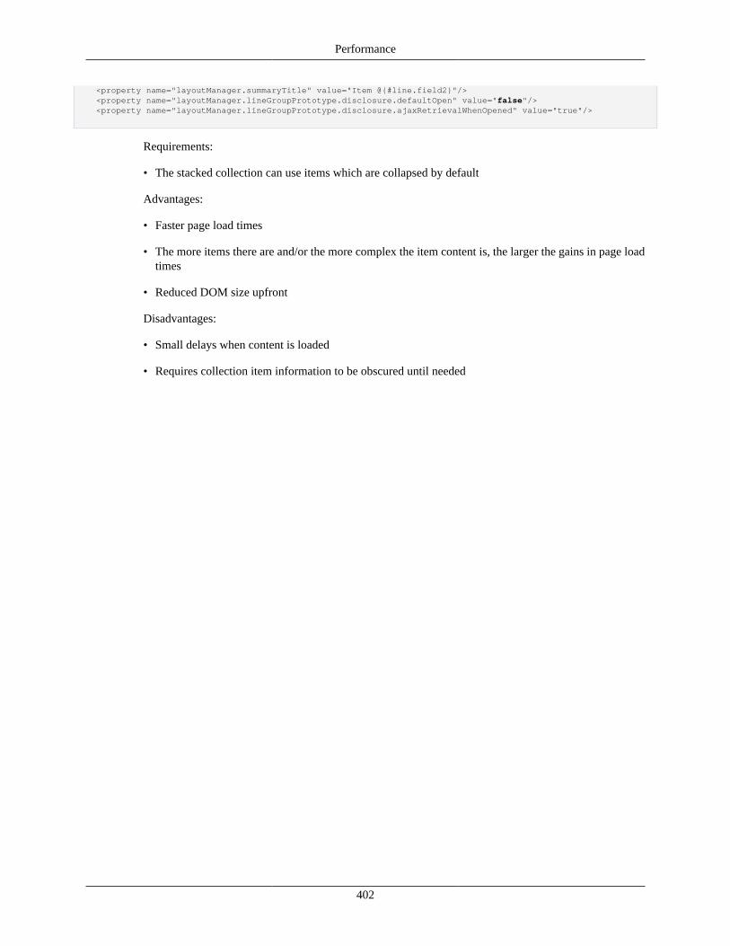
Performance
402
<property name="layoutManager.summaryTitle" value="Item @{#line.field2}"/> <property name="layoutManager.lineGroupPrototype.disclosure.defaultOpen" value="false"/> <property name="layoutManager.lineGroupPrototype.disclosure.ajaxRetrievalWhenOpened" value="true"/>
Requirements:
• The stacked collection can use items which are collapsed by default
Advantages:
• Faster page load times
• The more items there are and/or the more complex the item content is, the larger the gains in page loadtimes
• Reduced DOM size upfront
Disadvantages:
• Small delays when content is loaded
• Requires collection item information to be obscured until needed
403
Chapter 16. Security
OverviewThe purpose of this functionality is to provide security within the request binding process and controllerinvocation.
Model BindingRequest parameters are bound to model (form) properties based on property security levels. These levelsindicate when a property can be updated.
Default Security Level - ViewThe default security level for model properties is based on view metadata. That is, the property will onlybe updated if contained in view configuration that requires updating. This includes:
• Input Field Property Name - If the property name is associated with an input field
• Quickfinder Field Conversion - If the property name is listed as a return field of a quickfinder, the valuewill be updated when returning from that lookup
• Action Additional Submit Data - If the property name is listed in the additionalSubmitData propertyfor an action
• Data Field Additional Hiddens - If the property name is listed in the additionalHiddenPropertyNamesproperty for Data Field
• User Control Principal Id - Property name mapped to the user control principal id hidden
• Collection Group Property Name - If the property name is associated with a collection group, thecollection items will be updated (add or delete). Individual properties in the collection item must meetone of the other requirements.
Note in all these cases, the component must be rendered, not hidden, and not read-only (where applicable).These settings in turn can depend on code and KIM permissions.
Accessible Security LevelModel properties may contain the annotation @RequestAccessible to indicate their values can be updatedby request parameters. This would allow updates regardless of view configuration. The annotation maybe placed on a data object to grant access to all nested properties (unless they contain a request protectedannotation).
If a property is not within the view configuration (or in the view configuration but doesn't meet one ofthe conditions above), this annotation may be needed to allow binding. For example, the application mayhave custom script that pass request parameters which should update model (form) properties. In addition,since view post data is only available for POST requests, any properties that need binding on GETrequests must have this annotation. The annotation may also include a method value that restricts accessdepending on the HTTP request method (for example GET).

Security
404
Protected Security LevelModel properties may contain the annotation @RequestProtected to indicate their values cannot beupdated by request parameters. This would disallow updates regardless of view configuration. Note theannotation maybe be placed on a data object to deny access to all nested properties (unless they containa request accessible annotation).
If the property name is within the view configuration and meets one of the conditions above, this annotationwill be needed to prevent updating. For example, you might have a hidden which is needed for script, butyou don't want that value to be updated.
Binding Access Errors
When a request parameter is present for a property whose binding access is protected, the valuewill not be populated. In addition, a debug message will be written and the property name addedto supressedFields in the binding result. The request will continue as usual, and applications candeal further with the binding result if needed.
Example
public class TravelForm extends UifFormBase { // view security level private String firstName; // view security level private String lastName; @RequestProtected private String travelSequenceId; @RequestAccessible private boolean updateFlag; @RequestProtected private TaxInfo taxInfo; @RequestAccessible(method=RequestMethod.GET) private boolean copy; }
Controller Method BindingSecurity will be implemented within the UIF to verify the user has access to invoke the controller methodrequested. Method access will be granted based on the following.
Default Security Level - View
• Action Method To Call - If method is configured as the method to call for a view action
• Component Method To Call on Refresh - If method is configured as the method to call on refresh fora component
Note in all these cases, the component must be rendered, not hidden, and not read-only (where applicable).These settings in turn can depend on code and KIM permissions.
Accessible Security Level
Security
405
Controller methods may contain the annotation @MethodAccessible to indicate they can be invokedregardless of the view configuration.
Since view actions only cover posts, all methods that can be invoked in a GET request must have the@MethodAccessible annotation. The default start method of UifControllerBase (and GET methods forother framework controllers) will have this annotation already. In addition, any methods invoked withcustom script will need this annotation.
Spring's RequestMapping annotation can sldo be used to restrict method access for Http request types(GET, POST) and other request attributes.
Method Access Errors
When a controller method is requested whose access is protected, the request will end and theuser will be redirected to the incident report page.
Use ScreenUse Screen is a KIM permission template of the KNS that restricted controller access. Access is restrictedfor an entire module by just specifying the namespace (in permissions details), or a particular controller byspecifying the action class. In KRAD, the default security level requires a valid action component (whichcan then depend on permissions). So this is only be needed to restrict access (based on user) for thosecontroller methods annotated with @RequestAccessible.
This permission differs from the Open View permission which can be used to restrict any view (or screen)since it prevents someone form invoking a controller method they should not have access to (which mightindirectly prevent them from accessing a screen).
Edit ModesEdit Modes is a type of security that uses the 'viewId' and an 'editMode' to control screen rendering andother aspects of the user interface.
Each View object has an associated ViewPresentationController and ViewAuthorizer interface objects.During the apply model phase of the view life cycle these objects are used for permission checking. TheViewPresentationController is typically where a set of editModes are determined by looking at the stateof the model. The ViewAuthorizer then checks this set of editModes against KIM looking to see if theuser has the correct permission for that 'viewId' and 'editMode' combination. Here is a portion of the codefrom ViewLifecycleBuild class:
protected void runApplyModelPhase() { ViewLifecycleProcessor processor = ViewLifecycle.getProcessor();
View view = ViewLifecycle.getView(); ViewHelperService helper = ViewLifecycle.getHelper(); UifFormBase model = (UifFormBase) ViewLifecycle.getModel();
...
// get action flag and edit modes from authorizer/presentation controller helper.retrieveEditModesAndActionFlags();
...
processor.performPhase(LifecyclePhaseFactory.applyModel(view, model, "", refreshPaths));
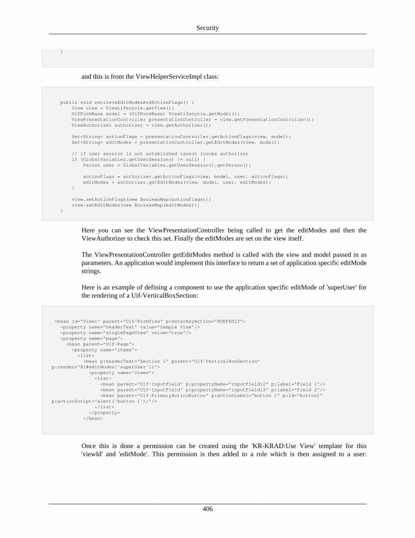
Security
406
}
and this is from the ViewHelperServiceImpl class:
public void retrieveEditModesAndActionFlags() { View view = ViewLifecycle.getView(); UifFormBase model = (UifFormBase) ViewLifecycle.getModel(); ViewPresentationController presentationController = view.getPresentationController(); ViewAuthorizer authorizer = view.getAuthorizer();
Set<String> actionFlags = presentationController.getActionFlags(view, model); Set<String> editModes = presentationController.getEditModes(view, model);
// if user session is not established cannot invoke authorizer if (GlobalVariables.getUserSession() != null) { Person user = GlobalVariables.getUserSession().getPerson();
actionFlags = authorizer.getActionFlags(view, model, user, actionFlags); editModes = authorizer.getEditModes(view, model, user, editModes); }
view.setActionFlags(new BooleanMap(actionFlags)); view.setEditModes(new BooleanMap(editModes)); }
Here you can see the ViewPresentationController being called to get the editModes and then theViewAuthorizer to check this set. Finally the editModes are set on the view itself.
The ViewPresentationController getEditModes method is called with the view and model passed in asparameters. An application would implement this interface to return a set of application specific editModestrings.
Here is an example of defining a component to use the application specific editMode of 'superUser' forthe rendering of a Uif-VerticalBoxSection:
<bean id="View1" parent="Uif-FormView" p:enterKeyAction="@DEFAULT"> <property name="headerText" value="Sample View"/> <property name="singlePageView" value="true"/> <property name="page"> <bean parent="Uif-Page"> <property name="items"> <list> <bean p:headerText="Section 1" parent="Uif-VerticalBoxSection" p:render="@{#editModes['superUser']}"> <property name="items"> <list> <bean parent="Uif-InputField" p:propertyName="inputField12" p:label="Field 1"/> <bean parent="Uif-InputField" p:propertyName="inputField13" p:label="Field 2"/> <bean parent="Uif-PrimaryActionButton" p:actionLabel="button 1" p:id="button1" p:actionScript="alert('button 1');"/> </list> </property> </bean>
Once this is done a permission can be created using the 'KR-KRAD:Use View' template for this'viewId' and 'editMode'. This permission is then added to a role which is then assigned to a user:
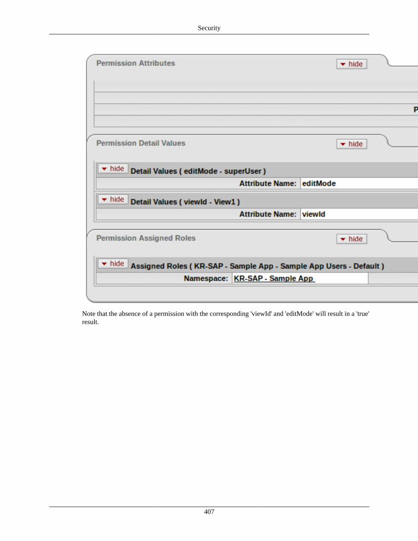
Security
407
Note that the absence of a permission with the corresponding 'viewId' and 'editMode' will result in a 'true'result.
408
Chapter 17. Testing and ToolingNote
Rice tools are currently considered in beta and are not verified for current use. While certain toolslike the Data Dictionary Reloader have gone through several revisions and have probably settleddown to a standard setup, other tools like the Rice Data Objects Developer (RDO) have not beenupdated from OJB to JPA, so use these tools at your own risk.
Reloading the Data DictionaryRice provides tooling to allow automatic data dictionary reloading when a server context is refreshed. Thisgreatly speeds up the KRAD development cycle as it allows a developer to reload view configurationswithout having to restart the server. The mechanism to refresh resources is different for every server, butit is very similar to hot swapping classes in Tomcat.
To set this up, you will first need to add rice-krad-development-tools as a dependency to theweb module of your project. In Rice, the best place to put this is in rice-middleware/web/pom.xmlsince it will affect all Rice applications. It is recommended that this be added for development only; thisis why Rice does not ship it with this dependency.
<dependency> <groupId>org.kuali.rice</groupId> <artifactId>rice-krad-development-tools</artifactId> <version>${rice.version}</version></dependency>
Finally, you will need to add a parameters to your Rice configuration file, such as rice-config.xml.
<param name="rice.kr.additionalSpringFiles">classpath:org/kuali/rice/krad/devtools/datadictionary/ReloadingDataDictionarySpringBeans.xml</param>
You will also need to make sure that your parameter rice.krad.dev.mode is set to true to avoidcaching the views.
Rice Data Objects
Introduction
Purpose of RDO
The Kuali Rapid Application Development Framework (KRAD) relies on several different artifacts for itscreation and rendering of web applications. These artifacts are greatly varied in both form and purpose;ranging from standard java class files to xml files. The creation of these can be both repetitive and timeconsuming to developers. The purpose of the Rice Data Object (RDO) Developer is to decrease both therepetitiveness and time it takes to create these artifacts by automating and guiding the creation.
What is RDO
The Rice Data Objects Developer is an artifact creation tool that helps in the implementation of the KualiRapid Application Development framework. It allows the user to rapidily develop web applications by

Testing and Tooling
409
providing a quick and easy way to create the necessary artifacts for use in the KRAD framework. In themost basic terms, it is a wizard that guides the user, through prompts and lists, in entering the neededinformation for each artifact, then generates the completed form, removing the need for repetitive typingand formatting. Through this it also brings a level of standardization to the different artifacts, making theinterpretation of each simpler.
This tool utilizes an interactive command line style interface that assists the user in entering the informationabout a desired artifact, offering validation on the content before writing the artifact to the appropriatelocation. This process takes care of the bulk work needed to create and deploy web applications with theuser only needed to touch the artifact itself for subject specific details and changes.
Installation and Configuration
Included Files
• Folder: Properties
• File: rdo-config.properties
• File: rdo-tool.jar
Setting Up File System
The RDO Developer is set up to save the artifacts generated to predetermined locations. This can causeerrors in the save process if the folder location that RDO is trying to access is missing. To prevent this,before using RDO, the user should configure the File Path Setup section of the properties so that thefile paths point to the folder in which they wish to save each artifact. More details can be found in theConfiguring Properties section below.
Configuring Properties
The RDO Developer offers a wide availability of customization and automization which can be set upthrough the rdo-config.properties file. This file is broken into a number of different sections based on thearea of the RDO affected. It is recommended to make a back up of this file before making changes.
• Main Program Setup
The properties described in this section deal with the functionality and navigation of the RDO. Pleasenote the all names and symbols defined in this area need to be exact to avoid critical runtime errorsin the program.
• Delimiter: List separator used in this file (default value: ",").
• developerlist: List of the developer names displayed in the main menu.
• lineardevelopment.javaobjectwriter.next: The name of the developer after the Java Object developerin the linear development method (default value: DDL).
• lineardevelopment.ddlwriter.next: The name of the developer after the DDL Developer in the lineardevelopment method (default value: OJB).
• lineardevelopment.ojbwriter.next: The name of the developer after the OJB Developer in the lineardevelopment method (default value: DataDictionary).
Testing and Tooling
410
• lineardevelopment.datadictionarywriter.next: The name of the developer after the Data DictionaryDeveloper in the linear development method (default value: ViewXML).
• lineardevelopment.viewwriter.next: The name of the developer after the View Developer in the lineardevelopment method (default value: DataObject).
• lineardevelopment.converters.use: The status of whether artifacts will be created by converting otherinformation from previous artifacts (values: always, never, prompt).
• utilities.filepath.errormessages: The file name and location for the xml document that contains thelist of error codes for the program.
• utilities.interface.gui: The status of whether the Tooling GUI Interface will be used to display andrun the program in.
• File Path Setup
The properties described in this section deal with the set up of the file system and the file locationfor saving artifacts developed using the RDO. File paths can be substituted into others by enclosingthe property name in "{}" for example: "{filepath.default.workarea}/ java/projects/ {projectname}/"where the first brackets enclose the workarea name defined in these properties. Putting brackets aroundprojectname and modulename tells the RDO to substitute the project or module name set by the user.
• filepath.prompt.projectname: Whether the user should be prompted to enter a project name whencreating new artifacts (values: true, false).
• filepath.prompt.modulename: Whether the user should be prompted to enter a module name whencreating new artifacts (values: true, false).
• filepath.default.projectname: The default name of the project for the artifacts.
• filepath.default.modulename: The default name of the module for the artifacts
• filepath.default.workarea: The default file location where the file system starts for the artifacts.
• filepath.location.project: The file path where the project folder is.
• filepath.location.workflow: The file path where workflow artifacts are saved.
• filepath.location.module: The file path where the module folder is.
• filepath.location.resource: The file path to where OJB artifacts are saved.
• filepath.location.changeset: The file path to where DDL artifacts are saved.
• filepath.location.dictionary: The file path to where Data Dictionary artifacts are saved.
• filepath.location.uif: The file path to where View artifacts are saved.
• filepath.location.dataobjects: The file path to where Java Object artifacts are saved.
• filepath.location.ojb: The file path to where OJB artifacts are saved.
• filepath.location.package.project: The import package of the project.
• filepath.location.package.module: The import package of the module.

Testing and Tooling
411
• Java Object Writer
The properties described in this section deal with the automization of the Java Object Developer.
• javaobjectwriter.default.authorname: The default name of the author for a Data Object.
• javaobjectwriter.default.authoremail: The default email of the author for a Data Object.
• javaobjectwriter.default.businessobject: The default business object status of a Data Object (values"yes" / "no").
• javaobjectwriter.prompt.authorname: Whether the user should be prompted to enter a author namewhen creating a new Object.
• javaobjectwriter.prompt.authoremail: Whether the user should be prompted to enter a author emailwhen creating a new Object.
• javaobjectwriter.prompt.businessobject: Whether the user should be prompted to enter the businessobject status when creating a new Object.
• javaobjectwriter.datatypes.names: List of data types in which common properties can be set.
• javaobjectwriter.datatypes.paths: List of corresponding import paths to the previous list (order ofthese items must match its counterpart in the first list).
• DDL Writer
The properties described in this section deal with the automization and list options of the DDLDeveloper.
• ddlwriter.columntype.names: List of column types in which a column can be set to.
• ddlwriter.converter.datatype: List of data types with registered JDBC matches.
• ddlwriter.converter.jdbctype: List of corresponding JDBC matches to the previous list (order of theseitems must match its counterpart in the first list).
• Data Dictionary Writer
The properties described in this section deal with the default list and options available for the DataDictionary Developer.
• datadictionary.definition.textconstraints: List of values for a special attribute –validCharactersConstraint.
• datadictionary.definition.controlfields: List of values for a special attribute – controlfield.
• datadictionary.definition.attributes.simple: List of attribute names for simple attributes.
• datadictionary.definition.attributes.example: List of examples for the simple attributes listed above(order of these items must match its counterpart in the first list).
• datadictionary.definition.attributes.special: List of attribute names for special attributes.
• OJB Writer
The properties described in this section deal with the OJB file and creation of a new file if needed.
Testing and Tooling
412
• ojb.file.name: This is the name of the ojb file which the developer will append to (default: ojb.xml).
Starting the program
Before starting the RDO, users should first make sure the program is set up correctly. They should firstcheck that the rdo-config.properties file are in the /properties folder. Once the properties files are in place,users should make changes to the rdo-config file to set up the customization and automization as theywish, and making sure the errorMsgs.xml file is being pointed to as well, to decrease errors and allowerror handling by the system. After set up is complete, start the program by clicking the program icon andopening the console.
User Guide
Artifact Creation Methods
RDO offers several ways to go about the development of the different artifacts used by the KRADframework based on the needs and desires of the users.
Stand alone
The most basic setup of the RDO allows users to create each artifact from scratch in a standalone method.Using this method, each artifact is created by itself, meaning that it is not using influenced by the otherartifacts, nor does the user need to create the others. This method allows for the quick replacement orcreation of specific artifacts in the system.
Linear Development
This method focuses on creating several artifacts of the same set (either complete or partial sets). In thisset up, the user fills in the information and creates the artifact before moving on to the next; allowing themto use information filled in on the previous artifacts to create the others. The default order of creation is:
Java Object -> DDL Table -> OJB Descriptor -> Dictionary entry -> Views
However, this can be changed to allow for the absence of an artifact or for the preference of the user.(Changing the order of artifact creation can be done by modifying the values of the lineardevelopmententries in the properties file).
Main Menu
The main menu for the RDO simply consists of the different artifacts that can be created using the program.To start the creation of an artifact, select it from the menu by entering its selection value (the number onthe left side of the artifacts name). You can also enter 0 to exit the program.
Interacting with Prompts
The RDO is meant to assist users in entering information to create the KRAD artifacts, and does this byusing prompts to direct what information the program is looking for the user to enter. To avoid mistakesor misinformation from being entered, the program will validate the information entered by the user andrespond if invalid information is detected. The user can also back out of a series of prompts by entering"/q", which will return them to the closest menu.
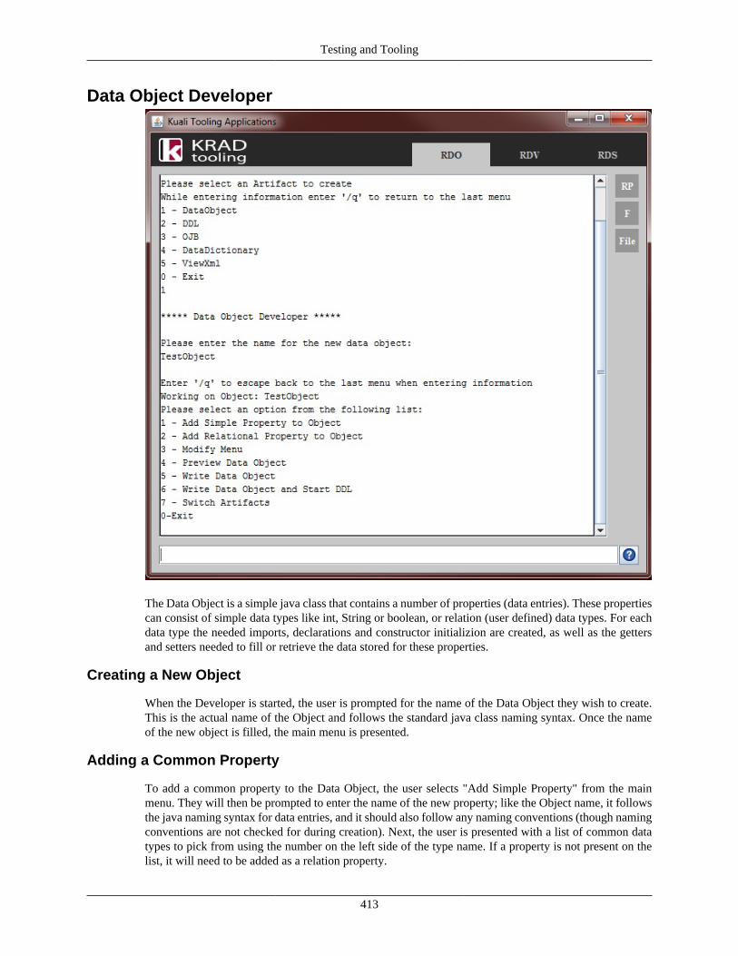
Testing and Tooling
413
Data Object Developer
The Data Object is a simple java class that contains a number of properties (data entries). These propertiescan consist of simple data types like int, String or boolean, or relation (user defined) data types. For eachdata type the needed imports, declarations and constructor initializion are created, as well as the gettersand setters needed to fill or retrieve the data stored for these properties.
Creating a New Object
When the Developer is started, the user is prompted for the name of the Data Object they wish to create.This is the actual name of the Object and follows the standard java class naming syntax. Once the nameof the new object is filled, the main menu is presented.
Adding a Common Property
To add a common property to the Data Object, the user selects "Add Simple Property" from the mainmenu. They will then be prompted to enter the name of the new property; like the Object name, it followsthe java naming syntax for data entries, and it should also follow any naming conventions (though namingconventions are not checked for during creation). Next, the user is presented with a list of common datatypes to pick from using the number on the left side of the type name. If a property is not present on thelist, it will need to be added as a relation property.
Testing and Tooling
414
Adding a Relation Property
To add a relation property to the Data Object the user selects "Add Relational Property" from the mainmenu. Like when adding a common property, they will be prompted to enter the name for the new property(same syntax and conventions apply). Next, they will be asked to enter the import package for the datatype. This means that the user must enter the exact import syntax for the type they wish to use, and nota general package using the * symbol (example path1.path2.type1) as the data type for the property isextracted from its import package. Once complete, the user is asked whether the relational property is "oneto one" or "one to many" by selecting the options from the list. A "one to many" status on the propertymeans that it will be designated as a list in the java class.
Modifying The Data Object
To modify information already entered into the Data Object, the user can select "Modify Menu" from themain menu. This will take them to a new menu in which they are able to modify any piece of data alreadyentered by selecting from the options and following the prompts. Where the primary data entering optionsin the main menu deal with collecting data for a whole item at once, the options under the modify menuhandle only a specific segment of the data at one time.
Previewing Java Class
Once the necessary information has been entered into the Data Object Developer, the user can previewa sample of the class that will be written by selecting "Preview Data Object" from the main menu. Thispreview shows the class imports, property declarations and constructor, but not the getters and setters.
Writing the Object to File
After checking the Data Object for completeness and correctness, it can then be written to the appropriatelocation defined in the program properties file by selecting "Write Data Object" from the main menu. Thisoption automatically writes the complete class to a .java file at that location. Once the file is written, theprogram prompts the user if they would like to open the new file. By entering "yes" to this prompt the filewill then be opened using the computer's default program for opening files of the type java.
Linear Development
When looking at the main menu, the user will notice that there are two options to write: "Write Data Object"and "Write Data Object and Start ____." The first option merely writes the Object being worked on toits file and stays in the Data Object Developer; the second option, however, is for the linear developmentmethod. Meaning that it will write the Object to file, then exit the Data Object Developer, and start thenext Developer as assigned in the properties file. By doing this the information entered for the Data Objectand previous artifacts is used to help in making the other artifacts helping speed up the process. For lineardevelopment, it is suggested to always start in the Data Object Developer, as it sets the property fieldsfor the others.
Exiting
Once the user has completed creating a Data Object, they can exit back to the RDO's main menu by simplyselecting the "Exit" option from the Data Object Developer menu.
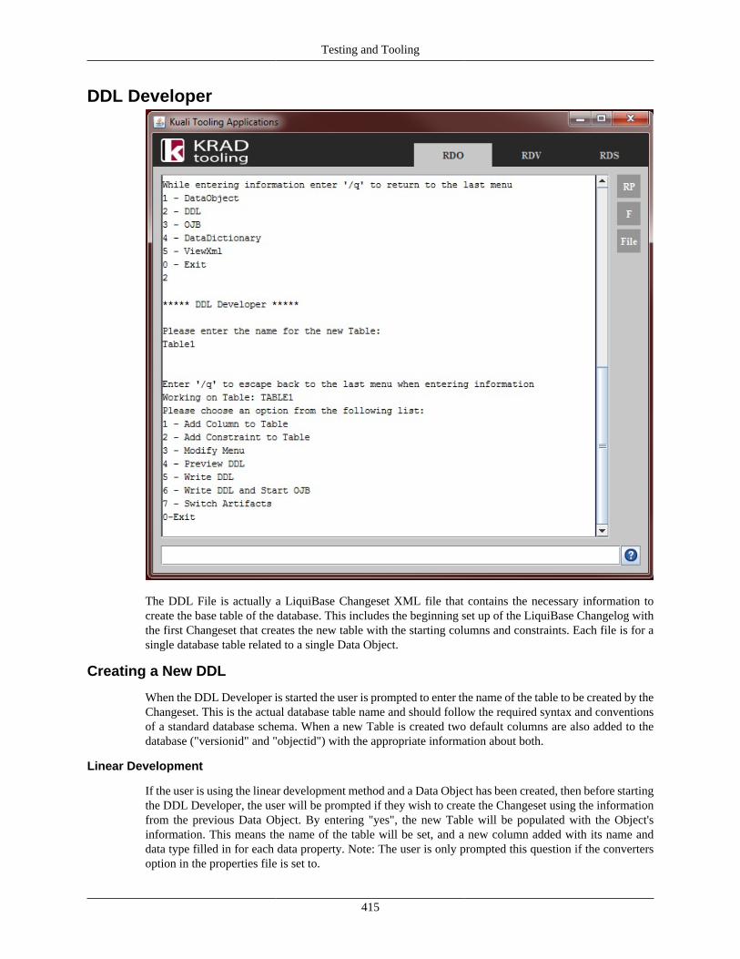
Testing and Tooling
415
DDL Developer
The DDL File is actually a LiquiBase Changeset XML file that contains the necessary information tocreate the base table of the database. This includes the beginning set up of the LiquiBase Changelog withthe first Changeset that creates the new table with the starting columns and constraints. Each file is for asingle database table related to a single Data Object.
Creating a New DDL
When the DDL Developer is started the user is prompted to enter the name of the table to be created by theChangeset. This is the actual database table name and should follow the required syntax and conventionsof a standard database schema. When a new Table is created two default columns are also added to thedatabase ("versionid" and "objectid") with the appropriate information about both.
Linear Development
If the user is using the linear development method and a Data Object has been created, then before startingthe DDL Developer, the user will be prompted if they wish to create the Changeset using the informationfrom the previous Data Object. By entering "yes", the new Table will be populated with the Object'sinformation. This means the name of the table will be set, and a new column added with its name anddata type filled in for each data property. Note: The user is only prompted this question if the convertersoption in the properties file is set to.
Testing and Tooling
416
Adding Columns
To add a column to the created Table, the user selects "Add Column" from the main menu. They willthen be asked to enter the name of the new column which should meet database syntax (the name willautomatically be set to uppercase). A list of JDBC types is displayed, and the column type can be selectedusing the index on the left side of the type's name. Once the type is selected the user can enter the parametersfor the type by following the prompt (if the JDBC type has a common format of parameters, the user willbe asked if they wish to use it, which provides a more detailed and structured prompt). After the type isentered the user can then enter a default value for the column which should match the type. Finally, theuser is prompted to enter whether this column should be nullable or not by selecting the appropriate option.
Adding Constraint
To add a constraint to the Table, the user can select "Add Constraint" from the main menu. They will thenbe prompted for the type of constraint they wish to add.
Primary Key: To add a primary key constraint to the Table, select "Primary Key" from the constraint list.Then select all columns from the list displayed by entering the index to the left of the name. Each columnis selected one at a time with as many columns being added as needed.
Foreign Key: To add a foreign key constraint to the Table select "Foreign Key" from the constraint list. Theuser will then be prompted to enter the name of the Table being referenced in the key, followed by enteringthe name of each column referenced in that Table, one by one. Once the referenced columns are entered,they can then enter the columns affected in the new Table by selecting them from the list displayed.
Modifying The DDL
To modify information already entered into the DDL, the user can select "Modify Menu" from the mainmenu. This will take them to a new menu in which they are able to modify any piece of data already enteredby selecting from the options and following the prompts. Whereas the primary data entering options in themain menu deal with collecting data for a whole item at once, the options under the modify menu handleonly a specific segment of the data at one time.
Previewing DDL
Once the necessary information has been entered into the DDL Developer, the user can preview the datafor the new Table by selecting "Preview DDL" in the main menu. This will display all the data enteredas it would appear in the file.
Writing the DDL to File
After checking the DDL Changeset for completeness and correctness, it can then be written to theappropriate location defined in the program properties file by selecting "Write DDL" from the main menu.This option automatically writes the complete Changeset to a xml file at that location. Once the file iswritten, the program prompts the user if they would like to open the new file. By entering "yes" to thisprompt, the file will then be opened using the computer's default program for opening files of the type xml.
Linear Development
When looking at the main menu, the user will notice that there are two options to write: "Write DDL" and"Write DDL and Start ____." The first option merely writes the Changeset being worked on to its file andstays in the DDL Developer, the second option however is for the linear development method. Meaningthat it will write the Changeset to file, then exit the DDL Developer, and then start the next Developeras assigned in the properties file. By doing this, the information entered for the Changeset and previousartifacts is used to help in making the other artifacts helping speed up the process. For linear development,it is suggested to always start in the Data Object Developer, as it sets the property fields for the others.
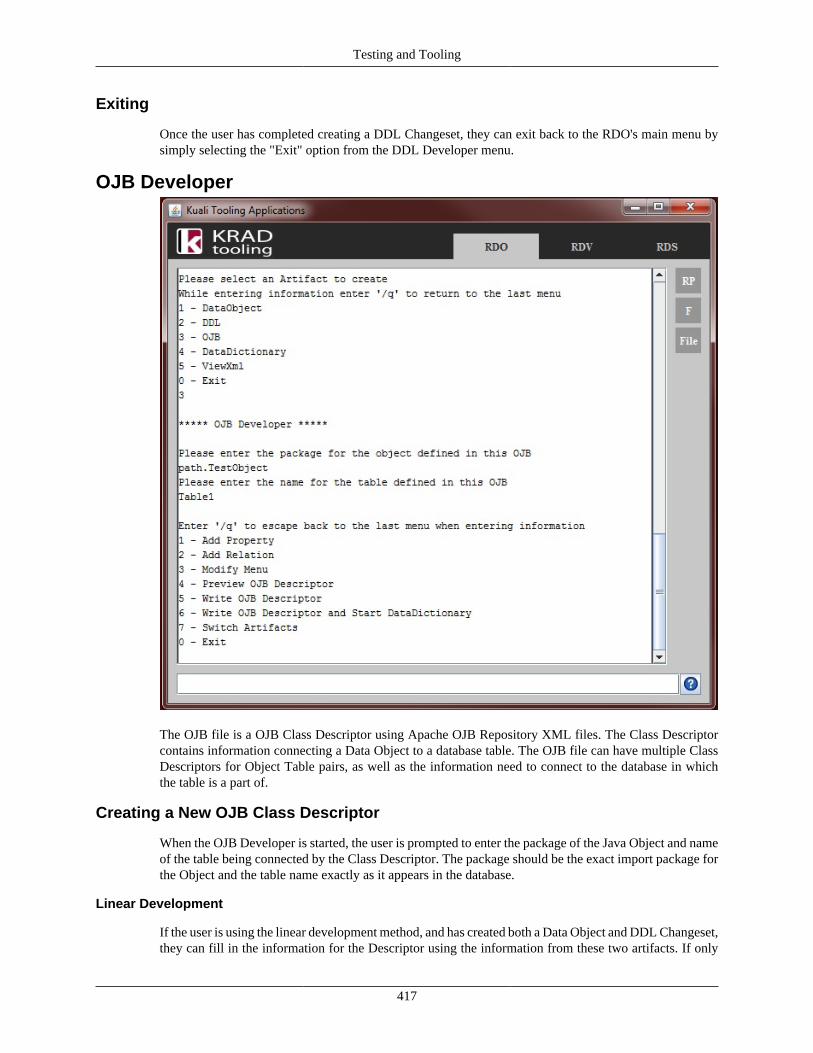
Testing and Tooling
417
Exiting
Once the user has completed creating a DDL Changeset, they can exit back to the RDO's main menu bysimply selecting the "Exit" option from the DDL Developer menu.
OJB Developer
The OJB file is a OJB Class Descriptor using Apache OJB Repository XML files. The Class Descriptorcontains information connecting a Data Object to a database table. The OJB file can have multiple ClassDescriptors for Object Table pairs, as well as the information need to connect to the database in whichthe table is a part of.
Creating a New OJB Class Descriptor
When the OJB Developer is started, the user is prompted to enter the package of the Java Object and nameof the table being connected by the Class Descriptor. The package should be the exact import package forthe Object and the table name exactly as it appears in the database.
Linear Development
If the user is using the linear development method, and has created both a Data Object and DDL Changeset,they can fill in the information for the Descriptor using the information from these two artifacts. If only
Testing and Tooling
418
a Data Object has been created, the OJB Developer will use that information to set the package, and onlyprompt them for the table name. Creating the Object first will allow the user to select the different dataproperties from it when adding properties and relations to the Descriptor.
Adding a Property
To add a property to the Class Descriptor, the user can select "Add Property" from the main menu. Theywill then be prompted to select a field from a list containing all properties defined in a previous createdData Object (if no Data Object was created, or the new property is not in the list, the user can create a newone by selecting "New Property"). They will then be asked enter the column name in the database thatcorresponds to this property before selecting the JDBC Type for this column from a displayed list. Nextthe Developer will prompt them to find out if the column is a primary key of the Table. If the column is aprimary key, it will ask if it is a sequence before asking for the name of the sequence.
Adding a Relation
To add a relation to the Class Descriptor, the user can select "Add Relation" from the main menu. Theywill then be prompted to select a field from a list containing all properties defined in a previous createdData Object (if no Data Object was created, or the new property is not in the list, the user can create anew one by selecting "New Property"). Next, they need to enter the import package of the class that it is arelation to. Once this is complete, they can set a number of options by selecting true or false as prompted.These options include AutoRetrieve, AutoUpdate, AutoDelete, whether the relation is a proxy or not, andfinally, whether it is a collection (ie. one to many). After this, they are asked to enter all foreign key fieldsreferenced by this column, as well as all fields in which it is ordered by (if the relation is a collection).
Modifying The Class Descriptor
To modify information already entered into the Class Descriptor, the user can select "Modify Menu" fromthe main menu. This will take them to a new menu in which they are able to modify any piece of dataalready entered by selecting from the options and following the prompts. Where the primary data enteringoptions in the main menu deal with collecting data for a whole item at once, the options under the modifymenu handle only a specific segment of the data at one time.
Previewing the OJB Class Descriptor
Once the necessary information has been entered into the OJB Developer, the user can preview the datafor the new Descriptor by selecting "Preview OJB Descriptor" in the main menu. This will display all thedata entered as it would appear in the file.
Writing the Class Descriptor to File
After checking the Descriptor for completeness and correctness, it can then be written to the appropriatelocation defined in the program properties file by selecting "Write OJB Descriptor" from the main menu.This option automatically appends the complete Descriptor to the OJB xml file at that location (if no fileexists, a new OJB xml will be created and the Descriptor appended to it). Once the file is written, theprogram prompts the user if they would like to open the new file. By entering "yes" to this prompt, the filewill then be opened using the computer's default program for opening files of the type xml.
Linear Development
When looking at the main menu, the user will notice that there are two options to write: "Write OJBDescriptor" and "Write OJB Descriptor and Start ____." The first option merely writes the Class Descriptorbeing worked on to its file and stays in the OJB Developer; the second option, however, is for the linear
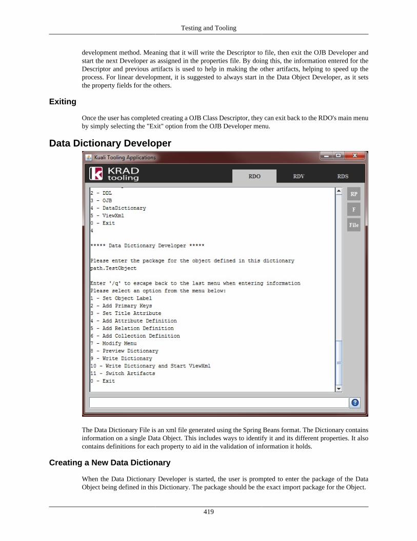
Testing and Tooling
419
development method. Meaning that it will write the Descriptor to file, then exit the OJB Developer andstart the next Developer as assigned in the properties file. By doing this, the information entered for theDescriptor and previous artifacts is used to help in making the other artifacts, helping to speed up theprocess. For linear development, it is suggested to always start in the Data Object Developer, as it setsthe property fields for the others.
Exiting
Once the user has completed creating a OJB Class Descriptor, they can exit back to the RDO's main menuby simply selecting the "Exit" option from the OJB Developer menu.
Data Dictionary Developer
The Data Dictionary File is an xml file generated using the Spring Beans format. The Dictionary containsinformation on a single Data Object. This includes ways to identify it and its different properties. It alsocontains definitions for each property to aid in the validation of information it holds.
Creating a New Data Dictionary
When the Data Dictionary Developer is started, the user is prompted to enter the package of the DataObject being defined in this Dictionary. The package should be the exact import package for the Object.
Testing and Tooling
420
Linear Development
If the user is using the linear development method and has created the Data Object, they can fill in theinformation for the Dictionary using the information from this artifact. Creating the Object first will allowthe user to select the different data properties from it when adding keys, title attributes and definitionsto the Dictionary.
Setting the Object Label
To set the object label of the Dictionary, select "Set Object Label" from the main menu. This will thenprompt the user to enter the label.
Adding Primary Keys
To add a set of primary keys to the Dictionary, select "Add Primary Keys" from the main menu. This willdisplay a list of properties in the Data Object which the user can add to (if no Data Object was created, orthe new property is not in the list, the user can create a new one by selecting "New Property"). Each keyis added one at a time, and the complete list of keys should be added in a single run of this option.
Adding Title Attributes
To add a set of title attributes to the Dictionary, select "Add Title Attribute" from the main menu. This willdisplay a list of properties in the Data Object which the user can add to (if no Data Object was created, or thenew property is not in the list, the user can create a new one by selecting "New Property"). Each attributeis added one at a time, and the complete list of attributes should be added in a single run of this option.
Adding Attribute Definitions
To add an attribute definition to the Dictionary, select "Add Attribute Definition" from the main menu.This will display a list of properties in the Data Object which the user can select from (if no Data Object wascreated, or the new property is not in the list, the user can create a new one by selecting "New Property").A list of attributes for this definition will be displayed; a user can add an attribute by selecting it from thelist using the index on the left side, which will then prompt them to enter the value for it.
Adding Relation Definition
To add a relationship definition to the Dictionary, select "Add Relation Definition" from the main menu.This will display a list of properties in the Data Object which the user can select from (if no Data Object wascreated, or the new property is not in the list, the user can create a new one by selecting "New Property").Next, they will be prompted to enter the target class, which should be the import package of the classbeing referenced. Then, they can add primitives (then supports) by entering the source property and targetproperty in the form of "source,target" in which the source is the name of a property in the class beingwritten in the dictionary, and the target is the name of a property in the class being referenced.
Adding Collection Definitions
To add an collection definition to the Dictionary, select "Add Collection Definition" from the main menu.This will display a list of properties in the Data Object which the user can select from (if no Data Object wascreated, or the new property is not in the list, the user can create a new one by selecting "New Property").Next, they will be prompted to enter the target class, which should be the import package of the classbeing referenced. Finally, they will be prompted to enter the label, short label, and element label for thecollection (they can default these when asked, letting the Developer create them).
Modifying The Data Dictionary
To modify information already entered into the Data Dictionary, the user can select "Modify Menu"from the main menu. This will take them to a new menu, in which they are able to modify any piece of
Testing and Tooling
421
data already entered, by selecting from the options and following the prompts. Whereas the primary dataentering options in the main menu deal with collecting data for a whole item at once, the options underthe modify menu handle only a specific segment of the data at one time.
Previewing the Dictionary
Once the necessary information has been entered into the Data Dictionary Developer, the user can previewa the data for the new Dictionary by selecting "Preview Dictionary" in the main menu. This will displayall the data entered as it would appear in the file.
Writing the Dictionary to File
After checking the Dictionary for completeness and correctness, it can then be written to the appropriatelocation defined in the program properties file by selecting "Write Dictionary" from the main menu. Thisoption automatically writes the complete Dictionary to an xml file at that location. Once the file is written,the program prompts the user if they would like to open the new file. By entering "yes" to this prompt, thefile will then be opened using the computer's default program for opening files of the type xml.
Linear Development
When looking at the main menu, the user will notice that there are two options to write: "Write Dictionary"and "Write Dictionary and Start ____." The first option merely writes the Dictionary being worked on to itsfile and stays in the Data Dictionary Developer; the second option, however, is for the linear developmentmethod. Meaning that it will write the Dictionary to a file, then exit the Data Dictionary Developer, andstart the next Developer as assigned in the properties file. By doing this, the information entered for theDictionary and previous artifacts is used to help in making the other artifacts, helping speed up the process.For linear development, it is suggested to always start in the Data Object Developer, as it sets the propertyfields for the others.
Exiting
Once the user has completed creating a Data Dictionary, they can exit back to the RDO's main menu bysimply selecting the "Exit" option from the OJB Developer menu.
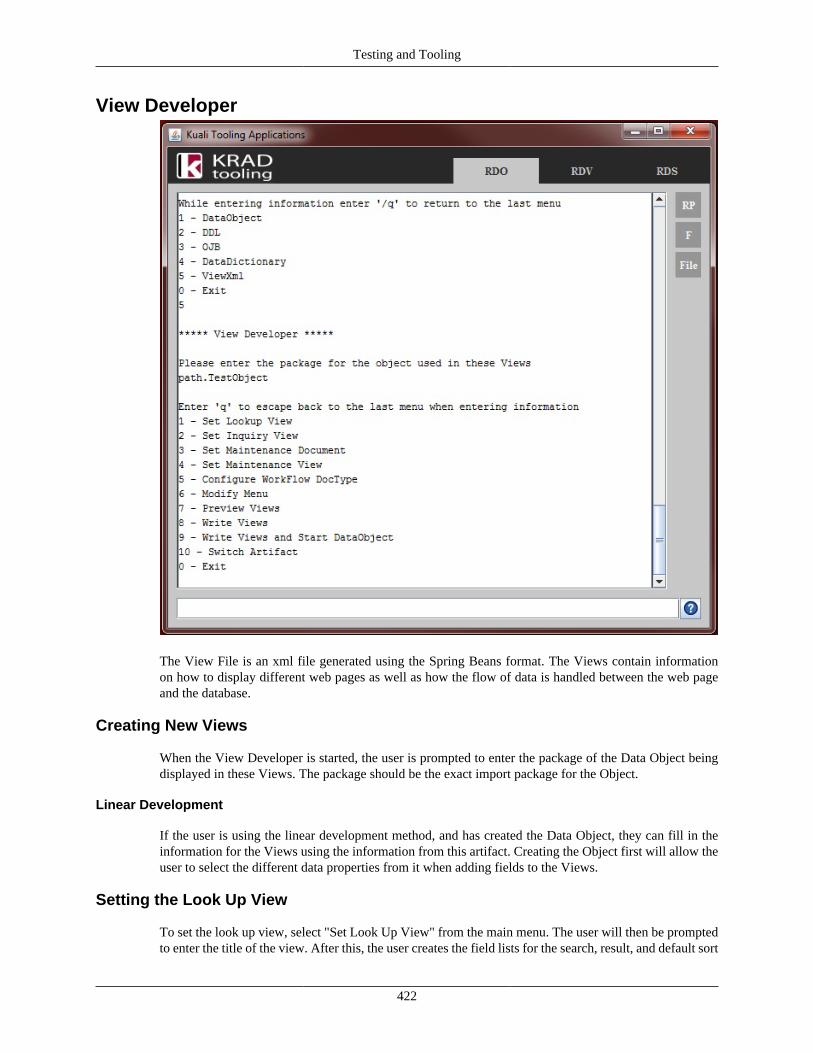
Testing and Tooling
422
View Developer
The View File is an xml file generated using the Spring Beans format. The Views contain informationon how to display different web pages as well as how the flow of data is handled between the web pageand the database.
Creating New Views
When the View Developer is started, the user is prompted to enter the package of the Data Object beingdisplayed in these Views. The package should be the exact import package for the Object.
Linear Development
If the user is using the linear development method, and has created the Data Object, they can fill in theinformation for the Views using the information from this artifact. Creating the Object first will allow theuser to select the different data properties from it when adding fields to the Views.
Setting the Look Up View
To set the look up view, select "Set Look Up View" from the main menu. The user will then be promptedto enter the title of the view. After this, the user creates the field lists for the search, result, and default sort
Testing and Tooling
423
fields by selecting from a list of properties in the Data Object (if no Data Object was created, or the newproperty is not in the list, the user can create a new one by selecting "New Property").
Setting the Inquiry View
To set the inquiry view, select "Set Inquiry View" from the main menu. The user will then be promptedto enter the title of the view. After this, the user will be continually prompted to create sections for theView. To create a section, they are first asked for the section's name and the instructional text. Next, a listof properties in the Data Object into which the user can add as fields is displayed (if no Data Object wascreated or the new property is not in the list the user can create a new one by selecting "New Property").After selecting the fields covered in the section, the user sets the type of section it is from a list. Each typehas its own information that the user can enter by following the prompts.
Setting the Maintenance
To set the Maintenance artifact, select "Set Maintenance Artifact" from the main menu. The user will beprompted to enter the document type, followed by displaying a list of properties in the Data Object fromwhich the user can select as locking keys (if no Data Object was created, or the new property is not in thelist, the user can create a new one by selecting "New Property").
Setting the Maintenance View
To set the maintenance view, select "Set Maintenance View" from the main menu. After this, the user willbe continually prompted to create sections for the View. To create a section they are first asked for thesection's name and the instructional text. Next, a list of properties in the Data Object into which the usercan add as fields is displayed (if no Data Object was created, or the new property is not in the list, theuser can create a new one by selecting "New Property"). After selecting the fields covered in the section,the user sets the type of section it is from a list. Each type has its own information that the user can enterby following the prompts.
Modifying The Views
To modify information already entered into the Views, the user can select "Modify Menu" from the mainmenu. This will take them to a new menu, in which they are able to modify any piece of data alreadyentered, by selecting from the options and following the prompts. Whereas the primary data enteringoptions in the main menu deal with collecting data for a whole item at once, the options under the modifymenu handle only a specific segment of the data at one time.
Previewing Views
Once the necessary information has been entered into the View Developer, the user can preview a the datafor the new Views by selecting "Preview Views" in the main menu. This will display all the data enteredas it would appear in the file.
Writing Views to File
After checking the Views for completeness and correctness, they can then be written to the appropriatelocation defined in the program properties file by selecting "Write Views" from the main menu. This optionautomatically writes the complete Views to a single xml file at that location. Once the file is written, theprogram prompts the user if they would like to open the new file. By entering "yes" to this prompt the filewill then be opened using the computer's default program for opening files of the type xml.
Linear Development
When looking at the main menu, the user will notice that there are two options to write: "Write Views"and "Write Views and Start ____." The first option merely writes the Views being worked on to its file and
Testing and Tooling
424
stays in the View Developer; the second option, however, is for the linear development method. Meaningthat it will write the Views to a file, then exit the View Developer, and start the next Developer as assignedin the properties file. By doing this, the information entered in previous artifacts is used to help in makingthe other artifacts, helping speed up the process. For linear development, it is suggested to always start inthe Data Object Developer, as it sets the property fields for the others.
Exiting
Once the user has completed creating Views, they can exit back to the RDO's main menu by simplyselecting the "Exit" option from the View Developer menu.
Rice Dictionary Validator
Introduction
Purpose
The Rice Framework works by utilizing a number of interconnected java data objects held together in theprograms' data dictionary. These objects are complex and created through the combination of a numberof Spring Beans; mistakes in these beans can cause breakdowns in the system, causing missing pages orincorrect information to be display. The purpose of the Rice Dictionary Validator (RDV) is to limit thesemistakes by validating that the beans are being created correctly, and warning developers of problems thatmay occur.
What is RDV
The Rice Dictionary Validator is a combination of an integrated backbone in the Rice Framework, and aindependent tool application within Rice Tools. It looks through the beans that make up the data dictionaryand identifies any problems it finds before reporting them to the developer. The tool is setup to do this inseveral ways. The first is to validate the beans during the start up of the Rice Framework allowing for thecheck of the entire dictionary being used. The other is a more limited check for use during development,loading only a core set of beans and any beans the developer has set to check.
Regardless of whether the Validator is being run during the Rice startup, or with the Rice Tools, theRDV runs through the complete list of beans being loaded and creates an individual error report for everyvalidation failed before displaying the report to the user. The output display can be configured based onwhat is displayed and how it is displayed.
Installation and Configuration
Rice Startup Validation
A default version of the RDV is setup to run during the start of the Rice Framework with the outputbeing handled by the DataDictionary.class logger as info, warn and errors. This hands responsibility ofthe display settings over to the log4j properties file. Since it is a developer tool, it can be turned onand off in the Framework's properties. The RDV can be toggled on and off by setting the parametervalidate.data.dictionary to true or false in the xml settings file: common-config-defaults of the rice-implmodule.
Rice Tools Validator
To setup the independent RDV all that is required is to configure its settings in the properties file(properties/rdv-config.properties). It can be run from the Rice Tools application.
Testing and Tooling
425
• ricedictionaryvalidator.corefiles - This is a list of default bean files to be loaded during validation
• ricedictionaryvalidator.display.method - This is the default setting for the method of output whendisplaying the validations
• ricedictionaryvalidator.display.method.file - This is the default file to save validation results to if theoutput type is file
• ricedictionaryvalidator.display.errors - Display default for whether to display the number of errors
• ricedictionaryvalidator.display.warnings - Display default for whether to display the number ofwarnings
• ricedictionaryvalidator.display.errors.messages - Display default for whether to display the errormessages
• ricedictionaryvalidator.display.warnings.messages - Display default for whether to display the warningmessages
• ricedictionaryvalidator.display.xmlfiles - Display default for whether to display the xml files whendisplaying the error/warning messages
• ricedictionaryvalidator.failonwarning - This is the default for whether the validator should fail ifwarnings are detect instead of just errors
User GuideThe Rice Dictionary Validator has two different implementations: a integrated validator to be run duringstart up of the Rice Framework, and an extension to run with the Rice Tools application. The first is toinsure that the dictionary is accurate when running the complete application. The second is to aid in thedevelopment of the new bean sets.
Rice Startup Validation
Running Validation
If the Rice Framework is set to run validations in its configuration file, then the validator will be runautomatically when the application is launched. The validation option is set in the common-config-defaultsof the rice-impl module.
Validations Covered
• Uif Component Beans
• Data Dictionary Beans
Viewing Results
By default, the validation results are set to be displayed using log4j. The basic results will be shown asinfo tags, while the messages will be displayed as error and warn tags respectfully. This can be changedin the DataDictionary.validateDD(boolean) method.
Adding Validation to Data Objects
Validation can be added to beans by adding the method:
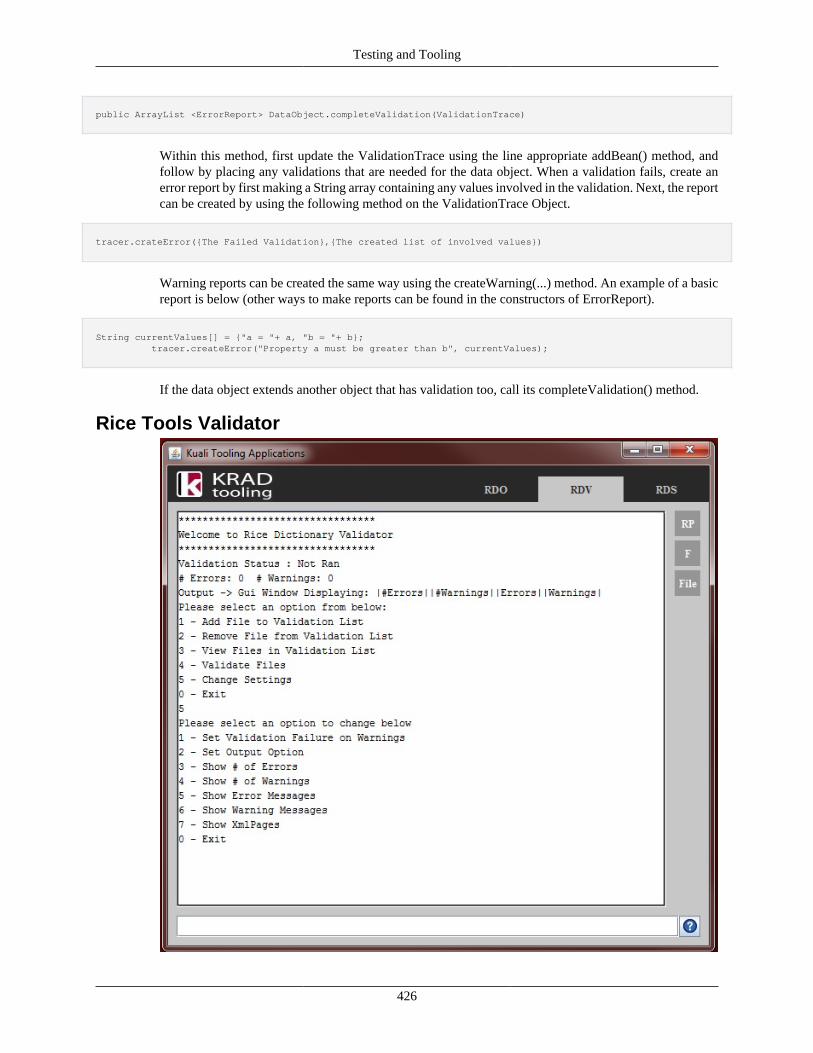
Testing and Tooling
426
public ArrayList <ErrorReport> DataObject.completeValidation(ValidationTrace)
Within this method, first update the ValidationTrace using the line appropriate addBean() method, andfollow by placing any validations that are needed for the data object. When a validation fails, create anerror report by first making a String array containing any values involved in the validation. Next, the reportcan be created by using the following method on the ValidationTrace Object.
tracer.crateError({The Failed Validation},{The created list of involved values})
Warning reports can be created the same way using the createWarning(...) method. An example of a basicreport is below (other ways to make reports can be found in the constructors of ErrorReport).
String currentValues[] = {"a = "+ a, "b = "+ b}; tracer.createError("Property a must be greater than b", currentValues);
If the data object extends another object that has validation too, call its completeValidation() method.
Rice Tools Validator
Testing and Tooling
427
Adding Files for Validation
To add a file to the validation list, the user can select "Add File to Validation List" in the main menu.They will then be prompted to enter the path of the file to be validated. The path must be a valid file onthe computer.
Removing File for Validation
To remove a file from the validation list, the user can select "Remove File from Validation List" to havethe program display a list of all file paths currently set for validation. The user can then select one toremove it from the list.
Viewing Files Set for Validation
To display the list of files they have added for validation, the user can simply select "View Files inValidation List", which then displays the file paths.
Validating Files
To validate the files, the user can simply select "Validate Files" from the main menu. The program willvalidate the files then display the output based on the options set by the user.
Changing Settings
The Display settings, as well as whether to have validations fail if a warning is detected, can be set byselecting "Change Settings" from the main menu. This will take you to a sub menu with options for all thesettings that can be changed. All the settings are controlled by toggling them, so the user can select theone they want to change, then select yes/no to turn it on/off.
The option for setting the output of the validation is slightly different, as it asks for additional informationbased on the output type selected.
Exiting
Once the user has completed running validations, they can "Exit" the RDV by selecting exit from the mainmenu.
Rice Dictionary Schema
Introduction
Purpose
The KRAD Framework works by utilizing the Spring Framework and its Bean feature that allows forthe filling of the data objects from xml files. These xml files are written using the Spring Bean xml tags.This reduces the file to a collection of a limited number of tags with little connection to the informationthey contain, and an unnatural semantic flow. The purpose of the Rice Dictionary Schema is to expandthe variety of the xml files to make them easier to understand and connect with the data objects they arerepresenting.
What is RDS?
The Rice Dictionary Schema performs the creation and setup of an extension to the Spring Frameworkthat allows for the use of unique and descriptive xml tags when creating the needed files for the KRAD
Testing and Tooling
428
Framework. The tooling application developed for RDS allows the user to setup, maintain, and expandthis language extension.
Setting Up the RDS
Basic Overview
The RDS utilizes another feature of the Spring Framework, Xml Authoring, that allows the user to setupand define a way for the Spring Framework to translate xml tags into the normal Bean tag format. Authoringfunctions through the use of five files to define the different aspects of the xml tags including reading thexml, translating into beans, and informing Spring of the language. RDS automates and eases the creationof these files that are then compiled into the KRAD Framework.
• Schema Xsd - Defines the semantics of the bean xml file.
• Namespace Handler - Registers the Bean Tag with a parser.
• Parser - Defines the semantics of the bean xml file.
• Spring.schemas - Registers the schema xsd with the Spring Framework.
• Spring.handlers - Registers the handler with the Spring Framework.
The RDS allows users to create new tags for the Rice Schema by building onto other schemas, giving thenew schema access to the older schemas tags and resources, including all of the files needed to definethe schema. Because of this, when implementing a new schema, users only have to create two of the files(Spring.schemas and schema.xsd) for their schema and the system will provide the rest of the files.
Expanding the Schema
Schema Naming
When creating a new schema, the first thing a user should do is name the schema. The name of the schemais used in several ways by the RDS, and all schema names should be unique. The class list file and schemafile both use the name as part of the automatic processing. Example:
• SCHEMANAME_schema.xsd
• SCHEMANAME_schemaclasses.xml
• spring.schemas
Schema Xsd
When creating the xsd file, the user uses the following code and replaces SCHEMANAME with the nameof the schema being built off of, and repeats this line in schema location for each support schema beingbuilt off of. For each tag bean added in the schema, add the element tag used in the example with the nameset to the new tag name.
<xsd:schema attributeFormDefault="unqualified" elementFormDefault="qualified" targetNamespace="http://www.kuali.org/schema" xmlns="http://www.kuali.org/schema" xmlns:xsd="http://www.w3.org/2001/XMLSchema">
Testing and Tooling
429
<xsd:include schemaLocation="http://www.kuali.org/SCHEMANAME/schema.xsd"/>
<xsd:element name="PROPERTYNAME" type="schema"/> <xsd:element name="PROPERTYNAME2" type="schema"/> </xsd:schema>
spring.schemas
When creating the spring file, the user simply adds the following line; as with creating the xsd, replaceSCHEMANAME with the name of the schema being created (instead of the supporting schema name).
http://www.kuali.org/SCHEMANAME/schema.xsd = META-INF/SCHEMANAME_schema.xsd
Class List File
Since the tags for the RDS are defined using annotations, a list of classes will be needed so the system canread them. This file is an xml file, with each class being listed with a class tag. The classes can be listedindividually, or in a list with comma's separating them. Below is an example of the file:
<kradSchema> <class>org.kuali.rice.krad.datadictionary.Class1</class> <class>org.kuali.rice.krad.datadictionary.Class2</class> <class>org.kuali.rice.krad.datadictionary.Class3</class> <class>org.kuali.rice.krad.datadictionary.Class4</class> </kradSchema>
Adding Annotations
Restrictions
When adding tags to the custom schema, there are several restrictions to the tag names and property names.
• Tag names should be valid string names as xml tags (ex. variable1, subclass.variable ,...)
• The tag names of beans must be unique
• The tag names of the properties should be unique among the other tags used in the bean (be careful, asthe bean tag gains the property tags of any parent classes)
• Property tags found in the bean file but not in the annotations will be dropped through when parsed tobe handled by the Spring Framework (ex. layoutmanager.numcols)
• Reserved object tags: ref
• Reserved property tags: id, parent, abstract, ref
Bean Tag
To create a new bean tag for the custom schema, add the annotation tag BeanTag to the class that it willrepresent. When adding a BeanTag, the user will have to declare a name for the new tag, and can also
Testing and Tooling
430
declare a bean default parent for beans of that tag. If there is no parent declared in the tag, the defaultnone will be used.
Property Tag
To create a new tag or attribute for a property, add the annotation tag BeanTagAttribute to the property'sget function. When adding the tag, the user will need to also declare a name for the new tag, and the type ofthe property being defined. If the type is not declared in the tag, the property will be treated as SingleValue.The types are defined by the types below found in the BeanTag Attribute:
• AttributeType.SINGLEVALUE - A single property of a simple data type.
• AttributeType.SINGLEBEAN - A single property of a bean object.
• AttributeType.LISTVALUE - A list property of a simple data types.
• AttributeType.LISTBEAN - A list property of a bean objects.
• AttributeType.MAPVALUE - A map of two simple data types.
• AttributeType.MAPBEAN - A map of a simple data type to a bean object.
• AttributeType.MAP2BEAN - A map of two bean objects.
• AttributeType.SETVALUE - A set of simple data types.
• AttributeType.SETBEAN - A set of bean objects.
Writing the Bean File
Spring and Custom Schema
The Spring Beans and Xml Authoring systems allow for the mix of both spring and custom schema in thesame set of beans. This means that a bean declaration can either be in the custom schema format, or thespring bean format. The property declarations within the bean has to follow the schema that the bean wasdeclared in; but if a nested bean is added, it can be declared in any format.
Property Names
When using the custom schema, the tag names of the properties do not all have to be declared in theannotations to be used in the bean file. Property names that are not found in the schema are dropped throughusing the unidentified name in the property declaration. They will then follow the normal spring rules onproperty names, which means that compound names can be used as well. Do note that if an unknown nameis found, it will be treated as a single value if in the attribute tags, or as a single bean if it is a nested tag.
• Beans Header
When creating the beans header in the bean file, there are two things that need to be looked at: thenamespace prefix, and the namespace schema location. If the custom schema is going to be the primarytags used, then it can be set to the xmlns and the spring beans given a prefix. The namespace for thecustom schema is http://www.kuali.org/schema. To add the custom schema to the bean file, it needs tobe added to the schema location using the line:
<spring:beans xmlns="http://www.kuali.org/schema" xmlns:p="http://www.springframework.org/schema/p"
Testing and Tooling
431
xmlns:xsi="http://www.w3.org/2001/XMLSchema-instance" xmlns:spring="http://www.springframework.org/schema/beans" xsi:schemaLocation="http://www.springframework.org/schema/beans http://www.springframework.org/schema/beans/spring-beans-2.0.xsd http://www.kuali.org/schema http://www.kuali.org/test/schema.xsd"> </spring:beans>
• Bean Object
If custom schema is the primary namespace of the xml, then the object tag can be used without a prefix.To use the custom tag, use the name declared in the class annotation for the tag name, then add anyproperties that are simple data types as attributes. Even if the properties do not have a custom tag or arecompound names, non-bean singles are handled by the attributes. Attributes encountered that are notfound in the custom schema are dropped through as property values by the parser.
<classTagName parent="uif-class1" id="classId" abstract="true" tagProperty="this is tagged" unTagProperty="this isnt" compound.name="Authors"/>
• Single Bean
For adding nested beans, the property is declared as a new tag with no attributes, and the new bean isnested within it.
<beanProperty> <singleBean parent="uif-bean"/> </beanProperty>
• List Value
When declaring a list of simple data types in the bean, the property name is used in a new tag withoutany attributes. Values are then added by nested value tags under the property tag.
<listProperty> <value>v1</value> <value>v2</value> <value>v3</value> </listProperty>
• List Bean
A list of bean objects is started the same as the list value with the property tag declared. However;instead of nested value tags, the bean tags are declared either by a referenced bean, or new spring, orcustom bean declarations.
<attributes> <ref bean="bean-id"/> <spring:bean parent="uif-bean"/> <customBean parent="uif-custom"/>
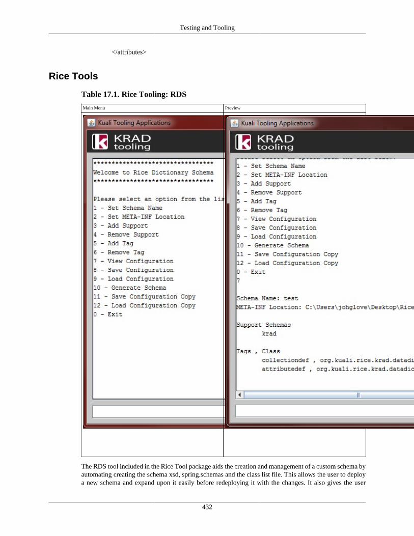
Testing and Tooling
432
</attributes>
Rice Tools
Table 17.1. Rice Tooling: RDS
Main Menu Preview
The RDS tool included in the Rice Tool package aids the creation and management of a custom schema byautomating creating the schema xsd, spring.schemas and the class list file. This allows the user to deploya new schema and expand upon it easily before redeploying it with the changes. It also gives the user
Testing and Tooling
433
instructions and lines needed to implement the schema in the KRAD Framework. The RDS allows thecopying of created schema configurations, letting users manage multiple schemas at the same time.
With this tool, the work needed by the user to implement a schema is greatly reduced, as the user onlyneeds to provide four things:
• Schema Name - The name of the new schema.
• META-INF - The location of the META-INF folder (.../META-INF).
• List of Support Schemas - The names of the schemas that the new schema is being built on.
• List of Tags - A list of new tags to be used in the schema with the class it represents.
Using Rice Tool's RDS
• Setting the Schema Name:
To set the name of the new schema, select the "Set Schema Name" option. Next, enter a name for thenew schema that is unique among the schemas being used and are acceptable as file names.
• META-INF Location:
To set the name of the new schema select the "Set META-INF Location" option at the main menu,and enter the path of the META-INF file. This path is actually into the folder so it should end in "/META-INF".
• Handling Support Schemas:
To add a schema to build upon, select "Add Support" from the menu, and enter the name of the schemato be added to the user. Supports can be removed by selecting "Remove Support" and selecting thesupport to remove. The name of the supports are case sensitive.
• Handling Tags:
To add a new class to the schema, select "Add Tag" from the main menu, and enter both the name ofthe new tag, and the package of the tag's class. Supports can be removed by selecting "Remove Tags"and selecting the support to remove.
• Handling the Schema Configuration:
The current configuration being worked on is handled automatically, and can be viewed and saved byselecting the load configuration option on the menu. The load configuration option will load the lastconfiguration saved automatically. This is the working configuration and is automatically saved to adefault file, so users will not have to enter a file name.
• Handling Additional Schemas:
If the user is working on multiple schemas, the configuration for each of them can be saved outside theworking configuration by selecting the save and load copy options. Unlike the working configuration,these are saved to user defined xml files, so the user will have to enter their file path.
• Generating a Schema:
Once the schema configuration is complete, the custom schema can be deployed by selecting "GenerateSchema" from the menu. This will create the schema, spring.schemas and class list and save them tothe META-INF folder. The RDS will notify the user that the files were created, followed by the schema

Testing and Tooling
434
location needed to be used in the bean xml files, and the setting needed for the KRAD configurationfiles for the class list.