Embed Size (px)
Citation preview

d e s i g n | i l l u s t r a t i o n
kennedy
erin kennedy | 8 1 5 . 3 5 1 . 5 1 8 6 | k e n n e d y c l a n 5 @ y a h o o . c o m
Senior Designer & Illustrator | Federated Foods - SCG, Arlington Heights | March 2016 - Present
Brand identity, packaging design and product name development
Character ideation and development from concept to �nish
In-store marketing: POP design - product display, mailer, promotional material, etc.
Brand steward, lead conceptual packaging designer and design guideline for several prominent private brands
—
Independent Design Contractor | Federated Foods - SCG, Arlington Heights | September 2015 - March 2016
Creative solutions, design and illustration for private label CPG
—
Senior Designer | Haugaard Creative Group - Chicago, IL | September 2000 - August 2015
Creative solutions, insight, brand strategy and on-target designs for some of America’s most iconic brands
Strategy, design and stewardship of packaging for:
Pepsico, Quaker, ConAgra Foods, Tropicana, Kraft, Sara Lee, Jays, Tootsie Roll and Lincoln Snacks
Trend and Culture Identification / Social Media Integration
In-store marketing: POP design - product display, mailer, promotional material, etc.
—
Independent Design Contractor | Simply d’lish Brands | September 2015 - Present
Design and extend a consistent and fresh look to an existing line of frozen cookies and granola products
Established design expectations and goals
—
Contract Illustrator | Schulzy Studios | Ongoing since 2006
Character illustration for a variety of applications
—
Creative Director | Forrest Technologies - Cary, IL | 1999 - 2000
Managed creative team, software, hardware, vendor contact and established protocol
Directly responsible for all pre-press preparation for vendor ready files and final approval on vendor proofs
—
Senior Designer | Midwest Exhibits Design Group - Davenport, IA | 1996 - 1999
Custom displays, graphics and digital prints for use at exhibition for Deere & Company and Montgomery Kone
Design and production of banners and signage for promotional use
Illustration and construction drawings for custom displays
Logo, brochure and banner development for corporate identity
Vinyl graphics design and application for signage and fleet vehicles
Creation and layout of project storyboards and model building

ther e c e n t p r o j e c t s a n d a c l a s s i c . . .

NOT EVERY REFRESH HAS TO
GO NINE ROUNDS.
In fact this one took about half a day to
nail down the look and settle on imagery.
The photoshoot was scheduled and done
a week later.
The imagery changes on each package
to re�ect the differences in the product. Color
coded napkins help to further the differentiation.
In the end, the packaging refreshed nicely,
on time, under budget and all was, and
still is, well.

LogoO V E R H A U L

Simply d’lish is a boutique bakery in Aurora, Illinois that knows cookies, not logos.
We connected through a friend and I took them on as a client. Wonderful people.
We �rst addressed the logo.
They had been in the market place for a while in limited capacity and wanted to update
the brands look so that it wasn’t so dated without straying too far and losing existing
customers to unecessary confusion.
Once the new look was
complete we broke it soft on
social media. No real mention
in copy, only visual. The goal
here was to spruce it up,
not stir it up!
before

On a very limited budget, we
sourced a cost effective and
efficient way to quickly get
Simply d’lish Ultimate
Snacking Granola into
Whole Foods Naperville.
The stand alone pouch
is a must for any
ultimate snacker.
Simply d’lish needed packaging developed for their line of freezer-to-oven cookies. Below are images from thecompetitive set. It is a colorful and whimsical category, especially in stores where our cookies were going to live.

Freezer to OvenC O O K I E S
As stated before and to anyone who will listen, Simply d’lish knows cookies. They have
individually wrapped cookies for sale at sites accross the suburbs, however the goal is to bring
these cookies to your oven. Bake ‘em all, just bake a few... whatever.
We wanted to be bold here. The category is ripe with boutique-style design and is very colorful,
so black seemed to be a great answer to the visual melee. DING! Cookies are done. :)

the Madness ofm a r s h m a l l o w s

There was a time before the madness. Marshmallow Lovers® was as close to
a kid-focused version of their beloved hot cocoa as ConAgra Foods had.
Kids love marshmallows, but they didn’t love this box.
At this point, everything was up for consideration. The brand treatment, �avor name,
visual structure, communication hierarchy... everything.
?

The end result is a fun, colorful and expressive package. The client agreed.
"Your team did excellent work on the Swiss Miss Kids project. We have received nothingbut positive comments on that packaging and how well it matches the product, etc."
Jamel Richardson | Senior Brand Manager | ConAgra Foods
"I really appreciate the effort your entire team put toward creating solutions for this project.You hit the mark on every phase."
Bill Luna | Senior Manager Brand Design | ConAgra Foods


Assemble the Cast ofC H A R A C T E R S
Centrella brand is undergoing a refresh. Here is how the “kid” cereals looked. They
were all over the place with poorly executed characters.
All of the characters needed to have a common style. A look.
I have a cool sketchy style that seemed to resonate with the client. They wanted
to see what it would look like for �nish. They see, they likey.
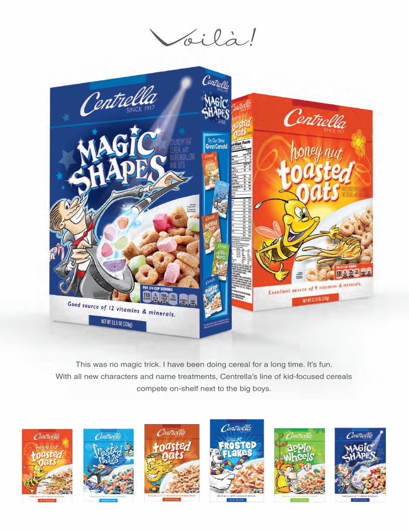
Voilà!
This was no magic trick. I have been doing cereal for a long time. It’s fun.
With all new characters and name treatments, Centrella’s line of kid-focused cereals
compete on-shelf next to the big boys.

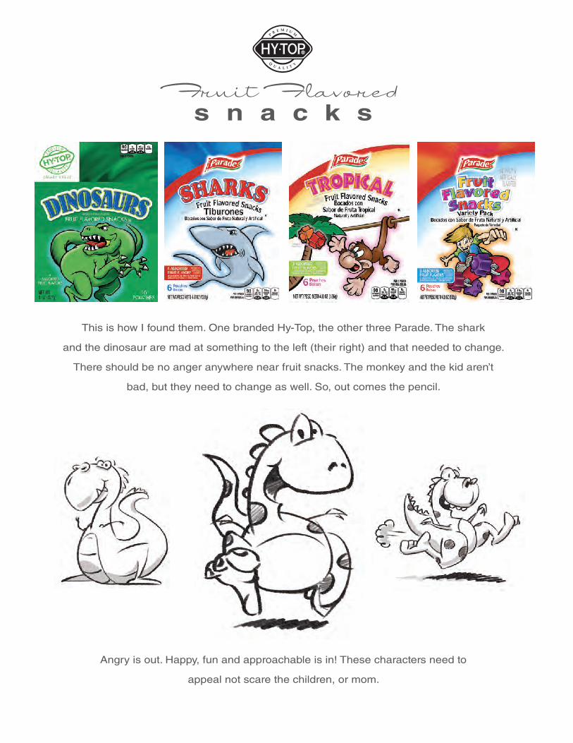
Fruit Flavoreds n a c k s
This is how I found them. One branded Hy-Top, the other three Parade. The shark
and the dinosaur are mad at something to the left (their right) and that needed to change.
There should be no anger anywhere near fruit snacks. The monkey and the kid aren’t
bad, but they need to change as well. So, out comes the pencil.
Angry is out. Happy, fun and approachable is in! These characters need to
appeal not scare the children, or mom.

We’re alls m i l e s !
This is how I left them. Super fun project that came out well. All are
excited about the result and can’t wait to see the return.

OldiesB U T G O O D I E S


ConceptualD E S I G N


ke n n e d yc l a n 5 @ ya h o o. c o m8 15 • 3 5 1 • 5 18 6