Embed Size (px)
Citation preview

Kaisey SkipperVisual Media Portfolio

Contact Information
Logos
Web page
Letterhead
Business Card
Imaging
Brochure
Montage
Flier
Event Ad
Table of Contents

Description: Three different logos to increase branding and marketing techniques.
Programs: Adobe Illustrator
Date: April 5, 2014
Course/ Instructor: COMM 130 Section 6 Brother Joel Judkins Objective: I wanted to build my own branding with these logos. I especially wanted to use my last name because I feel that my last name is memorable. I thought that using “design” instead of “photography” would make my brand seem more versatile than just one specific thing.
Process: I used the FOCUS process, and I took some index cards and just started sketching different things. After I had my basic idea, I began to use Illustrator to create my designs. I learned how to use the pen tool on Illustrator to create the bulk of my designs. Since my last name is Skipper, I used an anchor and a nautical theme to make it more memorable. I created a rope in my second design because I wanted to have the nautical approach, but I didn’t want it to be overbearing. Color scheme was a big part of this assignment for me because I learned that I have to be versatile in my designs. In order to get feedback for my designs, I posted them on Instagram and Facebook and asked my friends and followers to comment which one they liked best. This way I was able to get a more general idea of which idea was best rather than smaller specific numbers.
Logos

Kaisey Skipper Designs
SkipperDesigns
Designs
Kaisey Skipper
S������
De�i��

Description: A web page created using HTML and CSS.
Programs: Text Wrangler Notepad
Date: April 5, 2014
Course/ Instructor: COMM 130 Section 6 Brother Joel Judkins Objective: My message is branding in this project. Creating a webpage allows me to brand myself better because a Web page is much more accessible through more forms of media.
Process: I used the FOCUS design principles to create this project. After I figured out a basic idea, I used Adobe Illustrator and Photoshop to create my colors. I used Photoshop to get the color hues correct rather than just eyeing every color. I began using the basic code to make the text, bold the headings, and place the logo correctly using HTML. To make my other design elements including the colors and background, I used CSS. CSS allowed me to put my own personality in the design because it allowed me to have some different elements. I used anchors in the background to help with my branding because the anchors are the memorable object in this design. I made the colors not in my logo a little darker than the actual logo to help separate the logo from the design. Plus, this made it so that my viewers aren’t looking at the same two colors the entire time. Changes made to the CSS: I changed all of the colors on my CSS to match my logo, and I also added a color to my strong text. I also added my logo. I changed the CSS to allow me to center my logo.
Web page


Description: Letterhead to display stationery
Programs: Adobe InDesign Adobe Illustrator
Date:April 5, 2014
Course/ Instructor: COMM 130 Section 6 Brother Joel Judkins Objective: I wanted to enhance my own personal image. I wanted to be able to have something to use if I decide to be more professional in my approach. I used the circle design to have a classier approach.
Process: I played around with some ideas on Illustrator, and then I used the artboard to frame the logo perfectly. After I finished my logo, I then started creating my design on InDesign. For the design in the background, I created a few circles, and then grouped them to make a square image. I used the eraser tool to take the edges off. Once I got my circle design finished, I placed it in the box along with the logo and then grouped it all together. I used the rectangle tool to create the long rectangle that separates my information from the rest of the white space.
Letterhead


Description: A business card
Programs: Adobe InDesignAdobe Illustrator
Date: April 5, 2014
Course/ Instructor: COMM 130 Section 6 Brother Joel Judkins Objective: I wanted to enhance my own personal image. I wanted to be able to have something to use if I decide to be more professional in my approach. I used the circle design to have a classier approach.
Process: I played played around with some ideas on Illustrator, and then I used the artboard to frame the logo perfectly. After I finished my logo, I then started creating my design on InDesign. I made a 3×2.5 inch box and began creating my design. For the design in the background, I created a few circles, grouped them, and then did many copy and pastes in order to fill out the entire card. I used the eraser tool to take the edges off. Once I got my circle design finished, I placed it in the box along with the logo and then grouped it all together. I also did similar things for the backside of the business card.
Business Cards

Kaisey Skipper
465 Contour Ct.Linetown, IN 25436
012.345.6789
kaiseyskipperdesigns.gmail.comKSdesigns
KSdesigns

Description: Demonstrate photography techniques and basic editing techniques through the use of Photoshop
Programs: Adobe Photoshop
Date: April 5, 2014
Course/ Instructor: COMM 130 Section 6 Brother Joel Judkins
Objective: I wanted my message to be simple. I wanted it to express that we don’t have to be fancy or higher up to be the best person. Just loving the simple things–like eating–makes us the best person we can be. Process: I orignally took this picture for previous assignment and decided to use this for the project. The night I took this picture, I needed to think of possible color schemes for my pictures, which would eventually become my project. I was hungry and decided to make macaroni and cheese, which contrasted well on my blue plates. After taking the picture, I used basic edits such as masking, brightening, sharpening, and leveling on Photoshop, and I created this image. It included using several layers of various sizes in order to create this one cohesive look.
Imaging
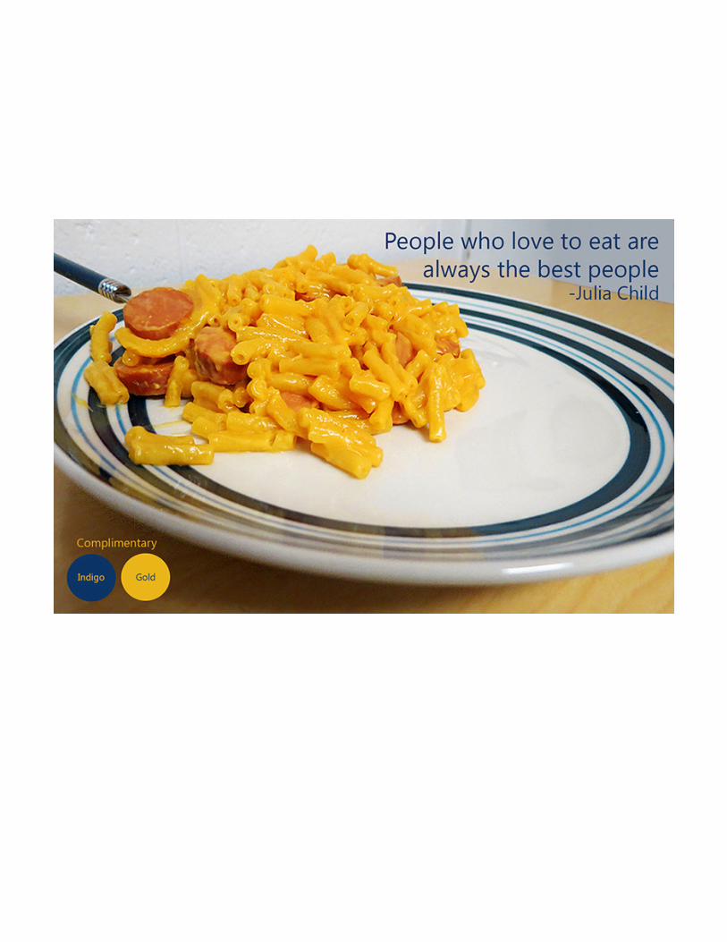

Description: A duplex-printed brochure.
Programs: Adobe InDesign Adobe Illustrator Adobe Photoshop
Date: April 5, 2014
Course/ Instructor: COMM 130 Section 6 Brother Joel Judkins Objective: I wanted this to be a marching camp for high school band students throughout the nation. I wanted these students to look at the brochure and want to go to the camp. I used a more professional design in order to remain classic, but I think the text-wrap element has a cool effect for the students that brings some edge to the design.
Process: To do this brochure project, I used the FOCUS design process, and I came up with a plan. I planned out the format I wanted for my brochure. When I planned my design, I used Adobe Illustrator to come up with the MBU logo, and then I used Adobe InDesign to create the rest of the project. I also used Photoshop to enhance the single trumpet player on the inside. I used all the skills I have gained throughout the semester to make this project. I printed this project in a duplex short-edge format to get the two-sided effect. To finish my project, I trimmed .25 inches off of each side to give the back image a full-bleed effect.
Brochure


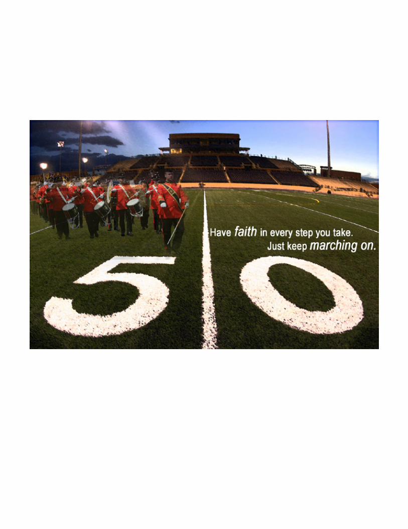
Description: A montage created using various masks and blending layers.
Programs: Adobe Photoshop
Date: April 5, 2014
Course/ Instructor: COMM 130 Section 6 Brother Joel Judkins
Objective:I was in marching band in high school, and I got discouraged pretty easily if a practice didn’t go too well or if our marching was off. So, for this montage, I wanted to make a motivational poster for those tough days where it’s tough to keep going on.
Process: First, I had to so the first step of the FOCUS process: formulate a plan. So after searching the web for about 30 minutes, I came up with an idea that I wanted to attempt. After I formulated my plan, I found images online that went along with my design. I found two images that I liked: a football field and a marching band. I then placed the football picture onto my screen and edited that with a grain filter to make the picture darker. After using the lasso tool on Photoshop, I placed my band image on the field and then used a 23% opacity to make the band not stand out as much. I used a mask on the band picture and took out all of the gray street. After I got the images to where I wanted them, I added the text to the image.
Montage
Flier
Description: A flier to promote a graduate leadership conference that is taking place.
Programs: Adobe InDesign
Date:April 5, 2014
Course/ Instructor: COMM 130 Section 6 Brother Joel Judkins Objectives: I wanted to focus more on the fact that the event was a leadership conference rather than a graduate leadership conference. Upon first glance, people other than seniors may not take a deeper look at my flier since it says graduate. To fix this, I emphasised the fact that it is a leadership conference to get a bigger audience upon first glance. My picture emphasizes the fact that it is a conference rather than something for only graduates because there are people laughing and looking professional.
Process: The process began by learning the FOCUS method which helped me to begin my creative attempt at creating a successful flier. After learning these basics, I created four sketches of possible designs that I wanted to make. Based on my sketches, I was able to put these into effect using Adobe InDesign. I learned what appropriate white space is, and the fact that I don’t have to squish everything to make it fit the page perfectly.
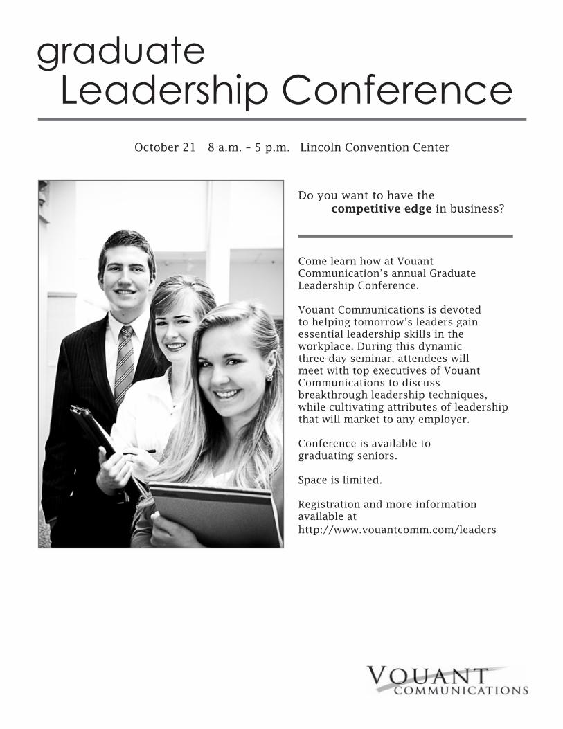
graduateLeadership Conference
Come learn how at Vouant Communication’s annual Graduate Leadership Conference.
Vouant Communications is devoted to helping tomorrow’s leaders gain essential leadership skills in the workplace. During this dynamic three-day seminar, attendees will meet with top executives of Vouant Communications to discussbreakthrough leadership techniques, while cultivating attributes of leadership that will market to any employer.
Conference is available to graduating seniors.
Space is limited.
Registration and more information available at http://www.vouantcomm.com/leaders
Do you want to have the competitive edge in business?
October 21 8 a.m. – 5 p.m. Lincoln Convention Center

Description: An event ad that was created using Microsoft Word. Programs: Microsoft Word 2013
Date: April 5, 2014
Course/ Instructor: COMM 130 Section 6 Brother Joel Judkins Objective: My objective for the ad was to create a desire to serve. Doing service is meaningful to not only others, but yourself as well. I wanted to be able to show that service can be fun.
Process: I started this project by looking through a magazine to find an image. I had to scan in the image, and then I could use it in my document. Then I made several sketches to get a basic idea of how I wanted to present my message and information to the audience. I used to FOCUS method to help me solidify my ideas for this advertisement. After my sketches I began using Microsoft Word and placed the image in and made my ad. I unified my ad through the use of a color scheme, and I worked on the overall flow of the ad.
Event Ad

Service Project April 13, 2014 9 a.m. – 3 p.m. Rexburg Northwest Park
All proceeds will go to the local Senior Center for renovations.