Embed Size (px)
DESCRIPTION
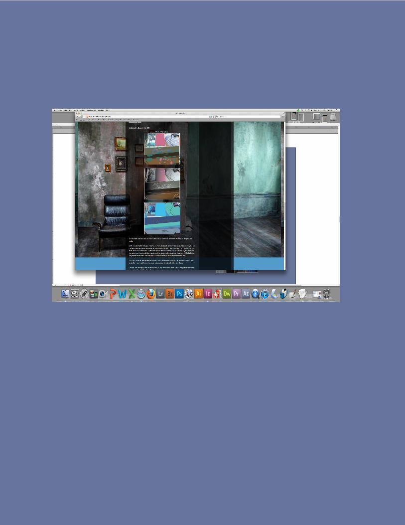
for the final of computer graphics we were told to make a magazine which was to house the art of our own and the art of our class mates
Citation preview
Journey Of A Art Student
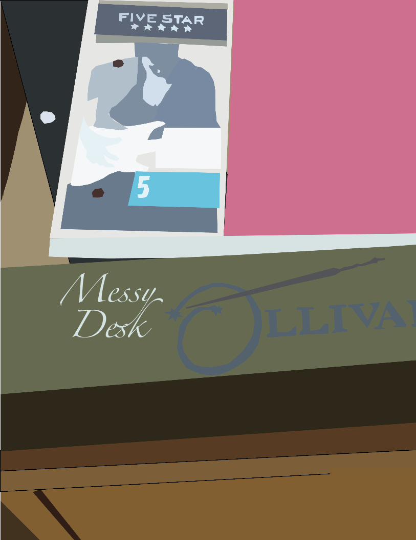
Messy Desk
“In the next picture the tool I had to use was the opacity tool to make the colors less vibrant”
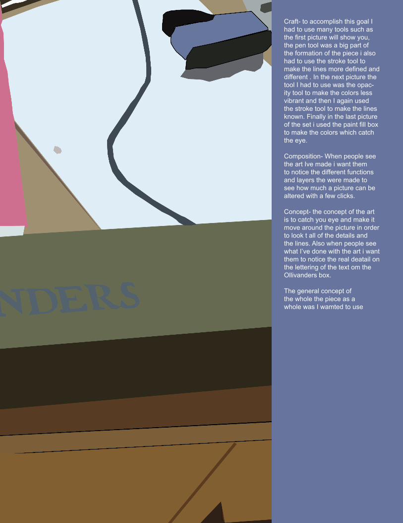
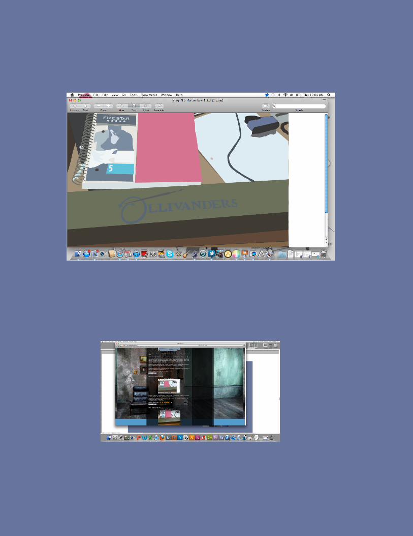
Craft- to accomplish this goal I had to use many tools such as the first picture will show you, the pen tool was a big part of the formation of the piece i also had to use the stroke tool to make the lines more defined and different . In the next picture the tool I had to use was the opac-ity tool to make the colors less vibrant and then I again used the stroke tool to make the lines known. Finally in the last picture of the set i used the paint fill box to make the colors which catch the eye.
Composition- When people see the art Ive made i want them to notice the different functions and layers the were made to see how much a picture can be altered with a few clicks.
Concept- the concept of the art is to catch you eye and make it move around the picture in order to look t all of the details and the lines. Also when people see what I’ve done with the art i want them to notice the real deatail on the lettering of the text om the Ollivanders box.
The general concept of the whole the piece as a whole was I wamted to use
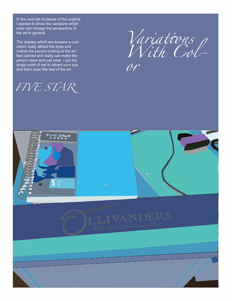
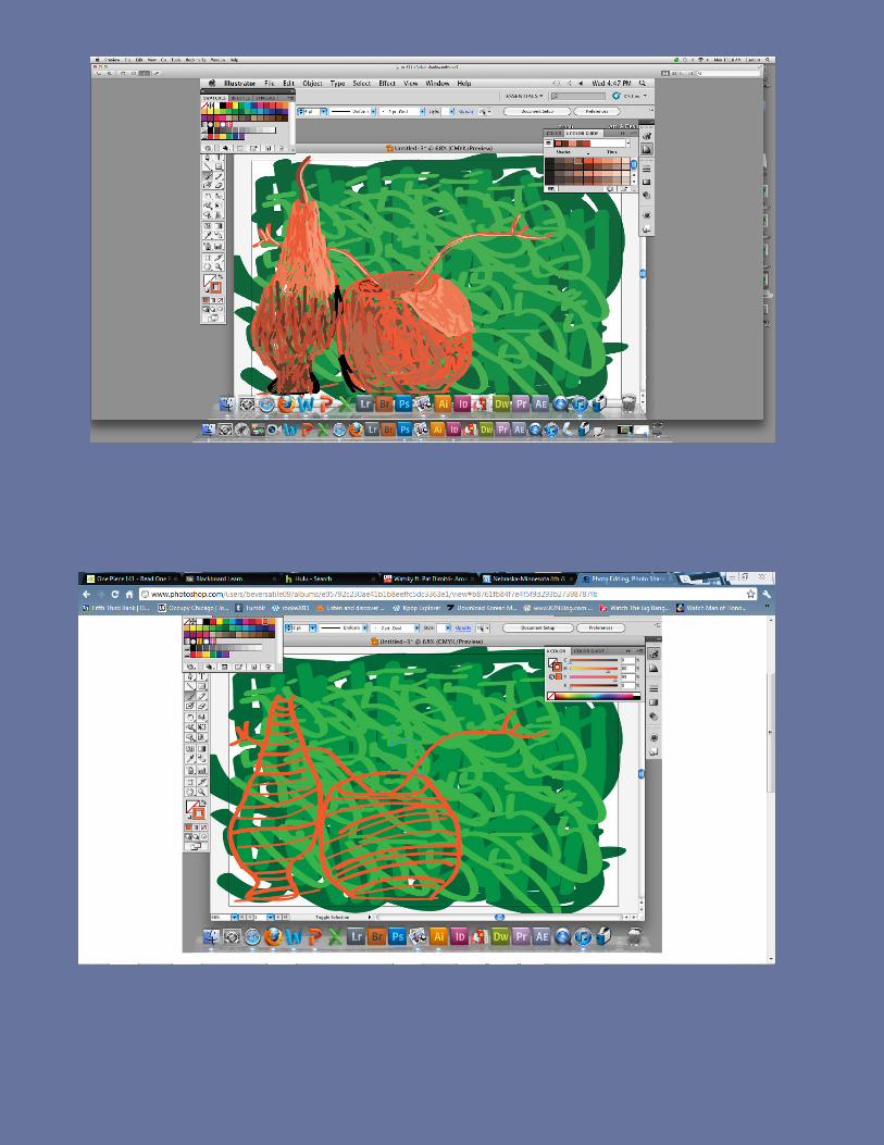
In the next set of pieces of the original I wanted to show the variatons which color can chnage the perspective of the art in general.
The shades which are knowns a cool colors really attract the eyes and makes the person looking at the art feel calmed and really can make the person stare and just relax. I put the single point of red to attract your eye and them scan the rest of the art
FIVE STAR
Variations With Col-or
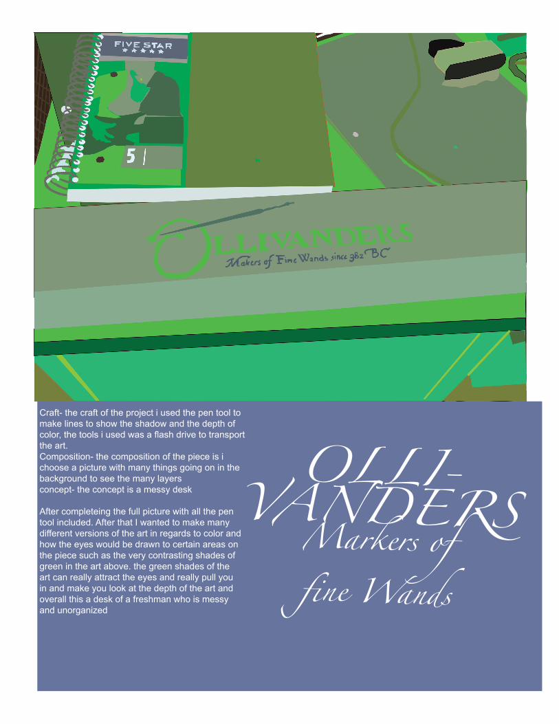
Craft- the craft of the project i used the pen tool to make lines to show the shadow and the depth of color, the tools i used was a flash drive to transport the art.Composition- the composition of the piece is i choose a picture with many things going on in the background to see the many layersconcept- the concept is a messy desk
After completeing the full picture with all the pen tool included. After that I wanted to make many different versions of the art in regards to color and how the eyes would be drawn to certain areas on the piece such as the very contrasting shades of green in the art above. the green shades of the art can really attract the eyes and really pull you in and make you look at the depth of the art and overall this a desk of a freshman who is messy and unorganized
OLLI-VANDERS Markers of fine Wands
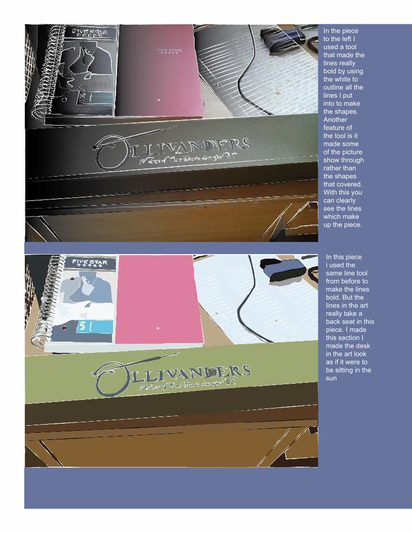
In the piece to the left I used a tool that made the lines really bold by using the white to outline all the lines I put into to make the shapes. Another feature of the tool is it made some of the picture show through rather than the shapes that covered. With this you can clearly see the lines which make up the piece.
In this piece i used the same line tool from before to make the lines bold. But the lines in the art really take a back seat in this piece. I made this section I made the desk in the art look as if it were to be sitting in the sun
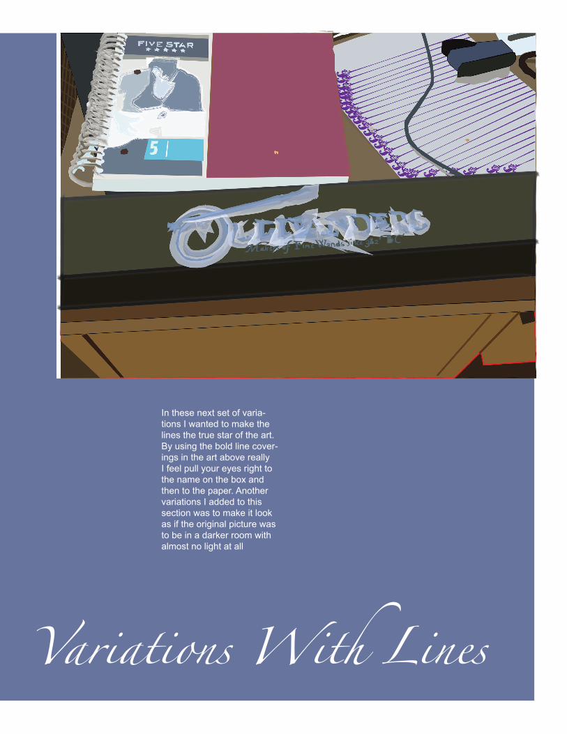
In these next set of varia-tions I wanted to make the lines the true star of the art. By using the bold line cover-ings in the art above really I feel pull your eyes right to the name on the box and then to the paper. Another variations I added to this section was to make it look as if the original picture was to be in a darker room with almost no light at all
Variations With Lines
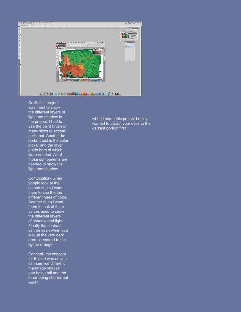
Craft- this project was ment to show the different layers of light and shadow in the project. I had to use the paint brush of many sizes to accom-plish that. Another im-portant tool is the color picker and the layer guide both of which were needed. All of those components are needed to show the light and shadow.
Composition- when people look at the screen shots I want them to see the the different hues of color. Another thing i want them to look at it the values used to show the different layers of shadow and light. Finally the contrast can be seen when you look at the very dark area compared to the lighter orange
Concept- the concept for this art was as you can see two different manmade shapes one being tall and the other being shorter but wider.
when i made this project I really wanted to attract your eyes to the darkest portion first
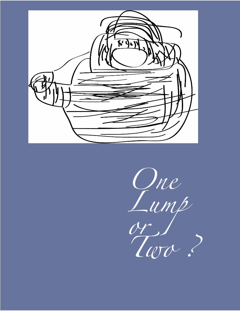
One Lump or Two ?
Teapots
Craft:while doing this project my hand was used to form the lines in a curved manner while using a simple pen and some printer paper and a camera to publish this art to this blog. In the amount of 100 lines these pictures were made
Composition: When people see my art I want them to see the detail of the art and the line structure and the curve and see the shape as well as the detail of shadow. Another concept is to show the bark ink on the white paper
Concept: these pieces were made to see the vectors in the lines and the curve of the strokes and to see the image as the cup in my dorm room sitting on my desk
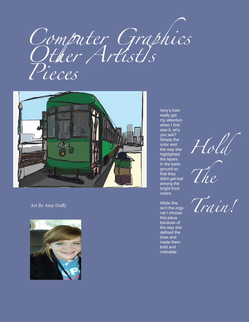
Art By Amy Duffy
Computer Graphics Other Artist’s Pieces
Amy’s train really got my attention when I first saw it, why you ask? Simply the color and the way she highlighted the layers in the back-ground so that they didnt get lost among the bright front colors.
While this isn’t the origi-nal I choose this piece because of the way she defined the lines and made them bold and noticable.
Hold The Train!
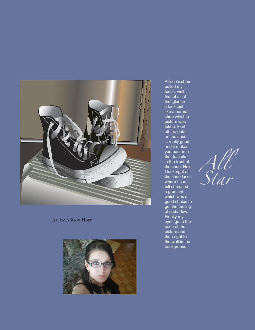
Art by Allison Horn
Allison’s shoe pulled my focus, well first of all at first glance it look just like a normal shoe which a picture was taken. First off the detail on the shoe is really good and it makes you peer into the deatails in the front of the shoe. Next I look right at the shoe laces where I can tell she used a gradiant which was a good choice to get the feeling of a shadow. Finally my eyes go to the base of the picture and then right to the wall in the background.
All Star
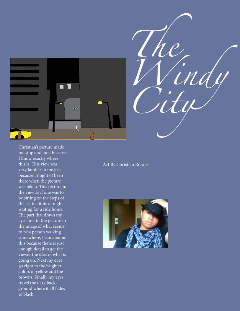
Art By Christian Rosales
Christian’s picture made me stop and look because I know exactly where this is. This view was very familer to me just because I might of been there when the picture was taken. This picture in the view as if one was to be sitting on the steps of the art institute at night waiting for a ride home. The part that draws my eyes first in the picture in the image of what seems to be a person walking somewhere, I can assume this because there is just enough detail to get the viewer the idea of what is going on. Next my eyes go right to the brighter colors of yellow and the browns. Finally my eyes travel the dark back-ground where it all fades to black.
The Windy City
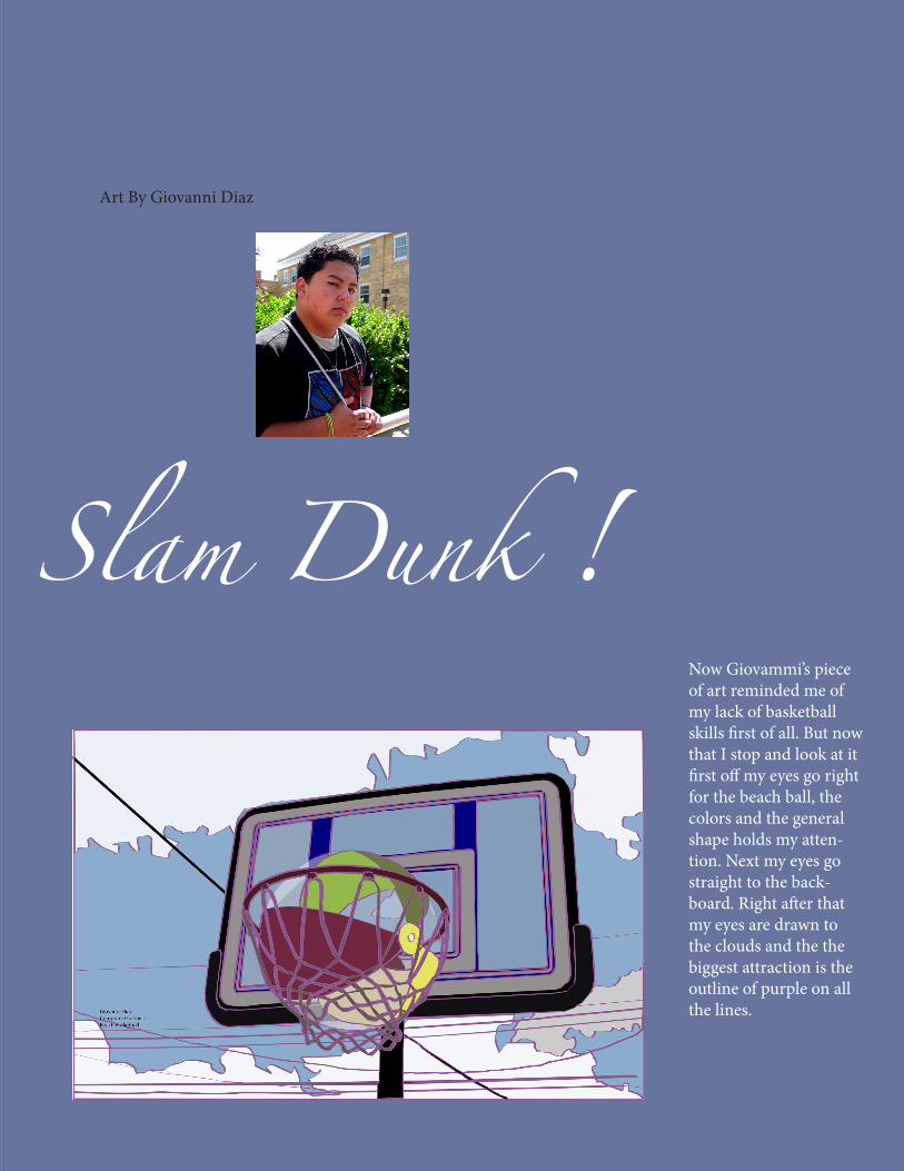
Art By Giovanni Diaz
Now Giovammi’s piece of art reminded me of my lack of basketball skills first of all. But now that I stop and look at it first off my eyes go right for the beach ball, the colors and the general shape holds my atten-tion. Next my eyes go straight to the back-board. Right after that my eyes are drawn to the clouds and the the biggest attraction is the outline of purple on all the lines.
Slam Dunk !
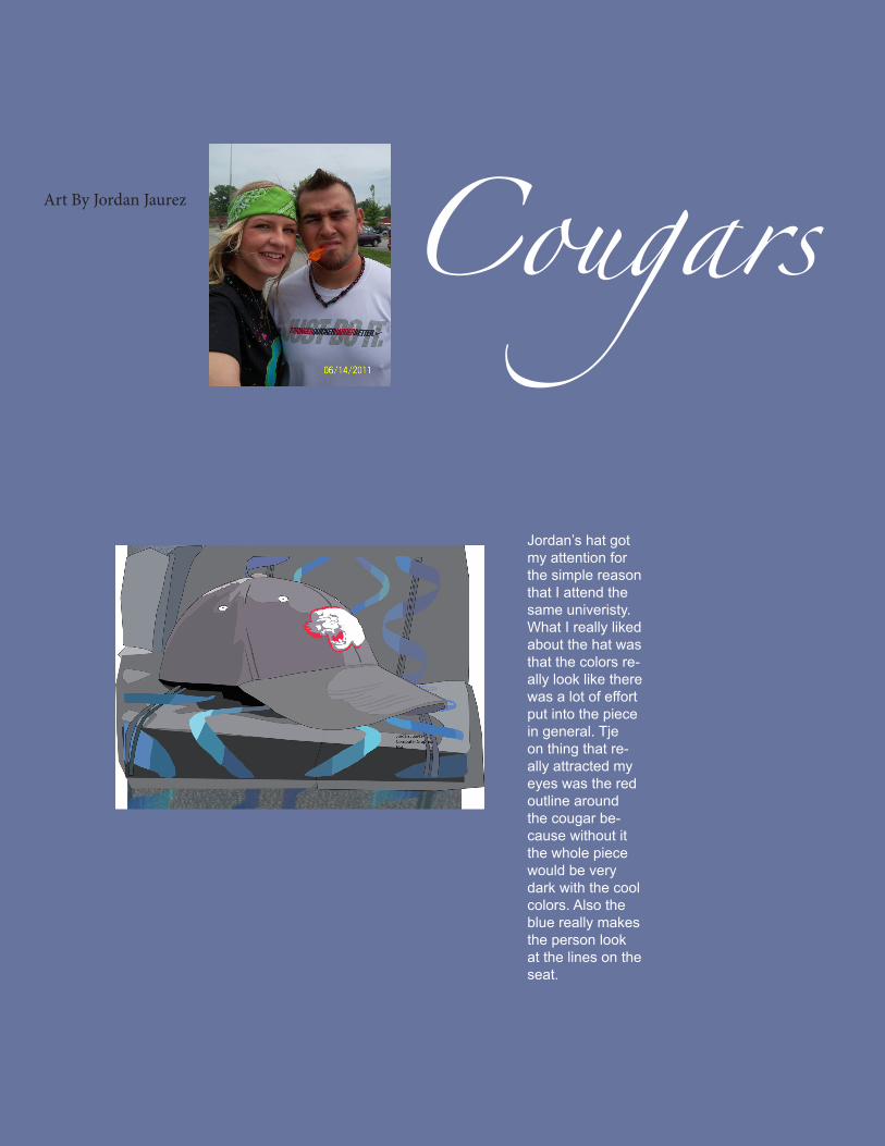
Art By Jordan Jaurez
Jordan’s hat got my attention for the simple reason that I attend the same univeristy. What I really liked about the hat was that the colors re-ally look like there was a lot of effort put into the piece in general. Tje on thing that re-ally attracted my eyes was the red outline around the cougar be-cause without it the whole piece would be very dark with the cool colors. Also the blue really makes the person look at the lines on the seat.
Cougars
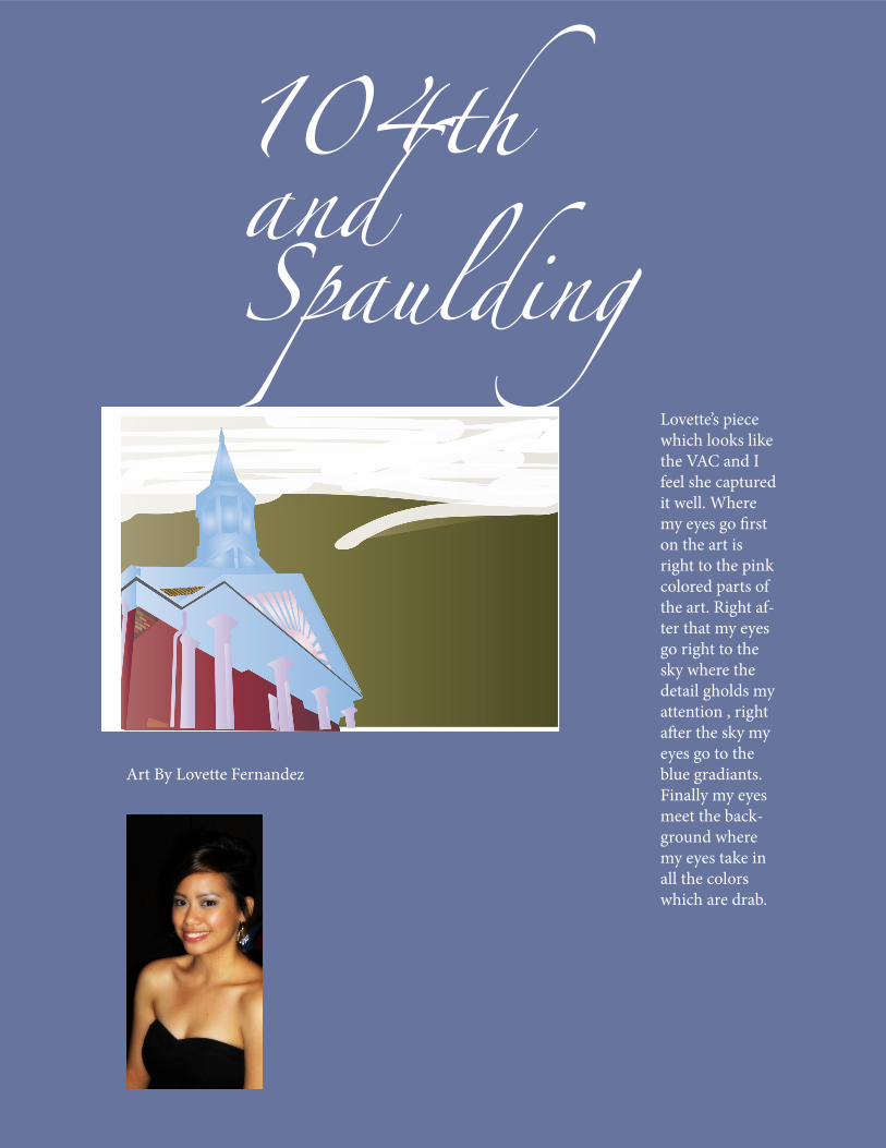
Art By Lovette Fernandez
Lovette’s piece which looks like the VAC and I feel she captured it well. Where my eyes go first on the art is right to the pink colored parts of the art. Right af-ter that my eyes go right to the sky where the detail gholds my attention , right after the sky my eyes go to the blue gradiants. Finally my eyes meet the back-ground where my eyes take in all the colors which are drab.
104th and Spaulding
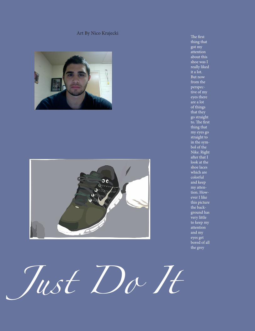
Art By Nico Krajecki The first thing that got my attention about this shoe was I really liked it a lot. But now from the perspec-tive of my eyes there are a lot of things that they go straight to. The first thing that my eyes go straight to in the sym-bol of the Nike. Right after that I look at the shoe laces which are colorful and keep my atten-tion. How-ever I like this picture the back-ground has very little to keep my attention and my eyes get bored of all the grey
Just Do It
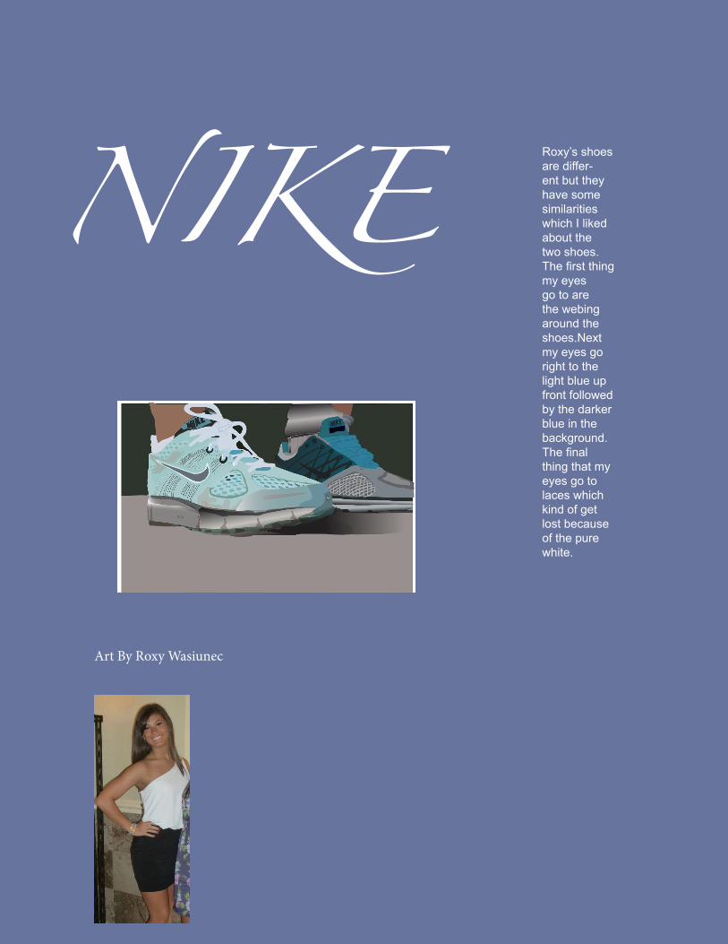
Art By Roxy Wasiunec
Roxy’s shoes are differ-ent but they have some similarities which I liked about the two shoes. The first thing my eyes go to are the webing around the shoes.Next my eyes go right to the light blue up front followed by the darker blue in the background. The final thing that my eyes go to laces which kind of get lost because of the pure white.
NIKE
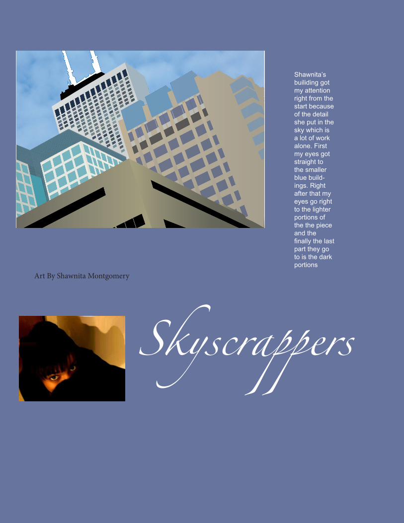
Art By Shawnita Montgomery
Shawnita’s builiding got my attention right from the start because of the detail she put in the sky which is a lot of work alone. First my eyes got straight to the smaller blue build-ings. Right after that my eyes go right to the lighter portions of the the piece and the finally the last part they go to is the dark portions
Skyscrappers
Skyscrappers
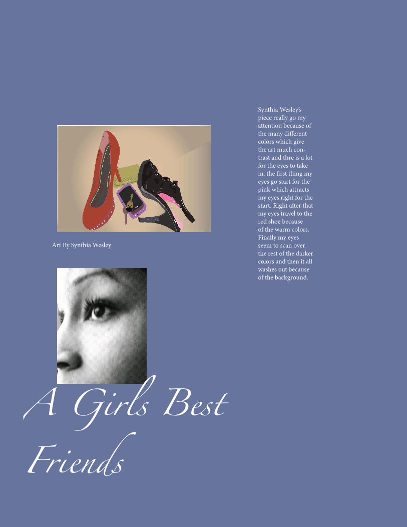
Synthia Wesley’s piece really go my attention because of the many different colors which give the art much con-trast and thre is a lot for the eyes to take in. the first thing my eyes go start for the pink which attracts my eyes right for the start. Right after that my eyes travel to the red shoe because of the warm colors. Finally my eyes seem to scan over the rest of the darker colors and then it all washes out because of the background.
Art By Synthia Wesley
A Girls Best Friends
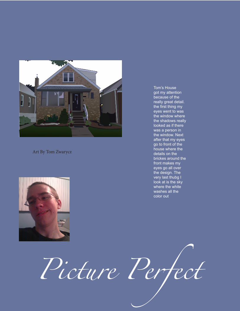
Art By Tom Zwarycz
Tom’s House got my attention because of the really great detail. the first thing my eyes went to was the window where the shadows really looked as if there was a person in the window. Next after that my eyes go to front of the house where the details on the brickes around the front makes my eyes go all over the design. The very last thubg I look at is the sky where the white washes all the color out
Picture Perfect
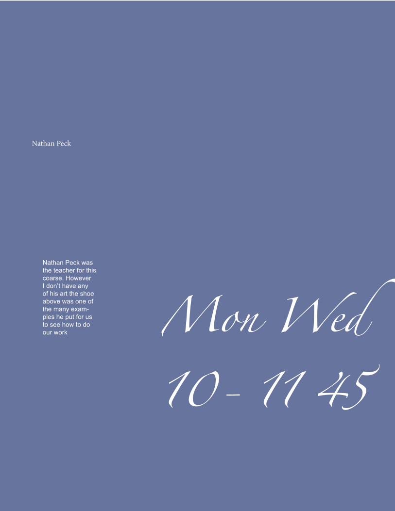
Nathan Peck
Nathan Peck was the teacher for this coarse. However I don’t have any of his art the shoe above was one of the many exam-ples he put for us to see how to do our work Mon Wed
10- 11 45
Blogger
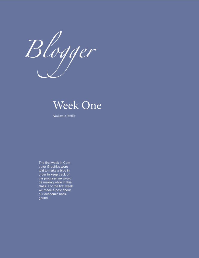
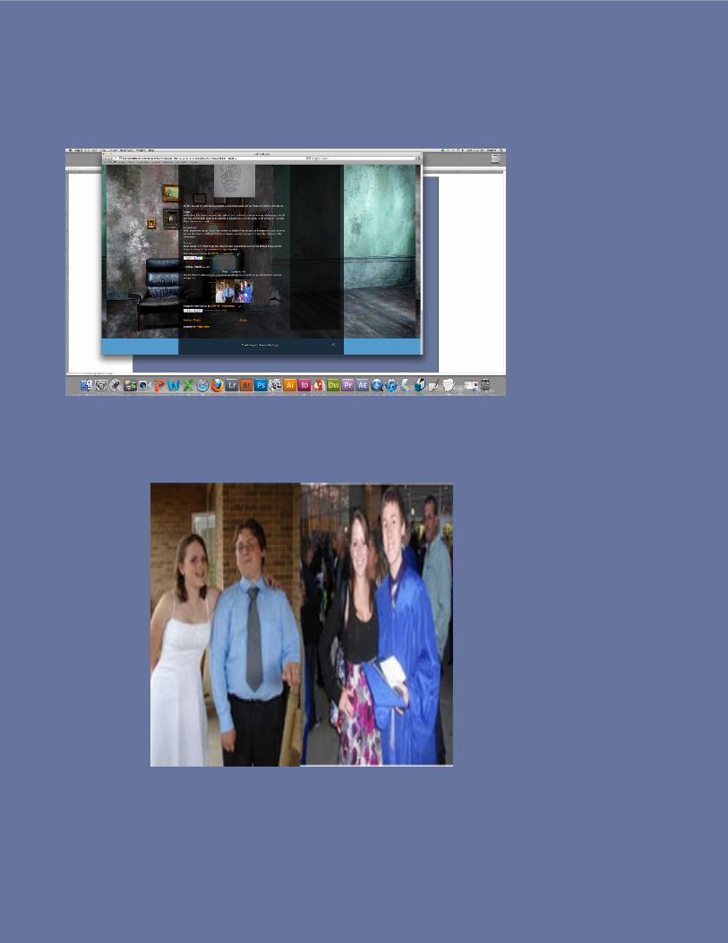
Week One Academic Profile
The first week in Com-puter Graphics were told to make a blog in order to keep track of the progress we would be making while in thia class. For the first week we made a post about our academic back-gound
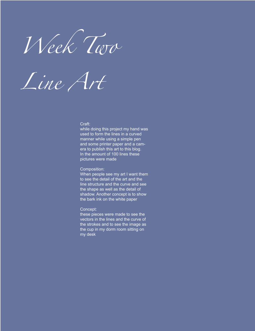
Week Two Line Art
Craft:while doing this project my hand was used to form the lines in a curved manner while using a simple pen and some printer paper and a cam-era to publish this art to this blog. In the amount of 100 lines these pictures were made
Composition: When people see my art I want them to see the detail of the art and the line structure and the curve and see the shape as well as the detail of shadow. Another concept is to show the bark ink on the white paper
Concept: these pieces were made to see the vectors in the lines and the curve of the strokes and to see the image as the cup in my dorm room sitting on my desk
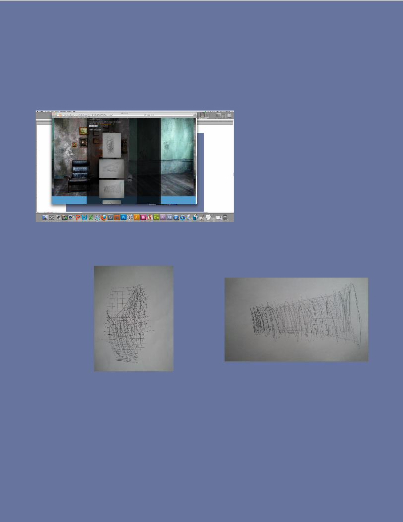
Week Three Value
For the next assignment we were told to show the value of the shapes when exposed to a light
Craft: For this project my hand had o make different movements to accomplish the art. I used a simple pencil and made simple elongated lines. to accomplish the values i used my fingers to smear the pencil and create the shadow of the light and shadow. to post this art i had to use my phone to take the picture and to post it online.
Composition : When the audience sees the art i want them to witness the shadows and see the smear-ing of the pencil marks to make the shadow. the color was accom-plished the light pencil marks and the deep shadows.
Concept :these pieces are made to show the values of light and shadow
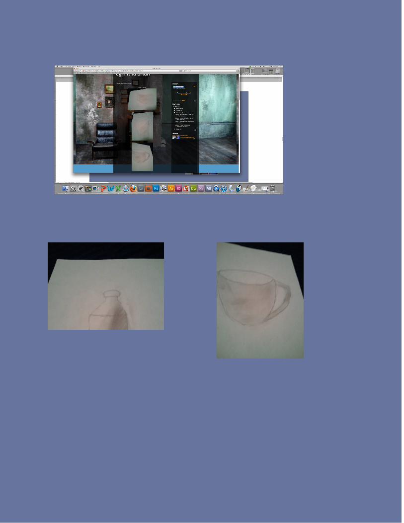
Week Four Line Art
Craft- this project was ment to show the different layers of light and shadow in the project. I had to use the paint brush of many sizes to accomplish that. Another important tool is the color picker and the layer guide both of which were needed. All of those compo-nents are needed to show the light and shadow.
Composition- when people look at the screen shots I want them to see the the different hues of color. Another thing i want them to look at it the values used to show the different layers of shadow and light. Finally the contrast can be seen when you look at the very dark area compared to the lighter orange
Concept- the concept for this art was as you can see two different manmade shapes one being tall and the other being shorter but wider.
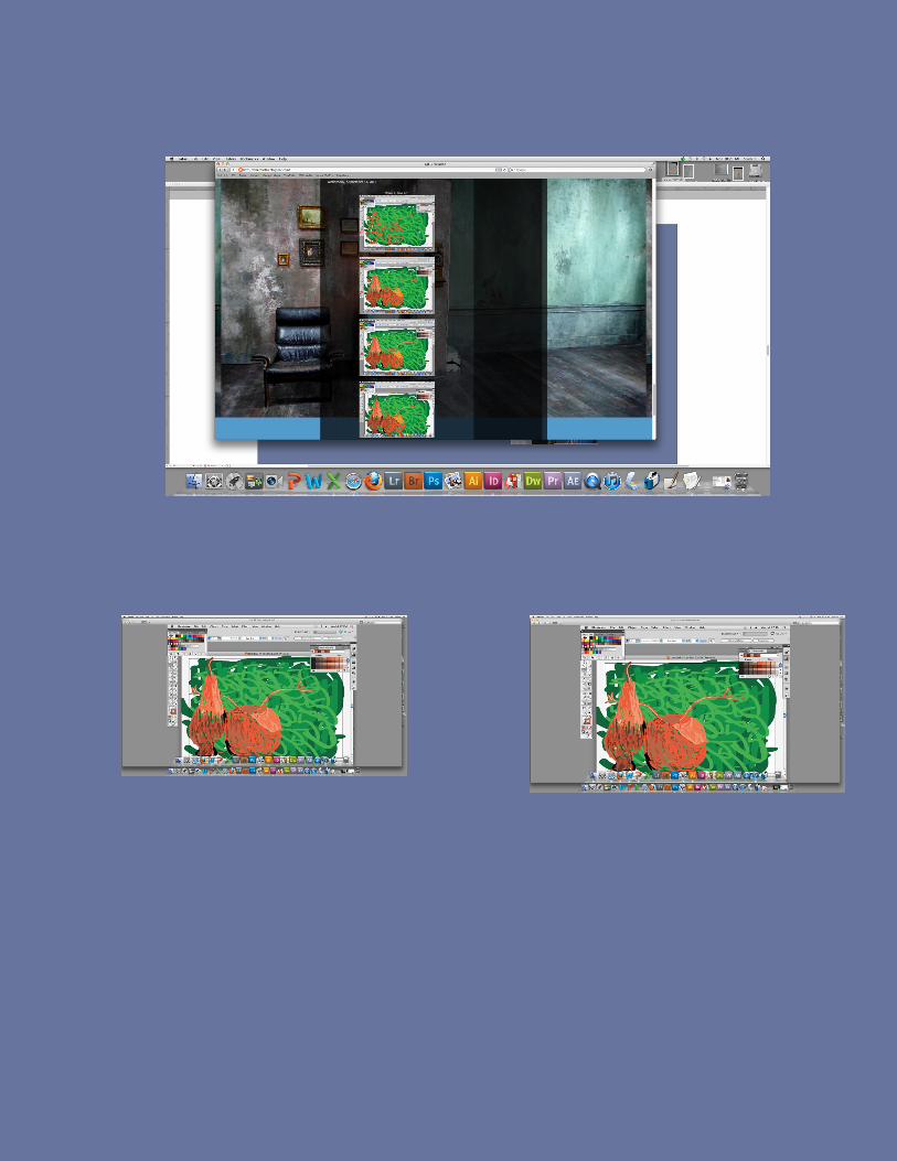
Week Five Vector Art
Craft- for the next project we had to use the pen tool to make the shapes that make up this set of objects on my incredibly messy desk. To bring you this image I used my camera phone and used a usb cord to bring it to the computer.
Composition- When people look at this art I want them to see the shapes that I am currently making to finish this art piece. Another thing I want people to notice is the many different shades of color and the and the work of shadows.
Concept - the concept of this piece is simply a super messy desk and a students unwill-ingness to clean and a harry potter wand a neighbor left on his desk
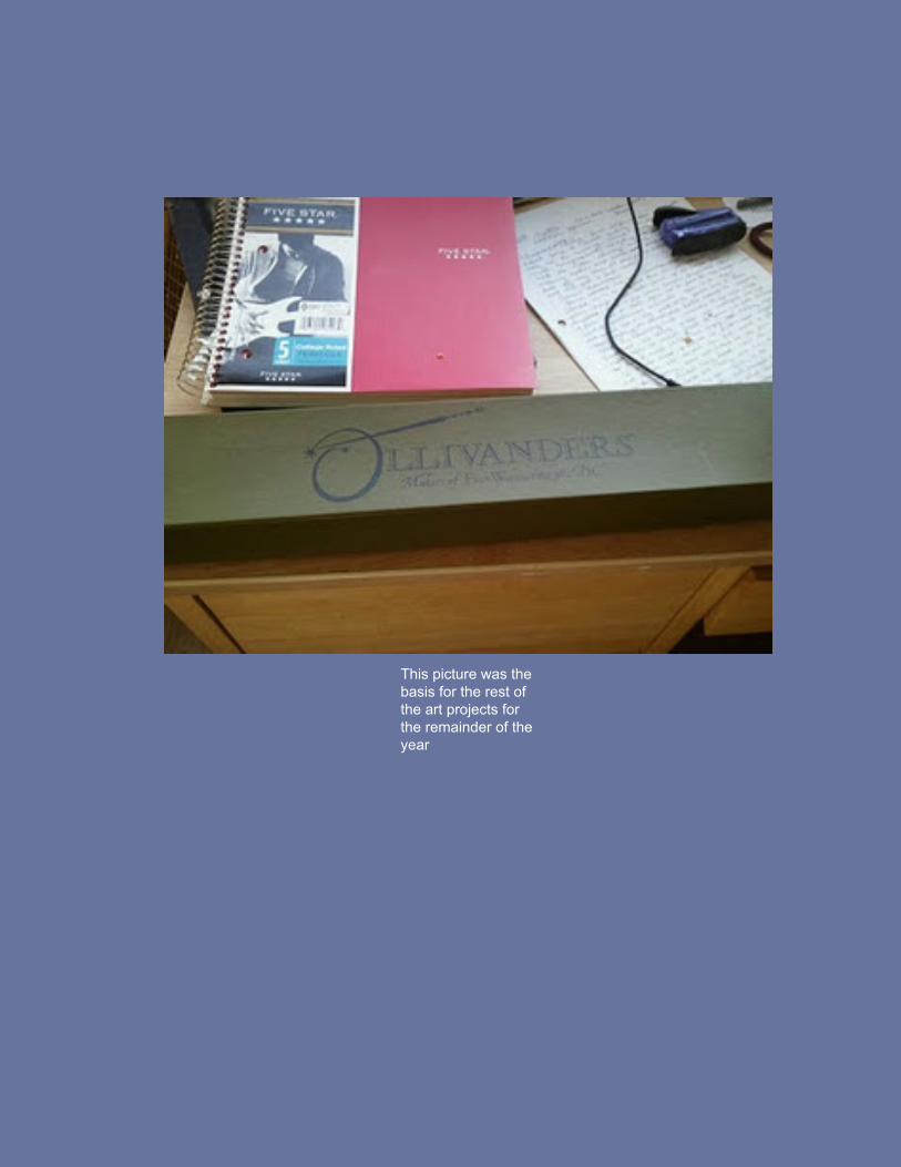
This picture was the basis for the rest of the art projects for the remainder of the year
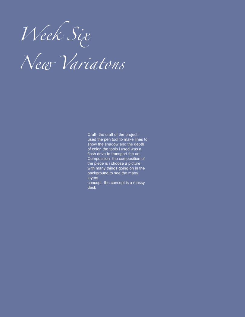
Week Six New Variatons
Craft- the craft of the project i used the pen tool to make lines to show the shadow and the depth of color, the tools i used was a flash drive to transport the art.Composition- the composition of the piece is i choose a picture with many things going on in the background to see the many layersconcept- the concept is a messy desk
Week Seven
Newer Variations
for this week we were told to make varia-tions of the art we have been working on the past few weeks
Craft- to accomplish this goal I had to use many tools such as the first picture will show you, the pen tool was a big part of the formation of the piece i also had to use the stroke tool to make the lines more defined and different . In the next picture the tool I had to use was the opacity tool to make the colors less vibrant and then I again used the stroke tool to make the lines known. Finally in the last picture of the set i used the paint fill box to make the colors which catch the eye.
Composition- When people see the art Ive made i want them to notice the different functions and layers the were made to see how much a picture can be altered with a few clicks.
Concept- the concept of the art is to catch you eye and make it move around the pic-ture in order to look t all of the details and the lines
Week 8 Magazine
Craft- how I made these pieces for the magazine was to use the tool Adobe Indesign to get started. First off we were told to make a magazine which could in-clude all the work we did the class or use the collected works of all the people in class I chose to use both. The tool i used the most was the pages tab to over-see the whole project as it was being developed.
Composition - when people see my magazine I want them to notice my art but also all the other artist that are in the class with me
Concept- the general con-cept is a magazine which holds all of my works and some of the other students in Computer Graphics work
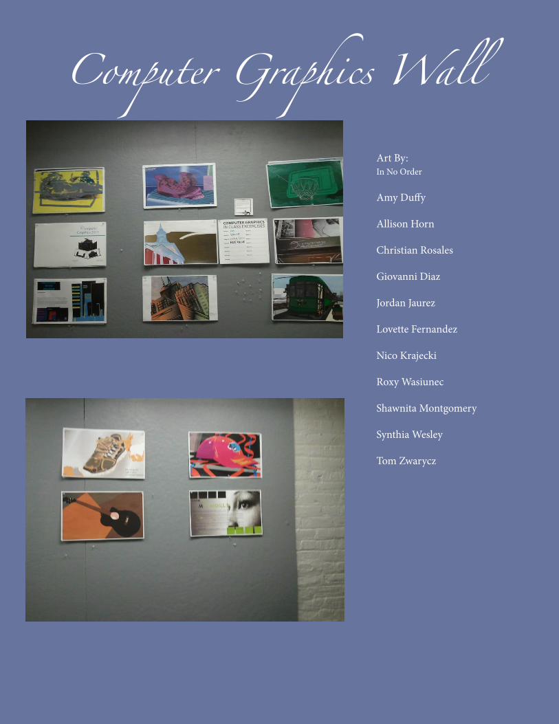
Computer Graphics Wall
Art By:In No Order Amy Duffy Allison Horn Christian Rosales Giovanni Diaz Jordan Jaurez Lovette Fernandez Nico Krajecki Roxy Wasiunec Shawnita Montgomery Synthia Wesley Tom Zwarycz