Embed Size (px)
Citation preview

Jennifer Nip, P.EngPortfolio

2
Jennifer Nip Portfolio
Jennifer has over 10 years experience in web design and usability analysis Being the Lead User Experience Designer, she has leading edge web design knowledge with emphasis
on Usability, Web Accessibility and Strategic Branding Design. With hands on experience in creating multimedia process flows, wireframes and user interface design by using Visio,
OmniGraffle, Axure, Photoshop, Illustrator, Dreamweaver, InDesign and other software technologies.
1 Usability (Page 3)
1.1 What is Usability?
1.2 Why Usability?
1.3 How to improve Usability?
2 Web Accessibility (Page 12)
2.1 What is Web Accessibility?
2.2 Why Accessibility?
2.3 Implementation Plan
2.4 Reference
3 Branding Design (Page 18)
3.1 Color Palette
3.2 Dropdown Menu
3.3 Product Banners
3.4 Page Layout
4 Mobile Design (Page 35)
4.1 Wireframes
4.2 Mockups
4.3 Icons
PROFESSIONAL EXPERIENCE & WORK EXAMPLES
JENNIFER NIP 2013

Usability Best Practices

4
METHODS FOR IMPROVING EASE-OF-USE
LEARNABILITY Is it easy for users to learn basic tasks the first time? Would it increase training time? Is it meant for all users? Who are your target audience?
EFFICIENCY & EFFECTIVENESS Can users perform the tasks quickly? Do they need to navigate to many different pages for one single task?
MEMORABILITY Can users easily reestablish proficiency after a period of time of not using it? “I have to remember 140 business rules and how this system works.”
REDUCE ERRORS Is it easy to make errors? Critical? Recoverable? “I got an error at the end of the activation, and lost all the information I previously entered.”
SATISFACTION Is the web site pleasant to use? How about its look and feel?
JENNIFER NIP
Usability1.1 WHAT IS USABILITY?
Usability refers to how well users can learn and use a product to achieve their goals and how satisfied they are with that process.

5
LEARNABILITY
Is it easy for users to learn basic tasks the first time? Would it increase training time? Is it meant for all users? Who are your target audience?
Let users know what happens if they click on a button or a link.For example, links or buttons should be self explanatory. If possible, we should provide information for the links/files to our users.
LINKS/FILES INFORMATIONType: Slide? PDF? Excel? External Web Site?Size: How big is the file? Date: When was it created?
ICON File Name [File Type, Size, Date]
LearnUsability [PDF, 1.20MB, April 2012]
JENNIFER NIP
Usability

6
EFFICIENCY & EFFECTIVENESS
Processes with many steps increases processing times and potential errors.Every time we make changes to an existing flow, we should review the whole process to ensure it remains consistent and efficient.
SITE RE-ENGINEERING If the site has been developed for a long time with many incremental updates over a period of time, its information may become unorganized, we could consider a site re-engineering.
Example of a process of a web site contains 25 steps, and the information is unorganized.
After site re-engineering, the following items have been accomplished:• Usability enhancement • Re-organized the information and reduced the process down to 4 steps. • Optimized the transaction down to 5 minutes• Provided quick access links to important flows• Introduced “In Progress” indicator to inform customer about the wait time.
Home Screen Eligibility Check
Customer Information & Method of
Payment
Equipment & Phone Number
Selection
Confirmation & Agreement
JENNIFER NIP
Usability
7
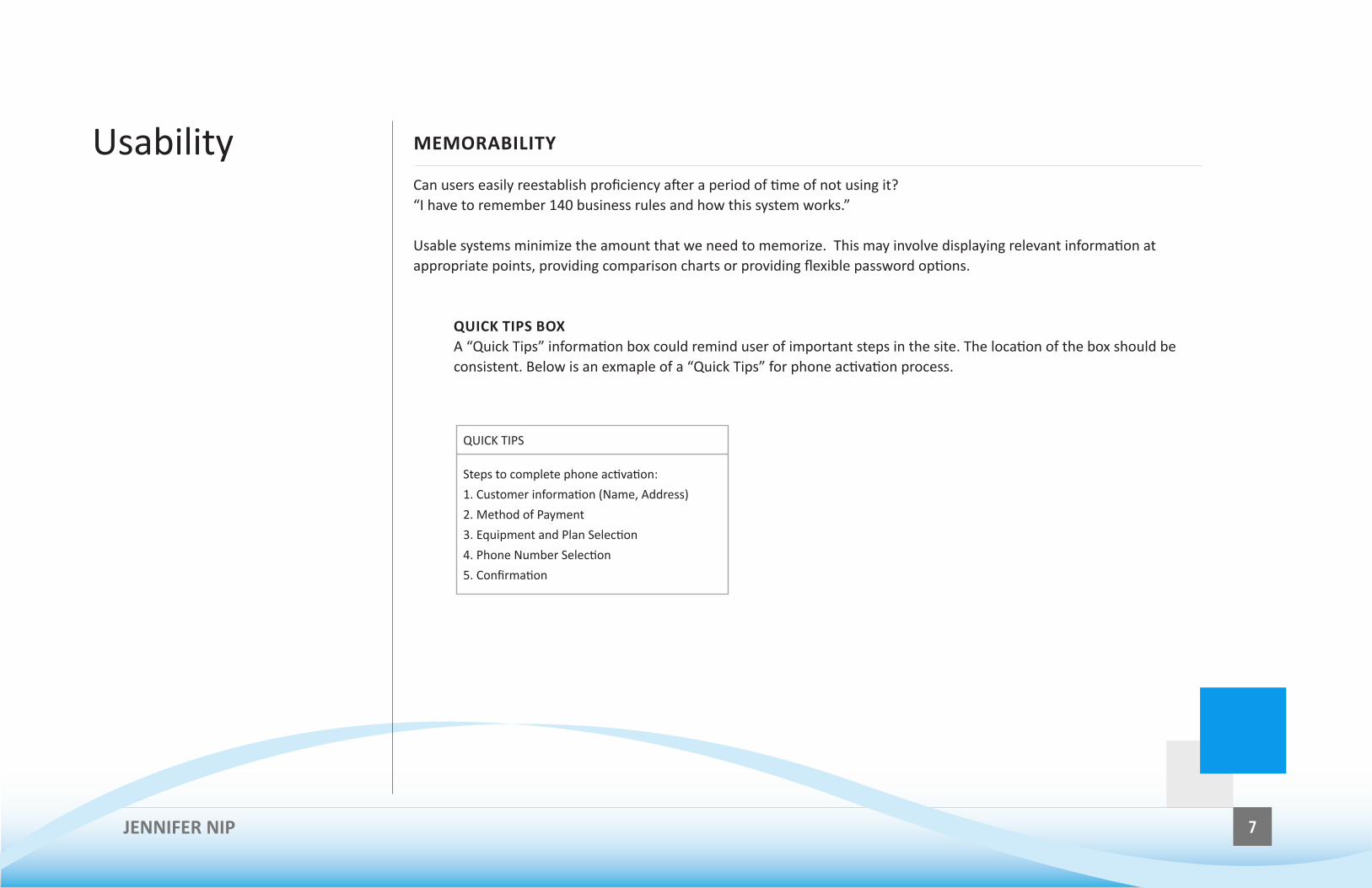
MEMORABILITY
Can users easily reestablish proficiency after a period of time of not using it? “I have to remember 140 business rules and how this system works.”
Usable systems minimize the amount that we need to memorize. This may involve displaying relevant information at appropriate points, providing comparison charts or providing flexible password options.
QUICK TIPS BOXA “Quick Tips” information box could remind user of important steps in the site. The location of the box should be consistent. Below is an exmaple of a “Quick Tips” for phone activation process.
Steps to complete phone activation:
1. Customer information (Name, Address)
2. Method of Payment
3. Equipment and Plan Selection
4. Phone Number Selection
5. Confirmation
QUICK TIPS
JENNIFER NIP
Usability

8
REDUCE ERRORS
Is it easy to make errors? Critical? Recoverable?“I got an error at the end of the activation, and lost all the information I previously entered.”
Users may forget steps involved in a process and miss certain important steps. We need to ensure the system has a mechanism to enforce steps sequence.
SYSTEM ENFORCEMENTWe can provide an error check in the system to ensure the input information is correct. This mechanism should be included with each group of information, not at the end of the whole process.
Let users know if a field is mandatory by putting an indicator, such as an asterisk (*), together with an annotation.
*E mail: *Mandatory field
Please enter a valid email in the format: [email protected]
jen&jennnifernip.com
JENNIFER NIP
Usability

9
SATISFACTION
Is the web site pleasant to use? How about its look and feel?
To ensure customer satisfaction, not only do we need to ensure a web site is easy to learn and use, memorable, and error-free, it is also important to maintain a balance between functional elements and non-functional elements. A good web design does not necessarily include a lot of information or graphics; white space is also an important visual aspect of a page.
A well designed web page should always consider the following elements:
WEB DESIGN ELEMENTSPAGE SIZEThe page layout or size of a web page usually determined by the average screen size of our site’s visiters. For example, a commonly used page width is 980 pixels wide. As for length, normally it should be less than 2 pages long.
PAGE LAYOUT Depends on the purpose of the page, it varies from 1 – 3 columns.
PAGE TITLETitle should be displayed on all pages.
USE OF COLOURA single, consistently-used palette helps give a unified look and feel to the site while minimizing visual distractions. Do not use colour as the only means to distinguish items of information. All such information should be provided by at least one other method, such as shape, position or textual description.
JENNIFER NIP
Usability

10
THE IMPORTANCE OF MAKING WEB SITES USER-FRIENDLY
GOALWe want to increase sales, promote the company brand, and ensure our site is presented professionally reflecting its actual abilities and capacities.
One way of ensuring that a web site is usable is to follow a user-centered design process, where users are considered and involved in the process, and usability testing is carried out at many stages of the design process.
USER CENTERED DESIGNUser centered design is a process to ensure user centered activities can be included throughout the design and development process, from concept development to final testing and beyond into support and maintenance. User Centered Design involves three key aspects: 1. Know your audience 2. Designing for your audience 3. Involve your audience throughout the design process LOOK AND FEELThe look and feel could be enhanced by page size, layout, use of colour, icons and graphics. It should be based on the company brand, theme colour and primary colour such as black, grey, white, red.
JENNIFER NIP
Usability1.2 WHY USABILITY?
A highly usable web site offers benefits to both users and businesses. It has direct impact on online sales and success rate vs drop-off rate.

11
THE PROCESS OF USABILITY
Listed below is the process of usability PLANNINGKick-off meetings start in the beginning to identify the users, the objective of the web site.
ANALYSISGather requirements: customer needs vs business needs.
SURVEY Review feedback from customers.
DESIGNDesign should be based on business requirements and customer feedback.
USABILITY TESTConduct usability test based on prototypes and mock-ups. The usability test identifies the key usability problems and collects quantitative measures of efficiency, effectiveness and satisfaction.
REVISIONRevise prototypes and mock-ups based on the feedback from the usability test.
JENNIFER NIP
Usability1.3 HOW TO IMPROVE USABILITY?
Involving the users throughout the design process is the key to improve usability. There are many ways that this can be done, from concept design to implementation and beyond.
Web Accessibility

13
WEB ACCESSIBILITY
Web accessibility means access to the Web by everyone, regardless of disability.Web Content Accessibility Guidelines (WCAG) 2.0 covers a wide range of recommendations for making web content more accessible. Following these guidelines will make content accessible to a wider range of people with disabilities, including blindness and low vision, deafness and hearing loss, learning disabilities, photosensitivity and combinations of these. Following these guidelines will also often make our Web content more usable to users in general.
Web Accessibility includes: Usability & design for people with diverse abilitiesBest practices for Web contentDevice independenceSearch engine optimization (SEO)
67% of the population uses Internet in 2006
16% of the population with disabilities in 2006
JENNIFER NIP
Web Accessibility2.1 WHAT IS WEB ACCESSIBILITY?
Web technologies and standards are constantly evolving and Web accessibility plays a major role in making web sites more effective and inclusive.
14
THE IMPORTANCE OF WEB ACCESSIBILITY
To provide equal opportunity to people with diverse abilities.
The UN Convention recognizes access to information and communications technologies, including the Web, as a basic human right.
The Ontario Regulation 191/11, ACCESSIBILITY FOR ONTARIANS WITH DISABILITIES ACT, requires web sites to conform to it by January 2014.
ONTARIO REGULATION 191/11 ACCESSIBILITY FOR ONTARIANS WITH DISABILITIES ACT Section 14.2.
Designated public sector organizations and large organizations shall make their internet websites and web content conform with the World Wide Web Consortium Web Content Accessibility Guidelines (WCAG) 2.0, initially at Level A and increasing to Level AA, and shall do so in accordance with the schedule set out in this section.
Section 14.4Designated public sector organizations and large organizations for their internet websites shall meet the requirements of this section in accordance with the following schedule:
1. By January 1, 2014, new internet websites and web content on those sites must conform with WCAG 2.0 Level A.
2. By January 1, 2021, all internet websites and web content must conform with WCAG 2.0 Level AA, other than,
i. success criteria 1.2.4 Captions (Live), and ii. success criteria 1.2.5 Audio Descriptions (Pre-recorded).
JENNIFER NIP
Web Accessibility2.2 WHY ACCESSIBILITY?
Accessibility as a tool for social inclusion, not only for people with disabilities, it also includes others, such as older people, people in rural areas, and people in developing countries.
15
IMPROVING WEB ACCESSIBILITY
It is important to plan for implementation of accessibility. This page lists resources and planning processes. Actual implementation plans should be tailored to the organization’s needs.
STANDARDWeb Accessibility Initiative (WAI) - http://www.w3.org/WAI/Web Content Accessibility Guidelines (WCAG) - http://www.w3.org/WAI/intro/wcag.php
MEASURING METHODSInitial Assessment and Conformance EvaluationOn-going EvaluationOn-Demand Evaluation TEAM RESOURCESProject manager: coordinate the project.Usability: communicate the goal, the importance, and the impacts. Marketing: impact to multiple media might affect marketing strategies. Web development: Assess and implement the changes to conform standard. Tech Lead: update new techniques for accessibility.Testing team: run and report evaluation tests.Representatives from key departments: form core committee to provide recommendations.
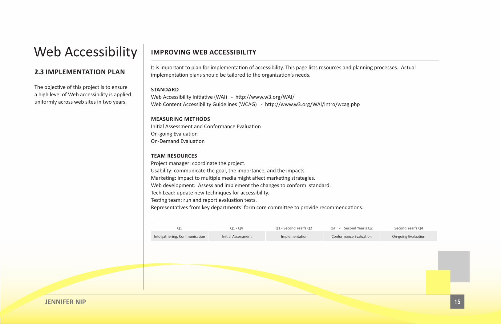
SCHEDULE
Info gathering, Communication Initial Assessment Implementation Conformance Evaluation On-going Evaluation
Q1 Q1 - Q4 Q1 - Second Year’s Q2 Q4 - Second Year’s Q2 Second Year’s Q4
JENNIFER NIP
Web Accessibility2.3 IMPLEMENTATION PLAN
The objective of this project is to ensure a high level of Web accessibility is applied uniformly across web sites in two years.
16
WCAG 2.0 QUICK LIST
CONFORMANCE REQUIREMENTS
1.1 Text Alternatives: Provide text alternatives for any non-text content
1.2 Time-based Media: Provide alternatives for time-based media.
1.3 Adaptable: Create content that can be presented in different ways (ie simpler layout) without losing information or structure.
1.4 Distinguishable: Make it easier for users to see and hear content including separating foreground from background.
2.1 Keyboard Accessible: Make all functionality available from a keyboard.
2.2 Enough Time: Provide users enough time to read and use content.
2.3 Seizures: Do not design content in a way that is known to cause seizures, refer to “flashing” contents
2.4 Navigable: Provide ways to help users navigate, find content, and determine where they are.
3.1 Readable: Make text content readable and understandable.
3.2 Predictable: Make Web pages appear and operate in predictable ways.
3.3 Input Assistance: Help users avoid and correct mistakes.
4.1 Compatible: Maximize compatibility with current and future user agents, including assistive technologies.
JENNIFER NIP
Web Accessibility2.4 REFERENCE
For more information, visit The World Wide Web Consortium (W3C) http://www.w3.org/

17
IMPROVING WEB ACCESSIBILITY
CONFORMANCE REQUIREMENTS1. Alternate versions
web page satisfies all the Level A Success Criteria, or a conforming alternate version is provided.
2. Full pages Conformance (and conformance level) is for full Web page(s) only, and cannot be achieved if part of a Web page is excluded.
3. Complete processes When a Web page is one of a series of Web pages presenting a process, all Web pages in the process conform at the specified level or better.
4. Only Accessibility-Supported Ways of Using Technologies Provide accessibility support ways to any information or functionality that is not accessibility supported.
5. Non-Interference If technologies are used in a non-conforming ways or not accessibility-supported, then they do not block the ability of users to access the rest of the page.
GUIDELINES AND TECHNIQUES1. Web Content Accessibility Guidelines (WCAG) 2.0
http://www.w3.org/TR/WCAG20/
2. How to Meet WCAG 2.0 http://www.w3.org/WAI/WCAG20/quickref/
3. Web accessibility evaluation tool http://www.w3.org/WAI/ER/tools/complete (Complete list)
JENNIFER NIP
Web Accessibility

Branding Design

19
BACKGROUND COLOUR PALETTE
HEX FFFFFF FCFCFC F2F2F2 E5E5E5 CCCCCC E2D21ERGB 255, 255, 255 252, 252, 252 242, 242, 242 229, 229, 229 204, 204, 204 255, 240, 0USE Page Table Navigation Table Header Divider Highlight
FONT COLOUR PALETTE
HEX 000000 333333 777777 0A9AEC 330033 CC0000RGB 0, 0, 0 51, 51, 51 119, 119, 119 10, 154, 236 51, 0, 51 204, 0, 0USE Body Fonts Instrustional
MessageSecondaryMessage
Unvisited Links
Visited Links Error Messages
JENNIFER NIP
Branding DesignCOLOR PALETTE
A single, consistently-used palette helps give a unified look and feel to the site while minimizing visual distractions. Do not use color as the only means to distinguish items of information. All such information should be provided by at least one other method, such as shape, position or textual description.

20
DROPDOWN MENU
The drop-down menus used in the main navigation. These menus contain the list of links related to the line of business as well as promotions (text and image).
JENNIFER NIP
Branding Design

21
PRODUCT BANNERS
A product banner is used to promote products and services offered.
The top panel web banner is the first thing a user sees when they go to a web site. Banners should be reflective of the brand. They should be a blending of the corporate colors, fonts, content that is attractive, informative, comfortable for the eye and encourages the user to click on the banner.
JENNIFER NIP
Branding Design

22
PRODUCT BANNERS
JENNIFER NIP
Branding Design

23
PRODUCT BANNERS
JENNIFER NIP
Branding Design

24
PRODUCT BANNERS
JENNIFER NIP
Branding Design

25
PRODUCT BANNERS
JENNIFER NIP
Branding Design

26JENNIFER NIP
Branding Design
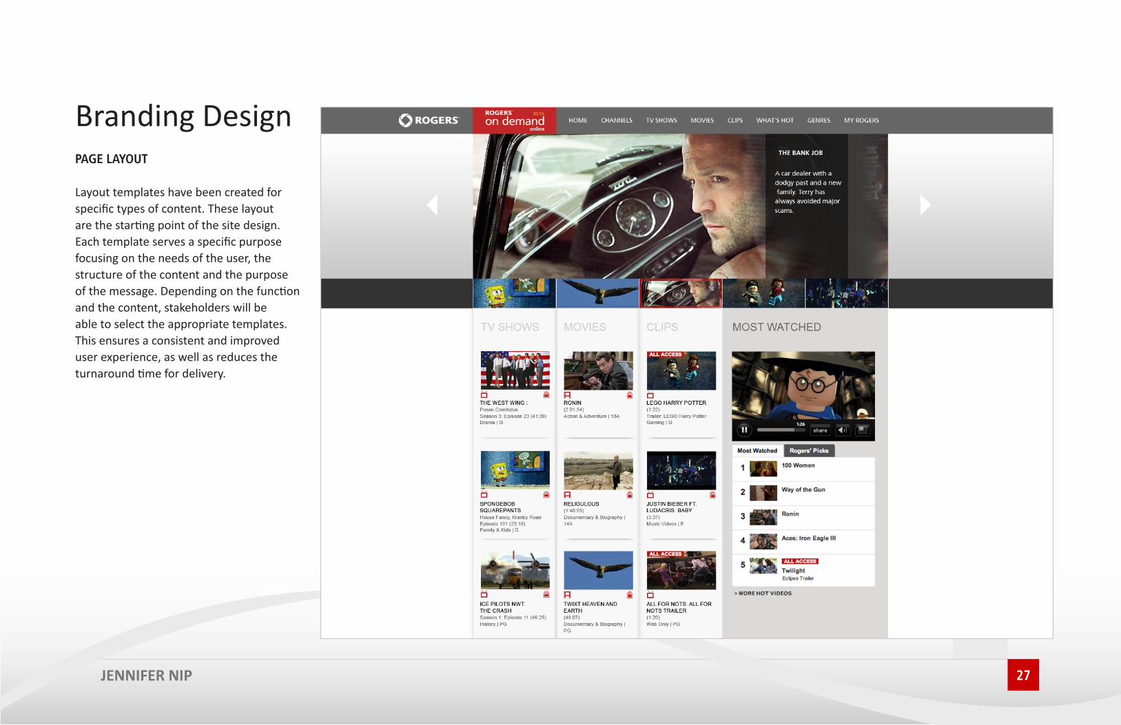
27
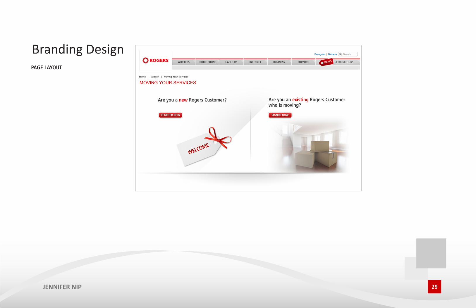
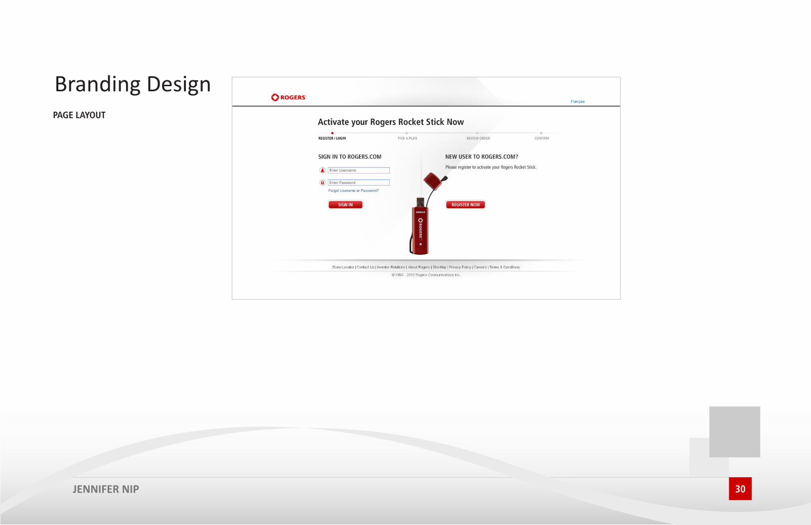
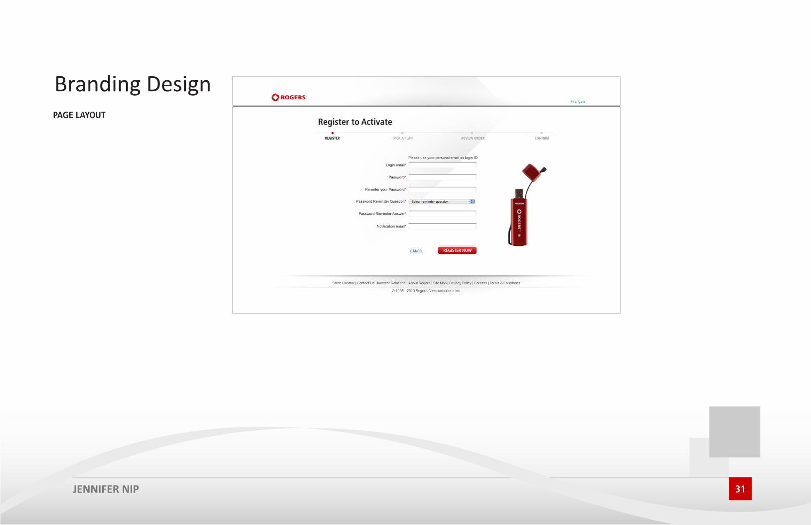
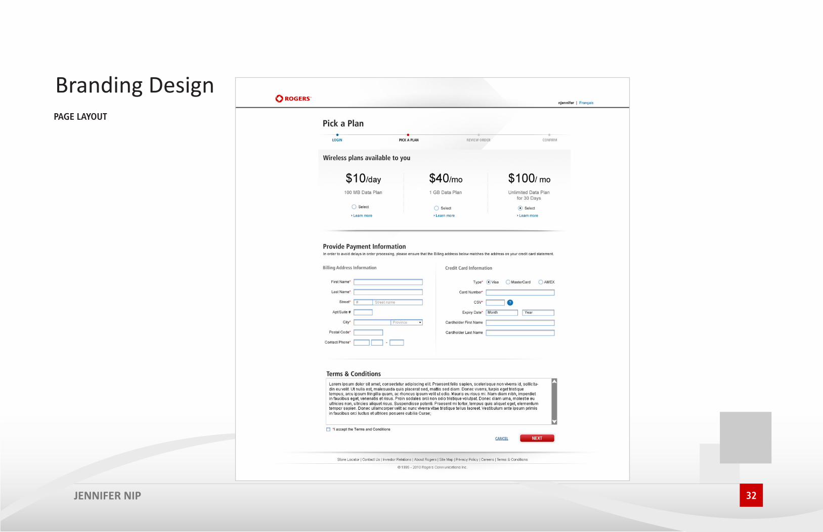
PAGE LAYOUT
Layout templates have been created for specific types of content. These layout are the starting point of the site design. Each template serves a specific purpose focusing on the needs of the user, the structure of the content and the purpose of the message. Depending on the function and the content, stakeholders will be able to select the appropriate templates. This ensures a consistent and improved user experience, as well as reduces the turnaround time for delivery.
JENNIFER NIP
Branding Design

28
PAGE LAYOUT
JENNIFER NIP
Branding Design
29
PAGE LAYOUT
JENNIFER NIP
Branding Design
30
PAGE LAYOUT
JENNIFER NIP
Branding Design
31
PAGE LAYOUT
JENNIFER NIP
Branding Design
32
PAGE LAYOUT
JENNIFER NIP
Branding Design

33
PAGE LAYOUT
JENNIFER NIP
Branding Design

34
PAGE LAYOUT
JENNIFER NIP
Branding Design

Mobile Design

36
WIREFRAMESM
JENNIFER NIP
Mobile Design

37
MOCKUPS
JENNIFER NIP
Mobile Design

38
ICONS
JENNIFER NIP
Mobile Design

39
ICONS
JENNIFER NIP
Mobile Design