Embed Size (px)
Citation preview

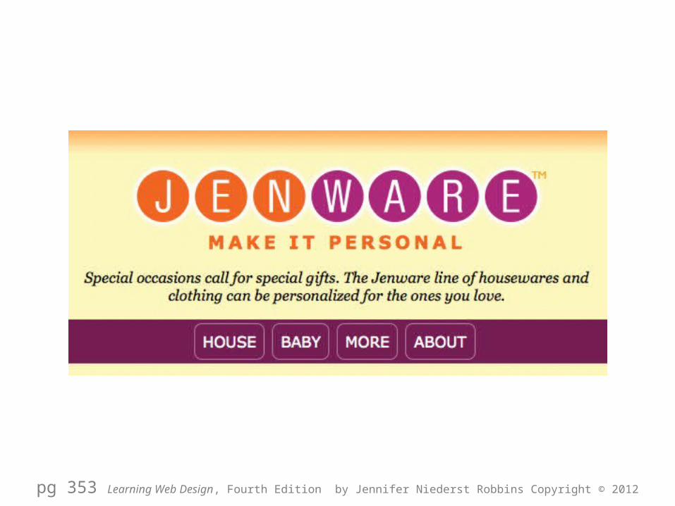
JENWARE
Chapters 14 & 15 Learning Web Design, Fourth Edition by Jennifer Niederst Robbins Copyright © 2012
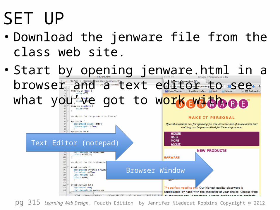
• Download the jenware file from the class web site. • Start by opening jenware.html in a browser and a
text editor to see what you’ve got to work with.
pg 315 Learning Web Design, Fourth Edition by Jennifer Niederst Robbins Copyright © 2012
Text Editor (notepad)Text Editor (notepad)
Browser WindowBrowser Window
SET UP
DOCUMENT BASICS
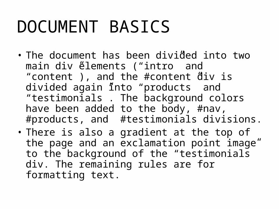
• The document has been divided into two main div elements (“intro” and “content”), and the #content div is divided again into “products” and “testimonials”. The background colors have been added to the body, #nav, #products, and #testimonials divisions.
• There is also a gradient at the top of the page and an exclamation point image to the background of the “testimonials” div. The remaining rules are for formatting text.
CSS CHANGES
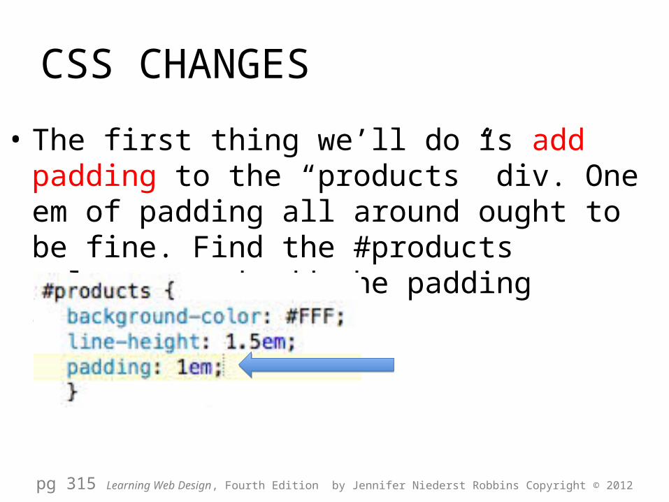
• The first thing we’ll do is add padding to the “products” div. One em of padding all around ought to be fine. Find the #products selector and add the padding declaration.
pg 315 Learning Web Design, Fourth Edition by Jennifer Niederst Robbins Copyright © 2012


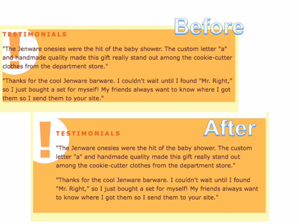
• Next, we’ll get a little fancier with the “testimonials” section. Clear some space in the left side of the div so that the nifty exclamation-point background image is visible
CSS CHANGES
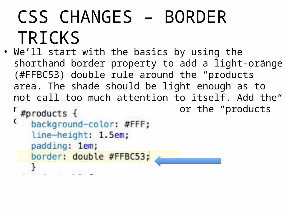
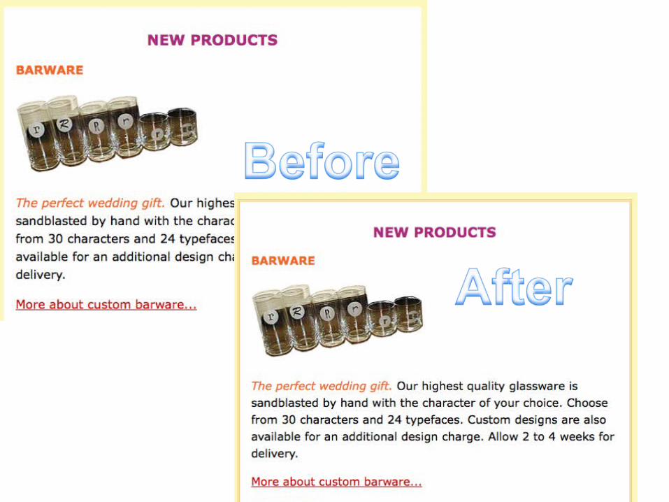
• We’ll start with the basics by using the shorthand border property to add a light-orange (#FFBC53) double rule around the “products” area. The shade should be light enough as to not call too much attention to itself. Add the new declaration to the rule for the “products” div.
CSS CHANGES – BORDER TRICKS
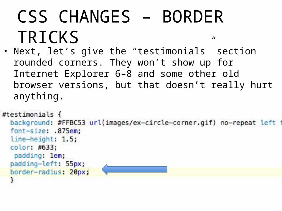
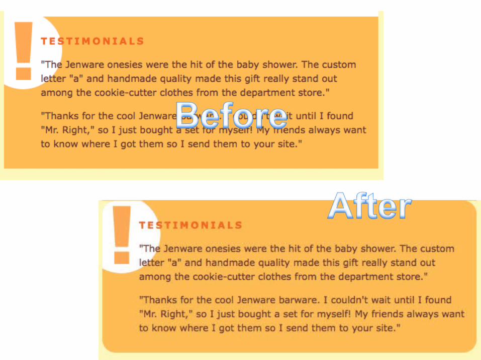
• Next, let’s give the “testimonials” section rounded corners. They won’t show up for Internet Explorer 6–8 and some other old browser versions, but that doesn’t really hurt anything.
CSS CHANGES – BORDER TRICKS
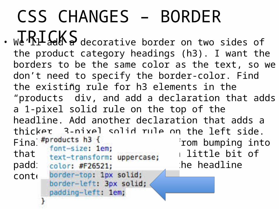
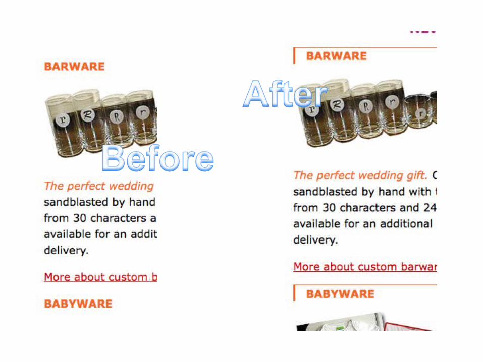
• We’ll add a decorative border on two sides of the product category headings (h3). I want the borders to be the same color as the text, so we don’t need to specify the border-color. Find the existing rule for h3 elements in the “products” div, and add a declaration that adds a 1-pixel solid rule on the top of the headline. Add another declaration that adds a thicker, 3-pixel solid rule on the left side. Finally, to prevent the text from bumping into that left border, we can add a little bit of padding (1em) to the left of the headline content.
CSS CHANGES – BORDER TRICKS
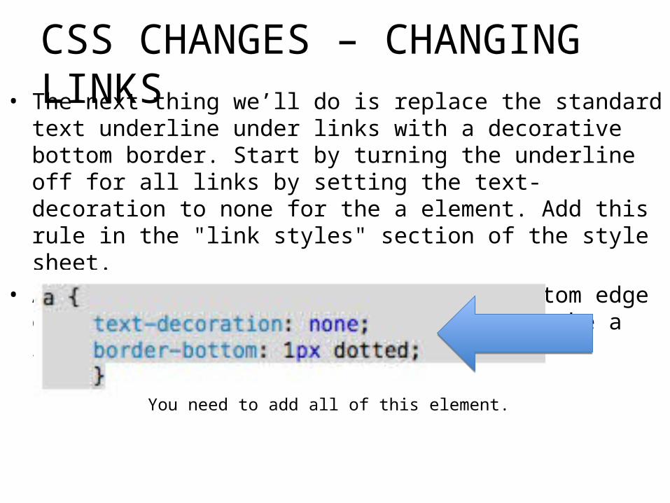
• The next thing we’ll do is replace the standard text underline under links with a decorative bottom border. Start by turning the underline off for all links by setting the text-decoration to none for the a element. Add this rule in the "link styles" section of the style sheet.
• Add a 1-pixel dotted border to the bottom edge of links by adding this declaration to the a rule.
CSS CHANGES – CHANGING LINKS
You need to add all of this element.
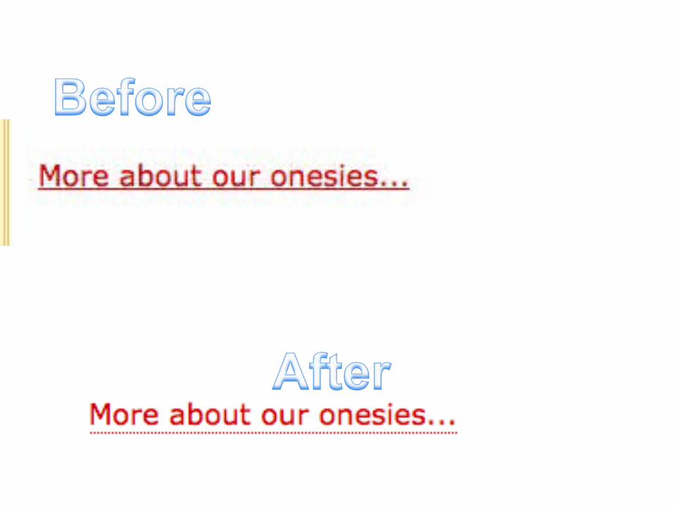
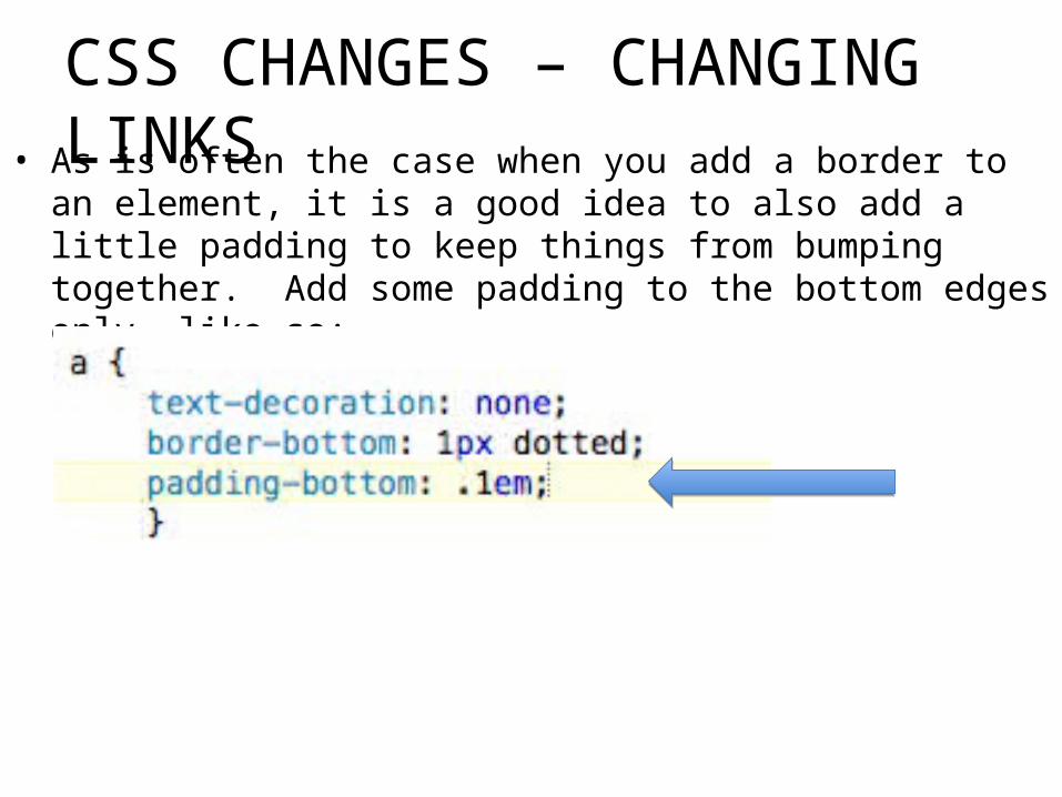
• As is often the case when you add a border to an element, it is a good idea to also add a little padding to keep things from bumping together. Add some padding to the bottom edges only, like so:
CSS CHANGES – CHANGING LINKS
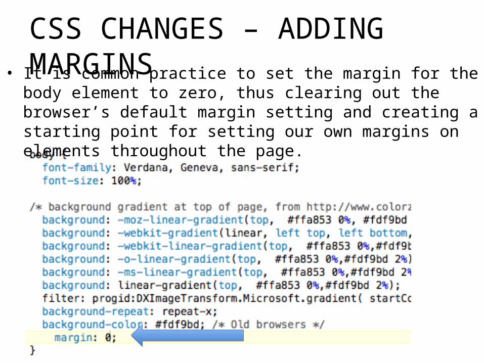
• It is common practice to set the margin for the body element to zero, thus clearing out the browser’s default margin setting and creating a starting point for setting our own margins on elements throughout the page.
CSS CHANGES – ADDING MARGINS
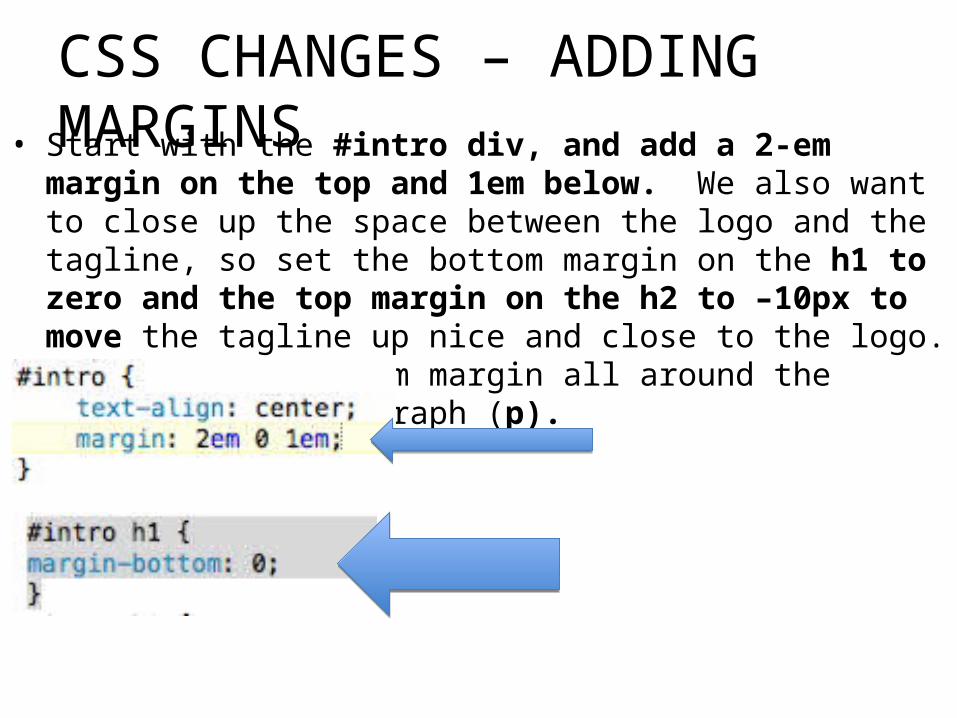
• Start with the #intro div, and add a 2-em margin on the top and 1em below. We also want to close up the space between the logo and the tagline, so set the bottom margin on the h1 to zero and the top margin on the h2 to –10px to move the tagline up nice and close to the logo. Finally, put a 1-em margin all around the introductory paragraph (p).
CSS CHANGES – ADDING MARGINS

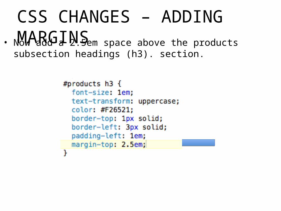
• Now add a 2.5em space above the products subsection headings (h3). section.
CSS CHANGES – ADDING MARGINS

• Finally, we’ll set apart the Testimonials box by adding 1em of space above and 10% on the left and right edges. This time, see if you can figure it out on your own.
CSS CHANGES – ADDING MARGINS
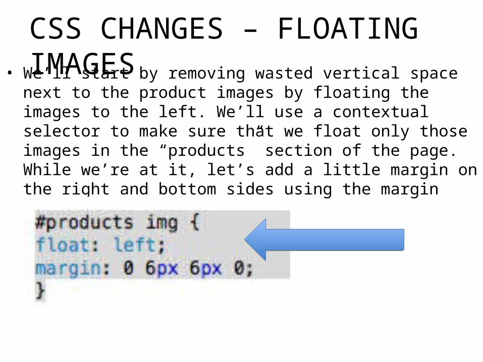
• We’ll start by removing wasted vertical space next to the product images by floating the images to the left. We’ll use a contextual selector to make sure that we float only those images in the “products” section of the page. While we’re at it, let’s add a little margin on the right and bottom sides using the margin shorthand property.
CSS CHANGES – FLOATING IMAGES

• Next, I’d like the “More about…” links to always appear below the images so they are clearly visible and consistently on the left side of the products section. This change is going to require a little extra markup because we need a way to target just the paragraphs that contain “more about” links. Add the class name “more” to each of the paragraphs that contain links. Here is the first one:
CSS CHANGES –
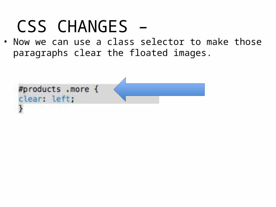
• Now we can use a class selector to make those paragraphs clear the floated images.
CSS CHANGES –
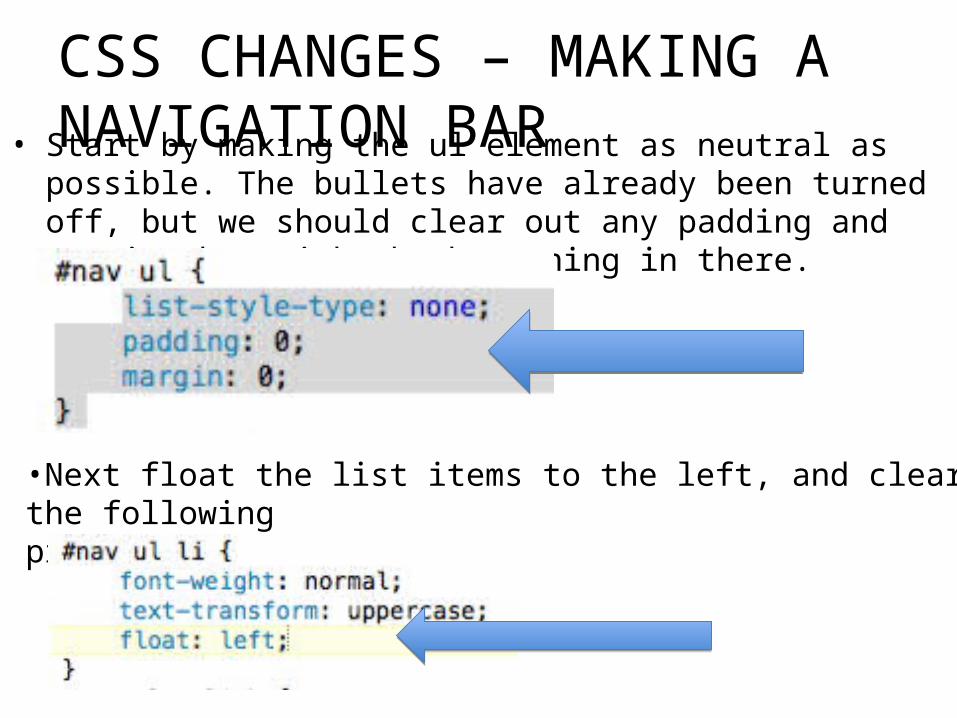
• Start by making the ul element as neutral as possible. The bullets have already been turned off, but we should clear out any padding and margin that might be happening in there.
CSS CHANGES – MAKING A NAVIGATION BAR
•Next float the list items to the left, and clear the followingproducts div.
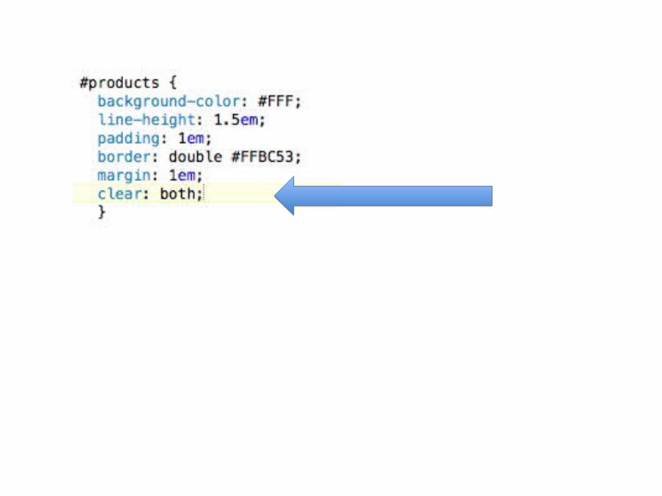

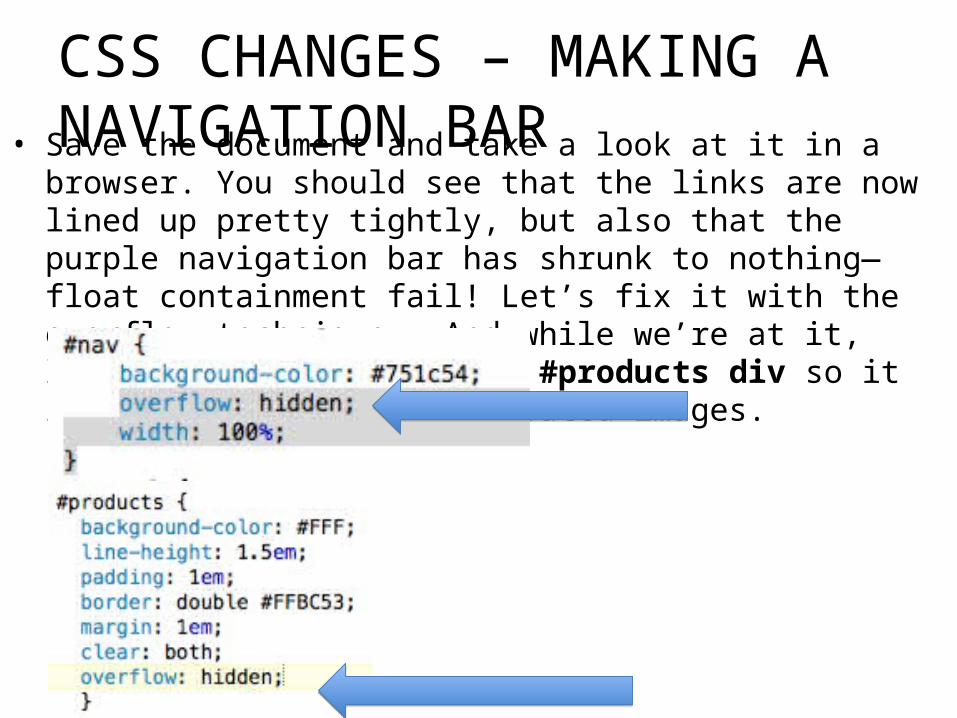
• Save the document and take a look at it in a browser. You should see that the links are now lined up pretty tightly, but also that the purple navigation bar has shrunk to nothing—float containment fail! Let’s fix it with the overflow technique. And while we’re at it, let’s do the same for the #products div so it is sure to contain the floated images.
CSS CHANGES – MAKING A NAVIGATION BAR

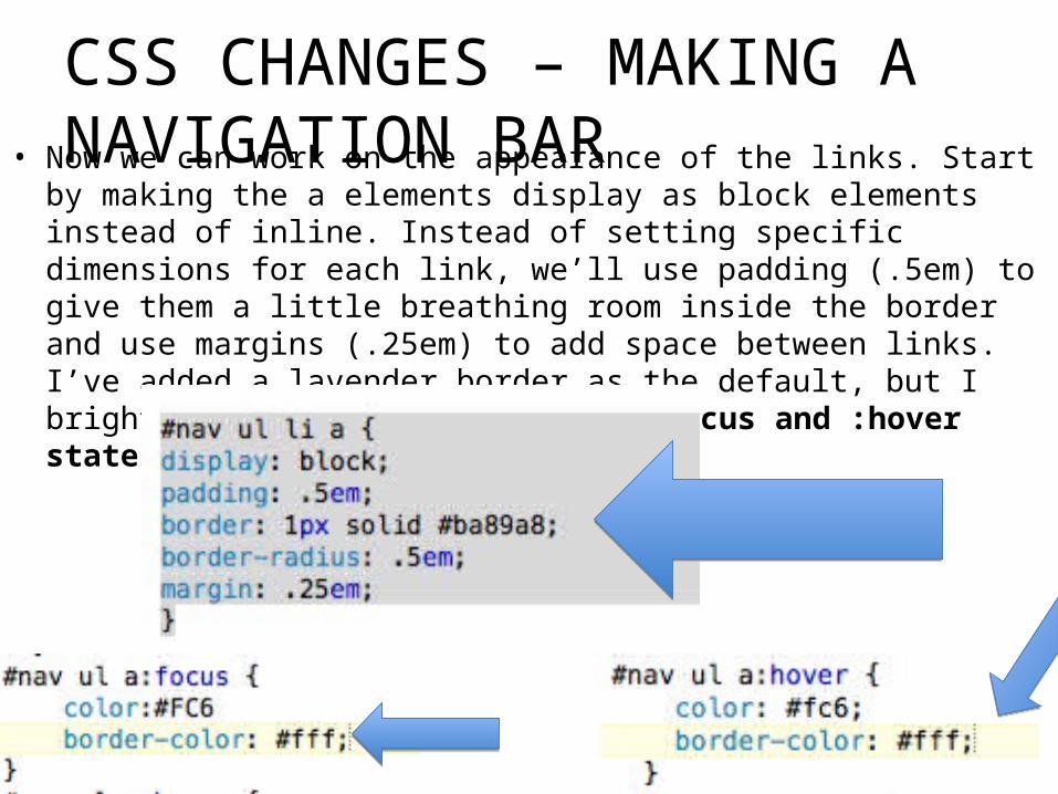
• Now we can work on the appearance of the links. Start by making the a elements display as block elements instead of inline. Instead of setting specific dimensions for each link, we’ll use padding (.5em) to give them a little breathing room inside the border and use margins (.25em) to add space between links. I’ve added a lavender border as the default, but I brighten it up to white for the :focus and :hover states.
CSS CHANGES – MAKING A NAVIGATION BAR

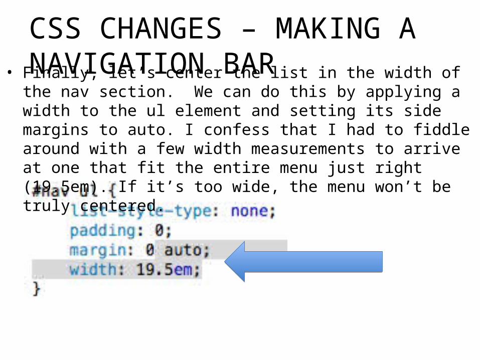
• Finally, let’s center the list in the width of the nav section. We can do this by applying a width to the ul element and setting its side margins to auto. I confess that I had to fiddle around with a few width measurements to arrive at one that fit the entire menu just right (19.5em). If it’s too wide, the menu won’t be truly centered.
CSS CHANGES – MAKING A NAVIGATION BAR
pg 353 Learning Web Design, Fourth Edition by Jennifer Niederst Robbins Copyright © 2012


![[Kay a. Robbins, Steve Robbins] UNIX Systems Progr Pratica](https://img.pdfslide.us/doc/110x75/552dbfcc4a795956618b4757/kay-a-robbins-steve-robbins-unix-systems-progr-pratica.jpg)