Embed Size (px)
Citation preview

Strategies to Graph, Analyze, and Present DataHOW TO PICK THE BEST CHART / GRAPH FORTHE JOB
RAUL SOTO, MSC, CQEIVT STATS CONFERENCE - JUNE 2016
PHILADELPHIA, PA
The contents of this presentation represent the opinion of the speaker; and not necessarily that of his present or past employers.
(C) 2016 RAUL SOTO 2

About the Author• 20 + years of experience in the medical devices, pharmaceutical, biotechnology, and consumer electronics industries
• MS Biotechnology, emphasis in Biomedical Engineering• BS Mechanical Engineering• ASQ Certified Quality Engineer (CQE)
• I have led validation / qualification efforts in multiple scenarios:
• High-speed, high-volume automated manufacturing and packaging equipment; machine vision systems• Laboratory information systems and instruments• Enterprise resource planning applications (i.e. SAP)• IT network infrastructure, Cognos & Business Objects reports• Manufacturing Execution Systems (MES)• Mobile apps• Product improvements, material changes, vendor changes
• Contact information:• Raul Soto [email protected]
(c) 2016 Raul Soto 3
What is “Data Visualization”?• Presentation of data in pictorial or graphical format• Advantages:
• Comprehend information quickly• Identify relationships and patterns• Discover trends• Communicate effectively
• Human brain typically does better job at understanding large amounts of data when presented in visual form vs when represented by just numbers
(c) 2016 Raul Soto 4

Why Graphs?
• Graphs use spatial arrangements to convey• Numerical information• Trends• Relationships
• Often easier to interpret than repetitive numbers or complex tables
(c) 2016 Raul Soto 5
Graphs vs Tables
• Oral presentation: • emphasis on graphs
• Written: Validation report, research reports, published papers:• Use both graphs and tables• Can use graphs on main text, data tables on Appendix
(c) 2016 Raul Soto 6

Exploratory Data Analysis
• Use of visual methods to analyze data sets and determine their main characteristics
• This is apart from the use of models (i.e. regression) or hypothesis tests
• Classical statistical analysis:• Problem => Data => Model => Analysis => Conclusions
• EDA• Problem => Data => Analysis => Model => Conclusions
(c) 2016 Raul Soto 7
Exploratory Data Analysis• Classical Statistical Analysis
• Focuses on quantitative models: estimating parameters, generating predicted values
• Imposes models (deterministic, probabilistic) on the data• Deterministic: ANOVA, regression, hypothesis tests• Probabilistic: assuming errors are normally distributed• Tools have underlying assumptions (i.e. normality, independence, etc.)
• Exploratory Data Analysis• Focus is on the data: its structure, outliers, etc.• Does not impose deterministic or probabilistic models on the data• Allows the data to suggest admissible models that best fit the data• Few or no assumptions
(c) 2016 Raul Soto 8

Advantages vs Disadvantages
• Advantages• High information density• Rapid assimilation of overall result• One graph can have multiple levels of detail• Can show complex relationships among multiple variables
• Disadvantages• May misrepresent data, accidentally or intentionally• May suggest interpolation between data points, even when it’s not applicable• Exact numeric values may be hard to read
(c) 2016 Raul Soto 9
Human Perception
• Can you tell the difference in length between the white parts of both bars?
• What about the black parts?
(c) 2016 Raul Soto 10

Human Perception
• They differ by exactly the same amount (1 unit)• It’s easier for the brain to tell the difference between the white bars because the
percentage difference was bigger
15
16
2
1
(c) 2016 Raul Soto 11
Human Perception: Accuracy• Position on a common scale/ axis• Position on an identical, non-aligned
scale• Length• Angle• Slope• Area• Volume• Density• Color saturation• Color hue
Easierto judge accurately
Harderto judge accurately
(c) 2016 Raul Soto 12

(c) 2016 Raul Soto 13
Human Perception: Why is this Important?
Because features / limitations in human perception may lead to accidental or intentional misrepresentation of data in graphs
(c) 2016 Raul Soto 14

MisrepresentationHow much larger is the Product C bar than the Product A bar?
• The first thing we look at is the image• We form our first impression based on the
image• Our brain is hardwired to focus on the
% change, not the actual amount of change
• After forming this first impression, then we look at the numbers in the scale
(c) 2016 Raul Soto 15
Misrepresentation• y-axis not starting in zero• makes a small % increase look much larger
0
1
2
3
4
5
6
Product A Product B Product C
% defective
% defective
4
4.2
4.4
4.6
4.8
5
5.2
5.4
5.6
5.8
6
Product A Product B Product C
% defective
% defective
(c) 2016 Raul Soto 16

Misrepresentation
• Horizontal axis suggests an equal interval between sampling dates, which is not true
• Intervals are 6 and 23 years
0
1
2
3
4
5
6
7
1977 20161993
(c) 2016 Raul Soto 17
Misrepresentation
• More examples:
• Misleading graphs. http://gator.gatewayk12.org/~smcgrail/myweb/powerpoint/misleading_graphs/here_are_some_examples_of_mislea.htm
• Misleading graphs: Real Life Exampleshttp://www.statisticshowto.com/misleading-graphs/
(c) 2016 Raul Soto 18

Best Practices• Make your data stand out
• Draw the audience’s attention to the important / relevant aspects of your graph
• Focus on, and improve, the visual aspect of your message
• Graph should make your point without distracting the audience
• Reduce clutter, distraction of non-essential elements in graph
• Use color sparingly: use it for emphasis, not for eye candy• Color should help make your point
(c) 2016 Raul Soto 19
What to Avoid
• Anything that distracts from the data, or from the point you want to make• Clutter• Avoid false-3D representations
• 3D pie charts, 3D bar charts
• Minimize fill patterns and background fills• Keep them subtle, don’t distract from the data
• Keep grid lines to a minimum, make them subtle and light• Use of color for decorative purposes
(c) 2016 Raul Soto 20

Pie Charts: Proportions• Visually highlight the relative proportion of one slice
(or a few slices) to the whole• Use colors and shades to group together related slices• Pre-sort data so slices show in decreasing order of size• In the example, you can analyze individual slices, and
also the blue group vs the orange group• Keep it simple:
• Avoid 3D tilt effects, distorts proportions• Keep the number of slices to a minimum (≤5) ,
group them if necessary• Don’t overuse or abuse the “slice explode out”
feature
(c) 2016 Raul Soto 21
Pie Charts: ProportionsDisadvantages: • Information is represented in angles, which are
low in the perception accuracy scale• 3D tilt effect distorts the angles• Slice explode out effect doesn’t really improve
the information conveyed• Relative sizes of the samples are not easy to
judge visually• i.e. BLUE slice looks larger than the RED slice but it’s
actually smaller
• Audience can’t really get much information
40 55
35
Concentration of 1080 in sample
Over 2 ppb
0.1 to 2 ppb
under 0.1 ppb
(c) 2016 Raul Soto 22

Pie Charts: Proportions
40
55
35
0 10 20 30 40 50 60Number of samples
Concentration of 1080 in sample
< 0.1 ppb
0.1 - 2 ppb
> 2 ppb
• The same information can be conveyed better with a bar graph.• Relative sizes of the samples are easier to judge with this graph type.
(c) 2016 Raul Soto 23
Stacked Bar/Area Charts: Changes in Proportions
4.32.5
3.54.5
2.44.4 1.8
2.8
2 2
3
5
01
1
2
0
2
4
6
8
10
12
14
16
Jan Feb Mar Apr
# de
fect
s
Month
Class 3 defects Class 2 Defects
Class 1 Defects Critical Defects
Used to display trend of proportions as well as the actual amounts
4.32.5
3.54.5
2.44.4 1.8
2.8
2 2
3
5
01
1
2
0
2
4
6
8
10
12
14
16
Jan Feb Mar Apr
# de
fect
s
Month
Class 3 defects Class 2 Defects Class 1 Defects Critical Defects(c) 2016 Raul Soto 24

100% Stacked Bar/Area Charts: Change in Proportions
4.35
3.5
2.5
3.5
2.43.1
1.8 4.4 1.8
2
1.13
2
3
0
21 1 1
0%
10%
20%
30%
40%
50%
60%
70%
80%
90%
100%
Jan Feb Mar Apr Jun
Class 3 defects Class 2 Defects Class 1 Defects Critical Defects
0%
10%
20%
30%
40%
50%
60%
70%
80%
90%
100%
Jan Feb Mar Apr Jun
Class 3 defects Class 2 Defects Class 1 Defects Critical Defects
Use this when you only care about the trend of proportions, not the actual values
(c) 2016 Raul Soto 25
Real Life Example: 100% Stacked Area Chart
Flow cytometry data.
Antibodies to α5 integrin were tagged with fluorescent tags, to study the levels of expression of α5 in rhabdomyosarcoma cancer cells.
Plot shows that α5 fluoresces mostly in the yellow region of the spectrum.
(c) 2016 Raul Soto 26
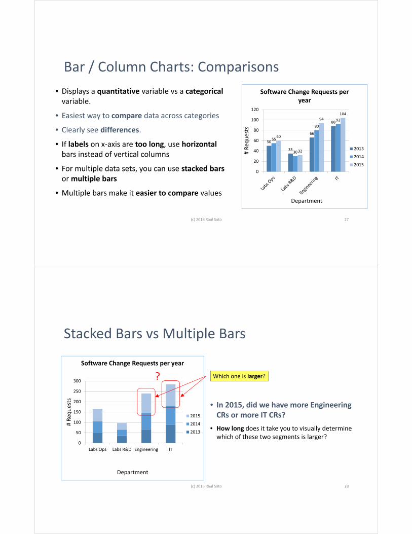
Bar / Column Charts: Comparisons• Displays a quantitative variable vs a categorical
variable.
• Easiest way to compare data across categories
• Clearly see differences.
• If labels on x-axis are too long, use horizontalbars instead of vertical columns
• For multiple data sets, you can use stacked bars or multiple bars
• Multiple bars make it easier to compare values
50
35
66
88
55
30
8092
60
32
94104
0
20
40
60
80
100
120
# Re
ques
ts
Department
Software Change Requests per year
2013
2014
2015
(c) 2016 Raul Soto 27
• In 2015, did we have more Engineering CRs or more IT CRs?
• How long does it take you to visually determine which of these two segments is larger?
Stacked Bars vs Multiple Bars
0
50
100
150
200
250
300
Labs Ops Labs R&D Engineering IT
# Re
ques
ts
Department
Software Change Requests per year
2015
2014
2013
?
28(c) 2016 Raul Soto
Which one is larger?

Stacked Bars vs Multiple Bars
0
20
40
60
80
100
120
Labs Ops Labs R&D Engineering IT
# Re
ques
ts
Department
Software Change Requests per year
2013
2014
2015
0
50
100
150
200
250
300
Labs Ops Labs R&D Engineering IT
# Re
ques
ts
Department
Software Change Requests per year
2015
2014
2013
?
Multiple bars make it easier to compare values
29(c) 2016 Raul Soto
Bar / Column Charts: Comparisons• Watch out for clutter, readability if too many data
sets are plotted in a single chart.
• If your horizontal (x) axis is quantitative, use a line chart or an x-y graph instead
• If all y-axis values are positive, start the y-axis at zero
• If the y-axis has positive and negative values, use zero as the midpoint
50
35
66
88
55
30
8092
60
32
94104
0
20
40
60
80
100
120
# Re
ques
ts
Department
Software Change Requests per year
2013
2014
2015
(c) 2016 Raul Soto 30

Bar / Column Charts: Comparisons
2
1
1
10
2
3
5
5
12
3
2
25
0 5 10 15 20 25 30
CR Initiate
Business Pre-Approval to TST
QA Pre-Approval to TST
Execution in TST
Business Post-Approval TST Results
QA Post-Approval TST Results
Business Pre-Approval to PROD
QA Pre-Approval to PROD
Execution in PROD
Business Post-Approval PROD Results
QA Post-Approval PROD Results
CR Closure
Current Software Change Requests by Phase
• If labels on x-axis are too long, use horizontal bars instead of vertical columns
(c) 2016 Raul Soto 31
Error Bars in Line Charts (MS Excel)
32(c) 2016 Raul Soto

Error Bars in Line Charts (MS Excel)
• Use error bars to display the uncertainty / variability of your data
• You can use either the Standard Error of the Mean (SEM) or a 95% Confidence Interval (CI)
• SEM is smaller when sample sizes are small
• 95% CIs are more widely used in the sciences
• You must state in the caption AND text which type of error bars you are illustrating
(c) 2016 Raul Soto 33
• Once you create a line or barchart:
• Left click on a line or a bar• On the upper menu click on
Layout / Error Bars/ More Error Bar Options/ Custom / Specify Value
• to use the Standard Error of the Mean, shade the SE Mean cells
• to use the Confidence Interval, shade the CI cells
(c) 2016 Raul Soto 34

(c) 2016 Raul Soto 35
Hypothesis test / p-values in Bar Charts• Use asterisks to display hypothesis
test comparisons between columns• In general
* => p< 0.05** => p< 0.01*** => p< 0.001**** => p<0.0001
• p-value should be reported in the figure description
• Notice how color is used to distinguish the controls from the experimental data
(c) 2016 Raul Soto 36
0
1000
2000
3000
4000
5000
6000
7000
8000
9000
10000
JAN FEB MAR APR MAY JUN JUL AUG SEP OCT NOV DEC
PRODUCTION CAMPAIGN FOR PRODUCT A
SKU 1 SKU 2 SKU 3 SKU 4
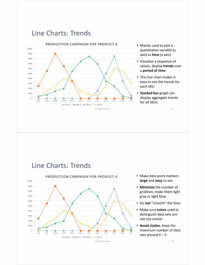
Line Charts: Trends• Mainly used to plot a
quantitative variable (y axis) vs time (x axis)
• Visualize a sequence of values, display trends over a period of time
• This line chart makes it easy to see the trends for each SKU
• Stacked bar graph can display aggregate trends for all SKUs.
(c) 2016 Raul Soto 37
Line Charts: Trends• Make data point markers
large and easy to see
• Minimize the number of gridlines, make them light gray or light blue
• Do not “smooth” the lines
• Make sure colors used to distinguish data sets are not too similar
• Avoid clutter. Keep the maximum number of data sets around 4 – 5.
(c) 2016 Raul Soto 38
0
1000
2000
3000
4000
5000
6000
7000
8000
9000
10000
JAN FEB MAR APR MAY JUN JUL AUG SEP OCT NOV DEC
PRODUCTION CAMPAIGN FOR PRODUCT A
SKU 1 SKU 2 SKU 3 SKU 4

Scatter Plots: Relationships
• A scatter plot is a plot of the values of Y versus the corresponding values of X:
• Vertical axis: variable Y--usually the response variable
• Horizontal axis: variable X--usually a variable we suspect may be related to the response
(c) 2016 Raul Soto 39
Scatter Plots: Relationships• Allows us to see graphically if there is a
relationship between X and Y
• Use regression to determine correlation between X and Y, and to fit lines or curves to data
• Plot the regression line vs the data points to verify visually if the regression is really a good fit, even if your R2
adj ≈ 1
• Remember : correlation DOES NOT necessarily mean causation
(c) 2016 Raul Soto 40

No relationship Strong Linear RelationshipPositive correlation
Strong Linear RelationshipNegative correlation
Quadratic Relationship
(c) 2016 Raul Soto 41
(c) 2016 Raul Soto
Scatter Plots
• Multiple data sets can be plotted simultaneously for comparison.
• Sealing strength increases more or less linearly as a function of temperature.
• Die A has generally produces seals with a lower sealing strength that the other two dies.
• Die B generally produces seals with higher sealing strength
42
200
250
300
350
400
450
500
550
600
650
90 110 130 150 170 190 210 230 250 270
SEAL
ING
STRE
NGT
H (N
/CM
)
TEMPERATURE (°C)
SEAL STRENGTH AS A FUNCTION OF HEAT STAKING TEMPERATURE
Die A Die B Die C
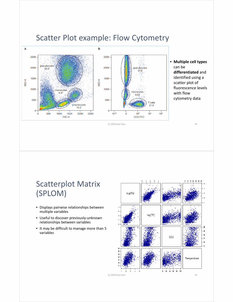
Scatter Plot example: Flow Cytometry
(c) 2016 Raul Soto 43
• Multiple cell types can be differentiated and identified using a scatter plot of fluorescence levels with flow cytometry data
Scatterplot Matrix(SPLOM)• Displays pairwise relationships between
multiple variables• Useful to discover previously-unknown
relationships between variables• It may be difficult to manage more than 5
variables
(c) 2016 Raul Soto 44
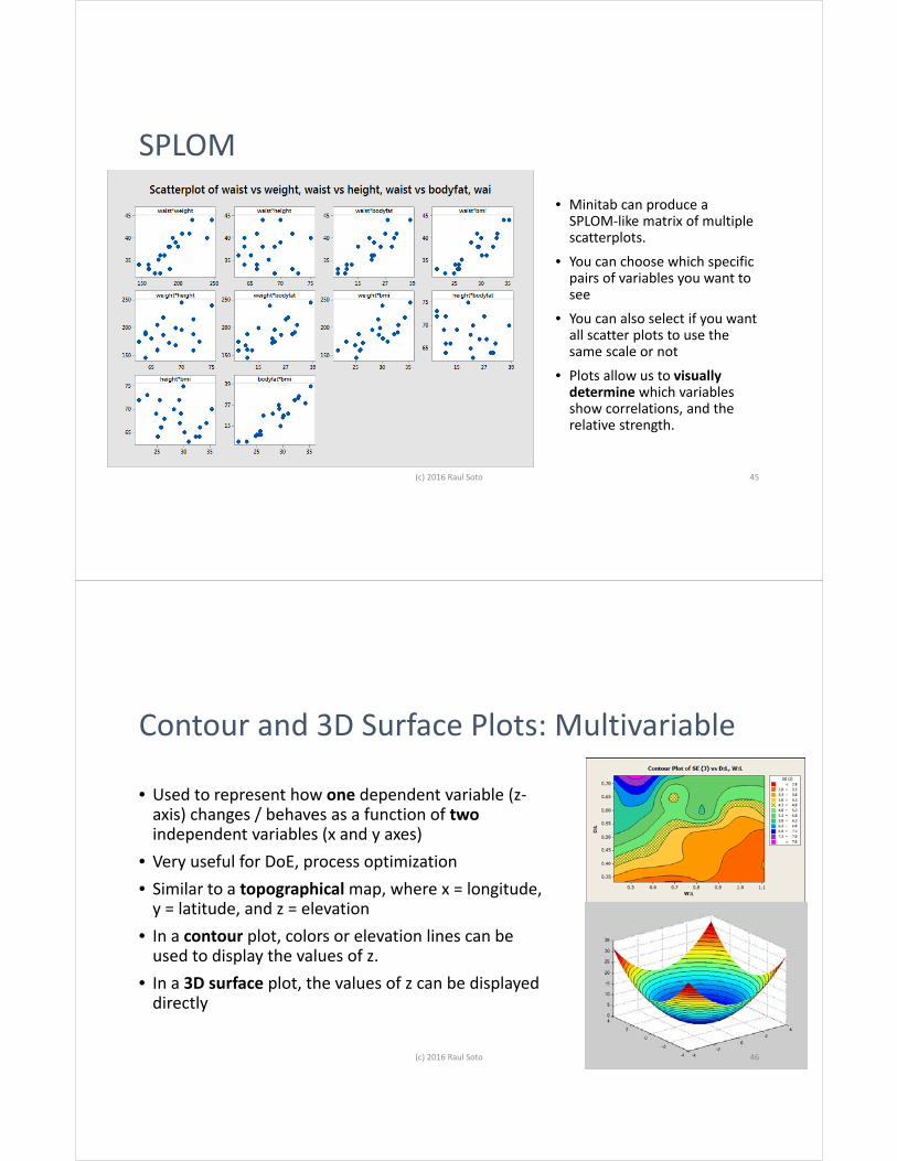
SPLOM
• Minitab can produce a SPLOM-like matrix of multiple scatterplots.
• You can choose which specific pairs of variables you want to see
• You can also select if you want all scatter plots to use the same scale or not
• Plots allow us to visually determine which variables show correlations, and the relative strength.
(c) 2016 Raul Soto 45
Contour and 3D Surface Plots: Multivariable
• Used to represent how one dependent variable (z-axis) changes / behaves as a function of twoindependent variables (x and y axes)
• Very useful for DoE, process optimization• Similar to a topographical map, where x = longitude,
y = latitude, and z = elevation• In a contour plot, colors or elevation lines can be
used to display the values of z. • In a 3D surface plot, the values of z can be displayed
directly
(c) 2016 Raul Soto 46

Contour and 3D Surface Plots: Multivariable
(c) 2016 Raul Soto 47
Radar (Spider) Charts: Multivariable
• Used to compare the aggregate values of multiple data series
• Display 3 or more quantitative variables on axes starting from the same point
• Plots values of each category along a separate axis that starts in the center of the chart, and ends at the outer ring
• Helps see clusters in the data• Not intuitive, requires explanation
(c) 2016 Raul Soto 48

0
1000
2000
3000
4000
5000
6000
7000
8000
9000Jan
Feb
Mar
Apr
May
Jun
Jul
Aug
Sep
Oct
Nov
Dec
Production Campaign for Plant A
SKU 1 SKU 2
SKU 3 SKU 4
SKU 1 SKU 2 SKU 3 SKU 4Jan 0 2500 500 0Feb 0 5500 750 1500Mar 0 9000 1500 2500Apr 0 6500 2000 4000May 0 3500 5500 3500Jun 0 0 7500 1500Jul 0 0 8500 800Aug 1500 0 7000 550Sep 5000 0 3500 2500Oct 8500 0 2500 6000Nov 3500 0 500 5500Dec 500 0 100 3000
Radar (Spider) Charts
49
• Radar chart highlights the “clusters” (i.e. for SKU 2)
• Does not display the aggregate (total) production well (c) 2016 Raul Soto
SKU 1 SKU 2 SKU 3 SKU 4Jan 0 2500 500 0Feb 0 5500 750 1500Mar 0 9000 1500 2500Apr 0 6500 2000 4000May 0 3500 5500 3500Jun 0 0 7500 1500Jul 0 0 8500 800Aug 1500 0 7000 550Sep 5000 0 3500 2500Oct 8500 0 2500 6000Nov 3500 0 500 5500Dec 500 0 100 3000 0 0 0 0 0 0 0
1500
5000
8500
3500
500
2500
5500
9000
6500
3500
0 0
0
0
0
0
0
500
750
1500
2000
5500
75008500
7000
3500
2500
500
100
0
1500
2500
4000 3500
1500
800 550
2500
6000
5500
3000
0
2000
4000
6000
8000
10000
12000
14000
16000
18000
Jan Feb Mar Apr May Jun Jul Aug Sep Oct Nov Dec
Production Campaign for Plant A
SKU 1 SKU 2 SKU 3 SKU 4
• Stacked bars allow us to see the aggregatedproduction and relative proportions
• Harder to see the clusters
50(c) 2016 Raul Soto

Bubble Charts: Multivariable
• Type of scatter plot, that represents three (3) dimensions of data
• X and Y axis are value axes, no categorical axes• 3rd dimension (Z) represented by the size of the
bubble• Some software packages allow display of a 4th
dimension in the color of the bubbles• Human perception does not judge proportional
increases / decreases in circle area or color hues accurately
(c) 2016 Raul Soto 51
$0
$10,000
$20,000
$30,000
$40,000
$50,000
$60,000
$70,000
0 5 10 15 20 25 30
Sale
s
# Products
Market Share vs Sales and # Products
Bubble size represents % market share
# products Sales% Market Share
5 $5,500 314 $12,200 1220 $60,000 3318 $24,400 1022 $32,000 42
(c) 2016 Raul Soto 52
33%
42%
10%
12%
3%

http://www.esteco.com/cmis/browser?id=workspace://SpacesStore/c8d9e58e-a183-435a-a6ef-c81c6ec586bf
4D Bubble chart used as part of materials design and evaluation for Lamborghini automobiles
(c) 2016 Raul Soto 53
Histograms: Distribution• The purpose of a histogram is to graphically summarize the distribution of a univariate
data set.
• The histogram graphically shows the following: • center (i.e., the location) of the data; • spread (i.e., the scale) of the data; • skewness and kurtosis of the data; • presence of outliers; and • presence of multiple modes in the data.
• These features provide strong indications of the proper distributional model for the data.
• The probability plot or a goodness-of-fit test can be used to verify the distributional model.
(c) 2016 Raul Soto 54

C1
Freq
uenc
y
5352515049484746
9
8
7
6
5
4
3
2
1
0
Mean 49.63StDev 1.497N 30
Histogram
Lot
Freq
uenc
y
363330272421
18
16
14
12
10
8
6
4
2
0
Mean 28.49StDev 3.733N 60
Histogram - Bimodal Mixture of 2 Normals
(c) 2016 Raul Soto 55
Histogram: Skewness and Kurtosis
• Skewness: • Measure of symmetry (or lack of symmetry)
• Kurtosis:• Measure of the combined weights of the tails, vs a normal distribution
(c) 2016 Raul Soto 56

Multiple Histograms: Distribution Comparisons
• Compare multiple data sets
• Visualize before/after changes (see example) in distribution
(c) 2016 Raul Soto 57
Day 0
Day 7
Multiple Histograms: Distribution Comparisons
10
2
4
6
8
01
21
41
61
81
5.4 0.6 5.7 0.9 5.01 0.21 5.31 0.5
7.392 0.9618 3010.29 0.9634 3013.30 0.8041 3010.07 1.226 30
6.635 0.8716 3012.71 0.8753 30
9.237 0.9759 309.947 2.492 210
Mean StDev N
D
ycneuqerF
ata
LelbairaV
llarevO7 toL6 toL5 toL4 toL3 toL2 toL1 to
P lamroN
emiT revO gnitfihS naeM ssecor
• More than 3 data sets: too much clutter, use box plotsinstead
(c) 2016 Raul Soto 58

Box Plots
• Box Plots give good indication of:• central tendency• spread of data• outliers
• Unlike histograms, box plots do notgive a direct visual display of the data distribution
(c) 2016 Raul Soto
Lot DLot CLot BLot A
35.0
32.5
30.0
27.5
25.0
Dat
a59
Box Plots : Elements• Asterisk : Outlier - an unusually large or small
observation. Values beyond the whiskers are outliers.
• Top of the box : third quartile (Q3) - 75% of the data values are less than or equal to this value
• Upper whisker : the highest data value within the upper limit.
• Upper limit = Q3 + 1.5 (Q3 - Q1)
• Line in the middle of the box : Median, the middle of the data. Half the observations are less than or equal to it.
• Bottom of the box is the first quartile (Q1) - 25% of the data values are less than or equal to this value
• Lower whisker : the lowest value within the lower limit.
• Lower limit = Q1- 1.5 (Q3 - Q1)
(c) 2016 Raul Soto 60

Multiple Box Plots
(c) 2016 Raul Soto
Dat
a
C3C2C1
57.5
55.0
52.5
50.0
47.5
45.0
Boxplot of C1, C2, C3
61
• Allows us to compare multiple data sets in a common scale
Multiple Box Plots• We can compare multiple lots and visually determine if the process mean or variation are
consistent
• Compare multiple validation lots to determine consistency• Compare samples from different lines, raw materials, operators• Compare before-after a process change• Compare samples from a process taken at different points in time
• We’d like the means to line up, and the spread to be consistent across the board.
• In order to actually determine if there has been a statistically significant shift on the mean or the variation, we need to perform a hypothesis test.
(c) 2016 Raul Soto 62

Heat Maps: Comparisons• Use different colors, or different hues of a
color, to visually represent differences in your data
• In MS Excel, use Home / Conditional Formatting / Color Scales
• In the rules, type in the limits you want to establish for each color or hue. Make sure they are consistent throughout all your data
(c) 2016 Raul Soto 63
Heat Maps - example
• Mammalian cell culture: human fibroblasts and mesenchymal stem cells
• Grown in 2D matrix, different concentrations of fibronectin or collagen for 8 days
• Used live/dead fluorescent stain, and measured fluorescence per well to ascertain cell growth under each condition
(c) 2016 Raul Soto 64

Color scale: green = higher fluorescence; yellow = lower fluorescence 65(c) 2016 Raul Soto
Color scale: green = higher fluorescence; yellow = lower fluorescence 66(c) 2016 Raul Soto

Run Chart: Trends
• Plot a variable vs time
• An easy way to summarize graphically an univariate data set
• Shifts in location and scale are usually evident
• Outliers can be detected
(c) 2016 Raul Soto
Observation
C1
30282624222018161412108642
53
52
51
50
49
48
47
46
Run Chart of C1
67
Limitations of Run Charts• In Run charts people frequently see things (special causes of variations) that aren’t
there:
• “obvious” cycles• trends• outliers• process instability
• If we misinterpret normal variation as a Special Cause, we end up overadjusting the process
• If we misinterpret a special cause of variation as normal, we fail to take action
(c) 2016 Raul Soto 68

Control Charts / SPC: Trends and Control
• Control limits • drawn at 3 sigma levels from the mean• If nothing changes in our process we expect to
see all observations between 45.01 and 54.25
• Special Cause Variation: • Control charts use eight statistical rules to
detect special cause variation (trends, outliers, etc.)
(c) 2016 Raul Soto
Sample
Sam
ple
Mea
n
30272421181512963
54
53
52
51
50
49
48
47
46
45
__X=49.63
+3SL=54.25
-3SL=45.01
+2SL=52.71
-2SL=46.55
+1SL=51.17
-1SL=48.09
6
Xbar Chart of C1
69
Main Types of Control Charts(Shewhart)
• Variable data• Xbar – R : mean and range of each sample• Xbar – s : mean and standard deviation of each sample• I – MR : individual values observations vs time
• Attributes• np : actual number of defectives• p : proportion of defectives• c : actual number of defects • u : defects per unit
• Defects : a single unit can have multiple flaws• Defectives : a single unit itself is either good or bad
(c) 2016 Raul Soto 70

Pareto Chart: Rank Importance
• Display Categorical Inputs vs Categorical Outputs
• Pareto Principle : 80% of events due to 20% of the categories
• Help to focus efforts on areas where they will have the most impact
(c) 2016 Raul Soto 71
Which chart type should I pick?To Display Use thisProportions Pie Charts
Change in Proportions: Proportions vs timeProportions vs categorical variable
Stacked Bar ChartsStacked Area Charts
Trends Line Charts
Comparisons Bar ChartsColumn Charts
Multivariable Relationships Bubble ChartsRadar Charts
Relationships X-Y => see NEXT PAGE
(c) 2016 Raul Soto 72

(c) 2016 Raul Soto
To Display Use thisY (continuous) vs frequency Histograms
Box plots
Y (continuous) vs time Run chartsControl charts
Y (continuous) vsX (categorical)
Bar charts Column charts
Y (continuous) vsX (continuous)
Scatter plots
Y (categorical) vsX (categorical)
Pareto Charts
Which XY chart type should I pick?
73
References• Duquia, Rodrigo Pereira, Bastos, João Luiz, Bonamigo, Renan Rangel, González-Chica, David Alejandro, & Martínez-Mesa,
Jeovany. (2014). Presenting data in tables and charts. Anais Brasileiros de Dermatologia, 89(2), 280-285. https://dx.doi.org/10.1590/abd1806-4841.20143388
• NIST/SEMATECH e-Handbook of Statistical Methodshttp://www.itl.nist.gov/div898/handbook
• Exploratory Data Analysis. NIST Engineering Statistics Handbookhttp://www.itl.nist.gov/div898/handbook/eda/eda_d.htm
• Few, Stephen. Information Dashboard Design: The Effective Visual Communication of Data. Beijing: O'Reilly, 2006. Print.http://www.amazon.com/Information-Dashboard-Design-Effective-Communication/dp/0596100167
• Jaedicke, Katrin. Applied Statistics: How to Present your Data Analysis in Graphs. Newcastle University.http://fms-itskills.ncl.ac.uk/pgres/stats/docs/14_presenting_data_in_graphs.pdf
(c) 2016 Raul Soto 74

References• Kelly, Dave, Jaap A Jasperse, I Westbrooke, and New Zealand. Designing Science Graphs For Data Analysis And
Presentation: The Bad, The Good And The Better. Wellington, N.Z.: Dept. of Conservation, 2005.http://www.doc.govt.nz/Documents/science-and-technical/docts32entire.pdf
• Misleading graphs. http://gator.gatewayk12.org/~smcgrail/myweb/powerpoint/misleading_graphs/here_are_some_examples_of_mislea.htm
• Misleading graphs: Real Life Exampleshttp://www.statisticshowto.com/misleading-graphs/
• Smeltzer, Philip. Presenting Health Care in Visual Displays. https://www.optum.com/content/dam/optum/resources/whitePapers/112912-OH-data-visibility-WP.pdf
• Sharma, Himanshu. How to select best Excel Charts for Data Analysis & Reporting. https://www.optimizesmart.com/how-to-select-best-excel-charts-for-your-data-analysis-reporting/
(c) 2016 Raul Soto 75