Embed Size (px)
Citation preview

istd2011International Society of Typographic Designers

istd2011studentassessmentInternational Society of Typographic Designers
Dear Tutors and Students
In the 36th year of our Student Assessments we are delighted to have Erik Spiekermann as our project partner. While his name is synonymous with typeface design, the project reflects his passion and long-time engagement with information architecture while addressing one of many current socio-environmental issues that designers should work to resolve.
We are often asked what we look for in student work – the brief response is – evidence of ideas, designing and craft skills. We are committed to the use of design to communicate – our accent being on the maintenance and development of typographic craft skills. We expect to see well handled student graphic design projects. They do not need to exclude imagery but should express an approach to interpretation that is essentially typographic, while giving due consideration to the emotional, rational and, where appropriate, the moral factors of communication. In my introduction to last year’s projects I stressed the importance of typographic detailing. Sadly, many projects that were creatively successful, failed due to lack of detailing. The knowledge, skill and care reflected in good typographic detailing can determine the difference between good visual ideas and good, efficient and appropriate graphic design.
In our Assessment we make value judgments of the work by a thorough process that demands evidence of not only creativity but also a level of typographic ability that can merit an offer of ISTD membership. To state the obvious – again – make sure the evidence of typographic craft is there.
As ever, I thank my colleagues on the ISTD Education Team, Board, members and the others from around the world whose entirely volunteer efforts make our Assessments possible.
John McMillanEducation Officer [email protected]
This document may have been accessed through our website or, as is the case for many institutions, has been mailed directly to those tutors on our Education database. By mailing education @istd.org.uk with your contact details you can receive subsequent project briefs and associated information by email.©istd 2010
IN PARTNERSHIP WITH
Erik Spiekermann

The Society’s education activities are generated and co-ordinated by the ISTD Education Team. Originally a group of design academics with a geographic coverage of the British Isles, it has expanded to represent our international activities and members in professional practice.
The Student Assessment projects are the result of months of correspondence by email, Skype and meetings, involving all members of the team, other members of ISTD and others who share our common interest and commitment to typographic education.
John McMillan University of Ulster, Northern Ireland ISTD Education Officer
Becky Chilcott chil3, Fremantle, Australia ISTD Deputy Chair/Australasia Co-ordinator
Ivan Cooper Educational Consultant, England
Jeanne Cummins Arts Institute at Bournemouth, England
David Dabner London College of Communications, University of The Arts, England
Peter Dawson GRADE Design, London, England ISTD Chair
Brenda Dermody Dublin Institute of Technology, Ireland Ireland Co-ordinator
Jonathan Doney Spitfire Press, Taunton, England
Robert Harland Loughborough University, England
David Herbert Dundee, Scotland
Mike Hope Educational Consultant, England
Alison Johnson University of Teesside, Middlesbrough, England
John Kortbaoui Notre Dame University, Louaize, Lebanon Middle East Co-ordinator
Sabina Monza-Goday CUBI, Barcelona, Spain Spain/Portugal Co-ordinator
Marc Peter on-idle, London, England
David Quay Amsterdam, The Netherlands
Jack Renwick The Partners, London, England
Freda Sack Foundry Types, London, England ISTD President
Barrie Tullett University of Lincoln, England
Tiffany Turkington-Palmer FlowSA, Johannesburg Africa Co-ordinator
istd2011education teamInternational Society of Typographic Designers

The criteria we use for assessment reflect what we require as elements for submission. We see these as an expression of appropriate practice for student designers and part of our support for typographic education. All of these criteria are used in the assessment of each project in both print and screen-based formats.
TYPOGRAPHIC INTERPRETATION (50%)• Typographic interpretation, creativity and control must be central to your proposals.• Evidence of creative and innovative thinking is essential.• Each project requires sensitive integration of words and images. However, we discourage the overt use of imagery and suggest a subtle and sensitive approach to the inclusion of any illustrative content. Remember that your solution must be essentially typographic.• The hierarchy of information in both print and screen formats must be clearly expressed through the inclusion and formatting of at least 500 words of text into your submission. • Typographic detailing is essential. Check spelling, punctuation/quote marks widows/orphans, hyphens/dashes, rags, justification/rivers . . . • Legibility, whether in print or on screen, must be considered – and resolved.• Consideration, where appropriate, should be given to the relationship between sound and movement (screen-based submissions).
RESEARCH AND DEVELOPMENT (20%)• All submissions must be supported by relevant primary and secondary research material.• Your research and development work should show that a range of ideas have been explored before developing your selected concept. Make sure that you present this material in an order that allows us to follow your thought and design process. • Design development on screen must be described through hard-copy evidence. • The total amount of this material should not exceed the equivalent of one a3 layout pad.• You must cite fully your bibliographic/web sources and, where relevant, credit images.
STRATEGY (10%)• Each submission must be accompanied by a strategy of 500 –1,000 words, describing the thought process underpinning your design proposals. • It should express what has driven your concept and its design development – not just a retrospective description of the various elements or a ‘log’ of what you did. • While the strategy will be read by assessors you should write it to be understood by a client.
SPECIFICATIONS (10%)• Typographic, production and broadcast specifications, must be included in all submissions. This must be relected in or reflective of – your detailed treatment of text matter.• Using your layouts, create fully annotated typographic specifications and grid(s).• Samples of paper stock and other materials used in print production should be attached.• Refer to the Specifications Guides later in this document.
PRESENTATION (10%)• Presentation is important but no substitute for a weak idea.• Ensure that screen-based submissions have been tested for use. Occasionally we cannot open files. These proposals, that otherwise may have succeeded, sadly fail. • All print submissions should incorp- orate a non-returnable DVD/CD with at least ten presentation images of the final proposal. It is very important that these clearly illustrate any large and/or three-dimensional elements that cannot be included physically in your a2* portfolio. Screen-based submissions must, equally, consider the appropriate format for presentation.• When submitting, ensure that you indicate your project choice, by number, and whether screen or print, on a label from the last sheet of this file – fixed firmly to your portfolio.• Finally, check that all of the requirements of your chosen brief are included and clearly identified. Submit work in one robust, clearly labelled, portfolio – no larger than a2.
istd2011assessmentcriteriaInternational Society of Typographic Designers

ENTRYFull-time under- and post-graduate students at universities and colleges – internationally –are eligible. As membership of the Society is awarded to successful entrants, only the work of individual students can be assessed.
ISTD does not accept entries that are the collaborative work of two or more students. All entries should be in English unless given prior approval by the Education Officer.
ONLINE REGISTRATIONDetails of how to register and pay are available on our website. Please make sure you read the Frequently Asked Questions (FAQs).
Registration for all assessments must be carried out by named tutors – not by students – using our website online system. This allows online payment of fees and can issue invoices where required.
FEESThe Registration fee is £25 per student submission (Institutional Member £20).Submissions that are submitted for assessment and have not been registered and/or have not paid the Registration Fee will not be assessed.
REGISTRATION DEADLINESMain/UK 18 February 2011Ireland 11 March 2011Middle East 29 April 2011South Africa August 2011Australia/NZ September 2011
On Registration, further information, including arrangements for delivery and return, will be sent to you.
Please meet the Registration Deadline as this allows us to gauge the number of assessors required.
DEADLINES FOR SUBMISSIONS The Deadline for submission of work to each of our Assessments will be confirmed on the Registration Deadline for that assessment but will generally be around 3 – 4 weeks later.ASSESSMENTEach submission is assessed by a two-person team, usually comprised of a member from education and one from industry. All material is examined, taking around 30–40 minutes. The outcome is ratified by a team of Moderators who maintain parity across the assessment teams. If necessary, the entry is passed on to a second stage panel for further appraisal. All entries gaining Merits and Commendations are further assessed. Results and Reports will be published within a month of each of the Assessments.
AWARDSA Student Awards ceremony takes place during June in London. All successful students from the Main and Ireland Assessments, and their tutors, are invited to be presented with their ISTD Membership Certificates. Those nominated tutors with successful students also receive Tutor Certificates. Individual arrangements are made for our other assessments.
IMPORTANT NOTEISTD makes digital records of all successful student submissions and reserves the right to use this material as it deems appropriate.
ISTD will not accept claims for payment in respect of using any such recorded material.
istd2011entryInternational Society of Typographic Designers

The ISTD Student Assessment Scheme began in 1975. The Society had been considering requests to accredit courses but the Assessment Scheme was an option that offered benefits to both tutors, students and, ultimately, to industry.
Institutional Membership allows us to improve communication between ISTD and tutors and, importantly, maximise the benefits to typographic education through use of our considerable archive of student typographic design. Our hope is that, as this area develops, we may develop the benefits.
INSTITUTIONAL MEMBERSHIP offers the following –
PROJECT ARCHIVE Each successful student project is photograph-ically archived. This combines images of research, development and presentation elements. Each member institution receives a comprehensive photographic archive of each year’s successful project submissions – a valuable teaching resource that is otherwise restricted to our Education Team.
PUBLICATIONS Member institutions receive copies of Typographic the Journal of ISTD; Condensed, the members’ newsletter and all other occasional publications during each year of membership. Our New Member Starter Pack includes a copy of our publication Typographic Writing, edited by David Jury. Institutional members are also entitled to discounted back-issues of publications bought online.
REGISTRATION FEES Member institutions receive a 20% discount on student Registration Fees for the Student Assessment.
MEMBERSHIP CERTIFICATE Each member institution receives an annual Membership Certificate that may be displayed publicly.
ISTD LOGO The ISTD logo may be used by member institutions for marketing purposes (with conditions for use).
INVITATIONS Invitations and, where applicable, discounts to all ISTD events, including exhibition openings, talks, lectures and workshops.
STAFF DEVELOPMENT Staff from member institutions qualify for the opportunity to participate in one of our Student Assessments and be mentored by one of the ISTD Education Team.
CONSULTATION Staff from Member Institutions have preferential access to the Education Team for consultation on the Student Assessment Scheme and other ISTD Education activities.
INSTITUTIONAL PRESENTATIONSPresentations on the work of ISTD and the Annual Student Assessment Scheme by the Education Officer or members of the Education Team can be arranged with member institutions.
Further information on applying for Institutional Membership is available from [email protected]
istd2011institutionalmembershipInternational Society of Typographic Designers

As cities around the world introduce schemes to rent bicycles, these are becoming more popular travel options for tourists wanting to see as much as possible in a limited time – cheaper than taxis, more to see than using the metro, unlimited mileage, no timetables to check and no carbon footprint. Similarly, more residents use bikes as the better all-round, healthier option.
However, what you gain in some ways you lose in others. If you walk you can check your tourist guide map or even ask someone for directions. In a car you can use your ‘sat nav’. How do you find your way around a city while riding a bicycle? How do you know what are safe, interesting and short routes? How could you be given cultural or event information, for instance, that enriches the potential of a journey?
Reading a map while riding a bike is not a skill worth trying to develop or refine – we suggest. So, is there an alternative?
What could the city provide to aid cyclists? Cycle Lanes provide designated ways but the pressure to provide for other traffic makes these impossible in most city streets. There are sat navs for bikes but they don’t yet offer that local knowledge of where is safe, what are short cuts that suit cyclists and what routes offer a great experience.
Our existing street signs and surfaces display national and internationally accepted symbols with location-specific names and language. Could we supplement these using a ‘hobo code’ that is transient? Could we amend the existing signs and information systems, the street surface or explore the architectural features of the city
street – or examine electronic possibilities that will satisfy the needs of the target market?
The BriefWe want you to create an information system for cyclists to find their way around cities. While we want you to consider the factors already mentioned, we want to see fresh thinking on what cycling in the city can offer and how the city can expand the potential for residents and visitors to cycle.
The system will require expression through appropriate media and will need information materials and promotion.
Use any media you think will work – the choice is yours – as long as it has a solid idea, informs and shows your typographic skills. Remember that words and language are our collateral and that your submission should be essentially typographic.
Target AudienceTourists and cyclists of all ages
Requirements• Research and Development• Strategy • Specifications/Grid(s) • Dummy/Prototype(s) • Presentation
Cross-reference this project brief with the ‘Assessment Criteria’ sheet.
Submissions will only be accepted in one robust portfolio no larger than a2.
ON YER BIKE . . .
istd2011project01International Society of Typographic Designers
IN PARTNERSHIP WITH
Erik Spiekermann
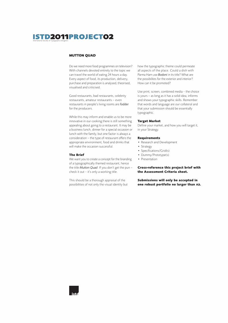
Do we need more food programmes on television? With channels devoted entirely to the topic we can travel the world of eating 24 hours a day. Every aspect of food, its production, delivery, purchase and preparation is analysed, theorised, visualised and criticised.
Good restaurants, bad restaurants, celebrity restaurants, amateur restaurants – even restaurants in people’s living rooms are fodder for the producers.
While this may inform and enable us to be more innovative in our cooking there is still something appealing about going to a restaurant. It may be a business lunch, dinner for a special occasion or lunch with the family, but one factor is always a consideration – the type of restaurant offers the appropriate environment, food and drinks that will make the occasion successful.
The BriefWe want you to create a concept for the branding of a typographically themed restaurant, hence the title Mutton Quad. If you don’t get the pun – check it out – it’s only a working title.
This should be a thorough appraisal of the possibilities of not only the visual identity but
how the typographic theme could permeate all aspects of the place. Could a dish with Parma Ham use Bodoni in its title? What are the possibilites for the exterior and interior? How can it be promoted?
Use print, screen, combined media – the choice is yours – as long as it has a solid idea, informs and shows your typographic skills. Remember that words and language are our collateral and that your submission should be essentially typographic.
Target MarketDefine your market, and how you will target it, in your Strategy.
Requirements• Research and Development• Strategy • Specifications/Grid(s) • Dummy/Prototype(s) • Presentation
Cross-reference this project brief with the Assessment Criteria sheet.
Submissions will only be accepted in one robust portfolio no larger than a2.
MUTTON QUAD
istd2011project02International Society of Typographic Designers

Fake is as old as the Eden Tree. Orson Welles
The history of the world is peppered with fakery and falsehood. We are surrounded by it in life and in nature. Fakery need not always be malicious or disingenuous – think of creatures that mimic their surroundings – but it certainly informs the richness of narrative in drama and literature when it is.
The English language has many synonyms for the word ‘fake’ – forgery, counterfeit, copy, pirate, sham, fraud, hoax, imitation, mock-up, dummy, reproduction, phoney, rip-off, dupe . . . .
In our everyday use of typefaces we encounter faces that are re-named to avoid copyright issues or paying licence fees, but the history of typeface design is rich in faces that that are based on existing faces – that in turn were based upon even earlier faces . . . such is the evolutionary design process! These are not fakes but there is, at times, a fine line of distinction.
From Del-Boy to Dali, Fake Tans to Fake Twitters, Faux Pas to Follies, the subject offers a wealth of possibilities for research, interpretation and visual communication.
The BriefExplore the wonderful world of ‘fakery’ and surprise us with your ingenuity and lateral thinking.
Use print, screen, combined media – the choice is yours – as long as it has a solid idea, informs and shows your typographic skills. Remember that words and language are our collateral and that your submission should be essentially typographic.
Target MarketDefine your market, and how you will target it, in your Strategy.
Requirements• Research and Development• Strategy • Specifications/Grid(s) • Dummy/Prototype(s) • Presentation
Cross-reference this project brief with the ‘Assessment Criteria’ sheet.
Submissions will only be accepted in one robust portfolio no larger than a2.
FAKERY
istd2011project03International Society of Typographic Designers

NOT JUST FLEURONS
‘The many great gardens of the world, of literature and poetry, of painting and music, of religion and architecture, all make the point as clear as possible: the soul cannot thrive in the absence of a garden. If you don’t want paradise, you are not human; and if you are not human, you don’t have a soul.’Thomas Moore
Some see gardening as a metaphor for life. Whether it is a plant or two on a window sill in an urban apartment, a vegetable plot in a suburban garden, the yard of an American home, the ornate gardens of the Château de Versailles, the botanical gardens of Kew or the Zen-inspired gardens of Japan, the constant in all gardens is the presence of plants.
The Brief We want you to consider plants in the broadest possible ways – their form, colour, size, texture, smell, taste, feel, associations, personalities, uses reputations, botanical names – and develop an eye-catching and informative outcome that interprets and celebrates plants and the concept of the garden and its role in our lives.
Use print, screen, combined media – the choice is yours – as long as it has a solid idea, informs and shows your typographic skills. Remember that words and language are our collateral and that your submission should be essentially typographic.
Target MarketDefine your market, and how you will target it, in your Strategy.
Requirements• Research and Development• Strategy • Specifications/Grid(s) • Dummy/Prototype(s) • Presentation
Cross-reference this project brief with the ‘Assessment Criteria’ sheet.
Submissions will only be accepted in one robust portfolio no larger than a2.
istd2011project04International Society of Typographic Designers

FLATLAND
With this brief we take a different approach. Rather than offer a theme that requires you to generate the content, we are directing you towards existing content – the Victorian (1884)novella Flatland by the English schoolmaster, Edwin A. Abbott.
You will find a mass of references and the full text freely available online.
The Brief Your task is to produce a proposal for a new edition of Flatland that doesn’t necessarily engage with the conventions of ‘the book’ as we understand them, although it may have text matter, pages and a cover – or not. It could be a pamphlet, a chapbook, a poster, a landscape, a happening, a dream, an installation, a text, a sound piece, an animation, a moment.
Interpret the text typographically – you can be as ambitious as you wish to be, but you must deal with the full contents of at least one chapter and show how the rest of the text would develop.
There are no restrictions, no conventions, no rules, no given formats. Static work, moving image, physical, virtual, ephemeral are all up to
you, as is the navigation of the piece, its viewer/reader/user engagement, its scale, simplicity, complexity, composition.
What can it become? There is a quote in the film Amadeus that says if you have four people talking at once, then that’s an argument . . . if you have four people singing at once, then that’s Opera.
Make an opera, not an argument !
Target MarketDefine your market, and how you will target it, in your Strategy.
Requirements• Research and Development• Strategy • Specifications/Grid(s) • Dummy/Prototype(s) • Presentation
Cross-reference this project brief with the ‘Assessment Criteria’ sheet.
Submissions will only be accepted in one robust portfolio no larger than a2.
istd2011project05International Society of Typographic Designers

Demonstrate your use of all typo/graphic elements in your layouts by detailing their use through annotated specifications. The diagrams below and on the following page give guidelines for possible methods of annotation.
Grids should detail all measurements of your document/screen grid – horizontal and vertical grid spacing (margins and gutters). The sample below shows the use of the baseline grid. This is not mandatory. Column/text block measures should be included.
Typo/graphic Specifications should detail your use of type/glyphs and other graphic elements. The main focus is your typographic treatment of texts – particularly the hierarchy of
information. Consider, for instance, your detailing for headlines; sub-heads; body text; cross-heads; standfirsts; call-outs; captions; headers; footers; folios; bullets; rules; fleurons and any other typographic devices that may be used. In all instances give the size, body/leading, weight and colour.
Media differentials will determine the appropriate information for your specifications. The list above relates to print-based matter. Your specifications for screen-based/broadcast type should include the appropriate information and terminology for that medium.
Type and lettering used as illustrative matter need not be specified.
Paragraph3-line drop cap Foundry Sans Demicolour: 100% black
Body Text9/12pt Foundry Sans Normal(3pt leading/12pt body)Ranged Left57mm measure 3mm paragraph indentscolour: 100% black
Heading 136 pt Times Italic3 column measurecolour: 100% black
Caption8/10 pt Foundry Sans Italic(2pt leading/10pt body) colour: 100% black
Heading 29/12pt Foundry Sans Demi(3pt leading/12pt body)colour: 100% black
Running Headline6 pt Foundry Sans Normal colour: 100% black
Gutter4mm
Rule4pt x 3 columncolour: 50% black
Folio6 pt Foundry Sans Demicolour: 50% black
Head margin15mm
ications1istd2011type|layoutspecifInternational Society of Typographic Designers

140px 140px 140px 140px 140px 140px
1
52
46
7
3
20px 20px 20px 20px 20px
1<img src=’’…guardian_logo.gif’’ />
2<h1>font-family: Georgia, serif;font-size: 24px;line height: 1.2em;font-weight: normal;colour: #005689;
3<h2>font-family: Georgia, serif;font-size: 18px;line height: 1.2em;font-weight: normal;colour: #005689;
4<h3>font-family: Georgia, serif;font-size: 14px;line height: 1.2em;font-weight: bold;colour: #005689;
5<h3>font-family: Georgia, serif;font-size: 24px;line height: 1.2em;font-weight: normal;colour: #005689;
6<p>font-family: Arial, sans-serif;font-size: 14px;line height: 1.2em;font-weight: normal;colour: #333;
7<p>font-family: Arial, sans-serif;font-size: 12px;line height: 1.3em;font-weight: normal;colour: #005689;
AnnotationThis illustration offers an alternative method of annotation to that on sheet #1 – in this case for specification of a screen-based submission.Either method is acceptable – clarity of information is the main criterion.
ications2istd2011type|layoutspecifInternational Society of Typographic Designers
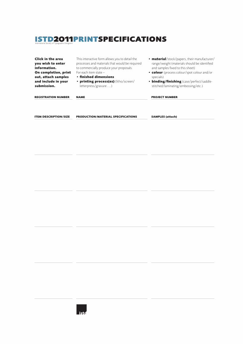
This interactive form allows you to detail the processes and materials that would be required to commercially produce your proposals. For each item state –• finished dimensions • printing process(es) (litho/screen/ letterpress/gravure . . .)
• material/stock/papers, their manufacturer/ range/weight (materials should be identified and samples fixed to this sheet)• colour (process colour/spot colour and/or specials)• binding/finishing (case/perfect/saddle- stitched/laminating/embossing/etc.)
Click in the area you wish to enter information.On completion, print out, attach samples and include in your submission.
ITEM DESCRIPTION/SIZE PRODUCTION/MATERIAL SPECIFICATIONS SAMPLES (attach)
REGISTRATION NUMBER NAME PROJECT NUMBER
icationsistd2011printspecifInternational Society of Typographic Designers

RETURN OF PORTFOLIO –CHECK ONE
POST COURIER
02 03 04 0501OTHER
PROJECT – CHECK ONE
SCREENPRINTMEDIA – CHECK ONE
NAME (IN CAPS) REGISTRATION NUMBER
SECURE THIS LABEL TO THE FRONT OF YOUR PORTFOLIO
RETURN OF PORTFOLIO –CHECK ONE
POST COURIER
02 03 04 0501OTHER
PROJECT – CHECK ONE
SCREENPRINTMEDIA – CHECK ONE
NAME (IN CAPS) REGISTRATION NUMBER
SECURE THIS LABEL TO THE FRONT OF YOUR PORTFOLIO
RETURN OF PORTFOLIO –CHECK ONE
POST COURIER
02 03 04 0501OTHER
PROJECT – CHECK ONE
SCREENPRINTMEDIA – CHECK ONE
NAME (IN CAPS) REGISTRATION NUMBER
SECURE THIS LABEL TO THE FRONT OF YOUR PORTFOLIO
istd2011
istd2011
istd2011


![[MS-ISTD]: iSCSI Software Target Discovery ProtocolMS-ISTD].pdf · iSCSI Software Target Discovery Protocol ... [MS-ISTD]: iSCSI Software Target Discovery Protocol ... The component](https://img.pdfslide.us/doc/110x75/5aa8c7067f8b9a9a188c0144/ms-istd-iscsi-software-target-discovery-protocol-ms-istdpdfiscsi-software-target.jpg)