Embed Size (px)
Citation preview

Issue 03Summer 2011
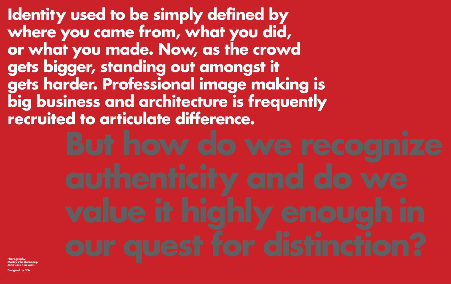
Identity used to be simply defined by where you came from, what you did, or what you made. Now, as the crowd gets bigger, standing out amongst it gets harder. Professional image making is big business and architecture is frequently recruited to articulate difference.
But how do we recognize authenticity and do we value it highly enough in our quest for distinction?
Photography:Morley Von Sternberg, John Ross, Tim Soar.
Designed by SEA

No modern organisation escapes branding and identity creation. Nor is it easy to escape the potential conflict between identity and authenticity. Oscar Wilde’s advice, ‘Be yourself, everyone else is already taken’, put its finger on just that. No amount of clever branding will forever mask a dodgy business.
Even good, sound organisations run the risk of long term reputation being swallowed in the short term feelgood of new logos and catchy strap lines. And when something as long lasting as a piece of architecture is recruited as part of an identity, how can we avoid a parallel conflict; of today’s icon becoming tomorrow’s embarrassment?

Branding has come a long way. From the sizzling hide of cattle to assert ownership, to capturing the essence of an organisation to engender a sense of ownership; from the marking of possessions to the fostering of loyalty amongst customers and allegiance amongst staff. The logotype, the literal brand, remains important as a rallying point, but visual identity can quickly lose meaning without the behaviours and communication strategies to capture and project a complex mixture of ethos, mission, goals and offer.
In the world of corporate branding the language devised for expressing the relationship between the individual and the family, tribe or nation – loyalty, faithfulness, commitment, belonging, respect, care – has come into the market in goods and services. At the same time the language of the marketplace has travelled the other way: so US Secretary of State, Colin Powell could say in 2001 ‘We’re selling a product. That product we are selling is democracy.’ The market, presumably because it is a near universal cultural phenomenon, has become the ruling paradigm for so much of human activity. But compared to a real live market, what modern organisations trade is very complex. As sellers, they have to struggle to distinguish themselves from others, not only as far as the buyers are concerned, but equally to enable the organisation to reliably ‘recognise’ itself, so that the players within it and around it can join in a common cause.
The best branding and identity exercises reveal and build on the true nature of an organisation, and devise the messages and deploy the media to do justice to that nature. At their best such exercises will even help organisations to be more themselves.
But inevitably the identity business also has a large shallow end where, after a focus group or two, an organisation or a project can be fitted with an identity, guaranteeing weak adhesion between image and reality. Some of the stands at the annual MIPIM property fair in Cannes are glorious examples of this.
But there are also plenty of examples of earnest and diligent re-branding giving farcical results, such as the reincarnation of the Royal Mail as Consignia. Eventually the company decided that its venerable pedigree was, after all, its chief asset. Even otherwise excellent visual identity can fail by being out of step with underlying cultural attitudes, such as the colourful British Airways tailfins scrapped because of a conservative backlash.
Architecture has forever been recruited to represent the status and ambitions of individuals and organisations at all scales from homes to empires. Formal languages unique to architecture were developed just for this. Modernism threw them all out in a quest for authenticity but despite many glorious inventions, it became frozen as a new family of languages that in most hands tended to arid or banal results.
Amongst the critiques of modernism that emerged, the polemical writings of the Venturi’s were thrilling for their heretical appreciation of the communicative power of everyday display and advertising. But much of the so-called post-modern architecture that followed dated quickly, a sure sign of the inauthentic.
Rich MixThe function of louvers on south facing façades to control solar gain does not by itself determine the shape of the louvers, and neither does cost.
The bank of computer controllable louvers of the Rich Mix Centre in London’s Bethnal Green is composed like a giant piece of fabric, the gold and silver weft of the horizontal louvers weaving across five colours of vertical curtain wall mullions.
The users regularly set individual groups of louvers in different patterns to make an endlessly changing and distinctive façade that captures the spirit of the enterprise; to house and showcase the creative energy that comes out of diversity.
Architecture has forever been recruited to represent the status and ambitions of individuals and organisations at all scales from homes to empires.
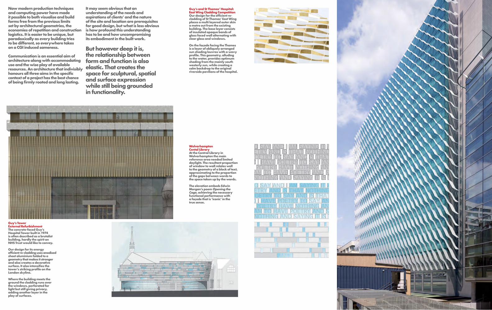
Now modern production techniques and computing power have made it possible to both visualise and build forms free from the previous limits set by architectural geometries, the economies of repetition and construction logistics. It is easier to be unique, but paradoxically as every building tries to be different, so everywhere takes on a CGI induced sameness.
Communication is an essential aim of architecture along with accommodating use and the wise play of available resources. An architecture that indivisibly honours all three aims in the specific context of a project has the best chance of being firmly rooted and long lasting.
Guy’s and St Thomas’ Hospital: East Wing Cladding CompetitionOur design for the efficient re-cladding of St Thomas’ East Wing places a multi layered outer skin a metre out from the existing building. The base layer consists of insulated opaque bands of glass faced wall alternating with clear glass and windows.
On the façade facing the Thames is a layer of obliquely arranged sun shading louvres with a wavy profile. This geometry, alluding to the water, provides optimum shading from the mainly south westerly sun, while creating a calm backdrop to the original riverside pavilions of the hospital.
Wolverhampton Cental LibraryAt the Central Library in Wolverhampton the main reference area needed limited daylight. The resultant proportion of window to wall relates well to the geometry of a block of text, approximating to the proportion of the gaps between words to the space taken up by the words.
The elevation embeds Edwin Morgan’s poem Opening the Cage, achieving the necessary functional performance with a façade that is ‘iconic’ in the true sense.
It may seem obvious that an understanding of the needs and aspirations of clients’ and the nature of the site and location are prerequisites for good design, but what is less obvious is how profound this understanding has to be and how uncompromising its embodiment in the built work.
But however deep it is, the relationship between form and function is also elastic. That creates the space for sculptural, spatial and surface expression while still being grounded in functionality.
Guy’s Tower External RefurbishmentThe concrete-faced Guy’s Hospital Tower built in 1974 is often described as a brutalist building, hardly the spirit an NHS Trust would like to convey. Our design for its energy efficient re-cladding uses anodised sheet aluminium folded to a geometry that makes it stronger and also creates a decorative surface. It also intensifies the tower’s striking profile on the London skyline. Where the building meets the ground the cladding runs over the windows, perforated for light but still giving privacy, adding another layer in the play of surfaces.
Sun
and
Pras
ad c
onsi
ders
Mul
ticul
tura
lism
–W
hat’s
New
?
For some time the concept of multiculturalism has been causing angst across the political spectrum due not least to the haphazard translation of an everyday fact of modern metropolitan life, the coexistence of people of different cultural origins, into an ‘ism’. If the ‘ism’ now becomes a ‘wasm’, to borrow John Lukacs’ witticism, what will actually change? Surely not its most fascinating and energising aspect, the proliferation of multiple identities. In the opening minutes of Ken Loach’s 2004 film, Ae Fond Kiss, Tahara declaims “I am a Glaswegian Pakistani teenage woman of Muslim descent who supports Glasgow Rangers in a Catholic school...”. Once people started moving around the world, thousands of years ago, the coexistence and coalescing of cultures was only a matter of time. Now such movement takes days and hours rather than years and only militarised sealing of borders can stop it or its hybridising effects.
It is clear how a work of art like Loach’s film can express and comment on culture and identity and how culture and identity shape the literary and visual arts. At least it is clearer than in the art and practice of architecture, or building. The simplest way to differentiate a work of architecture from a building is probably through intention i.e. architecture has the intention to communicate or to engage with the human senses as well as to satisfy the pragmatic requirements of use and durability, while building is just about the pragmatics. But once complete it’s the building that communicates irrespective of intentions.
The customs, the ways of life, the belief systems and the power structures of a certain time are manifest in the designs of buildings and the plans of cities. In aerial pictures of cities colonised by the British or French, from Delhi in the East to Casablanca in the West you can see the contrast between the old settlements with their narrow shady alleys and close packed houses planned round secluded courtyards, and the European pattern of streets with their individual buildings looking outwards. Forbidden to depict figures, and sometimes any natural form, Islamic master builders discovered amazing architectural geometries. Equally amazing, highly realistic, trompe l’oeil ceilings in the lofty domes of Venetian Churches must have literally been taken as visions of heaven in their time, proof plain of the presence of God.
Architecture is strongly linked historically to the expression of cultural identity. But the linkages may not be static or direct and understanding their changeable nature seems essential as preparation to understanding the architectural implications of a multicultural metropolitan society. The Brick Lane area of London’s East End is famous as a distillation of modern multicultural Britain. In the early 18th century Huguenots escaping persecution from Louis XIV found sanctuary here. On top of terraced houses they built weaver’s lofts illuminated with roof lights – now some of the most desirable property in town. The chapel they constructed in 1743 successively housed other Christian denominations and in 1898 was consecrated as a synagogue to serve what was by then a largely Jewish local population.
Bangladeshi sailors started settling in the area between the wars and in the 1970s were followed by families mostly from the country’s Sylhet region. By now most of the Jewish people had moved on and in 1976 the Synagogue became the Great London Mosque. Now, adding to the rich cultural mix, there is also a large Somali community here - many worshipping in the edifice built by protestant Huguenots.
In a multicultural metropolis like London, the presence of different cultures is obvious in people’s dress, food and languages. But where is this presence in architecture? The streets of Brixton or Bradford, if the setting and décor is stripped away, are the same as a less mixed town. Future archaeologists looking for evidence of multiculture won’t find much here, and what they do find might confuse rather than illuminate. The Moorish Market just off Brick Lane with its oriental arched windows was built 50 years before significant immigration started, by a whimsical East End chancer who wanted a department store with a different look.
Some of the archaeologists’ finds will have more distinguished content – the Regent’s Park Mosque, the Ismaili Centre and the Neasden Temple, for example. Naturally, identity is most strongly expressed in the architecture of religious buildings; one building type where minority communities have slowly been making a mark. There have been 1,700 mosques, 300 synagogues, 250 hindu temples, 200 sikh gurudwaras and a number of other places of worship initiated, funded, built and managed entirely by these communities, mostly in the last 20 years. Our archaeologist is unlikely to get it right as some of these buildings will originally have been chapels and churches, and even more are converted shops and houses. Where designed from scratch these buildings enshrine static, motif-based cultural expression rather than the dynamic hybrid identities that offer a more exciting vision of the future.
The most potent architectural hybrids spring up unforced. Just 200 years before people from Bangladesh started setting up households in England, the first British people had set up households in Bengal now partly in Bangladesh. The British had pragmatically adapted the local house type, known throughout India as a Bangla, making it suitable for their own lifestyles. The settlers wanted rooms with highly specific functions quite unlike local custom, including arrangements for defecating inside dwellings, not the rule in that part of the world. Some yearned for a true home from home, so they added an arch here and a portico there. Out of the cottages of Bangla was to come the global phenomenon of the bungalow.
In the mid sixties I helped my father to knock through the dining room and front parlour like others were doing in our North London working class street, no longer wanting to maintain an underused formal space. Such open plan arrangements became the norm as the centre of modern houses and apartments, well suited as it happened for families, especially the extended ones of many immigrant communities. Open kitchen and dining space was far preferred to the separate small cramped kitchens of standard council housing. But for traditionalist South Asian and particularly Muslim families the old front parlour/ back room arrangement turned out to perfectly suit family structures. They made the front room the men’s domain and the back the family area.
What we at Penoyre & Prasad learned from our 1990s exploration of housing design in a modern multicultural society was that we need to transcend particularities of lifestyle.
Houses change hands and within any particular community there are diverse and constantly changing ways of living. A design that is simple, spacious, robust and adaptable to different uses will prove to be of the longest lasting value. That done, how to make bits of town at different scales that work for people and how to create the magic link between place, architecture and memory?
Using façades to explore cultural references, Jean Nouvel at the Arab Centre in Paris devised a solar screen with motorised irises arranged in a pattern based on Islamic geometry.
At the Rich Mix Centre, on one façade we used coloured window mullions and silver/gold solar control louvres to make a weave-like pattern that can be adjusted by the occupants to make a giant adjustable billboard. The weave can be read as an allusion to the many meanings that ‘weave’ has here – from the Huguenot’s to the nearby Weavers Field, to the textile trade or the metaphorical weave of cultures. But the immediate impact of the façade works whether the cultural allusions are recognised or not.
In cities round the world there are architectural equivalents to both the self conscious and more intuitive approaches to hybridisation such as are readily perceived in music. Contrast the earnest attempts in the 1960s by Yehudi Menhuin and Ravi Shankar to create a fusion with the work of Massive Attack and Nitin Sawhney who in the 1990s produced a truly new music out of the multiple traditions that they have been immersed in almost from birth. Just as some attempts at fusion in music tend to homogenise and dilute the best aspects of its source traditions, so too in architecture. But the prospect for multi-cultural practice in architecture and our built environment is the potential for the expression of wholly new identities that transcend any single layer of reference. Some of the best examples come out of the combination of deep knowledge of locality, in particular climate and culture, and of a wide understanding of architecture round the world. And if people from more diverse backgrounds get better access to architectural education, practice and patronage, architecture will find even greater expression of multiple identities.

Settings
Activity Group Size
Frequencey
TimeChoiceQuantity
Atmosphere
Duration
This Time It’s PersonalI recently had a meeting at some sleek new offices for a local authority, and checked out the beautifully designed concrete panels, graphic wallpaper, and grid of long white paperless tables, all in keeping with the latest workplace thinking. Perhaps there were some latent bureaucratic qualities, for something still seemed to be missing for the individuals at work - a sense of belonging and of control. Staff spoke to me conspiratorially about an oppressive atmosphere, problematic acoustics, and headaches caused by the carefully integrated lighting, all leading to a strong desire to flee the office environment …cue Robert de Niro’s abseiling escape out of Terry Gilliam’s film Brazil, but in this version to a street café for a more conducive meeting space.
It was a useful reminder of how an organisation can overwhelm the needs and identity of the individual. Not everyone is lucky enough to work for businesses who can provide their staff with table football and ski-lift think-pods (Marx would probably have called these merely the capitalist tricks of repressive tolerance). In many modern work environments, the need for privacy and personal space is only met temporarily by accessing a private virtual world with the aid of an ipod, headphones, and perhaps a surreptitious link to a social network elsewhere.
How important then is the relationship of identity and personal space where the individuals are not adults, but children at new schools with “flexible learning landscapes” informed by workplace theory and procured from the economics of painted plasterboard? And how do we ensure that the control and ownership of shared spaces do not overwhelm young people’s sense of belonging, particularly in these critical formative years?
These types of questions arose during a recently completed two year research project called Space for Personalised Learning (S4PL). Since 2002, Personalised Learning has been the standard policy term used to give more emphasis to the non-academic aspects of the pupil experience, such as teamwork, thematic learning, and the skills for learning and work. In addition, the international shift to student-centred learning of the last decade has produced many innovative layouts for learning environments.
New schools in the UK have been encouraged to provide alternative spaces to classrooms, though with varying degrees of success. So the S4PL project brought together a team of experts in design, education, technology and research (including DEGW, Futurelab, Edison Learning, Davis Langdon and Penoyre & Prasad) to help examine the spatial implications for designs which support personalised learning, by developing pilot projects with ten UK schools.
Penoyre & Prasad Associate, Simon Dove takes a wider view of findings from the practice’s recent educational research project.
Recent policy shifts mean that, for now, Personalised Learning has fallen out of official favour, partly because the research that would support it - improved exam results, attendance and behaviour - has not yet been done. A reaction against progressive teaching methods has also come from those who think the state educational system had become opposed to teachers teaching, and children listening, denouncing the thematic curriculum in favour of a traditional subject structure.
But we found that, rather than returning to a traditional approach to education, for the schools on the S4PL project, personalised learning could be a ‘third way’ that values both academic and applied knowledge.
New types of space intended to support personalised learning and allow individuals to blossom are only part of the story. The degree to which individuals are able to customise their learning and achieve a level of autonomy cannot always be expressed spatially; and the simple use of bright colours and funky furniture can give a misleading impression of an institution and the way it operates for users. Although the variety and treatment of spaces help, schools that allow customising of educational pathways to suit the learners can also have a great influence on the sense of identity and engagement of the individual within the institution.
Given that, the S4PL team’s first step was to facilitate sessions with each of the ten schools to create an innovative brief that would be significantly better at supporting its learning aims. To move towards the sort of school it wanted to be, each school would have to interrogate the sort of school it was.
Settings for Wychall School www.space4pl.org
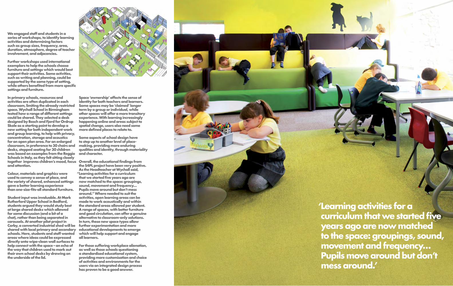
We engaged staff and students in a series of workshops, to identify learning activities and determining factors such as group sizes, frequency, area, duration, atmosphere, degree of teacher involvement, and adjacencies.
Further workshops used international exemplars to help the schools choose furniture and settings which would best support their activities. Some activities, such as writing and planning, could be supported by the same type of setting, while others benefited from more specific settings and furniture.
In primary schools, resources and activities are often duplicated in each classroom, limiting the already restricted space. Wychall School in Birmingham tested how a range of different settings could be shared. They selected a desk designed by Bosch and Fjord for Ordrup Skole as a starting point to develop a new setting for both independent work and group learning, to help with privacy, concentration, storage and acoustics for an open plan area. For an enlarged classroom, in preference to 30 chairs and desks, stepped seating for 30 children was based on examples from the Reggio Schools in Italy, as they felt sitting closely together improves children’s mood, focus and attention.
Colour, materials and graphics were used to convey a sense of place, and the variety of shared, enhanced settings gave a better learning experience than one-size-fits-all standard furniture.
Student input was invaluable. At Mark Rutherford Upper School in Bedford, students argued they would study best at large shared desks which allowed for some discussion (and a bit of a chat), rather than being separated in carousels. At another pilot project in Corby, a converted industrial shed will be shared with local primary and secondary schools. Here, students and staff wanted areas where ideas could be expressed directly onto wipe-clean wall surfaces to help connect with the space – an echo of the way that children used to mark out their own school desks by drawing on the underside of the lid.
Space ‘ownership’ affects the sense of identity for both teachers and learners. Some spaces may be ‘claimed’ longer term by a group or individual, while other spaces will offer a more transitory experience. With learning increasingly happening online and areas subject to spatial change, users also need some more defined places to relate to.
Some aspects of school design have to step up to another level of place-making, providing more enduring qualities and identity, through materiality and character.
Overall, the educational findings from the S4PL project have been very positive. As the Headteacher at Wychall said, “Learning activities for a curriculum that we started five years ago are now matched to the space: groupings, sound, movement and frequency… Pupils move around but don’t mess around.” Where needed to suit the activities, open learning areas can be made to work acoustically and within the standard areas allowed per student. A range of spaces, with better furniture and good circulation, can offer a genuine alternative to classroom-only solutions. In turn, these new space types allow further experimentation and more educational developments to emerge which will help support and engage all learners.
For those suffering workplace alienation, as well as those schools questioning a standardised educational system, providing more customisation and choice of activities and environments for the users via an integrated design process has proven to be a good answer.
‘Learning activities for a curriculum that we started five years ago are now matched to the space: groupings, sound, movement and frequency…Pupils move around but don’t mess around.’

Working closely and spending time within organisations in a process Penoyre & Prasad call ‘immersion’ allows us to capture their values in our designs. The ethos of a business must be shared by its staff and leaders, and one of the most effective ways of communicating this ethos is through the identity of the environment they all share.
The office is now free to be a desirable, engaging and sociable environment, representative of shared values and identity.
Hard Working SpacesDespite the rise of the coffee shop worker, the office has not yet disappeared from our lexicon of modern needs. The cultural associations of the word ‘office’ are shifting from the dreary, conventional space still conjured for many, towards the purposeful and open dynamic of the modern workplace.
Technology has been a key driver; endless vistas of people doing manual calculations in a grid of booths have been replaced by a more fluid digital landscape. The psychology of setting out territories and hierarchies has given way in the modern workplace to the creation of opportunities in a shared environment. Whilst there is a strong urge in many of us to own and demarcate space, the more egalitarian mode of occupying the right kind of space for the time you need, enabled by the necessary technology and furniture is more productive.
Social media may have further, as yet unknown, impacts on office layout and design. In this environment, people with different skills and experience are able to join up in creative and rewarding collaboration. They should also expect the environmental fundamentals to be right; daylight, fresh air and low carbon use.
These three factors; new technologies, space sharing based on need rather than entitlement and subjective environmental experience, have had a profound effect. The office is free to be a desirable, engaging and sociable environment, representative of shared values and identity.
These descriptions of two of our recent office projects illustrate our approach and show how that has enabled us to transform these working environments.

The International Institute for Environment and Development (IIED) is an organisation researching and promoting sustainable patterns of world development. They will shortly move to a newly refurbished office, designed to meet the needs of London staff as well as visiting staff and international partners who may touch down for anything from a few hours to several months. We proposed a wide variety of shared, unallocated areas to complement the open plan desk layouts; café, club, breakout areas, cubby holes, nooks, snug, meeting rooms and auditorium. This strategy will meet staff’s needs for specific environments, enabling more flexible working and occupancy rates to rise above the current 50%.
The environmental strategy balances the needs of the individual and the building with the lowest possible carbon use for the budget. The building sits on a busy road so windows will be kept closed and air circulated with heat recovery in winter and cooling to lessen peak temperatures in summer. Open plan space is integral to this strategy, since it avoids small spaces such as individual offices requiring air conditioning. Carbon is kept low by exposing the concrete soffit, applying solar film to the windows, and operating low energy fluorescents on daylight sensors. To maintain a quiet environment for researchers, acoustic panels are suspended above desks, absorbing sound while keeping the soffits free.
Our real challenge was to create a unifying identity for IIED in a building with small floor plates over 6 floors.
This is achieved through embellishing the stair as a giant bookcase or vitrine, a window into the world of IIED threading the floors of the building together for an organisation that still produces over 100 print publications a year. The intensity of articulation around the stair makes it more desirable to move up and down and provides places for mementos and objects as well as storage and display. From the entrance and up through the building the simple but strong architectural language of spruce ply with dark formica expresses a consistent identity at the heart of the building, locating places to sit, think, talk, meet and feel ‘at home’ in the new office space.
This radical transformation of the environment immediately captures a new identity for the University, of interaction and interconnectedness.
St George’s University of London is a medical school in south London that shares its site with an NHS Hospital.Medical research and teaching requires highly controlled environmental conditions, but it also feeds on ideas generated by conversation, often between those from different disciplines or research areas. It is this interaction between individuals that we sought to energise by radically transforming the pattern of occupation in an area of the existing Jenner Wing from allocated, individual offices and labs to open plan shared spaces for the Faculty of Basic Medical Sciences
The demands of specialist space had over time obscured simple aspects of environmental control, with seemingly arbitrary allocations resulting in labs with blacked-out daylight, windowless meeting rooms and a feeling of claustrophobia.
We saw that, even though staff spent half their time in the labs, these could be relocated to the centre of the plan so that all write up, meeting and group spaces could flow freely around the perimeter with views and daylight.
Our instinct to open up the perimeter theatrically places the Faculty’s research lab at the heart of the scheme.
This radical transformation of the environment immediately captures a new identity for the University, of interaction and interconnectedness. The regular rhythm of workspace alternates with free standing pod rooms for use as individual office, team base or meeting room. This gives the flexibility the Faculty needs to form and reform teams around new research leaders and projects, getting the best out of both people and space. From the write up areas on one side, you can look across the plan through the pristine lab to write up areas on the far side, know who is in and out, and pursue the spontaneous lines of enquiry appropriate to scientific endeavour.

Founded in 1924 to champion education founded on the Christian faith and its values, the London Diocesan Board for Schools, is a major educational sponsor with more than 149 schools across London.
Development Officer, Rob Hannan, describes the challenges of establishing the Board’s identity and ethos in the design and operation of the new Wren Academy in North London.

What distinguishes the London Diocese as an educational sponsor?As a church organisation, we have been an active provider of education for more than 150 years. We are well connected and trusted in local communities and that’s our route to very effective consultation. We draw from different sources for community engagement –the church, resident associations, the local authority, and primary schools.
Unlike some educational sponsors, we don’t have a blueprint that we apply wherever we go. We work with design teams to come up with local solutions for local communities. We are by our nature immersed in diverse areas of London, each with its own character. Although the Christian ethos is non negotiable, we take all this into consideration when looking at a school.
What did you want the design of Wren Academy to reflect?Our original vision as sponsors of the school focused around 5 key elements: a Christian ethos, an emphasis on the value of learning, dining and hospitality, an integrated sixth form, and the Academy’s built environment specialism.
Learning is at the heart of our vision for this Academy. We wanted to emphasise that in the design and make learning a very visible process. The first thing you see when you enter the school is the library and heartspace. Look up and you look straight into the classrooms. It’s a very immediate signal of what we are about. All the staff at Wren are encouraged – expected even – to be engaged in some kind of learning themselves. Learning is a valuable aspect of life, not just something to be done whilst at school.
Dining and hospitality is another very important part of the Christian ethos. We should enjoy food and each other’s company rather than just refuel during the day. The dining space at Wren reflects that. It is a restaurant rather than a canteen, a place with high quality finishes and art on the walls, a place which encourages people to stay and talk or work, as well as dine.
We offer a dining experience that values the individual, values social time, and values social interaction between adults and children. There are no kettles elsewhere in this building, no ‘staff-only’ social spaces. Staff are encouraged to come to this communal space which in turn becomes the social hub of the building. It’s the antithesis of the fragmented experience of many today; fast food or mealtimes which cater for children and adults at different times of the day.
How does the design reflect the Academy’s specialism?Wren is one of only two Academies in the UK with a specialism in the built environment. We wanted it to be integrated into the fabric of the building. This is a stimulating environment which can itself be used as a curriculum tool. There is a deliberate intention to make certain elements explicit such as the clearly expressed steelwork in the classrooms, the stairwells which are either expressed on the outside of the building or immediately visible upon entering the building, and of course the new central heartspace with its tall steels echoing those great cathedral spaces. We’ve used simple, robust materials with lots of visibility and transparency so you can see how things are put together.
How do you embody something as subtle as the Christian ethos in the design of a building, without overt ecclesiastical references?The Christian ethos is about caring for others, and being aware of our neighbours, colleagues and friends. This school offers a ‘no bullying’ design which supports that. Of course you run your school in a way which encourages caring behaviour, but you can also design out the opportunities to do the opposite. We have a very transparent school with excellent sightlines, vision panels, lots of light spaces, no dingy corridors or hidden corners, even in the playground.
Our toilets are unisex. There are no separate doors leading to a row of cubicles. Individual cubicle doors lead off main circulation corridors just as they might at home or in an office. They are lightly supervised from adjacent areas at all times and just don’t allow for bullying. Wren has a relatively small playground but one with visual links to indoor social spaces which make it easy to supervise. One person can have sightline of the whole playground. Too often you see playgrounds dominated by ball games while the girls all sit on benches around the outside. Our design separates ball games out to redress the balance a bit.
The first thing you see when you enter the school is the library and heartspace… It’s a very immediate signal of what we are about.

Have any spaces or design features proved to be a particular or surprising success?Overall our brief was for a highly organised, flexible school with quality finishes, and we’ve got that. This building could work as 3 small schools or organised by faculty or year groups. We can link three classrooms to create an examination space without taking the school hall out of action.
Our heartspace space has worked very well – as a space for quite private study or as a classroom space. It also shows that a successful library space doesn’t have to be silent, its more about an atmosphere of study which people respect even as they walk about.
Our circulation routes are highly legible and eliminate congestion. And of course the toilet areas have been a huge success. The kids love them. It’s an obvious win that one.
Another thing this design does spectacularly well is work with its location and its environment to reduce energy costs, without interventions which are difficult or costly to maintain.
How did the process of working with the design team enable you to achieve your vision? As sponsors, you go in with your vision and the architects respond to that vision. Penoyre & Prasad really interpreted our vision. They were interested in this project, and pushed us hard on telling them what really mattered to us – what we saw as the heart of the building.
It was a highly integrated design process of concept proposal and problem solving – for me, a seamless process of iterative design.
There were some major changes – the east end of the heartspace changed completely with the loss of the east window and the addition of two more floors of classrooms. But despite all the cost constraints and value engineering those original five core elements of our identity are highly visible. That in itself is a measure of success.
The building reflects what we wanted in terms of the whole experience of the child. We have a concierged cloakroom just inside the building entrance. Apart from practical considerations about children not having to lug their kit about with them all day, it means that every child has said hello and goodbye to a welcoming member of staff at the beginning and end of their day.
The quality of materials also plays a part. You value people, and set the example of valuing others, by giving them a high quality environment. We drove that very hard particularly in the refurbished areas of the scheme and Penoyre & Prasad did a very good job hammering that requirement home to the contractors.
All these things come out of valuing the individual and mutual care. Christian schools don’t have a monopoly on this approach to teaching young people but it is interesting to unpick the design in terms of why we might do these things.It’s about valuing people and lots of things contribute to that – the cloakroom system, the dining experience, the toilets, each child having their own locker. These elements give a constant and coherent message - of respect for the individual and for the individual’s experience.
As its sponsor, what do you feel you have achieved with Wren?It’s about the way we choose to educate our children, about their attitude to each other, to the fabric of the building, an appreciation of, and respect for, your surroundings. It’s a cumulative experience.
You enter Wren and you perceive it as a place of learning. That is extremely deliberate. I would go as far as to say this is an environment of quality learning, with the function of learning very visible. That’s what we wanted and that’s very much what we’ve got.

Kno
w Y
our
Plac
e Ra
lph
Ard
ill, B
rand
Co
nsul
tant
con
sider
s
the
art o
f pla
cem
akin
g.
We
all g
o to
pla
ces
in
our h
eads
long
bef
ore
w
e go
ther
e on
foot
. W
e bui
ld u
p per
ceptio
ns a
nd
expec
tatio
ns b
ased
on
the
nam
e,
iden
tity,
image,
sto
ry, p
ositi
onin
g and
re
put
atio
n of
a p
lace
whi
ch w
ill e
ither
be
harm
onio
us a
nd re-
enfo
rced
by
the
phy
sica
l ex
per
ienc
e, o
r be
dis
cord
ant
and
dis
appoi
ntin
g.
I was
abou
t 8 y
ears
old
whe
n I
start
ed to
thin
k a
bou
t the
rel
atio
nshi
p
bet
wee
n arc
hite
ctur
e and
iden
tity
–
or b
uild
ings
and
nam
es a
s I s
aw
it
back
then
. Gro
win
g up
in O
ldha
m
ther
e w
asn’
t a d
ay
whe
n I d
idn’
t st
op to
sta
re a
t the
see
min
gly
en
dle
ss cot
ton-
mill
s th
at d
omin
ate
d
the
land
scape.
But d
espite
thei
r phy
sica
l pre
senc
e it
was
thei
r exot
ic n
am
es th
at c
aptu
red
my
imagin
atio
n - A
LEX
AN
DR
A,
DU
RBA
N, H
ERO
N, F
OX
, ACE
and
BRIA
R
– all
defi
ant
ly p
ain
ted
at a
n im
pos
sible
si
ze in
whi
te capita
l let
ters
that c
ould
be
read
from
mile
s aro
und.
For a
whi
le it
was
bey
ond
my
com
pre
hens
ion
as to
why
any
one
wou
ld w
ant
to call
a bui
ldin
g su
ch
a th
ing,
but
thes
e na
mes
wer
e
intr
igui
ng e
noug
h fo
r me
to s
eek o
ut
the
fasc
inatin
g and
aut
hent
ic s
tori
es
that l
ay
beh
ind
them
.
Writin
g O
n
The
Wal
l Br
yan
Edm
ondso
n,
Part
ner at S
EA D
esig
n
arg
ues
that t
here
’s
mor
e to
font
s th
an
mee
ts th
e ey
e.
Chara
cter
rec
ogni
tion
–
the
abili
ty o
f the
hum
an
eye
to s
ee a
nd d
ecip
her
shapes
, and
then
the
mea
ning
s of
the
wor
ds
that t
hey
repre
sent
, has
alw
ays
intr
igue
d m
e.Co
ver up
the
bot
tom
of a
wor
d
and
you
can
usua
lly s
till d
ecip
her its
m
eani
ng fr
om th
e cu
rves
at t
he to
p
of th
e le
tter
form
. Cov
er th
e to
p o
f a w
ord a
nd d
ecip
heri
ng it
s m
eani
ng
from
the
shapes
left
at t
he b
otto
m
is th
at m
uch
hard
er.
With
suc
h su
btle
forc
es o
f rec
ogni
tion
at p
lay,
it’s
eve
n m
ore
extr
aor
din
ary
th
at a
sin
gle
cha
ract
er c
an
be
expre
ssed
so
entir
ely
diffe
rent
ly –
yet
in
stant
ly a
nd e
qua
lly rec
ogni
sably
–
with
two
separa
te fo
nts.
Com
pare
the
low
er c
ase
‘a’ i
n tw
o
sans
ser
if fo
nts:
Fut
ura d
esig
ned b
y
Paul
Ren
ner in
1927 a
nd H
elve
tica
des
igne
d b
y M
ax
Mie
din
ger
in 1
957.
Fu
tura
, as
clea
nly
and
traditi
onally
st
ruct
ured
as
a c
hild
’s fi
rst a
lpha
bet
; H
elve
tica,
so
full
of c
hara
cter
and
ca
mp fl
ouri
shes
that i
t look
s as
thou
gh
som
ebod
y ha
s re
inve
nted
th
e le
tter
s th
emse
lves
.
Look
at t
hat d
rople
t sha
ped
cou
nter
, and
the
flare
d le
g. T
hat u
se o
f the
ne
gativ
e sp
ace
s w
ithin
indiv
idua
l ch
ara
cter
s is
so
stro
ng in
Hel
vetic
a
that t
he c
ount
ers
alm
ost b
ecom
e lo
gos
in th
emse
lves
.
For si
gna
ge
to w
ork w
ell,
you
need
m
ax
imum
cha
ract
er rec
ogni
tion.
The
si
gna
ge
curr
ently
use
d o
n m
otor
ways
w
as
des
igne
d in
the
earl
y 60s
for th
e D
epart
men
t of T
rans
por
t by
gra
phi
c des
igne
rs M
arg
are
t Calv
ert a
nd
Jock
Kin
neir.
Thei
r sa
ns s
erif fo
nt w
as
roun
der
, us
ing lo
wer
case
lett
ers
with
dis
tinct
ive
asc
ender
s and
des
cend
ers,
and
was
succ
essf
ully
road te
sted
on
the
M1 b
etw
een
Lond
on a
nd
York
shir
e bef
ore
bei
ng rol
led o
ut.
Today
I stil
l spen
d a
lot o
f tim
e
thin
kin
g abou
t the
rel
atio
nshi
p
bet
wee
n arc
hite
ctur
e, b
rand
ing
and
iden
tity
and
how
all
our t
ale
nts
can
bes
t be
orch
estr
ate
d to
bui
ld
succ
essf
ul ‘p
lace
bra
nds’
in h
eart
s,
min
ds
and
com
mun
ities
.
The
stra
tegic
sto
ryte
lling
pot
entia
l of
pla
cebra
ndin
g is
so
muc
h m
ore
than
the
tact
ical p
inni
ng o
f a v
acu
ous
badge
on a
vaca
nt b
uild
ing. H
ow m
uch
mor
e ex
citin
g and
eff
ectiv
e co
uld
our p
lace
s bec
ome
if w
e co
uld
wor
k to
get
her t
o
put
the
bus
ines
s pla
n, b
rand
pla
n and
bui
ldin
g pla
ns fo
r a p
roje
ct o
n
the
sam
e ta
ble
at t
he s
am
e tim
e –
a
colla
bor
ativ
e ne
w b
reakin
g of
the
ice
long
bef
ore
we
ever
bre
ak g
roun
d.
The
arc
hite
ctur
al s
pec
tacl
e of
the
Eden
Pro
ject
is a
hug
e ach
ieve
men
t, but
it’s
the
mana
gem
ent o
f the
pla
cebra
nd th
at h
as con
trib
uted
im
mea
sura
bly
to it
s pos
ition
as
one
of th
e U
K’s
top
des
tinatio
ns, a
nd o
ne
who
se s
ucce
ss h
as s
urpas
sed
all
expec
tatio
ns. F
rom
the
nam
e, lo
go
and
the
visi
tor e
xper
ienc
e, to
the
soci
al
and
educ
atio
nal a
ims
of it
s ou
trea
ch
pro
ject
s, th
e ‘E
den
Pro
ject
’ em
bod
ies
ever
yth
ing
abou
t the
vis
ion
beh
ind
the
endea
vour
– s
o m
uch
mor
e th
an
gia
nt
bio
mes
in a
dis
used
qua
rry.
Place
bra
ndin
g is
abou
t bui
ldin
g
pla
ces
and
bui
ldin
g bra
nds
as a
sh
are
d jo
urne
y. A
pla
ce w
here
we
ca
n bot
h le
arn
, be
insp
ired
, ach
ieve
m
ore
and
bec
ome
all
the
bet
ter f
or it
.
It’s
abou
t wha
t happen
s w
hen
the
very
bes
t in
arc
hite
ctur
e and
bra
ndin
g co
llide.
ralp
h@th
ebra
ndex
per
ienc
econ
sulta
ncy.
com
But
font
s don
’t ju
st h
ave
a rol
e to
pla
y in
the
legib
ility
of s
igna
ge,
w
heth
er th
e re
ader
is tr
ave
lling
at
70 m
iles
an
hour
or no
t. W
ith th
eir
uniq
ue c
hara
cter
istic
s and
sty
listic
qui
rks
and
em
path
ies,
font
s ca
n
help
cre
ate
mem
orable
and
inst
ant
ly
reco
gni
sable
iden
titie
s fo
r bui
ldin
gs
and
bra
nds.
Its
no c
oinc
iden
ce
that t
he B
arb
ican
Cent
re in
Lon
don
co
nsid
ers
its u
se o
f Fut
ura to
be
at t
he
heart
of i
ts id
entit
y… ‘c
lean
dis
tinct
and
legib
le…
used
to e
xpre
ss b
oth
cont
empor
ary
and
cla
ssic
al q
ualit
ies’.
N
o co
inci
den
ce e
ither
that M
ass
imo
Vig
nelli
cho
se th
e co
nfiden
t flou
rish
es
of H
elve
tica,
the
font
des
igne
d fo
r,
and
aim
ed a
t, th
e or
igin
al M
ad M
en
for hi
s ic
onic
and
pow
erfu
l Am
eric
an
Air
ways
iden
tity.
bry
an@
seades
ign.c
o.uk
Prin
ted o
nN
atu
ralis
Sm
ooth
Rec
ycle
d c
onta
ins
50%
pos
t co
nsum
er w
ast
e and
is f
ully
FSC
cer
tified
.
Natu
ralis
is
manu
fact
ured
by
Tulli
s Rus
sell.
TT-C
OC-
1975

penoyreprasad.com