Embed Size (px)
Citation preview
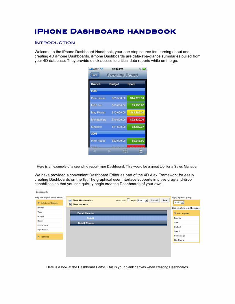
iPhone Dashboard handbook Introduction Welcome to the iPhone Dashboard Handbook, your one-stop source for learning about and creating 4D iPhone Dashboards. iPhone Dashboards are data-at-a-glance summaries pulled from your 4D database. They provide quick access to critical data reports while on the go.
Here is an example of a spending report-type Dashboard. This would be a great tool for a Sales Manager.
We have provided a convenient Dashboard Editor as part of the 4D Ajax Framework for easily creating Dashboards on the fly. The graphical user interface supports intuitive drag-and-drop capabilities so that you can quickly begin creating Dashboards of your own.
Here is a look at the Dashboard Editor. This is your blank canvas when creating Dashboards.
Requirements
4D v11 SQL 4D Ajax Framework v11 Sales_v11.4dbase The Sales Demo is attached with this document and it comes in one flavor:
• Interpreted Source Database This interpreted database already has the 4D Ajax Framework v11 installed and the Dashboards created for you. This will allow you access to Developer Hooks and to perform further customization in the back end. This document provides instructions on how to build each dashboard from scratch as if there were no dashboards to begin with. To get started, skip to any chapter that you wish.
• Chapter 1: Features: Get an overview of the Dashboard’s killer features. • Chapter 2: Editor: Get a quick introduction to the Dashboard Editor’s user interface. • Chapter 3: Demos: Follow step-by-step instructions to create Dashboard applications.
o Example 1: Indicators and Formatting o Example 2: Alternate Columns o Example 3: Custom Indicators o Example 4: Hiding Details o Example 5a: Google Maps o Example 5b: Phone and Email o Example 5b: Preset Queries (optional) o Example 6: Browser Integration o Example 7: Charts o Example 8a: Creating Custom Formulas o Example 8b: Formula: Method o Example 9: Query the Selection o Example 10: Customizing CSS and JavaScript o Example 11: Adding Custom Formats
• Appendix: Reference section. Optional examples modify existing examples to showcase alternate features.
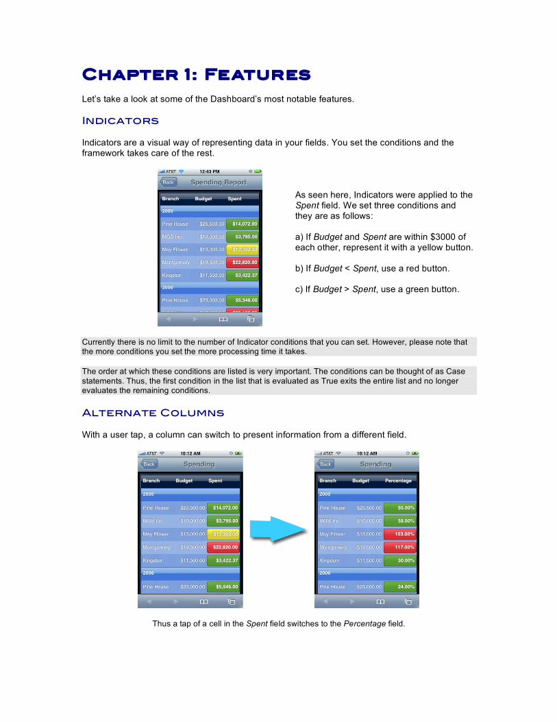
Chapter 1: Fe atures Let’s take a look at some of the Dashboard’s most notable features. Indicators Indicators are a visual way of representing data in your fields. You set the conditions and the framework takes care of the rest.
As seen here, Indicators were applied to the Spent field. We set three conditions and they are as follows: a) If Budget and Spent are within $3000 of each other, represent it with a yellow button. b) If Budget < Spent, use a red button. c) If Budget > Spent, use a green button.
Currently there is no limit to the number of Indicator conditions that you can set. However, please note that the more conditions you set the more processing time it takes. The order at which these conditions are listed is very important. The conditions can be thought of as Case statements. Thus, the first condition in the list that is evaluated as True exits the entire list and no longer evaluates the remaining conditions. Alternate Columns With a user tap, a column can switch to present information from a different field.
Thus a tap of a cell in the Spent field switches to the Percentage field.
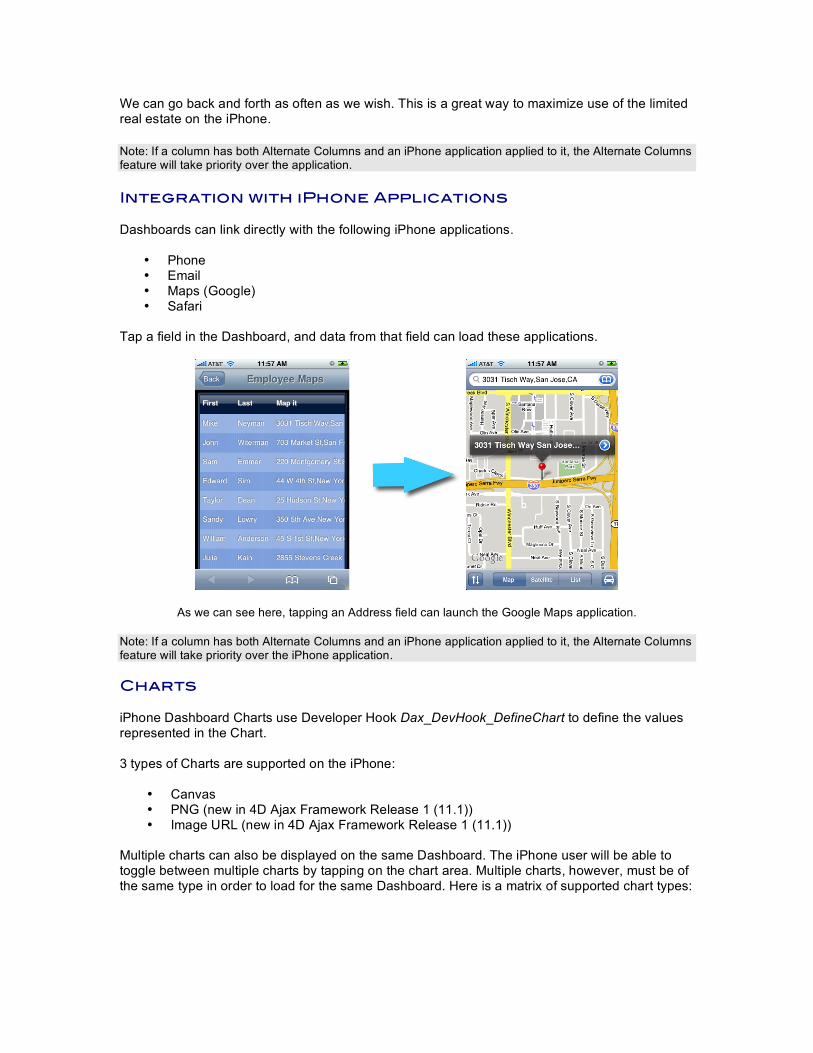
We can go back and forth as often as we wish. This is a great way to maximize use of the limited real estate on the iPhone. Note: If a column has both Alternate Columns and an iPhone application applied to it, the Alternate Columns feature will take priority over the application. Integration with iPhone Applications Dashboards can link directly with the following iPhone applications.
• Phone • Email • Maps (Google) • Safari
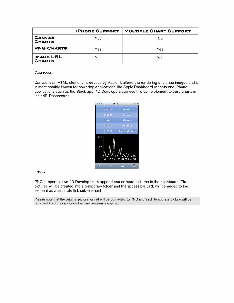
Tap a field in the Dashboard, and data from that field can load these applications.
As we can see here, tapping an Address field can launch the Google Maps application. Note: If a column has both Alternate Columns and an iPhone application applied to it, the Alternate Columns feature will take priority over the iPhone application. Charts iPhone Dashboard Charts use Developer Hook Dax_DevHook_DefineChart to define the values represented in the Chart. 3 types of Charts are supported on the iPhone:
• Canvas • PNG (new in 4D Ajax Framework Release 1 (11.1)) • Image URL (new in 4D Ajax Framework Release 1 (11.1))
Multiple charts can also be displayed on the same Dashboard. The iPhone user will be able to toggle between multiple charts by tapping on the chart area. Multiple charts, however, must be of the same type in order to load for the same Dashboard. Here is a matrix of supported chart types:
iPhone Support Multiple Chart Support
Canvas Charts
Yes No
PNG Charts Yes Yes
Image URL Charts
Yes Yes
Canvas Canvas is an HTML element introduced by Apple. It allows the rendering of bitmap images and it is most notably known for powering applications like Apple Dashboard widgets and iPhone applications such as the Stock app. 4D Developers can use this same element to build charts in their 4D Dashboards.
PNG PNG support allows 4D Developers to append one or more pictures to the dashboard. The pictures will be created into a temporary folder and the accessible URL will be added to the element as a separate link sub-element. Please note that the original picture format will be converted to PNG and each temporary picture will be removed from the disk once the user session is expired.
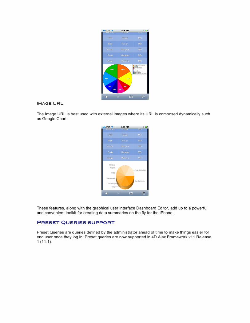
Image URL The Image URL is best used with external images where its URL is composed dynamically such as Google Chart.
These features, along with the graphical user interface Dashboard Editor, add up to a powerful and convenient toolkit for creating data summaries on the fly for the iPhone. Preset Queries support Preset Queries are queries defined by the administrator ahead of time to make things easier for end user once they log in. Preset queries are now supported in 4D Ajax Framework v11 Release 1 (11.1).

Chapter 2: Editor This chapter will get you familiar with the Dashboard Editor. Use the Editor to create Dashboards.
Here is the Dashboard Manager tab as part of the Control Panel in the 4D Ajax Framework.
• Choose the Selection (ie. Table, View, DCS) that the Dashboard will be based on. • Give the Dashboard a name. • Provide a description. • Select ‘iPhone Support’ for Platform Option.
Click the Start Dashboard Editor button to begin. You will then be presented with the following.
This is the Dashboard Editor. Here you define what the Dashboard application will report on, and how it will be displayed. Let’s take a look at the pieces that make up the Dashboard Editor. Editor
This provides a quick preview of what you are building. Drag fields to this area. Organize information by grouping it. Drag formulas here to perform calculations on specific columns. All these features and more can be done, and this editor outlines how the Dashboard will look.
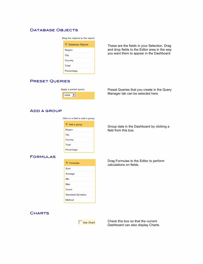
Database Objects
These are the fields in your Selection. Drag and drop fields to the Editor area in the way you want them to appear in the Dashboard.
Preset Queries
Preset Queries that you create in the Query Manager tab can be selected here.
Add a group
Group data in the Dashboard by clicking a field from this box.
Formulas
Drag Formulas to the Editor to perform calculations on fields.
Charts
Check this box so that the current Dashboard can also display Charts.
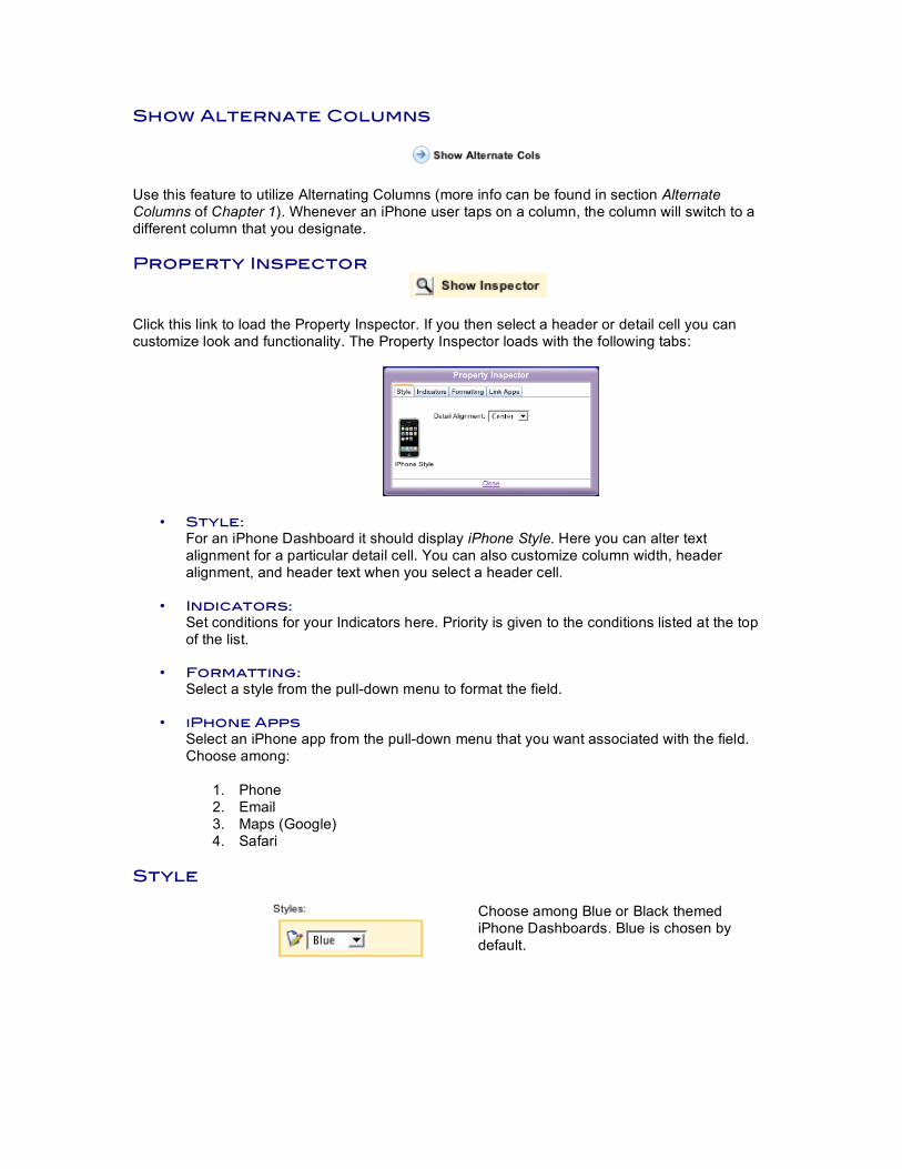
Show Alternate Columns
Use this feature to utilize Alternating Columns (more info can be found in section Alternate Columns of Chapter 1). Whenever an iPhone user taps on a column, the column will switch to a different column that you designate. Property Inspector
Click this link to load the Property Inspector. If you then select a header or detail cell you can customize look and functionality. The Property Inspector loads with the following tabs:
• Style: For an iPhone Dashboard it should display iPhone Style. Here you can alter text alignment for a particular detail cell. You can also customize column width, header alignment, and header text when you select a header cell.
• Indicators:
Set conditions for your Indicators here. Priority is given to the conditions listed at the top of the list.
• Formatting: Select a style from the pull-down menu to format the field.
• iPhone Apps Select an iPhone app from the pull-down menu that you want associated with the field. Choose among:
1. Phone 2. Email 3. Maps (Google) 4. Safari
Style
Choose among Blue or Black themed iPhone Dashboards. Blue is chosen by default.
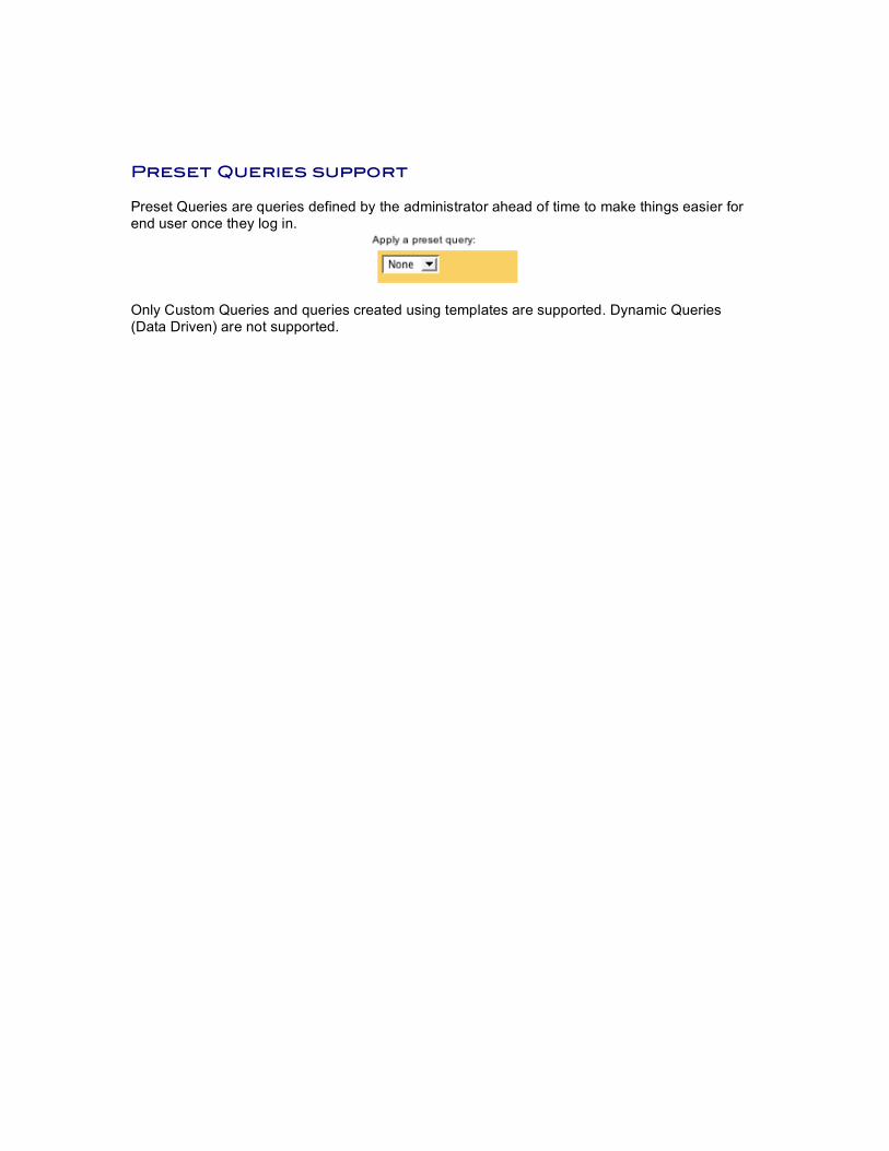
Preset Queries support Preset Queries are queries defined by the administrator ahead of time to make things easier for end user once they log in.
Only Custom Queries and queries created using templates are supported. Dynamic Queries (Data Driven) are not supported.
Chapter 3: Demos This chapter provides instructions on how to build each dashboard from scratch as if there were no dashboards to begin with. Launch the attached Sales Demo database. Connect to http://localhost:8080/ip.html on your iPhone/iPod Touch. The Dashboards are already created for you. Follow the documentation below to see how each dashboard was made. To begin creating dashboards first:
• Connect to http://localhost:8080/index.html. • Log in to the framework as Administrator (no password). • Hit the Control Panel button. Go to the Dashboard Manager tab.
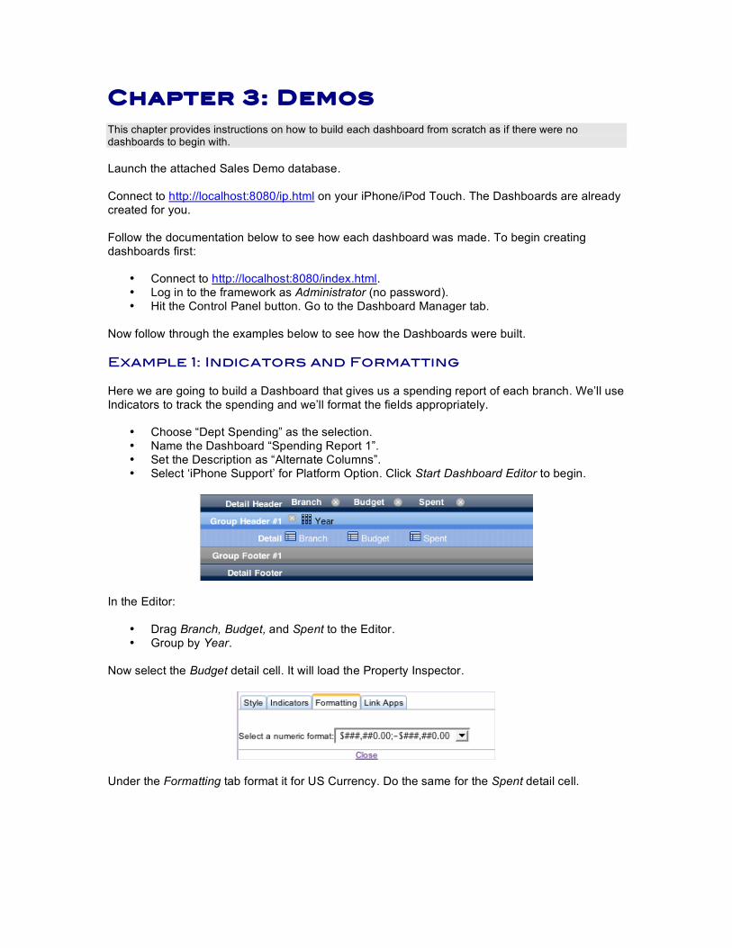
Now follow through the examples below to see how the Dashboards were built. Example 1: Indicators and Formatting Here we are going to build a Dashboard that gives us a spending report of each branch. We’ll use Indicators to track the spending and we’ll format the fields appropriately.
• Choose “Dept Spending” as the selection. • Name the Dashboard “Spending Report 1”. • Set the Description as “Alternate Columns”. • Select ‘iPhone Support’ for Platform Option. Click Start Dashboard Editor to begin.
In the Editor:
• Drag Branch, Budget, and Spent to the Editor. • Group by Year.
Now select the Budget detail cell. It will load the Property Inspector.
Under the Formatting tab format it for US Currency. Do the same for the Spent detail cell.
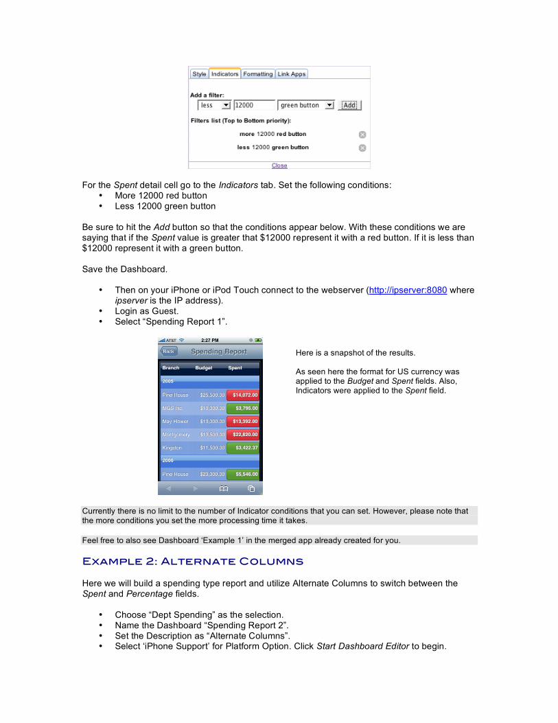
For the Spent detail cell go to the Indicators tab. Set the following conditions: • More 12000 red button • Less 12000 green button
Be sure to hit the Add button so that the conditions appear below. With these conditions we are saying that if the Spent value is greater that $12000 represent it with a red button. If it is less than $12000 represent it with a green button. Save the Dashboard.
• Then on your iPhone or iPod Touch connect to the webserver (http://ipserver:8080 where ipserver is the IP address).
• Login as Guest. • Select “Spending Report 1”.
Here is a snapshot of the results. As seen here the format for US currency was applied to the Budget and Spent fields. Also, Indicators were applied to the Spent field.
Currently there is no limit to the number of Indicator conditions that you can set. However, please note that the more conditions you set the more processing time it takes. Feel free to also see Dashboard ‘Example 1’ in the merged app already created for you. Example 2: Alternate Columns Here we will build a spending type report and utilize Alternate Columns to switch between the Spent and Percentage fields.
• Choose “Dept Spending” as the selection. • Name the Dashboard “Spending Report 2”. • Set the Description as “Alternate Columns”. • Select ‘iPhone Support’ for Platform Option. Click Start Dashboard Editor to begin.
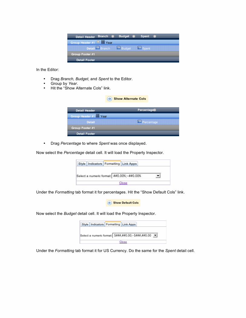
In the Editor:
• Drag Branch, Budget, and Spent to the Editor. • Group by Year. • Hit the “Show Alternate Cols” link.
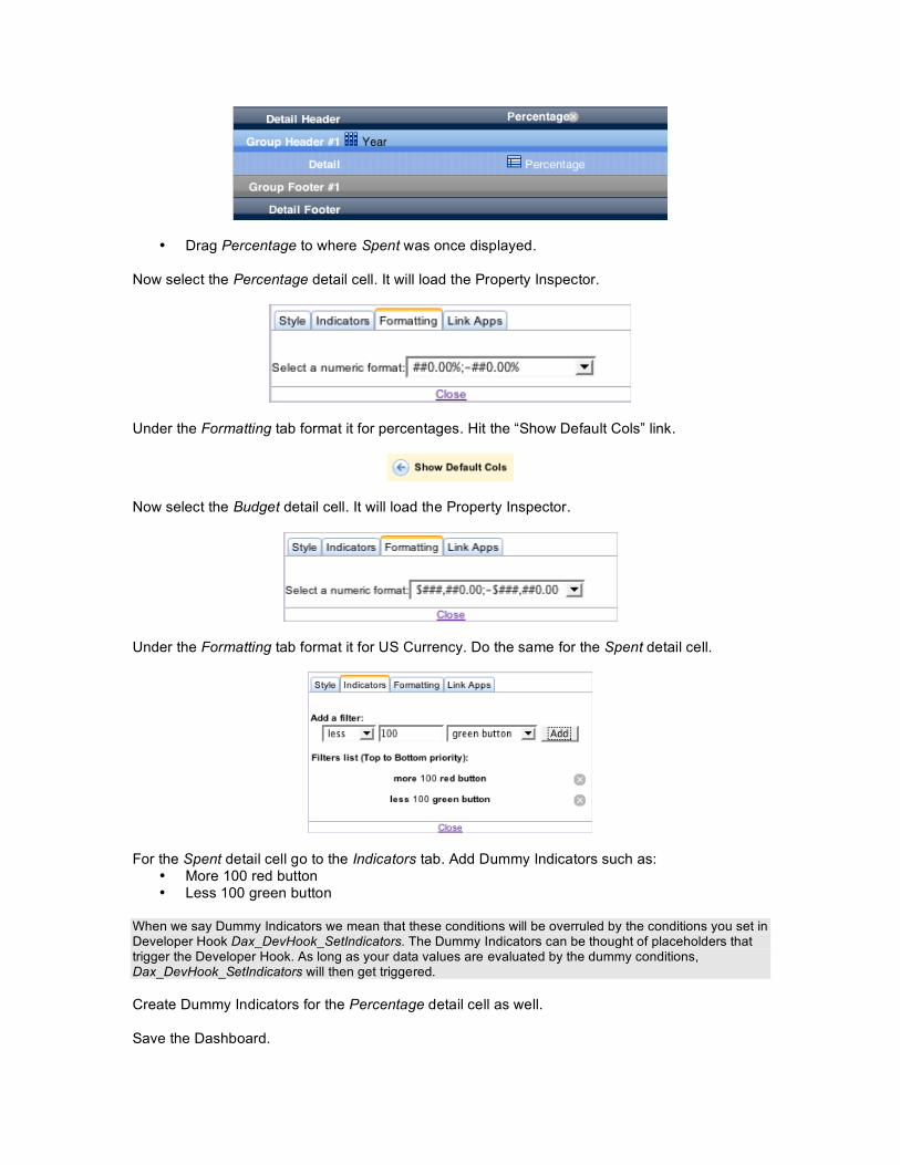
• Drag Percentage to where Spent was once displayed.
Now select the Percentage detail cell. It will load the Property Inspector.
Under the Formatting tab format it for percentages. Hit the “Show Default Cols” link.
Now select the Budget detail cell. It will load the Property Inspector.
Under the Formatting tab format it for US Currency. Do the same for the Spent detail cell.
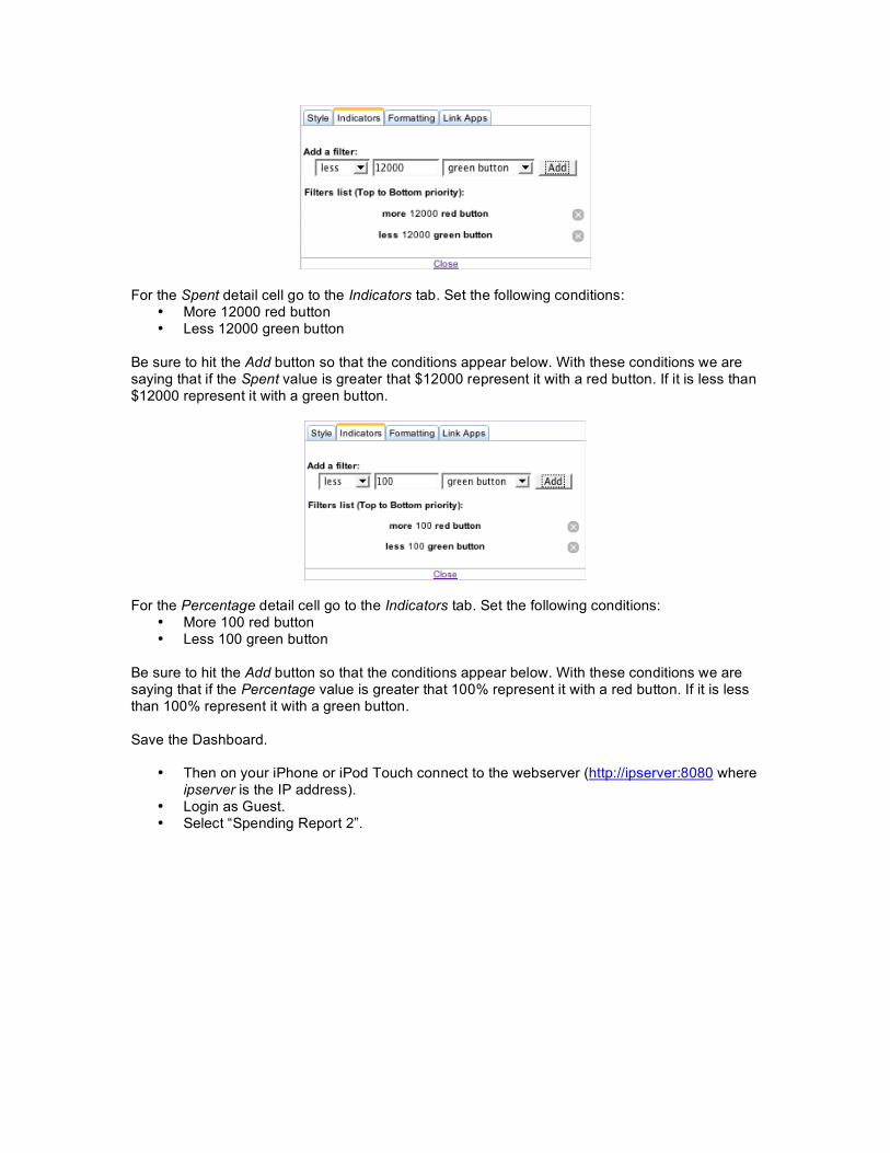
For the Spent detail cell go to the Indicators tab. Set the following conditions: • More 12000 red button • Less 12000 green button
Be sure to hit the Add button so that the conditions appear below. With these conditions we are saying that if the Spent value is greater that $12000 represent it with a red button. If it is less than $12000 represent it with a green button.
For the Percentage detail cell go to the Indicators tab. Set the following conditions: • More 100 red button • Less 100 green button
Be sure to hit the Add button so that the conditions appear below. With these conditions we are saying that if the Percentage value is greater that 100% represent it with a red button. If it is less than 100% represent it with a green button.
Save the Dashboard.
• Then on your iPhone or iPod Touch connect to the webserver (http://ipserver:8080 where ipserver is the IP address).
• Login as Guest. • Select “Spending Report 2”.
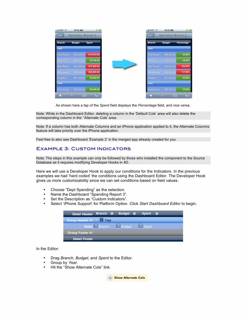
As shown here a tap of the Spent field displays the Percentage field, and vice versa.
Note: While in the Dashboard Editor, deleting a column in the ‘Default Cols’ area will also delete the corresponding column in the ‘’Alternate Cols’ area. Note: If a column has both Alternate Columns and an iPhone application applied to it, the Alternate Columns feature will take priority over the iPhone application. Feel free to also see Dashboard ‘Example 2’ in the merged app already created for you. Example 3: Custom Indicators Note: The steps in this example can only be followed by those who installed the component to the Source Database as it requires modifying Developer Hooks in 4D. Here we will use a Developer Hook to apply our conditions for the Indicators. In the previous examples we had ‘hard coded’ the conditions using the Dashboard Editor. The Developer Hook gives us more customizability since we can set conditions based on field values.
• Choose “Dept Spending” as the selection. • Name the Dashboard “Spending Report 3”. • Set the Description as “Custom Indicators”. • Select ‘iPhone Support’ for Platform Option. Click Start Dashboard Editor to begin.
In the Editor:
• Drag Branch, Budget, and Spent to the Editor. • Group by Year. • Hit the “Show Alternate Cols” link.
• Drag Percentage to where Spent was once displayed.
Now select the Percentage detail cell. It will load the Property Inspector.
Under the Formatting tab format it for percentages. Hit the “Show Default Cols” link.
Now select the Budget detail cell. It will load the Property Inspector.
Under the Formatting tab format it for US Currency. Do the same for the Spent detail cell.
For the Spent detail cell go to the Indicators tab. Add Dummy Indicators such as: • More 100 red button • Less 100 green button
When we say Dummy Indicators we mean that these conditions will be overruled by the conditions you set in Developer Hook Dax_DevHook_SetIndicators. The Dummy Indicators can be thought of placeholders that trigger the Developer Hook. As long as your data values are evaluated by the dummy conditions, Dax_DevHook_SetIndicators will then get triggered. Create Dummy Indicators for the Percentage detail cell as well. Save the Dashboard.
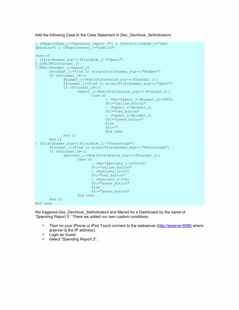
Add the following Case to the Case Statement in Dax_DevHook_SetIndicators: : ($ReportName_t="Spending report 3") & ($SelectionName_t="Dept Spending") & ($ReportOwner_t="public") Case of : ($fieldnames_atp->{$fieldnum_l}="Spent") C_LONGINT($foundat_l) C_REAL($budget_r;$spent_r) $foundat_l:=Find in array($fieldnames_atp->;"Budget") If ($foundat_l#-1) $budget_r:=Num($fieldvalue_atp->{$foundat_l}) $foundat_l:=Find in array($fieldnames_atp->;"Spent") If ($foundat_l#-1) $spent_r:=Num($fieldvalue_atp->{$foundat_l}) Case of : (Abs($spent_r-$budget_r)<3000) $0:="yellow_button" : ($spent_r>$budget_r) $0:="red_button" : ($spent_r<$budget_r) $0:="green_button" Else $0:="" End case End if End if : ($fieldnames_atp->{$fieldnum_l}="Percentage") $foundat_l:=Find in array($fieldnames_atp->;"Percentage") If ($foundat_l#-1) $percent_r:=Num($fieldvalue_atp->{$foundat_l}) Case of : (Abs($percent_r-100)<20) $0:="yellow_button" : ($percent_r>100) $0:="red_button" : ($percent_r<100) $0:="green_button" Else $0:="green_button" End case End if End case
We triggered Dax_DevHook_SetIndicators and filtered for a Dashboard by the name of “Spending Report 3.” There we added our own custom conditions.
• Then on your iPhone or iPod Touch connect to the webserver (http://ipserver:8080 where ipserver is the IP address).
• Login as Guest. • Select “Spending Report 3”.
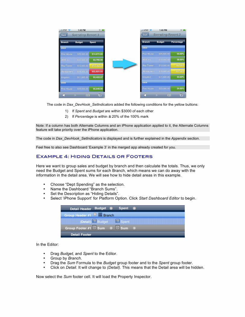
The code in Dax_DevHook_SetIndicators added the following conditions for the yellow buttons:
1) If Spent and Budget are within $3000 of each other 2) If Percentage is within ± 20% of the 100% mark
Note: If a column has both Alternate Columns and an iPhone application applied to it, the Alternate Columns feature will take priority over the iPhone application. The code in Dax_DevHook_SetIndicators is displayed and is further explained in the Appendix section. Feel free to also see Dashboard ‘Example 3’ in the merged app already created for you. Example 4: Hiding Details or Footers Here we want to group sales and budget by branch and then calculate the totals. Thus, we only need the Budget and Spent sums for each Branch, which means we can do away with the information in the detail area. We will see how to hide detail areas in this example.
• Choose “Dept Spending” as the selection. • Name the Dashboard “Branch Sums”. • Set the Description as “Hiding Details”. • Select ‘iPhone Support’ for Platform Option. Click Start Dashboard Editor to begin.
In the Editor:
• Drag Budget, and Spent to the Editor. • Group by Branch. • Drag the Sum Formula to the Budget group footer and to the Spent group footer. • Click on Detail. It will change to (Detail). This means that the Detail area will be hidden.
Now select the Sum footer cell. It will load the Property Inspector.
Under the Formatting tab format it for US Currency. Do the same for the other Sum footer cell. Save the Dashboard.
• Then on your iPhone or iPod Touch connect to the webserver (http://ipserver:8080 where ipserver is the IP address).
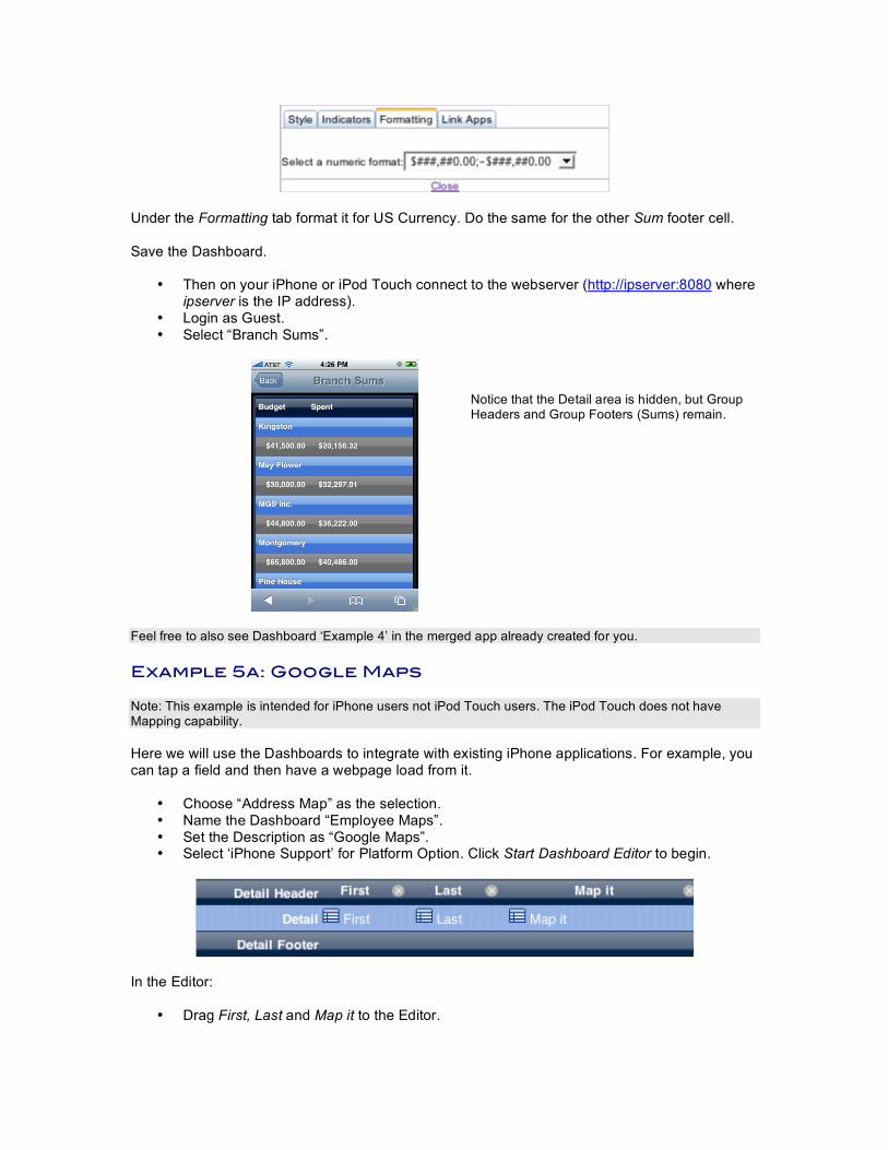
• Login as Guest. • Select “Branch Sums”.
Notice that the Detail area is hidden, but Group Headers and Group Footers (Sums) remain.
Feel free to also see Dashboard ‘Example 4’ in the merged app already created for you. Example 5a: Google Maps Note: This example is intended for iPhone users not iPod Touch users. The iPod Touch does not have Mapping capability. Here we will use the Dashboards to integrate with existing iPhone applications. For example, you can tap a field and then have a webpage load from it.
• Choose “Address Map” as the selection. • Name the Dashboard “Employee Maps”. • Set the Description as “Google Maps”. • Select ‘iPhone Support’ for Platform Option. Click Start Dashboard Editor to begin.
In the Editor:
• Drag First, Last and Map it to the Editor.
Now select the Map it detail cell. It will load the Property Inspector.
Under the Link Apps tab link it with Maps. Save the Dashboard.
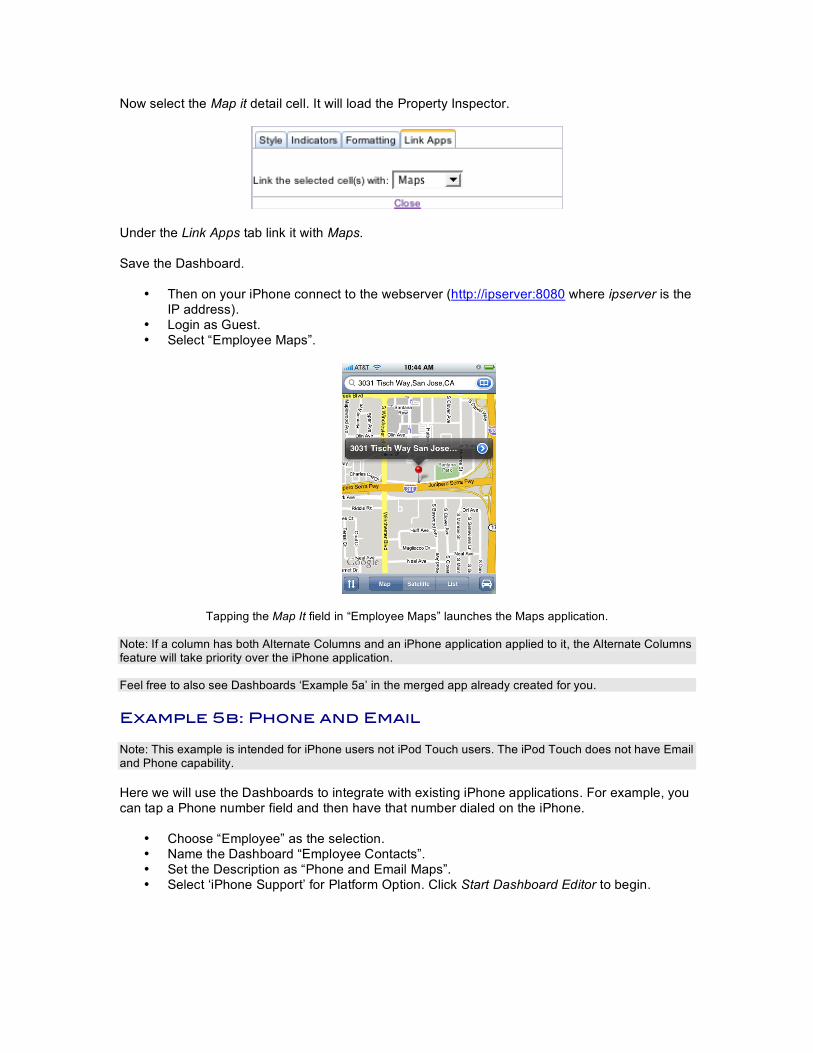
• Then on your iPhone connect to the webserver (http://ipserver:8080 where ipserver is the IP address).
• Login as Guest. • Select “Employee Maps”.
Tapping the Map It field in “Employee Maps” launches the Maps application.
Note: If a column has both Alternate Columns and an iPhone application applied to it, the Alternate Columns feature will take priority over the iPhone application.
Feel free to also see Dashboards ‘Example 5a’ in the merged app already created for you. Example 5b: Phone and Email Note: This example is intended for iPhone users not iPod Touch users. The iPod Touch does not have Email and Phone capability. Here we will use the Dashboards to integrate with existing iPhone applications. For example, you can tap a Phone number field and then have that number dialed on the iPhone.
• Choose “Employee” as the selection. • Name the Dashboard “Employee Contacts”. • Set the Description as “Phone and Email Maps”. • Select ‘iPhone Support’ for Platform Option. Click Start Dashboard Editor to begin.
In the Editor:
• Drag FirstName, LastName, Phone, and Email to the Editor. Now select the Phone detail cell. It will load the Property Inspector.
Under the Link Apps tab link it with Phone. Now select the Email detail cell.
Under the Link Apps tab link it with Email. Save the Dashboard.
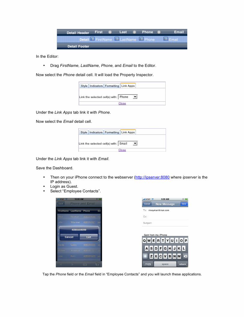
• Then on your iPhone connect to the webserver (http://ipserver:8080 where ipserver is the
IP address). • Login as Guest. • Select “Employee Contacts”.
Tap the Phone field or the Email field in “Employee Contacts” and you will launch these applications.
Note: If a column has both Alternate Columns and an iPhone application applied to it, the Alternate Columns feature will take priority over the iPhone application. Feel free to also see Dashboards ‘Example 5b’ in the merged app already created for you. Example 5b: Preset Queries (optional) Modify the iPhone Dashboard created in “Example 5b: Phone and Email” to apply Preset Queries to it. First, create a Preset Query. Go to the Control Panel -> Query Manager tab. Hit the Create link.
Chose the “Employee” table as the selection.
Choose the “A-Z Steps” query template. Apply it to the “FirstName” field. Hit the Next button to save the Preset Query. A Preset Query has now been created for the “FirstName” field in the “Employee” table. The “A-Z” template performs a query for each letter of the alphabet on the “FirstName” field. Now open up the Dashboard created in “Example 5b: Phone and Email.”
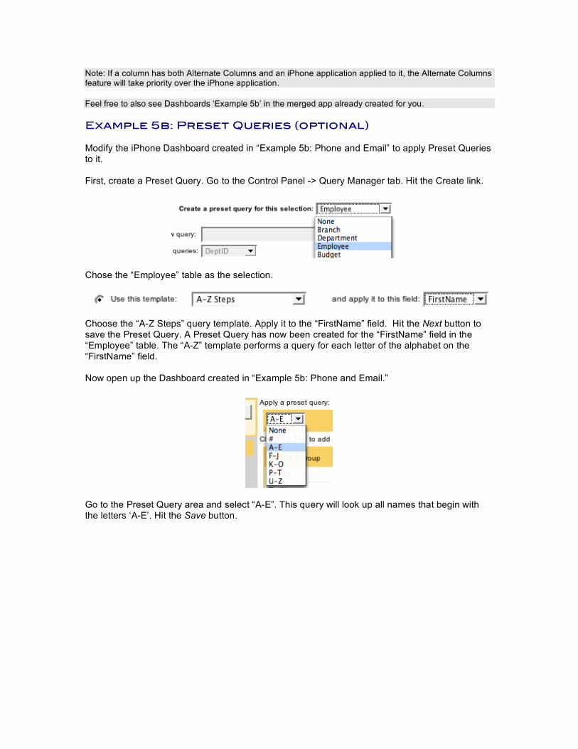
Go to the Preset Query area and select “A-E”. This query will look up all names that begin with the letters ‘A-E’. Hit the Save button.
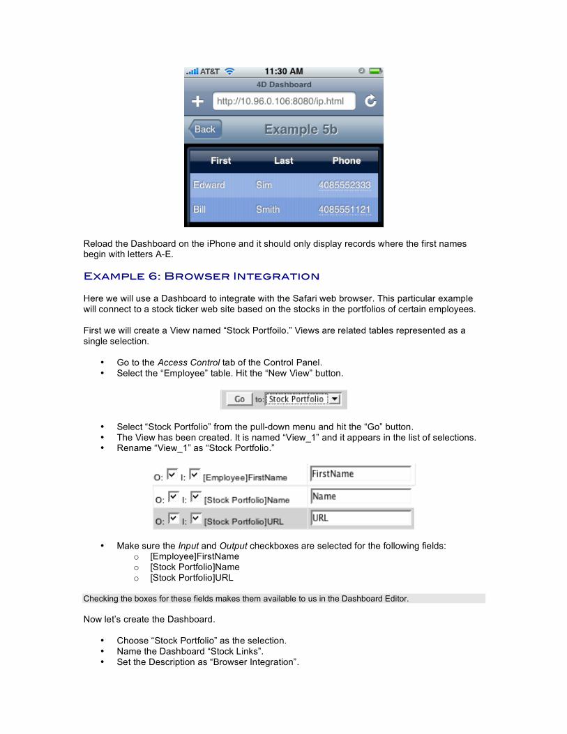
Reload the Dashboard on the iPhone and it should only display records where the first names begin with letters A-E. Example 6: Browser Integration Here we will use a Dashboard to integrate with the Safari web browser. This particular example will connect to a stock ticker web site based on the stocks in the portfolios of certain employees. First we will create a View named “Stock Portfoilo.” Views are related tables represented as a single selection.
• Go to the Access Control tab of the Control Panel. • Select the “Employee” table. Hit the “New View” button.
• Select “Stock Portfolio” from the pull-down menu and hit the “Go” button. • The View has been created. It is named “View_1” and it appears in the list of selections. • Rename “View_1” as “Stock Portfolio.”
• Make sure the Input and Output checkboxes are selected for the following fields: o [Employee]FirstName o [Stock Portfolio]Name o [Stock Portfolio]URL
Checking the boxes for these fields makes them available to us in the Dashboard Editor. Now let’s create the Dashboard.
• Choose “Stock Portfolio” as the selection. • Name the Dashboard “Stock Links”. • Set the Description as “Browser Integration”.
• Select ‘iPhone Support’ for Platform Option. Click Start Dashboard Editor to begin.
In the Editor:
• Drag Name and URL to the Editor. • Group by FirstName.
Now select the URL detail cell. It will load the Property Inspector.
Under the Link Apps tab link it with Browser. Save the Dashboard.
• Then on your iPhone or iPod Touch connect to the webserver (http://ipserver:8080 where
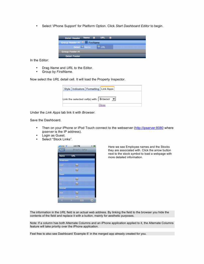
ipserver is the IP address). • Login as Guest. • Select “Stock Links”.
Here we see Employee names and the Stocks they are associated with. Click the arrow button next to the stock symbol to load a webpage with more detailed information.
The information in the URL field is an actual web address. By linking the field to the browser you hide the contents of the field and replace it with a button, mainly for aesthetic purposes. Note: If a column has both Alternate Columns and an iPhone application applied to it, the Alternate Columns feature will take priority over the iPhone application. Feel free to also see Dashboard ‘Example 6’ in the merged app already created for you.
Example 7a: Canvas Chart This example will show how to build Charts.
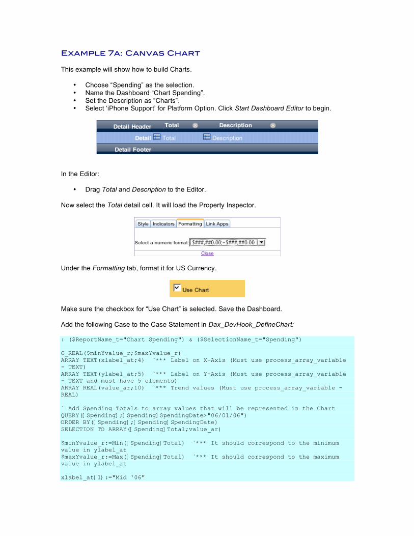
• Choose “Spending” as the selection. • Name the Dashboard “Chart Spending”. • Set the Description as “Charts”. • Select ‘iPhone Support’ for Platform Option. Click Start Dashboard Editor to begin.
In the Editor:
• Drag Total and Description to the Editor. Now select the Total detail cell. It will load the Property Inspector.
Under the Formatting tab, format it for US Currency.
Make sure the checkbox for “Use Chart” is selected. Save the Dashboard. Add the following Case to the Case Statement in Dax_DevHook_DefineChart: : ($ReportName_t="Chart Spending") & ($SelectionName_t="Spending") C_REAL($minYvalue_r;$maxYvalue_r) ARRAY TEXT(xlabel_at;4) `*** Label on X-Axis (Must use process_array_variable - TEXT) ARRAY TEXT(ylabel_at;5) `*** Label on Y-Axis (Must use process_array_variable - TEXT and must have 5 elements) ARRAY REAL(value_ar;10) `*** Trend values (Must use process_array_variable - REAL) ` Add Spending Totals to array values that will be represented in the Chart QUERY([Spending];[Spending]SpendingDate>"06/01/06") ORDER BY([Spending];[Spending]SpendingDate) SELECTION TO ARRAY([Spending]Total;value_ar) $minYvalue_r:=Min([Spending]Total) `*** It should correspond to the minimum value in ylabel_at $maxYvalue_r:=Max([Spending]Total) `*** It should correspond to the maximum value in ylabel_at xlabel_at{1}:="Mid '06"
xlabel_at{2}:="Early '07" xlabel_at{3}:="Mid '07" xlabel_at{4}:="Late '07" ylabel_at{1}:=String(Round(Int($minYvalue_r)/1000;0)) ylabel_at{2}:="" ylabel_at{3}:=String(Round(Int(($maxYvalue_r+$minYvalue_r)*0.5)/1000;0))+" K" ylabel_at{4}:="" ylabel_at{5}:=String(Round(Int($maxYvalue_r)/1000;0))+" K" DAX_Dev_SetDashboardChart (->xlabel_at;->ylabel_at;->value_ar;$minYvalue_r;$maxYvalue_r)
All Dashboards that have the “Use Chart” checkbox selected will call Dax_DevHook_DefineChart. Use this method to populate the Chart with an array of values as well as x-axis and y-axis labels.
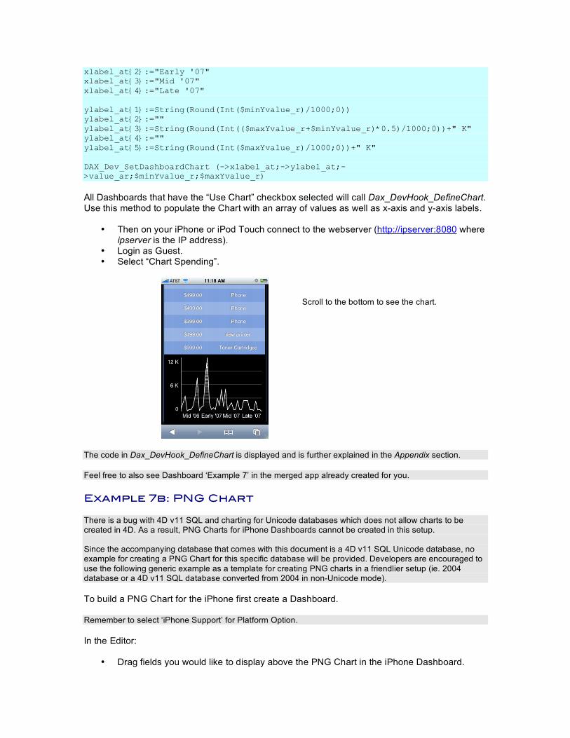
• Then on your iPhone or iPod Touch connect to the webserver (http://ipserver:8080 where ipserver is the IP address).
• Login as Guest. • Select “Chart Spending”.
Scroll to the bottom to see the chart.
The code in Dax_DevHook_DefineChart is displayed and is further explained in the Appendix section. Feel free to also see Dashboard ‘Example 7’ in the merged app already created for you. Example 7b: PNG Chart There is a bug with 4D v11 SQL and charting for Unicode databases which does not allow charts to be created in 4D. As a result, PNG Charts for iPhone Dashboards cannot be created in this setup. Since the accompanying database that comes with this document is a 4D v11 SQL Unicode database, no example for creating a PNG Chart for this specific database will be provided. Developers are encouraged to use the following generic example as a template for creating PNG charts in a friendlier setup (ie. 2004 database or a 4D v11 SQL database converted from 2004 in non-Unicode mode). To build a PNG Chart for the iPhone first create a Dashboard. Remember to select ‘iPhone Support’ for Platform Option. In the Editor:
• Drag fields you would like to display above the PNG Chart in the iPhone Dashboard.
Make sure the checkbox for “Use Chart” is selected. Save the Dashboard. The following is what Dax_DevHook_DefineChart would look like if the Dashboard was named “PNG_Chart” and it was based on selection “Dept Spending”: C_PICTURE($picVar) $ReportName_t:=$1 ` *** Name of the report $SelectionName_t:=$2 ` *** Name of the Selection (Table/View/DCS) $ReportOwner_t:=$3 ` *** Owner of the report ("public" or specific username) Case of : ($ReportName_t="PNG_Chart") & ($SelectionName_t="Dept Spending") $chartArea:=CT New offscreen area GRAPH($chartArea;1;aCategory;aSeries;aValues) $picVar:=CT Area to picture ($chartArea;-1) CT DELETE OFFSCREEN AREA ($chartArea) DAX_Dev_SetDashboardPNG (->$picVar) End case
Dax_Dev_SetDashboardPNG is the method that sends the chart to the frontend. You can also display multiple charts in a 4D Dashboard. They must be of the same type, however, so in this case they must both be PNG charts. Here is sample code that would execute in Dax_DevHook_DefineChart which would send 2 PNG charts to the front end. ARRAY PICTURE ($picArray;0) $ReportName_t:=$1 ` *** Name of the report $SelectionName_t:=$2 ` *** Name of the Selection (Table/View/DCS) $ReportOwner_t:=$3 ` *** Owner of the report ("public" or specific username) Case of : ($ReportName_t=" PNG_Chart ") & ($SelectionName_t="Dept Spending") ` ` *** Create 1st Picture $chartArea:=CT New offscreen area GRAPH ($chartArea;1;aCategory1;aSeries1;aValues1) $picVar:=CT Area to picture ($chartArea;-1) CT DELETE OFFSCREEN AREA ($chartArea) APPEND TO ARRAY ($picArray;picVar) ` *** Create 2nd Picture $chartArea:=CT New offscreen area GRAPH ($chartArea;1;aCategory2;aSeries2;aValues2) $picVar:=CT Area to picture ($chartArea;-1) CT DELETE OFFSCREEN AREA ($chartArea) APPEND TO ARRAY ($picArray;picVar) DAX_Dev_SetDashboardPNG (->$picArray) End case
Example 7C: Image URL Chart This example will show how to build Charts.
• Choose “Spending” as the selection. • Name the Dashboard “Image_URL_Chart”. • Set the Description as “Image URL Charts”. • Select ‘iPhone Support’ for Platform Option. Click Start Dashboard Editor to begin.
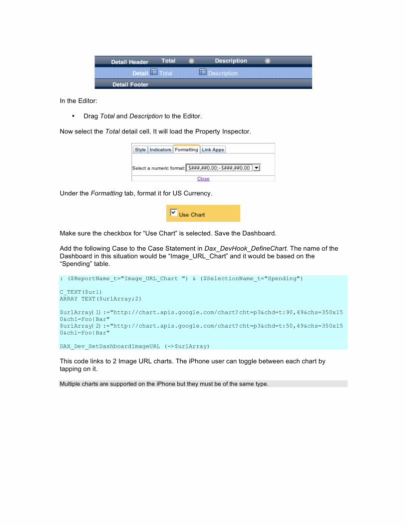
In the Editor:
• Drag Total and Description to the Editor. Now select the Total detail cell. It will load the Property Inspector.
Under the Formatting tab, format it for US Currency.
Make sure the checkbox for “Use Chart” is selected. Save the Dashboard. Add the following Case to the Case Statement in Dax_DevHook_DefineChart. The name of the Dashboard in this situation would be “Image_URL_Chart” and it would be based on the “Spending” table. : ($ReportName_t="Image_URL_Chart ") & ($SelectionName_t="Spending") C_TEXT($url) ARRAY TEXT($urlArray;2) $urlArray{1}:="http://chart.apis.google.com/chart?cht=p3&chd=t:90,49&chs=350x150&chl=Foo|Bar" $urlArray{2}:="http://chart.apis.google.com/chart?cht=p3&chd=t:50,49&chs=350x150&chl=Foo|Bar" DAX_Dev_SetDashboardImageURL (->$urlArray)
This code links to 2 Image URL charts. The iPhone user can toggle between each chart by tapping on it. Multiple charts are supported on the iPhone but they must be of the same type.
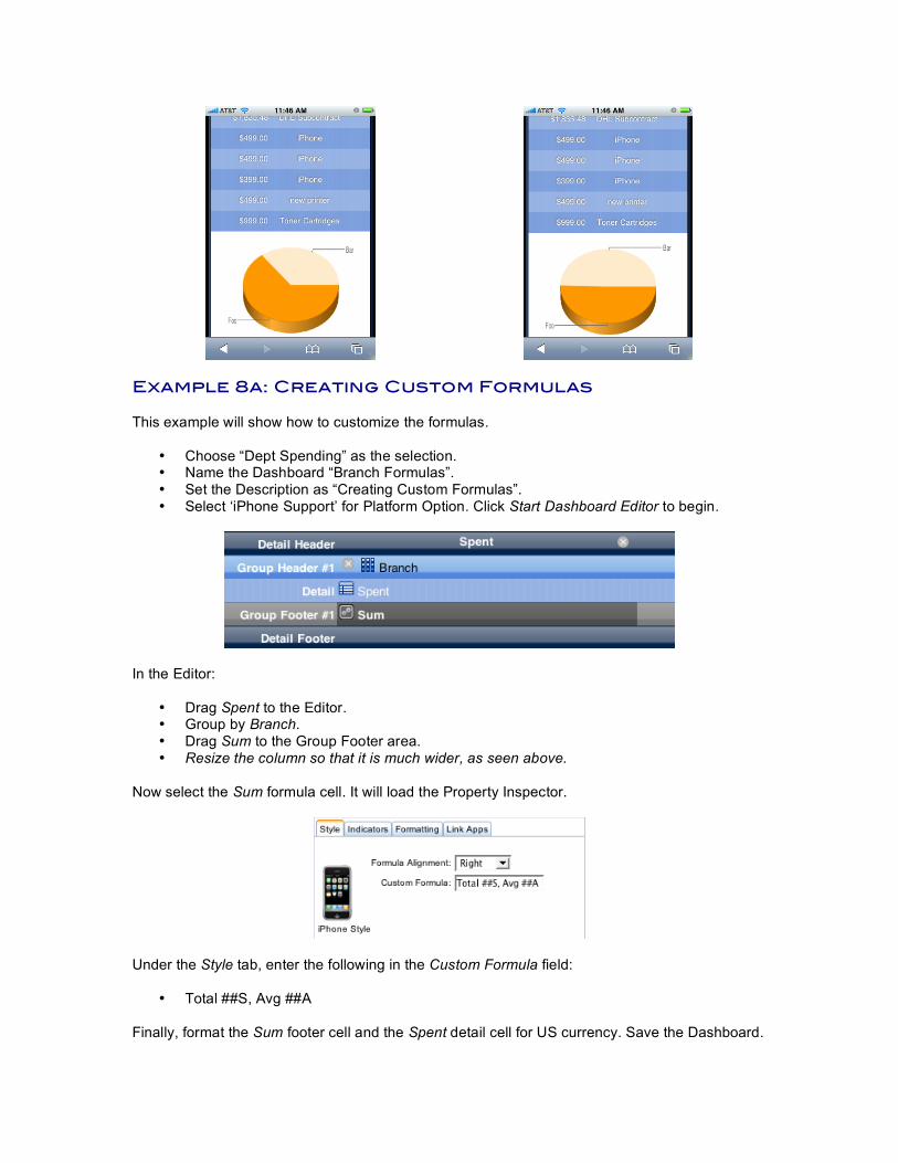
Example 8a: Creating Custom Formulas This example will show how to customize the formulas.
• Choose “Dept Spending” as the selection. • Name the Dashboard “Branch Formulas”. • Set the Description as “Creating Custom Formulas”. • Select ‘iPhone Support’ for Platform Option. Click Start Dashboard Editor to begin.
In the Editor:
• Drag Spent to the Editor. • Group by Branch. • Drag Sum to the Group Footer area. • Resize the column so that it is much wider, as seen above.
Now select the Sum formula cell. It will load the Property Inspector.
Under the Style tab, enter the following in the Custom Formula field:
• Total ##S, Avg ##A Finally, format the Sum footer cell and the Spent detail cell for US currency. Save the Dashboard.
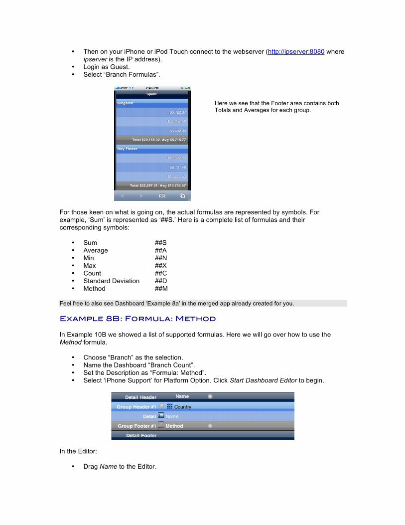
• Then on your iPhone or iPod Touch connect to the webserver (http://ipserver:8080 where ipserver is the IP address).
• Login as Guest. • Select “Branch Formulas”.
Here we see that the Footer area contains both Totals and Averages for each group.
For those keen on what is going on, the actual formulas are represented by symbols. For example, ‘Sum’ is represented as ‘##S.’ Here is a complete list of formulas and their corresponding symbols:
• Sum ##S • Average ##A • Min ##N • Max ##X • Count ##C • Standard Deviation ##D • Method ##M
Feel free to also see Dashboard ‘Example 8a’ in the merged app already created for you. Example 8B: Formula: Method In Example 10B we showed a list of supported formulas. Here we will go over how to use the Method formula.
• Choose “Branch” as the selection. • Name the Dashboard “Branch Count”. • Set the Description as “Formula: Method”. • Select ‘iPhone Support’ for Platform Option. Click Start Dashboard Editor to begin.
In the Editor:
• Drag Name to the Editor.
• Group by Country. • Drag Method to the Group Footer area.
Save the Dashboard. Add the following Case to the Case Statement in Dax_DevHook_RPT_Formula: : ($reportname_t="Branch Count") ` ** Example ` *** Process your value here $result_t:="Total Count: "+String(Records in selection($table_p->))
All Dashboards that use the formula Method will call Dax_DevHook_RPT_Formula. Use this method to perform your own custom formula on the selection.
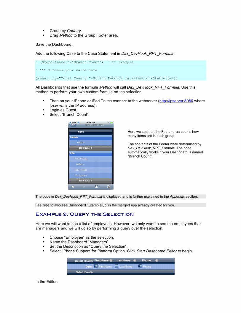
• Then on your iPhone or iPod Touch connect to the webserver (http://ipserver:8080 where ipserver is the IP address).
• Login as Guest. • Select “Branch Count”.
Here we see that the Footer area counts how many items are in each group. The contents of the Footer were determined by Dax_DevHook_RPT_Formula. The code automatically works if your Dashboard is named “Branch Count”.
The code in Dax_DevHook_RPT_Formula is displayed and is further explained in the Appendix section. Feel free to also see Dashboard ‘Example 8b’ in the merged app already created for you. Example 9: Query the Selection Here we will want to see a list of employees. However, we only want to see the employees that are managers and we will do so by performing a query over the selection.
• Choose “Employee” as the selection. • Name the Dashboard “Managers”. • Set the Description as “Query the Selection”. • Select ‘iPhone Support’ for Platform Option. Click Start Dashboard Editor to begin.
In the Editor:
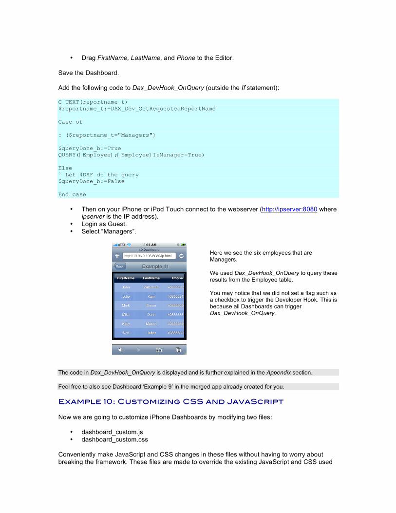
• Drag FirstName, LastName, and Phone to the Editor.
Save the Dashboard. Add the following code to Dax_DevHook_OnQuery (outside the If statement): C_TEXT(reportname_t) $reportname_t:=DAX_Dev_GetRequestedReportName Case of : ($reportname_t="Managers") $queryDone_b:=True QUERY([Employee];[Employee]IsManager=True) Else ` Let 4DAF do the query $queryDone_b:=False End case
• Then on your iPhone or iPod Touch connect to the webserver (http://ipserver:8080 where
ipserver is the IP address). • Login as Guest. • Select “Managers”.
Here we see the six employees that are Managers. We used Dax_DevHook_OnQuery to query these results from the Employee table. You may notice that we did not set a flag such as a checkbox to trigger the Developer Hook. This is because all Dashboards can trigger Dax_DevHook_OnQuery.
The code in Dax_DevHook_OnQuery is displayed and is further explained in the Appendix section. Feel free to also see Dashboard ‘Example 9’ in the merged app already created for you. Example 10: Customizing CSS and JavaScript Now we are going to customize iPhone Dashboards by modifying two files:
• dashboard_custom.js • dashboard_custom.css
Conveniently make JavaScript and CSS changes in these files without having to worry about breaking the framework. These files are made to override the existing JavaScript and CSS used
for Dashboards. You can make changes here without affecting the core files. These files are both found in /Webfolder/dax/iphone/dashboard/ next to the interpreted database. Note: Mac users must perform a right-click over the database and select “Show Package Contents” in order to view the Webfolder. dashboard_custom.js Change row height in pixels by modifying ‘rowHeight’. Define the default username and password when iPhone and iPod Touch users connect by modifying ‘defaultUsername’ and ‘defaultPassword’. Save any changes you have made. You must perform a refresh of the webpage in order for the changes to take effect. dashboard_custom.css Bundled with the Interpreted database is “dashboard_custom.css”. Copy it to /Webfolder/dax/iphone/dashboard/ and overwrite the existing file. Open up “dashboard_custom.css” and uncomment out all off the code below the line where it says, /* iPhone CSS can be overridden here */
This will reveal sample CSS styling that you can evaluate, which will override the existing CSS for iPhone Dashboards that were set to the Blue theme. In order to see the changes:
• Save dashboard_custom.css. • Perform a refresh of the web page on the iPhone.
Feel free to also load any of the Example Dashboards to see the changes you’ve made in the CSS and JavaScript. Example 11: Adding Custom Formats Here we will show how to add more formats to the Dashboard Editor to the ones already available. There are two ways of doing this, and they will be explained here. Method 1: Use Dax_DevHook_RPT_Formats (recommended) Use this Developer Hook to define formats available to the framework. This Developer Hook is executed once on startup during initialization, so be sure to restart the database to see any changes take effect. Step 1: Use Dax_Dev_RPT_FormatsGet to get a list of currently available formats. Step 2: Append a new format to the existing text array. Step 3: Execute Dax_Dev_RPT_FormatSet to save the formats. ` Project method: DAX_DevHook_RPT_Formats` ` Step 1 ARRAY TEXT($formatNumeric_at;0) DAX_Dev_RPT_FormatsGet ("numeric";->$formatNumeric_at) ` Step 2
APPEND TO ARRAY($formatNumeric_at;"Total: #,###,##0") ` Step 3 DAX_Dev_RPT_FormatsSet ("numeric";->$formatNumeric_at) Method 2: Manually add formats to the XML file
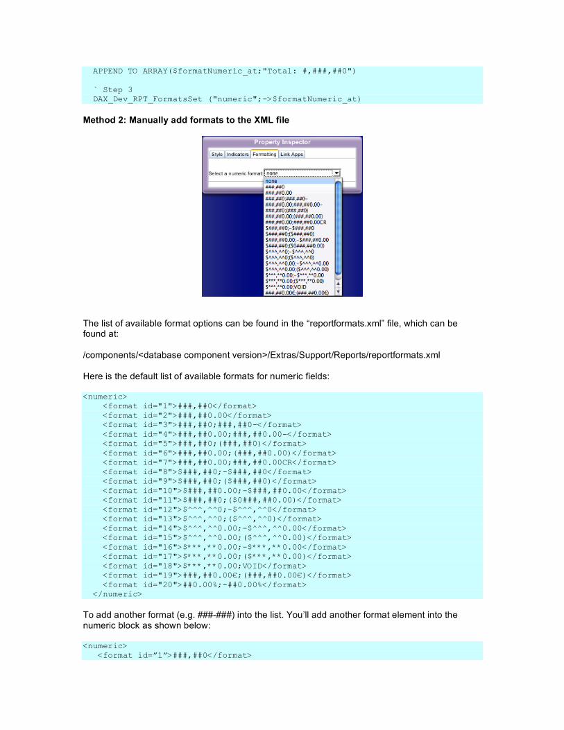
The list of available format options can be found in the “reportformats.xml” file, which can be found at: /components/<database component version>/Extras/Support/Reports/reportformats.xml Here is the default list of available formats for numeric fields: <numeric> <format id="1">###,##0</format> <format id="2">###,##0.00</format> <format id="3">###,##0;###,##0-</format> <format id="4">###,##0.00;###,##0.00-</format> <format id="5">###,##0;(###,##0)</format> <format id="6">###,##0.00;(###,##0.00)</format> <format id="7">###,##0.00;###,##0.00CR</format> <format id="8">$###,##0;-$###,##0</format> <format id="9">$###,##0;($###,##0)</format> <format id="10">$###,##0.00;-$###,##0.00</format> <format id="11">$###,##0;($0###,##0.00)</format> <format id="12">$^^^,^^0;-$^^^,^^0</format> <format id="13">$^^^,^^0;($^^^,^^0)</format> <format id="14">$^^^,^^0.00;-$^^^,^^0.00</format> <format id="15">$^^^,^^0.00;($^^^,^^0.00)</format> <format id="16">$***,**0.00;-$***,**0.00</format> <format id="17">$***,**0.00;($***,**0.00)</format> <format id="18">$***,**0.00;VOID</format> <format id="19">###,##0.00€;(###,##0.00€)</format> <format id="20">##0.00%;-##0.00%</format> </numeric>
To add another format (e.g. ###-###) into the list. You’ll add another format element into the numeric block as shown below: <numeric> <format id=”1”>###,##0</format>

<format id=”2”>###,##0.00</format> ... <format id=”20”>##0.00%;-##0.00%</format> <format id=”21”>###-###</format> </numeric>
Make sure to increment the format id. Then be sure to restart the database so that the startup sequence executes to update the Dashboard Editor.
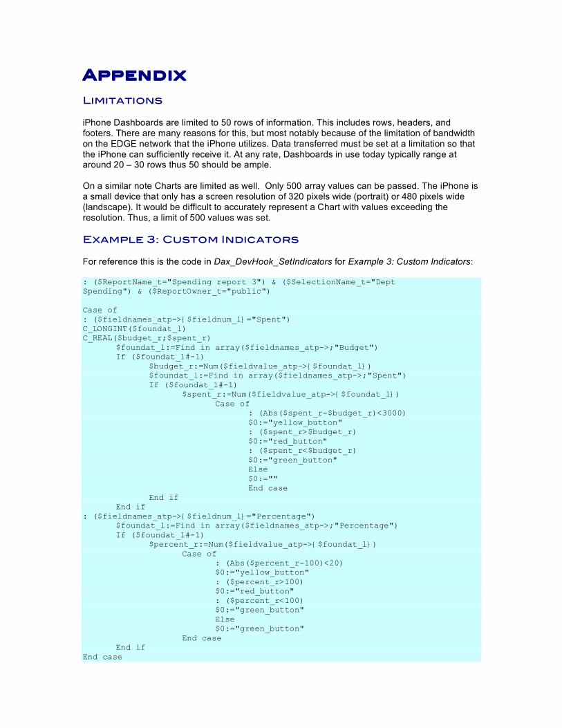
Appendix Limitations iPhone Dashboards are limited to 50 rows of information. This includes rows, headers, and footers. There are many reasons for this, but most notably because of the limitation of bandwidth on the EDGE network that the iPhone utilizes. Data transferred must be set at a limitation so that the iPhone can sufficiently receive it. At any rate, Dashboards in use today typically range at around 20 – 30 rows thus 50 should be ample. On a similar note Charts are limited as well. Only 500 array values can be passed. The iPhone is a small device that only has a screen resolution of 320 pixels wide (portrait) or 480 pixels wide (landscape). It would be difficult to accurately represent a Chart with values exceeding the resolution. Thus, a limit of 500 values was set. Example 3: Custom Indicators For reference this is the code in Dax_DevHook_SetIndicators for Example 3: Custom Indicators: : ($ReportName_t="Spending report 3") & ($SelectionName_t="Dept Spending") & ($ReportOwner_t="public") Case of : ($fieldnames_atp->{$fieldnum_l}="Spent") C_LONGINT($foundat_l) C_REAL($budget_r;$spent_r) $foundat_l:=Find in array($fieldnames_atp->;"Budget") If ($foundat_l#-1) $budget_r:=Num($fieldvalue_atp->{$foundat_l}) $foundat_l:=Find in array($fieldnames_atp->;"Spent") If ($foundat_l#-1) $spent_r:=Num($fieldvalue_atp->{$foundat_l}) Case of : (Abs($spent_r-$budget_r)<3000) $0:="yellow_button" : ($spent_r>$budget_r) $0:="red_button" : ($spent_r<$budget_r) $0:="green_button" Else $0:="" End case End if End if : ($fieldnames_atp->{$fieldnum_l}="Percentage") $foundat_l:=Find in array($fieldnames_atp->;"Percentage") If ($foundat_l#-1) $percent_r:=Num($fieldvalue_atp->{$foundat_l}) Case of : (Abs($percent_r-100)<20) $0:="yellow_button" : ($percent_r>100) $0:="red_button" : ($percent_r<100) $0:="green_button" Else $0:="green_button" End case End if End case
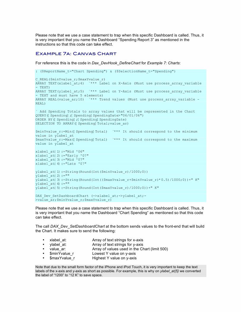
Please note that we use a case statement to trap when this specific Dashboard is called. Thus, it is very important that you name the Dashboard “Spending Report 3” as mentioned in the instructions so that this code can take effect. Example 7a: Canvas Chart For reference this is the code in Dax_DevHook_DefineChart for Example 7: Charts: : ($ReportName_t="Chart Spending") & ($SelectionName_t="Spending") C_REAL($minYvalue_r;$maxYvalue_r) ARRAY TEXT(xlabel_at;4) `*** Label on X-Axis (Must use process_array_variable - TEXT) ARRAY TEXT(ylabel_at;5) `*** Label on Y-Axis (Must use process_array_variable - TEXT and must have 5 elements) ARRAY REAL(value_ar;10) `*** Trend values (Must use process_array_variable - REAL) ` Add Spending Totals to array values that will be represented in the Chart QUERY([Spending];[Spending]SpendingDate>"06/01/06") ORDER BY([Spending];[Spending]SpendingDate) SELECTION TO ARRAY([Spending]Total;value_ar) $minYvalue_r:=Min([Spending]Total) `*** It should correspond to the minimum value in ylabel_at $maxYvalue_r:=Max([Spending]Total) `*** It should correspond to the maximum value in ylabel_at xlabel_at{1}:="Mid '06" xlabel_at{2}:="Early '07" xlabel_at{3}:="Mid '07" xlabel_at{4}:="Late '07" ylabel_at{1}:=String(Round(Int($minYvalue_r)/1000;0)) ylabel_at{2}:="" ylabel_at{3}:=String(Round(Int(($maxYvalue_r+$minYvalue_r)*0.5)/1000;0))+" K" ylabel_at{4}:="" ylabel_at{5}:=String(Round(Int($maxYvalue_r)/1000;0))+" K" DAX_Dev_SetDashboardChart (->xlabel_at;->ylabel_at;->value_ar;$minYvalue_r;$maxYvalue_r)
Please note that we use a case statement to trap when this specific Dashboard is called. Thus, it is very important that you name the Dashboard “Chart Spending” as mentioned so that this code can take effect. The call DAX_Dev_SetDashboardChart at the bottom sends values to the front-end that will build the Chart. It makes sure to send the following:
• xlabel_at: Array of text strings for x-axis • ylabel_at: Array of text strings for y-axis • value_ar: Array of values used in the Chart (limit 500) • $minYvalue_r Lowest Y value on y-axis • $maxYvalue_r Highest Y value on y-axis
Note that due to the small form factor of the iPhone and iPod Touch, it is very important to keep the text labels of the x-axis and y-axis as short as possible. For example, this is why on ylabel_at{5} we converted the label of “1200” to “12 K” to save space.
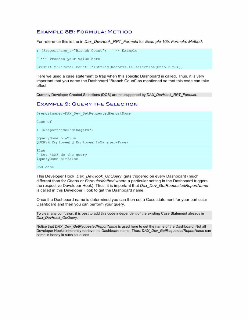
Example 8B: Formula: Method For reference this is the in Dax_DevHook_RPT_Formula for Example 10b: Formula: Method: : ($reportname_t="Branch Count") ` ** Example ` *** Process your value here $result_t:="Total Count: "+String(Records in selection($table_p->))
Here we used a case statement to trap when this specific Dashboard is called. Thus, it is very important that you name the Dashboard “Branch Count” as mentioned so that this code can take effect. Currenty Developer Created Selections (DCS) are not supported by DAX_DevHook_RPT_Formula. Example 9: Query the Selection $reportname:=DAX_Dev_GetRequestedReportName Case of : ($reportname="Managers") $queryDone_b:=True QUERY([Employee];[Employee]IsManager=True) Else ` Let 4DAF do the query $queryDone_b:=False End case
This Developer Hook, Dax_DevHook_OnQuery, gets triggered on every Dashboard (much different than for Charts or Formula:Method where a particular setting in the Dashboard triggers the respective Developer Hook). Thus, it is important that Dax_Dev_GetRequestedReportName is called in this Developer Hook to get the Dashboard name. Once the Dashboard name is determined you can then set a Case statement for your particular Dashboard and then you can perform your query. To clear any confusion, it is best to add this code independent of the existing Case Statement already in Dax_DevHook_OnQuery. Notice that DAX_Dev_GetRequestedReportName is used here to get the name of the Dashboard. Not all Developer Hooks inherently retrieve the Dashboard name. Thus, DAX_Dev_GetRequestedReportName can come in handy in such situations.


![2018 DODGE DURANGO - Auto-Brochures.com Durango_2018.pdfThis is smarter iPhone® integration, so you’ll experience your favorite features through your dashboard. With Siri,[2] all](https://img.pdfslide.us/doc/110x75/5fa89656476d335fcf76e472/2018-dodge-durango-auto-durango2018pdf-this-is-smarter-iphone-integration.jpg)