Embed Size (px)
Citation preview

e-Perimetron, Vol. 13, No. 3, 2018 [141-160] www.e-perimetron.org | ISSN 1790-3769
[141]
Gonçalo A. S. Dias*
Investigating Beccari’s Claims with New Cartometric Methods
Keywords: medieval nautical charts; cartometric analysis of maps; history of cartography;
medieval navigation; Francesco Beccari. Summary: One of the most important medieval nautical charts of the 15th century is argua-bly the Beccari Chart made in 1403. The author, Francesco Beccari, a Genoese, presented it as an innovation relative to previous charts, inserting for that purpose a textual legend into the charted area. The chart is known principally for the claims that it brought the At-lantic and Mediterranean Sea basins to the same scale and repositioned Sardinia. A lati-tude scale bar is shown over the Atlantic. Our work will use innovative cartometric meth-ods to ascertain these claims made by the author and to clarify, if possible, whether the latitude scale bar was inserted at a later date. We will show that the Atlantic and Mediter-ranean distance scales were brought closer together, with the former still smaller than the latter, that Sardinia was not moved significantly for us to say that it was repositioned, and finally that the latitude scale bar fits well with the latitudes of the places in the Atlantic but not with Mediterranean places. Nothing could be concluded about the issue of the dating of the latitude scale bar.
Introduction
In the history of medieval cartography one, if not the major obstacle to any would-be researcher is the lack of a contemporary instruction manual on how to make and copy a nautical chart. There is a complete dearth of accompanying literature which leaves no alternative to the historian than analyzing the objects themselves using, among other methods, the variation of place-names, the type of pictorial decorations, and cartometric analysis. The first known treatise to address the making of a nautical chart is Benedetto Cotrugli’s De Navigatione of 1464-1465 (Falchetta 2013). In it, however, the author dedicates only one short paragraph to the subject. An earlier book of the same century by Michael of Rhodes is a mixed work compiled over many years, including a por-tolan, but lacking any instructions regarding chart-making or chart-copying. Before the 15th cen-tury we only have extant a few portolans, essentially navigational guides describing itineraries with the bare minimum of estimated distances and directions between places, without any mention of charts or pictorial descriptions for that matter. The picture changes from the 16th century onwards, where we find such works as the Tratado da sphera (1537) or the Tratado em defensão da carta de marear (1539) by Pedro Nunes, Martín Cortés de Albacar’s Breve Compendio de la Sphera y de la Arte de Navegar (1551), or Andrés García de Céspedes’ Regimiento de nauegación (1606). If now we consider the writings on the charts themselves, the same problem arises. No chart has any indication on how it was produced, what sources were consulted, what design it followed, etc. One outstanding exception is the chart made by Francesco Beccari in 1403 (Campbell 1987: 427 and note 384). In it the author wrote an inset text that he placed south of the Mediterranean basin, where he explained his intentions in making this chart and where he claims to have improved its accuracy in certain aspects. He adds that such changes were made based on information gathered from experienced seamen, which is an indication of the kind of sources used in making such
* Department of History and Philosophy of Sciences, Faculty of Sciences, University of Lisbon and Interuniver-sity Center for the History of Sciences and Technology (CIUHCT), Campo Grande, Building C4, Room 4.3.07, 1749-016 Lisboa, Portugal.

e-Perimetron, Vol. 13, No. 3, 2018 [141-160] www.e-perimetron.org | ISSN 1790-3769
[142]
charts by a practitioner. This has extreme value, because it is a contemporary voice saying from where it got its data. No other known chart from before 1500 carries so vital a link to the informa-tion gathering process that was at the basis of the drawing of a chart. These claims made by Beccari in the inset text must be confirmed independently. It is then our purpose in this article to deploy a different cartometric approach, using a mix of old and new techniques, in order to confront the textual claims made with what is on the actual chart. One other feature that makes this chart unique is the existence on it of a latitude scale bar. Such aspect was unprecedented in 1403 and it would not be repeated until about one hundred years later, already in the 16th century. This latitude scale bar has been the object of intensive study re-garding its time of production (Lepore et al. 2012, 2017; Sheehan 2014). Given the impossibility of studying the chart materially (see Lepore et al. 2012: 21 and Sheehan 2014: 170-171), despite suggestions of non-invasive methods (Sheehan 2014: 171, note 159), our approach will try to ad-dress the question of whether the scale bar was made at the same time as the chart or was added later strictly by using cartometric methods. This paper is divided into three main parts. First comes a methodology section, where I explain the methods used to analyze the charts. Then comes the presentation of the text and claims made by Beccari, followed by a step by step analysis of the said claims using the cartometric methods introduced in the methodology section. I address the accuracy of the latitude scale bar and try to conclude if it was made at the same time as the rest of the chart or was added later. I finish by drawing conclusions and pointing to future avenues of research.
Methodology One of the tools in our approach is MapAnalyst1, an application freely available on the Internet, intended for comparing the geometries of two maps, based on a set of places of known geographi-cal coordinates, positively identified in them (control points). Between 150 and as many as 400 points, primarily ports and prominent capes, are identified in the Mediterranean Sea, Black Sea, and Atlantic Coast on a chart. The actual number of points will depend on the chart under study and, more importantly, on the quality of the image we can obtain for each chart. However, for the Mediterranean basin, Black Sea and Atlantic shores the interval between 150 and 400 is enough. The identification of points will be made by pairing a given location on the old nautical chart with the same place on a modern chart. Each pairing generates two sets of coordinate pairs: on the old chart one finds a coordinate pair given in units that locates the point on the image file (these units are chosen at the beginning); on the new chart one obtains the true modern values of the latitude and longitude of the place. By using the measured distance between two points of known latitude and longitude one determines the size of the degree on the old chart and translates the distances measured on it into geographical coordinates, using Gibraltar as the point of origin with its known latitude and longitude2.
1 The program MapAnayst, sited at http://mapanalyst.org/, was made by Bernhard Jenny, of Monash University, Melbourne, with the help of Adrian Weber, then at ETH Zurich. The website is maintained by Bernhard Jenny. 2 In our case, since Gibraltar and Alexandretta (Iskenderun, Turkey) are approximately on the same parallel of 36ºN, we use their known difference of longitude to determine the average size of the longitude degree on the chart, which means that we chose the 36th parallel as the reference parallel. Using the known relation between the sizes of the latitude and longitude degrees at a given latitude, we determine the same relation for the latitude degree, which is a constant. We end up with two pairs of coordinates (in degrees), one measured on the chart and the other on the surface of the Earth, for each chosen place.

e-Perimetron, Vol. 13, No. 3, 2018 [141-160] www.e-perimetron.org | ISSN 1790-3769
[143]
The purpose of MapAnalyst is not, however, the measuring of the coordinates of the points on the old chart. The main purpose is, as already said, the comparison of the geometric features of two charts. The result of the comparison is graphically illustrated by the application using two com-plementary methods: by showing the displacements of the control points of one of the maps rela-tive to the other map; or by showing the distortions of a square grid that is first overlapped over one of the maps, usually the modern map, and then adjusted as to bring it to the best possible match with the second one. These two ways of showing the differences between the two maps are designated by MapAnalyst as, respectively, ‘displacement vectors’ and ‘distortion grid’. Prior to comparing geometries of the two maps using either of the two methods, they are first brought to the best possible overlapping by using a rigid geometric transformation consisting of a rotation, a scale adjustment and a translation. An important point to note is that if the chart used for compari-son (the ‘modern map’) is a cylindrical map projection centered at the equator (which is formed by a square geographical grid), then the square grid superimposed on it will coincide with a mesh of parallels and meridians. Thus, the corresponding ‘distortion grid’ on the old map will also be a grid of parallels and meridians, as they would appear if we linked the points of the same latitude and longitude (Gaspar 2010: 45-85). Another cartometric method used in our study consists in assessing the apparent accuracy of the latitudes of a set of control points in the chart, by first measuring their values relative to an arbi-trary scale of latitudes, and then comparing them with the true values. The second step of the method consists in representing graphically the corresponding differences (‘errors’) as a function of both latitude and longitude, from which useful conclusions can be drawn relative to the sources used to compile the chart and the distortions affecting the different areas. The method was first proposed by Gaspar (Gaspar 2010: 54-61) and then used in the analysis of various charts (see, for example, Gaspar 2010: 85-174). As for the construction of an arbitrary scale of latitudes, the lati-tude of Gibraltar (about 36º N) was used as reference. The length L (in mm) of the degree of lati-tude was estimated by measuring the distance D, in mm, between Gibraltar and Alexandretta (pre-sent-day Iskenderun, Turkey) on the chart, taking the difference of longitudes ∆λ between the two places on a modern chart, and using the expression L = D*cos(36º)/∆λ. The more important plots are the errors of latitude as a function of latitude and errors of latitude as a function of longitude. From the first kind of plot – errors of latitude as a function of latitude – one obtains scale differences in a north-south direction between the set of points chosen and the arbitrary scale. Thus, a cloud of points that displays a trendline with a positive slope implies that the data was obtained from a region drawn to a higher scale than the arbitrary scale chosen at the beginning; the inverse happens when that slope is negative. Different trends denote different se-ries of measurements and therefore different regions. These ‘error signatures’ thus provide ‘foot-prints’ for the identification of regions within a chart (see this in practice in Gaspar 2010: 151-157; further below see Figure 10 for illustration of this kind of plot, where nevertheless some re-gions merge with others and cannot be unambiguously separated from their neighbors). From the second type of plot – error of latitude as a function of longitude – one may also derive coherent regions of data by inspection of the plot itself. This complements what is gleaned from the first kind of plot. In many instances the first type is not enough to help separate source re-gions. Any changes in the trendlines of the errors in a west-east direction, or a shift of the cloud of points north or southward, may point to a transition between different source regions when scale differences are not significant. The most important change one can detect using the plotting of latitude errors with respect to longitude is rotation. Any rotation to which the chosen data set of

e-Perimetron, Vol. 13, No. 3, 2018 [141-160] www.e-perimetron.org | ISSN 1790-3769
[144]
points has been subjected is reflected on the changes to the orientation of a given cloud of points (see, below, Figure 11, related to Figure 10, where we add to the view obtained from Figure 10). Instead of calculating the size of the latitude degree and converting distances on the chart to de-grees, one can read the latitude of a given place off the latitude scale bar that comes with the Bec-cari chart. This scale bar is depicted on the left/western part of the chart, on the Atlantic. It is still an open debate whether Beccari in the original chart drew this bar or if it was added later. Be that as it may, one can use the coordinates read off from this bar to determine latitudes and compare these with the real latitudes of the chosen places. The errors come from the differences and can be plotted with respect to both latitude and longitude (these are known from the modern coordinates of the identified places). The same kind of analysis as above then follows. In this context, one important conceptual distinction that is at the heart of this work, initially pro-posed by Joaquim Alves Gaspar and Henrique Leitão, is the one between the ‘internal geometry’ and the ‘external geometry’ of a chart (Gaspar and Leitão 2018: 131). The ‘internal geometry’ of a chart is the consequence of a direct transfer of sailing data such as compass courses and esti-mated distances onto the chart. In such case, the sailing directions were assumed to be straight lines that would define the same angle with a north-south wind rose line on the chart and with a meridian on the surface of the Earth. No account was taken of the sphericity of the Earth. In the end the ‘internal geometry’ arose from the placing of the geographical features (coastlines, is-lands, etc.) on the chart and their relationship to each other. On the other hand, the external ge-ometry is the network of rhumb lines and compass roses imposed upon the face of the chart along with a single distance scale bar and, when present, a latitude scale bar. The placing of navigational data on the chart generated a geometry that was essentially incompatible with this external geome-try. To bring to light what is the result of navigational data plotted onto a chart and what is the external framework built around the former, one extracts the chosen data point coordinates gener-ated by MapAnalyst and uses them to plot errors in the way already described. It is my conviction that through a mixture of distortion grid analysis and error plotting one may be able to distinguish the sources of the original data used to draw medieval nautical charts and understand how that information was transferred onto a chart. In this paper I show that these methods allow one to ad-dress the challenges presented by Beccari’s famous chart and confront his claims.
Francesco Beccari's chart of 1403
Introduction The chart of Francesco Beccari (also known as Franciscus Becharius) was drawn in February of 1403 in Savona. It is unusual for four reasons. The first one is that it is an exceptionally large chart, being drawn on two joined parchment skins with dimensions in frame of 93 x 139 cm and without frame of 80 x 127 cm. The second is that it presents a vertical latitude scale on the Atlan-tic side, from 26º N to 56º N, which was unprecedented in 1403. It is not yet known if this latitude scale bar is original or added later, despite conclusions in both directions (in support of it being a later addition see, e.g., Campbell 1987: 386; in support of it being an original bar see Lepore et al. 2012, 2017). What appears to be certain is that the next occurrence of a latitude scale bar on a navigational chart is approximately 100 years later. The third reason is that the chart shows three different mile scale bars: the usual scale at the upper and lower edges, plus a “Duitse mylen” and “Spaenis mylen” scale, both vertically depicted on the left side of the chart, the former to the west of France and the latter west of the Iberian Peninsula. The final reason is the inset text where the
e-Perimetron, Vol. 13, No. 3, 2018 [141-160] www.e-perimetron.org | ISSN 1790-3769
[145]
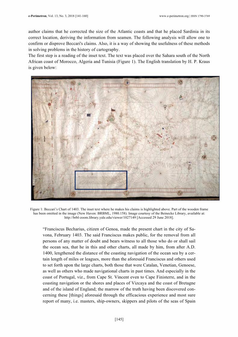
author claims that he corrected the size of the Atlantic coasts and that he placed Sardinia in its correct location, deriving the information from seamen. The following analysis will allow one to confirm or disprove Beccari's claims. Also, it is a way of showing the usefulness of these methods in solving problems in the history of cartography. The first step is a reading of the inset text. The text was placed over the Sahara south of the North African coast of Morocco, Algeria and Tunisia (Figure 1). The English translation by H. P. Kraus is given below:
Figure 1: Beccari’s Chart of 1403. The inset text where he makes his claims is highlighted above. Part of the wooden frame
has been omitted in the image (New Haven: BRBML, 1980.158). Image courtesy of the Beinecke Library, available at: http://brbl-zoom.library.yale.edu/viewer/1027149 [Accessed 29 June 2018].
“Franciscus Becharius, citizen of Genoa, made the present chart in the city of Sa-vona, February 1403. The said Franciscus makes public, for the removal from all persons of any matter of doubt and bears witness to all those who do or shall sail the ocean sea, that he in this and other charts, all made by him, from after A.D. 1400, lengthened the distance of the coasting navigation of the ocean sea by a cer-tain length of miles or leagues, more than the aforesaid Franciscus and others used to set forth upon the large charts, both those that were Catalan, Venetian, Genoese, as well as others who made navigational charts in past times. And especially in the coast of Portugal, viz., from Cape St. Vincent even to Cape Finisterre, and in the coasting navigation or the shores and places of Vizcaya and the coast of Bretagne and of the island of England; the marrow of the truth having been discovered con-cerning these [things] aforesaid through the efficacious experience and most sure report of many, i.e. masters, ship-owners, skippers and pilots of the seas of Spain

e-Perimetron, Vol. 13, No. 3, 2018 [141-160] www.e-perimetron.org | ISSN 1790-3769
[146]
and those parts and also of many of those who are experienced in sea duty, who frequently and over a long period of time sailed those regions and seas. And for-asmuch let no one be amazed the two forms of charts are found from the hand of the aforesaid Franciscus which are dissimilar in this point, since he himself fol-lowed the reckoning of other charts and the forms and traces of old masters, and that badly. And also, it was several times reported to me, the aforesaid Franciscus, by many owners, skippers and sailors proficient in the navigational art, that the is-land of Sardinia which is in the Sea, was not placed on the charts in its proper place by the above-mentioned masters. Therefore, in Christ’s name, having lis-tened to the aforesaid persons, I placed the said island in the present chart in its proper place where it ought to be. And therefore, let this be known to you, the owner of this chart and all the others to whom it many concern.”3
This inset text, shown in Figure 2, states that Francesco Beccari made this chart in February 1403 in the city of Savona, then part of the Republic of Genoa. Since 1401 Beccari had been drawing charts with an increased scale of distance in the Atlantic, unlike other cartographers at earlier times and himself before that date. He increased the size of the coast of Portugal and Western Spain, the Bay of Biscay, the Brittany Peninsula in Northwestern France, and England. He says he based his design on information received from experienced seamen. He furthermore added that he corrected the position of Sardinia, up until then ill-placed on the charts. These comments make him distinctive in medieval cartography because he is the sole primary source before 1500 on how charts were made in what source material was concerned. There is still no information on the ac-tual drawing on the chart, how the information received from word-of-mouth was transferred to the vellum, but it is known that the medieval cartographer was alert to the need of corrections to the charts and knew whom to ask about nautical information.
Figure 2: The text of the legend on the Beccari Chart of 1403 (detail).
One can directly evaluate the claims relating to the positioning of Sardinia by comparing coastal outlines, usually by drawing Beccari's coastal outline of the 1403 chart over available charts of the Mediterranean basin that had been made before this chart. In this case, I drew the coastal outline of the Western Mediterranean of the Beccari 1403 chart and superimposed it onto the equivalent outline of the Dulceti 1339 chart4. One sees that it almost perfectly matches the outline of the Dulceti 1339 chart. This coastal matching is seen in many other charts. This matching exercise has been made often before (see, e.g., Mesenburg 1988 and Sheehan 2014: 166)5. Sometimes
3 This translation into English is in Kraus 1961 apud Sheehan 2014: 160-161. 4 Angelino Dulceti, or Dulcert, Genoese cartographer who moved to Palma in Majorca, made this chart in 1339. Its current location is the BnF, ref. Rés. Ge B 696. 5 Figure 2.3.6 in Sheehan 2014, p. 166, indicates that Beccari did not so much move Sardinia as he shortened its north-south length relative to Dulceti 1339. The mismatch between Beccari's Sardinia and Dulceti's Sardinia,

e-Perimetron, Vol. 13, No. 3, 2018 [141-160] www.e-perimetron.org | ISSN 1790-3769
[147]
there are, however, superpositions made onto satellite images of the Mediterranean sections under study (Sheehan 2014: 167). In those cases, such as this one of the positioning of the island of Sar-dinia, the latter is visibly ill-placed (Wagner 1896: 698). One must bear in mind that the yard stick available to judge Beccari’s changes are the pre-existing charts, so that his claim is only valid as far as medieval nautical charts of the 14th and early 15th century are concerned. Focusing on the islands of Corsica and Sardinia, one sees that no deviation is visible with respect to Dulceti 1339 (See Figure 3).
Figure 3: This is the Western Mediterranean (WM) of the Dulceti 1339 chart. The thick continuous line represents the coastal outline of the WM around and including Sardinia as represented on the Beccari Chart of 1403, now superimposed on Dulceti
1339. Note that Sardinia and Corsica, inside the rectangle, are virtually in the same place. The same exercise can be made on the anonymous Genoese chart of the 14th century known as the Ristow-Skelton No. 36, which is presented in Figure 4.
Figure 4: This is the Western Mediterranean (WM) of the Ristow-Skelton No. 3 chart. The thick continuous line represents
the coastal outline of the WM around and including Sardinia as represented on the Beccari Chart of 1403, here superimposed on Ristow-Skelton No. 3. Note that Sardinia and Corsica, inside the rectangle, are very little moved in relation to the sur-
rounding coastlines. though small, is noticeably larger in the southern coastlines compared to the northern coastlines. Cf. also Figures 7-9, where there is a local convergence of parallels on Sardinia. 6 Chart made by an anonymous Genoese cartographer in the second quarter of the 14th century, presently at the Library of Congress, Washington, ref. G5672.M4P5 13-- .P6.

e-Perimetron, Vol. 13, No. 3, 2018 [141-160] www.e-perimetron.org | ISSN 1790-3769
[148]
One can conclude that Sardinia was barely moved by Beccari (see Sheehan 2014: 165-166 for similar conclusions; Nicolai 2016 and references therein). The same overlapping is made for the Atlantic coastal areas. I just consider the Dulceti 1339 chart, because the Ristow-Skelton No. 3 lacks the Atlantic. First, Gibraltar on the two charts is matched to each other, and the Atlantic coast of the Iberian Peninsula on the two charts is also matched to each other, as far as possible. The result shows that the Brittany Peninsula and Eng-land are located further north than their positions in the Dulceti chart and thus the Beccari chart shows the western coasts in a larger scale. This is one of the improvements claimed in the inset text and this exercise confirms it. However, it will be seen below that this can be also analyzed using other methods.
Figure 5: This image is of the Atlantic area of the Dulceti 1339 chart. The thick continuous line is the coastal outline of the
Atlantic in the Beccari Chart of 1403. The outline is here superimposed on the Dulceti 1339 chart. Note the northern shift of the Brittany Peninsula and of England, illustrating the stretching of the Atlantic shorelines as claimed by Beccari.
Cartometric Analysis: MapAnalyst Output
If one performs an analysis by MapAnalyst on the Beccari 1403 chart and compares it to a square chart of the Mediterranean, the result is a distorted grid (see Figure 6). Note the outstanding areas

e-Perimetron, Vol. 13, No. 3, 2018 [141-160] www.e-perimetron.org | ISSN 1790-3769
[149]
selected (west to east). First, the Atlantic is still shown at a smaller scale because the mesh is tighter there than in the main Mediterranean basin. Second, Sardinia does not appear to be moved, but seems to be responsible for a convergence of the parallels, hence its vertical size appears to be smaller than it should. Third, there is an elbow or kink in the northern Aegean around Thessalo-niki caused by a larger east coast of Greece versus the west coast. One can say that there is an in-crease in north-south scale in the Aegean. Finally, a larger scale was used in the Black Sea, as evidenced by a wider mesh. Note also the deviation of the parallels in northeastern Spain and the almost unchanged direction of the parallels coming from the Iberian Peninsula and following along the northern African coast. This shows that the Mediterranean shore of the Peninsula is drawn to a larger scale than the west-ern shore, confirming the conclusion that the Atlantic coasts are drawn to a smaller scale. Several causes may be behind this, such as the use of a different unit of distance like a larger mile than the one used in the Mediterranean (see, for instance, Wagner 1896), but the study of this matter lies outside the scope of this paper.
Figure 6: The output of the analysis of the Beccari Chart of 1403 using MapAnalyst. The four outstanding areas (west to east) are the Atlantic coast of the Iberian Peninsula, Sardinia, NW Aegean and the Black Sea. The noticeable increase of the grid in the north-south direction on the east coast of the Iberian Peninsula is pointed out. There is an increase in scale as we go east
from the Atlantic.
This is the typical grid of a medieval nautical chart of the Mediterranean (Figure 6). I have been able to reproduce this same analysis in fifteen charts, from the Pisan Chart of c.1290 to Aguiar’s chart of 1492 and all, with variations, show this same pattern. Moreover, in addition to the fea-tures that have already been described, there is another that is shared by all nautical charts of the pre-1500 Mediterranean, and that is a global tilt that affects the north-south orientation of those charts. In fact, Alexandria in Egypt is shown at the same rough latitude as Gibraltar, whereas we know that Antioch, or the near harbor city of Alexandretta (modern Iskenderun, Turkey), should be at the same latitude as Gibraltar. In Beccari’s chart of 1403 the angle between the 36th parallel

e-Perimetron, Vol. 13, No. 3, 2018 [141-160] www.e-perimetron.org | ISSN 1790-3769
[150]
and the horizontal is 9.5 degrees in the anticlockwise direction. We must, therefore, rotate the chart 9.5 degrees in the clockwise direction to make the 36th parallel horizontal. When analyzing the latitudes and longitudes of a set of chosen points one must always make sure if one is measuring before or after having corrected the tilt, i.e., if one has rotated the chart to make Gibraltar and Alexandretta show on the same horizontal line linking both places. The slopes of the trendlines are affected by rotations, and, in particular, the slopes on the error of latitude plotted with respected to longitude. If one analyzes after the correction of the tilt, the remainder slope is the difference from the average, which is what the global tilt is. However, local effects such magnetic declination, will vary. It is therefore natural to see that the clouds of points even after the global (average) rotation have recession lines with slopes of different signs and magni-tudes. This will become evident by inspecting the plots in the error analysis that now ensues.
Cartometric Analysis: Error Analysis The next step is the extraction of the Cartesian coordinates of the points set on the chart. The chart coordinates obtained will be compared to the “real world” coordinates and errors in longitude and latitude for each location will be determined. A positive (negative) error signifies a deviation to-wards the north (south). Gibraltar is set as a reference, so that it is an error free location, and all the errors are measured against its location. The latitude values are obtained from a direct reading on the latitude from the lateral scale bar. Errors in longitude, for which an arbitrary scale would have to be determined, will be left out. When plotting the errors in latitude with respect to both latitude and longitude, one uses the “real world” values of the locations chosen. What one obtains, then, is the plot of errors of latitude (in degrees) as a function of the modern latitude, or longitude, of the places chosen. The other way of proceeding is by creating an arbitrary scale. Here the size of the longitude de-gree is determined from the Gibraltar-Alexandretta (GA) distance along the parallel 36 degrees north. The size of the latitude degree is then determined by using the framework of an equirectan-gular projection with the reference parallel being 36 degrees north. This is called the arbitrary, or designated, scale. This analysis will be developed with the first method and the second will be relegated to a forthcoming work, where the arbitrary scale is used in the comparative analysis of multiple charts, all of which, except Beccari 1403, have no latitude scale bar inserted. The rele-vant plots using this scale have been added to an appendix at the end of the present work. For this analysis, one divides the Mediterranean Sea into seven sub-basins. Usual recent conven-tions have been followed (Loomer 1987: 159-160, Nicolai 2016: 129). From west to east the cho-sen basins will be (see Figure 7): (a) Atlantic; (b) Western Mediterranean; (c) Central Mediterra-nean; (d) Adriatic; (e) Eastern Mediterranean (or the Levantine Sea); (f) Aegean; (g) Black Sea.

e-Perimetron, Vol. 13, No. 3, 2018 [141-160] www.e-perimetron.org | ISSN 1790-3769
[151]
Figure 7: The choice of basins shown on the Beccari Chart of 1403. From left to right: Atlantic (red); Western Mediterranean (green); Central Mediterranean (cerulean blue); Adriatic (medium blue); Eastern Mediterranean (or the Levantine Sea) (dark
green); Aegean (dark blue); Black Sea (yellow).
Figure 8: Errors in latitude plotted as a function of latitude (∆Latitude-Latitude), without tilt correction. The errors were de-
termined using the latitude scale bar on the chart. The regional color key serves for all plots.
Black Sea
Levantine Sea
Aegean Sea
Central Med
Adriatic
Western Med
Atlantic

e-Perimetron, Vol. 13, No. 3, 2018 [141-160] www.e-perimetron.org | ISSN 1790-3769
[152]
The data will be plotted in two different ways. First, the errors of latitude versus latitude (∆Latitude-Latitude) in Figure 8 and, then, the errors of latitude versus longitude (∆Latitude-Longitude) in Figure 9. The most relevant data in a ∆Latitude-Latitude plot is the slope of the trendline of a given cluster of points. The slope of this line will tell if the area covered by this cluster was drawn to a larger scale than the reference scale (positive slope) or a smaller scale than the reference scale (negative slope). In this case, the reference scale is the latitude scale bar, which apart from allowing the reading of latitudes, also implicitly establishes a distance scale. Moreover, any shift of the cluster of points that preserves the internal relation between them (a rigid translation of the cluster, for example) will reveal a systematic error influencing the values of latitude. So, one has the errors as resulting from three sources: stochastic (point dispersion), scale differences (slope of the trend-line), and systematic (rigid translations). The reading from a ∆Latitude-Longitude plot, in addition to the previous ∆Latitude-Latitude plot, will help discriminate the actual data clusters and confirm or reject the basin division with which this analysis started. It will also help one see the effects of local rotations on the errors. From both plots (Figures 8 and 9) one sees that the errors of latitude read from the chart grow in an eastward direction. This is seen from the shift upwards that the clusters of points gain as one considers regions going east in Figure 8. It is also read immediately from Figure 9 since the errors are plotted according to their west-east position.
Figure 9: Errors in latitude plotted as a function of longitude (∆Latitude-Longitude), without tilt correction. The errors were determined using the latitude scale bar on the chart.
In addition, from Figure 8, one can draw one more important conclusion: the latitude scale bar is made for the Atlantic coastline, because the trend line has a near zero slope. So, the scale bar is the scale of distances for the Atlantic. All other chosen basins, except for the Adriatic, are drawn to larger scales than the Atlantic. The stretching of the Atlantic shoreline as claimed by Beccari

e-Perimetron, Vol. 13, No. 3, 2018 [141-160] www.e-perimetron.org | ISSN 1790-3769
[153]
was not sufficient to make the Atlantic and Mediterranean scales equal. At the same time, it is clear that the scale bar was not made to give latitudes of Mediterranean places. As previously stated, there is a global average tilt. One can repeat the previous analysis after rotat-ing the chart clockwise by 9.5 degrees. The average till will be eliminated from the data and we will be left with the local variations of each cluster of points with respect to the average tilt. The only exception will be the Atlantic region, which will remain with the original orientation because of its well-fitting with the scale bar and because the theoretical models of magnetic declination (CALS7K) for the middle 1200s give a smaller value to the west coast of the Iberian Peninsula than to the Mediterranean region (see Korte and Constable 2005 and Nicolai 2016: 225, Fig. 6.10).
Figure 10: ∆Latitude-Latitude plot, with tilt correction, except for the Atlantic. The errors were determined using the latitude scale bar.

e-Perimetron, Vol. 13, No. 3, 2018 [141-160] www.e-perimetron.org | ISSN 1790-3769
[154]
Figure 11: ∆Latitude-Longitude plot, with tilt correction, except for the Atlantic. The errors were determined using the lati-
tude scale bar.
From Figure 10 one can see that the entire Mediterranean region is drawn to a larger scale than the Atlantic. In addition, the Aegean and Black Seas suffer from a vertical translation of the errors even after the rotation. This is confirmed in Figure 11, between 24 and 42 degrees of longitude. Finally, in Figure 11, the different trends in each basin show that there are local variations of ori-entation. Even if the average tilt is now corrected, the remaining varied slopes say that the original orientation of the latitude errors in longitude varied. One can speculate about causes, such as the influence of currents, winds or just the preferred routes from which nautical information was de-rived. However, the most likely cause is magnetic declination. It is known that the magnetic dec-lination was smaller on the western coast of the Iberian Peninsula than in the Mediterranean (see Korte and Constable 2005). From a reading of a model plot of magnetic declination for the year 1250 one can see that there was a smaller declination in the west and a peak in northern Italy (Nicolai 2016: 225, Fig. 6.10). This may be a reason for the small deviation of the interpolated meridians on the Atlantic side of Beccari’s chart (see Figure 6). The Levantine region east of the meridian 30 degrees East has a noticeable change in orientation, with a negative trend, which may indicate that the magnetic declination of the region was smaller than the average of the Mediterra-nean. This is corroborated by the theoretical model CALS7K (Korte and Constable 2005). The Black Sea region does not appear to be as affected as the Levant in the negative direction, al-though it too should be affected by a smaller than average declination, according to CALS7K. One must, however, bear in mind that the model is a theoretical prediction of a very complicated phenomenon and so it is merely indicative. The Historical Field Model, based on historical obser-vations, does so only for the time lapse between 1590 and 1990 (see Jackson et al. 2000), beyond our later limit of 1500.

e-Perimetron, Vol. 13, No. 3, 2018 [141-160] www.e-perimetron.org | ISSN 1790-3769
[155]
Conclusion The chart Beccari made in 1403 is a rare glimpse into the process of chart-making. There are no other relevant sources before 1500 that allow one to know the details about the making and copy-ing of charts (the exception being Cotrugli’s paragraph in his treatise on navigation, see Falchetta 2013). Faced with this lack of sources one must treat whatever one has with care. The text Beccari added to his 1403 chart is not just an explanation of a process or an identification of sources. It carries with it a claim to improvements made in chart-making. One must then analyze these claims, as done in this article, and conclude if the author lived up to them or not. By doing so, some new methods have been introduced that can be used to address problems in the history of cartography. It has been shown that there is little improvement in the Beccari Chart of 1403 apart from the lin-ear distance scale correction of the Atlantic coasts. This correction was not sufficient to make the scale homogenous throughout, but the Atlantic scale became larger than in previous charts, e.g., Dulceti 1339. In fact, Beccari said that he “lengthened the distance of the coasting navigation of the ocean sea by a certain length of miles or leagues, more than the aforesaid Franciscus and others used to set forth upon the large charts […]”. This implies not that the Atlantic scale became equal to the Mediterranean scale but that it became larger in the 1403 chart than in previous charts. There is, however, as far as I can surmise, the conviction that Beccari drew the entire territory in the chart of 1403 to the same scale. This is not warranted from the text on the chart and is not supported by the cartometric analysis here made. The second claim is, in my view, completely rejected by the evidence. I have found no support for Beccari’s claim of correcting the location of Sardinia. The superimpositions shown in this paper do not present any significant change and can be repeated for other instances with the same out-come. No comparison to a modern chart or a satellite image is worthwhile because the gauge to measure the changing of the position of Sardinia must be the previous charts, not a modern map. Moreover, the grids resulting from MapAnalyst show that Sardinia is never well placed, before, on, and after the 1403 chart, but is ill-placed the same way regardless of the chart under study. The other point of interest around this chart is the latitude scale bar. Never before 1403 was there any scale using implicitly, much less explicitly, the latitude as a way of placing any point on the chart. Plus, not until the first quarter of the 16th century does one see again a latitude scale bar on a chart. This militates against considering it a development by Francesco Beccari himself. Moreo-ver, had it been a development by this cartographer, the fact that there is no mention in the inset text of any latitude scale bar would be odd, since he wrote the text with the purpose of informing the interested reader of the novelties introduced into the chart, such as a new Atlantic scale and the repositioning of Sardinia. Had it been an original scale bar, why was it not repeated in later charts of the 15th century? Be that as it may, this latitude scale bar is well-fitted. From this one cannot conclude if it is origi-nal or added later. The distance scale in the Atlantic is quite rigorous, which indicates that Beccari did try to improve the drawing of the western coasts. However, if the distances were well deter-mined in the sources and the scale equal from Morocco to Great Britain, then it would be easy to fit a latitude scale to the coastline, since all that is required is to know the latitudes of two differ-ent places, one to place the scale bar and the other to give the size of the division of the latitude degree.

e-Perimetron, Vol. 13, No. 3, 2018 [141-160] www.e-perimetron.org | ISSN 1790-3769
[156]
I have thus reached a solid, but mixed, conclusion about the 1403 chart drawn by Francesco Bec-cari: the author did make changes, as claimed, to the Atlantic scale of distances, but these were not enough to draw the entire chart to the same scale; he did not reposition Sardinia in any rele-vant way to any who would consult this chart for navigation. Even if the text is precious to our eyes as the only explanatory text about chart-making on a chart before the year 1500, it still leaves much to be desired after one has checked for the accuracy of its claims. Regarding the latitude scale bar, my conclusion reinforces the need for an inspection of the chart itself. If the scale bar had been badly-fitted on the Atlantic shores one could argue that it had been a later addition. However, since it fits nicely, one cannot draw a definitive conclusion, thus rendering a closer in-spection mandatory if one is to resolve this issue once and for all.
Appendix
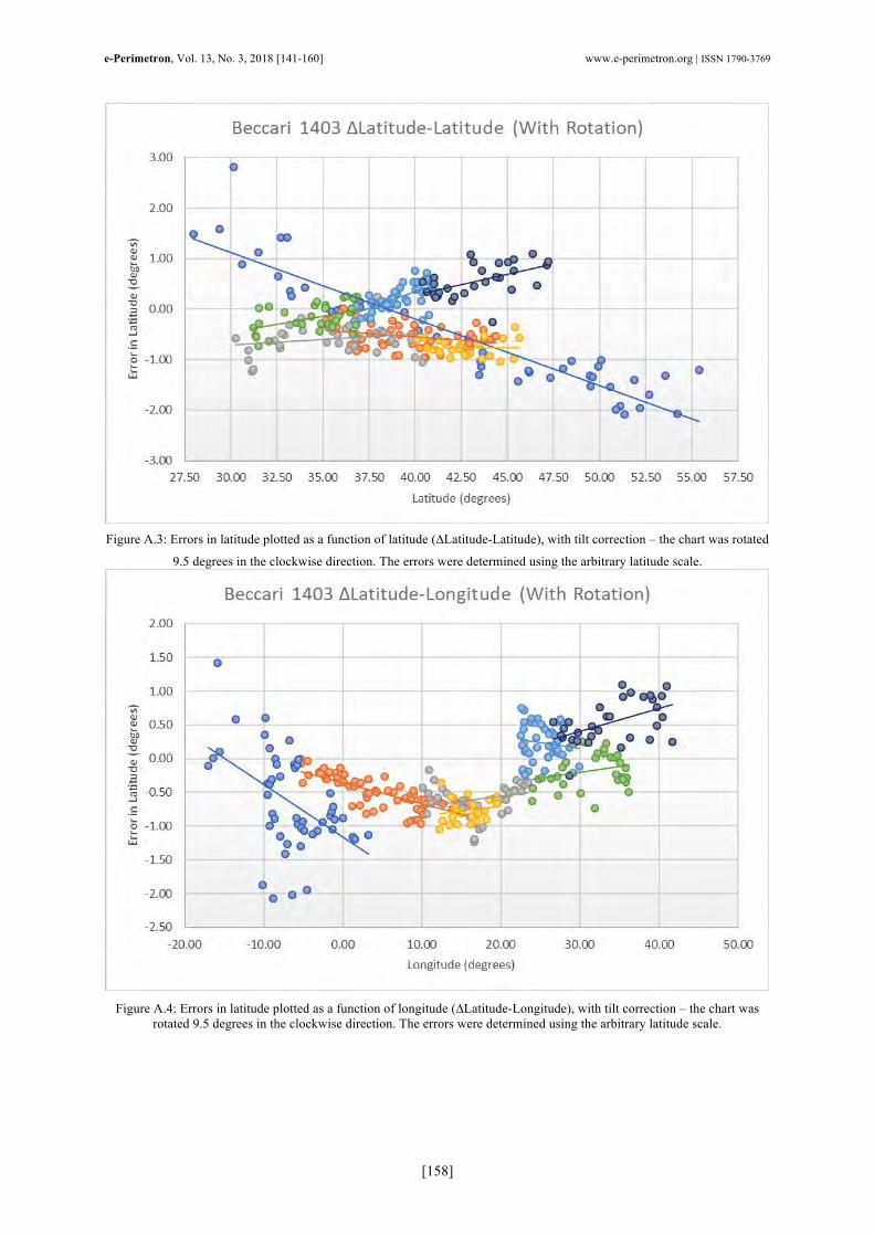
In this appendix I show the same plots as in Figures 8 to 11, but with the size of the degree given by the designated (or arbitrary) scale. This scale is calculated by dividing the distance between Gibraltar and Alexandretta by the difference in longitude of these places, to obtain the size of the longitude degree, and dividing the latter by cos(36º) to determine the size of the latitude degree. The plotting of errors with this scale shows a slight different picture from the picture one has us-ing the inserted scale on the chart. The main difference is the fact that the Atlantic scale is now smaller than this designated or arbitrary scale. The main basins of the Mediterranean, Western, Central, Adriatic and Levant are approximately at the same scale as this arbitrary scale. The Ae-gean and Black Sea are still at a larger scale. This is easily seen if one compares slopes between equivalent plots (Figures A.1 to 8 through Figures A.4 to 11). All other important features, such as chart rotation, with growing errors towards the East, are present as well. Finally, the same con-clusions about magnetic declination can be reached by looking at Figure A.4, where east of the 30th meridian there is a change in trend compatible with a smaller regional magnetic declination in the Levant, confirmed by the theoretical model CALS7K for the year 1250, and a persistence of the magnetic declination in the Black Sea region, not accompanied by the prediction of the model CALS7K, for which the declination should be similar to the one in the Levant.

e-Perimetron, Vol. 13, No. 3, 2018 [141-160] www.e-perimetron.org | ISSN 1790-3769
[157]
Figure A.1: Errors in latitude plotted as a function of latitude (∆Latitude-Latitude), without tilt correction. The errors were
determined using the arbitrary latitude scale.
Figure A.2: Errors in latitude plotted as a function of longitude (∆Latitude-Longitude), without tilt correction. The errors
were determined using the arbitrary latitude scale.
Black Sea
Levantine Sea
Aegean Sea
Central Med
Adriatic
Western Med
Atlantic
Black Sea
Levantine Sea
Aegean Sea
Central Med
Adriatic
Western Med
Atlantic
e-Perimetron, Vol. 13, No. 3, 2018 [141-160] www.e-perimetron.org | ISSN 1790-3769
[158]
Figure A.3: Errors in latitude plotted as a function of latitude (∆Latitude-Latitude), with tilt correction – the chart was rotated
9.5 degrees in the clockwise direction. The errors were determined using the arbitrary latitude scale.
Figure A.4: Errors in latitude plotted as a function of longitude (∆Latitude-Longitude), with tilt correction – the chart was
rotated 9.5 degrees in the clockwise direction. The errors were determined using the arbitrary latitude scale.

e-Perimetron, Vol. 13, No. 3, 2018 [141-160] www.e-perimetron.org | ISSN 1790-3769
[159]
Acknowledgements This project has received funding from the European Research Council (ERC) under the European Union’s Horizon 2020 research and innovation programme (grant agreement 714033-MEDEA-CHART/ERC-2016-STG). I wish to thank the Medea-Chart members for discussions and suggestions. In particular, I thank Greg-ory C. McIntosh for helping me with the presentation that motivated this paper and for revising it. I thank André Ferrand and Bruno Almeida for reading this paper while in gestation and for offering suggestions. I acknowledge Ricardo Vaz’s help with computer specifics. I wish to thank Henrique Leitão’s reading of the entire manuscript and for his invaluable input. Finally, I thank project leader Joaquim Alves Gaspar for suggesting this work and for improvements.
Bibliography Campbell, T. (1987). Portolan charts from the late thirteenth century to 1500, in D. Woodward (ed.), The History of Cartography, vol. 1, Cartography in Prehistoric, ancient, and medieval Europe and the Mediterranean, Chicago 1987, pp. 371-463.
Falchetta, P. (2013). Benedetto Cotrugli et son traité De navigatione (1464-1465). The Historical Review/La Revue Historique 9: 53-62. doi:http://dx.doi.org/10.12681/hr.288
Gaspar, J. A. (2010). From the Portolan Chart of the Mediterranean to the Latitude Chart of the Atlantic: Cartometric Analysis and Modeling. Ph.D. Diss: Universidade Nova de Lisboa.
Gaspar, J. A. (2012). Blunders, Errors and Entanglements: Scrutinizing the Cantino Planisphere with a Cartometric Eye. Imago Mundi 64: 181–200.
Gaspar, J. A. and H. Leitão (2014). Squaring the Circle: How Mercator Constructed His Projection in 1569. Imago Mundi 66: 1–24.
Gaspar, J. A. and H. Leitão (2018). What is a nautical chart, really? Uncovering the geometry of early modern nautical charts. Journal of Cultural Heritage 29: 130-136.
Jackson, A., A. R. T. Jonckers and Matthew R. Walker (2000). Four centuries of geomagnetic secular variation from historical records. Philosophical Transactions of the Royal Society A 358: 957-990.
Jenny, B. and A. Weber. MapAnalyst: The Map Historian's Tool for the Analysis of Old Maps, available: http://mapanalyst.org/. [Accessed 29 June 2018]
Korte, M. and C. G. Constable (2005). Continuous geomagnetic field models for the past 7 mil-lennia: 2. CALS7K. Geochemistry, Geophysics, Geosystems 6:1.
Kraus, H. P. (1961). Twenty-Five Manuscripts. Vaduz, Liechtenstein: Rare Books.
Lepore, F., M. Piccardi, E. Pranzini (2012). The autumn of mediaeval portolan charts. Cartometric issues. e-Perimetron 7(1): 16-27.
Lepore, F., M. Piccardi, and E. Pranzini (2017). Latitudine senza latitudine. Determinazioni astronomiche e carte per navigare dell’Europa tardo-medievale: le innovazioni di Francesco Beccari. Studi Costieri 22: 33-110.
Long, P. O., D. McGee, and A. M. Stahl (2009), The Book of Michael of Rhodes: A Fifteenth-Century Maritime Manuscript, 3 vols, Cambridge, Massachusetts and London, England: MIT Press.

e-Perimetron, Vol. 13, No. 3, 2018 [141-160] www.e-perimetron.org | ISSN 1790-3769
[160]
Loomer, S. A. (1987). A Cartometric Analysis of Portolan Charts: a Search for Methodology. Unpublished PhD thesis. Madison: University of Wisconsin.
Mesenburg, P. (1988). Numerische und grafischen Analysen zur geometrischen Struktur von Portolankarten. In Internationales Jahrbuch für Kartographie, Vol. 28: 73-81.
Nicolai, R. (2016). The Enigma of the Origin of Portolan Charts: A Geodetic Analysis of the Hypothesis of a Medieval Origin. Leiden and Boston: Brill.
Pujades i Bataller, R. J. (2007). Les cartes portolanes: la rapresentacio medieval d'una mar solcada, Barcelona.
Sheehan, K. E. (2014). The Functions of Portolan Maps: An evaluation of the utility of manuscript nautical cartography from the thirteenth through sixteenth centuries. Durham theses, Durham University. Available at Durham E-Theses Online: http://etheses.dur.ac.uk/10645/.
Wagner, H. (1896). The origin of the medieval italian nautical charts. In Report of the Sixth International Geographical Congress, London, 1895. London: Royal Geographical Society, 695-702; reprinted in Acta Cartographica 5 (1969): 476-83.