Embed Size (px)
Citation preview
M249 Practical modern
statistics
Introductory Unit
Introduction to statistical modelling

About this module
M249 Practical modern statistics uses the software packages IBM SPSS Statistics (SPSS Inc.)and WinBUGS, and other software. This software is provided as part of the module, and itsuse is covered in the Introduction to statistical modelling and in the four computer booksassociated with Books 1 to 4.
Cover image courtesy of NASA. This photograph, acquired by the ASTER instrument onNASA’s Terra satellite, shows an aerial view of a large alluvial fan between the Kunlun andAltun mountains in China’s Xinjiang province. For more information, see NASA’s EarthObservatory website at http://earthobservatory.nasa.gov.
This publication forms part of an Open University module. Details of this and otherOpen University modules can be obtained from the Student Registration and EnquiryService, The Open University, PO Box 197, Milton Keynes MK7 6BJ, United Kingdom(tel. +44 (0)845 300 60 90; email [email protected]).
Alternatively, you may visit the Open University website at www.open.ac.uk whereyou can learn more about the wide range of modules and packs offered at all levels byThe Open University.
To purchase a selection of Open University materials visit www.ouw.co.uk, or contactOpen University Worldwide, Walton Hall, Milton Keynes MK7 6AA, United Kingdomfor a brochure (tel. +44 (0)1908 858779; fax +44 (0)1908 858787; [email protected]).
The Open University, Walton Hall, Milton Keynes MK7 6AA.
First published 2007. Second edition 2013.
Copyright c© 2007, 2013 The Open University
All rights reserved. No part of this publication may be reproduced, stored in aretrieval system, transmitted or utilised in any form or by any means, electronic,mechanical, photocopying, recording or otherwise, without written permission fromthe publisher or a licence from the Copyright Licensing Agency Ltd. Details of suchlicences (for reprographic reproduction) may be obtained from the CopyrightLicensing Agency Ltd, Saffron House, 6–10 Kirby Street, London EC1N 8TS(website www.cla.co.uk).
Open University materials may also be made available in electronic formats for useby students of the University. All rights, including copyright and related rights anddatabase rights, in electronic materials and their contents are owned by or licensedto The Open University, or otherwise used by The Open University as permitted byapplicable law.
In using electronic materials and their contents you agree that your use will be solelyfor the purposes of following an Open University course of study or otherwise aslicensed by The Open University or its assigns.
Except as permitted above you undertake not to copy, store in any medium(including electronic storage or use in a website), distribute, transmit or retransmit,broadcast, modify or show in public such electronic materials in whole or in partwithout the prior written consent of The Open University or in accordance with theCopyright, Designs and Patents Act 1988.
Edited, designed and typeset by The Open University, using the Open UniversityTEX System.
This edition produced for Web publication by The Open University. Third partycopyright images on pages 5 and 29 of the print edition are not available in this Webversion.
ISBN 978 1 7800 7667 6
2.1

Contents
Study guide 4
Introduction 5
1 Presenting and summarizing data: the silver darlings 5
1.1 Presenting data 5
1.2 Describing samples of data 10
2 Introducing SPSS: North Sea cod 14
2.1 Navigating SPSS 14
2.2 Printing and pasting output 20
2.3 Line plots and scatterplots 22
2.4 Histograms and numerical summaries 25
3 Populations and models: health effects of
air pollution 28
3.1 Samples and populations 29
3.2 Probability models for continuous random variables 33
3.3 Probability models for discrete random variables 36
4 From samples to populations: asthma and air quality 41
4.1 Samples and estimates 42
4.2 Confidence intervals 43
4.3 Testing hypotheses 46
5 Related variables: pollutants and people 50
5.1 Association between two continuous variables 50
5.2 Association between two discrete variables 54
6 Statistical modelling in SPSS: the air we breathe 58
6.1 Transforming variables 58
6.2 Confidence intervals and correlations 61
7 Modelling exercises 64
Summary of Unit 66
Learning outcomes 66
Solutions to Activities 67
Solutions to Exercises 71
Index 75
3

Study guide
This unit has two aims: first, to revise basic statistical ideas and techniques withwhich you are assumed to be familiar when you study Books 1 to 4 (or to providea concise introduction to any with which you are not familiar); and secondly, tointroduce SPSS, the main statistical package used in M249. Other software is used in Book 4
and will be introduced when youstudy that book.There are seven sections in this unit. Sections 1, 3, 4 and 5 do not require the use
of a computer, while Sections 2, 6 and 7 are computer-based. If you have notalready installed SPSS, then you will need to do so before you begin Section 2. Instructions on how to install
the M249 software are given inthe Software Guide.
Section 2 is longer than average, and Section 6 is shorter than average.
This unit contains both activities, which are included at various pointsthroughout the text, and exercises. Their purposes are quite different. Activitiesform a central part of the text, and you should try to do them as you workthrough the unit. Exercises are provided to give you further practice at applyingcertain ideas and techniques, if you need it : you should not routinely try them allas you work through the unit. You may find it more helpful to try them only ifyou are unsure that you have understood an idea. Exercises that do not requirethe use of a computer are included at the end of Sections 1, 3, 4 and 5. There areno exercises at the end of Sections 2 and 6, but Section 7 consists of modellingexercises that require the use of a computer. Some of these exercises use ideas andtechniques from several sections of the unit. You can use these exercises, if youwish, to help consolidate your understanding, or for further practice with SPSS.Comments on some of the computer-based activities in Sections 2 and 6 areincluded within the activities. Solutions to the other activities and all theexercises may be found at the back of the unit.
This unit will require seven study sessions of between 2 1
2and 3 hours. The idea of
a ‘study session’ of 2 1
2–3 hours has been introduced simply to help you plan your
study.
One possible study pattern is as follows.
Study session 1: Section 1.
Study session 2: Section 2. You will need access to your computer for this session.
Study session 3: Section 3.
Study session 4: Section 4.
Study session 5: Section 5.
Study session 6: Section 6. You will need access to your computer for this session.
Study session 7: Consolidating your work on this unit — for example, by tryingsome of the modelling exercises in Section 7 — and answering the TMA questionon the unit. You will need access to your computer for this session.
4

Introduction
In M249 Practical modern statistics you will be introduced to four topics instatistical modelling: medical statistics, time series, multivariate analysis andBayesian statistics. Each of these topics is largely self-contained, and most of thestatistical methods required will be taught where they are needed. Thisintroductory unit includes a review of the basic statistical techniques that formthe common background to the more advanced topics to be covered later. SPSS,the main statistical package used in M249, is also introduced.
The emphasis throughout this unit is on statistical modelling as an approach toderiving information on a particular topic of interest. Two topics with anenvironmental theme are used to motivate and link the material: levels of fishstocks in the North Sea and the Irish Sea, and air quality and asthma inNottingham. In Section 1, methods for presenting data using graphs andnumerical summaries are described. An introduction to SPSS is given in Section 2,where you will learn how to obtain graphs and numerical summaries. Somecommonly used probability models are described in Section 3, while approaches tostatistical inference are discussed in Section 4, including confidence intervals andsignificance tests. Methods for describing and analysing related variables aredescribed in Section 5. In Section 6, you will learn how to implement some of thetechniques described in Sections 3, 4 and 5 using SPSS. Finally, Section 7 consistsof computer-based exercises on the material covered in Sections 1 to 6.
1 Presenting and summarizing data: the silverdarlings
There are many ways of presenting data, and which method to use dependsentirely on the type and amount of data available, and the purpose of thepresentation. In this section, three ways of presenting data are reviewed: tables,graphs and numerical summaries. This is done in the context of several data setsrelating to fish stocks around the British Isles. The data used in this section andin Section 2 were obtained in October 2004 from the website of the Departmentfor the Environment, Food and Rural Affairs (http://www.defra.gov.uk).
In Subsection 1.1, tables, bar charts, line plots and scatterplots are discussed.Numerical summaries and histograms are reviewed in Subsection 1.2.
1.1 Presenting data
Fishing for herring, the ‘silver darlings’ of the title of this section, was once amainstay of the economy of the east coast of Britain, from Great Yarmouth inEast Anglia to Peterhead in Scotland. The herring industry has now largelydisappeared, and has been replaced by more intensive forms of fishing, which arethreatening fish stocks in many sea areas. Fish stocks are now carefullymonitored. This provides information that can be used to set fishing quotas, andalso to assess the impact of environmental pollution and conservation measures.
5

Introduction to statistical modelling
Example 1.1 Annual fish catch 1999
Table 1.1 shows the total annual fish catch in the North Sea, for seven fish Table 1.1 Total catch(thousand tonnes) for sevenfish species, North Sea, 1999
Fish species Catch
Cod 96Herring 372Haddock 112Whiting 59Sole 23Plaice 81Saithe 114
species, measured in thousands of tonnes, for the year 1999. The key features ofthis table, in addition to the data, are a title describing the contents of the table(with the relevant units — in this case thousands of tonnes, which is abbreviatedas ‘thousand tonnes’), and short column headings. Note that the data have beenrounded to the nearest thousand tonnes.
Tables are ideal for conveying detailed numerical information. (Large tables areusually stored on a computer as databases or spreadsheets.) However, to illustratea particular point, a graph might be better than a table. For example, it is clearfrom Table 1.1 that the herring catch in 1999 was much greater than that for sole.However, the relative size of the different catches may be conveyed moreeffectively using a suitable diagram.
For the data in Table 1.1, a suitable diagram is a bar chart, in which the 1999catch for each species is represented by a bar, the length of the bar indicating thesize of the catch. A bar chart with vertical bars is shown in Figure 1.1(a).
Figure 1.1 Total catch for seven fish species, North Sea, 1999
The bar chart in Figure 1.1(a) shows at a glance that in 1999 the herring catch faroutstripped the catches for the other fish species.
Bar charts may also be drawn with horizontal bars. A horizontal bar chart of thedata in Table 1.1 is shown in Figure 1.1(b). Horizontal bar charts are sometimesmore convenient than vertical bar charts, when the labels for the bars are long, orwhen there is a large number of bars, as the bar labels may be easier to read. �
Bar charts can be used to represent changes over time when there are only a fewtime points. This is illustrated in Example 1.2.
6

Section 1 Presenting and summarizing data: the silver darlings
Example 1.2 Variation in the fish catch, 1979–99
Table 1.2 shows the annual North Sea catch for the seven species of fish listed inTable 1.1, for the years 1979, 1989 and 1999.
Table 1.2 Annual North Sea catch (thousand tonnes)
1979 1989 1999
Cod 270 140 96Herring 25 788 372Haddock 146 109 112Whiting 244 124 59Sole 23 22 23Plaice 145 170 81Saithe 136 118 114
An issue of interest, particularly to biologists and to people involved in the fishingindustry, is the variation in the catch over time, for different species. Thisvariation can be conveyed using a comparative bar chart, such as that shownin Figure 1.2.
Figure 1.2 Comparative bar chart for annual catch of seven fish species
This bar chart is similar to the one in Figure 1.1(a), except that now three barsare drawn side-by-side for each fish species, representing the catches for 1979,1989 and 1999. �
Activity 1.1 Trends in fish catches
(a) Use Figure 1.2 to identify a general trend in the fish catch over time for thefish species represented.
(b) Are there any exceptions to this general trend?
When there are only a few time points, a bar chart is fine for showing trends.However, to obtain a more complete picture of changes over time, more time Statistical techniques for the
analysis of data consisting ofobservations collected at regulartime intervals are described inBook 2 Time series.
points must be used, but then a bar chart will be too cluttered to be of much use.In such circumstances, a line plot is used.
7

Introduction to statistical modelling
Example 1.3 Annual herring catch
In Activity 1.1, you saw that the North Sea herring catch increased by a verylarge amount between 1979 and 1989. A line plot of the total North Sea herringcatch (in thousands of tonnes) for each year between 1963 and 1999 is shown inFigure 1.3.
Figure 1.3 Annual catch of North Sea herring
This line plot gives a more complete picture of the variation in the herring catchthan does the bar chart in Figure 1.2. In particular, it shows that there was a bigdrop in the annual herring catch in the late 1970s, followed by a peak in thelate 1980s. �
A measure of mature fish stocks — that is, of the quantity of mature fish in thesea — is given by the biomass. The biomass is the total mass of mature fish, andis measured in thousands of tonnes. A line plot of the estimated herring biomassin the North Sea, between 1963 and 2003, is shown in Figure 1.4, together withthe line plot of the annual herring catch from Figure 1.3.
Figure 1.4 Biomass and annual catch of North Sea herring
8

Section 1 Presenting and summarizing data: the silver darlings
Activity 1.2 The impact of overfishing
In the 1970s herring stocks in the North Sea were seriously depleted byover-fishing.
(a) What features of Figure 1.4 indicate that there was a problem withover-fishing for herring in the 1970s?
(b) Fishing for herring in the North Sea was severely restricted between 1978 and1982. What does Figure 1.4 suggest about the impact of the restrictions?
A line plot is particularly useful for representing data ordered in time. To displaythe relationship between two variables, neither of which is time, a scatterplotcan be used.
Example 1.4 Herring biomass and new recruits
Two variables are commonly used to monitor fish stocks: the biomass and thenumber of new recruits. New recruits are young fish who become of age to be The age at which fish are
deemed to be old enough to befished varies from species tospecies.
fished. Clearly, the two variables are likely to be related: the more mature fishthere are, the more new fish they will produce. In Figure 1.5, the estimatednumber of newly recruited herring (in billions) is plotted against the herringbiomass (in thousands of tonnes) in the North Sea, for each year between 1963and 2003.
Figure 1.5 North Sea herring: new recruits and biomass �
Activity 1.3 The new silver darlings
(a) Briefly describe the relationship between herring new recruits and biomass inFigure 1.5.
(b) How does the variability in the number of new recruits change with thebiomass?
(c) Identify any possible outliers (that is, any observations that do not appear tofit the overall pattern) in the scatterplot.
9

Introduction to statistical modelling
1.2 Describing samples of data
In order to describe a sample of data it is useful to begin by classifying the data aseither numerical or categorical . Numerical data are numbers; categorical dataare categories. For example, the variable ‘Fish species’ in Table 1.1 is a categoricalvariable, taking the values cod, herring, haddock, and so on. Sometimes,categories may be represented by numbers. For example, for the variable ‘Sex’(taking values Male and Female), Male could be coded as 1, Female as 2. But thisdoes not make Sex a numerical variable: the numbers 1 and 2 are just labels. Thecategory Male could equally well be coded as 2 and the category Female as 1.
A distinction is drawn between two different kinds of numerical data: discretedata and continuous data. Discrete data arise when variables are restricted totaking particular values — for example, counts of fish (0, 1, 2, . . .). The herringbiomass, on the other hand, is a continuous variable because it can take anyvalue in a continuous range of values. In some instances, it is reasonable to treatdiscrete variables as if they were continuous. For example, in Example 1.4, theannual number of new herring recruits in the North Sea is a discrete variable. Butit can reasonably be treated as if it were continuous, because it can take a greatmany different values, and the exact number of herring is not important.
The distribution of a sample of categorical observations may be represented by abar chart, as in Figure 1.1. A bar chart can also be used to represent discretenumerical data. The simplest way to represent the distribution of a sample ofobservations on a continuous variable is using a histogram. A histogram ofthe annual North Sea herring catch between 1963 and 1999 is shown in Figure 1.6(a).
Figure 1.6 Two histograms of annual herring catch, 1963–99
In Figure 1.6(a), the data are grouped into intervals, or bins: 0–200, 200–400,and so on. If an observation lies exactly on a boundary it is placed in the binimmediately to the left of the boundary. For example, a catch of exactly200 thousand tonnes is placed in the bin 0–200. The observations in each intervalare represented by a vertical bar, the height of the bar being equal to the numberof observations in the interval, that is, the frequency of the observations. Forexample, there were 12 observations between 600 000 and 800 000 tonnes, so theheight of the bar for the bin 600–800 is 12. A difference between bar charts andhistograms is that in bar charts gaps are left between the bars, while in histogramsthe bars are contiguous (unless there is an interval with no observations).
A histogram gives an impression of the range of the data and the overall shape ofits distribution. However, it is important to remember that changing the width ofthe bins or the boundaries separating the bins can alter the appearance of thedistribution, as illustrated in Figure 1.6. The interval width in Figure 1.6(a)is 200 whereas in Figure 1.6(b) it is 50. The peak of the distribution is lessapparent in Figure 1.6(b) than it is in Figure 1.6(a). Several of the bins inFigure 1.6(b) are empty, so there are gaps in this histogram. In this case, perhapsFigure 1.6(a) gives a better impression of the shape of the distribution than does
10

Section 1 Presenting and summarizing data: the silver darlings
Figure 1.6(b). It is not easy to give general rules about how many bins should beused. For very large data sets, it may be appropriate to use a large number ofbins in order to obtain as much information as possible about the shape of thedistribution. On the other hand, given a small data set, even as few as five binsmay be too many. However, a rough guide is to begin by choosing between 5 and20 bins, then to adjust the number of bins up or down if this seems desirable.
Numerical summaries complement graphical displays such as histograms:commonly, both graphical displays and numerical summaries are used to representa sample of data. As is often the case in statistics, there is a choice of numericalsummaries that can be used. The numerical summaries reviewed here are in twogroups: measures of location and measures of dispersion. In Section 2, a further summary,
the skewness, is discussed.Measures of location describe the ‘average’ or ‘typical’ value of a sample. Theyinclude the mean, median and mode, which are defined in the following box.
Measures of location
Let x1, x2, . . . , xn denote a sample of n data values. The mean of thesample, which is denoted x, is the arithmetic average of the data values:
x =1
n(x1 + x2 + · · ·+ xn) =
1
n
n∑
i=1
xi. The expressionn∑
i=1
xi means
x1 + x2 + · · ·+ xn.The median m of a sample of data with an odd number of values is themiddle value of the data set when the values are placed in order ofincreasing size. If the sample size is even, the median is halfway between thetwo middle values.
For categorical data, the mode is the most frequently occurring (or modal)category. The term mode is also used to describe a clear peak in a histogramor a bar chart of a set of numerical data.
Table 1.3 Averageconcentration of mercurycontamination (measured inmg/kg) in plaice
Year North Sea Irish Sea
1984 0.06 0.111985 0.05 0.091986 0.04 0.111987 0.05 0.111988 0.06 0.121989 0.05 0.101990 0.05 –1991 0.05 –1992 – 0.101993 0.05 0.09
Example 1.5 Mercury contamination in plaice
In Subsection 1.1, you saw that over-fishing can have a large impact on fishstocks. Also of concern, for the health of both fish and humans, are the levels ofpollution from sewage or effluent from industry. Contamination of variouspollutants in fish is therefore carefully monitored.
Table 1.3 contains the average concentration of mercury contamination in plaicecaught in the North Sea and the Irish Sea for various years between 1984 and1993. The contamination is measured in mg/kg wet weight.
There are some missing values in Table 1.3. Nevertheless, it seems clear that thereis no obvious trend in the contamination levels between 1984 and 1993.
Consider the data for the North Sea. The mean concentration of mercurycontamination in plaice over the decade 1984–93 is
x = 1
9(0.06 + 0.05 + 0.04 + 0.05 + 0.06 + 0.05 + 0.05 + 0.05 + 0.05)
= 0.05111 . . .
≃ 0.051.
To obtain the median, the values must first be arranged in order of increasingsize, as follows.
0.04 0.05 0.05 0.05 0.05 0.05 0.05 0.06 0.06
For an odd number of values, the median is the middle value. There are ninevalues, so the middle value is the fifth value, which is 0.05. So the median mis 0.05.
A histogram of the mercury concentration in North Sea plaice is given inFigure 1.7 Average mercuryconcentration in North Seaplaice, 1984–93Figure 1.7. This shows that the mode lies in the interval 0.045 to 0.055. �
11

Introduction to statistical modelling
Activity 1.4 Mode and median for the fish catch
(a) Use either Table 1.2 or Figure 1.2 to identify the modal species of fish caughtin the North Sea in each of the years 1979, 1989 and 1999.
(b) Use the histogram in Figure 1.6(a) to identify the interval that includes themedian annual herring catch for the 37 years 1963–99.
Measures of dispersion describe the variation within a sample around its averagevalue. As with measures of location, several measures of dispersion are commonlyused in statistics. The measures used in M249 are the standard deviation andthe variance, which are defined for numerical data only. These are defined in thefollowing box.
Measures of dispersion
Let x1, x2, . . . , xn denote a sample of n data values, with sample mean x.The standard deviation of the sample, denoted s, is given by
s =
√√√√ 1
n− 1
n∑
i=1
(xi − x)2.
The quantity s2, the square of the standard deviation, is known as thevariance of the sample.
Note that the sum in the expression for the sample standard deviation is dividedby n− 1 rather than n. For a sample of size 1, the sample standard deviation isundefined.
Example 1.6 Variation in mercury levels
The mean of the mercury concentration levels in North Sea plaice in Table 1.3 is See Example 1.5.
0.05111 . . . ≃ 0.051. So the variance is
s2 =1
n− 1
n∑
i=1
(xi − x)2
≃ 1
9− 1
((0.06− 0.05111)2 + (0.05− 0.05111)2 + · · ·+ (0.05− 0.05111)2
)
= 0.00003611 . . . ≃ 0.000036.
Hence the standard deviation is
s ≃√0.00003611 . . .
= 0.006009 ≃ 0.0060. �
Notice that, in Example 1.6, four significant figures were retained for the meanwhen calculating the variance and the standard deviation. This was done in orderto avoid introducing rounding errors.
12
Section 1 Presenting and summarizing data: the silver darlings
Activity 1.5 Mercury contamination in Irish Sea plaice
Use the data in Table 1.3 to calculate the following summary measures for themercury concentrations in Irish Sea plaice.
(a) The mean and the median.
(b) The variance and the standard deviation.
Note that the measures of location and dispersion discussed in this subsection allrelate to a sample of data values. Corresponding measures relating to an entirepopulation will be described in Section 3. To avoid confusion with theirpopulation counterparts, the numerical summaries described here are sometimescalled sample summaries: sample mean, sample median, sample standarddeviation, and sample variance.
Summary of Section 1
In this section, several types of graphs have been reviewed: bar charts, line plots,scatterplots and histograms have been discussed. Numerical summaries have alsobeen reviewed: measures of location, such as the mean, median and mode, andmeasures of spread, such as the standard deviation and the variance, have beendefined.
Exercise on Section 1
Exercise 1.1 Differences in pollution
For seven of the years listed in Table 1.3, the concentration of mercurycontamination in plaice was measured both in the North Sea and in the Irish Sea.One approach to comparing contamination levels in the two sea areas is toexamine the differences between the contamination levels in the two areas in theseyears.
(a) Suggest an appropriate graph for displaying these differences.
(b) Calculate the difference between the mercury contamination levels in plaice(Irish Sea minus North Sea) for each of the seven years in which values wereobtained in both areas, and arrange them in order of increasing size.
(c) Calculate the mean and the median of the differences.
(d) Calculate the variance and the standard deviation of the differences.
(e) What might you conclude about the differences between mercurycontamination levels in plaice in the Irish Sea and the North Sea?
13

2 Introducing SPSS: North Sea cod
In this section, the statistical software package SPSS is introduced. If you have SPSS is used in Books 1, 2and 3.not yet installed the M249 software on your computer, then do so now.
Instructions are given in the Software Guide.
In Subsection 2.1, you will familiarize yourself with SPSS. In Subsection 2.2, youwill learn how to print output, or paste it into another document. The use ofSPSS to obtain line plots and scatterplots is described in Subsection 2.3, andhistograms and numerical summaries in Subsection 2.4.
For clarity of presentation, bold-face type has been used for file names throughoutM249. The names of menus and items in menus are also printed in bold-face whenreferred to in the text, as are options and the names of fields and buttons indialogue boxes. When you are asked to use the mouse to click on an item, youshould assume that this refers to the left-hand mouse button. If you need theright-hand mouse button this will be stated explicitly.
This section is organized around some data sets on stocks of cod in the North Sea.Cod stocks in the North Sea have been declining for some time. There is concernabout the sustainability of these stocks, particularly following the collapse in theearly 1990s of the once plentiful cod stocks off the coast of Newfoundland inCanada due to over-fishing.
2.1 Navigating SPSS
Activity 2.1 Getting started
Run SPSS now: click on the Start button, move the mouse pointer to Programs(or All Programs — this depends on the version ofWindows you are using),then to IBM SPSS Statistics, and click on IBM SPSS Statistics xx(where xx is the version number).
The SPSS opening screen contains the IBM SPSS Statistics Data Editorwindow and the IBM SPSS Statistics xx dialogue box (which is uppermost).You will not need this dialogue box. So check the box labelled Don’t show thisdialog in the future (by clicking on it) and click on OK. Then close thedialogue box by clicking on the button marked x at the right-hand end of the titlebar. The IBM SPSS Statistics Data Editor window shown in Figure 2.1 willremain.
14

Section 2 Introducing SPSS: North Sea cod
If you would prefer the windowto be larger, then maximize it(by clicking on the maximizebutton, which is next to theclose button in the title bar).
Figure 2.1 The IBM SPSS Statistics Data Editor window
As with manyWindows-based software packages, there is a menu bar at the top ofthe window. Below this is a toolbar containing a number of buttons. The mainpart of the window contains two tabbed panels, named Data View andVariable View; these are discussed further in Activity 2.2. Initially Data Viewis uppermost.
Click on File in the menu bar. Some of the items in the menu appear in bold,meaning that they are currently available. Others are in faint text, indicating thatthey are not currently available — they are disabled. For example, Save isdisabled (because there is nothing yet to save). An arrowhead pointing to theright on a menu item indicates the existence of a submenu. Before moving on tothe next activity, spend a few minutes exploring the menus and their submenus.Note the different types of facilities available in the menus.
By the way, you can exit from SPSS at any time by clicking on File, and choosingExit from the File menu (by clicking on it).
Comment
The roles of the menus may be summarized as follows.
⋄ The File menu is used for importing and exporting or printing data.
⋄ The Edit menu contains commands for editing files.
⋄ The View menu enables you to control the appearance of the software.
⋄ The Data menu is used to organize data files.
⋄ The Transform menu allows you to define new variables from existingvariables.
⋄ The Analyze menu contains the main statistical routines.
⋄ The Graphs menu provides a range of graphical tools.
⋄ The Utilities menu provides access to the command language.
⋄ The Add-ons menu provides links to additional facilities.
⋄ The Window menu enables you to activate a particular window.
⋄ Finally, the Help menu provides access to help.
15

Introduction to statistical modelling
Activity 2.2 Opening a data file
In SPSS, there is little you can do without first opening a data file (or creating anew data file). You are asked to open a data file in this activity. In SPSS, data You will learn how to create a
data file in Computer Book 1.are stored in files with the extension .sav. All the data files for M249 are locatedwithin the M249 Data Files folder within Documents. The files required forthis unit are stored in the Introduction subfolder of the M249 Data Filesfolder.
Data on the estimated stocks of cod in different sea areas are saved in the datafile codareas.sav. Open this data file, using Data. . . from the Open submenuof the File menu, as follows.
⋄ Click on File, move the mouse pointer to Open, then choose Data. . . fromthe Open submenu (by clicking on it). The Open Data dialogue box willopen.
The main panel shows the folders and files contained in the Documentsdirectory, whose name appears in the Look in field at the top of the dialoguebox. Navigate to the folder where the M249 files are stored, as follows. The list offolders in Documents appears in the main panel.
⋄ In the main panel, double-click on the folder M249 Data Files.
⋄ Now double-click on the Introduction subfolder.
The files in the Introduction folder will be displayed as shown in Figure 2.2.
Figure 2.2 The Open Data dialogue box
The extension .sav may not bedisplayed in the list of filenames. Whether or not it isdisplayed depends on yourcomputer’s current settings (noton SPSS).
⋄ Open the file codareas.sav by double-clicking on it. The data will appear in Alternatively, you can open afile by clicking on its name toselect it, then on Open; or youcan type its name in the Filename field, then click on Open.
the IBM SPSS Statistics Data Editor. The IBM SPSS StatisticsViewer window will also open. This window contains the output from yoursession and will be described further in Activity 2.3.
The data file contains two variables, which appear in the Data View panel ascolumns named area and biomass. The variable area describes a sea area. Forsimplicity, names have been assigned to these. West of Scotland, for example,refers to the sea off that coast; the Celtic Sea includes the western part of theEnglish Channel and the sea area to the south-west of Ireland. The variablebiomass contains the estimated biomass of cod in 2002, in thousands of tonnes. The biomass is the total mass of
mature fish. This was definedjust after Example 1.3.
16

Section 2 Introducing SPSS: North Sea cod
In Activity 2.1, we noted that the Data Editor contains two tabbed panels,named Data View and Variable View. The tabs are located in the lowerleft-hand corner of the Data Editor window. Data View displays the data,whereas Variable View displays information about how the variables areformatted. Initially the Data View panel is uppermost. Click on the VariableView tab to see the Variable View panel. Generally, it is better to keep DataView uppermost, so that you can refer to the data. Click on the Data View tabso that Data View is once again uppermost.
Note that if you make any changes to a data file, whether changes to the data inData View, or to the data formats in Variable View, you will be prompted tosave the data file when you exit from SPSS. If you wish to do so, you shouldchoose a file name different from that of the original file, so that you do notoverwrite the original file.
Now exit from SPSS: click on Exit in the File menu. You will be prompted tosave the output from your session, which in this case is just the instruction toopen the file. Click on No; saving output will be described in Activity 2.5.
Activity 2.3 Producing a bar chart
In this activity you will obtain a bar chart for the cod biomass in the seven seaareas. You will need this bar chart in Activities 2.4 and 2.5, so try to do thoseactivities immediately after this one.
Run SPSS now.
(a) You will need the data file codareas.sav. You could open it as described inActivity 2.2, but the following is a quicker way to open a data file that youhave used recently.
⋄ Move the mouse pointer to Recently Used Data in the File menu. Alist of the data files you have used recently will appear.
⋄ Click on codareas.sav, and SPSS will open the file.
(b) Bar charts are produced using Bar. . . within the Legacy Dialogs submenuof the Graphs menu. Obtain a bar chart showing the cod biomass in each ofthe seven sea areas, as follows.
⋄ Choose Bar. . . from the Legacy Dialogs submenu of Graphs (byclicking on it).
The Bar Charts dialogue box will open, as shown in Figure 2.3.
This dialogue box requires you to choose the type of bar chart required andFigure 2.3 The Bar Chartsdialogue box
to indicate the format in which the data are stored.
⋄ A bar chart for a single variable is required, so select Simple (byclicking on the corresponding bar chart).
⋄ The heights of the bars are in the variable biomass (so they do not need There are several ways ofobtaining graphs in SPSS. Themost direct way is via LegacyDialogs.
to be calculated). In the Data in Chart Are area of the dialogue box,select Values of individual cases (by clicking on it or on its radiobutton).
⋄ Click on the Define button. The Define Simple Bar: Values ofIndividual Cases dialogue box will open, as shown in Figure 2.4(overleaf).
17

Introduction to statistical modelling
Figure 2.4 The Define Simple Bar: Values of IndividualCases dialogue box
This dialogue box is used to specify the variables that are to be used, and toannotate the bar chart. In this case, a bar chart showing the biomass in eachof the sea areas is required. So the bars will represent the biomass, and thelabels on the bars will be the sea areas. The variables area and biomass arelisted in the panel on the left-hand side of the dialogue box.
⋄ Click on biomass to select it.
⋄ Click on the arrow to the left of the Bars Represent field and biomass
will be entered in the field. (Notice that the direction of the arrowchanges. You can remove biomass from the field by clicking on thearrow a second time.)
⋄ In the Category Labels area, click on Variable (or on its radiobutton).
⋄ Click on area (in the panel on the left-hand side of the dialogue box) toselect it.
⋄ Click on the arrow to the left of the Variable field to enter area in thefield.
The method just described is the standard way to enter variables in fields inSPSS. From now on, we will refer to entering variables more briefly — forexample, ‘Enter biomass in the Bars Represent field’.
Titles and subtitles are added to bar charts using the Titles dialogue box,which is obtained using the Titles. . . button in the top right-hand corner ofthe Define Simple Bar: Values of Individual Cases dialogue box. Adda title to the bar chart, as follows.
⋄ Click on Titles. . . to open the Titles dialogue box.
⋄ Type a suitable title in the Line 1 field of the Title area — for example,Cod biomass by sea area.
⋄ Click on Continue to close the Titles dialogue box, then click on OK inthe Define Simple Bar: Values of Individual Cases dialogue box.
18

Section 2 Introducing SPSS: North Sea cod
The bar chart will be displayed in the IBM SPSS Statistics Viewer window,as shown in Figure 2.5.
Figure 2.5 The IBM SPSS Statistics Viewer window
All SPSS output appears in the IBM SPSS Statistics Viewer window.The menu bar includes all the menus available in the Data Editor, plus twoothers — Insert and Format. The Viewer window has two panels. The You may need to maximize the
Viewer window and use thescroll bar in order to see all ofthe bar chart.
right-hand panel contains the commands which SPSS has carried out, thename of the active data set, and the bar chart. This shows that the codstocks in the North East Arctic and Iceland sea areas far outstripped those inthe coastal sea areas of the British Isles in 2002. You will be using theleft-hand panel of the Viewer window in Activity 2.7.
Activity 2.4 Editing a graph using Chart Editor
In this activity, you will learn how to change the appearance of the bar chart youproduced in Activity 2.3.
⋄ Place the mouse pointer anywhere on the bar chart and double-click. TheChart Editor window will open.
In general, within the Chart Editor, to alter the appearance of an item, youmust first select it by placing the mouse pointer on it and clicking. Once selected,the item can be edited.
For example, the vertical axis is labelled Value biomass. A better label would bebiomass (thousand tonnes). Make this change, as follows.
⋄ Place the mouse pointer on the vertical axis label Value biomass and clickonce to select the label. When an item is selected, it is
surrounded by a colouredborder.⋄ To edit the label, click a second time and the text of the label will be
displayed horizontally.
⋄ Delete the unwanted text and type in the new label.
⋄ Press Enter and the new label will appear on the bar chart in the ChartEditor window.
You can make other changes if you wish. For example, to change the colour of thebars, double-click on one of the bars. The Properties dialogue box will open.Click on the Fill & Border tab, select your preferred colour (by clicking on it),then click on Apply and finally on Close.
19

Introduction to statistical modelling
If you wish to change the colour of a single bar, double-click on the bar. After theProperties dialogue box opens, click on the bar whose colour you wish to change(so that only this bar is selected). Then select your preferred colour, click onApply and then on Close.
If you have time, spend a few minutes exploring the Chart Editor.
Once you have finished editing the chart, close the Chart Editor and the edited You can exit from the ChartEditor either by clicking onClose within the File menu ofthe Chart Editor or by clickingon the button marked x at theright-hand end of the title bar.
bar chart will appear in the Viewer window.
Activity 2.5 Saving output
SPSS output can be saved in a file: the file extension required is .spv. Save youroutput from Activity 2.4 in a file named cod1.spv, as follows.
⋄ Choose Save As. . . from the File menu within the Viewer window toobtain the Save Output As dialogue box. (Note the folder name in theLook in field: the output file will be placed in this folder. If necessary,navigate to the folder in which you wish to save the file.)
⋄ Enter cod1 in the File name field and check that the Save as type field Navigation is done by clickingon the folders displayed (to godown one level) or on theup-arrow button to the right ofthe Look in field (to go up onelevel).
reads Viewer Files (*.spv). If it does not, then select this option.
⋄ Click on Save. The contents of the Viewer window will be saved in a filenamed cod1.spv.
⋄ Now exit from SPSS.
2.2 Printing and pasting output
In this subsection, instructions are given for printing output or pasting it into aword-processor document. If the output you wish to print is saved in a file that isnot already open, then you must first open the file, as described in Activity 2.6.
Activity 2.6 Opening an output file
Run SPSS now. Suppose that you wish to print the bar chart that you created inActivities 2.3 and 2.4, and then saved in the output file cod1.spv in Activity 2.5.There are two ways to open this file. Open the file using the following quickmethod.
⋄ Click on File, move the mouse pointer to Recently Used Files in the Filemenu, and choose cod1.spv from the list that is displayed.
The Viewer window will open in exactly the same state as when you saved it.However, note that the data are not available: if you needed them, you wouldhave to load them separately by opening the data file. You will not need the data in
this subsection.This quick method only works for files that have been used recently. If you wishto open an output file that has not been used recently, then you should proceed asfollows.
⋄ Choose Output. . . from the Open submenu of the File menu. The OpenFile dialogue box will open.
⋄ If necessary, navigate to the folder where the file is located. A list of outputfiles in this folder will be displayed. Note that only names of output files(with the file extension .spv) are displayed when you use Output. . . fromthe Open submenu of File.
⋄ Double-click on the name of the output file that you wish to open. TheViewer window will open in the state in which it was saved.
20

Section 2 Introducing SPSS: North Sea cod
Activity 2.7 Selecting output for printing and export
In this activity, you will learn how to select output, for example a graph, inreadiness for printing it, pasting it into a word-processor document, or saving itfor future use.
Look at the panel on the left-hand side of the Viewer window. This shows thepath structure of the Viewer window, with a record of the output you havegenerated. (At this point there is not much output. Being able to see the pathstructure is useful for keeping track of where you are in the Viewer window whenyou have undertaken several analyses.) Click on Title. A short red arrow willappear to the left of the word Title, and the panel on the right-hand side of theViewer will scroll to the corresponding position (if required). The Notes item is hidden and
will not be used in M249. Itemscan be shown or hidden usingShow and Hide within theView menu.
To print or export output, you must first select the item you require. Forexample, to select the bar chart, click on it (in either the right-hand panel or theleft-hand panel of the Viewer). A box enclosing the bar chart will appear on theright-hand panel. The box indicates that the bar chart has been selected.
You are now ready to print the selection, or paste it into a word-processordocument. The instructions for doing this are given following this activity. Youshould read them now, then try printing and pasting the bar chart you haveselected.
The instructions for printing and pasting output have been grouped below forease of reference.
Printing output from the Viewer window
These instructions assume that SPSS is running and that the Viewer window isopen.
⋄ Select the item in the Viewer window that is to be printed. Selecting an item for printing isdescribed in Activity 2.7.⋄ Choose Print. . . from the File menu (by clicking on it) to obtain the Print
dialogue box.
⋄ In the Print range area, click on Selected output or on its radio button.(Warning: If you select All visible output, the entire contents of theright-hand panel of the Viewer window will be printed. You are advised notto select All visible output when printing, as this sometimes uses a lot ofpaper.)
⋄ Click on OK.
Pasting output from the Viewer window into a word processordocument
These instructions assume that both SPSS and your word processor are running. These instructions work forMicrosoft Word and many otherword processors.
The Viewer window and the document in which you wish to insert SPSS outputshould both be open.
⋄ Select the item in the Viewer window that is to be pasted into the wordprocessor document.
⋄ Choose Copy from the Edit menu (by clicking on it). Alternatively, place the mousepointer on your selection, clickthe right-hand mouse buttonand choose Copy from themenu that is displayed (or pressCtrl+C).
⋄ Switch to your word processor (by clicking on the button corresponding tothe word processor on the task bar).
⋄ Place the cursor at the position in your document where you wish to insertthe SPSS output.
⋄ Finally, choose Paste from the Edit menu or Home toolbar of your Alternatively, click theright-hand mouse button andchoose Paste from the menuthat is displayed (or pressCtrl+V).
word processor (by clicking on it). The item you selected will be inserted inyour document.
21

Introduction to statistical modelling
2.3 Line plots and scatterplots
By the beginning of the 21st century, cod stocks in the North Sea had becomeseverely depleted owing to over-fishing. In this subsection, line plots andscatterplots will be used to investigate the relationships between, and changesover time in, the catch, stocks and new recruits of cod in the North Sea. You willlearn how to use SPSS to obtain such plots.
The data that will be used throughout this subsection are in the file cod.sav.Open this file now: a reminder of how to do this is given in the margin. From now Use File > Open > Data. . .
as described in Activity 2.2.on, instead of repeating detailed instructions, a reminder such as this one willoften be given in the margin. In this case, the reminder indicates that you shouldchoose Data. . . from the Open submenu of File. (Later, when an operation hasbeen done several times, neither instructions nor a reminder will be given.)
Activity 2.8 Line plots in SPSS
There are four variables in the file cod.sav: year, biomass, recruits and catch.The data are the year, the spawning stock biomass (in thousands of tonnes), theestimated numbers of new recruits (in millions) and the annual catch (inthousands of tonnes) for North Sea cod.
Data are available on the catch for each year from 1963 to 1999, and on thebiomass and recruits for each year from 1963 to 2003. Scroll down to the end ofthe data set: you will see that the last four values of catch are missing, asindicated by the dots in the cells for 2000 to 2003.
How has the North Sea cod catch varied over time? This can be investigated usinga line plot of the annual catch by year. Line plots, which are called line charts inSPSS, are produced using Line. . . from the Legacy Dialogs submenu withinthe Graphs menu. Obtain a line plot of the North Sea cod catch, as follows.
⋄ Choose Line. . . from the Legacy Dialogs submenu of Graphs to obtainthe Line Charts dialogue box. This is very similar to the Bar Chartsdialogue box.
⋄ A single plot is required, so select Simple (by clicking on it).
⋄ The variable to be plotted is catch, and so does not need to be calculated.So, in the Data in Chart Are area, select Values of individual cases (byclicking on it or on its radio button).
⋄ Click on Define. The Define Simple Line: Values of Individual Casesdialogue box will open.
This dialogue box is used to enter the variables to be plotted and to specify thetitle of the plot.
⋄ Enter the variable catch in the Line Represents field. Entering variables was describedin Activity 2.3.⋄ In the Category Labels area, select Variable (by clicking on it or its radio
button) and enter the variable year in its field.
⋄ Click on Titles. . . to open the Titles dialogue box.
⋄ Enter a suitable title in the Line 1 field of the Title area — for example,Annual catch of North Sea cod.
⋄ Click on Continue to close the Titles dialogue box.
⋄ Click on OK.
The line plot will appear in the Viewer window. If you wish to edit the plot —for example, you might wish to change the vertical axis label from Value catch
to thousand tonnes — then double-click on the graph to open the ChartEditor, and proceed as described in Activity 2.4. With this change of label, thegraph will be as shown in Figure 2.6.
22

Section 2 Introducing SPSS: North Sea cod
Figure 2.6 Annual catch of North Sea cod
The line plot shows that the annual catch declined substantially after 1980, and Do not close the file cod.sav.You will need it in Activity 2.9.has remained at low levels since 1990. The catch was also low in the early 1960s.
Activity 2.9 Multiple line plots
The annual catch may be influenced by factors other than stock levels. A pictureof the changes in the annual catch and the annual stock levels, and therelationship between them, can be obtained by producing line plots of the annualcatch and the annual biomass for North Sea cod on a single diagram — that is, byproducing a multiple line plot.
⋄ Obtain the Line Charts dialogue box. Use Graphs > Legacy Dialogs> Line. . . .⋄ Since you wish to plot two lines on the same diagram, select Multiple.
⋄ In the Data in Chart Are area, select Values of individual cases.
⋄ Click on Define. The Define Multiple Line: Values of IndividualCases dialogue box will open.
Now proceed as follows. The procedure is similar to thatdescribed in Activity 2.3.⋄ Enter both the variables catch and biomass in the Lines Represent field.
⋄ Enter year in the Variable field of the Category Labels area.
⋄ Also specify a suitable title — for example, North Sea cod: annual catch Use Titles. . . .
and biomass.
⋄ Click on Continue (to close the Titles dialogue box), then on OK toproduce the graph in the Viewer window.
⋄ Place the mouse pointer anywhere on the graph and double-click to open theChart Editor.
Now use the Chart Editor to edit the graph, as follows. The use of Chart Editor wasdiscussed briefly in Activity 2.4.⋄ Replace the vertical axis label Value by the label thousand tonnes.
Now alter the labelling of the horizontal axis, as follows.
⋄ Place the mouse pointer on one of the ticks on the horizontal axis anddouble-click to open the Properties dialogue box. (Alternatively, click onthe large X in the toolbar of the Chart Editor.)
⋄ Click on the Labels & Ticks tab. This panel offers a range of options foraltering the labelling of the axis.
⋄ In the Major Increment Labels area, click on the down arrow on the rightof the Label orientation box, and select Diagonal from the drop-down listthat appears.
⋄ Click on Apply and then on Close.
⋄ Close the Chart Editor.
23

Introduction to statistical modelling
This will produce a graph in the Viewer window, as shown in Figure 2.7.
Figure 2.7 Annual North Sea cod catch and biomass
Figure 2.7 shows that the cod biomass began to decline in the early 1970s, before Do not close the data filecod.sav. You will need it inActivity 2.10.
the annual catch began to decline, and that since then the annual catch has beengreater than the biomass. This suggests that there was indeed a problem withover-fishing for cod in the North Sea.
Activity 2.10 New recruits of North Sea cod
In this activity, you will investigate the relationship between the number of newcod recruits and the annual cod biomass by obtaining a scatterplot. Use the datain cod.sav and Scatter/Dot. . . from the Legacy Dialogs submenu ofGraphs to produce a scatterplot, as follows.
⋄ Choose Scatter/Dot. . . from the Legacy Dialogs submenu of theGraphs menu. The Scatter/Dot dialogue box will open.
⋄ A single scatterplot is required, so select Simple Scatter (by clicking on thecorresponding graph).
⋄ Click on Define. The Simple Scatterplot dialogue box will open.
⋄ Enter the variable recruits in the Y Axis field, and the variable biomass inthe X Axis field. Leave the other fields empty.
⋄ Click on Titles. . . and enter a suitable title — for example, North Sea
cod: recruits and biomass.
⋄ Click on Continue to close the Titles dialogue box.
⋄ Click on OK.
The scatterplot will appear in the Viewer window. This scatterplot can be editedusing the Chart Editor. For example, in Figure 2.8, the points are plotted with Instructions for using Chart
Editor are given inActivities 2.4 and 2.9.
a black fill.
24

Section 2 Introducing SPSS: North Sea cod
Figure 2.8 A scatterplot of recruits against biomass
For the herring data of Example 1.4, you saw that the number of recruitsincreases as the biomass increases, and that the variability in the number of newrecruits increases with biomass. The scatterplot in Figure 2.8 suggests that this isalso true for North Sea cod.
If you wish to save the graphs you have produced in this subsection, then save Use File > Save As. . . withinthe Viewer window. SeeActivity 2.5.
them now in an output file, before beginning Subsection 2.4.
2.4 Histograms and numerical summaries
In this subsection you will learn how to obtain histograms and numericalsummaries in SPSS. The data used relate to levels of PCB contamination inNorth Sea cod. PCB is short for polychlorinated biphenyl. PCBs are pollutantsthat accumulate in the environment, and have been associated with a range ofadverse health effects including cancer.
The data are in the data file pcb.sav. You will need this file for the two activitiesin this subsection.
Activity 2.11 PCBs in North Sea cod
Open the data file pcb.sav. (Note that in SPSS you can have more than one data Use File > Open > Data. . . .
file open at the same time, so if cod.sav is still open, pcb.sav will automaticallybecome the active data set.) There are two variables, year and pcb. The variable You can make a data set active
by clicking on the Data Editorwindow in which the data aredisplayed.
pcb gives the annual average PCB concentration in North Sea cod, measured instandard units, for most years between 1985 and 1994. Note that there is onemissing value — for the year 1992.
Histograms are produced using Histogram. . . from the Legacy Dialogssubmenu of Graphs. Obtain a histogram of the PCB concentrations, as follows.
⋄ Choose Histogram. . . from the Legacy Dialogs submenu of Graphs.The Histogram dialogue box will open.
⋄ Enter the variable pcb in the Variable field.
⋄ Click on Titles. . . and enter a suitable title — for example, PCB levels in
North Sea cod, 1985-94.
⋄ Click on Continue to close the Titles dialogue box.
⋄ Click on OK.
25

Introduction to statistical modelling
The Viewer window will display the histogram shown in Figure 2.9(a).
(a) (b)
Figure 2.9 Two histograms of PCB levels in North Sea cod
Note that the sample mean, the sample standard deviation and the number ofobservations are given at the top right-hand side of the histogram.
The bin size and the boundaries of the bins on the default histogram can bechanged using the Chart Editor. Edit the default histogram to obtain ahistogram similar to the one in Figure 2.9(b), as follows.
⋄ Place the mouse pointer on the graph and double-click to open the ChartEditor.
⋄ Within the Chart Editor, double-click on one of the bars of the histogram.The Properties dialogue box will open.
⋄ If necessary, click on the Binning tab.
First, change the intervals (or bins) used to plot the histogram, so that the firstbin starts at 1 and the bins have width 0.5, as follows.
⋄ In the X Axis area, check the Custom value for anchor box (by clickingon it), and change the value in its field to 1. This sets the lower limit of thefirst interval (or bin) in the histogram.
⋄ Now click on Custom or its radio button. You can specify either the numberof intervals or their width.
⋄ Click on Interval width or its radio button, and change the value in its fieldto 0.5.
⋄ Click on Apply and then on Close.
Next, remove the numerical summaries, as follows.
⋄ Place the mouse pointer on the numerical summaries next to the topright-hand corner of the histogram, and select them (by clicking on them).
⋄ Delete the numerical summaries by pressing the delete key on your keyboard.
⋄ Click on Close in the Properties dialogue box that opens.
Now close the Chart Editor, and the histogram will be displayed in the Viewer Do not close the file pcb.sav.You will need it in Activity 2.12.window, as shown in Figure 2.9(b).
26

Section 2 Introducing SPSS: North Sea cod
Activity 2.12 Numerical summaries
In Activity 2.11, you saw that SPSS calculates the sample mean and the samplestandard deviation when drawing a histogram. There are several ways of obtainingnumerical summaries directly in SPSS. One of these is described in this activity.
The data file pcb.sav, which you used in Activity 2.11, should still be open andactive. If not, then open it now. Numerical summaries may be obtained usingFrequencies. . . from the Descriptive Statistics submenu of Analyze. Obtainnumerical summaries for the PCB concentrations, as follows.
⋄ Click on Analyze, move the mouse pointer to Descriptive Statistics andchoose Frequencies. . . from the Descriptive Statistics submenu. TheFrequencies dialogue box will open.
⋄ Enter the variable pcb into the Variable(s) field.
⋄ Click on the Statistics. . . button. The Frequencies: Statistics dialoguebox will open.
Summary statistics will be displayed if their check boxes are ticked. Make thefollowing selections (by clicking on them or on their check boxes).
⋄ In the Central Tendency area, select Mean and Median. Measures of central tendencyare measures of location.⋄ In the Dispersion area, select Std. deviation and Variance.
⋄ In the Distribution area, select Skewness. Skewness will be explainedshortly.⋄ Click on Continue to return to the Frequencies dialogue box.
⋄ In the Frequencies dialogue box, deselect Display frequency tables byclicking on it or on its check box. (These tables can be huge for large datasets.)
⋄ Click on OK.
The following table will appear in the Viewer window.
Notice that SPSS has reported that there are nine values and one missing value.The mean is 2.211 and the median is 2.200. The standard deviation is 0.3983 andthe variance is 0.159. You might like to check for
yourself that the variance is thesquare of the standarddeviation.
The (sample) skewness is a measure of departure from symmetry. If data aresymmetrically distributed around the median, then the skewness is zero. If thereis a long tail of values to the right of the median, then the data are said to beright-skew, or positively skewed, and the skewness is positive. Similarly, if there isa long tail to the left of the median, then the data are left-skew or negativelyskewed. For the PCB data, the skewness is −0.471, indicating that the data arenegatively skewed, but the skewness is not strong.
Also listed is the standard error of the skewness, which was not requested; youshould ignore this. In common with many statistical packages, SPSS often givesmore output than is strictly necessary (or required).
27

Introduction to statistical modelling
SPSS has many other features for presenting and summarizing data. For example,some numerical summaries can be obtained using Descriptives. . . from theDescriptive Statistics submenu of Analyze. If you have time, you might liketo explore this facility.
The following points on managing the various windows in SPSS may be helpful.
Managing the Data Editor and Viewer windows
⋄ If you have several Data Editor windows open at the same time, as well asthe Viewer window, your computer screen might get a little cluttered. Youshould close any Data Editor windows that are no longer needed.
⋄ You must keep at least one Data Editor window open if you do not wish toexit from SPSS. If you try to close the last of several Data Editor windows,a dialogue box will appear, asking if you wish to proceed and close SPSS.
⋄ Clicking on Window in the main toolbar will reveal which windows areopen. The active window is indicated by a tick. Clicking on another windowname or its checkbox will bring it to the front and make it active.
⋄ Saving data should always be done from the Data Editor window where thedata are displayed. Saving output is done from the Viewer window.
⋄ Procedures (such as transforming data, obtaining graphs, or runningstatistical analyses) can be launched from either a Data Editor window orfrom the Viewer window. If you do so from the Viewer window, make surethe active data set is the right one!
Summary of Section 2
In this section, the statistical package SPSS has been introduced. Some of thefacilities available within the Data Editor and Viewer windows have beendescribed. You have learned how to print SPSS output or paste it into aword-processor document. Some of the facilities for producing the types of graphsand for calculating the summary statistics that were reviewed in Section 1 havebeen described, and applied to data on fish stocks.
3 Populations and models: health effects ofair pollution
In Sections 1 and 2, the use of graphical and numerical summaries to representvariation was discussed. The variables considered, such as annual herring catchand PCB concentration in cod, are subject to random variation: they are calledrandom variables. If a variable is continuous, it is said to be a continuousrandom variable. If it is discrete, it is said to be a discrete random variable.Random variables are generally represented by capital letters X,Y, . . ., todistinguish them from the numerical values they take in particular samples ofdata, which are represented by lower case letters x, y, . . . .
In this section, random variation is described using probability models. Typically,a probability model for a random variable involves a rule giving the probabilitywith which each possible value of the variable will arise. The rule (usually amathematical formula) may depend on parameters, which may be estimated fromdata.
28

Section 3 Populations and models: health effects of air pollution
In Subsection 3.1, some of the properties of random variables are described. Somemodels for continuous random variables and discrete random variables arediscussed in Subsections 3.2 and 3.3, respectively. Some of the data used in thissection relate to air quality. During the 1950s, London was infamous for its smog— a toxic combination of smoke and fog. The great smog of December 1952,killed many thousand people. This disaster eventually led to the introduction ofthe Clean Air Acts which instituted smokeless zones and controlled industrialpollution. Although air quality has improved since the 1950s, other forms of airpollution, such as emissions from cars, have come to the fore. Smogs still occur:the London smog of 1991 is believed to have killed well over a hundred people.
Even in the absence of smog, air quality has an impact on health. Over recentdecades, there has been a steady rise in the incidence of asthma in children. It hasbeen suggested that this increase might be related to air quality, but so far theevidence for this is inconclusive. However, the relationship between air pollutionand health remains an important topic of research.
In this section and in Sections 4 and 5, two sets of data are used — one on air The air quality data wereobtained from the website of theAir Quality Archive(http://www.airquality.co.uk/archive/index.php) inSeptember 2004. The asthmadata were provided by DrRichard Hubbard and Dr JoeWest, University of NottinghamMedical School.
quality in central Nottingham, and one on admissions to a Nottingham hospitalfor asthma. The data on air quality were collected using an automatic monitoringdevice between 1 January 2000 and 30 June 2004. Air quality is described by theconcentrations of several different pollutants. The data on asthma admissions to ahospital were collected over the same period as the air quality data.
3.1 Samples and populations
In statistics, a key distinction is drawn between a population and a sample fromthat population. This distinction is illustrated in Example 3.1.
Example 3.1 Particulate matter in the air
Particulate matter comprises small particles of pollutants suspended in the air —smoke particles, for example. The PM10 level is the concentration of particles lessthan 10µm in diameter, measured in µgm−3. In this example, the logarithm of 1µm (1 micrometre) is one
millionth of a metre. 1µgm−3
(microgram per cubic metre) isone millionth of a gram percubic metre.
the PM10 level at a location in central Nottingham is considered.
The average daily logPM10 level fluctuates from day to day around some averagevalue. It is a continuous random variable, X say. Clearly, it is not possible togather together all possible measurements on X that might conceivably occur.However, the distribution of X can be described approximately using a sample ofvalues of X obtained on n different days — x1, x2, . . . , xn say.
29

Introduction to statistical modelling
The histogram in Figure 3.1, which is based on a sample of 1472 average dailylogPM10 levels in central Nottingham, gives an approximate idea of the shape ofthe distribution of X . Superimposed on the histogram is a smooth curve. This
Figure 3.1 LogPM10 levelsin central Nottingham
curve describes a probability model for X — that is, for the population of allvalues of X , not just those that were collected in the sample. If this probabilitymodel is correct then, as the sample size increases and the width of the bars inthe histogram is reduced, the outline of the histogram should follow the curvewith increasing accuracy. �
A probability model for a continuous random variable X is specified by theprobability density function (or p.d.f.) of the random variable. The p.d.f. isdefined for all possible values x of X , that is for all values x in the range of X .The p.d.f. f(x), which cannot be negative, defines a curve. The total area underthe curve defined by f(x) is 1.
A graph of the p.d.f. corresponding to the probability model drawn in Figure 3.1is shown in Figure 3.2. This is a scaled version of the curve in Figure 3.1, the
Figure 3.2 The p.d.f. for theprobability model forlogPM10 levels
scale being chosen so that the area under the curve is 1.
The probability model for a discrete random variable X is specified by theprobability mass function (or p.m.f.) of the random variable:
p(x) = P (X = x).
The p.m.f. is defined for all values x in the range of X . It takes values between 0and 1 (0 < p(x) ≤ 1), and the sum of all its values is 1 (that is,
∑p(x) = 1).
Example 3.2 Daily asthma admissions
The number of persons admitted to a Nottingham hospital for asthma during thecourse of one day is a random variable X , say. Since X takes the discrete values0, 1, 2, . . ., it is a discrete random variable. The bar chart in Figure 3.3(a) showsthe distribution of a sample of values of X , collected on 1643 days.
Figure 3.3 Daily admissions for asthma: (a) the data (b) a model
The p.m.f. of a probability model for X is shown in Figure 3.3(b). The verticalscales in Figure 3.3(a) and Figure 3.3(b) are different: the heights of the bars inFigure 3.3(a) sum to 1643, the number of observations, whereas the heights of thebars in Figure 3.3(b) sum to 1. However, the shapes of the two plots are similar.If the probability model describes the variation in X correctly, then anydifferences in shape between Figure 3.3(a) and Figure 3.3(b) are due to chanceeffects in the particular sample represented in Figure 3.3(a). �
30

Section 3 Populations and models: health effects of air pollution
Activity 3.1 A probability model for asthma admissions
Several values of the p.m.f. for the probability model in Figure 3.3(b) are given in This probability model isdiscussed in Subsection 3.3.Table 3.1.
Table 3.1 A probability model for asthma admissions
x 0 1 2 3 4· · ·
p(x) 0.342 0.367 0.197 0.070 0.019
(a) Calculate the value of each of the probabilities P (X ≥ 5), P (X ≤ 2) andP (X > 2).
(b) According to this probability model, on what percentage of days might youexpect there to be at least one admission to hospital for asthma?
In Section 1, numerical summaries such as the mean, the median, and thestandard deviation were introduced. These are all sample quantities, that is,values calculated from a sample. Corresponding to these sample quantities arepopulation summaries. The population mean, variance and standard deviation aredefined in the following box.
The population mean, variance and standard deviation
The mean µ and the variance σ2 of a discrete random variable X with The symbol µ is a Greek letterpronounced ‘mew’. The Greekletter σ is pronounced ‘sigma’.
probability mass function p(x) are given by
µ = E(X) =∑
x
xp(x),
σ2 = V (X) = E[(X − µ)
2]=∑
x
(x− µ)2p(x),
where the sums are taken over all values x in the range of X .
The mean µ and the variance σ2 of a continuous random variable X withprobability density function f(x) are given by
µ = E(X) =
∫
X
xf(x) dx, The notation∫X. . . dx
represents an integral. Thisnotation has been included asyou may meet it elsewhere. Noknowledge of integrals, orcalculus, is required in M249.
σ2 = V (X) = E[(X − µ)2
]=
∫
X
(x− µ)2f(x) dx,
where the integrals are taken over all values x in the range of X .
For both continuous and discrete random variables X , the standarddeviation of X is σ, the square root of the variance.
The notation E(X) is read ‘the expectation of X ’, or ‘the expected value of X ’.The population mean is also called the expectation, or expected value.
In Subsection 1.2 the sample median of a data set was defined to be the middlevalue (or halfway between the two middle values) when the values are placed inorder of increasing size. So, roughly speaking, about half of the values are belowthe median and about half are above the median. The population median may bedefined in an analogous way. More generally, it is convenient to describe randomvariables in terms of their quantiles, a particular example of which is the median.In M249, you will only need the quantiles of continuous random variables.
31

Introduction to statistical modelling
The quantiles of a continuous random variable
If X is a continuous random variable with probability density function f(x),and 0 ≤ α ≤ 1, then the α-quantile of X is the value qα such that The symbol α is a Greek letter
pronounced ‘alpha’.α = P (X ≤ qα).
The (population) median of X is the 0.5-quantile of X . The lowerquartile of X is the 0.25-quantile. The upper quartile of X is the0.75-quantile.
For a continuous random variable X , the probability P (X ≤ x) is the area underthe curve of the probability density function to the left of x. This is illustrated inFigure 3.4(a).
Figure 3.4 (a) The probability P (X ≤ x) for a random variable X with p.d.f.f(x) (b) The α-quantile of X
So if P (X ≤ x) = α, then x = qα, the α-quantile of X . That is, the area to theleft of qα, the α-quantile of X , is α. This is illustrated in Figure 3.4(b).
Example 3.3 Calculations with the quantiles of the logPM10 levels
The median, the lower quartile, and the upper quartile for the logPM10 levels,based on the probability model shown in Figure 3.2, are shown in Figure 3.5.
The lower quartile q0.25 is approximately 2.59. Thus the probability that thelogPM10 level is 2.59 or lower is 0.25. Similarly, the upper quartile q0.75 is 3.13, sothe probability that the logPM10 level is 3.13 or lower is 0.75.
These quantiles can be used to obtain other probabilities. For example, theprobability that the logPM10 level lies above 3.13 is
P (X > q0.75) = 1− P (X ≤ q0.75)
= 1− 0.75
= 0.25.
Similarly, the probability that the logPM10 level lies between 2.59 and 3.13 is
P (q0.25 < X ≤ q0.75) = P (X ≤ q0.75)− P (X ≤ q0.25)
= 0.75− 0.25
= 0.5.
So the logPM10 level lies between 2.59 and 3.13 on about one day out of everytwo. �
Figure 3.5 The median andquartiles of the model forlogPM10 levels
32

Section 3 Populations and models: health effects of air pollution
Activity 3.2 Population quantiles
The p.d.f. of a continuous random variable X , with three quantiles qA, qB and qCmarked, is shown in Figure 3.6.
(a) The three quantiles marked on Figure 3.6 are the 0.2-quantile, the0.5-quantile, and the 0.9-quantile. Which of these quantiles is qA? Which isqB, and which is qC?
(b) Mark on Figure 3.6 the approximate locations of the lower and upperquartiles of X .
Figure 3.6 Quantiles of acontinuous random variable
(c) The range of X is to be partitioned into three intervals, in such a way that,for each interval, the probability that X takes a value in the interval is 1
3.
Which quantiles should be used to specify the boundaries of the middleinterval?
Finally, for a discrete random variable, the mode is the value that has the highestprobability of occurring, if there is just one such value. For a continuous randomvariable, a mode corresponds to a local maximum of the p.d.f. For example, themode of the random variable with the p.d.f. shown in Figure 3.6 is 1.25. (If ap.d.f. has more than one maximum point, then the random variable has morethan one mode.)
3.2 Probability models for continuous randomvariables
Probability models for random variables often involve one or more parameters.Different values of these parameters give different p.d.f.s. A collection of p.d.f.s,indexed in this way by one or more parameters, is called a family of probabilitymodels. Three families of models for continuous random variables are reviewedbriefly in this subsection: the families of normal, exponential and continuousuniform distributions.
Normal distributions
Perhaps the most commonly used family of probability models for continuousrandom variables is the family of normal distributions. This family is indexedby two parameters, the mean µ and the variance σ2 (or alternatively, the standarddeviation σ). A random variable X with such a probability distribution is said tobe normally distributed, and this is written X ∼ N(µ, σ2).
The p.d.f. of a normal distribution is given by
f(x) =1
σ√2π
exp
(−1
2
(x− µ
σ
)2), −∞ < x < ∞. You do not need to remember
this expression.
33

Introduction to statistical modelling
The p.d.f.s of three normal distributions are shown in Figure 3.7.
Figure 3.7 The p.d.f.s of three normal distributions
Two key features of a normal distribution are that it is symmetric with a singlemode at the mean µ. Changing the value of the mean µ moves the position of themode to the left or right along the horizontal axis, while changing the value of thestandard deviation σ changes the spread of the distribution. A normaldistribution is often a sensible probability model given data on a continuous There are other distributions
that may be sensible for suchvariables.
random variable that are clustered symmetrically around a central peak.
Example 3.4 Normal distributions
The probability model suggested for the logarithms of the PM10 levels inExample 3.1 is a normal distribution. (See Figure 3.2.) The mean and standarddeviation of this distribution were estimated from the data: the mean was takento be 2.86, and the standard deviation 0.402, so the model used wasN(2.86, 0.4022). �
All normal distributions share the same basic shape. So, for instance, whateverthe values of the parameters µ and σ2, values more than 1.96 standard deviationsaway from the mean arise with probability 0.05. Hence a reference normaldistribution, the standard normal distribution, which has mean µ = 0 andstandard deviation σ = 1, is often used, and selected quantiles are tabulated inbooks of statistical tables. The letter Z is used to denote the standard normalrandom variable: Z ∼ N(0, 1).
Exponential distributions
A family of distributions that have a completely different shape from the normaldistributions is the family of exponential distributions. This family is indexedby a single parameter, the rate λ. The p.d.f. of an exponential distribution is The Greek letter λ is
pronounced ‘lambda’.given by
f(x) = λe−λx, x ≥ 0.
34
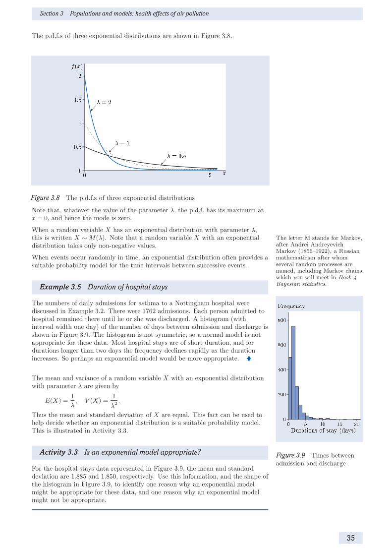
Section 3 Populations and models: health effects of air pollution
The p.d.f.s of three exponential distributions are shown in Figure 3.8.
Figure 3.8 The p.d.f.s of three exponential distributions
Note that, whatever the value of the parameter λ, the p.d.f. has its maximum atx = 0, and hence the mode is zero.
When a random variable X has an exponential distribution with parameter λ,this is written X ∼ M(λ). Note that a random variable X with an exponential The letter M stands for Markov,
after Andrei AndreyevichMarkov (1856–1922), a Russianmathematician after whomseveral random processes arenamed, including Markov chainswhich you will meet in Book 4Bayesian statistics.
distribution takes only non-negative values.
When events occur randomly in time, an exponential distribution often provides asuitable probability model for the time intervals between successive events.
Example 3.5 Duration of hospital stays
The numbers of daily admissions for asthma to a Nottingham hospital werediscussed in Example 3.2. There were 1762 admissions. Each person admitted tohospital remained there until he or she was discharged. A histogram (withinterval width one day) of the number of days between admission and discharge isshown in Figure 3.9. The histogram is not symmetric, so a normal model is not
Figure 3.9 Times betweenadmission and discharge
appropriate for these data. Most hospital stays are of short duration, and fordurations longer than two days the frequency declines rapidly as the durationincreases. So perhaps an exponential model would be more appropriate. �
The mean and variance of a random variable X with an exponential distributionwith parameter λ are given by
E(X) =1
λ, V (X) =
1
λ2.
Thus the mean and standard deviation of X are equal. This fact can be used tohelp decide whether an exponential distribution is a suitable probability model.This is illustrated in Activity 3.3.
Activity 3.3 Is an exponential model appropriate?
For the hospital stays data represented in Figure 3.9, the mean and standarddeviation are 1.885 and 1.850, respectively. Use this information, and the shape ofthe histogram in Figure 3.9, to identify one reason why an exponential modelmight be appropriate for these data, and one reason why an exponential modelmight not be appropriate.
35

Introduction to statistical modelling
Continuous uniform distributions
The third family of probability models reviewed in this subsection is the family ofcontinuous uniform distributions. A random variable X , defined on an interval[a, b], is said to have the continuous uniform distribution if its p.d.f. isf(x) = 1/(b− a), for a ≤ x ≤ b. This is written X ∼ U(a, b). All values of X inthe interval [a, b] are equally likely.
Activity 3.4 Adults with asthma
It is claimed that the age at admission to hospital for asthma of adults agedbetween 20 and 50 years is uniformly distributed: U(20, 50).
(a) Sketch the p.d.f. of this distribution.
(b) Data on the exact age of patients aged between 20 and 50 years who areadmitted for asthma are available. Given the data, what type of graph mightyou use to investigate the claim that the uniform probability model isappropriate for describing the variation in the age of such patients?
The families of probability models reviewed in this subsection are summarized inthe following box.
Probability models for continuous random variables
The random variable X is normally distributed with mean µ and variance σ2
if the p.d.f. of X is given by
f(x) =1
σ√2π
exp
(−1
2
(x− µ
σ
)2), −∞ < x < ∞.
This is written X ∼ N(µ, σ2). The normal distribution with mean 0 andvariance 1 is called the standard normal distribution. The letter Z isused to denote the standard normal random variable: Z ∼ N(0, 1).
If the random variable X has an exponential distribution withparameter λ, its p.d.f. is given by
f(x) = λe−λx, x ≥ 0.
This is written X ∼ M(λ). Its mean is 1/λ and its variance is 1/λ2.
A random variable X with the continuous uniform distribution on theinterval [a, b] has p.d.f. given by
f(x) =1
b− a, a ≤ x ≤ b.
This is written X ∼ U(a, b).
3.3 Probability models for discrete randomvariables
The continuous uniform distribution has a discrete counterpart, the discreteuniform distribution. The family of discrete uniform distributions is indexed bya single parameter n. The discrete uniform distribution with parameter n is amodel for a random variable X that can take values on a discrete set of n points,which are usually labelled 1, 2, . . . , n for convenience. The p.m.f. of X is
p(x) = P (X = x) =1
n, x = 1, 2, . . . , n.
So the n possible outcomes are all equally likely.
36

Section 3 Populations and models: health effects of air pollution
Often there are just two possible outcomes. For example, a child might or mightnot be admitted to hospital with asthma on a particular day; and a personadmitted to hospital with asthma will be male or female. In this case, the randomvariable X is said to be binary, and the outcomes are often labelled 0 and 1.
The discrete uniform distribution on {0, 1} is very restrictive, as it implies that {0, 1} is mathematical notationfor the set containing thenumbers 0 and 1.
both outcomes have probability 0.5. A more general and more useful probabilitymodel for a binary random variable X is the Bernoulli distribution. The familyof Bernoulli distributions is indexed by a single parameter p, wherep = P (X = 1); p is called the Bernoulli probability or success probability. Ifa random variable X has a Bernoulli distribution with parameter p, this is writtenX ∼ Bernoulli(p). The mean and variance of X are given by
E(X) = p, V (X) = p(1− p).
The Bernoulli model is useful primarily as a building block for other models. Themost important of these models is the binomial distribution. This isintroduced in Example 3.6.
Example 3.6 Gender and asthma
Information on the gender distribution of persons with asthma can help to informstrategies for controlling the disease. Records of the hospital admissions forasthma described in Example 3.2 include data on the gender of persons withasthma. Over the data collection period, 1762 persons were admitted for asthma,and records on their gender were available for 1761 persons.
The gender of a person admitted to hospital for asthma can be represented by abinary random variable X with a Bernoulli(p) distribution as follows: X = 1 ifthe case is female, X = 0 if the case is male, and p = P (X = 1) is the probabilitythat the case is female.
Let Xi denote the gender of the ith person admitted. Then the total number offemales among a sample of 1761 admissions is a random variable R, where
R = X1 +X2 + · · ·+X1761. We could just as well havedefined a random variable X byX = 1 if a person is male andX = 0 if a person is female.Then R would be the number ofmales in a sample of 1761admissions.
Clearly, R can take any of the values 0, 1, 2, . . . , 1761. It is a discrete randomvariable with range {0, 1, 2, . . . , 1761}. However, its distribution is not uniformsince the values are not all equally likely. For example, if an asthma case isequally likely to be male or female, so that P (X = 1) = P (X = 0) = 0.5, then youwould expect about half the admissions to be female. So, for example, the valuesR = 880 or R = 881 are more likely than the value R = 0.
Provided that the gender of one person admitted does not influence the gender ofanother (which is a reasonable assumption in this case), the random variable Rhas the binomial distribution with parameters 1761 and p; this is writtenR ∼ B(1761, p).
Of the asthma cases admitted to the Nottingham hospital, 907 were female and854 were male. So a sensible estimate of the success probability p is907/1761 ≃ 0.515. �
The term Bernoulli trial is used to describe a single statistical experiment forwhich there are just two possible outcomes. So, in Example 3.6, whether or not apatient admitted to hospital for asthma is male or female is a Bernoulli trial. InExample 3.6, it was assumed that the outcome of one Bernoulli trial did notinfluence the outcome of another; that is, it was assumed that the Bernoulli trialswere independent. The corresponding Bernoulli random variables are said to beindependent.
37

Introduction to statistical modelling
In general, a random variable X is said to have a binomial distribution withparameters n and p , written X ∼ B(n, p), if it is the sum of n independentBernoulli random variables each with success probability p. The random variableX is discrete, and takes values in {0, 1, 2, . . . , n}. Its p.m.f. is
p(x) =
(nx
)px(1 − p)n−x, x = 0, 1, 2, . . . , n.
The bracketed term at the front is read ‘n C x’, or alternatively as ‘n choose x’.It is defined as follows:
(nx
)=
n!
x!(n− x)!,
where x! = 1× 2× · · · × x, 0! = 1. x! is read ‘x factorial’. Much usewill be made of the binomialmodel in Book 1 Medicalstatistics, but you will not berequired to calculate binomialprobabilities.
The binomial distribution, B(n, p), provides a probability model for the totalnumber of successes in a sequence of n independent Bernoulli trials, in which theprobability of success in a single trial is p.
The mean and variance of X ∼ B(n, p) are
E(X) = np, V (X) = np(1− p).
The p.m.f.s of three binomial distributions are shown in Figure 3.10.
Figure 3.10 Three binomial models with n = 20
A binomial distribution has a single mode. It is right-skew when the parameterp < 0.5, left-skew when p > 0.5, and symmetric when p = 0.5. The binomialmodel is very commonly used to represent data on the number of individuals witha particular attribute in a sample of given size.
Activity 3.5 Severity of asthma cases
One way to classify the severity of cases of asthma admitted to hospital is by theirlength of stay. For example, a case might be regarded as severe if one or moredays in hospital are required. Of the 1762 admissions for asthma at theNottingham hospital, 500 were admitted for less than a day.
(a) Identify a suitable model for R, the number of patients admitted for less thana day in a sample of 1762 admitted for asthma. Use the data for theNottingham hospital to estimate the values of the parameters.
(b) Calculate the mean and variance of R using the model you specified inpart (a).
38

Section 3 Populations and models: health effects of air pollution
Both the discrete uniform distribution and the binomial distribution have a finiterange — {1, . . . , n} for the discrete uniform model and {0, 1, . . . , n} for thebinomial model. The distribution described in Example 3.7 has an unboundedrange {0, 1, 2, . . .}.
Example 3.7 Daily number of asthma admissions
In the Nottingham hospital at which the data used in this section were collected,1762 persons were admitted on 1643 days, so on average 1.072 persons wereadmitted per day. However, the mean number of admissions per day does notprovide any information about the variation in the number of admissions fromday to day. Was just one person admitted on most days? Or were all1762 persons admitted on the same day?
A bar chart of the data is shown in Figure 3.11.
On most days, the number of admissions was 0, 1 or 2, but there were some dayswith more than two admissions. On one day, 14 patients were admitted (this isbarely visible on Figure 3.11). This is the sort of pattern that might be expectedif all individuals in a large population have the same low probability of beingadmitted to hospital with asthma. There is no pre-determined maximum numberof admissions, but numbers very much larger than the mean are exceptional,though not impossible. �
Figure 3.11 Dailyadmissions for asthma
The characteristics of the distribution described in Example 3.7 are typical of amember of a family of distributions called Poisson distributions. This family ofdistributions is indexed by a single parameter µ. The parameter µ of a Poissondistribution is the mean of the distribution. If a random variable X has thePoisson distribution with mean µ, this is written X ∼ Poisson(µ). The p.m.f. ofX is
p(x) =µxe−µ
x!, x = 0, 1, 2, . . . .
The mean and variance of X are given by
E(X) = µ, V (X) = µ.
So both the mean and variance of a Poisson distribution are equal to µ. ThePoisson model is often used to represent counts of independently occurring events.
Activity 3.6 A model for admissions
In Table 3.1, a probability model for the number of asthma admissions per daywas suggested. This model was based on the Poisson distribution with mean1.072.
(a) For X ∼ Poisson(1.072), calculate the value of p(x) for x = 0, 1, 2. Check thatthese values are the same as those given in Table 3.1.
(b) The variance of the number of admissions is 1.285. Explain whether or not,in your view, the Poisson model is adequate.
39

Introduction to statistical modelling
The main properties of the three discrete distributions described in thissubsection are summarized in the following box.
Probability models for discrete random variables
If a random variable X has a binomial distribution with parameters nand p, then its p.m.f. is given by
p(x) =
(nx
)px(1− p)n−x, x = 0, 1, 2, . . . , n.
This is written X ∼ B(n, p). The mean of X is np and the variance isnp(1− p).
If a random variable X has a Poisson distribution with parameter µ, thenits p.m.f. is given by
p(x) =µxe−µ
x!, x = 0, 1, 2, . . . .
This is written X ∼ Poisson(µ). The mean and variance of X are both equalto µ.
If a random variable X has the discrete uniform distribution on{1, 2, . . . , n}, then its p.m.f. is
p(x) =1
n, x = 1, 2, . . . , n.
Summary of Section 3
In this section, the distinction between populations and samples has beendiscussed. Population summaries, including the mean, variance and standarddeviation, have been reviewed. Quantiles for continuous random variables havebeen defined, including the median and the quartiles. A range of commonly usedprobability models for continuous and discrete data have been presented,including the normal, exponential, continuous uniform, discrete uniform,Bernoulli, binomial and Poisson distributions.
Exercises on Section 3
Exercise 3.1 Calculating probabilities
The p.m.f. of a discrete random variable X is given in Table 3.2. Table 3.2 The p.m.f. of X
x 0 1 2 3p(x) 0.1 0.2 0.4 0.3
Calculate the values of the probabilities P (X ≤ 2) and P (X > 0).
Exercise 3.2 Quantiles of continuous random variables
A continuous random variable X has lower quartile 2.3, median 4.6 and upperquartile 6.2. Decide whether each of the following statements is true or false,giving reasons for your answers.
(a) P (X > 6.2) = 0.25.
(b) q0.1 < 4.6.
(c) q0.8 ≤ 2.3.
40

Section 4 From samples to populations: asthma and air quality
Exercise 3.3 Choosing a probability model
Figure 3.12 shows histograms of observations on two continuous random variablesX and Y defined on the interval [0, 20].
Figure 3.12 Two histograms: (a) observations on X , (b) observations on Y
Suggest a plausible probability model for each variable, giving reasons for yourchoice in each case.
4 From samples to populations: asthma and airquality
Researchers usually seek to draw general conclusions about a particular topic onthe basis of observations. In statistical terms, they are interested in populations,rather than samples. For example, ecologists might be interested in understandingthe relationship between fishing and fish stocks in the North Sea, not just indescribing what happened in the particular years for which data have beencollected; and public health doctors might be interested in whether there is a linkbetween air pollution and asthma, not just between air quality and asthmahospital admissions in a particular area.
The process of drawing conclusions about populations on the basis of samples ofdata from those populations is called statistical inference, and is the subject of The approach to statistical
inference reviewed here is aclassical, or frequentist,approach. In Book 4 Bayesianstatistics you will learn about adifferent approach to statisticalinference.
this section. In Subsection 4.1, the central limit theorem is discussed briefly. Thisis one of the fundamental results of statistical theory. Given a large sample ofdata, it can be used to infer information about the population from which thesample is drawn. This result underpins the methods described in Subsections 4.2and 4.3. In Subsection 4.2, the central limit theorem is used to obtain a plausiblerange of values for a population parameter, given a sample of data; this range ofvalues is a confidence interval for the parameter. Significance tests are used toevaluate the evidence against a particular hypothesis. In Subsection 4.3, a testbased on the central limit theorem is used to illustrate the ideas involved insignificance testing.
41

Introduction to statistical modelling
4.1 Samples and estimates
Much of statistical inference proceeds by taking averages of all the values in asample. Averages have simple statistical properties which can be exploited tomake inferences about population parameters. The central limit theorem concernsthe means of large samples. Before stating the theorem, some notation andterminology will be introduced.
In order to distinguish between an estimate and the population parameter beingestimated, an estimate is denoted by writing a ‘hat’ over the populationparameter. For example, if µ is a population mean, then µ̂ is used to denote anestimate of µ; if p is a proportion or probability, then p̂ is used to denote anestimate of p. For obvious reasons, this notation is called the hat notation. µ̂ is read ‘µ-hat’ and p̂ is read
‘p-hat’.More generally, suppose that θ is a population parameter of interest, and that θ̂ is
an estimate of θ obtained from a sample of size n (say). The estimate θ̂ iscalculated using some procedure or estimating formula. (For example, if the
parameter is the population mean, then θ̂ is the sample mean, which is calculatedby adding together the values in the sample and dividing by the sample size.)Different samples of size n will in general lead to different estimates, so theestimating formula is a random variable. This estimating formula is called an
estimator for θ. The hat notation is also used for an estimator. So θ̂ is used todenote both a random variable expressing an estimating formula and an estimateobtained from a particular sample of data.
Now consider a population with mean µ and variance σ2. Suppose that a sampleof size n is taken from this population and that the sample values are selectedindependently. An estimate of µ is given by the sample mean x: µ̂ = x. Thisestimate is an observation on the estimator µ̂ = X. Since the estimator µ̂ is arandom variable, it has a distribution. This distribution is called the samplingdistribution of the mean; it is the distribution of the means of all possiblesamples of size n from the population. The mean and variance of this distributionare given by
E(µ̂) = µ, V (µ̂) =σ2
n.
Furthermore, it can be shown that, for large n, the probability distribution of µ̂— that is, the sampling distribution of the mean — is approximately normal.These results together comprise the central limit theorem, which is statedformally in the following box.
The central limit theorem
If n independent random observations are taken from a population withmean µ and finite variance σ2, then for large n the distribution of theirmean µ̂ is approximately normal with mean µ and variance σ2/n:
µ̂ ≈ N
(µ,
σ2
n
). The symbol ≈ is read ‘has
approximately the samedistribution as’.
The central limit theorem underpins all the statistical methods described inSubsections 4.2 and 4.3. Note that it applies to the mean of both discrete andcontinuous random variables.
The standard deviation of the sampling distribution of the mean, which is equalto σ/
√n, is called the standard error of µ̂. The standard error may be
estimated by substituting the sample standard deviation s in the expressionσ/
√n. So the estimated standard error is s/
√n.
42

Section 4 From samples to populations: asthma and air quality
Activity 4.1 Daily asthma admissions
For the data on the number of admissions for asthma on each of 1643 daysdiscussed in Example 3.7, the sample variance is 1.285.
(a) Estimate the standard error of the mean daily number of admissions.
(b) Figure 4.1 shows two graphs. One represents the probability distribution ofthe daily number of admissions for asthma; the other represents the samplingdistribution of the mean number of daily admissions for samples of size 1643.Which graph represents the probability distribution, and which representsthe sampling distribution of the mean? Explain your answer.
Figure 4.1 Two distributions relating to asthma admissions
4.2 Confidence intervals
Different samples lead to different estimates, so parameter estimates are subjectto sampling error. The word ‘error’ here refers to the difference between theestimate and the true value, and does not signify that a mistake has been made.The central limit theorem makes it possible to quantify the likely size of thesampling error.
Example 4.1 Ozone levels
Ozone is a form of oxygen that forms a thin layer at high altitude. This layershields the Earth’s surface from ultraviolet sunlight. However, at ground level,ozone is a toxic pollutant: it is an important constituent of smog.
The average concentration of ozone (in parts per billion) in Nottingham wasmeasured on each of 1594 days. A histogram of these values is shown inFigure 4.2.
Note that the histogram does not suggest a normal, exponential or uniformprobability model. However, the central limit theorem applies for large sampleswhatever the distribution of the population from which the data are drawn. Sincethe sample size is large in this case (n = 1594), the central limit theorem may beused.
The mean concentration is 15.171, with sample standard deviation 8.2773. Owingto random fluctuations, it is unlikely that the population mean is exactly 15.171,the value of the sample mean. A measure of the likely discrepancy between thesample mean and the population mean is provided by the standard error of themean σ/
√n.
Figure 4.2 A histogram ofdaily average ozoneconcentrations in Nottingham
43
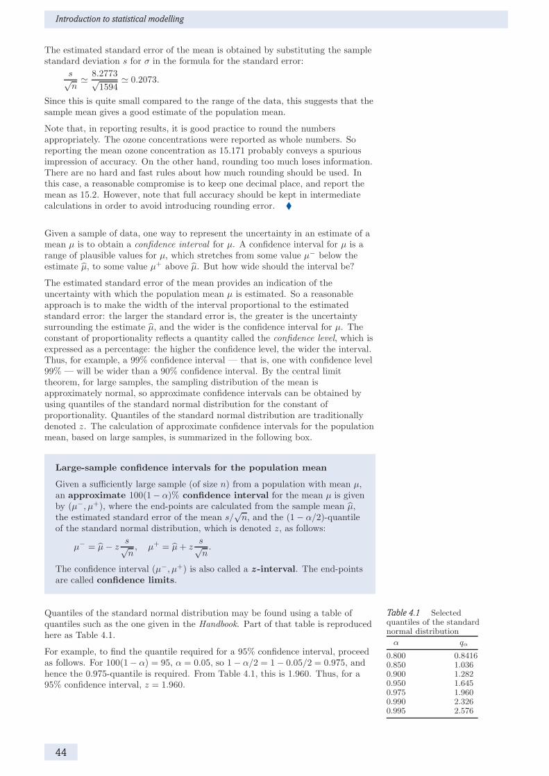
Introduction to statistical modelling
The estimated standard error of the mean is obtained by substituting the samplestandard deviation s for σ in the formula for the standard error:
s√n≃ 8.2773√
1594≃ 0.2073.
Since this is quite small compared to the range of the data, this suggests that thesample mean gives a good estimate of the population mean.
Note that, in reporting results, it is good practice to round the numbersappropriately. The ozone concentrations were reported as whole numbers. Soreporting the mean ozone concentration as 15.171 probably conveys a spuriousimpression of accuracy. On the other hand, rounding too much loses information.There are no hard and fast rules about how much rounding should be used. Inthis case, a reasonable compromise is to keep one decimal place, and report themean as 15.2. However, note that full accuracy should be kept in intermediatecalculations in order to avoid introducing rounding error. �
Given a sample of data, one way to represent the uncertainty in an estimate of amean µ is to obtain a confidence interval for µ. A confidence interval for µ is arange of plausible values for µ, which stretches from some value µ− below theestimate µ̂, to some value µ+ above µ̂. But how wide should the interval be?
The estimated standard error of the mean provides an indication of theuncertainty with which the population mean µ is estimated. So a reasonableapproach is to make the width of the interval proportional to the estimatedstandard error: the larger the standard error is, the greater is the uncertaintysurrounding the estimate µ̂, and the wider is the confidence interval for µ. Theconstant of proportionality reflects a quantity called the confidence level, which isexpressed as a percentage: the higher the confidence level, the wider the interval.Thus, for example, a 99% confidence interval — that is, one with confidence level99% — will be wider than a 90% confidence interval. By the central limittheorem, for large samples, the sampling distribution of the mean isapproximately normal, so approximate confidence intervals can be obtained byusing quantiles of the standard normal distribution for the constant ofproportionality. Quantiles of the standard normal distribution are traditionallydenoted z. The calculation of approximate confidence intervals for the populationmean, based on large samples, is summarized in the following box.
Large-sample confidence intervals for the population mean
Given a sufficiently large sample (of size n) from a population with mean µ,an approximate 100(1− α)% confidence interval for the mean µ is givenby (µ−, µ+), where the end-points are calculated from the sample mean µ̂,the estimated standard error of the mean s/
√n, and the (1− α/2)-quantile
of the standard normal distribution, which is denoted z, as follows:
µ− = µ̂− zs√n, µ+ = µ̂+ z
s√n.
The confidence interval (µ−, µ+) is also called a z -interval. The end-pointsare called confidence limits.
Quantiles of the standard normal distribution may be found using a table of Table 4.1 Selectedquantiles of the standardnormal distribution
α qα
0.800 0.84160.850 1.0360.900 1.2820.950 1.6450.975 1.9600.990 2.3260.995 2.576
quantiles such as the one given in the Handbook. Part of that table is reproducedhere as Table 4.1.
For example, to find the quantile required for a 95% confidence interval, proceedas follows. For 100(1− α) = 95, α = 0.05, so 1− α/2 = 1− 0.05/2 = 0.975, andhence the 0.975-quantile is required. From Table 4.1, this is 1.960. Thus, for a95% confidence interval, z = 1.960.
44

Section 4 From samples to populations: asthma and air quality
Example 4.2 Ozone levels — a confidence interval
An approximate 95% confidence interval for the mean daily ozone concentration iscalculated using µ̂ = 15.171, s/
√n = 0.2073, and z = 1.96 (the 0.975-quantile of
the standard normal distribution). Thus
µ− = µ̂− zs√n≃ 15.171− 1.96× 0.2073 ≃ 14.765, Note that full numerical
accuracy should be retainedthroughout these calculations:any rounding should be carriedout at the end.
µ+ = µ̂+ zs√n≃ 15.171 + 1.96× 0.2073 ≃ 15.577.
Hence an approximate 95% confidence interval for µ, the mean daily ozoneconcentration, is (14.8, 15.6). �
It follows from the central limit theorem that if samples of size n were repeatedlyand independently obtained, and the 100(1− α)% confidence interval (µ−, µ+)was calculated on each occasion, then the percentage of intervals containing thetrue value µ would be approximately 100(1− α)%, the approximation improvingas n increases. This is known as the repeated experiments interpretation ofconfidence intervals.
A limitation of the repeated experiments interpretation is that it does not help ininterpreting the confidence interval you have actually calculated, which eithercontains the true mean, or does not (and you do not know which is the case). Inpractice, statisticians use the plausible range interpretation of confidenceintervals: a confidence interval represents a range of values of µ that are plausibleat the 95% confidence level, given the observed data. The plausible rangeinterpretation is described in Example 4.3.
Example 4.3 A plausible range for the mean daily ozoneconcentration
In Example 4.1, the sample mean for the daily ozone concentrations was found tobe about 15.2 parts per billion, and in Example 4.2, you saw that a 95%confidence interval for the mean daily ozone concentration is (14.8, 15.6). Theplausible range interpretation of this confidence interval is as follows.
If the true value of µ were 15.6 or greater, then the probability of observing asample mean less than or equal to 15.2 would be 0.025 or less. Similarly, if thetrue value of µ were 14.8 or less, then the probability of observing a sample meangreater than or equal to 15.2 would also be 0.025 or less.
Thus values of µ outside the confidence interval are implausible, since they wouldrequire the data configuration to be unlikely. �
The population mean is not the only parameter for which z-intervals can becalculated. Whenever the central limit theorem applies, z-intervals can be used,so z-intervals are very versatile. Also, although they are approximate, theaccuracy of the approximation improves as the sample size increases.
In general, for a sufficiently large sample, an approximate 100(1− α)% z-intervalfor a parameter θ is denoted (θ−, θ+) and is given by
(θ−, θ+
)=(θ̂ − zσ̂, θ̂ + zσ̂
),
where θ̂ is the sample estimate of θ, σ̂ is the estimated standard error of the
estimator θ̂, and z is the (1 − α/2)-quantile of the standard normal distribution.
For example, suppose that it is required to calculate a confidence interval for aproportion p, from a sample of size n. In this case, the parameter is p, its estimateis the sample proportion p̂, and the standard error of p̂ may be estimated by
σ̂ =
√p̂(1− p̂)
n.
45
Introduction to statistical modelling
So an approximate 100(1− α)% confidence interval for p is given by the z-interval
(p−, p+) =
(p̂− z
√p̂(1− p̂)
n, p̂+ z
√p̂(1− p̂)
n
), You do not need to remember
this formula.
where z is the (1− α/2)-quantile of the standard normal distribution.
Activity 4.2 A confidence interval for the proportion of females among
asthma cases
In Example 3.6, the gender distribution of the 1762 asthma cases admitted tohospital was discussed. Of the 1761 cases for whom gender was recorded, 907 werefemale. Thus the sample proportion of females is
p̂ =907
1761≃ 0.5150.
This is an estimate of p, the underlying proportion of females among personsadmitted for asthma.
(a) Calculate an approximate 95% confidence interval for p, and summarize yourresults.
(b) From population statistics, it is known that the proportion of females amongresidents in Nottingham was 0.4976 during the period when the data werecollected. Using the plausible range interpretation, comment on whetherfemales are more or less likely than males to be admitted to hospital forasthma in Nottingham.
The calculation of z-intervals is summarized in the following box.
Large-sample confidence intervals
Given a sufficiently large sample (of size n), let θ̂ be the sample estimate ofthe population parameter θ. Then an approximate 100(1− α)% confidenceinterval or z-interval for θ, which is denoted (θ−, θ+), is given by
(θ−, θ+) =(θ̂ − zσ̂, θ̂ + zσ̂
),
where σ̂ is the estimated standard error of the estimator θ̂, and z is the(1 − α/2)-quantile of the standard normal distribution.
If θ is the population mean µ, then θ̂ is the sample mean and σ̂ = s/√n,
where s is the sample standard deviation.
If θ is a binomial proportion p, then θ̂ is the sample proportion p̂ andσ̂ =
√p̂(1 − p̂)/n.
4.3 Testing hypotheses
A confidence interval quantifies the uncertainty of an estimate due to samplingerror. Sometimes, however, scientific questions are formulated as hypothesesabout the value or values that a particular parameter may take. There are severalrelated approaches to testing hypotheses. The approach reviewed here is calledsignificance testing. You will meet several significance tests in M249. Thesewill be discussed in detail as they are required. In this subsection, data on thelengths of stay for patients admitted to hospital for asthma will be used toillustrate the steps involved in carrying out a significance test.
46

Section 4 From samples to populations: asthma and air quality
The purpose of a significance test is to evaluate the strength of the evidenceagainst a null hypothesis, denoted H0. It is sometimes convenient inconstructing the test to specify an alternative hypothesis, denoted H1. InM249, the null and alternative hypotheses will be of the form
H0 : θ = θ0, H1 : θ 6= θ0,
where θ0 denotes some particular value of the parameter θ. Alternativehypotheses of the form H1 : θ 6= θ0 are called two-sided, as they allow eitherθ < θ0 or θ > θ0. All the significance tests in M249 involve two-sided alternativehypotheses. So, on most occasions, the alternative hypothesis will not be stated You may have encountered
alternative hypotheses of theform H1 : θ > θ0. These arecalled one-sided alternativehypotheses.
explicitly, though for clarity it will be stated in this unit.
Example 4.4 Mean duration of hospital stay: the hypotheses
Suppose that an evaluation of the cost of treating asthma in hospital is based onthe assumption that the mean length of stay for patients admitted for asthma istwo days. Is this assumption valid for patients admitted to the Nottinghamhospital of Section 3?
Data on the length of hospital stay in Nottingham were described in Example 3.5and Activity 3.3. For these data, the average length of stay was 1.885 days, whichis less than 2. However, it could be hypothesized that the difference between thissample mean and 2 is due to random variation, and that the underlying meanlength of stay is indeed 2.
A significance test is required to test this hypothesis. Let µ denote the meanduration of stay for a patient admitted to hospital for asthma in Nottingham.Then the null and alternative hypotheses are as follows:
H0 : µ = 2, H1 : µ 6= 2. �
After setting out the null and alternative hypotheses, the next step is to identify asuitable test statistic, and obtain its null distribution, that is, its distribution ifthe null hypothesis is true.
Example 4.5 Mean duration of hospital stay: the test statistic
An appropriate test statistic for the significance test discussed in Example 4.4 isµ̂, the mean length of stay. Under the null hypothesis, µ̂ has mean 2. By thecentral limit theorem, the approximate distribution of µ̂ is N(2, σ2/1762), where σis the population standard deviation of the durations. The sample standarddeviation, s, is 1.850. Substituting s for σ gives the estimated standard error:
s√n≃ 1.850√
1762≃ 0.04407.
Thus, if the null hypothesis is true, the distribution of the test statistic isapproximately N(2, 0.044072).
Note that, in reporting the results, the mean length of stay could be rounded to1.9 days, since the original data were rounded to the nearest day. Similarly, thestandard deviation 1.850 could be rounded to 1.9. However, full accuracy shouldbe retained throughout the calculations. �
The observed value of the test statistic is then computed for the sample, and allvalues at least as extreme as the observed value (in relation to the nullhypothesis) are identified. Then the probability of these values under the nullhypothesis is calculated. This probability is called the significance probability,or p value, for the test.
47

Introduction to statistical modelling
Example 4.6 Mean duration of hospital stay: the p value
The value of the mean under the null hypothesis is 2. The observed value of thetest statistic is the sample mean, namely 1.885 days. Thus the difference betweenthe observed value and the value under the null hypothesis is 0.115 in magnitude.Since µ = 2 under the null hypothesis, values lying at least 0.115 below or above 2are at least as extreme as the value observed. These ‘at least as extreme’ valuescomprise the two tails of the null distribution: the lower tail is µ̂ ≤ 1.885 and theupper tail is µ̂ ≥ 2.115. The null distribution, the observed value of the teststatistic and the ‘at least as extreme’ tail regions are shown in Figure 4.3.
The significance probability, or p value, is the probability that the test statistic isat least as extreme as the value observed, if the null hypothesis is true. This isgiven by
p = P (µ̂ ≤ 1.885) + P (µ̂ ≥ 2.115),
where µ̂ ≈ N(2, 0.044072). This probability, calculated using a computer, isapproximately 0.00907. Thus the p value is about 0.009. �
Figure 4.3 The nulldistribution of the teststatistic, showing theobserved value and the ‘atleast as extreme’ tailsThe final step in a significance test is to interpret the p value. There are no hard
and fast rules on how to do this, but Table 4.2 sets out a rough guide, which willbe used throughout M249.
Table 4.2 Interpreting p values
Significance probability p Rough interpretation
p > 0.10 little evidence against H0
0.10 ≥ p > 0.05 weak evidence against H0
0.05 ≥ p > 0.01 moderate evidence against H0
p ≤ 0.01 strong evidence against H0
Example 4.7 Mean duration of hospital stay: conclusion
Following the guide in Table 4.2, our conclusion is as follows.
The p value is 0.009, so p < 0.01. So there is strong evidence against thehypothesis that the mean length of stay is two days for patients admitted to theNottingham hospital for asthma. Since the observed mean duration of hospitalstay is less than 2, this suggests that the mean duration is less than two days. �
The steps involved in conducting a significance test are set out in the followingbox.
Significance testing
1 Determine the null hypothesis H0 and the alternative hypothesis H1.
2 Choose a suitable test statistic and determine the null distribution ofthe test statistic.
3 Calculate the observed value of the test statistic and identify the valuesthat are at least as extreme as the observed value in relation to H0.
4 Calculate the significance probability p.
5 Interpret the significance probability and report the results.
48

Section 4 From samples to populations: asthma and air quality
Activity 4.3 Gender and asthma cases
In Activity 4.2 you calculated a confidence interval for the proportion p ofhospital admissions for asthma who are female, and compared this to theproportion of females in the population, which is 0.4976.
It is required to test the null hypothesis that the proportion of hospitaladmissions for asthma who were female is the same as the proportion of femalesin the population, using the sample of size 1761 patients described in Activity 4.2,907 of whom were female.
(a) State the null and alternative hypotheses for the test.
(b) An appropriate test statistic is X , the number of females admitted tohospital with asthma, out of 1761. Specify the null distribution of X .
(c) The significance probability for the test is 0.146. Interpret this significanceprobability. Are females more likely or less likely than males to be admittedto hospital for asthma?
Summary of Section 4
In this section, the hat notation for estimates and estimators has been introduced.The sampling distribution of the mean and the standard error of the mean havebeen defined, and the role of the central limit theorem in statistical inference hasbeen outlined. Large-sample confidence intervals, or z-intervals, have beendescribed, together with their interpretations in terms of repeated experimentsand plausible ranges. Significance testing has been reviewed briefly. The stepsinvolved in carrying out a test have been discussed. These include defining thenull and alternative hypotheses, choosing the test statistic, determining its nulldistribution, and interpreting significance probabilities.
Exercises on Section 4
Exercise 4.1 Mercury contamination in plaice
In Exercise 1.1 you calculated the differences between the mercury contaminationlevels in plaice in the Irish Sea and the North Sea for seven years between 1984and 1993. The mean of the seven values (Irish Sea minus North Sea) is 0.053, andthe standard deviation is 0.011.
(a) Obtain a 95% z-interval for the difference between the mean mercurycontamination level in plaice in the Irish Sea and the North Sea.
(b) Briefly discuss the validity of this confidence interval.
(c) A significance test of the null hypothesis that there is no difference betweenthe mean mercury contamination levels in the two sea areas is to beundertaken using these data. State the null and alternative hypotheses forthe test.
(d) The p value for the test is reported as being less than 0.001. Interpret thisresult. Do the mean contamination levels in plaice differ in the two sea areas?
49

Introduction to statistical modelling
Exercise 4.2 Asthma in young children
Of the 1762 hospital admissions for asthma described in Example 3.5, 452 were ofchildren aged between 0 and 6 years.
(a) Obtain an approximate 95% confidence interval for p, the underlyingproportion of children aged between 0 and 6 years among hospital admissionsfor asthma.
(b) A significance test is to be conducted of the null hypothesis that a quarter ofall hospital admissions for asthma are children aged between 0 and 6 years.State the null and alternative hypotheses for the test.
(c) The significance probability for the test is 0.545. Interpret this result. Is itcorrect to conclude that children aged between 0 and 6 years account formore than a quarter of all hospital admissions for asthma?
5 Related variables: pollutants and people
In this section, statistical methods for describing the association, if any, betweentwo variables are reviewed. Associations between continuous variables arediscussed in Subsection 5.1 using data on air pollutants. Associations betweendiscrete variables are discussed in Subsection 5.2 using data on hospitaladmissions for asthma.
5.1 Association between two continuous variables
Air quality is evaluated by measuring the concentrations (or levels) of severaldifferent pollutants. Data on the levels of particulate matter in the air in centralNottingham on each 1472 days were discussed in Subsection 3.1. In this See Example 3.1.
subsection, data from the same source on the concentrations of five pollutants arediscussed: carbon monoxide (CO), nitric oxide (NO), nitrogen dioxide (NO2),ozone (O3) and particulate matter (PM10). The PM10 level is measured in Data such as these, involving
several variables, are calledmultivariate. In Book 3Multivariate analysis, you willlearn special techniques foranalysing such data.
micrograms per cubic metre (µgm−3); the CO concentration is measured in partsper million (ppm); the others are measured in parts per billion (ppb).
Example 5.1 Ozone and nitrogen dioxide levels
A scatterplot of the ozone (chemical formula O3) and nitrogen dioxide (NO2)concentrations in central Nottingham is shown in Figure 5.1.
Figure 5.1 A scatterplot of O3 and NO2 concentrations
50

Section 5 Related variables: pollutants and people
Each point in Figure 5.1 represents a pair of daily averages for the same day,measured in parts per billion (ppb). The pattern of the points on the scatterplotslopes downwards from left to right: ozone concentrations tend to be high whenthe nitrogen dioxide concentration is low, and low when the nitrogen dioxideconcentration is high. �
In Example 5.1, knowing the value of one of the concentrations tells yousomething about the value of the other: the two variables are said to be relatedor associated. Note that the words ‘related’ and ‘associated’ do not imply thatone variable directly or indirectly influences the other. They just mean that thetwo variables tend to vary together in some systematic way.
When two variables are related, it is often of interest to describe the way in whichthey are related. In general, two variables are said to be positively related, orpositively associated, if one tends to be high when the other is high, and lowwhen the other is low. When this is the case, the pattern of points in a scatterplotslopes upwards from left to right. Similarly, two variables are said to benegatively related, or negatively associated, if one tends to be high when theother is low, and low when the other is high. When this is the case, the pattern ofpoints in a scatterplot slopes downwards from left to right. So, for example, thetwo variables in the scatterplot in Figure 5.1, ozone concentration and nitrogendioxide concentration, are negatively related.
When the points on a scatterplot appear to be distributed randomly on eitherside of a straight line, the variables are said to be linearly related. FromFigure 5.1, it looks as though the ozone and nitrogen dioxide concentrationsmight be linearly related.
Example 5.2 Ozone and nitric oxide concentrations
A scatterplot of ozone (O3) and nitric oxide (NO) concentrations in centralNottingham is shown in Figure 5.2.
Figure 5.2 A scatterplot of O3 and NO concentrations
The scatterplot suggests that the two variables may be negatively related: highO3 concentrations tend to correspond to low NO concentrations, and low O3
concentrations to high NO concentrations. However, the scatterplot has a curvedshape, like the letter J written backwards. In this case the two variables arerelated, but the relationship is not linear. �
51

Introduction to statistical modelling
Activity 5.1 Describing relationships between continuous variables
Three scatterplots of concentrations of various pollutants in central Nottinghamare shown in Figure 5.3.
Figure 5.3 Three scatterplots of pollutant concentrations
For each of the scatterplots, describe the relationship between the variables. Inparticular, say whether the variables are positively or negatively associated. If thevariables are related, say whether or not the relationship is linear.
When two continuous variables are linearly related, the points on a scatterplot lieon either side of a straight line. However, the amount of scatter around the linemay vary. This is illustrated in Figure 5.4 for data on two pairs of randomvariables: X and Y , and X and Z.
Figure 5.4 Two scatterplots of linearly related variables: (a) X and Y(b) X and Z
The amount of scatter in Figure 5.4(a) is greater than that in Figure 5.4(b). Theassociation between X and Z, shown in Figure 5.4(b), is said to be stronger thanthat between X and Y , shown in Figure 5.4(a).
52

Section 5 Related variables: pollutants and people
A measure of the strength of a linear association is provided by the Pearsoncorrelation coefficient, which is often simply called the correlation. Thismeasure is based upon a statistic called the covariance, which describes how twovariables vary together (or ‘co-vary’).
For observations (x1, y1), (x2, y2), . . . , (xn, yn) on two random variables X and Y ,for which the sample means of the x-values and the y-values are x and yrespectively, the sample covariance is defined by
Cov(x, y) =1
n− 1
n∑
i=1
(xi − x)(yi − y). (5.1)
Consider the expression (xi − x) in (5.1). It is positive for values of xi above themean x, and negative for values below the mean. Similarly (yi − y) is positive forvalues of yi above y, and negative for values below y.
Now suppose that the random variables X and Y are positively related. Thenthey will tend to take relatively large values at the same time, and relatively lowvalues at the same time. Thus for any i, both xi and yi are likely to be abovetheir respective means, or both below their means. If both are above their means,then the two terms in brackets in (5.1) will be positive for that value of i, andtheir product will be positive, so that this data point will contribute a positivevalue to the sum in (5.1). If both xi and yi are below their means, the two termswill be negative, so again their product will be positive, and the data point willcontribute a positive value to the sum. Only when one of the values is below itsmean while the other is above, will the contribution to the sum be negative. SinceX and Y are positively related, xi and yi will tend to be either high (above theirmeans) at the same time, or low (below their means) at the same time. Thusmost terms in (5.1) will be positive, and so the covariance will be positive. This isillustrated in Figure 5.5(a).
Figure 5.5 Related variables
Similarly, if X and Y are negatively related, then negative terms will dominate inthe sum in (5.1) and the covariance will be negative (see Figure 5.5(b)). Finally, ifX and Y are not related, a positive value of (xi − x) will sometimes be pairedwith a positive value of (yi − y), and sometimes with a negative value. The resultis that about half of the terms in (5.1) will be positive and about half will benegative, thus producing a covariance close to zero (see Figure 5.5(c)).
However, the covariance depends on the scale on which X and Y are measured. Ameasure of association that does not depend on scale, is obtained if the covarianceis divided by the sample standard deviations of X and Y , denoted sx and syrespectively. So the following expression can be used as a measure of association:
r =Cov(x, y)
sxsy.
This is the Pearson correlation coefficient. It can be shown, though it will not bedone here, that its value always lies between −1 and 1. Values close to +1 arisewhen the points in the scatterplot lie close to a straight line with positive slope.Values close to −1 arise when the points in the scatterplot lie close to a straightline with negative slope.
53

Introduction to statistical modelling
The correlation coefficient for the variables in Figure 5.4(a) is 0.642, whiler = 0.970 for the variables in Figure 5.4(b).
Both correlations are positive, indicating positive relationships. The correlationbetween X and Z is greater than that between X and Y . Thus the association (orcorrelation) is stronger between X and Z than it is between X and Y .
Activity 5.2 Correlation between ozone and nitrogen dioxide
concentrations
One of the following values is the Pearson correlation coefficient for the datashown in Figure 5.1.
−2.055 −0.558 0.607 −0.981 −0.048
Say which value this is, and explain why have you ruled out each of the othervalues.
5.2 Association between two discrete variables
In Section 3 and Subsection 4.3, data on the daily number of admissions to a See Examples 3.2, 3.5, 3.6 andExamples 4.4 to 4.7.Nottingham hospital for asthma, and on their gender and length of stay in
hospital, were discussed. In this subsection, data on age and length of stay inhospital will be used to introduce some ideas concerning association betweendiscrete random variables.
Example 5.3 Age and length of hospital stay of asthma cases
When two discrete variables X and Y can take only a few distinct values, theirjoint distribution in a sample of data can be conveniently represented in a table offrequencies, such as the one in Table 5.1.
Table 5.1 Age and length of stay of persons admitted tohospital for asthma
Age group (years)Length of stay 0–19 20–59 60+ Total
Short (0–6 days) 790 698 221 1709Long (> 6 days) 9 14 29 52
Total 799 712 250 1761
This table is called a contingency table. Table 5.1 is a 2× 3 table, becausethere are two row categories and three column categories. (The row and columntotals do not count as categories.)
In Table 5.1, the age of 1761 patients admitted to hospital for asthma has beencategorized in three groups: children and teenagers (aged 0–19 years), young andmiddle-aged adults (aged 20–59) and older adults (60+). The length of stay inhospital has been categorized in two groups: short (0 to 6 days), and long (morethan 6 days). �
54

Section 5 Related variables: pollutants and people
Example 5.4 Estimating probabilities from a contingency table
Let the variable X denote the age of a randomly chosen person admitted tohospital for asthma, and let Y denote the length of their stay in hospital. If youknew the probability distribution of X , you could find, for instance, theprobability p1 that a randomly chosen person admitted to hospital for asthma isaged between 20 and 59 years. The true distribution of X is unknown, but thedata in Table 5.1 can be used to obtain an estimate p̂1 of this probability. Thetotal number of persons aged between 20 and 59 years among the 1761 admittedfor asthma is 712, so
p̂1 =712
1761≃ 0.404.
Similarly, suppose that an estimate is required of the probability p2 that arandomly chosen person admitted to hospital for asthma is aged between 20 and59 years and remains in hospital for more than 6 days. From Table 5.1, out of1761 persons admitted for asthma, the total number of persons who are agedbetween 20 and 59 years and who remain in hospital for more than 6 days is 14.Hence an estimate of p2 is given by
p̂2 =14
1761≃ 0.008. �
Conditional probabilities are probabilities of events of the form ‘Y = y, givenX = x’. In mathematical notation, the ‘given’ in this sentence is denoted by avertical bar. Thus
P (Y = y|X = x)
is notation for ‘the probability that Y = y, given that X = x’, or ‘the probabilitythat Y = y, conditional on X = x’. Conditional probabilities can also beestimated from a contingency table.
Example 5.5 Estimating a conditional probability
Suppose that it is required to estimate p3, the conditional probability that arandomly chosen person admitted to hospital for asthma remains there for morethan 6 days, given that the person is aged between 20 and 59 years. FromTable 5.1, the total number of admissions in persons aged between 20 and59 years is 712. Of these, 14 stayed in hospital for more than 6 days. Hence anestimate of p3 is p3 may be written as
P (Y = ‘long’ |X = ‘20–59’).Strictly speaking, randomvariables must take numericalvalues, and not category labelssuch as ‘20–59 years’. This isnot a problem as we canrepresent the categories withnumbers, for example, 1 for the0–19 age group, 2 for 20–59,3 for 60+.
p̂3 =14
712≃ 0.020.
Note that the probability p3 can equivalently be described as the probability thata randomly chosen person of age between 20 and 59 years who is admitted tohospital for asthma remains there for more than 6 days. In this description, thewords ‘given that’ do not feature. Nevertheless, the description refers to aconditional probability. �
55
Introduction to statistical modelling
Activity 5.3 Estimating probabilities from a contingency table
State whether or not each of the following statements describes a conditionalprobability. Use the data in Table 5.1 to estimate each of the probabilities.
(a) The probability that a randomly chosen person admitted to hospital forasthma is aged between 0 and 19 years.
(b) The probability that a randomly chosen person admitted to hospital forasthma is aged between 0 and 19 years and remains in hospital for more than6 days.
(c) The probability that a randomly chosen person admitted to hospital forasthma, who is aged between 0 and 19 years, remains in hospital for morethan 6 days.
Example 5.6 Dependence between age and hospital stay
Using Table 5.1, an estimate of the probability p4 that a randomly chosen personadmitted to hospital for asthma stays there for more than 6 days is given by
p̂4 =52
1761≃ 0.030.
Now consider p5, the conditional probability that a randomly chosen person p5 may be written asP (Y = ‘long’ |X = ‘60+’).admitted to hospital for asthma, who is aged 60+ years, stays there for more than
6 days. An estimate of p5 is given by
p̂5 =29
250≃ 0.116.
Thus the estimated conditional probability of a long hospital stay, given that theperson admitted is aged 60+ years, is larger than p̂4. This suggests that longerhospital stays are more likely for older patients than among patients as a whole:in other words, length of hospital stay depends on age.
The dependence of length of stay on age may also be seen from the data for theyounger age groups, for which the proportions of patients with hospital stays over6 days are lower than among all patients: 0.020 for the 20–59 year olds (as shownin Example 5.5) and 0.011 for 0–19 year olds (as you found in Activity 5.3). �
In Example 5.6, the dependence between two discrete random variables wasinvestigated by examining the effect on the distribution of one variable (length ofhospital stay) of conditioning on the value of the other variable (age). This ideacan be used to define independence for two discrete random variables.
Independent discrete random variables
Two discrete random variables X and Y are independent if, for all valuesof x and y,
P (Y = y|X = x) = P (Y = y).
If X and Y are not independent, they are said to be dependent, orrelated, or associated.
In Example 5.6, estimates were used to compare conditional and unconditionalprobabilities. However, the differences between these estimated probabilities couldbe due to sampling variation. A formal significance test is required to evaluate theevidence against the null hypothesis of no association. The statistical analysis ofassociations between discrete random variables, including tests for no association,is discussed in Book 1 Medical statistics.
56

Section 5 Related variables: pollutants and people
Activity 5.4 Age and gender of hospital admissions for asthma
Data on both age and gender were available for 1760 persons admitted to hospitalfor asthma. Table 5.2 gives the distribution of these persons by age group andgender.
Table 5.2 Age and gender of persons admitted to hospital for asthma
Age group (years)
Gender 0–19 20–59 60+ Total
Male 497 276 81 854Female 302 435 169 906
Total 799 711 250 1760
(a) Estimate the probability that a person admitted to hospital for asthma ismale.
(b) Estimate the probability that a person admitted to hospital for asthma, whois aged between 0 and 19 years, is male.
(c) What do the probabilities you estimated in parts (a) and (b) suggest aboutthe relationship, if any, between age and gender in persons admitted tohospital for asthma?
Summary of Section 5
In this section, relationships between two continuous variables have beendiscussed, and the sample covariance and the Pearson correlation coefficient havebeen defined. The estimation of probabilities, including conditional probabilities,from contingency tables has been described. These estimates have been used toinvestigate dependence between discrete random variables.
Exercises on Section 5
Exercise 5.1 Nitrogen dioxide and particulate matter
A scatterplot of nitrogen dioxide (NO2) concentrations and particulate matter(PM10) levels in the air in central Nottingham is shown in Figure 5.6.
(a) Briefly describe the relationship between nitrogen dioxide concentrations andparticulate matter levels.
(b) One of the following values is the correlation between the two variables.
−0.178 1.328 0.986 0.516 0.002
State which value is the correlation, and explain why you have not choseneach of the other values.
Exercise 5.2 Hospital admissions for asthma in older people
(a) For each of the probabilities described below, state whether or not it is aconditional probability, and use the data in Table 5.2 to estimate theprobability.
Figure 5.6 A scatterplot ofNO2 concentration and PM10
levels in central Nottingham
(i) The probability that an individual admitted to hospital for asthma isaged 60 years or over.
(ii) The probability that an individual admitted to hospital for asthma ismale and aged 60 years or over.
(iii) The probability that a male admitted to hospital for asthma is aged60 years or over.
(b) Describe how you would use the probabilities defined in part (a) toinvestigate whether age and gender are associated in persons admitted tohospital for asthma.
57

6 Statistical modelling in SPSS: the air we breathe
Throughout this section, you will use the data on air quality and asthma thathave been discussed in Sections 3, 4 and 5. The data are in the SPSS data fileairquality.sav. This data file contains information on air quality and asthmaadmissions in Nottingham, obtained for 1643 successive days between 1 January2000 and 30 June 2004. There are eight variables. The first variable, day,represents the day number: day 1 is 1 January 2000, day 2 is 2 January 2000, andso on. The next six variables give the daily average concentrations of sixpollutants: carbon monoxide (CO), nitric oxide (NO), nitrogen dioxide (NO2),ozone (O3), particulate matter (PM10), and sulphur dioxide (SO2). CO is measuredin parts per million (ppm), PM10 is measured in micrograms per cubic metre(µgm−3), and the others are measured in parts per billion (ppb). The eighthvariable, asthma, is the number of hospital admissions for asthma on each day.
Transforming data in SPSS is described in Subsection 6.1. In Subsection 6.2, youwill learn how to use SPSS to obtain confidence intervals and correlationcoefficients.
6.1 Transforming variables
Transforming one variable into another is a commonly used statistical procedure.In Subsection 3.1, the PM10 levels were transformed by taking logarithms, and thelogPM10 levels were modelled using a normal distribution. This transformationwas done so that a standard distribution could be used in the modelling process.In this subsection, you will learn how to transform variables using SPSS.
Activity 6.1 A model for nitric oxide concentrations
Open the data file airquality.sav.
(a) Obtain a histogram of nitric oxide concentrations (NO), with the first interval Use Graphs > Legacy Dialogs> Histogram. . . . Instructionsfor altering the interval widthsusing Chart Editor are givenin Activity 2.11.
starting at 0 and with interval width 5. Also obtain the mean and standarddeviation of the concentrations.
(b) Suggest a possible model for the nitric oxide concentrations.
(c) Do you think your suggested model is appropriate for these data? Give onereason in favour of your model and one reason against it.
Activity 6.2 The log transformation
Rather than attempt to model the nitric oxide concentrations directly, analternative approach is to transform them. In SPSS one variable can betransformed into another using Compute Variable. . . from the Transformmenu. Transform NO by taking natural logarithms, as follows. In M249, natural logarithms are
used, rather than logarithms toany other base.⋄ Choose Compute Variable. . . from the Transform menu (by clicking on
it). The Compute Variable dialogue box will open.
⋄ Type the name of the variable in which the transformed data are to be stored(logNO, say) in the Target Variable field.
⋄ The natural log function in SPSS is called LN. Type LN(NO) in the NumericExpression field.
⋄ Click on OK.
A new variable logNO will be created containing the logarithms of the nitric oxideconcentrations. If you wish, you can view logNO in the Data Editor.
Obtain the default histogram of logNO, and suggest a possible model for logNO.
58

Section 6 Statistical modelling in SPSS: the air we breathe
Activity 6.3 Finding a function
In Activity 6.2, you were told the SPSS name for the natural logarithm function.In this activity, instructions are given for using a function when you do not knowits SPSS name. The method is illustrated for the natural logarithm function usingthe nitric oxide concentrations. (You might like to try transforming one of thevariables using a different function of your choice.)
Obtain the Compute Variable dialogue box and click on Reset. (This removes Use Transform > ComputeVariable. . . .any previous entries and resets the SPSS defaults.) Type the name of the variable
in which the transformed data are to be stored (logNO, say) in the TargetVariable field. Then select the natural logarithm function from the list offunctions available in SPSS, as follows.
⋄ In the Function group list, select Arithmetic (by clicking on it), and a listof the arithmetic functions available in SPSS will be displayed in theFunctions and Special Variables area.
⋄ Select Ln from the list of functions (by clicking on it), and a description ofthe function will appear in the area to the left of the list.
⋄ Click on the vertical arrow just above this description, and LN(?) will beentered in the Numeric Expression field.
⋄ Replace the question mark with the variable name, NO say, by typing NO (orby entering NO from the list of variables on the left-hand side of the dialoguebox).
The dialogue box, with the relevant items highlighted, is shown in Figure 6.1.
Figure 6.1 Calculating the logarithm of NO
When you click on OK, the new variable will be created. If a variable of the same namealready exists, you will be askedif you want to change it. If indoubt, choose Cancel andchange the variable name.
In Section 3, the data on particulate matter levels and on daily hospitaladmissions for asthma were discussed separately. Is the concentration ofparticulate matter associated with asthma attacks? One way to investigate this isby comparing the numbers of admissions to hospital on days with high PM10
levels with the numbers on days with low PM10 levels. A reasonable approach isto classify as ‘low’ those PM10 levels that are less than or equal to the median,and to classify as ‘high’ those PM10 levels that are greater than the median.Combining values of a variable into categories in this way to form a categoricalvariable is called recoding in SPSS. You will learn how to do this in Activity 6.4.
59

Introduction to statistical modelling
Later, in Activity 6.6, you will compare the numbers of admissions on days withlow PM10 levels and days with high PM10 levels.
Activity 6.4 Recoding the PM10 levels
In SPSS, recoding a variable is done using Recode into Different Variables. . .from the Transform menu. In this activity you will create a categorical variablenamed PM10group from the variable PM10. The median of PM10 is 17. Values of You can check the value of the
median using Analyze >Descriptive Statistics >Frequencies. . . , as described inActivity 2.12.
PM10 that are less than or equal to the median (‘low’) will form category 1, andvalues that are greater than the median (‘high’) will form category 2.
Use Recode into Different Variables. . . to create the variable PM10group, asfollows.
⋄ Choose Recode into Different Variables. . . from the Transform menu.The Recode into Different Variables dialogue box will open.
⋄ Enter the variable PM10 in the Input Variable –> Output Variable field.This field will display PM10 –> ?.
⋄ In the Output Variable area, type PM10group, the name of the newvariable, in the Name field.
⋄ Click on Change in the Output Variable area. The display in the InputVariable –> Output Variable field will change to PM10 –> PM10group.
⋄ Click on the Old and New Values. . . button.
The Recode into Different Variables: Old and New Values dialogue boxwill open. This offers many recoding options. Begin by recoding values less thanor equal to 17 (the median of PM10) as 1, as follows.
⋄ In the Old Value area of the dialogue box, click on the fifth radio buttondown and type 17 in the Range, LOWEST through value field.
⋄ In the New Value area (on the right), type 1 in the Value field.
⋄ Click on Add.
The recoding you have defined will appear in the Old –> New area as Lowestthru 17 –> 1.
Now recode the values greater than 17 as 2, as follows.
⋄ In the Old Value area, click on the sixth radio button down, and type 17.01in the Range, value through HIGHEST field.
⋄ In the New Value area, type 2 in the Value field.
⋄ Click on Add, and the text 17.01 thru Highest –> 2 will appear in theOld –> New area.
⋄ Click on Continue, then on OK.
The new variable PM10group will appear in the Data Editor. Check that thenew variable is correct, as follows.
⋄ Obtain the Frequencies dialogue box. Use Analyze > DescriptiveStatistics > Frequencies. . . .⋄ Enter PM10group in the Variable(s) field. If Display frequency tables is
not selected — that is, if there is no tick in its check box — then select it (byclicking on it or on its check box).
⋄ Click on OK.
The following frequency table will appear in the Viewer window.
60

Section 6 Statistical modelling in SPSS: the air we breathe
This table shows that PM10 levels were measured on 1542 days. On 802 days, thePM10 level was lower than or equal to 17, and on 740 days it was greater than 17.
The recoded variable PM10group will be required in Activity 6.6, so save the datafile, which now includes PM10group, in a data file named airquality2.sav.
6.2 Confidence intervals and correlations
In this subsection, you will learn how to use SPSS to obtain confidence intervalsfor the mean, and to calculate correlation coefficients. You will need the airquality data again for the activities. In particular, in Activity 6.6 you will need thevariable PM10group that you created and saved in the data file airquality2.savin Activity 6.4. So if that data file is not still open, then open it now.
Activity 6.5 Mean daily number of asthma admissions
In this activity, you will obtain a confidence interval for the mean daily number ofhospital admissions for asthma. A confidence interval for a population mean maybe found using Explore. . . from the Descriptive Statistics submenu ofAnalyze. Summary statistics can also be found using Explore. . . . There are several ways of
obtaining summary statistics inSPSS: in Activity 2.12, you usedFrequencies. . . .
Obtain the sample mean daily number of hospital admissions for asthma, togetherwith a 95% confidence interval for the mean, as follows.
⋄ Choose Explore. . . from the Descriptive Statistics submenu ofAnalyze. The Explore dialogue box will open.
⋄ Enter asthma in the Dependent List field. Leave the Factor List field andthe Label Cases by field empty.
⋄ In the Display area, select Statistics by clicking on it or its radio button.This will limit the output to numerical summaries.
⋄ Click on the Statistics. . . button to open the Explore: Statistics dialoguebox. Check that Descriptives is checked, and that 95 appears in theConfidence Interval for Mean field. (Leave the other boxes unchecked.)
⋄ Click on Continue, and then on OK.
Two tables will appear in the Viewer window: the Case Processing Summary,which gives the number of cases processed, and the following table.
The sample mean and the 95% confidence interval are given at the top of thistable: the mean daily number of asthma admissions is 1.07, with 95% confidence This confidence interval is a
t-interval. In large samples,z-intervals and t-intervals arenearly the same. Thecalculation of t-intervals is notdescribed in M249.
interval (1.02, 1.13).
61

Introduction to statistical modelling
Activity 6.6 Particulate matter and asthma
In this activity you will obtain the sample mean number of asthma cases admittedon days with low average PM10 levels, and on days with high average PM10 levels,with 95% confidence intervals. Obtain the sample means and confidence intervals,as follows.
⋄ Obtain the Explore dialogue box. Use Analyze > DescriptiveStatistics > Explore. . . .⋄ Enter asthma in the Dependent List field and PM10group in the Factor
List field. (Leave the Label Cases by field empty.)
⋄ In the Display area, select Statistics.
⋄ Click on the Statistics. . . button to open the Explore: Statistics dialoguebox. Check that Descriptives is checked, and that 95 appears in theConfidence Interval for the Mean field. (Leave the other boxesunchecked.)
⋄ Click on Continue, and then on OK.
In the Viewer window, locate the Descriptives table. Notice that there are twosub-tables, corresponding to the categories PM10group = 1 and PM10group = 2.Use these sub-tables to write down the mean number of hospital admissions forasthma on days with low average PM10 levels, and the mean number on days withhigh average PM10 levels. Also write down the 95% confidence intervals for theunderlying means.
In your view, do these results lend support to the hypothesis that the higher theaverage daily PM10 level, the greater the number of persons admitted to hospitalfor asthma?
Activity 6.7 Carbon monoxide and nitric oxide
Air quality can be measured in many different ways. In the Nottingham airquality data, concentrations of several pollutants are given. Relationships betweenpollutants can be investigated by producing scatterplots and calculatingcorrelation coefficients. You learned how to obtain a scatterplot in Activity 2.10.Correlation coefficients are calculated using Bivariate. . . from the Correlatesubmenu of Analyze. In this activity you will calculate the correlation betweenthe carbon monoxide and nitric oxide concentrations in the air.
Obtain a scatterplot of CO (carbon monoxide concentration) against NO (nitricoxide concentration). Use Graphs > Legacy Dialogs
> Scatter/Dot. . . .A scatterplot is shown in Figure 6.2.
Figure 6.2 A scatterplot of CO against NO
This scatterplot indicates a rather strong linear relationship between the twovariables.
62

Section 6 Statistical modelling in SPSS: the air we breathe
Obtain the correlation between CO and NO, and carry out a significance test of thenull hypothesis of zero correlation, as follows.
⋄ Choose Bivariate. . . from the Correlate submenu of Analyze. TheBivariate Correlations dialogue box will open.
⋄ Enter CO and NO in the Variables field.
⋄ In the Correlation Coefficients area, make sure that Pearson is checked;and in the Test of Significance area, make sure that Two-tailed isselected.
⋄ Deselect Flag significant correlations (by clicking on it or on the tick inits check box).
⋄ Click on OK.
The following table will appear in the Viewer window.
Look at the top entries in the NO column. The Pearson correlation coefficientbetween CO and NO is 0.837; it was calculated from N = 1562 pairs of values. (Ofcourse, this is the same as the correlation between NO and CO.)
SPSS has conducted a significance test of the null hypothesis of zero correlation.The significance probability for the test is given in the row labelledSig. (2-tailed). This is quoted as .000, which means that p < 0.0005.
Thus there is strong evidence against the null hypothesis of zero correlation, andhence strong evidence that carbon monoxide and nitric oxide concentrations inthe air are related.
Summary of Section 6
In this section, you have learned how to transform and recode data in SPSS, andhow to obtain a confidence interval for the mean. The calculation of correlationcoefficients has been described. These methods have been applied to data on airquality and asthma in Nottingham.
63

7 Modelling exercises
The purpose of these exercises is to give you more practice, if you feel you need it,in using SPSS to apply the methods described in this unit.
Exercise 7.1 Mercury in North Sea and Irish Sea plaice
In Activity 1.5 you compared the levels of mercury contamination in plaice in theNorth Sea and in the Irish Sea. In this exercise you will investigate the issuefurther. The data are stored in the SPSS data file mercury.sav. These data are in Table 1.3.
(a) Create a variable diff containing the differences between the mercurycontamination levels in the Irish Sea and the North Sea (Irish Sea minusNorth Sea) for years when data are available from both sea areas, as follows.
⋄ Obtain the Compute Variable dialogue box.
⋄ Type diff in the Target Variable field.
⋄ Enter Irishsea − Northsea in the Numeric Expression field. To enter the minus sign, click onthe minus button on thecalculator keypad below theNumeric Expression field.
⋄ Click on OK.
How does SPSS cope with the missing values?
(b) Obtain a histogram of the differences, with bin width 0.015.
(c) Estimate the mean difference and obtain a 95% confidence interval for themean difference in mercury concentrations.
(d) Summarize your conclusions.
Exercise 7.2 Catch and biomass of North Sea cod
It might be expected that the annual catch is positively related to the spawningstock biomass for the simple reason that the more fish there are in the sea, themore will be caught. Use the data file cod.sav to investigate this hypothesis as it This data set is described in
Activity 2.8. This exercise usesthe variables biomass andcatch.
relates to cod in the North Sea.
(a) Obtain a scatterplot of catch against biomass. What do you conclude aboutthe relationship between catch and biomass?
(b) Obtain the Pearson correlation coefficient between catch and biomass, andthe p value for the significance test of the null hypothesis of zero correlation.
(c) Interpret the p value you obtained in part (b).
Exercise 7.3 Nitrogen oxides in the air
In the solution to Activity 6.2, it was suggested that a normal model may beappropriate for describing the day-to-day variation in the logarithms of averagedaily NO concentrations. In this exercise you will consider the distribution ofnitrogen dioxide (NO2) concentrations, and the relationship between NO2
concentrations and nitric oxide (NO) concentrations. The data are in the data fileairquality.sav.
(a) Create a variable named sqrtNO2 containing the square root of NO2. Obtain Use Transform > ComputeVariable. . . and the functionSqrt.
histograms of NO2 and sqrtNO2, and calculate the sample skewness of bothvariables.
(b) Briefly describe the results you obtained in part (a). Is a normal modelappropriate for NO2 or for sqrtNO2?
(c) Create a variable named logNO containing the logarithms of the nitric oxideconcentrations. Obtain scatterplots of NO against sqrtNO2, and logNO againstsqrtNO2.
(d) Calculate the Pearson correlation coefficients between NO and sqrtNO2, andbetween logNO and sqrtNO2.
(e) Which of the correlation coefficients that you calculated in part (d) is larger?Use the scatterplots you obtained in part (c) to explain why it is larger.
64

Section 7 Modelling exercises
Exercise 7.4 Hospital stays
In this exercise you will examine the lengths of stay for males and females who areadmitted to hospital for asthma, and how they differ. This may be explored usingthe data in asthma.sav using the variables stay and sex.
(a) Obtain an estimate of the mean length of stay, the sample standard deviationand a 95% confidence interval for the mean stay, for males and femalesseparately.
(b) What do your findings from part (a) suggest?
(c) A significance test of the null hypothesis that the mean length of stay is thesame for males and females yields the p value 0.001. What do you conclude?
65

Summary of Unit
A statistical analysis often begins with exploring the data using various graphicalmethods. The graphs reviewed in this unit include bar charts, line plots,scatterplots and histograms. Numerical summaries, including measures of locationand dispersion, can also help to describe a data set. The measures reviewedinclude the mean, median, mode, standard deviation and variance. Severalcommonly used probability models have been described: the normal, exponentialand uniform models for continuous variables, and the binomial, Poisson anduniform models for discrete data. A key aspect of statistical modelling is to drawinferences about populations on the basis of samples. Methods for drawing suchinferences, including z-intervals and significance tests, have been discussed. Themethods described are valid for large samples and depend on the central limittheorem. Techniques for describing and quantifying the association between twovariables, including correlation coefficients and conditional probabilities, havebeen reviewed. The implementation of these statistical methods in SPSS has beendescribed.
Learning outcomes
You have been working to develop the following skills.
⋄ Explore a data set using appropriate graphs and numerical summaries.
⋄ Interpret graphs and numerical summaries.
⋄ Select an appropriate probability model for a continuous random variable ora discrete random variable.
⋄ Calculate approximate confidence intervals for means and proportions.
⋄ Describe the rationale underlying significance tests.
⋄ Interpret significance probabilities.
⋄ Interpret the Pearson correlation coefficient.
⋄ Estimate conditional probabilities and explore dependence in contingencytables.
You have also been working to acquire the following skills in using SPSS.
⋄ Manipulate, transform and recode data.
⋄ Construct and customize graphs including bar charts, line plots, scatterplotsand histograms.
⋄ Calculate numerical summaries including measures of location and measuresof dispersion.
⋄ Calculate confidence intervals for the mean.
⋄ Calculate Pearson correlation coefficients.
⋄ Print output, and export output for use in other documents.
66

Solutions to Activities
Solution 1.1
(a) There is considerable variation between species,but for most species the catch declined between 1979and 1999.
(b) For sole, the catch appears to have remainedbroadly constant. For herring, the catch was verymuch lower in 1979 than in 1989 and 1999.
Solution 1.2
(a) The biomass declined steeply during the 1970s.The annual catch exceeded the biomass between 1968and 1977. This could indicate over-fishing, which mayhave endangered the ability of mature fish to replenishstocks naturally.
(b) The biomass rose again in the 1980s as theherring stocks recovered. The start of this recoverycoincides with the restrictions on herring fishing. Notethat such a coincidence does not in general prove acausal relation. However, in this case it is well knownthat over-fishing endangers fish stocks, so a causalexplanation is reasonable.
Solution 1.3
(a) The number of new recruits increases with thebiomass, at least for lower values of the biomass. Thetrend is increasing: it may be linear, or it may levelout as the biomass increases.
(b) The variability in the number of recruits increasesmarkedly with the biomass, as shown by the funnelshape of the scatterplot.
(c) The point in the bottom right-hand corner of thescatterplot corresponds to the highest biomass but arather low number of recruits. If the relationshipbetween the two variables were linear, then this pointwould be an outlier. This point and other points thatmight be considered outliers have been circled inFigure S.1. (You might have identified other points aspossible outliers.)
Figure S.1 Possible outliers
Solution 1.4
(a) In each year, the modal fish species is the specieswith the highest catch. In 1979, it was cod; in 1989and 1999, it was herring.
(b) As there are 37 values, the median is thenineteenth value. From Figure 1.6(a), there are6 values in the first interval (0–200), 8 in the second(200–400), and 7 in the third (400–600). So thenineteenth largest value lies in the third interval, andhence the median lies between 400 000 and 600000tonnes.
Solution 1.5
(a) There are eight values. The mean is
x = 1
8(0.11 + 0.09 + · · ·+ 0.09)
= 0.10375 ≃ 0.104.
The eight values, arranged in order of increasing size,are as follows.
0.09 0.09 0.10 0.10 0.11 0.11 0.11 0.12
The median is halfway between the two middle values,which are 0.10 and 0.11. Hence the median m is 0.105.
(b) Using the value 0.10375 for the mean leads tovalues of 0.0001125 for the variance and0.0106066 . . .≃ 0.0106 for the standard deviation. Forsimplicity, the calculations are illustrated here usingthe rounded value of 0.104 for the mean.
The variance is given by
s2 ≃ 1
7
((0.09− 0.104)2 + · · ·+ (0.12− 0.104)2
)
= 0.00011257 . . .
≃ 0.000113.
So the standard deviation is
s =√0.00011257 . . .≃ 0.0106.
Using the rounded value for the mean whencalculating the variance has not resulted in a largerounding error in this case. However, in general, usinga rounded value for the mean is not recommended asit will often lead to rounding errors being introduced.
Solution 3.1
(a) Since the probabilities sum to 1,
P (X ≥ 5) = 1−(p(0) + p(1) + p(2) + p(3) + p(4)
)
= 1− (0.342 + 0.367 + 0.197 + 0.070 + 0.019)
= 0.005.
Also,
P (X ≤ 2) = p(0) + p(1) + p(2) = 0.906.
Finally,
P (X > 2) = 1− P (X ≤ 2) = 1− 0.906 = 0.094.
(b) The probability that there is at least oneadmission is
P (X ≥ 1) = 1− p(0) = 1− 0.342 = 0.658.
Hence there is at least one admission on 65.8% ofdays.
67
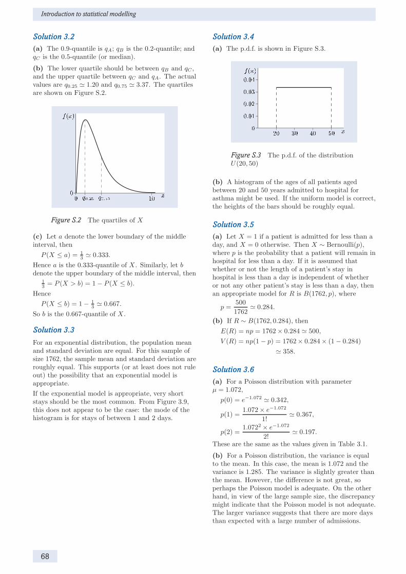
Introduction to statistical modelling
Solution 3.2
(a) The 0.9-quantile is qA; qB is the 0.2-quantile; andqC is the 0.5-quantile (or median).
(b) The lower quartile should be between qB and qC ,and the upper quartile between qC and qA. The actualvalues are q0.25 ≃ 1.20 and q0.75 ≃ 3.37. The quartilesare shown on Figure S.2.
Figure S.2 The quartiles of X
(c) Let a denote the lower boundary of the middleinterval, then
P (X ≤ a) = 1
3≃ 0.333.
Hence a is the 0.333-quantile of X . Similarly, let bdenote the upper boundary of the middle interval, then
1
3= P (X > b) = 1− P (X ≤ b).
Hence
P (X ≤ b) = 1− 1
3≃ 0.667.
So b is the 0.667-quantile of X .
Solution 3.3
For an exponential distribution, the population meanand standard deviation are equal. For this sample ofsize 1762, the sample mean and standard deviation areroughly equal. This supports (or at least does not ruleout) the possibility that an exponential model isappropriate.
If the exponential model is appropriate, very shortstays should be the most common. From Figure 3.9,this does not appear to be the case: the mode of thehistogram is for stays of between 1 and 2 days.
Solution 3.4
(a) The p.d.f. is shown in Figure S.3.
Figure S.3 The p.d.f. of the distributionU(20, 50)
(b) A histogram of the ages of all patients agedbetween 20 and 50 years admitted to hospital forasthma might be used. If the uniform model is correct,the heights of the bars should be roughly equal.
Solution 3.5
(a) Let X = 1 if a patient is admitted for less than aday, and X = 0 otherwise. Then X ∼ Bernoulli(p),where p is the probability that a patient will remain inhospital for less than a day. If it is assumed thatwhether or not the length of a patient’s stay inhospital is less than a day is independent of whetheror not any other patient’s stay is less than a day, thenan appropriate model for R is B(1762, p), where
p =500
1762≃ 0.284.
(b) If R ∼ B(1762, 0.284), then
E(R) = np = 1762× 0.284 ≃ 500,
V (R) = np(1− p) = 1762× 0.284× (1− 0.284)
≃ 358.
Solution 3.6
(a) For a Poisson distribution with parameterµ = 1.072,
p(0) = e−1.072 ≃ 0.342,
p(1) =1.072× e−1.072
1!≃ 0.367,
p(2) =1.0722 × e−1.072
2!≃ 0.197.
These are the same as the values given in Table 3.1.
(b) For a Poisson distribution, the variance is equalto the mean. In this case, the mean is 1.072 and thevariance is 1.285. The variance is slightly greater thanthe mean. However, the difference is not great, soperhaps the Poisson model is adequate. On the otherhand, in view of the large sample size, the discrepancymight indicate that the Poisson model is not adequate.The larger variance suggests that there are more daysthan expected with a large number of admissions.
68

Solutions to Activities
Solution 4.1
(a) The estimated standard error of the mean is
s√n≃
√1.285√1643
≃ 0.0280.
(b) Figure 4.1(a) shows the p.m.f. of a discreterandom variable, and is similar in shape to thehistogram of numbers of daily admissions inFigure 3.11. Thus it represents the p.m.f. of thedistribution of the daily number of admissions forasthma. Figure 4.1(b) shows the p.d.f. of a continuousrandom variable, which appears to be normal. Henceit is the sampling distribution of the mean.
Solution 4.2
(a) The sample estimate is p̂ ≃ 0.5150, so
p− = p̂− z
√p̂(1− p̂)
n
≃ 0.5150− 1.96×√
0.5150× (1− 0.5150)
1761
≃ 0.4917,
p+ = p̂+ z
√p̂(1− p̂)
n
≃ 0.5150 + 1.96×√
0.5150× (1− 0.5150)
1761
≃ 0.5383.
Hence the estimated proportion is about 0.515, and anapproximate 95% confidence interval for p is(0.492, 0.538). (In reporting the results, three decimalplaces have been kept in view of the large sample size.)
(b) The value 0.4976 is included in the 95%confidence interval, and hence is plausible at the 95%confidence level. Thus it is plausible that the genderdistribution of asthma cases admitted to hospital isthe same as the gender distribution of the generalpopulation. This does not suggest that females areany more or less likely than males to be admitted tohospital for asthma.
Solution 4.3
(a) Let p denote the underlying proportion ofhospital admissions for asthma who are female. Thenull and alternative hypotheses are as follows:
H0 : p = 0.4976, H1 : p 6= 0.4976.
(b) Under the null hypothesis, the probability that ahospital admission for asthma is female is 0.4976. So,under the null hypothesis, X ∼ B(1761, 0.4976).
(c) The significance probability 0.146 provides littleevidence against the null hypothesis. Thus there islittle evidence that the proportion of hospitaladmissions for asthma who are female differs from theproportion of females in the population. From this itmay be concluded that there is little evidence thatmales and females differ in their likelihood of beingadmitted to hospital for asthma.
Solution 5.1
Figure 5.3(a): NO and NO2 concentrations arepositively related, but the relationship is not linear.
Figure 5.3(b): NO and CO concentrations arepositively related, and the relationship seems to belinear.
Figure 5.3(c): There is no clear relationship betweenO3 concentrations and PM10 levels.
Solution 5.2
The correlation for the data in Figure 5.1 is −0.558.The value −2.055 does not lie between −1 and +1, soit is not a correlation. The value 0.607 is positive,whereas the variables are negatively associated. Thevalue −0.981 indicates a very strong association, withlittle scatter, which is not the case. The value −0.048is close to 0, indicating a very weak association, whichis not the case in Figure 5.1.
Solution 5.3
In each case the probability is denoted p.
(a) This probability is not a conditional probability.An estimate of p is given by
p̂ =799
1761≃ 0.454.
(b) This probability is not a conditional probability.An estimate of p is given by
p̂ =9
1761≃ 0.005.
(c) This probability is a conditional probability.An estimate of p is given by
p̂ =9
799≃ 0.011.
The probability may be written as
P (Y = ‘long’|X = ‘0–19’).
Solution 5.4
(a) The estimated probability that a patient is male is
p̂ =854
1760≃ 0.485.
(b) The estimated (conditional) probability that apatient is male is
p̂ =497
799≃ 0.622.
(c) The estimate of the conditional probability inpart (b) is larger than the estimate of the probabilityin part (a). This suggests that the gender distributionmay depend on the age group, and hence that age andgender may be related in hospital admissions forasthma. However, it is possible that the differencebetween the two estimates is due to random variation.(In fact, a formal significance test indicates that it isunlikely that this is the case.)
69

Introduction to statistical modelling
Solution 6.1
(a) The histogram required is shown in Figure S.4.
Figure S.4 A histogram of NO concentrations
The mean and standard deviation are displayed nextto the histogram: the mean is 18.14 ≃ 18.1, and thestandard deviation is 20.166 ≃ 20.2.
(b) The histogram has a long tail to the right, andthe mode is close to zero. Of the probability modelsdescribed in Section 3, the exponential model isperhaps the most suitable (or least unsuitable).
(c) The mean and standard deviation of anexponential distribution are equal. The sample valuesyou obtained in part (a) are similar, which supportsthe choice of an exponential model. However, themode of an exponential distribution is zero, whereas inFigure S.4 values in the interval 0–5 are much lessfrequent than values in the interval 5–10. Thus theexponential distribution may not be appropriate forthese data.
Solution 6.2
The default histogram is shown in Figure S.5.
Figure S.5 The default histogram
The histogram is roughly symmetric around a singlemode. A reasonable model for logNO is a normaldistribution.
Solution 6.6
For PM10group = 1 — that is, on days when theaverage PM10 level is lower than or equal to themedian — the mean number of asthma cases is 1.10,with 95% confidence interval (1.03, 1.18).
For PM10group = 2 — that is, on days when theaverage PM10 level is greater than the median — themean number of asthma cases is 1.09, with 95%confidence interval (1.00, 1.17).
The mean number of asthma cases on days with highaverage PM10 levels is slightly lower than that on dayswith low average PM10 levels. This does not supportthe hypothesis that average daily PM10 levels arepositively associated with asthma.
70

Solutions to Exercises
Solution 1.1
(a) A histogram would be appropriate for displayingthe differences. Alternatively, a line plot of thedifference by year could be used.
(b) The differences arranged in order of increasingsize are as follows.
0.04 0.04 0.05 0.05 0.06 0.06 0.07
(c) The mean is 0.053, and the median is 0.05.
(d) The standard deviation is 0.011, and the varianceis 0.00012.
(e) All the differences are positive, indicating that themercury contamination level in plaice was higher inthe Irish Sea than in the North Sea in each of theseven years. However, in view of the small sample size,the possibility that this pattern is due to chancecannot be ruled out without further analysis.
Solution 3.1
Either
P (X ≤ 2) = P (X = 0) + P (X = 1) + P (X = 2)
= 0.1 + 0.2 + 0.4
= 0.7
or
P (X ≤ 2) = 1− P (X = 3)
= 1− 0.3
= 0.7.
Either
P (X > 0) = 1− P (X ≤ 0) = 1− P (X = 0)
= 1− 0.1
= 0.9
or
P (X > 0) = P (X = 1) + P (X = 2) + P (X = 3)
= 0.2 + 0.4 + 0.3
= 0.9.
Solution 3.2
(a) Since 6.2 is the 0.75-quantile of X ,P (X ≤ 6.2) = 0.75. Hence
P (X > 6.2) = 1− P (X ≤ 6.2) = 1− 0.75 = 0.25.
So the statement is true.
(b) Since 0.1 < 0.5, the 0.1-quantile of X , q0.1, is lessthan the 0.5-quantile of X , which is 4.6. So thestatement is true.
(c) Since 0.8 > 0.25, the 0.8-quantile of X , q0.8, isgreater than the 0.25-quantile of X , which is 2.3. Sothe statement is false.
Solution 3.3
The histogram for X in Figure 3.12(a) is roughlysymmetric with a single clear peak. Thus a normaldistribution would be an appropriate choice ofprobability model.
The histogram for Y in Figure 3.12(b) does not have aclear peak, and the bars are of similar height. Thus acontinuous uniform distribution would be anappropriate choice of probability model.
Solution 4.1
(a) Let µ denote the (population) mean differencebetween the mercury contamination levels in the IrishSea and the North Sea. For a 95% confidence interval,the 0.975-quantile of the standard normal distributionis required, namely z = 1.96. An approximate 95%confidence interval for µ is given by (µ−, µ+), where
µ− = µ̂− zs√n= 0.053− 1.96× 0.011√
7≃ 0.045,
µ+ = µ̂+ zs√n= 0.053 + 1.96× 0.011√
7≃ 0.061.
Thus the 95% z-interval for the mean difference is(0.045, 0.061).
(b) The approximation involved in calculatingz-intervals improves as the sample size increases. Herethe sample size n is 7, which is not large. Thus theconfidence level of the confidence interval calculated inpart (a) may not be accurate. (A different method,the t-interval, which may be more accurate in smallsamples, gives the 95% confidence interval(0.043, 0.063). So the z-interval is quite good evenwith this small sample size.)
(c) Let µ denote the mean difference between themercury contamination levels in plaice in the two seaareas (Irish Sea − North Sea). The null andalternative hypotheses are
H0 : µ = 0, H1 : µ 6= 0.
(d) The p value is less than 0.001, so there is strongevidence against the null hypothesis of zero differencebetween the mean contamination levels. Thus there isstrong evidence that there is a difference between themean contamination levels. Since the observed meandifference (Irish Sea − North Sea) was 0.053, thissuggests that the mean mercury contamination level inplaice is higher in the Irish Sea than in the North Sea.
71

Introduction to statistical modelling
Solution 4.2
(a) The sample proportion of young children amonghospital admissions for asthma is
p̂ =452
1762≃ 0.2565.
The estimated standard error of p̂ is
σ̂ =
√p̂(1 − p̂)
n=
√0.2565× (1 − 0.2565)
1762≃ 0.0104.
For a 95% confidence interval, the 0.975-quantile of thestandard normal distribution is required. So z = 1.96.Hence the 95% confidence limits of the z-interval are
p− ≃ 0.2565− 1.96× 0.0104 ≃ 0.2361,
p+ ≃ 0.2565 + 1.96× 0.0104 ≃ 0.2769.
Thus the estimated proportion of children agedbetween 0 and 6 years among hospital admissions forasthma is about 0.257, with approximate 95%confidence interval (0.236, 0.277).
(b) Let p denote the underlying proportion of childrenaged between 0 and 6 years among hospital admissionsfor asthma. The null and alternative hypotheses are
H0 : p = 0.25, H1 : p 6= 0.25.
(c) The significance probability p is 0.545. Thisindicates that there is little evidence against the nullhypothesis that the underlying proportion of childrenaged between 0 and 6 years among hospital admissionsfor asthma is 0.25. In particular, there is littleevidence that the underlying proportion is more thana quarter.
Solution 5.1
(a) The two variables are positively and (roughly)linearly related.
(b) The correlation is 0.516. The first value isnegative, indicating a negative relationship; the secondvalue is greater than 1, so it is not a correlation; thethird indicates a very strong relationship between thetwo variables, which is not the case here; and the lastindicates virtually no relationship between the twovariables.
Solution 5.2
(a) (i) This probability is not a conditionalprobability. An estimate of the probability is
p̂ =250
1760≃ 0.142.
(ii) This probability is not a conditional probability.An estimate of the probability is
p̂ =81
1760≃ 0.046.
(iii) This probability is a conditional probability. Anestimate of the probability is
p̂ =81
854≃ 0.095.
(b) The probabilities estimated in parts (a)(i)and (a)(iii) are relevant for investigating a possibleassociation between age and gender. If age and genderare unrelated, then the underlying probabilities shouldbe equal.
Solution 7.1
(a) The Compute Variable dialogue box isdiscussed in Activity 6.1. SPSS returns a missingvalue whenever either the value for the Irish Sea or thevalue for the North Sea is missing.
(b) The histogram required is shown in Figure S.6.
Figure S.6 A histogram of differences inmercury contamination
Altering the bin widths of a histogram is described inActivity 2.11.
(c) The estimated mean difference is 0.0529, and the95% confidence interval is (0.0426, 0.0631). These maybe obtained using Explore. . . , as described inActivity 6.5.
(d) Data on average mercury concentrations in plaicewere available for seven years for both the Irish Seaand the North Sea. This analysis is based on sevendifferences. The mean difference (Irish Sea minusNorth Sea) was 0.053, with 95% confidence interval(0.043, 0.063). The confidence interval is located wellabove zero, suggesting that mercury concentrations inplaice are higher in the Irish Sea than in the NorthSea. (This confidence interval is a t-interval. See themargin note at the end of Activity 6.5, and also thesolution to Exercise 4.1(b).)
72

Solutions to Exercises
Solution 7.2
(a) Producing a scatterplot is described inActivity 2.10. The required scatterplot is shown inFigure S.7.
Figure S.7 A scatterplot of cod catch against biomass
The scatterplot suggests a positive relationshipbetween catch and biomass. The relationship looks asthough it may be roughly linear.
(b) Use the Bivariate Correlations dialogue box asdescribed in Activity 6.7. The correlation coefficient is0.714 and the p value is reported as .000, sop < 0.0005.
(c) There is strong evidence against the nullhypothesis of zero correlation. So it appears that thecod catch and spawning stock biomass are related.
Solution 7.3
(a) Transforming variables using ComputeVariable. . . is described in Activities 6.2 and 6.3.(Enter SQRT(NO2) in the Numeric Expression field.)Obtaining histograms is described in Activity 2.11.The default histograms of nitrogen dioxideconcentrations and their square roots are shown inFigures S.8 and S.9.
Figure S.8 A histogram of NO2
Figure S.9 A histogram of sqrtNO2
Calculating the skewness is described in Activity 2.12.(Use Analyze > Descriptive Statistics >Frequencies . . . .) The skewness of NO2 is 0.436, thatof its square root is −0.028.
(b) NO2 is slightly positively skewed, whereas itssquare root is roughly symmetric, with a single clearpeak. A normal model appears appropriate for thesquare root of NO2.
(c) The scatterplot of NO against sqrtNO2 is as shownin Figure S.10.
Figure S.10 A scatterplot of NO against sqrtNO2
73

Introduction to statistical modelling
Use Compute Variable. . . (as described inActivity 6.2) to create a variable logNO containing thenatural logarithm of NO. The scatterplot of logNOagainst sqrtNO2 is shown in Figure S.11.
Figure S.11 A scatterplot of logNO against sqrtNO2
(The layered effect in the scatterplot is due torounding and may be ignored.)
(d) Calculating the Pearson correlation is describedin Activity 6.7. (Use Analyze > Correlate >Bivariate. . . .) The correlation between NO andsqrtNO2 is 0.625, and that between logNO andsqrtNO2 is 0.769.
(e) The correlation between sqrtNO2 and logNO ishigher than that between sqrtNO2 and NO because therelationship between sqrtNO2 and logNO is linear, asshown in Figure S.11, while that between sqrtNO2 andNO is not (see Figure S.10). The Pearson correlationcoefficient is a measure of the strength of a linearrelationship between two variables.
Solution 7.4
(a) Use Explore. . . as described in Activity 6.6.The (unrounded) statistics, as given by SPSS, are asfollows.
Mean SD 95% CIMales 1.738 1.6208 (1.629, 1.847)Females 2.025 2.0334 (1.892, 2.157)
(b) The estimated mean stay is longer for womenthan for men, and the length of stay also appears morevariable for women than for men. The 95% confidenceintervals do not overlap, suggesting that the differenceis not attributable to chance. However, to assess thenull hypothesis that men and women have the samemean length of stay, a significance test is required.
(c) A p value of 0.001 provides strong evidenceagainst the null hypothesis that the underlying meanlengths of stay are the same, and hence providesstrong evidence that they are different. Examinationof the sample means suggests that the mean length ofstay is greater for women than for men.
74

Index
alternative hypothesis, 46associated variables, 50
bar chart, 6Bar Charts, 17Bernoulli distribution, 36Bernoulli trial, 36binary variables, 36binomial distribution, 36, 37, 39bins, 10Bivariate Correlations, 62
categorical data, 10central limit theorem, 41Chart Editor, 19, 23, 25comparative bar chart, 7Compute Variable, 57conditional probabilities, 54confidence interval, 43, 45
plausible range interpretation, 44repeated experiments interpretation, 44
Confidence Interval for the Mean, 60confidence level, 43confidence limits, 43contingency table, 53continuous data, 10continuous random variable, 27continuous uniform distribution, 35Correlate, 62correlation, 52, 61covariance, 52
Data Editor, 14Data View, 16discrete data, 10discrete random variable, 27discrete uniform distribution, 35, 39
editing a graph, 19entering variables in fields, 18estimate, 41estimator, 41exit from SPSS, 15expectation, 30expected value, 30Explore, 60exponential distribution, 33, 35
family of probability models, 32Frequencies, 26, 59frequency, 10
hat notation, 41histogram, 10Histogram, 25
independent Bernoulli trials, 36independent discrete random variables, 55interpreting p values, 47
Line Charts, 22line plot, 7linearly related, 50lower quartile, 31
mean, 11, 30median, 11, 31mode, 11, 32
negatively associated, 50negatively related, 50normal distribution, 32null distribution, 46null hypothesis, 46numerical data, 10numerical summaries, 11, 26
measures of dispersion, 12measures of location, 11
open a data file, 15open an output file, 20open a recently used file, 17, 20Open Data, 15outliers, 9
p value, 46interpretation, 47
p.d.f., 29p.m.f., 29pasting output, 21Pearson correlation coefficient, 52plausible range interpretation, 44Poisson distribution, 38, 39positively associated, 50positively related, 50printing output, 21probability density function (p.d.f.), 29probability mass function (p.m.f.), 29
quantiles, 30
random variable, 27rate, 33Recode into Different Variables, 59related variables, 50repeated experiments interpretation, 44
sample covariance, 52sampling distribution, 41sampling error, 42Save As, 19saving output, 19Scatter/Dot, 24scatterplot, 9significance probability, 46significance testing, 45, 47skewness, 27standard deviation, 12, 30standard error, 41
75

Introduction to statistical modelling
standard normal distribution, 33, 35statistical inference, 40
Transform, 57, 59transforming variables, 57
uniform distributioncontinuous, 35discrete, 35
upper quartile, 31
Variable View, 16variance, 12, 30Viewer, 18
z-interval, 43, 45
76