Embed Size (px)
Citation preview

Introduction to R Graphics
George Bell, Ph.D.
BaRC Hot Topics – November 2016Bioinformatics and Research Computing
Whitehead Institute
http://barc.wi.mit.edu/hot_topics/

Topics for today
• Getting started with R• Drawing common types of plots (scatter, box,
MA)• Comparing distributions (histograms, CDF plots)• Customizing plots (colors, points, lines, margins)• Combining plots on a page • Combining plots on top of each other• More specialized figures and details
2

Why use R for graphics?
• Creating custom publication-quality figures• Many figures take only a few commands• Almost complete control over every aspect of
the figure• To automate figure-making (and make them
more reproducible)• Real statisticians use it• It’s free
3
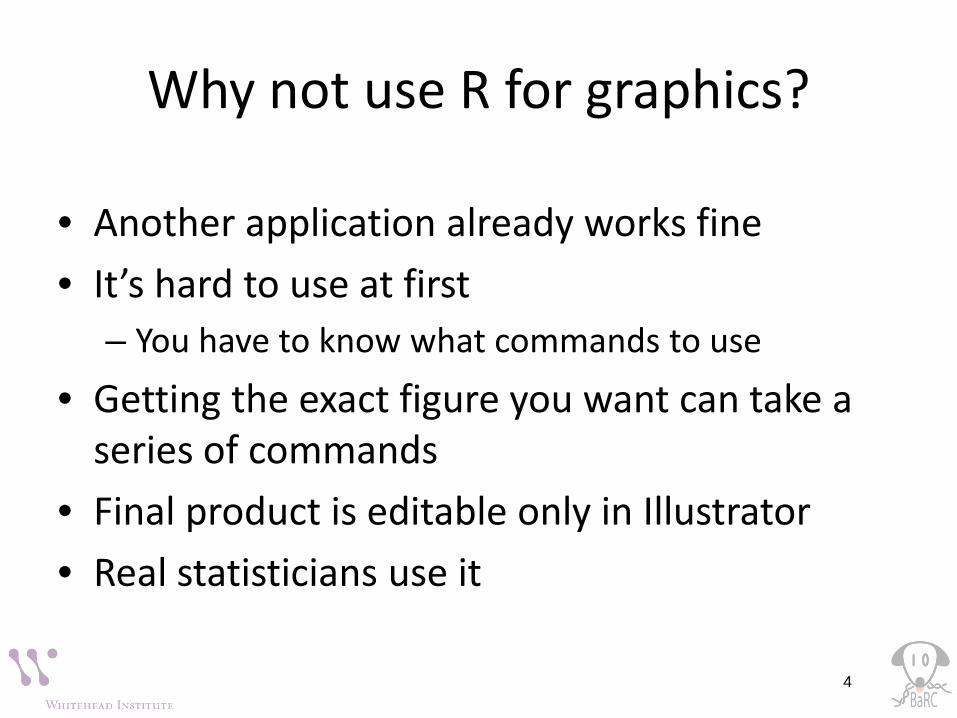
Why not use R for graphics?
• Another application already works fine• It’s hard to use at first
– You have to know what commands to use
• Getting the exact figure you want can take a series of commands
• Final product is editable only in Illustrator• Real statisticians use it
4

Getting started• See previous Hot Topic: Introduction to R
• Hot Topics slides: http://barc.wi.mit.edu/hot_topics/
• R can be run on your computer or on tak:– RStudio– Traditional interfaces
• Class materials also at\\BaRC_Public\Hot_Topics\Intro_to_R_Graphics_Nov_2016
5

6
Start of an R session
6

Getting help
• Use the Help menu• Check out “Manuals”
– http://www.r-project.org/– contributed documentation
• Use R’s help?boxplot [show info]??boxplot [search docs]example(boxplot)
• Search the web– “r-project boxplot”
Html help
7

• Take R to your preferred directory ()
• Check where you are (e.g., get your working directory) and see what files are there> getwd()[1] "/nfs/BaRC_Public/Hot_Topics/Intro_to_R_Graphics_Nov_2016"> dir()[1] “all_my_data.txt"
Reading files - intro
8

Reading data files
• Usually it’s easiest to read data from a file– Organize in Excel with one-word column names– Save as tab-delimited text
• Check that file is theredir()
• Read filetumors = read.delim("tumors_wt_ko.txt", header=T)
• Check that it’s OK
9
> tumorswt ko
1 5 82 6 93 7 11
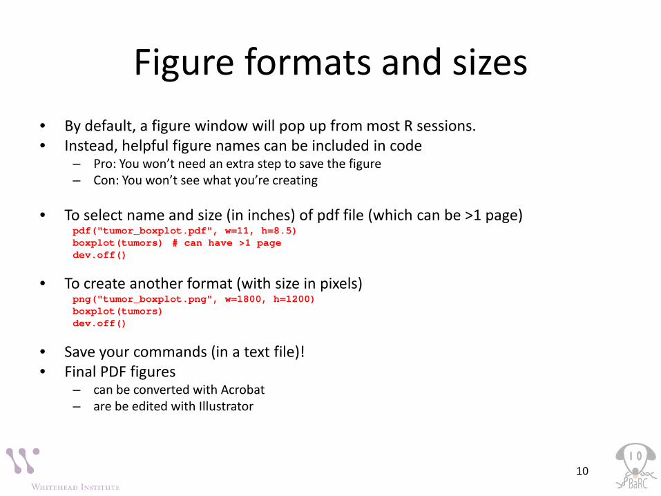
Figure formats and sizes• By default, a figure window will pop up from most R sessions.• Instead, helpful figure names can be included in code
– Pro: You won’t need an extra step to save the figure– Con: You won’t see what you’re creating
• To select name and size (in inches) of pdf file (which can be >1 page)pdf("tumor_boxplot.pdf", w=11, h=8.5)boxplot(tumors) # can have >1 pagedev.off() # tell R that we’re done
• To create another format (with size in pixels)png("tumor_boxplot.png", w=1800, h=1200)boxplot(tumors)dev.off()
• Save your commands (in a text file)!• Final PDF figures
– can be converted with Acrobat– are be edited with Illustrator
10
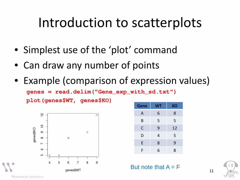
Introduction to scatterplots
• Simplest use of the ‘plot’ command• Can draw any number of points• Example (comparison of expression values)
genes = read.delim("Gene_exp_with_sd.txt")plot(genes$WT, genes$KO)
11
Gene WT KO
A 6 8
B 5 5
C 9 12
D 4 5
E 8 9
F 6 8
But note that A = F

Boxplot conventions
IQR = interquartile range75th percentile
median25th percentile
<= 1.5 x IQR
Any points beyond the whiskers are defined as“outliers”. Right-click to
save figure
12
wt ko
5 8
6 9
7 11
Note that the above data has no “outliers”. The red point was added by hand.
Other programs use different conventions!

Comparing sets of numbers• Why are you making the figure?• What is it supposed to show?• How much detail is best?• Are the data points paired?
13Note the “jitter” (addition of noise) in the first 2 figures.
boxplot(genes)stripchart(genes, vert=T)plot(genes)

Gene expression plots
14
Typical x-y scatterplot MA (ratio-intensity) plot x-y scatterplot with contour
plot(genes.all)abline(0,1)# Add other lines
M = genes.all[,2] - genes.all[,1]A = apply(genes.all, 1, mean)plot(A,M)# etc.
smoothScatter(genes.all, nrpoints=1500, pch=20, cex=0.5)# colramp to choose colors
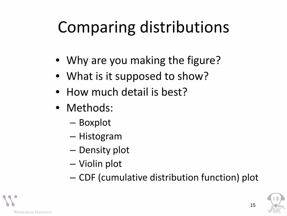
Comparing distributions
• Why are you making the figure?• What is it supposed to show?• How much detail is best?• Methods:
– Boxplot– Histogram– Density plot– Violin plot– CDF (cumulative distribution function) plot
15

Displaying distributions
• Example dataset: log2 expression ratios
16

Comparing similar distributions
• Example dataset: – MicroRNA is knocked
down – Expression levels are
assayed– Genes are divided into
those without miRNA target site (black) vs. with target site (red)
17
CDF plot
Density plot

Customizing plots
• About anything about a plot can be modified, although it can be tricky to figure out how to do so.– Colors ex: col=“red”– Shapes of points ex: pch=18– Shapes of lines ex: lwd=3, lty=3– Axes (labels, scale, orientation, size)– Margins see ‘mai’ in par()– Additional text ex: text(2, 3, “This text”)– See par() for a lot more options
18

Point shapes by number
19
Ex:
pch=21
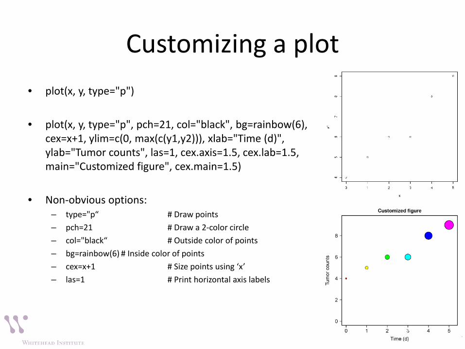
Customizing a plot• plot(x, y, type="p")
• plot(x, y, type="p", pch=21, col="black", bg=rainbow(6), cex=x+1, ylim=c(0, max(c(y1,y2))), xlab="Time (d)", ylab="Tumor counts", las=1, cex.axis=1.5, cex.lab=1.5, main="Customized figure", cex.main=1.5)
• Non-obvious options:– type="p“ # Draw points– pch=21 # Draw a 2-color circle– col="black“ # Outside color of points– bg=rainbow(6) # Inside color of points– cex=x+1 # Size points using ‘x’– las=1 # Print horizontal axis labels
20

Combining plots on a page
• Set up layout with command like– par(mfrow = c(num.rows, num.columns))– Ex: par(mfrow = c(1,2))
21

Merging plots on same figure
• Commands:– plot # start figure– points # add point(s)– lines # add line(s)– legend
• Note that order of commands determines order of layers
22

More graphics details
• Creating error bars• Drawing a best-fit (regression) line• Using transparent colors• Creating colored segments• Creating log-transformed axes• Labeling selected points
23
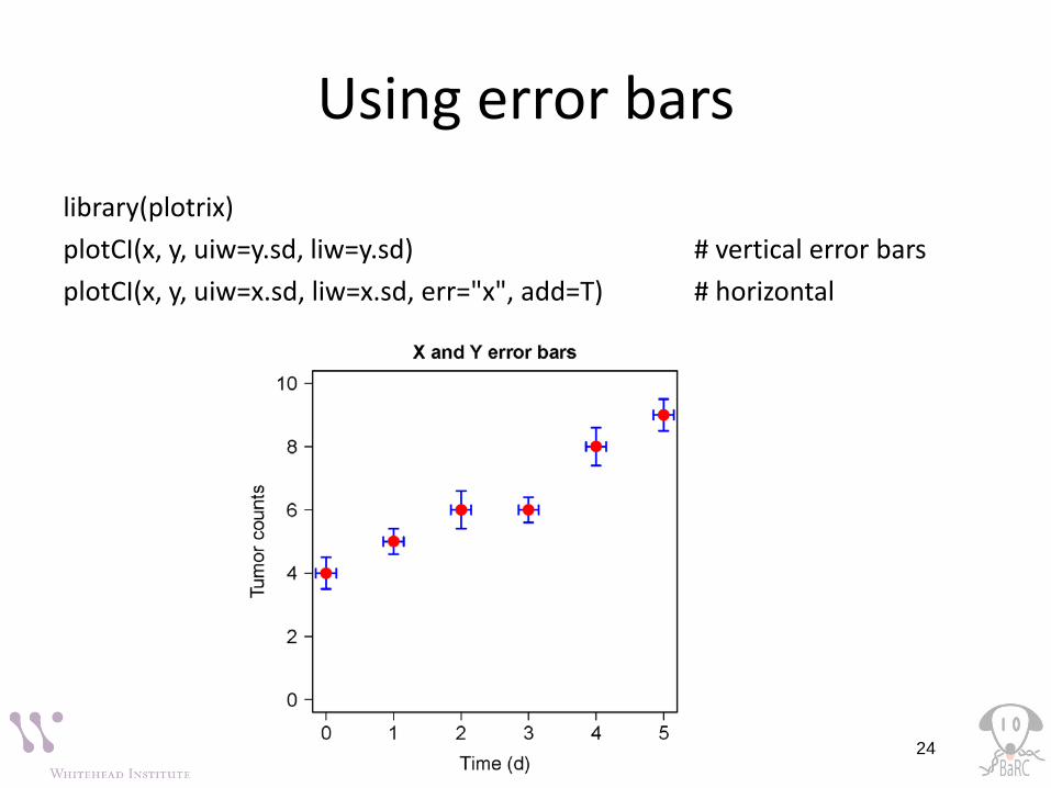
Using error barslibrary(plotrix)plotCI(x, y, uiw=y.sd, liw=y.sd) # vertical error barsplotCI(x, y, uiw=x.sd, liw=x.sd, err="x", add=T) # horizontal
24

Drawing a regression line
• Use ‘lm(response~terms)’ for simple linear regression:
# Calculate y-interceptlmfit = lm(y ~ x)# Set y-intercept to 0lmfit.0 = lm(y ~ x + 0)
• Add line(s) withabline(lmfit)
25

Transparent colors
• Semitransparent colors can be indicated by an extended RGB code (#RRGGBBAA)– AA = opacity from 0-9,A-F
(lowest to highest)– Sample colors:
Red #FF000066Green #00FF0066Blue #0000FF66
26

Colored bars
• Colored bars can be used to label rows or columns of a matrix– Ex: cell types, GO terms
• Limit each color code to 6-8 colors
• Don’t forget the legend!
27
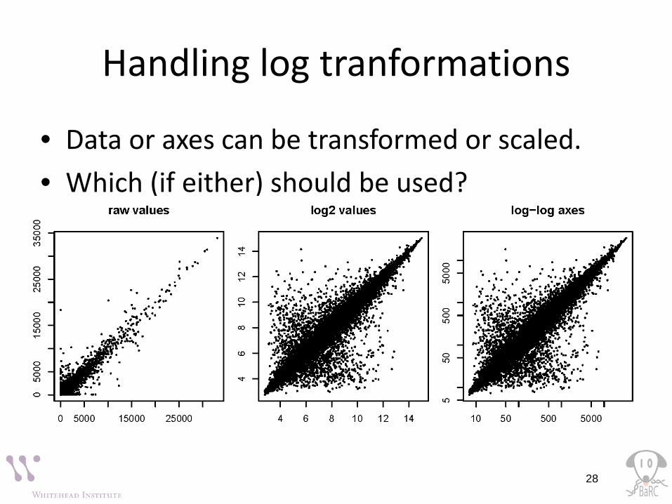
Handling log tranformations
• Data or axes can be transformed or scaled.• Which (if either) should be used?
28

Figures with ggplot2
• A graphing package designed to make figures– Easier to create with a nicer syntax– Using better default settings
• Input data needs to be in a “stacked” structure
29
> genes.values.onlyWT KO
1 6 82 5 53 9 124 4 55 8 96 6 8
> stack(genes.values.only)values ind
1 6 WT2 5 WT3 9 WT4 4 WT5 8 WT6 6 WT7 8 KO8 5 KO9 12 KO10 5 KO11 9 KO12 8 KO

Dotplot with ggplot2
30
library(ggplot2)ggplot(genes.stack, aes(x = factor(ind), y=values)) + geom_dotplot(binaxis="y", stackdir = "center")
ggplot(genes.stack, aes(x = factor(ind), y=values)) + geom_dotplot(binaxis="y", stackdir = "center", binwidth=0.5,fill=c(rep("red",6),rep("blue",6))) + labs(x="genotype", y="log2 expression value") +ggtitle("Dotplot with ggplot2")
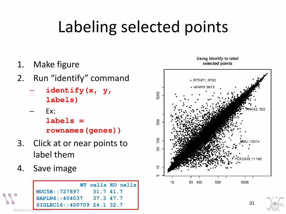
Labeling selected points
1. Make figure2. Run “identify” command
– identify(x, y, labels)
– Ex: identify(genes, labels = rownames(genes))
3. Click at or near points to label them
4. Save image
31
WT cells KO cellsMUC5B::727897 31.7 41.7HAPLN4::404037 37.3 47.7SIGLEC16::400709 24.1 32.7

More resources• R Graph Gallery:
– http://rgraphgallery.blogspot.com/ • R scripts and commands for Bioinformatics
– http://iona.wi.mit.edu/bio/bioinfo/Rscripts/– \\wi-files1\BaRC_Public\BaRC_code\R
• List of R modules installed on tak– http://tak/trac/wiki/R
• Our favorite book:– Introductory Statistics with R (Peter Dalgard)
• Cheat sheets from RStudio– https://www.rstudio.com/resources/cheatsheets/
• We’re glad to share commands and/or scripts to get you started
32

Data sources• All data and scripts can be found at
1. http://barc.wi.mit.edu/hot_topics/
2. \\wi-files1\BaRC_Public\Hot_Topics\Intro_to_R_Graphics_Nov_2016
(2) is the same as /nfs/BaRC_Public/Hot_Topics/Intro_to_R_Graphics_Nov_2016
33