Embed Size (px)
Citation preview
1
Introduction to ggplot2
Dawn Koffman
Office of Population Research
Princeton University
January 2014

2
Part 1: Concepts and Terminology
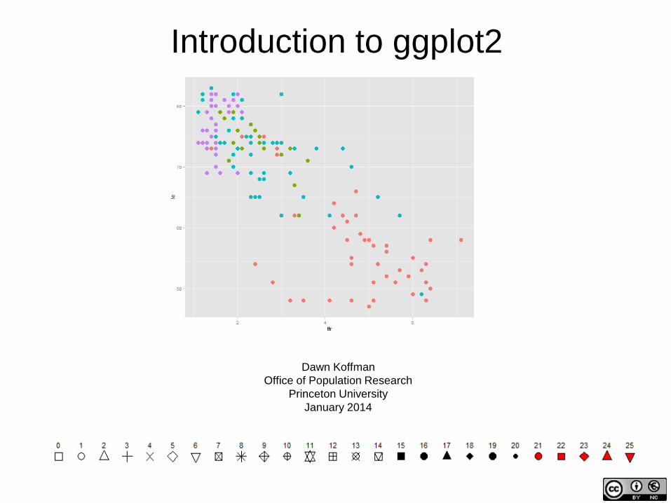
R Package: ggplot2
Used to produce statistical graphics, author = Hadley Wickham "attempt to take the good things about base and lattice graphics and improve on them with a strong, underlying model " based on The Grammar of Graphics by Leland Wilkinson, 2005 "... describes the meaning of what we do when we construct statistical graphics ... More than a taxonomy ... Computational system based on the underlying mathematics of representing statistical functions of data." - does not limit developer to a set of pre-specified graphics adds some concepts to grammar which allow it to work well with R
3
qplot() ggplot2 provides two ways to produce plot objects: qplot() # quick plot – not covered in this workshop uses some concepts of The Grammar of Graphics, but doesn’t provide full capability and designed to be very similar to plot() and simple to use may make it easy to produce basic graphs but may delay understanding philosophy of ggplot2 ggplot() # grammar of graphics plot – focus of this workshop provides fuller implementation of The Grammar of Graphics may have steeper learning curve but allows much more flexibility when building graphs
4
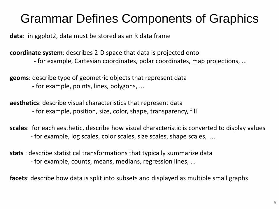
Grammar Defines Components of Graphics
data: in ggplot2, data must be stored as an R data frame coordinate system: describes 2-D space that data is projected onto - for example, Cartesian coordinates, polar coordinates, map projections, ... geoms: describe type of geometric objects that represent data - for example, points, lines, polygons, ... aesthetics: describe visual characteristics that represent data - for example, position, size, color, shape, transparency, fill scales: for each aesthetic, describe how visual characteristic is converted to display values - for example, log scales, color scales, size scales, shape scales, ... stats : describe statistical transformations that typically summarize data - for example, counts, means, medians, regression lines, ... facets: describe how data is split into subsets and displayed as multiple small graphs
5
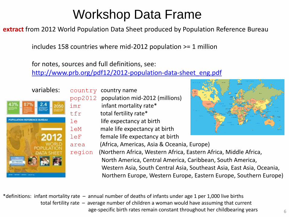
Workshop Data Frame extract from 2012 World Population Data Sheet produced by Population Reference Bureau includes 158 countries where mid-2012 population >= 1 million for notes, sources and full definitions, see: http://www.prb.org/pdf12/2012-population-data-sheet_eng.pdf variables: country country name pop2012 population mid-2012 (millions) imr infant mortality rate* tfr total fertility rate* le life expectancy at birth leM male life expectancy at birth leF female life expectancy at birth area (Africa, Americas, Asia & Oceania, Europe) region (Northern Africa, Western Africa, Eastern Africa, Middle Africa, North America, Central America, Caribbean, South America, Western Asia, South Central Asia, Southeast Asia, East Asia, Oceania, Northern Europe, Western Europe, Eastern Europe, Southern Europe) *definitions: infant mortality rate – annual number of deaths of infants under age 1 per 1,000 live births total fertility rate – average number of children a woman would have assuming that current age-specific birth rates remain constant throughout her childbearing years 6
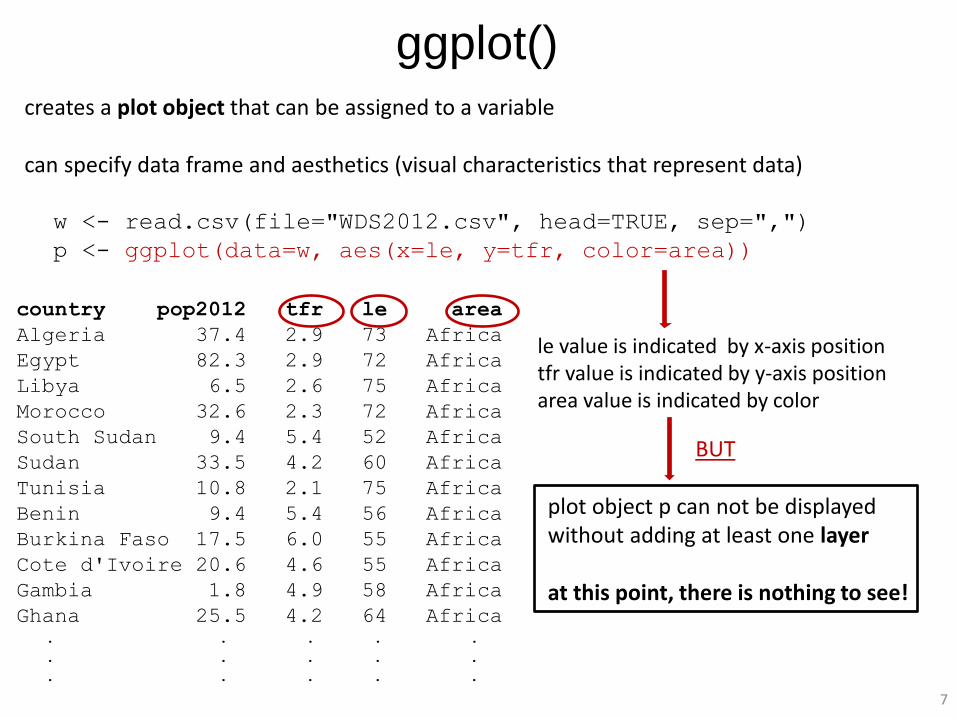
ggplot() creates a plot object that can be assigned to a variable can specify data frame and aesthetics (visual characteristics that represent data) w <- read.csv(file="WDS2012.csv", head=TRUE, sep=",")
p <- ggplot(data=w, aes(x=le, y=tfr, color=area))
country pop2012 tfr le area
Algeria 37.4 2.9 73 Africa
Egypt 82.3 2.9 72 Africa
Libya 6.5 2.6 75 Africa
Morocco 32.6 2.3 72 Africa
South Sudan 9.4 5.4 52 Africa
Sudan 33.5 4.2 60 Africa
Tunisia 10.8 2.1 75 Africa
Benin 9.4 5.4 56 Africa
Burkina Faso 17.5 6.0 55 Africa
Cote d'Ivoire 20.6 4.6 55 Africa
Gambia 1.8 4.9 58 Africa
Ghana 25.5 4.2 64 Africa . . . . .
. . . . .
. . . . .
plot object p can not be displayed without adding at least one layer at this point, there is nothing to see!
le value is indicated by x-axis position tfr value is indicated by y-axis position area value is indicated by color
BUT
7
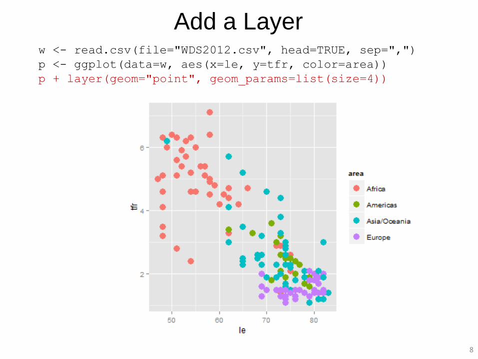
Add a Layer w <- read.csv(file="WDS2012.csv", head=TRUE, sep=",")
p <- ggplot(data=w, aes(x=le, y=tfr, color=area))
p + layer(geom="point", geom_params=list(size=4))
8
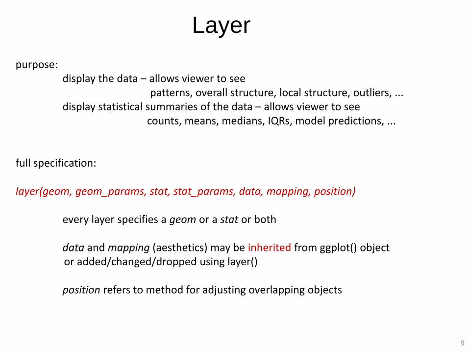
Layer
purpose: display the data – allows viewer to see patterns, overall structure, local structure, outliers, ... display statistical summaries of the data – allows viewer to see counts, means, medians, IQRs, model predictions, ... full specification: layer(geom, geom_params, stat, stat_params, data, mapping, position) every layer specifies a geom or a stat or both data and mapping (aesthetics) may be inherited from ggplot() object or added/changed/dropped using layer() position refers to method for adjusting overlapping objects
9
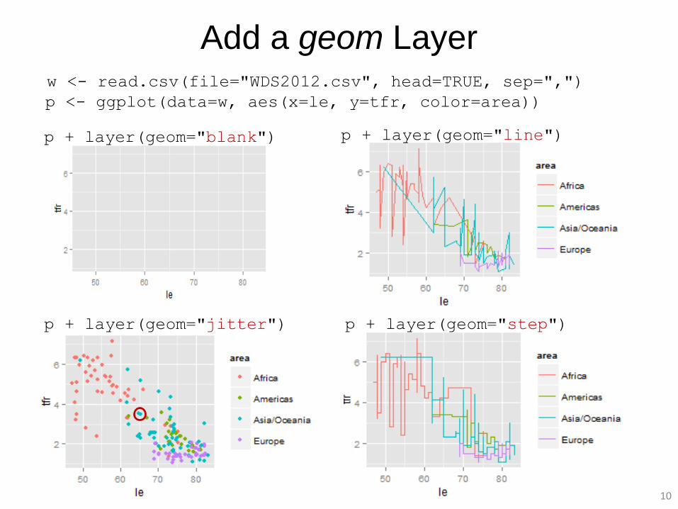
Add a geom Layer w <- read.csv(file="WDS2012.csv", head=TRUE, sep=",") p <- ggplot(data=w, aes(x=le, y=tfr, color=area))
p + layer(geom="blank") p + layer(geom="line")
p + layer(geom="jitter") p + layer(geom="step")
10
Add a stat Layer
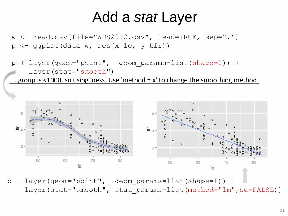
w <- read.csv(file="WDS2012.csv", head=TRUE, sep=",")
p <- ggplot(data=w, aes(x=le, y=tfr))
p + layer(geom="point", geom_params=list(shape=1)) +
layer(stat="smooth") ... group is <1000, so using loess. Use 'method = x' to change the smoothing method.
p + layer(geom="point", geom_params=list(shape=1)) +
layer(stat="smooth", stat_params=list(method="lm",se=FALSE))
11
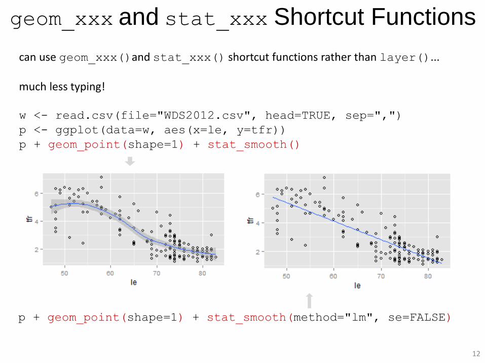
geom_xxx and stat_xxx Shortcut Functions
can use geom_xxx()and stat_xxx() shortcut functions rather than layer()...
much less typing! w <- read.csv(file="WDS2012.csv", head=TRUE, sep=",")
p <- ggplot(data=w, aes(x=le, y=tfr))
p + geom_point(shape=1) + stat_smooth()
p + geom_point(shape=1) + stat_smooth(method="lm", se=FALSE)
12
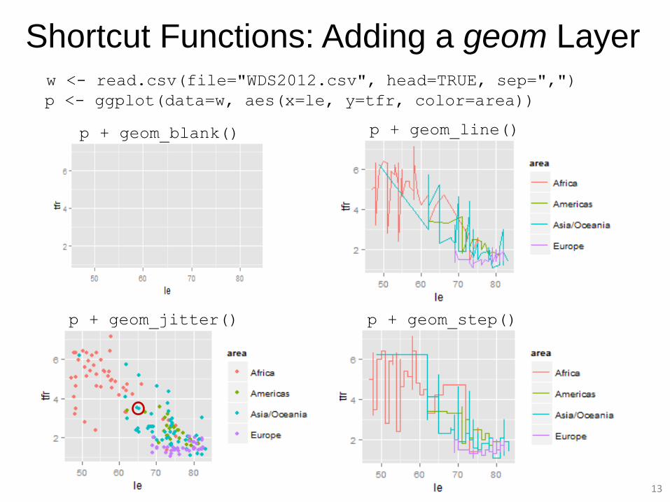
Shortcut Functions: Adding a geom Layer w <- read.csv(file="WDS2012.csv", head=TRUE, sep=",") p <- ggplot(data=w, aes(x=le, y=tfr, color=area))
p + geom_blank() p + geom_line()
p + geom_jitter() p + geom_step()
13
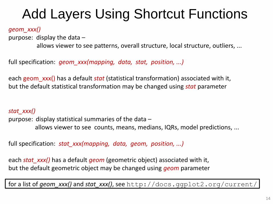
Add Layers Using Shortcut Functions geom_xxx() purpose: display the data – allows viewer to see patterns, overall structure, local structure, outliers, ... full specification: geom_xxx(mapping, data, stat, position, ...) each geom_xxx() has a default stat (statistical transformation) associated with it, but the default statistical transformation may be changed using stat parameter stat_xxx() purpose: display statistical summaries of the data – allows viewer to see counts, means, medians, IQRs, model predictions, ... full specification: stat_xxx(mapping, data, geom, position, ...) each stat_xxx() has a default geom (geometric object) associated with it, but the default geometric object may be changed using geom parameter for a list of geom_xxx() and stat_xxx(), see http://docs.ggplot2.org/current/
14
15
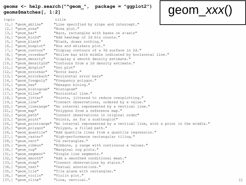
geoms <- help.search("^geom_", package = "ggplot2")
geoms$matches[, 1:2]
topic title [1,] "geom_abline" "Line specified by slope and intercept."
[2,] "geom_area" "Area plot."
[3,] "geom_bar" "Bars, rectangles with bases on x-axis"
[4,] "geom_bin2d" "Add heatmap of 2d bin counts."
[5,] "geom_blank" "Blank, draws nothing."
[6,] "geom_boxplot" "Box and whiskers plot."
[7,] "geom_contour" "Display contours of a 3d surface in 2d."
[8,] "geom_crossbar" "Hollow bar with middle indicated by horizontal line."
[9,] "geom_density" "Display a smooth density estimate."
[10,] "geom_density2d" "Contours from a 2d density estimate."
[11,] "geom_dotplot" "Dot plot"
[12,] "geom_errorbar" "Error bars."
[13,] "geom_errorbarh" "Horizontal error bars"
[14,] "geom_freqpoly" "Frequency polygon."
[15,] "geom_hex" "Hexagon bining."
[16,] "geom_histogram" "Histogram"
[17,] "geom_hline" "Horizontal line."
[18,] "geom_jitter" "Points, jittered to reduce overplotting."
[19,] "geom_line" "Connect observations, ordered by x value."
[20,] "geom_linerange" "An interval represented by a vertical line."
[21,] "geom_map" "Polygons from a reference map."
[22,] "geom_path" "Connect observations in original order"
[23,] "geom_point" "Points, as for a scatterplot"
[24,] "geom_pointrange" "An interval represented by a vertical line, with a point in the middle."
[25,] "geom_polygon" "Polygon, a filled path."
[26,] "geom_quantile" "Add quantile lines from a quantile regression."
[27,] "geom_raster" "High-performance rectangular tiling."
[28,] "geom_rect" "2d rectangles."
[29,] "geom_ribbon" "Ribbons, y range with continuous x values."
[30,] "geom_rug" "Marginal rug plots."
[31,] "geom_segment" "Single line segments."
[32,] "geom_smooth" "Add a smoothed conditional mean."
[33,] "geom_step" "Connect observations by stairs."
[34,] "geom_text" "Textual annotations."
[35,] "geom_tile" "Tile plane with rectangles."
[36,] "geom_violin" "Violin plot."
[37,] "geom_vline" "Line, vertical."
geom_xxx()
16
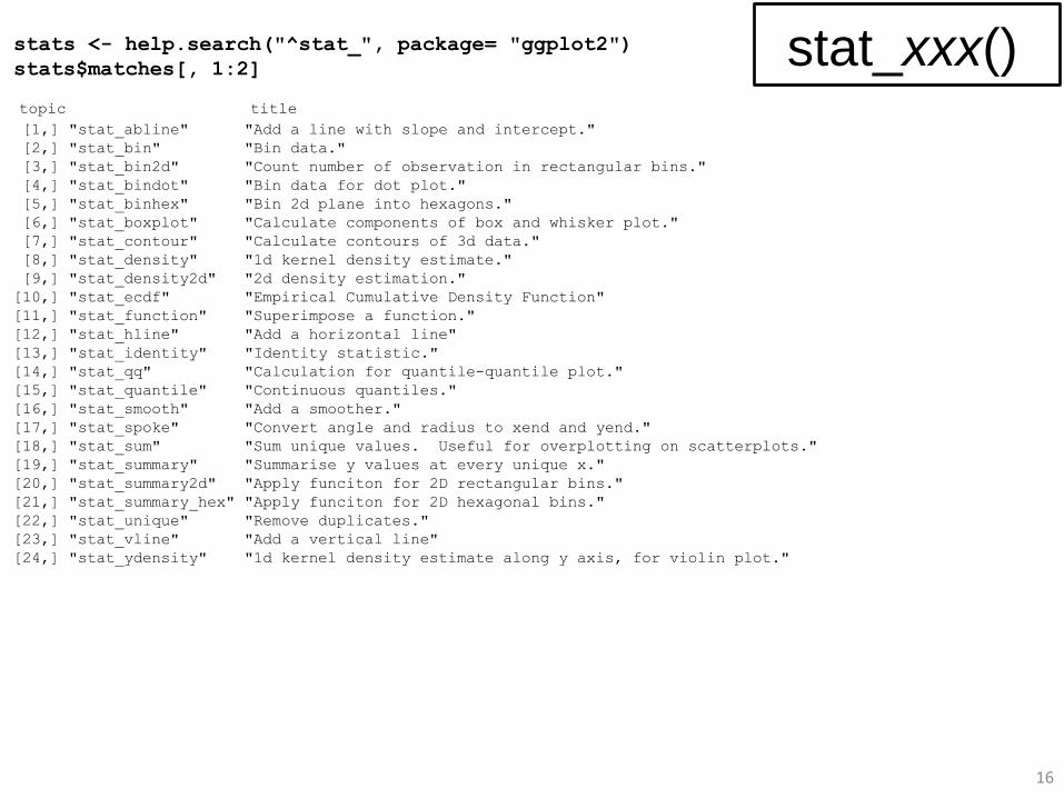
topic title [1,] "stat_abline" "Add a line with slope and intercept."
[2,] "stat_bin" "Bin data."
[3,] "stat_bin2d" "Count number of observation in rectangular bins."
[4,] "stat_bindot" "Bin data for dot plot."
[5,] "stat_binhex" "Bin 2d plane into hexagons."
[6,] "stat_boxplot" "Calculate components of box and whisker plot."
[7,] "stat_contour" "Calculate contours of 3d data."
[8,] "stat_density" "1d kernel density estimate."
[9,] "stat_density2d" "2d density estimation."
[10,] "stat_ecdf" "Empirical Cumulative Density Function"
[11,] "stat_function" "Superimpose a function."
[12,] "stat_hline" "Add a horizontal line"
[13,] "stat_identity" "Identity statistic."
[14,] "stat_qq" "Calculation for quantile-quantile plot."
[15,] "stat_quantile" "Continuous quantiles."
[16,] "stat_smooth" "Add a smoother."
[17,] "stat_spoke" "Convert angle and radius to xend and yend."
[18,] "stat_sum" "Sum unique values. Useful for overplotting on scatterplots."
[19,] "stat_summary" "Summarise y values at every unique x."
[20,] "stat_summary2d" "Apply funciton for 2D rectangular bins."
[21,] "stat_summary_hex" "Apply funciton for 2D hexagonal bins."
[22,] "stat_unique" "Remove duplicates."
[23,] "stat_vline" "Add a vertical line"
[24,] "stat_ydensity" "1d kernel density estimate along y axis, for violin plot."
stats <- help.search("^stat_", package= "ggplot2")
stats$matches[, 1:2] stat_xxx()
country pop2012 tfr le area
Algeria 37.4 2.9 73 Africa
Egypt 82.3 2.9 72 Africa
. . . . .
. . . . .
. . . . .
Canada 34.9 1.7 81 Americas
United States 313.9 1.9 79 Americas
. . . . .
. . . . .
. . . . .
Armenia 3.3 1.7 74 Asia/Oceania
Azerbaijan 9.3 2.3 74 Asia/Oceania
. . . . .
. . . . .
. . . . .
Denmark 5.6 1.8 79 Europe
Estonia 1.3 2.5 76 Europe
. . . . .
. . . . .
. . . . .
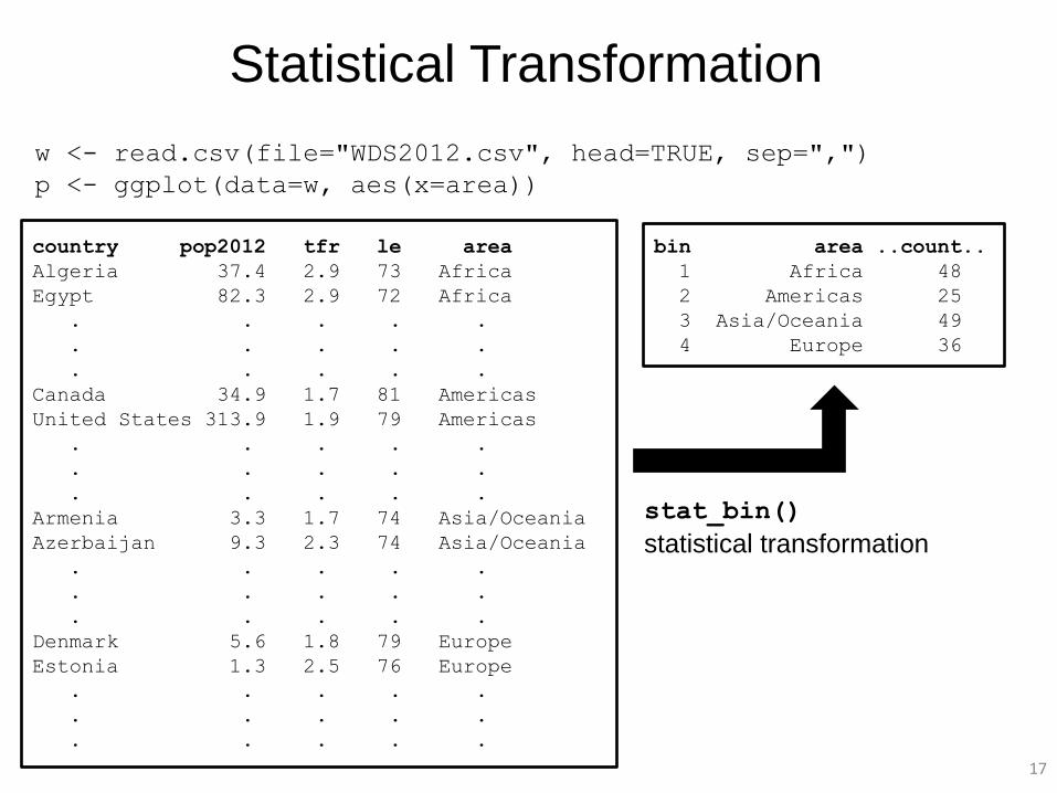
w <- read.csv(file="WDS2012.csv", head=TRUE, sep=",")
p <- ggplot(data=w, aes(x=area))
bin area ..count..
1 Africa 48
2 Americas 25
3 Asia/Oceania 49
4 Europe 36
Statistical Transformation
stat_bin()
statistical transformation
17
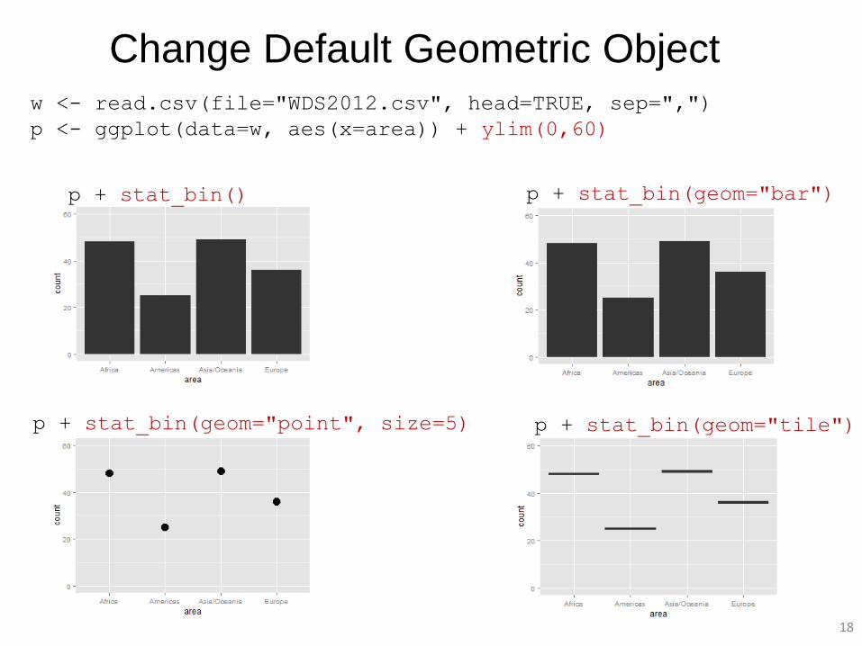
Change Default Geometric Object w <- read.csv(file="WDS2012.csv", head=TRUE, sep=",")
p <- ggplot(data=w, aes(x=area)) + ylim(0,60)
p + stat_bin() p + stat_bin(geom="bar")
p + stat_bin(geom="point", size=5) p + stat_bin(geom="tile")
18
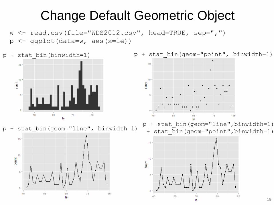
Change Default Geometric Object w <- read.csv(file="WDS2012.csv", head=TRUE, sep=",")
p <- ggplot(data=w, aes(x=le))
p + stat_bin(binwidth=1) p + stat_bin(geom="point", binwidth=1)
p + stat_bin(geom="line", binwidth=1) p + stat_bin(geom="line",binwidth=1)
+ stat_bin(geom="point",binwidth=1)
19
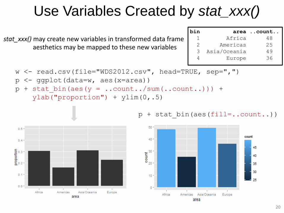
stat_xxx() may create new variables in transformed data frame aesthetics may be mapped to these new variables
Use Variables Created by stat_xxx()
bin area ..count..
1 Africa 48
2 Americas 25
3 Asia/Oceania 49
4 Europe 36
w <- read.csv(file="WDS2012.csv", head=TRUE, sep=",")
p <- ggplot(data=w, aes(x=area))
p + stat_bin(aes(y = ..count../sum(..count..))) +
ylab("proportion") + ylim(0,.5)
p + stat_bin(aes(fill=..count..))
20
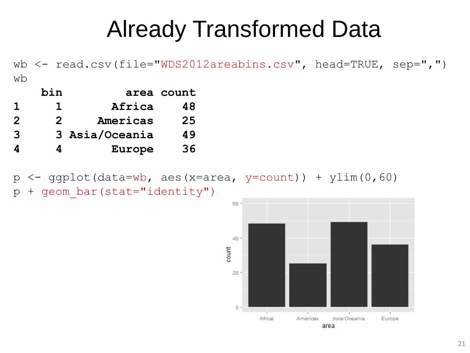
Already Transformed Data
wb <- read.csv(file="WDS2012areabins.csv", head=TRUE, sep=",")
wb
bin area count
1 1 Africa 48
2 2 Americas 25
3 3 Asia/Oceania 49
4 4 Europe 36
p <- ggplot(data=wb, aes(x=area, y=count)) + ylim(0,60)
p + geom_bar(stat="identity")
21
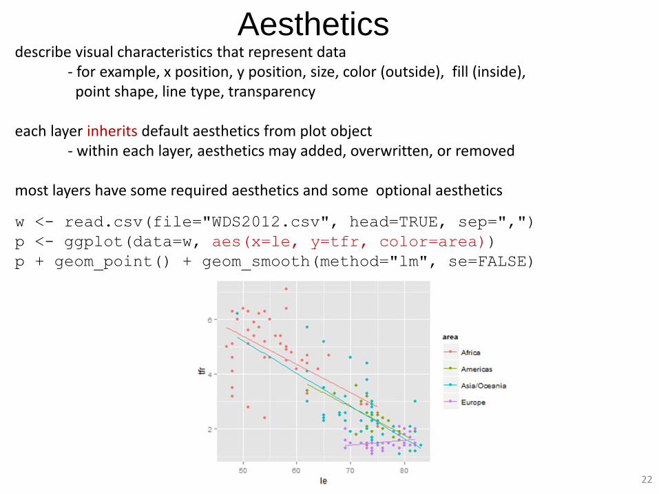
Aesthetics describe visual characteristics that represent data - for example, x position, y position, size, color (outside), fill (inside), point shape, line type, transparency each layer inherits default aesthetics from plot object - within each layer, aesthetics may added, overwritten, or removed most layers have some required aesthetics and some optional aesthetics
22
w <- read.csv(file="WDS2012.csv", head=TRUE, sep=",")
p <- ggplot(data=w, aes(x=le, y=tfr, color=area))
p + geom_point() + geom_smooth(method="lm", se=FALSE)
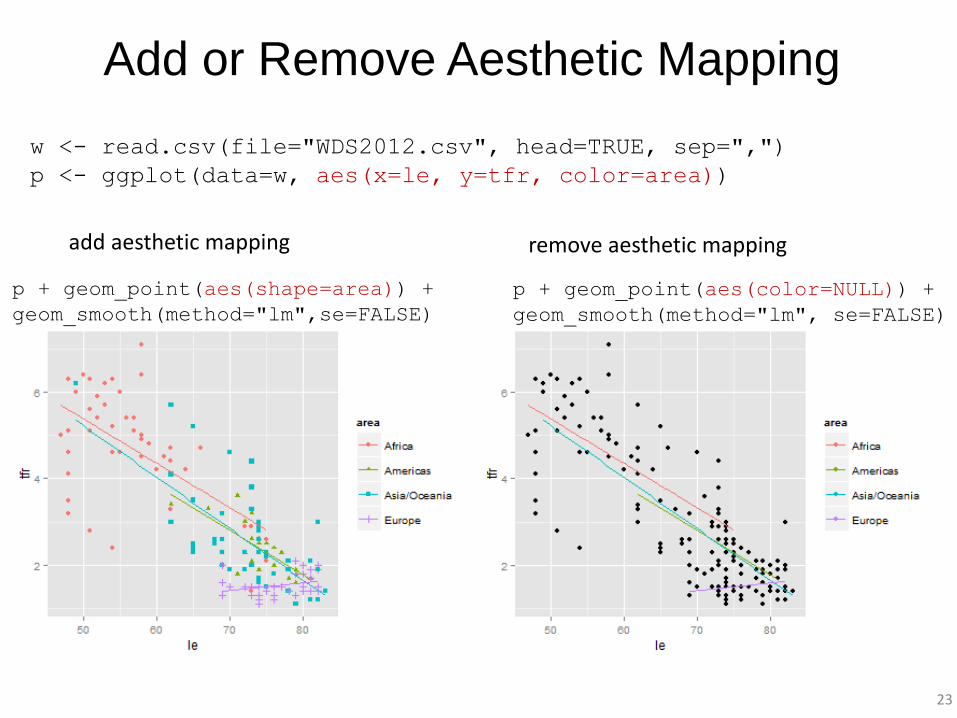
Add or Remove Aesthetic Mapping
w <- read.csv(file="WDS2012.csv", head=TRUE, sep=",")
p <- ggplot(data=w, aes(x=le, y=tfr, color=area))
p + geom_point(aes(shape=area)) +
geom_smooth(method="lm",se=FALSE)
p + geom_point(aes(color=NULL)) +
geom_smooth(method="lm", se=FALSE)
add aesthetic mapping remove aesthetic mapping
23
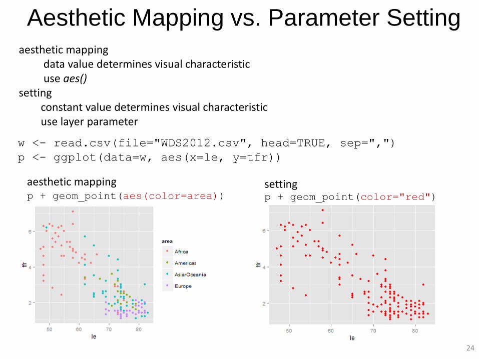
Aesthetic Mapping vs. Parameter Setting aesthetic mapping data value determines visual characteristic use aes() setting constant value determines visual characteristic use layer parameter
w <- read.csv(file="WDS2012.csv", head=TRUE, sep=",")
p <- ggplot(data=w, aes(x=le, y=tfr))
p + geom_point(aes(color=area)) p + geom_point(color="red")
aesthetic mapping setting
24
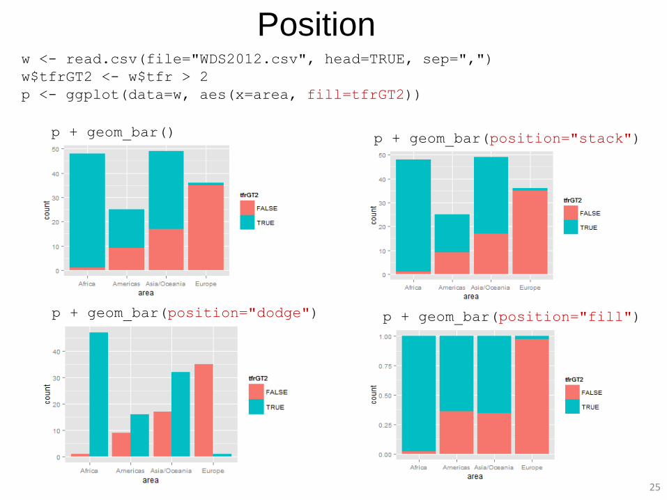
25
Position w <- read.csv(file="WDS2012.csv", head=TRUE, sep=",")
w$tfrGT2 <- w$tfr > 2
p <- ggplot(data=w, aes(x=area, fill=tfrGT2))
p + geom_bar() p + geom_bar(position="stack")
p + geom_bar(position="dodge") p + geom_bar(position="fill")
26
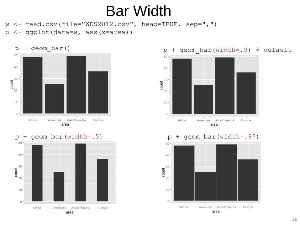
Bar Width w <- read.csv(file="WDS2012.csv", head=TRUE, sep=",")
p <- ggplot(data=w, aes(x=area))
p + geom_bar() p + geom_bar(width=.9) # default
p + geom_bar(width=.5) p + geom_bar(width=.97)
27
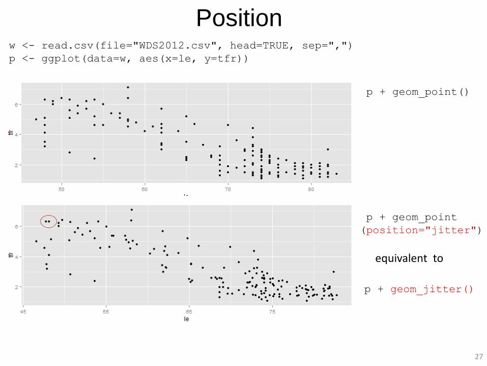
Position w <- read.csv(file="WDS2012.csv", head=TRUE, sep=",")
p <- ggplot(data=w, aes(x=le, y=tfr))
p + geom_point()
p + geom_point
(position="jitter")
p + geom_jitter()
equivalent to
28
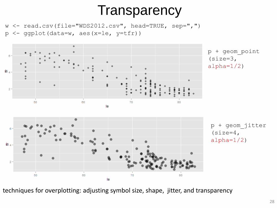
Transparency w <- read.csv(file="WDS2012.csv", head=TRUE, sep=",")
p <- ggplot(data=w, aes(x=le, y=tfr))
p + geom_point
(size=3,
alpha=1/2)
p + geom_jitter
(size=4,
alpha=1/2)
techniques for overplotting: adjusting symbol size, shape, jitter, and transparency
29
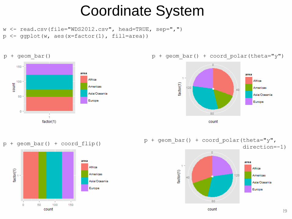
Coordinate System w <- read.csv(file="WDS2012.csv", head=TRUE, sep=",")
p <- ggplot(w, aes(x=factor(1), fill=area))
p + geom_bar()
p + geom_bar() + coord_flip()
p + geom_bar() + coord_polar(theta="y")
p + geom_bar() + coord_polar(theta="y",
direction=-1)
30
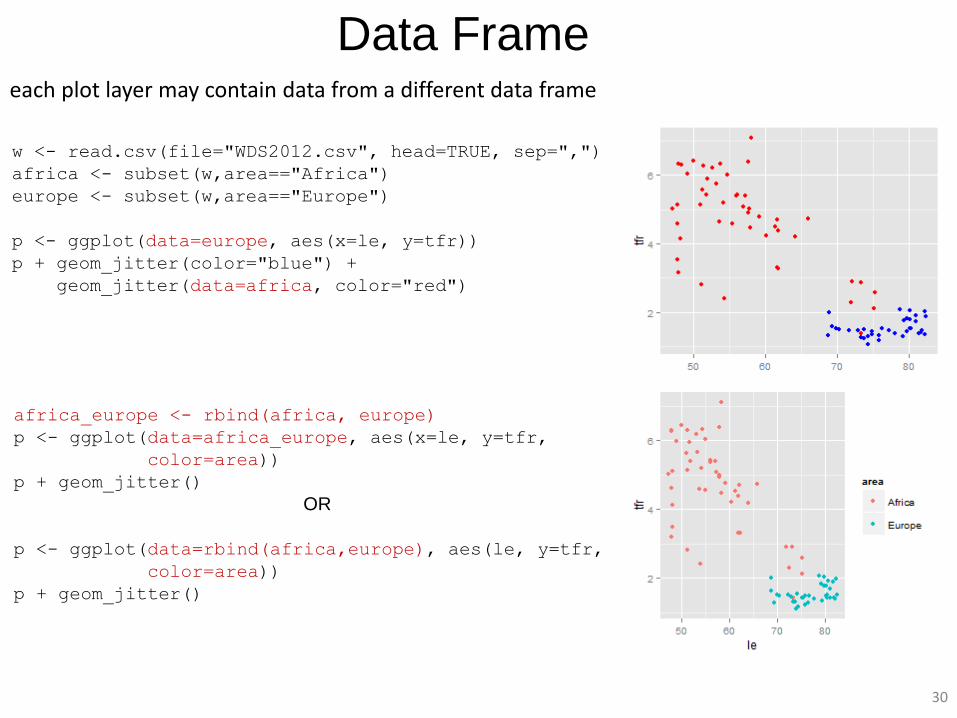
Data Frame each plot layer may contain data from a different data frame
w <- read.csv(file="WDS2012.csv", head=TRUE, sep=",")
africa <- subset(w,area=="Africa")
europe <- subset(w,area=="Europe")
p <- ggplot(data=europe, aes(x=le, y=tfr))
p + geom_jitter(color="blue") +
geom_jitter(data=africa, color="red")
africa_europe <- rbind(africa, europe)
p <- ggplot(data=africa_europe, aes(x=le, y=tfr,
color=area))
p + geom_jitter()
OR
p <- ggplot(data=rbind(africa,europe), aes(le, y=tfr,
color=area))
p + geom_jitter()
31
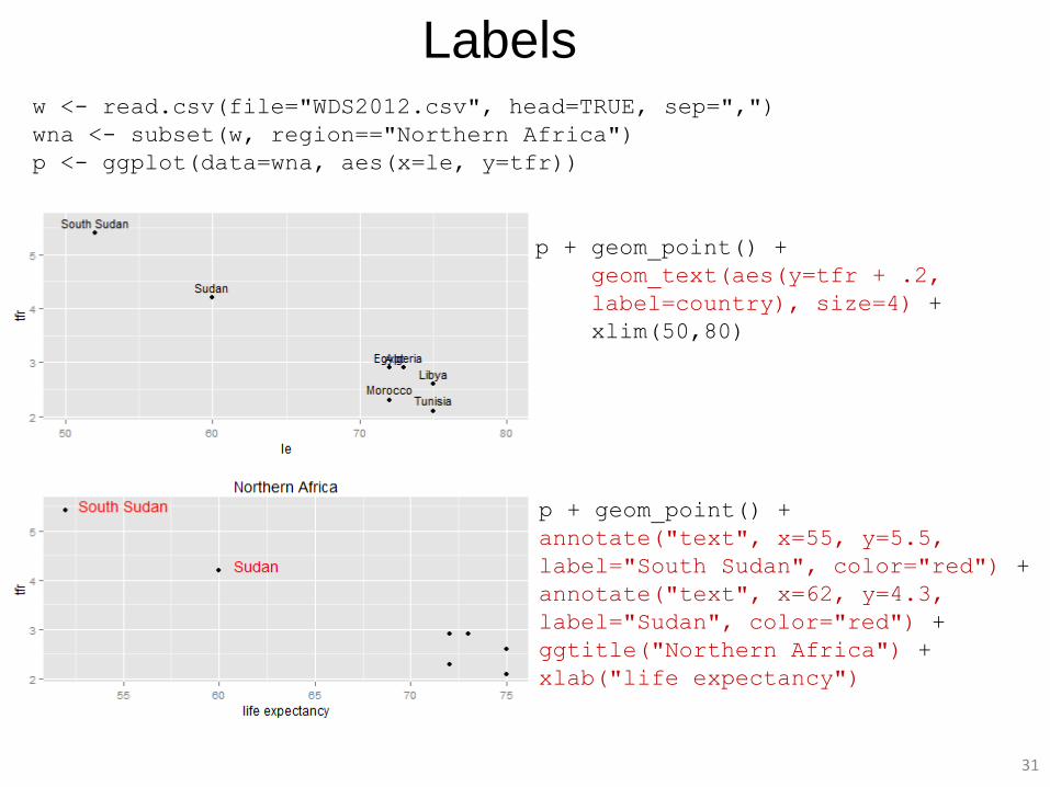
Labels w <- read.csv(file="WDS2012.csv", head=TRUE, sep=",")
wna <- subset(w, region=="Northern Africa")
p <- ggplot(data=wna, aes(x=le, y=tfr))
p + geom_point() +
geom_text(aes(y=tfr + .2,
label=country), size=4) +
xlim(50,80)
p + geom_point() +
annotate("text", x=55, y=5.5,
label="South Sudan", color="red") +
annotate("text", x=62, y=4.3,
label="Sudan", color="red") +
ggtitle("Northern Africa") +
xlab("life expectancy")
32
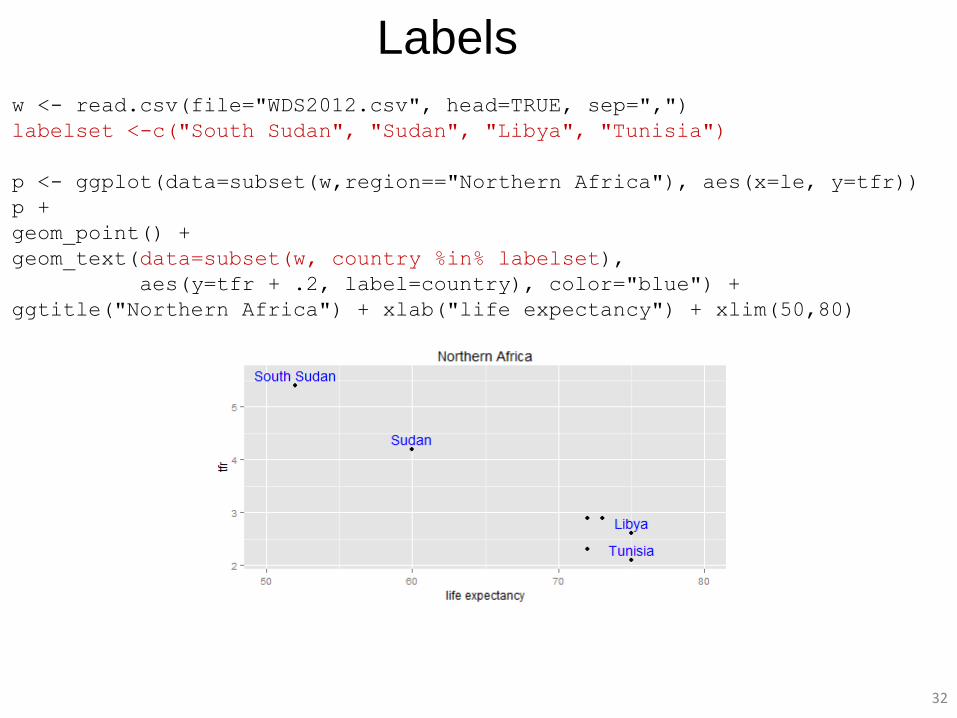
Labels
w <- read.csv(file="WDS2012.csv", head=TRUE, sep=",")
labelset <-c("South Sudan", "Sudan", "Libya", "Tunisia")
p <- ggplot(data=subset(w,region=="Northern Africa"), aes(x=le, y=tfr))
p +
geom_point() +
geom_text(data=subset(w, country %in% labelset),
aes(y=tfr + .2, label=country), color="blue") +
ggtitle("Northern Africa") + xlab("life expectancy") + xlim(50,80)
33
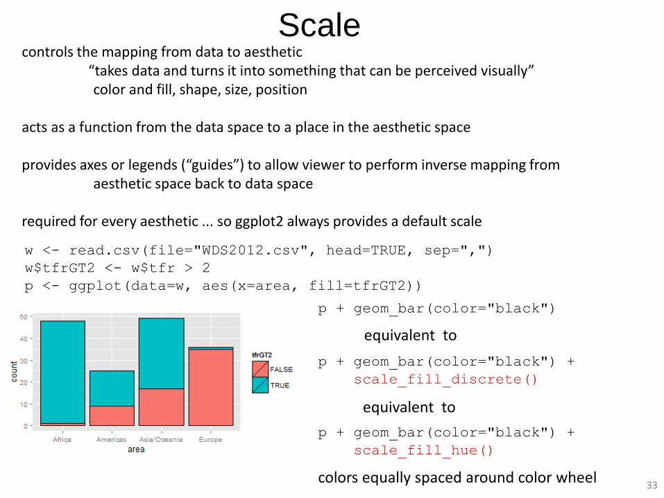
Scale controls the mapping from data to aesthetic “takes data and turns it into something that can be perceived visually” color and fill, shape, size, position acts as a function from the data space to a place in the aesthetic space provides axes or legends (“guides”) to allow viewer to perform inverse mapping from aesthetic space back to data space required for every aesthetic ... so ggplot2 always provides a default scale
p + geom_bar(color="black")
p + geom_bar(color="black") +
scale_fill_discrete()
p + geom_bar(color="black") +
scale_fill_hue()
colors equally spaced around color wheel
equivalent to
equivalent to
w <- read.csv(file="WDS2012.csv", head=TRUE, sep=",")
w$tfrGT2 <- w$tfr > 2
p <- ggplot(data=w, aes(x=area, fill=tfrGT2))

34
Fill Scales w <- read.csv(file="WDS2012.csv", head=TRUE, sep=",")
w$tfrGT2 <- w$tfr > 2
p <- ggplot(data=w, aes(x=area, fill=tfrGT2))
p + geom_bar(color="black") +
scale_fill_grey()
p + geom_bar(color="black") +
scale_fill_brewer()
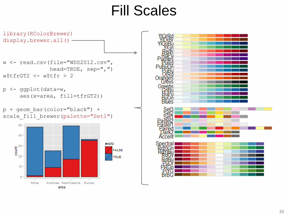
library(RColorBrewer)
display.brewer.all()
Fill Scales
w <- read.csv(file="WDS2012.csv",
head=TRUE, sep=",")
w$tfrGT2 <- w$tfr > 2
p <- ggplot(data=w,
aes(x=area, fill=tfrGT2))
p + geom_bar(color="black") +
scale_fill_brewer(palette="Set1")
35
36
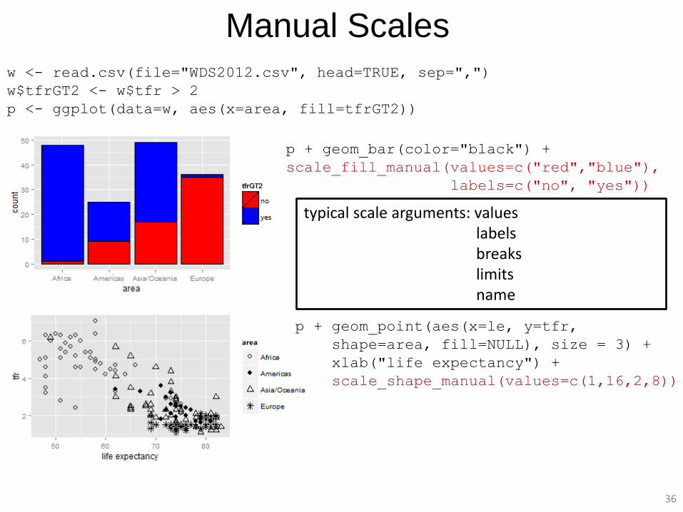
Manual Scales w <- read.csv(file="WDS2012.csv", head=TRUE, sep=",")
w$tfrGT2 <- w$tfr > 2
p <- ggplot(data=w, aes(x=area, fill=tfrGT2))
p + geom_bar(color="black") +
scale_fill_manual(values=c("red","blue"),
labels=c("no", "yes"))
p + geom_point(aes(x=le, y=tfr,
shape=area, fill=NULL), size = 3) +
xlab("life expectancy") +
scale_shape_manual(values=c(1,16,2,8))
typical scale arguments: values labels breaks limits name
37
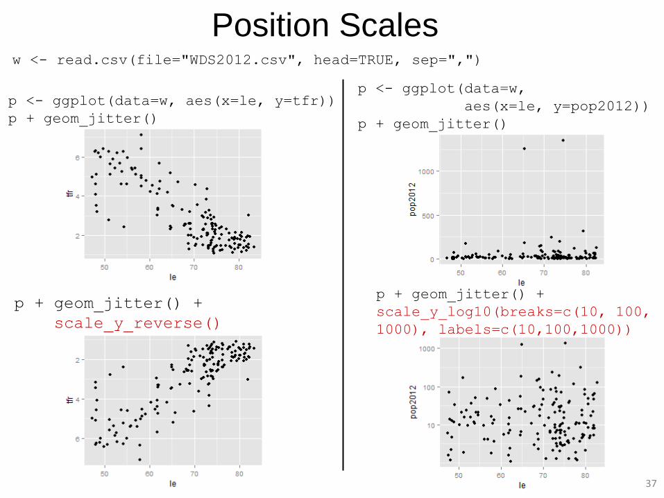
Position Scales w <- read.csv(file="WDS2012.csv", head=TRUE, sep=",")
p <- ggplot(data=w, aes(x=le, y=tfr))
p + geom_jitter()
p + geom_jitter() +
scale_y_reverse()
p <- ggplot(data=w,
aes(x=le, y=pop2012))
p + geom_jitter()
p + geom_jitter() +
scale_y_log10(breaks=c(10, 100,
1000), labels=c(10,100,1000))
38
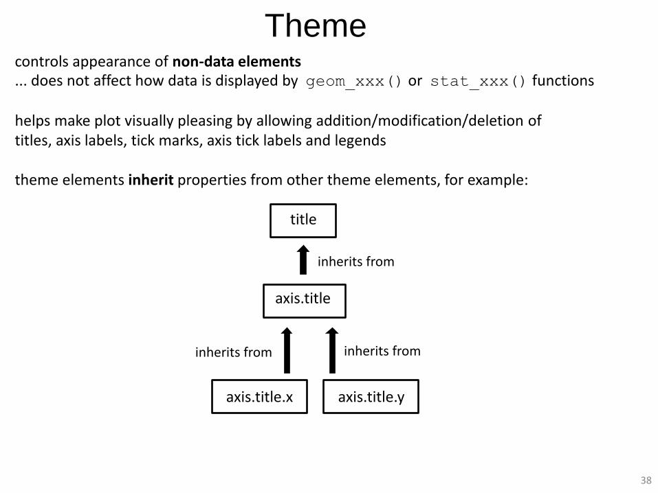
Theme controls appearance of non-data elements ... does not affect how data is displayed by geom_xxx() or stat_xxx() functions helps make plot visually pleasing by allowing addition/modification/deletion of titles, axis labels, tick marks, axis tick labels and legends theme elements inherit properties from other theme elements, for example: title axis.title axis.title.x axis.title.y
inherits from
inherits from inherits from
39
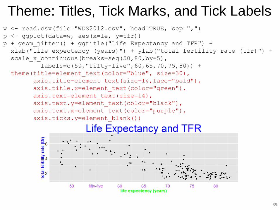
Theme: Titles, Tick Marks, and Tick Labels w <- read.csv(file="WDS2012.csv", head=TRUE, sep=",")
p <- ggplot(data=w, aes(x=le, y=tfr))
p + geom_jitter() + ggtitle("Life Expectancy and TFR") +
xlab("life expectency (years)") + ylab("total fertility rate (tfr)") +
scale_x_continuous(breaks=seq(50,80,by=5),
labels=c(50,"fifty-five",60,65,70,75,80)) +
theme(title=element_text(color="blue", size=30),
axis.title=element_text(size=14,face="bold"),
axis.title.x=element_text(color="green"),
axis.text=element_text(size=14),
axis.text.y=element_text(color="black"),
axis.text.x=element_text(color="purple"),
axis.ticks.y=element_blank())
40
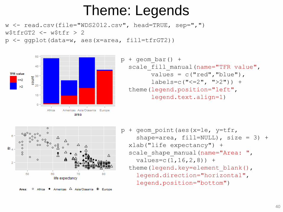
Theme: Legends w <- read.csv(file="WDS2012.csv", head=TRUE, sep=",")
w$tfrGT2 <- w$tfr > 2
p <- ggplot(data=w, aes(x=area, fill=tfrGT2))
p + geom_bar() +
scale_fill_manual(name="TFR value",
values = c("red","blue"),
labels=c("<=2", ">2")) +
theme(legend.position="left",
legend.text.align=1)
p + geom_point(aes(x=le, y=tfr,
shape=area, fill=NULL), size = 3) +
xlab("life expectancy") +
scale_shape_manual(name="Area: ",
values=c(1,16,2,8)) +
theme(legend.key=element_blank(),
legend.direction="horizontal",
legend.position="bottom")
41
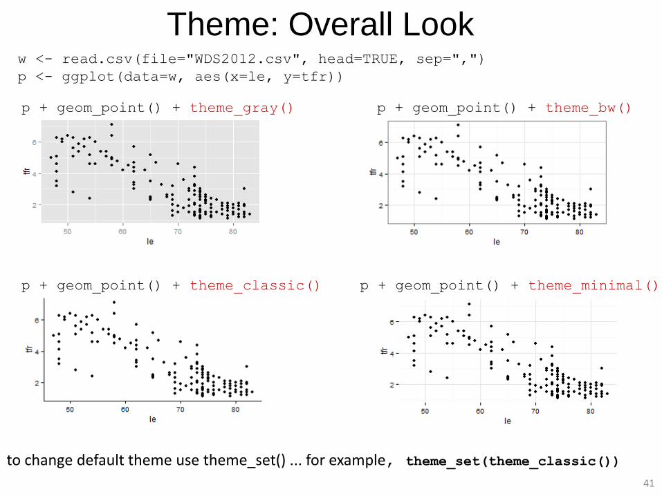
Theme: Overall Look w <- read.csv(file="WDS2012.csv", head=TRUE, sep=",")
p <- ggplot(data=w, aes(x=le, y=tfr))
p + geom_point() + theme_gray() p + geom_point() + theme_bw()
p + geom_point() + theme_classic() p + geom_point() + theme_minimal()
to change default theme use theme_set() ... for example, theme_set(theme_classic())
42
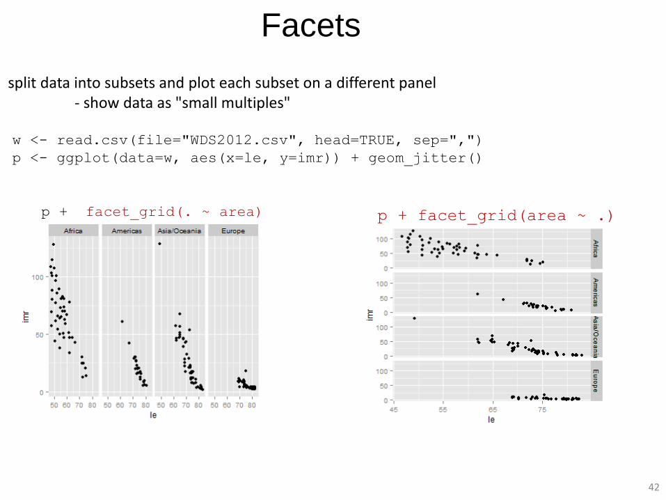
Facets
split data into subsets and plot each subset on a different panel - show data as "small multiples"
w <- read.csv(file="WDS2012.csv", head=TRUE, sep=",")
p <- ggplot(data=w, aes(x=le, y=imr)) + geom_jitter()
p + facet_grid(. ~ area) p + facet_grid(area ~ .)
43
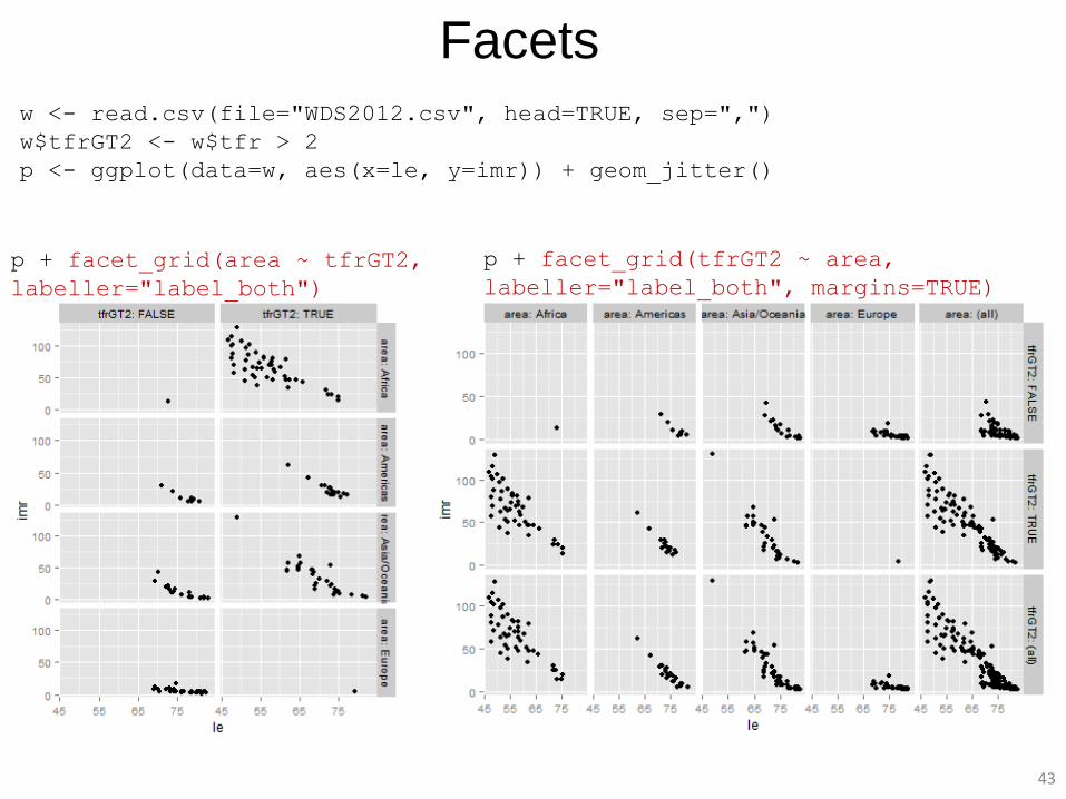
w <- read.csv(file="WDS2012.csv", head=TRUE, sep=",")
w$tfrGT2 <- w$tfr > 2
p <- ggplot(data=w, aes(x=le, y=imr)) + geom_jitter()
Facets
p + facet_grid(tfrGT2 ~ area,
labeller="label_both", margins=TRUE)
p + facet_grid(area ~ tfrGT2,
labeller="label_both")
44
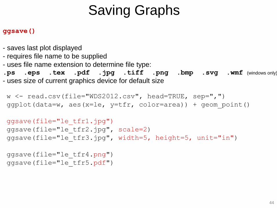
Saving Graphs
ggsave()
- saves last plot displayed
- requires file name to be supplied
- uses file name extension to determine file type: .ps .eps .tex .pdf .jpg .tiff .png .bmp .svg .wmf (windows only)
- uses size of current graphics device for default size
w <- read.csv(file="WDS2012.csv", head=TRUE, sep=",")
ggplot(data=w, aes(x=le, y=tfr, color=area)) + geom_point()
ggsave(file="le_tfr1.jpg")
ggsave(file="le_tfr2.jpg", scale=2)
ggsave(file="le_tfr3.jpg", width=5, height=5, unit="in")
ggsave(file="le_tfr4.png")
ggsave(file="le_tfr5.pdf")
45
Part 2: Examples
46
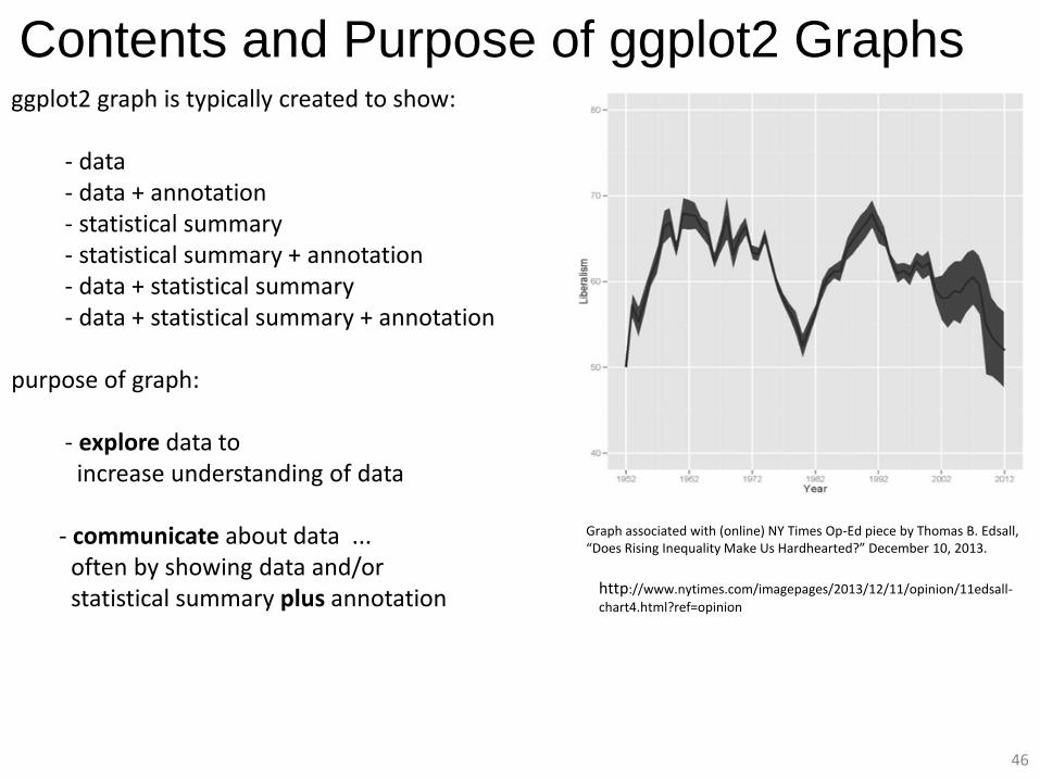
ggplot2 graph is typically created to show: - data - data + annotation - statistical summary - statistical summary + annotation - data + statistical summary - data + statistical summary + annotation purpose of graph: - explore data to increase understanding of data - communicate about data ... often by showing data and/or statistical summary plus annotation
Contents and Purpose of ggplot2 Graphs
http://www.nytimes.com/imagepages/2013/12/11/opinion/11edsall-
chart4.html?ref=opinion
Graph associated with (online) NY Times Op-Ed piece by Thomas B. Edsall, “Does Rising Inequality Make Us Hardhearted?” December 10, 2013.
47
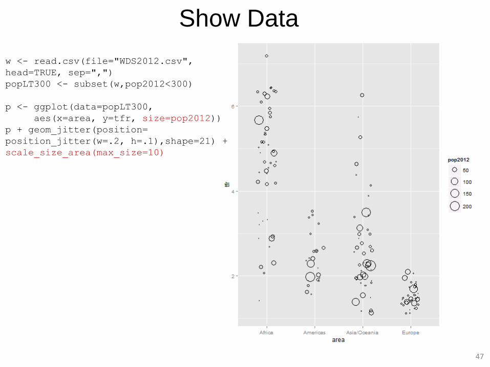
Show Data
w <- read.csv(file="WDS2012.csv",
head=TRUE, sep=",")
popLT300 <- subset(w,pop2012<300)
p <- ggplot(data=popLT300,
aes(x=area, y=tfr, size=pop2012))
p + geom_jitter(position=
position_jitter(w=.2, h=.1),shape=21) +
scale_size_area(max_size=10)
48
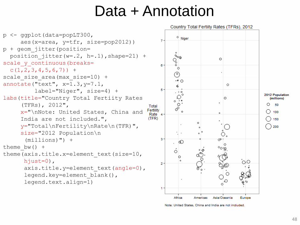
Data + Annotation
p <- ggplot(data=popLT300,
aes(x=area, y=tfr, size=pop2012))
p + geom_jitter(position=
position_jitter(w=.2, h=.1),shape=21) +
scale_y_continuous(breaks=
c(1,2,3,4,5,6,7)) +
scale_size_area(max_size=10) +
annotate("text", x=1.3,y=7.1,
label="Niger", size=4) +
labs(title="Country Total Fertiity Rates
(TFRs), 2012",
x="\nNote: United States, China and
India are not included.",
y="Total\nFertility\nRate\n(TFR)",
size="2012 Population\n
(millions)") +
theme_bw() +
theme(axis.title.x=element_text(size=10,
hjust=0),
axis.title.y=element_text(angle=0),
legend.key=element_blank(),
legend.text.align=1)
49
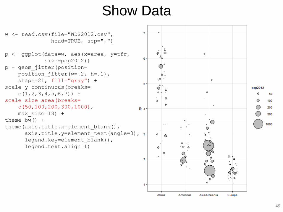
w <- read.csv(file="WDS2012.csv",
head=TRUE, sep=",")
p <- ggplot(data=w, aes(x=area, y=tfr,
size=pop2012))
p + geom_jitter(position=
position_jitter(w=.2, h=.1),
shape=21, fill="gray") +
scale_y_continuous(breaks=
c(1,2,3,4,5,6,7)) +
scale_size_area(breaks=
c(50,100,200,300,1000),
max_size=18) +
theme_bw() +
theme(axis.title.x=element_blank(),
axis.title.y=element_text(angle=0),
legend.key=element_blank(),
legend.text.align=1)
Show Data
50
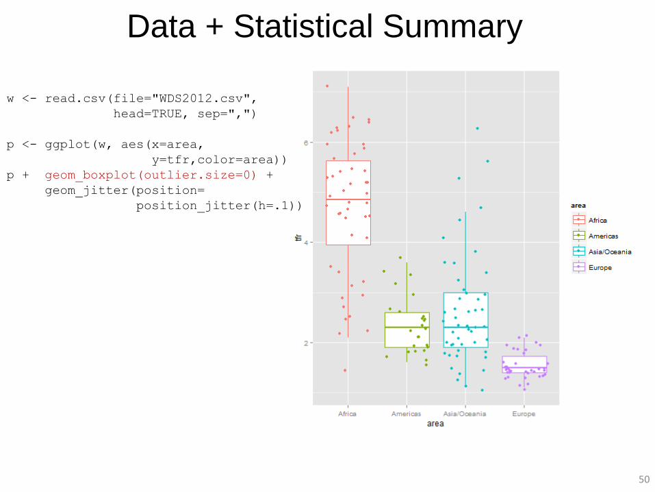
Data + Statistical Summary
w <- read.csv(file="WDS2012.csv",
head=TRUE, sep=",")
p <- ggplot(w, aes(x=area,
y=tfr,color=area))
p + geom_boxplot(outlier.size=0) +
geom_jitter(position=
position_jitter(h=.1))
51
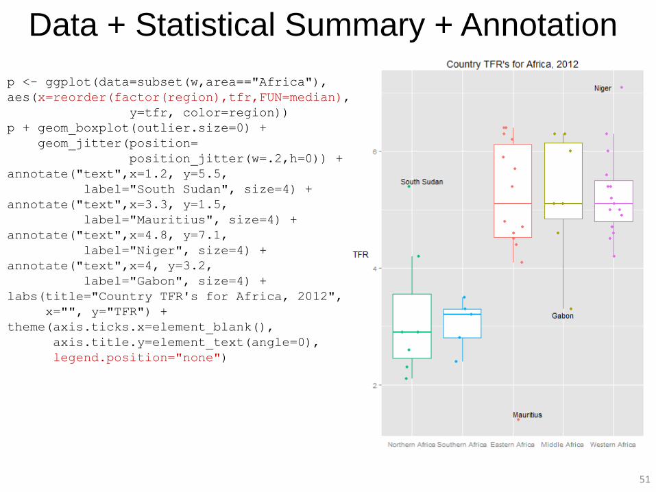
Data + Statistical Summary + Annotation
p <- ggplot(data=subset(w,area=="Africa"),
aes(x=reorder(factor(region),tfr,FUN=median),
y=tfr, color=region))
p + geom_boxplot(outlier.size=0) +
geom_jitter(position=
position_jitter(w=.2,h=0)) +
annotate("text",x=1.2, y=5.5,
label="South Sudan", size=4) +
annotate("text",x=3.3, y=1.5,
label="Mauritius", size=4) +
annotate("text",x=4.8, y=7.1,
label="Niger", size=4) +
annotate("text",x=4, y=3.2,
label="Gabon", size=4) +
labs(title="Country TFR's for Africa, 2012",
x="", y="TFR") +
theme(axis.ticks.x=element_blank(),
axis.title.y=element_text(angle=0),
legend.position="none")
52
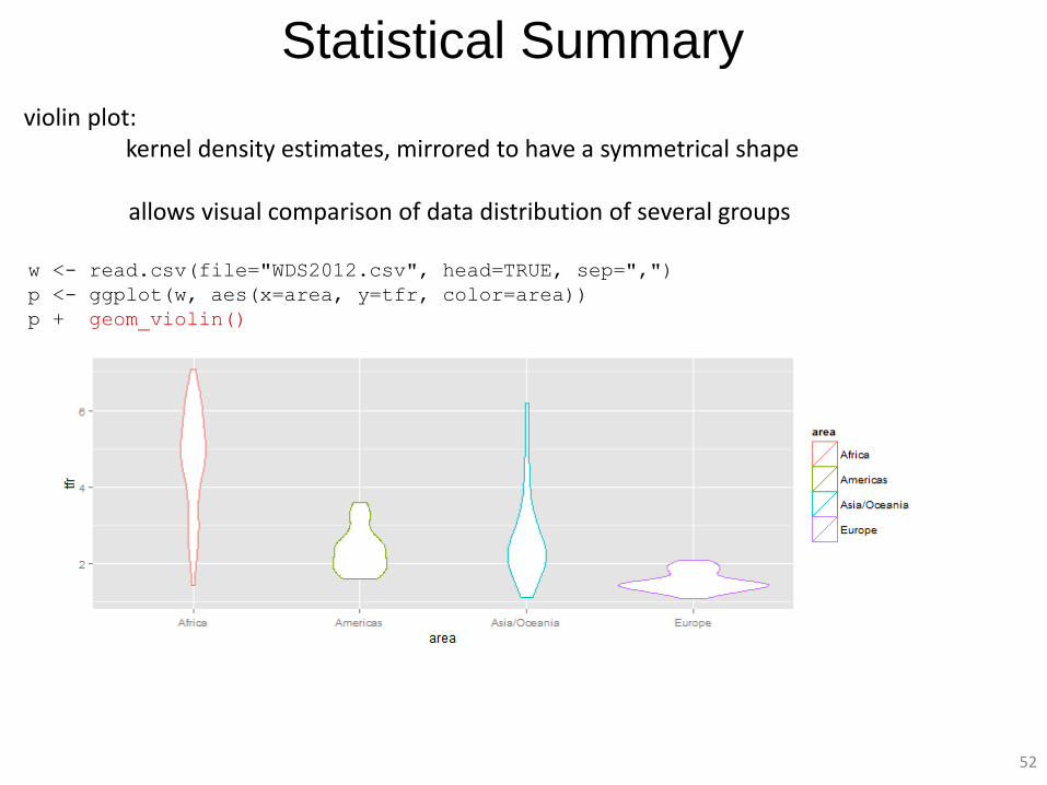
Statistical Summary
violin plot: kernel density estimates, mirrored to have a symmetrical shape allows visual comparison of data distribution of several groups
w <- read.csv(file="WDS2012.csv", head=TRUE, sep=",")
p <- ggplot(w, aes(x=area, y=tfr, color=area))
p + geom_violin()
53
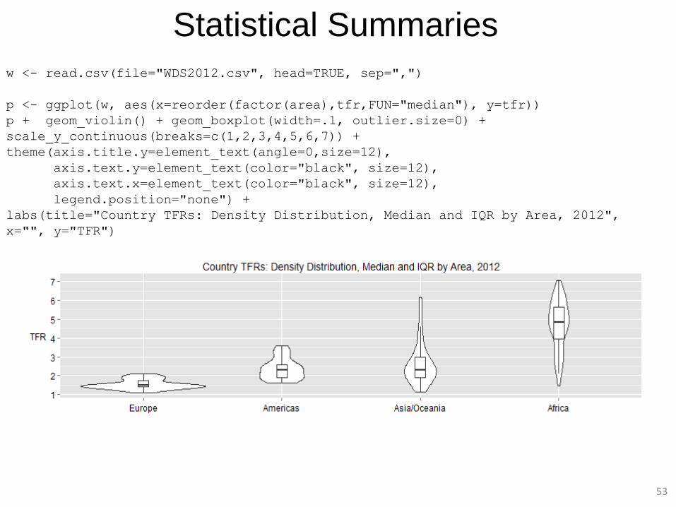
Statistical Summaries
w <- read.csv(file="WDS2012.csv", head=TRUE, sep=",")
p <- ggplot(w, aes(x=reorder(factor(area),tfr,FUN="median"), y=tfr))
p + geom_violin() + geom_boxplot(width=.1, outlier.size=0) +
scale_y_continuous(breaks=c(1,2,3,4,5,6,7)) +
theme(axis.title.y=element_text(angle=0,size=12),
axis.text.y=element_text(color="black", size=12),
axis.text.x=element_text(color="black", size=12),
legend.position="none") +
labs(title="Country TFRs: Density Distribution, Median and IQR by Area, 2012",
x="", y="TFR")
54
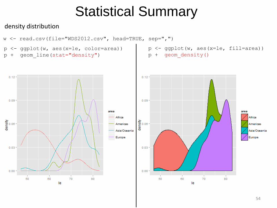
Statistical Summary
w <- read.csv(file="WDS2012.csv", head=TRUE, sep=",")
p <- ggplot(w, aes(x=le, color=area))
p + geom_line(stat="density")
p <- ggplot(w, aes(x=le, fill=area))
p + geom_density()
density distribution
55
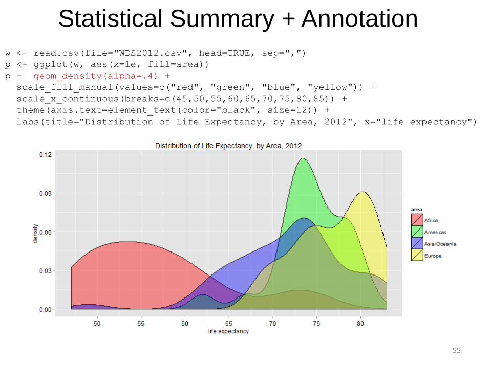
Statistical Summary + Annotation
w <- read.csv(file="WDS2012.csv", head=TRUE, sep=",")
p <- ggplot(w, aes(x=le, fill=area))
p + geom_density(alpha=.4) +
scale_fill_manual(values=c("red", "green", "blue", "yellow")) +
scale_x_continuous(breaks=c(45,50,55,60,65,70,75,80,85)) +
theme(axis.text=element_text(color="black", size=12)) +
labs(title="Distribution of Life Expectancy, by Area, 2012", x="life expectancy")
56
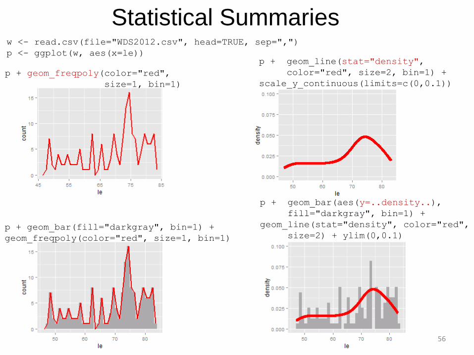
Statistical Summaries w <- read.csv(file="WDS2012.csv", head=TRUE, sep=",")
p <- ggplot(w, aes(x=le))
p + geom_freqpoly(color="red",
size=1, bin=1)
p + geom_bar(fill="darkgray", bin=1) +
geom_freqpoly(color="red", size=1, bin=1)
p + geom_line(stat="density",
color="red", size=2, bin=1) +
scale_y_continuous(limits=c(0,0.1))
p + geom_bar(aes(y=..density..),
fill="darkgray", bin=1) +
geom_line(stat="density", color="red",
size=2) + ylim(0,0.1)
57
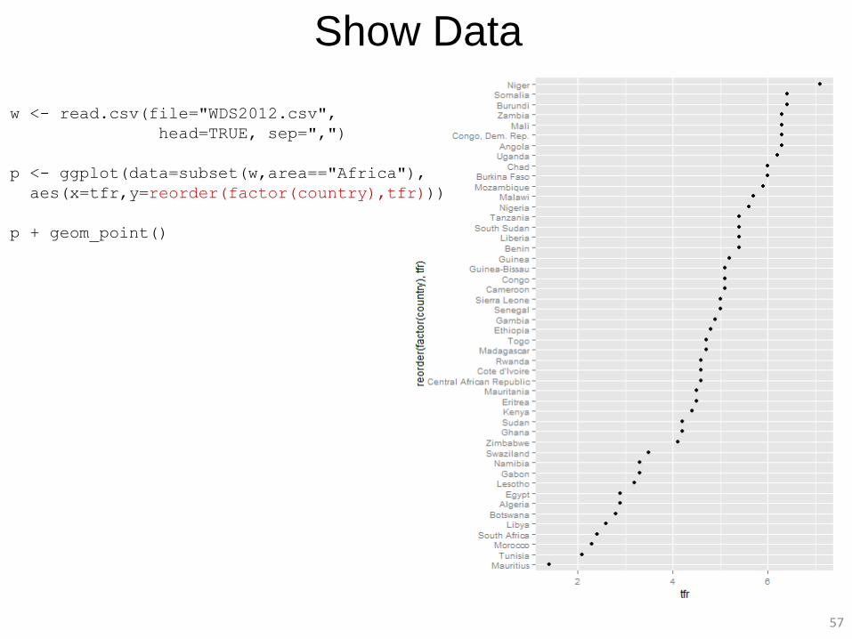
Show Data
w <- read.csv(file="WDS2012.csv",
head=TRUE, sep=",")
p <- ggplot(data=subset(w,area=="Africa"),
aes(x=tfr,y=reorder(factor(country),tfr)))
p + geom_point()
58
Show Data
w <- read.csv(file="WDS2012.csv",
head=TRUE, sep=",")
p <- gplot(data=subset(w,area=="Africa"),
aes(x=tfr,y=reorder(factor(country),tfr)))
p + geom_segment(aes(yend=country,xend=0)) +
geom_point() +
theme_minimal() +
scale_x_continuous(breaks=
c(0,1,2,3,4,5,6,7)) +
labs(x="Total Fertility Rate (TFR)", y="",
title="Total Fertility Rates (TFRs)
in Africa, by Country, 2012") +
theme(panel.grid.major.y=element_blank(),
axis.ticks=element_blank())
59
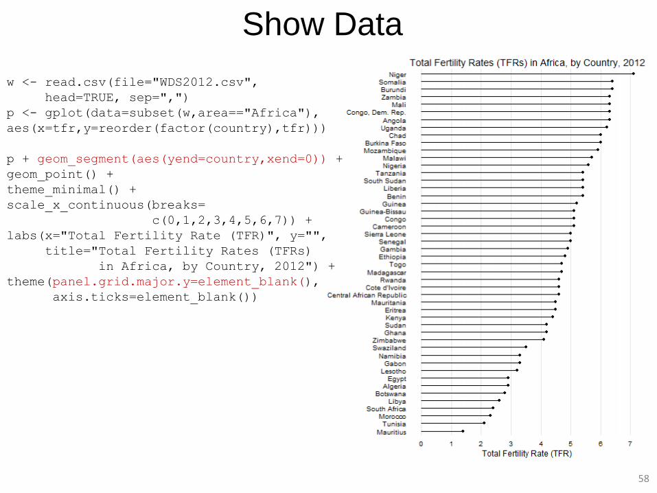
Show Data
w <- read.csv(file="WDS2012.csv",
head=TRUE, sep=",")
p <- ggplot(data=subset(w,area=="Africa"),
aes(x=tfr, y=reorder(factor(country),tfr)))
p + geom_segment(aes(yend=country,xend=0),
size=2) +
theme_minimal() +
scale_x_continuous(breaks=
c(0,1,2,3,4,5,6,7)) +
labs(x="Total Fertility Rate (TFR)", y="",
title="Total Fertility Rates (TFRs)
in Africa, by Country, 2012") +
theme(panel.grid.major.y=element_blank(),
axis.ticks=element_blank())
60
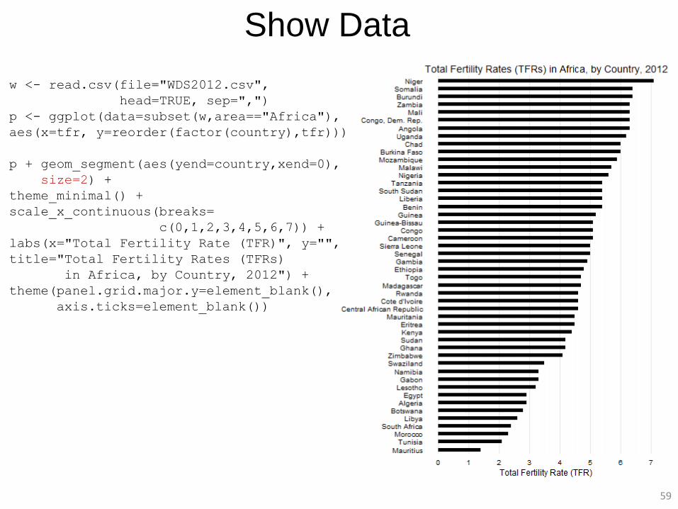
Show Data
w <- read.csv(file="WDS2012.csv",
head=TRUE, sep=",")
p <- ggplot(data=subset(w,area=="Africa"),
aes(x=tfr,
y=reorder(factor(country),tfr)))
p + geom_text(aes(x=tfr+.1, label=country,
hjust=0), size=4) +
geom_segment(aes(yend=country,xend=0), size=2) +
theme_minimal() +
scale_x_continuous(breaks=c(1,2,3,4,5,6,7),
limits=c(0,8)) +
labs(x="", y="",
title="Total Fertility Rates (TFRs)
in Africa, by Country, 2012") +
theme(panel.grid.major.y=element_blank(),
axis.text.y=element_blank(),
axis.ticks=element_blank())
61
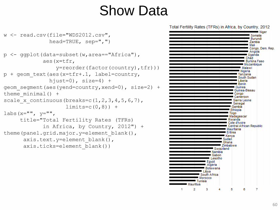
Show Data
w <- read.csv(file="WDS2012.csv",
head=TRUE, sep=",")
p <- ggplot(data=subset(w,area=="Africa"),
aes(x=tfr, y=reorder(factor(country),tfr)))
p + geom_text(aes(x=tfr-.1, label=country,
hjust=1), size=4) +
geom_point() +
theme_minimal() +
scale_x_continuous(breaks=c(1,2,3,4,5,6,7),
limits=c(0,8)) +
labs(x="", y="",
title="Total Fertility Rates (TFRs) in
Africa, by Country, 2012") +
theme(panel.grid.major.y=element_blank(),
axis.text.y=element_blank(),
axis.ticks=element_blank())
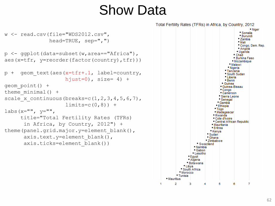
62
Show Data
w <- read.csv(file="WDS2012.csv",
head=TRUE, sep=",")
p <- ggplot(data=subset(w,area=="Africa"),
aes(x=tfr, y=reorder(factor(country),tfr)))
p + geom_text(aes(x=tfr+.1, label=country,
hjust=0), size= 4) +
geom_point() +
theme_minimal() +
scale_x_continuous(breaks=c(1,2,3,4,5,6,7),
limits=c(0,8)) +
labs(x="", y="",
title="Total Fertility Rates (TFRs)
in Africa, by Country, 2012") +
theme(panel.grid.major.y=element_blank(),
axis.text.y=element_blank(),
axis.ticks=element_blank())
63
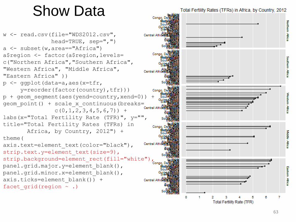
w <- read.csv(file="WDS2012.csv",
head=TRUE, sep=",")
a <- subset(w,area=="Africa")
a$region <- factor(a$region,levels=
c("Northern Africa","Southern Africa",
"Western Africa", "Middle Africa",
"Eastern Africa" ))
p <- ggplot(data=a,aes(x=tfr,
y=reorder(factor(country),tfr)))
p + geom_segment(aes(yend=country,xend=0)) +
geom_point() + scale_x_continuous(breaks=
c(0,1,2,3,4,5,6,7)) +
labs(x="Total Fertility Rate (TFR)", y="",
title="Total Fertility Rates (TFRs) in
Africa, by Country, 2012") +
theme(
axis.text=element_text(color="black"),
strip.text.y=element_text(size=9),
strip.background=element_rect(fill="white"),
panel.grid.major.y=element_blank(),
panel.grid.minor.x=element_blank(),
axis.ticks=element_blank()) +
facet_grid(region ~ .)
Show Data
64
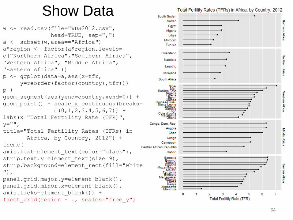
Show Data w <- read.csv(file="WDS2012.csv",
head=TRUE, sep=",")
a <- subset(w,area=="Africa")
a$region <- factor(a$region,levels=
c("Northern Africa","Southern Africa",
"Western Africa", "Middle Africa",
"Eastern Africa" ))
p <- ggplot(data=a,aes(x=tfr,
y=reorder(factor(country),tfr)))
p +
geom_segment(aes(yend=country,xend=0)) +
geom_point() + scale_x_continuous(breaks=
c(0,1,2,3,4,5,6,7)) +
labs(x="Total Fertility Rate (TFR)",
y="",
title="Total Fertility Rates (TFRs) in
Africa, by Country, 2012") +
theme(
axis.text=element_text(color="black"),
strip.text.y=element_text(size=9),
strip.background=element_rect(fill="white
"),
panel.grid.major.y=element_blank(),
panel.grid.minor.x=element_blank(),
axis.ticks=element_blank()) +
facet_grid(region ~ ., scales="free_y")
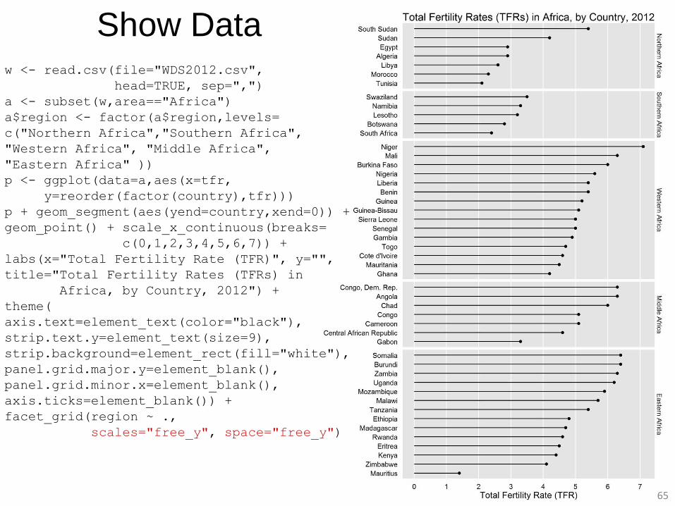
Show Data w <- read.csv(file="WDS2012.csv",
head=TRUE, sep=",")
a <- subset(w,area=="Africa")
a$region <- factor(a$region,levels=
c("Northern Africa","Southern Africa",
"Western Africa", "Middle Africa",
"Eastern Africa" ))
p <- ggplot(data=a,aes(x=tfr,
y=reorder(factor(country),tfr)))
p + geom_segment(aes(yend=country,xend=0)) +
geom_point() + scale_x_continuous(breaks=
c(0,1,2,3,4,5,6,7)) +
labs(x="Total Fertility Rate (TFR)", y="",
title="Total Fertility Rates (TFRs) in
Africa, by Country, 2012") +
theme(
axis.text=element_text(color="black"),
strip.text.y=element_text(size=9),
strip.background=element_rect(fill="white"),
panel.grid.major.y=element_blank(),
panel.grid.minor.x=element_blank(),
axis.ticks=element_blank()) +
facet_grid(region ~ .,
scales="free_y", space="free_y")
65
66
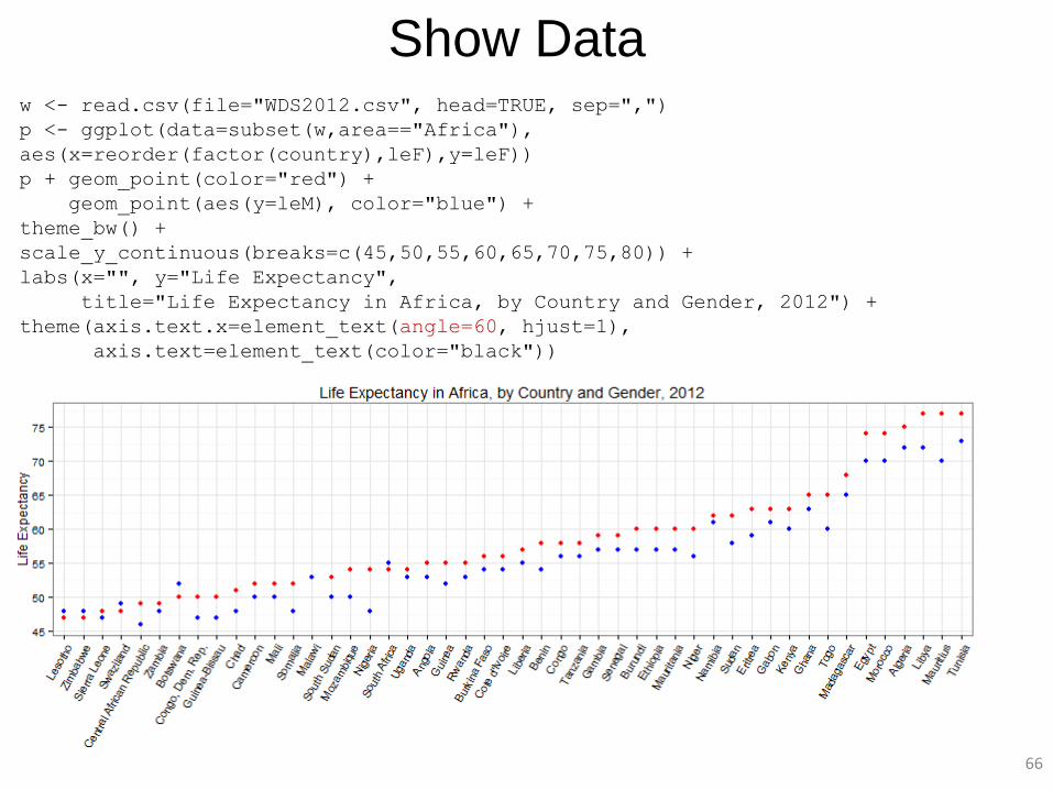
Show Data w <- read.csv(file="WDS2012.csv", head=TRUE, sep=",")
p <- ggplot(data=subset(w,area=="Africa"),
aes(x=reorder(factor(country),leF),y=leF))
p + geom_point(color="red") +
geom_point(aes(y=leM), color="blue") +
theme_bw() +
scale_y_continuous(breaks=c(45,50,55,60,65,70,75,80)) +
labs(x="", y="Life Expectancy",
title="Life Expectancy in Africa, by Country and Gender, 2012") +
theme(axis.text.x=element_text(angle=60, hjust=1),
axis.text=element_text(color="black"))
67
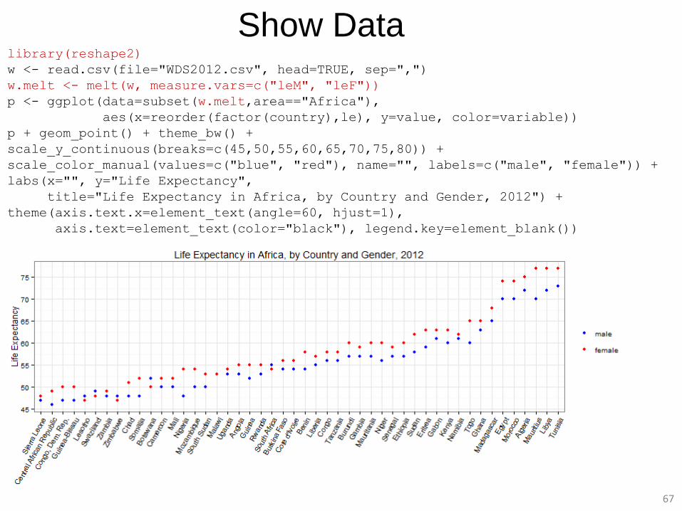
Show Data library(reshape2)
w <- read.csv(file="WDS2012.csv", head=TRUE, sep=",")
w.melt <- melt(w, measure.vars=c("leM", "leF"))
p <- ggplot(data=subset(w.melt,area=="Africa"),
aes(x=reorder(factor(country),le), y=value, color=variable))
p + geom_point() + theme_bw() +
scale_y_continuous(breaks=c(45,50,55,60,65,70,75,80)) +
scale_color_manual(values=c("blue", "red"), name="", labels=c("male", "female")) +
labs(x="", y="Life Expectancy",
title="Life Expectancy in Africa, by Country and Gender, 2012") +
theme(axis.text.x=element_text(angle=60, hjust=1),
axis.text=element_text(color="black"), legend.key=element_blank())
68
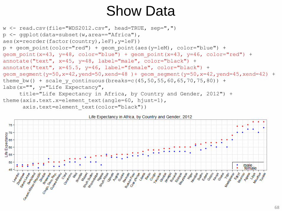
w <- read.csv(file="WDS2012.csv", head=TRUE, sep=",")
p <- ggplot(data=subset(w,area=="Africa"),
aes(x=reorder(factor(country),leF),y=leF))
p + geom_point(color="red") + geom_point(aes(y=leM), color="blue") +
geom_point(x=43, y=48, color="blue") + geom_point(x=43, y=46, color="red") +
annotate("text", x=45, y=48, label="male", color="black") +
annotate("text", x=45.5, y=46, label="female", color="black") +
geom_segment(y=50,x=42,yend=50,xend=48 )+ geom_segment(y=50,x=42,yend=45,xend=42) +
theme_bw() + scale_y_continuous(breaks=c(45,50,55,60,65,70,75,80)) +
labs(x="", y="Life Expectancy",
title="Life Expectancy in Africa, by Country and Gender, 2012") +
theme(axis.text.x=element_text(angle=60, hjust=1),
axis.text=element_text(color="black"))
Show Data
69
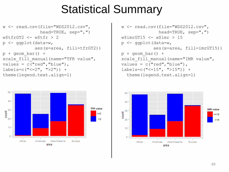
w <- read.csv(file="WDS2012.csv",
head=TRUE, sep=",")
w$tfrGT2 <- w$tfr > 2
p <- ggplot(data=w,
aes(x=area, fill=tfrGT2))
p + geom_bar() +
scale_fill_manual(name="TFR value",
values = c("red","blue"),
labels=c("<=2", ">2")) +
theme(legend.text.align=1)
w <- read.csv(file="WDS2012.csv",
head=TRUE, sep=",")
w$imrGT15 <- w$imr > 15
p <- ggplot(data=w,
aes(x=area, fill=imrGT15))
p + geom_bar() +
scale_fill_manual(name="IMR value",
values = c("red","blue"),
labels=c("<=15", ">15")) +
theme(legend.text.align=1)
Statistical Summary
70
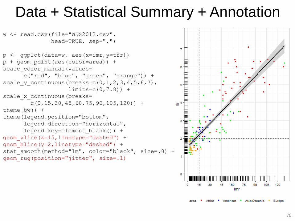
Data + Statistical Summary + Annotation
w <- read.csv(file="WDS2012.csv",
head=TRUE, sep=",")
p <- ggplot(data=w, aes(x=imr,y=tfr))
p + geom_point(aes(color=area)) +
scale_color_manual(values=
c("red", "blue", "green", "orange")) +
scale_y_continuous(breaks=c(0,1,2,3,4,5,6,7),
limits=c(0,7.8)) +
scale_x_continuous(breaks=
c(0,15,30,45,60,75,90,105,120)) +
theme_bw() +
theme(legend.position="bottom",
legend.direction="horizontal",
legend.key=element_blank()) +
geom_vline(x=15,linetype="dashed") +
geom_hline(y=2,linetype="dashed") +
stat_smooth(method="lm", color="black", size=.8) +
geom_rug(position="jitter", size=.1)
71
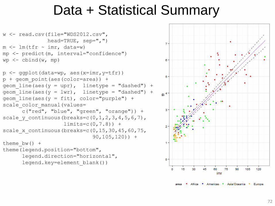
Data + Statistical Summary w <- read.csv(file="WDS2012.csv",
head=TRUE, sep=",")
p <- ggplot(data=w, aes(x=imr,y=tfr))
p + geom_point(aes(color=area)) +
stat_smooth(method="lm", fill=NA,
color="purple") +
stat_smooth(method="lm", fill=NA, color="black",
linetype="dashed", geom="ribbon") +
scale_color_manual(values=c("red", "blue",
"green", "orange")) +
scale_y_continuous(breaks=c(0,1,2,3,4,5,6,7),
limits=c(0,7.8)) +
scale_x_continuous(breaks=c(0,15,30,45,60,75,
90,105,120)) +
theme_bw() +
theme(legend.position="bottom",
legend.direction="horizontal",
legend.key=element_blank())
72
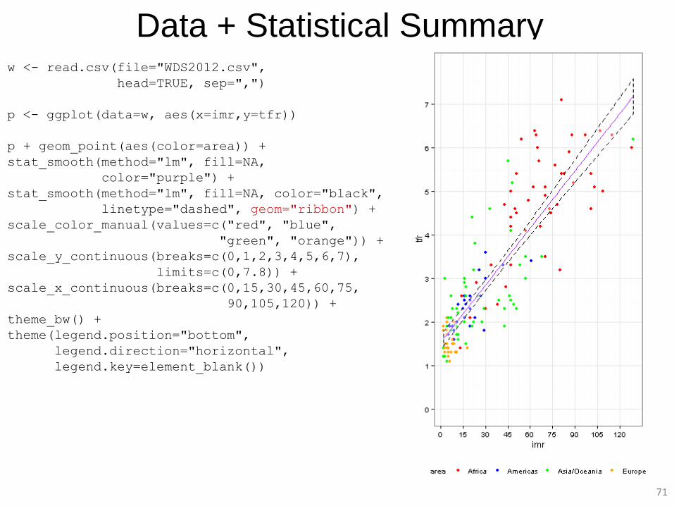
Data + Statistical Summary
w <- read.csv(file="WDS2012.csv",
head=TRUE, sep=",")
m <- lm(tfr ~ imr, data=w)
mp <- predict(m, interval="confidence")
wp <- cbind(w, mp)
p <- ggplot(data=wp, aes(x=imr,y=tfr))
p + geom_point(aes(color=area)) +
geom_line(aes(y = upr), linetype = "dashed") +
geom_line(aes(y = lwr), linetype = "dashed") +
geom_line(aes(y = fit), color="purple") +
scale_color_manual(values=
c("red", "blue", "green", "orange")) +
scale_y_continuous(breaks=c(0,1,2,3,4,5,6,7),
limits=c(0,7.8)) +
scale_x_continuous(breaks=c(0,15,30,45,60,75,
90,105,120)) +
theme_bw() +
theme(legend.position="bottom",
legend.direction="horizontal",
legend.key=element_blank())
73
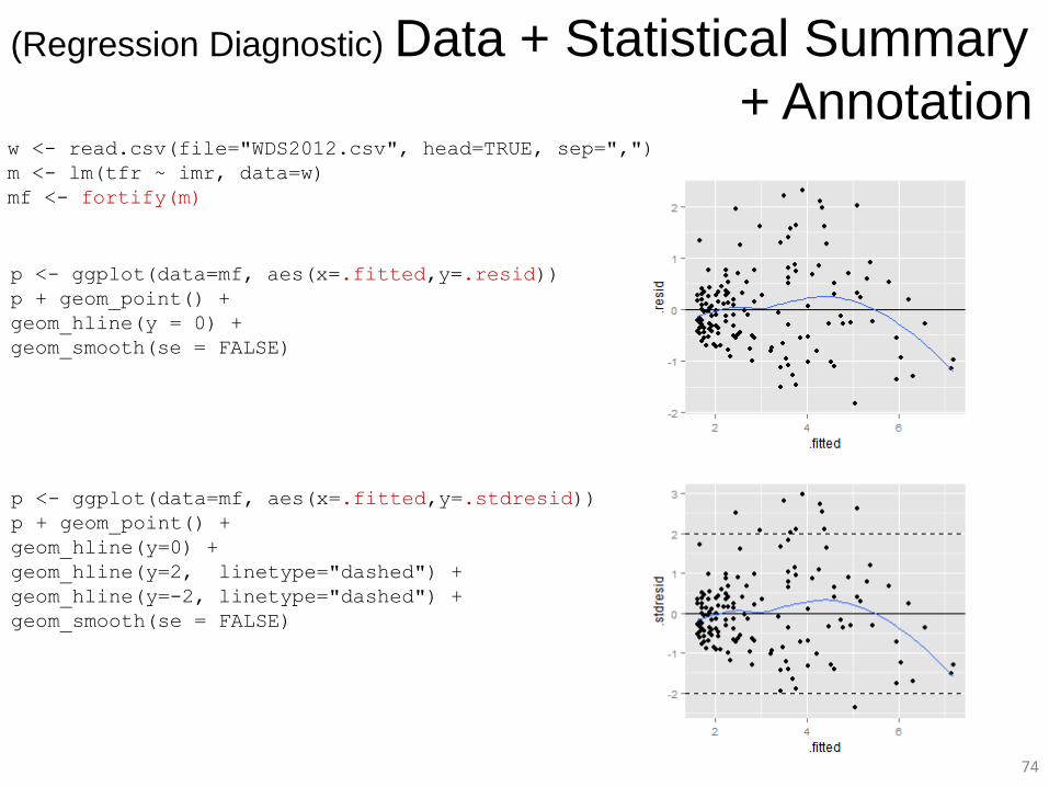
Graphing Regression Diagnostics approach: make diagnostic data easily available use all ggplot2 capabilities to visualize data diagnostic data and visual representation are separate flexibility fortify(model)
provides data frame containing variables used in model and
columns containing regression diagnostics:
.fitted fitted values from the model
.resid residuals
.stdresid standardized residuals
.hat diagonal of the hat matrix
.cooksd estimate of effect of deleting an observation (influence)
.sigma estimate of residual standard deviation when observation dropped
from model
74
(Regression Diagnostic) Data + Statistical Summary
+ Annotation w <- read.csv(file="WDS2012.csv", head=TRUE, sep=",")
m <- lm(tfr ~ imr, data=w)
mf <- fortify(m)
p <- ggplot(data=mf, aes(x=.fitted,y=.resid))
p + geom_point() +
geom_hline(y = 0) +
geom_smooth(se = FALSE)
p <- ggplot(data=mf, aes(x=.fitted,y=.stdresid))
p + geom_point() +
geom_hline(y=0) +
geom_hline(y=2, linetype="dashed") +
geom_hline(y=-2, linetype="dashed") +
geom_smooth(se = FALSE)
75
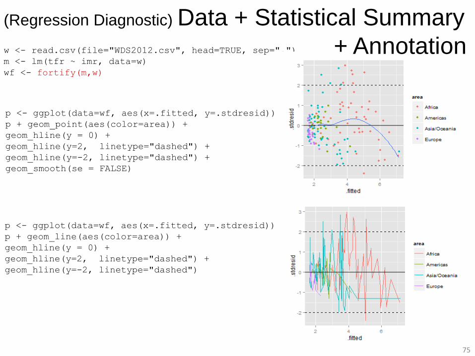
w <- read.csv(file="WDS2012.csv", head=TRUE, sep=",")
m <- lm(tfr ~ imr, data=w)
wf <- fortify(m,w)
p <- ggplot(data=wf, aes(x=.fitted, y=.stdresid))
p + geom_point(aes(color=area)) +
geom_hline(y = 0) +
geom_hline(y=2, linetype="dashed") +
geom_hline(y=-2, linetype="dashed") +
geom_smooth(se = FALSE)
p <- ggplot(data=wf, aes(x=.fitted, y=.stdresid))
p + geom_line(aes(color=area)) +
geom_hline(y = 0) +
geom_hline(y=2, linetype="dashed") +
geom_hline(y=-2, linetype="dashed")
(Regression Diagnostic) Data + Statistical Summary
+ Annotation
76
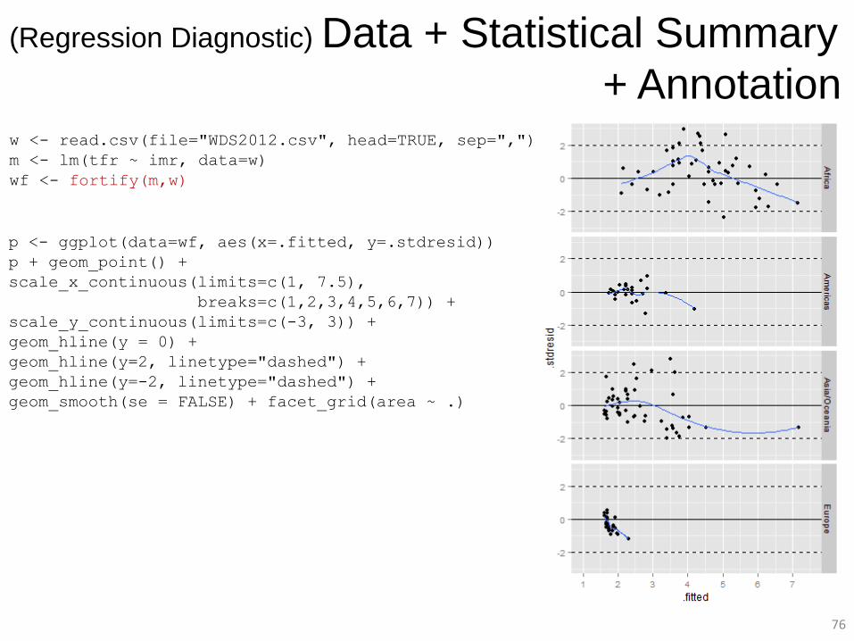
w <- read.csv(file="WDS2012.csv", head=TRUE, sep=",")
m <- lm(tfr ~ imr, data=w)
wf <- fortify(m,w)
p <- ggplot(data=wf, aes(x=.fitted, y=.stdresid))
p + geom_point() +
scale_x_continuous(limits=c(1, 7.5),
breaks=c(1,2,3,4,5,6,7)) +
scale_y_continuous(limits=c(-3, 3)) +
geom_hline(y = 0) +
geom_hline(y=2, linetype="dashed") +
geom_hline(y=-2, linetype="dashed") +
geom_smooth(se = FALSE) + facet_grid(area ~ .)
(Regression Diagnostic) Data + Statistical Summary
+ Annotation
77
Part 3: Recap and Additional Resources
78
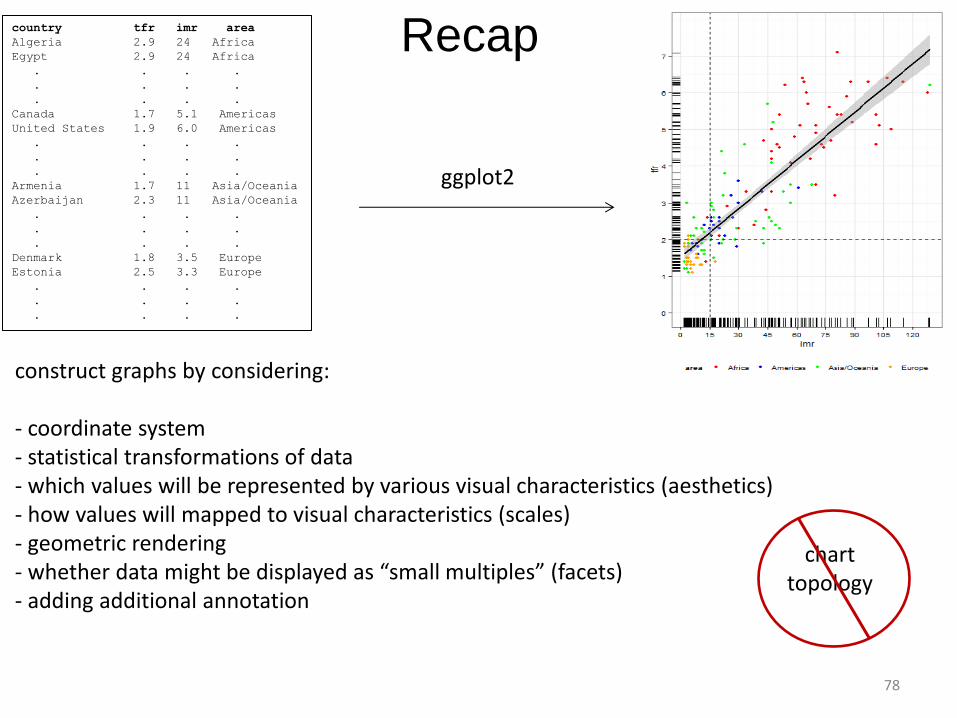
Recap country tfr imr area
Algeria 2.9 24 Africa
Egypt 2.9 24 Africa
. . . .
. . . .
. . . .
Canada 1.7 5.1 Americas
United States 1.9 6.0 Americas
. . . .
. . . .
. . . .
Armenia 1.7 11 Asia/Oceania
Azerbaijan 2.3 11 Asia/Oceania
. . . .
. . . .
. . . .
Denmark 1.8 3.5 Europe
Estonia 2.5 3.3 Europe
. . . .
. . . .
. . . .
construct graphs by considering: - coordinate system - statistical transformations of data - which values will be represented by various visual characteristics (aesthetics) - how values will mapped to visual characteristics (scales) - geometric rendering - whether data might be displayed as “small multiples” (facets) - adding additional annotation
ggplot2
chart topology
79
Additional Resources official "Package ggplot2" documentation and help - http://cran.r-project.org/web/packages/ggplot2/ggplot2.pdf - http://docs.ggplot2.org/current/ online ggplot2 user community - http://groups.google.com/group/ggplot2 - http://stackoverflow.com/tags/ggplot2 books - ggplot2: Elegant Graphics for Data Analysis by Hadley Wickham. Springer, 2009. - R Graphics Cookbook by Winston Chang. O’Reilly, 2012. - The Grammar of Graphics by Leland Wilkinson. Springer, 2005. videos - A Backstage Tour of ggplot2 with Hadley Wickham, Feb. 2012. http://www.youtube.com/watch?v=RHu5vgBZ1yQ - Plotting with ggplot2: Part 2 with Roger Peng, Johns Hopkins University, Oct. 2013. http://www.youtube.com/watch?v=n8kYa9vu1l8 online tutorials and slide presentations - Visualizing Data by Garrett Grolemund, Rstudio, July 2013. http://www.edii.uclm.es/~useR-2013/Tutorials/Grolemund.html - AVML 2012: ggplot2 by Josef Fruehwald, University of York, 2012. http://www.ling.upenn.edu/~joseff/avml2012/ - Introduction to R Graphics with ggplot2 by IQSS, Harvard University. http://www.slideshare.net/izahn/rgraphics-12040991 - ggplot2 Quick Reference by SAPE Research Group. http://sape.inf.usi.ch/quick-reference/ggplot2