Embed Size (px)
Citation preview

Introduction Microsoft Excel features statistics in two places: in the list of available functions under Insert on the menu bar, and in Data Analysis under Tools. If you don’t see a Data Analysis item, you need to install it from the set of Add-ins provided with Microsoft Office. If you would like to go beyond Excel’s capabilities, there are two popular choices. The Excel Add-in StatTools from Palisade (www.palisade.com) improves Excel’s numerical accuracy and adds useful features,and Resampling Stats in Excel (www.resamplingstats.com) shows how to solve most of the problems here using straightforward simulation methods. Note that the methods described here will work in almost any version of Excel.
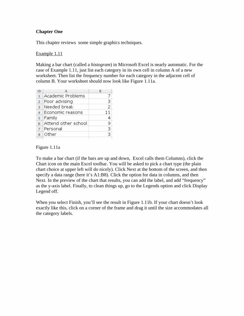
Chapter One This chapter reviews some simple graphics techniques. Example 1.11 Making a bar chart (called a histogram) in Microsoft Excel is nearly automatic. For the case of Example 1.11, just list each category in its own cell in column A of a new worksheet. Then list the frequency number for each category in the adjacent cell of column B. Your worksheet should now look like Figure 1.11a.
Figure 1.11a To make a bar chart (if the bars are up and down, Excel calls them Columns), click the Chart icon on the main Excel toolbar. You will be asked to pick a chart type (the plain chart choice at upper left will do nicely). Click Next at the bottom of the screen, and then specify a data range (here it’s A1:B8). Click the option for data in columns, and then Next. In the preview of the chart that results, you can add the label, and add “frequency” as the y-axis label. Finally, to clean things up, go to the Legends option and click Display Legend off. When you select Finish, you’ll see the result in Figure 1.11b. If your chart doesn’t look exactly like this, click on a corner of the frame and drag it until the size accommodates all the category labels.
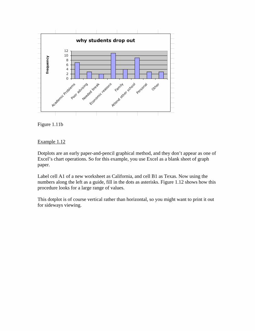
Figure 1.11b Example 1.12 Dotplots are an early paper-and-pencil graphical method, and they don’t appear as one of Excel’s chart operations. So for this example, you use Excel as a blank sheet of graph paper. Label cell A1 of a new worksheet as California, and cell B1 as Texas. Now using the numbers along the left as a guide, fill in the dots as asterisks. Figure 1.12 shows how this procedure looks for a large range of values. This dotplot is of course vertical rather than horizontal, so you might want to print it out for sideways viewing.
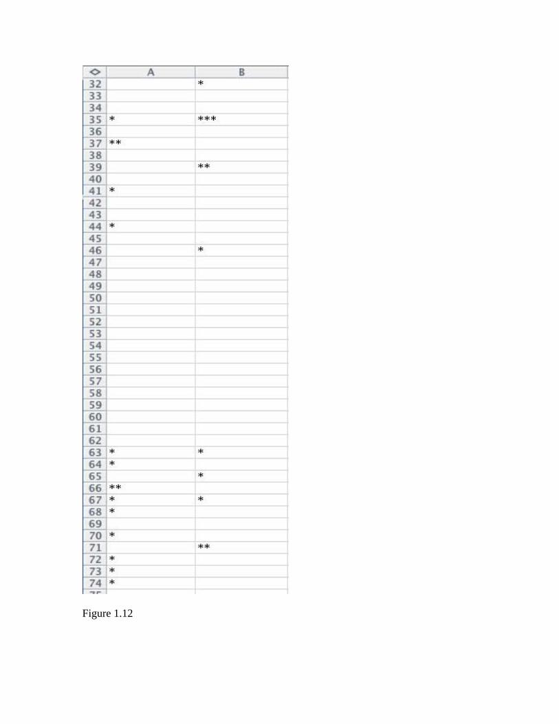
Figure 1.12
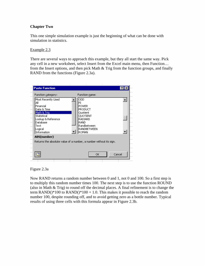
Chapter Two This one simple simulation example is just the beginning of what can be done with simulation in statistics. Example 2.3 There are several ways to approach this example, but they all start the same way. Pick any cell in a new worksheet, select Insert from the Excel main menu, then Function… from the Insert options, and then pick Math & Trig from the function groups, and finally RAND from the functions (Figure 2.3a).
Figure 2.3a Now RAND returns a random number between 0 and 1, not 0 and 100. So a first step is to multiply this random number times 100. The next step is to use the function ROUND (also in Math & Trig) to round off the decimal places. A final refinement is to change the term RAND()*100 to RAND()*100 + 1.0. This makes it possible to reach the random number 100, despite rounding off, and to avoid getting zero as a bottle number. Typical results of using three cells with this formula appear in Figure 2.3b.
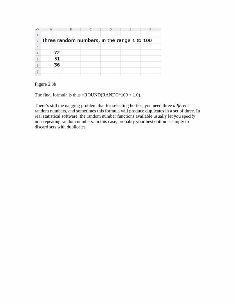
Figure 2.3b The final formula is thus =ROUND(RAND()*100 + 1.0). There’s still the nagging problem that for selecting bottles, you need three different random numbers, and sometimes this formula will produce duplicates in a set of three. In real statistical software, the random number functions available usually let you specify non-repeating random numbers. In this case, probably your best option is simply to discard sets with duplicates.
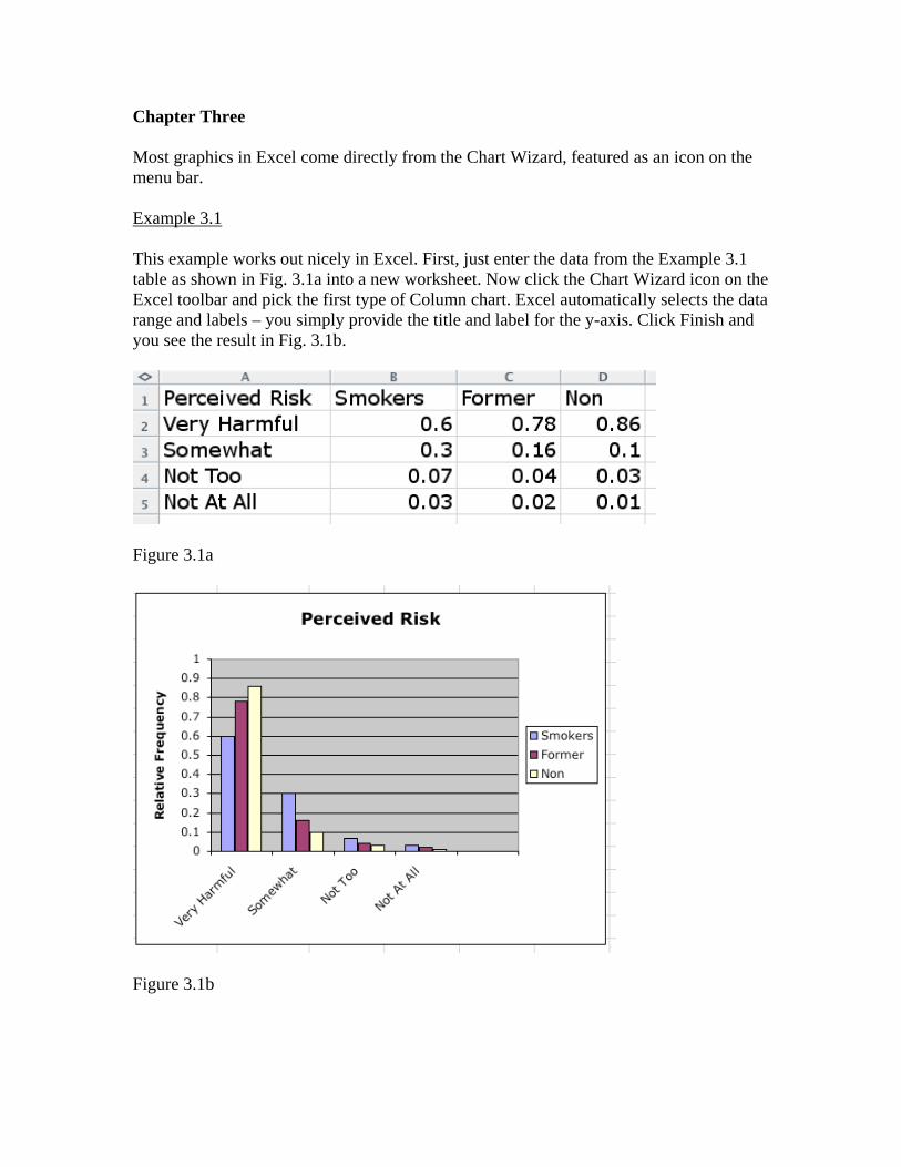
Chapter Three Most graphics in Excel come directly from the Chart Wizard, featured as an icon on the menu bar. Example 3.1 This example works out nicely in Excel. First, just enter the data from the Example 3.1 table as shown in Fig. 3.1a into a new worksheet. Now click the Chart Wizard icon on the Excel toolbar and pick the first type of Column chart. Excel automatically selects the data range and labels – you simply provide the title and label for the y-axis. Click Finish and you see the result in Fig. 3.1b.
Figure 3.1a
Figure 3.1b
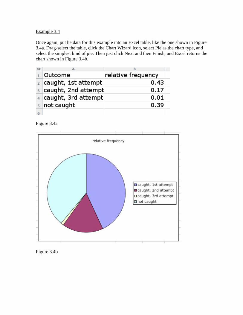
Example 3.4 Once again, put he data for this example into an Excel table, like the one shown in Figure 3.4a. Drag-select the table, click the Chart Wizard icon, select Pie as the chart type, and select the simplest kind of pie. Then just click Next and then Finish, and Excel returns the chart shown in Figure 3.4b.
Figure 3.4a
Figure 3.4b
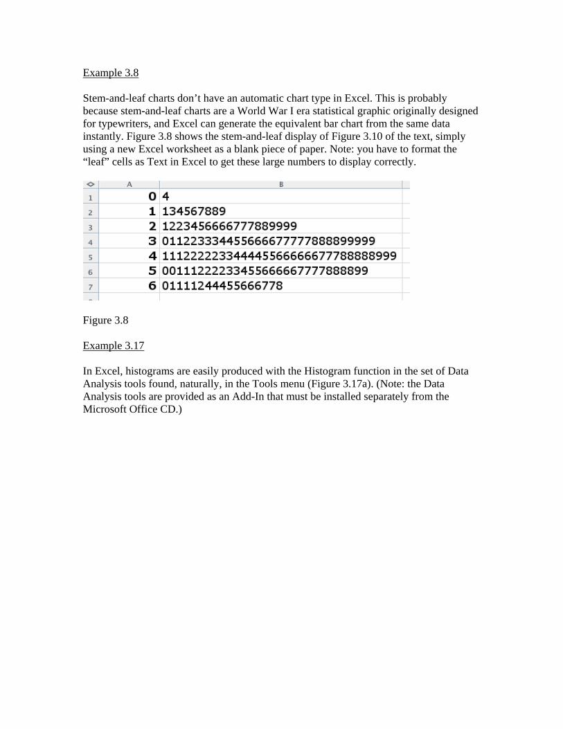
Example 3.8 Stem-and-leaf charts don’t have an automatic chart type in Excel. This is probably because stem-and-leaf charts are a World War I era statistical graphic originally designed for typewriters, and Excel can generate the equivalent bar chart from the same data instantly. Figure 3.8 shows the stem-and-leaf display of Figure 3.10 of the text, simply using a new Excel worksheet as a blank piece of paper. Note: you have to format the “leaf” cells as Text in Excel to get these large numbers to display correctly.
Figure 3.8 Example 3.17 In Excel, histograms are easily produced with the Histogram function in the set of Data Analysis tools found, naturally, in the Tools menu (Figure 3.17a). (Note: the Data Analysis tools are provided as an Add-In that must be installed separately from the Microsoft Office CD.)
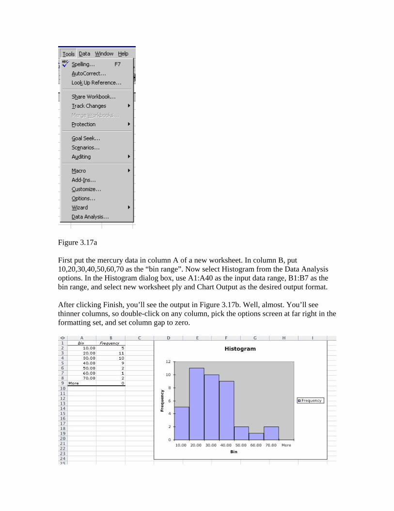
Figure 3.17a First put the mercury data in column A of a new worksheet. In column B, put 10,20,30,40,50,60,70 as the “bin range”. Now select Histogram from the Data Analysis options. In the Histogram dialog box, use A1:A40 as the input data range, B1:B7 as the bin range, and select new worksheet ply and Chart Output as the desired output format. After clicking Finish, you’ll see the output in Figure 3.17b. Well, almost. You’ll see thinner columns, so double-click on any column, pick the options screen at far right in the formatting set, and set column gap to zero.
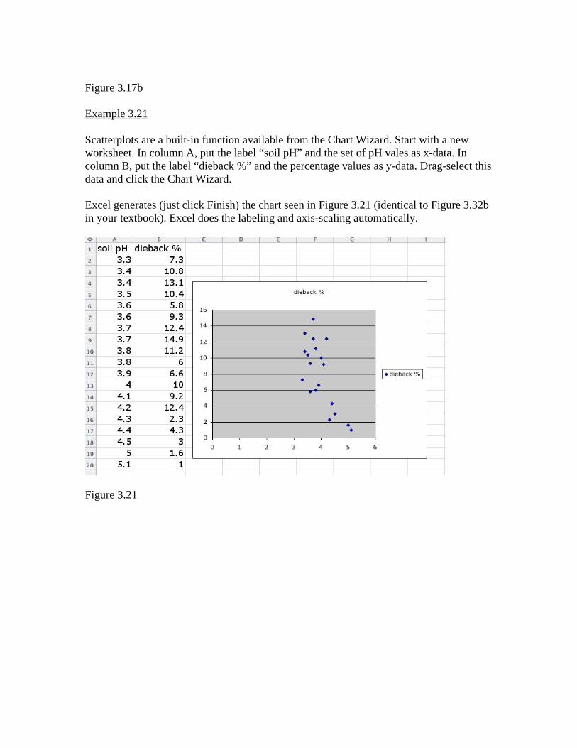
Figure 3.17b Example 3.21 Scatterplots are a built-in function available from the Chart Wizard. Start with a new worksheet. In column A, put the label “soil pH” and the set of pH vales as x-data. In column B, put the label “dieback %” and the percentage values as y-data. Drag-select this data and click the Chart Wizard. Excel generates (just click Finish) the chart seen in Figure 3.21 (identical to Figure 3.32b in your textbook). Excel does the labeling and axis-scaling automatically.
Figure 3.21
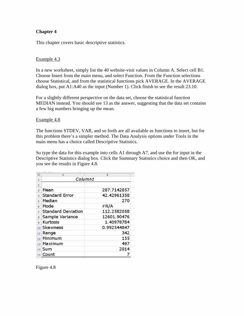
Chapter 4 This chapter covers basic descriptive statistics. Example 4.3 In a new worksheet, simply list the 40 website-visit values in Column A. Select cell B1. Choose Insert from the main menu, and select Function. From the Function selections choose Statistical, and from the statistical functions pick AVERAGE. In the AVERAGE dialog box, put A1:A40 as the input (Number 1). Click finish to see the result 23.10. For a slightly different perspective on the data set, choose the statistical function MEDIAN instead. You should see 13 as the answer, suggesting that the data set contains a few big numbers bringing up the mean. Example 4.8 The functions STDEV, VAR, and so forth are all available as functions to insert, but for this problem there’s a simpler method. The Data Analysis options under Tools in the main menu has a choice called Descriptive Statistics. So type the data for this example into cells A1 through A7, and use the for input in the Descriptive Statistics dialog box. Click the Summary Statistics choice and then OK, and you see the results in Figure 4.8.
Figure 4.8
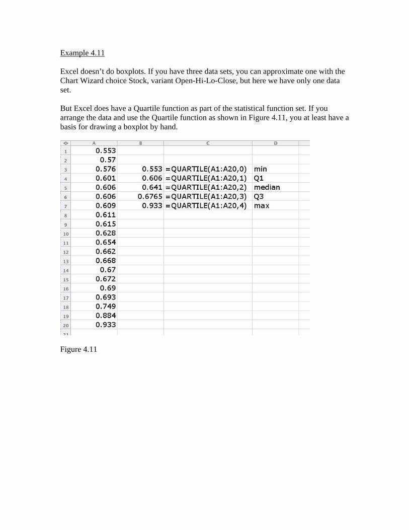
Example 4.11 Excel doesn’t do boxplots. If you have three data sets, you can approximate one with the Chart Wizard choice Stock, variant Open-Hi-Lo-Close, but here we have only one data set. But Excel does have a Quartile function as part of the statistical function set. If you arrange the data and use the Quartile function as shown in Figure 4.11, you at least have a basis for drawing a boxplot by hand.
Figure 4.11
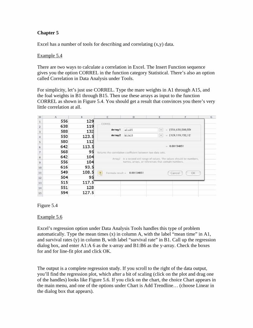
Chapter 5 Excel has a number of tools for describing and correlating (x,y) data. Example 5.4 There are two ways to calculate a correlation in Excel. The Insert Function sequence gives you the option CORREL in the function category Statistical. There’s also an option called Correlation in Data Analysis under Tools. For simplicity, let’s just use CORREL. Type the mare weights in A1 through A15, and the foal weights in B1 through B15. Then use these arrays as input to the function CORREL as shown in Figure 5.4. You should get a result that convinces you there’s very little correlation at all.
Figure 5.4 Example 5.6 Excel’s regression option under Data Analysis Tools handles this type of problem automatically. Type the mean times (x) in column A, with the label “mean time” in A1, and survival rates (y) in column B, with label “survival rate” in B1. Call up the regression dialog box, and enter A1:A 6 as the x-array and B1:B6 as the y-array. Check the boxes for and for line-fit plot and click OK. The output is a complete regression study. If you scroll to the right of the data output, you’ll find the regression plot, which after a bit of scaling (click on the plot and drag one of the handles) looks like Figure 5.6. If you click on the chart, the choice Chart appears in the main menu, and one of the options under Chart is Add Trendline… (choose Linear in the dialog box that appears).
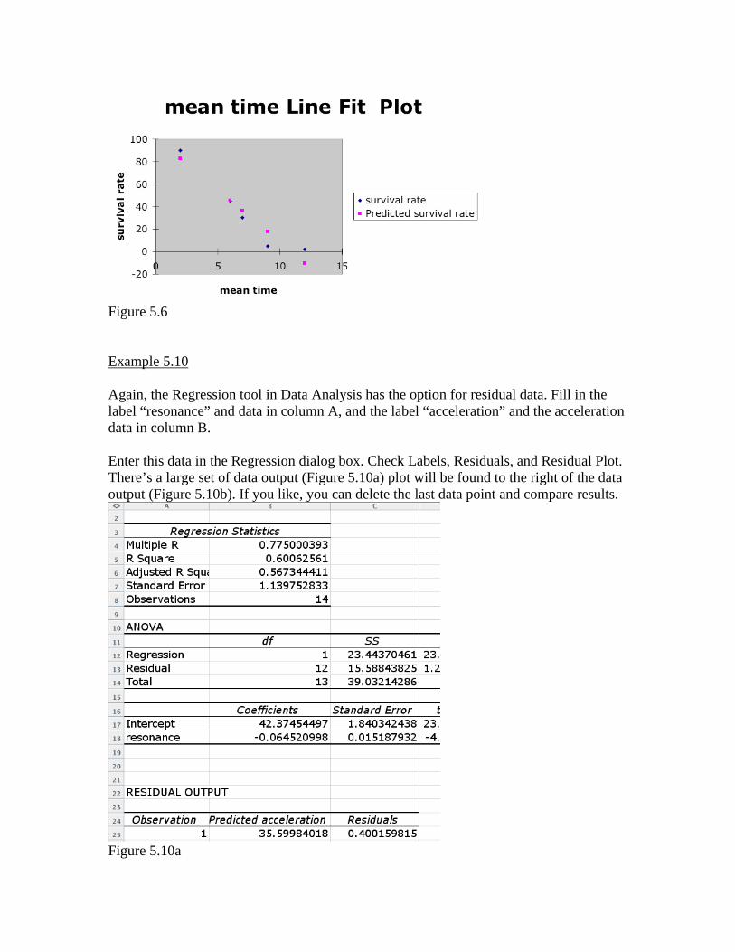
Figure 5.6 Example 5.10 Again, the Regression tool in Data Analysis has the option for residual data. Fill in the label “resonance” and data in column A, and the label “acceleration” and the acceleration data in column B. Enter this data in the Regression dialog box. Check Labels, Residuals, and Residual Plot. There’s a large set of data output (Figure 5.10a) plot will be found to the right of the data output (Figure 5.10b). If you like, you can delete the last data point and compare results.
Figure 5.10a
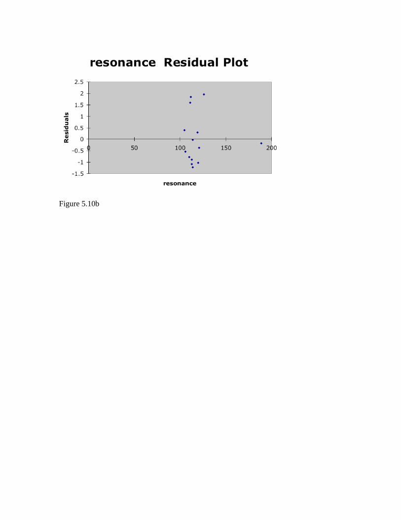
Figure 5.10b
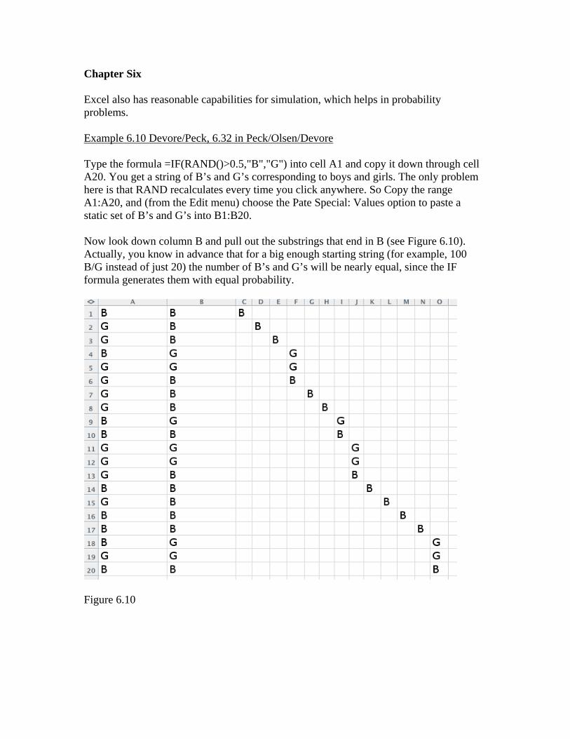
Chapter Six Excel also has reasonable capabilities for simulation, which helps in probability problems. Example 6.10 Devore/Peck, 6.32 in Peck/Olsen/Devore Type the formula =IF(RAND()>0.5,"B","G") into cell A1 and copy it down through cell A20. You get a string of B’s and G’s corresponding to boys and girls. The only problem here is that RAND recalculates every time you click anywhere. So Copy the range A1:A20, and (from the Edit menu) choose the Pate Special: Values option to paste a static set of B’s and G’s into B1:B20. Now look down column B and pull out the substrings that end in B (see Figure 6.10). Actually, you know in advance that for a big enough starting string (for example, 100 B/G instead of just 20) the number of B’s and G’s will be nearly equal, since the IF formula generates them with equal probability.
Figure 6.10
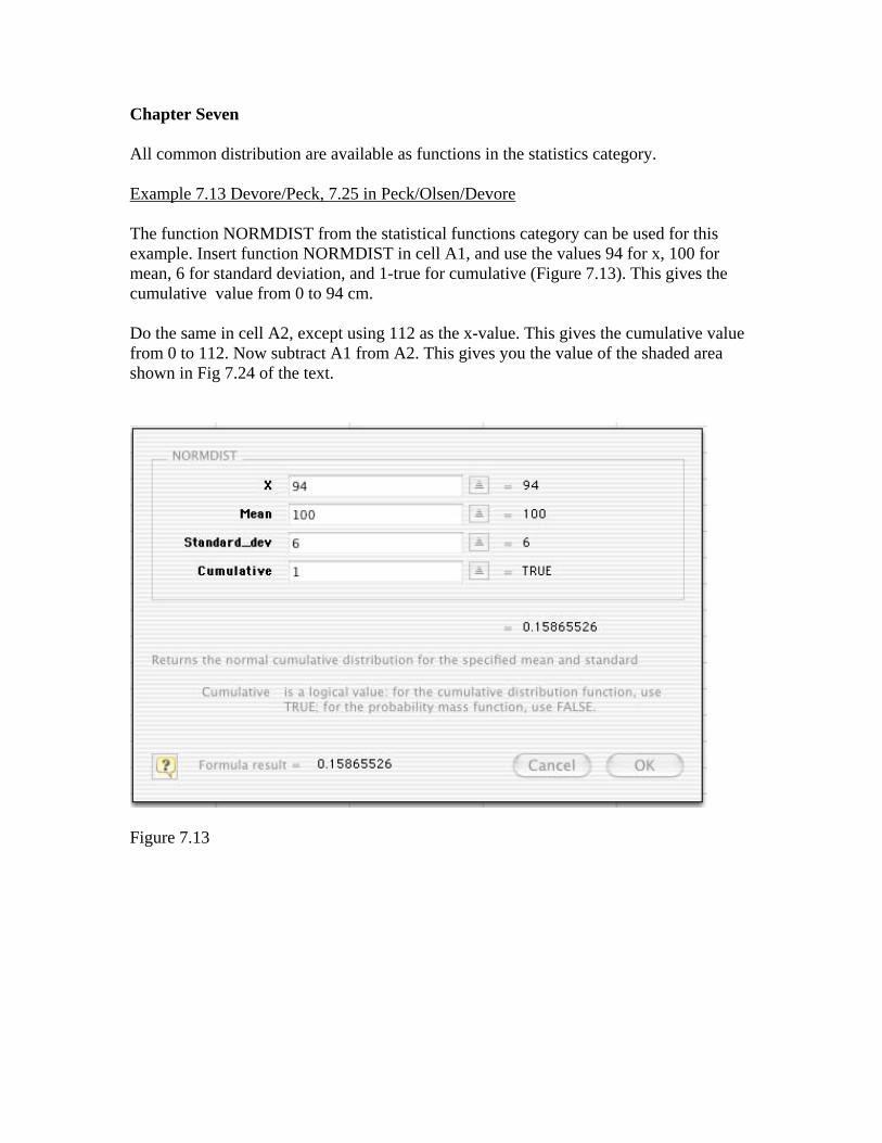
Chapter Seven All common distribution are available as functions in the statistics category. Example 7.13 Devore/Peck, 7.25 in Peck/Olsen/Devore The function NORMDIST from the statistical functions category can be used for this example. Insert function NORMDIST in cell A1, and use the values 94 for x, 100 for mean, 6 for standard deviation, and 1-true for cumulative (Figure 7.13). This gives the cumulative value from 0 to 94 cm. Do the same in cell A2, except using 112 as the x-value. This gives the cumulative value from 0 to 112. Now subtract A1 from A2. This gives you the value of the shaded area shown in Fig 7.24 of the text.
Figure 7.13

Chapter Eight There are no examples for Chapter Eight.
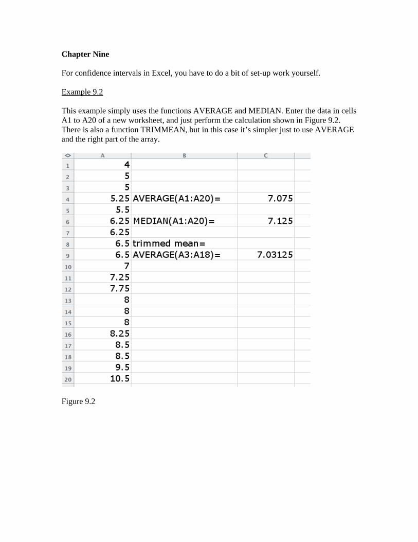
Chapter Nine For confidence intervals in Excel, you have to do a bit of set-up work yourself. Example 9.2 This example simply uses the functions AVERAGE and MEDIAN. Enter the data in cells A1 to A20 of a new worksheet, and just perform the calculation shown in Figure 9.2. There is also a function TRIMMEAN, but in this case it’s simpler just to use AVERAGE and the right part of the array.
Figure 9.2
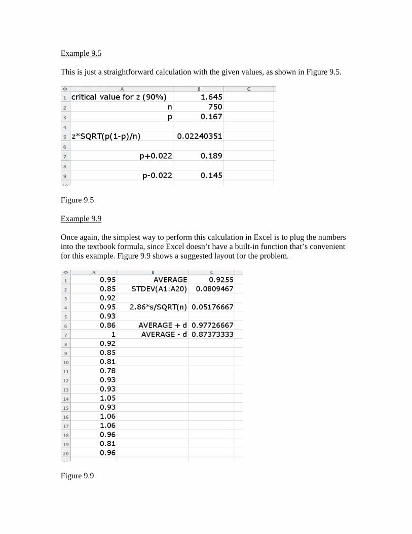
Example 9.5 This is just a straightforward calculation with the given values, as shown in Figure 9.5.
Figure 9.5 Example 9.9 Once again, the simplest way to perform this calculation in Excel is to plug the numbers into the textbook formula, since Excel doesn’t have a built-in function that’s convenient for this example. Figure 9.9 shows a suggested layout for the problem.
Figure 9.9
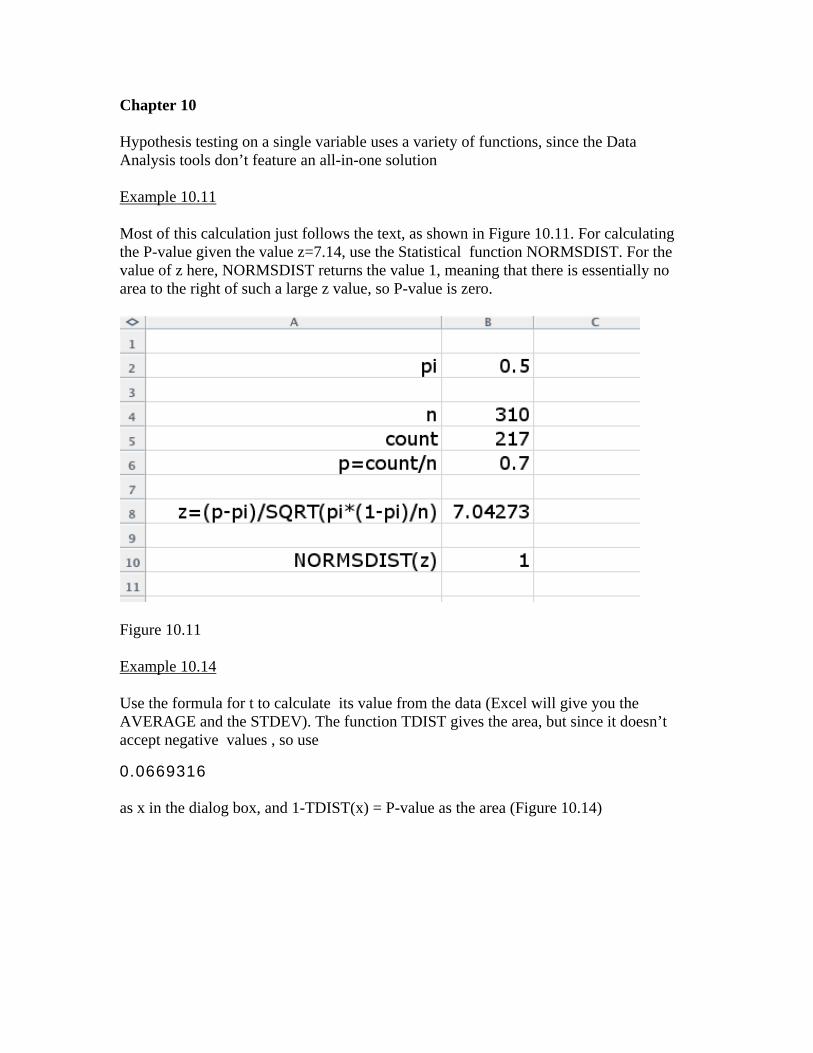
Chapter 10 Hypothesis testing on a single variable uses a variety of functions, since the Data Analysis tools don’t feature an all-in-one solution Example 10.11 Most of this calculation just follows the text, as shown in Figure 10.11. For calculating the P-value given the value z=7.14, use the Statistical function NORMSDIST. For the value of z here, NORMSDIST returns the value 1, meaning that there is essentially no area to the right of such a large z value, so P-value is zero.
Figure 10.11 Example 10.14 Use the formula for t to calculate its value from the data (Excel will give you the AVERAGE and the STDEV). The function TDIST gives the area, but since it doesn’t accept negative values , so use
0.0669316 as x in the dialog box, and 1-TDIST(x) = P-value as the area (Figure 10.14)
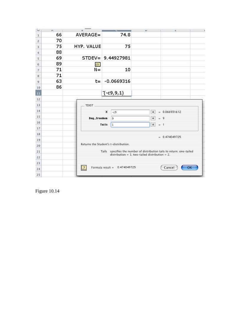
Figure 10.14
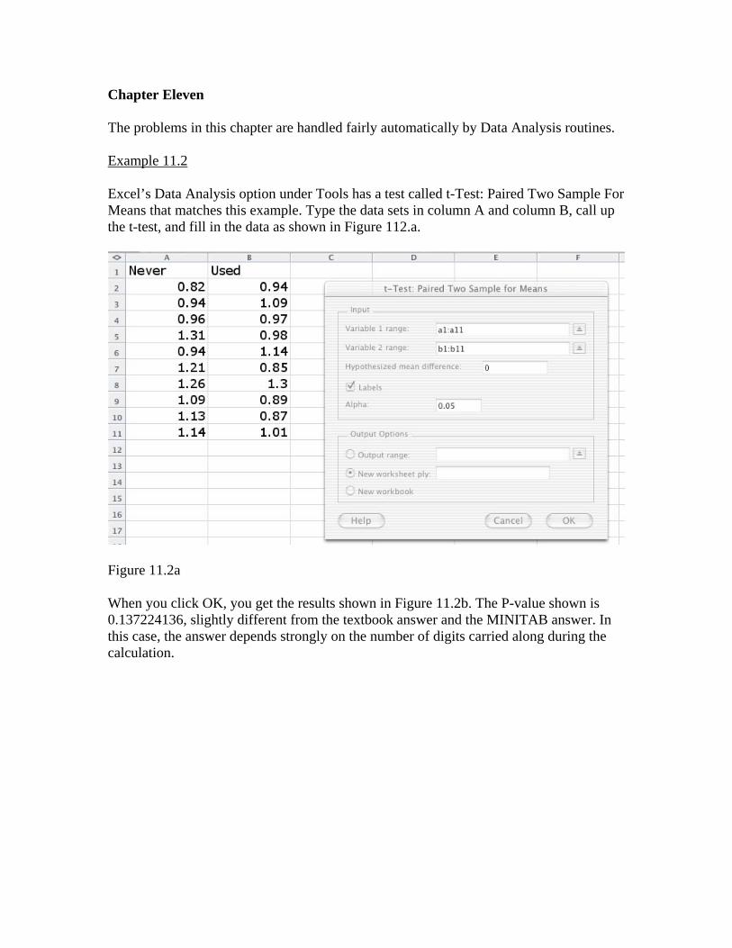
Chapter Eleven The problems in this chapter are handled fairly automatically by Data Analysis routines. Example 11.2 Excel’s Data Analysis option under Tools has a test called t-Test: Paired Two Sample For Means that matches this example. Type the data sets in column A and column B, call up the t-test, and fill in the data as shown in Figure 112.a.
Figure 11.2a When you click OK, you get the results shown in Figure 11.2b. The P-value shown is 0.137224136, slightly different from the textbook answer and the MINITAB answer. In this case, the answer depends strongly on the number of digits carried along during the calculation.
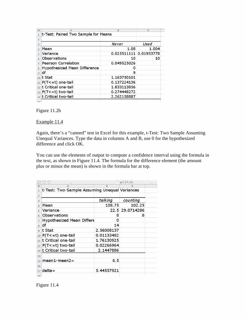
Figure 11.2b Example 11.4 Again, there’s a “canned” test in Excel for this example, t-Test: Two Sample Assuming Unequal Variances. Type the data in columns A and B, use 0 for the hypothesized difference and click OK. You can use the elements of output to compute a confidence interval using the formula in the text, as shown in Figure 11.4. The formula for the difference element (the amount plus or minus the mean) is shown in the formula bar at top.
Figure 11.4
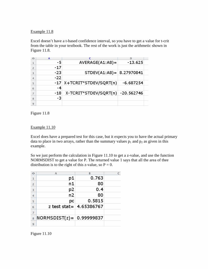
Example 11.8 Excel doesn’t have a t-based confidence interval, so you have to get a value for t-crit from the table in your textbook. The rest of the work is just the arithmetic shown in Figure 11.8.
Figure 11.8 Example 11.10 Excel does have a prepared test for this case, but it expects you to have the actual primary data to place in two arrays, rather than the summary values p1 and p2 as given in this example. So we just perform the calculation in Figure 11.10 to get a z-value, and use the function NORMSDIST to get a value for P. The returned value 1 says that all the area of thee distribution is to the right of this z-value, so P = 0.
Figure 11.10
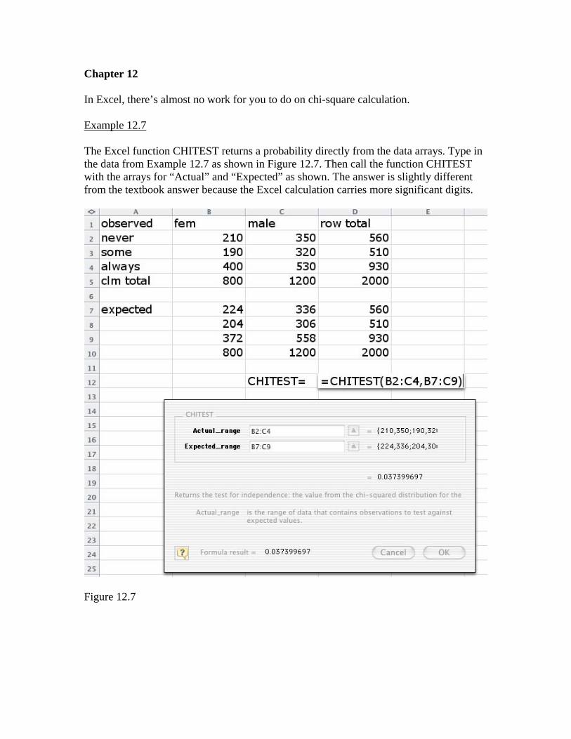
Chapter 12 In Excel, there’s almost no work for you to do on chi-square calculation. Example 12.7 The Excel function CHITEST returns a probability directly from the data arrays. Type in the data from Example 12.7 as shown in Figure 12.7. Then call the function CHITEST with the arrays for “Actual” and “Expected” as shown. The answer is slightly different from the textbook answer because the Excel calculation carries more significant digits.
Figure 12.7
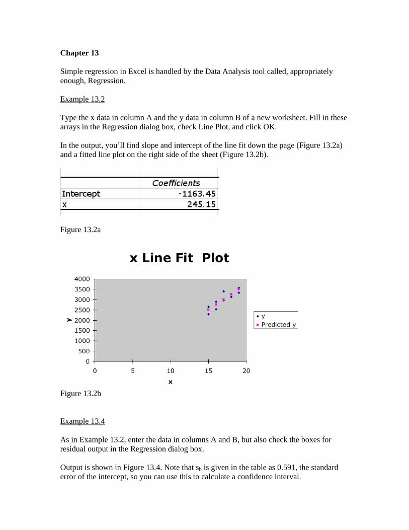
Chapter 13 Simple regression in Excel is handled by the Data Analysis tool called, appropriately enough, Regression. Example 13.2 Type the x data in column A and the y data in column B of a new worksheet. Fill in these arrays in the Regression dialog box, check Line Plot, and click OK. In the output, you’ll find slope and intercept of the line fit down the page (Figure 13.2a) and a fitted line plot on the right side of the sheet (Figure 13.2b).
Figure 13.2a
Figure 13.2b Example 13.4 As in Example 13.2, enter the data in columns A and B, but also check the boxes for residual output in the Regression dialog box. Output is shown in Figure 13.4. Note that sb is given in the table as 0.591, the standard error of the intercept, so you can use this to calculate a confidence interval.
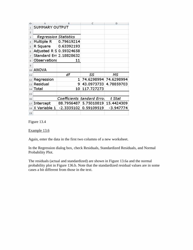
Figure 13.4 Example 13.6 Again, enter the data in the first two columns of a new worksheet. In the Regression dialog box, check Residuals, Standardized Residuals, and Normal Probability Plot. The residuals (actual and standardized) are shown in Figure 13.6a and the normal probability plot in Figure 136.b. Note that the standardized residual values are in some cases a bit different from those in the text.
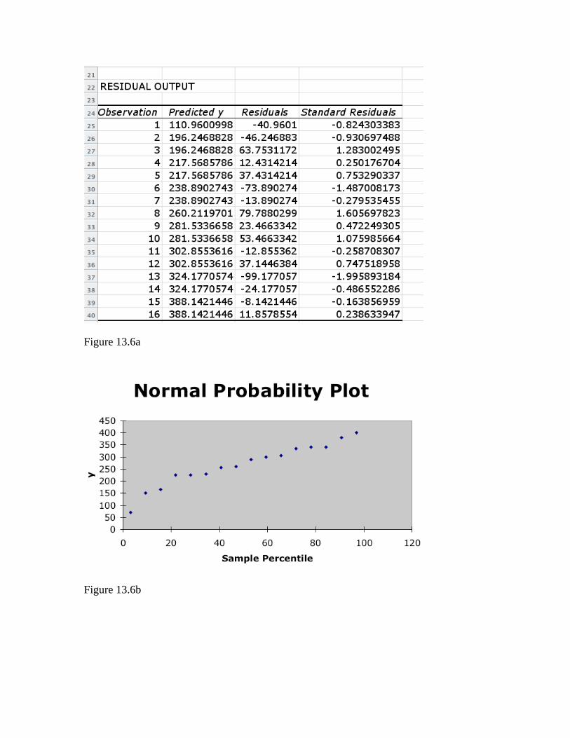
Figure 13.6a
Figure 13.6b
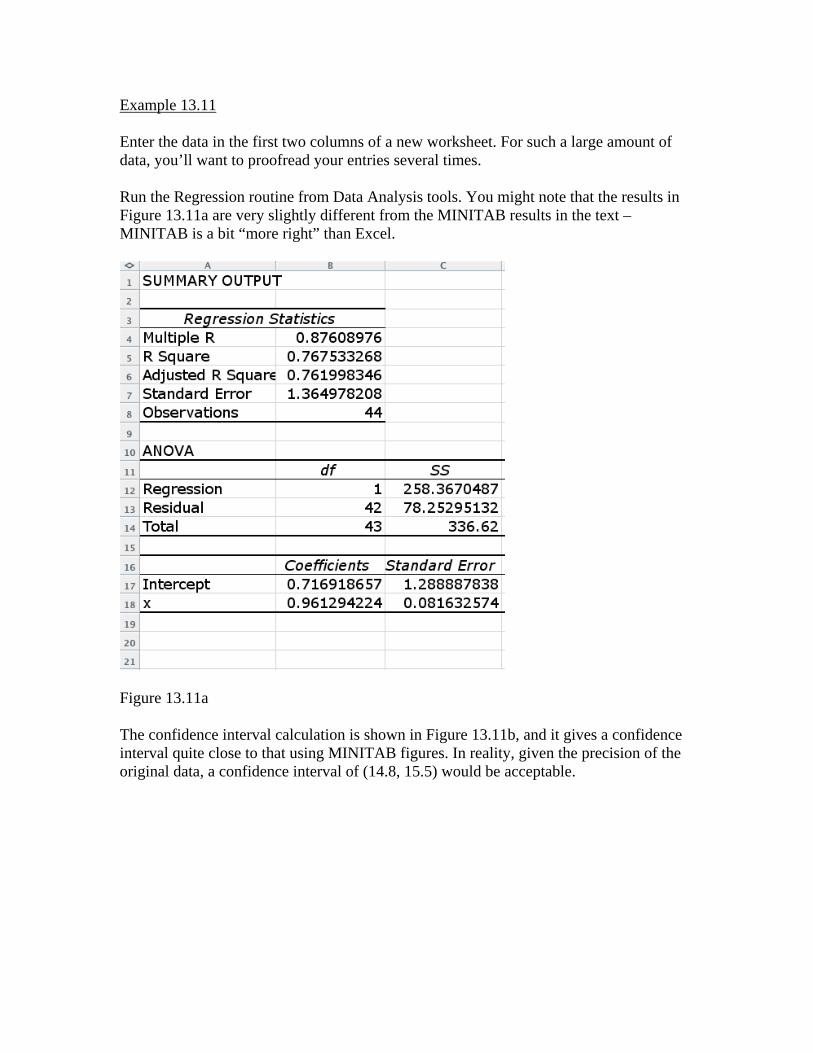
Example 13.11 Enter the data in the first two columns of a new worksheet. For such a large amount of data, you’ll want to proofread your entries several times. Run the Regression routine from Data Analysis tools. You might note that the results in Figure 13.11a are very slightly different from the MINITAB results in the text – MINITAB is a bit “more right” than Excel.
Figure 13.11a The confidence interval calculation is shown in Figure 13.11b, and it gives a confidence interval quite close to that using MINITAB figures. In reality, given the precision of the original data, a confidence interval of (14.8, 15.5) would be acceptable.
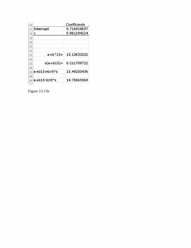
Figure 13.11b
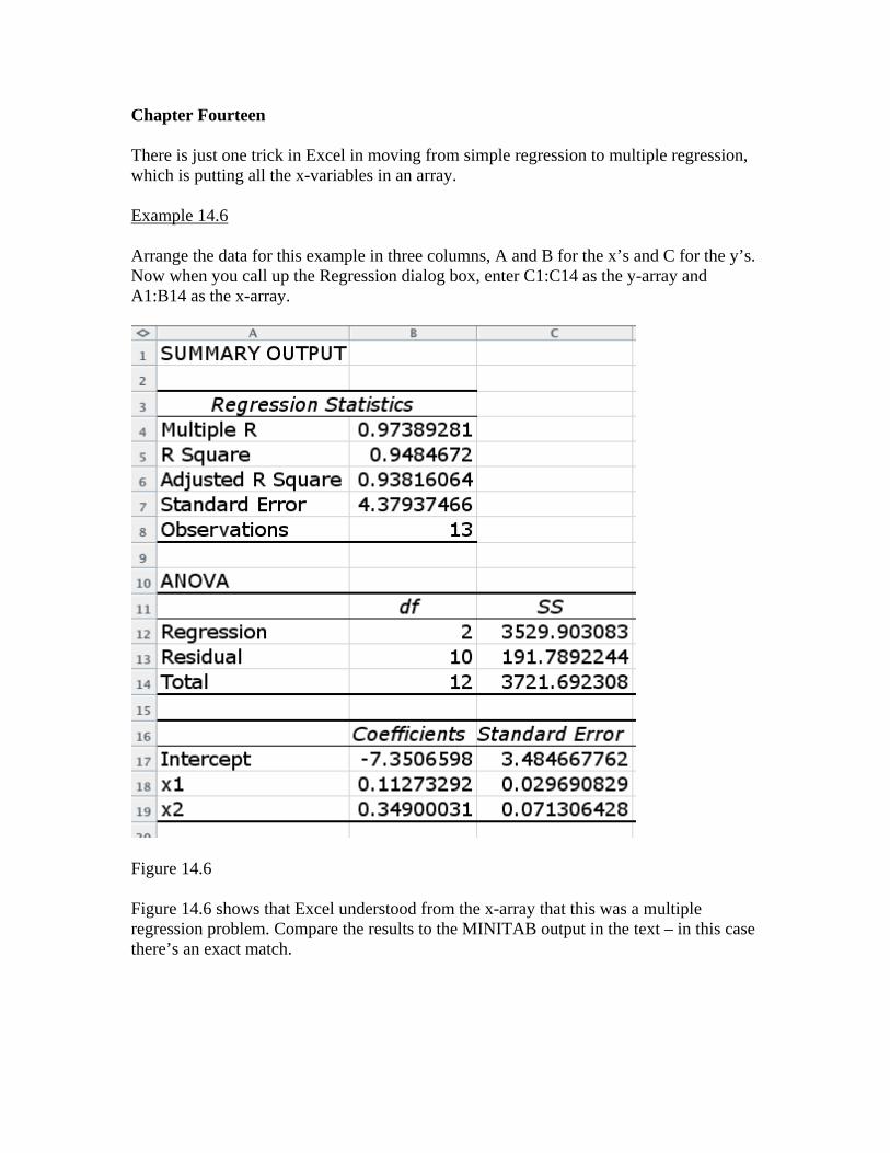
Chapter Fourteen There is just one trick in Excel in moving from simple regression to multiple regression, which is putting all the x-variables in an array. Example 14.6 Arrange the data for this example in three columns, A and B for the x’s and C for the y’s. Now when you call up the Regression dialog box, enter C1:C14 as the y-array and A1:B14 as the x-array.
Figure 14.6 Figure 14.6 shows that Excel understood from the x-array that this was a multiple regression problem. Compare the results to the MINITAB output in the text – in this case there’s an exact match.
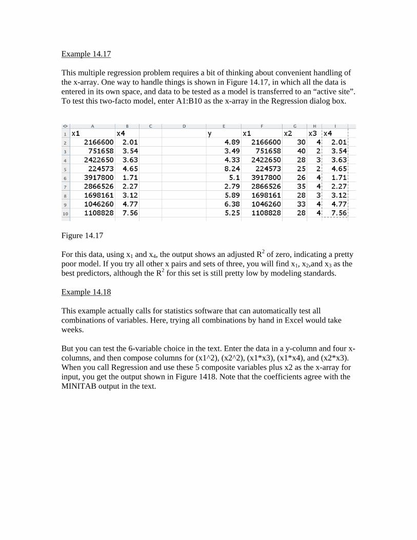
Example 14.17 This multiple regression problem requires a bit of thinking about convenient handling of the x-array. One way to handle things is shown in Figure 14.17, in which all the data is entered in its own space, and data to be tested as a model is transferred to an “active site”. To test this two-facto model, enter A1:B10 as the x-array in the Regression dialog box.
Figure 14.17 For this data, using x1 and x4, the output shows an adjusted R2 of zero, indicating a pretty poor model. If you try all other x pairs and sets of three, you will find x1, x2,and x3 as the best predictors, although the R2 for this set is still pretty low by modeling standards. Example 14.18 This example actually calls for statistics software that can automatically test all combinations of variables. Here, trying all combinations by hand in Excel would take weeks. But you can test the 6-variable choice in the text. Enter the data in a y-column and four x-columns, and then compose columns for (x1^2), (x2^2), (x1*x3), (x1*x4), and (x2*x3). When you call Regression and use these 5 composite variables plus x2 as the x-array for input, you get the output shown in Figure 1418. Note that the coefficients agree with the MINITAB output in the text.
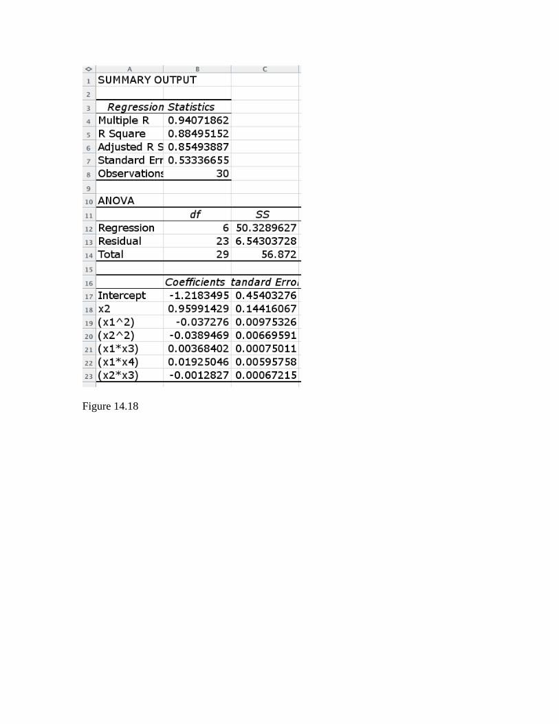
Figure 14.18
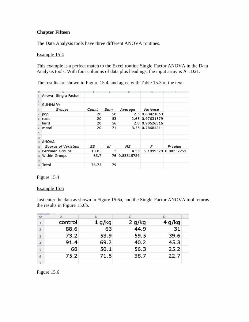
Chapter Fifteen The Data Analysis tools have three different ANOVA routines. Example 15.4 This example is a perfect match to the Excel routine Single-Factor ANOVA in the Data Analysis tools. With four columns of data plus headings, the input array is A1:D21. The results are shown in Figure 15.4, and agree with Table 15.3 of the text.
Figure 15.4 Example 15.6 Just enter the data as shown in Figure 15.6a, and the Single-Factor ANOVA tool returns the results in Figure 15.6b.
Figure 15.6
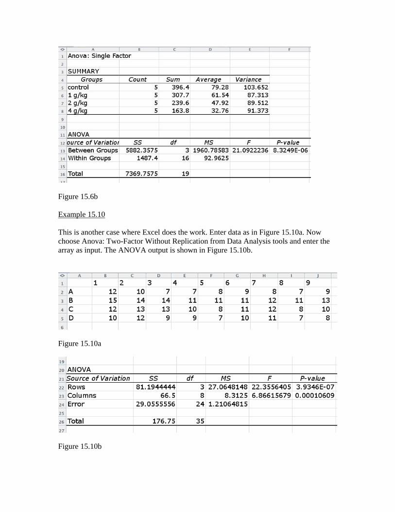
Figure 15.6b Example 15.10 This is another case where Excel does the work. Enter data as in Figure 15.10a. Now choose Anova: Two-Factor Without Replication from Data Analysis tools and enter the array as input. The ANOVA output is shown in Figure 15.10b.
Figure 15.10a
Figure 15.10b
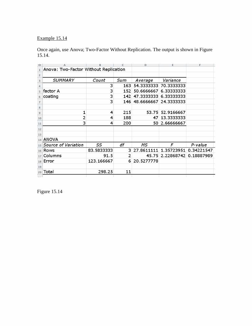
Example 15.14 Once again, use Anova; Two-Factor Without Replication. The output is shown in Figure 15.14.
Figure 15.14

![Statistics with Excel Examples - Computer Action Teamweb.cecs.pdx.edu/~cgshirl/Documents/Demonstrations...distribution on [0,1]. Statistics with Excel Examples, G. Shirley January](https://img.pdfslide.us/doc/110x75/5b01a7487f8b9a84338e75b4/statistics-with-excel-examples-computer-action-cgshirldocumentsdemonstrationsdistribution.jpg)