Embed Size (px)
Citation preview
PRELIMINARY DRAFT—DO NOT DISTRIBUTE
Appendix M—Adaptive Smoothed Seismicity
Model
By K.R. Felzer
Introduction
An adaptive smoothed seismicity model is constructed and is based on the
method of Helmstetter and others (2007) (updated in Werner and others, 2011),
which performed well in the Regional Earthquake Likelihood Models (RELM)
California earthquake forecasting experiment (Schorlemmer and others, 2010). This
model is one of the logic tree branches for smoothed seismicity in Uniform
California Earthquake Rupture Forecast, version 3 (UCERF3). As in the smoothed
seismicity model used for UCERF, version 2 (UCERF2) and the 2007 National Hazard
Maps (Frankel, 1995), measured seismicity is smoothed using a Gaussian kernel.
Instead of using a fixed smoothing constant of 50 km, however, the Helmstetter and
others (2007) method uses an adaptive smoothing constant that is set equal to the
distance to the nth closest earthquake. Thus the smoothing constant becomes very
small in areas of dense seismicity, allowing for fine delineation of major active
faults, while allowing for broad smoothing in areas of low seismicity. Other
differences from the UCERF2 approach are that rather than using the post-1850
1
PRELIMINARY DRAFT—DO NOT DISTRIBUTE
magnitude less than or equal to 4 (M≥4) catalog, we used the post-1984 M≥2.5
earthquakes based on the findings of Werner and others (2011) that using smaller
and more recent earthquakes produces the best forecast. This method produces a
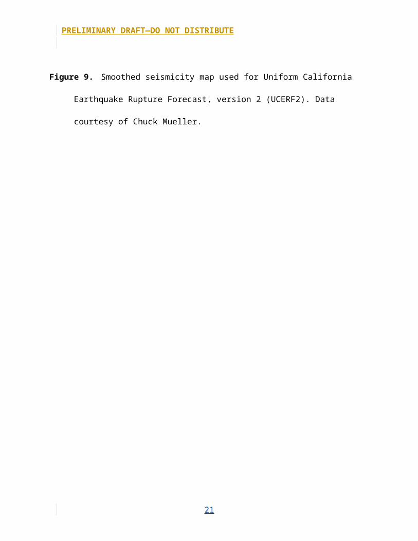
map that is quite different from that used for UCERF2 (compare figs. M8 and M9).
The original UCERF2 map and the map described here are each given a weighted
factor of 0.5 in the UCERF3 logic tree.
To optimize the value of n for the smoothing kernel, Werner and others
(2011) made a series of retrospective 5-year forecasts that were evaluated by their
forecast gain, or the difference between the log-likelihood score of the forecast and
the log-likelihood score of a uniform probability map. They determined that the
mean value of n for the best forecasts was n=3.75, but because of concerns that this
constant produced a map that was too tightly clustered, they used n=6. For the
present purpose, we needed the smoothing constant, which works best for
forecasting time periods as long as 50 years. This is a difficult problem because a
good, small earthquake catalog is only available from 1984, so a 50-year period is
not available for retrospective testing; in fact multiple independent 50-year periods
would be needed to derive optimal results. Lacking 50 years of data we made
consecutive 5, 10, and 16 year forecasts to test if the optimal smoothing constant
increases with the length of the forecast. These were made from a map based on
1984-1994 data. A second map was also made with 1995-99 data to forecast the
2000–2011 period, to have an additional data point. We measured the accuracy of
the results with the gain metric of Werner and others (2011) and with a
measurement of the fraction of earthquakes captured in the highest probability grid
2
PRELIMINARY DRAFT—DO NOT DISTRIBUTE
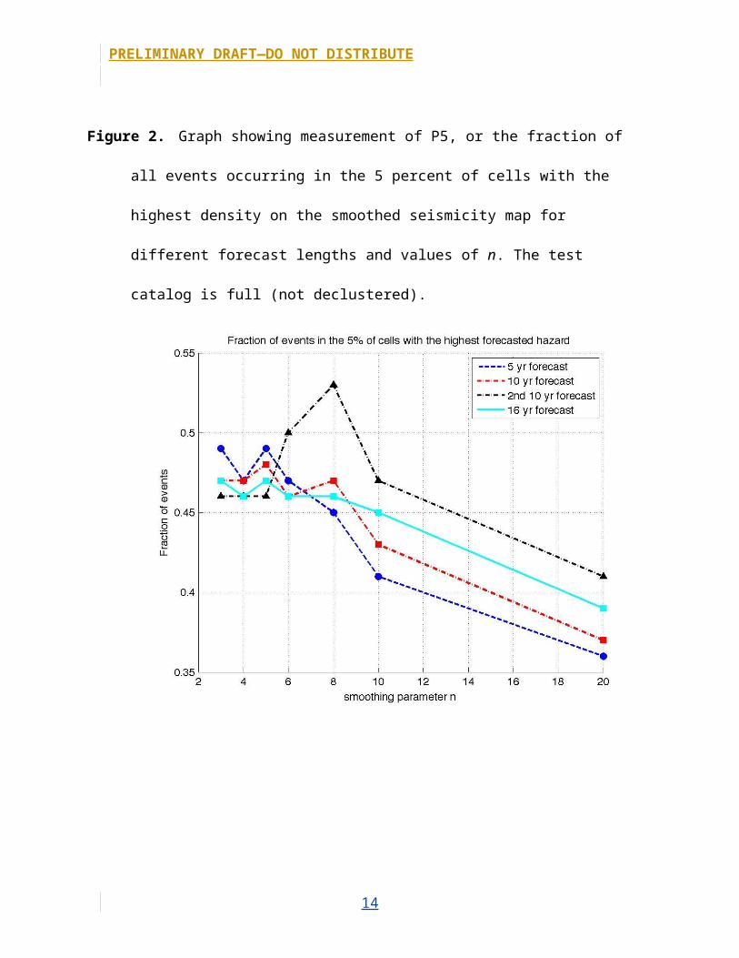
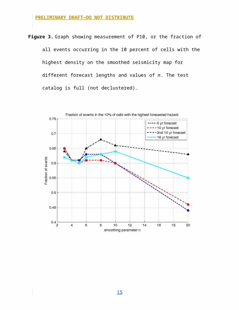
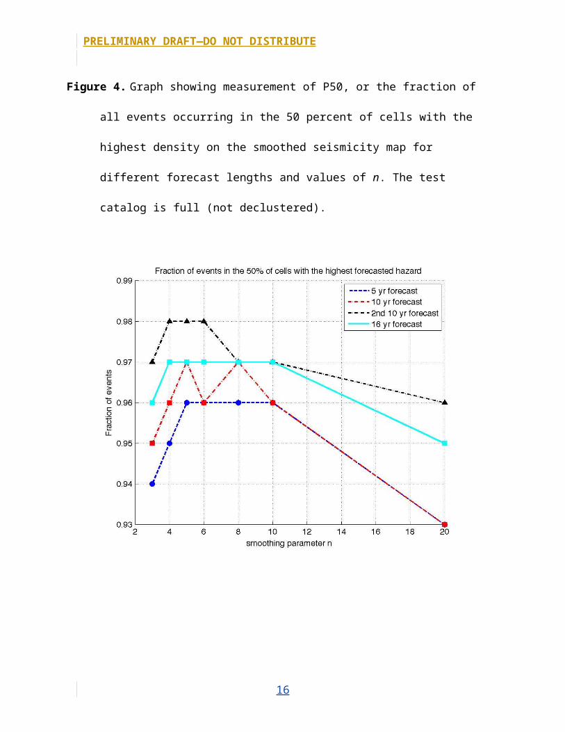
cells of the forecast, which we call the P5, P10, and P50 metrics. To calculate these
metrics we sorted the bins on the forecast map from the most- to least-likely to host
an earthquake, and then measured the fraction of earthquakes that are in the top 5
percent of these cells (P5 metric), the top 10 percent of these cells (P10), and the top
50 percent of these cells (P50). Forecasts with higher values of P5, P10, and P50 are
better because this indicates that more earthquakes actually occur in the bins
forecasted to host more events. In all cases, the smoothed seismicity maps are
derived from a catalog declustered with the routine of Gardner and Knopoff (1974).
When we measured gain, the test catalog also was declustered, as we have
determined that one strongly clustered bin can dominate the results. For the P5,
P10, and P50 tests, we made calculations on full and declustered catalogs.
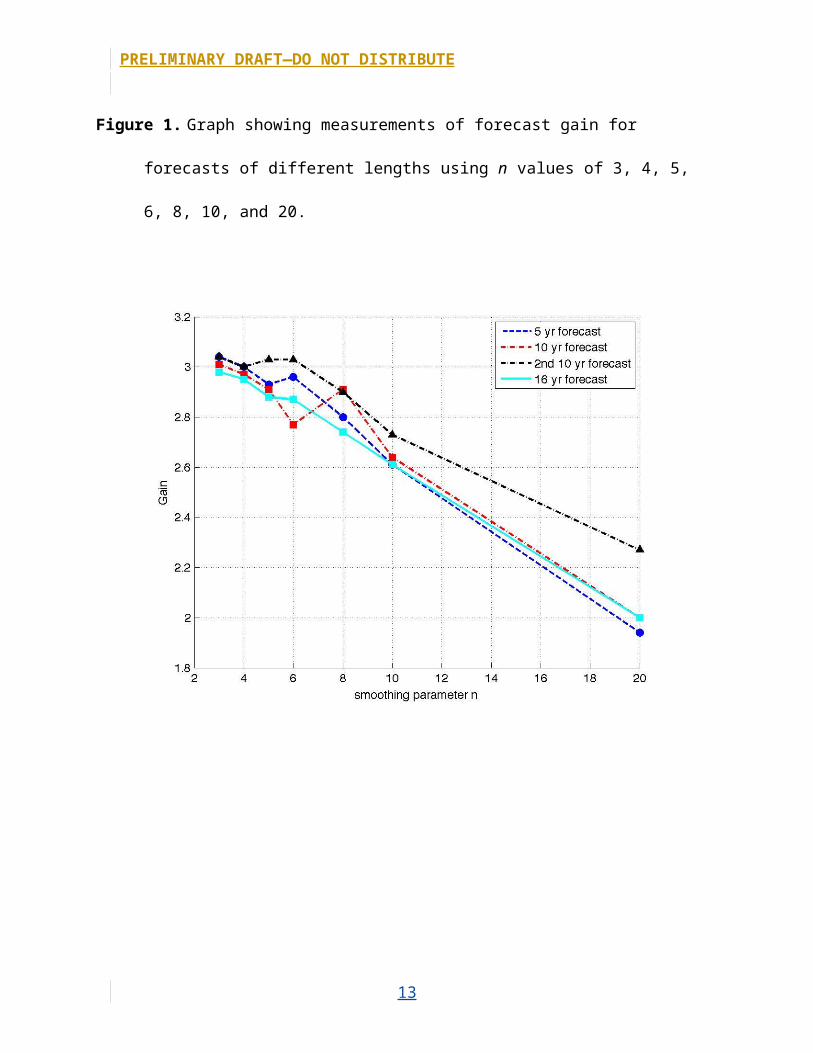
The gain and the P5, P10, and P50 metrics measured with the different
values of the smoothing constant n are shown in figures M1 through M7. Similar to
the result of Werner and others (2011), we recovered the highest value of gain at
n=3; this is true for the 5-, 10-, and 16-year datasets, although one 10-year dataset
also had a peak at n=6. For all tests, gain decreased for n≥8. For the P5, P10, and P50
tests with declustered catalogs, most of the forecasts also did worse for n≥8. For the
full catalog, however, n=8 is acceptable for most of the data, and for P50, which is
the most relevant metric for measuring the forecast’s ability to capture more
isolated seismicity, values of n between 4 and 10 produce comparable results for the
16-year forecast. For the 16-year forecast and n values between 4 and 10, the top 50
percent of grid cells capture 97 percent of all seismicity. Given these results, and the
probability that a smoother map may be better for a longer forecast, we produced
3
PRELIMINARY DRAFT—DO NOT DISTRIBUTE
the final maps with n=8, which is the largest value of n that produces a good result
for many of the maps.
The resulting smoothed seismicity map (fig. M8) shows much tighter
clustering than the map used in UCERF2 (fig. M9). Given the lack of test periods, it is
not possible to determine with certainty which map will perform better over 50
years. However, the locations of precarious rocks provide one indication of where
seismic accelerations may be low over the long term. The UCERF2 smoothed
seismicity map was inconsistent with the locations of precarious rocks (Purvance
and others, 2008), whereas the new map forecasts lower activity along the
precarious rock band that lies between the San Jacinto and Elsinore Fault zones
(Brune and others, 2006). A full testing of the current forecast and precarious rock
locations can be performed after ground motions are calculated. To see the affect of
using different values of n, smoothed maps with n=3 and n=15 are shown in figures
M10 and M11. Figures M12 and M13 show n=8 maps for earthquakes less than 35
km depth and greater than or equal to 35 km depth, respectively.
Part of the Helmstetter and others (2007) routine includes correcting for
catalog incompleteness at points that are not adequately covered by network
stations. The Helmstetter and others (2007) routine for finding the completeness at
each point produces results with so much variance over short distances that it is
strongly suggested that random variations in the data, rather than simply real
changes in completeness, are significantly influencing the result, and thus the
authors smooth their values before application. The entire procedure is complex, so
we developed a completeness routine, described below, which produces more
4
PRELIMINARY DRAFT—DO NOT DISTRIBUTE
stable results. Like the Helmstetter and others (2007) routine, our completeness
routine assumes a Gutenberg-Richter magnitude frequency distribution at each
point. Additionally, we assume that the b value for this distribution equals 1.0,
following the b value calculation results in appendix I of this report. A Gutenberg-
Richter magnitude frequency distribution assumption is generally assumed to be
accurate for random areas. Even for areas centered over major faults, Gutenberg-
Richter distributions are clearly seen over short periods of time (Wesnousky and
others, 1983).
Completeness routine:(1) Select catalog earthquakes (M≥2.5) in a 25 km radius around each grid point.(2) If there are less than 10 earthquakes selected, increase the size of the radius
until there are at least 10 earthquakes or the radius is 50 km, whichever comes first.
(3) Measure the Spearman correlation coefficient between earthquake distance from the grid point and magnitude. If there is a significant correlation, this indicates that the degree of catalog completeness is changing within the selected radius. If this occurs, repeat the steps of removing the most distant earthquake from the dataset and remeasuring the correlation until the correlation becomes insignificant, or there are less than 10 earthquakes remaining in the dataset. The goal is for the earthquakes within the radius to represent a single completeness threshold that as closely as possible equals the completeness threshold at the grid point.
(4) Remove the largest earthquake from the remaining dataset to account for outliers, and then take the mean of the remaining magnitudes. If the mean is consistent with the mean expected for a completeness magnitude of 2.5 (at 95-percent confidence) then a completeness of 2.5 is assigned to the point. If the mean is too high then obtain the completeness magnitude that the mean is consistent with.Maps of the completeness magnitudes solved forare shown in figure M14.
Catalog incompleteness is corrected by estimating the missing seismicity rate
5
PRELIMINARY DRAFT—DO NOT DISTRIBUTE
greater than M2.5. For example, to solve for a completeness of M2.8, multiply the
seismicity rate at the grid point by 10(2.8-2.5).
An area of concern in the maps is The Geysers, which is a geothermal energy
production area in northern California that has historically had many small
earthquakes but no large ones. Werner and others (2011) determined The Geysers
to be the only area with a statistically distinct Gutenberg-Richter relationship b-
value than the rest of the State, although there are a few other areas that are highly
prone to swarm activity. Specifically, Werner and others (2011) determined b=1 for
M<3.3, but b=1.75 for M>3.3. They defined The Geysers to be in the geographic box
38.7 N to 38.9 N (latitude) and 122.9 W to 122.7 W (longitude). The largest
earthquake recorded in this box in the UCERF3 catalog is M4.8. The change in b-
value forecasts that the rate of M3.4 to M4.8 earthquakes should be 40 percent of
what is expected for a continuous b value of 1.0; data indicate that the rate of M3.4
to M4.8 earthquakes is actually 50 percent of what is expected, which is a close
match. Additionally, we examined how closely the model and data match, as
magnitudes increase. For the second half of the range, from M4.1 to M4.8, the model
predicts that there should be an 86-percent decrease in earthquake rates from the
b=1 model, whereas measurements show a 61-percent decrease. Taking the highest
magnitude quartile, from M4.4 to M4.8, the model predicts a 90-percent decrease,
whereas the data shows an 80-percent decrease. For the magnitude range of
interest, approximately M5–8, the changing b-value model forecasts a significant 98-
percent decrease in the seismicity rate. Because there have been no earthquakes
this large in The Geysers, we cannot verify this forecast empirically and hesitate to
6
PRELIMINARY DRAFT—DO NOT DISTRIBUTE
apply a change this large. It is more advisable to reduce the M5–8 rate by about 60–
80 percent because changes this large are seen in the data. Because there is no clear
quantification on how to proceed, however, we have not altered the maps here,
pending future discussion.
References Cited
Brune, J. N., and Anooshehpoor, A., and Purvance, M.D., and Brune, R.J., 2006, Band
of precariously balanced rocks between the Elsinore and San Jacinto, California,
fault zones—Constraints on ground motion for large earthquakes: Geology, v. 34,
no. 3, p. 137–140, doi: 10.1130/G22127.1.
Frankel, A., 1995, Mapping seismic hazard in the Central and Eastern United States:
Seismological Research Letters, v. 66, no. 4, p. 8–21.
Gardner, J.K., and Knopoff, L., 1974, Is the sequence of earthquakes in Southern
California, with aftershocks removed, Poissonian?: Bulletin of the Seismological
Society of America, v. 64, no. 5, p. 1363–1367.
Helmstetter, Agnes, Kagan, Y.Y., and Jackson, D.D., 2007, High-resolution time-
independent grid-based forecast for M≥5 earthquakes in California: Seismological
Research Letters, v. 78, no. 1, p. 78–86.
Purvance, M.D., Brune, J.N., Abrahamson, N.A., and Anderson, J.G., 2008, Consistency
of precariously balanced rocks with probabilistic seismic hazard estimates in
southern California: Bulletin of the Seismological Society of America, v. 98, no. 6, p.
2629–2640, doi: 10.1785/0120080169.
7
PRELIMINARY DRAFT—DO NOT DISTRIBUTE
Schorlemmer, D.J., Zechar, Douglas, Werner, M.J., Field, E.H., Jackson, D.D., Jordan,
T.H., and The RELM Working Group, 2010, First results of the regional earthquake
likelihood models experiment: Pure and Applied Geophysics, v. 167, p. 859-876.
Werner, M. J., Helmstetter, Agnes, Jackson, D.D., and Kagan, Y.Y., 2011, High-
resolution long-term and short-term earthquake forecasts for California: Bulletin
of the Seismological Society of America, v. 101, p. 1630–1648.
Wesnousky, S.G., Scholz, C.H., Shimazaki, K., and Matsuda, T., 1983, Earthquake
frequency distribution and the mechanics of faulting: Journal of Geophysical
Research, v. 88, no. B11, p. 9331–9340.
8
PRELIMINARY DRAFT—DO NOT DISTRIBUTE
Figure 1. Graph showing measurements of forecast gain for forecasts of different lengths using n
values of 3, 4, 5, 6, 8, 10, and 20.
Figure 2. Graph showing measurement of P5, or the fraction of all events occurring in the 5
percent of cells with the highest density on the smoothed seismicity map for different forecast
9
PRELIMINARY DRAFT—DO NOT DISTRIBUTE
lengths and values of n. The test catalog is full (not declustered).
10
PRELIMINARY DRAFT—DO NOT DISTRIBUTE
Figure 3. Graph showing measurement of P10, or the fraction of all events occurring in the 10
percent of cells with the highest density on the smoothed seismicity map for different forecast
lengths and values of n. The test catalog is full (not declustered).
11
PRELIMINARY DRAFT—DO NOT DISTRIBUTE
Figure 4. Graph showing measurement of P50, or the fraction of all events occurring in the 50
percent of cells with the highest density on the smoothed seismicity map for different forecast
lengths and values of n. The test catalog is full (not declustered).
12
PRELIMINARY DRAFT—DO NOT DISTRIBUTE
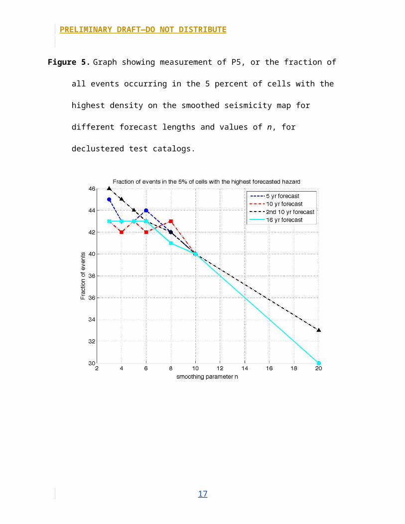
Figure 5. Graph showing measurement of P5, or the fraction of all events occurring in the 5
percent of cells with the highest density on the smoothed seismicity map for different forecast
lengths and values of n, for declustered test catalogs.
13
PRELIMINARY DRAFT—DO NOT DISTRIBUTE
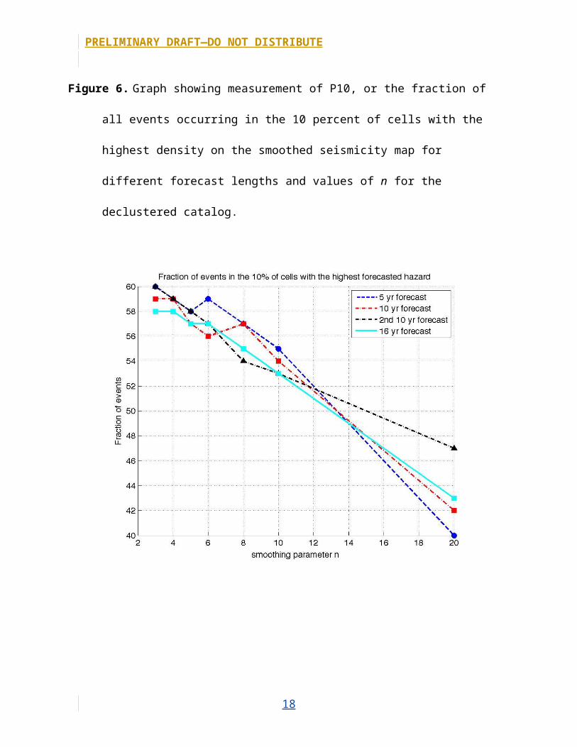
Figure 6. Graph showing measurement of P10, or the fraction of all events occurring in the 10
percent of cells with the highest density on the smoothed seismicity map for different forecast
lengths and values of n for the declustered catalog.
14
PRELIMINARY DRAFT—DO NOT DISTRIBUTE
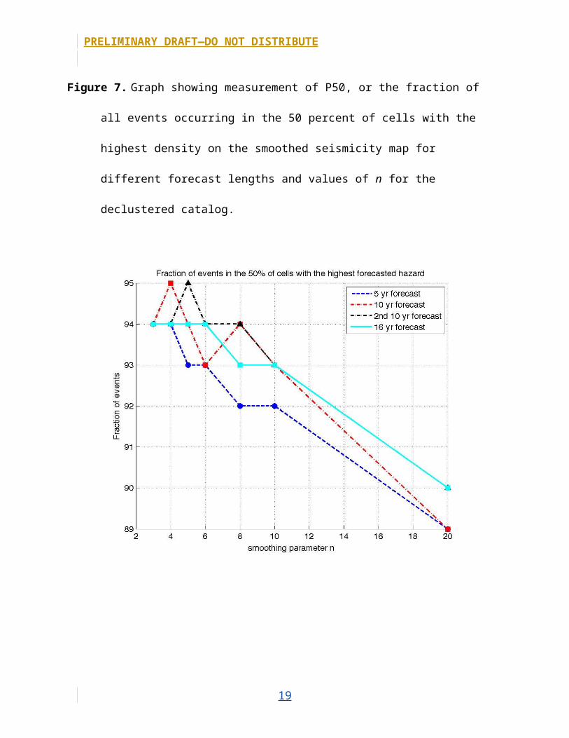
Figure 7. Graph showing measurement of P50, or the fraction of all events occurring in the 50
percent of cells with the highest density on the smoothed seismicity map for different forecast
lengths and values of n for the declustered catalog.
15
PRELIMINARY DRAFT—DO NOT DISTRIBUTE
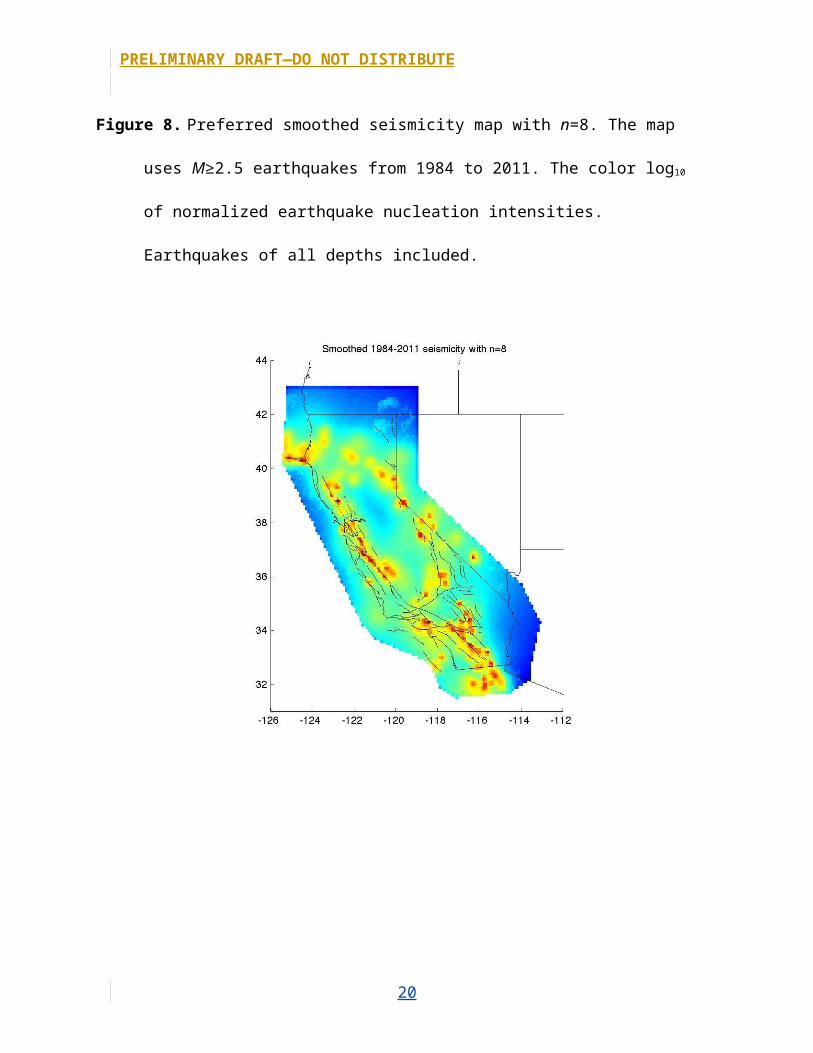
Figure 8. Preferred smoothed seismicity map with n=8. The map uses M≥2.5 earthquakes from
1984 to 2011. The color log10 of normalized earthquake nucleation intensities. Earthquakes of
all depths included.
16
PRELIMINARY DRAFT—DO NOT DISTRIBUTE
Figure 9. Smoothed seismicity map used for Uniform California Earthquake Rupture Forecast,
version 2 (UCERF2). Data courtesy of Chuck Mueller.
17
PRELIMINARY DRAFT—DO NOT DISTRIBUTE
Figure 10. Smoothed seismicity map with n=3 for comparison with figure M9.
18
PRELIMINARY DRAFT—DO NOT DISTRIBUTE
Figure 11. Smoothed seismicity map with n=15 for comparison with figure M9.
19
PRELIMINARY DRAFT—DO NOT DISTRIBUTE
Figure 12. Smoothed seismicity map with n=8, earthquakes less than 35-kilometer depth.
20
PRELIMINARY DRAFT—DO NOT DISTRIBUTE
Figure 13. Smoothed seismicity map with n=8, earthquakes greater than or equal to 35-kilometer
depth. Deep, greater than or equal to magnitude 2.5 earthquakes plotted on the map.
21
PRELIMINARY DRAFT—DO NOT DISTRIBUTE
Figure 14. Map showing estimated catalog completeness for 1984–2011 catalog. Dark blue areas
are outside of the Uniform California Earthquake Rupture Forecast, version 3, (UCERF3) zone
or do not have enough data to determined completeness. Completeness magnitudes less than
2.5 were not tested.
22


![Converged Storage, Wishful Thinking & Realitycloudscaling.com/assets/pdf/cloudscaling_whitepaper_converged_st… · inimitable Werner Vogels, CTO of Amazon [@werner]. Werner focuses](https://img.pdfslide.us/doc/110x75/5f46e8be3e118e38f36b60e4/converged-storage-wishful-thinking-inimitable-werner-vogels-cto-of-amazon.jpg)