Embed Size (px)
Citation preview
INTERNATIONAL ORIENTEERING FEDERATION
2010
Valid from 1 y 20 05 Ma 1
Mountain bike orienteering (MTBO) is a sport in which the competitor completes a course of control points in theshortest possible time, aided only by map, compass and bike. As in all forms of sport, it is necessary to ensurethat the conditions of competition are the same for all competitors. The more accurate the map, the better thiscan be done, and the greater the opportunity for the course planner to set a good and fair course.
From the competitors' point of view, an accurate and legible map is a reliable guide for choice of route, and itenables them to navigate along a route chosen to suit their navigational skill and physical ability. However, skill inroute choice loses all meaning if the map is not a true picture of the ground if it is inaccurate, out-of-date or ofpoor legibility.
The path and track network shows where the going and navigation is easiest. A detailed classification of thedegrees of hindrance or good going helps the competitor to make the right decisions. Orienteering is, first of all,to navigate by map reading. An accurate map is, therefore, necessary for a good and effective route choice. Inthe ideal case no competitor should gain an advantage or suffer a disadvantage because of faults on the map.
The aim of the course planner is a course where the deciding factor in the results will be navigational skill. Thiscan be achieved only if the map is sufficiently accurate, complete, and reliable, and also clear and legible undercompetition conditions. The better the map the course planner has, the greater the chance he has of settinggood, fair courses, whether for the elite or for the novice.
For the mapper, the task is knowing which features to map and how to represent them.Acontinuing involvementin the sport is important for a basic understanding of the requirements for the orienteering map: its content, theneed for accuracy, the level of detail and above all the need for legibility.
—
Orienteering is a world-wide sport. A common approach to the interpretation and drawing of orienteering mapsis essential for fair competition and for the future growth of the sport.
These specifications should be read in conjunction with the Competition Rules for IOF Mountain BikeOrienteering Events. For IOF events, deviations are permissible only with the sanction of the IOF MapCommission (IOF MC). For other events such sanction must be given by the national federation.
It is the aim of the International Specification for Orienteering Maps (ISOM) to provide a map specification whichcan accommodate the many different types of terrain around the world and the many ways of doing orienteering.Map specifications for mountain bike orienteering are based on the specifications for foot orienteering maps.However, in order to meet the specific requirements put on the map by the nature of mountain bike orienteering,a complete and separate set of specifications is described in this set of rules.
Mountain bike orienteering is a sport in which the competitor uses the map to navigate a track and path networkin order to visit a number of control points. The competitor must always stay on the tracks and paths and is notallowed to cycle freely in the terrain. This rule is important for the requirements of the map.
1 INTRODUCTION
2 GENERAL REQUIREMENTS
2.1 Orienteering and the map
2.2 Content
1
The contour interval for mountain bike orienteering maps is 5 m. In very hilly terrain an interval of 10 m and in aflat terrain an interval of 2.5 m may be used. The aim is a clear representation of the elevation.
Note: The same interval must be used all over the map!
The correct order of colours plays an important role in the legibility of a map. Theorder of colours of an map is to be as follows:
Upper purple: all purple symbols except control points (circles) and lines between themBlack track and path symbolsLower purple: control points (circles) and lines between themBlack 70 % symbolsBrownBlueGreenYellow
mountain bike orienteeringmountain bike orienteering
w
w
w
w
w
w
w
w
Mountain bike orienteering takes place on the track and path network and involves as a basic element complexroute choice problems, including the estimating of height differences. It is obvious that the map must concentrateon clearly depicting these features. The map must also be legible when cycling at high speed. This means thatthe map should omit a large number of details in "free" terrain in order to exaggerate the track and path networkand to simplify the presentation of the shape of the ground. Only details that impact a) route choice and b)navigation and positioning, need be shown on the map.
A mountain bike orienteering map is a detailed topographic map. The map must contain the features which areobvious on the ground to a competitor at speed. It must show every feature which could influence map reading orroute choice.
The map must show the features which are obvious on the ground and which are of value from the point of viewof map reading.When surveying, an attempt must be made to maintain the clarity and legibility of the map, i. e.the minimum dimensions designed for normal sight must not be forgotten when choosing the degree ofgeneralization.
The map must contain magnetic north lines and may additionally contain some place names and peripheral textto help the competitor to orientate the map to north. This text should be written from west to east. Text within themap should be placed to avoid obscuring important features, and the style of lettering should be simple.
The sides of the map should be parallel to the magnetic north lines. Arrowheads may be used to show magneticnorth.
The general rule should be that competitors shall not perceive any inaccuracy in the map. The accuracyof the map as a whole depends upon the accuracy of measurement (position, height and shape) and theaccuracy of drawing.
Those features which are most essential for the competitor in competition must be selected and presented onthe orienteering map. To achieve this, in such a way that the map is legible and easy to interpret, cartographicgeneralization must be employed. There are two phases of generalization — selective generalization andgraphic generalization.
Selective generalization is the decision as to which details and features should be presented on the map. Twoimportant considerations contribute to this decision — the importance of the feature from the competitors' pointof view and its influence on the legibility of the map. These two considerations will sometimes be incompatible,but the demand for legibility must never be relaxed in order to present an excess of small details and features onthe map. Therefore, it will be necessary at the survey stage to adopt minimum sizes for many types of detail.However, consistency is one of the most important qualities of the orienteering map.
Graphic generalization can greatly affect the clarity of the map. Simplification, displacement and exaggerationare used to this end.
Scale
1:20 000
1:15 000
1:10 000
1:7500
1:5000
Symbols
As specified in this publication
As specified in this publication
Enlargement (1.5x) from 1:15 000 map
Enlargement (1.5x) from 1:15 000 map (same as 1:10 000)
Enlargement (1.5x) from 1:15 000 map (same as 1:10 000)
The scale for a mountain bike orienteering map is often smaller than that for a foot orienteering map. Organisersare encouraged to use maps drawn specifically for mountain bike orienteering at an appropriate scale, which willnormally be 1:10 000, 1:15 000 or 1:20 000. 1:5000 and 1:7500 scales are suitable for sprint.
The official map scales in official IOF mountain bike orienteering events:
Ø
Ø
Ø
Ø
1:20 000 for long distance events
1:15 000 for relay, middle and long distance events
1:10 000 for relay, sprint and middle distance events
1:7500 and 1:5000 for sprint and sprint relay events
For practical reasons, a map should not be larger than is necessary for the orienteering competition. Maps largerthanA3 should be avoided.
The size of symbols in different scales:
3 MAP SPECIFICATION FOR MOUNTAIN BIKE ORIENTEERING
3.1 Scale and symbol sizes
3.2 Contour interval
3.3 Colours
2.3 Accuracy
2.4 Generalization and legibility
32
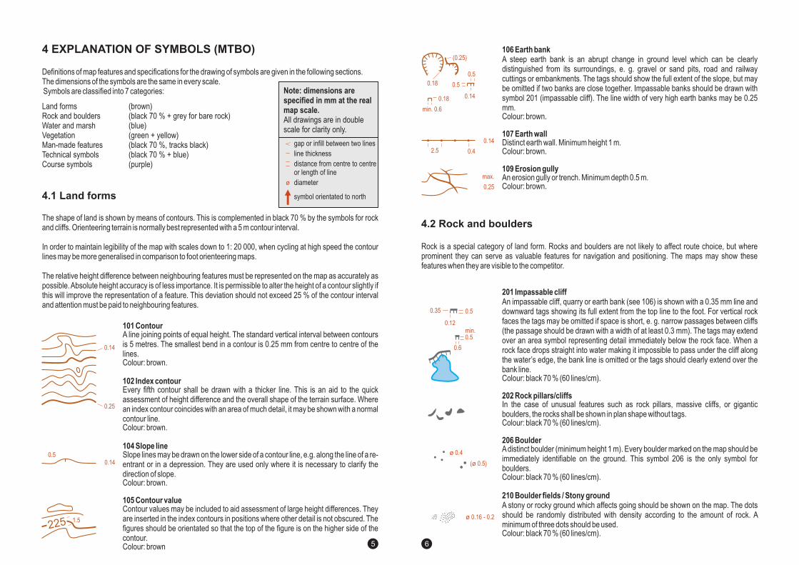
Definitions of map features and specifications for the drawing of symbols are given in the following sections.
Symbols are classified into 7 categories:The dimensions of the symbols are the same in every scale.
( rown)
(blue)(green + yellow)
(black + blue)(purple)
b(black 70 % + grey for bare rock)
(black 70 %, tracks black)70 %
Land formsRock and bouldersWater and marshVegetationMan-made featuresTechnical symbolsCourse symbols
The shape of land is shown by means of contours. This is complemented in black 70 % by the symbols for rockand cliffs. Orienteering terrain is normally best represented with a 5 m contour interval.
In order to maintain legibility of the map with scales down to 1: 20 000, when cycling at high speed the contourlines may be more generalised in comparison to foot orienteering maps.
The relative height difference between neighbouring features must be represented on the map as accurately aspossible.Absolute height accuracy is of less importance. It is permissible to alter the height of a contour slightly ifthis will improve the representation of a feature. This deviation should not exceed 25 % of the contour intervaland attention must be paid to neighbouring features.
101 Contour
102 Index contour
104 Slope line
A line joining points of equal height. The standard vertical interval between contoursis 5 metres. The smallest bend in a contour is 0.25 mm from centre to centre of thelines.Colour: brown.
Every fifth contour shall be drawn with a thicker line. This is an aid to the quickassessment of height difference and the overall shape of the terrain surface. Wherean index contour coincides with an area of much detail, it may be shown with a normalcontour line.Colour: brown.
Slope lines may be drawn on the lower side of a contour line, e.g. along the line of a re-entrant or in a depression. They are used only where it is necessary to clarify thedirection of slope.Colour: brown.
105 Contour valueContour values may be included to aid assessment of large height differences. Theyare inserted in the index contours in positions where other detail is not obscured. Thefigures should be orientated so that the top of the figure is on the higher side of thecontour.Colour: brown
Even though new printing methods, like digital offset, colour copying etc., are developing rapidly, traditionaloffset is still superior in quality when printing detailed maps. For IOF events such as World Championships andWorld Cup this is the recommended method. However, if alternative methods produce maps with the samequality as traditional spot colour offset printing, they will be accepted.
For smaller competitions, maps are likely to be reproduced in relatively small quantities and for this the new andcheaper printing methods are well suited.
Note: dimensions arespecified in mm at the realmap scale.All drawings are in doublescale for clarity only.
gap or infill between two lines
line thickness
distance from centre to centreor length of line
diameter
symbol orientated to north
4 EXPLANATION OF SYMBOLS (MTBO)
4.1 Land forms
3. Printing and reproduction4
0.14
0.25
0.140.5
225 1.5
54
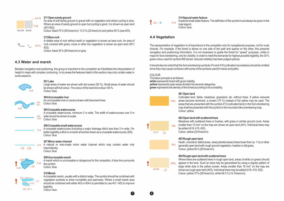
211 Open sandy ground
212 Bare rock
An area of soft sandy ground or gravel with no vegetation and where cycling is slow.Where an area of sandy ground is open but cycling is good, it is shown as open land(401/402).Colour: black 70 % (60 lines/cm) / 12.5 % (22 lines/cm) and yellow 50 % (see 403).
A ridable area of rock without earth or vegetation is shown as bare rock. An area ofrock covered with grass, moss or other low vegetation is shown as open land (401/402).Colour: black 30 % (60 lines/cm) or grey.
301 Lake
304 Uncrossable river
305 Crossable watercourse
306 Crossable small watercourse
307 Minor water channel
309 Uncrossable marsh
310 Marsh
Large areas of water are shown with dot screen (50 %). Small areas of water shouldbe shown with full colour. The colour of the bank line is blue 100 %.Colour: blue.
An uncrossable river or canal is drawn with blue bank lines.Colour: blue.
A crossable watercourse, minimum 2 m wide. The width of watercourses over 5 mwide should be shown to scale.Colour: blue.
A crossable watercourse (including a major drainage ditch) less than 2 m wide. Forbetter legibility a ditch in a marsh should be drawn as a crossable watercourse (305).Colour: blue.
A natural or man-made minor water channel which may contain water onlyintermittently.Colour: blue.
A marsh which is uncrossable or dangerous for the competitor. A blue line surroundsthe symbol.Colour: blue.
Acrossable marsh, usually with a distinct edge. The symbol should be combined withvegetation symbols to show runnability and openness. Where a small marsh areashould be combined with either 403 or 404 it is permitted to use 401 / 402 to improvelegibility.Colour: blue.
106 Earth bank
109 Erosion gully
A steep earth bank is an abrupt change in ground level which can be clearlydistinguished from its surroundings, e. g. gravel or sand pits, road and railwaycuttings or embankments. The tags should show the full extent of the slope, but maybe omitted if two banks are close together. Impassable banks should be drawn withsymbol 201 (impassable cliff). The line width of very high earth banks may be 0.25mm.Colour: brown.
An erosion gully or trench. Minimum depth 0.5 m.
107 Earth wallDistinct earth wall. Minimum height 1 m.Colour: brown.
Colour: brown.
201 Impassable cliff
206 Boulder
210 Boulder fields / Stony ground
An impassable cliff, quarry or earth bank (see 106) is shown with a 0.35 mm line anddownward tags showing its full extent from the top line to the foot. For vertical rockfaces the tags may be omitted if space is short, e. g. narrow passages between cliffs(the passage should be drawn with a width of at least 0.3 mm). The tags may extendover an area symbol representing detail immediately below the rock face. When arock face drops straight into water making it impossible to pass under the cliff alongthe water’s edge, the bank line is omitted or the tags should clearly extend over thebank line.
In the case of unusual features such as rock pillars, massive cliffs, or giganticboulders, the rocks shall be shown in plan shape without tags.
This symbol 206 is the only symbol forboulders.
A stony or rocky ground which affects going should be shown on the map. The dotsshould be randomly distributed with density according to the amount of rock. Aminimum of three dots should be used.Colour: black 70 % (60 lines/cm).
Colour: black 70 % (60 lines/cm).
Colour: black 70 % (60 lines/cm).
Adistinct boulder (minimum height 1 m). Every boulder marked on the map should beimmediately identifiable on the ground.
Colour: black 70 % (60 lines/cm).
202 Rock pillars/cliffs
Rock is a special category of land form. Rocks and boulders are not likely to affect route choice, but whereprominent they can serve as valuable features for navigation and positioning. The maps may show thesefeatures when they are visible to the competitor.
Besides navigation and positioning, this group is important to the competitor as it facilitates the interpretation ofheight in maps with complex contouring. In dry areas the features listed in this section may only contain water insome seasons.
4.2 Rock and boulders
4.3 Water and marsh
0.25
0.1
0.5
0.3
0.25
0.2
0.25
0.14
1.25 0.25
min. 0.5
0.14
0.45
YELLOW BLACK
ø 0.18
(30 %)
0.25
0.25
min.0.2
min.0.25
0.5
0.14
max.
0.25
0.50.18
(0.25)
0.18
min. 0.6
min.0.5
0.50.35
0.6
0.12
0.14
2.5 ø 0.4
ø 0.4
( 0.5)ø
ø 0.16 - 0.2
76
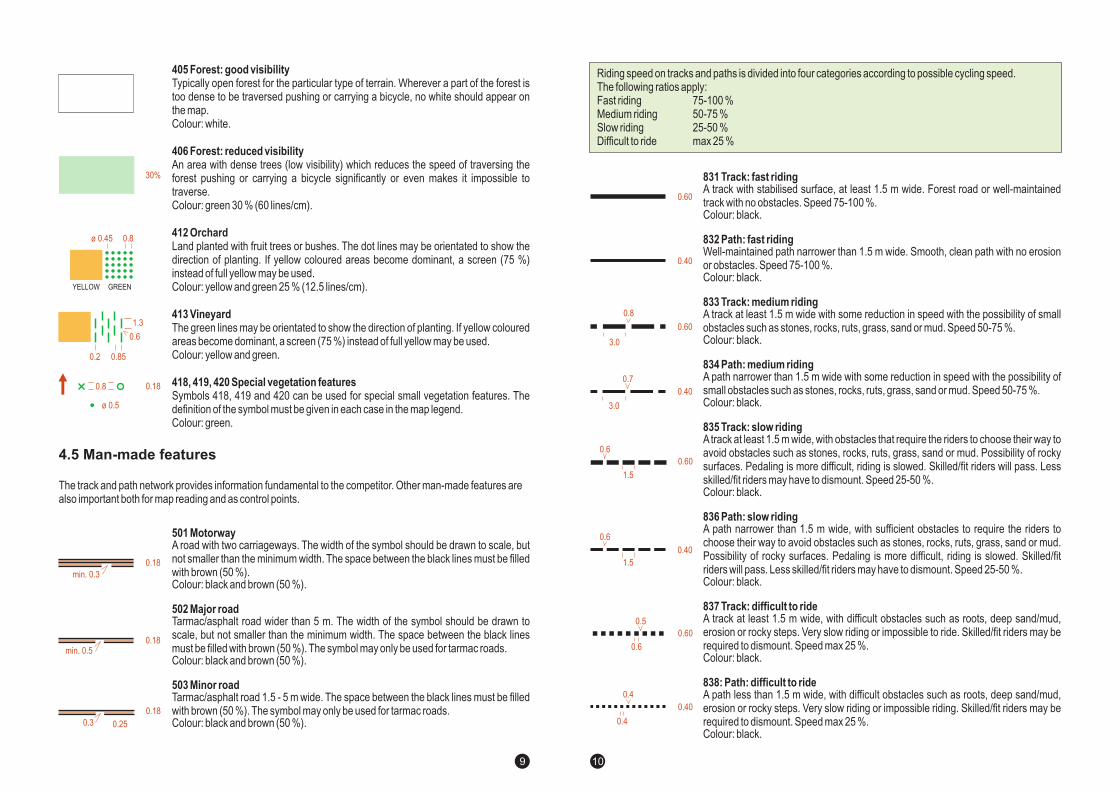
405 Forest: good visibility
406 Forest: reduced visibility
412 Orchard
413 Vineyard
418, 419, 420 Special vegetation features
Typically open forest for the particular type of terrain. Wherever a part of the forest istoo dense to be traversed pushing or carrying a bicycle, no white should appear onthe map.Colour: white.
An area with dense trees (low visibility) which reduces the speed of traversing theforest pushing or carrying a bicycle significantly or even makes it impossible totraverse.Colour: green 30 % (60 lines/cm).
Land planted with fruit trees or bushes. The dot lines may be orientated to show thedirection of planting. If yellow coloured areas become dominant, a screen (75 %)instead of full yellow may be used.Colour: yellow and green 25 % (12.5 lines/cm).
The green lines may be orientated to show the direction of planting. If yellow colouredareas become dominant, a screen (75 %) instead of full yellow may be used.Colour: yellow and green.
Symbols 418, 419 and 420 can be used for special small vegetation features. Thedefinition of the symbol must be given in each case in the map legend.Colour: green.
501 Motorway
502 Major road
503 Minor road
A road with two carriageways. The width of the symbol should be drawn to scale, butnot smaller than the minimum width. The space between the black lines must be filledwith brown (50 %).Colour: black and brown (50 %).
Tarmac/asphalt road wider than 5 m. The width of the symbol should be drawn toscale, but not smaller than the minimum width. The space between the black linesmust be filled with brown (50 %). The symbol may be used for tarmac roads.Colour: black and brown (50 %).
Tarmac/asphalt road 1.5 - 5 m wide. The space between the black lines must be filledwith brown (50 %). The symbol may be used for tarmac roads.Colour: black and brown (50 %).
only
only
314 Special water featureAspecial small water feature. The definition of the symbol must always be given in themap legend.Colour: blue.
The representation of vegetation is of importance to the competitor only for navigational purposes, not for routechoices. For example, if the forest is dense on one side of the path and sparse on the other, this presentsnavigation and positioning information. It is not necessary to grade the forest for “speed” purposes, unlike inmaps for foot orienteering, only for visibility. In order to meet the demands for highest possible legibility, the 30 %green colour used for symbol 406 (forest: reduced visibility) has been judged optimal.
It should also be noted that the foot orienteering symbols 414 and 416 (cultivation boundaries) should be omittedsince they may cause confusion with some of the symbols used for tracks and paths.
COLOURThe basic principle is as follows:
represents forest with good visibility,represents open areas divided into several categories,
represents the density of the forest according to its runnability.
whiteyellowgreen
401 Open land
402 Open land with scattered trees
403 Rough open land
404 Rough open land with scattered trees
Cultivated land, fields, meadows, grassland, etc. without trees. If yellow colouredareas become dominant, a screen (75 %) instead of full yellow may be used. Theareas that are presented with the symbol 415 (cultivated land) in the foot orienteeringmap shall be presented with this symbol in the mountain bike orienteering map.Colour: yellow.
Meadows with scattered trees or bushes, with grass or similar ground cover. Areassmaller than 10 mm on the map are shown as open land (401). Individual trees maybe added (418, 419, 420).Colour: yellow (20 lines/cm).
Heath, moorland, felled areas, newly planted areas (trees lower than ca. 1 m) or othergenerally open land with rough ground vegetation, heather or tall grass.Colour: yellow 50 % (60 lines/cm).
Where there are scattered trees in rough open land, areas of white (or green) shouldappear in the tone. Such an area may be generalised by using a regular pattern oflarge white dots in the yellow screen. Areas smaller than 16 mm on the map areshown as rough open land (403). Individual trees may be added (418, 419, 420).Colour: yellow 70 % (60 lines/cm), white 48.5 % (14.3 lines/cm).
2
2
The track and path network provides information fundamental to the competitor. Other man-made features arealso important both for map reading and as control points.
4.4 Vegetation
4.5 Man-made features
0.18
0.18
min. 0.3
min. 0.5
0.18
0.250.3
30%
ø 0.45 0.8
1.3
0.6
0.2 0.85
YELLOW GREEN
ø 0.5
0.180.8
0.180.8
100%
50%
(36%)
0.7ø 0.55
50%
0.5ø 0.4
98
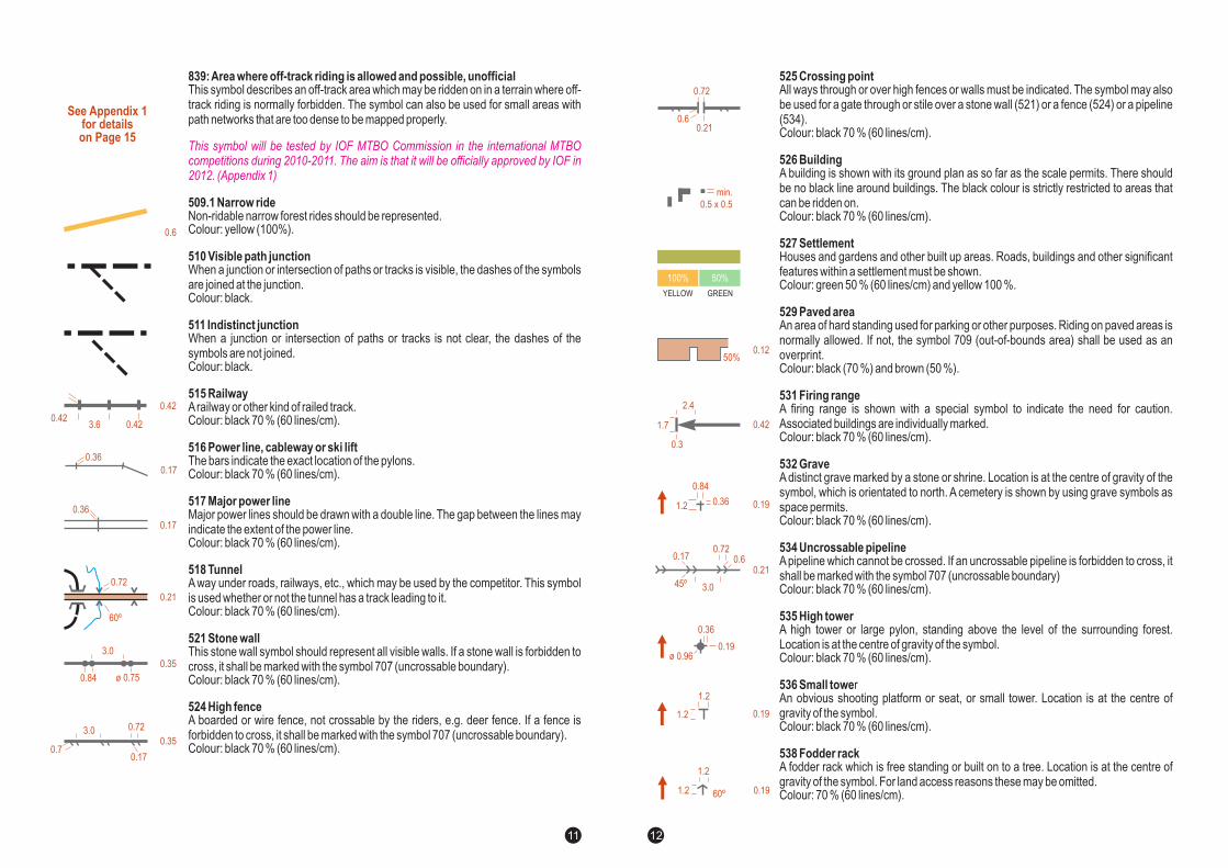
839:Area where off-track riding is allowed and possible, unofficial
509.1 Narrow ride
510 Visible path junction
511 Indistinct junction
515 Railway
516 Power line, cableway or ski lift
517 Major power line
518 Tunnel
521 Stone wall
524 High fence
This symbol describes an off-track area which may be ridden on in a terrain where off-track riding is normally forbidden. The symbol can also be used for small areas withpath networks that are too dense to be mapped properly.
Non-ridable narrow forest rides should be represented.Colour: yellow (100%).
When a junction or intersection of paths or tracks is visible, the dashes of the symbolsare joined at the junction.Colour: black.
When a junction or intersection of paths or tracks is not clear, the dashes of thesymbols are not joined.Colour: black.
Arailway or other kind of railed track.Colour: black 70 % (60 lines/cm).
The bars indicate the exact location of the pylons.Colour: black 70 % (60 lines/cm).
Major power lines should be drawn with a double line. The gap between the lines mayindicate the extent of the power line.Colour: black 70 % (60 lines/cm).
A way under roads, railways, etc., which may be used by the competitor. This symbolis used whether or not the tunnel has a track leading to it.Colour: black 70 % (60 lines/cm).
This stone wall symbol should represent all visible walls. If a stone wall is forbidden tocross, it shall be marked with the symbol 707 (uncrossable boundary).Colour: black 70 % (60 lines/cm).
A boarded or wire fence, not crossable by the riders, e.g. deer fence. If a fence isforbidden to cross, it shall be marked with the symbol 707 (uncrossable boundary).Colour: black 70 % (60 lines/cm).
This symbol will be tested by IOF MTBO Commission in the international MTBOcompetitions during 2010-2011. The aim is that it will be officially approved by IOF in2012. (Appendix 1)
831 Track: fast riding
832 Path: fast riding
833 Track: medium riding
834 Path: medium riding
835 Track: slow riding
836 Path: slow riding
837 Track: difficult to ride
838: Path: difficult to ride
A track with stabilised surface, at least 1.5 m wide. Forest road or well-maintainedtrack with no obstacles. Speed 75-100 %.Colour: black.
Well-maintained path narrower than 1.5 m wide. Smooth, clean path with no erosionor obstacles. Speed 75-100 %.Colour: black.
A track at least 1.5 m wide with some reduction in speed with the possibility of smallobstacles such as stones, rocks, ruts, grass, sand or mud. Speed 50-75 %.Colour: black.
A path narrower than 1.5 m wide with some reduction in speed with the possibility ofsmall obstacles such as stones, rocks, ruts, grass, sand or mud. Speed 50-75 %.Colour: black.
Atrack at least 1.5 m wide, with obstacles that require the riders to choose their way toavoid obstacles such as stones, rocks, ruts, grass, sand or mud. Possibility of rockysurfaces. Pedaling is more difficult, riding is slowed. Skilled/fit riders will pass. Lessskilled/fit riders may have to dismount. Speed 25-50 %.Colour: black.
A path narrower than 1.5 m wide, with sufficient obstacles to require the riders tochoose their way to avoid obstacles such as stones, rocks, ruts, grass, sand or mud.Possibility of rocky surfaces. Pedaling is more difficult, riding is slowed. Skilled/fitriders will pass. Less skilled/fit riders may have to dismount. Speed 25-50 %.Colour: black.
A track at least 1.5 m wide, with difficult obstacles such as roots, deep sand/mud,erosion or rocky steps. Very slow riding or impossible to ride. Skilled/fit riders may berequired to dismount. Speed max 25 %.Colour: black.
A path less than 1.5 m wide, with difficult obstacles such as roots, deep sand/mud,erosion or rocky steps. Very slow riding or impossible riding. Skilled/fit riders may berequired to dismount. Speed max 25 %.Colour: black.
Riding speed on tracks and paths is divided into four categories according to possible cycling speed.The following ratios apply:
ast riding 75-100 %edium riding 50-75 %low riding 25-50 %ifficult to ride max 25 %
FMSD
0.42
0.420.423.6
0.17
0.36
0.17
0.36
0.35
0.35
ø 0.75
3.0
0 84.
3.0 0.72
0.70.17
0.21
0.72
60º
See Appendix 1for detailson Page 15
0.6
0.60
0.40
0.60
0.8
3.0
0.40
3.0
0.7
0.60
0.5
0.6
0.40
0.4
0.4
0.60
0.6
1.5
0.40
0.6
1.5
1110
701 Start
702 Control point
840 Control point with focus point (in MTBO maps)
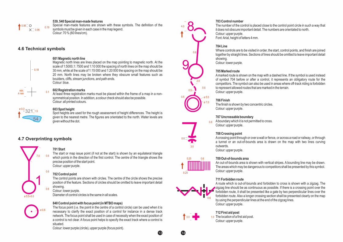
The start or map issue point (if not at the start) is shown by an equilateral trianglewhich points in the direction of the first control. The centre of the triangle shows theprecise position of the start point.Colour: upper purple.
The control points are shown with circles. The centre of the circle shows the preciseposition of the feature. Sections of circles should be omitted to leave important detailshowing.Colour: lower purple.Diameter of control circles is the same in all scales.
The focus point (i.e. the point in the centre of a control circle) can be used when it isnecessary to clarify the exact position of a control for instance in a dense tracknetwork. The focus point shall be used in case of necessity when the exact position ofa control is not clear. A focus point helps to specify the exact track where a control issituated.Colour: lower purple (circle), upper purple (focus point).
601 Magnetic north line
602 Registration marks
603 Spot height
Magnetic north lines are lines placed on the map pointing to magnetic north. At thescale of 1:5000,1: 7500 and 1:10 000 the spacing of north lines on the map should be30 mm, while at the scale of 1:15 000 and 1:20 000 the spacing on the map should be20 mm. North lines may be broken where they obscure small features such asboulders, cliffs, stream junctions, and path ends.Colour: blue.
At least three registration marks must be placed within the frame of a map in a non-symmetrical position. In addition, a colour check should also be possible.Colour: all printed colours.
Spot heights are used for the rough assessment of height differences. The height isgiven to the nearest metre. The figures are orientated to the north. Water levels aregiven without the dot.
539, 540 Special man-made featuresSpecial man-made features are shown with these symbols. The definition of thesymbols must be given in each case in the map legend.Colour: 70 % (60 lines/cm).
525 Crossing point
526 Building
527 Settlement
529 Paved area
531 Firing range
532 Grave
534 Uncrossable pipeline
535 High tower
536 Small towe
538 Fodder rack
All ways through or over high fences or walls must be indicated. The symbol may alsobe used for a gate through or stile over a stone wall (521) or a fence (524) or a pipeline(534).Colour: black 70 % (60 lines/cm).
A building is shown with its ground plan as so far as the scale permits. There shouldbe no black line around buildings. The black colour is strictly restricted to areas thatcan be ridden on.Colour: black 70 % (60 lines/cm).
Houses and gardens and other built up areas. Roads, buildings and other significantfeatures within a settlement must be shown.Colour: green 50 % (60 lines/cm) and yellow 100 %.
An area of hard standing used for parking or other purposes. Riding on paved areas isnormally allowed. If not, the symbol 709 (out-of-bounds area) shall be used as anoverprint.Colour: black (70 %) and brown (50 %).
A firing range is shown with a special symbol to indicate the need for caution.Associated buildings are individually marked.Colour: black 70 % (60 lines/cm).
A distinct grave marked by a stone or shrine. Location is at the centre of gravity of thesymbol, which is orientated to north. A cemetery is shown by using grave symbols asspace permits.Colour: black 70 % (60 lines/cm).
Apipeline which cannot be crossed. If an uncrossable pipeline is forbidden to cross, itshall be marked with the symbol 707 (uncrossable boundary)Colour: black 70 % (60 lines/cm).
A high tower or large pylon, standing above the level of the surrounding forest.Location is at the centre of gravity of the symbol.Colour: black 70 % (60 lines/cm).
rAn obvious shooting platform or seat, or small tower. Location is at the centre ofgravity of the symbol.Colour: black 70 % (60 lines/cm).
A fodder rack which is free standing or built on to a tree. Location is at the centre ofgravity of the symbol. For land access reasons these may be omitted.Colour: 70 % (60 lines/cm).
4.7 Overprinting symbols
4.6 Technical symbols
7.0
ø .55 –6.0
0.6
0.6
0.6
1
0.18
1.5
min.4 mm
0.1
ø 0.3321
54
0.190.96
0.96
ø 0.6
0.12
0.17
0.210.6
3.0
0.72
50%
0. 24
0.3
2.4
1 7.
45º
100% 50%
YELLOW GREEN
0.190.36
0 84.
1.2
0.191.2
1.2
0.191.2
1.2
60º
0.36
0.19ø 0.96
0.6
0.72
0.21
min.
0.5 x 0.5
1312
701 Start
702 Control point
840 Control point with focus point (in MTBO maps)
The start or map issue point (if not at the start) is shown by an equilateral trianglewhich points in the direction of the first control. The centre of the triangle shows theprecise position of the start point.Colour: upper purple.
The control points are shown with circles. The centre of the circle shows the preciseposition of the feature. Sections of circles should be omitted to leave important detailshowing.Colour: lower purple.Diameter of control circles is the same in all scales.
The focus point (i.e. the point in the centre of a control circle) can be used when it isnecessary to clarify the exact position of a control for instance in a dense tracknetwork. The focus point shall be used in case of necessity when the exact position ofa control is not clear. A focus point helps to specify the exact track where a control issituated.Colour: lower purple (circle), upper purple (focus point).
601 Magnetic north line
602 Registration marks
603 Spot height
Magnetic north lines are lines placed on the map pointing to magnetic north. At thescale of 1:5000,1: 7500 and 1:10 000 the spacing of north lines on the map should be30 mm, while at the scale of 1:15 000 and 1:20 000 the spacing on the map should be20 mm. North lines may be broken where they obscure small features such asboulders, cliffs, stream junctions, and path ends.Colour: blue.
At least three registration marks must be placed within the frame of a map in a non-symmetrical position. In addition, a colour check should also be possible.Colour: all printed colours.
Spot heights are used for the rough assessment of height differences. The height isgiven to the nearest metre. The figures are orientated to the north. Water levels aregiven without the dot.
539, 540 Special man-made featuresSpecial man-made features are shown with these symbols. The definition of thesymbols must be given in each case in the map legend.Colour: 70 % (60 lines/cm).
525 Crossing point
526 Building
527 Settlement
529 Paved area
531 Firing range
532 Grave
534 Uncrossable pipeline
535 High tower
536 Small towe
538 Fodder rack
All ways through or over high fences or walls must be indicated. The symbol may alsobe used for a gate through or stile over a stone wall (521) or a fence (524) or a pipeline(534).Colour: black 70 % (60 lines/cm).
A building is shown with its ground plan as so far as the scale permits. There shouldbe no black line around buildings. The black colour is strictly restricted to areas thatcan be ridden on.Colour: black 70 % (60 lines/cm).
Houses and gardens and other built up areas. Roads, buildings and other significantfeatures within a settlement must be shown.Colour: green 50 % (60 lines/cm) and yellow 100 %.
An area of hard standing used for parking or other purposes. Riding on paved areas isnormally allowed. If not, the symbol 709 (out-of-bounds area) shall be used as anoverprint.Colour: black (70 %) and brown (50 %).
A firing range is shown with a special symbol to indicate the need for caution.Associated buildings are individually marked.Colour: black 70 % (60 lines/cm).
A distinct grave marked by a stone or shrine. Location is at the centre of gravity of thesymbol, which is orientated to north. A cemetery is shown by using grave symbols asspace permits.Colour: black 70 % (60 lines/cm).
Apipeline which cannot be crossed. If an uncrossable pipeline is forbidden to cross, itshall be marked with the symbol 707 (uncrossable boundary)Colour: black 70 % (60 lines/cm).
A high tower or large pylon, standing above the level of the surrounding forest.Location is at the centre of gravity of the symbol.Colour: black 70 % (60 lines/cm).
rAn obvious shooting platform or seat, or small tower. Location is at the centre ofgravity of the symbol.Colour: black 70 % (60 lines/cm).
A fodder rack which is free standing or built on to a tree. Location is at the centre ofgravity of the symbol. For land access reasons these may be omitted.Colour: 70 % (60 lines/cm).
4.7 Overprinting symbols
4.6 Technical symbols
7.0
ø .55 –6.0
0.6
0.6
0.6
1
0.18
1.5
min.4 mm
0.1
ø 0.3321
54
0.190.96
0.96
ø 0.6
0.12
0.17
0.210.6
3.0
0.72
50%
0. 24
0.3
2.4
1 7.
45º
100% 50%
YELLOW GREEN
0.190.36
0 84.
1.2
0.191.2
1.2
0.191.2
1.2
60º
0.36
0.19ø 0.96
0.6
0.72
0.21
min.
0.5 x 0.5
1312
713 Refreshment point
843 Dangerous object across tracks or paths, stairs
844 Uncrossable barrier / forbidden to cross
The location of a refreshment point which is not at a control.Colour: upper purple.
These barriers must be highly visible on the map and should be overprinted in purple.The symbol should be used for all obstacles that are difficult to cross. For uncrossablebarrier, symbol 844 shall be used. This symbol can be used for stairs. There is noparticular stair symbol.Colour: upper purple.
This symbol can be used for all spots that are forbidden or impossible to pass, e.g.uncrossable barriers; fences or walls that are forbidden or impossible to cross; shortsections of roads, tracks or paths that are forbidden to use (for longer sections,symbol 711 shall be used). In spots where two tracks or paths almost meet, but thesituation is not obvious on the map, this symbol can be used to indicate that crossingis forbidden.Colour: upper purple.
703 Control number
704 Line
705 Marked route
706 Finish
707 Uncrossable boundary
708 Crossing point
709 Out-of-bounds area
711 Forbidden route
712 First aid post
The number of the control is placed close to the control point circle in such a way thatit does not obscure important detail. The numbers are orientated to north.Colour: upper purple.Font:Arial, height of letters 4 mm.
Where controls are to be visited in order, the start, control points, and finish are joinedtogether by straight lines. Sections of lines should be omitted to leave important detailshowing.Colour: lower purple.
A marked route is shown on the map with a dashed line. If the symbol is used insteadof symbol 704 before or after a control, it represents an obligatory route for thecompetitors. The symbol can also be used in areas where off-track riding is forbiddento represent allowed routes that are marked in the terrain.Colour: upper purple.
The finish is shown by two concentric circles.Colour: upper purple.
Aboundary which it is not permitted to cross.Colour: upper purple.
Acrossing point through or over a wall or fence, or across a road or railway, or througha tunnel or an out-of-bounds area is drawn on the map with two lines curvingoutwards.Colour: upper purple.
An out-of-bounds area is shown with vertical stripes. A bounding line may be drawn.The areas which may be dangerous to competitors shall be presented by this symbol.Colour: upper purple.
A route which is out-of-bounds and forbidden to cross is shown with a zigzag. Thezigzag line should be as continuous as possible. If there is a crossing point over theforbidden route, it shall be presented like a gate by two perpendicular lines over theforbidden route. Also a longer crossing section shall be presented clearly on the mapby using the perpendicular lines at the end of the zigzag lines.Colour: upper purple.
The location of a first aid post.Colour: upper purple.
2.50.52
3.0
3.00.35
0.8
2.3
ø 5.0
ø 7.0
0.5
0.6
3.0
0.8
0.60.25
0.6
0.6
2.0
0.5
4.0 8
9
1.03.0
0.6
0.25
14 15
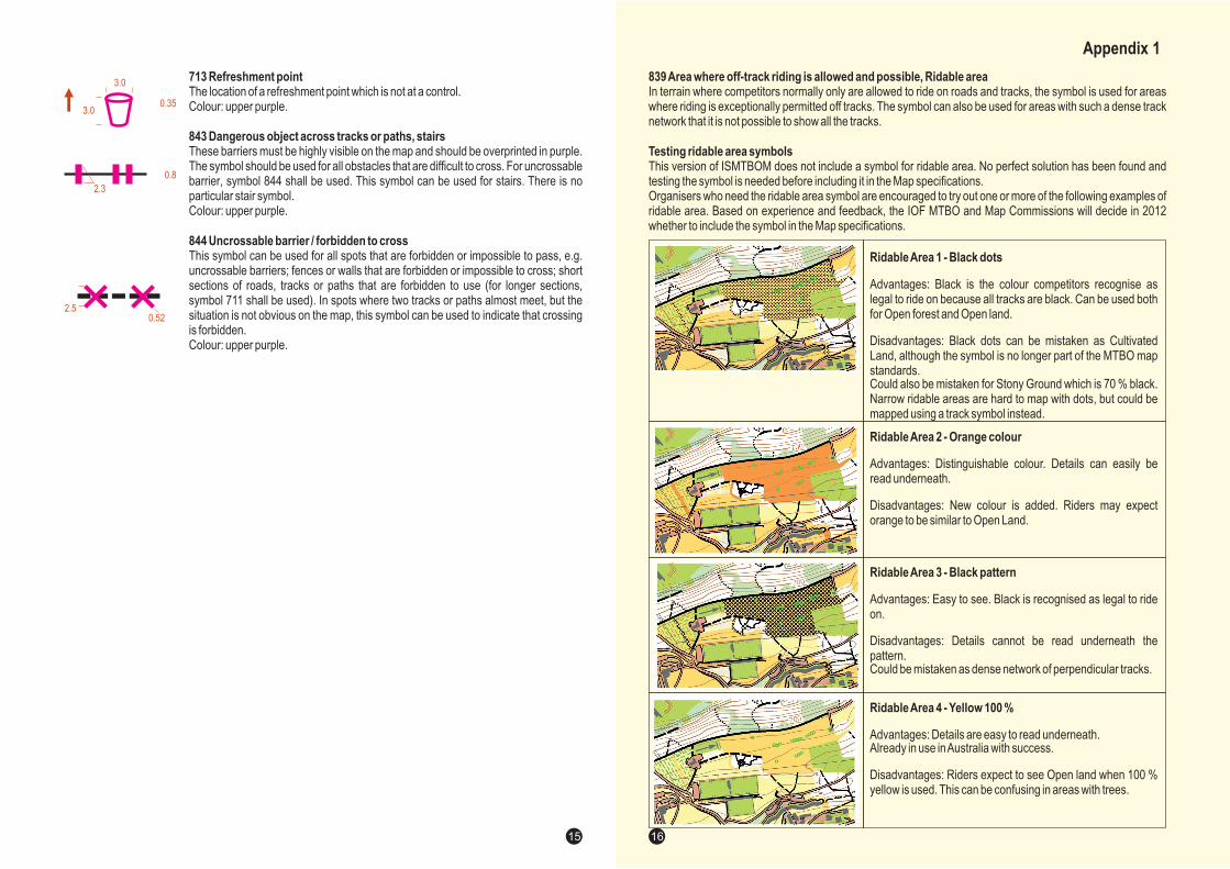
RidableArea 1 - Black dots
Advantages: Black is the colour competitors recognise aslegal to ride on because all tracks are black. Can be used bothfor Open forest and Open land.
Disadvantages: Black dots can be mistaken as CultivatedLand, although the symbol is no longer part of the MTBO mapstandards.Could also be mistaken for Stony Ground which is 70 % black.Narrow ridable areas are hard to map with dots, but could bemapped using a track symbol instead.
RidableArea 2 - Orange colour
Advantages: Distinguishable colour. Details can easily beread underneath.
Disadvantages: New colour is added. Riders may expectorange to be similar to Open Land.
RidableArea 3 - Black pattern
Advantages: Easy to see. Black is recognised as legal to rideon.
Disadvantages: Details cannot be read underneath thepattern.Could be mistaken as dense network of perpendicular tracks.
RidableArea 4 - Yellow 100 %
Advantages: Details are easy to read underneath.Already in use inAustralia with success.
Disadvantages: Riders expect to see Open land when 100 %yellow is used. This can be confusing in areas with trees.
839Area where off-track riding is allowed and possible, Ridable area
Testing ridable area symbols
In terrain where competitors normally only are allowed to ride on roads and tracks, the symbol is used for areaswhere riding is exceptionally permitted off tracks. The symbol can also be used for areas with such a dense tracknetwork that it is not possible to show all the tracks.
This version of ISMTBOM does not include a symbol for ridable area. No perfect solution has been found andtesting the symbol is needed before including it in the Map specifications.Organisers who need the ridable area symbol are encouraged to try out one or more of the following examples ofridable area. Based on experience and feedback, the IOF MTBO and Map Commissions will decide in 2012whether to include the symbol in the Map specifications.
Appendix 1
16