Embed Size (px)
Citation preview

1
http://www.ftsm.ukm.my/apjitm
Asia-Pacific Journal of Information Technology and Multimedia
Jurnal Teknologi Maklumat dan Multimedia Asia-Pasifik
Vol. 5 No. 1, June 2016: 1 - 13
e-ISSN: 2289-2192
INTERFACE DESIGN GUIDELINES OF NUTRITIONAL INFORMATION
APPLICATION FOR THE ELDERLY
TAN LI YIN
NAZLENA MOHAMAD ALI
SHAHRUL AZMAN MOHD NOAH
ABSTRACT
The aim of this study is to evaluate the interface design of nutrition information application for elderly people.
Obtaining the proper nutritional information is an important aspect for elderly healthcare. Most information on
healthcare can be found from the Internet. However, many elderly people face problems when using the Internet
due to their inability to adapt to common platforms of interface design. Due to deterioration in physiological
functions, elderly users have different requirements from adult users. A high fidelity prototype on nutrition was
developed, taking into consideration the evaluation results from the initial need assessment focus group study. A
questionnaire survey was conducted involving 30 respondents aged between 60 and 79 years old. The result
reveals that most of the respondents gave a positive feedback to the three main features of interface design, which
are simplicity (96%), directness (90%) and consistency (100%). Based on this outcome, it can be concluded that
the interface design is well accepted by the elderly respondents.
Keywords: Nutrition information, elderly healthcare, interface design, web application, prototype on nutrition
INTRODUCTION
Adequate intake of energy and nutrients is a basic prerequisite for all physiological process,
organ functions, physical and mental performance, health and well-being. Malnutrition often
contributes to morbidity and mortality in the elderly. This indicates that the elderly should
obtain a balanced nutrition for long-term health. However, the complexity of nutritional
information often confuses the public (Manafo & Wong, 2012).
Web technology has become one of the main sources to gain nutrition information.
There are a number of significant barriers faced by older people when using technology. One
major barrier is inappropriately designed technological guidelines (Sofianiza & Muna, 2013).
Most computer interfaces are designed and developed according to the needs of people in the
young age group and the middle-aged adults group who are familiar with computer technology.
Senior people struggle and force themselves to adapt to design guidelines that are specifically
meant for younger users, and whether they are successful in adapting varies with age and
cognitive factors (Malik & Azuddin, 2013).
In Malaysia, there are currently no official online nutritional information applications
catered to the elderly. The objective of this study is to develop an online nutritional information
application called Penuaan Sihat (PS) by following appropriate design guidelines for elderly
for better user interaction. This paper reports the findings of a survey conducted to evaluate the
prototype which was developed based on guidelines interfaces for the elderly.

2
BACKGROUND
This section highlights some online nutritional information existing in several countries such
as Malaysia (nutrition.moh.gov.my) (Ministry of Health Malaysia, 2014), United States
(www.nutrition.gov/life-stages/seniors) (Food and Nutrition Information Centre et al., 2004),
Taiwan (chnh.mohw.gov.tw) (Ministry of Health and Welfare Taiwan, 2013) and Hong Kong
(www.info.gov.hk/elderly/chinese/lifestyles.htm) (Department of Health The Government of
the Hong Kong Special Administrative Region, 2011). The online nutrition information
applications (Department of Health The Government of the Hong Kong Special Administrative
Region, 2011; Ministry of Health and Welfare Taiwan, 2013; Ministry of Health Malaysia,
2014) consist of several features, such as web customisation functions and typography
information organisation. Web customisation is a web technology that accommodates the
differences among individuals in the way they browse for information, which enable users to
modify the page layout or specify what content should be displayed (Mardziah et al., 2010).
However, web customisations of ministry websites such as the Elderly Health Service by
Department of Health, The Government of the Hong Kong Special Administrative Region
(Department of Health The Government of the Hong Kong Special Administrative Region,
2011) and Chang Hua Nursing Home by the Ministry of Health and Welfare Taiwan (2013) are
limited to text size customisations only. The web-based application of the Ministry of Health
Malaysia (2014) enables users to modify the page layout but not the text size. These are among
the current online information that relate to the elderly but still need further features
enhancement.
There are three existing health applications which represent the three different interface
styles that were tested by the elderly (Dhillon et al., 2011): MyFitnessPal
(www.myfitnesspal.com), DailyBurn (www.dailyburn.com) and DailyStrength
(www.dailystrenth.org). DailyBurn uses a good contrast of colours for most of the items
presented on the interface, which immediately attracted the attention of the elderly. The weight
chart presented on the interface introduces them to this application. MyFitnessPal provided the
“What’s on your mind?” text box feature which enables them to share. The elderly gave
negative comments regarding the crowded information in DailyStrength. However, these three
existing health applications possess no special design for the elderly.
According to Fisk et al. (2009) and Dhillon et al. (2011), an online application can be
improved in the following ways particularly for elderly needs. Firstly, screen scrolling should
be minimised. Secondly, there should be clearer instructions for users to better utilise the online
application. For example, web-based applications should provide instructions to users on how
to proceed to the next page. Lastly, web-based applications should present more visual
information than textual information.
METHODS AND MATERIALS
Studies that incorporate the end-user perspective from the conception stage of the project are
rare, with most technology trials commencing purely from a technical point of view; and
obtaining feedback from real usage and users only at post deployment stage (Nazlena et al.,
2009). An early needs assessment survey was carried out to identify the needs of elderly users
in relation to the interface design of nutrition websites, and to develop a nutrition online
application that addresses those needs. Three focus group interviews were conducted involving
18 respondents aged between 60 and 78 years old. A low fidelity prototype on nutrition was
developed, taking into consideration the physiological changes of the elderly such as cognition
and motion impairment based on Fisk’s concepts (Fisk et al., 2009). Three theme features were
derived from the early needs assessment studies using Thematic Analysis (Braun & Clarke,

3
2006) and these were simplicity, directness and consistency. The Penuaan Sihat (PS) prototype
was developed based on these features. The early needs assessment studies were carried out
using qualitative data analysis. This prototype was developed using PHP server-side scripting
language and JavaScript programming language. PHP server-side scripting language offers
stability and features of design patterns which are the cornerstones of building solid, stable,
flexible, and feature-rich web applications (Saray, 2009). The language used in PS is Malay
and contains five modules: (1) Daily Caloric Intake, (2) Menu, (3) Nutrition Tips, (4) Quiz and
(5) Exercise Demonstration Video.
Based on an early needs assessment survey, three theme features on interface designs
were generated. They are simplicity, consistency and directness, following theme guidelines
as below:
i. Simplicity - Most researchers (Kurniawan & Zaphiris, 2005; Kurniawan et al., 2006;
Fisk et al., 2009; Dhillon et al., 2011; Williams et al., 2013) emphasised the principle
of simplicity as one of the interface design guidelines for the elderly. Simplicity is easily
understood by the elderly who are not technologically perceptive. Hence, user interface
should be simple, uncomplicated and easy to manage. Due to a slower rate of response,
the application should not use auto-play media, have any pop-up advertisements or
make use of flashing images (Kurniawan et al., 2006; Dhillon et al., 2011). These
features add to an information overload and result in a break in user concentration.
Instead, the application should allow the elderly to progress at their own rate, and to
take their time to soak in the information presented. This concept had a similar interface
design format in their design guidelines, such as: consistent brightness, alert tone for
warning (Fisk et al., 2009; Williams et al., 2013), lesser capital letters, emboldened
letters and several types of fronts mixed together, avoid signalling important
information using short wavelength (blue-violet-green) contrast, reduce the use of three
dimensional display (Kurniawan et al., 2006; Fisk et al., 2009), screen scrolling should
be minimised, apply consistency, avoid minimising or ensure that the drop down or pop-
up menu duration is long enough to carry out the demand (Kurniawan & Zaphiris, 2005;
Kurniawan et al., 2006; Fisk et al., 2009) and provide location of the current page or
breadcrumbs (Kurniawan & Zaphiris, 2005; Kurniawan et al., 2006).
ii. Directness - Due to information overload and a general lack of familiarity with browsing
websites, the elderly may at times feel disoriented when browsing nutrition information
websites. Therefore, such websites should be clear, direct and progress step-by-step with
reader instructions. This discovery supported the finding of Grguric et al. (2010) where
the computer literacy level of the elderly people is generally poor, and that they may
face problems even with simple tasks. As colourful icons attract the attention of the
elderly, therefore, different colours were used to represent each function button and a
five-module menu bar was adopted to support this theme. There were also instructions
of input format and sequence actions for users, along with a ‘next’ button to proceed to
the next page and a ‘previous’ button to return to previous page. All buttons in the
interface were designed with appropriate sizes for easy user-click tasks. Once clicked
or hovered, the shadow of the button will be removed to show a clickable button or the
task selected.
iii. Consistency – Consistency refers to the visual elements of the website’s design, as well
as, the organisation of information across the website. Consistency has always been
considered the most important principle of user-interface design, as evidenced by
virtually all currently available design guidelines today. Accordingly, this application
uses the same background and menu bar for all modules so that the elderly will not

4
become confused as to which page they are on. In addition, this application presents
information systematically and does not require scrolling or frequent switching of pages.
The PS prototype applies a background information contrast with a contrast ratio of at
least 50:1 (text content in black on a white background) (Fisk et al., 2009) even though
Kurniawan and Zaphiris (2005) has mentioned that background screens should not be pure
white. A study (Dhillon et al., 2011) has found that the elderly preferred light blue or green
backgrounds although Kurniawan and Zaphiris (2005) suggest that blue and green tones should
be avoided. Some similar design formats were widely used in previous studies, as well as in
this study, such as larger sized fonts, keeping information simple (Kurniawan & Zaphiris, 2005;
Kurniawan et al., 2006; Fisk et al., 2009; Dhillon et al., 2011; Williams et al., 2013) and Jargon-
free language (Kurniawan & Zaphiris, 2005; Kurniawan et al., 2006; Fisk et al., 2009; Williams
et al., 2013).
The PS nutrition application is developed by considering the aforementioned design
guidelines. The following explains the five modules that are incorporated in the application.
The contents briefly describe, and the corresponding figures illustrate some main screen
interfaces.
Module 1: Daily Caloric Intake: This module can determine the BMI (Body Mass Index)
category and suggest the ideal daily caloric intake for the elderly. In this module, the elderly
only need to enter their body weight (kg) and height (cm) into the input box and select their
daily level of physical activities. The daily caloric intake module shows the user’s BMI
category, whether they are underweight, normal weight or overweight. If the elderly falls under
the category of underweight or overweight, this module gives a warning sign and the ideal body
weight is displayed. This module also displays the ideal daily caloric needs for the elderly to
achieve or maintain a normal body weight. The calculation of the ideal daily caloric intake is
based on the “quick” method by Cole and Camerini-Davalos (1970) (Suzana et al., 2009) which
multiplies the current body weight (kg) with the factors according to weight status and physical
activity as shown in Table 1. TABLE 1. Quick Method
Overweight Normal weight Underweight
Sedentary Activity 20-25 kcal/kg weight 30 kcal/kg weight 35 kcal/kg weight
Moderate Activity 20-25 kcal/kg weight 35 kcal/kg weight 40 kcal/kg weight
Marked Activity 20-25 kcal/kg weight 40 kcal/kg weight 45 kcal/kg weight
Figure 1 shows the screen shot for this module. It displays five modules in the menu bar and
the input components for user information.
FIGURE 1. Module 1: Daily caloric intake

5
Module 2: Food Menu: This module is divided into two parts. The first part provides a view of
all suggested menus in this module, which includes the menu for 1200kcal, 1500kcal and
1800kcal. These menus were adapted from the study by Suzana et al. (2009). In this part, three
buttons are linked to each suggested menu where the details of the menu are displayed in the
second part. Figure 2 displays the browsing page for the ‘Menu’ module. This page presents all
recipe images on one page, where the users can acquire an overview of all the recipe choices
available. Red image borders were used to indicate that the recipe images can be magnified
when users click on them. This feature provides a larger image for users to view before
proceeding to recipe details. A brushing and linking technique was applied to show the
connection between the thumbnail images and the magnified images that corresponded to each
step. Brushing is an interactive selection process that is often, but not always, combined with
linking, a process for communicating the selected data to other views of the data set
(International Cartographic Association, 2005). Brushing enables users to select data on one
chart and see how it is reflected on other linked charts (Amir et al., 2013). After brushing,
selected items are highlighted in order to make them stand out against the rest of the data
(Aigner et al., 2011).
FIGURE 2. Module 2: Menu
Module 3: Nutrition Tips: The contents were adapted from a study by Intan (2005). However,
charts and graphics were used to represent some of the contents so they may be more easily
understood and accepted by the elderly. Figure 3 shows the screen shot for this module.
FIGURE 3. Module 3: Nutrition Tips

6
Module 4: Quiz: Quiz questions from this module were randomly adapted from the study by
Intan (2005) and developed in a multiple-choice format. A total of 9 questions were included
to test the knowledge level of the elderly after they had browsed through the Nutrition Tips
module.
Module 5: Exercise Demonstration Video: The final module contains exercise demonstration
videos. This module is adapted from a study by Nazlena et al. (2012). According to Nazlena et
al. (2012), this module aims to help the elderly adopt an active and healthy lifestyle, which can
help improve their lives and health. As such, this module demonstrates and teaches the elderly
about different types of exercises, which are easy to remember, learn and practise at home.
EXPERIMENT DESIGN
The experiment was carried out by performing the following: (1) a set of questions was prepared
to filter respondents in order to fit the sample selection criteria; (2) a set of open-ended Mini-
Mental State Examination (MMSE) in Malay was prepared; (3) a set of open-ended
demographic data questionnaire was prepared; (4) the introduction and objective questionnaire,
the questionnaire questions, and the web exploration of the PS prototype was made; (5) the
post-questionnaire survey was conducted; and (6) findings of the acceptance evaluation test
were then analysed.
The questionnaire survey was carried out with 30 respondents at two different locations:
Cheras Baru Seniors Activity Centre in Kuala Lumpur, Malaysia and Darul Insyirah Seniors
Care and Education Centre in Bandar Baru Bangi, Selangor, Malaysia. At the Cheras Baru
Seniors Activity Centre, a membership system welcomes the involvement of all elderly
Malaysians regardless of age, religion or ethnicity. However, the Darul Insyirah Seniors Care
and Education Centre only welcomes the involvement of elderly Malaysian Muslims. The
demographic make-up of the respondents at both the centres does not reflect the demographic
structure of the elderly population in Malaysia. However, the respondents who have participated
in the questionnaire survey were ethnically diverse, and include respondents who are of Malay,
Chinese and Indian descent: the three largest ethnic groups in Malaysia. However, the
respondents who have participated in the questionnaire survey were ethnically diverse, and
include respondents who are of Malay, Chinese and Indian descent: the three largest ethnic
groups in Malaysia.
To ensure that respondents were the target audience of the questionnaire survey, three
criterions were formulated to which respondents must answer before they were chosen to be
part of the questionnaire survey. First, respondents must be 60 years of age or above because
according to the Social Welfare Department of Malaysia, the elderly are defined as those aged
60 years or above (Jabatan Kebajikan Masyarakat Malaysia, 2013). Second, respondents were
required to be able to read what was on a monitor screen. Finally, respondents must pass the
Mini-Mental State Examination (MMSE) in Malay to ensure that they were in good cognitive
state so as to follow the questionnaire survey properly.
Respondent selection began by asking elderly respondents the following questions: (1)
“Are you 60 years old or above?”; (2) “Can you read a computer screen?”; (3)”Can you
understand Malay?”
The elderly who said yes to all the questions, were asked to take the Mini-Mental State
Examination (MMSE) in Malay which was validated by Norlinah et al. (2009). The MMSE
was developed as a brief cognitive screening tool which allows serial assessment and
monitoring of the cognitive function of patients with dementia over time (Norlinah et al., 2009).
MMSE is considered to be a brief mental status test that measures a single underlying
characteristic of broad cognitive capacity, reflected in the test score of an individual (Schultz-
Larsen et al., 2007). The MMSE, which contains 19 items and has a maximum score of 30

7
points (10 points for orientation, 6 for verbal memory, 5 for concentration and calculation, 5
for language, 3 for praxis, and 1 for visuospatial construction) is the instrument most widely
used for screening cognitive dysfunction in older adults in both clinical and research settings
(Kim et al., 2012). According to Norlinah et al. (2009), the validation studies of all 3 versions
of the MMSE among the Malay-speaking community are valid and reliable in the screening of
dementia among Malaysians, at different cut-off scores. The cut-off score of the Malay MMSE
version that was used for this study was 21 and above. The elderly who scored enough points
were invited to become respondents in the questionnaire survey as they possess good cognitive
status.
A set of Demographic Data Questionnaires were distributed to respondents to collect
the following information: their gender, age, ethnicity, marital status, occupation, education
level, experience in using computers and frequency of using the internet.
In the questionnaire survey, the respondents were asked to browse through the
application and answer the questionnaire based on the application. A researcher was present to
provide guidance to the respondents along the survey sessions. The maximum duration of each
session was set at 35 minutes and the study employed the 5-point Likert Scale. Likert item data
display several distinct characteristics: discrete instead of continuous values, tied numbers, a
restricted range and participants specify their level of agreement to statements with typically
five or seven ordered response levels (Winter & Dodou, 2012). Accordingly in the survey, the
respondents answered the questionnaire survey questions by degree of agreement (1 = strongly
disagree, 5 = strongly agree).
Normality tests are supplementary to graphical assessment of normality, such as the
Kolmogorov-Smirnov (K-S) test and Shapiro-Wilk test, and are recommended only for a
sample size of less than 50 (Ghasemi & Zahediasl, 2012). In the survey, the obtained data was
not normally distributed as shown by the p-value of less than 0.05 for both tests. Hence, for
data analysis, the parametric statistical test adopted in this study was the Mann-Whitney (or
Wilconxon-Mann-Whitney) test (Hart, 2001). The Mann-Whitney U test can be used to answer
the questions of the researcher concerning the differences between his group participants; and
can also be applied when the measured variables are of the ordinal type and were recorded with
an arbitrary and not very precise scale (Nachar, 2008). Additionally, SPSS version 19.0 was
employed to analyse all the collected data.
RESULTS AND DISCUSSIONS
A total of 30 elderly respondents were invited to involve in the questionnaire survey as they
have fulfilled the criteria. They were divided into 2 groups, namely Group A and Group B.
Group A involved the respondents who have previously joined the needs assessment focus
group study. Group A respondents were selected to evaluate the developed application whether
application fulfil the early analysis study result. On the other hand, group B involved new
respondents who did not join in the focus group study earlier. Such an arrangement was to
observe significant differences in the respondents’ perceptions and to study whether the
suggested design guidelines are also well accepted by the elderly who did not join in the study.
The questionnaire sessions were conducted over a 2-week period.
TABLE 2. Demographic characteristics of the respondents.
Demographic Group A
� (%)(� =15)
Group B
� (%) (� =15)
Total
� (%) (� =30)
Gender
Male 3 (20%) 0 (0%) 3 (10%)
Female 12(80%) 15(100%) 27(90%)
Age group
60-64 years 5 (33%) 3 (20%) 8 (27%)

8
65-69 years 3 (20%) 6 (40%) 9 (30%)
70-74 years 4 (27%) 2 (13%) 6 (20%)
75-79 years 3 (20%) 4 (27%) 7 (23%)
Ethnicity
Malay 5 (33%) 12(80%) 17(57%)
Chinese 9 (60%) 3 (20%) 12(40%)
Indian 1 (7%) 0 (0%) 1 (3%)
Marital status
Single 2 (13%) 2 (13%) 4 (13%)
Married 5 (33%) 10(67%) 15(50%)
Widowed/Divorced 8 (53%) 3 (20%) 11(37%)
Education Background
Do not have 0 (0%) 1 (7%) 1 (3%)
Primary level 6 (40%) 7 (46%) 13(43%)
Secondary level 7 (47%) 6 (40%) 13(43%)
Diploma level 2 (13%) 0 (0%) 2 (7%)
Degree level 0 (0%) 1 (7%) 1 (3%)
Occupation
Self-employed 1 (7%) 2 (13%) 3 (10%)
Private pensioners 5 (33%) 2 (13%) 7 (23%)
Government pensioners 0 (0%) 2 (13%) 2 (7%)
Unemployed 9 (60%) 9 (60%) 18(60%)
Computer literacy
Yes 15(100%) 7 (47%) 22(73%)
No 0 (0%) 8 (53%) 8 (27%)
Frequency of using the
Internet
Daily 3 20%) 4 (27%) 7 (23%)
Weekly 2 (13%) 0 (0%) 2 (7%)
Monthly 0 (0%) 3 (20%) 3 (10%)
Rarely 10(67%) 0 (0%) 10(33%)
Never 0 (0%) 8 (53%) 8 (27%)
a. Three theme features TABLE 3. Fulfilment evaluation of three theme features
Theme Feature Positive Feedback Asymp.Sig. (2-tailed), p
Simplicity
Pictures/diagrams/illustrations 100% (n = 30) 0.128
Video display mode 100% (n = 30) 0.446
Sentences 96% (n = 29) 0.545
Content 100% (n = 30) 0.264
Navigation using button only 100% (n = 30) 0.369
Directness
Different colour represent different function 100% (n = 30) 0.128
Red colour as essential sign 100% (n = 30) 0.015
Button design 100% (n = 30) 0.710
Understanding of page locations 90% (n = 27) 0.062
Understanding of navigation steps 90% (n = 27) 0.061
Consistency
Background 100% (n = 30) 0.050
Colour each function 100% (n = 30) 0.070
Menu bar position 100% (n = 30) 0.022
Switch between pages 100% (n = 30) 0.671
In accordance with Table 3, all the respondents have agreed that
pictures/diagrams/illustrations, video display mode, and contents used in PS prototype were
simple. All of the respondents (100%) have also agreed that navigation by clicking only on
buttons was simple and easy to use. This finding was similar to the study of Hanson (2001),

9
which stated that scrolling is particularly difficult for seniors for a number of reasons related to
a combination of visual and motor factors. In terms of visual impairments, the small size of the
scroll bar, particularly the target box, can be problematic (Hanson, 2001). In terms of motor
skills, scrolling requires the complex sequence of moving the mouse to the small target box,
holding down the mouse button, and continuing to hold down the button while moving the
mouse in the direction needed for scrolling. Moreover, a majority of the respondents (96%)
have agreed that sentences used in the PS prototype are perceived to be simple. However, one
of them neither agrees, nor disagrees. Overall, there are no significant differences between
Group A and Group B on the acceptance of the “Simplicity” theme.
The average evaluation on the theme of “Simplicity” by all 30 respondents (100%) gave
a result of 5 (Md≥5), which is a positive assessment. This statement reveals that all the
respondents agree that the interface design PS prototype meets the theme of “Simplicity”.
In accordance with Table 3, all the respondents agreed that the use of colourful buttons
to differentiate functions and modules gave respondents direction on sequence actions and
module pages. The respondents (100%) further agreed that the colour red, which represents the
meaning of “essentiality” primarily, directs them to read the sentences or words in that colour.
Additionally, 100% of the respondents agreed that the affordance of the button design is
clicking. This finding was similar to the study by Susan (Weinschenk, 2011), which stated that
cues in the button’s shadow tell people that it can be pushed in, in the way a button on an actual
device can be pushed in. Most of the respondents (90%) were directed to and were familiar with
the page locations and navigation steps, but some of the respondents (10%) felt confused. In
general, there were no significant differences between Group A and Group B on the acceptance
of the “Directness” theme except for the statement of “red colour as essential sign”. However,
this significant difference can be ignored, as it merely reflects the difference between two
different degrees of positive feedback: “agree” and “strongly agree”. Essentially, in Group A,
47% of the respondents have agreed and 53% of the respondents have strongly agreed; while
in group B, 7% of the respondents have agreed and 93% of the respondents have strongly
agreed.
The average evaluation of the theme of “Directness” by all 30 respondents (100%) is
equal to or more than 4 (Md≥4), which is a positive assessment. This statement demonstrates
that all the respondents believe that the interface design PS prototype meets the theme of
“Directness”.
According to Table 3, all the respondents agreed that the design background of the PS
prototype has fulfilled the “Consistency” theme, as the background colour for all the pages were
consistently white. In addition, the respondents have also unanimously mentioned that the
colour of each function or module is consistent. This is for instance, on every page the previous
and next buttons were in the colour hex #6fe18d, which is composed of 43.5% red, 88.2% green
and 55.3% blue. Moreover, 100% of the respondents agreed that the menu bar position is
consistently placed on the top of every page and believe that the design is consistent when
switching between the pages. There were no significant differences between Group A and
Group B on the acceptance of the “Consistency” theme, with the exception of the statement on
“menu bar position is consistent”. However, this significant difference can be ignored, because
the significant difference is merely between two different degrees of positive feedbacks:
“agree” and “strongly agree”. In relation to this, in Group A, 53% of the respondents have
agreed and 47% of the respondents have strongly agreed; while in group B, 13% of the
respondents have agreed and 87% of the respondents have strongly agreed.
The average evaluation of the theme “Consistency” by all 30 respondents (100%) is
equal to or more than 4 (Md≥4), which is a positive assessment. This statement uncovers that
all the respondents believe that the interface design PS prototype meets the theme of
“Consistency”. In analysing the above data, it was concluded that the elderly have accepted that
10
nutritional information websites offer three key features, namely simplicity, directness and
consistency.
TABLE 4. Theme design guidelines
Theme Design Guidelines
Simplicity Static pictures / figures / illustrations without the use of flashing images.
Provide start-stop function buttons for video and do not auto-play video.
Do not use implicit and passive sentences.
Content that is easy to understand and unscientific.
Navigation using button only.
Directness Use of colours to differentiate the function of buttons.
Red colour signalled the meaning of "precedence".
Design of realistic button.
Understanding web page locations with varied menu colours.
Understanding the navigation steps with design of ‘next’ and ‘previous’ that is clearly
visible to user.
Consistency Consistent background design.
Consistent colour for each function.
Consistent menu position.
Minimum need for scrolling.
Table 4 shows the 14 design guidelines for the three theme features.
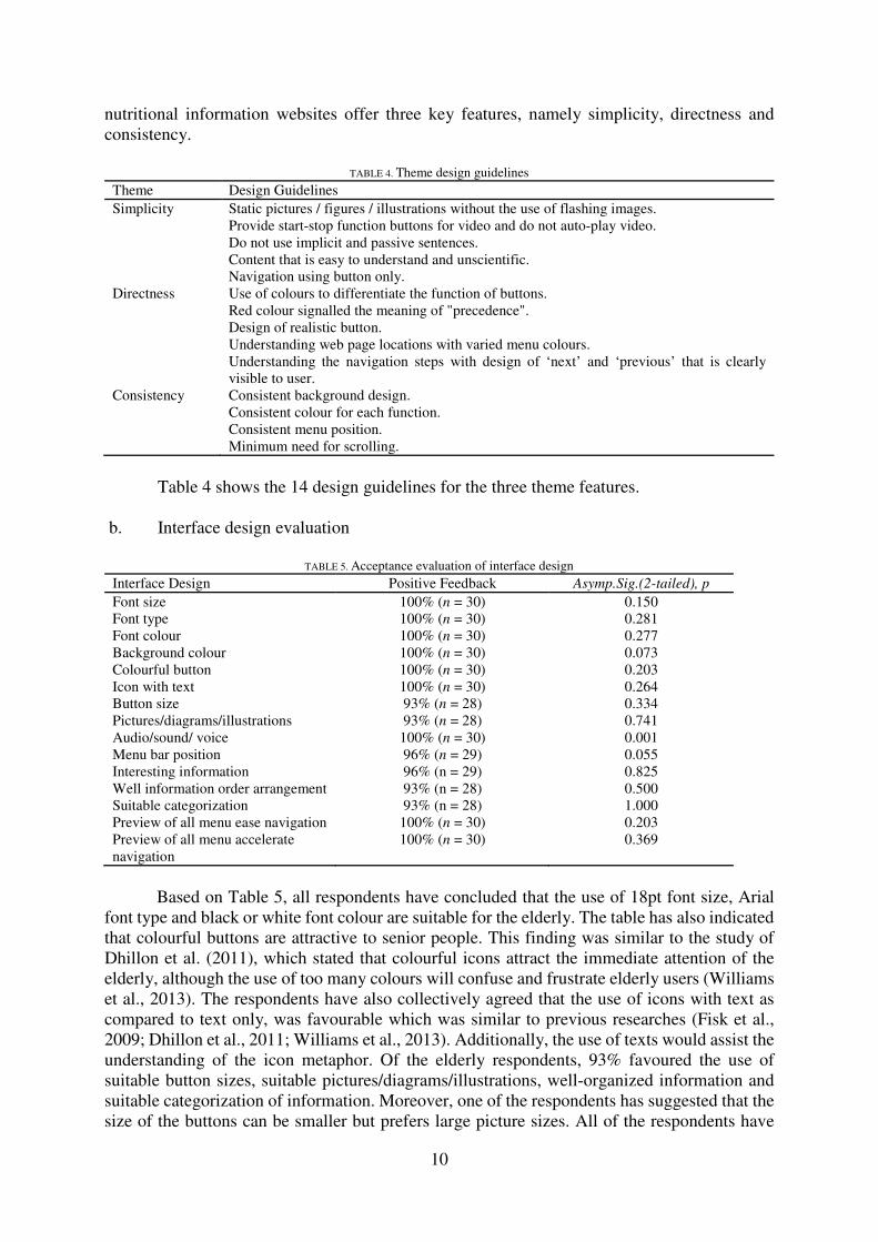
b. Interface design evaluation
TABLE 5. Acceptance evaluation of interface design
Interface Design Positive Feedback Asymp.Sig.(2-tailed), p
Font size 100% (n = 30) 0.150
Font type 100% (n = 30) 0.281
Font colour 100% (n = 30) 0.277
Background colour 100% (n = 30) 0.073
Colourful button 100% (n = 30) 0.203
Icon with text 100% (n = 30) 0.264
Button size 93% (n = 28) 0.334
Pictures/diagrams/illustrations 93% (n = 28) 0.741
Audio/sound/ voice 100% (n = 30) 0.001
Menu bar position 96% (n = 29) 0.055
Interesting information 96% (n = 29) 0.825
Well information order arrangement 93% (n = 28) 0.500
Suitable categorization 93% (n = 28) 1.000
Preview of all menu ease navigation 100% (n = 30) 0.203
Preview of all menu accelerate
navigation
100% (n = 30) 0.369
Based on Table 5, all respondents have concluded that the use of 18pt font size, Arial
font type and black or white font colour are suitable for the elderly. The table has also indicated
that colourful buttons are attractive to senior people. This finding was similar to the study of
Dhillon et al. (2011), which stated that colourful icons attract the immediate attention of the
elderly, although the use of too many colours will confuse and frustrate elderly users (Williams
et al., 2013). The respondents have also collectively agreed that the use of icons with text as
compared to text only, was favourable which was similar to previous researches (Fisk et al.,
2009; Dhillon et al., 2011; Williams et al., 2013). Additionally, the use of texts would assist the
understanding of the icon metaphor. Of the elderly respondents, 93% favoured the use of
suitable button sizes, suitable pictures/diagrams/illustrations, well-organized information and
suitable categorization of information. Moreover, one of the respondents has suggested that the
size of the buttons can be smaller but prefers large picture sizes. All of the respondents have

11
agreed that the audios/sounds/voices applied in the PS prototype were suitable. In terms of
menu bar, 96% of the respondents gave a positive feedback on the placing of the menu bar at
the top of the pages, while one respondent suggested placing the menu bar at the bottom of the
pages to reduce the denseness of information layout. Additionally, most of the respondents
(96%) have agreed that the information in PS prototype was interesting. The same percentage
of respondents gave a positive feedback on information order arrangement and on information
categorization, which was 93% (n=28). On the design of preview of all menu images, all the
respondents have agreed that this design eases and accelerates the navigation process. On the
overall, there were no significant differences between Group A and Group B on the evaluation
of interface design with the exception of the audios/sounds/voices section. However, this
significant difference can be ignored, as the difference is merely based on different positive
feedbacks: “agree” and “strongly agree”. In Group A, 33% of the respondents have agreed and
67% of the respondents have strongly agreed; while in group B, 7% of the respondents have
agreed and 93% of the respondents have strongly agreed.
The average evaluation of 15 interface design statement results by all 30 respondents
(100%) is equal to or more than 4 (Md≥4), which is a positive assessment. Thus, the interface
design of PS prototype is well accepted by all the respondents.
CONCLUSION
This study evaluates the respondents’ perception on the interface design of PS prototype. A
majority of the respondents have given a positive feedback on a few aspects of the perceived
usefulness of the prototype. However, as the respondents were selected from only two locations,
they were not good representatives of the diverse elderly population in Malaysia. Hence, it is
suggested that future studies on the subject be conducted with a sample of respondents that
mostly represent the elderly in Malaysia in order to further refine the findings from this study.
From the study, it is concluded that elderly internet users require a nutritional information
website that is simple, direct and consistent. A conceptual design of the prototype was well
accepted by the elderly users.
ACKNOWLEDGEMENT
This work was supported by the research grant from MOSTI eSCIENCEFUND 06-01-02-
SF1083. REFERENCES
Aigner, W., Miksch, S., Schumann, H., & Tominski, C. 2011. Visualization of time-oriented data. New
York: Springer.
Amir, H.H., Tory, M., & Leung, R. 2013. Supporting awareness through collaborative brushing and
linking of tabular data. IEEE Transactions on Visualization and Computer Graphics, 19(12):
2189–2197.
Braun, V. & Clarke, V. 2006. Using the thematic analysis in psychology. Qualitative Research in
Psychology, 3: 77-101.
Department of Health, The Government of the Hong Kong Special Administrative Region. 2011. Elderly
health service. http://www.info.gov.hk/elderly/chinese/lifestyles.htm [8 September 2015].
Dhillon, J.S., Ramos, C., Wunsche, B.C., & Lutteroth, C. 2011. Designing a web-based telehealth
system for elderly people: an interview study in New Zealand. Proceeding of the 24th International
Symposium on Computer-Based Medical Systems. South West England: IEEE, 1-6.
Fisk, A.D., Rogers, W.A., Charness, N., Czaja, S.J., & Sharit, J. 2009. Designing for Older Adults:
Principles and Creative Human Factors Approaches 2nd ed. Boca Raton: CRC Press.
Food and Nutrition Information Centre, United States Department of Agriculture, National Agricultural
Library. 2004. Nutrition.gov. http://www.nutrition.gov/life-stages/seniors [8 September 2015].

12
Ghasemi, A. & Zahediasl, S. 2012. Normality tests for statistical analysis: a guide for non-statisticians.
International Journal of Endocrinology and Metabolism, 10(2): 486–489.
Grguric, A., Bene, I., Desic, S., Mosmondor, M., Krizanic, J., & Lazarevski, P. 2010. Designing user
interfaces for elderly : a case study in applicability of thin vs. fat clients. Proceeding of the e-
Health Networking Applications and Services (Healthcom). Lyon: IEEE, 90–105.
Hanson, V.L. 2001. Web access for elderly citizens. Proceedings of the 2001 EC/NSF workshop on
Universal accessibility of ubiquitous computing: providing for the elderly. Alcacer do Sal: ACM
Press, 14–18.
Hart, A. 2001. Mann-Whitney test is not just a test of medians: differences in spread can be important.
British Medical Journal, 323(7309): 391–393.
Intan, H. 2005. Develop of the nutrition education booklet for the elderly’s health aging. Degree thesis,
The National University of Malaysia.
International Cartographic Association. 2005. Exploring Geovisualization 1st ed. Oxford: Elsevier.
Jabatan Kebajikan Masyarakat Malaysia. 2013. Portal Rasmi Jabatan Kebajikan Masyarakat.
http://www.jkm.gov.my/content.php?pagename=perkhidmatan_warga_emas&lang=bm [8
September 2015].
Kim, J.L., Park, J.H., Kim, B.J., Kim, M.D., Kim, S.-K., Chi, Y.K., Kim, T.H., Moon, S.W., Park, M.H.,
Bae, J.N., Yoon, J.C., Lee, N.-J., Lee, D.Y., Lee, D.W., Lee, S.B., Lee, J.J, Lee, C.-U., Chang,
S.M., Han, J.W., Jhoo, J.H., Han, C., Cho, M.J., & Kim, K.W. 2012. Interactive influences of
demographics on the Mini-Mental State Examination (MMSE) and the demographics-adjusted
norms for MMSE in elderly Koreans. International Psychogeriatrics Association, 24(4): 642–650.
Kurniawan, S. & Zaphiris, P. 2005. Research-derived web design guidelines for older people.
Proceeding of the 7th International ACM SIGACCESS conference on Computers and accessibility.
Baltimore: ACM Press, 129–135.
Kurniawan, S.H., King, A., Evans, D.G., & Blenkhorn, P.L. 2006. Personalising web page presentation
for older people. Interacting with Computers, 18(3): 457–477.
Manafo, E. & Wong, S. 2012. Exploring older adults’ health information seeking behaviours. Journal
of nutrition education and behaviour, 44(1): 85-89.
Ministry of Health and Welfare Taiwan. 2013. Chang Hua Nursing Home. http://chnh.mohw.gov.tw/ [8
September 2015].
Ministry of Health Malaysia. 2014. Elderly Nutrition Service. Official Website Nutrition Division
Ministry of Health Malaysia. http://nutrition.moh.gov.my/index.php/warga-emas/pemakanan-
warga-emas [8 September 2015].
Ministry of Health Malaysia. 2005. Golden Years Nutrients Need. Official Portal MyHealth Ministry
Health Malaysia. http://www.myhealth.gov.my/index.php/my/pemakanan/warga-
emas/keperluan-pemakanan [8 September 2015].
Nachar, N. 2008. The Mann-Whitney U : A Test for Assessing Whether Two Independent Samples
Come from the Same Distribution. Tutorials in Quantitative Methods for Psychology, 4(1): 13–
20.
Nazlena, M.A., Suzana,S., Kee, Y.L., Azir, R.N., & Shahrul, A.M.N. 2012. Design of an interactive
digital nutritional education package for elderly people. Informatics for health & social care,
37(4): 217–219.
Nazlena, M.A., Smeaton, A. F., Lee, H. & Brereton, P. 2009. Developing, Deploying and Assessing
Usage of a Movie Archive System among Students of Film Studies. In Jacko, J. A. (ed.) Human-
computer Interaction: Interacting inVarious Application Domains, 567-576. Berlin:Springer
Science & Business Media.
Norlinah, M.I., Shamarina, S., Chong, H.-T., Abdul Hamid, R., Rosdinom, A.R., Esther, E., & Hamidon,
B.B. 2009. Validation study of the Mini-Mental State Examination in a Malay-speaking elderly
population in Malaysia. Dementia and geriatric cognitive disorders, 27(3): 247–253.
Public Service Department Post Service Division Malaysia. 2005. Healthy Nutrition Components off
Portal Post Services. http://www.jpapencen.gov.my/komponen_pemakanan.html [8 September
2015].
Saray, A. 2009. Professional PHP Design Patterns 1st ed. Indianapolis: Wiley Publishing.

13
Schultz-Larsen, K., Kreiner, S., & Lomholt, R.K. 2007. Mini-Mental Status Examination: mixed Rasch
model item analysis derived two different cognitive dimensions of the MMSE. Journal of Clinical
Epidemiology, 60(3): 268–279.
Sofianiza, A.M. & Muna, A. 2013. The Use of Technology by Older People. International Journal of
Interactive Digital Media, 1(3): 65–68.
Suzana, S., Noor Aini, Y., Mohd Safii, N.S., Rafidah, G., & Roslina, A. 2009. Atlas Makanan: Saiz
Pertukaran & Porsi 2nd ed. Kuala Lumpur: MDC Publishers.
Weinschenk, S. 2011. 100 Things Every Designer Needs to Know About People. Berkeley:Pearson
Education.
Williams, D., Mohammad Arif, U. A., Sheikh, I.A., & William,C. 2013. Considerations in Designing
Human-Computer Interfaces for Elderly People. Proceeding of thr 13th International Conference
on Quality Software. Najing: IEEE, 372–377.
Winter, J. & Dodou, D. 2012. Five-Point Likert Items : t test versus Mann-Whitney-Wilcoxon. Practical
Assessment, Research & Evaluation, 15(11): 1-15.
Tan Li Yin
Nazlena Mohamad Ali
Institute of Visual Informatics (IVI),
Universiti Kebangsaan Malaysia,
43600 Bangi, Selangor, Malaysia.
[email protected], [email protected]
0172869998
Shahrul Azman Mohd Noah
Faculty of Information Science and Technology,
Universiti Kebangsaan Malaysia,
43600 Bangi, Selangor, Malaysia.
Received: 8 September 2015
Accepted: 15 December 2015