Embed Size (px)
Citation preview
0018-9162/02/$17.00 © 2002 IEEE80 Computer
Interactively ExploringHierarchical Clustering Results
M olecular biologists and geneticistsseek to understand the function ofgenes, including the more than 6,000genes in the yeast genome and theestimated 40,000 genes in the human
genome. Recently developed for genome analysis,DNA microarrays—also known as gene arrays orgene chips—usually consist of glass or nylon sub-strates that measure 1 × 3 inches or smaller. Thesechips contain specific DNA gene samples spottedin an array by a robotic printing device.Researchers spread fluorescently labeled messen-ger RNA (mRNA) from an experimental conditiononto the DNA gene samples in the array. ThismRNA binds (hybridizes) strongly with some DNAgene samples and weakly with others. Finally, alaser scans the array and sensors detect the fluo-rescence levels, indicating the strength with whichthe sample expresses each gene.
Experimental conditions can include types of can-cers, diseased organisms, or normal tissues.Microarray experiments typically have from 100 to20,000 DNA gene samples and from two to 80experimental conditions. These experiments pro-duce data sets containing the profiles that includeexpression levels for each DNA gene sample undereach experimental condition.
Researchers often use mathematical clusteringmethods to discover interesting patterns in theselarge data sets.1-3 However, several limitations hin-der biologists from recognizing important patterns,such as groups of genes with similar profiles, whichmight indicate similar function. The data volume
makes it impossible to display a large microarrayexperiment—on one screen.
Researchers also struggle to understand the impli-cations of a specific clustering result. Because theclusters occupy a high-dimensional space andinvolve so many experimental conditions,researchers find it difficult to view patterns on a 2Dor even a 3D display. Further, data can contain hun-dreds of variously sized clusters, which makes spot-ting the meaningful clusters a challenge, especiallywhen using a static display. Users need an efficientinteractive visualization tool to facilitate patternextraction from microarray data sets.
Hierarchical clustering has been shown to beeffective in microarray data analysis for identifyinggenes with similar profiles and thus possibly withsimilar functions. This approach finds the pair ofgenes with the most similar expression profiles anditeratively builds a hierarchy by pairing genes (orexisting clusters of genes) that are most similar.
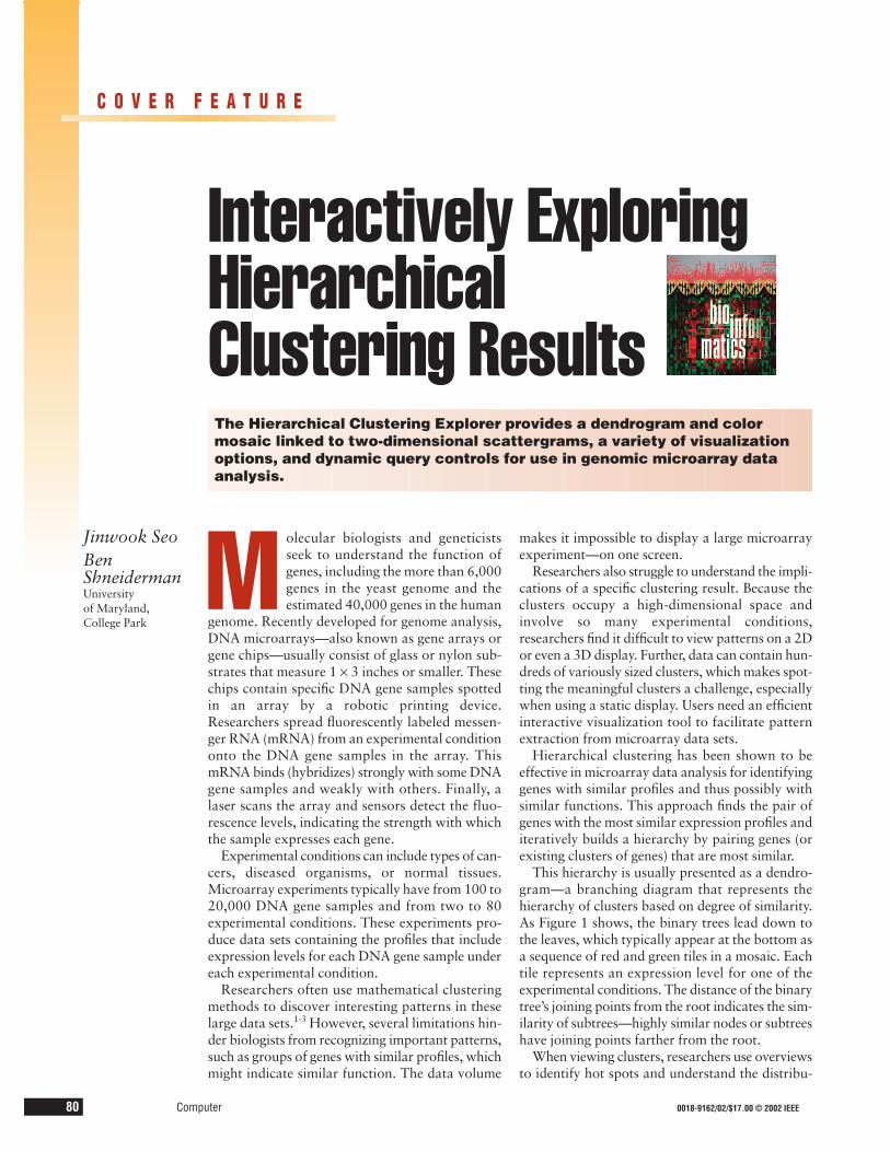
This hierarchy is usually presented as a dendro-gram—a branching diagram that represents thehierarchy of clusters based on degree of similarity.As Figure 1 shows, the binary trees lead down tothe leaves, which typically appear at the bottom asa sequence of red and green tiles in a mosaic. Eachtile represents an expression level for one of theexperimental conditions. The distance of the binarytree’s joining points from the root indicates the sim-ilarity of subtrees—highly similar nodes or subtreeshave joining points farther from the root.
When viewing clusters, researchers use overviewsto identify hot spots and understand the distribu-
The Hierarchical Clustering Explorer provides a dendrogram and colormosaic linked to two-dimensional scattergrams, a variety of visualizationoptions, and dynamic query controls for use in genomic microarray dataanalysis.
Jinwook SeoBen ShneidermanUniversity of Maryland,College Park
C O V E R F E A T U R E
tion of data. Hot spots are distinctive regions ofinterest that indicate high or low expression levels.However, screen resolution limitations hampervisualization of large data sets on commonly useddisplays, which measure only 1,600 pixels across.Even limiting each item to a single pixel means thatfor data sets larger than 1,600 points, the corre-sponding dendrogram and color mosaic do not fitonto a single screen.
HIERARCHICAL CLUSTERING EXPLORERAdding interactive exploration features to hier-
archical-clustering visualization tools is needed forthe exploration of large data sets. To meet this need,we developed the Hierarchical Clustering Explorer(HCE), which integrates four interactive features:
• overview of the entire data set, coupled with adetail view so that high-level patterns and hotspots can be easily found and examined;
• dynamic query controls4,5 that let users elimi-nate uninteresting clusters and show the inter-esting clusters more clearly;
• coordinated displays that forge a bidirectionallink from the overview mosaic to two-dimen-sional scattergrams; and
• cluster comparisons to let researchers see howdifferent algorithms cluster the genes.
Our work meshes with the current trend to takethe substantial progress in data mining algorithmsand give users more than just a printout. With novelinformation visualization techniques,6 users cannow control the processes and interact with theresults. For example, recent decision tree packageslet users manipulate incoming data and the rulesgenerated, then examine the results with color- andsize-coded visualizations. The capacity to interactand explore lets domain experts apply their knowl-edge by quickly testing hypotheses and performingexploratory data analysis. We hope to provide sim-ilar features to users of hierarchical clustering algo-rithms.
OVERVIEW IN A LIMITED SCREEN SPACETo accommodate large data sets, HCE provides
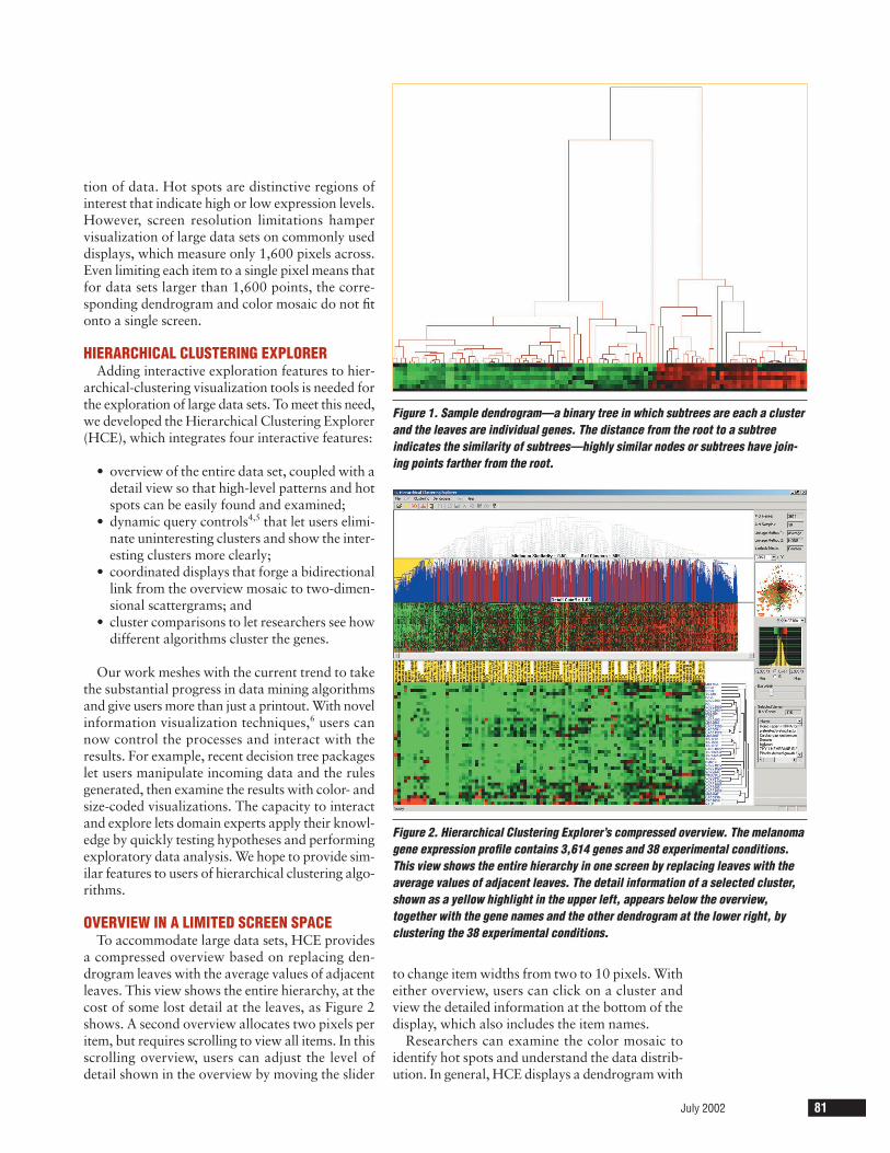
a compressed overview based on replacing den-drogram leaves with the average values of adjacentleaves. This view shows the entire hierarchy, at thecost of some lost detail at the leaves, as Figure 2shows. A second overview allocates two pixels peritem, but requires scrolling to view all items. In thisscrolling overview, users can adjust the level ofdetail shown in the overview by moving the slider
to change item widths from two to 10 pixels. Witheither overview, users can click on a cluster andview the detailed information at the bottom of thedisplay, which also includes the item names.
Researchers can examine the color mosaic toidentify hot spots and understand the data distrib-ution. In general, HCE displays a dendrogram with
July 2002 81
Figure 1. Sample dendrogram—a binary tree in which subtrees are each a clusterand the leaves are individual genes. The distance from the root to a subtree indicates the similarity of subtrees—highly similar nodes or subtrees have join-ing points farther from the root.
Figure 2. Hierarchical Clustering Explorer’s compressed overview. The melanomagene expression profile contains 3,614 genes and 38 experimental conditions.This view shows the entire hierarchy in one screen by replacing leaves with theaverage values of adjacent leaves. The detail information of a selected cluster,shown as a yellow highlight in the upper left, appears below the overview,together with the gene names and the other dendrogram at the lower right, byclustering the 38 experimental conditions.
82 Computer
a color mosaic at the leaves to show the underly-ing graphical pattern. The mosaic colors each tileon the basis of measured fluorescence ratio, whichdenotes the gene’s expression level.7
The gene expression profile data consists of theratio or relative amount of each specific gene in thetwo mRNA or DNA samples—corresponding tothe normal and test conditions. Some data sets,including melanoma and yeast mutants, are morecomplicated. These data show expression levels forseveral mutants or cancer cell lines relative to a con-trol condition. Researchers commonly use the logof ratio values and display the result using a 2D col-ored mosaic.
The HCE control panel, to the right of the den-drogram visualization in Figure 2, shows the datahistogram by expression level. User controls helpviewers see subtle differences in the ranges of inter-est. For skewed data distributions, this feature helpsprevent large areas of all green or red, which wouldindicate all low or high gene expressions, respec-tively. Users can change the color mapping byadjusting the range of the color stripe displayed overthe histogram. Because they can instantly see theresult of a new color mapping on the display, userscan identify the proper mapping for the data set.
DYNAMIC QUERY CONTROLSOnce users find a closely related group of genes,
they can infer that an unknown gene clustered witha known gene may have a similar biological func-tion to the known gene.1 HCE users select a data set,
apply their desired clustering algorithm, then beginthe process of understanding the output. First, theyadjust the color mapping to get a clearer presentationof similarities and differences in expression levels.They can then study the main groupings—the twohigh-level clusters—which may not themselves beinteresting but may combine interesting subclusters.For example, a set of 800 genes may be composed of10 or 20 interesting subgroups, so looking at a sim-ple two-group clustering does not reveal the relevantsubgroups. Currently, static dendrogram users relyon their eyes and fingers to traverse the hierarchyand identify interesting clusters.
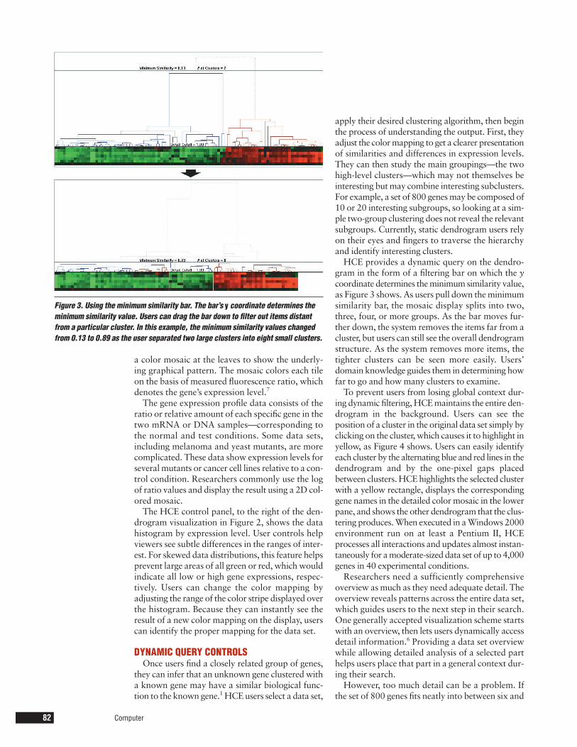
HCE provides a dynamic query on the dendro-gram in the form of a filtering bar on which the ycoordinate determines the minimum similarity value,as Figure 3 shows. As users pull down the minimumsimilarity bar, the mosaic display splits into two,three, four, or more groups. As the bar moves fur-ther down, the system removes the items far from acluster, but users can still see the overall dendrogramstructure. As the system removes more items, thetighter clusters can be seen more easily. Users’domain knowledge guides them in determining howfar to go and how many clusters to examine.
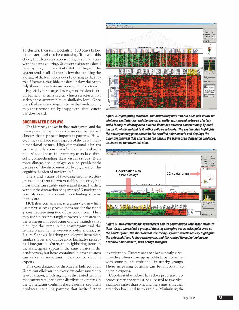
To prevent users from losing global context dur-ing dynamic filtering, HCE maintains the entire den-drogram in the background. Users can see theposition of a cluster in the original data set simply byclicking on the cluster, which causes it to highlight inyellow, as Figure 4 shows. Users can easily identifyeach cluster by the alternating blue and red lines in thedendrogram and by the one-pixel gaps placedbetween clusters. HCE highlights the selected clusterwith a yellow rectangle, displays the correspondinggene names in the detailed color mosaic in the lowerpane, and shows the other dendrogram that the clus-tering produces. When executed in a Windows 2000environment run on at least a Pentium II, HCEprocesses all interactions and updates almost instan-taneously for a moderate-sized data set of up to 4,000genes in 40 experimental conditions.
Researchers need a sufficiently comprehensiveoverview as much as they need adequate detail. Theoverview reveals patterns across the entire data set,which guides users to the next step in their search.One generally accepted visualization scheme startswith an overview, then lets users dynamically accessdetail information.6 Providing a data set overviewwhile allowing detailed analysis of a selected parthelps users place that part in a general context dur-ing their search.
However, too much detail can be a problem. Ifthe set of 800 genes fits neatly into between six and
Figure 3. Using the minimum similarity bar. The bar’s y coordinate determines theminimum similarity value. Users can drag the bar down to filter out items distantfrom a particular cluster. In this example, the minimum similarity values changedfrom 0.13 to 0.89 as the user separated two large clusters into eight small clusters.
16 clusters, then seeing details of 800 genes belowthe cluster level can be confusing. To avoid thiseffect, HCE lets users represent highly similar itemswith the same coloring. Users can reduce the detaillevel by dragging the detail cutoff bar higher. Thesystem renders all subtrees below the bar using theaverage of the leaf node values belonging to the sub-tree. Users can thus hide the detail below the bar tohelp them concentrate on more global structures.
Especially for a large dendrogram, the detail cut-off bar helps visually present cluster structures thatsatisfy the current minimum similarity level. Onceusers find an interesting cluster in the dendrogram,they can restore detail by dragging the detail cutoffbar downward.
COORDINATED DISPLAYSThe hierarchy shown in the dendrogram, and the
linear presentation in the color mosaic, help revealclusters that represent important patterns. How-ever, they can hide some aspects of the data’s high-dimensional nature. High-dimensional displayssuch as parallel coordinates8 and other novel tech-niques9 could be useful, but many users have diffi-culty comprehending these visualizations. Eventhree-dimensional displays can be problematicbecause of the disorientation brought on by thecognitive burden of navigation.6
The x and y axes of two-dimensional scatter-grams limit them to two variables at a time, butmost users can readily understand them. Further,without the distraction of operating 3D navigationcontrols, users can concentrate on finding patternsin the data.
HCE thus contains a scattergram view in whichusers first select any two dimensions for the x andy axes, representing two of the conditions. Thenthey use a rubber rectangle to sweep out an area onthe scattergram, producing orange triangles thathighlight the items in the scattergram and therelated items in the overview color mosaic, asFigure 5 shows. Marking the selected items withsimilar shapes and orange color facilitates percep-tual integration. Often, the neighboring items inthe scattergram appear in the same cluster in thedendrogram, but items contained in other clusterscan serve as important indicators to domainexperts.
This coordination of displays is bidirectional.Users can click on the overview color mosaic toselect a cluster, which highlights the related items inthe scattergram. Seeing the distribution of items inthe scattergram confirms the clustering and oftenproduces intriguing patterns that invite further
investigation. Clusters are not always neatly circu-lar—they often show up as odd-shaped buncheswith some points embedded in nearby groups.These surprising patterns can be important todomain experts.
Coordinated windows have their problems, too.Scarce screen space must be allocated to two visu-alizations rather than one, and users must shift theirattention back and forth rapidly. Minimizing the
July 2002 83
Figure 4. Highlighting a cluster. The alternating blue and red lines just below theminimum similarity bar and the one-pixel white gaps placed between clustersmake it easy to identify each cluster. Users can select a cluster simply by click-ing on it, which highlights it with a yellow rectangle. The system also highlightsthe corresponding gene names in the detailed color mosaic and displays theother dendrogram that clustering the data in the transposed dimension produces,as shown on the lower left side.
Figure 5. Two-dimensional scattergram and its coordination with other visualiza-tions. Users can select a group of items by sweeping out a rectangular area onthe scattergram. The Hierarchical Clustering Explorer simultaneously highlightsthe selected items in the scattergram, and the related items just below theoverview color mosaic, with orange triangles.
84 Computer
distance between visualizations, avoiding overlaps,and making rapid updates all contribute toimproved human performance. After some explo-ration with a given scattergram, users often exploreanother pair of axes. Showing multiple scatter-grams concurrently can help, but doing so exacer-bates the screen-space management problem.
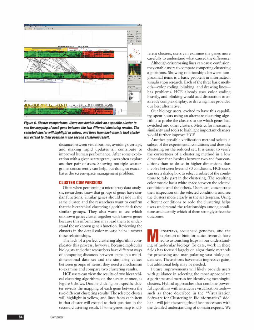
CLUSTER COMPARISONSOften when performing a microarray data analy-
sis, researchers know that groups of genes have sim-ilar functions. Similar genes should reside in thesame cluster, and the researchers want to confirmthat the hierarchical clustering algorithm finds thesesimilar groups. They also want to see whichunknown genes cluster together with known genesbecause this information may lead them to under-stand the unknown gene’s function. Reviewing theclusters in the detail color mosaic helps uncoverthese relationships.
The lack of a perfect clustering algorithm com-plicates this process, however. Because molecularbiologists and other researchers have different waysof computing distances between items in a multi-dimensional data set and the similarity valuesbetween groups of items, they need a mechanismto examine and compare two clustering results.
HCE users can view the results of two hierarchi-cal clustering algorithms on the screen at once, asFigure 6 shows. Double-clicking on a specific clus-ter reveals the mapping of each gene between thetwo different clustering results. The selected clusterwill highlight in yellow, and lines from each itemin that cluster will extend to their position in thesecond clustering result. If some genes map to dif-
ferent clusters, users can examine the genes morecarefully to understand what caused the difference.
Although crisscrossing lines can cause confusion,they enable users to compare competing clusteringalgorithms. Showing relationships between non-proximal items is a basic problem in informationvisualization research. Each of the three basic meth-ods—color coding, blinking, and drawing lines—has problems. HCE already uses color codingheavily, and blinking would add distraction to analready complex display, so drawing lines providedour best alternative.
Our biology users, excited to have this capabil-ity, spent hours using an alternate clustering algo-rithm to probe the clusters to see which genes hadswitched into other clusters. Metrics for measuringsimilarity and tools to highlight important changeswould further improve HCE.
Another possible verification method selects asubset of the experimental conditions and does theclustering on the reduced set. It is easier to verifythe correctness of a clustering method in a lowdimension that involves between two and four con-ditions than to do so in higher dimensions thatinvolve between five and 80 conditions. HCE userscan use a dialog box to select a subset of the condi-tions to take part in the clustering. The resultingcolor mosaic has a white space between the selectedconditions and the others. Users can concentratetheir inspection on the selected conditions and seethe clusters more clearly in the scattergram. Usingdifferent conditions to redo the clustering helpsusers understand the relationships among condi-tions and identify which of them strongly affect theoutcomes.
M icroarrays, sequenced genomes, and theexplosion of bioinformatics research haveled to astonishing leaps in our understand-
ing of molecular biology. To date, work in thesefields has focused largely on algorithmic methodsfor processing and manipulating vast biologicaldata sets. These efforts have made impressive gains,but additional help may be needed.
Future improvements will likely provide userswith guidance in selecting the most appropriatealgorithms and metrics for identifying meaningfulclusters. Hybrid approaches that combine power-ful algorithms with interactive visualization tools—such as those described in the “VisualizationSoftware for Clustering in Bioinformatics” side-bar—will join the strengths of fast processors withthe detailed understanding of domain experts. We
Figure 6. Cluster comparisons. Users can double-click on a specific cluster tosee the mapping of each gene between the two different clustering results. Theselected cluster will highlight in yellow, and lines from each item in that clusterwill extend to their position in the second clustering result.
need further research into bioinformatics visual-ization to develop the tools that will meet theupcoming genomic and proteomic challenges. �
AcknowledgmentsWe thank Eric Baehrecke, Harry Hochheiser, Eser
Kandogan, Yehuda Koren, Bill Ladd, and the anony-mous reviewers for their thoughtful comments.Partial support for this project came from theUniversity of Maryland Institute for AdvancedComputer Studies. Bongshin Lee served as an early
contributor to the software’s development. Addi-tional information about the HCE, more screenimages, a user manual, and the software are avail-able at http://www.cs.umd.edu/hcil/multi-cluster.
References1. M.B. Eisen et al., “Cluster Analysis and Display of
Genome-Wide Expression Patterns,” Proc. Nat’lAcademy of Sciences USA, vol. 95, no. 25, 1998, pp.14,863-14,868; http://www.pnas.org/cgi/content/full/95/25/14863.
July 2002 85
As computing became widespread, sta-tistical analysts quickly developed the hier-archical clustering technique.1 Extensionsincluded alternative ways to compute
• distances between items in a multi-dimensional data set, such asEuclidean, correlation coefficient,and Manhattan distance; and
• the similarity values between groupsof items—or linkage—such as aver-age, complete, and single.
Meanwhile, presentation refinementsfocused on producing effective colorprintouts for publication.
TreeViewSoftware tools for hierarchical cluster-
ing have been developed in many disci-plines and incorporated into a variety ofsoftware products. The widely used Tree-View (http://www.pnas.org/cgi/content/full/95/25/14863), developed especiallyfor genetic research, generates a dendro-gram and color mosaic. Users can get anoverview and detail view by selecting acontiguous region of the mosaic, which ismagnified in a second view. BecauseTreeView’s main purpose is to produce agood image in many formats for publi-cations, the current version does notallow direct manipulation of the visuali-zation.
GeneMathsDeveloped by Applied Maths (http://
www.applied-maths.com/ge/ge.htm),GeneMaths displays dendrograms forgene samples and experimental condi-
tions on a single screen. Users can selecta cluster by clicking a subtree’s root.GeneMaths offers one of the fastest clus-tering algorithms and a visually appeal-ing design. It shows only a few genes at atime, however, which makes it difficult toget an overview of the entire data set.
Spotfire DecisionSiteThe Spotfire Array Explorer, now
included in the DecisionSite product(http://www.spotfire.com/), does the hier-archical clustering, and users can view theentire green-black-red color mosaic orselected components. Users select a sub-tree in the dendrogram by clicking on theroot of the subtree, or they can select agroup of subtrees by selecting a similar-ity threshold. Users can coordinate scat-tergrams and bar charts with thedendrogram display to help understandthe clustering results.
Expression ProfilerThe European Bioinformatics Insti-
tute’s Expression Profiler tool set doesclustering, analysis, and visualization ofgene expression and other genomic data(http://ep.ebi.ac.uk/). Among these tools,Epclust lets users do a hierarchical clus-tering with many different distance mea-sures and linkage methods. When usersselect a dendrogram node, it showsdetailed information about that node ina new window. Users can load their owndata and try many kinds of hierarchicalclustering algorithms. The institute’s Website also shows the great diversity in out-comes for different correlation-relateddistance metrics.
Clustering methodsIn recent years, many clustering meth-
ods have been developed and imple-mented in software products. Popularmethods include k-means clustering,which identifies starting points for a fixednumber of clusters and then grows theregion around the clusters. Recent workseeks to get beyond the limitation ofspherical clusters2 by using graph repre-sentations and developing clusters of arbi-trary shapes, including interlockinggeometries.3 All clustering methods facevalidity challenges.4 Does the clusteringreflect known classifications? How manyclusters are best? What should be doneabout outliers or intruders to clusters?What metrics could confirm or reject aperceived cluster?
References1. S.C. Johnson, “Hierarchical Clustering
Schemes,” Psychometrika 32, 1967, pp.241-254.
2. G. Karypis, E-H. Han, and V. Kumar,“Chameleon: A Hierarchical ClusteringAlgorithm Using Dynamic Modeling,”Computer, Aug. 1999, pp. 68-75.
3. D. Harel and Y. Koren, “Clustering Spa-tial Data Using Random Walks,” Proc. 7thInt’l Conf. Knowledge Discovery andData Mining (KDD-2001), ACM Press,New York, 2001, pp. 281-286.
4. G.S. Davidson, B.N. Wylie, and K.W. Boy-ack, “Cluster Stability and the Use ofNoise in Interpretation of Clustering,”Proc. IEEE Symp. Information Visualiza-tion (InfoVis 01), IEEE CS Press, LosAlamitos, Calif., 2001, pp. 23 -30.
Visualization Software for Clustering in Bioinformatics
2. M. Bitter et al., “Molecular Classification of Cuta-neous Malignant Melanoma by Gene ExpressionProfiling,” Nature vol. 406, 2000, pp. 536-540;http://www.nhgri.nih.gov/DIR/Microarray/selected_publications.html.
3. I. Hedenfalk et al., “Gene-Expression Profiles inHereditary Breast Cancer,” The New Journal of Med-icine, vol. 344, no. 8, 2001, pp. 539-548; http://www.nhgri.nih.gov/DIR/Microarray/selected_publications.html.
4. B. Shneiderman, “Dynamic Queries for Visual Infor-mation Seeking,” IEEE Software, Nov./Dec. 1994,pp. 70-77.
5. C. Williamson and B. Shneiderman, “The DynamicHomeFinder: Evaluating Dynamic Queries in a Real-Estate Information Exploration System,” Proc. ACMConf. on Research and Development in InformationRetrieval (SIGIR 92), ACM Press, New York, 1992,pp. 338-346.
6. S.K. Card, J.D. Mackinlay, and B. Shneiderman,Readings in Information Visualization, MorganKaufmann, San Francisco, 1999.
7. P.O. Brown and D. Botstein, “Exploring the NewWorld of the Genome with DNA Microarrays,”Nature Genetics Supplement, vol. 21, 1999, pp. 33-37; http://www.nature.com/ng/.
8. A. Inselberg and T. Avidan, “Classification and Visu-alization for High-Dimensional Data,” Proc. 6th Int’l
Conf. Knowledge Discovery and Data Mining (KDD00), ACM Press, New York, 2000, pp. 370-374.
9. E. Kandogan, “Visualizing Multi-Dimensional Clus-ters, Trends, and Outliers Using Star Coordinates,”Proc. 7th Int’l Conf. Knowledge Discovery and DataMining (KDD 01), ACM Press, New York, 2001, pp.107-116.
Jinwook Seo is a graduate research assistant in the Department of Computer Science & Human-Computer Interaction Laboratory, Institute forAdvanced Computer Studies, University of Mary-land, College Park. His research interests includeinformation visualization and human-computerinteraction. Seo received an MS in computer sci-ence from Seoul National University. Contact himat [email protected].
Ben Shneiderman is a professor in the Departmentof Computer Science & Human-Computer Inter-action Laboratory, Institute for Advanced Com-puter Studies, University of Maryland, CollegePark. His research interests include human-computer interaction and information visualiza-tion. Shneiderman received a PhD in computer sci-ence from the State University of New York, StonyBrook. Contact him at [email protected].
computer.org/csidc/
The IEEE Computer Society thanks thesesponsors for their contributions to the Computer Society International Design Competition.
The IEEE Computer Society thanks these sponsors for their contributions to the Computer Society International Design Competition.
computer.org/csidc/
F I N A N C I A L S P O N S O R S T E C H N O L O G Y S P O N S O R S
ABBAMDEMC2
Hewlett-PackardIntel
Lucent TechnologiesMicrosoftMotorola
Science Applications International Corp.Sun Microsystems
EricssonIntel
ToshibaMicrosoft