Embed Size (px)
Citation preview
Interactive Visualization of Weather and Ship Data
Patrik Lundblad, Oskar Eurenius, Tobias HeldringNational Center for Visual Analytics (NCVA)
Linkoping University, [email protected], [email protected], [email protected]
AbstractThis paper focus on the development of a tool for Ship
and Weather Information Monitoring (SWIM) visualizingweather data combined with data from ship voyages. Theproject was done in close collaboration with the SwedishMeteorological and Hydrological Institute (SMHI) whoalso evaluated the result. The goal was to implement atool which will help shipping companies to monitor theirfleet and the weather development along planned routesand provide support for decisions regarding route choiceand to evade hazard. A qualitative usability study was per-formed to gather insight about usability issues and to aidfuture development. Overall the result of the study was pos-itive and the users felt that the tool would aid them in thedaily work.
Keywords— Voyage Analysis, Weather Visualization, Geo-visual Analytics, Visual Data Exploration and Analysis, Us-ability Evaluation.
1 IntroductionVisualizing multiple data sets from different sources
represents a major challenge for the future. Using data fu-sion [1], [2] to visualize integrated spatial and temporaldata it is possible to gain insight and retrieve informationthat would otherwise have to be obtained using much moretime consuming methods.
One subject area of particular interest is the shipping in-dustry where the need of being able to draw accurate con-clusions and make well planned decisions regarding routesand weather factors are important. There are a large num-ber of variables affecting the success of every sea voyageperformed by vessels such as cargo ships. Important as-pects being considered are speed, safety and costs becauseof their direct impact on the voyage performance. Weatherfactors are the main concern when considering these as-pects and therefore shipping companies consult meteorol-ogists about weather information and route optimization.
SWIM was created to aid shipping companies mon-itoring vessels according to forecasted weather develop-ment along planned routes (figure 1). The tool providessupport for decisions regarding route choice with respect
to future weather development and warnings of extremeweather factors. With weather forecasts and voyage in-formation provided by the European Centre for Medium-Range Weather Forecasts (ECMWF) [3] and SMHI [4]shipping companies can monitor fleets using highly inter-active visual representations visualizing weather parame-ters and detailed voyage information. Using a geographicmap visualization together with a parallel coordinates plot(PCP) brings great possibilities when exploring the data.
SWIM was designed with the following tasks in mind:
• Detailed monitoring of voyages based on planned andreported waypoints.
• Easy exploration of weather forecast according toboth geographic positions and along routes.
• Using a PCP together with a geographic map vi-sualization to find interesting voyages according toweather parameters.
• Using highly interactive linked visual representationsto facilitate exploration of data.
In this paper a section about related work will be pre-sented in section 2 followed by a conceptual descriptionof SWIM in section 3. In section 4 a usability evaluationis presented and discussed and the paper is concluded withconclusions and discussions of ideas for future work.
2 Related WorkVisualization of spatio-temporal data has been the sub-
ject of several recent research papers, see [5] for anoverview. GeoVista Studio [6] and CommonGIS [7] aregeneral systems which support exploratory data analysiswith decision-making and Andrienko and Andrienko hasillustrated other motivating approaches in earlier papers[8], [9]. According to Jern and Franzen most of these sys-tems lack support for analyzing simultaneously multipleattributes data and spatio-temporal behavior [10] and asa response a generic ”GeoAnalytics” visualization (GAV)[11] toolkit is introduced. Jern et al. emphasize the ad-vantages and need of multiple linked views (MLVs) fordynamically exploring time-varying, geographically refer-enced and multivariate attribute data. Parallel coordinates
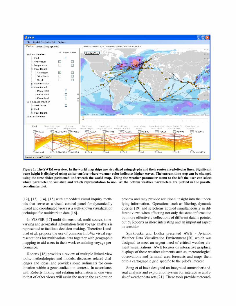
Figure 1: The SWIM overview. In the world map ships are visualized using glyphs and their routes are plotted as lines. Significantwave height is displayed using an iso-surface where warmer color indicates higher waves. The current time step can be changedusing the time slider positioned underneath the world map. Using the weather parameter menu to the left the user can selectwhich parameter to visualize and which representation to use. At the bottom weather parameters are plotted in the parallelcoordinates plot.
[12], [13], [14], [15] with embedded visual inquiry meth-ods that serve as a visual control panel for dynamicallylinked and coordinated views is a well-known visualizationtechnique for multivariate data [16].
In VISPER [17] multi-dimensional, multi source, time-varying and geospatial information from voyage analysis isrepresented to facilitate decision-making. Therefore Lund-blad et al. propose the use of common InfoViz visual rep-resentations for multivariate data together with geographicmapping to aid users in their work examining voyage per-formance.
Roberts [18] provides a review of multiple linked-viewtools, methodologies and models, discusses related chal-lenges and ideas, and provides some rudiments for coor-dination within a geovisualization context. In accordancewith Roberts linking and relating information in one viewto that of other views will assist the user in the exploration
process and may provide additional insight into the under-lying information. Operations such as filtering, dynamicqueries [19] and selections applied simultaneously in dif-ferent views when affecting not only the same informationbut more effectively collections of different data is pointedout by Roberts as more interesting and an important aspectto consider.
Spirkovska and Lodha presented AWE - AviationWeather Data Visualization Environment [20] which wasdesigned to meet an urgent need of critical weather ele-ment visualizations. AWE focuses on interactive graphicaldisplays of these weather elements such as, meteorologicalobservations and terminal area forecasts and maps themonto a cartographic grid specific to the pilot’s interest.
Song et al have designed an integrated atmospheric vi-sual analysis and exploration system for interactive analy-sis of weather data sets [21]. These tools provide meteorol-
ogists with new abilities to analyze their data and answerquestions on regions of interests, ranging from physics-based atmospheric rendering to illustrative rendering con-taining particles and glyphs.
In accordance with Dorneich et al. challenges lie ineffectively integrating voyage and weather information inthe same tool to facilitate decision-making [22].
3 SWIMSWIM is developed using the GeoAnalytics Visualiza-
tion (GAV) Framework [23] and is a tool shipping com-panies can use to monitor voyages and receive up to dateweather forecasts corresponding to their routes.
SWIM will on startup automatically find the lat-est weather forecast delivered by the ECMWF. SWIMpresents three different modes. In the first mode a selectionof static weather parameters are presented in a weather pa-rameter menu sorted according to priority level, e.g. basicweather, advanced weather and extra weather. The secondmode presents a searchable list menu with all active voy-ages retrieved from the SMHI database. In the third modefocus lies on one or more selected voyages with detailedinformation presented.
In SWIM the users are given the possibility to studyweather data cohering with voyage information in dif-ferent views. A view represents a visual representationdisplaying selectable data with possibilities of interactionand filtering.
3.1 Gridded Binary Format (GRIB)The input weather data used by SWIM is in GRIB
(Gridded Binary) [24] format which is a mathematicallyconcise data format commonly used in meteorology tostore weather data. It is developed and standardized by theWorld Meteorological Organization (WMO). The GRIBformat is used world-wide by meteorological centers fornumerical weather prediction output and serves as an effi-cient solution of transferring large volumes of digital grid-ded weather data.
In our work focus lies on GRIB files originated fromECMWF.
3.2 Voyage DataData retrieved for each of the approximately one hun-
dred voyages includes ship information such as operator,ship name and ship type. Voyage specific information in-cludes time of departure and estimated time of arrival, portof departure and port of arrival as well as a list of way-point positions. Lastly, reports delivered on a daily basisare retrieved which includes current positions, speed andperformance as well as weather observations at reportedpositions.
Reported positions are combined with planned way-points to form a list used to visualize voyages routes inthe world map view. This list of waypoints contains anaverage of 30 positions for an entire route. The position ofships at different time steps are estimated via interpolationwhere the time of last reported position, the time atselected time step and the estimated time of arrival areused to estimate the distance traveled between the lastreported position and the position of the arrival port.
3.3 World Map
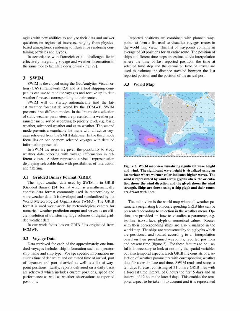
Figure 2: World map view visualizing significant wave heightand wind. The significant wave height is visualized using aniso-surface where warmer color indicates higher waves. Thewind is represented by wind arrow glyphs where the orienta-tion shows the wind direction and the glyph shows the windstrength. Ships are shown using a ship glyph and their routesare drawn with lines.
The main view is the world map where all weather pa-rameters originating from corresponding GRIB files can bepresented according to selection in the weather menu. Op-tions are provided on how to visualize a parameter, e.g.iso-line, iso-surface, glyph or numerical values. Routeswith their corresponding ships are also visualized in theworld map. The ships are represented by ship glyphs whichare positioned and rotated according to an interpolationbased on their pre-planned waypoints, reported positionsand present time (figure 2). For these features to be use-ful it is necessary to look at not only the spatial variablesbut also temporal aspects. Each GRIB file consists of a se-lection of weather parameters with corresponding weatherdata for a certain date and time. SWIM reads and stores aten days forecast consisting of 31 binary GRIB files witha forecast time interval of 6 hours the first 5 days and aninterval of 12 hours the later 5 days. This enables the tem-poral aspect to be taken into account and it is represented
by a forecast time slider. This slider can be positioned atany of the 31 forecasts which effectively enables the user toview weather changes and ship movement over time (figure3). Routes with corresponding ships that at a specific timeindex has reached its final destination is marked as inactiveand grayed out. The world map view with selected weatherdata visualized and chosen voyages plotted will work as aneffective support to monitor several vessels simultaneouslyover a period of time.
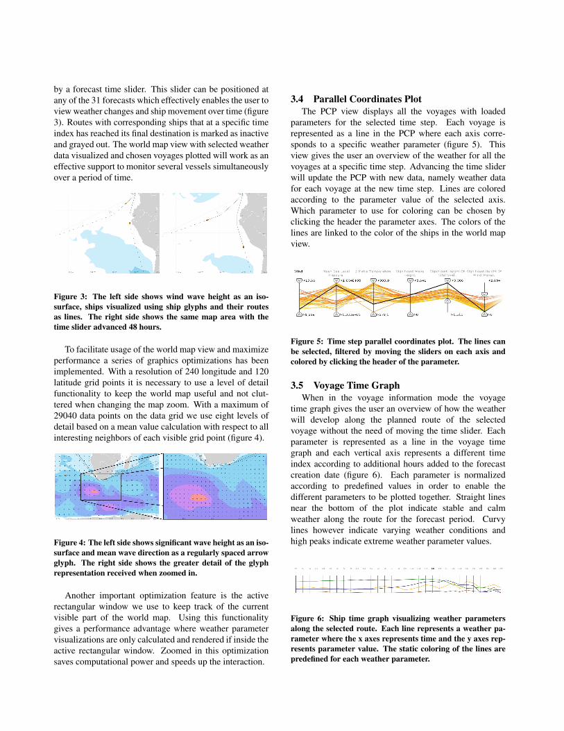
Figure 3: The left side shows wind wave height as an iso-surface, ships visualized using ship glyphs and their routesas lines. The right side shows the same map area with thetime slider advanced 48 hours.
To facilitate usage of the world map view and maximizeperformance a series of graphics optimizations has beenimplemented. With a resolution of 240 longitude and 120latitude grid points it is necessary to use a level of detailfunctionality to keep the world map useful and not clut-tered when changing the map zoom. With a maximum of29040 data points on the data grid we use eight levels ofdetail based on a mean value calculation with respect to allinteresting neighbors of each visible grid point (figure 4).
Figure 4: The left side shows significant wave height as an iso-surface and mean wave direction as a regularly spaced arrowglyph. The right side shows the greater detail of the glyphrepresentation received when zoomed in.
Another important optimization feature is the activerectangular window we use to keep track of the currentvisible part of the world map. Using this functionalitygives a performance advantage where weather parametervisualizations are only calculated and rendered if inside theactive rectangular window. Zoomed in this optimizationsaves computational power and speeds up the interaction.
3.4 Parallel Coordinates PlotThe PCP view displays all the voyages with loaded
parameters for the selected time step. Each voyage isrepresented as a line in the PCP where each axis corre-sponds to a specific weather parameter (figure 5). Thisview gives the user an overview of the weather for all thevoyages at a specific time step. Advancing the time sliderwill update the PCP with new data, namely weather datafor each voyage at the new time step. Lines are coloredaccording to the parameter value of the selected axis.Which parameter to use for coloring can be chosen byclicking the header the parameter axes. The colors of thelines are linked to the color of the ships in the world mapview.
Figure 5: Time step parallel coordinates plot. The lines canbe selected, filtered by moving the sliders on each axis andcolored by clicking the header of the parameter.
3.5 Voyage Time GraphWhen in the voyage information mode the voyage
time graph gives the user an overview of how the weatherwill develop along the planned route of the selectedvoyage without the need of moving the time slider. Eachparameter is represented as a line in the voyage timegraph and each vertical axis represents a different timeindex according to additional hours added to the forecastcreation date (figure 6). Each parameter is normalizedaccording to predefined values in order to enable thedifferent parameters to be plotted together. Straight linesnear the bottom of the plot indicate stable and calmweather along the route for the forecast period. Curvylines however indicate varying weather conditions andhigh peaks indicate extreme weather parameter values.
Figure 6: Ship time graph visualizing weather parametersalong the selected route. Each line represents a weather pa-rameter where the x axes represents time and the y axes rep-resents parameter value. The static coloring of the lines arepredefined for each weather parameter.
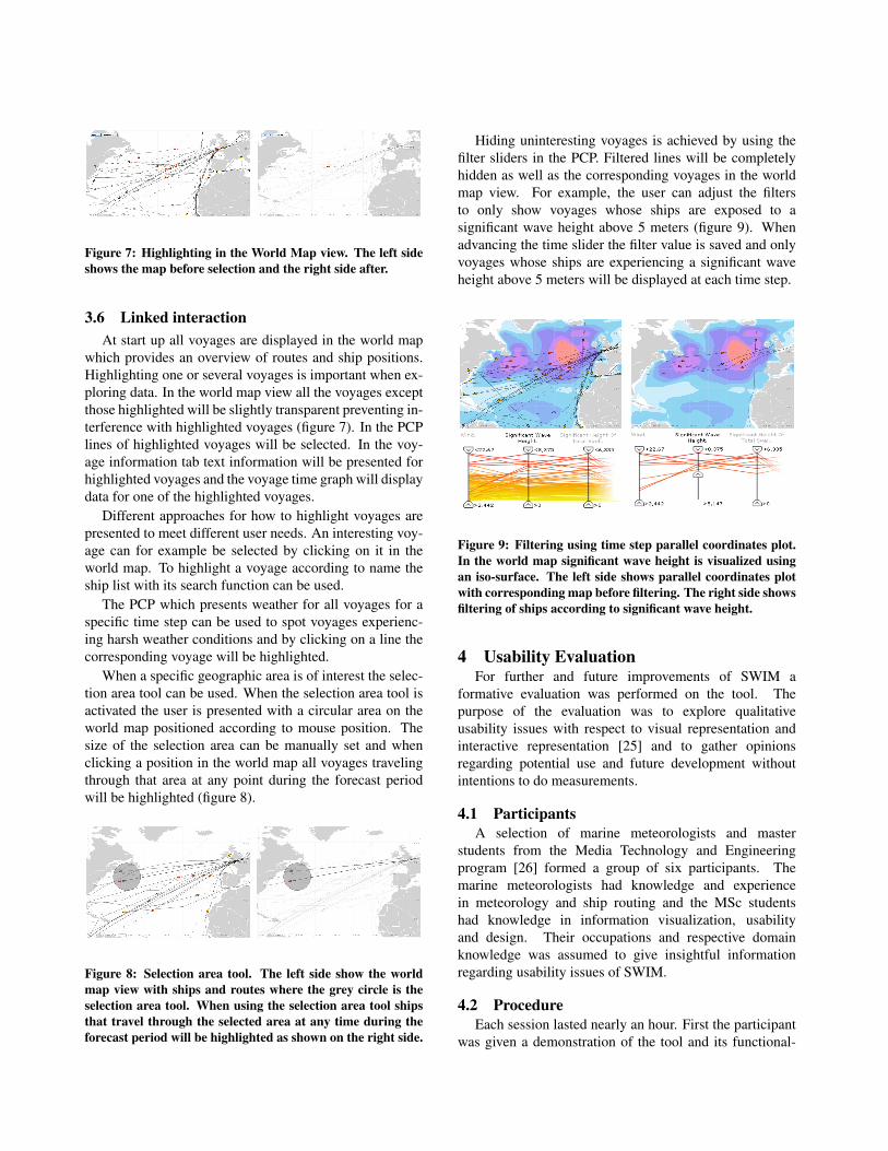
Figure 7: Highlighting in the World Map view. The left sideshows the map before selection and the right side after.
3.6 Linked interactionAt start up all voyages are displayed in the world map
which provides an overview of routes and ship positions.Highlighting one or several voyages is important when ex-ploring data. In the world map view all the voyages exceptthose highlighted will be slightly transparent preventing in-terference with highlighted voyages (figure 7). In the PCPlines of highlighted voyages will be selected. In the voy-age information tab text information will be presented forhighlighted voyages and the voyage time graph will displaydata for one of the highlighted voyages.
Different approaches for how to highlight voyages arepresented to meet different user needs. An interesting voy-age can for example be selected by clicking on it in theworld map. To highlight a voyage according to name theship list with its search function can be used.
The PCP which presents weather for all voyages for aspecific time step can be used to spot voyages experienc-ing harsh weather conditions and by clicking on a line thecorresponding voyage will be highlighted.
When a specific geographic area is of interest the selec-tion area tool can be used. When the selection area tool isactivated the user is presented with a circular area on theworld map positioned according to mouse position. Thesize of the selection area can be manually set and whenclicking a position in the world map all voyages travelingthrough that area at any point during the forecast periodwill be highlighted (figure 8).
Figure 8: Selection area tool. The left side show the worldmap view with ships and routes where the grey circle is theselection area tool. When using the selection area tool shipsthat travel through the selected area at any time during theforecast period will be highlighted as shown on the right side.
Hiding uninteresting voyages is achieved by using thefilter sliders in the PCP. Filtered lines will be completelyhidden as well as the corresponding voyages in the worldmap view. For example, the user can adjust the filtersto only show voyages whose ships are exposed to asignificant wave height above 5 meters (figure 9). Whenadvancing the time slider the filter value is saved and onlyvoyages whose ships are experiencing a significant waveheight above 5 meters will be displayed at each time step.
Figure 9: Filtering using time step parallel coordinates plot.In the world map significant wave height is visualized usingan iso-surface. The left side shows parallel coordinates plotwith corresponding map before filtering. The right side showsfiltering of ships according to significant wave height.
4 Usability EvaluationFor further and future improvements of SWIM a
formative evaluation was performed on the tool. Thepurpose of the evaluation was to explore qualitativeusability issues with respect to visual representation andinteractive representation [25] and to gather opinionsregarding potential use and future development withoutintentions to do measurements.
4.1 ParticipantsA selection of marine meteorologists and master
students from the Media Technology and Engineeringprogram [26] formed a group of six participants. Themarine meteorologists had knowledge and experiencein meteorology and ship routing and the MSc studentshad knowledge in information visualization, usabilityand design. Their occupations and respective domainknowledge was assumed to give insightful informationregarding usability issues of SWIM.
4.2 ProcedureEach session lasted nearly an hour. First the participant
was given a demonstration of the tool and its functional-
ities. This was done to minimize the risk of misinterpre-tation as well as first time user misses since the intendedusers are a small number of people using the tool regularly.For the same reason the participants were given answersand explanations to all their questions about SWIM and itsfunctionality during the test.
After the demonstration the participant was given thecontrol of the tool and was encouraged to explore some ofthe functionality earlier demonstrated. A number of tasksthat was prepared beforehand were presented to the user inrandom order. The intention was not to evaluate the par-ticipant’s success of the specific tasks but simply to guidethe user and encourage exploration. Throughout the evalu-ation a guide sat beside the participant actively discussingthoughts and opinions regarding the tool and a third persondocumented the important parts of the discussion.
The last part of the evaluation consisted of a generaldiscussion based around the criteria stated by Freitas et al.[25].
Visual Representations were discussed according to thefollowing selection of criteria: Data density, limitations,visual/spatial orientation, data dimensions, relevant infor-mation, reference context, occlusion, display of detail andlogical order.
Interactive Representations were discussed accordingto the following selection of criteria: filtering, selection ofobjects, search and querying, control of level of detail andviewpoint manipulation.
4.3 ResultsThe marine meteorologists had limited previous experi-
ence working with visualization tools in comparison withthe MSc students which were skilled using these tools. Onthe other hand the marine meteorologists had significantexperience with weather data and route optimization toolsand these differences were observed when studying the re-sults of the usability evaluation.
All participants completed the prepared tasks with-out major complications and the overall opinions describeSWIM as a tool with many possibilities. Direct data ma-nipulation and filtering based on dynamic queries imme-diately changing the displayed view and additional linkedviews was greatly appreciated. All participants and espe-cially the marine meteorologists described the possibilityto filter voyages in the world map view according to cri-teria in the PCP as useful. During the evaluation the par-ticipants also pointed out both known and previously un-known issues and discussions about certain criteria regard-ing visual and interactive representation brought to lightstrengths and weaknesses of the tool.
With regard to the visual representations, participantsexperienced the built in level-of-detail functionality in the
map view as smooth and natural. However, commentswhere made about not being able to connect weather pa-rameters to a specific route instead of regularly spacedgrid-points. All found the spatial organization of visualrepresentations as well thought-out and easy to interpret.The ability to choose different visualization methods forcertain weather parameters in the world map and there-fore being able to combine different representations waspointed out as well designed and important. The ma-rine meteorologists requested functionality where the userwould be automatically warned about voyages whose shipsare affected by extreme weather situations rather than hav-ing to gain that insight during manual exploration. All par-ticipants agreed that the information displayed in the mapview was relevant but additional information was requestedin specific situations such as more detailed voyage infor-mation in the ship tool tip.
With regard to the interactive representation a differencewas noticed between the marine meteorologists and theMSc students in discovering interaction possibilities. TheMSc students which are skilled using visualization tech-niques based on brushing, picking and filtering found iteasier to discover and use these features. The marine me-teorologists requested additional descriptions of the visualrepresentations. However, even though the chosen targetgroup is a small number of people using the tool regu-larly we found it possible for people without previous ex-perience of similar techniques to embrace the fundamentalideas with a short introduction.
All participants pointed out the difficulty of comparingweather values for different time steps. One participantsuggested maximum and minimum axis values of the TimeStep Coordinates Plot spanning over the entire forecast pe-riod as opposed to being time step specific. Participantsalso described the variety of selection methods to highlighta unique voyage as well implemented and the different ap-proaches as good complements to each other. The Selec-tion Area tool was especially appreciated by the marinemeteorologists who saw advantages with the tool enablingexploration of geographical areas.
The voyage time graph was described by all as a pow-erful technique to quickly gain insight of weather develop-ment along a specific route. Comments were however ex-pressed regarding carefully choosing normalization valuesfor each parameter to avoid misinterpretation. Participantsalso requested an explanation of the colors of weather linesin the voyage time graph. The time slider was describedby all participants as natural and appeasing to use. A moredistinct representation of elapsed hours of the weather fore-cast was pointed out as a valuable addition. When selectinga single voyage requests about a go-to-ship functionalitywas expressed, automatically focusing and positioning the
view over the ship corresponding to the selected voyage inthe world map.
Suggestions of improvements and additions to the GUIwere given. One of those, a feature pointed out missingby the majority of the participants, was the ability to undosteps in the interaction.
ConclusionsThis paper presents SWIM which is a tool to explore
multi-source, time-varying and geospatial data. SWIM al-lows weather forecast data and voyage information to beanalyzed using an interactive map view linked to a PCPand time graph. Using SWIM analysts at shipping com-panies can monitor ship voyages and weather developmentalong planned routes. Voyages whose ships are being ex-posed to harsh weather can easily be brought to focus anddetailed route specific weather and voyage information canbe retrieved.
A qualitative usability evaluation was performed witha selection of six participants. Discussing and exploringthe tool with each participant resulted in useful feedbackregarding functionality and design issues. All participantscompleted the prepared tasks without major complicationsand the overall opinions describes SWIM as a tool withmany advantages and interesting functionalities comparedto similar tools in the same domain.
In summary, especially appreciated features were:
• The world map view with interaction possibilitiessuch as highlighting, smooth zooming, brushing andweather parameter visualization options.
• The PCP with the possibility to filter and distinguishvoyages according to weather criteria, presenting re-sults immediately in the world map view.
• The voyage time graph which gives an overview ofweather development along planned routes of selectedvoyages.
• The ability to view and interact with the geospatialdata in linked views with several highlighting possi-bilities.
Using a PCP proved to be a powerful tool to filter andexplore data in the world map view. Discovering voyageswhich fulfills certain weather criteria is an import featurewhich is made possible using the filtering and picking tech-niques of the PCP. The synergy between geovisualizataion(map) and information visualization (PCP) was demon-strated and evaluated as useful.
The both known and previously unknown issues re-garding visual and interactive representation that broughtto light strengths and weaknesses during the evaluationwill constitute the foundation for further development.
5 Future WorkFor future development of SWIM more automation
could be built into the tool. The tool could present a listwith voyages meeting certain criteria for harsh weatherconditions. Using this feature investigation of risky voy-ages could start immediately without the need of first filter-ing according to criteria. To easily compare weather val-ues of different time steps for all voyages a second timegraph could be implemented were weather developmentover time could be shown displaying one weather param-eter and all or a selection of voyages. This would facili-tate discovering of voyages experiencing the most extremeweather parameter value during the entire forecast period.
The ability to use presets of user customizations, filter-ing criteria and standard parameters to read would increasethe dynamics and speed when using the tool.
In the future the amount of active voyages will increaseand within a few years SWIM should be able to handle upto 3000 voyages and would then benefit from using trackanalysis methods [28] [29].
Shipping companies regularly evaluate the performanceof their ships by evaluating reports along the routes,weather factors and other variables of interest to deter-mine if the voyage was performed as planned [17]. Tofacilitate this work SWIM could be extended to supportpost voyage analysis. Using the time slider to view pasttime steps and presenting reported data and waypoint spe-cific weather SWIM could be a useful tool for this purpose.
AcknowledgmentsThis applied research case study was carried out by
National Center for Visual Analytics (NCVA) [27], ITN,Linkoping University, in close collaboration with SMHIwhich supplied data and domain expertise. The research isin part funded by the ”Visualization Program” coordinatedby the Swedish Knowledge Foundation.
A special thanks to SMHI Global Product ManagerLennart Cederberg and VITA Professor Mikael Jern.
References[1] L. A. Treinish, ”Visual data fusion for applications
of high-resolution numerical weather prediction,” in2000 IEEE Visualization Conference, 2000, pp. 477-480+594.
[2] M. Mandiak, P. Shah, Y. Kim and T. Kesavadas, ”De-velopment of an integrated GUI framework for post-disaster data fusion visualization,” in 2005 7th In-ternational Conference on Information Fusion, FU-SION, 2005, pp. 1131-1137.
[3] European Centre for Medium-Range Weather Fore-casts (ECMWF) url: http://www.ecmwf.int/.
[4] Swedish Meteorological and Hydrological Institute(SMHI) url: http://www.smhi.se.
[5] W. Muller and H. Schumann, ”Visualization methodsfor time-dependent data - an overview,” in Proceed-ings of the 2003 Winter Simulation Conference: Driv-ing Innovation, 2003, pp. 737-745.
[6] GeoVista Studio url:http://www.geovistastudio.psu.edu.
[7] CommonGIS url: http://www.commongis.de.
[8] G. Andrienko and N. Andrienko, ”Visual explorationof the spatial distribution of temporal behaviors,” in9th International Conference on Information Visual-ization, iV05, 2005, pp. 799-806.
[9] N. Andrienko and G. Andrienko, ”Interactive visualtools to explore spatio-temporal variation,” Proceed-ings of the Working Conference on Advanced VisualInterfaces AVI 2004, pp. 417-420, 2004.
[10] M. Jern and J. Franzen, ””GeoAnalytics” - explor-ing spatio-temporal and multivariate data,” in Infor-mation Visualization 2006, IV06, 2006, pp. 25-31.
[11] M. Jern and J. Franzen, ”Integrating InfoVis and geovis components,” in 11th International ConferenceInformation Visualization, IV 2007, 2007, pp. 511-518.
[12] G. Grinstein, M. Trutschl and U. Cvek, ”High-dimensional visualizations,” Proceedings of the 7SIGKDD Workshop on Visual Data Mining (KDD-2001)Th, pp. 1-14, 2001.
[13] J. Blaas, C. P. Botha and F. H. Post, ”Extensionsof parallel coordinates for interactive exploration oflarge multi-timepoint data sets,” IEEE Trans. Visual.Comput. Graphics, vol. 14, pp. 1436-1443, 2008.
[14] A. Inselberg, ”The plane with parallel coordinates,”The Visual Computer, vol. 1, no. 4, pp. 69-91, 1985.
[15] E. J. Wegman, ”Hyperdimensional data analysis us-ing parallel coordinates,” Journal of the AmericanStatistical Association, vol. 85, no. 411, pp. 664-675,1990.
[16] G. Andrienko, N. Andrienko, ”Construction ParallelCoordinates Plot for Problem Solving,” Smart Graph-ics ’01 (Pergamon), 2001.
[17] P. Lundblad, M. Jern and C. Forsell, ”Voyage anal-ysis applied to geovisual analytics,” in 12th Inter-national Conference Information Visualization, IV08,2008, pp. 381-388.
[18] J. C. Roberts, ”Exploratory visualization with mul-tiple linked views,” Exploring Geovisualization, pp.159-180, 2004.
[19] B. Shneiderman, ”Dynamic queries for visual infor-mation seeking,” IEEE Software, vol. 11, pp. 70-77,1994.
[20] L. Spirkovska and S. K. Lodha, ”AWE: Aviationweather data visualization environment,” ComputGraphics (Pergamon), vol. 26, pp. 169-191, 2002.
[21] Y. Song, J. Ye, N. Svakhine, S. Lasher-Trapp, M.Baldwin and D. S. Ebert, ”An atmospheric visualanalysis and exploration system,” IEEE Trans. Visual.Comput. Graphics, vol. 12, pp. 1156-1164, 2006.
[22] M. C. Dorneich, O. Olofinboba, S. Pratt, I. Wil-son and C. Herbster, ”An experimental evaluation ofweather avoidance using route optimization as a deci-sion aid,” in 2002 IEEE International Conference onSystems, Man and Cybernetics, 2002, pp. 608-612.
[23] GAV Framework url: http://vita.itn.liu.se/GAV.
[24] National Center for Environmental Prediction url:http://www.nco.ncep.noaa.gov/pmb/docs/on388/.
[25] C. M. D. S. Freitas, P. R. G. Luzzardi, R. A. Cava, M.A. Winckler, M. Pimenta and L. P. Nedel, ”On Eval-uating Usability of Information Visualization Tech-niques,” AVI’02: Proceedings of Advanced Visual In-terfaces, 2002.
[26] Media Technology and Engineering,Linkoping University, Campus Norrkoping url:http://www.medieteknik.nu.
[27] National Center for Visual Analytics NCVA url:http://ncva.itn.liu.se.
[28] G. Andrienko, N. Andrienko, S. Wrobel ”Visual An-alytics Tools for Analysis of Movement Data,” ACMSIGKDD Explorations, 2007, v.9 (2), pp.38-46.
[29] S. Rinzivillo, D. Pedreschi, M. Nanni, F. Giannotti,N. Andrienko, G. Andrienko, ”Visually-driven anal-ysis of movement data by progressive clustering,” In-formation Visualization, 2008, v.7 (3/4), pp. 225-239.