Embed Size (px)
Citation preview
8/17/2019 Infogr8 Trend Report Spring 2015
http://slidepdf.com/reader/full/infogr8-trend-report-spring-2015 1/33
Volume 1 o 4 – Spring 2015
Spotlight: Entertain
8/17/2019 Infogr8 Trend Report Spring 2015
http://slidepdf.com/reader/full/infogr8-trend-report-spring-2015 2/33

8/17/2019 Infogr8 Trend Report Spring 2015
http://slidepdf.com/reader/full/infogr8-trend-report-spring-2015 3/33
Awareness Purchase
E n t e
r t a i n
I n s p i r e
C o n v i
n c eE d
u c a t e
E m o t i o n a l
R a t i o n a l
Bitesize
Maps/way-finding
Dashboard
Quiz
Real time assets
Wall mural/ex. stand
Presentation
Data art
Visual story
Interfaces
ECRM
Static Interactive Video
Data analysis
Reports &White Papers
Installation
Educationalworkshop
Creativeworkshop
Tech spec.
Sales col.
Survey
Score cards
Print magazine
Data drivenblog/microsite
Data bites
Advertising/media
E x p l o r e
E x h i b
i t
E x plain
Forms &utilities
Featurepages
Tools
Visualisation
Explaineranimation
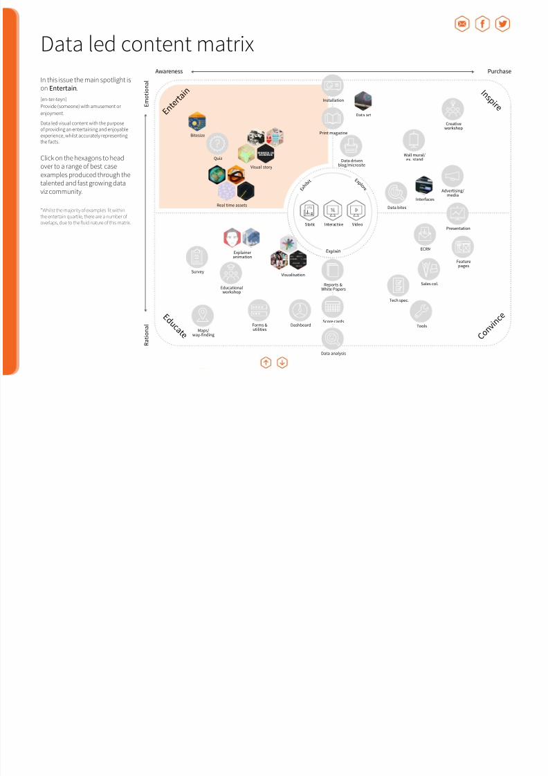
We start with this matrix wecompiled having been inspired
by Dave Chaffeys Smartinsightscontent matrix. Although notperscriptive by any means, itsdesigned to aid organisationsserious about using data ledcontent to plot out opportunitiesand evaluate the general spreado activity.
Note: A more fluid interactive version is onits way showing the general trail of contenttypes.
Frequency:
Frequent
Regular
Considered
Data led content matrix
8/17/2019 Infogr8 Trend Report Spring 2015
http://slidepdf.com/reader/full/infogr8-trend-report-spring-2015 4/33
In this issue the main spotlight ison Entertain.
[en-ter-teyn]
Provide (someone) with amusement or
enjoyment.
Data led visual content with the purposeo providing an entertaining and enjoyableexperience, whilst accurately representingthe acts.
Click on the hexagons to headover to a range o best caseexamples produced through thetalented and ast growing data
viz community.
*Whilst the majority of examples fit withinthe entertain quartile, there are a number ofoverlaps, due to the fluid nature of this matrix.
Awareness Purchase
E n t e
r t a i n
I n s p i r e
C o n v i
n c eE d
u c a t e
E m o t i o n a l
R a t i o n a l
Bitesize
Maps/way-finding
Dashboard
Quiz
Real time assets
Wall mural/ex. stand
Presentation
Data art
Visual story
Interfaces
ECRM
Static Interactive Video
Data analysis
Reports &White Papers
Installation
Educationalworkshop
Creativeworkshop
Tech spec.
Sales col.
Survey
Score cards
Print magazine
Data drivenblog/microsite
Data bites
Advertising/media
E x p l o r e
E x h i b
i t
E x plain
Forms &utilities
Featurepages
Tools
Visualisation
Explaineranimation
Data led content matrix
8/17/2019 Infogr8 Trend Report Spring 2015
http://slidepdf.com/reader/full/infogr8-trend-report-spring-2015 5/33
Editor’s Note
Events
CampaignWatch
CommunityTrends
DataVisualisation
DataJournalism
Interview
– Question 1How has data visualisation evolved since you’ve started workingin this area, and how has this affected your practice over time?
– Question 2What predictions do you have, and what trends should we lookout or concerning design and data visualisation in 2015?
Community TrendsWhat’s hot this year
CommunityTrends

8/17/2019 Infogr8 Trend Report Spring 2015
http://slidepdf.com/reader/full/infogr8-trend-report-spring-2015 6/33
Editor’s Note
Events
CampaignWatch
CommunityTrends
DataVisualisation
DataJournalism
Interview
Q1 I’ve ound that due to the glut o digital posters (ie not proper inormationgraphics) looding the internet, inormation graphics seem less impactul
than they did a ew years ago when I started working in this ield. As a designer, I’veound the standard ‘column inographic’ quite restrictive as a space to innovate andextend mysel creatively as a designer, so I’ve explored working with data both in amore illustrative way (using data as a design material) as well as have explored wayso communicating data through physical installations and tactile objects. Finally,due to the restrictive nature o static inographics I tend to be more interested in
interactive data visualisation projects these days.
Q2 Inormation graphics and data visualisations have ofen been siloedoff rom the rest o communication design. However, it seems that they
are slowly being brought back into communication design as just one way ocommunicating inormation, and I think this is great! Now that data visualisationis normal or designers, they are able to think about data communication in thesame open-ended, creative way as they would any other design problem. I’m alsohoping we see more explorations into ‘inormation experience’ that extend off o
the screen into the physical world.
Q1 I irst came across data visualisation when trying to make ‘traditional’business inormation charts more user riendly and interesting. The
data was all about operational perormance o a leading insurer, so how couldwe turn a standard set o Key Perormance Indicators in to something that themanagement team could just look at to ully understand what needed to bechanged? Enter data visualisation tools that have made ‘mass production’o effective visualisation possible. I’m a history student with little computingbackground, yet the most modern tools have allowed me to specialise in a ield
without having huge amounts o ‘coding’ experience.
Q2 More democratisation o data. As tools become easier to use, easier to join disparate sets o data and more people understanding how data can
help them, you will get a rise in the use o data or all aspects o lie rom itbitsto banking. Also, I hope to see more people becoming ‘analysts’ so they can usedata to analyse what they are interested in and this will develop the visualisation
ield even urther with new ideas and perspectives.
Community Trends
Steanie Posavec Carl AlchinSteanie Posavec works as a designer with a ocus on data-related design,with work ranging rom data visualization and inormation design tocommissioned data art or a variety o clients. This work has been exhibited
internationally at major galleries including at the Museum o Modern Art (NewYork), Centro Cultural Banco Do Brasil (Rio de Janeiro), the Victoria & AlbertMuseum, and Somerset House (London).
http://www.steanieposavec.co.uk
Now that data visualisation is normal or designers,they are able to think about data communication inthe same open-ended, creative way as they wouldany other design problem.
CommunityTrends
The most modern tools have allowed me to specialise in a ield without having huge amountso ‘coding’ experience.
Carl Alchin is a Tableau Consultant or The Inormation Lab introducingthe product, teaching and solving challenges or their clients. His blogdatajedininja.blogspot.co.uk ocuses on data visualisation techniques usually
in relation to basketball analysis.http://datajedi.ninja
8/17/2019 Infogr8 Trend Report Spring 2015
http://slidepdf.com/reader/full/infogr8-trend-report-spring-2015 7/33
Editor’s Note
Events
CampaignWatch
CommunityTrends
DataVisualisation
DataJournalism
Interview
Community Trends
Alberto Cairo
The main trend I believe is that this type o work is becoming more and morepopular, and I see that in my own classes at the University o Miami. The studentsthat I had in 2012 were mostly students o journalism, but nowadays my classes areilled with scientists, business types, people rom public administration, etc. All othem wanting to learn how to display data correctly and how to use visualisationor effective communication.
So the popularisation o visualisation is certainly a reality that we are dealing withnowadays. More and more people are becoming interested in data visualisation
both or exploring data or their own purposes such as research, but also howto use visualisation to communicate either with their peers or with the generalpublic, which is another worthy goal. And I believe that it’s wonderul that this ishappening because there is so much to be done, so much to be taught, so muchcollaboration with people rom so many different backgrounds. I believe that it’s awonderul time to be in visualisation.
At the same time another trend that we have experienced in the past 5 or 6 yearsis the rise o ree tools, some o which are open source that are increasing easy touse or visualisation work. Things like JavaScript libraries, Highcharts and TableauPublic and many others are wonderul and very sophisticated. When I started doinginographics back in the late 1990s, tools were generally difficult to use and veryexpensive, and it took a lot o time to learn how to use them. Today we have manytools that allow us to create effective visualisations very rapidly.
I believe as more people are creating visualisations nowadays, this is leading toa challenging uture as we see pieces that don’t respect certain rules o visualpresentation o inormation. I know that many visualisation designers out there areagainst speaking about rules, but I believe that they are wrong. I believe there are rulesin visualisation design. It is true that these rules are very lexible and generic, but thereare certain rules o visualisation design in the same way that there are rules in graphicdesign. They are very lexible but they still exist and we should keep teaching them.
Today many amous visualisation designers are all about creativity, and I amcompletely onboard with that. I love creative visualisations and the work o MoritzSteaner, Giougia Lupi rom Accurat, and Periscopic in Portland, but I also believethat kind o work can only be done well when people who try to create that type owork have understood the basic rules o visualisation design.
For example, Moritz Steaner has been working or many years, and he understandsintuitively the rules o visualisation and he is able to bend or even to break thoserules when it is appropriate. The danger nowadays is that we are selling this idea o
complete creative reedom to newcomers. Beore you break the rules you need tounderstand what the rules mean and how to apply them really well.
Creativity is certainly a value that we should pursue, because without creativity wewould never have developed new graphic orms, new orms o expression, newways o communicating data, etc. But that can only be done afer people haveembraced traditional visualisation design, learning rom Edward Tufe, StephenFew and others who have been writing about “rules” o visualisation design.
Cognitive psychology has shown that we do know that the brain processesvisual inormation, and this can somehow help us decide how to create bettervisualisations. Again, these rules can be extremely lexible and extremely generic butthey are still there and they need to be studied and learned.
It is a desire o mine that there will be more recognition to this traditionalapproach to visualisation rom amous people who practice visualisation. Again, Ibelieve they do wonderul work, but in some cases the way in which they expressthemselves can be misleading or those w ho are beginning there careers, leadingthem to believe that rules don’t exist or that rules don’t need to be learned and thatit’s all about sel expression and creating cool stuff. However it’s not that. It’s aboutcommunicating effectively and clearly with the public. That should be the end goalo visualisation, to help people conduct better lives by providing them with goodinormation, presented in a clear and engaging manner.
Alberto Cairo teaches visualization and inographics at the University o Miami.He’s also director o the visualization program at UM’s Center or ComputationalScience. He’s the author o “The Functional Art: An Introduction to Inormation
Graphics and Visualization” and will publish “The Truthul Art: Data, Charts, andMaps or Communication” in March 2016.
Twitter: @albertocairo
There are certain rules o visualisation design in the same way that there are rules in graphic design.
They are very lexible but they still exist and we should keep teaching them.
CommunityTrends
Listen to Alberto’s ull audio response here

8/17/2019 Infogr8 Trend Report Spring 2015
http://slidepdf.com/reader/full/infogr8-trend-report-spring-2015 8/33
8/17/2019 Infogr8 Trend Report Spring 2015
http://slidepdf.com/reader/full/infogr8-trend-report-spring-2015 9/33
Editor’s Note
Events
CampaignWatch
CommunityTrends
DataVisualisation
DataJournalism
Interview
Q1 My irst concerns, dating back to 1995, were concentrated on designo original lexicographic systems allowing at that time to graphically
transpose/translate/transcribe diverse alphabets, different words, terms andconcepts as well as some o their meanings (in reerence, or instance, toearlier proprietary expert-systems which represented all lexical componentsinto graphical items). Later, I worked on several GUI projects dealing withrepresentation-visualisation o speciic documentary inormation (in connectionwith some coherent corpus o documents); one o them entitled “Crystal hy-map” adapts a 3D ‘hypermedia’ structure – as we called it in those days – tosupport a large network o links. It relies on a connectionist system capable ohandling numerous data units where inormation is organized in directories andindexed by ‘geosemantic’ analysis. In 2007, I received my PhD degree in Designrom the University o Paris I Pantheon-Sorbonne. The ocus o my research wasto examine careully and in depth (on both theoretical and practical levels) thevarious aesthetic implications o the conceptual schemes and ormal patterns thatunderlie the ‘non-conventional’ data visualisation techniques (rather than thosealready known and used).
In some ways the direction o my practice-based research has evolved unceasinglysince 1996; it ollowed the numerous changes that occurred in this ield. Everythinghas changed in just 15 years time. The huge piles o data processed today havenothing in common with what we experienced in the past. In that bygone age,we were looking or new graphical depictions o mid-size databases (reerring tospeciic pools o data). Now, we endeavour to create original visual languages andvocabularies making the massive data more visible and comprehensible or thepublic — I am talking here about highly heterogeneous data (ad hoc) that are alsowidely distributed, and exceedingly complex; Thus one o the main challenges is togive big data a meaningul visual dimension, to shape such datasets so that it couldbe read/perceived/understood by anyone (towards new ways to provide accessto and acilitating understanding o large data sets). Fortunately, the design anddevelopment tools (as well as the visualisation techniques) have improved; theyhave become very powerul and straightorward to handle.
Another point concerns the perceptual-cognitive gain o data visualisation. Manywere skeptical, and rankly doubted that data visualisation could deliver valuableassistance to users dealing with inormation (despite the conclusive results oresearch conducted by Stuart K. Card, Jock Mackinlay, Ben Shneiderman, JohnStasko and others). Today, everyone, or nearly everyone, is sure o that. Whatmatters nowadays is not the “why to”, but mostly the “how to” (in order to addressthe increasing mass o data now available, we have to identiy new creative paths– it is certain that technological advances alone will not completely resolve theproblem: the data abounds).
Q2 From my point o view, one o the big challenges or data designers willbe to seek/ind creative tracks which enable people to design their own
data presentations, to give them user-riendly toolkits to manage and visualisepublic data as well as their own personal datasets (quantiied sel movement).What counts today is not to deine visual languages that it speciic visualisationrequests (semiosis) but rather to develop metalanguages (physis) that permit tocombine/mix the visual attributes in accordance with the qualities o data whichis processed, and also in line with the different needs/practices and situationso use. As the world changes (different states), the data collected is updatedaccordingly; Individuals, too, change continuously (different activities/tasks/needs, but also different moods, different states o being and so on). That’s
the reason why the inographics and visualisations portraying the world (or,alternatively, the individual personalities o the people) through data have tobe constantly reconsidered and reocused. It is up to data designers to think,and imagine the ways in which we could build, rom the data at our disposal,our own images, our own stories. This implies the sharing o tools, o course (asI mentioned earlier), but more broadly the sharing o culture, experience andknow how. I’m sure that the New Year that is beginning will be ull o this kind oprojects/initiatives that are, I believe, I hope, I wish, emerging.
Community Trends
David BihanicDesigner and ounder o the FXDESIGNSTUDIO digital design agency, and also Associate Proessor at the University o Valenciennes and Hainaut-Cambresis(UVHC, FRANCE), David Bihanic is o the rising generation o design proessionals
or whom originality reers speciically to their (learning and proessional)transversal path. He is presently Head o the Master’s degree in Digital Design othe UHVC and Vice-Director o the laboratory CALHISTE (EA 4343).
http://www.davidbihanic.com
One o the main challenges is to give big dataa meaningul visual dimension, to shape such
datasets so that it could be read/perceived/ understood by anyone.
CommunityTrends

8/17/2019 Infogr8 Trend Report Spring 2015
http://slidepdf.com/reader/full/infogr8-trend-report-spring-2015 10/33
Editor’s Note
Events
CampaignWatch
CommunityTrends
DataVisualisation
DataJournalism
Interview
Q1 I think the main observations would be the steady and growing penetrationo visualisation as a discipline into the mainstream consciousness.
I discovered the ield in 2007 w hen it was very much a ringe activity, largelydominated in terms o ‘entry point into the ield’ by the likes o Edward Tufe andStephen Few. I started working in this area in a part time capacity in 2 010, thenmore permanently in 2011. Around this time you could really sense a greaterand broader appreciation amongst the possible client base o what visualisationwas, why it was important and where help existed. Nowadays people are moreimmediately aware o data visualisation and inographic. It is increasingly parto their job duties, and it seems to be seen as a un prospect - something manypeople are willing to embrace.
Q2 The rapid growth o the ield in this last 5 years has led to increased useo different techniques or portraying data: methods like slope graphs,
sankey diagrams, tree maps, scatter plots, even connected scatter plots arebecoming so common. The world o newspapers and journalism in particular is onthe ront line here. Graphics editors are displaying increasing conidence to try outnew - and correct - approaches to their data portrayals. Linked to this however, Ithink there will be i ncreasing ocus towards the reader (user, audience, consumer,how ever we wish to label them). Visualisation literacy is hugely on my radar dueto my involvement in a research project on this subject but even beyond that I
eel there is greater appreciation o the gap that exists between the wonderuladvancements made by creators o visualisations and the capability/conidence othe readers to make sense o these very different - non entry-level - visual devices.I eel we need to preserve the conidence o creators to try different approachesor audiences but need to equip these audiences with even more assistance thanwe are doing to help them get the most out what they’re consuming.
Community Trends
Andy Kirk Andy Kirk is a data visualisation specialist, reelance design consultant,trainer, blog editor, researcher & author. He is also a visiting lecturer atMaryland Institute College o Art.
http://www.visualisingdata.com
I eel there is greater appreciation o the gap thatexists between the wonderul advancements madeby creators o visualisations and the capability/ conidence o the readers to make sense o thesevery different - non entry-level - visual devices.
CommunityTrends

8/17/2019 Infogr8 Trend Report Spring 2015
http://slidepdf.com/reader/full/infogr8-trend-report-spring-2015 11/33
Editor’s Note
Events
CampaignWatch
CommunityTrends
DataVisualisation
DataJournalism
Interview
Campaign Watch
A World o Belonging
UP Data Snapshots
Datagrams
#SpeakBeautiul
Outdo You
Model S Auto Pilot
Let it ly
Lef Behind
CampaignWatch
8/17/2019 Infogr8 Trend Report Spring 2015
http://slidepdf.com/reader/full/infogr8-trend-report-spring-2015 12/33
Editor’s Note
Events
CampaignWatch
CommunityTrends
DataVisualisation
DataJournalism
Interview
hate *
ugly
unattractive
hideous
Campaign Watch
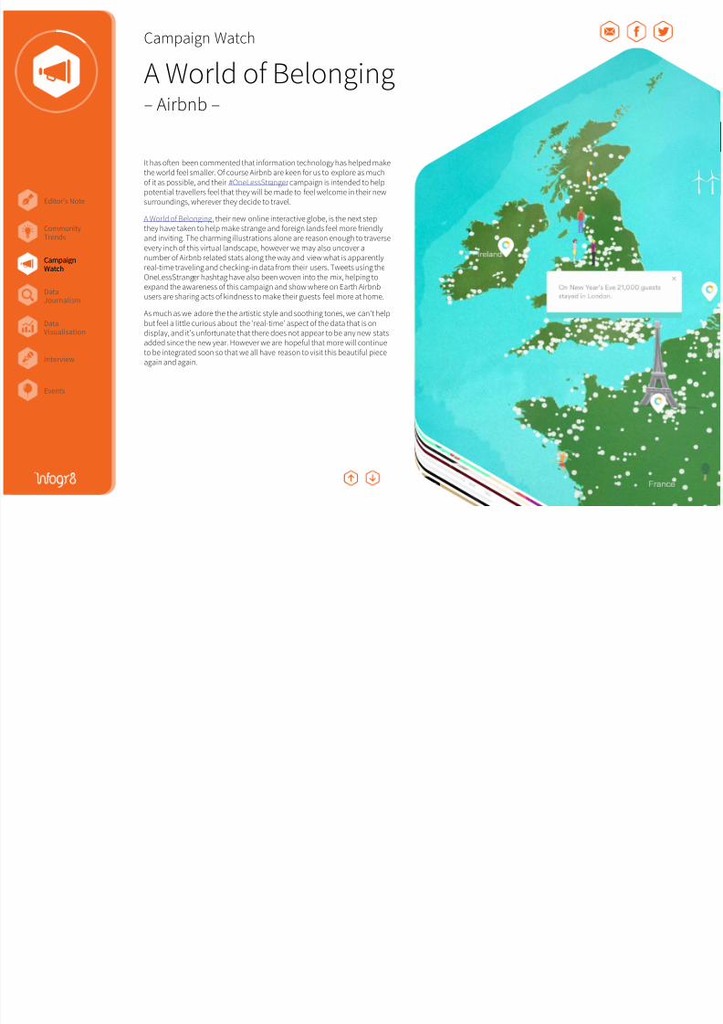
A World o Belonging– Airbnb –
It has ofen been commented that inormation technology has helped makethe world eel smaller. O course Airbnb are keen or us to explore as mucho it as possible, and their #OneLessStranger campaign is intended to helppotential travellers eel that they will be made to eel welcome in their newsurroundings, wherever they decide to travel.
A World o Belonging, their new online interactive globe, is the next stepthey have taken to help make strange and oreign lands eel more riendlyand inviting. The charming illustrations alone are reason enough to traverseevery inch o this virtual landscape, however we may also uncover anumber o Airbnb related stats along the way and view what is apparentlyreal-time traveling and checking-in data rom their users. Tweets using theOneLessStranger hashtag have also been woven into the mix, helping toexpand the awareness o this campaign and show where on Earth Airbnbusers are sharing acts o kindness to make their guests eel more at home.
As much as we adore the the artistic style and soothing tones, we can’t helpbut eel a little curious about the ‘real-time’ aspect o the data that is ondisplay, and it’s unortunate that there does not appear to be any new statsadded since the new year. However we are hopeul that more will continueto be integrated soon so that we all have reason to visit this beautiul pieceagain and again.
CampaignWatch

8/17/2019 Infogr8 Trend Report Spring 2015
http://slidepdf.com/reader/full/infogr8-trend-report-spring-2015 13/33
Editor’s Note
Events
CampaignWatch
CommunityTrends
DataVisualisation
DataJournalism
Interview
hate *
ugly
unattractive
hideous
Campaign Watch
Datagrams– IBM –
We all love to watch a good game o Tennis, but in this ast-paced internetage who really has the time? Luckily IBM together with Ogilvy & Mather and Buck were at hand to serve up some colourul bite-sized videos viaInstagram. This was to help promote their presence and summarise thematches played at the US Open, and subsequently Roland Garros andWimbledon in 2014. Each Datagram visualised key stats rom the games oncourt, and could be published within a minute o the set ending. The databites certainly appear to have stroke a chord with tennis ans, generatingmore than 30,000 likes and close to one million impressions on an account
that didn’t exist beore the start o the tournament.We applaud the creative thinking, and a new approach to real-time marketing,however the speed at which the inormation is delivered is sometimes alittle overwhelming, requiring us to watch several cycles to ully grasp whatis being shown. It’s difficult to pick aults at this campaign especially withthe time constraints o the platorm, however we would be interested tosee what more could be done i they had just a ew more seconds availableto play with.
We haven’t seen anything quite like this beore, or repeated in the monthssince, but hopeully we will see similar examples in the near uture. Maybethey turn their attention to the game o cricket next, which could helpmake the sport even remotely tolerable to ollow. Sorry @BeeyBotham!
CampaignWatch
8/17/2019 Infogr8 Trend Report Spring 2015
http://slidepdf.com/reader/full/infogr8-trend-report-spring-2015 14/33
Editor’s Note
Events
CampaignWatch
CommunityTrends
DataVisualisation
DataJournalism
Interview
Campaign Watch
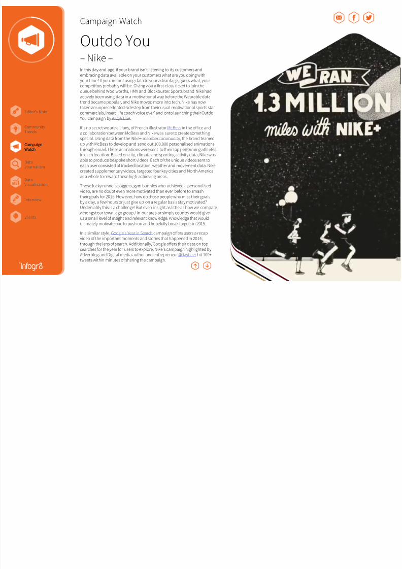
Outdo You– Nike –In this day and age, i your brand isn’t listening to its customers andembracing data available on your customers what are you doing withyour time? I you are not using data to your advantage, guess what, yourcompetitors probably will be. Giving y ou a irst-class ticket to join thequeue behind Woolworths, HMV and Blockbuster. Sports brand Nike hadactively been using data in a motivational way beore the Wearable datatrend became popular, and Nike moved more into tech. Nike has nowtaken an unprecedented sidestep rom their usual motivational sports starcommercials, insert ‘lie coach voice over’ and onto launching their OutdoYou campaign by AKQA USA.
It’s no secret we are all ans, o French illustrator McBess in the office anda collaboration between McBess and Nike was sure to create somethingspecial. Using data rom the Nike+ member community, the brand teamedup with McBess to develop and send out 100,000 personalised animationsthrough email. These animations were sent to their top perorming athletesin each location. Based on city, climate and sporting activity data, Nike wasable to produce bespoke short videos. Each o the unique videos sent toeach user consisted o tracked location, weather and movement data. Nikecreated supplementary videos, targeted our key cities and North Americaas a whole to reward these high achieving areas.
Those lucky runners, joggers, gym bunnies who achieved a personalisedvideo, are no doubt even more motivated than ever beore to smashtheir goals or 2015. However, how do those people who miss their goalsby a day, a ew hours or just give up on a regular basis stay motivated?Undeniably this is a challenge! But even insight as little as how we compareamongst our town, age group / in our area or simply country would giveus a small level o insight and relevant knowledge. Knowledge that wouldultimately motivate one to push on and hopeully break targets in 2015.
In a similar style, Google’s Year in Search campaign offers users a recapvideo o the important moments and stories that happened in 2014,through the lens o search. Additionally, Google offers their data on topsearches or the year or users to explore. Nike’s campaign highlighted byAdverblog and Digital media author and entrepreneur @Jaybaer hit 100+tweets within minutes o sharing the campaign.
CampaignWatch
hate *
ugly
unattractive
hideous
8/17/2019 Infogr8 Trend Report Spring 2015
http://slidepdf.com/reader/full/infogr8-trend-report-spring-2015 15/33
Editor’s Note
Events
CampaignWatch
CommunityTrends
DataVisualisation
DataJournalism
Interview
Campaign Watch
Let it ly– Virgin –
CampaignWatch
hate *
ugly
unattractive
hideous
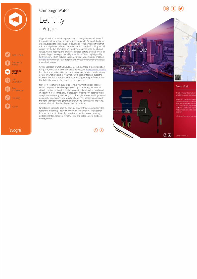
Virgin Atlantic’s ‘Let it ly’ campaign launched early February with one othe most inspiring holiday ads we’ve seen or a while. On a daily basis, weare all subjected to an onslaught o adverts, so it was a masterstroke thatthis campaign impacted upon the team. So much so, the irst thing we didwas re-visit the ‘Let it ly’ video online. Virgin remains true to their brandvalues, with its inspiring and entrepreneurial go-getting creative. This is allpart o a larger campaign created by Adam&EveDDB and highlighted byFast Company, which includes an interactive online destination enablingusers to ollow their goals and aspirations by recommending hypotheticaltravel destinations.
Virgins approach is what we would come to expect or a typical marketing
campaign, however, as a sel-conessed nomad, this interactive destination eels like the perect asset to support the commercial. When you input yourdetails on what you pack or your holiday, this clever tool will guess themost suitable destination based on your holiday packing preerences andhighlights the must see locations and experiences.
Now or those o us with busy lives, to have your next holiday optionscurated or you this eels like a great starting point or anyone. You canvirtually explore destinations including curated ilm clips, live tweets andimages rom local attractions. This leaves you eeling only a stones throwaway rom the country, and ready to book a light. We assume Virgin wouldagree, millennials aren’t their target audience. This interactive aligns withthe trend sparked by this generation o shunning travel agents and using
online tools to aid their holiday destination decisions.
Whilst Virgin appear to be at the early stages with this tool, we admire theroute they are taking. The addition o some real-time data like weatherorecasts and photo shares, by those in the location, would be a trulyadded beneit and encourage many cursors to slide nearer to the bookholiday button.
8/17/2019 Infogr8 Trend Report Spring 2015
http://slidepdf.com/reader/full/infogr8-trend-report-spring-2015 16/33
Editor’s Note
Events
CampaignWatch
CommunityTrends
DataVisualisation
DataJournalism
Interview
Campaign Watch
UP Data Snapshots– Jawbone –
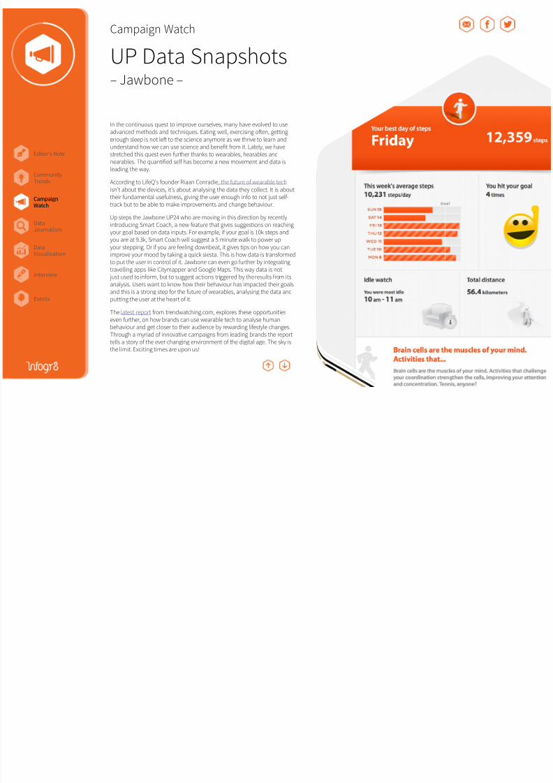
In the continuous quest to improve ourselves, many have evolved to useadvanced methods and techniques. Eating well, exercising ofen, gettingenough sleep is not lef to the science anymore as we thrive to learn andunderstand how we can use science and beneit rom it. Lately, we havestretched this quest even urther thanks to wearables, hearables andnearables. The quantiied sel has become a new movement and data isleading the way.
According to LieQ’s ounder Riaan Conradie, the uture o wearable tech isn’t about the devices, it’s about analysing the data they collect. It is abouttheir undamental useulness, giving the user enough ino to not just sel-track but to be able to make improvements and change behaviour.
Up steps the Jawbone UP24 who are moving in this direction by recentlyintroducing Smart Coach, a new eature that gives suggestions on reachingyour goal based on data inputs. For example, i your goal is 10k steps andyou are at 9.3k, Smart Coach will suggest a 5 minute walk to power upyour stepping. Or i you are eeling downbeat, it gives tips on how you canimprove your mood by taking a quick siesta. This is how data is transormedto put the user in control o it. Jawbone can even go urther by integratingtravelling apps like Citymapper and Google Maps. This way data is not just used to inorm, but to suggest actions triggered by the results rom itsanalysis. Users want to know how their behaviour has impacted their goals
and this is a strong step or the uture o wearables, analysing the data andputting the user at the heart o it.
The latest report rom trendwatching.com, explores these opportunitieseven urther, on how brands can use wearable tech to analyse humanbehaviour and get closer to their audience by rewarding liestyle changes.Through a myriad o innovative campaigns rom leading brands the reporttells a story o the ever changing environment o the digital age. The sky isthe limit. Exciting times are upon us!
CampaignWatch
hate *
ugly
unattractive
hideous
8/17/2019 Infogr8 Trend Report Spring 2015
http://slidepdf.com/reader/full/infogr8-trend-report-spring-2015 17/33
Editor’s Note
Events
CampaignWatch
CommunityTrends
DataVisualisation
DataJournalism
Interview
Campaign Watch
#SpeakBeautiful– Dove and Twitter –
Social media can make or break a trend. Human curiosity knows noboundaries thanks to the limitless connections we have created. We aredrawn to controversial discussions like moths to a flame. Yes, we are talking
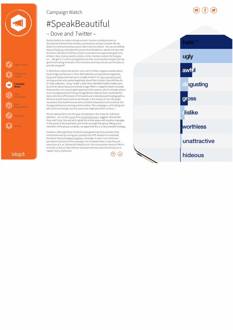
about #TheDress, the latest discussion that divided our planet into two setsof colours. Besides the flames, these conversations are generating all sortsof data. Likes, shares, tweets, visitors, clicks, memes created, the list goeson… We get it, it’s all fun and games, but how much positive impact can weignite from being involved in the viral wave and how can we use this data toactually do good?
In 2014 Dove noted that women sent over 5 million negative tweets about
body image and beauty in 2014. Motivated by such grandiose negativity,Dove and Twitter teamed up on a single mission: to start a positive trend among women who spoke negatively about their bodies. How did they doit? Data collection. Using Twitter’s data Dove identified hateful tweets sentby women about beauty and body image. When a negative tweet is posted,Dove sends a non-automated response to the person, which includes adviceto encourage positive thinking. Alongside the respond, they visualised thedata collection off the back of the tweets and created powerful gifographics..What we would have loved to see though, is the impact of the campaignvisualised, how hateful words were turned into beautiful ones and how thischanges behaviours among women online. The campaign is still rolling andwill continue through-out the year so we might give them a shout. ;)
We are seeing 2015 to be the year of positivity in the chase for millenial’sattention - as a recent report from ZenithOptimedia suggests. Brands likeDove and Coca-Cola are set to ignite the online space with positive messages
in the quest of winning hearts and minds amongst this group. Being proudmembers of the group ourselves, we agree that this is a very powerful strategy.
However, although these initiatives have good intentions at heart, theysometimes end up turning very quickly into a PR disaster. For example,the latest Starbucks #RaceTogether campaign. It wasn’t just the brandperception that drove this campaign into a heated mess, it was the pureexecution of it, as Starbucks’s failed to turn the conversation around. Whichreminds us that an idea without well planned execution should stay on anapkin. Sorry, Starbucks.
hate *
ugly
unattractive
hideous
CampaignWatch
8/17/2019 Infogr8 Trend Report Spring 2015
http://slidepdf.com/reader/full/infogr8-trend-report-spring-2015 18/33

8/17/2019 Infogr8 Trend Report Spring 2015
http://slidepdf.com/reader/full/infogr8-trend-report-spring-2015 19/33
Editor’s Note
Events
CampaignWatch
CommunityTrends
DataVisualisation
DataJournalism
Interview
Campaign Watch
Lef Behind– UNESCO Institute or Statistics –
CampaignWatch
You may remember we eatured a UNESCO interactive back in Volume 3 o the ICYMI. Data driven story telling was a real buzzword in 2014 and itdoesn’t seem to be letting off, well why would it when you can combineempathy with the acts?
Across Arica, 28 million young and adolescent girls are out o school. In ourview UNESCO have set a sound approach in their latest interactive pieceby allowing users to explore the data allowing them to come to their ownconclusions. The lef side o the screen displays interesting observationspulled rom the data, while the charts allow us to explore and compare inmore detail. The photographic images in the background make it impossibleto orget that there are real people behind these numbers, making theinormation all the more impactul. The overall result is pretty impressive, thisis a ine benchmark on how to combine visualising charts within an engagingphoto rich story built or responsive viewing. One thing we would have likedto see was the capability or users to broadcast speciic key acts rom thecharts they are viewing /interacting with. Additionally, the report may travelurther by re-purposing intriguing acts/chart elements to seed out acrossUNESCO’s key social channels Twitter and Facebook over time.
For organisations intending to produce something quicker and slightly lessbespoke, the out o the box solution Shorthand can be a potential option aswe’ve come to see rom the likes o BBC’s coverage on Westgate siege.
8/17/2019 Infogr8 Trend Report Spring 2015
http://slidepdf.com/reader/full/infogr8-trend-report-spring-2015 20/33
Editor’s Note
Events
CampaignWatch
CommunityTrends
DataVisualisation
DataJournalism
Interview
Data Journalism
Women in Science Live Longer, Live Well CCS: a 2 degree solution Regional Wellbeing
DataJournalism
8/17/2019 Infogr8 Trend Report Spring 2015
http://slidepdf.com/reader/full/infogr8-trend-report-spring-2015 21/33
Editor’s Note
Events
CampaignWatch
CommunityTrends
DataVisualisation
DataJournalism
Interview
Data Journalism
Women in Science– UNESCO Institute or Statistics –
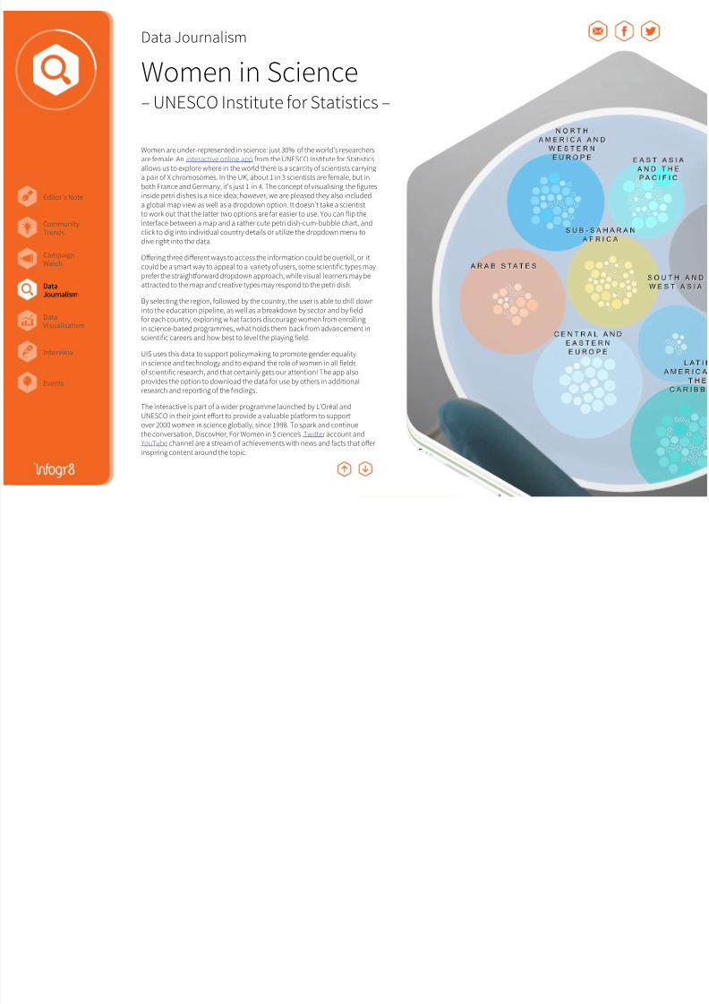
Women are under-represented in science: just 30% o the world’s researchersare emale. An interactive online app rom the UNESCO Institute or Statisticsallows us to explore where in the world there is a scarcity o scientists carryinga pair o X chromosomes. In the UK, about 1 in 3 scientists are emale, but inboth France and Germany, it’s just 1 in 4. The concept o visualising the iguresinside petri dishes is a nice idea; however, we are pleased they also includeda global map view as well as a dropdown option. It doesn’t take a scientistto work out that the latter two options are ar easier to use. You can lip theinterace between a map and a rather cute petri dish-cum-bubble chart, andclick to dig into individual country details or utilize the dropdown menu todive right into the data.
Offering three different ways to access the inormation could be overkill, or itcould be a smart way to appeal to a variety o users, some scientiic types maypreer the straightorward dropdown approach, while visual learners may beattracted to the map and creative types may respond to the petri dish.
By selecting the region, ollowed by the country, the user is able to drill downinto the education pipeline, as well as a breakdown by sector and by ieldor each country, exploring w hat actors discourage women rom enrollingin science-based programmes, what holds them back rom advancement inscientiic careers and how best to level the playing ield.
UIS uses this data to support policymaking to promote gender equalityin science and technology and to expand the role o women in all ields
o scientiic research, and that certainly gets our attention! The app alsoprovides the option to download the data or use by others in additionalresearch and reporting o the indings.
The interactive is part o a wider programme launched by L’Oréal andUNESCO in their joint effort to provide a valuable platorm to supportover 2000 women in science globally, since 1998. To spark and continuethe conversation, DiscovHer, For Women in S cience’s Twitter account andYouTube channel are a stream o achievements with news and acts that offerinspiring content around the topic.
DataJournalism
8/17/2019 Infogr8 Trend Report Spring 2015
http://slidepdf.com/reader/full/infogr8-trend-report-spring-2015 22/33
Editor’s Note
Events
CampaignWatch
CommunityTrends
DataVisualisation
DataJournalism
Interview
Data Journalism
Live Longer, Live Well– British Society or Research on
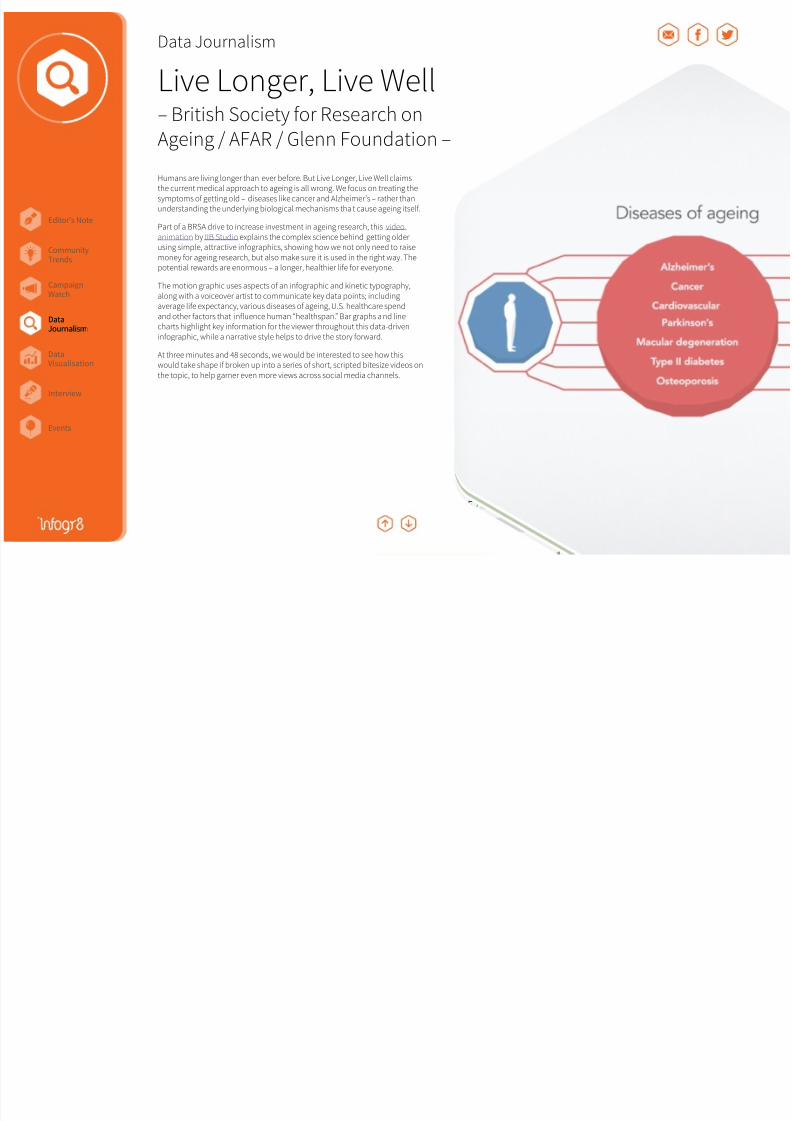
Ageing / AFAR / Glenn Foundation –Humans are living longer than ever beore. But Live Longer, Live Well claimsthe current medical approach to ageing is all wrong. We ocus on treating thesymptoms o getting old – diseases like cancer and Alzheimer’s – rather thanunderstanding the underlying biological mechanisms tha t cause ageing itsel.
Part o a BRSA drive to increase investment in ageing research, this video animation by IIB Studio explains the complex science behind getting olderusing simple, attractive inographics, showing how we not only need to raisemoney or ageing research, but also make sure it is used in the right way. Thepotential rewards are enormous – a longer, healthier lie or everyone.
The motion graphic uses aspects o an inographic and kinetic typography,along with a voiceover artist to communicate key data points; includingaverage lie expectancy, various diseases o ageing, U.S. healthcare spendand other actors that inluence human “healthspan.” Bar graphs a nd linecharts highlight key inormation or the viewer throughout this data-driveninographic, while a narrative style helps to drive the story orward.
At three minutes and 48 seconds, we would be interested to see how thiswould take shape i broken up into a series o short, scripted bitesize videos onthe topic, to help garner even more views across social media channels.
DataJournalism
8/17/2019 Infogr8 Trend Report Spring 2015
http://slidepdf.com/reader/full/infogr8-trend-report-spring-2015 23/33
Editor’s Note
Events
CampaignWatch
CommunityTrends
DataVisualisation
DataJournalism
Interview
Data Journalism
CCS: a 2 degree solution– WBCSD –
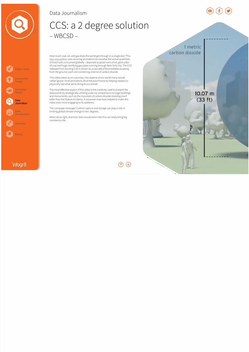
How much coal, oil, and gas does the world get through in a single day? Thisour-minute ilm uses stunning animations to visualise the actual quantitieso ossil uels consumed globally – depicted as great rivers o oil, giant pileso coal and huge, terriying gas pipes running through New York City. The CO2released rom burning it all is shown as a cascade o blue bubbles eruptingrom the ground, each one containing a tonne o carbon dioxide.
This video takes us on a journey, into aspects o our world many wouldrather ignore. Vivid animations drive the point home by helping viewers tophysically see what we’re doing to our planet.
The most effective aspect o this video is the creativity used to present thedata points by strategically utilising scale via comparisons to large buildingsand monuments, such as the mountain o carbon dioxide standing muchtaller than the Statue o Liberty. A voiceover may have helped to make thisvideo even more engaging to its audience.
The campaign message? Carbon capture and storage can play a role inlimiting global climate change to two degrees.
When done right, dramatic data visualisation like this can really bring bignumbers to lie.
DataJournalism

8/17/2019 Infogr8 Trend Report Spring 2015
http://slidepdf.com/reader/full/infogr8-trend-report-spring-2015 24/33
Editor’s Note
Events
CampaignWatch
CommunityTrends
DataVisualisation
DataJournalism
Interview
Data Journalism
Regional Wellbeing– OECD –
How does your region perorm when it comes to education, environment,saety and other topics important to your well-being? This interactive site created by Moritz Steaner and Dominikus Baur allows you to measurewellbeing in your region and compare it with 362 other OECD regions basedon nine topics central to the quality o our lives.
These topics include– income, jobs, health, access to ser vices, environment,education, saety, civic engagement and housing. A score is calculated oreach topic, allowing users to compare places and topics within and acrosscountries. Using location-based technology, the site is a ble to automatically
detect the region o the visitor (with permission), offering a seamless userexperience.
The success o this is all in the design. Colourul, lower-like designs (similarto those pioneered by Steaner and Baur in the earlier OECD Better LieIndex) visualise the unique well-being score proile o each region, whilesliding scales urther break down each o the nine topics, sharing keyindicators that greatly impact the scores or each region. The site offersloads o explanatory inormation including why this data is important, auser’s guide, and requently asked questions.
With the noble goal o improving people’s lives by improving public policies,this site utilizes over 7,000 data points distilled into a visually appealing,supremely user-riendly interace that won its creators an Inormation is
Beautiul silver award last November. While the current data ocuses on statesand provinces, a second version o the site could drill down deeper into citiesand metropolitan areas or an even more comprehensive view o overallwell-being.
DataJournalism
8/17/2019 Infogr8 Trend Report Spring 2015
http://slidepdf.com/reader/full/infogr8-trend-report-spring-2015 25/33
Editor’s Note
Events
CampaignWatch
CommunityTrends
DataVisualisation
DataJournalism
Interview
Seliecity F1 Timeline Friends in Space Braindance
Data Visualisation
DataVisualisation

8/17/2019 Infogr8 Trend Report Spring 2015
http://slidepdf.com/reader/full/infogr8-trend-report-spring-2015 26/33
Editor’s Note
Events
CampaignWatch
CommunityTrends
DataVisualisation
DataJournalism
Interview
Data Visualisation
Seliecity– Digital Thought Facility –
In case you didn’t realise, 2014 was the year o the selie. Ellen DeGeneres’star-studded Oscar photo was retweeted a record breaking three million times.It’s a phenomenon that has swept the globe, and now thanks to Seliecity wecan see how different cultures are expressing themselves through their ownpersonal images. Produced under the creative direction o Moritz Steaner,this interactive tool allows us to view 32,000 selies taken across ive citiesrom around the world to explore interesting patterns in this very public ormo sel expression.
We are immediately presented with a series or histograms where photos have
been categorised according to gender, age, and mood, making some trendsimmediately clear. We noticed that woman share more images than menin all o the cities eatured, but the difference in emale vs. male selies wasespecially large in Moscow, and or some reason they have a tendency to lookmore grumpy. Snappers in Bangkok however have been shown to be muchmore cheerul.
We are then encouraged to apply a range o additional ilters such as headtilt, acial expressions and pose to see i we can identiy interesting trendsor ourselves, and discover patterns we would never have expected. Theexploration process is immensely enjoyable, and encourages users to dig deepand share there observations with others. So remember, the next time youshare a selie, you may be expressing more than you had previously imagined.
DataVisualisation

8/17/2019 Infogr8 Trend Report Spring 2015
http://slidepdf.com/reader/full/infogr8-trend-report-spring-2015 27/33
Editor’s Note
Events
CampaignWatch
CommunityTrends
DataVisualisation
DataJournalism
Interview
Data Visualisation
F1 Timeline– Peter Cook –
Be prepared to hear the name Max Verstappen mentioned quite a bit during2015. The Seventeen-year-old has become the youngest Formula 1 driver totake to the starting grid as the the championship got underway in Melbourneon March 15. The sport has seen teenagers race beore, but the new Toro Rossodriver will be almost a ull two years younger than any who have raced beore.
The trend or younger and younger drivers to take to the driving seat is clearlyvisible in this comprehensive interactive piece rom Peter Cook, visualising thecareers and successes o every F1 driver since 1950 using nothing more thanbeautiully crafed bar charts. Many modern drivers would probably consider
retirement when they hit their mid 30s, however they would be consideredmere whippersnappers i they were racing just a ew decades ago. At the timeo writing, young Max has not yet been included in this visualisation, howeveronce he is it’s clear that the scale used to show driver age is going to need to bere-drawn, as he would all off the screen.
This incredibly data rich piece allows us to sort drivers by age, timeline or racecount, and with the coloured scale used to display inishing positions o everyrace, we can immediately identiy the champions rom the rest o the pack. Welove that act that the visualisation does not make any compromises, everyrace and every result in the history o F1 has been eatured, allowing us toexplore the sport in enormous depth.
DataVisualisation
8/17/2019 Infogr8 Trend Report Spring 2015
http://slidepdf.com/reader/full/infogr8-trend-report-spring-2015 28/33
Editor’s Note
Events
CampaignWatch
CommunityTrends
DataVisualisation
DataJournalism
Interview
Data Visualisation
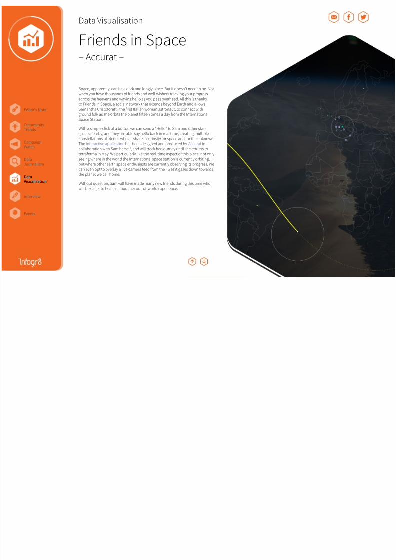
Friends in Space– Accurat –
Space, apparently, can be a dark and longly place. But it doesn’t need to be. Notwhen you have thousands o riends and well-wishers tracking your progressacross the heavens and waving hello as you pass overhead. All this is thanksto Friends in Space, a social network that extends beyond Earth and allowsSamantha Cristooretti, the irst Italian woman astronaut, to connect withground olk as she orbits the planet ifeen times a day rom the InternationalSpace Station.
With a simple click o a button we can send a “Hello” to Sam and other star-gazers nearby, and they are able say hello back in real time, creating multiple
constellations o riends who all share a curiosity or space and or the unknown.The interactive application has been designed and produced by Accurat incollaboration with Sam hersel, and will track her journey until she returns toterraerma in May. We particularly like the real-time aspect o this piece, not onlyseeing where in the world the International space station is currently orbiting,but where other earth space enthusiasts are currently observing its progress. Wecan even opt to overlay a live camera eed rom the IIS as it gazes down towardsthe planet we call home.
Without question, Sam will have made many new riends during this time whowill be eager to hear all about her out-o-world experience.
DataVisualisation
8/17/2019 Infogr8 Trend Report Spring 2015
http://slidepdf.com/reader/full/infogr8-trend-report-spring-2015 29/33
Editor’s Note
Events
CampaignWatch
CommunityTrends
DataVisualisation
DataJournalism
Interview
Data Visualisation
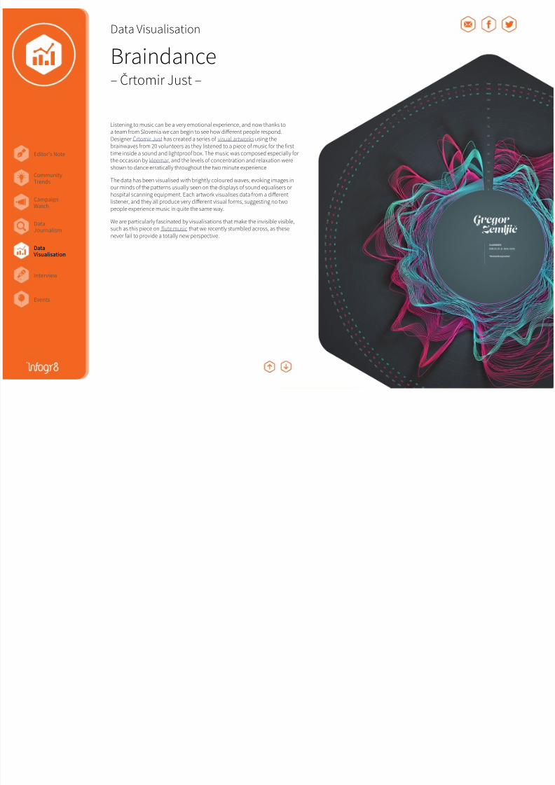
Braindance– Črtomir Just –
Listening to music can be a very emotional experience, and now thanks toa team rom Slovenia we can begin to see how different people respond.Designer Črtomir Just has created a series o visual artworks using thebrainwaves rom 20 volunteers as they listened to a piece o music or the irsttime inside a sound and lightproo box. The music was composed especially orthe occasion by kleemar, and the levels o concentration and relaxation wereshown to dance erratically throughout the two minute experience.
The data has been visualised with brightly coloured waves, evoking images inour minds o the patterns usually seen on the displays o sound equalisers or
hospital scanning equipment. Each artwork visualises data rom a differentlistener, and they all produce very different visual orms, suggesting no twopeople experience music in quite the same way.
We are particularly ascinated by visualisations that make the invisible visible,such as this piece on lute music that we recently stumbled across, as thesenever ail to provide a totally new perspective.
DataVisualisation

8/17/2019 Infogr8 Trend Report Spring 2015
http://slidepdf.com/reader/full/infogr8-trend-report-spring-2015 30/33
Editor’s Note
Events
CampaignWatch
CommunityTrends
DataVisualisation
DataJournalism
Interview
Interview
Ben WillersBen Willers leads data visualisation at inogr8 where he enjoys exploring and creating data richvisualisations. Afer graduating rom the University o Lincoln in 2012 with a MA in Design, Benwon a competition set by the Inormation is Beautiul group and had work exhibited at ExpoViz 2012 in Paris. He relects on his methodology in his chapter eatured in New Challenges or Data
Design, a book which includes contributions rom many o the leading minds in this ield.
http://benwillers.com
What got you interested in information graphics?
It’s something that has always interested me. A ew years ago I dug out somedrawing rom when I was about 6 or 7 years old showing a step-by-step illustratedguide to cooking and baking, so I think a pragmatic element has always beenthere in the stuff I have created. However it was probably David McCandless’Inormation is Beautiul book which acted as the catalyst and encouraged me tostart thinking about visualising data as a ull time proession. But even then it tooka ew months or the idea to really sink in. I irst read the book in the summer o2010, and then went back to university to study MA Design several months later,however it wasn’t until I was a ull semester in that I decided to rip up my originalproposal and ocus my efforts purely on the visualisation o data. I had originallyset out to explore branding and packaging, and everyone on the programme wasencouraged to keep a journal so that we could document our study process. It
just so happened that I was also reading a book calledData Flow at the time, andI decided to go down the inographic route or my log book. I created a simplechart to visualise something that I had learned, or something interesting that hadhappened to me each day, and also the amount o time I spent on certain activities.Afer a ew months it was clear to me and everyone else around me that the journalitsel was more interesting than the project I was working on, and things justdeveloped very quickly rom there.
With data everything seems calculated and precise. But is there a time where
you’ve had to deal with uncertainty in your designs?
A great example o this was when I was creating my ‘Lie’ piece right at the end omy MA in which I experimented with visualising my happiness at various stagesacross my lie. I had previously created a series o visualisations depicting personalactivities I had been monitoring and recording, such as calorie intake, sleep patterns and television viewing, however happiness was a little different because I had nodata or accurate means o measuring this. The inal piece combined these moresubjective ideas with other datasets that were based an act, such as the number ohours worked in a part-time job at Tesco which came rom old payslip inormation.
Who is usually the audience for your work?
The answer to that question varies so much depending on the project. SometimesI work with organisations who want to understand their own data better, and inthese cases there is sometimes not a lot o room or artistic reedom. Stephen Fewhas written some great books which cover best practice, and I came across manyother examples during my studies. I also enjoy designing or audiences that arenot so versed with data, and here there is the additional challenge o balancingclarity o communication with an element o engagingness. However my avouriteprojects are ofen the ones when I challenge mysel to push the boundaries indmethods o visualising data that would not be considered normal. In these cases Iam not so concerned about how others will react to my work, because ultimately Iam creating these or mysel. Having said that I always enjoy pushing my work outthere to gauge how it is received, and the eedback is usually very interesting andgenerates some worthy discussions!
Where do you think the practice is heading next, both in general and yoursspecifically?
I think in general we are going to see many more data visualisations that arereactive to events happening right now. Almost as soon as Madonna ell off thestage at the Brit Awards the other night there were animated maps visualising thereaction generated rom Twitter ollowers. I am a big an o all o this stuff, howeverI also think that it’s a shame that there are so many pieces out there that only havea moment to shine. I personally like to work on more considered pieces that cancontinue to offer insights many years orm now.
What do you think are the pitfalls with infographics today?
Sourcing o reputable inormation is a real concern o mine. I suspect many othose that create inographics come up with the concept irst, then try to locate andretroit data aferwards. In my experience inding really reputable data that you cantrust to support an idea can be challenging, and I think this is why we see so manyinographics which cite Wikipedia, or worse still sites like Yahoo Answers.
Interview

8/17/2019 Infogr8 Trend Report Spring 2015
http://slidepdf.com/reader/full/infogr8-trend-report-spring-2015 31/33
Editor’s Note
Events
CampaignWatch
CommunityTrends
DataVisualisation
DataJournalism
Interview
Could you talk us through a couple of your favourite pieces, say one from thepast and one that’s current?
I think that my absolutely avourite piece ever has to be Florence Nightingale’sCauses o Mortality diagram rom 1858 in which she visualised the number owounded soldiers dying rom inections diseases hospitals, to those being killedon the battleield during the Crimean War. Not because o the visualisationitsel, although I do ind it very interesting, but I ind the whole story behind itutterly ascinating. Data visualisation is such a hot topic right now, and it’s easyto orget that there is a lot o history in this area. Nightingale’s visualisationapproach was revolutionary or the time, and even without an establishedcommunity here efforts will still scorned upon by certain individuals who madetheir eelings known. However the message that she wanted to convey waspowerul enough to convince the British army at this time to improve the quality
o healthcare in the hospitals, which no doubt helped save many lives afer that.I she were alive today I have no doubt that Florence would be creating all kindso crazy interactive charts that would be inspiring us all to seek new orms odata visualisation.
From more recently I really liked Umbro’s poster showing every pass, shot andgoal during the 2010 Fia World Cup rom Michael Deal. It doesn’t attempt todistill the inormation down in any way, instead we are shown all o the criticalmoments rom every game in a very condensed orm which we are able to viewand explore reely.
On the other hand, can you think of an example where an infographic hasn’treally helped?
I see many antastic choropleth and bubble chart maps being produced andshared on a daily basis, however there are probably just as many again thathaven’t really been been thought through and offer very little insight. This isprobably because it’s never been easier to produce maps o this type, and thosethat create them do not necessarily need a lot o experience with this type ocontent. It’s relatively simply to throw statistics onto a map to proile a certainactivity geographically, but quite ofen all we get is essentially a populationdensity map. This piece displaying economic activity across the US is a classicexample, however there are plenty more culprits like it out there.
What (if time and money were no object) would be your absolutely idealproject be?
I believe that it’s a misconception that the visualisation o data should alwaysmake trends and stories instantly clear. This notion has been around long beoreTwitter, however it eels that everything nowadays has to have that immediate‘wow’ actor. Some o my avourite visualisation examples are those which took alittle time to appreciate because it was not immediately obvious what they weretrying to show, but these can sometimes be some o the most rewarding andengaging experiences i given the chance. So I would deinitely relish the chanceto work on more o these types o pieces.
I eel constantly restricted by computer screen technology and would love to seehow visualisations could exist outside this medium. Viewing data visualisations inan exhibition environment helps remove many o the technological boundaries,with actions like zooming in and out made as simple as stepping orwards andback. I would like to experiment with how data can be explored in a more tactilemanner using all the senses to create a more immersive experience.
Asking the questions was Christopher Twigg, Senior Lecturer in Design at the University o
Lincoln, and Ben’s mentor while studying MA Design rom 2010 to 2011.
Interview
Ben Willers
Interview

8/17/2019 Infogr8 Trend Report Spring 2015
http://slidepdf.com/reader/full/infogr8-trend-report-spring-2015 32/33
Editor’s Note
Events
CampaignWatch
CommunityTrends
DataVisualisation
DataJournalism
Interview
Events
dd:LONDON “Designing with Data”
Guardian Data Visualisation
The DataIQ Summit
Lean Book Club
Axure London
March 26th 2015, London, UK
Examining the relationship between data and design and the inluence theyhave on each other. How does data inorm design decisions in user centricdesign, and progressing urther, how can we use data and technology todesign or us?
April 11th 2015, London, UK
A one-day workshop.
June 16th 2015, London, UK
Unique insight into how sector leaders are aligning their business strategy
around data and analytics.
Non London ollowers, we did try to ind relevant events in your area, butrest assured next season we’ll hunt out more events outside o the capital!
March 30th 2015, London, UK
“Seductive interaction design” by Stephen P. Anderson.
April 22nd - 12th 2015, London, UK
Responsive Style Guide and Board Games.
Big Data Innovation SummitMay 11th - 12th 2015, London, UK
Discussions around:
• Big Data: A Rich Flow o Revenue• Hadoop, R, NoSQL & Open Source Sofware• Big Data Analytics• Data Visualization• Big Data and Customer Engagement
Events

8/17/2019 Infogr8 Trend Report Spring 2015
http://slidepdf.com/reader/full/infogr8-trend-report-spring-2015 33/33