Embed Size (px)
Citation preview

10/16/2016
1
Incorporating Technology to Achieve Excellence in Data Visualization
Assessment InstituteIndianapolis, INOctober 17, 2016
Martha J. Larkin George R. Larkin Assessment Director FacultyCollege of Education & Leadership School of Public Policy & Administration
[email protected] [email protected]
Session Learning Outcome 1

10/16/2016
2
Session Learning Outcome 2
Overview
1. Growing Interest in Data Visualization
2. Principles and Processes for Data Visualization (Edward Tufte)
3. Technology Tools for Data Visualization
4. Collaborative Activities

10/16/2016
3
1. Growing Interest in Data Visualization
Early Data Visualization
http://pics‐about‐space.com/ancient‐egyptian‐astronomy‐chart?p=1#img6110296666893470338

10/16/2016
4
What is Data Visualization?
What is Data Visualization?

10/16/2016
5
What is Data Visualization?
What is Data Visualization?
10/16/2016
6
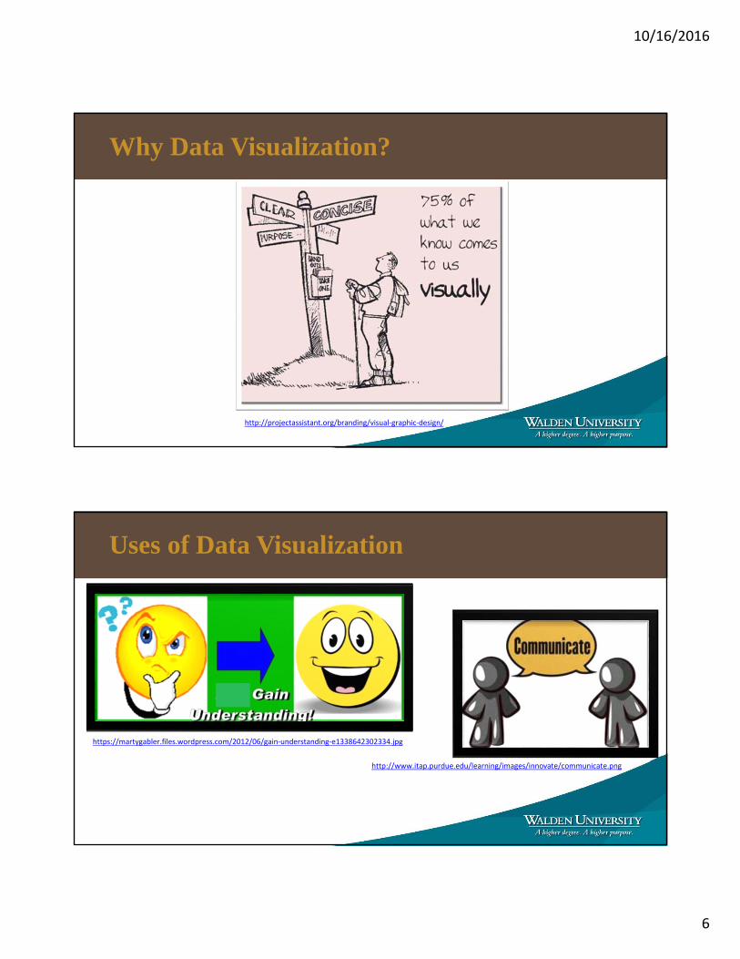
Why Data Visualization?
http://projectassistant.org/branding/visual‐graphic‐design/
Uses of Data Visualization
https://martygabler.files.wordpress.com/2012/06/gain‐understanding‐e1338642302334.jpg
http://www.itap.purdue.edu/learning/images/innovate/communicate.png

10/16/2016
7
Technology and Data Availability
http://siliconangle.com/files/2011/08/access.jpghttp://www.clearedgemarketing.com/wp‐content/uploads/2013/07/f1‐not‐equal‐sign.jpghttp://fergusonvalues.com/wp‐content/uploads/2012/10/Excellence‐Just‐Ahead.jpg
Planning for Excellence in Data Visualization(Fry, 2008)
1. We Face Information Overload.
2. We Are Better at Data Collection.
3. We Need More Sophisticated Thinking About Data.
4. We Know Data Never Stay the Same.
5. We Must Remember the Reason for Data Collection.
6. We Must Draw Insights from Diverse Fields.

10/16/2016
8
Fry’s Seven Stages of Data Visualization
Acquire Parse Filter Mine Represent Refine Interact
2. Principles and Processes for Data Visualization (Edward Tufte)

10/16/2016
9
Who is Edward Tufte?
Tufte’s Principle of Graphical Integrity 1
http://www.politifact.com/truth‐o‐meter/statements/2015/oct/01/jason‐chaffetz/chart‐shown‐planned‐parenthood‐hearing‐misleading‐/

10/16/2016
10
Would you buy this? Why?
Or Would You Buy This? Why?

10/16/2016
11
Tufte’s Principle of Graphical Integrity 2
Tufte’s Principle of Graphical Integrity 3

10/16/2016
12
Tufte’s Principle of Graphical Integrity 4
https://www.google.com/#q=cost+of+loaf+of+bread
http://www.thepeoplehistory.com/pricebasket.html
http://www.bls.gov/data/inflation_calculator.htm
Tufte’s Principle of Graphical Integrity 5
Hypothetical Teacher Shortage in Millions

10/16/2016
13
Tufte’s Principle of Graphical Integrity 6
http://www.act.org/newsroom/act‐national‐and‐state‐scores/
3. Technology Tools for Data Visualization

10/16/2016
14
Overview of Tools for Data Visualization
Excel

10/16/2016
15
SAS
http://www.sas.com/en_us/insights/big‐data/data‐visualization.html
STATA
http://www.stata.com/
10/16/2016
16
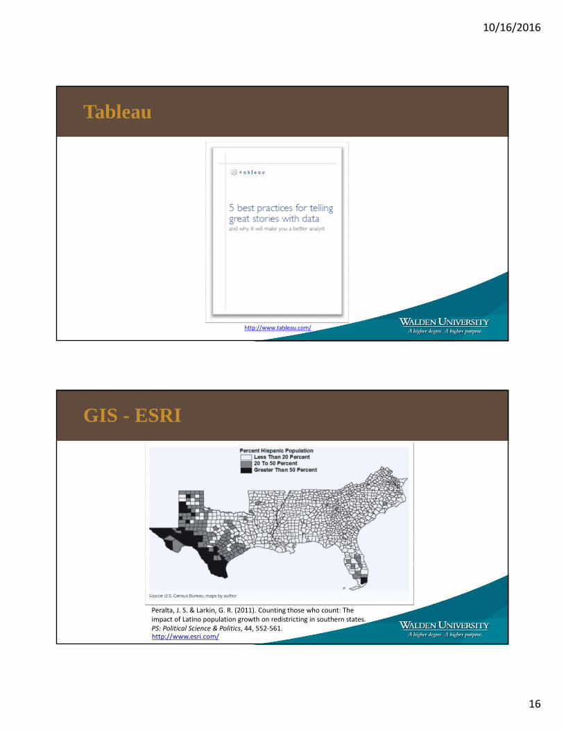
Tableau
http://www.tableau.com/
GIS - ESRI
Peralta, J. S. & Larkin, G. R. (2011). Counting those who count: The impact of Latino population growth on redistricting in southern states. PS: Political Science & Politics, 44, 552‐561.http://www.esri.com/

10/16/2016
17
William Jacoby’s Home Page
http://polisci.msu.edu/jacoby/
Coursera
https://www.coursera.org/course/datavisualization
10/16/2016
18
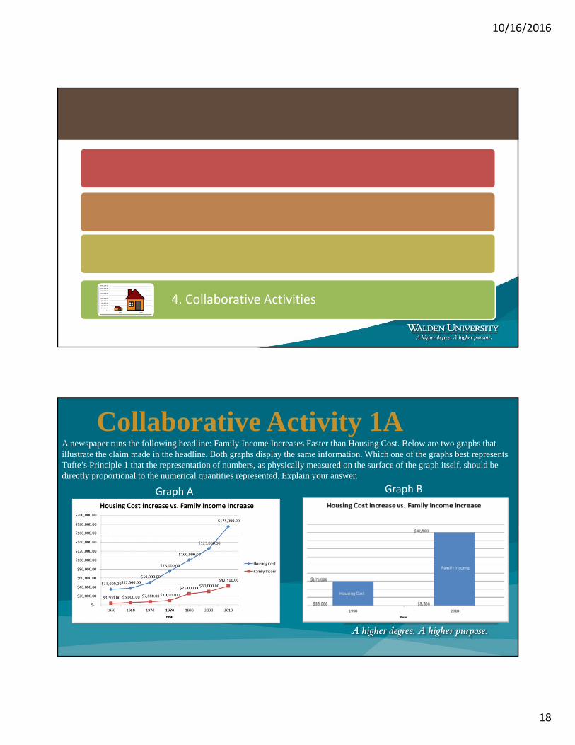
4. Collaborative Activities
Collaborative Activity 1A A newspaper runs the following headline: Family Income Increases Faster than Housing Cost. Below are two graphs that illustrate the claim made in the headline. Both graphs display the same information. Which one of the graphs best represents Tufte’s Principle 1 that the representation of numbers, as physically measured on the surface of the graph itself, should be directly proportional to the numerical quantities represented. Explain your answer.
Graph A Graph B
10/16/2016
19
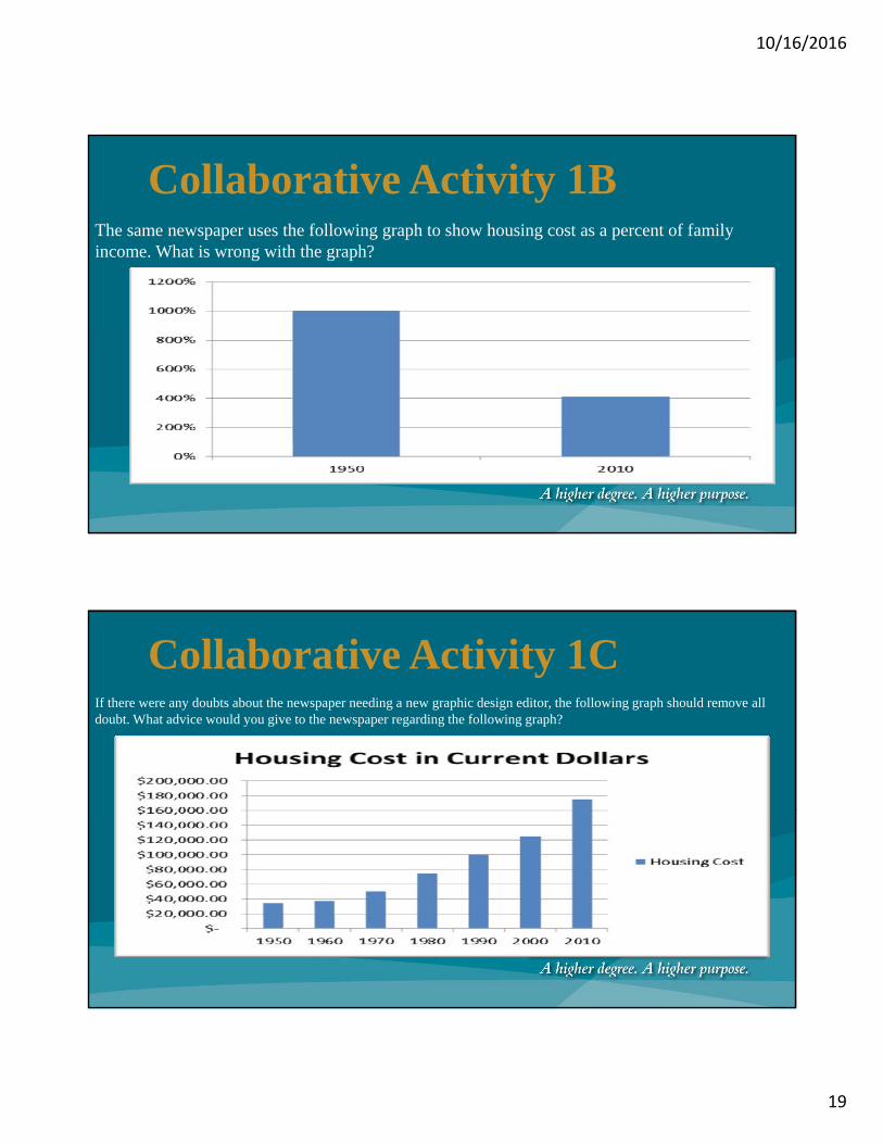
Collaborative Activity 1B The same newspaper uses the following graph to show housing cost as a percent of family income. What is wrong with the graph?
Collaborative Activity 1C If there were any doubts about the newspaper needing a new graphic design editor, the following graph should remove all doubt. What advice would you give to the newspaper regarding the following graph?

10/16/2016
20
Collaborative Activity 1DThe final newspaper graph adds insult to injury. What is wrong with the graph?
Collaborative Activity 2 Design a visual representation of the following data. Do not concentrate on artistic perfection, instead try to design a visual representation of the data that incorporates one or more of Tufte’s Principles. Explain your work and the principles you highlighted to the group.

10/16/2016
21
Conclusion
http://www.personal.psu.edu/users/n/y/nyl5096/Assignment%206.html
Martha J. Larkin martha.larkin
@staff.waldenu.edu
George R. Larkin george.larkin
@staff.waldenu.edu